3 minute read
Exercises����������������������������������������������������������������������������������������������������������������������


Chapter 4 ■ Visualizing Data
To create this plot using explicit geometries we want a ggplot object, we need to map the speed parameter from the data frame to the x-axis and the dist parameter to the y-axis, and we need to plot the data as points.
Advertisement
ggplot(cars) + geom_point(aes(x = speed, y = dist))
We create an object using the ggplot() function. We give it the cars data as input. When we give this object the data frame, following operations can access the data. It is possible to override which data frame the data we plot comes from, but unless otherwise specified, we have access to the data we gave ggplot() when we created the initial object. Next, we do two things in the same function call. We specify that we want the x- and y-values to be plotted as points by calling geom_point() and we map speed to the x-values and dist to the y-values using the “aesthetics” function aes(). Aesthetics are responsible for mapping from data to graphics. With the geom_point() geometry, the plot needs to have x- and y-values. The aesthetics tell the function which variables in the data should be used for these.
The aes() function defines the mapping from data to graphics just for the geom_point() function. Sometimes we want to have different mappings for different geometries and sometimes we do not. If we want to share aesthetics between functions, we can set it in the ggplot() function call instead. Then, like the data, the following functions can access it, and we don’t have to specify it for each subsequent function call.
ggplot(cars, aes(x = speed, y = dist)) + geom_point()
The ggplot() and geom_point() functions are combined using +. You use + to string together a series of commands to modify a ggplot object in a way very similar to how we use %>% to string together a sequence of data manipulations. The only reason that these are two different operators here are historical; if the %>% operator had been in common use when ggplot2 was developed, it would most likely have used that. As it is, you use +. Because + works slightly different in ggplot2 than %>% does in magrittr, you cannot just use a function name when the function doesn’t take any arguments, so you need to include the parentheses in geom_point().
Since ggplot() takes a data frame as its first argument, it is a typical pattern to first modify data in a string of %>% operations and then give it to ggplot() and follow that with a series of + operations. Doing that with cars would provide us with this simple pipeline—in larger applications, more steps are included in both the %>% pipeline and the + plot composition.
cars %>% ggplot(aes(x = speed, y = dist)) + geom_point()
For the iris data, we used the following qplot() call to create a scatterplot with colors determined by the Species variable.
iris %>% qplot(Petal.Width, Petal.Length , color = Species, data = .)
The corresponding code using ggplot() and geom_point() looks like this:
iris %>% ggplot + geom_point(aes(x = Petal.Width, y = Petal.Length, color = Species))
89
Chapter 4 ■ Visualizing Data
Here we could also have put the aesthetics in the ggplot() call instead of in the geom_point() call.
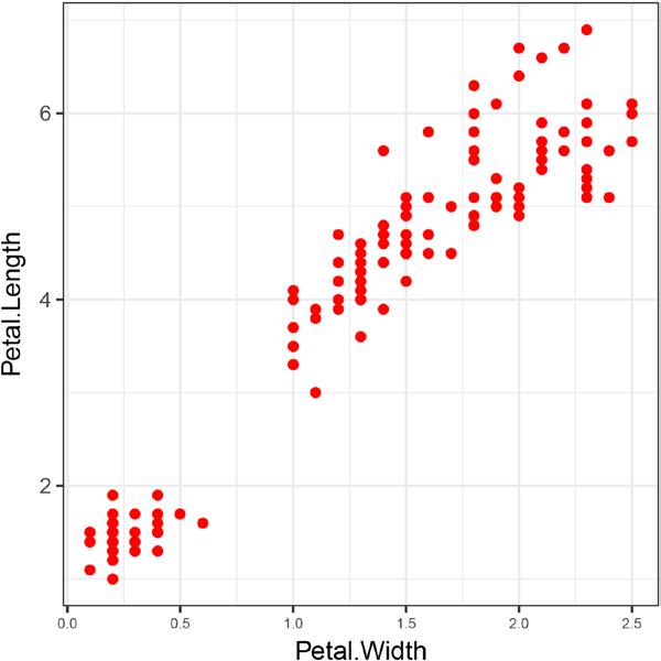
When you specify the color as an aesthetic, you let it depend on another variable in the data. If you instead want to hard-wire a color—or any graphics parameter in general—you simply have to move the parameter assignment outside the aes() call. If geom_point() gets assigned a color parameter, it will use that color for the points; if it doesn’t, it will get the color from the aesthetics. See Figure 4-13.
iris %>% ggplot + geom_point(aes(x = Petal.Width, y = Petal.Length), color = "red")
Figure 4-13. Iris data where the color of the points is hardwired
The qplot() code for plotting a histogram and a density plot:
cars %>% qplot(speed, data = ., bins = 10) cars %>% qplot(speed, data = ., geom = "density")
Can be constructed using geom_histogram() and geom_density(), respectively:
cars %>% ggplot + geom_histogram(aes(x = speed), bins = 10) cars %>% ggplot + geom_density(aes(x = speed))
90


