Showcasing BC & Alberta’s architects and interior designers
Q
U
A
R
T
E
R
L
FALL 2010 Vol. 11 No.2
Y
PM 40063056
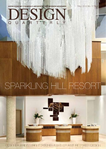
sparkling hill resort
Designer Jerilyn Wright | Kitchen & Bath | Furniture | Green Design
Visit Your KOHLER Registered Showroom ®
Ask our sales professionals for assistance with all of your project needs. ®
4120 Blackfoot Trail SE, Calgary • 403-245-8637 1338 United Boulevard, Coquitlam • 604-523-6555 18511 - 104 Avenue, Edmonton • 780-453-5714 2285 Cambie Street, Vancouver • 604-879-2494 1760 Ellice Avenue, Winnipeg • 204-784-0111 www.rlrbc.com
kitchen & bath :::::::
contents
Q
U
A
R
T
E
R
L
Y
FALL 2010 Vol. 11 No.2 www.designquarterly.ca PUBLISHER Dan Gnocato dang@mediaedge.ca Managing Editor Cheryl Mah Graphic Designers Shannon Swanson, Cory Dawson CONTRIBUTING WRITERS Tom Bakker, Sara Barron, Nick Bevanda, Donna Church, Mark Hanna, Jane Lawson, Trinh Nguyen, Ken Larsson, Douglas Kennedy, Alda Pereira, Jackie Teed, Bernard Vouchan B.C./ALBERTA SALES Dan Gnocato 604.739.2115 ext. 223 Advertising Rep Paulina Przyczyna 604.739.2115 ext 224
PUBLISHED BY
PRESIDENT Kevin Brown
06 Designer Profile Jerilyn Wright
vancouver office
402-1788 W. Broadway Vancouver, BC V6J 1Y1 Tel: 604.739.2115 Fax: 604.739.2117
10 PROJECT Profile
Toronto office
1000-5255 Yonge St. Toronto, ON M2N 6P4 Tel: 416.512.8186 Fax: 416.512.8344
Jerilyn Wright, one of Calgary’s top interior designers, has been applying her creative flair to interior spaces for more than 30 years.
The recently opened Sparkling Hill Resort in Vernon brings the concept of luxury spa and hotel destination to a whole new level.
Features 18 Kitchen & Bath
Fine Furniture for the Bath Sexy Surfaces Exploring Kitchen Trends Designing a Dream Kitchen
26 Green Design
Model for Sustainable Design Green Building Acoustics Energy Efficient Lighting Design Collaborative Community Design
31 Furniture
Sustainability in Design Timeless Trends Flexible Wall Systems
departments 04 From the Editor Elegance and Style 36 IDC Creating Value through Design 37 Architects in BC Winery Architecture 38 Design Headlines ON THE COVER: Sparkling Hill Resort in Vernon, B.C. Ema Peter Photography.
Copyright 2010 Canada Post Canadian publications mail sales publication agreement no. 40063056 – ISSN 0834-3357 Return all undeliverable Canadian addresses to: Suite 1000 – 5255 Yonge Street, Toronto, Ontario, M2N 6P4
PRINTED IN CANADA Design Quarterly is published four times a year by MediaEDGE Communications Inc. Yearly Subscription $26.40 + GST REPRINTS: No part of this magazine may be reproduced in any form — print or electronic — without written permission from the publisher. Requests for permission to reprint any portion of this magazine should be sent to the publisher. For all subscription inquiries or changes of address, please contact circulation@mediaedge.ca
PROUD SPONSOR OF
february 23 & 24, 2011
March 22 & 23, 2011
November 3 & 4, 2010 The purpose of Design Quarterly is to reflect and represent practitioners and professionals in the architectural, interior design and design resource communities throughout British Columbia and Alberta. Fall 2010 | DESIGN QUARTERLY 3
::::::: from the editor :::::::
elegance and style
M
any people (myself included) associate Swarovski crystal only with beautiful glittering figurines but in fact the century old company does much more. A team of designers at Swarovski have created many innovative uses for the gems over the years from dazzling curtains and jewellery to accents in walls, fabrics and even cars. Now a new resort in Vernon is showcasing the unique crystals in a spectacular way. Gracing our cover, Sparkling Hill Resort is the first hotel in North America to incorporate Swarovski crystal elements in its architectural design as well as throughout the interiors. The result is a touch of elegance and style wherever you go in the resort that complements the serene and natural surroundings. Read about how the design team met the client’s goals and delivered a truly unique experience with this luxury spa and hotel destination. For our profile, we talk to one of Calgary’s top interior designer Jerilyn Wright. The Winnipeg native has worked in Calgary specializing in corporate office design for the past 35 years, 26 as
the principal of Jerilyn Wright & Associates. She shares her thoughts about her firm’s success, good workplace design, trends and more. Staying on top of trends is always our goal. In this issue we focus on furniture and green design. A very green project is the VanDusen Botanical Garden Visitor’s Centre in Vancouver. Find out why this project is expected to be Canada’s first certified Living Building. We also highlight the importance of green building acoustics and community design. For our kitchen and bath feature, we’ve gone to industry experts to see what’s happening with bath furniture, countertops, kitchen aesthetics and renovations. Hopefully these articles will get you excited about your next project.
Cheryl Mah Managing Editor
Design Quarterly 2010 7.5x5.5.ai 27/10/2010 11:52:57 AM
ALBERTA
BC
AIRDRIE Ph (403) 945-9481
CHILLIWACK Ph (604) 792-0866
BARRHEAD Ph (780) 674-4255
COURTENAY Ph (250) 334-0645
CALGARY NORTH Ph (403) 291-1099
KELOWNA Ph (250) 769-3101
CALGARY SOUTH Ph (403) 216-6717
Western Canada’s premier plumbing, heating & electrical supplier with 31 locations to serve you.
KELOWNA NORTH Ph (250) 807-4050
Stocking Distributors of:
MAPLE RIDGE Ph (604) 467-1535
EDMONTON JASPER PL. Ph (780) 483-1411 EDMONTON NORTH Ph (780) 472-2850
NANAIMO Ph (250) 758-1771
EDMONTON SOUTH Ph (780) 437-7767
NORTH VANCOUVER Ph (604) 988-4141
EDSON Ph (780) 723-6180 FORT MCMURRAY Ph (780) 743-4476
4
PORT COQUITLAM Ph (604) 941-7318
Building Success
www.bartlegibson.com
PRINCE GEORGE Ph (250) 562-5505
HINTON Ph (780) 865-4800
SAANICH Ph (250) 727-9976
LETHBRIDGE Ph (403) 320-0411
SURREY Ph (604) 502-9122
LLOYDMINSTER Ph (780) 875-2683
VANCOUVER Ph (604) 253-2779
MEDICINE HAT Ph (403) 527-3565
LANGFORD Ph (250) 389-1073
PEACE RIVER Ph (780) 624-4050
WHISTLER Ph (604) 932-4871
SPRUCE GROVE Ph (780) 962-4891
NWT
WETASKIWIN Ph (780) 352-3722
YELLOWKNIFE Ph (867) 920-2248
DESIGN QUARTERLY | Fall 2010
a solid f o u n d a t io n o f s t yle Rugged materials • Smooth, easy-to-clean finishes Simple, quick installation • Affordable • Outstanding service and support
For detailed product information and where to buy, please contact Hytec at 1- 800 - 871- 8311 | Hytec.ca BATHS AND WHIRLPOOLS | SHOWERS AND RECEPTORS | MODULAR SYSTEMS
::::::: designer profile :::::::
creative planning By Cheryl Mah
A
fter more than 30 years working in the interior design industry, Jerilyn Wright is still having fun. “For me, interior design is more of a passion than a business. It’s so much fun,” says the Calgary based interior designer. “My strength is the creative side and I love trying to sort out the psychology of how do you develop space so it actually does what it says it will do.” As the principal of Jerilyn Wright & Associates, Wright leads a multicultural team of 12 architects and designers who are all committed to bringing energy and creativity to its design solutions for clients. “I’m all about creating energy in space,” she says. “Space can be weak and strong by how it’s planned and if it doesn’t have a classic sense of rhythm and proportion, it can appear really weak. A lot of spaces don’t have energy and vibrancy.” The firm offers a full range of interior design services but are sought out for its unique corporate workplace design. “We do all different types of work which keeps it interesting for me but we’re certainly known for our corporate design,” says Wright. “Our work is really about creative planning and bold use of colours.” When we spoke, she had just returned from Italy where she attended the furniture expo in Verona. “You have to stay on top of trends,” says Wright, who enjoys traveling for business and pleasure. “It’s an important part of what we offer our clients.” 6
DESIGN QUARTERLY | Fall 2010
Having travelled all over the world, Wright says that Canadian design can hold its own on the global stage. She cites as an example a recent trip to Dubai where she was “disappointed” with what she saw. “I went to Dubai for some possible work. So here I was going to the mecca to see what they were doing there,” she says. “And truly honestly, I thought our work here was as good or better.” Wright has come a long way since growing up in Winnipeg. Adopted at one month old, her father was an architect and her mother an artist and professional pianist. “I don’t think I had a choice,” laughs Wright about her career path. “For me it was always just a question of whether it was going to be fine arts, fashion design or architecture.” The decision came one day when her father took her on a tour to see a few different professions. When they visited an interior designer and she saw how great it was, her mind was made up. She graduated with a Bachelor of Interior Design from the University of Manitoba in 1974. She then moved to Calgary where she worked for Cohos Evamy for nine years from 1975-1984. “I learned a lot and it was great fun,” recalls Wright, citing Le Corbusier as a favourite during school. In 1984, she struck out on her own with a partner and opened a design firm. Wright bought out her partner after five years and has been at the helm of Jerilyn Wright & Associates ever since.
Photo by Ro Design Studio Inc | rodesign.ca
[ It’s not fire. It’s art. ]
A Town & Country Luxury Fireplace is more than just a hearth: it’s a design centre piece. Our fireplaces create individual design signatures, adding flair, ambiance and long-term value to any home. Our Design-AFire feature allows your clients to select burners and panels that reflect their personal style, and our unmatched venting options work around open spaces, structural beams and other unique features – meaning that a Town & Country Luxury Fireplace can be located almost anywhere within a building envelope. Go ahead — fire up your imagination.
Meet your new flame online at townandcountryfireplaces.com
Distributed by: Northwest Stoves Ltd, Langley, 1-800-663-0462 www.northweststoves.ca
Northern Fireplace Ltd, Edmonton, 1-866-667-5263 www.northernfireplace.com
Diamond Fireplace & Stone, Calgary, 403-273-0000 www.diamondfireplace.com
::::::: designer profile :::::::
Baytex Energy reception.
As one of today’s leading Western Canadian design firms, its client base of more than 15 million square feet includes companies from all sectors of business, with 85 percent of them repeat clients. “We’re always looking at offering more vision, more innovation and more service,” says Wright, crediting the firm’s success to energy, commitment and creative flair. “It’s about offering quality design.” The firm can be working on as many as 30 projects at any given time. Wright remains hands on with every project, focusing on the conceptual stage. “Don’t ask me to do the drawings. I’ve always hired people to do that,” chuckles Wright, adding she has made a conscience effort to create a multicultural work environment to bring together a broad spectrum of talent to meet the diverse needs of their clients. Based in Calgary, naturally oil and gas companies comprise the majority of their clientele along with the sectors that service that industry. Although projects are predominantly located in Alberta, the firm has done work across Canada and elsewhere. Last year the firm did some work in Belize. “We would like to do more international work,” notes Wright. “It gives us a broader appreciation of different flavours elsewhere.” The firm’s first significant project was the relocation of the TransCanada Pipeline corporate office from Toronto to Calgary in 1991. It was 430,000 square feet. “We beat out everybody in Canada. That was pretty exciting,” says Wright. “It put us on the map.” The firm was also responsible for the 730,000 square foot of space for Amoco Corp and Dome Petroleum in the late 1980s, one of Canada’s largest mergers at the time. The impact of the recent recession was minimized by the firm having a few larger projects carrying them through the slowdown. “We were lucky we had some larger projects that kept us going,” says Wright. Current projects include 140,000 square feet for the law firm McLeod Dixon and 108,000 square feet for Baytex Energy. The concept for Baytex was to create the “un-office” explains Wright. “It takes the demountable partition system and breaks it down and changes it so it’s all different components. It’s almost like a street 8
DESIGN QUARTERLY | Fall 2010
Oil & Gas Executive office corridor.
of different ideas and components as you wander along so it’s very lively, energizing,” she says. The firm has also worked on high end condo projects such as Astoria on 10th penthouses and La Caille on 4th. The transformation of her own private residence (Wright Residence) was an award winning effort. Out of the various design awards the firm has won, she is most proud of the award winning innovative “glow walls” they created for the energy company Fortis Alberta. Comprised of tiny fluorescents in plexiglass sandwich panels, they quickly became popular for use as whiteboards and projection screens. “It’s a series of movable panels that really energize the hallways — a wall that you can essentially write on it and it’s lit from behind. It was the coolest thing,” says Wright. “It was a serious piece of industrial design because it had never been done before.” As for the future of corporate design, Wright feels space will have to answer the different needs of the various generations — “these different generations want very different things” — and increasingly examine the psychological impact of elements such as colour, sounds and smells. “I think colour will truly start to play more of an impact than it does. We’ll start looking at smell and air quality more. Some scents have been shown to lower stress or enhance creativity,” says Wright. “Lighting is always important. Good lighting has for example been linked to 15 per cent reduction in absenteeism.” Outside of work, she’s an avid gardener and a prolific painter. She’s also dabbled in fashion design, having had her own line of clothes made in Vietnam. “I really love to paint and I paint these huge canvases,” says Wright, who starred in a threeyear television series called “Open Homes” which is now syndicated. She has also been very active in the industry. She has served on various boards: as president of the Interior Designers of Alberta, director of Interior Designers of Canada, a board member of Alberta Association of Architects, and the Mount Royal College Interior Design advisory board. Wright is currently serving on the board of the Ability Society, a non-profit agency for children and adults with special needs. DQ
::::::: proect profile :::::::
By Cheryl Mah
A Truly Unique Experience
P
erched on the edge of a granite ridge in Vernon, B.C., Sparkling Hill Resort is a landmark luxury spa and hotel destination. The $122 million European inspired resort is the first of its kind in North America, combining the concept of whole body wellness with the world-renowned Swarovski crystals as its overarching architectural theme.
10
DESIGN QUARTERLY | Fall 2010
E ma P et e r
By Cheryl Mah
perfection you deserve the best
NEW SURREY SHOWROOM The Margranite Burnaby and New Surrey Showrooms colours of
stock stone
over
300
different
slabs in a variety of
finishes and thicknesses. The state-of-theFor new and innovative ceramic and stone
art eco-friendly production facility locally
tile, C&S Distributors’ 6,000 sq.ft. showroom
produces over 1.5 million sq.ft. of slabs
features new and innovative products from
annually.
around the globe. For your next project, visit
North America can match the wide variety
our showrooms or our new website to explore
of quality stone products we produce.
No other company in Western
our vast product lines.
Showroom & Distribution 2820 Ingleton Avenue, Burnaby 604-435-4431 info@ceramstone.com
Showroom & Production Facility 19135 - 94th Avenue, Surrey Showroom & Distribution 2820 Ingleton Avenue, Burnaby 604-435-4431 margranite@ceramstone.com
www.ceramstone.com
E m a P e t e r X2
::::::: project profile :::::::
All the details — from the ambitious architecture to the distinct interior spaces — culminate to create a unique experience in a breathtaking setting. Designed by Cannon Design, the massing and siting of the 250,000 square foot resort maximizes the incredible views. It required blasting two storeys deep and 400 feet wide along the top of the ridge to put in a parkade, mechanical systems and more than 200 geothermal wells. The geothermal system is expected to provide approximately 110 per cent of the hotel’s heating and cooling energy needs. “The fundamental building planning had to work with the grain of this long rock ridge and we had to fit a 152 room hotel and a massive spa into it,” says Cannon Design associate principal David Wilkinson. “The building clearly wiggles its way along the ridge as if it was one more layer of strata in the rock.” The six storey reinforced concrete structure is literally cut into the rock 700 feet above Lake Okanagan and integrated into the pristine landscape on many different levels. Rock removed for the building site was used as landscaping material. The goal over time is to have the built form and natural form to grow and knit back together, according to Wilkinson. Being on top of a ridge meant limited outdoor space but the design team took advantage of the natural topography to put in an outdoor pool with vanishing edges, hot pools and some walking trails. “It doesn’t try to hark back to traditional alpine or spa design forms. It’s an incredibly modern building,” notes Wilkinson. Crystals and its ability to reflect light and movement play a pivotal role in the overall structure as well as throughout the interiors. “Because the major backer of this project is the Swarkovski family — it’s about crystals,” says Wikinson. “It’s about refraction and reflection of light and the effects of light.” Cannon Design and SSDG Interiors collaborated with Swarovski design leader Andy Altmeyer and his staff to integrate the crystal theme into the architecture and interior details. Rather than being gaudy or ostentatious, the $10 million worth of crystals has been 12
DESIGN QUARTERLY | Fall 2010
handled with careful thought and creativity. The result showcases the versatility of crystal and its unique ability to infuse light and vibrancy into the spaces. “One of the concerns with designing with crystal is that it is about cold light. But what we found was in most of the lighting fixtures and lighting effects that were used, it’s the prismatic aspect of crystal that we were designing to which reveals the full spectrum of colour so you’re getting a lot of warm colour coming into it,” says Wilkinson. The lobby features three massive chandeliers that create a dramatic “rainfall” of crystals cascading down from the ceiling. Extensive use of natural wood for the reception area and three pedestrian bridges that cross the expansive lobby space add warmth and character. SSDG was involved in every aspect of the hotel’s interior programming including seamlessly integrating one of a kind crystal features. “Although there are some pretty dramatic feature pieces, other crystals in the resort have been integrated in a more subtle manner,” says SSDG senior designer Shauna Root. Approximately two million loose crystals as well as Swarovski luminaries and lighting systems were used extensively throughout the building. Crystals are incorporated into fixtures, finishes, backs of dining room chairs, signage and the overall architecture including the signature 59-foot-high window wall in the lobby. Composed of more than 90 uniquely shaped and sized pieces of glass, angled irregularly to replicate a crystal, the atrium is supported by a complicated frame and unique cable tension system. Depending on the weather, the façade radiates a colour from white to dark metallic. “The large four storey crystal was quite a challenge technologically and budget wise,” says Wilkinson. “The resort sits up there twinkling at you because of this huge prismatic shape and therefore the name Sparkling Hill.” Officially opened in May 2010, the resort offers a myriad of amenities including conference space, exercise studios, a ballroom, dining venues and indoor and outdoor saltwater pools.
jennair.ca
Registered Trademark/TMTrademark of Jenn-Air U.S.A. Used under license in Canada. © 2009. All rights reserved.
®
Never before has a kitchen appliance demanded so much attention, and actually deserved it.
Introducing the industry’s best performing wall oven – the new Jenn-Air ® 30" (76.2 cm) double wall oven. Boasting a 7" (17.8 cm) full-colour touch anywhere LCD with innovative Culinary Centre and a V2TM vertical dual-fan convection system, its performance speaks for itself. To enhance your every culinary endeavour with precision-crafted, Jenn-Air® appliances, visit jennair.ca or an exclusive showroom near you.
We s t e r n C a n a d a ’ s L a r g e s t S u p p l i e r o f H o m e A p p l i a n c e s
VANCOUVER
VICTORIA
CALGARY N.
COQUITLAM
EDMONTON S.
SASKATOON
KELOWNA
WINNIPEG
NANAIMO
SURREY
CALGARY S.
EDMONTON N. NEW
ABBOTSFORD
RED DEER
REGINA
TORONTO NEW
w w w . c o a s t a p p l i a n c e s . c o m
NEW
The various public spaces have been created to encourage guests to explore and find sanctuary within the resort; curling up with a good book in the library or savouring a glass of port in the Wine Bar. “The spaces are all unique with each area having a slightly different feel,” describes SSDG principal Gerry Shinkewski. “What we’ve tried to do is create an atmosphere of healing and relaxing.” Adds Root, “we used ledgestone throughout the public spaces which is a nice contrast texture of light stone. We’ve also used a lot of Egyptian marble for the flooring.” Despite all the dazzling crystal overlay, the real gem is the resort’s 40,000-square-foot spa. Modeled after Europe’s traditional wellness centres, the KurSpa houses seven unique sauna and steam rooms offering more than 100 treatments. Each room has a different temperature, scent, texture and stimulants with the goal to promote rejuvenation and relaxation. ”In order to make the spa not feel like a huge cavernous space, we used soft natural materials and key colours for wayfinding and to give each area a unique identity,” says SSDG designer Jennifer Kurtz. Colours range from conch shell inspired purple and turquoise to brown and cream. The spa focuses on the European concept of whole-body wellness which means the treatments are designed not only to pamper guests but also to enhance their health. Many of the spa environments were designed and built in Europe and shipped to the site in components. “The spa is very rigorous,” says Wilkinson. “The most complex part was the spa spaces and pools. The spa required the most detail care because all of them were very technically demanding with a lot of intricate systems.” The spa also features the first ever cold sauna in North America. The -110˚ C cold sauna is beneficial for people suffering from chronic pain such as arthritis. From the spa lounge areas to the guest rooms, the spectacular lake and mountain views have been maximized throughout the resort with floor-to-ceiling windows. “The main focus was to have incredible views from virtually every space,” says Root. “And the colour and material palette that we used really complements the natural beauty outside the window.” 14
DESIGN QUARTERLY | Fall 2010
E ma P e t er X 2
::::::: project profile :::::::
Kate Holland Landscape Accessories Ltd. A complete variety of commercial and residential garden accessories as well as site furnishings for the design professional. 1 (877) 531-8574 www.khla.com
Frances Andrew Site Furnishings Ltd. Offering a huge selection of commercial site furnishings including benches, trash receptacles, bike racks, tables bollards and more! 1 (800) 565-6579 www.francesandrew.com
Taking inspiration from Vernon’s diverse landscape, the colour palette picks up on the wheat tones of the farmland, the dark rusts of the rocks and sage greens of the trees. “So the guest rooms have a touch of bright mossy green inspired by the moss on the rocks, a grey/brown barky texture reflected in the carpet and for the wood colour we didn’t go dark and dramatic but light and airy instead,” describes Root. Oriented towards the views of Lake Okanagan or the Monashee Mountains, every room has a window wall with an all glass Juliet balcony. The rooms feature one king or two queen beds and custom designed Kohler soaker tubs for two located right next to the window wall. Crystal elements can be found in the ceiling over the sitting area and in the cold fireplace that flickers with LED red lights. The rooms are zen like in its simplicity with a freestanding ash wood cabinet divider (power wall) between the wet and dry areas. One side contains a TV, fireplace and storage and the other side is the bathroom vanity and a walk through shower with outside view. “Part of the challenge with the power wall itself is that we have 152 suites and although there are similarities in the shapes, there were 13 different room types,” notes Root. “So we created components that we could put together in different configurations to make it work.” The bathroom double sinks are carved out of one huge slab of granite (seven feet long and 4 inches thick). “It’s one massive piece and quite incredible,” says Root. The client wanted a hotel that was a different experience all together, which challenged the SSDG design team to create spaces that would do just that. “Curvilinear forms were used for the wellness area and angular forms used elsewhere and to connect those different shapes and materials was challenging,” says Root. “It was part of the great success of the project but it certainly stretched our minds during the process.” Another challenge was the tight time frame. Led by construction managers PCL Constructors in Kelowna, the fast track project took 20 months to complete. “We double shifted for most of the project to bring it in on time,” says PCL manager Wayne Bilawchuk. “Site access was extremely 16
DESIGN QUARTERLY | Fall 2010
D erek L ep p er P h o t o gr a p h y / Co u r t es y o f Ca nn on D es i gn X 2
::::::: project profile :::::::
challenging being on top of a mountain and we were hit with one of the worse winters on record in 08/09.” The construction permit at $55 million was the highest ever issued by the City of Vernon and the resort was the city’s single largest building under construction at the time. “We’re very happy to have been able to help such a challenging project come to realization. It was a very big team effort,” says Wilkinson. “The design took place with very strong participation from the owners and the Swarovski group intends to do more of these around the world based on this model.” DQ
Join the
conversation with canada’s leading industry professionals
clare tattersall
VIDEO REPORTS
editorial Director, v-reports
coming soon… Design for Change: Responding to New Industry Realities
Jim toy Principal False Creek Design Group
Joe Pettipas Regional Practice Leader, Western Canada HOK
coming soon… Guiding Principles for Sustainability: A Look at the Past, Present and Future Approaches to Green Building
thomas Mueller CEO Canada Green Building Council
Peter Busby Managing Director Busby Perkins+Will
teresa coady Principal Bunting Coady Architects
w w w. d e s i g n q u a r t e r l y. c a Not getting our V-Reports?
sign up at v-reports@mediaedge.ca for direct delivery to your e-mail inbox. To sponsor a V-Report, contact Dan Gnocato at 604.739.2115 ext. 223. To participate in a V-Report, contact Clare Tattersall at claret@mediaedge.ca.
::::::: kitchen & bath :::::::
fine furniture for the bath By Donna Church
H
designer series
frameless glass showers
simply the
best 18
DESIGN QUARTERLY | Fall 2010
#101-13060 80th Ave. Surrey BC Phone 604.591.6422 | Fax 604.597.3995 www.deltaglass.ca
ow times have changed. Ten years ago, designers recognized the first stirrings of what is now a full-blown trend in bathroom furniture. Both they and do-ityourself homeowners were taking a deep breath and converting beautiful antique cabinets into vanities for their bedrooms and baths. They did so at no small risk. A steamy or sun-drenched bathroom is a dangerous place to store wood antiques.Not to mention the potential for structural damage caused by installing a basin — no less one filled with water — into the top of Aunt Ethel’s beautiful Victorian cabinet. No need to go to such lengths today. Thanks to a growing availability of beautiful and durable furniture made specifically for the bathroom, standalone vanities are increasingly popular with homeowners of all tastes, regardless of their style of home. What’s behind the appeal of fine furniture in the bath? For one thing, the notion of simple luxury has proven wildly attractive to consumers eager to seek refuge from their fast-paced lives and everyday worries. Nowhere in the home is this more evident than the bathroom, which has transformed into the ultimate getaway. Yesterday’s ho-hum utilitarian vanity can now resemble an elegant living room piece, making the bathroom a unique escape from the ordinary. Bathrooms are also getting larger, up to 200 to 300 square feet. Homeowners have to fill that space, and don’t want to have all countertop. The furniture look is most definitely appropriate for these bathrooms. The design industry is starting to see more demand for armoires, upholstered chairs, and vanities that are true pieces of furniture rather than built-in cabinetry.
::::::: kitchen & bath :::::::
Natural Stone A world selection of
Handsome bath furniture is popular with all ages and style preferences…
At your fingertips
At the other end of the spectrum are half-baths and powder rooms, which are great sites for all styles of furniture vanities. In a small bathroom, homeowners are more willing to experiment with a freestanding vanity because the dollar investment is not as great as with a large bath. There is also more freedom to deviate from the style of the rest of the home. Homeowners are more willing to take a chance with a freestanding vanity of an Asian motif, even if the rest of the home is traditional or French contemporary. Portable bath furniture is also a good fit for our transient society. Individuals are moving on a more regular basis and they don’t want to leave the things they truly admire and appreciate about their homes. Homeowners are trending towards things that can go with them on a move: an armoire, an upholstered chair or a really great looking bakers rack, and other typical pieces of furniture. The following are considerations to help achieve the best furniture look possible in the bath: • Add wood accent pieces For baths of all sizes, complement the vanity with other wood furniture, such as a small table or plant stand. Adding a narrow, high wood chest helps create a cozy atmosphere, particularly in the small bath.
Top right: Kohler’s Persuade collection of vanities represents a highly functional small space storage solution with contemporary styling. Middle: Every exquisite detail of Kohler’s Thistledown vanities have been thoughtfully designed
• Toss in an area rug Consider covering the floor with a high-quality area rug, just as you would for a hard-surface living room floor. Higher-quality rugs are actually less impervious to water absorption than other rugs.
With over 600 colors and styles of granite: • Marble • Travertine • Limestone • Slate • Semi Precious Stone • Onyx • Soap Stone • Engineered Quartz Stone Hari Stones turns your vision into reality.
and meticulously crafted to create heirloom-quality bathroom furniture. Bottom: From the premium hardwoods and veneers to the dovetail drawer boxes, Kohler’s Provinity vanity reflects a strikingly symmetrical blend of fashion and function.
• Use layers of lighting. To highlight the bath furniture, use floor and table-top lamps. For accent lighting, use incandescent bulbs on dimmers with track, recessed or ceiling lights. And always include fluorescent lighting — the workhorse of bath illumination — and place it in coves, under soffits, or along ceiling lines to bring out architectural and furniture details.
Don’t expect the bathroom furniture trend to fade anytime soon. Handsome bath furniture is popular with all ages and style preferences, from solid traditionalists to those who prefer a sleek, contemporary look. DQ Donna Church is manager of marketing & communications at Kohler Canada Co.
SURREY 13042 84 Avenue Surrey, BC V3W 1L2
PH: 604.599.4274 (HARI) TF: 1.877.599.4274 (HARI) FAX: 604.502.8478
WAREHOUSE LOCATIONS in KELOWNA and EDMONTON
www.haristoneslimited.com Fall 2010 | DESIGN QUARTERLY
19
Immerse yourself in the possibilities.
Experience our new showroom.
Be inspired. Experience our new Vancouver showroom — unlike any in North America — and see the possibilities unfold. Cantu — ideas made real.
www.cantubathrooms.com 604.688.1252 Now—196 Kingsway, Vancouver Soon— 8351 Ontario Street, Vancouver
Bathrooms—Kitchens—Hardware
::::::: kitchen & bath :::::::
sexy surfaces By mark hanna
S
avvy consumers are looking for the best countertop solutions. With modern kitchen living and select interior spaces holding so much more significance in our daily lives, having an ‘okay’ surface is no longer an option. Nowadays the ‘en vogue’ trend is absolute product excellence in every way, as the real concept of cool goes far beyond the look. Sustainability is at the heart of what we define as cool, sexy and hot. Currently, quartz based materials are still at the top of the list in terms of performance, practicality and elegance. Designers are working with and specifying a lot of quartz because of its unique appeal in combining depth and colour consistency — assuring the desired look is always achieved. The available colour palettes are also extremely versatile.
22
DESIGN QUARTERLY | Fall 2010
As the new wave in home design is becoming unmistakably “green” and eco-conscious, consumers are striving to create sound choices that have minimal impact on the environment while at the same time showcase their personality and flare. Interestingly enough, quartz, one of the hardest minerals found in nature is now being combined with epoxy resin which is inherently heat and chemical resistant. An entirely new surface option is now emerging. Beyond its ultra-durability, quartz has also become the focal point of kitchen and bathroom designs because of its uniquely sophisticated and timeless look. A really exciting new eco-friendly countertop material is Elements by Durcon. It is an extremely durable, silky smooth countertop surface with a contemporary honed stone look and is made with, among other things,
recycled beer bottles. Molded from a blend of fine quartz, epoxy resin, and recycled glass the material is solid, non-porous (certified NSF 51), never requires sealing, and is homogenous in consistency. Also very unique and due to the epoxy, Elements countertops have been created to withstand extreme heat like no other surfacing material. Normally intense direct heat placed on most countertop surfaces will cause irreparable damage. This stuff can truly take the heat, yet it is ultrasmooth to the touch. This slick and sensual quality is truly why it is being marketed as the “sexiest countertop available”. For many designers, the once simple process of selecting a countertop is now starting to feel like browsing through a high-end shopping centre searching for the perfect outfit. Fashion has quickly broadened its reach inspiring the surfaces we cut on and the floors we walk on. In Canada our good friends who once made statements based on their cars and their clothes are now evermore proud to boast their new sexy surfacing. We have all been to parties where the not so subtle theme becomes their sheik new appliance or new countertop that everyone has to touch. We all want the best and we’re even more proud to flaunt it after we’ve self-assured our right choices. The trend of showing off our great design and surfacing solutions is here to stay. We can look forward to more of the great new surfacing products in the pipeline because our living spaces will continue to be increasingly important. Also without a doubt, some incredible new green products will evolve, incorporating increased sustainability, design functionality and cost effectiveness. Striving for our proven perfection to be connected with innovation and eco-responsibility while at the forefront of style is how surfaces will truly remain sexy for years to come. There is no more room for fluff — cool is the new rule. DQ Mark Hanna is president of Montréal based Leeza. Leeza is recognized as a leading supplier of premium surfaces, servicing Canada and the North East USA. Surfacing materials include industry leading brands such as Staron® by Samsung, elements™ by Durcon, Eclipse Stainless, Accolade Quartz and Premium RF Marble Tile Collections as well as the very exciting and now Canadian-made HanStone™ Quartz Surfaces by Hanwha.
Surfaces for real life Vancouver • Montréal • New York www.leezadistribution.com Fall 2010 | DESIGN QUARTERLY 23
::::::: kitchen & bath :::::::
exploring kitchen trends By Alda Pereira
non-kitchen/seamless integration This spilling of the kitchen into the living areas such as the family room promotes visual concealment in order to create spaces that merge into others without definition. It redefines the way we see kitchens by this extension. An integrated kitchen conceals function while creating a more rational approach to the organization of space. Ranges can be incorporated to look like furniture. Refrigeration with no visible hinges or grills can be decentralized, perhaps into a breakfast room or other area that serves it well. Appliances can be camouflaged into the cabinetry to appear as freestanding furniture.
kitchen as a laboratory
W
ith the current trend towards eating in and the evolution of eating well, the kitchen continues to define the heart and pulse of domestic life. The modern kitchen has blurred the boundaries between cooking, eating, and living; it has become less of a room and more of a hub. It is a multi-functional place where food is prepared, where the family gathers, children do their schoolwork, and friends are entertained. The trends in kitchen design adjust with new technologies and materials that optimize function and efficiency. Energy saving appliances is constantly improving to meet the demand of consumers who are increasingly energy conscious. The following three kitchen aesthetics invite creativity and exploration within reach. APPLIANCES • Induction cook tops facilitate cooking time (boiling water in record speed), thermal efficiency, are safer and easy to clean. • Convection ovens used in the restaurant industry are becoming more popular for residential use. They are separate steamers. • Drawers used in refrigeration, microwave, dishwasher are highly functional and allow more integration into cabinets. PLUMBING FIXTURES • Automatic (touch less) faucets normally seen commercially are now available for residential use. These are hygienic, water and energy efficient. • Kitchen faucets in black matte finishes add drama to an otherwise utilitarian space; all white faucets for a modern look are another alternative to the popular stainless steel finishes. • Water Filtration Systems incorporating carbonated water as alternatives to bottled water. • Sinks integrated with cutting boards or boards that cover up the sink provide more counter space. CABINETRY & HARDWARE • Injecting bold or high impact colour to matte or high gloss lacquer cabinets is a refreshing move away from the more conventional kitchen materials. • Kitted out drawers step up organization to higher levels
24
DESIGN QUARTERLY | Fall 2010
The popularity of the cooking channel encourages the possibility of creation and thought to the basic necessities of life. The commercial like kitchen continues to be a trend for budding inner chefs incorporating six-burner gas ranges with built-in steamers, roast grills, warming drawers and commercial grade appliances. Stainless steel is the go to material for the countertops and cabinets.
freestyle or modular It’s about the rethinking of the concept of the kitchen and its use. It is organized and rational in floor layout but throws out any of those notions in the three dimensional form. The aesthetic appears less studied; it flies in the face of anything integrated. By eliminating traditional upper cabinets, it frees up this space for new storage ideas such as open shelves or mounting a collage of kitchen gadgets. Some systems offer three key elements with the following functions: the workbench with prep area, hob and water point with tool cabinets to hold the appliances, crockery, tools and ingredients. The kitchen becomes casual utilitarian. DQ Alda Pereira is principal of Alda Pereira Design Inc., a Vancouver based Interior design firm specializing in private residential projects and multi-unit developments. www.aldapereiradesign.com •D rawers concealed in the kick toe space of the cabinets for extra storage utilizes otherwise dead space. • Tall floor to ceiling cabinets with wardrobe style doors and deep drawer units conceal pantry, and provide plentiful storage. COUNTERTOPS • Extra slim countertops which inverts the chunky profiles of the past. •R ough-hewn stone tactile countertops for contrast teams with sleek lacquer cabinets. LIGHTING •G lass-fronted illuminated units which come with light panels fitted between them for an even glow. • Light shelves are floating shelves with built in lighting. • Strip LED lighting for upper cabinets BEVERAGE DESIGNATED AREAS • The entertainment hub in the kitchen space incorporates a built-in coffee machine, wine fridge, refrigeration drawer, and bar service for entertainment and casual gatherings. TECHNOLOGIES •R emote controlled flatscreen TVs that can be mounted on the back of glass or mirrored doors.
::::::: kitchen & bath :::::::
designing a dream kitchen By tom bakker
Before
After
K
itchens today are often the showpiece in any home, making design considerations for a new or renovated space that much more important. An outdated kitchen can be transformed into a dream space that is functional, cozy and beautiful with a carefully planned renovation. From colour selection to fixtures and cabinetry, the key to a successful renovation is detailed upfront discussion of what the client’s goals are. These goals can be visualized in a “dream book”. For this 12,000 square foot kitchen in South Surrey, the owners wanted a new dream kitchen that would be warm, cozy and above all grand. It was to include features such as a walk-in pantry and a rear deck to accommodate indoor/outdoor living. The project was an amazing challenge, because the existing space was large and uninviting. Kitchen remodeling is something that needs to be carefully planned using the size and configuration of the room. In this project, the first main challenge was to determine the general layout and traffic areas of the kitchen which would help dictate where the Nanawall folding door would be located, allowing the owners to walk out onto their new rear deck that was part of phase one. The door to the deck would be in the main kitchen area. A current trend is to transform kitchens into Great Rooms where larger groups of
people can entertain and prep food all at the same time, without being visually separated. The challenge with that is to create space in such a way that people who are “watching” will not be in the way of people who are prepping food. A big advantage of this project was the large space. The owners wanted to make sure though that it was going to be cozy and intimate, meaning that the space can still be large but that it wouldn’t be perceived that way. The solution chosen was to use two oversized islands and dark stained cabinetry to help achieve that goal. One large ceiling drop over both islands painted in a darker accent colour was another important contributor to making the new interior warm and cozy. One of the islands accommodates five barstools for a breakfast area. A great challenge when designing renovations is to address architectural details that are “in the way” and if something can’t “go away”, it needs to be unrecognizably integrated in the new interior. In the middle of this space was a structural post, which could not be removed, so a second one was added. With a TV cabinet in between it helped to create a semi-transparent separator between the kitchen and the adjoining sitting room. This TV cabinet, including posts and a small ceiling drop, were finished in a dark stained wood to co-ordinate well with the islands. The existing structural post “went away” and became part of cabinetry. These details are
tough challenges sometimes, but when addressed properly, can become harmonious elements of the new interior. Another big trend is that base cabinets have full extension drawers, so people don’t have to “dig” anymore to get to whatever is stored inside. Soft-close hardware has become a given. A beautiful hammered copper farmer’s sink was placed in the larger island closest to the rear of the home, allowing the owner to enjoy the view of a spectacular back yard. A co-ordinating free-form smaller hammered copper sink was placed in the bar. Storage is always key and this kitchen did not have enough of it. The space had one long angled wall that needed to “disappear”, because it was not in harmony with any other detail in the home. Also, the furniture arrangement for the adjoining sitting room was not going to work because of this angle. Adding a large walk-in pantry addressed both challenges. The pantry door was built to look like wall paneling, so the pantry access would not be obvious. Two-tone interiors are a popular trend for large kitchens. The perimeter cabinetry was painted in Cloud White from Benjamin Moore and antiqued with a glaze that coordinated with the dark stained wood island cabinets and TV cabinet. All cabinet fronts were built in a timeless Shaker style. Cabinet hardware matches the brushed stainless steel Sub Zero rod handles. The upper perimeter cabinetry has authentic leaded glass panels and LED back lighting inside to create a stunning and cozy ambiance for when it gets dark outside. DQ Tom Bakker is president of Tom Bakker Design Ltd. The firm specializes in interior and architectural design for private residences, corporate offices and luxury yachts. It offers a full range of design services from initial concept drawings to project completion. www. tombakker.ca Fall 2010 | DESIGN QUARTERLY
25
::::::: green design :::::::
model for sustainable design VanDusen Botanical Garden Visitor’s Centre
By Ken Larsson
The team was unanimous that the building and roof must appear seamless and appear to grow out of the site. Seventy-five per cent of the significant trees, many of them towering Douglas Firs, were retained to enhance this experience. Large Chestnut and Walnut trees within the sloping fescue meadow create a shady wildlife corridor and habitat for butterflies, critters, and birdlife ultimately linking the site to the building. The living roof is designed to reflect the Pacific Northwest Coastal grassland community including over 20 species of plants, bulbs, and grasses (totaling 25,000). The roof itself is shaped and divided like the petals of a flower. These unique undulating shaped roof planes simulate rolls and hummocks 26
DESIGN QUARTERLY | Fall 2010
i m a g e s by BP W
I
nspired by the form of an orchid, the new Visitor’s Centre at Vancouver’s VanDusen Botanical Garden forges a unique relationship between architecture and ecology. Together with Cornelia Hahn Oberlander, and Busby Perkins + Will Architects, we are creating a landmark facility to engage the public and celebrate nature in the city. In mid-December 2009, the project was awarded Federal Government Infrastructure Grant stimulus funding, and thereby the challenge to meet the substantial completion date of March 31, 2011. The fast tracked timeline created immediate critical paths with rapid resolution of design concepts, urgent and timely decision/approval making process, and construction documentation. The documents were prepared within seven months. The project is registered for the Cascadia Green Building Council’s Living Building Challenge (LBC) 2.0 and is seeking LEED Platinum. Come spring 2011, the Visitor’s Centre will become a signature piece of Vancouver architecture and an international model for sustainable design. More than 30 years ago the founders of VanDusen Garden had a vision to rescue a strategic land reservoir from intense urbanization. Our five-acre study site plan sits within the 55-acre Botanical Garden. The new 23,000 sq.ft building features a 20,000 sq.ft roof, of which 16,000 sq.ft is planted. The remaining 4,000 sq.ft is gravel ballast to collect and filter rainwater and store in an underground cistern for the building’s water requirements. Our team with Cornelia Oberlander led the architectural team in development of the overall site plan and roof garden design and resolution. The integrated and collaborative design team followed four overarching objectives: • Education: Communicate the importance of plant conservation and biodiversity; • Demonstration: Provide a living example of what it means to be a botanical garden in a modern society; • Performance: To foster a relationship between building and ecological systems; and • Identity: To celebrate the concept of nature in the city.
with gentle slopes ranging from 5-20 per cent. Undulating topography create multiple drainage challenges within the individual roof petals connecting to the perimeter scuppers. The multiple low points and highpoints, varying depths of growing medium and solar orientation create planting and drainage variation. Roof garden runoff will be directed to perimeter scuppers and then to the existing stream stormwater system, enhanced infiltration beds, wetland and rain gardens. Planting habitat design solutions include: Carex in the deeper soil valleys and depressions; fescue mix with Lilies, Onion, and Camas, at mid elevations, and sedums along exposed and steep 30 per cent grades or within the thinner dry growing media profiles. Automatic irrigation will not be used. A specialized contractor maintenance program has been developed to give the plant material a solid chance for survival. Our original intent was to have a performance based nonproprietary drain mat and green roof system with a pre-selected shortlist of suppliers and installers. Zinco was eventually selected as the sole source supplier based on timing, reliability, and a system, which currently meets the drainage retention solution. This is not to say other systems will not work. Sufficient time to research would be required, and the sole sourcing allows us the opportunity to work directly with Zinco early in the implementation process to iron out the difficult problem areas such as unique conditions of ponding, quick runoff, drainage retention requirements, without an automatic irrigation system. The membrane is a two-ply SBS with a leak detection system beneath the protection board and roof membrane, and a root barrier cap sheet in addition to the drainage mat. Growing media is performance based on criteria within our specification. Roof maintenance anchors are incorporated into individual petals. As per the Living Building Challenge Red List, galvanized material and PVC products are prohibited; materials must meet distance-based criteria. The city preferred to follow the Roofing Contractor Association of British Columbia Warranty. In combination with the Living Building Challenge, this limited the selection of green roof systems, materials, and suppliers. The scope of works for green roof, roofing membrane, and roof installation is to be one complete tender to meet the warranty. DQ Ken Larsson, BCSLA, CSLA, ASLA, is a principal and landscape architect with Sharp & Diamond Landscape Architecture. www. sharpdiamond.com.
::::::: green design :::::::
green building acoustics by Douglas Kennedy
W
ith only a few exceptions, as noted later in this article, a search for the word “acoustics” in LEED Canada documents inevitably comes up with the message “no results”. This may seem surprising to many designers, and particularly to acoustical consultants since acoustics is an important aspect of indoor environmental quality. The absence of acoustic criteria is not only surprising, it is also unfortunate, since many of the energy efficient design features that qualify a building as “green”, can actually be detrimental to good acoustics. Furthermore, many acoustic measures that were readily accepted as being necessary in the past are now being sacrificed in order to maximize LEED points for energy efficiency, thermal comfort, and other design requirements. The end result is that complaints of poor acoustics, particularly lack of speech privacy and excessive noise, have become more common place in new buildings. Some of the most common acoustic problems associated with green design, include: • insufficient sound absorbing material • large operable windows for improved day lighting and fresh air ventilation • very low background noise levels due to reliance upon natural ventilation or under-floor air distribution systems • a tendency to design large open spaces with less partitioning between adjacent areas. Insufficient sound absorbing treatment, particularly in large rooms, degrades speech intelligibility, reduces speech privacy and increases general noise levels but these detrimental factors are often overlooked for a variety of reasons. For example, a suspended acoustic ceiling may interfere with radiant heating, it may conceal efforts to maximize the use of wood, it may restrict the height of exterior windows, or it may be perceived as less durable and sustainable than a hard finish such as concrete. Solutions to such problems often involve compromises and trade-offs. In the case of a radiant heat ceiling, it may be possible to suspend a number of acoustic “clouds” with large enough separations between them to allow adequate heat transfer between the radiant ceiling and the room or, where there is a desire to maximize window height and/or expose a wood deck roof, it may be possible to provide a partial suspended ceiling that stops short of the exterior wall, thereby exposing more window and some of the wood deck.
Large windows which rely on operable sections for fresh air ventilation may be acceptable on relatively quiet sites but in the presence of heavy road traffic or other exterior noise sources, the building occupants will be exposed to excessive interior noise levels unless they decide to keep the windows closed and suffer from inadequate ventilation. The solution in such cases may be to reduce the window area and utilize an acoustically superior glazing system on the noise exposed façade and locate operable windows on façades which can be shielded from the exterior noise source. Relocating operable windows may not be practical in some situations in which case, alternate means of providing fresh air ventilation should be investigated. Too little background noise can also cause problems, namely a lack of acoustic privacy. Whereas traditional HVAC systems generally provide a relatively steady and continuous level of masking noise, more energy efficient systems utilizing natural ventilation or underfloor distribution systems can result in very low levels of background noise. This can be detrimental, particularly in open area offices, where the objective is to maximize speech privacy between work areas so that office workers at one end of the room are not distracted by the conversations of co-workers at the other end of the room. In some situations, this may even require installation of a sound masking system and, although some systems are more energy efficient than others, they all increase energy consumption to some degree. Although it is not suggested that energy efficient ventilation systems should be avoided for these reasons, the potential acoustic implications should be recognized and considered. Resolving potential acoustical problems in the design of green buildings is challenging and almost always involves compromises and trade-offs between conflicting requirements. Most importantly, acoustical requirements must be considered from the very beginning of the project through to its completion, in parallel with all of the other disciplines. This approach would be greatly encouraged if acoustic performance were added to the LEED score card. With two notable exceptions, there has been little indication to date of this happening in Canada. One exception is the opportunity to claim 1 point under the rating system for LEED Canada for New Construction, under Innovative Design, for applying “strategies or measures that are not covered by LEED such as acoustic performance”. The other exception is found in the LEED Canada for Existing Buildings Operations and Maintenance 2009 rating system which offers a 1 point credit for implementing an occupant comfort survey and collecting responses about thermal comfort, acoustics, indoor air quality, lighting levels, building cleanliness and other occupant comfort issues. This latter reference to acoustics acknowledges that acoustics is a factor to be considered, even though LEED Canada for New Construction makes little mention of acoustics. Recent developments in the United States are more encouraging, where LEED for Schools offers an additional point for enhanced acoustic performance as does a draft version of LEED for Healthcare, which is very close to being formally adopted in the U.S. DQ Douglas Kennedy, P.Eng., is president of BKL Consultants Ltd., an acoustical consulting firm providing a wide range of acoustical, environmental noise, and noise and vibration control design services. Kennedy’s work in architectural acoustics has covered a wide range of projects including hotels, hospitals and schools. Contact him at kennedy@bkl.ca or visit www.bkl.ca. Fall 2010 | DESIGN QUARTERLY
27
::::::: green design :::::::
energy efficient lighting design
Hank Jasper General Manager of Development & Construction Millenium Group
T
FROM OLYMPIC VILLAGE TO THE GREENEST NEIGHBOURHOOD IN THE WORLD BEING POWER SMART MAKES BUSINESS SENSE On February 16, 2010, the entire Millennium Water development on Vancouver’s Southeast False Creek received LEED Platinum Neighbourhood Certification, making it the greenest, most energy-efficient and sustainable neighbourhood in the world—with help from BC Hydro’s New Construction Program. “If everybody achieved this standard of energy efficiency,” says Hank Jasper, General Manager of Developmentand Construction for Millennium Development Corporation, “it would have a huge impact on the world we live in and share. It’s also, of course, good business: the buying public want to live in a sustainable community.” BC Hydro’s New Construction Program helps reduce the cost of building better, greener, more energy-efficient buildings from the ground up. Looking for new ways to build better? Visit bchydro.com/construction or call 1 866 522 4713.
A10-352
28
DESIGN QUARTERLY | Fall 2010
oday, building energy efficiency into new high-end, highprofile mega-projects like the 2010 Olympic Village or the Vancouver Convention Centre seems like a pretty solid bet. Bigger costs up-front for state-of-the-art technology will almost certainly be equaled by bigger gains later, in greater marketability as well as substantially lower operating costs over the long-term. But what about smaller projects, like offices and warehouses, or more modest multi-unit residential or commercial buildings, on tighter budgets and requiring a quicker turnaround? Is the latest in energy efficiency really cost-effective for them? BC Hydro’s Luis Damy says it is, particularly energy efficient lighting design. “For offices, warehouses and parkades in MURBs,” says Damy, program manager of the New Construction Program, “lighting makes up a large percentage — as much as 50 per cent — of ongoing electricity costs, but at the same time, going energy-efficient on your lighting is low cost in comparison to other new, high-end conservation technologies.” BC Hydro’s New Construction Program (NCP) is offering what Damy calls “unprecedented and unbeatable” incentives that include $1,000 for creating an energy efficient lighting design that exceeds the B.C. building code by 10 per cent or more, and a sizeable incentive to help cover the costs of buying and installing the new lighting. Exactly how sizeable that incentive is depends on the total electrical savings of the energy-efficient design but, says Damy, “we increased our lighting incentives by 70 per cent a year ago, and the incentive is substantial.” Damy cites Bontebok Holdings Ltd. as one of many examples where the NCP has worked to a developer’s advantage. Over the past three years, Bontebok has received more than $270,000 in NCP incentives for four warehouse projects, based on electricity savings of 1.63 million kilowatt hours in 679,000 square feet of space. Bontebok’s Ron Emerson is now a firm believer in working with his lighting designer, Cantec Electric, to create energy-efficient lighting design because it “results in savings on operating costs, while the rebates from BC Hydro make the initial increase in capital costs palatable.” Says Damy, “It makes sense to build energy-efficient lighting, as well as other measures if you can, into a new building at the design stage rather than to retrofit later on. Your operating costs are immediately lower so you don’t waste money, and you’re able to determine exactly what you want from the get-go.” Jerry Wyshnowsky, director of energy and environment for Thrifty Foods, agrees. “Energy efficient lighting design early in the design process pays dividends in many ways,” he says. “Because of lower energy consumption, efficient lighting produces less heat, which means that we are not running refrigeration systems to remove the heat produced by lighting our products. The products look better and stay fresh longer. As a result there is less waste all around, which helps keep prices low .” Important, too, for most building developers and designers is the fact that applying to the New Construction Program is easy. For the Energy Efficient Lighting Design component, the lighting designer receives a lighting calculator spreadsheet that makes it simple to determine exactly what lighting will achieve the best energy savings — and the highest incentives — while still delivering the right quality and quantity of light to a space. DQ For more information about the New Construction Program and its full range of tools and incentives, visit bchydro.com/construction.
::::::: green design :::::::
collaborative community design
A
spirations for sustainability inform the planning and design of many communities. Yet, despite this strong interest, there continues to be a considerable gap between intentions and practice. Shifting community planning and design toward more sustainable alternatives requires changing the processes through which these designs are conceived. This change depends on better integration of issues, interests and objectives than prevailing practices provide. Collaborative methods that include direct stakeholder engagement throughout the planning process are crucial. It is only through engagement with, and buy-in from, community stakeholders that the knowledge of how to create sustainable places can be put into practice once the initial planning process has finished. The Design Centre for Sustainability’s (DCS) mission is to work towards a future in which the sustainability of our natural and built environments is assured. Our team operates within the School of Architecture and Landscape Architecture at the University of British Columbia, collaborating with the school’s faculty and students to work with communities of various sizes to collectively create visions and plans for sustainable futures. At the end of a community project, the key service we deliver is not just a vision of how to move towards sustainability, but the knowledge and commitment to that vision that we transfer to the community as part of our design process. An example of this is our recent project in Peachland, British Columbia. Our team was approached in the spring of 2009 by the District of Peachland to facilitate the creation of a sustainable, residentdriven vision and plan for the revitalization of the municipality’s downtown neighbourhood. Peachland is a small community located on the western shore of Okanagan Lake, approximately 25 kilometres south of Kelowna. As Peachland’s Mayor Keith Fielding notes: “With our magnificent beach front and the pioneer character of our downtown core, Peachland provides for its residents and visitors a unique example of small town charm.” Despite this charming character, current development pressures on the outskirts of the community, coupled with economic decline in the downtown core, have created a downtown neighbourhood ready for revitalization. The project initially lacked significant citizen support for what was anticipated to be “yet another typical planning process” for downtown Peachland. Since 1996 there had been two other attempts to establish a Downtown Concept Plan, both of which included public consultation. Initially, local residents were skeptical that, like previ30
DESIGN QUARTERLY | Fall 2010
James Tuer for the Design Centre for Sustainability
By Sara Barron and Jackie Teed
ous attempts, this plan would end up on the shelves of city hall instead of being realized as new development within the community. One resident told the team that “some folks didn’t show up (to the workshop) because they are tired of giving input, but (their input) is not written into an Official Community Plan [. . .] but if we could pool these great ideas and somehow give it teeth for the future then the ideas could truly be a reality.” With this challenge, our project team set about designing a process to create a plan that would be accepted by the broad community and written into Peachland’s Official Community Plan. To do this, our team developed and facilitated a multi-disciplinary design charrette process with local stakeholders to generate the Sustainable Downtown Peachland Plan and Actions. Through this participatory community engagement process, residents of Peachland came to better understand the trade-offs and synergies of decisions necessary for creating a vibrant, sustainable downtown. This educational process and the transparent integration of outputs into each subsequent step of the process led to an increased understanding of, and support for, the resulting implementable outcomes. For example, the community was initially very adverse to density in the downtown neighbourhood, but through working together to understand the trade-offs and benefits of various strategies, ended up with even more density in a form and character that was acceptable to all participants. At the end of the process, we were told by a participant: “I feel that I have participated in active discussion on the future of our community.” The project had a very high level of community engagement, particularly for a small municipality. As one community participant stated: “my hats off to the town council for going with a process that is resident-driven.” The Sustainable Downtown Peachland Plan process can now serve as a model for other small communities across British Columbia who wish to increase citizen engagement and support for sustainable planning activities. By engaging the community in this way and transferring our knowledge of sustainable design through the process itself, the DCS gave Peachland the tools necessary to realize their vision. DQ Sara Barron and Jackie Teed are with the Design Centre for Sustainability, School of Architecture and Landscape Architecture, UBC. For further information, contact them at sfryer@sala.ubc.ca and jteed@sala.ubc.ca.
::::::: furniture :::::::
sustainability in design By Bernard Vouchan
F
actors that used to mean little to nothing in furniture-buying decisions are now becoming crucial. Years ago, people chose their furniture based mainly on the aesthetics, the ergonomics, brand recognition and price. Today, companies that wish to maintain their market leadership must take into consideration consumers’ growing awareness of other factors that enter into the production of any given product: sustainability, environmental impacts and fair trade. Some furniture retailers across Canada and the United States have developed charts, on their own initiative, that present their various products and/or brands in the context of their ability to produce products with minimal impact on the environment and in harmony with fair trade practices. This information is not only available to the public on demand, but has become a major part of their selling features and marketing. This phenomenon gives furniture industry professionals a brand new opportunity to promote these factors as added values within their sales approach. Everyone has noticed how buzz words such as “green,” “environmental friendly,” and “organic” crop up more frequently in marketing strategies. It is not easy for consumers to figure out what’s real and what’s false when a product identifies itself as an “eco-friendly” or “eco-responsible” product. What about an “organic” product? A new term has been coined for this: green-washing. There is not one international standard or norm in use for certifying whether a product qualifies as “green” or “organic.” While a number of organizations used this movement as a springboard to specialize in “green” certification and/or accreditation, when you look into how this has affected the industry, you find that only a few companies can afford to go through the process of getting certified and most of them just give up on getting any form of certification. As a result, there are a number of companies that simply take advantage of the weakness in the system to either create their own standard or just use some appropriate vocabulary in their marketing to convince consumers that they are “green,” etc. However, among all accreditations that are well recognized in the world, the ISO 14000, which certifies manufacturers that adopt environmental policies to minimize the impact of their production on the environment, is probably the most credible. Manufacturers’
Production of Flou’s Nathalie bed was improved and savings passed onto customers.
behaviors are probably the best way to make up our mind about how a company or brand scores within these new criteria. Like Flou, many companies adopted environmental policies such as using only renewable energy (produced from wind or water) and recycled paper, and instituted best practices to minimize waste and garbage. Europeans have for a long time been more careful with their environment. For decades now, they use only farm forest grown wood in the production of furniture, flooring, etc. The current economy together with awareness of the new influential factors in the customer’s buying decision, have pushed companies, although still mainly companies in Europe and America, to be even more creative in the way they manage their production in order to keep their market share. For example, Flou Spa conducted research on the production of their star product, the Nathalie bed (a 32-year-old design), to improve the efficiency of its production. Every aspect was reviewed, from the cutting patterns to the material used and construction, in order to minimize waste. As a result, a whole new way to produce the Nathalie bed was created without any compromise on the look and design, and the 20 per cent lower production cost has been passed on to Flou customers.
We will see factors like these used more and more in the marketing of products and services. It is important to promote the careful practices adopted by companies that realized that we cannot continue to produce, use and dispose of products like we did in the past. Consumers are buying in a different way. We no longer hear: “I change my furniture every five years; I throw the old stuff away.” Not only is this viewed as politically incorrect, but everyone is more conscious of their impact on the environment and wants to be part of the solution, not part of the problem. Furniture industry professionals, including designers and architects, are also increasingly demanding about these factors because their clients insist on knowing where the product comes from, how it is produced and how the company behaves with its employees. We, as individuals as well as a company, want to be leaders in these new practices and behaviors. We adopted an environmental policy many years ago, and we are pleased to report that we now measure a growing understanding from consumers on sustainability, environmentally-friendly and organic criteria. DQ Bernard Vachon is the sales and marketing manager for Flou Canada. Fall 2010 | DESIGN QUARTERLY
31
PHOTO: JAKE FILUSH
We can help BUILD your business...
Don’t miss BUILDEX Vancouver Join over 12,000 industry professionals at Western Canada’s largest exposition and conference for Construction, Design and Real Estate: BUILDEX Vancouver. With over 600 exhibits, 50 seminars and 120,000 square feet of networking opportunities, you cannot miss this show! Supplier or Exhibitor? Book now for high-profile locations. For more info and to reserve your exhibit space at BUILDEX Vancouver, please contact: Mike Pelsoci mpelsoci@mmart.com o. 604.730.2034
Ben Carson bcarson@mmart.com o. 604.730.2032
FEBRUARY 23 & 24, 2011 VANCOUVER CONVENTION CENTRE
www.buildexvancouver.com
VANCOUVER • FEB 23 & 24, 2011 C H I C A G O • MAY 10 & 11, 2011 EDMONTON • MARCH 22 & 23, 2011 C A L G A R Y • N O V 8 & 9, 2 0 11 S E A T T L E • COMING FALL 2011
Buildex shows are about designing, building and managing real estate. www.buildexshows.com • 1.877.739.2112 MEDIA PARTNERS
Get ready for BUILDEX Edmonton The largest event of its kind in Edmonton, BUILDEX has become a must-attend trade show and conference for the Design, Construction and Real Estate Management Industries. BUILDEX Edmonton is your gateway to the Northern Alberta market. Supplier or Exhibitor? Secure space for 2011 today! For more info and to book your exhibit space at BUILDEX Edmonton, please contact: Wolfgang Ortner wortner@mmart.com o. 403.241.1088
Ben Carson bcarson@mmart.com o. 604.730.2032
MAY 10 & 11, 2011 THE MERCHANDISE MART
www.buildexchicago.com
MARCH 22 & 23, 2011 EDMONTON EXPO CENTRE, NORTHLANDS
www.buildexedmonton.com
NOVEMBER 8 & 9, 2011 BMO CENTRE, STAMPEDE PARK
www.buildexcalgary.com
FALL 2011
THE CONFERENCE CENTRE AT CONVENTION PLACE
www.buildexexpress.com
::::::: furniture :::::::
timeless trends By Trinh Nguyen
A
s a designer my main objective when working on a residential project, is to translate a developed design perspective into a reality by harmoniously mixing traditional design elements with the latest trends. Furniture trends in the interior design world, like the latest styles in fashion, are constantly evolving from one season to the next. Sometimes it can be difficult to navigate through the constantly changing new crop of season’s hottest must-have pieces in order to pull off a look effortlessly without crossing that faux-pas line of trend overkill. However, like fashion, the latest trends can be successfully incorporated into residential interior design by keeping the basics classic and timeless and accenting with bold and unique accessories in order to personalize a space. Timelessness never goes out of style, so larger key pieces should be simple with classic lines in a neutral and soothing colour. These classic signature pieces can now be used as a neutral backdrop for anchoring accent accessories with bold patterns and colours. Gone are the days of feature colours on walls; instead furniture and accessories with bold patterns or colours can make a strong statement when paired with a neutral background. A strong trend this year is using taupes and greys on the walls as an elegant backdrop. Greys are especially hot this year as it complements virtually every colour palette. 34
DESIGN QUARTERLY | Fall 2010
Trends will come and go, but antiques will always be in style. A classic vintage piece will add personality and history to a room and will only continue to gain value if treated with the proper care. Vintage pieces add interest to a room full of neutrals. For example, a decorative turned leg on a side chair or a crackled finish mirror on a side table can add some unexpected design element to an otherwise simple and neutral space. It’s these small touches of character that will add warmth to a room and keep it from feeling static and impersonal. Metallics have been taking centre stage for the last few years as North America starts to adopt the more modernistic design aesthetic of Europe. This trend is still going strong, however, it is now being used in a more subtle way. Ultra modern spaces with wall to wall stainless steel are now feeling cold and uninviting and the trend has started to move back to creating warmer and more livable spaces that can incorporate someone’s personal design style. Where chrome and stainless steel were once used to create a minimalistic and masculine space, designers are now using the warmer tones of distressed bronze and pewter as a great way to add luxury and elegance to a space. When used sparingly, metallics can help add richness and interest to a room. But be selective and choose metallic pieces that will complement each other, as there is a fine line between luxury and gaudiness.
In the past, eco-friendly furniture has been both hard to find and expensive for homeowners to justify going that extra mile. But as the environmental movement continues to enter the mainstream and smart-cars, organic groceries and solar energy are fast becoming the norm, furniture manufacturers are recognizing a growing market and quickly following suit. It is becoming increasingly accessible for designers to now purchase eco-friendly furniture that is both trendy and affordable for their clients. Hand-made products, natural and recycled materials can now be used to help add that one of a kind conversation piece to any room. Finally, using more texture as a key design element is often overlooked. If used properly, it’s a subtle feature that can add a powerful dimension to a room. You would think that texture is effective only if you touch and feel the material. In reality, your mind helps your senses by pulling from your memory how a recognized surface feels. So even without touching it, texture can bring up feelings and emotions which adds warmth and richness to any space. It really can add the extra depth of interest and let you be fully immersed in a space. DQ Trinh Nguyen CID, has worked as an interior designer for multiple award-winning design firms throughout the Lower Mainland. Trinh is currently with VictorEric Design Group. Contact her at tnguyen@victoreric.com or visit www.victoreric.com.
::::::: furniture :::::::
flexible wall system solutions
Teknion Furniture Systems undertakes North America’s largest installation of full-height, demountable walls.
T
he Bow, a 58-storey tower currently under construction in Calgary, is set to redefine the modern office tower. This is the first time a triangular diagrid system (think of the steel beams on the outside of the John Hancock building in Chicago) has been applied to a curved building in a North American skyscraper. Scheduled for completion in late 2011, its fluid design lends a surprisingly intimate feel to the space despite the fact that the typical floor area is 35,000 square feet. Further, the building’s arched shape provides clear views of the Bow River Valley, the Bow River and the Rocky Mountains, bringing the outside in for its lucky occupants. The Bow is also home to one of the world’s largest installations of full-height, demountable wall products. Teknion Altos demountable walls will be used throughout the 58 floors to define individual offices, collaborative workspaces and meeting areas. If all of the walls were assembled in a straight line, they would extend about 32 km. Demountable wall systems rather than conventional drywall offer the perfect balance of form and function, part of a growing trend in the office construction and renovation field. The increasing awareness of the advantages of demountable walls is seeing them become the new standard for office space solutions. Advantages include: flexibility, ease of installation and environmental. In explaining how Teknion won the project, Cheryl Wheatley, Teknion’s national sales manager, wall products and quarterback for The Bow team begins with this: “We knew that the contemporary design of Altos would last the life of the building. However, it wasn’t enough just to have the best product. What was equally important was our ability to execute a project of this scale and complexity.” Wheatley recalls the net result of The Bow team’s group tour of Teknion’s manufacturing facilities: “Our vertical manufacturing — focused factories within a 25-kilometer radius, close to major transportation corridors — makes us responsive to each project’s needs. Within this zone we can seamlessly control quality, schedules and delivery times. After our tour, no one asked us, ‘Can you handle this?’” Wheatley continues: “We embarked on the most comprehensive demountable wall evaluation ever undertaken and worked hard, collaborating with the tenant and renowned industry leaders — Foster
+ Partners, Gensler, Matthews Southwest Developments, and the Ledcor Group of companies — to customize our product and create a comprehensive manufacturing and logistics plan.” “When we won the project, we broke out the champagne… but then went straight to work because a project this size requires an extremely complex manufacturing and installation plan,” says Tim Wasley, wall product sales support manager at Teknion. A testimony to this: Wasley’s project plans include every detail down to the amount of hoist time needed to deliver product to the building (902.5 hours, by the way). “It’s really about making an insurmountable task mountable, or demountable, as is the case here,” Wasley jokes. Jeff Wilson, senior vice president, manufacturing and supply chain management, explains: “We are pre-delivering each floor of Altos product to our staging warehouse two weeks prior to the scheduled installation date. Product is delivered nightly to coincide with installation phases, and staged in the work zone in which it is to be installed the following day. By taking this step, we minimize any potential setbacks that could cause a domino effect of delays in the overall installation process.” Once The Bow is open for business, the flexibility and reconfigurability of the Altos wall will quickly become apparent. Not only can Altos be easily moved, but the wall fascias themselves can be easily switched out to meet changing functional or aesthetic requirements. For example, the walls’ glass fascias can be switched to wood with no disruption to the space. The inherent flexibility is a testament to why demountable walls have become the fastest growing segment of the contract furniture industry. “The scope of The Bow project is unprecedented,” says Frank Delfino, president of worldwide markets, Teknion. “This is not just about winning an initial massive contract. It’s about the beginning of a long-term relationship. For the next 25 years, as integral business partners, we will work with the tenants of The Bow to meet their evolving needs.” Delfino concludes, “Our success with The Bow is a direct result of our corporate approach that fosters team effort from the factory floor to the executive level — and that’s something to be proud of!” DQ Fall 2010 | DESIGN QUARTERLY
35
::::::: ida :::::::
creating value through design By Jane Lawson
Newalta Corporation, Calgary.
T
imes and expectations have changed and we, as commercial interior designers, have to recognize how we can add value to our consulting services. Whether for hospitality or corporate commercial, our clients want to know that every dollar spent will enable a return, and not just a financial return. Our clients are concerned with company morale, branding opportunities, value added amenities for their customer and employee base, and employee/client attraction and retention. Never before has this been more apparent. As more of our clients are recognizing that the workplace speaks volumes about the company, we designers must recognize this opportunity. Our clients are more aware that in a competitive market, a key element lies in expressing who they are and in differentiating themselves and their physical space is one of the ways they can do it. Only a decade ago, corporate offices were simply concerned with creating efficient, functional and ergonomic places to get work done. Now, workplaces that offer innovation and inspiration to a new generation of millennials must become the norm. Our youngest colleagues are arriving at new workplaces with unique requirements and expectations. With their strong inclination to collaborate and communicate, they require workspaces that allow easy access to their mentors and colleagues, and that support mobile technology. As noise distrac36
DESIGN QUARTERLY | Fall 2010
tions and larger desk spaces are not as important, offices are shrinking, and as result, so are the associated real estate costs. Mobile technology and a new collaborative work style have demanded new spaces for support and have made traditional spaces become much more multi-functional. No longer do meetings just happen in the boardroom or around the manager’s desk. Savvy organizations are creating common areas that inspire and encourage collaboration while at the same time, they perform their traditional role. For example, the “lunchroom” is no longer a kitchen-like space with VCT on the floor and plastic laminate cafeteria tables used only for the brown baggers. These highly used “public” spaces have now become the “internet lounge” of the organization, complete with LCD screens, smart boards and comfortable lounge furniture that encourage use all day long. These spaces have become collaborative meeting areas making very efficient use of a space that formerly was used once a day. As these collaboration spaces become more valuable, the need for large, dedicated “cubicles” that sit empty 60 per cent of the time, is changing. With better design of collaboration spaces that are truly multi-functional and suited to mobile technology, the need for large dedicated individual workstations is changing with overall square footage requirements shrinking. Many of our clients are looking at other ways to attract and retain new employees and
have identified the need for fitness facilities, daycare facilities as well as corporately run and staffed food service facilities. Newalta Corporation in Calgary has done all three and has experienced a huge cultural shift in their organization as a result. Fitness facilities can vary from a dedicated area within a high rise floor plate to full service facilities with locker rooms and showers. These amenities are seen as definite perks and become not only a tool that supports the company culture but a way that corporations show that they value employees and their well-being. Many organizations have realized that these facilities support employee health and that only supports the bottom line in increased productivity and decreased absenteeism. We have seen food service facilities also grow in popularity, again for the health benefits they offer as well as convenience to staff in a work day that becomes shorter and shorter. Not always financially profitable to the company, many of these facilities are non-revenue producing and are truly perks offered to serve their employees and perform as in-house catering services. Corporate daycare facilities are increasing, as employers recognize the need to attract and retain young workers with families. With the ease of an on-site daycare, employees can again become more productive, as their workday is simplified and minds are at ease. Staffed by their own employees, companies can control wages and services, and can choose to subsidize or not. Today’s workplace is changing and as a result, the design industry is recognizing the shift and innovating to suit. We have to become experts in many areas that were design disciplines in their own right, including amenity spaces that reflect individual corporate values and brand. Workspaces must be more collaborative, use space more efficiently because of this, and offer the kind of environment that attracts and retains talent. If we get these right, performance improves, employees become more efficient and effective and real estate is better utilized. If we get these right, we truly add value to our clients’ bottom line. DQ Jane Lawson, BID, ARIDO, IDA, IDC, AAA, is principal of Walker Lawson Interior Design Inc, an interior design firm based. in Calgary. The firm specializes in hospitality and corporate design. www.walkerlawson.com
::::::: aibc :::::::
winery architecture: it’s all about the dirt
“I
t’s all about the dirt”, explains Mick and Pam Luckhurst, in describing their wines. The Road 13 vineyard proprietors believe that great wines begin in the vineyards and are a product of the land. Similarly it’s the dirt that influenced the architecture for Road 13’s expansion. Our winemakers understood the need for process driven design that links the building as much to the natural environment as is the wine. With this in mind, for Road 13, the architecture of the expansion did not look to the historical imagery of its existing buildings to find a solution, but rather, it looked to program and context to develop the form. Our concern was to create a link to the beautiful natural setting of the South Okanagan with opportunities for looking outwards from the building, as much as towards the building. It’s an opportunity for the patrons to understand what the dirt is all about and the larger context of the winery. The Okanagan is a unique destination that is quickly becoming known internationally for the production of quality wine; much of this success is due to the unique semi desert climate, as the northern most point of the Sonora desert that extends from Mexico to the Okanagan Valley. It is this unique location and context that is also influencing the quality of the wineries being constructed. Similar to the wine, there’s been a maturity that has occurred with Okanagan winery architecture. It wasn’t uncommon in the early 1990s to see the new wineries constructed as French chateaus, castles or some other iconic wine imagery. In fact, Road 13’s original building is a castle constructed from concrete block, by the original owner of the winery, then called Golden Mile Cellars. Over time, as more thoughtful
By Nick Bevanda
individuals were attracted to the wine industry in the Okanagan, the wine improved and so did the architecture. (Case in Point: The Black Hills Estate Winery won a 2008 Lieutenant Governor’s Certificate of Merit). The design of the Road 13 expansion is intended to add much needed barrel and finished product storage, as well as a new tasting area, with a small kitchenette, washrooms and a wine library located in a basement wine cave. The building is constructed from tilt up concrete sandwich panels, cast on the slab of the barrel and case goods storage room and then craned into place. The panels provide a robust finish, both internally and externally. Insulation is sandwiched between two concrete panels, allowing the internal finish to be water resistant. The public is directed to the west side of the building and exposed to the landscape, via a large picture window, running the entire length of the building and leading patrons from the entrance to the tasting room. This walk way and window cantilevers from the main structure by extending the cast in place floor over the foundation walls and hanging the concrete finish to the underside of the suspended slab. The walk, allows patrons to view the landscape and the many wines on display, prior to arriving at the tasting area. The roof construction for the barrel and finish goods areas is constructed from open web steel joists, spanning between concrete panels, supporting structural steel decking and finished with SBS roofing. For the public areas, engineered glue laminated beams and 2x6 wood decking spans between the beams, providing a warm wood finish. The beams are supported by engineered glue laminated wood columns that support the structure, allowing the curtain wall glazing to extend the full length of the east elevation. Acoustic wood
ceilings provide sound dampening creating a beautiful finish, in harmony with the wood decking. There is a visual connection between the tasting area and the barrel storage through glazed overhead doors that can be opened for large banquets that may include the barrel storage as part of a larger venue. The Road 13 winery incorporates a sustainable strategy including the following items: Sustainable Sites: On site storm water retention and a septic field was developed for the building expansion. A heat Island effect is minimized by the use of light coloured roofing and building materials. A compact building footprint increases the area of potential land for farming. Water Efficiency: Water efficient landscape. Energy and Atmosphere: Minimum energy performance with the inclusion of a ground source heat pump system for heating and cooling. Low E2 glazing was incorporated to minimize heat gain. Materials and Resources: Low emitting materials have been incorporated. Indoor Environmental Quality: Maximum daylight for public spaces. Innovation and Design Process: A separate reservoir, filled with water, has been constructed under the tasting area for fire fighting needs and is used as a heat sink, linked to the ground source heat pump system. A LEED professional was included on the design team. DQ Nick Bevanda, MAIBC, MRAIC, AIA, NCARB, is principal of Bevanda Architecture, a firm specializing in the design of residential, commercial, cultural and educational facilities. The firm recently merged with CEI Architecture Planning Interiors. Fall 2010 | DESIGN QUARTERLY
37
::::::: design headlines ::::::: Recognizing Foreign Credentials The Government of Canada is funding a project that will make it easier for internationally trained architects to find work in their field. Architecture Canada will receive more than $1.6 million in Foreign Credential Recognition Program funding for its project entitled Integration of Broadly Experienced Foreign Architects in Canada project. Through this project, Architecture Canada will create a fair, efficient and timely panCanadian system for evaluating and licensing architects with international education and work experience. The organization will also work with Athabasca University to develop bridge-towork programs and language training courses aimed at improving labour market integration for newcomers. Courses will be offered at the new Centre of Architecture at Athabasca University in September 2011.
IDC New Office
Team Selected
The Association of Registered Interior Designers of Ontario (ARIDO) and Interior Designers of Canada (IDC) have moved into a new home. The new facilities, located at C536-43 Hanna Avenue, Toronto, are owned by ARIDO, which leases office space to IDC. Three ARIDO staff members and eight IDC staff members moved into the new space at the end of August. The space was designed by modo to meet LEED CI Silver specifications. Corporate donations figured prominently in the materials and furnishing of the new headquarters. Nienkamper and Keilhauer furnished the board room, while Teknion provided the staff workstations. Knoll provided antenna workstations, credenzas and chairs. Inscape provided the hotelling stations. All countertops throughout the space were provided by Cambria. IDC also launched a newly redesigned website and visual identity.
Integrated Team Solutions has been selected as the preferred proponent to design, build, finance and provide facilities management services for the new emergency department and critical care tower at Surrey Memorial Hospital (SMH). The project will be the single-largest, health-capital investment in B.C. history. The SMH expansion includes a new critical care tower, complete with an expanded emergency department; a new perinatal centre for high-risk newborns; larger adult intensive care unit, and, with the University of British Columbia, an expanded clinical academic campus for Surrey. Once complete, 151 new patient beds will be added in an effort to reduce congestion and improve patient service. Members of Integrated Team Solutions include: EllisDon, CEI Architecture Planning and Parkin Architects.
Best Commercial Buildings The best commercial buildings were honoured at the inaugural Real Estate Board of Vancouver Commercial Building Awards in September. The awards celebrate the very best in commercial and mixed-use residential building within the Greater Vancouver area. The Woodward’s Building Redevelopment won the Judges’ Choice Award for best overall of the 36 entries. Woodward’s also won the excellence award in the mixed use commercial/ residential category for owner/developer Ian Gillespie of Westbank and Ben Yeung, Peterson Investment Group. Westbank and Peterson Investment Group were also winners of the excellence award in the hospitality/hotel category for the Shangri-La Vancouver Hotel. Other award winners were: • The False Creek Energy Centre received excellence awards in both the green and industrial categories. • The Alhambra, 8 Water Street in Vancouver, won the commercial renovation /restoration excellence award. • The Rennie Art Gallery & Offices earned
38
DESIGN QUARTERLY | Fall 2010
ADVERTISING INDEX 2nd Century Rugs IBC Bartle & Gibson
4
Buildex
32,33
BC Hydro
28,29
Canlyte
Insert
Cantu
20, 21
Coast Wholesale Appliances
13
Delta Glass
18
Frances Andrew/Kate Holland
15
Hari Stones
19
Kohler
5
Leeza
23
Odyssey Wall Coverings OBC Robinson Lighting and Bath Centre IFC Town & Country vangogh
7 11
New Name The recent mergers of Cohos Evamy, Hotson Bakker Boniface Haden, Mole White Associates, and Office for Urbanism will now be known collectively as DIALOG. The name DIALOG conveys the firm’s uniquely collaborative approach founded upon engagement of clients and communities by multidisciplinary teams of architects, engineers, interior designers, planners, and graphic artists in an interactive planning and design process. It is an approach that has garnered international recognition for the firm’s outstanding contributions to the public realm and the design of cities.
an award of merit in the commercial renovation/restoration category. • West Vancouver Community Centre received the excellence award in the community facility category. An award of merit in the same category went to Mountain View Cemetery at 5455 Fraser Street. • Refrigerative Supply Ltd., 8028 North Fraser Way in Burnaby, took an award of merit in the industrial category. • Vancouver Convention Centre West received an excellence award in the legacy category to honour Winter Olympic related projects. An award of merit went to the Richmond Olympic Oval. • Millennium Water: Parcel 10, and London Station Phase 2, at 6033, 6077 London Road in Richmond, both received awards of merit in the mixed use commercial/residential category. • Ritchie Bros. Auctioneers in Burnaby, received the excellence award for the office category. A merit award was presented to 3383 Gilmore (formerly Discovery Green) in Burnaby.
fromLANDFILL toLEEDcredits
eco-friendly wallcovering RECORE Recycled Wall Technology. Exclusively from OMNOVA Solutions, the global leader for eco-friendly commercial wallcoverings. Diverts waste from landfills while contributing to LEED credits. 30% recycled content including a minimum of 20% post consumer recycled content. Low VOC emitting – GREENGUARD Indoor Air Quality Certified®. Durable – Type II, 20 oz. Discriminating color and design.
1-800-663-6069
www.odysseywallcoverings.com
Available in these leading OMNOVA brands:
is a registered trademark of OMNOVA Solutions Inc. is a registered trademark of OMNOVA Solutions Inc.