Showcasing BC & Alberta’s architects and interior designers
PM 40063056
Q
U
A
R
T
E
R
L
SPRING 2013 Vol. 13 No.4
Y
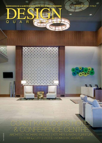
Coast Kamloops Hotel & Conference Centre
Architect Richard Iredale | Kitchen & Bath | Furniture Flooring | 2013 WOOD WORKS! BC AWARDS
®
www.rlrbc.com Western Canada's Premiere Showrooms Vancouver Coquitlam
Progress Phillips
• •
Quoizel Hinkley
• •
Aquabrass • Cheviot Hytec • Hansgröhe
Schonbek Kichler
• •
• •
•
•
Calgary Kamloops
Tech • Fine Art Lamps • Kendal • Alico Hubbardton Forge • Kalco • Standard
Duravit • Grohe Kohler • Thermasol
• •
Kindred • Moen Blanco • Dornbracht
...and many more
•
•
•
•
Edmonton Penticton
Lutron • Murray Feiss • Zaneen • Galaxy
Bain Ultra • Franke
• •
Delta Brizo
• •
Fiat Maax
kitchen & bath :::::::
contents
Q
U
A
R
T
E
R
L
Y
SPRING 2013 Vol. 13 No.4 www.designquarterly.ca PUBLISHER Dan Gnocato dang@mediaedge.ca Managing Editor Cheryl Mah Graphic Design Tang Creative Inc.
06 Designer Profile Richard Iredale
Architect Richard Iredale, partner at Iredale Group Architecture, is committed to influencing positive change in the built environment.
10 PROJECT PROFILE
Inside Design Studio undertook a dramatic and modern makeover for The Coast Kamloops Hotel & Conference Centre.
CONTRIBUTING WRITERS Joost Bakker, Stan Baldwin Ross Bonetti, Patricia Fanty, Jenni Finlay Jennifer Heffel, Robert Kravitz Ian Ross McDonald, Deborah McBride Wilson Dejan Radoicic, Adele Rankin
16 trends
B.C./ALBERTA SALES Dan Gnocato 604.549.4521 ext. 223
The Future Workplace
Features
PUBLISHED BY
22 Furniture
Salone Del Mobile 2013 Placement, Style, Durability
PRESIDENT Kevin Brown
25 Kitchen & Bath
Washrooms on the Edge Clean Design The Art of Kitchen Lighting Countertop Styles
31 Flooring
Flooring Fancies In-Floor Heating Art for the Floor
vancouver office
114 – 42 Fawcett Drive Coquitlam, BC V3K 6X9 Tel: 604.549.4521 Fax: 604.549.4522
Toronto office
1000-5255 Yonge St. Toronto, ON M2N 6P4 Tel: 416.512.8186 Fax: 416.512.8344
Copyright 2013 Canada Post Canadian publications mail sales publication agreement no. 40063056 – ISSN 0834-3357 Return all undeliverable Canadian addresses to: Suite 1000 – 5255 Yonge Street, Toronto, Ontario, M2N 6P4
departments
PRINTED IN CANADA
04 From the Editor 36 IDA Revitalizing Aging Office Stock 37 AIBC Designing for a SUB Culture 38 Design Headlines
Design Quarterly is published four times a year by MediaEDGE Communications Inc. Yearly Subscription $26.40 + GST REPRINTS: No part of this magazine may be reproduced in any form — print or electronic — without written permission from the publisher. Requests for permission to reprint any portion of this magazine should be sent to the publisher. For all subscription inquiries or changes of address, please contact circulation@mediaedge.ca
PROUD SPONSOR OF
february 19 & 20, 2014
March 18 & 19, 2014
On the cover: Coast Kamloops Hotel & Conference Centre. Photo: Robert Stefanowicz photography
November 5 & 6, 2013 The purpose of Design Quarterly is to reflect and represent practitioners and professionals in the architectural, interior design and design resource communities throughout British Columbia and Alberta. Spring 2013 | DESIGN QUARTERLY 3
::::::: from the editor :::::::
power of design
I
have visited many wonderful places during my travels over the years. I was fortunate enough to do some travelling with my parents when I was younger and then with my friends when I was older. Now with a family of my own, I hope to expose my children to the fun of travelling to different parts of the world. Of course, travelling also means I have stayed in my fair share of hotels. From budget accommodations to five stars, I’ve had a range of hotel experiences. When I saw what Inside Design Studio did to transform the Coast Kamloops Hotel & Conference Centre, I was blown away. It reminded me of the power of good design and its ability to create a whole new experience within a space through the careful selection of materials, lighting and colours. As the saying goes, ‘a picture is worth a thousand words’, and the before and after photos of this hotel says quite a lot. Read about the transformation in our project profile. Transformation is something Richard Iredale has focused much of his career on. The Vancouver architect and partner at Iredale Group Architecture is committed to transforming the built environment towards a more sustainable one.
Inside you will also find features on kitchen and bath, flooring and furniture. Flooring industry experts share insights into handcrafted rugs; specifying commercial hardwood flooring; and the benefits of in-floor heating. In our kitchen and bath, we take a look at lighting, countertops, clean restroom design and the stunning washrooms at Vancouver’s Wreck Beach. At Buildex Vancouver this year, the interior design keynote session focused on the top design elements and factors influencing the future workplace. From collaborative space to furniture requirements, learn what a panel of four internationally recognized leaders in office design had to say about how workplace design is evolving. Finally, it’s with sadness that we note the passing of a leader in the design community. Robert Ledingham, the founder and president of Ledingham Design Consultants in Vancouver, died on May 2, 2013. Bob was one of Canada’s top interior designers with a distinguished career.
Cheryl Mah Managing Editor
NEW INTERIOR DESIGN DEGREE BCIT’s new Interior Design degree offers a unique combination of theory and practical skills necessary to meet the challenges of today’s design and building industry. Students benefit from: > An interdisciplinary learning approach to build skills for real-world application > Insight from experienced industry practitioners as instructors > Opportunities to study abroad and enroll in co-op education Learn how to launch or advance your career with part-time or full-time options and become a registered interior designer. Register for an upcoming info session at: bcit.ca/interiordesign
It’s your career. Get it right.
4
DESIGN QUARTERLY | Spring 2013
Buzzi Space available from Inform Contract
405 Railway St Vancouver
www.informcontract.com
::::::: designer profile :::::::
towards a sustainable future By Cheryl Mah
Iredale Group’s restoration of Vancouver’s Christ Church Cathedral was a labour of love that took 10 years to complete.
T
oday’s most pressing societal issues require change at many levels from cities to individuals. Richard Iredale, partner at Iredale Group Architecture, is one such individual who has worked for more than two decades to influence positive change in the built environment. He is particularly dedicated to bringing attention to the overwhelming challenge of climate change. “It’s a huge issue — an ongoing issue that will shape the design of the built environment. But like all issues such as world hunger and disease, it requires persistence and perseverance of generations to solve,” says the leading Vancouver architect and engineer. Iredale, 53, is committed to raising awareness in the industry, actively involved with the Canada Green Building Council (CaGBC) and the Cascadia Green Building Council. Cascadia is the Pacific Northwest’s leading organization in the field of green building and sustainable development. It is also a chapter of both the US Green Building Council and CaGBC. As the 2013 chair of the Cascadia Green Building Council, Iredale’s goal is to reach more like-minded people by growing the organization’s annual conference. “In order to really change society we need to reach far more people,” he says. “Our goal is to get grassroots events happening.” 6
DESIGN QUARTERLY | Spring 2013
Iredale is a regular speaker at conferences and tradeshows, currently presenting on the topic of carbon balanced site design. He will be a speaker at the 2013 CaGBC’s national conference this June in Vancouver. “The concept is about using a building project or site development project as a way to restore natural ecology — in particular to balance the carbon emissions,” he explains. “I think the problem of climate change will be solved by using landscapes to balance carbon emissions. If you use innovative methods of building up top soil, it’s amazing the amount of carbon absorption that you can do to offset carbon emissions created by heating, lighting and operating a building.” The site and landscape have always been a source of inspiration for Iredale in his design approach. His focus is on designing buildings that meaningfully connect to nature and the local environment. “As architects we need to work on creating communities of living buildings and emphasizing the relationship of building and landscape, he says. Iredale’s interest in sustainability dates back to his university days in Stanford where he studied environmental engineering Growing up, he shared his father’s interest in architecture and structural engineering. “He had a great interest in structural engineering and always talked about how impor-
tant the structure was in designing a building,” recalls Iredale, who obtained a bachelors degree in civil and environmental engineering from Stanford University 1982. Born and raised in Vancouver, Iredale is a second generation architect. His father Rand Iredale was an influential Vancouver architect who not only helped to shape the city’s urban landscape but was also a mentor to some of B.C.’s most prominent architects. “My father was a huge mentor in the formation of my way of thinking about architecture,” says Iredale.
2013 O U T D O O R C O L L E C T I O N McGUIRE I GLOSTER I DEDON I BROWN JORDAN I JANUS ET CIE I CANELINE I KINGSLEY BATE
1855 Fir Street at West 3rd Armoury District Vancouver 604.736.8822 Monday - Saturday 10-5:30 pm broughaminteriors.com
::::::: designer profile ::::::: The Squamish Adventure Center has become an icon on the Sea to Sky highway between Vancouver and Whistler. The structure is made out of only four materials: wood, stone, steel and glass.
After graduation, Iredale joined Bogue Babicki Associates and worked on a number of projects including the Expo Centre (now Telus World of Science) and other pavilions during Expo ’86. He then moved to Seattle and worked on various projects including the restoration of masonry and timber frame buildings in Pioneer Square. At the same time he attended the University of Washington to earn his degree in architecture. “I had a young family and bills to pay so I had to do my degree part time,” says Iredale. “I knew as soon as I was in architecture school that I was in the right place with the right people. I found the creative atmosphere very much to my liking.” In 1990, he joined his father Rand and partner Charlotte Murray at The Iredale Partnership and began working on seismic upgrade and heritage restoration projects in Vancouver. Two of the firm’s hallmark proj8
DESIGN QUARTERLY | Spring 2013
ects were Barclay Heritage Square in the 1980s and Place des Arts at Maillardville Heritage Square in the 1990s. The firm was also responsible for the award-winning heritage restoration of the Christ Church Cathedral, a major downtown Vancouver landmark. “Heritage restoration is one of our specialties,” notes Iredale. “Charlotte and my father pioneered heritage restoration practices in Vancouver and B.C.” Iredale describes his early years at the firm as a “steep learning curve.” “The complexity of architecture is amazing and I was wondering will I figure this job out,” he says with a laugh. “There is a lot to learn to practice architecture. It’s partly what makes it interesting and partly what makes it difficult.” The firm was renamed the Iredale Group Architecture after Rand passed away in 2000. Murray retired in 2004.
Today, the firm has grown into a team of 34 with six partners (James Emery, Kendall Jessiman, Selwyn Dodd, Graham Coleman, Peter Hildebrand and Iredale) and three senior associates (Dennis Maguire, Ladi Holovsky, Phillip Chang). Much of that growth has come through mergers with other firms over the last 10 years. “It’s been great having all these people coming together to strengthen our knowledge and experience base,” says Iredale. “We have a very collegial style of operating with the partners meeting every two weeks. Essentially every partner runs their own project.” Client relationships are critical to successful projects and Iredale Group has enjoyed many repeat clients who continue to seek them out for their high level of expertise and hands on approach. “The relationship of the client is really important. There is a huge people aspect to practicing architecture…it’s about having mutual respect and trust,” says Iredale citing the City of Coquitlam (and the Maillardville Heritage Square) as one such long term client. Operating out of offices in Vancouver and Victoria, Iredale Group has built an impressive and diverse portfolio with projects across many sectors including civic, cultural, educational and commercial. Specialized areas of practice include programming, feasibility studies, sustainable master planning, structural engineering, green systems design and heritage restoration. Two favourite projects for Iredale include the Kay Meek Centre in West Vancouver and the Squamish Adventure Centre — both of which are good examples of his emphasis on sculptural building designs. Bringing both an architect’s vision and an engineer’s analysis approach to his designs, Iredale enjoys using the structure as the sculptural aspect of a building. “I like designing structures and focusing on the detailing of a building — choice of materials and facade,” he says. “I’ve done a lot of buildings that are either steel frame or heavy timber — using the timber as the interior and exterior aesthetic of the building or using the steel as the sculptural expression of the building.” Iredale’s primary focus is the sustainable design of civic, cultural, residential, and education facilities. He is currently leading the design on a number of projects including a new replacement school for Sexsmith Elementary, Vancouver; Emerald Gardens
hytec.ca
refresh your home and body
Bowen Skirted bath with System Connects wallset ™
(MODELS: BATH 3832, SIDE WALLS 5530L/R, BACK WALL 5760)
For more detailed product information and where to buy, please contact Hytec at 1-800-871-8311 BATHS AND WHIRLPOOLS | SHOWERS AND RECEPTORS | MODUL AR SYSTEMS
::::::: designer profile ::::::: Apartments, Richmond; two custom homes and renovation of the CPR Steamship Terminal, Victoria. The Bateman Centre will be opening in the historic steamship building this spring, notes Iredale. Originally the centre was planned for the Royal Roads University campus and designed by the firm in 2007 as a living building with a zero net ecological footprint. The project remains unbuilt, but Iredale says it was a good learning experience that has lead the firm to push the sustainability envelope on other subsequent projects. Currently the firm is involved with the high profile restoration of Vancouver’s old stock exchange building, which will be incorporated into a new high rise office tower. Designed to incorporate the latest sustainable technologies, the development will become the city’s largest LEED certified platinum office tower. Working with Swiss and German clients on the project, Iredale notes that the Europeans are really taking the lead on green technology and “B.C. has plenty of catching up to do.” Another project Iredale is excited about is the rehabilitation of the Burrard Bridge where the firm is acting as heritage consultant for the city. “That is a heritage structure from the ’30s — not many of those around,” he says. While the firm’s projects are primarily located in B.C., they have undertaken work across
10
DESIGN QUARTERLY | Spring 2013
The Kay Meek Center for the Performing Arts in West Vancouver is a striking curvilinear steel structure.
Canada. The group currently has projects in Alberta, Nova Scotia and Saskatchewan. “We’re on the lookout to grow — looking perhaps to expand into the B.C. interior and Alberta,” says Iredale. The firm not only actively pursues growth opportunities but is cognizant of the need to nurture the young talent within. “We actively engage our young associates in growing them to become partners,” explains Iredale, which is also a part of their succession planning. “I see our role as nurturing the next generation of leaders in the world of architecture and planning.” Asked about the future of design, Iredale believes that as this century progresses, ar-
chitects and engineers will become ecological architects and engineers. “We will stop designing just around the functional and aesthetic requirements of a building and start designing more and more around the ecological requirements of sites,” he predicts. “We’re going to become way smarter about how to engineer sites sustainably.” Iredale splits his time between the firm’s two offices and on the weekends, he can be found on Mayne Island where he has a 12 acre sheep farm. Married 30 years, he and his wife raised their three daughters there. His hobbies include painting, hiking and long distance walking. DQ
East India Carpets
The ďƒžnest in contemporary & classic designs since 1948
1606 West Second Avenue at Fir, Armoury District, Vancouver Mon-Sat 10-6 Sun 12-5 604 736 5681 eastindiacarpets.com
::::::: project profile :::::::
dramatic transformation By Cheryl Mah
A
new brand and a new look has transformed an outdated property into a premier four star hotel in Kamloops. Located on the hillside overlooking downtown, the Coast Kamloops Hotel & Conference Centre has been undergoing a three phase renovation that began in 2011. The extensive upgrades and redesign of the hotel by Vancouver based Inside Design Studio Inc. has breathed new life and energy into a failing property. Originally built in 1989, the three storey hotel was built as a 62 room Best Western. It was expanded in 1992 and again in 2001 with the addition of a convention centre. The property was rebranded the Kamloops Towne Lodge in 2007. When hotel owner Ron Mundi purchased the property in May 2011 and rebranded it as a Coast Hotel, he wanted a dramatic change. Inside Design Studio was commissioned to transform the interiors of the aging 203 room property. The multi-million project includes significant upgrades to guest rooms, public corridors, lobby, furnishing, fixtures and the convention centre. 12
DESIGN QUARTERLY | Spring 2013
Before
since 1925
Italia kitchen from the Arclinea Collection, design Antonio Citterio. arclinea.com
1706 West 1st Ave Armoury District Vancouver 604 683 1116 livingspace.com
::::::: project profile :::::::
The hotel’s exterior also underwent extensive renovations with landscaping, a new colour (two-tone taupe with a rich dark brown trim) and stonework as well as a new porte cochere entrance. “The client’s objective was to reinvent this property. He purchased an older failing property and rebranded it,” says Inside Design Studio principal Judy Henderson, whose firm has also worked on other Coast properties including the flagship Coast Coal Harbour in Vancouver. “So we had to meet brand standards while also producing a modern look for the owner.” The design team drew inspiration from the large garden atrium located in the centre of the hotel. “We decided to do a modern interpretation of a garden theme,” explains Henderson. “That is where the idea of the lattice work in the lobby came from.” The first phase involved the complete redesign of the hotel’s lobby with new flooring, wall coverings, lighting, contemporary furniture, and a front desk with a marble top counter. The lobby now features walnut wood panelling throughout the space and three beautiful walls of 16 foot x 12 foot back-lit white lattice screens. “We were trying to achieve something that took full advantage of the height and the space — to draw your eye up,” says Henderson, explaining the previous lobby had bulk heads and built out walls that cut the proportions of an otherwise simple space. “It feels very elegant now. We opened up the front desk area and focused on the architectural lattice feature.” The colour palette also plays off the subtle garden theme with warm hues of blue, greens and browns. A gold table and an art piece comprised of a circular cluster of brightly coloured fans inject a sense of whimsy and bolt of colour. Large format porcelain tiles (1x3) were used for the new flooring. Careful attention was paid to lighting with seven large custom pendants used to illuminate the volume of the lobby. “I love the lighting in this project,” says Henderson. “The lobby is not a symmetrical space so we didn’t do a central fixture — we did a random grouping with these large scale pendants that add a warm glow and sparkle.” 14
DESIGN QUARTERLY | Spring 2013
A band of wall washers successfully highlight the height of the 25 foot ceiling in the lobby. “I was very pleased with the lighting behind the lattice work,” says Henderson. “You get the full 16 feet of wash behind that lattice. Sometimes what happens is you only get about two feet of trim lighting and then it’s dark. We worked through our lighting carefully and it’s beautifully lit all the way through.” The main challenges encountered on this project were in the lobby: an uneven floor and the ventilation system. “This is a slab on grade building and the floor was completely uneven. We had to pour significant amounts of levelling to get it right,” says Henderson. “Also there was some ventilation behind the original bulk heads and reconfiguring that to obtain a clean look was a lot of work.” Renovations to the guestrooms located in the south and north towers are also complete. It involved new carpeting, updated bathrooms, bedding, furnishings, fresh colour palette and accents. The corridors follow the underlying garden theme with an olive green and grey carpet. “When you do a hotel, you have to have some kind of concept that knits it all together but you also have to have variation and nice transitions as you go through the space — giving the guests something new around each corner,” says Henderson. Inside Design is currently working on the third and final phase which involves updating the 30,000 square foot convention centre. The public corridors, meeting rooms, ballroom, theatre and washrooms will all be redone with modern finishes. Completion is anticipated for this summer. “It’s the biggest facility in the city and is in need of a desperate update,” she says. The striking transformation has resulted in a sophisticated and contemporary interior that offers new and existing customers a more luxurious experience. The redesign has already led to increased profitability and customer satisfaction for the client. “It really worked out well. We’re very pleased and so is the client,” says Henderson. DQ
::::::: trends :::::::
the future workplace By Cheryl Mah
F
lexible workstyles, open workstations, access to daylight and collaborative spaces were all identified as key design elements for the future workplace at this year’s interior design keynote session at Buildex Vancouver. A panel of four internationally recognized leaders in the office design industry discussed the different factors influencing the design and space requirements of tomorrow’s workplace. Several case studies were examined to showcase how the workplace is evolving. Chuck We, director of leasing, Oxford Properties Group moderated the session attended by a packed room of 400 industry representatives. He set the stage by providing some background and statistics on the Vancouver office market. Downtown Vancouver is “one of the tightest office markets in the country and because of that we’re seeing some of the leading innovations and design creative with office space,” said We. Four new towers are currently under construction or redevelopment in downtown: MNP Tower, Telus Garden, Sears and 745 Thurlow. The new towers will add 1.5 million square feet to the city’s office inventory.
16
DESIGN QUARTERLY | Spring 2013
“We have four developments coming that are incredibly different in their offering to the market,” he said, which reflects the growing recognition that people do come first. “Now there’s more recognition of that as the labour market tightens and people grow older. It’s important to have good workspace and to show the differentiation in the workstyles.” He pointed out that office design needs to address future workers that will be recruited into the space as well as today’s workers who will still be in the workforce. “The workplace has to function for everyone,” he said. Getting a new workplace to function for everyone was a big challenge for SSDG Interiors when it was commissioned by Fraser Health to consolidate multiple office locations into two large 55,000 square feet floor plates. In her presentation, SSDG principal Susan Steeves discussed how Fraser Health went through a “transformational change” with its new administrative offices in Central City. Consolidating 11 locations into one constituted a major change for the people working in the space, described Steeves, “it was moving from small communities into a big city.”
Not only were employees moving from small offices of 2,000 — 10,000 square feet into two large 55,000 square foot floor plates, they also were moving from traditional office oriented spaces to open workstations. To facilitate this significant change in a very tight timeframe, a highly unique and collaborative process was required between designers and Fraser Health representatives. She stressed the importance of client engagement. The project was about changing the way people work and the culture as well as creating a network of places that support individual and collaborative work. “Sixty per cent chose to sacrifice individual space to create more space for them and their team to work together,” noted Steeves. Joe Pettipas, senior vice president and principal at HOK Vancouver, also focused on a large project for Google in Toronto — 89,000 square feet over several floors. “It’s not about the cost of real estate; it is about the effect of real estate,” said Pettipas, explaining the impact of a well planned space can have a positive effect on the bottom line and employee line. He walked the audience through the new space for the Internet giant which was “de-
Sept 19 22 Vancouver
Interior Design Show West
Convention Centre West
Complimentary Trade Day registration now available at idswest.com
+ +
Trends. Ideas. New Products. .For The Home.
IDSwest idswest.com
Image: ‘Sliding Top’ kitchen by Minimal Cucine available from Italinteriors
Trade Day Presented by
Q
U
A
R
T
E
R
L
Y
IDSwest Produced by
::::::: trends ::::::: signed to encourage both collaboration and creativity” among the staff. At Google, the design was about moving away from “me space into we space” which Pettipas said is a growing trend. Taking a more historical perspective, Aliki Gladwin, principal of Aliki Gladwin and Associates shared insights into financial and investment office design and some of the changes that have occurred since 1985 notably technology. She pointed out “If you do good design, it does last for many years.” Finally Teresa Miller, senior workplace designer at Perkins+Will Canada, discussed the importance of active and healthy design for interiors. Within the last decade, environmental health has become an important decision making factor in workplace design. “Sustainable design is increasingly important. The younger generations coming into the workplace today and tomorrow are much more aware of this and they’re demanding healthier environments to work in,” said Miller, noting LEED and the Living Building Challenge have brought environmental quality issues to the forefront of design dialogue. She stressed, moving forward, the goal for buildings is not just to do less harm but for them to be positive contributors to the environment and the health of its occupants. Key design factors identified by Miller include maximizing views, increased access to daylight, use of healthy materials and encouraging physical activity. “We’re starting to practice the strategy of active design in our projects and this is by encouraging physical activity. Not only can this be achieved by amenities like yoga and fitness studios, we’re finding the actual placement of stairs has a positive effect,” she said, adding creating a “stair culture” reduces energy use while positively influencing employee health at the same time. When it comes to using healthy materials, Perkins+Will has been leading the discussion by pushing for greater transparency in building materials and substances. “Part of the challenge in minimizing our exposure to harmful substances is that it’s difficult to find a complete list of building material ingredients that allows us to determine which products are potentially harmful,” said Miller. Sustainable design, she concluded, is going to continue and be important for the future of our workplace. “As designers, we should not only seek to empower our clients to make informed decisions and encourage material health but we should also encourage them to look at the views, include access to daylight and consider the physical activity in the space.” DQ 18
DESIGN QUARTERLY | Spring 2013
workplace 20/20 Tomorrow’s Workplace Today In conjunction with the interior design session was a 2,000 square foot feature area on the Buildex tradeshow floor where each design firm worked in partnership with leading manufacturers Steelcase, Haworth, Teknion and Knoll to create commercial office spaces that highlight the growing needs of modern businesses and their employees.
KNOLL “The booth we wanted to keep simple to reflect the Knoll product and the highlight of the space is of course the additional interesting pieces. We did a very graphic carpet (Interface) to set off the booth by impact of colour, texture and grabbing the space.” — Aliki Gladwin
HAWORTH “Our booth concept builds on the idea of a residential workspace, technologically driven where you can collaborate and share information in a multitude of settings yet it’s comfortable and diverse. We use a lot of wood in the space to create warmth. All our finishes are sustainability sourced and certified.” — Teresa Miller
STEELCASE “This booth is about choices…opportunities and being able to work anywhere at any time and anyplace. Hence why it’s in the forest…we would all love to work in the forest. It’s about communication and tools to communicate with.” — Joe Pettipas
TEKNION “Fewer offices and they are getting smaller; workstations smaller; and panels are getting lower. Technology is allowing us to work in different places. The booth is a 43 square foot office. 6x6 workstations are the standard now. Open plan is great but open plan can be noisy — the issue of noise needs to be addressed.” — Susan Steeves
Advertise in Design Quarterly and let us connect your products and services to the design industry Endorsed by the leading design and architectural associations, Design Quarterly is the publication of choice by advertisers who want to connect with the decision makers in the multi-billion dollar B.C. and Alberta design marketplace. To advertise your products, services and expertise or for more information on customizing an advertising program, please contact: Dan Gnocato 604.549.4521, ext. 223 dang@mediaedge.ca
www.designquarterly.ca
2013 Wood WORKS! BC Wood Design Award winners Awards evening held on Monday, March 4th, 2013 - Vancouver Convention Centre, West
Residential Wood Design
Multi-Unit Residential
Kimberley Smith and Bo Helliwell, Helliwell + Smith Blue Sky Architecture BCSolar Crest, Sidney Island, BC
Oliver Lang, LWPAC Lang Wilson Practice in Architecture Culture
Institutional Wood Design: Large
Western Red Cedar
Monad, Vancouver, BC
Green Building
Peter Busby, Perkins+Will Centre for Interactive Research on Sustainability, Vancouver, BC
Wood Innovation
Jana Foit, Perkins+Will
Pam Chilton, Zimba Design
Peter Busby and Jim Huffman, Perkins+Will
Earth Sciences Building, Vancouver, BC
The Urban Longhouse, North Vancouver, BC
VanDusen Botanical Garden Visitor Centre, Vancouver, BC
Event Sponsors
Trophy Sponsor
Jury Sponsor
Sponsors
More than 350 distinguished design and building professionals, including architects, engineers, project teams, industry sponsors and their guests gathered to honour the nominees and winners of the 2013 Wood WORKS! BC Wood Design Awards. The annual awards evening recognizes leadership and innovation in wood use while being an opportunity to publicly salute and encourage continued excellence in the building and design community. This year there were 98 nominations in 12 categories from all over BC as well as some national and international submissions. Wood WORKS! is a national industry-led initiative of the Canadian Wood Council, with a goal to support innovation and provide leadership on the use of wood and wood products. Wood WORKS! BC provides education, training and technical expertise to building and design professionals involved with non-residential construction projects throughout BC.
Commercial Wood Design
Interior Beauty Design
Institutional Wood Design: Small
McFarland Marceau Architects Ltd.
Andreas Kaminski, aka architecture + design inc.
Graham D. Fligg, Merrick Architecture - Borowski Sakumoto Fligg Ltd.
Bioenergy Research and Demonstration Facility, Vancouver, BC
Queen of Peace Monastery, Squamish Valley, BC
Klahoose First Nation New Relationship Centre, Cortes Island, BC
Architect
Engineer
Wood Champion Award
Kimberley Smith and Bo Helliwell, Helliwell + Smith Blue Sky Architecture
Eric Karsh, Equilibrium Consulting, Vancouver, BC
Equilibrium Consulting
Miracle Beach House, Miracle Beach, BC
City of North Vancouver Civic Centre Renovation
Vancouver, BC
www.wood-works.org
::::::: furniture :::::::
salone del mobile 2013 By Ross Bonetti
22
DESIGN QUARTERLY | Spring 2013
Boc c i
N
othing is more exciting for designers than the infusion of creativity and innovation that has become synonymous with our industry — a trait that defined the 2013 Salone del Mobile. Livingspace travelled to Milan to explore the new collections and trends in interiors for the upcoming year. Originally intended to showcase the work of Italian furniture designers, the Salone del Mobile, which began in 1961, has expanded to become an internationally recognized and prestigious fair with a total of more than 300,000 visitors from over 160 countries. The fair takes place annually inside a group of buildings, designed by Massimilian Fuksas, and linked together by an organic structure of steel and glass that washes over the buildings like a wave. The first stop on our tour is always Minotti. Having been founded in 1950, their 60 plus years of experience has firmly rooted Minotti in their role as a trend setter for furniture design and everyone knows it. Minotti consistently attracts large numbers at the Salone, with both dealers and other designers eager to see the new collection. As a company, Minotti remains deeply loyal to its Italian routes, attempting to find the perfect blend of tradition and technology, with a focus on craftsmanship and innovations in materials. Two new additions this year that caught our eye was Minotti’s new sectional with an attached side table in place of an arm and a large pedestal dining table. Lema, another Italian company showcasing their designs, has always been known for their customizable closet and wall systems but, at this year’s Salone, they extended their line, introducing sofas to their collection. Lema has a long history in design. Founded in 1970, they introduced the first Italian free standing wall system in the late ’70s. By branching into other areas of furniture design, Lema takes a step toward becoming a more comprehensive line. The new Cloud sofa, designed by Francesco Rota, has the option of an upholstered tray that can be integrated into the sofa. The modularity of their new sofa is in keeping with their product philosophy, allowing clients to customize Lema products to suit their spaces. Although fairly new to the scene, Moooi quickly established themselves as a trendsetter within the design community, a role
the company continued to embrace in the fair this year with their daring and colourful displays. Founded by Marcel Wanders and Casper Vissers in 2001, the Dutch company highlights their overall concept in their name, which means beautiful in the native tongue. For the 2013 fair, Moooi collaborated with Surrealist Erwin Olaf, whose pieces from the series “Rain, Hope, Grief, Fall” added dramatic flair to the atmosphere of Moooi’s display and was a perfect complement to their designs. Moooi’s contribution was to “reveal how a wide empty space can be magically transformed into several iconic, rich and colourfully dressed living quarters”. Moooi has expanded their breadth, adding new sofas to their line as well as reinventing some of their current pieces. Particularly noteworthy this year was the new model of the Raymond lamp with downlighting, making it a functional piece for over a dining table. Moooi’s overall playful and colourful style made them a sensation at this year’s fair and a key contender to watch for next year. Vancouver’s own Bocci Design, led by creative director Omer Arbel, has made a big name for itself on the international scene and set a new trend for how we define chandeliers
and lighting. Five years ago, Bocci exhibited one chandelier in a remote location outside of the fair. This year Bocci was front and centre, showcasing alongside major Italian lighting companies, like Flos and Artemide at Euroluce. Bocci’s booth design was considered one of the most impressive at Euroluce. The space itself, and Bocci’s use of simple architectonics to showcase their designs, was breathtaking. The booth used a lower ceiling entrance to open into a higher space, accentuating Bocci’s famous chandeliers as artistic and sculptural pieces. Bocci is responsible for bringing Canadian design into a larger market and showing Canada as an innovator in the field. As with fashion, it is hard to find overarching design trends as every company strives to set themselves apart from the competition by creating new techniques, using different colours or reinventing designs. The true beauty of design lies in the different perspectives each company and designer brings, allowing us to create spaces that reflect unique personalities and visions. DQ Ross Bonetti is president of Livingspace Interiors, a leading Vancouver modern furniture retail store.
Kate Holland Landscape Accessories Ltd. A complete variety of commercial and residential garden accessories as well as site furnishings for the design professional. 1 (877) 531-8574 www.khla.com
Frances Andrew Site Furnishings Ltd. Offering a huge selection of commercial site furnishings including benches, trash receptacles, bike racks, tables bollards and more! 1 (800) 565-6579 www.francesandrew.com
::::::: furniture :::::::
placement, style, durability Hospitality furniture evolves By AdÈle Rankin Shangri-La Toronto — Owner’s Suite
T
he evolution of hotel design is intrinsically linked to how we stay and relate to the overall hotel experience. Take for instance a lobby; it has evolved from a grand parlour to a more utilitarian transitional space to a great room to ultimately an experience of discovery. With this evolution, all elements of design change and adapt — the space planning flexes and bends, the lighting dims and brightens, the colour palette shifts with the ebbs and flows of various trends and finally the furniture direction and style completes and often solidifies this evolution. There are three main criteria for selecting the correct hospitality furniture; placement, style and durability. As mentioned furniture often solidifies a change in the way we evolve and design a lobby. Placement is key to this change. We are now at a point in design where expectations of a sensory experience are commonplace as soon as the guest steps through the front doors. Gone are the austere chairs and loveseats placed inexplicably at the entry and missing elsewhere. We’re less concerned about creating pretty vignettes than we are about creating comfort, flexibility and delight not only for the guest but for the hotel staff as well. The expectation now is that public spaces in hotels seamlessly function as living rooms, waiting areas, cocktail lounges, business centres, private getaways 24
DESIGN QUARTERLY | Spring 2013
and so much more. Creating these zones in one lobby for example is only achievable with the right furniture placement. Locating a large sectional with low backed chairs in the centre of the room is an invitation for all to enjoy. Locating a raised bar top with barstools adjacent to reception provides business travelers both visibility and privacy without commitment. Placing a communal table in a restaurant is a signal of participation and community. Something for everyone and a way to do so without as many physical dividers like screens, low walls etc. Style of hospitality furniture is instrumental not only in this zoning but also as a reinforcement of the hotel’s personality. A wing back chair says something a low sling chair does not. The key is to understand the message. Is the client expecting whimsy, intrigue, tradition, theming? This can all be found in the style of furniture. Hotel designers almost always custom design rather than select the furniture for a hotel. When dealing with a standard sized guestroom for instance, space is paramount and custom furniture is necessary so as to ensure the right scale. You would be surprised how reducing a slipper chair by 2” lets a room breathe. In a lobby or restaurant, scale is crucial in conveying the right relationship each piece has to one another. Making sure a side table is deigned to the correct height so that the guest sitting on the ad-
jacent sofa can easily lean over and rest their drink is an absolute must. Durability isn’t the sexiest of topics concerning hospitality furniture but it is just as important as both placement and style. The lifecycle of a hotel runs anywhere from five to 10 years. This means that the furniture must last not only stylistically for that length of time but also must stand up to a tremendous amount of wear and tear during this period. No designer wants a call a year down the road with an angry client telling them that the fabric is already threadbare, tables are collapsing or that the sofa legs are breaking. Built-in obsolescence has no place in hospitality design. So how do we ensure that a coffee table will withstand a 200 lb. man sitting on it, a sofa can withstand a child jumping on it and a lamp can withstand clothing hanging from it? We begin with understanding how each piece is typically made. We educate ourselves on construction methods, we learn to listen to the specialists who make each piece and we also endeavor to learn how this space will be used. Is it a ski resort where ski boots will likely be propped up on a coffee table? Is it a hotel that caters to sports teams where throngs of teenagers will pile on one chair? Is it a well-known hotel who regularly host large and celebrated events requiring the furniture to constantly move and where red wine is known to flow easily? This informs our decisions to choose fabrics suitable in colour and texture, choose woods vs. laminates, and choose glass lamps vs. metal ones and so on. Of course, there needs to be a balance between aesthetics and durability. While the maintenance staff may be happy to have a bomb proof design, ultimately durability should be incorporated in such a way that doesn’t detract from the overall look and feel. Creating a sensory experience in hospitality design is a complex undertaking requiring numerous aspects of design ranging from space planning to millwork design, to lighting analysis and beyond but furniture design and selection is unquestionably a fundamental and essential part of this. By thoughtful placement, educated styling and lasting design we can feel confident to have created a space that guests want to visit time and time again. DQ Adèle Rankin, B.A.D.I.D., is senior associate at B+H CHIL Design with a specialty in the planning, design, documentation and management of major hospitality and residential projects.
::::::: kitchen & bath :::::::
washrooms on the edge By Ian Ross McDonald
S
ituated below the cliffs that edge the UBC Endowment Lands and forming part of Pacific Spirit Park, Wreck Beach feels like it is on the edge of the world. Access to the beach is only possible by braving a steep 473 step log staircase that quickly removes any visitor from the sounds of campus life and traffic. It is an experience that belies entirely its proximity to downtown Vancouver. Indeed, once you feel the sand between your toes, you realize that it is just you, forest, ocean... and hundreds of naturalists. This is no ordinary beach — this is Canada’s most famous nude beach. Bruce Carscadden Architect was selected by the Regional District of Metro Vancouver to develop a strategy and design for permanent beach toilets to replace the beach’s long-problematic plastic urinals and temporary toilet facilities. The design brief called for a solution that balanced the need for more comprehensive and accessible sanitary facilities that addressed the deceptively remote and unique socio-cultural aspects of both the site and its users — users who maintain a strong connection to Vancouver’s legacy of activism and political engagement. That profound sense of responsibility and stewardship of Wreck Beach by its users and members of the Wreck Beach Preservation Society helped to structure a rich and frequent engagement process with stakeholders throughout the design process to ensure
the washroom design respected the users’ vision for the beach. Together with stakeholders, the team identified the site’s remoteness and natural setting as central drivers of the project’s design and the requirement that any new facility not be visually or physically obtrusive and not create a target for bad behaviour.
durable design The toilets are located at the most popular section of the beach, near the foot of Trail 6, where the sand starts suddenly at the edge of the heavily forested cliffs and the beach has amassed a collection of logs loosed from offshore booms, rendering a reminder of Vancouver’s history and continued tradition in forestry. Wreck Beach makes for a strange bedfellow, of course, and once they reach the beach, the logs take on an entirely new purpose, serving as a place to lounge or dry a towel. Still others are propped — inexplicably, mysteriously — vertically in the sand like trees or friendly totemic sentries. It was in this image and narrative of an enigmatic collection of logs reimagined and reanimated to other ends that the design team, client, and stakeholders found meaning: that the new facilities might occupy a similar place in the minds of visitors, even as they satisfied the more prosaic requirements of actual washrooms. The specific design resolution employs a collection of metal rounds of varying dimension clustered on a sandy dais at the edge of the
forest, an obvious reference to the forest trees, vertical beach logs, and other abandoned naval and logging artifacts washed ashore over decades. The cylindrical metal pipes vary in diameter and height with purpose, some for structural need, others to provide privacy screen, still others to provide venting for the gases created in the pit-toilet proper. The painted metal is easy to maintain and difficult to destroy. Each of the four washrooms is a standalone pit toilet and circular in plan. A clever device to maximize privacy while eliminating corners to hide behind and produce the illusion of a facility smaller than it is. The shape is also the direct result of the location and means of construction; with all construction materials needing to be brought in by barge, efficiency was key, and the toilets sit on precast concrete rings that form both the foundations and the lids to the tank below. The result is a collection of durable and deceptively modern suite of washroom facilities that sit comfortably back from the water at the threshold of the beach from the forest, deferring to the iconic and spectacular view while simultaneously reminding you of it as you open the door having finished your business. DQ Ian Ross McDonald, Architect AIBC, is a partner at Bruce Carscadden Architect, a design studio based in Vancouver. His work with the firm includes the Lieutenant Governor Medal winning Swalwell Park, Kensington Park, and Robert Burnaby Park Washrooms. Spring 2013 | DESIGN QUARTERLY
25
e d a r t f o p u o r g t s e g r a l s ’ a M d y a t n r a e C p s o i r BUILDEX gn & Architecture, P i s e D r o i Inter
NOVEMBER 5 & 6, 2013
BMO CENTRE, STAMPEDE PARK
buildexcalgary.com With over 4000 industry attendees and 250+ exhibits, this is Alberta’s largest industry event. Registration opens in September.
SUPPLIER OR EXHIBITOR? Secure your position at the 2013 show today! COMPANIES AL: Wolfgang Ortner wolfgang.ortner@informacanada.com 403.241.1088
COMPANIES MZ: Ben Carson ben.carson@informacanada.com 604.730.2032
// More than 20,00 // 800+ companie buildexshows.com // 1.877.739.2112
e h t o t d e t a c i d e d s e c n e r e s f e n i r o t c s d u n d a n i n o i t c u eshows r t s n o C d n a t n e m e g Mana
FEBRUARY 19 & 20, 2014
MARCH 18 & 19, 2014
VANCOUVER CONVENTION CENTRE WEST
EDMONTON EXPO CENTRE, NORTHLANDS
buildexvancouver.com
buildexedmonton.com
We look forward to seeing you in Vancouver. We expect over 13,500 attendees to join us again for 60+ seminars and over 150,000 sq. ft. of tradeshow floor. If you work in the industry, you cannot afford to miss this event! Register online today.
The largest event of its kind in Edmonton, BUILDEX has become a mustattend trade show and conference for the Design, Construction and Property Management Industries. BUILDEX Edmonton is your gateway to the Northern Alberta market.
SUPPLIER OR EXHIBITOR? Contact us today to secure your high-profile location.
SUPPLIER OR EXHIBITOR? Act early to confirm your booth location on the new expanded floorplan.
Michael Pelsoci michael.pelsoci@informacanada.com 604.730.2034
COMPANIES AL: Wolfgang Ortner wolfgang.ortner@informacanada.com 403.241.1088
00 attendees annually es exhibit each year
COMPANIES MZ: Ben Carson ben.carson@informacanada.com 604.730.2032
MEDIA PARTNERS
PRODUCED BY
::::::: kitchen & bath :::::::
clean design By Robert Kravitz
B
uilding owners, architects, designers, and contractors often spend months — or even years — going over every little detail for a new building. Much time is spent on decisions ranging from what light fixtures to install, to what colour of floor coverings to choose, and on and on. Yet there is one aspect of building planning and construction that is often overlooked, and it relates to an issue that can prove to be as important — if not more important — as any other aspect of building design: how will the building be cleaned? More precisely, many facilities are simply not constructed with cleaning in mind. Common examples are ceiling lights that are virtually impossible to change without scaffolding; soap dispensers that drip on walls and floors; paper dispensers that are hard to reach or find; and wall or floor coverings that are selected more for their appearance than for how well they will function or resist soiling. Fortunately, this problem can easily be rectified. Everyone involved in the planning stages for new construction must simply pay more attention to how a building will be cleaned and maintained once it is in use. This will both help maintain the location more effectively and keep operating costs down. Those involved in the planning stages for building construction and design should be sure to keep these key considerations in mind:
28
DESIGN QUARTERLY | Spring 2013
Countertop colours. Light-coloured countertops tend to camouflage soiling and water stains better than dark ones. While the ideal situation would be to keep counters hygienically clean at all times, they do inevitably become soiled during the course of the workday. Light-coloured materials make this less noticeable. Countertop materials. Smooth or lessporous countertops resist soils, and waterimpervious surfaces tend to be easier to keep clean. Hand dryers. While some users do not like these machines, electric hand dryers are less costly over time than paper towels, and can help reduce cleaning times and labour expenses. Many of these systems are now also touch free, further reducing cleaning needs and helping to prevent cross contamination. Paper towel dispensers. Select systems that automatically dispense a prescribed amount of paper so there is no need for users to pull and tear off pieces. Again, such systems are more cost effective and help keep restrooms cleaner. Trash receptacles. More and more people today are using paper towels to open restroom doors while exiting so as not to resoil their hands after washing. For this reason, consider installing trash receptacles both near sinks and near exit doors. This will encourage users not to toss used paper towels on the floor.
Toilets. Although they can be difficult to source, toilets with lids that close help prevent the dissemination of microbes onto partitions, walls, and floors during flushing. This will keep restrooms more hygienically clean. Floor drains. More than one floor drain should be installed, especially in larger restrooms. Having multiple floor drains makes cleanup much easier should a urinal or toilet overflow. Outlets. Power outlets should be installed high enough on the wall to prevent moisture infiltration and to keep the equipment cords off the floor. Bathroom flooring materials. If tile and grout floors are to be installed in restrooms, a medium to dark gray colour is preferable. Light-coloured floors typically show more soiling and wear-and-tear over time. Further, epoxy or urethane-based grout should be selected because it is usually easier to keep clean. Floor Concerns. Floors are of particular importance in restrooms. This is an area in which concerns about appearance often trump practicality. Although no one wants an ugly floor, the first consideration when choosing any flooring material must be safety factors. Always select flooring materials that are considered nonslip. Tile and grout are often selected as flooring materials because they are generally the safest type of flooring for a restroom setting. However, grout is difficult to keep clean in general and tile can easily become soiled because of its porous nature. Of course, if tile and grout is used, there are things cleaning professionals can do to make maintenance easier. Spray-and-vac (no-touch) or dispenseand-vac cleaning systems are a useful alternative when it comes to cleaning tile and grout. These systems tend to be less dependent on potentially dangerous chemicals. Embedded soils are removed either by pressure washing the floor or brushing. Moisture and soils are then vacuumed up. The entire process is also faster than traditional cleaning methods, reducing cleaning times and labour costs. DQ Robert Kravitz is a former building service contractor and now a frequent writer on cleaning related issues. He may be reached at rkravitz@alturasolutions.com
::::::: kitchen & bath :::::::
the art of kitchen lighting By Stan Baldwin
K
itchen lighting is an art within the lighting industry. It has to be aesthetically pleasing and comfortable as well as be bright enough to work under. A dimly lit kitchen is not only uncomfortable, it can be dangerous. If there is not enough light on the work surface it could lead to an injury when preparing food. Ambient or general lighting can be created in a lot of different ways. One of the most popular and trendy ways is to use recessed pot lighting in the ceiling. This can be a good way to go if you have a qualified lighting specialist to help with the layout of the lights. A common complaint is the kitchen feels dim, not bright enough. This is usually due to improper placement of the lights in the ceiling. One big thing to consider is that recessed pot lighting was originally designed to light an item or surface directly under the unit. They were never designed or intended to use for general light. When used for ambient lighting the beam spread is extremely important. You want the beams to overlap between 5.5 and 6 feet off the floor to give even lighting. Another good source of ambient light is pendants over the island if you have one. This can create mood, be a visual highlight as well as create working light on the surface. Pendants combined with recessed pot lights are a very effective and comfortable way to light the kitchen with the help of a qualified lighting specialist when doing the layout. Some things to keep in mind when
designing the lighting for a kitchen is colour temperature of the light — mixing colour temperatures can be very unpleasant to the eye. Trim appearance of the pot lights is also important. The trim is the part of the recessed light that you will see from below so it has to be both effective and decorative to blend with your overall design. Debatably the work light is the most important lighting in the kitchen. The best way to accomplish this for most people is under cabinet lighting. These are small lights that
The greatest benefit of strip lighting is the even light across the entire counter with no scallop effect. are installed on the underside of the upper cabinets. If done right they are not visible and operate on their own switch. These are turned on when you are preparing food and can also be used as a night light when the kitchen is not in use. The most common types of lighting for this application are known as puck lights and strip lights. Puck lights are individual lights that can be placed on the underside of the cabinet or recessed into the cabinet. Puck lights come in Xenon or LED. Both of these options require a transformer. They are a good choice however you should consult a quali-
fied lighting specialist with your layout prior to installing. The biggest mistake made with puck lights is they are spaced too far apart and this creates bright and dim spots on the counter also known as scalloping. Strip lights work well under the cabinets. They are small diameter fixtures that are either LED or fluorescent. The greatest benefit of strip lighting is the even light across the entire counter with no scallop effect. The lights will usually have a switch on each fixture so independent control is possible. Also the LED strips are usually dimmable depending on the manufacturer. LED tape light is a relatively new way to light countertops. This kind of lighting is very small so keeping it hidden is easy. Installation is easy to do with the 3M tape to stick to the cabinet. It does take a driver or transformer that will need to be hidden, however with the low wattage of LED the transformer is very small. The low wattage is also very energy efficient. Accent lighting is where you get to think outside of the box. With LED tape and mini LED recessed lights you can virtually do most anything you want to. Add light to the toe kicks, above the cabinets, inside glass door cabinets or most anywhere you can think of. DQ Stan Baldwin, LS, is showroom supervisor for B.A. Robinson Lighting & Bath Centre in Vancouver. He has been in the residential lighting industry for more than 20 years and is certified as a Lighting Specialist through the American Lighting Association. Spring 2013 | DESIGN QUARTERLY
29
::::::: kitchen & bath :::::::
countertop styles By Jennifer Heffel
T
oday’s kitchen and bathroom countertops come in many materials, colours and styles, so how to choose what’s right? Three concerns that we help our clients address when selecting the proper materials are what will complement the look of the home best, provide the required durability and fit the budget. Although natural stones have been popular for many years, new products in countertop surfaces that are gaining popularity include engineered stones, solid surfaces, stainless steel and the newer styles of plastic laminates. Decorative and durable, these surfaces range from affordable to expensive, come in a variety of colours, textures and patterns, all to fit every kitchen or bathroom needs. Here is our top list of suggested countertops for planning a new kitchen or remodel: Granite/Marble Granite and marble have been the countertop material of choice for many years. They define elegance in a kitchen. The beauty of the natural stone contributes to the beauty of even the most modest kitchen. Granite is resistance to heat; comes in a range of colours; will last 30
DESIGN QUARTERLY | Spring 2013
a lifetime and is almost maintenance-free with proper sealing. Marble is often requested due to its classic look and colours, however we caution clients wanting marble in their kitchens as it is more porous and needs regular maintenance to maintain its pristine beauty. Engineered Stone Engineered stone is composed of 93 per cent+- quartz particles. It is available in a larger range of colours
Engineered stone has a nonporous surface that resists scratches and is easy to maintain… than natural stones and is gaining popularity at lightening speed. We often suggest engineered stones to our clients who are looking for lighter or more solid colours for their design scheme than the often darker and busier natural granites. Engineered stone has a nonporous surface that resists scratches and is easy to maintain without the an-
nual sealing required by natural stone. Both natural and engineered stone are on the pricey scale of countertops but do offer high value to potential homebuyers. Solid Surfaces These products come in a wide variety of colours and have also been produced in varying opacities to give the end user a wide selection of design possibilities. Many companies also provide solid surface countertops with integrated sinks that provide easy cleaning and seamless integration. While still moderately expensive (maybe 20 per cent less than granite or engineered stone) and sometimes vulnerable to damage from hot pans and stains, these products are often a secondary choice to engineered natural stones unless the client is looking for something really specific with their design ideas in which case solid surfaces excel! Wood Wood or “butcher block” countertops offer a beautiful warm look and are available in a wide range of colours and finishes. Maple and oak are most often used as countertop woods. They are easy to clean; smooth; can be sanded and resealed as needed. However, over time water and stains can damage wood. Scratches must be oiled or sealed according to manufacturer’s instructions. We often suggest only a portion of the kitchen uses a wood top if the client is looking for that design aesthetic. Stainless Steel For a really contemporary and industrial look, stainless steel is often requested. Stainless counters are heat resistant, durable and because it is constructed to specifications, clients can have a seamless countertop. They definitely will give kitchens a sleek, modern look however, if a client requests stainless counters we ensure they are well aware of the cons of this product. It can be expensive; noisy; may dent, scratch and you can’t cut on it. We rarely specify stainless counters for a busy family home. Laminate Laminate is an old favourite that’s not to be forgotten. It’s affordable and easy to keep clean. Laminate also comes in a range of colours and can be more affordable to change when the client is ready for a new look than other countertop materials. Laminates do scratch and chips are almost impossible to repair; seams show; end finishing and front edge choices can be pricey. Jennifer Heffel, RID, is principal at Heffel Balagno Design Consultants.
::::::: flooring :::::::
floor fancies
Commercial Hardwood Finds Its Niche
W
hat insights are helpful to anyone who is specifying hardwood flooring? First, decide what’s most important to the space. Is it performance, design, price, maintenance, environmental considerations? Next prioritize. The key is not so much the building, but the applications within the building where wood flooring is most appropriate. Commercial hardwood flooring is seen primarily in specialty retail, hospitality, and multifamily residential locations. There is a trend of wood moving into corporate public areas such as reception and conference rooms, in dark, rich stains, mimicking many of the trends in residential interiors. Healthcare is also seeing an increase, especially in assisted living facilities, creating a more homelike, warm environment. Designers for these key commercial channels primarily select wood flooring for its design and durability. As new visuals gain popularity on the home front, these same visuals are also gaining popularity based on the impression that building owners and facility managers wish to convey. The growth in technology and new manufacturing techniques have made exotic finishes, unique staining, distressed finishes and handscraped options possible, creating warm and inviting spaces by bringing the home-like appearance into commercial environments. The biggest consideration and opportunity in wood flooring is to manage customer expectations. What does this mean for everyone in the business of manufacturing and specifying wood floors for commercial environments? It means continuing to develop beautiful products while educating the customer that 1) an effective preventative maintenance program is essential; 2) knowing where wood floors per-
By Patricia Fanty
form best; and 3) density or hardness of the wood species and its ability to withstand foot traffic varies from species to species. Hardness will impact wear performance, especially commercial environments, so education on impact resistance and selecting the right product for the right space is key. Setting designer, architect, and owner expectations around defining the space using a natural wood product versus an engineered product, and the ongoing environmental conditions best suited for wood products, is ultimately the winning combination. Additionally, when thinking about a floor, understanding that wood is a dynamic product with colour and graining variations between boards which change over time as the wood continues to age. Before the floor is installed, there are other considerations like subfloor preparation, grade level and moisture remediation, underlayments which provide quieting features and moisture barrier protection, and layout of the floor including gapping requirements. With all wood floors, there will be movement due to expansion and contraction; the gapping process provides the necessary expansion space required to ensure the floor does not buckle over time. Proper gapping is required on all sides of the room including at the door frames into adjacent rooms. Hardwood floors can be installed using traditional methods with tongue and grove, as well as the newer Lock&Fold® technologies that can be floated, glued down, or nailed with specialized stapling guns. Still other considerations involve understanding the manufacturer’s recommended maintenance procedures. Products are developed with the end use in mind, so in order to keep the wood floors looking beautiful for years to come wellknown manufacturers go the extra mile by providing clear, concise cleaning and main-
Hardwood flooring for commercial spaces has never been more popular.
tenance advice. And it doesn’t stop there. As technology changes so do the benefits users experience in these new product innovations. Some manufacturers offer commercial products with acrylic-infused finishes to improve overall hardness of the surface against typical dents under normal foot traffic. Other standard and site-applied finishes look great out of the box, however over time they may show wear. So before considering a commercial wood floor, think about the space, the type of floor, the durability of the product, the installation, and the care, and then design a floor that wows the audience. Hardwood flooring can be installed on all grade levels, so if you have a need for engineered hardwood flooring in a basement area it can be installed providing that the proper moisture testing has been completed before any flooring is installed. Engineered flooring is stable because of the cross ply construction. Most manufacturers provide installation and maintenance charts along with sustainability charts in their commercial catalogs. This will guide you through the correct hardwood product for locations within your facility. Commercial floors by their very nature are subject to the toughest demands in any building; choose a brand that the building owners trust. Installation should be professionally done using the manufacturers recommended installation procedures. Proper installation and appropriate maintenance will help the flooring investment last a long time. DQ Patricia Fanty is North American marketing manager for Armstrong Commercial Flooring. Lock&Fold® trademark is owned by Armstrong Hardwood Flooring Company. Spring 2013 | DESIGN QUARTERLY
31
::::::: flooring :::::::
in-floor heating
A rc h i te c ts P e r k i n s+ W i l l
Sustainability and Comfort By Dejan Radoicic
R
adiant heating is an age-old concept, used in far-east Asia over 7,000 years ago and in ancient Rome as well. Over the past half-century it has been used extensively in Europe in industrial and residential buildings. In recent years, particularly with the drive toward sustainable living, hydronic heating is seeing increased use in Western Canada. The North American market in general is seeing a shift towards these forms of heat and in-floor heat is swiftly gaining in popularity. So here’s the question: Why are we seeing increased use of in-floor heating? Arguably, there are two major underlying reasons: sustainability and comfort. The sustainability advantages are fairly straightforward. The low-grade constant heat used in radiant floor heating saves on energy usage when compared to “traditional” systems. Rather than using an intense heat that rapidly changes temperature, the slow and steady heating method conserves energy. If radiant systems save energy, why aren’t they the prevailing heating system used? The answer to that is economical — historically it has been more expensive to install a hydronic system in relation to a traditional air system, particularly where gas-fired systems were available. As fuel becomes more expensive — economically and socially/sustainably — we see a shift towards those who understand the benefits and are increasingly willing to pay more upfront in order to save in the long-run. These lifecycle savings are especially enticing when radiant floor systems can typically last 50 years before they need replacing. When optimal temperature is reached it is easier for the environment to maintain that
32
DESIGN QUARTERLY | Spring 2013
temperature. Radiant floor methods can utilize recovered heat, which is not a simple option with other systems that use high-grade heat. When we bury pipes deep in a high mass base it could be anywhere from four to eight hours for a 1°C increase in temperature — this is both an advantage and disadvantage as in-floor heating excels where continuous/stable service is required but it does not respond quickly when intermittent use is expected. There are a few ways that this can be adjusted, mainly by changing the material used or thickness. If we use a material with lower mass such as wood (versus concrete) it will be more responsive to desired changes in temperature, and if concrete is used, we can work with a thinner slab. Radiant heat also allows finishes that are traditionally considered uncomfortable to be more temperate — tile and concrete become warm to the touch, taking away the feel of a cold surface. That being said, flooring selection is key to making radiant heat work properly. Certain floorings can insulate the heat, suppressing its effect. Luckily, most flooring products provide good information on their compatibility with radiant heating systems these days, helping to keep consumers and designers informed prior to installation. In general, the gentle and uniform heat is far more comfortable. This is particularly true for children and the elderly — children because they tend to spend more time on the floor than the rest of us, and the elderly because their feet are always cold (and no one wants their grandmother to be uncomfortable). Aesthetically, a radiant in-floor system has no visible heating element and does not require the use of floor space. This gives designers an efficiency advantage when planning a
space — allowing for greater flexibility of space and a cleaner aesthetic. So what would detract from the advantages of a radiant heat system? From a design and installation perspective radiant systems are very effective when installed at original build. They can be more difficult to install in a retrofit situation. After installation, the systems are easily commissioned. With normal care we don’t expect any trouble with the piping over the system’s lifetime. The most important part is for the pipes to be cared for during construction, particularly prior to the topping pour. Even with modern cross-linked polyethylene piping (with oxygen barrier), there are isolated cases of problems with piping after it has been interred. The greatest hazard, particularly in cold-weather climates, is freeze-up, both during construction and in service. In extreme cases we would ensure that the system is protected by the use of anti-freeze, emergency power, or a combination of the two. When asked if we would recommend radiant floor heating systems, our answer is always a resounding yes — for the right application. It just has to be done right the first time. Any mechanical system can provide a great service or be a nightmare — radiant floor heating is no exception. Used in the right application and executed properly it is a sustainable, comfortable, and economical solution with an aesthetic advantage. DQ Dejan Radoicic, P.Eng., LEED® AP, is a mechanical engineer with Stantec in Vancouver, B.C. He has more than 30 years experience of design specializing in complex air, hydronic, and steam systems, energy recovery, energy management, and commissioning.
::::::: flooring :::::::
art for the floor By Jenni Finlay
Far right: Tabriz Canal Aerial, from the Erased Heritage collection by Jan Kath Right: The Beast, from the Line and Spot collection by Zoe Luyendijk
W
hen it comes to handmade rugs, there really is a whole, wide world out there. A world of varying qualities and manufacturing techniques, a world of colour and design ideas, and a world of limitless possibilities to create that special piece that will set your interior environment apart from any other. I have been fortunate enough to be able to travel that world over the past few years, in search of the most exquisite and interesting handmade contemporary carpets. I have learned a lot along the way, witnessed masterpieces in the making and also viewed some very low quality and poorly made replicas (okay, I won’t hold back on calling them knock-offs) of talented designers ideas. It is an ever-changing and evolving industry, where younger, forward thinking players have created such a demand for modern rugs, that many established traditional rug producers have joined in on the quest to provide consumers with modern works of art for their floors. The concept of ‘art for the floor’ has been embraced by interior designers across the globe in both residential and commercial spaces. The pairing of good design with the work of highly skilled artisan weavers puts the stars of this industry ahead of all the rest. Jan Kath, the renowned German designer and a genius at his art, has won numerous awards for his work year after year. While he has obvious respect for traditional design, his signature manipulation of each classic pattern allows his rugs to be used in the most contemporary of interiors. He has found a way
to blend old world design with new ideas and colours, as well as blending ancient weaving techniques with different fibres and fascinating textures. Of special note at this year’s recent European show was his new collection called “Lost Weave”. The concept was inspired from old Moroccan boucherouite rugs, done in a loose, antique Tibetan technique. Even though Kath introduced the trend a few years ago of mixing traditional design
The desire for artistic hand-knotted carpets …is becoming a major component of today’s interiors… and modern elements with his highly acclaimed “Erased Classics” collection, this idea is still taking flight. Presented this year, and winning the prestigious title of ‘Best Collection Traditional’ is his new series called “Erased Heritage”. This collection is a modern interpretation of centuries old Oriental carpet designs, and will be appreciated by contemporary art and antique lovers alike. Walking the halls of the design shows in Europe, Asia and all over North America, one can clearly see that many manufacturers are following Kath’s lead — and there is no sign of this trend coming to an end. In fact, what I see is a newly discovered modern appreciation for tradition, quality, and all things handmade. Aside from Kath’s work, there are some incredible examples of modern design pro-
duced by carpet manufacturers worldwide. After searching the globe for the best of the best, one of the most talented rug designers is right here in our own backyard: Zoe Luyendijk. She designs unbelievable custom contemporary carpets from her home studio in Langley, B.C. and is an industry leader. She and her partner Murray are responsible for creating, together with highly skilled artisan weavers in Nepal, a technique of blending infinite colours and natural fibres to create her nature-inspired works of art. Drawing insight from her surroundings — our beautiful coastal waters and forests — as well as myths and stories from other times and cultures, Zoe has gained international recognition. Other producers have tried to embrace the trend of recreating organic beauty from nature in an artistic modern carpet, but Zoe’s pieces stand above all the rest. She has recently launched four new collections, including the highly anticipated Tofino collection and the Line and Spot collection. All of her designs can be made in any colour combination imaginable. The desire for artistic hand-knotted carpets made of natural fibres is becoming a major component of today’s interiors, and not just in the home. High fashion retail shops, boutique hotel lobbies, corporate executive offices, reception areas and meeting rooms are now becoming common places to spot a beautiful handmade rug. Again, art for the floors is the idea. The rug can become the focal point for the whole setting with bold colour combinations that stand alone, or it can be a subtle backdrop to transform previously uninviting spaces into luxurious and welcoming rooms. Interior designers are increasingly embracing the idea of having custom rugs designed specifically with their client’s needs in mind — especially in corporate environments where durability and longevity are key. For this, they rely upon industry professionals who can guide them in the right direction and to the right product to suit the space. DQ Jenni Finlay is the rug buyer for Colin Campbell, with showrooms catering to the design trade in both Vancouver and Calgary. She has worked closely on many custom residential and commercial projects with some of Western Canada’s most well known interior designers. Spring 2013 | DESIGN QUARTERLY
33
ER T IS AY G D RE TO
FIND OUT WH WHAT WE’RE DOING TO
BUI BUILD LASTING CHA CHANGE Living roof - the Vancouver Convention Centre
CaGBC National Conference and Expo
Vancouver, B.C. June 4-6, 2013
Get the latest green building knowledge in five education streams, including:
Get the latest green building knowledge in six education streams, including: » Leading the Way: Green
» Next Generation of Products
» LEED in Canada: 10 Years Commercial Real Estate of Innovation
» Leading the Way: Green Commercial and Materials Real Estate
» Future Green: Neighbourhoods and Cities
» Next Generation of Products and Materials
»» Pushing LEED in Canada: 10 Years of the Boundaries: Net Positive Innovation Buildings (SB13) » Master Speaker Series
is proud to be organizing the inaugural Real Estate stream at the CaGBC National Conference
CaGBC National Conference and Expo 2013 June 4-6, 2013 - Vancouver
ALL NEW FOR 2013 MediaEdge is proud to be an active participant in the development of an inaugural real estate stream that will be incorporated into the highly successful CaGBC National Conference and Expo. The content of this stream has been specifically geared towards Canadian real estate professionals and includes information on a wide range of timely and informative topics. Since 1986, MediaEdge Communications has been a leader in producing trade magazines, digital products and events in the Canadian real estate industry. We have seen firsthand the interest and growing acceptance of energy conservation best practices, new technologies and sustainable design and we commend the CaGBC on adding this important industry component to its annual conference.
Real Estate Stream Sponsored by
TUESDAY, JUNE 4
LEADING THE WAY: GREEN COMMERCIAL REAL ESTATE
The focus is on industry leadership in greening new and existing buildings to meet investor expectations, tenant demand for green office space and CSR goals. Benchmarking results, performance management, performance disclosure policies and programs; tenant engagement programs; and market research on green office space will be covered in these sessions.
WEDNESDAY, JUNE 5
9:45 A.M. - 11:00 A.M. Green Premium or Brown Discount: Sustainability and the Real Estate Professional 11:15 A.M. - 12:30 P.M. Occupant Engagement: What’s the Opportunity?
8:00 P.M. - 10:00 P.M.
REAL ESTATE STREAM’S RECEPTION, MAHONY & SONS IRISH PUB Don’t miss the Real Estate Stream’s Inaugural Reception at Mahoney & Sons authentic Irish Pub! Your host, MediaEdge Communications, publisher of Canadian Property Management, Building Strategies & Sustainability and many other leading trade publications, dishing up some great appetizers and complimentary drinks for all those in attendance. Please plan to attend this reception which offers a fun and informal setting for real estate professionals to kick back, network and receive prizes, all over a cold pint and some canapés.
Less Water Sod & Seed
www.manderley.com
3:15 P.M. - 4:30 P.M. Seeing Green: TELUS Garden
THURSDAY, JUNE 6
9:30 A.M. - 10:45 A.M. How Do Green Buildings Perform After They Are Occupied? 11:15 A.M. - 12:30 P.M. Leveraging Benchmarking to Reduce Energy Costs and Accelerate Sustainability Projects
These industry leading magazines are proud to be part of the inaugural Real Estate stream at the CaGBC National Conference
For sponsorship or exhibit space, please call Dan Gnocato at: 604 549 4521, ext. 223 or dang@mediaedge.ca
::::::: ida :::::::
revitalizing aging office stock By Deborah McBride Wilson
640 Fifth
A
ccording to Barclay Street Real Estate just about half of the office inventory in downtown Calgary was constructed during the late ’70s and early ’80s — this aging inventory along with tightening vacancy rates brings a unique set of challenges to the landlords of existing buildings. With a strong appetite for premium space in Calgary, how do you strategically reposition an aged building to retain and attract tenants and manage risk while creating value and economic benefit? How do you respond to the demands of a shifting workforce demographic and size with traditionally smaller floor plates and outdated technology infrastructure and systems? Aging office inventory presents not only a critical business decision but a significant design issue to be resolved. Whether the decision is to reposition or build new, the A&D industry plays an important role in assessing and aligning the strategies with the approach, culture and business practices of the stakeholders — integrating environmental, social and governance considerations. In BKDI’s experience on the 640 Fifth project, the question was: what do you do with a 30-year-old 15 storey purpose built office building that holds a distinct place in the history of Calgary’s energy sector and for its entire existence has had a single tenant (that relocated in 2009)? 36
DESIGN QUARTERLY | Spring 2013
The former Energy Resources Conservation Board building (ERCB) presented a distinct challenge in terms of the revitalization and strategic repositioning of a ‘tired’ Class ‘B’ building in the competitive Calgary marketplace — especially considering the several million square feet of new office space under construction at the time. With the age of the ERCB building, the mechanical and electrical systems had reached the end of their lifecycle, major components did not meet current code, the building had been purposely isolated from Calgary’s +15 Walkway System and the tenant amenities were outdated — all a concern to an owner and property manager when attracting and retaining new tenants. The first 12 months of the project focused on the critical aspects of the building and systems design, budget implications, and the marketing and leasing position for development. At the forefront of the design initiatives was the owner’s commitment to repositioning the building to rival the industry benchmark of a Class ‘A’ office focusing on high quality standard finishes, stateof-the-art systems, universal accessibility, enhanced building amenities and distinct market presence. Another driving force in the renovation was the owner’s environmental policy on sustainable design and practice. After months of careful consideration and energy modeling
the final consensus was to proceed with redesigning and certifying the building under LEED Canada for Core and Shell Development 2009 — silver. With this new cornerstone for base building sustainable design and systems, the owner then extended the certification commitment to all new tenant leases in the building. The entire mechanical system was automated for maximum comfort control and efficiency. Air trough heaters were replaced with radiant panels and ventilation standards were set far above code standards to ensure tenants would always be comfortable. Washrooms were rebuilt for code and sustainable design compliance, with a focus on high quality finishes, materials, fixtures and LED lighting. One of the biggest additions in the 640 Fifth renovation was the new 22,000 sq ft fitness centre. This state-of-the-art amenity used the large volumes provided by the building to create an airy, modern workout facility. The building elevators were also completely overhauled and modernized with new interiors and the technology to make vertical circulation more accessible and efficient. The building also opened up to Calgary’s +15 Walkway System. A modest but elegant entrance was added, connecting the building and its tenants to the nearby amenities and anchoring the west end of the +15 with the new and improved 640 Fifth. Although large scale revisions to the façade and main building entrance were considered, the final design direction was to refresh with strategic upgrades to the building envelope, exterior plaza and ground floor lobby. The interior renovations to the ground level main entrance, interiors, and signage further supported this design integration. The revitalization and reposition of 640 Fifth was completed at the end of 2012 and the design initiatives and client mandates successfully realized. The revitalization promise resulted in 90 per cent of the building being leased within three months of the project start. While still remaining a landmark building at the west end of Calgary’s downtown core, 640 Fifth is now in a position to establish a new corporate legacy for years to come. DQ Deborah McBride Wilson, B.I.D. LEED AP ID+C, is senior associate at BKDI Architects. She led the project from the initial proposal stage to completion.
::::::: aibc :::::::
designing for a SUB culture Building engagement in the digital age By Joost Bakker
Achieving these sustainability goals is paramount to the project’s success, both in terms of design and the engagement process. Our approach to sustainability uses three interconnected strategies: Fixed Parts + Loose Parts. Fixed elements give the building character and endurance. Loose elements allow it to grow, expand, and flux over time with user input. The thoughtful and strategic combinations of these fixed and loose parts allow the building to have ‘layers of change’.
T
oday you’d be hard pressed to find a design process void of user engagement. In fact, public engagement in our digital era has become a central element of design in Vancouver. It seems that everybody is comfortable voicing their opinions about how a project should look, where it should be located, and what kinds of features it should have. It’s our new lot as design professionals. Now don’t get me wrong, I’m a firm believer in engagement. It’s an essential part of any integrated design process. But the key to successful engagement is the quality of the dialogue and the ability to listen — high quality engagement processes tend to be more effective and yield more meaningful and robust feedback and results. Unfortunately, these dialogue-rich ‘give and take’ processes have proved to be more elusive. So how do you ensure a project develops through a high-quality engagement strategy? This is precisely the question DIALOG and B+H faced for the design of the Student Union Building (SUB) at UBC. How do different groups with varying approaches and vantage points have a productive conversation? How do architects engage students in a constructive and significant way? The assets our team had on our side were cumulative years experience and an appetite for openness.
thinking outside (and Inside) of the ‘cube’ We knew the ‘SUB’ held tremendous potential to reflect the students’ progressive thinking — but how to convey this to the student body — a body empowered to select the architect? The key was creating a process to both establish dialogue and excite students about what a student union building could entail. We wanted students to know that there were many di-
verse possibilities for the site and the building, so we launched “What’s your SUB?” and used Facebook, Twitter, video calling software, and a dedicated project website to connect with students both on and off campus. Social media helped keep everyone on the same page and contributed to an open forum where ideas, input, and solutions were shared. Another key element of the engagement process was the “Design Cube”. The futuristic glass room, located inside the existing SUB building, was our home base and site office at UBC. The Cube included a video screen with up-to-date design information, which allowed students to stay informed about the building’s evolving design. It also helped us have an interactive discussion with students, staff, and faculty by allowing people to actively participate in the process and ask questions. Building on our social media and onsite engagement, an intensive Integrated Design Process (IDP) further refined design options. The process saw students, project managers, UBC representatives, key consultant team members, engineering sub-consultants, and construction administrators sitting at the same table. The IDP led to the development of five different building concepts that were presented to the public for feedback.
regenerative and sustainable design A key theme emerging from the engagement process was the importance of regenerative and sustainable design. Regenerative design seeks to leave a place — a building, its inhabitants, and its surroundings — in a better condition than before. The SUB aims to be a testament to this high-level of design by including aspects of the Living Building Challenge and setting the goal of LEED Platinum certification.
Flexibility, Adaptability, + Future-Proofing Moveable, reconfigurable, deconstructible, and reconstructible systems allow flexibility to respond to short-term user changes. Durable materials allow for adaptation to occur over longer timescales. The skillful combination of this flexibility and durability allows the building to respond to the challenges of designing for unknowable futures. Flowscapes The building is designed to shape flows through space — flows of peoples, materials, ecologies, energies, and ideas. As flows intersect and overlap, new flowscapes are created, and perspectives change and take shape. These three strategies are evident in several areas throughout the building. Some are more overt (information monitors located throughout the building), others less so (bike facilities and parking and a variety of food systems, including rooftop gardens). Overall, they respond to the discoveries of the engagement process by providing sustainable and regenerative design solutions. The speed of information in today’s digital age requires designers to embrace engagement in different and unconventional ways. While this can push us way outside our comfort zones, it also allows us to engage in public discussion in a meaningful way so that we can continue to create designs that are both beautiful and functional — today and 100 years from now. In the words of the Dalai Lama at the recent Jaipur Literary Festival, “the 21st century belongs to dialogue, not conflict.” DQ Joost Bakker, B.A., B.Arch, Architect AIBC, OAA, AAA, FRAIC, RCA, is a principal at DIALOG, a fully integrated architectural, engineering, interior design, urban design and planning firm. Spring 2013 | DESIGN QUARTERLY
37
::::::: design headlines ::::::: Museum Masterplan John McAslan + Partners along with Merrick Architecture have been selected to create a masterplan for the Royal BC Museum renewal in Victoria. The masterplan is expected to set the framework for a realistic, functional and affordable future development given today’s economic climate. The masterplan will guide future development of the Royal BC Museum site, identifying opportunities inherent within the site and its surroundings. The ideas formulated by the plan will capture both the physical space needs of a modern museum and archives and growing visitor expectations, while reflecting the B.C. and Canadian context. The community will continue to be involved in the master planning phase through forums, focus groups or meetings which will be announced at a later date. In addition to the master plan, McAslan + Partners will design reinvigorated threshold entrances and a lecture theatre within the existing footprint of the exhibition building.
Pet Shop Redesign Designers Dale Kosowan and Sally Han at MCM Interiors changed this 950 square foot space into a bright, fresh and playful environment which is both pet and people friendly. Using an outdoors theme, they transformed the large structural column in the middle of the front retail display into an abstract tree form. Curved, colourful, contemporary shelves line the perimeter walls.
New BCIT Degree The British Columbia Institute of Technology has added a Bachelor of Interior Design to its certificate and diploma offerings. The program will be offered as both an accelerated, 16-month full-time course and a part-time option. Effective in 2015, the Interior Designers Institute of British Columbia along with other provincial design associations, will require a bachelor degree in interior design as the minimum requisite education for those wishing to become registered interior designers. 38
DESIGN QUARTERLY | Spring 2013
ADVERTISING INDEX 2nd Century Rug Co.....................................IBC Ampco Grafix................................................ 10 BCIT............................................................... 4 Brougham Interiors........................................... 7 Buildex....................................................26/27 CaGBC National Conference and Expo 2013...34/35 East India Carpets.......................................... 11 Frances Andrew/Kate Holland......................... 23 IDS West...................................................... 17 Inform Contract................................................ 5 Inform Interiors............................................... 15 Kohler/Hytec................................................... 9 Livingspace................................................... 13 Odyssey Wallcoverings................................OBC Robinson Lighting and Bath Centre................. IFC Wood WORKS! BC...................................20/21
Klinkhamer Honoured IDC and IIDA presented interior designer and educator Sooz Klinkhamer with the prestigious Leadership Award of Excellence. The award, which recognizes outstanding contributions to the interior design industry, was presented at the annual IDC/IIDA Leaders Breakfast on February 14 at the Vancouver Convention Centre. Klinkhamer has been active in the B.C. interior design community for nearly 40 years and is a fellow member of Interior Designers of Canada, the Interior Designers Institute of British Columbia, the International Interior Design Association and the Interior Design Education Council. She practised interior design for 13 years before becoming an interior design educator in 1985. She was chair of the interior design department of Kwantlen University from 1994 to 2005, and retired in 2010. An active volunteer, she has served on the board of several organizations and participates frequently in fund-raising events, including the annual IDIBC Habitat for Humanity garage sale. This year’s keynote speaker was John Fluevog, who spoke about the design process and unique challenges of the shoe industry.
Carbon-Neutral Hospital The newly expanded St. Mary’s Hospital in Sechelt, B.C. has officially opened. The 5,400-square-metre addition includes new larger emergency and radiology departments, intensive care rooms and a new labour/delivery unit. Designed by Perkins+Will in association with Farrow Partnership Architects, the hospital is targeting LEED Gold certification with the goal of becoming North America’s first carbon-neutral hospital.
Brovhn Honoured The International Interior Design Association (IIDA) has announced winners of its inaugural Emerge Italy competition, which evaluates new product ideas from young designers. Vancouver-based designer Miguel Brovhn of Studio Brovhn received an honourable mention for his O-series, designed for the residential market. O-Series is a collection of tables, desks and benches. The hallmark of the design is bases that can be positioned either at ends, or the centre of tops. For tables having bases at the centre, legs can be placed in six different configurations.
REMEMBERING LEDINGHAM Renowned Vancouver interior designer Robert Ledingham passed away on May 2, 2013 at the age of 71. The founder and president of Ledingham Design Consultants was one of Canada’s top interior designers with a distinguished career. He was a Fellow and past president of the Interior Designers of BC and Interior Designers of Canada (IDC). His work has been recognized with numerous awards including several City of Vancouver Heritage Awards, for his contribution to heritage design, and was inducted to Western Living magazine’s Hall of Fame. In 2011, Bob received the inaugural prestigious 2011 Leadership Award of Excellence by IDC and the International Interior Design Association (IIDA).
Own a piece of Vancouver history Available exclusively at
Harvey Burritt’s 2nd Century Rug Co. 3594 Main Street Vancouver British Columbia www.2ndcenturyrug.ca 604.879.8432