First Semester at NID

Page 1

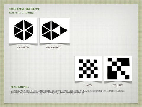
DESIGN BASICS Elements of Design

SYMMETRY

KEY-LEARNINGS

ASYMMETRY

UNITY

VARIETY

Learnt about the elements of design and developed the sensitivity to use them together more effectively to create interesting compositons by using Gestalt principles & the principles of Balance, Proportion, Rhythm, Unity, Contrast, Harmony, Movement etc.

DESIGN BASICS Elements of Design

FINAL B & W COMPOSITION

KEY-LEARNINGS Learnt about the elements of design and developed the sensitivity to use them together more effectively to create interesting compositons by using Gestalt principles & the principles of Balance, Proportion, Rhythm, Unity, Contrast, Harmony, Movement etc.

OTHER EXPLORATIONS


DESIGN BASICS Color

Pulse of a Street -Shivajinagar Keywords for Shivajinagar

Color Palette


DESIGN BASICS Color

Pulse of a Street -Shivajinagar Theme of Poster Where Commerce-Culture intersect

Final Color Palette


DESIGN BASICS Color

Pulse of a Street -Shivajinagar

Process & Learning Shivaji Nagar is a multicultural place with raw business of life. The marketplace can be seen as a composition of small repeating patterns of different variety which combine to form bigger elements of commerce and trade and take a bold and practical shape of business in the form of shops. The cultural elements depicted in bigger squares at the top part of the composition tend to mix with the business ongoing in the street. The overall place seems crude and dull which is shown by the dull greyish background and therefore the colors of culture and bright elements also get dominated by it and hence appear less brighter. The Vertical rectangle seemed to be most apt for showing intermixing of the 3 layers of small random elements depicting objects/things in the shops; bigger arranged elements forming street shops and the top big squares depicting cultural layers.


DESIGN BASICS Color

Color Palettes


DESIGN BASICS Color

Color Interaction

Process & Learning I have experimented on blue and black background composition with orange and magenta as foreground colors. The magenta color appears more brighter on blue background as it almost merges with the black one and little contrast is there in the black one. While in the first one the blue is complementary to orange and more contrast is there. Thus colors interact and can reduce or enhance the effect of each other.


DESIGN BASICS Color

Changing Emotional Quotient by changing Color The present color scheme is very dull, serious, boring, monotonous , strict and rude. The color palette consists of all pastels of green color and only one accent yellow is there. As its about entrepreneurship, it should target youth more. But the present color scheme makes it unattractive somehow and much serious instead of being more adventurous

PROPOSED NEW SCHEMES

Willpower,Vigor, Courage,Yearning, Leadership, Success

Intellect, Freshness, Higher Thoughts, Communication,Calm, Wisdom

OLD COLOR SCHEME


DESIGN BASICS Form

BOLD EXPRESSION Strong Appearance Bold Squares Strong Edges

BRUTE EXPRESSION Crude Bodily/ Muscular Sharp

KEY-LEARNINGS Had the basic knowledge of Color and how it affects human psychology Developed visual sensitivity towards use of color Hands on experience with poster colors, brushes as well as choosing colors on a digital medium Inspiration from colors available in nature-esp flora and fauna and capturing the essence of nature Expressing the character of a place through color and to use colors interestingly in composition Color can change the emotional quotient of a product and creates a psychological effect on user using that product.


DESIGN REPRESENTATION Freehand Drawing

KEY-LEARNINGS Equipped me with the abilty to capture an entire experience and record it with the dextrous use of hands Developed both the ability to draw quickly as well as to capture all the details as well if required A great tool for externalising thoughts when required to develop concept ideas, scenarios, thumbnails & initial prototypes/wireframes etc and present it to other


BASIC GRAPHIC DESIGN Poster on ‘Right to Education’

Concept: Here I have used a far analogy of comparing an illiterate person who is in the darkness and peeping through a hole towards the outside world which is full of light of knowledge of education. He is craving to step out of the darkness of illiteracy into the light of education and is like a fish which is at the brink of ocean but is captivated in a glass container and just restless to explore the vast ocean of possibilities. As the stress was on creating a provocative visual , I think the analogy is strong enough to provocate people about illiteracy and fetch the illiterate people from the darkness by letting out a helping hand. The typography is a broken font used to depict the broke condition of such people and yellow is the color of education.


BASIC GRAPHIC DESIGN Sustainability, Creativity, Aesthetics, Happiness to Society and Innovation.

Symbol Design- I-Mark

Concept: I-Mark is a world known standard for recognizing and ensuring a good design in terms of Sustainability, Creativity, Aesthetics, Happiness to Society and Innovation in India after doing brainstorming to sort out the various design qualities in Indian context. The symbol is in the form of a tree itself which represents sustainability with a firm, bold, looking up into the sky and bears a foliage in the form of 5 rings depicting the above five qualities.


BASIC GRAPHIC DESIGN Object Semantics

SQUARE CALLIGRAPHIC STYLE

ORIGINAL SKETCH

ORIGINAL GRAPHIC

MY STYLE ‘ORNAMENTAL’

MY STYLE ‘BOLD’


BASIC GRAPHIC DESIGN Typography

Concrete Poetry

KEY-LEARNINGS Improved my visual communication skills Helped to understand the process of design and to improve the design and technical skills from initial sketches to final presentations Helped in improving visual appeal and aesthetics sense and to understand the character of typefaces and use them accordingly in design Helped me to apply principles of design in concepts to make them more communicative and visually pleasa


DESIGN THINKING Creative Thinking

KEY-LEARNINGS Focussed on problem solving by use of creative tools and methods Helped me to develop fluency and flexibility in thoughts by use of creative tools such as brainstorming, mindmapping, storyboarding, thumbnails, empathising & experiencing, analogical thinking etc. Recording to capture ideas as they are momentary and if not captured fly away fast and reflecting upon them so that they can be implemented in future Collaboration of various disciplines to solve problems


DESIGN THINKING Designing Charging Station for Mobile Phones

KEY-LEARNINGS Focussed on problem solving by use of creative tools and methods Helped me to develop fluency and flexibility in thoughts by use of creative tools such as brainstorming, mindmapping, storyboarding, thumbnails, empathising & experiencing, analogical thinking etc. Recording to capture ideas as they are momentary and if not captured fly away fast and reflecting upon them so that they can be implemented in future Collaboration of various disciplines to solve problems


DESIGN CONCEPTS & CONCERNS Book Review

KEY-LEARNINGS Learnt the practical approach of solving problems. Developed the ability to feel, see, discover, analyze, brainstorm, build structures and metaphors to deal with the real world problems. Learnt to work in a structured manner. Team Learning and individual work focussed upon simultaneously Opportunity mapping exercise helped to share insights with others Book Review helped to capture deeper essence of books


DESIGN CONCEPTS & CONCERNS Designing UniversityInformation & E-Governance


DESIGN CONCEPTS & CONCERNS Opportunity Mapping for University Design Insights


DESIGN CONCEPTS & CONCERNS Opportunity Mapping for University Design Insights


DESIGN CONCEPTS & CONCERNS Proposed University Design


INTERACTIVE MEDIA PROJECT

PROCESS Data Collection and Interviews Field visit Day1- RTDC Field visit Day1I- Mr. Ramamurthy (Woodcraft Artist) Visual Ethnography Initial segregation of Information in the form of images and videos Giving suitable captions to all the images Categorizing information into raw materials, tools, machinery, process and finished products StoryWriting Storyline and establishment of character Script Writing Creating scenes and narration to the story Storyboarding Adding visuals to the narration Information Structuring Non-Linear Narrative


INTERACTIVE MEDIA PROJECT


INTERACTIVE MEDIA PROJECT


INTERACTIVE MEDIA PROJECT


INTERACTIVE MEDIA PROJECT


INTERACTIVE MEDIA PROJECT


Turn static files into dynamic content formats.

Create a flipbook
Issuu converts static files into: digital portfolios, online yearbooks, online catalogs, digital photo albums and more. Sign up and create your flipbook.