5 minute read
Colour of the Year 2020
Colour of the year 2020 Classic blue Ka rin melberg schwier Pa ntone color institute
Now that we’re well into the Roaring Twenties Redux, there’s good reason to feel a little blue.
Advertisement
Twenty years ago, the Pantone Color Institute began its annual tradition of choosing a colour that would be a major influencer in fashion, home décor and design, travel, entertainment, technology, art, social media, sports and various industries. Colour experts are said to “comb the world” for indicators that determine the ‘it’ colour to watch for the year. That first year, Cerulean became the 2000 shade of blue at the forefront. Twenty years and 21 colours later—2016’s Rose Quartz and Serenity (a shade of blue) shared the mantle—blue makes the cut again, a hue to bookend these two decades. This time, it’s a classic.
Old, New, Borrowed, Blue
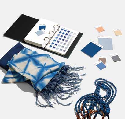
So what particular kind of blue is this Classic Blue 19-4052? In the descriptors of Pantone publicists, it’s “trustworthy, dependable, stable and calming.” It’s the sky at dusk, that serene deepening blue when the first star is visible. It’s a familiar yet enchanting shade that suggests a vast expanse of boundless possibilities. In a chaotic world, returning to a classic means a colour that is approachable and friendly. But this particular indigo is also full of new potential.
Big talk and a lot of responsibility for a colour. Look around. Colour is big business. Beyond that, in a world of upheaval, uncertainty and unrest, being a calming influence means Classic Blue has its work cut out.
An Anchoring Azure Each year, Saskatoon HOME talks with Leatrice (Lee) Eiseman, Executive Director of the Pantone Color Institute, at her home office on Bainbridge Island, Washington. The Institute is a colour consultant unit that researches and forecasts global colour trends and advises various industries on brand identity.
But what comes first? Is the trend toward a particular palette already on the global scene or does Pantone set the agenda for what will be
seen in fashion, design, entertainment and other industries for the year? Lee explains.
“It’s a bit of both,” she says. “This blue is a classic color, just as the name implies, so it will be seen in various applications prior to being chosen as the Color of the Year, but it gains more traction after the release is made public.” So it’s not so much chicken or the egg, but more chicken and the egg. “We look for the possibilities of the growing usage of the color,” Lee adds, “and create the rationale as to why we believe in it.”
The 2020 colour has been called “solid and dependable.” Lee has also described Classic Blue as “imbued with a deep resonance, PANTONE 19-4052 Classic Blue provides an anchoring foundation.”

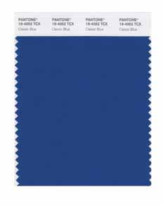
A Comfortable Camaraderie
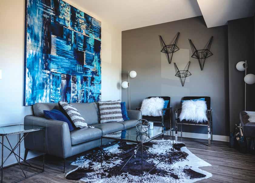
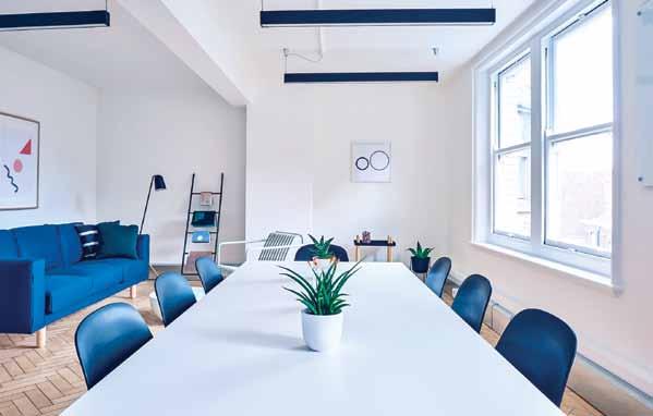
Classic Blue plays well with others, specifically those in the accompanying Pantone Home and Interior Colour Palette for 2020. It’s comfortable, but still has a little spice.
“It is an extremely versatile color, one that can be used as background easily,” Lee explains. “There is some drama as there is a tad of red as an undertone to this particular blue, but not overthe-top. It’s not as somber as navy, nor as bright as royal blue. It combines very well with all other colors in the spectrum and can be easily used with black. There is no mistaking this is a blue, whereas navy usually doesn’t provide enough contrast with blacks or deep grays, even browns.”
At Home Applications
Lee is steeped in the business of colour, but she usually has her own personal favourite applications for each Colour of the Year. This year is no different.
“I love it in cosmetic applications and have bought three bottles of nail polish that are spot on,” she says. “It is spectacular on a table top, especially in glassware and I love it in patterns like Blue Willow on china.”
That versatility comes through again as Lee explains how Classic Blue can comfortably go small or open wide and go big.
“It would be an amazing ceiling color in a bedroom, imitating the time of day when the world is winding down to quiet time,” she insists. Who wouldn’t want to lie in bed and gaze up at that?
A Subtle Reassurance
When Cerulean Blue was selected as the first annual Colour of the Year in 2000, the United States was in turmoil over fears about the growing hole in the ozone, the possible devastation of the Y2K

virus, the largest solar flare in over ten years, and the nailbiting election vote recount in the testy Bush v. Gore presidential campaign. Now, with recent impeachment trials dominating the U.S. administration and infiltrating the public’s psyche, perhaps Classic Blue will provide a calming, steadying force. The fact that blue is the identifying colour for the Democratic Party is probably just coincidence. It’s worth noting Baywatch Red didn’t make the cut. Still, Flame Scarlet did dominate the New York Fashion Week runway colour palette.
Karin Melberg Schwier

WEEKENDS WERE NOT MADE FOR HOUSE CLEANING.
FINALLY. An outside decking that looks like it belongs inside.


LANAI has re-invented, re-thought and re-engineered decking. We’ve removed the design barrier between indoor & outdoor living. We have taken the idea of existing composite ‘decking’, and changed every detail including those you can and cannot see.
Sharla Shaw, OWNER
www.tidytimesaver.com
PROUD PARTNER
PROUDLY SERVING REGINA, SASKATOON AND SURROUNDING AREAS
Saskatoon Office OFFICE HOURS Mon to Fri – 9am to 5pm TELEPHONE 306-664-0072 EMAIL info@tidytimesaver.com
If you’re even thinking about a new deck, please check out our website and see the LANAI difference.
