SCI-Arc


Design Studio 3GA p. 08-27
Visual Studies Tending the Wild p. 28-39
Advanced Project Delivery p. 40-57
History IV Stochastic Messages p. 58-63
Design Studio 2GB p.66-91
Design Studio 2GA p. 92-105
Design Development p. 106-121
Visual Studies IV p. 122-137
Visual Studies III p. 138-151
Design Studio 1GB p. 154-169
Design Studio 1GA p. 170-193
Visual Studies II p. 194-199
Visual Studies I p. 202-217
Materials and Tectonics
p. 218-223
AI and Urbanism p. 224-231
History III p. 234-237
History II p.238-241
History I p. 242-243
Intro To History and Urbanism p. 244-249
Touching on formal, conceptual and the abstract, the work is meant to poke at the way in which we conceptualize design today. Visceral, Joyful and subversive, each piece animates the serious and stoic field of architecture to suggest what could be.
Paige Davidson is a multidisciplinary designer. She is the co-founder of Studio Gluten, an experiential and motion graphic design firm, and she is currently a Masters of Architecture I candidate at the Southern California Institute of Architecture. She holds a Bachelor of Science in Architectural
Studies from the University of Illinois. Her previous work as a Senior Designer at Snarkitecture received international awards and acclaim.


 Instructor Elena Manferdini
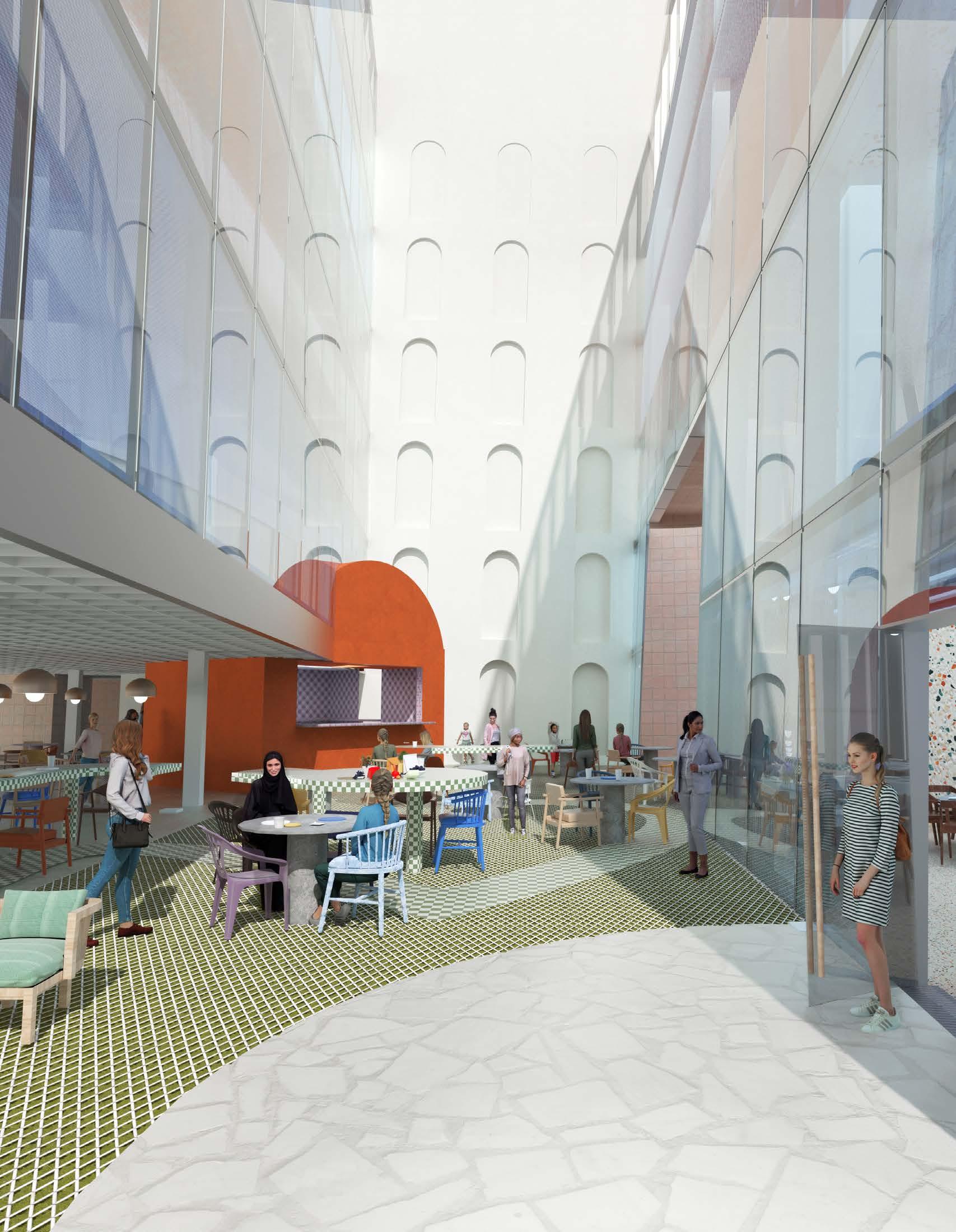
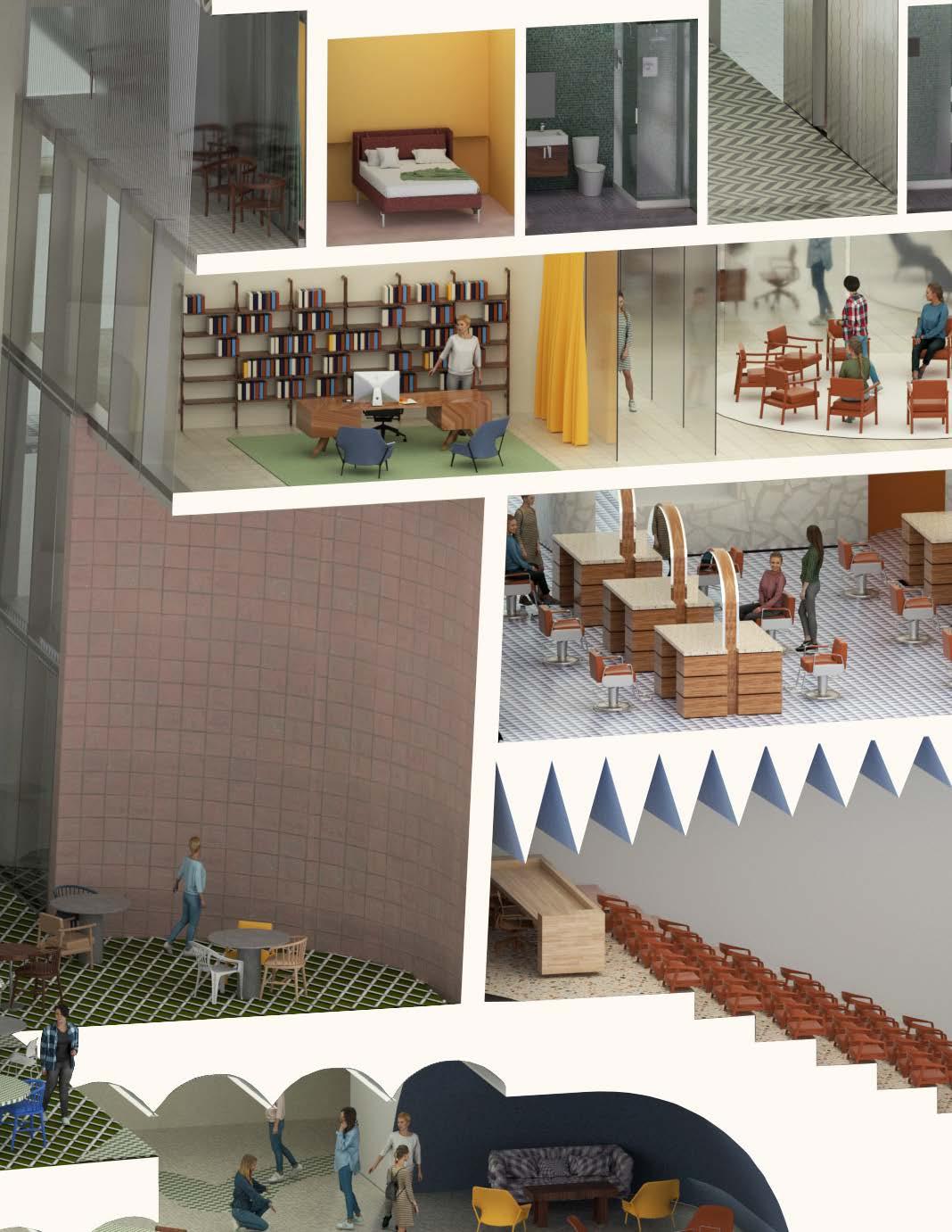
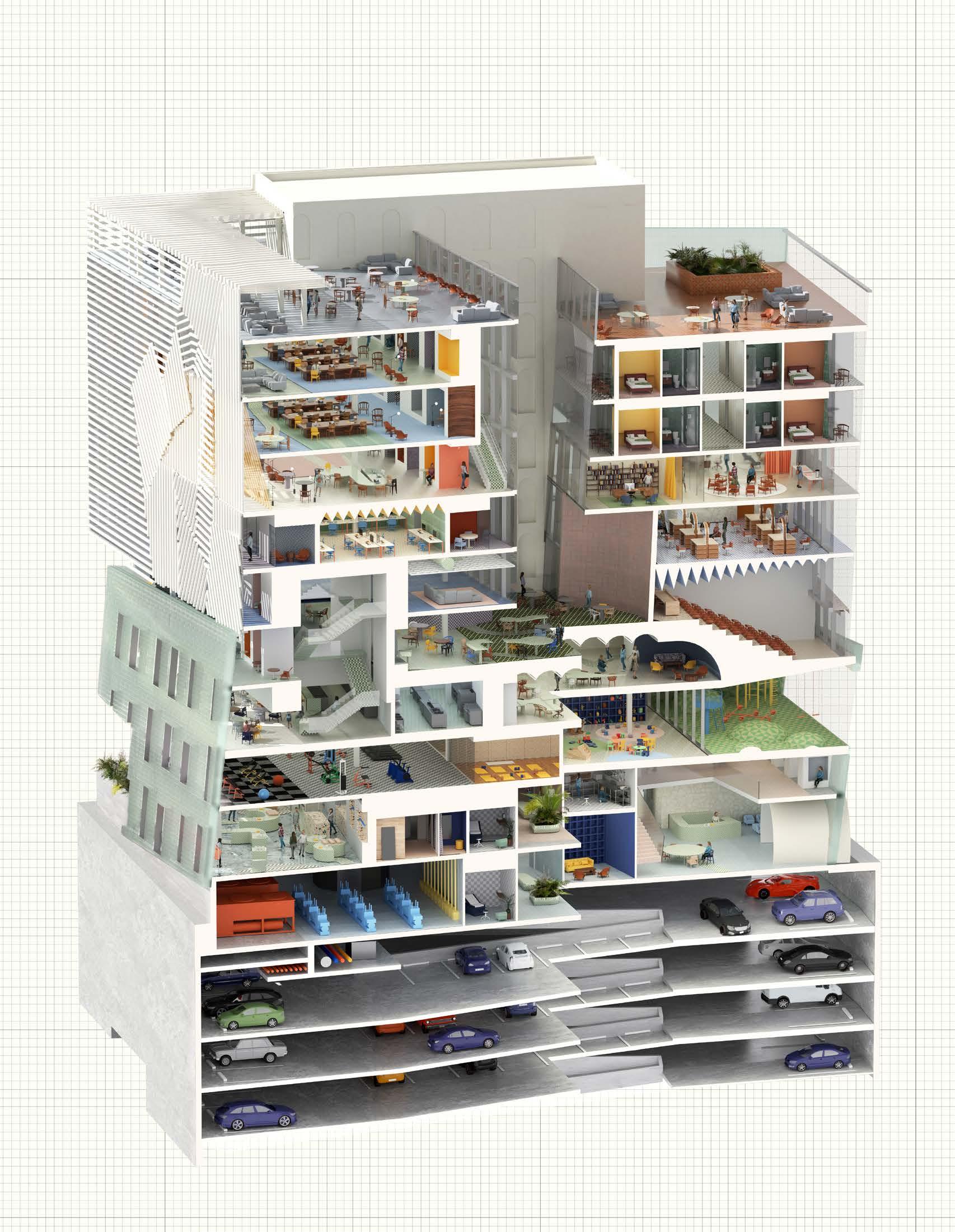
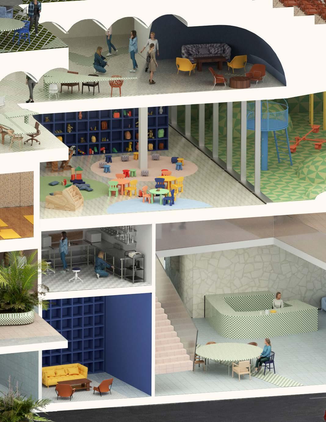
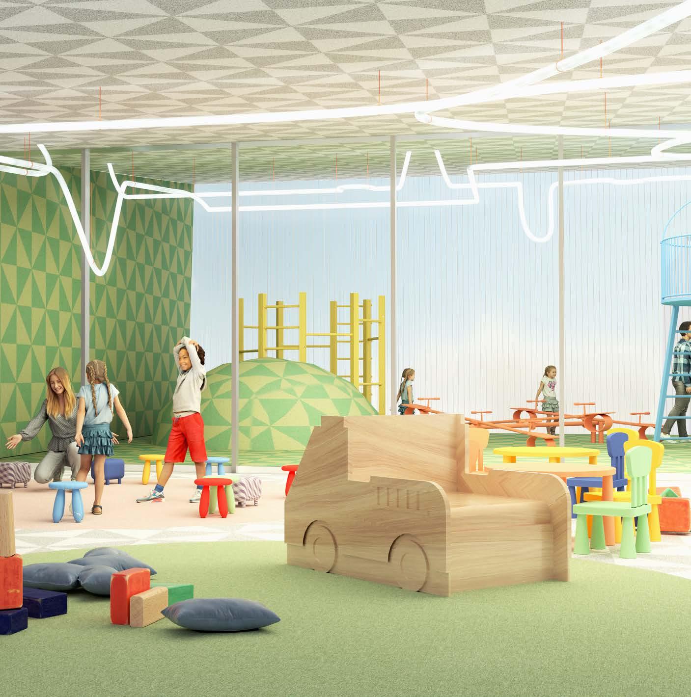
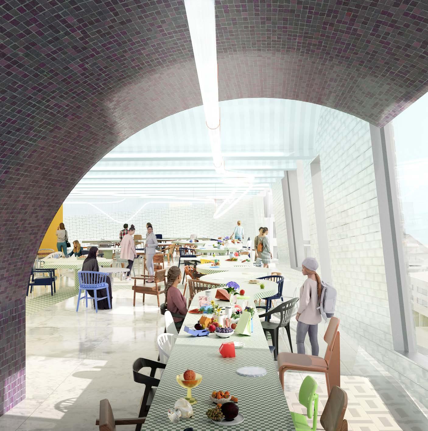
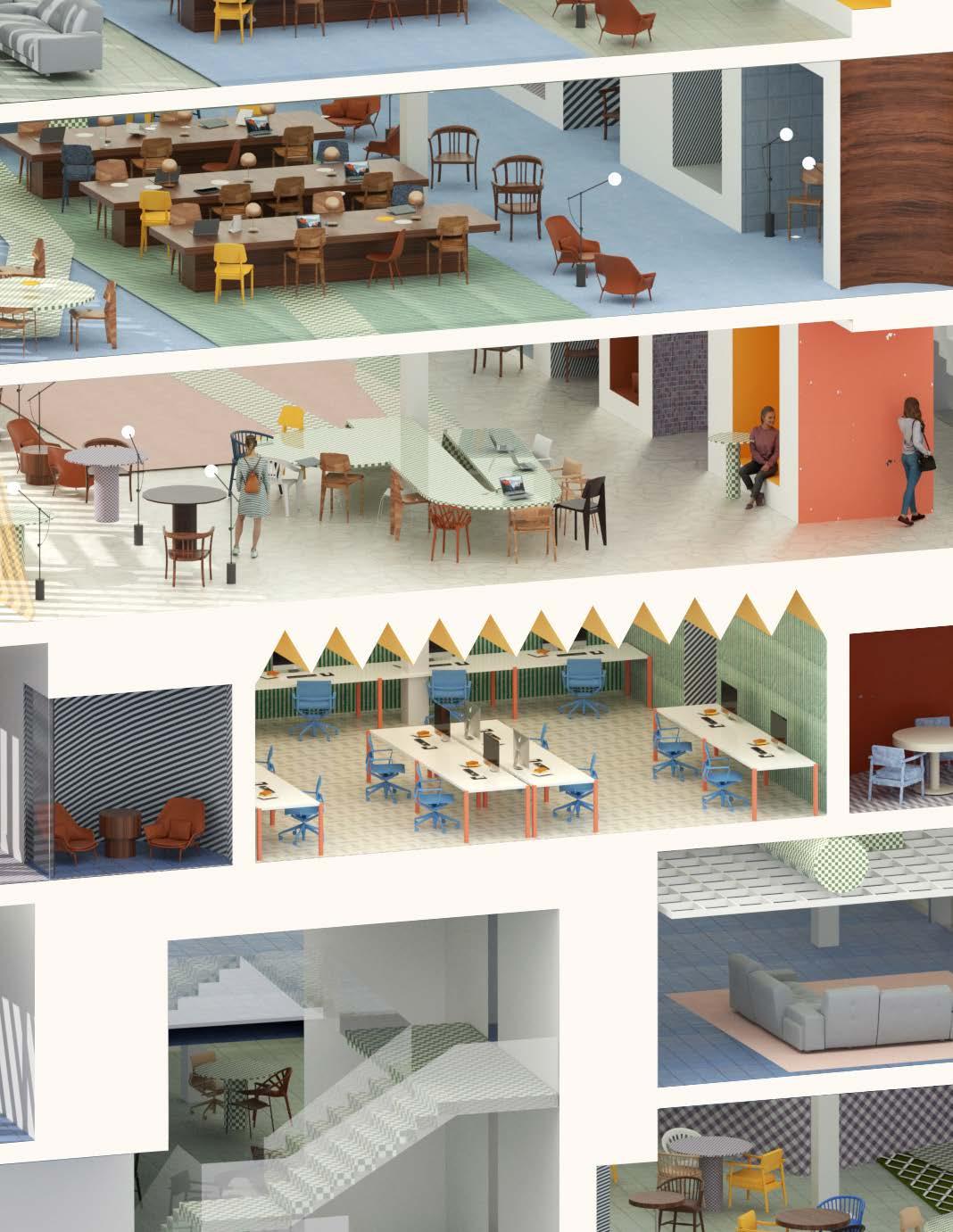
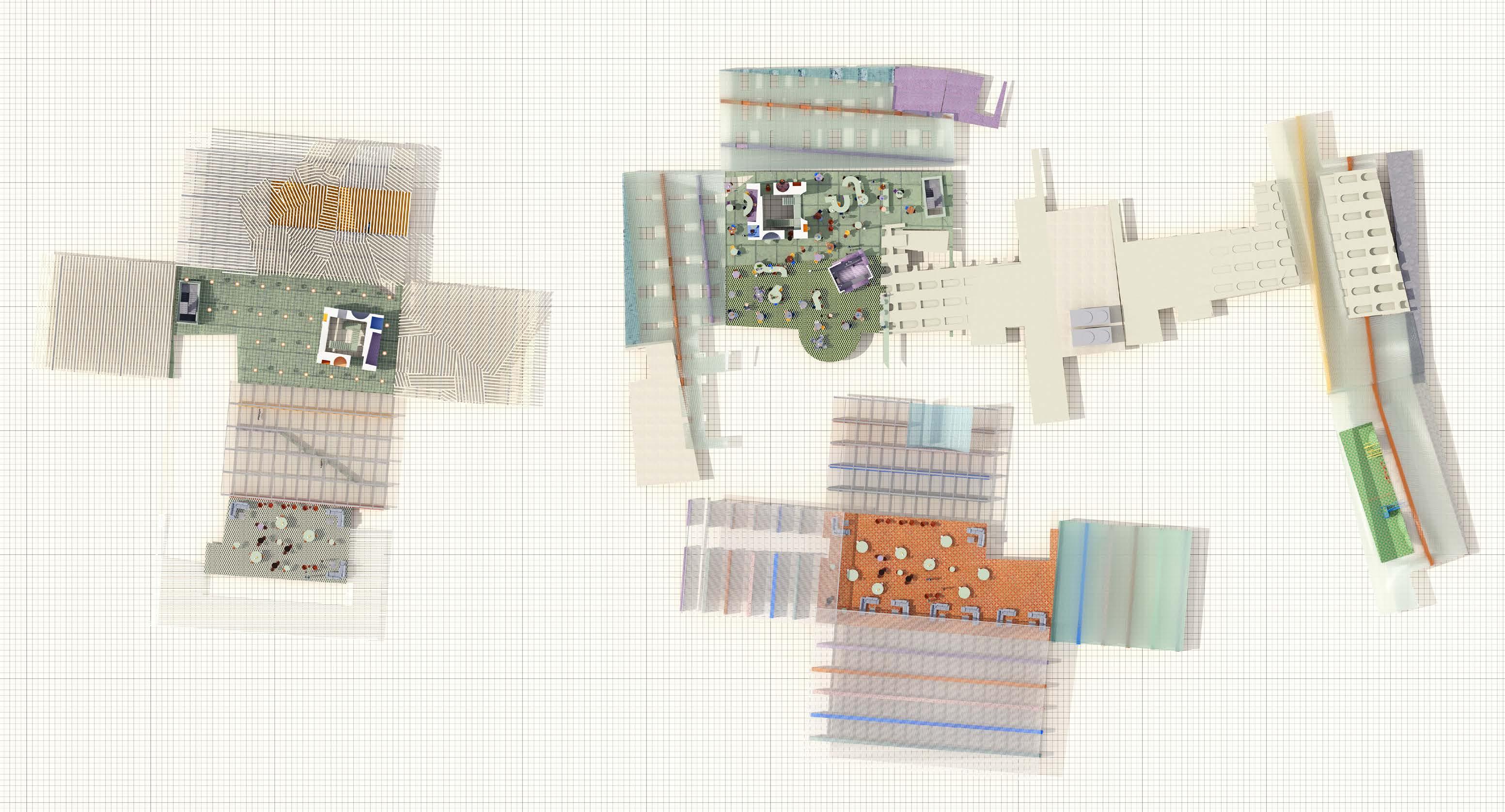
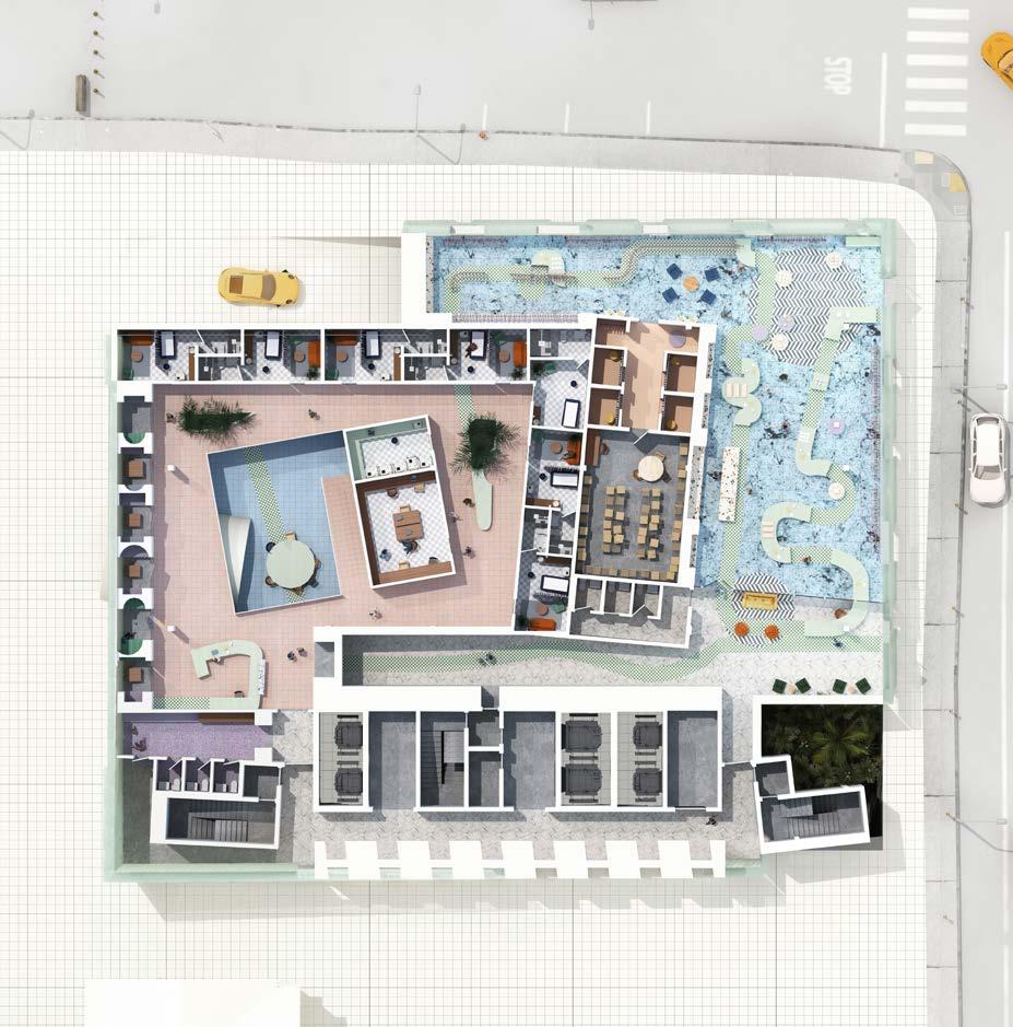
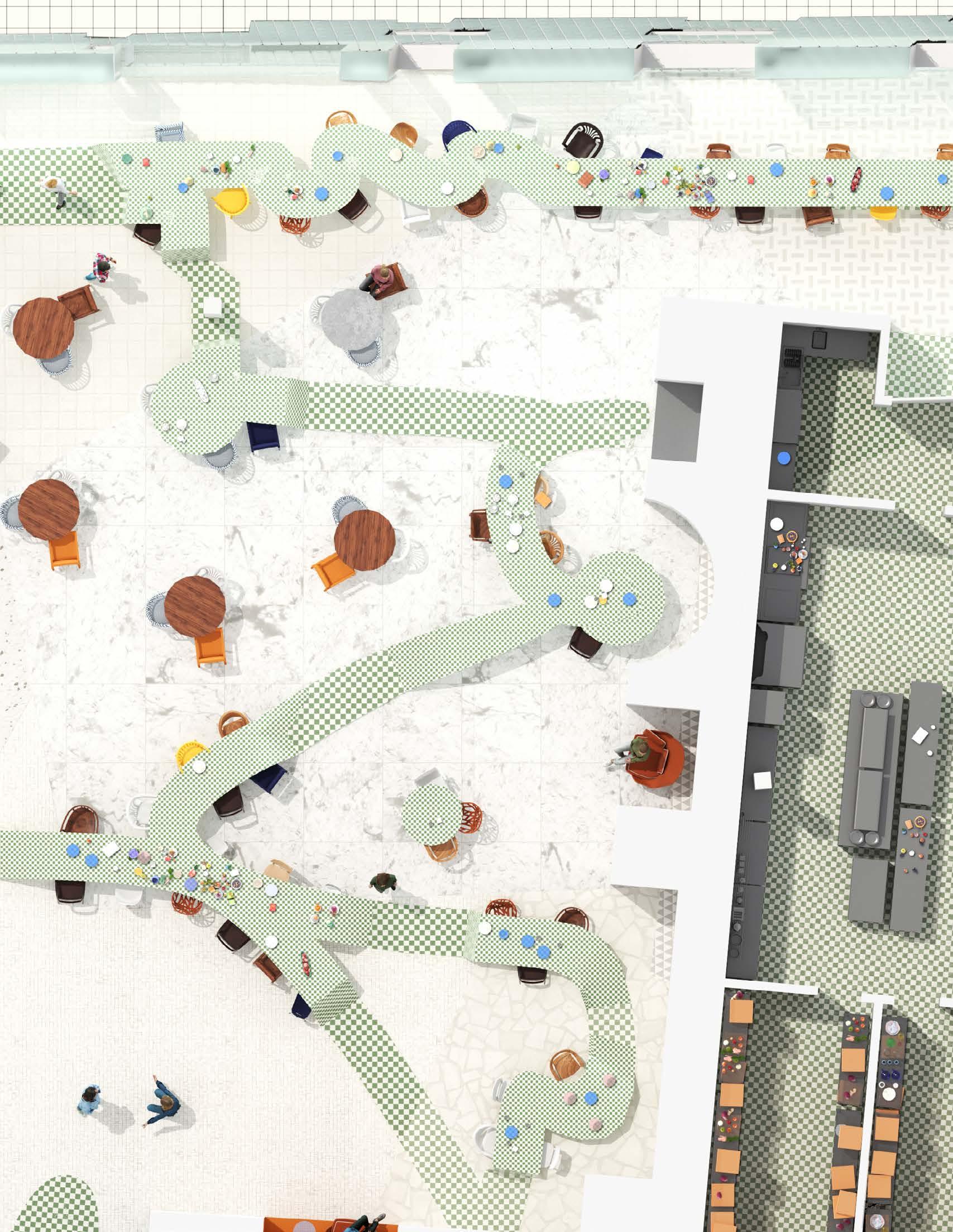
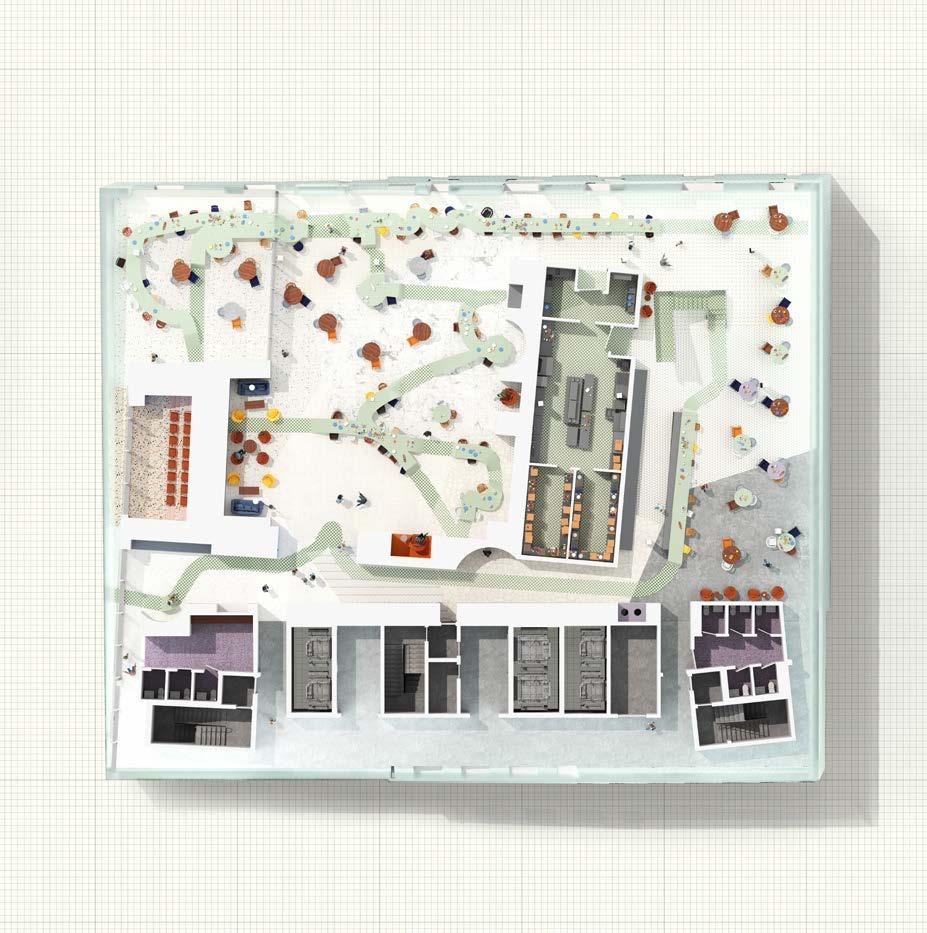
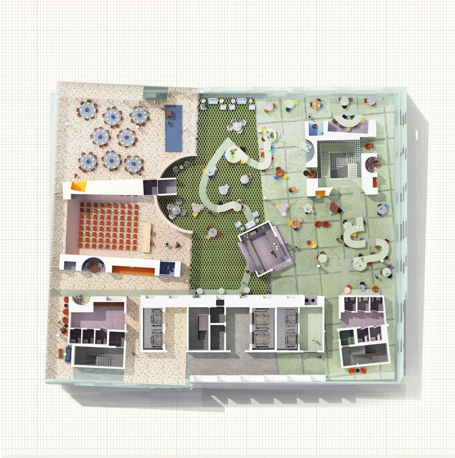
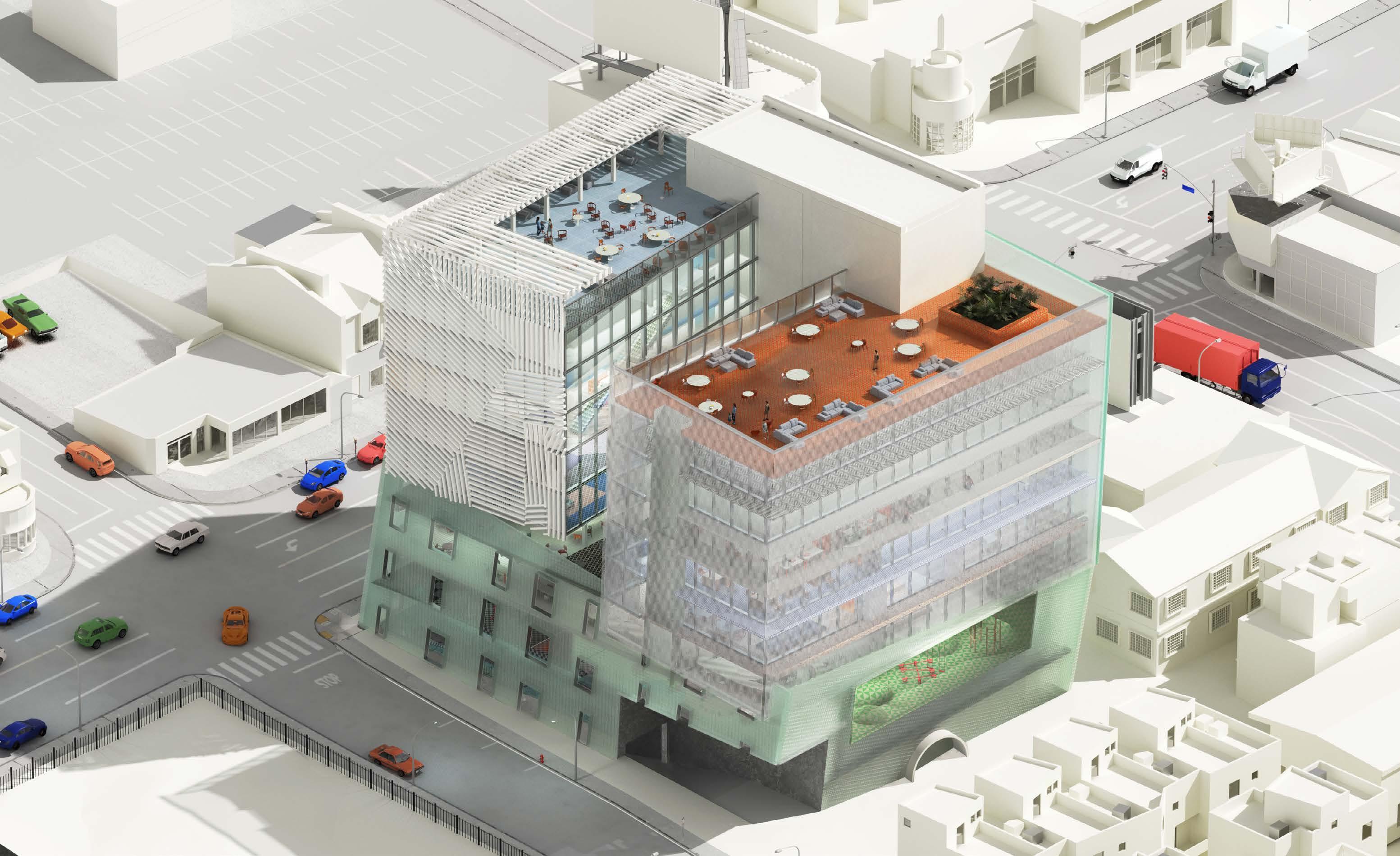
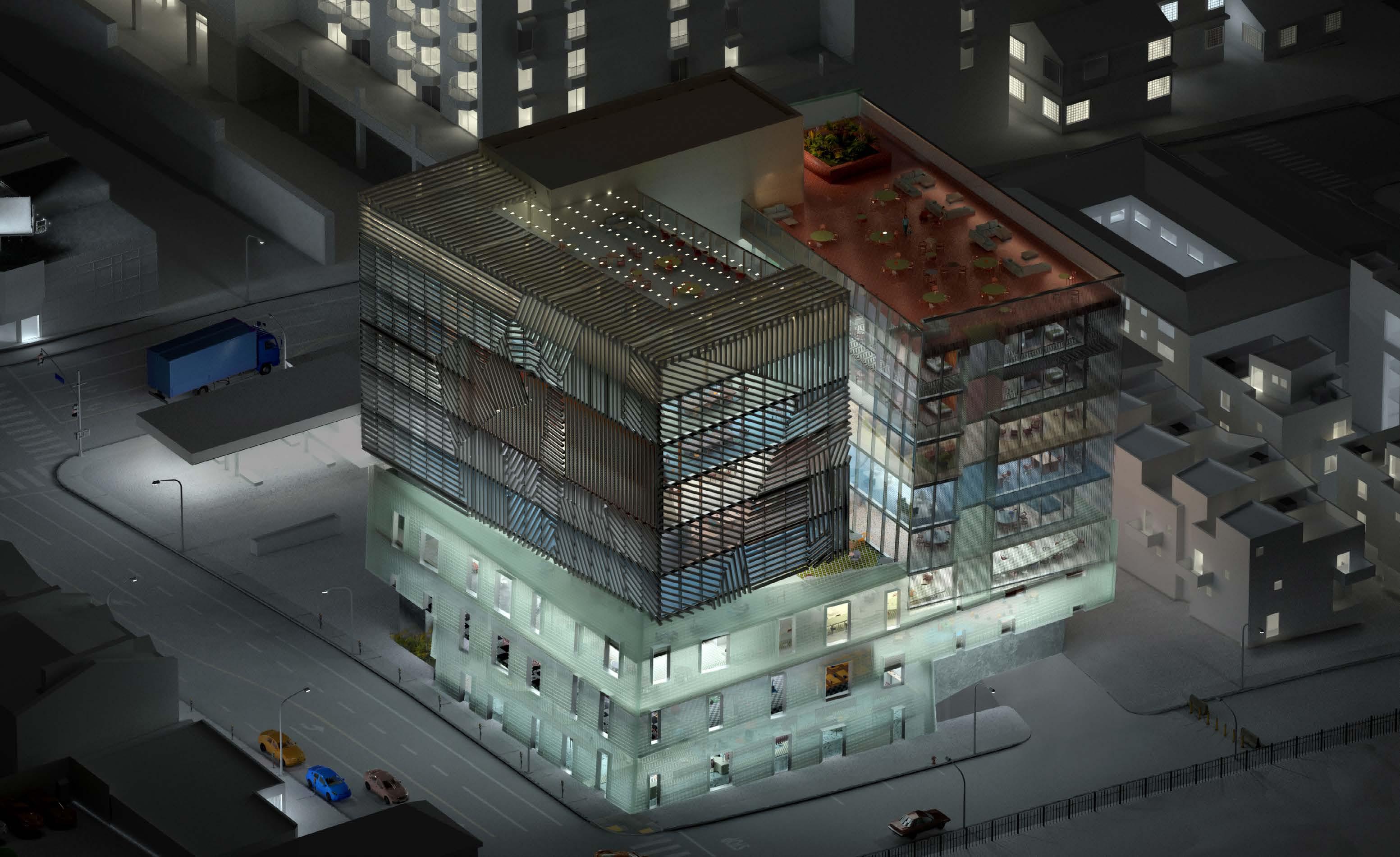
Boon examines the role and identity of social clubs in modern times. Rooted in a desire to create an impactful communal space, the project merges the exclusivity of clubs with the necessity of temporary housing for disenfranchised populations. Aimed at creating a new kind of “women’s club”, the project repurposes traditionally segmented and gendered programs into a unified intricacy, encouraging a gender diverse membership from all who identify as female, trans and non-binary.
The building’s façade shrouds a protective layer around sensitive programs, and punches moments of transparency at habitually exclusive fragments, forcing an architectural checks and balances of engagement.

Detail
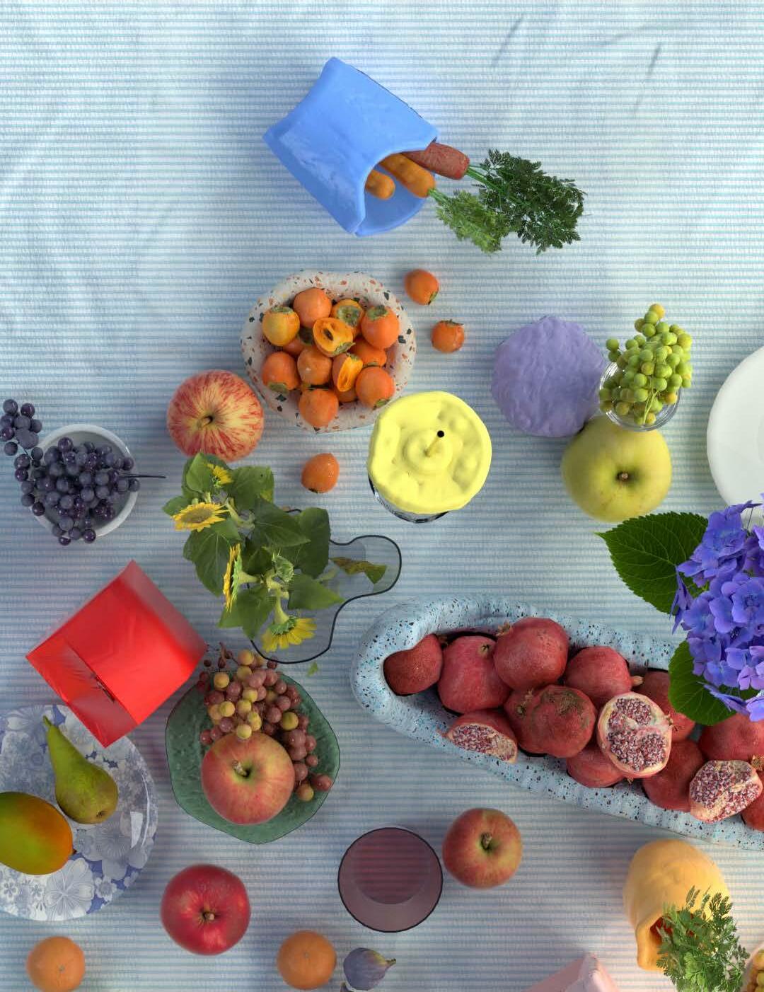
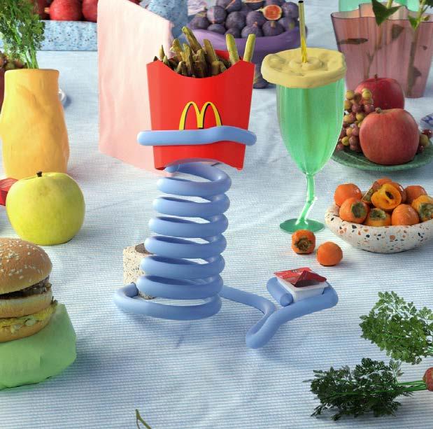
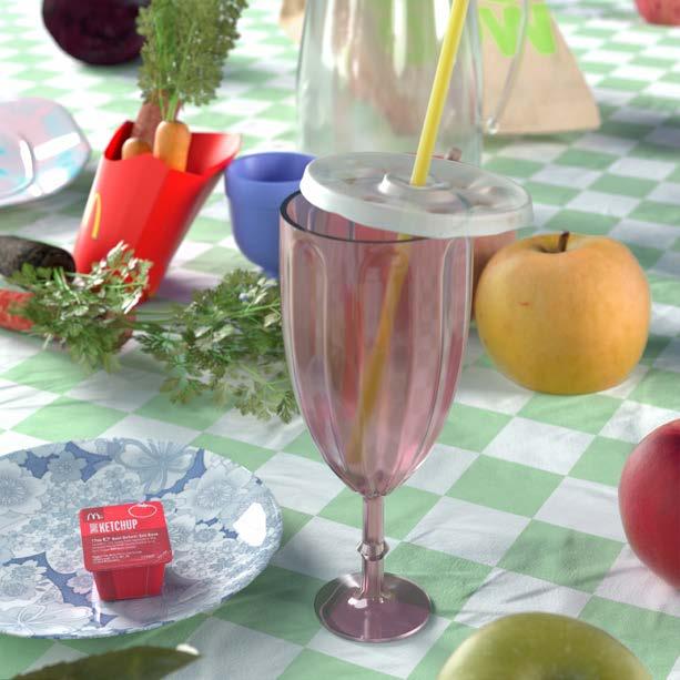
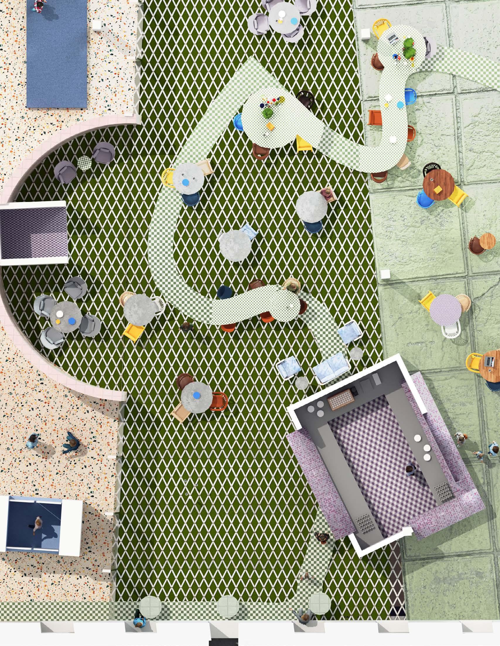
Furthermore, an open plan centered interior discourages secrecy and privilege from the realities within, surrounding communal membership areas with high need, accessible programs. Expanding typically discrete areas onto a series of merged common spaces wherein services are focused and specified needs addressed. Utilizing gender neutrality and enhanced accessibility standards within key spaces like bathrooms, nursing rooms, mental health and clinical spaces, the project encompasses a wider definition of what a woman negotiating a spatial reality looks like today. A continuous line running through the project acts as wall/table/pattern and creates an linked organization through the discrete programs of the building. Variation of color and texture throughout the building interpret traditional notions of femininity as new areas of control, reclaiming a bright variety as an essential identity for the club at large.




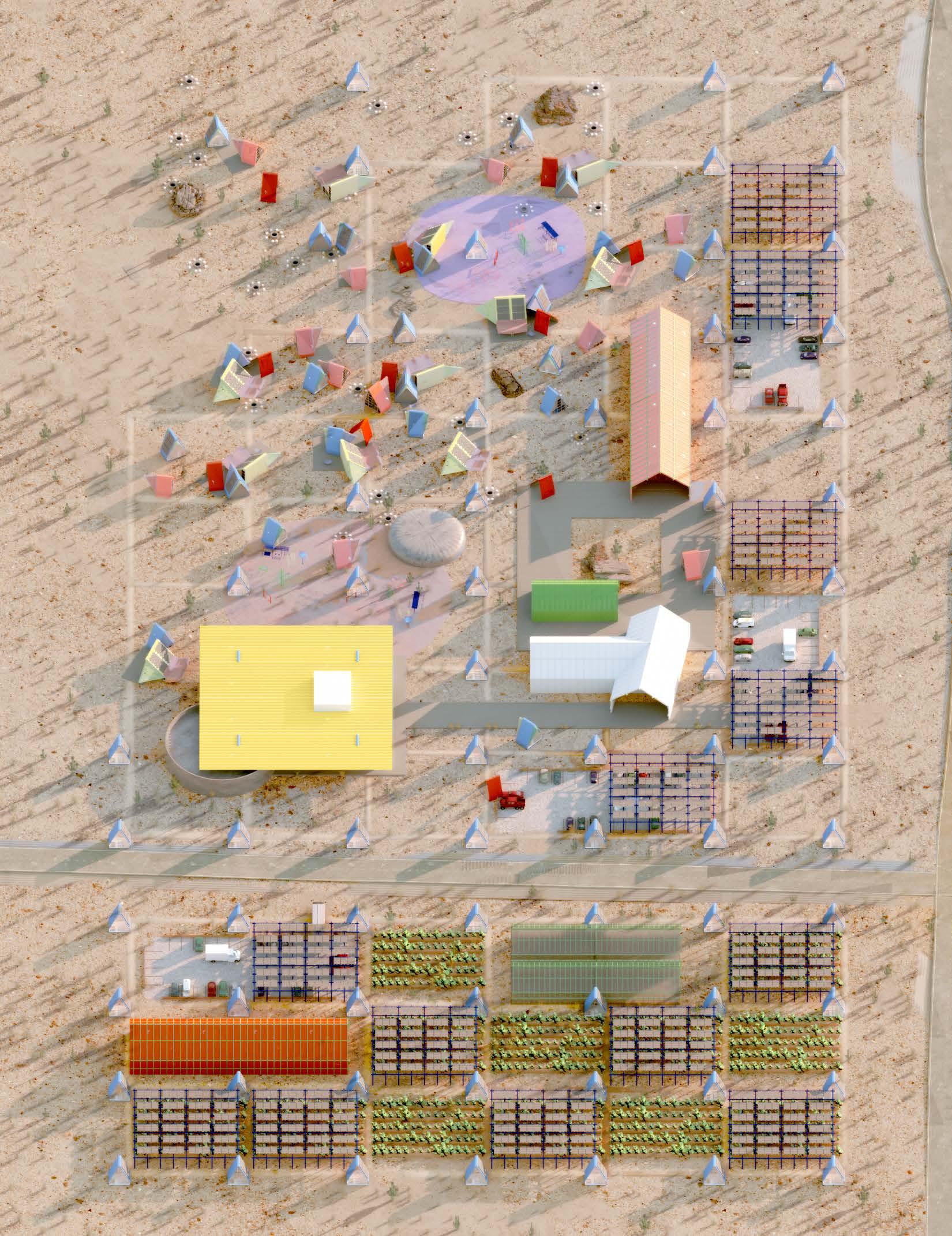
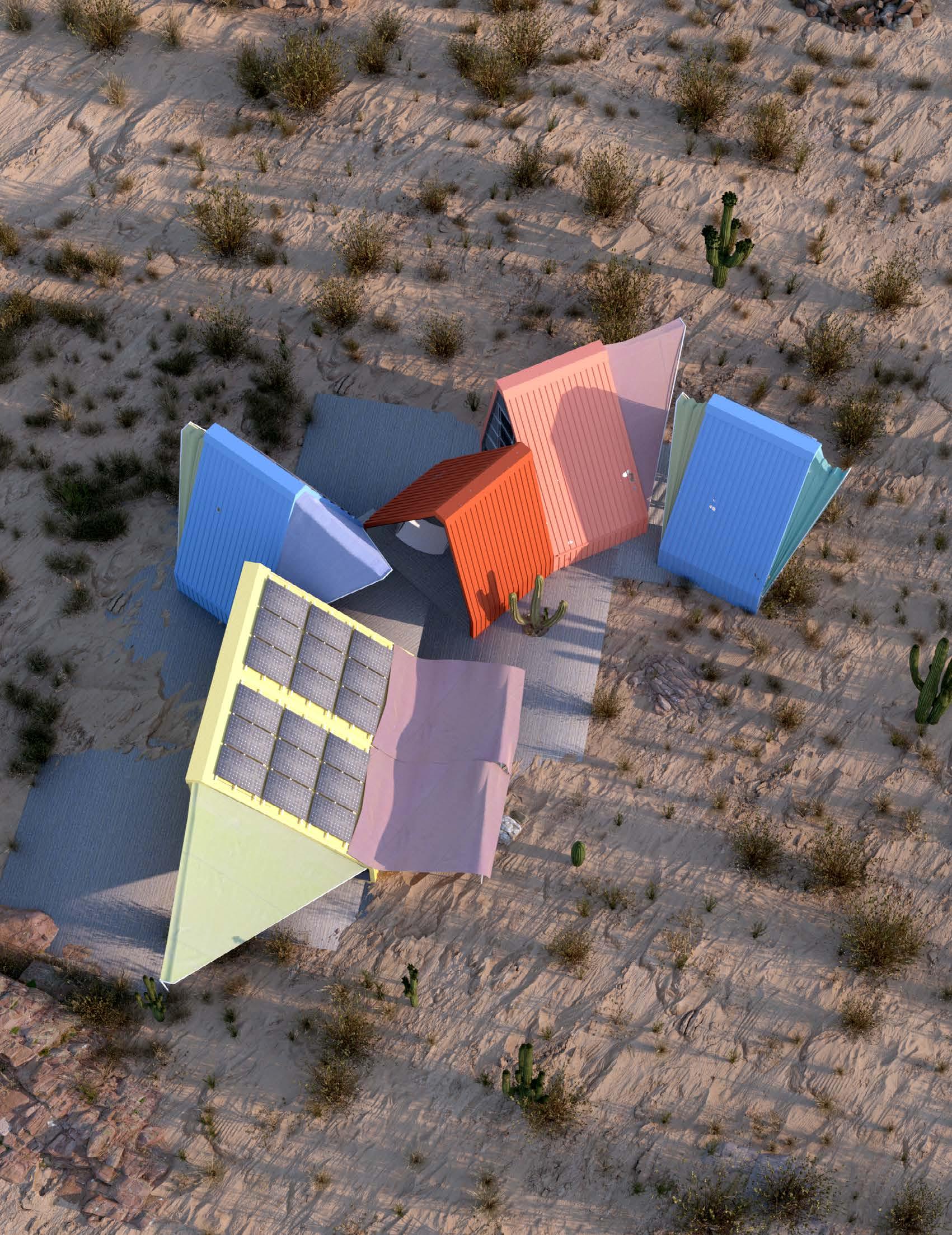
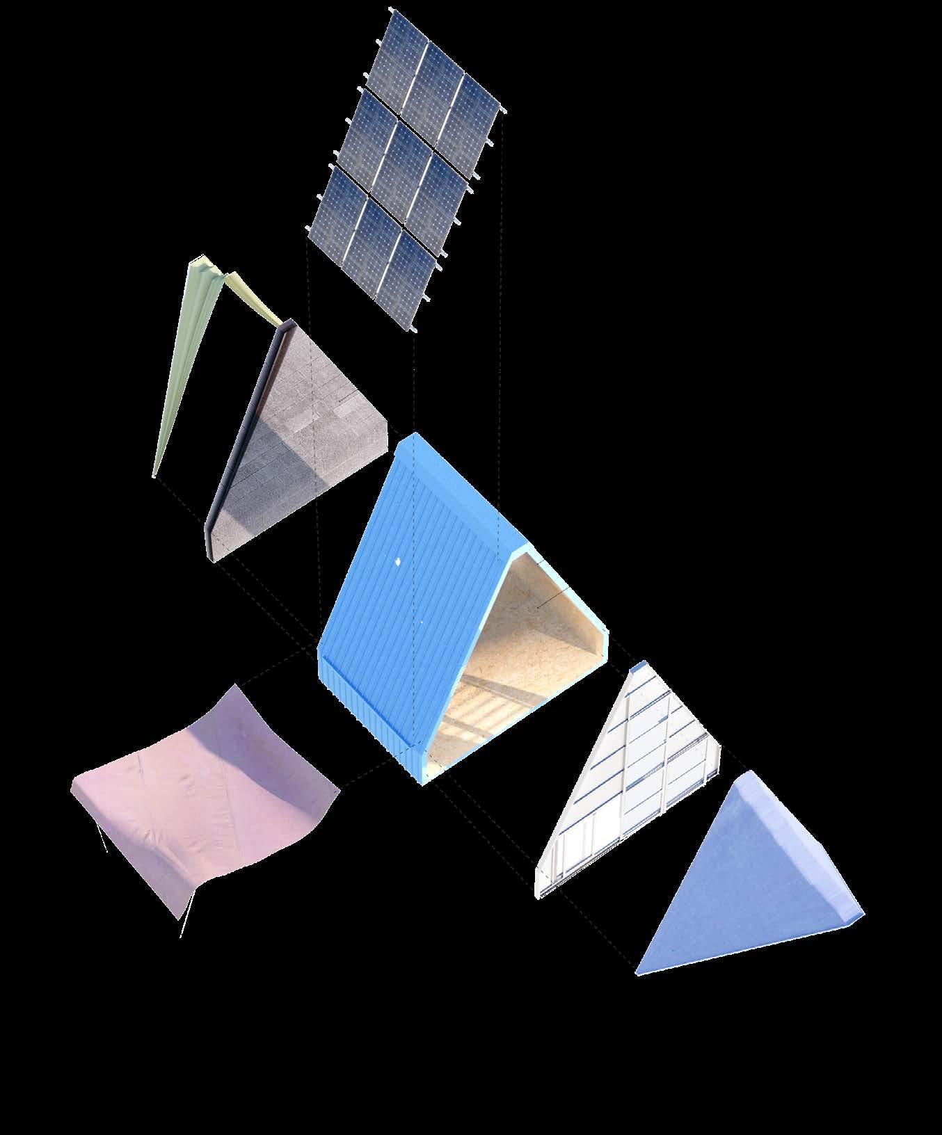
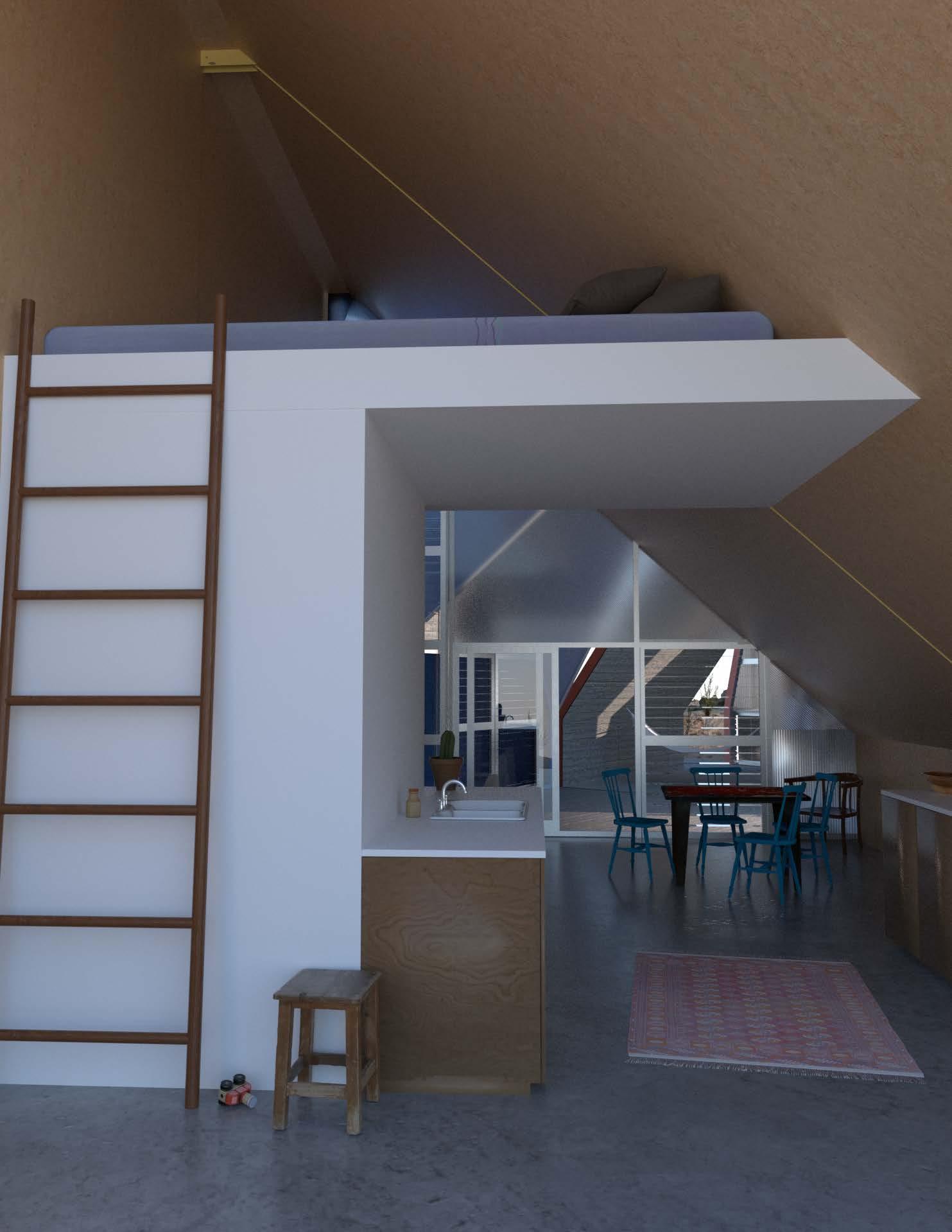
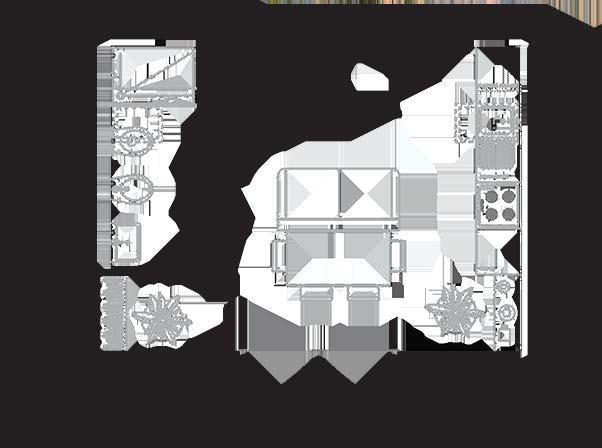
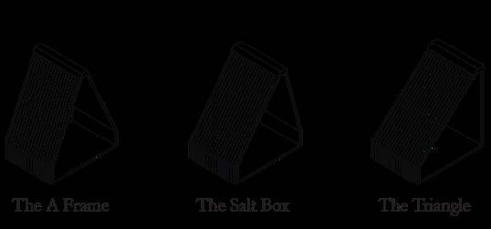
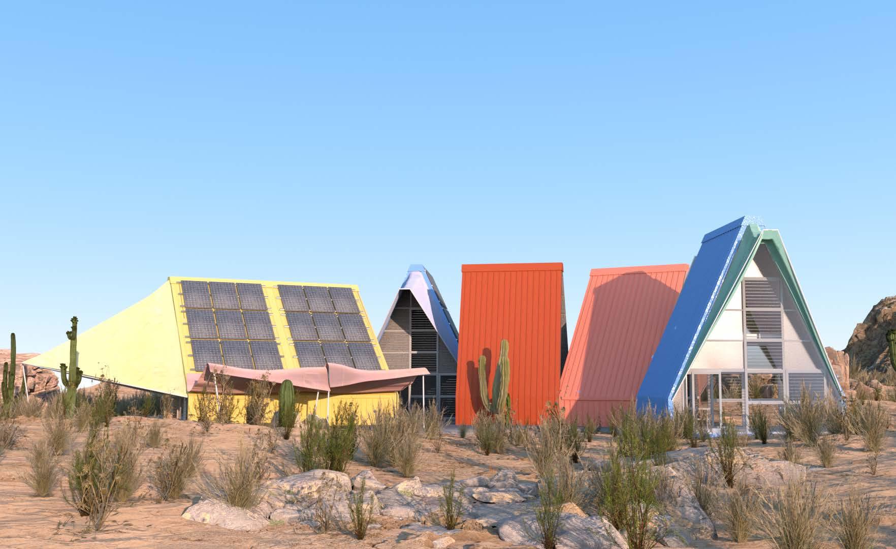
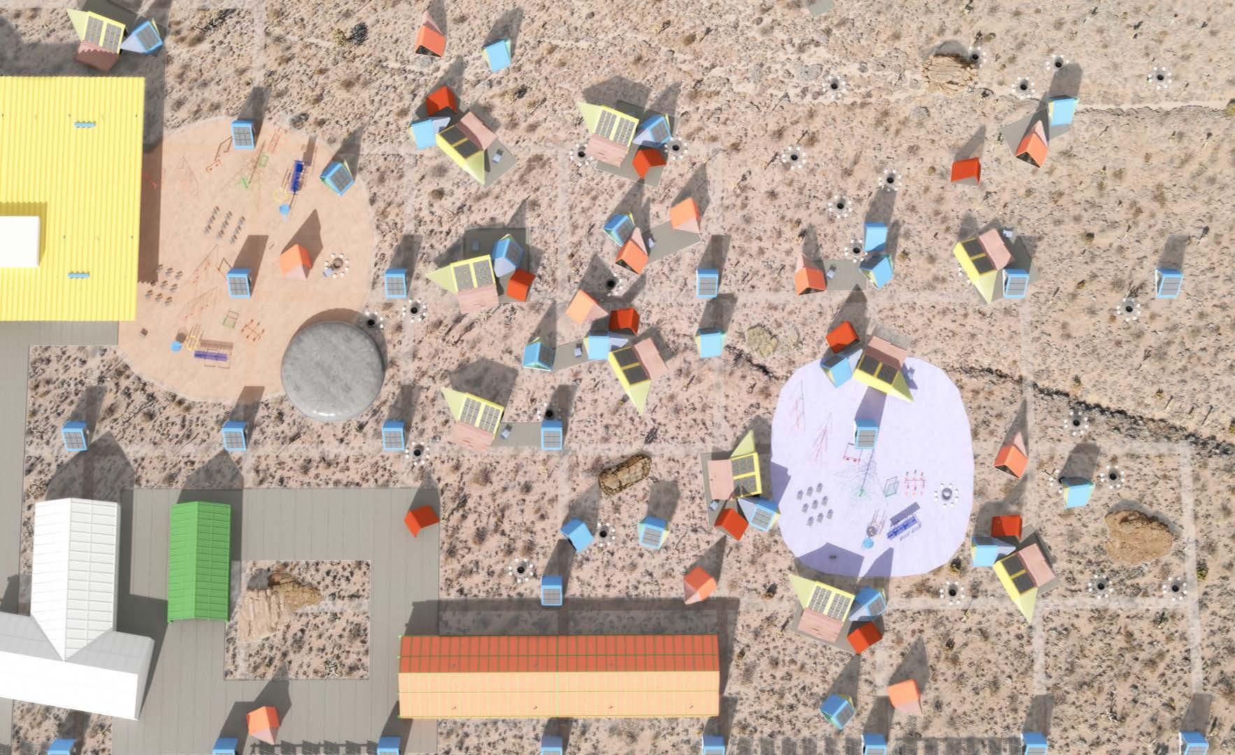
Tiny Town is an off the grid community focused on young mothers and children who have become unhoused. Located in the Llanno del Rio region of California, an area known for a historic communist commune at the turn of the twentieth century, the area is surrounded by wilded nature.
Focusing at three scales, the earth, the house, and the town, the project examines ungainly forms, color, and transformation through the seasons.




















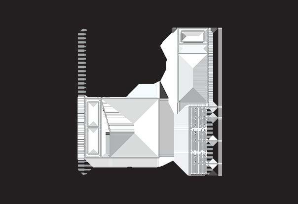
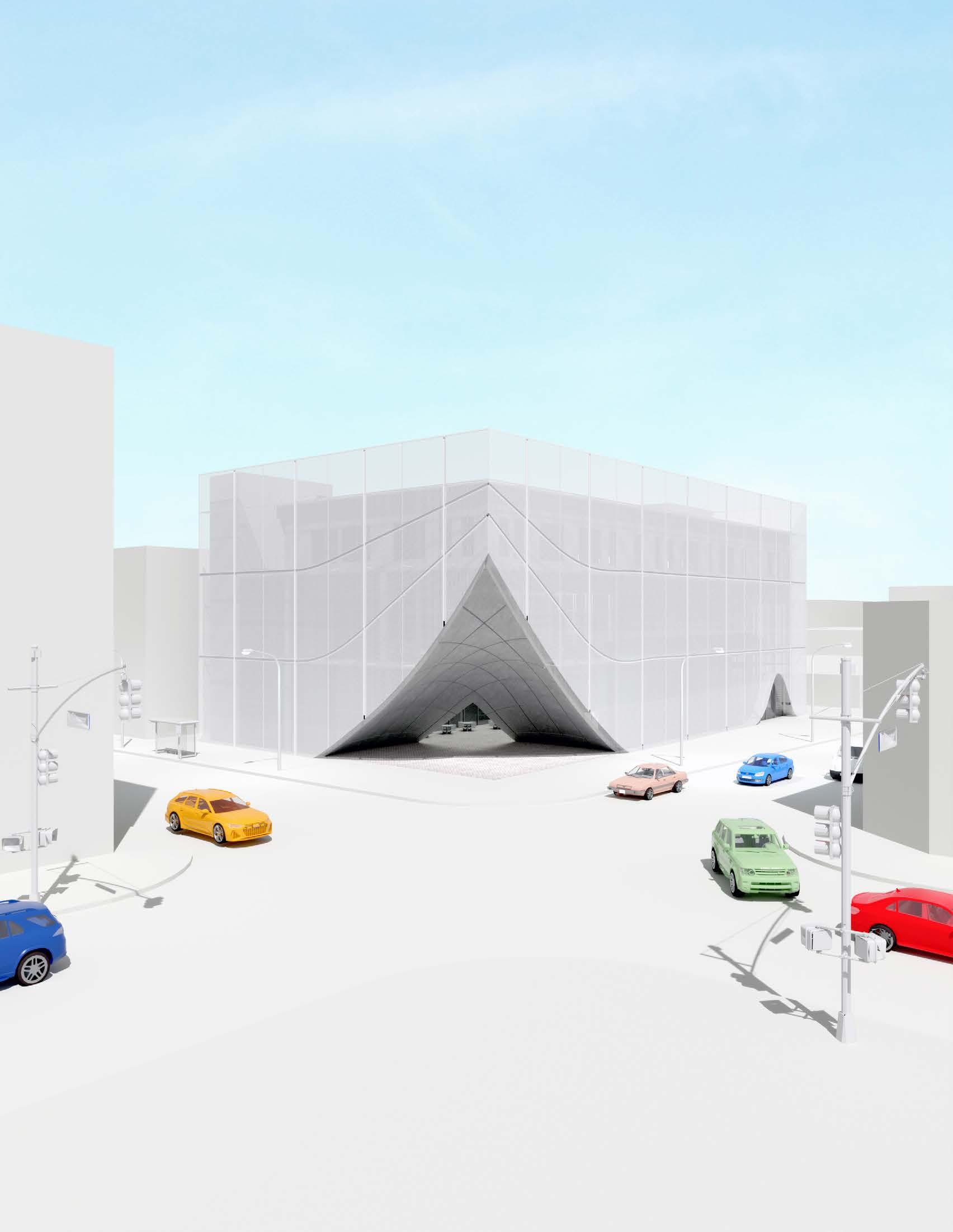
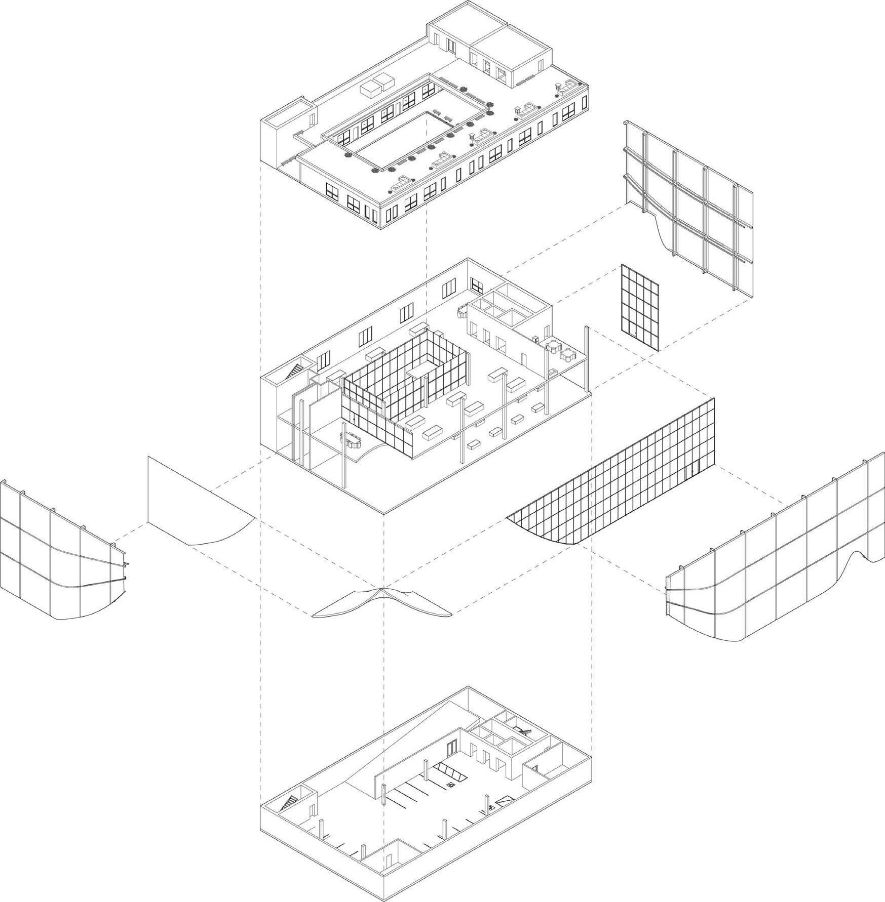
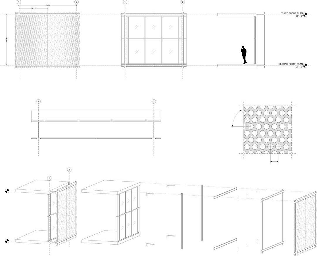
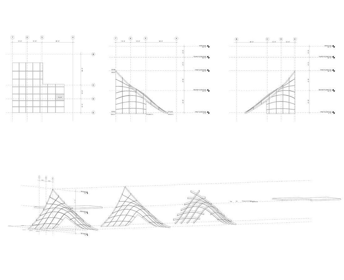
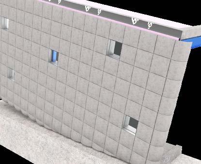
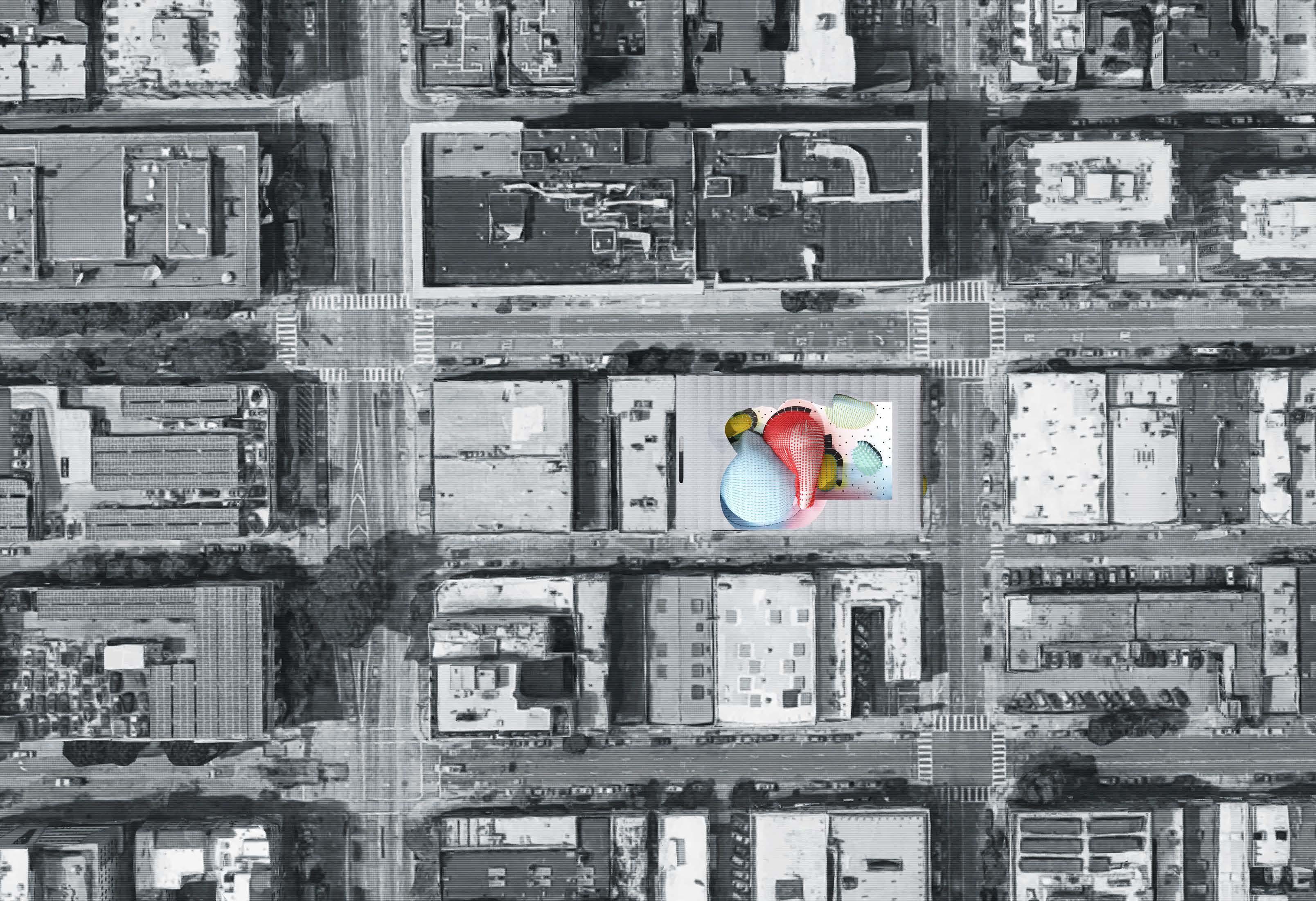
DTLA Print is a four story mixeduse building on the corner of San Julian and 9th Street in Downtown Los Angeles. Wrapped in a homogenous perforated screen, the simple massing lifts up at the Southwest Corner to create a public plaza and entry into the main courtyard.
The mixed programs stack on themselves, with retail and public outreach on the ground floor, a factory space on the second, temporary studio housing on the third floor, and an accessible roof deck with views of the city.
CONSULTANTS
CONSULTANTS

STRUCTURAL ENGINEER KURT FISCHER STRUCTURAL ENGINEERING 17547 VENTURA BLVD. SUITE 302 ENCINO, CA 91316 818 874 1445
INFO@KFSENG.COM HYPERLINK "http://www.kfseng.com" WWW.KFSENG.COM CIVIL ENGINEER SOUTHLAND CIVIL ENGINEERING & SURVEY, LLP 87 N. RAYMOND AVENUE, SUITE 300 PASADENA, CA 91103 626 486 2555
LMAR@SOUTHLANDCIVIL.COM (LARRY MAR) HYPERLINK "http://www.southlandcivil.com" WWW.SOUTHLANDCIVIL.COM
MEP ENGINEER K2D CONSULTING MEP ENGINEERS 13465 BEACH AVE., SUITE B MARINA DEL REY, CA 90292 310 935 3773 INFO@KD.COM HYPERLINK "http://www.k2d.com" WWW.K2D.COM
LANDSCAPE SPECIALIST SALT LANDSCAPE ARCHITECTS 423 GIN LING WAY LOS ANGELES, CA 90012 213 234 0057 STUDIO@SALT LA.COM WWW.SALT LA.COM
GEOTECHNICAL ENGINEER GEOCONCEPTS, INC. 14428 HAMLIN ST. #200 VAN NUYS, CA 91401 818 639 9534 SWALTER@GEOCONCEPTSINC.COM (SCOTT WALKER) WWW.GEOCONCEPTSINC.COM
ARCHITECT
CLIENT
CONSULTANTS
ENCINO, CA 91316 818 874 1445
INFO@KFSENG.COM HYPERLINK "http://www.kfseng.com" WWW.KFSENG.COM
CIVIL ENGINEER SOUTHLAND CIVIL ENGINEERING & SURVEY, LLP 87 N. RAYMOND AVENUE, SUITE 300 PASADENA, CA 91103 626 486 2555
LMAR@SOUTHLANDCIVIL.COM (LARRY MAR) HYPERLINK "http://www.southlandcivil.com" WWW.SOUTHLANDCIVIL.COM
MEP ENGINEER
LANDSCAPE
STUDIO@SALT
CONTINUOUS
HYPERLINK "http://www.kfseng.com"
CIVIL ENGINEER SOUTHLAND CIVIL ENGINEERING &

N. RAYMOND AVENUE, SUITE 300 PASADENA, CA 91103 626 486 2555
LMAR@SOUTHLANDCIVIL.COM (LARRY MAR) HYPERLINK "http://www.southlandcivil.com" WWW.SOUTHLANDCIVIL.COM
ENGINEER K2D
LLP
PASADENA,
CONSULTANTS

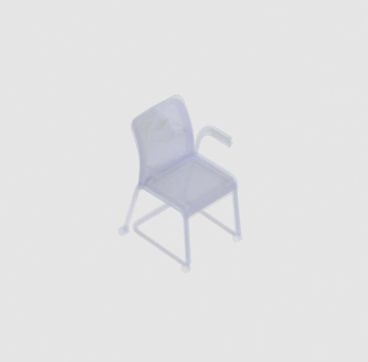
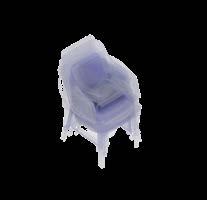
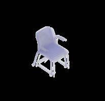
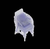
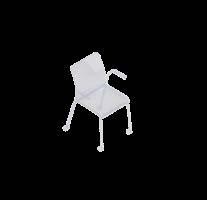
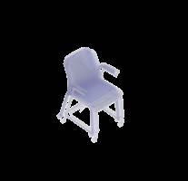
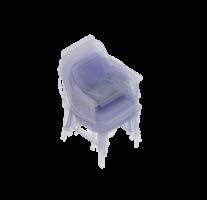
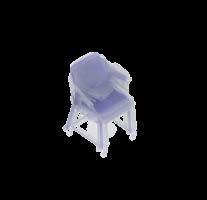
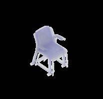
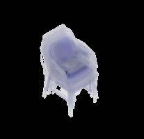
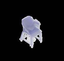
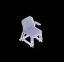
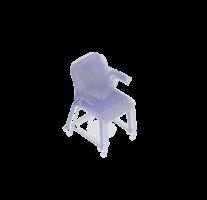
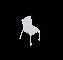
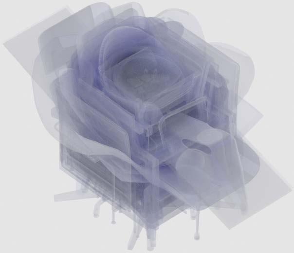
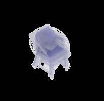
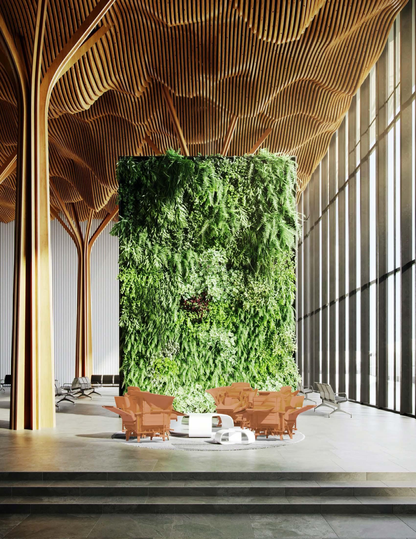
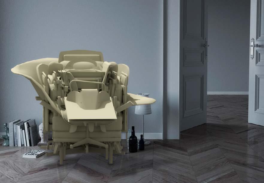
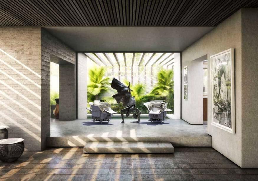
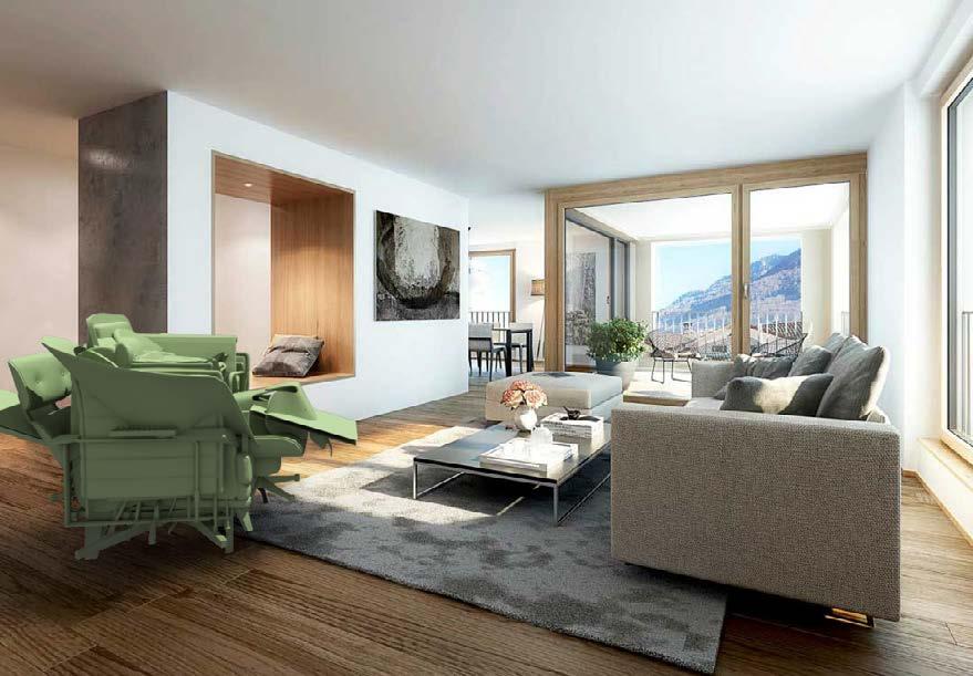
Chairish is a speculative project that examines the platonic ideal of the chair. Defined by its general form and function, the chair is a ubiquitous object in the built environment. Typically used to help signify scale, function and design intent in architectural imagery, the chair is an instantly recognizable yet highly variable object. Collection’s like Vitra’s chair library or Max Lamb’s 33 chairs constantly push against the accepted forms of a chair in favor of its essence.
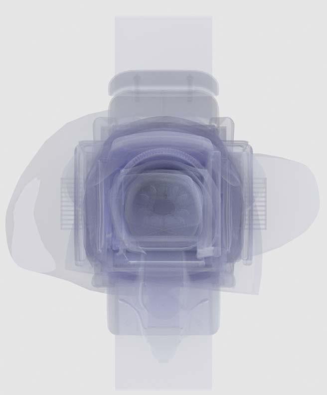
Looking a the digital archive, and specifically its designation of type, Chairish questions the form and function of a chair in the digital environment. Through an amalgamation of 3D models of chairs from open source sites, a hyperchair is created that neither looks nor functions like its individual components. Instead, small recognizable elements break out from the massy form, showing the mash up of unit to whole. Rendered entirely in one material, the hyperchair becomes an indicator of a digital world in which the object need not function for any other reason but aesthetics and scale.
Stacked Chair Axonometric


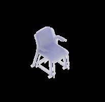
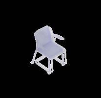

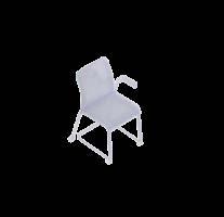



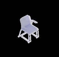
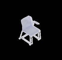
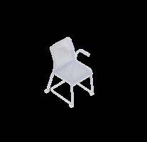


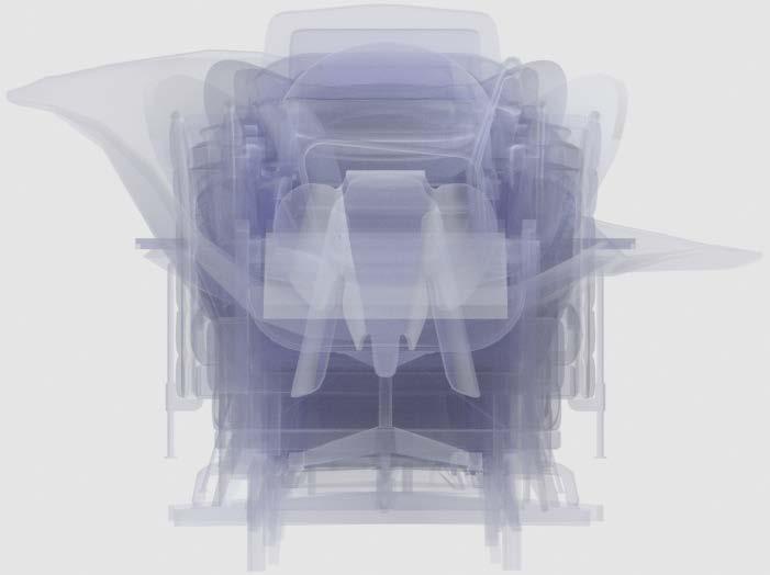
Stacked Chair Front Elevation
Stacked Chair Side Elevation
Stacked Chair Top View

Through social media, digital searches and the information age consumption, the image has become the standard when describing an object. An understanding of the built environment unfolds through google image searches and Instagram feeds. All slightly skewed from one another, the information of the experience remains relatively intact.
The project proposes to look at the relation of type and object through a two phase process. Starting at a domestic scale of known objects, the chair, the kettle and the cup, the process will be tested in a 2D and animated format. Ubiquitous in modern society, these three object types will begin to blur and distort based on the layering of their physical differences.
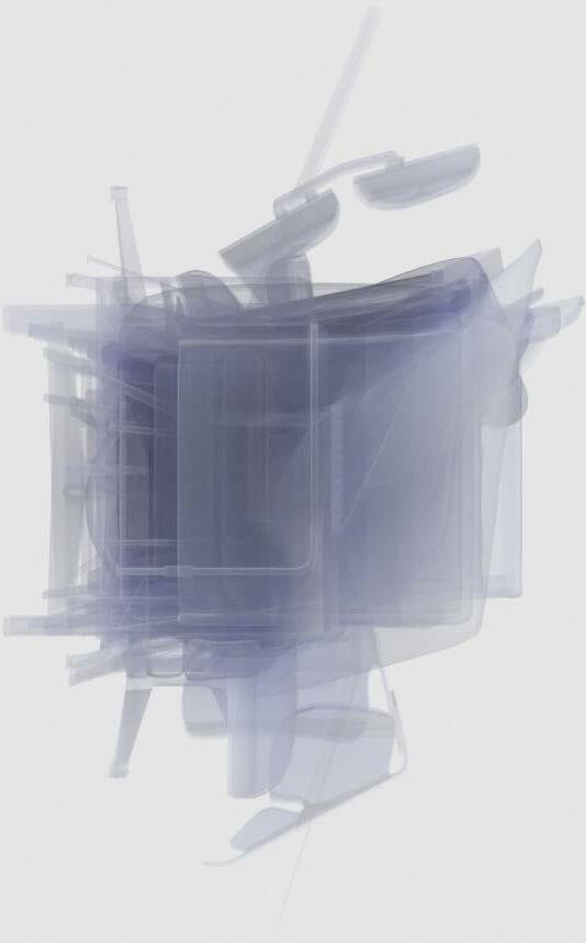
Harvesting the production of society to make a noisier approximation of the iconic objects which we believe to collectively understand and know, this project highlights the reality of the dislocation of the individual to the collective. By creating a fixed process on two different kinds of objects, the ubiquitous and the singular, connection between the idea of something to its perception can be better understood. There is a false notion that gathering more information on something will clarify its boundaries. This project looks to explore the static that is created through the amalgamation of said types and objects.


New York, New York
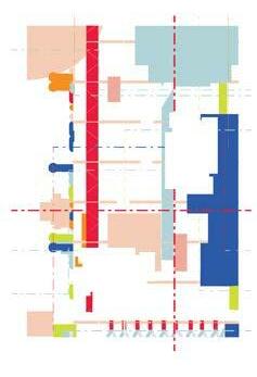
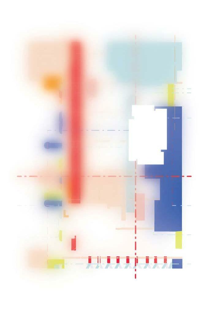
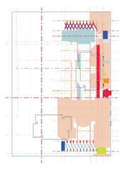
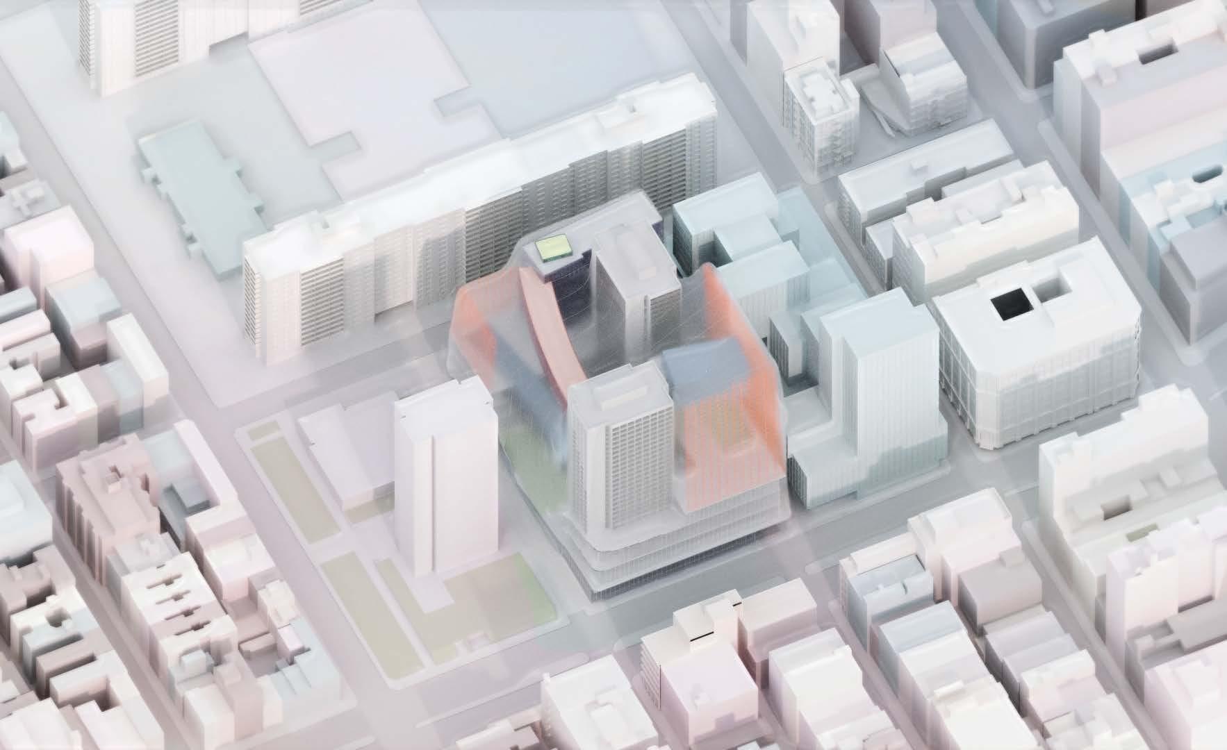
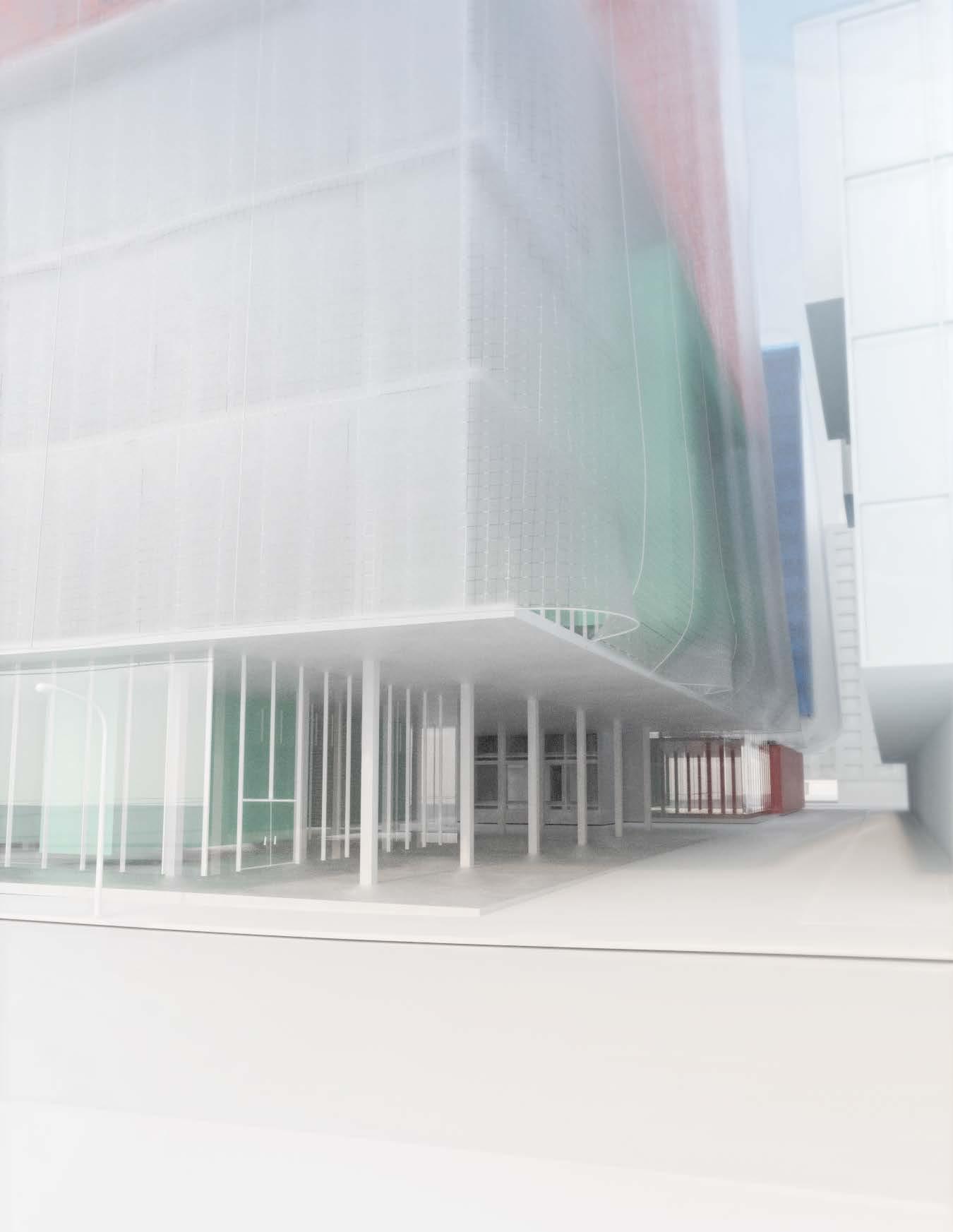
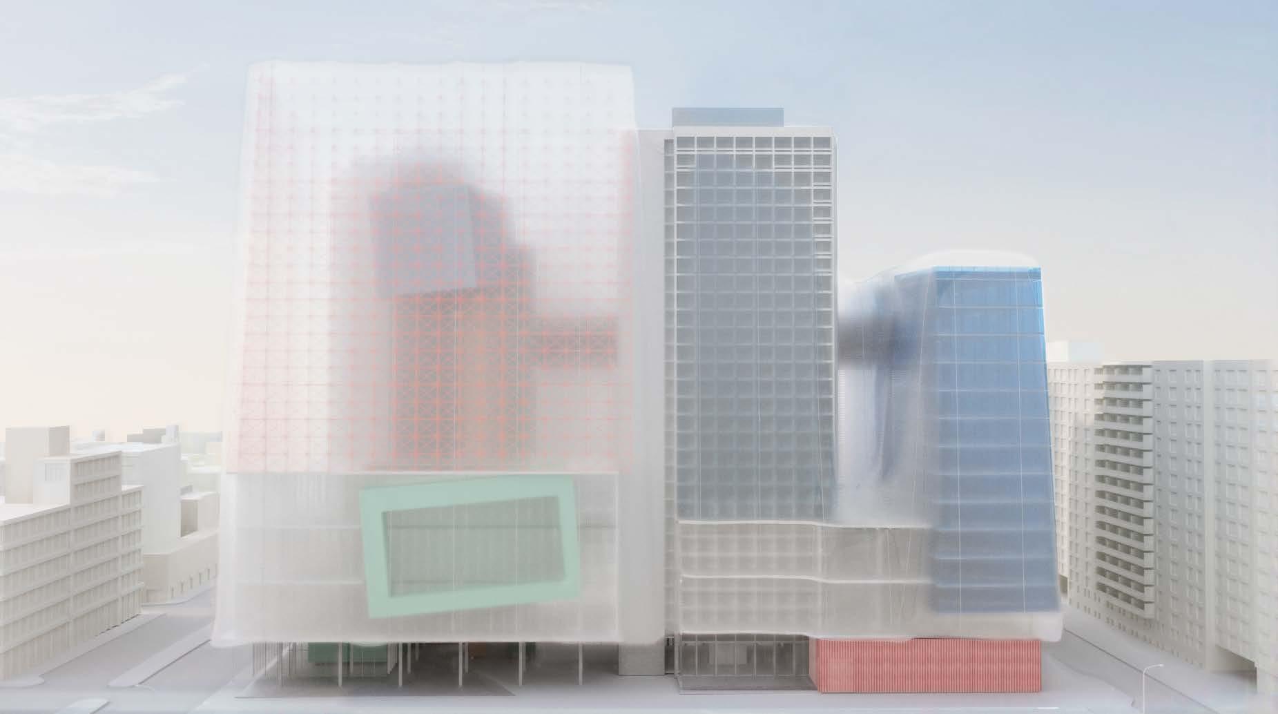
Blurred Icon delineates spatial complexity as the blurred boundary between entities. Gaussian moments of program, edge, color and scale juxtapose the clarity of New York City’s tight grid.
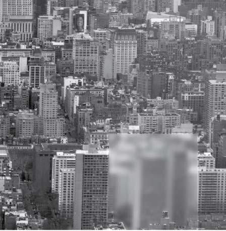
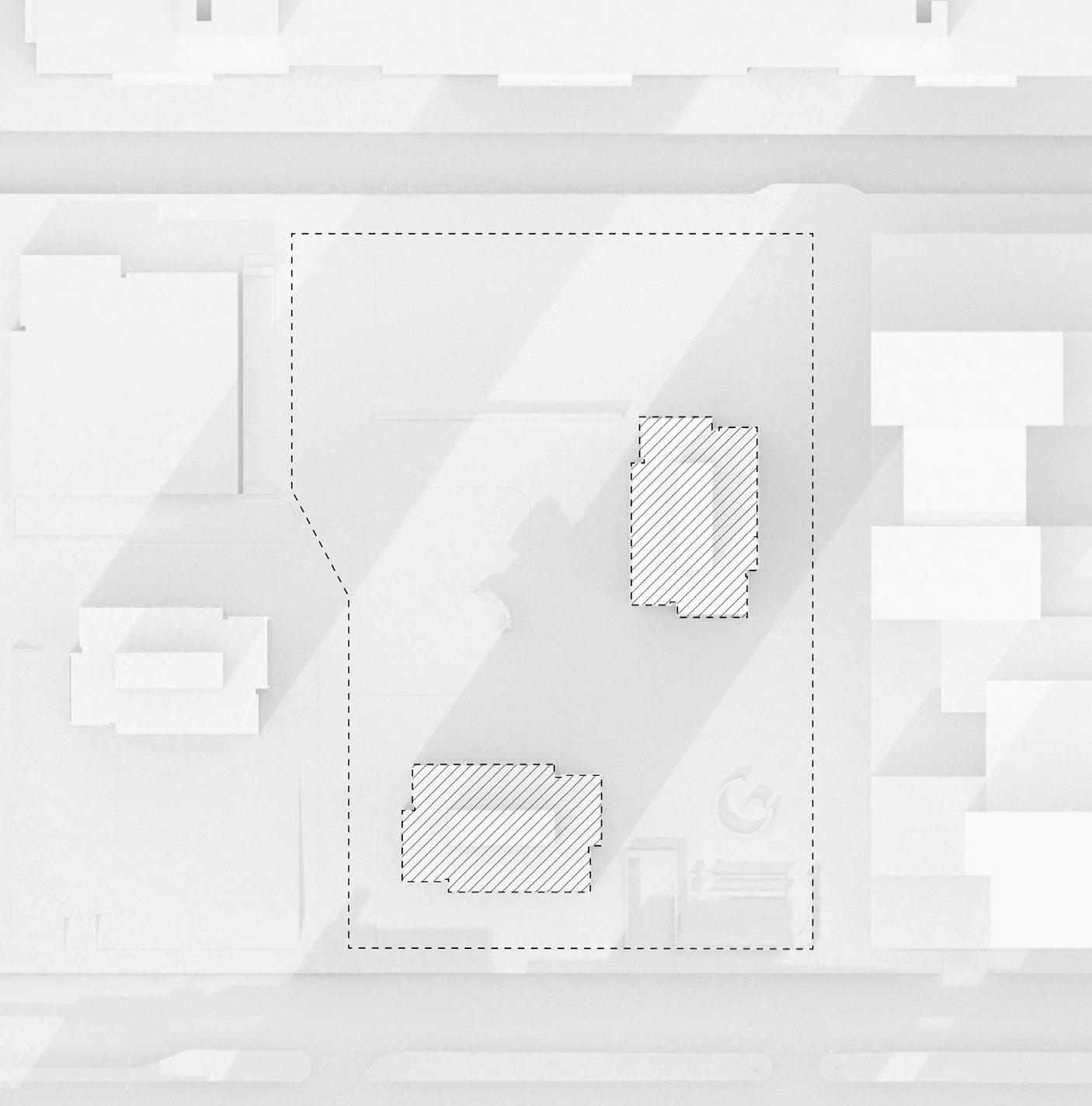
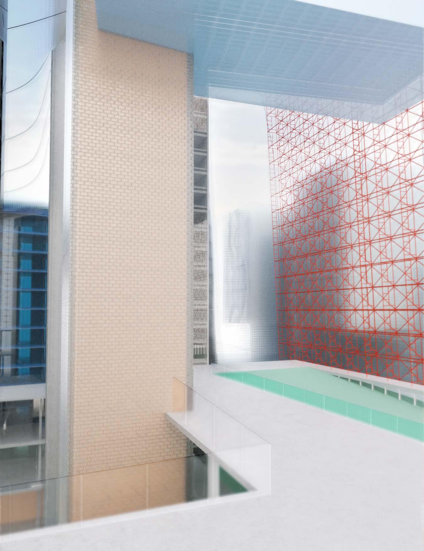
By layering existing facades and figure grounds, traditional architectural process is abstracted into a series of massed interventions that attach and cantilever off of the precedent Silver Towers, blending into an adaptive reuse project. Inner layers are arranged vertically, promoting upward movement towards the softness of blurred sky. Lightly draped portions contrast forms vacuum formed surfaces as delineation of the grid is reintroduced in scaffold and panelization of the drape.

Columbia University’s neoclassical plan identifies strong figural outlines that are organized by an overall gridded set of circulation paths throughout the campus. Juxtaposing rectilinear and rounded forms are combined to create a series of internalized garden spaces, protected from the density of the surrounding city.
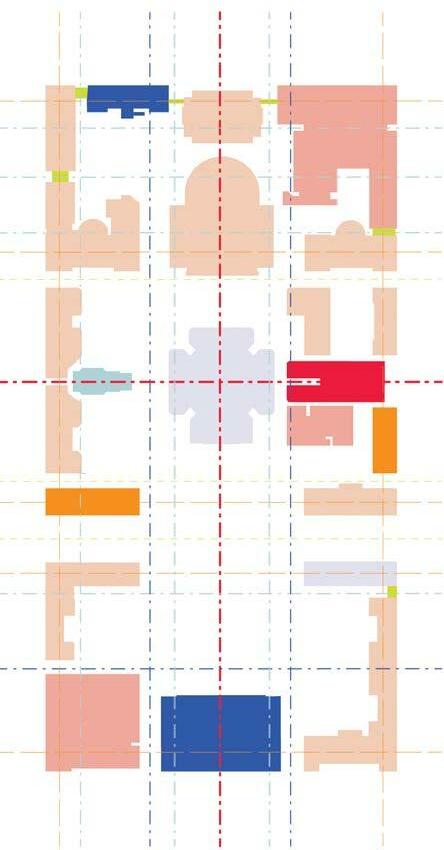
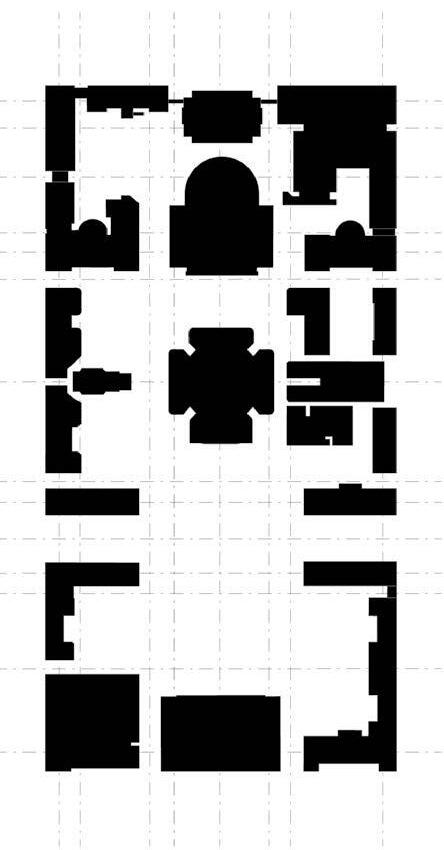
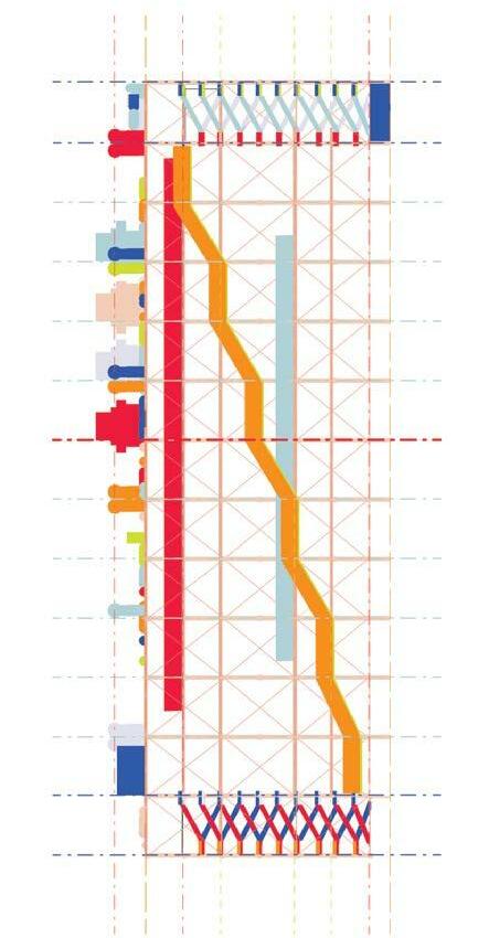
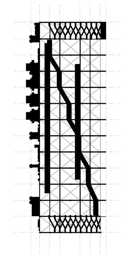
This elevation study looks at Centre Pompidou’s complex layered facade as precedent for the strategic intervention and organization of discrete elements within a planar surface. Site analysis places this as the antithesis of Columbia where rigid grid is maintained- Paris is ignored in favor of organized chaos.
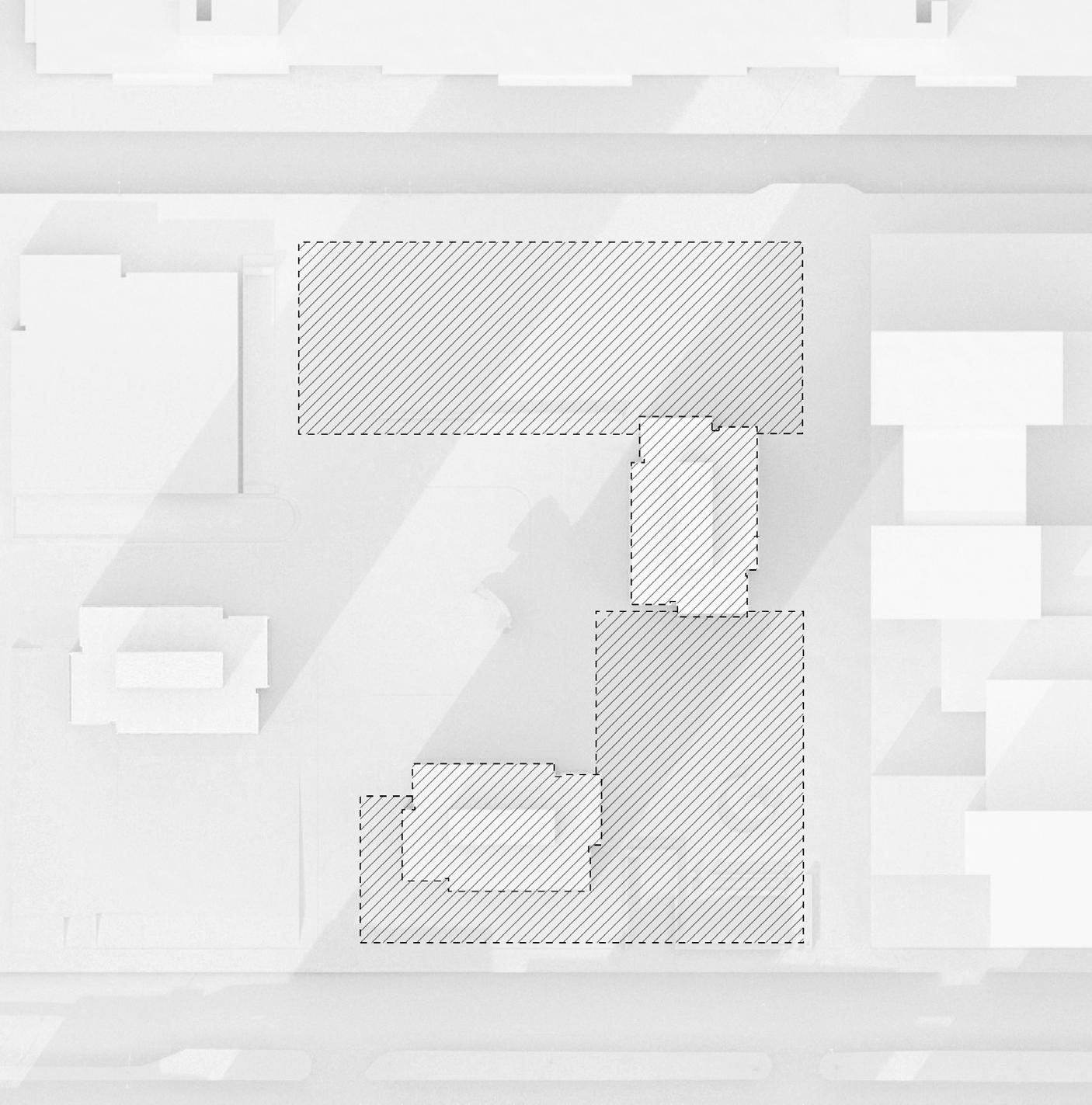








Site Grid from Southern
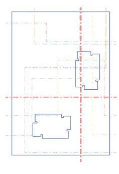
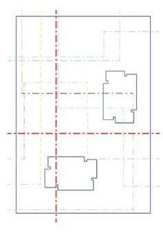
Grid from Western Facade
Ground Proposal
Eastern Facade
Figure
Overlay
Blurred
Blur is introduced at multiple scales and functional portions of the project. Here program boundaries are abstracted and melted into one another to enhance the mobility and visibility of the collaboratively focused university.

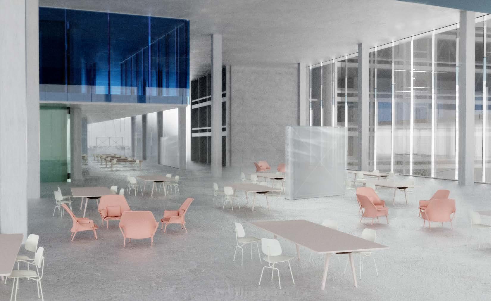

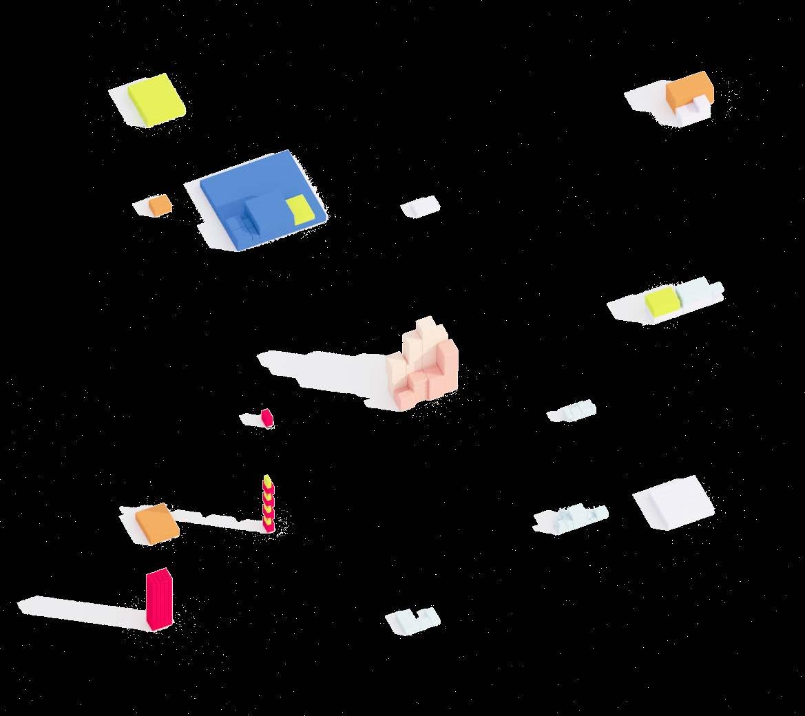
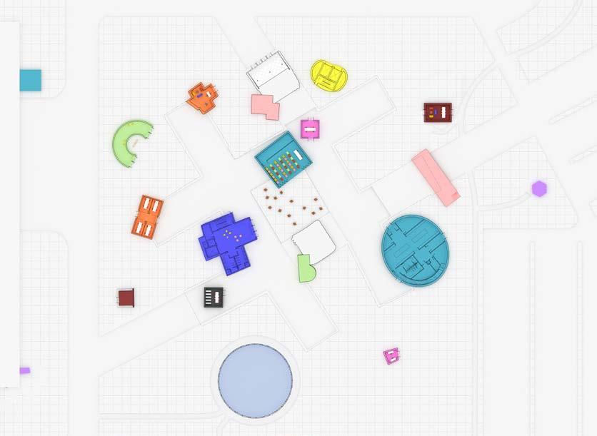
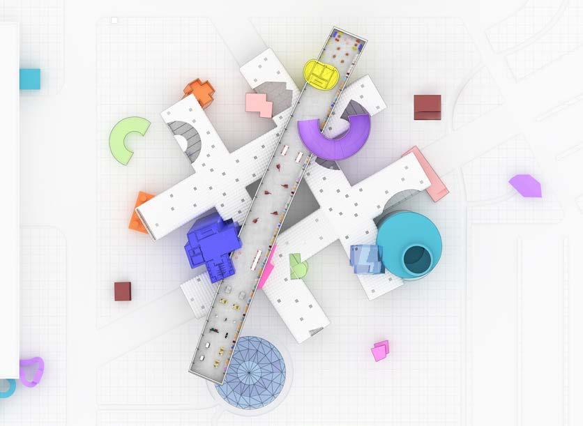
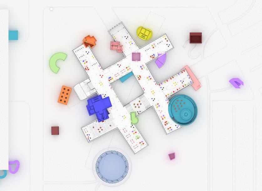
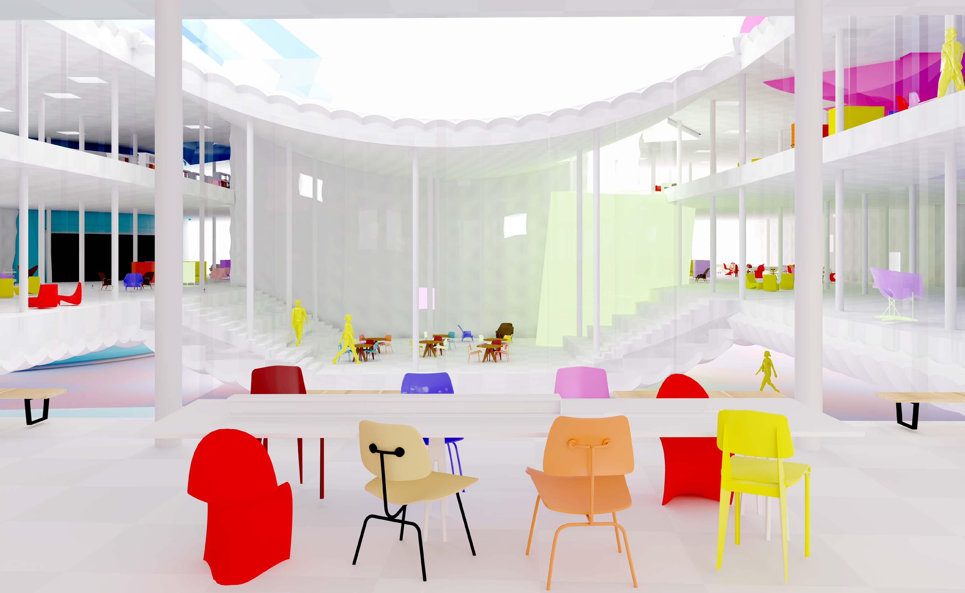
In the post COVID-19 era, concerns for the future of the office have come into question. Contributors to the Vitra Summit argue that the personal desk is dead, as most individual tasks can be done at home. Instead, in the new office, collaboration and flexibility is the essential task. Examining this idea, especially for a brand like Vitra who often works with outside designers, the relation of design and games, or play became the main focus of the project.
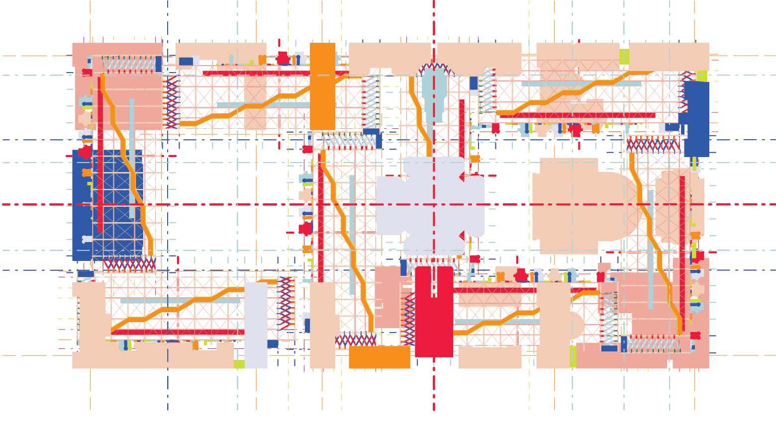
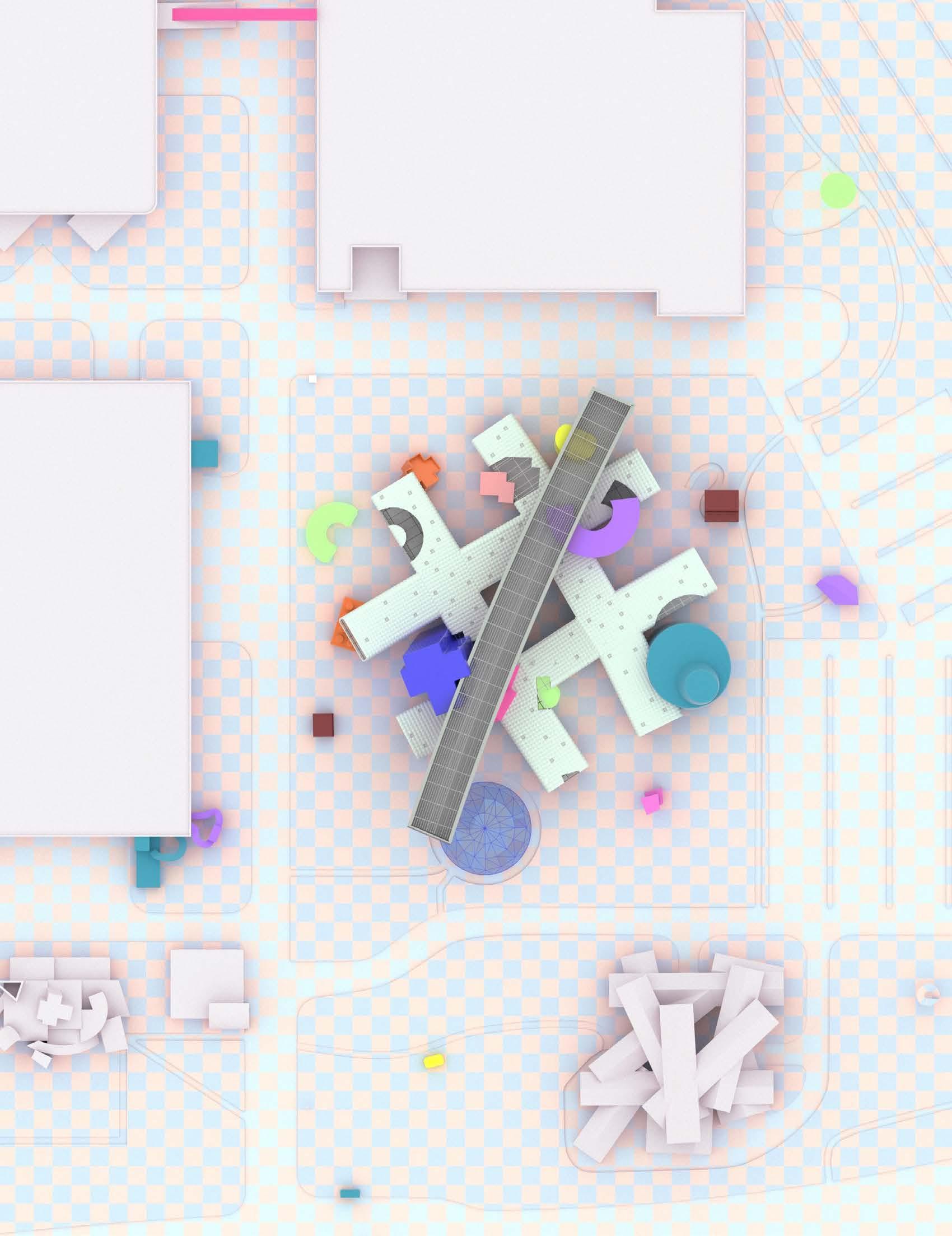
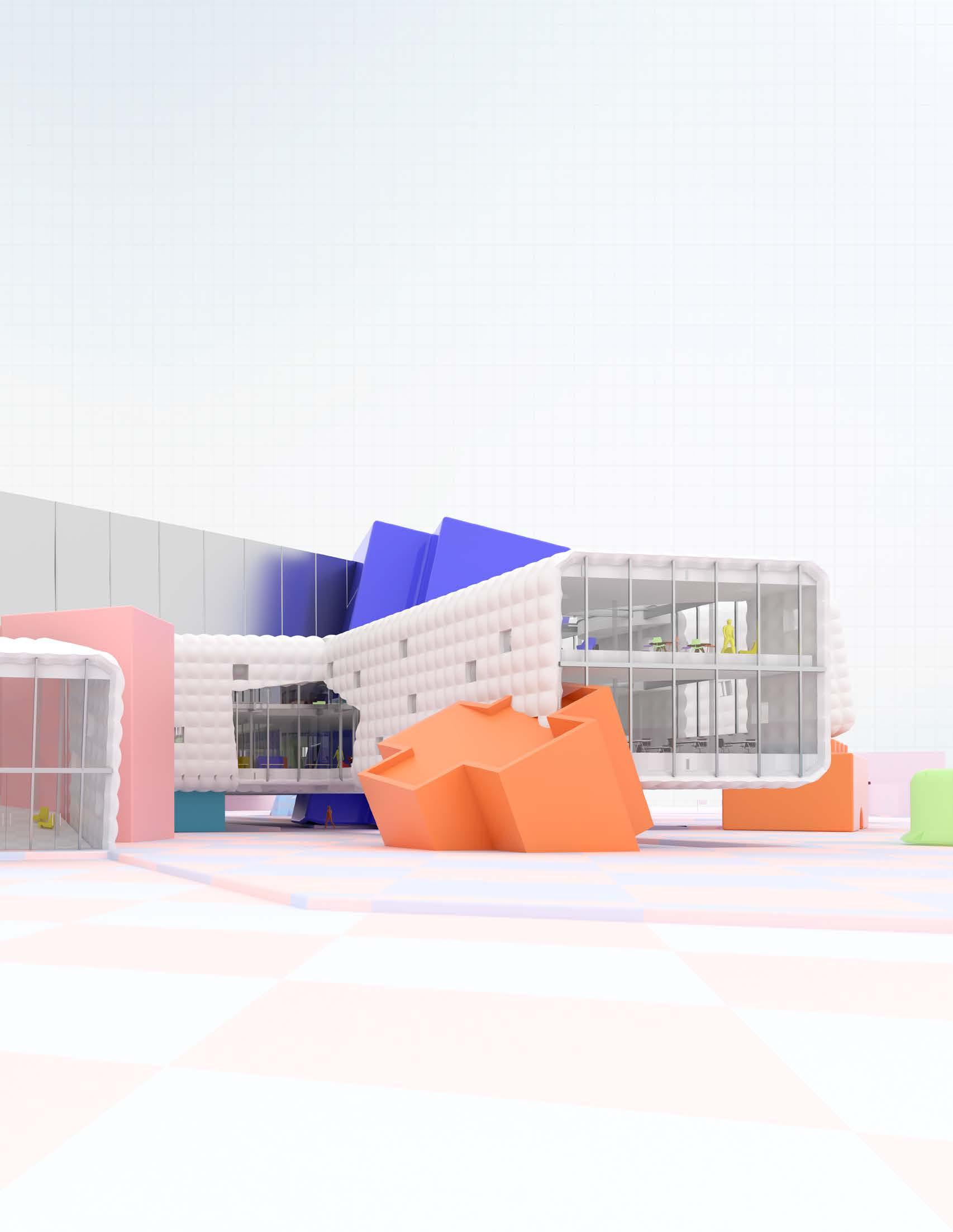
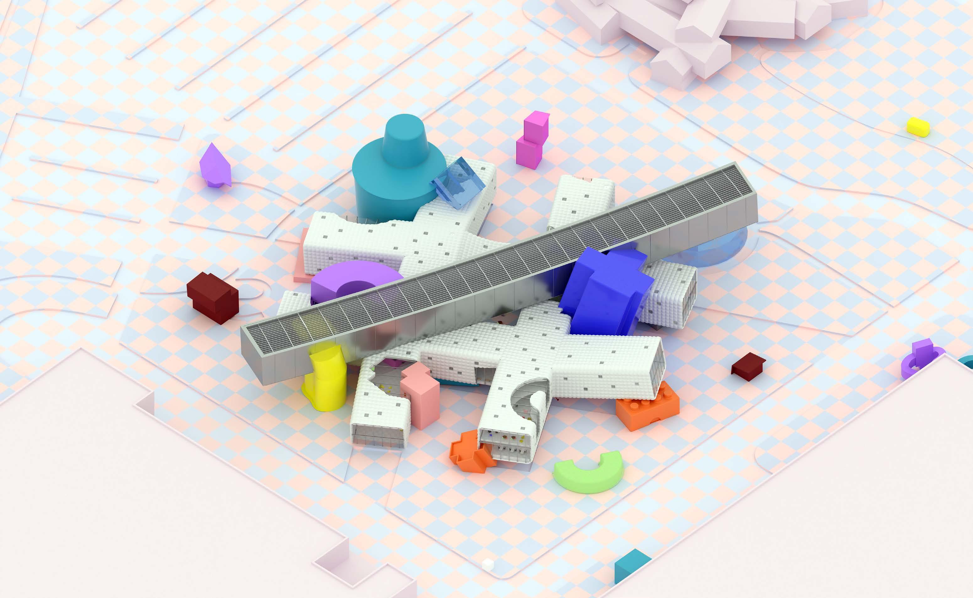
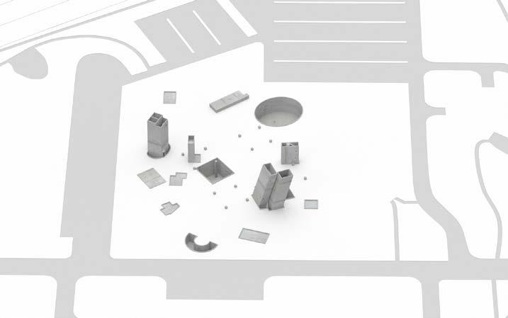
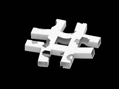
Leaning into the organized looseness of play, Tic Tac Toe respects and breaks the homogeneous/heterogeneous divide. Using physical games as a means of design, relational references to homogeneity (rules/order) and heterogeneity (looseness/breaking) become the main signifiers. The Gameboard is realized as a series of intersecting, oversized hallways. This allows the space to become a decentralized field of flexibility with moments of highly specialized functions sprinkled throughout.
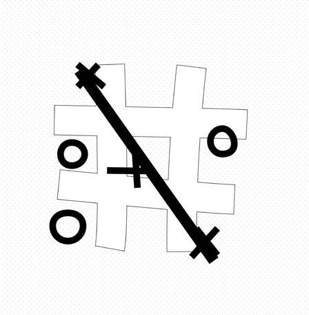
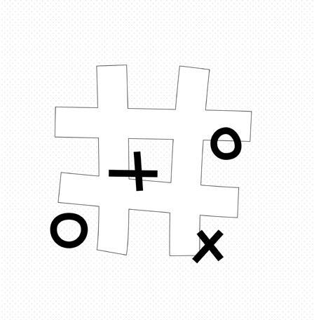
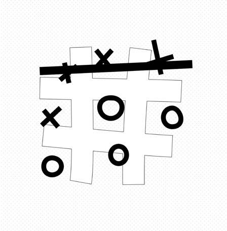
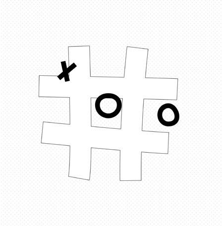
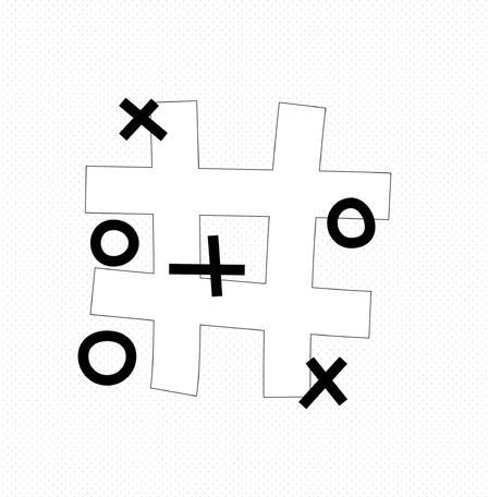
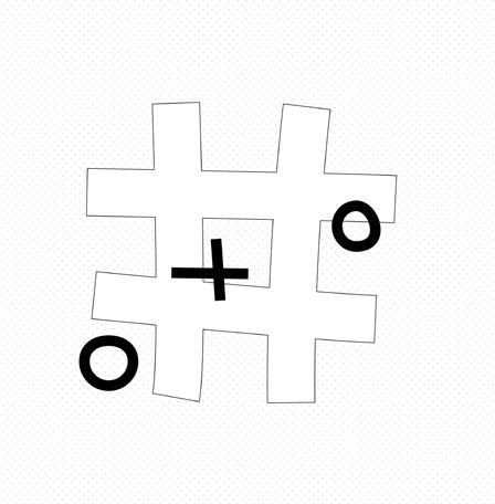
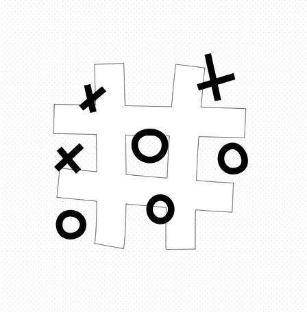

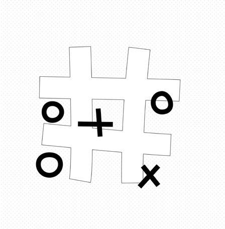

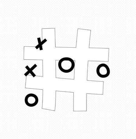
Serving as structure and framework, the relaxed grid is infilled, supported and cut by game pieces. Heterogeneous in nature these game pieces sprinkle the landscape creating a varied procession throughout the site. Splayed between the Vitra Haus and rectilinear factories, its placement is skewed from the implied grid of the site. Buckminster Fuller’s dome is collected into the site composition, implying that smaller pavilions and objects on the site might resemble game pieces themselves. Propped off the ground by oversized building blocks, the ground condition acts as a series of pavilions accessed from outside.




Alloy 5052 is a non-heat-treatable 2½% magnesium, 0.25% chromium alloy commonly available in flat rolled coil, sheet and plate from a wide range of producing mills.
Like all the 5000-series high magnesium Alloys 5052 has a fairly high strength and is hardenable to a significant degree by cold working, enabling a series of “H” tempers.


Alloy 5052 is also produced as a treadplate (also known as chequer plate) with mainly industrial applications. Stucco finish sheet is produced typically in 1.0 –1.5mm thickness. The alloy is also produced as drawn seamless tube, wire and bar and foil, available on indent from Atlas. Corrosion Resistance Excellent in a wide range of atmospheric environments, in food and architectural applications and it is also acceptable in many marine environments.


Cladding


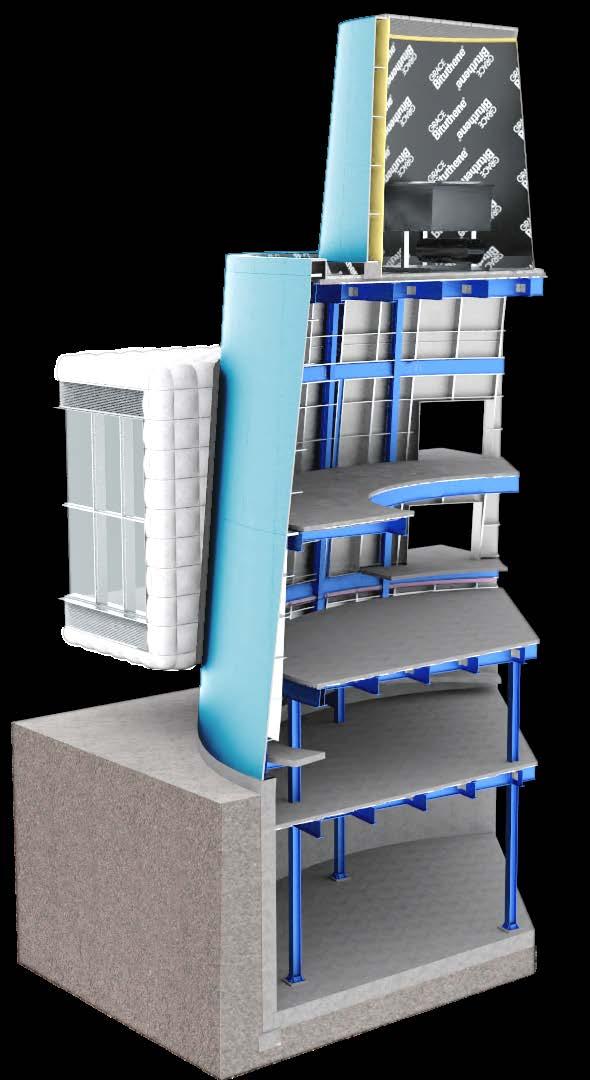
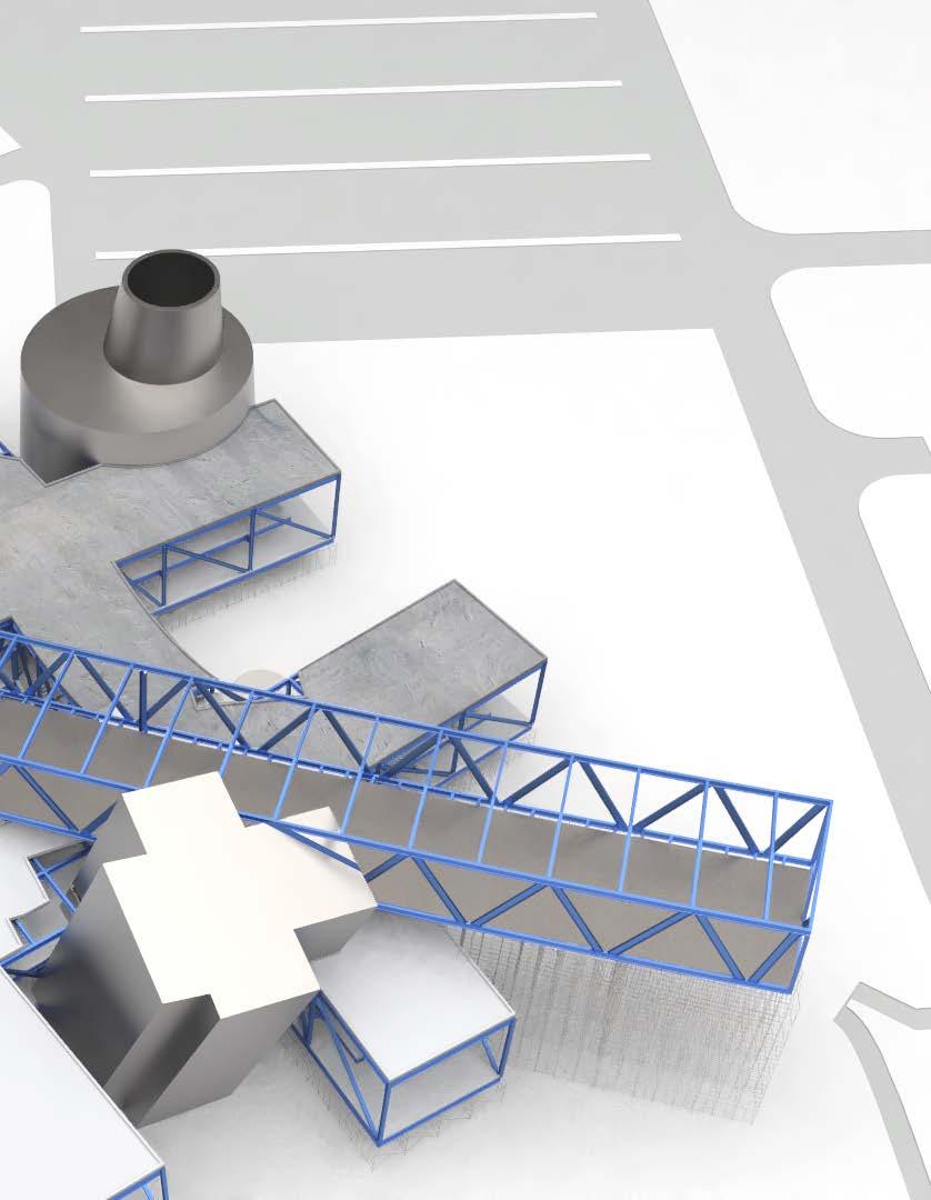
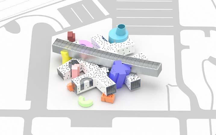
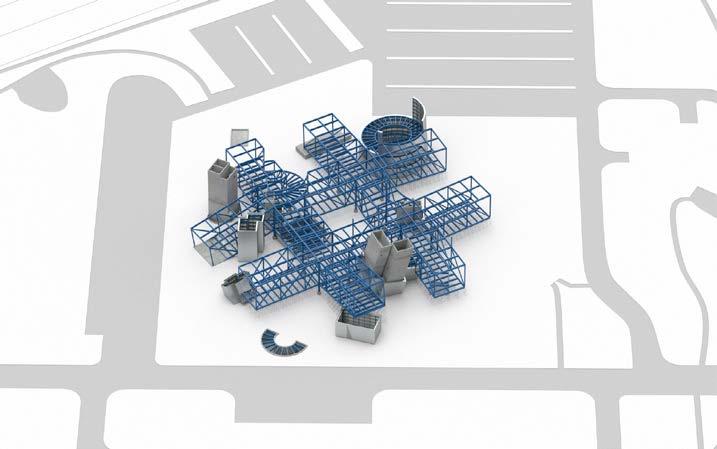
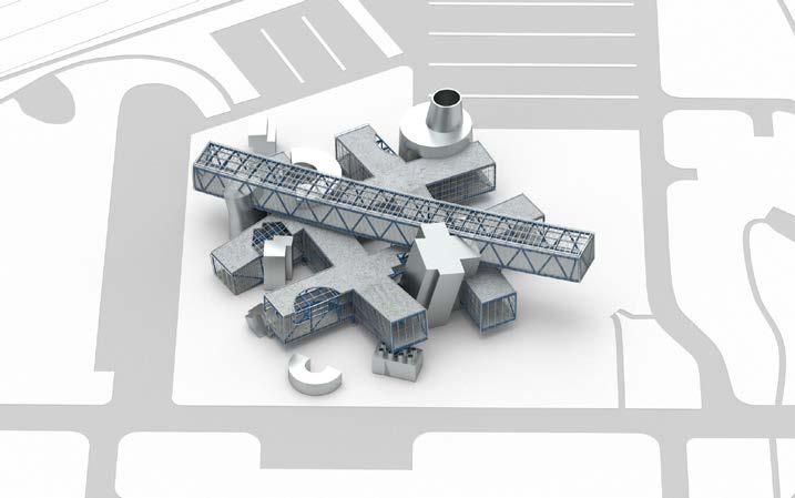
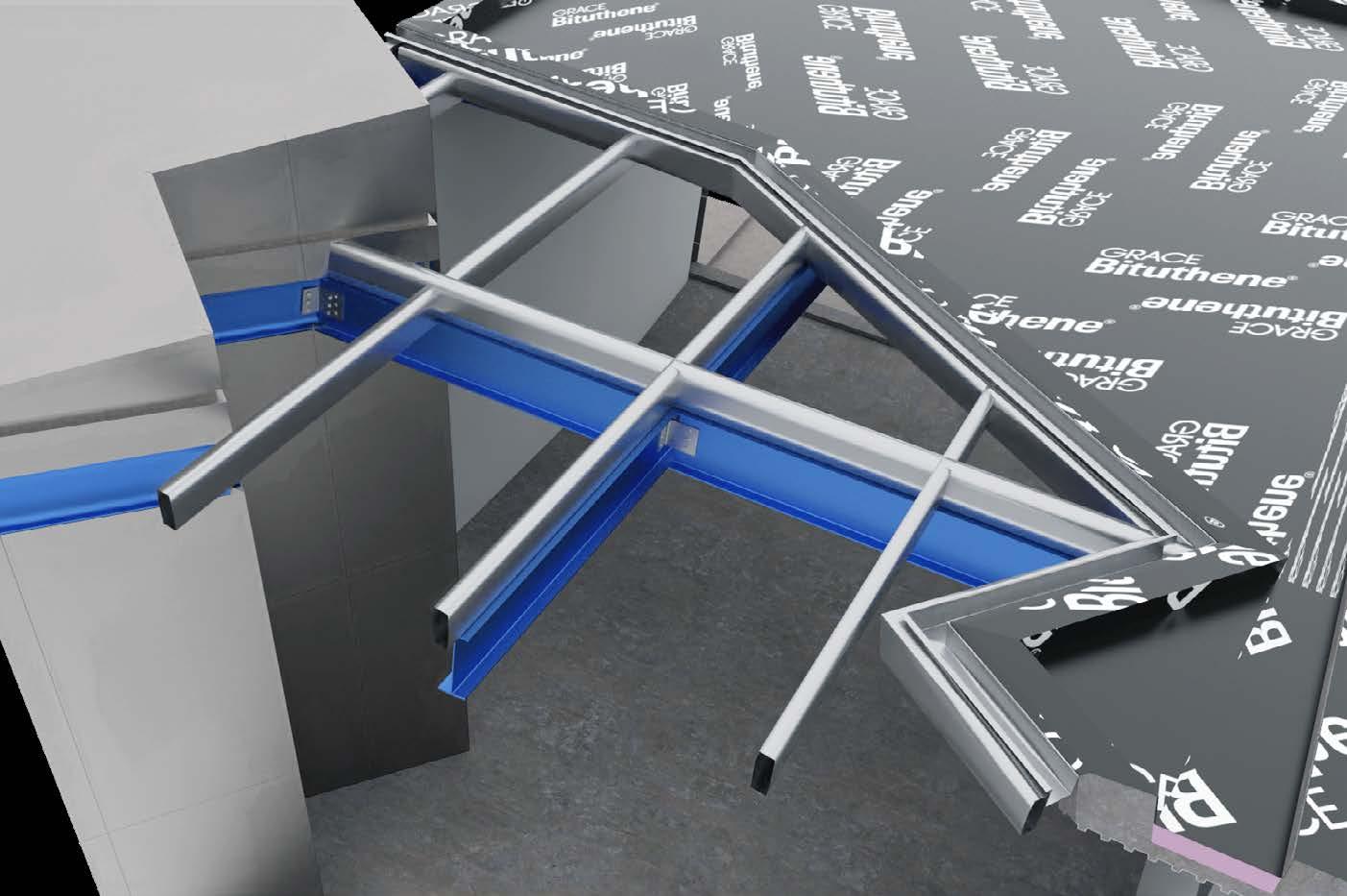
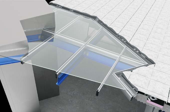
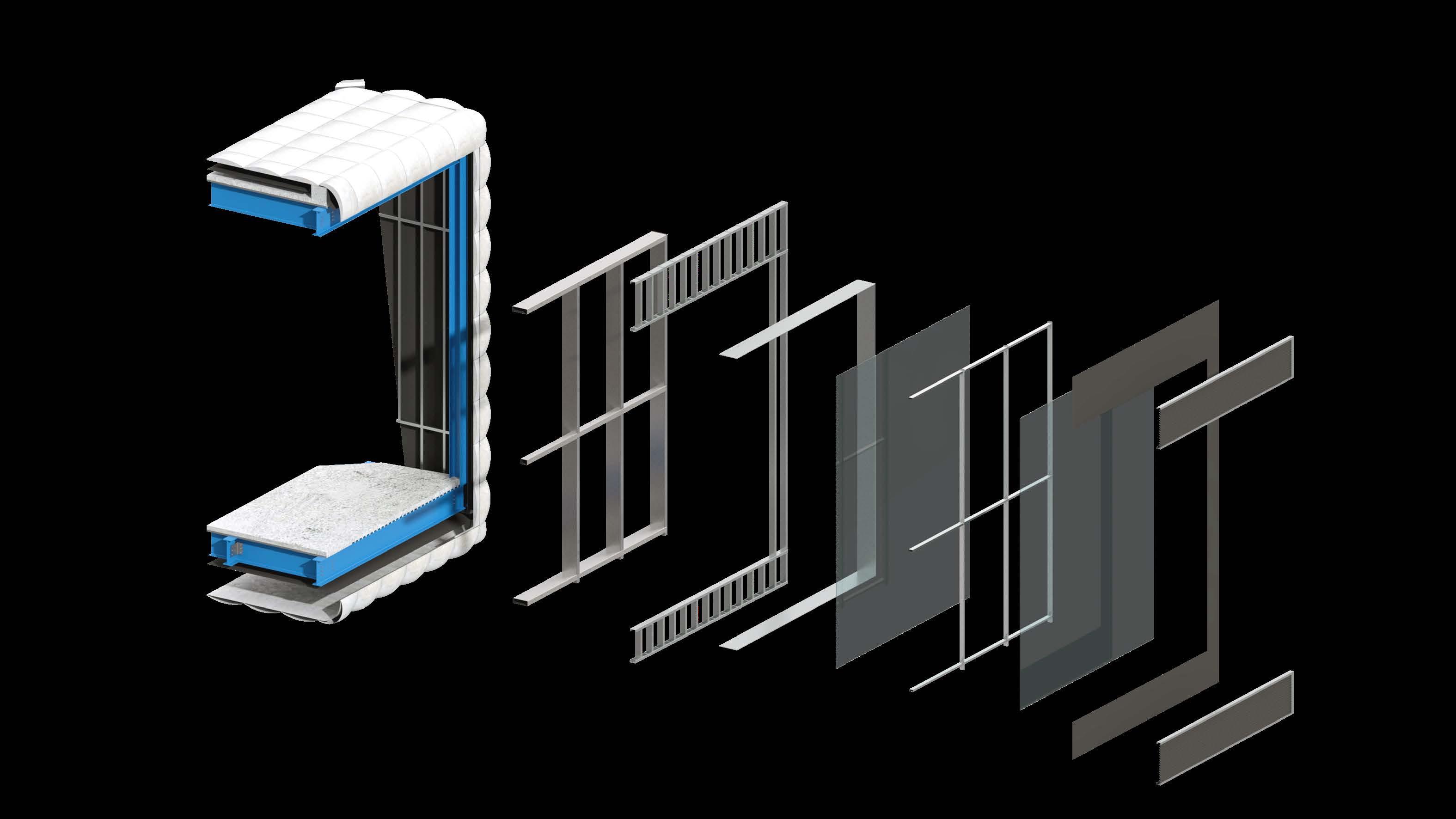
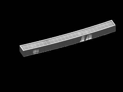
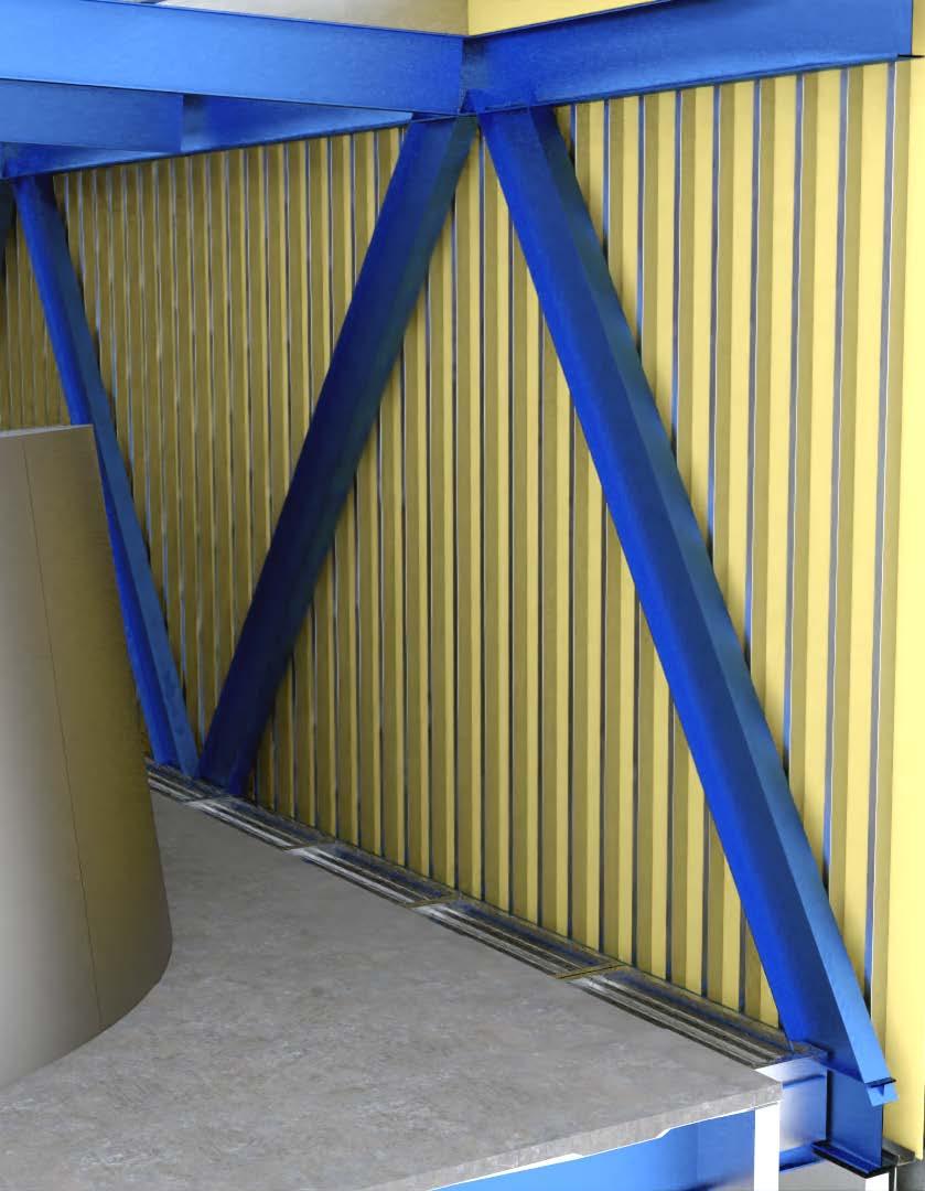
Broken into a series of views within the animated sequence, construction is separated into parts to understand the complexity of undertaking a project at this scale. From excavation to structural base to exterior skin, each element is detailed and modeled to properly estimate the implications of this construction model.


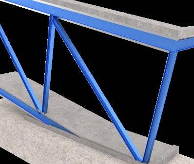
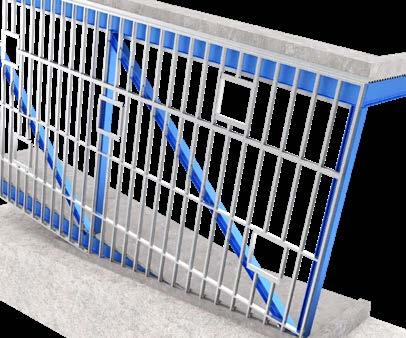
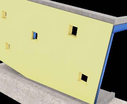
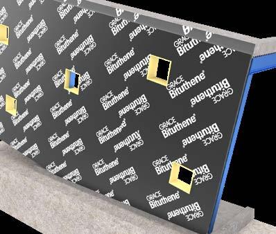
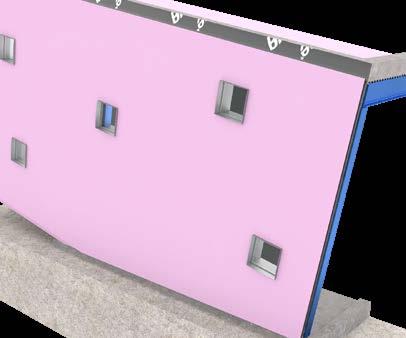
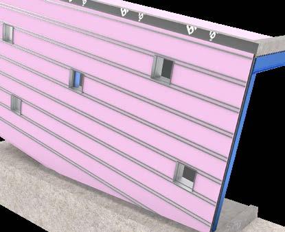
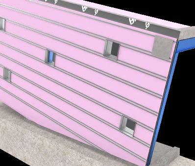
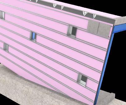
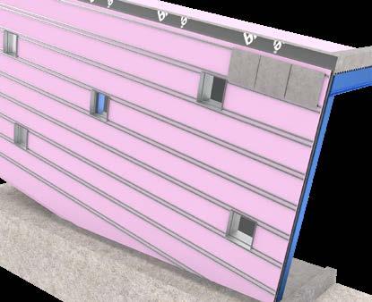
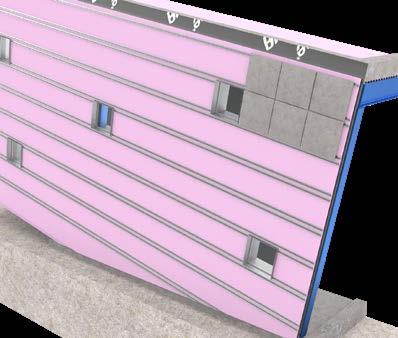
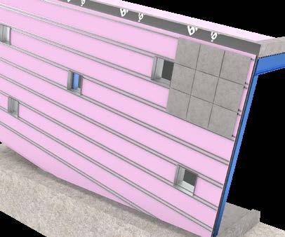






WATERPROOFING
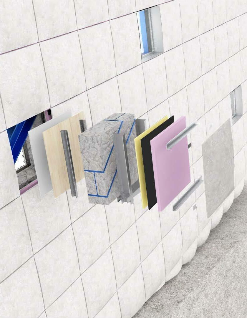


THERMAL
SUSPENDED
Suspended






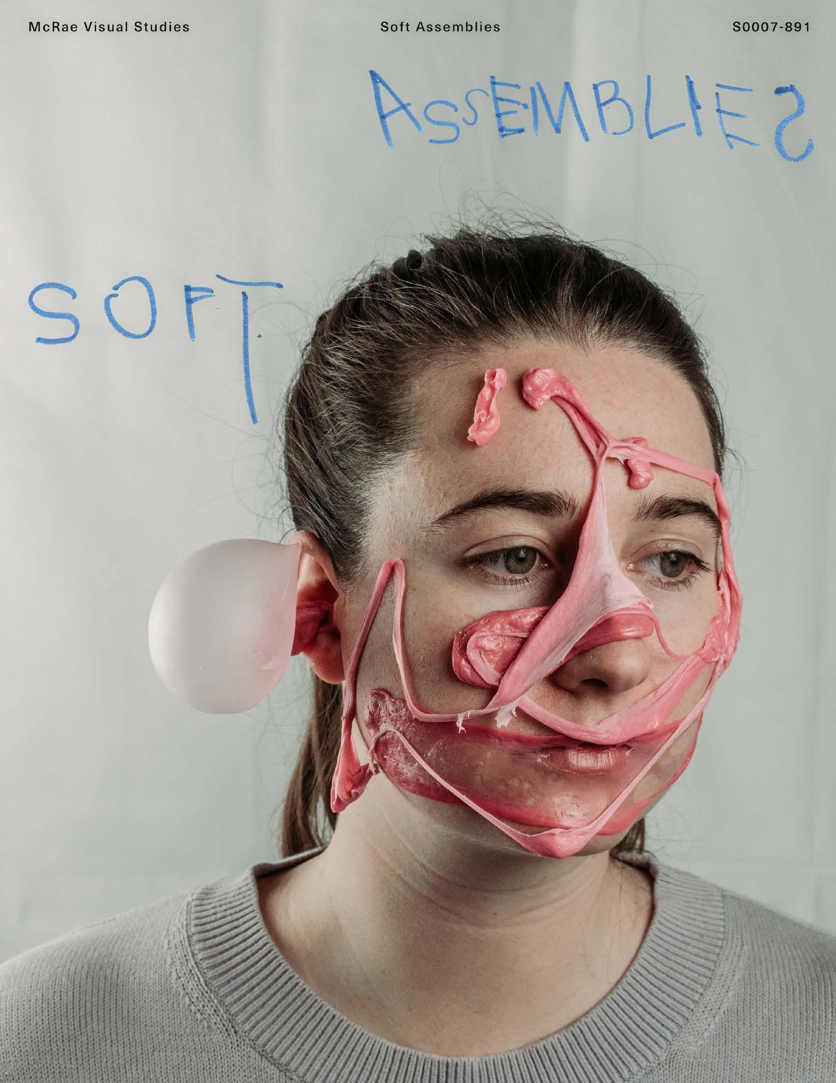
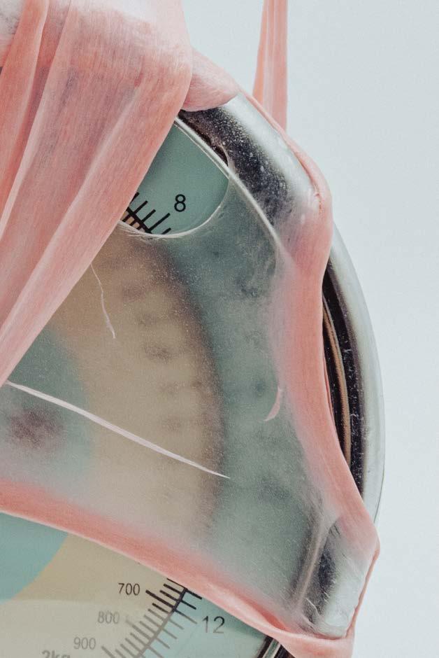
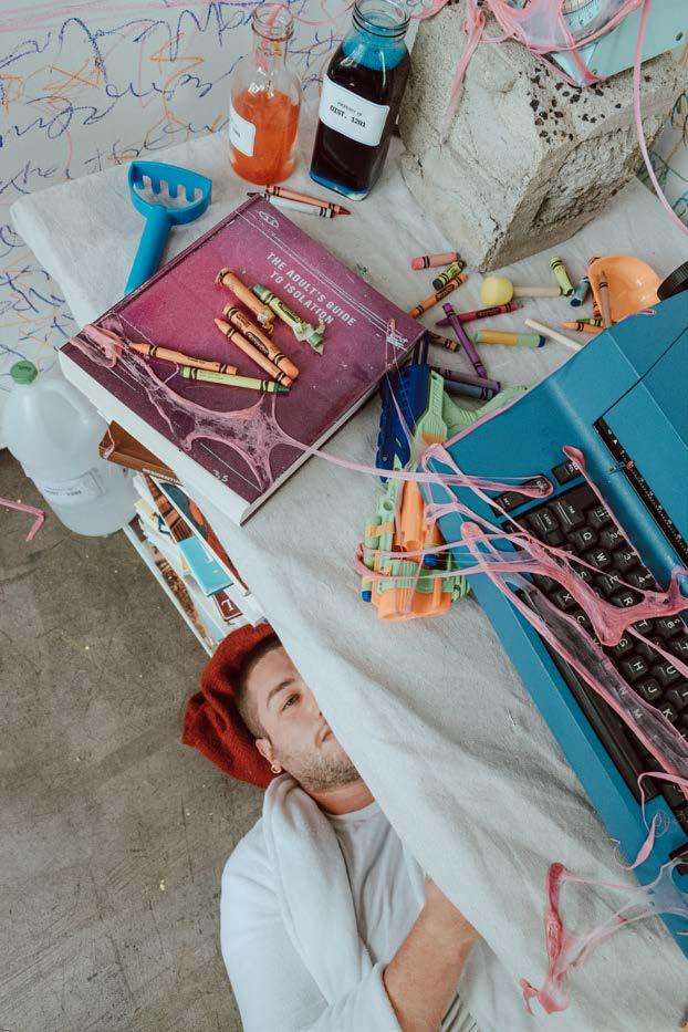
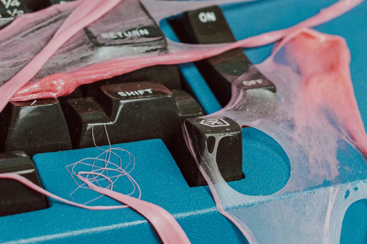
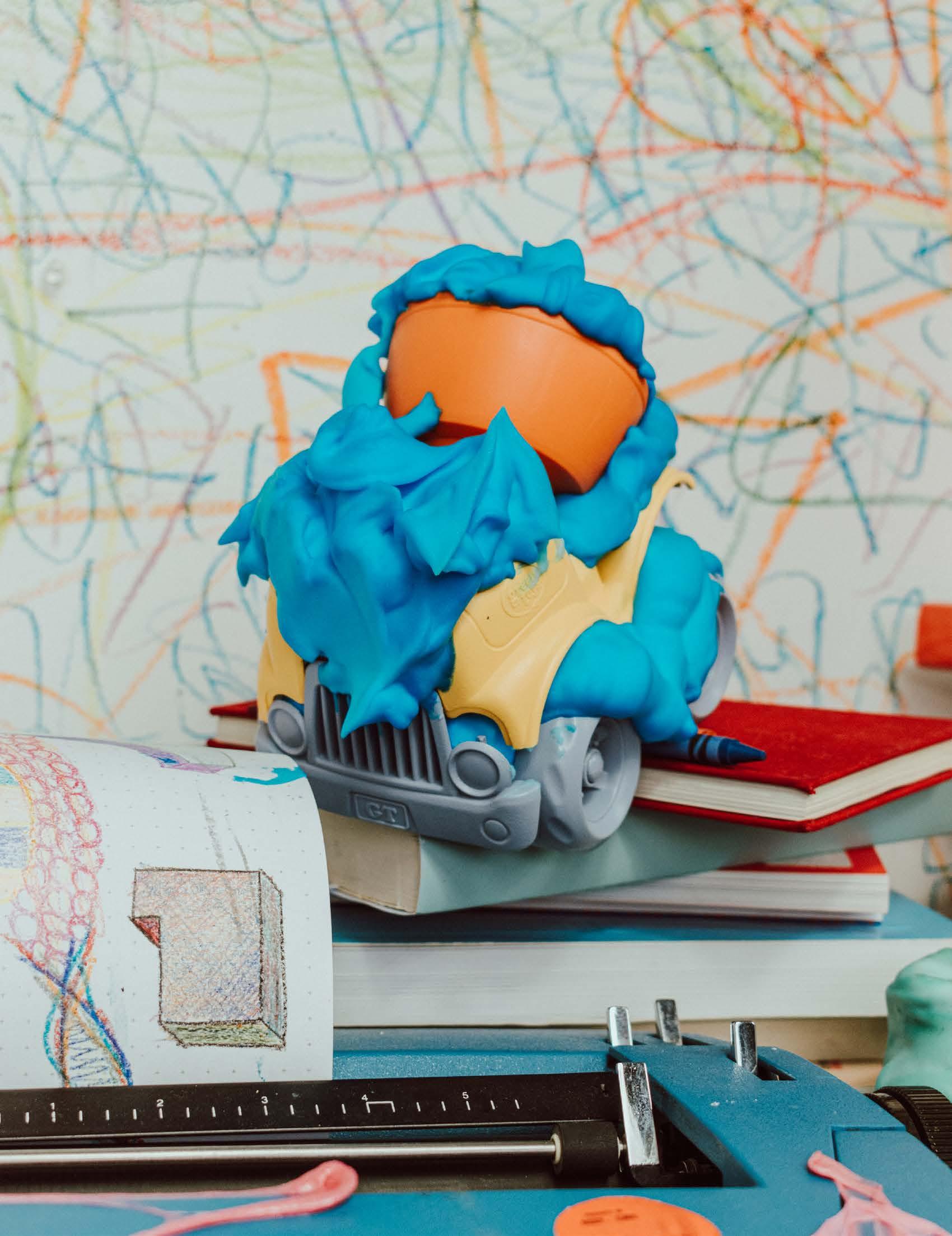
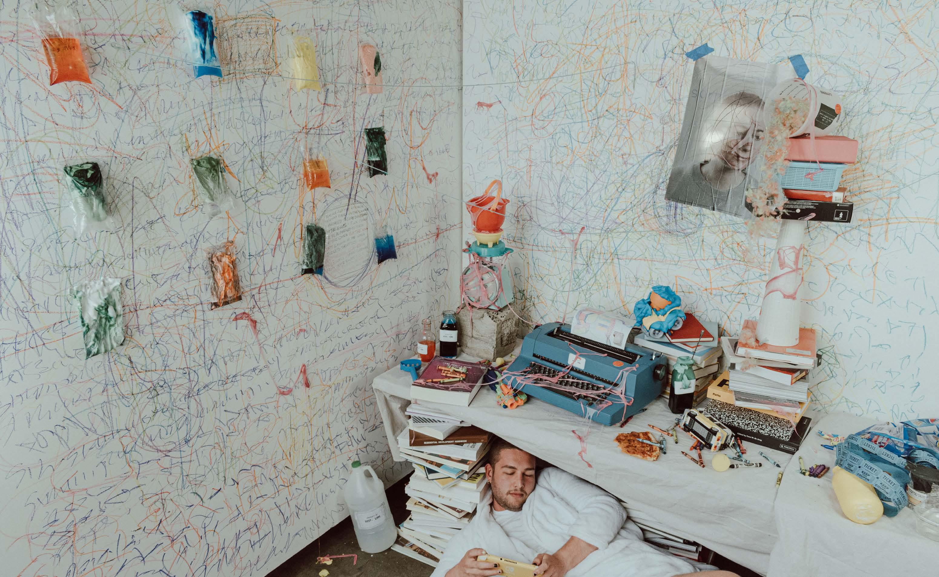
33 years ago the kitchen caught on fire. In the scramble I managed to grab everything, but the eggs fuck I really should’ve remembered to turn off the oven. But the knobs kept laughing at me when I turned them so I quit. Once the smoke cleared I found my gum bucket hidden beneath the floorboards totally intact. My chewing is a real talent. I mean working from home sucks so I make experiments in my free time. My cat is giving me weird looks cause yesterday i took a food scale out of the dumpster and covered it in pink sinuous gum.
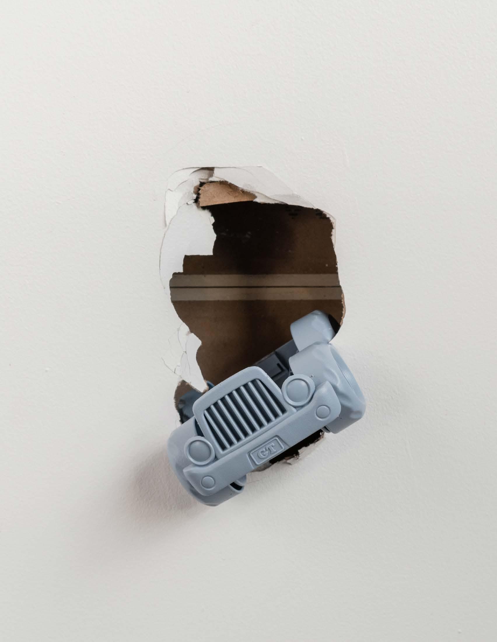
And then I decided to destroy all my old toys and fill them with shaving cream. It’s a commentary on inequality really. Half of the time I wonder why I keep saying half of the time but then I realized I got it from my neighbor who is obsessed with astrology and keeps telling me all my experiments are manifestations of my gemini energy.
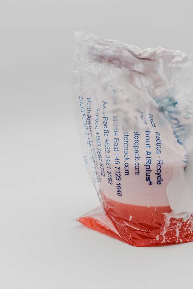

This might be proving her point but the last time she yelled at me she was wearing a mesh frock and a bunch of gum so she really shouldn’t throw stones from her glass house. My mother says she wants me out of her basement by noon tomorrow.

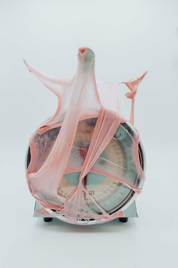

I bet if I gifted her the orchid that I killed the other day she would change her mind, something is growing in the house though. Must be the can of shaving cream I poked a hole in this morning. Good luck cleaning that one up.
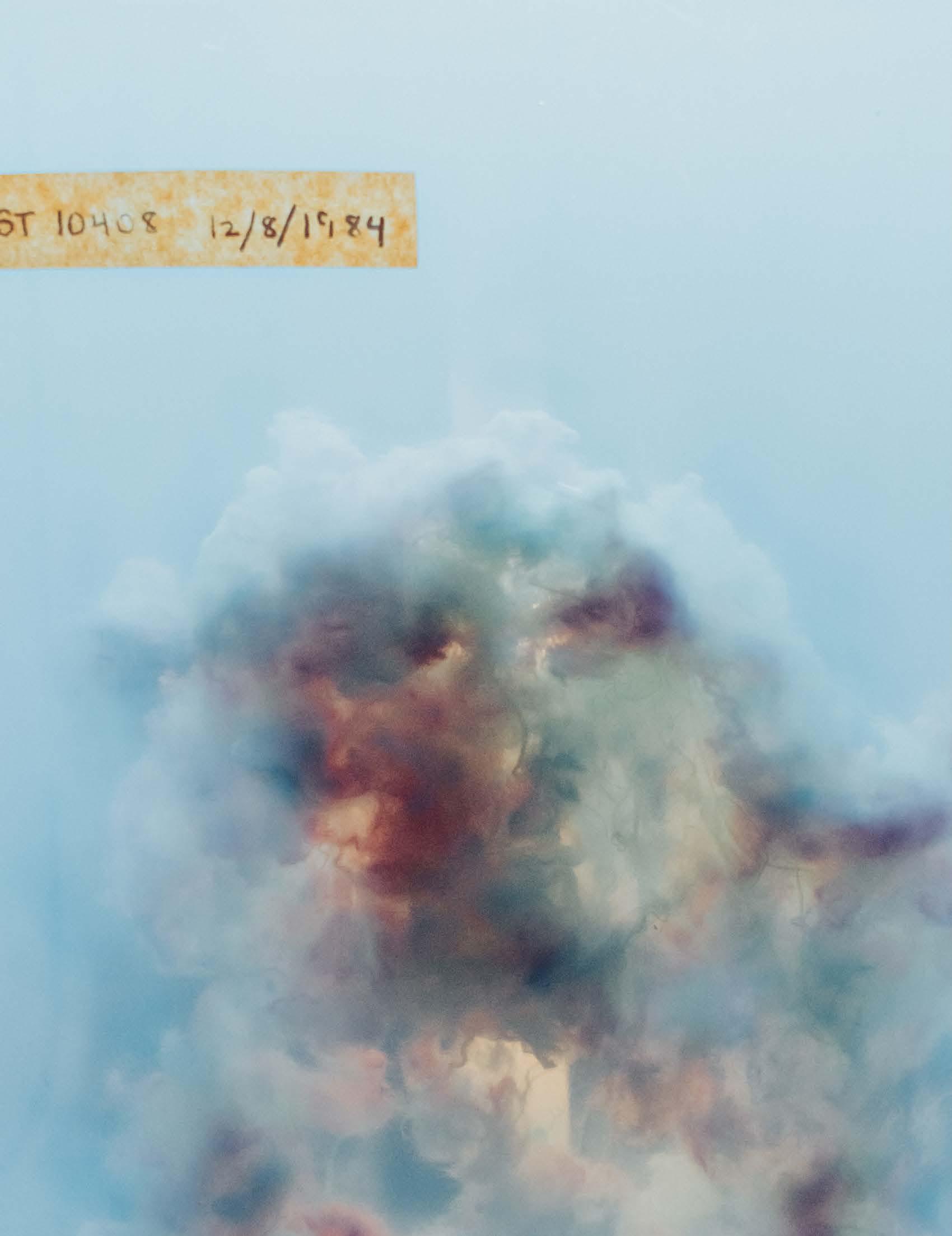




Half of the time I’m convinced I can say anything in these portfolio blurbs because the architectural mind lacks the imagination to read something fully, but then again who am I to judge I just put gum on my imaginary girlfriends face. We should probably check that gas leak huh? I’m feeling a little woozy.
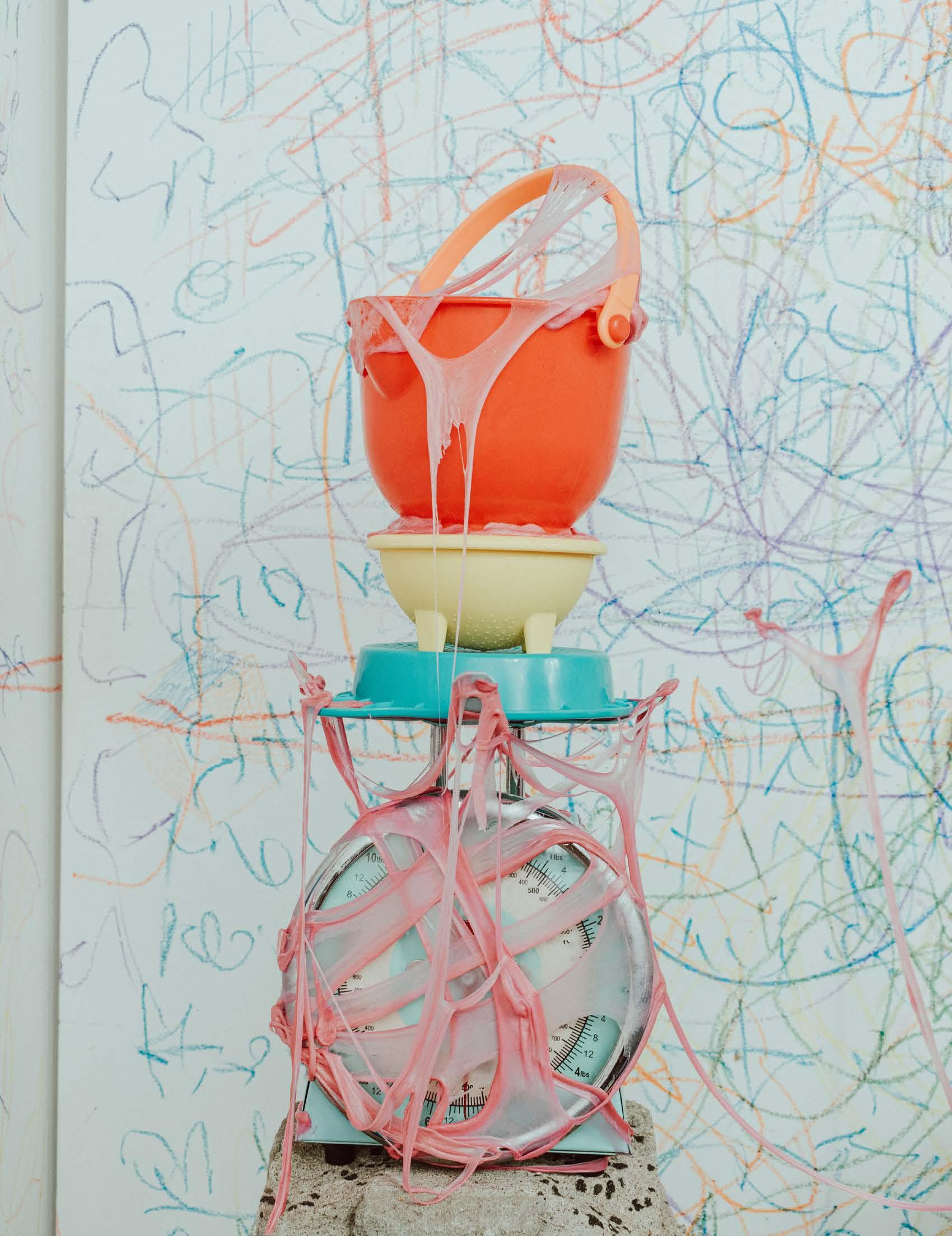
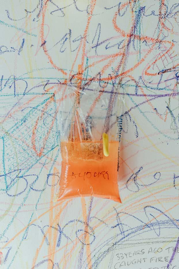
Fall 2020
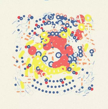
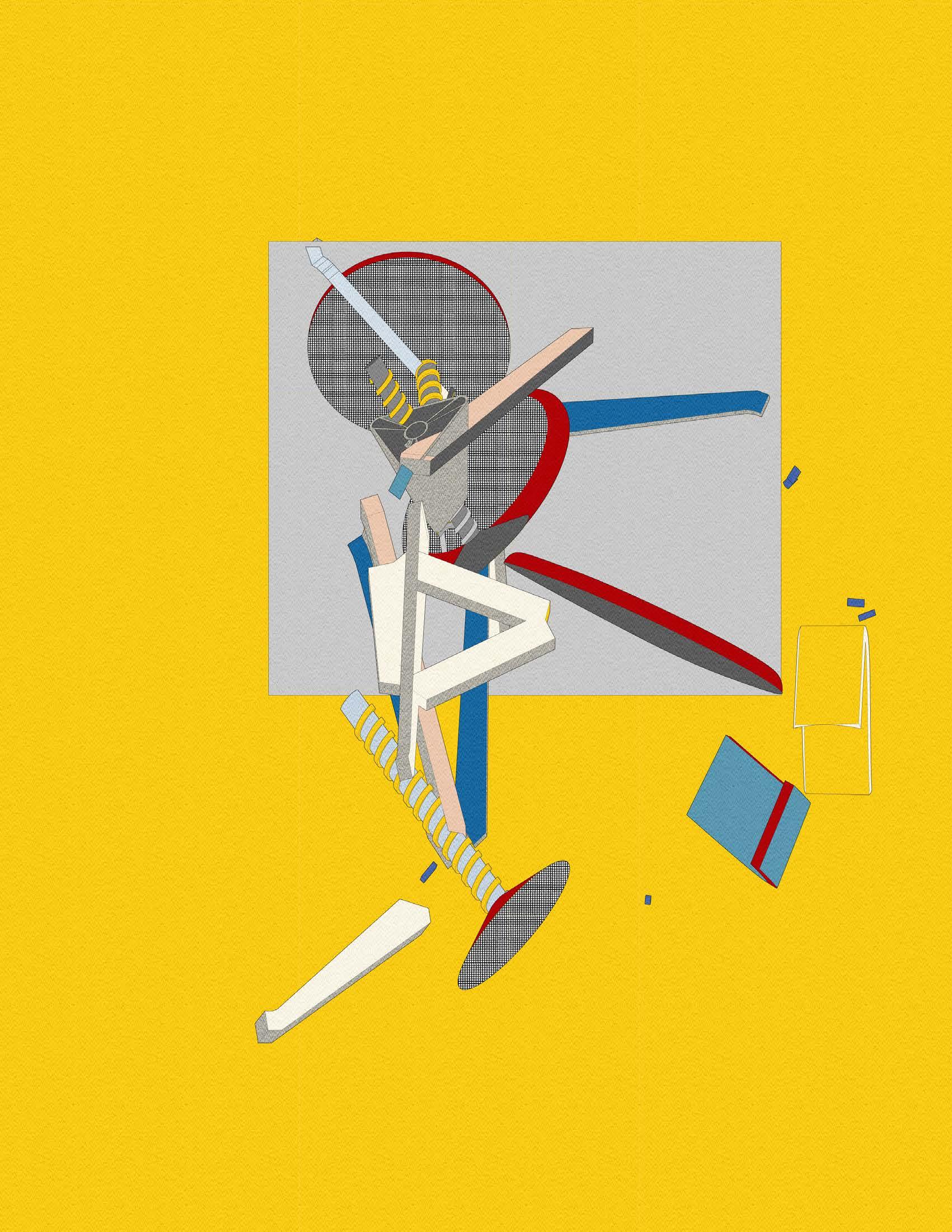
Visual Studies III Instructors Devyn Weiser & Andrea CadioliExamining the contradictions of physics simulations through digital methods, vitra furniture was disassembled and run through generators to test the flexibility of its tectonics. Observed in the frontal plane, the identity of a plain box is subverted to act as container, broken box and implied boundary.
Post-production then identifies elements and color codes an identification system through which new compositions and volumetric understandings can be explored. Run as a series of gifs, the project works between understood fragmentation between still and moving form/objects.
Radial
Radial
Radial
Radial
Radial
Radial
Radial
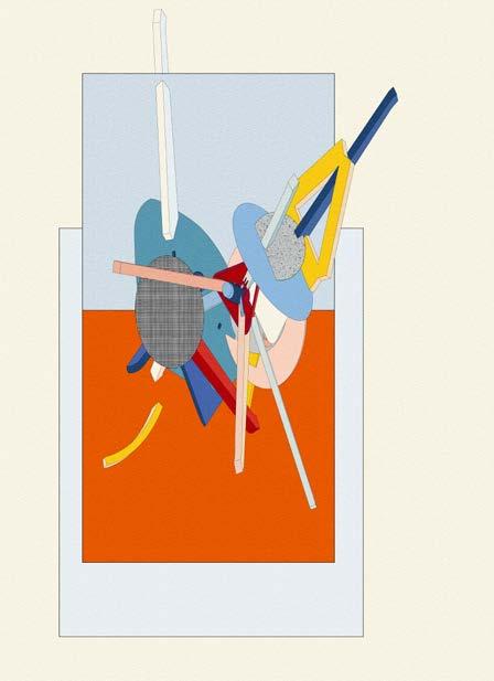
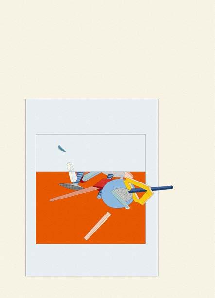

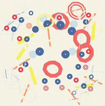
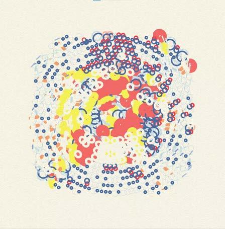
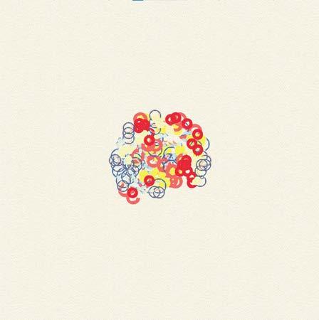
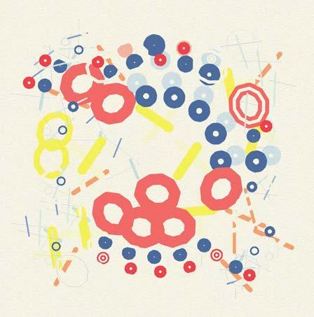
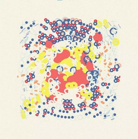
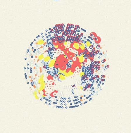
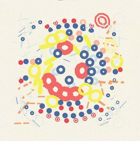
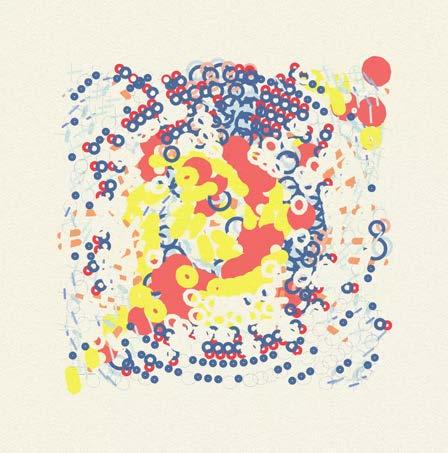
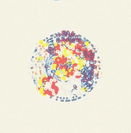
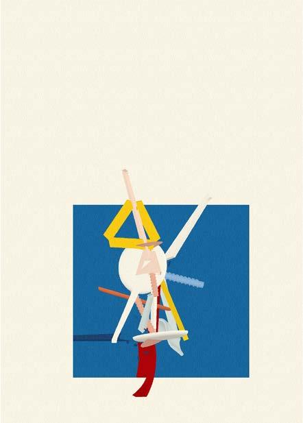
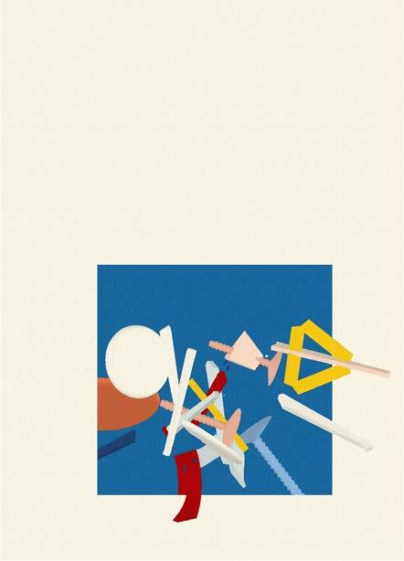
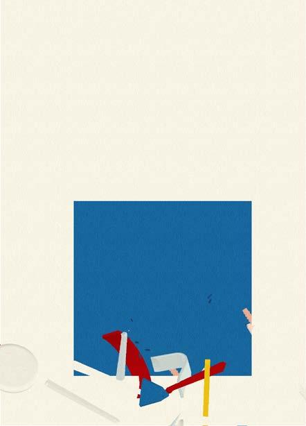
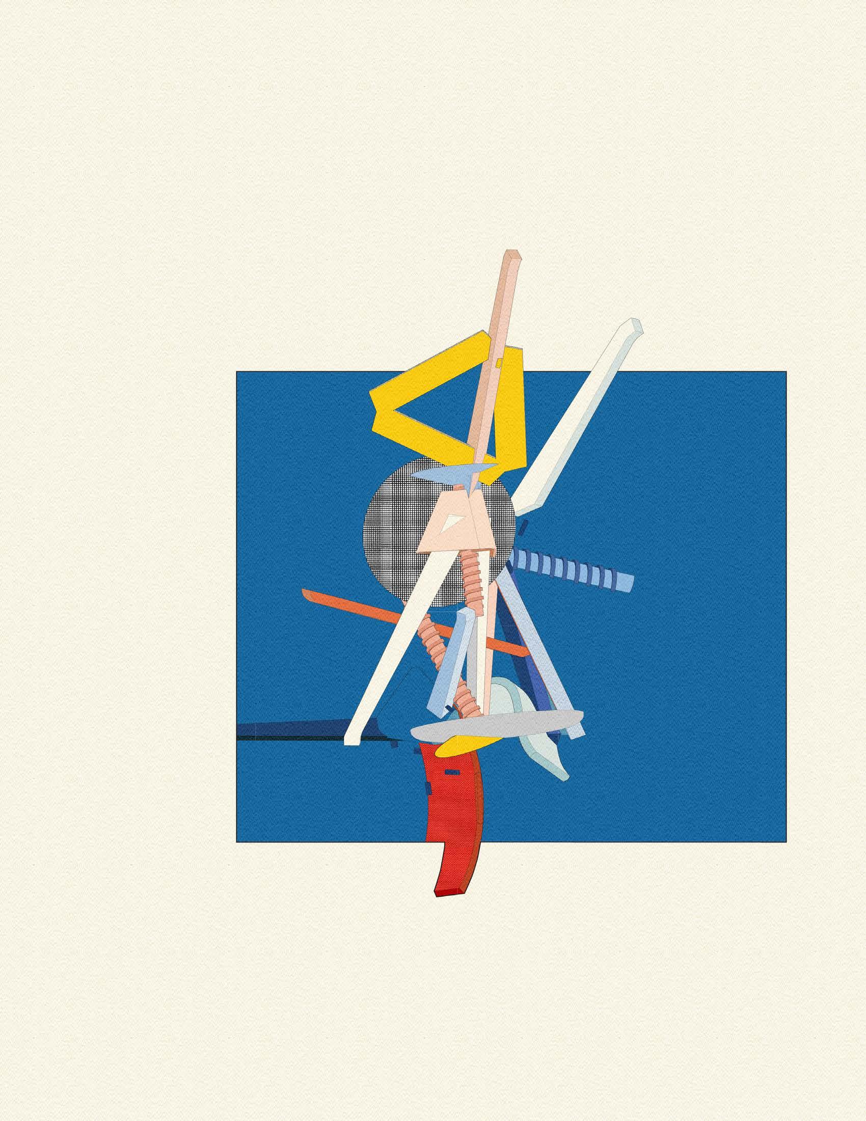
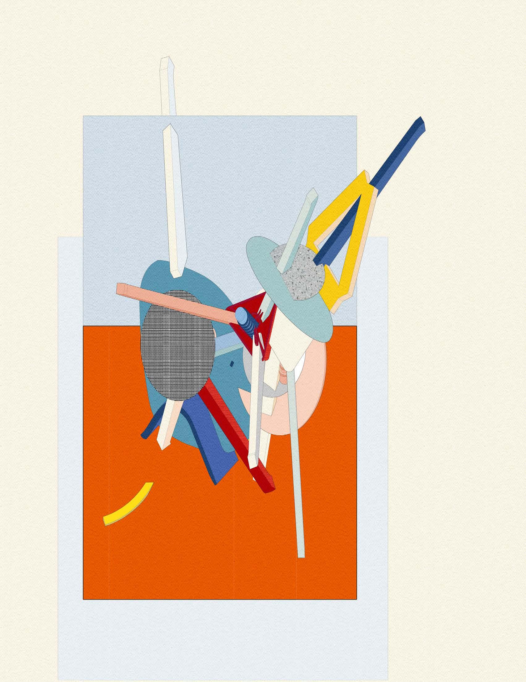
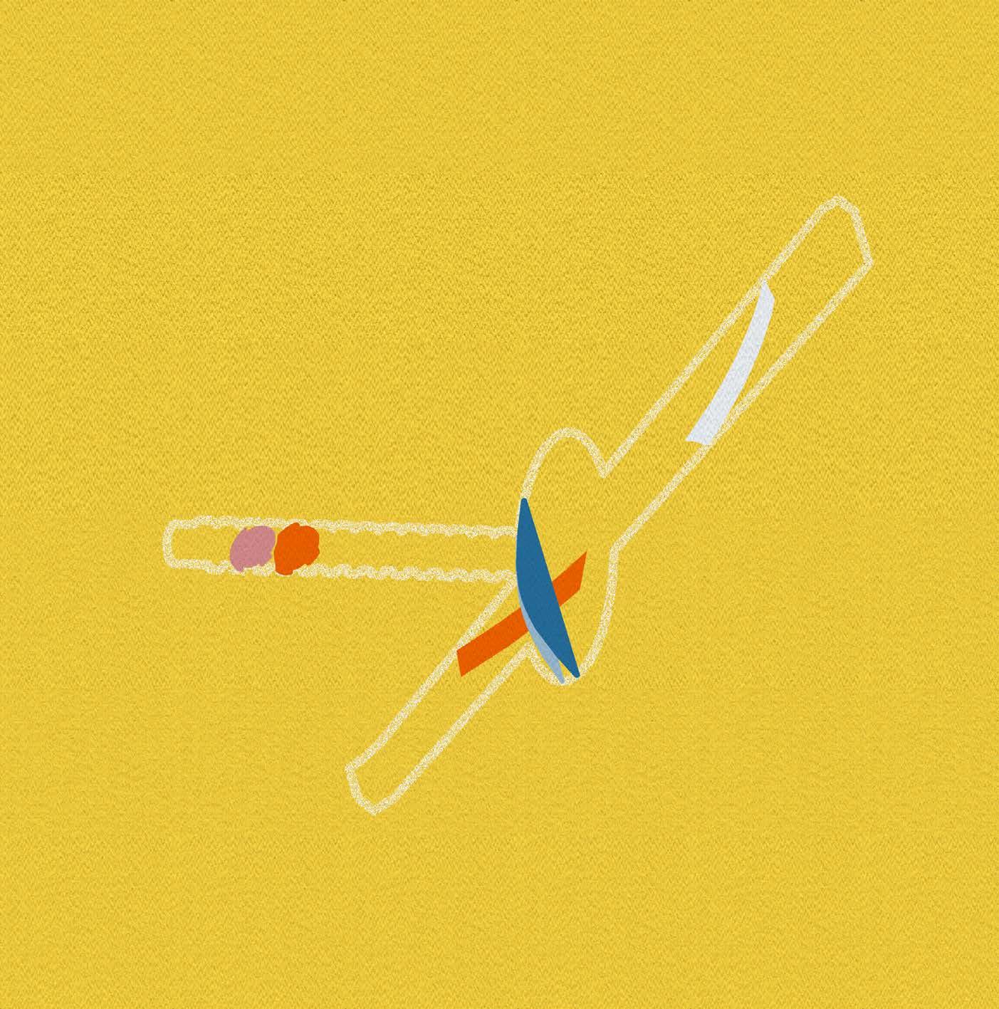
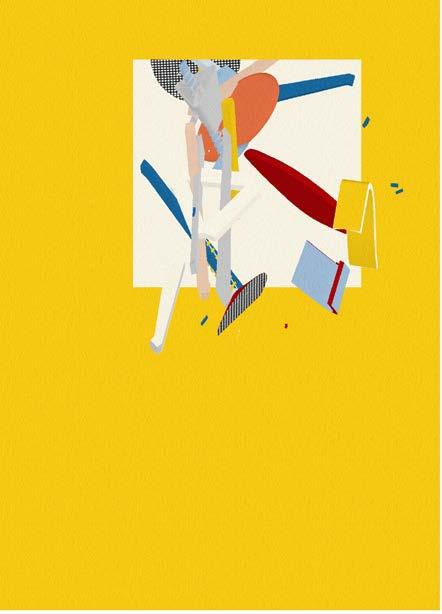
Bold orange and yellow act as textured backdrop for the singled elements of tectonic strength within Vitra’s catalog of things. Playing on a digital cabinet of curiosity, the composition remains a minimal framework through which one can observe and comprehend the complexity of a single piece within the mass of the whole.


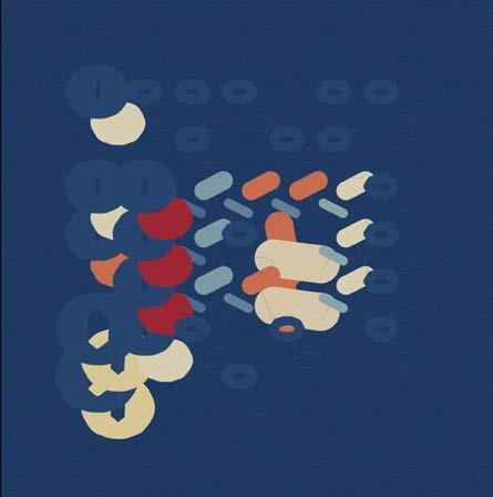
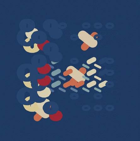
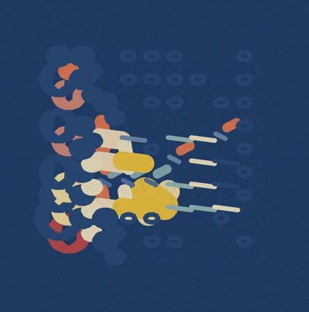
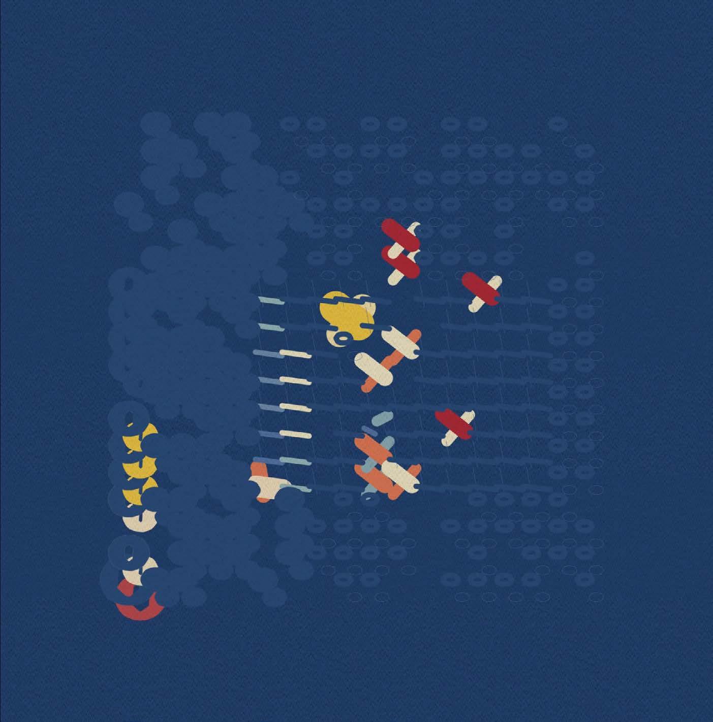
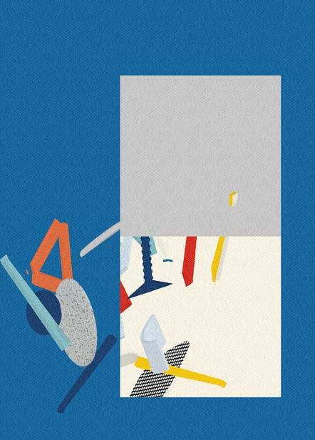
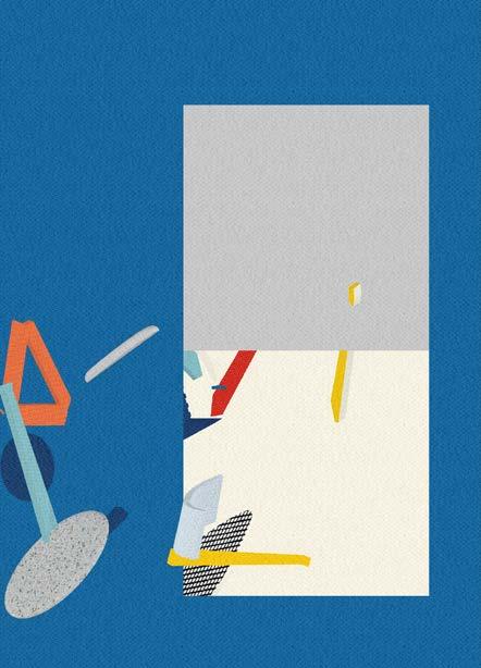
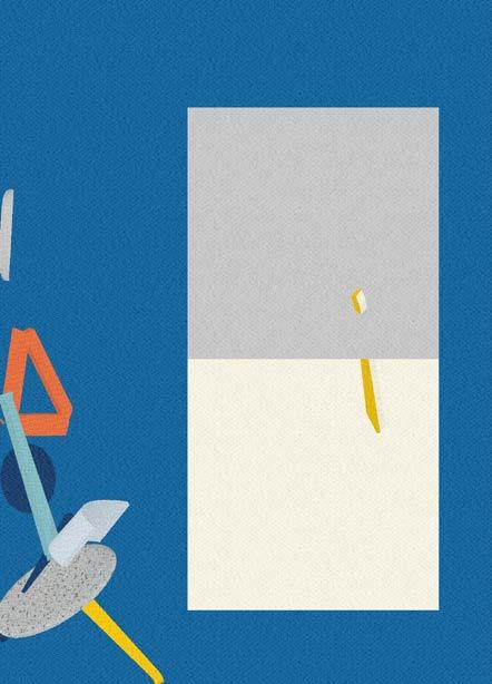
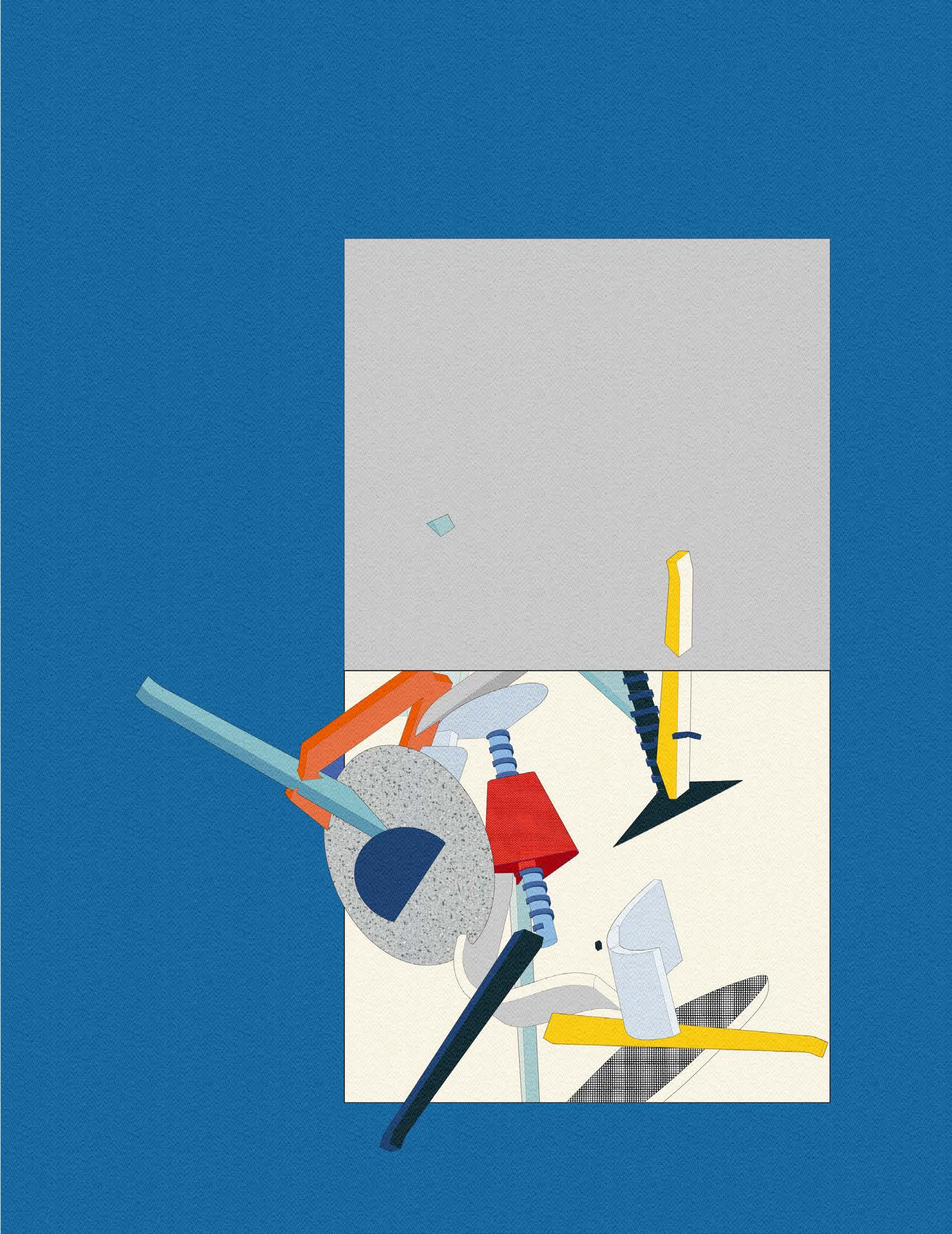


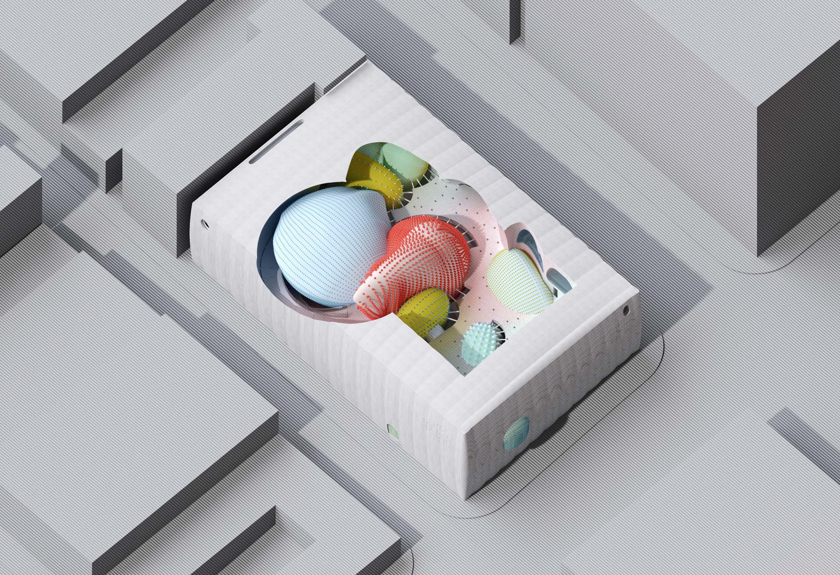
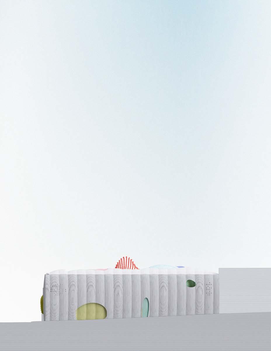
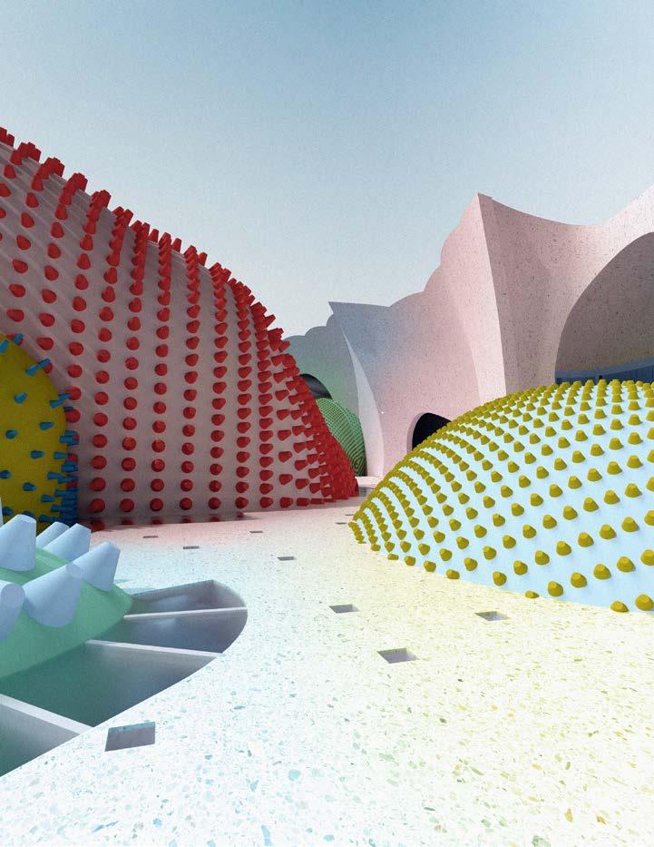
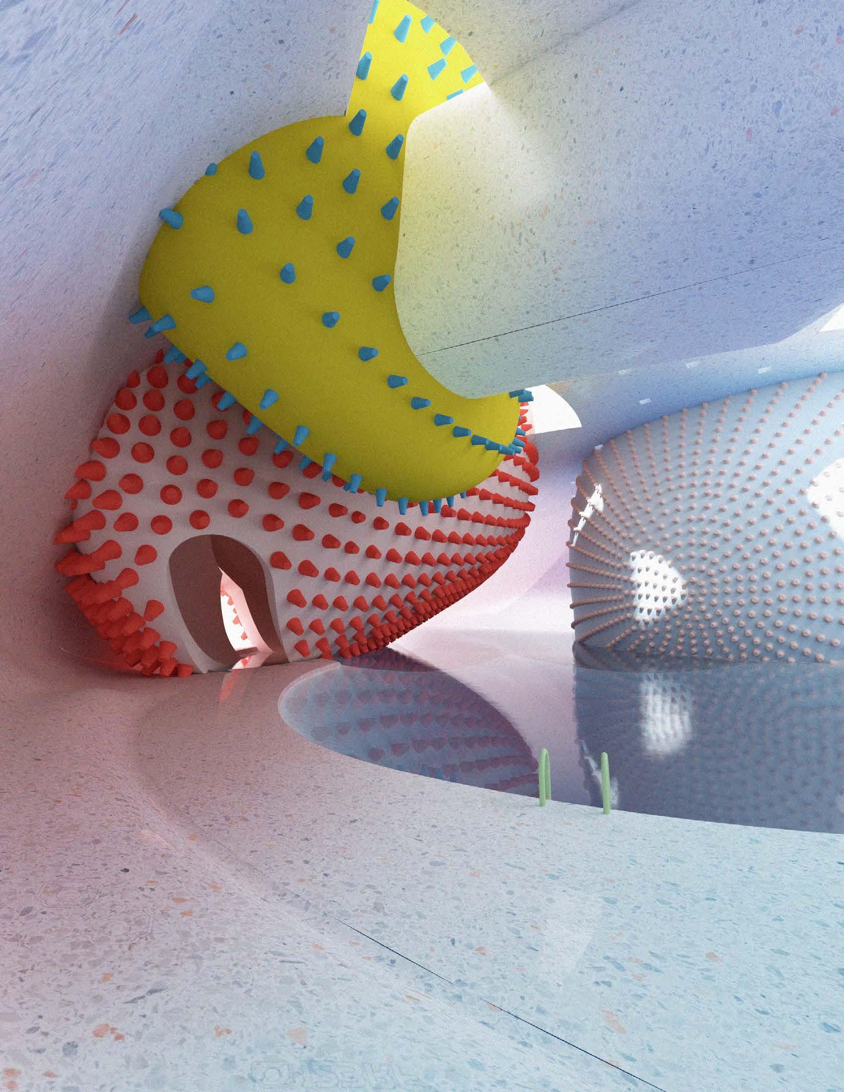
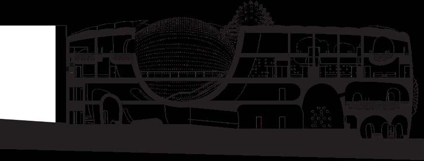
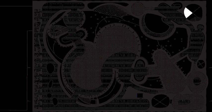
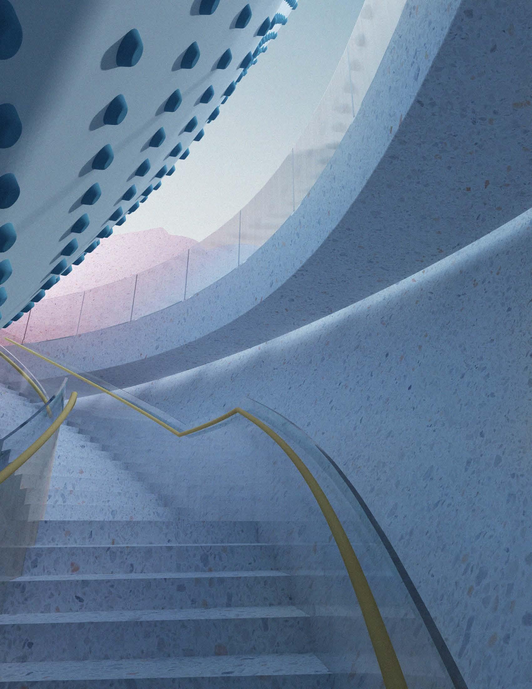
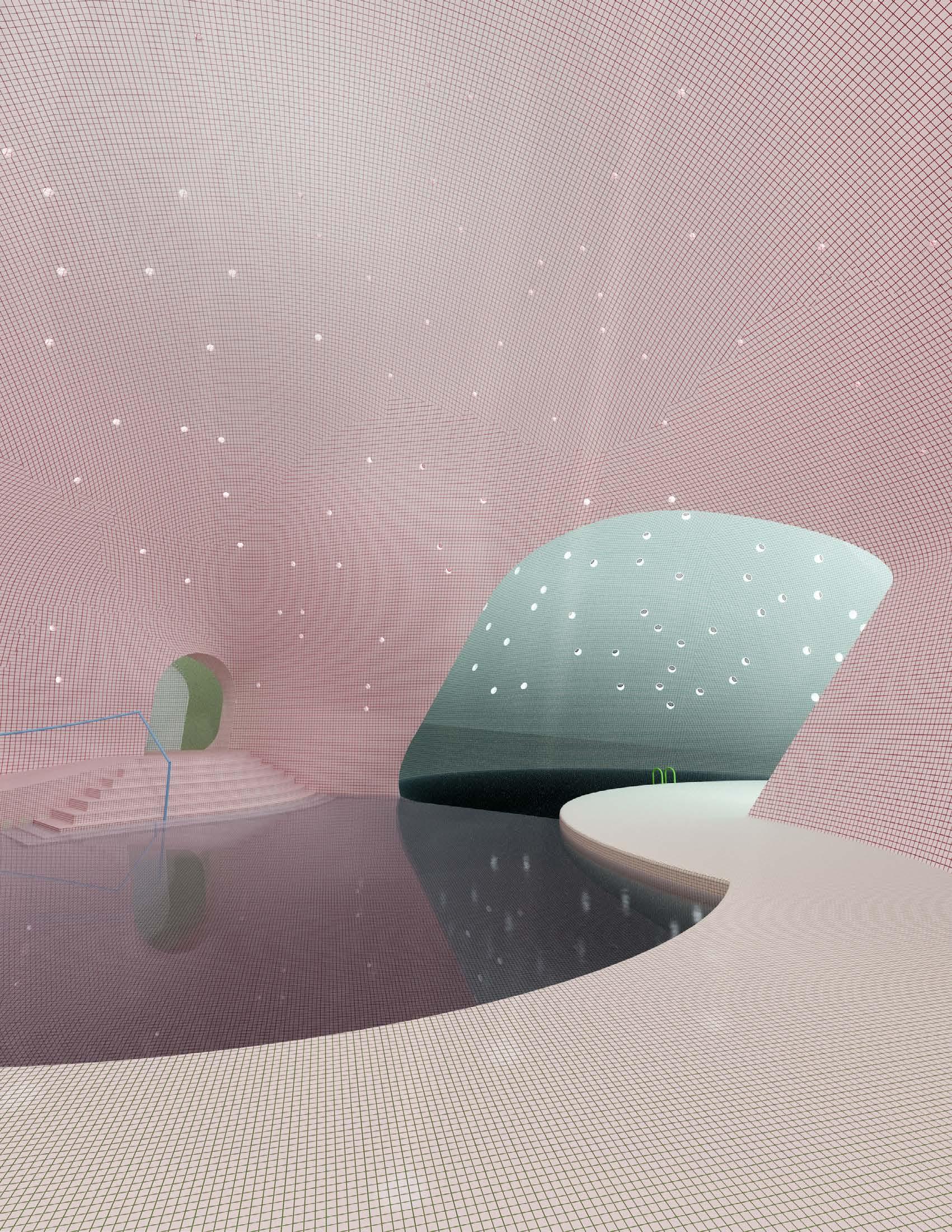
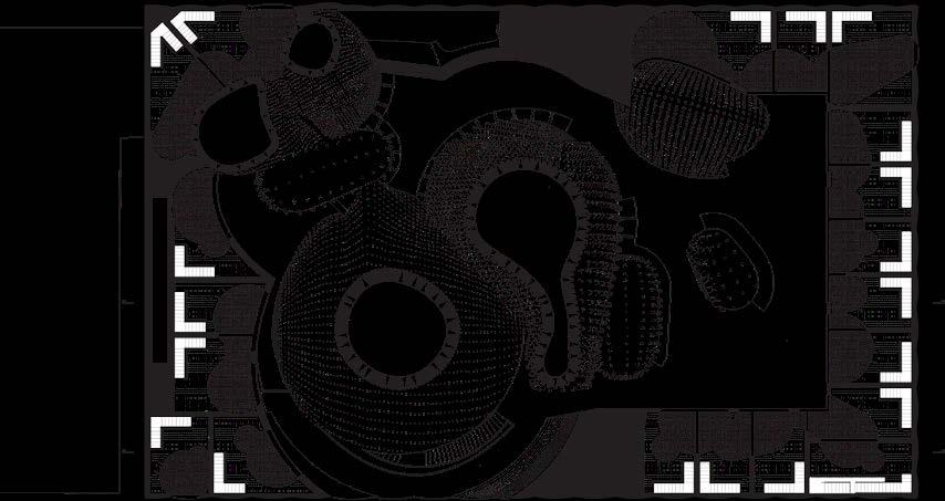
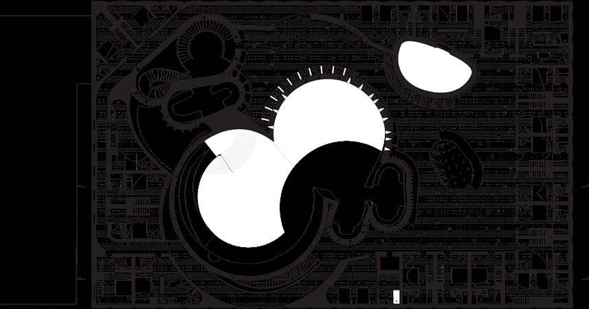
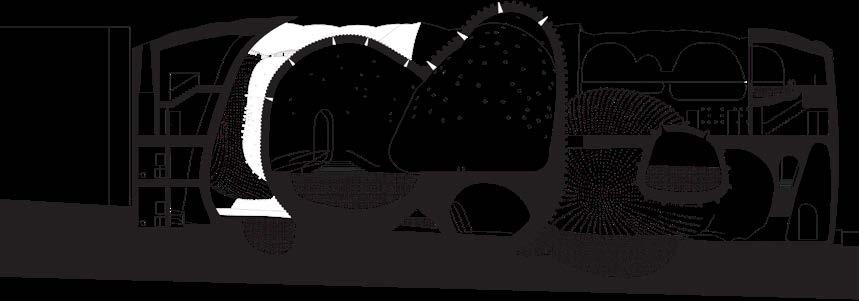
The typology of the bathhouse is one of sequence and other worldliness. Taking cues from historical formation of hammams, a series of idiosyncratic bulbous forms create a family of spatial volumes. These forms are meant to be perceived as a multiplicity: void, shell and mass.
Topics of figure/ground, mass/ void, and interiority/boundary are the main topics of study with the bathhouse. Both nestled within and carved out of a singular blocky mass, a play of figure and ground question the reading of these elements. Characteristically different from interior to exterior, they are purposefully meant to read as objects within a space with their own characteristic and identity.
Looking to historical iteration of the typology, specifically the Hammam, a volumetric pattern starts to emerge. Typically concealed within nondescript masses, a series of related yet unique volumes form a family of sequenced forms.
When abstracted from the original mass, the spiked, animate nature of the oculi pierce through to grab light from the roof.
...We are only able to evoke the vernacular, rather than build within its context any longer. If the vernacular no longer only belongs to a place, does the primitive hut belong to everyone? How does this align with the quickly forming social constructs like cultural misappropriation? Our current global shift of information towards collective inspiration is creating a collaged network of vernacular reimagined through a new kit of parts. We justify rammed earth and Japanese joinery as technological progress and therefor fair game, but while this global circulation of ideas is elemental to Loos’s argument, the true examination of grounded design needs to be further rooted in what we have lost rather than gained...
Excerpt from “The Collective Intelligence of the Vernacular” p. 100
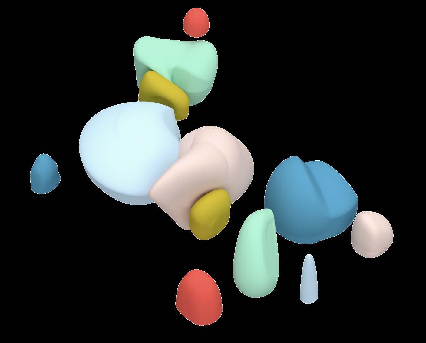
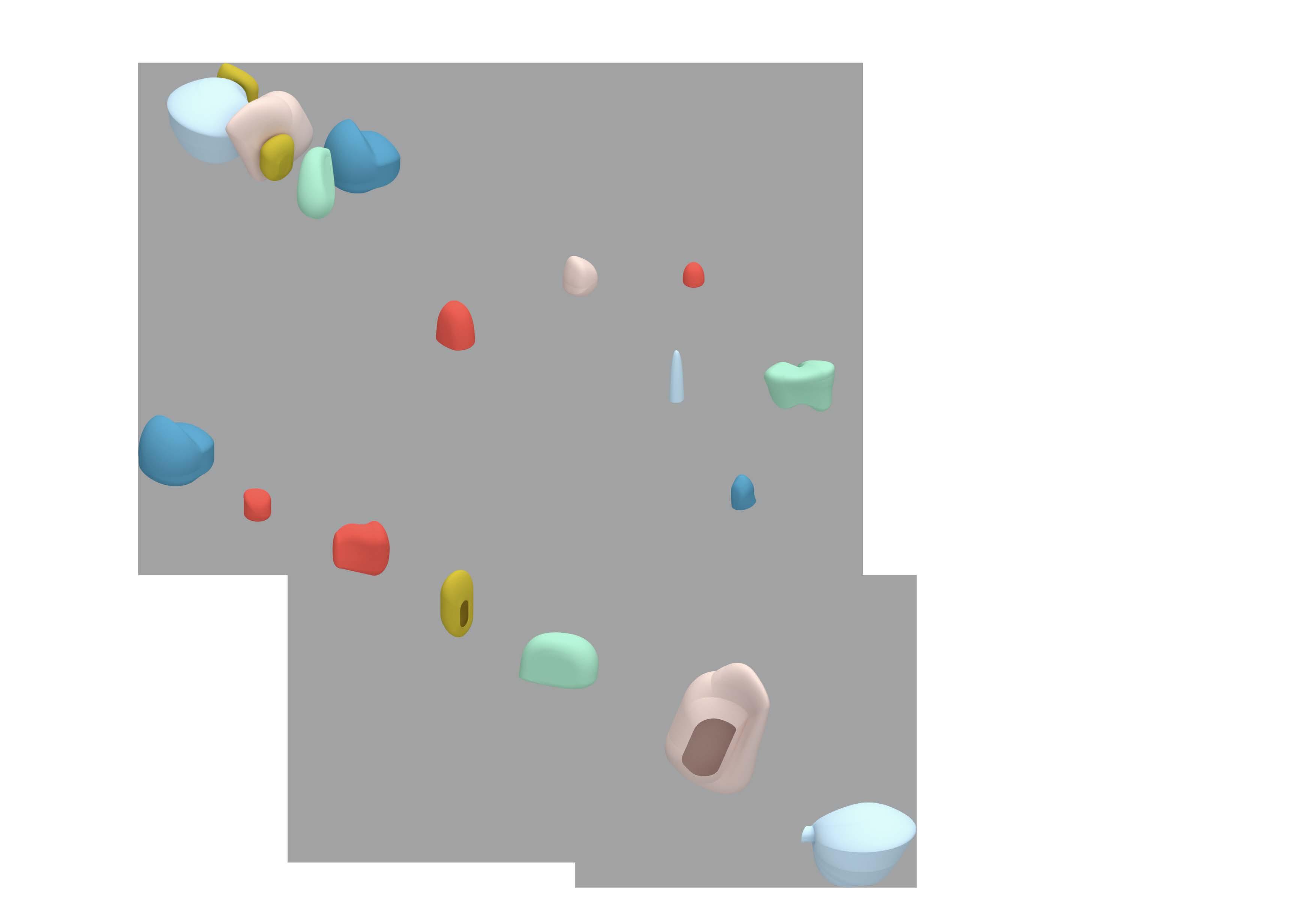

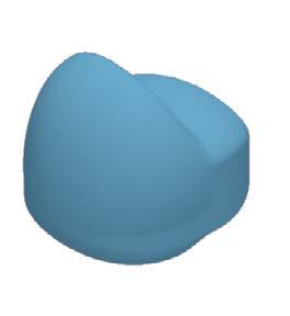
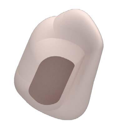


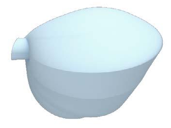
Color plays a main part in sequencing within the structure. Each element has its own identity and characteristic. Through the erosion and rubbing of the main mass, the resultant form begins to take on the same color tones of as the vessels. From this, gradient color tones flow throughout the site creating a holistic experience.

2
1
Community Center
Los Angeles, California
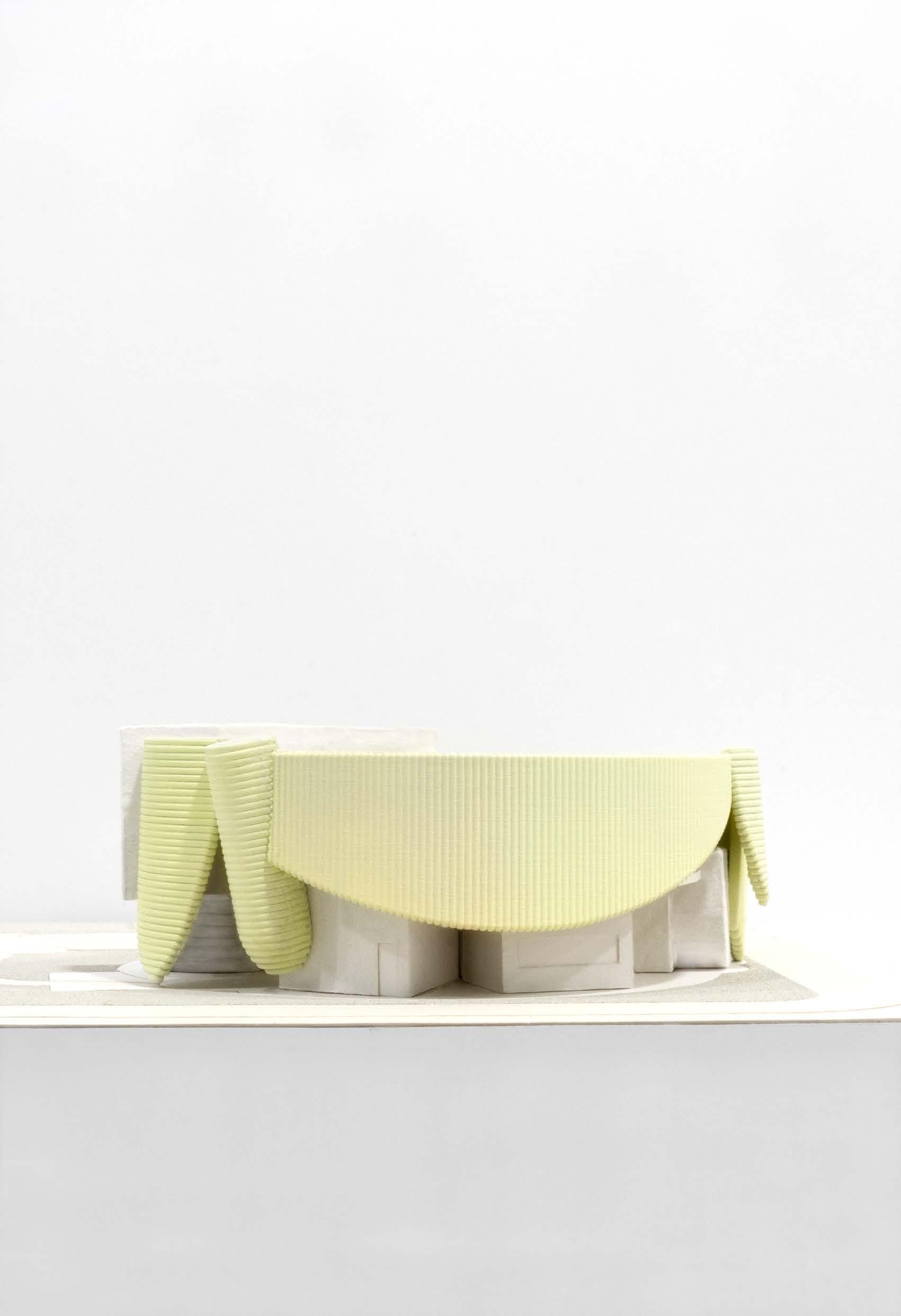
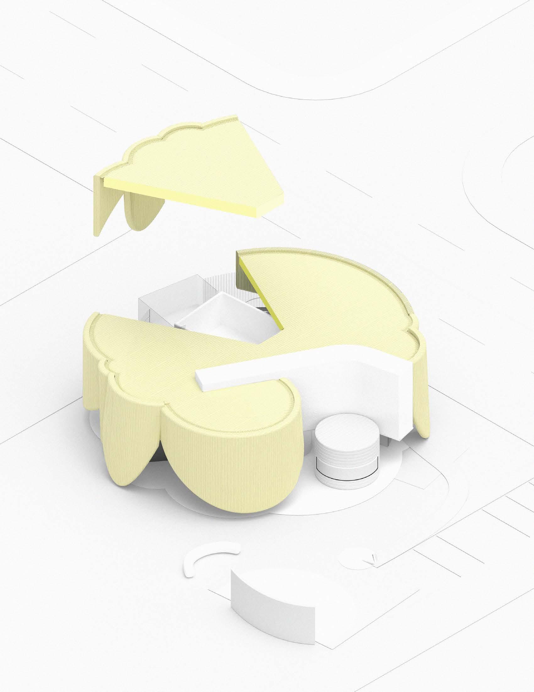
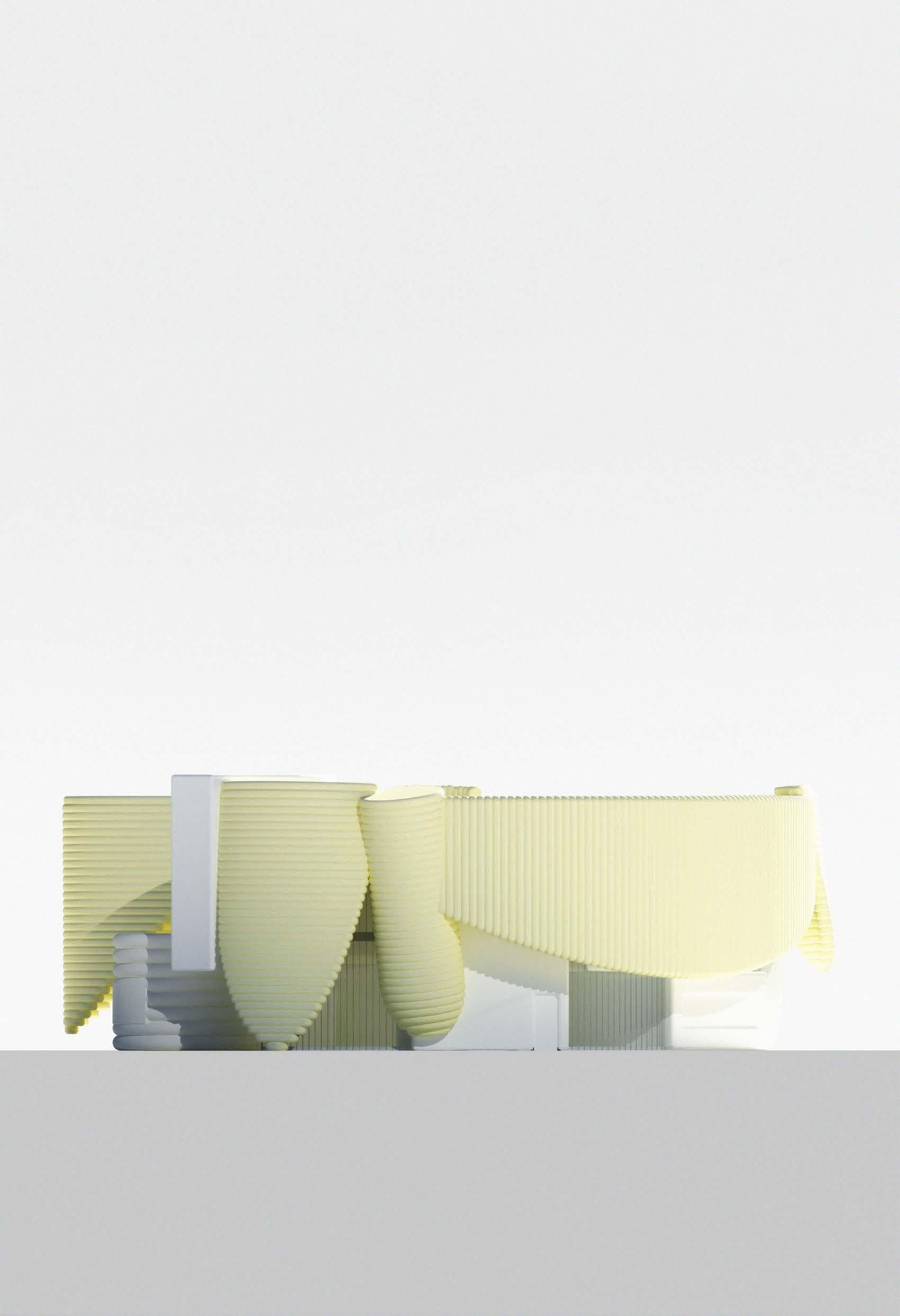
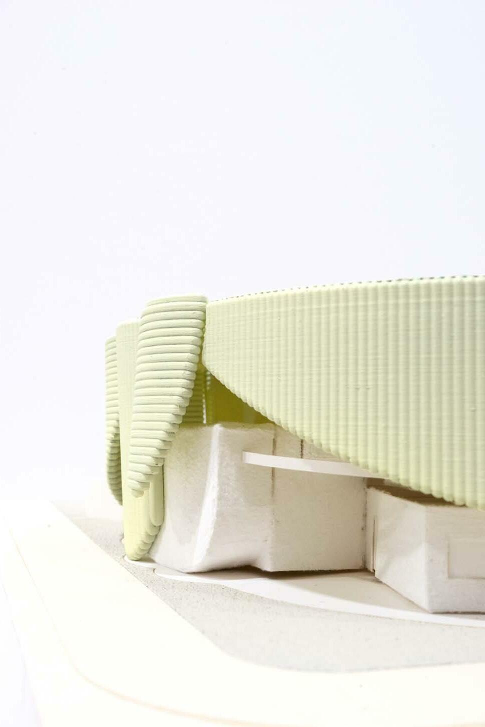
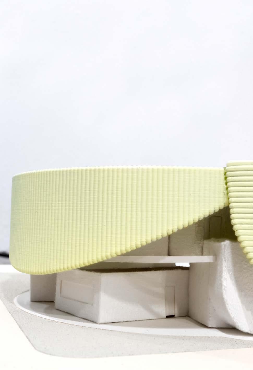
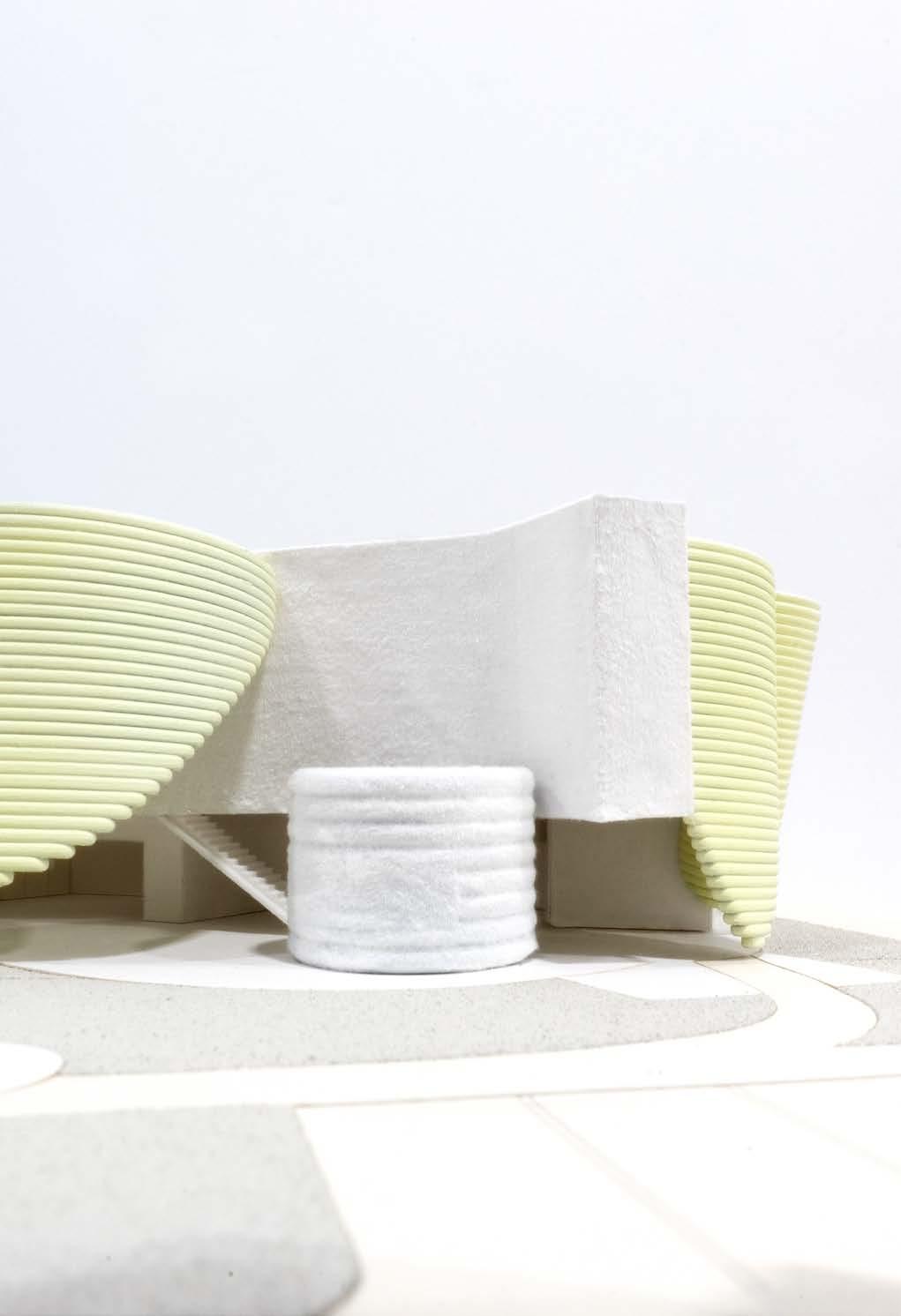
Acting as service and symbol for historic Filipino Town, the Community Center questions the idea of boundary. Embracing that of a small campus typology, the design is positioned as a series of objects scattered within the site.
Wrangled by a bright splayed awning system, the form is both singular and a collection. The idea of boundary is questioned through the soft transition between exteriority and interiority. This concept is followed through the interior, with the intersection of boundaries that create unconventional edges of room conditions. Resultant volumes nestle within the structure to add more private programming.
Playful in nature, the form as a informal quality to it as if in movement or process.
Pine Cone Restaurant in Sebastopol, about 1950s or 1960s. co Western Sonoma County Historical Society North Elevation View
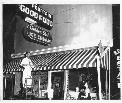
The required program is loosely scattered across the site. Interior program is grouped by the awnings while still relating to the site conditions. The result of this creates an ephemeral feeling of the building. Structure and facade becomes awning, a typical cosmetic application, and the facade seems to disappear.
Creating an exposed building for such a public program allows for the nooks of the building to be activated by the community. Never fully closed off it becomes a symbol of gathering.

...This fuzzy feeling that circles have been popping up in contemporary architecture and therefore should be avoided. Transcending scales, styles, and motivations, the circular stands out as a dominant force for designers. Exposing an interesting intuition of the architectural profession, our fear of commonality and the need to feel different is obvious and ubiquitous. Why does that all have to rest on the circular? Why is a rough association to this geometric shape that is pivotal to architecture’s foundation so beloved yet feared?...
Excerpt from “Objectifying the Circular” See p. 96
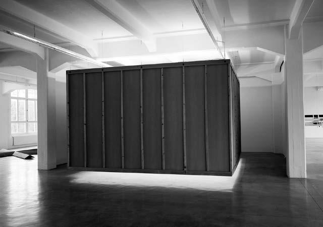
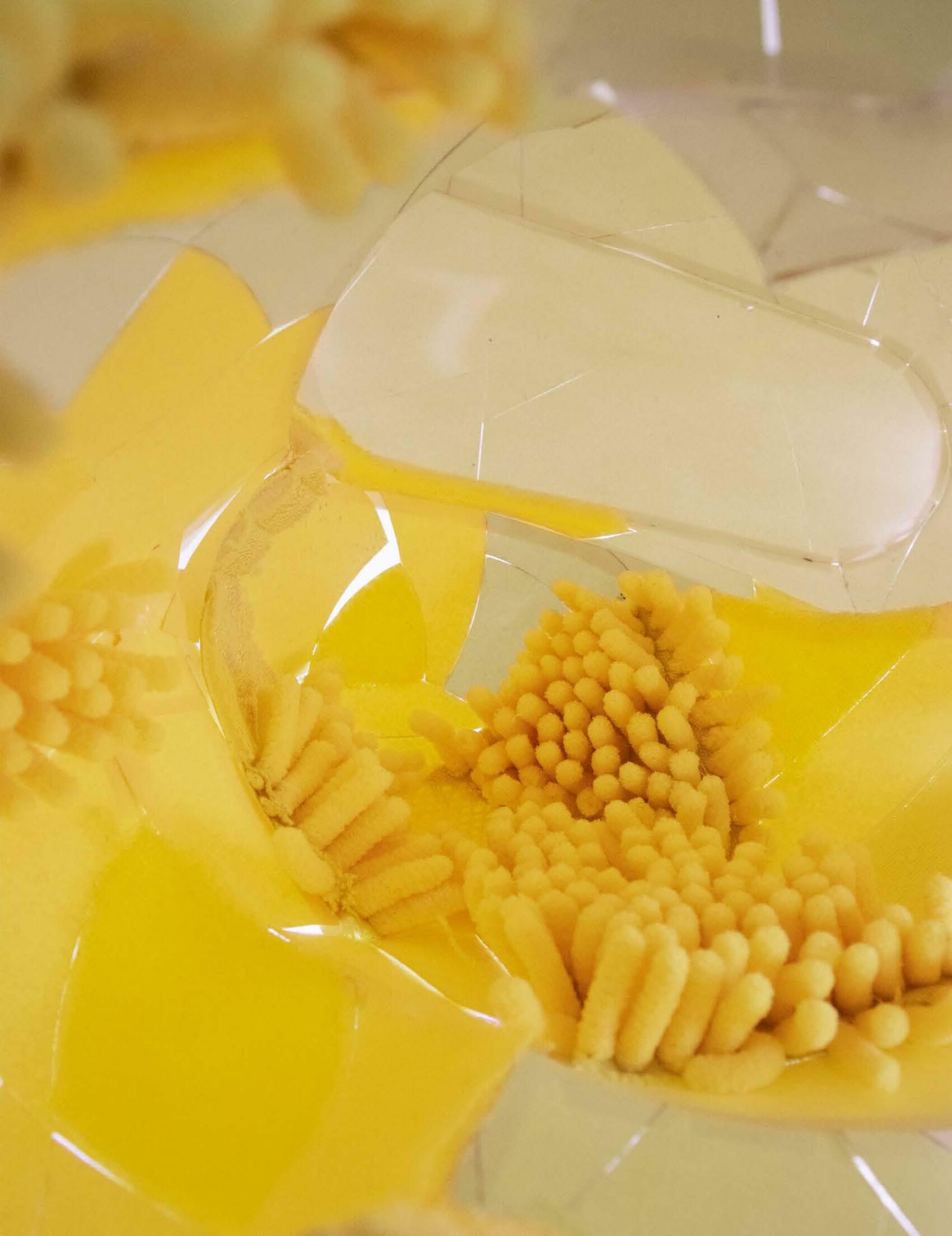
Rolling Room is a cracked, yellow, tumbleweed, that is void of orientation, function, or site. In conversation with Bruce Nauman’s Floating Room: Lit from Inside, 1972, the project actively pushes against the subtle moves made in the seminal work. Loud, complex and ostentatious, the piece looks to create the same disorienting sensation as Floating Room, but through opposite characteristics. Acting as a foil to the minimalist installation, Rolling Room examines the characteristics often taken for granted in our associations with certain design languages.
Hallen für Neue Kunst
Dusseldorf, 1974
InK, Halle für internationale
neue Kunst, Zurich
Raussmuller Hallen, Basel
Bruce Nauman, Drawing for
Interior of Floating Room: Lit from Inside, 1972
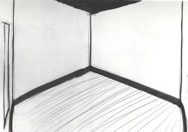
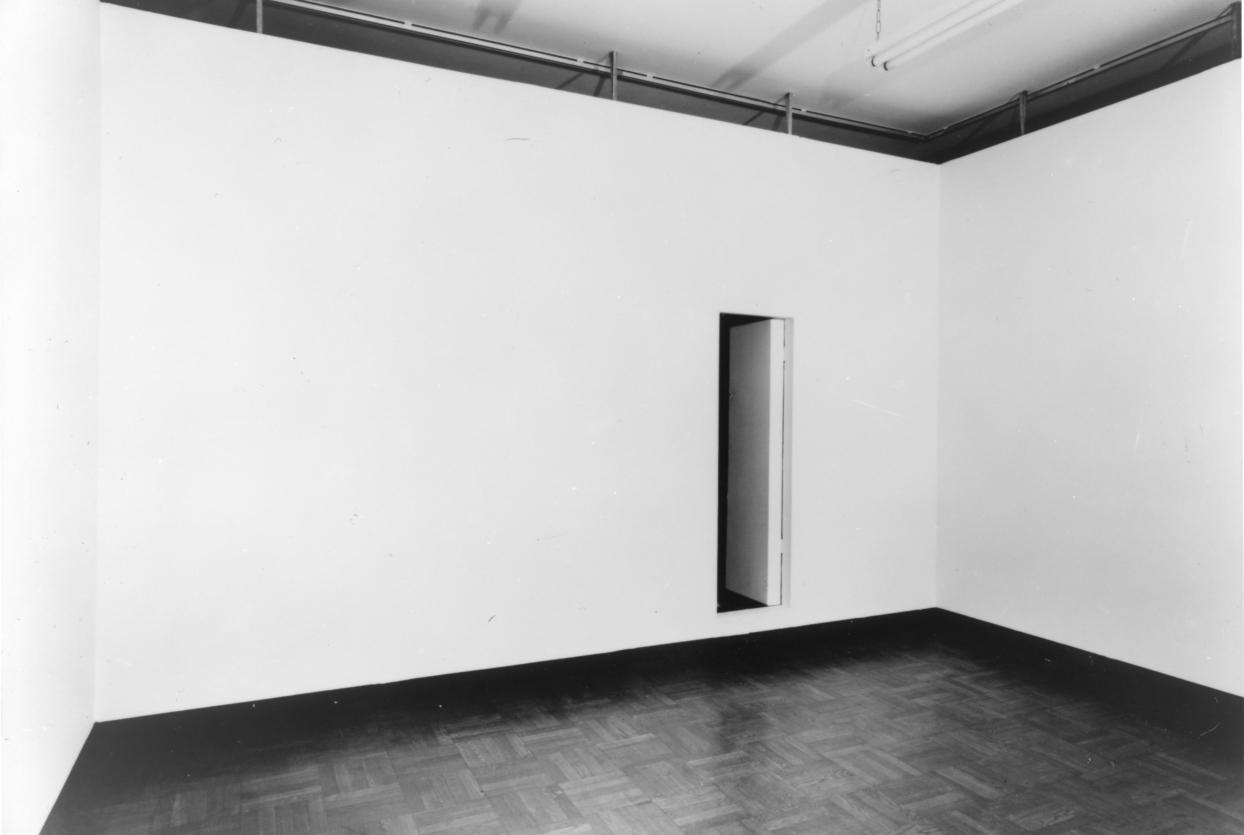

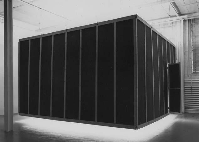
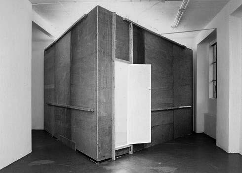
As a precedent, Bruce Nauman’s Floating Room: Lit from inside, 1972 is a room of ambiguous boundary and site specificity. The exhibited rooms are created not by Nauman himself, but through a series of instructions he presented. The resultant experience of the simple floating structure is highlighted through the subtle differences when looking at the installation as a series. Each location at a quick glance appears similar but there are important differences that change the experience of the visitor. The floor and ceiling is left exposed, embracing part of the site. The approach shifts from on axis to slightly askew. The florescent lighting changes intensity based on the proximity to the walls. While the built piece is four white walls floating in space, their starkness numbs the senses almost seeming to disappear. What is left is the framed ceiling, floor, and a sense of isolation.
Guggenheim, New York
Raussmuller Hallen, Basel
InK, Halle für internationale neue Kunst, Zurich
InK, Halle für internationale neue Kunst, Zurich (Reinstalled)
Hallen für Neue Kunst
Bruce Nauman, Floating Room: Lit from Inside, 1972
Isometric compilation of installation sites
Orthographic compilation of installation sites
Given the importance of the site specificity of the Floating Room, it is impossible to study just one location as the main experience. What if the latent memory of the piece, accumulated through traveling installations, became its actual form?
Orthographic projections of each site, elevations and ceiling plan, are layered atop one another to create a scarred memory of the piece. Non hierarchical in nature, the banal site elements of beams, windows, etc become a patterned patchwork of context.
Two pills rolled together
Three pills rolled further
Fourth pill is collected
Fifth pill joins the gang
Sixth pill added for fun
A tumbleweed is formed
Flatness added for function
Tumbleweed cracked into sections
Negligible thickness added, cracks highlighted Patchwork pieces to obscure pill formation
Keep on rolling Series of Rolling Sections
Ambiguous of direction and scale, the room implies multiple arrangements of configuration. A series of nooks create pockets of isolation, while constantly connecting back to the overall void of the space.
Meant to be experienced from its interiority, the project exposes the dissonance of a room without two sides. Infinitely thin, it is near impossible to perceive the space without also internalizing its sculptural exteriority. Negotiating with ground, light, and gravity the purely interior project is literally shattered to expose its exterior condition.
Patchworked Material Study

Rolled
Rolled
Rolled
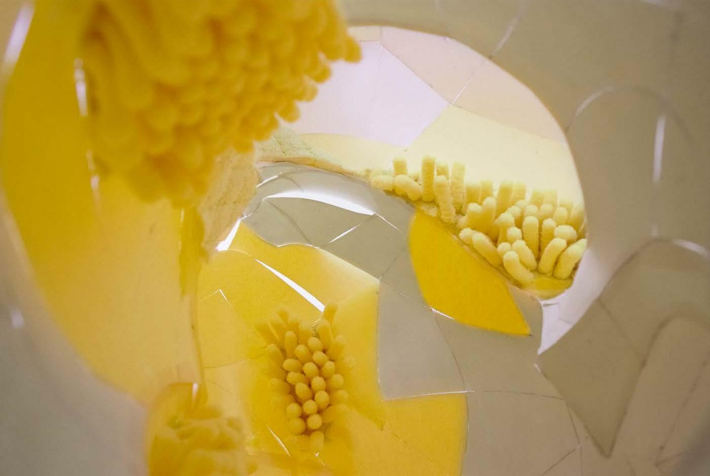
Non developable in nature, the doubly curved form is shattered and stitched together with a series of planar forms. The error in alignment in the seams creates cracks and opportunities for light. Seemingly cohesive yet patchworked, the articulation of the mass hearkens to that of a frankensteined teacup.
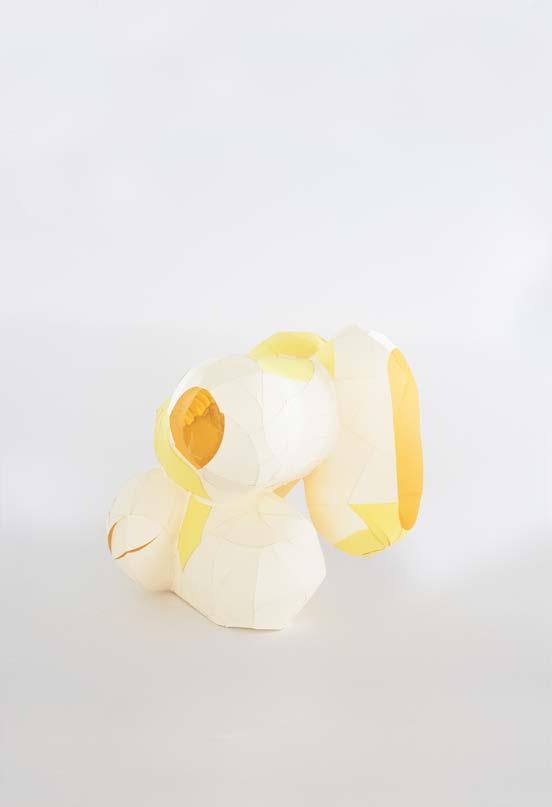
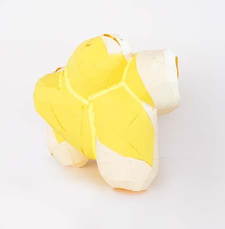
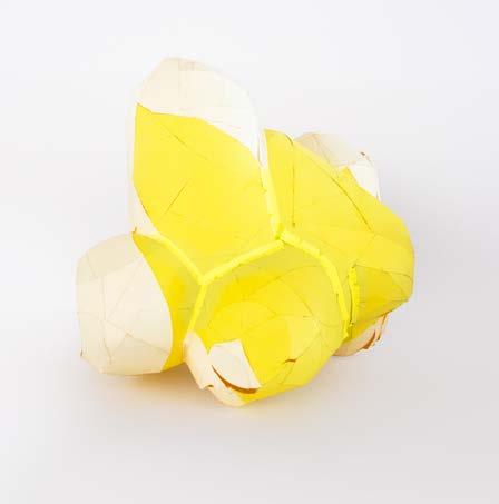
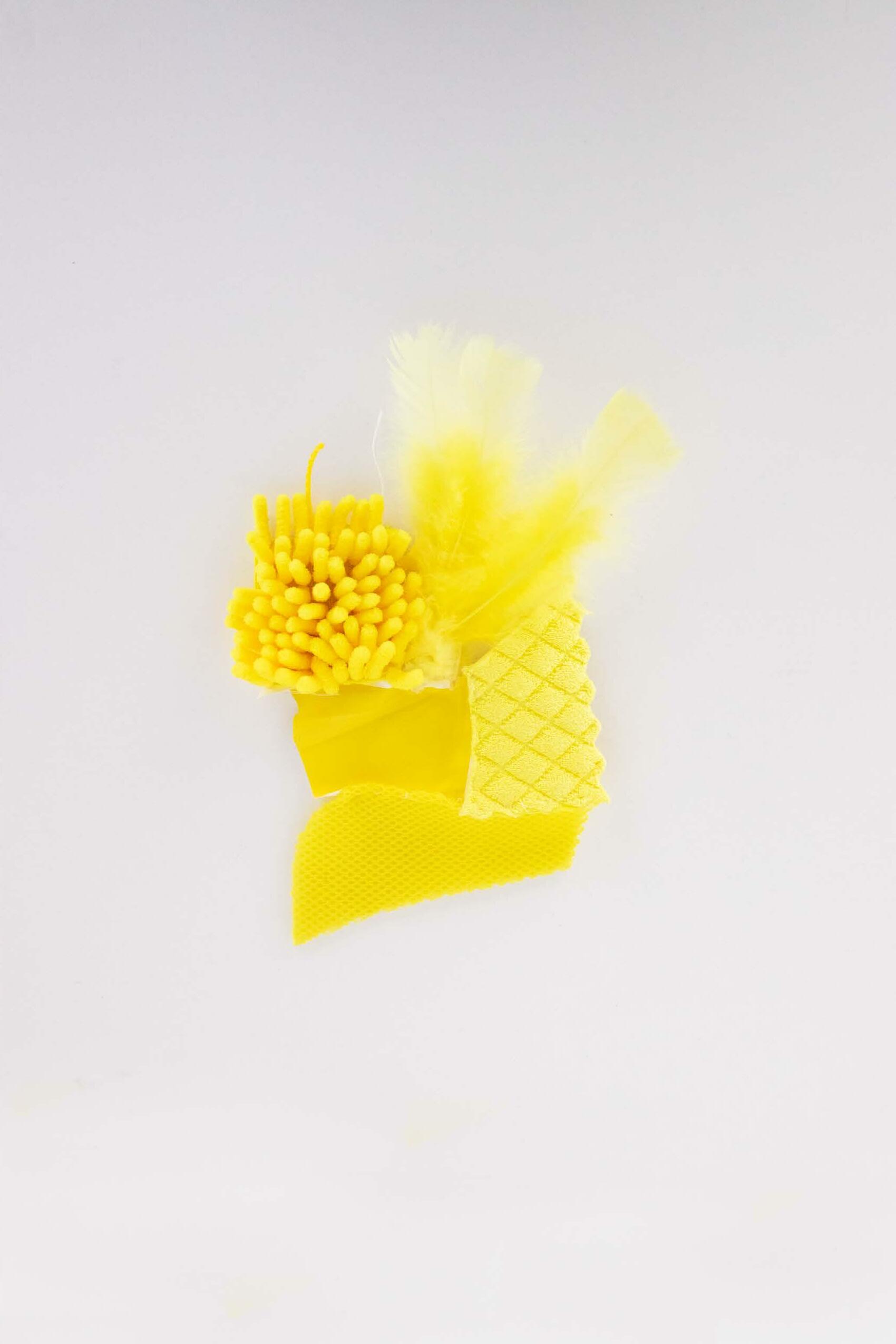
Rolling room plays with the concept of site specifcity, movement, and ambiguity. Unlike the Floating room, it is intentionnally blocked from all site conditions sans for the ground condition and cracks of light. Always in process it suggests a continual shift in materiality, function, and form.
Q studies examines the tradition of geometry and characteristic meaning. Exemplified through the historic typeface Le Romain du Roi created by Louis Simmonneau in 1695 and 1718, a series of iterative studies were made on the singular letter q. Isolating the letter from its typical alphabetical grouping, the Q Studies were one of a collective focusing on each letter.
A redrawn letter with perfect geometry is deformed by the distortion of the grid it was created on. Following the same process, a simplified, abstract version of the Q is morphed through the same technique.
Turning three-dimensionally, the morphed grid is then projected against another morphed letter from the alphabetical grouping to create a new massy object. Jumping between paper space and 3-dimensionality, the studies look at how a flat artifact can imply depth and a dimensional one, flatness.
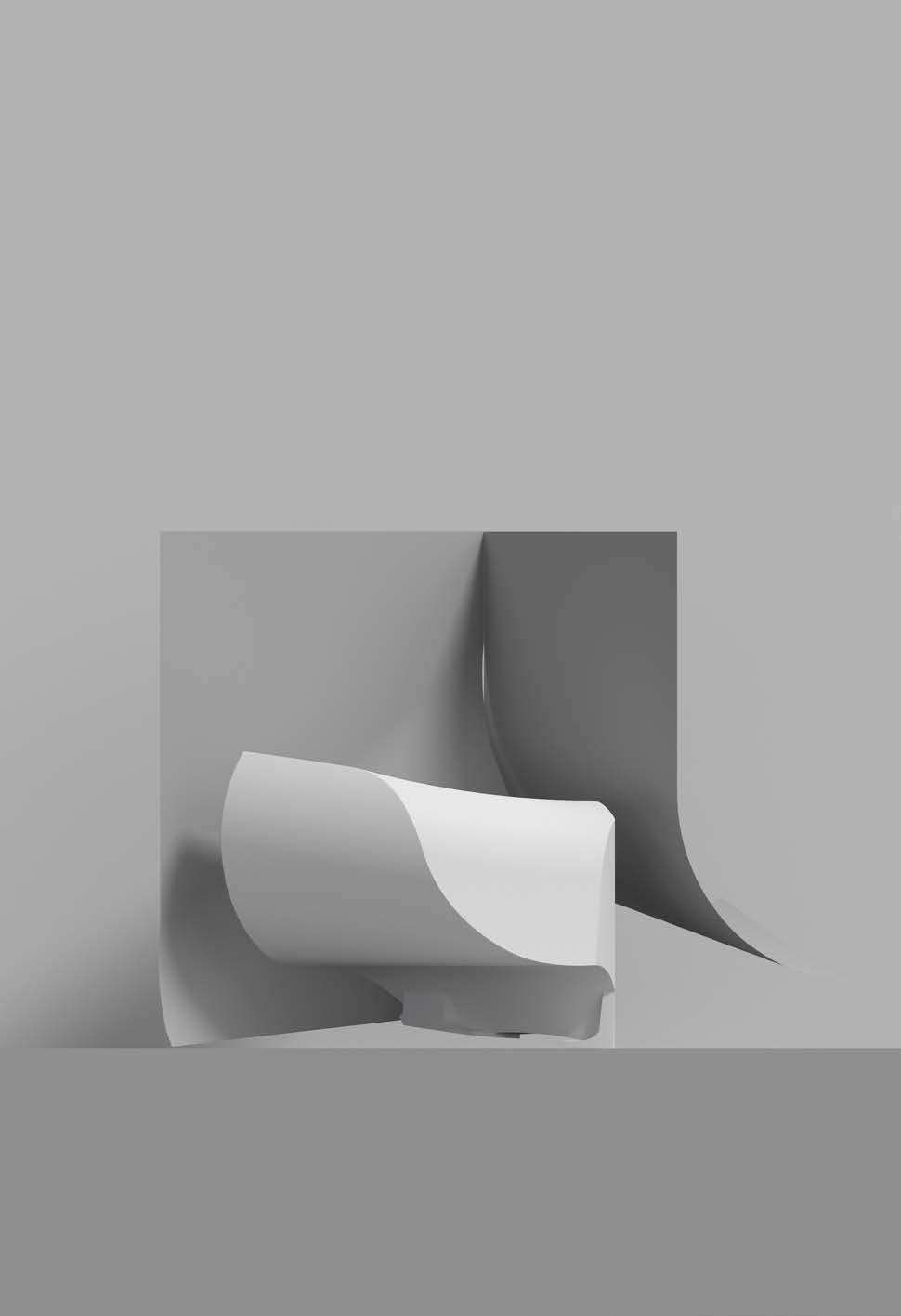
Character is often tied to our output. It is the desired effect rather than an iterative tool. In a study as focused on character and process throughout, how can the steps embody characteristic traits, leading to a semi recognized resultant form? Instead of focusing on how to create a wonky Q, can the process of wonkiness be embraced in the folds and projections? At what point do we acknowledge the importance of the process versus product?
Oscillating between means of technological and physical design and production, Knuckle Studies examine idea of precision and narrative within the creative process.
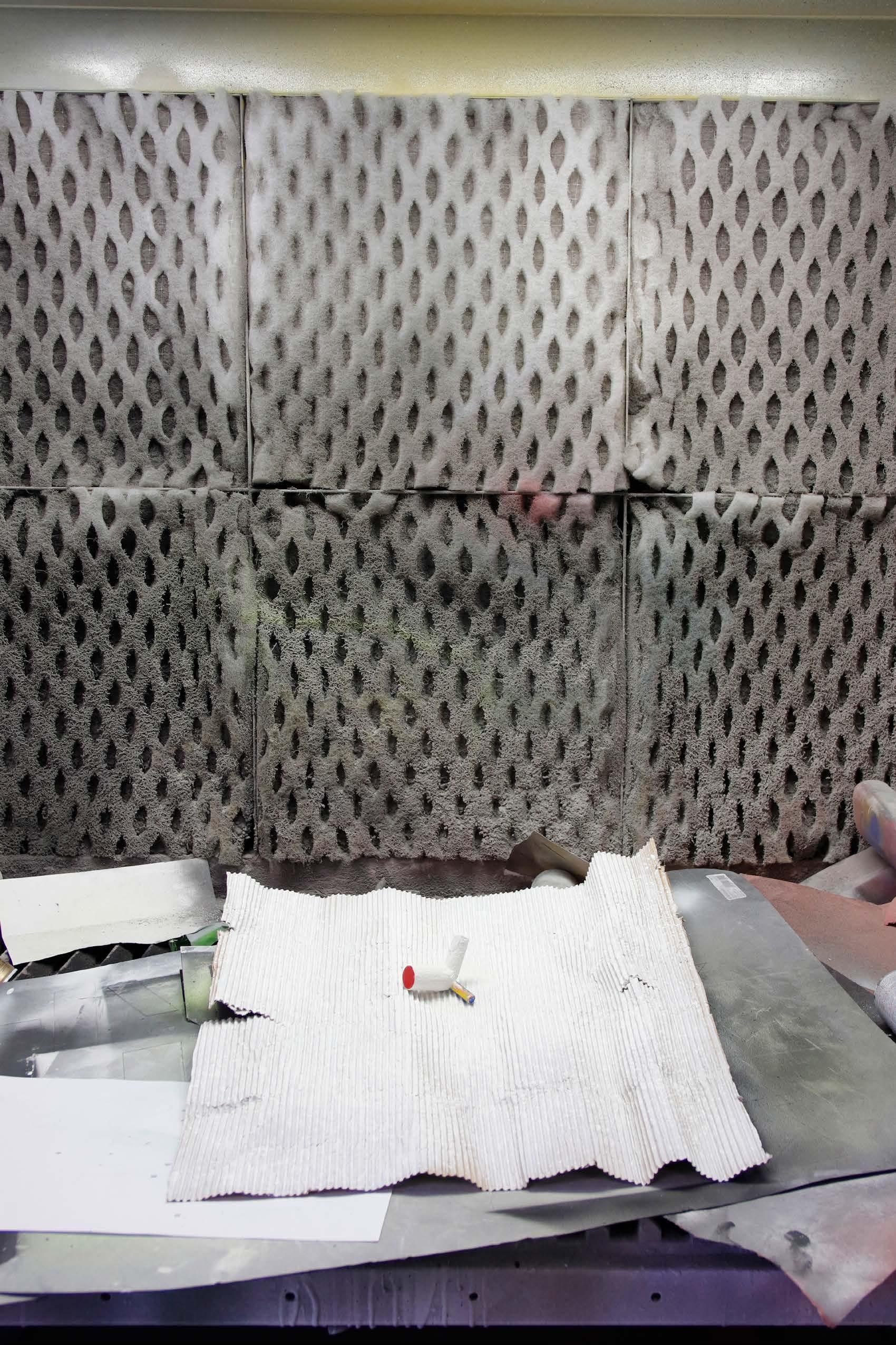
A series of misaligned, contorted boxes are created by drawing in virtual reality. Imperfections arise from the free-form nature of drawing in the air. The error of attempting to draw an exact entity creates a series of misaligned joints at the cube corners. These knots create a series of identities that begin to form their own characteristic qualities from these misalignments.
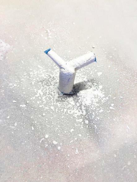
Turning back to the physical reality of these forms, the perfect digital models of the imperfect drawings are then 3D printed. A series of physical modeling techniques are then applied to the knot, obscuring the latent appearance from the printed model. Intentionally rooting it back through a series of loosely controlled processes, the knot appears both precise yet imperfect.
Imperfection creates the unique and treasured qualities of this process. Error is the quality of interest. The knuckles present themselves as both clumsy and natural, giving them a story of their own. Contrasting the precision of the digital model, the physical process intentionally deforms the knuckle through a progressive additive and subtractive process.
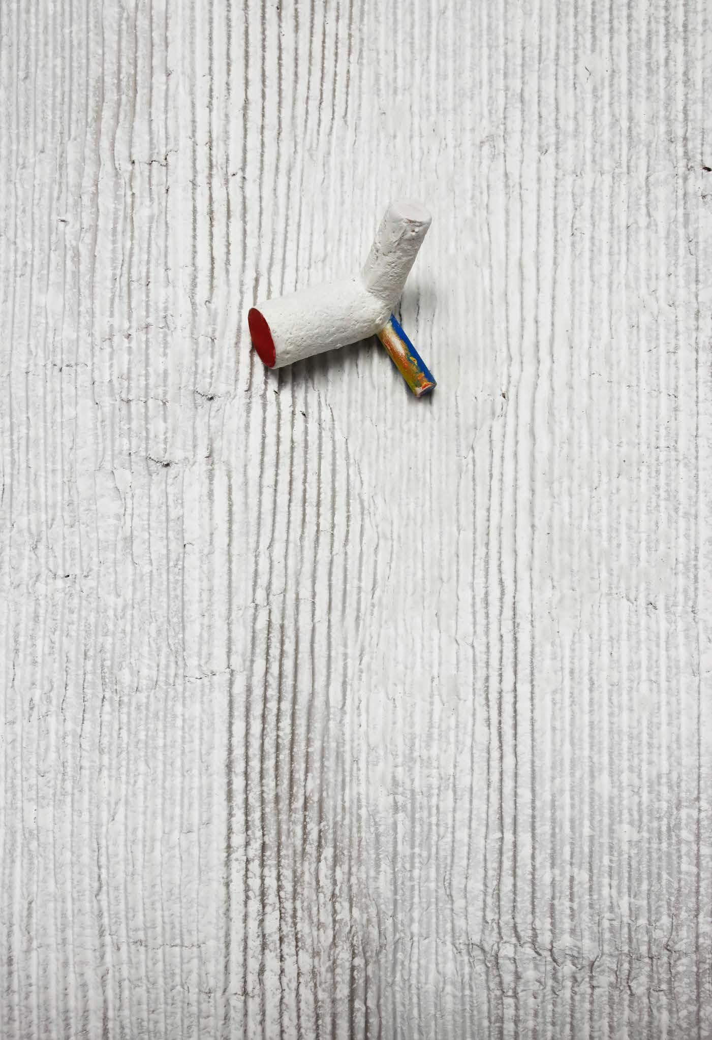
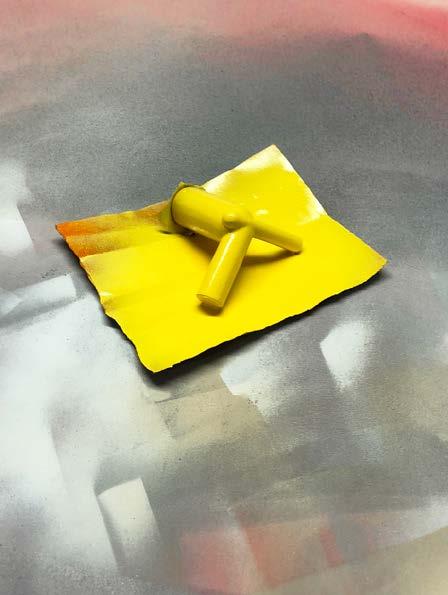
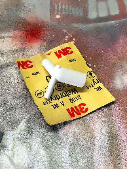
The original precise print of the digital model was subsequently sprayed in layers of fill, paint, and plaster, till the shape was recognizable, yet muddled. The depth of this process is then highlighted by the removal and sanding specifically to one element of the knot. Traces of the erosion are visible through the soft blur of boundary. Intentionally rough, what was once a dimensionless material-less object becomes laden with a sense of history and process.
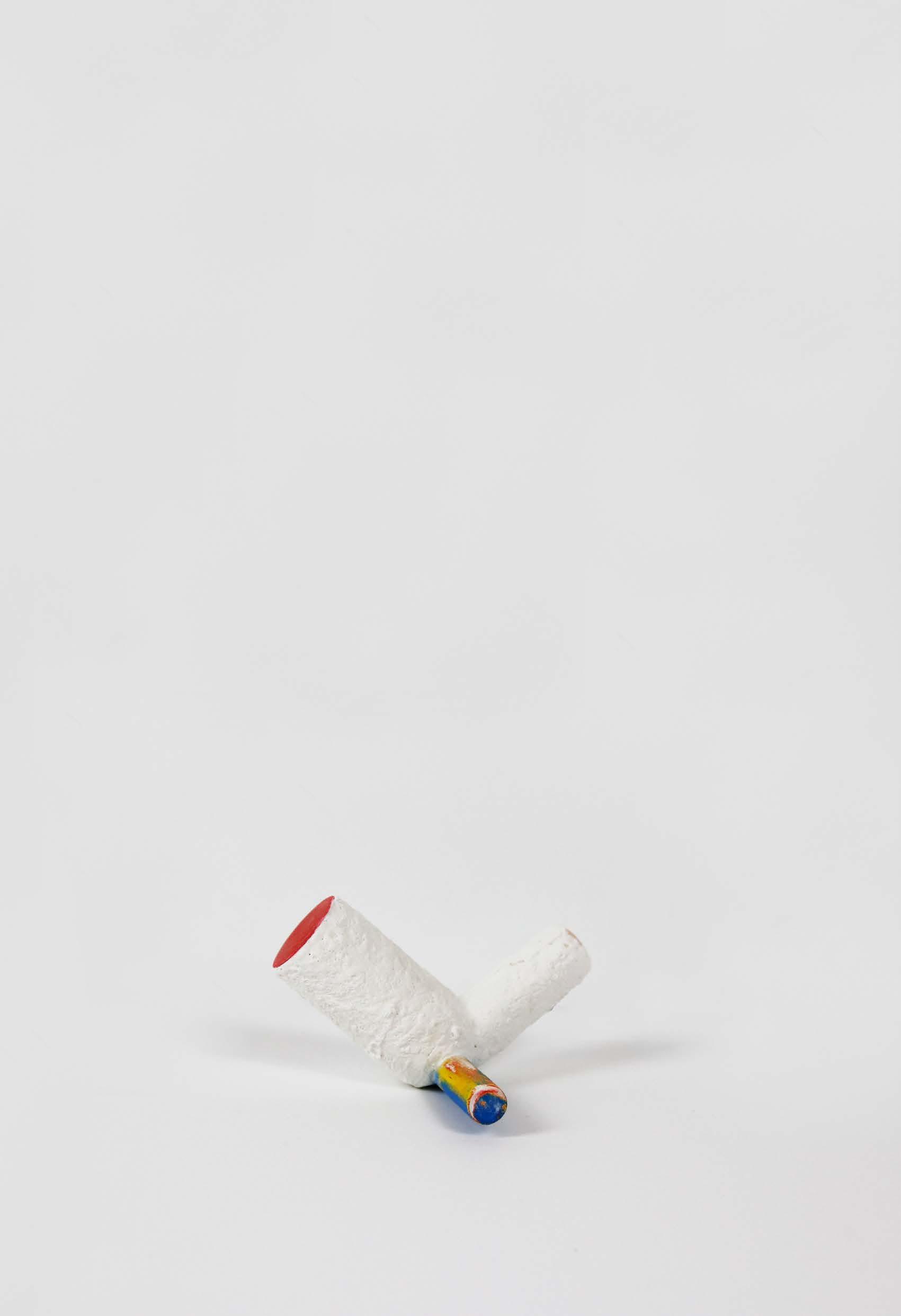
2 Finished Knuckle
1. Drawn Cubes - Using a virtual reality hand set, draw three cubes in the air. Vary diameter of each line while drawing.
2. Modeled Cubes - Take virtual model of drawn cube-like objects and remodel in Rhino. Pay attention to the joints of each intersection
3. Contoured Cubes - Give cubes character by assigning a series of stylized contours to each pipe segment.
4. Extracted Knuckles - Examine the joints and intersections of the imperfect cubes. Extract a series of knuckles or corner sections as stand alone objects.
5. Printed Knuckle - 3D print Knuckle. Consider how the print texture might align with the knuckle contouring.
6. Layered Knuckle - Obscure the printed nature of the now real artifact by covering with layers of paint and plaster. Precise form of the digital print should become muddled.

7. Eroded Knuckle - Sand Knuckle to expose built up layers. Highlight a portion of the knuckle to read as a grouping rather than a singular object.
8. Modeled Knuckle - Taking cues from physically manipulated model, digitally rebuild modeled imperfections.
9. Rendered Knuckle - animate physical layering process digitally through a series of rendered images. Expose artificiality through digital replicas.
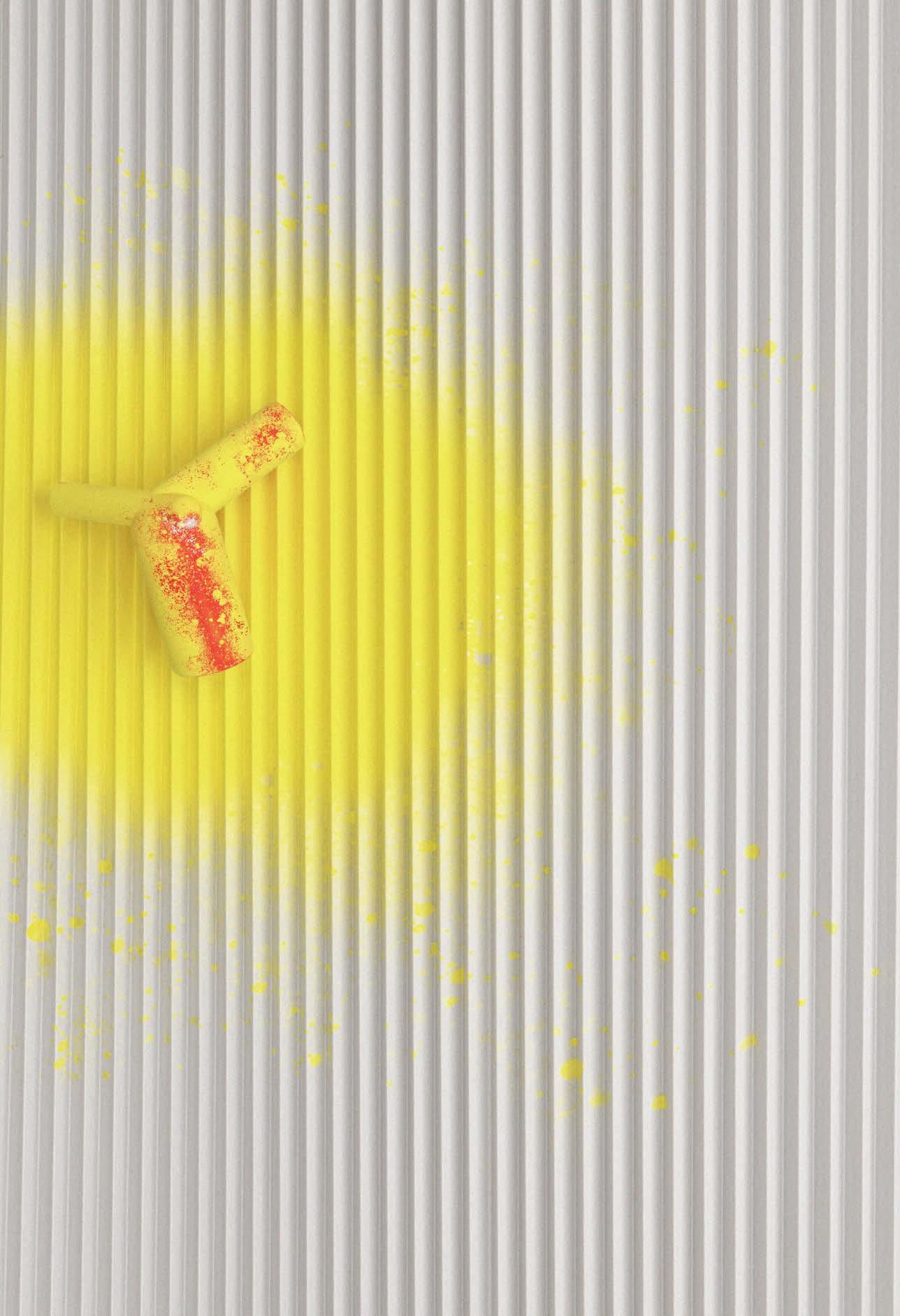
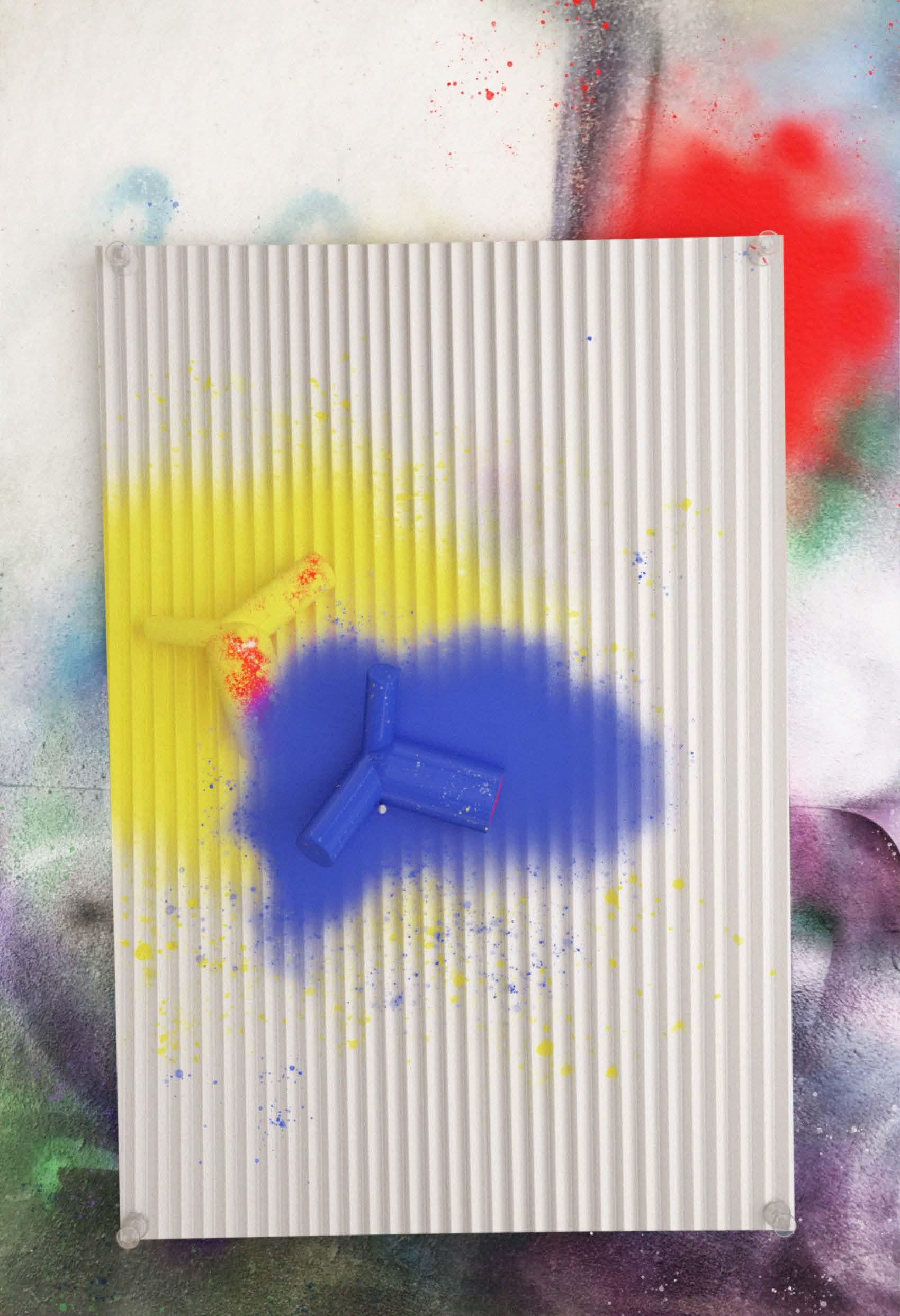
Creating a new narrative from this fictional identity, the imperfection and muddled nature is then reapplied to the digital model. A series of “in process” shots are staged, acting as the new reality. This false image is exposed by the background of each shot. The flattened image of the previous iteration becomes the backdrop, exposing the false nature of the process.
Exploring concepts of articulation, orthographic projections and boundaries, Line Studies plays with the tension between the drawn line and real world thickness.
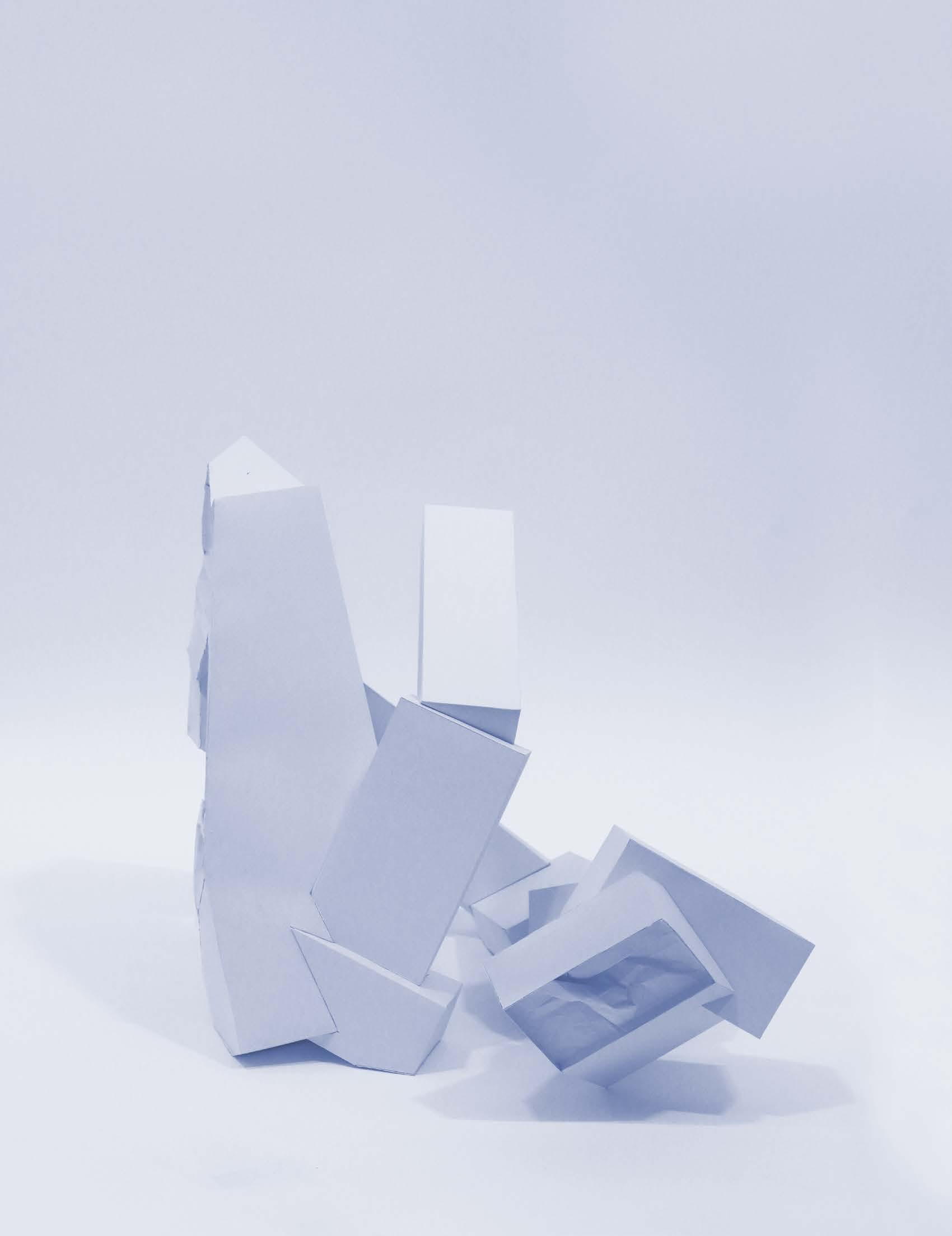
To begin, a 1,200 foot weightless line was asked to fit within a 300 foot invisible cube. Worked through digitally, the puzzle created a series of bends and kinks to properly fit. Examining how the line could be perceived as in motion, its orientation was placed in a way that appeared to be mid topple.
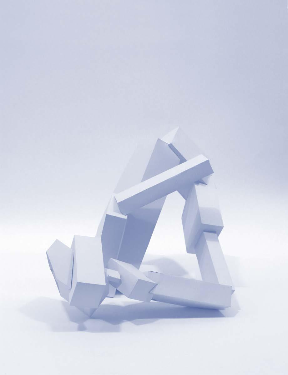
This tenuous centerline is then given mass through a series of mis-scaled boxes. Intersecting as odd angles, the tension of precariousness is heightened as they seem to be supporting one another to reach the top boundary. As a result, a quarter mile cantilever floats within the boundary condition, blurring which element is the grounding force.
Orthographic
Orthographic
Sliced
Centerline
Sliced
Sliced
Tipped
Isometric views of the form void of the boundary continue to imply the boundary from its crushed edge. Appearing to almost topple, the object feels this invisible presence, redistributing the weight and making it stable.
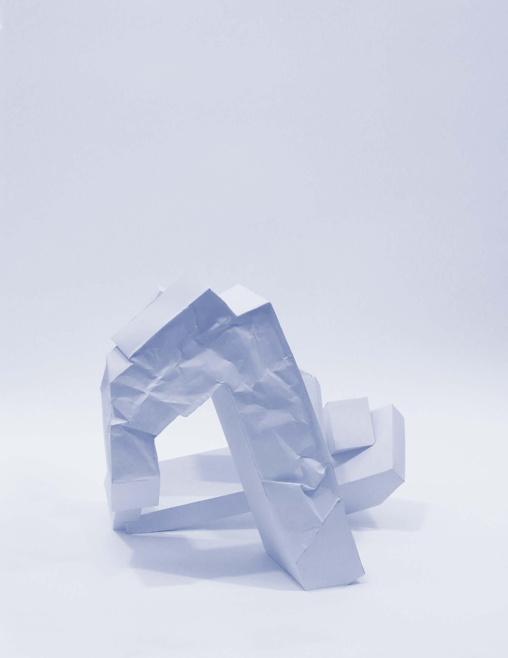
As the bent form intersects with the invisible boundary, the proposed mass is deformed and crushed to allow it to become complacent within the border. Creating new texture from the deformation an implied boundary is newly visible.
Shifting between designing as line, mass and matter, the study looks at edge as both suggestion and reality to negotiate with.
1 2
 Instructor Benjamin Bratton With Julia McConnell & Donwon Choi
The homeless population living on Skid Row in Los Angeles are unmapped and vulnerable to pandemics such as COVID-19. When the whole world is told to shelter in place, what are you to do if they have no shelter? By mapping and understanding the health and movements of this population through an opt in system, outbreaks can be contained.
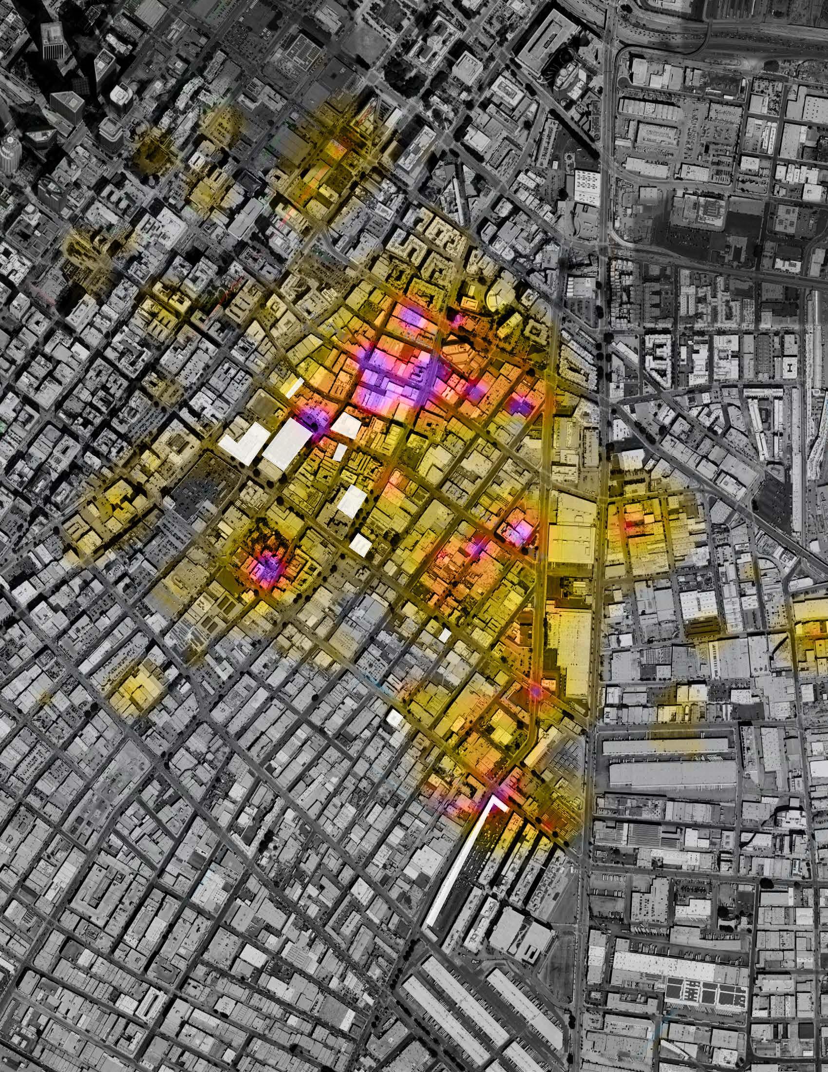
Since most of the checkpoints and resources used by the vulnerable population has been shut down or restricted, there is a lack of help and information. Information on the pandemic is spreading through Internet and television, both of which the homeless have limited access to.
Singaporean Temperature Testing Station, 2020.
St photo: Ng Sor Luan
Skid Row Mapping
Homelessness Density
Fire Station No. 23 Old Greyhound Station LAPD Central Division Union Rescue Mission Weingart Center Gladys Park Ford Hotel Terminal Market New LA Mission San Julien ParkLA’s main response is that of sheltering in large rooms like recreation centers. This is causing a high density situation where people are unable to social distance. Currently the city, and specifically the shelters, have no means of diagnosing if someone is infected. While the city continues to fill shelters, it is essential that they are equipped with testing and mapping information to protect themselves and limit further spread of COVID-19.
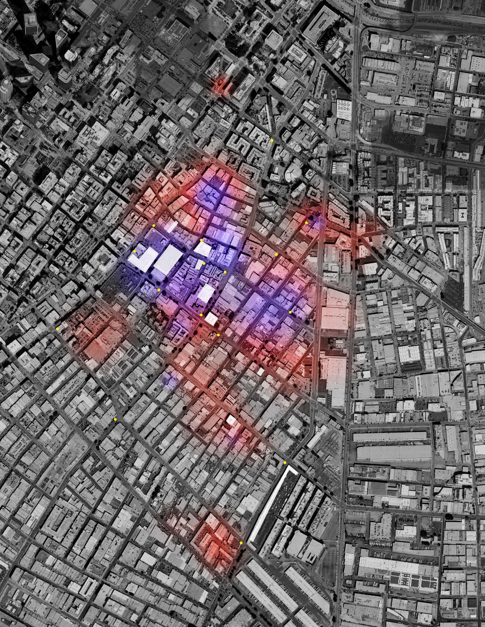
While mapping through urban touch points of temperature monitoring and cell tracking, an opt in system through automated text messaging
the population of proximity outbreaks and further health information. Resource alerts from shelters can also be added to the system to equalize shortages.
widespread
remote
shelters
supply chain shortages demographic
inequality for people with existing conditions corporate production
Relying on methods of gaining shelter, food, power and news are challenged in the current climate. The homeless are being forced to seek these resources from government programs and shelters.
The turf house of the Nordic Vikings were an efficient way to use the land as shelter. The house type is a type of rammed earth/earthen structure originally created around 1000 AD in the Nordic regions. Created with limited building materials like lumber because of the tundra-like environment, the structures were created by digging a mass out of the earth, structurally reinforcing the void with limited wooden beams and planks, and then relayering the original soil and sod on top. Acting doubly for warmth and security, the structures are extremely efficient for their lack of additional insulation and minimal structure. By directly displacing the material of the land to build from, the footprint of building was essentially null.
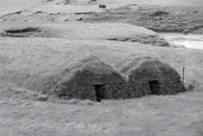
How can we learn from this typology to embrace and manage one of the greatest terraforming entities in modern times: the landfill.
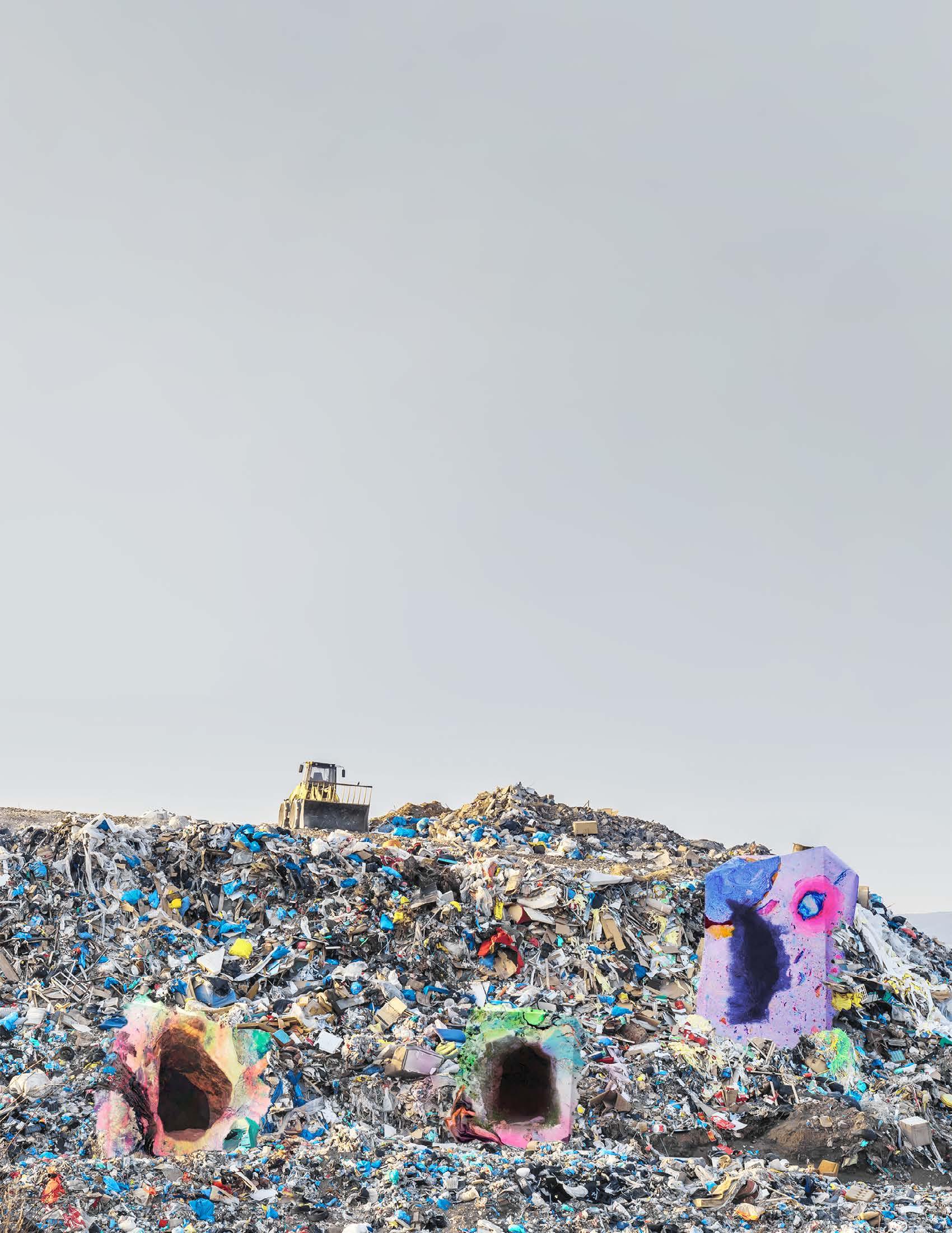
There is a rich history in recycling as building material, but it often is created without manipulating the recycled product. This creates an interesting result, but does not distance itself from the memory of being considered a waste product. Because of this, it is has not been able to reach beyond its prototype.
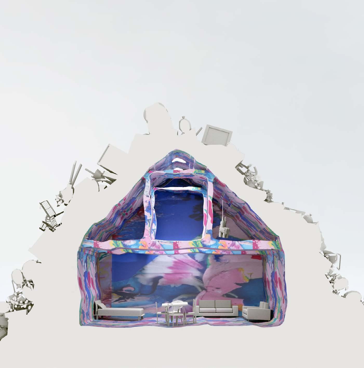
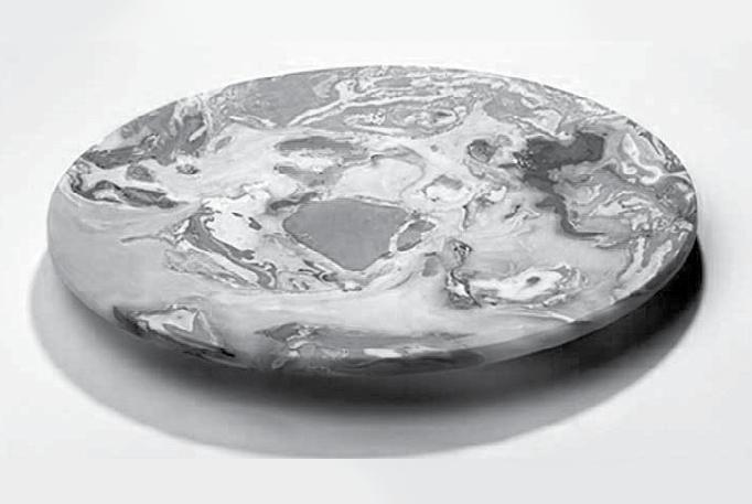

The proposal looks to found object idea of the Icelandic turf house
and reimagines it for the landfill.
Using the existing found plastic, new structures can be created by reforming the material into a more structurally stable environment. The structural process can be created through a means of simple tools. First is sorting and collection for the right types of plastic for particular functions (strength, translucency, toxicity). Selected pieces are then ground into pellet
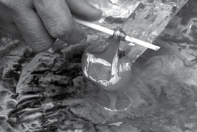
sized pieces which are then fused and molded into structural shape from a heat source. The unused elements then cover the structure for security.
While a bit far reaching, this proposal shows how the unused plastic can be rethought for low-fi purposes and should be seriously considered further in the architectural setting.
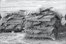
1
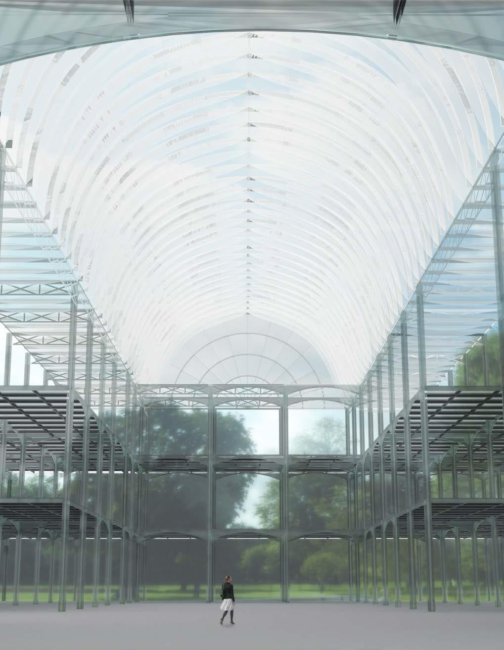
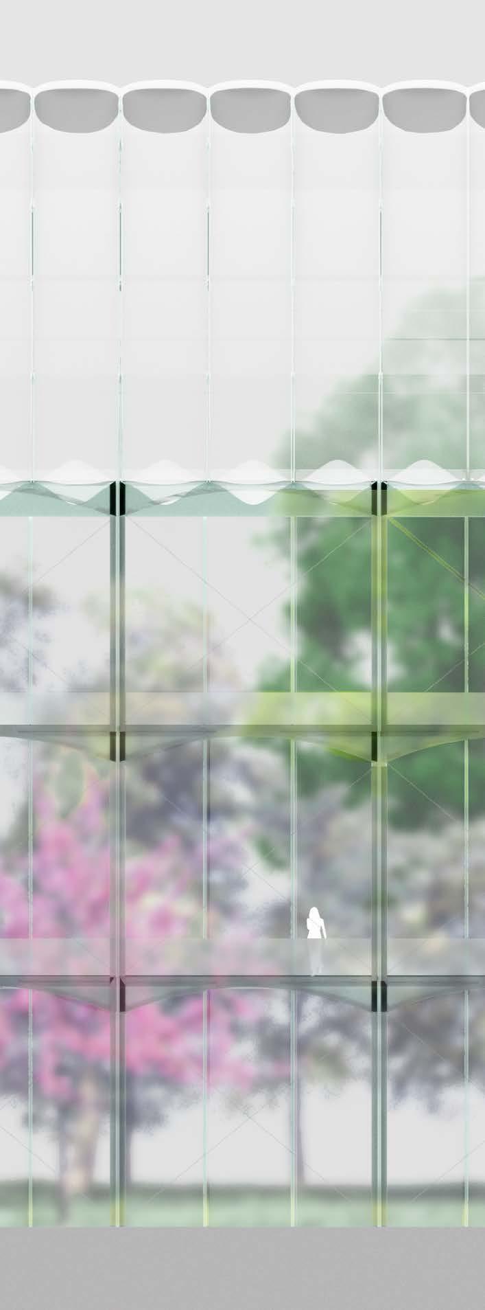
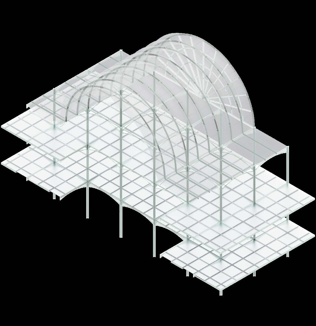
The Crystal Palace was a cultural and technological innovation at the turn of the 20th century. Its simplicity of construction became the standard for building for the the next century. When looking at such a significant element in today’s age, how can a modern innovation on this historic piece be made?
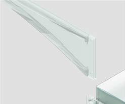
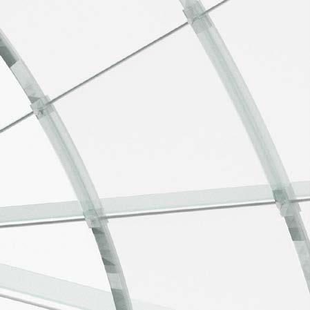
As glass and cast iron were the innovative materials to create the transparency that was thought impossible at the time, what if the very material of innovation then further created transparency? By inverting the diagram with glass as structure, a ghosted appearance of the highly recognizable structure seems to become an illusion. Modern innovations of lightweight inflated plastics can replace the transparent quality of glass, dramatically decreasing the load required of the structure. Innovations of structural glass while not at the strength of steel, are capable of self weight and supporting the ETFE.
Interior view of the Crystal Palace, 1851. © paristeampunk. canalblog.com
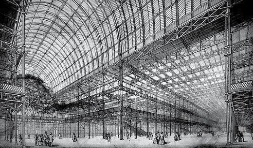
Interior Rendering of Crystallized Palace
 1GA Fall 2020



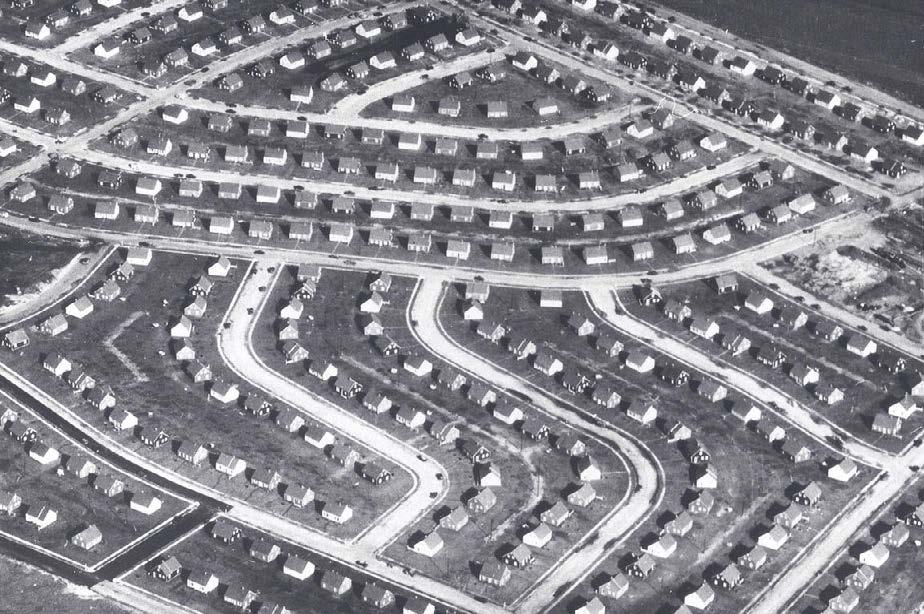
Once idealized by the Jeffersonian Grid, the post-World War II planned suburb reduced the American Dream to a ¼ acre lot. Levittown, the most notable development of this period was lauded as the primary example for this new type of living. Serving as the archetype for the homogenized manicured lawns behind picket fences for white middle class Americans, this neighborhood is a product of federally sanctioned shortcuts passed under the guise of affordability and efficiency. While the houses within have evolved to match fashions of the era, the bones from the 1950’s Levittown are still a standardization of many American suburban realities.2 Proof of this stasis is exposed in documentary style entertainment from home centric television networks like DIY and HGTV. While seemingly passive and tangentially educational, these programs fill the void for viewers promising a sensorially dulling consistency. However, looking critically at these docile programs exposes the stagnancy and complacency present in today’s domestic American Landscape.
the house occupies the media is directly related to the way the media occupies the house.”11 She furthers that, “television not only brings the public indoors, it also sends the private into the public domain.”12 The transactional flip of private to public and back is inherent through the common knowledge of this type of intimate enclosure, without the real didactic understanding of any other home but your own.
This is the first government sponsored suburbs. She argues that the guidelines “eliminated the more obviously symbolic artifacts of domestic life that had become standard in the nineteenthth century and prewar middle-class home” Kelly, “Little Boxes, Big Ideas,” 26.
Ruff, “Levittown: The Archetype for Suburban Development”.
Clauses within these guidelines limited the funding to Caucasian communities, creating a state sanctioned aesthetic of the Cape Cod that became a beacon of white supremacy and segregation. Azus, “Uncanny Home,” 160.
Azus, “Uncanny Home,” 159.
Azus, “Uncanny Home,” 160.
The term commodity connotes the commercial aspect of these seemingly efficient housing through a mass planned developer scheme. Azus, “Uncanny Home,” 160.
This efficient design while better than the tenement housing of the city, was not a functional living space for a growing family. Homeowners needed to take renovation into their own hands to create a space that worked for them. Prior to this phenomena, single family housing was a much slower craft, typically working from the sears catalogue for plans and working with local craftsman directly. Shifting from artisanal to mass produced a rethinking of the home from something static and stable to one that is fixed, adapted, and renovated. This newly adapted attitude towards a consumer-based domesticity cemented the idea of home design as that of fashion. The subsequent birth of the home renovation, and DIY economy came of this supply chain disconnect. Kelly, “Little Boxes, Big Ideas,” 27.
Fry, “Prior to Covid, Urban Core Counties in the U.S.”.
Ruff, “Levittown: The Archetype for Suburban Development”.
Post-World War II, the Federal Housing Administration released guidelines for an economical house aimed at accommodating the boom of young families in need.3 This newly defined minimal house tackled the single-family typology through the filter of efficiency, eliminating anything considered unnecessary. Architectural niceties like foyers, hallways and basements were omitted for a condensed style of living. The accompanying pattern book offered 44 variations of a single homogenized floorplan, all contained in a Cape Cod Revival style wrapper. Levittown built most of its development following this guide, and today it is one of the most common styles of homes in America.4 Lee Azus suggests that popular vernacular housing typologies were abstracted and reduced to “traditional styles that functioned as skins over the modern minimum house floor plan.”5 This reconfiguration of the traditional single family home, largely based on traditional cape cods, colonials or bungalows, “was reimagined as an efficient commodity.”6 Typologies that were once indicative of unique layout, tectonics and style were condensed down to purely an aesthetic skin.7 A nationwide sales pitch of federally backed planned communities bolstered propagation in metropolitan suburbs like Chicago, Los Angeles, and New York City, establishing this case study into home for 25% of the nation .8 As clones of this mass neighborhood sprouted up across the nation, regional vernacular abstractions differentiated the cladding of relatively identical homes.
Reinforcing the sales of planned communities through culturally integrated advertising, innovative campaigns of targeted print ads, sponsored articles, and television integration establishing community into the status of the American cultural cornerstone.9 This relationship of the image of the home, and the usage of the home are inherently interconnected through the transitory relationship of private and public realms.10 Beatriz Colomina suggests that the house from the 20th century to now has been in a constant dialogue with media: “The way
Today, television programs like HGTV’s House Hunters further blur the relationship of media and the domestic realm. Turning large swaths of banal suburban homes into a series of discombobulated stage sets, the viewer has an intimate understanding of the interior, giving access to judge the buyer through a false pretense of superior knowledge. Part of the inherent success of the program is the elevated position viewers can take, however misguided they might be. Self-proclaimed experts critique the personal and complex decisions of strangers from the comfort of their couches. Terms like open plan, indoor outdoor living, and geometric lines have been absorbed through osmosis from home buyer to viewer. The show conditions viewers on what is available in the market, passing along little teasers of misused architectural phrases through word of mouth, and teaches the public to focus on the consumer fixes rather than the larger systematic issues. Paula Marantz Cohen outlines this consumerist brainwashing through her own experience of diving into this programming. She rationalizes that the fixtures and finishes that seem to top every buyer’s list are “fetishized luxury commodities, priced out of the utilitarian market and available only to those with a great deal of disposable income.”13 It is the idea of coveting or feeling the need to keep up with the Joneses that keeps the multibillion dollar a year home décor industry churning. Even when it is presumed by the viewer that their tastes are superior, Cohen argues that “Culture emerges of social relationships and socially constructed norms that we can’t escape.”14 As the discourse typically eschews from this type of mass level engagement, it is worth noting that the taste embedded in the show, is almost certainly begat through conditioning.15 Cohen postures that “Taste always has a communal dimension… and it is always, in some way, conditioned.”16
Comparing the logics of Colomina and Cohen, taste, the media, and home are in a constant dialogue between the personal and communal realms. Culture is unknowingly training itself to not only accept this, but to desire it. Where architects and designers have tried to reach out to the public through media, their voices have been drowned out by the constant stream of mind-numbing feel-good entertainment. This seemingly innocuous conditioning of culture becomes sinister when it is realized that HGTV is not a neutral actor in the situation. Shawn Shimpach suggests that HGTV is a “revealing site for understanding the… nuanced relationship between textural representation and political economy.”17 Positioned as a neoliberal capitalist company, the underlying drive is to feed into viewers constant conditioning to keep up and not be left behind.18 Consumption of supposed architecture through this low brow
Learning from Levittown was the unpublished sequel to learning from Las Vegas conducted concurrently. Robert Venturi and Denise Scott Brown similar to the methodology in La Vegas, the pair studied formal analysis through the presented branding and aesthetic as compared to the reality of its use.
Colomina, “The Media House,” 63.
Colomina, “The Media House,” 63.
Cohen, “On Granite Countertops and Wolf Ovens,” 130.
Cohen, “On Granite Countertops and Wolf Ovens,” 135.
“I wonder if was conditioned, even before I was sentient, in certain kinds of furniture and home décor that my mother liked and from which have never strayed.” Cohen, “On Granite Countertops and Wolf Ovens,” 135.
Cohen, “On Granite Countertops and Wolf Ovens,” 135.
Shimpach, “Realty Reality,” 517.
Shimpach continues by suggesting that the network operates in two specific realms: the ideological and the disciplinary. The first suggests a free market approach towards self-interest. The latter “teaches viewing subjects about presentation of self, the limits of possibility and the ubiquity of surveillance.” Shimpach, “Realty Reality,” 517.
“In relation to the ‘Good Design’ program, Edgar Kaufman Jr., appeared daily on Margaret Arlen’s Morning Show for two weeks in early 1954.” Colomina, “The Media House,” 63.
Harwell, “How House Hunters became the most unstoppable juggernaut on TV,”
media creates a diminished baseline for the American dream that matches growing economic and sociopolitical discontent of younger generations. In a broad sense, understanding of the field of architecture has been entirely overtaken by the building product industry, reducing the conversation down to a set of sinks.
Just like Levittown was not the first planned community, HGTV is not the first network to focus on the American home and home improvement.19 It is the breadth of the programming, and its accumulative ability to show the actual condition of housing in America that sustains it today. HGTV’s longest running show, House Hunters, alone has aired 1,750 episodes over 22 years, showing three houses per 22 minute segment. Its success is its reliability and consistency. For many of its 25 million monthly viewers,20 the show is one of the only sources architectural discourse. Modern American programming has created a neo-picturesque jumble in which dismal standards Americans have come to accept and desire are revealed. Evident in the breadth of this kind of programming is the disconnect from picturesque Americana originally portrayed through Levittown propaganda, to the astonishingly grotesque architectural disarray apparent in suburbia today. On its own, each episodic segment presumes to be a docile documentary, following American home buyers as subjects. Uncannily similar, each home offers minute variants, often void of regional context. Typologies that were abstracted in the era of Levittown have further been reduced to a cosmetic application. Casual binging of the show’s multi-decade run, reveal an archival gem: the largest documentation of the current state of housing in America. Today, the American Dream is whatever is being sold between commercial breaks.
Aerial View of LevittownA three-dimensional collage of disparate textures and objects form to create a loosely recognizable interior corner. Distorted noise that blends each element is an artifact of the analogue camera that produced it. Yet it is perfectly digitized and cropped to a standard ratio. The exposure mimics the high contrast of a UV camera: highlighting texture and simultaneously obscuring clarity. In contrast, the washing of light in the image transcends the flattened effect of the patchworked room. Cropped out of both sides of the frame, the tacit light source hints at a space beyond. One of two archival photographs of the Keio University Faculty Room Memorial to Father designed by Isamu Noguchi, the image acts as a cross-cultural bridge.
Instructor Marrikka TrotterA Japanese American Noguchi was born in San Francisco, raised in both countries and served time in an American internment camp during World War II. His Noguchi Room, designed in 1951, was one of three commissions awarded in Japan following the end of war. Nestled into the ground floor of Shin Banraisha2 Noguchi’s involvement on significant national works was seen by the Japanese public as an imperative portion of post-war healing for Japanese – American relations.3 Noguchi’s first interior commission, the room was a deeply personal work of art. Dedicated to his father, Yone Noguchi, Isamu used the brief to obtain closure and understanding surrounding memories of their difficult relationship. Yone, a former professor of literature, had a muddled history with Isamu’s mixed-race status.4
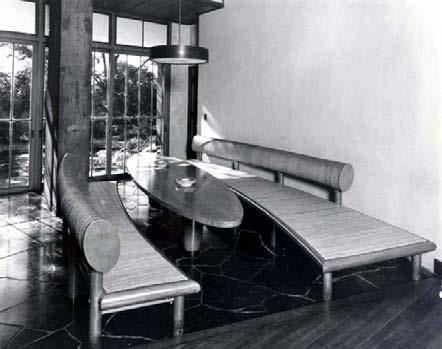
Consequently, Noguchi explored the dissonance of his two heritages through the patchwork of materiality and sculpture. Materials that recalled nature, like stone and tatami, symbolized Japanese naturalism whilst manmade materials like concrete and metal represented the urbanism of New York.5 Floor became a patchwork of material, creating sculpted zones indicated by various transitions. Similarly, a mixture of eastern and western seating options layered the room. Raised wooden platforms lined the back wall and could be used for sitting or walking. Half of the tatami was left open to sit on while the western half was filled in with bench and table.
cropped frame becomes a singular still in the promenade of the space. The photo acts as both a snapshot in time and hints at eastern approach to the design.11 The hearth is central to the image, with no reference to the sculptures in the garden surrounding.12 Light sources are only found out of frame. Their resultant wash fades to deep shadows. These shadows deepen the contrast and patina of the natural, raw materials. Faint washes of light give life to the image, embracing Japanese ideals of light and beauty at the time.13 In contrast, the second archival photo, Figure 2, contrasts the subtle light of Figure 1. Views directly out to the garden serve as a backdrop illuminating the scene with strong sunlight. Exposed by the wall of windows, the image has a much brighter, harsher tone. Redundant in function, the layering of cultural seating elements further highlight the collaged quality to the room. The photos frame moments of the experience rather than attempting to capture the composition at large. Creating contrasting views of the room, the two images distill and embody the essence of Noguchi’s dualistic design.
The power of photography to frame the dialogue about a project is not novel. Many modernist architects used the newly harnessed camera as a means of framing their designs, often eschewing the actual building for the photographic representations. The Bild-Bericht photos of the Barcelona Pavilion became the authority of the work for 70 years prior to reconstruction.14 Even then, archaeological evidence was superseded by the discourse’s interpretation of the photographs.15 Framed, retouched, and narrated, the photos of the Barcelona pavilion became the true beacon of the project. Sigfried Kracauer argues that “although time is not part of the photograph [it] is a representation of time.”16 Further, the details of the space or the moment cannot outlast time “rather, time would create images for itself out of them.”17 The inevitable abstraction of the photograph from the room birthed new interpretations of the work.18 Misreads, became new discoveries. Photographic representation became the architecture.
Noguchi Room, Hiroshima Bridge, and the Hiroshima Memorial were commissioned as a national rebuilding and act of reconciliation. Torres, A Study of Space, 76.
“New Building for Many Guests”. Building designed by Yoshiro Taniguchi. Torres, A Study of Space, 76.
“The destruction of Banraisha during the war leaves the need for a new structure or Shin Banraisha to carry on the spirit of Fukuzawa. With the war over, I thought that architecture symbolizing an open country and new ideas would be appropriate” Qtd.Yoshiro Taniguchi. Torres, A Study of Space, 76.
Hakutani, Noguchi, Father and Son, 18
Torres, A Study of Space, 79.
Torres, A Study of Space, 68.
Torres, A Study of Space, 79.
Torres, A Study of Space, 79. Noguchi, A sculptor’s World, 39.
A sculptor by trade, Noguchi’s work also focused on the spatial relation of sculpted objects to their site,6 designing large scale gardens to pair with his interiors. Surrounding the Noguchi Room, three garden sculptures triangulate the room from the garden.7 Materiality and form extend past the boundary of the room via stone flooring that blurred the borders of interior and exterior.8 A fourth sculptural hearth centers the interior, both as functional object and visual foil. To him, sculptures were as alive as the subject, and continued to change based on the viewer’s relationship with it. He argued that space is the medium which animates sculpture.9
How can an image represent work that is so intertwined with movement, symbolism, and site? Walter Benjamin argues that the distance the camera creates between the object and subject gives way to dream like state of interpretation.10 It is only through the distance and framing of the photo itself that we can really understand the aura of the space. While the image in figure 1 captures a corner of the room, the intentionally
Mirroring a similar path in 2002, Keio University announced the demolition of Shin Banraishi to make way for a new Law Building.19 Proposing to relocate the Noguchi Room to the roof, the university supported a solution of museumification. An uproar from the architectural community was not enough to stop the disembodiment of the site-specific work.20 Separated from the lore, the building, and garden the room became a shell of itself. Preserved in materiality and footprint, the room was ripped from its site gardens and placed into a glaringly bright glass penthouse. The shadowy composition was replaced with blasting sun beams, The patina’d hearth out of place in the sky.
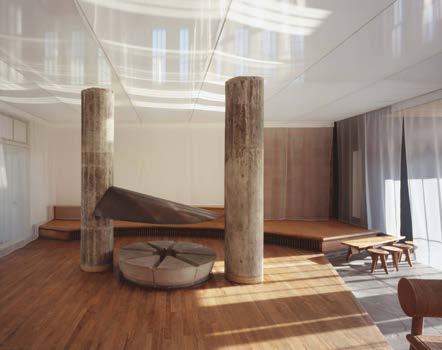
Seemingly acknowledging this dissonance, the architects responsible for the relocation wrapped the room in a thin veil of white fabric (see figure 3). A sheer curtain grazes the ceiling, draping around the perimeter of the room. Shrouding the original collage in a blur of gauze, the same softening effect of the analogue photo begins to come through in transplanted room. Artificially creating the same visual noise from the photograph, the reconstruction aligns with the spatial narrative of the photograph over the physical reality of the space. The photograph has become the main
Dodds, “Body in Pieces”, 178.
Torres, A Study of Space, 79.
Torres, A Study of Space, 79.
Tanizaki, In Praise of Shadows, 1-48.
Dodds, “Body in Pieces”, 174.
Dodds, “Body in Pieces”, 176.
Kracauer, The Mass Ornament, 49.
Kracauer, The Mass Ornament, 49.
Dodds, “Body in Pieces”, 176.
Micucci, “Dismantling work of Noguchi.” Micucci, “Dismantling work of Noguchi.”
means of translating architecture to an audience.
Even if the room were preserved in situ, people’s understanding to it would change. Kracauer argues that without the folklore being passed down, the image feels almost unreal. Becoming void of context, the photo is disassociated with the memory of the physical space.21 Arguably, the same happens to the symbolism of the architecture. Designed in the same year as the Noguchi Room, The Hiroshima Bridge has been physically preserved since its construction. A remembrance to the lives lost from the atomic bomb, the bridge was a message of renewal. Symbolic forms shape the bridge, becoming an integral identity of the city, but the latent memory of the symbolism has faded.22 Distanced by time, the population of Hiroshima does not feel the same physical connection to the significance of the bridge and therefore see it as a piece of infrastructure. When asked, citizens hold a closer association to the photograph of the bridge’s opening as a connection to events associated, then physically being at the bridge in modern times.23 But the everyday structure is not mired with the same weight as the photo. Extrapolating from Kracauer’s argument, the “Ur-image” or the memory images slowly decay and fade for the architecture. Eventually all that remains is the photograph as witness.24

Despite the few architecturally relevant pilgrimage sites one can visit in a lifetime, most of our knowledge and access to the range of architectural history comes through the seemingly infinite compilation of photographs. Our understanding of the spaces is so deeply linked to the image that our bias of the a work often hinges on the clarity of the photographs. A big part of an architectural understanding is seeing or experiencing historical pieces of architecture, the photo is an invaluable tool for the architect. Gathering, curating, and metabolizing this infinite database is now the modern pilgrimage. Giving access to a wider group of people, the digital platform acts as an expansive leveler. With this often used, but seldom discussed habit of image hoarding comes a question of curation. We should treat archiving the digital record as an equal valued player of architectural history.
In the COVID-19 era of domestic isolation, the world collectively stopped experiencing new physical spaces. The digital pilgrimage is the new digestion of history as well as the present. Predating the pandemic, the shift to digitized image accumulation has become a knew facet to human knowledge. Just as this shift exposed the latent traditions of office culture and retail therapy, the use of the image to understand space became fully understood as essential in the professional practice. Unable to explore physically and discover beyond the canonical greatest hits, the digital pilgrimage has fostered a new type of archival grave digging.
We learn more precedents than we will ever be able to physically access. We rely on images to capture the essence of the project, using digital databases to link us with as many iterations possible to understand a clear spatial narrative. Sifting through millennia of images, ripped from their context, the digital photograph is the new ascension to the acropolis. Unlike the reinterpretation of a singular place, it is the neural network of
search engines that jump us from one image to the next accumulating a progressive narrative. A new sense of collective emerges not from four walls and a roof, but from a series of visually similar pixels, arguing for similar symbolic collectivity as Noguchi himself. The individual photo or space or story no longer becomes relevant, instead it is the collective wave of each acting as a pixel in its own storyboard. The room, reconstructed or preserved, is no longer needed. Many architects will discuss the piece will have never seen it. It has lived on in its curated sense, as anything does. The physical components decay and become lesser versions of the intent, but the time stamped photo remains as a constant energy map ready for categorization.25 Enigmatic photos like those of the Noguchi Room are given greater access than ever before. Their stories live on in continually shifting digital file organizations. Existing autonomous of their three-dimensional sibling, a question of authenticity arises. Does the room add value to the image anymore?
Aldo Rossi is consumed with dissecting, digesting, and understanding urbanity. Refusing to understand it as a series of disparate entities forced into close proximity, nor a sweeping creation from à la Robert Moses, he sees it as a natural set of truths that can start to be understood. Delineated into primary elements, certain “fixed activities” (86) can be processed as the collective nature of urbanity. His focus on “urban reality” (86) as a means to understand how an urban environment actually functions allows him to analyze a city more anthropomorphically than through the typical eyes of a designer. It is the abstraction of the primary urban artifact that creates the monument. Removed potentially from its original function, it has become a marker or beacon nestled within a pocket of the city. Similar to that of the Parthenon, it creates and embodies the personality of the city more than the infrastructure surrounding it.
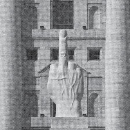
This important role of the monument became critical to Rossi’s work and embodied by Milan to this day. While the majority of his researched monuments are quite large in size, it is the mixture of Milan’s monumental scale making the city so dynamic and rich. A smaller incarnation, hovering between public art and urban fabric, has taken as the new monument typology. Milan has embraced this idea of monument as attraction. From Rossi’s own work like the Monument to Sandro Pertini, to Maurizio Cattelan’s L.O.V.E. it is the smaller works scattered throughout that create breaks in the expected urban fabric. Even monuments of temporality take over the city once or twice a year for the many fashion and design “weeks” that create urban scale art for the city. Moving at the speed of commercialism and social media, these monuments are as outward facing as they are temporal, further diminishing “the importance of the plan and overall pattern of the city” (92) which is further a concern between the monument and city.
Windows are frames and tools. Often seen as invisible (short of stained glass) the argument of the window from both Alberti and Kenzari’s example of the Perret, Le Corbusier argument is one of absence. To Alberti what is significant is the control of airflow, light and subsequent heat, and movement. It is not the window itself; it is the opening of the wall. Perret and Corbusier’s argument regards the framing proportion of the subject. Viewing a window as a flattening representation of the world that lays beyond, Perret and Corbusier see windows primarily as active paintings rather than sensory tools.
Alberti’s take on windows is a more utilitarian argument for their existence. Looking to ancient Rome, he rationalizes windows as a set of functions, air purity, light and movement. Kenzari focuses on the symbolism of the window. He argues that the window frame within art and literature is embedded within the architecture that we make. He even argues that “the architect’s understanding of the window has not been limited to the practical considerations of fenestration only” (Kenzari, 39). Perret’s Port Fenetres is in proportion with the viewer, it creates a one to one relation of body and void. Le Corbusier’s strip window intentionally disrupts the body, only engaging the subject’s vision through the frame. No longer acting as an object and subject, the subject is shielded from view. It is the dislocation of the head from the proportioned body that is the real issue for Perret. The traditional window is more comfortable. It is akin to romantic paintings of streetscapes. It is digestible and in line with our understanding of how the world should be perceived. Like Alberti, Le Corbusier’s window is one of the external. It is bringing the elements and light in. It is not transactional. While prioritizing visual over light and air as Alberti’s preference to place windows above the head as not to block them. Similar to le Corbusier, the subject is protected from the exterior. He is able to reap the benefits of openings without exposure.
Does the window have the responsibility to be visually double sided?
As Kenzari pointed out in the conclusion of his essay, even Le Corbusier transitioned between his beloved strip window to more traditional punches later on in his work. The Nuance of the window is more than can be summed up in a proportion. Alberti’s view of the window as void in wall rather than framed image beyond is probably the most honest definition of this question as it negates the site beyond for a purely interior perspective. Questioning the service of a window is quite a large question for a single page (or two) of discourse. It is the very fact of its framing that creates the complexity in its definition. What is included, excluded and why are games that could be eternally played by artists and architects alike.
Rossi, Aldo, Diane Yvonne. Ghirardo, Joan Ockman, and Peter Eisenman. The Architecture of the City. Cambridge, MA: MIT Press, 1982.
Maurizio Cattelan, L.O.V.E, 2010
Alberti, Leon Battista. De Re Aedificatoria, 1452. Kenzari, Bechir. “Windows.” Built Environment 31, no. 1 (January 2005): 38–48.
A few years back I warned a colleague about the overuse of arches and circular cuts. It seemed that overnight bubbles sprung up in every type of project around the world . Just last week I was warned of the same thing. Both encounters stemmed from this fuzzy feeling that circles have been popping up in contemporary architecture and therefore should be avoided. Transcending scales, styles, and motivations, the circular stands out as a dominant force for designers. Exposing an interesting intuition of the architectural profession, our fear of commonality and the need to feel different is obvious and ubiquitous. Why does that all have to rest on the circular? Why is a rough association to this geometric shape that is pivotal to architecture’s foundation so beloved yet feared? We generally do not have this same sensitivity towards the orthogonal, so why is it quietly taboo? Apparently, the worry in the field has become so widespread that any circle-like things are on watch.
At first glance, it seems that some of this fear is the resurgence to Memphis design, and the relation it had to pure geometry. Jimenez Lai among others wonders if we are in a Neo-PoMo period2, and viewing the circular within the lineage of the Piazza d’Italia. While there are some close contenders for this like Confetti Urbanism or arguably Lai’s own work, this is an oversimplification and a classic example of the pure objectification of the circular.
So let’s look at the circle throughout architecture. Surely the Parthenon and Boullee’s Cenotaph for Newton welcome the circular with open arms. On a more elemental scale, the historical innovation of the arch and the vault make rational structural arguments for roundness. Fully integrated into many architectural languages, circularity was as necessary and important as orthogonality. When did this switch become disjointed?
Modernism can partially be blamed, as the free plan allowed for roundness to be isolated and highlighted like in Le Corbusier’s Villa Savoye or John Hejduk’s Wall House. This is the first time that circularity is used as a point of expression rather than a structural, historical, typological reason. Pressing against the industrialization of early 1900’s the circular felt like a subtle human expression, a break in the binary, the other. Since this shift, we have been trained to code circular as this other. It lays somewhere between a placeholder, and an unattainable form. Opposite of the historical feasibility and rationality, modern circular contradicts traditional construction techniques. Its ephemeral rests in its unachievable nature. The functional circular characters – the dome, the vault, and the arch – suddenly need to justify their existence rather than coexist. To go one step further, given our somewhat complicated relationship to historical associations thanks to Post Modernism, it feels more justified for Zaha Hadid Architects to design a signature swooshed form than an arcade. 3
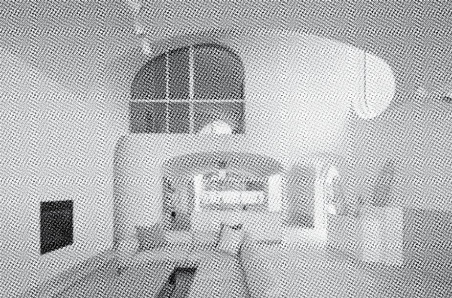
Johnston Marklee’s Vault house is an interesting example of justifying the existence of the circular. Far from the cuteness or PoMo inspiration Lai points to, the house is purely about the link of geometry oscillating between icon and void. For Johnston Marklee the Vault house was “apotheosis of a first generation of works with a more static exterior versus a more complex interior”.4 While the overall massing is a common
shoe box, the project is about the reduction of the mass through circular and vaulted forms similar to Greg Lynn’s definition of interiority as “a problem of finding an entry.”5 Looking at a house devoted to playing between the relation of shape and form, the Vault House is a game of framing and framed.
Often eschewing a stance on the fashionable movements within the field, Johnston Marklee seems to be in constant search for the role of “other” within architecture without it feeling like “other”. This element changes from project to project, shifting the ratio of non-congruent shapes to almost dominant. There is a recognition of our historical position and the firm actively searches to push the edge of this. The collage-like nature of the vaults at first glance seems like a rejection of Greg Lynn’s provocation that “Geometry with an eye toward those moments where it describes spaces and forms as whole bodies. It is in fact most likely not utility, economy, or structure that fixes architecture statically but its prejudice in favor of geometric ideality.” He furthers that “Geometry provides the apparently universal language with which architecture assumes to speak through history, across culture, and over time. Architecture tends to employ geometries that are eidetic: that it is, they are self-identical, signifying nothing other than themselves; they are repeatable identically; and they are absolutely translatable for all people, for all time.”6 The Vault House is actively trying to manipulate yet acknowledge the inevitability of the vaulted forms reading as the identifiable shapes Lynn lays out. It is eidetic, recognizable architectural tools, but they are squished, splayed, and cut. The forms are actually playing with the splines, anexactness and associations. Form is disguised and is a byproduct of the sculpting of perceived shapes.
With Lynn’s provocation to free form from shape, why does Johnston Marklee’s Vault House hide form through shape? The house’s utter resistance to the theoretical dialogue connotes a need for using shape as a mode of abstract, inverting Lynn’s argument. It morphs and warps the classical icons for a glorification of geometry in its purest. Lynn argued that “Vague objects that are merely round may be more or less spherical yet no two are ever absolutely identical. Roundness itself can be defined with the probability for never ideally described with exactitude. Likewise, an ideal sphere can never be realized in matter.”7 However the Vault House uses these shape-like objects as identifiable form, pushing against and acknowledging that while not exact, it is “close enough” and the association will be made regardless. This is why the Vault House reads as a series of morphed and intersected objects rather than a sculpted void. The icon of the vault is inevitable and will be seen as the full object.
This blurring between conceptual shape, drawn shape and memory of a shape spans greater than the geometric category. Lynn argues that “In effect, the sphere that existed for Plato has been handed down to us identically across cultures and through history,”8 but it is true that the disk has as well. Imperfect from the reality of its existing in the real world, there is still an eidetic memory of it as that of the circle. While Lynn was arguing for the abstraction of this shape to the point of no recognition, Johnston Marklee know that any abstraction will be related to another thing. Everything looks like something that looks like something else.
A somewhat random collection of architects have been complicit in this including but not limited to: Zaha Hadid Architects, Berau Spectacular, Toyo Ito, Sanaa, OMA, Food, Leong Leong, ODDA, WorkAC, and Johnston Marklee.
Lai, Jimenez. “Between Irony and Sincerity.” Log, 2019 23-32.
Although the firm is currently designing both.
Johnston, Sharon, and Mark Lee. El Croquis 198: Johnston Marklee, May 1, 2019, 13.
Lynn, Greg. Folds, Bodies, and Blobs. 2nd ed. La Lettre Volee, 2004, 36.
Lynn. Folds, Bodies, and Blobs. 2004, 39.
Lynn. Folds, Bodies, and Blobs, 2004, 41.
Lynn. Folds, Bodies, and Blobs, 2004, 40.
Lynn. Folds, Bodies, and Blobs, 2004, 35-36.
Meredith, Michael. “Indifference Again.” Log, 9-15.
Gage, Mark Foster. “MMM: Multiple Resolutions.9-22.
With their continuing focus on the creation of “other” to create dynamic forms and spaces, the Vault house is self-aware in the simplistic relation between circular and other playing it out throughout the structure of the house. Being made exclusively by the circular vault, the rectilinear and orthogonal portions of the house should feel objectified and “other” but still becomes a backdrop for the sculptural form of the circular. We are unable to make this separation of round shapes as outliers.
But why is there still this feeling of circular form being played out? Do we feel like it is a cheap trick, a stand in for real design? Even as it becomes the rational barrier between organic and inorganic forms, continuing softness but reading as recognizable, it still feels all consuming. Our instinctual gravitation towards quick glances and identifying shapes forces us to instinctively categorize and lump designs. Seeing the “other” as a circle gets labeled as such and nothing more. From a collection of forms that create a piece of architecture, it is logical that the circular objects stick out in our mind as heightening the sensation for being trendy. Jacques Derrida explains this phenomenon as “spatial shapes, temporal shapes, and shapes of motion are always singled out from the totality of the perceived body.” 9 Our imperfect memory focuses on this spatial relation of the perfect, imperfect circular shape. We are hard wired to find a relation with it. The 44 Low-Resolution Houses curated by Michael Meredith last year attempts to codify and abstract a series of houses through a minimized and reduced format. Regardless of whether this is a productive exercise of simplification to see patterns across current built work, it exposed our shallow reading of new work. Given the dramatic increase of image consumption, we have already been processing the contemporary field at a lower resolution. The quick glances at media outlets and social media, judging the project from the quick snapshot of form and materiality.
When compiling examples for this argument I had a preconceived categorization of this kind of “type.” Upon further reading none of these buildings really relate. There is no other categorization that can be claimed other than this geometric element, yet I had instinctively done so as a designer trying to actively cipher the feeling of the moment. In practice, a multitude of other designs could be used to highlight the charged no man’s land that the circle resides. Our over-saturation of press photos and renderings reduces our understanding of spaces to elevational elements and other-type moves. We naturally categorize but have issues being categorized. Michael Meredith pointed to the reluctance to identify oneself as part of a movement10 and Mark Foster Gage even got heated being categorized with fellow OOO architects.11 To further from aligning with a theory, it is even more irksome to be aligned formally with another contemporary.
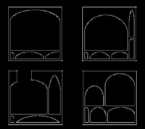
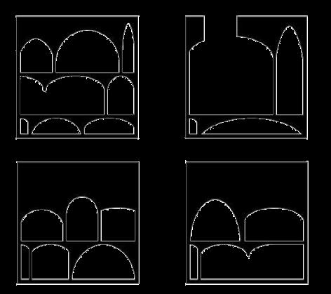
We see circular as circle, we simplify it into shape because of our lowresolution readings of contemporary architecture. Ingrained in us as the symbol of other, we are trained to see it individually as an object creating an inverse weight within the larger composition of the built environment. This is a warning sign of our quick reads and partial understanding of the contemporary fabric. We need to give the circle a break and let it be freed from this restrictive boundary.
What does vernacular mean to a society as we further our post digital age and become increasingly more dependent on the global database of design? As next steps on technology fling us into greater informational connectivity is global urbanism and vernacular architecture fundamentally different? Even prior to the steroid injected internet that is glued to our hands, Kenneth Frampton identified that the world’s architecture had become homogenized. He claims that “the practice of architecture today is as global as it is local, as we may judge from the international celebrity architects who are increasingly active all over the world.”1 In the 12 years since, architecture’s collective conscious has become another world in and of itself.
the intangible qualities of his society. Irrespective for either’s insistence on solution or quality, it is essential to reexamine the new idea of global connectivity through the lens of the first essential shift in globalization.
Since Frampton’s claim of contemporary architecture’s homogenization,9 there has been a collective effort to further root and identify specificity of place. While starchitect’s capitalist inroads still create yearly blockbusters, great value has been placed on rooted architects trying to understand their local vernacular. However noble a venture, one is unable to truly separate oneself from the global context of design.
Erik GhenoiuTo learn from our past, let us look at two distinct and opposing theorists that grappled with this very dilemma of globalization from technology: Adolf Loos and Jun’ichiro Tanizaki. Both discuss the qualities and characteristics of national cultural design at a pinnacle times in globalization. One radicalized by industrialization, the other from colonization. One the prophet of modernism, the other phenomenology. One opportunistic, the other resentful. Dealing with it in opposing ways, the conflict between the two highlight two key nuances through modernist thought and the phantasmagoria of a culture. Given the cultural break and global connection of the digital age closely mirrors the industrialization shift roughly 100 years prior, these dichotomies of discussion are as essential as when they were first presented.
From a time of cultural upheaval from the industrial revolution, Loos’s attack on ornament/vernacular was his way to free man from serfdom towards modernization.2 Arguing that the appearance of tradition was an outdated mode in Viennese culture put on by an elevated class, and that “either we have the courage of our conviction that we should keep ourselves apart from the rest of humanity and wear or national costume, or we decide we want to be like other people and dress as they do. But to play the modern, advanced European in externals alone... is not really the behavior of a gentleman.”3 To Loos, globalization was inevitable to the western world and man should stop playing charades of tradition.
Born out of the consequence of Loos’s globalist idealism,4 Tanizaki laments his excitement towards new possibilities. He argues that “The Westerner has been able to move forward in ordered steps, while we have met superior civilization and have had to surrender to it, and we have had to leave a road we have followed for thousands of years.”5 35 years after Loos’s writings of the revolution, Tanizaki witnessed an unwitting exposure to this western modernism that Loos fought to expose. He furthers “But we would have done only in a direction that suited us. We would have gone ahead very slowly, and yet it is not impossible that we would one day have discovered our own substitute for the trolley, the radio, the airplane of today.”6 Not only does Tanizaki claim they would have gotten to the same level of cultural innovation but, that “they would have been tools of our own culture, suited to us.” 7
Both are trying to unpack the universality of globalization after the industrial revolution. Loos sees it as an opportunity of modernization and freeing from tradition8 and Tanizaki believes it to have destructed
To come to terms with this, we claim that we have learned from both Loos and Tanizaki to create unique articulated architecture that speaks to the larger trend that follows local building conventions and materials and recalling our past “history” to situate and ground works into local vernacular. We build with a kit of parts but with the collective knowledge of the world’s precedents. We pretend that we are creating rooted and unique modern versions of the vernacular and we try to balance bold iconography while demurring to tradition. We have inverted Loos’s claim towards undergarments, and pretend to have traditional garb on the exterior with modern underneath.
The sharing and piecemeal of Fundamentals10 is being glorified as a way to push against a global style towards a new vernacular void of context. Rem Koolhaas’s 2014 Venice Biennale does this in his curated collection of elements. Through the research he positions that “architecture is not defined as a comprehensive thing, but through the ingenuity of a collectively acquired overall intelligence”11. Koolhaas is optimistically motivated by this idea, I am not. The sharing and global discourse of architecture is inevitable, but to what cost.
In essence we are only able to evoke the vernacular, rather than build within its context any longer.9 If the vernacular no longer only belongs to a place, does the primitive hut belong to everyone? How does this align with the quickly forming social constructs like cultural misappropriation?
Our current global shift of information towards collective inspiration is creating a collaged network of vernacular reimagined through a new kit of parts. We justify rammed earth and Japanese joinery as technological progress and therefor fair game, but while this global circulation of ideas is elemental to Loos’s argument, the true examination of grounded design needs to be further rooted in what we have lost rather than gained.
Knowledge cannot be undone, and so there is no unlearning of the broad tools we have at our disposal. The profession however needs to be selfaware that architectural discourse is progressively open sourced whether it was intended to be or not. The context in which we steal and manipulate form must become evident in our work. There needs to be a closer read at our parts and how we can embed intangible meanings of place back into society. It is essential for the vernacular to finally become footnoted within the built environment. Only with this will we be able to hold on to a sense of location in an increasingly digitized world.
Kenneth Frampton, Modern Architecture: A Critical History (London: Thames & Hudson, 1980) 344.
Adolf Loos, Crime and Punishment (California: Ariadne Press, 1998) 113.
Loos, Crime and Punishment, 114.
It should be noted that Loos does make exception - albeit from a place of perceived superiority - for the global reaches to not be reciprocal. He argues that “One who well understands the way the African works pattern in his cloth according to a certain rhythm, so the design appears only when the fabric is taken off the loom...The aristocrat lets them carry on in their own accustomed way, he knows the time they spend on their work is sacred to them.” 174. Matching Tanizaki’s sentiment of knowledge as a one directional force, he does appreciate the need to keep people preserved in the purity of their own world and vernacular. Loos, Crime and Punishment, 173-174.
Jun’ichiro Tanizaki, In Praise of Shadows (Stony Creek: Leete’s Island Books, 1977) 8.
Tanizaki, In Praise of Shadows, 8.
Tanizaki, In Praise of Shadows, 9.
While said in gest, Loos’s antidotal friend claiming that he is “of wanting to homogenize the whole world” has proven to be a valid outcome. Loos, Crime and Punishment, 113.
Frampton, Modern Architecture: A Critical History, 345.
Referring to the 2014 Venice Biennale curated by Rem Koolhaas named Fundamentals.
Oosterman, Arjan. “Critical Globalism: Rem Koolhaas Interviewed by Brendan Cormier and Arjen Oosterman.” Volume, October 20, 2014. http://volumeproject.org/criticalglobalism-rem-koolhaas-interviewed-bybrendan-cormier-and-arjen-oosterman/.