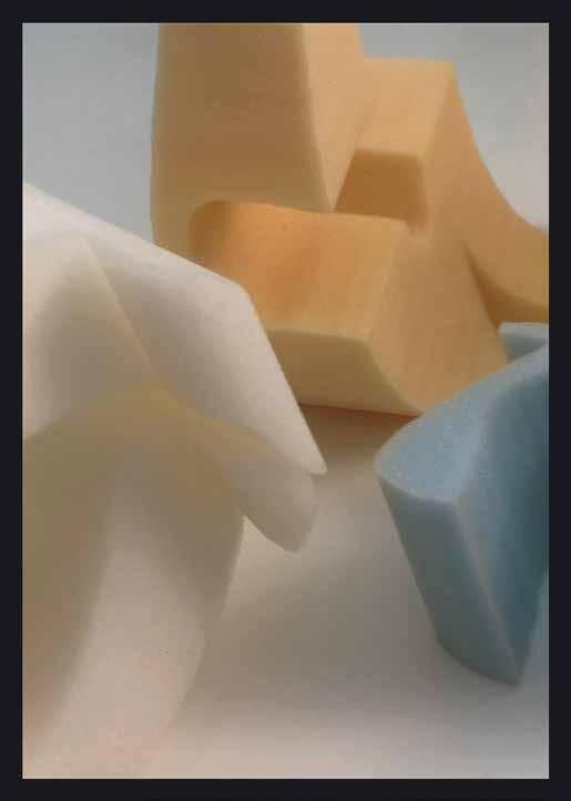
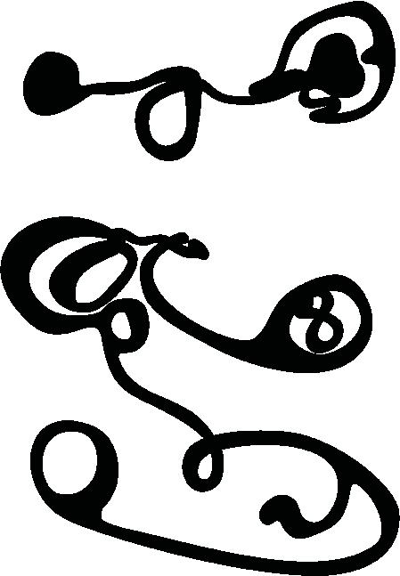
finding

Forte Mara Reissberger Tom Koch A Typographic Search for Traces Eine typografische Spurensuche


A larger family gathering. My father is there, but he keeps to himself. He bends over a sheet of paper, drawing. He talks about earlier times, about the war, about war experiences that he can remember. He does this repeatedly, repetitively — over and over again. Only much later do I realize how much this ritual called for therapeutic care. Physical injuries were easier to heal than psychic ones; later he knew how to conceal both of them. My father spoke little about his role in the fight for the Papier-Zellwolle und Zellstoffabrik Lenzing (Lenzing Pulp and Paper Factory) in Upper Austria. On May 5th, 1945, he played a significant role as a member of the Austrian resistance group known as “Bari” in the surrender of the intact and undamaged plant to the American troops, thus saving Lenzing. He and the others of the group received no special thanks or recognition for this.
“In the post-war period, I tried to pick up where my career had ended,” he once wrote. For the trained typesetter who had already worked as an illustrator, it was obvious that his future “best path in life” would also be in the graphic arts. Studying at the Academy of Fine Arts in Vienna was no longer really an option …. So he became a technical teacher at the Vocational School for Graphic Arts in Vienna, but also worked on the side as a commercial artist. Not an easy time: lessons at school during the day, commissioned work in the evenings and at night, which my mother delivered in the morning, hoping for a quick payment of the fee … for advertising in times of general privation immediately after the war’s end.
This “dual track” of teaching and freelancing took hold early, determining my father’s life. His employment at the school — right up to his leadership of it — was, so to speak, his safe “pillar.” As he increasingly became a freelance graphic artist and painter, these fields of creative activity served as “room for play” for his work.
“The versatility that comes with my work,” he stated, “has brought me new ideas, especially graphic techniques.” He inclined at first toward linocuts and woodcuts and experimented with rubber plate cut techniques and etch ing. He also produced a large number of watercolors and oil paintings.
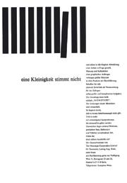
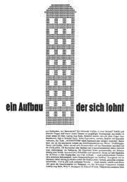
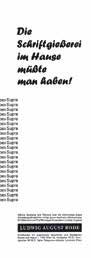
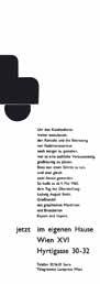
Karl Reißberger’s signed posters in the poster collection of the Vienna Library at City Hall convey the impression that this genre probably played only a minor role on a side stage in the professional life of this artist, graphic designer, and typesetter. However, this is only part of the story. On the one hand, Reißberger’s time as a poster designer was very short. On the other, he was not just a freelance artist — which means that he did not sign every one of his designs, in particular when he worked at Donnhofer-Werbung. He was also a teacher and, later, director of the Vocational School for Graphic Arts in Vienna. Even before his time was fully taken up by these two occupational mainstays, he worked during the economically difficult and existentially harsh years after the Second World War as a contract teacher and commercial artist. He was also active from 1945 to 1946 as a studio manager, and took on commis sions for poster design as well. It is thus worthwhile to take a closer look at his design work in the context of a publication on the history of the Forte type face he designed.
The Vienna Library stores the breathtakingly impressive, almost unimaginable number of more than 400,000 posters in its depots. This makes it an excellent source for research on all facets of Vienna’s poster history. Over the decades and across all genres, it offers a wealth of material, whether scholars wish to research designers, printers, or historical product advertising. Designers looking for old typefaces to inspire new designs will also find what they are looking for in the collection.
When using this collection to obtain an overview of the posters stored here and assigned to Reißberger by name, we obtain a list of 110 titles, the majority of which date from the period from 1945 to 1950. Only three posters were created in 1935 and two in 1952.
The search results may be considered representative for Vienna, even if one or the other poster may be missing from the list. What cannot be determined from this collection is whether Reißberger also accepted commissions in other cities. In addition, there are a good dozen design drawings from his hand in the poster collection, as well as two objects that are probably con nected with product packaging. Beyond that, there are six unsigned posters
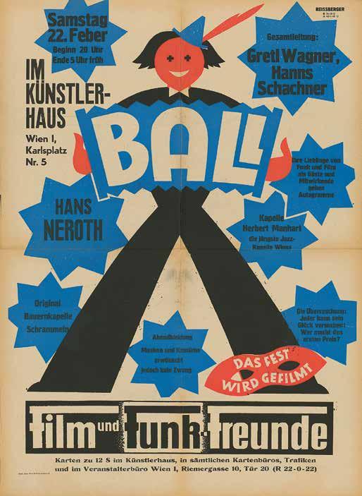 The Künstlerhaus Ball, Friedrich Sailer, 1947, Vienna Library at City Hall, poster collection Ball im Künstlerhaus, Friedrich Sailer, 1947, Wienbibliothek im Rathaus, Plakatsammlung
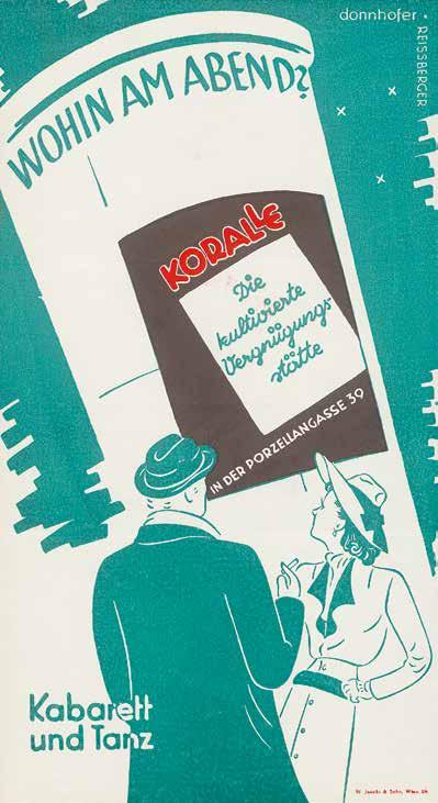
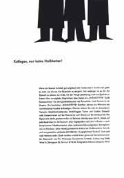
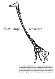
Where to go in the evening? Koralle, the cultivated entertainment venue, Donnhofer Advertising, W. Jacobi & Sohn, ca. 1946, Vienna Library at City Hall, poster collection Wohin am Abend? Koralle, Die kultivierte Vergnügungsstätte, Donnhofer-Werbung, W. Jacobi & Sohn, ca. 1946, Wienbibliothek im Rathaus, Plakatsammlung


Sie erwähnten John Dreyfus, der ja auch im Designprozess der Forte eine Rolle spielte. Kannten Sie ihn näher?
Ich lernte ihn bei der ATypI kennen, der Association Typographique Internationale, die damals, soweit ich mich erinnere, ihren Sitz in Basel, bei der Gießerei Haas, hatte.
Er war ja mehrere Jahre Vorsitzender dieser Gesellschaft. Es dauerte aller dings eine Weile, bis wir einander näherkamen. Er war ein sehr gebildeter, kenntnisreicher Mann, während ich damals noch ein junger Spund war. Doch mit der Zeit entwickelte sich ein sehr freundschaftliches Verhältnis. Er hat mich öfters zu sich nach Hause eingeladen, wo ich seine Bücherbestände bewundern durfte. Dreyfus war ein unglaublich kultivierter und sehr freundlicher Herr. Ich schätzte ihn sehr und war unendlich traurig, als er starb. Natürlich bin ich zu seiner Beerdigung nach London gefahren.
Ihre Begeisterung für Monotype-Maschinen begleitet Sie Ihr Leben lang. Ist das für Sie eine Art Glaubensfrage?
Die Monotype ist ein Wunderwerk der Technik. In ihrer Konstruktion, ihrer Funk tion und in ihrer Konzeption allen anderen Systemen weit überlegen. Gar keine Frage. Mit ihr können komplizierte Aufträge ausgeführt werden, die mit Anlagen anderer Hersteller nicht möglich waren. Denken Sie an Formelsatz, Musiknoten u. a. Das ist eine ganz andere Philosophie mit eigener Ausstrahlung, dahin ter stand eine hohe Kultur. John Dreyfus hat diese Kultur befördert, davor tat es Stanley Morison. Beide waren hervorragende Männer mit großem Einfühlungsvermögen. Sie waren etwas ganz Besonderes.
Ihre Sammlung wuchs beständig weiter?
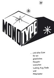
Das Engagement für Bleisatz und Buchdruck hat sich herumgesprochen. So manche Rarität des traditionellen Buchdrucks kam ins Haus, Druckmaschinen aller Art und Größe, historische Pressen, Buchbindereigeräte u. v. m. Manchmal wusste ich gar nicht mehr wohin damit. In der Not habe ich einen Bauernhof gepachtet, um all die Dinge zu bewahren. Sicher keine verkehrte Entscheidung. Im Zuge all dessen ist neben den Monotype-Matrizen einiges an Bleilettern hinzu gekommen oder in den Beständen gefunden worden. Viele Stunden lang haben wir versucht, Übersicht in diese Vielfalt, auch Chaos, zu bringen. Dabei kamen manchmal wahre Schätze ans Tageslicht. Zum Beispiel im letzten November die original Gießerei-Matrizen der Mendelssohn-Type, 1919, vor 100 Jahren, in Dresden entstanden. Mit großer Freude haben wir diese Matrizen gleich ausgießen lassen und die Schrift, eine absolute Besonderheit, für den traditionellen Jahresgruß an die Freunde unseres Hauses genutzt.
In general, Austria is regarded as a country rich in tradition and culture. Nonetheless, it is not until the second half of the twentieth century that we find a typeface designer who designed an original typeface that found international use or that bore international comparison. This represents a clear contrast to the demonstrable and globally recognized achievements in the fields of medi cine and technology, for example, as well as the fine arts, literature, and music.
From the sixteenth century on, the Habsburg Empire was as much a determining power of Europe as were France, England, the Netherlands, Italy, or Germany, for example. Nonetheless, typefaces that shaped the culture were designed in other countries and not in Austria. The question as to why, in this country that was not lacking in creative achievements otherwise, the design of typefaces up to that point had never been able to achieve a significance comparable with other countries can be answered both in terms of intellectual history and politics.
Only some 50 years after Gutenberg’s invention of book printing with moveable type did Johann Winterburger, who was trained in Mainz, set up a printing workshop in Vienna, where he worked from 1492 to 1519. To begin with, he printed exclusively using imported letters not designed by him, from Mainz and Nuremberg, and mainly religious works. These are two early indications of the hard fate that awaited typeface design in Austria, and both with it and as a result of it, genuine knowledge, research, and its dissemination.
It took another 60 years until the existence of a type foundry in Vienna could be documented (here, too, without any of its own designs). Until the introduction of newspapers, typeface design was necessarily linked to book production and thus to discourse. Under these circumstances, only a lively intellectual life could bring about the production of typeface. This lively intellectual life was never as prominent in Austria as it was in other European countries. Austria’s history could not come up with political thinkers and philosophers of the caliber of (to name but a few examples) Marguerite Porete, Christine de Pizan, Coluccio Salutati, Pico della Mirandola, Beatriz Galindo, Wilhelm von Ockham, Roger Bacon, Erasmus von Rotterdam, Michel de Montaigne, Francisco Suárez, Hugo Grotius, Marie de Gournay, Francis Bacon,
Gerolamo Cardano, Everad Digby, Margaret Cavendish, Anne Finch-Conway, Johanna Charlotte Unzer, Olympe de Gouges, Émilie du Châtelet, Voltaire, D’Alembert, Jean-Jacques Rousseau, Germaine de Staël, David Hume, Immanuel Kant, Harriet Taylor-Mill, Friedrich Nietzsche, Karl Marx, Rosa Luxemburg, or Hannah Arendt. Parallel to this, there are no notable lead typefaces and no type designs emanating from Austria that have lasted to the present day or been revived, which bear the names of their punch-cutters from those days, nor printers or book authors of the likes of Jenson, Bembo, Aldus (Manutius), Garamond, Jannon, Janson, Plantin, Van Dijck, Kis, Fleischman, Rosart, Caslon, Baskerville, Didot, Bodoni or Walbaum. It was only around the turn of the nineteenth to the twentieth century that the first philosophers in Austrian intellectual history appear in the persons of Bertha von Suttner, Rosa Mayreder, Ernst Mach, Fritz Mauthner, and Ludwig Wittgenstein. Critical thinkers, those who transgressed boundaries, who cast doubt on and then broke the norms of the day, trouble-makers in other words, the group of people who present and disseminate new ideas and outlooks played no significant role in Austria up to the beginning of the twentieth century. Social changes and political upheavals in a direction counter to that of secular and religious hierarchy and autocracy have never gained the upper hand here and thus never started from here, either. In such fundamentally reactionary conditions, so antithetical to free-thinking, original typeface design was rendered impossible. Innovation and human design only arise in progressive circles and serve exclusively subjects not dictated by conservative-hierarchical thinking, nor by religion. So, too, types are designed within, and for, the environment of world views that at the time were contemporary, modern, and not primarily shaped by hierarchical or religious thinking. They are symptomatic of humanistic, reformational, enlightening (anti-hierarchical and anti-religious), proto- or early democratic, democratic, liberal, emancipatory mindsets. They are created by pioneers in places that were breaking free of what was then mainstream thought; they are expressions of nascent movements that are diversely humanistic in orientation.
In Europe, of course, history was permanently shaped and also written (and described) by the predominant royal and imperial dynasties, and so, too, by religious patriarchalism. Yet, in the political intellectual-historical devel opment of book printing’s invention up to the Industrial Revolution, there are places and social environments associated with typeface where then-modern and progressive ideas first arose. Their discourse was always connected with book production, and these discursive spaces of intellectual history were presented and borne by typefaces in the true sense of the word, as well as by the techniques of printing and book production. They were ground-breaking shafts of light in, and eruptions out of, a hegemony of religious and secular authority and censorship, injustice, oppression and violence, and stultification of the people. Our humanistic tradition was developed by means of and along side typeface blueprints and designs.
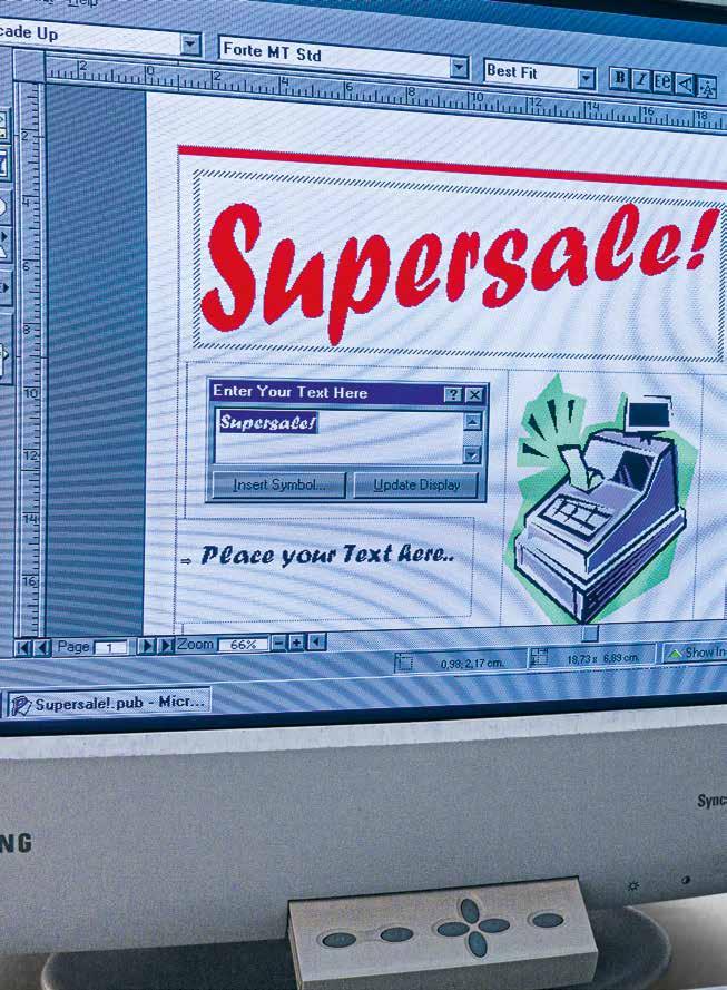
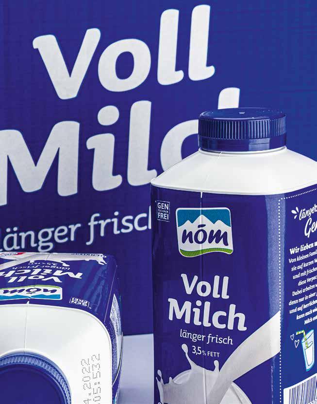
Digitized by Monotype in 1992, Forte found its way into Microsoft Office programs in the mid-1990s and thus onto millions of desktop computers worldwide. In the process, it was not always treated well: Compressions, contortions, and distortions were the order of the day. But what can you do when your font comes bundled with WordArt?
1992 von Monotype digitalisiert, fand die Forte Mitte der 1990er Jahre ihren Weg in die Microsoft-Office-Programme und somit auf Millionen von Desktop-Rechnern weltweit. Dabei wurde sie nicht immer gut behandelt: Stauchungen, Verbiegungen und Verzerrungen waren an der Tagesordnung. Aber was kann man schon tun, wenn man als Schrift in einem Bundle gemeinsam mit WordArt ausgeliefert wird?
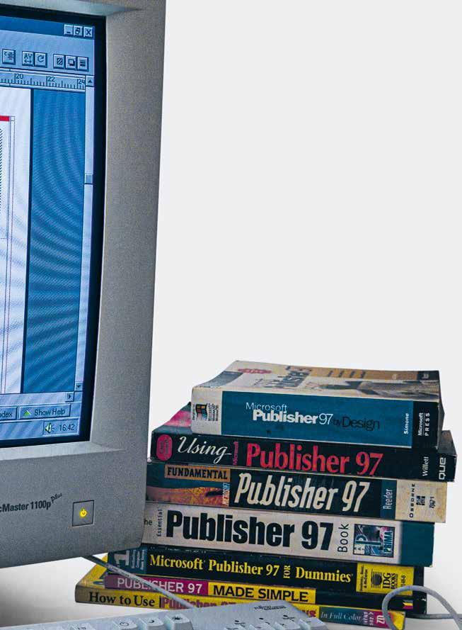
Retracing exactly how Forte found its way into the digital world is difficult today. The oldest software with which Forte is listed at Microsoft is Publisher 97, but it was digitized as early as 1992. What is certain, however, is that these early years of digital type technologies are among the most exciting times in the history of type. And there, in the middle of it all and thirty years after its appearance at Monotype is Forte!
Adobe Systems dominated the digital font market at the end of the 1980s. Its PostScript technology had been integrated into Apple’s LaserWriter printers and had established itself as the standard format for high-quality type. But when Microsoft and Apple announced their collaboration on the TrueType format at the Seybold Conference in September 1989, the “font war” that would last until 1996 began. It was about nothing less than developing digital fonts for a rapidly growing market of millions of screens and printers and breaking Adobe’s predominance. Employees with very different backgrounds were responsible for type at Microsoft, and the first typography group, Systems Type and Text (STAT), was formed in the run-up to the release of Windows 3.1 (1992). This group was later renamed the Windows Accessory Group (WAG), and was finally called Microsoft Typography. In 1993, probably its best-known figure today joined the Windows Accessory Group: Vincent Connare, designer of Trebuchet and Comic Sans.
Vincent Connare Remembers:
“In the early 1990s (about 1991 or 1992), veteran type designer Robert Norton was hired to be in charge of acquiring typefaces from external sources for Microsoft products. I joined Microsoft in 1993 and, at that time, our group was known as the Windows Accessory Group and was a part of the Advanced Technology Division. Our group included software engineers whose main job was to maintain and upgrade the Windows font rasterizer and all other things type-related. We had Program Managers that worked on products such as Scenes, which was a series of screen savers. The role of Microsoft Typography later was to acquire and supply fonts for Microsoft products. But the first
TrueType font packs for Windows 3.1 were done before Microsoft Typography was formed and before I joined Microsoft.”
His role within the group
“My job title was Typographic Engineer. I was hired because I knew the lowlevel TrueType code (commonly called ‘hints’) that only a handful of people in the world had learned. I checked fonts that came to Microsoft for their techni cal and design quality. Mainly the designs were converted from other formats and of poor digital quality. The programming was not done sufficiently for the screen display of the monitors of that time. Computer screens were low resolution, and this meant the code had to control how it looked on the screen. I worked with the programmers of the Windows system team to fix or develop special solutions for them. The first thing I remember: the Windows 95 operating system was going to use a font for all icons used by the system. The font had all the pieces for those icons, and the icons would be made of several of them. The code in the font was not correct, and some of the images were not aligning. I worked directly with the programmer who was writing the code that displayed the icons and fixed the font so it functioned as it was intended.”
The other team members
“The director of Typography was Robert Norton; the head of software engineers was and still is Greg Hitchcock, who was always responsible for the Windows font rasterizer. Beat Stamm was responsible for making and updating the font software that was used to produce the fonts. Geraldine Wade, Mike Duggan, Ian Patterson, and Sue Lightfoot were responsible for all the important fonts that were used at Microsoft (like the system fonts). Steve Shaiman and Bill Hill were the bosses that kept it all going. When we became Microsoft Typography, we were not a product group, so we were just Program Managers, Software Design Engineers and Testers.”
“In the early 1990s, the suppliers were mainly Monotype, Bitstream, AgfaCompugraphic, Matthew Carter and his company Carter and Cone, Bigelow and Holmes, and other small groups who provided designs that were then processed by the engineers at Microsoft.
Microsoft had a special relationship with Monotype and had four of Monotype’s top designers / typographic engineers working as contractors, first from England, then resident as contractors in Redmond. Mike Duggan and Geraldine Wade were hired about 1999, and Ian Patterson and Sue Lightfoot became independent contractors. The Monotype team was responsible for the engineering of the main core set of fonts and all key system fonts at Microsoft in the 1990s. They produced the original versions of Arial, Times New Roman and Courier for the original Truetype fonts in Windows 3.1, Windows 95 and Windows 2000.”
but you might not notice it because it works in harmony with the content. Let’s test this. Set a timer for 20 seconds. Cross out all the instances where you think Forte does not match the word.
My guess is that your answers will be similar to mine. You can find my answers at the end of this essay. *
You respond instinctively to the shapes of the letters. You also learn associations from seeing Forte used in the wild.
Your instinctive responses to Forte’s curvy shapes Forte’s letter shapes are spontaneous and energetic. They look like they’re painted with a big brush loaded up with paint almost to the point of dripping. Their informal structure creates a casual appearance. They look familiar and comfortable, not pretentious or exclusive. These are letters that speak to everyone in a regular voice. But don’t take my word for it, here’s some research I’ve done … These are the results from the online Type Tasting Font Census survey. Ninety-one people participated; 60% had design experience and 40% were non-designers.
Participants were given 43 multiple-choice options. They rated Forte’s top five values as: Cheerful • Friendly • Relaxed • Warm • Imaginative. Almost half of the votes went to these top five values. Cheerful and Friendly were the most popular choices by far. They received 30% of the votes between them.
By contrast, Forte received zero votes for: Dignified • Intellectual • Logical • Serious • Traditional.
The top five multiple-choice options for style received nearly 38 % of the votes: Silly • Arty • Quick and easy • Comfortable • Hand-crafted. By contrast, Forte received only one or zero votes for: Glamorous • Sophisticated • Elegant • Formal • Polished.
auf den Inhalt zu trüben. Neutrale Schriften erfordern oft ein typografisch geschultes Auge, um sie voneinander zu unterscheiden.
Forte gehört nicht zu diesen Schriften. Die Formen der Forte strotzen nur so vor Charakter. Sie schafft einen ersten Eindruck, der den Inhalt bereits in Szene setzt, bevor man zu lesen beginnt. Forte ist einzigartig genug, um wiedererkennbar und vertraut zu wirken, aber nicht so ausgefallen, dass sie die Lust am Lesen verderben würde.
Lesen ist Alchemie. Es verschmilzt die wörtliche Bedeutung von Worten mit Assoziationen, die deren Formen auslösen. Man hat einen intuitiven Sinn dafür, wann eine Schrift zu einer Situation passt und wann nicht. Eine gut gewählte Schrift ist nicht unsichtbar, aber wir bemerken sie vielleicht nicht, weil sie mit dem Inhalt harmoniert.
Lassen Sie uns das testen. Stellen Sie einen Timer auf 20 Sekunden. Nun streichen Sie alle Stellen durch, an denen Sie denken, dass Forte nicht zum Wort passt.
Ich denke, Ihre Antworten werden den meinen ganz ähnlich sein. Meine Antworten finden Sie am Schluss dieses Textes. *
Man reagiert instinktiv auf die Formen der Buchstaben und entwickelt Assoziationen, wenn man sich ansieht, wie die Forte „in der freien Wildbahn“ verwendet wird.
Instinktive Reaktionen auf die geschwungenen Linien der Forte Die Buchstaben der Forte sind spontan und energiegeladen. Sie sehen aus, als wären sie mit einem großen Pinsel gemalt worden, der so voll mit Farbe ist, dass sie fast tropft. Ihre informelle Struktur verleiht ihnen ein lockeres Aussehen. Ihre Formen wirken vertraut und sympathisch, nicht prätentiös oder exklusiv. Es sind Buchstaben, die jeden mit normaler Stimme ansprechen.
Aber verlassen Sie sich nicht auf mein Wort, hier sind einige Untersuchungen, die ich angestellt habe … Dies sind die Ergebnisse der OnlineUmfrage Type Tasting Font Census. 91 Personen haben daran teilgenommen; 60 % hatten Designerfahrung und 40 % waren nicht im Design tätig.
Den Teilnehmern wurden 43 Multiple-Choice-Optionen vorgegeben. Sie bewerteten die fünf wichtigsten Werte von Forte wie folgt: Fröhlich • Freundlich • Entspannt • Warm • Fantasievoll.
Fast die Hälfte der Stimmen entfiel auf diese fünf Top-Werte. Heiterkeit und Freundlichkeit waren die mit Abstand beliebtesten Werte. Auf sie entfielen jeweils 30 % der Stimmen.
Im Gegensatz dazu erhielt Forte null Stimmen für: Würdevoll • Intellektuell • Logisch • Seriös • Traditionell.
Fortes Stil
Auf die fünf Optionen, die im Rahmen von Multiple-Choice-Verfahren am häufigsten genannt wurden, entfielen fast 38 % der Stimmen: Albern • Künstlerisch • Schnell und einfach • Bequem • Handwerklich.
Im Gegensatz dazu erhielt Forte nur eine oder null Stimmen für: Glamourös • Anspruchsvoll • Elegant • Formell • Geschliffen.

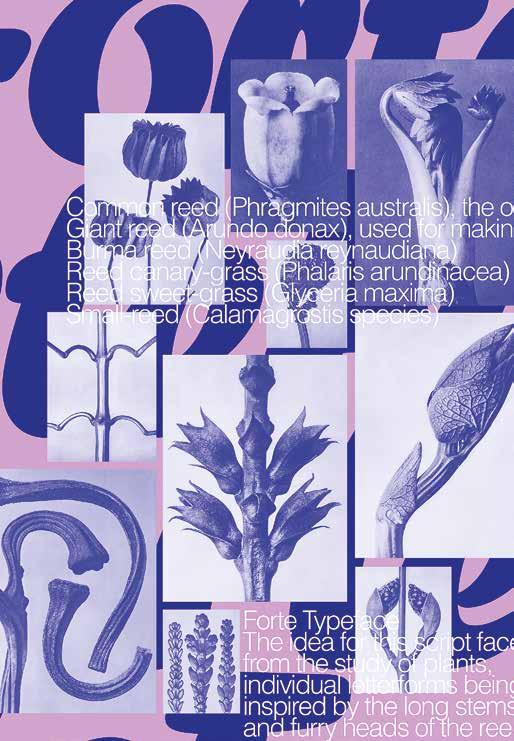
“The idea for the design and the forms of my font was born during my various studies of plants and flowers. In the plants and the leaves, in the tendrils and panicles I found all those details which, in a figurative sense, finally resulted in the letters for my fonts. The reed has always been a favorite among my plant models. The long stalks with their furry cattails always inspire me anew, especially the slender leaves, which seem so multifaceted. As well, I have enjoyed writing my font with the reeds sharpened into a pen. For me, this writ ing material has always been a wellspring of new forms of writing. One of them is Forte.”
„Die Idee zum Entwurf und für die Formen meiner Schreibschriften ist bei den verschiedenen Studien von Pflanzen und Blüten entstanden. In den Gewächsen, den Blättern, Ranken und Rispen fand ich alle jene Details, die schliesslich im übertragenen Sinne die Buchstaben der Schreibschriften ergeben. Einen Lieb lingsplatz unter meinen Pflanzenmodellen nahm immer schon das Schilf ein. Die langen Halme mit den pelzigen Früchten und vor allem die schlanken, so vielgestaltig wirkenden Blätter inspirieren stets aufs neue. Darüberhinaus habe ich meine Schreibschriften gerne mit den zu Federn gespitzten Schilfrohren geschrieben. Aus diesem Schreibmaterial quellen mir immer neue Schriftformen. Eine davon ist Forte.“
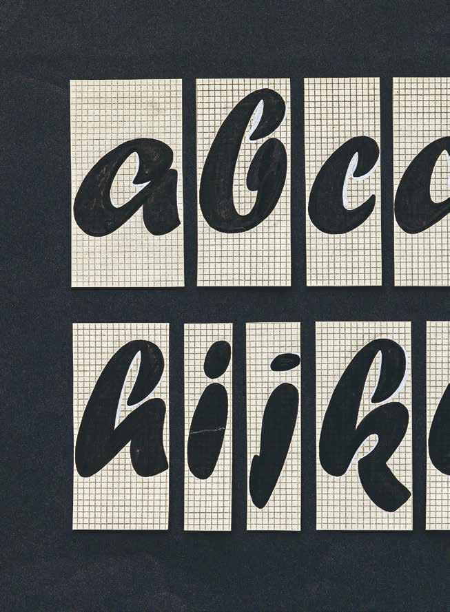
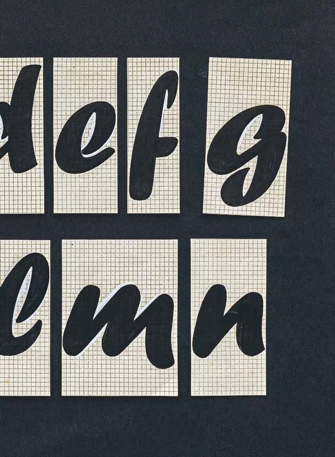
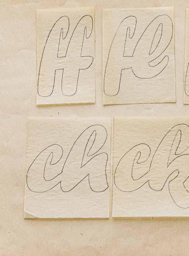
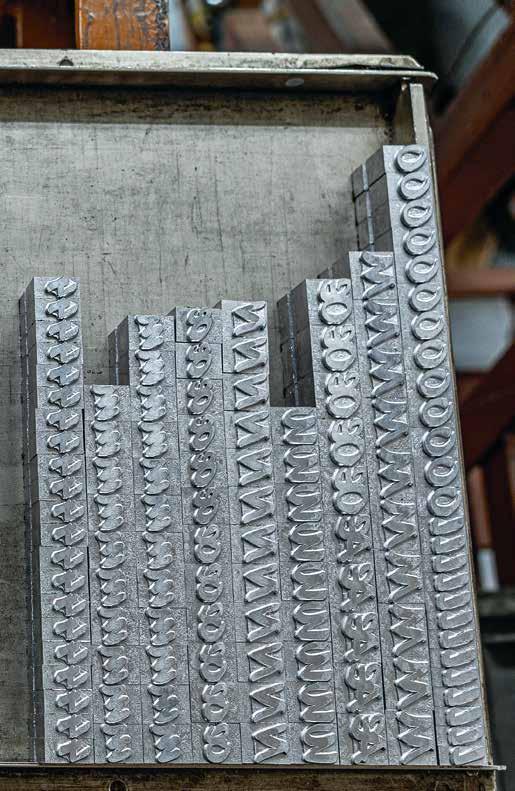
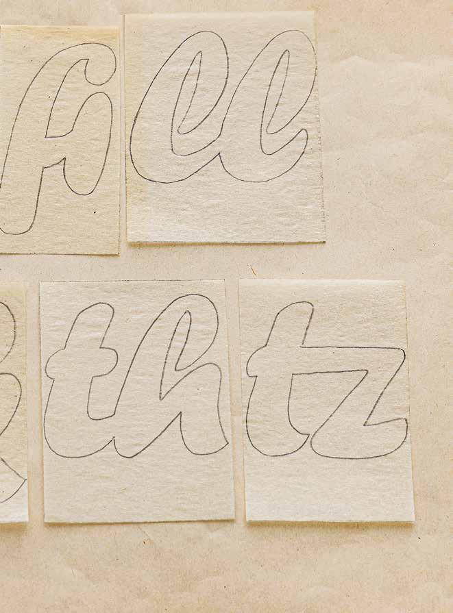
Not all of Karl Reißberger’s 119 characters were published. We found some neverpublished ligatures, a number 3 flattened at the shoulder, and some special characters. Nicht alle 119 Zeichen Karl Reißbergers wurden veröffentlicht. Wir fanden einige nie publizierte Ligaturen, eine an der Schulter abgeflachte 3 und einige Sonderzeichen.
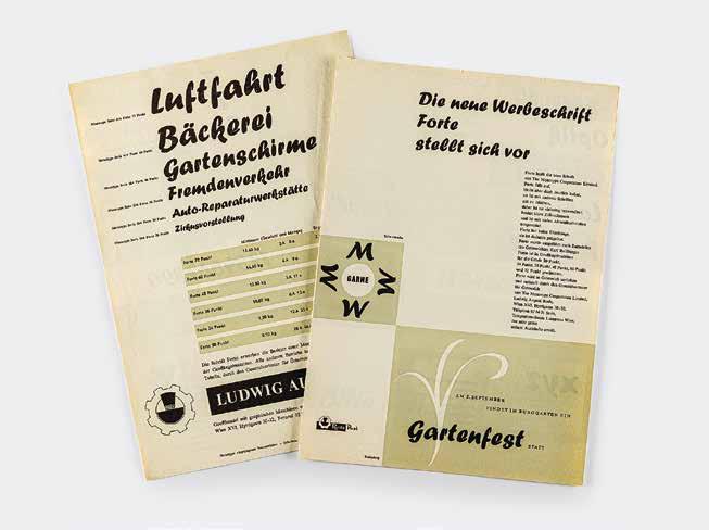
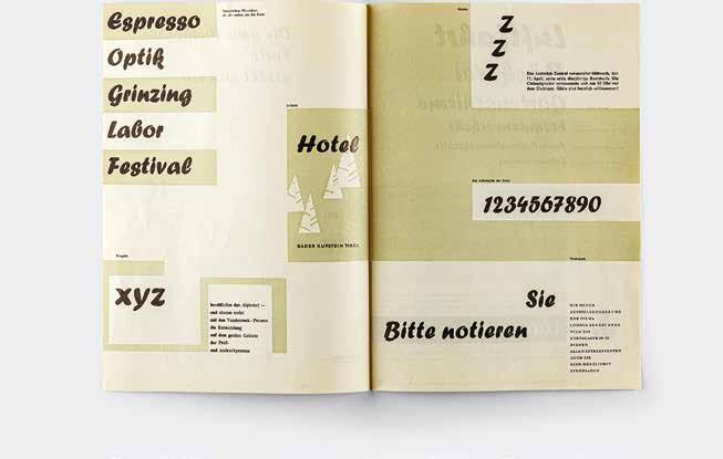
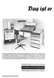
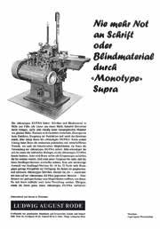
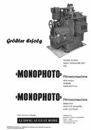
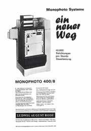
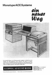
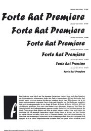
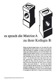
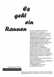
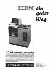
The activities of the Ludwig August Rode Company contributed significantly to the dissemination of Forte. Karl Reißberger designed most of the printed works himself. Zur Verbreitung der Forte trugen die Aktivitäten der Firma Ludwig August Rode wesentlich bei. Karl Reißberger gestaltete die meisten Druckwerke selbst.
Forte attracted Toshi Omagari’s attention while he was still working at Monotype. For quite some time he considered revising the font to meet the needs of current typeface design. In 2022, the time had come: On behalf of Microsoft, he revised Forte, which meets contemporary requirements as Forte Forward. This ensures that Karl Reißberger’s typeface design will continue to be used worldwide sixty years after its initial release.
Toshi Omagari fiel die Forte bereits während seiner Zeit bei Monotype auf. Lange trug er sich mit dem Gedanken, den Font für die Erfordernisse aktuellen Schrift designs zu überarbeiten. 2022 ist es nun so weit: Im Auftrag von Microsoft über arbeitete er die Forte, die nun als Forte Forward den veränderten Anforderungen entspricht. Damit wird sichergestellt, dass Karl Reißbergers Schrift auch 60 Jahre nach ihrer Veröffentlichung weiterhin weltweit Verwendung finden wird.
Karl Reißberger in his studio, 1963
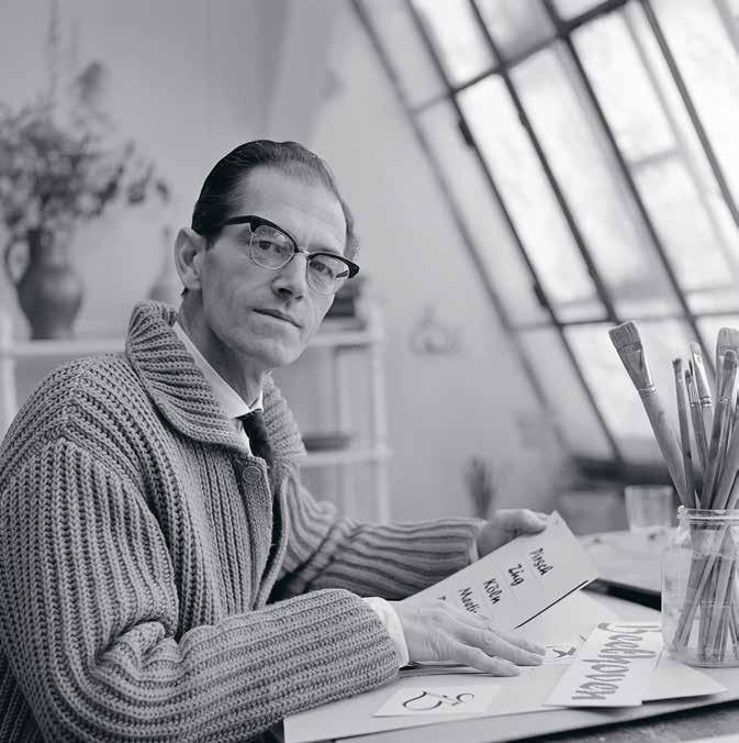
Photo: Peter Sladkovsky
Karl Reißberger in seinem Atelier, 1963
Foto: Peter Sladkovsky
1915 Born in Vienna on 5 June. Apprenticeship as a typesetter and work as a commercial graphic artist
1945 / 46 Studio manager at Donnhofer Werbung: Posters, advertisements, trademarks
1952 Release of his first specialist publication ABC des SemperitGummitonplatten Schnittes
1953 Tenured appointment as a teacher at the Berufsschule für graphische Gewerbe in Vienna
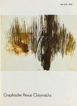
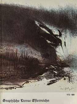
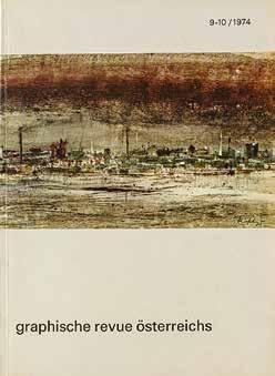
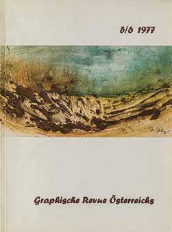
1950s Work as a freelance graphic artist and painter: Linocuts and woodcuts, etchings, watercolors, oil paintings
1956 First large exhibition with pictures of the Viennese suburb of Brigittenau as part of the Wiener Festwochen
1960s Development of the color monotype as a specific means of artistic expression
1965 After several exhibitions in Vienna’s Künstlerhaus, accepted as a member of the Gesellschaft der bildenden Künstler / Künstlerhaus
1966 Appointed Director of the Berufsschule für graphische Gewerbe in Vienna
1970s Participation in numerous exhibitions, including solo exhibitions
1972 Awarded the title of Professor
1973 Honorary Award of the City of Vienna in recognition of his entire achievement in the field of fine arts
1976 Honorary Künstlerhaus membership
1977 Publication of Allgemeine Fachkunde für graphische Berufe: Schrift-Bild-Druck
1979 Awarded the Austrian Cross of Honor for Science and Art
1982 Last major personal exhibition at the Österreichische Postsparkasse in Vienna
1983 Passed away on 18 March in Mödling near Vienna
1915 Karl Reißberger wird am 5. Juni in Wien geboren. Ausbildung zum Schriftsetzer, Arbeit als Gebrauchsgrafiker
1945 / 46 Atelierleiter bei „Donnhofer Werbung“: Plakate, Inserate, Schutzmarken
1952 Erscheinen der ersten Fachpublikation „ABC des Semperit-Gummitonplatten Schnittes“
1953 Definitive Ernennung zum Lehrer an der Berufsschule für graphische Gewerbe in Wien
1950er Jahre Tätigkeit als freischaffender Grafiker und Maler: Linol- und Holzschnitte, Radierungen, Aquarelle, Ölbilder
1956 Erste große Ausstellung mit Bildern von der Wiener Vorstadt (Brigittenau) im Rahmen der Wiener Festwochen
1960er Jahre Entwicklung der Farbmonotypie als spezifisches künstlerisches Ausdrucksmittel
1965 Nach mehreren Ausstellungen im Wiener Künstlerhaus Aufnahme als Mitglied der Gesellschaft der bildenden Künstler / Künstlerhaus
1966 Ernennung zum Direktor der Berufsschule für graphische Gewerbe in Wien
1970er Jahre Zahlreiche Einzelausstellungen sowie Ausstellungsbeteiligungen
1972 Verleihung des Professorentitels
1973 Ehrenpreis der Stadt Wien in Würdigung des Gesamtschaffens auf dem Gebiete der bildenden Kunst
1976 Ehrenmitgliedschaft des Künstlerhauses
1977 Erscheinen von „Allgemeine Fachkunde für graphische Berufe: Schrift-Bild-Druck“
1979 Verleihung des Österreichischen Ehrenkreuzes für Wissenschaft und Kunst
1982 Letzte große Personalausstellung in der Österreichischen Postsparkasse in Wien
1983 Karl Reißberger stirbt am 18. März in Wien / Mödling


Forte, this lively and friendly typeface that everyone knows, has been used, misused, and overused for over six decades now, ever since it was published by The Monotype Corporation in 1962. Well-known figures in the typographic world like Stanley Morison and Vincent Connare have stood in the limelight of this typeface’s sprightly lifelines. But the typeface’s designer, Karl Reißberger, remained little known. Until now. This book traverses the world in search of “findings” such as Reißberger’s early posters, original designs, and advertising materials to trace the origin story of the “typeface everyone knows.” Sixty years after Forte’s first appearance, it has found new life as Toshi Omagari’s revised typeface, Forte Forward. Its release accompa nies this book. Also finding its way into this book on Forte are the artistic visions of thirty-one contemporary artists who have examined Forte’s formal language in dialog with its historical outlines. The interpretations of these international creatives open up new approaches to typography.