Slanted #14 – Grotesque 2

Page 1

Slanted 14 To quote is to bring back to life

Slanted 14 Grotesque II – Quotation

www.slanted.de

Slanted 14 To quote is to bring back to life

Grotesque 2 Quotation Summer 2011 Typography & Design ISSN 1867–6510 Germany € 12 Switzerland CHF 25 UK £ 16 USA $ 26 Others € 16

Slanted 14 To quote is to bring back to life 14

Slanted 14 To quote is to bring back to life
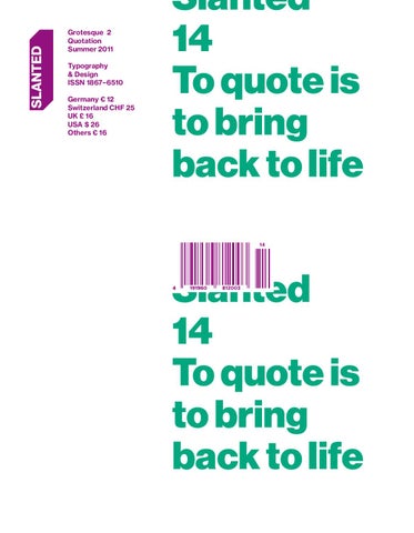


Slanted 14

Typeset in Platform Bold

Slanted 14


4

Vorwort Slanted #14

Slanted #13 und #14 bilden eine Doppelnummer zum umfangreichen Feld der Groteskschriften. Hier kommt die zweite Ausgabe – in #13 haben uns die Humanist Grotesques beschäftigt, jetzt interessieren wir uns für aktuelle Schrift­ entwürfe in der Tradition der amerikanischen, Neo- oder geometrischen Grotesk. Deren Ursprünge liegen überwiegend in der Zeit um die Jahrhundert­ wende vom 19. ins 20. Jahrhundert. Ferdinand Theinhardt hat 1880 die Royal Grotesk in vier Schnitten für die Königlich-Preußische Akademie zu Berlin gestaltet, aus der um 1918 die Akzidenz Grotesk hervorgegangen ist. Zeitgleich entwarf z. B. der Typograf Morris Fuller Benton zwischen 1905 und 1930 Schriften einer Gruppe der sogenannten Amerikanischen Grotesk, basierend auf der Älteren Grotesk. Einflüsse von Futurismus und Dadaismus sowie dem Bauhaus der 20er und 30er Jahre haben in Deutschland zu einer anderen Entwicklung der Grotesk geführt, bis hin zu Ideologien von Konstruktion und Sachlichkeit. Zu Beginn des Zweiten Weltkriegs verlagerte sich die Fortentwicklung der Grotesk in die benachbarte Schweiz, wo an den Kunstschulen in Basel und Zürich eine Phase der Wiederentdeckung von Groteskschriften des 19. Jahrhunderts eingeläutet wurde. In den 60er Jahren entwickelten Konrad F. Bauer mit der Folio, Max Miedinger und Eduard Hoffmann mit der Neuen Haas Grotesk bzw. Helvetica je eine Grotesk, die auf historischen Schriften basierte. Heute sind unterschiedliche Verfahren bei der Gestaltung von Schriften zu beobachten, die als Zitate beschrieben werden können. Eine Vielzahl von Schriften beziehen sich mehr oder weniger direkt auf historische Vorbilder aus dem oben umrissenen Zeitraum. Einige von ihnen zeigen wir in diesem Magazin. Ebenfalls mit Freude präsentieren wir Fotoreportagen von Miguel Hahn und Jan-Christoph Hartung sowie von Volker Derlath. Viel deutlicher können groteske Zustände unserer Gesellschaft kaum gemacht werden: Während in Melilla tausende Menschen auf dem Weg nach Europa fest­ gesetzt werden und wertvolle Lebenszeit verlieren, wird auf dem Münchner Oktoberfest gefeiert, bis alle Hemmungen fallen. Ein Déjà-vu – groteske Freude an dieser Ausgabe! Eure Slanted-Redaktion Typeset in Platform Medium


YEAR OF THE EEL ATTENTION! Sticker Attack: Send Sende 145 Eurocent in Briefmarken f端r das Aalziehn an: Cleptomanicx Aalziehn, Budapester Str. 49, 20359 Hamburg St. Pauli cleptomanicx.com


6 TYPE ESSAYS 11–13 Flo Gaertner, Karlsruhe (DE) Erinnerungstäuschung II

61, 64, 68, 71, 74 / 75, 77 / 78, 80 / 81, 85

Publications 140–145

146

101–105 Lizá Defossez Ramalho, Artur Rebelo, Porto (PT) 106 / 107 Edwin van Gelder, Amsterdam (NL) 108 / 109 Marta Podkowinska, Karol Gadzala, Krakow (PL) 110 / 111 Hans Gremmen, Amsterdam (NL) 112–115 Miguel Hahn, Jan-Christoph Hartung, Frankfurt (DE) 116–118 Volker Derlath, München (DE) 120–125 Ian Lynam, Tokyo (JP) Glue Vapors & Go: The Life of Kiyoshi Awazu / Tokyo Report Part 4: Kanji na kanji 126 Frank Wiedemann, Berlin (DE) Musikalischer Reisebericht: Reisemusik! Typeset in Relevant Normal & Black

Fonts & Typelabels

128–139

Interviews & REPORTS

Photography

65, 67, 69, 70, 72 / 73, 75, 76, 78 / 79, 82 / 83, 84 Volker Derlath, München (DE) Ein Abend auf der Wiesn – Pictures taking during the great beer rush

87–89

Imprint

Projects

Index

90–99

20–22, 24 / 25 Anna Sinofzik, London (UK) Avant Garde oder die (vergessene) Lust am Text

36, 38, 41 42–46, 48 / 49 Miguel Hahn, Frankfurt (DE) / Jan-Christoph Hartung, Frankfurt (DE) Almost Europe

TypoLyrics

Fontnames Illustrated

14–19 Robert Schumann, Berlin (DE) Literatur und Moderne

27–37, 39, 40, 44–47, 49, 50, 52–54, 56–60, 63, 66

Content Slanted #14


Was ist dieser helle Punkt am schwarzen Himmel? Warum fasziniert er uns? Was wissen wir 端ber ihn. Was verbirgt er uns? Die 16. Ausgabe der Akademischen Mitteilungen befasst sich mit unserem Mond. Autoren, Illustratoren und Fotografen geben Antworten und stellt neue Fragen. Besuchen Sie uns auf: www.am16.de


Typeset in Neue Haas Grotesk Text Pro 75 Bold & Display 95 Black

Gaertner/ Schumann/ Sinofzik Type Essays Type Essays


11

Type Essays Flo Gaertner Erinnerungstäuschung II › P. 129

Erinnerungstäuschung II Flo Gaertner

Am 7. Oktober 2011 fand während der Frankfurter Buchmesse auf dem Forum Verlagsherstellung eine Podiumsdiskussion statt.1 Ihr Titel – Type-Trends 2011 – Neue (?) Schriften, oder: Warum wir was gerne lesen – schien ein Versprechen auf die Beantwortung der Frage zu geben, was die Zukunft im Bereich Typografie wohl so bringt. Ein Interesse an Trends ist weit verbreitet und häufig ökonomisch motiviert. Die Vorhersagen von Trends zielen auf ein Begehren nach Teilhabe an der in Gegenwart und unmittelbarer Zukunft angesagten Mode. Die Befriedigung dieses Begehrens kann vorbereitet, Produkte können daraufhin ausgerichtet werden, daher die bunte Jagd von leidenschaftlichen und/oder professio­ nellen Trendscouts nach den Dingen, die die Mode der Zukunft ausmachen. Ob auf der Podiumsdiskussion die Beantwortung der Trendfrage oder des zweiten Teils des Titels (Warum wir was gerne lesen) befriedigend aus­ gefallen ist, sei an dieser Stelle dahingestellt. Auf zwei Momente der dortigen Diskussion möchte ich hier jedoch näher eingehen, da sie mir im Verhältnis zur Gegenwartstypografie sehr interessant zu sein scheinen. Bertram Schmidt-Friderichs vom Verlag Hermann Schmidt Mainz hatte die Moderation der Runde übernommen – also so etwas wie die Rolle des Trendscouts, was durchaus eine undankbare Aufgabe sein kann. Eine seiner zentralen Fragestellungen an die Teilnehmenden (unbeantwortet, also offen geblieben) war diejenige nach der heutigen großen Verbreitung von Retrofonts und dem Mangel an Neuem im zeitgenössischen Type-Design: »Was ist die Helvetica, die Frutiger der 2000er Jahre?« Und zu einem bestimmten Zeitpunkt stellte er fest, dass eine Generation junger Leute heutzutage dieselbe Musik2 höre wie ihre Elterngeneration – so etwas hatte es in früheren Zeiten nicht gegeben. Im ersten Teil dieses Essays3 hatte ich beschrieben, wie eine große Zahl von Gestalterinnen und Gestaltern derzeit ein Interesse für die Historie von Grafik- und Type-Designs zu entwickeln scheint, historisierende Designs entwirft und Schriftenklassiker einsetzt.

1 Forum Verlagsherstellung 2010 – Strategien, Prozesse, Produktion, Gestaltung. 6.– 8. Oktober 2010, Halle 4.0 Stand A 1308. Type-Trends 2011 – Neue (?) Schriften oder: Warum wir was gerne lesen. Moderation & Key­ note: Bertram Schmidt-Friderichs. Podiumsdiskussion mit Otmar Hoefer, Ulrich Weiß, Jürgen Weltin und Gregor Stawinski. 2 M. E. meint Schmidt-Friderichs damit neuere Vertreter des Garage Rock bzw. -Punk, die in den 2000ern populär geworden sind, etwa The Strokes, The White Stripes etc., deren Bezüge auf Bands aus den 1960er und 1970er Jahren deutlich zu sehen und zu hören sind. 3. Flo Gaertner: Erinnerungs­ täuschung I. In: Slanted, Karlsruhe, No. 13, Spring 2011, 12–15.


14

Robert

Schumann L i t e r at u r und

Moderne Typeset in Dada Grotesk Heavy


15

Der Umschlag eines Buches ist dessen wichtigstes Verkaufs­ instrument, jeder Titel ein kleines Werbeplakat. Die Hülle muss den Inhalt gegenüber den etwa 90.000 Neuerscheinungen pro Jahr behaupten, nicht zu vergessen die Millionen Bücher der Vorjahre und -jahrzehnte. Effektive Buchmarktbeeinflussung ist teuer und der Erfolg nur schlecht voraussagbar. Leser bilden prinzipiell eine schwierige Kaufgemeinschaft: überaus heterogen, anspruchsvoll und in ihrer Größenordnung recht überschaubar. Die werbliche Wirkung eines Umschlags muss also maximal sein, bei gleichzeitiger adäquater Vermittlung der Buchinhalte. Der ideale Buchumschlag ist ein Groß­ flächenplakat für Eiscreme, das tatsächlich nach Vanille schmeckt, wenn man daran leckt, weshalb man es sofort mit nach Hause nehmen will. Folglich sind die Erwartungen der Publikumsverlage an die Umschlag­ gestaltung sehr hoch. Eine stets wiederkehrende Forderung lautet dabei: Der Titel solle »modern« sein. Ein Begriff, der durchaus kein einheitliches Verständnis voraussetzt, wie die irritierten Reaktionen von Seiten der Verlage auf die präsentierten Entwürfe in der Regel zeigen. Die Irritation gilt dabei nicht zuletzt häufig auch der Wahl der Typografie … Die moderne Buchgestaltung in Deutschland und Europa ist seit ihrer Entwicklung in den zwanziger Jahren unmittelbar mit der Verwendung der serifenlosen Antiqua verbunden. Bis zum ersten Weltkrieg hatte der Umschlag eine rein schützende Funktion. Die recht pragmatische Ummantelung des Buchblocks bot allerdings viel Raum für dekorative Gestaltung. Gefälligkeit und Dekor, typografische und gestalterische Eleganz in den verschiedens­ ten historisierenden Stilrichtungen signalisierten wahlweise den literarischen Zeitvertreib oder die erhabene Buchkunst. Inmitten von Aufruhr und der Abkehr vom Alten entwickelte sich nach 1916 eine emanzipatorische Visualisierungskultur, die seitdem mit dem Begriff der »Moderne« assoziiert wird. Die gesellschaftlichen Umwälzungen dieser Zeit brechen dabei auf allen gesellschaftlichen Ebenen mit dem Tradierten und schaffen Raum für die umfassende Neukonzeption der Zukunft. Während die Typografen des Bauhauses zusammen mit den Konstruktivisten die der neuen Zeit angemessenen Schriften entwerfen, setzen die Verlage diese, nunmehr vom Gewicht der Serifen befreiten Grotesk-Schriften, umgehend in der Umschlag­ gestaltung ein. Die veröffentlichten »modernen« Texte erhalten nun auch den passenden Gestus: klar, stark, stabil. Neue Gestaltung für neue Texte heißt die Devise. 1916 gründet Wieland Herzfelde den Malik Verlag, es sollte einer der progressivsten Verlage der Neuzeit werden. John Heartfield, sein Bruder, gilt als der Erfinder des modernen Buchumschlags. Beide Brüder verweben fortan Literatur, Kunst und Politik zu einem publizistischen Statement, anspruchsvoll und breitenwirksam. Heartfield komponiert aus Bildern Texte, er montiert Fotos zu Botschaften und illustriert das bislang nicht Visualisierte. Ganz der typografische Avantgardist, der er ist, bevorzugt Heartfield dabei konsequent groteske Schrifttypen. So entstehen mehr als 300

Type Essays Robert Schumann Literatur und Moderne › P. 129

überaus innovative und wirkungsstarke Buchtitel, welche die künftige Buchgestaltung revolutionieren sollen. Selbst Kurt Tucholsky wünscht sich daher 1932: »Ich möchte Buchumschlag im MalikVerlag sein.« 1924 erscheint Kafkas letztes Werk »Ein Hungerkünstler«. Ein Text, den er aus Geldnot nicht den etablierten Verlagen anbietet, die zahlen in der Regel schlecht, sondern dem Berliner Verlag Die Schmiede, der Tantiemen verspricht. Das Verlagsinteresse ist nämlich weniger ein künstlerisches, denn ein kommerzielles. Bemerkenswert ist des­halb die Umschlaggestaltung, die zum einen ganz auf die Wirksamkeit zeitgemäßer Typografie setzt und den Band in ein markantes Reihen­konzept einordnet, und die überdies die dekorative Reklame für sämtliche Verlagspublikationen gleich mit integriert: »Die Romane des zwanzigsten Jahrhunderts«. Nunmehr bestätigt also auch rein ökonomisches Kalkül den Erfolg der avantgardistischen Mittel. Kafka selbst profitierte vom Marketingerfolg der Schmiede nicht mehr, er starb unmittelbar vor der Veröffentlichung. Die Ablehnungshaltung der Nationalsozialisten gegenüber allem »dekadent« Modernen stoppt die Entwicklung jedweder progressiver Verlagsarbeit nach 1933. Die Gestaltung der Nachkriegspubli­ kationen ab 1945 schließt dann stilistisch nicht wieder an die Ent­wicklungen der Zwanziger an. Man bemüht sich zunächst um ein überaus neutrales Erscheinungsbild. Die typografische Gestaltung der Buchumschläge der fünfziger Jahre dominieren gezeichnete oder kalligraphierte Schriftzüge, revolutionär geht anders. Sicherlich sind die wirtschaftlich schwierigen und politisch vorsichtigen Nachkriegs­ jahre in Deutschland aber auch kein solider Nährboden für bahn­ brechendes Grafikdesign. Schnelle Veränderung hingegen bringt die technische Entwicklung der Buchproduktion. Neue, immer größere Druckmaschinen verändern die Verlagsarbeit, Bücher werden zu Konsumgütern. Auf der einen Seite steigt die Qualität der Druckerzeugnisse, auf der anderen Seite sind nun tatsächliche Massenproduktionen möglich. Wieder gründen sich neue Verlage vor dem Hintergrund techno­ logischer und gesellschaftlicher Umbrüche. Wieder werden Buch­ umschläge zu visuellen Taktgebern einer neuen Zeit. Und wieder sind es Grotesk-Schriften, die das neue Zeitalter ausrufen. Im Jahr des Mauerbaus, 1961 gründen elf etablierte Verlage den Deutschen Taschenbuch Verlag. Sie errichten diesem Leitmedium demokratischer Kultur so seine eigene Institution. Der diesen Prozess begleitende gestalterische Generalauftrag wird an einen Schweizer vergeben; Celestino Piatti zeichnet nunmehr verantwortlich für ein Erscheinungsbild, das von Dauer sein soll. Bis Ende der 80er gestal­ tet er über 6300 Umschläge für dtv nach dem von ihm entwickelten Raster. Ein Raster, das vor allem den konsequenten Einsatz der zumeist rechtsbündig gesetzten Akzidenz Grotesk vorsieht. Beides ist bisher einmalig in der Geschichte des deutschen Grafikdesigns, die Langlebigkeit eines Konzepts und die Fülle von Adaptionen.


16

John Heartfield für Malik Verlag ↑ 1922/1930/1930/1931

A.K. Hemberger für Adalbert Schultz Verlag → 1930 Georg Salter für S.Fischer →→ 1930

Georg Salter für Die Schmiede ↗ 1924

Type Essays Robert Schumann Literatur und Moderne › P. 129


17

Celestino Piatti für dtv ↑ 1961/1964/1975/1988

Werner Rebhuhn für Piper → 1973 Kurt Wirth für S.Fischer →→ 1967

Typeset in Dada Grotesk Book & Heavy

Willy Fleckhaus für Suhrkamp ↑ 1971/1973/1974


20

Anna Sinofzik Avant Garde oder die (vergessene) Lust am Text

Typeset in DF Dejavu Pro Medium & Black


21

Type Essays Anna Sinofzik Avant Garde › P. 129

Typographische Verbrechen werden täglich begangen, hält Steven Heller im Jahr 2004 in einem Artikel für das englische Magazin Grafik fest1. Titel des Artikels: “Crimes Against Typography – The Case of Avant Garde”. Die Avant Garde sieht Heller nämlich als typische Tatwaffe typographischer Ungesetzlichkeit, sich selbst als nun endlich vom illegalen Laster abgekommenen Wiederholungstäter. Es ist wahr, seitdem die Avant Garde im Jahr 1970 von der International Typeface Corporation veröffentlicht wurde ist auf ihrer damals so funkelnagelneuen Weste so mancher unschöner Fleck entstanden. Ziemlich ärgerlich ist das, zumal die Gefahr solch unverhoffter Bekleckerung ursprünglich gar nicht bestanden hatte: In Zusammenarbeit mit seinem Partner Tom Carnase hatte Herb Lubalin die Schrift in den späten 60ern für ein Magazin namens Avant Garde gestaltet, lediglich für dessen Schriftzug sollte sie Verwendung finden. Laut Ed Benguiat, einem alten Freund und Kollegen Lubalins, hätte es dabei auch bleiben sollen: “The only place Avant Garde looks good is in the words Avant Garde. Everybody ruins it. They lean the letters the wrong way.” Lubalins Mitarbeiter und späterer Partner Tony DiSpigna stimmt zu: “The first time Avant Garde was used was one of the few times it was used correctly. It has become the most abused typeface in the world.” Und auch Lubalin selbst verflucht im Nachhinein wohl den Tag, an dem die Schrift der schamlos drauflosdesignenden Allgemeinheit zu­ gänglich gemacht worden war. Von da an wurde die Avant Garde nämlich miss­ braucht – so oft, dass sie in Fachkreisen heute weitestgehend negative Assozia­ tionen hervorruft. Traurig eigentlich, schließlich handelt es sich um eine der außergewöhnlichsten Schriftentwürfe des 20. Jahrhunderts. Sie hat die vielleicht perfektesten, vollsten Rundungen und die am strengsten gleichbleibende Strichdicke, die geometrisches Typedesign erträumen lässt. Lasziv geneigte Lettern, die sich einander anschmiegen, sich ungeniert überlagern und miteinander verschmelzen. Formen, die die Sinne betören, sie in größerer Menge aber auch schnell ermüden. Mit ihren eleganten, aber durchaus gewöhnungs­ bedürftigen Accessoires, zieht sie unermüdlich alle Aufmerksamkeit auf sich selbst und begeht damit wohl eine der größten Sünden, die eine Schrift begehen kann – zumindest wenn es um zweckorientierte Informationsvermittlung geht und man die Type-should-be-transparent-Mentalität Beatrice Wardes2 teilt . Nein, eine Schrift im Stil eines “Crystal Goblet”, glasklar, schlicht und einzig und allein der Darbietung ihres Inhalts verpflichtet, wie es die britische Typographin in ihrem gleichnamigen Essay definiert – das ist die Avant Garde ganz sicher nicht. Im Gegensatz zu ihren geometrisch konstruierten Vorgängern, zum Beispiel der Futura, deren egozentrische Formensprache im Sinne der ideologischen Ansprüche der Neuen Sachlichkeit wenig zukunftsweisend und deshalb paradox ist (typographisch gesehen ist Funktionalität schließlich in erster Linie Lesbarkeit, und wo funktionale Klarheit als A und O gefeiert werden, sollten sich kleines a und kleines o doch eigentlich entsprechend unterscheiden ...) – erweist diese Schrift ihrem Namen und dem Geist ihrer Zeit alle Ehre. Sie spielt mit dem Konzept von Gleichheit und Unterschied wie Jaques Derrida, durchbricht ge­­­wohnte Strukturen wie William S. Burroughs, führt Lettern ad absurdum wie Samuel Beckett Existenzen, bedient sich vorhandener Formen wie Marcel Duchamp Objekten und John Cage Geräuschen. Avantgarde, das ist Irritation und Entfremdung – auch typographisch.


Pro jects

26

Projects Vorname Nachname, Vorname Nachname Dokument – designforum Wien 2006–2010 › P. XXX

26 Pro jects Typeset in Neue Haas Grotesk Display Pro 95 Black


27 27

Projects Vorname Mainstudio Nachname Invitation / Office READ + PLAY Opening Party › P. 129 XXX


Projects Daniel Schmid LOK ZEITUNG NO1 › P. 130

32


Projects Brumnjak – Studio for Design Klangzeitort December (DEZ) › P. 130

33

Projects 3st Works, Vol. 1 › P. 130


36 Photography Miguel Hahn, Jan-Christoph Hartung Almost Europe › P. 133

Founding a family is often seen as a possibility to receive documents for the Spanish mainland.


37

Projects A is a name Good Times, Bad Times › P. 131

EXTENDED VERSION

O�DE�

+

=

SIGN

CONDENSED VERSION


Projects A is a name Traces et Empreintes › P. 131

40

une enquête familiale

nous étions indésirables en France

traces et empreintes

A is a name

Suzanne Leo-Pollak


41

Photography Miguel Hahn, Jan-Christoph Hartung Almost Europe › P. 133

For women the journey to Europe is much harder.


Almost Europe Hahn/ Hartung Melilla tries to establish itself as a tourist destination. The success keeps within limits.


43

Photography Miguel Hahn, Jan-Christoph Hartung Almost Europe › P. 133

Many refugees become religious on their journey.


Projects Philippe Desarzens The Tablets of Wood › P. 131

46

Photography Miguel Hahn, Jan-Christoph Hartung Almost Europe › P. 133

Melilla has the biggest police detachment all over Spain.


47

Projects Falko Ohlmer Ugly Dance World Cup › P. 131


58

Der Körper des Gesagten 2000–2009 Originally issued as a graphic cycle (Silkscreens) in 21 languages. Presented here in Enamel on Stainless Steel. mensch, 85 × 21cm uomo, 75 × 21cm

Projects Kai Selbar Sprachbilder › P. 132


59

Projects Das Moment MOA Typeface › P. 132


Fonts & Typelabels Stefan Gandl Neubau Grotesk™ › P. 134

64

Projects Vorname Nachname, Vorname Nachname Dokument – designforum Wien 2006–2010 › P. XXX


65

Photography Volker Derlath Ein Abend auf der Wiesn – Pictures taken during the great beer rush › P. 134


68

FontsProjects & Typelabels Vorname Nachname, Nikola Djurek Vorname Nachname Dokument – designforum Plan Grotesque Wien 2006–2010 › P. 134 XXX


Ein Abend auf der Volker Wiesn Derlath Ein Abend auf


74

FontsProjects & Typelabels Vorname Nachname, Jack Usine Vorname Nachname Dokument – designforum Vidange Pro Wien 2006–2010 › P. 135 XXX


Fonts & Typelabels Florian Schick Kaart Antiek › P. 135

75

Photography Volker Derlath Ein Abend auf der Wiesn – Pictures taken during the great beer rush › P. 134


Fonts & Typelabels Michael Mischler & Nik Thoenen Relevant › P. 136

78

Photography Volker Derlath Ein Abend auf der Wiesn – Pictures taken during the great beer rush › P. 134


79

Photography Volker Derlath Ein Abend auf der Wiesn – Pictures taken during the great beer rush › P. 134


Typo Lyrics Beaulieu/ Haraigue/ Rooseleer Typo


87

TypoLyrics Derek Beaulieu › P. 137

Artist: Song: Typeface: Typedesign:

Sex Pistols Something Else Helvetica Max Miedinger


Font names illustrated

Wagner/ Hoppek/ Wagner/ Farner/ Font Forstreuter names illustrated


91

Fontnames Illustrated Raban Ruddigkeit Introduction › P. 137

d

d

neo ist das neue alt auf den ersten blick scheint es langweilig zu sein, dass sich alles in zirkeln bewegt. nahezu alles, was es gerade mal geschafft hat, out zu sein, kann sich kaum ausruhen, denn es ist schon auf dem besten weg, wieder hip zu werden. das ist einerseits beruhigend, aber für den trend, der eigentlich mal ein sabbatical machen wollte, auch sehr anstrengend. als einige studenten meinen kollegen fons hickman und mich fragten, ob wir sie nicht in die kunst der neunzigerjahregestaltung einweihen könnten, sahen wir in genau diesem sinne des wortes tatsächlich ziemlich alt aus ... andererseits hat der, der wie ich seine klamotten länger als 10 jahre aufbewahrt, so die chance, immer etwas tagesaktuelles hervorkramen zu können. und dann auch noch so zu tun, als wäre das eine selbstverständlichkeit, weil der kragen ja schon so ein bisschen schuppert. das hat (obwohl es eigentlich mehr mit geiz und faulheit zu tun hat) dann fast schon wieder etwas nachhaltiges. und damit bin ich nach einigen nebulösen schleifen auch schon bei den illustratoren dieser ausgabe. einige von ihnen kenne ich schon so lange, dass sie bereits bei den ersten freistil-büchern dabei waren. und andere erst so kurz, dass sie noch gar keine gelegenheit hatten, dabei zu sein. was sie alle vereint ist ihr unbedingter qualitätswille und ein starker eigener charakter. das waren und sind die einzigen parameter, nach denen sich zu urteilen lohnt. und trotz aller moden, die dich von hinten anrempeln, um dich ein wenig zu ärgern – das wird auch immer so bleiben.


92


93

Fontnames Illustrated Marco Wagner Akkurat › P. 137


98


99

Fontnames Illustrated Emilia Forstreuter MAUREN › P. 138


Interviews & Reports > P. XXX

Inter views

100

100 Inter views 1_XXXXX

<– Typeset in Neue Haas Grotesk Text Pro 55 Roman & 75 Bold


Interviews & Reports > P. 138

101

We face each project as if it were our last opportunity to design

Lars Harmsen_Hello Lizá, hello Artur. Great to see you. Where did you meet? R2_Hi Lars, it’s a pleasure to have you here at R2. It’s funny actually, we spent our childhood living two blocks away from each other, went to the same middle school (for approxi­ mately 8 years), but only met later on at the Faculty of Fine Arts in Porto. How was R2 established? It all started during the second year of Fine Arts school when we worked together on several projects. Then we began ­receiving requests for work which we accepted eagerly, ­having a great desire to take things to a professional level. Partly because at school we didn’t have access to the world of print, which fascinated us. The two main projects we started with were a series of ­illustrations for a streetwear collection about to be launched by a friend, and the promotional materials for the shows of a young independent theater company called “Teatro Bruto.” Both were equally important; the streetwear project attracted more clients, while the Teatro Bruto project gave us room to experiment and lent visibility to our work, especially through street posters. Our studio developed gradually over time, step by step. When we started, it wasn’t easy to access digital tools; at Fine Arts school there was one classroom with half a dozen computers, to which the 5th year students had priority. We were in our second year, and could rarely use them. During the first years of school we relied essentially on photocopies and transfer letters. While being still students, we worked out of my room (Lizá), with a Quadra 450 and an A4 printer. The money we earned, we invested in books and attended congresses and design conferences abroad, since nothing was going on in Portugal, with the exception of Icograda in Lisbon in 1995. We accepted virtually every work request, even if it was entirely uninteresting, like this client we had who fabricat­ ed orthopaedic mattresses. By the time we finished school, we already had a reasonable client portfolio, which led us to believe we could run our own studio. We had the means to pay for our own atelier space, so we rented out a space in an industrial area of Porto. The b ­ uilding was so scary at night that some clients were afraid to come. Later on we found a nice space inside an office building, but then we grew tired of the Xerox machine salesmen ... Four years ago we moved to this small house in a quiet neighborhood.

Lizá Defossez Ramalho and Artur Rebelo founded the design studio R2 in 1995. Based in Porto, Portugal, R2 works on projects for a wide range of cultural organizations, contemporary artists and architects in areas such as visual identity, poster, book, sign system, graphic installation and exhibition design. Lars Harmsen visited R2 in their studio in Porto in February 2011 and talked to them.

You started in 1995. What has changed during the years? Everything. Technology, the city and the country. Whoever lived in the second biggest city of a small and semi peripheral country such as Portugal in 1995, felt substantially isolated from what was happening culturally and technologically in the rest of Europe. We shouldn’t forget that, at that time, Portugal was only recently a democratic country, still recovering from many years of a completely closed government that lasted until the 25th of April in 1974. In order to find specialized or specific design books, we would go to Spain. Who is the boss? When we registered our company, we were advised to assign each other different percentages so that there would be no deadlock in case of disagreement. We thought it didn’t make sense, which is why we always split the direction of R2. It has worked really well for us, which doesn’t mean that we always agree; we do have different opinions, but we talk them through and find a solution. Author, designer, artist. What are you most? We are designers. There is also a space for authorship. Over the last few years there has been a series of projects in which we were allowed to intervene with a certain amount of freedom. We embraced these opportunities because we ­believe that a more participatory and comprehensive ­approach in terms of authorship can really make sense and benefit a project. There are things that surface during the experimental and ­research phase of the creative process that are worth exploring, without the constraints typical of commercial project, and that is a different domain that we are especially ­interested in. That experimental component is fascinating, it is an ­essential aspect and the anchor of our professional practice. Some of these visual essays end up living a parallel life of their own, and evolve into a new project. An example of this is the series “Letters in the Landscape.” I would say the starting point is the designer’s creative process, but I would also agree that the framework is not as evident as the one of a typical design project. After all those years, is there something special you are more than proud of? Yes. We are very happy with our trajectory. Our projects are the materialization of our work, and it is through these ­projects that we have gained international visibility; even ­having been executed under varying circumstances such as tight deadlines and low budgets. Why do you submit your work to contests like TDC, ­Icograda, Red Dot, etc.?


Interviews & Reports > 27 / 30 / 31 / 62 > P. 138

106

I use the font as typography, not as an illustrative image

Lars Harmsen_What did you dream of being when you were a child? Edwin van Gelder_I dreamt of becoming an inventor, like Gyro Gearloose. For example: I made a flashlight of a tooth­ paste package when I was eight years old. I also made my own ­parachute to jump off a dike. You founded Mainstudio after graduating from Utrecht School of the Arts in 2004. How did everything start? How big is Mainstudio now? After graduating, the plan was to start a studio together with two friends. But after a few months we each went our own way. I worked under the name ever since. In the early days I mainly worked for Utrecht based cultural organizations. My clients have gradually become more geographically dispersed and broader in scope. I’m still on my own, but collaborate on big projects with freelancers and I often hire interns. You are creative director of the architecture magazine MARK (“MARK magazine sees itself as a platform for the practice and perception of architecture at the dawn of the third millennium”). What is your work there about? How much of MARK’s DNA is yours? And: What does it mean to work on a bimonthly published magazine? Apart from the logo, the complete design DNA is mine. I did the re-styling in 2009 and won a Golden cube with it at the ADC NY. And I just finished restyling the magazine for the second time! A large part of my time is dedicated to MARK magazine, and ­rewardingly so. It’s a great project, and really interesting to see the magazine growing; content wise and design wise. About your design approach you say, “it is creating a clear concept, while always playing with the context of the information and looking for something unique in ­every assignment.” How do you convince your clients with your ideas / solutions? Always involve the client within the process. Most of my c ­ lients work for cultural organizations which tend to give designers more freedom than commercial clients. That helps. The start of a project is based on a question, to serve as a framework. This also makes sure the client stays involved, because we reflect upon the question together and continue having a dialogue throughout the design process. The Mondriaan Annual Report (2010), the invitation of Frames Office Opening Party (2008), the architecture book STILLS (2010) and many other of your projects use typography rather than illustration or photography. Why? Doesn’t one image say more than 1000 words?

Edwin van Gelder is an award winning designer from Amsterdam, the Netherlands. After graduating from Utrecht School of the Arts in 2004, van Gelder founded Mainstudio and worked under the name ever since. The interview with him was conducted by Lars Harmsen in April 2011.

I find it very interesting to define a project by typography and search for new solutions within these boundaries. Personally, I like the modernistic and abstract approach. It gives a design layers, it’s a less literal approach, encouraging the imagination and intellect of the audience. You seem to be particularly attached to grotesque typefaces (Akzidenz Grotesk, Franklin Gothic, Benton Sans, Aperçu, etc)? I like the abstract language of these fonts. I use the font as typography, not as an illustrative image. What contemporary artists or designers have recently grabbed your attention? Conceptual artists like Sol LeWitt, Lawrence Weiner, John Baldessari and Dan Graham. I really like their approach of clear and strong concepts as the basis of their work. MARK magazine describes architects as “having become pop stars, complete with fan clubs.” Is it the same for ­designers? What would you change about your ­profession? Where do you see yourself in a couple of years? I think every profession runs the risk of receiving a pop star status these days. This status is generally associated with avant-garde’s novelty. It started the fashion models, then the fashion designers, photographers, DJ’s and now the ­architects and graphic designers as well. You see ­different currents within graphic design. For example the graphic design­ers from Yale who are lectured by Rietveld professors. This creates global design currents, with distinct nuances. Also, language and use of type become more fashionable ... I don’t think I would change anything about my profession. Where do I see myself in a couple of years? On the same track as I am now, just a bit further. Doing interesting projects and collaborating more. What were you eager to do in your career path but haven’t got the chance to do so far? To work more on self-initiated projects with a collective of other designers. If you did not work in Amsterdam, where would you like to work? NYC! The most inspiring city in the world, and the centre of art & design.


Interviews & Reports > 27 / 30 / 31 / 62 > P. 138

107 1_MARK Magazine – Another Architecture

1

2

2_ STILLS– Wiel Arets Book, printed in silver and black, 632 pages, 010 Publishers, 2010. Nominated Best Dutch Book Design


<– Typeset in Relevant Normal & Bold

Index 128 Index

128


129

Type Essays

11–13 Erinnerungstäuschung II Flo Gaertner, Karlsruhe (DE) www.magmabranddesign.de www.slanted.de

20–22, 24/25 Avant Garde oder die (vergessene) Lust am Text Anna Sinofzik, London (UK) www.annasinofzik.com Anna studied Graphic Design at Middlesex University (UK) and Design Writing Criticism at London College of Communication. She works as a freelance graphic designer and occasional writer. Sometimes Anna blogs for www.slanted.de.

Flo Gaertner studied Visual Communication and Art at HS Pforzheim, HfG Karlsruhe and HfbK Hamburg. He is working at MAGMA Brand Design, Karlsruhe. From time to time he is involved in putting together Slanted Magazine.

In the opening pages of the book the static Futura on three-dimensional elements in space is applied. It’s an oscillation between heavy and light, hard and soft. The monumental character of the font is broken by its application. Manifestations and statements of totalitarianism are no longer timely. The theme is transience, dynamic flow, open discourse. The typographical treatment of the book reflects a temporary status quo of competing approaches and opinions that conform through friction, win through their lightness, lose clarity, evaporate, interweave and develop themselves. All this new information calls for the re-evaluation of the entire system. Retro Futurism: The use of the word Futura is a respectful look at the past, as a way to understand the future. Futura is left in its original condition as the antipole to the current aesthetic trend: modifying existing fonts. Just as the rough and heterogene­ous photo paper has no embellishing revisions, so the typography has no modernizing interventions.

Projects 29

14–19 Literatur und Moderne Robert Schumann, Berlin (DE) www.buchgut.com www.blog.buchgut.com Robert Schumann, born 1976, studied Visual Communication at Prof. Rudolf Grüttner in Berlin, book designer since 1994. Starting from 1999, Schumann was art director for different advertising agencies including Jung von Matt, Heimat and Fritzsch & Mackat. 2008 he founded agency Buchgut and works primarily for publishing houses. Together with the copy writers Bernd Friedrich and Alexander Rehm, he published in 2009 »Der kleine Türöffner. Wie man sich bei sei­ner Traumagentur bewirbt und die Chancen er­höht, genommen zu werden.« (www.die­gu­te­eigenschaft.de). He writes regularly for the Börsenblatt des Deutschen Buchhandels amongst others, and teaches at the Mediadesign Hochschule Berlin.

27 Invitation / Office Opening Party Mainstudio, Amsterdam (NL) www.mainstudio.com Frame publishers hosted a party to celebrate the opening of their new office. All Frame’s clients and relations were invited. The approach of the invitation design was archi­tec­tonic; the space on the cardboard is filled with typography, resembling a city plan. Client: Frame publishers Year: 2008 Size: 148 × 210 mm Printing: Foil blocked cardboard Typefaces: Akzidenz Grotesk

28 Dokument designforum Wien 2006-2010 Isolde Fitzel, Vienna (AT) Alexander Egger, Berlin (DE) www.designforum.at www.isoldefitzel.com www.satellitesmistakenforstars.com

READ + PLAY An Introduction to Typography Peter Glaab, Kleinostheim (DE) Prof. Jean Ulysses Voelker, Mainz (DE) shop.designinmainz.de The book “Read + Play” is a guide through the jungle of professional know-how. It gives orientation about which areas of typography are particularly relevant and which books / publications / links provide additional help. “Read + Play” has three chapters: Chapter A deals with the intertwined relat­ionships between typography, communi­ cation, culture and society. Chapter B addresses basic questions of typography. In chapter C teachers of the University of Applied Sciences in Mainz discuss various questions arising in the book. Chapter C also contains brief descriptions of the recommended publications and other links and references. This reader addresses both, students and graduates. Editors: Peter Glaab, Prof. Jean Ulysses Voelker Text: Prof. Jean Ulysses Voelker Design: Peter Glaab, Prof. Jean Ulysses Voelker Year: 2010 Size: 210 × 275 mm Volume: 144 pages Printing: Brochure, Open thread stitching, Offset, black and 2 special colors Language: German / English ISBN 13: 978-3-936723-26-7


130

30 Stills Mainstudio, Amsterdam (NL) www.mainstudio.com This book is about the power of thought in architecture by renowned Dutch architect Wiel Arets. The “Stills” book shows the theoretical evolution in the oeuvre of Wiel Arets. This is reflected in the design by a chronolo­gical timeline throughout the book. The book follows a rhythm in text and images, which gives it a documentary look and feel. The book is nominated for Best Dutch Book Designs 2011. Client: Wiel Arets Architects Year: 2010 Size: 200 × 265 mm Printing: Silver + Black PMS Typefaces: Aperçu

31 WE Pressbook SS10 Mainstudio, Amsterdam (NL) www.mainstudio.com Three different sized booklets together construct the Pressbook. The inner booklet is A5 sized with the photography. The middle booklet in A6 features the overall images and the outer A7 sized booklet contains the credits. Client: WE fashion Year: 2009 Sizes: 148 × 210 mm, 105 × 148 mm, 74 × 105 mm Printing: Full color Typefaces: Franklin Gothic Photography: Marc de Groot

32 LOK ZEITUNG NO1 Daniel Schmid, St. Gallen (CH) www.lokremise.ch www.alltag.ch The quarterly published LOK-Newspaper is THE print product of the Lokremise. Each edition is editorially composed and deals with the activities in and around the Lokremise under a specific topic. It further informs about the program of the cultural partner

institutions such as the Theater St. Gallen, the Kinok Cinema and the Kunstmuseum St. Gallen. The Lokremise St. Gallen, which has opened in September 2010, represents a political important cultural centre in the Kanton St. Gallen (Switzerland). The LOK-Newspaper wants to capture this prominence by not only informing about the program presented, but also to reflect on own activities or wider cultural contexts. Crucial topics related to cultural politics shall also be dealt with as well as the Lok­remise as work in progress or themes focused on in the programs. As the LOKNewspaper is published every three months, it’s obvious that up-to-dateness is not prioritized but the message that the Lokremise wants to inform and reflect.

33 Klangzeitort December (DEZ) Brumnjak – Studio for Design, Berlin (DE) www.brumnjak.com This image is taken from a monthly series for »Klangzeitort / University of Arts, Berlin.« The December (DEZ) flyer / poster visualizes the theme “sound & space.” Client: Klangzeitort / University of Arts, Berlin Year: since 2005 Design: Brumnjak – Studio for Design

33, 34 Works, Vol. 1 3st, Chicago IL (US) www.3st.com “Infrastructures for Change” is Archeworks’ first publication documenting the result of their students’ research. Martin Felsen came to Rick Valicenti with the idea for an Archeworks Publication, together they developed a template and format. Rick and Bud Rodecker worked together to bring this inaugural issue to life. Which included the development of AW, a riff on Mathew Carter’s Bell Centennial, with ink traps that replace function with style. Client: Archeworks Year: 2009 Design Director: Rick Valicenti Designers: Rick Valicenti, Bud Rodecker Printer: The Graphic Arts Studio

34 SPW / T,P&E Edi D. Winarni, Düsseldorf (DE) www.ediwinarni.de Spring 2010, “Sugary Photographs with Tricks, Poses and Effects” – a festival on photography – took place in Antwerp, Belgium. For the entire design of the festival, I decided to use »Alte Haas Grotesk« by Yann Le Coroller. A free Helvetica-lookalike with a soft feel to the edges. With its two font weights regular and bold it was perfect for the desired minimalist design. Because of the length of the title, I decided to develop an abbreviation as logo made of capital letters and characters: SPW / T,P&E. The 120 pages of the catalog are structured into the eight exhibitions and show the work of the artists, plus additional interviews. The bunched pages with free arranged pictures show only the folio as a typographic element, which refers to an index with image information on the page before.

34 See You At Regis Debray 3Group, Poznan (PL) www.3-group.eu Series of 3 posters as an announcement of film “See You at Regis Debray” in forty countries. Typography used on poster is connected by straight or twisted lines which suggest covering up a place where the meaning character of this film was hiding. In the film Andreas Baader hides in the Paris apartment of Regis Debray in Novem­ ber 1969 while Debray serves a thirty year prison sentence in Bolivia for being a comrade of Che. Client: C.S. Leigh Designer: Ryszard Bienert / 3group

35 Rezept-Destillate Thomas Lehner, Berlin (DE) www.thomaslehner.com Rezept-Destillate is an assortment of different pure fruit spirits from a small Swiss producer. The packaging design reflects the process of distillation, during which the fruits are reduced to their flavor essences.


131 This approach leads to a unique brand concept, incorporating the context of pharmaceutics at the beginning of the last century. The labels refer to the periodic table and imply the products’ elementary purity. For that purpose a custom font was drawn by Samuel Bänziger (Studio reizundrisiko.ch). It is a bold Sans Serif in the tradition of geometrical based letter constructions. The type was kept rough and not finalized to contrast the products’ high quality appearance. Because a full spirit bottle behaves like an optical lens, the label’s typography continually changes depending on the perspective and light. These dynamic type images are fascinating the viewer – and may cause confusion when he had a few drinks too much.

shirt, and a portrait of his girlfriend, topless. Both are unexpected and, in their way, charming. Dr. Jakob Bill, director of the Bill Foundation, saw the poster and wrote me a letter about the design. The poster was officially inclu­ ded in the Max Bill Archive in Adligenswil, CH. He liked the number element very much, but was critical of the red “x bill” on the lower left. To me this “x bill” makes explicit that the event is in a contemporary and critical context.

40 Traces et Empreintes A is a name, Paris (FR) www.a-is-a.name

36 / 37 Good Times, Bad Times A is a name, Paris (FR) www.a-is-a.name At the beginning, we started to work on two opposed ideas: order and chaos. We did drew the first font throughout this, and after a while and few exchanges with the client, a wide and a condensed version of fonts appeared and we kept the shape from the font version that we called “order” (we also used some specific drawing from the “chaos” one). We were most influenced by the way that the roman capital is constructed, especially for the width of the letters (but we forced every sign to be in the same width). Client: Dazed and Confused Creation Director: Christopher Simmonds Year: 2011

The letter “E” is the sign that occurs most often in the French language. George Perec, a famous French author, wrote a novel called «la disparition» (the disappearance), in this book he used only the words without the “E” letter. We made the choice to work on this idea, to change and modify every “E” in all versions of the logotype. We used the font »Akkurat« because we needed a “Helvetica like” typeface. Client: Traces et Empreintes Publisher Year: 2009 Title 1: We were undesirable in France Suzanne Leo-Pollak Size: 220 × 215 mm Volume: 264 pages Title 2: Imagination Batsheva Dagan Size: 110 × 190 mm Volume: 120 pages

47 Ugly Dance World Cup Falko Ohlmer, Hamburg (DE) www.falko-ohlmer.com Visual Coding for the 2nd Annual Ugly Dance World Cup that took place in 2011. The design was rolled out on posters, flyers, a website and several short video clips, delivering a strong identity for an event series focused on the exploration of fun. It shows a bright shining aesthetic of resistance against synchronization and demonstrates a detailed love for the beauty of imperfection.

49 BATTERIES GVA Studio, Geneva (CH) www.gvastudio.com The Centre International de Percussion is above all a group of passionate musicians. It promotes and stimulates all activities related to the world of percussions, mainly in the field of contemporary music. It develops projects in different areas of activity: concerts, commissions to composers, co-productions, international competitions, research, artist residencies, multimedia shows, musical theater. Our posters for “Batteries!” and “Percussions!” focus on communicating concert and festival dates and transmitting a rhythmical, musical atmosphere through the use of deconstructed / restructured type. Client: CIP (Centre International de Percussion)

39

44, 46

Max Bill – evening lecture poster Harald Geisler, Frankfurt on the Main (DE) www.haraldgeisler.com

The Tablets of Wood Philippe Desarzens, Zurich (CH) www.phildesarzens.net

The assignment was to design a poster for an event commemorating Max Bill. For me an opportunity to reexamine Bill’s work. Particular a composition that I own called “white centre.” From the picture I deduct­ed an arrangement of numeric code, that offers an alternative understanding and notation of Bill’s composition. The program is set in lowercase Akzidenz Grotesk to reflect the typographic mindset of the HfG Ulm. To attract on an emotional level, I integrated two photos that Bill took in his early 20s. A self-portrait, wearing a torn

The purpose of this work is, to question the ever increasing digitalization of human communication and to search for elementary forms reacting to it, visually and technically. This was explored combining the classical woodblock printmaking technique with pyrography. Using a simple woodburning tool, words were traced on plywood plates: HATE, SPACE, AIR, OIL/WATER, INK>PAPER, (ME()YOU), LIGHT, FIRE/ WOOD, LOVE, TIME. Posters were then printed with a home-made hand press. In collaboration with Fabio Parizzi.

50 The Truth of Painting 3group, Poznan (PL) www.3-group.eu The catalogue “The Truth of Painting” was designed for an artist, Kamil Kuskowski, and presents his works from the last few years. Different kinds of papers were used throughout the book (7 different stocks, coated and colored) to accentuate several techniques used by the artist. Stock colors were matched with particular distinctive colors in the artist works. There are four chapters in the catalogue, each one has its


Subscribe Slanted Magazine Subscribe to Slanted Magazine and never miss an issue. Receive 4 issues per annum via mail and save money and time. Be in tune with the zeitgeist of typography and design.

Das Gef端hl Typografie www.slanted.de


141

Selected Font reviews ––– www. slanted. de/ themen/ schriften

/3932 Rameau linotype.com Zeichnungen aus dem Frankreich des 18. Jahrhunderts dienten als Vorbild für die handschriftlich anmutende Rameau ¬

/4021 Weingut volcano-type.de Weingut zeichnet sich durch kleine, verspielte, floris­tische Details aus und wirkt im Mengensatz fast stickmusterartig ¬

/4118 Brezel Grotesk milieugrotesque.com Eine Sans Serif, inspiriert durch klassische Grotesk Schriften des 19. Jahrhunderts und gleich­ zeitig formal an die bayrische Brezel angelehnt ¬

/3915 Trick Pony volcano-type.de Trick Pony ist ein Schriftbastard, der Charakterzüge einer Sans Serif aufweist und diese mit den Eigenschaften einer Tuschefeder kombiniert ¬

/3947 Novel Sans burodunst.com Novel Sans ist eine eigenständige humanistische Linearantiqua – sie gehört zur Schriftfamilie Novel von Christoph Dunst ¬

/4047 Terraformer fonts.gestalten.com Der Debütfont von Dmitri Yarynych, zeichnet sich durch besonders ausdrucksstarke und kraftvolle Züge aus, ist dennoch im Gesamtschriftbild zurückhaltend ¬

/4123 Realist martinplusfonts.com Direkt und einfach, ohne ernst oder streng zu wirken; unkompliziert lässt sie den Inhalt die Hauptrolle spielen. Ebenfalls erschienen: RealistNarrow & RealistWide ¬

/3932 Aeris linotype.com Humanistische Sans Serif, besitzt eine gute Lesbarkeit, hat deutliche Kontraste in der Strichstärke und weiche an Schreibfedern erinnernde Formen ¬

/3973 FB Alix fontbureau.com FB Alix besitzt Retro-Charakter. Sie erhält ihre besondere Ausstrahlung durch kleine verspielte Details, bietet hohe Lesbarkeit in zwei Schnitten und eine echte Kursive ¬

/4071 Lavigne re-type.com Eine Schriftfamilie für das neue Leitsystem von Bath City (England). Aus einer ursprünglich geplanten Sans Serif entwickelten sich eine eigene Sans und eine eigene Serif ¬

/4124 Motora Sans hubertjocham.de Hubert Jochams neueste Schrift ist gegenüber seiner bekanntesten Fonts eindeutig maskulin, tech­noid und kantig ¬

/3932 Helvetica Monospaced linotype.com Helvetica Mono ist die eigentlich schon längst fällige MonospacedVersion der klassischen Helvetica von Miedinger, entworfen vom Linotype Design Studio ¬

/4005 Matrona hubertjocham.de “The News Blackness!” Ein DisplayFont von Hubert Jocham, der sich von frühen ornamentartigen Schriften hat beeinflussen lassen ¬

/4115 Skitch myfonts.com Die handschriftliche Serifentype, die den Charakter des Grafik­ designers Ryan Martinson trägt, wurde auf einen schattierten Schnitt ausgeweitet ¬

/4151 Akko linotype.com Neue robuste, stark konstruierte, serifenlose Schrift von Linotypes Typedesigner Akira Kobayashi. Als Gegenpol gibt es die weichere Variante Akko Rounded ¬


142 142

Favorite Publications

GUDBERG ist Verlag, Agentur und Galeria.

By

In den angeschlos­ senen Galerieräumen bietet GUDBERG Bücher, Magazine, Fan- und Artzines von ausgewählten inter­ nationalen Künstlern und Verlagen an.

GUDBERG, Hamburg (de) GUDBERG Verlag – Agentur – Galeria Betreiber: Jan Mueller-Wiefel Poolstrasse 8 D–20355 Hamburg Tel. +49 (0) 40 8195150 verlag@gudberg.de www.gudberg.de

I love you #6

Calin Kruse dienacht-magazine.com

E-Design & Communication iloveyou-magazine.com

»dienacht« ist ein super kuratiertes Ein-Mann-Magazin abseits des Mainstreams, das zweimal im Jahr von Calin Kruse herausge­ geben wird und mit abwechslungsreichen Beiträgen international angesagter Künstler aktuelle Strömungen der »Fotografie, Gestaltung und Subkultur« zeigt. 122 Seiten, mit Aufklappseiten, 15 × 18 cm, nummerierte 1.000 Exemplare.

“I love you” ist ein Magazinprojekt der Berliner E-Design & Communication und widmet sich in dieser Ausgabe “The Mama issue, because I said so” ganz dem Thema Mutter. Auszug aus ihrem Manifest: “women are beautiful – women are sexy – women are clever and intellegent – life is change. Change is good. Fashion is the display of change – life is irregular”. Schöne Fotos und Geschichten treffen gute Gestaltung auf feinem Papier. 119 Seiten, 24 × 33,5 cm.

DER GREIF #4 DER GREIF GbR dergreif-online.de

The Crook, The Sad and The Dusty Moritz Kaltheuner gudberg.tradoria-shop.de

»DER GREIF« kuratiert Fotografien und Texte aus aller Welt. Jeder kann Arbeiten einreichen. DER GREIF ist mobile Galerie, gleichzei­ tig Forum für die ausstellenden Künstler und thematisch frei. Er lebt von der Kombination der eingesendeten Arbeiten. DER GREIF steht einem Buch näher als einem herkömmlichen Magazin. Die Spannung der inszenierten Arbeiten wird nicht durch Werbung unterbrochen. DER GREIF bildet und konserviert eine zeitgenös­ sische Vorstellung von Fotografie, Literatur und Ästhetik. DER GREIF ist ein tolles Experiment. 84 Seiten, 25 × 35 cm, nummerierte 1.500 Exemplare.

Typeset in Aperçu Regular, Medium & Bold

Montag bis Freitag: 10:00 bis 18:00 Uhr

Neben gerahmter Kunst, Postern und Editionen präsentiert GUDBERG zudem wechselnde Wand­ malereien.

dienacht #9

»Der Gauner, der Traurige und der Staubige« – Eine fabelhafte Kurzgeschichte von Moritz Kaltheuner mit Illustrationen von Golden Green 179 (BTN / UB). »Der Gauner, der Traurige und der Staubige stammten aus den entlegensten Winkeln der Welt. Die drei kannten sich nicht und hatten, abgesehen von ihrem Vorstrafenregister, nicht viel gemeinsam. Aber in Zukunft mussten sie, Wohl oder Übel, gemeinsame Sache machen, wenn sie nicht für immer in der Gegen­ wart verloren sein wollten … Sie mussten die ›Tränen des Mondes‹ finden und zurück in die Ver­gangenheit bringen!« 60 Seiten, 10,5 × 14,5 cm, signierte 500 Exemplare.


143

Fuego #2 Fuego Fanzine fuegofanzine.bigcartel.com

“Fuego – Great minds think alike” ist ein halbjährlich erscheinendes Fanzine aus Barcelona mit inter­nationaler Reichweite und inte­res­santen künstlerischen Kooperationen. Für diese Ausgabe ließen sich die Macher der Geschichte von Salvador und Joe Flaschs Hüten und Kostümen inspirieren. 80 Seiten, 16,5 × 23,5 cm, limitierte 700 Exemplare.

Finger weg von den Jahrhunderten

Selected book reviews ––– www. slanted. de/ themen/ BUECHER

/3984 50 Jahre Afrikanische Un-Abhängigkeit africavenir.org Sammelband mit Beiträgen afri­ kanischer Intellektueller, Aktivisten und Künstler wie etwa Achille Mbembe oder Kum’a Ndumbe III ¬

/4069 Why we lose our hands etsy.com Ein Gedicht, visualisiert in QRCodes und analog mit einer Letterpress im Western New York Book Arts Center gedruckt ¬

/3878 Typeface Catalog A-Z linotype.com Der Typeface Catalog beinhaltet die drei Bibliotheken von Monotype, Linotype und ITC und zeigt die aktuelle Bandbreite von OpenType Schriften ¬

/3985 Clip Stamp Fold – The Radical Architecture of Little Magazines 196X-197X actarbirkhauser.com Im Buch werden 70 ArchitekturMagazine aus zwei Jahrzehnten präsentiert und vorgestellt ¬

/4092 General Idea – A Retrospective (1969-1994) jrp-ringier.com Über das kanadische Kollektiv. Enthält Projekt-Abbildungen, Texte und ein Interview von Louise Dompierre ¬

/3916 Common Interest: Documents indexbooks.com Ein Buch über außergewöhnlich gestaltete Dokumente im sozialen und kulturellen Bereich. Viele unterschiedliche Herstellungstechniken mit kurzer Erläuterung ¬

/4027 I don’t know where I’m going but I want to be there – The Expanding Field of Graphic Design 1900-2020 bispublishers.nl 120 Jahre Grafikdesign und die Skizze einer möglichen Zukunft ¬

/4104 Mike Morrisroe jrp-ringier.com Monografie mit mehr als 500 Bildern, darunter weniger Bekanntes wie der Anfang der Punkbewegung und die “Sandwich Prints”. Ergänzt durch Essays und Biografie ¬

/3916 Graphic USA cicadabooks.com Die Empfehlungen kommen von Autoren, die auch in der Stadt leben, über die sie berichten. Meistens haben sie die Artikel auch selbst illustriert ¬

/4045 Brehms Tierland – Aus dem Expeditionsbuch des Tier­ forschers Edmund Alfred Brehm edition-büchergilde.de Abenteuerroman, spannend geschrieben, wunderbar illustriert, sehr schön gestaltet ¬

/4116 Arabic Graffiti fromheretofame.com Zahlreiche Abbildungen, lesenswerte Essays, Hintergründe grafischer Traditionen, heutige Anwendungen, kulturelle und soziale Auseinandersetzungen ¬

Tilman Knop tilman-knop.de

Ein zeitlos guter Ausstellungs­ katalog des Hamburger Künstlers Tilman Knop, in dem man immer wieder famose Details entdeckt … Großformate, Commercials, 50 Jahre Menschheit, Objekte, Wu­cherungen. Installationen, Einblicke, Erklärungen und viel skurriler Humor der besten Sorte. 72 Seiten, 22 × 22 cm.


146

Imprint Herstellung

Redaktionsanschrift

Druck E&B engelhardt und bauer Druck- und Verlag GmbH Käppelestraße 10 D–76131 Karlsruhe T +49 (0) 721 96226100 F +49 (0) 721 96226101 center@ebdruck.de www.ebdruck.de

Slanted c/o MAGMA Brand Design Wendtstraße 4 D-76185 Karlsruhe T +49 (0) 721 82485850 F +49 (0) 721 82485810 magazine@slanted.de www.slanted.de Slanted Magazin Herausgeber: MAGMA Brand Design GmbH & Co. KG Chefredaktion: V.i.S.d.P. Lars Harmsen, Uli Weiß Art-Direktion: Flo Gaertner, Lars Harmsen Chefin vom Dienst: Julia Kahl Redaktion: Flo Gaertner, Lars Harmsen, Julia Kahl, Michael Schmidt Grafik: Julia Kahl Mitarbeit: Anja Neidhardt, Sarah Schmitt ISSN 1867-6510 Auflage: 10.000 Stück Erscheint 4 × jährlich (Frühling, Sommer, Herbst, Winter) Slanted Weblog Chefredaktion: V.i.S.d.P. Lars Harmsen, Uli Weiß Chefin vom Dienst: Julia Kahl Redaktion: www.slanted.de/ redaktion Für die Richtigkeit aller Angaben über­nimmt der Verlag keine Gewähr. Verlag und Redaktion setzen voraus, dass ihnen zur Veröffentlichung zur Ver­fü­gung gestelltes Material frei von Rechten Dritter ist. Vervielfäl­tigung und Speicherung bedarf der Geneh­mi­gung des Verlages. Fotos und Texte sind willkommen, es wird jedoch keine Haftung übernommen. Namentlich gekennzeichnete Beiträge entsprechen nicht unbedingt der Meinung des Verlags oder der Redaktion.

Farbe HKS Warenzeichenverband e. V. Sieglestr. 25 D–70469 Stuttgart T +49 (0) 711 9816608 F +49 (0) 711 9816341 info@hks-farben.de www.hks-farben.de • Cover: HKS 53 K HKS 33 K-90-50 • Diskurs / Visuell: HKS 75 K-100-50 •V isuell / Interviews: HKS 49 K-20-00 Papier IGEPA Group Karl-Heinz Geiger Papiergroßhandlung GmbH & Co. KG Am Fuchsgraben 12 D–77880 Sasbach T +49 (0) 7841 67390 F +49 (0) 7841 6739344 www.igepa.de •U mschlag: IGEPA / Spezial / 350 g/qm Grobleinenkaschierung glänzend • Diskurs / Visuell: IGEPA / Profigloss / 135 g/qm • I nterviews / Index / Colophon: IGEPA / Profibulk 1.1. / 115 g/qm

Fonts • Aperçu The Entente, 2010 (Colophon Foundry / colophon-foundry.org) • Dada Grotesk deValence, 2007, 2011 (Optimo / optimo.ch) • DF-Dejavu Ko Sliggers, 2010 (Dutchfonts / dutchfonts.com • Neue Haas Grotesk Christian Schwartz, 2011 (Linotype / linotype.com) • Platform Berton Hasebe, 2010 (Commercial Type / commercialtype.com) • Relevant Michael Mischler, Nik Thoenen, 2007, 2010 (Binnenland / binnenland.ch) Dank Wir danken allen, die an dieser Aus­gabe mitgewirkt haben. Ein besonderer Dank an Robert Schumann und Anna Sinofzik, Miguel Hahn, Jan-Christoph Hartung und Volker Derlath, Raban Ruddigkeit, Lizá Defossez Ramalho und Artur Rebelo, Edwin van Gelder, Marta Podkowinska und Karol Gadzala, Louise Bååth, Hans Gremmen, Peter Brugger, Ian Lynam, Frank Wiedemann, do you read me?! und Gudberg. Ein großes Dankeschön auch an alle Typedesigner und Foundries, die uns ihre Schriften für diese Ausgabe zur Verfügung gestellt haben – so können wir viele unterschiedliche Schriften in ihrer Anwendung präsentieren. Vielen Dank außerdem an Thomas Appelius und Joachim Schweigert von der Drucke­rei E&B engelhardt und bauer für ihren Einsatz und den – wie immer – perfekten Druck.

Copyright: Slanted, Karlsruhe 2011 Alle Rechte vorbehalten.

Order

Vertrieb Buchhandel National Julia Kahl T +49 (0) 721 82485850 julia.kahl@slanted.de Bahnhofs- & Flughafenkiosk IPS Pressevertrieb GmbH www.ips-d.de Internationaler Vertrieb Export Press SAS www.exportpress.com Vertrieb Abonnements www.slanted.de/abo Weitere Bezugsmöglich­ keiten Slanted BookShop: www.slanted.de/shop Verkaufsstellen: www.slanted.de/verkaufsstellen Amazon Marketplace: www.amazon.de www.amazon.com Advertising Anzeigen / Web-Banner Wir sind manchmal käuflich. Und deshalb kann man im Slanted Magazin auch Anzeigen schalten. Mehr Infos unter www.slanted.de/ mediadaten Julia Kahl T +49 (0) 721 82485850 julia.kahl@slanted.de Awards • ADC of Europe 2010, 2008 • ADC Wettbewerb 2010, 2008, 2007 • Annual Multimedia 2008 •B erliner Type 2008 (Bronze), 2009 (Silber) • Designpreis der BRD 2009 (Silber) • European Design Awards 2008 • Faces of Design Awards 2009 • if communication design award 2007 • Laus Awards 2009 • Lead Awards 2008 (Weblog des Jahres), 2007 • r ed dot communication design awards 2008 • Type Directors Club NY 2008, 2007

Typeset in Dada Grotesk Medium


Slanted 14 To quote is to bring back to life

Slanted 14 Grotesque II – Quotation

www.slanted.de

Slanted 14 To quote is to bring back to life

Grotesque 2 Quotation Summer 2011 Typography & Design ISSN 1867–6510 Germany € 12 Switzerland CHF 25 UK £ 16 USA $ 26 Others € 16

Slanted 14 To quote is to bring back to life 14

Slanted 14 To quote is to bring back to life


Turn static files into dynamic content formats.

Create a flipbook
Issuu converts static files into: digital portfolios, online yearbooks, online catalogs, digital photo albums and more. Sign up and create your flipbook.