


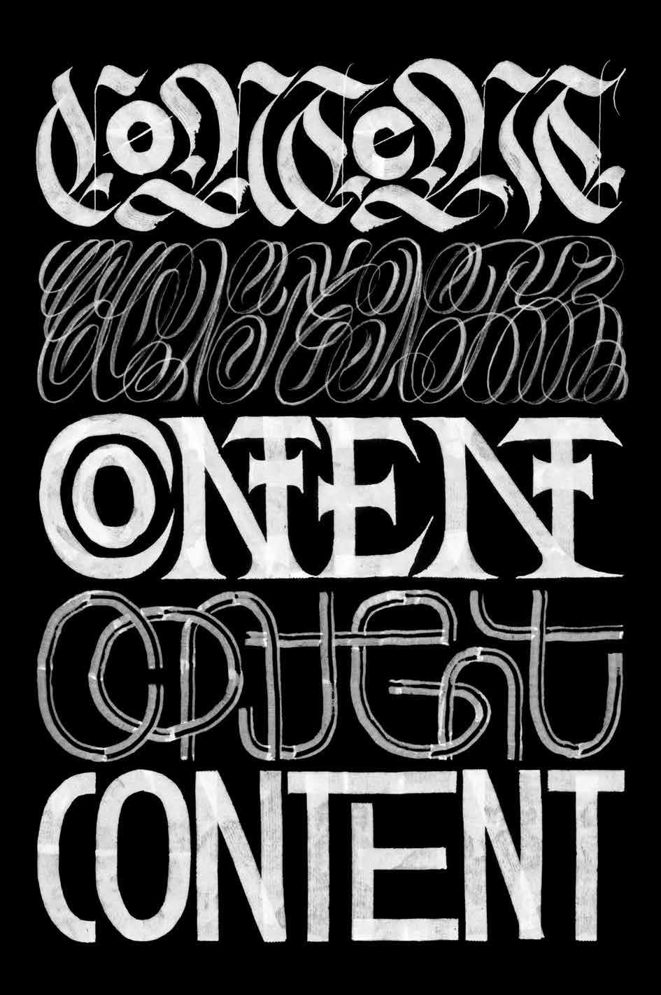
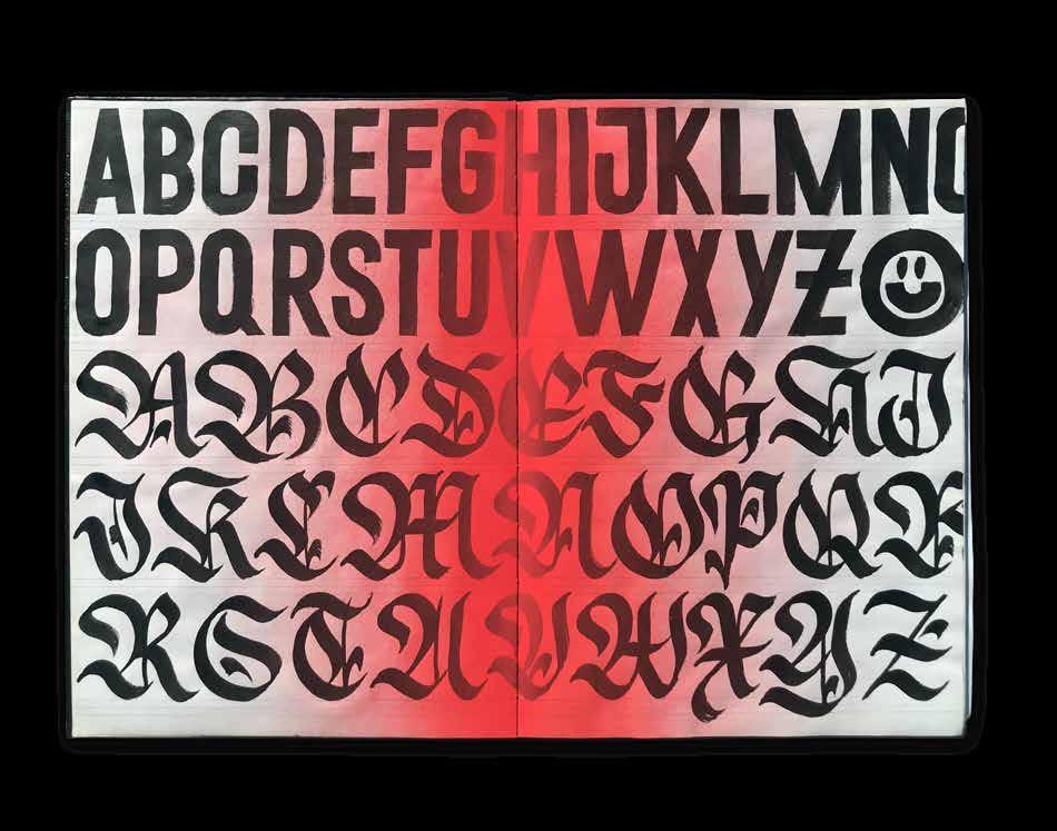
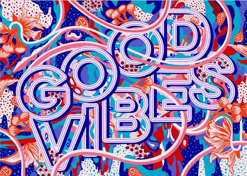
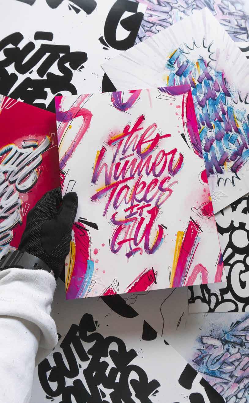
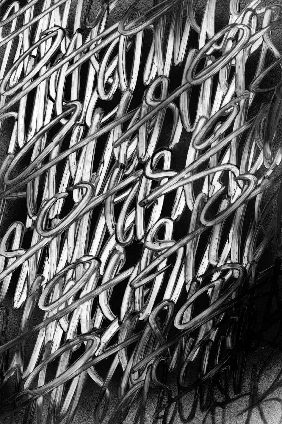
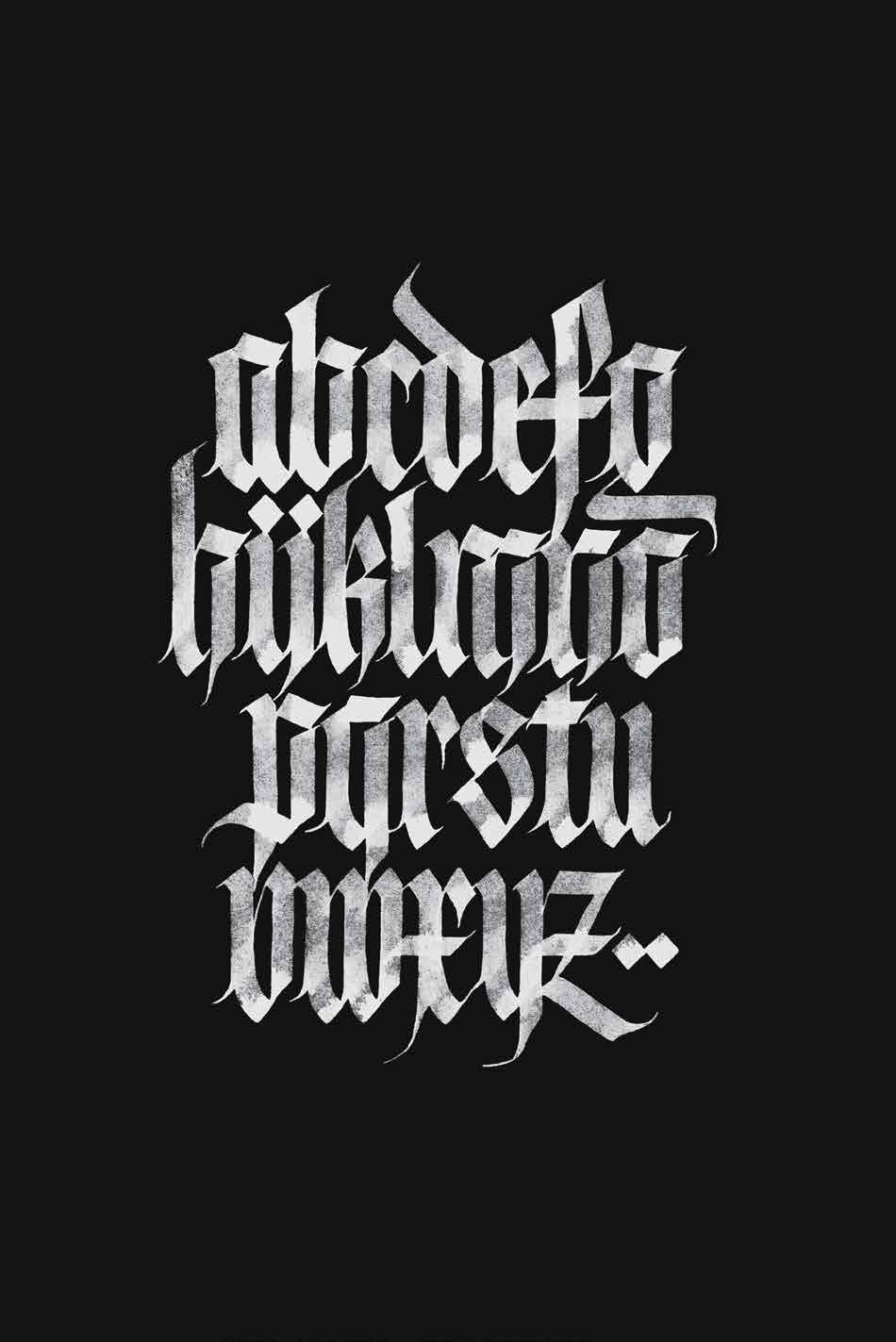
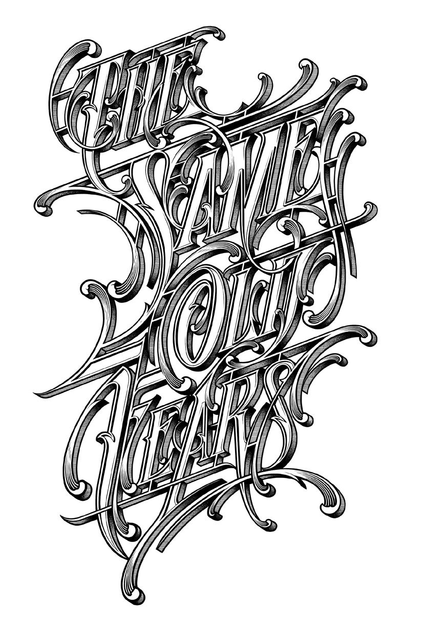
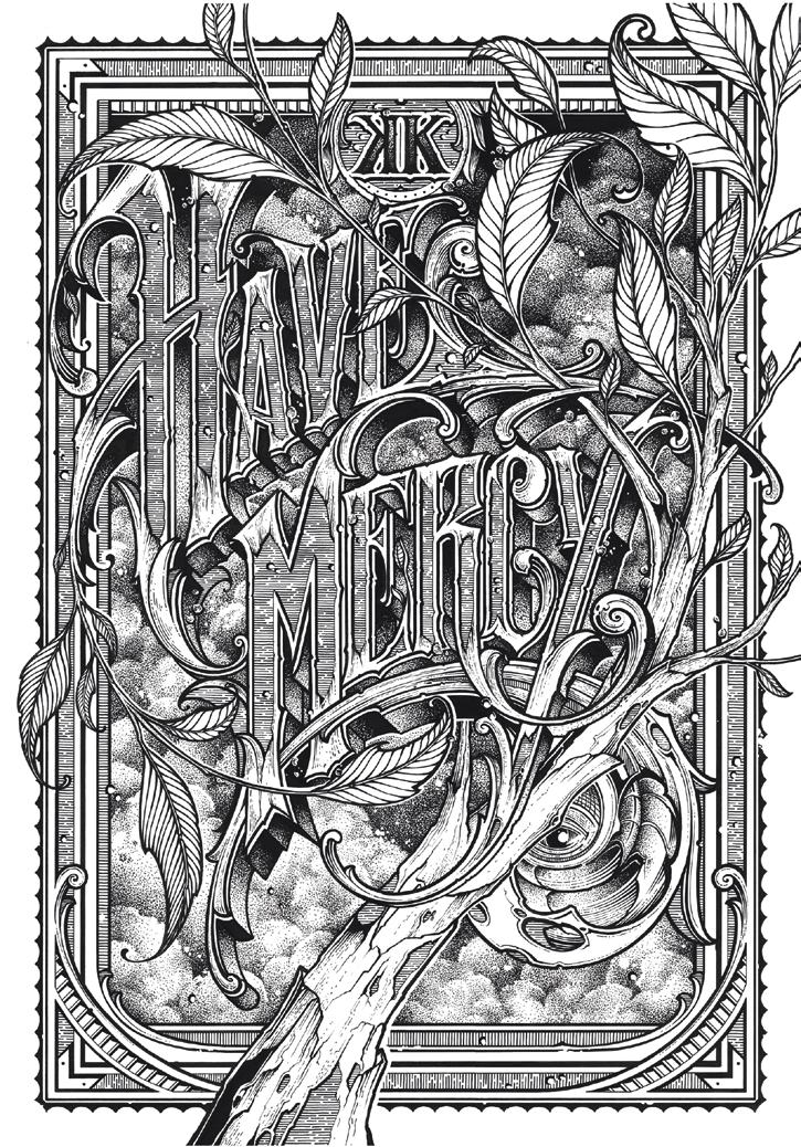
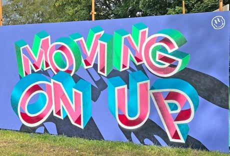
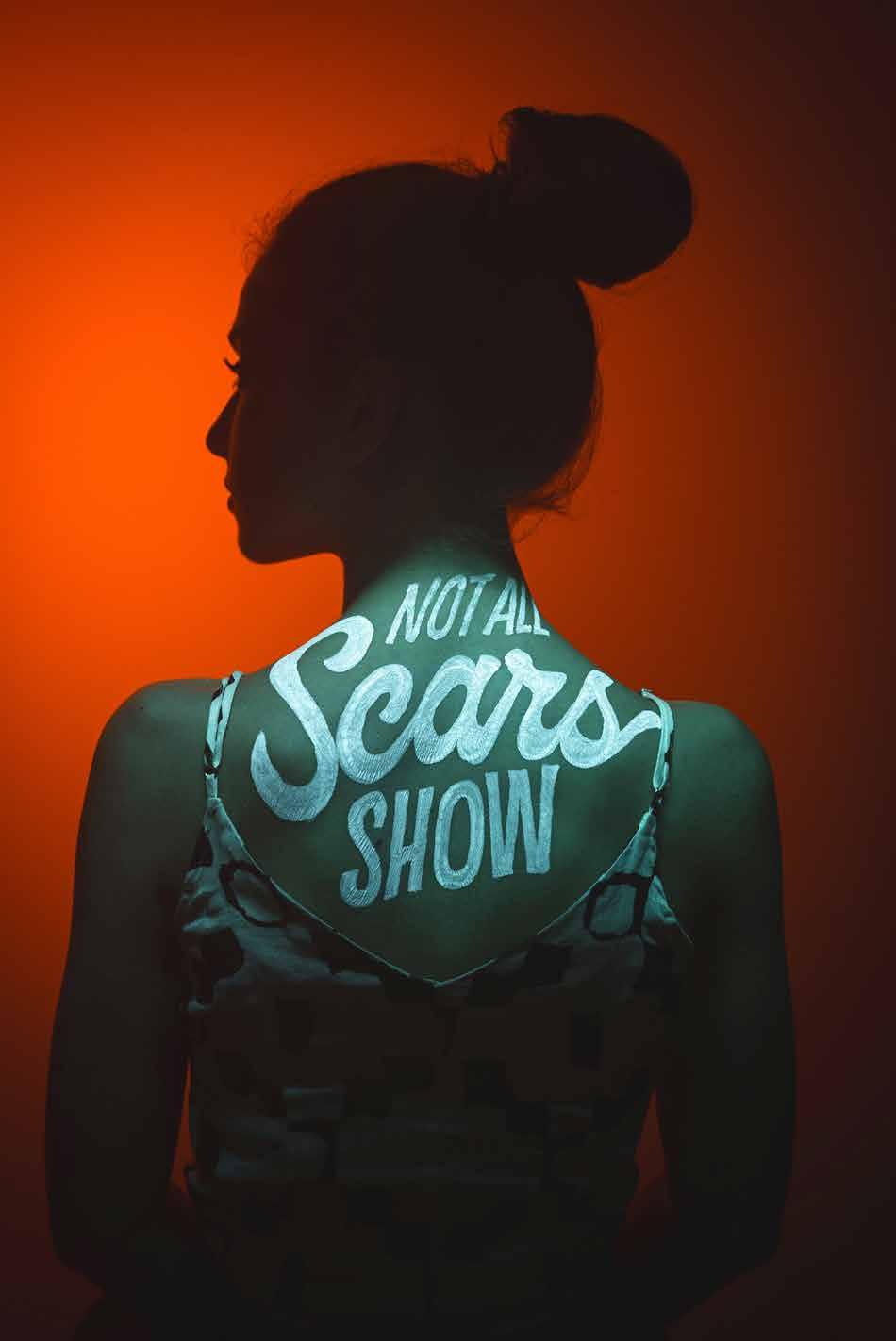
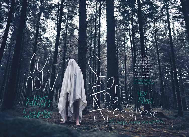
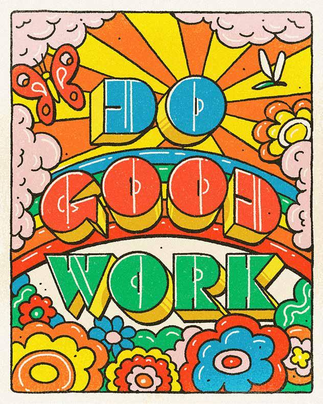
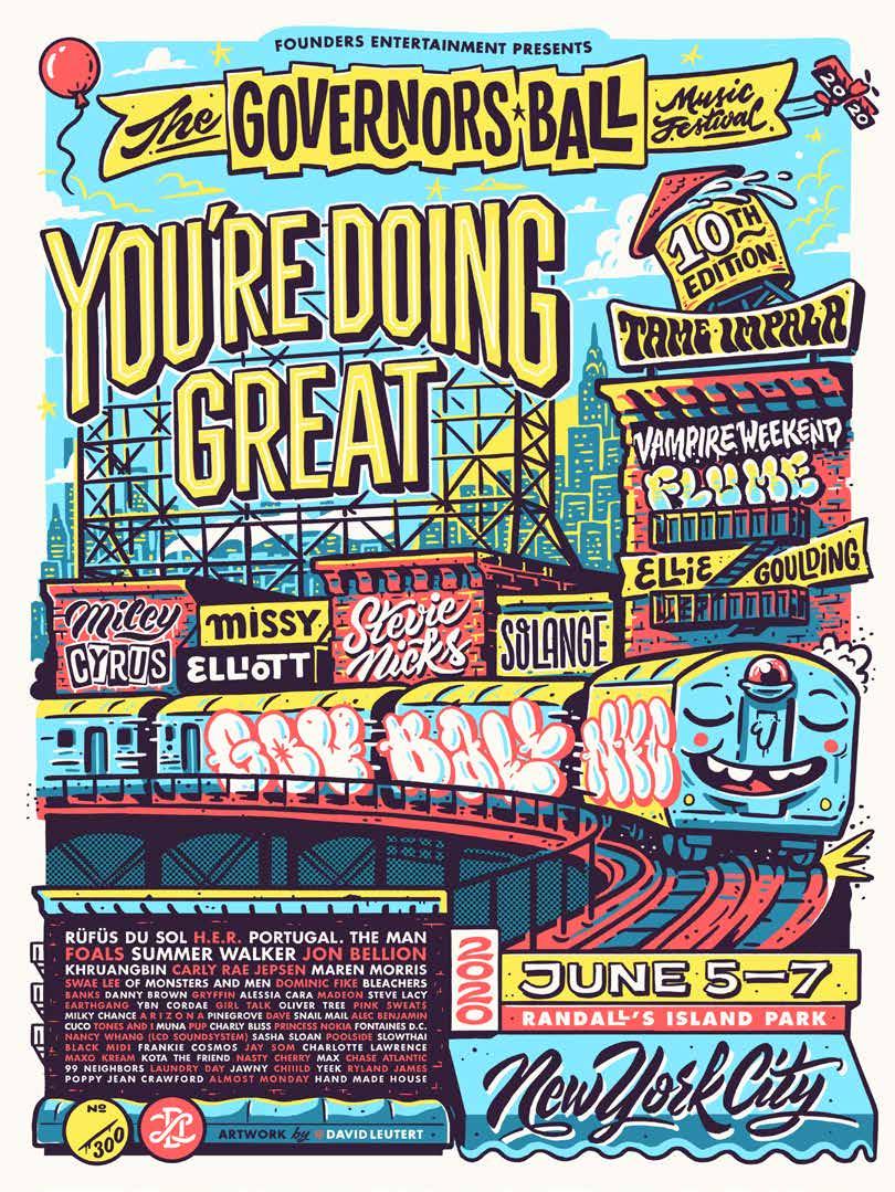
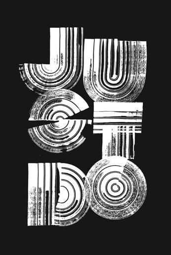
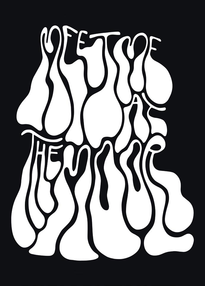
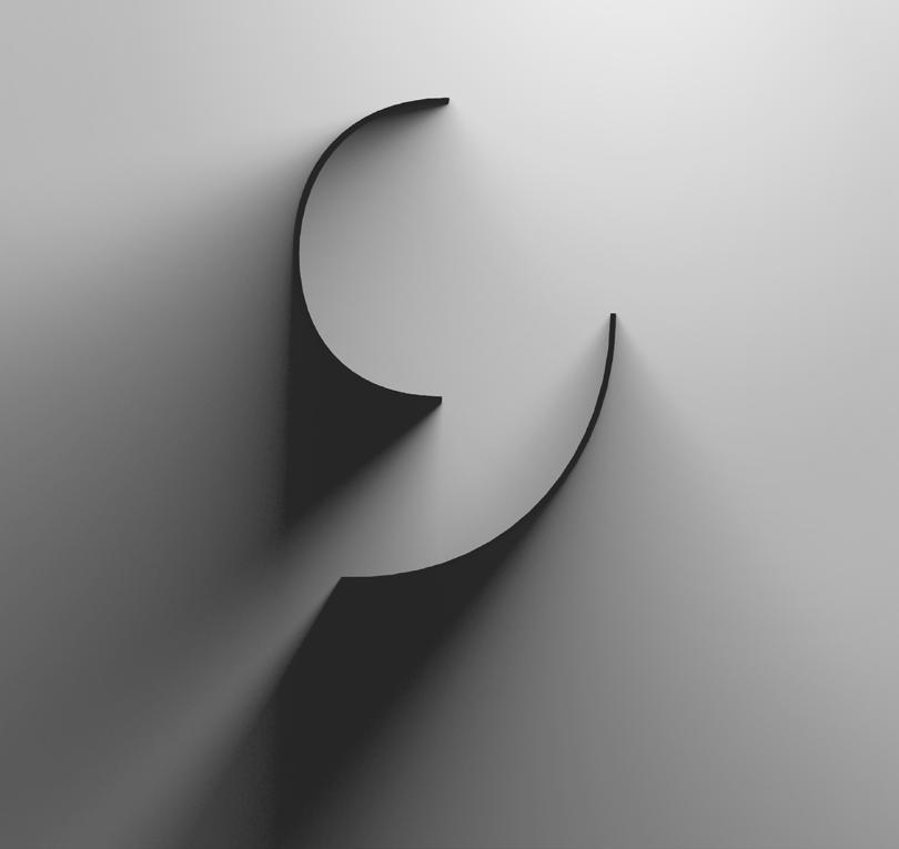
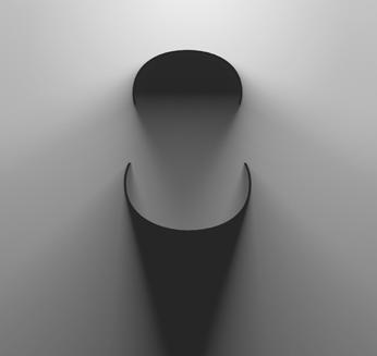
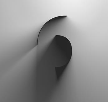
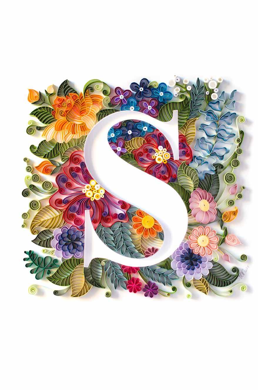
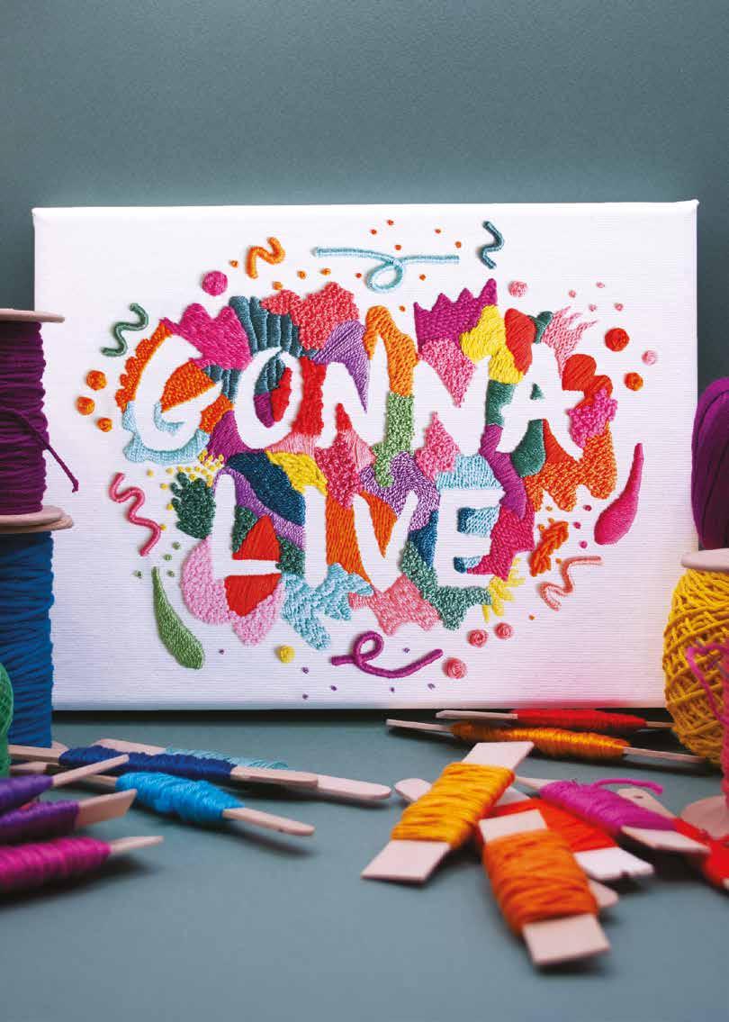
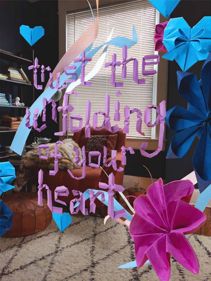
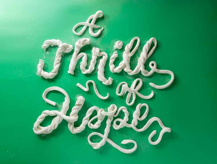
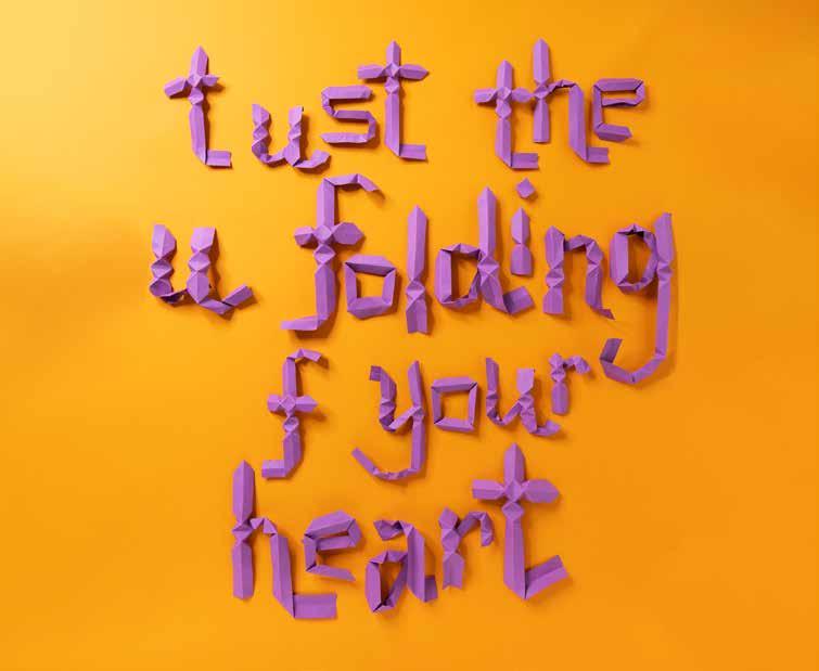
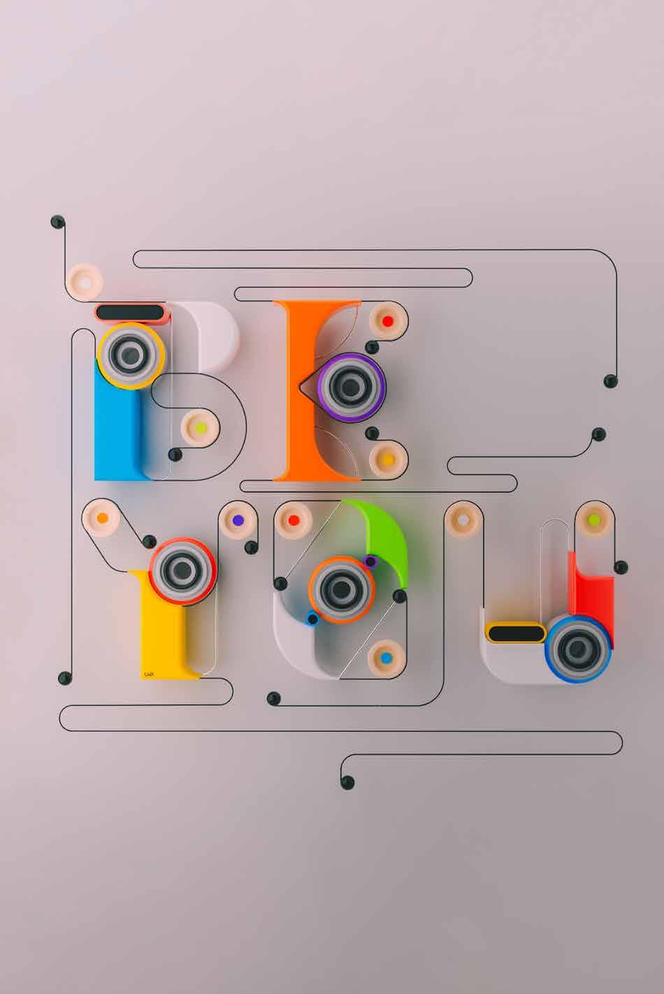
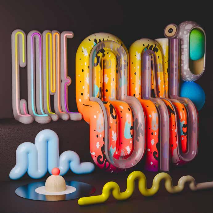
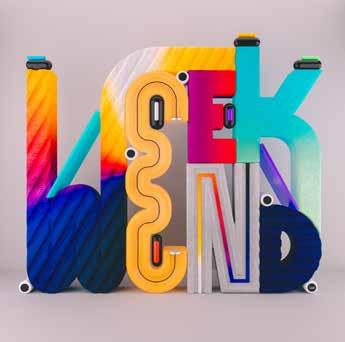
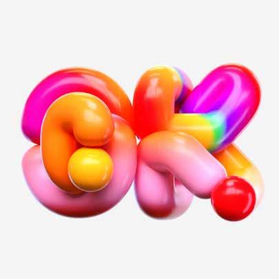
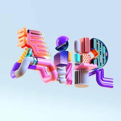
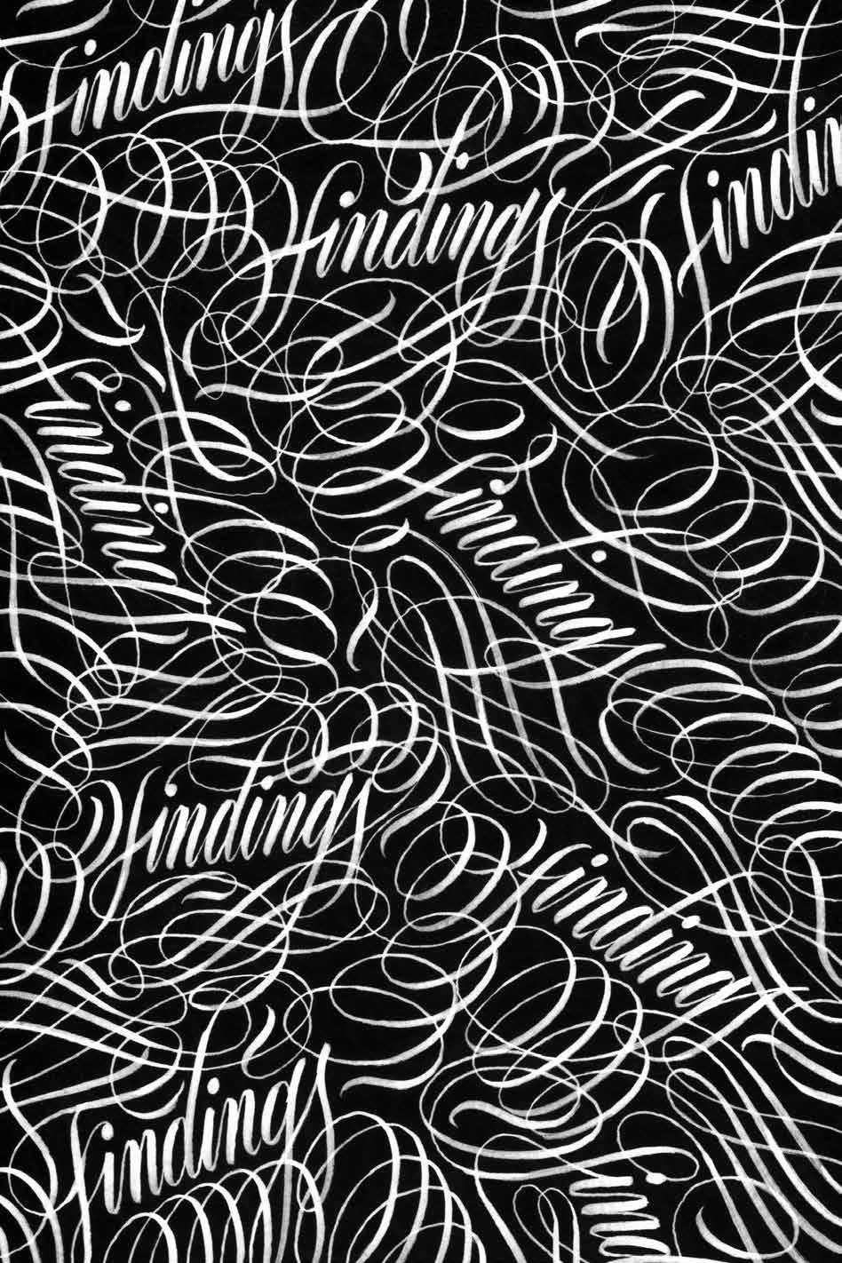
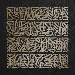
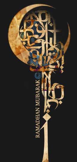
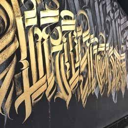
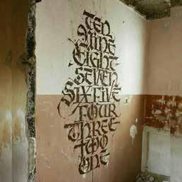
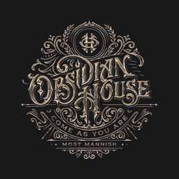
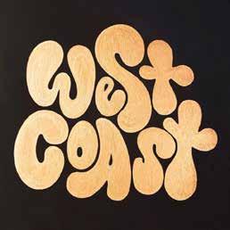
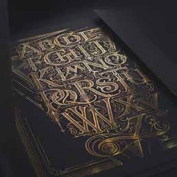
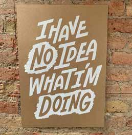
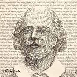
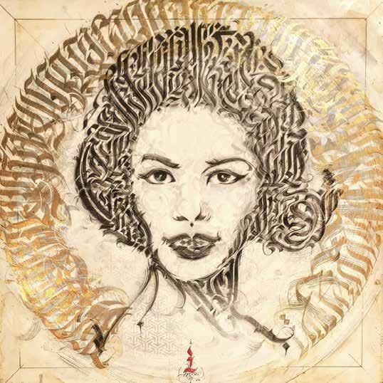
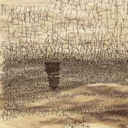
Letters and typefaces not only tranports information but also create a feeling and have a personality. Lettering takes this a step further— with its movement, artistic strokes, and variety, it has the potential to radiate a whole range of energies and tell stories of harmony and distortion, about positive and negative space. Words become drawings and pictures themselves.
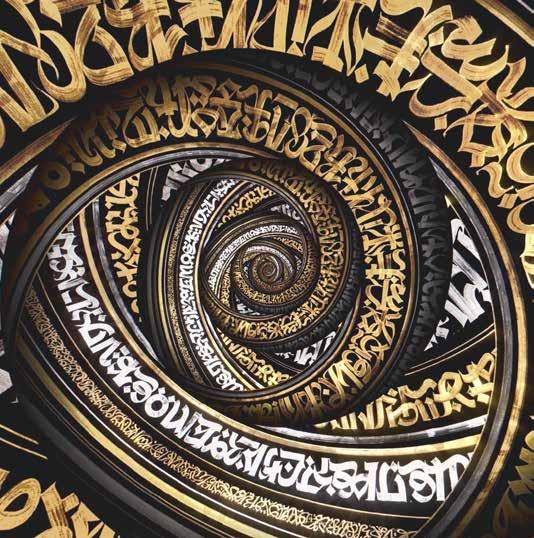
Born out of the success of the concept of the Yearbook of Type, we have created a new book series: the Yearbook of Lettering. It presents a selection of lettering artwork created all over the world—from traditional calligraphy and hand
lettering, street art and graffiti, to 3D digital lettering, showcasing the vibrant and wide range of different styles and techniques. The book offers an overview of high-quality handcrafted typographic art and can help clients source the right artist for a project. It serves as a source of inspiration not only for people in the design world but also displays the contemporary world of lettering and the many different styles available— giving lettering, calligraphy, brush lettering, blackletter, hand lettering, graffiti artists, and more the platform, appreciation, and recognition they deserve.
How does using a new tool change / improve your creative output?
For me, it’s always great when I try something new, mainly when I don’t have a purpose and do it only for the fun of experimenting. This constant experimentation allows me to have new perspectives and results that I can apply to my work on a daily basis. I always try to get the most out of each technique and tool, to unlock ideas when I’m stuck or with some kind of creative block.
Does coincidence matter in your work / process?
Of course it does! Several times that has happened. Every time I create something, I learn something! Mainly because I experiment with a lot of different tools and approaches, just to try to understand their capabilities and what I can create with them. So most of the time, I get unexpected results. Sometimes I end up leaving that “mistake” or working on top of it because it gave me an input or idea that, otherwise, I would have never had or made. I like to call it happy coincidences.
What influence does your environment have on you (and your work)?
Everything really. Every part of it made me the person that I am today, personally and also professionally. What I am and where I am today is part of my environment and my influences growing up.
Art and music were and still are present in my life, so unconsciously that shaped the way I see and approach things. Also, support from friends and family is one of the most important aspects. In fact, I have an awesome story about my grandfather. He had a brief passage through design when he was younger, and used to do mainly lettering and illustration, but the funny thing is that I didn’t have access to his work until several years ago, and when I did, it blew my mind!!! It’s really cool to see the similarities between our work. So, I think that everything we experience is meaningful for our growth as a person, and that’s reflected in your actions, way of being, and perceiving the world.
From 2013 to 2018 you were a resident member and researcher
at “We Came From Space,” a research and knowledge exchange platform. Can you please tell us about it?
In 2013, I had an invitation from one of my design teachers, João Martino, to be a part of a project that was later called We Came From Space. There, we had the possibility to be in the same physical space with other creatives from different fields of expertise, with different years of experience in the design industry. It was almost like a big studio / school with very cool and talented people.
The only premise, to be part of the project, was that each and any one of us had to teach / share our knowledge and skills with everybody else. In fact, that was the main reason that pushed me to start with my calligraphy and lettering workshops. It was undoubtedly one of my best experiences so far! I’ve learned a lot only by being there, watching, and absorbing all the info that I could.
What is something you learned for yourself through giving workshops?
Fundamentally, I learned to detach myself from any kind of vices that a person normally creates over time. I realized that most of the results produced during the workshops would not be something that I produced myself, perhaps because I already have too many references and / or vices in my creative process.
I learned above all that it is good not to think too much, it is good to get out of the comfort zone, and not be afraid to take risks, embrace mistakes, and most importantly, to share.
For me, more than teaching something, I see the workshops as a constant sharing of ideas. I always feel that what I share, most of the time I get back double.
In 2011 you started your own studio and have been very successful ever since. What are your plans for the future?
If possible, I just want to keep doing what I love the most, being able to make a living out of it, and grow as a creative person! I want to collaborate with as many people as I can and reach a wider audience. But most importantly, inspiring people the way that my references inspired me!
Petra Dočekalová (1991) is a type designer, calligrapher, and lettering artist working on new digital scripts, letterings, and typefaces.
Petra received the TDC Award of Excellence for her Master’s diploma project dealing with Czechoslovak calligraphy and new handlettering forms. She continued exploring this topic and finished her doctoral studies on Fostering Increased Appreciation for Handwriting, Penmanship, and a Personal Handwriting Style at the Type Design and Typography studio at UMPRUM in Prague in 2020.
Since 2013, Petra has been a member of the Briefcase Type Foundry, working on new fonts—the most recent one being a type collection from the project The Heritage Of Oldrich Menhart. She also focuses on editorial work such as the TYPO9010 book, which won several global awards, or the Jaroslav Benda 1882–1970 book.
Petra is based in Prague, but she often organizes international lettering workshops. petra-d.com @petra.typo
If you could only write one last word for the rest of your life, which one would it be and why?
I would write a random non-existing word—basic sketching and finding unusual combinations lead to unexpected ligatures and shape variations. However, it has a solid potential for freeing fantasy and finding new letter shapes.
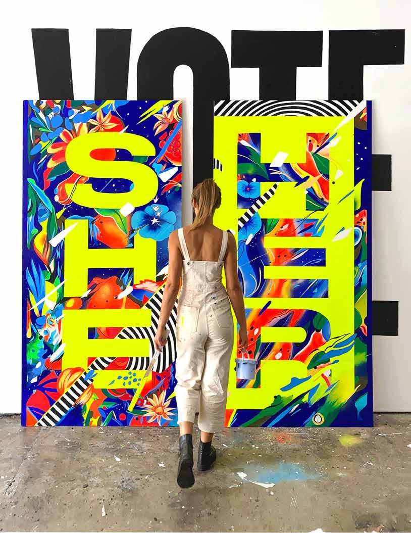
Gemma O’Brien is an internationally renowned designer and artist known for her bold graphics, illustrative lettering, and murals.
Her work has been commissioned by Apple, Nike, and Google, and is held in the permanent collection of the Cooper Hewitt Smithsonian Design Museum in New York City.
Outside her commercial design work, she explores language, nature, and the human experience through her art practice.
gemmaobrien.com @mrseaves101
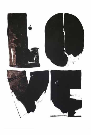
If you could only write one last word for the rest of your life, which one would it be and why? It would be: Love!
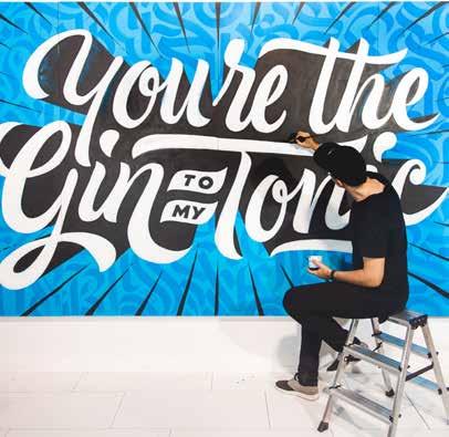
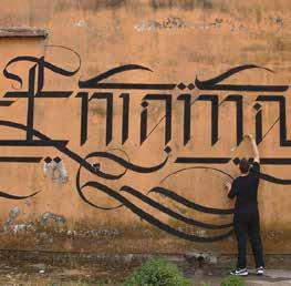
What do you like most about painting murals?
The physicality, painting with a team, and the unexpected challenges that arise from working on a large scale. I like the feeling of making something bigger than myself, and often if the mural is painted over at the end, I like the memory of its creation.
Which influence does social media have on your work?
It had a huge impact on my work between 2012–2017. I never intended to use it to build a career or showcase my work, but as I experimented and shared work in progress, this led to a growing audience. This helped me gain momentum and confidence, leading to many amazing commissions around the world. It was also a place to connect with artists whom I eventually met in real life. This started to change in 2018, and since then I have refocused my practice to find ways to grow, learn, and work in a way that relies less on social media.
You were pretty young when you were already very successful— luck or a burden?
I feel lucky and grateful. I feel as though I achieved many of the dreams I had as a young design student. Now I am refocusing to start a new chapter: as an ultra artist!
Has your confidence grown over the years, or do you feel more pressure to create something “perfect”?
Pressure does seem to grow with success, but ultimately you have to find ways to master that from within. Learning how to manage it and to continue creating becomes a skill that I’m still honing. I like learning and the freedom of being a beginner, so I have been actively seeking out new skills, mostly in drawing and painting from life.
How do you see the future of AI and what influence could it have on your work?
I like how AI forces us to reflect on what makes us human. I like the idea of AI as a creative collaborator and a prompt to philosophical questions about how we should spend our time on this earth. Ask yourself: if AI can do everything for you, what would you still choose to do anyway?
Does design emerge in art or the other way around?
For me, art is a chance to create without being told what to do. The inner stuff comes out! But I think design can emerge in art, and art in design, and both can occur in how you live any aspect of life.
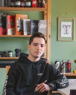
Snooze One is a lettering artist from Berlin. His interest in letterforms started with discovering graffiti at age 13. Shortly after that, he got into Calligraphy. During school, he started publishing his work on Instagram. Inspired by a trip to the US, he set up his own screen-printing shop in his attic to print his lettering on T-shirts, which also pushed him to pursue this passion.
He currently studies visual communication with a focus on advertising. His style is versatile and features several different tools and techniques. He loves to experiment, find new ways to write, and build letters. He created lettering out of Micro Algae for the New-York skincare brand When Life Gives You Lemons, formed letters out of cookie dough, and wrote on pressed cellulose sponges.
Snooze One worked with various brands like STABILO, Dettol, COMBO BREAKER, and Serif. He not only works with traditional media but also explores the possibilities in the digital world. He plays with augmented reality and creates diverse digital brushes for other creatives.
If you could only write one last word for the rest of your life, which one would it be and why?
In case I have to limit myself to just one word, I would want to make the most out of it: Donaudampfschifffahrtselektrizitätenhauptbetriebswerkbauunternehmenbeamtengesellschaft.


@reano_feros
@jorgeaguilart@malik.alrajab
@czajazz@letterryrthm@malik.alrajab
@iamrushdog@marlamakesstuff
@mateuszwitczakdesigns
BRANDS WE WOULD LIKE TO RECOMMEND
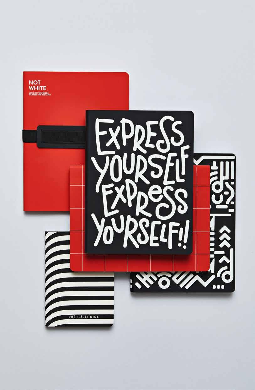
Notebooks store our ideas—and that’s how they should look. That’s why nuuna produces notebooks that are not only fit for ideas but contain a whole bunch of ideas themselves.
nuuna is the retail collection of brandbook and their own label through which they express their dedication to notebooks. brandbook has been specializing in producing notebooks, books, and calendars for corporate customers for 25 years. nuuna combines this expertise with a passion for creativity and design, resulting in a fusion of traditional bookbinding, unique materials, and innovative finishing techniques. In their Frankfurt-based studio, they create experimental book concepts and test out materials and finishes, aiming to constantly reinterpret the book as a medium. For them, notebooks are not outdated but rather a complementary work tool to our digitized lives. They draw inspiration from the things they love, such as design, architecture, fashion, literature, art, and music.
They like design with a strong concept— so one can expect a clear idea behind every nuuna design, which they apply using elaborate printing techniques and metallic effects
that turn each notebook into a small collector’s item. nuuna notebooks are manufactured with great attention to detail in Germany and bound in special cover materials, such as smooth recycled leather, vegan jeans label material, or effective artificial leather. They ensure the use of strong premium paper and perfect lay flat behavior, which guarantees an ultimate writing and sketching experience.
Of course, a notebook should feel good in one’s hand yet still be large enough for bigger letterings or fat sketches. Alternatively, it should be handy enough to be whipped out of a bag for those spontaneous notes. With each use in mind, the creators have developed their own unique formats – guaranteeing comfort and function in the creative day-to-day process.
The nuuna collection marks the beginning of the end of boring notebooks and has become absolutely indispensable for creative professionals and stationery enthusiasts alike.
Ap. 190 / 191
Addante, Clarissa @c_addante clarissa-addante.com illustrative, experimental pencils, digital tools
Clarissa Addante is an Art Director and Senior Graphic Designer based in Toronto, Canada.
p. 87–89
Agostini, Daniel Horacio @dagostinilettering dani-agostini-lettering.com calligraphy, handwriting, brush, experimental, expressive calligraphy, brushpen, ruling pen, brushes, handmade wooden pens, plant paintbrush, handmade ruling pens
Dani Agostini is an Argentinean graphic designer with a studio in Girona, Spain, specialized in lettering and expressive calligraphy. He is passionate about the gesture of strokes and random effects of unusual tools (such as wooden pens that he makes with branches), and uses them to give expressiveness to his projects. Since 2016, he is a teacher of calligraphy and lettering and author of two books.
p. 150 / 151
Alaniz, Graciela @alanizcreative alanizcreative.com calligraphy, blackletter, illustrative, digital markers, pencils, brushes
Graciela Alaniz is a web designer and developer by day and a lettering enthusiast by night. She discovered her penchant for letterforms in university while studying multi-media. She enjoys pencil and chalk lettering in particular—she says there is no limit to how creative you can be with just the basics. Outside of design, you can find her searching for scenic places to take photos of, and the nearest churro.
p. 144
Albert, Tobias-David @tobiasdavidalbert TobiasDAlbert.de calligraphy, pointed pen, handwriting, brush nibs / broad edged nibs, pointed sponge brush
Tobias-David Albert, born in 1978, is a calligrapher, lettering designer, type designer, teacher of letters, lettering artist, and artisan. He works and lives in Leipzig, Germany.
p. 251
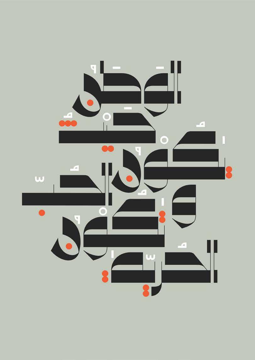
Alsaidni, Khalid @khalid.alsaidni behance.net /khalidalsaidni handwriting, digital, 3d digital tools, blender
Khalid is a Palestinian lettering artist and graphic designer based in Palestine. He has a degree in architecture. However, letters—both Arabic and Latin—have always been his passion. He developed a new 3D style with Arabic letters and continues to explore and experiment with Arabic lettering and typography. Working as a freelancer, he helps businesses grow with brand and logo design or lettering art.
p. 43
Alves, Jackson @letterjack jacksonalves.com
calligraphy, pointed pen, blackletter, handwriting, brush, illustrative, experimental, digital, calligrafitti, mural , nibs / broad edged nibs, ink, brushpen, pilot parallel pen, ruling pen, markers, pencils, brushes, mixed media, digital tools
Jackson Alves is a Brazilian letterer, calligrapher, and educator. Graduated in graphic design, Jack has more than 20 years of experience in visual arts and works exclusively as a letterform expert collaborating with clients from different countries since 2012. He is always looking to continue to grow as an artist and
encourages others as well by teaching online classes to people all over the world.
p. 108 / 109
Ang, Joell @johwells johwells.com
illustrative, digital , digital tools
Joell Ang is a lettering artist and designer from Singapore currently based in New York City. His work is deeply rooted in hand-lettered type, often accompanied by colorful illustrated characters— each unique and personal. Interested in lettering for nonEnglish languages, Joell’s work illustrates type with a focus on exploring how languages play, meld, and interact with one another.
p. 172 / 173
Annand, Yukimi @yukimi_annand yukimiannand.com
calligraphy, handwriting, illustrative, experimental, digital, nibs / broad edged nibs, ink, ruling pen, pencils, brushes, mixed media
Yukimi Annand is a calligrapher, lettering, and book artist with a background in visual communication design. She is passionate about the beauty of the Roman alphabet and creates unique and distinctive artwork with her love of calligraphic mark making incorporated with nature. Her works have been exhibited in the US, Japan, some European countries, and are part of various collections.
p. 170 / 171
Antonio, Paul @pascribe pascribe.com
calligraphy, pointed pen, blackletter , nibs / broad edged nibs, ink
Paul Antonio, also known as PAScribe, trained as a calligrapher, gilder, and heraldic artist. He went on to study English Palaeography and
Archaeological Illustration and worked with the MET Museum in Egypt, drawing Ancient Egyptian Hieroglyphs for their archives. His love of writing encompasses the development of the written word in its many forms. Paul developed an innovative 4Fold Symmetry which links Calligraphy and Meditation into the practice of writing.
p. 164 / 165
Asaoka, Chisato @_ch_is_art_o_ calligraphy, pointed pen, blackletter, handwriting, brush, experimental nibs / broad edged nibs, ink, brushpen, ruling pen, chalk, pencils, brushes, watercolors, acrylic colors, mixed media bee wax, sumi ink
Chisato Asaoka learned Japanese calligraphy and ink painting from her grandfather at an early age. Her interest in the shapes and roots of the alphabet drew her to Western calligraphy in 1996. Writing originated in keeping memories alive, a fact that she values as a lettering artist. The soft letterforms she uses, blending with their backgrounds, evoke memories and emotions.
p. 92
Aujoulat, Audrey @audreyrror404 behance.net/audreyaujoulat1 illustrative, experimental, chalk, pencils, mixed media
Audrey Aujoulat is a graphic designer and aspiring Art Director. She just graduated with a master’s degree in Art Direction and Graphic & Interactive design from ECV France.
Bp. 146 / 147
Barber, Ken @typelettering typeandlettering.com calligraphy, pointed pen, blackletter, handwriting, brush, illustrative, digital, 3d, spencerian lettering, interlocking lettering, stencil lettering, monograms, nibs / broad edged nibs, ink, brushpen, markers, pencils, brushes, digital tools
Ken Barber is a letterer, type designer, author, and educator. For 25 years, he has made distinctive logos for global brands and created dozens of fonts. Ken’s work is part of the Henry Ford Museum of American Innovation and Cooper-Hewitt National Design Museum. He is an instructor at Cooper Union and the type director at House Industries. Ken’s award-winning Lettering Manual was published in 2020.
p. 217
Bastarda Type Foundry @bastardatype bastardatype.com
illustrative, experimental, digital , digital tools
Bastarda is an independent type branding studio. It focuses on the typographic treatment mainly from the design of brand identities, custom figures for wayfinding systems, custom logotypes and logo refinements, custom typefaces, and monograms. Bastarda has recently opened its digital doors in New York with the intention of permeating our typographic vision from the Global South.
p. 124 / 125
Bauer, Marlene @soul_lettering soullettering.com blackletter, brush, experimental, digital, ink, brushpen, ruling pen, markers, chalk, pencils, brushes, spray paint, digital tools, round sponge brush
Marlene Jadzia Bauer is a lettering artist from Münster, Germany. While running an online shop for fine prints, she focuses mainly on commission work and collaborations. While finishing her bachelor’s degree at the Münster School of Design in 2022, she mostly worked on large-scale letterings and new designs for fine print techniques.
p. 104
Beck, Katherine @kate_letters_lots kateletterslots.com calligraphy, illustrative, digital, digital tools
Katherine (Kate) Beck is a lettering and illustration artist, and she is currently a Linguistics and English major at the University of Calgary. Kate’s art has been published in the Applied Arts Magazine Student Awards Issue and the Women of Type Compendium Book. When she is not making art, she can be found baking or spending time with her dogs, Bailey, Luna, Rufus, and Scout. You can find more of Kate’s work on her website or on Instagram.
p. 248 / 249
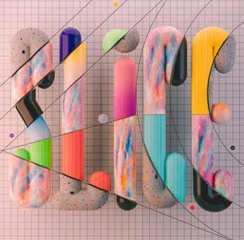
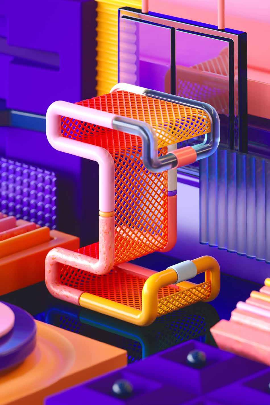
Betti, Leonardo @leonardoworx behance.net/leonardoworx illustrative, experimental, digital, 3d, markers, pencils, watercolors, mixed media, digital tools
Leonardo Betti is a digital artist focused on 3D type and abstract 3D illustrations. He combines hand-drawn textures with 3D shapes, researching for the perfect match between analog and digital. His artworks are inspired by modern design, playful product objects, focusing also on color combinations and gradients. He works for clients like Adobe, Billboard, Microsoft, Wired, and many more.
2023 / 24
Publisher
Slanted Publishers UG (haftungsbeschränkt)
Nördliche Uferstraße 4–6 76189 Karlsruhe, Germany
T +49 (0) 721 85 14 82 68 info@slanted.de slanted.de @slanted_publishers
© Slanted Publishers, Karlsruhe, 2023
Nördliche Uferstraße 4–6, 76189 Karlsruhe, Germany
All rights reserved.
ISBN: 978-3-948440-53-4 1st edition, 2023
No part of this publication may be reproduced or transmitted in any form or by any means, electronic or mechanical, including photocopy or any storage and retrieval system, without permission in writing from the publisher.
Bibliographic information published by the Deutsche Nationalbibliothek. The Deutsche Nationalbibliothek lists this publication in the Deutsche Nationalbibliographie, detailed bibliographic data is available online at dnb.d-nb.de
About Slanted Publishers
Slanted Publishers is an independent design, publishing and media house founded in 2014 by Lars Harmsen and Julia Kahl. They publish the award-winning print mag Slanted biannually featuring global design and culture. Since 2004, the daily blog highlights international design and showcases inspiring video interviews. Slanted Publishers initiates and creates publications, focusing on contemporary design and visual culture, working closely with editors and authors to produce outstanding publications with meaningful content and high quality.
Publishing Direction
Lars Harmsen, Julia Kahl
Creative Direction
Lars Harmsen
Art Direction & Managing Editor
Tessa Breuer
Assistance Graphic Design & Editing
Juliane Nöst
Proofreading
Julia Kahl, Juliane Nöst
Website yearbookoflettering.com
Cover Artwork:
Ying Chang, yinglish.net (front) “Xesta” Hugo Moura, xestastudio.com (spine)
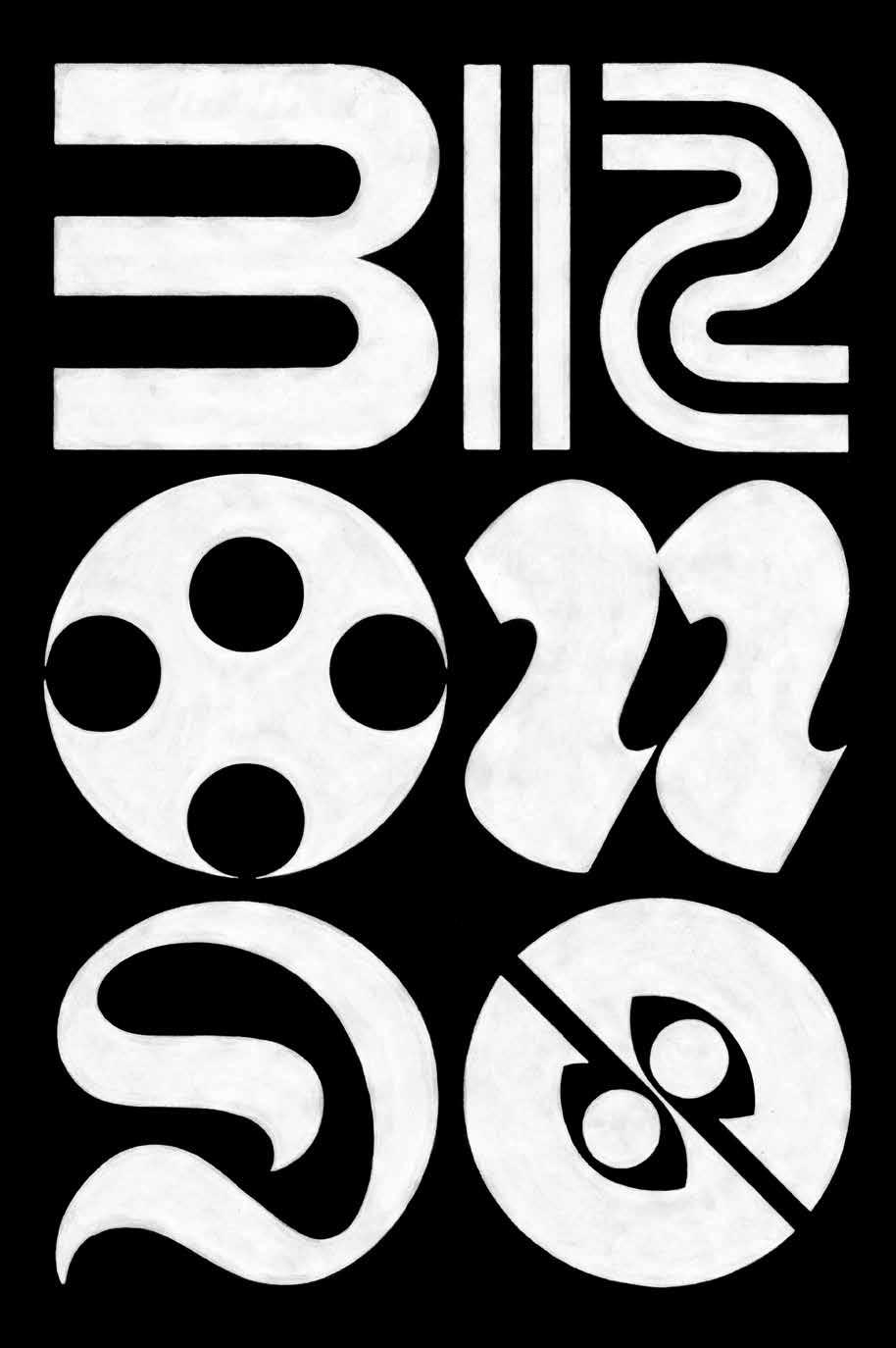
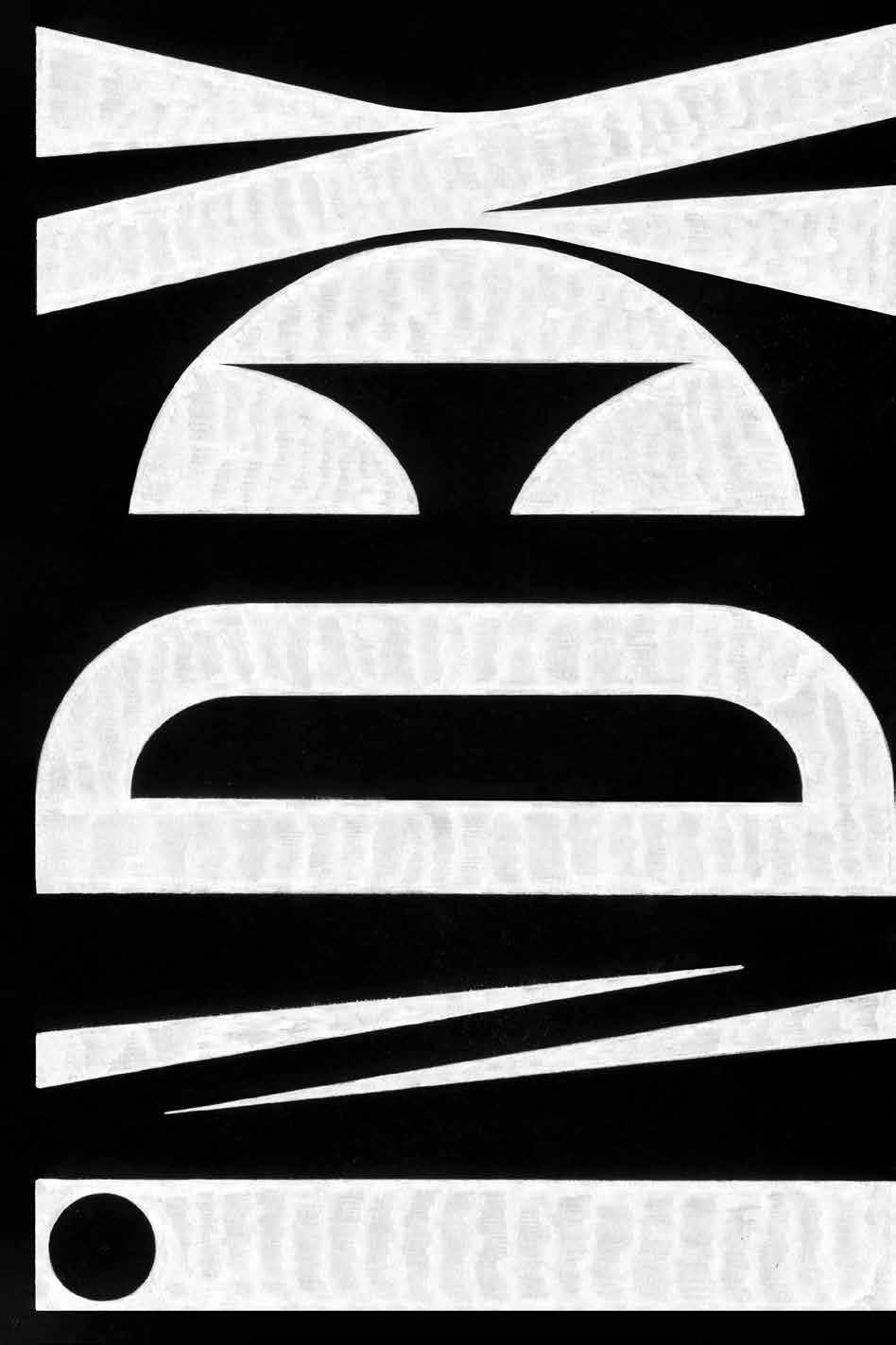
Chapter Page Artworks: “Xesta” Hugo Moura, xestastudio.com
Fonts
Reynaldo, abstractoffice.xyz Sergio, janniszell.com
Printing BALTO print, baltoprint.com
Cover Material
PEYDUR neuleinen, 135 g / sm peyer graphic gmbh, peyergraphic.ch
Paper
Inside: Munken Print White 15, 100 g / sm, Endpaper: SURBALIN seda 8240 gelbgrün, 115 g / sm, peyer graphic gmbh, peyergraphic.ch
With Thanks to Gemma O’Brien, Tessa Breuer, Chris Campe, Ying Chang, Petra Dočekalová, Dainius Grigaitis, Thomas Hoyer, “Xesta” Hugo Moura, Snooze One, “Tintenfuchs” Natascha Safarik
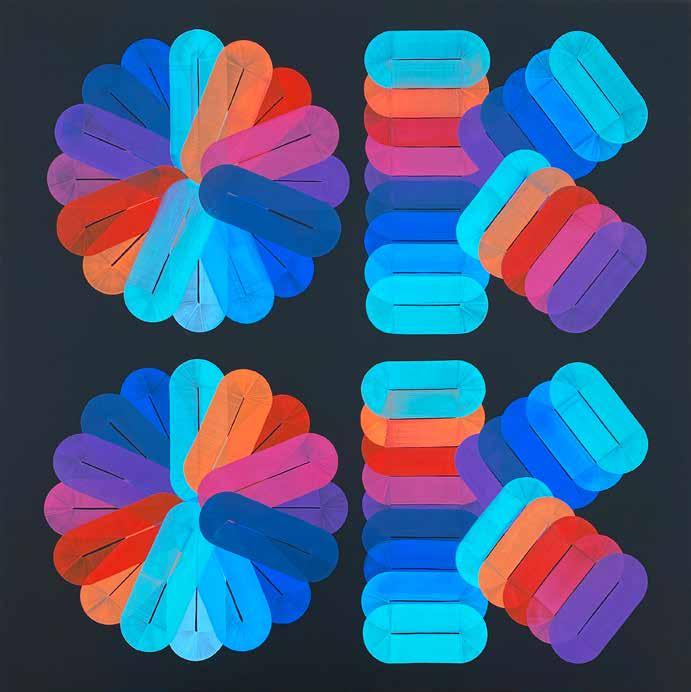
The world of lettering, calligraphy, graffiti, and 3D-lettering unveils itself as challenging and sublime! Once you immerse yourself in this domain, you become enthralled by the insane quality and sheer range of skills and possibilities—and by the passion of those who throw themselves into the subject completely. The dedication with which they acquire and refine their skills is nothing short of remarkable, resulting in extraordinary creations.
The sheer magnitude of what can be achieved seems almost inconceivable, yet we endeavor to showcase its vast range. Within this volume lies a compilation featuring the most exemplary artists from around the world, granting us a privileged glimpse into the realm of lettering. Immerse yourself into this world of color, sweeps, curls, brushstrokes, and pure creative energy.