STUDY REPORT
Done By Soundarya Sahoo
193701082
Section D Manipal School of Architecture and Planning


Done By Soundarya Sahoo
193701082
Section D Manipal School of Architecture and Planning


I would like to thank to Thirdspace Architecture Studios who gave me an opportunity to work as an intern in their office. I would sincerely like express my gratitude to Principal Architect Praveen Bavadekar for checking up on me time to time. I would also like to thank my mentors Senior Architect Ashwani C and Junior Architects Jatan Gala and Sharath Senthil for helping me in my work and supported me during these whole internship program. I would also like to thank my fellow employees and family members who gave me support all these times.
Thank You

As an intern of Thirdspace Architecture Studios, I would like to put forward my roles and responsibilities in the firm, and a brief the current projects I am working on.
For Joining Letter, Internship Confirmation Document, Agreement, Monthly Log Sheet and Daily Log Sheet, link is given below:
https://drive.google.com/drive/folders/1YYhOdfaBMxd0v3A9YTOXprYOAp9l0dqD?usp=share_link
Working as an Intern in TAS has given me a different experience, due to the Principal Architect and other architects, being more approachable and providing proper guidance throughout. It is understandable that a degree of nervousness and curiosity will be there in student before stepping into an office for the first time. That’s exactly what I felt. It took me a week's time to get adapted into the Office Environment, and then I felt at ease, and became the part of that firm. It has the nature of music, calmness, and a sense of timelessness and dynamic nature of the office that I wanted to and since many of the staffs members are most of the time busy with their works, or Site Visits, hence we don’t have any sort of fixed office timings. Work is given more importance rather than the Office Timings, that was the most important thing that I have learnt from this firm. However, there was a sense of loneliness at the beginning as sometimes there was no one in the firm to interact, but due to the works given to me by Senior Architect, I did not give much attention to it.Later the time passes and now we have great bonding with each other. We also have interactive sessions every Saturday unless employees are less in strength.The Office, is small,but great environment to work on and as an Intern, I did not know what to expect at a firm with whatever I have learnt before joining. I got to work on Student Housing (Physical Model only) to small scale Apartment units (Punya Shrushti Interiors). I worked on Conceptual designing, Construction and Demolition drawings, Plumbing Layout drawings,Electrical Layout drawings,3D models and Physical Model with the use of softwares that I was learning, detailed drawings, presentation drawings, and went on site as well. It was a great learning that will remain within me for longer period of time. I learnt numerous things in various ways and at all times. The office also taught me to be professional and precise at work. It taught me to be sincere while doing even the minimal work that might not be as important as it looks. The firm also taught me to work as a team (Student Housing Project), and how every contribution, regardless of its magnitude matters. Through the weeks, I got to know how to be patient and do my work with perfection while keeping my mind at peace.Hence,from these learnings I got to know how training plays an important role in teaching the real-life situations in these architectural field. It was and will be a great experience for me to work on training at Thirdspace Architecture Studios, Belgaum, Karnataka, throughout this internship time period.
Thirdspace Architecture Studios (TAS) was established in 2003 by Ar. Praveen Bavadekar (BMS college of engineering, Bangalore and his schooling from St.Paul’s High School Belgaum and M.Arch from the Architectural AssociationLondon). He is also the co-founder of Thirdspace Bangalore. In the Belgaum studio, he heads a team of around 15 persons, and juggles between his studio, academics and teaching, and even farming in his ancestral farms
Based in Bangalore and Belgaum, Thirdspace is envisaged as a network of professionals working on architectural/ urban projects. The practice is a loosely defined organisation, which is always open to ‘cross pollination’ from various synergetic sources Their projects themselves blur traditionally accepted boundaries, looking at urban issues in interior projects and architectural issues within urban proposals. The diversity of the work, also lets them experiment with similar generative techniques across different scales of budgets, size and typologies. Sir with his team at Thirdspace, have worked on several prestigious projects, including the Gururaj Deshpande funded Deshpande Center for Social entrepreneurship at Hubli and has also won the competition project for the Gangubai hangal Gurukula at Hubli Thirdspace has also won two A+D Spectrum National awards for its outstanding architectural performances in the year 2004. It won the Recreational architecture award 2004 for its project ‘Cafe Ajanta’, the restaurant in Belgaum, as well as the commendation trophy for ‘Young enthused architect 2004’

The practise has published a lot of its projects, and Sir has given lectures on his projects at several architectural schools and conventions. His farmhouse at Hudali is also included in the book 91 residences, by incite publications.

1. Yeshwantpur Student Housing Project, Bangalore, Karnataka
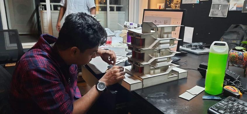
• Physical Model Making
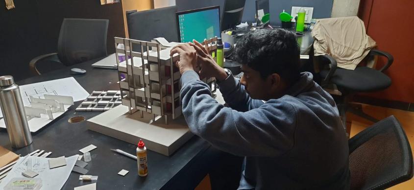
• Demolition Plans
• Construction Plans (with Revised)
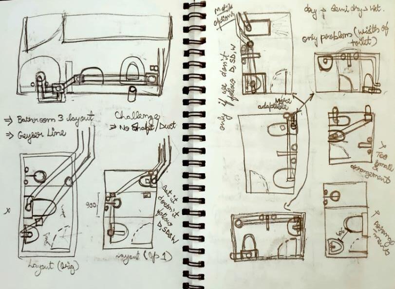
• Plumbing Layout Plans (Kitchen & Utility, 3 Toilets) (With 1 Layout being Revised)
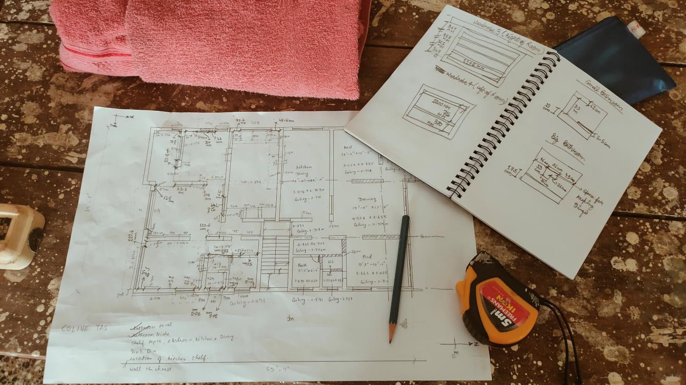
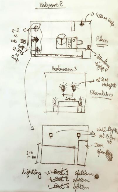
• Furniture Layout
• Wardrobe Detailing
• Beam Layout on newly Constructed wall plans
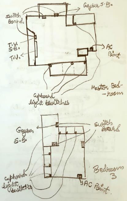
• Electrical Layout
• SketchUp Model (Conceptual)
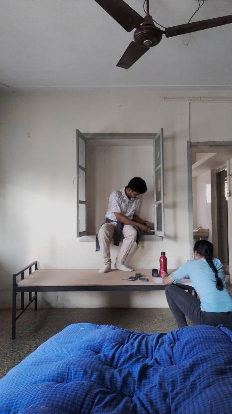
• Site Visit to document the spaces
2. Punya Shrushti Interiors, Kolhapur, Maharashtra 3. Coliving TAS, Ranade Colony, Hindwadi, Belgaum, KarnatakaPrincipal Architect
Ar. Praveen Bavadekar and Ar. Namrata Betigiri
Senior Architect
Ashwani C Consultant
Junior Architect
Jatan Gala and Sharath Senthil
Contractor
Changes from project to project
Principal Architect
Intern Soundarya Sahoo
• Both Sir and Ma’am meet with clients/receive calls or mail from client to determine objectives and requirements for the building design.
• Give preliminary estimates on cost and construction time and prepare structure specifications
• Directs Senior Architect (mostly), Junior Architects or Interns to prepare drawings and documents.
• Prepare scaled drawings or conceptual model, with computer software like AutoCAD and SketchUp.
• Prepare contract documents for building contractors and have communication with Consultant
• Manage construction contracts.
• Visit worksites to ensure that construction adheres to architectural plans.
• Seek new works by giving presentations.
Senior Architect
• Contribute, support projects, have direct communication with the contractors and consultant.
• Complete most of the paperwork that is involved in the design process.
• Visit worksites to ensure that construction adheres to architectural plans
• Helps Junior Architect in works and also Interns in their internship program.
Junior Architect
• Contribute, support projects and works under direct supervision of Senior Architect or Principal Architect.
• Complete much of the paperwork that is involved in the design process but lesser as compare to Senior Architect..
• Communicate with involved clients and contractors.
• Also helps Interns in their internship program.
Contractor


• Directly have connection with Principal Architect or Senior Architect.
• Directly engages construction workers and manages construction work.
Consultant
• They have licensed to carry out the practices at different levels of employment and involvement.
• They allows Architects to utilize and further their design expertise.

OFFICE BUILDINGS BELAGAVI, INDIA
ARCHITECTS: THIRDSPACE ARCHITECTURE STUDIO
AREA : 1200 M²
YEAR : 2020
PHOTOGRAPHS : SURYAN // DANG
LEAD ARCHITECT : AR. PRAVEEN BAVADEKAR
STRUCTURAL DESIGN : D.L.KULKARNI ASSOCIATES, DILEEP KULKARNI
CITY : BELAGAVI
COUNTRY : INDIA
Could an existing structure be extended without really disturbing it or even barely touching it? How can the new negotiate with the old so that each retains their own identity and yet are cohesive together? These were among the many questions we asked ourselves when a reputed educational charity institution needed additional space for their 50-year-old, two-story corporate office. The existing office, though nondescript, was nevertheless a space that had significance to the Institution’s collective memory, and it was sought to be retained out of a sense of historicity. The offices were always bustling with activity and had undergone a mid-life retrofit, so any addition to the top would have to be done in a manner that did not disturb or disrupt the workings of the office. Therefore the challenge was to intervene in a manner that the existing office would not be affected in its functioning nor would its interiors be damaged through intrusive structural works.
•The Artery: The proposed building required multiple responses to its multiple contexts. On the one hand, the building, though being a part of a hundred-acre, century-old educational campus, was on an important arterial road in the city of Belgavi. Any building on this road would occupy an important place in the visual map of the city. It was a mandate of the brief that the building should establish itself as a visual landmark on this important road of the city.
•The Campus: The proposed building would also be one of the frontages of the century-old campus which marked the birth and growth of this remarkable charity organization. The campus was a collection of buildings built over the past century, loosely connected by a retrofitted interstitial landscape. Because of the number of trees and the low-slung nature of the existing buildings, the campus was perceived by the city more as a very long perimeter wall with barely any views of the inside. This was an opportunity to create a meaningful intervention that could give the campus a recognizable identity
•The Sports Field: The sports field of the campus abutted the existing head-office building and whereas the existing building barely registered in the view from the ground, the new intervention would be a part of the peripheral edge of the ground. As much as the building had to respond to these three contexts, the building also would be viewed from these three vantage points.

Strategy - After a deep study, a three-pronged response to the brief was envisaged: The building would not be a mere extension/extrusion of the lower floors, but rather could be a structure that floated above the old building barely touching the ground. This would be a structure that had to respond to three separate micro-contexts - the road fronting the site, the colonial-era campus within, and the adjacent campus sports field. The structure was restricted to a height of 15 m because of fire regulations, and its footprint was restricted by road setbacks as well as the buildings and the ground in its proximity. The building construction would have to happen in a manner that did not disturb the functioning of the existing campus.
Resolution - Structure as Space: The proposed addition was thought of as a space that could hover over the existing building in a manner that creates little disturbance at the ground level - A Hover Space. At its simplest, the design is a space between two full-floor height edge trusses. These trusses would be supported on just 8 cylindrical RCC columns, carefully positioned to avoid creating obstacles to the existing conditions at the ground level. These eight columns at the periphery of the truss allowed a seamless uninterrupted interior space of around 1200 sq.m


The width of the office on top was restricted by the existing context on site as well as the considerations of daylight penetrating throughout the whole interior. The length of this space was similarly restricted by the ground on one side, and an existing garden with a historically significant memorial on the other. In elevation, it comes across as an inverted L form with a vertical arm containing the circulation and lobby and a horizontal arm that floats over the old building and cantilevers onto the sports field. The vertical circulation that forms the L form also helps visually anchor the building to the ground on one side, while allowing it to float in the background of the sports field on the other side. The L form of the building creates an entry portal from the road to the campus which aligns with the central tree-lined avenue along which there are several heritage structures. These heritage buildings are framed through this triple-height entry portal as one views the campus from the road.


Verandah as a second skin: The simple box of column-free office space is wrapped around with a continuous verandah. This verandah is an interpretation of one of the ubiquitous features of the colonial architecture of the subcontinent. A verandah is simultaneously a social space, which is undefined in a singular function but allows for a multiplicity of uses, as well as a passive climatic device that protects the interiors from the harsh rain and sun of the subtropics. This continuous verandah, here, is a breakout space for the offices as well as a climatic buffer between the interior and exterior. The floor-height trusses, painted in a deep red, become a sculptural element that defines the edge between the core office space and the verandah outside. Simple aluminum sliding doors act as an interior envelope allowing for easy access to the verandahs. An expanded mesh aluminum skin of operable vertical fins further enhances the climatic and transparency control offered by the verandahs that front the longer eastern and western facades thus filtering harsh direct sunlight on these facades.

The views of the exterior from the interior spaces are layered and framed, by the form of the trusses as well as the simple aluminum glazed windows, the plants in the verandah, and the light aluminum mesh screen. Thus, the office spaces provide a sanctuary from the bustle of the city outside yet filter in the city and the campus through layers of transparency. The interior spaces of the offices benefit from the abundant natural light and ventilation and a simple palette of whites and accent colors with foliage of plants and trees enliven the space. The interior is programmatically divided into three main spaces - the entrance lobby with the Chairman’s chambers, a middle section with private offices and meeting rooms, and a rear section with open office cubicles with a view of the city and the sports field. The roof trusses are left exposed in many areas, and a clerestory skylight along the center of the roof defines a spine that also emphasizes the main circulation corridor.
Interstitial Space: Programmatically the new addition was required to function in cohesion with the offices in the existing building. Visually and conceptually, they needed to be distanced. The two structures are connected by a glass elevator facing the sports field, which provides dynamic vistas of the campus and its sports ground as one travels vertically through the office complex.

The glass elevator is also an element that not only connects the two buildings physically but also allows a user to temporarily exit the buildings albeit in a glass box and reconnect back to the offices. This ritual of being transported while being in the building yet being apart from it, further emphasizes the distinction between the old and new. The terrace of the old building becomes an interstitial space that can function as an event space/terrace garden. This anti-space acts as a buffer and a pause point, visually as well as programmatically, between the old and the new. The terrace had access from the lower floors through a regular dog-legged staircase. It now also gets a sculptural circular staircase that connects it with the new addition above. The placement of the new addition with respect to the old one generates a condition where parts of the terrace are open to the sky and a part of it is covered by the hovering space above.


Several responses: The new addition, though appearing to be a simple metal box, has several layers of complexity woven into its very fabric. It responds to the road by appearing as a linear screened box that is set parallel to the road and is experienced through the foliage. It forms a portal entranceway to the campus beyond. It also is experienced as a backdrop to the sports ground and track acting as a visual anchor for the campus. Overall, the new office space created has given a new identity and presence to the organization as well as created a sense of an entry portal for the larger campus. The offices with their combination of private chambers and open work desks vastly benefit from the exterior verandahs which shelter the interiors from the harsh outdoors. In its several nuances and details, the design addresses several functional, contextual, and climatic parameters through simple strategies.

An RCC Column is the vertical member that effectively takes load by compression. Basically, its a compression member as the load acts on its longitudinal axis. The bending moment could occur because of wind, earthquake or accidental masses. RCC Column transfers the load of the structure of slab beams on top to below, and at last, the load is transferred to the soil. RCC Columns location ought to be specified such that it hides within the walls in partially or totally.
RCC sections are heavier comparatively to the sections made with other construction materials like Steel, wood, etc. These also consume more space than other sections made with construction materials like Steel
In this project, the trusses would be supported on just 8 cylindrical RCC columns, carefully positioned to avoid creating obstacles to the existing conditions at the ground level. These eight columns at the periphery of the truss allowed a seamless uninterrupted interior space of around 1200 sq.m.


Aluminum sliding doors are comprised of solid and durable metal. They're generally made of aluminum sheets with a thermal insulating substance commonly made of plastic. These sliding doors have an aluminum thermal frame to help keep your home energy efficient and stainless steel or aluminum handles. Aluminum is one-third the weight of steel while still being incredibly durable, making it an excellent choice for a large patio door. The great strength-to-weight ratio of the material significantly improves dent resistance, making aluminum sliding doors a perfect choice for homes and offices. Furthermore, aluminum sliding glass doors require minimal maintenance to maintain their structure and performance over time One disadvantage of these doors are staining from water. In case if structure is built in a constantly wet area, especially an area that rains a lot, expect to find some marks on these doors.
The marks may increase in size and number over time. Although they don’t rust, these marks look unsightly
In this project, Simple aluminum sliding doors act as an interior envelope that allows for easy access to the verandahs.


Glazed aluminum windows and doors help enhance energy efficiency and regulate thermal insulation. Glazed windows are those windows that have multiple panes of glass and a vacuumed space, often filled with an inert gas, preferably argon between them. This inert cavity is responsible for trapping heat and preventing its conduction from the indoors to the outdoors and vice versa. Glazed aluminum windows also come with primary and secondary seals that are specifically designed to contain the heat and reduce the noise, in a far more superior way than other regular window systems. Primarily, aluminum glazed windows are made available in two major glazing options- single glazing and double glazing Aluminum windows have a high U-value, they may not be the best pick for frigid climates.
Screens made from aluminum mesh have limited color options, but they are one of the sturdiest and most durable screens available. They have a long lifespan and will offer you protection from different weather conditions, including rain, strong winds, and even hail in some cases. Thanks to their construction from aluminum, aluminum mesh screens are resistant to abrasion, corrosion, and rust, making them a great screen choice for nearly any environment. Aluminum wire window screens also will not sag or rust, extending its life even further. If you choose charcoal or black aluminum screens, the finish will absorb light and reduce glare, improving outward visibility.

The building would not be a mere extension/extrusion of the lower floors, but rather could be a structure that floated above the old building barely touching the ground. This would be a structure that had to respond to three separate micro-contexts - the road fronting the site, the colonial-era campus within, and the adjacent campus sports field. The structure was restricted to a height of 15 m because of fire regulations, and its footprint was restricted by road setbacks as well as the buildings and the ground in its proximity. At its simplest, the design is a space between two full-floor height edge trusses. These trusses would be supported on just 8 cylindrical RCC columns, carefully positioned to avoid creating obstacles to the existing conditions at the ground level. These eight columns at the periphery of the truss allowed a seamless uninterrupted interior space of around 1200 sq.m The width of the office on top was restricted by the existing context on site as well as the considerations of daylight penetrating throughout the whole interior. The length of this space was similarly restricted by the ground on one side, and an existing garden with a historically significant memorial on the other. In elevation, it comes across as an inverted L form with a vertical arm containing the circulation and lobby and a horizontal arm that floats over the old building and cantilevers onto the sports field. The vertical circulation that forms the L form also helps visually anchor the building to the ground on one side, while allowing it to float in the background of the sports field on the other side. The L form of the building creates an entry portal from the road to the campus which aligns with the central tree-lined avenue along which there are several heritage structures. These heritage buildings are framed through this triple-height entry portal as one views the campus from the road.


The views of the exterior from the interior spaces are layered and framed, by the form of the trusses as well as the simple aluminum glazed windows, the plants in the verandah, and the light aluminum mesh screen. Thus, the office spaces provide a sanctuary from the bustle of the city outside yet filter in the city and the campus through layers of transparency. The interior spaces of the offices benefit from the abundant natural light and ventilation and a simple palette of whites and accent colors with foliage of plants and trees enliven the space. The interior is programmatically divided into three main spacesthe entrance lobby with the Chairman’s chambers, a middle section with private offices and meeting rooms, and a rear section with open office cubicles with a view of the city and the sports field. The roof trusses are left exposed in many areas, and a clerestory skylight along the center of the roof defines a spine that also emphasizes the main circulation corridor.

The simple box of column-free office space is wrapped around with a continuous verandah. This verandah is an interpretation of one of the ubiquitous features of the colonial architecture of the subcontinent. A verandah is simultaneously a social space, which is undefined in a singular function but allows for a multiplicity of uses, as well as a passive climatic device that protects the interiors from the harsh rain and sun of the subtropics. This continuous verandah, here, is a breakout space for the offices as well as a climatic buffer between the interior and exterior. The floor-height trusses, painted in a deep red, become a sculptural element that defines the edge between the core office space and the verandah outside. Simple aluminum sliding doors act as an interior envelope allowing for easy access to the verandahs. An expanded mesh aluminum skin of operable vertical fins further enhances the climatic and transparency control offered by the verandahs that front the longer eastern and western facades thus filtering harsh direct sunlight on these facades.


The new addition was required to function in cohesion with the offices in the existing building. Visually and conceptually, they needed to be distanced. The two structures are connected by a glass elevator facing the sports field, which provides dynamic vistas of the campus and its sports ground as one travels vertically through the office complex. The glass elevator is also an element that not only connects the two buildings physically but also allows a user to temporarily exit the buildings albeit in a glass box and reconnect back to the offices. This ritual of being transported while being in the building yet being apart from it, further emphasizes the distinction between the old and new.

The new addition, though appearing to be a simple metal box, has several layers of complexity woven into its very fabric. It responds to the road by appearing as a linear screened box that is set parallel to the road and is experienced through the foliage. It forms a portal entranceway to the campus beyond. It also is experienced as a backdrop to the sports ground and track acting as a visual anchor for the campus.
In CAD
• How you can work by using the command XREF. In this command, you can take the plan (or sheet template) from the directory which it is in and use it in CAD drawings which saves time as if you edit in original plan, it will get edited in every file wherever this command for that particular plan (or template) has been used.
• By using the PSLTSCALE command, the line-type property which I changed in the model but wasn’t showing that during the sheet presentation can be changed.


• More shortcut keys of different command I get to know while working in plans which gain my working speed in CAD like SPL (for Smooth curve line), MA (for match properties) etc.
• How to do a balance sheet presentation meaning having a proper balance between positive and negative spaces by VIEWPOINT scaling and having multiple Viewpoints.
In SKETCHUP
• More use of basic commands (Perspective view, sections, movie, drag, reference point etc.) to make my basics for modeling strong
Problem Solving Skills
• With the help of my mentors I gained some more innovative ideas of how to design spaces if you have some restrictions in terms of spaces and using of products.
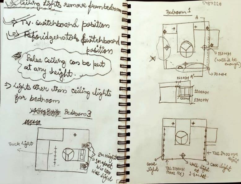
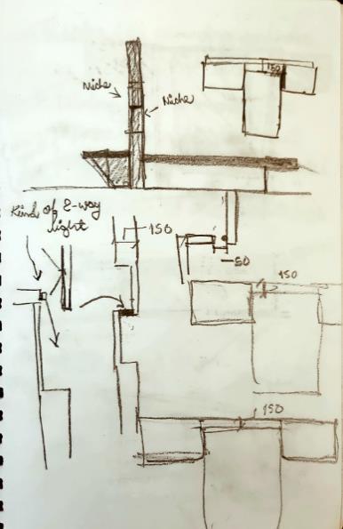
• Teamwork for a particular project by performing certain tasks given by the seniors. (like in Yeshwantpur Student Housing Project)
• Time management which helped me to avoid deadlines of submissions. (like Punya Shrushti Interiors Project)
