A MAGAZINE ABOUT BRICKWORK AND RESPONSIBLE ARCHITECTURE 47 | 2022 ’Interspecies Campus’, Roskilde University, Photo: Anders Sune Berg
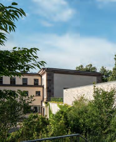
Interspecies Campus, Roskilde University Center (RUC), Denmark
Artist: SUPERFLEX. Artwork developed in close collaboration with KWY.studio.
Client: The Danish Building and Property Agency for Roskilde University.
Inaugurated: 2022
Brick: Six different formats of the handmade Superbrick, German clay, two kinds of surfaces, one with sand and one without.

Text: Thomas Bo Jensen, Head of Research, Professor, Cand.arch., PhD, Arkitektskolen Aarhus
Photos: Anders Sune Berg, Jacob Bloch Read more: www.interspecies.superflex.net
Coral Polyps at RUC
THE ART COLLECTIVE SUPERFLEX PUTS FOCUS ON THE GLOBAL CLIMATE EMERGENCY WITH AN EYE-CATCHING NEW WORK IN HANDMADE BRICK.

Alien elements have infiltrated Roskilde University campus. Coral polyps from spectacular underwater reefs have invaded the otherwise highly regimented complex of RUC’s original structuralist concrete buildings and new regular building blocks designed by Henning Larsen Architects. The sea levels are rising, and our long-held conception of the natural world as separate and distinct from human culture is changing. You enter RUC from Korallens Allé (Coral Avenue), so why not illustrate the story of how coral forms communities on the campus of the institution that has put the social sciences on the agenda more than any other in the country since the 1960s?
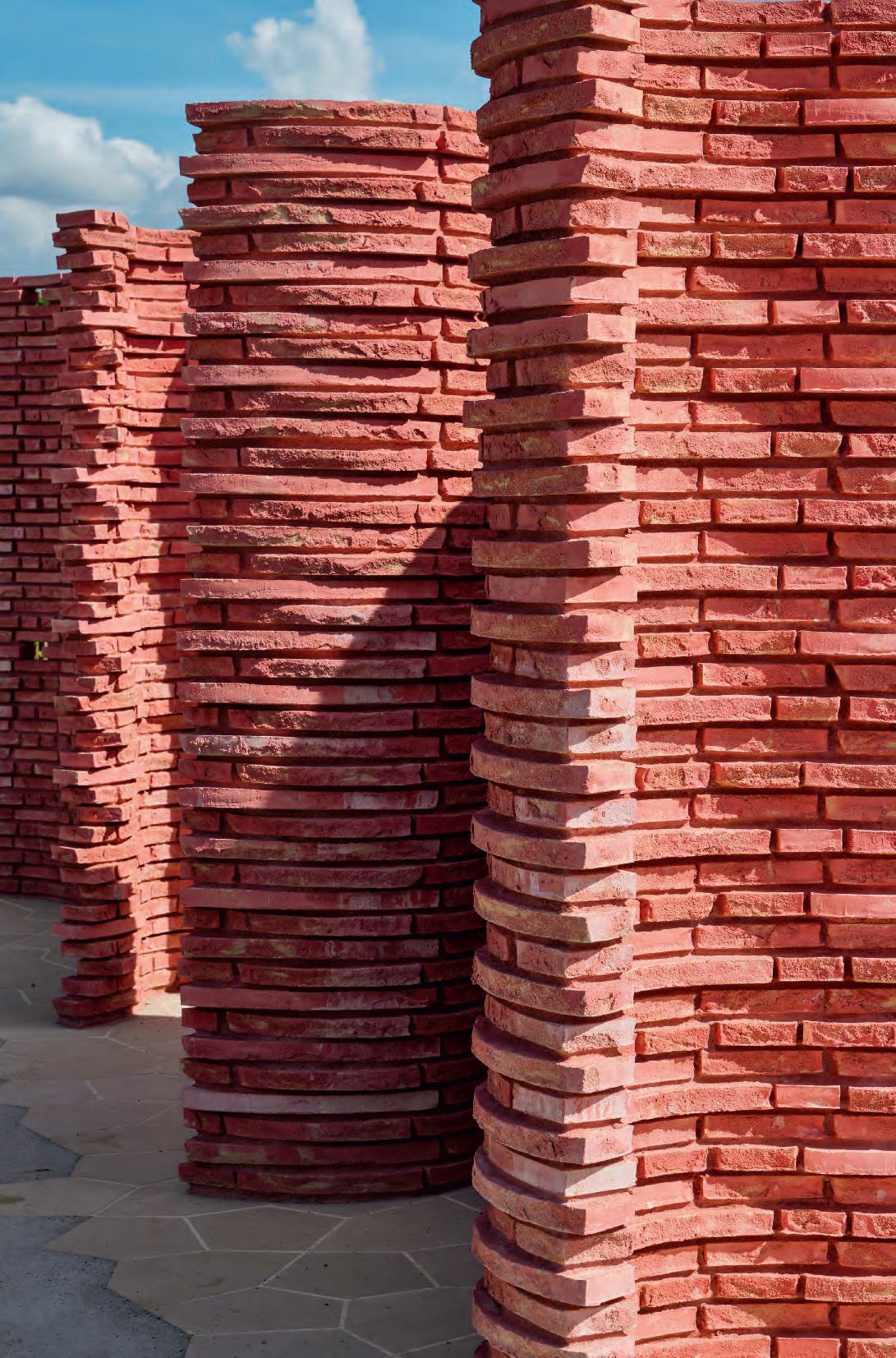
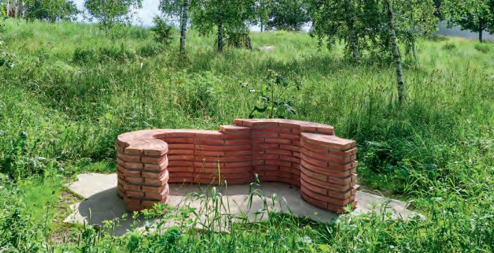
Created by the SUPERFLEX art collective, Interspecies Campus consists of eight sculptural objects spread across the campus. Each sculpture uses six sizes of flat, custom-made bricks, cut from a circular mould and arranged to form organic, winding walls. The six different bricks have been produced with two surfaces, one with sand and one without. The artists have named all 12 versions ’Superbricks’.
The bricks have been fired with a pink pigment that breaks up the typical earthy tones. Some are coated in coarse sand before the firing process, giving them a rustic, granular surface as if they have been hauled up from the seabed. Glimpsed through the overgrown vegetation between the buildings, they look like sparkling alien artefacts.
Artist Bjørnstjerne Christiansen speaks passionately about the process and how unexpected mistakes left their mark on the end product. One example is the sandy surface, which was the result of an error made during the process of devel oping the elongated Kolumba brick.
Seven of the sculptures wind their way around the land scape in various shapes and sizes. The eighth, the “Mother Coral”, stands at the heart of the campus. It consists of six curved walls, around 2.5 metres tall – high enough to evoke a labyrinthine feeling as you walk through it. Its bright, bold colour makes the sculpture stand out from its grey concrete surroundings. And that’s very much the point.
“Coral reefs are a type of sculptural infrastructure,” explains Christiansen. “Coral polyps are attracted to the pink colour of the coralline algae and build reefs on them. Their entire existence as a colony depends on this collective endeavour. This contrast to the surrounding world is what sustains the collective.”
It is inspiring to imagine this subaquatic, collectivist way of life washed up on land within the campus of a university founded on the notion of community. We spot some young people sitting on the sculptures. Maybe, like the polyps themselves, they were attracted by the pink hue. Or maybe all they needed was a place to sit and think for a moment. From a distance, the pink has an alluring quality against the background of the long, green grass. Is it beautiful? For humans, perhaps. But for polyps seeking a community on the ocean bed, it’s much more than that – the force of the aesthetic appeal is a matter of survival.
The main sculpture, the ‘Mother Coral’, stands right at the heart of the RUC campus. Its striking pink colour looks slightly alien to the grey surrounding concrete buildings but that is exactly what attracts us to its curved spaces.
You need to have a good look around before you find all the sculptures nestling in the grass and scrub on the campus.
2
We might argue that humans have become aesthetical ly lazy. We concentrate on our own cultural aesthetic at nature’s expense. Perhaps our failure to appreciate nature’s aesthetic sensibility is the reason for the climate crisis. At least, that’s the view of the Italian philosopher Emanuele Coccia, who in his writing on the way nature uses aesthetic forms of communication perceives the ecological crisis as an aesthetic crisis. Why? Because we have forgotten that nature’s aesthetic preparedness is also the basis for our own existence, and that our aesthetic choices are, therefore, also inherently ethical.
Just as the alien pink shade was a conscious choice, the sand on the brick surfaces is also an important part of the artwork. “Sand is, of course, a fundamental component in all construction work,” explains Bjørnstjerne.


Under a microscope, we can see that grains of sand do not have any right angles. Instead, they are wildly asymmetrical in structure, like haphazardly shattered crystals. All eight sculptures in Interspecies Campus stand on a plateau of sandstone tiles carved to reflect the diverse geometry of sand. At the same time, the tiny grains that cover every brick surface chime with the artists’ ‘interspecies philosophy’, as they leave small holes and cracks for seeds to sprout or insects to find shelter.

“We want the construction industry to adopt a multispecies perspective,” says Bjørnstjerne, “and to realise that the future is curved. The industry can’t keep building the way it does. Nature doesn’t do right angles – the right angle is the wrong angle!” he adds, referring to the rigid geometry of RUC, which comprises an ever-expanding grid of right angles.
 Bjørnstjerne Christiansen of SUPERFLEX tells the story of the corals, and Thomas Bo Jensen scribbles down notes on the campus and out in the field. Three photos above: Jacob Bloch
Drone photo of the main piece with the backs of the six winding walls facing inward towards each other on a ‘carpet’ of sandstone. The sandstone tiles are cut in a way that reflects the crystalline geometry of sand. If you look at grains of sand under a microscope, no two angles are the same. Nor are there any right angles.
Map of the RUC campus with the eight sculptures plotted on it according to size.
An invitation to sit – nature and sculpture in complementary harmony.
Bjørnstjerne Christiansen of SUPERFLEX tells the story of the corals, and Thomas Bo Jensen scribbles down notes on the campus and out in the field. Three photos above: Jacob Bloch
Drone photo of the main piece with the backs of the six winding walls facing inward towards each other on a ‘carpet’ of sandstone. The sandstone tiles are cut in a way that reflects the crystalline geometry of sand. If you look at grains of sand under a microscope, no two angles are the same. Nor are there any right angles.
Map of the RUC campus with the eight sculptures plotted on it according to size.
An invitation to sit – nature and sculpture in complementary harmony.
3
Brick as leitmotif
A COMBINED HOME AND DESIGN STUDIO NORTH OF ANTWERP LOOKS AS IF ALL OF ITS CONSTITUENT PARTS HAVE BEEN CARVED OUT OF A MIGHTY BRICK MASSIF WITH CONSUMMATE ARCHITECTURAL PRECISION AND FINESSE.

At certain times of the year, the building’s bright, muted-yellow exterior walls seem to fuse with their surroundings, as if the tall, swaying grasses are transformed into stable brick bonds. This is just one of many straightforward and exquisite details in this unique project.
What catches the eye above all else is the main structure’s firmly grounded simplicity. Although built in brick by human hands, you might think it is a mighty stone massif, from which a number of structures have been chiselled out with remarkable architectural precision and finesse. Brick is the leitmotif, and its materiality is pursued and deployed everywhere – from the main surfaces to the smallest details. All other materials serve the brick.
The cubic, minimalist corpus has not been chiselled out of stone, of course. Instead, it consists of interconnected, rectangular volumes with flat roofs and multiple spaces offset from each other, both horizontally and vertically. Slightly offset brick pillars, bands and niches, including retracted windows and doors, add to the variation and spatial depth.
Several of the surfaces are further enriched with discrete, rectangular sections where either gaps or protruding bricks form patterns.
The Belgian architect couple Elke de Neef and Frederik Slachmuylders (SDN Architecten) designed the complex as a private residence and design studio. Built on a large, 6,500-m2 scenic plot north of Antwerp, the total building area is 625-m2. The home and studio form a single unit, sometimes on one level, sometimes on two, while a smaller, separate annex contains an atelier and wellness facilities.
The design studio is located by the driveway and road. To the rear, the main, east-facing façade of the couple’s home reaches out towards the extensive garden, which includes a small, natural lake. A north-facing patio separates home from work, while a double-height glass section draws nature and daylight into the house.

“We’ve always been attracted to yellow-brick buildings. And yellow was the predominant brick colour in Belgium in the interwar years, a period we find particularly interesting. The first time we saw D72 was in a project in London, and we were enchanted by it straight away.”
Architect Frederik Slachmuylders
The west-facing façade, towards the road, has a relatively closed look, with expansive brick surfaces, offset volumes and retracted windows and doors. The east façade, which faces the garden, is more open, with large glass sections facing onto a terrace that stretches the entire length of the building. The defining element on this side of the building is a strong, protruding brick band that ties the residence and the annex together. Between the two structures, the band forms a brick-clad cover over the terrace, reinforcing the impression of openings chiselled out of solid stone. The terrace continues onto a patio dotted with plants and shielded from the road by a brick wall. A section of patterned brickwork adds texture to the wall as well as a point de vue at the end of the terrace.
The brick continues indoors in the hallway and the large living room, which faces out onto the garden. A brick fireplace and adjacent brick bench form the focal point on the end wall in the living room. The large glass sections in the living room have been pushed out from the façade, effectively bringing two load-bearing, brick-clad pillars indoors as rustic, tactile elements. Conversely, the glass section in the adjoining kitchen has been pulled back into the room, leaving the brick pillars outdoors, where they provide shelter and create a relief effect.
Combined home and design studio, Antwerp, Belgium
Client: SDN Architecten
Architect: SDN Architecten Contractor: Isobuild


Engineer: Engelen ingenieurs
Completed: 2020 Brick: D72 FF
Text: Tina Jørstian, MA in Architecture
Photos: Luuk Kramer
4
The house near Antwerp consists of interconnected, rectangular volumes offset from each other, both horizontally and vertically. Slightly offset brick pillars, bands and niches add to the variation and spatial depth.
Plan, first floor Plan, ground-floor Section
The combined home and design studio are on a 6,500-m2 plot with natural vegetation and a small lake.

Entry to the home and design studio is via a 5.35-meter tall, recessed niche with a large glass section above the front door.


 Facing the garden, a brick ceiling provides cover for the terrace between the home and the annex.
In addition to its golden tones, the D72 brick, which is made from Danish blue clay, also has delicate grey and greenish tones, which beautifully mirror the changing shades of the surrounding vegetation.
Facing the garden, a brick ceiling provides cover for the terrace between the home and the annex.
In addition to its golden tones, the D72 brick, which is made from Danish blue clay, also has delicate grey and greenish tones, which beautifully mirror the changing shades of the surrounding vegetation.
5
Wooster Street stands at the heart of SoHo on Manhattan. It is an area with a large number of well-preserved cast-iron buildings from the second half of the 19th century, which helped inspire the architecture at 150 Wooster Street.

 Photo: iStock by Getty Images
Classic tone
150 WOOSTER STREET BLENDS IN WITH THE HISTORIC BUILDINGS IN NEW YORK’S SOHO DISTRICT. PRECISE PROPORTIONING AND MATERIALS SUCH AS BRICK AND LIMESTONE CREATE A CLASSIC IDIOM, WHILE SCULPTURAL STEEL DETAILS ADD A MODERN EDGE.
SoHo is a bustling neighbourhood full of shops and offices, most of them in buildings originally used for manufacturing or storage. In the second half of the 19th century, cast iron was used to produce entire façades and to decorate brick walls, often around the storefront or as an ornamental, projecting cornice. This distinctive combination of brickwork and decorative cast iron typifies the area and served as the inspiration for the architecture at 150 Wooster Street.
The building is a concrete superstructure around a service core, which keeps the floors free from load-bearing pillars. Spanning eight sections, it features two large retail spaces at street and basement level, above which are five storeys, each housing a single apartment. At the top is a duplex penthouse with terraces running the full length of the building, facing both the street and the yard. The top floor is set back from the façade and not visible from the street. The upper and lower parts of the exterior are covered in dark-grey steel – a reference to the local tradition of using cast iron. The middle section has cream-coloured brickwork in Kolumba, windows with darkgrey frames, and exterior window surrounds made of light Indiana limestone.
150 Wooster Street was designed and built by KUB Capital but is now part of the portfolio of another real estate investment firm, Arcus. Roger Bittenbender, co-founder of Arcus and former head of KUB Capital, takes up the story.

The expressive steel-clad storefront pays homage to the cast iron buildings in the neighbourhood, while the cream-coloured bricks add texture and warmth to the façade.
Photo: Florian Holzherr
Site plan 6
Photo: Adrian Gout
“The most important thing for us was to use the right materials to create a building that looks old but has a modern and fresh feel. We knew from day one that we would use Petersen bricks. Many of the most beautiful buildings in the neighbourhood are made of cream-coloured brick, so we’ve used them, too. They go so well with the limestone and the dark-grey metal.”
Each section has five windows positioned directly above each other and a shared outer frame made of limestone. Towards the edge, these frames are cut at an angle, so they become narrower and catch the light. The frames protrude approximately 13 cm, which enhances the relief effect and emphasises the façade’s vertical lines. The distance between the frames matches the length of a Kolumba brick exactly. Kolumba is laid in vertical stacks between the window frames, while above and below each frame, there is space for four smaller Kolumba stacks, laid side by side. The horizontal sections between the window frames consist of D71 Hamburg format, laid vertically.
The top floor has segmental-arched windows and a strongly cantilevered galvanised steel cornice. The serpentine shape and metal fins mean the cornice serves as a kind of brise soleil, which filters the sunlight, combining a classic look with contemporary and sculptural style.
 Photo: Dean Kaufman
“Petersen is one of the few companies that make bricks that feel authentic. We didn’t want things to look perfect. We wanted them to look as if they were made by hand. That, above all, is what appeals to me about Petersen. Each and every brick has its own character, its own story.”
Roger Bittenbender
7
Classic proportions make the façade look coherent and balanced. The light is articulated by the façade’s rich relief in brick and limestone and by the narrow metal fins on the cornice.
The top floor of the façade has a strongly cantilevered cornice made of galvanised steel plates. Its metal fins look at once classic and absolutely contemporary.
D71 in Flensburg format is used on the back and the sides of the building, both overlooking the outdoor terraced area and the upper, retracted penthouse floor.


“For me, the Flensburg format brick is unique,” Bittenbender explains. “I like this slender brick. Many of the historical bricks in the area are actually the same height. They are Roman-type bricks but in slightly different lengths.”
All the joints are in lime mortar and as narrow as possible to allow the bricks to stand out undisturbed. “It’s difficult to find good bricks these days,” Bittenbender notes.
“Petersen is one of the few companies that make bricks that feel authentic. We didn’t want things to look perfect. We wanted them to look as if they were made by hand. That, above all, is what appeals to me about Petersen. Each and every brick has its own character, its own story.”
150 Wooster Street, New York, USA

Client and Design Architect: Arcus (formerly KUB)
Associate Architect: HTO Architect

Contractor: Cauldwell Windgate Engineer: McNamara Salvia
Completed: 2017 Brick: K71, D71 HF, D71 FF
Text: Martin Søberg, PhD, architectural historian
Photos: Adrian Gout, Richard Caplan, Florian Holzherr and Dean Kaufman
Overlooking the street, the apartments have big, light-filled living rooms with wide oak floorboards. Photo: Richard Caplan
Profiled limestone frames link the windows together. The distance between the frames exactly matches the length of a Kolumba brick. The spaces between the windows consist of D71 Hamburg format laid vertically. Photo: Adrian Gout
The kitchen-dining room and a smaller living room face the courtyard and lead out onto spacious balconies. Photo: Richard Caplan
Cross-section
8
With due respect
THE CREMATORIUM AT FRIEDHOF AM HÖRNLI, THE LARGEST CEMETERY IN SWITZERLAND, IS BOTH AN ADVANCED TECHNICAL FACILITY AND A SETTING IN WHICH PROFOUNDLY HUMAN EMOTIONS PLAY OUT. TWO DIFFERENT COLOURS OF BRICK PROVIDE TEXTURE AND WARMTH AND EMBED THE BUILDING IN ITS SURROUNDINGS.

The Friedhof am Hörnli cemetery is near the centre of Basel, close to the River Rhine. Built between 1926 and 1932, it has the striking geometric layout and simple, classical style of the era. The surrounding trees and bushes have grown tall since then, forming an organic, green contrast to the straight architectural lines and establishing a link with the adjacent forest that straddles the Swiss-German border.
The cemetery is arranged along a central axis running from the entrance in the west to the hilly wood-land in the east, crossed by a north-south axis. At the intersection, two monumental buildings face each other across a central square. These neoclassical buildings from 1932 have extensive colonnades flanked by end pavilions and house various chapels and rooms for the deceased as they await cremation or lie in state. Originally, there were two crematoria, one built in 1932 to the south-west. The other built in 1984 to the north-west. However, as they

no longer complied with modern, technical standards (e.g. smoke emissions regulations), the northern one was demolished, and its neighbour to the south was converted into a museum. Both have now been replaced by a single crematorium designed by Architekturbüro Bernhard Maurer in collaboration with Frédéric Garrigues Architectes. The building sits on a north-south avenue of lime trees, its façade flush with the southern chapel’s eastern pavilion and spanning the same width.
The crematorium is on three floors. The top one is on the same level as the avenue of lime trees, the middle partially below ground level and the bottom one completely underground. The two lower floors form an extension to the older chapel, creating a passage for transporting coffins to the crematorium. The furnaces extend the full height of the building, while the cremation room is on the top floor. Mourners arrive at a square entrance yard between the
 One of the two monumental chapels built in neoclassical style in 1932. The crematorium is behind the furthest pavilion.
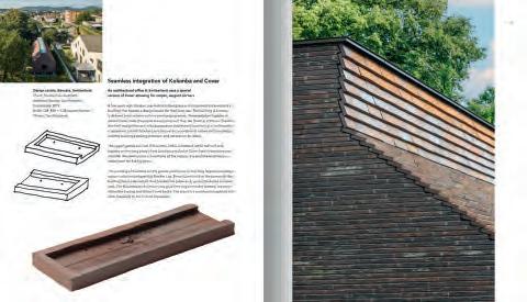
The light, yellowish D71 was chosen because it matches the beige plaster on the older chapel, grey D91 because it fits in with the colour of the decorative sandstone elements.
The Friedhof am Hörnli crematorium stretches along an avenue of lime trees. Architect Bernhard Maurer chose a mixture of D71 and D91 to generate a camouflage-like effect so that the building appears to merge into its surroundings.
One of the two monumental chapels built in neoclassical style in 1932. The crematorium is behind the furthest pavilion.
The light, yellowish D71 was chosen because it matches the beige plaster on the older chapel, grey D91 because it fits in with the colour of the decorative sandstone elements.
The Friedhof am Hörnli crematorium stretches along an avenue of lime trees. Architect Bernhard Maurer chose a mixture of D71 and D91 to generate a camouflage-like effect so that the building appears to merge into its surroundings.
Friedhof am Hörnli Crematorium, Basel, Switzerland

Client: Kanton Basel-Stadt
Architect: Architekturbüro Bernhard Maurer in collaboration with Frédéric Garrigues Architectes
Landscape architect: August + Margrith Künzel Landschaftsarchitekten
Construction management: BfB Büro für Bauökonomie
Engineer: Bollinger + Grohmann
Completed: 2017
Brick: D71 DNF, D91 DNF
Text: Martin Søberg, PhD, architectural historian
Photos: Paul Kozlowski
crematorium and the old chapel before entering an enclosed courtyard that spans half the width of the building. They then enter a smaller, glass-walled room, from where they can see into the double-height cremation room. Behind the building, the chimney consists of a tall, flat, rectangular volume. As you arrive, each component is taller than the previous one. The effect is like an ascending staircase, symbolising a link between this world and the next.
“On the one hand, cremation is a highly industrial and regulated process. Crematoria are places of work. On the other hand, the act of saying goodbye to a loved one is extreme. We were fascinated by the tension between these two realities and wanted to bring them closer together,” Bernhard Maurer explains.
The wall facing the tree-lined avenue is an open lattice of offset, stacked runners that establishes a visual link between the internal courtyard and the greenery beyond. A similar, semi-transparent brickwork screen wraps around the top half of the building. Most of the windows in the furnace room are obscured by the screen – only one is uncovered, high up at the end of the building, offering a clear view of the sky.

The architects and client chose Petersen Tegl for the variety of colours in the company’s range.
“The brickwork is a mixture of D71 and D91, with colours that reflect the original crematorium. D71 is an exact match for the plastered beige façades on the roughly 100-year-old chapel, while the darker, greyish D91 reflects the shades of sandstone used in the base, cornices, corners and around the windows,” he explains.
“We developed two architectural languages – one for the interior, one for the exterior. On the outside, the idea was to conceal the building and create something intimate and secluded. However, as the cemetery is also used as a park, we didn’t want the building to attract too much attention. So we combined D71 and D91 to achieve a camouflage effect. Inside, however, you are met by the bright, yellow shades of D71 on the lower part of the walls and the greyish hues of D91 further up.”
Outside, the crematorium seems to merge with its surroundings. Inside, the visual clarity offers comfort to those bidding final fond farewells.

10
0 100
Longitudinal sectionSite plan
Plan, Ground floor
As you approach the crematorium, the gradually increasing height of its component parts is plain to see, from the yard and entrance at street level to the tall chimney at the back.
The closed courtyard leads to the crematorium’s main entrance. The perforated brickwork shields visitors while maintaining contact with the surroundings. The paving is made of local sandstone in the same colour tones as the bricks.
The width of the crematorium matches that of the end pavilion on the chapel. The two buildings are connected so that coffins can be moved straight from the chapels to the crematorium.
The lower part of the wall in the double-height furnace room is made of light, yellowish D71, the upper part consists of a band of grey D91. The light is filtered through windows behind the lattice brickwork on the façade.
The mixture of colours on the façades gives the impression that the light and structure actively work with the bark and leaves on the trees outside. The perforated brickwork filters the natural light, adding depth and an air of lightness to the minimalist shapes deployed by the architects.


11
The new crematorium is located in a birch grove in the Aabenraa Parish Cemetery. The covered walkway on the south side of the building is marked by three brick pillars. The solar cells on the one-sided roof cover approximately 75% of the crematorium’s electricity consumption.

The obligatory chimney is integrated into the design as a distinctive and sculptural brick element and slopes up towards the north-east corner of the building.
The patterned brickwork on the façades produces a prominent relief effect, which introduces an element of variety and life to the large surface. The pattern is the result of a combination of protruding bricks and perforations. Zeni Architects designed bricks in special formats for the chimney’s brickwork.


The covered walkway offers shelter and mediates the transition to the interior of the crematorium.
”In the crematorium, we took advantage of the fact that the bricks’ texture and rich play of colours evoke positive associations – and, not least, that their natural and recognisable materiality can have a calming effect.”
 Architect Torben Engsig Svan Sørensen
12
Simple, robust and dignified
For those mourning the loss of a loved one, stepping into a crematorium can stir intense, even overwhelming feelings of grief and despair. So it is vitally important that the building is able to accommodate these emotions in a dignified and considerate manner. In their design for the new crematorium at Aabenraa Parish, Zeni Architects rose to the challenge with a series of simple and refined architectural techniques.

Until recently, crematoria in Denmark did not accommodate ceremonies for bereaved families, but that is starting to change. In Aabenraa, the client wanted to reflect this shift toward greater openness and accessibility.
Approaching from the south, mourners are quietly welcomed into a harmonious and robust, dark-brick building surrounded by birch trees. The crematorium is built on a human scale, familiar in both proportion and idiom. An internal, covered walkway breaks up the south-facing façade and mediates the transition to the interior. It also marks the entrance to the crematorium and offers shelter.
Even from a distance, the walls have a strikingly tactile look that cannot be achieved by bricks alone – not even the highly textural D49 by Petersen Tegl. In addition, patterned brickwork on the façades creates a distinctive relief effect, which adds variation and life to the expansive surfaces –which, due to the building’s function, feature few openings.

The pattern is formed mainly by protruding bricks. However, a few sections, such as the gable wall, make use of perforation to allow daylight to filter into the covered space.
The crematorium is a simple, rectangular volume with an east-west orientation. Seen from the south, it does not appear particularly tall, but this is deceptive. The furnace room at the north end is a very large, high space. From here, a one-sided roof slopes down towards the south façade, where the lower eaves contribute to the welcoming, empathetic scale.
All crematoria must have a chimney, of course, and this one is integrated as a focal element. It has a towering, sculptural idiom, sloping up towards the north-east corner of the complex. The south- and west-facing sides are laid in a
“raking course”, a traditional technique often seen in older church architecture but rarely used nowadays. At the point where the chimney emerges from the roof, it leaves a narrow, horizontal surface along the ridge of the roof before sloping upwards. It is an inspired minor intervention that stops the roof from looking excessively angular.
The crematorium is one of the first in Denmark to offer indoor facilities for mourners. Therefore, the high-quality materials used on the exterior are used in the semi-public indoor areas as well. The interior walls make use of brick, albeit in a lighter colour – muted yellow D72 – that exudes a dynamic and gentle air. These bright, welcoming materials are also found in the furnace room, providing a sense of continuity for those who wish to follow the coffin all the way to the furnace. They do so from a vantage point in the relatives’ room next door, through a large glass panel that can be made transparent.
The new crematorium shows how a relatively simple structure can be infused with quality and meaning through the judicious choice of materials and craftsmanship. In this case, the solid, natural materials, patterned brickwork and subtle nods to classic ecclesiastical architecture generate the desired dignity and robust solidity. The result is an idiom that not only complements the building’s purpose but also the surrounding birch trees.

Aabenraa Crematorium, Denmark
Client: Aabenraa Parish
Architect: ZENI Architects
Engineer: OJ Engineering Consultants
Bricklayer: Peter S. Nielsen
Completed: 2021 Brick on façades: D49, DNF, D49 custom bricks, Interior: D72 DNF
Text: Tina Jørstian, MA in Architecture
Photos: Anders Sune Berg
13
A NEW CREMATORIUM IN AABENRAA, DENMARK, DERIVES MEANING AND DIGNITY FROM EXQUISITELY PROCESSED MATERIAL, IN THE SHAPE OF WATER-BRUSHED BRICK, AND FROM THE EFFECTIVE USE OF PATTERNED BRICKWORK.
In the interior, D72 adds a lively and soft touch.
Cross-section
Karel du Jardinstraat
A NEW COMPLEX IN THE HEART OF AMSTERDAM IS ATTRACTING A GREAT DEAL OF ATTENTION, PARTLY DUE TO ITS INNOVATIVE BRICK CLADDING.


De Pijp was built as a working-class area in the 19th century. The name, Dutch for “The Pipe”, is thought to stem from the long, straight streets. The area’s cheap housing later attracted students and artists, including Piet Mondriaan, who had a studio here in the early 1900s. De Pijp eventually evolved into the city’s Latin Quarter.
Still an attractive place to live, De Pijp has a unique ambience, numerous museums and galleries, and an abundance of restaurants serving food from all over the world. In 2015, the family-owned property company Caransa Groep bought Karel du Jardinstraat 61-67. It planned to convert the site into a residential complex with social functions on the ground floor and commissioned ZZDP Architecten for the project. The result is a beautiful and harmonious development well integrated into the surrounding architecture.
The Karel du Jardinstraat 61-63 building was built in 192021 and has been used for various purposes over the years, e.g. clothing business. From 1987 until 1998 it was occupied by the office of Stadsdeel Zuid.
The renovation element of the comprehensive project consists of two preserved five-storey brick buildings – nos. 61-65 – which have been completely transformed, with new doors, windows, roof and a glass tower.
To the right, no. 67 replaces the original – now demolished – two-storey block. Like its neighbours, the new building also has five floors but is somewhat shorter due to the lower ceilings in the 24 duplex apartments.
De Pijp’s aesthetic is dominated by brick, so it was the obvious choice for the new part of the project. However, the architects and client also wanted the bricks to look unique.
 Facing Karel du Jardinstraat, the well-proportioned façade has seven rows of bay windows that run from the first floor upwards, before culminating in a flat roof. Between these rows, balconies have been built into each of the flats.
The protruding ground floor façade facing out onto the courtyard is also brick clad.
Every Kolumba brick bears the thumbprint of the person who brushed it.
It was crucial to the architects that the new townhouse be clad in a brick that articulated and stressed the verticality of the façade.
Facing Karel du Jardinstraat, the well-proportioned façade has seven rows of bay windows that run from the first floor upwards, before culminating in a flat roof. Between these rows, balconies have been built into each of the flats.
The protruding ground floor façade facing out onto the courtyard is also brick clad.
Every Kolumba brick bears the thumbprint of the person who brushed it.
It was crucial to the architects that the new townhouse be clad in a brick that articulated and stressed the verticality of the façade.
14
plan
They wanted a material that would emphasise and articulate the verticality of the façade, so Kolumba was the natural choice.
The new building is simple, beautifully rhythmic and well-proportioned. The vertical lines on the façade are created by seven columns of floor-to-ceiling windows that run from the first floor up to the flat roof, between which are inset balconies. At ground-floor level, the windows blend into both the facade’s volume and the vertical lines.
Horizontal brick bands run along the building at pavement level, above the ground floor and in the columns below each window. Here, the special-format bricks have been laid in an unusual way: vertically, with the surface outward, alternating with an edge-on, protruding vertical band of 490 x 100 x 15 mm Kolumba. This rhythmic relief generates a play of light and shadow that changes the look of the building throughout the day.
The inner balcony walls are also clad in Kolumba, laid vertically and facing outward. As a result, the balconies’ rustic brick walls are clearly visible from the street, giving the building the appearance of a solid brick mass, despite the large glass sections.
The façade overlooking the garden is less articulated, with no columns or balconies. Towards the street, however, the vertical motif is repeated. To the rear, the ground floor extends into the garden with a prominent, flat-roofed glass section adding 50 m2 extra space to the business premises.
As you stroll down Karel du Jardinstraat and catch a glimpse of the new complex, especially the brand-new building, it can’t help but lift your spirits. The project attests to the desire and ability to rethink how brick is used while also honouring the fundamental character of the material. Karel du Jardinstraat 61-67 is a wonderful example of refined, crisp and elegant design in fired clay.
To achieve the look they wanted on the façade, ZZDP Architecten used Kolumba on the surface combined with a vertical strip of the same brick. The result is a play of light and shadow that changes the look of the building throughout the day

Karel du Jardinstraat, apartments and business premises, Amsterdam, The Netherlands
Client/owner: Caransa Groep B.V.
Architect: ZZDP Architecten
Contractor: Hillen & Roosen B.V.
Engineer: Van Rossum Raadgevende Ingenieurs B.V.
Completed: 2021
Brick: Kolumba, special colour F-402. Special formats: 490 x 100 x 38 mm and 490 x 100 x 15 mm
Text: Ida Præstegaard, MA in Architecture
Photos:
15
Karel du Jardinstraat
Site
Section Plan, first floor Plan, second floor
Luuk Kramer
The coffee house
JOHANN JACOBS OPENED A GROCER’S SHOP IN THE OLD HANSEATIC PORT OF BREMEN IN 1895. IT BECAME RENOWNED FOR ITS ROASTED COFFEE. THE NEW JOHANN JACOBS HAUS PAYS HOMAGE TO THE FOUNDER AND ESTABLISHES AN ARCHITECTURAL LINK BETWEEN PAST AND PRESENT.


Designed by Felgendreher Olfs Köchling Architekten, Johann Jacobs Haus sits between the busy thoroughfare Obernstrasse, the narrow side alley Grosse Waagestrasse and the public square Jacobshof. It forms part of Bremen’s new Balge Quarter – a pioneering urban renewal project that establishes a new link between Obernstrasse and the River Weser. In addition, the district includes three other historic buildings: The Kontorhaus am Markt office building by the market square, the Neues Essighaus facing Jacobshof, and Stadtwaage, a Renaissance-era weighing house used by the Bremen’s merchants.
Its position among these important landmarks – many of them listed – has made an indelible mark on the architecture of Johann Jacobs Haus. It looks like a closed block and has three horizontal indents on each side, each at the same height as the cornices on the neighbouring buildings – on the fourth floor overlooking Obernstrasse, the third floor facing Grosse Waagestrasse and the second floor backing onto Jacobshof. The staggered descent accentuates the approximately three-metre drop from Obernstrasse to Jacobshof and creates a stepped profile reminiscent of typical Hanseatic gables. The indents also allow more daylight to reach street level.
Large, floor-to-ceiling arched windows allow plenty of light into the ground floor and create a feeling of transparency, as you can see straight through the building. The rounded windows also pay homage to Bremen’s historic arcades and archways. By way of contrast, the four floors above are fitted with rectangular windows that become narrower towards the top and appear to congregate around the centre of each façade, accentuating the association with the historical stepped gable walls. Each façade is decorated with sculptures depicting the journey of coffee, tea and cocoa from harvest to cup.
Johann Jacobs Haus is made from slabs of in-situ-cast concrete, with a service core containing stairs, an elevator and other services. This form of construction avoids the need for supporting pillars, allowing for open and adaptable interior spaces.
16
Johann Jacobs Haus is part of the new Balge Quarter, which also includes the Renaissance building Stadtwaage. Between the old and the new is the new Jacobshof area with outdoor seating for the two cafés in Johann Jacobs Haus.
Johann Jacobs Haus is the latest addition to Obernstrasse, the busy shopping street in Bremen. The architecture is contemporary, but has clear connections to older surrounding buildings in terms of materials and architectural motifs.
“The idea was to build a highly flexible building that could be used in completely new ways 50 or 60 years down the line, so we kept the service core to a minimum and allowed for generous ceiling heights,” explains Christian Felgendreher, architect and partner at Felgendreher Olfs Köchling Architekten
The façades are made of D48 from Petersen and have windows with bronze frames. The choice of materials also helps to establish a link with the historical surroundings.

“The Petersen brick reflects the brownish shades of the early 20th-century neighbours, whereas post-war constructions used more orange tones. We wanted a subtle contrast. The Petersen brick’s blend of brown and orange made it the perfect choice and tied everything together. The contrast between the dark bricks and the light, sand-coloured joints also draws attention to the cross bond and each individual brick’s varied tones and textures,” he continues.
The ground floor facing Obernstrasse houses a chocolate shop and café. Towards Jacobshof is the heritage shop and a café, which serves as a lobby for the rest of the building. Previously a dreary backyard but now an attractive public space, Jacobshof provides outdoor seating for customers. The building also houses offices, conference rooms, event spaces, a roastery that offers barista training, and access to a barrel-vaulted loggia with views over the roof and gables of Stadtwaage. Here, as elsewhere in the building, past and present engage in a living, breathing dialogue.
Johann Jacobs Haus, Bremen, Germany
Client: Obernstraße 20 GmbH & Co KG
Architect: Felgendreher Olfs Köchling Architekten


Construction management: ARGE Gödecke & Janssen
Engineer: Wetzel & von Seht
Completed: 2020
Brick: D48 DNF
Text: Martin Søberg, PhD, architectural historian
Photos: Philip Heckhausen
“We wanted a subtle contrast. The Petersen brick’s blend of brown and orange made it the perfect choice and tied everything together. The contrast between the dark bricks and the light, sand-coloured joints also draws attention to the cross bond and each individual brick’s varied tones and textures.”
Architect Christian Felgendreher
17 Plan, fourth floorPlan, ground floor Cross-section
Site plan
Indents on each of the three façades match the surrounding buildings and allow more light to make its way down into the surrounding streets.
The loggia on the fourth floor has barrel vaults, apse-shaped end walls and concave parapets, i.e. all curved forms that contrast with the building’s many right, obtuse and acute angles.
The windows in the building are gathered around the middle. The overall appearance is a subtle reference to Bremen’s historical stepped gables.
The geometry on the floor, made of eight different pentagons, continues on the ceiling. The material is expanded, jet water-cut aluminium from recycled cans, which reflects light and absorbs sound.
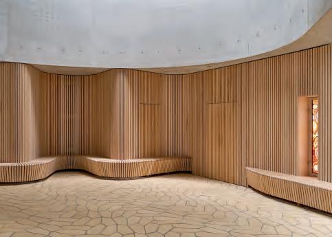
Throughout the church, the floor consists of five-centimetre-high pentagonal tiles made of German blue clay and imbued with a pale, yellowish hue by the firing process. The desired surface was achieved by producing the tiles in two variants – one the mirror image of the other.
Meditative setting in brick
THE FLOOR OF TREKRONER CHURCH IN DENMARK COMBINES A THOUSAND-YEAR-OLD BRICK TRADITION WITH A GROUND-BREAKING GEOMETRICAL INNOVATION FROM THE WASHINGTON UNIVERSITY I SEATTLE.


It usually bodes well for a new building project when the artists involved are brought in at an early stage of the process. That was very much the case when Henrik Plenge Jakobsen was asked to decorate Trekoner Church, close to Roskilde.
Trekroner Church stands out in various ways. The parish council first discussed a new building in the early 1990s, after several years of steady population growth, some of it due to the opening of Roskilde University in 1972. However, various challenges had to be overcome before the planning work could begin in early 2000.
The parish council did not want to run a competition to determine the design but held workshops to define its requirements. Symbolically, the design was to reference the Holy Trinity and the 12 apostles. In functional terms, the building was to house the chapel itself, meeting rooms and space for individual contemplation. As for the exterior, the council members were inspired by Le Corbusier’s iconic Chapelle Notre-Dame du Haut in Ronchamp and sought an undulating, organic shape without
”In Trekroner Kirke, the art is not something we added after the church was built. Right from the start, we worked closely and with mutual respect with the artists, so that architecture and art became a whole.“

Nicolai Overgaard, architect, partner, Rørbæk and Møller Architects
18
windows. They agreed on the broad outlines, and the next step was to ask Rørbæk and Møller Architects to translate the ideas into a finished product. The project was eventually completed in spring 2019.
The interior of the church is a stark contrast to the closed concrete façade. As you enter, the bright, welcoming space immediately embraces you, which is a powerful and surprising experience. A skylight that runs the whole way around the winding perimeter of the church filters and spreads daylight gradually and evenly over all of the surfaces, generating a beautiful and harmonious sense of a whole.

Henrik Plenge Jakobsen, who also acted as project manager and consultant, brought on board two other artists – Alexander Tovborg and Lea Porsager. The three artists’ involvement at an early stage allowed for the seamless and convincing integration of art into the architecture. Porsager made a baptismal font from South African sodalite, Tovborg the oak alters, and Jakobsen designed the main door and a window in thin-cut agate embedded in glass.
Jakobsen knew he wanted to use a natural material, preferably Danish, and that concrete was out of the question. He had previously worked with Petersen Tegl on the floor of the Traffic Tower in Copenhagen, designed by Tranberg Architects. It made sense to work with the brickworks in Nybølnor again – and they were only too happy to oblige, of course.
Daylight filters down through the skylight that runs around the building’s winding perimeter. The cross, designed by Henrik Plenge Jakobsen, is perforated, and the five holes combine to represent a fragment of the Northern Cross star constellation where nature has drawn the same lines.
“Laying a tile floor in a modern church benefits the indoor climate and is a beautiful and fitting continuation of a tradition that has lasted for thousands of years.”
Artist Henrik Plenge Jakobsen
Jakobsen’s inspiration for the floor design came from an article about a new type of pentagon that can be arranged to form tiled surfaces. The discovery was made by three mathematicians – Casey Mann, Jennifer McLoud and David Von Derau – at the University of Washington in Seattle.
He turned the idea into reality using pentagonal clinkers made of German clay, imbued with a pale-yellow hue by the firing process. The surface pattern was achieved by producing two variants – one the mirror image of the other. They are 5 cm thick and laid in 15 mm wet mortar joints. Jakobsen is delighted with the result.
“In functional terms, a clinker floor is a huge advantage for the indoor environment, and the visual impact fully lives up to my expectations. Apart from the cross, we eschewed Christian iconography. We wanted churchgoers to lose themselves in the ornamentation of, for example, the floor, and achieve a meditative state. Laying a tile floor in a modern church is a beautiful and fitting continuation of a tradition that has lasted for thousands of years,” Henrik Plenge Jakobsen says.
Trekroner Church, Roskilde, Denmark

Client: Himmelev Parish Council
Architects: Rørbæk and Møller Architects
Completed: 2019
Project manager for artistic decorations, incl. floor design: Henrik Plenge Jakobsen
Brick: Pentagonal, handmade bricks made of German clay
Text: Ida Præstegaard, MA in Architecture
 Photos: Anders Sune Berg
19
The wall cladding, benches and altar are in ash, the light tones of which harmonise beautifully with the light floor tiles.
To achieve the organic curves of the church, the contractor produced over 200 moulds to cast the nine concrete sections in situ
Cross-section Longitudinal section Floor plan
Solid and graceful
MATERIALITY AND CLEAR LINES ARE THE GUIDING ARCHITECTURAL PRINCIPLES BEHIND THIS RESIDENTIAL PROPERTY IN NEW YORK. ALTHOUGH THE KINSHIP TO ITS OLDER NEIGHBOURS IS CLEAR, THE BUILDING HAS A CONTEMPORARY, EXPRESSIVE LANGUAGE ALL OF ITS OWN.
New York’s West Village is home to many buildings worthy of preservation. Constructing new ones requires a special approach, as epitomised by this new apartment block on Jane Street by David Chipperfield Architects. It is a balancing act that depends on precise composition and careful choice of materials. In this case, the result is a building that may take cues from its surroundings but has a character all of its own.

Many of the elements – the use of brick, classically proportioned windows, metal elements such as fire escapes, grates and gates, as well as horizontal cornices and lintels –are classic features of the neighbouring buildings.
“The classic architecture of the West Village was an im portant reference point,” explains Mattias Kunz, architect and director of David Chipperfield Architects. “We have developed a project that strongly relates to the aesthetic and principles of its older neighbours but is slightly more expressive. It is a con temporary building that feels at home in historical New York.”
The apartment block contains three different types of housing. The townhouse-like duplexes at each end have their own entrances from the street, and both have their own garden in the back yard. Between them are the main entrance to the block and the driveway to a garage. The third and fourth floors house single-storey apartments, while above, on the fourth and fifth floors, is a duplex penthouse, with a roof garden running the entire length of the building. The four middle floors are clad in dark-red Kolumba with red flush joints.
“The Kolumba set in the random bond creates a beautiful texture, almost like a textile,” Kunz explains. “Clay is a natural material, and the way it is fired creates subtle variation and range of shades. The building is predominantly red, but shows aspects of yellow, green and blue.”
Dark bronze balcony balustrades, gates and window and door frames add depth. The ground floor and the penthouse are in red concrete that matches the bricks and recurs on the window lintels and mullions, as well as the cornices on the façade.
“The modern construction industry is geared towards absolute precision, but this can also lead to a certain degree of monotony and lack of character. Using the beautiful Kolumba brick adds texture and irregularity, which contrasts with the precise concrete elements,” Kunz points out.
The structure of the façade follows a tripartite arrangement of classical architecture – a clearly marked base and a central section extending over four floors, above which is a strongly cantilevered cornice and the retracted penthouse floor. Apart from the area around the main entrance, the façade is completely symmetrical. Similarly, the second to sixth floors are arranged as horizontal bands of identical, repeating elements. Again, these are all classic features that endow the façade with a harmonious and stable look.
“Sustainability is fundamental to our work,” explains Kunz. “The aim was to create a building that would be lived in and understood for a long time – for many future generations. An architecture with a profound quality and substance in its materials.”
Architect Mattias Kunz
20
Simple lines and red brick are recurring features of the buildings in Manhattan’s West Village. Nevertheless, the Kolumba bricks and an extremely precisely composed façade make 11-19 Jane Street stand out.
Cross-section Plan, ground floor Plan, first floor Site plan
Architect Mattias Kunz
“The beauty of the horizontal Kolumba lies in how it subtly relates to the horizontal lines of the building. Its shallow and elongated proportions convey a solid structure, yet create a texture which is also delicate and light.” says Kunz.
The variation in the arrangement of windows bears witness to the building’s functions. The third and fourth floors mainly house large living spaces, with broad windows divided in two by mullions. Similar windows are also found in older buildings in the neighbourhood. The second and fifth floors mainly feature bedroom windows, which are narrower to provide greater privacy.
The solid materials and a design language that is both contemporary and classic echo the architects’ intention to create a building that will last for many years.
“Sustainability is fundamental to our work,” explains Kunz. “The aim was to create a building that would be lived in and understood for a long time – for many future generations. An architecture with a profound quality and substance in its materials.”
11–19 Jane Street, New York, USA
Client: Edward J. Minskoff Equities
Architect: David Chipperfield Architects Landscape architect: Wirtz International Construction Engineer: DeMarco Ysrael A. Seinuk Construction: Sciame Construction3


Completed: 2018
Brick, façade and paving in garden: K48

Text: Martin Søberg, PhD, architectural historian
Photos: Florian Holzherr and © Evan Joseph
“The beauty of the horizontal Kolumba lies in how it subtly relates to the horizontal lines of the building. Its shallow and elongated proportions convey a solid structure, yet create a texture which is also delicate and light.”
Architect Mattias Kunz
21
“The construction industry is geared towards absolute precision, which can often lead to a certain degree of monotony and lack of character. Using the Kolumba brick adds texture and irregularity, which contrasts with the more strictly controlled concrete elements.”
The Kolumba bricks highlight the horizontal lines of the facade and add texture. The concrete elements are in a matching red colour. Dark bronze details reinforce the warm air.
The different window patterns bear witness to the functions behind the façade. Behind the double windows on the third and fourth floors are living rooms, while bedrooms are situated behind the narrower windows on the second and fifth floors.
The garden behind the building is paved in the same Kolumba used on the façade. Photo: © Evan Joseph
The ground floor is marked out as a base for the rest of the building. The main entrance and driveway to the garage are in a central niche.
A huge glass section opens up the kitchen-living room to the garden and swimming pool. The entire glass surface slides into the flanking walls.
Cohesive and precise sculptural idiom – inside and out
A CONSISTENT MATERIAL PALETTE AND A MINIMALIST DESIGN LANGUAGE ARE HALLMARKS OF THIS COMBINED RESIDENCE AND DESIGN STUDIO OUTSIDE ZURICH.
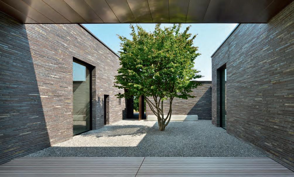
The complex by Swiss architects L3P on a big, green plot on the outskirts of Zurich is exquisitely refined, boldly minimalist and highly judicious in its choice of materials.
In marked contrast to the lushness of the undulating grounds, the building is extremely precise, defined by right angles and dark hues. It consists of three separate structures: the house, part of which is on two levels, a separate studio with a high ceiling, and a
garage. An extensive basement runs underneath much of the complex. Flat roofs and sharply delineated doors and windows enhance the minimalist look.

The three rectangular volumes have different proportions and are displaced in relation to each other, both horizontally and vertically, forming a cubist composition that looks different from every angle. Three large, floating canopies bind the structures
into a cohesive unit, resulting in accentuated, covered outdoor spaces that form integral elements in the overall complex.

Architecturally and in terms of materials, the quality is exceptional inside and out. All elements and functions have been meticulously refined into precise, sculptural idioms and assembled, with consummate skill, into a single architectural piece.
 Access to the building and garage is under a large canopy which is clad in copper, as are the door and gate. The layout makes it possible to see the garden from the arrival side.
For the cladding, the architect and client chose a brick developed by Lundgaard & Tranberg for the Playhouse in Copenhagen, where K57 picks up the colours of the surrounding brick buildings. In the Swiss home, the natural materiality and red-brown hues of the brick reach out and forges links with the surrounding nature.
Access to the building and garage is under a large canopy which is clad in copper, as are the door and gate. The layout makes it possible to see the garden from the arrival side.
For the cladding, the architect and client chose a brick developed by Lundgaard & Tranberg for the Playhouse in Copenhagen, where K57 picks up the colours of the surrounding brick buildings. In the Swiss home, the natural materiality and red-brown hues of the brick reach out and forges links with the surrounding nature.
22
The consistent, extremely minimalist material palette is maintained on the façades and a number of exterior elements, which are clad in tactile, grey-brown Kolumba, K57. The bricks are laid in wild bond with anthracite grey joints. With a single exception, all of the doors and windows are set back from the brick openings, which greatly helps to underline the massive, solid character of the walls. In addition to brick, the exterior is also defined by copper. The garage doors are copper-clad, as are the huge canopies and the studio’s bay window. The gleaming copper stands in exquisite contrast to the rustic, grey-brown brick. Although the copper will weather over time, it will still look beautiful alongside the dark brick.
The interior of the home is bright, with lime-plastered walls and floors to match the colour. The bespoke fixed elements – doors, wall panels, cupboards, shelves and benches – are made of walnut, the dark hue of which brings a soft, glowing warmth to the light surfaces in the rooms. The copper motif also recurs indoors, including on the handrails and door and window handles.
Like the exterior, the interior rooms and floor plan are also configured sharply and rigorously, with offsets, openings and niches that use light, shadow and depth to draw the eye.

One of the architect’s requirements was that the house should interact with its natural surroundings. A patio dotted with plants straddles the space between the three structures. The studio and many of the rooms in the home offer direct access to the outdoors – at ground-floor level, to the garden; and on the first floor, to balconies with views over the countryside. The windows are positioned to maximise views of the garden, while sculptural skylights draw daylight into the home.
A large glass wall connects the central, generously proportioned open-plan kitchen/ living room to the garden and a swimming pool. This entire section slides open and retracts into the flanking walls, enabling a pure, unencumbered transition to the canopy-covered terrace and the garden. The whole approach is about bringing together the inside and outside, even in terms of materials – from the bright, lime-plastered surfaces and walnut

elements to the mahogany planks of the terrace, the copper of the canopy and, not least, the grey-brown Kolumba brick, the rich nuances of which harmonise with and reflect the material palette’s carefully coordinated tones. The natural materiality and hues of the brick also establish links with the surrounding nature.
Villa M&K, Switzerland Client: Private Architect: L3P Architects Contractor: Barizzi AG, Bauunternehmung Executing contractor: Bautec Sichtmauerwerk AG Facade planning: Murtec AG Landscape architect: Enea Landscape Architecture GmbH Completed: 2021 Brick: K57
Text: Tina Jørstian, MA in Architecture Photos: Sabrina Scheja
The interior has bright, lime-plastered walls and concrete floors in matching colours. A skylight allows light to reach down to the corridor on the first floor.
Doors, wall panels, cupboards, shelves and benches are all custom made in walnut, the dark hue of which adds warmth and a glow to the light surfaces in the rooms. The surface on the island in the kitchen is made of Gris du Marais marble.
Plan,
first floor
Plan, ground-floor
Section
The
house consists of three volumes grouped around a patio. The doors, windows and glass sections are all pulled back from the façade. The
brick clearings emphasize the massive character of the building.
23
Custom Bricks
THE FACT THAT BRICKS CAN BE TAILOR-MADE ALLOWS ARCHITECTS AND DESIGNERS GREATER FREEDOM AND CREATIVITY. OUR NEW BOOK WILL FEATURE EXAMPLES OF THE USE OF CUSTOM BRICKS.
As a building block, brick has an almost unique quality. It can be produced in exactly the shape you need. Much of Petersen Tegl’s standard product range is 100 % handmade, which makes it possible to comply with special requests. The production apparatus is already in place.

An order can range from a single brick to a major shipment – the procedure is the same. The customer and the brickworks discuss specifications, and the brickworks then makes a wooden mould for the production process.

In some cases, special formats are used for ornamentation and complicated detailing. In others, they are used to make the brickwork look as harmonious as possible, for example, angled bricks used at corners. Or you can accentuate the bond by having bricks produced in different lengths.
Custom Bricks will feature 46 projects that use bricks in special formats, colours or glazes. The book will be published in November. You can request a copy by writing to info@petersen-tegl.dk or download it from: www.petersen-tegl.dk.


CONSULTANTS–PETERSEN TEGL
DENMARK EAST CHRISTIAN TEITUR HARRIS P: +45 2463 9235
CTH@PETERSEN-TEGL.DK
DENMARK WEST AND FUNEN TORBEN SCHMIDT P: +45 2028 4355 E: TSC@PETERSEN-TEGL.DK
EXPORT MANAGER STIG H. SØRENSEN P: +45 4014 1236 E: SHS@PETERSEN-TEGL.DK
NORWAY MUR DIREKTE AS SIMEN BØE P: +47 2339 2010 E: POST@MURDIREKTE.NO
SWEDEN TEGELMÄSTER AB MARTIN PERSSON P: +46 40 542 200
INFO@TEGELMASTER.SE
FINLAND CHIPS AND BRICKS OLLI PYYKÖNEN P: +358 50 4345 782
OLLI@CHIPSANDBRICKS.COM
GERMANY SCHLESWIG-HOLSTEIN, HAMBURG JUTTA ENGLER P: +49 171 756 19 43
ENGLER@PETERSEN-TEGL.DK
GERMANY EAST, BERLIN, NIEDERSACHSEN, BREMEN ERIC SCHMIDT-BANDUR
+49 174 3800 667
ESB@PETERSEN-TEGL.DK
GERMANY SOUTH/NORTH RHINE-WESTPHALIA SWITZERLAND (GERMAN-SPEAKING REGION) AUSTRIA BACKSTEIN-KONTOR GMBH
+49 221 888785-0

+49 221 888785-10
INFO@BACKSTEIN-KONTOR.DE
BENELUX PETERSEN BENELUX
LUCASSEN
BELGIUM, LUXEMBOURG
+31 (0) 652362168
(0) 622529266
(0) 646236445
KINGDOM
SØRENSEN
E:
E:
E:
E:
P:
E:
P:
F:
E:
NETHERLANDS,
BJÖRN
P:
E: BLU@PETERSEN-TEGL.DK NETHERLANDS LINEKE LUCASSEN P: +31
E: LLU@PETERSEN-TEGL.DK TOM LUCASSEN P: +31
E: TLU@PETERSEN-TEGL.DK UNITED
STIG H.
P: +45 4014 1236 E: SHS@PETERSEN-TEGL.DK EUROPEAN BUILDING MATERIALS LIMITED P: +44 0203 805 0920 E: ENQUIRIES@EBMSUPPLIES.COM POLAND CENTRUM KLINKIERU SCHÜTZ P: +48 58 56 37 201 E: BIURO@CENTRUM-KLINKIERU.PL EASTERN EUROPE (EX POLAND), ITALY INGRID KATHRIN GROKE P: +45 2047 9540 E: IKG@PETERSEN-TEGL.DK UKRAINE INGRID KATHRIN GROKE P: +45 2047 9540 E: IKG@PETERSEN-TEGL.DK VISTARK KLINKER P: +380 44 221 47 37 E: VISTARK.KLINKER@GMAIL.COM AUSTRALIA AND NEW ZEALAND ROBERTSON’S BUILDING PRODUCTS PTY LTD P: +61 3 8199-9599 E: PETER@ROBERTSONS.CO INDIA ATLAS DEVELOPMENTS INDIA P: +91 9818932863 E: ISHANVIR@ATLASDEVELOPMENTS.NL SOUTH AMERICA INGRID KATHRIN GROKE P: +45 2047 9540 E: IKG@PETERSEN-TEGL.DK DESIGN AND LINTELS STEEN SPANG HANSEN P: +45 2142 7962 E: SSH@PETERSEN-TEGL.DK PUBLISHER PETERSEN TEGL A/S NYBØLNORVEJ 14 DK-6310 BROAGER P: +45 7444 1236 E: INFO@PETERSEN-TEGL.DK WWW.PETERSEN-TEGL.DK EDITORS IDA PRÆSTEGAARD, MA IN ARCHITECTURE E: IPR@PETERSEN-TEGL.DK ANNETTE PETERSEN, MA IN ARCHITECTURE E: AP@PETERSEN-TEGL.DK LAYOUT ZANGENBERG DESIGN TRANSLATION CITADEL TRANSLATIONS PRINT STRANDBYGAARD REPRO EHRHORN HUMMERSTON PRINT RUN 109,000
