
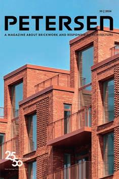
A MAGAZINE ABOUT BRICKWORK AND RESPONSIBLE ARCHITECTURE
50 | 2024
Nordø, Copenhagen. Photo: Anders Sune Berg


”Brick knows no boundaries of time or place. It travels through nations as culture’s messenger.”
Ulla Viotti, Artist


A quarter of a century of responsible architecture
WHEN PETERSEN TEGL ASKED PROFESSOR THOMAS BO JENSEN TO WRITE AN ARTICLE MARKING THE 25TH ANNIVERSARY OF PETERSEN MAGAZINE, HE WANTED TO LET HIS FELLOW ARCHITECTS HAVE THEIR SAY, WHICH IS ENTIRELY IN KEEPING WITH THE SPIRIT OF BOTH THE COMPANY AND THE PUBLICATION.
This is the 50th edition of the biannual PETERSEN magazine launched for the first time 25 years ago. The subtitle “A magazine about brickwork and responsible architecture” remains as apt as ever. Architects were, of course, somewhat sceptical when the magazine was launched. What about credibility?
But the magazine has kept the company perspective at arm’s length, focusing instead on the most interesting architects and projects of the day. Over the years, Petersen Tegl’s artisanal approach to brick production and its tradition of inviting architects into its workshop to develop products together have attracted the most visionary thinkers. The magazine has also garnered respect for its emphasis on innovation and high architectural standards. Its success has enabled it to expand from a predominantly local audience to publication in three languages and distribution all over the world. Overall, PETERSEN has helped boost brick’s status in modern architecture by focusing on its strength as a robust structure with deep historical roots and boundless potential for nuance and contrast.
Brick as culture’s messenger
Right from the start, the magazine opened its columns to the most critical voices of the day. “Why doesn’t the brick industry develop more products that combine the organic texture of brick as a material with a modern design idiom?” asked Boje Lundgaard of Lundgaard & Tranberg Architects in 1999. “idyllification is a lost cause. But conversely, we have to be aware that buildings need to have popular appeal.”
A few issues later, sculptor Bjørn Nørgaard struck a blow for precisely that kind of mass appeal, dreaming of “great popular, decorative art” in which “art, architecture and
brick form a coherent whole” (P4-2000). He continued to pursue the dream when hand-moulding clay models for Copenhagen’s Bispebjerg Bakke housing estate in his workshop: “A house should be like the edge of a forest by a beach – in winter, a cave. We want to integrate craftsmanship, art, architecture and technology in such a way that nobody can tell where one ends and the next begins. But everyone can see that they are all there” (P9-2002). The Swedish artist Ulla Viotti echoed this poetic power when she spoke of brick’s special “pact with nature” and its cultural resonance: “Brick knows no boundaries of time or place. It travels through nations as culture’s messenger” (P4-2000).
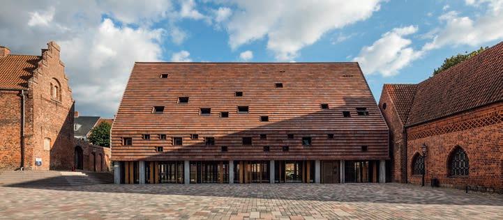
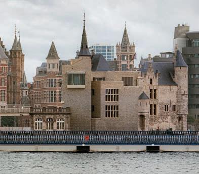
2,000 years of history woven into a new museum
Peter Zumthor from Switzerland is one of the many prominent architects who have helped revitalise the language of brick. When he designed the Kolumba Museum in Cologne, he wanted to weave 2,000 years of history into the new building. He dreamed of a long, narrow brick similar to those used in Ancient Rome and capable of blending in almost imperceptibly with the intricate surfaces and varied sizes of the ruins on which the museum was to take shape (P19-2007). The Danish architect Mads Bjørn Hansen (Praksis Arkitekter) worked in Zumthor’s studio at the time. After his visit to Petersen Tegl and a subsequent discussion between Christian A. Petersen and Zumthor, the grey Kolumba brick was born (P19-2007).
A cave carved out by animals and the elements
Petersen Tegl later developed new colours and firings of Kolumba, including a strikingly beautiful variant for the Playhouse in Copenhagen. In issue 13, Lundgaard & Tranberg Architects note that the rustic black brick, with its rough, sandy surfaces, inspired them to create a space that looked “like a rock cave, carved out by the elements and animal savagery” (P13-2004). This cave-like concept recurs in the work of several international studios, e.g. the Swedish architect Johan Celsing’s “A Brick in the Forest” at Stockholm Forest Cemetery (P31-2014) or the German company GMP’s “Raum der Stille” – a space for prayer and reflection in the heart of Berlin’s new airport (P46-2022).
Facing bricks that glisten in a thousand earthy colours
The Kolumba format has also yielded new forms of rustic facing bricks, like Sorø Art Museum’s reflective cladding, which glistens in a thousand earthy colours when struck by the sun (P26-2012). An even larger and coarser facing brick developed for Kannikegården in Ribe creates a similar effect. “In the Middle Ages, everything in Denmark was measured in feet, not millimetres,” says architect Erik Frandsen from Lundgaard & Tranberg. The bricks appear to “grow out of the ground” but also blend in naturally with Ribe’s medieval town centre. By making tiny adjustments in the kilns, Petersen Tegl arrived at precisely the right mix of rust-red shades and textural variation needed to resonate with the surroundings, while also maintaining traces of the production process (P35-2016).
2
01 02 03 04 05 06
PETERSEN number 1 & 50
The landscape flows through the brick Lene Tranberg’s poetic approach to brick recurs several times in the magazine, such as in the profile of Louiselund nursing home in Hørsholm, north of Copenhagen. Tranberg describes the yellow bricks as “streams of energy” running from the moraine field’s soft curves, through each individual brick, on through the inset and marble surfaces of the facades. “It was important for us that the landscape be allowed to flow in through the development, that the site live through the landscape. It was to have an air of embedding rather than a positioning,” she says (P30-2014).
Interwoven
In 2009, the architects’ favourite bricks, the coal-fired red D48 and D49, arrived at the colourful Transvaalbuurt neighbourhood in Amsterdam. The multicultural meeting place “Fusion” was the perfect place to unfold the richly faceted, burnt earth colours, with a facade that breaks all the rules of bonding and pays homage to the wild brick escapades of the Amsterdam School. “These Petersen bricks reflect the mosaics of Muslim aesthetics in the most beautiful way possible,” says architect Marlies Rohmer, who commissioned bricks fired in three formats – standard Danish, Hamburg and Flensburg (P22-2009).
Just as refined and beautifully embedded in its context is the extension to Museum De Lakenhal in Leiden, the Netherlands, presented under the heading “Interwoven”. Here, a yellowish-green standard brick (D190) has been supplemented with 13 specially produced moulded bricks in the same clay. “We wanted to create a building without an additional idea of ornamentation, but which is ornamental in material application,” says
architect Ninke Happel. “We chose to create a sawtooth pattern of moulded brick, angled at 30°, each brick with almost the same shape as a small house” (P42-2020).
Gothic gable motif in quatrefoil
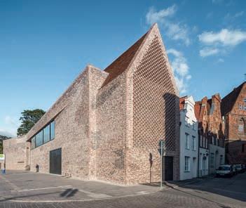
The same flair for sensitive adaptation and contrasting brickwork is also seen in the Hanseatic Museum in Lübeck, for which architect Andreas Heller developed a heavily mottled, purposefully irregular brick similar to those used in medieval monasteries. The angular body of the building culminates in a dazzling gable motif that recurs in Lübeck’s Gothic buildings. Here, a custom-moulded brick forms a quatrefoil relief pattern reminiscent of four-leaf clovers (P33-2019).
Vejen Town Hall in Denmark is another striking example of brick art, which reveals how an exquisitely detailed facade can be achieved using just ordinary, standard grey brick. The building is an explosion of reliefs, contrasts and deep, shadowy niches contained within a tight cubic form. “We opted for the sawtooth look partly because of the small shadows it casts under the bricks. This creates a pixelation effect in the colour of the brick that changes throughout the day and enhances the illusion of depth,” says architect Lars Povlsen, Transform Architects (P44-2021).
Old-world aesthetic meets modern design
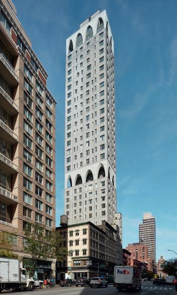
Petersen bricks have also made it to the other side of the Atlantic, including the New York skyline, where they are used up to a height of 160 metres (P44-2019), as well as in some 60 properties spread evenly between Brooklyn and Manhattan. According to architect Carlos Cardoso from Beyer Blinder Belle,
“We chose the Petersen brick in order to bring the ‘old world’ aesthetic to complement a modern and sophisticated building design” (P48-2022). For the same reason, many of London’s top architects have embraced Petersen bricks, as evidenced by the many sensitive extensions to single-family homes that have popped up in London’s terraced neighbourhoods (P45-2021).
Not to copy the past but to interpret it In issue 21, architect and brick researcher Mette Jerl Jensen had much to say. At the time, she was working on her PhD thesis, “Revitalising the Brick Wall”, which was sponsored by the Copenhagen Bricklayers’ Guild and supervised by Lene Tranberg and Bjørn Nørgaard. She warned against being excessively focused on the outermost facade and instead proposed a deeper, physics-based perspective on the properties of brickwork. Her observations still remain topical and act as a source of inspiration for new development opportunities in brick architecture. “Looking back is not the same as copying the past, it’s interpreting it. We need to use the values of the past in the language of our time,” she says. “But it’s a problem that the brilliant thermal qualities of the brickwork are lost when the brickwork is efficiently insulated from the load-bearing constructions of the house. So a brick wall as a climate screen integrated into the supporting structure of the house in order to transmit its technical properties with respect to climate – that’s a goal worth pursuing” (P21-2008).
01 Bispebjerg Bakke, 2007, Copenhagen
Idea: Sculptor Bjørn Nørgaard
Architect: Boldsen & Holm Arkitekter
Photo: Torben Eskerod
02Cimbris, 1997, Simrishamn
Artist Ulla Viotti
Photo: Peter Jørgensen
03Kolumba Museum, 2007, Cologne
Architect: Peter Zumthor
Photo: Anders Sune Berg
04 The Playhouse, 2008, Copenhagen
Architect: Lundgaard & Tranberg Arkitekter
Photo: Anders Sune Berg
05The Woodland Cemetery, 2013, Stockholm
Architect: Celsing Arkitektkontor
Photo: Ioana Marinescu
06Raum der Stille,
Berlin Brandenburg Airport Willy Brandt, 2020
Architect: Architekten Gerkan, Marg und Partner
Photo: Marcus Bredt
07 Sorø Art Museum, 2011, Sorø
Architect: Lundgaard & Tranberg Arkitekter
Photo: Anders Sune Berg
08Kannikegården, 2016, Ribe
Architect: Lundgaard & Tranberg Arkitekter
Photo: Anders Sune Berg
09Louiselund, 2012, Hørsholm
Architect: Lundgaard & Tranberg Arkitekter
Photo: Jens Lindhe
10 Fusion, 2008, Amsterdam
Architect: Marlies Rohmer Architecture & Urbanism
Photo: Thea van den Heuvel
11 Museum De Lakenhal, 2019, Leiden
Architect: Happel, Cornelisse, Verhoeven Architekten
Photo: Karin Borghouts
12 Europäisches Hansemuseum, 2015, Lübeck
Architect: Studio Andreas Heller Architects & Designers
Photo: Anders Sune Berg
13 Vejen Town Hall, 2019
Architect: Transform Arkitekter, Pluskontoret
Photo: Anders Sune Berg
14 180 East 88th Street, 2021, New York
Architect: DDG
Photo: Richard Barnes
15 Iffley Road, extension, 2018, London
Architect: Neil Dusheiko
Photo: Tim Crocker
16 505 Pacific Street, 2018, New York
Architect: Beyer Blinder Belle Architects
Photo: Florian Holzherr
Thomas Bo Jensen Professor, Head of
Aarhus School of Architecture 07 08 09 10 11 12 13 14 15 16
Research
3
Ongoing experiment turns 55
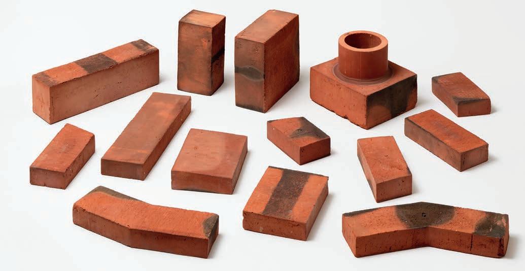
WHEN CHRISTIAN A. PETERSEN TOOK OVER THE FAMILY BUSINESS 55 YEARS AGO, HE SET ABOUT EXPERIMENTING AND DEVELOPING NEW TYPES OF BRICKS. THE D-SERIES, ONE OF THE RESULTS, IS NOW EXPORTED ALL OVER THE WORLD, AS ARE THE HANDMADE TYPES THAT CAME LATER. ALL OF THE PROJECTS PRESENTED IN THIS EDITION OF PETERSEN EXCLUSIVELY USE D-BRICKS.
Following the death of his father in 1969, Christian A. Petersen took over the running of Petersen Tegl at the age of 28. The family has owned the company since 1791, and Christian became the seventh generation to run the brickworks, which he still does with his daughters, Vibeke and Annette Petersen.
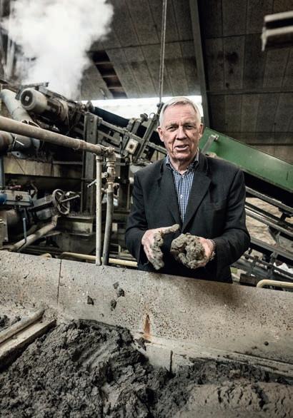
In the late 1960s, the only bricks on the market were red or yellow, and they were all machine-made. Petersen Tegl’s new owner saw no future in that. He immediately embarked on all kinds of experiments, including making sanded bricks based on techniques he had observed in the Netherlands. Soon afterwards, he brought another of his visions to life – producing handmade bricks with rustic and irregular surfaces reminiscent of those seen in the earliest brick houses. Working closely with the staff, he designed new machines (still in use today) to replicate the character of hand-moulded
bricks. His tireless experimentation with colour and firing resulted in the D-series, which was an instant hit with both architects and builders, being exported to five continents today. As per the motto “the customer is king”, the company has always worked closely with architects and clients on the development of new products.
The D-series is now exported all over the world. The 33 variants have a rich play of colour, ranging from the softest yellow to orange, red, green, blue, grey, brown and almost black.
This year marks the 55th anniversary of Christian Petersen’s ongoing experiment. Around the turn of the century, he delved over 200 years back in history for inspiration and started producing handmade bricks in wooden moulds. Like the D-bricks, these are now exported all over the world. But that’s another story.
4
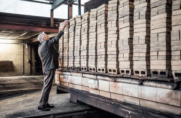
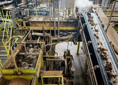
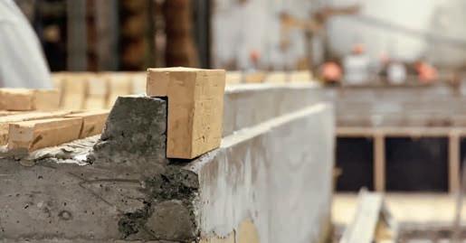
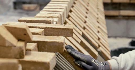
Petersen Tegl kneads, moulds and presses the clay, using techniques that replicate the more traditional handmade process. This method gives the clay the optimum texture, with capillaries and air voids providing space for the water to expand when it freezes without ruining the brick. In other words, the bricks’ ability to absorb water negates the risk of frost damage.
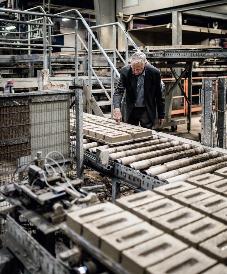
The D-bricks are made on machines designed at the brickworks that mimic the production of handmade bricks. The look is not determined by cosmetic concerns but is a direct and natural result of the production process.
The bricks are then fired in the tunnel kiln. The fact that the bricks are waterstruck means that all of the surfaces have a consistent look and colour. This has both practical and financial advantages, as all four surfaces of a Petersen brick can be used on a facade.
D-bricks: DNF
Text: Ida Præstegaard
Photo: Anders Sune Berg
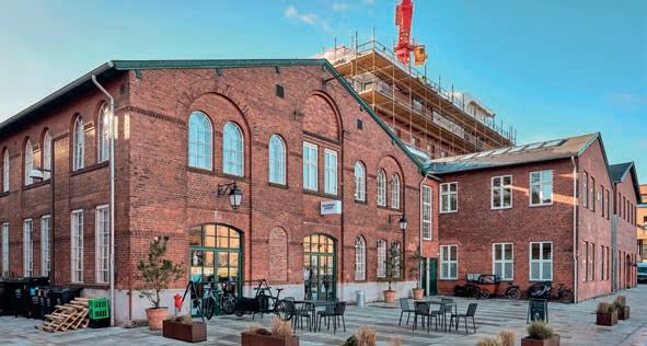
historical red-brick buildings around the waterfront in
reconfigured for new functions. Pakhus 48, built in the 1920s, was converted into showrooms and offices for design and architecture companies in 2014.
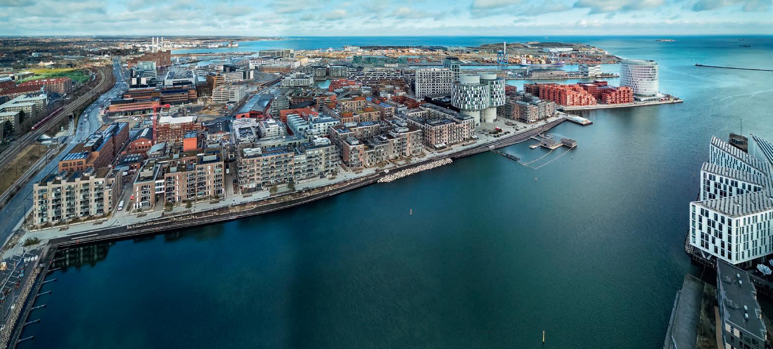
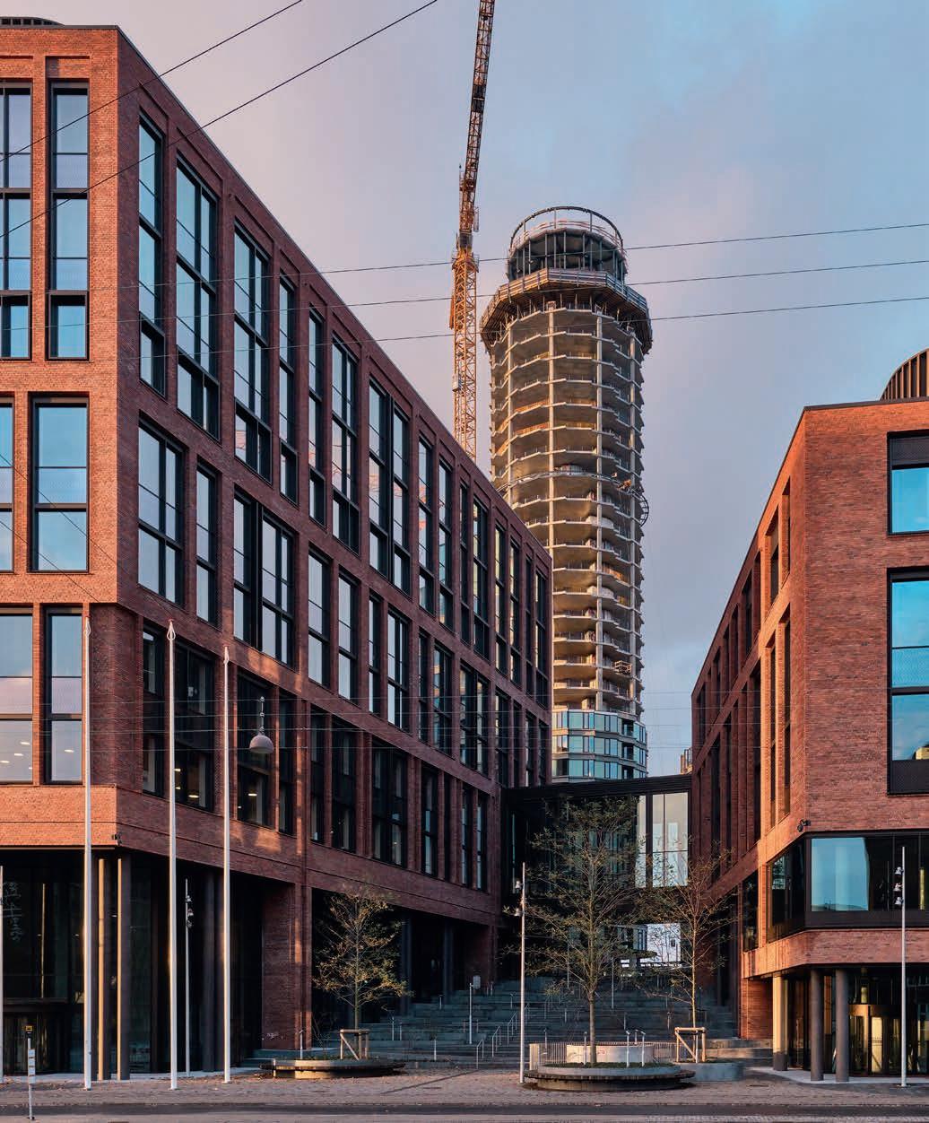
Waterfront neighbourhood nears completion in Copenhagen
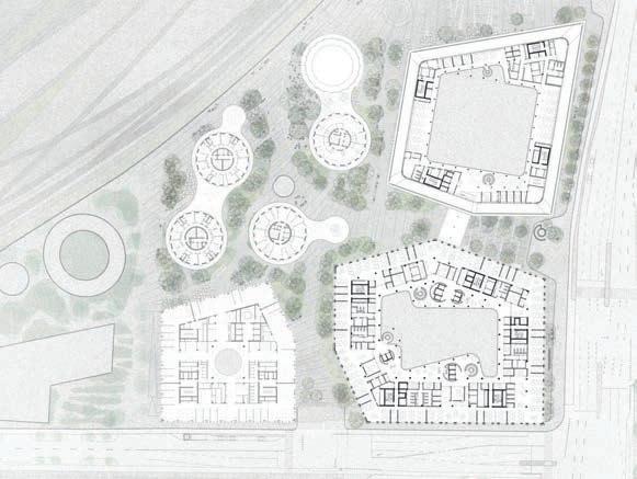
Nordhavn (the North Harbour) straddles much of the old waterfront north of Copenhagen’s historic city centre. Its transformation began in 2008 when an architectural competition was held to design a new and sustainable neighbourhood. The brief called for a vision that took account of the site’s proximity to the harbour and canals, its industrial architecture and the brick-built tenements in nearby neighbourhoods. It also had to include green space, be bike-friendly and have good public transport.
Phase one comprises the Århusgade neighbourhood, which extends like a pier out into the harbour between the Nordhavn and Kronløb basins. It is now almost fully completed and is home to around 4,000 people.
There are two distinct types of buildings in Nordhavn. The first category consists of large buildings up to 60 metres tall that reflect the port’s industrial scale. These include several converted silos. The second category, which makes up most of the development, varies from three to six storeys and is inspired by traditional tenements. They make for urban spaces on a more human scale, and many of them feature facades with prominent textural effects, including brick.
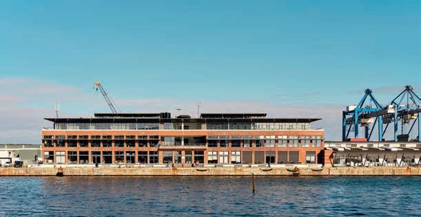
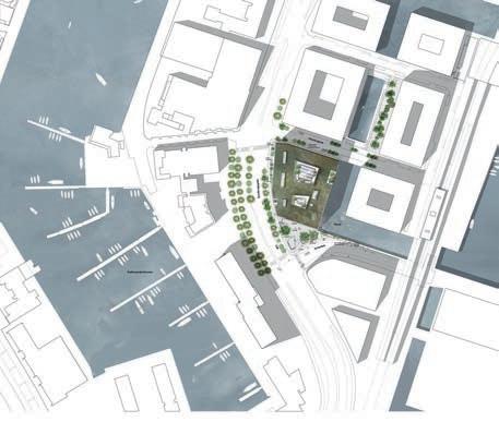
As the following pages show, Petersen Tegl has supplied the bricks for a number of these projects, including the Court of Appeal of Eastern Denmark and two residential buildings on Nordø, all designed by Henning Larsen, as well as the Orienthuset office building by Arkitema. The company has previously supplied bricks for other projects in Nordhavn (see issue 38 from 2018).
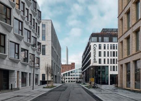
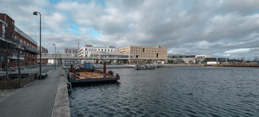
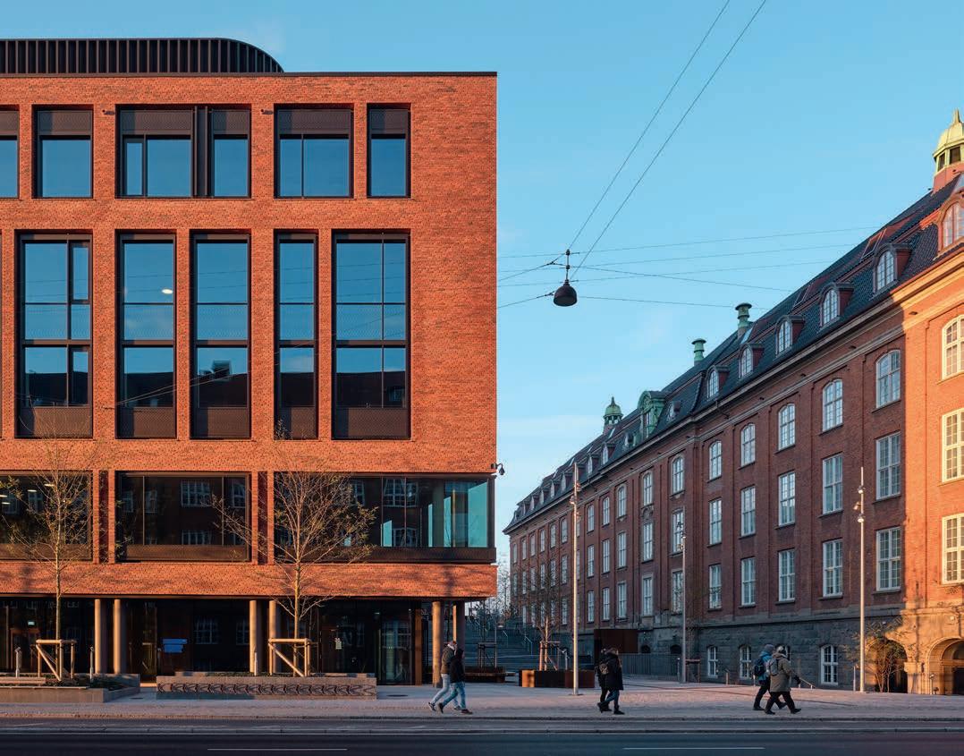
The Århusgade neighbourhood – phase one of the transformation of Nordhavn – is almost complete. It faces the big Nordhavn Basin and extends like a pier out into the Sound. The photo features Orienthuset, the Court of Appeal of Eastern Denmark, Nordø and Fortkaj – all of which are covered in this magazine.
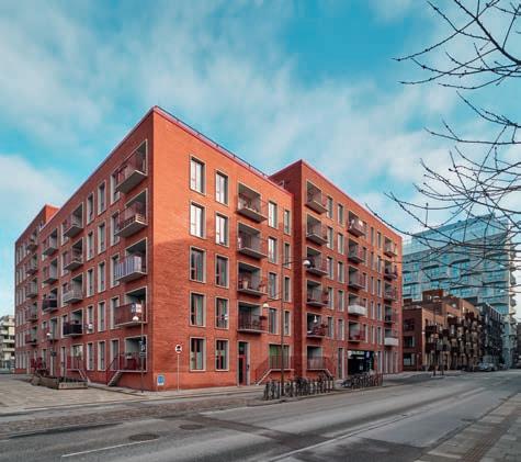
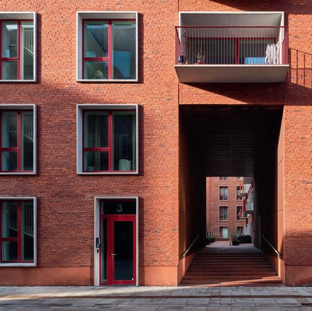
The Fortkaj residential development on Helsinkigade has 81 apartments. Vilhelm Lauritzen Architects and Cobe designed the building, which was completed in 2021. The facades use D33 DNF both on the bare walls and in the recessed bonds. Red joints endow the buildings with their solid, homogeneous character.
The architects see Fortkaj as a reinterpretation of 1930s modernism. In particular, they were inspired by the architect Kay Fisker, who had a major impact on Danish house-building.
Fortkaj
The
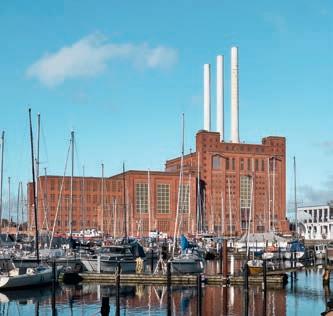
the north of Copenhagen inspired the new additions. Old warehouses and former harbour-authority buildings like Århusgade 126 now serve as offices. The monumental Svanemølle Power Station, a prominent Nordhavn landmark, opened in 1953 and closed in 2023. It will be
The development comprises different volumes of slightly varying heights around a courtyard with a garden. Metallic red windows and doors with concrete frames painted in white are inserted into the brickwork.
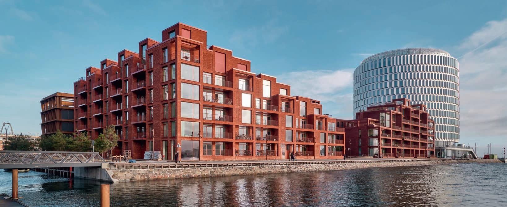
On the edge of the sky and the sea
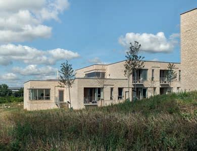
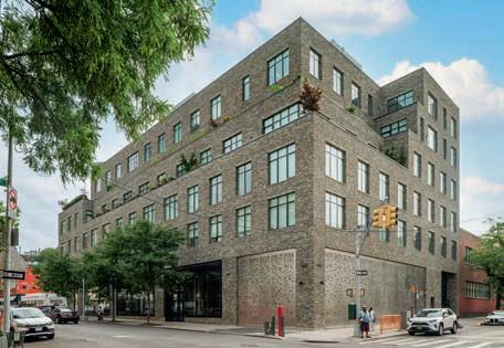
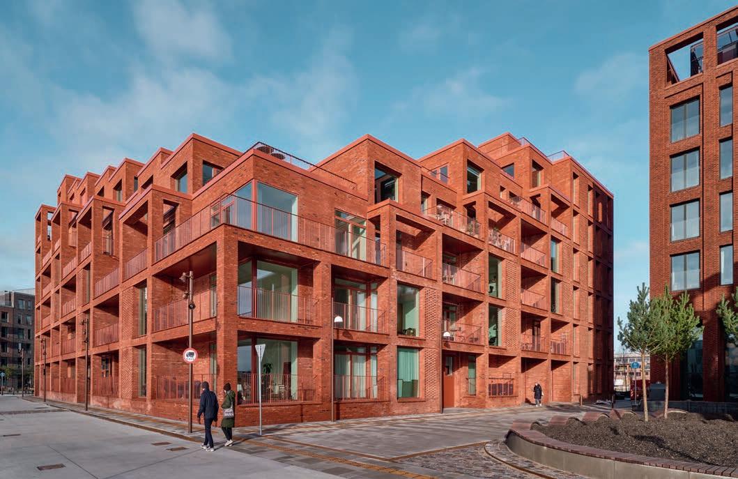
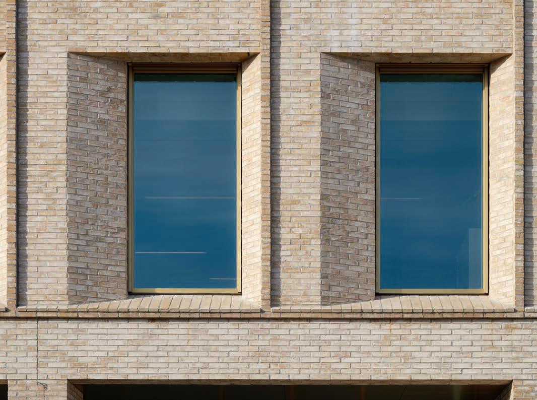
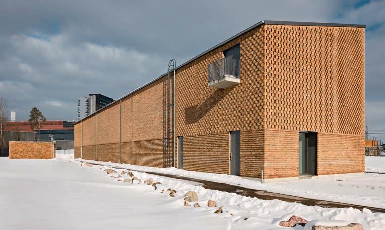
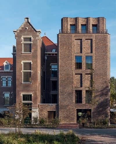
THE WIDE WORLD AND PRACTICAL DETAIL MEET IN TWO NEW RESIDENTIAL BUILDINGS ON NORDØ, PART OF THE NEW COPENHAGEN DISTRICT OF NORDHAVN. THE FACADES’ REDDISH TONES MAKE THE OVERALL LOOK COHERENT, WHILE THE INTERPLAY BETWEEN BRICK RELIEFS, NICHES AND BAY WINDOWS CAPTURES THE CHANGING LIGHT AND REFLECTIONS FROM THE WATER.
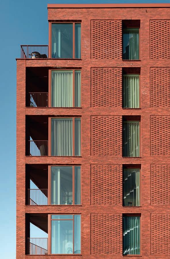
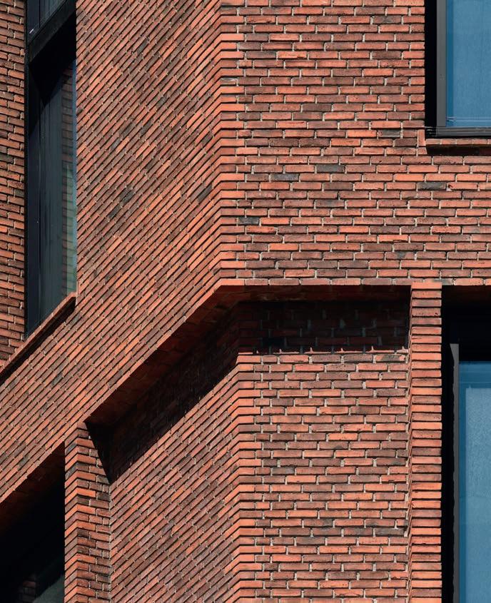
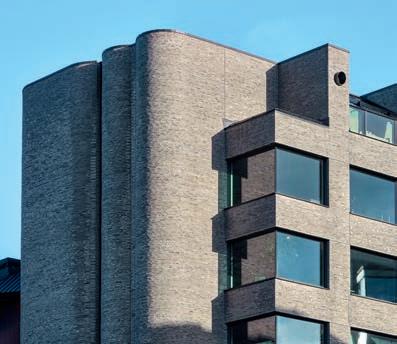
Across the canal to the east of Nordhavn’s Århusgade neighbourhood lies Nordø – a 23,000 m2 island divided into five construction plots. At the extreme tip of the island, a 60-metre-high silo-like office block featuring facades of angled glass and galvanised steel forms a distinctive landmark. A rectangular area between the office building and the canal is divided into four construction plots, separated by roads and smaller urban spaces. The Henning Larsen studio designed the four buildings on these plots: to the north, a hotel with a brick facade next to a Corten steel office block; and to the south, two blocks of homes with brick facades by Petersen Tegl. All four share similar reddish tones, establishing a material connection to the rest of the Århusgade neighbourhood, where red facades are a recurring feature.
The two residential buildings house 115 apartments of varying sizes, including several duplexes. The one to the west is built around a yard, while the one to the east forms a single, elongated structure. The two building complexes have their own distinctive shade of red due to the use of the reddish-
orange D23 and the reddish-brown D35. In each complex, the colours of the windows, balcony rails and stained joints have been carefully chosen to harmonise with the brick. Larger expanses of wall, such as those beside the windows, feature patterned brickwork in an English bond, with the runner bonds drawn back from the facade and forming reliefs that accentuate the pillars and decking.
“From afar, the buildings form a unified, heavy base that contrasts with the silo at the tip,” says Eva Ravnborg, architect and partner of Henning Larsen. “A bit closer up, you see the four plots as a family of reddish shades. And at really close quarters, you see that it is Corten steel and various types of brick and the minor setbacks in the brickwork that imbue it with a sense of intimacy and with texture.”
The many staggered elements and niches on the facades capture the changing light in the harbour and endow the buildings with a fascinating and ever-changing look. In the building furthest to the west, wide balconies between the bay windows provide shelter from the sea winds. Facing the canal
that separates Nordø from the Århusgade neighbourhood, the interplay between balconies and windows makes the block look like a row of tall, narrow canal-side townhouses in the old parts of Amsterdam and Hamburg. The tectonics are even clearer in the building to the east, where brick sections, pillars and girders face the harbour basin. Both buildings are on multiple levels, descending like stairs towards the small piazza between them. The design means the yard has plenty of sunlight.
“Nordø sticks out on the edge of the sky and the sea, and no two days there are ever the same,” Ravnborg continues. “We have strived to be sensitive to the sky and the myriad reflections from the water. The relief and various setbacks in the brickwork underpin that narrative because how you experience the buildings is very much determined by the constantly changing sky. In bright sunlight, the shadows are deep. At other times, the light is more diffuse, which is also quite poetic.”
Client: PFA
Architect: Henning Larsen
Turnkey solutions: Pihl & Søn
Engineer: Rambøll
Completed: 2023
Brick: D23 DNF and D35 DNF
Text: Martin Søberg,
 Two types of red brick – D23 and D35 – bestow a glow on the two residential buildings on Nordø, which contrasts with the tall, glass and galvanised steel office building at the tip of the island.
The brick creates a link to the Århusgade neighbourhood, the red facades of which refer to older buildings in the area, such as the Svanemølle Power Station.
Two types of red brick – D23 and D35 – bestow a glow on the two residential buildings on Nordø, which contrasts with the tall, glass and galvanised steel office building at the tip of the island.
The brick creates a link to the Århusgade neighbourhood, the red facades of which refer to older buildings in the area, such as the Svanemølle Power Station.
6
The building furthest to the west, in D23, forms a block that descends like a flight of stairs towards a small yard. The balconies are sandwiched between bay windows and pillars, which provide protection from the wind.
Nordø, two residential buildings with 115 homes, Copenhagen
PhD, Architectural Historian
Photo: Anders Sune Berg
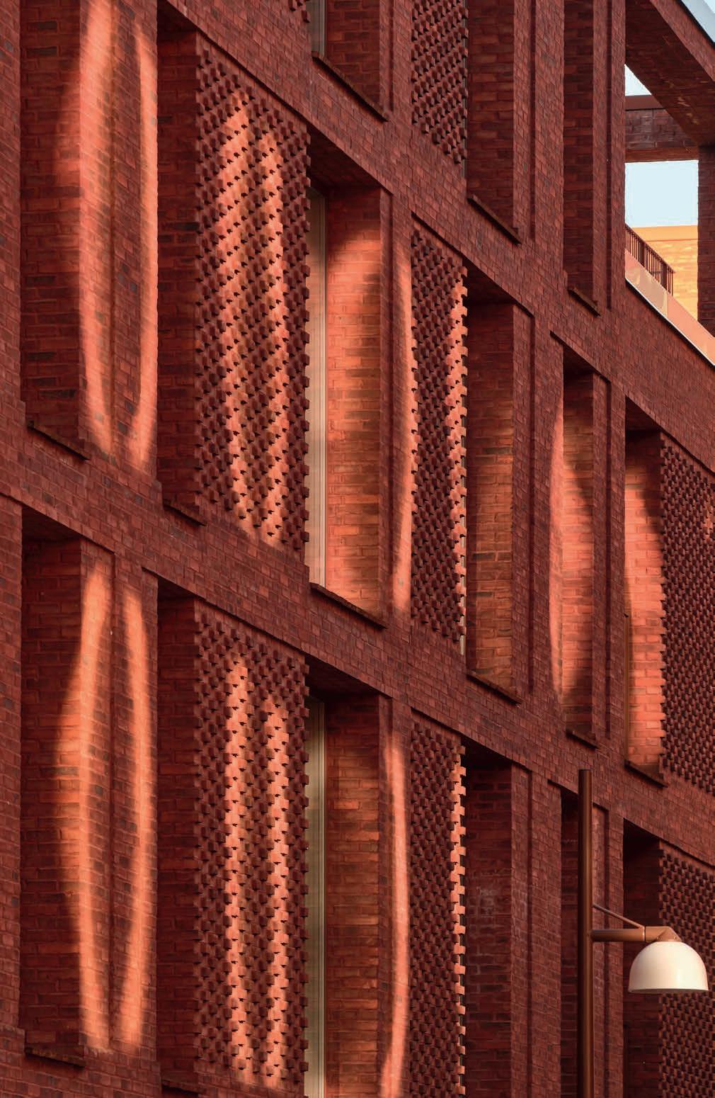
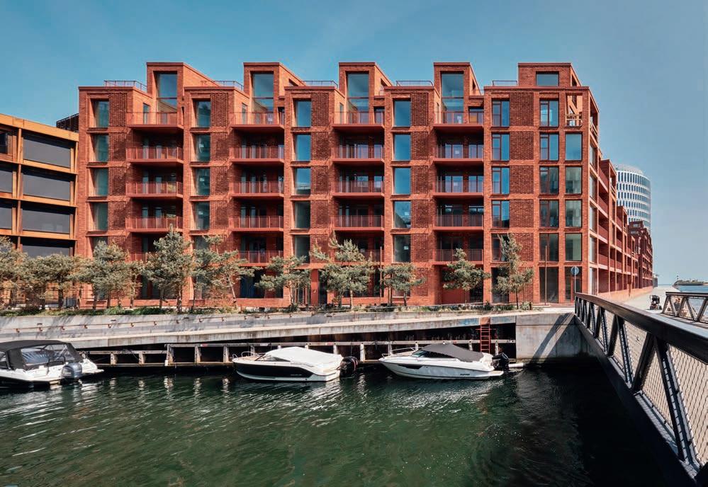 Sunlight reflecting off the windows of the building opposite emphasises the relief effects in the facades using D35, patterned brickwork.
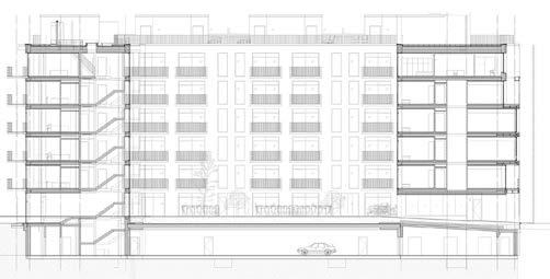
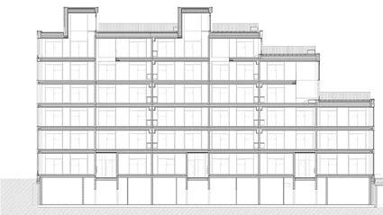
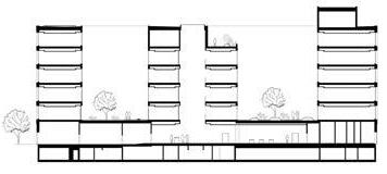
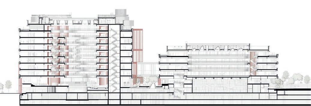
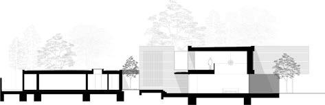
Section, residential block to the west
Section, residential block to the east
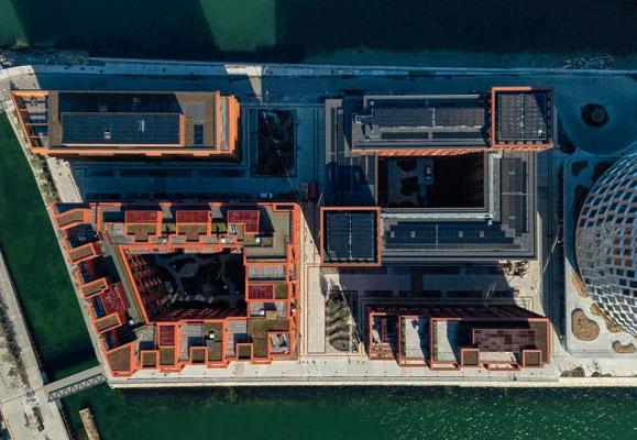
The four building plots are dotted between the canal and the silo-like office block. At the bottom of the photo, the two apartment buildings profiled in this article form a block and an elongated block.
Larger expanses of wall featuring patterned brickwork in an English bond bring variation to the facade and emphasise the building’s supporting framework as a clear tectonic element. The colours of the windows, railings and joints have been carefully chosen to harmonise with the bricks.
Sunlight reflecting off the windows of the building opposite emphasises the relief effects in the facades using D35, patterned brickwork.
Section, residential block to the west
Section, residential block to the east
The four building plots are dotted between the canal and the silo-like office block. At the bottom of the photo, the two apartment buildings profiled in this article form a block and an elongated block.
Larger expanses of wall featuring patterned brickwork in an English bond bring variation to the facade and emphasise the building’s supporting framework as a clear tectonic element. The colours of the windows, railings and joints have been carefully chosen to harmonise with the bricks.
7
Nordø is separated from the Århusgade neighbourhood by a canal lined with pine trees and berths for small boats. From this angle, it looks like a cluster of the kind of classic, tall, narrow townhouses found along canals.
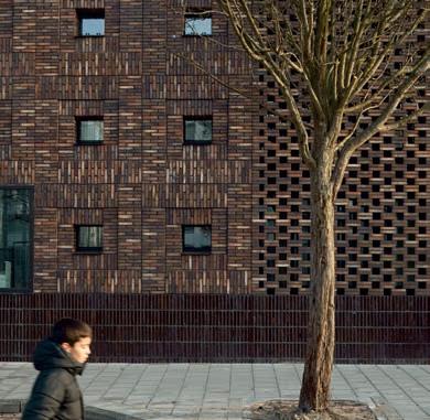
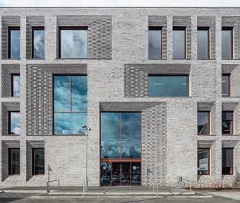
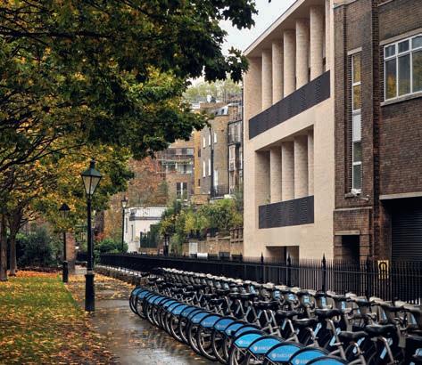
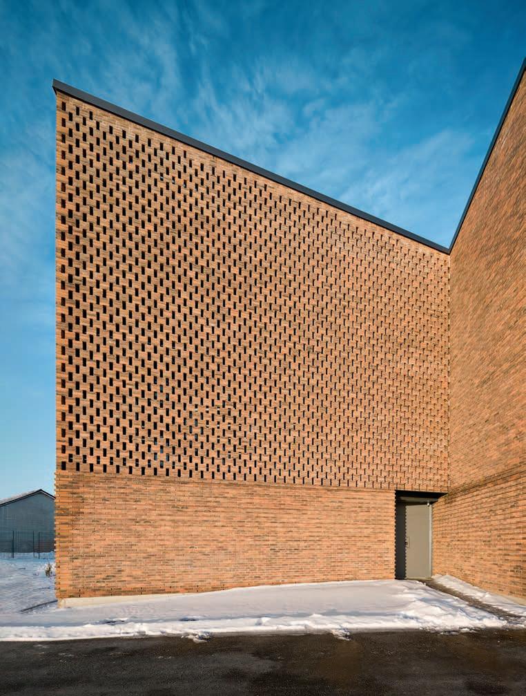
Understated intricacy
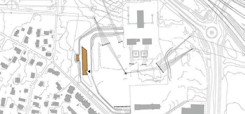
ORIENTHUSET IS NOT A LOUD BUILDING. CONTINUING THE DANISH TRADITION OF SOLID BRICK CONSTRUCTION WITH SIMPLE FORMS, IT ADDS PRECISION AND TEXTURAL EFFECTS TO THE EMERGING CITYSCAPE ON TRÆLASTHOLMEN IN COPENHAGEN’S NEW NORDHAVN DISTRICT.
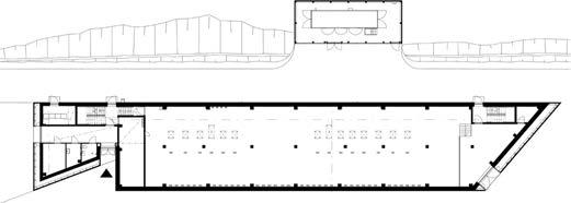
Many contemporary buildings appear striking from a distance, but up close their facades are flat and lack a sense of materiality. Orienthuset bucks the trend. At first glance, the office block does not appear particularly remarkable, but on closer inspection, it reveals its carefully thought-out detailing and rich texture. The 14,800 m2 office building is in a central position near the above-ground Orientkaj station on the Copenhagen Metro. On the other side of the tracks are a park-like public square and the Orient Basin, a large harbour that flows into the Sound. The eastern side of Orienthuset offers views over the water, while to the west is the canal that cuts through Trælastholmen.
Orienthuset consists of six floors plus a basement. The ground floor contains a foyer, meeting rooms and canteen, with service rooms in three corners. The other floors house
office space and have a flexible structure that allows them to be organised in different ways. Two internal courtyards open up communal spaces within the large, rectangular building and bring daylight into the offices, while the atrium-like foyer at the centre connects all of the floors.
The light-yellow tiles of the facades, combined with clean, simple forms, make the building look robust. On the ground floor, the brick was laid on site. The rest of the facades are made up of six-metre-wide prefabricated elements, each with two window bays. The bays are marked by a slightly protruding latticework construction, which makes for a fine relief on the facades. They also cast narrow shadows that hide the brickwork’s expansion joints. Occasional double-height loggias break the strict rhythm of the bays.
“They were inspired by the old warehouses’ large openings, through which goods were hoisted in and out,” explains Kim Risager, Market Director and Partner at Arkitema.
The wall behind the frames is made of D71 in a half-brick bond and with a light-coloured joint, the combination of which creates a tranquil effect. The windows in each bay are offset from the centre, deeply recessed into the wall, and connected to the outermost plane of the facade by sloping surfaces cut at different angles. A deep external sill made of Kolumba K71 extends across the whole width of the bay.
“These beautiful bricks have lots of texture, materiality and different shades of colour, and they patinate beautifully with their surroundings. In this sense, Orienthuset continues the tradition of humble and solid brick construction,” Risager explains.
8
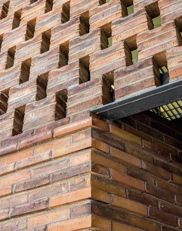
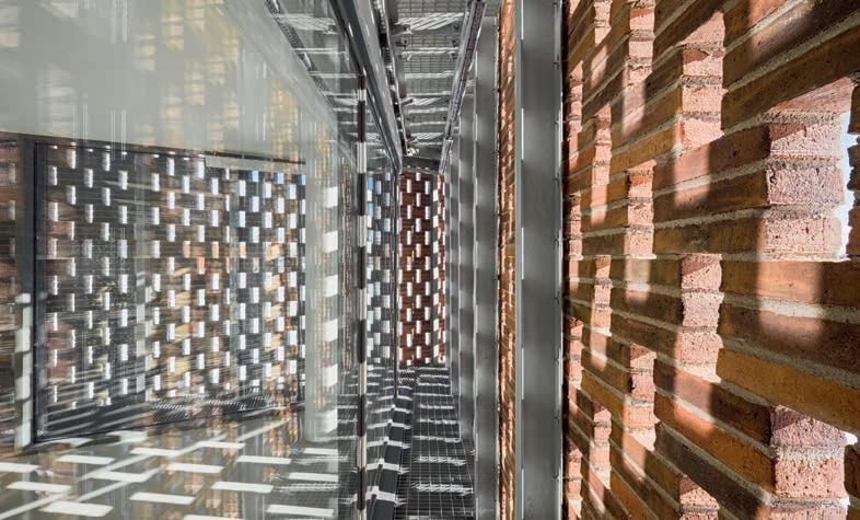
The bricks lend texture and warmth to the facade’s stringent composition. The numerous protrusions and angles create a relief that catches the light and has subtle shadow effects.
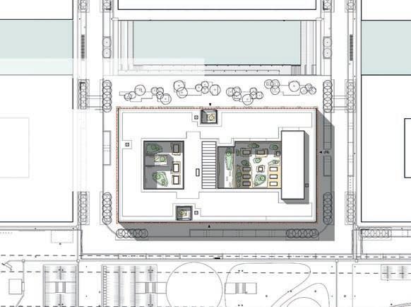
Site plan Cross-section
Orienthuset is an undemonstrative addition to Nordhavn’s emerging cityscape. The street it is on leads to the elevated Metro line and out into the Orient Basin and the Sound.
The intricate brickwork meant that the bricks were cut in up to 96 different ways in each facade element. The CRH Concrete element factory carried out this work.
“In traditional bricklaying, the bricklayer stands on scaffolding and has to make everything work vertically. Using brick elements lets you play around with the bricks a bit more because they are laid indoors on a horizontal surface, which is only raised up once the mortar has set. It’s a bit like being a pastry chef,” he adds.
Orienthuset, Copenhagen
Client: AP Pension
Architect: Arkitema
Landscape architect: Arkitema
Turnkey solutions: 5E Byg
Engineer: Niras
Elements: CRH Concrete
Completed: 2023
Brick: D71, K71
“In traditional bricklaying, the bricklayer stands on scaffolding and has to make everything work vertically. Using brick elements lets you play around with the bricks a bit more because they are laid indoors on a horizontal surface, which is only raised up once the mortar has set. It’s a bit like being a pastry chef.”
Kim Risager, Market Director, Partner at Arkitema
12 5988 12 244 5980 12 588 660 1392 228 12 108 12 588 660 1392 228 12 108 12 160° 110° 135° 135° 160° 110° 135° 135°40 0 11 40 0 11 12 228 12 228 12 210 120 12 207 120 12 228 12 228 12 90 12 228 12 87 10 4 12 10 8 24 0 29 29 60 390 614 1392 1608 1392 194 390 228 12 6 0 1 2
Horizontal section of a facade element
Occasional double-height loggias interrupt the rhythm of the recurring elements on the facade. The simplicity and light-yellow bricks bestow a robustness reminiscent of traditional brick buildings on the Copenhagen waterfront.
Each prefabricated element is six metres wide and includes two window bays. The bays are marked by protruding frames that conceal the expansion joints. The windowsills are made of K71.
The CRH Concrete factory made the facade elements. The bricks were laid horizontally. Some of the elements involved cutting bricks in up to 96 different ways.
Text: Martin Søberg, PhD, Architectural Historian
9
Photo: Anders Sune Berg
“The light-coloured D91 is a stunning brick with a real lasting quality. The fixtures and
may need to be replaced in 50 years, but nobody will need to touch the
10
fittings
bricks.” Merete Adler, Architect, Henning Larsen
The three lower floors are open to the public and include the courtrooms. The two upper storeys contain offices, a library and other facilities for the judges.
Site
The Court of Appeal of Eastern Denmark is part of the area in Nordhavn known as Trælastholmen. Just visible in the background is the red-brick Svanemølle Power Station.
plan
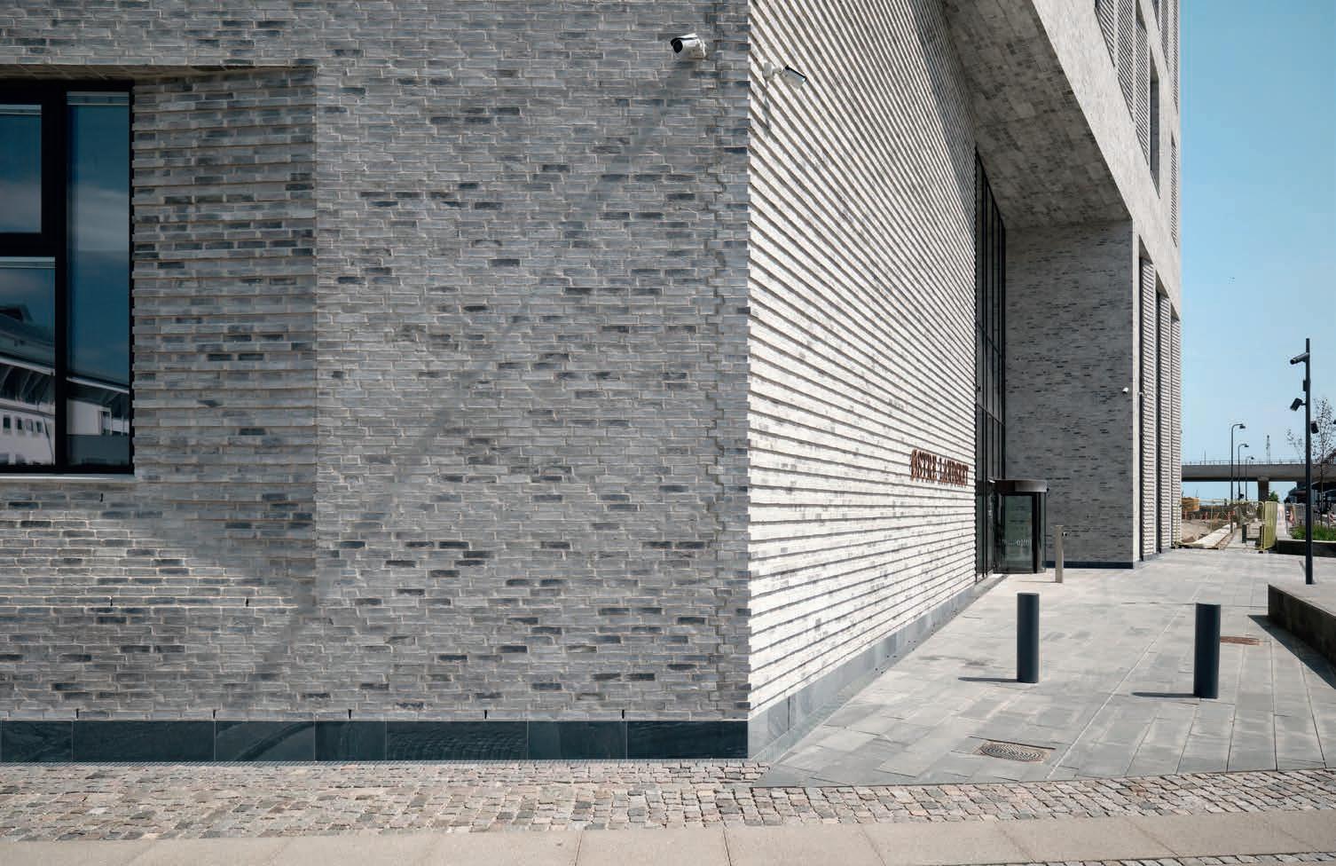
The striped brickwork on the facade hints at the way visitors should approach the main entrance, which faces onto Østre Landsrets Plads. The horizontal relief is repeated in the angled indents at the windows.
Open justice
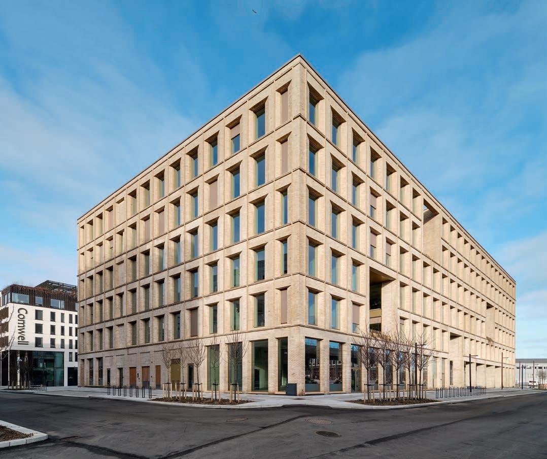
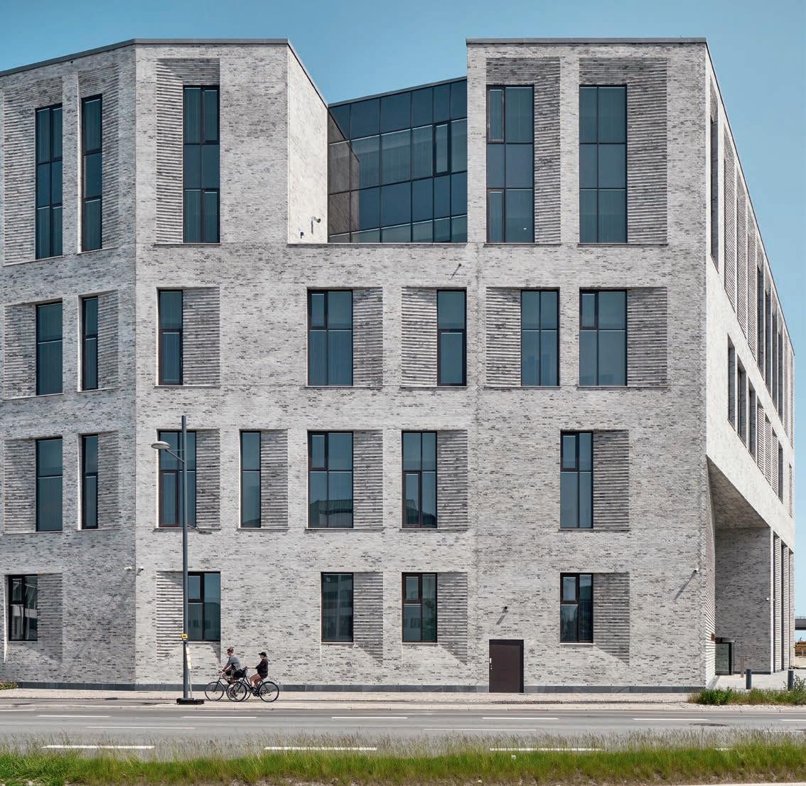
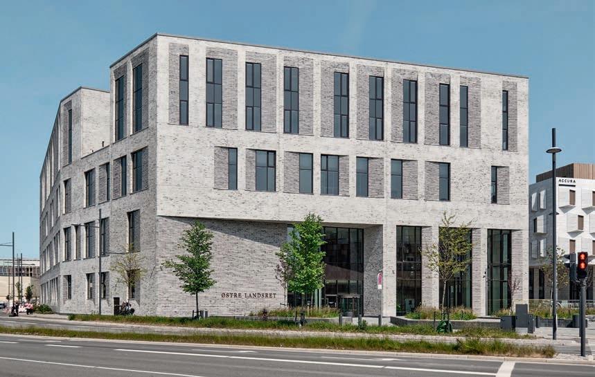
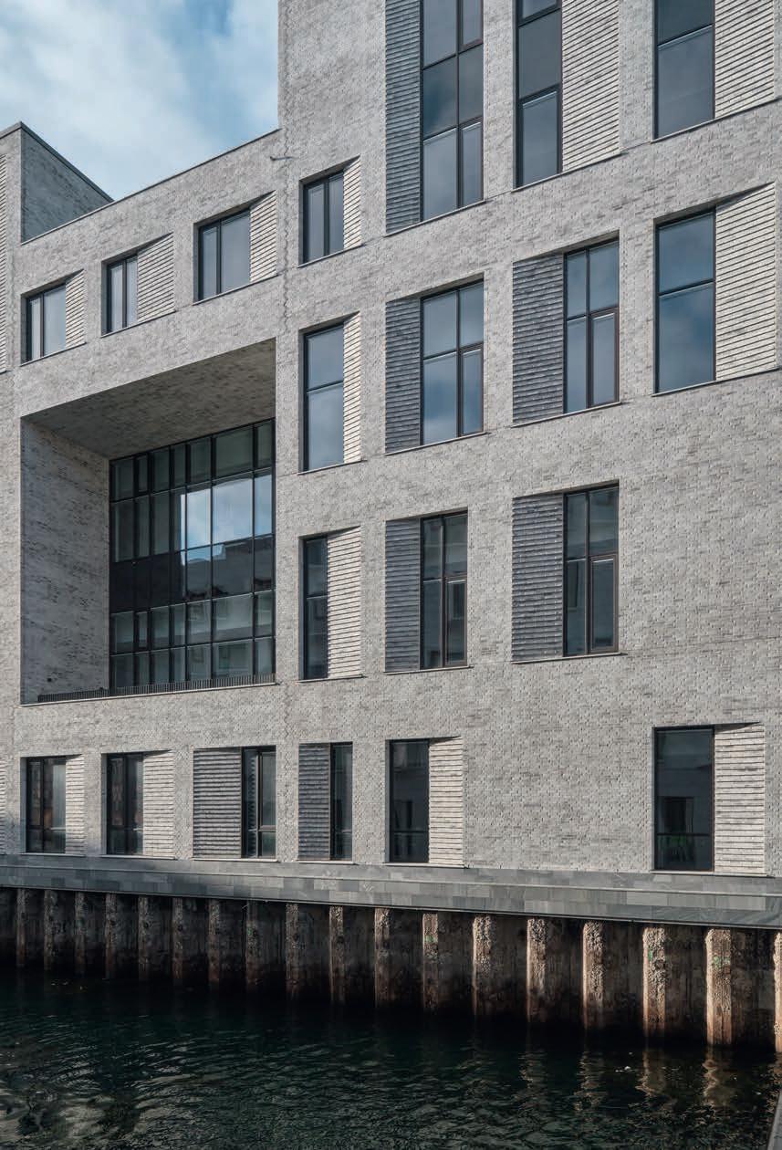
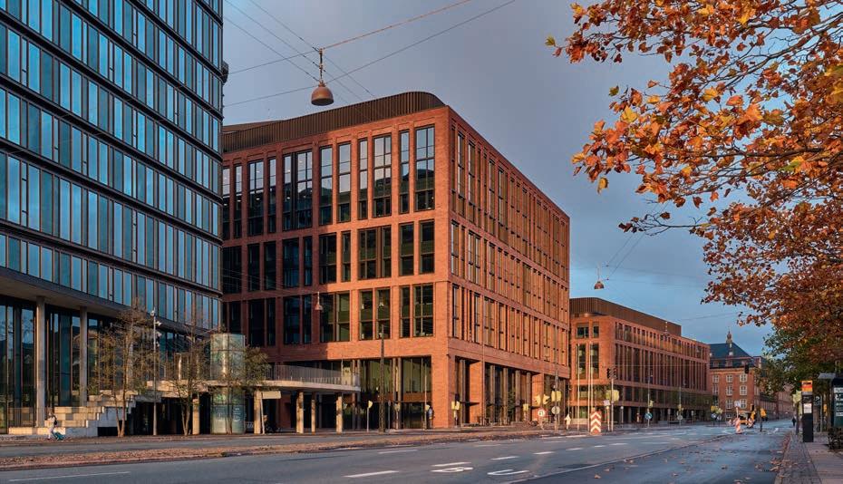
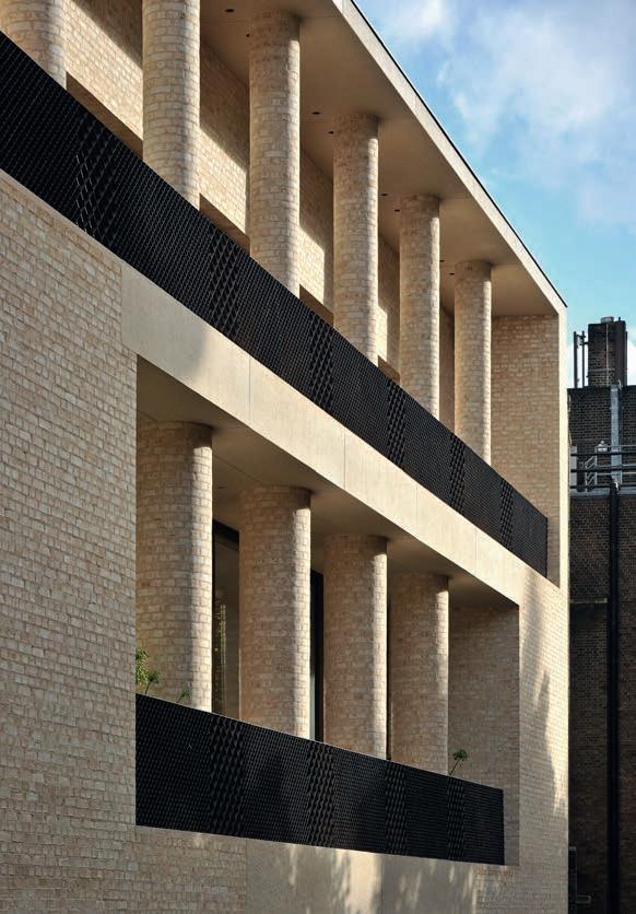
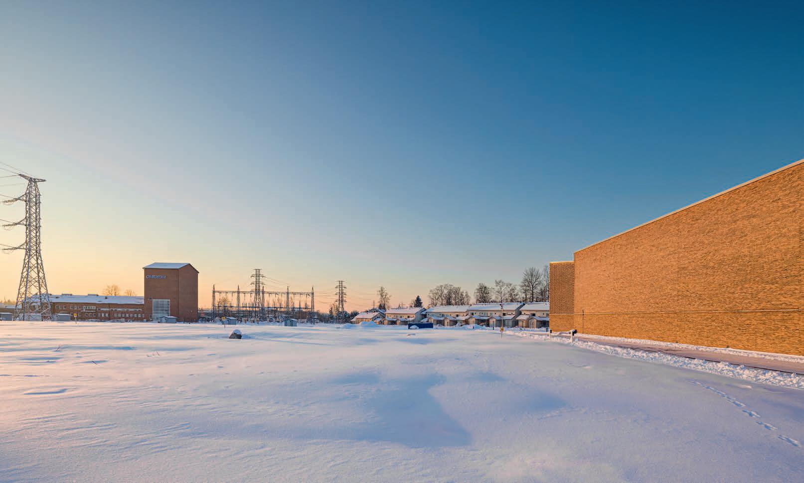
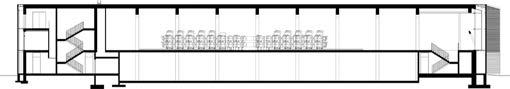
CLAD IN LIGHT GREY BRICK, THE COURT OF APPEAL OF EASTERN DENMARK EXUDES QUALITY AND GRAVITAS, A DIGNIFIED SETTING FOR THE EXERCISE OF JUDICIAL POWER AND EXPRESSING DIFFICULT EMOTIONS. THE BUILDING OPENS UP TO THE PUBLIC AND CAPTURES THE REFLECTIVE LIGHT OF NORDHAVN DISTRICT.
The Court of Appeal of Eastern Denmark – the body to which appeals are lodged about cases heard in the district courts – was previously based in an 18th-century Baroque palace on Bredgade in the city centre. Originally built as an opera house, the old courthouse has served as an army barracks, a naval academy, and briefly as the Danish parliament. However, the intricate old building was far from ideal as a modern courthouse, where judges and the accused have to be kept apart, and the security level needs to be high.
The new building, designed by the Henning Larsen architect studio, is on Trælastholmen in Nordhavn, where several old harbour buildings still set the tone, mainly due to their grand, industrial scale and solid materials. In a clear reference to these historical neighbours, the Court is a solid block with textural brick facades.
“The Court of Appeal was to exude integrity and solidity and remind the public that it is an institution they can trust. It also had to be open and welcoming, so people would not be afraid to enter and would feel safe inside,” explains architect Merete Alder from Henning Larsen.
People often imagine a courthouse as a monumental building with huge columns or pilasters like the palace on Bredgade.
“Our approach focused on the place and recognisability in relation to both the column motif at the entrance and the materials used. The Bredgade building had an intricate brickwork pattern, and close to the new court we have the Svanemølle Power Station, a large, cubic brick building,” Alder says.
The building is both a workplace for judges and staff as well as a public space, part of the Courts of Denmark – the Danish judiciary. This twin function determined the layout. The two upper floors are reserved for immersion and administration, housing offices, meeting rooms, a library and a canteen; the three at the bottom are open to the public. Visitors approach via a small green space at the entrance. As you step into the bright foyer, you have views of the harbour, and the light that reflects off a canal brings the water even closer. A public café extends along the canal side. From the lobby, you enter a high-ceilinged atrium with access to courtrooms of various sizes, from 100 m2 up to 323 m2. The atrium and courtrooms are connected via stairways and wide balconies, which also serve as waiting areas and space for discrete conversations.
Corridors that run along the facade allow judges and staff to make their way discretely to and from the courtrooms without bumping into members of the public. The corridors are connected to the two upper floors by stairs and elevators and provide access to rooms where the judges and lay judges deliberate. The corridors also allow light to filter from the large facade windows into the courtrooms without passers-by being able to look inside. Visitors can enjoy a view of the harbour and some fresh air on one of several terraces which break up the body of the courthouse.
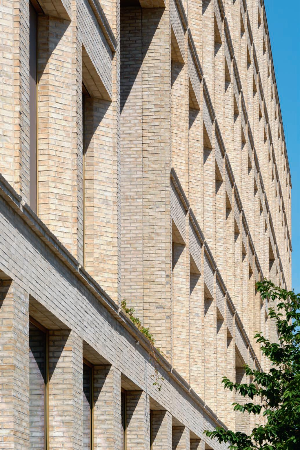
“The building looks like a block, a single brick volume. The continuous, constructive lines that run the length of the facade give a sense of calm. The facade then retreats as you enter the building, welcoming you in. We played about with how much to open up and achieve an effect on the facade,” the architect continues.
The windows are set back into the facade and look as if they were carved out of the block. The angled window edges are accentuated by striped brick reliefs, with every other course protruding a few centimetres. The reliefs capture changing light conditions and cast delicate shadows over the course of the day.
“The brick responds to its surroundings, and brick buildings feel so solid. The light-coloured D91 is a stunning brick with a real lasting quality. The fixtures and fittings may need to be replaced in 50 years, but nobody will need to touch the bricks,” she adds.
The Court of Appeal of Eastern Denmark, Copenhagen
Client: The Danish Building & Property Agency
Architect and landscaping: Henning Larsen
Private partner in the public-private partnership: Velliv
Contractor: A. Enggaard
Engineer: Norconsult
Completed: 2022
Brick: D91 DNF
Text: Martin Søberg, PhD, Architectural Historian
11
Photo: Anders Sune Berg
A view over the water to the north, with the Metro, Orienthuset and the Court of Appeal of Eastern Denmark in the distance.
The building has a solid, monolithic look that conveys stability. The double-height pillars at the entrance add a classical touch – a nod to traditional courthouse architecture.
The recessed windows look as if they have been carved out of the solid brick facade. The constantly changing reflections from the canal that cuts through Trælastholmen bring the facade to life and accentuate the relief effects.
Brickwork as urban bond
IN THE CENTRE OF COPENHAGEN, LUNDGAARD & TRANBERG ARKITEKTER CONNECT TWO DISTINCT PARTS OF THE CITY THROUGH THE MANIPULATION OF MASS AND A MASTERY OF DETAILING.
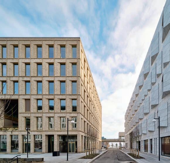
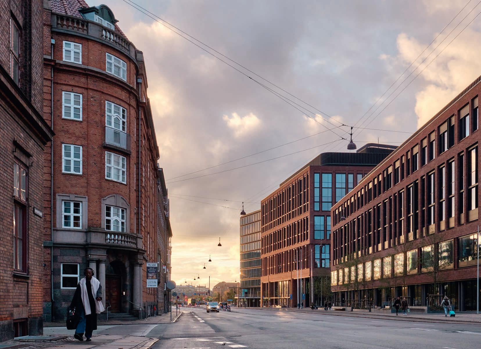
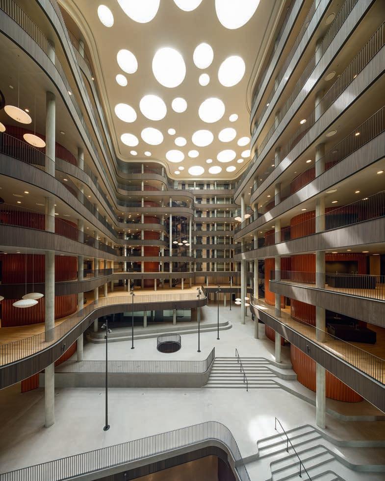
The Danish architectural firm of Lundgaard & Tranberg is internationally renowned for using the latest technology to create sculptural buildings with public plazas that evoke a natural landscape, such as the Axelborg Towers, SEB Bank and Pension, and Copenhagen Plant Science Centre. The firm’s new headquarters for Danske Bank A/S continues those signature practices, but the architects have also used a distinctly pre-industrial material – Petersen bricks – to address a longstanding gap in Copenhagen’s urban fabric – between the historical centre and the industrial zone behind the central railway station. Rather than mimic the facades of the historical brick buildings on either side of Bernstorffsgade – the traffic artery separating the two districts; the architects created abstract compositions of solid and void that harmonise with the older buildings in scale, material and variety of brick details. As a result, they were able to extend Copenhagen’s traditional pattern of enclosed blocks with absolutely contemporary buildings.
Based on their civic ambition, the architects divided Danske Bank’s headquarters into two blocks that correspond with their contents – management or financial trading – and recall the width of the older buildings on the far side of the street. In the gaps between the blocks and the neighbouring Post & Telegraph Building from 1914, now a hotel, stepped public plazas extend the sightlines from streets on the far side of Bernstorffsgade and deliver pedestrians to an elevated platform overlooking the railway yard. On both blocks, one- or two-storey glass walls along the streets, plazas and platform undermine the impression of a private enclave and invite passers-by to patronise the bakeries and coffee shops that provide a public amenity. Overhead, the varied openings in the brick facades are filled with aluminium windows and correspond to the actual structure of the building, which is revealed along the pavement by pairs of concrete columns.
While the Trading Block is relatively low and experienced as urban infill, the taller Management Block occupies a
prominent corner of the site and plays a symbolic role in the complex, which the architects reinforced by intricate detailing. Despite their different characters, both blocks are enclosed with lyrical arrangements of piers and pilasters that eliminate a simple correspondence between structure and facade. Just above the glass storefronts, the piers between the window openings are framed by projecting brick pilasters that correspond to the paired columns below and recall the historical convention of the piano nobile. On the Management Block, additional pilasters continue across the windows at irregular intervals, reminiscent of a traditional piano nobile and emphasising the honorific status of the building. In select locations on both blocks, the projecting pilasters continue to the pavement and create the effects of contingency and variety crucial to an urban environment.
Further up the facades, the window openings are subdivided with ornamental piers freely arranged to create syncopated rhythms, like displaced notes in a musical score.
Site plan Section through the management building and the financial trading building. 12
The large complex spread over two buildings is composed of contemporary, abstract and simple forms. However, in terms of scale, materials and rich brick details, it harmonises with the surrounding 20th-century buildings.
 The whole facade is red brick, including the horizontal parapets, vertical piers every six metres and secondary vertical posts. The main proportions are subdivided by a frame motif in dark-brown anodised aluminium, which spans up to three storeys at a time.
Between the two buildings facing Bernstorffsgade is a wedgeshaped public space. A staircase leads up to a raised terrace and a square that will be furnished with plants, benches and tables. The block of flats to the rear will be completed later this year.
The main entrance at the northern corner of the management building leads to an impressive atrium with a broad, landscaped staircase. Circular skylights in different sizes draw daylight down into the space.
The whole facade is red brick, including the horizontal parapets, vertical piers every six metres and secondary vertical posts. The main proportions are subdivided by a frame motif in dark-brown anodised aluminium, which spans up to three storeys at a time.
Between the two buildings facing Bernstorffsgade is a wedgeshaped public space. A staircase leads up to a raised terrace and a square that will be furnished with plants, benches and tables. The block of flats to the rear will be completed later this year.
The main entrance at the northern corner of the management building leads to an impressive atrium with a broad, landscaped staircase. Circular skylights in different sizes draw daylight down into the space.
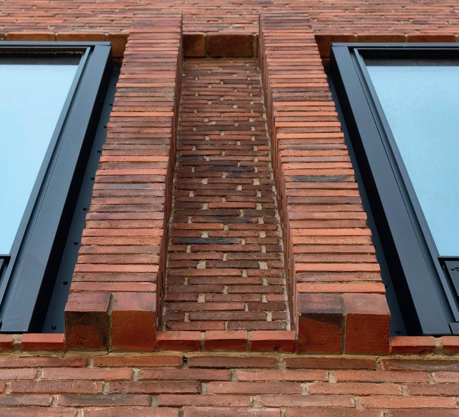
Just above the glass facades on the first floor, the pillars between the windows are framed by pilasters the width of a single special brick on top of heavy, also specially moulded bricks in the shape of a loaf of rye bread. All of the brickwork consists of bare brick in runner bond, with half-brick and quarter-brick protrusions. It is made exclusively of custom bricks, which were laid in a single operation, during which the joints were indented by 12 mm.
At the corners are recesses set back 228 mm (one brick) from the facade. Only one of the building’s 11 corners is at a 90° angle, so the brickworks produced ten special corner bricks with varying angles.
“Lundgaard & Tranberg’s buildings along Bernstorffsgade remind us that brick is an essentially timeless material that can accommodate multiple agendas and provides the means for architectural poetry in every language.” Michael Sheridan, Dr. Arch. and Author
The two parts of Danske Bank’s new HQ blend harmoniously with the surrounding buildings, including the neighbouring SEB headquarters, inaugurated in 2010 and also designed by Lundgaard & Tranberg.
The art of making the difficult look easy
MICHAEL KVIST, ARCHITECT AND PARTNER, AND MORTEN SMITH SØRENSEN, STRUCTURAL ENGINEER, BOTH OF LUNDGAARD & TRANBERG, ON THE BRICKWORK FOR THE NEW DANSKE BANK HEADQUARTERS IN COPENHAGEN.
The commission Danske Bank HQ is situated on the edge of Postbyen, a brand-new Copenhagen neighbourhood, and serves as a transition to the city centre’s classic brickbuilt tenement blocks. It soon became clear that clay and brick would form the framework for the new HQ. Danske Bank saw brick as a fundamental part of the history of this part of the city and a way of embedding the HQ in its surroundings. The brick facade also conveys a sense of solidity and credibility.
engineer
14
Structural
Morten Smith and architect and partner Michael Kvist worked very closely with Torben Schmidt from Petersen Tegl throughout the entire process of designing and producing the custom bricks required to produce the intricate detailing.
At the top of the Management Block, the combination of narrow openings and ornamental piers increases the visual weight of the top floors, recalling historical brick facades and emphasising the non-structural role of the brickwork. And yet, closer inspection reveals tactile surfaces that recall traditional brick construction. Working with the technical staff at Petersen Tegl, the architects developed a special bonding technique with raked mortar joints that delineate the individual bricks, creating a constantly changing mesh of shadows. Over time, as the facades weather and the joints darken, the sharp edges will gradually soften, and the blocks will acquire the patina of permanence.
By incorporating an urban agenda into their design for Danske Bank’s new headquarters, Lundgaard & Tranberg have managed to align private interests with the public experience of the complex. The instrument of that alignment is the precise brickwork that plays a dual role according to distance, at once urban veneer and tactile surface. In that sense, the new headquarters continues the historical custom of urban buildings playing both symbolic and sensual roles, even as the abstract facades reveal radical shifts in technology and aesthetics over the centuries. As such, Lundgaard & Tranberg’s buildings along Bernstorffsgade remind us that brick is an essentially timeless material that can accommodate multiple agendas and provides the means for architectural poetry in every language.
The bricks
We wanted a contemporary building with a look of its own but that also looks back in time. Again, this made brick essential. Petersen’s products have a tactility and inherent patina that endows the new brickwork with a timeless idiom. The company’s range includes several bricks in reddish and brownish hues resembling those found in the tenement blocks on the other side of Bernstorffsgade, which are more than a century old, as well as in the neighbouring hotel, which started life in 1912 as the Central Post Office.
We had our eye on the clinker-fired D48 at first but eventually opted for D35, which is more restrained and fits in better with the highly refined brickwork. Another thing that makes D35 interesting is that the subtle play of colour between them is also replicated on the individual bricks.
The customisation
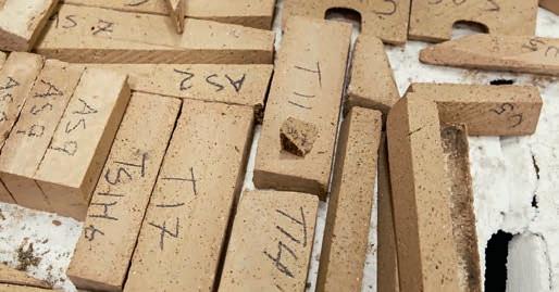
Danske Bank is an example of a building with a facing wall that looks simple and traditional but is also highly intricate and technical. We incorporated into the facade several details rarely seen in modern architecture – e.g. indents, projections, reliefs, columns, cornices, consoles, sills and folds – and gave them an updated, contemporary twist. Achieving these effects required a 1:1 mock-up and extensive detailing.
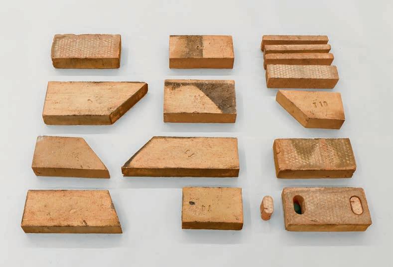
Special formats were not part of our thinking at the outset, but as the design evolved, custom bricks became essential. We designed approximately 35 hand-moulded bricks, including nine cornerstones, quoins, folding bricks and spout bricks with different angles. Petersen makes bricks by hand, so could supply all of the formats we needed. Few of those who look at it will notice the custom bricks, but they greatly contribute to the overall look of the facade.
The collaboration
Throughout the process, we worked closely with the client, contractor, engineer, bricklaying company and the brickworks. Without total commitment from all parties, this project simply would not have been possible. We were actively involved on the site throughout the year-long bricklaying process. Mistakes are inevitable with such complicated bricklaying, so it was really helpful that Petersen Tegl could deliver new custom bricks very fast whenever we needed them. It also helped that the brickworks based the names of the custom bricks on our designs. When we were on site working on a J-corner and only had G-bricks on the scaffolding, it was easy to shout to those below: “We need Js up here!” Yet another advantage of handmade production.
Danske Bank Head Quarters and city space
Copenhagen, DK
Client: Danica Pension
Architect: Lundgaard & Tranberg Arkitekter
Contractor: Per Aarsleff
Engineer: COWI
Landscape architect: Lundgaard & Tranberg Arkitekter, Julie Kirkegaard
Completed: 2015-2023
Brick: D35 DNF, D35 FF, Kolumba F469
Various special bricks in D35 DNF and F469 clay
Text: Michael Sheridan, Dr. Arch. and Author
Photo: Anders Sune Berg
Photo, Interior, page 13: Hampus Berndtson
A selection of the approximately 35 different custom bricks designed by the architects and made in wooden moulds at the brickworks in Broager. A square brick with a circular spout placed every 6 metres just below the facade rim provides drainage during heavy rainfall.
 The facades on both buildings’ lower floors feature large, horizontal glass sections. Only some of the load-bearing lines continue down to the pavement – some as brick pillars, others as round columns. Red brick is also found in the 1914 postal terminal building, now Hotel Villa Copenhagen (to the right in the photo).
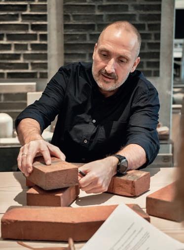
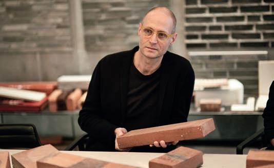
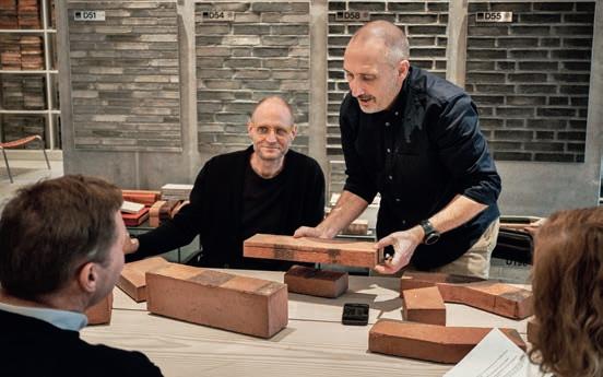
The architects visited Petersen Tegl’s Studio in Copenhagen to discuss the project.
The facades on both buildings’ lower floors feature large, horizontal glass sections. Only some of the load-bearing lines continue down to the pavement – some as brick pillars, others as round columns. Red brick is also found in the 1914 postal terminal building, now Hotel Villa Copenhagen (to the right in the photo).
The architects visited Petersen Tegl’s Studio in Copenhagen to discuss the project.
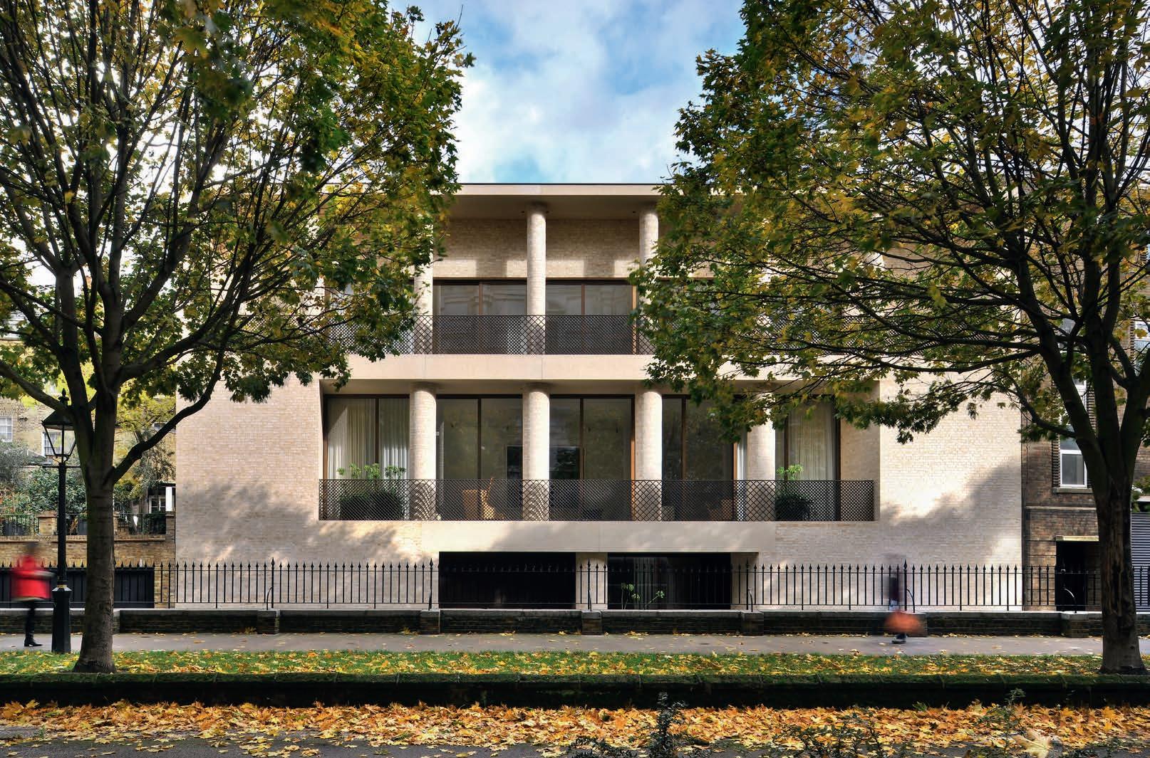
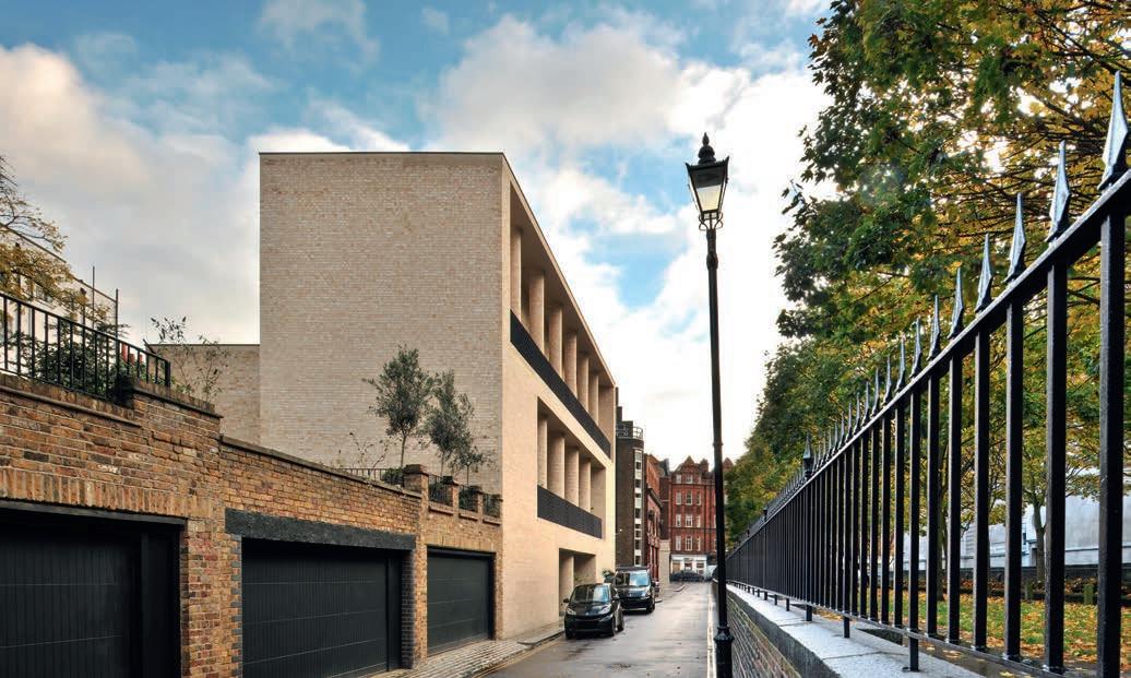
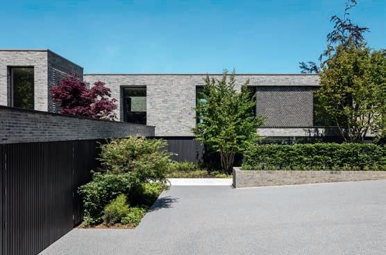
More palazzo than townhouse
DESPITE ITS MONUMENTAL CHARACTER, THIS LUXURIOUS PRIVATE LONDON HOME DOES NOT FEEL LIKE AN INTROSPECTIVE FORTRESS. ON THE CONTRARY, ITS SEMI-OPEN, SEMI-PRIVATE SPACES BLUR THE BUILDING’S BOUNDARIES.
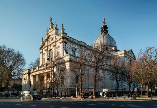
Kensington is renowned for its important historical buildings, such as the Brompton Oratory, which makes it a challenging location in which to build a modern home. Fortunately, David Chipperfield, the latest recipient of the Pritzker Prize, has built a career around establishing fruitful dialogue with the past, most notably in his celebrated transformation of the Berlin Neues Museum.
This private home by David Chipperfield Architects London elegantly fits into the heart of historic London. Like many of Chipperfield’s projects, it reveals how continuity enriches modern architecture. The point is not always to invent new idioms. Often, it is about going further down existing paths.
This Kensington residence expresses continuity via its use of materials – specifically brick, which is so prevalent in the terrace on Brompton Square and Holy Trinity Church, a few yards down Cottage Place. The travertine used on the floors, both indoors and in the loggias, and the concrete lintels with stone aggregate on the facade all allude to the Portland stone of Brompton Oratory.
Continuity is also evident in the column motif, which again echoes the front of the Oratory. Here, the columns express a sense of classical monumentality, establishing it as more palazzo than townhouse.
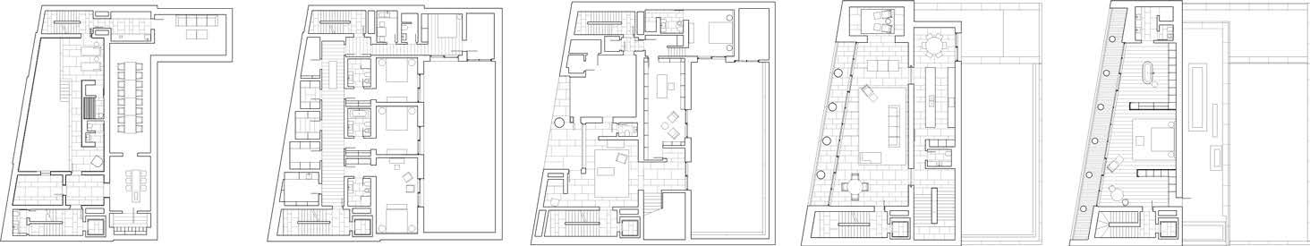
At the entrance, you are greeted by a single, relatively short and sturdy column, which gives the impression that we have stepped back in time. A wide staircase leads
up from the loggia and foyer to the first floor, or piano nobile, where we find the kitchen and main living spaces. As befits a classic Italian palazzo, the ceilings in this communal area are much higher than those of the other floors.
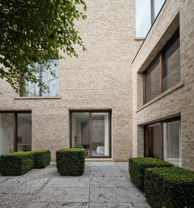
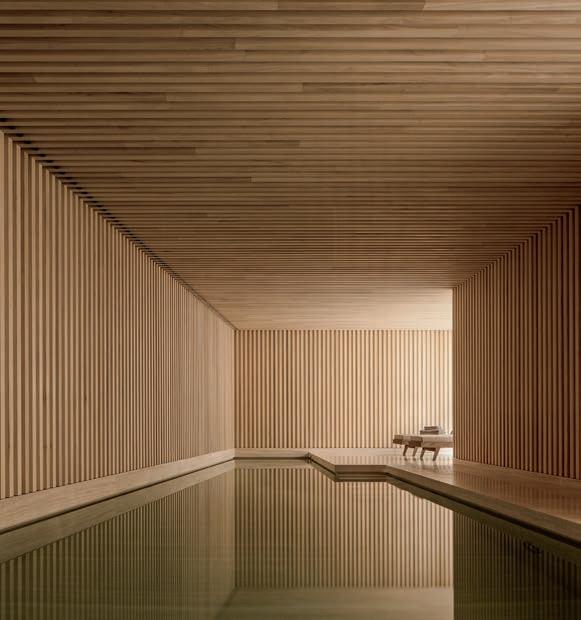
Almost half of the home is underground, to accommodate the client’s ambitious vision, which called for a spa, swimming pool and cinema. At the back of the house is a sunken courtyard, which perhaps pays homage to the service entrance typical of traditional townhouses in older parts of London. Also to the rear is an attractive garden dotted with birch trees, which allows natural light to flow into the guest rooms in the upper basement level.
Since the front is visible from a distance, the architects used sculptural means to break up and articulate the brick mass. This includes terracing, which means the volume slopes from front to back, the sunken courtyard and the loggias that extend from the living room to the second floor and provide ample daylight.
When approached from the street, the rich variations and textures of the water-struck bricks come into their own. In particular, the intricate bronze detailing on the
forms a delicate veil, which judiciously varies in density to emphasise the scale of the columns.
Despite the monumentality demanded by its surroundings, this luxurious home is no introspective fortress. Instead, its semi-open, semi-private spaces blur the build-
16
railings
The townhouse on Cottage Place has a formal and symmetrical, palazzo-inspired facade with loggias opening up the interior while also providing some privacy. The house is laid out like a traditional palazzo, with the main living spaces on the first floor, or piano nobile
Next door is the neoclassical Brompton Oratory, designed by architect Herbert Gribble and completed in 1884.
The sunken garden to the rear of the new home is paved with travertine and planted with slender birch trees and square hedges. Photo: © Simon Menges
“Our approach was traditional, using full bricks with an English cross bond to give a solid and monolithic appearance. We wanted lightcoloured bricks with a hand-made quality, so chose D71 in Hamburg format. A lot of time and effort was spent sampling before we arrived at a mortar colour that matches the shades of the brick.”
Sebastian Drewes, Architect
David Chipperfield Architects London
ing’s boundaries. The loggias enhance both the building’s aesthetics and its function by offering dramatic views of the Oratory from both the interior and exterior of the upper floors. To the rear, the sunken courtyard provides yet another way to experience life outside the house.
The way the house achieves the weight and presence necessary to stand alongside the Oratory and the church, while also reducing its scale to the north in order not to overpower the neighbouring buildings, speaks to us. It conveys a caring and civilised attitude. Were buildings able to have such a thing, it might even be called good manners.
Architect: David
Contractor: Cottage PL LLP
Engineer: Hannaford Upright
Completed: 2008
Brick: D71 Hamburg format, special bricks for columns
Text: Nathan Romero, Architect and Author
Philip Vile, Simon Menges
 Private home, Kensington, London, UK
Client: Hill Spink Ltd.
Chipperfield Architects London
Photo:
The distinguished residence has bronze balustrades with a pattern that varies in density to emphasise the proportions of the brick columns.
The columns on the first and second floor loggias increase in number and decrease in diameter. A shorter column on the ground floor marks the entrance. The columns are made of customised round bricks hand-made at the brickworks.
The house faces a park and is surrounded by brick buildings, including garages made in London stock.
The minimalist pool area has a Zen-like atmosphere, with travertine flooring and ceilings, covered in strips of obeche wood. Photo: © Simon Menges
Cross-section of the Brompton Oratory and the residence on Cottage Place.
Private home, Kensington, London, UK
Client: Hill Spink Ltd.
Chipperfield Architects London
Photo:
The distinguished residence has bronze balustrades with a pattern that varies in density to emphasise the proportions of the brick columns.
The columns on the first and second floor loggias increase in number and decrease in diameter. A shorter column on the ground floor marks the entrance. The columns are made of customised round bricks hand-made at the brickworks.
The house faces a park and is surrounded by brick buildings, including garages made in London stock.
The minimalist pool area has a Zen-like atmosphere, with travertine flooring and ceilings, covered in strips of obeche wood. Photo: © Simon Menges
Cross-section of the Brompton Oratory and the residence on Cottage Place.
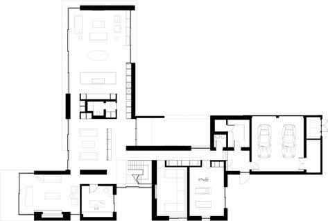
Basement Ground floor First floor Second floor
Lower
ground
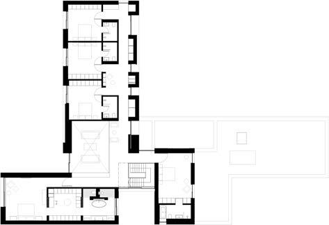
The wing containing the shared room ends with a dining room (photographed before being furnished), with large expanses of glass to the north, east and south. The absence of skirting boards gives the impression that the room opens up to the landscape. The D71 end wall has a built-in fireplace and bench in the same brick.
As if drawn by nature
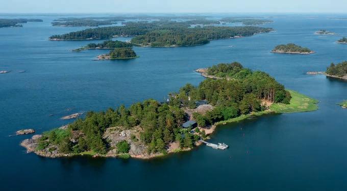
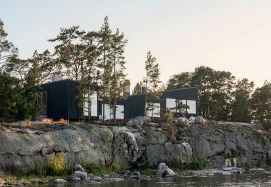
PRESERVING AS MUCH OF THE NATURAL SITE AS POSSIBLE WAS THE BRIEF FOR VILLA FURUHOLMEN IN THE FINNISH ARCHIPELAGO. THE FIVE TIMBER-CLAD VOLUMES CLAMBER UP AND DOWN THE ROCKY COASTLINE, OFFERING HOSTS AND GUESTS EXTRAORDINARILY CLOSE ENCOUNTERS WITH THE FOREST, CLIFFS AND SEA.
The client broke with tradition when he set out to commission the design for a holiday retreat on Norra Furuholmen, his privately owned 43,000 m2 island in the Finnish archipelago. He wanted to give architecture students nearing the end of their studies the opportunity to work on the project, and he collaborated with Aalto University, Espoo, to run a design competition.
Norra Furuholmen is part of the breathtakingly beautiful Turku Archipelago, some 150 km southwest of Helsinki. The brief was to design 400 m2 of holiday accommodation to sleep 22 people but still offer plenty of privacy for hosts and guests alike. It was to be carefully integrated into the uneven terrain and positioned so it was barely visible to passing boats and canoes.
Gustav Jerlvall Jeppsson of the School of Architecture at the Royal Danish Academy of Fine Arts in Copenhagen and Sarita Poptani of the Aalto University School of Arts, Design and Architecture in Helsinki spent the summer of 2015 coming up with the winning entry.
Right from the outset, the pair were resolutely determined to preserve as much of the natural surroundings as possible, an idea that may well be in vogue but is rarely realised as successfully as on Norra Furuholmen.
“The swimming pool has been sunk at angles that suit the rocks, but other than that, the granite has been left untouched,” explains Jeppsson.
“Our solution involved dividing the accommodation into five volumes, each adapted to suit its part of the terrain. It means that even indoors, you move up and down with the rocks.”
“The solution also meant there was no need for interior hallways. To get from one unit to another, you venture out onto the wooden decking that connects them. Proximity to nature is more important than dry shoes.”
There is no main door. Access is via a partially wood-covered path that weaves its way from one side of the site to the other. Delightful spaces of various shapes between the units face different directions to make the most of the sunlight and views. A beach house stands on the south side of the island, while to the north, a sauna offers panoramic views of the sun setting over the Baltic Sea.
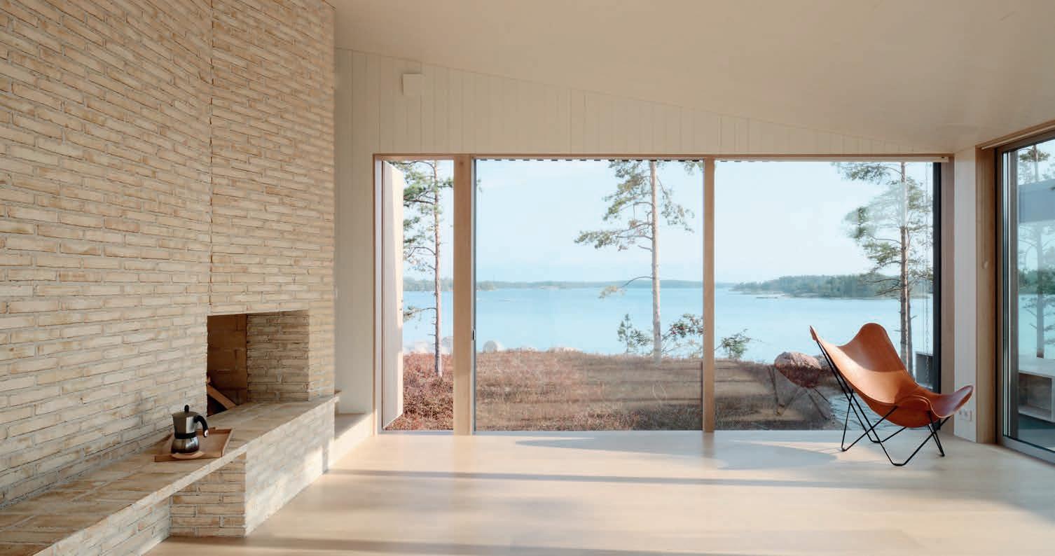
The main building extends over three floors and houses the living room and kitchen and has a dining room on the top floor. The bedrooms, each with its own en-suite bathroom, office and fitness area, are spread out among the other volumes. Big, floor-to-ceiling glass panels in every room blur the distinction between indoors and out and are ideally positioned to make the most of the views.
In an effort to underplay the architectural idiom, the roof pitches on four of the units consistently reflect the topography of the terrain. A steeper slope on the roof of the main building creates space for a bedroom high up among the treetops.
Only a select few natural materials were used. The exterior cladding is in larch. The doors and windows are pine. The kitchen table and bathroom floors are made of local granite. The floorboards are solid oak.
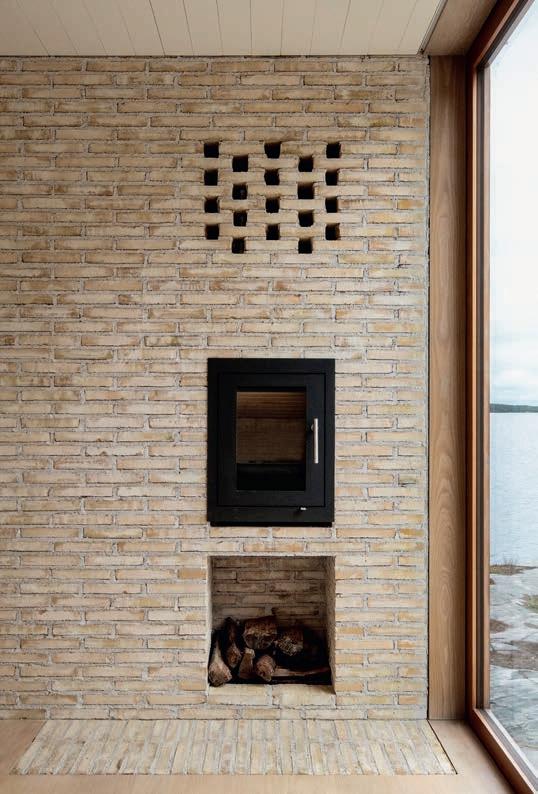
From the beginning, brick was integrated into the project in various ways, further blurring the distinction between inside and out. D71 in Flensburg format is used for the outdoor
fireplace, three indoor ones and multiple walls – including the load-bearing one, which comes with a built-in bench between the living room and kitchen.
Villa Furuholmen is shielded from the elements by an irregular, 11-metre-long wall to the south, which responds to the uneven terrain and serves as a planter for herbs.
“The patterns built into the wall create a play of light and shadow. In nature, you rarely find completely smooth surfaces. Thanks to its structure, the wall adapts well to the terrain and doesn’t look or feel as hard as a smooth one.”
Brick was chosen early on. “I discovered Petersen Tegl’s Flensburg brick in the Material Lab in the school of architecture in Copenhagen. The narrow format was just right. We ordered several colour samples and settled on D71. The whitish-yellow bricks look stunning alongside the white-painted walls and the varied tones of the light wood surfaces. Outdoors, they blend harmoniously with the rocks, heather and pine trees.”
Holiday home, Norra Furuholmen, Rosalandet archipelago, Finland
Client: Private
Architect: Gustav Jerlvall Jeppsson (now STRÅ Architects) and Sarita Poptani
Woodwork by: Jerker Jensén Construction
Completed: 2020
Brick: D71 FF
Text: Ida Præstegaard, M.Arch
Photo: Thurston Empson
18
Norra Furuholmen in the Turku archipelago met the client’s requirements that the topography should provide shelter for the house and a mooring for a boat.
”From the beginning, brick was integrated into the project in various ways, further blurring the distinction between inside and out. The narrow Flensburg format proved to be right.”
Gustav Jerlvall Jeppsson, Architect
 The exterior is clad in larch, patinated in greyish tones that blend beautifully with the hues of the rock and the trunks on the pine and birch trees.
A long, zig-zag wall to the south features a pattern made by protruding headers. The wall absorbs differences in the level of the terrain and serves as a planter box for herbs.
On either side of the brick wall in the dining room, two oak staircases lead up to the kitchen, and from there to the living room, which opens onto one of the many terraces.
The exterior is clad in larch, patinated in greyish tones that blend beautifully with the hues of the rock and the trunks on the pine and birch trees.
A long, zig-zag wall to the south features a pattern made by protruding headers. The wall absorbs differences in the level of the terrain and serves as a planter box for herbs.
On either side of the brick wall in the dining room, two oak staircases lead up to the kitchen, and from there to the living room, which opens onto one of the many terraces.
Section Site plan
The living room, office and master bedroom feature built-in brick fireplaces. Decorative holes in the bedroom wall provide ventilation for the fireplace.
The new substation is an addition to the existing power plant. Both the design and materials derive inspiration from the listed substation from 1947, seen on the left. It was designed by Aarne Ervi, one of the most important post-war architects in Finland.
interwoven pattern
20
Site plan The facades use four types of brickwork to mark the different parts of the building. The ground floor features rusticated brickwork, while the upper floor uses either bare bricks or two different types of patterned bricks. Longitudinal section Cross-section Ground-floor plan
The almost
of the brickwork adds structure to the facade. The bricks’ texture and subtle variations of colour emphasise the effect.
every
“We made detailed 3D models of each brick and used 13 custom ones made in special moulds. That was one reason why we chose Petersen Tegl because few brickworks offer that degree of flexibility.”
Tuomas Kivinen, Architect, Virkkunen & Co Architects
Complex simplicity
TAMMISTO ELECTRICITY SUBSTATION IS AN IRREGULAR BRICK BOX CONTAINING A VITAL SWITCHING SYSTEM. THE FOUR TYPES OF BRICKWORK ON THE FACADES INDICATE THE VARIOUS FUNCTIONS INSIDE.
Tammisto Electricity Substation is in Vantaa in southern Finland, close to Helsinki, the airport and a ring road, and surrounded by residential and commercial buildings of varying scales. The station forms part of a bigger electricity plant that plays a key role in the region’s energy supply. The plant also includes a listed substation from 1947 comprising two red-brick volumes – a tall tower and a lower wing – which inspired Virkkunen & Co Architects’ design for the new substation, a rectangular volume from which a wedge has been carved on one of the long sides, splitting the volume in two.
The gas-insulated system is in a double-height main process room in the larger of the two volumes. It is directly connected to the control room in the smaller one, which features temporary workstations, as the substation is not permanently staffed.
The concrete structure consists of prefabricated frames and panels, with facades in four different types of brickwork. The ground floor forms a continuous, horizontal band of rusticated brick, in which every other row protrudes. Above this band, the long sides of the large volume feature ordinary brickwork in a halfbrick bond. The facades and the east facade of the smaller volume have a woven pattern with vertical, diagonally placed perforations. These openings bring daylight into the control room and the end of the long main process room and prevent anybody from looking inside. The west facade on the smaller volume has a kind of inverted version of the perforated brickwork, in which the perforations are filled by three headers laid on top of each other.
“We wanted the brick to connect with the red of the existing substation but not be as dark,” explains architect Tuomas Kivinen, partner and CEO of Virkkunen & Co Architects. “We opted for D36. It has reddish tones but is a little lighter, which is good when the brickwork features different patterns because it is easier to make them out if the brick isn’t too dark a colour.”
“But we didn’t want too wide a range of tones either because that would interfere with the effect of the pattern. Traditionally, the bricklayers mix the bricks on site, but Petersen Tegl does it in advance at the factory, which guarantees a good outcome. They’re really good at mixing them in a way that avoids unfortunate marks at joints. It means the colours are modulated but coherent.”
The perforated facades consist of double walls, with the brickwork attached to steel frames. Behind the facade is a glass wall that serves as a climate envelope. Between the walls is a narrow gap that can be used for storage or technical equipment. In the interior, the floors, walls and ceilings are white, with the exception of the transition between the two volumes, where the concrete wall is clad in brick tiles.
“In many ways, this is a complex building, so the interior is abstract and almost intangible. We have simplified it and made everything white, in contrast to the warm colour of the bricks,” says Kivinen.
In addition to the new substation, other modifications to the facility included replacing existing, air-insulated electricity pylons with new, gas-insulated ones. The changes freed up space to create a meadow-like area between the buildings, in which surface water pools to form a small pond. Close to the substation, a new backup generator has also been built and is screened off on three sides by brick walls and Corten steel slats, the colour of which matches the bricks. The concrete surfaces of two transformer bunkers from the 1980s have been chemically treated so that they are now in a dark umber to fit in with the plant’s overall warm tones.
A number of custom bricks were needed to form the wedge shapes and special brickwork.
“The building includes straight, pointed and blunt angles, several openings and different brickwork patterns. We made detailed 3D models of each brick and used 13 custom ones made in special moulds. That was one reason why we chose Petersen Tegl because few brickworks offer that degree of flexibility,” Kivinen explains.
Tammisto Transformer Station, Vantaa, Finland
Client: Fingrid Oyj
Architect: Virkkunen & Co Architects
Contractor: RTA-Yhtiöt Oy
Engineer: Victor Abramov, AFRY Finland
Completed: 2023
Brick: D36 DNF, 13 special bricks
Text: Martin Søberg, PhD, Architectural Historian
Photo: Tuomas Kivinen
21
The project required 13 different types of custom brick, which were made in wooden moulds at the brickworks. The elliptical holes for the reinforced steel on the brick in the bottom right corner were cut in Finland.
Perforated brickwork brings daylight into the double-height process room that houses the gas-insulated switching system. It also stops anybody looking inside.
On the ground floor,
other course protrudes, while three bricks stacked form the perforated, diagonal pattern on the upper floor.
The double-walled facades consist of brickwork attached to steel frames and a glass wall that forms the building envelope.
“We chose Flensburg format because it is different from traditional British brick. At a height of 40 mm, it looks longer, so the house appears to be more elongated.”
Gregory Phillips, Architect
An essay on brick
IN THE PRESTIGIOUS RESIDENTIAL AREA OF TOTTERIDGE, IN NORTH LONDON, THE PREDOMINANT TYPE OF HOUSING IS THE TWO-STOREY, BRICK-BUILT DETACHED HOUSE WITH PITCHED ROOF, CUBIC PROPORTIONS AND A TRADITIONAL ARCHITECTURAL IDIOM.
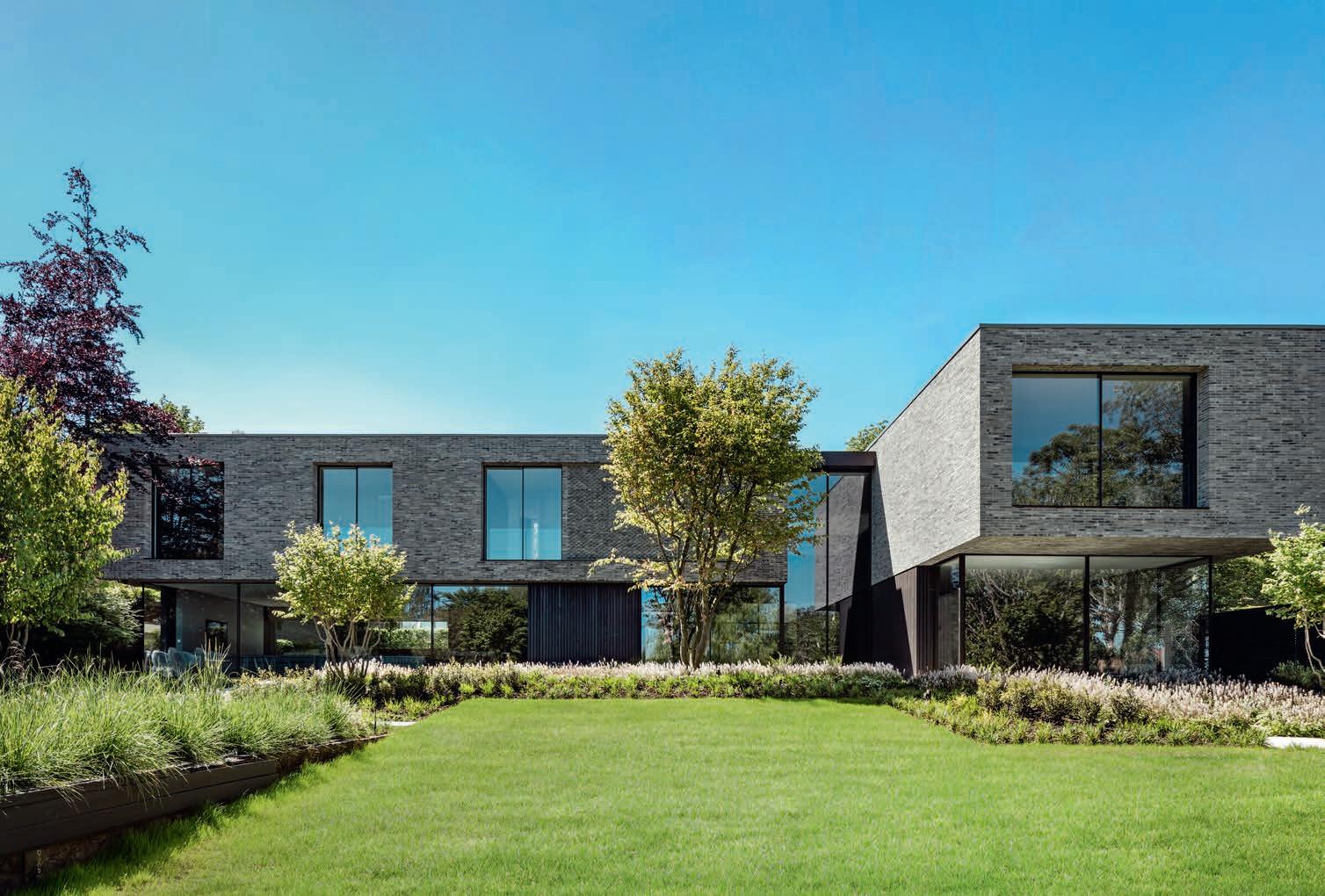
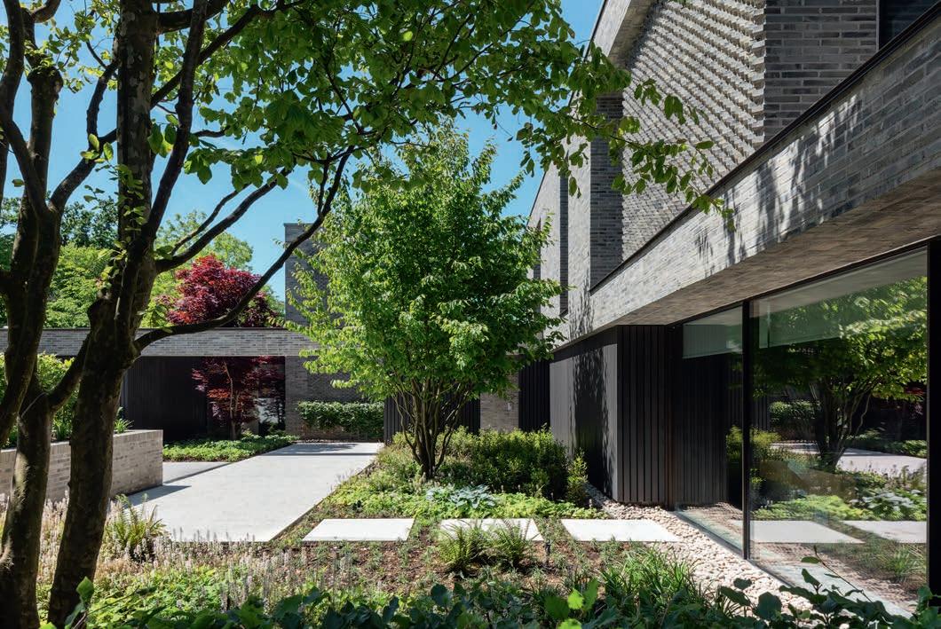
The floor plan of the newly built house is in the shape of a letter T, which breaks the volume down into smaller units, makes the scale smaller and brings natural light and ventilation into all of the rooms. The design also allows for closer contact with nature, in this case a lush and varied garden visible from every part of the interior.
From the driveway, we walk downhill to the house, first into a sort of patio in front of the door, an interesting space formed by the garage wall and the house. The main door is a few steps further on. The buffer this design places on access to the house builds up our expectations, offering glimpses of the interior and lush landscaping.
The private areas, including bedrooms, are all externally made of brick, and the more public areas of glass and timber. The fact that the bedrooms are, quite reasonably, upstairs and the living spaces downstairs poses challenges to our constructive logic and intuition: for example, a thick brick wall seems to float in mid-air in the double-height gallery. Indeed, the whole of the upper floor seems to hover above the ground in general.
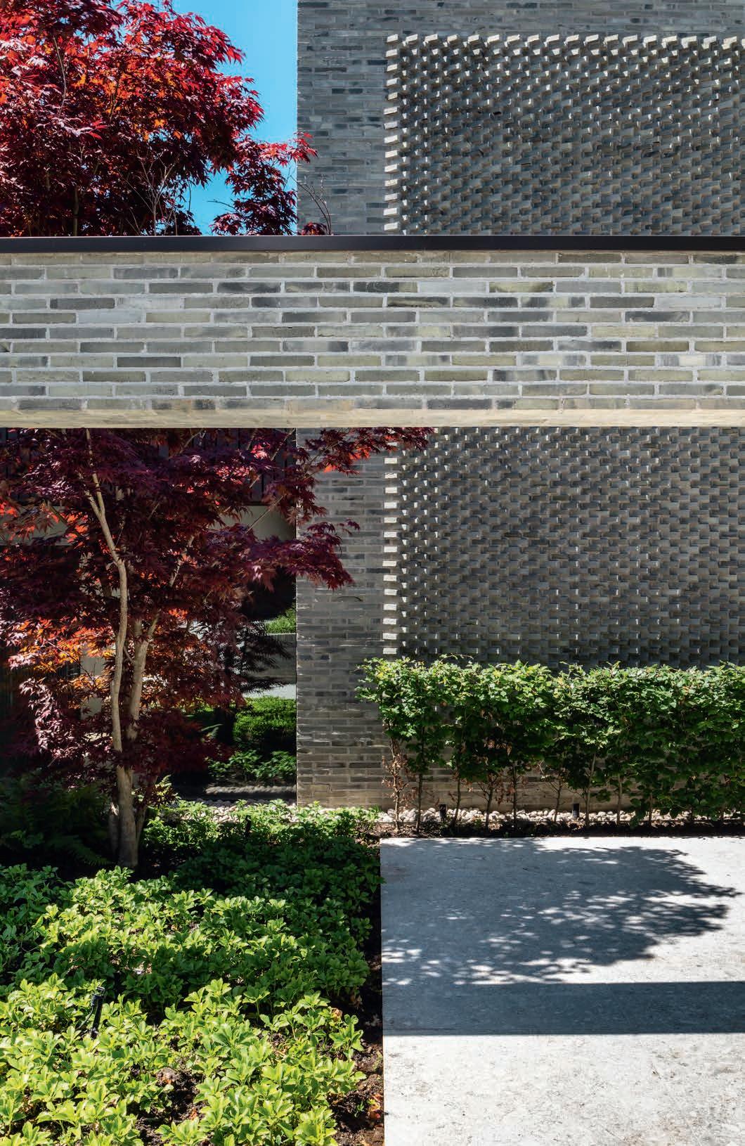
This ‘airborne’ effect was a favourite device of many modernists. Houses by Marcel Breuer and Harry Seidler spring to mind and the volume and geometry of this home make it a decidedly modernist ensemble of perpendicular walls. On the other hand, the choice of brick relates it to the neighbourhood and “humanises” the newcomer. In some places, brick is used in a non-structural way, almost as a textile. For example, the lattice effect achieved by using the 45° sawtooth bond adds vibration and depth to the wall. This draws on one of the most attractive qualities of traditional brickwork: the inexhaustible richness of texture and relief that different bricks and bonds offer the architect. In this instance, brick’s decorative idiom is toned down to a subtle but effective minimalist abstraction. Brick has also been used indoors to blur the line between interior and exterior. In the sitting room to the north, the big brick fireplace is more or less the only wall to the west. Darkstained cedar walls and polished concrete floors inside the home complement the water-struck bricks.
Elsewhere – in the deeply recessed windows, for example – the brick evokes massiveness. This avoids overheating in the south-facing rooms.
Gregory Phillips, the architect who’s office designed the new home, refers to it as ‘an essay on brick’ which seems appropriate given the many ways the material has been deployed as part of a restrained and minimalist aesthetic.
Private home, Totteridge, London, UK
Client: Private
Architect: Gregory Phillips Architects
Contractor: RelicPride
Engineer: Heyne Tillett Steel
Completed: 2021
Text: Nathan Romero, Architect and Author
Brick: D51 FF
Photo: Andrew Beasley
22
The home is designed to maximise the orientation of the plot. Facing the garden, large glass sections on the ground floor and large windows on the first floor provide unobstructed views of the Green Belt.
2323
Architecturally, the house does not resemble its neighbours, but it does so in materials – brick and wood. For large facade spaces, the architects chose bricks in the narrow Flensburg format with runner bonds, complemented by sawtooth sections. The 45° angle of the bricks generates a vibrant play of light.
The entrance in the middle of the southern facade is approached by passing a brick-built garage, which echoes the materiality of the house.
Siteplan
The windows in most of the facades are recessed to prevent overheating during the summer.
Longitudinal section
First-floor level
Floor plan
Focus on the D-series
When Christian A. Petersen took over Petersen Tegl 55 years ago, he set about experimenting and developing new bricks. One of the results was the rustic D-brick with its rich play of colours. The D-series now has more than 30 variants and is exported all over the world. All of the projects presented in this edition of PETERSEN use D-bricks.
25 years of PETERSEN
This year, Petersen Tegl celebrates the 25th anniversary and 50th edition of this magazine. Thomas Bo Jensen, Architect and Head of Research at Aarhus School of Architecture, has written a special anniversary article. In keeping with the spirit of the brickworks and the magazine, he lets the architects have their say.
Honours for brick buildings
> Pillows Hotel Mauritz at the Park, Amsterdam, the Netherlands, designed by Office Winhov using D46 and a range of specially moulded bricks, received the Bronze Eric Mendelsohn Award 2023. Photo: Stefan Müller.
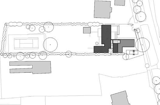
Het Steen, Antwerp, Belgium, designed by noAarchitecten and built in a gradation of D55, D96, D54, D51, D90 and D190 supplied by the brickworks in 17 different mixes. The project has been nominated for the Mies van der Rohe Award 2024. Photo: Kim Zwarts.
>> Merkurhuset, Gothenburg, Sweden, designed by Olsson Lyckefors Arkitektur and built using D91 FF, has been nominated for the Mies van der Rohe Award 2024. Photo: Ulf Celander.
Award for beautifying Copenhagen
On 18 January, Christian A. Petersen and Petersen Tegl received a prestigious award from the Association for the Beautification of the Capital. The organisation, founded in 1885, “promotes aesthetic beautification and the preservation of buildings in Copenhagen.”
The Association explained that: “The beauty is in the detail. Exquisite architecture emerges from a combination of idiom, technique and material. The quality of the final architectural product emerges from its smallest building block. Brick is made of 100% natural materials and lasts for centuries without maintenance. In an age of industrialised construction, it is important to maintain the tradition of building well with brick. It is essential to understand the inherent beauty and tectonic clarity of the brick and how to use it in this day and age. Petersen Tegl knows how. For several years, the brickworks has been collaborating with top architects to beautify Copenhagen and the rest of the world with wonderful, durable bricks.”
CONSULTANTS–PETERSEN TEGL
DENMARK EAST ARNE GOTFREDSEN P: +45 2967 7030 E: AGO@PETERSEN-TEGL.DK
DENMARK WEST AND FUNEN TORBEN SCHMIDT P: +45 2028 4355 E: TSC@PETERSEN-TEGL.DK
EXPORT MANAGER STIG H. SØRENSEN P: +45 4014 1236 E: SHS@PETERSEN-TEGL.DK
NORWAY MUR DIREKTE AS SIMEN BØE P: +47 2339 2010 E: POST@MURDIREKTE.NO
SWEDEN TEGELMÄSTER AB CATHARINA HOLMSTRÖM P: +46 40 542 200 E: INFO@TEGELMASTER.SE
GERMANY SCHLESWIG-HOLSTEIN, HAMBURG JUTTA ENGLER P: +49 171 756 19 43 E: ENGLER@PETERSEN-TEGL.DK
GERMANY EAST, BERLIN, NIEDERSACHSEN, BREMEN ERIC SCHMIDT-BANDUR P: +49 174 3800 667 E: ESB@PETERSEN-TEGL.DK
GERMANY SOUTH/NORTH RHINE-WESTPHALIA SWITZERLAND (GERMAN-SPEAKING REGION) AUSTRIA BACKSTEIN-KONTOR GMBH P: +49 221 888785-0 F: +49 221 888785-10 E: INFO@BACKSTEIN-KONTOR.DE
BENELUX PETERSEN BENELUX NETHERLANDS, BELGIUM, LUXEMBOURG BJÖRN LUCASSEN P: +31 (0) 652362168 E: BLU@PETERSEN-TEGL.DK
NETHERLANDS LINEKE LUCASSEN P: +31 (0) 622529266 E: LLU@PETERSEN-TEGL.DK TOM LUCASSEN P: +31 (0) 646236445 E: TLU@PETERSEN-TEGL.DK
UNITED KINGDOM STIG H. SØRENSEN P: +45 4014 1236 E: SHS@PETERSEN-TEGL.DK
EUROPEAN BUILDING MATERIALS LIMITED P: +44 (0) 203 805 0920 E: ENQUIRIES@EBMSUPPLIES.COM
POLAND CENTRUM KLINKIERU SCHÜTZ P: +48 58 56 37 201 E: BIURO@CENTRUM-KLINKIERU.PL
EASTERN EUROPE (EX POLAND), ITALY INGRID KATHRIN GROKE P: +45 2047 9540 E: IKG@PETERSEN-TEGL.DK
UKRAINE INGRID KATHRIN GROKE P: +45 2047 9540 E: IKG@PETERSEN-TEGL.DK
VISTARK KLINKER T: +380 44 221 47 37 E: VISTARK.KLINKER@GMAIL.COM
AUSTRALIA AND NEW ZEALAND ROBERTSON’S BUILDING PRODUCTS PTY LTD P: +61 3 8199-9599 E: PETER@ROBERTSONS.CO
INDIA AND MIDDLE EAST ATLAS DEVELOPMENTS INDIA P: +91 9818932863 E: ISHANVIR@ATLASDEVELOPMENTS.NL
SOUTH AMERICA INGRID KATHRIN GROKE P: +45 2047 9540 E: IKG@PETERSEN-TEGL.DK
DESIGN AND LINTELS STEEN SPANG HANSEN P: +45 2142 7962 E: SSH@PETERSEN-TEGL.DK
PUBLISHER
PETERSEN TEGL A/S NYBØLNORVEJ 14 DK-6310 BROAGER P: +45 7444 1236 E: INFO@PETERSEN-TEGL.DK WWW.PETERSEN-TEGL.DK
EDITORS IDA PRÆSTEGAARD, M.ARCH E: IPR@PETERSEN-TEGL.DK
ANNETTE PETERSEN, M.ARCH E: AP@PETERSEN-TEGL.DK
LAYOUT ZANGENBERG DESIGN
TRANSLATION
CITADEL TRANSLATIONS
PRINT STRANDBYGAARD
REPRO EHRHORN HUMMERSTON PRINT RUN 115,865

24
Three generations at the award ceremony: Lukas Thomsen, Christian A. Petersen og Annette Petersen.
Architect Anders Brøgger, a member of the board of the Association for the Beautification of the Capital, presented the award to Christian A. Petersen.
