At any given time, there are approximately eight thousand products from global markets being considered for placement in a portfolio of The InSight™ Trend Index. You can imagine that each time our team gathers to create a new topical portfolio, we find ourselves in some spirited debates over final selections. Perhaps that’s one reason why The Pantone ® ColorWatch portfolio has become one of our favorites.
Color preference and passion are somehow inarguable. Like all consumers, each member of the team reacts to color palettes in unique, almost personal ways. So we all win.
But there are other reasons that this portfolio holds a unique place among our trend portfolios. First and foremost because the vision and insight of Leatrice (Lee) Eiseman, executive director of the Pantone Color Institute, never fails to deliver actionable inspiration to the home industry by offering color palettes firmly grounded in the styles and spirits of our times. Second, because the palettes she presents seem to reach beyond product and marketing applications, creating a foundation capable of communicating the essence and spirit of our companies, products and services.
So welcome to a world of color, and the color palettes poised to drive expression and demand in 2024-25.

Tom Mirabile Principal, Springboard Futures and Consumer and Lifestyle Trend Analyst, International Housewares Association (IHA) and HomePage News


The objective of my work with ColorWatch is really to give you the big picture. Trust me, as far as trends are concerned it’s the big picture, the macro, not the micro that matters. To know where trends come from, to understand them, we must explore the broader world. That’s what we as forecasters look at to tell us the direction that color is going to be moving in. Color always has an intrinsic meaning, and that is what we connect to when we do our color forecasts.
When you look at the new PANTONE VIEW Home + Interiors 2025, you’ll see that the subject we’ve chosen is Harmony. It’s a beautiful word that conjures up certain pictures in your mind. Being in tune with ourselves, in tune with others within our immediate surroundings, and in tune with the greater world around us. It also speaks to a sense of balance, a much
Lee Eiseman Executive Director Pantone® Color Institute LeatriceEiseman.com
sought after sense of equilibrium. As forecasters, it’s vital that we look into the meanings that are behind each color, so that when we put the palettes together we really embrace what the consumer is looking for. We dig into the emotional aspects of color and bring that into our thinking process as well.
When it comes to design, much of the harmony that is created is certainly because of the educated and creative use of color.
Today, there is an urgent need to preserve the resources, the life and the beauty that surrounds us. We know that we want to join hands internationally, both professionally and personally, so that we can be thoughtful, congruent and compatible with the earth that we inhabit.

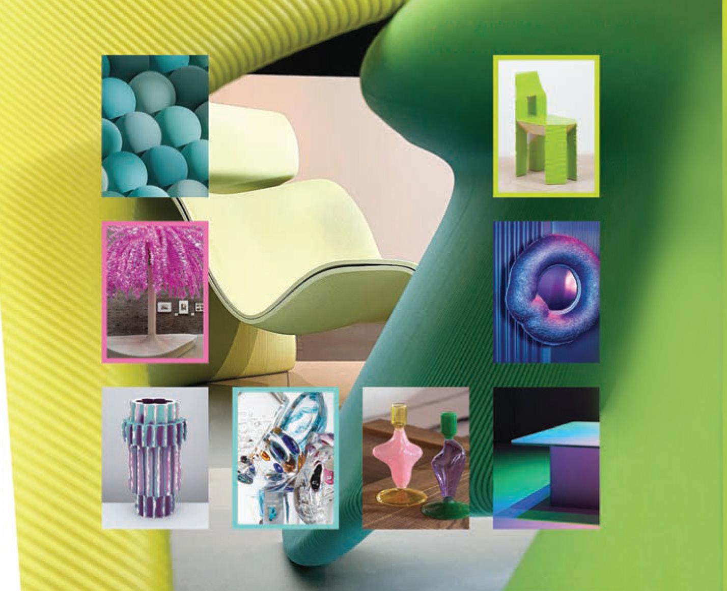
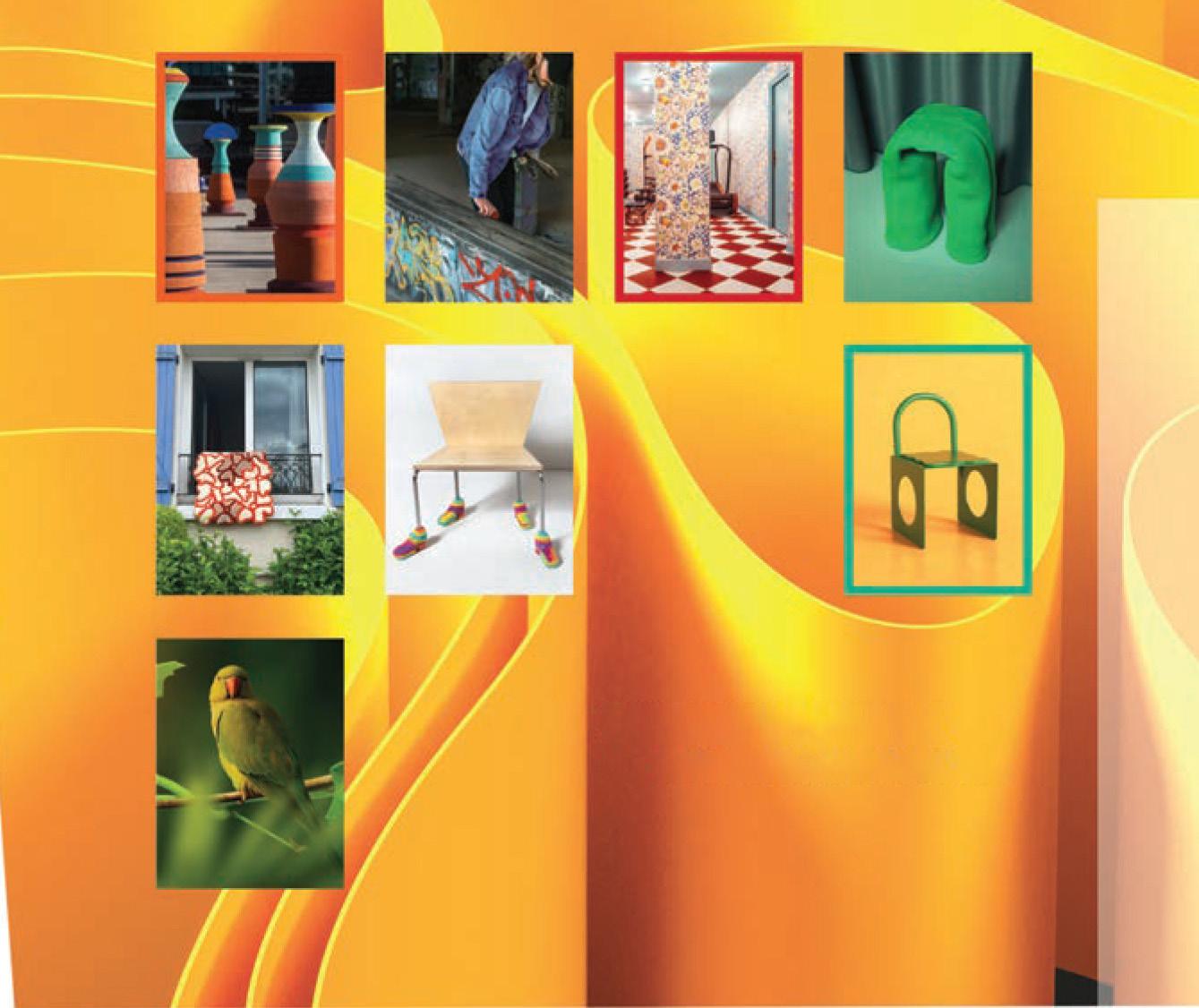
The seven color palettes featured in this portfolio come from the PANTONE VIEW Home + Interiors 2025 trend book. Each palette has a musical name, reflecting the common association between harmony and music.
Just as people have different tastes in music, they also have different preferences in color, so we ensure there is a palette for everyone.
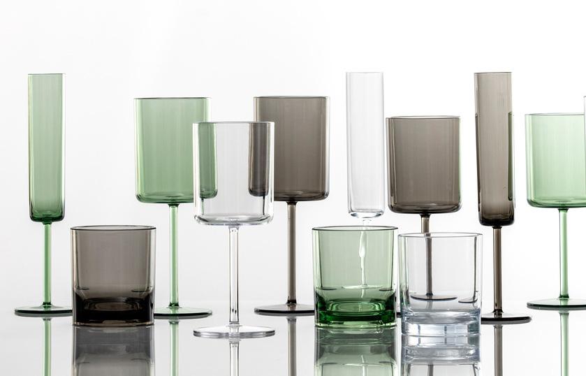
These color palettes range from bold and bright to sophisticated mid-tones, and even include cold and crisp hues.


According to Lee Eiseman
When considering color, it’s essential to embrace and inspire both your current customers and those you aim to attract. Regardless of the product segment, it is the color mixes and harmonies that invariably catch the consumer’s eye and spark trend buzz.
Enjoy exploring the harmonious blends of the seven color palettes in this portfolio.
The color palette descriptions in this portfolio are from Lee Eiseman’s Keynote session, “A New Harmony: Pantone Home & Interiors Color Forecast,” presented at The Inspired Home Show® 2024.


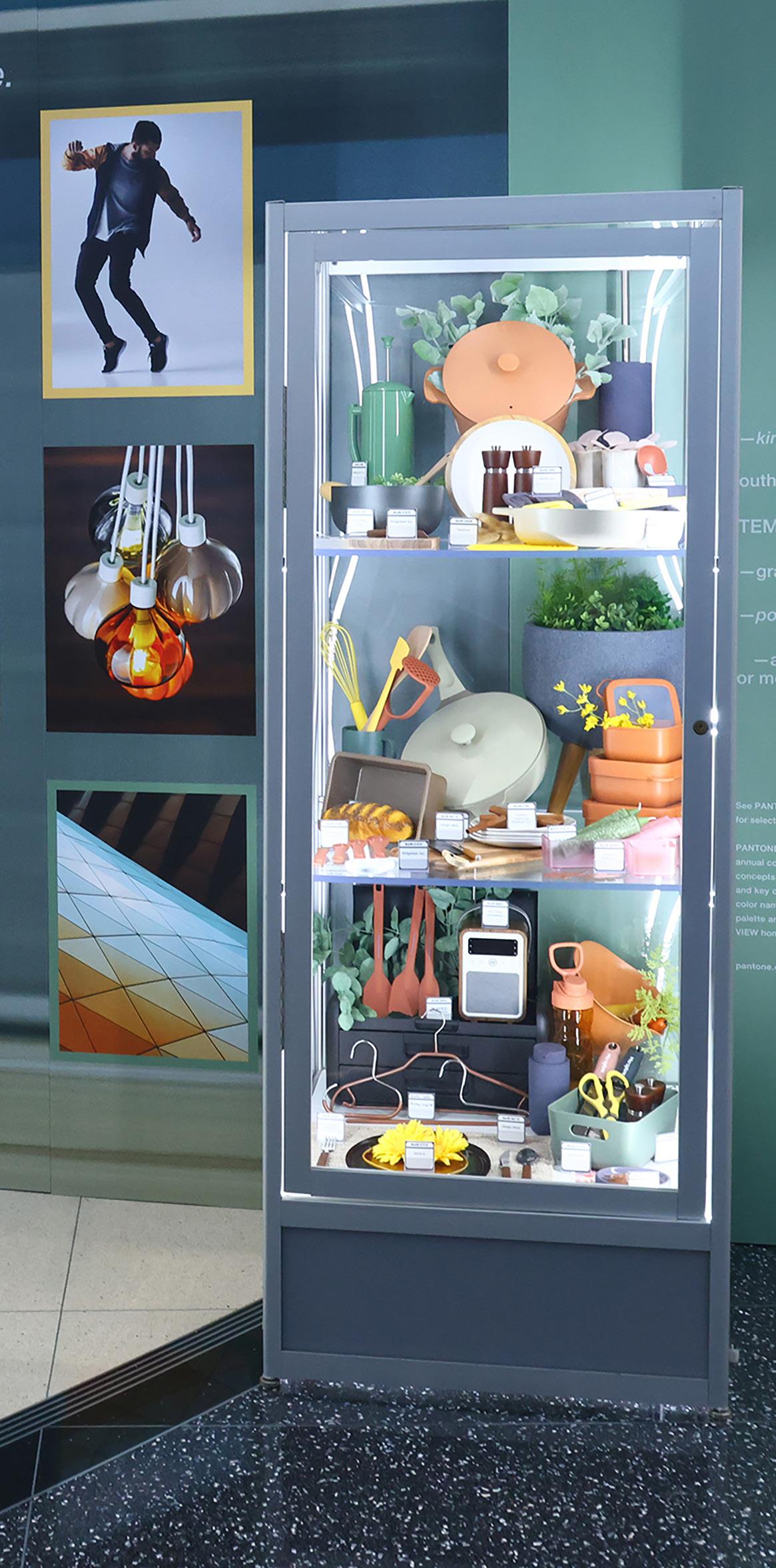
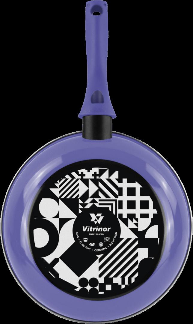
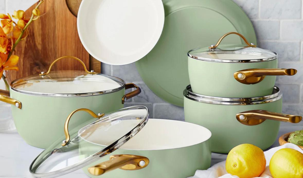
The product images in this portfolio were selected by Pantone for the ColorWatch display at The Inspired Home Show 2024.
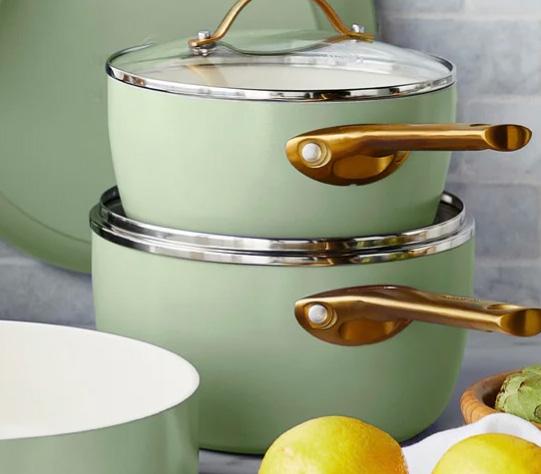
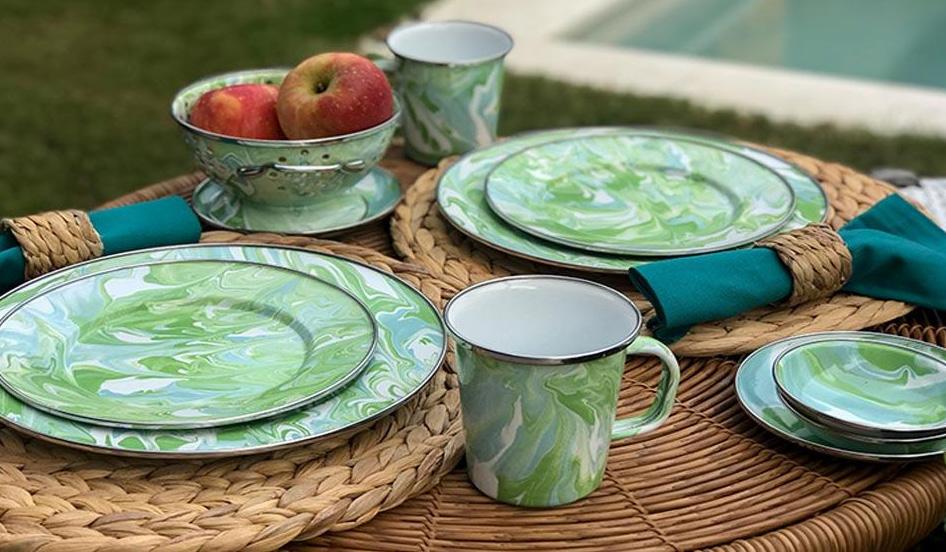
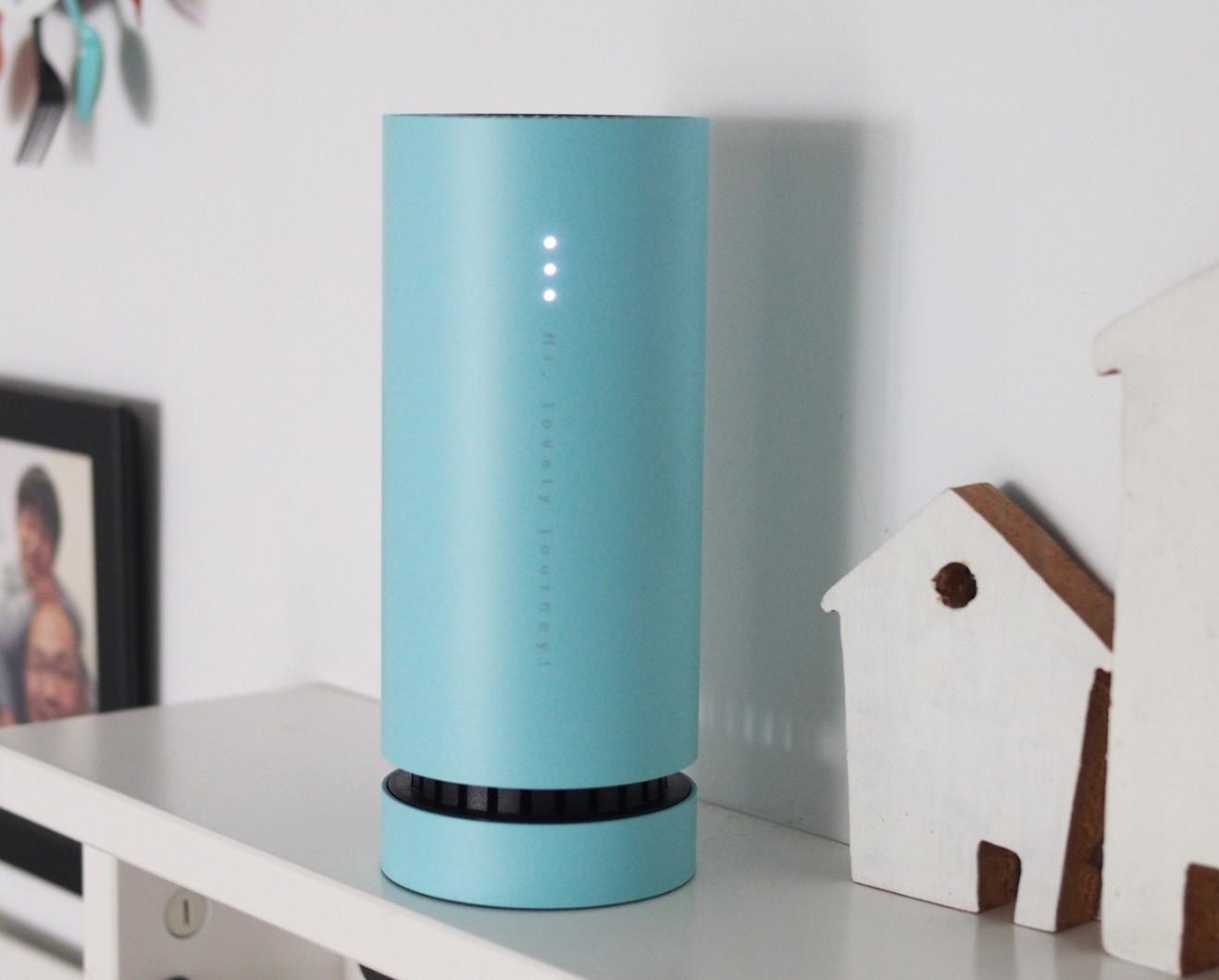
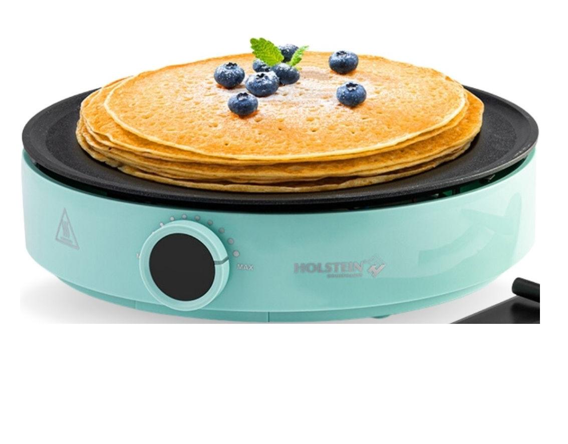
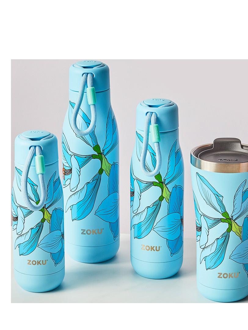
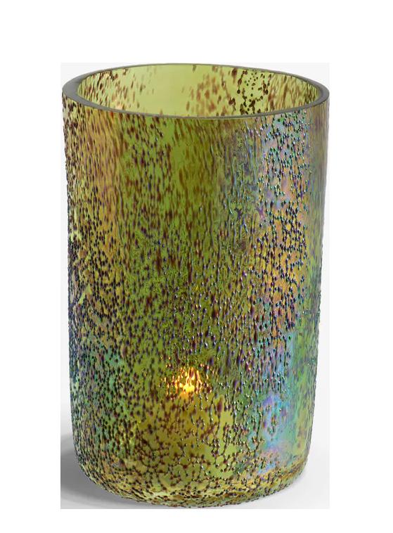
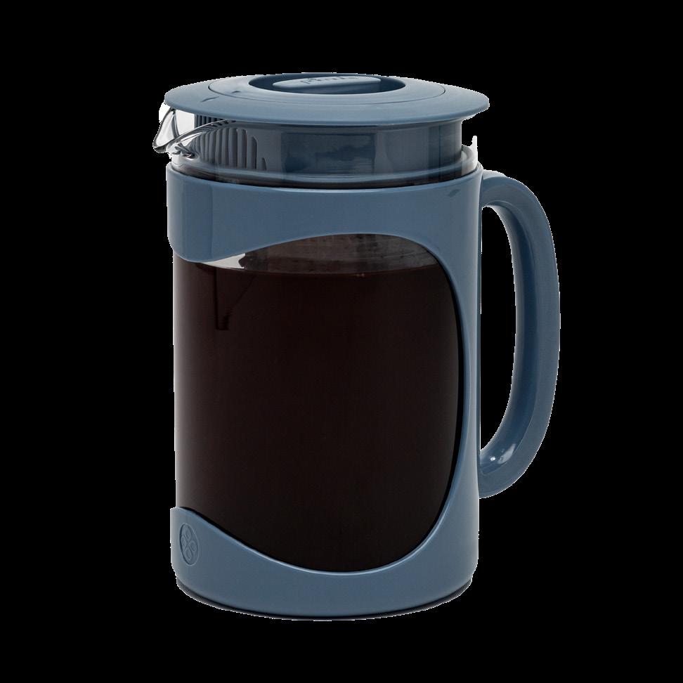
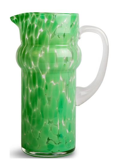
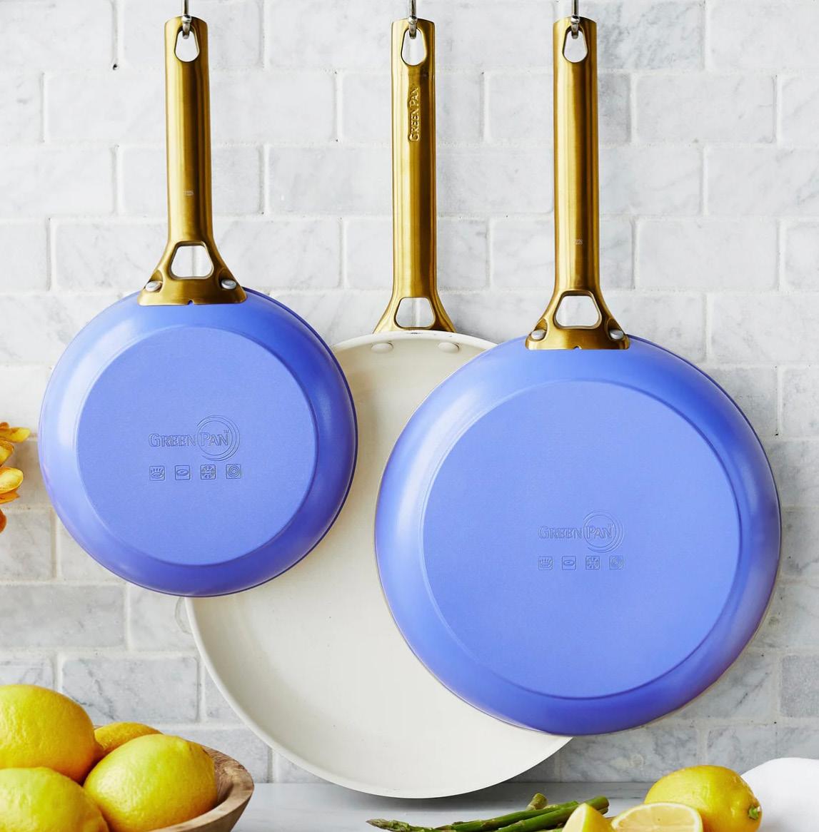
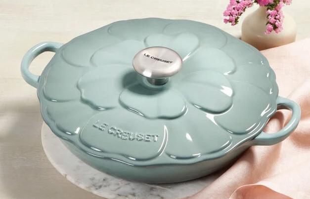
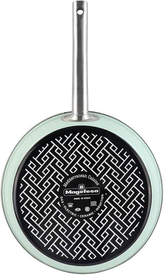
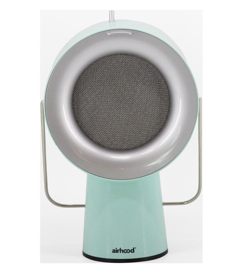
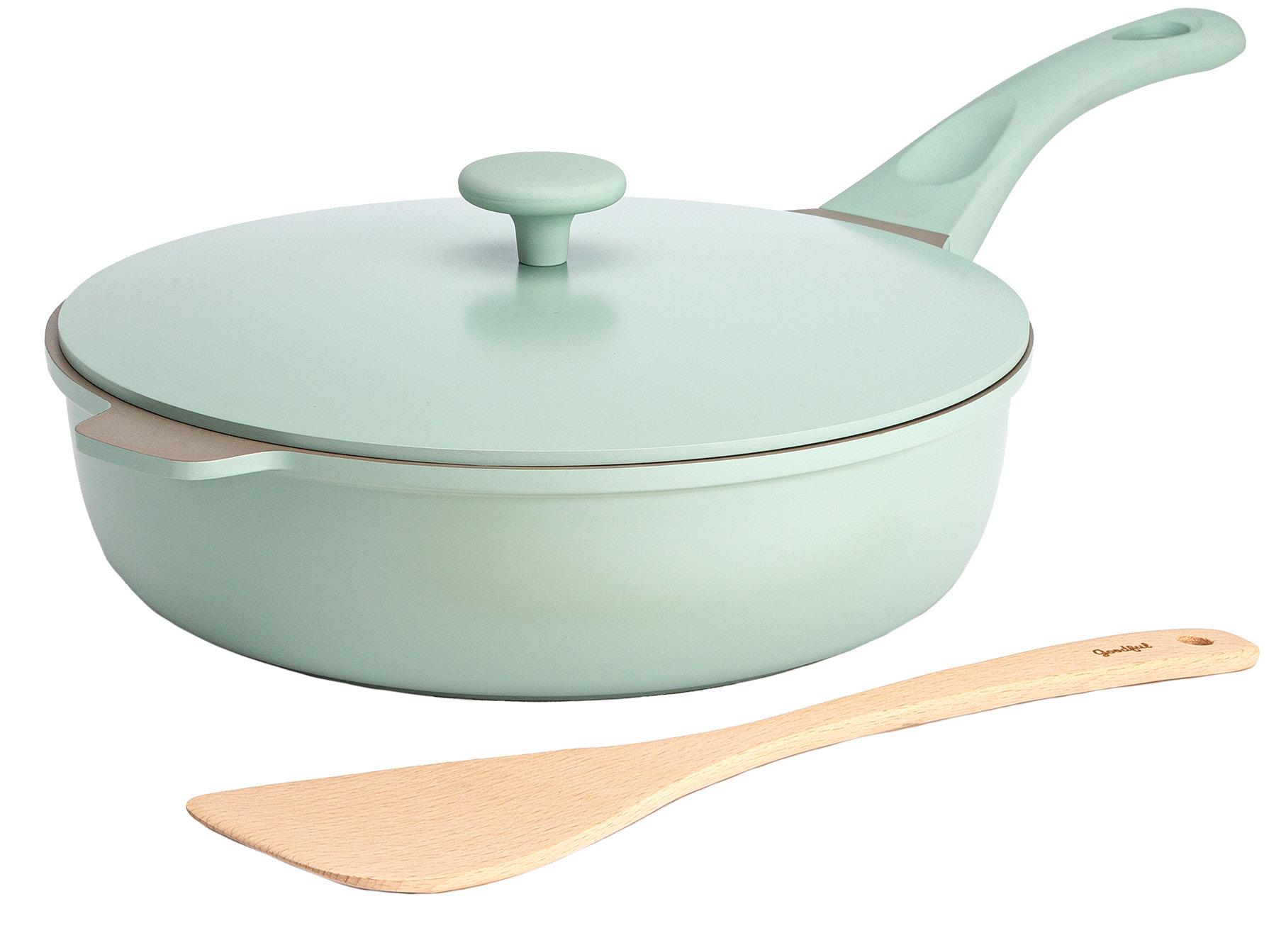
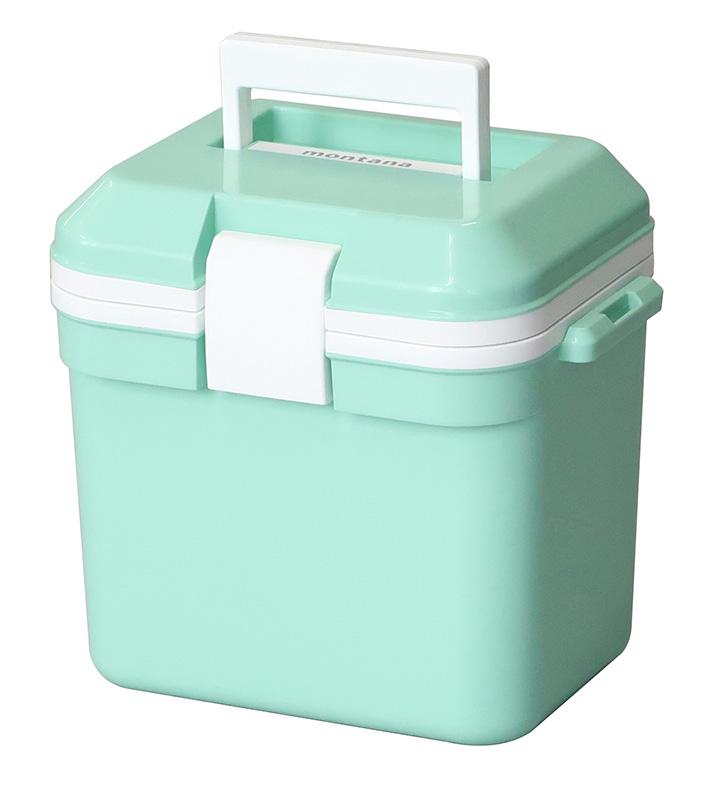
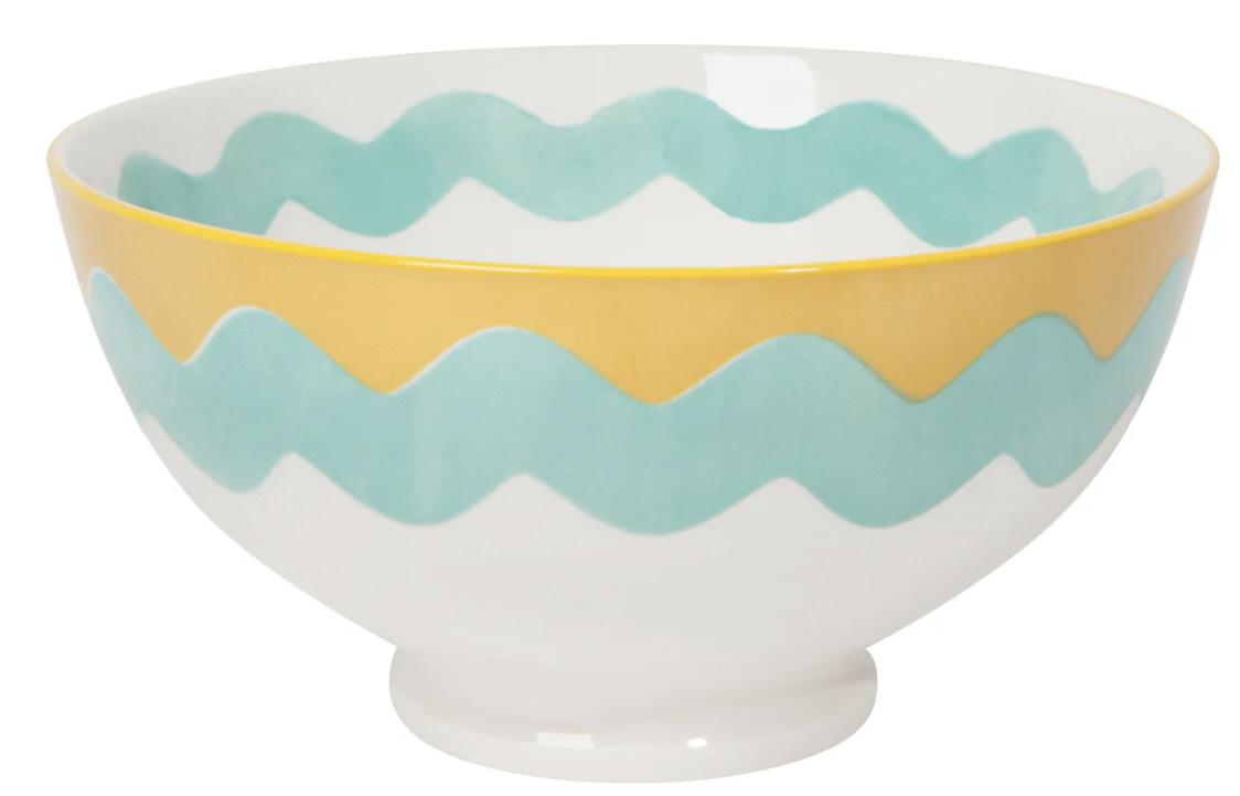
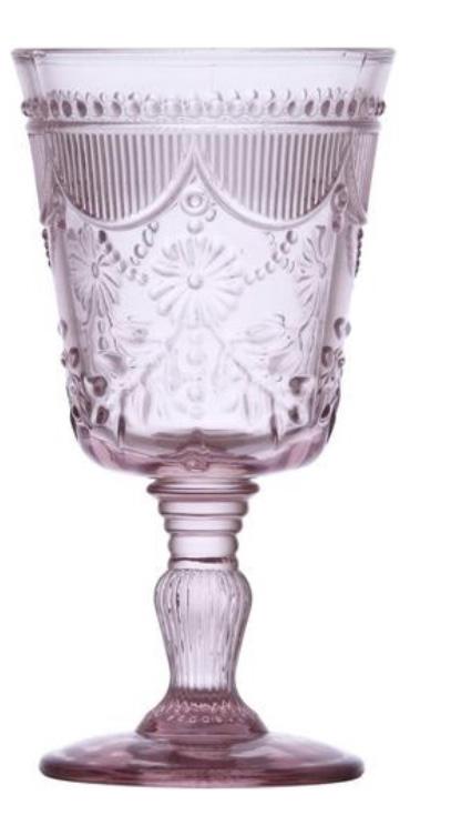
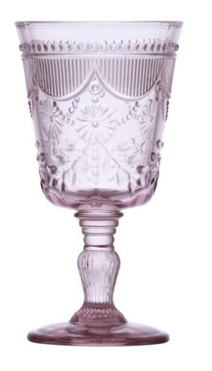
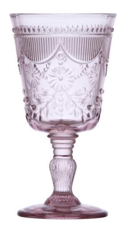
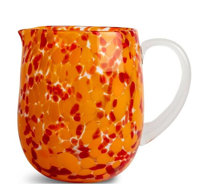
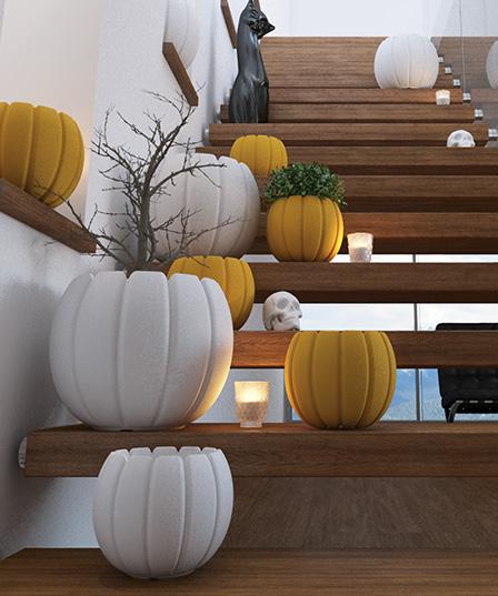
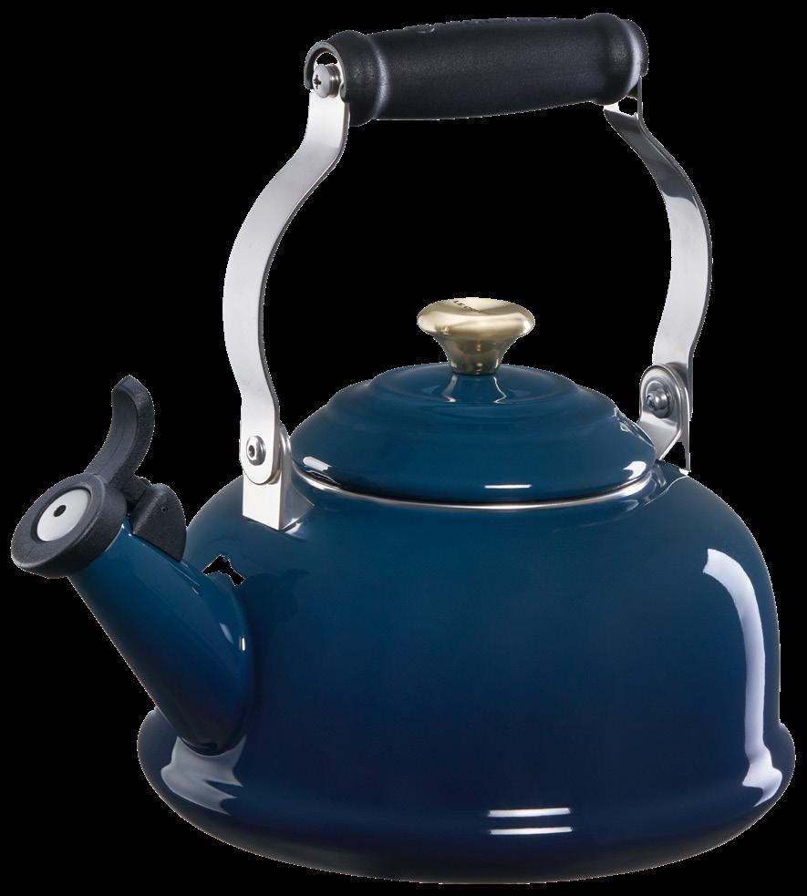
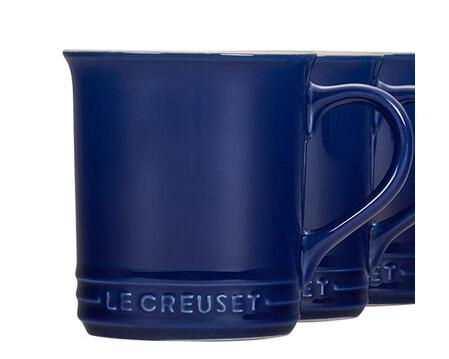
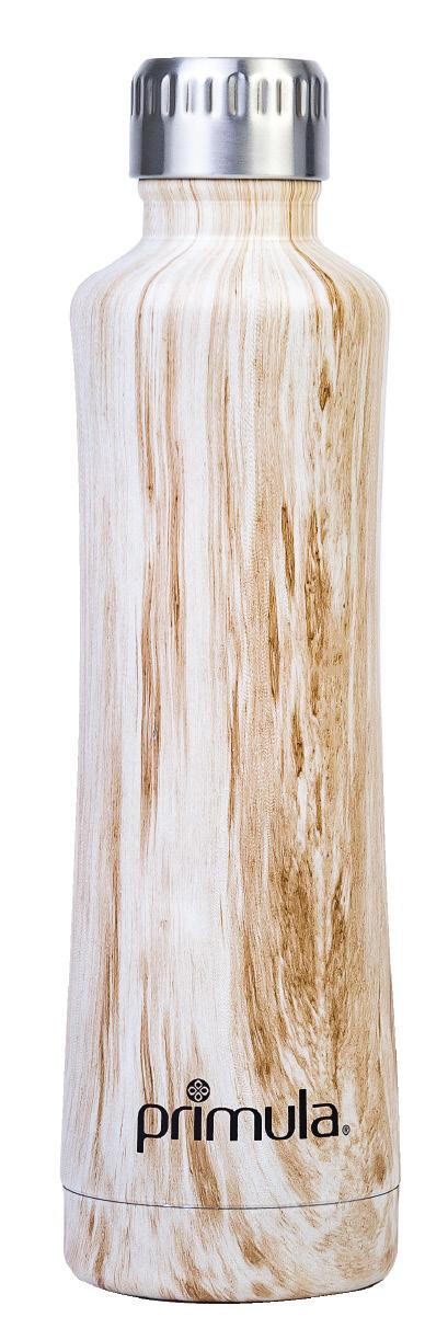
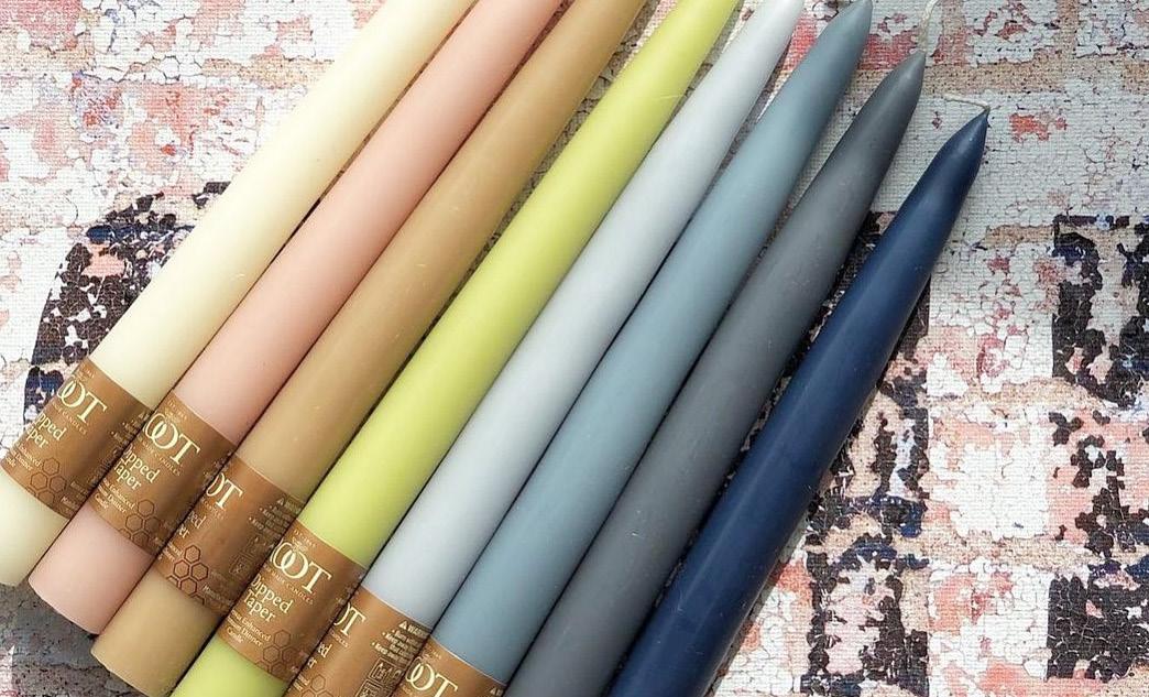
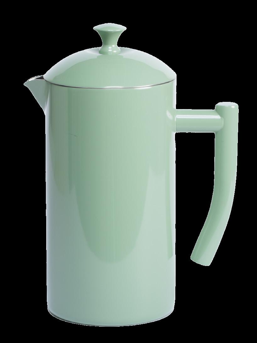
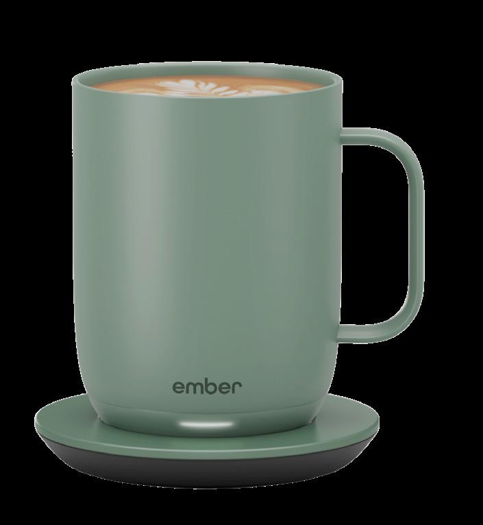
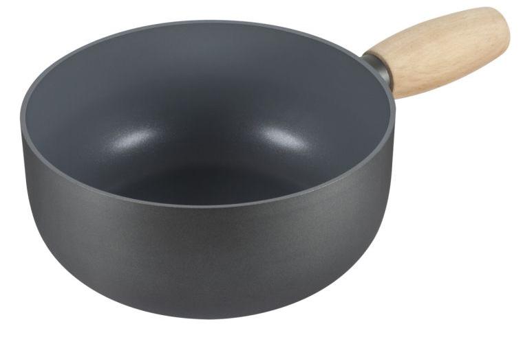
This palette is filled with cool naturals, icy tones and are gently stimulating like a breath of fresh air. The blue-greens are always a consumer favorite. Our challenge as forecasters and trend reporters is to bring some newness into the picture again, and in this particular case add some cool naturals to the mix. There are the blues and blue-greens in softer shades, but there is also some contrast going on here, which when you have soft colors, you often need that punch of contrast to go along with it.


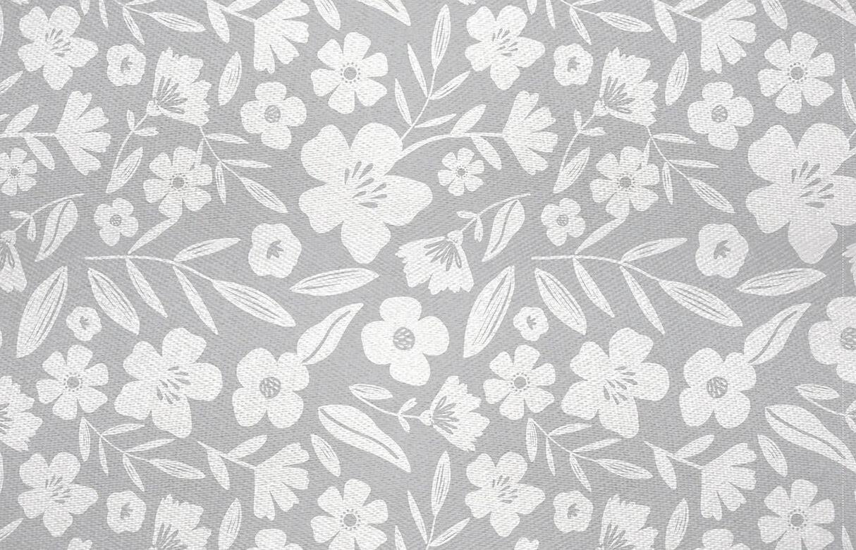

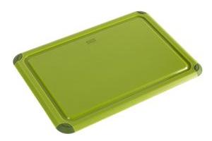
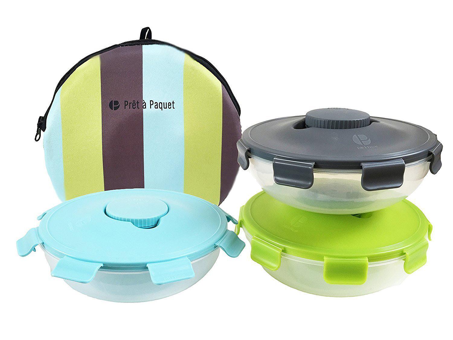
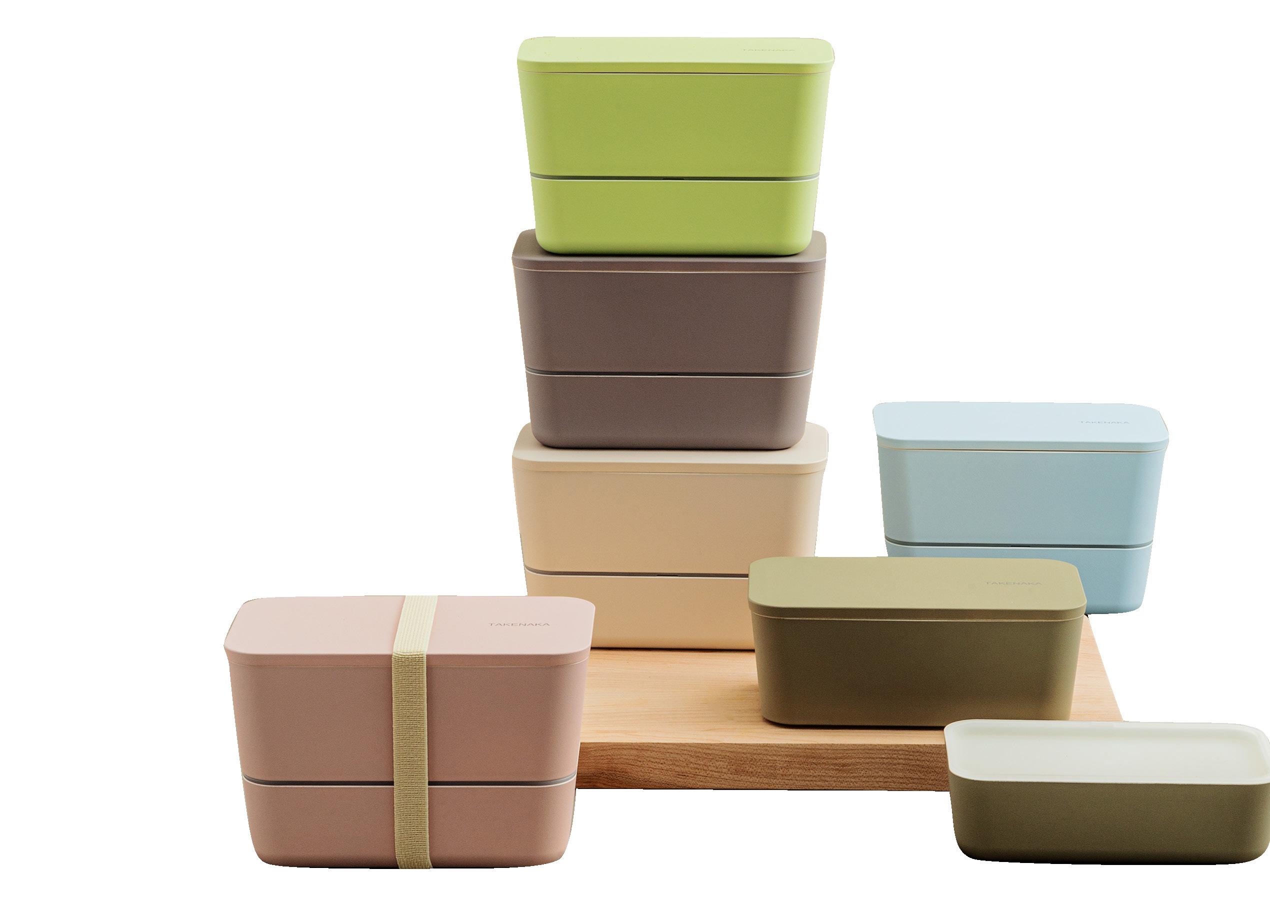
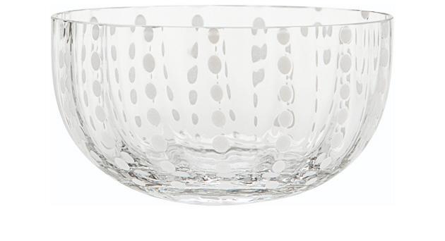
TEXXTURE
TEXXTURE
TEXXTURE


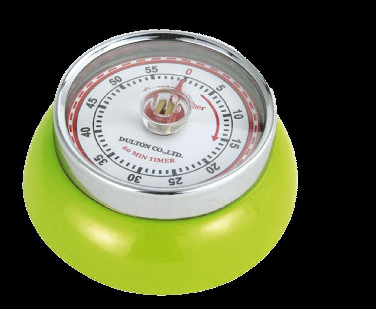
THREE BY THREE
Why has color become so important to the buying decisions we make in home and housewares products?

Keith
Recker
Author: Deep Color: The Shades That Shape Our Souls Editor in Chief, TABLE Magazine
Because it’s personal! Energized by time-tested tropes and in-the-moment trends, color delivers an incredible range of feelings to the customer. Sultry reds. Sassy hot pinks. Sporty, energetic neon greens. Noble, reassuring dark blues and light-hearted, optimistic powder blues. Radiantly happy yellows. Every shade tells a story, and customers gravitate towards narratives that satisfy their unique needs. Whether looking to invigorate, to impress, to enjoy some nostalgia, or to focus and recover from today’s frenetic pace, color opens emotional portals in each of us. It always has.
What should be the most important considerations when brands are selecting color palettes for their products and marketing?
The most important consideration when brands are selecting color palettes for products and marketing is quite simply to understand their consumer. What can be challenging is the consumers’ ever-changing and evolving tastes, needs and wants. CMF forecasting requires awareness of what is happening in the world that impacts their mindset, and applying that knowledge to design in a holistic way. Appeal to the senses with color or combinations of color and with the material, all while also reaching that consumer’s heart via marketing.

Peggy Van Allen President & Founder, Colorfuel President, Color Marketing Group
Like its name conveys, Crescendo includes colors that seem to make noise. This palette features vibrant tones that seem to build toward a joyful journey. Crescendo carries a sense of playful modernity and pop opulence. Just about every color family is represented, but a little


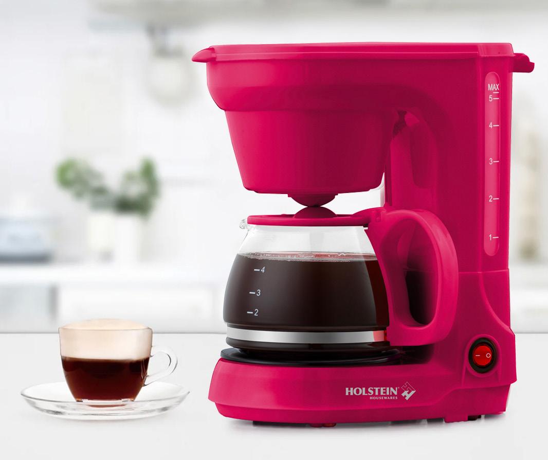
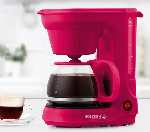
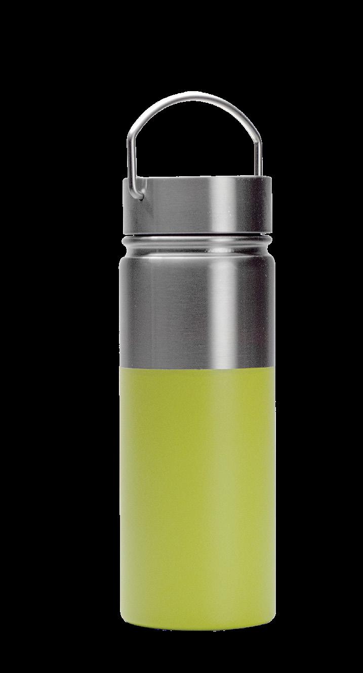
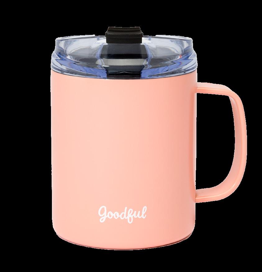
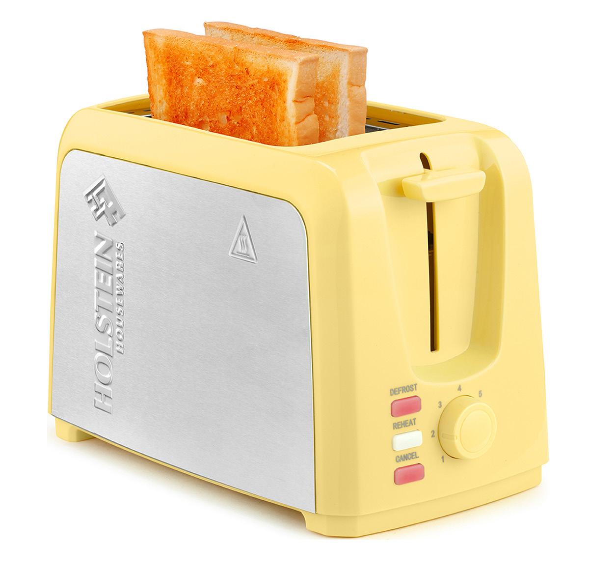
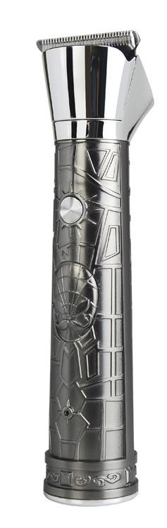
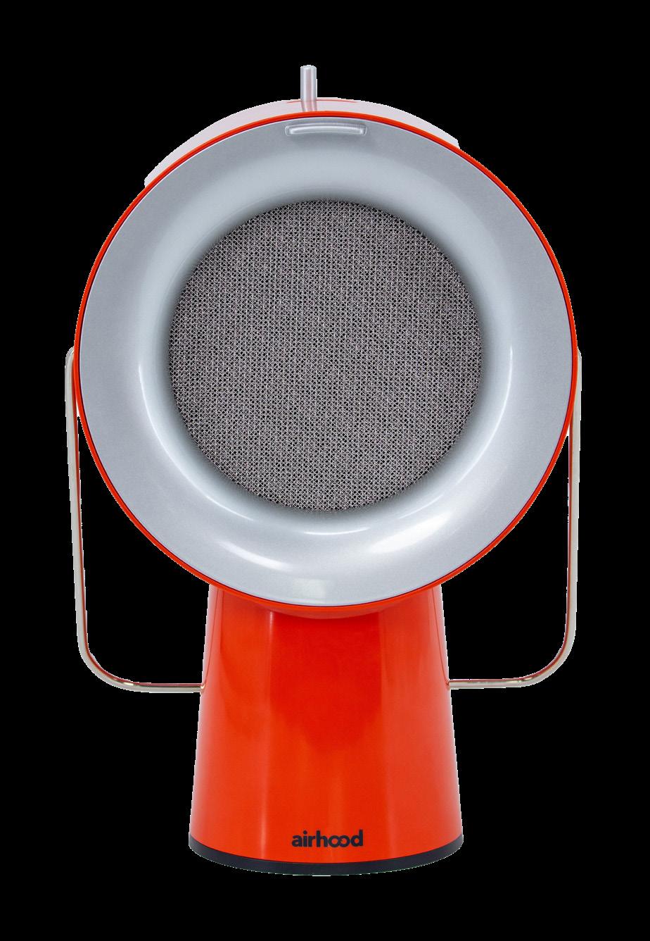
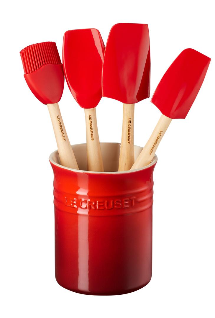
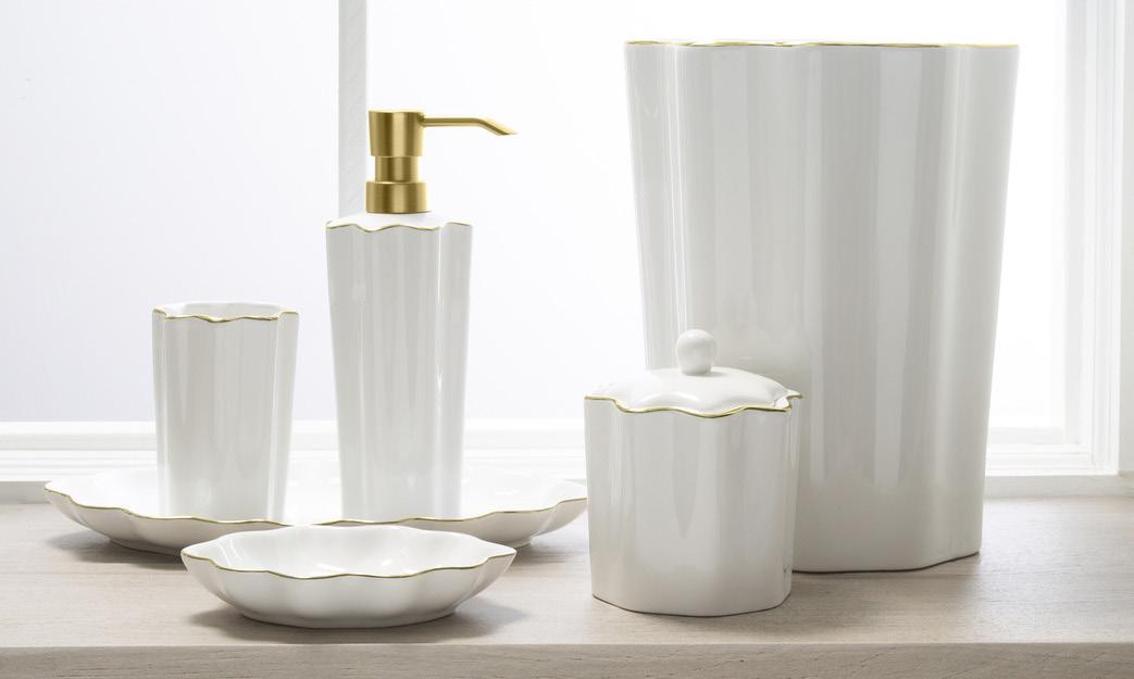
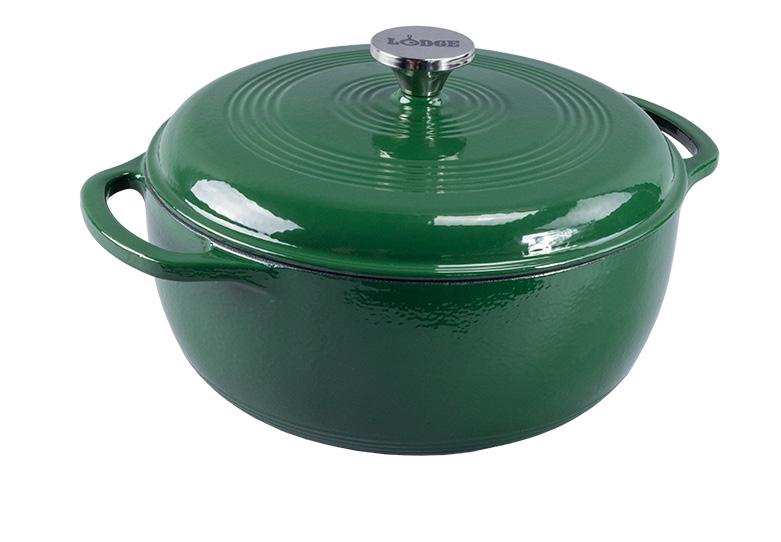
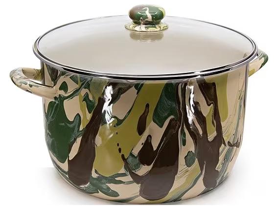
HOLSTEIN HOUSEWARES
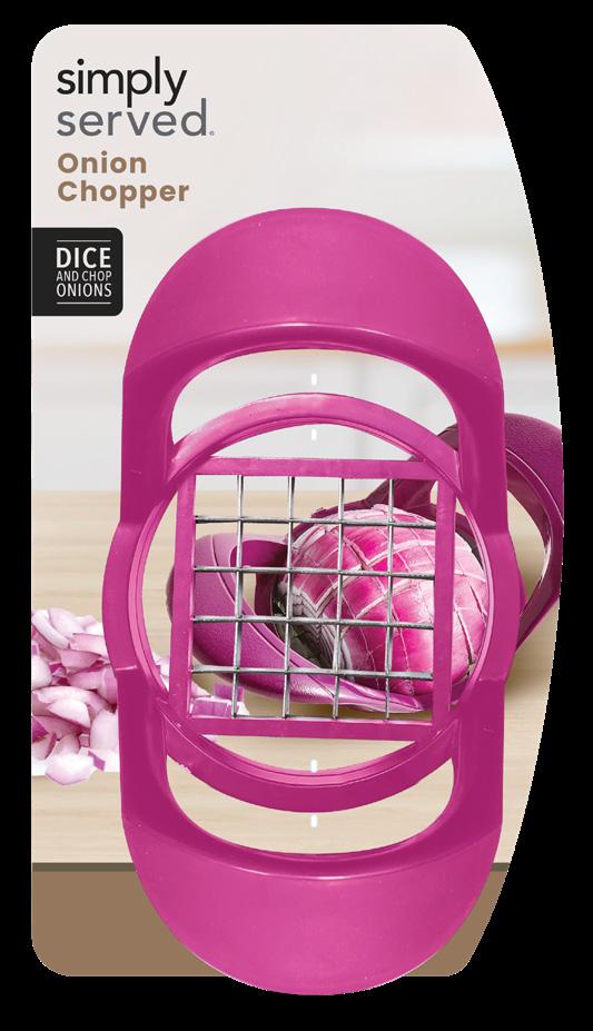
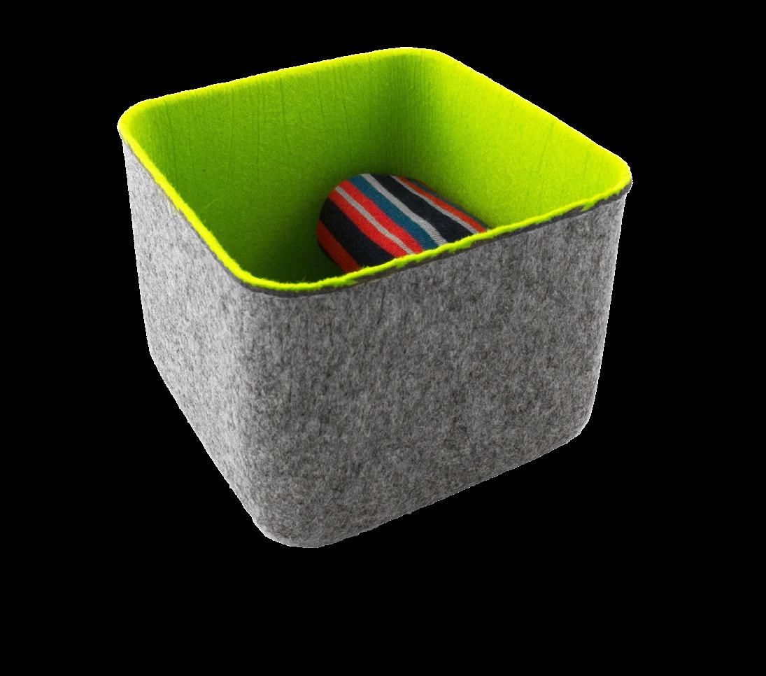
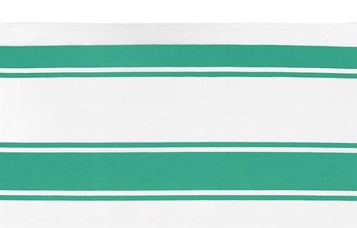
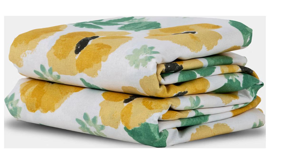
SIMPLY SERVED
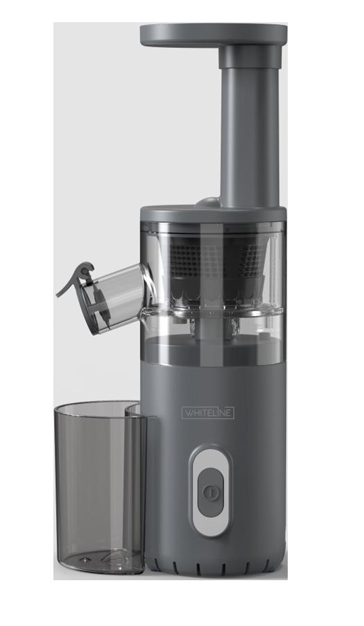
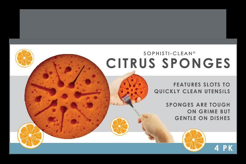
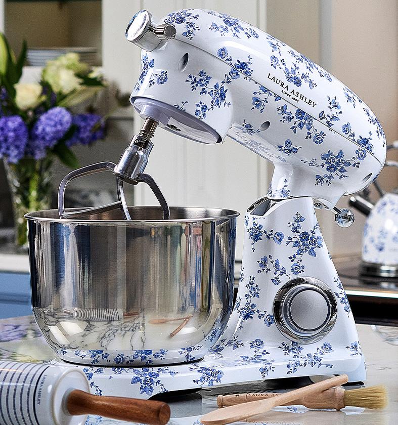
BOSTON WAREHOUSE


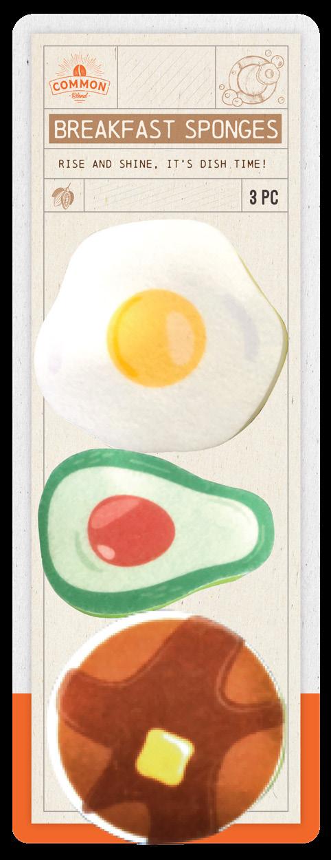
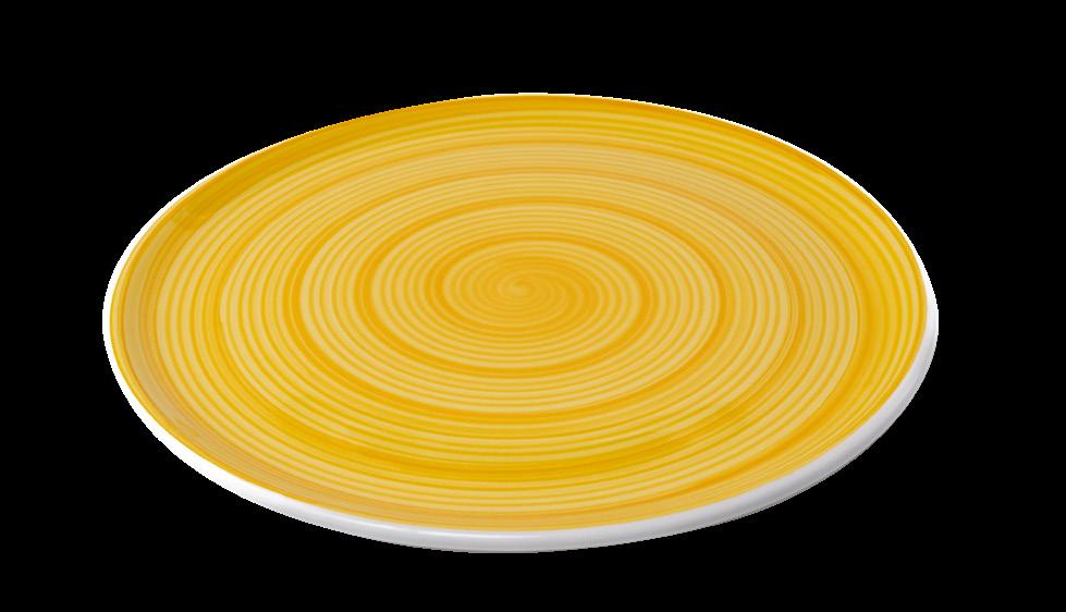
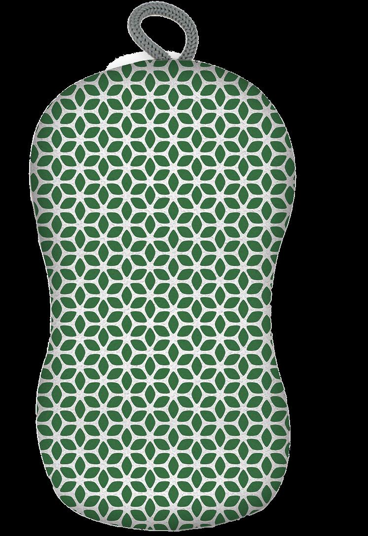
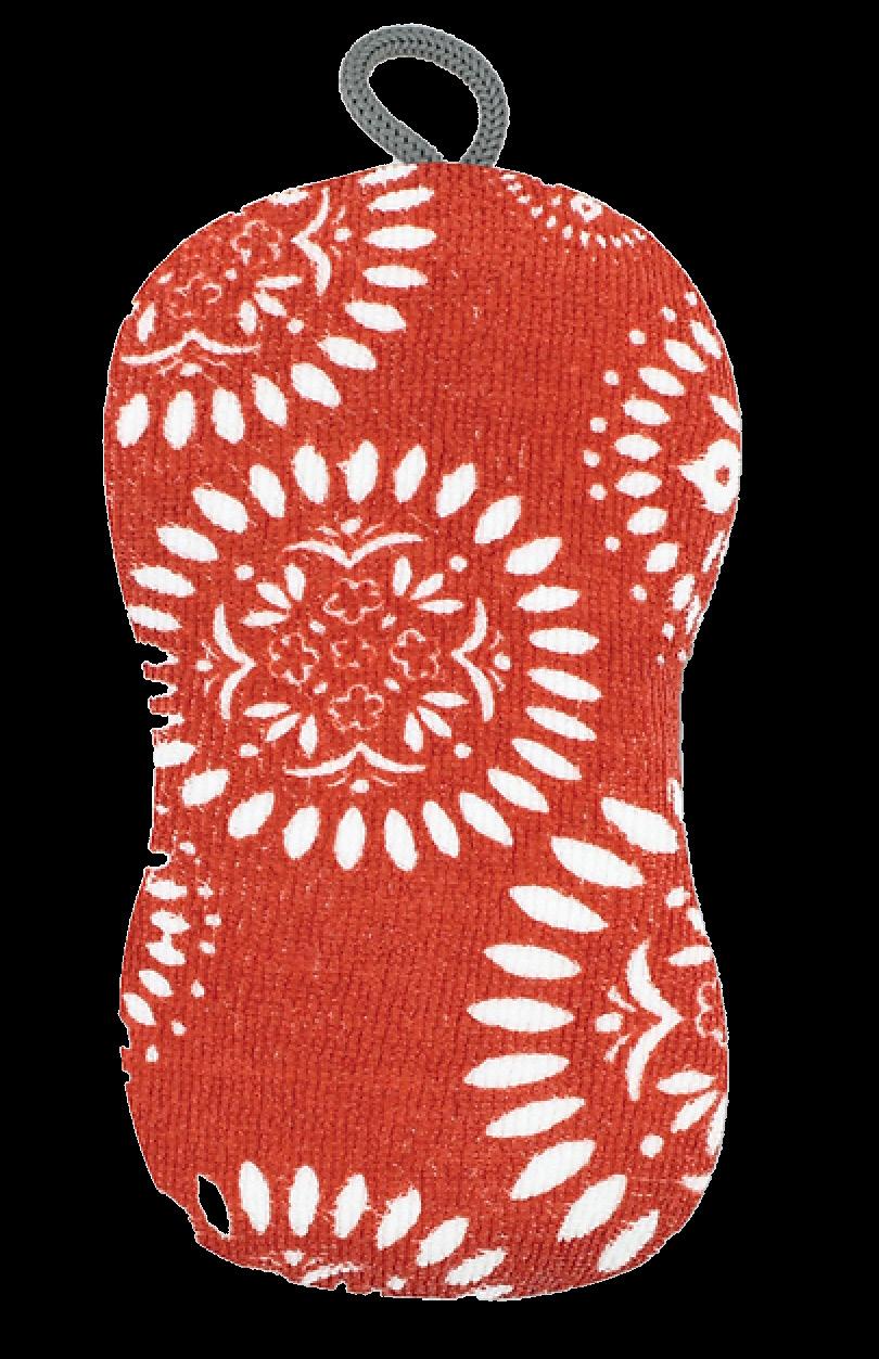
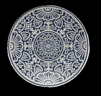
EVRIHOLDER

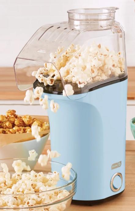
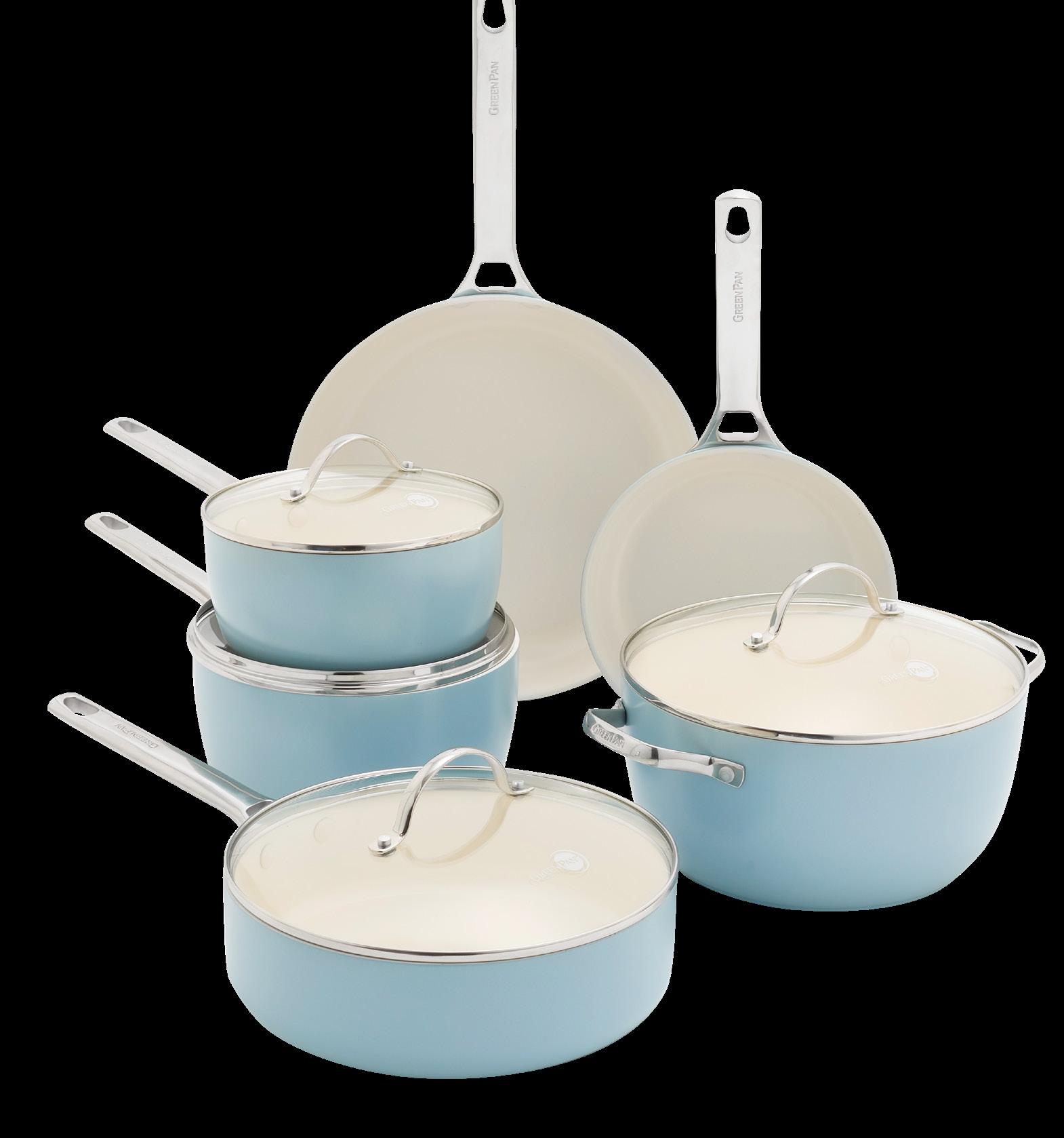
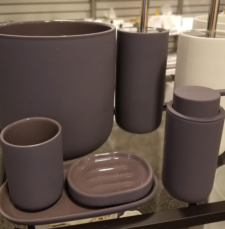
This Easy Listening palette is all about serenity. It says “Let’s relax. Let’s unwind.” The style is very carefree. It’s very lighthearted with its soft shades and gentle tints. It features a variety of soft and light-hearted pastels with a gentle fizz. It’s important to remember that if the shades get too soft without something to excite them again, the eye will gloss over it. Now, maybe it’s with the texture or some other treatment. When you’re presenting product, or you’re creating product, ask yourself what can we do that has a little bit of drama attached to it that makes the eye linger a little bit longer.


How has design education evolved to embrace the role of color in product development and design?

Shannon Maher Dean, Baker School of Business and Technology Fashion Institute of Technology
On the whole, higher education for creative industries understands the immense impact of color on product development, design and marketing. In the home industry, this evolving knowledge is applied to harmonize products with aspirations, personal styles and of course enhance living spaces. We focus on color’s psychological and cultural significance, equipping professionals with skills to innovate and respond to evolving market demands and consumer realities.
Social media has become the ultimate color trend mood board. The colors that capture attention and ignite “likes” and shares get amplified across feeds. This exposure can take a hue that was a niche favorite and make it mainstream. User-generated content showcasing trending colors in homes adds social proof. Seeing these “real life” examples fuels the trend, shaping our perception of color and evoking emotions tied to those hues.

Joe Derochowski VP, Home Industry Advisor, Circana

Adrian Bredeson Co-Owner, E-Power Marketing
Product choices will always engage both physical and emotional aspects: the needs the product meets as well as our emotional response to it. Color is critical in this latter part. We want products to create optimistic feelings, and help us craft positive experiences. Nothing has the ability to do that like color, which makes it a powerful purchase influencer.
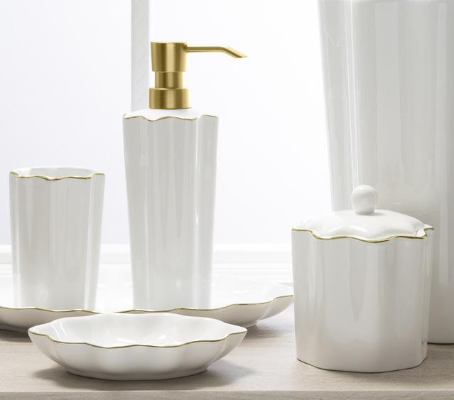
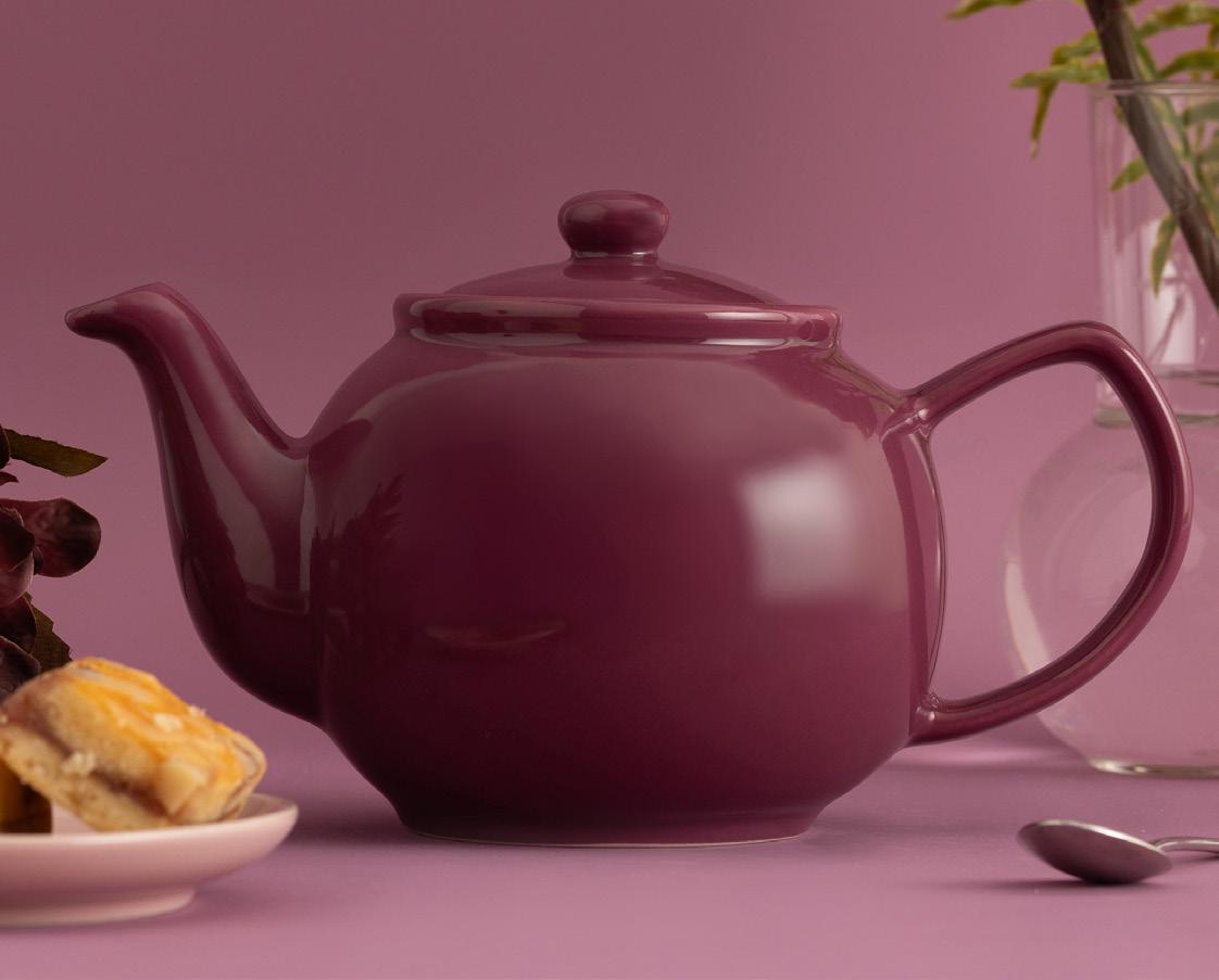
Perfect Pitch carries a certain sense of the Gothic. It’s smoky, it’s highbrow, and its colors seem to have a bit of a powdery finish. It feels cinematic and mysterious, while conveying a feeling of sophistication and luxury. It’s romantically dark, rich, refined and dramatic. All of these would apply, and you can see that these colors are reduced a bit. They are not in their boldest application, but somewhat reduced even in the off-white neutrals.


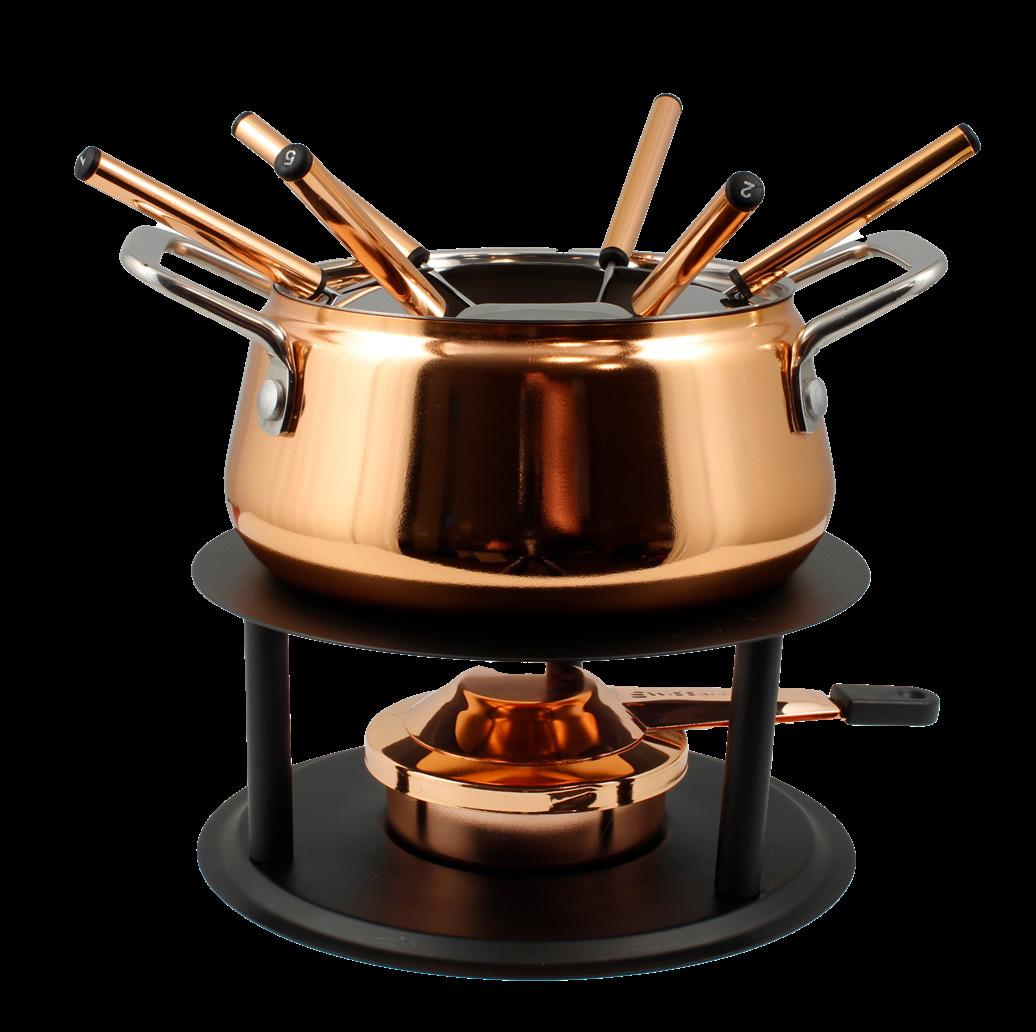


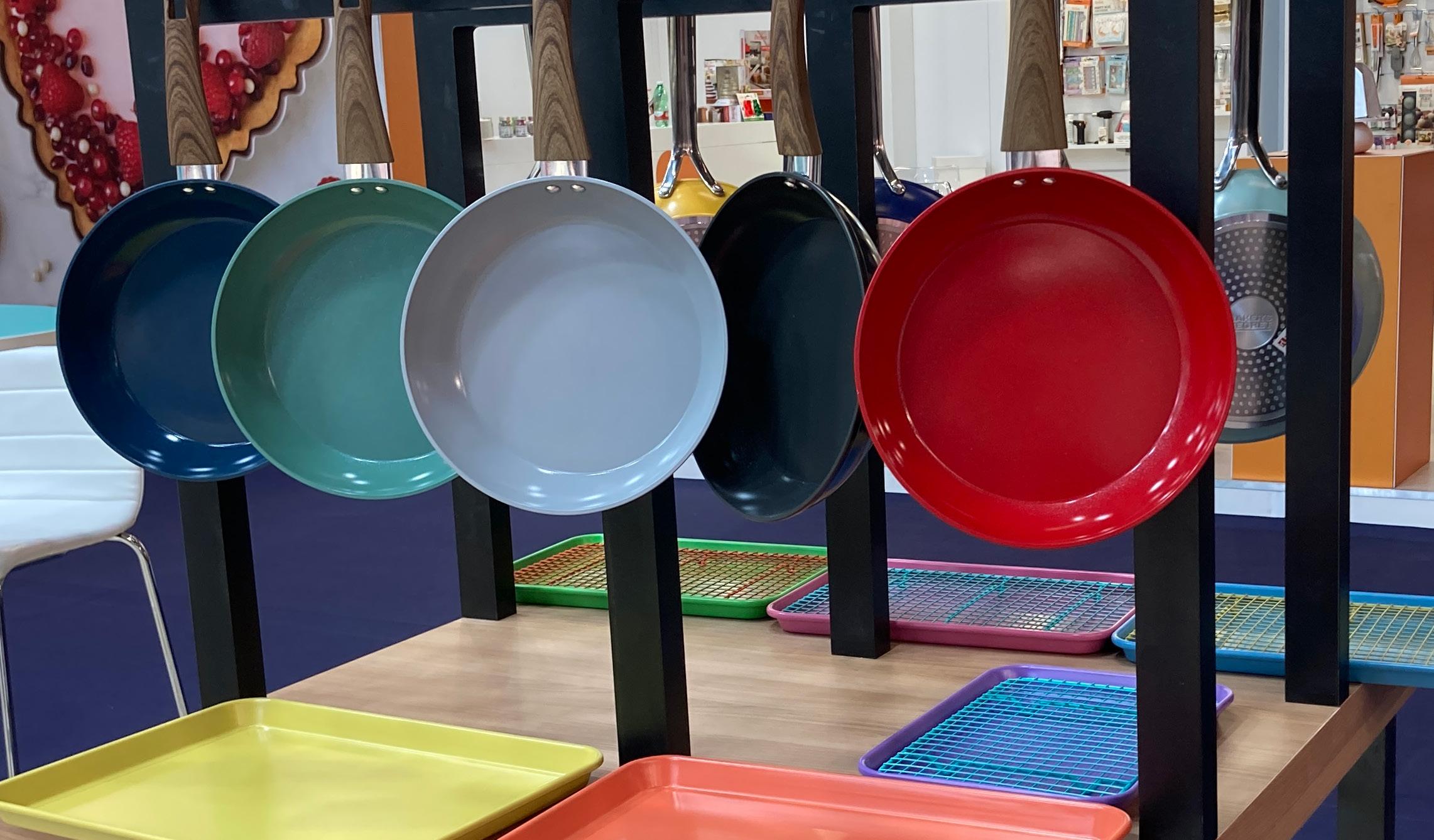
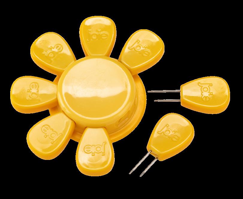
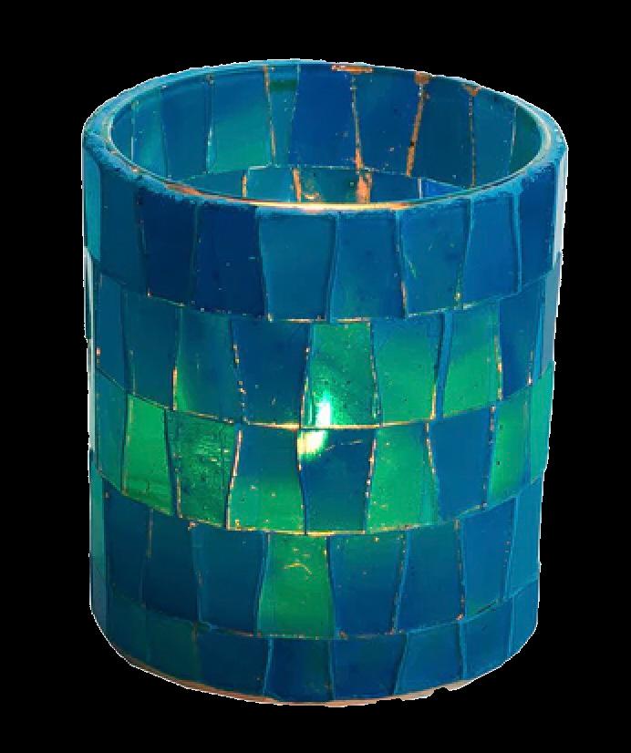
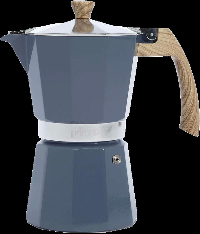
FISSLER


Staccato is sweet and sour, and bright and bold. It evokes feelings of design as play, and inspires alternative thinking, imagination and color blocking. It’s a different kind of mix than we’ve used before, something that will stop the consumer, help them see colors differently and think “Oh, I haven’t thought about that particular shade of red and terracotta. That’s not something I would have put together, but I like the way it looks.” It helps them integrate products and colors they may already have – that’s important in today’s economy.


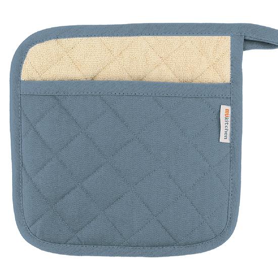
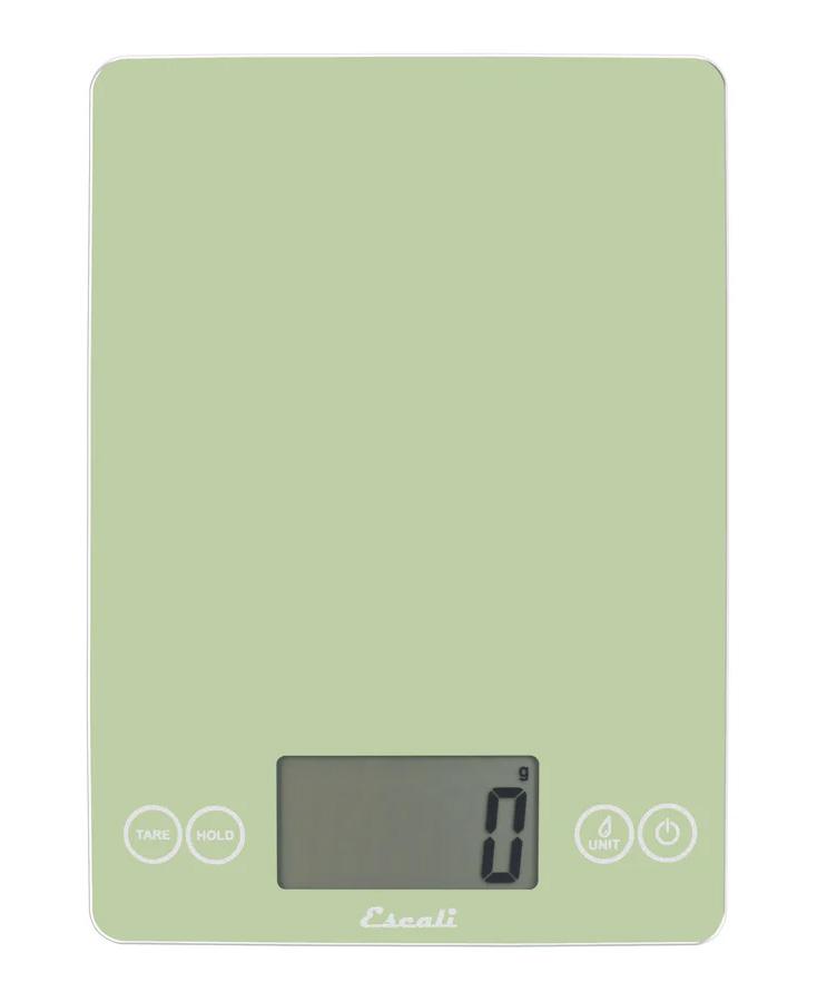
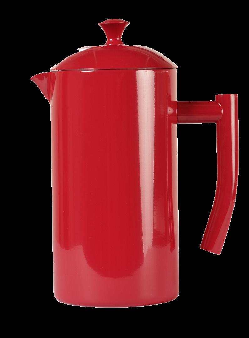
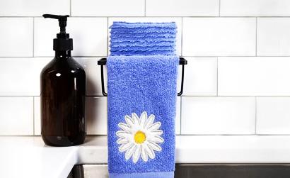
MÜKITCHEN


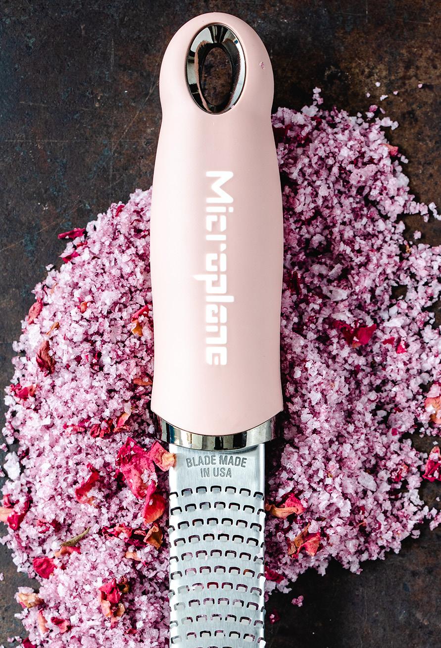
TEXXTURE


What makes color such an important part of our purchasing and decorating decisions?

Color’s varied impacts give it an out sized influence on purchasing and decorating decisions. From an emotional perspective, color triggers perceptions of a product or environment (think green for nature, warm hues for cozy). From a practical perspective, color affects how roomy a space feels and how energy efficiently it operates. From a trend perspective, color conveys a message about contemporary preferences and awareness of the world at large.

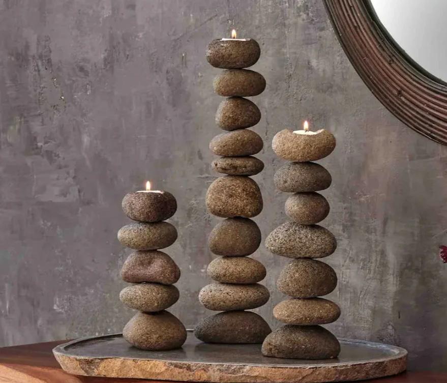
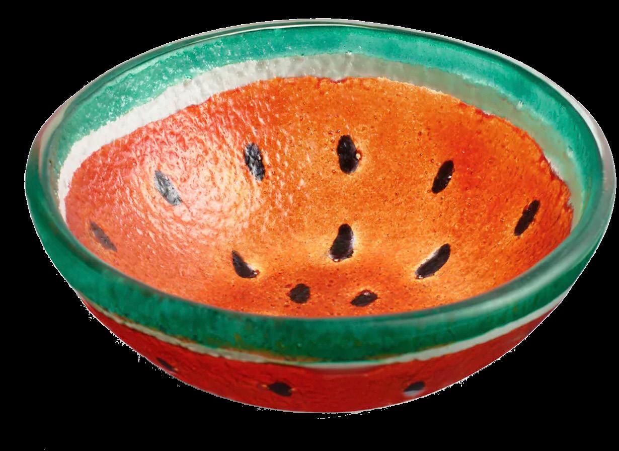
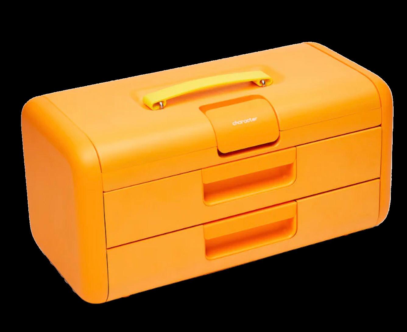
The Stage Presence palette is jazzy and smooth, retro, with ‘70s-inspired styling. It features tan with a little orange in it. It also includes denim blues, which we’re seeing in a Western vibe that’s not going away. The palette is perfect for bold patterning. It’s earthy and eclectic at the same time thoroughly inspired by nature. You’ve got real stage presence in these strong colors.


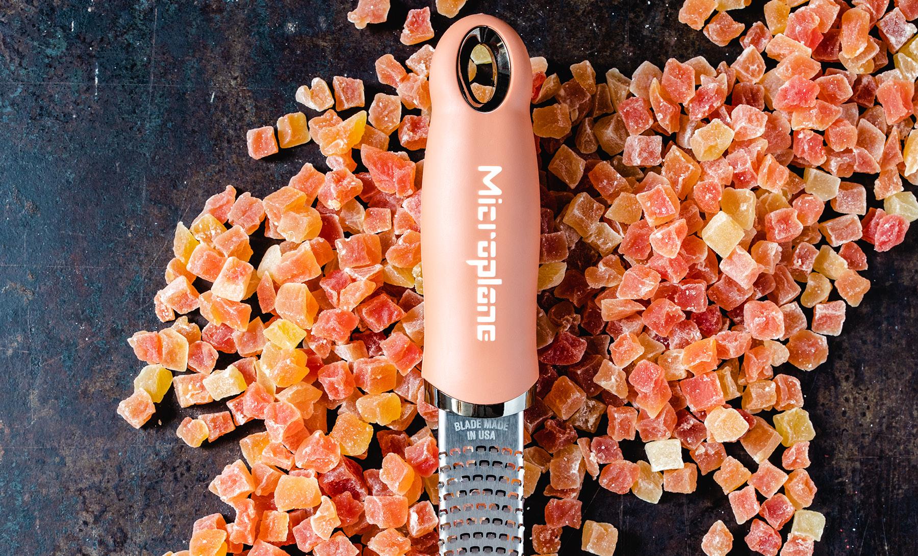
Tempo Timing is all about athleticism. It’s graceful, but at the same time has a kinetic energy. There are darker tones in here, but we also lighten it up a little bit with some contrast in a peachy tone, in a very light yellow tone and off-white. So we’ve got good balance in this very polished and crafted look.


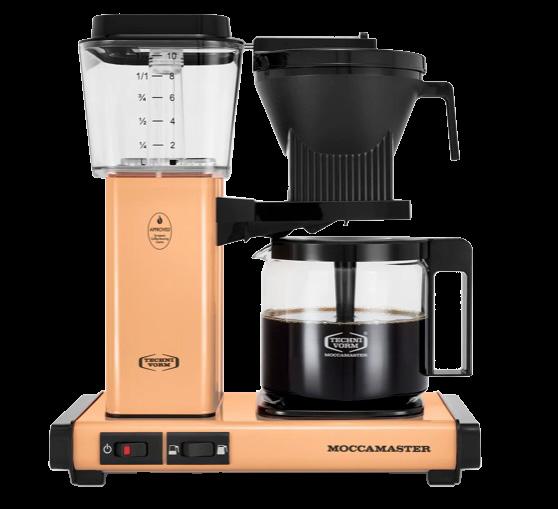
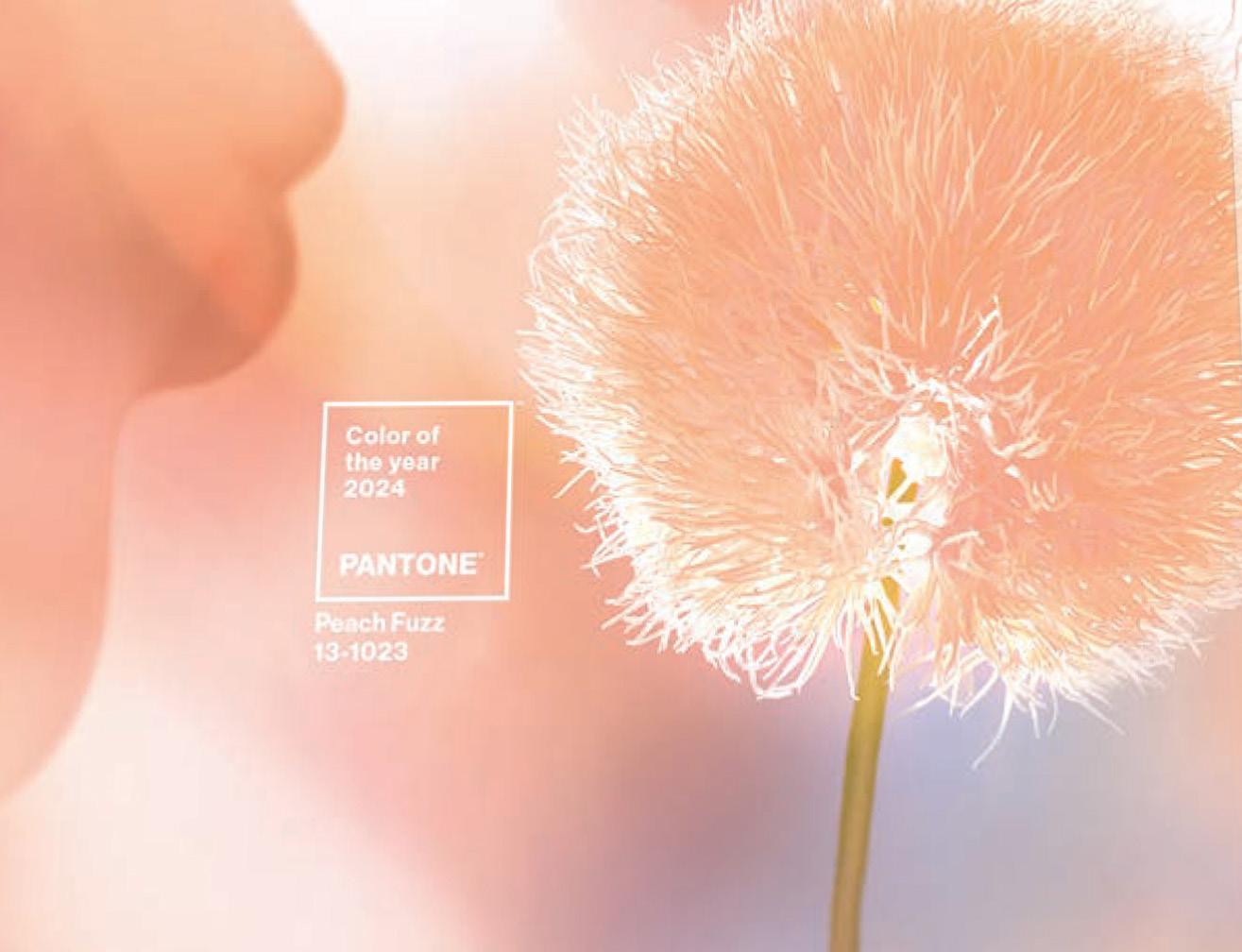
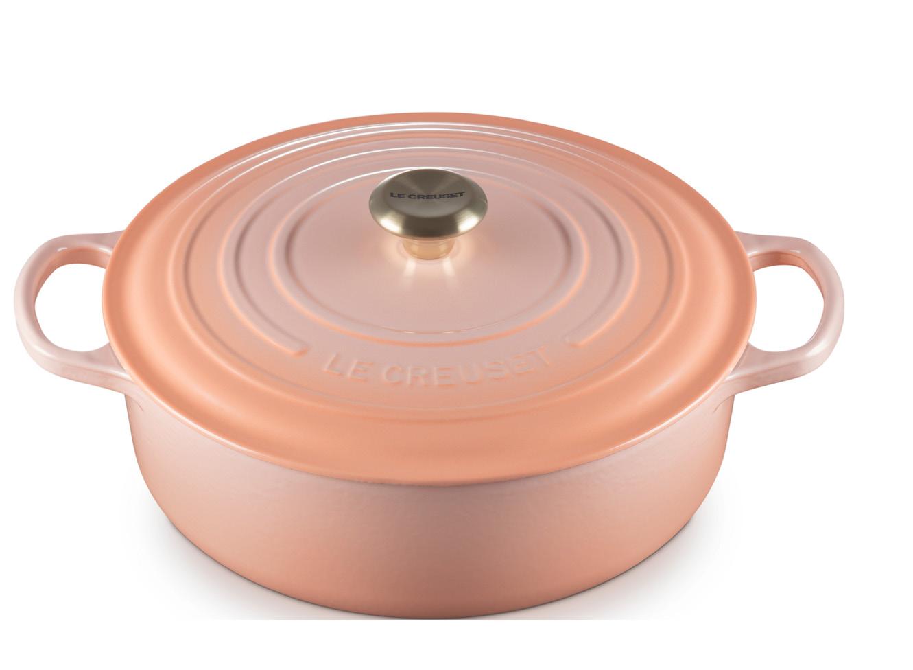
PANTONE 13-1023 Peach Fuzz captures our desire to nurture ourselves and others. It’s a velvety gentle peach tone whose all-embracing spirit enriches mind, body and soul.
In seeking a hue that echoes our innate yearning for peace, closeness and connection, we chose a color radiant with warmth and modern elegance. A shade that resonates with compassion. Peach Fuzz offers a tactile embrace, and effortlessly bridges the youthful with the timeless.


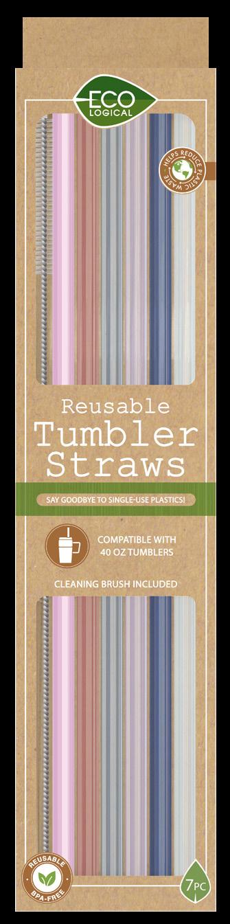
Exhibitions Index In Market Order: A next-level exploration of sustainability and eco-responsible products.


Pantone Color Institute (PCI) publishes PANTONE VIEW home + interiors as part of its global color trend forecasting across many industries, product types and material categories. PCI also selects the Pantone Color of the Year, highlights top seasonal runway colors and advises on color in product and brand visual identity. In partnerships with brands and companies around the world, PCI helps to leverage the power, psychology and emotion of color into design strategies. For more information about the PANTONE Color Institute visit: pantone.com