Baliraj Automation Training

Baliraj Automation Center.
Software testing is a crucial part of the software development process, and it is only going to become more important as technology continues to advance. With the increasing reliance on software in our daily lives, the demand for skilled software testers is only going to grow.

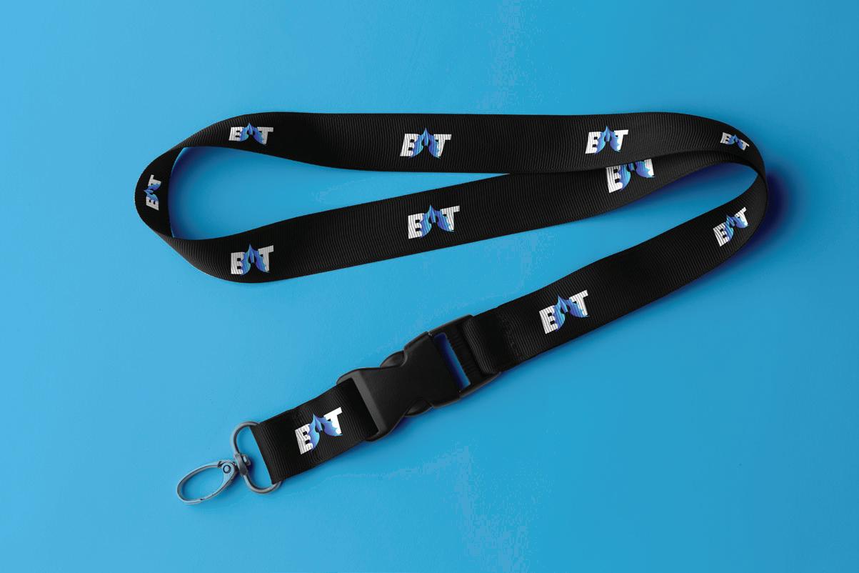
Mockups.


Mockups are an important tool for branding because they allow you to visualize your brand's designs and see how they would look in the real world. This can be especially helpful when working with clients, as it allows them to get a better understanding of what the final product will look like and how it will function. Mockups can also be used to test out different design ideas and see which ones work best for your brand. By creating mockups, you can also identify and fix any design issues before going to production, saving time and resources in the long run. Overall, mockups are a valuable tool for ensuring that your brand's designs are effective and consistent with your branding goals.
Brand Design


Colour.
Date
Project name
ClientThe color palette for a brand is an important aspect of its overall identity because it helps to establish a visual personality and tone for the brand. Colors can convey different emotions and associations, and choosing the right color palette can help to effectively communicate the values and message of a brand.
Note-
The color palette for a brand should be consistent across all marketing materials, including the website, social media profiles, packaging, and advertising. This helps to create a cohesive look and feel for the brand and makes it easier for customers to recognize and remember the brand.
In summary, the color palette for a brand is an important aspect of its identity because it helps to establish the brand's personality, tone, and message, and it should be consistent across all marketing materials to create a cohesive look and feel for the brand.
Usecase.
1. Use the correct version of the logo: Make sure to use the correct version of the logo, such as the horizontal or vertical version.


2. Use the correct colors: Use the correct colors as specified in the brand guidelines.
3. Maintain clear space around the logo: Leave enough clear space around the logo to ensure that it is easy to read and stands out.

4. Do not stretch or distort the logo: Do not stretch or distort the logo in any way, as it can affect its integrity and readability.
5. Do not add elements to the logo: Do not add any elements or text to the logo, as it can interfere with the overall design and impact its readability.
6. Use the logo consistently: Use the logo consistently across all materials to maintain a cohesive brand image.
7. Follow the appropriate file format guidelines: Use the correct file format for the intended use, such as a vector file for print materials and a raster file for digital materials.
By following these guidelines, you can ensure that your logo is used correctly and effectively to represent your brand.

