
Batman, Robin TM & © DC Comics.
About Our Covers
TABLE OF CONTENTS
Ye Ed’s Rant: The long road getting this Byron Preiss tribute onto the printing press 2
COMICS CHATTER
Up Front: Mike Deodato, Jr. Part one of Greg Biga’s three-piece profile of the Brazilianborn artist, with this portion discussing young Deo’s father, a super-hero creator in his own right, Mike’s early years in fanzines, and early pro work in the United States 3
The Borth Files: The second installment of our look at the best cartoonist you never heard of on his move to Montauk and 1950s work at Treasure Chest comics 14
Hembeck’s Dateline: Forget the Emissaries of Evil! Here’s the Midgard Mob! 23
THE MAIN EVENTS
William Stout: Of Dinosaurs and Comic Books
The great illustrator, movie poster artist, production designer, author, and environmentalist focuses on his love of comics and sequential art work for fanzines, CYCLEtoons and CARtoons, underground comix, Pacific Comics/Bruce Jones, and quite a bit more! 24
Leader of the Pack: Byron Preiss
An assessment by James Romberger on the publishing virtuoso’s comics work 40
Byron Preiss: The Life of the Creative Visionary
Twenty years in the making, an extensive retrospection into the wondrous comicsrelated work of book packager/publisher Byron Preiss, incorporating a career-spanning interview, comments and remembrances from his wife, friends, and collaborators, and survey of his achievements, including Chandler, Dinosaurs, and Weird Heroes
(and a word on the enduring cultural phenomenon he spawned: The Secret!) ........... 42
BACK MATTER
Creators at the Con: Kendall Whitehouse clicks a cadre of creative couples at the cons 78
Creator’s Creators: There may be a pop quiz learning about Mr. Biga, CBC associate ed! 79
Coming Attractions: Waugh! Remembering Steve Gerber and the world he made 79

A Picture Is Worth A Thousand Words: Tom Ziuko finds Jack Davis’ Superman! ......... 80
EDITOR’S NOTE: Alas, regular CBC features by Richard Arndt, Steven Thompson, and Darrick Patrick, as well as the letters column, are postponed due to space considerations.
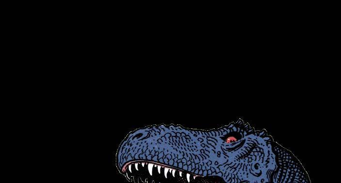
Right: A detail of an illustration by William Stout.
Comic Book Artist Vol. 1 & 2 are available as digital downloads from twomorrows.com

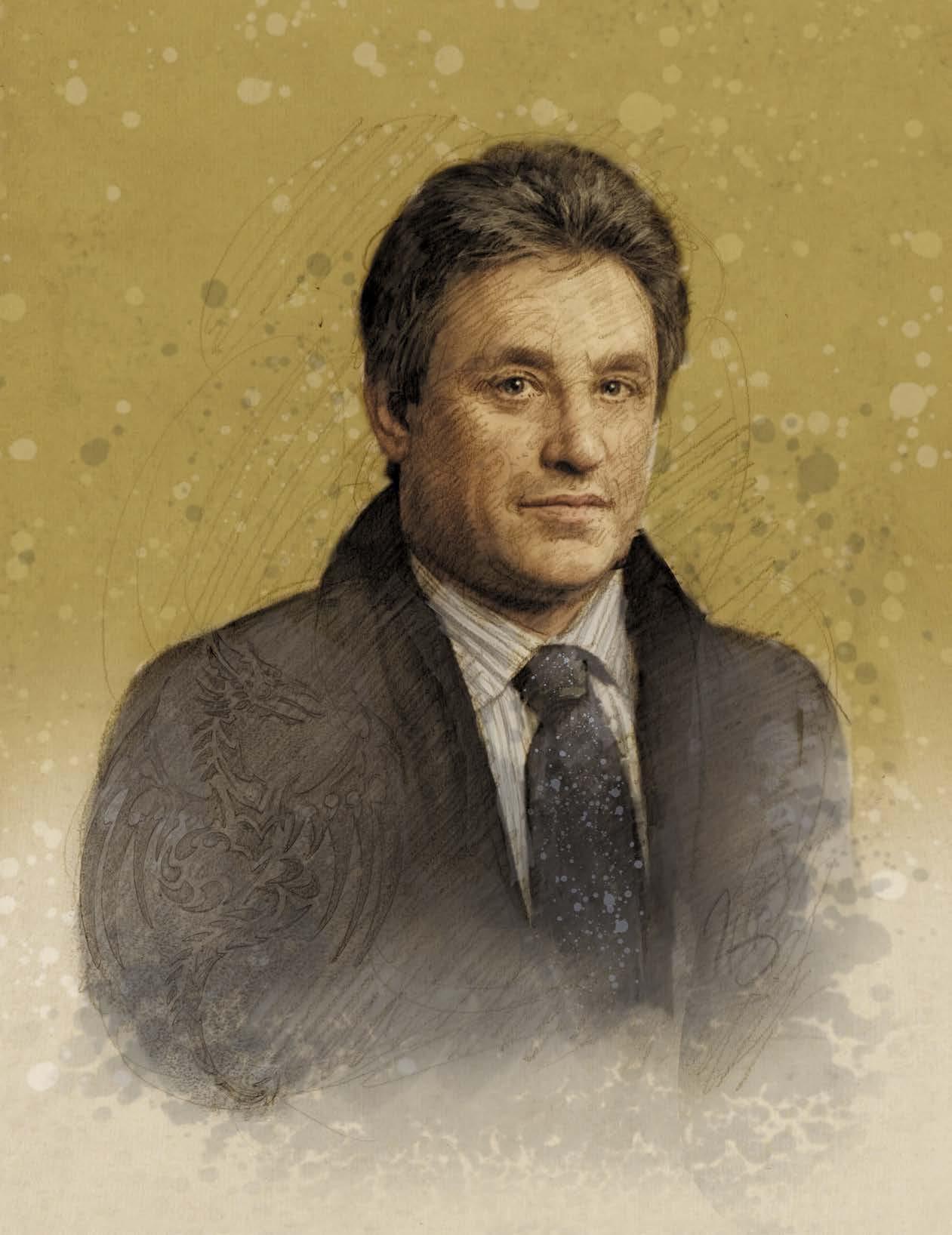
Comic Book Creator ™ is published quarterly by TwoMorrows Publishing, 10407 Bedfordtown Dr., Raleigh, NC 27614 USA. Phone: (919) 449-0344. Jon B. Cooke, editor. John Morrow, publisher. Comic Book Creator editorial offices: P.O. Box 601, West Kingston, RI 02892 USA. E-mail: jonbcooke@aol.com. Send subscription funds to TwoMorrows, NOT to the editorial offices. Four-issue subscriptions: $53 US, $78 International, $19 Digital. All characters are © their respective copyright owners. All material © their creators unless otherwise noted. All editorial matter ©2023 Jon B. Cooke/ TwoMorrows. Comic Book Creator is a TM of Jon B. Cooke/TwoMorrows. ISSN 2330-2437. Printed in China. FIRST PRINTING. Above: William Stout, who is also artist and colorist of our Byron Preiss back cover, kindly shared his art, coloring, and cropping direction, for his Ray Bradbury Comics #1 [Feb. 1993] cover, which, when printed, cropped out the essential element of Bradbury’s “A Sound of Thunder” short story: a squashed butterfly on the boot sole of the rifleman lying on his belly. Fall 2023 • The Stout/Preiss Issue • Number 32 WILLIAM STOUT Portrait by KEN MEYER, JR. ©2023 Ken Meyer, Jr. Cover art © William Stout © William Stout
Covers art and colors by WILLIAM STOUT
COMIC BOOK CREATOR is a proud joint production of Jon B. Cooke/TwoMorrows
C’mon citizen, DO THE RIGHT THING! A Mom & Pop publisher like us needs every sale just to survive! DON’T DOWNLOAD OR READ ILLEGAL COPIES ONLINE! Buy affordable, legal downloads only at www.twomorrows.com or through our Apple and Google Apps! & DON’T SHARE THEM WITH FRIENDS OR POST THEM ONLINE. Help us keep producing great publications like this one! Don’t STEAL our Digital Editions!
Deodato, Son of the Flame
Part one of the Mike Deodato, Jr., interview: his early years, his trials, and his women
 by GREG BIGA
[This first segment of our three-part look at the life of Deodato Taumaturgo Borges Filho — Mike Deodato, Jr., to you and me — includes commentary from David Campiti, Paul Kupperberg, and William Messner-Loebs. — G.B.]
To only know Mike Deodato, Jr., through his social media posts is to see a multi-black belted Shotokan Karate master at the peak of his prowess. In these images, he remains a proudly physical specimen who takes joy in being in better shape now than he was 20 years ago. He is the bald-headed master of a fighting discipline, which makes him a genuine deadly weapon. He looks like the guy that mobsters in foreign action films employ as their hit man.
However, to spend a few moments talking with Mike is to be introduced to an entirely different animal. Rather than a braggart’s voice, his is a light voice, one with a remarkably soft and soothing tone which surprisingly emits from his fanatically fit body. Deo, as friends call him, is a genuinely humble and kind individual, yet still a titan in the world of comic book artists, though he is uncommonly reflective and honest about career, relationships, and mistakes.
He is a man who loves his family and his native country of Brazil. As most know, Mike uses a pen name. He was born Deodato Taumaturgo Borges Filho in Campina Grande, Paraiba. As Mike shared during the recent pandemic, he was wholeheartedly involved in the health and political ramifications of COVID in Brazil under former president Jair Bolsonaro, a leader for whom Mike had little regard and whom he spent time actively opposing.
Mike explained in 2021, “Well, right now, it’s kind of embarrassing, because many Brazilians have voted for a fascist that has killed 500,000 people by not implementing the right treatment for COVID. So, I feel kind of ashamed of my being Brazilian right now. But, before that, it was okay. I was proud to be Brazilian. I think we have great, great cultural backgrounds, mixes, we have influences, and they have heritage from several races of people that came here. And the result was a great place of community for artists in general. So, I think I was actually very lucky to be born Brazilian. Even my specific work in comics, I was able to be exposed to a lot of comics that were not only super-heroes. So, I had a chance to read comics from Argentina, from France, and from several countries because they were all published in Brazil. So, I feel lucky in spite of the last few years.”
THE SAGA OF DEODATO BORGES
Although Deo was very frustrated during the lockdown, he is quick to revisit his pride in his family. “My father was a journalist, mostly working for radio. My mother was a teacher. She taught German. She’s Brazilian, but she was learning the German language.
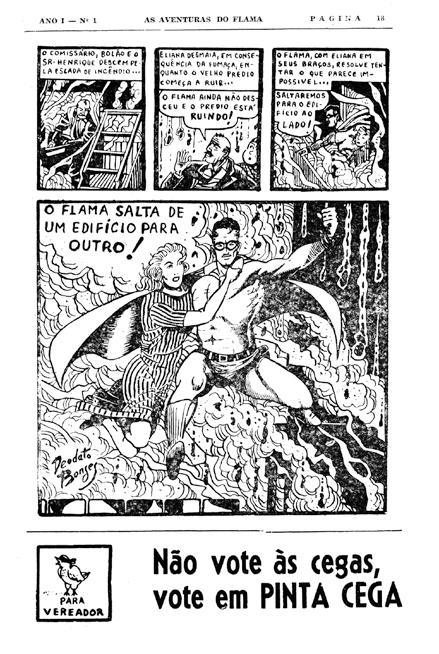
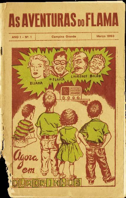
“And so, my father created that first comic book in our region, in the northeast of Brazil. It was 1963. And it was based on a soap opera he created with a character called The Flame. And so, he was not only the director of the radio show, he created the soap opera and he was the actor that played the hero and he wrote it. He did everything. And so, it was like, everybody has a father-figure as a hero. Mine was actually a hero. Because I could actually hear the soap operas on the radio with him playing the hero, and he will give pictures for the fans with the mask on. So, it was a great time. I could see him while growing at home, I could read the comics of the hero, and when he would come back home after work me and my brother would ask him to draw for us to color with markers.
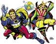
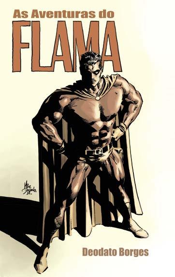
Inset left: In tribute to his late father, Deodato Borges, the creator of The Flame, a Brazilian super-hero created in 1963 that was inspired by Will Eisner’s The Spirit, Mike Deodato, Jr., provided this cover art of an edition reprinting some early adventures.
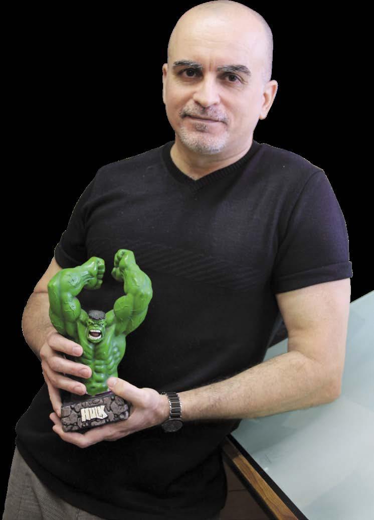
Below: Mike Deodato, Jr., the artist himself, in 2011, holding a statuette of The Hulk sculpted in the Brazilian-born creator’s style.
SAM GROSS, JOHN ROMITA SR., and JOE GIELLA up front
The Flame TM & © the respective copyright holder. Photo courtesy of Mike Deodato, Jr. COMIC BOOK CREATOR • Fall 2 023 • #32 3
This page: The Brazilian superhero, The Flame, was conceived in 1963 as a radio soap opera (broadcast regionally in the South American country) by the multi-talented Deodato Borges, father of Mike Deodato, Jr. Inspired by Will Eisner’s crimefighter, The Spirit, As Aventuras do Flama featured creator Deodato Borges as the voice of the hero. Soon thereafter, he used his cartooning talents to initiate a comic book version of the radio show, which lasted for five issues after debuting in Mar. 1963. All items on this page are from #1.
So, he’ll draw characters from his youth, like all those now obscure characters from the ’40s and ’50s. It was fun. He’d tell the story about the origin of the hero and, when we grew up, when we were, like eight or nine, he started buying a lot of comics for us because it was at newsstands — second-hand comics — because it was cheaper. So, he bought like a big pack of comics and everybody would have fun. They were mostly in black-&-white back then. That’s why I love black-&white comics.
“At 13, I found out that I had the talent to draw, and that’s when he entered the game and we started working together. He’d write and I’d be drawing. He never gave me any formal lesson on how to draw or stuff like that, but I learned a lot from him by his introducing me to the masters, like showing me a book Comics and Sequential Art] by Will Eisner. It would explain how he used light so it looks like a movie, and show the angles he was using… all the stuff I usually would not notice. I actually would prefer to see like how [Ed] Hannigan was doing The Defenders, but you can see the control of this and that.
So, that’s why I started, very early, reading comics like Prince Valiant, Esteban Maroto on Five for Infinity, and a lot of stuff that usually a young guy would ignore. He made me pay attention to them. And later, when we started working together, I was getting a lesson because he was not a regular writer. He would take half of page and draw little thumbnails with the panels, and balloon positions, and angles. And so, we just translated it onto a bigger page and, without realizing it, I was learning storytelling through the angles and to use the panels to [connote] time, like Eisner used to do it. So, there were a lot of things I learned just by working with him.
I had a father who, instead of saying, “No comics for you! There’s not enough money in it!,” he encouraged me. I was fortunate to have my father in my life.”
Mike’s father also encouraged his son to develop his own properties. “I started doing fanzines in 1978,” Mike said, “and he saw me working with other guys and asked me why I didn’t do something with this character I created. I had a character called The Ninja, who was just a ninja — “ninja” was a strange word back then — and then we turned the character into The Spirit. There were a lot of short stories of our own Brazilian version of The Spirit. (The character showed up just in the beginning or end, and wasn’t really the main subject of the story.)
“Then we started doing things for little companies in Brazil. We did this for ten years, from 1980–90. But it wasn’t possible to make a living from comic in Brazil. So, it was more a period where I learned a lot. I did a lot of different genres I could find… Westerns, super-heroes… anything. So, that was a learning decade for me.”
As inauspicious as it sounds, Deo’s first published work was that character he created, The Ninja. “In 1978,” he said, “I got it published in a local newspaper. Everything was copied from some other artist, including Gil Kane poses. The character was even based on a character called Phantom Man*. It was a Danish character from 1969, I guess. Actually, I posted some pages of that on Instagram to show people that miracles can happen.”
THE EARLIEST EFFORTS
The early fanzine days led Deo into a larger world of publishing. Specifically, he dove headlong into a work which would be reprinted well after he had made a name for himself in America: Fallout 3000. “I did that because doing the comics and the fanzine stuff I did back then,” he explained, “I never knew when I would be in a position to be able to do an issue. So, I tried
*The Mexican version of the crime-fighting vigilante, Fantomas, has been called “the ultimate Mexican anti-hero.”
#32 • Fall 2023 • COMIC BOOK CREATOR
The Flame TM & © the respective copyright holder.
All courtesy of Mike Deodato, Jr.
The Treasure Chest King
Part two of CBC ’s retrospective on the career of the best cartoonist you never heard of
by JON B. COOKE
[In our first installment, Ohio-born Frank Mellors Borth [1918–2009] had attended the Cleveland School of Art and befriended classmate Reed Crandall, the fabled comics artist renowned for Blackhawk, EC Comics, and his Warren horror tales. Their companionship led to Frank entering comics, first at Funnies, Inc., drawing stories for True Comics and then going freelance at “Busy” Arnold’s Quality Comics, where the artist wrote and drew outstanding “Spider Widow” and “Phantom Lady” stories, a time during which he spent the Summer of ’42 with an acting troupe. Military service intervened for the near-sighted artist, who served stateside, and, when last we left him, the just-married technical sergeant had painted a massive mural for the central Pennsylvania military fort at Indiantown Gap. — Ye Ed.]
Being a newlywed and desiring to start a family, Tech Sgt. Frank Borth was anxious to secure a civilian job before leaving military service. As he told me, “I was living off-post at Bobbie’s mother’s home, in Harrisburg, Pennsylvania, which is 25 miles or so from Indiantown Gap. I used to drive my own car. I didn’t have to be there for reveille; I just had to be there in time for work to begin at eight o’clock. I went to an art store to get something myself, and I picked up American Artist magazine… and there was… an ad in the middle of it saying that this company was looking for artists familiar with comic-strip drawing and production, which caught my eye, because, hey, this was an ad for something that I could see if I could get, so that I’d have something for when I was discharged. So I answered the ad and sent them what I had available. And they sent me back a nice letter saying they weren’t set up yet to hire anybody, but that I might be receiving some assignments for other publications.” The outfit seeking comic book artists was, of course, the Geo. A. Pflaum Publishing Company.
Based in Dayton, Ohio, Pflaum had been founded in 1885 and it produced periodicals for Catholic Schools, The Young Catholic Messenger, which was distributed weekly through the academic year. In 1946, YCM was described by a University of Dayton alumni magazine thusly:
“It features editorials, news articles, historical stories, comics, and much the same material as a daily newspaper, with the exception that it is written in a juvenile way for the comprehension of secondary school children.”
Discharged in February 1946, Frank shared in an autobiographical timeline, “Came back to New York to find work and an apartment. Found neither, but landlady offered me summer use of unheated rooms over garage of a large house she planned to rent to roomers out in Montauk.” After taking up her offer to summer cheaply in the Hamptons — and subsequently to live for all seasons for most of the remainder of his life — Frank Borth fell in love with the area. Thereafter, he would be associated with the idyllic hamlet at the easternmost tip of Long Island, where he would have his home built, raise his children, be active in civic life, and would become — from the very start — an artist passionate about the East Hampton fishing village.
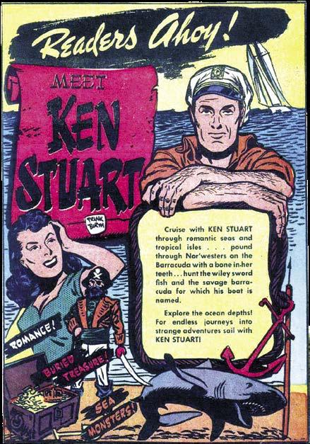
TREASURE HUNT
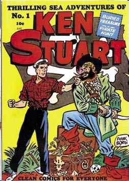
Doubtless, the advertisement Frank came upon in American Artist was looking for seasoned professionals to work on Pflaum’s brand-new venture launching in March, 1946, Treasure Chest of Fun and Fact, their first all-comics publication Appearing bi-weekly between September and May/June, and distributed exclusively through in-class subscription in Catholic schools, the comic book initially included work packaged by former Funnies, Inc., heads Lloyd and Grace Jacquet, which might explain why Frank didn’t receive Treasure Chest work right away. But Pflaum
#32 • Fall 2023 • COMIC BOOK CREATOR Ken Stuart TM & © the respective copyright holder. 14
the borth files
This page: Artifacts relating to Frank Borth’s comic strip, including the comic book one-shot and Sept. 6,1947, Tampa Bay Times article.
portrait courtesy of Roger Hill. Ken Stuart TM & © the respective copyright holder.
did have need for a cartoonist to produce comic stories in Young Catholic Messenger. He told me, “I remember one of the first assignments they sent me was ‘The First WAC’ [YCM Vol. 63, #5, Oct. 11, 1946] which was Molly Pitcher, who happens to be the first female soldier in the Women’s Army Corps.”
Frank did, indeed, have some of his comic-book work appear in YCM — typically two-page stories about inspirational, real-life, and usually Catholic notables — but the jobs were infrequent and, before he could score a steady assignment with the Dayton publisher, the cartoonist was on the prowl for a more reliable gig. He painted murals in East Hampton bars during summer months and produced signs for the Montauk Yacht Club, where the owner hired him —”My pay was free dinner for Bobbie and me” — to entertain members at the club’s buffet dinner every Thursday night with amusing skits and his well-rehearsed chalk talk. The latter routine not only gratified
Frank’s urge to revisit his acting work while also making use of his artistic ability — his was a witty performance he’d give time and again before the locals over the decades — it also led unexpectedly to the next full-time job for the cartoonist.
When Frank decided to create his own newspaper feature, an adventure strip in the Milt Caniff mold about a two-masted Montauk schooner available for charter and its two-fisted captain, there just so happened to be an agent in the audience one Thursday night who offered to pitch it to the newspaper feature
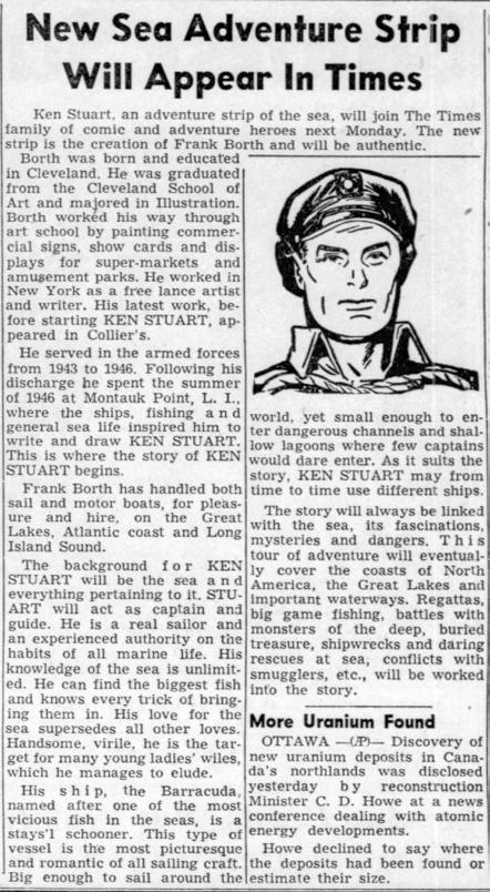
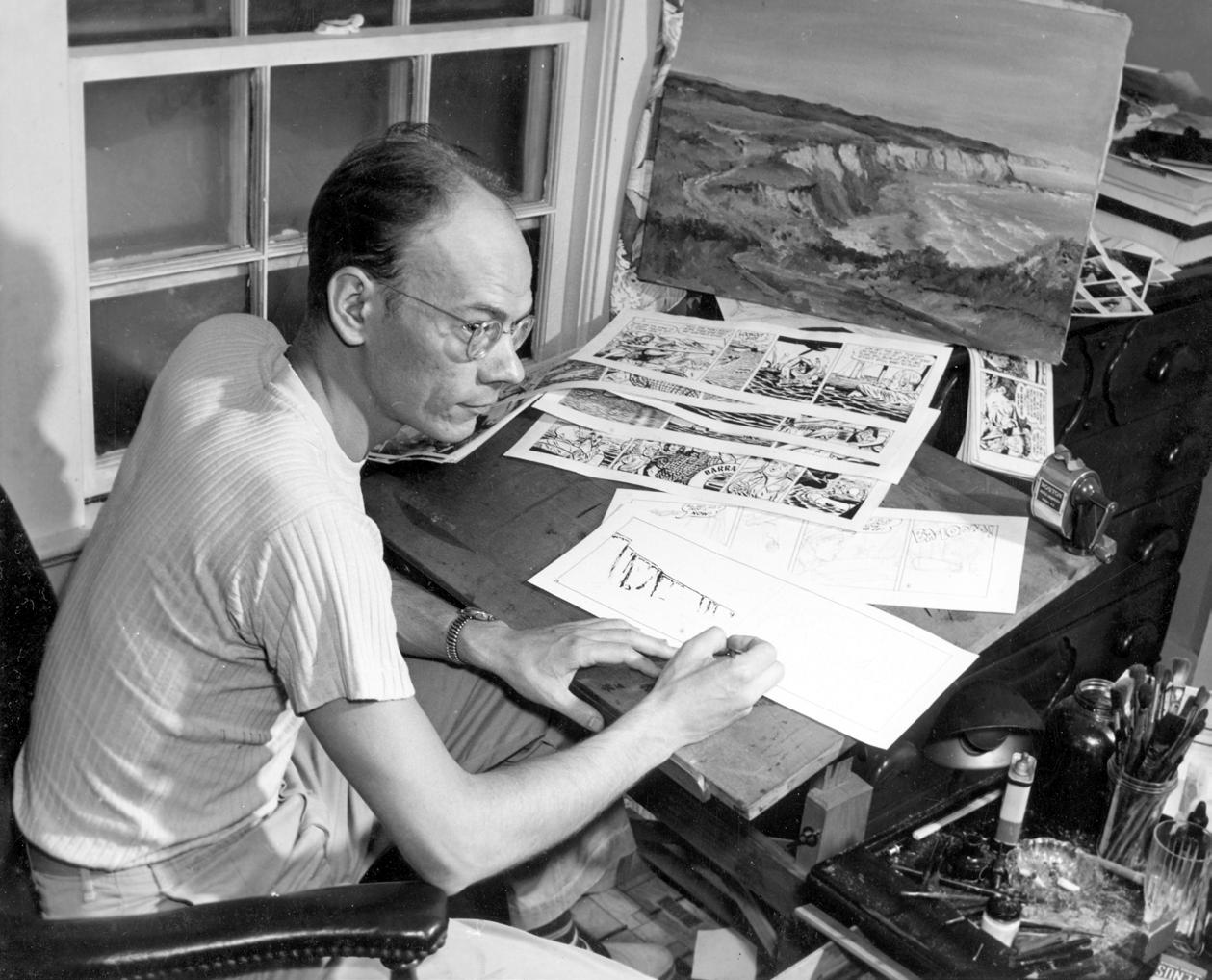
Above: Frank Borth poses for a publicity photo in his Montauk, New York, studio, around 1948, when he was drawing the syndicated newspaper comic strip, Ken Stuart.
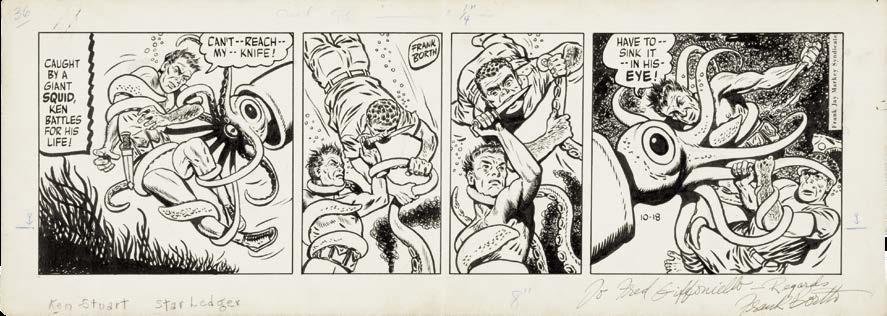
Below: The original art to the Oct. 18, 1947, strip. Frank did it all — script, art, and lettering.
COMIC BOOK CREATOR • Fall 2 023 • #32 Borth
15
Photo ©2023 EC Fan-Addict Productions and may not be reproduced in any form. Used with permission.
syndicates. But before the Frank Jay Markey Syndicate would pick up Ken Stuart (first appearing in papers on September 8, 1947), Frank was forced to move back to Cleveland after his father died suddenly.
While helping with his mother’s finances by working at a small Ohio advertising agency, as he and his wife endured the frigid Midwestern climate and his starting Ken Stuart, the pages of Montauk’s paper, The East Hampton Star, expressed local affection for Frank and Bobbie Borth, in the Nov. 14, 1946, edition: “Montaukers feel, like others before them, the Borths will find a way, for they’ve gotten sand in their shoes, as the saying goes, and they’ll be back.” When the couple did, in fact, return to Long Island (with Frank’s widowed mom, Mabel, coming to live with them in a few years), the Borths stayed for good.
SETTING SAIL WITH KEN STUART
Of course, what prompted their reappearance in the Hamptons was the agent’s sale of Ken Stuart to the Markey Syndicate and the settling of his late father’s affairs. “We really had lived on the money I had saved up in the three years in the Army,” Frank explained. And, after moving from place to place in Montauk, by 1949, the Borths purchased a lot on Birch Drive, just off of the Old Montauk Highway, where their first home was built, which included Frank’s art studio and a barn out back that became a stable for Bobbie’s horse (named for an Apache warrior).
A promotional article trumpeting the arrival of Ken Stuart boastfully described the strip’s titular skipper: “his love for the sea supersedes all other loves. Handsome, virile, he is the target for many young ladies’ wiles, which he manages to elude.” And about the storylines: “The adventures come with his clientele, who get him into all sorts of jams.”
Frank may have been familiar with a newspaper man by the name of Frank Jay Markey through the artist’s onetime association with Everett “Busy” Arnold, whose Quality imprint featured Borth material in Feature Comics and Police Comics. Markey, who had started his own modestly-sized (and aforementioned) newspaper feature syndicate by the 1930s, had teamed with Arnold in 1937 to provide material for the burgeoning Quality line and, in 1940, Markey became partners with comics artist/ editor Vincent Sullivan to form Columbia Comics, a small company that would publish a Ken Stuart one-shot, featuring reprints of Frank’s newspaper strip, in 1948.
Though Ken Stuart, the strip Frank wrote, penciled, inked, and lettered, was included daily in a major metropolitan newspaper, The Boston Globe (with a Sunday color page every week in some papers), the feature just couldn’t hook the more land-locked accounts into subscribing, despite Frank’s ever-improving artwork and unique nautical storytelling perspective. The cartoonist was only earning about $100 a week from the rigorous, unrelenting seven-day-a-week assignment.
“It was only syndicated to about six papers,” Frank told me with a chuckle. “We couldn’t get it inland because it was a story about a captain who owned a two-masted schooner that was available for charter. So, every time the charter changed, I had a new story to tell. Well, I did that one for almost three years before we finally gave it up, because it was just killing me. If we lost one paper, it was 10% of my income. I hated to do it, because I had my opportunity to hit the big time and I didn’t follow through with it.” (Frank told Ron Goulart in The Encyclopedia of American Comics, “I spent too much time on the art and not enough on the story… the pen is mightier than the sword, but I forgot that the pen was used to write with first, then draw.”) The schooner captain finally sailed into the horizon as the last Ken Stuart newspaper strip appeared on April 30, 1949.

#32 • Fall 2023 • COMIC BOOK CREATOR
16
Ken Stuart TM & © the respective copyright holder.
All Creatures
The William Stout Interview
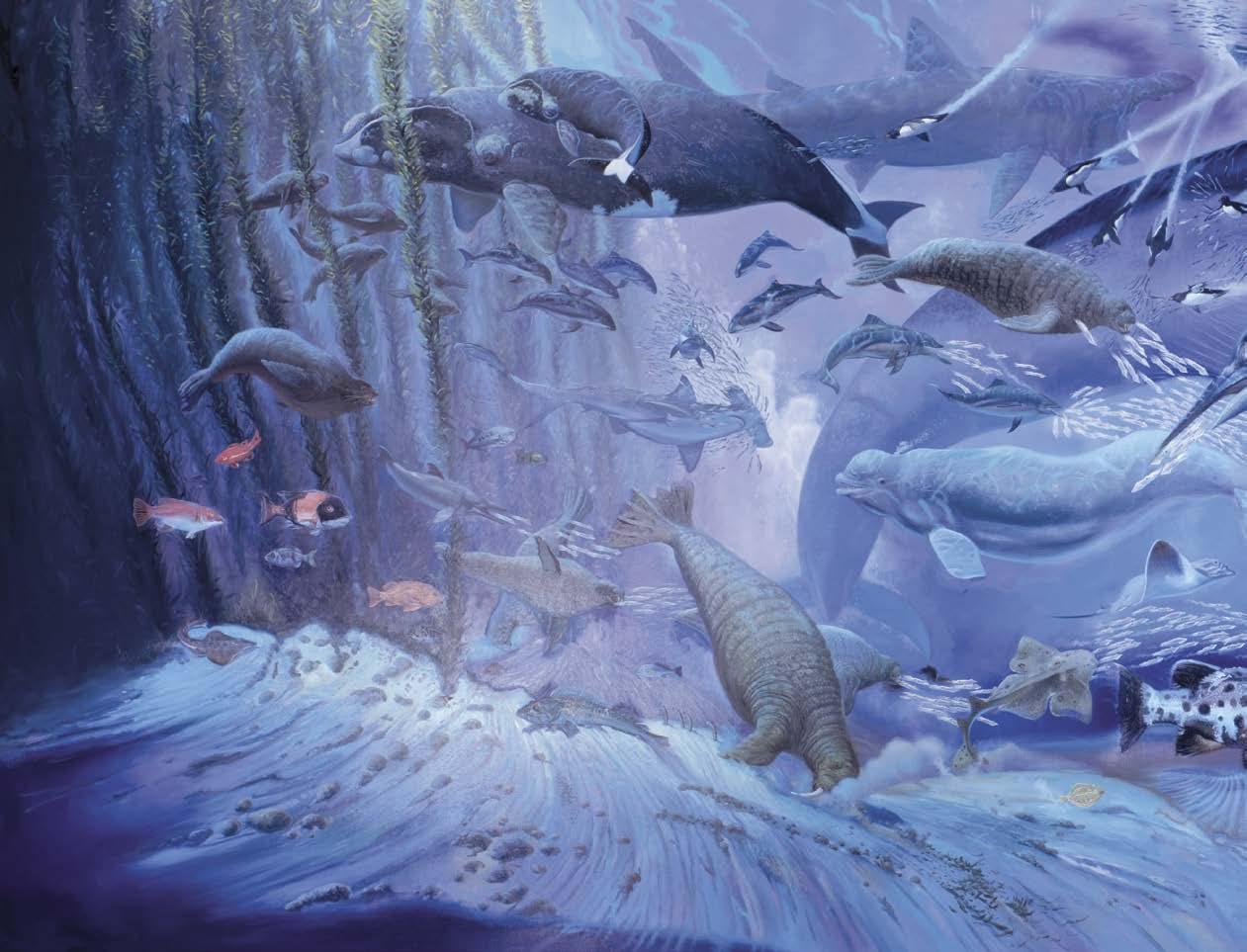
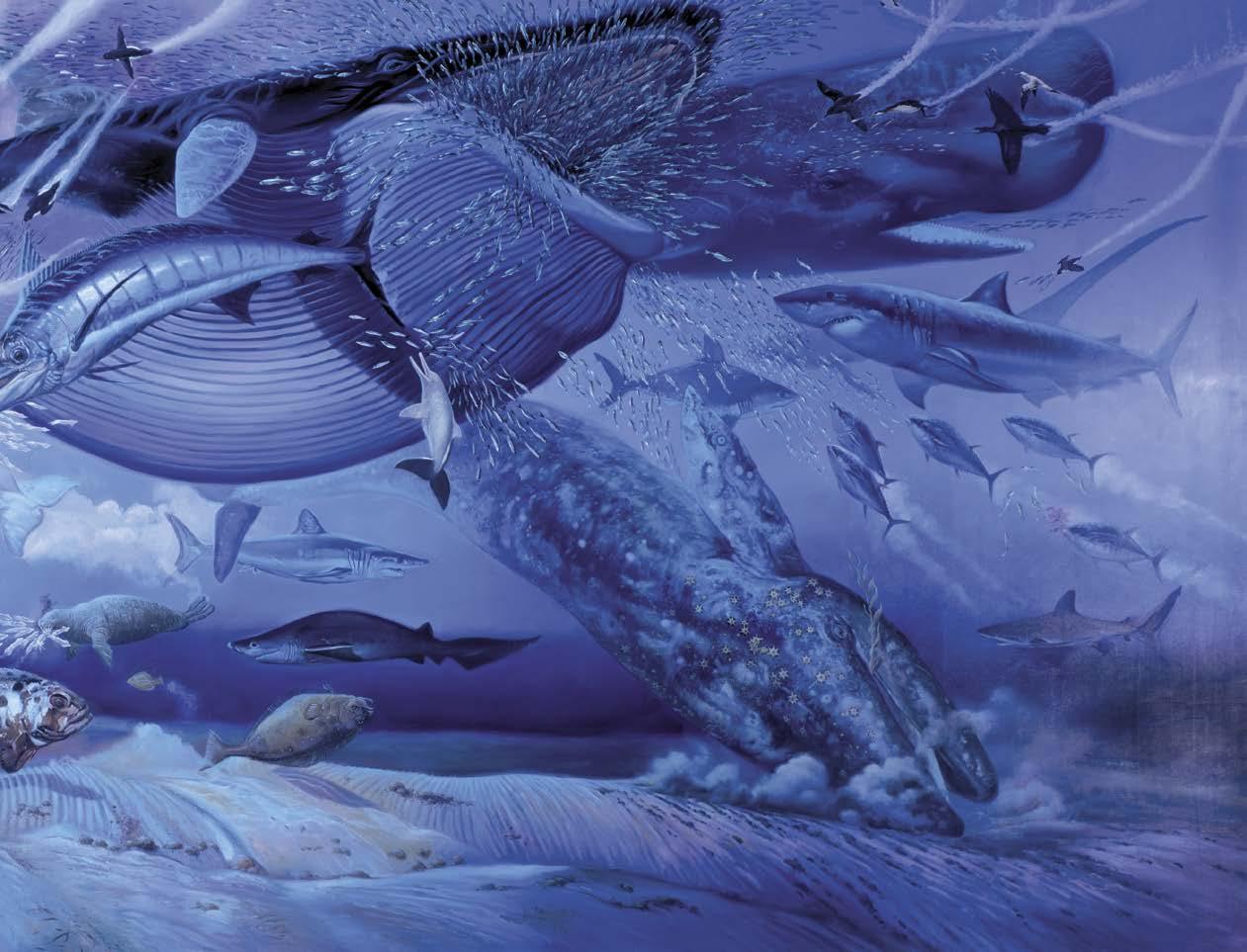
The good news is that, in his 50 years as a professional artist, William Gerard Stout has had a wildly successful career in many different fields, whether movie posters and storyboards, album covers and trading cards, art books and painting exhibitions, paleontology and wildlife advocation, environmental activism and book illustration, and even theme park ride design, among numerous other creative pursuits.
The bad news? Not enough comic book work, dammit! And yet a passionate mastery of
comics is core to his talent and a constant source of inspiration. Still, as we’ll find out in this interview — intended to focus on his comics — Bill has done his share of great work in that department, and we’re grateful to feature this conversation, which includes talk of many legendary talents he has worked with. But do note that Ye Ed conducted a separate interview with Bill specifically about his collaborations with Byron Preiss, so discussion of that BPVP work, including The Dinosaurs, is in that section. — JBC.

#32 • Fall 2023 • COMIC BOOK CREATOR 24
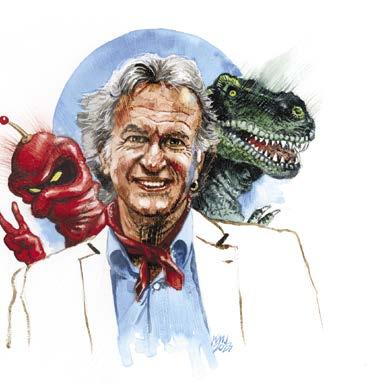
Bill Stout portrait © & by Greg Preston.
Great and Small
Comic Book Creator: It is April 5th. I’m talking to Bill Stout. We are talking comics, baby. Here we go. When did you first encounter comics?
William Stout: Oh, gosh, it was when I was in elementary school. There was a kid named John Thomas, who invited me over to his place, and he pulled out this huge, classic, black trunk filled with mint condition Golden Age comics. He wouldn’t let me look at those because he was worried I’d bend the cover around back while I was reading it. So, he had a stack of more recent copies and I read those. And then, the kid around the block from me, Bruce Rolie, he had a whole bunch of Archies and Supermans. I liked the Archies because they were funny. But eventually, I discovered the Superman family, and I branched out from there.
CBC: So you were how old when you started getting into Superman?
William: Oh, probably eight or ten.
CBC: Were newspaper comic strips in play, too?
William: Oh, I read the Sunday funnies. I was a regular reader of Prince Valiant and, of course, I liked the funny stuff, too. My dad taught me to read when I was two, so that just opened up worlds for me.
CBC: So were you reading books?
William: Oh, yeah! By the time I was three, I was reading entire
books. I used the same method to teach my sons how to read when they were two. I remember my oldest son was resisting a little bit, and I said, “Andy, if you learn to read, there are books and books and books on anything you’re interested in. You will never be bored. You’ll always have something exciting to look forward to.”
I practically grew up in the library. If I was missing from home, my mom or my dad knew that I was probably at the public library.
CBC: What books did you gravitate to?
William: We moved for one year to a little town called El Segundo, an oil town, and there I discovered Classics Illustrated. Those got the official approval from my parents because, well, as you know, they’re based on classic literature. What could be wrong with that? So, I read a lot of those and that led me to read the original novels those comics were adapted from, like The Count of Monte Cristo. I fell in love with that book. I did not want it to end. I was just enjoying the hell out of myself reading it.
When I was about 14 in junior high school, I was always looking for old bookstores that might have comics, and I found one. As I was going through a box, a kid my age said, “Hey, you like comic books?” His name was Fred Romanek. He also introduced me to
Conducted by Jon B. Cooke •Transcribed by Tiara Shopman
25 C OMIC BOOK CREATOR • Fall 2023 • #32
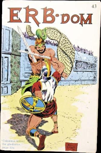
Above: Some of William Stout’s earliest published art was in the Edgar Rice Burroughs fanzine produced by Camille Cazedessus, Jr., ERB-dom. For #43 [Feb. 1971], Caz used front and back cover art by Stout drawn in 1968.
comic book fandom. I had never heard of fandom prior to that. He showed me issues of Rocket’s Blast Comicollector and some mimeo zines. He also introduced me to ECs, although the first one he showed me was not a turn-on — it was a science fiction EC, but it was the special issue on UFOs, so not a typical EC, at all. It didn’t have the twist endings or anything. It was just their “factual” interpretations of UFOs.
large it was and shocked at how incredibly precise the lettering was and how beautiful the inking was, and that it wasn’t inked with a ballpoint pen — it was inked with India ink. That was a real eye-opener.
And then Marvel came along. Once I did finally understand the appeal of Kirby and Ditko, I became a huge fan, especially of Ditko. Ditko’s work still blows my mind, to this day. At one point, I had almost all the Marvel super-hero comics. Eventually, I sold or traded them off, but I held on to the Steve Ditko “Doctor Strange”s and the Steve Ditko Spider-Mans. I still have them. CBC: And can you put a finger on it? What was the appeal?
William: His work is just so bizarre, and so personal. Like when he was doing “Doctor Strange,” he’d have a classic six-panel grid, but within those panels, he took you into worlds that were so incredibly weird, it felt like he was tapping directly into his spinal cord or something. The subsequent artists who drew “Doctor Strange” never, ever reached that level. Sure, they would try to do all kinds of things like messing with the panel layout, so that if you looked at it together, it appeared to be a giant face or something… you know, trick stuff. Ditko didn’t need to do that; all the tricks were in his head. And the way he drew stuff… just the hand positions of Spider-Man were like, “Wow!” I don’t think hands can actually do that, but it was just a joy to pursue and look at and to wonder about.
CBC: Did Ditko just seem to disappear from comics after he left Marvel or were you able to follow him over to Charlton and Tower?
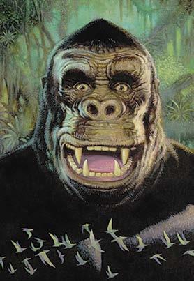
Previous spread: At top is Stout’s painting entitled “All Creatures Great and Small”; and below are, left, photo of the artist by Greg Preston; and right is the big guy himself as rendered by Stout and used for a 2017 Burbank King Kong art exhibition poster.
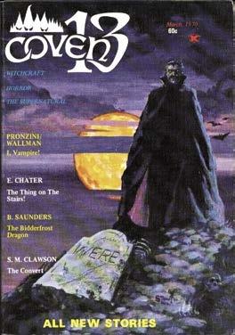
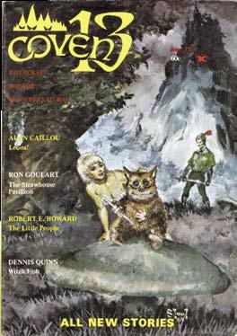
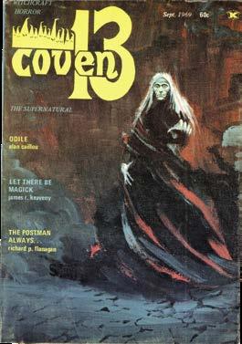
Below: During his art school years, Stout produced cover paintings for the supernatural-themed digest, Coven 13, published for four issues [Sept. 1969–Mar. 1970]. From left are #1, 3, and 4.
When he found out I liked to draw, Fred convinced me that we should put out a fanzine. So, we did. It was called Comics Past, Present and Future. It was typical for the era. It was mimeographed, for one thing, so all the line art was purple – not black. There were typically idiotic (but sincere) articles like, “Should Spider-Man join the Fantastic Four?” You know, it was just silly stuff like that, but we took what we were doing really seriously.
CBC: So, you were you were 13 by then?
William: Right, 13 or 14.
CBC: And you were encountering the Marvel Comics. Was that an epiphany at all? Were you like, “Oh, this is different”?
William: It took me a while to get into Marvels because of their art style. Jack Kirby and Steve Ditko were so radically different from the slick style that was in the DC Comics. The other thing that Fred did for me: he bought an original page of comic art by Jim Mooney who, for a while, was living in L. A. I think it was Lois Lane or a “Supergirl” page. That was the first time I’d ever seen any original comic book art. I was shocked at how
William: Oh, once I fell in love with Ditko’s work, I’d search his stuff out everywhere. You know, I got “Mr. A” and I got Blue Beetle. Anything else he touched, I wanted.
CBC: Did you ever encounter Steve?
William: No. My first trip to New York, I got hired by Harvey Kurtzman and Will Elder to help them out with “Little Annie Fanny,” for Playboy. On my very first day in New York, I looked in the phone book and found his name. It said, “Ditko, Steve. Artist.” That was enough for me. I had already heard that he was a very private person, so I wasn’t going to disturb him. I wasn’t going to try to take away any of his work time. It was just satisfying for me to know that, “Yeah, this guy is real, he really exists, and he’s right here in New York City.”
CBC: I’m making an assumption here that you encountered Frank Frazetta….
William: The first Edgar Rice Burroughs book I ever got was a hardcover edition of Tarzan of the Apes. It didn’t impress me all that much. But then somehow, I got a hold of the third John Carter book, Warlord of Mars. I read that and I flipped. Then it was like, “Oh my God, that was incredible! And there’s more of them? Holy…!” Man, I had to get and read all of them. That turned me on to the world of Edgar Rice Burroughs, and I began buying the paperbacks. At that time, Ace was coming out with those incredible paperbacks with the Roy Krenkel and Frank Frazetta covers, and their pen-&ink illustrations on the title page. Those were just a joy to behold. The more I saw Frazetta’s work, the more I was just blown away by what that guy could do.
It wasn’t too much later when the Canaveral Press editions appeared. I consider those illustrations to be Frank’s best work. The brush-&-ink illustrations he did for the Burroughs books, I think, are unsurpassed by anyone in art history.
26 #32 • Fall 2023 • COMIC BOOK CREATOR
13 TM
ERB-dom, Coven
& © the respective copyright holders.
CBC: Were the illustrations interspersed throughout the book or just the frontispieces?
William: Well, the first ones I saw were actually in a Burroughs fanzine called ERB-dom, put out by Camille Cazedessus. When I saw those Frazetta black-&-white illustrations, I could not believe how phenomenal they were. This art was featured in ERB-dom because Canaveral was releasing ERB books illustrated by Frazetta, Krenkel, and Reed Crandall. Man, I had to get those books!
Richard Lupoff’s ERB biography, titled Edgar Rice Burroughs: Master of Adventure, had all the Canaveral press Frazetta illustrations that never made it to the separate books. I think Canaveral was having a similar issue with Burroughs as Ace had, because they both thought the Burroughs stuff had gone into public domain — but it hadn’t. They were in big trouble, illegally printing these books. But God, it was great to see the artists that they got doing those illustrations.
CBC: Did you see the Charlton unauthorized Jungle Tales of Tarzan?
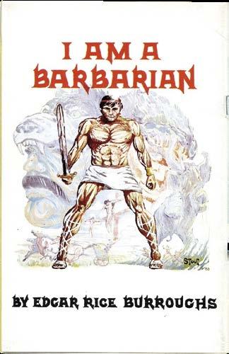
William: As those came out, I picked them up; I still have them. I was a gigantic fan of Russ Manning’s Magnus, Robot Fighter, and then his later Tarzan stuff. I began to contribute to the ERB-dom fanzine. During that time, there was a Burroughs book that had never been published entitled I Am a Barbarian It was the story of Caligula as told by his personal slave. I was really excited that there was a new Burroughs book to read. They got Jeff Jones to illustrate it. After I got the book, I wasn’t very happy with the Jones illustrations (I thought they were too simple), so I did a whole set of my own, each one in a different style. I did a Frank Frazetta-style illustration, Al Williamson-style, Infantino and Anderson-style, Krenkel-style, Reed Crandall-style, and sent copies of those off to ERB-dom. And about a year or two later, they were published in the fanzine, and I got a phone call from Russ Manning asking me if I’d like to be his new assistant on Tarzan of the Apes Sunday and daily strips. I jumped at the chance!
One of the things that blew me away about Russ’ work is the way he drew Tarzan. That was exactly how I pictured Tarzan when I was reading the novels. That just really stunned me. Really clean style, too. Russ was a great writer as well. Very underrated.
CBC: Did I read a credit of a Brothers of the Spear story by you?
William: Russ wanted me to do a Brothers of the Spear Sunday strip. He did a layout and I penciled it in my own style — but Russ was expecting me to do it in his style. So, it didn’t go anywhere.
CBC: How many did you do? Just that one?
William: Just the one. I penciled it using Russ’ layouts; I don’t even think I inked it. I think Russ was really disappointed...
CBC: Now you went to art school, correct?
William: Yes, I went to the Chouinard Art Institute, which was also known as the California Institute of the Arts, or Cal Arts. It was also nicknamed the “Disney Farm” because, if you wanted to be an animator, you had to go there. That was the only place that really taught great animation. In fact, when I was going there, Disney’s famous “Nine Old Men” were the teachers in the animation department.
CBC: What did you want to do?
William: I wanted to be an illustrator, so I became an illustration major at Chouinard. My family was desperately poor; there was no way they could pay for college — not even a community college. Fortunately, I got a full four-year scholar-
ship from the state of California because of my poverty and the fact that I got perfect scores on my SATs — highly unusual — there were no SAT prep courses back then. When I was going to Chouinard, I think it was probably the best art school in the country. Edith Head was in charge of the fashion department. Disney’s Nine Old Men taught the animation department. Harold Kramer, who was the first president of the Society of Illustrators, was the head of the illustration department. When the ceramics department would have their annual ceramics sale, people would come from all over the United States to buy the ceramics being sold at the school. Ravi Shankar was the head of the music department… It was an embarrassment of riches. And plus, it was L.A. In the late ‘60s! So, the music scene was phenomenal. You could see every L.A. band play live, but you could also see every San Francisco and English band because they all came to L.A. to record and, while they were here, they would do
27 C OMIC BOOK CREATOR • Fall 2023 • #32
Tarzan TM & © Edgar
Artwork ©
Above: Looks like a painting by William Stout related to the Bo Derek movie, Tarzan, the Ape Man [1981]. Below: Stout pen-&-ink drawing of the Jungle Lord drawn in 1984 that appeared in Erbania #57 [1987].
Rice Burroughs, Inc.
William Stout.
CBC: Oh yes. The Disney orgy.
William: That’s a great one. It was awesome because it was so unexpectedly shocking and he nailed the Disney style so perfectly.
I worked for Walt Disney Imagineering designing theme parks. I worked at the park painting portraits. I did some work for some of their animated features. It’s important to remember that each branch of Disney is completely different from the other branches. Different rules, different attorneys.
CBC: Do you have any ambivalent feelings about their cultural grip on the world?
William: Very, very ambivalent. In fact, it was sometimes quite weird. I worked for two-and-a-half years straight as a full-time consultant for Walt Disney Imagineering, designing their theme parks. One day I got a call. They said, “Could you come in and look at portfolios with us?” Yeah, sure. I went into a room where two guys were looking at portfolios. Looking through the submitted work, it was really easy for me to go, “Oh, that person’s really talented. She’s great. Hire them. Oh, this is terrible. This is awful. This is bad — he can’t draw. Oh, here’s a good one.” I stopped in the middle of this. I said, “Why are you having me look at these portfolios?” They said, “Oh, because we don’t know how to tell what’s good.” And I went, “Are you kidding me? You’re with the Walt Disney Company and you can’t tell which artists are good and which ones aren’t. Holy cow!” That was a real shocker. And it explained a lot of what I saw going on around me.
CBC: So, how and when did you meet Dave Stevens?
William: It was at one of the early, early San Diego Comic-Cons. He came up and introduced himself to me because he had taken over my spot as Russ Manning’s assistant on Tarzan, so we had a lot of things in common. Both of us loved working for Russ. Dave was obviously really talented even back then. You could easily see it. It was like, “Oh, man, this guy can really ink. Holy cow.” I had a big studio on La Brea Avenue, in L. A., not far from the celebrated tar pits. I rented out the front room to Richard Hescox, and then Richard split that room in half and rented out his other half to Dave.
When Dave eventually left, he was replaced by Paul Chadwick, who started creating Concrete in that spot.
[Discussion on how rotten the comics business could be.]
I got a phone call when I was working on Harvey Kurtzman’s Strange Adventures. It was Harvey. He asked me to take over “Little Annie Fanny.” I turned him down, and he was like, “What? How can you turn that offer down? ‘Little Annie Fanny’ pays more than any other thing in comics.” And I said, “Harvey, the key phrase there is ‘in comics.’ I work in the real world. I’ve worked on ‘Little Annie Fanny.’ I know what goes into each page, and I can make more in two days in advertising than in two months working on ‘Little Annie Fanny.’ So why on earth would I want to do ‘Annie Fanny’? Plus, you know Hefner is going to continue to interfere with the strip.”
A few months later, I was talking to Harvey. He said, “You know, I’ve been depressed for the last two months since that phone call.” I said, “Harvey, why do you think I’ve been trying to get you out here to L.A.? You write comedy; that’s gold in this town. And I know you want to make movies. The opportunities are here, but they’re not going to be in New York and you’re not going to be able to take advantage of them if you’re still doing ‘Annie Fanny.’”
CBC: You’ve been in the presence of working with some of the absolute greatest creators in the history of the business and certainly any number of the finest illustrators. You know the history of comics as well and you know how poorly the industry has treated its creators. You’ve been able to avoid that, yet you’ve never let it affect your love of comics or diminish your love for the creators, as well. I know that you live as an example, Bill. You’re out in the professional world and you’ve made a nice living. Do you have any message to impart on aspiring artists today…? I mean, I spent a few days with Bernie [Wrightson] in L.A., and he could be just so depressed talking about the comics industry sometimes...
William: Oh, Bernie, what a great guy — and what a terrible businessman. Kurtzman, the same thing: great guy, terrible businessman. One of my favorite classes at art school was the business course. I paid such close attention to that because I thought, “Oh, this guy’s telling me how to make money and protect myself. This is great!”
This led me to becoming an artist rights advocate. I would hire expensive attorneys to write my contracts. And then I’d sit down with him. I say, “Okay, I want to go through this line by line with you. Why did you phrase it that way? Why did you write this? Why did you include this?” I did this because I wanted to teach myself how to write contracts so that I wouldn’t have to pay a lawyer $400 an hour to do so. I could just do it
34 #32 • Fall 2023 • COMIC BOOK CREATOR
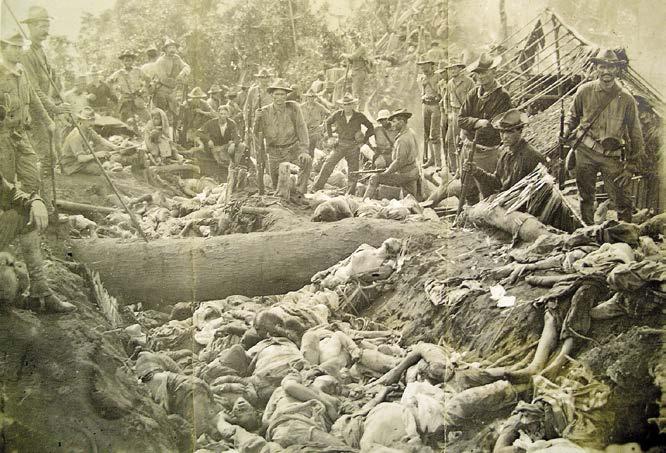
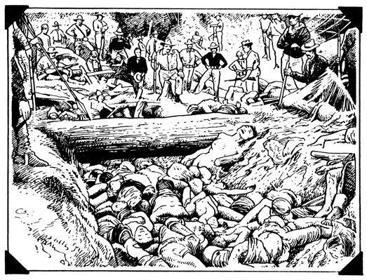
Above: For “Filipino Massacre,” Bill painstakingly referenced archival evidence of the genocidal tactics of U.S. forces during the Moro Rebellion. At left is his panel based on the photo at right.
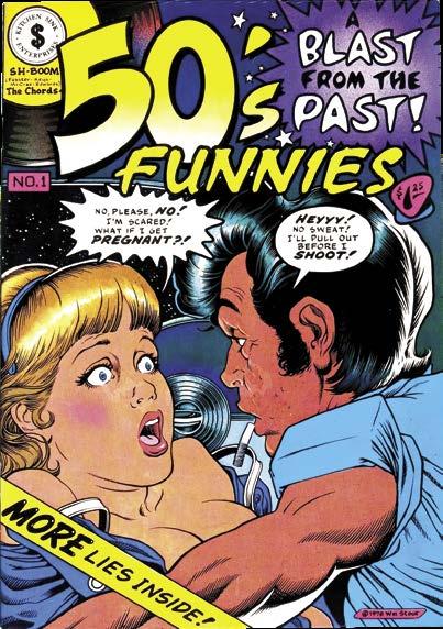
Above: Bill Stout self-portrait. Below: Hilarious underground comix cover by Bill Stout from Kitchen Sink Press [1980] that still makes Ye Ed laugh out loud.
TM &
‘Filipino Massacre,” self-portrait © William Stout. 50’s Funnies
©
Kitchen Sink.
on my own. And it also helped me in negotiating. I think it’s really important to have a good business sense and have a good negotiation mind. Still, eventually, somewhere, somehow, you’re going to end up being screwed. But it won’t be as often as it would have been if you hadn’t pursued that business knowledge.
I think it’s important to be your own biggest fan and value your work. Don’t give it away. Don’t make it cheap. It’s one of the things I really admired about Greg Irons. There was a piece of his I really wanted to buy, but he wouldn’t come down in price. I admired him for that. I thought, “Thank God you’re sticking to your guns because you deserve to get more money for this piece than I can pay for it.”
CBC: You know how rare that is to have the right mix, Bill. William: I know. There are very few artists with good business skills. Here in L.A. I was a co-founder of the Comic Art Professional Society [CAPS]. One of the lectures I did for the group was a business lecture. I gave everybody at the meeting what was called a standard contract — like a contract that you might typically get from Disney or one of the other big companies. And then I would show them how to go through the contract, line by line, and rewrite the whole thing. And I would explain why I made each change and how it benefited the artist.
One of the best pieces of advice I ever got was at a bachelor party. There were a bunch of artists at the party, and there was an attorney there. I love talking to attorneys and this guy was great. He gave me fantastic advice. Like, in writing your contract, don’t refer to yourself as a “contractor.” Call yourself an “artist.” Make sure that you’re referred to as “artist” everywhere in the contract. I asked, “Why do that?” He said, “Okay, let’s imagine you’re in a dispute with Disney. What the jury first hears, is that this case is Walt Disney versus the ‘contractor.’ Well, automatically Disney is favored. The wonderful Walt Disney Company! The makers of our childhoods. Why is this contractor messing with them? But, if it’s Walt Disney versus ‘artist,’ it’s now Goliath versus David. Hey! Artists made the Walt Disney Company! How dare they treat artists this way? So, before the trial’s even begun, you’re ahead; the jury is already on your side. You’re winning, just because of that one change, that one word.”
CBC: Now, have you had come into conflicts yourself with corporations and big businesses?
William: Yeah! I just had a gigantic fight with Disney and a gigantic battle with Paramount. And I think the word got out because my phone has not been ringing since. But that’s okay, because I am not going to kowtow to these jerks. I’ve got plenty of fun stuff to do that doesn’t involve them at all.
CBC: So was it resolved?
William: It was resolved this way: I was working on a dream project for Disney but the legal situation and negotiations were was just
getting worse and worse and worse. Pretty soon they were horrible. I talked to a friend who was an attorney. He said, “Bill, it’s time for you to leave — and make them pay you a lot of money to leave.” I asked the attorney, “What would you suggest for a figure?” He gave me a figure and I tripled it because I was so pissed off. Disney quickly wrote me a big check. They gave me the check and I said, “You know what? I don’t have to work now for a year or two because of this check. But, you know, I’d rather do your project. I don’t understand you people. I don’t understand why on earth you would be so unsympathetic and so unfair to your talent.”
Years earlier, my wife heard me on the phone. I was negotiating with Disney and she heard me say, “Well, I guess we’ve reached an impasse. Nevertheless, I wish you all the best of luck with your project. I hope it’s really successful.” And then I hung up. My wife said, “Honey, are you insane? We’ve only got $15 in our savings account. We need that job.” I said, “Darling, if you can’t walk away from a negotiation, there is no negotiation.” The phone rang about five minutes later and Disney caved in, giving me exactly what I wanted. They were playing a business game and were testing me.
CBC: Lucky man.…
William: But you have to be willing to walk away, you know? I can’t say that I haven’t lost jobs because of my firm but polite business stance. I have. But I’m not about to start giving up rights, money and other issues, especially at this point in my career.
CBC: I remember a lot of advertising work for the American Comic Book Company. Did you do that for barter or did you did was that a regular gig? Was it a good paying gig? You know, you did all those ads?
This page: Bill Stout’s devotion to the environment and animal welfare stretches back to his work on Slow Death, the “Eco Funnies” title published by Last Gasp. Above is Bill’s cover for #8 [July 1977], expressing an advocacy for the activist ecological group, Greenpeace. Below is Bill’s double-page spread from that same issue, a piece about the extinction of animal species that would spark in a young Leonard DiCaprio and prompt him to dedicate a portion of his life to raising public awareness of environmental causes.
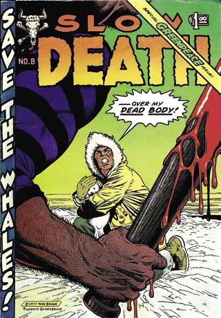
COMIC BOOK CREATOR • Fall 2 023 • #32 35
Slow Death TM & © Ron Turner and Last Gasp. “Animals Your Children Will Never See” © William Stout.
Byron Preiss VISIONARY
43 C OMIC BOOK CREATOR • Fall 2023 • #32
On May 24, 2024, it will be 50 years since...
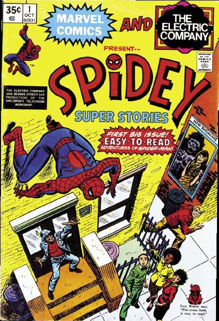
Byron Cary Preiss, born in 1953 of earthly New York City, and, since 2005, residing in the celestial cosmos, incorporated his company, Byron Preiss Visual Publications. In the spring of 1974, the wunderkind had just turned 21 and he’d already, as a teen, collaborated with comic book super-stars Jim Steranko and Joe Kubert; interned for DC Comics, where he inspired publisher Carmine Infantino to collect comics into paperback books; and worked at the Children’s Television Workshop, when he brainstormed with Marvel’s Stan Lee to develop what became the easy-to-read comic book series, Spidey Super Stories.
With his BPVP, Inc., the young man was determined to use it to advance a new literary form, one that had, in 1974, yet to even be given a name, but would soon find one: the graphic novel.
It wasn’t long before Preiss met and deeply impressed Norman Goldfind, publisher of paperback house Pyramid Books, who okayed
the initial BPVP productions, with the young man assuming his role as book packager. First to emerge was the Weird Heroes series, a comics/ pulp magazine hybrid enlisting the talents of an astonishing line-up of both literary and illustrative storytellers.
Then came the prototypical graphic novel series, Fiction Illustrated, which included Steranko’s masterwork, Chandler: Red Tide, followed by the Illustrated series and BPVP’s science fiction graphic novels.
By the 1980s, Preiss’s ambitions widened as he helmed projects in various book categories, including cult phenomenon The Secret, and, while he only sporadically delved into the comics realm, his new ibooks imprint was poised to conquer graphic novels just before the tragic event of July 9, 2005.
Much of the following retrospective is derived from an extensive two-session phone interview with Byron about his life and achievements conducted by yours truly in 2003. — JBC.
Biographical Essay by
Jon B. Cooke
Portrait by Thomas Haller Buchanan
#32 • Fall 2023 • COMIC BOOK CREATOR
42
The Dionsaurs cover illustration © William Stout. Byron Preiss portrait © Thomas Haller Buchanan.
EDITOR’S NOTE: Regarding Ye Ed’s 2003 Byron Preiss interview, thanks to Steven E. Tice and Barbara Lein-Cooper for help with the transcript, to James Romberger for a copy-edit of same, and to Judy Gitenstein for sharing her editorial expertise on this final essay.
1 Jeffrey Preiss, interview [Nov. 9, 2022].
2 Byron Preiss, interviews [June and Nov. 2003]. Unless otherwise referenced, all quotes from Byron are from Ye Ed’s two-session Q+A.
3 Jeffrey Preiss.
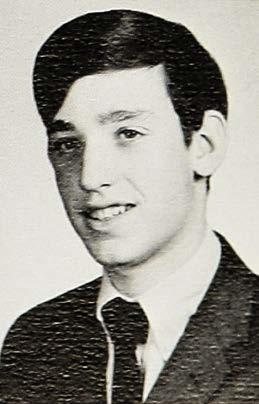
Top: Street view of 1304 Glenwood Road, in the Flatbush neighborhood of Brooklyn, where Byron Cary Preiss grew up and the mailing address he used for his early fan efforts.

Inset right: Byron’s senior portrait taken for the 1969 Midwood High School Yearbook.
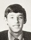
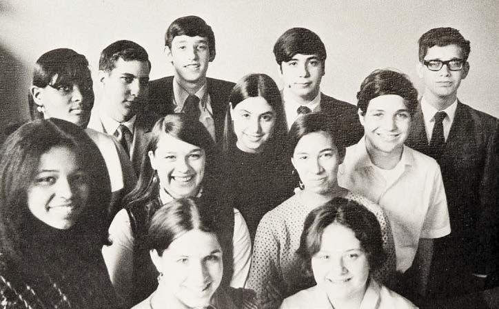
Below: Byron is highlighted in this group portrait of the Midwood High School “commissioners,” presumably a student leadership group at the public institution.
THE BROOKLYN BOY
Comics were a constant in the boy’s world. His cousin, Jeffrey Preiss, remembered the bedroom of the only child filled with “just stacks and stacks of comics,” likening the collection to “the Fort Knox of comics.”1 Years later, when the lad was all grown up, Byron would recall, “I loved them all. I would read whatever they printed. If it was a comic book and it wasn’t Wonder Woman, I would read it. I loved the Carmine Infantino period at Detective Comics, I loved Gil Kane’s work, I loved Stan Lee and Jack Kirby’s work on anything, John Buscema’s work. I just loved all the quality work. You name it.”2
Even the presence of America’s Gemini 3 astronauts — the first pair of U.S. spacemen to enter Earth’s orbit together — didn’t distract the boy from obsessing about comics. “When I was 11 years old, my parents took me to one of the ticker-tape parades for the astronauts,” he said, “and I remember my mother [came with] me up to the DC Comics offices, which, for a time, was on Lexington Avenue. I think it was Jack Adler who gave me a tour of the DC offices. I remember there were a lot of drawing boards, and they gave me a Curt Swan Superman daily strip as a souvenir…. It had the Bottled City of Kandor in it. It was very exciting…. Carmine Infantino, I think, was there at the time. And Murphy
Anderson, if I remember correctly, was up there. And, of course, [so was] Sol Harrison and the old DC crew.”
Reminiscing about the DC offices of that chilly, drizzly Manhattan day in early spring 1965, he said, “I just thought it was the coolest place in the world. I’d just seen the astronauts go down Broadway, and that didn’t impress me as much as going up and seeing those comic-book offices. I don’t know how I talked my mother into taking me up there.”
It was in the Flatbush section of Brooklyn where Byron Cary Priess — a family name pronounced “price” — would start it all, on 1304 Glenwood Road. Son of attorney Edmund and homemaker Pearl (née Krasnor), he was born on April 11, 1953, one day after his father’s 41st birthday. “Byron’s father, born in Europe, was an immigrant, even though he came here with his family as a small boy and my father was born here in America,” cousin Jeffrey recalled. “Uncle Ed was sort-of a father-figure to my father. In some ways, Byron’s upbringing was more old-world than mine, which was more modern. They lived in this house in Brooklyn and we lived out in the suburbs. Their house was one of these wonderful, Brooklyn Victorian houses and [Ed] lived not too far from his sister, so there was this kind-of Brooklyn Jewish community where families stay close and it was an observant family.”3
(Though referred to as Austria in some documents, Edmund’s birthplace was most likely the Polish city of Zloczow/ Zlochov — today part of Ukraine — where he, at the age of eight, would leave to accompany his parents and travel to America in 1921, just prior to severe immigration restrictions. In 1943, almost four months before he enlisted in the U.S. Army at 31, the Jewish population of his birthplace, numbering some 10,000, was liquidated in early April by the Nazi occupiers with the aid of Ukrainian locals. According to his son, Edmund served his adopted country initially at the rank of Private and was in Europe for the Allied invasion on D-Day and the Battle of the Bulge.)
Despite future rumors to the contrary, “We were not a rich family,” Byron explained, “so it was pretty much just an allowance to go to the newsstand.” And young Byron scoured the borough to appease his mania. “I was frequenting the newsstands and comic shops, like every other kid in Brooklyn, which, in those days, were strictly candy stores.” Asked if he was #32
• Fall 2023 • COMIC BOOK CREATOR
singularly a DC fan, he replied, “No, I walked [all] sides of the street — DC, Marvel, Tower/T.H.U.N.D.E.R. Agents, MAD — pretty much anything but Archie. I even had my Harvey Comics phase when I was eight. If it had four colors and a staple, I’d read it.”
“Byron and I grew up maybe a mile apart in Brooklyn,” future DC publisher Paul Levitz shared. “He was maybe four or five years older than I was, so we didn’t come and go a lot. But we went to the same used bookstore, My Friend’s Bookstore, that sold old comics. I worked behind the counter there now and then briefly when I was a kid.”4 (Discovering the establishment — also frequented by future comics pros Howard Chaykin and Dan DiDio, among others — was, for Jimmy Palmiotti, “like winning a comic book lottery.”)5
It was the youngster’s passion for the form that would propel Byron into a fascinating and innovative career as a true publishing visionary who would help usher in a new age of comics, and it was in fandom where his journey truly began.
FANNISH BEGINNINGS
Byron, who professed an average middle-class life-style, went to Midwood High School — “the same high school Woody Allen attended” — where, he said, “I was friendly and I had plenty of great, gregarious friends, but I was a fairly shy person, I guess.” There, as a “commissioner,” he volunteered in student governance though, during that period, “My first experience of any consequence was… I sent scripts to Julie Schwartz at DC, and he was kind enough to write me encouraging letters, which I saved in a scrapbook. He encouraged me to keep writing.”
It was while in high school Byron corresponded with fellow fan and future letterer extraordinaire Tom Orzechowski, who welcomed the Brooklyn teen as a contributor to his Detroit-based fanzine, Ye Graphic Gazette, where Byron put to work his talents as burgeoning scribe. For the last issue, dated Dec. 1969, he wrote an essay on the diminishing genre of super-hero comics, “The Strange Case of the Deaths of the Superheroes,” and a piece on a British artist new to the scene at Marvel Comics, “Here Comes… Smith, Man with a Pencil,”
about Barry Windsor-Smith. Designated YGG’s Eastern seaboard representative, Byron designed his own article layouts, but stopped short of attempting any illustration.
“I officially surrendered my expectations of artistry when Tom Orzechowski and I worked on a fanzine together,” Byron confessed. “I was 16 at the time, and I drew a playing card with the face of Captain America.” He added with a laugh, “That was the beginning of the end. But Tom and I had a great deal of fun, actually. He was in Detroit. He and Mike Kucharski were my pen pals. I can’t even remember how we got to know each other, though Tom might. But he was working on a fanzine and I was contributing to that, trying to submit drawings, and it was nice. It was early fandom.”
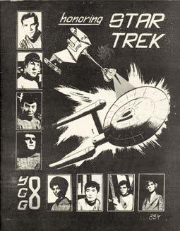
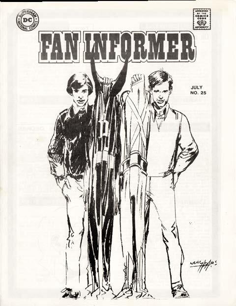
Michael Kucharski recently remembered those days, when he was an aspiring comic book artist, sharing that, in addition to YGG, “Byron was also a later contributor to Arvell Jones’ Fan Informer fanzine, providing at least one cover drawn by Neal Adams of Byron and a friend holding Deadman and Adam Strange costumes.* In spring of 1969, Byron wanted to break into the comics industry as a producer — or maybe an editor — [and] he developed an
*Guest edited by future renowned letterer Tom Orzechowski, the fanzine, Fan Informer #25/26 [July 1970], did include a cover illustration by Neal Adams of “Byron Preiss and friend.” The ish was dedicated to Byron [left], called “one hell of a guy.”

4 Paul Levitz, interview [Jan. 3, 2023].
5 Jimmy Palmiotti, “My Friend’s Bookstore,” blog entry, Blast from the Past website [undated], https:// www.zestworld.com/Paperfilms/ update/blast-from-the-past-myfriend-s-bookstore.
Inset left: Neal Adams cover, Fan Informer #25/26 [July 1970]. Below: Ye Graphic Gazette #8 [Dec. 1969] cover and page of an article by Byron, said to have been designed by the teen himself.
Deadman, Adam Strange TM & © DC Comics. Daredevil, Black Panther, Yellow Jacket TM & © Marvel Characters, Inc. Star Trek TM & © Paramount Pictures Corporation.
45 C OMIC BOOK CREATOR • Fall 2023 • #32
https://www.youtube.com/ watch?v=MyLfgrsyL-g&t=5s.
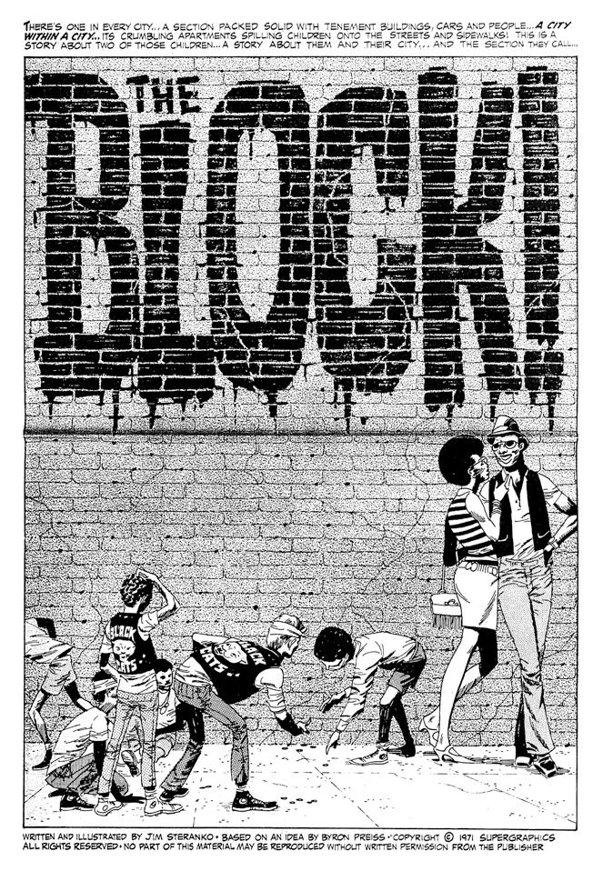
ONCE AROUND THE BLOCK
Of Byron Preiss, Jim Steranko said in 2020, “He was really sharp and we spoke the same language,”11 even in the earliest years of their association. Byron described the genesis of his first project with the renowned artist: “In September, 1969, I started college at the University of Pennsylvania, in Philadelphia. I was pretty young to start college. I was 16, but I really was excited about being there. I got involved with the student newspaper, did some single-panel cartoons for them. I found out, in 1970, during my second semester, that Jim Steranko lived in Reading, Pennsylvania, actually an hour away from where I was going to school. So I started to write to him. I got involved, as many kids did in those days, in community affairs and began working with some of the African-American communities, trying to teach kids to learn to read. It was a very difficult time in west Philadelphia and south Philadelphia.”
In his first semester of college, Byron set about promoting comics,* proving its potential as a force for public good. In an
*During that first semester, Byron volunteered as a tutor/teacher’s aide at a Philadelphia middle school, later saying, “I had begun testing a new educational device: comics. The reaction had been exciting, but not unexpected. Kids who were turned off by the sight of the printed word, jumped at the chance to read from comics. Color, action, adventure — it worked.”
essay in Comixscene #4 [June 1973], he wrote, “[W]hat was needed was a new comic, not about a super-hero or a monster, but about kids on the street, and how drugs affected their lives. It had to be short, and it had to be made available everywhere — on the street, in schools, in public media.”12
Byron continued, “So I approached Jim about doing an anti-drug comic book…. It was called ‘The Block.’ [See left.] To my shock and joy, he agreed to work with me on it. We put together the comic along with a teacher’s guide. I saved my money for the printing of the comic, which was done as a tabloid newspaper…. Oh, it had magnificent drawing. One of pure visual style, as only Jim could do. Beautifully paced. A little bit of Kurtzman-esque echoes in caption design. Very clear. And the kids loved it. And I thought I was onto something in terms of using comics to teach reading and teach life’s lessons.”
Development of “The Block” occurred in winter. “The months that followed were a period of discussion, experimentation, and conception,” Byron explained about sending Steranko an outline. “Drawing upon certain elements of my script for atmosphere and characterization, Steranko wrote a story of his own — a tale in the classic mold — a story of two ‘brothers’ who choose to walk different paths. It was a story of the city, of the inner city, of a neighborhood, of ‘The Block.’”13
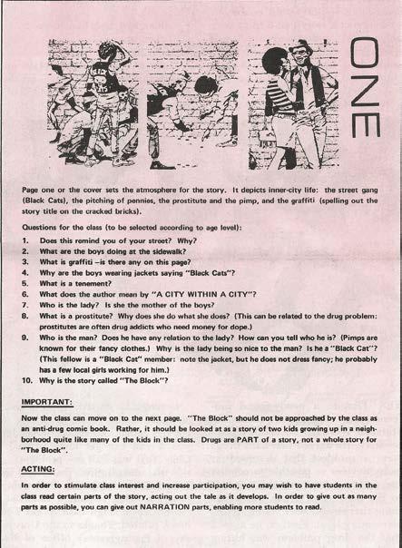
Intended for a readership of inner-city students aged eight to 11, “The Block” was an eight-page, tabloid-size presentation, printed on newsprint, with an accompanying “Teacher’s Guide” [see below]. The story, conceived by Byron and written and drawn by Steranko, was about two Black kids whose lives diverged, with Billy Lee embracing a love of music and living a creative life, and Leroy descending into drug addiction and tragedy.
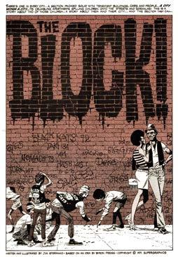
Funding for the first printing was secured from UPenn’s Office of External Affairs, and the tabloid was distributed by nonprofits Model Cities and the Fellowship House to classrooms in poverty-stricken portions of Philadelphia. Emboldened by it being embraced by City of Brotherly Love educators, Byron began contemplating the possibilities of national exposure for their effort or, at the very least, discover some level of acceptance for “The Block” in the Big Apple.
#32 • Fall 2023 • COMIC BOOK CREATOR 48
TM & © Supergraphics/James
“The Block”
Steranko.
11 James Steranko, Comic Book Historians interview [2018],
12 Byron Preiss, “The Block,” Comixscene #4 [June 1973], pgs. 11–12.
13 Ibid.
tions, and it was the Golden Age of DC as a Silver-Age company, I guess you’d say. It was at 909 Third Avenue. There was a cafeteria where artists would come and hang out. It was there I met Neal Adams. Neal was artist-in-residence at DC. He had a room with an old Art-O-Graph machine, which allowed him to take his minute pencil sketches and project them onto Bristol board and then render the hell out of them as only Neal could. You had, in one place, Carmine as publisher; you had Neal, Joe Kubert, the tail end of the days of Murray Boltinoff and Bob Kanigher. You had Julie Schwartz in his heyday. You had Mike Sekowsky, Joe Orlando, Nick Cardy, Vince Colletta, Mike Kaluta, Bernie Wrightson, Murphy Anderson, Dick Giordano, Marv Wolfman, Len Wein, and Paul Levitz, all around on a daily basis. If that didn’t inspire you about the medium, then you had to be dead.”
Byron then observed, “I have to say, everybody in the industry — and this is even true today — just the nicest people, just really caring about the medium regardless of their own financial situation. There’s also a lot of bitterness in the field after all these years, but in those days there was a palpable enthusi-
You had titles like Bat Lash come out, you had books like ‘Firehair’ from Kubert. I mean, the field was just exploding. Then, of course, there was Jack [Kirby]’s Fourth World! And there were new formats being explored.
“Neal had just done his first run of Green Lantern with Denny O’Neil and DC was also the sister company of Paperback Library, soon to be called Warner Paperback Library. I went into Carmine’s office and said, ‘Carmine, you have to take these comics and collect them into book form. You have to convince the paperback people to publish them, because college kids will buy them, and it’s important work that has to be seen. So Carmine let me meet the paperback people, and we dummied a collection up, and they published two of them.
“I’m thanked in the book. The1960s saw a slew of paperback collections, including the super-heroes of Marvel, Batman, T.H.U.N.D.E.R. Agents, even the Archie super-heroes, as well as some Warren reprints, but these were ‘socially provocative’ comics.” In fact, the paperback’s title page sports a hip, activist slogan, “Comix That Give a Damn.”
Volume one was released on Jan. 15, 1972, and the second precisely six months later, on June 15. There were no more editions. “I’m sure [sales were] okay,” Byron said. “I mean, today the numbers would be spectacular. The number 35,000 sticks in my head.” At least in the Big Apple, it appeared a sell-out, as mentioned in Chuck McNaughton’s “Eerie’s Book Reviews” column, in Eerie magazine: “When the book was unleashed last spring, it vanished from New York bookstores in the twinkling of an eye. With good reason. It contains the first two Denny O’Neil/Neal Adams collaborations on the now legendary Green Lantern/Green Arrow comic book saga, which for little more than a year, expanded the realm of comic book art. It dealt for the first time in comics some real, and un-’campy’ super-evils: bigotry, drug-addiction, poverty and pollution. A comics Greening of America.”24
HEY, YOU GUYS!!!
asm for what comics could be. Neal was the spearhead of that attitude and he really drove the industry. It was a vision and an ability to inspire Neal had, at the time, being in New York and dealing with Marvel and DC and the rights of artists. He gave everybody a sense that this was a medium with great potential. Of course, cartoonists — comic strip artists — had already proven that for newspaper strips. It was a unique time. You still had the great adventure strips being a significant portion of the revenue of the comics medium. You had Milton Caniff active and working, you had Stan Drake active and working. You had a lot of the giants still leading the field.
“Then there was this ghetto beneath called comic books. It was still an age when someone like Neal, who was just a genius, originally aspired to do a daily strip. And, of course, he did Ben Casey. It was an interesting time. Everything was changing, both socially and within the medium. You had Carmine, an artist, running a comic-book company. That was revolutionary!
“I guess I worked at DC from 1971 into ‘72,” Byron shared, “and then, in the summer of ‘72, I began to work on Sesame Street…. I befriended Jesse Jackson’s head of community relations, and he recommended me to Sesame Street for a job. I went to work on Sesame Street in the print division under Christopher Cerf, who was [Random House publisher] Bennett Cerf’s son. Chris was a major force at Harvard Lampoon.”
Byron also made use of his comic book connections at
The Electric Company TM & © Sesame Workshop. Spidey Super Stories TM & © Marvel Characters, Inc.
53 C OMIC BOOK CREATOR • Fall 2023 • #32
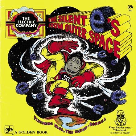
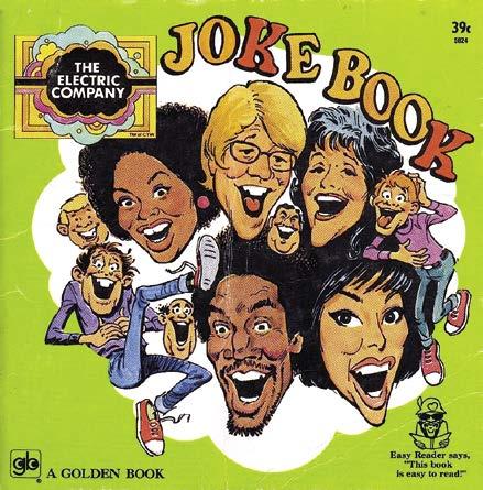
This page: The first two books to carry Byron’s credit as author were The Electric Company Joke Book (with art by MAD’s Jack Rickard) and The Silent e’s from Outer Space, both from 1973. He also worked with Stan Lee to develop Spidey Super Stories
Graham’s black-&-white (and red) tour The which he published through
24 Chuck McNaughton, “Eerie’s Book Reviews” column, Eerie #43 [Nov. 1972], pg. 49.
Stan Lee, 1970
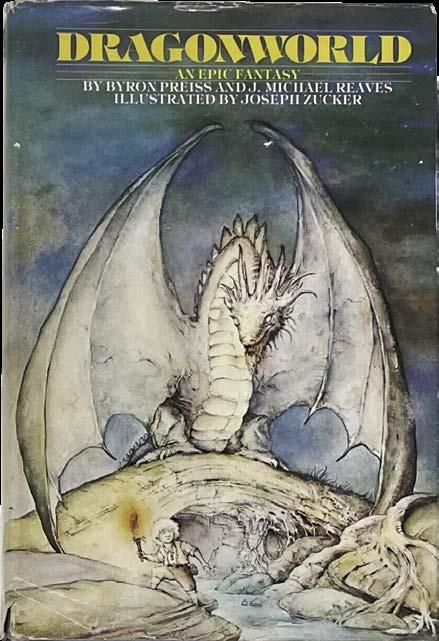
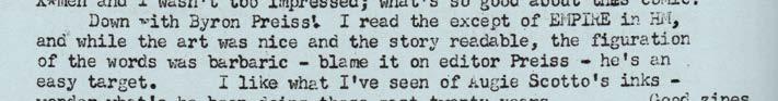
This page: Above is Empire cover with art by Howard Chaykin. a remarkably controversial graphic novel packaged by Byron in 1978; snippet of Ron Harris comment in CAPA-alpha #170 [Dec. 1978]; and the cover of Dragonworld, the well-received fantasy novel by Byron and J. Michael Reaves, with copious illustration by the talented Joseph Zucker and outstanding production overall. The books was released as a hardcover, trade paperback, and mass-market edition in 1979. The epic, obviously influenced by the success of The Lord of the Rings, was adapted into a video game by Byron Preiss Video Productions in 1984.

beautifully printed graphic novels with Baronet, this is spectacular!
“So we go into Berkley with all great enthusiasm for doing Empire. And, at the same time, Baronet commits to a third book, The Stars My Destination, which was Howard’s favorite novel. He turned me on to it, and I loved it and tracked down Alfred Bester. Alfie, of course, had written for the comics, so for him, it was a natural thing to let a comic-book version be done. Here’s the most visual science-fiction novel ever published, and we think this is going to go great guns. And, of course, Howard is growing in fame by virtue of the other things he’s doing.
“So now, Howard was working for me on two graphic novels at the same time. It was impossible. He was not a happy camper…. He never will be, but I had a great admiration for him, and still do. At the time, when we were trying to do these books, it was against great odds. Howard was trying to perfect techniques that would allow him to do a large amount of content with one assistant and still maintain his style. I think, to this day, one of the best things he ever drew was The Stars My Destination. I think Howard did a magnificent job.”
Byron continued, “I did all the panel configurations on The Stars My Destination and gave Howard specific panel layouts and special effects I wanted to build into the book. I think, to this day, Howard probably wants to kill me for that. On Empire, I was under the visionary design influence of Steranko and trying to create a language that would work over 160 or however many pages it was, so the rhythm of the book would be constant and Chip Delany could write to that. So it would be a consistent visual language throughout a book of that length. I’ve always been very focused on the fact that when you do a longer work, it’s critically important to have a consistent visual language.
“At any rate, here comes Empire. All this expectation, limited signed edition…. And Berkley decides the P&L — the profit and loss statement — for the book, doesn’t look very good. So they change the paper in the 11th hour from glossy sheet to uncoated white sheet. All this magnificent rendering by Howard is soaked up in the sheet and tortured visually. I can’t look at Empire to this day and not be upset. Although, to the average consumer, it was a good-looking book, I know how well he drew and rendered it, and I know how badly they printed it. So I still can’t look at Empire, but there’s 20 pages in an issue of Heavy Metal somewhere I can tolerate [v. 2, #7, Nov. 1978], even [though] its printing was over-inked. At any rate, they were good books. Then Baronet went bankrupt or foreclosed, and we never were able to publish the second volume of The Stars My Destination until Carl Potts asked me to put it together when he was at Marvel [The Complete Alfred Bester’s The Stars My Destination, 1992, published by Marvel’s Epic line].”
Working with Byron led to Alex Jay meeting any number of creative people also freelancing for BPVP. “After I designed the Empire logo, Byron had me meet Howard Chaykin, at his apartment, to show the logo and its placement on the cover. That’s where I met Joe Jusko. Later on I met Samuel Delany. One of Byron’s publishers was Baronet Publishing, which did The Illustrated Roger Zelazny and Harlan Ellison books, as well as The Stars My Destination. At Baronet, I met Will Eisner and did a couple of jobs for him. When Chaykin’s The Stars My Destination was in progress, I met Alfred Bester, the author, and Steve Oliff, who was assisting Chaykin on volume two.”60
GOOD AND BAD
Even with the notice he received in 1977 as the first artist on Marvel’s Star Wars comic book series, Howard Chaykin had been a frustrated comics professional. “The thing is, once I got the work, it was an enormous letdown, because the work I got wasn’t very interesting, and I wasn’t very good and didn’t know what to do with the work,” he said in 2004. “So I humped along doing different stuff. It wasn’t really until I had the opportunity in the mid- to late ’70s to work with Byron Preiss that everything came together. I loved doing that.”61

With BPVP, he said, “I saw it as an opportunity to do something outside of mainstream comics. Again, it was like doing animatics [in advertising]. The difference was there was no money in it. I got myself into a credit hole I didn’t get out of until I did American Flagg! [starting in 1983], because I was getting paid far less to do this than anything I was doing at the time, but [The Stars My Destination] was satisfying work…. It took forever to get that second volume out. Marvel published it years later.”62
In a 2010 interview, Chaykin was blunt about the packager. “Byron had contempt for the material. At heart, he felt that his
#32 • Fall 2023 • COMIC BOOK CREATOR 64
Howard Chaykin
photo © & by Jackie Estrada. Used with permission. Empire TM & © the respective copyright holder.
, Dragonworld TM & © Byron Preiss Visual Publications.
Howard Chaykin, 1977
60 Alex Jay, email [Dec. 28,2022].
61 Howard Chaykin, “Howard Chaykin: An American Artist,” Comic Book Artist V.2 #4, pg. 82. 62 Chaykin, CBA, pg. 89.
CATS AND MORE DINOSAURS
Increasingly, in the early 1980s, Byron was delving into science fiction/fantasy realms of the prose variety, packaging books for Berkley, which had just purchased Jove Books and was then headed by the brilliant Rena Wolner, about whom Sandi shared, “Rena was the president of three companies by the time she was 48. She was at Berkley, then Simon & Schuster and then Avon, and then she left the business…. She bought a lot of Byron’s creations, a lot of his packaging. She was very supportive of Byron.” (Sandi added about her relationship with trailblazer Wolner: “Rena was basically my sister.”)91
For Berkley, between 1983–86, Byron put together the Masterworks of Science Fiction and Fantasy trade paperback series, which reprinted classic novels by Frank Herbert, Fritz Leiber, Philip José Farmer, Isaac Asimov, and Arthur C. Clarke, all handsomely illustrated by such artists as Michael Wm. Kaluta, Paul Rivoche, Robert Gould, and Ralph McQuarrie.
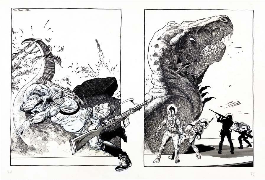
Byron also cultivated a friendship with another famous SF/fantasy scribe, Ray Bradbury, who gave permission for Byron to compile Dinosaur Tales [1983], a collection of his saurian-related writing published by Bantam. The compilation — which boasted a reprint of “A Sound of Thunder,” as well as a new story, “Besides a Dinosaur, Whatta Wanna Be When You Grow Up?” — contained an astonishing team of illustrators — all approved by Bradbury — including William Stout (who was also cover artist), Jim Steranko, Moebius, Overton Loyd, and others, as well as a collaboration between the author and Gahan Wilson about dancing archosaurs. Designed by Alex Jay with glorious frontispiece art by Kenneth Smith (who, you’ll remember, was the designer of Byron’s very first published effort, Fancal 1972!), the trade paperback also contained a “Special Thanks” to Byron’s then-fiancée, Sandi Mendelson. (A mass-market paperback edition was published the next year.)
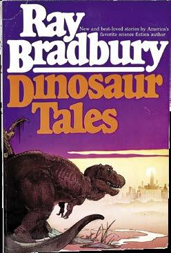
With all due respect to the other fine illustrators of Dinosaur Tales, it is William Stout’s breathtaking and abundant set of double-page spreads (as well as his magnificent cover featuring a T. Rex hungrily eying a modern day metropolis) that elevate the wonderful book to “must-have” status. (It was reprinted in 1996 and by Byron himself in 2003.)
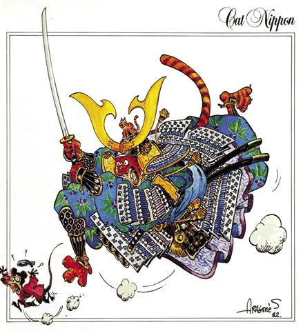
Published by Collier Books, The Secret Life of Cats [1982] is a truly unexpected curiosity in the Preiss oeuvre, no doubt one inspired by the runaway publishing success of B. Kliban’s book, Cat, and its accompanying calendars. Collecting single-page feline-centric illustrations, the book, according to McCall’s magazine, is “the result of 46 artists joining forces… addressing themselves to the question [quoting the book’s introduction]: ‘What does a cat think about all those hours he or she spends sitting on a windowsill, moving only the tip of a tail?’ They give us — besides the expected Fat Cat, Glamour Puss, and Sex Kitten — Cat-Man, Sam Spayed, Poe Cat, Fluff Gordon, and Catanova. (They can’t help themselves, these people.”)92
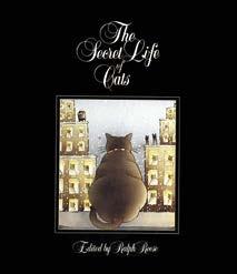
“These people” included another stellar line-up of artists, — all under the direction of frequent Preiss collaborator Ralph Reese, who was the book’s editor — including Rick Geary, Sergio Aragonés, Trina Robbins, Ron Barrett, Alex Niño, Tom Sutton, and Mary Wilshire, among others. Ron Cobb also contributes a color piece, “Shade,” which is identified on the copyright page as being cropped and was owned by motion picture director John Milius. Cobb was production designer for the Conan the Barbarian movie that was released the same year, and he had been introduced to Byron by Bill Stout.
This spread: The Secret was another heavily-promoted BPVP production. On previous page bottom, Sandi [left] and daughters, Blaire [center] and Karah [right] appeared on Expedition Unknown episode about the book. Above is Sergio Aragonés’ contribution to The Secret Life of Cats [1982]; and below is Bill Stout’s original art that appeared in BPVP’s Dinosaur Tales, featuring Ray Bradbury stories.
69 C OMIC BOOK CREATOR • Fall 2023 • #32
91 Mendelson.
92 Andrea Thompson, review, “Cat Books: Pick of the Litter,” McCall’s V. 110 #6 [Mar. 1983], pg. 66.
The Secret Life of Cats, Dinosaur Tales TM & © Byron Preiss Visual Publications.
IT IS THE YEAR 1984
As with all successful publishing ventures, Choose Your Own Adventure, the Bantam interactive children’s paperback series that launched in 1979 and has sold a staggering 270 million copies thus far, made room for more series in the genre, two from its own publishing house: Be an Interplanetary Spy [1983] and Time Machine [1984], both series packaged by Byron. Referring to Be an Interplanetary Spy, which had 12 volumes between 1983–85, then Bantam editor Judy Gitenstein recently shared, “The books were unlike anything out there in
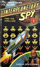
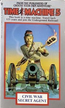
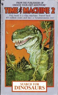
the children’s market, then and now. The books are interactive but not quite the way Choose Your Own Adventure was. The plots are linear, and the reader advances by solving puzzles and getting through mazes and space games worked out right on the page. In the books, you are a spy working for an agency located in Sector 666 — which, as it happens, was Bantam’s location, in the Tishman Building, at 666 Fifth Avenue. The books have tons of little touches like that and can be read/ played on many levels.”93
Demian’s Gamebook website describes Be an Interplanetary Spy as “cast[ing] the reader as a spy who travels through space tracking down various alien criminals. The books are very visually-oriented, having a style that feels like a mix between comic books and early ’80s video games.”94 Byron, in discussing those busy days juggling multiple projects, talked about preferring the packaging to doing the work of an actual publisher. “It wasn’t fun doing half of something,” he said. “Well, it was fun doing half of something; it was not fun not doing the other half. We were [packaging] science-fiction, it was very successful at the time. We were [packaging] Time Machine for Bantam at the same time we were doing Nuts with Harvey [Kurtzman]. Time Machine went to 25 volumes and millions of copies in print…. Actually, they were interactive books, but they were historically accurate. So each book would have a wonderful premise — ‘Why did the Samurai Age end?’ or ‘What ended the Pony Express?’ — Then you’d get facts and you’d have to go back in time in the books to solve them.
IF

“We had comics artists illustrating the books and doing the covers. We had three Steranko covers. We had a wonderful French Revolution Steranko cover, with the interiors by Scott Hampton. We had a Sherlock Holmes-type book done by Charles Vess. We had Richard Hescox do a knights book. We had Alex Niño do three or four. We had Dave Stevens do a cover for a pirate book, and the insides [by] John Pierard, who did one of our other Epic graphic novels, which was Steven Brust’s Jhereg [1990], a fantasy graphic novel.” Asked who were the Time Machine writers, Byron replied, “People like Michael Reaves, Steve Perry, people who [later] worked for Dark Horse. We did 25 of them. Fastner and Stout covers. The covers were just wonderful…. Oh, Steve Leialoha did two beautiful books, the samurai one and a Western.”
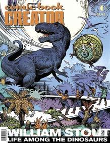
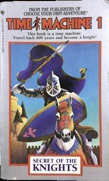
(84-page FULL-COLOR magazine) $10.95 (Digital Edition) $4.99 https://twomorrows.com/index.php?main_page=product_info&cPath=98_132&products_id=1764
#32 • Fall 2023 • COMIC BOOK CREATOR 70
All items TM & © the respective copyright holders.
Photo courtesy of Judy Gitenstein.
Judy Gitenstein, 1984
YOU ENJOYED THIS PREVIEW, CLICK THE LINK TO ORDER THIS ISSUE IN PRINT OR DIGITAL FORMAT!
BOOK CREATOR #32
STOUT is interviewed about his illustration and comics work, as well as his association with DINOSAURS publisher BYRON PREISS, the visionary packager/publisher who is also celebrated in this double-header issue. Included is the only comprehensive interview ever conducted with PREISS, plus a huge biographical essay. Also MIKE DEODATO on his early years and
COMIC
WILLIAM
FRANK BORTH on Treasure Chest!
