Although it is widely accepted Bill Everett’s pre-Code horror writing and art presented in the later issues of Venus, between 1951 and 1952, are truly outstanding, perhaps not enough has been said of its seminal influence on the genre as a whole. It should be remembered, Atlas was the prime purveyor of this ghoulish material, with over a dozen titles on the stands each month during the peak years of 1952 through 1954.
The legendary status of Everett’s Venus work stems from his being one of the architects of the Golden Age. This was best expressed by his creation of the Sub-Mariner, the aquatic superhero featured in Marvel
Comics #1, November 1939, who would appear in all 92 issues of that series’ initial run all the way through until 1949, as well as branching into his own title for 42 appearances during this incredible Golden Age of comic book publishing. The original comic books have since become scarce and rather expensive: Everett’s fame as a superhero creator would eventually aid collectors and historians alike in garnering an appreciation of his contribution to Venus. This came by way of the few story and splash panel reprints made available to all but the wise or well-heeled, who had already succeeded in acquiring at least some of these highly prized issues.
I could not count myself among either one of those groups—I was one of those who would benefit when the oversized hardcover Atlas Archives: Venus, Volume 2 appeared, securing a copy and immediately diving in. The intro by Dr. Michael Vassallo, the redoubtable Doc V, is admirably comprehensive, with his recap of issues 1-9 (Volume 1) helping one to understand how the oddest of the Atlas “working girl” titles (the love goddess is reincarnated as a big city fashion editor) morphed into the realm of the macabre.
Working Girl Comics
Since the earlier comic book history researchers were mostly superhero fans, these became the focus, as the Golden Age was really about the first flowering of fourcolor heroes. It was only later, it became obvious the post-war era
was also worthy of attention, even though the excitement engendered by the superhero phase of comic books was winding down. Publishers had noted that the returned servicemen with dimes in their pockets were a large and voracious part of their audience. Their response was to put a somewhat more adult spin on many of their offerings. Certain genres now came into their own: Crime, romance, and western. Atlas was hugely influential in building up the “working girl” styled comics, engaging nice-looking young ladies to ensure there was an appeal for both male and female readers. Sales went up; and the success of this new style encouraged variations on established themes. So to see a classical goddess working at a typewriter behind a modernday desk was very much a part of the inventiveness of the era, as well as being relevant given the role of women in the workplace had shifted so much during and after WWII. The title continued, with ever more mythic and fantastic elements added into the mix, fueled by the industry revelation that this latecomer genre comprised of fantasy, horror, and science fiction was going to be a big seller. So, enter Bill Everett. He had already
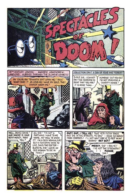
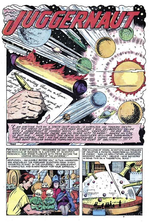
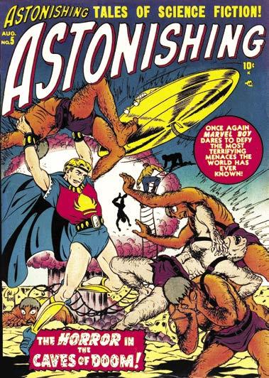
shown editor Stan Lee how adroit he could be with horror in tales such as “Spectacles of Doom” in Marvel Tales #94, November 1949, and science fiction with “Juggernaut” in Marvel Tales #98, December 1950. Stan knew Ev was on to something and had him take over Marvel Boy, a brand new superhero title, with issue #2, dated February 1951, after Russ Heath had introduced the character on his debut a couple of months before. With issue #13, cover-dated April 1951, Everett’s work began on Venus. Most of his Venus and Marvel Boy work (the latter character lasted a year, expiring slowly as his mag—retitled as Astonishing—shifted to fantasy-horror) was produced single-handedly: Written, drawn, and lettered in a bravura run.
Colorful Phantasmagoria
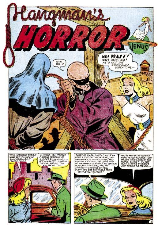
Venus #13 was transitional, with Everett taking over the strip where it had left off. In #14 he ups the ante, putting his stamp firmly on the stories: Colorful phantasmagorias with the gorgeous goddess on hand to rectify reality with wit and charm. “Fountain of Death” is pure science fiction, “Hangman’s Horror” is definitely horror, and “Venus Meets the Lady Killer” is a nod to the mythic background of the series.
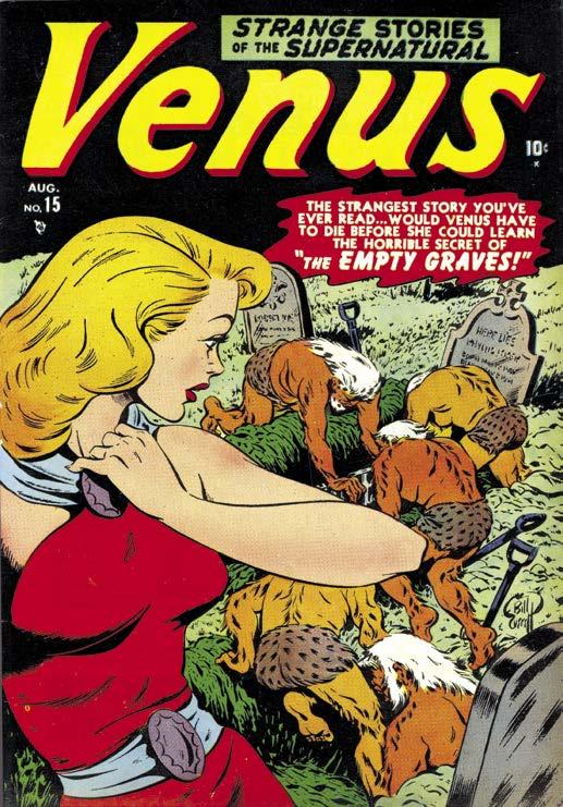
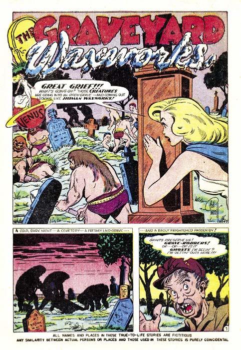
Issue #15, August 1951, dials up the intensity to fullblown pre-Code horror, with Everett drawing his first cover for the title, along with illustrating the lead story, “The Graveyard Waxworks.” Venus bests reanimated
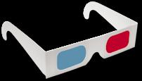
AMAZING! EXCITING! SPECTACULAR! WHEN HORROR AND SCI-FI FANS WORE FUNNY LOOKING GLASSES
by Mark Voger
“The camera contains two lenses—the pupillary distance apart being the same as that of our own eyes. On the screen, to the naked eye, the photography appears to be out of focus, a red and green outline of each figure being plainly discernible. This was remedied by the red and green lens glasses given out at the door, the instructions being that the red glass was for the left eye and the green for the right... By closing one eye, the pictures are seen only with breadth and height as is the ordinary picture. Opening the eye immediately gives them depth, and, instead of the foreshortened view of a room which we ordinarily get in motion pictures, we see the room exactly as we would were we to see it in real life.”
Nope, not a review of Arch Oboler’s jungle thriller
Bwana Devil (1952), which is regarded as the first 3-D feature film. The account appeared in a 1915 edition of the film journal Motography under the headline “Stereoscopic Pictures Shown.” It just goes to show you: There’s nothing new under the sun.
By the Fifties, 3-D was viewed (albeit, briefly) as a godsend for the movie industry, which was facing strong competition from that newfangled thing called television. From the earliest days of the fad, 3-D found a kindred spirit in the horror and science fiction genres. Horror and sci-fi are big, melodramatic. 3-D can do big and melodramatic. The formats seemed made for one another.
The mack daddy of all 3-D horror movies had appeal that wasn’t limited to horror geeks. This movie was a bona fide blockbuster.
3-D MONSTERS
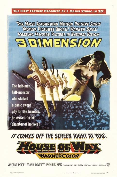
HOUSE OF WAX (1953)
Ah, hoopla. Posters for Warner Bros.’ House of Wax made a carefully worded claim: “First Feature Produced by a Major Studio in 3-D!” In other words: Yeah, Bwana Devil got there first, but it wasn’t from a “major” studio. Snobbery!
In any case, Warner put the full might of its resources behind this widescreen, Technicolor, 3-D spectacle. André de Toth’s House of Wax is as much a glittering mainstream entertainment as it is a horror film. And it represents the moment when the film’s star, Vincent Price, ascended to the horror movie throne following decades of dominance by old masters like Boris Karloff, Bela Lugosi, and Lon Chaney Jr.
This didn’t come out of the blue, exactly; Price had flirted with the genre for years. He previously played a doomed nobleman opposite Karloff in Tower of London (1939); the Invisible Man in The Invisible Man Returns (1940) and Abbott and Costello Meet Frankenstein (1948, a cameo); and a murderous medico in Shock (1946). But from House of Wax on, Price had a lasting, and profitable, hook.
It’s a canny performance. As mad sculptor Henry Jarrod, Price brings a veneer of believability to the bombastic dialogue, convincing the audience that Jarrod communicates with his wax creations, and is in love outright with his Marie Antoinette (though he has yet to “find” the perfect Marie). Price’s Jarrod somehow evokes sympathy, even though we can clearly see he is one twisted dude.
A star was born. By 1953, Price had acquired a seasoned beauty in middle age, and looked quite becoming in period garb—a prerequisite for any horror star. He was the right man for the job of holding together what could have gone down in flames (pun intended) as an expensive publicity stunt. Instead, House of Wax was No. 1 at the box office for five straight weeks, and finished as one of 1953’s top grossers.
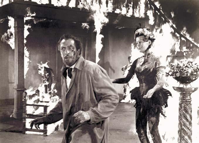
Setup: In 1800s New York City, Jarrod’s business partner Matthew Burke (Roy Roberts) burns their wax museum to the ground for the insurance money. Jarrod’s body is never found—he is presumed dead—and Burke lives the high life off of the insurance payoff.
Stalking the streets is a mysterious figure in a widebrimmed black hat and cape with a disfigured face. But there’s no mystery to his identity, at least for the audience. We know it’s Jarrod, especially when he kills Burke and makes it look like suicide.
One day, Jarrod materializes in a wheelchair with face intact, though his gloves cover gnarled hands rendered useless in the fire. Jarrod is launching a new wax museum, this one focusing on sensational murders rather than historical tableaux. “I’m going to give the people what they want: sensation, horror, shock,” he says in what could double as the mission statement for the remainder of Price’s career.
Jarrod can no longer do the sculpting, which he leaves to two “pupils” who are more like henchmen. One of them, Igor, is played by Charles Bronson, here billed as
THE 3-D COMIC CRAZE THAT DIDN’T QUITE TAKE COMICS BY STORM by
Peter Normanton
If Warner Brothers could bring 3-D to life on the big screen, then 3-D could come to being in the pages of a comic book. It was just too good an opportunity to miss. With all the excitement generated by Warner Bros.’ 3-D terror House of Wax in April 1953, it wasn’t long before the comic book industry was experimenting with furthering the thrills and spills in their content, to give them that extra dimension, a dimension
designed to explode from the very page. Shortly after the release of House of Wax, several creative pioneers set out to break new ground, conferring the conventional 2-D comic book with a seemingly inconceivable third dimension.
In their endeavor to make comic books even more entertaining, Joe Kubert and Norman Maurer came up with a process they christened the “3-D Illusteror,” layering as many
as five acetate cells over a Craftint board to create an illusion of depth. With no time to spare, their employers at St. John seized upon this innovation, releasing Three Dimension Comics, starring Mighty Mouse, which although cover-dated September 1953, hit the newsstand during the heat of July. And boy did it hit—making the newsstand even hotter! It’s price tag may have been hiked up to a quarter, but this piece of funny animal malarkey went way beyond anyone’s expectations, selling over a million copies in a matter of weeks to outperform the most popular titles of the day. Such was the clamor for this cutting edge presentation, St. John opted for a second print, before swinging into action to set about publishing more of these three-dimensional comics. To their way of thinking, it was the future.
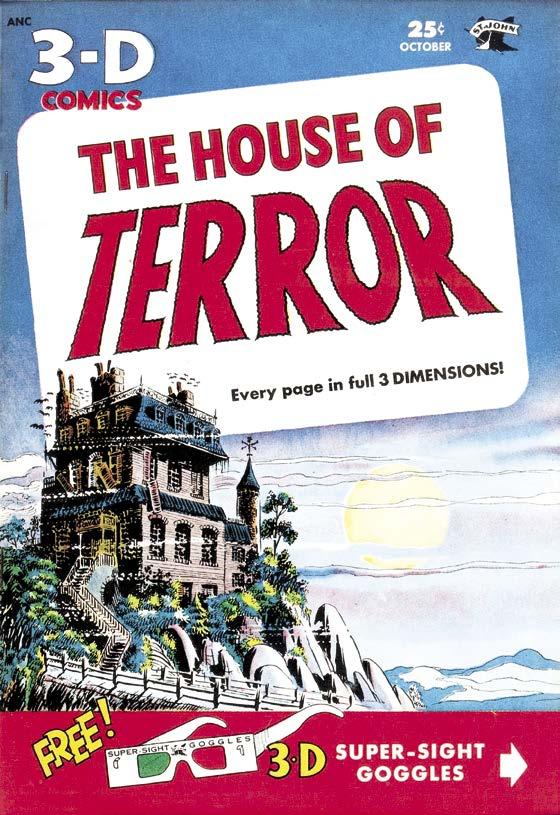
Among these new titles came 3-D House of Terror, which could be found on the newsstand just a month after the release of Three Dimension Comics. In all fairness, St. John hadn’t exactly impressed with their horror comic output, fielding just seven issues of Strange Terrors along with nine issues of Weird Horrors, although their covers were appreciably different to anything out there at that time. Amazing Ghost Stories and Nightmare
were still waiting in the wings, being readied for their debut just a few months hence.
3-D Dread
Since joining the industry in 1947, St. John’s bread and butter had rested firmly with their funny animal, crime, humor, romance, and war titles. Their entry into the domain of four-colored horror had been cautious, initially unearthing reprints from Chesler stock to sit alongside new material embellished by Joe Kubert and Bob Forgione, among others. 3-D House of Terror was a hair-raising way to avail themselves to the demand for these cutting edge 3-D comics, while making it clear St. John were at last beginning to take their venture into horror a little more seriously. The introduction to this 3-D fear-filled oddity beckoned its readership to “travel into the amazing third dimension.” However, it failed to disclose the terror within would be exacerbated in a way never before seen in a horror comic, the dread now spilling forth from the pages upon which it had been printed.
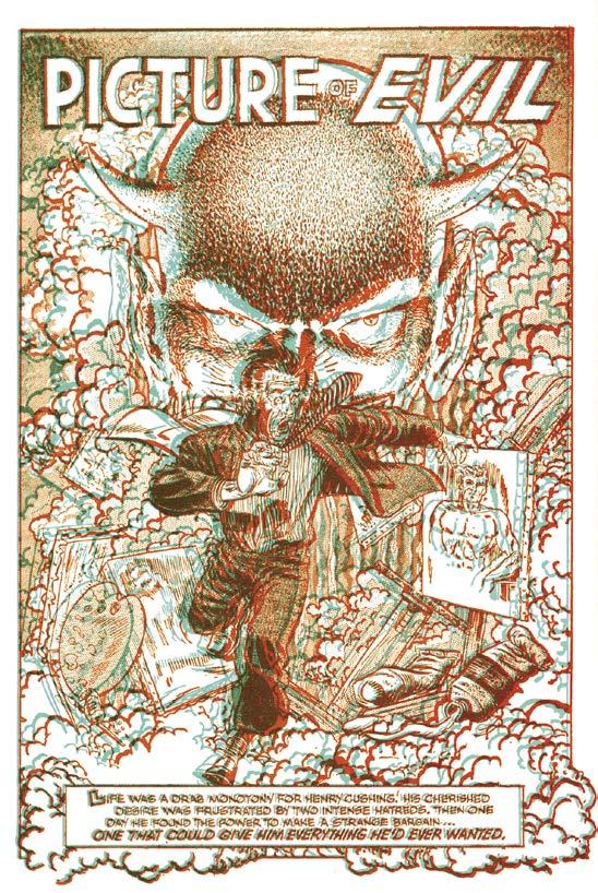
Behind Joe Kubert’s brooding cover, which could have adorned DC’s revitalized House of Mystery during the late ’60s, came his rendition of “Picture of Evil,” introduced with a hallucinatory splash page depicting a terrified man running full pelt from the looming visage of Satan. You can
Wof Adventures into the Unknown may have been the catalyst for a torrent of similarly creepy publications, but at no time was it planned that way. Their apparent enterprise was in reality bucking the trend, for ACG was never really a pioneering publisher. Their modus operandi was to gauge the market, then jump aboard the bandwagon, reaping the rewards when others had already taken the risk. This prudence almost saw the short-lived 3-D phenomenon pass them by; yet their cautious approach would see them avoid so many of the pitfalls that colluded to curtail this fleeting moment in comic book history.
The process involved in the making of these 3-D comics was costly. As a result, the cover price was always going to be substantially higher than their 2-D counterparts; although this didn’t deter over a couple million readers digging a little deeper into their pockets when Three Dimension Comics first appeared. Let’s be honest, well before comics were ever on the horizon, your average kid had an eye for a novelty item; but once the novelty had worn off he was off seeking something new. To add to this caprice, the absence of color was inevitably going to detract from these comics—and as for those irritating glasses...! In hindsight, it is plain to see why these comics were doomed from the start. Thankfully, this wasn’t going to deter the innovators of the day from exploring different avenues in the hope of broadening the scope of a medium, still very much in its infancy.
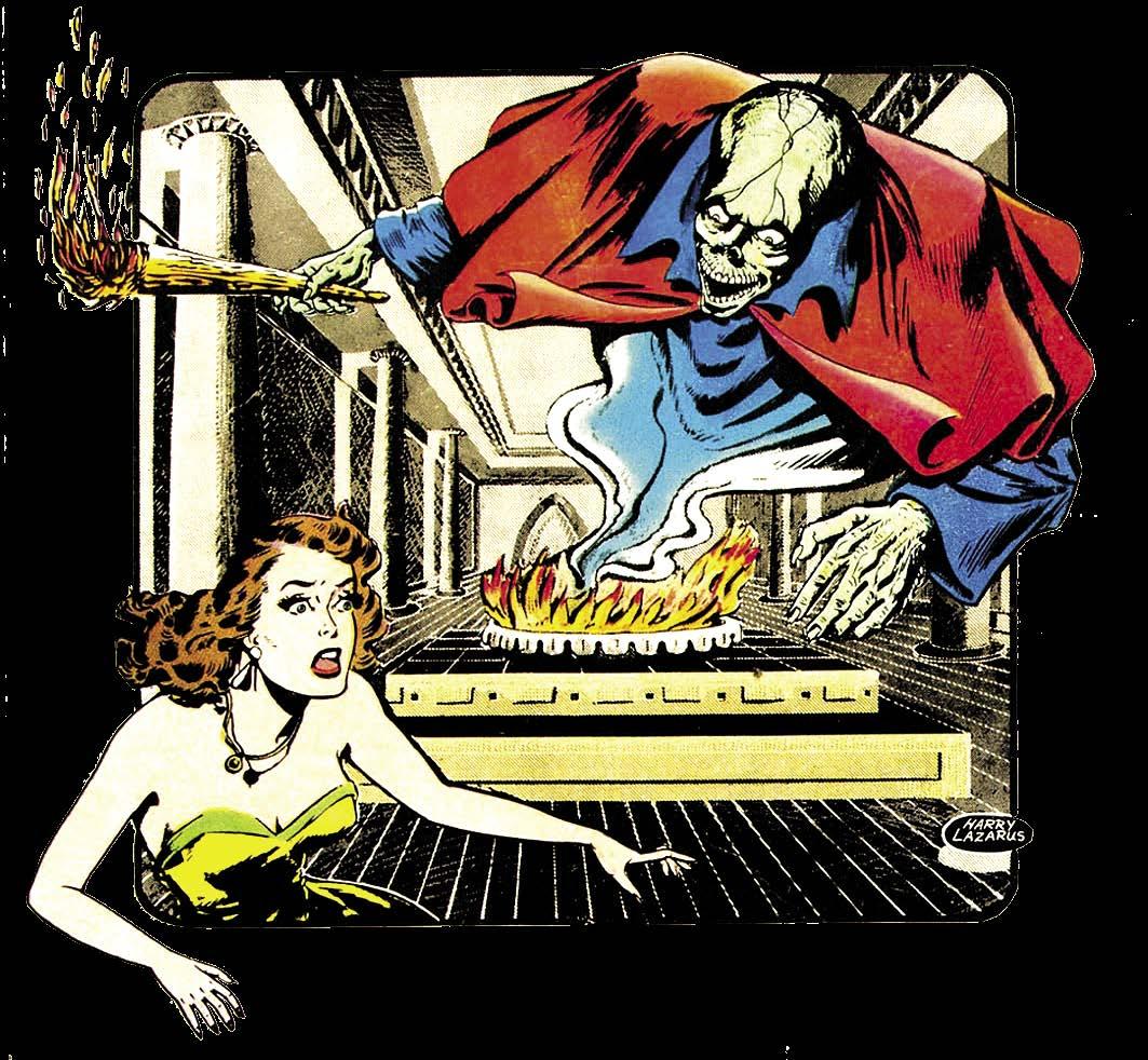
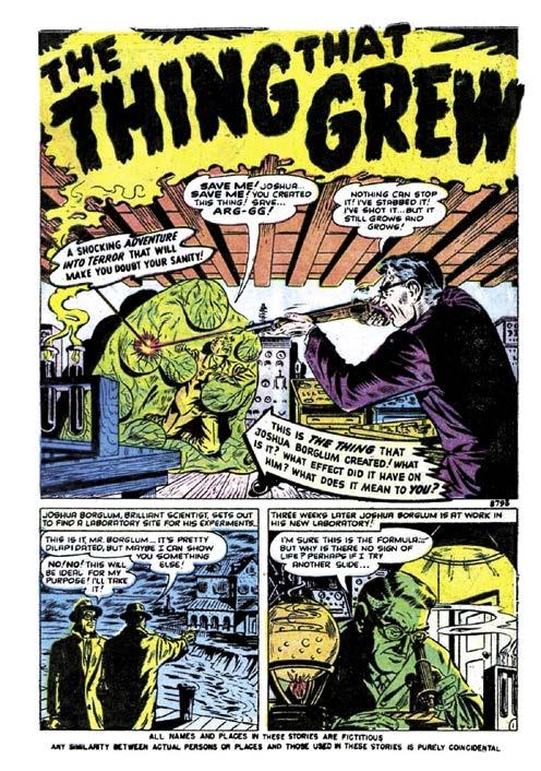
Bronx born, Harry Lazarus was among those visionaries who were stirred into action by the prospect of augmenting the excitement in these comics with an extra mind-boggling dimension, just as the cinema screen had done with House of Wax. Having entered the field in 1944, he was drawn to the dark domain of horror while in the employ of Atlas, initially penciling “The Thing that Grew” for Adventures into Terror #7, dated December 1951; before following immediately after with “Paid in Full” for Astonishing #7, published that same month. For the next few months Atlas kept him busy with semi-regular assignments, work he supplemented with the occasional story for Avon. The pages he produced for Atlas revealed
a highly competent comic book artist, who could turn his hand to almost any genre laid before him. However, his work for Avon evidenced an unbridled rawness, one very much in keeping with the company’s house style. On these early showings, there were signs of a horror artist in the making, who in the right hands could make a lasting impression.
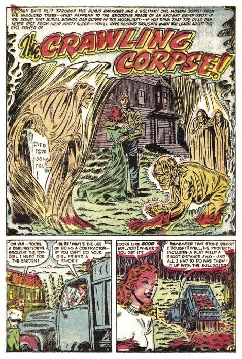
The Crawling Corpse
The right hands proved to be ACG. Harry’s first horror story for his new employer, “The Crawling Corpse” appeared in Adventures into the Unknown #32, coverdated June 1952. His rendition of the corpse was indeed terrifying, while his layouts throughout were easy on the eye in a tale marking the beginning of an affiliation that would continue into the early years of the next decade. For those who had heartily lapped up his macabre delineation in this account, it was no surprise to see him return to become a regular contributor to the contents of Adventures into the Unknown and its companion Forbidden Worlds
Given the tone evinced in some of his previous work, Harry was going to have to be careful, for his editor Richard Hughes was not entirely enamored with the excess proliferating the horror comics of the day. Despite his misgivings, Richard had had little choice but to go along with this revulsion in the hope of ensuring ACG maintained their place on the newsstand. Fortunately, Harry had the ability to confer to horror fiends much
In 1994, Alex Ross burst onto the comics scene with his groundbreaking painted art for the highly successful Marvel mini-series Marvels. Two years later, Alex’s work on DC’s Kingdom Come maxi-series turned him into a comic book superstar. Alex has been wowing fans with his exquisite cover paintings, special projects, and prints for 30 years, becoming comics’ preeminent painter. In 2020, Ross acquired the Universal license to start creating a series of paintings of the classic Universal Monsters. Alex was kind enough to speak to Cryptology all about those paintings, and if there will be more.
Michael Kronenberg: How did the Universal Monster paintings come about?
Alex Ross: I was able to license the rights from Universal to do these pieces. It was an idea my agent pursued to build on our relationship with Universal since I had already done artwork related to their Flash Gordon film.
MK: Did you grow up watching these movies?
AR: Yes, but I was first seeing images of these characters and performances in books I got from the library. I was mythologizing these films in my young mind before I finally saw them around the ages of 11 to 13 when they were aired on a brand-new movie channel in my town.
MK: What are your favorite movies among the classic Universal horror films?
AR: I’m probably like most people when I identify the James Whale-directed
Frankenstein and Bride of Frankenstein as the highlights of the Universal lineup. Karloff’s monster is such a singular popular invention that influenced countless other concepts that go beyond its source material. The beleaguered innocentbut-powerful protagonist is built in to so much storytelling, and much of it is directly related to those films, performer, and makeup.
MK: You’re primarily known for your Marvel and DC superhero comics work. Were you a fan of horror comics like Marvel and DC’s output in the 1970s, and the pre-Code horror comics in the 1950s?
AR: I grew up reading about the lost EC era of brilliance in comics that came and went in the 1950s. The art and story examples almost seemed to indicate that the best time-period for comics was already past. In the 1970s, when I grew up, many new attempts to rekindle that level of ambition and artistry were growing with new artists and writers like Berni Wrightson, who directly shaped my work.
The monster comics weren’t as much my thing, but I knew that some of the best artistry was there. I was drawn to books like Swamp Thing and Werewolf by Night (which each recalled those Universal monster archetypes and storytelling), but when the black-and-white magazine boom was in full swing, I was looking intermittently at the many horror and sci-fi titles, but absolutely obsessed with The Rampaging Hulk mag (again another Frankenstein analogue).
AR: Yes, I did the principal pieces in lamp black gouache for an approach similar to the original black-and-white films. I did not paint opaquely, though, and only did translucent
able to release a set of prints in their simple, gray-toned state and later do a version with added color toning. I did this version painting over giclée printings of the first stage so that the two versions do exist as separate works of art.
MK: How many times did you watch the movies and how did you come to the decision of what to depict in each painting?
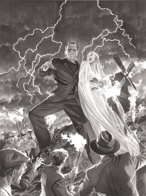
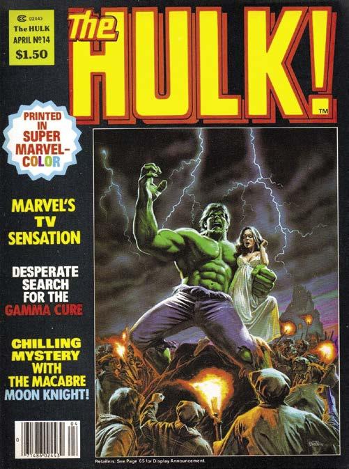
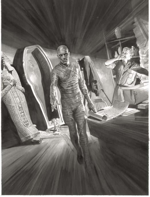
AR: I mostly went with my first gut instinct with compositions, recalling key scenes or combining elements of story. Like with the Frankenstein piece, I intentionally created a tribute to my favorite Hulk magazine cover by Bob Larkin featuring a torch-wielding mob and a frightened woman in the clutches of the creature. I did review the original films for each piece, and I photographed figures and settings to match the views I put on them in each piece. Often with some films there is only one key scene to reference for full view of the characters, like with the Mummy only being seen once in the opening in his bandages, or in the closing of Bride of Frankenstein where she appears.
MK: Did Universal supply you with stills for reference?
AR: I don’t know what library of reference in Universal’s history is curated by them, but it wasn’t something they shared with us. As a licensee, I was also pointed at negotiating with Bela Lugosi’s estate since there is no
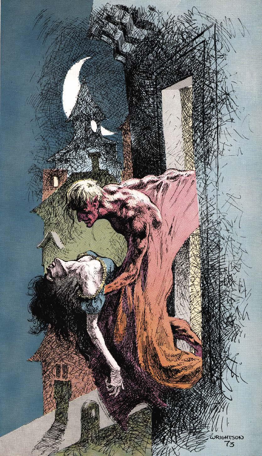
Prior to beginning his professional comic book career in late 1968, Bernie Wrightson’s work appeared in a number of fanzines. By this time, comic book fanzines had evolved past their early ditto and mimeograph days, with many of them reproduced using offset printing and featuring art by professional artists. After Wrightson began his professional career, his drawings and stories would continue to appear in these fan-based publications. With their lack of detailed indicia, sporadic schedules, and drawings sometimes being printed years after their completion, it can be difficult to ascertain the exact publication times of many of these fanzines from the late 1960s and early 1970s. Wrightson did dozens, if not hundreds, of drawings that appeared in fan publications from the late 1960s up to the present day. In this article, I’ll focus on some significant early publications and fanzines with complete stories. The best currently available information reveals Bernie’s earliest published fanzine art was in the Robert E. Howard fanzine Amra. The December 1967 issue (Vol. 2 #45) features an ambitious doublepage illustration of Conan fighting off several attackers. Although often associated with horror art, Wrightson was a big Robert E. Howard fan and a lot of his early artwork is of Conan and other characters of this barbarian ilk. The August 1968 issue (Vol. 2 #49) supplements this spread with a smaller scaled drawing of Conan. It is likely Bernie made connections with the publishers of Amra, perhaps even
giving or selling the drawings to them, when he attended the 1967 World Science Fiction Convention in New York.
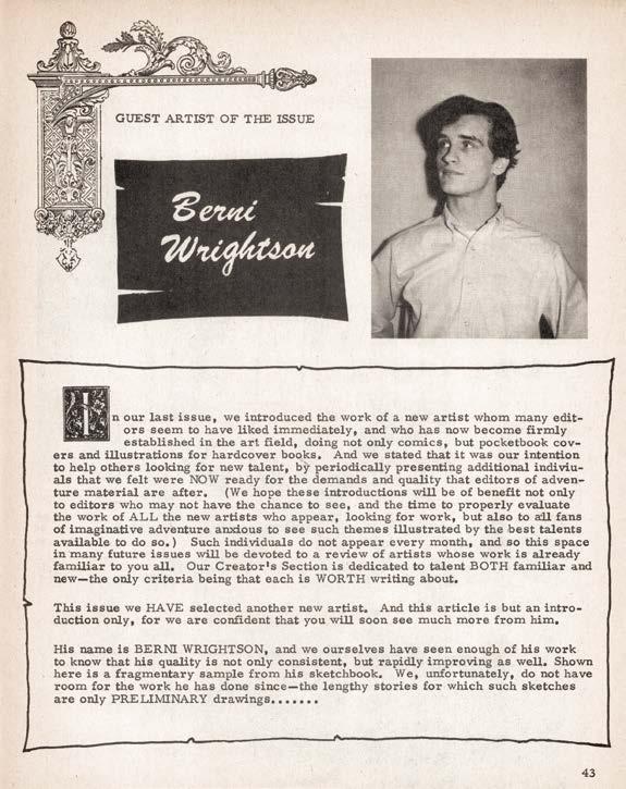
Although not a fanzine (it was sold on the newsstands), Monsters and Heroes #3 (March 1968) contained the first mention of Wrightson in any kind of comic fandom press, professional or otherwise. The magazine featured a very short profile of the artist, several early illustrations and a photo. The magazine was published by Larry Ivie, who Wrightson had also met while attending the 1967 World Science Fiction Convention.
1968 saw the publication of Wrightson’s first comic book story. It was in the Baltimore-based fanzine Nozdrovia, published by Richard Pratt. The twelve-page story, “Michael Clayton of Galvan,” is a blatant Robert E. Howard pastiche. Although crude, when looking at the story in hindsight, you can see many of what would become hallmarks of Wrightson’s style, including evil, twisted trees and an attempt at intricate cross-hatching in the background.1
Another important contact Wrightson made at the World Science Fiction convention was Jerry Weist, publisher of the EC Comics fanzine Squa Tront. The second issue (October 1968) had a short profile of Wrightson put together from 1 Nozdrovia #1 is very difficult to find in the collector’s marketplace. Fortunately, it was reprinted in Tales From the DMV: The Origins of Comic Fandom in DC, Maryland, and Virginia. DMV
Project, 2018. As of this writing it is available on
WRIGHTSON: THE FANZINE YEARS
Fan
Amazon.
Even when he had ascended to become one of DC and Warren’s finest artists, Bernie still contributed to the fan press, as evidenced across the page on his cover for Rocket Blast Comic Collector #117 (March 1975). Above, his double-page spread for Amra V2 #45.
An early profile of the aspiring artist in Monsters and Heroes #3 (March 1968). Publisher Larry Ivie had the foresight to recognize a talent in the making.
the BRITISH KING of HORROR
THE PAPERBACK FANATIC ON THE MOST IMPORTANT HORROR AUTHOR AND BOOK IN 1970s BRITISH HORROR FICTION
by Justin Marriott
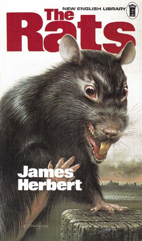
In the simplest terms, James Herbert was Great Britain’s answer to Stephen King. Both burst onto the scene in 1974 with Carrie and The Rats, first books that would become phenomenally successful and set them on the road to become household names in their respective countries. These breakthrough novels relocated horror fiction from cobwebbed castles and mad scientist’s laboratories into contemporary America and Britain.
However, nothing is quite that simple, and Herbert and King had very different approaches to their horror fiction. King’s horror lies in the heart of small town
America and the capacity for evil that lies in all of us, whereas Herbert saw evil as the British system, preferring to set his horror in decaying working class cities. Each of their books were masterfully crafted, with King taking his time to tell the story and build the terror, whilst Herbert’s stories unfolded at double-speed in a direct and no holds barred manner. Herbert as punk rock, King as classical composer, both equally as powerful and of artistic merit.
For these pages I will narrow the focus to Herbert to uncover why he was such an elemental force when The
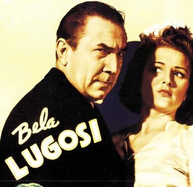
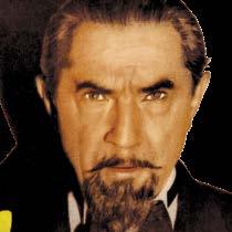
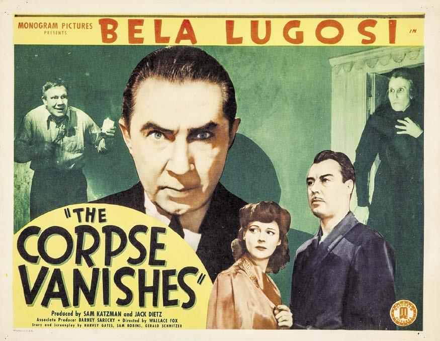
By 1942, Bela Lugosi’s star was on the descent. His bravura performance as Ygor in Son of Frankenstein (1939) was three years behind him, though he vigorously reprised the role in 1942’s The Ghost of Frankenstein. But his options became limited due to typecasting and a refusal to alter his Hungarian accent. In addition, he no longer enjoyed top billing at his home studio Universal Pictures (he was fifth-billed in Ghost). It was inevitable that he’d find a home at Poverty Row’s Monogram Studios, which began a long, if not distinguished relationship with Lugosi in particular, and horror films in general. Lugosi made a total of nine genre entries with Monogram (collectively designated by fans as “the Monogram Nine”).
All nine of Bela’s Monograms were characterized by illogical plots, uninspired cinematography, cheap sets, and annoying comedy relief. But in some cases, the lack of cinematic quality was compensated by a surfeit of entertainment value. A standout entry is The Corpse Vanishes (1942). Lugosi is Dr. Lorenz, a deranged scientist who kidnaps young brides by subduing them with the odor from an orchid he breeds in his secluded laboratory. He combines their spinal fluid with a concoction of his own and uses the mix to restore the beauty and youth of his aging wife, Countess Lorenz (Elizabeth Russell). Lorenz is assisted by a strange family confined to the cellar of his foreboding mansion: a mute brute named Angel (Frank Moran), his oddly diminutive brother Toby (Angelo Rossitto), and their hatchet-faced mother Fagah (Minerva Urecal). The abductions catch the attention of spunky
newspaper reporter Pat Hunter (Luana Walters), who hitches a ride to Lorenz’s manse with his medical assistant Dr. Foster (Tristram Coffin). He tells her that Lorenz and the Countess are “very interesting” and “a bit eccentric,” which turns out to be an understatement: the Countess greets Pat by telling her she’s unwelcome and slapping her across the face. “That girl,” she tells her husband. “She’s up to no good.” With those words, the Countess’ countdown begins. When a thunderstorm forces Pat to spend the night at Lorenz’s home, she uncovers the clues she needs to incriminate him and land the scoop of a lifetime. Chaos ensues in the standard Monogram manner before the movie wraps with an upbeat finale.
Lugosi and Lorenz are a good match. After his work in films like The Raven (1935), The Phantom Creeps (1939), and The Devil Bat (1940), Bela could play a mad medico with his eyes closed. Still, he gives Corpse his usual 1,000 %, a joy to watch
ATTACK OF THE CENSORS
by Barry Forshaw
THE VIDEO NASTIES SCARE
Do you remember the video nasties hysteria? The period when UK newspapers and publicity-seeking politicians shouted about how society’s moral values were on the verge of collapse because of the availability—in the then-new home video medium—of a variety of horror films? It was a frenetic period that had some unexpected consequences—not just the banning of many films, both good and bad. Outraged condemnations of popular culture have often had an inevitable side effect (as true today as it was in the past): inspiring a keen interest in the hungry target audience for “unacceptable” fare, the transgressive and the forbidden.
The historian Macaulay’s acid observation “We know no spectacle so ridiculous as the British public in one of its periodical fits of morality” is a phrase that might have been coined for the prissy British reaction to the wave of horror films that appeared on video in the Margaret Thatcher era of
UK politics. In the horrified discussions of the 1980s, would-be censors of what was perceived as a new cinema of “cruelty as diversion” censured such films as indexes of depravity. And who could defend them? (Gothic horror elements incorporated in non-genre or other films of the day were less vilified, however; modern-set horror was the target.)
An essential ingredient of the British macabre film has long been its unfaltering ability to upset those seeking the experience of being upset (and thereby gleefully recording falling moral standards). And filmmakers have been more than happy to oblige. In cyclical fashion over the years, selfstyled or government-appointed guardians of decency have become vexed over what they considered the unredeemable imagery of the horror film, the flames often fanned by the headline-grabbing exploitation of popular newspapers as well as by the usual elective upholders of morality, religion,
a REQUIEM for CHARLTON HORROR a REQUIEM for CHARLTON HORROR
By Will Murray
Part 2
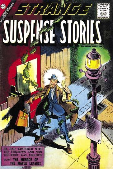
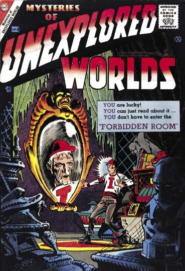
The landscape for supernatural fiction in 1965 was pretty bleak. The American Comics Group virtually had the market cornered with a trio of titles consisting of Adventures into the Unknown, Forbidden Worlds and Unknown Worlds. AitU had the distinction of being the first continually-published supernatural-horror title in comics. The ACG line had survived the 1950s decimation by retooling from grisly vampire and werewolves to sometimes sentimental ghost stories supplemented by fantasy and science fiction themes—a mix that also fueled Marvel’s pre-hero titles like Strange Tales, before they disappeared from the scene in 1963.
This same grab-bag formula fueled a trio of Charlton fantasy titles, Strange Suspense Stories, Mysteries of Unexplored Worlds and Unusual Tales. From a production standpoint, they were an editor’s dream. You could commission a pile of inventory
suitable across the board and when it came time to assemble an issue of any title, dip in and pluck out a fantasy tale, a ghost story and a UFO or alien invasion yarn and presto! you had an issue ready-made. Warren had recently launched Creepy and Eerie as Code-proof black-and-white magazines, using the same concept.
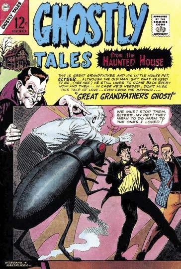
But the formula had grown tired. Early in 1965, Charlton editor Pat Masulli converted those titles into other genres and for a short period Charlton had no fantasy titles. A year later, the company returned to the field with Ghostly Tales from the Haunted House. While it was a departure from the lately-retired fantasy trio, if there were any long-time Charlton readers still buying their wares in ’65, they would have instantly recognized it as an updated revival of This Magazine of Haunted, right down to the spooky host-narrator and the signature presence of Steve
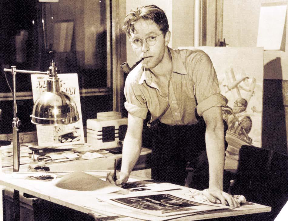
Bill Everett’s masterful brushstrokes had gone hand-in-hand with the grandeur we now call the Golden Age of Comics, each and every one of them underlining his eminence as a storyteller par excellence, most notably while working on Timely’s long running Sub-Mariner Comics. His ability to fine-tune his style to suit the mood to whichever story he was assigned, would see him spread his wings to gift his artistry to a whole variety of genres. This would eventually work to his advantage when the Sub-Mariner and his heroic companions fell out of favor with the comic buying public during the late 1940s. Sandwiched between the pages he produced for the Sub-Mariner and Namora, prior to their unfortunate
demise, came a regular supply of work for the latest crop of big sellers, namely crime, war and romance; then in 1950 he took his first step into the shadow laden realm of the macabre.
Conjecture remains as to whether Bill had a hand in Suspense #3’s “The Creature Who Didn’t Exist,” first seen in May 1950; many attribute much, if not all of these pages, to Sol Brodsky. However, there is no doubt his pencils had been sharpened for the tale “Hangman’s Noose,” a malefic narration for Suspense #5, cover-dated November 1950. With over ten years under his belt, it is little wonder his composition was so assured, becoming darker and darker in a way his brushes had never done before. While we love to revel in the excess of these years, only occasionally did Bill’s interior story pages resort to such extremes; yet the hanging scene he conceived for this story was graphic to say the least, but then this tale was entitled “Hangman’s Noose”—so the chances are the reader would have been sorely disappointed if he had been served up with anything less, even at this early juncture in the history of horror comics.
As Pat Calhoun recounted at the beginning of this issue, Bill’s contribution to Atlas’ Venus traced her transformation from the heroism of the late superhero period, through into a brief flirtation with science-fiction, before succumbing to this realm of fear-filled terror. His other assignments took a similar path, crafting a few science fiction tales for the early issues of
indication these outlandish tales of science-fiction and horror were set to eclipse the once majestic superhero, if only for a short while.
FILED FOR BANKRUPTCY IN JANUARY without paying for our December and January magazines and books, leaving us with enormous losses— and we still have to pay the expenses on those items, and keep producing new ones. Until payments from our new distributors begin in the Fall, we’re staying afloat with WEBSTORE SALES
Nightmare Covers
Every new order (print or digital) and subscription will help TwoMorrows get through this, and emerge even stronger for 2026. Please download our NEW 74-PAGE 2025 CATALOG and order something if you can: https://shorturl.at/gA9Fv
Also, ask your local comics shop to change their orders from Diamond to LUNAR DISTRIBUTION, our new distributor. We’ve had to adjust our release dates for the remainder of 2025 while we wait for orders from our new distributor, so you may see some products ship earlier or later than originally scheduled. We should be back to normal by end of Fall 2025; thanks for your patience!
Journey into Unknown Worlds and Strange Tales. The lion’s share of his endeavor at this point was given over to Venus and Marvel Boy, before and after the latter’s metamorphosis to become Astonishing This change in title was yet another
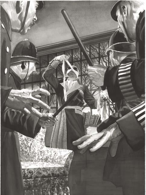
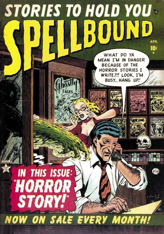
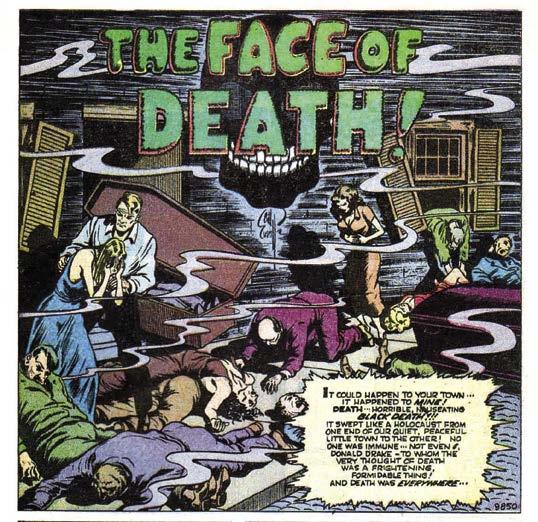
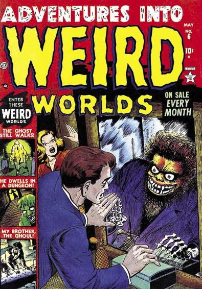
Having embellished a series of nightmarish covers for Venus, Bill’s first horror fraught cover for Atlas’ recently established ghastly line appeared on Spellbound #2, cover-dated April 1952. While it was nowhere near as shocking as that being touted by its companions on the newsstand, it was imbued with the dark wit soon to become emblematic of his horror inspired covers. The monstrous creature on this cover, observed forcing its way into the office of a publisher of these diabolical comics, came just a couple of months after the appearance of his rather chilling rendition of “The Face of Death” for Adventures into Weird Worlds #4, dated Spring 1952. The impending sense of doom permeating this account was momentarily lightened by the use of caricature to buoy up some of the characters, but Bill’s brushes were now laden in the most tenebrous shadow, conveying to the reader a finale so typical of this new breed of comic. Okay, so this tale may have refrained from the gruesome, but it was nonetheless terrifying.
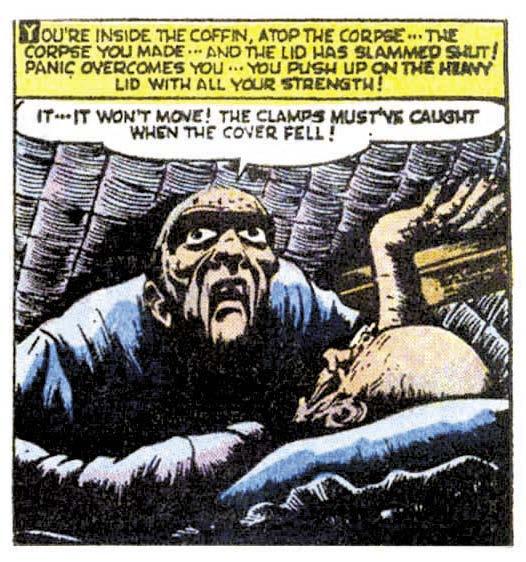
He returned with the equally macabre “Don’t Bury Me Deep” in the next issue of this title, dated April 1952. Those parents eager to curtail junior’s obsession with these ghastly comics would have been mortified to see an explicitly detailed murder paraded over a sequence of excruciating
panels, rounded off by a damning premature burial denouement. To this day, Bill’s depiction of the scheming undertaker trapped within one of his own coffins, rates as one of the most disturbing portrayals of this claustrophobic form of death. It was in these spine-tingling pages, along with his last covers for Venus, Bill assumed the mantle as one of the genre’s genuinely ghoulish artists. In the ensuing months, the Atlas portfolio of terror would ascend to extraordinary heights, ensuring these comics stood out wherever they were placed; just as their superhero titles had during the 1940s.
IF YOU ENJOYED THIS PREVIEW, CLICK THE LINK TO ORDER THIS ISSUE IN PRINT OR DIGITAL FORMAT!
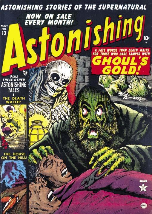
Within months, Bill began to reveal his savvy for comedic terror, moving on from the wry nature of the editorial office fronting
“Ghoul’s Gold” creation for #13, dated May 1952. This creepy tableau took enormous satisfaction in doling out exactly what the youngsters of the day were demanding. However, Bill did avoid going that one step further in having this heinous creature caught in the act of removing the gold from the teeth of these recently deceased corpses.
CRYPTOLOGY #4
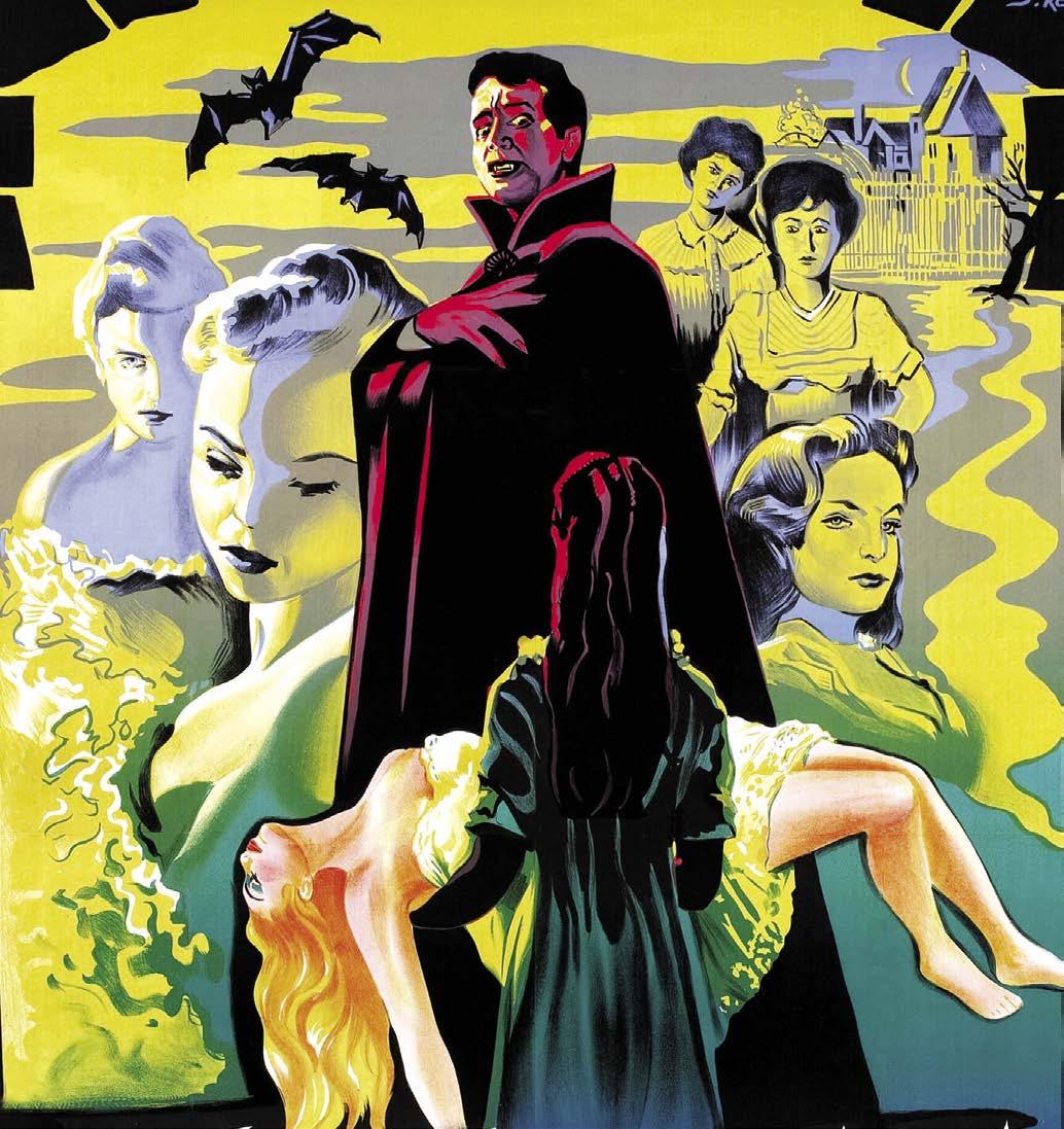
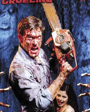
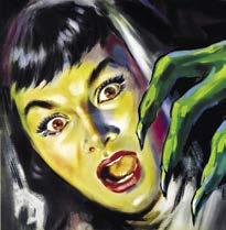
Get ALEX ROSS’ gory lowdown on his Universal Monsters paintings! Spend Hammer Time with the “Brides of Dracula”, and 3-D horror movies and comics of the 1950s! Learn the origins of slasher films, chill to pre-Code artwork of Atlas’ BILL EVERETT and ACG’s 3-D maestro HARRY LAZARUS, see a Killer “B” movie, and more by NORMANTON, the KRONENBERGS, LEESE, VOGER, and VON SHOLLY!
By then Atlas had reached their stride, having assembled a formidable team of artists with a penchant for this burgeoning