

From Colour to Art


for Eugene and Mathilde


From Colour to Art
monica rotgans
Waanders Publishers, Zwolle


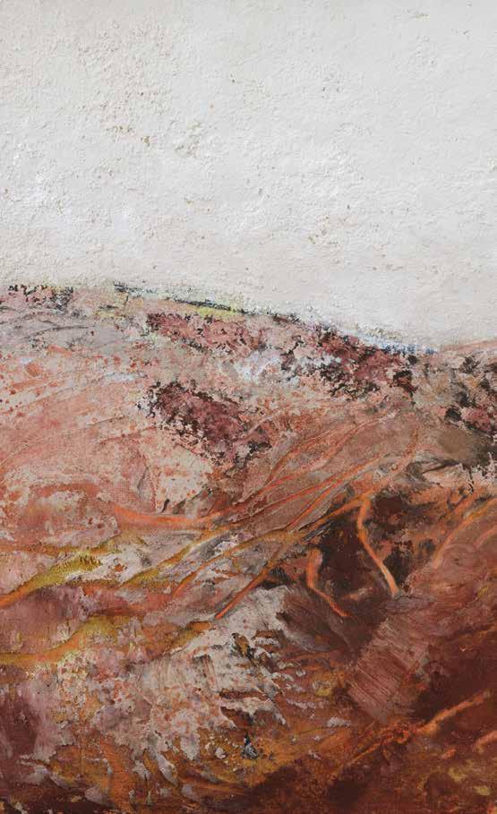
Red Earth
Iron Oxide
Kermes & Cochineal
Madder lake & Alizarin
Purple & Mauve
Organic Reds
Lichens & Fungi
Cadmium Red
Naphthol Red & Quinacridone Red
Yellow Earth & Sienna
Gold
Orpiment & Realgar
Stil de grain Yellow & Weld
Saffron
Yellowwood & Gamboge
Lead-Tin Yellow & Massicot
Naples Yellow
Indian Yellow
Chrome Yellow & Chrome Orange
Cadmium Yellow & Cadmium Orange
Hansa Yellow
Umber
Cassel Brown
Asphalt & Mummy
Organic

Indigo & Woad
Mayan Blue
Egyptian Blue
Turquoise
Vivianite
Prussian blue
Cobalt Blue
Ultramarine
Manganese Blue
Phthalo Blue
Green earth
Malachite
Verdigris
Plant green & Sap greens
Scheele’s Green & Schweinfurter Green
Chromium Oxide Green
Chalk & Kaolin
Lead White
Zinc white
Titanium White
Charcoal & Soot Black
Stone Black & Black Oxide
Bone black & Ivory black
Graphite
Composite Blacks
Conclusion
Glossary
About the Author
Further Reading
Credits


Introduction
< Painting an incense burner, Oualata, Mauritania
Eucalyptus gum, Australia

‘Colour
never comes alone’
Antjie Krog – South African poet and writer
It began with earth and charcoal. The first and actual primary colours: red, yellow, white and black coloured earth. They can be found almost everywhere in the world, with an additional black provided by charred wood. This palette was later expanded with the colourful sap of plants, fruits, flowers, fungi, and animal fluids. Much later, probably around 7000 years ago, humans discovered the use of minerals for paint: the green and blue of copper ore, the bright red of vermillion (cinnabar), and a white, orange, and yellow from lead ore. The beginnings of our current abundance.
Since earliest prehistory, millions of hands have created paints. Paint to adorn the body, objects, and surroundings. Humans began to distinguish themselves from nature and others. Creating images allowed for the sharing of ideas, as demonstrated by preserved prehistoric cave drawings. Even after tens of thousands of years, these drawings have lost little of their original vitality. This is due to both the protection offered by the caves and to the stability of the earth colours with which they were made.
Ochre Point, South Australia


I knew very little of the preceding when I started my studies at the original, classical, Rijksakademie in Amsterdam.. Like most of us, I was familiar with the cave drawings of aurochs and horses from Altamira and Lascaux. That was the extent of my knowledge. Not much was yet known about how they were made and what materials were used. The same counted for the images of artworks shown to us during art history classes. I can vividly recall the numerous examples of temples and cathedrals, the paintings of well-known artists, the sculptures, the genres and movements, the shared influences. However, there was nothing about the colours. Nothing about pigments. In our first year of painting, the closest we came was when we were taught how to stretcha canvas, prepare painting grounds, and turn dry pigments into paint. But we painted with tube paint. The training aspect of our education was focused on developing skills, and a dexterity for form, as the basis for our individual style. All the while, as young artists, we each had our idols whom we wanted to emulate. Virtually all our idols were artists who had achieved their results precisely due to their craftsmanship and knowledge of pigments, materials, and colours. Studying the artworks of our idols came down to, basically, looking without actually understanding what we were seeing.
It wasn’t until I began teaching that I realised what was missing: the knowledge of what colour and paint are and what they do. This is the rudimentary foundation for anyone who wants to work effectively with colour. At the time, in the early 1990s,
Painted ceiling of the Hall of Pillars at the Dendera Temple near Qena, Egypt
professional literature concerning the subject was still scarce and not comprehensibly written. I decided to fill the gap myself by delving into the history of the painting palette and the history of pigments and colour. The more I discovered, the more I marvelled at the enormous variety of knowledge and available material. I was awed by the limitless connection of people and cultures using colour. My view on the profession drastically changed.
This book addresses the most essential pigments. It would be impossible to provide a complete overview of all pigments for the following reasons: – many historical pigments are barely or no longer used – specific and local pigments, the so-called everyday household pigments, are not (yet) known – the enormous range of modern synthetic pigments – the overabundance of mixtures
The last refers to a colour composed of several pigments. A large portion of the colours produced by paint manufacturers are mixed colours consisting of two or more pigments. This applies to the manufacturers of both general use paint and art paints. The first time I became aware of this was when a colour I often used was suddenly no longer available. Enquiries sent to the manufacturer informed me it was a mixture of two simple earth pigments, a red and a yellow, and easy to make. Something I hadn’t realized.


A good example of the difference between a manufacturer’s supply and a classic basic palette is found in two colour charts from a long-standing producer of traditional artists paint in the Netherlands, the Oudt Hollandse Olieverveven Makerij, now Old Holland. Shown on the left colour chart is the palette used as a standard by one of its founders, the 19th-century painter Willem Roelofs Jr. Eighteen colours in total, including two different whites, enough to work with freely. On the right is the current chart overview of Old Holland with one hundred and
The palette of Willem Roelofs Jr., one of the founders of Oudt Hollandse Olieverven Makerij; to the right Old Holland’s current offer
sixty (!) colour variations. The enrichment lies mainly in the hues that are difficult, or cannot, be made with Roelofs’ palette: violets, oranges, warm greens, and the so-called lake pigments, the transparent paints.
The deluge of colours to choose from today is almost incomprehensible. This superabundance we can mostly attribute to the Industrial Revolution of the 19th century. During the period when new pigments were created, and the industrial paint factories emerged, and the convenient paint tube was invented (around 1841). As a result, our direct contact with pigments, the process of making paint, has practically been lost from view and vanished from everyday life.
CRAFTMANSHIP
How did people make paint? Raw materials were (and still are) readily available. That is to say, every environment had a series of basic pigments to offer, the so-called common household colours. Plants, flowers, different types of soil, wood varieties, and minerals. These basics could be supplemented, as needed, with those available from merchants and pharmacies (Latin apothe-ca: ‘storehouse’). We know pharmacies today as only dispensaries for medicine. Originally, various earths, herbs, minerals, tree products, dried fruits, insect specimens, oils, and spices passed over the counter. All served multiple purposes: as medicines, preservatives and cleaning agents, cosmetics, paints and dyes, or as flavouring. In this book you will frequently see examples of these combinations named.
The strict separation of disciplines, of craft and science, of ‘labour’ and ‘domestic work’, is a relatively modern phenomenon. It results from the growing urbanisation and industrialisation during the past three hundred years. Such a process happens gradually and occurs everywhere at a different rate. The raw materials in a painting studio or a dyer’s workshop could be found at a physician’s medical practice or in a private household. People were more or less self-reliant. Manuals for ‘the young housewife’ were still being published as late as the early 20th century. They featured formulas for making inks, varnishes, waxes, and basic dyes. Knowledge that is still readily available outside the urbanised world.
As with cooking, making paint is something you gradually master. Each pigment and each binder has specific properties. Through understanding, skill, and ability, these properties could be employed for the various techniques worked with by the artist. To the dry, raw materials were added glue, egg, or oil, to make paints in the studio or workshop. This was usually carried out by an assistant who, according to the master’s
Jan Josef Horemans,
An Artist’s Studio, 1st half 18th cen., oil on canvas, 49 x 60 cm, Nationalmuseum, Stockholm
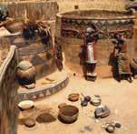
requirement, prepared the needed colours and placed them on the palette or stored them in jars, or in pig’s bladders. Before you continue reading, take a good look at the examples shown here from different times and cultures. The 15th-century woman paints with tempera, the 18th-century artist Horemans with oil, and the Tiébélé woman with a glue-based paint. The paints are made on location, and all the needed ingredients are visible. Their similarities are more relevant than their differences.
Horeman’s painting provides a good idea of the ins and outs of an artist’s studio, and how apprentices were trained, as was practised for hundreds, perhaps thousands, of years. The master himself is the focal point of the composition. He looks to the assistant, busily preparing paint. Perhaps they discuss the amount of oil, how fine the pigment should be ground, or how long before a colour is ready. The aroma of linseed oil seems tangible. Behind the painter, an apprentice with more experience uses a painting stick to add details to a work set up by his master. To the right of the easel stands a boy, with a sketch in his hands, apparently waiting for approval or instructions. His drawing board with a sheet of blue paper, to practice working with half-tones, his charcoal, chalk,

Tiébélé, Burkina Faso
Anonymous, A Woman
Painting the Virgin Mary, Italian manuscript, c. 1402, Bibliothèque Nationale, Paris

Kawanabe Kyōsai, Students at Work, 19th cen.
and brush feather, are on the floor in the foreground, beside the box he was sitting on. It is the drawing corner for beginners. A boy lying on the floor (girls are absent) sharpens pens. This shows how the trade was learned. Starting at a young age learning to look and to draw. By copying and being gradually allowed to do more. Eventually, hopefully, gaining recognition as a master and permission to start their own workshop.

LIFE AFTER THE EASEL AND THE SCULPTING STAND
When an artwork leaves the studio you hope, as creator, it will receive a long and good life. That the new owners will enjoy it, treat it with care, and the materials used will not prove capricious by showing signs of decay. This last is never a certainty. Not historically, nor in the present day. A fast-drying pigment can cause an overlying paint to crack if the first paint layer had insufficient drying time. Some pigments change or lose their original colour, over time, and a fine pigment can seep through other coarser pigments, commonly known as bleeding. There are pigments that dry poorly, or never thoroughly, and combining different types of paint could have disastrous consequences. Ready-to-use factory paint is like a closed book. The formula is kept secret, which makes it difficult to determine the exact composition. Additionally, an error in production may come to light later or after a long period of time. Artworks in museums, whether hanging or standing, also might suffer the aforementioned possibilities. They may, for centuries, have had exposure to fluctuating temperatures, smoke, humidity and draughts prior to their placement within the relatively safe walls of an art institute. Many of these artworks have lost some, or whole sections, of their original appearance. This is not immediately noticeable if you are unfamiliar with these effects. Once aware of the pigments and colours in common use during specific periods, you learn to spot the characteristics.

Parthenon Elgin Marbles, detail of the tympanum, Acropolis, British Museum, London
The white marble sculptures from Greek and Roman times, for example, were painted in clearly defined colours to emphasise the status and function of those depicted. Signal colours, which made it possible to immediately recognise, even from a distance, whom or what was presented. Most of these applied paints, with the passing of time, have vanished through weathering or people’s actions. Sometimes, you can still discover a remnant of colour in a fold, or on the back of a work, as is the case with the once richly painted Elgin Marbles. The same applies to the wooden sculptures of later times, which were stripped of their paint, especially so during the 19th century. While their form may be more defined without their original colour, it is difficult to recognise who they represent. For a predominantly illiterate population, colour was the essential visual guide.
Paintings can undergo a similar transformation. A part of the composition or a figure might be painted over, or a colour or form that no longer pleases the eye could be modified. The artist may decide to alter something if she or he is no longer pleased with the composition, or an owner of a work could have it adapted to a new trend or a changed circumstance. Murals, by definition, are vulnerable on both exterior and interior walls. They are comparable to the painted walls of a house. Regular
Elías García Martínez, Ecce homo, 1930, and the ‘restoration’ by Cecilia Giménez, 2012
repainting is necessary due to discolouring or damage. Paintings on and in public spaces are particularly vulnerable. The number of murals that have disappeared over the centuries is difficult to estimate. In 2012, a well-intentioned repair made international headlines when an 81-year-old resident of Borja, Spain, irreparably ‘restored’ a damaged mural in her local church.


Unfortunately, this is how restoration is often perceived: restoration means repainting. Not so when a restoration is done correctly. Professional restoration involves treating the painting in a manner that protects it from further deterioration. Yellowed old varnish, dirt, and, if necessary, overpainting is removed, and missing sections retouched. Optically adjusted retouching makes it imperceptible.
The starting point is to leave the artist’s signature style and palette, and the structure of the paint, as intact as possible. An example of the latter is the restoration of De Heem’s The Dessert in the Louvre. De Heem’s showpiece still life (Pronkstilleven) is a sizeable canvas made to flaunt and impress. A status symbol with a display of exclusive objects and food that were, in his time, unattainable for most people. It must have been an explosion of colour, when fresh on his easel, much of which has now become invisible. If you look closely, you can see details that don’t actually make sense. The morbidly grey grapes, whitish apples and quinces, the picture-filling, gloomy canopy and the sombre little landscape in the left background, despite a fair-weather cloud having been painted in the sky.
We can see this more clearly now because the thick, dirty, and yellowed varnish has been removed whereby the brownish glow, so characteristic of ‘old’ art, is dissolved. The faded colours, however, have not been restored.