Velocita combines big agency resources with start-up responsiveness. We help businesses and teams showcase what it is they do and how they provide value through the power of storytelling.

Since 2008, we’ve been creative partners to 100+ global brands and Fortune 500 companies, collaborated with numerous businesses and delivered 10,000+ projects.
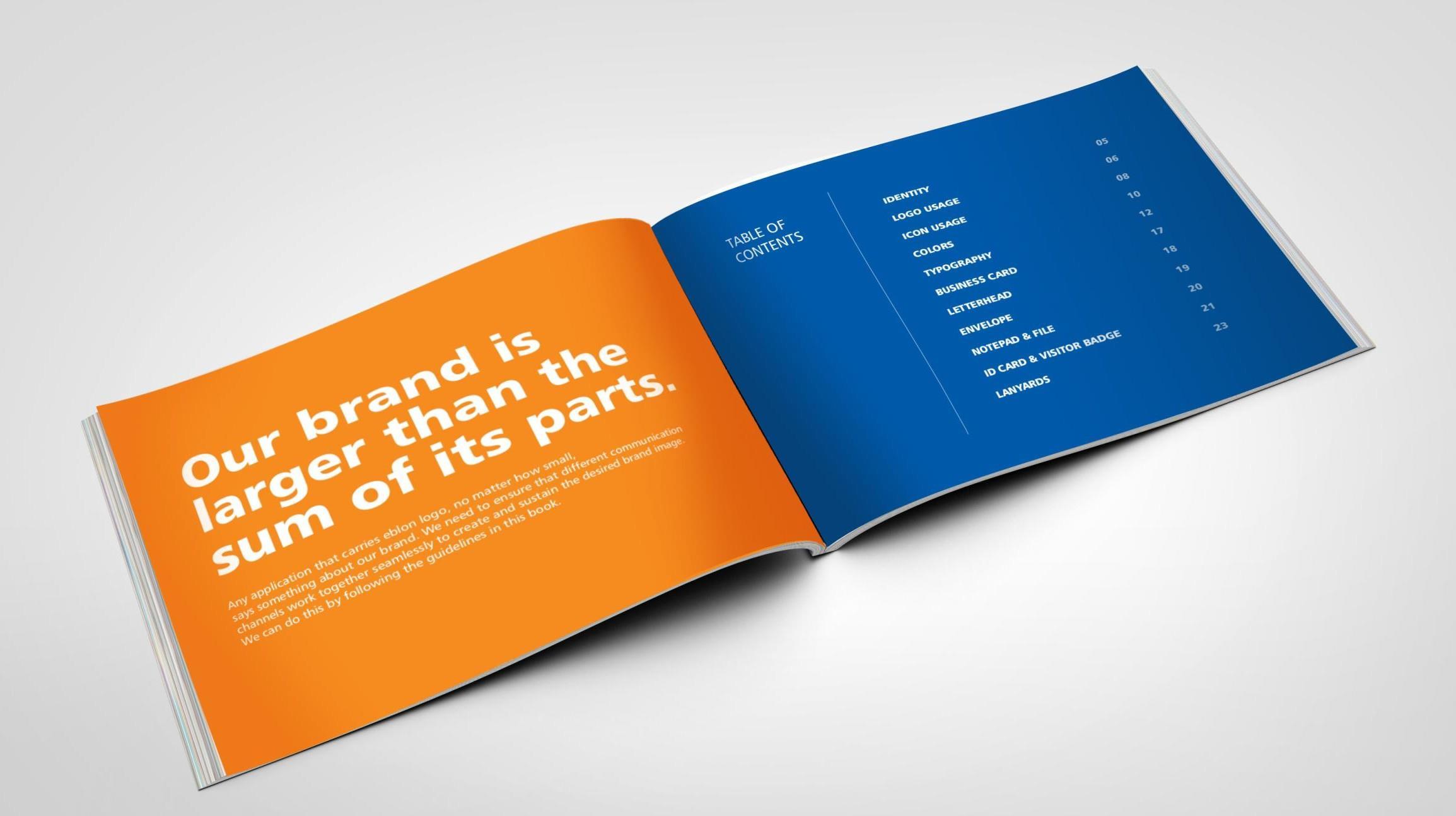
Our areas of
Vision and Mission


Purpose and Values
Marketing Communication
Brand Positioning
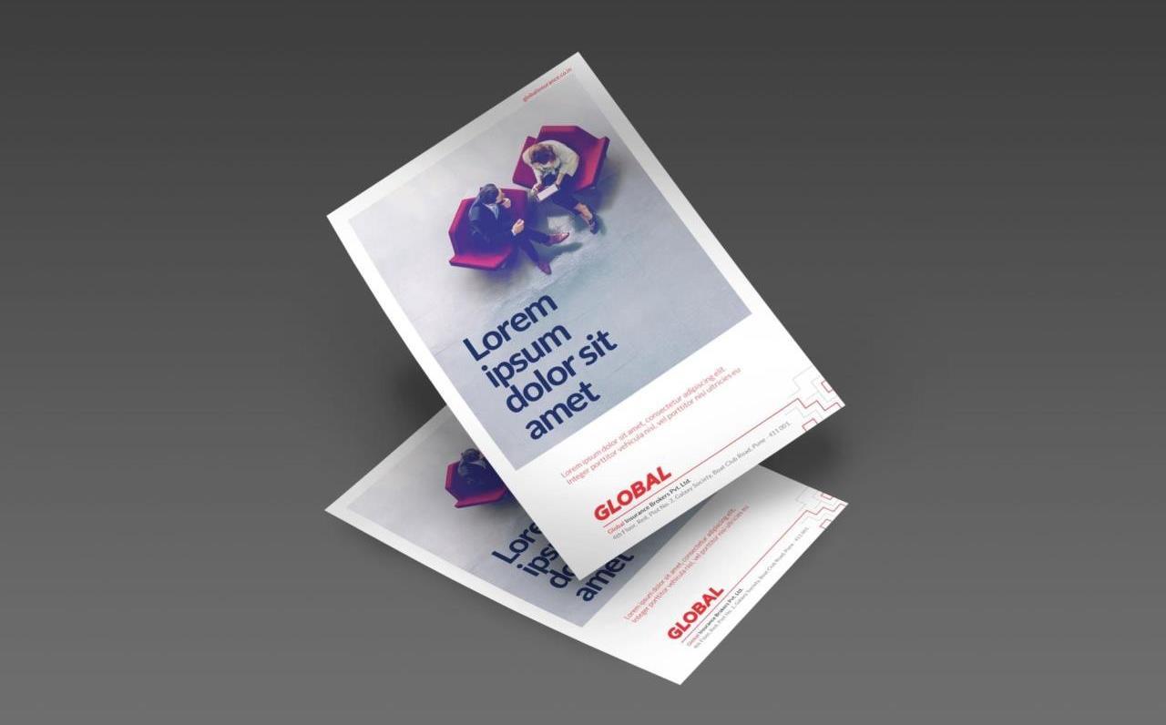
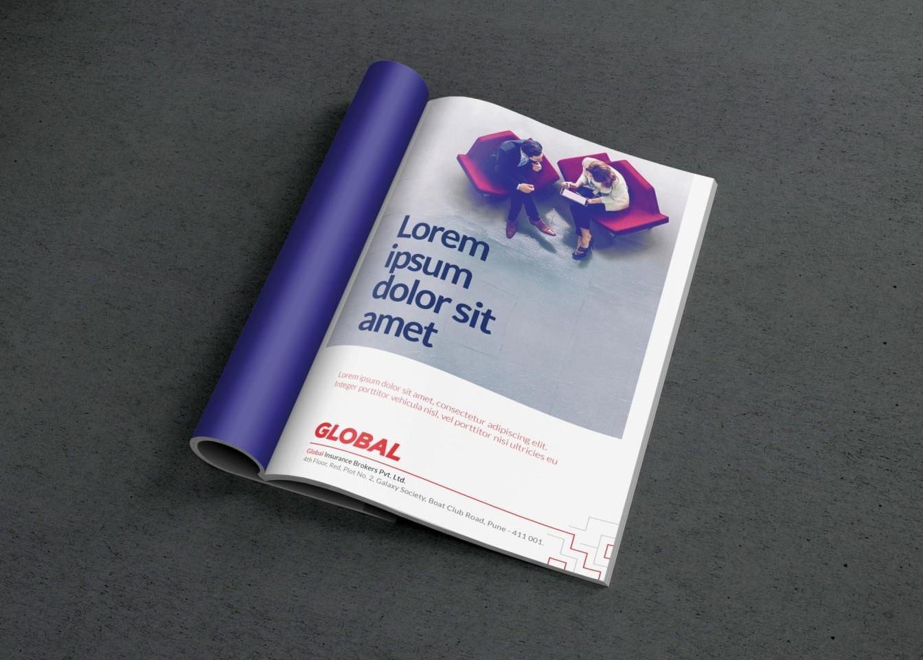
Stakeholder Reports
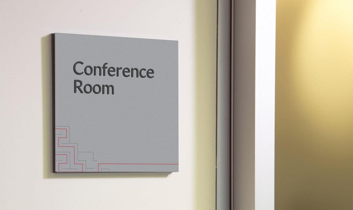
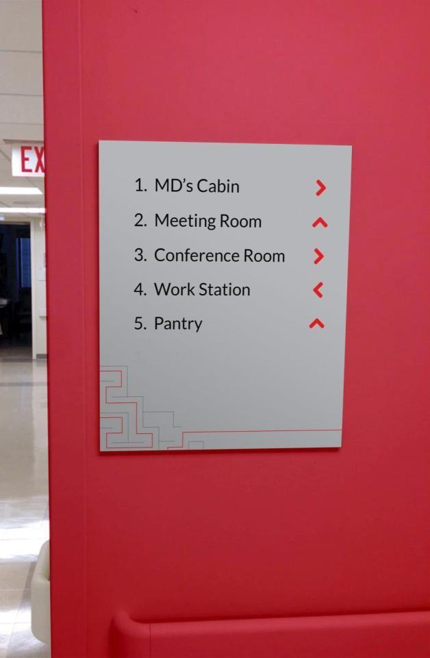
Internal Communication Office Branding / Environment Graphics
Employer Brand Social Media
Employer Value Proposition (EVP)
Website UX/UI
Recruitment Marketing
Social Media Marketing
CSR Communication

Robust domain knowledge, which enables us to assess risk accurately and negotiate settlements swiftly
Unparalleled customer service/ experience which has resulted in high customer stickiness
Strong relationship focus, which gives us the competitive advantage of having reach in several geographies

Mixed reactions ranging from ambivalence to outright congratulatory
Company with ethical business practices
Technical superiority—across domains

- Domain Expertise
- Ethical Business Practices
- Comprehensive Portfolio
- People Focus
For companies with complex structures and large to medium scale, who need adequate yet accurate coverage of actual and perceived risks, Global’s proven ability to assess risk neutrally; identify best provider; and negotiate speedy resolution of claims, unlike current players, makes us a brand to be trusted.
- Trustworthy
- Authoritative
- Futuristic
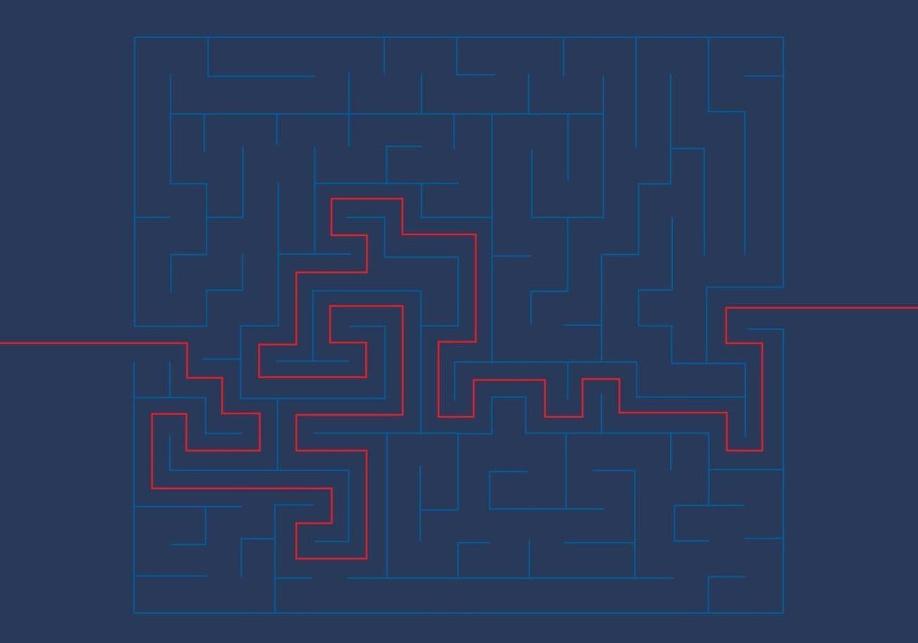
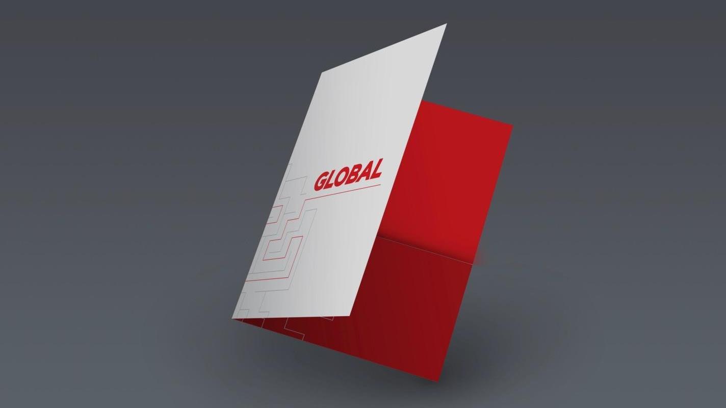
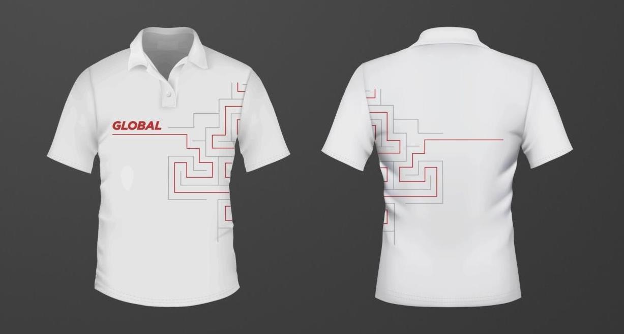
Insurance as a sector can be a maze to navigate. Without in-depth domain knowledge, a client can easily lose its way.
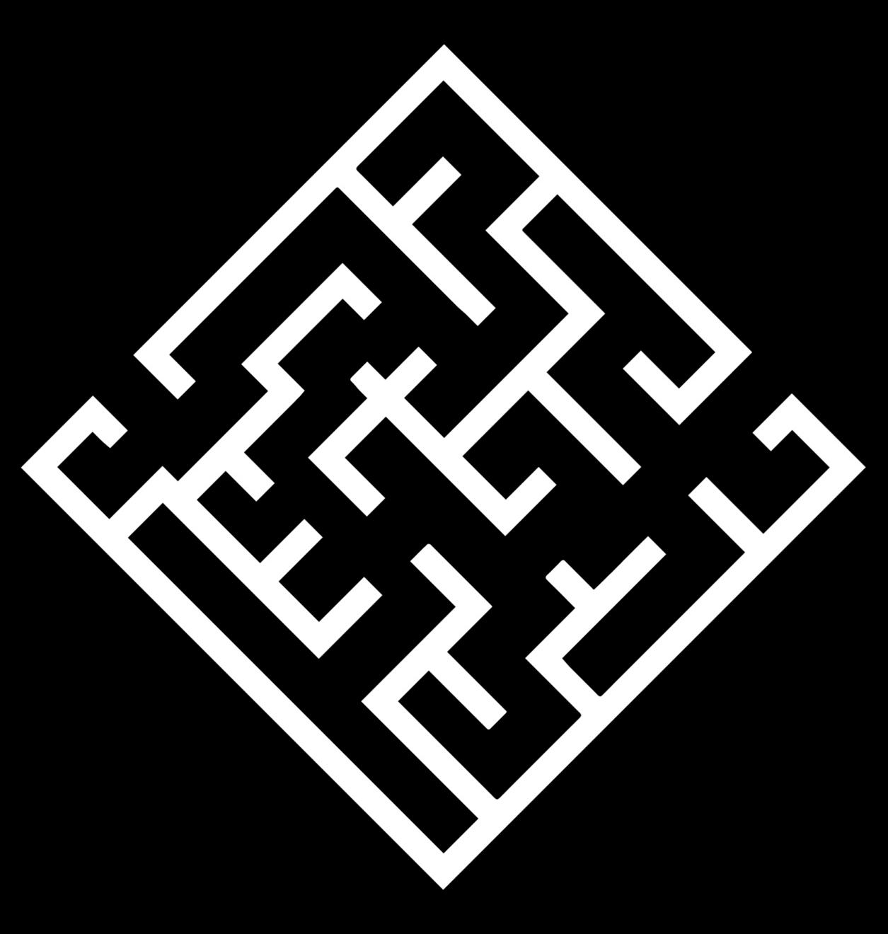
We, at Global, play the role of a guide, using our technical expertise and years of experience in each sector to pick a policy—and where necessary, tailor one—to suit our client’s needs.
The maze gives us a lot of shotcut but there’s only one best— often the longest—route to success. This is the route we take. We strongly stand for our ethics and will never compromise them for any business shortcuts


CATL (Classic Auto Tubes Ltd.) has spent its entire life as the in-house OEM for Apollo Tyres
Tubeless tyres are slowly making the entire industry redundant
To help Classic gain relevancy, improve profitability and move up the value chain, Apollo decided to set it up as an independent brand

Help CATL define its own unique Identity, by:
• deriving clear positioning
• establishing brand architecture
• articulating CATL’s vision, mission and value statement
• creating the identity and setting out usage
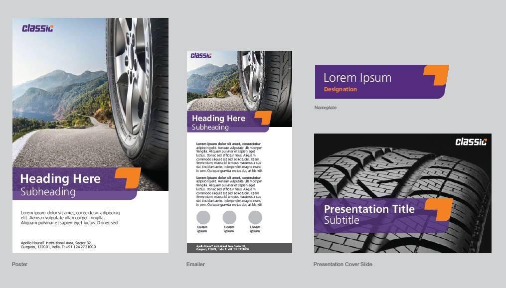
• designing marketing collateral

Cutting-edge Technology
Innovative thinking Customer delight Stakeholder profitability

Cutting-edge Technology
Innovative thinking Customer delight Stakeholder profitability
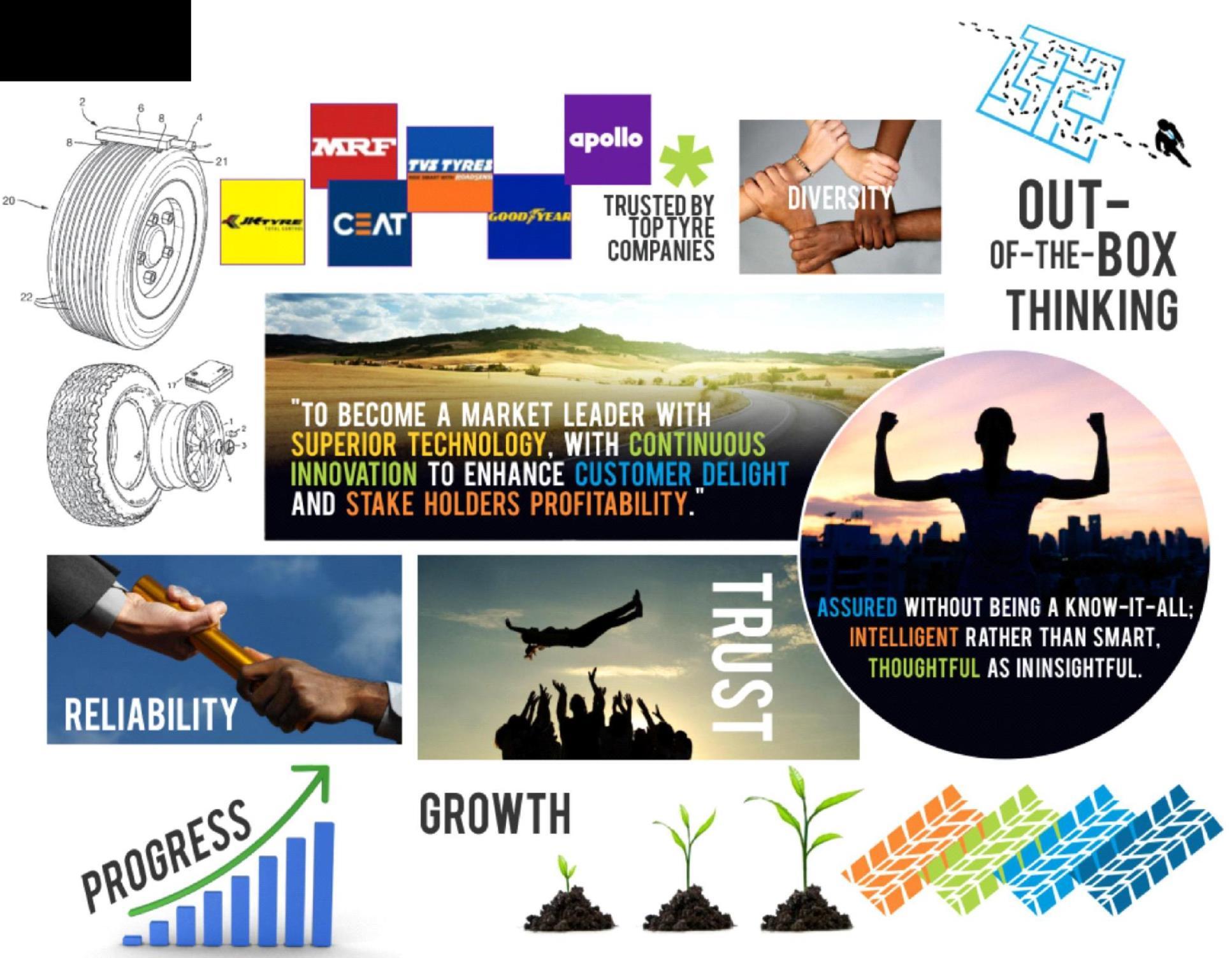
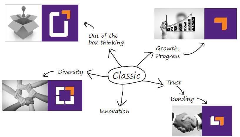
Thinking out of the box is what differentiates Classic as a brand; the orange arrow head flows from this positioning; its upward pointing stance reflects a vision of constant and progressive growth.
The squarish sans serif font evokes reliability; it also works well across offline and online media purple was chosen, both, for its associations of premiumness, and its high visibility.


single name, descriptors for all subbrands (Scores high on brand promise)
e.g. Mercedes Benz
Sponsored brand
(benefits from association)
e.g. Polo by Ralph Lauren
(often competitive)
e.g. Hindustan Lever: Bru, Lakme, Lux, Pears, Rin, Surf…
Hybrid (usually a result of M&A’s)
Monolithic (partly to leverage existing brand equity, partly for legal reasons)
Monolithic brand
single name, descriptors for all sub-brands (Scores high on brand promise)

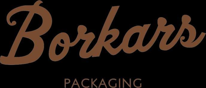
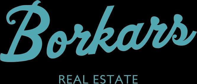
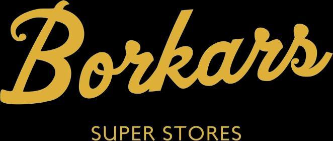
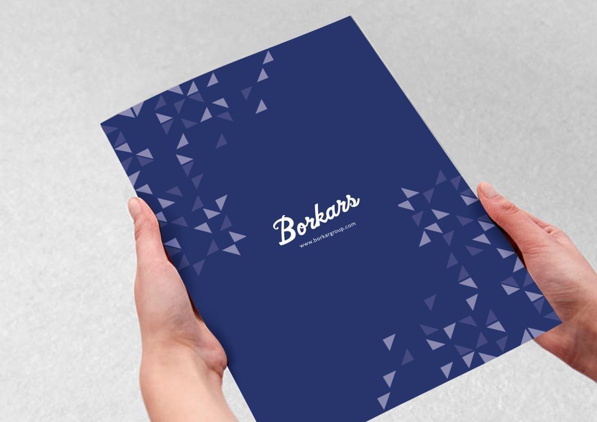
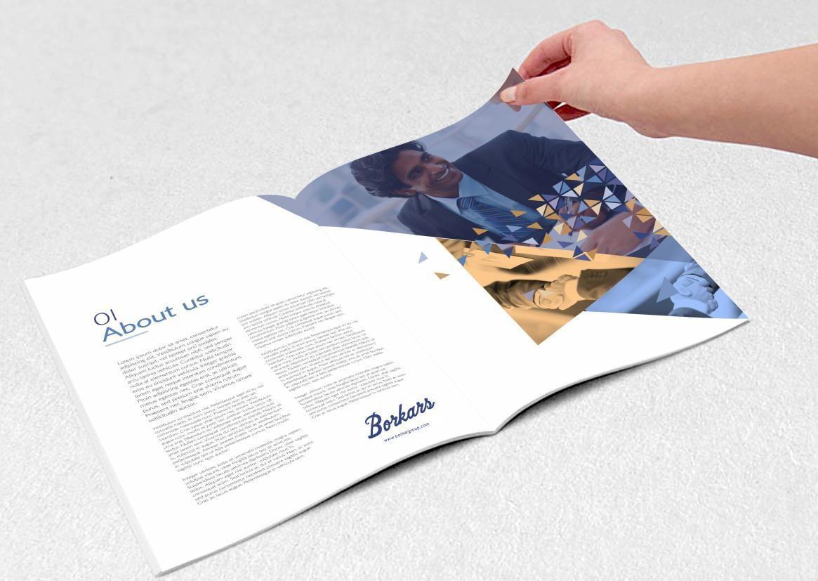
Borkars Group is an eminent conglomerate based in Goa, India.
The group’s businesses span diverse industry categories, from corrugated boxes to construction.
The name owns an enviable bond of trust that extends across generations of customers.

The group’s organic growth over the decades had resulted in a bewildering variety of designs and styles.


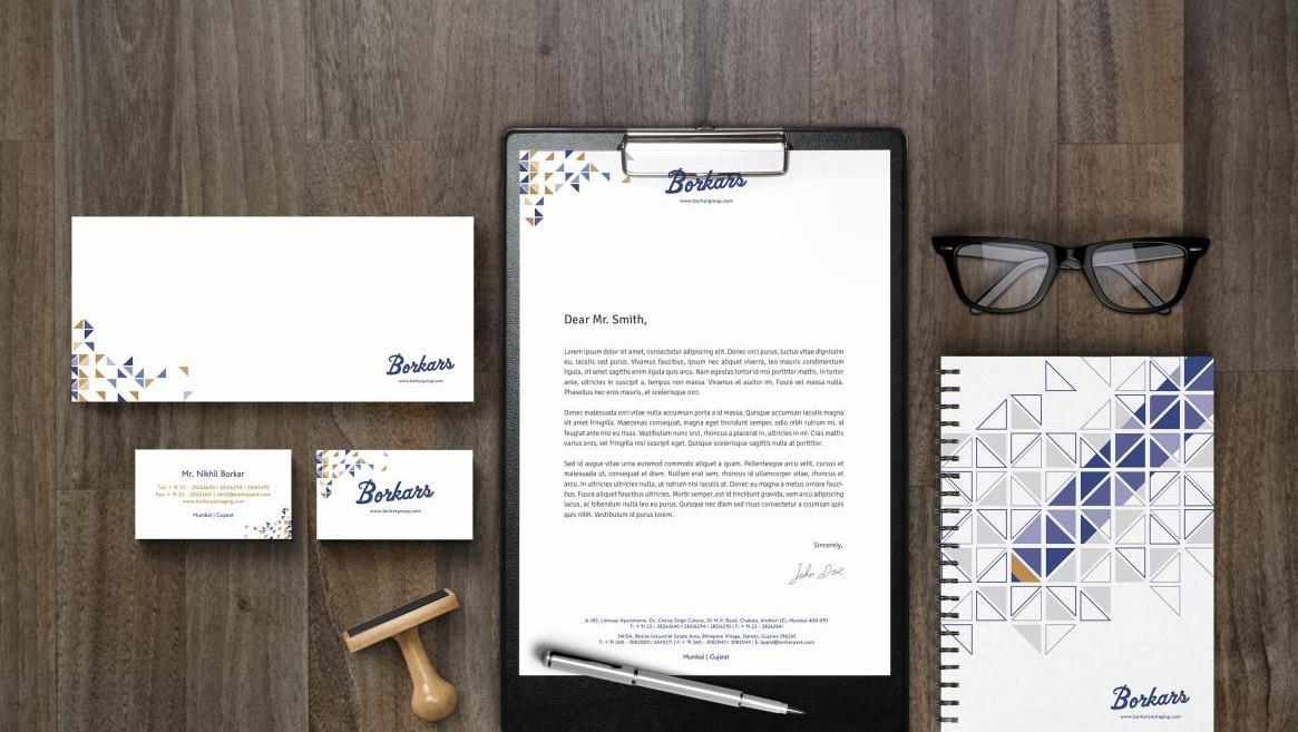
Help Borkars consolidate their brand and unify their messaging to leverage the advantage of being an eminent conglomerate by establishing their brand architecture & create the identity for all their businesses.
Mutil level dialogues with internal stakeholders - founders, senior management ,employees & external –customers, B2B customers , general residents & vendors by having one on sessions with them.
• Owners/Mgmt: Wholly Invested in the Borkars name
• Proud of their 100 year legacy
• Employees: job satisfaction & security… enjoy a degree of recognition that comes from working for a recognized brand
• Multiple Businesses named Borkars has led to confusion regd. Ownership
• Customers trust the brand
• Good recall; Borkars name familiar to general public
The stylized signature symbolizing the brand’s promise & gives shape to the customer-trust they had built over the years
The stylized signature symbolizing the brand’s promise & gives shape to the customer-trust they had built over the years.
From Cartons—a primary product of Borkars’ Corrugated Boxes came the Square
The Square simplified gave us the Triangle… and our design inspiration
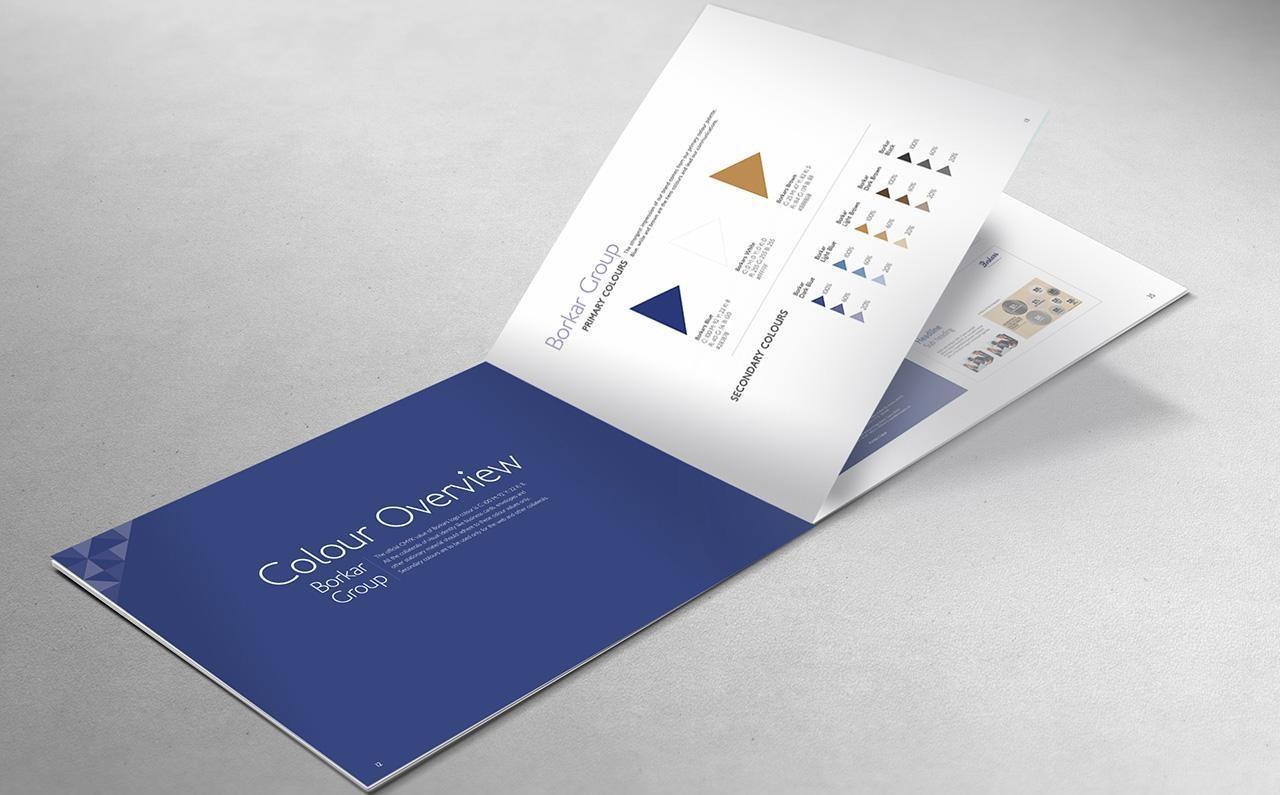
Triangles represent equilibrium, and growth. Multiple triangles create new shapes, while retaining the characteristics of each piece. As Borkars many businesses so successfully did.

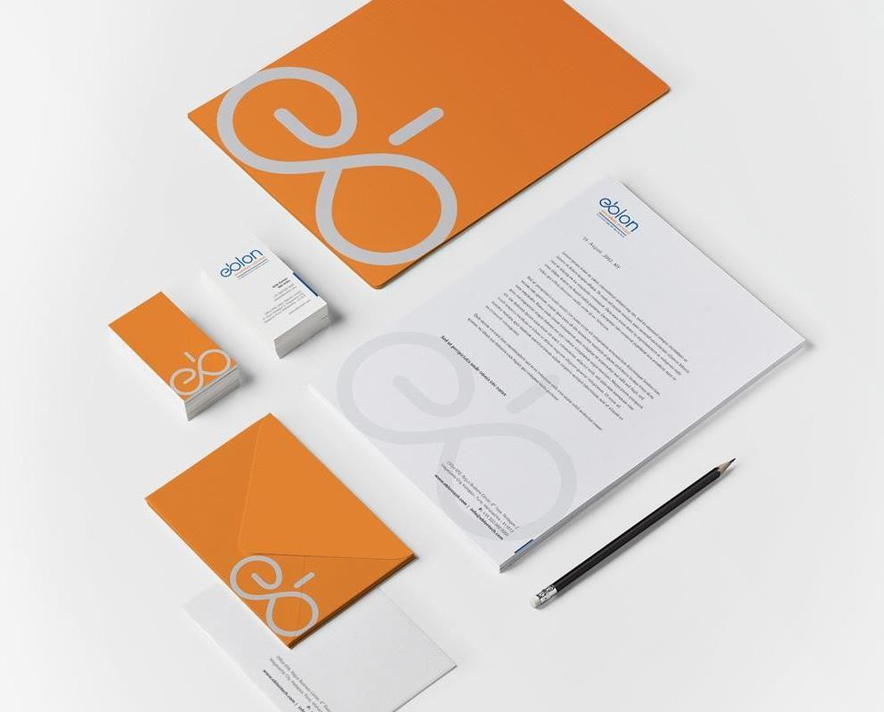
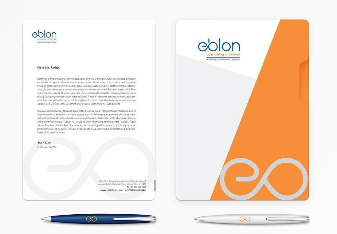
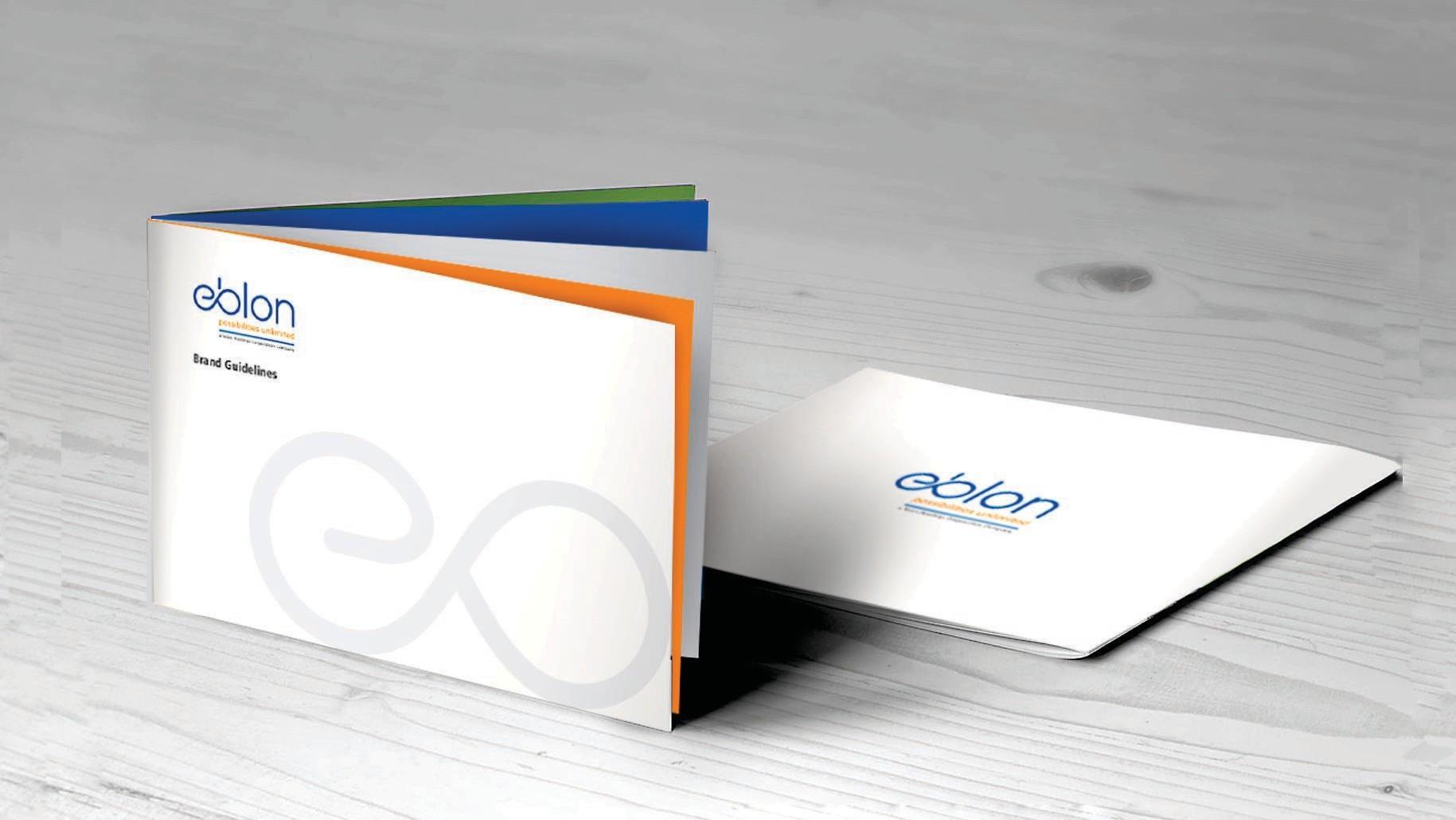
EBLON TECHNOLOGIES, a Sears Globaltech Company, specializes in IT services including data analytics, modernization of computer software design, developments, et al.
Eblon Technologies approached VBC to create an identity that brings out the company’s ability to develop evolved solutions


The Name: Eblon – meaning possibility, in Spanish, was selected to reflect the company’s capability in deriving winning outcomes in any situation, and reiterated in the tagline possibilities unlimited.
The Logo: The leminscate inspired logotype highlights the everyevolving nature of Information Technology as an industry and the company’s ability to deliver solutions that keep on delivering.
The Colours: Blue evokes a reassuring, professional emotions, while orange for the tagline captures the creativity needed to deliver limitless possibilities.
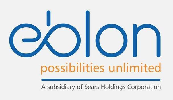
Design Language: Slim minimalist styles complemented by lowercase sans serif type-faces deliver a no-nonsense sense of modernity.
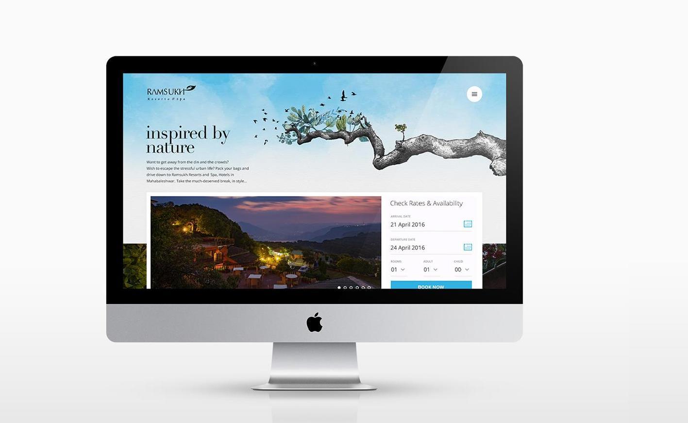
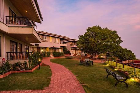
Ramsukh Resort and spa is a premium resort in Mahabaleshwar. The resort overlooks a cliff on one side and untouched forest on the other. By virtue of its vegetarian fare, the resort is perceived as catering exclusively to the Marwadi and Gujarati communities.
While appreciably niche, this was also acting as a deterrent in attracting international (expat) and pan-India clientele who would be willing to pay and would enjoy the organic charm Ramsukh offered.
Ramsukh Resort approached VBC to help redefine their positioning, refine their identity and refresh their ranking, placing them among the best resorts to in Mahabaleshwar, allowing them to move away from their exisitng positioning which confined them to ethnic vegetarian communities. The resort was open to changing the name of the brand as well.
VBC conducted a physical survey to get a first-hand experience of the resort; online customer surveys were run to help understand the current brand positioning and the brand recall.
The original idea was to come up with a new name for the property/ brand however the survey unearthed a lot of interesting insights, which led us to believe that the current name was inextricably linked to the resort and carried enormous goodwill, especially with locals.
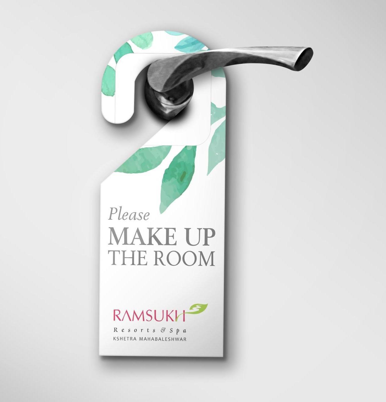
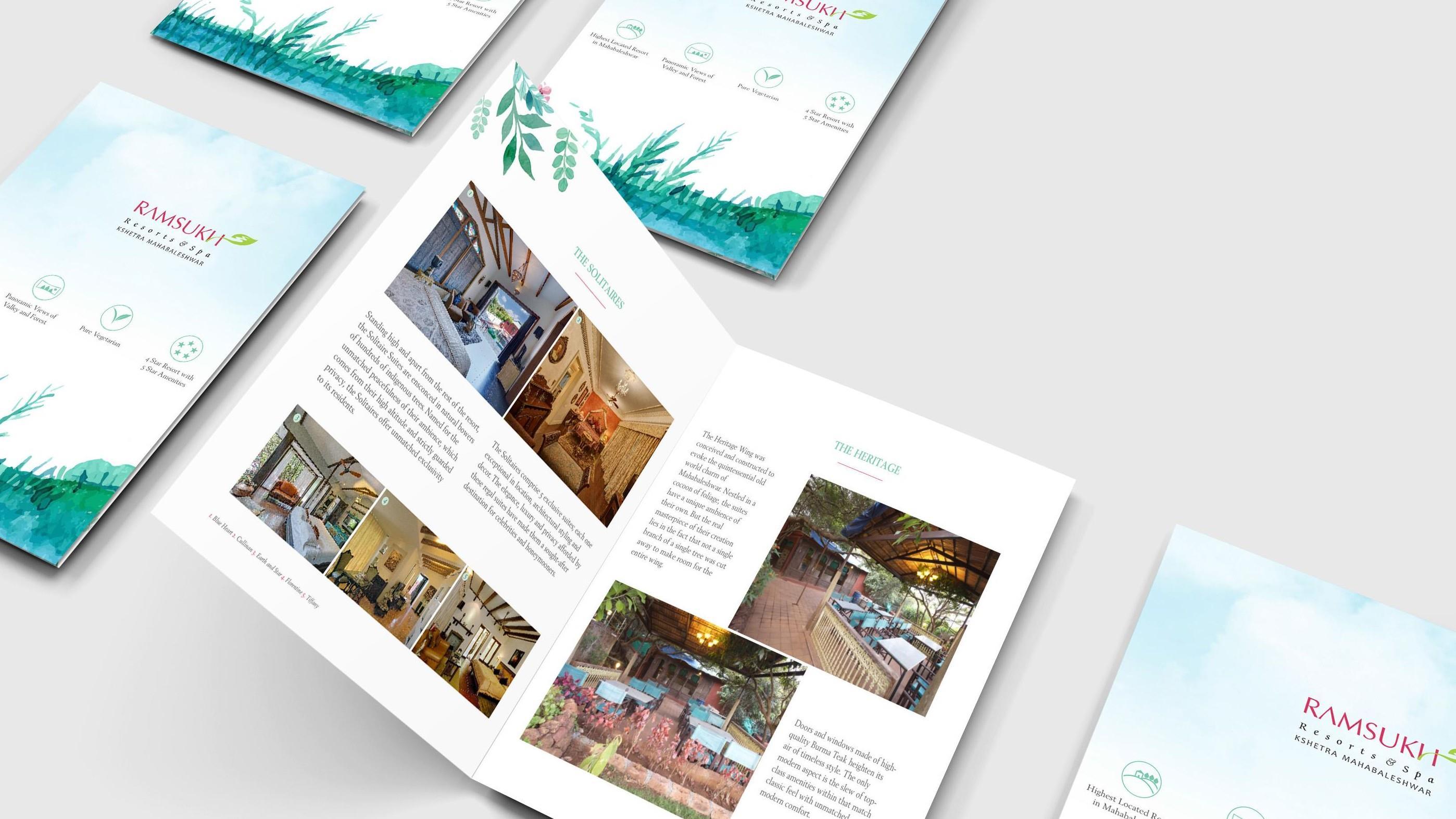
The property has a lot of inherent strengths that are truly unique— including its location on the highest point in Mahabaleshwar; stunning views of pristine forest and valley. These are truly inimitable, and fundamental to the resort’s appeal.
Our findings led us to define a positioning that would combine the property’s natural advantages and the holistic experience it offered.
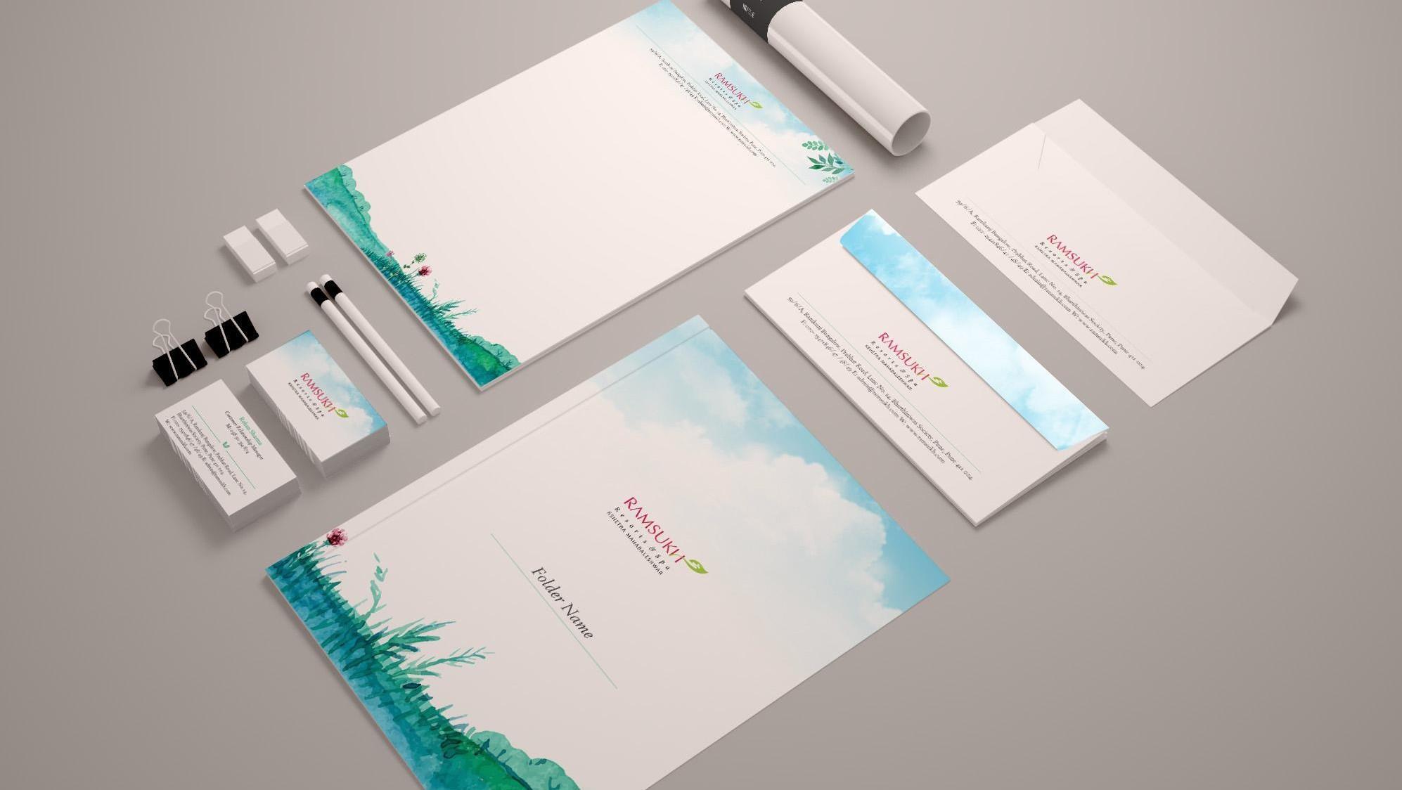
To capture this essence we chose to create designs using a watercolour effect, with predominantly pastel shades that tried to replicate the atmosphere of the resort.
This style of design was extended to all collateral: from stationery to marketing touchpoints to way-signs leading to the kiosks and internal branding elements.