
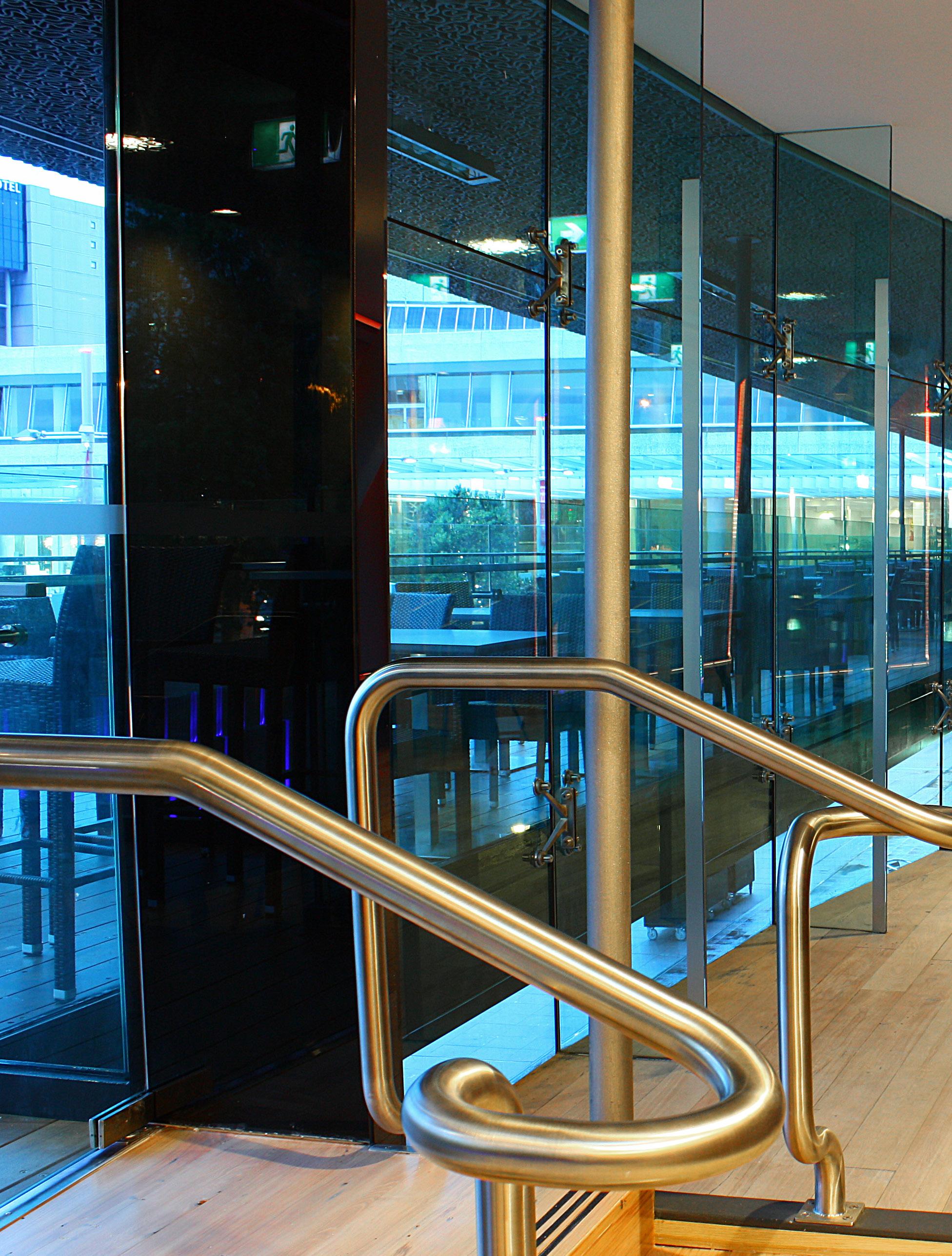



Regardless of the size and complexity of the project, we seek to exceed expectations in both our documentation and service, delivering projects within agreed time frames and budgets.
Walker Group Architects Ltd. has it origins as far back as 1932 when the original firm, Lewis Walker, was founded in Auckland, New Zealand. Now, as always, we aim to produce buildings of aesthetic quality, sound construction through enduring honest design, lateral thinking and excellence. We take a holistic team approach with an integrated, total building focus to create inspirational and environmentally sustainable solutions, focussing on and meeting our client’s expectation through close client collaboration is baseline for us - “ we listen ”.
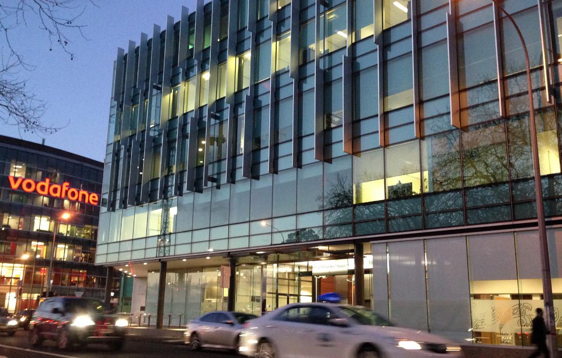
We understand that the clients of the modern building and construction industry require of its consultants an understanding of the latest proven technologies and trends. The resources, people and technology in Walker Group Architects enable us to undertake a wide range of projects, through our specialist business units, including commissions involving design, feasibility studies, planning submissions, contract documentation and administration, quality control and peer reviews.

WAIRAKEI // NEW ZEALAND
Client: Francis
A RETREAT FROM THE CITY APARTMENT.
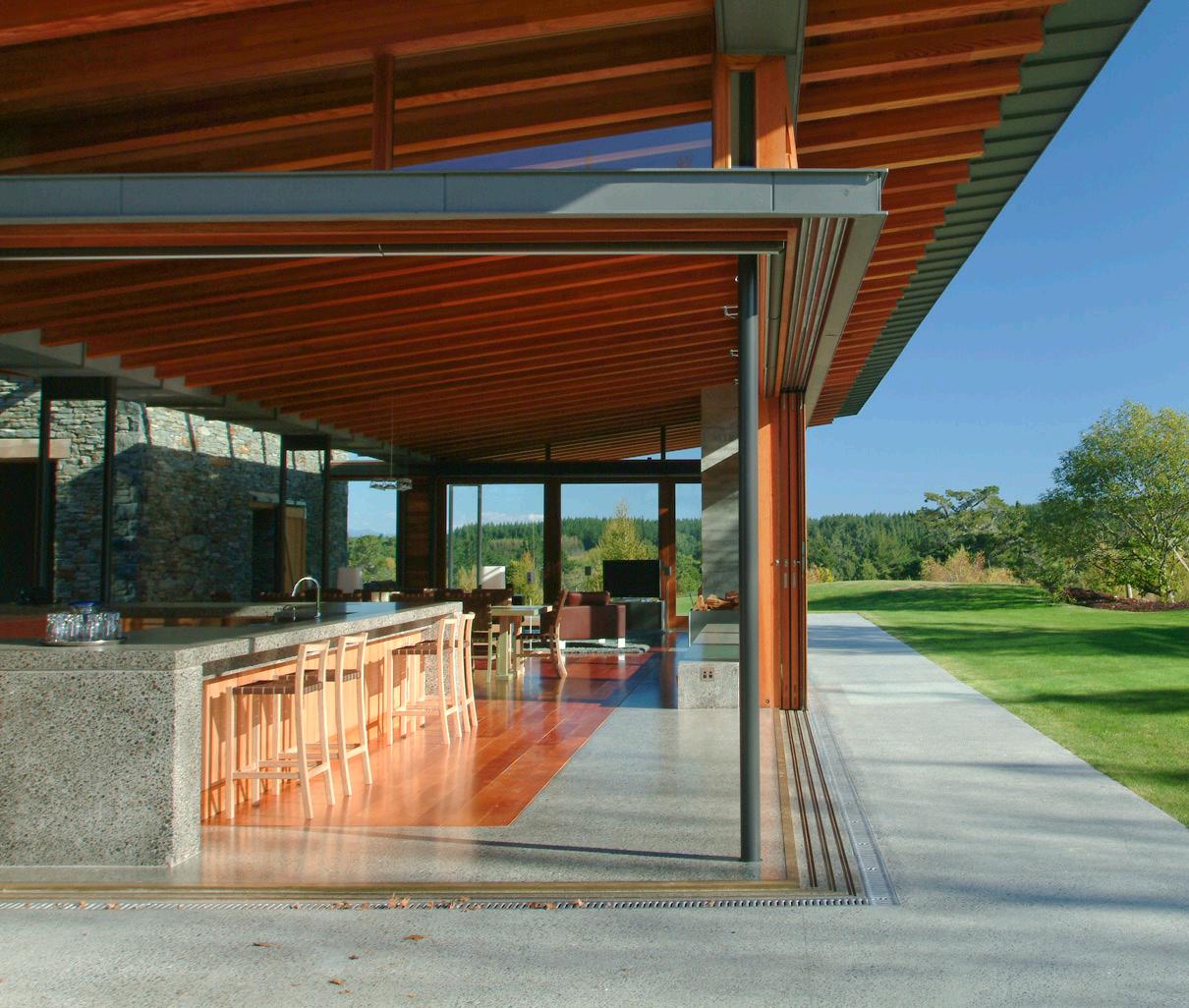
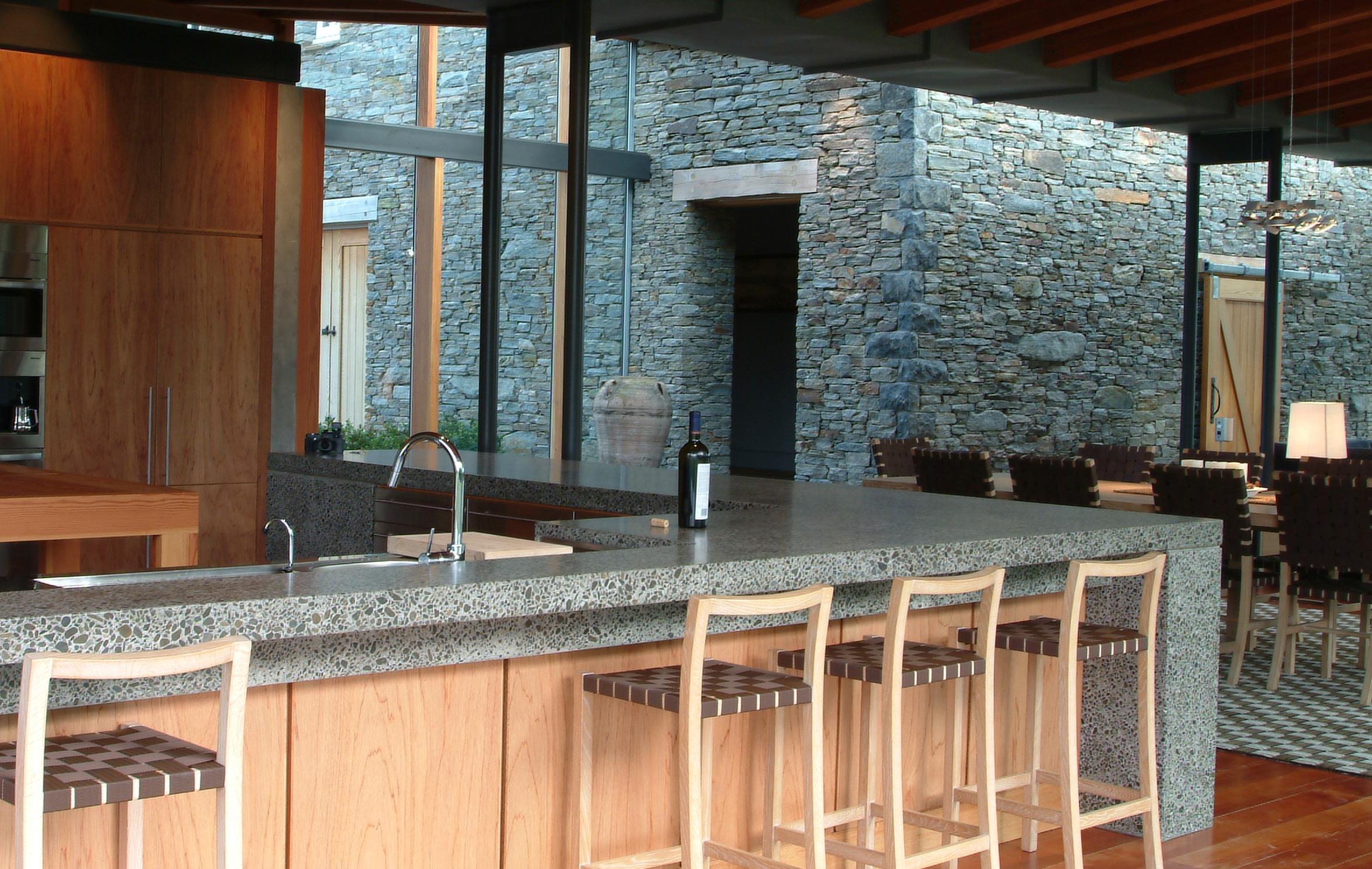
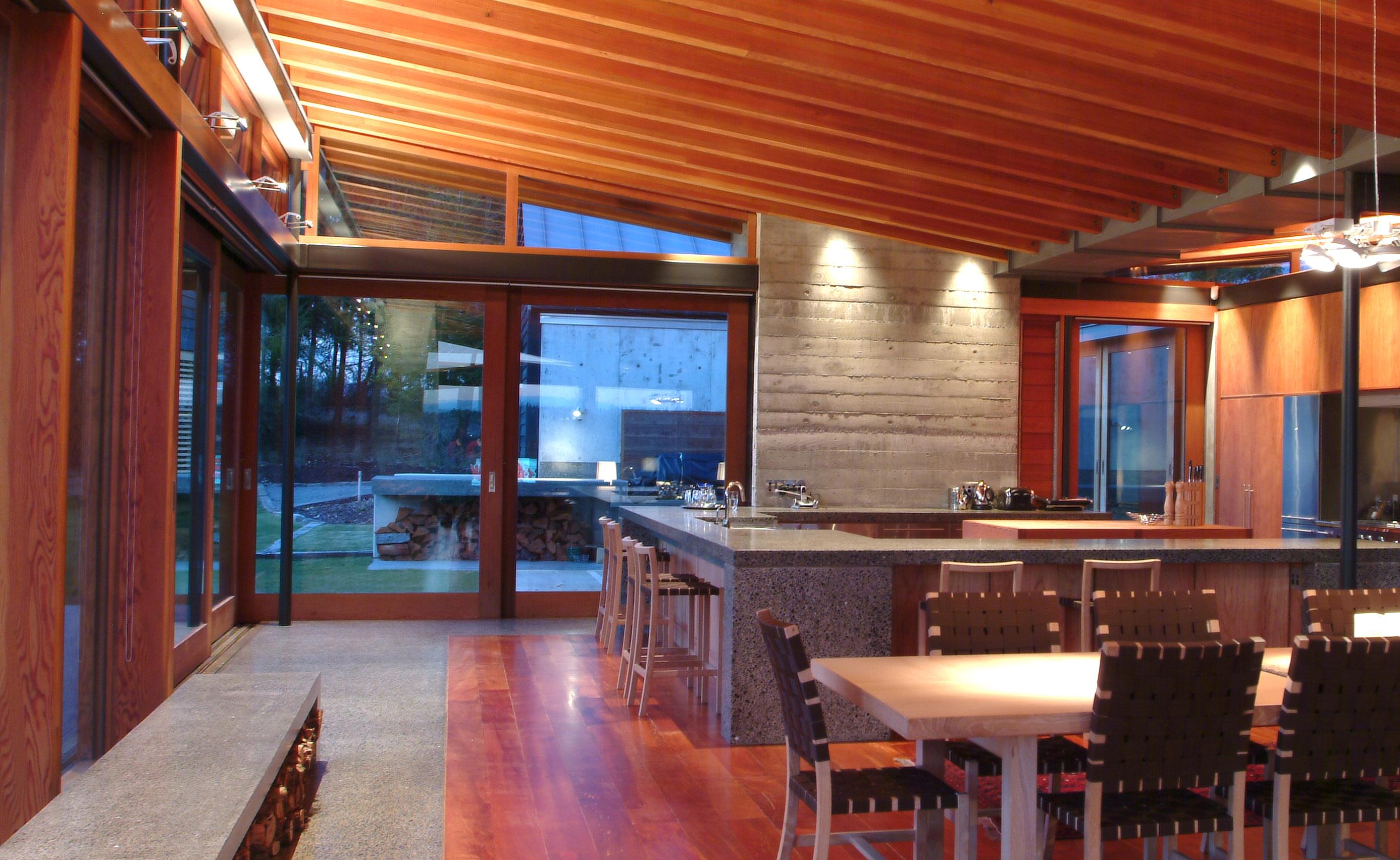
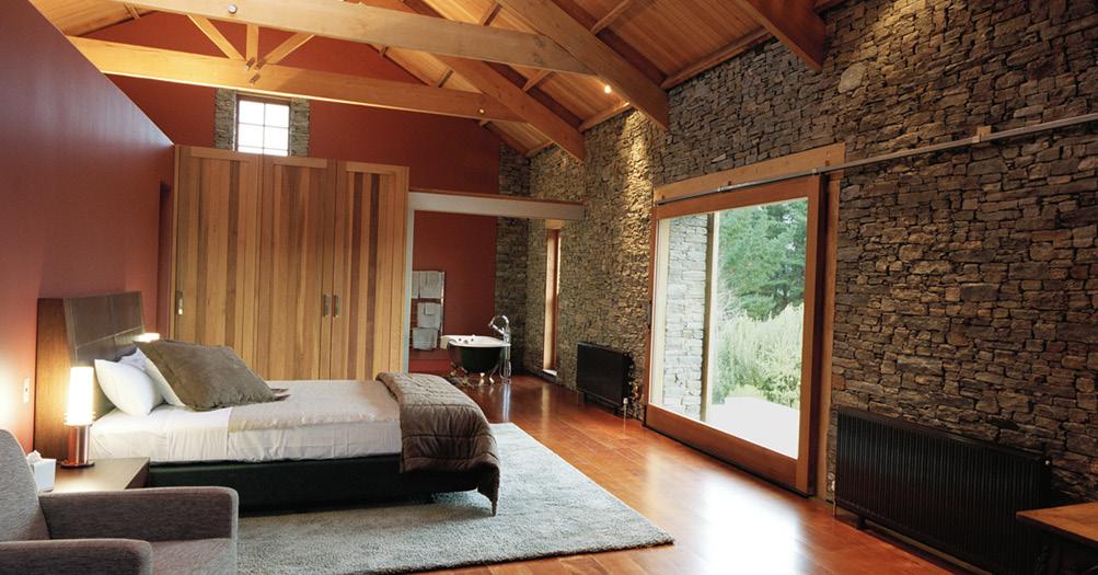
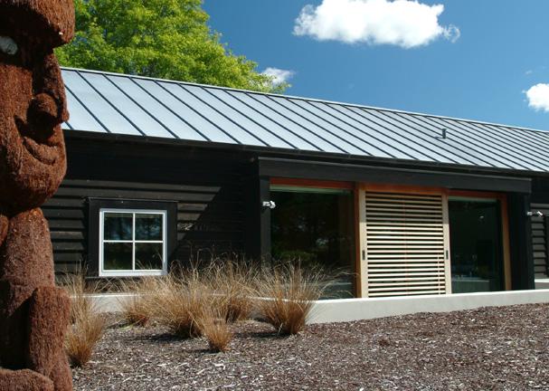
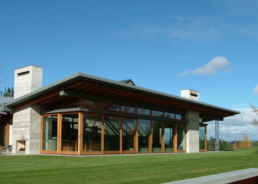
This complex of buildings is designed as a retreat from the city apartment. It is intended for easy entertaining and can accommodate several guests, as well as retaining the residents’ personal space. An environment memorably different from city life is created.
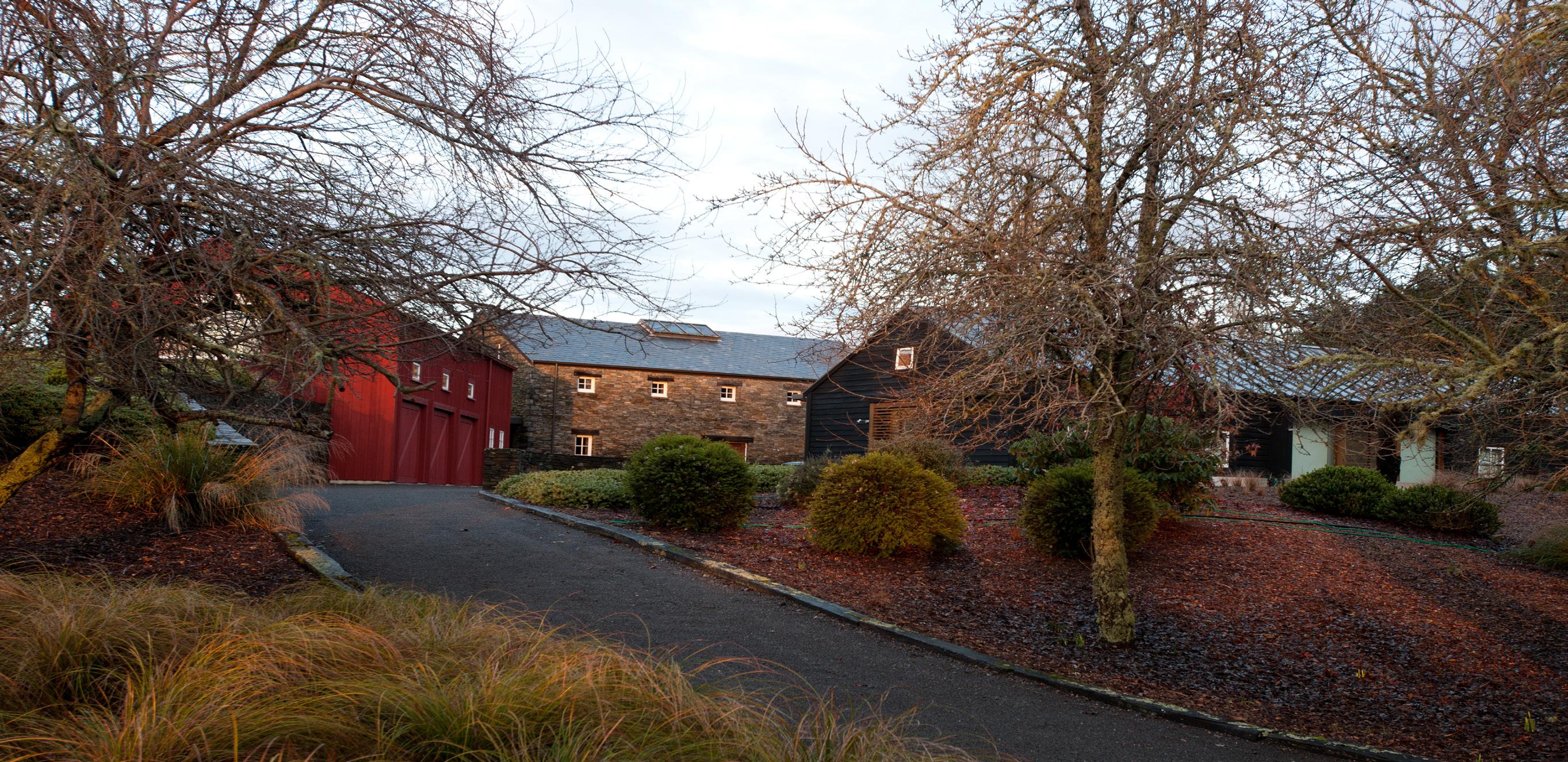
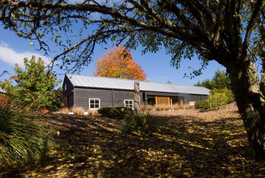
The concept of this house is to create a collection of buildings that has developed over time to provide a protected outside courtyard. This central courtyard has an oak tree located on the key axis of the
buildings which acts as both a link to the seasons and as a blurring of the line between architecture and nature.
The collection consists of four buildings; a red cedar structure as the shed, a stone building as the entry as well as an anchoring feature on the site, a modern glass and timber pavilion containing the living areas, and a black cedar guest wing. Creating a sense of establishment on the site has been crucial in the design.


AUCKLAND // NEW ZEALAND
Client: FRANCIS
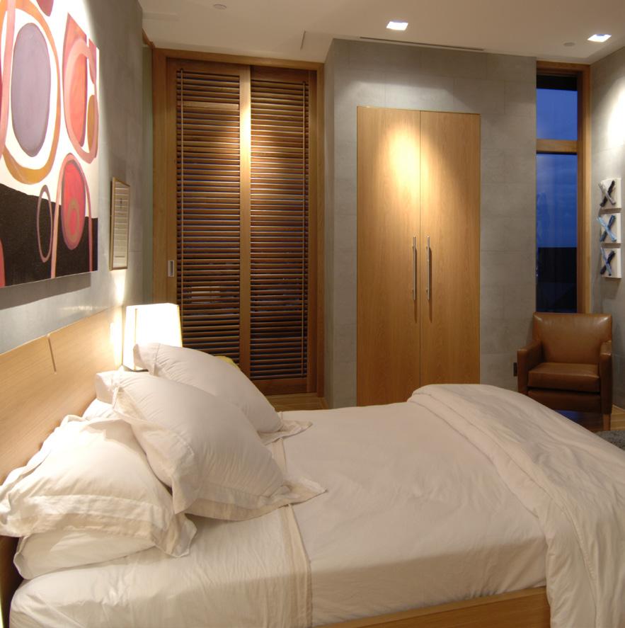
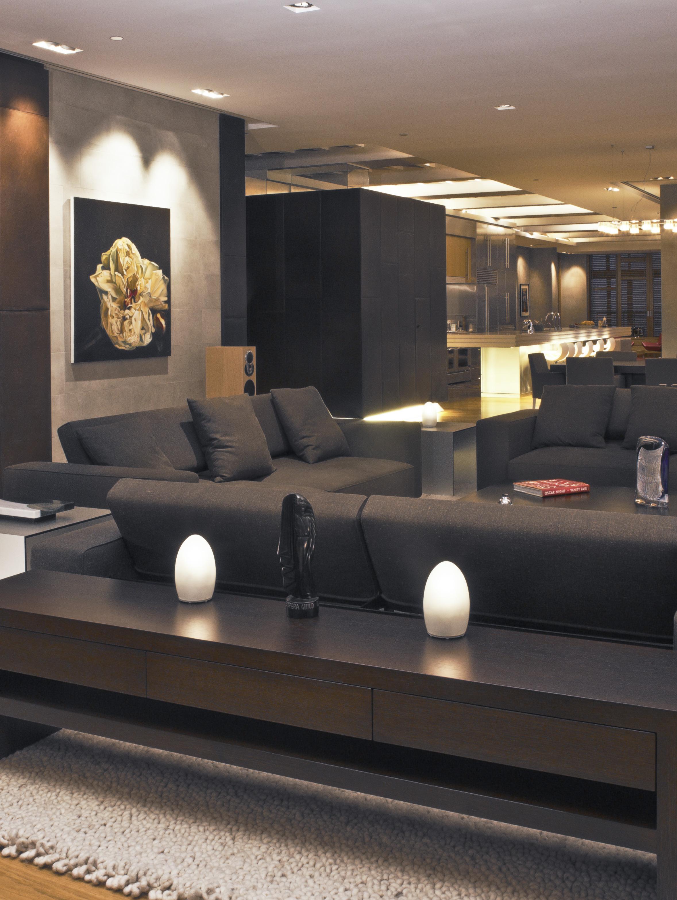
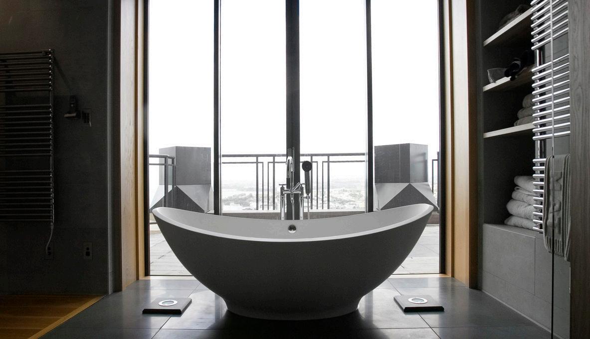
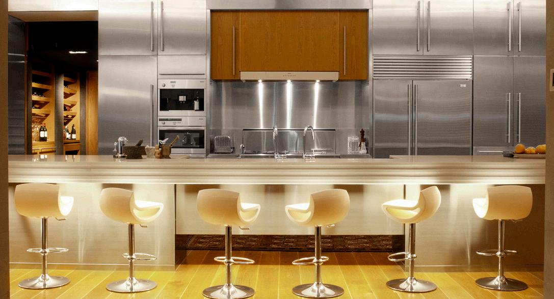
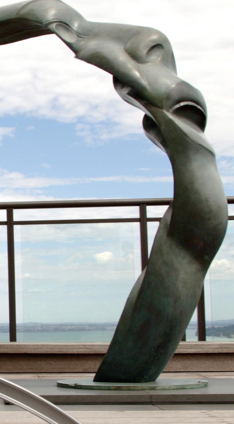
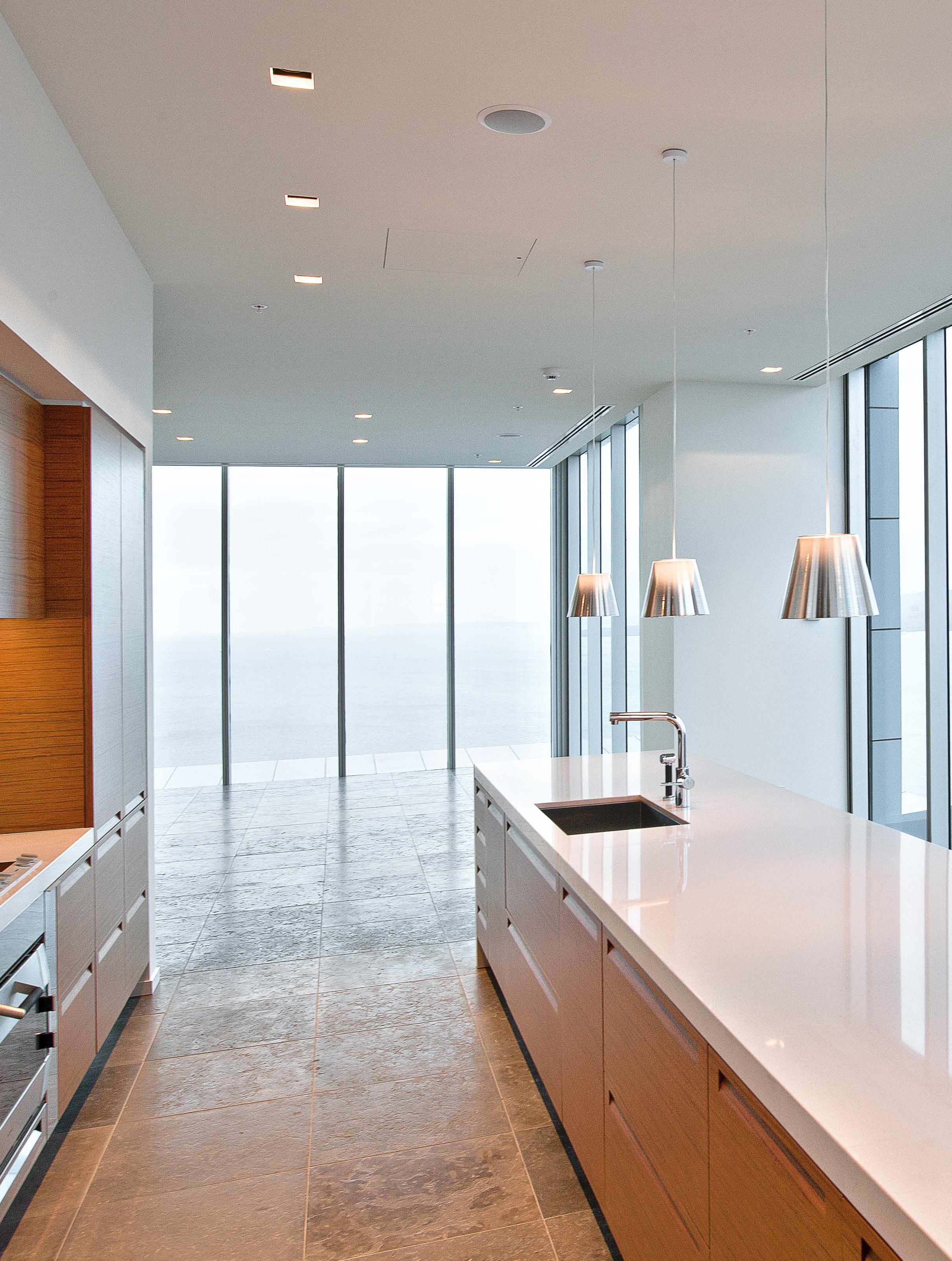
With 300m2 decks overlooking Auckland’s harbour and city, this 500m2 multimillion dollar apartment atop the Metropolis tower in central Auckland City, is a sophisticated but practical, comfortable but spacious urban pad.
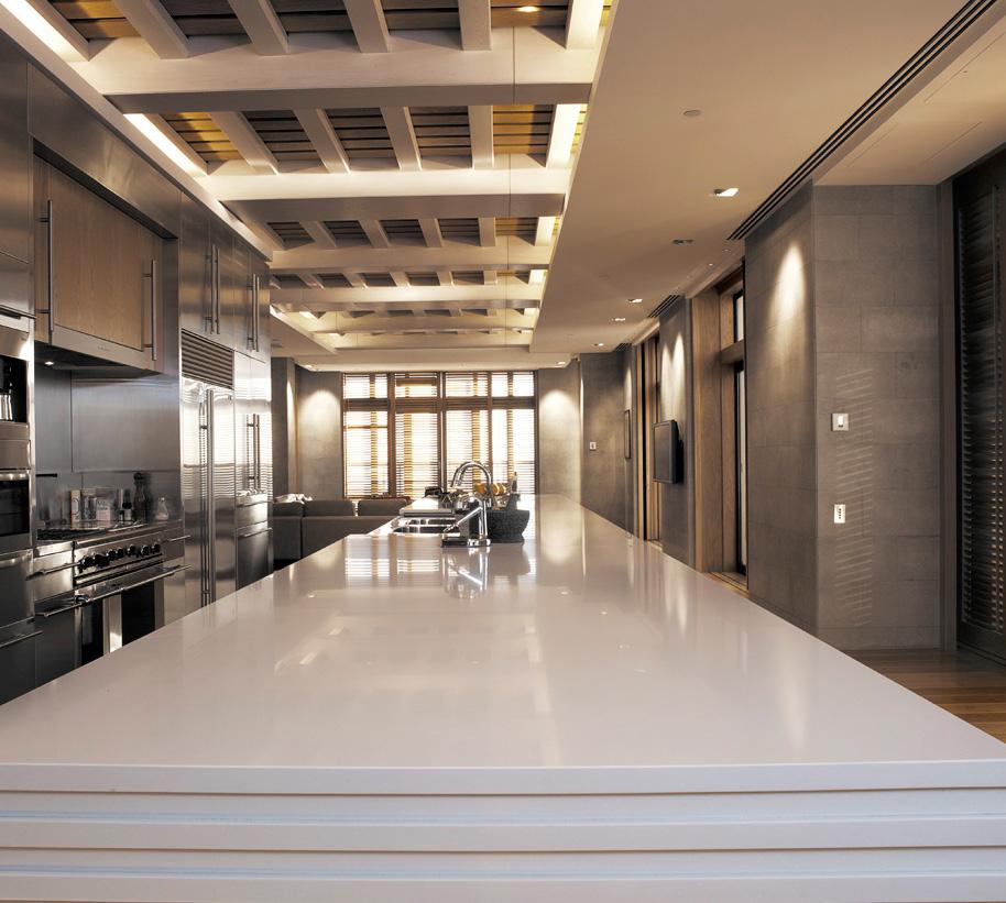
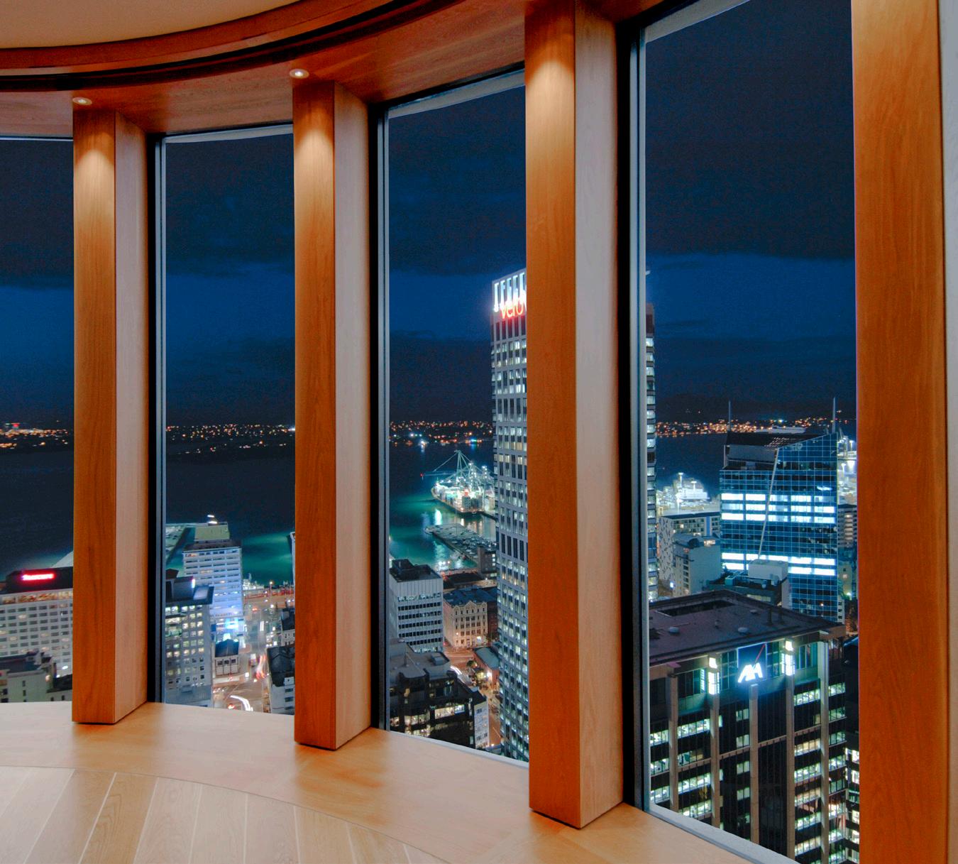
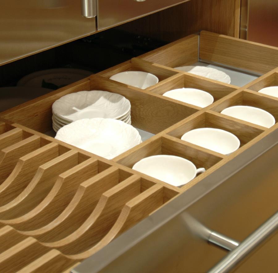
Meticulously designed and managed to the smallest detail, with all the latest wired and wireless technology in search of convenience from a single swipe, the apartment flexibly accommodates a single owner and his visiting family and friends and opens up to the changing panoramas around the building perimeter.
New sliding door suites, matching indoor and outdoor large plank timber floors, multiple inside and outdoor dining suites and indoor and outdoor fireplaces blurr the inside from out and provide advantage for using the decks in adverse weather conditions.
Winner NZIA Interior Design Award




Client: Cornerstone
Standing at over 140m high in total with 30 stories the Sentinel is New Zealand’s tallest all apartment building. Floor to ceiling glazing affords outstanding grandstand views of the Hauraki Gulf coastline North and East and Auckland City to the South. The simple square building shape has a highly efficient served core,
a simple cost effective structure and its scale permits a variety of different sized spacious quality apartments. Decks are punched in for protection from high winds and for clarity of form. Perimeter columns dominate spandrels and continue up to form the arched head of the Sentinel.


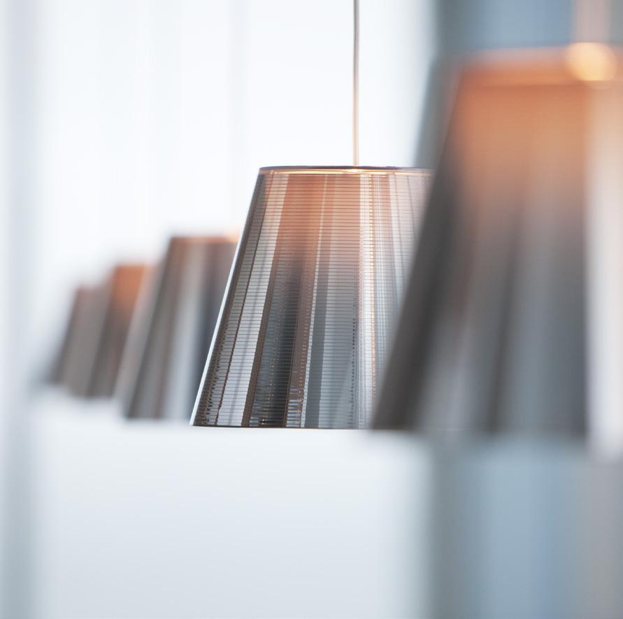
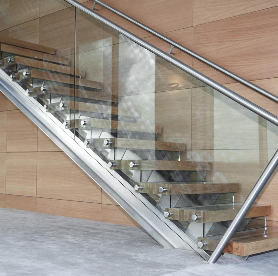


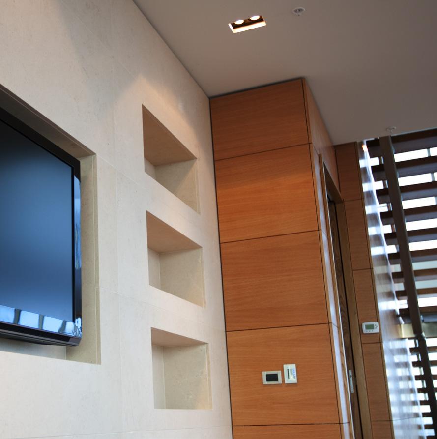


In response to our clients requirements for a new consular office and a community based Fale these buildings respond to the specific needs of a growing community whilst addressing Councils desired vision for the Mangere town centre.
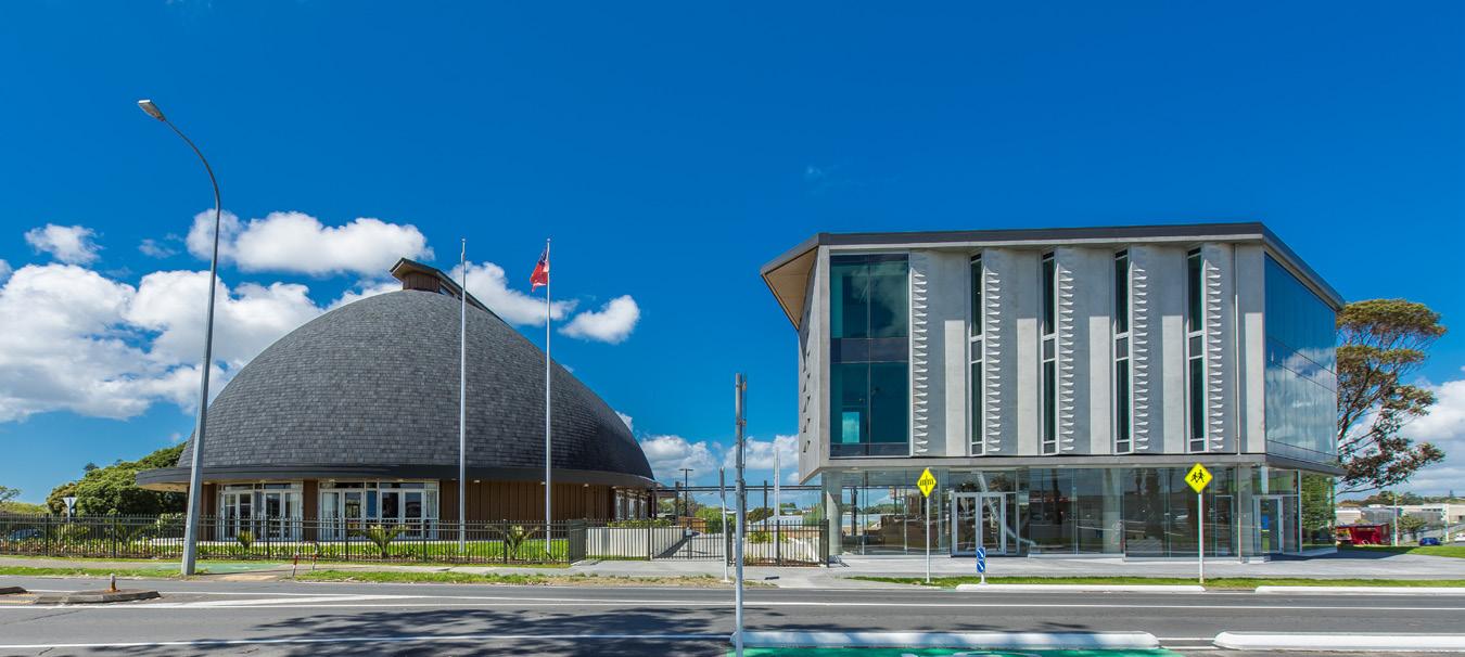
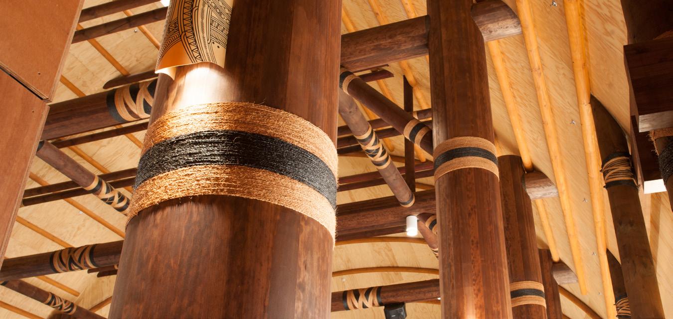
The project consists campus style development with two building, a three level consulate office of approximately 1500 square metres, one level consulate offices, one commercial office floor and a level of ground floor retail, a separate traditional Fale building seating over 450 people which we believe to be the largest in the world, a formal Malae or traditional gathering area and an associated 55 space carpark.

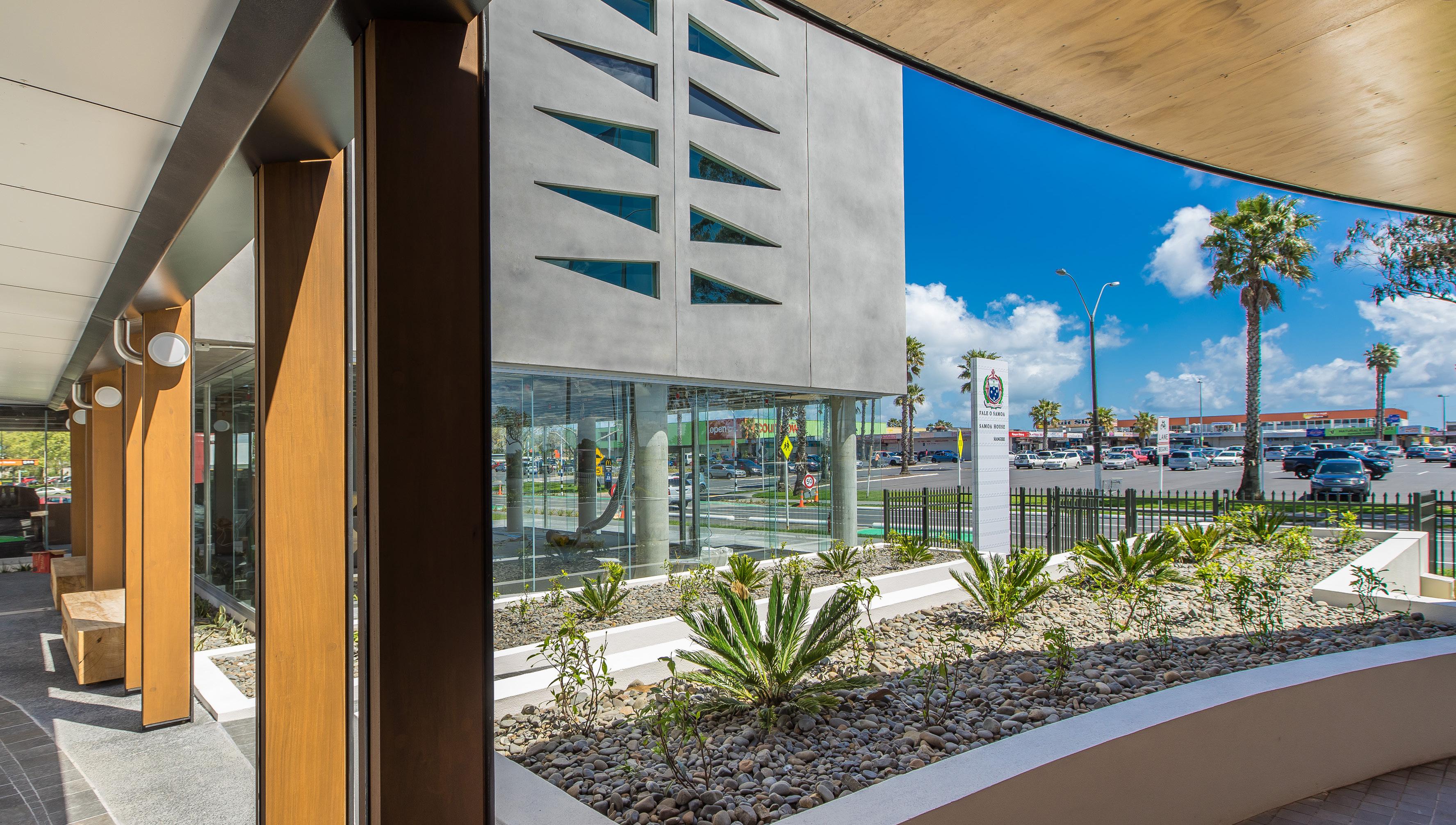
The openness of the traditional Malae and transparency through the adjacent office building at ground level, provides clear sight-lines that reinforce the legibility of entry points into and out of this space allowing a high level of passive surveillance at all times. From within the Malae view corridors connect back to the mangere town centre. From within the office building strong visual connections were created from north facing gathering areas and balconies while at ground level physical connections from the retail level and Fale link these main internal spaces together worldwide was made easy via internet.
 Client: Government of Samoa

AUCKLAND // NEW ZEALAND
Client: Force - Village SkyCity

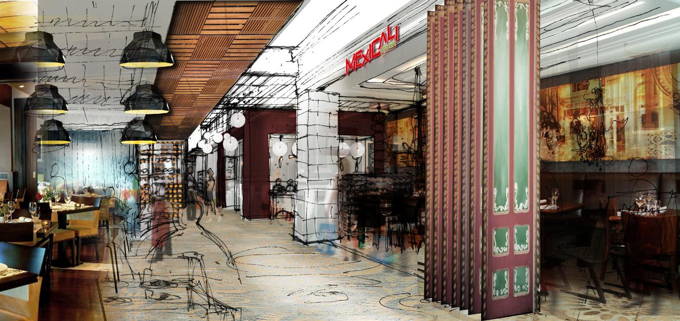
Following a successful redevelopment of the Metro Centre on the level above as a 10 pin bowling venue with bar food and drink facilities, the new owners wanted to redevelop 1400m2 of existing bar and retail into a new restaurant and bar precinct opening directly off Auckland’s main urban Aotea square. New outdoor canopy enclosures extend weather protection provided by the large bowling venue deck for outdoor dining into Aotea square.
A new ‘market’ themed street connects Aotea square to the Metro Centre’s north entry and more restaurants feed off this street. This internal street also connects westward via a court to Bledisloe Lane, an existing pedestrian walkway which runs from Aotea square to the North entry and main city streets, to provide visibility and connectivity for the new restaurant tenancy frontages in the internal street.

AUCKLAND CITY // NEW ZEALAND
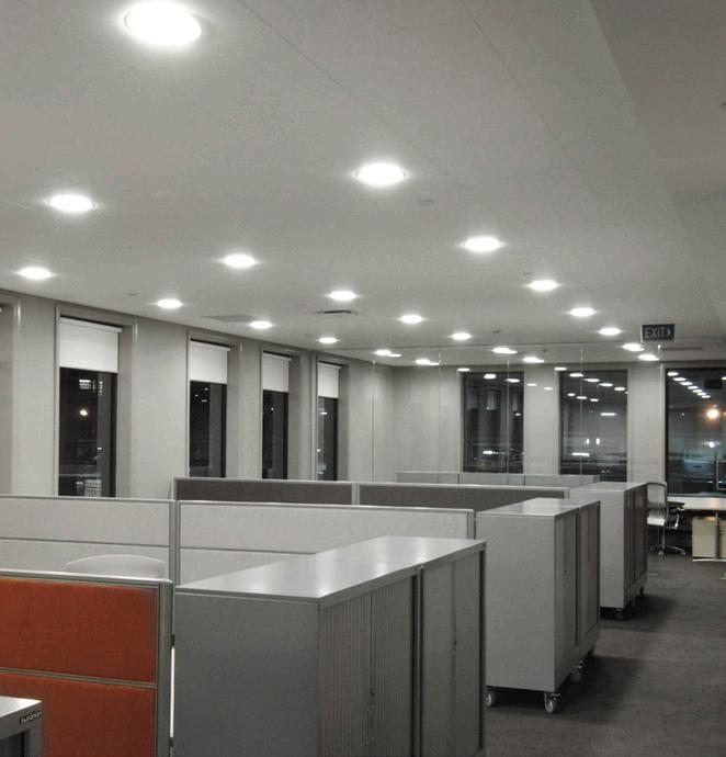
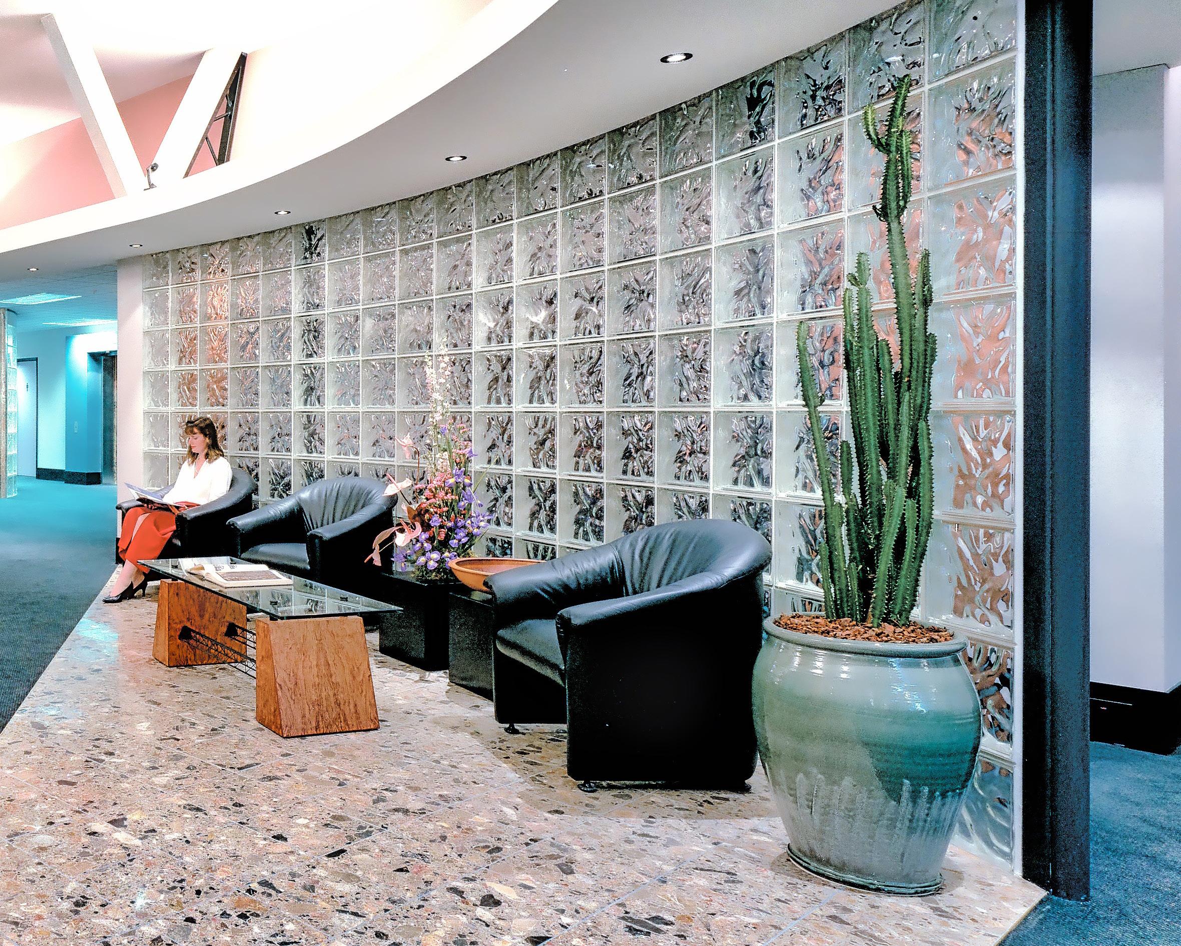
Prestigious fit-out within buildings of Maritime Square. Views down Lighter Key. Designed in keeping with the classic design of the building exterior as a requirement of the brief. Good quality materials, well detailed and well constructed and crafted. The reception and waiting area welcome the visitor, the starkness of the external walls surrounding the warmth and detail of the dark stained timber louvres. The floor and ceiling edges soften in waves, edge dissolved by multiplication. The solid stone block wall behind reception separates the public reception space from the private
work areas, creates a backdrop for the reception function and a centre of rotation for the visitorís movement towards the more semi-private foyer beyond.
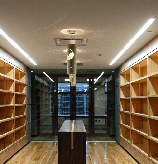


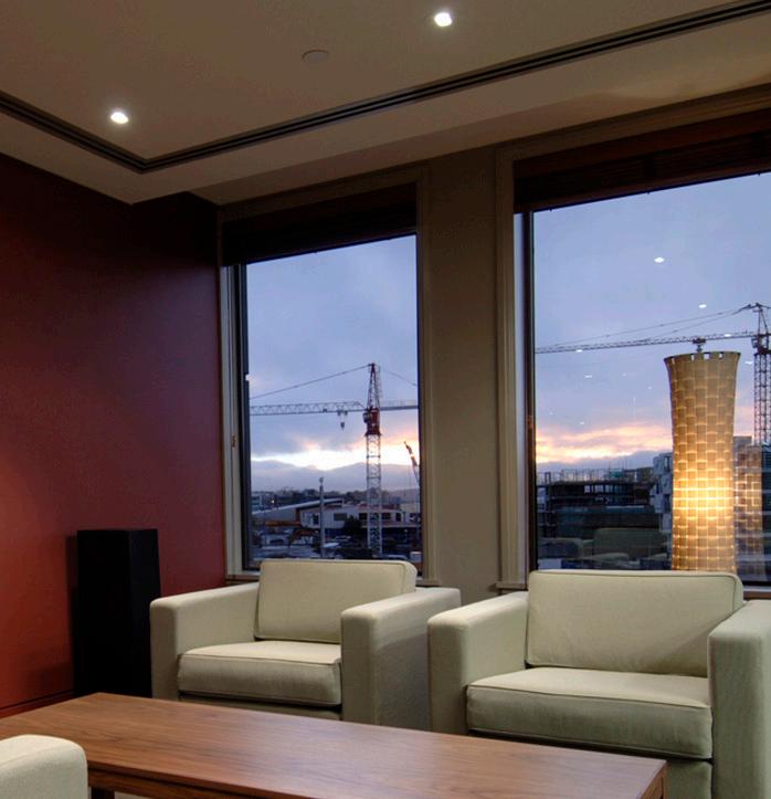
Quality is understated; detail is simplified and form solid and strong; materials are soft with subtle texture variation.
The seaward waiting area is set against the water playground, engaged in its life but set apart from it: complete with telescope and comfortable seating. The foyer is like a lock, its gates the solid darkstained
The owners of the successful Queenstown restaurant brands of Wai, Finz & Bella Caucina approach Walker’s to be part of a limited design competition.

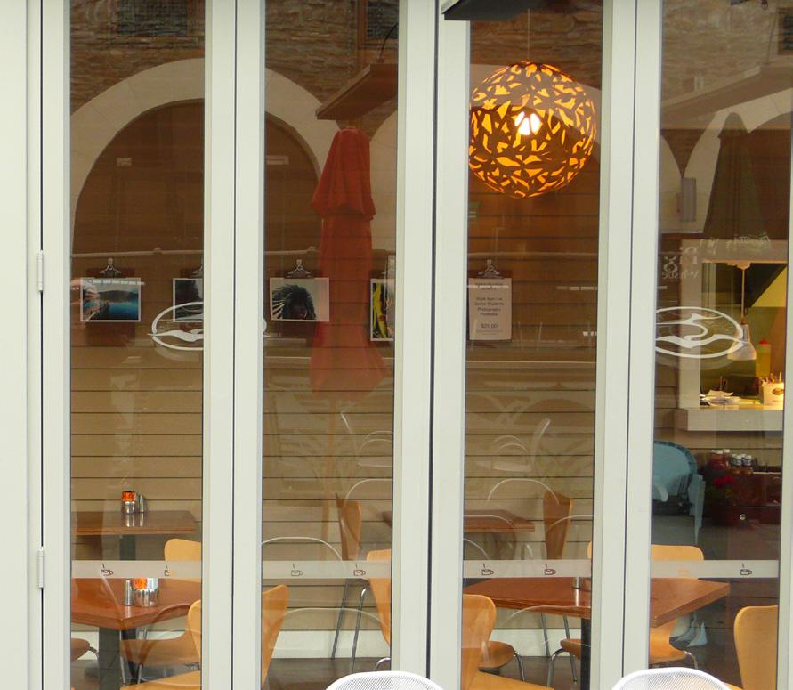
Our concept was to design relaxed cafe that referenced back to the Kiwi bach and slower pace of holiday life. Materials followed this theme with the use of timber floors, weather boards and pendant lights. Ceiling panels are used to provide a visual break between the exposed structure above.
To contrast the public space a private dining room was designed to cater for cafe over flow and private bookings.
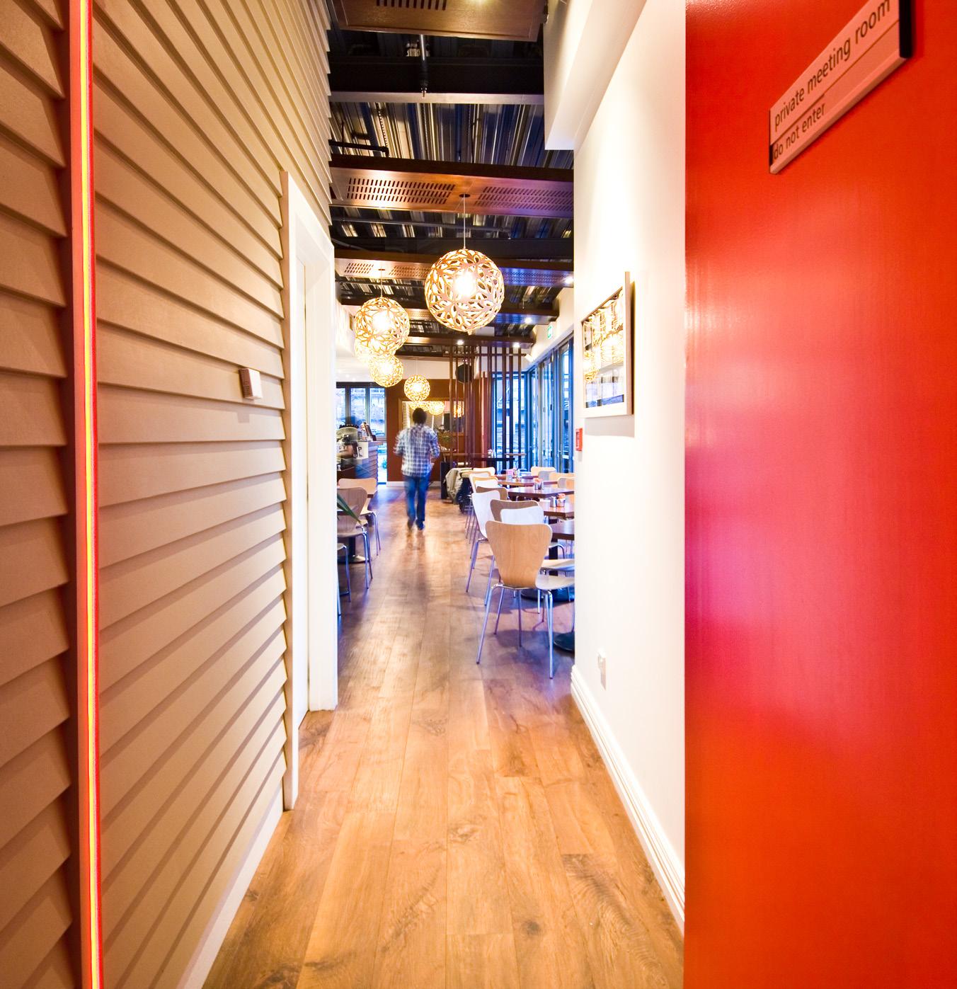 The cafe is located in the new Post Office Precinct developed by Ngai Tahu.


TAKAPUNA // NEW ZEALAND
Main Headquarters, a single large floor on the first floor with views towards Rangitoto Island from the rear deck and boardrooms. The boardroom can be opened to the reception, when not in use, therefore allowing the inner areas of the office space to be open to the view and light. The inner angled structural bracing was made a feature and the walls angled back in keeping with this. This floor was done in construction with the branch office on the ground floor.

AUCKLAND CITY // NEW ZEALAND
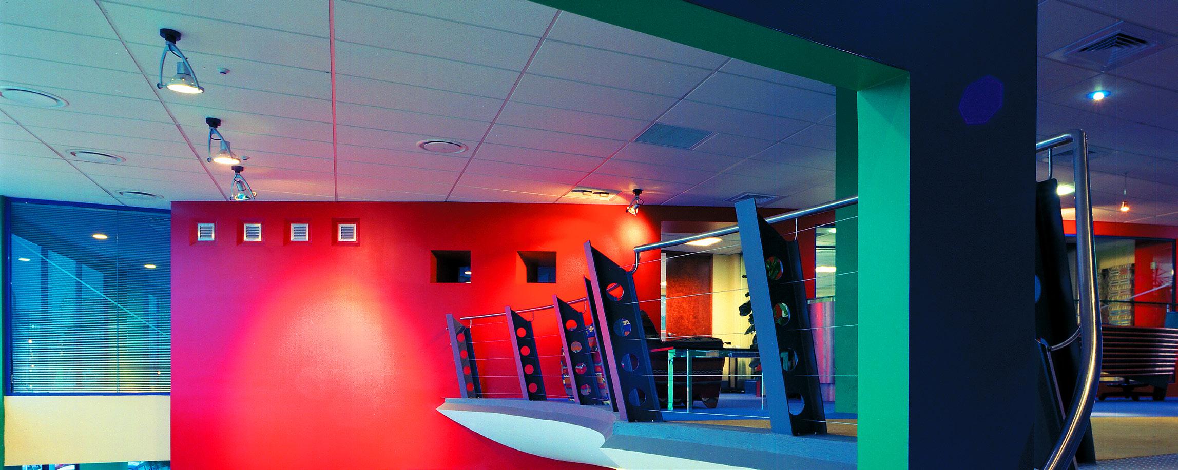
The design required to retain a strong identity throughout this acheived by utilising antique telephone poles and lines displayed in the entry hall of the building. The wire railing on the mezzanine, symbolising telephone lines and visually bringing the communication technology to the visitors.


PUNE // INDIA
Client: Future Group
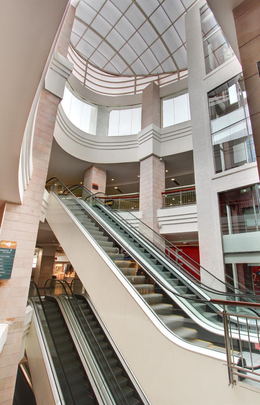
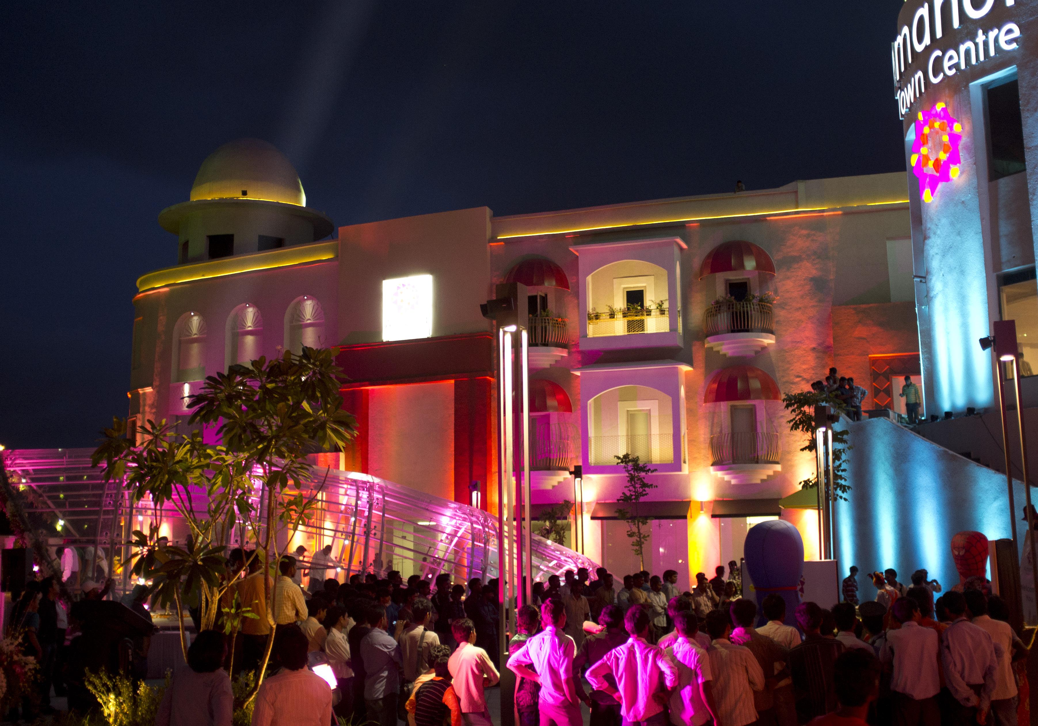
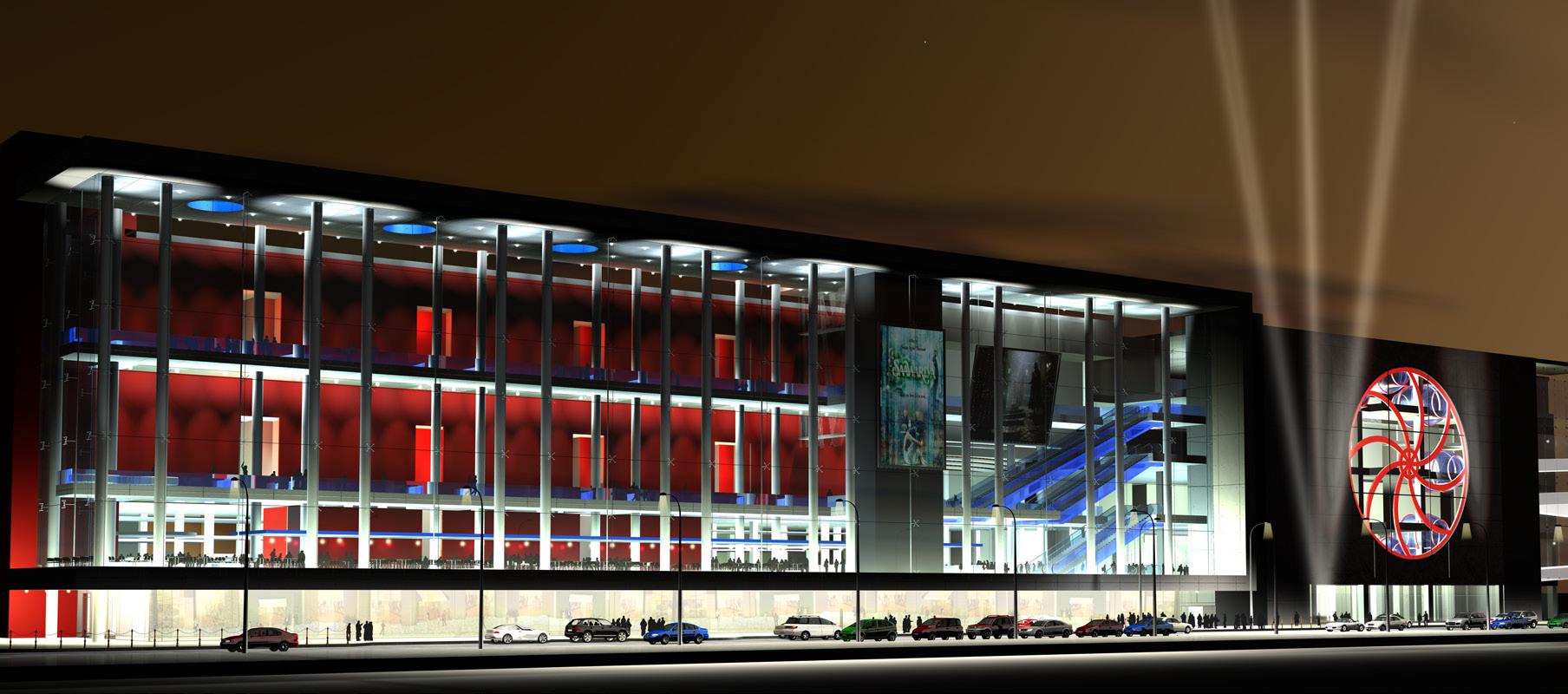
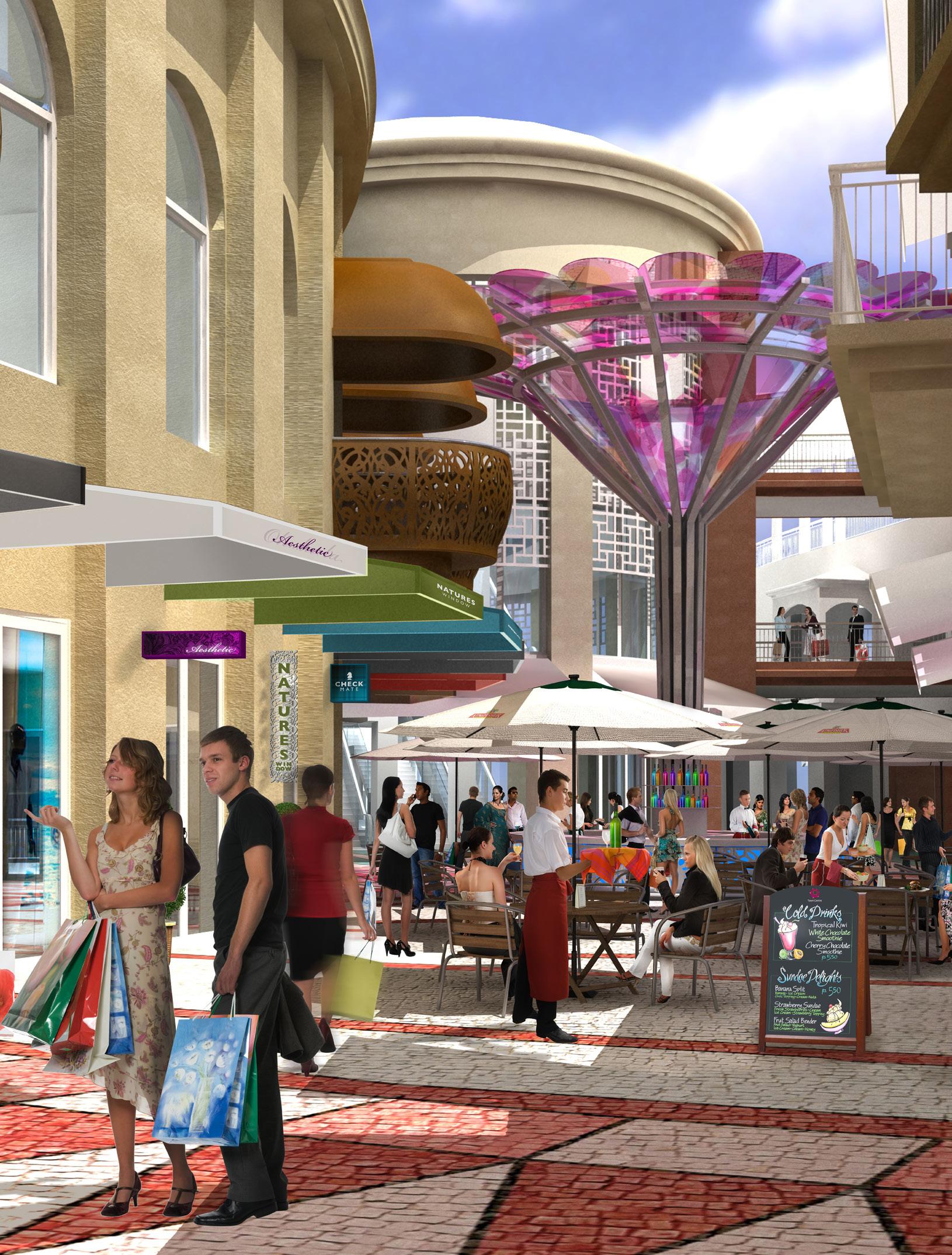
Amanora Town Centre awarded “ Best Shopping Mall” by The Confederation of Real Estate Developer’s Associations of India In 2012 for its “innovative and unique Structure as designed by Walker Group Architects keeping the character of Pune”
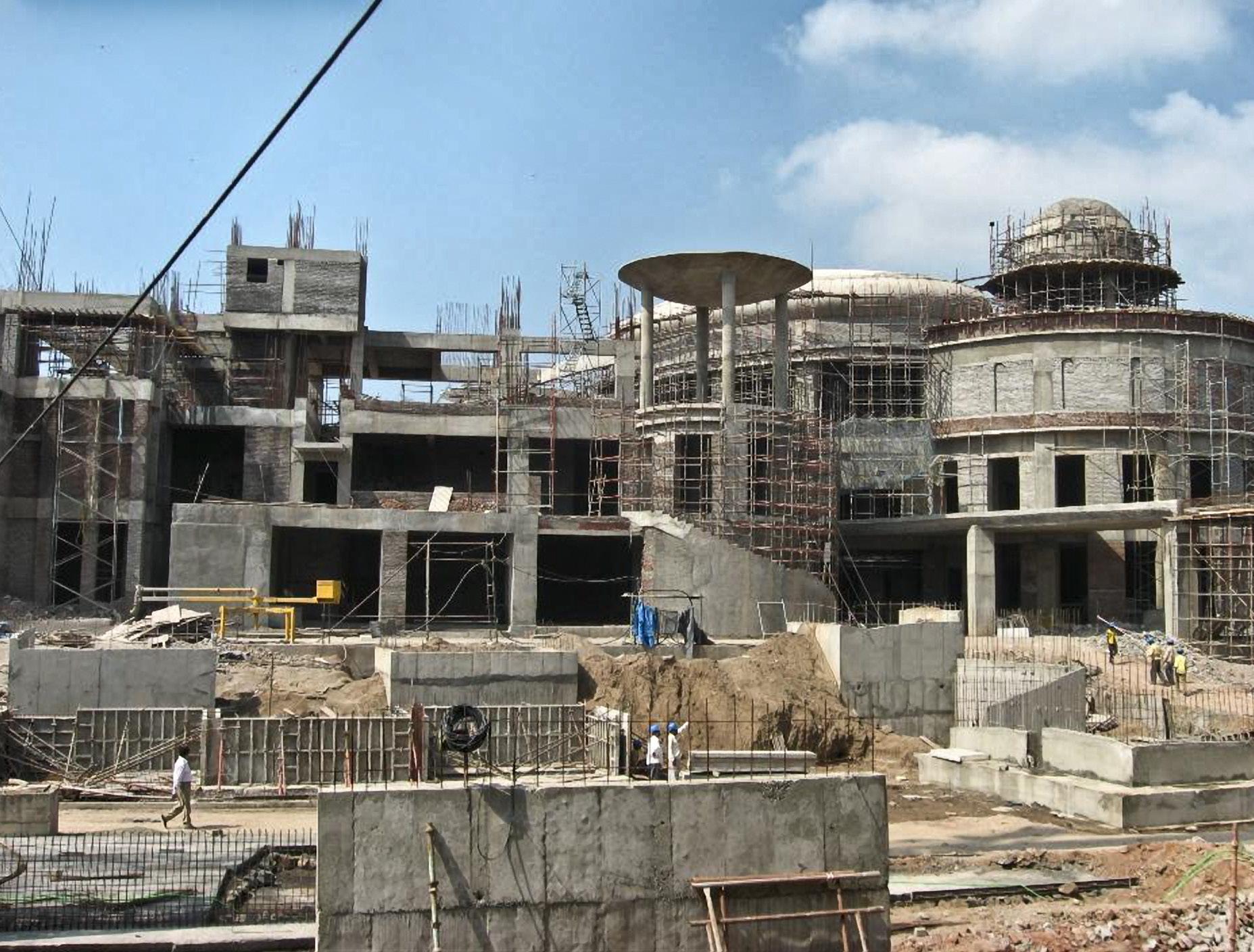
Blurring the lines between entertainment and retail mall, the 8 screen multiplex is on the 3rd floor to one side of a spectacular atrium formed under a dome. On the same floor as the multiplex is typically a cafe court and restaurant bars which step down into a landscaped oasis.





Client: AJ Hackett Bungy
In 2004 AJ Hackett Bungy had undergone major extensions under Patterson Architects to provide an exciting interactive retail entrance and foyer to preview and postscript the Bungy experience off the adjacent Kawerau bridge.
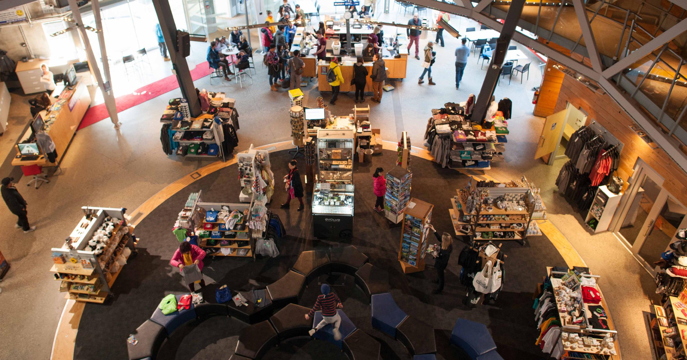
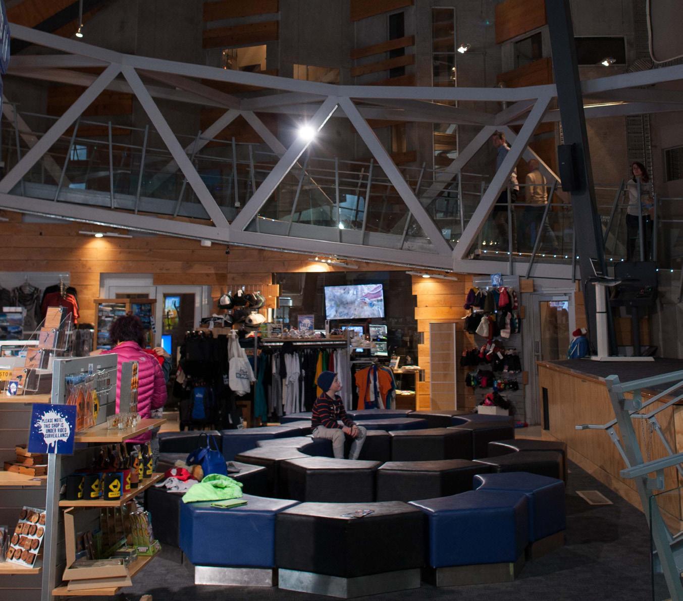
While successful for those jumping, it was not for their families and friends who would not jump but wanted to come share in the experience. A large domed retail cocoon dominated the steel and raw precast concrete interior and was enclosure to a ‘rocking’ floor experience which was not popular.
The proposal seeks to open up the raw interior by removing the cocoon and special floor, to introduce more space for visual and audio interactive experiences for those not jumping, to see ones progression from entry to centre, to watch others making the jump, their reactions down to the most detailed.
More interactive activities are proposed near the bridge outside for those who did not want to take the big jump, as well as external toilet facilities to cope with the huge numbers.
DESIGN COMPETITION
QUEENSTOWN // NEW ZEALAND
Using a selected tender process, Shotover Jet wanted to replace their existing administration centre with an’ icon’ building to attract tourists from around the world, a building with better operational flows, with an emphasis on pre and post jet boat experience and with provision for more revenue oriented opportunity around jet boating.

Selected as one of the two preferred schemes, the proposal achieved the complex design brief on a magnificent promontory site around which the Shotover river winds its way down to the Kawerau river then to the mighty Clutha river. The upturned roof tips to acknowledge the mountain side forces around the promontory site. Its underside, viewed from the river below, is furrowed like the underside of a jet boat, to grip the water. From the mountains above it appears as a saddle, a waka moving down the river gorge. A Pounamu greenstone welcomes the visitor.
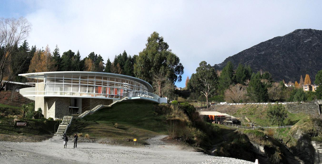
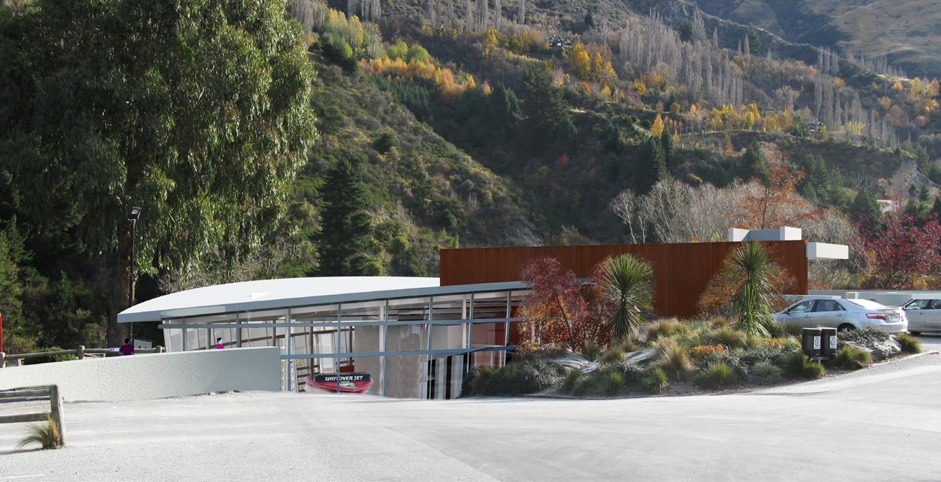
The very first jet boat used on the river has become reception counter and focus. Sweeping views surround the visitor on all sides with invitation to see, hear, touch and move as part of the rushing and ebbing ‘river jet boating’ experience.


Client: Equinox
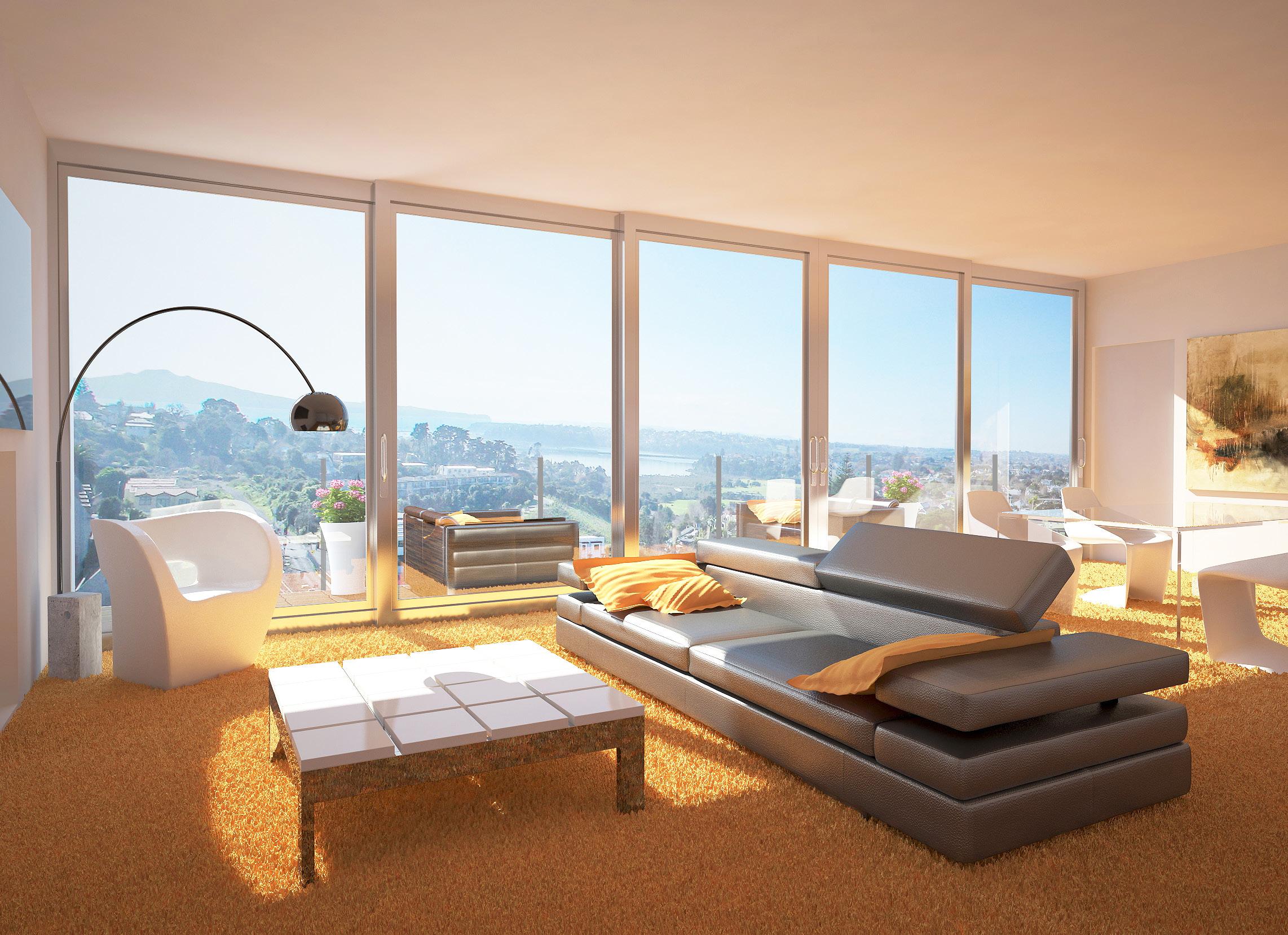
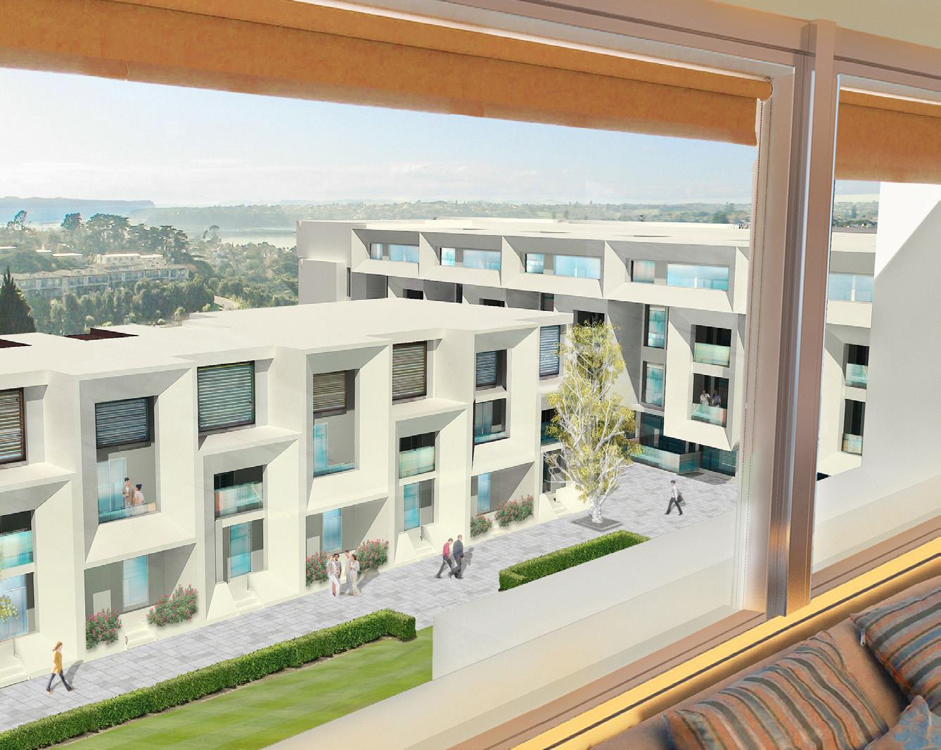
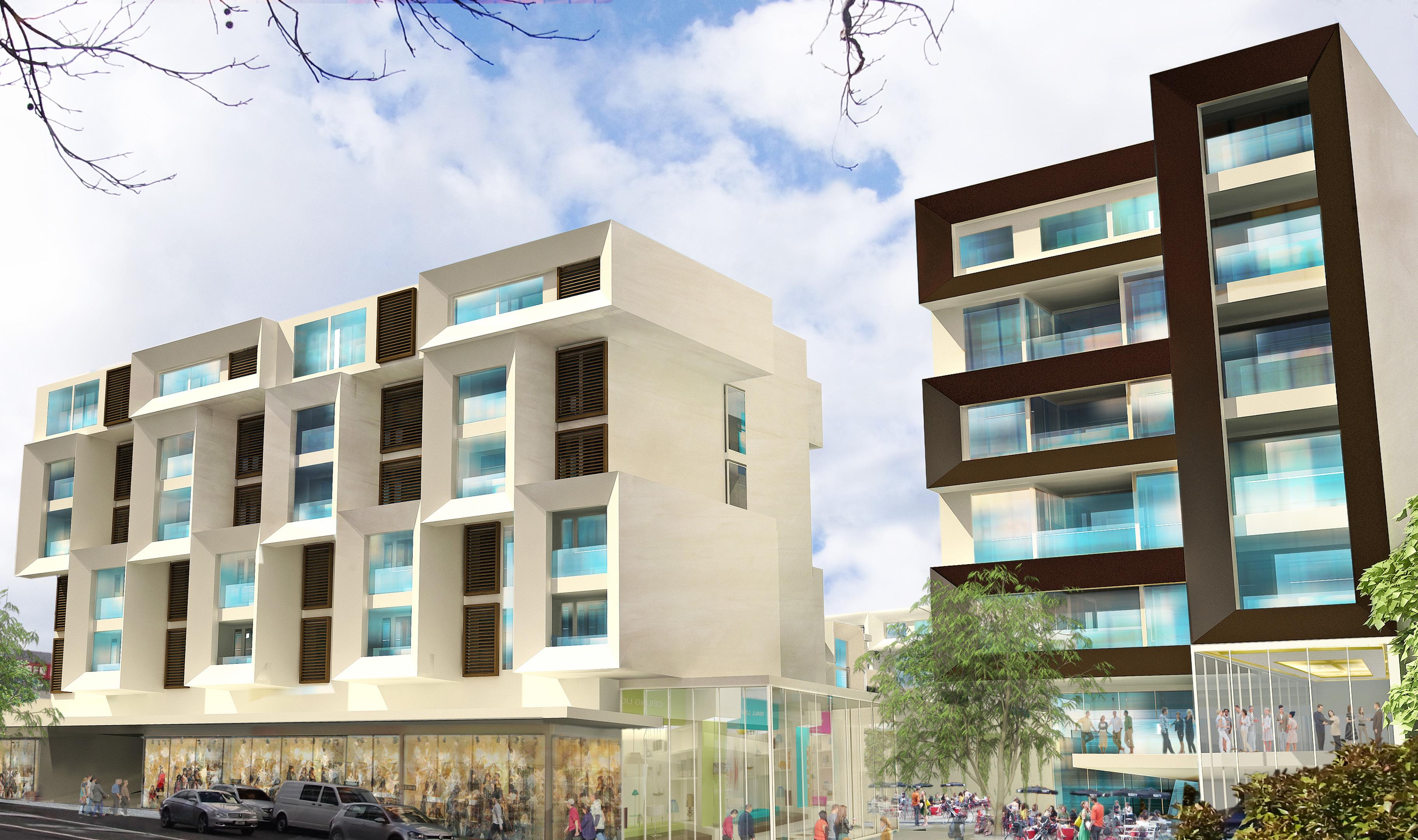
Six level 157 unit residential apartment and town house development grouped around a landscaped plaza. The development sits on top of a new podium built above the Newmarket Triangle railway junction. It incorporates retail along Broadway at street level and along a pedestrian access to Newmarket railway station. Currently being marketed


QUEENSTOWN // NEW ZEALAND
Using a selected tender process, Shotover Jet wanted to replace their existing administration centre with an’ icon’ building to attract tourists from around the world, a building with better operational flows, with an emphasis on pre-and post-jetboat experience and with provision for more revenue oriented opportunity around jetboating.
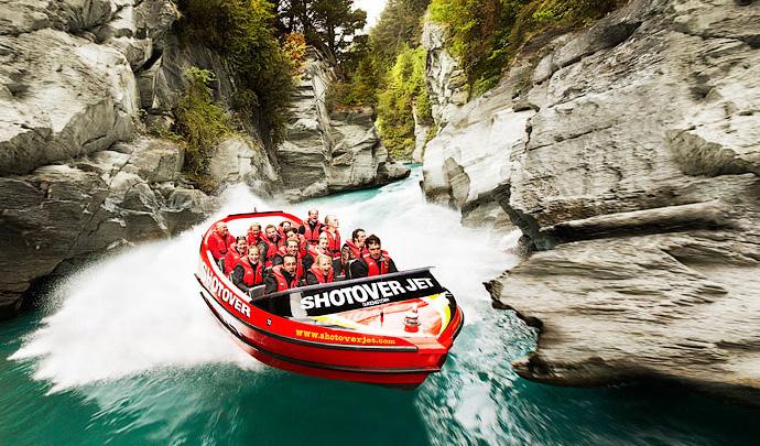
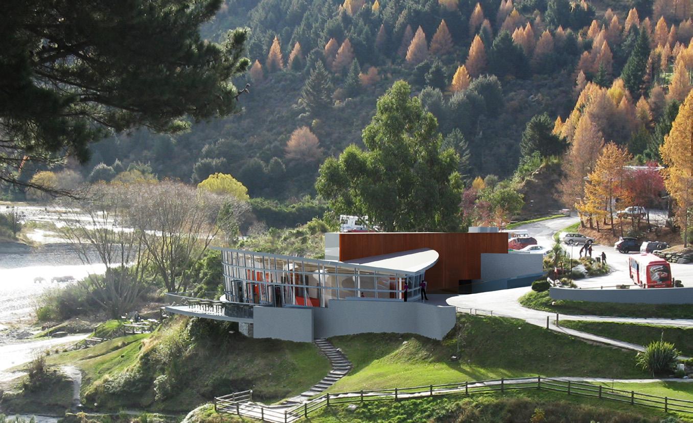
Selected as one of the two preferred schemes, the proposal achieved the complex design brief on a magnificent promontory site around which the Shotover river winds its way down to the Kawerau river then to the mighty Clutha river. The upturned

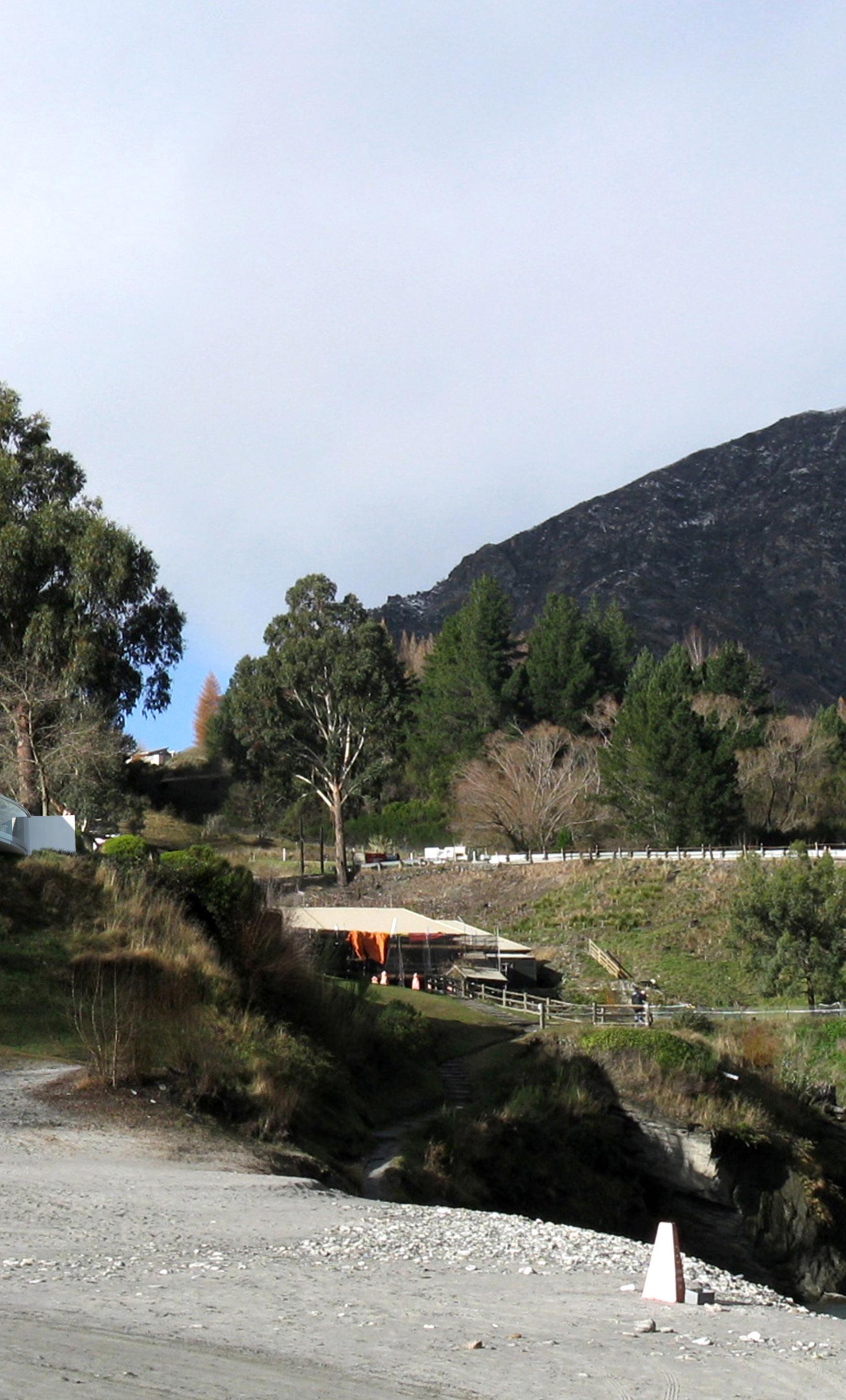
roof tips to acknowledge the mountain side forces around the promontory site. Its underside, viewed from the river below, is furrowed like the underside of a jetboat, to grip the water. From the mountains above it appears as a saddle, a waka moving down the river gorge.
A Pounamu greenstone welcomes the visitor. The very first jetboat used on the river is the reception counter and focus. Sweeping views surround the visitor on all sides with invitation to see, hear, touch and move as part of the rushing and ebbing ‘river jetboating’ experience.
Client: AJ Hackett Bungy
In 2004 AJ Hackett Bungy had undergone major extensions under Patterson Architects to provide an exciting interactive retail entrance and foyer to preview and postscript the Bungy experience off the adjacent Kawerau bridge.
While successful for those jumping, it was not for their families and friends who would not jump but wanted to come share in the experience. A large domed retail cocoon dominated the steel and raw precast concrete interior and was enclosure to a ‘rocking’ floor experience which was not popular.
The proposal seeks to open up the raw interior by removing the cocoon and special floor, to introduce more space for visual and audio interactive experiences for those not jumping, to see ones progression from entry to centre, to watch others making the jump, their reactions down to the most detailed.

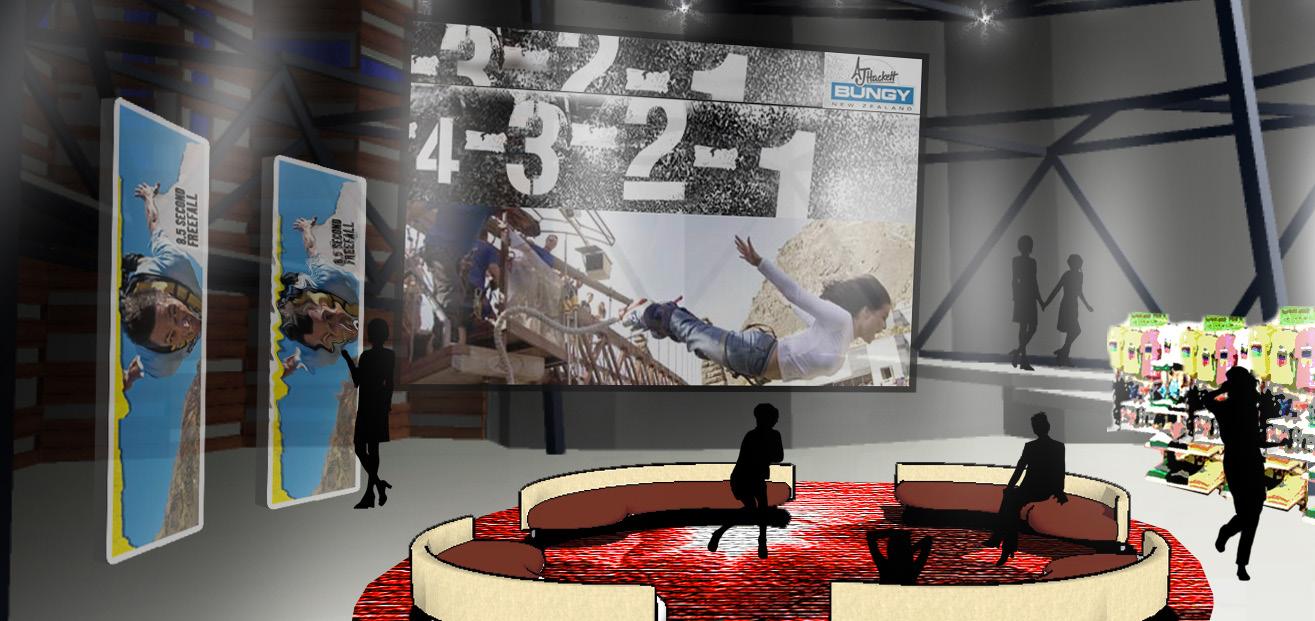
More interactive activities are proposed near the bridge outside for those who did not want to take the big jump, as well as external toilet facilities to cope with the huge numbers.
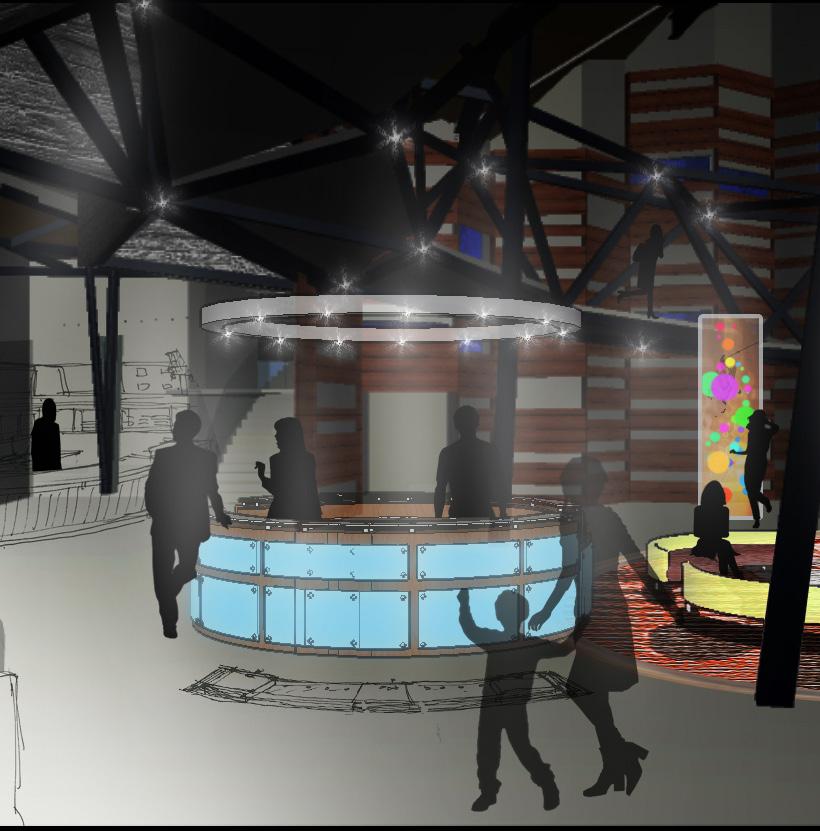

AUCKLAND // NEW ZEALAND
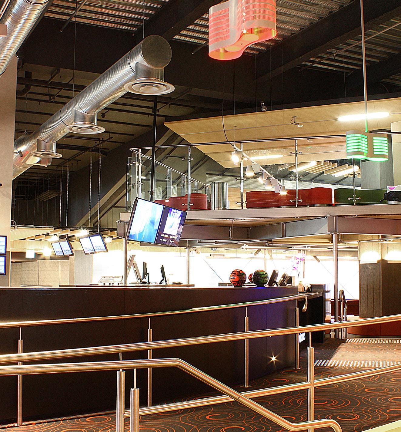
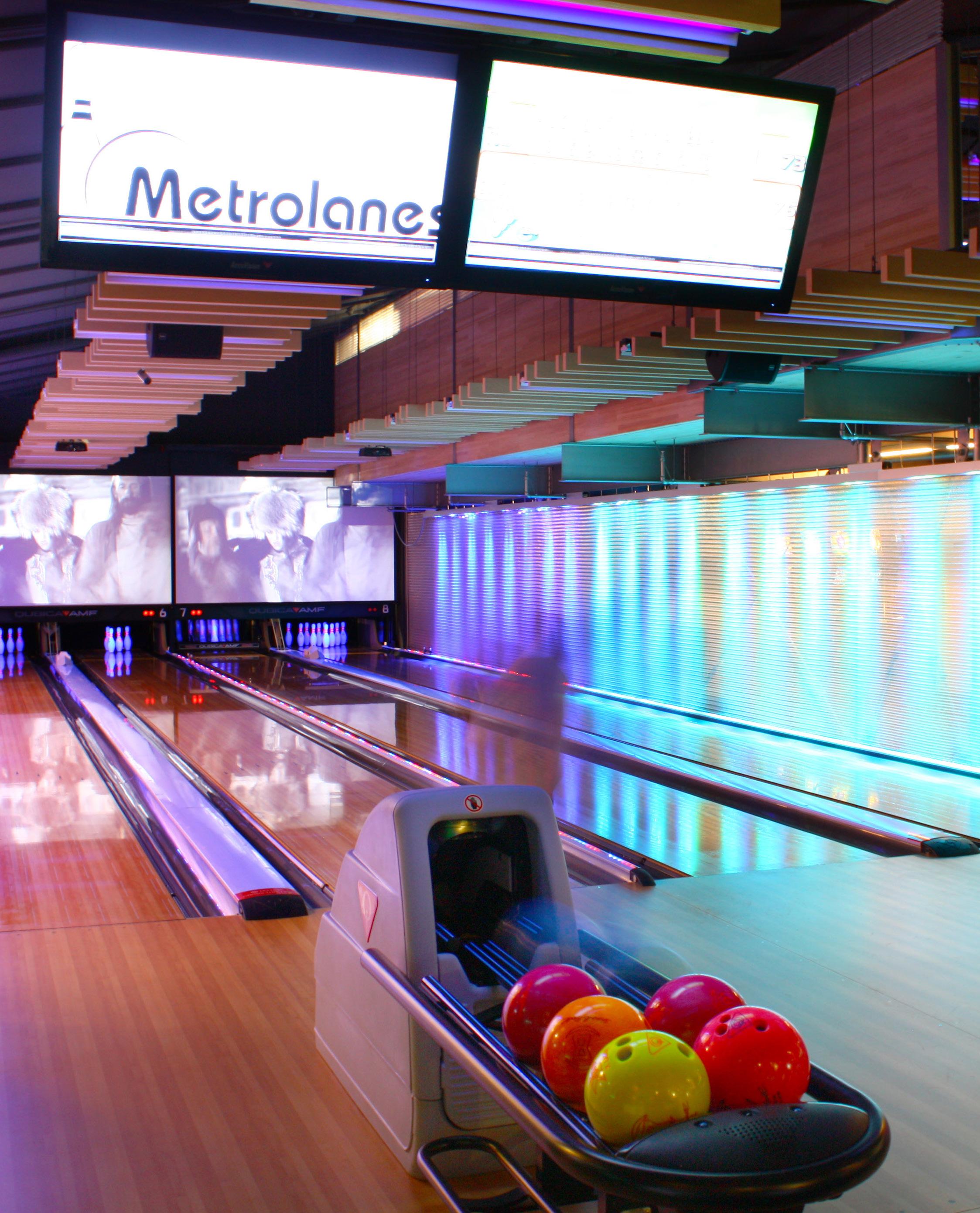
The new owners of the Metro Centre in Auckland wanted to strip out 1400m2 of a large volume area for a socially relaxing 10 pin bowling experience focused around a simple food and drink operation and which can also be used for international standard competition.
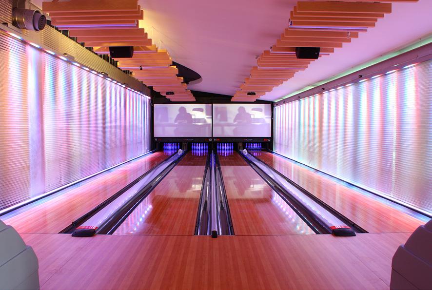

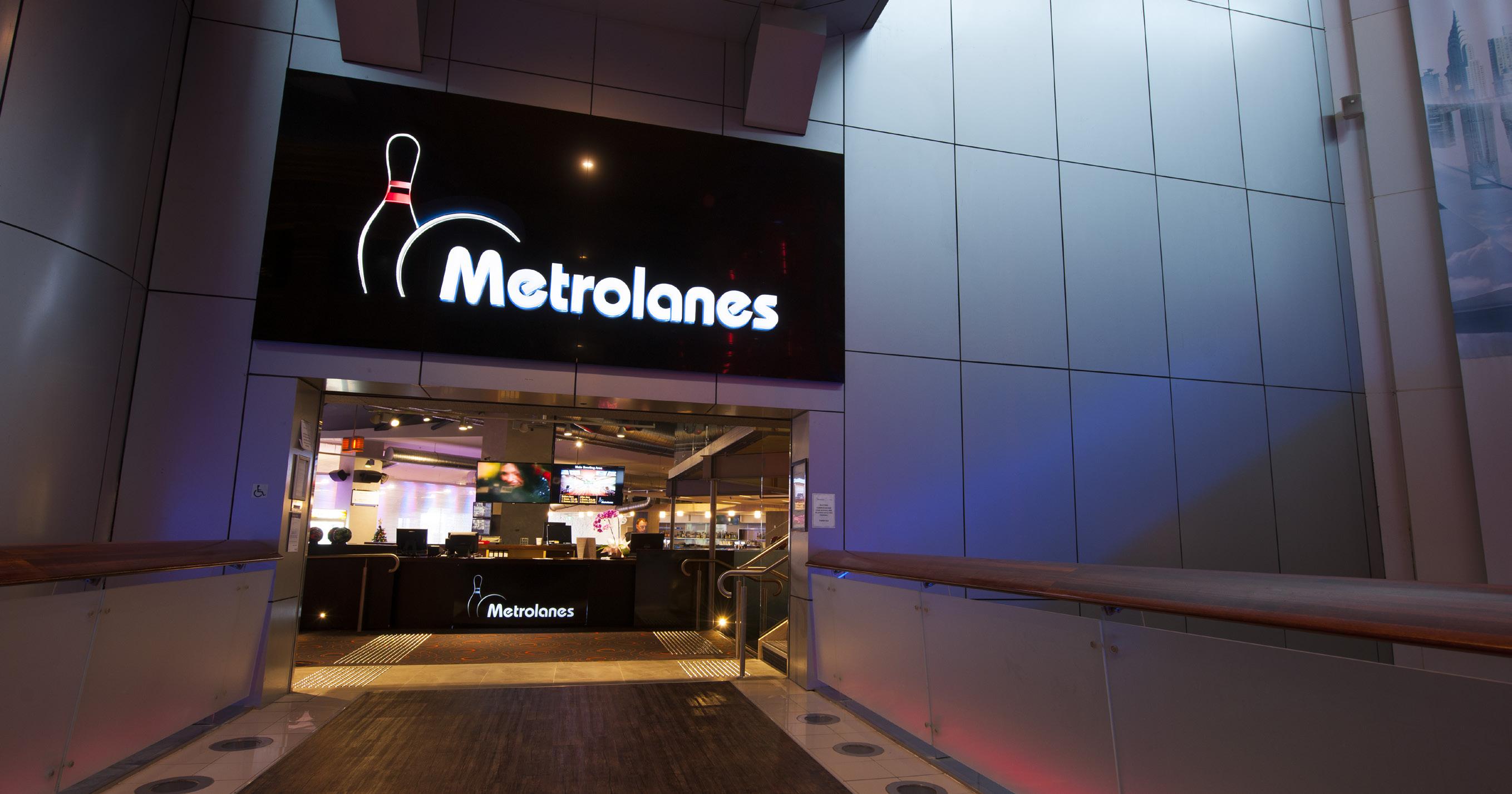
There are 12 bowling lanes serviced by a bar and kitchen at entry level, a 120m2 deck off the bar seating area onto Aotea Square and 4 mini lanes in a mezzanine functions area. The concept
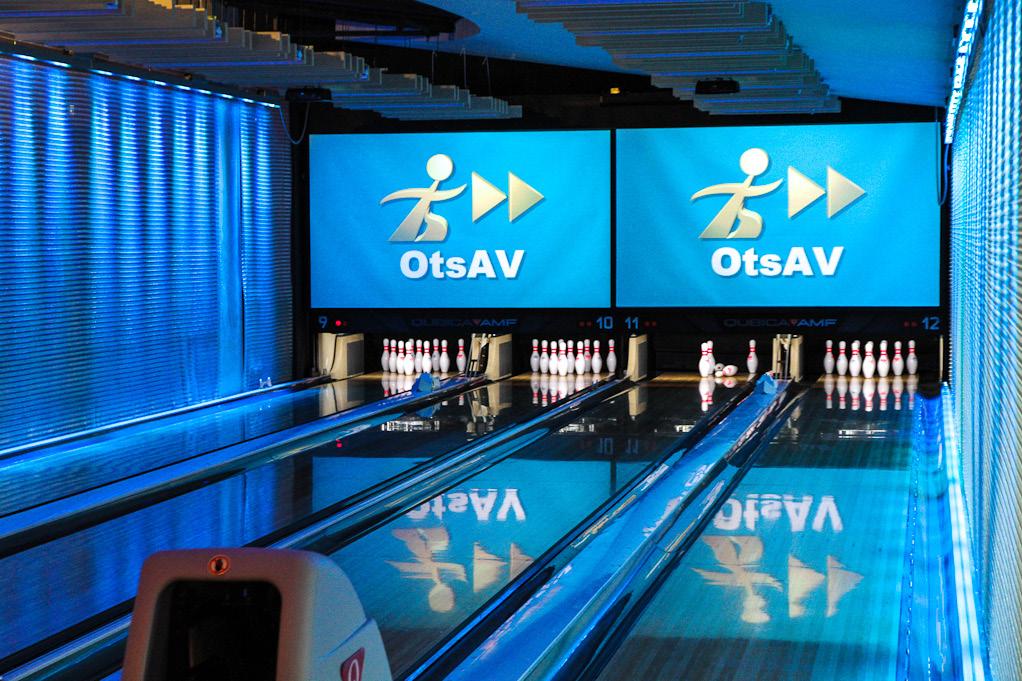
proposed splitting up the lanes and dividing them into separate intimate experiences without the loss of the sense of the whole. It was important to retain and reinforce the raw industrial feel of the existing volume and to soften and invigorate the edges for patron comfort. The three entrances flow into one level floor for the playing and entertainment area for accessibility and social engagement.
Acoustic materials and detailing were specifically chosen to control
sound transmission to the cinema complex above and to the slab below, to heighten the experience of the ‘strike’ at one end of the lanes and to absorb and quieten the bar and player areas for conversation and social communication at the other end.
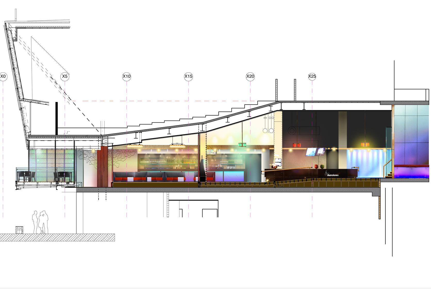
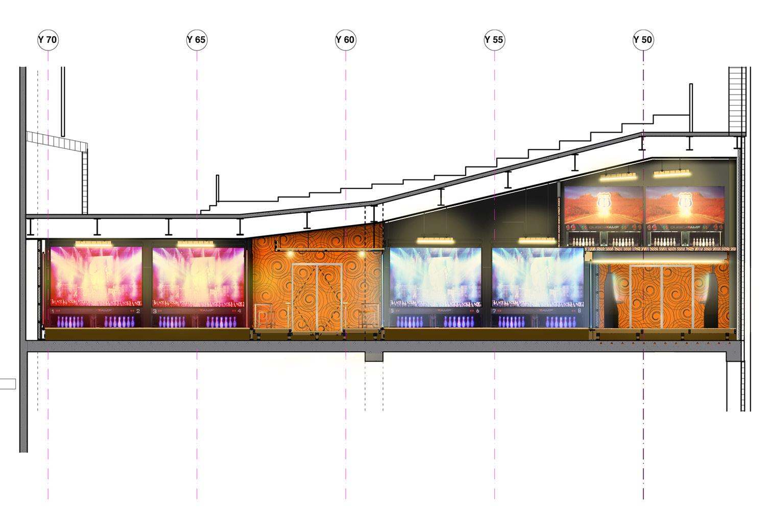
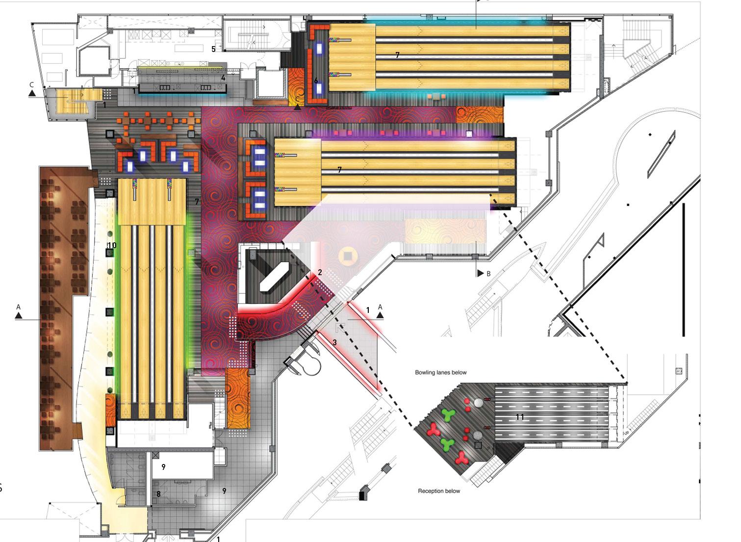
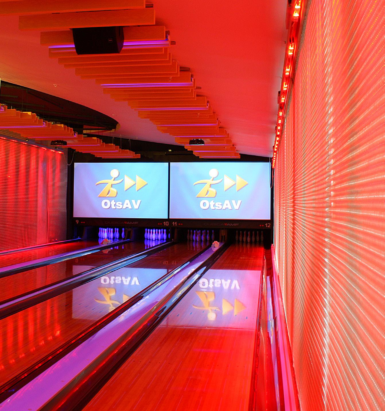
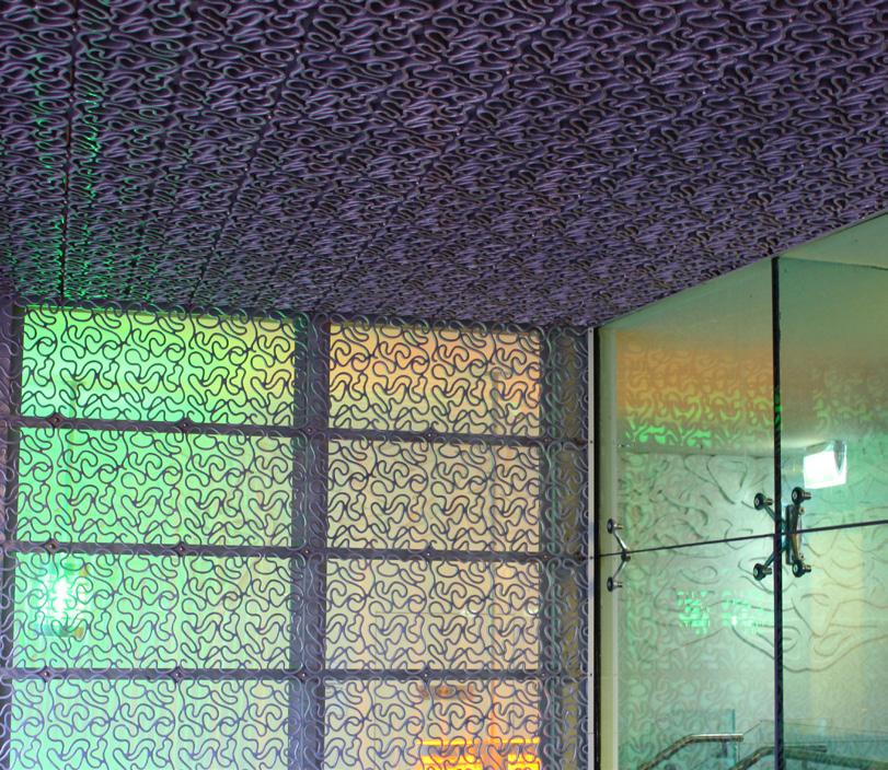
The design allows the playing and bar areas to grandstand over the adjacent public square and to be separated from it. New and youthful technology is everywhere, edgy but comfortable: The use of Kaynemaile screens, NZ technology invented for Peter Jackson’s ‘Lord of the Rings’ films, gives a sense of separation between the lanes, and creates spaces between for seating, playing pool and the latest video games, Colour changing led technology is used to illuminate these screens as lively and themed backdrops and more subtlety behind the ball racks, at reception, behind the bar and in the white acrylic player tables.The use of German technology absorbent material finishes over the new lanes provides texture, warmth and comfort.


Client: Inox
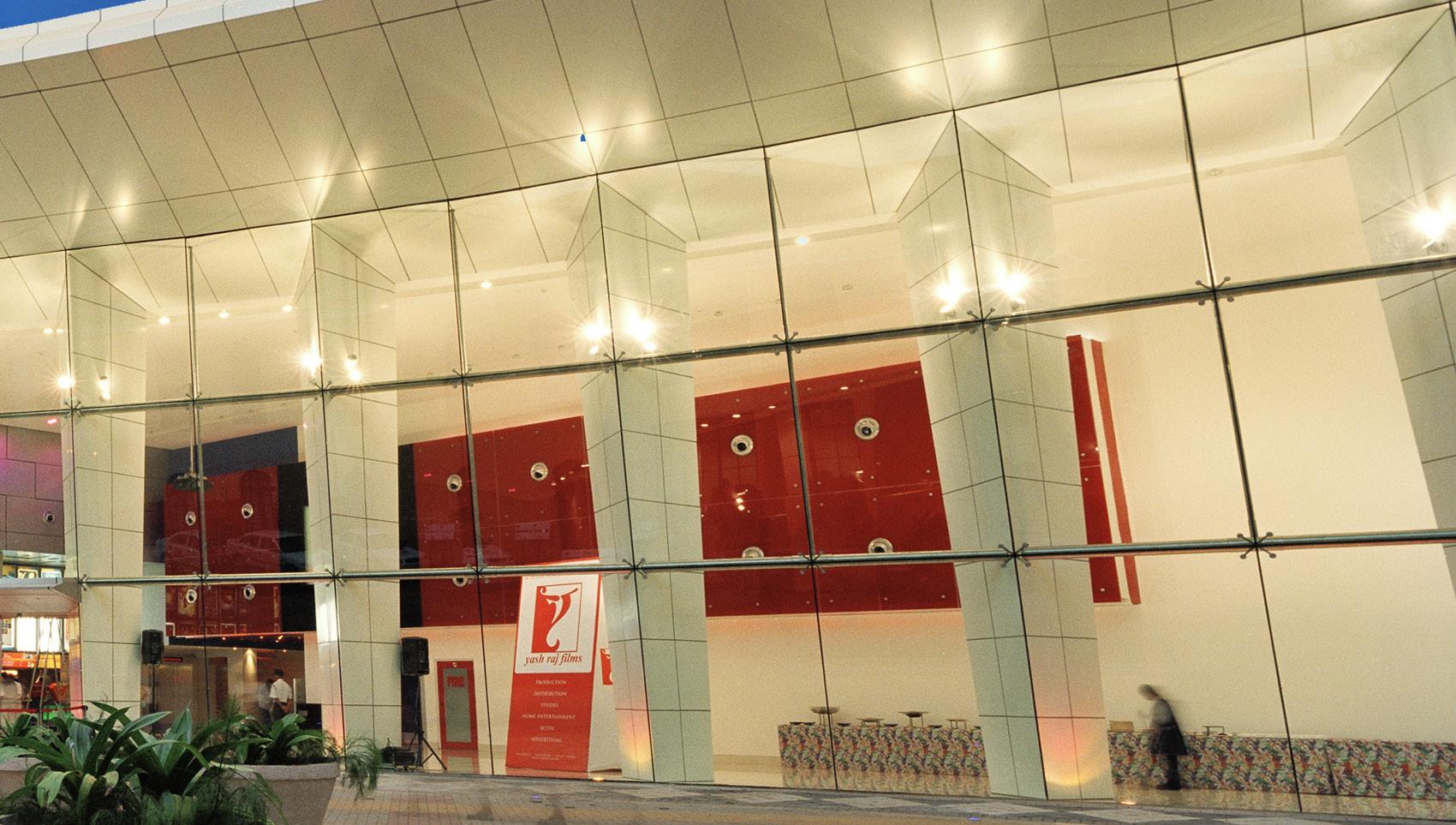
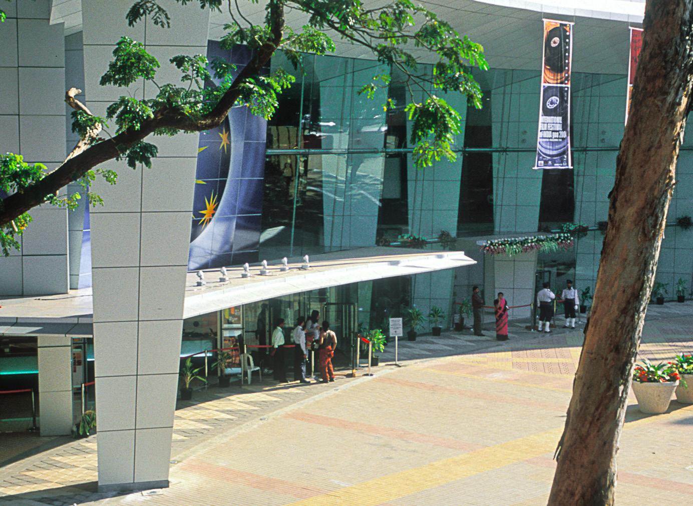
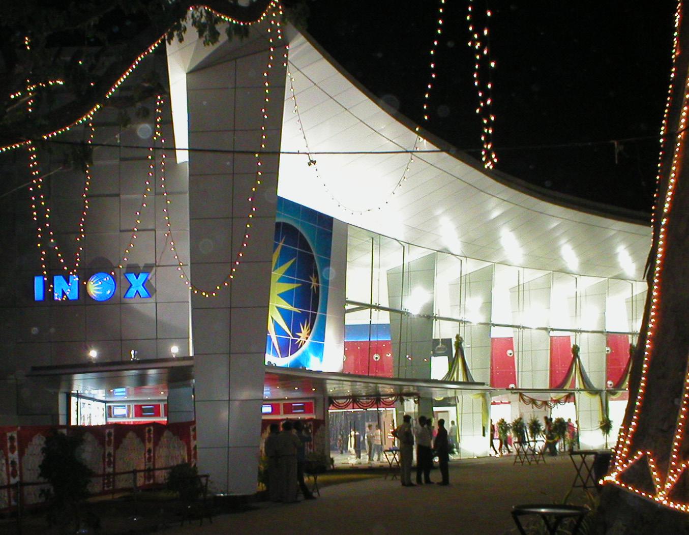
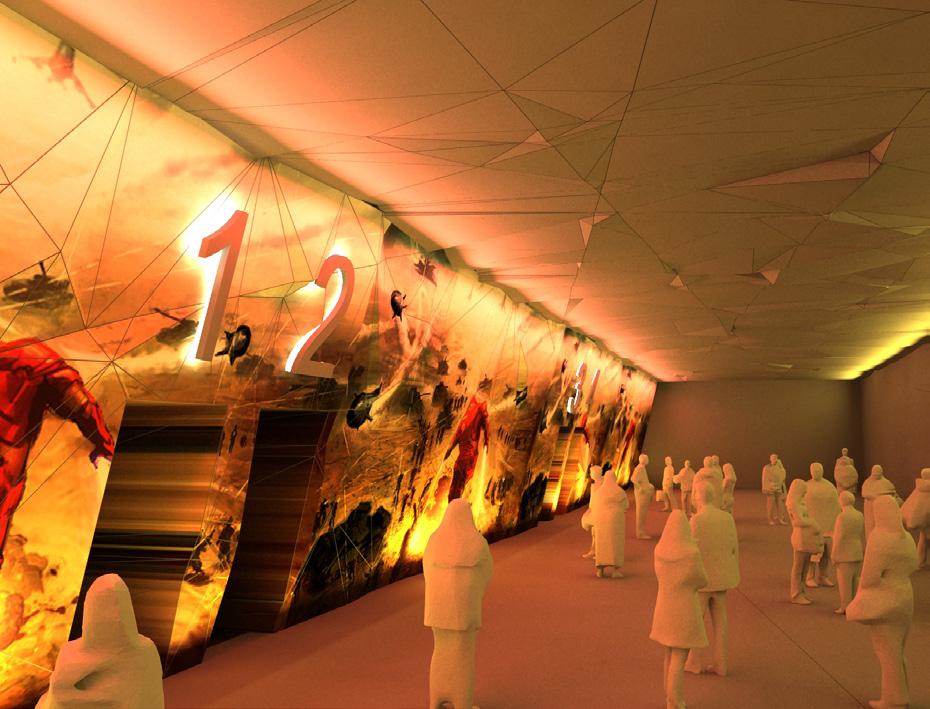
The new international film venue complex for Goa and India was completed in 8 months from award of design contract. Twenty four hour a day documentation and design co-ordination with local architects, made possible by offset time shifts across the globe, helped to achieve the short programme for the opening of the complex.
Beyond the atrium the auditoria reveal a soft sensuous interior and externally these auditoria are expressed as ‘solid boxes’ painted in colours from traditional Goan architecture.
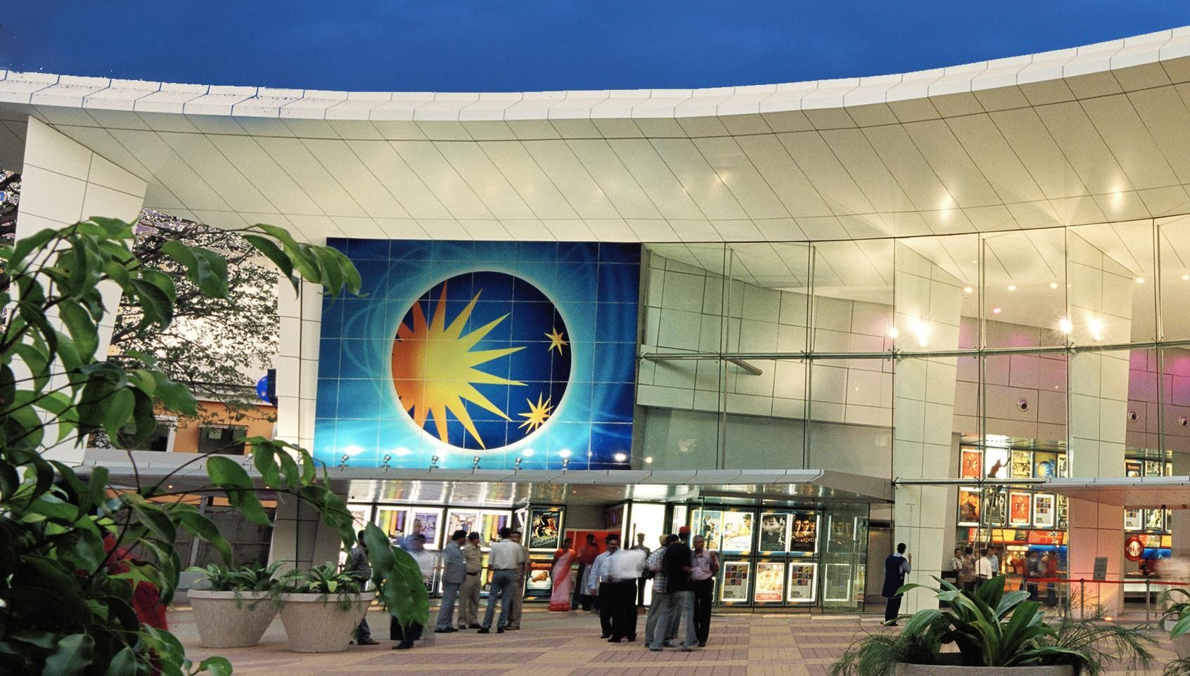 A large overhanging fine edged roof floats off a row of stiletto tapered columns at the plaza’s edge.
AUCKLAND CITY // NEW ZEALAND
Client: Village Skycity / Planet Hollywood

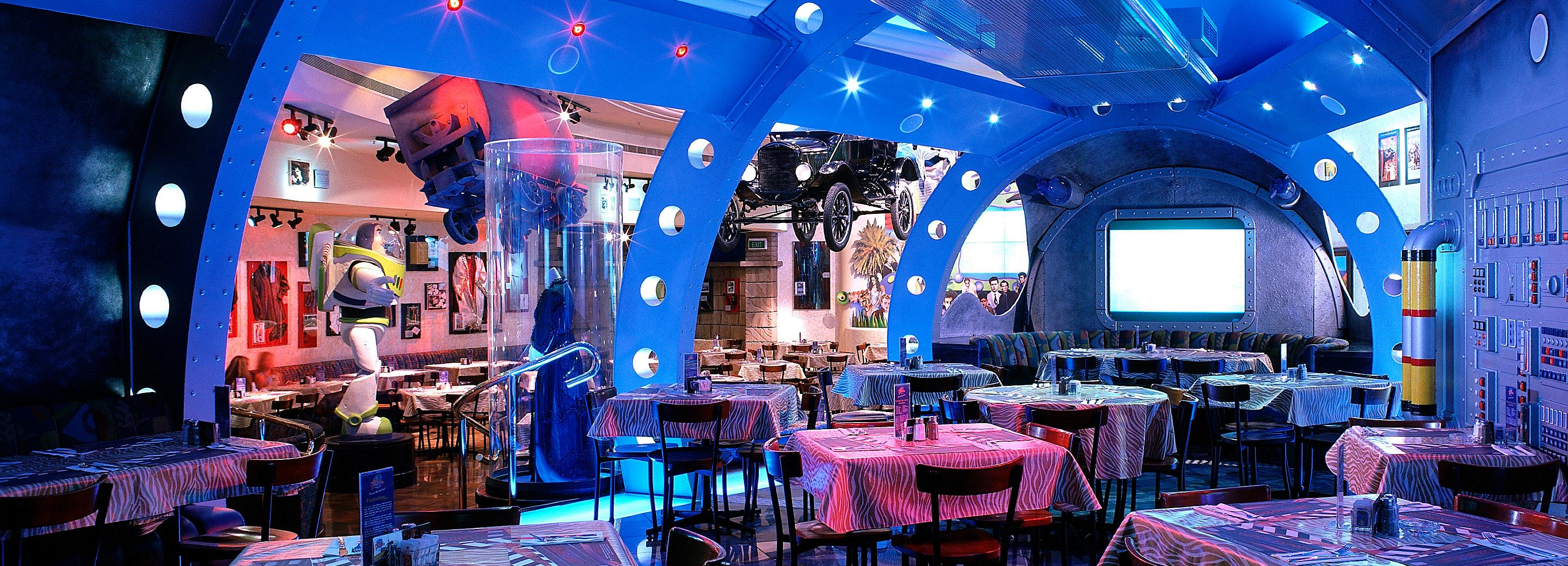
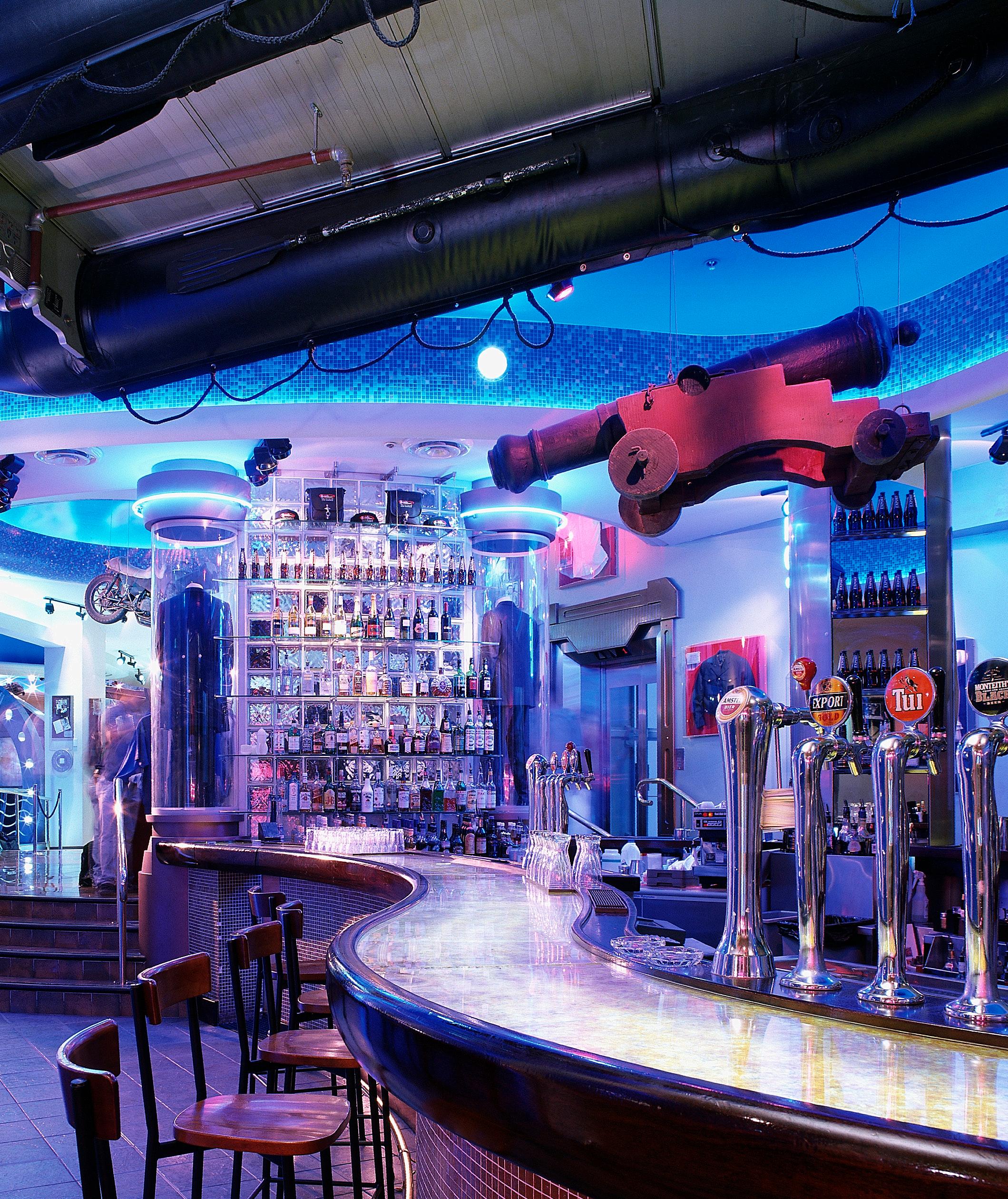
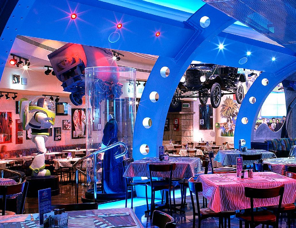
The clients brief demanded an environment consistent with the international restaurant chain’s theme worldwide but with an individual statement emphasising its own strong identity in Auckland City.
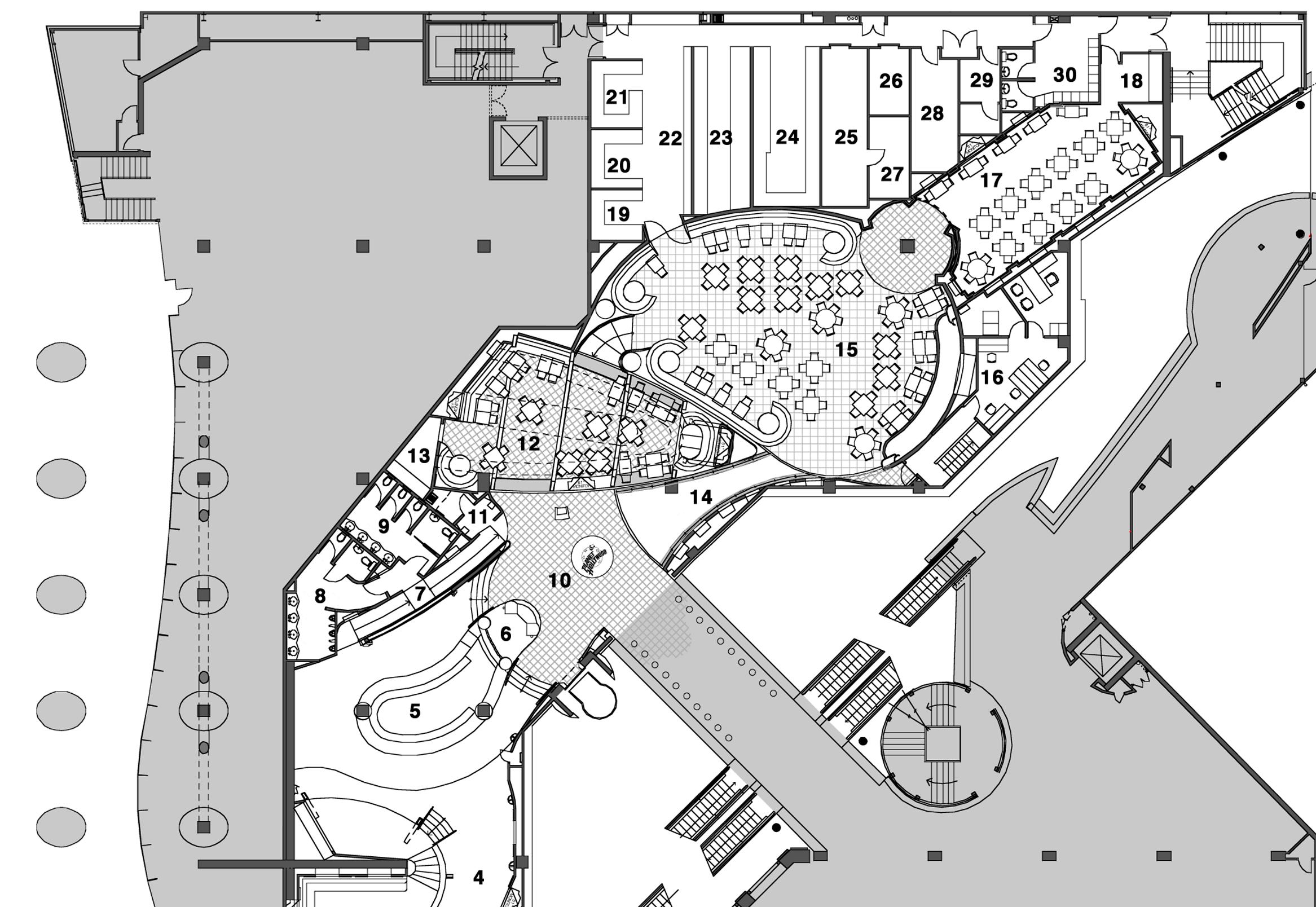
The basis of the concept is to transport the visitor to different worlds created by a multitude of various theme rooms or spaces, one quite different from the next and separated by transitional zones. Every visit to the restaurant should be a different experience. Film memorabilia is carefully selected and placed to reinforce the theme, together with AV display, sounds, colour(background) and light. On arrival at the main reception area, one can see over the whole
restaurant. The bar area is the holding zone but also, as for each room, functions and feels separate in identity. The various eating rooms are opened up progressively so that patrons always have a degree of intimacy. The multitude of visual displays, both static and digital, draw one around the restaurant due to ‘glimpses’ available from neighbouring rooms.
Serving up to 1000 meals a day, this is one of New Zealand’s busiest restaurants making huge demands on food and beverage distribution flow, yet still make the ‘movie set’ a real experience for each and every patron.
AUCKLAND // NEW ZEALAND
Client: SkyCity
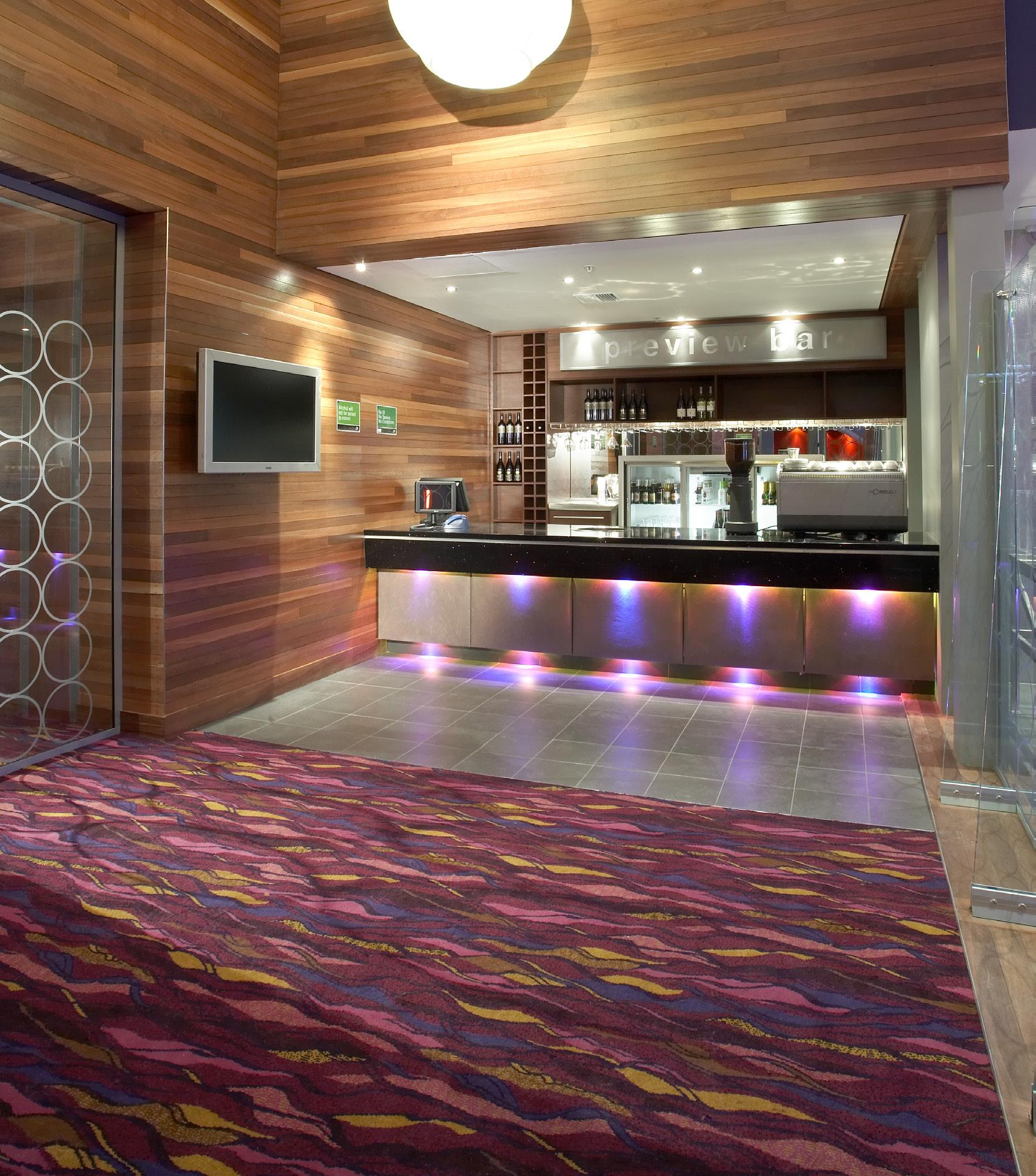
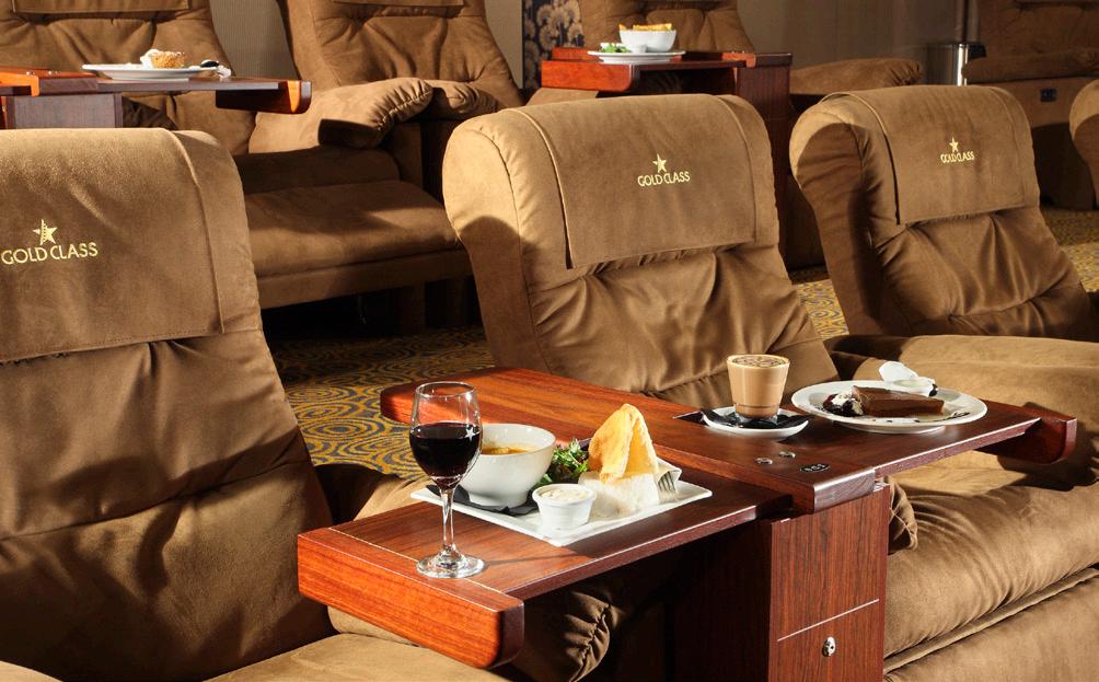
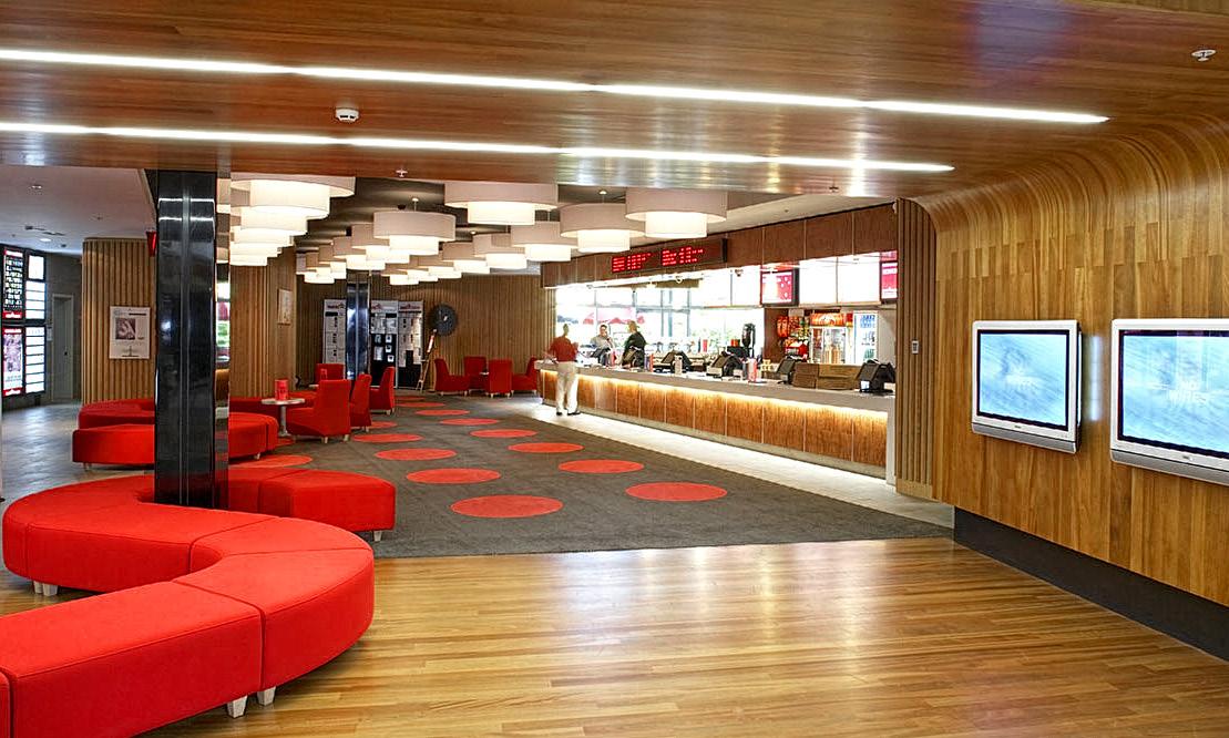
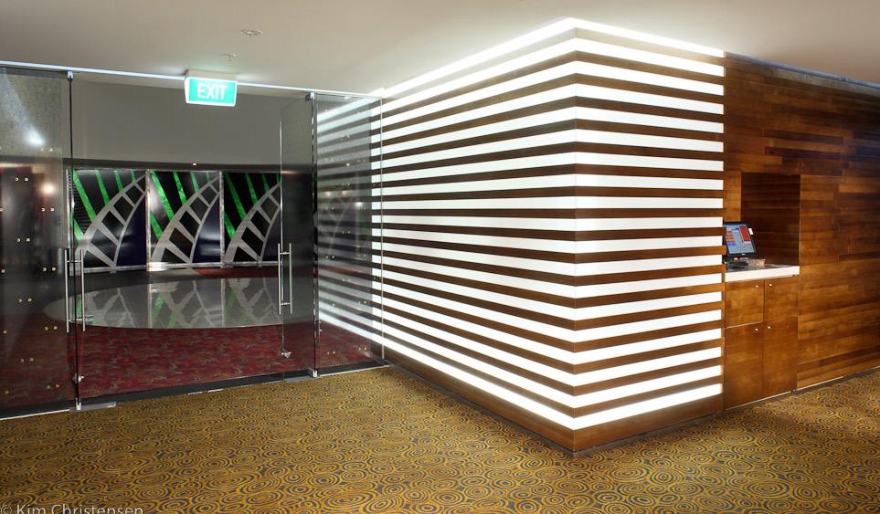
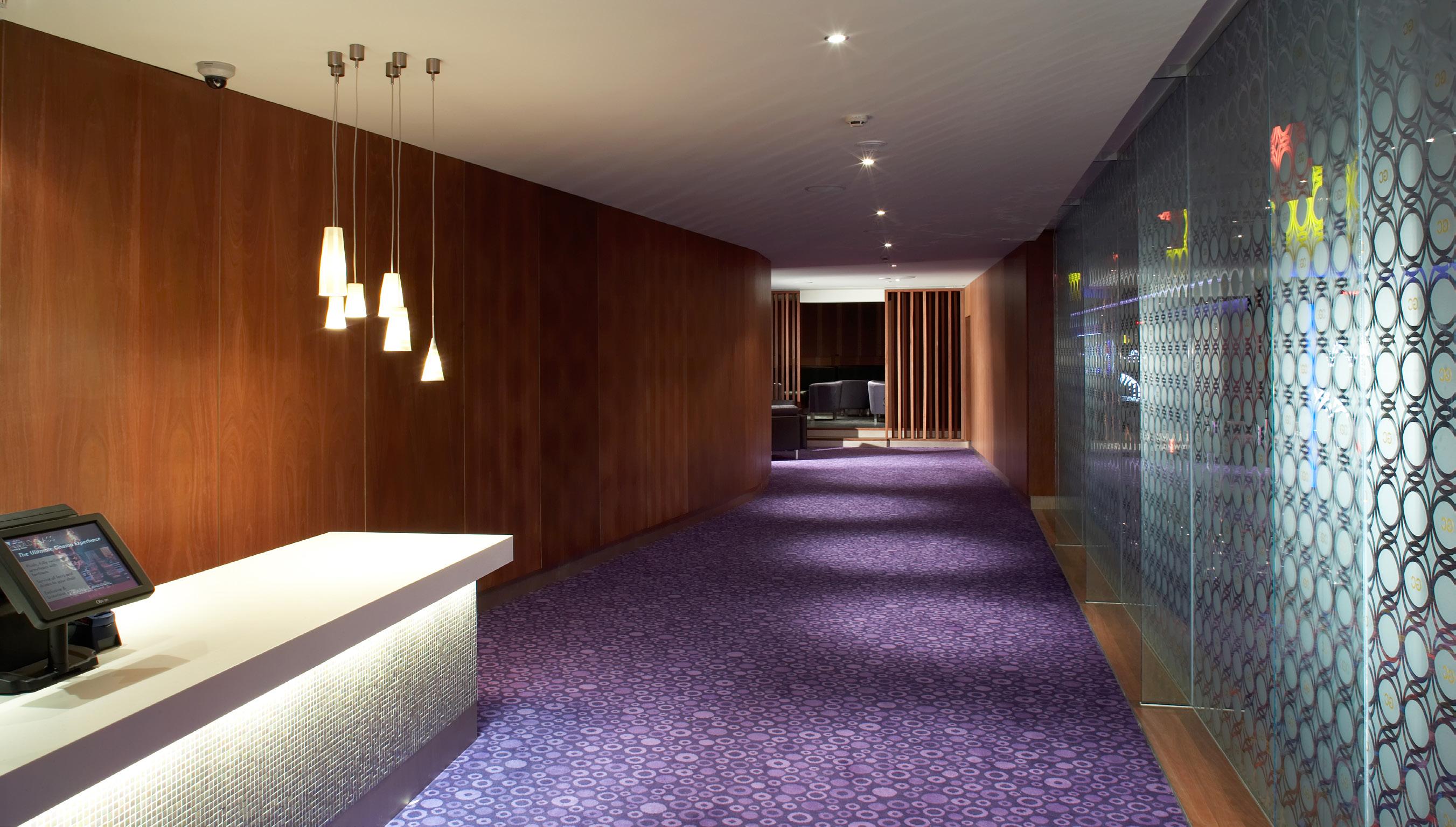
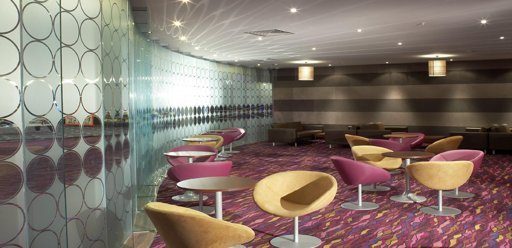
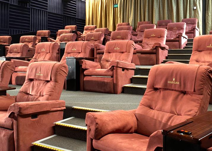
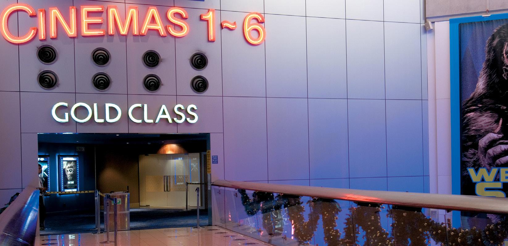
Gold Class cinemas offer operators the chance to attract a different clientele, usually in more intimate surroundings more in keeping with the mode of movies being screened.
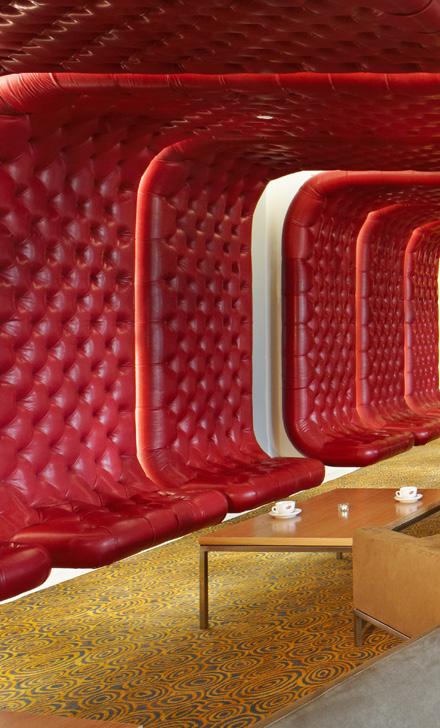
The team at Walker Group Architects are passionate about design and pride themselves on the professionalism they bring to all aspects of their work. The field of cinema and entertainment is both fast growing and technically
challenging. It is crucial that any company involved in this area of design is well versed with these changes and developments. Walker Group Architects understands and recognises this need for innovative design. We are dedicated to being a world leader in this special field of architecture

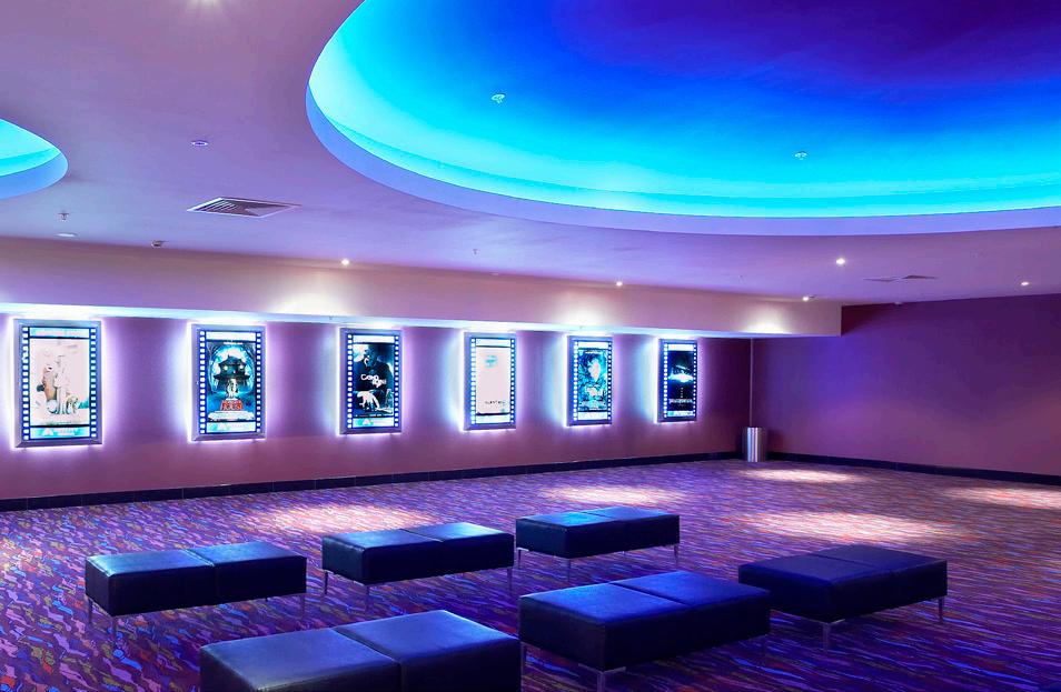



Client: Lane Foods Group

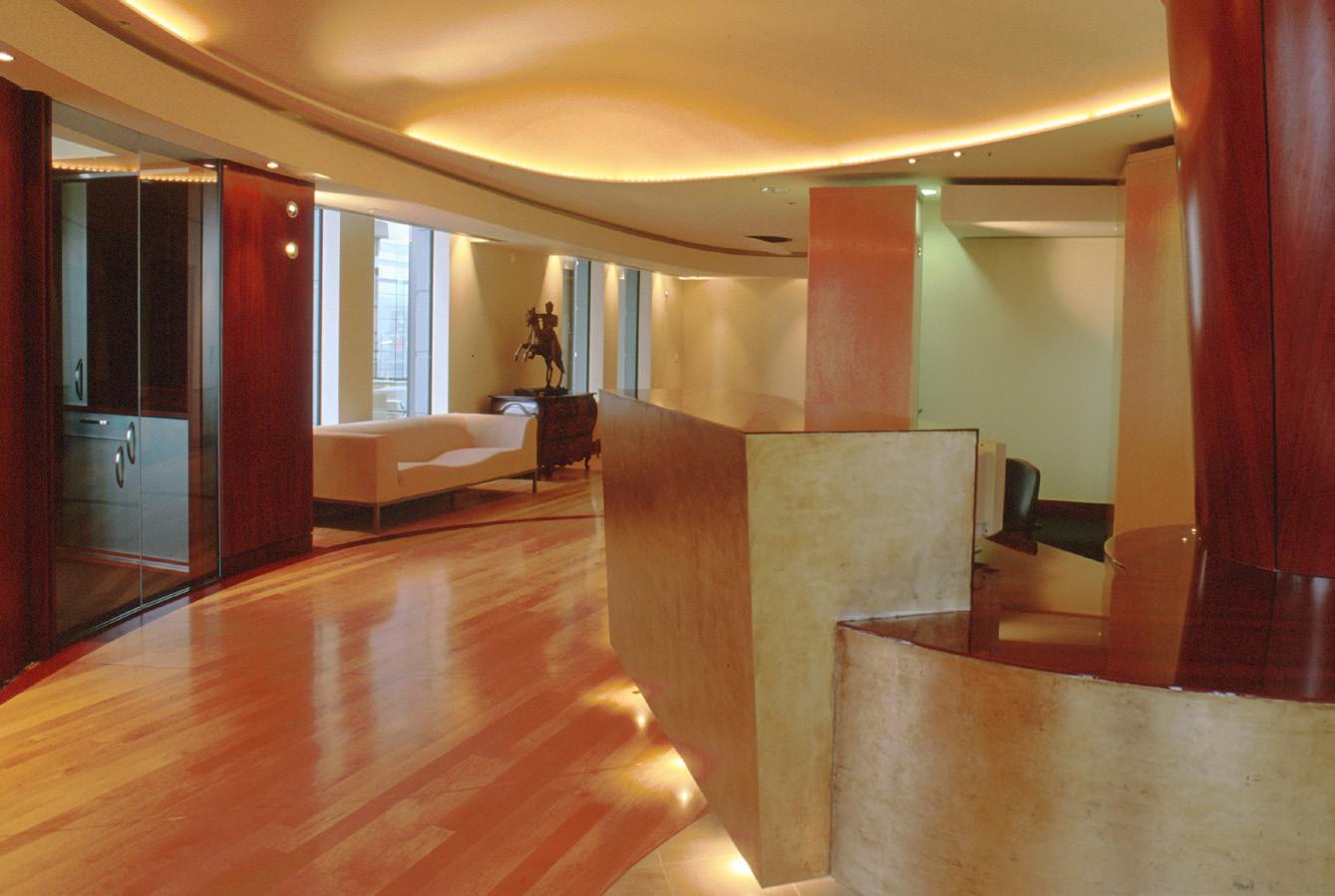
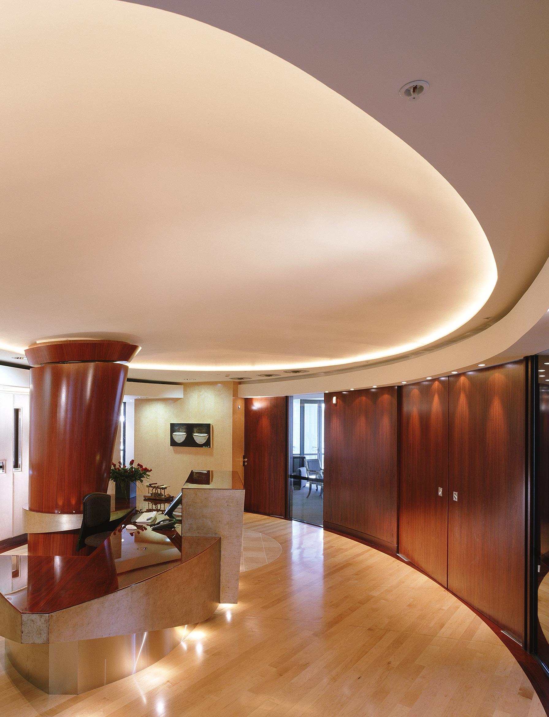
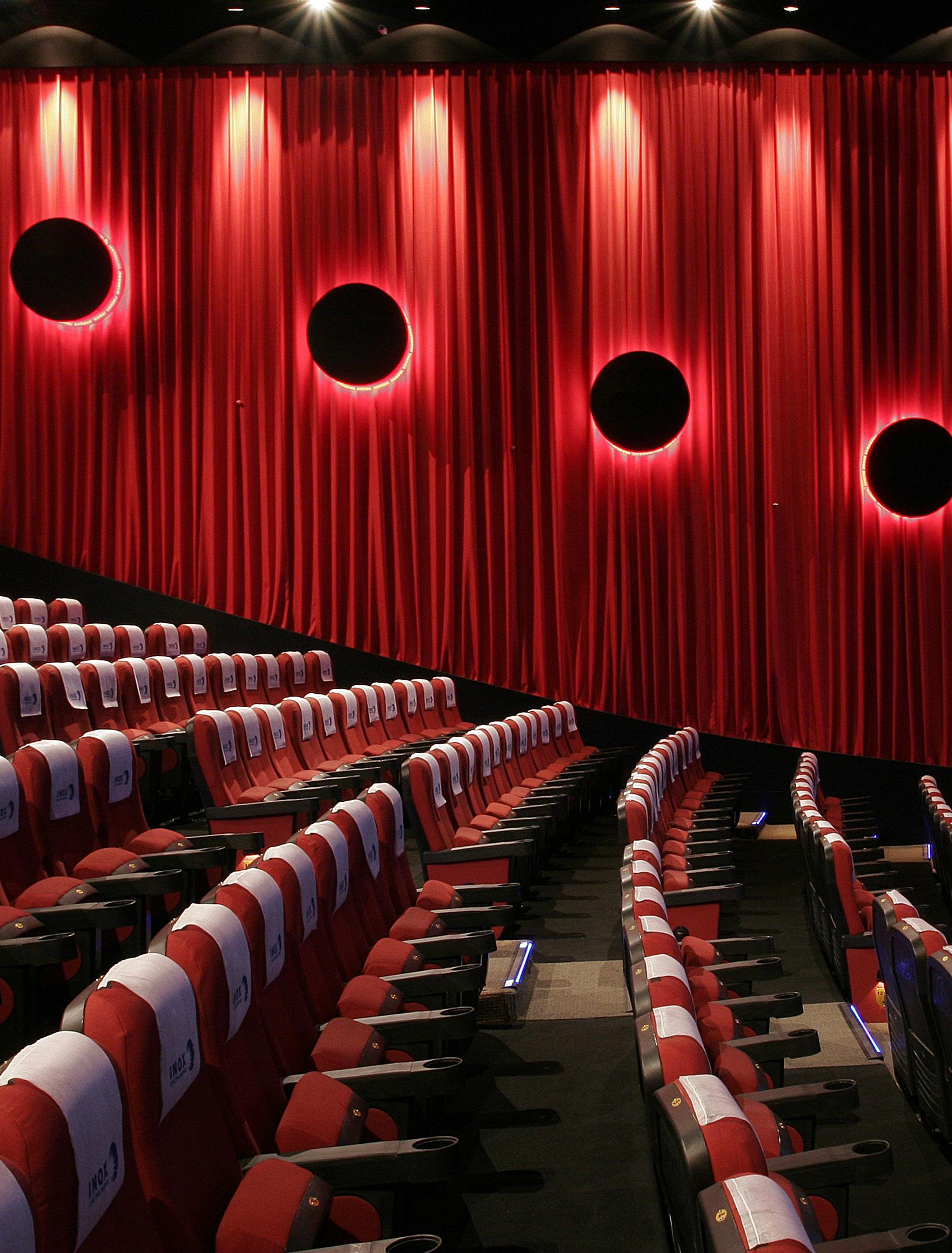
The maritime office floor surveys across the tidal manmade Viaduct harbour, at boat mast level. Promenade lamps parade the view out to the harbour and beyond. This new office is international class, warm and welcoming realm between the boat and home , ‘club’ to entertain the esteemed work player.
The reception hull floats, its mast strong to the breeze, under the softly domed sky, the hub for an anti-cyclonic dispersal of rooms about its elliptical perimeter like a section of the globe unravelled. Latitude and Longtitude lines divide the maple planked flooring connecting and aligning to the perimeter ‘tough’ jarrah panelled wall, which gradually separates public from private. Walls of birdseye maple, like a cliff-face embedded with fossils from history, hold the reception area and, beyond, the open plan rear office, against the harbour promenade. The jarrah panels open to release the enclosure to the boardroom and executive offices.
BANGALORE
Client: INOX
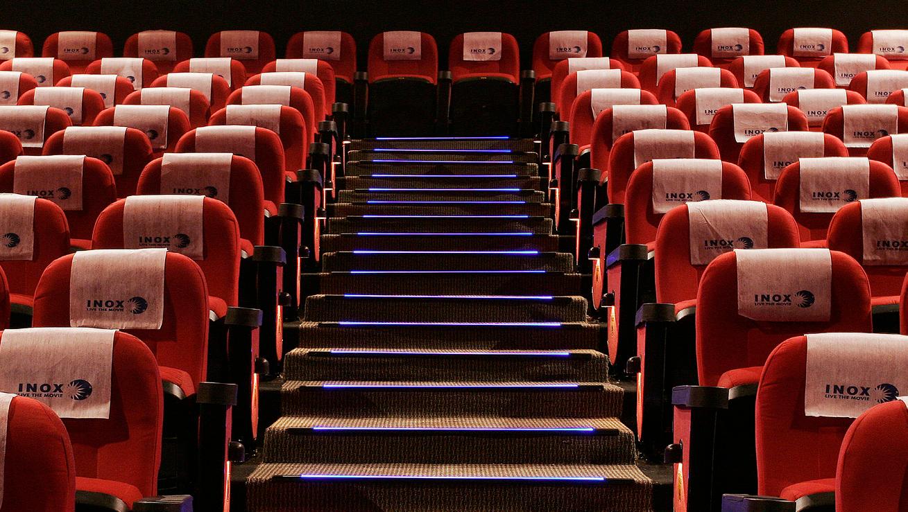
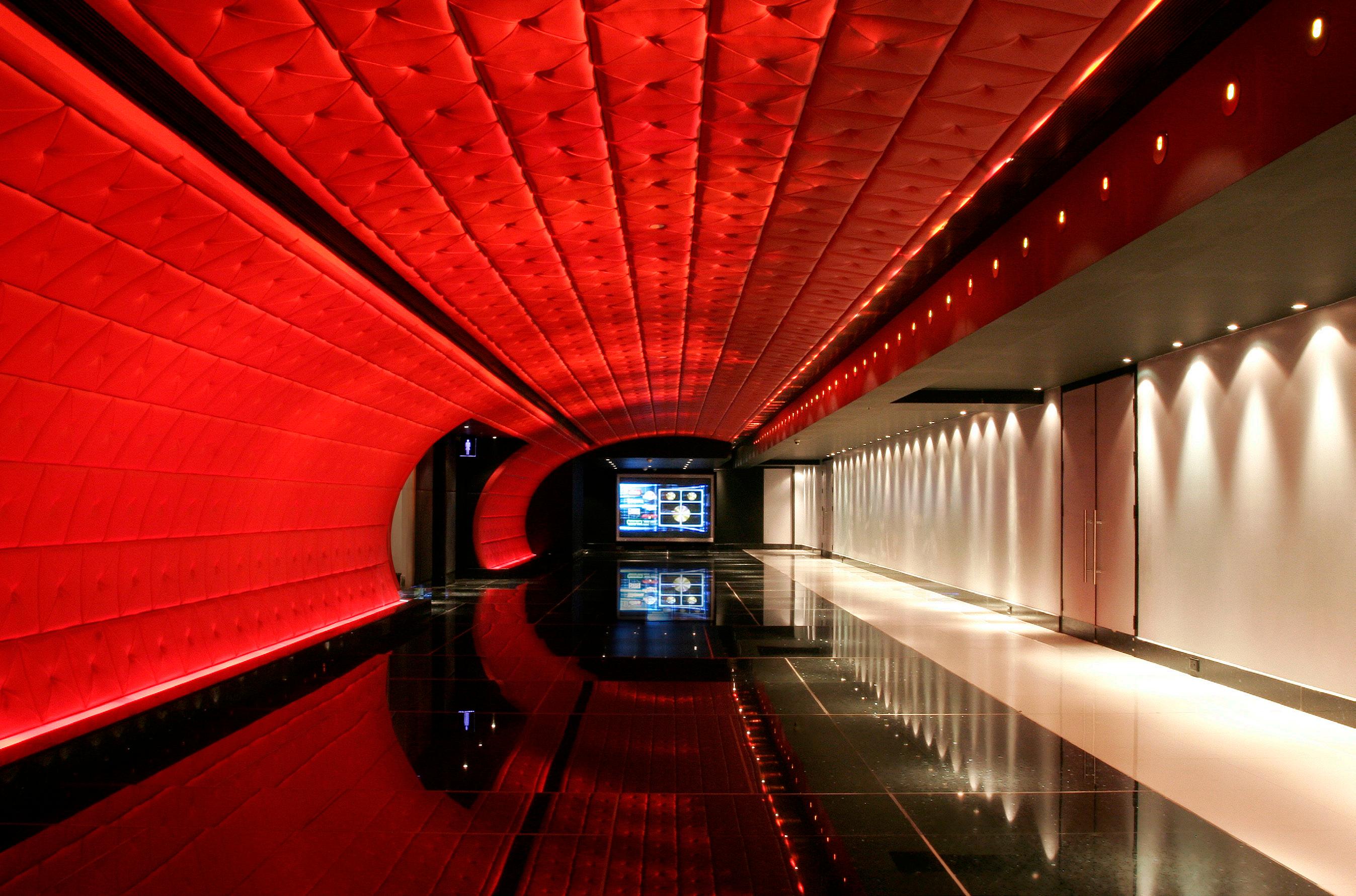
This six screen, 1100-seat complex occupies the first floor level of a multi-storey shopping centre in Bangalore, India. The concept is based around a rich colour scheme of red and blue offset against black and white ceiling and floor backgrounds. Materials were selected to define shape, changing under coloured light. Reflective and repeated shape surfaces multiply images of colour and texture. With very low ceiling heights and unworkable volumes in the shell building, this use of light and colour change give a sense of expanding space and richness of detail to the main ticket and concessions areas.
Transfer of documentation between consultants worldwide was made easy by email.
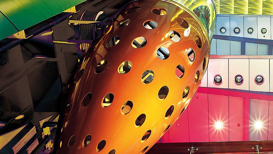
AUCKLAND // NEW ZEALAND
Client: Force - VillageSkyCity
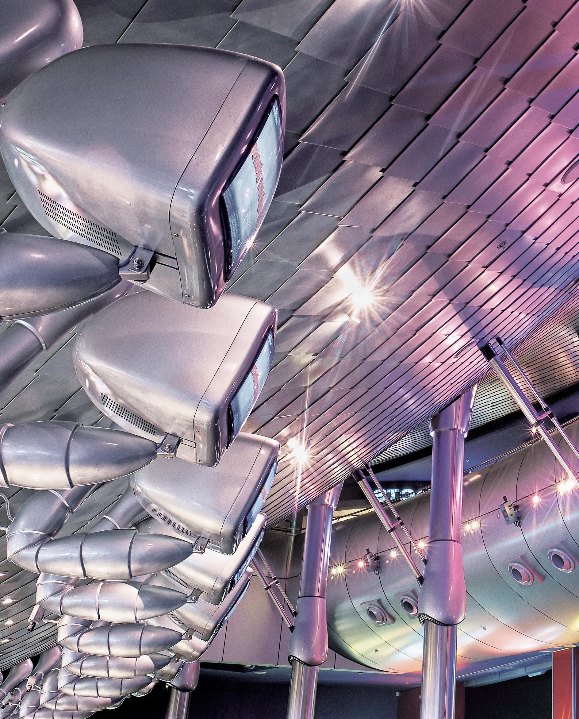
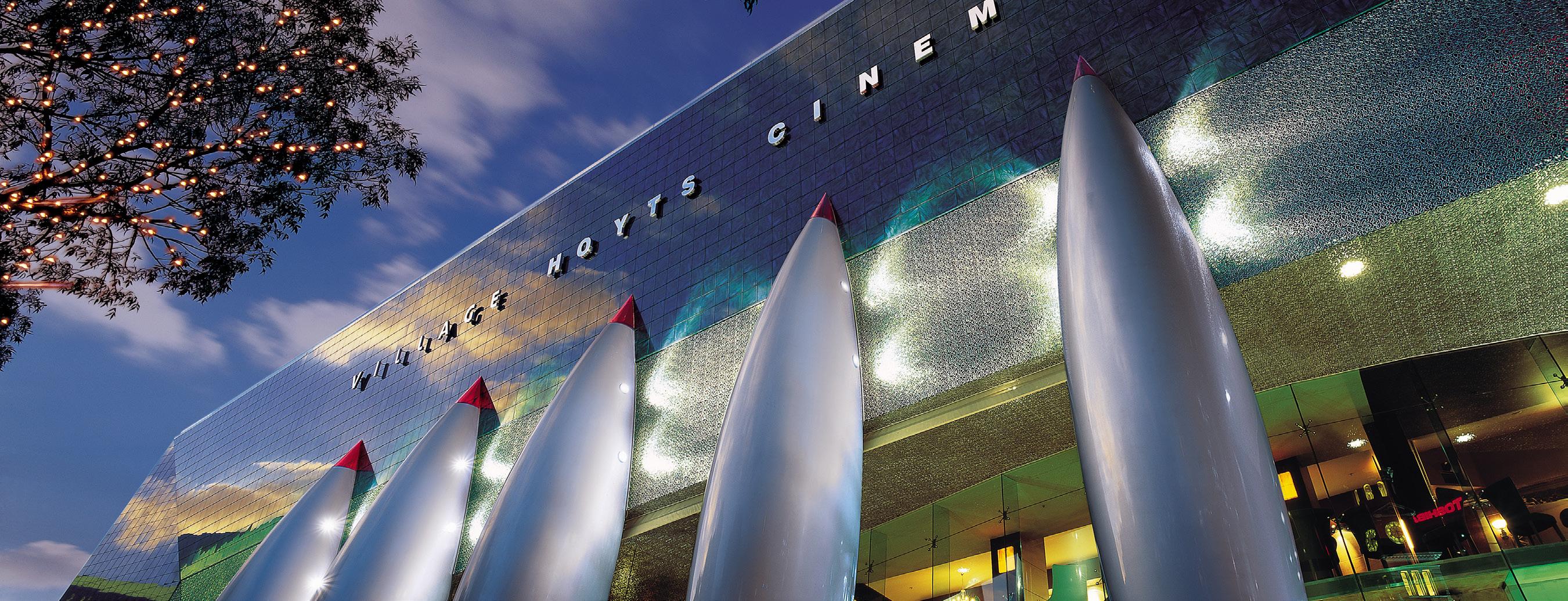
IMAX ENTERTAINMENT CENTRE AND FOODCOURT
The brief was to produce a quality building to house activities which principally revolve around or feed off entertainment. This building had to be exciting, memorable and exude the notion of entertainment. The building is incorporated into the entertainment hub known as The Edge. The building footprint fronts onto Aotea Square, Bledisloe Concourse, Queen Street and abuts The Civic
Theatre, with which it shares loading facilities. It was built which are enhanced by the new building. The tall, narrow, aerofoil plan shaped atrium runs in a strong diagonal across the complex and serves as a pedestrian link in lieu of the original streets. . With walls and roof of the same material it appears like an alien object above, plunging into and taking root in the old historic Fergusson
and Civic buildings. Accentuating the difference between the old and new. Most of the activities housed within the complex such as the Force Cinemas, Planet Hollywood and Imax Cinema are inward looking. When the patrons visit the entertainment centre they enter a different world and everything is designed to reinforce this. In short, to keep them entertained by stimulating the senses as well
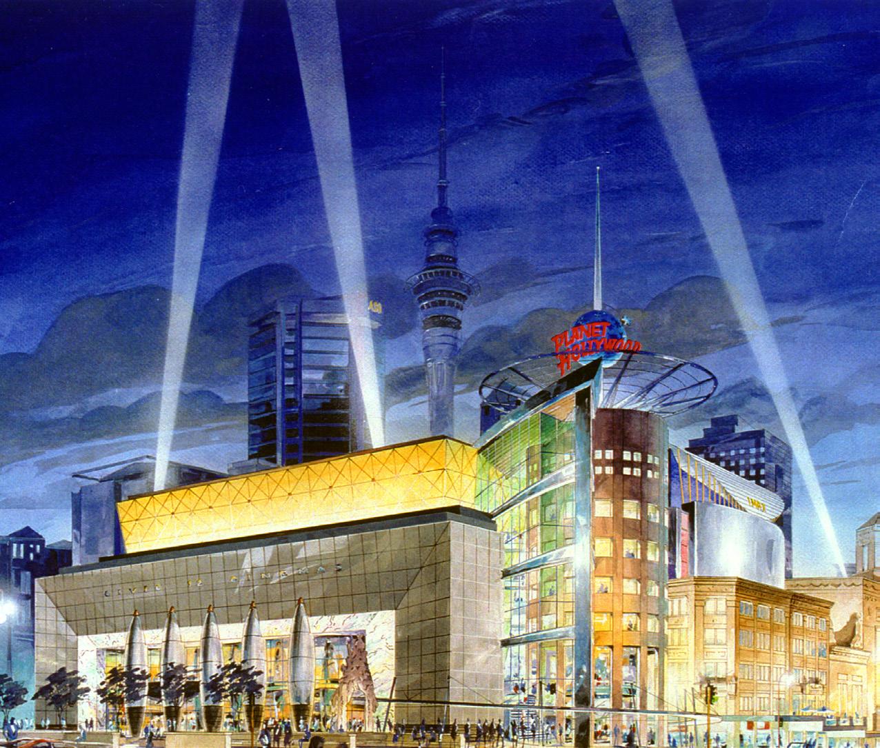
as offering enough variety that they experience something new each time they visit.




Mobile 021 925 396
AUCKLAND
Ground Floor, 152 Fanshawe Street
Freemans Bay, 1141 PO Box 5319
Auckland City
New Zealand
Phone : +64 9 373 3828
QUEENSTOWN
110B Wynyard Cres.
Fernhill, 9300 PO Box 398
Queenstown
New Zealand
Phone : +64 3 442 5318
www walkergrouparchitects com

 Ashley Gillard-Allen Director
