WANYU CHEN


Biotech Laboratory
2022 SPRING 2GBX Design Studio
Instructor: Elena Manferdini
Partner: Jinxin Xu
Software: Rhino, Zbrush, Unreal Engine
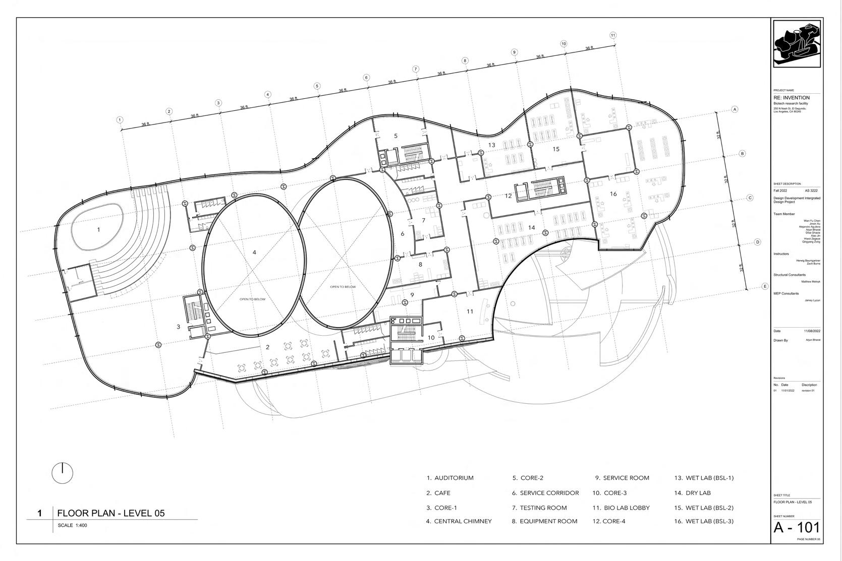
RE: INVENSION biotech focuses on exploring the advanced biotechnology of Anti-aging and decay of human bodies. As a hub of biotechnology, the design redefines the conventional idea of how people approach laboratory spaces by incorporating nature and landscape into the building.
In the future, humanity will overcome most diseases. In return, more people are becoming immobile due to the aging and decay of their bodies. Human society is faced with the question of aging of organs and natural death. The Global Anti-Aging market report and forecast indicate the market's growing size due to consciousness among consumers regarding their physical appearance. Behind this are the advancements in technology and huge investments in research and development activities.
Climate change, health crisis, scarcity or excess of resources, luxury and poverty, technology and inventions, reinforce the idea that humans are part of a relational ecosystem with other beings, biospheres and environments. In our globalized and hyper-connected world, we are increasingly exposed to complex phenomena and an expanded network of representation. To understand them and to deal with them, we need to manage large quantities and qualities of data. This project investigate possible futures stemming from the current ecological and health challenges, and to expand the role of agency in our architectural creative process.




The initial ideas and concepts of the project came from A.I. GAN training. To align the possible futures that we imagine, jellyfish, prothesis, and tree barks have been chosen to undergo the A.I. GAN training. And the mixture images that have metallic shells with bulbing and glowing volumes were generated. These images of living and nonliving creatures were then used as the inspiration for the building form.
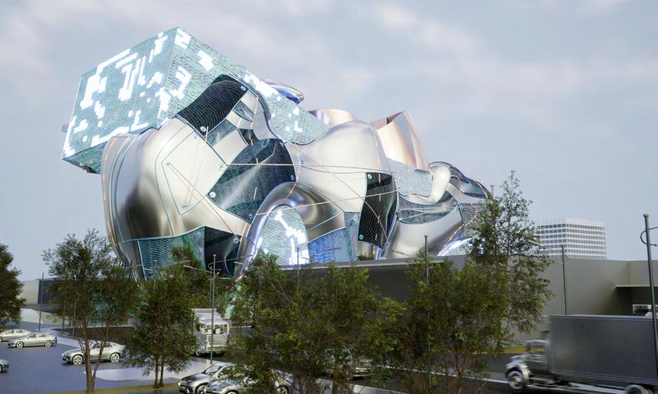




The mass of the building is generated from A.I. GAN training with images of jellyfish, trees, and prostheses for the inspiration of the organic form of architecture.


The bulbing volumes with metallic and transparent material are generated and replaced several major spaces of the originally rectangular mass of the building. They create specific qualities that varieties of programs require inside the building.
The pipes attached throughout the whole building connect all the spaces in the building. Collecting wastewater from laboratories, they form a water circulation system that purifies water and reuses them. The panels on the surface of bulbing volumes constantly are water purifiers. They change colors according to the status of water purification.


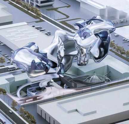

The design is specially composed of Jellyfish and Trees laboratories, theater, two major parliaments, and several circulations which connect them all. Each circulation gives people the freedom to explore the space inside the building. The bulbing volumes with metallic and transparent material
To let the public be involved, the main entrance of the building is located at the southwest corner of the building, which is more accessible to the public. The other one is a down digging space underneath the building, which leads to the forestry at the east that connects to the building. The forestry is part of the tree lab, which serves as the eco landscape. By breeding varieties of trees and vegetation, people can experience a natural forest

As the heart of the building, the parliaments are used for arranging seminars and summits between scientists and the public. The huge hollow spaces introduce the light into it and other spaces in the building. It is also the intersection of all the public circulation.


The Jellyfish lab locates at the upper levels of the building. Its primary research is to do cell research and genetic research of jellyfish. In addition, there are also studies on the extraction of ingredients from various plants (seaweed, coral, bark) that can be used as health or nutritional supplements. Depending on the research project, the shape of the lab is different. Each laboratory has its breeding tank. Jellyfish with varying cycles of life were cultured in other laboratories and tanks.
Parliament lightwell
Parliament space
As the heart of the building, the parliaments are used for arranging seminars and summits between scientists and the public.


The aquaculture water will be collected through the pipeline to the ecological pool outside the laboratory towards the forestry and to the underground to form an eco cycling. Filtered water will be reused for culturing trees and jellyfishes. Depending on the research project, the shape of the lab is different. Each laboratory has its breeding tank. Jellyfish with varying cycles of life were cultured in other laboratories and tanks. The forestry is part of the tree lab, which serves as the eco landscape. By breeding varieties of trees and vegetation, people can experience a natural forest while circulating up to the inside of the building.


2022
Instructor: Herwig Baumgartner, Zach Burns / Consultant: Matthew Melnyk,

Sophie Pennetier, Jamey Lyzun
Teamleader: Wan-Yu Chen, Jinxin Xu
Partner: Arjun Bharat, Diba Ghazia, Qingyang Zong, Xiao Jin, Alejandro Aguilera
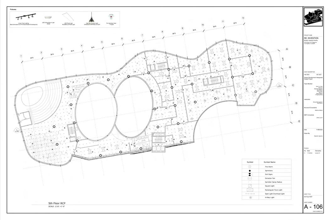
This project investigates issues related to the implementation of design: technology, the use of materials, systems integration, and the archetypal analytical strategies of force, order and character. The project includes a review of basic and advanced construction methods, analysis of building codes, the design of Structural and Mechanical systems, Environmental systems, Buildings service systems, the development of building materials and the integration of building components and systems. The intent of this project is to develop a cohesive understanding of how architects communicate complex building systems for the built environment and to demonstrate the ability to document a comprehensive architectural project and Stewardship of the Environment based on the previous design project "RE: INVENTION" .
A series of built case studies will be presented by the instructors along with visiting professionals in the field who are exploring new project delivery methods. These case studies will be shown in-depth with construction photographs, 3D renderings, and technical drawings and details.






Diamond Ranch Elementary School
2021 FALL 2GAX Design Studio
Instructor: Marcelyn Gow
Partner: Hao Wang, Suyue Jin
Software: Rhino, Cinema 4D, Maya, Redshift
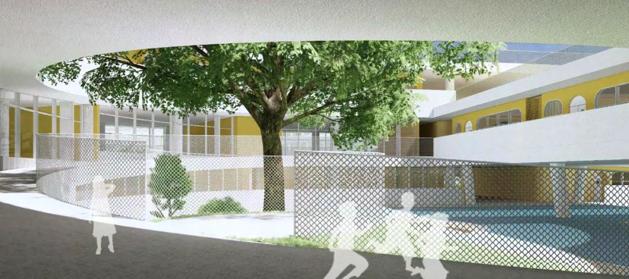
Diamond Ranch High School was established in 1997-1999 to inject more vitality into the community and recruit more students. The studio centers on public education, especially elementary learning. And the project will be Diamond Ranch Arts and Sciences Elementary school. The notion of scalar change focuses on our design from small items at the scale of chairs to large-scale work on the context and site in the surrounding environment.
The reference of this method of close up and zoom out is the movie ‘The Powers of Ten’ created by Charles and Ray Eames in 1977. The intention is to work through scalar changes to navigate the project in all scales, understanding that interiority and exteriority are intermingled into a single narrative.
The pedagogical position of this project is to create small learning environments in the school where students reflect on the relationship between people and nature. From a functional point of view, holes of different sizes and walls of varying shape also introduce natural light into the rooms and allow for natural ventilation, which cools down the perennially hot building. The project reflects a belief that architecture should create a connection rather than a separation between people and nature.


The architectural shape of the classromm is designed and developed from the form and concept of the chair. It unified and clear architectural language can enhance people’s first impression of this school and improve the integrity and harmony of the design.
The design of chairs came from the the iteration of Thonet chair. The chairs are curved and intrinsic with different pipe widths and deformed into various models, beginning from simple line work. Since chairs are for the elementary schools, more vitality is considered to be brought
into the site. The chair design exaggerates some features derived from the Thonet chair and transforms the color palette.
With the meandering wall forms and the textures applied to them, the birch bark material creates natural terrain and plant growth qualities. The classroom is the landscape, which blurs the boundary between architecture and nature, allowing natural elements to be introduced into the indoor spaces. This creates the possibility for sunlight, air, and plants in the natural environment to enter the indoor spaces.


Our site and building are quietly located between the land and the mountains, and the campus has a strong sculptural quality. The free and organic form also shapes the adaptable indoor space comprised of walls, floors, ceilings, flexible interiors, and the landscape of the campus. The design language of meandering, which is driven from the lines, creates an escalating landscape and zoning along with the existing site. These forms allow teachers and students to roam, experience nature, and look at the sky and mountains at any time. They
blur the boundary between architecture and nature. The community center locates at the end of the main road of the existing middle school site for public people to access this site. As the building mainly serves students and faculty in the school, the art center and sports stadium locate the inner part of the site, which nears the sports field. On top of this, the circulation from one building to another was placed created for people to circulate inside the site.


West 2nd Street Art Museum
2022 FALL 3GAX Vertical Studio
Instructor: Jenny Wu
Partner: Yiyu Zhou
Software: Rhino, Cinema 4D, Redshift

Geometric primitives are the basic shapes we all know and recognize. They are simple three-dimensional forms such as cubes, spheres, cylinders, and cones. One of the fundamental powers of the primitive is the way our brain instantly recognizes its geometric character, even when the form is not perfectly defined.
In addition to its formal qualities, we have also been interested in articulating methods of assembly, specifically the operations necessary in connecting and attaching parts in place. We like to imagine that building elements, while sliding, rotating, clicking into place, may leave traces of its assembly onto the architecture itself.
The studio will begin by using Midjourney as an early exercise to test potential configurations and spatial consequences for a geometric primitive made with interlocking parts. The second half of the semester will situate the primitive in relation to the ground.


In recent years, with the increasing development of AI computing power, AI's ability to process images has also improved. When a man's drawing created with Midjourney AI won an award at the Fine Arts Exhibition held at the Colorado State Fair, it caused an uproar not only in the art world, but also among the general public. It is undeniable that the use of AI will gradually become part of people's lives and affect the way creators create their work. AI can produce a series of solutions in a short period of time by interpreting textual narratives and deconstructing and sewing together material from databases. However, if we imagine a 3D spatial relationship based on the 2D images generated by AI, there is an ambiguity in the results generated by AI. This allow people to read the space and the 3D relationship in different ways. This ambiguity is why we should consider AI as a powerful aid to our design and exploration of volumes.
Our design uses two pictures obtained from midjourney and DALL.E 2 as the front and back hemispheres of the sphere puzzle. Using 3D modeling, we explore the relationship between the surface of the spheres and the volumes inside, such as how they connect and pull themselves together to form a sphere. In both midjourney and DALL.E 2 images, the depth and width of the gaps become the basis for cutting the spheres. We imagine the internal relationship of this sphere puzzle by disassembling the puzzle.

We use sequential disassembly to emphasize the narrative of a disassembly process and the spatial relationship between the connected parts of the different pieces. We imagine that this sphere is assembled by 9 pieces of different sizes, and in the process of disassembly, we can find that each piece overlaps and wraps around the previous parts that have not yet been disassembled. At the end of the disassembly, the core part is a key-like block that locks itself to the next piece. In terms of material selection for the physical model, we used clear resin as the core key material, and plated copper, nickel, and zinc for the other pieces.
Midjourney and DALL.E 2 generated result
Two pictures obtained from midjourney and DALL.E 2 are used as the reference for the front and back hemispheres of the sphere puzzle




Based on the primitive puzzle that we have already developed, we want to discover the possibility of how the primitive puzzle can be the starting point for a building. By de-assembling the primitive into a new posture on a site, the spatial relationship within the sphere puzzle fundamentally disrupts the fit of the parts to its whole and opens up opportunities for the primitive to become architectural - addressing program, structure, spatial sequence and materiality.
The site of the building is located in the heart of downtown LA, in a nearby open space of The Broad. The site is on a slope with a huge
height difference which is a continuous slope all the way up to The Broad. This open space is now used as a parking lot.
As an art museum, we imagine the building and the surrounding landscape are not only an extension of the original museum space of The Broad but also a space that bridges and interlocks the space, people, and the neighborhood and allows them to flow inside. The sphere puzzle was de-assembled by a few moves, such as pulling out and adding pieces, scaling, and rotating before placing it on the site.


The building volumes are mainly divided into two halves placed on the base, they come from the process of decomposition and transformation of the sphere puzzle. The keys in the original plan still function as keys to the two large spatial assemblages in the architectural space. The two keys in the building are the main spaces for changing the flow of people. We tried to preserve the spatial relationship between the different blocks of the original plan in the process of transforming the plan into a building. The transformed building volumes are combined with the newly designed topography to create a gap for people to enter.


Solar Carve + The King Fahad National Library
2021 FALL Advanced Materials and Tectonics

Instructor: Randy Jefferson, Dwayne Oyler
Partner: Sizhe Lu, Yiyu Zhou, Arjun Bharat
Software: Rhino

Satus: Built 2019
Industries: Commercial Property
Location:New York, NY
Floor: 12-Story
Area: 117,530 SF
Client: Aurora Capital Associates
Architect: Studio Gang
Structural Engineer: ARUP
MEPS: Glickman Engineering Associates (GEA)
The overall tectonics of this building consists of a fully overlapped double-glazed glass façade. The North and the south edges have been deformed into a pixelated geometrical form. This geometry consists of a repeating module that consists of a folded five glass panel geometry. This module has a height of 16 feet that flushes over the entire span of a floor, and it is prefabricated and assembled on site. This geometry primarily consists of a central diamond-shaped panel supported by four smaller triangular panels and is angled in a manner that produces a sharply recessed façade, which is nestled into punctured floor slabs. The glass panels are supported with the help of internally recessed mulleins.

Solar Carve exterior facade

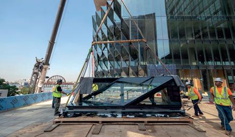
The facade of the building consists of 16 feet height modules.

Isometric
The Solar Carve building is connected to the highline.

Modules
Modules are prefabricated and then stacked on site.
ADAVANCED MATERIALS AND TECTONICS FINAL AS3200

Assignment 1 - Precedent Detail: Solar Carve-Studio Gang
Prefabricated Diamond-shape Unit Transformation


Prefabricated Unit & Concrete Slab Conjunction


Precedent Research: Solar Carve-Studio Gang


Assignment 1.2 - Applied secondary structure to original Solar Carve parimary structure
Overall building chunk and tectonic breakdown
Assignment 1.2 - Applied secondary structure to original Solar Carve parimary structure


Overall building chunk and tectonic breakdown


Assignment 1.2 - Applied secondary structure to original Solar Carve parimary structure

Inner saddle tension cable connection detail

Primary Structure + Secondary Structure: Solar Carve + The King Fahad National Library


Neishi Transit Station
2019 Thesis Design
Instructor: Chia-Ju Lin
In modern society, people's lives are restrained by families, friends, and work. People live monotony life subjects to time. People are used to finishing tasks quickly, fulfilling their free time, replying, and receiving information immediately. People nowadays often overlook the good things in life.
This project is a reflection of monotonous life under a fast-moving modern society. By integrating the feeling of speed and time elapsing people will perceive at different heights and distances on the horizontal site, the vertical tower form of the transit station will make people rethink the question, "How do we experience time?" and have an opportunity to get rid of the monotony of life.
As a container for change of external environmental, the architecture makes time perceivable. As time goes by, the atmosphere of the space will change the way we understand the space.


Station, a node of the transportation network, is a part of most people's life. People go to work, travel to other places from stations. Timetable in the station organizes not only train schedules but also the interval time people wait for trains to make stations operate quickly and efficiently. It is a combination of speed and efficiency.
Surrounded by the blue sea of Taiwan strait, endless mango field, and beautiful starry night of southern Taiwan, it seems to be a totally different feeling in Neishi station. Neishi station is in Pingdong, the south of Taiwan. Only one train will stop here every day. As a result, less than one person is getting on and off every day on average. Unlike other station, Neishi station seems to have nothing to do with time,
speed, and efficiency like any other station.
With the implementation of the Hengchun Sightseeing Railway Project, Neishi Station will become a transfer station for the railway, sightseeing train, and bus in 2024. It will be known as a transit point across Taiwan for passengers who want to go to Kenting.
This new transfer station proposal looks forward to provide people with opportunities to get rid of inertial life. People can get involved in the slow pace of Neishi and choose to experience travel and life in different ways while they are waiting for trains rather than ignoring the beautiful things around them when they pass by in a rush.




Height & Sight analysis

Observer's sight and feel of speed according to various distances and different heights


Because of Hengchun Sightseeing Railway Project, the volume of the station building will become much more significant than now anyway. Making the station building taller instead allows the building to become be a vertical container that integrates different kinds of speed on the field. A taller tower could also create a dialogue with the platform. The passengers’ feeling of various distances and different heights to the building could provoke passengers’ curiosity about the tower and the external environment during the transfer. Besides, it creates opportunities for passengers to get out of monotonous life.
The concept of the tower can be described in the drawing below. The triangles are the platforms of three different transportation systems, and the thick dotted line is the primary path for people to transfer from the platform to the tower. In addition to the primary path, there are trails where people can explore the site next to each platform. Both roads allow people to reach the transfer tower, and the passenger can take either one as their will. The tower is divided into two parts. The outer part is the space for exploring the natural scenery of the site, and the inner part is the hall of the transfer station, connecting platforms.

P1: Windows at different heights show a different sense of speed. P2: Layers of speed intersected by people’s perspectives of view. P3: Tall volume creates ample opportunities for light in different angles.


Lying in the capsule, people see the sea and the stars in a distance. After a day of travel, it is time to say goodnight. Goodnight Neishi!
Walking through the narrow corridor, there is the endless sea.This is a space for a person and the sea. The height of the tower has brought people closer to the sea.The slow slap of the sea is like the silent poem.
People's perception of time becomes unclear as the height goes higher. However, the glass pool that extends out of the wall allows people to look back at busy traffic systems that operate orderly.


The two-hour procedure of sunset is the most recognizable time-change period of the day Facing the direction of sunset, mango shaved ice shop is the last destination for travelers who are not going to check-in in the capsule hotel Eating a bowl of shaved ice along with the scenery of sunset slowly falling into the beautiful Taiwan Strait is such an enjoyment.
The residents of the Neishi go to church from 9:00 am to 2:00 pm every Sunday The light effect in the chapel changes when time goes by. The direct light at 12:30 will light up the stage that the priests and performers stand on and magnified people’s perception of lapse of time.


The platform and the transport level are the intros to the transfer tower The form of tower is in sharp contrast to the flat base, making people curious about the tower and the external environment.



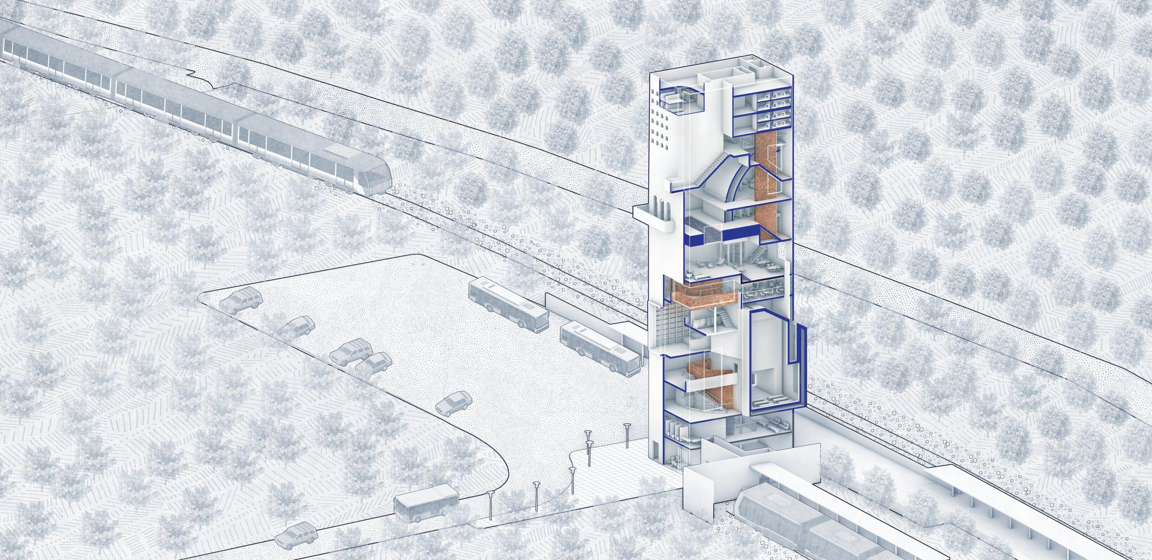
The transparent hydraulic elevator from the bottom all along to the top of the towers allows passengers to view the spaces and activities in the tower. While the elevator rises, the distance between the passenger and the sky is getting closer. In the closed volume, the elevator serves as a light well which produces different light effects in the tower while people are using the elevator.
The new design of Neishi transit station redefines spaces on people's path up to the top of the tower with a specific code; T stands for timing, M for minutes, and H for hours. Different codes represent specific moments or durations in which people experience these spatial experiences caused by light, sound, and the speed of the external environment. With these experience, people will feel different ways that time flies during climbing and begin a dialogue with the external environment around them.
∞ Sea of Solitude


M120




Time-lapse Swimming Pool
T1500
Cafe’ Under the Water
M120 Sunset Mango Shaved Ice Shop
M030 Seaview Library


The implementation of the transfer station while brings tourists to the Neishi, also destroys the originally slow and lonely pace. When society continues to develop, people become numb under the chase of time. In a fast-moving life, people gradually forget “How do we experience time?”

The new design of the transfer station proposes the possibility of redefining programs with time for the reconstruction of the station. The transfer station integrates speeds people would perceive at different heights and distances on the site with the form of a tower. The tower consists of the space with programs that intersect into a path to the top. People would slowly establish a dialogue with the external environment and time to extend people’s perception of time and speed as they climb up through space and activities (auditorium, seaview library, swimming pool, mango shaved ice shop, and capsule hotels). Animation Link


Trace Architecture Office
2020 Professional Work
Position: Assistant Architect
Contribution: later stage of project(interior, drawings, 3D modeling)
Located in Haikou, Hainan, China, the campus includes primary school, kindergarten and dormitory buildings, with a total floor area of 64,700 square meters. This is TAO's second educational project in Haikou, which is another creative practice of exploring links between education and architecture with respect of local context.
The site is located in Jiangdong New District, east coast area of Haikou. The design regards the campus as a miniature garden city, responding to the surrounding environment in an organic form. The building integrates with the surrounding countryside area, green space, river, wetland and ocean, being part of a unified whole.
Meanwhile, the free curves, vivid colors and poetic spaces, which echo the unique childlike innocence and playfulness, are aimed to evoke children’s imagination and creativity, making students a unique school experience.
The kindergarten design creates a looped circulation, providing a platform for children to run. Continuous ramps connect different elevations, and the roof becomes an extension of the ground. The middle layer is elevated to release more semi-outdoor activity space for shade and rain, and at the same time, it is a positive response to Hainan's tropical climate. Children can run from the ground to the sky, from indoor to outdoor, and grow up free.




1:1 Interactive installation
2018 Micro Architecture
Instructor: Hwai-Wen Chang
Partner: Yu-Chuan Hsu, Hao-Jui Peng, Cheng-Wei Wu
The wind is an invisible presence. It always seems to be around. But it has a far relationship between our culture and life.
Blue dye is an old Hakka art that has gradually disappeared. The timeconsuming and complex but elegant dyeing methods are becoming less known...
Hsinchu city is the settlement cluster of Hakka culture, and it is also a windy city that blows strong winds because of its special landscape. This project is to build a micro-architecture that has such special humanities with natural factors and revives blue dye with the wind.


Wind Indigo Dye is an architecture that can capture the shape of the wind. The wind is an unlimited resource and the memory of the people who live in Hsinchu. We hope that people could have brand new learning of the Hakka culture by dyeing their own Wind Indigo Dye. The analysis shows that the wind in Hsinchu is constantly blowing in different directions, especially from the North-East. To access the wind from different directions, the microarchitecture should be designed into a radial form. To make the invisible wind into a physical movement, we made a wind panel as a unit to study how to perform wind’s action. The diagram shows that the wind panel unit, which drives the movement of the drip tube, makes the dripping of dye turn into different patterns due to the different wind force.


2022 FALL Elective Course
Instructor: Dwayne Oyler
Partner: Yiyu Zhou, Amin Marandi
As the site of our project, Casa Barragan uses flat planes and light, both natural and artificial as its most prominent aspects of the design. The skylights and windows allow for visual tracking of light throughout the day.
Upon entering, the visitor walks down a dark hallway until they suddenly encounter a pink wall, the first engagement with the known style of Barragan. The concrete texture of the wall gives the room a solid feeling and shows the contrast between the natural light and shadow. The handrail is not originally designed in this room to preserve the concept of visual tracking of light and consistency.
To not ruin the atmosphere of this room, the safety of the people who live in this house was sacrificed. We wanted to ensure the safety of the users in the space while maintaining the original atmosphere and transparency of the space. We want to design a lightweight handrail or staircase.

This handrail is developed in detail by the experience of holding it in the hand. The handrail, as a container of light, is composed of three materials: resin, metal and wood, exploring the interaction between material properties, time and light. The handrail is made of a curved metal plate as the main structure. The transparent texture of the resin introduces light into the handrail, allowing it to travel between the wall and the handrail. When placing the hand on the handrail, one can feel the interplay of natural light, light refracted by the resin, and light reflected by the metal on the back of the hand at different times.


Instructional Construct
2022 SPRING Elective Course
Instructor: Jenny Wu
Partner: Yiyu Zhou, Zeyu Wang
Software: Rhino, Blender, Unreal Engine
As a form of communication, drawing is an effective tool to elaborate and visualize thoughts from scratches in people's minds. By studying existing furniture masterpieces and transforming them into different pieces of work, this project presents a new furniture piece that employs drawings and animation in logical thinking and narrative.
This project explores the harness realistic texture, light effect, and tectonic concept of furniture in modeling software ends and rendering engines.


The assembly Animation was made with Blender. The animation was composed of clips taken from different angles and different scale of view of the chair to showcase the overall view of chair and close-up detail of asseblage. We have a velvet texture covering all over the chair, and the metal frame weld the main structure together so that the chair can support the weight itself and the person who sits on it. Chair legs are made of wood. Every major part was designed to be easy to assemble by bolts.


2021 FALL 2GAX Visual Study
Instructor: Kumaran Parthiban
Partner: Yiyu Zhou
Software: Cinema 4D, Redshift, Zbrush, Octane, Adobe Suite
Omen is an occurrence or phenomenon believed to portend a future event. In 2079, outer space travel is already mature, and humans are dedicated to exploring unknown planets and alien civilizations. The animation is a story of a future unexpected encounter in which a human being discovers a strange manlike alien.
This project explores a small part of world-building and environmental design with terraforming, a hypothetical process of deliberately modifying the atmosphere, temperature, surface topography. This project emphasizes the visual narration to the audience in the format of animation.


In 2079, outer space travel is already mature, and humans are dedicated to exploring unknown planets and alien civilizations. Space Rager is a new occupation as the frontiers of human civilization to explore and recond the boundless universe. While exploring the distant coordinate universe, the Space Ranger discovered a gradually decomposing planet. The flake rock mass turned into dust that filled the planet’s surroundings, and the earth itself formed a hollow topography. A sleeping giant slept peacefully inside. There were technologies unknown to humankind on the planet itself, which held the air and nutrients needed by the giants. The ground grew overgrown with grass, covering the giant’s body as soft as a carpet over time. The discovery of this humanoid species may reveal an ancient and unknown civilization related to humans.


Previous stage of the setting up the scenes. Litting up the scene with neon light effect to create a the outer space vibe.
Components

Final Rendering
Draft scenes renders The components included in the final animation. Spaceship passed by the undiscovered planet.


Overlaid
2021 FALL 2GAX Visual Study
Instructor: Kumaran Parthiban
Partner: Yiyu Zhou
Software: Adobe Suite
This project mainly looks at post-production and compositing, by layering, filtering, and multiplying opacities within materials, this project created a different aesthetics and idea of narrative from the previous animation by layering and multiplying opacities within materials.
In this project, the composition materials are majoring from the clips created from the previous project, 'Omen,' to explore different possibilities that bring from rendering and after-effects. This project aims to create a vibe of uncanny lucid dreams and a different narrative to the same story.
During the design progress, clips from the last animation were layered in a different mode in Adobe After Effect to try out the result.


The major effects used in this project are wave wrap, Saber, CC scattering, and colorize.


