Concept Presentation Wichita


The Wichita Art Museum is a foundational entity in Kansas' largest city with strategic goals crafted to reach a level of being a national model of excellence.
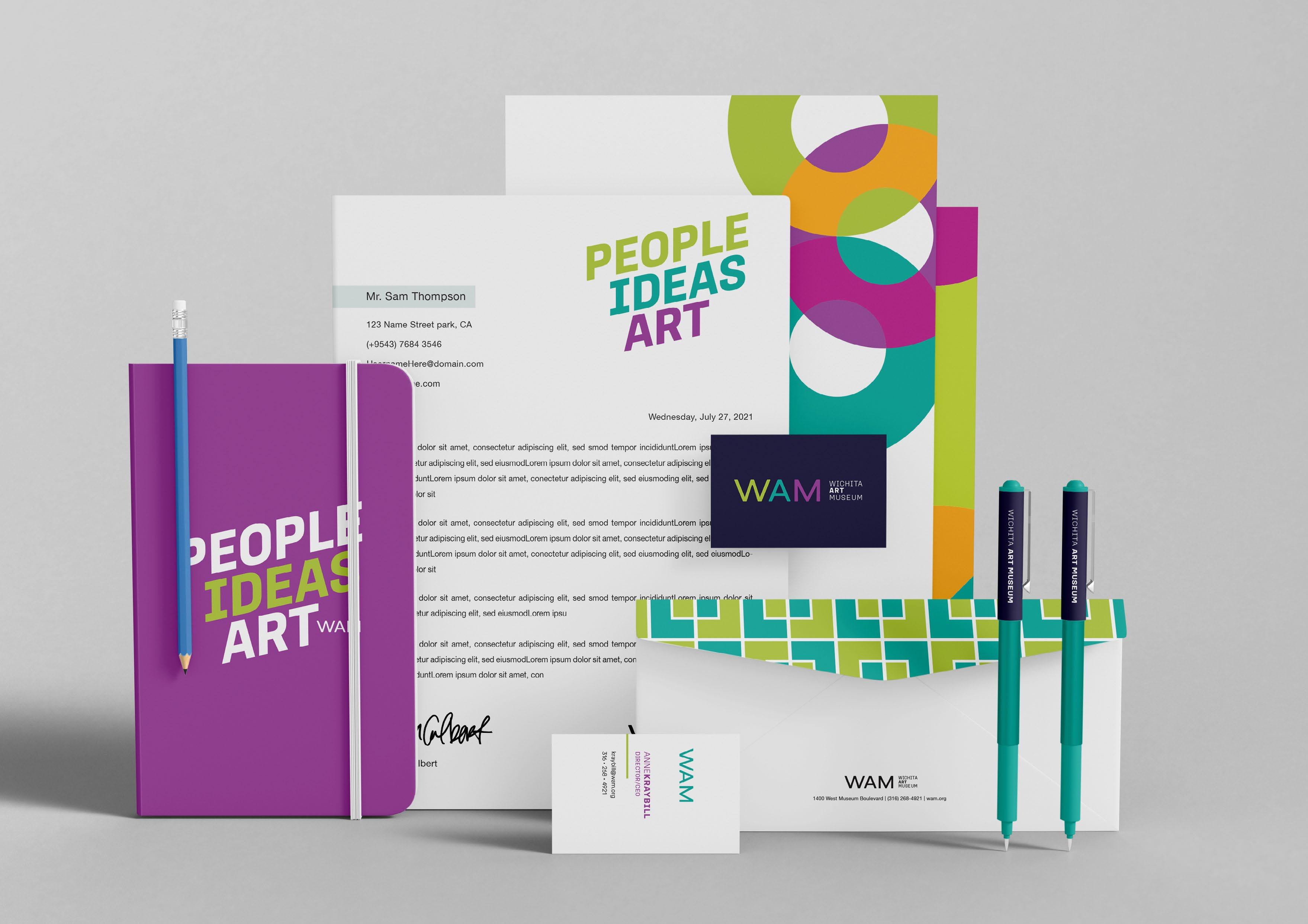
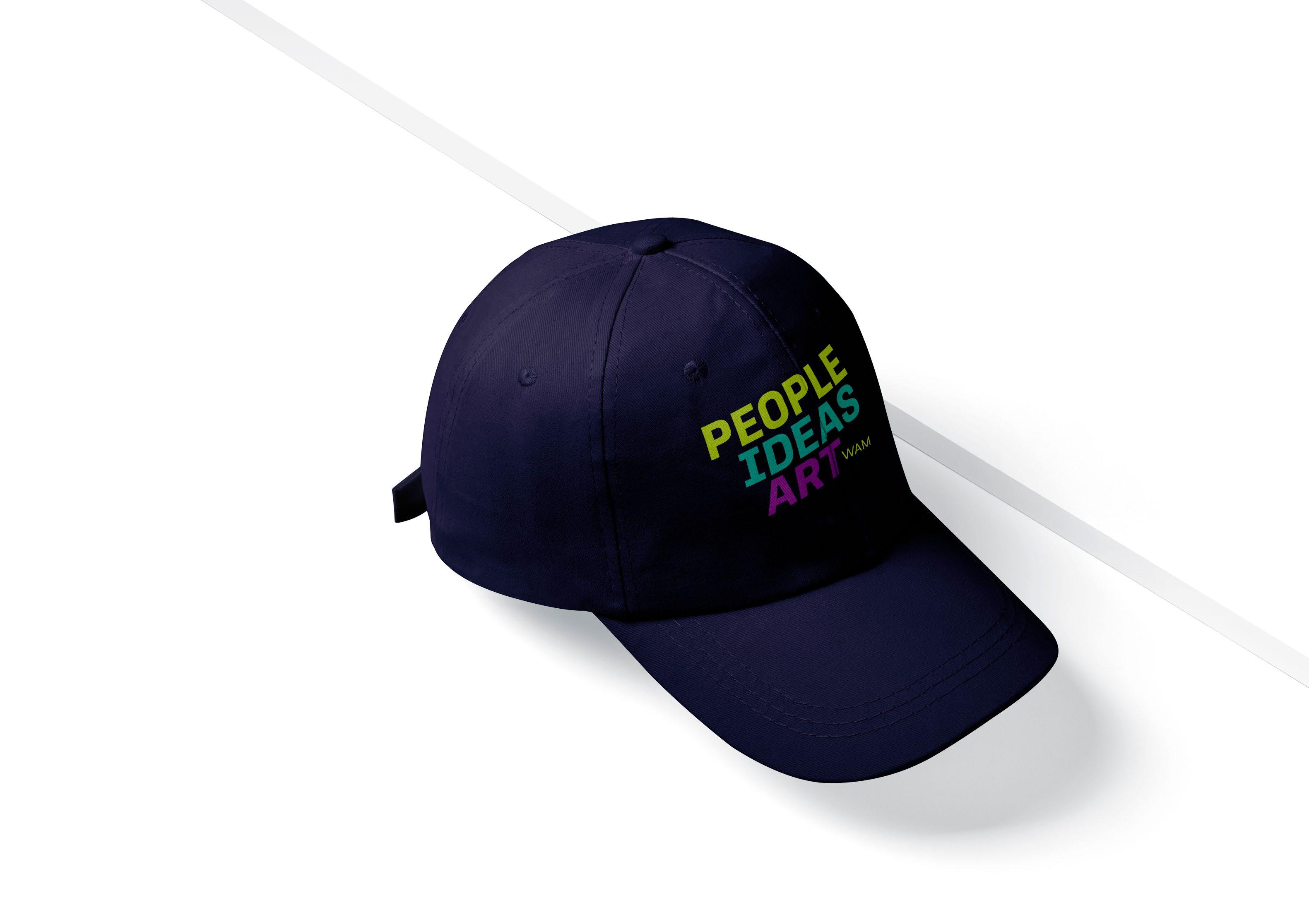
With the rebrand to WAM, there is an instant boost of modernization. My goal is to craft a recognizable, energetic, and yet familiar to our city visual identity that will support WAM in current and future initiatives.


I use the One Concept Approach as part of my design process by presenting only the strongest, best-suited concept that aligns best with the brand strategy and direction we outlined in the previous step.
Of course, this doesn't mean that I only explore one direction. I brainstorm, research, and sketch dozens of ideas before choosing the strongest solution that connects with your target audience, brand values, mission, and personality.
By narrowing down the focus of our presentation, I not only focus on quality over quantity but can present a much more in-depth idea and showcase how all assets work together to form a complete brand.

W, A, and M are sharp letters with ridged edges. Together they are bold, but I wanted a softness to them that matched the soft curves found on the WAM campus. It's subtle yet adds a level of welcome to the logo.
The logo can be used in a single color or full-color. The stacked colors will each represent a part of the vision and mission of WAM. Energetic. Inventive. Welcoming.

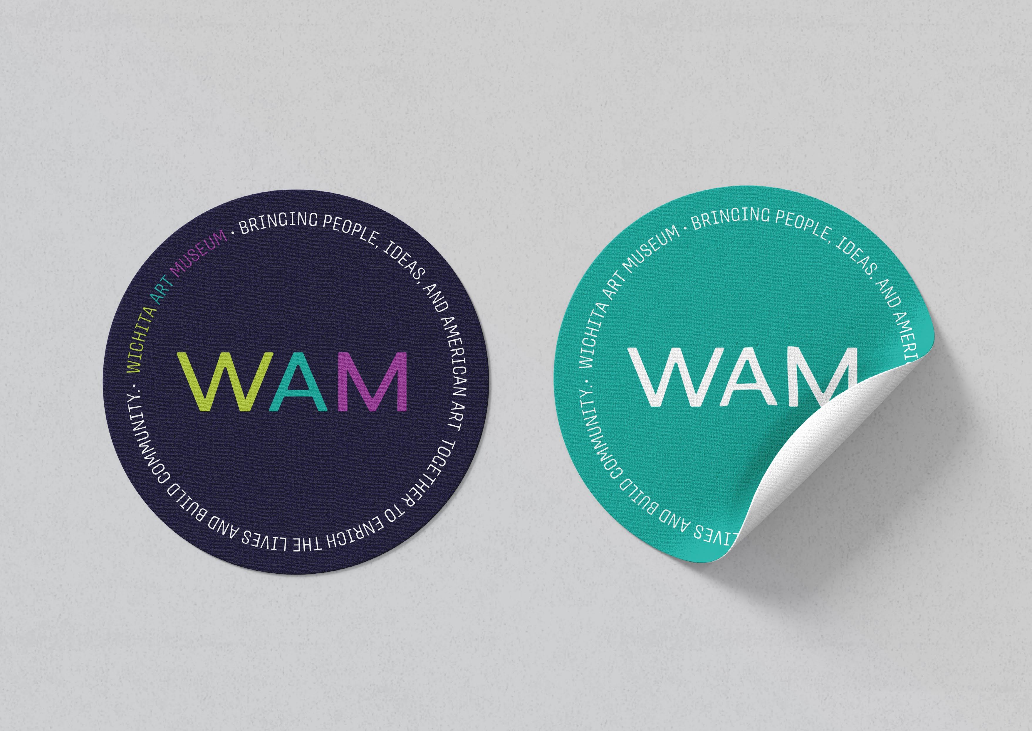
The Museum Store's current micro-branding will continue to work well with the new WAM visual identity. I recommend swapping out colors to the new combonation.


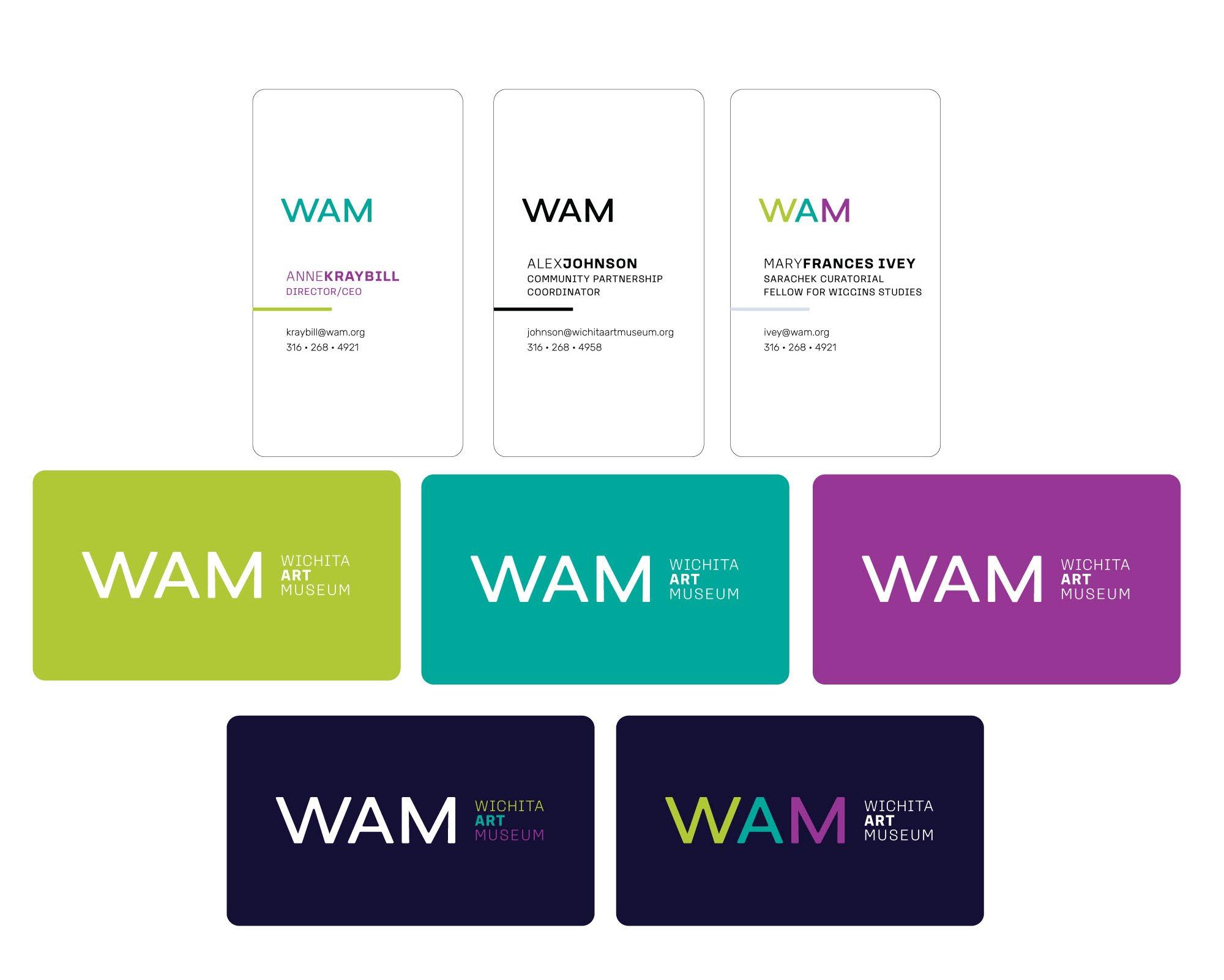
The WAM mark paired with the line and stacked-weight type will create the sub-brand lockups.
Each lockup's line color can be selected based on which of the color feelings they best align.
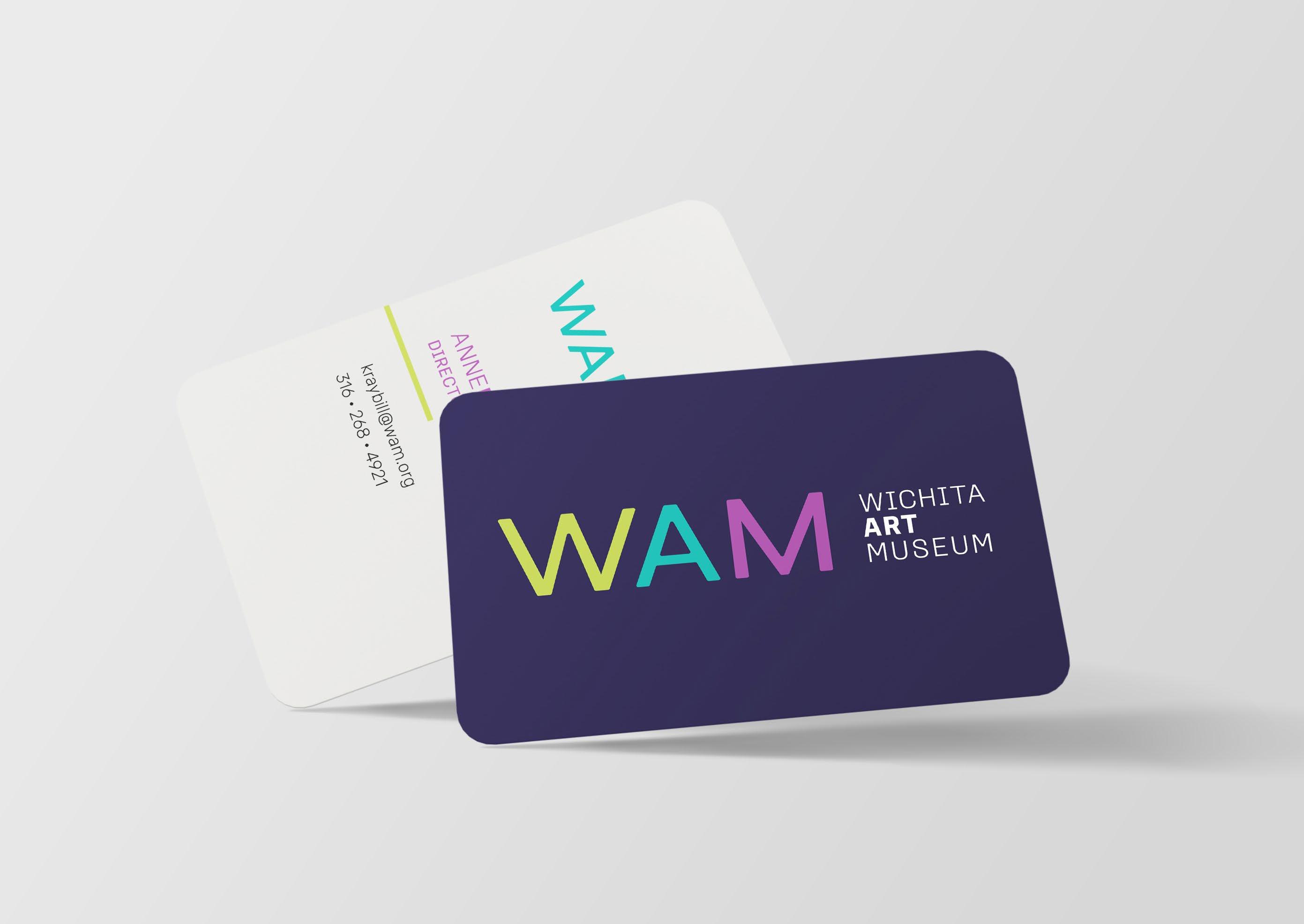


All the cool kids hang out in the basement at parties. The new kid on the block might be WAM's upgraded look, but it fits in well and is easily read at a reduced size.

WAM's campus is delightful to look at, with the shared sharpness of the diamonds and curves of the sidewalks around the building and the Art Garden. These three shapes can be used to build a variety of icons and patterns to continue the elevation of the visual identity.
Update: Additional colors are "created" through "artificial layering."
This might be a made up phrase, but rather than using the muliply effects, use the pink, navy, gray, and yellow as they look best in overlaps.




This is a subheading
Pe repedit, simin rae moditec esecturerum dolorem olorum dentem qui reseriae.
Pe repedit, simin rae moditec esecturerum dolorem olorum dentem qui reseriae. Berruntis de conserernat. Doluptature reperiore qui dolupta tistium aut fuga. Aximus res pelit, earum non ped quiaspis.
Pe repedit, simin rae moditec.
For emails & letterhead documents
Pe repedit, simin rae moditec esecturerum dolorem olorum dentem qui reseriae. Berruntis de conserernat. Doluptature reperiore qui dolupta tistium aut fuga. Aximus res pelit, earum non ped quiaspis. Pe repedit, simin rae moditec.
Petersburg / Italic
Loos Compressed / Regular + Bold
Petersburg / Italic
Rubik / Regular
Bahnschrift / Regular
I hope you enjoyed this Brand Concept presentation!
Please take some time to review this document in detail before providing your feedback.
How do you feel about the presented concept? What do you like/dislike in particular? Why do you like/dislike it?

Does the concept align with your vision and brand values?
Do you think your target audience will connect to this concept?
Can you envision how this concept can be applied through the different brand touchpoints in WAM (print and digital)?