1 minute read
Pure Space
by 張皓翔
Trained as an interior designer, “Spatiality” has always been my primary focus. However, we were taught early on to generate Space only with non-spatial parameters, such as the client’s preferences or a brand’s identity, rendering Space as a mere signifier of something non-spatial. We were almost always required to create fictional clients with fictional requisites to base our design on and to justify our design decisions. Despite this, I have always found this type of space-generating approach pretentious and unconvincing.
Space is a weak medium as a signifier due to its abstract disposition. One could aim to signify one thing, then end up having it be interpreted by others as another. And even then one could just as easily re-phrase the whole concept for the design to be justified. It is also extremely hard for designers to operate when there are only generic briefs or uninteresting clients available to work with. This often led to the excessive use of “referencing,” with the resulting Space a collage of nice-looking “spatial instances” appropriated by the author from all kinds of sources, which is then justified by a fictitious narrative, grounding it to the brief.
Advertisement
Realizing that such operations are nonsensical and that Space isn’t necessarily derived from non-spatial parameters to begin with, I began exploring in the opposite direction. To create Space with purely spatial ideas and avoid turning it into a signifier of something non-spatial. Pure Space, Space that even when stripped of fancy finishes, designer furniture, and ornamentation, would still radiant with its inherent Spatiality.
Carhartt WIP Shop
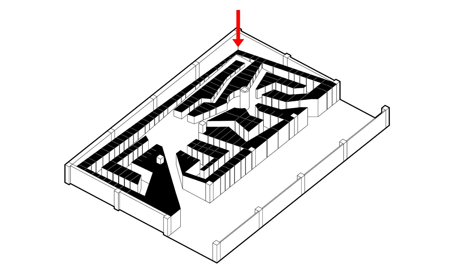
Three pieces of “furniture” were placed in the center of the “Shop.” They act as both display stands and space-generating agencies, defining negative space as circulations and generating “places” depending on its orientations. The furniture themselves was a play on perceptions. Viewed from the south, they seem arbitrary, whereas, from the west, they aligned to depict the logo of the brand.
Flexible Office
In the context of a department store, “Shop” was an early attempt to conceive space purely with spatial ideas in place of depicting the brand’s identity. Due to the size, it was clear that filling up the already cramped space with “designs” was nonsensical, which is why I resolved to only create the three “furniture.” All operations within this project were based on how space was to be perceived and experienced, representing nothing and signifying nothing. It was conceived purely spatially.
Pure Space: Shop
Pure Space: Office


