1 minute read
Carhartt WIP Shop
by 張皓翔
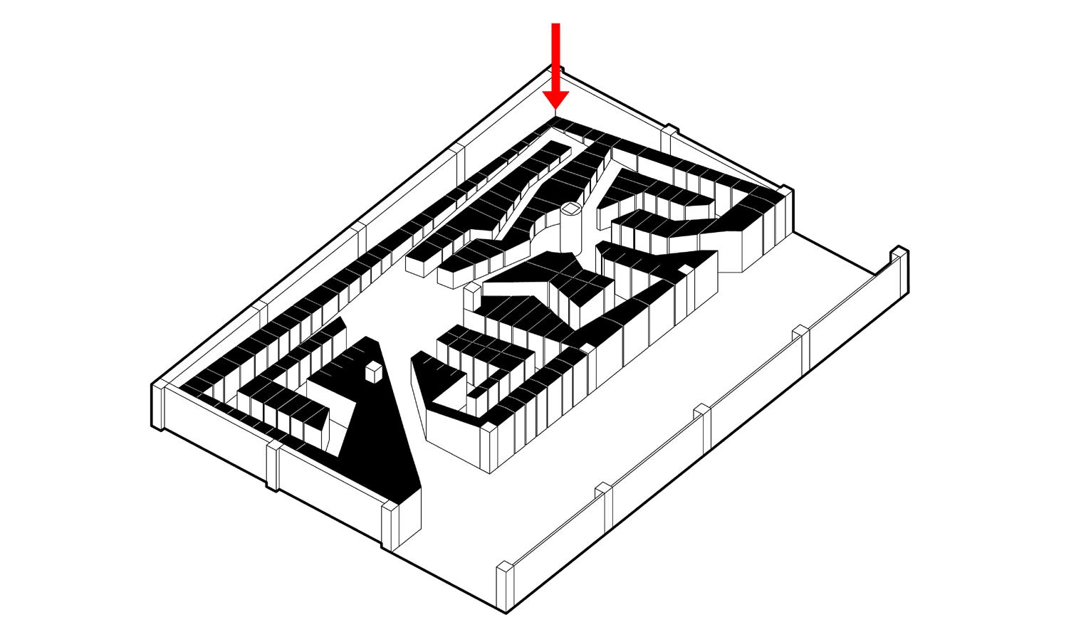
Three pieces of “furniture” were placed in the center of the “Shop.” They act as both display stands and space-generating agencies, defining negative space as circulations and generating “places” depending on its orientations. The furniture themselves was a play on perceptions. Viewed from the south, they seem arbitrary, whereas, from the west, they aligned to depict the logo of the brand.
In the context of a department store, “Shop” was an early attempt to conceive space purely with spatial ideas in place of depicting the brand’s identity. Due to the size, it was clear that filling up the already cramped space with “designs” was nonsensical, which is why I resolved to only create the three “furniture.” All operations within this project were based on how space was to be perceived and experienced, representing nothing and signifying nothing. It was conceived purely spatially.
Advertisement
Pure Space: Shop


