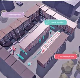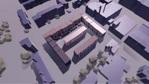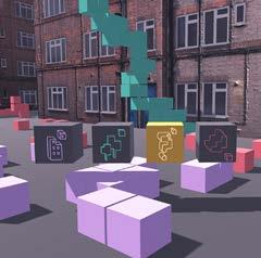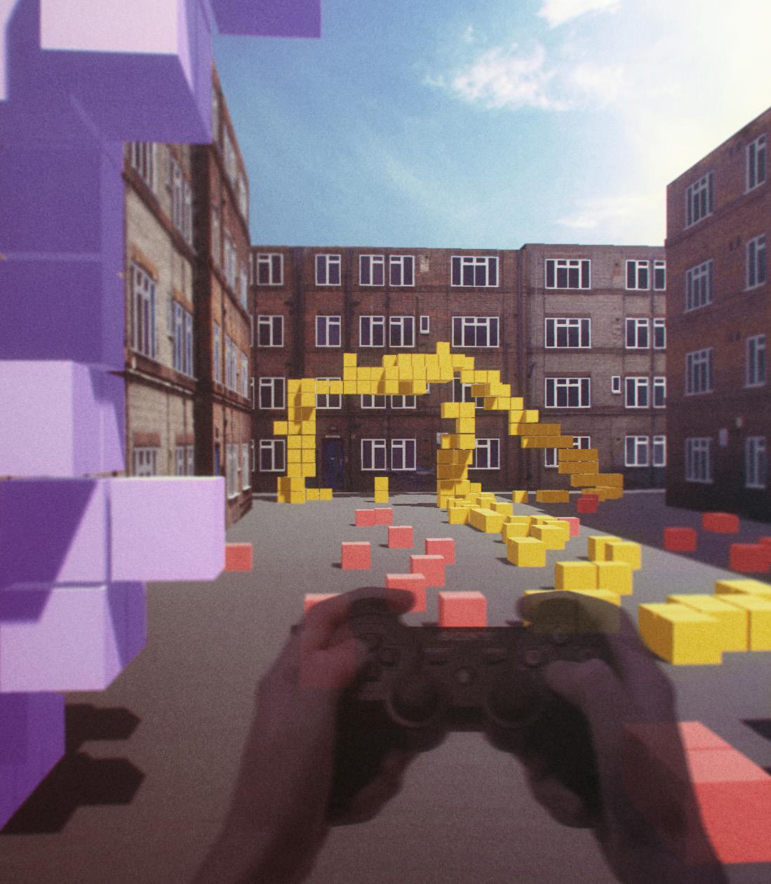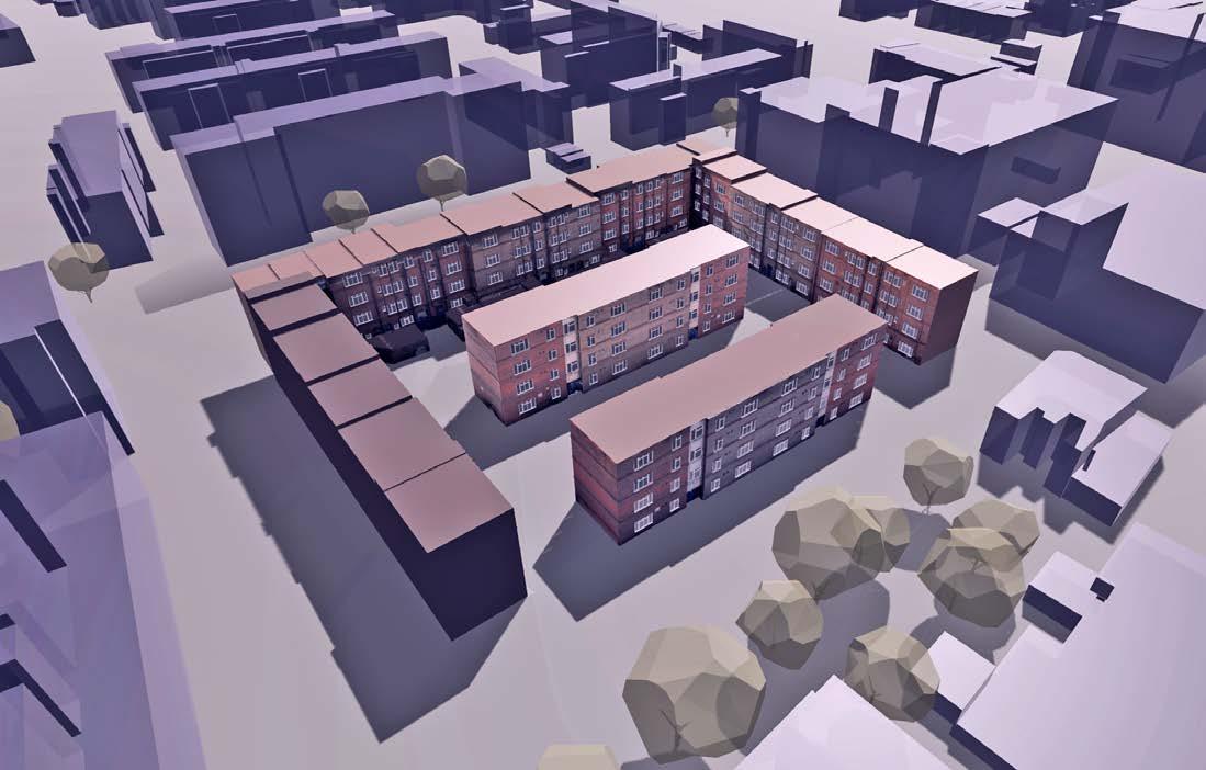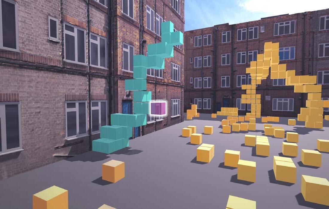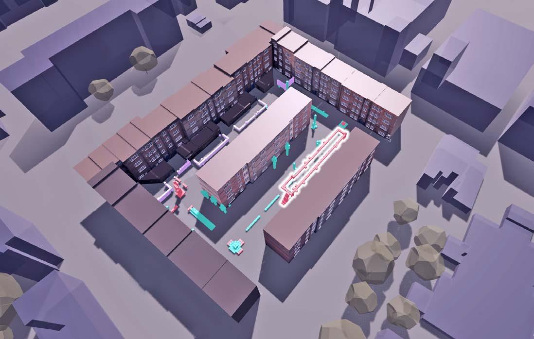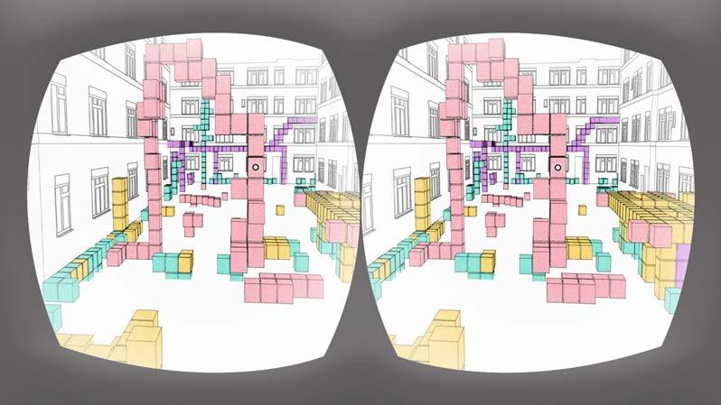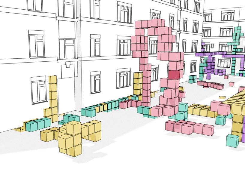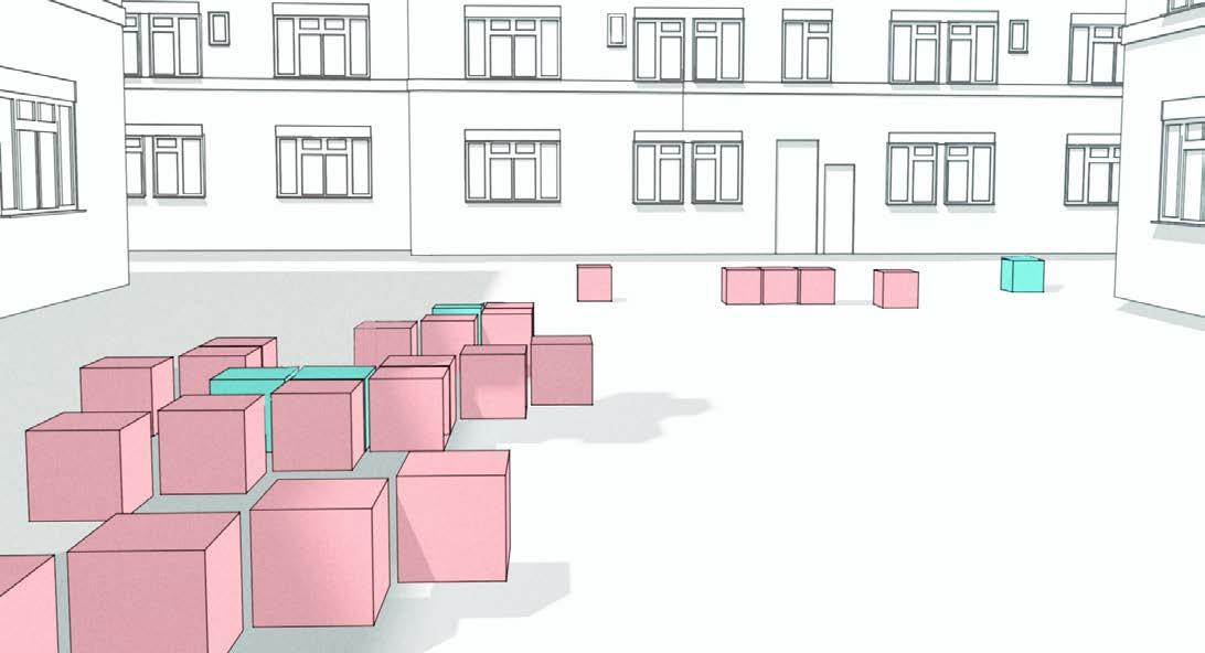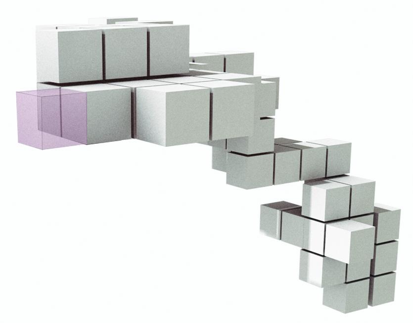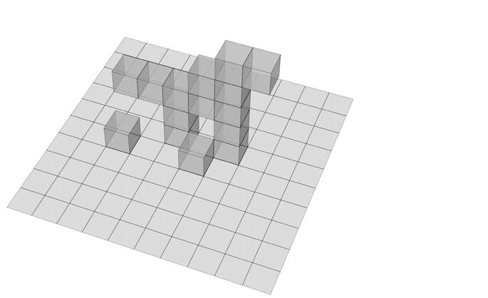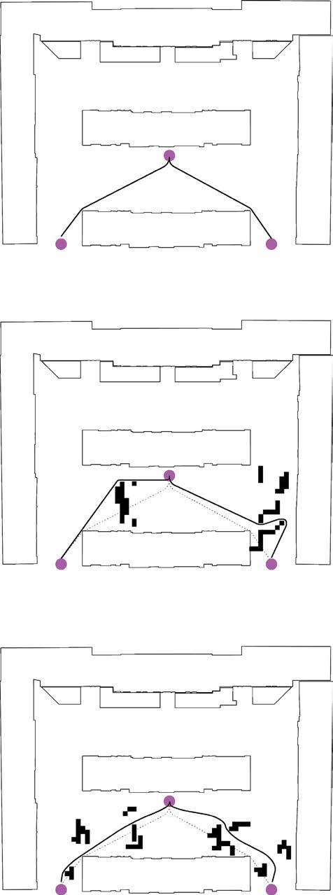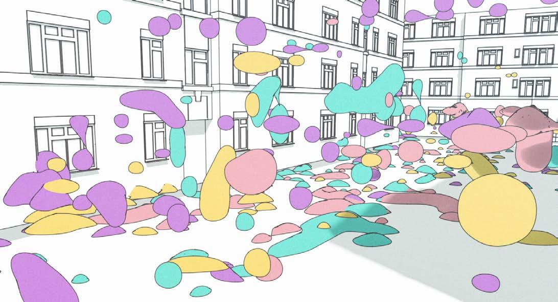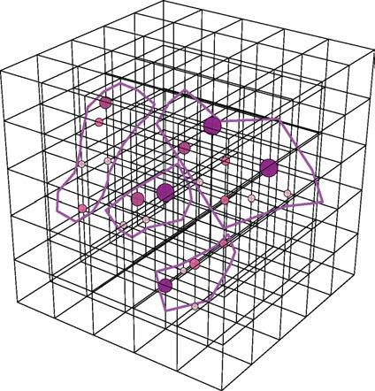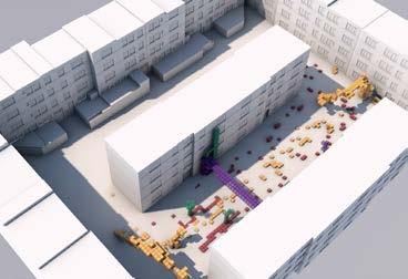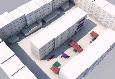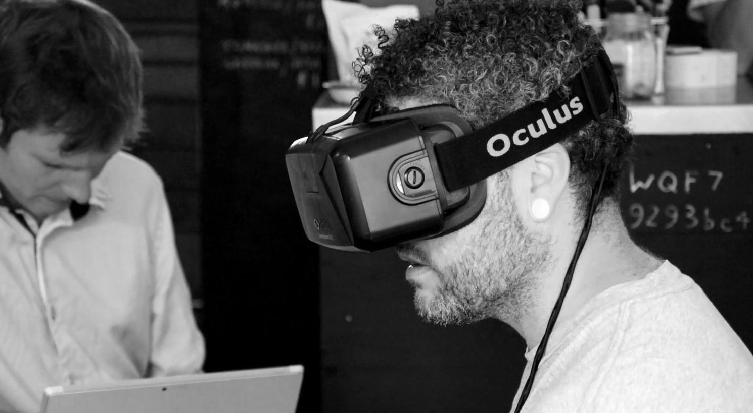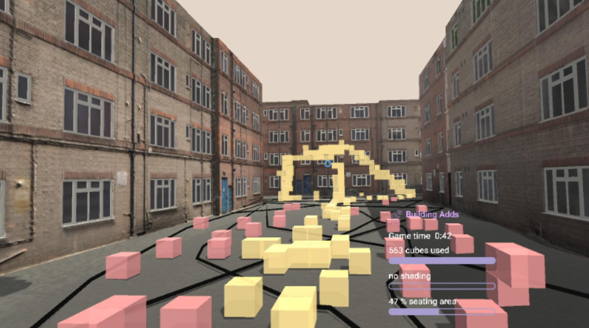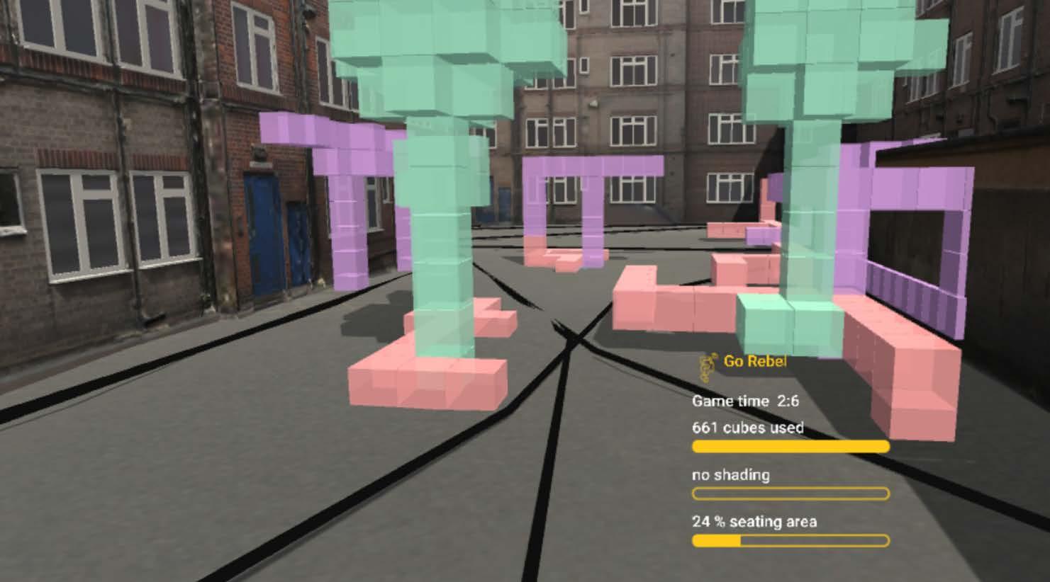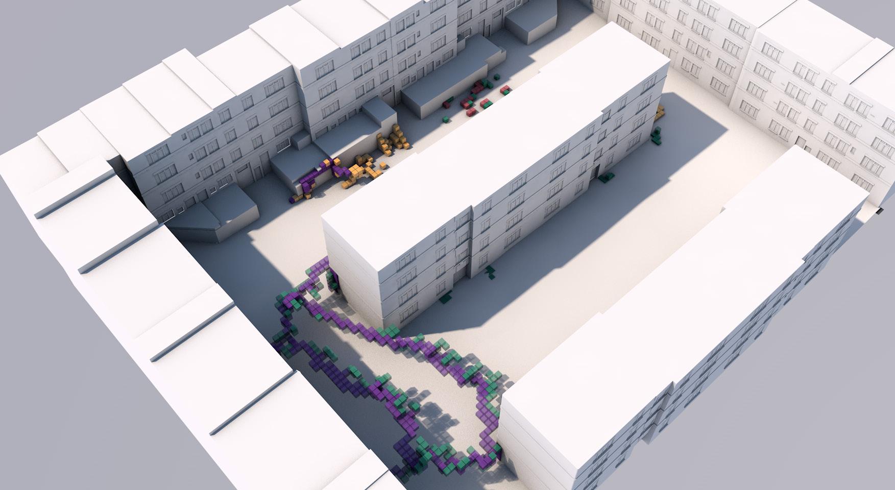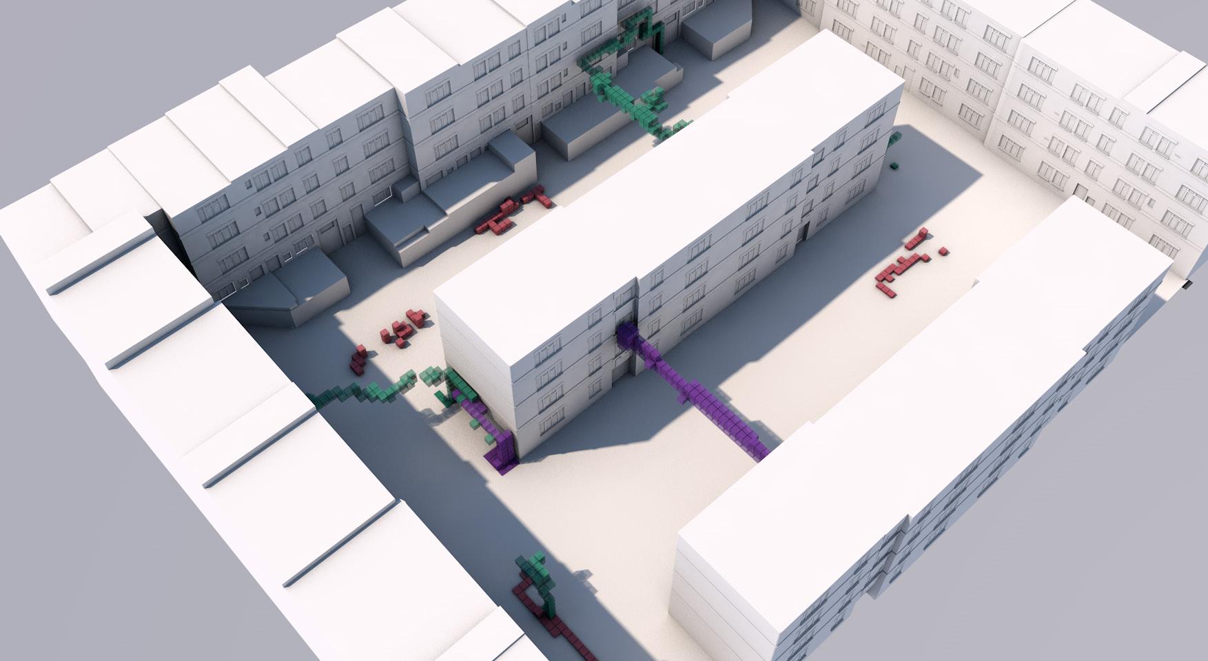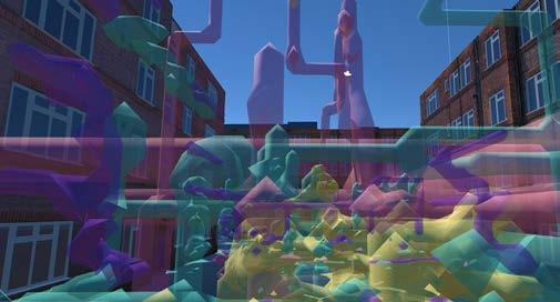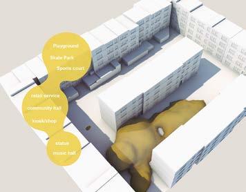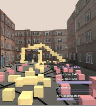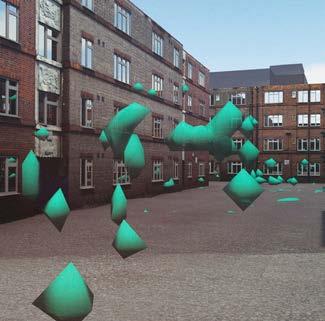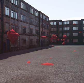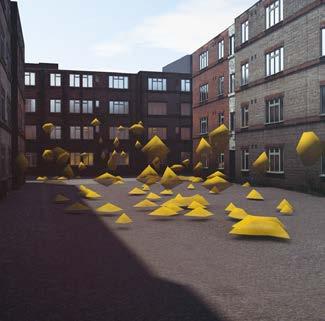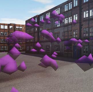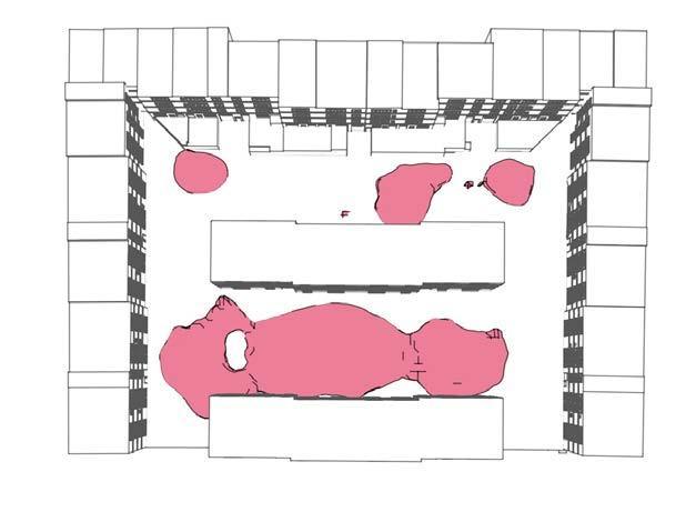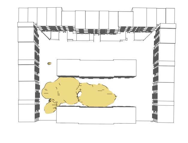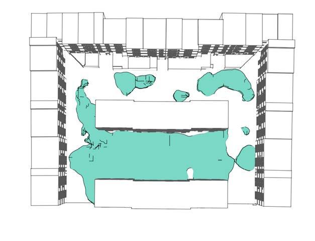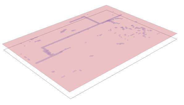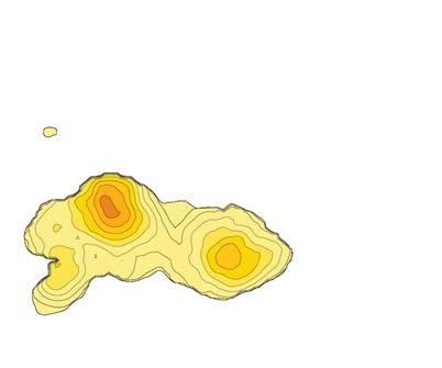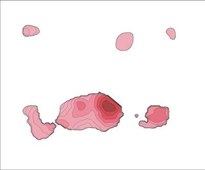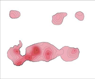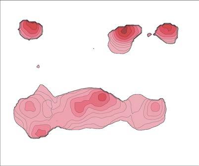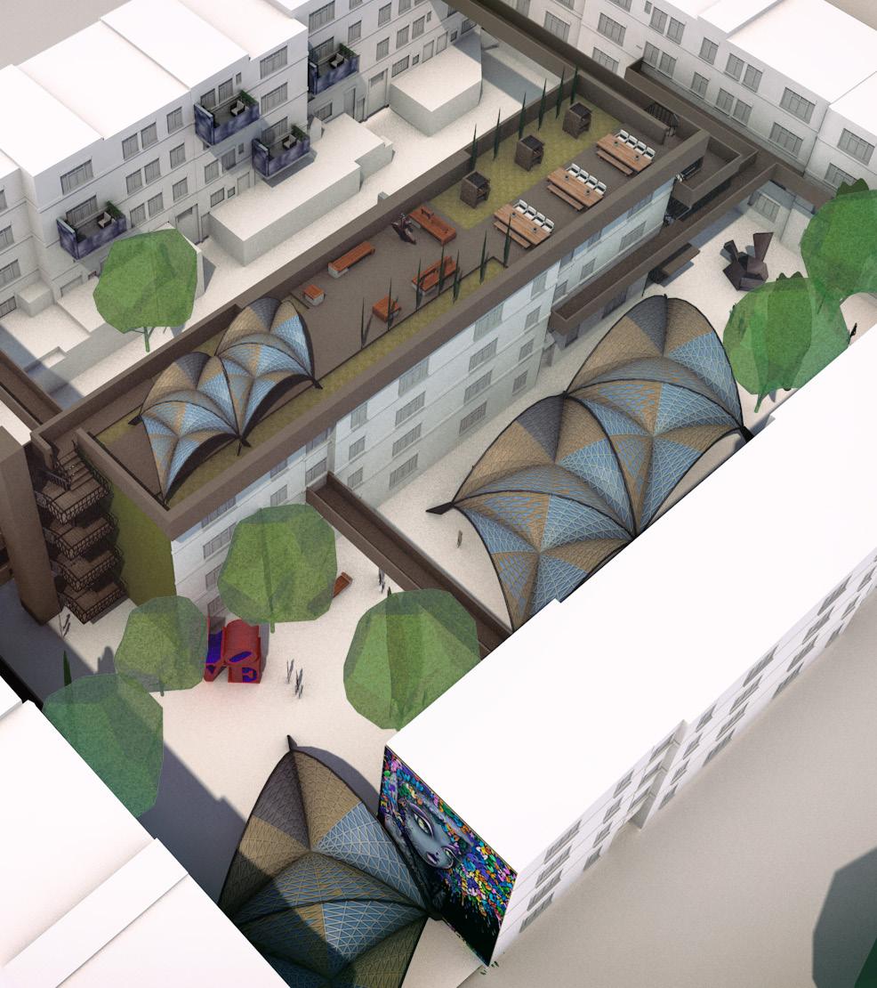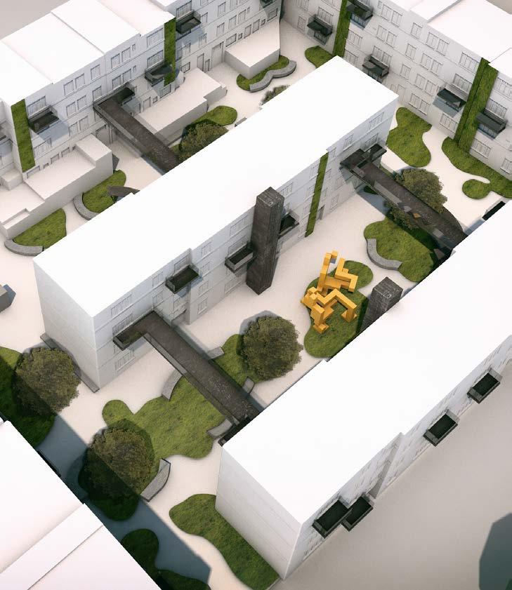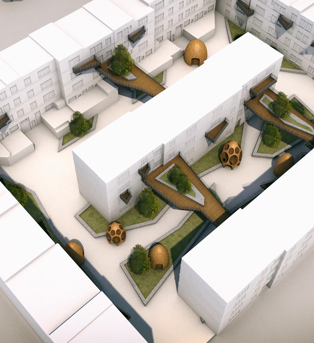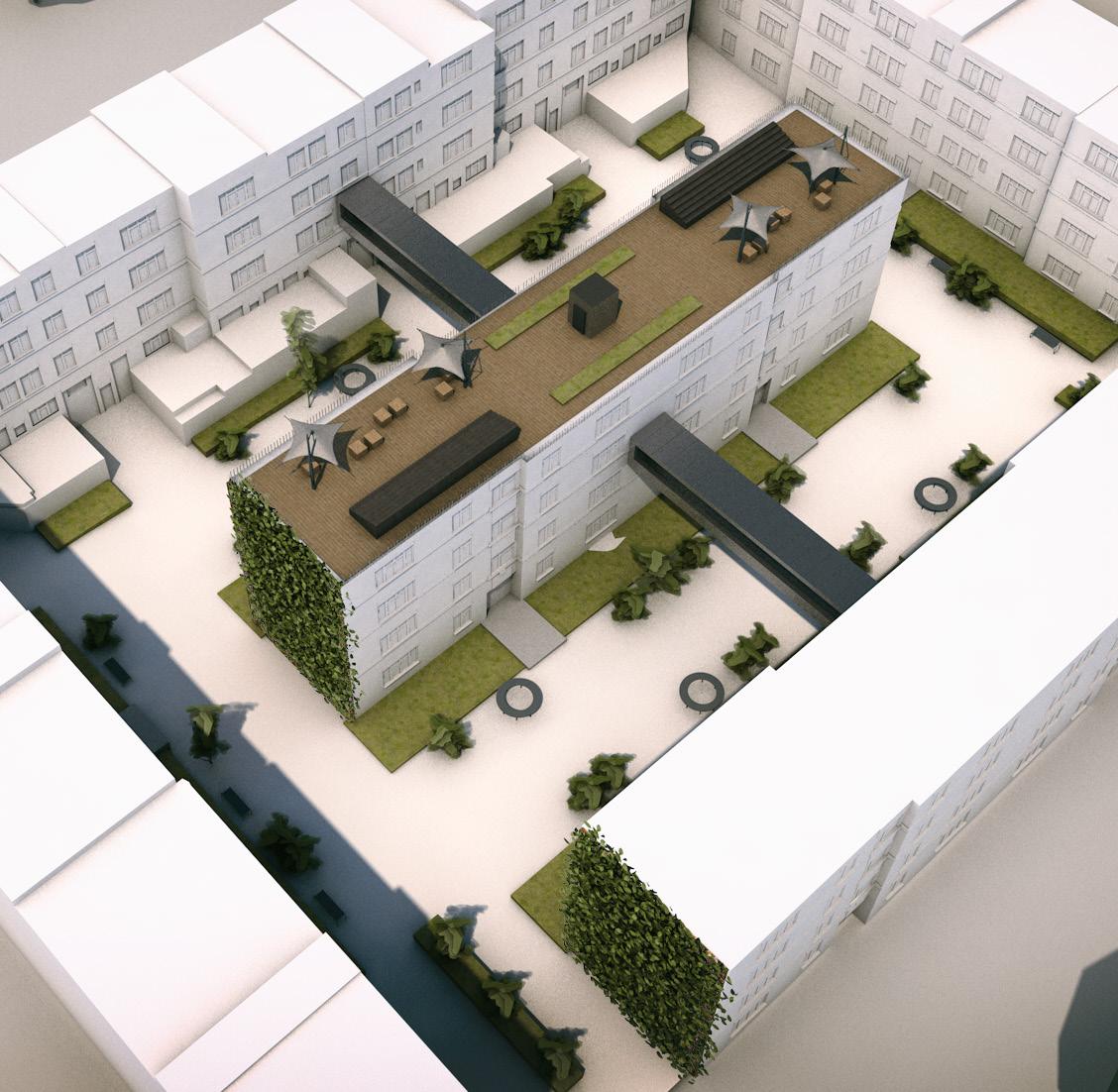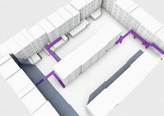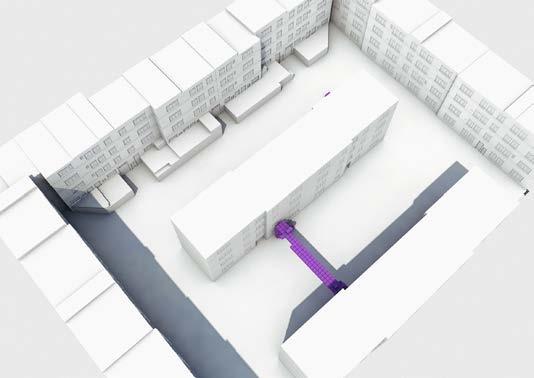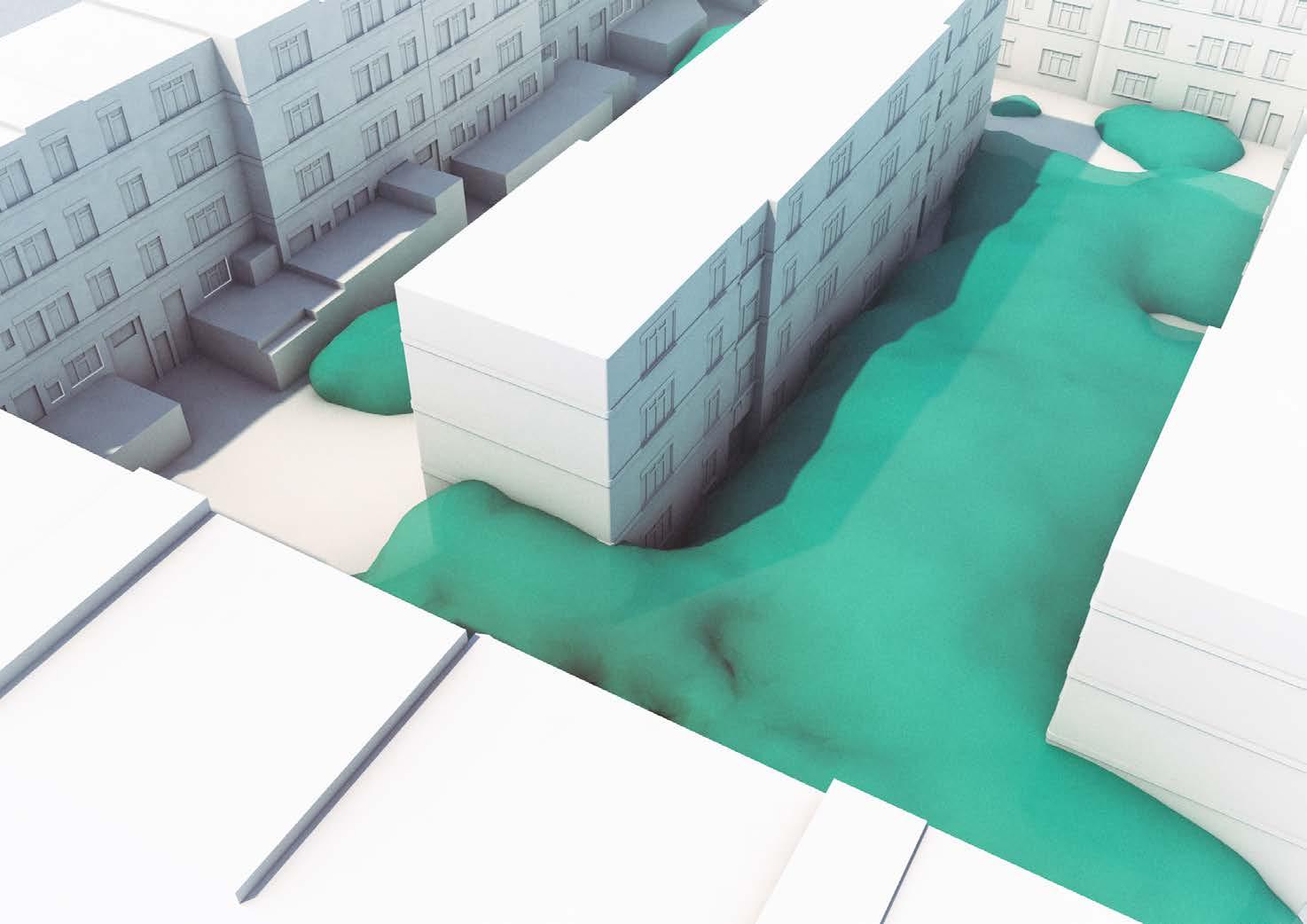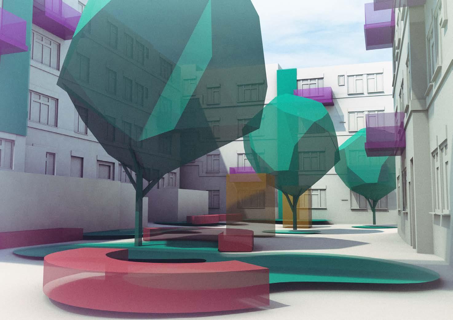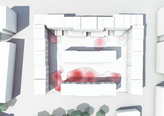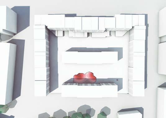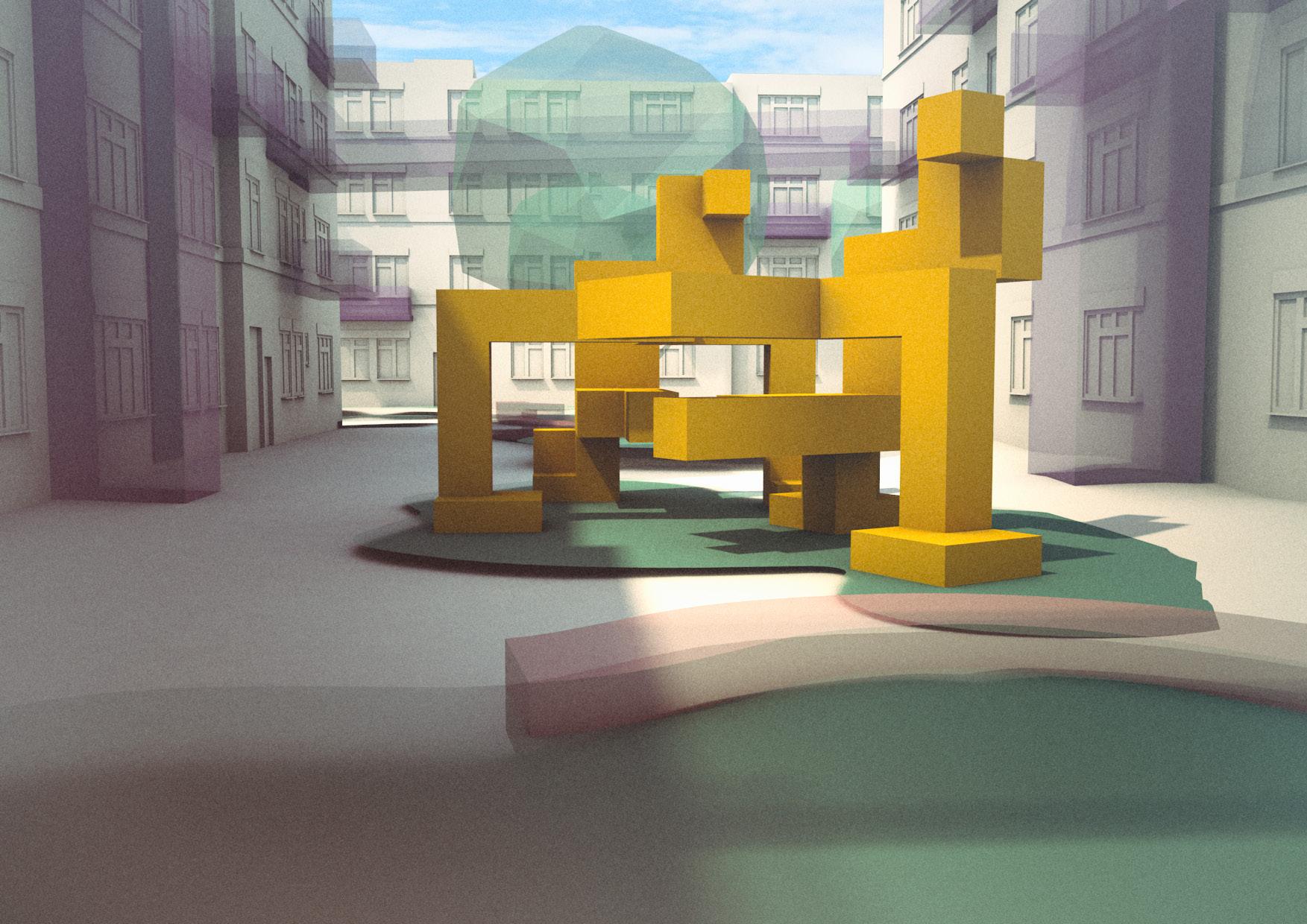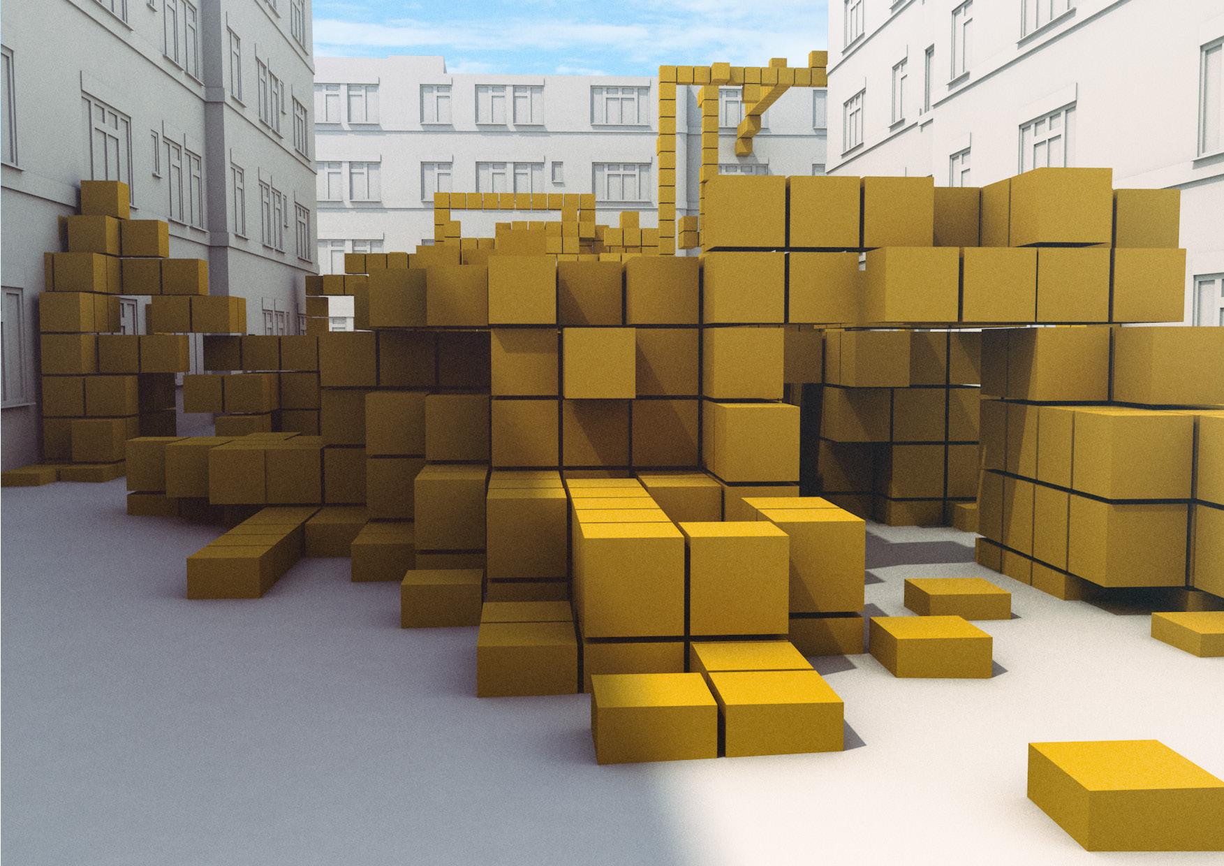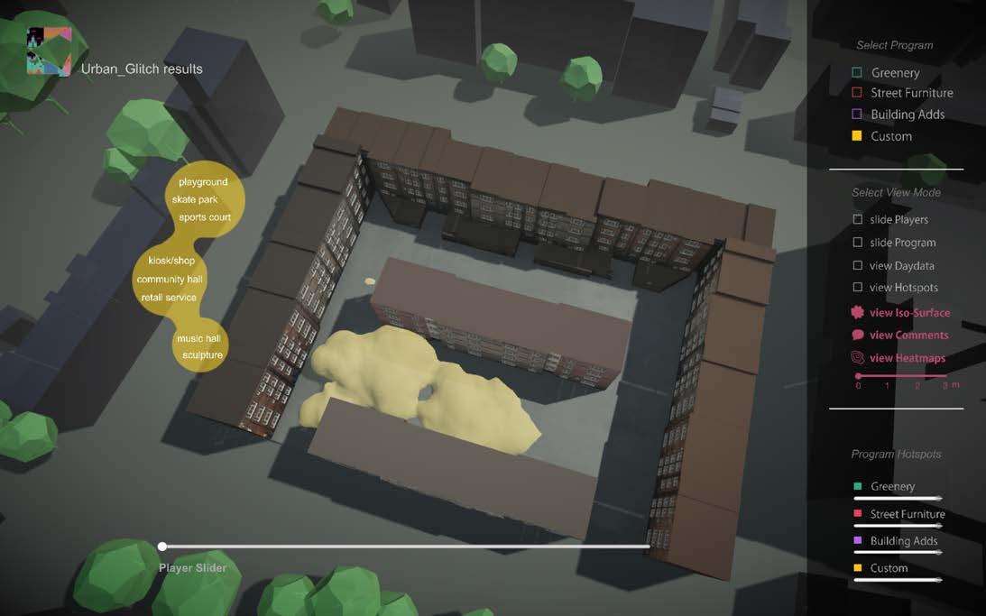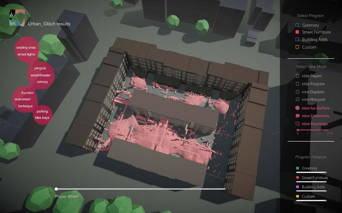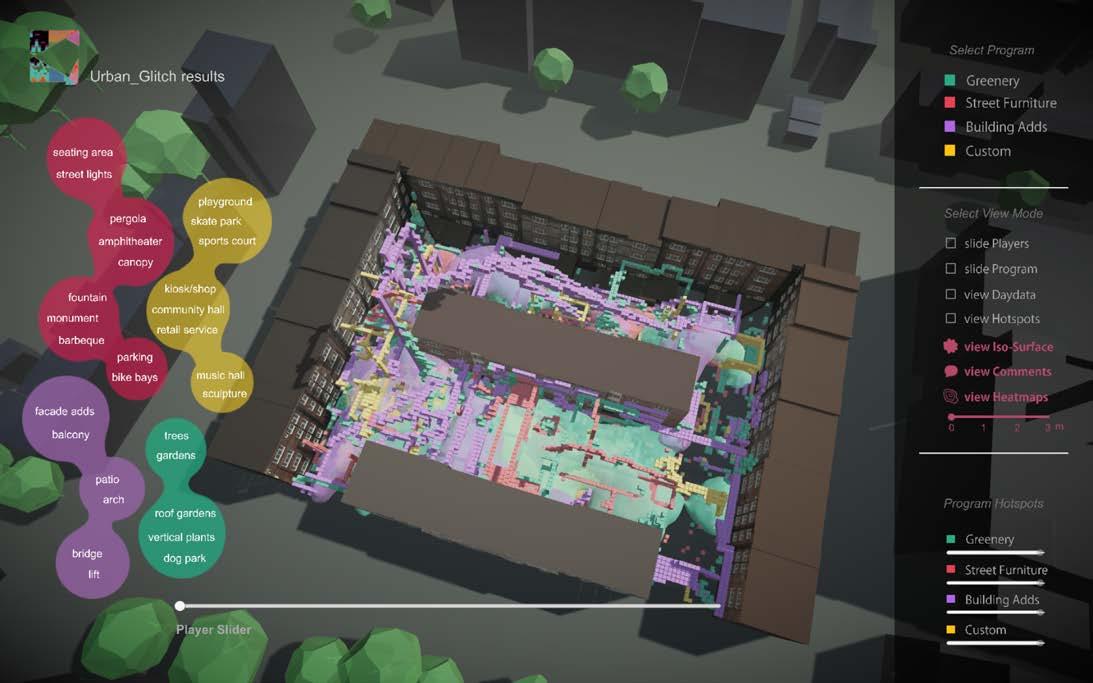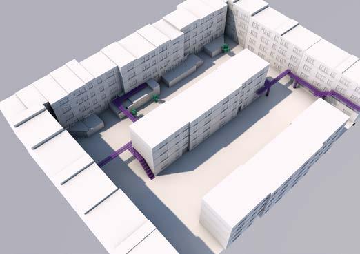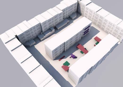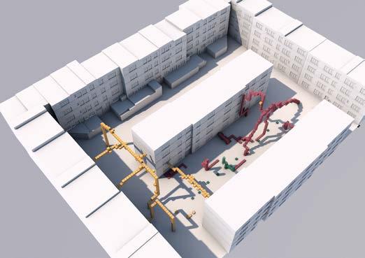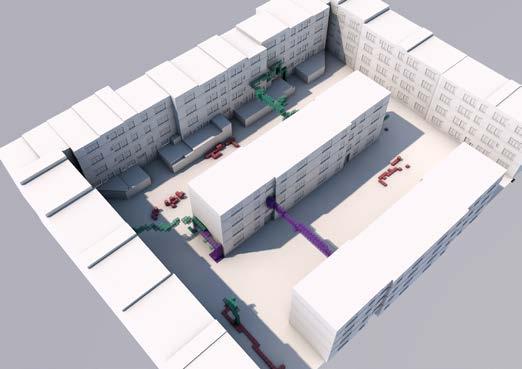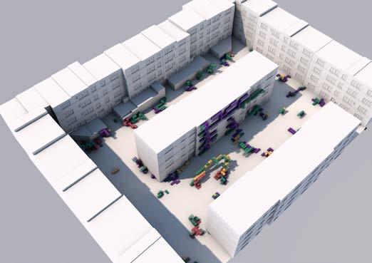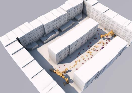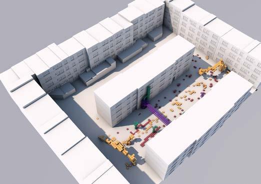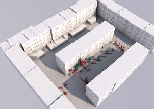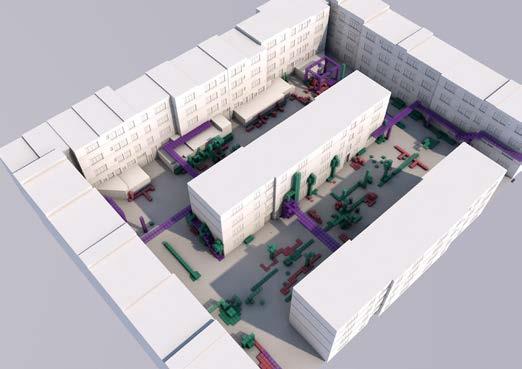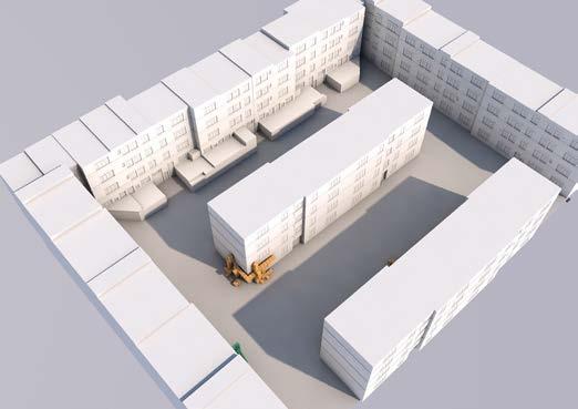
[Urban Glitch] Immersive technologies as a new means of participation Aceytuno | Manousaki | Perea | Polychronaki AA Emergent Technologies and Design [ Individual Contribution & Critical Reflections ]
ARCHITECTURAL ASSOCIATION SCHOOL OF ARCHITECTURE
URBAN GLITCH: Immersive technologies as a new means of participation

GEORGE JERONIMIDIS EVAN GREENBERG ELIF ERDINE MANJA VAN DE WORP
22/09/2017
EMERITUS PROFESSOR FORMER STUDIO MASTER
STUDIO MASTER
STUDIO TUTOR
“I certify that this piece of work is entirely my/our own and that any quotation or paraphrase from the published or unpublished work of others is duly acknowledged”
term
names SUBMISSION TITLE COURSE DIRECTOR COURSE TUTORS SUBMISSION DATE DECLARATION SIGNATURE OF STUDENTS EMERGENT TECHNOLOGIES AND DESIGN 03
ACEYTUNO POCH
-CHRISTINA MANOUSAKI
POLYCHRONAKI
MICHAEL WEINSTOCK PROGRAM
student
MARIA
MARIA
GIOVANNA CAROLINA PEREA ORE ELENI
MSC MARCH MSC
MARCH
We want to express our deepest gratitude to all those who supported us throughout this dissertation and the past year in general.
To our tutors Michael Weinstock, Evan Greenberg, Elif Erdine, Manja van de Worp and George Geronimidis for continuously encouraging and guiding us fulfill our ambitions.
To EmTech’s new tutors Antiopi Koronaki, Alican Sungur and Lydia Badarnah for providing useful advice and introducing fresh ideas in the short period we encountered them.
To our friends and families, for standing by us at all times providing a much needed moral and psychological support.
To our external consultants: George Adamopoulos for the Unity tutorials and timely technical guidance and Francis Aish for the introduction to immersive technologies and the means utilized today.
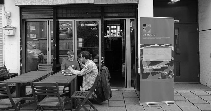
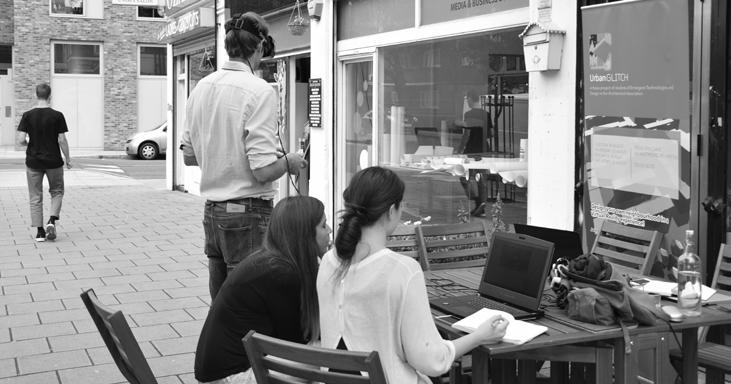
To the residents of New Era estate and fellow EmTech students, as well as our friends for participating in our experiments.
To the staff of Trew Era cafe for hosting our design workshops.
And finally to our boyfriends, for all the patience and chocolate!
acknowledgements
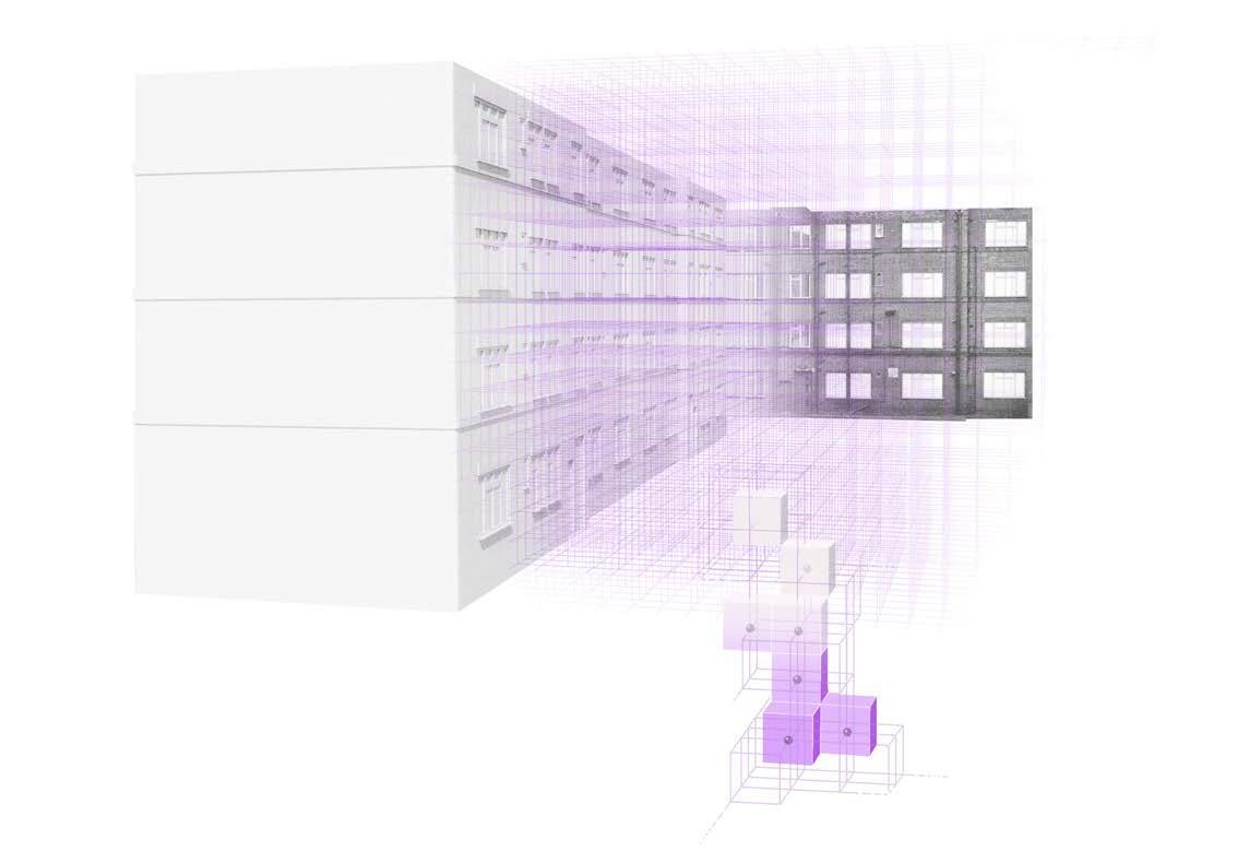
The aim of this research is to examine a new medium of communication between designers and users in an attempt to bridge the gaps in their conceptual and perceptual thresholds concerning space. Our main focus is located on the fields of participatory design, immersive technologies and serious games, while targeting the issue of unused public spaces in high-dense populated cities in general and London in particular.
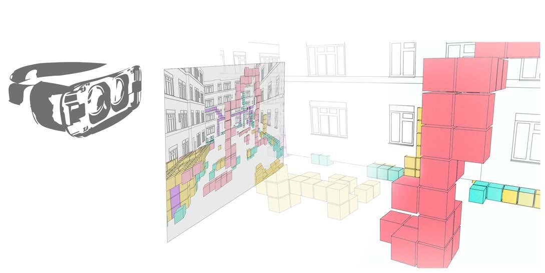
We propose a virtual reality platform (game) that aspires to stimulate users’ imagination and through a modular logic and a series of simple tools, empower them to articulate their opinions for and their desires for public space, in a 3-dimensional manner.
The first set of experiments focuses on matters of spatial and self perception within the game, as well as on the design toolkit available to the player. An additional series of experiments define the levels of contribution of both users and architects during game-time and the formation of the collective factor, as well as an enhanced design of the game features.
The release of the extracted data to a number of architects signifies the first step towards validating the efficiency and applicability of the proposed platform. Rather than propose a blunt manual of “how to”, we aim to explore multiple architectural interpretations of those data. The variety of proposals and feedback from both architects and users will contribute significantly in developing a truly participatory tool.
abstract
table of contents research development 4.1 AIM 4.2 EXPERIMENT A: SITE REPRESENTATION 4.3 GAME DEVELOPMENT 4.4 EXPERIMENT B: VR PLATFORM 4.5 EXPERIMENT C: USER INTERACTION 4.6 CONCLUSIONS introduction domain 2.1 PARTICIPATORY DESIGN 2.2 IMMERSIVE TECHNOLOGIES 2.3 SERIOUS GAME 2.4 UNUSED PUBLIC SPACES 2.5 CONCLUSIONS acknowledgment abstract p. 01 1 2 p. 07 p. 15 p. 21 p. 27 p. 35 methods 3.1 VR PLATFORM DEVELOPMENT 3.2 DATA COLLECTION 3.3 DATA ANALYSIS 3 p. 41 p. 45 p. 47 4 p. 51 p. 55 p. 59 p. 61 p. 69 p. 71 p. 03 p. 37 p. 49
design development 5.1 AIM 5.2 SITE RESEARCH 5.3 SURVEY 5.4 GAME DESCRIPTION 5.5 GAMETIME 5.6 GAME DEVELOPMENT 5.7 DATA OF PARTICIPANTS 5.8 DESIGN RESULTS 5.9 PARTICIPANTS’ FEEDBACK 5.10 CONCLUSIONS 5 p. 75 p. 77 p. 81 p. 89 p. 95 p. 103 design proposal 6.1 AIM 6.2 DESIGN INVITATION 6.3 DATA ANALYSIS 6.4 PROPOSALS 6.5 DESIGN BIASES 6.6 CONCLUSIONS p. 125 p. 127 p. 129 p. 133 6 CRITICAL ANALYSIS 7.1 PARTICIPATORY PROCESS 7.2 ABSTRACTION AND REALISM 7.3 USER DESIGN LANGUAGE 7.4 USER ENGAGEMENT 7.5 COMMUNICATION IN VR 7.6 CONCLUSIONS p. 141 p. 143 p. 145 p. 161 p. 179 p. 193 7 p. 197 p. 199 p. 201 p. 203 APPENDIX BIBLIOGRAPHY p. 209 p. 235 p. 73 p. 139 p. 195 p. 205 p. 207
A common phenomenon of the high dense populated metropolitan cities is the disruption of continuity in the planned urban tissue from un-programmed spaces that can vary from leftover gaps in-between buildings, to either unused or misused public plazas. We identify those spaces as glitches in the urban fabric, arguing that they could possibly (re)gain a role in the urban environment through a participatory user-centric design promoting citizen comfort as well as a feeling of “belonging” in space.
The concept of participation dates back from 1960’s, coupled with a political vision to return the power to the people and an aim to create collectively designed cities (Constant Nieuwenhuys, 1956-1974, “New Babylon”), where the inhabitants are educated by the “experts” and are free to design their own spaces (Yona Friedman, 1958, “Architecture Mobile”). In recent years, participatory design has been based on a productive dialogue between the architect and the users and its success vitally relies on the right translation and combination of the users’ needs and perception of the space by the architects towards a design solution (Save the Old Spotted Dog campaign, 2014, London).
At the same time, the recent technological accomplishments in visualization devices of immersive reality (VR, AR, MR) are becoming more and more accessible to the public (Google cardboard glasses, project Tango mobile phones, etc.),
opening up new possibilities in the experiential field and providing the means for the user to be immersed in digital platforms. The initial steps towards user engagement through those devices have already taken off, both in terms of experiencing virtual environments and interacting within them, as well as in simply overlaying virtual objects/ information onto the existing.
Moreover, gaming and game interfaces are progressively being accessed by the architectural community as means of interacting with users and communicating their spatial intentions.
In this chapter, we will present three fields of research: participatory design , immersive technologies and serious games and examine the case of London in terms of unused public spaces. Our aim is to map the aspects that will contribute to the development of this dissertation as well as articulate our main research question.
1 | URBAN GLITCH : Immersive technologies as a new
of participation
means
INTRODUCTION 1
3 | URBAN GLITCH : Immersive technologies as a new
of participation
means
2.1 participatory design
2.2 Immersive technologies
2.3 SERIOUS GAME
2.4 uNUSED PUBLIC SPACES
2.5 Conclusions
| 4
DOMAIN 2
2.1 DOMAIN | PARTICIPATORY DESIGN
INTRODUCTION
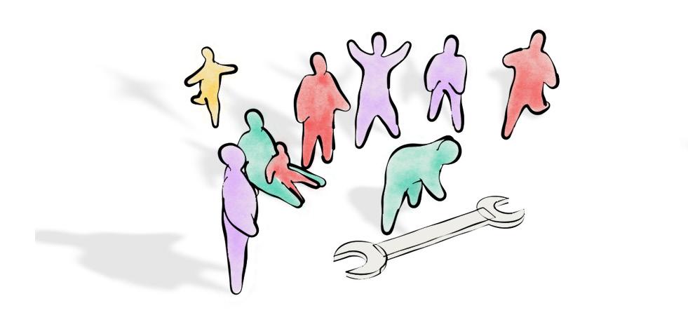
The term participatory design first appeared in the 1960’s and it was strongly coupled both with the sociopolitical attributes of the time, as well as with the technological bloom that followed in the post-war era. Essentially, the aim was to engage the users into the design procedure, as a means to directly address their spatial needs, seeking urban sustainability and a more democratic social order. However, the blurring of the lines between the revisited roles of the “user” and the “designer”, as well as the medium -technological or analogical- that would accommodate their communication, rendered the definition of participatory design loose and mutable, a characteristic that remains until today.
The most important issue in participation has always been the communication between the designer/expert and the user/non-expert, with technology always being a barometer in the formation of this relationship. With the central question persistently being: how to engage users in the design procedure, several models of how participatory design should be, have been proposed through the years such as: the thermostat model by Charles Eastman (Eastman 1972), the menu model by Yona Friedman (Friedman, 1958) and the surrogate self model by Nicolas Negroponte (Negroponte, 1970). Regardless of the specifics of each
theory, the center of attention is concentrated in the medium to express and transfer spatial ideas between the two parties in a way that the voice of the non-expert public is heard and their ideas are actually applied in the final solutions.
The initiatives for participation can either derive from grassroots communities, government/private funded programs or architecture firms choosing to approach a project in a collective way. However, the ways in which the users participate and the amount of design freedom they are entitled to in their choices, can vary from project to project and is defined by the experts themselves. It goes without saying that a crucial part of such projects is the stimulation of communal concern, as participation is a long process of intense interaction and requires the persistence of the users. Uninterested users cancel out the whole purpose of participatory design. The main challenge for success is to maintain the comfort zone of the users in the way they are called to make spatial decisions, while at the same time they feel that their opinion is actually taken into consideration.
5 | URBAN GLITCH : Immersive technologies as a new means of participation
Figure2.1.0.1 Toolsforparticipatorydesign [Urban Glitch]
The research of D. Di Mascio and R. Dalton (Di Mascio, Dalton 2017) comes to enlighten the process of communication in participatory design, as well as highlight the issues that affect the interaction between designers and users and assort them in five categories: communication, content, tools, role and phase (Fig. 2.1.0.2).
The first three categories are somehow intertwined, as they refer to the specifics that establish the aforementioned interaction. It is important to set out the way information is communicated between all parties involved and this happens only when the right tools are utilized and the appropriate content is created. The tools refer to the different visualization techniques and methods that enable the stakeholders involved express themselves and their ideas. However, due to the core difference in the way architects and users perceive space, it is often rather hard to create a common ground/content in their exchange of ideas.
Users’ conceptual ability of space (its limits and its possibilities) is usually constrained in what they already know, meaning that it is quite possible they are unable to free themselves from immediate reality and wish for something different, let alone articulate that wish to themselves or others. Architects on the other hand are
used to work in an abstract notion of space. Consequently, regarding space, the different perceptual and conceptual thresholds between designers and users generate a complex challenge for their communication, especially when they are called to work together.
Another important factor is the clear definition of the roles each party holds in the decision making process. Users possess information about a specific place deriving from personal experiences, something that architects lack. On the other hand, the experts are responsible for educating the laymen/users for spatial matters, enhancing their understanding of the build environment and raising awareness towards architectural and planning issues. Finally, something else that requires attention is the definition of the phase in which participation will occur. It is crucial to clarify upfront the stage(s) and the ways in which the public will be involved.
In the following pages, a series of case studies are examined aiming to identify the ways in which the communicational issues were approached, concluding in a critical reflection of how those methods could be improved and/or combined.
| 6
PARTICIPATION ISSUES content tools role phase communication
Figure2.1.0.2 ParticipatoryDesigncategories (redrawn) [D. Di Mascio and R. Dalton1]
case studies
2.1.1 LAMLASH GARDEN, LONDON, UK (2015)
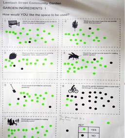
Lamlash Garden is one of the 100 Pocket Parks initiative part of the Mayor’s London’s Great Outdoors. The street was an unmaintained road with scarce traffic flow and bad condition footpaths, a favoured dumping ground in between dwellings (Available at www.lamlashgarden.co.uk).
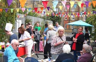
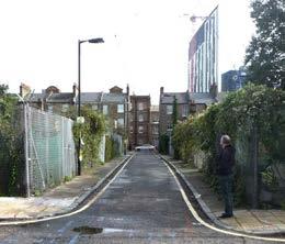

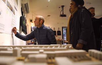
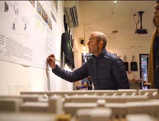
The proposal aimed to re-vitalize the place with a design developed through community meetings and workshops where on-spot sketches, surveys and physical models were shaped thanks to one architect’s involvement to achieve a common and accepted by all proposal.
The success of the project relies on the attractiveness of the space along with the frequent calendar of activities that take place on site.
7 | URBAN GLITCH : Immersive technologies as a new means of participation
Figures2.1.1.1[top],2.1.1.2-5[bottomfromlefttoright] Lamlash Street Garden construction [FriendsofLamlashStreet,FacebookPage]
2.1.2
ADAPTIVE
BDD CHAWLS, MUMBAI, INDIA (2016)
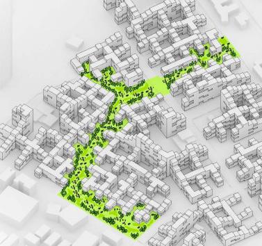
BDD Chawls is an overpopulated area result of unplanned dwellings of the textile mill activity workers (Chaugule, 2016).
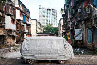
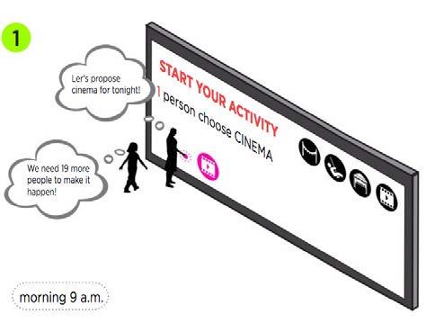
The Adaptive Neighbourhood project thesis of the IaAC investigates the re-configuration of the space using a responsive system that will enable residents to modify the public space according to their needs and activities.
The system will be imputed with both citizen decision and real-time data collected from traffic and pedestrian flows and weather conditions to provoke an architectural response.
Given the academic nature of the project, a participatory event to experience the outcome using Virtual Reality glasses was undertaken to allow residents evaluate the proposal.
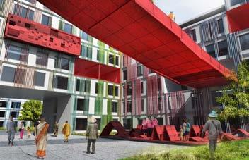

Figures2.1.2.1[top],2.1.2.2-5[bottomfromlefttoright]
AdaptiveNeighbourhood,BBDChawls,Mumbai,India
[source:http://www.iaacblog.com/programs/adaptive-neighborhood-for-responsive-city/]
| 8
NEIGHBOURHOOD,
case studies
and greener (Chan Ahn, 2015). This was the case of an abandoned lot near the Sung-Seo elementary school.
The graduate program Urban Design at the Seoul National University prepared a collective design process through games such as the ‘Paper Kit for Park Design’ including a map and some kinds of items sheets, such as trees and paving patterns were placed in a blank canvas for the students to add their ideas.
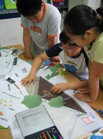
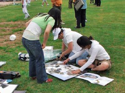

Eventually in the feedback step, realistic design drawings were provided by the designers for the participants to evaluate.
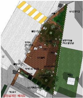
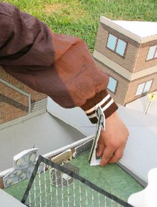
Figures2.1.3.1[top],2.1.3.2-5[bottomfromlefttoright]
Sung-SeoPocketPark,Seoul
[source:http://courses.washington.edu/quanzhou/pacrim/papers/Ahn-Park-paper.pdf]
9 | URBAN GLITCH : Immersive technologies as a new means of participation
the area. The architect provided a basic infrastructure and the user was asked to further expand it, according to his needs. The framework was mainly supporting rather than constraining, so that negative effects of self-construction were avoided. As for the built part, it included spaces that a non-expert would never be able to achieve on his own, such as the kitchen, the bathroom and stairs.
In this example it seems that the architect sets a series of parameters, so that the user can be both protected and free to create his own space. The expert’s contribution was to provide safe housing to low-income families and in extension, to overcome poverty. (Available at: http://www. elementalchile.cl/en/projects/quinta-monroy)
2.1. DOMAIN | participatory design
Figures2.1.4.1[top],2.1.4.2-5[bottomfromlefttoright]
QuintaMonroyhousinginChile
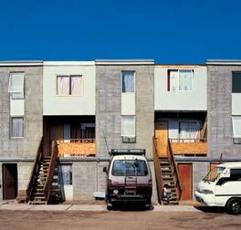
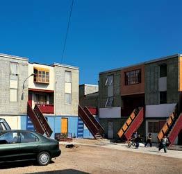
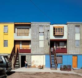
[source:http://www.elementalchile.cl/en/projects/quinta-monroy/]
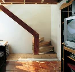

| 10
case studies
objective was to upgrade the social conditions of the area, which lacked public services, such as healthcare, affordable education, sanitation and electricity. Furthermore, a drug issue critically affected the high unemployment, violence and crime rates of the community.
This project aimed to incorporate the citizens’ opinion in the design process through interviews, workshops and public meetings. As a result, there was a year-long preparation period, which allowed the team to design and build the structure in three weeks. The construction’s simplicity and repetitive logic empowers the residents to make refinements and adaptations that follow their changing needs. This collective design process allows for the enhancement of the area, adapted to the users’ needs and preferences. (Available at: http://www.tyinarchitects. com/works/klong-toey-community-lantern)
KlongToeyCommunityLantern
[source:http://www.archdaily.com/212214/klong-toey-community-lantern-tyintegnestue-architects]
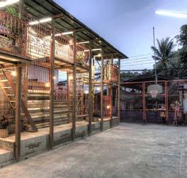
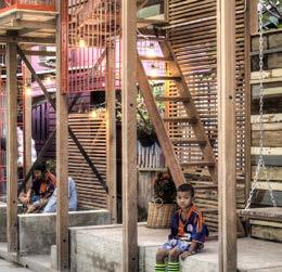
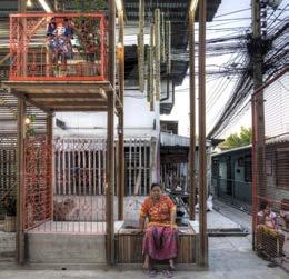
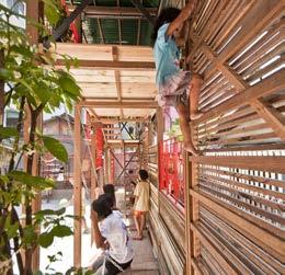
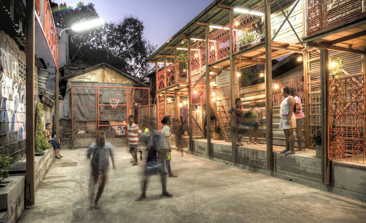
11 | URBAN
:
GLITCH
Immersive technologies as a new means of participation
Figures2.1.5.1[top],2.1.5.2-5[bottomfromlefttoright]
/ SPORTS
Santa Barbara Runaway Pavilion is another example of participatory design, which aims to portray and privilege the aesthetic quality of air in Santa Barbara; blur caused by heat and beach fog are two phenomena that characterise the area. The installation refers mainly to art and it is considered as an urban decorative setting.

In this case the architects have created three simple self-similar geometries that have a variety of possible orientations; these positions can provide shading, separation, sitting or a performance stage. The user actively engages by changing their location and orientation, which results in various spatial compositions. Furthermore, the matrix objects are finished with brightly-coloured paints, which eventually creates a vibrantly saturated visual experience. (Available at: http://www.sportscollaborative. com/#/runaway/)
2.1. DOMAIN | participatory design

| 12
Figures2.1.6.1[top],2.1.6.2-5[bottomfromlefttoright] PhotoinsiteRunawaySantaBarbaraPavilion&Experimentswithphysicalmodels. [source:http://www.sportscollaborative.com/#/runaway/]
2.1.7 DOMAIN | participatory design conclusions


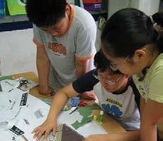
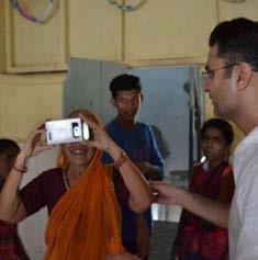
The first three cases (Fig. 2.1.7.1) were examined focusing on the specifics of the communication between architects and users, as well as the tools used to achieve it. While in Lamlash Pocket Garden, more traditional methods were employed (surveys, sketches, physical models), it is rather interesting to observe, in the Adaptive neighborhood BDD Chawls and in the San-Geo pocket park, the success of tools more akin to other fields, such as gaming and immersive platforms (VR,AR). Such initiatives lay the foundations for a more comprehensive content of participation and open up a field of research aiming to explore whether the technologies of other domains can facilitate the bridging of the perceptual and conceptual gaps between experts and non-experts.
The following three examples (Fig. 2.1.7.2) focus on the clarification of the role between the participants (architects, users) as well as the stages in which each of them actively engaged to the project. Both in Aravena’s incremental housing and in the Santa Barbara Runway Pavilion, the architects almost holistically lead the design process. In those examples the users were given the opportunity to either personalize/finish an already designed structure according to their needs, or merely interact with predefined spatial modules and reconfigure their position. Although these cases may reflect the architects’ intention to relief users from matters incomprehensible to them regarding space and architectural design, one might deem them
13 | URBAN GLITCH : Immersive technologies as a new means of participation
PARTICIPANTS community members and architect PLACE unmaintained street PARTICIPANTS community members, university and trust PLACE abandoned lot i. iI. iII. IAAC TOOLS survey, [design at IaAC] and 3D virtual proposal TOOLS informative talks, design i. iI. iII. workshops and sketched proposal i. iI. iII. TOOLS informative games, design workshops and sketched proposal COMUNICATION PLACE PROJECT CONTENT / TOOLS PARTICIPANTS community members and university PLACE unplanned neighbourhood
[Urban Glitch]
Figure2.1.7.1 Comparativediagramofcollectivedesigncasestudies
2.1. DOMAIN | participatory design


ROLE / USER ROLE / ARCHITECT PROJECT PHASE
provides an infrastructure, a basic design
add to the architect’s design according to their needs
participation occurs after a significal part of the project is completed solely by the architect

works together with the community: meetings, interviews etc
actively participate and express their opinions during the design procedure
participation occurs during the longest part of the project / direct interaction and involvement
creates a spatial arrangement of modular elements
as overstepping and disregarding non-experts ability to engage in design. In the Klog Toey community lantern on the other hand, the residents participated in the planning process throughout the whole project and all stakeholders were devoted to achieve a fruitful communication and a commonly approved final result. Considering that laymen cannot really be devoted when they do not understand the levels of a project, it always fall on the architect-expert to hold the role of the organizer and estimate the situations/ issues that may occur along the way according to that responsibility.

interact with predesigned spatial elements
participation occurs after the design is complete in the form of spatial interaction

| 14
INCREMENTAL
COLLECTIVE
INTERACTIVE
Figure2.1.7.2 Comparativediagramofparticipatorydesigncasestudies [Urban Glitch]
2.2 DOMAIN | immersive technologies
INTRODUCTION
Immersion is a perception of being physically present in a non-physical world. Immersive technologies refer to the tools that blur the lines between the physical environment and the simulated world. They consist of several tools, such as Virtual Reality, Augmented Reality, haptic technology and tele-immersion. The perception is created by fooling the five senses through panoramic 3D digital displays (visual), surround sound acoustics (auditory), haptics and force feedback (tactile), smell replication (olfactory) and taste replication (gustation); thereby the user perceives the digital environment and stimuli to be physically real (Varney, 2006).
An immersive digital environment is an artificial, interactive, computer generated world and it could either be a representation of reality or a complete imaginary abstraction, as long as the user is engrossed within it. After the senses reach a sufficient level of being fully integrated to the digital environment, the user should be able to interact with it in a natural and intuitive manner. Gestural controls and motion tracking tools respond to the user’s gestures and movements, giving him the opportunity to communicate with the virtual world (Grau, 2007).
Immersive tools have been widely applied in the architectural field. The immersive design process attempts to portray
two entwined tasks. Initially, it tries to create a coherent world, with an interior logic and allow the user to be fully immersed in both environment and story. Furthermore, it creates a collaboration between the creator and the user, thereby broadening the potential design outcomes and creating a more user-centric approach. Although these tasks have always existed in the architectural world, immersive technologies have facilitated the engagement of the user in the design process and have allowed for his interaction and manipulation of the three-dimensional space.
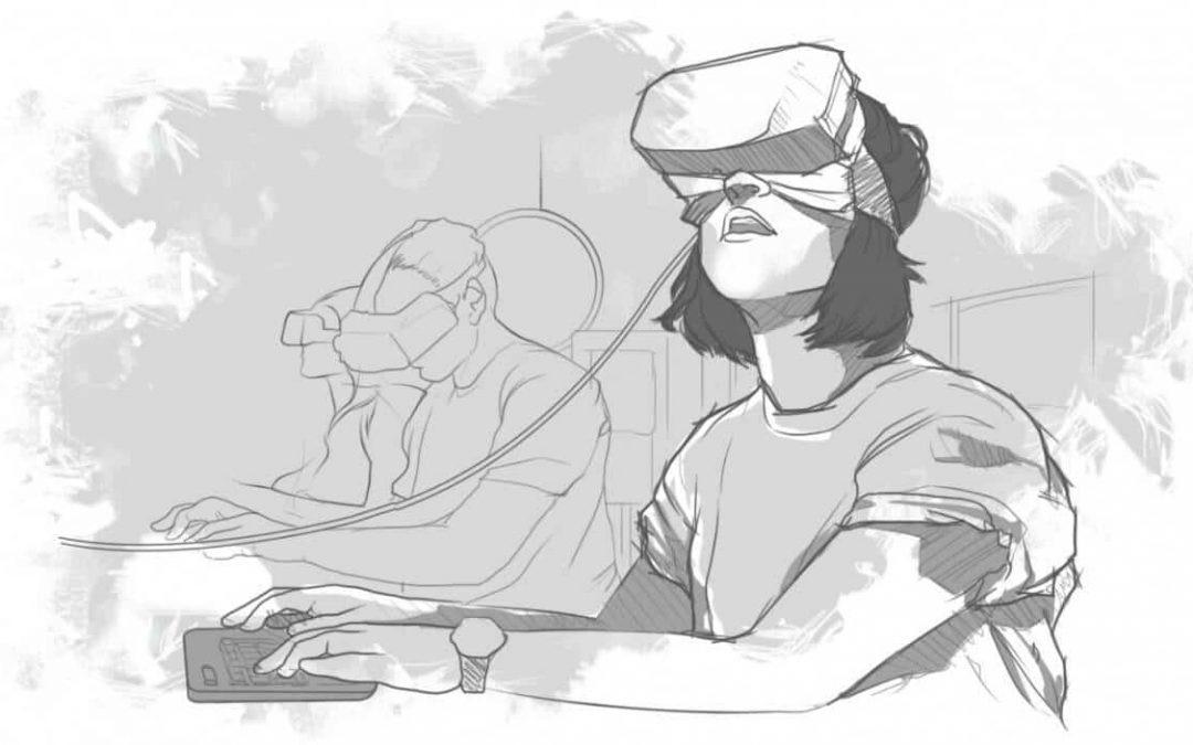
In our thesis project we are focusing on Virtual Reality simulations, where the user interacts with a completely fabricated, virtual world. Our objective is to create a realistic environment without forcing the user to physically move. Additionally, we want to be able to carry out the experiment without being in the actual site, which makes a Virtual Reality platform better able to assist our needs.
In the following case studies several techniques of utilising immersive technologies will be portrayed and analysed. Out of these paradigms we will extract information that is beneficial for the development of the VR platform at a later stage.
15 | URBAN GLITCH : Immersive technologies as a new means of participation
Figure2.2.0.1 VirtualRealitysketch [source: labster.com]
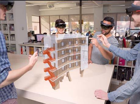
and visualise, as well as interact with holograms in this environment.
The main idea that is being articulated in this initiative is a deeper understanding of the design and an enhanced communication between the architect and the client. Getting from the screen into physical space becomes easier and more direct. Design solutions and construction details can be visualised at any stage of the project, thereby allowing the creator to take decisions. With Sketchup viewer the design can be experienced in the most natural way; the user can either interact with holographic models or fully immerse himself in the 3D project. Microsoft Hololens attempts to bridge the gap between 2D, 3D and physical space.
This approach is both user- and designer-centric, focusing actively on the method that an architect can communicate his work through a highly realistic experience to the client. This means of communication is an asset for our project, as our goal is to create a tool that will facilitate the process of designing for a non-expert user. In addition, the benefit of visualising the environment in an immersive experience is that it creates a common language for the user and the architect.
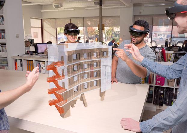
| 16
Figure2.2.1.1 Trimble’sSketcupviewerforMicrosoftHololens [source:https://www.sketchup.com/products/sketchup-viewer/ar]
case studies
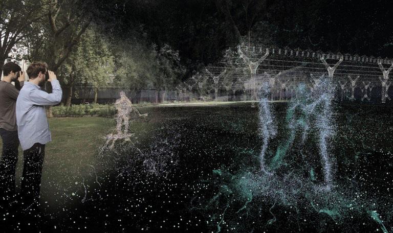
Another way to utilise immersive technologies in architecture is as a scanning and recording process, to keep track of a design that will change in the future. This is what some students proposed in the Palimpsest project in UCL (Torisu, Tveito, Beaumont 2016). In this way, various versions of the city could exist simultaneously and could be experienced. Both past and future scenarios would be visualised in the digital platform, which gives the opportunity to all the parties that are involved in the project, from communities to government bodies to put forward ideas and compare a variety of proposals with higher accuracy.
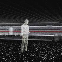
Immersive technologies have become a means of communication between not only various groups of people but also between various chronological periods. This approach is user-centric, allowing the users to raise debates and express their opinion about future plans of the urban fabric. In our project we are following the same technique to scan the urban patch that interests us and record it in its actual condition. We are aiming to create a highly realistic model in order to enhance the chances of the user immersion in the Virtual Reality experience.
17 | URBAN GLITCH :
a new
of participation
Immersive technologies as
means
Figure2.2.2.1 Palimpsestproject-process [UCL Interactive Architecture Lab, 2016]
2.2 DOMAIN | immersive technologies
2.2.3 Flock - UCL [Interactive Architecture Lab]

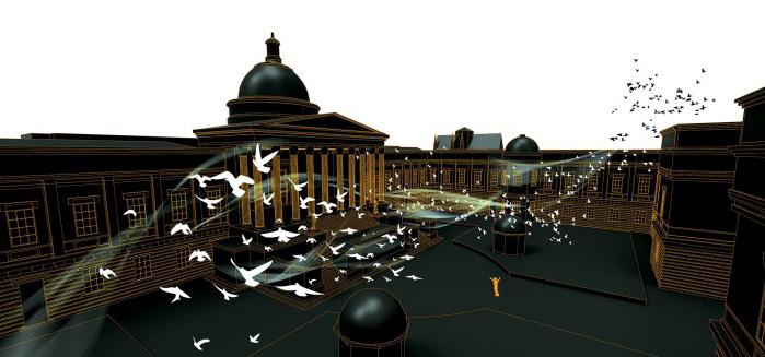
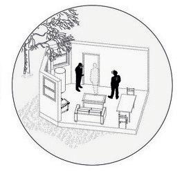
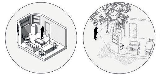
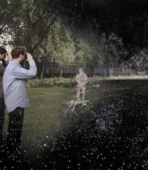
Another initiative that uses immersive technologies as a design tool is the Flock project (UCL Zhang , 2014). The user can experience a dynamic performance through gestural interaction. 3D drawing into physical space, creation of novel spatial experiences and virtual time control are some of the features that the digital platform provides. The main aim of the project is the interaction between the user and the environment, so that he can experience it in a realistic way and he can visualise his design ideas in real time.
This process could be described as user-centric; the designer provides a realistic representation of the environment and several pre-designed modules and options that the user can manipulate and control. This approach is beneficial for accomplishing our goal, which is to provide the user with a design tool that he will be able to use in order to express his ‘3D opinion’ and communicate it to the architect.
| 18
Figure2.2.3.1 Flockproject-siteexperiment [UCL Interactive Architecture Lab, 2016]
Our aim is to utilise Virtual Reality technologies in the design process and examine their feasibility, efficiency, as well as their beneficial role and limitations. The reason that we are selecting an immersive tool is to test if this level of immersion helps the user express his opinion in a more intuitive, accurate and direct way. The visualisation field is enhanced and the interactive experience takes place in real time. The user is designing in 1:1 scale and he is constantly receiving spatial information that can affect his design thought process. Microsoft Hololens is a visualisation tool, that aims to enhance the immersion of the user in the virtual experience, bridging the gap between experts and non-experts by educating both sides.
Furthermore, in the next cases, Virtual Reality technologies are utilised as a recording method, as well as a means of interaction between the users. The aim of the projects is to enhance the communication field between people in various chronological times or from various backgrounds. However, except for the communication between the users, this method includes an information exchange between the users and the creators of the platform, which is reflected in the tools that the player can utilise within it, as well as in the outcome that they produce and communicate it to the experts.


19 | URBAN GLITCH : Immersive technologies as a new means of participation
2.2.4 DOMAIN | immersive technologies conclusions
Figure2.2.4.1 DesigninterestsinVR [Urban Glitch]
VIRTUAL REALITY DESIGNER INTEREST
REALISTIC EXPERIENCE LIMITELESS ACTIVITIES
MULTI-USER INTERACTION
SIMULATION
the product mainly refers to an upgraded vizualization experience both for the architect and the user
2.2 DOMAIN | immersive technologies


VISUALIZATION
immersive tools in this project aim to capture/record the essence of a space bound to change

INTERACTION
the user experiences a dynamic performance that is dictated by his hand gestures
ACTIVE
PASSIVE
INTERACTIVE
| 20
Figure2.2.4.2
Comparativediagramofimmersivetechnologiescasestudies [Urban Glitch]
TOOL Microsoft Hololens Palimpsest FLock
PROJECT PROJECT
2.3 DOMAIN | serious games
INTRODUCTION
Toys
Serious games fall within the field of edutainment, and unlike the popular funny games, they are designed for a primary purpose other than entertainment (Djaouti, 2011) . Traditional board games such as Trivial might be considered as retro serious games (Available at http:// serious.gameclassification.com/) although the main feature of such games has to do with simulation mainly, and explicitly with emphasising the added pedagogical value of fun and competition. For example, videogames of this nature are commonly used by industries like defence, education, scientific exploration, health care, etc. given the alternative way of representing and communicating information and allowing the player to interact with it. This makes the process more interesting and playful and by extension, more effective (Di Mascio, 21017) .
A growing awareness of the potential of this tool in architecture is evident with regards to collaborative design, as virtual environments could be positioned as a versatile canvas between designers and citizens in serious videogames. However, the majority of the projects focus on the visualisation of designs (urban designs) developed by
Games
professionals seeking people’s opinions. This inconcurrent way of ‘participatory design’ develops from the inability of the user to intrinsically participate in the design process due to lack of skills and/or education.
Our interest lies in the state-of the art serious games that radically cope with this issue and serve as a means for the non-designer player to provide a designer outcome. In the following pages, three examples of serious games in participatory design are analysed.These instances refer to methodologies that aim to produce a commonly agreed design solution.
21 | URBAN GLITCH : Immersive technologies as a new means of participation
Edutainment
Game-based learning
Audio &Video
Serious Games
Video games
Figure2.3.0.1 Seriousgamesandlearningdiagram [Urban Glitch]

| 22 robust and reliable perceivableinformation understandableinformation operable interface COMPUTER GAME WORKING ALLIANCE ACCESSSIBILITY LEARNING IMMERSION s ituationallearning m u ltipleperspectives s imu latedreallife im mersive factors challenge | companionship | expl orati o n | ysatnaf | ytiledif laog | t a s k s | bond
Figure2.3.0.2 Seriousgamesdesignelements [Urban Glitch]
case studies
2.3.1 Block by block, Mojang & UnHabitat (2012)
Block by Block is a charity that aims to involve young people in the planning of urban public spaces through the use of Minecraft, a worldwide known sandbox videogame about construction and adventures. It mainly focuses on poor communities in developing countries and it is utilised as a participation tool in urban design all over the world. (https://blockbyblock.org/)
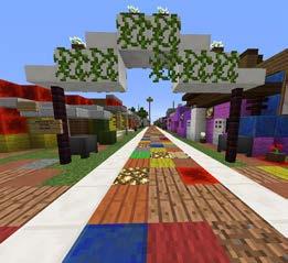

The process starts with the characteristic cube-based 3D model that represents the public space. After Minecraft training sessions have been held, the participants are divided into groups of 2-4 people to develop their ideas in the game world. Eventually these proposals are presented to stakeholders for discussion and final design selection. The game interface provides limitless construction supplies that allow the player to stack and destroy material blocks according to the desired design. He has the option to select among materials and uses of cubes to create the atmospheric attributes that fit his preference. The outcome is highly detailed proposals, regarding shape, scale and material information, that are used as a means of communication between the players and the architect, who develops a professional design project.
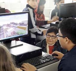
The benefit from this design method is on the one hand the utilisation of the cube as a design unit. It is easily understood by non experts and it can provide them with a variety of options, allowing them to express their opinion with high precision, as well as visualise the outcome real time and make alterations. On the other hand, game mentality enhances the engagement of the users in the participatory activity, as it becomes a pleasant and efficient initiative, where players redesign public spaces and intervene in poor communities.
Figure2.3.1.1[top]
ParkatVillaElSalvador(Peru)designedwithMinecraft[source:blockbyblock.org]
Figures2.3.1.2-3[bottomfromlefttoright] BlockbyBlockdesignworkshopatPeru[source:minecraft.net]

23 | URBAN GLITCH : Immersive technologies as a new means of participation
2.3.2 City_kit, Hybrid Space Lab (2014)
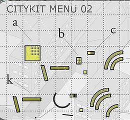
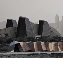
Following the rapid growth of digital tools that foster participatory systems, CITY_KIT is a project that connects the user and the architect, aiming to upgrade neighbourhoods for the Hong Kong Social Housing Authority through an urban-computer game. (http://ecosistemaurbano.org)

The kit is an open-source medium that focuses on city planning and urban redevelopment. Its participants are able to enhance the local environment by fixing or moving modular building components, aiming to activate the local community. Furthermore the users can pinpoint the exact location of the digital objects in the analogue world. The project targets young people that are familiarised with computer games and it aims to engage people in the redesign process of their community, revaluing their local surroundings and incorporating innovative layers of information that are created within the virtual world. As a result, the DIY Pavilion in Hong Kong was designed in the Hong Kong & Shenzhen Bi-city Biennial of Urbanism and Architecture 2009-2010.
This initiative is an asset for our project, as it serves as a good example of user engagement and community
2.3 DOMAIN | serious games
decision-making through a digital platform. Moreover, the tool is utilised as a dynamic field of information between the architect and the user, educating both sides within the framework of the design process.
| 24
Figure2.3.2.1[top] HongKongre-designedwithCityKit[source:hybridspacelab.net]
Figures2.3.2.2-3[bottomfromlefttoright] PlywoodDIYpavillion[source:hybridspacelab.net]
2.3.3
20,000 Blocks/Digital Design Unit(TUD), Invent the World[2016]
20,000 Blocks is a research project that aims in involving groups of non-trained individuals in the creation of architectural designs by utilising the game mentality and crowdsourcing for user-centric problem-solving. Architectural experts encode their design knowledge into the game, where non-expert players are guided to create their own architectural idea. The method includes three components that are crucial for the information exchange between the user and the architect and are the following: guiding rules, verification routines and fast feedback. The results are verified by utilising robotic fabrication to construct the users’ proposals at 1:1 scale. (Savov, Buckton, Tessmann, 2016)
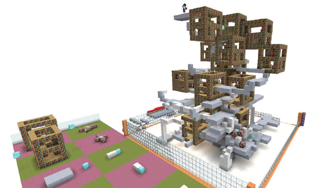
The method includes a strong incentive, aiming to motivate the players and make them more invested to the gameplay. To achieve this it focuses on three key roles: Initially, the organisation of the game in terms of the technologies that will be used is crucial and needs to be addressed at an early stage of the application. Furthermore, defining the goal, the incentive, as well as the vocabulary of the game is significant, as it influences the motivation and
by extension, the engagement of the players. Finally, the experience of the players is the third point of interest, as their experience needs to be tightly controlled, in terms of which materials can be used and where they can walk. Rewarding the players gives a further motivation to the game; while players compete to achieve their aim, a building or structure emerges out of the configuration of blocks that they have created.
The benefit of this research method is that it aims to explore tools for calibrating the influence on the resulting designs between experts and non-experts. It focuses on the creation of a constant communication tool between them and allows for real-world problem-solving, rather than a parametrically optimal solutions tool. The generation and evaluation of architectural design proposals through real-time structural analysis feedback is included in this methodology and is significant for the education of both the players and the designers. Moreover, including an incentive in the design process enhances the engagement of the users, giving them motivation to achieve more tasks and by extension, be more invested to the design process.
25 | URBAN GLITCH : Immersive technologies as a new means of participation
case studies
Figure2.3.3.1 A20,000BlocksgamemaptitledHOWHIGH–createdbyAndreaQuartara,Marc EmmanuelliandUlrikMontnemeryduringtheclusteratSmartGeometry2016 [source: ACADIA 2016 — 20,000 Blocks — Savov, Buckton, Tessmann]
For the purpose of this study we investigated serious games and game technologies applied to design and planning activities, aiming to create a 3D representation of the urban realm and engage the users in the design process as a means of participation. By utilising game technologies we attempt to create a dynamic field of communication between the user and the architect and allow a constant information exchange between them. In the text below, we analyse thoroughly the issues that are addressed through game technologies, which mainly refer to the communication between experts and non-experts, as well as the tools and context that are used for enhancing it.
Initially, how will game technologies facilitate the communication of the information? “A proper communication is also essential to build consensus” (Wates and Knevitt 1987). The communication process is always related to the visual tools used during the design process. The traditional representation process of a project is through displaying technical drawings, plan views, where the proposed idea, as well as the current condition can be overlaid on one drawing without using any graphical means; thus the plans are practically cumbersome to read for a non-expert reader. Game technologies allow for a more intuitive method of processing and collating information, overcoming these difficulties and making the design process a pleasant experience that immerses the non-expert user.
Another important issue is the language and tools of communication between stakeholders and architects. According to Granath, users do not have the proper foundations to be involved in a participatory design process. ”The point of departure for their conceptions of the future is often limited to the existing situation with its restrictions and possibilities. Being asked about what they want, they may have problems conceptualising their wishes, articulating them even to themselves and even more communicating them to colleagues” (Granath 2001). The context and tools that are used through game technologies enhance the faculty of the stakeholders to understand abstractions, even if they lack knowledge in the architectural domain. Adding the game mentality to the design process through interactive tools and real-time changing features, enhances the understanding of the players and helps them articulate their desires and needs; thus, the communication gap between experts and nonexperts is crucially diminished.
| 26 2.3 DOMAIN | serious games conclusions
2.4 DOMAIN | unused public spaces
INTRODUCTION
“Lostspacesaretheundesirableurbanareasthatareinneed of redesign – antispaces, making no positive contribution to the surroundings or users. They are ill-defined, without measurable boundaries, and fail to connect elements in a coherent way.” -
Roger Trancik (1986), Finding Lost Space
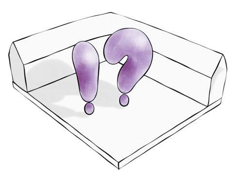
The design of any metropolis is an accumulation of successful and unsuccessful urban planning. Population exchange, alterations in population densities, changing of management and innovative technologies play a crucial role in the development of an urban planning throughout the years. As a result, miscellaneous design plans overlap and emerge in an undefined urban activity, which sometimes creates urban voids, meaning unused public spaces surrounded by buildings, active areas and planned spaces. Nonetheless, these unused spaces can contribute in the redevelopment of cities, by revitalising the areas around them, aiming in the enhancement of the environment not only for the people who live nearby, but also for the people that interact with these spaces on a daily basis. Therefore, new urban planning initiatives usually include the opinion of the users in the design process, enhancing participatory design methods.
27 | URBAN GLITCH : Immersive technologies as a new means of participation
Figure2.4.0.1 Selectionofurbanspacethatservesthe objectiveoftheproject [Urban Glitch]
“A characteristic of these spaces is the sensation of neglected and insecurity”
“...The unused public spaces emerged because of the necessity of space, the rapid development, the disorganisation and lack of planning.”
Carmona M. (2012), Capital Spaces
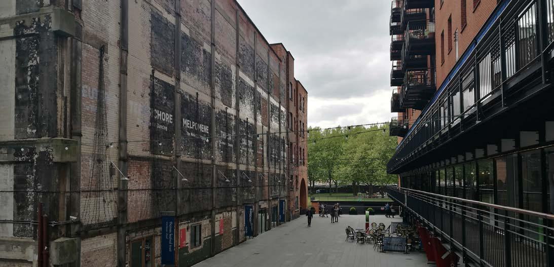
Unused public spaces are usually referred to as forgotten or abandoned spaces. For the purpose of this research we are focusing on spaces that can be characterised as city voids and residual spaces, that have no particular denomination or any urban activity. A common feature of these places is the sensation of neglection and insecurity, that occur from poor management or uncertainty of ownership. Certain areas are considered semi-public, which causes a misunderstanding about who should take care of them, between the private owner and the borough. Moreover, they do not belong to any particular body or institution, which increases the level of abandonment, resulting in the creation of undefined and unused spaces.
An important question is when did these urban voids occur? What caused these areas to become unused spaces? Their origin is as important as their transformation throughout the years. In european cities, the urban
management before and after World War II played a major role in the growth of unused spaces. Likewise, in the 1950’s and 60’s the decentralisation and movement of people to the peripheries increased the number of empty spaces. After thirty years, when people returned to the centres, misused or unused public spaces emerged, due to the rapid development and the disorganisation and lack of urban planning of the cities.
| 28 1. definition and formation
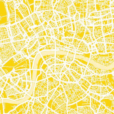
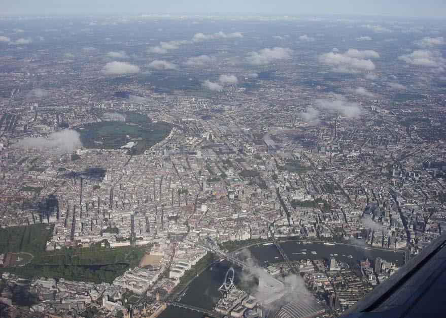
Figure2.4.1.1 UnusedspaceinLondon [Urban Glitch]
AerialphotographofcentralLondon [source: wikimedia]
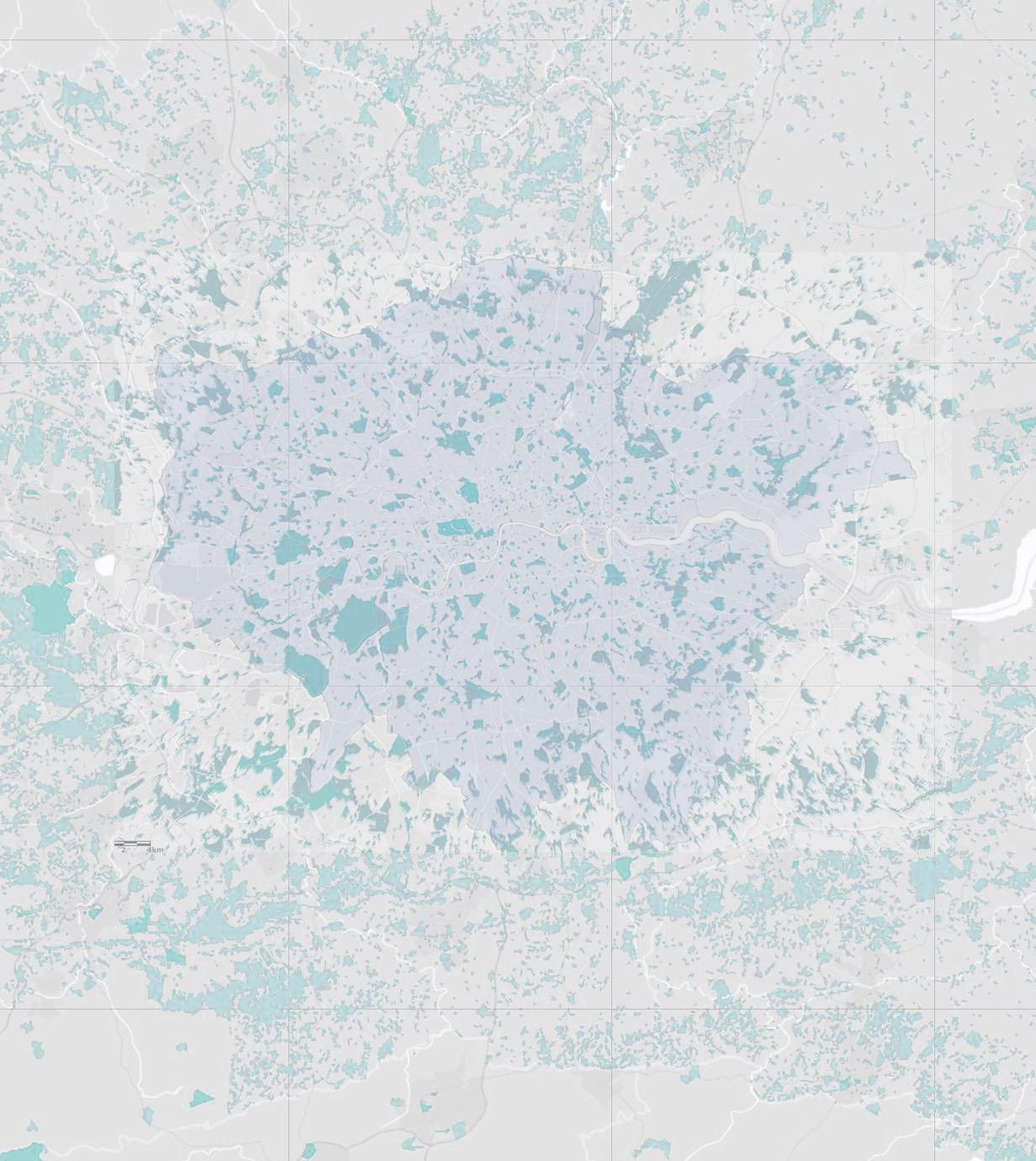
Although the potential benefits of investing on unused urban spaces is a controversial topic, the latter have offered great opportunities to governments and investors throughout the years. Nowadays, the most significant urban projects in metropolises are focused on the transformation of unused urban spaces. Planning and designing these spaces is a process that should involve both architects and users, as it aims to create a space, that people will use and interact with.
The main methods of participation are surveys and workshops. However, it is common that in these cases the collected information is disorientated and is eventually not used throughout the design process; thus the opinion of the users is disconnected from the final design proposal.
Therefore, the revitalisation of unused public spaces is actively connected with the level of participation of the people who use them. The final design plan should reflect their preference and thoughts about the utilisation of a public space.
PublicspacesinLondon(redrawn) [source:arcgis.com/]
29 | URBAN GLITCH : Immersive technologies as a new means of participation 2. potentials
Figure2.4.2.1[p.29]
Figure2.4.2.2[p.30]


0 4 10km 8
3. Unused public spaces of London
Percentageofpublicspacesclassifiedby morphology(redrawn)

[source: Carmona, M., and F. Wunderlich. 2012,CapitalSpaces,theMultipleComplex PublicSpacesofaGlobalCity.London]
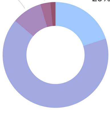
London serves as a good example of unused public spaces. As mentioned in the book “Capital Spaces”, the public spaces of London can be classified either by morphology or by functionality. Spaces that emerged from urban planning or building projects are regarded as incidental spaces and form 16% of the public spaces in London. Unused public spaces are also the spaces that lack a dominant function or their function is not clear; these spaces constitute 7% of the public spaces of London. As a result, almost 25% of the public areas in London are considered as unused public spaces.
Regarding their functionality, 14% of the overall amount are considered as undefined public areas, lacking identity and any physical elements that would indicate their use.
GLITCH : Immersive technologies as a new means of participation
Percentageofpublicspacesclassifiedby functionality(redrawn)


[source: Carmona, M., and F. Wunderlich. 2012, CapitalSpaces,theMultipleComplexPublic SpacesofaGlobalCity.London]

31 | URBAN
Community 35% Corporate 18% Undefined 14% Domestic 10% Civic 10% Consumption 6% Service 4% Transit 3% Piazzas 37% Courtyards 18% Incidental spaces 16% Garden Squares 13% Forecourts 9% Others 7%
MORPHOLOGIES
1. Carmona, M., and F. Wunderlich. 2012. Capital Spaces, the Multiple Complex Public Spaces of a Global City. London: Routledge.
FUNCTIONALITY
Figure2.4.3.1
Piazzas 37% Community 35% Corporate 18% Undefined 14% Domestic 10% Civic 10% Consumption 6% Service 4% Transit 3% Courtyards 18% Incidental spaces 16% Garden squares 13% Forecourts 9% Others 7%
Figure2.4.3.2
2.4 DOMAIN | unused public spaces 4. City analysis
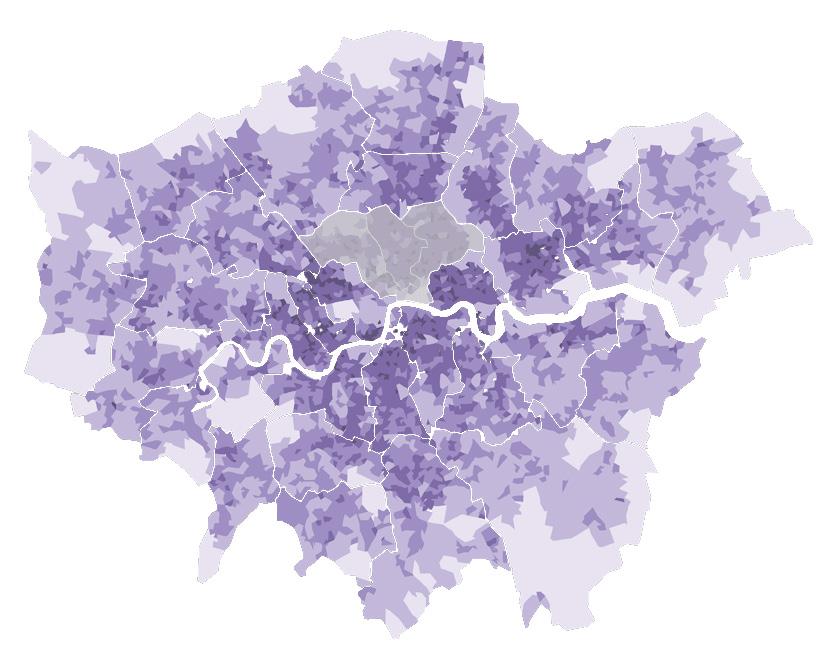
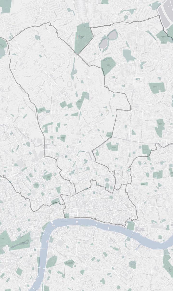
Unused urban spaces are located in high density parts of the city of London, where there is a high agglomeration of buildings. After thorough research, we discovered relative areas in London and focused on the boroughs of City of London, Camden, Islington and Hackney, where there is also a strong feeling of community. Aiming to gain a deeper understanding about the properties of the areas and their spatial quality we visited the sites and talked with people who interact daily with them.
| 32 People per square kilometer (Total number of areas=4,835)
or above (302) 10,000 to <20,000 (1,648) 5,000 to <10,000 (1,786) 1,000 to <5,000 (1,020) <1,000 (79) Research area
20,000
Rank District Density Type of district [per km2]
Islington 15,670.00 London borough
Towe Hamlets 15,404.00 London borough
Hackney 14,358.00 London borough
Kensington 12,931.00 London borough, Royal B.
Lambeth 12,230.00 London borough
Westminster 11,522.00 London borough, City (1540)
Camden 11,297.00 London borough
Hammersmith 10,954.00 London borough
Southwark 10,853.00 London borough
1
2
3
4
5
6
7
8
9
1. Carmona, M., and F. Wunderlich. 2012. Capital Spaces, the Multiple Complex Public Spaces of a Global City. London: Routledge.
Office for National Statistics Contains National Statistics
Office for National Statistics]
Figure2.4.4.1 PopulationdensitymapofLondon [source:
data2013ContainsOrdnanceSurveydata2013] Figure2.4.4.2 BoroughsofEnglandorderedbypopulationdensity,basedon populationestimatationsfor2016 [source:
Unused public space
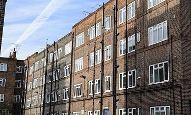
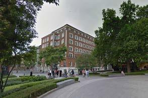
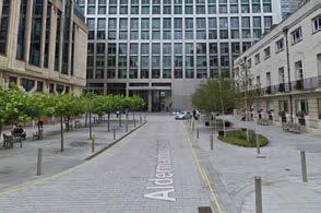
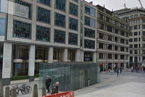

Public space
KEY Figure2.4.4.2 SitesthatwevisitedintheCityofLondonandinEastLondon [source:arcgis.com/]
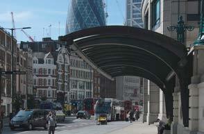
 1. Liverpool bus station, City of London
2. New Era Estate, Hackney
3. Monument Yard, City of London
4. Phoenix St. and Stacey St., Camden
6. Aldermanbury Square, City of London
5. Carter Lane, City of London
5. site research
2.4 DOMAIN | unused public spaces

CATEGORIES OF UNUSED PUBLIC SPACES
NEGLECTED RESIDUAL LIMINAL
• Phoenix St. and Stacey St.
• New Era Estate
• Carter Lane
• Monument Yard
• Aldermanbury Square
• Liverpool bus stop
The sites that we have visited can be regarded as unused public spaces. Their use refers to a combination of residential, business and commercial areas of public, private or semi-private inactive spaces. We visited each site more than once and in different times during the day to perceive people’s flow, as well as the activities that are concentrated around it.
The sites were basically divided into three categories: neglected, residual and liminal spaces. Neglected areas are common in unused public spaces. However, in many cases, although there were no activities in the unused spaces, they turned out to be safe and respected; in this
case they are residual spaces. Furthermore, liminal spaces were investigated, forming transitional spaces with blurry boundaries, that belong either to public boroughs or private managers.
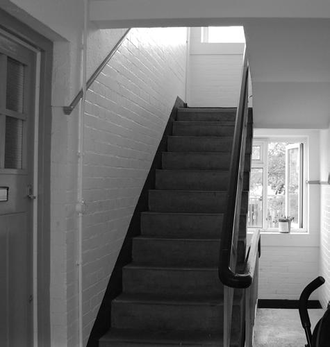
Our research was mainly focused on neglected spaces that were characterised by social issues. The relationship of the residents with their living space is a crucial aspect in our research; it is important to select a neighbourhood with a strong community feeling, as the residents will be more invested in the improvement of the spatial qualities of the public space.

| 34
Phillipp Street
PhoenixStreet Stacey Street
Orsman Road
Whitmore Road Halcomb Street
Figure2.4.5.1 PhoenixStandStaceyST [source:digimaps]
Figure2.4.5.2 New Era Estate [source:digimaps]
Figure2.4.5.3 Classification of the sites that we visited [Urban Glitch]
Through this initiative we attempt to merge three fields: participatory design, immersive technologies and serious games. The aim of this project is to create an architectural tool that receives the users’ information, stores it and communicates it to the architect, allowing him to utilise the data based on his preference and eventually produce a design. Each field contributes in the creation of the tool equally, setting perceptual and conceptual thresholds that form the guidelines of its development.
Participatory design is utilised as a means that involves non-experts in the design process, giving them the opportunity to create their own space by interacting with each other. Attention should be placed on the roles of the architect and the user, defining the level of involvement of each, as well as the stages that each one interferes with the design process.
However, another significant aspect of this process is the communication between the experts and non-experts, which in this case is addressed through immersive tools and particularly, Virtual Reality technologies. The level of immersion of the user in the design process plays a significant role to the information exchange between him and the architect. A realistic environment would possibly enhance the feeling of actually designing in the real place, as the user visualises the design outcome in real-time. Adding more features in the realistic experience, such as
sound and temperature would further increase the level of immersion of the user.


Amidst the user involvement and the communication with the architect lie the tools that the stakeholder utilises to establish and transmit his design idea. The language that is used should be easily understandable by people who are not trained to comprehend abstractions, but detailed enough so that it conducts sufficient information to the recipient. That is were serious games contribute in the establishment of a method that not only facilitates but also educates both sides.
Transit unused public spaces drew our attention due to their lack of identity and lack of any physical elements that reflect their context. As a result, they have a high potential of having a tangible impact to the surrounding society. Through utilising immersive technologies we attempt to pool miscellaneous ideas on how non-experts and experts can catalyse changes in the urban realm, addressing an identity into residual spaces and allowing the users of the public space to engage in it and socially interact.
Our interest lies among these three domains, forming the question: Can we enhance the design method of public spaces by utilising immersive technologies as a new means of participation?
35 | URBAN GLITCH : Immersive technologies as a new means of participation
2.5 DOMAIN | conclusions
PARTICIPATORY ACTIVITY IMMERSIVE TECHNOLOGIES
SERIOUS GAMES
Figure2.5.0.1 Mergingthreefields [Urban Glitch]
PROPOSED LINE OF INVESTIGATION
PARTICIPATORY TOOL


RESOURCES
CONVENTIONAL DESIGN METHOD


DESIGN
CONSULTATION
PROPOSAL DESIGN
PROPOSAL
Comparisonoftheprojects’ processwithtraditionalmethods
[Urban Glitch]
| 36
Figure2.5.0.2
37 | URBAN
GLITCH : Immersive technologies as a new means of participation
methods 3
3.1 vr platform development
3.2 data collection
3.3 data analysis
| 38
Our objective is to conduct certain experiments, utilising technologies and methods that facilitate our research and design process. The project procedures are divided into three major categories, classified by their aim.
Visual representation and game engine tools were used to develop a Virtual Reality platform in various phases. Time efficiency and high accuracy were the reasons that drove us into these tools.
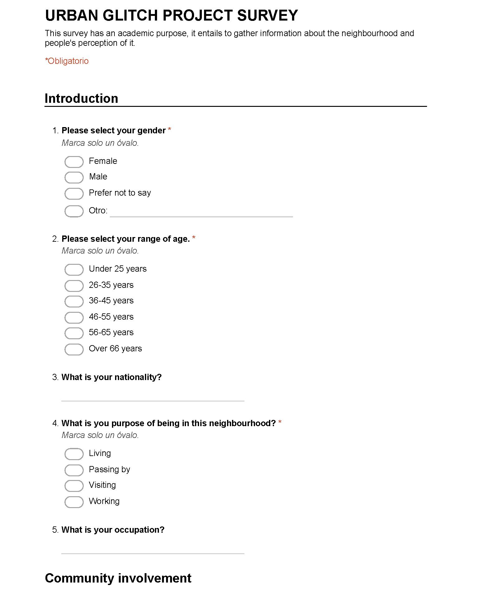
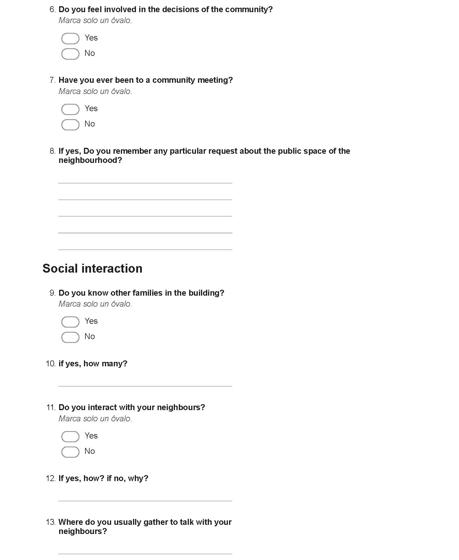
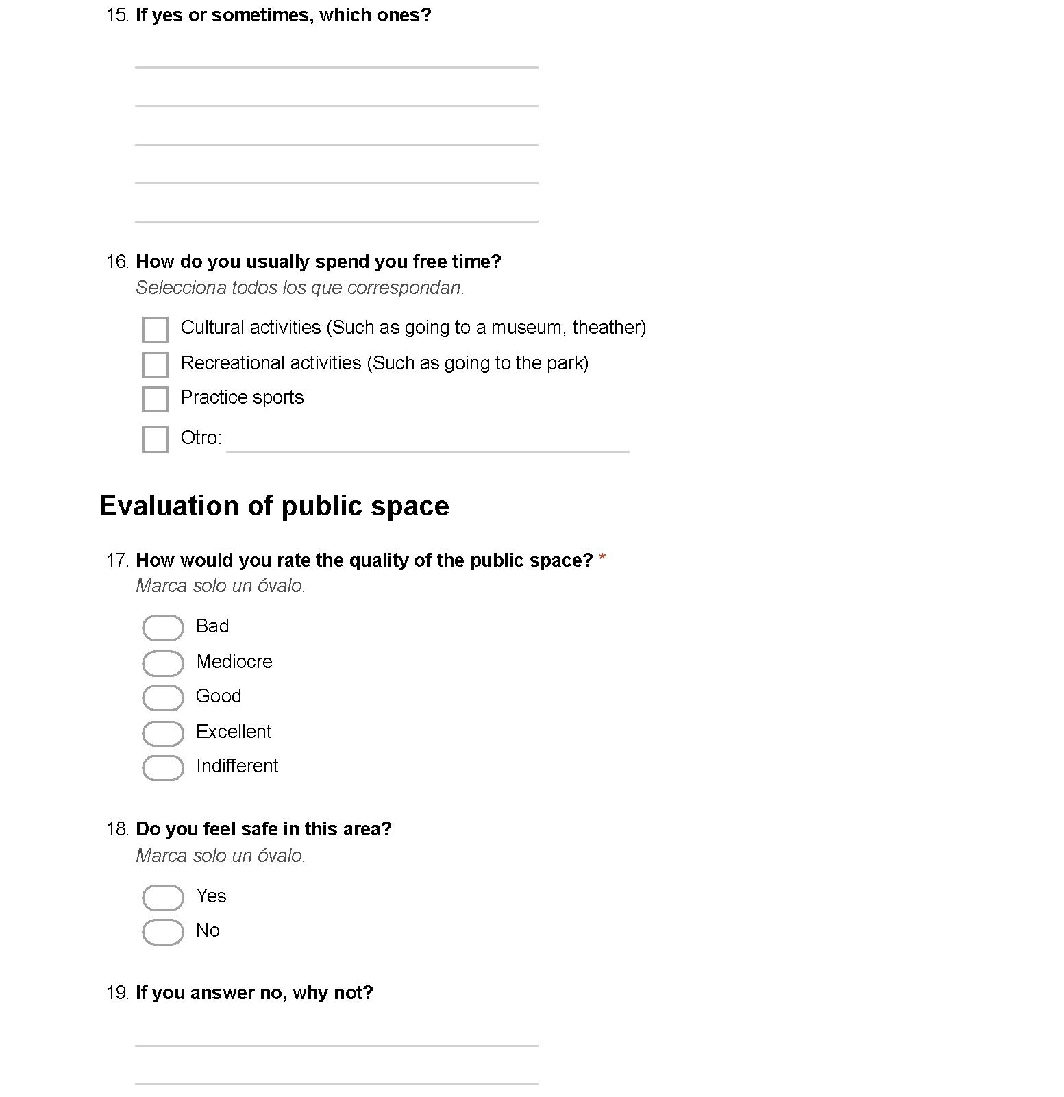
Questionnaires took place as a means of extracting information from groups of people. Interacting with people helped us gain a deeper understanding about certain issues and formed the guidlines of the design development.
After collecting data and conducting the research and design experiments, we aimed to analyse the information that occured, so that we can further develop the design process. In order to achieve this, we utilised a visual programming software, that helped us visualise the data in an automated manner and allowed us to collate it.
39 | URBAN GLITCH : Immersive technologies as a new means of participation INTRODUCTION 3.1 methods | AIM


| 40
1
analysis
RESULTS Questionnaire
DATA
Photogrammetry Game
VR PLATFORM
Digital Site 2
Reality
Figure3.1.0.1 Methods utilised in theproject’sprocess
[Urban Glitch] DATA ANALYSIS Density maps Heat maps Hotspots
Data
READING OF
1 Inform VR platform
COLLECTION
engine
1 Realistic
Game
representation software
methods | VR PLATFORM
1. PHOTOGRAMMETRY and visual representation tool
Objective
Our objective was to create a realistic 3D model of the site that we are interested in. To achieve this, we utilised the technique of photogrammetry, which allowed us to recover the exact positions of the points of the objects that exist in the site.
After obtaining photographs we aimed to create a visually consistent 3D digital model by utilising a visual representation software. By using this method, the points that are in the same position in the photographs create a cloud of points, which is a representation of the physical environment.
Benefits
The benefit of using photogrammetric methods is the higher accuracy results that it provides in less time. However, except for the efficiency, another significant factor is that the data is captured at once, which means that ther is no need for additional site visits to obtain further information. Moreover, vital risk is avoided, as several areas are not accessible by utilising traditional mapping methods.
As for the visual representation software, it provides a full and accurate documentation of the physical space, in less time, compared to conventional survey instruments. It benefits us, as we need to map several sites in a limited amount of time, to conduct our experiments. Furthermore, acquiring a high detailed 3D model facilitates our objective, which is to immerse the users in the digital environment.
41 | URBAN GLITCH : Immersive technologies as a new means of participation
3.2
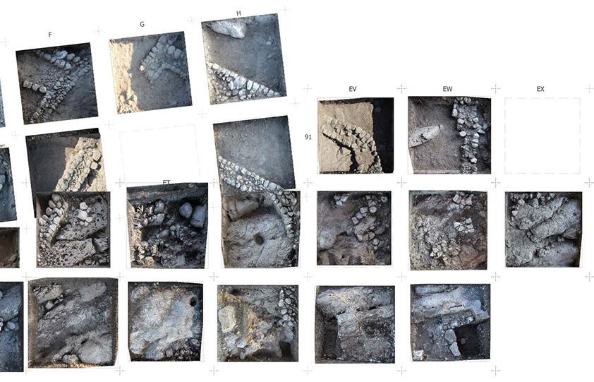
Figure3.2.1.1[top] Complete photogrammetricplan [JVRP’sTelMegiddo East excavations]
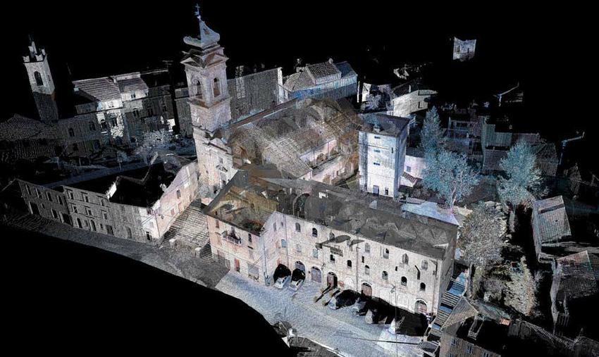
Figure3.2.1.1[bottom] Mergedpointcloud [TOF scanner]


| 42
3.2 methods | VR PLATFORM
2. game engine
Objective
Our goal was to develop an immersive environment, that the players would engage with. A game engine would facilitate this process, as through scripting and modelling we can obtain an immersive technologies simulation, where the users will experience the environment, as well as the design process in a realistic manner. However, architecture is an innovative field for the utilisation of game engines; they are mainly used for video game and PC/consoles/ mobile devices simulations.
Benefits
On the one hand, game engines fit our needs, as real-time 3D content becomes easily accessible and allows us to design and build an immersive experience fast and in great detail. Furthermore, it is a customisable tool, which gives us the opportunity to widely experiment with the interface, the navigation of the user, as well as the content of the environment.
On the other hand, utilising game technologies increases the user engagement and facilitates their accessibility to the design process. It provides them with a user-friendly toolset and a purpose, which correspond to game mentality. As a result, non-expert users perceive the space in a more intuitive manner and understand the design process, without the need to have any knowledge in the architectural domain. Their motivation to participate in the architectural process is increased and the design process is perceived as a game experience.
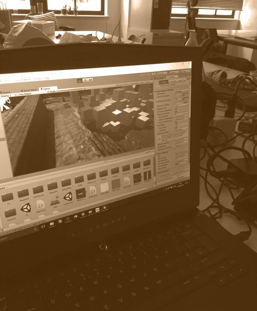
Gameengine while buildingtheVR platform [Urban Glitch]
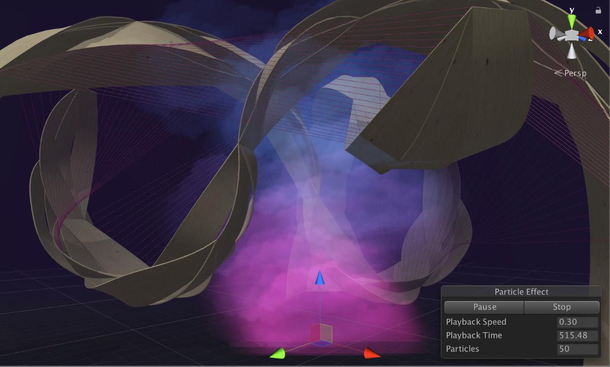
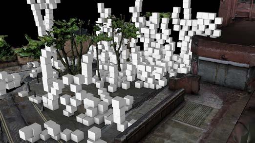
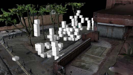
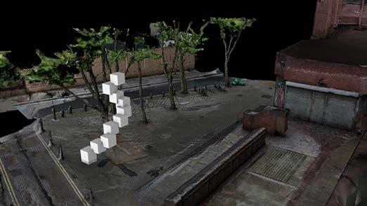
Particleeffectingame enginesoftwareinthe project:Entwine [Urban Glitch]
43 | URBAN GLITCH : Immersive technologies as a new means of participation
Figure3.2.2.1[top]
Figure3.2.2.1[bottom]


| 44
Objective
We conducted surveys to extract specific data from a particular group of people. By talking face-to-face with people that could help us gain a deeper understanding about certain topics, we increased our knowledge in fields that were crucial for the development, as well as the enhancement of the immersive platform.
Benefits
The surveys helped us to assess thoughts, opinions and feelings, aiming to meet the pragmatic needs of the people who we interacted with. Through a predetermined set of questions, we were informed about the social problematics of the site that we investigates, as well as the opinion of the people after using the immersive platform. A sufficient sample of answers was the key to compare various opinions and draw conclusions that would further facilitate the development of our thesis.
45 | URBAN GLITCH : Immersive technologies as a new means of participation questionnaire
data
3.3 methods |
collection
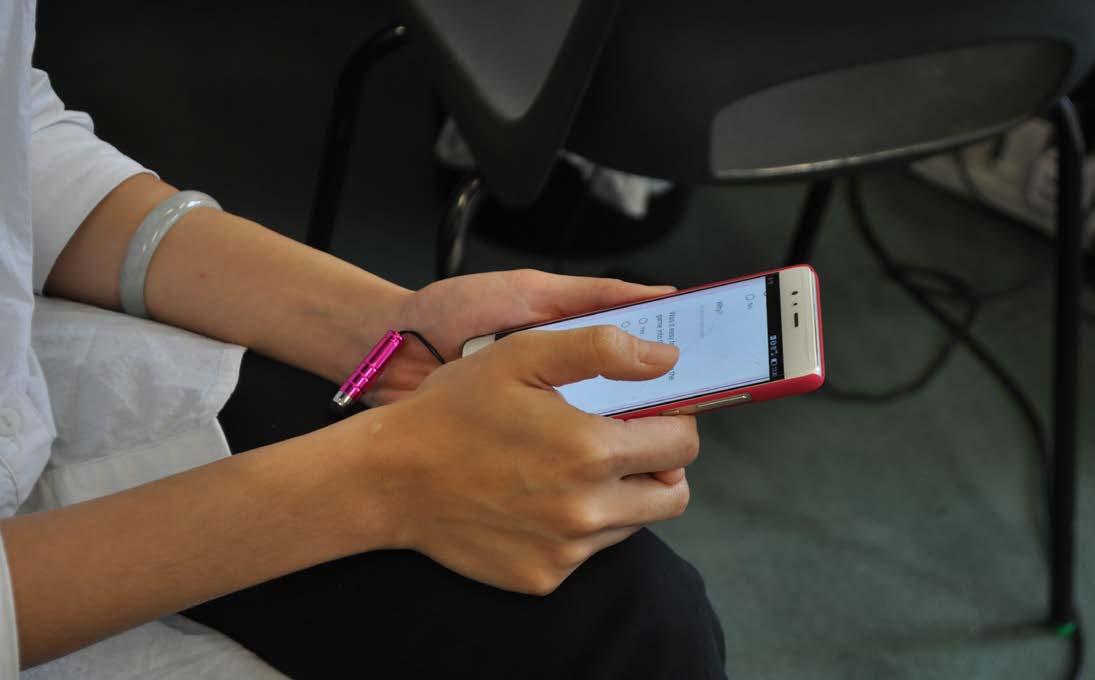
Figure3.3.0.1 Conductingthesurveyduring thedesigndevelopment experiment [Urban Glitch]
Figure3.3.0.2 Conductingthesurveyduring thedesigndevelopment experiment [Urban Glitch]


| 46
3.4 methods | data analysis
density analysis through a visual programming software
Objective
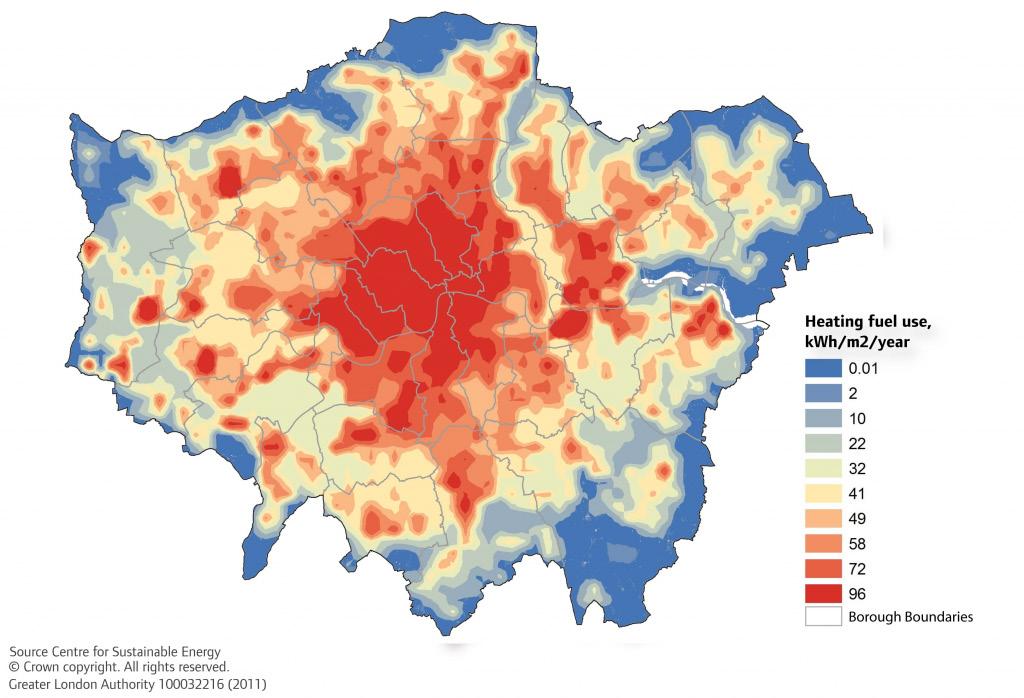
After extracting raw data from our experiments we aimed to classify it and portray it in a more utilisable manner, so that it can be further understood and exploited. The method that we used was density analysis which allowed us to visualize the user-derived data altogether. The spatial relationships of the locations the data were collected from, formed the guidelines of different templates of density representation both in 2D and 3D formats.
Benefits
This method gave us access to information and allowed us to edit it according to the purpose of the project. By creating density maps through a visual programming software, we gained a deeper understanding about the quantities, the distribution and the relationships of the data.
Apart from facilitating our understanding of the derived results, the density analysis’ outputs also aided the utilisation of the data by other designers that were not involved from the beginning of the process, by enhancing the communication between them and the users. The density analysis will be explained thoroughly in the design design proposal chapter.
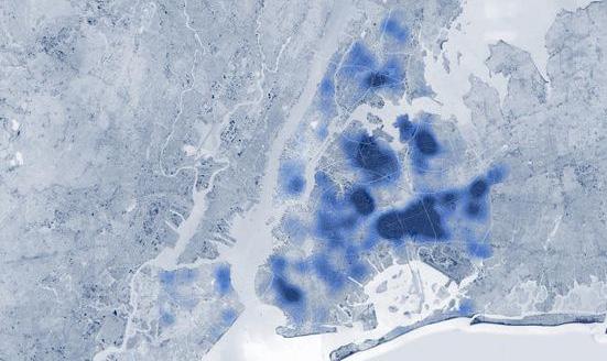
Mapofslumsdensityin
New York
[source:CityMetric.com]
47 | URBAN GLITCH : Immersive technologies as a new means of participation
Figure3.4.0.2[p.48 bottom]
Figure3.4.0.1[p.48top] HeatingfueluseinLondon [source: Centre for sustainableenergy]


| 48
49 | URBAN GLITCH : Immersive technologies as a new means of participation
RESEARCH DEVELOPMENT 4
4.1 aim
4.2 experiment a: site representation
4.3 game development
4.4 experiment b: VR platform
4.5 experiment c: user interaction
4.6 conclusions
| 50
In this chapter, we take the first steps into exploring how the worlds of participatory design, immersive technologies and serious gaming can be merged, towards the collaborative design of more comprehensive public spaces. We imagined of a virtual environment that would be a representation of an actual unused site, where users would be able to immerse into and through certain tools and elements, express their personal ideas/suggestions about the place.


Our aim was to explore the creation of such a platform both in terms of representing an existing site, as well as in terms of developing the game environment and devising the appropriate features (tools and methods) the users would utilize to interact with it and create spatial configurations of their liking. Finally, the platform was evaluated on the results derived from the user design proposals, as well as the engagement of players and the clarity of the game’s purpose.


51 | URBAN GLITCH : Immersive technologies as a new means of participation INTRODUCTION 4.1 RESEARCH DEVELOPMENT | AIM
VIRTUAL REALITY ENVIRONMENT GAME DYNAMICS USER INTERACTION 1 Photogrammetry based 3D scan 1 Navigation 1 Immersion degree 2 Digital reconstruction 2 Modules insertion 2 Controls manageability 2 Modules control 2 Spatial reactions and interventions PARTICIPATORY DESIGN TOOL AIM
1. VIRTUAL REALITY ENVIRONMENT
Essentially, the choice of virtual reality occurred seeking for a totally immersive experience and inducing to users a certain feeling of presence. Presence is a state that expresses the sense of involvement individuals can experience within VR simulations/environments (Carassa, Morganti and Tirassa, 2005). It can be broken down into three consisting components: personal presence, social presence and environmental presence (Heeter, 1992). Personal presence basically entails the subjective feeling of “being there” (Casanueva and Blake, 2001) and is inextricably connected with the individual’s sensory inputs and outputs within the VR. Social presence refers to a sense of “being with others” and includes the interactions a user can have within a VR platform with other users. Environmental presence has to do with the user’s perception that a virtual space actually exists and he/she can move within it and interact with its elements. All three components of presence are equally important and can enhance significantly the user’s perception of a virtual space as realistic.
Our aim was to create a platform featuring a realistic experience of being, that would at the same time allow actions beyond the realm of the actual world-as will be further explained below. We believed that an environment as lifelike as possible would induce a certain degree of seriousness and enable users to not only detect the actual problems of the place, but also experience realtime and in person the by-products of their creations. In that way certain spatial aspects of the users’ configurations such as size, orientation, shade, etc will be directly explained to them upon creation in a blunt manner.
| 52
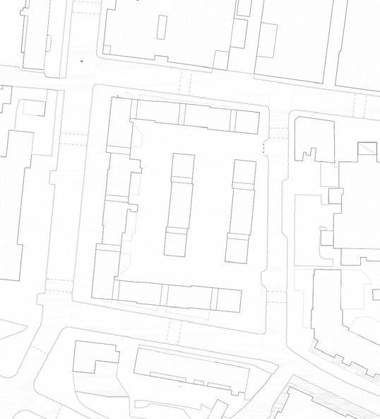
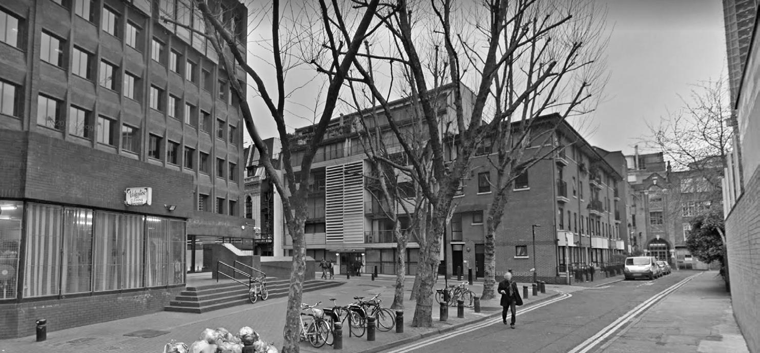
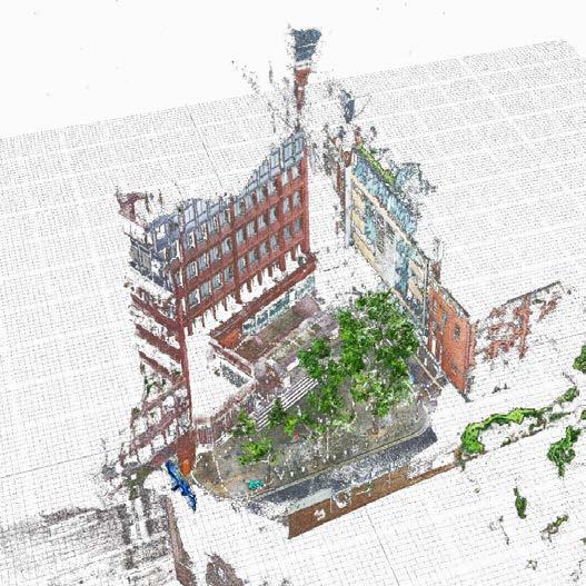
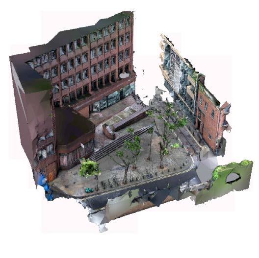
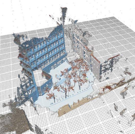
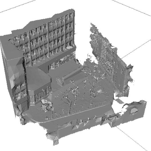
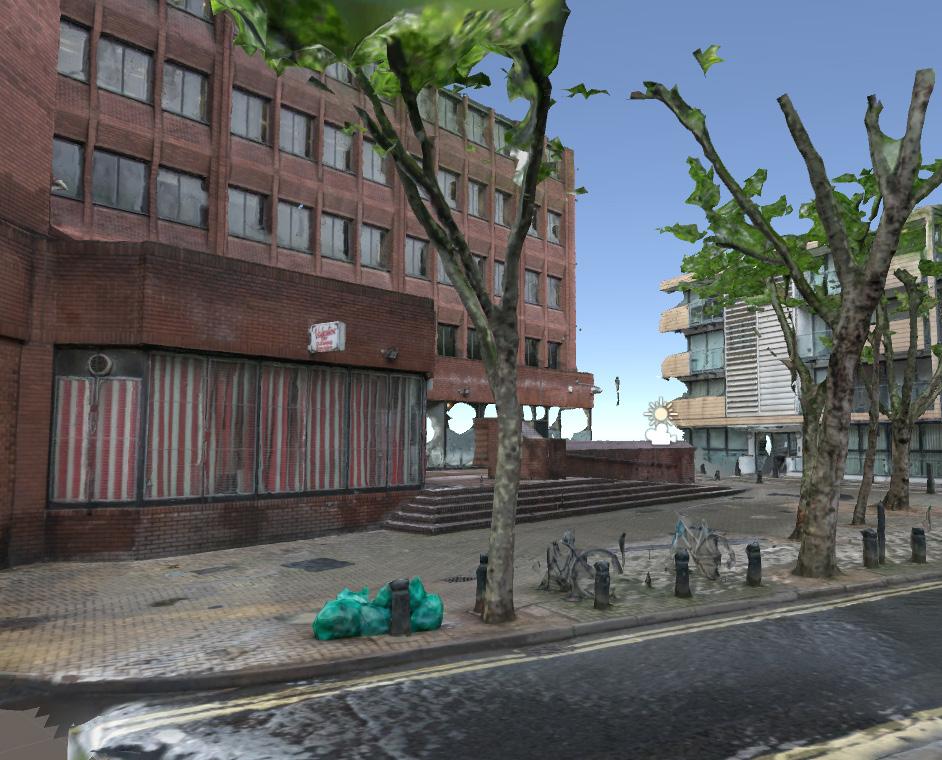
The selected site was a small public square in the junction of Phoenix street and Stacey street in central London. Selecting to exclude any level of direct reality in our platform, as we might have allowed through augmented reality, automatically rendered our work of recreating a realistic environment significantly more complex. We used photogrammetry (650 manually taken pictures) and a reality representation software to reconstruct the chosen site, initially as a point cloud and then as a mesh geometry. Due to the excessive number of polygons in the derived mesh, we additionally used a polygon reduction software, and explored techniques to re-project the original texture onto the low-poly version of the mesh. Further details of this method will be explained in the next pages.


53 | URBAN GLITCH : Immersive technologies as a new means of participation
SITE
2.
RECONSTRUCTION
Figures4.1.2.1 North-east facade of 21 Stacey street [Urban Glitch]
Figure4.1.2.2 Plan view of selected site [Urban Glitch]
Charing Cross
StaceySt SITE

| 54
Figure4.1.2.3 Site location [source: fineartamerica.com]
Site
4.2 RESEARCH DEVELOPMENT | a. SITE REPRESENTATION EXPERIMENT


EXPERIMENT A
SOFTWARE USED
Photoshop
Reality Capture
Instant Meshes
Cinema4D Blender
Aim of experiment
Realistic digital 3D model of a public space through mesh and map.

Method and Tools
I. capture 500 photograps
II. image contrast correction
III. import images to software
IV. mesh & mapping obtention
V. mesh refinement
Observation of results
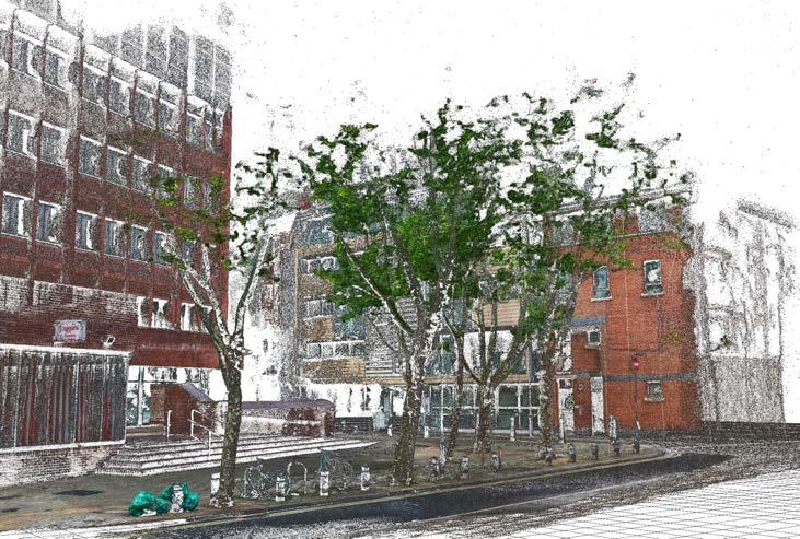
The photogrammetry based scan demonstrated high accuracy in a reduced period of time compared to conventional building survey methods. Armed with just a camera, spaces of different complexity are possible to be captured. Although the resulting maps/textures are of high quality, the mesh itself required a high amount of refinement to be cleaned up and reduce the file size. For this, we used other tools for mesh reduction and polishing techniques that eventually conducted to a very realistic 3D environment in an easy and automated process.
55 | URBAN GLITCH : Immersive technologies as a new means of participation
Figure4.2.A.1 Textured Point Cloud 21StaceyStreet|Reality Capturesoftware [Urban Glitch]
photogrammetry based 3d scanning


| 56
Figures4.2.A.2-5[fromtoplefttobottomright]
Designprocess:3Dcloudofpoints,textured3Dcloudofpoints,mesh,texturedmesh RealityCapturesoftware [Urban Glitch]

57
|
URBAN
GLITCH : Immersive technologies as a new means of participation
Figures4.2.A.6-7[fromlefttoright]
3Dscannedmeshversusrealphotoof21Staceystreet RealityCapturesoftware [Urban Glitch]
4.2 research development | site representation experiment

| 58
The second milestone of this phase was the development of the game application itself. We subdivided this main goal into two separate domains: one referring to the player’s navigation within the platform, as well as his/ her interaction with the elements that constitute its environment and another referring to the way users would be able to design while playing. As far as navigation and interaction are concerned, a series of tests were conducted, aiming to enhance the state of presence that the players would feel while immersed in the game. The matter of design, however was approached more thoroughly.
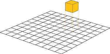
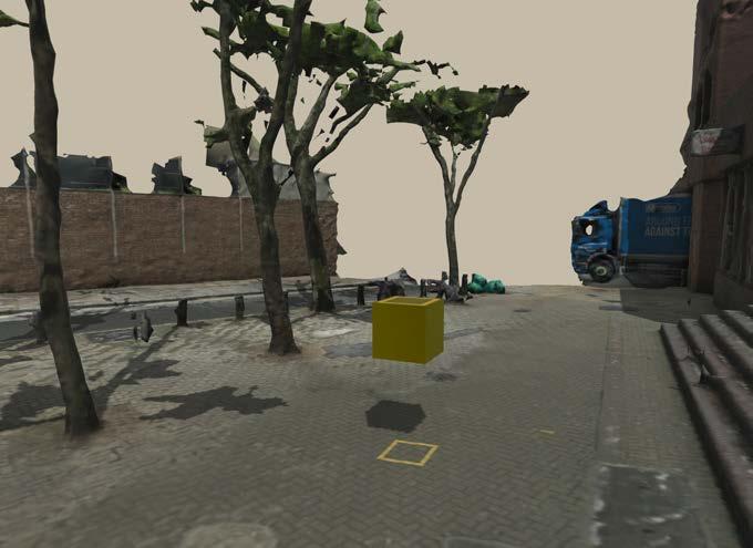
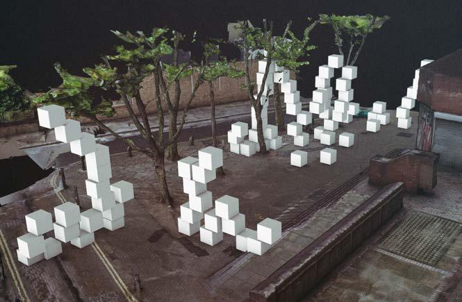
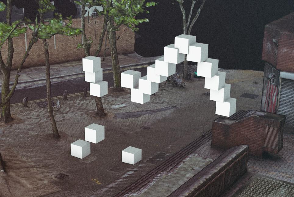
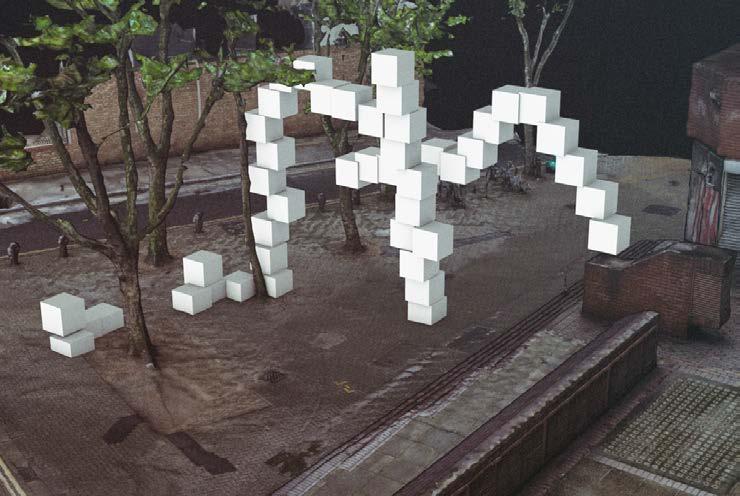
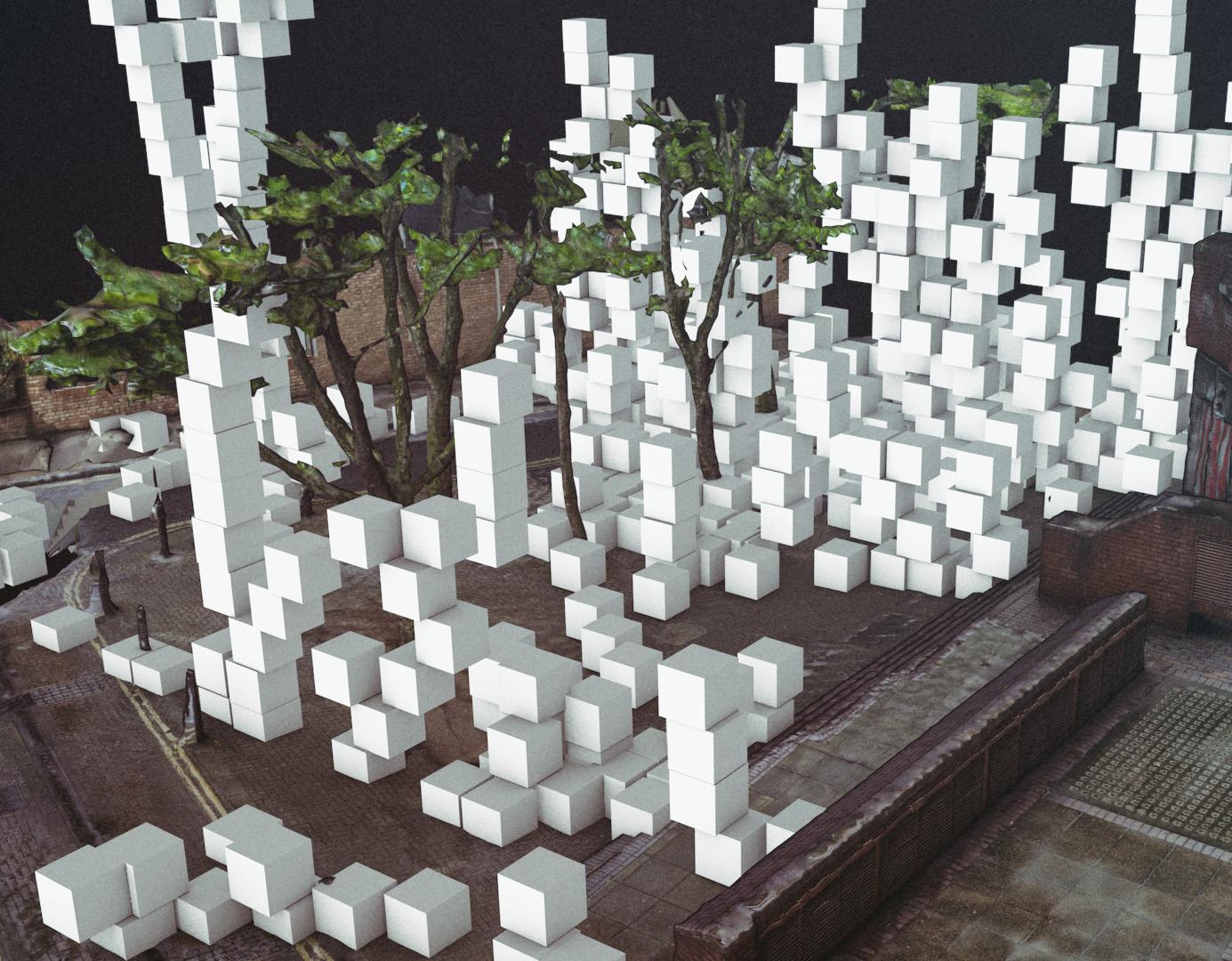
As mentioned earlier, the non-experts’ perception of space derives from a concrete experience of the already known dimensions of reality, thus constraining their conceptual threshold regarding new notions for space. It was a challenge for us to stimulate users to design within a lifelike world, while at the same time triggering them to abstract their idea of “the known” attributes of the actual world. Therefore, we inserted a modular logic into the design method. More specifically, we set the building unit as a 50 cm cube that users were able to generate repeatedly and move in space creating a series of assemblages and shapes according to their desires. There was no limit on the number of modules available to each user and our intention was to introduce a lego-like logic of creation and assembly. We made the hypothesis that the use of a single generic module, would break the users free of the constraints of reality and enable them to envision and create shapes and spaces, beyond the boundaries of the known, based on their imagination. The simplicity of the cube module and the ease in using it to create a large variety of different compositions were two key attributes that lead us to its selection as this experiment’s unit.
Subsequently, a series of methods were tested regarding the levels of control of the module within the game in an effort to render the experience intuitive for the user.
Game description
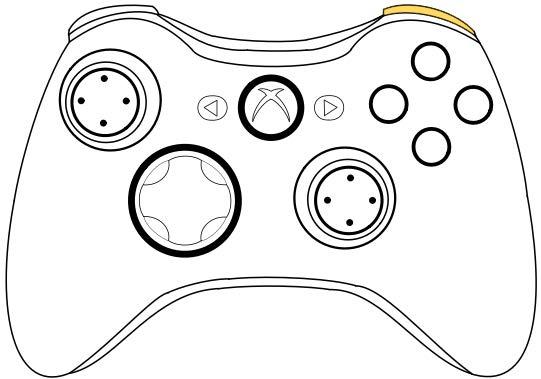
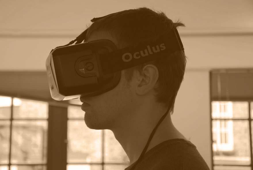
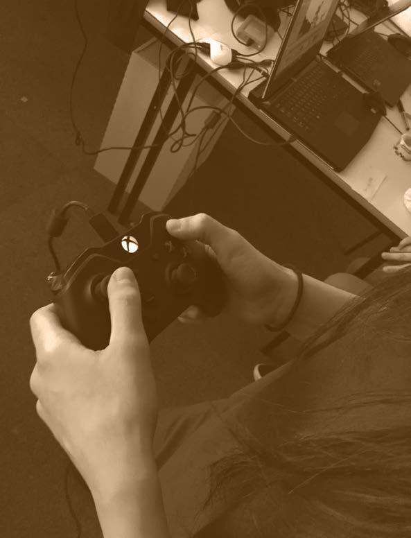
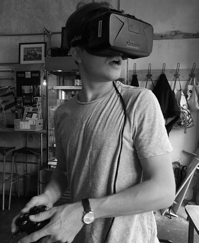
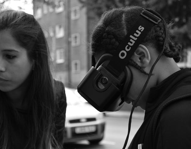
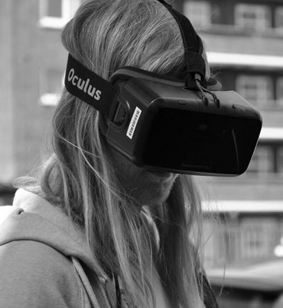
Before explaining the technical and experimental process that we followed to develop the VR platform, we will elaborate the features that existed within the game, as well as the options that the users had. The hardware that was used is the Oculus DK2 and the XBox360 controller.
Regarding movement, the user was able to navigate through the whole site and explore its full potential. Furthermore, he had the option to generate cubes to define spatial arrangements. After their introduction, the user was able to select and deselect them, move them towards all directions, lock them in the position of his liking and finally, remove them.
Further information that would facilitate the controlling of the modules was added. While hovering over a module its colour turned to red to indicate the unit that can be selected. Moreover, when moving a cube, a footprint of its boundaries was displayed on the ground surface to inform the user about its exact future location.
59 | URBAN GLITCH : Immersive technologies as a new means of participation
4.3 RESEARCH DEVELOPMENT | GAME DEVELOPMENT


| 60 PLAY SAVE NAVIGATION MODULE GENERATE MOVE LOCK DELETE
Figure4.3.0.1 Game options [Urban Glitch]
b.1 NAVIGATION experiments
[Urban Glitch]
Aim of experiment
User navigation(walking) inside the VR application without discomfort/ motion sickness.
Method and Tools

Description

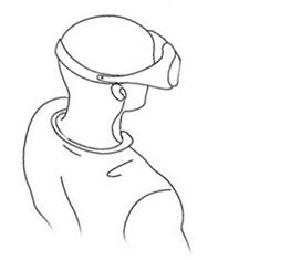
The first method that we examined was the ‘Lookwalk’, where the user can move along a vector, pointing forward with his head in the center of his field of vision (FOV). The movement is activated when the user looks down or up, according to a predefined degree threshold.
Observation of results
The advantage of this method lies in the lack of need to use additional devices (joystick, leapmotion, kinect) in order to navigate within the app. However, the “LookWalk” appears to cause significant motion sickness both during the experience and after removing the headset; moving the head to navigate without a physical movement of the body results in an uncomfortable feeling, that needs to be examined in the next experiment.

61 | URBAN GLITCH : Immersive technologies as a new means of participation
RESEARCH
b. vr
4.4
DEVELOPMENT |
platform
Figure4.4.B.1.A.1 User’smovementaccording to his FOV and head vertical rotation
SOFTWARE Unity
II.
C# 30° threshold lookdown-move Forward vector Lookup-move
EXPERIMENT B.1.a LookWalk I. user’s head tracking
scripting
EXPERIMENT B.1.b Joystick-Aided
Aim of experiment
User navigation (walking) inside the VR application without discomfort/ motion sickness.
Method and Tools

Description


In this case the user can change both his translation and his rotation inside the VR app with the utilisation of the control joysticks of a gamepad. In this case he is using an Xbox 360 controller. No customised scripts are required if the oculus SDK is installed.
Observation of results
By using the joystick to navigate within the VR platform, extreme motion sickness and discomfort are caused. They mainly derive from the change on the FOV, without the user physically rotating his head or moving his body. The translation and rotation of the ‘digital player’ should be ristricted and defined in a more intuitive and natural way, considering the lack of physical walking.


| 62
SOFTWARE Unity
gamepad
A Y X B player rotation
II.
I. oculus SDK
player translation
Figure4.4.B.1.B.1
User’s movement based on XBox360 controller [Urban Glitch]
b.1 NAVIGATION experiments
EXPERIMENT B.1.c Move_Forward
[Urban Glitch]
Aim of experiment
User navigation (walking) inside the VR application without discomfort/ motion sickness.

Method and Tools
I. user’s head tracking
II. gamepad

III. scripting C#


Description
In this case the translation of the player is activated by hitting a gamepad button, rather than a head inclination or using the joystick. However, the rotation of the player takes place through head rotation, where through a vector that points forward in his center of FOV he defines the direction that he will eventually follow.
Observation of results
This method has proven to have better results on users’ motion sickness as it gives them a level of control that is related to their physical functions of navigation and space perception. The translation is simple, although it lacks the physical movement of the body, which is linked only with the rotation of the player, providing a sense of physical moving.
63 | URBAN GLITCH : Immersive technologies as a new means of participation
A Y X B move forward
vr platform
Figure4.4.B.1.C.1 User’smovementthrough controller button
Unity
SOFTWARE
EXPERIMENT
Aim of experiment
Create a user-friendly module-generation method for the player.


Method and Tools
Description

The user takes part in the design process through instantiating cube modules in a predetermined fixed location in the scene (x,y,z coordinates).

Observation of results
This method of instantiating objects in the scene fails in terms of making the user relate with them. For instance the object might be generated outside the user’s FOV. The modules should be being generated in a relative to the user location so that he is better able to control the design process.
| 64 b.2 module insertion
I. gamepad A X B cube generation Y fixed position 4.4 research development | b. vr platform
b.2.a Fixed_Position
SOFTWARE Unity
Figure4.4.B.2.A.1 Insertion of module in a predefinedlocation [Urban Glitch]
b.2 module insertion
EXPERIMENT b.2.b
Player_Related Position

fixed relation


Aim of experiment
[Urban Glitch]
Create a user-friendly module-generation method for the player.


Method and Tools II.
Description
The object is always instantiated in a position that has a predefined relevance to the player’s position, as well as his field of vision; thus, the modules are always introduced within his FOV, allowing him to control the generation point. The modules are generated at a particular height and then fall on the ground.

Observation of results
This method is more user-friendly, as the user through his FOV is always related with the generated object and is better able to control the configurations of his liking. However the instantiation still remains restricted as the player can not yet pick a specific location to generate the module. Another important aspect is that the initial position that the modules are generated (on the air), decreases the control of the user on them, as the final location is not obvious in the beggining.
65 | URBAN GLITCH : Immersive technologies as a new means of participation vr platform
I. user’s head tracking
A X B cube generation Y
gamepad
Figure4.4.B.2.B.1 Insertion of the module relativetotheplayer’s position
SOFTWARE Unity
4.4 research development | b. vr platform


b.3 module control
Aim of experiment
Move modules within the game scene in with a significant level of control.

Method and Tools
Description
The modules are moved through the joysticks of a gamepad (Xbox 360 controller in this case). Through moving them in all of the axes, the user can define what the final location of each module will be.

Observation of results
This method is giving a level of control to the user, however when moving in a 3D space it is impossible to locate the module if it’s not on another surface or object. Additionally the button assignment is cumbersome, as the joystick decreases the control of the steps of the cube while moving it; thus, the assignment of the movement axes to the joystick’s axes could be informed through a gamepad scheme in order to be easier to control, as well as more intuitive for the user.
| 66
Module movement I. gamepad X Y B A left/right left/right front/back up/down x y z
EXPERIMENT b.3.a
movement [Urban Glitch] SOFTWARE Unity
Figure4.4.B.3.A.1 Joystickassignment accordingtomodules’axes
b.3 module control
EXPERIMENT
b.3.b
Module selection
Aim of experiment
Give a design flexibility to the users, enabling them to select modules in the scene and/or change their active state.


Method and Tools
I. oculus SDK

II. gamepad

III. scripting C#


I. user’s head tracking
Description
The user can target modules in the 3D scene simply by looking at them. A pointer placed in the center of his field of vision targets the modules and by pressing the assigned buttons on the gamepad he can select/deselect, lock modules in place or delete them.
Observation of results
The implementation of a pointer related with the users’ head position proved to be a very efficient/direct way of targeting objects in the scene. Allowing them to move, lock and deletes modules, increased their freedom during the design process, resulting in a more game-friendly reaction, rather than actually design in the space. Furthermore, the corellation of selection and movement of objects can be revisited into becoming more user-intuitive.
67 | URBAN GLITCH : Immersive technologies as a new means of participation
Figure 4.4.B.3.B.1 Gamepadbuttons’ assignmentandcolorcoding of different module states [Urban Glitch]
targeted module selected module locked module
X Y B A select / deselect lock remove vr platform SOFTWARE Unity
4.4 research development | b. vr platform


b.3 module control
EXPERIMENT b.3.c
Module footprint
Projection
SOFTWARE Unity
Aim of experiment
Enable users to understand the position of selected modules in 3D space.

Method and Tools
I. projection
II. gamepad
Description
This step was an attempt to increase the spatial information of the VR platform. It allowed the user to visualise the projection of a module’s outline, either on the ground surface or on the modules that are below, when the initial module is selected.

Observation of results
The projection technique enabled a much more informed understanding of the modules’ position within the game scene, as well as the relative positions between different modules. It provided the users with an additional layer of information, resulting in a better control of the design process.
| 68
Figure 4.4.B.3.C.1 Projectionexamplewithing thegameengineonactive screen
[Urban Glitch]
4.5 RESEARCH DEVELOPMENT | c. user interaction

EXAMINING USER INTERACTION WITH THE ENVIRONMENT AND THE MODULES

EXPERIMENT
SOFTWARE Unity
HARDWARE
Oculus Rift Xbox 360 controller
Aim of experiment
User comfort within the ‘on-going’ VR application development, evaluation of immersion degree and manageability of commands inside a limited space. Attempt to trigger spatial reactions/interventions to/ from the users.
Method and Tools
I. prepare room space
II. initialize application in pc


III. connect controller
Observation of results
IV. Provide 10 participants of different backgrounds with controller and VR headset
V. one minute induction on commands
VI. ten minutes game experience
The realism degree of the 3d model within the provided virtual reality set was positively valued by the participants. A higher level of information on how to use the application was needed as well as a more intuitive button assignment for the controller. Although no motion sickness was experienced in such short experiment, some users highlighted having felt limited physical motion given the unability to walk around while being connected to the pc, and therefore this might affect the place/on-going design perception. Despite this, very different design results were obtained highly linked to each individual: some took the time to observe and think how to enhance the space, others triggered the ‘insert module’ command independently of its impact in the site, revealing the need for a more programmed design experience.
69 | URBAN GLITCH : Immersive technologies as a new means of participation
c
Figure 4.5.C.1[p:69] Auserdesigned arrangementofmodules [Urban Glitch]
Figures4.5.1-3[p:70] Userproposedarrangement of modules
4.6 RESEARCH DEVELOPMENT | results


4.6 RESEARCH DEVELOPMENT | conclusions
Introduction
The results of the experiments administered in this stage of the research gave insight into many matters. Initially, new methods of site representation were used. Furthremore, both concerning the development of a VR application, as well as in regards to the users’ engagement, the tool was examined, as well as its employment in the participatory process.
Site representation
The realistic representation of the site increased the engagement of the users in the VR experience. Navigating in a space with real climatic attributes, such as sun exposure, as well as real-time conditions, such as parked cars, influences the perception of the players significantly. Nonetheless, that was not sufficient to induct them in the design process, aiming to enhance the spatial qualities of the public space.
Game features/intuitive experience
As it is illustrated through the smaller experiments themselves, although a successful degree of user immersion was achieved, there is still a lot of unharnessed potential in the development of functions regarding player navigation and module control. The aim to trigger the feeling of presence still has room for significant improvement that relies on making every control more intuitive for the player and every movement more lifelike.
Incentive
Nonetheless, a more significant matter rises when it comes to how users engaged with the platform and on what level did the logic of a simple generic module succeed as an means of communication. It is clearly portrayed on the resulting user-designed solutions (Fig.4.5.1-3) that the game significantly failed to transmit its purpose as a design tool and was treated as a fun -but purposeless- game of random cube generation/deletion instead.
The reasons for this misconception vary but the most important missing feature is a strong narrative supporting the game’s purpose. At the moment, the users do not really have any sort of guidance, about what to do within the
platform, allowing them to explore it on their own terms and create their own rules. At the same time, the options offered for cube manipulation while playing ,create an excessive body of possibilities, intensifying in that way the sense of unguided choices and unconditional freedom. A convincing background scenario would help players feel more immersed and create the incentive for playing the game. Perhaps, that scenario can begin by including certain information about the site the players are seeing in the game. This particular experiment was carried out, as mentioned, in a virtual public square in the center of London. However, the players had no reason to be somehow invested in that particular place as it does not necessarily reflect some space of importance to them or some part of their everyday routine. On that grounds, it might have been helpful for them to receive some information about it or even some subtle direction on which spatial issues might need attendance. The next experiment should include a more thorough site research, focusing on public spaces where people are invested and engage, so that they are interested in the redesign process. Places that fulfill this necessity are community public spaces.
Collective activity
Another important issue was the absence of the collective. So far, the game is set-up for individual players and successfully or not, it only seeks the articulation of their individual spatial fantasies. The next step will be to come up with a way of introducing user-user communication within the platform, in an effort to reach a convergence of different opinions.
All in all, the end of this experiment leaves a blurry image on how the communications between the design’s stakeholders were achieved. The following part of the research will focus on clarifying those relationships and the way they will be incorporated both inside the VR platform as well as during the overall design project itself.
Figures4.6.1-4 Experimentday(EmTechstudio)
71 | URBAN GLITCH : Immersive technologies as a new means of participation


73 | URBAN GLITCH : Immersive technologies as a new means of participation
design DEVELOPMENT 5
5.9
| 74
site research
5.1 aim 5.2
5.3 survey
5.4 game description
5.5 gametime
5.6 game development
5.7 data of participants
5.8 design results
participants’ feedback
5.10 conclusions
In light of the results that derived from the previous experiment and based on the aspects it highlighted, during the design development, a new experiment is set out. The core guidelines of this experiment focus not only on the definition of a new medium of communication, but also in the construction of a tool for collective design. More specifically, this section aims to examine two different types of communication/interaction enclosed in participatory design: one between the users/non-experts and the architect/expert and another between individual users themselves, in seek of a convergence of ideas.
In a more detailed exploration of these two communications, the first one refers to an information exchange between different stakeholders, that do not utilize the same language in expressing and sharing ideas and do not perceive or read space in the same way. In order to render this communication conducive, both sides need to articulate their expertise and educate each other. On one hand the user is asked to transfer their personal knowledge and experience about a specific place, as it has been inscribed/documented throughout the years of living there on his personal “lifeworld” (Husserl, 1970). He is responsible of demanding the spatial configurations he considers appropriate and needed, based on his personal involvement with the place both before and after the design procedure. On the other side, the designer is responsible for educating the user about certain features that hold an important role during design but are not evident and/or considered in a non-expert approach of space.

Such features can include: solar exposure, wind exposure, noise levels, people flow, structural feasibility etc. This first type of communication has an educational character, as both sides need to inform each other for equally important design details that will lead to a more comprehensive final result.
The second type of communication is established between individual users and refers to the power of each individual opinion over others, and the formation of the collective result. Every user has a specific fantasy about space that refers back to his/her personal perception of space and expectations of reality. The collective result cannot fully satisfy all individual fantasies but needs to derive from them and depict a user-acceptable level of convergence of different ideas. The communication between different users aims to achieve a reasonable degree of balance between individual opinions. It is a hard and long-lasting procedure that requires devotion and personal investment.
The ultimate goal of this experiment is to map out a process that will simultaneously enhance both communications and the means required for their success, as well as create a dynamic field of information through which different stakeholders will be able to interact and exchange data. These will occur within a virtual reality platform.
75 | URBAN GLITCH : Immersive technologies as a new means of participation INTRODUCTION 5.1 design DEVELOPMENT | AIM
COMMUNICATION TOOL AIM EDUCATIONAL TOOL b/w COLLECTIVE TOOL user user other users architect
Figure5.1.1 Communication field [Urban Glitch]
design strategy


Our first step towards that direction, was to investigate public spaces that are disused, meaning that they do not enhance people’s interaction and are regarded as unpleasant and unsafe. Several areas in east London are listed as spaces that need redevelopment and their use needs to be redefined. After selecting one of these areas we conducted a survey to verify the deficiencies of the site and the feeling of security of the residents, workers and people who pass by. The answers helped us form the principles of the VR platform, as we gained knowledge regarding the people’s needs, the quality of the public space and the social interaction between the residents.

At the next phase, we developed the VR platform, through which the user was able to select a specific program for each location. The outcome of the process was a spatial volumetric configuration, which the architect would use later as a design space, as well as the personal feedback of the users regarding spatial attributes and the
atmosphere of the area. The users were updated for various environmental features, which were relative to the answers that the participants submitted at the survey.
At the final stage, the architect receives the input of the users spatially expressed as 3D opinions on site, a template that renders his work of combining results significantly smoother. In such a manner, he is able to utilize the platform’s resulting geometries as program and location indicators, and the corresponding comments as a refined expression of spatial intention.

| 76
COMMUNICATION TOOL PROCESS OUTCOME SPATIAL ATTRIBUTES DESIGN PROGRAMME 1 SITE RESEARCH 3D OPINION 2 SURVEY 3 GAME DEVELOPMENT 4 GAME WORKSHOP 5 OUTCOME ANALYSIS
Figure5.1.2 Experiment process [Urban Glitch]
5.2 design DEVELOPMENT | site research new era estate

The first step of the experiment was to conduct a thorough site research. Except for neglected spaces, we looked into neighbourhoods that are characterised by social issues and lack of social interaction. Furthermore, we gave importance to sites that had a strong community feeling, as it would make its occupants more interested in the enhancement of their public space.
After investigating public spaces in London, we were focused on New Era Estate, a housing estate in Hoxton. It was constructed in 1930 and it consists of 16 building blocks and approximately 300-350 people. Its use is mainly residential; however, it hosts twelve shops towards Whitmore Road, including services such as beauty shops, super-markets, dry cleaners, cafés, rehabilitation and a bike shop.
77 | URBAN GLITCH : Immersive technologies as a new means of participation
Figure5.2.1 New Era estate block [Urban Glitch]


| 78 Orsman Road Phillipp Street Whitmore Road Halcomb Street Leeward House 1 - 8 Flats 8 Families Area of intervention Block information 13 Buildings 100 Families 300-350 persons Hackney Map of London
social issues of new era estate
In 2014 the block was acquired by developers named ‘Westbrook Partners’, aiming in the gentrification of the neighbourhood. That would leave the occupants with the option either to pay triple the rent or to be evicted from their houses. However, after protesting and collecting 350,000 signatures, the residents managed to stay in their houses and the block was sold to a housing office called ‘Dolphin Living’, which maintained it in its current condition. Since then, the residents created ‘New Era Association’, which is an initiative to help address similar issues. It is obvious that the community is active and supportive with their living space, which serves as a good example for our aim, as the residents will be more invested in the redesign process of the public space.
Another aspect that drew our attention was that although it is a strong community there are no social activities within the block, which significantly decreases the social interaction between the occupants.

79 | URBAN GLITCH : Immersive technologies as a new means of participation


| 80 5.2 design development | site research
Figure5.2.2[p.79] New Era estate block [Urban Glitch]
Figures5.2.3-6[p.80] NewEraestateblock+protesting [UrbanGlitch+huffingtonpost.co.uk]
design DEVELOPMENT |
After obtaining information about the site from online resources, the next step was to conduct an on-site survey. Our objective was to create a deeper understanding of the residents’ needs, their social interaction, the involvement in the community decisions, as well as the quality of the public space.


Mainly residents but also people who daily interact with the public space of NEE participated and expressed their opinion about these major issues and refered to certain deficiencies of the site.
Community involvement
Do you feel involved in the decisions of the community?
Yes
Have you ever been to a community meeting?
Yes
No No
81 | URBAN GLITCH : Immersive technologies as a new means of participation
introduction
5.3
survey
URBAN GLITCH PROJECT SURVEY
Figures5.3.1-2 On-sitesurveypictures[top] [Urban Glitch]
Figures5.3.3 Sampleofthequestionnaire[bottom] [Urban Glitch]


| 82 participants’ data AGE GROUP under 25 years old 12% 26-35 23% 46-55 27% 56-65 12% over 66 years old 12% OCCUPATION students engineering waitingstaff education sports retail healthcare pensioners transportation hospitality administration media/journalism beauty consultancy arts 8 6 4 2 0 GENDER 40 30 20 10 0 female male 36-45 15% PURPOSE OF BEING ON THE SITE working 18% passing by 17% NATIONALITY British 60% Indian 10% Irish 4% Italian 8% Kurdish 2% Polish 12% Spain 2% USA 2% Figure5.3.4
Figure5.3.5
Figure5.3.7
Figure5.3.6
Figure5.3.8
involvement in the community decisions


DO YOU REMEMBER ANY PARTICULAR REQUEST FOR THE PUBLIC AREA OF THE BLOCK?
Being involved in the community decisions shows how active and supportive the residents are with their living space. In this case the majority of the occupants were not interested in community meetings, as there are not crucial changes, as they claimed.

However, the ones that are involved refered to meetings about certain conditions of the public space, such as lack of greenery, bad lighting conditions, as well as lack of bike bays and car parking. Furthermore, some of them mentioned security issues, that were diminished during the last years.
By using a VR platform to express their opinion we believe that their motivation to participate in collective activities about improving their public space will be enhanced and their involvement in the decisions of the community will be increased.
DO YOU FEEL INVOLVED IN THE DECISIONS OF THE COMMUNITY?
HAVE YOU EVER BEEN TO A COMMUNITY MEETING?
83 | URBAN GLITCH : Immersive technologies as a new means of participation
yes 48% no 52%
yes 44% no 58%
40 30 20 10 0 securityissues parkingissues sittingareas betterlighting cleaningissues greenery bikebays rentprice
Figure5.3.9
Figure5.3.10
Figure5.3.11
social interaction


IN WHAT CIRCUMSTANCES DO YOU INTERACT WITH YOUR NEIGHBOURS?
DO YOU KNOW OTHER FAMILIES IN THE BUILDING?
Being involved in the community decisions shows how active and supportive the residents are with their living space. In this case the majority of the occupants were not interested in community meetings, as there are not crucial changes, as they claimed.


However, the ones that are involved refered to meetings about certain conditions of the public space, such as lack of greenery, bad lighting conditions, as well as lack of bike bays and car parking. Furthermore, some of them mentioned security issues, that were diminished during the last years.
By using a VR platform to express their opinion we believe that their motivation to participate in collective activities about improving their public space will be enhanced and their involvement in the decisions of the community will be increased.
WHERE DO YOU USUALLY GATHER TO TALK WITH YOUR NEIGHBOURS?
| 84
family 11% friends 18% cross paths 29% visit the shop 18% no common space 18%
inside the block 40%
50 40 30 20 10 0 yes no community meetings 7% 5.3 design development | survey
Figure5.3.12
Figure5.3.13
outside the block 60%
Figure5.3.14
quality of public space
HOW WOULD YOU RATE THE QUALITY OF THE PUBLIC SPACE?


Moreover, we asked for the opinion of the people about the quality of the public space and the feeling of safety. The majority of them claimed that it is bad or mediocre and it does not cover the needs of all age groups. However, it is a safe place, especially the last years, after the formation of ‘New Era Association’, that aimed to address similar issues.
Being unsatisfied by the quality of the public space is an asset for our objective, as we believe that the motivation of the residents to change this space and express their opinion about its enhancement is stronger.
DO YOU FEEL THAT THE NEIGHBOURHOOD COVERS THE NEEDS OF ALL AGE GROUPS?
DO YOU FEEL SAFE IN THE AREA?
85 | URBAN GLITCH : Immersive technologies as a new means of participation
bad 28% mediocre 47% good 15% excellent 2% indifferent 8%
no 34% yes 66%
yes 43% no 57%
Figure5.3.15
Figure5.3.16
Figure5.3.17
conclusions 5.3 design development | survey


• only residential use
• buildings upgrade
• enhance involvement of neighbours
• enhance socialization
• safer common areas
• more pleasant public spaces
• greener areas
• more communal / recreational spaces
The results of the survey were used to set the guidelines of the VR platform. We classified the outcome into four groups, which are related to the issues that the site already has, according to the obtained information.
Initially, the use is mainly residential, which shows the lack of communal recreational spaces; people do not have the opportunity to socialise or spend their free time in a public area in their block. A high percentage of the residents does not feel involved in the community decisions or does not care about them, which proves the lack of interest about their living space. The ones that take part in community meetings mentioned that the most common topics are security issues and lack of green spaces, as well as poor lighting conditions in the neighbourhood. Moreover, the neighbourhood does not offer the opportunity for attending cultural events. It also lacks sports facilities. Most participants claimed that for any recreational, cultural or physical activities they use facilities outside the block.
Not only the actual results, but also the personal feedback of the participants helped us gain a deeper understanding about the deficiencies of the site. Most of the residents lived in the area for 20-30 years and believe that they are a strong community, having been through months of protest. We believe that this is an asset for our goal, as the people will be highly invested in the enhancement of the communal space. Furthermore, we were informed that the community meetings take place every six months.
| 86
USE
COMMUNITY
PUBLIC SPACE DEFICIENCIES
SAFETY
Figure5.3.18 Majorissuesexpressedbyresidents [Urban Glitch]
utilisation of results
WHAT SPACES WOULD YOU ADD IN THE PUBLIC SPACE OF NEW ERA ESTATE?
Among the deficiencies of the public space of New Era Estate, the most important drawback is the lack of communal activities. People mainly refered to lack of greenery and parks, areas to sit and rest and additions on the building facades, such as balconies and connecting outdoor corridors. Furthermore, there is lack of sport facilities and places for children.
After acquiring this data, we classified it into four categories, according to its use, which helped us form the guidelines for the creation of the VR platform. The category “Greenery” included the green areas and “street furniture” consisted of the geometries that can be designed within the public space. As for “Building Additions”, geometries that can be added on the buildings were included. Finally, there is a miscellaneous category that contained facilities and objects that were not included in the previous ones.
GREENERY
STREET FURNITURE
BUILDING ADDITIONS
VARIOUS
Figure5.3.19[p.87]
Activities that the residentssuggested [Urban Glitch]
Figures5.3.20-25[p.88]
New Era estate photographs [source: standard.co.uk +Urban Glitch]
87 | URBAN GLITCH : Immersive technologies as a new means of participation
Parks Greenery 40 ppl
Sportfacilities Benches Seatingareas Lifts Restingareas Lighting Balconies Facade corridorsBridgesbetweenbuildings
Playground


5.4 design DEVELOPMENT | game description introduction | world design
The development of the world design is intended to set all the aim components in accordance to give a coherent and consistent vision of the proposed VR Game. Like every design, the game started with an idea (Bates, 2004): a 3D-proposals generator of simplified geometries that is capable of specifying use, proportions and location and which development is set in a collaborative environment.
The idea is inbuilt within the world design (Brathwaite, 2009), defined by us as:
Backstory
Players are invited to immerse in the virtual reality of the New Era neighborhood where, aware of its lack of quality public space, they can propose its upgrade using the provided tools (player options) and placing comments.
Settings
The game is set in mono-player mode, where a chain of narrated scenes (user interface) lead the player through all the game stages.
Theme
The main theme of the game is to create a design proposal using simple cubes (building unit), within one or more architectural categories (player modes).
Each of the elements that conform this world are illustrated in the following pages.
89 | URBAN GLITCH : Immersive technologies as a new means of participation
1. user interface
LoL [source: Riot Games]

Pokemon [source: Nintendo]

HoloLens [source: Microsoft]

WatchDogs[source:UbisoftMontreal]
Unlike the most frequently used dynamic and static 2D user interfaces (UI) known as diegetic and non-diegetic, our eyes in the VR game are unable to focus on screen-space overlay items (Available at https://www.unity3d.com).
Given this, 2D / 3D information needs to be located within the digital environment (world space coordinates) for the player to feel comfortable. Far from characteristic funny games interfaces such as the meta, the spatial UI allows for an easy manageability and deep immersion.

| 90
META UI SPATIAL UI NON-DIEGETIC UI DIEGETIC UI
Figure4.5.1.1[toptobottom]
2. design unit and player modes


design unit player modes
Everyone knows how to play with cubes. With this 500 mm piece we seek to place the players all at the same level, with a unit that is unmodifiable but allows for limitless stacking options.
The player can design in one or more of these 4 categories. By giving them we help the non-designer player to efficiently bring his/her ideas up. Furthermore the frequency each category has been used will be important data for us in further stages.
G


91 | URBAN GLITCH : Immersive technologies as a new means of participation
U ILDINGADDS
REET FURNITU R E
B
ST
REENERY
00 mmcube
O REBEL!
5
G
Figure4.5.2.1[toptobottom] Designunitandplayermodes(categories)
[Urban Glitch]

SPECIFICUSE

The player in the proposed game-space environment will have the task to build a design proposal. Free navigation will help him/her understand the space to be built, key to start the design process. Furthermore, we aim for these constructions to be firmly build upon knowledge given by real-time analysis bars. The measure in which they affect the outcome is vital for our work.


Collaborative games are usually played in multi-player mode. In this case, the players’ outcomes are recorded in the Collaboration options, and the current individual decides whether to be influenced by them or not. We will use these options to understand emerging pattern formations or uniqueness of the proposals.


93 | URBAN GLITCH : Immersive technologies as a new means of participation
player options
3.
• g units used •Playerflow ofmovement •Ove hadowing •Seatingarea •Cubeaddition & de l e t i o n • Swap modes •Previewother ’s comments •Prev wpopular desig n s o lu t i o n s •P most usua l loc a t i o n s NAVIGATIO N ANALYSIS C ONSTRUCTION
COLLABORATION Go Rebel Game time 6:42 Cubes used Overshadowing Seating area
Figure4.5.3.1 Playeroptions [Urban Glitch]

design DEVELOPMENT |
In this chapter we explore the proposed Urban Glitch App which was prepared for the New Era Estate Workshop. We will run through all the features developed, including the game structure along with the detailed design of all the elements as seen by the player when using the Oculus Rift headset and Xbox controller.
The game is played in single-player mode and it consists of three levels. Firstly, we aim to inform the player on how the game is played through a series of instructions and demonstrations. Secondly, we give him/her to choose among four design categories: building additions, greenery, street furniture and a free category. All this prior jumping into the game stage. In this one the player is able to start building with the design unit (cubes), swap categories and turn on/off a series of previews where lie all the participatory features. These include a live set of information to raise awareness of their design, most popular locations preview and other user’s comments.
95 | URBAN GLITCH : Immersive technologies as a new means of participation
5.5
gametime introduction
The first scene invites the player to introduce his/her personal details. Besides identifying each player’s outcome, we are interested in obtaining statistical data mainly related to the age of the participants and circumstances of participation. The possible linkage of the solutions, for example more or less conventional, or more or less detailed,
to a specific age range or participation motif will be part of our research regarding tool acceptation, efficiency and adaptability.

| 96
A. Log in details
A B Design your own neighbourhood My name is... My age is... My gender is... I’m in the site because... UrbanGLITCH NEXT A
information
B. Next
user
Figure5.5.1 User information [Urban Glitch]
Following the log in scene, the player is trained to play. Starting by introducing the New Era Estate virtual environment, the goal of the project and a series of simple instructions always accompanied with diagrams pursuing a fast understanding of concepts.

97 | URBAN GLITCH : Immersive technologies as a new means of participation
A. Story telling B. Next
A
C. Aerial view of the site
NEXT demonstration
This is the New Era Estate Virtual Reality! Your quest is to achieve your dream public space by building it with the help of your neighbours in Urban Glitch! C B a
Figure5.5.2 Demonstration [Urban Glitch]
| 98 You’ll use them to BUILD freely! NEXT A CUBES Push forward / backward to WALK! NEXT A controlLER Wherever you point, a highlighted cube will indicate a possible insertion POSITION NEXT A cube generation
| gametime
5.5 design development
Figures5.5.3-5[toptobottom] Buildingunit Controller buttons Signsidentification [Urban Glitch]
This level is characterized by a pile of cubes that contain the four design categories. The player shall pick one using the pointer that moves according to the head local orientation.


99 | URBAN GLITCH : Immersive technologies as a new means of participation B A A NEXT
category selection
Figure5.5.6 Categoryselectionscreen [Urban Glitch]
The ‘play’ space starts with a fixed floating panel relative to the player orientation. This one indicates the active design category, the time elapsed, number of cubes used so far, the overshadowing and seating area amount. By showing it we seek to educate the user towards developing a meaningful construction.


The interactive features are activated through the insertion of the modules. A cube placeholder appears everytime the pointer passes through an available surface, and will adopt a distinctive color if the place has been highly used by other players. Furthermore, most common flow lines will adapt to the new constructions the user creates.

| 100
C
Cubes
Overshadowing Seating area D NEXT A
Greenery Game time 5:10
used
A. Target, possible new cube indicator
B. Flow analysis
C. Floating panel, analysis information
A B spatial features 5.5 design development | gametime
D. Next
Figure5.5.7 Live information [Urban Glitch]
Finally, the player is able to insert a comment at any point of the space. Moreover, by just hovering over a comment -loaded location, other users additions will pop up for consultation. These interactive features will enhance the relation between users in the game space, pursuing a high range of design solutions that could have followed common patterns, spot unknown problems and lead to new discussions common to the players community.


101 | URBAN GLITCH : Immersive technologies as a new means of participation A A. Target B. Next level button B A NEXT Protective pergola comments
Figure5.5.8
Comment insertion screen [Urban Glitch]
| 102 5.5 design development | gametime
5.6 design DEVELOPMENT | game development
This chapter unfolds the computational infrastructure based on which the proposed game application is developed. Our aim was to select the best ways of quantifying and extracting user information, while creating a friendly and intuitive game experience, able to run smoothly without unnecessary lags. In the following pages we examine: how the game’s background mechanisms were set up, how the user interaction was introduced, how certain spatial information were encoded and transmitted live during runtime and finally how the user proposals were saved and processed, in seek of a collective communication.
103 | URBAN GLITCH : Immersive technologies as a new means of participation
introduction
| 104 Head IMMERSION MEANS Hands Eyes A B C ORIENTATION J O Y S T I C K Game Manager Convergenceofmodules PlaceholderModule Comment insertion Pointer Flow Lines Seatingarea Module insertion Shaded Area Assignvalue togrid PLAYER INPUT A B C On click write On enter save Instantiate input field Hit position Start / Update OVR Ray Pointer Instantiate object Start / Update Select object Deselect object Lock object Start / Update Get raycast data Face hit choose side Visualize on cube Visualize on hidden cube Visualize on grid Plane relative position Cube indicator Read grid values Start/Update Start/Update Start/Update Start/Update Start/Update Flow calculation Seating surface activation Shade calculation Obstruction percentage Seating factor Obstruction percentage Visualize flows Dynamic seats Visualize percentage Node data Deactivate menu Voxel grid load Activate deactivate menu Voxel grid save Yield return Grid addition Reset all Save grid Save all Assign voxel value Clear mode Assign local voxel value Parse voxel grid Read voxel value Script space Features space Actions space Player input SNOTTUB O C U L U S
Figure5.6.0.1 Game structure [Urban Glitch]
As mentioned earlier, the strategy behind this experiment lies on the existence of an information field which enables the interactions between architects and users as well as between users themselves. This field is articulated in the virtual reality platform as an underlying 50x50x50 cm 3D grid invisible to the players, spreading in all three axes (x,y,z) and covering the site. The data are inserted on this grid through the placement of the game’s building modules. More specifically, each time a module is placed in a specific position during game-time, a value of 1 is assigned on the grid point that is closest to the module’s position.
This set-up enabled us to achieve two things. We initially gained a significant speed advantage while running a set of live calculations on gametime, that would otherwise require considerable additional computational force, causing the game to lag. The specifics of these calculations will be explained in the next pages. Further more, with the grid background, we were able to organize and transform the user proposals into data and more specifically as values on a scalar field that was then used as the foundation of collective communication, as will be explained further along in this chapter.

105 | URBAN GLITCH : Immersive technologies as a new means of participation
1. information field
Theunderlying3Dgrid structureduringgametime

[Urban Glitch]
5.6 design development | game development
Empty 3D Grid

Point Values: 0
The unvalued state of the 3Dgrid
[Urban Glitch]
The valued state of the 3D grid (Thevalues ineachgrid pointindicatethetimeithas beenselectedbytheusers)

[Urban Glitch]
Valued 3D Grid
Point A Value: 4 4 users
Point B Value: 2 2 users
Point C Value: 1 1 user
Value
Assignement
| 106
Figure5.6.1.2[p.106top]
Figure5.6.1.3[p.106bottom]
Figure5.6.1.1[p.105]
ray-casting
One of the main challenges of Virtual Reality games/ platforms is the world-space environment. In regular gaming the player experiences the game through a 2D screen layer and usually has a pointer element (mouse, controller, etc) that enables him to interact with other objects within the game and select specific locations in the game-space. In VR on the other hand, the player is completely immersed in a first-person experience of space, he/she has no physical instrument to point other than the headset itself and the 2D screen is integrated in the user’s field of vision due to the mechanics of VR headsets. The challenge of pointing and specifying location within VR platforms is addressed through a technique called raycasting. This method follows the same principle regardless if the pointer instrument is the headset itself, or some additional controller device. In this particular experiment, the players point aided by the headset and thus the analysis of the ray-casting technique will be focused on it.
The driving logic behind ray-casting indicates that a ray is cast, starting from a source point between the player’s eyes. The ray’s direction is a vector in the forward axis of the player’s head, meaning that the ray is always aligned with the player’s head movements. As soon as the ray collides (hits) with another object in the game-space, the object of collision, the point where the ray hit as well as the object’s normal in that point, can all be identified and extracted as spatial data. The additional option to layer and filter collision objects in the game-scene enhances the accuracy and control over selecting specific positions and objects during game-time.

107 | URBAN GLITCH : Immersive technologies as a new means of participation
Camera VR Screen 3D object
2. world space interaction and
(Theraystartsfromthe centeroftheplayer’seyes passesthroughtheVR screenandintothe3Dspace untilithitsacolliderobject)


[Urban

5.6 design development | game development
| 108
Figure5.6.2.1[p.107] Diagramofray-casting
Glitch]
Fogure 5.6.2.2 [p.108 top] Ray-castingisinextricably connectedwiththeplayer’s head movements
[Urban Glitch]
Figure5.6.2.3[p.108bottom] Adisplayofwhattheuser sees within the headset, withapointerindicating thecollisionobjectofthe ray-casting.
As established earlier in this dissertation, the building module of the game remains a 50x50x50 cm cube. However, considering the conclusions of the previous experiments in terms of module insertion, this time the aim was to significantly increase control, ease and accuracy and abstain from presenting a series of options (move, generate from the sky, lock, delete, etc) that eventually induced confusion and affected negatively the game’s general context. On that grounds, the cubes now are always generated from the ground up, following a growth-like logic. This means that the generation of a new cube is always relative to an already existing cube on scene, unless the new cube is generated directly on the ground. Of course the users still have the ability to delete cubes and thus break the visual effect of the growth pattern of their insertion. Cube generation utilizes the ray-casting technique as a means of selecting specific locations on the game-space wether these are on the ground, or on the sides of existing cubes.
On the ground
In order to instantiate a new cube module on a specific location on the ground, the player needs to point to that

location with his head/eyes in order to cast the ray that will extract the spatial data of that spot. Once that is done, a cube can be inserted 25cm above the hit position, as the modules’ pivot is in their volume centroid. Each new cube has a predefined rotation in order to avoid rotational overlaps.
Effective as this technique might seem, the placement of cubes directly referenced to the ray-casting’s hit position creates a significant problem of module positional overlap, in case the user points at a location right next to an existing cube. However, the existence of the underlying 3D grid comes to solve this issue. The ground and the base of the grid are placed with a 25cm height difference. Every time the player points at a specific location on the ground, the closest grid point to the hit position is calculated and the cube is placed directly on that position. In that way the cubes not only remain separated and next to each other at all times, but the placement procedure appears to have some sort of snapping feature in the eyes of the player which enhances his level of control.
109 | URBAN GLITCH : Immersive technologies as a new means of participation
3. module insertion
referencedtotheground
5.6 design development | game development
Thepreviouslogicof module insertion with cubes generatedfromthesky, allowed little control over locationaccuracy

Inthisexperimentmodules aregeneratedstartingfrom thegroundandfollowing agrowth-likelogic.The absence of numerous optionsmadetheprocedure moreuserfriendly

| 110
Figure5.6.3.1[p.109]
Modulesgenerated
[Urban Glitch]
Figure5.6.3.2[p.110top]
[Urban Glitch]
Figure5.6.3.3[p.110bottom]
METHOD 1: modules generated from the sky
METHOD 2: modules generated in a growth pattern
Theray-castinghitpointis translated 25 cm in z axis to correspondtothemodule’s pivot.
[Urban Glitch]
Figure5.6.3.5[middle]
Themoduleisplacedinthe translatedhitposition.


[Urban Glitch]
Thepositionaloverlapcan occurwhenhitpointsare closer that the module’s width.


[Urban Glitch]
new cube
25 cm translation on z axis
hit - point
cube’s pivot
existing cube


111 | URBAN GLITCH :
as a new
of participation module insertion
Immersive technologies
means
Figure5.6.3.4[top]
Figure5.6.3.6[bottom]
Assoonastheuser’srayhits theground,theclosestgrid pointtothecorresponding hitpositioniscalculated.


(section detail provided) [Urban Glitch]
Figure5.6.3.8[middle]
Themodulesisgenerated directlyonthegridpoint.
(section detail provided) [Urban Glitch]
Figure5.6.3.9[bottom]
Thenewcubeswillalways snaponthe sidesofthe existingastheyarealways refrencedtothegridpoints.
(section detail provided) [Urban Glitch]
25 cm translation on z axis
closest grid point


hit - point
grid pts
hit - point
ground
25 cm translation on z axis
hit - point
grid pts
ground
25 cm translation on z axis
existing cube


existing cube new cube
hit - point
| 112 5.6
design development | game development
Figure5.6.3.7[top]
On cube side
Cube generation relative to existing cubes follows a similar ray-casting logic. Every time the player points at one of the existing cube’s sides, a new cube can be generated with a 50cm translation (center-to-center) in the direction of the normal vector of the hit point.
Nevertheless, this method soon proved to be prone to some serious limitations. For example, the player’s height is set to 1,75m meaning that for any cube above 1,75 the player will be unable to target its top side, rendering his/ her configurations limited to a 2 m height. Additionally, if the player is too close or too far from the existing source cube, it will be difficult to target any of its rear sides without requiring ta further movement to the right or left accordingly. For those reasons, the ray-casting method applied for the growth-like module generation, was revisited and enhanced.
Whenever the user points at one of the source cube’s sides, an additional 90x90 cm rectangular plane is placed on that side, invisible to the player, posing like a scaled

cube-side. As long as the player’s ray points directly on the cube side -meaning it is colliding both with the cube and the plane- the previous method of cube generation on the sides is applied. However, as soon as the player’s pointer moves away from the cube side but still remains within the boundaries of the rectangular plane, a vector is calculated form the center of the plane towards the hit point. Then the vector
The angle of this vector with the plane’s x axis indicates the corresponding side where the new cube will be placed (top, bottom, left, right). Then the new cube is placed accordingly with a 50cm translation from the origin cube. Of course every cube has its own axis system that remains unchanged regardless of the player’s changing position. This means that every time the player targets a cube’s side, this side needs to be classified as front, back, right or left according to the cube’s axis system in order to utilize the corresponding axes for the calculations mentioned above.
113 | URBAN GLITCH : Immersive technologies as a new means of participation
module insertion
Figure5.6.3.10[p.113] Modulesgenerated referencedtoexisting modules.
[Urban Glitch]
Figure5.6.3.11[p.114top]
Everytimetheplayersaims onacube,anunderlying planeisgeneratedonthe hit cube side.


[Urban Glitch]
Figure5.6.3.12[p.114 middle]
Assoonastheplayer’sray movesawayfromthecube but still remains within theplane,thenewcube canbegeneratedonthe corresponding side.
[Urban Glitch]
Figure5.6.3.13[p.114 bottom]
Thevectorfromtheplane’s centertothehitpoint givesa25ºanglewiththe x axis and falls into the threshold of 315º to 45º . Accordinglythenewcube canbegeneratedonthe rightsideofthesource cube.

[Urban Glitch]

| 114
45º 25º ray-cast hit point new cube RIGHT RIGHT LEFT TOP BOTTOM 135º 225º 315º
5.6 design development | game development
4. seating area calculation
The seating area calculation was one of the features we added in order to give additional spatial information on the users’s proposals. The calculation is based on a very simple logic of testing initially which cubes were placed below a predefined height threshold -viable of being treated as a seating area- and additionally, which of those low modules remained uncovered by other modules. Due to the dynamic character of cube manipulations within the game (constant additions/deletions), the calculation needed to be computed repeatedly. This is the first case where the existing underlying 3D grid proved to be a significant asset for the game’s agility. As mentioned before, each time a module was placed in the game, a value of one (1) was also added on the corresponding grid point. On that grounds, after sorting the cubes based on the specified height limitations, we only had to test one more thing: whether the value on the grid point above each module was one or zero. In this way the calculation of

the seating area remained fast regardless of the number of cubes utilized even if the latter was excessive. This simple trick enabled us to check the relative position of 3D objects in the game, without resorting to solutions such as raycasting from multiple locations which would have been a significant drawback speed-wise.
We transmitted this information to the users both visually through colorization of the seating area cubes with the hit of a button, as well as through a ratio of the seating surface modules over the overall number of used modules.
115 | URBAN GLITCH : Immersive technologies as a new means of participation
All modules under 1,5 meters are considered seatable area.
[Urban Glitch]
5.6 design development | game development


STARTING STATE
all modules are considered seating areas.
All modules under 1,5 meters are considered seatable area.

[Urban Glitch]
When new modules are placedontopofexisting, theyarenolonger consideredseatingareas. Thestateisconstantly updating.

[Urban Glitch]
CHANGED STATE
seating area has been changed by the new modules
Diagramindicatingthe correlationofvaluedgrid pointstotheseatingarea calculation. For each module we check the value onthegridpointaboveit (z+1). If the value is zero and the module falls within the heightthresholdthenitis consideredasseating.
[Urban Glitch]
height threshold
seating area non-seating
| 116
Figure5.6.4.2[p.116top]
Figure5.6.4.1[p.115]
Figure5.6.4.3[p.116middle]
Figure5.6.4.4[p.116bottom]
5. shaded area calculation
Another spatial attribute we wanted to calculate, hoping that it would enable the users gain a better understanding of their designs, was the amount of shaded area their configurations created. Our initial tests only included a specific hour of day (15:00pm), aiming to broaden the experiment’s spectrum with additional hours. However, we soon came to realize that this particular calculation would be one of the most computationally expensive of the game.
For one more time, we applied the ray-casting method, with the rays this time mimicking a reversed trajectory of the solar rays. More specifically, we cast rays from multiple points on the ground, reverse aligned to a predefined vector – the solar ray at 15:00pm- and checked which of those rays collided with the user’s modules. The collisions indicated that the corresponding source points were shaded. Naturally, the more the source points, the higher the resolution of the shaded area was and the slower the calculation became. After several tests with different
resolutions, we decided that the utilization of the ground level grid points was the most suitable. Unfortunately, the calculation still remained significantly slow, to enable it to continuously run realtime and we decided to refresh it only with the hit of a button instead.
In terms of informing the users of the percentage of shaded area, we divided the ground level area into 20 smaller pieces of approximately 25 square meters each and calculated the ratio of the shaded area over one or more of them proportionately.

117 | URBAN GLITCH : Immersive technologies as a new means of participation
Visualisation of shaded area calculation [Urban Glitch]


design development | game development
Solar Ray
Rays with the reverse direction of sun
Themoduleconfiguration andthevectorimitatingthe directionofsolarray [Urban Glitch]
Raysfromthegridpoints with the reverse direction of the solarrayarecast [Urban Glitch]
Thepointswhoserays collide with the modules, indicate the shaded area on theground [Urban Glitch]
| 118
5.6
Figure5.6.5.2[p.118top]
Figure5.6.5.1[p.117]
Shaded area
Figure5.6.5.3[p.118middle]
Figure5.6.5.4[p.118bottom]
The final piece of information we reveled to the users during game-time at this stage of the experiment, was an indication of the people flow on the site. The aim of this feature was mostly a visual representation of how the placement of matter changes the circulation routes within the public space. It was important for us to let the users know of this particular byproduct of their designs, as it directly refers to other users as well.
We initially created a series of nodes, connecting the main entrances of the estate with the doors of each building. After the definition of the static obstacles (buildings), we calculated the shortest paths through an integrated A* algorithm within the game-engine. We set the building modules as obstacle geometries as well, meaning that every time a cube’s location was disrupting the precalculated shortest paths, new paths were automatically generated, changing the overall flow.
The flow lines were visible on the ground at all times emphasizing the dynamics of their changes.

119 | URBAN GLITCH : Immersive technologies as a new means of participation
6. flow calculation
Visualisation of flow calculation [Urban Glitch]
The initial calculation of theshortestpathbetween definednodes,aidedbythe integratedA*algorithm. [Urban Glitch]
Changedpathsafterthe insertion of obstacles (modules). example1 [Urban Glitch]
Changedpathsafterthe insertion of obstacles (modules). example2 [Urban Glitch]

| 120
5.6 design development | game development
Figure5.6.6.2[p.120top]
Figure5.6.6.1[p.119]
Figure5.6.6.3[p.120middle]
Figure5.6.6.4[p.120bottom]
As mentioned earlier, the existence of the 3D grid was a significant asset in terms of introducing the aspect of collective communication. The ever-growing scalar field of values created through the user modules’ positions, set the foundations on seeking patterns of collective convergence in the proposed designs.
More specifically, we searched for grid points that were repeatedly valued and thus now held a value of 2, 3 or higher. This was calculated for each program category separately, as will be explained later, and indicated locations of preference. In order to make the expression of these locations volumetric, rather than mere points on a 3D environment, we run a marching cubes algorithm.
This algorithm searches the scalar field for a specific reference value that needs to be defined beforehand, and creates iso-surface envelop geometries around the points that bear it. In our case the reference value indicated the number of times a point had been used. The way the algorithm works is by adding temporary voxels (cubes) on each point of the scalar field which are then cut by surfaces, in such manner, that the final iso-surface is created. There are 33 distinct cases of how these cutting surfaces can
be placed on each voxel, depending on the values of its immediate neighbors. The smoothness of the resulting isosurface/mesh geometry is based on the resolution of the scalar field.
The marching cubes algorithm was applied after every player, creating the iso-surface geometry for each category. We named those geometries, program hotspots.
During the game, each user was able to visualize the program hotspots so far (based on previous players’ data) by holding down a button in the controller. In that manner we offered a generalized visualization of user preference, aiming to figure out if it would eventually drive the players’ choices to convergence. Another visualization feature we added was the coloring of the preview module. Based on its location on the grid, the preview cube could either have the general grey color, indicating that the location is unvalued at the moment, or it could be colored according to the active program category on a gradient of intensity referring back to the amount of times this location had been used.

121 | URBAN GLITCH : Immersive technologies as a new means of participation
7. collective communication / convergence
Visualisationofprogram hotspots

[Urban Glitch]
5.6 design development | game development
The valued points provide the scalar field
Themarchingcubes algorithmcreatesiso-surface envelopsbasedonthe valuesoftheprovidedscalar grid.
[Urban Glitch]
Theendproductis3D volumetricregionsof preference.


[Urban Glitch]
Themaincasesofcutting surfaces,referringtothe voxels derived from
[Urban Glitch]
The iso-surfaces are created based on the values of the scalar field
| 122
Figure5.6.7.2[p.122top]
Figure5.6.7.1[p.121]
Figure5.6.7.3[p.122middle]
Figure5.6.7.4[p.122bottom]
the scalar field.
All the aforementioned game features were made available due to the game’s thorough structure and data organization. It was crucial to be able to record, access and store the user information in two different ways.
Initially, and in order to perform the realtime calculations mentioned earlier, we needed to focus on each user separately and store his corresponding game-data individually. The general logic, as introduced during game-time, relied on the program categories to form the driving guidelines of the data structure, based on which the application was build and the 3D grid stored information. On that grounds, not one but four versions of the 3D grid were instantiated anew for each new player, or rather each grid point was equipped with four empty data holders/slots, one for each program category. This allowed us access to the player’s proposal not only as a whole design referenced to him, but also as four sets of different morphologies referenced to the corresponding program category.
On the other hand, the formation of the hotspot iso-surface geometries, as well as the colored module preview feature,

required access to the total of all player-data accumulated so far. For that reason we created four additional versions of the 3D grid -one for each category- that were instantiated once and were loaded on the game memory from then on for every individual player. At the end of each user’s turn, the individual data of his proposal were added on those general grids accordingly, saving in this manner the accumulative results for all players.
This structure not only provided a very tidy data organization, but also facilitated the structure of the player options referred to the program categories.
123 | URBAN GLITCH : Immersive technologies as a new means of participation
8. data collection / structure
GRID TEMP GRID
MAIN
Glitch]
5.6 design development | game development
Greenery
Building adds
TEMP GRID
point i [9,0,1]
individual values
Thetemporarygridpoints enclose information for the point’scoordinatesaswell as 4 data holders for the valuesongreenery,building additions, street furniture andcastomcategory [Urban Glitch]

Themaingrid’spointscarry informationforeachpoint’s coordinates as well as the summation of values for all fourcategories [Urban Glitch]
Thetemporaryvaluesare added to the main values at theendofeachplayer’sturn toupdatethemaingrid [Urban Glitch]
point i [9,0,1]
MAIN GRID +
TEMP GRID
point i [9,0,1]
individual values
Bi Fi Ci
Gi [4] [0] [5] [2]
Gi [0] [1] [1] [0]
Bi Fi Ci
Streeet furniture Streeet furniture
Greenery
Building adds
Custom Custom
Gi [0] [1] [1] [0]
Bi Fi Ci
MAIN GRID

point i [9,0,1]
total values
Gi [4] [0] [5] [2]
Bi Fi Ci
UPDATED GRID
point i [9,0,1]
total values updated values
Gi [4] [1] [6] [2]
Bi Fi Ci
| 124
Figure5.6.8.2[p.124top]
Figure5.6.8.1[p.123] Datastructureoftemporary andmaingrid [Urban
Figure5.6.8.3[p.124middle]
Figure5.6.8.4[p.124 bottom]
5.7 design DEVELOPMENT | data of participants


The experiment was carried out in two different locations. One was on New Era estate neighbourhood, in Trew Era cafe. Residents, workers and passers-by played in the Virtual Reality application and expressed their ‘3D opinion’ about the site. The second location was in the Architectural Association, where mainly architects tried it. The experiment lasted four days and counted 65 participants. It was hard to reach a high participation, as only one person could play at a time. Some users played for five minutes, whereas others used it for one hour. The average game time was fifteen minutes, including the narrative description.
The age group that tried it was mainly between 26-35 years old or younger. The non expert users were more, as we aimed to examine how non familiarised participants would utilise the application. Our goal was to allow residents and workers of New Era estate interact with the VR platform, as they would have a more established opinion about the needs of the site and would be motivated in enhancing its spatial qualities. However, that was challenging, as most of the people who appeared in the neighbourhood were passers-by.
125 | URBAN GLITCH : Immersive technologies as a new means of participation
AGE GROUP 26-35 66% under 25 20% 36-45 9% 56-65 2% 46-55 3% REASON OF BEING IN THE NEIGHBOURHOOD Residents 18% Workers 15% Visitors/passers-by 40% Random 26% EXPERTISE Experts Non experts 0 10 20 30 40 GENDER Male Female 0 10 20 30 40 NUMBER OF PARTICIPANTS 25 20 15 10 5 0 Day 1 Day 2 Day 3 Day 4 Figure5.7.1
Figure5.7.2
Figure5.7.3
Figure5.7.4
Figure5.7.5
Figure5.7.6-16 [p.126]
Photos from the experimentday


5.8 design DEVELOPMENT | design results

127 | URBAN GLITCH : Immersive technologies as a new means of participation
Several examples of the occuring results are portrayed above. A high convergence in all the categories is visible on the bottom left part. That happens due to the starting point of the game, which was exactly there. Many interventions are being noticed in front of the closed yards, as well as on the blind walls of the buildings. Furthermore, many connectivity structures have been designed in the ‘Building Additions’, that connect the buildings. Balconies, bridges, arches, gates, seating areas and greenery were some of the main additions that the users suggested.


Roughly all the program categories are overlapping. Some solutions have been thoroughly designed and include interventions in all the extent of the site, whereas others have small representations in some parts of it. The front part of the site was widely explored, in comparison with the back part; the view of its public space was blocked by a building, which made the users not fully explore it and take advantage of its full potential.
Figure5.8.1[p.127]
Userdesignedproposals
cubes used: 343
playingtime:56min
Figure5.8.2[p.128top]
Userdesignedproposals
cubes used: 197
playingtime:32min
Figure5.8.3[p.128middle]
Userdesignedproposals
cubes used: 170
playingtime:26min
Figure5.8.4[p.128bottom]
Userdesignedproposals
cubes used: 259
playingtime:41min
| 128
5.9 design DEVELOPMENT | participants’ feedback platform utilisation


As aforementioned, the experiment was carried out in two different locations. Both on New Era estate and in the Architectural Association, people played and expressed their opinion about the game. All participants gave us a feedback not only on the application but also on their feeling of engagement in the decision making of the community, as well as the process of collective design while using the VR platform.
Starting from the design module, the majority of the users was satisfied by using a coloured cube, as it was simple and easy to control. They also found it useful, as it does not demand a pre-decided design solution from the user but a rough representation of an object that can be altered later. However, a great amount of participants mentioned that the size, shape and material limitation prevents them from fully expressing their ideas. The navigation was easy for most of the players, even for the players that were not familiarised with technology and gaming. Some of them asked to be able to climb on the structures that they created, instead of just walking around them and building them from a further distance. A usual comment was to make the user movement faster. However, that would cause nausea to the players.
An interesting suggestion was to have the ability to group some of the already built units and repeat them in order to generate a collection of pre fabricated modules. That would make the process faster, more uniform and more user-friendly, as the particular site is too big to allow people design on its whole extent in a small amount of time.
When selecting the categories, several participants mentioned that it would be facilitating to use different modules or have a different insertion field in each of them. That would give them a hint of how they can be used. In some cases, especially when non expertised users tried it, the categories were ignored or forgotten. As for the insertion field, an idea was that the user can generate cubes not only on the ground but also on the facades, as that would change the way that the category ‘Building additions’ is utilised. Moreover, a suggestion was to be able to change the category of a module, after placing it.
As for the spatial information that was provided, such as flow, seating area and shaded areas, it was particularly useful for expertised users. Non experts included it in some phases of the design process but did not take full advantage of it. Furthermore, architects or designers that played asked for additional spatial information, such as the north sign and the time of the day.
129 | URBAN GLITCH : Immersive technologies as a new means of participation
DID YOU FIND THE APPLICATION EASY TO USE?
DID YOU FIND THE CONTROLLER EASY TO USE?
Yes 88% Yes 82% Yes 94% No 12% No 7% Other 11% No 6%
WAS THE CUBE AN EASY UNIT TO DESIGN WITH?
Figure5.9.1
Figure5.9.2
Figure5.9.3
involvement in the community desicions


The majority of the participants mentioned that they would feel involved in the community decisions of the neighbourhood if the project was real and if it worked as a tool of collecting ‘design opinions’. However, a few people responded in a negative manner, claiming that their individual proposal is not traced to the final solution; thus their degree of influence is indeterminate.

The users were not able to visualise previous converged solutions or popular locations of cubes at an early stage; thus the participatory activity could not be accomplished in this size of site with 65 participants. At a later phase, where the participation in the VR game will be higher and sufficient to have convergence and distinction between the solutions, the users will be better able to visualise and consider the most popular results.
IF THE PROJECT WAS REAL WOULD YOU FEEL PART OF THE DECISION MAKING OF THE COMMUNITY?
| 130
No
Yes 92%
8%
Figures5.9.4-5
Photographsfromtheexperimentday [Urban Glitch]
Figure5.9.6
immersion and expression through the vr platform
Most of the participants felt fully immersed in the virtual environment. An interesting point was risen by a user, who mentioned that it was captivating at its beginning but after he became accustomed in it, he needed new altering inputs, such as changes in the environment, wind, shadows, sound inclusion and features that would make the environment more vivid and realistic.
As for the VR platform as a medium of expressing opinion, it seemed beneficial for the majority of the participants. Visualising their ideas helped them criticise and inform them accordingly. They highlighted that time played a significant role, as they needed to play more to get used to design in this abstract way and by extension, produce new ideas. There were some people who claimed that they were not familiarised with technological products and were
not able to control their design, which occurred in not expressing their own ideas.
Translating the game into reality seemed an easy task for a large part of participants. Nonetheless, a great amount of players expressed difficulty in it, mainly due to the repetitiveness of the design unit. Another reason was the lack of interaction with other people, realtime sound and climatic attributes of the site within the VR platform.


131 | URBAN GLITCH : Immersive technologies as a new means of participation
DID YOU FEEL IMMERSED IN THE VR ENVIRONMENT?
WAS IT EASY TO TRANSLATE THE GAME INTO REALITY?
Yes 85% No 15% Yes 96% No 4% Yes 90% No 10%
DID THE VR PLATFORM HELP YOU EXPRESS YOUR OPINION IN A BETTER WAY THAN A QUESTIONNAIRE WOULD DO?
Figure5.9.7
Figure5.9.8
Figure5.9.9
social analysis
5.9 design development | participants’ feedback
Experts/non experts
Part of the experiment was to investigate the method that experts and non experts followed, as well as the program that they presented and the comments that they inserted. Architects were focused on creating a pleasant atmosphere, taking into consideration the sun hours, people’s flow, asking for wind direction, as well as the north sign. Their ideas were based on improving the atmosphere and the spatial qualities of the public space by introducing well-thought placed modules that represented parks, monuments, relaxation areas and by providing a more detailed design idea.
Non experts were focused on their basic needs, such as seating areas and greenery, shadowed areas and playgrounds for children. The location decisions were mainly intuitive and spontaneous and the representation was quite rough in comparison with the most precise solutions of the expertised users. Their major concern was to create fundamental attributes that did not exist before and to cover several vertical surfaces that were not pleasant aesthetically.
Residents,workers/random users

The variation between the residents and random users was crucial. The residents were based on objects and areas that the site lacked, such as playgrounds, benches, green areas, lighting, bike bays and several sheltered areas. People that were not familiarised with the needs of the site created more abstract and ‘luxurious’ objects, such as monuments, fountains, amphitheatre, as well as seating areas and parks. An interesting observation is that people who owned shops in the neighbourhood started designing in front of their shops. Some of them just focused on the enhancement of their yards and provided some general data for the rest of the site.


| 132
benches
vertical gardens greenery
building connections
building connections
seating areas
welcoming monument
creation of geometries near his shop
Figure5.9.10 Expert[architect]proposal
Figure5.9.11 Non-expertproposal
Figure5.9.13 Non-expertproposal
Figure5.9.12 Workerproposal
5.10 design DEVELOPMENT | conclusions user interaction
Participatory activity
Through the utilisation of the platform, as well as the review of the feedback of the users, several points of interest are risen. Initially, the participatory activity did not take place for the reasons mentioned above. The number of the participants was too small to provide sufficient results in this size of site. The users were not able to visualise previous ‘prefered’ locations, as well as a convergence of the prefered locations in a marching cubes volume; thus, they were unable to interact with each other and design in a collective process. Steps that need to be done to address this issue are increasing the number of participants or revising the information grid’s size and adjusting it to the site’s size.
However, that would not solve the problem entirely. Providing the user with constant information rather than giving him the choice to visualise it by pressing a button is a more direct and intuitive way of communicating the data to him. In this way the participatory activity is enhanced. That would possibly generate a growth scenario between all the users.
User engagement
The VR environment enhanced the feeling of immersion of the user. However, after some time without changing any climatic attributes it lessened and the game became tedious and indifferent. One method to address this issue is to introduce information about time, temperature and sound and attempt to imitate the climatic conditions of the real site. Another solution would be to provide the user with an incentive and make him fully respond to the objective of the game, imitating the game mentality.
User education
The participants were mainly indifferent to the spatial information that was provided. That possibly occurred due to the button assignment, as they had to enable the data by using the controller. It would be facilitating if the information was constantly in the field of vision of the player. In that case the information exchange between the user and the environment would be clear and its impact would be direct; that would possibly affect the design strategy of the players. Furthermore, in order to make the experience more understandable and controllable a multiple viewpoint visualisation could be introduced.
Figures5.10.1-2[p.134] Photographsfromthe experimentdays [Urban Glitch]
133 | URBAN GLITCH : Immersive technologies as a new means of participation


game options
Module selection
As for the design unit, it was deliberately simple and classified only by program. Our aim was to create a userfriendly application and allow the user to focus on the design process, rather than cope with a cumbersome interface and have no control of the modules that he is using. Nonetheless, we could conduct an experiment, in which we would provide the players with modules of various shapes and sizes. In this way we would be informed about their impact and how the users interact with them. Introducing a material classification would be an additional layer of information for the user and would certainly form intuitive modules to use. Several adjustments, such as grouping cubes as joint objects and repeating them to create a pattern would facilitate and expedite the design process.
Category accuracy
Selecting a category proved to be complicated for non expertised users. On the one hand, it was a feature that needed time in order to be fully exploited. The users who played for more than 10-15 minutes considered it as a significant tool and took it into consideration throughout the design process. On the other hand, the modules in the categories could be visualised with a series of materials to allow the users have a deeper understanding of what they are designing.
Another opportunity that could be tested is to insert modules in various fields according to what they are designing. In that case there is a debate between the freedom and the understanding they have over the design process. Allowing them to place modules of all the categories in the same insertion fields gives them freedom in expressing their design opinion, even if the solution they provide is not feasible. Limiting the insertion field according to the used category creates a deeper understanding of the use of the categories but might constrain their imagination. As architects, we are interested in allowing the users to express their opinion in a free manner, without any limitations of “unfeasible structures”. However, their understanding of the design field and modules is crucial, which makes the category accuracy and comprehension an important component of the application development.
Site representation
The site is represented with excessive realism, whereas the modules and the surrounding environment have a symbolic representation. That might be a crucial disadvantage in the accessibility and utilisation of the information from the user. Designing in a more abstract or artistic environment would facilitate the use of abstract modules. The high contrast between the modules and the environment raises the expectations of the users regarding the modules and creates a misunderstanding about how they are used. The participants expect to have the tools to generate a real structure, rather than a rough volumetric representation of an object. That could be addressed by adding information on the modules and providing the user with some options, such as transparency, materiality and solidity of the modules.
135 | URBAN GLITCH : Immersive technologies as a new means of participation
Figures5.10.2-[p.136] Gametime (from the experimentdays) [Urban Glitch]


data collection
As aforementioned, the number of participants was too small for this size of site. The data collection was cumbersome, as there was no significant convergence after extracting so few results. Except for increasing the number of users, to address this issue, the information grid could be revised and adjusted to the site requirements, by decreasing its resolution. That would give us more general patterns of bigger areas but still sufficient to understand the preference of the users in program and location.
Figures5.10.5-[p.138]
137 | URBAN GLITCH : Immersive technologies as a new means of participation
Userdesignedproposals


139 | URBAN
GLITCH : Immersive technologies as a new means of participation
design proposal 6
6.1 aim
6.2 design invitation
6.3 data analysis
6.4 proposals
6.5 design biases
6.6 conclusions
| 140
This stage of the research focuses on how the architects/ experts can employ the user-derived data extracted from the game application, towards an actual design proposal. Our aim is to map out the different approaches on the matter, clarify our MSc position on the matter and define the final steps of our proposed mechanism.
From a more general point of view, we acknowledge that on every design process, there comes a point where the architect, based on the resources he is given, which can include a massive amount of diverse information, is required to make a choice. This choice will not only reflect his personal language in utilizing the resources towards a proposal, but will also constitute the unique architectural identity of his design. In our case, the available resources were the extracted user data and we too confronted a dilemma. The first option, was to step out of our objective role as researchers and organizers of a more global method and -as architects ourselves- work on our own unique design proposal. In this way however, we would automatically risk not only promoting our design method as the only legitimate way our tool can reach a proposal, but also miss an unprecedented opportunity of seeing how other designers would interact with the user outputs.
On that grounds, we moved forward with the second option, which was to create a design invitation, release the game data to a series of architects, explore the diversity of their proposals and look for design biases that would
validate the contribution of the user preferences in their designs. In doing so, we wanted to emphasize that we do not propose a manual on how to perform participatory design in seek of one holistic solution, but a way of actively incorporating user opinions in the design thinking of the experts. Subsequently, we are interested to explore the plethora of different designs this method can generate, and based on the architects’ feedback, rethink the kinds of data we can extract from the game, the templates in which we provide them, as well as the methods we use to quantify user preference.
In the following pages, we initially explain the organization and sharing of the design invitation and then move on to explore the different kinds of available data we released to the architects, as well as the visualization application we created to overlay them. Thereafter, a series of early solutions and strategies, as well as feedback on the way information was distributed and used are examined. This chapter concludes with the architect’s feedback and a critical reflection on the ways the procedure could be enhanced.
141 | URBAN GLITCH : Immersive technologies as a new means of participation
INTRODUCTION 6.1 design proposal | AIM
PARTICIPATION RESULTS
ARCHITECTURAL DESIGN TIMELINE


A. ANALYSIS
B. RESOURCES
C. DESIGNER
D. DESIGN PROPOSAL
| 142
USER DATA Design Invitation
Choice/
language Package Interpretation RESOURCES PACKAGE 3 Spatial data 2 Design brief Other designers 1 Overlay app Us
Architectural
Figure6.1.1 Designprocess [Urban Glitch]
6.2 design proposal | design invitation


Our design invitation was published in social media and the corresponding brief aimed to inform the participants of the design task, as well as the process followed so far. Initially we explained the background of our own ambition to design a participatory tool. We then informed them of the selected site and the user participation phase, providing a description of the game application and the options the players had within it. Subsequently, we mentioned the different kinds of data we were able to extract from the user outputs, as well as the templates in which we organized them in order to create a comprehensive set of resources. After clarifying the technical and participant requirements, we set a time limit of 5 days after which we received the first early results which will be analyzed later on.

143 | URBAN GLITCH : Immersive technologies as a new means of participation
About Write something... Write Post Add Photograph Create Poll August 18 - August 22 Aug 18 at 6 PM to Aug 22 at 12 PM AUG 18 Discussion
Urban Glitch Design Invitation
Going
Public | Hosted by Maria Christina Manousaki, Carolina Perea, Maria Aceytuno and Eleana Polychronaki
THE BACKGROUND GAME DESCRIPTION DATA PROVIDED
REQUIREMENTS DESIGN BRIEF
Figure6.2.1[leftside] FacebookpageofDesignInvitation [Urban Glitch]
Figure6.2.2[rightside] Explanationofdesignbrief [Urban Glitch]
project ambition and site information

information exchange between user and platform
london unused public spaces


new era estate
in a visualisation platform and in a 3D modelling software


information that the user inputs
heatmaps
comments


Project description
3D
Students Professionals
| 144
TECHNICAL PARTICIPANTS
6.3 design proposal | data analysis INTRODUCTION


At the next stage, we defined the types of data we released to the designers which we divided into two categories: the raw and processed data. The first category refers to data extracted straight from the game, with no additional processing and includes the players’ individual proposals, as well as the aforementioned program hotspots. The processed data, derive from a series of supplementary analyses performed on the raw game outputs aiming to render them readable and understandable for designers who were not involved in the process from the beginning. The processed data consists of: 3D zoning iso-surfaces of program preference expressing a generalized density, 2D heatmaps in selected horizontal planes providing a more specified density representation and finally the grouped user comments that refined their individual designs.
Due to the unique manner each individual designer thinks and works, our goal was to create a variety of available data templates both in 2D and 3D in order to enrich the architects’ choices. At the next pages we examine the different kinds of data and the additional analyses conducted to provide them.
145 | URBAN GLITCH : Immersive technologies as a new means of participation RAW DATA
DATA TYPE TYPE
PROCESSED
Figure6.3.0.1
Data set that is included intheDesignInvitation brief [Urban Glitch]
individual designs
program hotspots
iso-surfaces
heat-maps

user - comments
TEMPLATE DEFINITION DEFINITION
User-designed Configurations
TEMPLATE
Generalized Density

Common Locations Density Refinement


Spatial Refinement

| 146 3D 3D 2D 3D Text
INDIVIDUAL PROPOSALS
HOTSPOTS
The raw data we extracted directly from the players’ engagement in the game included: the positions of all the cubes they used categorized according to the program they selected, the corresponding comments relevant to each proposal, as well as four overall 3D maps of the program hotspots. As mentioned earlier, due to the massive size of the New Era estate, and the relatively small number of players, the program hotspots turned out to be a series of small sized iso-surfaces, incapable of indicating considerably-sized volumetric regions of user-defined program as was our initial aim (Fig.6.3.1.3). Consequently, we explored alternative methods of converging/grouping the derived data, before handing them over to the architects.
COMMENTS
on site fromlefttoright: buildingadditions,greenery, streetfurniture,customcategory


147 | URBAN GLITCH : Immersive technologies as a new means of participation 1. RAW DATA
Figure6.3.1.1[p.147] Visualisation of raw dataset [Urban Glitch]
Figure6.3.1.2[p.148 backgroundimage] TopViewofNewEraEstate &programhotspotsforall categories
Figure6.3.1.3[p.148bottom] Individualprogramhotspots


| 148 1 2 3 4
2. ISO-SURFACES [process]
Figure6.3.2.1[LeftColumn]
Calculation for one solution, fromtoptobottom:the proposal,the3Dgrid,the calculationofpointswithinthe distance threshold in 3D and the latter in 2D.
Figure6.3.2.2[MiddleColumn]
Calculation for all solutions, fromtoptobottom:the proposals,the3Dgrid,the calculationofpointswithinthe distance threshold in 3D and the latter in 2D.

The derived iso-surface envelops|fromtoptobottom: 3Dview,topviewtogether withallindividualproposals, top view

Based on the players’ individual solutions, we run a secondary, post-game analysis which was again based on an underlying 3D grid. This time the distance from each grid point to it’s closest mesh (user-defined configuration) was calculated. The procedure was then repeated for every individual proposal. As soon as all calculations concluded, every point bared its distance values from each individual solution. The distances were filtered based on a maximum value threshold in order to eliminate very long distances. Subsequently, we summed all values for each point and remapped them.

A similar to “marching cubes” iso-surface algorithm was applied. The -now summed and remapped- distances of each grid point were the values based on which the algorithm recreated the program volumetric iso-surfaces (Fig.6.3.2.3). The shift from specific integer valued points, to a sum of distances created a more gradient effect in the way the grid points were evaluated by the iso-surface algorithm and thus produced broader volumetric regions. The procedure was repeated for each program category separately.

149 | URBAN GLITCH : Immersive technologies as a new means of participation
Figure6.3.2.3[RightColumn]


| 150
ISO-SURFACE [utilisation]
The new iso-surface envelops provided a more generalized volumetric expression of program preference. Through these regions, the designers have the opportunity to explore the solution-scape either in 3D or after extracting 2D contours (horizontal or vertical) in various selected planes as displayed in Fig.6.3.2.8-11.


151 | URBAN GLITCH : Immersive technologies as a new means of participation
Figures6.3.2.4-7[p.151fromlefttoptorightbottom] Recalculatedisosurfaces:intopview buildingadditions,greenery,streetfurniture,customcategory [Urban Glitch]
Figures6.3.2.8-11[p.152fromtoptobottom] Recalculated isosurfaces in section view: buildingadditions,greenery,streetfurniture,customcategory [Urban Glitch]


| 152
3. heat-maps [process]
Toptobottom: Allproposals, thecuttingmeshplane, theoutlinesoftheproposalson thecuttingplane.
Toptobottom: thegeometryoutlinesand thegridpointswithinthe boundaries of the iso-surface, thecalculationofpointswithin the distance threshold, theformationofdensity contours
Toptobottom: Thecontoursandgeometry outlines, theplaindensitycontours,the derivedcoloureddensitymap.
Additionally, we created a series of heat-maps in selected horizontal levels (0.00m, 1.00m, 2.00m, 3.00m) to highlight the density of user choices in plan view (Fig.6.3.3.4). Those maps were created with a similar logic as described above, the only difference being that the 3D grid was replaced by a 2D horizontal mesh-pane. According to the distances of each mesh-plane point from its closest solution-mesh section, the plane was colored and contoured, indicating areas of high and low density.

The heat-maps provide enhanced information, referring to certain heights substantial in design thinking, as they “weight” specific locations within the contours extracted from the previous analysis, as more and less dense. Consequently a comparison of different program heatmaps for a specific height could facilitate the decision making when different programs’ general contours seem to overlap.


153 | URBAN GLITCH : Immersive technologies as a new means of participation
Figure6.3.3.1[leftcolumn]
Figure6.3.3.2[middlecolumn]
Figure6.3.3.3[rightcolumn]


| 154
heat-maps [outcome]


155 |
0.00 m 1.00 m 2.00 m 0.00 m 1.00 m 2.00 m 0.00 m 1.00 m 2.00 m 0.00 m 1.00 m 2.00 m
URBAN GLITCH : Immersive technologies as a new means of participation
As it is displayed in the corresponding heatmaps, the most popular programs appear to be building additions and greenery whereas the least used is the custom category. It is rather interesting to observe that the street furniture region seems to be fading as the height increases which indicated that the players were conscious of its meaning. Of course the displayed heights only refer to a small part of the iso-surface volume, data insuffiecient to reach more general conclusions.


| 156 3.00 m 3.00 m 3.00 m 3.00 m high low high low high low high low Greenery Building Additions Street Furniture Custom Category
Figure6.3.3.4 Heat-mapTableinselected heights [Urban Glitch]
4. grouped comments
EXTENSIONS
facade additions
balconies
vertical plants
trees
arch

patio
bridge
lift
gardens
roof gardens
dog park
As far as the player comments are concerned, we further grouped them into categories within the main four categories of program as depicted in Fig.6.3.4.1. The aim of comments was to refine the user solutions and provide an extra layer of information for the contents of the principal program categories.
157 | URBAN GLITCH : Immersive technologies as a new means of participation
Figure6.3.4.1
Visualisation of comments on a user designedproposal
RECREATION CIRCULATION VEGETATION
GREENSPACES

5. RESULTS APPLICATION
Together with the spatial data, we provided the designers with a results application. In this case, the aim was to help them dynamically visualize the user data, compare and overlap different kinds of information and through this, identify patterns that will guide their design.
The interface of the application includes three different menus. The first, refers to the selection of category, meaning that the designer will be able, at all times, to filter the provided templates of information, according to the program categories the players used in the game. The second menu includes all the different data templates in which the user data are provided, divided in raw and processed.
In the raw data section, the designer is able to visualize the individual proposals, as well as the growth evolution of the program categories, aided by a slider. Another option is to display all data for one or more categories. The last part of the raw information includes the program hotspots, accompanied by their own menu of individual sliders. The sliders of program hotspots indicate the amount of times the locations included in the displayed hot-spot regions have been used.
The processed data include the extended iso-surface regions mentioned earlier, as well as the heat-maps for the selected heights, accessed through another slider. Finally, we provide a visualization of the grouped user comments.
We believe that this application will provide a quick and easy way to run through the user data and this feature, coupled with the graphics of the rendered environment of the site, can facilitate the comprehension of the designers towards the specific nature of the project.

159 | URBAN GLITCH : Immersive technologies as a new means of participation
Player Slider

1
2
MENU
MENU
MENU 3
6.4 design proposal | proposals INTRODUCTION
After analysing and classifying the data we asked designers to establish a design strategy as well as propose a design solution based on it. The strategy should utilise and overlap the information obtained at the previous stage.
Initially, we provide the designers with a results application, that helps them dynamically visualise the solutions of the players. It includes the individual solution of each player, all the solutions together and a growth-based visualisation. The user is able to spot the results from one till all four program categories in case he wants to overlap or exclude certain information. Another asset of the application is that the users are able to visualise 3D density maps of hotspots, meaning the most widely prefered locations of cubes in each program. The users can overlap the hotspots with each other or with any other of the offered information, seeking for patterns that they will possibly find helpful for establishing their design strategy.
Except for the results application, designers are given a 3D reconstruction of the site in order to implement their ideas.
In this file they are able to visualise the ‘hotspots’ of each category and the zoning that they create.
Through this design invitation we aim to explore a variety of methods that deal with the results of a participatory activity. This method can range between an architectural design and urban installations; it has to be an urban guerilla that responds accordingly to its context and supports the public life. The design is aimed to reclaim the residual public space for collective purposes, focusing on social interaction, locality and users’ engagement in the community’s activities.
161 | URBAN GLITCH : Immersive technologies as a new means of participation


proposal 1 [ioannis basoukos]

Aim
The aim of this proposal was to create a circulation system that would enhance the occupants’ social interaction not only on the ground floor public space, but also on additional spaces on the facades and the central terrace of the buildings. The architect claims that the buildings should allow access from one to each other, as well as have a connection system. Through this proposal he exploits the given public areas to the utmost and turns them into a vibrant, active space.
Description
This plan considers the rooftop of the middle building as the main active public spot, where all the routes end. Paths connect the buildings both on the ground floor and on certain levels, creating a new flow that enables public life both outside and inside the buildings. The goal is to unify all the elements of the public and the private space and by extension enhance the social interaction between the residents.
| 164
Figure6.4.1[p.161] Aerialperspective viewofproposal1


Figures6.4.2-3
Data utilisation
In this design approach, the hotspots were not considered as a significant piece of information. The interest was focused on the individual solutions, that were based on the particular needs of the players. The architect’s strategy was to analyse them thoroughly, combine them with the accompanied commentary and select the objects that he regarded as crucial for the activation of the space. Furthermore, similar objects were repeated in analogous spaces, creating a pattern of spatial atmospheres. A personal addition of the architect was the utilisation of the rooftop of the middle building, creating a socialisation area and making it the main communal space.
Benefits and limitations
An interesting request of this designer was to have the option to visualise the proposals of the residents and the rest of the players independently. That would provide him with an extra layer of information, that would clearly portray the residents’ needs and impression of the site on how they daily experience it; thus, the designer would be able to analyse and utilise the results based on his preference. Another risen point was that the hotspots can be analysed in the opposite way, creating non popular areas, defining a space that no interventions would take place. The benefit of this design method, according to this architect, was the direct communication between the user and the architect. “Focusing on the individual solutions, the architect can take great inspiration. I feel that I know the needs of the people in this community and can offer them a better place to live.”
As for its benefits, the method seemed to reveal great potential, as it included the personalised opinion of a great amount of participants. Focusing on the individual solutions, the architects can take great inspiration, as well as ‘hear the actual needs’ of the residents.
| 166
[p.162] Close-up perspective views
proposal 2 [ana ruiton]

Aim
The main aim of this project was to provide community facilities and high quality public spaces to the residents, so that the social interaction would be enhanced. The architect attempts to prevent the residents of having a sedentary lifestyle and fosters them to be active and engage in their public space vigorously. The content of the designed geometries refers to the activities of the residents and their suggested places.
Description
The architect creates an open socialisation area in the front part of the public space to allow both residents and passers by to interact with this area by creating facilities that support the players’ preferences. In the back part of the public space she creates a semi-public space, where although people can freely access it, it is mainly used by residents and workers. Following the same principles, she selects activities that the residents suggested as necessary. Finally, she creates a central private zone, which includes socialisation areas only for the residents. It extends to the rooftop of the central building and its access is restricted by private circulation in the complex.
| 168
Figure6.4.4[p.163] Aerialperspective viewofproposal2


Data utilisation
The design process was to collate and overlay the provided information, giving importance to the categories with the highest amount of information. Starting with the building additions, she considered the heat maps as the main source of information, as well as certain individual proposals to define where several geometries will be placed. In the greenery section she was based on the hotspots, as well as the zoning to locate green walls and parks. As for the street furniture, the heatmaps and the comments facilitated the process of placing canopies and seating areas throughout the whole site. Finally, in the ‘Other’ category the architect is driven not only by the individual proposals but also the commentary in order to comprehend the player’s intention. An interesting point that was risen is that the ‘Other’ geometries in this project worked supplementary to the ‘Street furniture’, as the location was almost similar and the objects could be easily combined and create facilities that serve multiple uses.
Benefits and limitations
The architect considered this architectural tool as an asset, as it facilitated the communication with the users, but also worked as a data tool that can receive high amounts of information and allows the architect to collate it. The visualisation of the data in a 3D environment provided additional information to the architect, such as volume, location and other spatial properties that would not be visible if a traditional analysis method had been used. “This tool gives us the opportunity to obtain a great amount of information breathlessly! We keep forgetting that architects are visual learners.”
Furthermore, the architect referred to the game, emphasising the importance of the information field. She suggested that the players should have the option to place cubes on the facades and rooftops of the buildings to further clarify their intention and intervention areas. In certain examples people aimed to intervene on the walls and on the rooftop but due to the information grid, they were restricted to placing cubes around the desired areas or start building from the ground till they reached the desired level.
Moreover, a close-up perspective in the results application would further communicate the users’ ideas to the architect. Finally, regarding the commentary section, quantifiable data would showcase the preference of the players in a clearer manner. For instance, messages such as “40 people placed a tree here” could be displayed to further facilitate the comprehension of the comments.
| 170
Figure6.4.5[p.164] Close-up perspective view
proposal 3 [mauricio villagra]

Aim
Based on the aerial photos provided, the usage of the available space is at its minimum since it mostly serves as a parking lot for the building’s occupants. The main goal of the allocation of greenery, street furniture and building installations is to maximise the utilisation of the currently unused communal space. Taking into consideration the fact that parking space requirements can be met by the existing space along the perimeter of the building, this design proposal aims to motivate users to spend time outdoors and socialise. The approach aims in creating a yard or a private park feel for the users in order for them to escape from the environment of “lifeless” materials such as concrete and steel and by extension, offer a sanctuary from the pressure and stress of everyday city life. This is why there is an attempt to minimise the presence of the concrete structures and bring forth the greenery configurations.
Description
The design proposal includes parks not only on the ground level but also at a higher level, maximising the green areas and the connections between the buildings. The connecting bridges are also utilised as canopies and create shaded areas of relaxation. Moreover, the green areas offer an area to sit and relax. Furthermore, miscellaneous installations are kept to a minimum and large volume objects are avoided in order to allow sunlight into the public area, as well as the buildings. The creation and assembly of the installations could become an internal group project for the building occupants in order to minimise cost and enhance a participatory and community engaging activity between the residents. Although the use of the installations could be further defined by the users, the architect suggests that they should be kiosks or playgrounds that would activate the main entrances of the buildings, being placed there.
| 172
Figure6.4.6[p.165] Aerialperspective viewofproposal3


Data utilisation
The architect is initially driven by the individual proposals. The abstract visualisation of the information influenced his design approach, resulting in abstract geometries that symbolise green areas, seating areas, canopies, kiosks or playgrounds. The zoning played a significant role in defining the areas of placing each geometry. Especially the installations, were located in the hotspots of the ‘Other’ category, imitating the morphology of the isosurfaces or the contour boundaries of the zoning data. The architect decided to further identify the designed objects according to the most popular comments, which were playground and kiosks. However, he did not give a thorough explanation of each geometry, leaving the occupants to decide what they are destined for.
Benefits and limitations
The benefit of this tool is that it offers the opportunity to a designer to promptly extract the opinion of a non expertised person, as well as a rough design plan. It gives immediate access to the problematics and needs of the space. The input that the architect takes is clear and sufficiently represented, as it is located in a 3D environment, instead of a text description. It is a highly advantageous visualisation method, as it creates a common ground between experts and non experts. People who played, experienced the space instead of imagining it, which gives a major value to their design suggestions. However, it would be interesting to add visual information, such as materials, shapes or comments on particular locations to provide additional precision to the player’s proposal and induct the architect to the player’s mentality.
A drawback is that the communication with the users is cut after completing the experiment; thus additional information that an architect would consider crucial can not be taken. Also, certain individual proposals seemed to be misleading, as it was not obvious if it was a design decision or just an attempt to familiarise with the Virtual Reality platform. Possibly, giving the chance to the users to play again would enhance their design development and contextualise the designed objects.
| 174
Figure6.4.7[p.166] Close-upperspective view

proposal 4 [mathilde konti]
Aim
This proposal was focused in the creation of a variety of spatial atmospheres in the public space of the neighbourhood. Active and resting, sunny and shaded, cultural and recreational areas were allocated in the communal space. Particular objects symbolise the notion and the use of each space, whereas a route that runs out the whole public area navigates the user into the different spaces.
Description
This design idea is displayed through a combination of diagrams and a 3D visualisation. The main goal is the activation of certain areas, based on the preference of the players, regarding location, as well as the shape of the objects. The proposal attempts to satisfy all age groups through the creation of a playground, kiosks, parks and resting areas. There are consecutive seating areas along the neighbourhood, creating a walking path around the blocks. Furthermore, the buildings are connected by bridges in order to generate communal spaces, where people will be able to socialise. Finally, green walls add an interesting aesthetic feature on the monotonous repeated pattern of the facades.
| 176
Figure6.4.8[p.167] Aerialperspective viewofproposal4


Data utilisation
The main idea behind this plan was to analyse the hotspots of each category and define a use and a module based on their location on the vertical axis. Starting from the greenery category, the designer placed horizontal gardens in the low green hotspots and vertical gardens, mainly on the walls on the higher ones. As for the street furniture, she created benches on the ground level and canopies on the higher levels, although there were not many available locations. In the ‘Other’ category there was a high concentration of prefered location on the front yard, where the designer placed the most common designed element, a playground. The design and volume of the playground structure was an imitation of a similar module in one of the player solutions. Finally, in the ‘Building additions’ she placed kiosks on the back yard, emulating modules that the players designed and altering their configuration. On the higher hotspots she put balconies, bridges and lifts.
Benefits and limitations
The data that was provided was used for an initial design approach. The personal design solutions of the participants portray their thoughts and ideas, as well as their expectations for the area. However, certain solutions are formless and it is hard to comprehend what lies behind them. The comment section was beneficial, as it provided an additional field of information about the neighbourhood. Having the zoning in an editable format was beneficial, as it was easy to translate the uses into the design space. A useful addition would be to have the individual solutions in editable format, so that the architects have the opportunity to copy part of the design or certain objects, rather than replicating it; thus, the residents that used the VR platform and part of their design was used in the final proposal, will feel more engaged to the design process of the public
| 178
Figure6.4.9[p.168] Close-up perspective view
6.5 design proposal | design biases INTRODUCTION
Although the dataset that we acquired was not sufficient enough to draw conclusions, we observed a convergence in several design proposals, which possibly occurred from design biases in the provided data. In the next pages, there is a thorough analysis of the geometries that were placed in each category, as well as an extensive comparison between certain designs and the data that influenced them.
179 | URBAN GLITCH : Immersive technologies as a new means of participation
GREENERY CATEGORIES FURNITURE BUILDING ADDS VARIOUS
Figure6.5.0.1
Aerialperspectiveviewofproposal1[IoannisBasoukos]classifiedby program
Mostusedcategory:Greenery
Figure6.5.0.2
Aerialperspectiveviewofproposal2[AnnaRuiton]classifiedby program


Mostusedcategory:Greenery,Buildingadditions,Streetfurniture
Figure6.5.0.3
Aerialperspectiveviewofproposal3[MauricioVillagra]classifiedby program
Mostusedcategory:Greenery,Other
Figure6.5.0.4
Aerialperspectiveviewofproposal4[MathildeKonti]classifiedby program
Mostusedcategory:Greenery,Buildingadditions

| 180
The way that architects utilised the provided data varied. A common response was to create patterns, inspired by configurations of cubes within the game. The individual proposals of the players showed their intention to create connectivity between the buildings, which is clearly reflected in the design proposals by the introduction of bridges. A clearer comparison of the provided data and one of the designs can be portrayed in fig. 6.5.1.1 and 6.5.1.2-5.

181 | URBAN GLITCH : Immersive technologies as a new means of participation
1. pattern creation


| 182
Figure 6.5.1.1 [p.171]
Bridge connections - Design proposal 3 [Mauricio Villagra]
Figures 6.5.1.2-5 [p.172]
Data provided (Individual designs that showed the intention to create connectivity between the buildings)
The information tool was also useful for defining spatial attributes, such as the location and volume of the designed geometries. The creation of green areas, trees and greenery was possibly driven by the zoning and the hotspots, not only in terms of their location but also regarding their morphology which resembled the isosurfaces and the contour boundaries of the zoning. A characteristic example is shown in the figures 6.5.2.1-6.5.2.2 and 6.5.2.3-6.5.2.4.

183 | URBAN GLITCH : Immersive technologies as a new means of participation 2. indication of location and volume

| 184
Figure 6.5.2.1 [p.173]
Morphology of greenery - Design proposal 4 [Mathilde Konti]
Figure 6.5.2.2[p.174]
Data provided (Morphology imitating the isosurfaces of the zoning)

185 | URBAN GLITCH : Immersive technologies as a new means of participation indication of location and volume

| 186
Figure 6.5.2.3 [p.175]
Morphology and location of greenery - Design proposal 4 [Mathilde Konti]
Figure 6.5.2.4 [p.176]
Data provided (Morphology and location imitating the isosurfaces of the zoning)
In fig. 6.5.2.5-6.5.2.6 the location of the street furniture, which is the canopies and the seating areas is driven by the preference of the players, which is clearly shown in the heatmaps. In each level the architect tried to copy the location of the designed objects, which influenced the morphology of the canopies.

187 | URBAN GLITCH : Immersive technologies as a new means of participation
indication of location and volume


| 188
Figure 6.5.2.5 [p.177]
Location and volume of street furniture - Design proposal 2 [Ana Ruiton]
Figure 6.5.2.6 [p.178]
Data provided (Location and volume imitating the contour boundaries of the heat maps)
Furthermore, the architects were based on the commentary to further clarify and understand the intention of the players, as it added a significant layer of information on the abstract geometries that were designed within the game. In the example shown below (fig. 6.5.3.1-6.5.3.2) the most common comment which was the playground stimulated the architect to include it in his design proposal. Also, the morphology of the playground resembled the configuration of cubes that exists within the game.

189 | URBAN GLITCH : Immersive technologies as a new means of participation 3. common comments
playground
skate park
sports court
kiosk/shop
community halll
retail service
music hall
sculpture
Data provided (Commentary on abstract geometries-most common comment in this category: playground)

| 190
Figure 6.5.3.1 [p.179]
Imitation of abstract playground - Design proposal [Mathilde Konti]
Figure 6.5.3.2 [p.180]
Another important common feature between the design proposals was the areas of intervention that was possibly influenced by a combination of the data. Certain individual solutions showed the intention of the users to build at a high level, which was utilised from the architects as interventions on the rooftops (fig. 6.5.4.1-6.5.4.2). The

placement of cubes near the blind walls of the buildings was another commonality between certain designs, resulting in the addition of vertical gardens, as well as murals at the same place (fig. 6.5.4.3-6.5.4.4).

191 | URBAN GLITCH : Immersive technologies as a new means of participation
4. areas of intervention
Figure 6.5.4.1 Interventions on the rooftop - Design proposal 2 [Ana Ruiton]
Figure 6.5.4.2 Interventions on the rooftop - Design proposal 1 [Giannis Basoukos]


| 192
Figure 6.5.4.3 Interventions on the blind walls (green wall) - Design proposal 1 [Giannis Basoukos]
Figure 6.5.4.4 Interventions on the blind walls (murals) - Design proposal 2 [Ana Ruiton]
6.6 design proposal | conclusions
Utilisation of data
In most cases the way that the data was displayed helped the architects understand and utilise it. Nonetheless, they utilised it in miscellaneous ways, overlaying information and giving importance or even excluding certain datasets.
The zoning, the heat maps and the hotspots that occurred by the hotspots is a visual tool that architects are familiarised with; it was basically useful to define the areas of action. People would imitate the location of the data, as well as the morphology of the isosurfaces of the zoning volumes or the contour boundaries of the heatmaps. Nonetheless, in certain cases it was not followed to the letter, as some architects included only the information that would enhance their design idea. These maps were also beneficial as a tool to define the areas that no design would take place. However, that was contradictory to the individual solutions, as certain architects were inspired by objects that the players created and imitated their location, shape and size, without examining if they were overlapping with the hotspots. A usual complaint was that the individual proposals could not always be utilised to the utmost, due to certain geometries that had an abstract form, due to the restrictions of using a cube as a design unit at the first stage. Nonetheless, even when introducing abstract forms, the intention of the users in terms of location was clear, such as the design of high volumes in certain proposals, which indicated the players’ intention to add facilities on the rooftops or on the buildings’ facades.
Furthermore, the comment section was facilitating and provided the architect with a supplementary layer of information, helping in gaining a deeper understanding of the players’ intention. However, in certain cases the designers considered the method cumbersome and deficient, as they needed higher accuracy information, such as the precise location of the comments or an exemplary visualisation of the designed modules. Allowing the players to insert more detailed input, such as materiality, rigidity of modules and a further explanation of what the designed object is, will make the architects better able to comprehend the design thought process and the intention of the users.
Communication between user and architect
The cube as a design unit was hard to understand at all stages, especially if the design was not finalised. Some abstract forms or several ‘experimentation’ shapes were misleading and confused the designers, making them suspicious about the accuracy of the hotspots. However, in solutions that players spent much time, the result was more descriptive and facilitated the communication between the architect and the user. The realism of the site helped in immersing them in the Virtual Reality experience but it did not necessarily facilitate the design thought process, as it created a great contradiction between the surrounding environment and the designed geometries.
This issue could be resolved by allowing the players at the first stage to experiment with the game, familiarise with it and then develop a design idea. To achieve higher accuracy, the players need to be trained, even if the design unit is a strict shape that does not allow for the generation of various alternatives. Moreover, the use of materials at the initial phase would further pave the way for an informative information exchange between the user and the architect. Furthermore, reducing the amount of realism in the surroundings would facilitate the non-expert users to obtain a more abstract way of thinking during the design process.
193 | URBAN GLITCH : Immersive technologies as a new means of participation
Figure 6.6.1 Program zoning [street furniture] [Urban Glitch]

195
|
URBAN GLITCH : Immersive technologies as a new means of participation
CRITICAL ANALYSIS 7
7.1 participatory process
7.2 abstraction and realism
7.3 user design language
7.4 user engagement
7.5 communication in vr
7.6 conclusions
| 196
7.1 conclusions | participatory process
HELLAsTOCK,participatory workshopinAthens,supportedby theNationalTechnicalUniversityof Athens and the Hellenic Institute of Architecture {source: 3nta.com]
Introduction
The end of the Msc stage signifies a pivotal point of critical reflection for our research, that will define the main focus and strategies of the MArch stage. Our body of work so far, established that immersive technologies can indeed enhance the participatory process, as the data collection method we tested and its outputs, proved to be a significant asset for the designers. In the following paragraphs we identify our level of contribution in certain fields as this project evolved and point out the aspects that can be further developed, either under the spectrum of the MArch stage of this dissertation, or as complementary work from fellow researchers.
Participatory process
The initial and most nodal aspect of our dissertation is participation. However, at the moment, we have primarily established the ways and tools through which designers and users will take part in the design process, without thoroughly defining the sequence and duration of each part’s involvement, or the dynamics of their interactions. On that grounds, the participation process so far, is only deployed in a linear manner, clearly defining the point where the user’s involvement stops (data collection) and the architect’s design commences (design proposal). In a more extensive future approach, the aspect of participation should be re-examined as a dynamic loop of interactions between designers and users expressed in multiple iterations. As mentioned earlier, each side possesses significant knowledge on different spatial matters, whether this comes through living experience (users), or though professional expertise (architects). Nonetheless this knowledge needs to be shared and communicated, seeking equilibrium in a commonly approved proposal.
On that matter, the role of the architect should be that of the educator. In our game application, although we did offer certain spatial information to the players (shading area, seating area, flow), they mainly remained indifferent
to it while designing, being unable to grasp the purpose it served. Both the context and the transmission of this information should be inextricably linked with the game’s narrative and purpose, enlightening the players about additional spatial attributes and guiding them on how to use this new knowledge in order to achieve a specified goal. In this way the designer becomes a computationally encoded advisor throughout the user’s interaction with space. This counseling can either occur live in an automated manner, as in the platform we proposed, or -as required in more computationally advanced calculations such as 20.000 Blocks (Savov, Buckton, Tessmann, 2016)after the player selects to submit a version of his design for evaluation by the expert and wait for the results the next time he plays. Of course in the latter, the thresholds of allowed interventions/alterations from the architect is a new area of research by itself and would require thorough planning and testing.
As far as the users are concerned, the dynamic loop of interactions is articulated through the notion of the “persistent user” (Adamopoulos, Pappas, Aronidis, 2016). In such manner, the role of the users should not be concluded after expressing their initial fantasies for space, even if they are in a quantifiable 3D template. On the contrary, they should be asked to evaluate the designers’ proposals time and time again, if not actively re-interact with them within the game platform. Although the specifics of this evaluation/re-interaction constitute an extensive field of further research, the general dynamic logic is quite simple: in every iteration, the outputs of the corresponding “designer” -user or architect- will be evaluated and processed by the other party and fed back into the loop. into the loop.
197 | URBAN GLITCH : Immersive technologies as a new means of participation
Figure7.1.1[p.190]

7.2 conclusions | abstraction and realism
Another important topic that emerged from our research and especially through our two game experiments, was the evident contradiction between abstraction and realism. The realism is expressed through the meticulously detailed representation of the surrounding environment, an effect that aimed to promote immersion and inform the user of the site’s problematics, even in a reconstructed version of reality. The generic cube module on the other hand, introduces a level of abstraction in the procedure and was tested as a method of setting the users free of the constraints of the known, by providing them with a simple unit to produce diverse spatial configurations.
One can argue that this polarity turned out to be both successful and confusing. Successful due to the final outcome of the experiments and the extraction of user data the architects were actually able to utilize towards design proposals, and confusing after receiving the user feedback and realizing that the purpose of the game (design) and the means to fulfill it (cube unit) were not providing a very smooth user experience. In the eyes of an non-designer, the hyper-realism introduced in the representation of the site, created a build-up in his expectations of what he would be able to do in the game, that the offered building unit did not live up to. This experiential fluctuation coupled with the fact that our game lacked a specific incentive, established a degree of disorientation to the users and in some cases, even made them miss the point completely.
It would be a significant part of further research to explore ways to resolve this matter, as any change in the game’s vocabulary automatically shifts the balance: either in the way the user perceives the game environment and interacts with its elements, or in the different kinds and layers of
data that reach the architect and their potential use, or in most cases, both. For instance, one solution could be to dial down the levels of realism of the site, risking to make the game factor of the approach more absolute, while weakening the participatory purpose. Another direction would be to enhance the existing module by introducing more features, such as layers of materiality or the ability to perform morphological modifications (scale, stretch, trim, etc), but would this really be helpful or introduce even more confusion? Likewise, the list of potential solutions can go on and on in perpetuity.
The choice is rather a crossroad with numerous possible directions, each of which, needs to be explored and would undeniably add to the value of this research with supplementary knowledge on the overall goal of participation through immersive technologies and serious games. One could argue that the only golden rule future researches should follow is to always seek an equilibrium of information, whether that refers to visual aspects, interactive features or extracted outputs. More specifically, during the game development, the provided information needs to be adequate to synthesize a user friendly environment and induce the needed levels of immersion, while at the same time, referring to interactive options, remain minimal and under control so as to not complicate or interrupt the user’s design flow. Subsequently, the extracted information that reaches the architect should be of such extent, detail and quantification that renders it usable towards a design proposal. In any case the calibration of this fragile balance is essential for the success of such research.
199 | URBAN GLITCH : Immersive technologies as a new means of participation
Figure7.2.1[p.192] “Thepossibleconceptualfuture” [source:fragmentmarket.com]

The selection and formation of the design language offered to the users as a means of expression and interaction, consists another major field of research with plenty of room for further exploration.
In asking users to articulate their desires for space, we identify three different ways of expression: one referring to verbal description using questioners and comments, another regarding the indication of preference and selection from a “menu” of predefined choices (geometries, spaces, colors, etc) and finally a freestyle method where the user actually designs on his own. Each method bears its own benefits and limitations regarding, specificity, clarity, ease of use, etc. In this dissertation, the examined technique was that of freestyle design which in turn raised the significant question: “how can we enable non-designers design?”.
Our approach was based on a modular logic, using cubes as the building units. Undeniably, both of these two choices (modular logic and cube modules) could have been approached differently, opening up the way to new questions and revelations. At this point, we have no way of knowing how the application of other design methods such as splines, sculpting tools or blob-like geometries would have affected our experiments and how they would have been utilized and evaluated by the users. This admission alone already reveals the potential of further research on the matter.
Even in the modular logic itself however, the selection of the cube unit can be approached differently. We picked this module based on the assumption that it is easy to use and introduces a very comprehensible logic in terms of composition. At the same time, we acknowledge that different shapes can not only have diverse psychological effects on the users regarding space, but can also introduce alternate strategies on the subject of module interlocking and thus change the game’s design logic completely. Additionally, the cube module creates a certain morphological effect -cuboid in this case- in all produced forms, as would happen with any other generic module.
Of course in any case this effect will affect significantly the spatial perception of the users while designing. All of these aspects are worth investigating as they open up our research towards a better understanding of how to approach the users.
Based on knowledge gained from our experiments, coupled with the participants’ feedback, we argue that the most important aspect in terms of user design language is the transmission of information and more specifically the spatial intent enclosed in this information. For example, in our case, our final aim was to extract volumetric regions of preference and density maps, data that would enable the designers to work. Acknowledging the fact that the users are not trained designers, we never actually asked them to design in terms of morphology or materiality. At this point, one would argue that we could have simply asked them to point out their preferred locations through volumetric blobs, in an even more abstracted manner than the modules. However, it was the relative specificity of the cube shape and the effort to create various spatial configurations with it, that infused some sort of design mentality to the users, thus enabling them to provide the data we needed. Additionally, even the designers themselves were affected by certain individual designs, as it was obvious through the sample of proposals we got, as they actively tried to translate some of the users’ rough shapes into actual spaces.
At this point, it is important to identify as a guideline for further research, the significance of a thoroughly defined design language, that will not only help the users grasp the notion of design, but will also enable the designers understand the spatial intent of the non designers. Perhaps this task could be achieved with a combination of verbal, menu and freestyle design methods, where one could even out the misconceptions of the others when needed.
201 | URBAN GLITCH : Immersive technologies as a new means of participation
7.3
[source:lodownmagazine.com]
conclusions | user design language Figure7.3.1[p.194] “Truegrid”byEstherStocker

7.4 conclusions | user engagement
A more extensive view on the game’s appeal to the user, introduces another significant field of study: the user engagement. The subject in this case is very broad, as the engagement to the game can be affected by various aspects such as the immersion in the game, the feeling of presence, the design language etc. However the point we want to bring up in this part is the game mentality as a means of intensifying the users’ devotion to a design project.
With regards to our proposed VR platform, although we did construct it as a game and added game-like features, a game narrative and a game UI, we recognize that the our effort was not backed up from a strong incentive. Considering that the success of games generally relies heavily on the feeling of accomplishment they provide to their players, in our case this is not clearly defined through a logic of tasks and rewards.
However, due to the serious character we want to introduce in the game in order to receive usable results, the infusion of “gaminess” needs to be surgical. For example, an incentive based on survival, as it is encountered in Mojang’s game “Minecraft” with which we share several aspects, would divert the game’s purpose completely, as the designed spaces would be driven by urgency rather than desire. In another example, a game focusing on the interlocking of modules with an ultimate goal of solving some kind of geometrical puzzle, could on the one hand provide the desired incentive, but could also weight the purpose towards solving a problem rather than provide a platform of user spatial expression.
It is obvious that the game mentality is an aspect of the utmost importance in the quest of introducing a new means of designer-user communication. In our point of view, the introduction of tasks could derive from the designer’s expertise and matters that actually need to be resolved in any design project (feasibility, flow, solar exposure etc). At the same time the introduction of these tasks should not be in expense of the user’s freedom of expression, but guide it instead.
All in all, the game mentality remains a matter that needs to be approached in a subtle way, maintaining the balance between thresholds of seriousness and gaminess.
203 | URBAN GLITCH : Immersive technologies as a new means of participation
Figure7.4.1[p.196] Visualisationofhotspots [Urban Glitch]

The last point we want to highlight through this critical reflection is the aspect of communication within a VR environment. The experiments conducted during our research, were based on a one-player-at-a-time logic, meaning that the communication between different users occurred in a stigmergic manner. In other words, the users only communicated through the data each of them left behind on the information field for the others to find.
One could argue that this absence of direct communication/ conversation is a step backward in terms of participatory projects. However, although clear communication between separate parties is indeed of the utmost importance, we argue that the construction of this experiential tool may as well welcome this character of individuality and indirect dialogue, at least in the beginning. Considering that our aim was initially to trigger the design abilities of individual untrained people, even if it was targeting abstracted outputs, and accepting the novel challenges this effort unveiled, the introduction of aspects such as arguments, personal biases and conflicts would add a significant level of complexity in the research. In addition, we believe that the communication through accessible data and 3D matter, rather than words, is a method that might just bear the subtlety needed for the experience we are aiming for, thus rendering is a method worth investigating.
Although our final goal is to create a new tool for participatory design, we chose to initially focus on the experiential side of this approach and in doing so we examined its results individually for separate users. After gaining enough knowledge of the field, the next step would be to open up for applications of our tool in social VR and multiplayer games. The comparison of direct and indirect communication results as well as the unfolding of the two processes as experienced by the users, will provide the necessary insight to conclude on which type is fitter in cases of immersive environments.
Figure7.5.1[p.198]
HELLAsTOCK,participatory workshopinAthens,supportedby theNationalTechnicalUniversityof Athens and the Hellenic Institute of Architecture {source: 3nta.com]
205 | URBAN GLITCH : Immersive technologies as a new means of participation
7.5 conclusions | communication in vr

In the previous pages we identified five separate fields of research that our work can extend to. Of course our critical reflection is not conclusive in terms of the general approach on participation through immersive technologies and gaming, as it derives only from the body of work we managed to fulfill given a defined period of time.
Apart from additional observations on our research we might have missed, we recognize that the reach of the fields we have encountered, usually extends beyond the boundaries of architecture. In dealing with the aspects of human cognition and perception, we need to open up to complementary studies conducted under the spectrums of philosophy (phenomenology), psychology, neuroscience, even artificial intelligence. Our aim when confronted with this broad field is to make a small and complete contribution providing a clear depiction of the things we achieved.
We can see the tool we explored and proposed applied not only in projects of collective participation, as was examined in this dissertation, but also as a means of interaction in all architectural projects, introducing a new language of communication between the architects and the clients. The nature of this communication can change from static to interactive, were both parts will be able to design and interact with space, while the project is still active and mutable. Immersive technologies bring to the table a new approach on design, where different stakeholders can share expertise and express their ideas in a commonly understood content. After all, architecture is a humancentric science and it is crucial to embrace opportunities that enhance and solidify this character.
207 | URBAN GLITCH :
technologies as a new
of participation
Immersive
means
7.6 conclusions
“So that is another rule for the whole nature of architecture: it must create new appetites, new hungers-not solve problems, architecture is too slow to solve problems.”
- Cedric Price, Re: CP, ed. by Hans-Ulrich Obrist (Basel: Birkhäuser, 2003). p. 57.

| 208
209 | URBAN GLITCH : Immersive technologies as a new means of participation
APPENDIX 8
8.1 experiment c results [re. page 70]
8.2 SURVEY [re. page 81]
8.3 SURVEY results [re. page 82]
8.4 design brief [re. page 142]
8.5 overlay app [re. page 142]
8.6 spatial data [re. page 142]
| 210
8.1 APPENDIX | EXPERIMENT C results


211 | URBAN GLITCH
: Immersive technologies as a new means of participation
Player1
Player3
Player5
Player2
Player4
Player6


| 212
Player7
Player8
Mark just once

213 | URBAN GLITCH : Immersive technologies as a new means of participation
Mandatory
8.2 APPENDIX | SURVEY *
Mark just once
Mark just once
Mark just once
Mark just once
Mark just once
Mark just once

| 214


215 | URBAN GLITCH : Immersive technologies as a new means of participation
Mark just once
once
just once
various
aPPENDIX | SURVEY
Mark just
Mark
Select

| 216 Mark just once

217 | URBAN GLITCH : Immersive technologies as a new means of participation
8.3 APPENDIX | SURVEY results

| 218

219 | URBAN GLITCH : Immersive technologies as a new means of participation
8.3 APPENDIX | SURVEY results

| 220

221 | URBAN GLITCH : Immersive technologies as a new means of participation
8.3 APPENDIX | SURVEY results
| 222
8.4 APPENDIX | DESIGN BRIEF

223 | URBAN GLITCH : Immersive technologies as a new means of participation
Page1-DesignInvitation

| 224 Page2-DesignInvitation
8.4 APPENDIX | DESIGN BRIEF

225 | URBAN GLITCH : Immersive technologies as a new means of participation
Page3-DesignInvitation

| 226 Page4-DesignInvitation
8.4 APPENDIX | DESIGN BRIEF

227 | URBAN GLITCH : Immersive technologies as a new means of participation
Page5-DesignInvitation

| 228 Page6-DesignInvitation
Greenery:Displayofheatmapsandcomments

229 | URBAN GLITCH : Immersive technologies as a new means of participation 8.5 APPENDIX | OVERLAY APP

| 230 CustomDisplayofiso-surfaceandcomments
Streetfurniture:Displayofheatmaps,singlesolutionsandcomments

231 | URBAN GLITCH : Immersive technologies as a new means of participation 8.5 APPENDIX
OVERLAY
|
APP
Allcategories: Displayofheatmaps,singlesolutionsandcomments

| 232
8.6 APPENDIX | user designed proposals


233 | URBAN GLITCH
: Immersive technologies as a new means of participation
Player1
Player3
Player5
Player2
Player4
Player6


| 234
Player7
Player9
Player 11
Player8
Player10
Bullinger,H.Bauer,W.Wenzel,G.Blach,R.(2010)Towardsusercentreddesign(UCD)inarchitecturebasedonimmersive virtualenvironments,Germany.
Carmona,M.(2015)Re-theorisingcontemporarypublicspace:anewnarrativeandanewnormative,JournalofUrbanism: InternationalResearchonPlacemakingandUrbanSustainability,8:4,373-405,DOI:10.1080/17549175.2014.909518
M.Ma,A.Oikonomou(eds.),SeriousGamesandEdutainmentApplications:VolumeII.DOI10.1007/978-3-319-51645-5_1
Nefs,M.2006,Unusedurbanspace:conservationortransformation?Polemicsaboutthefutureofurbanwastelandsand abandonedbuildings.City&Time2(1):4.[online]URL:http://www.ct.ceci-br.org
Savov,A.Buckton,B.Tessmann,O.(2016)20,000Blocks:Cangameplaybeusedtoguidenon-expertgroupsincreating architecture?
Sanders,E.(2002)Fromuser-centeredtoparticipatorydesignapproaches.
Brandt,E.(2006)DesigningExploratoryDesignGames:AFrameworkforParticipationinParticipatoryDesign?ParticipatoryDesignConference2006.
Sanoff,H.(2008)Multipleviewsofparticipatorydesign.Archnet-IJAR,InternationalJournalofArchitecturalResearch.
Dines,N.Cattell,V.Gesler,W.Curtis,S.(2006)Publicspaces,socialrelationsandwell-beinginEastLondon.
ISBN1861349238
Reich,Y.Konda,S.Monarch,I.Levy,S.Subrihmanian,E.(1996)Varietiesandissuesofparticipationanddesign.
Sanders,E.Brandt,E.Binder,T.(2010)AFrameworkforOrganizingtheToolsandTechniquesofParticipatoryDesignParticipatoryDesignConference2010.
SashaA.Barab(2003)AnIntroductiontotheSpecialIssue:DesigningforVirtualCommunitiesintheServiceofLearning, TheInformationSociety:AnInternationalJournal,19:3,197-201,DOI:10.1080/01972240309467.
235 |
URBAN GLITCH : Immersive technologies as a new means of participation
bibliography
Hanzl,M.(2007)Informationtechnologyasatoolforpublicparticipationinurbanplanning:areviewofexperimentsand potentials.
Nijholt,A.(2017)PlayableCities,Thecityasadigitalplayground.DOI10.1007/978-981-10-1962-3
Adamopoulos,G.Aronidis,I.Pappas,F.(2016)KEMπ,Adigitalplatformforparticipatorydesign.
Merleau-Ponty,M.(1945)PhenomenologyofPerception.
Vardouli,T.(2015)Chapter2,Whodesigns?Technologicalmediationinparticipatorydesign.D.Bihanic(ed.),Empowering UsersthroughDesign.DOI:10.1007/978-3-319-13018-7_2
Hofmann,S.(2014)Architectureisparticipation,Diebaupilotenmethodsandprojects.
Miller-Rushing,A.Primack,R.Bonney,R.(2012)Thehistoryofpublicparticipationinecologicalresearch.DOI:10.1890/110278
Torisu,T.(2016)SenseofpresenceinsocialVRexperience–InteractivearchitectureLAB.
Sung,Y.Cho,K.Um,K.(2012)ADevelopmentArchitectureforSeriousGamesUsingBCI(BrainComputerInterface)Sensors. DOI:10.3390/s121115671
Vardouli,T.(2016)UserDesign:Constructionsofthe“user”inthehistoryofdesignresearch–DesignResearchSociety2016.
Friedman,Y.(1958).L’Architecturemobile.L’Auteur,Paris
Negroponte,N.(1970).Aspectsoflivinginanarchitecturemachine.
Bihanic,D.(2015).EmpoweringUsersThroughDesign.Chapter2:Whodesigns?Technologicalmeditationinparticipatorydesign
Djaouti,D.Alvarez,J.Jessel,J.(2011)ClassifyingSeriousGames:theG/P/Smodel.
| 236
Mascio,D.Dalton,R(2007)UsingSeriousGamestoEstablishaDialogueBetweenDesignersandCitizensinParticipatoryDesign.
ParkatVillaElSalvador,Peru(2012)Blockbyblock,Mojang&Un-Habitat.
HongKongre-designedwithCityKit(2014)HybridSpaceLab.
Bates,B.(2004).GameDesign(2nded.).ThomsonCourseTechnology.
Brathwaite,B.Schreiber,I.(2009).ChallengesforGameDesigners.CharlesRiverMedia
Kingston,R.(2005)Theroleofparticipatorye-PlanninginthenewEnglishLocalPlanningSystem
Chaugule,M.(2016)AdaptiveNeighbourhood,InstituteforAdvancedArchitectureofCataluña
Ahn,H.(2015)DesignToolsandThreeStepsinParticipatoryDesignProcesses:AProposalforBetterCommunications amongResidentsandExperts,basedonaCaseProjectofNeighborhoodParkinSeoul,Korea
Varney,A.(2006).ImmersionUnexplained.TheEscapist
Grau,O.(2007).MediaArtHistories.MIT-Press
Madigan,J.(2010).ThePsychologyofImmersioninvideogames
Popper,F.(2006).FromTechnologicaltoVirtualArt.MIT-Press
Steinicke,F.(2016).BeingReallyVirtual:ImmersiveNativesandtheFutureofVirtualReality
Choi,S.Jung,K.DoNoh,S.(2015).Virtualrealityapplicationsinmanufacturingindustries:Pastresearch,presentfindings, andfuturedirections
CruzNeira,C.Sandin,D.DefAnti,T.(1993).Surround-screenprojection-basedvirtualreality:thedesignandimplementation oftheCAVE
237 | URBAN GLITCH : Immersive technologies as a new means of participation
McKalin,V.(2014).AugmentedRealityvs.VirtualReality:Whatarethedifferencesandsimilarities?
Aggawar,V.AugmentesReality-Introductionanditsrealworlduses
Charara,S.Sumra,H.(2017).Virtualrealityvaugmentedreality:Whichisthefuture?
Nowhere:ExploringthePotentialofUnusedSpaces-oda[WWWDocument],n.d.URLhttp://cargocollective.com/oes/ Nowhere-Exploring-the-Potential-of-Unused-Spaces(accessed9.20.17).
Seriousgameclassification[WWWDocument],n.d.URLhttp://serious.gameclassification.com/
UrbanObservatory[WWWDocument],n.d.URLhttp://www.urbanobservatory.org/(accessed5.20.17).
QuintaMonroyproject,Chile[WWWDocument],n.d.URLhttp://www.elementalchile.cl/en/projects/quinta-monroy/ (accessed7.26.17).
Adaptiveneighbourhood,BDDchawls,Mumbai,India(2016)[WWWDocument],n.d.URLhttp://www.iaacblog.com/ programs/adaptive-neighborhood-for-responsive-city/(accessed7.26.17).
Sung-seopocketpark,Seoul(2015)[WWWDocument],n.d.URLhttp://courses.washington.edu/quanzhou/pacrim/ papers/Ahn-Park-paper.pdf(accessed6.16.17).
KlongToeyCommunityLantern/TyinArchitects[WWWDocument],n.d.URLhttp://www.archdaily.com/212214/ klong-toey-community-lantern-tyin-tegnestue-architects
RunawaySantaBarbaraPavilion[WWWDocument],n.d.URL.http://www.sportscollaborative.com/#/runaway/ Trimble’sSketchupviewerforMicrosoftHololens[WWWDocument],n.d.URL.https://www.sketchup.com/products/ sketchup-viewer/ar
Palimpsest–UCL(2016)UCLInteractiveArchitectureLab.
Flock–UCL(2016)InteractiveArchitectureLab
| 238


 1. Liverpool bus station, City of London
2. New Era Estate, Hackney
3. Monument Yard, City of London
4. Phoenix St. and Stacey St., Camden
6. Aldermanbury Square, City of London
5. Carter Lane, City of London

