2022 design awards


bridging logic with imagination


bridging logic with imagination


“The preservation of CUNY LaGuardia Community College elongates the longevity of the 100-year-old building while breathing new life into it for its student population and the adjacent community.

bridging logic with imagination

Annually since 1968, AIA New York State’s Design Awards celebrate local, national and international projects that achieve architectural excellence designed by architects who are licensed and registered in New York State.

Twenty-four projects were recognized for Citation, Merit, and Honor Awards in the following categories: Adaptive Reuse/Historic Preservation, Commercial/ Industrial, Institutional, Interiors, Pro Bono Projects, Residential, Small Firms, Unbuilt and Urban Planning/Design. Small Firms, a new category this year, replaces and broadens the original Sole Practitioner category to be more inclusive and reflective of our membership.
The 2022 Design Awards jury was comprised of Jury Chair Benjamin Kasdan, AIA, Principal and Design Leader at KTGY; Jennifer Marsh, AIA, Founder and Principal at Mowery Marsh Architects; Pamela Lucas Rew, FAIA, Partner Emeritus at KSS Architects; Dawn Carpenter, CPM®, broker-owner of Dawning Real Estate Inc. AMO®; and Kenneth MacKay, AIA, Clinical Associate Professor, Department of Architecture, University at Buffalo. Out of the 24 award recipients, the jury also selected one project considered to be the “Best of the Best,” which will be revealed at the virtual awards ceremony on March 16.
Benjamin Kasdan, AIA, the 2022 Design Awards Jury Chair stated, “The jury was impressed and inspired by the depth and quality of this year’s AIA New York State design awards submissions. We particularly liked that many projects address pressing social issues, like climate action and housing for vulnerable populations, but that also bring joyful experiences to users of those buildings and spaces.”
AIANYS 2022 President Pasquale Marchese, AIA said, “I am energized by the creative solutions architects continue to implement that make a profound impact on the communities they serve. Congratulations to all our well-deserved award recipients.”
The recipients were honored at a virtual award ceremony on March 16.





JURY CHAIR | Benjamin Kasdan, AIA, is a Principal and Design Leader at KTGY in Tysons, VA near Washington, DC. He is a frequent speaker and published writer about the value of design, mentorship, advocacy, sustainable architecture, resilience, student housing, multifamily housing, and mixed-use communities. He has held leadership positions with the American Institute of Architecture Students at Cal Poly San Luis Obispo, AIA Orange County, AIA California, and AIA National including serving as the 2019 President of AIA California.
Jennifer Marsh, AIA | Prior to founding her own firm, Jennifer Marsh worked at Davis Brody Bond as project architect on several award winning K-8 schools. In 2004, she established Mowery Marsh Architects, a residential practice where architecture, interiors, and Passive House construction are seamlessly integrated, as was exemplified in their recent net zero York Street Passive House that received an AIANJ Honor award for Architectural Interiors.
Kenneth S. MacKay, AIA, has more than thirty years’ experience teaching architectural design studios. A practicing architect who has won several design awards for completed structures, he is also a two term Past President of AIA Buffalo/WNY and past board member of AIA New York State. For the past 10 years he has served as the Comprehensive Design Studio Coordinator (now Synthesis & Integrated Design Studios). For the past twenty years he has taught the required professional practice course at the University at Buffalo and in 2019 was designated an NCARB Scholar in Professional Practice. A former Intern Development Program Coordinator, he has been awarded the Mentor of the Year Award from AIA Buffalo/WNY. As the current Study Abroad Program Director for the School of Architecture and Planning, he has coordinated a three-fold increase in students involved in international programs.
Dawn Carpenter, CPM®, is the broker-owner of Dawning Real Estate Inc. AMO®, in Staten Island, NY, a full service Real Estate Management Company since 1999. Dawn is the 2023 Secretary/Treasurer for IREM (Institute of Real Estate Management) and was the Greater New York Chapter president in 2006. She was named their CPM of the Year in 2008. She is a past president of the Staten Island Board of REALTORS® (SIBOR) and was recognized as SIBOR’s REALTOR® of the Year in 2008. Carpenter was the 2017 President of the New York Association of Realtors®; the first CPM to serve in that capacity and was named the association’s REALTOR® of the Year in 2011. Dawn also served as the National Association of REALTORS® 2021 Chair of the Real Property Operations Committee.
Pamela Lucas Rew, FAIA, is a Partner Emeritus at KSS Architects. Over her 40-year career in architecture, Rew has been an idealistic leader, steadfast in building a creative, collaborative practice with design excellence at its core. Throughout her career, Rew has worked on a broad range of building typologies, cultivating specific expertise in cultural and higher education projects. Her work is characterized by simple, woven, articulated places that align each institution’s ideals with its context. Rew’s designs and relationships have led to projects at institutions across the country; her work, and that of the firm, have been recognized through numerous awards including the American Institute of Architects. Rew was elected to the American Institute of Architects College of Fellows in 2015.
LONG ISLAND CITY, NEW YORK
SUBMITTED BY: MITCHELL GIURGOLA
LaGuardia Community College, part of the City University of New York system, is located in Long Island City, New York.
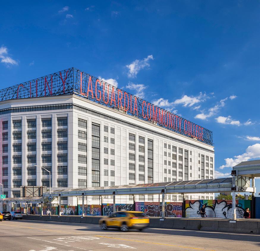
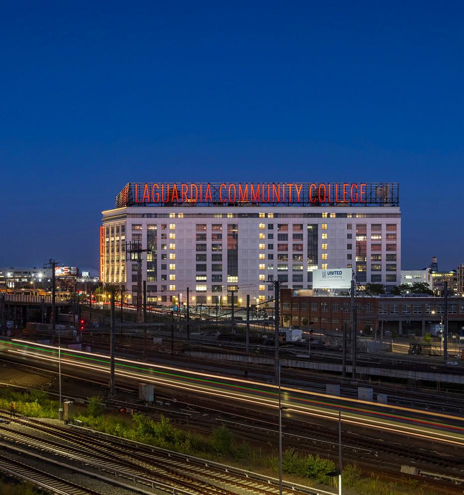
The CUNY LaGuardia Community College Façade and Lobby Renovation Project, submitted by Mitchell Giurgola, transformed the 100-yearold, one million square-foot Center III Building in Long Island City into a structure that aims to support the activities of the College for the next century. The Project involved two major scopes of work: the complete replacement of the exterior cladding of the building, inclusive of all aspects of the ground floor, sidewalks, and signature billboard signage at the top of the building; and a reinvention of the entrance sequence and lobby of a building that serves hundreds of occupants daily.
On the exterior, years of neglect, patching, inadequate and sometimes damaging repairs contributed to exterior wall failures including chunks of terracotta falling from the building. A sidewalk shed to protect pedestrians from falling objects surrounded the building for over a decade while potential solutions were considered. The design team was directed to develop a new exterior cladding that respected the long history of terra cotta use on the façade, and to incorporate contemporary technology in the form of a unitized curtainwall system.
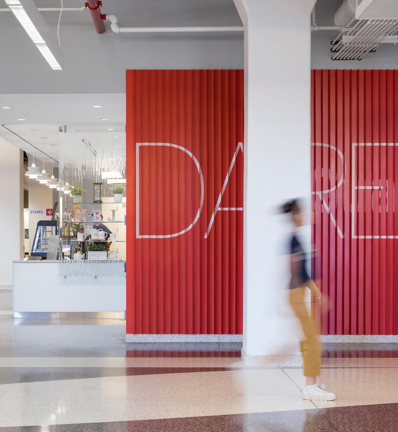
The Project also afforded an opportunity to reinvent the lobby and entrance sequence of the building, improving clarity, security, and flow. Multiple entrances, which created confusion, were reduced to one canopied primary entrance in the center of the front façade, where security was concentrated. This had the effect of opening additional interior space at the well-lit corner of the building for casual meeting, study, and eating space. A two-story signature stair was added, for direct connection to the public spaces of the second floor.
“The preservation of CUNY LaGuardia Community College elongates the longevity of the 100-year-old building while breathing new life into it for its student population and the adjacent community.”
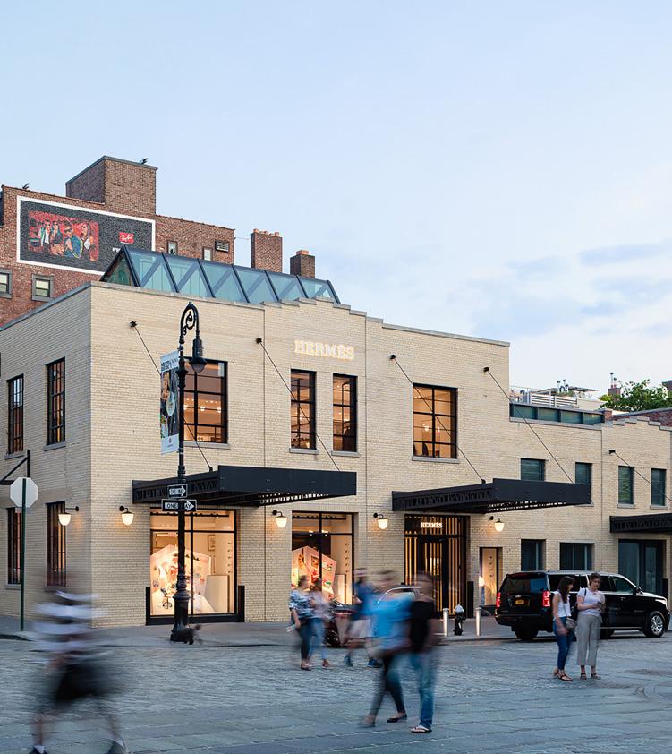
Gansevoort Row is a group of five contiguous structures in the Gansevoort Market Historic District in New York City. Submitted by BKSK Architects, their redevelopment for a single owner was created from eleven buildings that had undergone various interventions in their existence, and were left as underutilized commercial spaces. The project required a complex proposal to the Landmarks Preservation Commission which was unanimously confirmed.
The full-block design celebrates the many periods-of-significance within this historic district—a showcase for utilitarian brick buildings of multiple eras, many with a compelling interplay of masonry materials.

The architectural interventions of the three smallest buildings might go unnoticed, as they involve transformation for modern retail by restoration and interior reconfiguration. The two largest buildings include an 80,000 sf vertical expansion and new construction; appearing separate yet are linked by one core. For 60-68 Gansevoort Street, BKSK restored the two-story surviving vestige of a five-story, 19th century tenement as the base for a dialogue between old and new. This includes detailing a brick façade for three new upper floors and employing a contemporary brick screen to highlight points of interest such as the “ghosts” of former chimney flues, window lintels and cornices. The new 70-74 Gansevoort Row completes the block as a six-story building, evoking the gravitas of the grand warehouses within the surrounding blocks. It anchors the corner with a visually striking masonry building composed of prominent large-arched bays, as a homage to the district’s overall industrial-strength character.
An anchor block is a significant addition to a thriving commercial area, creating a gateway from popular tourist destinations, The Whitney Museum, and the High Line to the neighborhood.
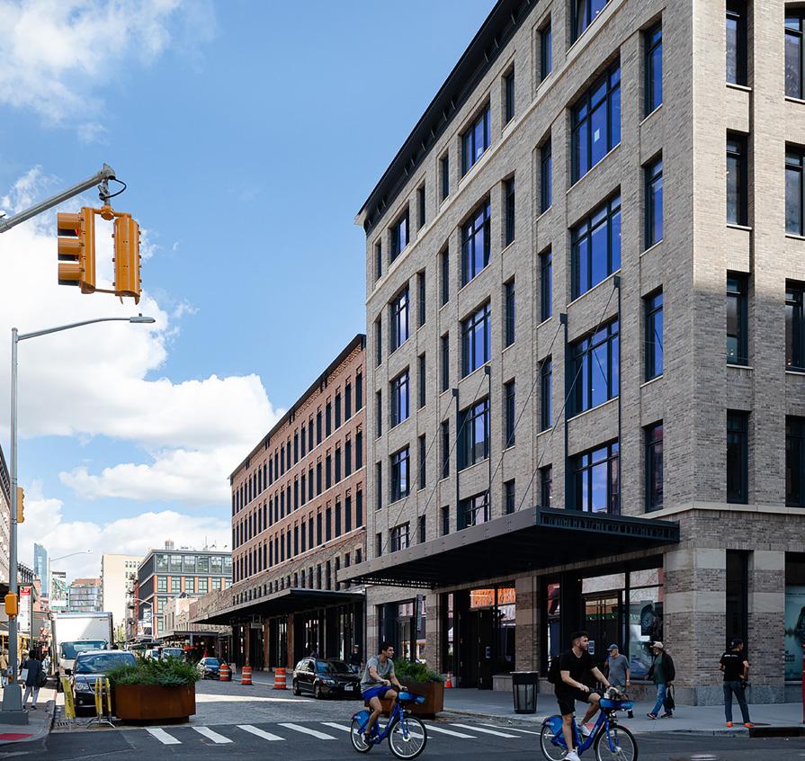
NEW YORK, NEW YORK
SUBMITTED BY: BKSK ARCHITECTS“The collection of five contiguous historic buildings comprising Gansevoort Row are tastefully restored to create a vibrant and welcoming series of pedestrian scales spaces.”
BROOKLYN, NEW YORK
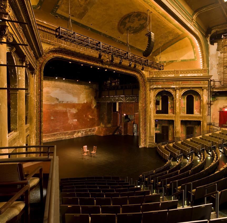
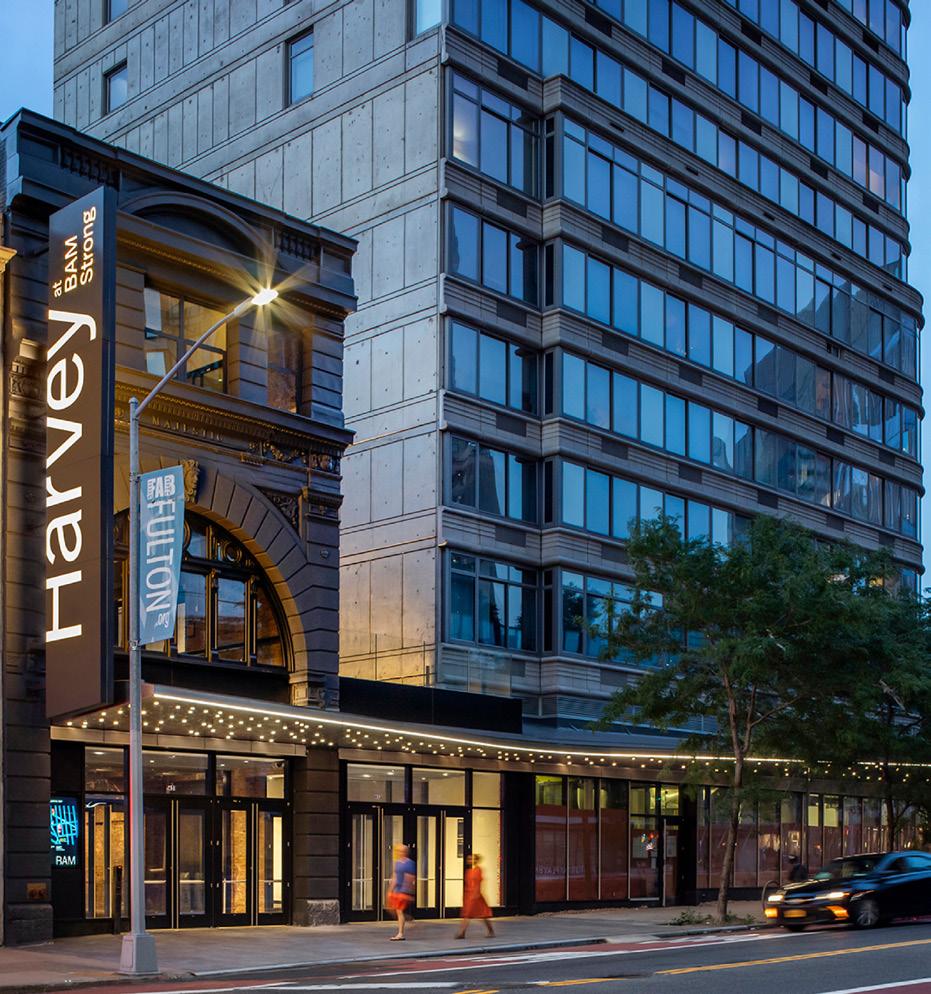
SUBMITTED BY: MITCHELL GIURGOLA“After being abandoned for twenty years, the renovation into the Brooklyn Academy of Music exemplifies the transformational power of preservation. The modifications restore and effectively enhance the historic character of the spaces while making them more accessible so that more people can experience them more easily.”
The Brooklyn Academy of Music, BAM Strong and Harvey Theater project submitted by Mitchell Giurgola, transforms three adjacent properties on Fulton Street in Downtown Brooklyn into a lively cultural destination for audiences, artists and neighbors. Redevelopment of the Harvey Theater and new construction and renovation of the two adjacent properties provides state-of-the-art infrastructure, theater technology and improvements to the patron experience. The resulting unified complex is a key feature of the New York City Economic Development Corporation’s Downtown Brooklyn Cultural District Development Plan.
BAM Strong gives new life to the former Majestic, a 120-year-old burlesque house that became a movie house in the 1940’s, gradually falling into decay. The theater was rediscovered in the 1980’s by BAM’s then-president Harvey Lichtenstein, and on a very tight budget, was converted to a contemporary thrust stage configuration, opening in 1987. This renovation intentionally left the performance space and lobby with a distressed appearance that became a unique and beloved characteristic. Phased over 10 years to conform to BAM’s active programming schedule and City funding, the first phase included re-raking the 850-seat orchestra and balcony areas to improve sight lines, provide code compliant row-to-row dimensions, new seats, and vomitories to meet egress requirements. Also included are 3D cinema, surround sound and variable acoustics. Subsequent phases included renovations to the public spaces, expanded lobby and customer services, a patrons lounge, an art gallery, café, and retail space. The complex is ADA compliant, including an elevator. An artful restoration of the original aging façade and a distinctive 180-foot-long marquee to unify the three properties and give the theater a visible presence consistent with its importance to the cultural life of the district.

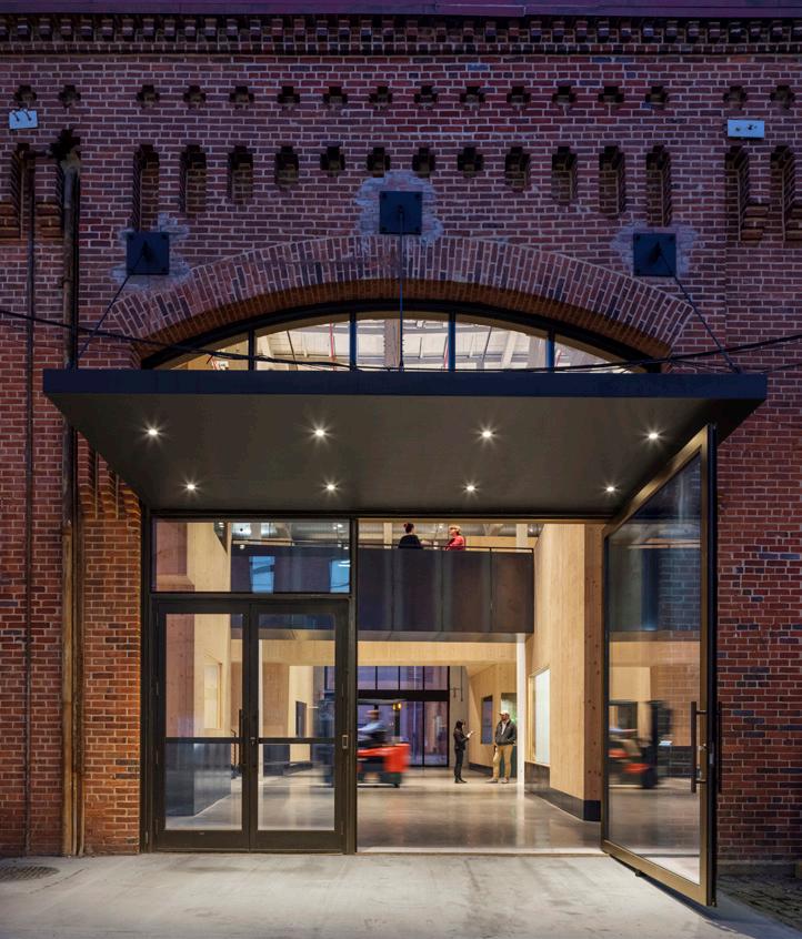
The Nanotronics Smart Factory is a 44,000 sf flagship production center that converts a 150-year-old Civil War era shipbuilding warehouse in the Brooklyn Navy Yard into an advanced manufacturing facility and headquarters. The project, submitted by Rogers Partners Architects and Urban Designers, brings together research, design, prototyping, and fabrication under one roof.
Originally constructed by the Department of the Navy to facilitate the armor plating of wooden ships, the building’s shell remains intact. Enclosed, yet transparent, “pods” are stacked on two floors with double-height public spaces nestled in between, resolving the challenge of creating enclosed workspaces—some need to be airtight, soundproof, and climate-controlled—without cutting up the building, impeding the flow, or compromising the beauty of the long, narrow building. The Pods were constructed of wood, cross laminated timber, to expedite construction. The wood surfaces were left exposed with blackened steel railings, harkening back to the steel plated boats that once occupied the building.
The goal was to create a blueprint for urban manufacturing; proving that cities with skilled workforces and legacy infrastructure are perfect for the next wave of industrial advancement. More specific goals were to vertically integrate the process from concept through final production that fostered interaction and communication among all team members, from PhD scientist to CNC mill operator. The project was to reveal the process and make sure a visitor understood that “things are made here.”
The adaptive re-use of infrastructure greatly reduces the carbon footprint of the City’s first “smart factory.”
The new facility is on track to create 110 new local jobs and offers a training pipeline-hosting programs in partnership with CUNY and Medgar Evers College so that New Yorkers can obtain and retain those positions.
SUBMITTED BY: ROGERS PARTNERS ARCHITECTS + URBAN DESIGNERS
The juxtaposition of a new hightech factory within the shell of a 150-year-old historic Civil War era shipbuilding warehouse at Nanotronics Smart Factory evokes a whimsical quality to the interior spaces and a truly delightful building. Re-using the existing building greatly reduces the building’s carbon footprint which was further emphasized with the use of sustainably manufactured CLT for the new pods inside the space. In addition, the building is designed to be cleaner and more efficient than traditional factories offering a great example of smart urban manufacturing.
“The juxtaposition of a new high-tech factory within a 150-year-old historic Civil War era shipbuilding warehouse evokes a whimsical quality to the interior spaces and a truly delightful building. Designed to be cleaner and more efficient than traditional factories— a great example of smart urban manufacturing.”

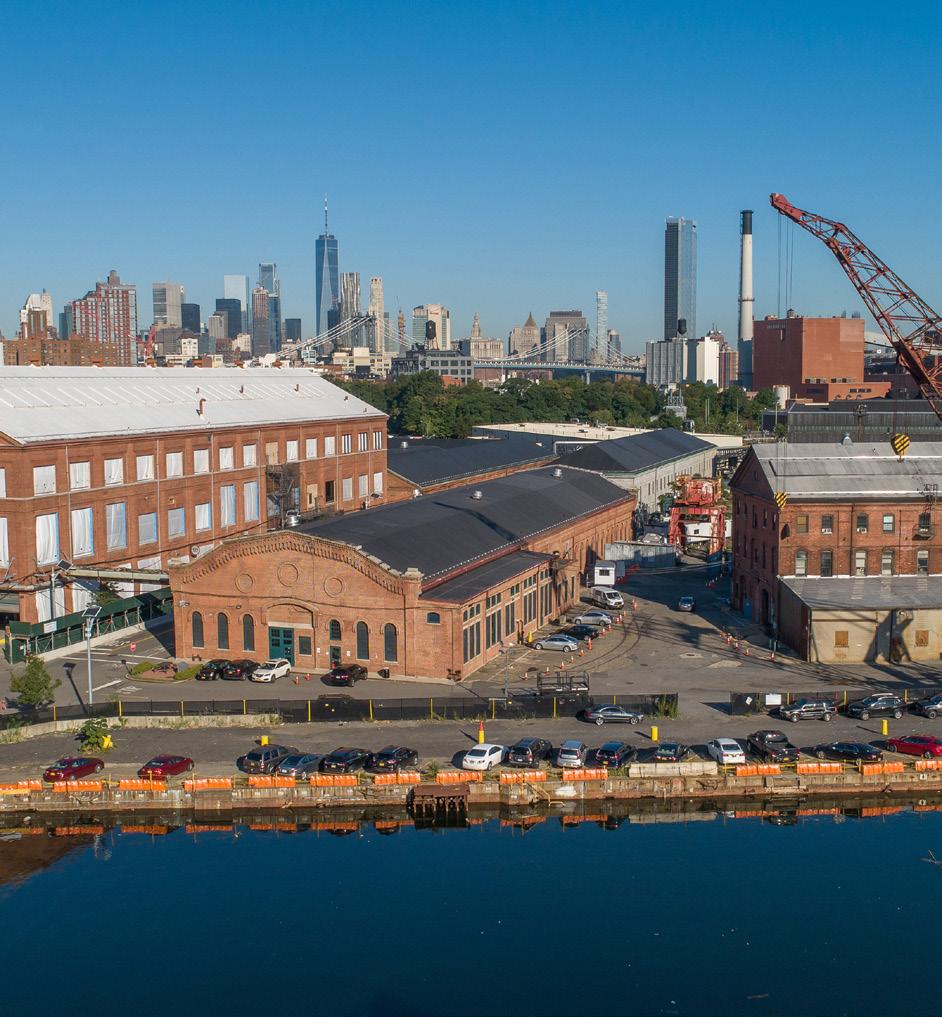 Jury Comment
Photo Credit: © Albert Vecerka | Esto
COMMERCIAL, INDUSTRIAL SMALL PROJECTS, LESS THAN 5,000 SF
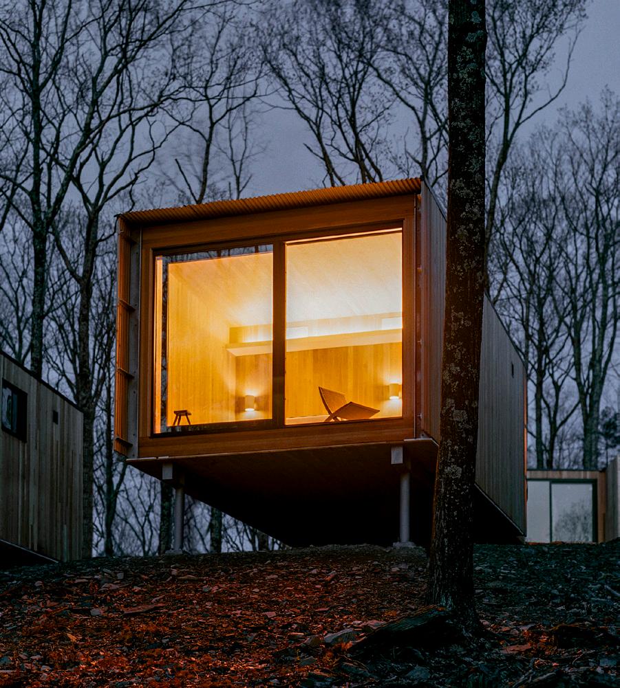
Since the 19th century, the Catskill Mountains have offered a serene and scenic reprieve for the increasingly urbanized northeastern seaboard of the United States. Thomas Cole enshrined the landscape into the American conscious by painting its grand sylvan panoramas, inspiring a generation of artists known as the Hudson River School. The Piaule Landscape Retreat project, submitted by Garrison Architects, was designed to immerse visitors into that same natural setting while emphasizing the pristine beauty of the region.
The hotel is comprised of 24 individual cabins scattered among the trees on a secluded hill that overlooks the Catskill Escarpment. Each cabin is oriented to a large operable window wall that opens up to the outdoors to give bedrooms the feel of a screened porch. These windows are designed to present visitors with the sensory atmosphere of outdoor camping from the comfort of an indoor cabin.
The cabins are clustered in groups, some are linked by a flexible living room to create 2-bedroom suites. The wood structures were factory-fabricated in Quebec, transported, and craned into their locations to minimize on-site disturbance, preserving local habitats and ecosystems.
The Main House is a communal space that can be utilized as a library, dining room, and contains a lounge, fireplace, and bar. The dining room accommodates 80 guests. Hidden below the green terrace is a full featured spa, fitness room, and a deck area with a pool.
The landscape retreat encourages visitors to explore beyond the hotel grounds, which are traversed on foot with nature trails that loop in and out of the surrounding woods and wetlands. The landscape hotel is designed to foster interaction among visitors in communal spaces, while allowing them to relax at the spa and retreat to private cabins, providing a getaway amidst the Catskill Mountains.
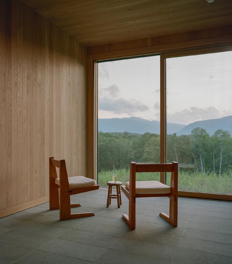
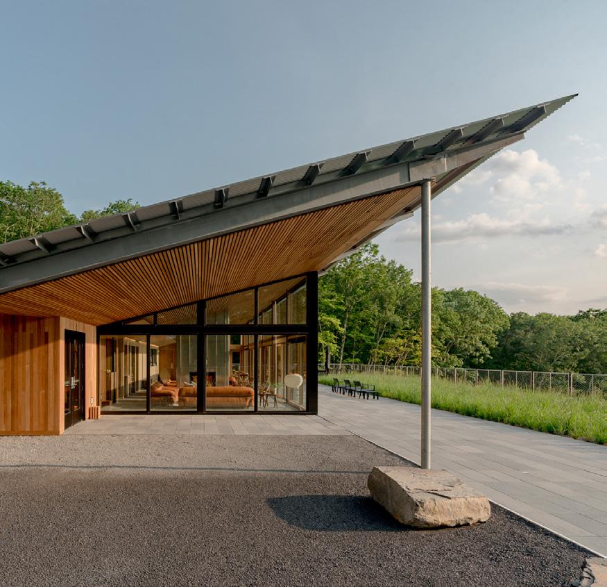
“Piaule Catskill Landscape Retreat nestles itself gracefully into its natural setting working with the landscape, not against it.”
TQL Stadium serves as the home to soccer club FC Cincinnati and a canvas to express the team and city’s evolving identity on a global stage. Nestled between two of Cincinnati Ohio’s most notable neighborhoods — the historic West End and the Over-The-Rhine district — TQL Stadium, submitted by Populous, enhances connectivity between FC Cincinnati, the city and the overall community.
The venue is oriented to welcome avid MLS supporters and boasts an expansive eastern plaza that dramatically connects the urban environment to the excitement within. The exterior design draws direct inspiration from the kinetic energy of the club’s fan base. More than 500 formed aluminum elements wrap the exterior — each lined with a one of-a-kind linear LED video fixture that — boldly displaying state-of-the-art dynamic digital content.
The formed aluminum façade defies stasis, shaped in such a way that creates a singular twisting motion across the expanse of the stadium with the overall form, signifying the tension between two teams about to take the pitch. When viewed straighton, narrow openings provide soccer fans a glimpse inside to build anticipation for the experience to come.
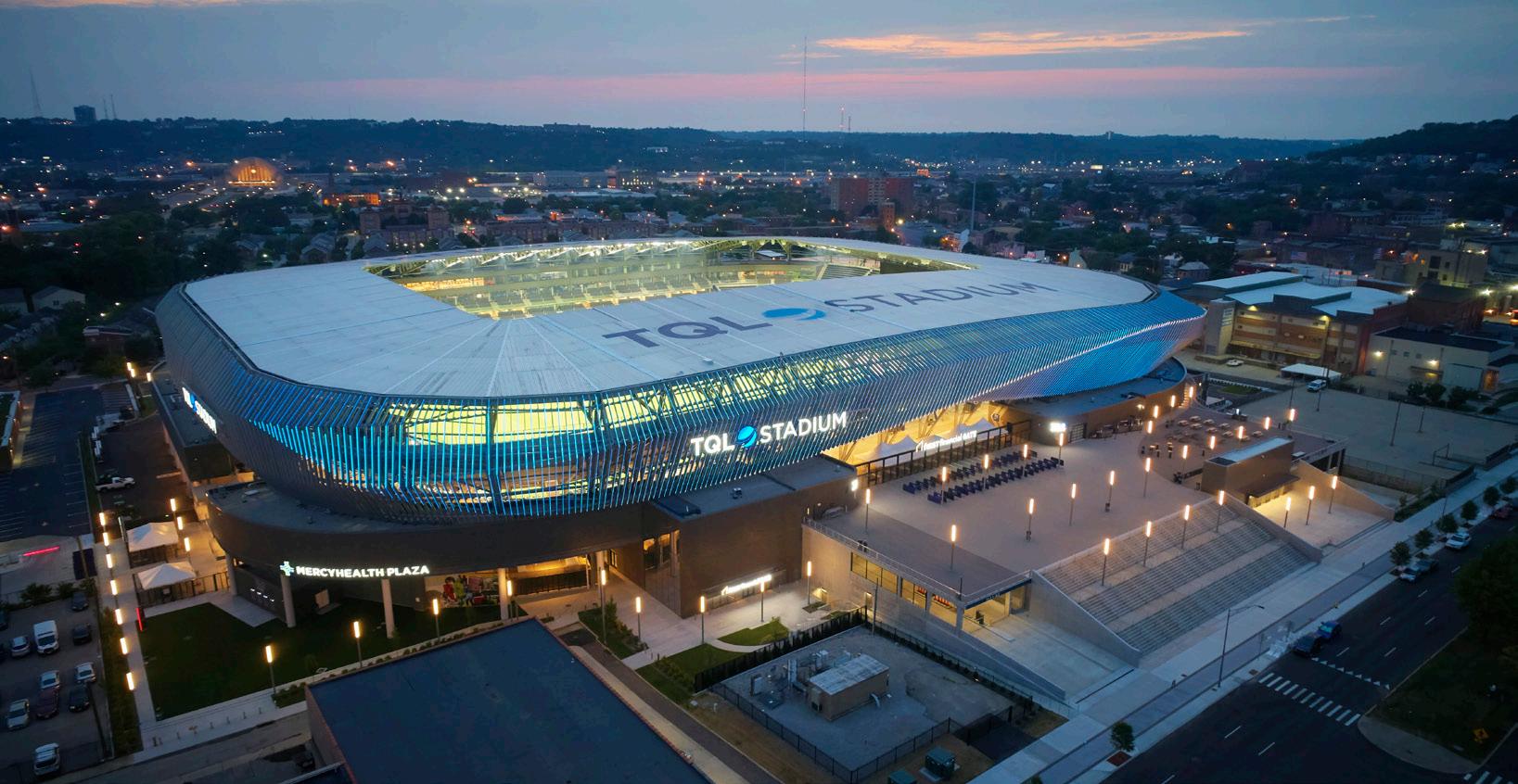
A grand plaza staircase welcomes fans to it all, an entry sequence like no other in the MLS. At dusk, the exterior skin comes alive. By implementing a one-of-a-kind LED lighting system, a brilliant and colorful video display results which showcases the club brand, atmospheric graphics and match day messaging.
Once inside, 360-degree multitiered seating bowl and a roof canopy overhead direct the energy of the spectators to the field of play.
From its urban site location to its unifying design elements, TQL Stadium serves as a connecting fabric within Cincinnati strengthening societal connections at every scale.

CINCINNATI, OHIO
SUBMITTED BY: POPULOUS
“TQL Stadium makes thoughtful design choices at both the macro and micro levels.”
NEW YORK, NEW YORK
SUBMITTED BY: HOK
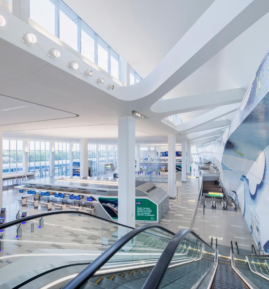
LaGuardia Airport’s new Terminal B, submitted by HOK, is a transformation of one of the nation’s highest-profile airports. The 850,000 sf Arrivals and Departures Hall celebrates movement while conveying a strong civic presence.
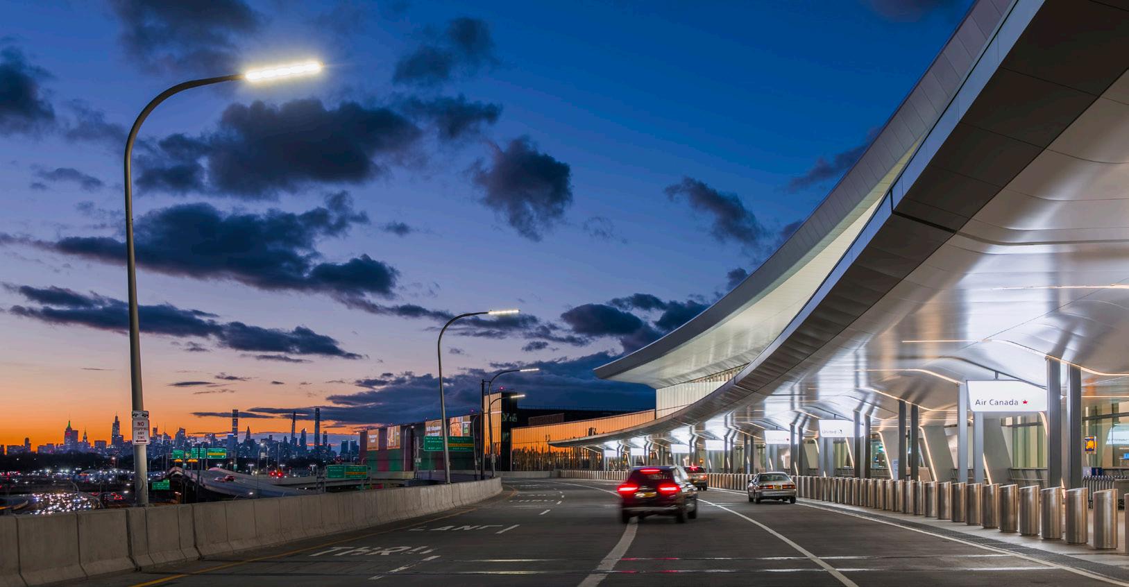
The first entirely new US airport in over 25 years, the architects initially provided professional advisory services for the 8 billion dollar project.
The original master plan suggested a headhouse with traditional concourses extending into the airfield. The team had a bolder vision of creating two island concourses accessed from the main terminal through two pedestrian bridges. This dramatically increased the efficiency of airport operations by moving the new terminal 600 feet closer to the Grand Central Parkway, recapturing 40 acres of land for airside operations.
The solution enabled contractors to build the new terminal over the existing structure—shaving almost two years off the construction schedule, minimizing impact to ongoing operations and saving millions of dollars.
The interior communicates New York City’s vibrancy, material sensibility and cultural diversity. Passengers enjoy soaring, airy, grand-scaled sequences, punctuated by 60-foot-high ceilings and floor-to-ceiling windows that fill the space with daylight.
Indoor green space is modeled after urban pocket parks and includes lush landscaping and sculptural benches. Concourses feature ample seating with charging stations, modern restrooms, nursing rooms, and public art installations curated by the Public Art Fund in partnership with LaGuardia Gateway Partners.
It’s the world’s first airport to earn LEED version 4.1 Gold certification; to have an Envision Platinum rating, the highest rating possible; and the first project to earn recognition under version 3 of the framework developed by the Institute for Sustainable Infrastructure.
“ Terminal B flips the script on the perception of access, convenience, and comfort at a critical piece of New York City’s transportation system. The expansion connects previously unconnected terminals and provides a refreshingly pleasant experience for air travelers.”
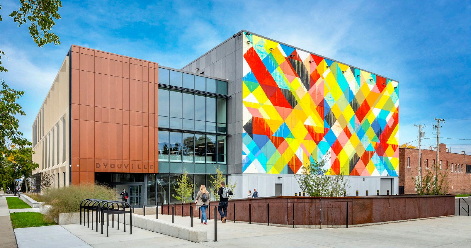
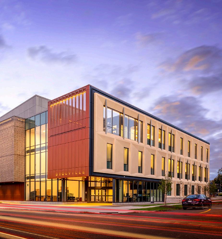
D’Youville University Health Professions Hub, submitted by Cannon Design, confronts two critical challenges in the Buffalo region. First, the city’s West Side community, rich with immigrants and refugees, is underserved and faces complex challenges around limited access to care and prevalent poverty and food insecurity. Concurrently, the region anticipates a critical shortage of healthcare professionals in excess of 10,000 by 2024.
The Hub converts these into opportunity as a “first-of-its-kind” health center featuring innovative learning spaces, a workforce center, virtual training resources, and a clinic offering primary care, rehabilitation medicine, nutrition, nursing, and pharmacy. A planning structure of CARE, COMPREHEND, and CONNECT is utilized for organizing these opportunities up through the building with a central atrium that stitches them together. These same principles extend beyond the inside, with an outdoor classroom and respite garden at level three, improving community access to healthcare services, introducing educational opportunities, preparing a new workforce to seize in-demand healthcare jobs, and supporting a living-wage ecosystem.
The Hub is located at one of Buffalo’s most historic and walkable districts. The palette reinforces and strengthens the urban fabric, which had lost some character over the years. The materiality also transitions and turns the corner of the building seamlessly, from complementary brick, glass, and metal on the community streetside, to more collegiate materials and massing, evocative of the college on the opposite side.
D’Youville University and its design team partnered with the Albright Knox Art Gallery to ensure this project served and beautified its community. Renowned national muralist Maya Hayuk painted The Tree of Y on a key face of the building, amplifying the design of the project and further beautifying the city’s West Side.
BUFFALO, NEW YORK
SUBMITTED BY: CANNONDESIGN
“
The D’Youville University Health Professions Hub seeks create a healthier community via design. The building incorporates variations in its façade as it addresses is various contextual conditions and provides a warm and welcoming environment with vibrant public art, textures, colors, and light.”
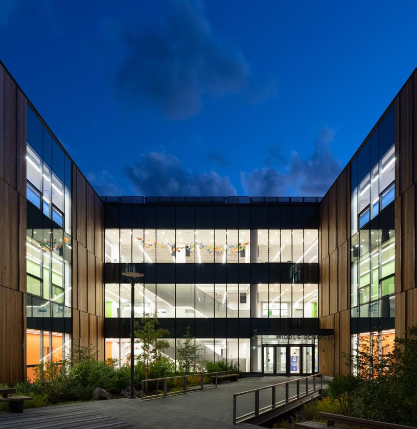
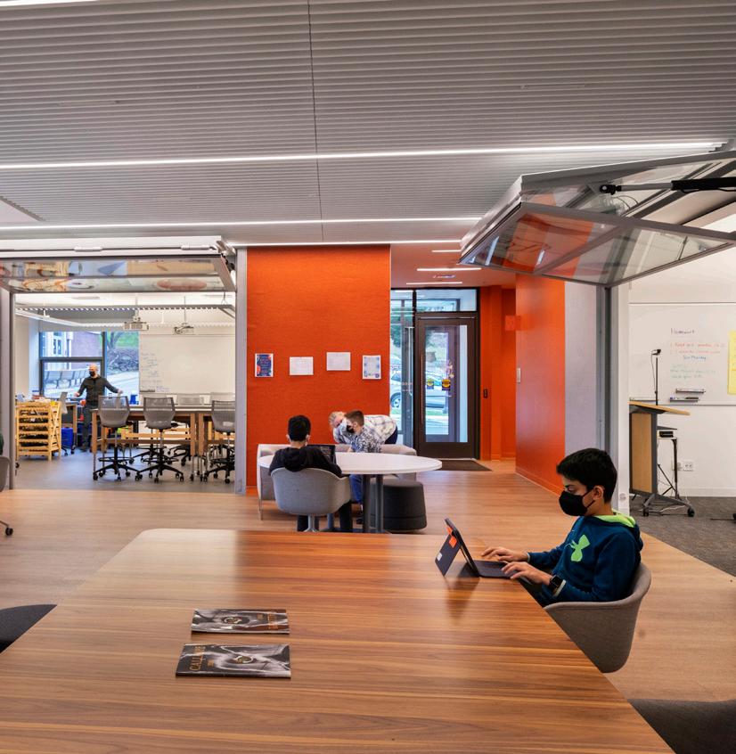
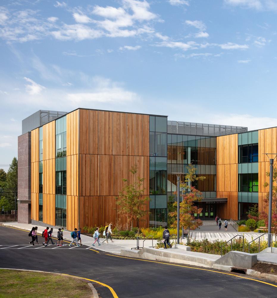
The Dwight-Englewood (dwite ing-elwood) School, a leading independent college preparatory school located in Englewood, New Jersey, seeks to provide students with an experience that fosters their development into mature, knowledgeable, and energetic citizens of the 21st century. It encourages students to be aware of the issues that society faces and interested in engaging them. The school wants them to have confidence, based on their extensive academic, intellectual, physical, and socio-emotional growth, to go into the world ready to live healthy lives and become leaders in their fields. And, most importantly, Dwight-Englewood wants its students to grow as people and develop into responsible adults.
The school firmly believes that the design of their facilities has the power to create paradigm shifts in the way they deliver education. As part of this paradigm shift, they sought to reimagine the middle school experience and develop a design that would enable children to learn in a creative and meaningful way. As a part of Gensler’s decade-long master planning at The Dwight-Englewood School, the middle school creates inclusive educational opportunities that enable multiple pathways for student success.
As seen through Dwight-Englewood Middle School, the new school does not ask how it can best support the average learner, but how it can best support all learners. Rather than designing one optimal universal learning experience, it becomes imperative that schools are designed for choice, adaptability, and connectivity – providing multiple pathways to skills development that spark the joy of learning in each student.
“ Dwight-Englewood Village & Middle School incorporates innovative space planning for education and results in a dynamic set of spaces that encourage interaction, spontaneous conversations, and build a sense of community among its students.”
The 12,200-square-foot Tsai Center for Innovative Thinking, located at Yale University in New Haven Connecticut, establishes a beacon for university wide interdisciplinary collaboration. The center, and submitted by WEISS/MANFREDI Architecture/ Landscape/Urbanism, brings students from diverse disciplines together to create innovative solutions to real world problems. The program, unique to Yale University, is based around team workshops that allow students to bring their ideas to fruition.
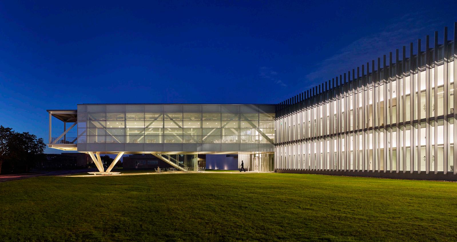
The building’s unique, elliptical form is centrally positioned in a courtyard of stepped orthogonal structures. Curved transparent glass walls encourage circulation through and around the center and allow the rest of the university to see and participate in ongoing work. Indoor and outdoor connections between the center and the adjacent landscape will establish this section of the campus as a new circulation route and a new home for innovation.
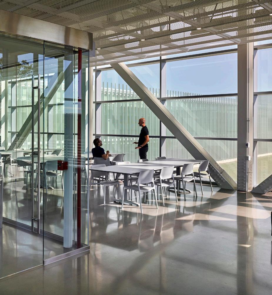
Within the center, continuous sightlines throughout unite spaces of creation and critique, encouraging interdisciplinary discourse. The open studio, conference and breakout spaces create opportunities for spontaneous discussion and provide a link between public areas and adjacent instructional spaces. In keeping with Yale’s commitment to sustainability, the project replaces the current underused paved plaza with a new planted garden, significantly reducing storm runoff and encouraging activity year-round. The building and the plaza renovation have received LEED gold certification.
The combination of connectivity, sustainability and new collaborative spaces will transform the existing plaza and establish the Center for Innovative Thinking as a new interdisciplinary learning environment that cultivates innovators, leaders, creators, and entrepreneurs in all fields and for all sectors of society.
SUBMITTED BY: ANDREA STEELE ARCHITECTURE
“NASA Glenn Research Center Support Building elevates the concept of its utilitarian typology. Taking examples from the mission of its population, the building exemplifies its techtonics, technology, and defies gravity in a literal and metaphorical way.”
Photo Credit: © Alan KarchmerSUBMITTED BY: DEBORAH BERKE PARTNERS
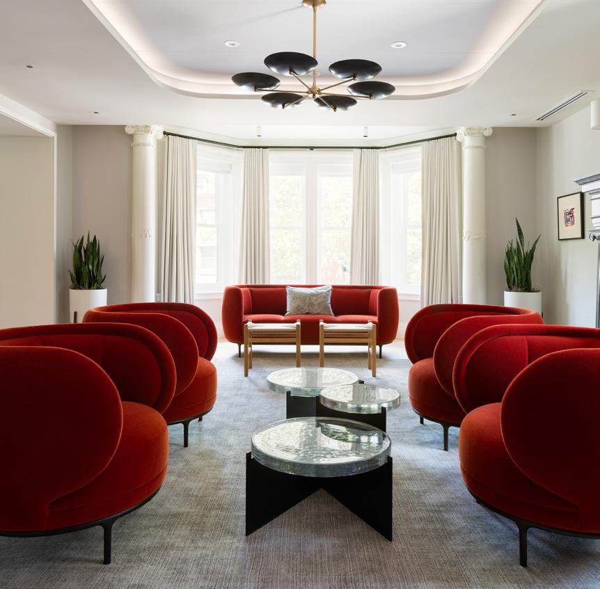
The new Meeting and Guest house at the University of Pennsylvania, located in Philadelphia, Pennsylvania welcomes important guests to campus, provides a place for strategic meetings and trustee gatherings, includes touch-down space for visiting dignitaries, and hosts special events.
The project, submitted by Deborah Berke Partners, transforms a pair of late Victorian townhouses into a 21st century destination for visitors to campus, including the adjacent President’s House, the Perry World House, and the Kelly Writers House.
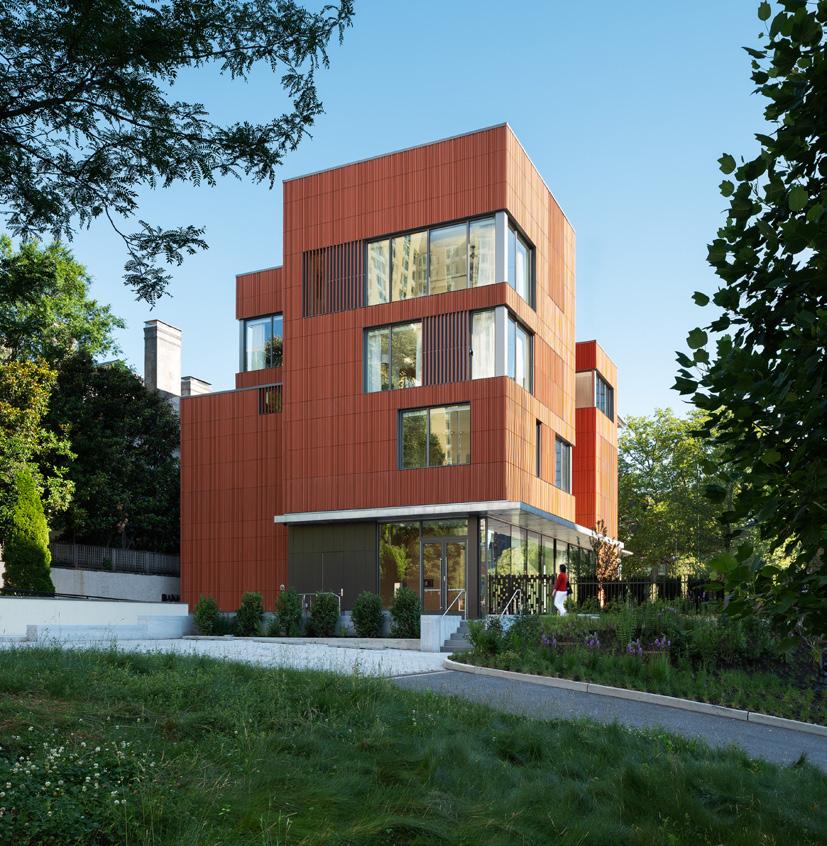
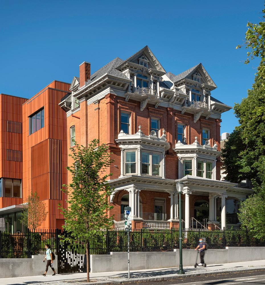
The historic Walnut Street façade is preserved and updated with repointed brick, a new roof, re-glazed original windows, and repaired decorative elements. The primary entrance to the Meeting and Guesthouse is reoriented to the south side of the building facing Locust Walk in a new at-grade, fully accessible addition off a shared motor court. A former parking lot is transformed into a landscaped bluestone terrace for outdoor and tented events. The space is a quiet refuge from the busy 38th Street thoroughfare.
Inside, the new lobby at-grade has floor to ceiling glass window walls that open out to the terrace. A staircase and elevator bring guests up a half level to a conference room that adjoins a flexible meeting and event space. The second floor contains a board room and multi-purpose meeting spaces as well as offices, while the third and fourth floors are more private, with four guest suites and offices for guests on campus.
The rear and east side of the building feature a new terracotta façade in a tripartite arrangement that reflects the massing of the original building. The material relates to but reinterprets the roman brick of the original building. Transparent and “veiled” glazing creates a varied day-tonight expression for the building and allows it to glow like a beacon. The project achieved LEED Gold certification.
“ The University of Pennsylvania Meeting and Guesthouse abruptly yet seamlessly integrate old and new.”
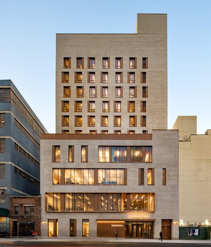
How do you create a home for the homeless? Youth who find themselves on the streets now have a safe and accepting place to take a breath and change their lives. Submitted by FXCollaborative, Covenant House New York contains nearly everything atrisk young adults will need—a safe and respectful place to live, access to legal, physical, and mental health services, along with educational and spiritual support.
Born out of a creative real estate transaction, the new home sits in the Hell’s Kitchen community. The building’s design is hand-crafted and humanely scaled to contrast with the glass towers. At 12 stories, the building is substantial and bold. Natural materials create a secure and welcoming experience. Solidity and transparency are balanced: connections to the city are enhanced from the community spaces, while solidity provides shelter and refuge. The main lobby welcomes all into the building, providing a singular identity and a central security point.
A Welcome Center, a Wellness Center and the CovCafé are located on the first floor, providing the necessities of care, food, and health. The Café opens directly to a courtyard that serves as a community gathering space for relaxation or engagement.
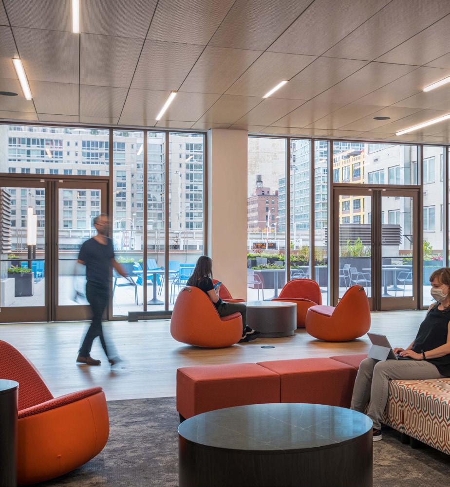
A defining gesture is the gracious wood stair, dubbed the Stoop, which literally and figuratively transports at-risk youth from the street to an oasis of calm one floor above. The wood interiors of Pride Hall extend to a large, landscaped terrace: nature replacing pavement. The Hall is light filled throughout the day with city views facing both North and South. An Art room and Hope room are provided for youth expression and contemplation.
Throughout the building individual bathroom and bathing facilities respect the gender identity of all youth, a detail that embodies the safety and security Covenant House provides to all.
SUBMITTED BY: FXCOLLABORATIVE
“Covenant House operates at an extremely high level, providing much needed housing for un-housed youth in a well-detailed and well-proportioned building while also contributing to the urban fabric in a meaningful way.
The building’s humanscaled massing create a marked contrast to its Hudson Yards neighbors.”
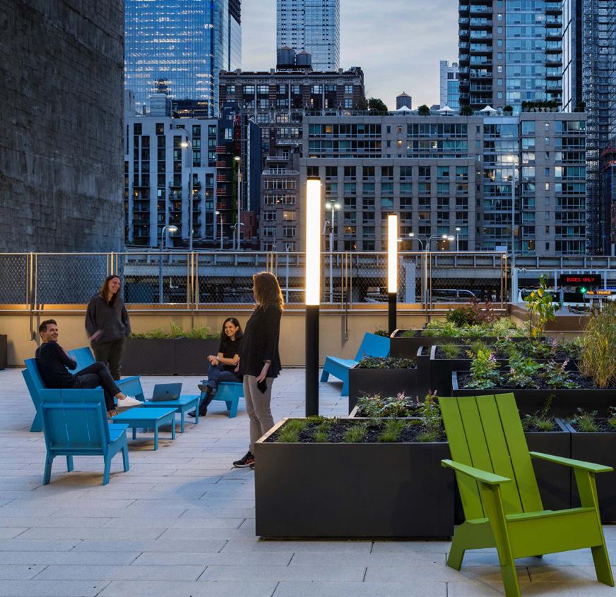 Photo Credit: © Adam Kane Macchia, Chris Cooper & Courtesy of FXCollaborative Architects
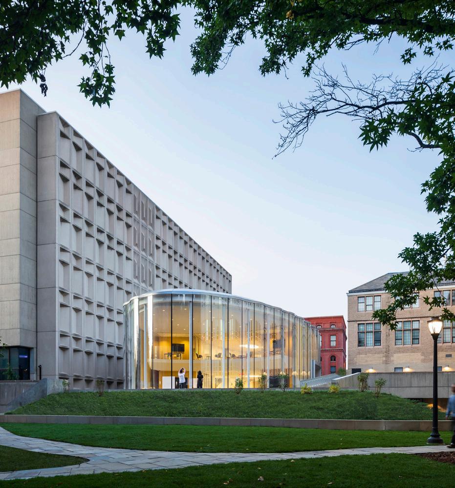 SUBMITTED BY: WEISS/MANFREDI ARCHITECTURE/LANDSCAPE/URBANISM
The 12,200 sf Tsai Center for Innovative Thinking, located at Yale University in New Haven Connecticut, establishes a beacon for university wide interdisciplinary collaboration. The center, submitted by WEISS/ MANFREDI Architecture/Landscape/ Urbanism, brings students from diverse disciplines together to create innovative solutions to real world problems. The program, unique to Yale University, is based around team workshops that allow students to bring their ideas to fruition.
The building’s unique, elliptical form is centrally positioned in a courtyard of stepped orthogonal structures. Curved transparent glass walls encourage circulation through and around the center and allow the rest of the university to see and participate in ongoing work. Indoor and outdoor connections between the center and the adjacent landscape will establish this section of the campus as a new circulation route and a new home for innovation.
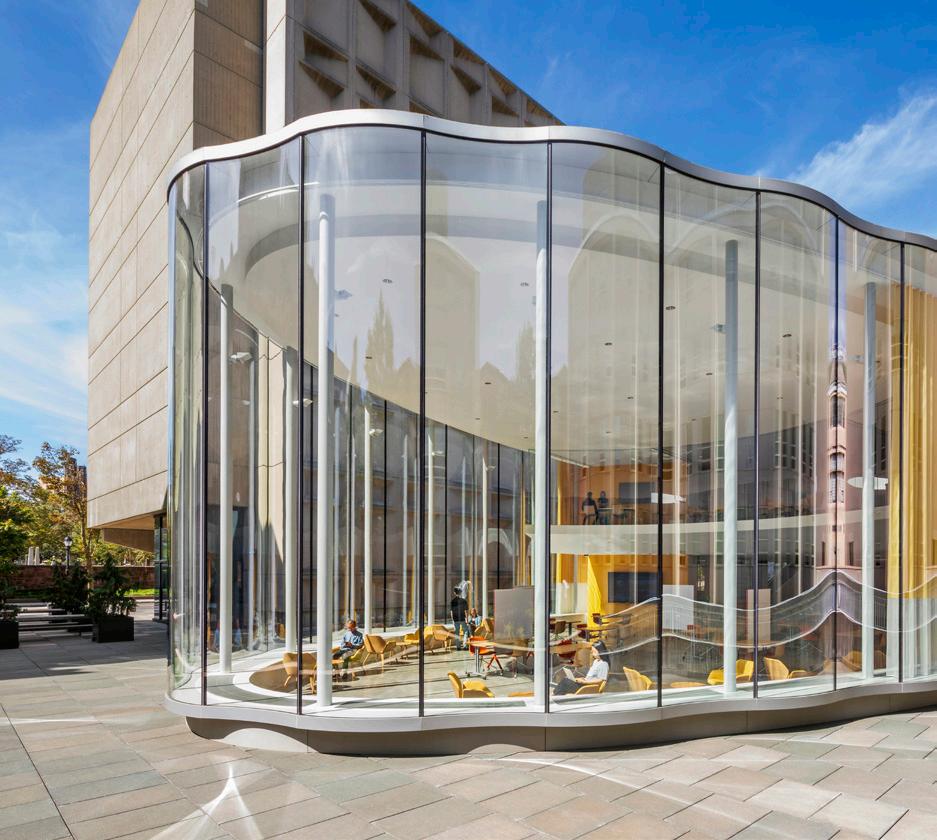
Within the center, continuous sightlines throughout unite spaces of creation and critique, encouraging interdisciplinary discourse. The open studio, conference and breakout spaces create opportunities for spontaneous discussion and provide a link between public areas and adjacent instructional spaces. In keeping with Yale’s commitment to sustainability, the project replaces the current underused paved plaza with a new planted garden, significantly reducing storm runoff and encouraging activity year-round. The building and the plaza renovation have received LEED gold certification.
The combination of connectivity, sustainability and new collaborative spaces will transform the existing plaza and establish the Center for Innovative Thinking as a new interdisciplinary learning environment that cultivates innovators, leaders, creators, and entrepreneurs in all fields and for all sectors of society.
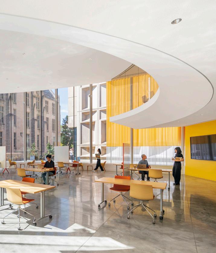
“An ethereal building in a unique setting, the curved Tsai Center for Innovative Thinking gracefully sails into its orthogonal courtyard context. Its simple yet sinuous plan form gives space to the collegiate Gothic and brutalist buildings around it which indirectly celebrates them while setting itself as a worthy addition to the campus.”
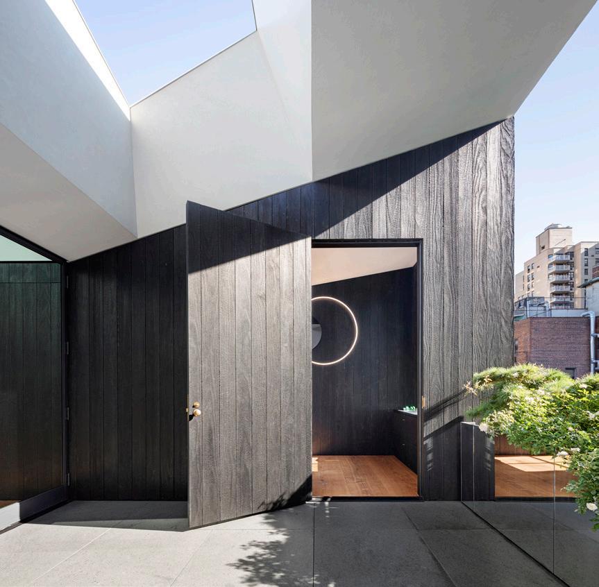
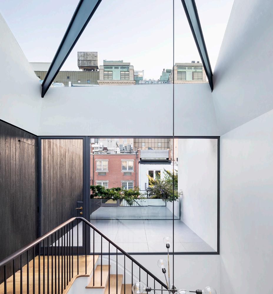
The Gramercy Residence is a full renovation of, and addition to, a turn of the century townhouse in the Gramercy neighborhood of New York City.
The goal of the project was to celebrate the 1890s townhouse and at the same time craft a modern home where the clients could retreat from the intensity of the city.
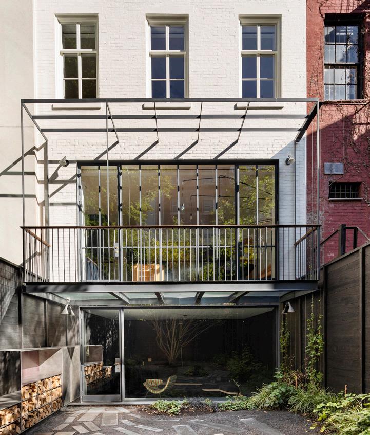
O’Neill Rose Architects used the idea of a vertical gradient to organize the program. The lower level spaces are intimate and inviting, with an inner focus on socializing with family and friends. Both the garden level and the parlor level kitchen are more intimate spaces that open up to the cloistered back yard. Both spaces have custom furniture that the firm designed with collaborators, which allow for family gatherings both small and large. As you move further up the house, the spaces gradually open up to the larger environment of the city. The very top floor is crafted to blur the line between inside and outside so that you can reconnect with the city just beyond. With large angled windows, a sculptural skylight, interior glazing, and a rear terrace with an occulus open to the sky, the top floor is a continual dialogue between inside and out, and between home and the city.
This vertical gradient strategy of the intimate lower level spaces to the expansive upper levels created a modern home in the shell of a traditional New York City building.
NEW YORK, NEW YORK
SUBMITTED BY: O’NEILL ROSE ARCHITECTS
“
The design for Gramercy Residence fully reimagines an existing 1890s townhome by opening the spaces up to the sky and filtering light down through the entire home, in what it describes as a vertical way of living. The spaces created by the renovation blur the line between indoor and outdoor space and gracefully integrate old and new.
Photo Credit: © Michael MoranSUBMITTED
BY: EFFICIENCY LAB FOR ARCHITECTURE, PLLCSubmitted by the Efficiency Lab for Architecture, the design of the Senegal Elementary School, located in Marsassoum, Senegal, has two primary goals: to rebuild the existing school campus and to introduce a new construction method to the local population which can then be employed in other projects.
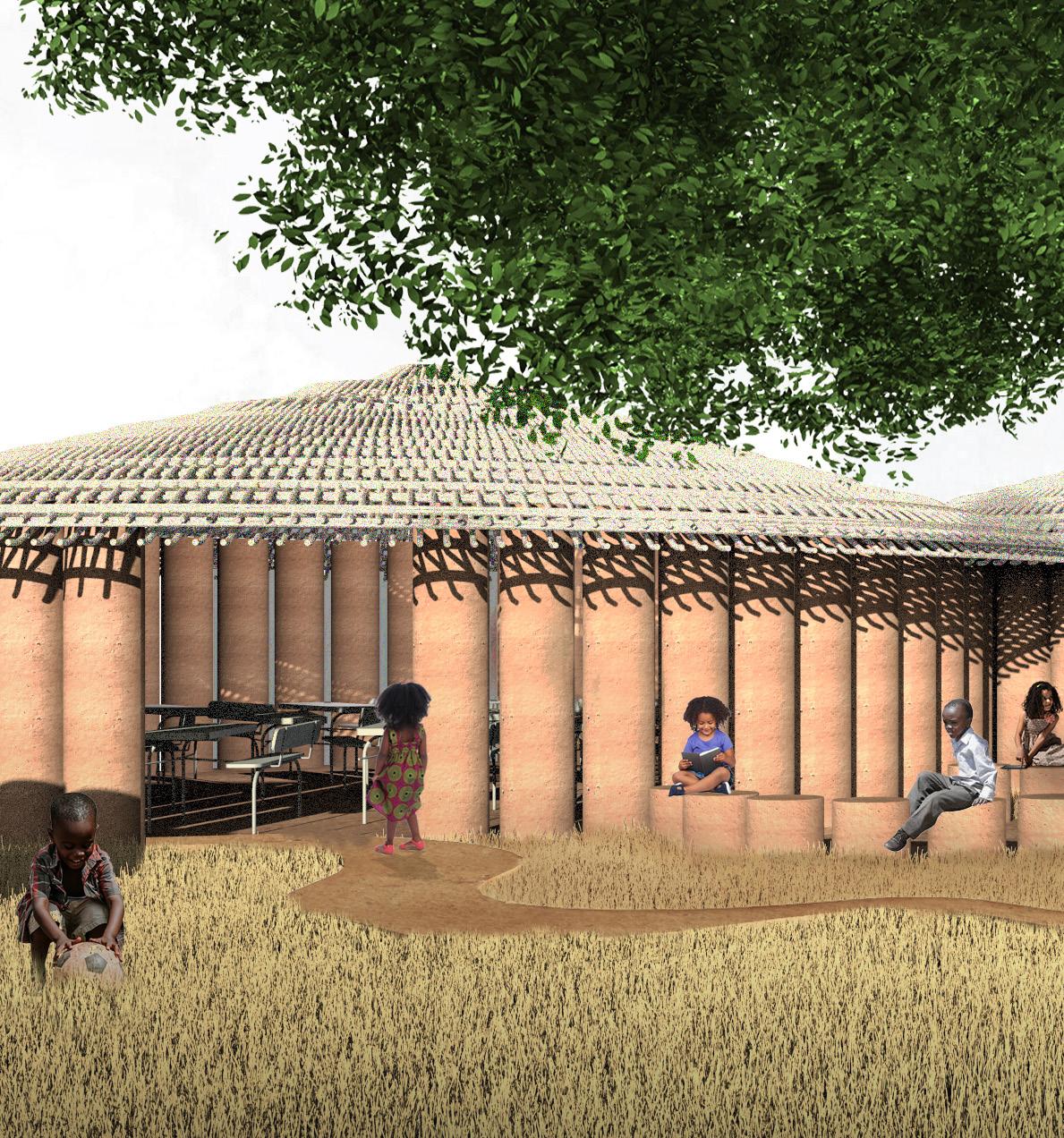
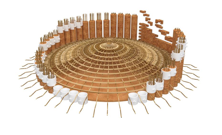
The design approach starts from the exploration of a tectonic integer—the rammed earth column—and expanding to define spaces, and further propagation of individual spaces forming the campus.
The design creates a circular, slip formwork strategy that enables rammed earth columns to be built without the need for elaborate scaffolding and formwork braces. Each individual column is poured and rammed in 500 millimeter vertical sections. The circular geometry enables structural integrity of the formwork against lateral pressure during the ramming process. The columns are arranged in a circular plan, forming the spatial integer of the campus. The columns are spaced with a 75 millimeter gap to allow natural light into the space as well as provide cross ventilation. The gaps between the columns also allow for ease of construction of adjacent columns, as well as create spaces for the roof rafters to be interlaced with the columns. The roof is created on the floor from woven bamboo, and hoisted up to its final elevation. Each circular space is nested together to create the school’s cellular spatial structure. The spaces are adjoined by a masonry wall, created by L-shaped bricks that interlock in all three directions forming a good bonding for lateral stability of the wall. The school is composed of twelve pavilions organized around the existing tree, creating a courtyard for the school that serves as the social heart.
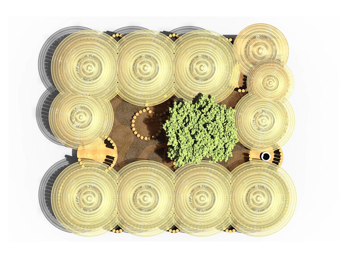
The school campus is programmed to be self-sustaining, encompassing not only classrooms, a library and reading nook, and offices, but also a well, corrals, and orchards.
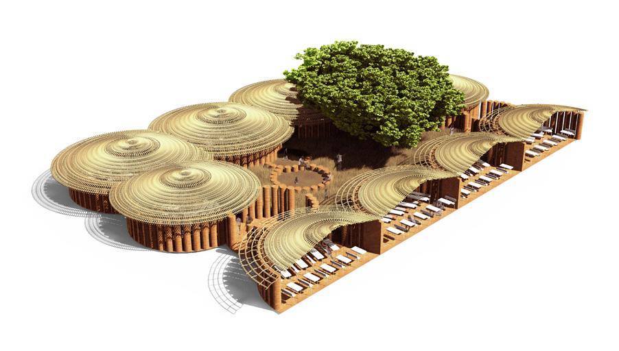
“ Entering the discourse of the local design vernacular with a beautiful modern interpretation, the design for the Senegal Elementary School will benefit the community in tremendous ways.”
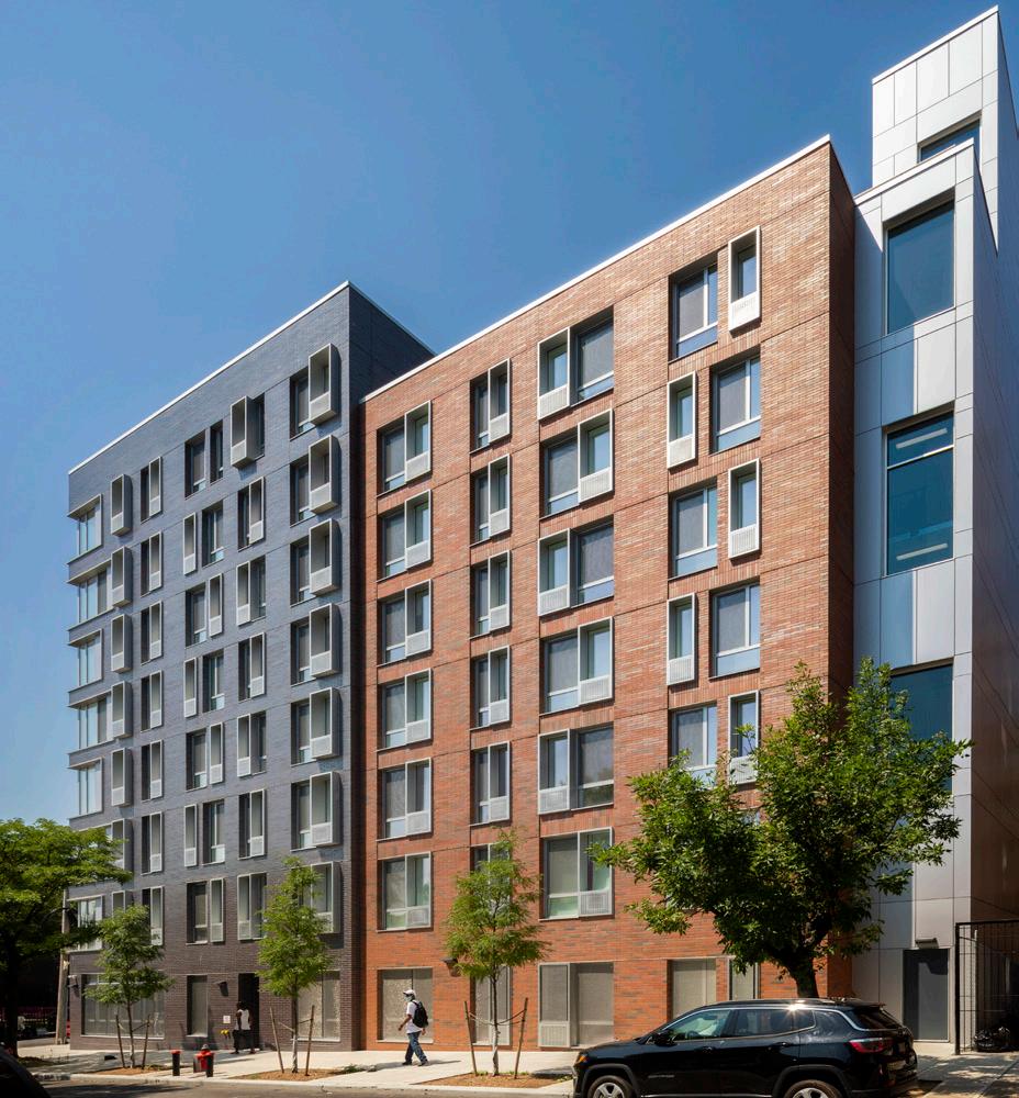
Submitted by Magnusson Architecture and Planning, The Corden, located in the Bronx, offers 62 apartments for low-income households—37 reserved for families from New York City’s domestic violence shelters, creating a safe, stable community in the Bronx.
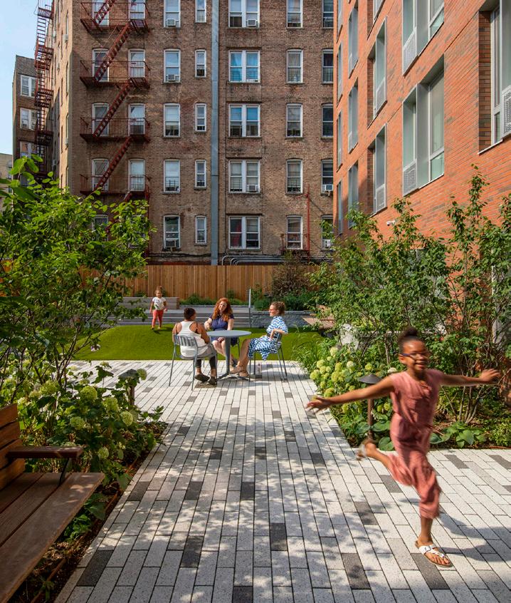
Emphasizing mental and physical well-being, the design prioritized day-lit corridors and apartments flooded with natural light for restorative, inspired living; egress stairs with large windows and double-height landings to encourage safety and use; and an array of communal spaces—a library, lounge, community room, children’s playroom, and rear yard designed to accommodate gatherings, a small stage, and a children’s play area. The variety of amenities, their airy feel and locations, especially the top floor laundry, lounge, and library with views of Manhattan and the East River, are uncommon for affordable housing in the city; but reserving the best spaces for community speaks to the inclusiveness of this design.
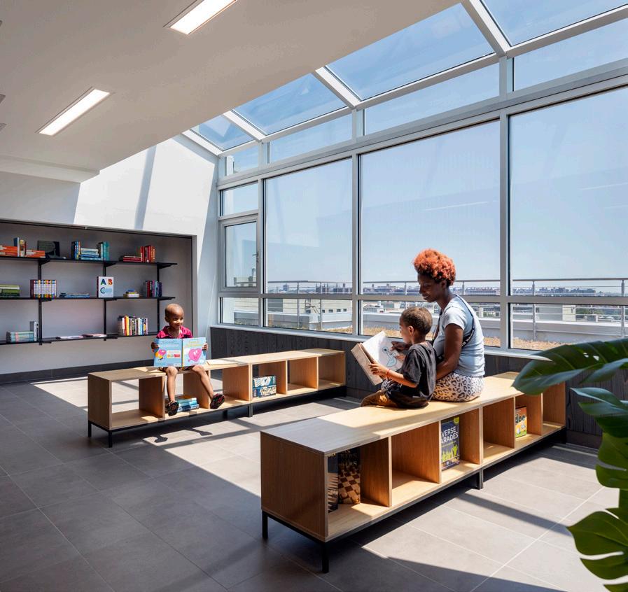
While the development is larger than its neighbors, context was important. Breaking the massing through variations in color and materials facilitated an appropriate scale.
Red brick adorns the facades along East 165th Street and Bryant Avenue and again in the rear along the courtyard, corresponding to the rust color of the neighboring masonry structures. The classic stylistic choice sets this building comfortably within its surroundings. By contrast, another, darker brick with blue undertones, is a contemporary counterpoint to that long-established aesthetic.
The metal panels at the upper floor setbacks and on portions of the 165th street façade lighten the appearance and relate to the metal-clad lobby structures of the NYCHA buildings across the street. They also combine with metal window boxes, which conceal air conditioners, to reflect light and brighten the surface for a dynamic exterior.
“The Corden welcomes low-income residents— many victims of domestic violence—to enjoy thoughtful spaces that encourage their mental and physical well-being in a safe and stable community. The building activates a formerly vacant corner and refurbishes a public basketball court bringing benefits to its community.
Photo Credit: © David Sundberg | Esto & Ari BurlingSUBMITTED BY: STEVEN HARRIS ARCHITECTS
Submitted by Steven Harris Architects, the House on Lake Maitland in Winter Park, Florida, is a modern courtyard house that utilizes the challenges of its site to create opportunities to enjoy and preserve its lakefront setting. Once deemed unbuildable, the site sloped significantly and was crowned by a group of live oak trees. In response, the major volumes of the house encircle the oaks and protect their root systems and the house is partially buried into the highest elevation of the site, creating a green roof along the street.
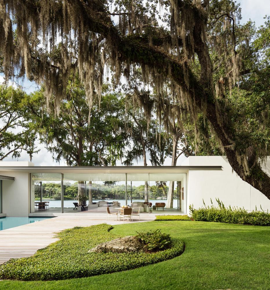
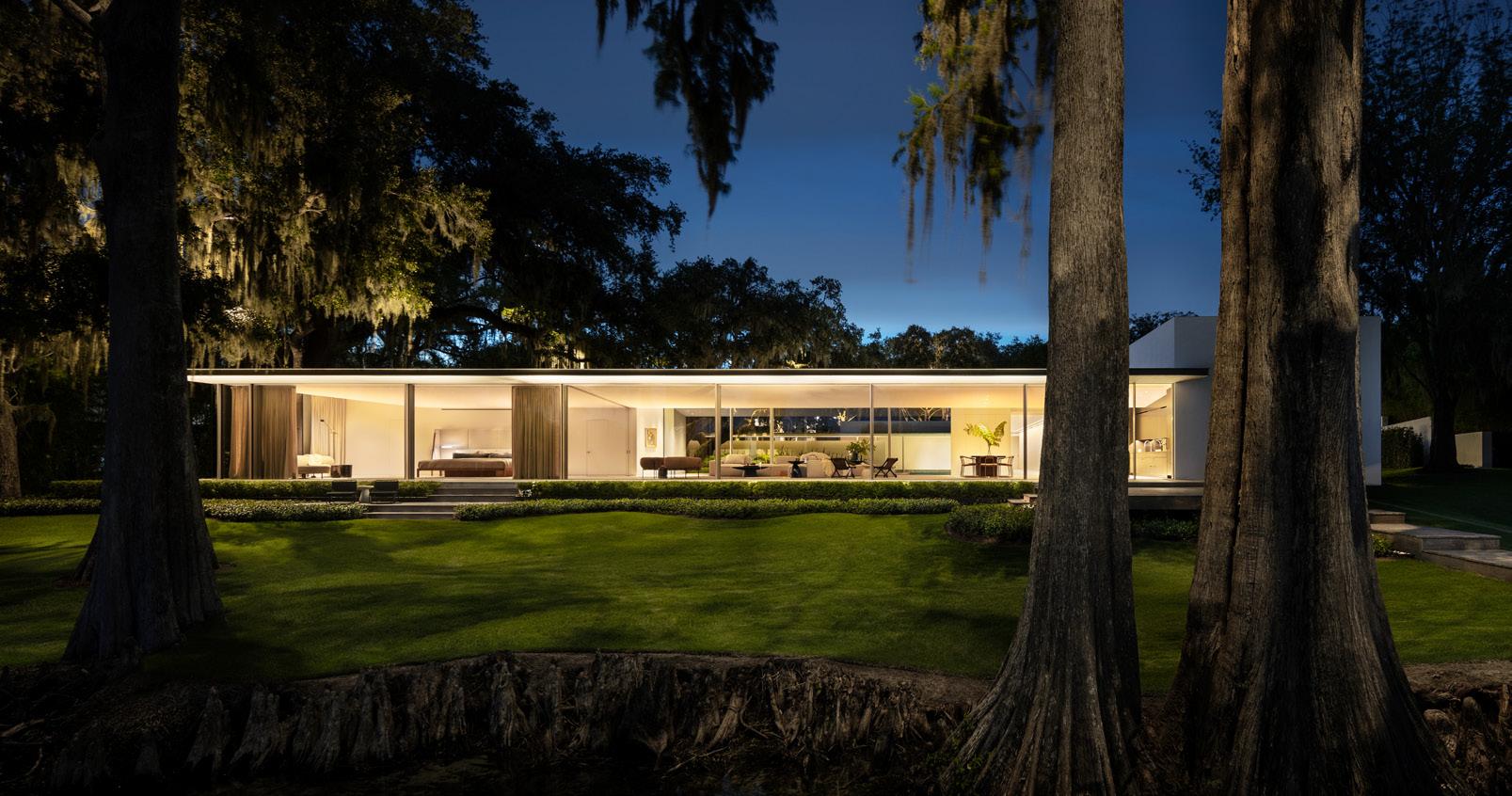
The home contains several protected courtyards which open the major rooms to sunlight and expansive lake views. Generous eaves provide passive shade and extend the living space outdoors. The home is a single story, preserving neighbors’ lake views while providing a stealthy, almost submerged sense of privacy. This low profile, along with the planted roofscape, offer the neighborhood a park-like break in the conventional fabric of more imposing suburban homes nearby. The home has become a stop on local tours and generated interest in the town.
The stucco volumes of concrete masonry belies the complex systems at work supporting the site’s ecosystem. Portions of the house are cantilevered or raised on grade beams, treading lightly near sensitive tree roots and permitting tightly-choreographed stormwater management through grading. Local crushed shell paving, pervious wood decks, and bioswales planted with native grasses maximize runoff absorption and slow runoff and erosion.
New live oak plantings dot the landscape, expanding the existing ecology and preserving it for the future.
This project best (left the word “best” out) fulfills the Ecosystem, Well-being, and Water criteria of the AIA Framework for Design Excellence and provides an example of how architecture can respect its clients, ecosystem, and community.
“The House on Lake Maitland provides a series of tranquil spaces within a picturesque natural setting.”
In the mid seventeenth century, early settlers of Montauk, New York established what is now the oldest working cattle ranch in America. Their remnants survive today in the form of horse stables, barns, and workers’ cottages. One such cottage sat near the top of a hill with almost three hundred sixty degree views of the nearby lake, ocean, sound, and nature preserves. Its new owners sought to maintain the existing structure’s unpretentious appearance and the pastoral landscape, while creating a larger house, known as Signal Hill, suiting the modern expectations of year-round living for a family of five.
Submitted by Bates Masi + Architects, the house structure references traditional livestock pens built from glacial rubble that meander through the local landscape. Its stone walls extend to the top of the first floor, organizing its spaces and providing a base for the second story. The walls carve into the sloping meadow, reducing the apparent size of the home when viewed from the exterior. Some of the walls reach out and taper into the ground, cutting strategic sightlines into the hilltop and linking the house with the pool. These apertures brighten interior spaces, provide access to the lawns and meadows, and frame views of the lake and preserves. They carry from exterior, through the interior, and back to exterior. Sliding glass walls disappear into recesses at the central sightline overlooking the lake, providing an uninterrupted connection between east and west, sunrise and sunset.
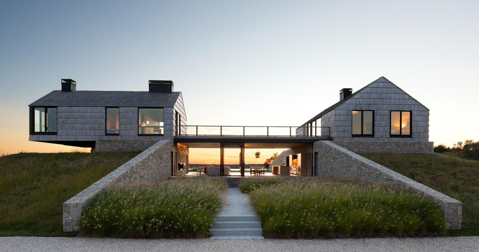
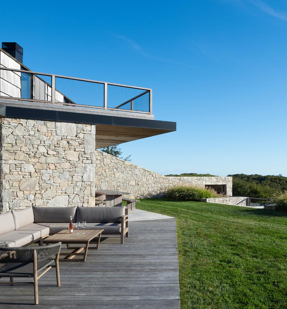
Perched atop the stone walls sit two simple shingled “cottages” reminiscent of the property’s original structures. Because the first floor is largely concealed they appear as small houses lightly set on the hill when viewed from the road and driveway approach below.
“Signal Hill does a great job of reinterpreting a cultural vernacular in a new and refreshing way. The forms and materiality harken to other Long Island beach houses, but the spaces themselves are new and fresh.”
SUBMITTED BY: J_SPY ARCHITECTURE
“
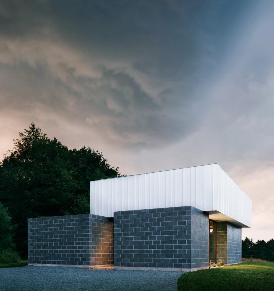
The awkwardly lovable Garage House shows the potential for providing a family with an elevated design experience in a small house, even if the neighbors think it is just a garage. The simple exterior forms and crisp use of humble materials capture a series of wellproportioned and friendly spaces to support daily life.
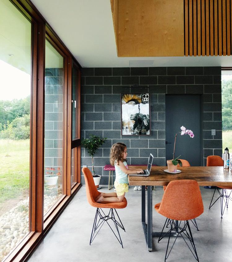
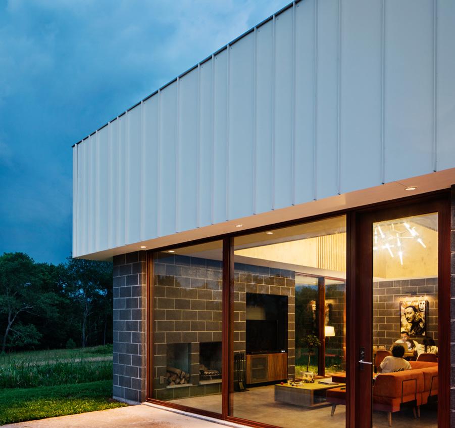
Originally named “Garage House” because the neighbors thought the client building a garage based on the concrete block, the Catskills House, located in White Lake, New York, is in reality, a super efficient small family home. J_spy Architecture believes strongly in making buildings that will last, one that future people will want to rehabilitate versus tear down. Using concrete block as the main material will allow this house to age like the brick townhouses of our cities, worth keeping. The windows are solid wood that add warmth to the space and each window opening is protected by an overhang to add to their longevity. These overhangs are also strategically placed as sun shading. The deepest overhang is on the South, and fully blocks the summer sun at noon, but still allows the winter sun to enter and warm up the concrete floor. When mechanical heating and cooling are needed, a super efficient geothermal heat pump was installed to provide radiant heating in the winter and air conditioning in the summer. Although the house looks stand-offish from the outside, the plywood ceiling in the main space adds both volume and warmth. There is also purple felt behind the wood slats in the plywood ceiling to help with acoustics. Finally, with the size of the windows, the detail of the concrete block being both exterior and interior finish, and the concrete floor being continued with a patio, the main room feels like it is almost outside with sweeping views of the property.
Rarely has the firm Eric J. Smith Architect been asked to step outside of its preferred design sensibilities, to venture in a seemingly opposite aesthetic direction.
The client, a lifelong poet, knowing the firm’s practice was primarily focused on traditional homes, called to challenge the firm to recalibrate the architect’s eye and design a “purpose-built, self-sufficient contemporary writer’s studio” in the woods within Greenwich, Connecticut.
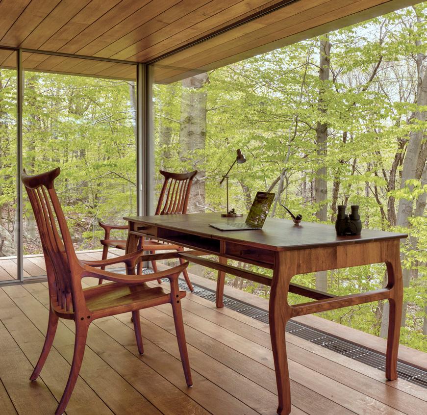
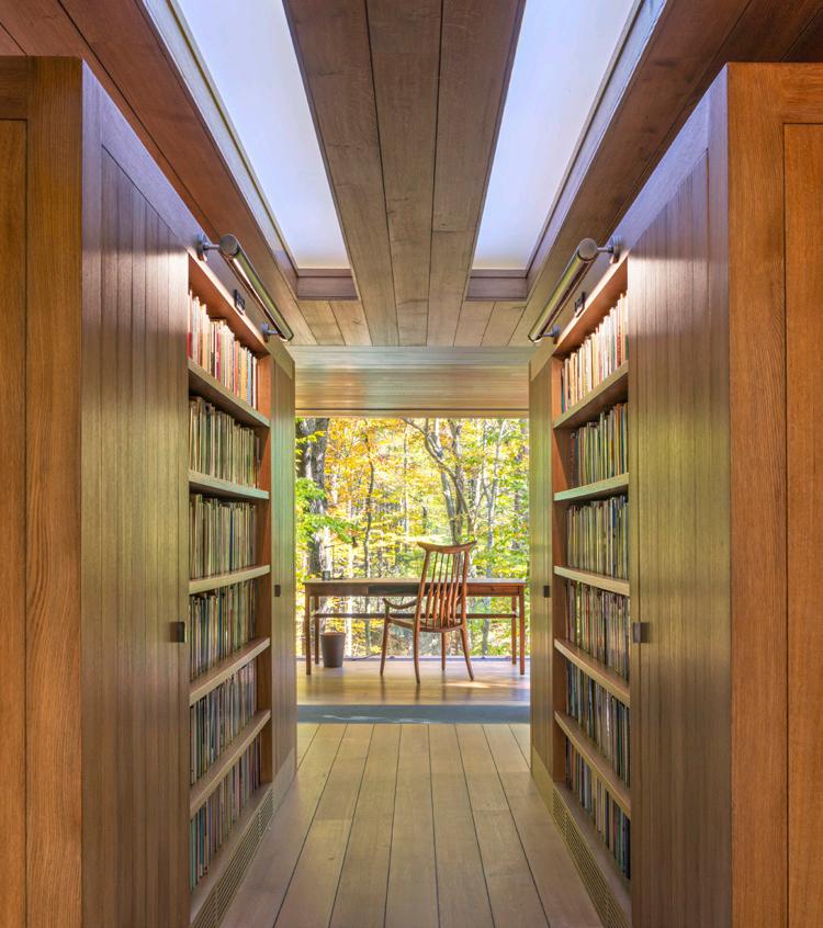
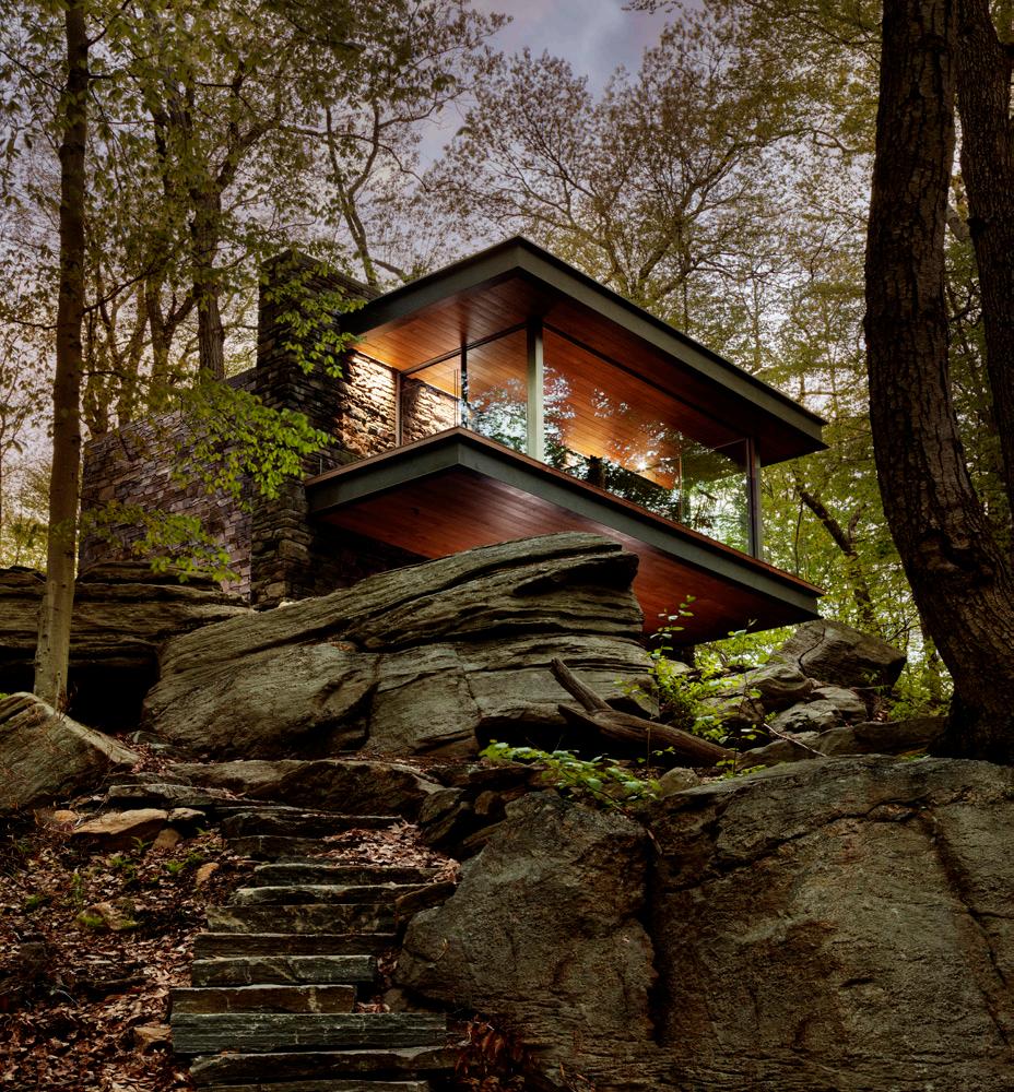
The discussion began with the client’s youthful impressions of Walden and the simplicity of “a small cabin in the woods.” The goal however was not to recreate Thoreau’s cabin, but rather to reinterpret it anew.
The result of this journey is the Writer’s Studio. Hugely appealing to the client—poetry is inspired daily and prolifically, fulfilling the main goal. Classical design elements present themselves, the axial & symmetrical plan, connecting to the surroundings with a balanced use of natural light, view, and ventilation. In contrast, every edge, corner, surface, and transition is entirely exposed. The Studio attains a certain “essentialism.”
Intimate, welcoming, and rightsized – the building is only 400 sf of conditioned space. Systems are concealed with an eye towards sustainability, electrical services buried, a well for water, an incinerating toilet eliminating the need for septic, and ground source geothermal provides proper conditioning to preserve a 1700 volume collection of poetry.
The Studio is “of the place and of the person.” Portions appear as having always been there while others are new and transformative. The fieldstone walls are of the land and it’s as if the forest has grown around them, while steel and glass create an openable and transparent enclosure; a cantilevering counterpoint to the mass walls – all reflective of the poet’s passions. Classical and contemporary design are no longer directional opposites in this aesthetic journey.
“The Writer’s Studio is designed, detailed, and crafted like a finely-tuned watch. The rich textures and comfortably proportioned spaces nicely complement its idyllic setting to provide an architectural muse for the writer.”
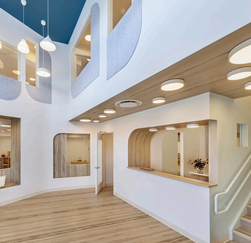
“ The City Kids Education Center inspires its young users with tactile textures, natural light, and flowing spaces. Since the building’s program itself is whimsical, it is delightful to see equally fun forms. The fact that the building was originally a lumber warehouse shows the transformational possibilities of adaptive reuse.”
The City Kids Education Center is a new childhood education center located in Williamsburg, Brooklyn. The project, submitted by Barker Architecture Office, is an adaptive reuse of a former lumber warehouse located under an existing residential highrise. Six preschool classrooms open onto a central double height courtyard gathering space lit by a large storefront window as well as a constellation of pendant light fixtures to bring the outside into a large interior space with limited access to windows. The interior “plaza” features a thickened wall that incorporates the reception desk and storage cubbies and provides a central gathering space for the classrooms. Windows of varying shapes and sizes in the interior façade allow borrowed light to enter the surrounding spaces and provide visual access for children and teachers. The classrooms are interconnected through double doors and shared spaces such as bathrooms and play sinks. Half height walls allow for visual privacy for the kids and monitoring capability for the teachers. The after-school program for elementary school students is accessed up the stairs at the reception area. Apertures bring light and views to the courtyard and the street. Lockers wrap the courtyard volume in the form of a city skyline. Specialized classrooms for cooking, theater, STEM, art, and movement are accessed off of the upper hallway. A lounge with bleacher seats provides a place for informal gathering. Plank flooring creates continuity between space. Acoustical felt panels cut into graphic shapes provide visual interest.
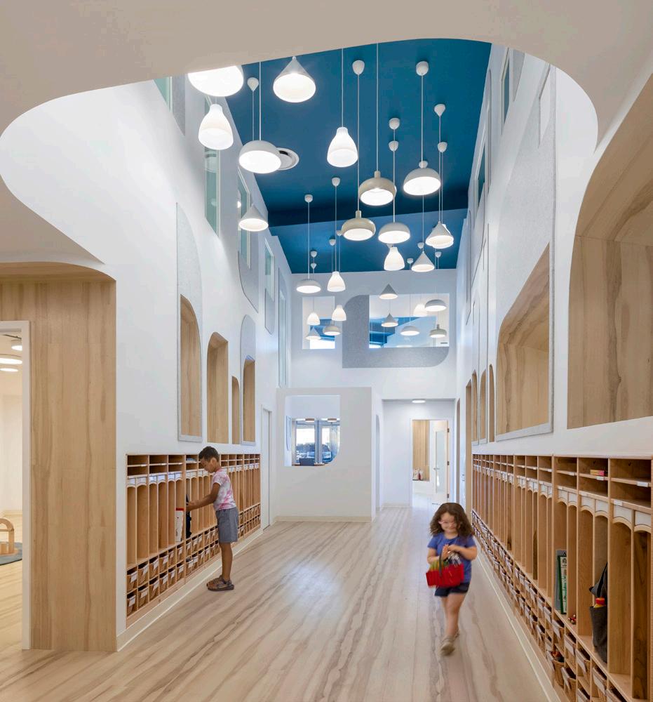
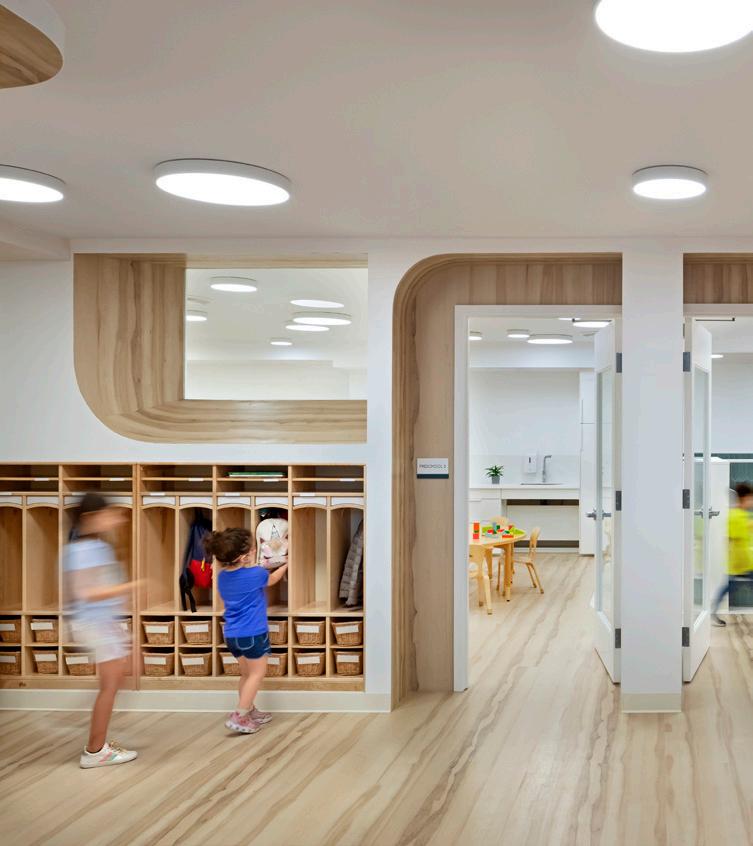
This project underwent construction during the height of the COVID-19 pandemic. The pandemic prompted some ventilation improvements in the form of electronic and ultraviolet light HVAC filters, touchless security and check in points, as well as the addition of operable windows to bring light and air to all classrooms.
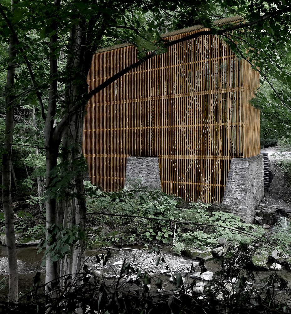
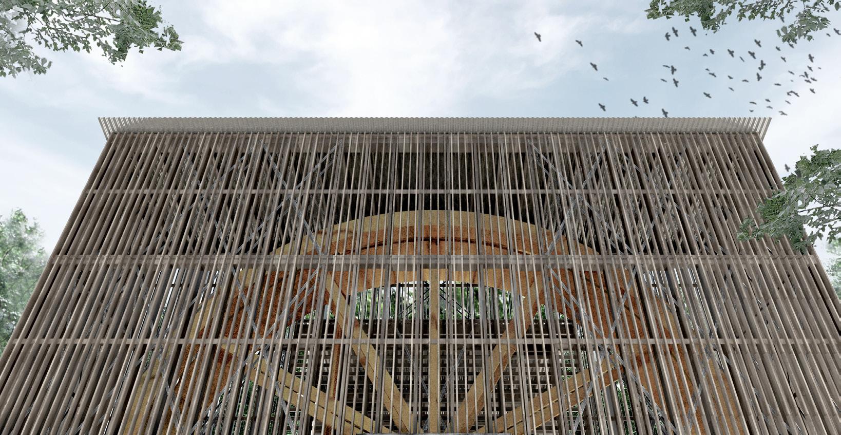
Submitted by ASDF, Waterwheelhouse, a new enclosure for a 1932 Hydro-electric Water Wheel near Cazenovia, New York is intended to exhibit a historical example of hydro-electric infrastructure in Central New York. The enclosure makes the eighteen foot diameter steel waterwheel and its mechanisms visible to the public while also protecting it from vandalism and the elements. The enclosure structure consists of a two by eight balloon frame, clad with prefabricated panels of one by three vertical slats, anchored to an existing stone masonry foundation. The facade of vertical slats conceals the waterwheel when viewed on the oblique, but as the visitor approaches, the screen becomes transparent to reveal the massive steel object within. Of significant importance in the design was to maintain a cost of under 10,000 dollars while also providing a strong and durable enclosure for the waterwheel. Although an obvious choice for the structure would have been preservative-treated wood, we sought a more environmentally sensitive method to address rot-resistance on the creek. We discovered a local source of Tamarack, a naturally durable wood species native to the Adirondacks which could be cheaply sourced from a mill only a few miles from the waterwheel site. Tamarack was intended to be used for both the two by eight framing and the one by three facade screen. The wood would be untreated and rough-cut to keep costs down while providing important long-term durability to the structure. The project remains unbuilt after funding for its construction was canceled.
UNBUILT, COMMISSIONED ARCHITECTURAL DESIGN WORK BY PRACTICING EMERGING ARCHITECTS LICENSED 10 YEARS OR LESS, NOT YET BUILT
SUBMITTED BY: ASDF
“Waterwheelhouse solves its programmatic goal with an elegantly simple clarity of form and materiality.”
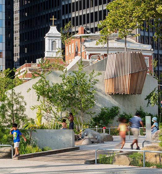
Submitted by BKSK Architects, the Battery Playscape is located at the tip of Manhattan where land meets sea, locals meet tourists, and the bustle of the city yields to the presence of nature. Ecologically, the site is a dynamic confluence of water and land, including a partly natural-partly constructed coastline.
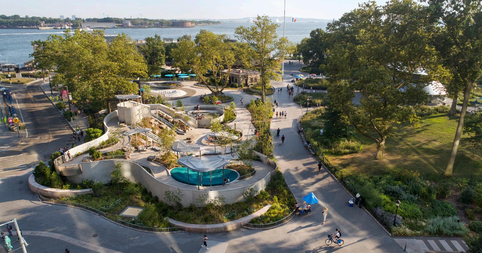
Conceived after Hurricane Sandy, the 1-1/2 acre Playscape responds to the site’s past and future flooding by telling the story of resilience, interwoven with play. It is the last piece of the Battery Conservancy’s masterplan which envisioned a verdant future for the then-dilapidated park. The Playscape realizes that vision through accessible, full body play immersed in planting, natural landforms, and visible water management. Opened in 2021, it is built to flood and recover, part of the embedded climate change narrative. The project was a collaboration between architects, landscape designers, and specialty fabricators, as well as a public-private partnership between the Battery Conservancy and the NYC Department of Parks and Recreation.
On the premise that early appreciation for ecological diversity fosters environmental stewardship in adulthood, the Playscape’s five zones are each designed around a landscape typology from the Hudson River Valley. The zones represent ways land and water meet in nature—Bluff, Meadow, Riverbed, Marsh, and Dune. Each typology encourages site specific experiences and play—standing atop the Bluff to view the harbor, looking at the city from houses in the tree canopy, peeking out of grasses in the Meadow or running up and down the Dune. Custom play structures encourage interactivity through tall stone slides, multi-level playhouses, and performance space at the Showbox Theater. The Battery Playscape is a revitalized urban landscape serving as a respite from urban chaos, supporting open-ended play and using the local ecology to teach about resiliency.
“Offering a playful oasis within the dense urban fabric of Lower Manhattan, the Battery Playscape brings its own playful energy to support the children who visit.”
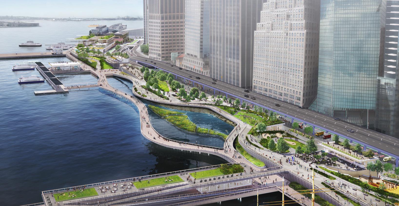
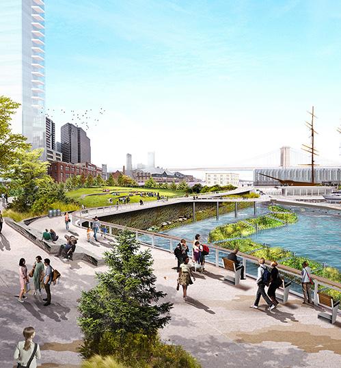
The Financial District and Seaport Climate Resilience Master Plan, submitted by ONE Architecture, is a shared city-community vision for a resilient 21st-century waterfront. Grounded in community and regulatory input, climate science, and engineering, the master plan reflects an ambitious vision that can be realized. Lower Manhattan’s waterfront is a unique confluence of urban life and infrastructure where vast transportation networks converge and connect. This waterfront houses maritime facilities that serve the entire region, ships, a heliport, a constellation of public open spaces, amenities, and historic landmarks, and the elevated FDR viaduct. Below grade underground infrastructure includes five subway lines, power transmission lines, and the sewer interceptor. This dense urban fabric leaves limited space to site flood defense without walling off the community. To achieve the objectives requires extending the shoreline of Lower Manhattan into the East River to create space for flood defense infrastructure and waterfront uses. The proposed design envisions a new multi-level public waterfront. The upper level will protect against coastal storms, with buried floodwalls that create elevated open spaces with views of the harbor and city. A lower-level esplanade will be close to the water and connect to piers and ferries. Ferry terminals will be redeveloped into new resilient and modern facilities with room for future expansion. This waterfront will also help advance sustainability goals and identifies opportunities to integrate renewable energy in new buildings or structures along the water. Nature-based solutions will help manage stormwater, provide shade, and reduce local summer temperatures. Finally, this new shoreline edge will incorporate opportunities for ecological enhancements, providing new habitats both on land and in the water.
NEW YORK, NEW YORK
SUBMITTED BY: ONE ARCHITECTURE
Renderings: © ONE Architecture & SCAPE Landscape Architecture
“The Financial District & Seaport Climate Resilience Masterplan sets a profound example of how to mitigate climate risk along urban waterfronts with community-building uses for the majority of the time when not in a disaster-prevention mode.”
TALISHA SAINVIL, AIA
PAST YOUNG ARCHITECT AWARD RECIPIENT
KELLY HAYES MCALONIE, FAIA


PAST KIDENEY & MATTHEW W. DEL GAUDIO AWARD RECIPIENT
PAUL MCDONNELL, AIA

2023 AIANYS PRESIDENT & PAST PRESIDENT’S AWARD RECIPIENT
PASQUALE MARCHESE, AIA
2022 AIANYS PRESIDENT
TONJA ADAIR, AIA
AIANYS SECRETARY
Established in 2005, the Student Award recognizes notable contributions and accomplishments by a student member of The American Institute of Architecture Students within New York State.
Kayla Hansen graduated from Roger Williams University in 2020 with a BS in Architecture and a minor in Art and Architectural history. Kayla received her Master of Architecture, from Roger Williams University in 2022. During her undergrad years, she was a member of AIAS at Roger Williams University. She is now an Associate AIA member on the path of licensure, studying for and taking the ARE exams. Kayla’s Architectural thesis project, The Urban Atrium, was recognized by AIA Long Island, as it won first place for Long Island AIA Women in Architecture lnspire and Aspire 2022 Student Design Scholarship Competition. Her project is a reinterpretation of the atrium in a new way and at a new scale where Times Square becomes the atrium. Upon this realization, the project becomes about life above the city and the focus of the design aims toward creating a building that embodies the qualities of the atria typology.
The Young Architect Award recognizes notable contributions and accomplishments within the architecture profession by an architect member in New York State who has also demonstrated exceptional leadership.
The first recipient is Jeffrey Pawlowski, AIA. For over 13 years, Jeff has been an active, engaged, and energetic member of the AIA—serving on several committees for the Central New York chapter, and for the past five years, serving at the state level. He has engaged on various programs, initiatives, and task forces where he’s brought an open mind, a positive attitude, and high expectations for outcomes that consistently promote the mission of the AIA.
As the Vice President of Communications & Public Awareness, he positively impacted all portfolios to better that mission. And in his current position as Vice President of Education, Jeff’s knowledge and expertise helps to guide the delivery of relevant and diverse programming to the AIANYS (change to AIA New York State) membership. Jeff believes that education is crucial to advancing and improving the profession and the industry.
As a Project Manager at SUNY Upstate Medical University Design and Construction, Jeff instills his belief that designing spaces to promote harmony of mind, body and spirit, culture will shift from one that is dependent on invasive medicine to one that focuses on the healing experience of the patient.
The second recipient is Jaclyn Tyler, AIA. Since 2007, Jaclyn has actively participated in the American Institute of Architects. Her dedication to growth motivates her actions to advocate for change within communities, diversify her profession and to act with genuine responsibility for the impact architecture has on our environment and future generations.
Established in 1985, the Community Development Award recognizes and acknowledges projects and individuals who have had a substantial impact on the built environment within the various localities of New York State or, on the State as a whole. This Award, in the form of a citation, may be made to any individual, community or civic organization, governmental agency, or private corporation whose efforts have resulted in a significant and positive improvement to the built environment.
Starr Whitehouse Landscape Architects and Planners has demonstrated themselves as an organization to be committed to issues of health equity, environmental justice and resilience in the built environment—from their work across Manhattan to their design influence internationally. Starr Whitehouse has demonstrated leadership and collaboration in their work to celebrate the shared human experience on the waterfront.


Established in 1984, the President’s Award recognizes outstanding contributions to the profession in education, industry or government by an AIA New York State member.
Graciela is an immigrant Architect from Bogota, Colombia. She is passionate about building a better community and advocating for the profession on a local, state, and national level. Fueling Graciela is her own “American dream experience.” Her journey to leadership within the profession and immigrant community started while learning how to overcome the adversities she had to endure from the first day she arrived In the United States. Navigating life in a new country, the challenges throughout the licensing process, and finding her voice in a predominantly male profession forged Graciela’s commitment to charting a course for those that would inevitably follow. Today, Graciela is an advocate and exceptional leader within the Institute and the network of immigrant professionals.
Established in 2005, the Firm Award recognizes notable achievements in design, community service, education, and service to the profession and AIA by an architectural firm within New York State.
Listen, Imagine and Build. This three-word design philosophy encompasses the firm’s mission to actively listen; test ideas with imaginative design and to view the solution through the lens of how it is best realized for each individual client. The process is engaging, collaborative and professional.
KG+D has been in practice in Mount Kisco, New York for 26 years. Founded as Kaeyer, Garment and Davidson in 1994, the firm has built upon a well-established legacy of more than 85 years of superior services to school clients throughout the Hudson Valley region.
President
Pasquale Marchese, AIA
President-Elect
Paul McDonnell, AIA
Vice President, Government Advocacy
Peter Wehner, AIA
Vice President, Education
Casey Crossley, AIA
Vice President
Communications & Public Awareness
Jeffrey Pawlowski, AIA
Vice President
Emerging Professionals
Ofé Clarke, AIA
Secretary
Tonja Adair, AIA
Treasurer
Andrew Harding, AIA
Immediate Past President
Illya Azaroff, FAIA Directors
Sarah Bruce, AIA
Danei Cesario AIA
Kritika Dhanda, Assoc. AIA
Richard Kruter, AIA
Christopher Less, AIA
Brianna Lopez, Assoc. AIA
Julian J. Misiurski III, AIA
Jacob Rivalsi, AIA
Scott Townsend, AIA
Jenna Wandishin, AIA
Seth Wiley, AIA
Charles Woodcock, AIA
Mi Zhang, AIA
Associate Director
Tannia Chavez, Int’l Assoc. AIA
New York Rep to YAF
Christopher Fagan, AIA
National Associates
Committee Regional Associate Director
Ebru Sulker, Assoc. AIA
Student Director
Rahmah Blessing
Oshioneh Gimba, AIAS
AIA Strategic Council
Kirk Narburgh, FAIA
Victor Han, AIA
Graciela Carrillo, AIA
Executive Vice President
Georgi Ann Bailey, CAE, Hon. AIA
Legislative Counsel
Richard Leckerling, Esq.
Whiteman Osterman & Hanna LLP
General Counsel
Michael De Chiara, JD
Zetlin & De Chiara LLP
Anthony DiBrita, Esq. Of Counsel
Zetlin & De Chiara LLP

