4 minute read
What makes for a good and an effective airline livery?
What makes for a good and an effective airline livery?

Advertisement
Comment from Marc Weber Bång, CEO, SimpliFlying Global Institute
Spotting a special airline livery is not as rare as it used to be as many airlines across the globe are making use of this fun way of communicating a message. By taking a closer look at this trend, I would argue that within the category of special airline liveries, there are three sub-categories.
1. Advertising
Whenever an airline sells aircraft exterior space to promote another brand. The liveries from SunExpress, Latam, Virgin Atlantic and Alaska Airlines belong in this group.
2. Awareness & Acknowledgement
Charity, Honorary, Political, and Remembrance liveries. Here we find Etihad, Emirates and American Airlines.
3. Airline Activity
Destinations, Competitions, Celebrations, Events, Products and Services etc. Qantas, United and Air Indiafall under this category.
There is another category of Retro Liveries, which are liveries from the past.
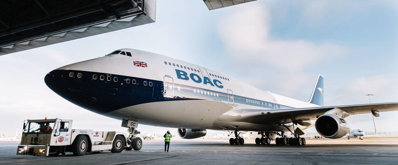
However, I would place this as a sub-category to the standard liveries that airlines do, as they were once the norm. Although none are featured here, a good example is British Airways and their five retro liveries to celebrate their Centennial jubilee this year.

Each of the liveries featured in this issue are indeed seen as a special livery, but some do not stand out as they ought to.
Others have been seen before in different variations, such as the Star Wars liveries, which was originally pioneered by ANA in 2016, and who I think still have the best and most original ones.
This suggests that it is getting increasingly more difficult to grab people’s attention through this medium because more and more airlines are doing it.
It has to be aligned or connected to the airline brand somehow. It must have the “wow” factor when people see it. It has to convey a clear message that is easily understood. 1. 2. 3.
What has worked in the past?
Here are some good examples of airlines that have mastered all three principles:
Air New Zealand

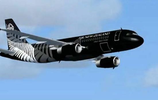
The Lord of The Rings, The Hobbit and the All Black liveries. Each of them are aligned with the Air New Zealand brand in either a geographic or cultural way, and the campaign also featured other elements such as safety videos around the themes, which leads to a more complete and well connected campaign.
They are noticeable and extremely well executed, and have received heaps of attention, and there is no doubt whatsoever as to what message they are conveying.
Brussels Airlines

Brussels Airlines has also recently launched a number of liveries called Belgian Icons, which is exactly what they are. Like Air New Zealand, these are very much on-brand, beautifully decorated (and painted by André Eisele) and convey their message loud and clear making them impossible to miss no matter which angle you see them from.
The Belgian Icons are featured on five Airbus A320s and comprise of the Smurfs, Tomorrowland, Magritte, Tintin and the national football team called the Red Devils ( Not to be confused with Manchester United), all of which scream “Belgium”.
Of other noteworthy liveries that live up to these principles I would mention Finnair and their Marimekko liveries and Icelandair with their Northern Lights livery. Kulula’s “ Flying 101” livery also hits the nail on the head.
Why have special liveries in the first place?
At the end of the day, the point of doing a special livery is to do something different and exciting that increases brand awareness and which tries to promote a specific element as found in one or more of the 3 subcategories of the special airline liveries categories:
Many people are fascinated by planes, and they become even more interesting when they stand out from the crowd by sporting a special livery.
Airlines know this, and use this to their advantage. Afterall, an airline’s aircraft are their most valuable physical assets, so they might as well maximize the use of them for other purposes than flying passengers and cargo from A to B.
Personal favourite: Alitalias Bulgari livery on their 747-200
Personal dislike: Alitalias McDonald’s livery on their MD80.
What I would like to see: SAS - Scandinavian Airlines and Royal Copenhagen livery
Check out my article in the May 2019 Issue of airline marketing monthly where I discuss how airlines and advertisers can complement each others brands.


