A
Compilation
of Case
Studies
Academy of Architecture Semester 5 2021-2022
Postmodernism
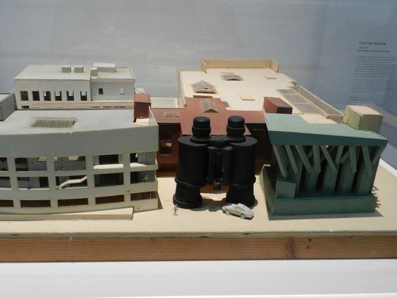
1. James RThompson Centre, HelmutJahn 2. No.1 Poultry Building,James Stirling 3. Furniture design, Memphis group 4. St. Coletta school, MichaelGraves 5. Ahouse for Essex- Grayson Perry ,Jack Hobhouse 6. Binoculars building, Frank Gehry
Abteiberg Museum, Hans Hollein
San Cataldo Cemetery,Aldo Rossi 9. Humana building tower- MichaelGraves
Contents
3
7.
8.
15 37 57 83 102 117 135
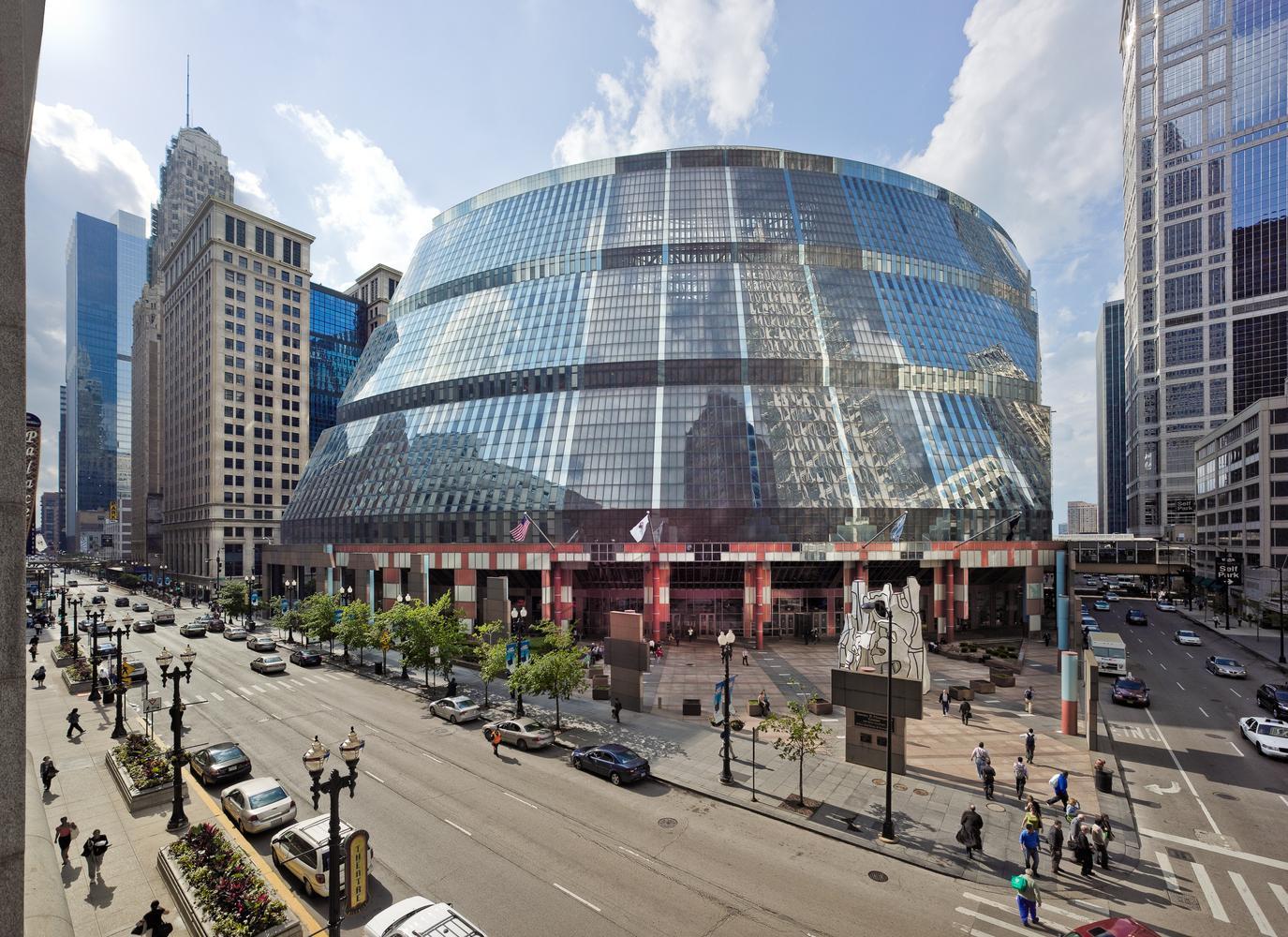
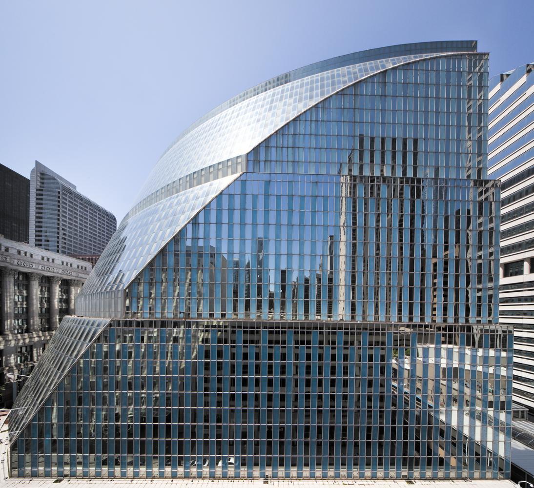
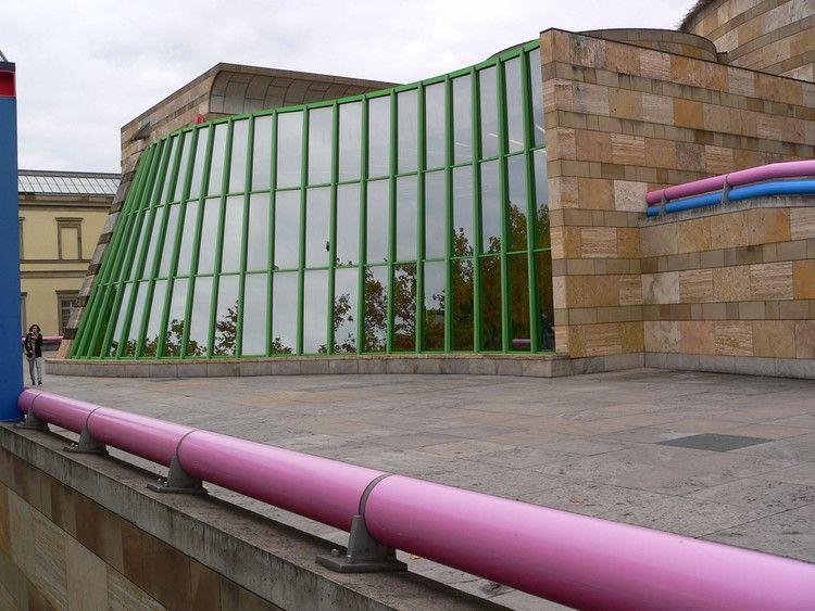
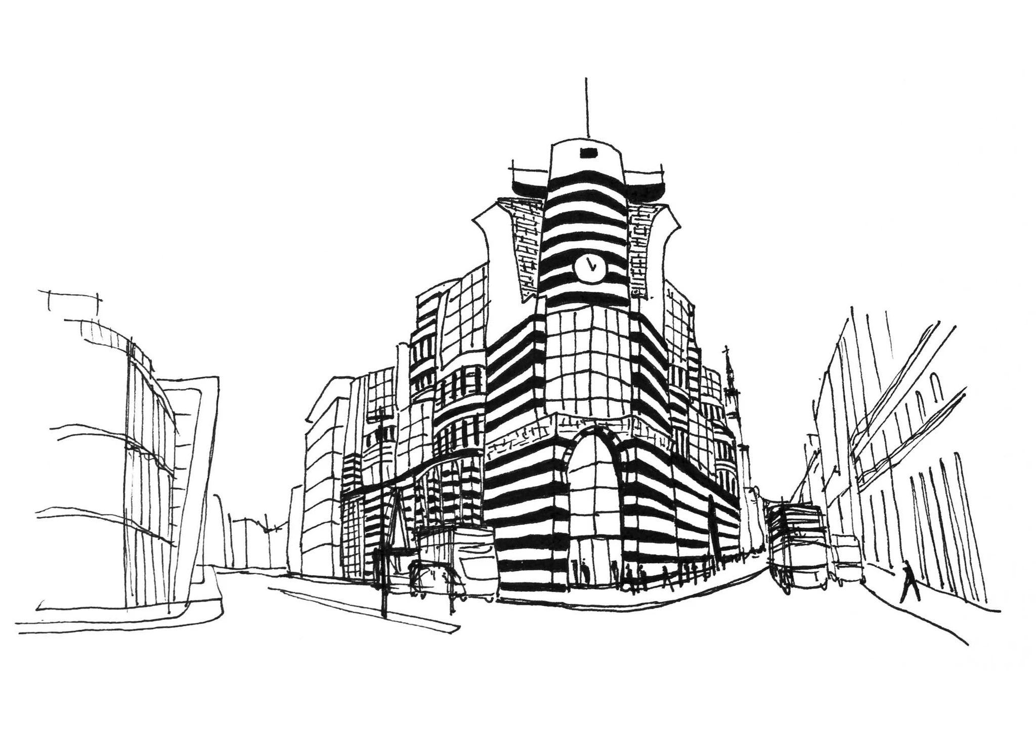
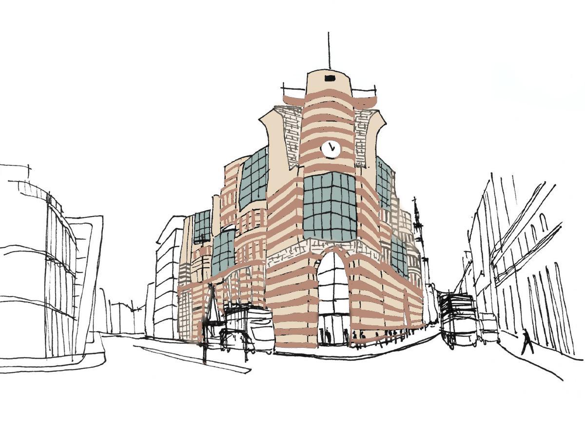
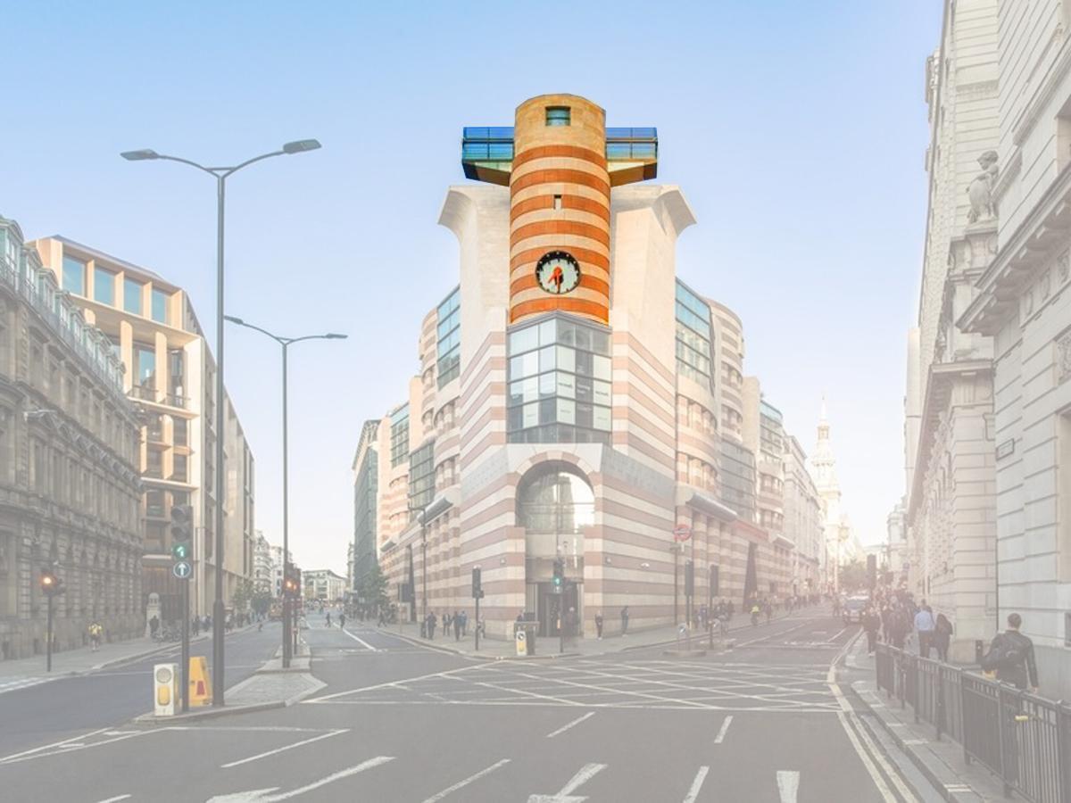
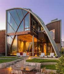
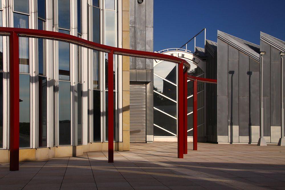
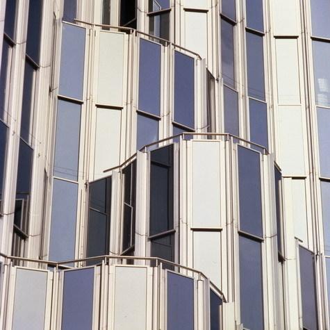
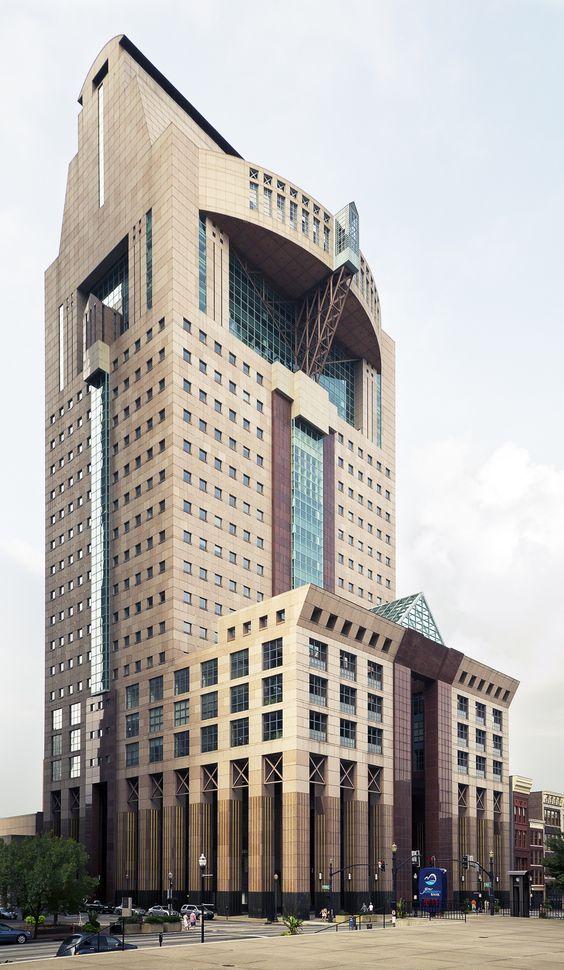
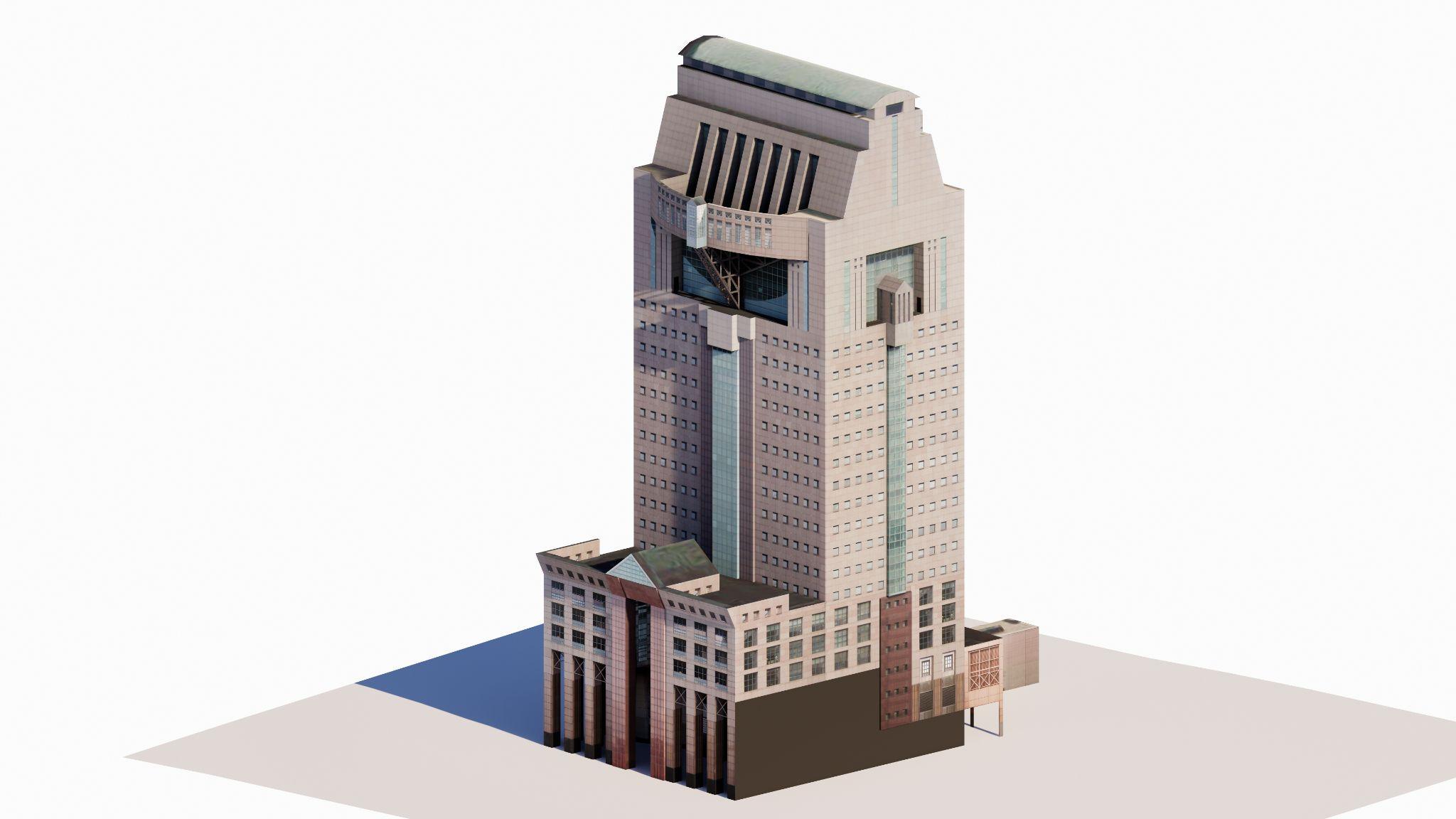
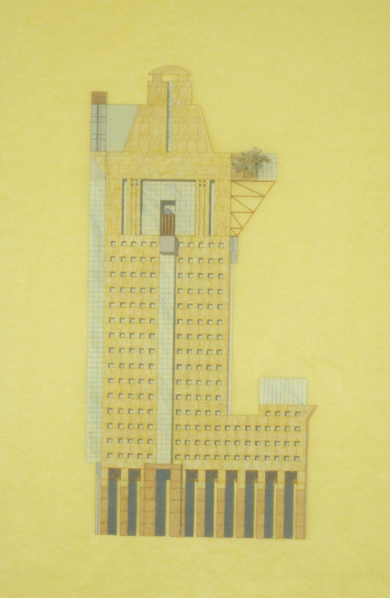
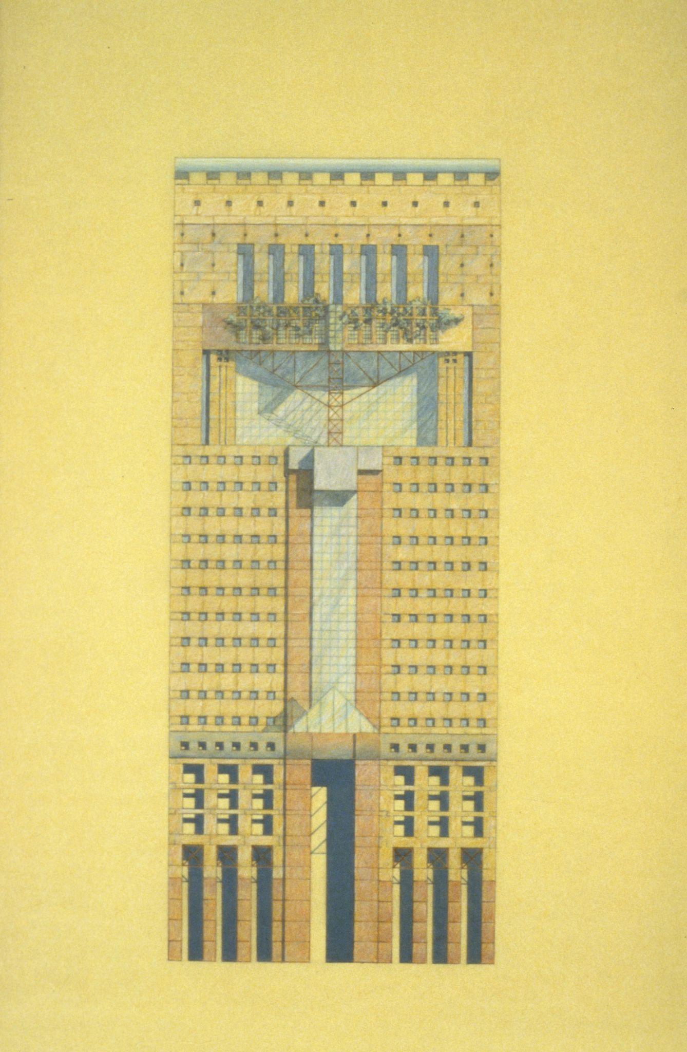
JamesRThompsonCentre
Architect : Helmut jahn Year : 1985 Location : Chicago
AbouttheArchitect
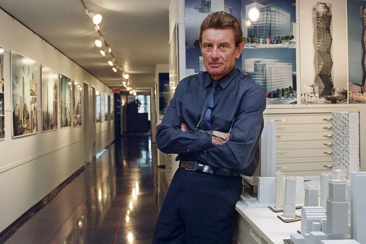
HelmutJahn(1940-2021)
● Helmut Jahn, (1940 - 2021), German-born American architect known for his postmodern steel-and-glass structures.
● Known for buildings such as the Sony Center on the Potsdamer Platz in Berlin, Germany; the Messeturm in Frankfurt, Germany; One Liberty Place in Philadelphia, Pennsylvania (formerly the tallest building in Philadelphia); Illinois Centre, Chicago, and the Suvarnabhumi Airport, an international airport in Bangkok,Thailand.
● Inspired by Ludwig Mies van der Rohe, yet opposed to the doctrinal application of modernism by his followers,
● His architectural style shifted from the modernism of the Miesian tradition to postmodernist one with high-tech stylizations.
-https://archinect.com/news/article/150263145/renowned-architect-helmut-jahn-dies-at-81-from-cycling-accident
We Do Not Construct Decoration, We Decorate Construction – Helmut Jahn
Source
https://www.jahn-us.com/
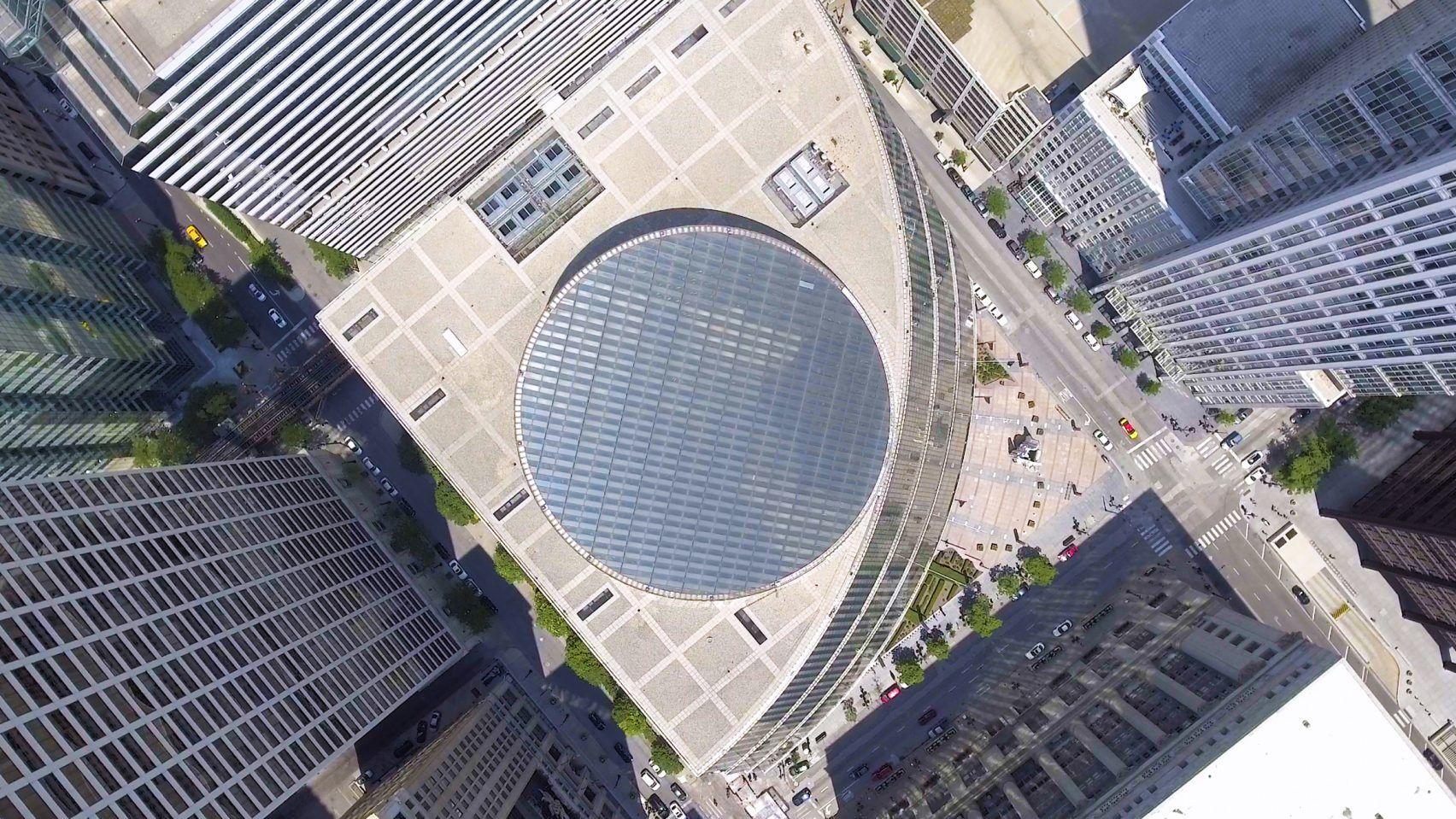
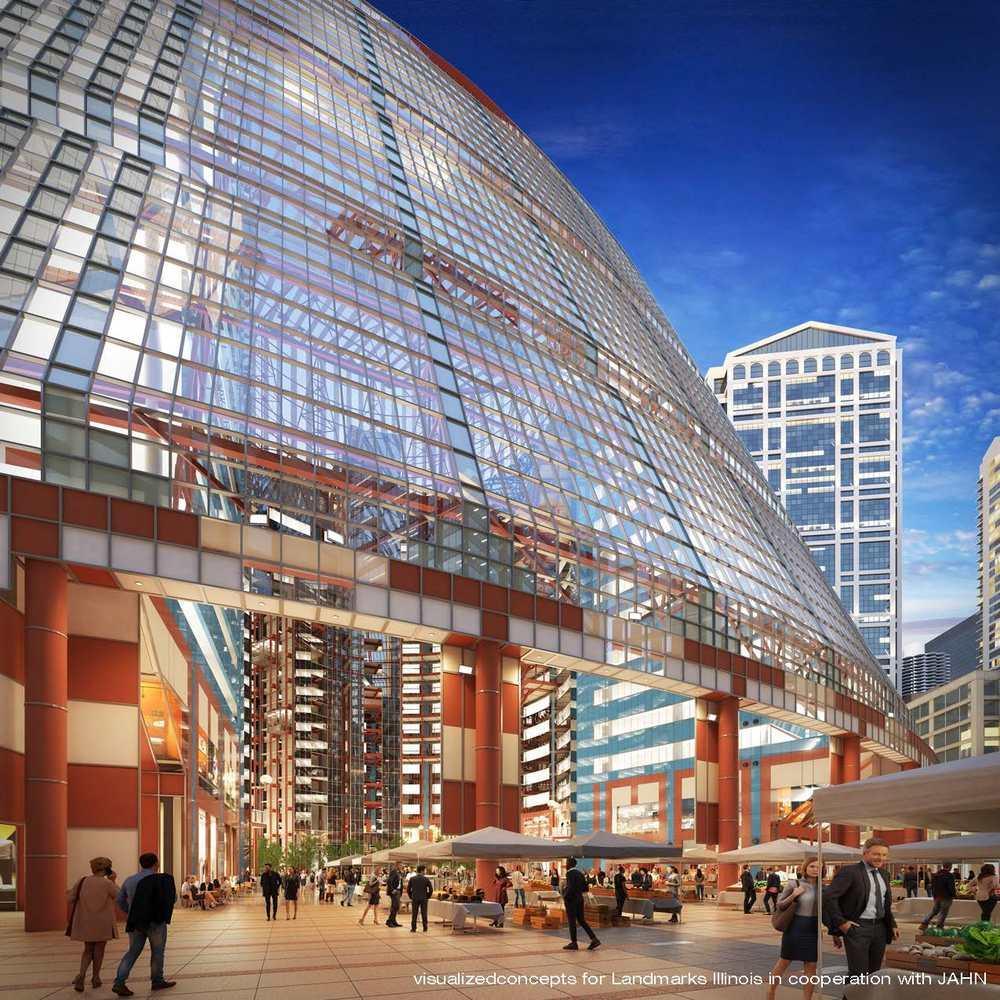
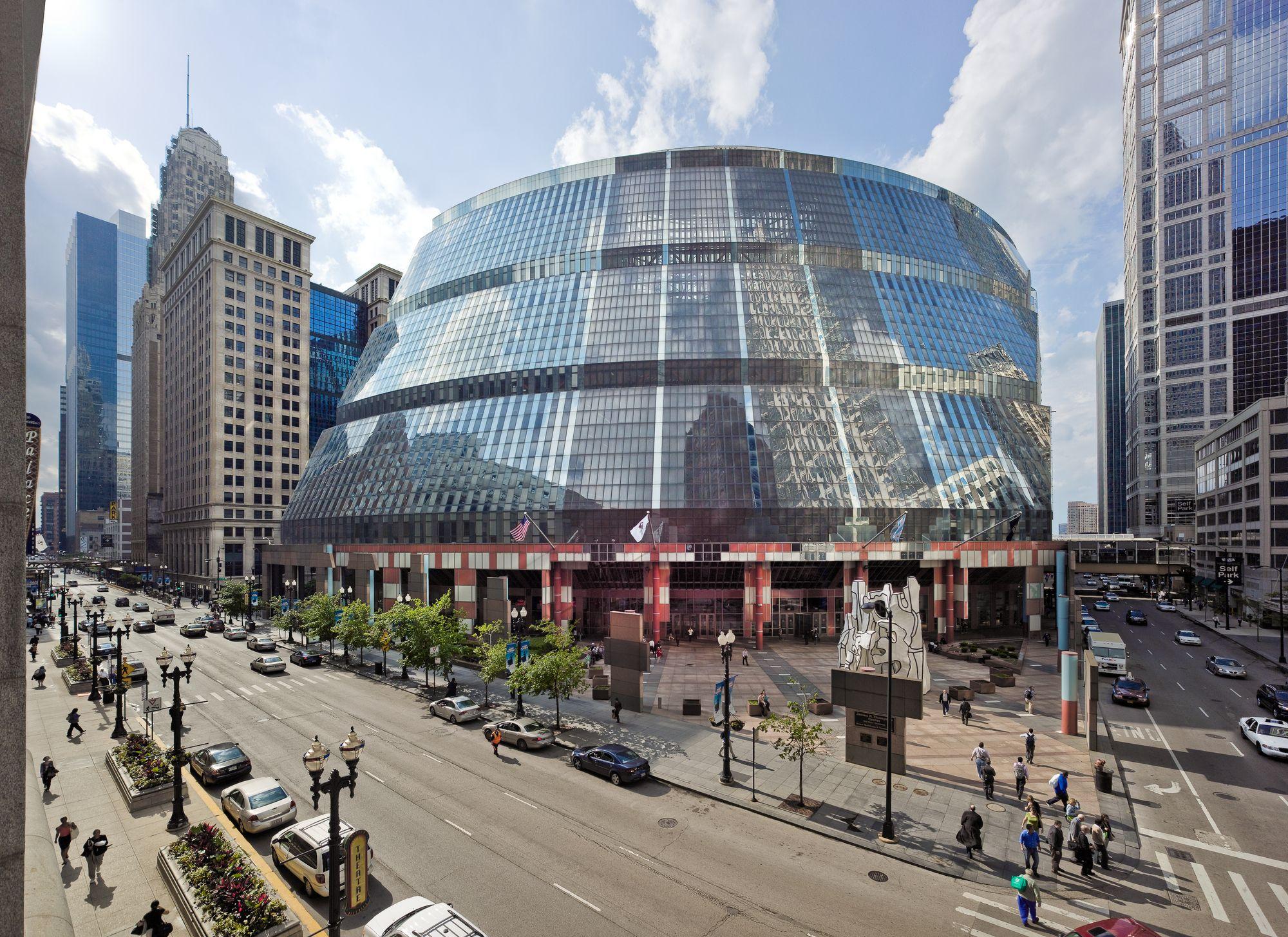
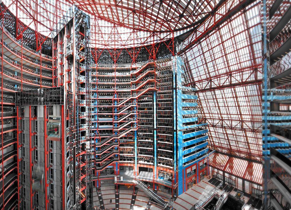
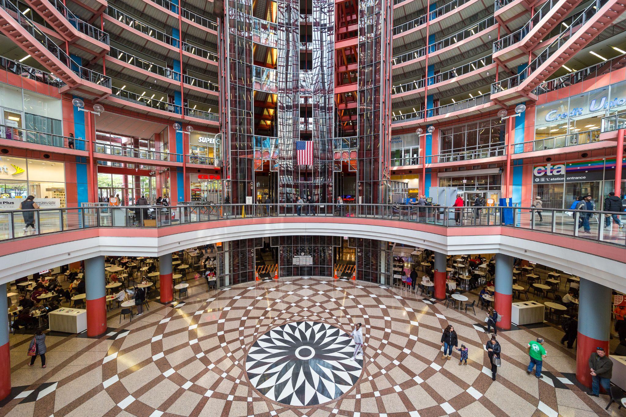
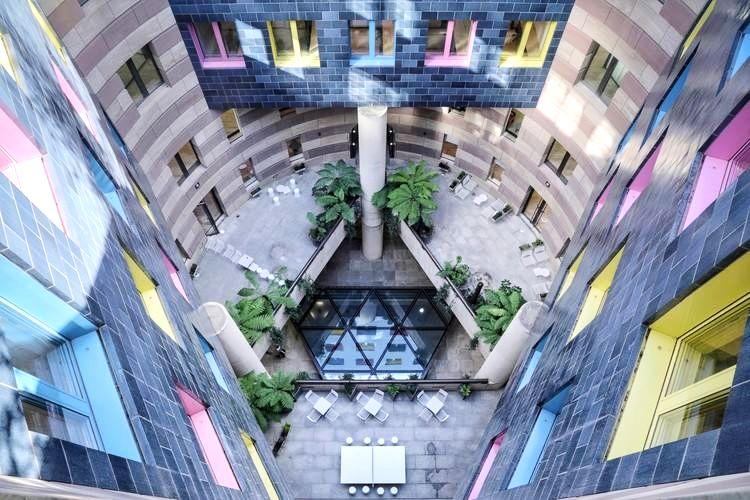
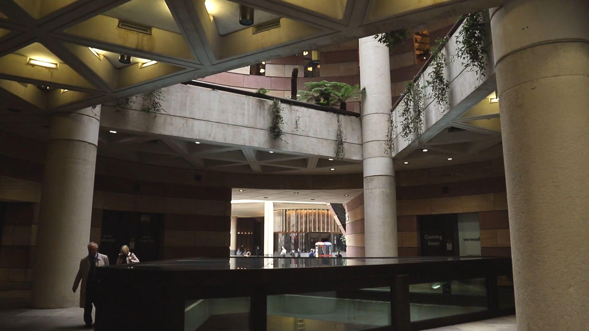
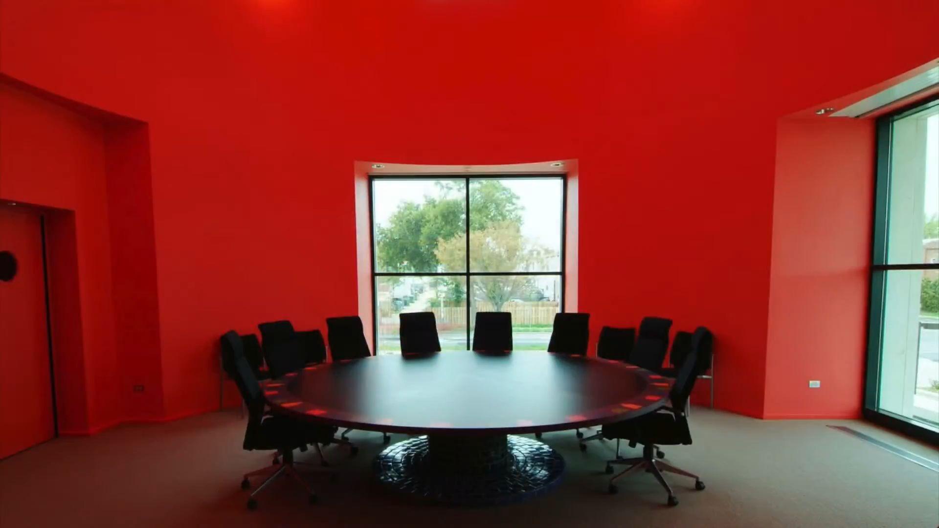
● Opened in May 1985 as the State of Illinois Center, the building was renamed in 1993 to honor former Illinois Governor James R. Thompson. It sits on an entire city block bordered by Lake Street, LaSalle, Randolph and Clark Streets in the heart of downtown Chicago.
● Helmut Jahn designed center of state government which is unabashedly Postmodern, with colorful details and a shape that references the dome of state's capitol.
● The openness and transparency of the building are meant to symbolize the state’s commitment to serving the people.
● The building is a subway stop, an elevated train station, a pedwayintersection, an interior marketplace, a food court concourse, an exterior plaza, and the list goes on—a kind of city-extension that inhales and breathes public life.
Introduction
- https://www.archdaily.com/954146/the-thompson-center-a-building-facing-demolition-threat-in-chicago
Source
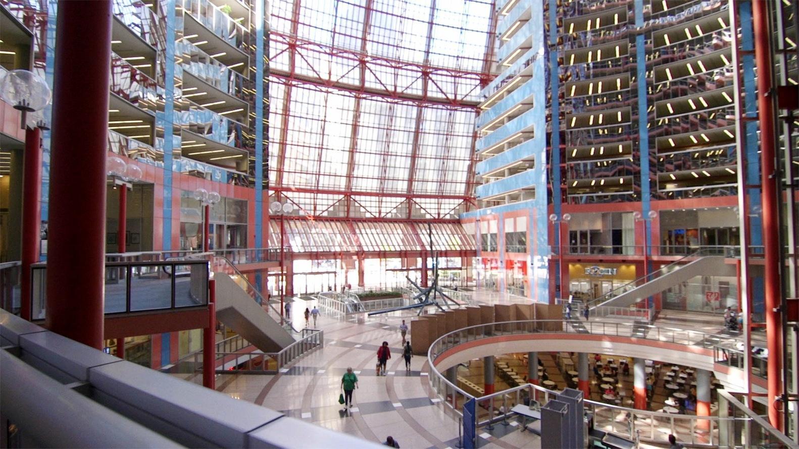
● It is a symbolic structure, a contemporary take on the traditional state capitol, a domed government building.
● The whole building is hollowed out to celebrate the centrality and transparency of government.
● Symbolism extends to the choice of materials – toned down red, white, and blue glass panels arranged in bands that look more like salmon, silver, and baby blue.
Concept
Source - https://www.archdaily.com/954146/the-thompson-center-a-building-facing-demolition-threat-in-chicago
ArchitecturalAnalysis
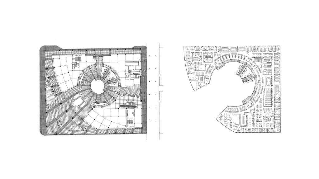
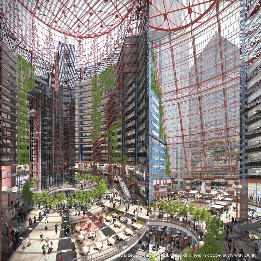
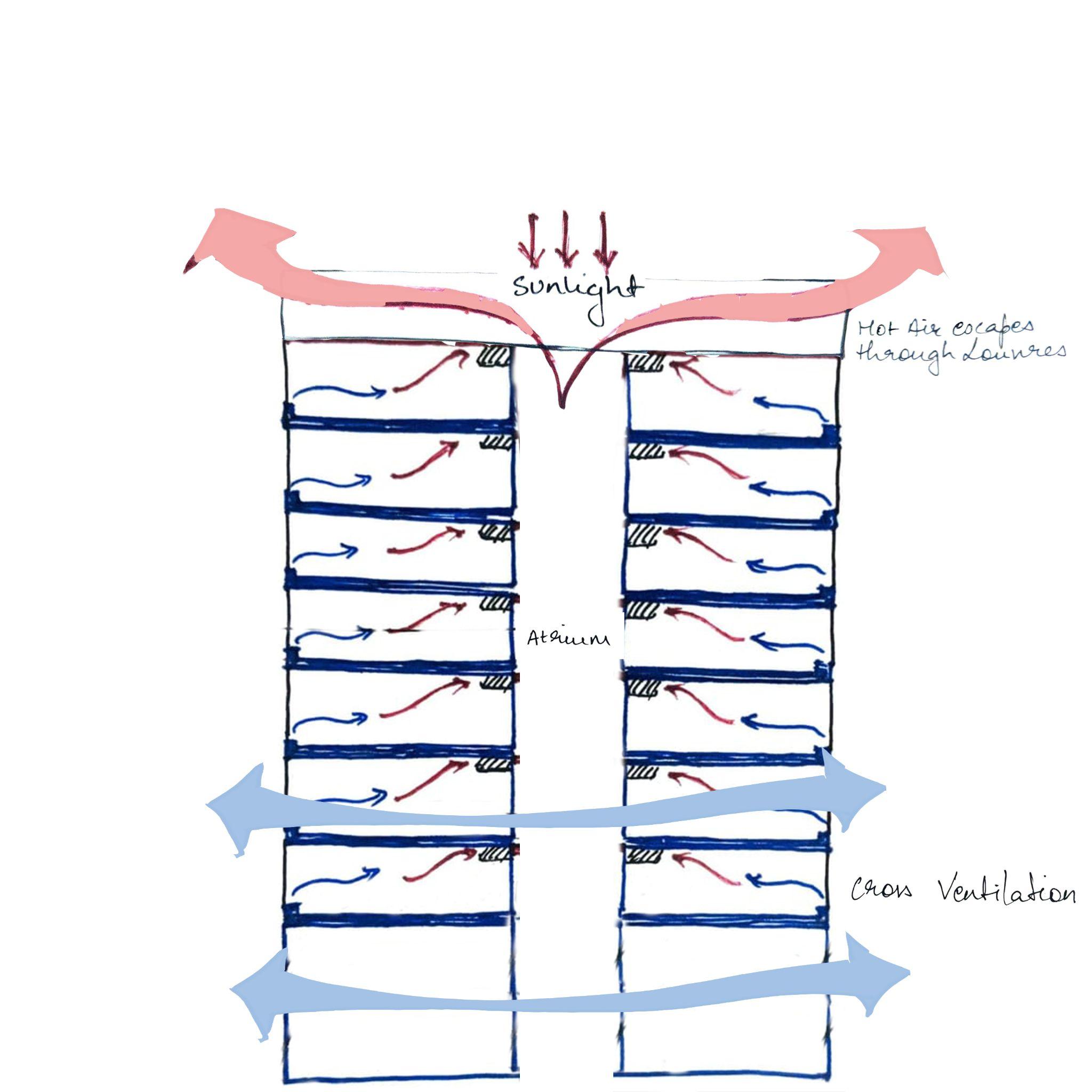
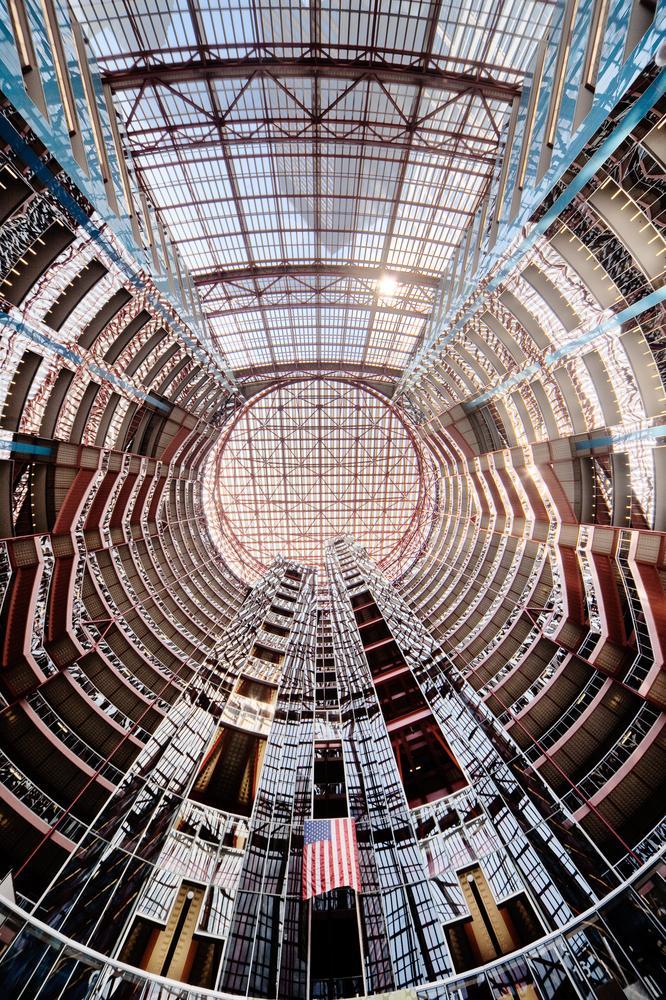
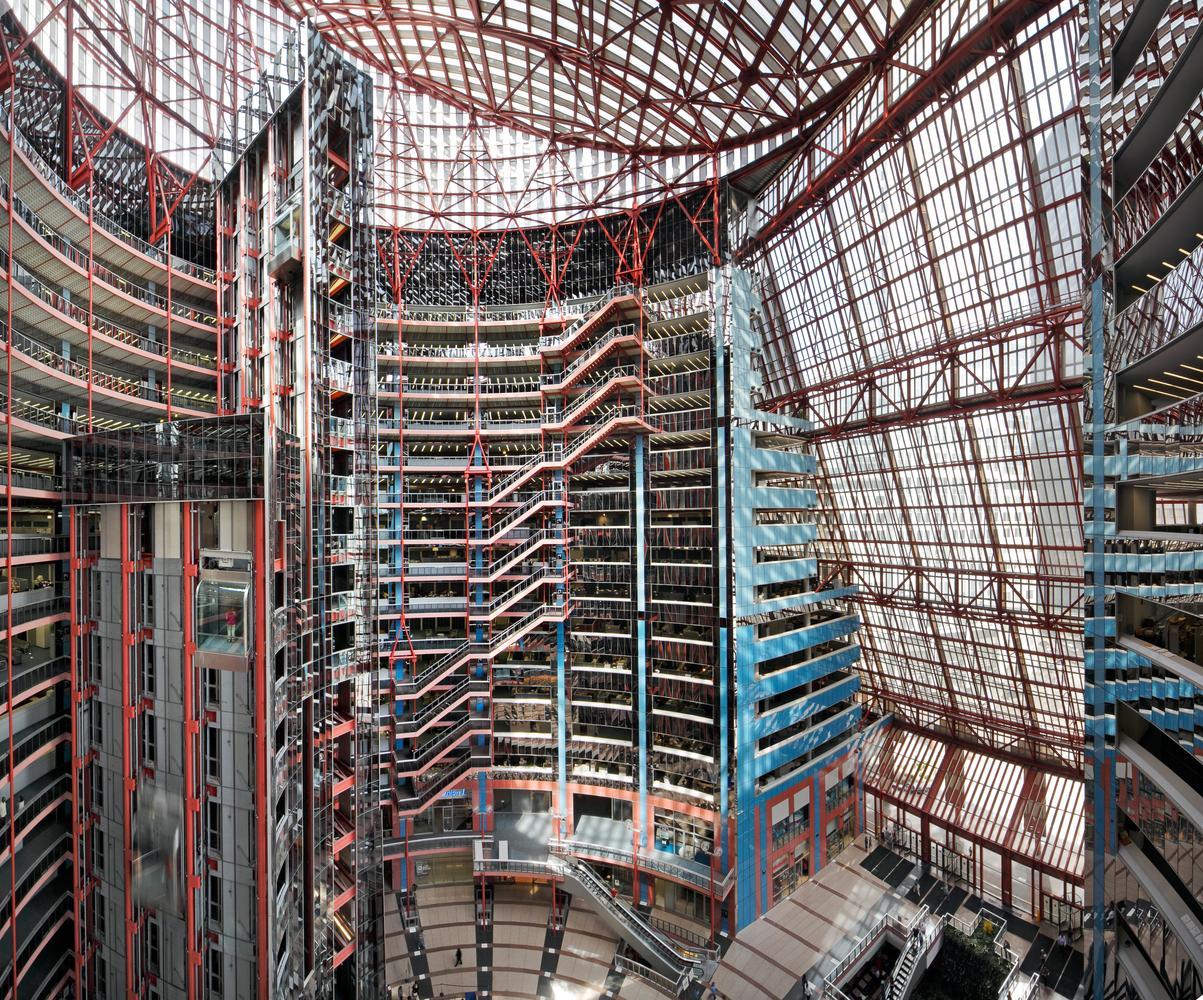
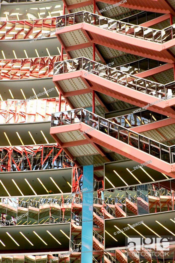
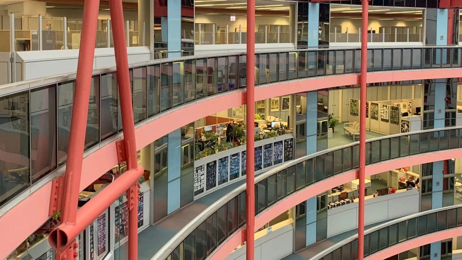
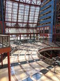
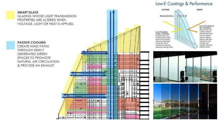
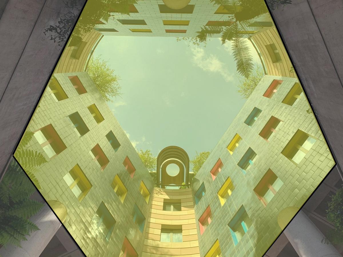
● An enormous skylit rotunda and a circular cutout in the floor aiding in the wind flow
● A steady flow of people move around on escalators and exposed elevators, enlivening the space.
● An innovative system of thermal storage helps. Chillers create ice slush overnight, when electricity prices are low, and store the slush in basement tanks.The slush is used to air condition the building during the day and isthen re-frozen at night.
● It is a glass and steel structure with an open floor plan and a massive open atrium.
● The plan refers to the American tradition of centrally planned domed state capitols with dramatic blue-and-pink glass-and-steelappearance.
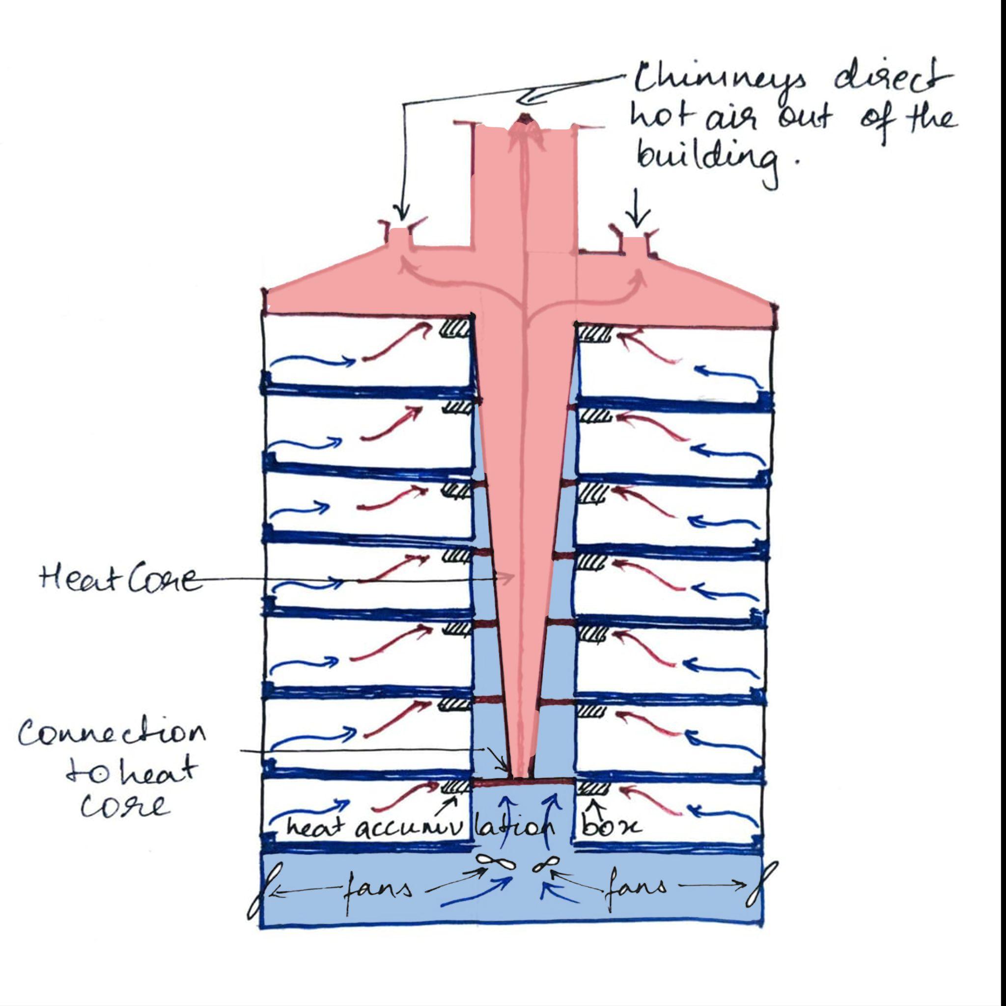
Core
to heat core
ArchitecturalAnalysis Heat
Connection
ElementsofPostmodernism
Curved forms
Features often borrowed from earlier periods
ELEMENTS OF POSTMODERNISM
Colours and textures were unrelated to the structure or function of the building; colour is an important element in many postmodern buildings
Communicating meanings with ambiguity Sensitivity for the building's context
Sourcehttps://www.archdaily.com/954146/the-thompson-center-a-building-facing -demolition-threat-in-chicago
IN FAVOUR
Unique architectural experience.
Public Asset and an Ambitious Structure
Offers a distinctive spatial arrangement
Exposed machinery elevates the sensory experience of buildings

Critiques https://www.archdaily.com/954146/the-thompson-center-a-building-facing-demolition-threat-in-chicago
Critiques
AGAINST
Asymmetrical shape
Single paned glass ,custom made curved glass.
Building is completely open.
Poor maintenance
Material usage generated interior ventilation and temperature issues.
Color Palette Source - https://www.archdaily.com/954146/the-thompson-center-a-building-facing-demolition-threat-in-chicago
● 1st strategy : Utilization of smart glass coating to control the amount of UV lights
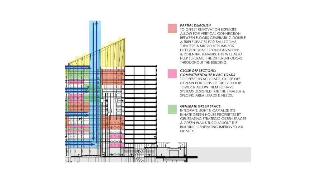
● 2nd strategy : Closing off sections to compartmentalize HVAC loads
Conclusion
● It is a significant building with a truly remarkable interior public space.
● Poor maintenance
● The list of problems the structure is facing is long.
● In reality is a monument to Post Modernist architecture, and it's quite an architectural marvel.
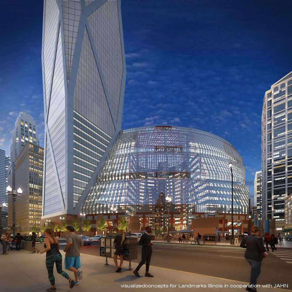
● Acomprehensive redevelopment plan and proposed tower addition.
● Bleak future.
Conclusion
-
Source
https://www.archdaily.com/954146/the-thompson-center-a-building-facing-demolition-threat-in-chicago
● https://www.archdaily.com/954146/the-thompson-center-a-building-facing-de molition-threat-in-chicago
● https://www2.illinois.gov/cms/about/jrtc/pages/default.aspx
● https://www.enjoyillinois.com/explore/listing/james-r-thompson-center
● https://www.theatriumchicago.com/james-r-thompson-center/
● https://www.choosechicago.com/listing/james-r-thompson-center/
● https://www.stirworld.com/think-columns-review-of-thompson-center-in-chicag o-the-building-facing-demolition-threat
● https://www.archpaper.com/2019/07/chicagos-thompson-center-sale/
● http://www.serhiichrucky.com/james-r-thompson-center
● https://preservationchicago.org/chicago07/james-r-thompson-center-state-of-i llinois-building-2/
● http://www.serhiichrucky.com/james-r-thompson-center
● https://medium.datadriveninvestor.com/the-thompson-center-how-it-can-be-sa ved-5abf0d66900c
Bibliography
No.
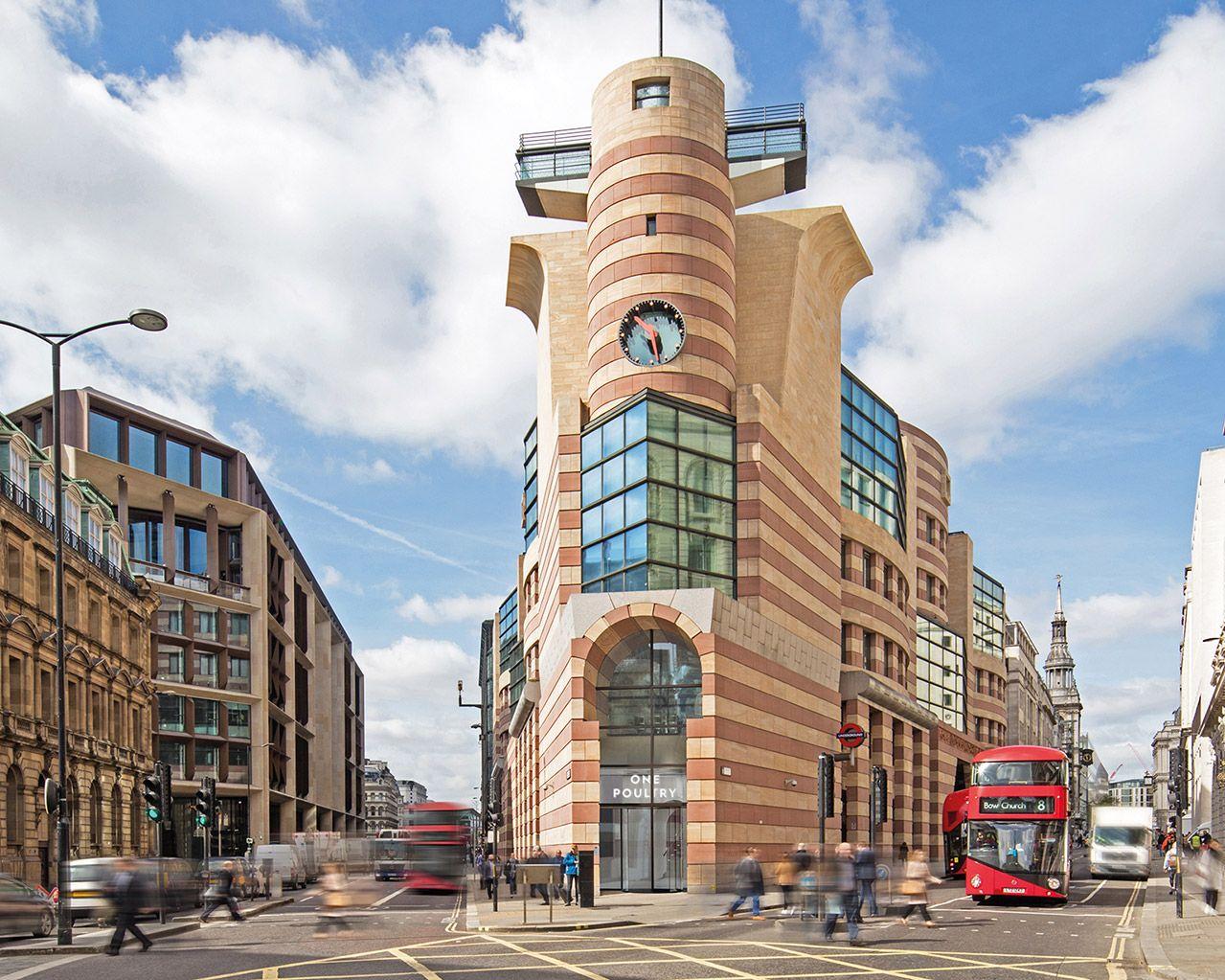
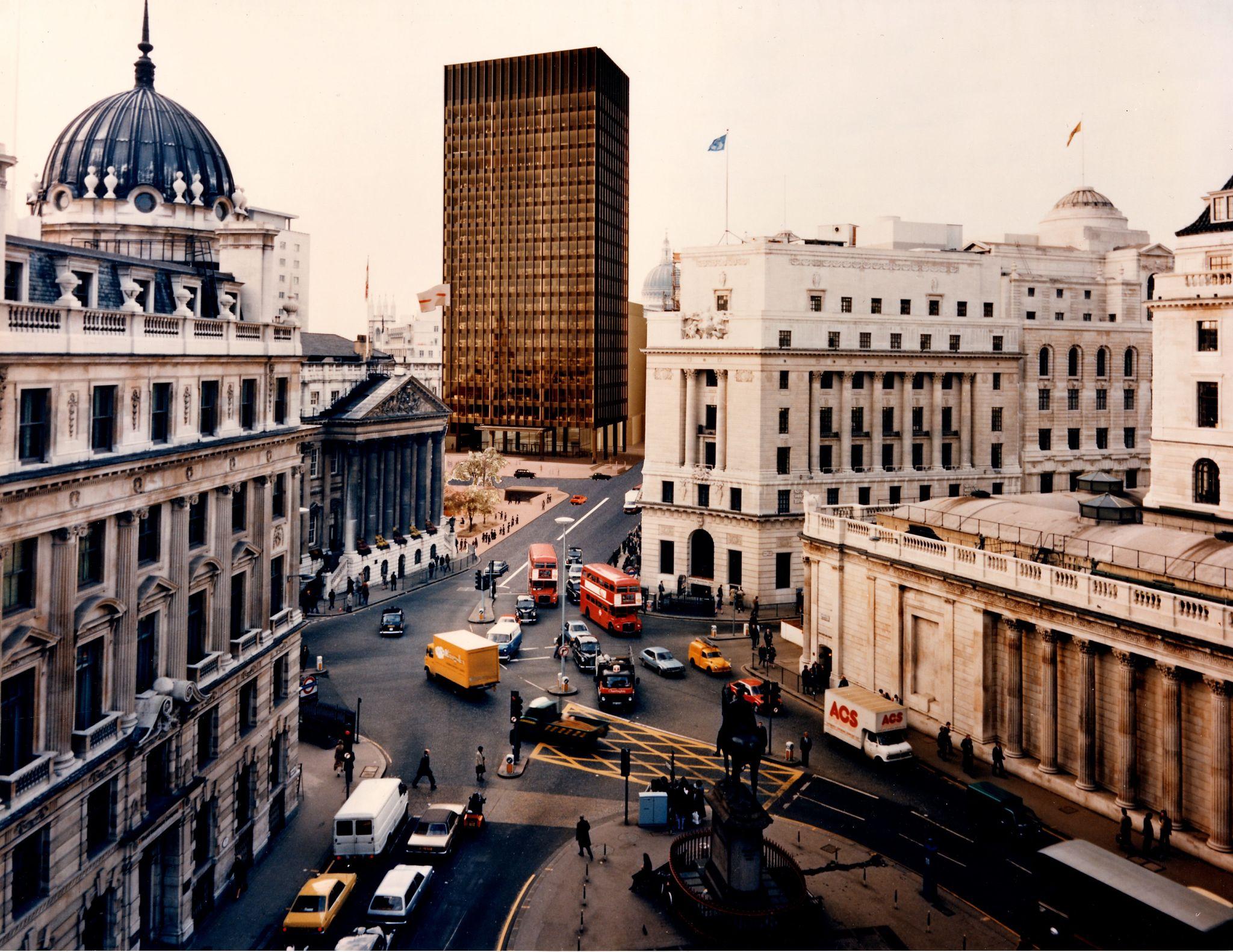
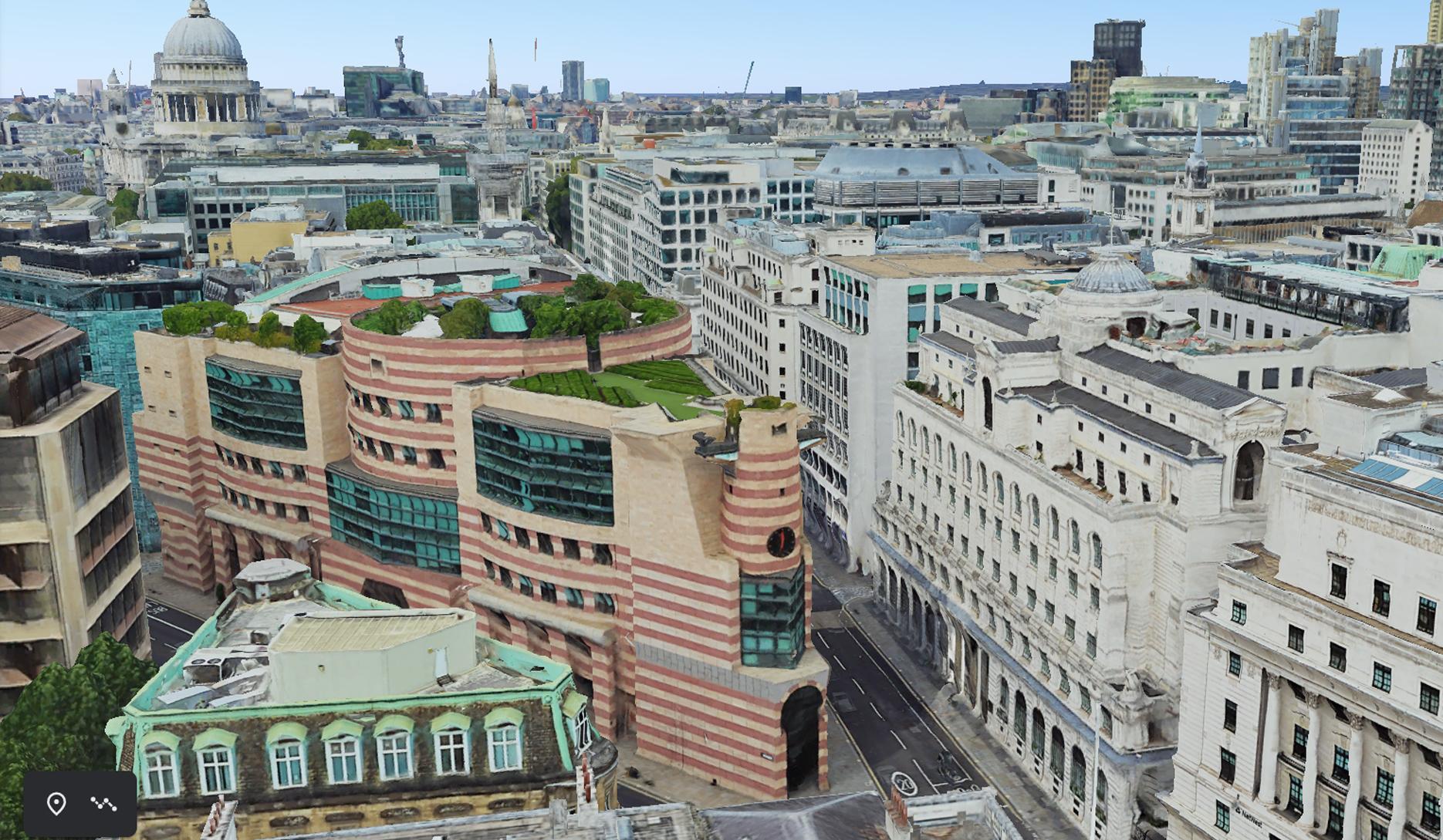
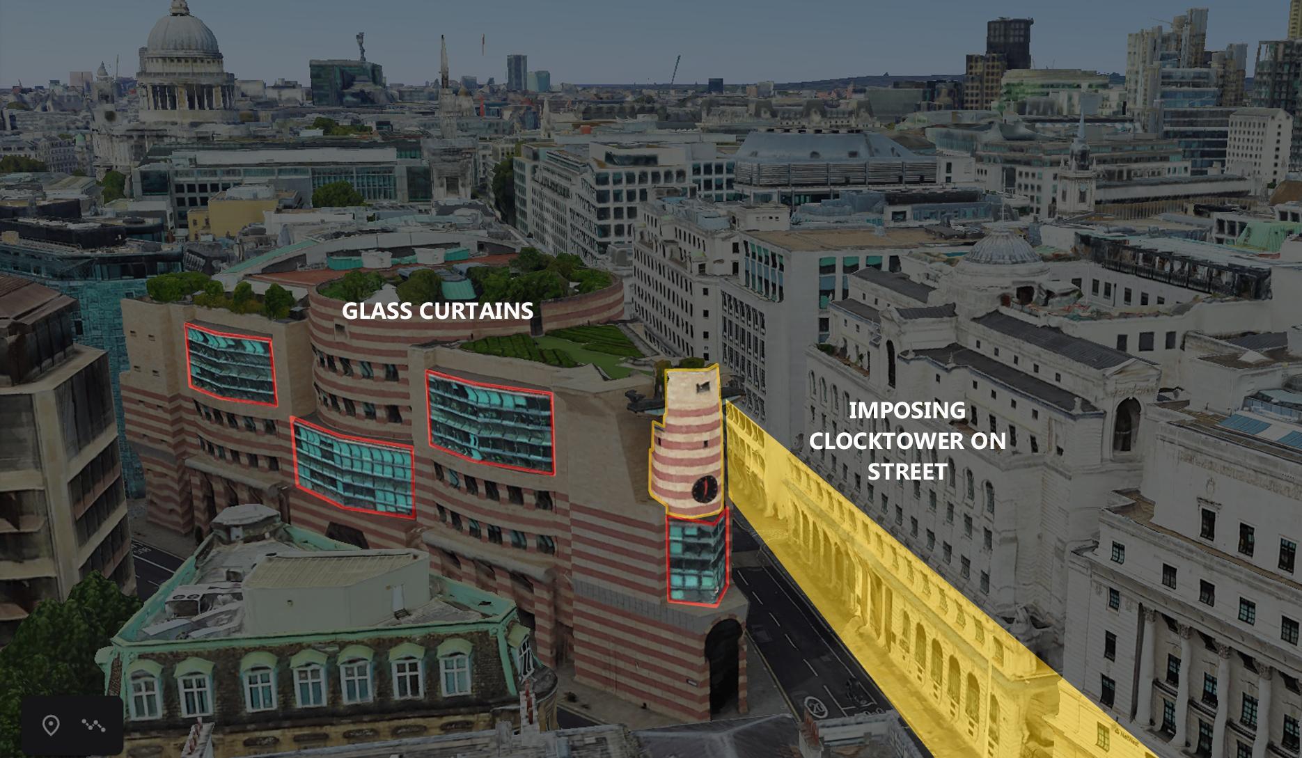
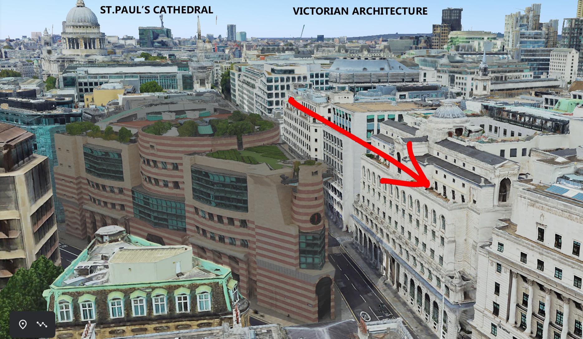
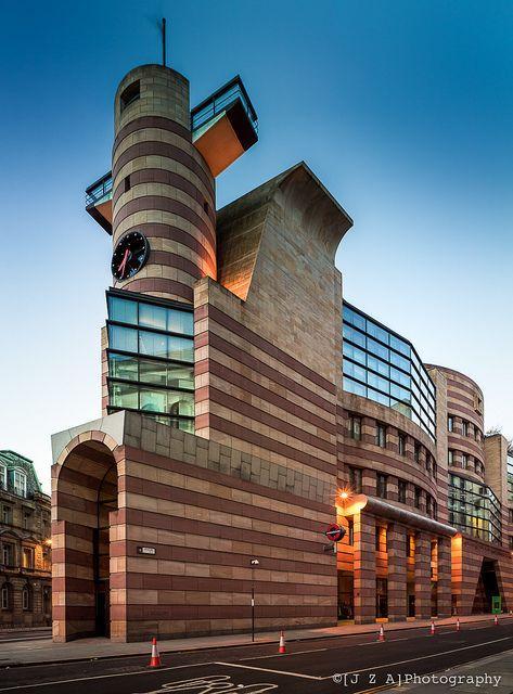
1PoultryBuilding James Stirling 1997 City of London
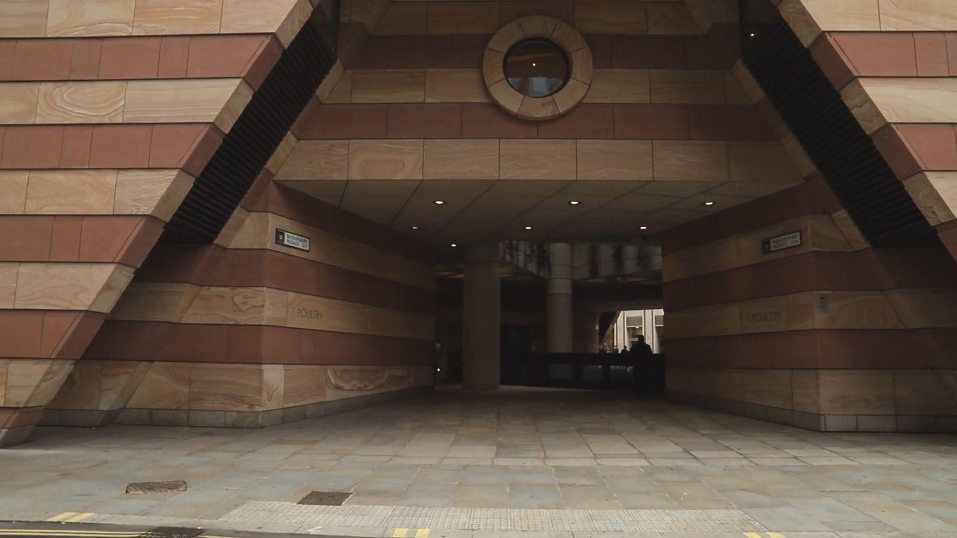
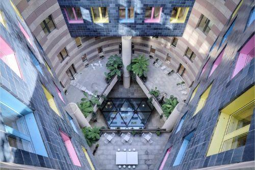
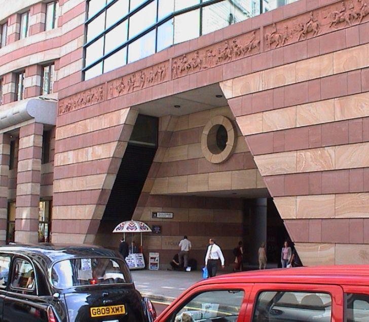
● No 1 Poultry[a] is a building in the City of London, allocated to and commercial use.
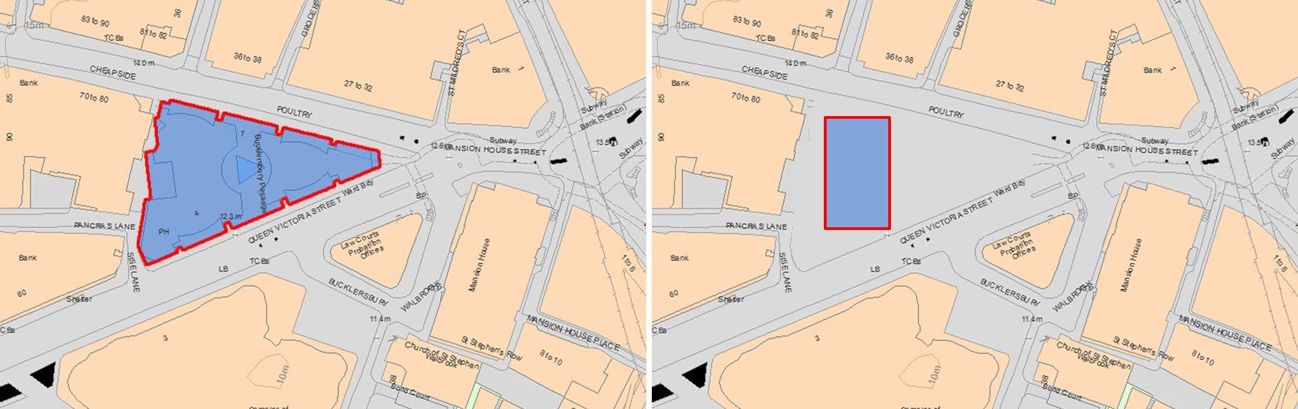
● It occupies the apex where the eastern ends of Poultry Victoria Street meet at Mansion House Street, the western to Bank junction.
● The design, by James Stirling, was constructed after the architect's death. It replaced a neo gothic, conical-turreted, predecessor retail building, owned by developer Rudolph Palumbo and subsequently by his son, developer Peter Palumbo.
● The tall but less towering design, in a postmodernist outer shell of even bands of rose-pink and muted yellow stone, prevails today.
Introduction
Source - https://www.archpaper.com/wp-content/uploads/2017/11/01_ONE_POSITION_LARGE_POP_UP.jpg
DesignPhilosophy
1959-63 engineering department university of leicester 1964-67 History Building Cambridge university 1977 -83 Neue Staatsgalerie 1988-97 No. 1 Poultry Building Design Philosophy ● austere, no ornamentation with clean lines ● Using new technology ● communalvitality and integration of space and circulation ● Humane in scale and style ● Use of colours ● Contextualism 1950s 1990s Post -Modernism Modernism
James Stirling’s
Sourcehttp://a2d-architecture.com/post/20401185465/attention-southgate-housing-runcorn-by-sir
DESIGN PROPOSALS
Tangible model-making
● Initial designs were true to form: grand, rectangular and clad in bronze.
● The building would soar to 88.5m – 30 m above regulation height.
● Dwarfing its Victorian neighbours
● Too much for the British public to bear.
Painstaking pencil drawings with meticulous shading and spacing.
Context:

Response to
Subtle Scale that allows it to merge with surrounding buildings.
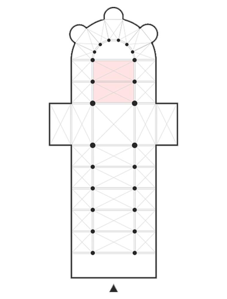
Site Building Heights Symmetrical Plan Divided Facade Planned around a longitudinal axis Two similarfacades Horizontallyin three Verticallyinto five Centralwedge-shaped entrance Access to the centralrotunda
Context:
Design and Elements
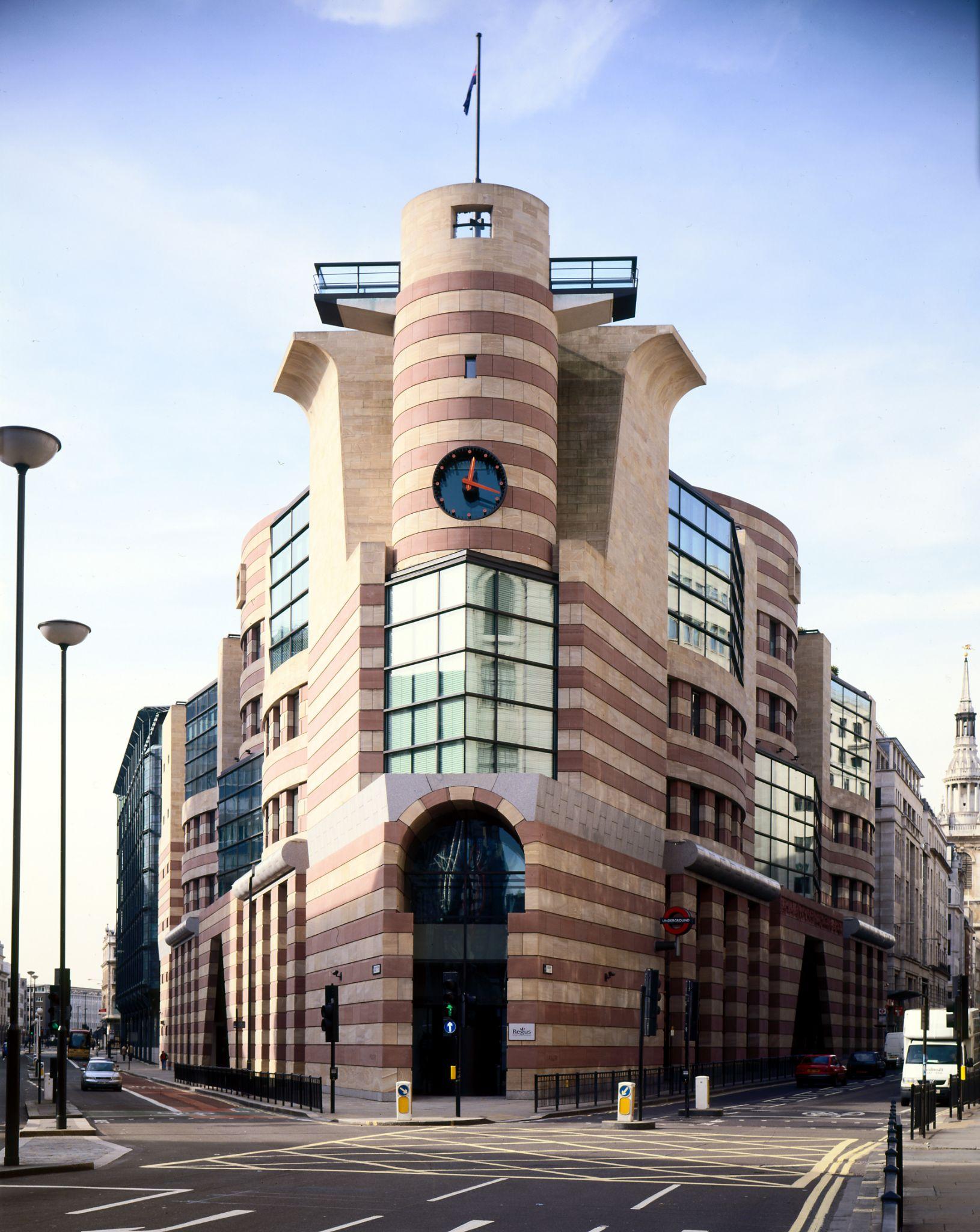
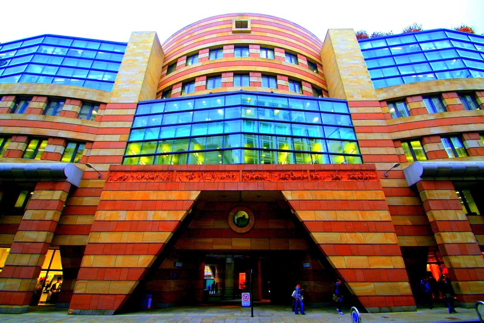
TRIANGULAR planwith a CYLINDRICALcore
Main entrance : situated at the'PROW'
LIME-STONE-clad facade
Bands of Beige and Pink Huge Cornices and Industrialwindows.
Punched-out triangles, circles and squares
Highlight Geometries ofthe building.
Characteristics ● Complexity and contradiction ● Fragmentation ● Asymmetry or Symmetry ● Colour ● Humour and "camp" ● features often borrowed from earlier periods. “ Post modern architecture apart from its colourful, humorous, eclectic elements is very functional in nature ” Source - https://4.bp.blogspot.com/_ap-hMHXgd9Y/TQFNHUwHDSI/AAAAAAAABtw/UA-LAC8EJ7U/s1600/IMG_7140.JPG
Complexityandcontradiction
PAST STYLES
ROCOCO ARCHITECTURE NEOCLASSICAL ARCHITECTURE
Light pastel colours
Flowing, giddy,carvings
Limited to exterior facade ornamentation
symmetry Grandeur
Use of columns in the facade
Fluid and delicate decor
BRITISH ARTS AND CRAFTS GERMAN JUGENDSTIL
Mixture of traditional and modern materials
Organic, merging, flowing windows are shaped like large keyholes
Use of geometrical forms
Source :https://lookup.london/no1-poultrys-decorative-frieze/
Complexityandcontradiction
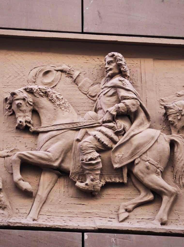
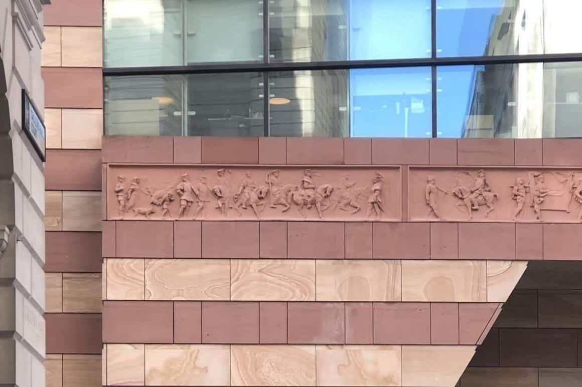
A. An Accumulation of citations and collages brought from past styles
● building's ship-like prow
● horn-like projecting balconies, also mimics nearby structures
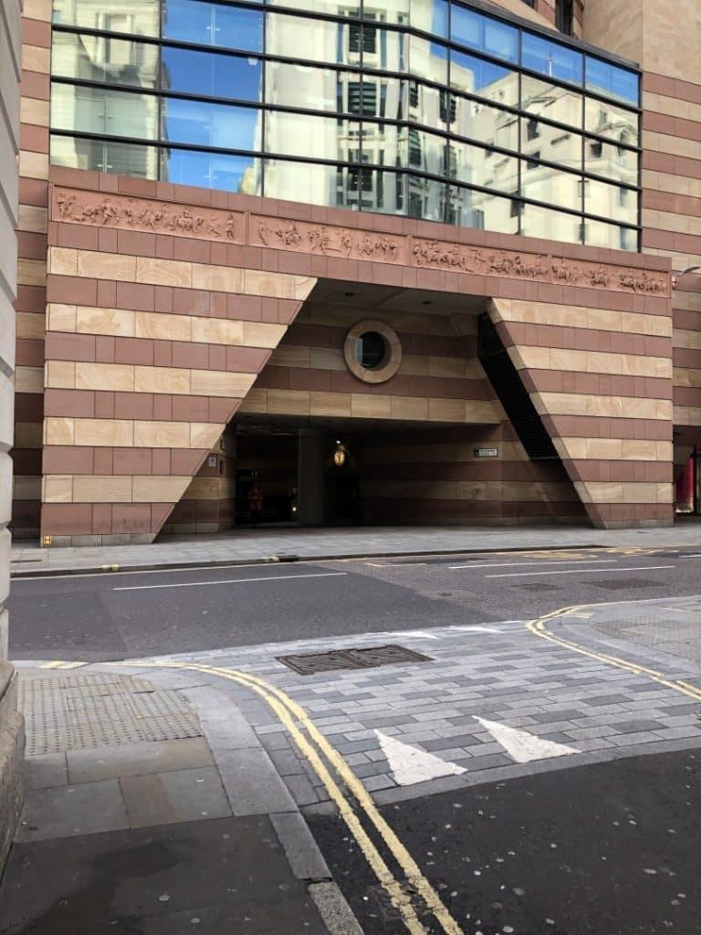

● Greek and Roman rostral columns, which were erected to celebrate navalvictories
● terracotta panels were part of the Victorian Mansion Buildings
● The sculptures include aristocrats and the british monarch.
● They also depict the major public events which includes the public and royal
● Frieze of entrance.
Source https://lookup.london/no1-poultrys-decorative-frieze/
UseofColours
Use of bright colours
External facade Stone
Coloured glass Ceramic tiles
● Colours were added to give the facade variety and personality
● Colour and texture were unrelated to the structure and function of the building
Source https://cdn.shopify.com/s/files/1/0132/0383/2932/products/No_1_Poultry-_Sketch-_Architectour_Guide_1024x1024@2x.jpg?v=1567951827
SenseofHumor
Use of bright colours Atrium
Juxtaposition and exaggeration of forms
Use of bright colours and glass
Sense of humor
Theatrical experience
● Stirling's architectural language became having humor and surprise
● Humor and sense of theatricality reflect in structure
Source https://images.adsttc.com/media/images/5bcf/27fb/f197/cc4d/db00/01d1/newsletter/PQIyFLdA.jpg?1540302833 https://encrypted-tbn0.gstatic.com/images?q=tbn:ANd9GcSLSHt1QQxFgN_QmwmS2C-s5cTbkWohXI2tCraM08BKo984DYjC-UhzNs1D_WBF
MLed6Ys&usqp=CAU
Fragmentation
B. Fragmentation
● breaks large buildings into several different structures and forms .
● convexities and concavities
Fragmentation
● A single building can appear like a small town or village.
● the use of different materials and styles,
● Sometimes these forms representing different functions of those parts of the building.
Source latest(300×240)(nocookie.net)
SymmetryorAsymmetry?
C. Symmetry or Asymmetry ?
Postmodern characteristics
● rarely symmetric, balanced and orderly.
● Often tilt, lean, and seem about to fall over
● Contextualism
● Structure trying to fit in with the scale of the context .
● Symmetrical from the central axis but asymmetrical from each facade
● In close proximity to highly prestigious civic and commercial buildings which are highly symmetrical .
Sourcehttps://www.dezeen.com/2016/12/02/james-stirling-postmodernist-no-1-poultry-granted-listed-status-historic-england-london/
Functionality
Post modern architecture apart from its colourful, humorous, eclectic elements is very functional in nature.
A. Colonnade
Colonnade
● Interaction with the Streets and people
● Window Shopping for Retail Stores
● Shaded walkway with temporary stalls and artist
● Colonnade acts as a buffer which helps interaction with the public
● The context is taken into consideration as the building sits on the tip of poultry street.
Sourcehttps://youtu.be/twkB_BEnTgw
Functionality
B. Entry and Visual Connect
● Entry points create a setting to the built form thus help in the following functions.


● Double Height entry to show grandeur
Entry
● Entrance gateway is ceiling height to mark buffer
● Atrium helps to maintain a connect with both the streets
2X X Sourcehttps://youtu.be/twkB_BEnTgw
C. Atrium
Meeting
Functionality
● Distinct breakout zones ● Visual Connect with concourse level ● Visual Connect with all spaces
● Atrium creates an indoor environment in the office space. ● Distinct zones for cafe, meeting spaces is formed Atrium
Sourcehttps://images.adsttc.com/media/images/5bcf/2876/f197/cc21/0f00/0108/slideshow/Poultry_2.jpg?1540302954
Cafe
Functionality
D. Planning
● Planning involved creating glass curtain walls for conference spaces with cubicles having smaller windows.
● The convexities and concavities of facade are planned to house toilet blocks
● Curtain walls create an expanse
Planning
● Atrium as a central element with core near it
● Private meeting lounges at the tip
Sourcehttps://miesarch.com/uploads/images/works/1615%20-%20Number%201%20Poultry1615%20(2).jpg
Functionality
E. Terrace
Terrace
● View of London’s skyline
● Restaurant as a functional space
● Public events, ceremonies
Sourcehttps://i.pinimg.com/originals/48/a1/40/48a140aab686ca3e5dc6ba571551246a.jpg
Sourcehttps://youtu.be/twkB_BEnTgw
Critiques
British establishment and people
Edwin Heathcote
No appreciation
Structure reach at apogee of postmodernism
Charles Jencks
Statements Prince Charles Hugh Pearman
Revolt against high tech modernism
1930’s Wireless
Compared with a hen
Geoffrey Baker Laurence Bain
Ambiguous and wanted to retain its uniqueness
Naughty child which makes people smile
● Despite Stirling's impressive reputation, the building was not widely appreciated when it was completed
● Bold colors and homely furnishing can be seen throughout the building, where the scheme was inspired by the postmodernist era of design so thoughtfully conceived by Stirling.
● No 1 Poultry has become a monument in the fast-changing cityscape, and London's Postmodern flagship.
ImpactonSocietyandCurrentUse
● The Postmodern masterpiece now serves as a WeWork space for 2300 members, as well as shops, a roof garden, and a restaurant.
● After being saved from a major renovation that would have eliminated its iconic Postmodern façade, No 1 Poultry building was carefully renovated by WeWork’s in-house team of designers, featuring bold colors, homely furnishing, and artwork inspired by the surrounding area.
● Sensitive renovation has culminated in large lounges offering views of the scheme’s colorful, blue ceramic tiled rotunda
● The prow of the building features -
1. Boardrooms,
2. wellness spaces
3. Intimate lounges- positioned to exploit views of Bank Junction and central London.
Interiors are adorned with tongue in cheek artwork referencing the surrounding area, such as1. shoes stepping in gum,
2. workers sliding on banana skins
3. “A neon depicting a London cab with wheels alight referencing the phrase ‘burning up the streets of the city’.”
https://www.archdaily.com/904522/james-stirlings-postmodern-no-1-poultry-building-reopens-as-wework-offices
Source
Conclusion
Friezes narrating the story at the entrance
Structure with interlocking volumes and modulated facade
Glass curtain walls co existing with ornamented friezes
Representation and Abstraction
Monumental and Informal
Contemporary and Traditional
Abstracted elements give a sense of humor
Atrium with bright colours and patterns
Egyptian headgear encompassing the glass entryway
Like many of the best Postmodern buildings, No 1 Poultry also makes some provocative historical quotations and references to its historic neighbours ,respects the context yet marks a distinct landmark in the context

Bibliography
●
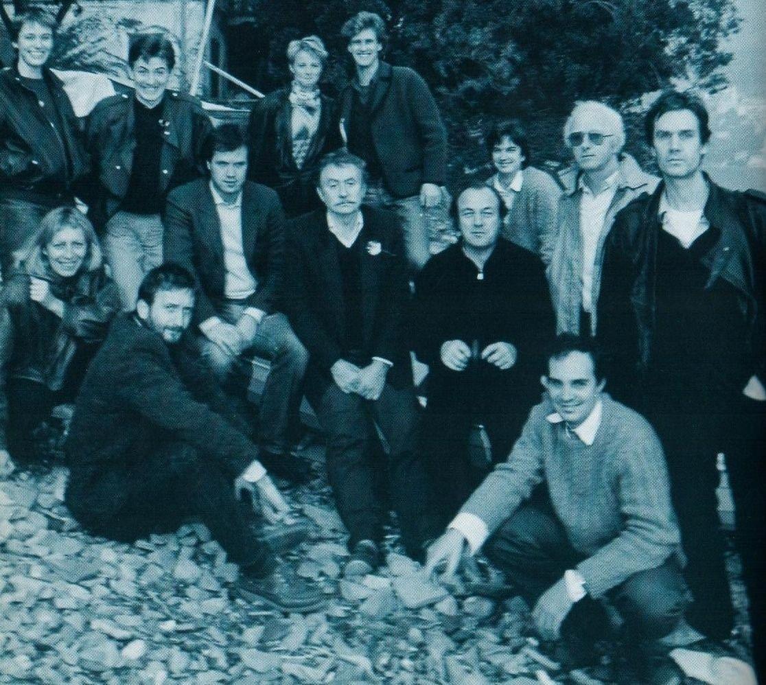
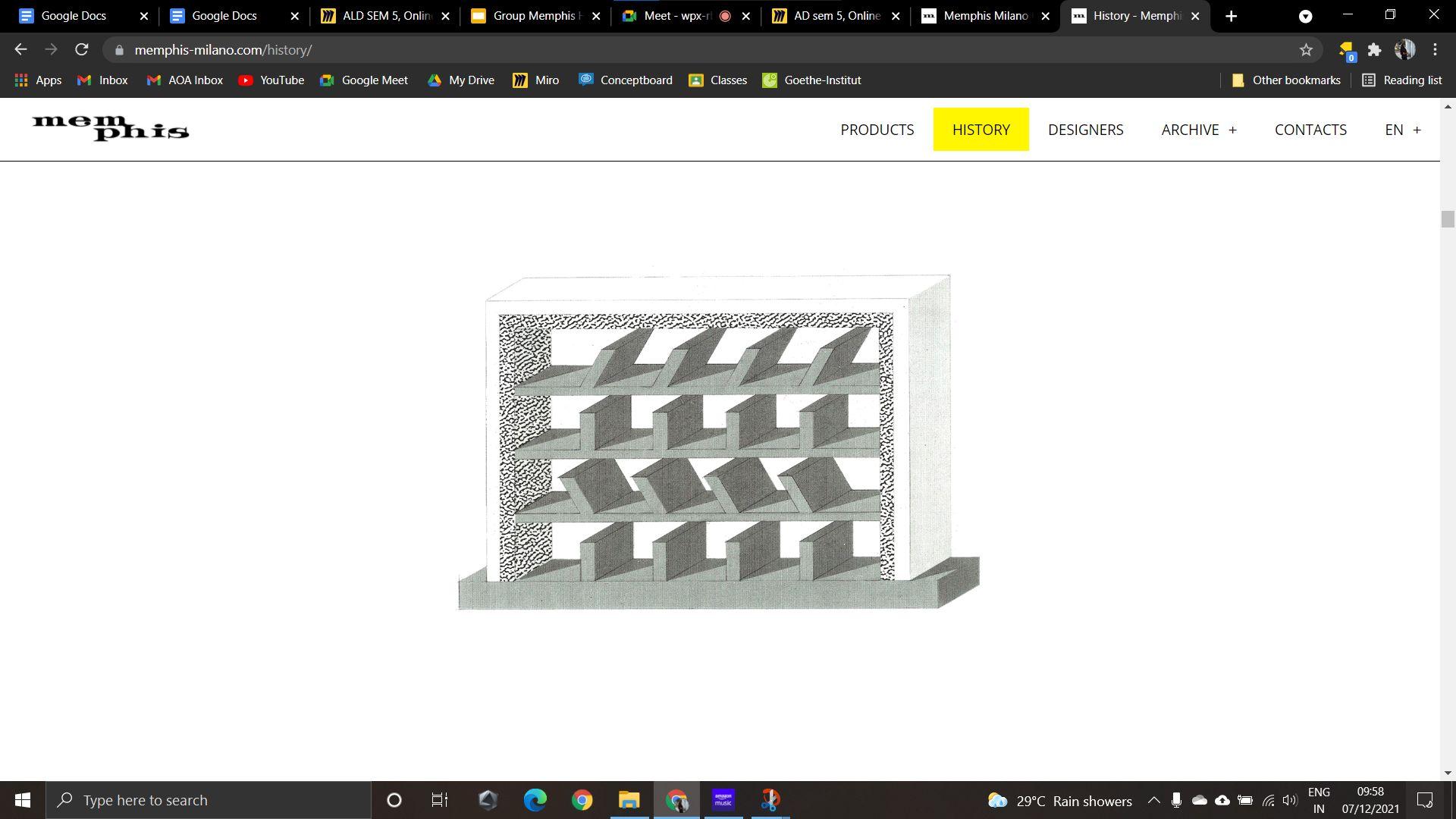
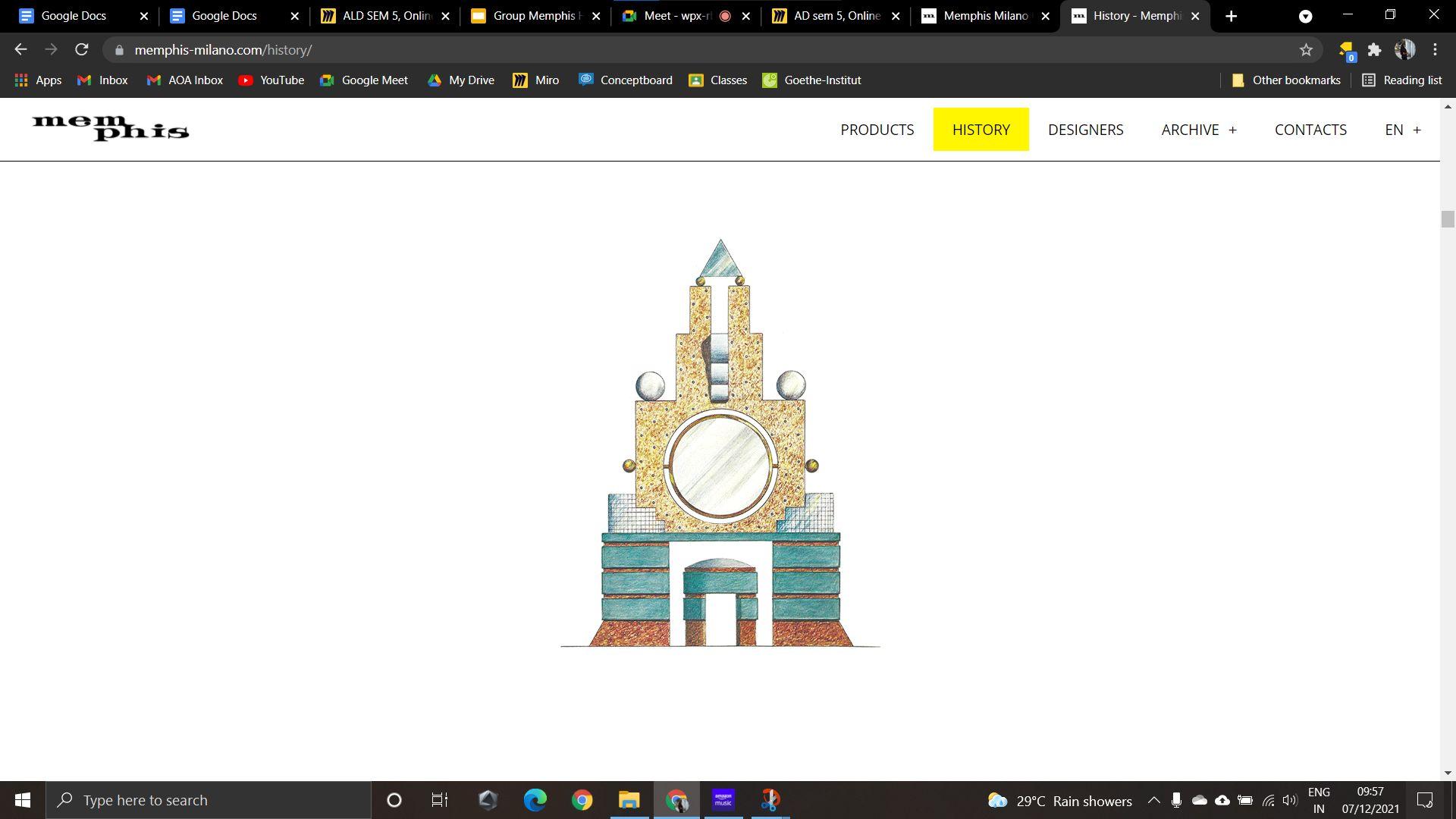
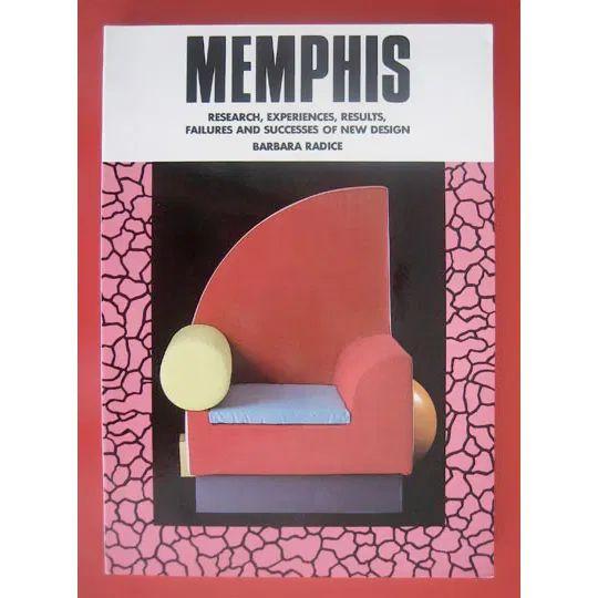
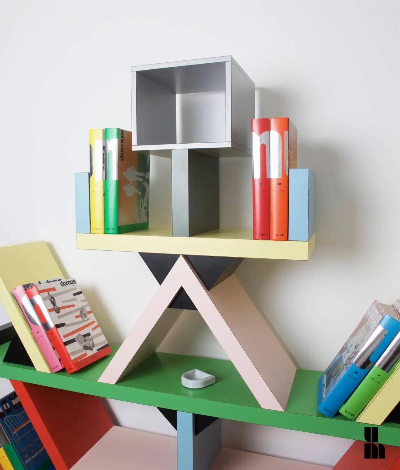
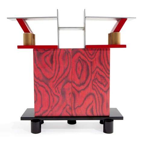
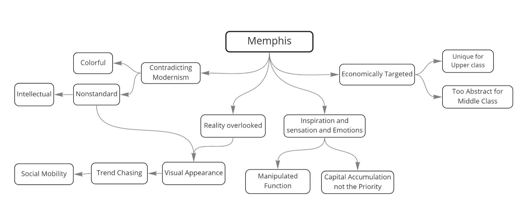
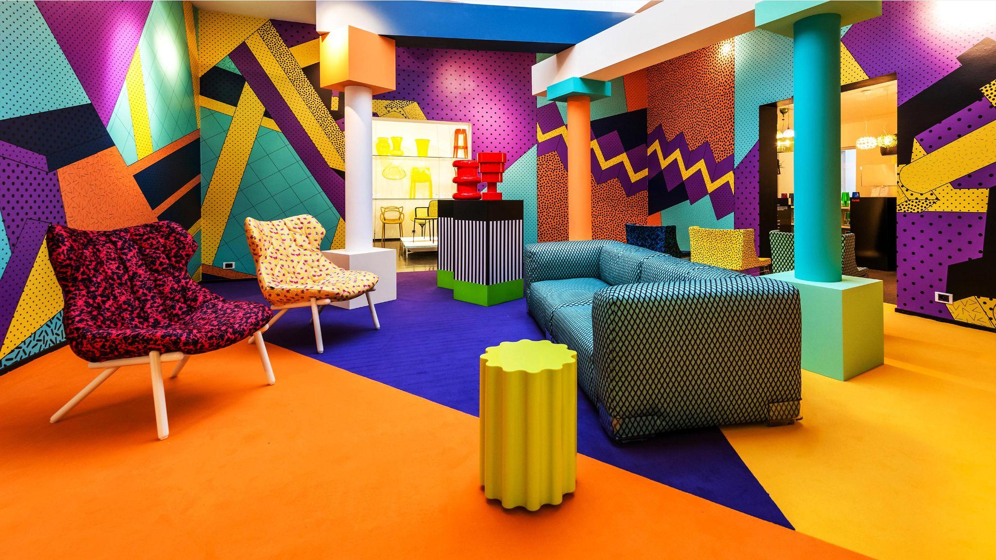
MemphisFurniture Memphis-Milano 1981-88 Milano, Italy
● The Memphis group was formed on an evening in December, 1980.
● The group had a multifold reference -the song “Stuck Inside of Mobile With the Memphis Blues Again”,by Bob Dylan, which was playing on the evening the group was formed, the ancient capital of the Egyptian pharaohs and the birthplace ofAretha Franklin and Elvis Presley inTennessee.
● Ettore Sottsass, Aldo Cibic, Matteo Thun, Marco Zanini, Martine Bedin, Michele De Lucchi, Nathalie Du Pasquier, and George Sowden were the prominent members of the group.
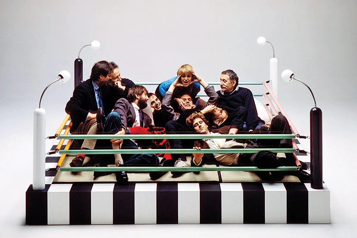
● The Memphis Group created furniture, fabrics, patterns, ceramics and other products in a distinctly Postmodern style that blended stylistic traits of 1950s kitsch,Art Deco, and PopArt.
Source - https://www.memphis-milano.com/history/
Introduction
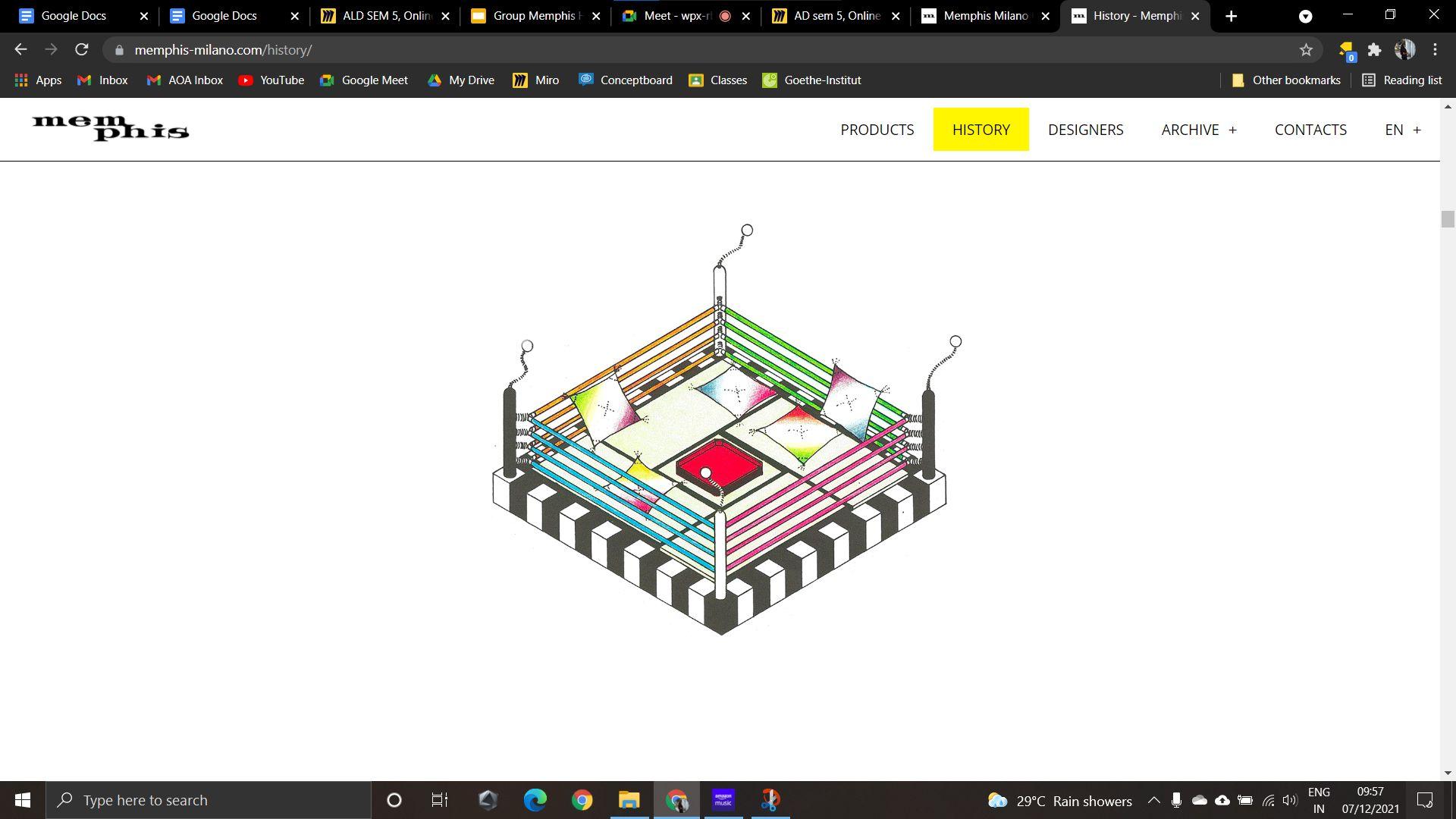
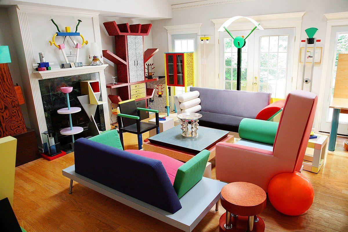
Original Memphis group members lounging in Masanori Umeda’s “boxing ring bed.”
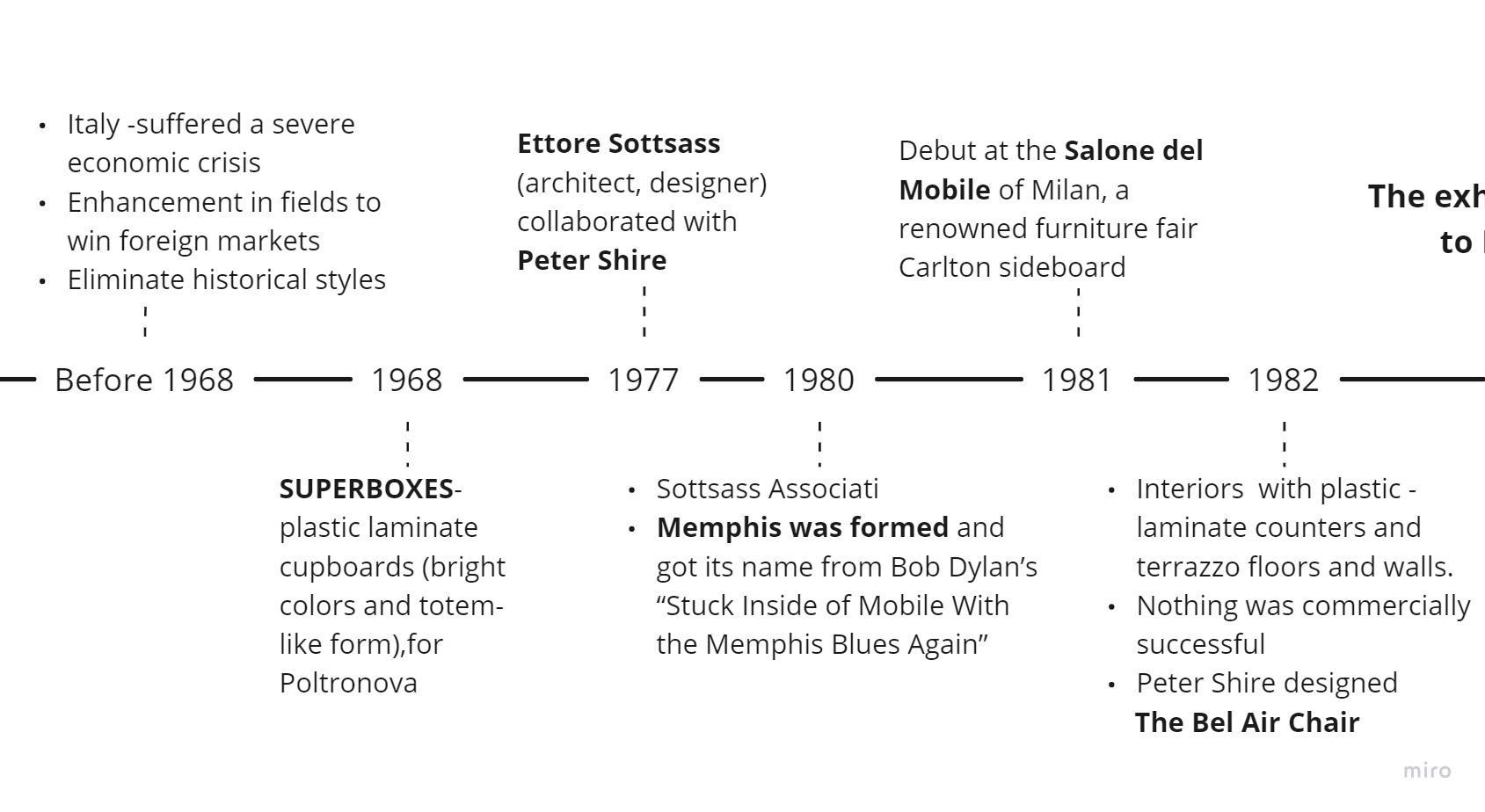
Timeline
Source https://www.curbed.com/2017/05/the-memphis-design-movement-is-having-a-moment.html

Timeline
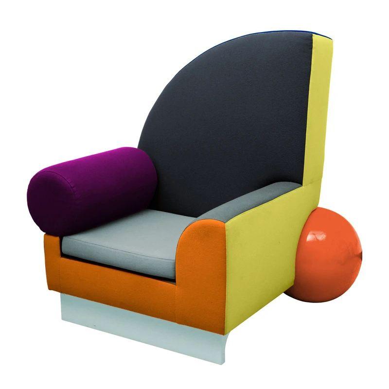
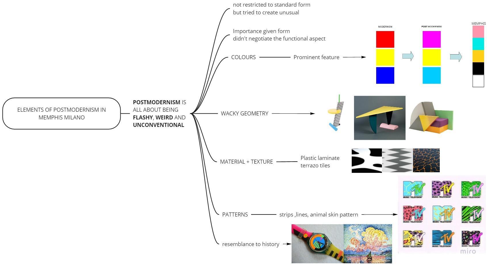
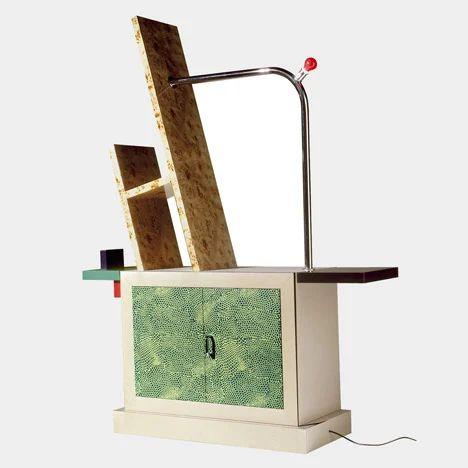
Memphis design has a few key characteristics, such as,
● Inspired byPopArt and Art Deco
● Bold blocks of color
● Wacky Geometry
● Clashing animal prints, stripes and patterns
● Chunky and clumsy shapes
● Ornamental design as opposed to practical design of Modernism
● Non conformist
● Anti minimalist
● Absurd materials combinations like plastic laminates and terrazzo
Source - https://www.memphis-milano.com/history/ https://www.curbed.com/2017/05/the-memphis-design-movement-is-having-a-moment.html
Style/FurnitureCharacteristics
●
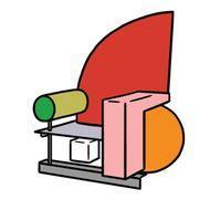
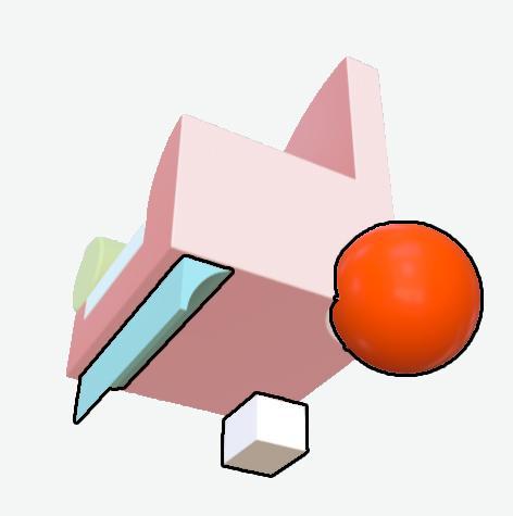
BelAirchairbyPeterShire(1982)
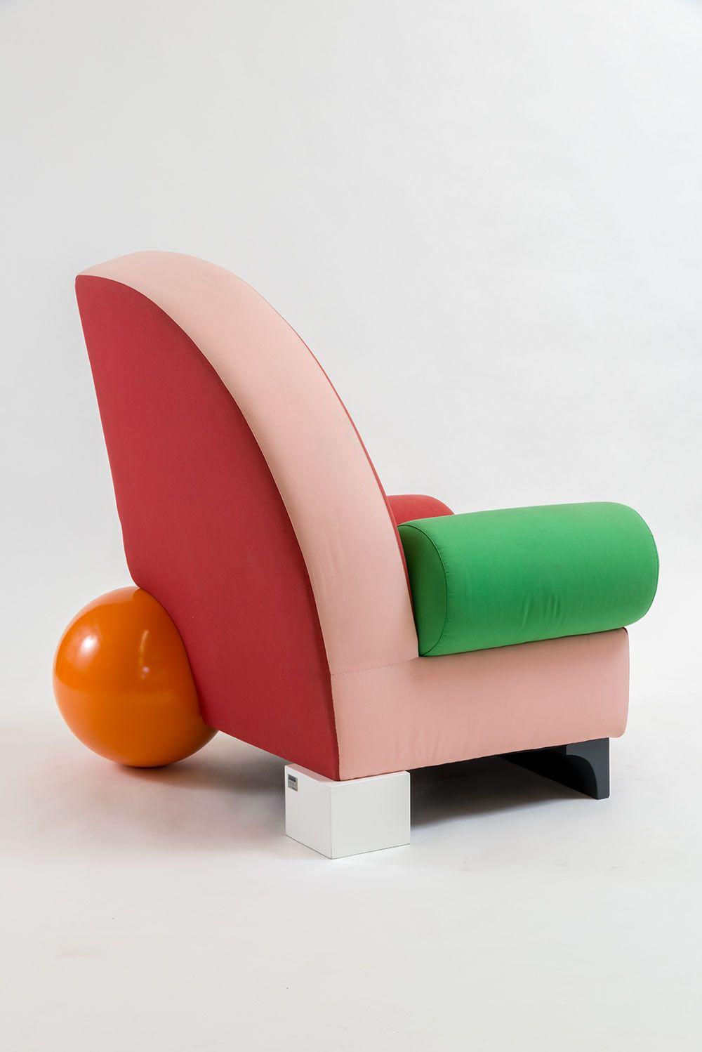
● Designer: Peter Shire (Californian designer and ceramist)
● Style: Post-Modern
● Function: Chair
Source-https://collections.vam.ac.uk/item/O1175028/bel-air-chair-shire-peter/
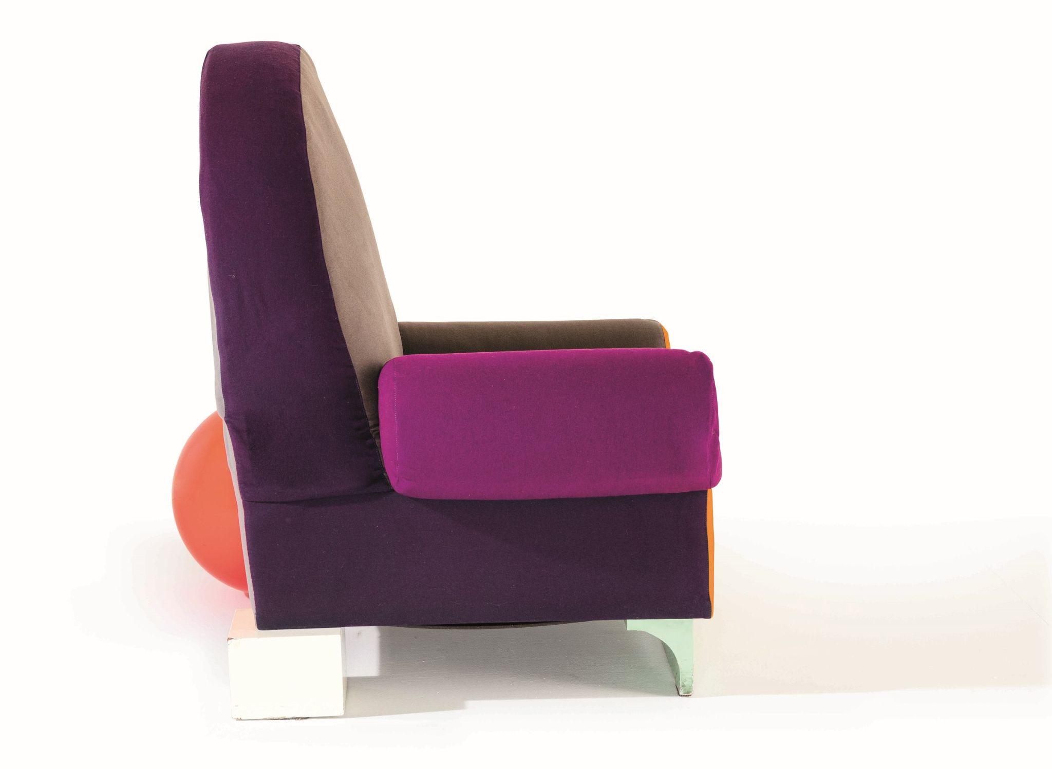
Name : BelAir Chair
Source-https://collections.vam.ac.uk/item/O1175028/bel-air-chair-shire-peter/

●
ArchitecturalAnalysis
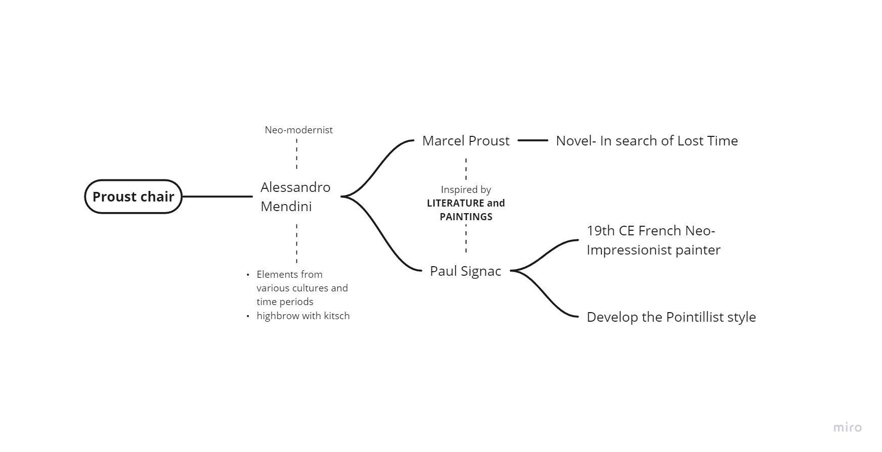
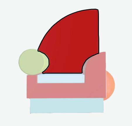
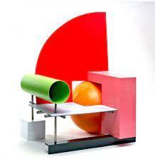
Name- "Proust" Armchair
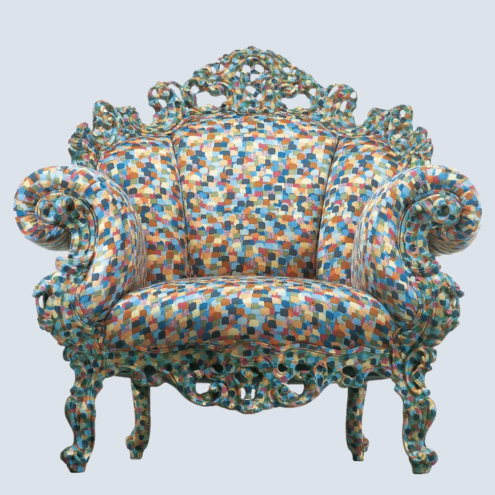
● Designer - Alessandro Mendini
● Function- “The chair was made only for amusement”
https://www.dezeen.com/2019/02/22/alessandro-mendini-architecture-design-projects-proust-chair/
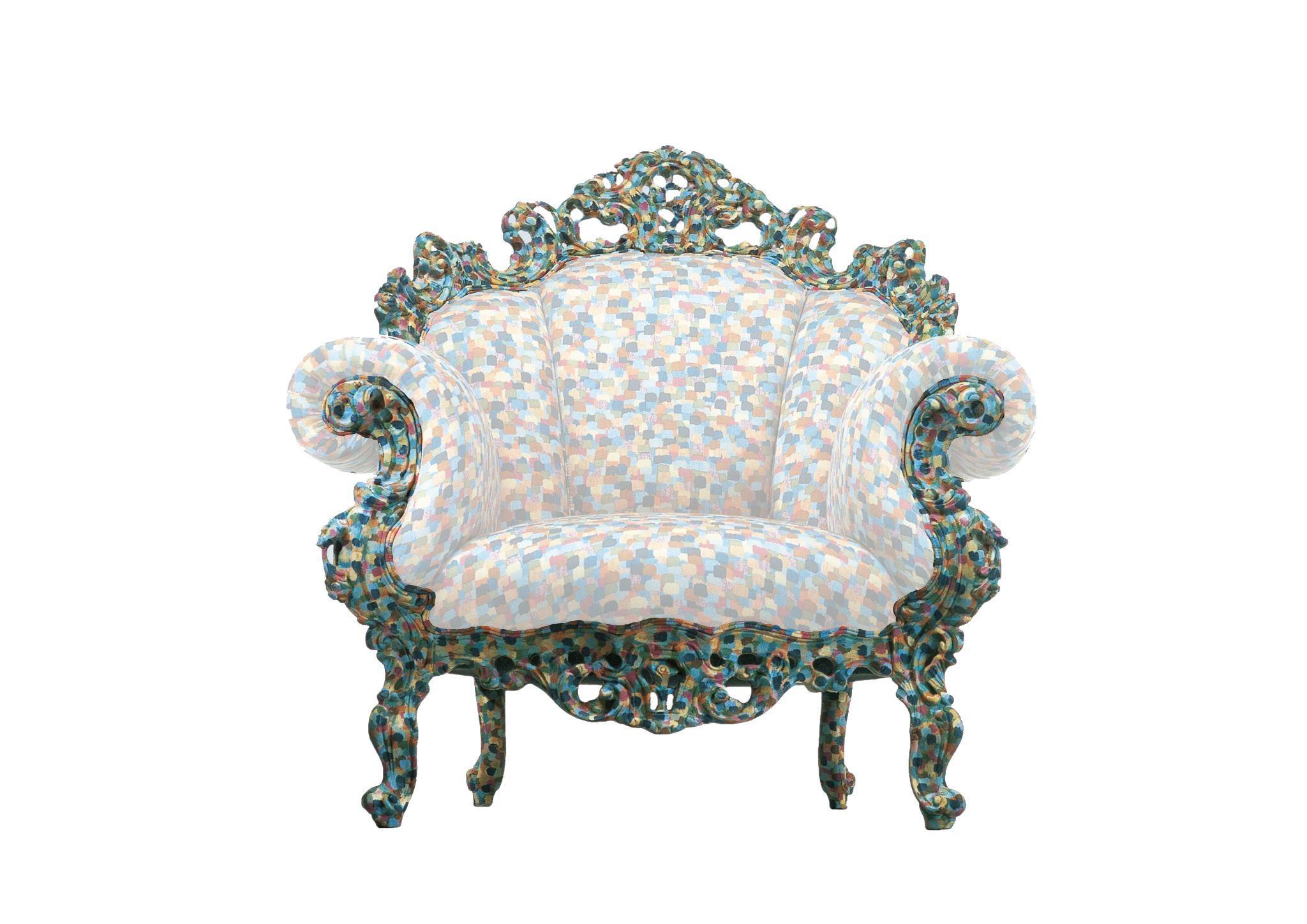
Source https://www.cappellini.com/en/proust
ArchitecturalAnalysis ● Name :- Super Lamp
● Designer:- Martine Bedin (designer)- 1977 ,Fausto Celati (maker)- 1981
● Function:- mobile lamp Source https://www.google.com/search?q=super+lamp+by+memphis&hl=en&sxsrf=ALeKk02HaqPHERcB4OgkRRzVr1uXxVsrvA:1626106602088&source=lnms&tbm=isch&sa=X&ved=2ahUKEwjJ-IiT993xAhXlILcAHYszA0UQ_AUo AXoECAEQAw&biw=1536&bih=664#imgrc=w2CA3NtN1ylO2M

ArchitecturalAnalysis
●
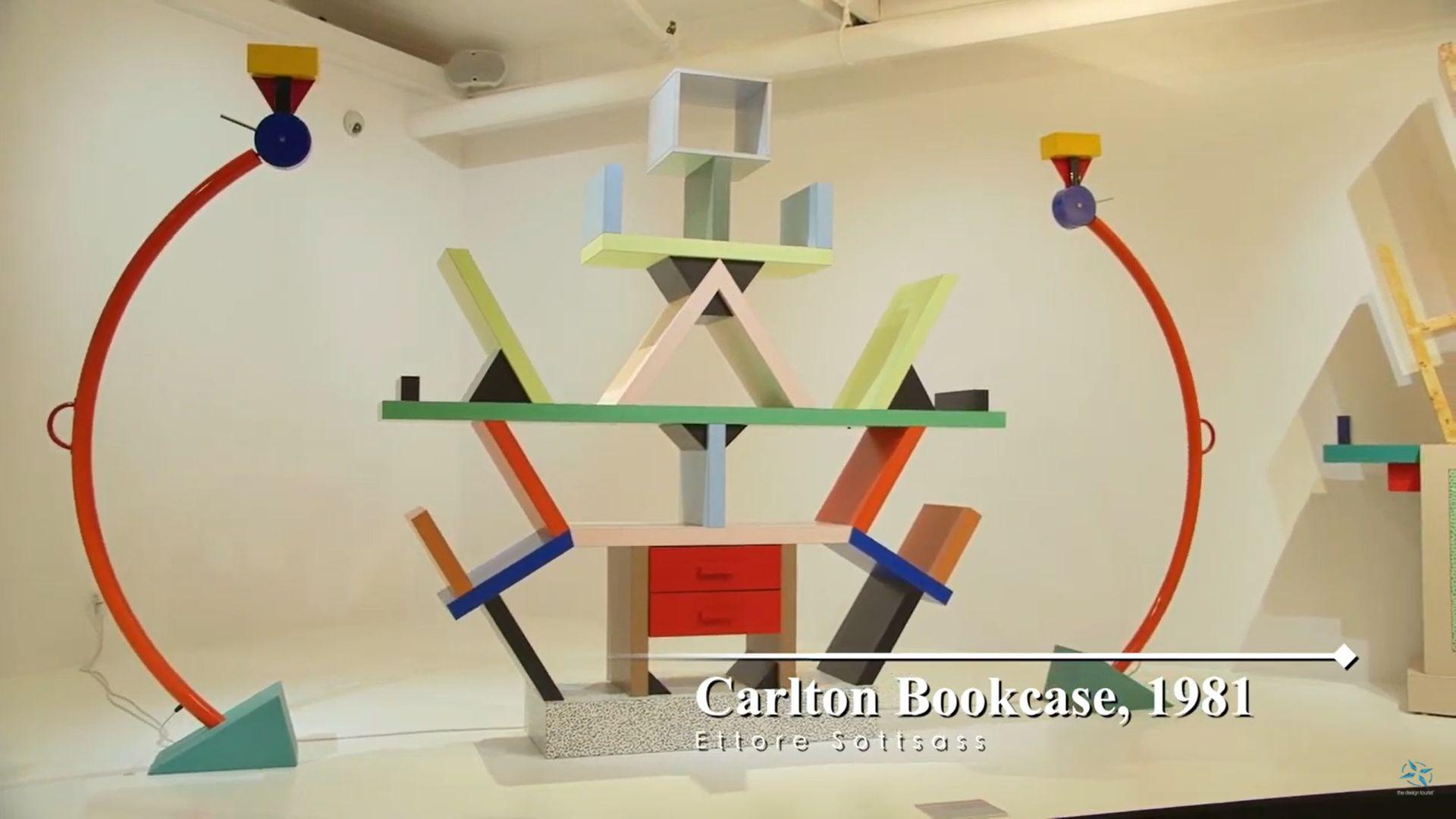
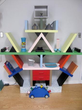
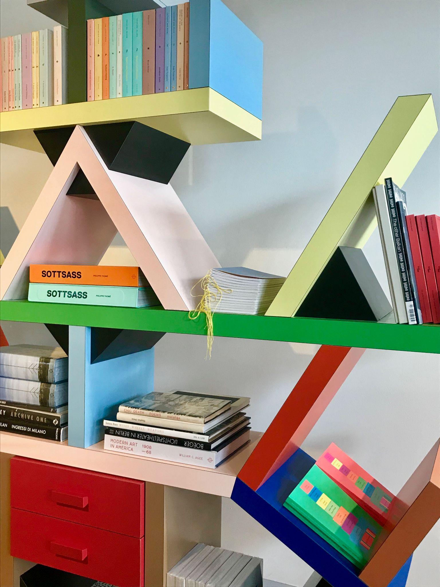
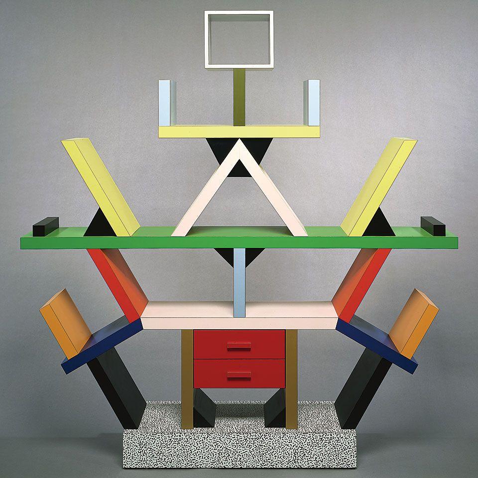
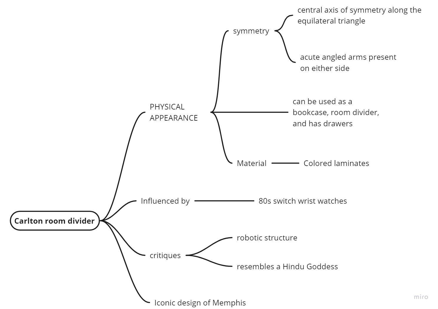
Name- Carlton Room Divider
● Designer- Ettore Sottsass - Memphis Milano,1981
● Function- It’s a bookcase, a room divider, a chest of drawers
Source https://blog.mam.org/2010/12/12/from-the-collection-ettore-sottsass-carlton-bookcase/
ArchitecturalAnalysis
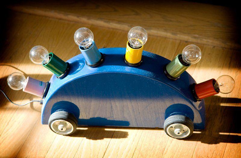
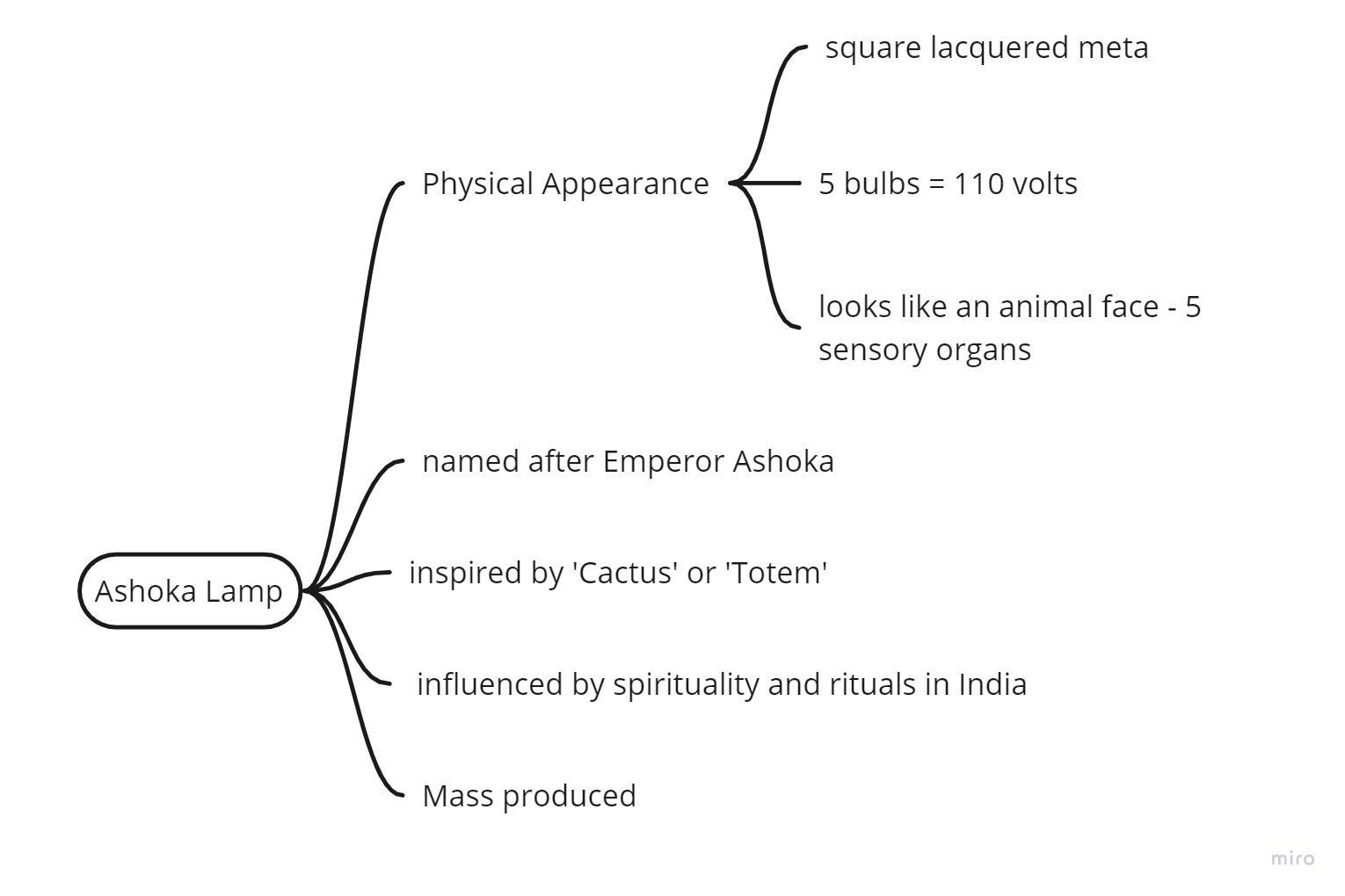
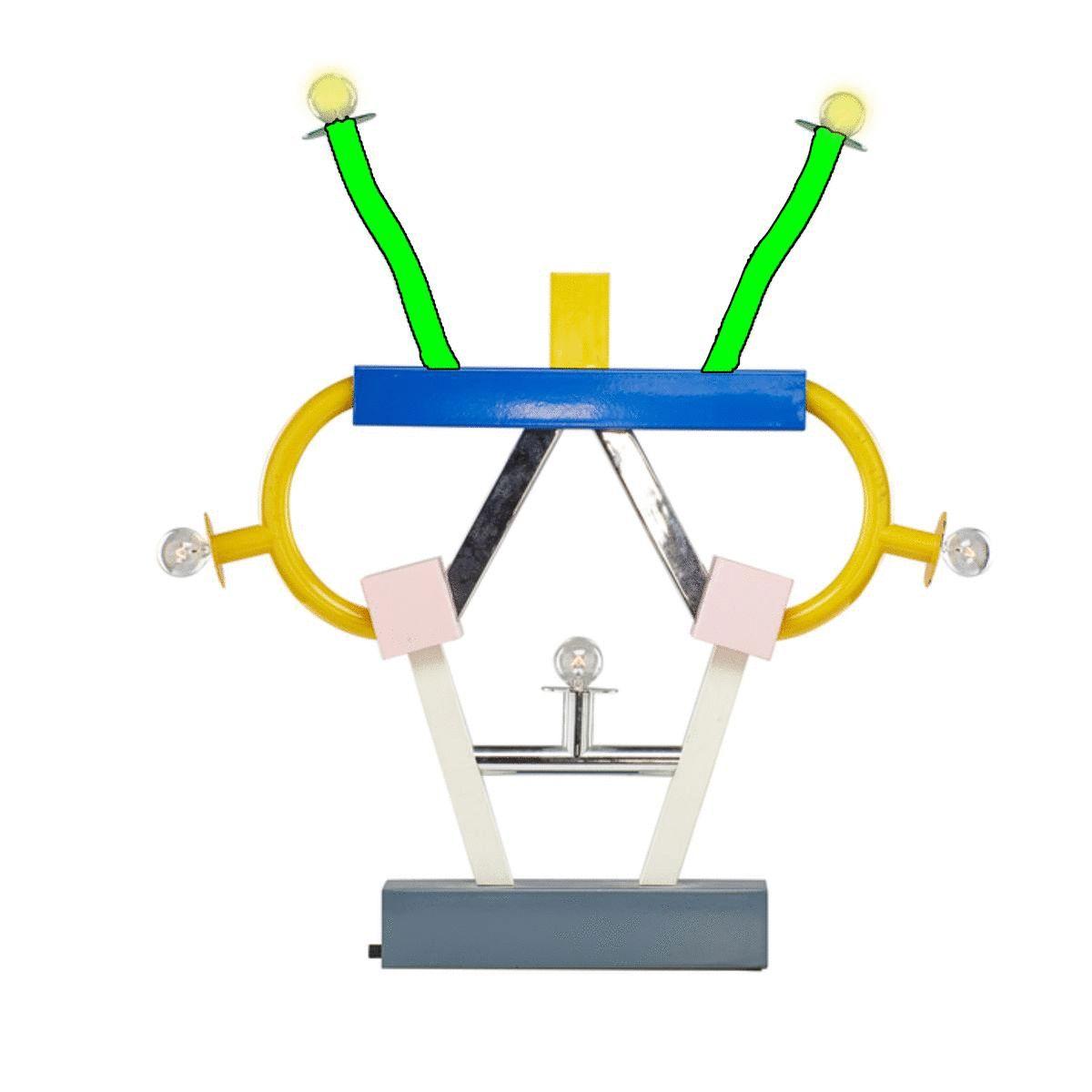
AshokaLampbyEttoreSottsass(1981)
● Name - Ashoka Lamp
● Designer - Ettore Sottsass
● Function - It will illuminate a room with its five bulbs.

● Dimensions (cm)- W 74 x H 85
Source https://www.artsy.net/artwork/ettore-sottsass-ashoka-lamp-1

ElementsofPostmodernism
● The initial reaction to the furniture was not a positive one. The masses characterised their use of plastic laminates and bold clashing colors as“bad taste”.
● individuals tend to either completely love it or loathe it.
● For some people it was a celebration of bright colors vibrant patterns and bold graphic forms, while for others it was vibrant patterns and bold graphic forms
● It was referred to as a “shotgun wedding between Bauhaus and Fisher-Price”.
● Some people described the furniture as ugly, expensive and impractical.
Critics
Source -
The Beverly sideboard Sottsass' Fremont sideboard, 1985
A house interior with Memphis furniture
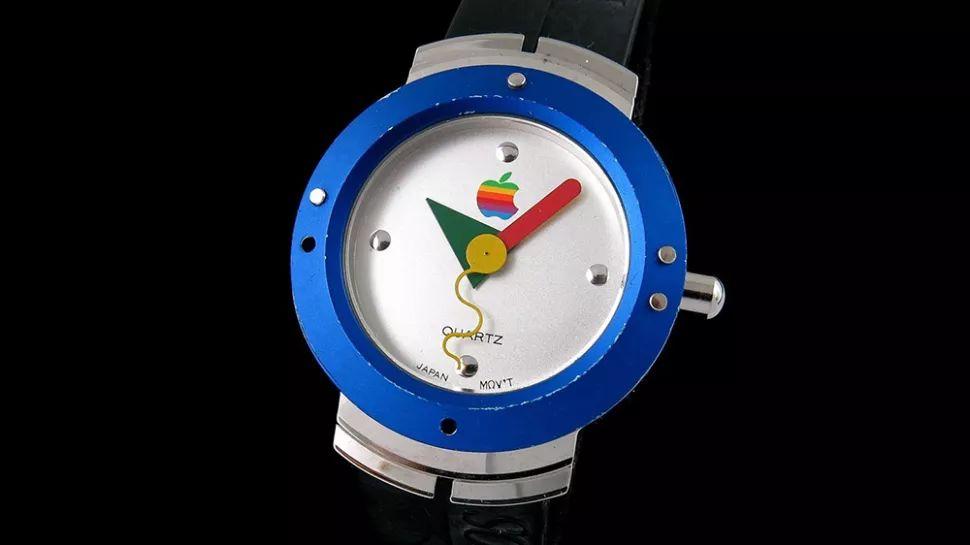
Influenceandrevival
● Actor David Bowie collected about 400 items from Memphis’ collection which were auctioned after his death
● After Sottsass' death, interest in the Memphis style began to grow. It influenced high fashion houses Missoni, Karl Lagerfeld and Christian Dior.
● Christian Dior 2011 Fall collection helped kick-start the modern movement in earnest.
● Katy Perrydonned one of the collection's outfits at the MTVVideo Music
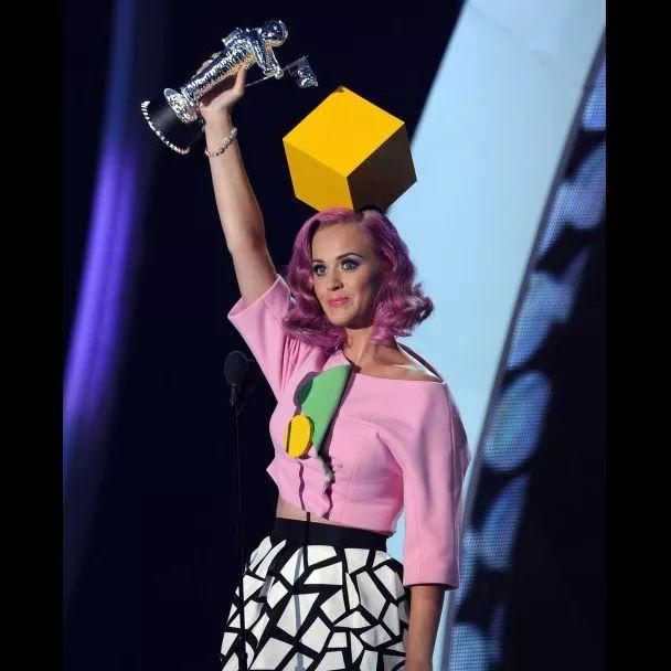
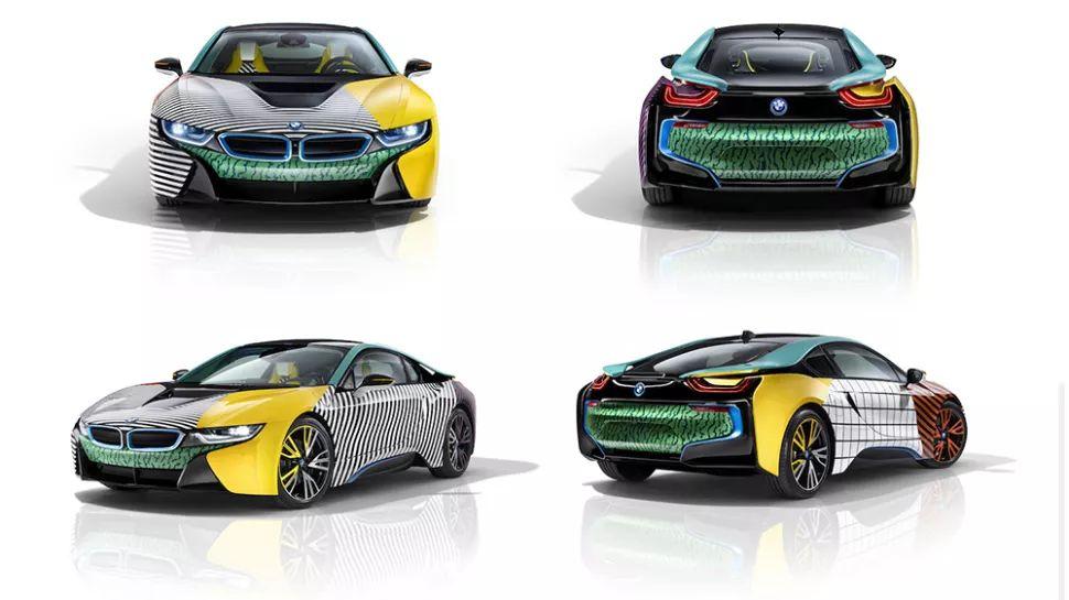
● In 2015, Apple released a watch which was inspired by the Memphis group style
https://www.creativebloq.com/inspiration/10-iconic-examples-of-memphis-design
Image 4
watch
4 , 5
i8 with
patterns
Image 1 David Bowie’s Memphis collection Image 2 Katy Perry at MTV awards Image
3 building facade inspired by Memphis Style
Apple
Image
BMW
Memphis Style
Conclusion
● https://www.creativebloq.com/inspiration/10-iconic-examples-of-memphisdesign
● https://ijlass.org/data/frontImages/gallery/Vol._4_No._8/2._9-11.pdf
● https://www.memphis-milano.com/
● https://www.masterclass.com/articles/memphis-design-guide#what-are-the -origins-of-memphis-design
● https://design.tutsplus.com/articles/what-is-the-memphis-style--cms-31160
● https://oss.adm.ntu.edu.sg/ytan149/memphis-postmodernism/
● https://en.m.wikipedia.org/wiki/Memphis_Group
● https://www.creativebloq.com/inspiration/10-iconic-examples-of-memphisdesign
● https://designmuseum.org/discover-design/all-stories/memphis-group-awf ul-or-awesome#
● https://hommes.studio/journal/what-is-memphis-design-style/
● https://www.pamono.com/makers/memphis
● https://www.curbed.com/2017/05/the-memphis-design-movement-is-havin g-a-moment.html
● https://www.metropolismag.com/design/sottsasss-affair-india-is-little-know n-vital/
● https://www.theguardian.com/artanddesign/2017/jul/21/memphis-group-e ttore-sottsass-design-radical-met-breuer
● https://scroll.in/magazine/824568/one-of-the-worlds-most-iconic-designs-a nd-the-indian-secret-behind-it
● https://www.jstor.org/stable/1511424?read-now=1&seq=2#page_scan_tab_co ntents
Bibliography
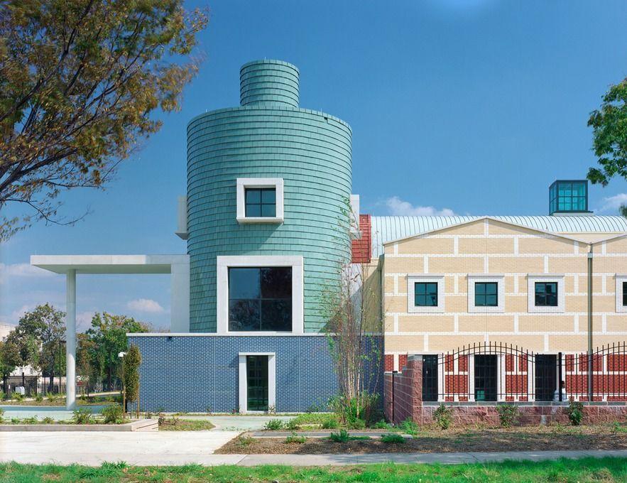
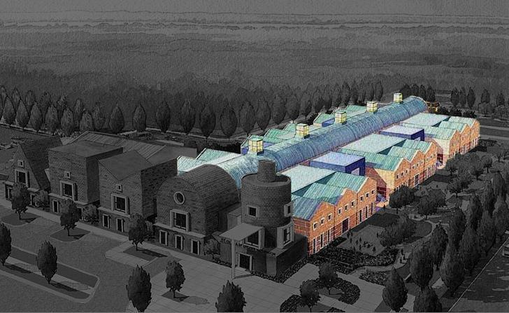
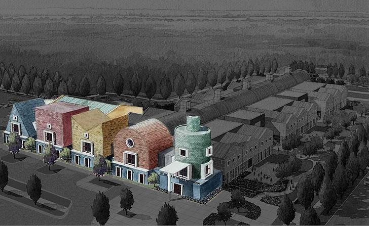
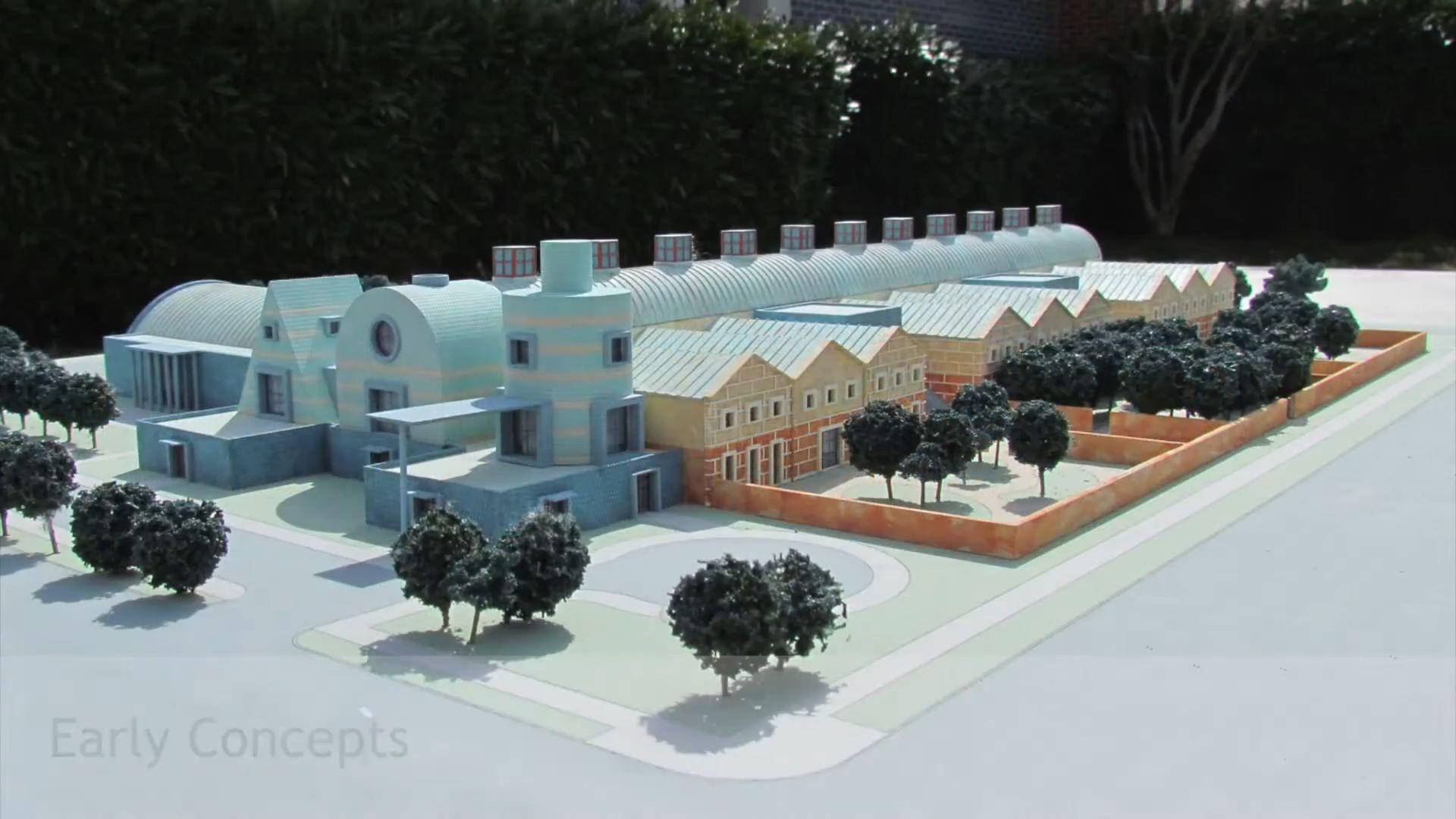
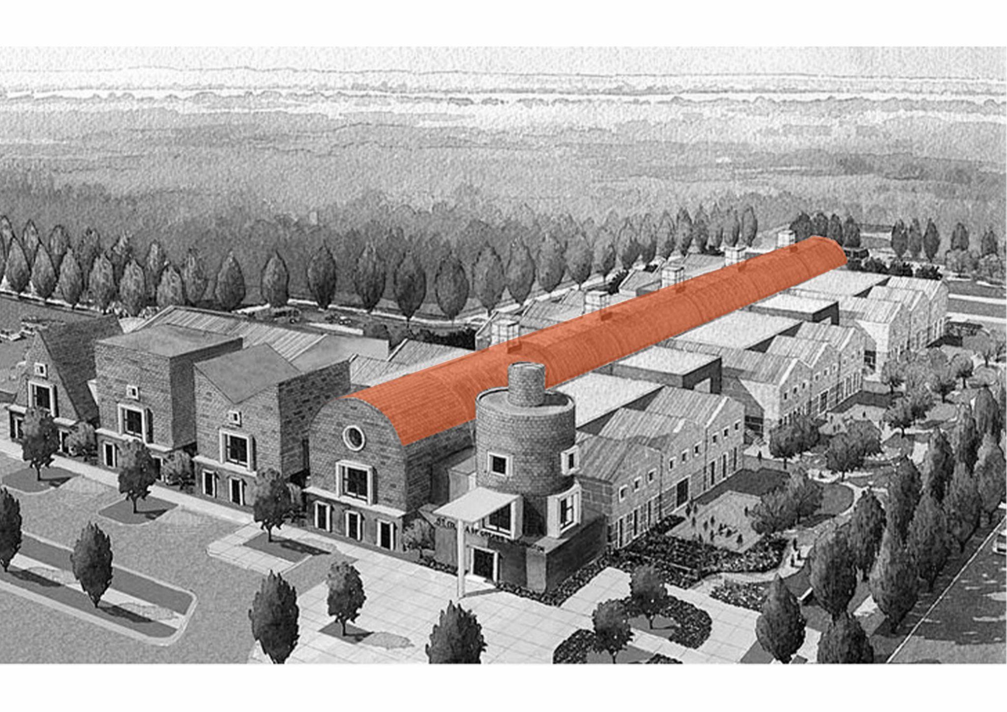
St.ColettaSchool Michael Graves 2006 Greater WA, USA
● Architects: Michael Graves
● Year: 2006
● Founded by : Acouplewith a child - Down Syndrome
● Struggle to find educational systems for their child
● Established a special educational charter- children with severe or multiple disabilities.
● Area : 99,000-square-foot

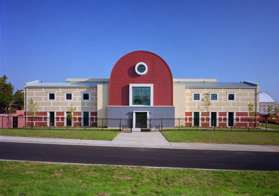
● Adult Day Program
● StudentAge group : 3-22 - individual houses
Introduction
Architectuul.com
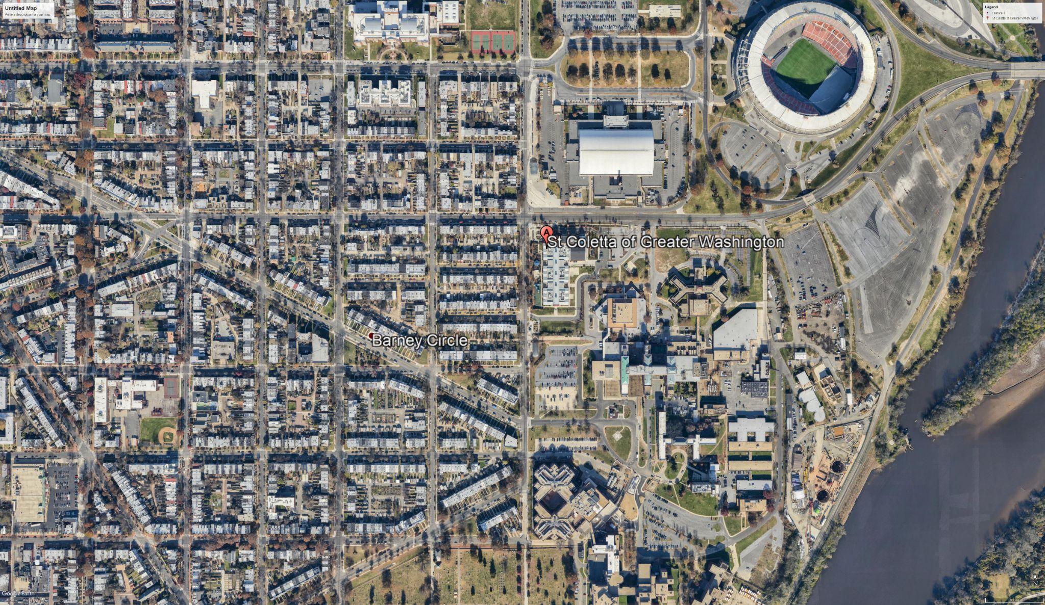
● Site located between a residential and an institutional zone.
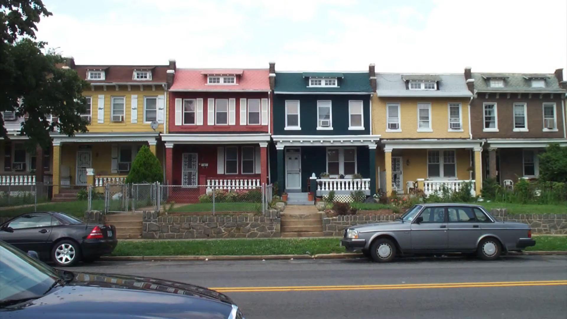
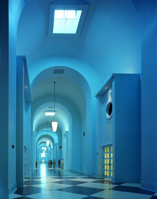
● The building’s “houses” faces the residential neighborhood.
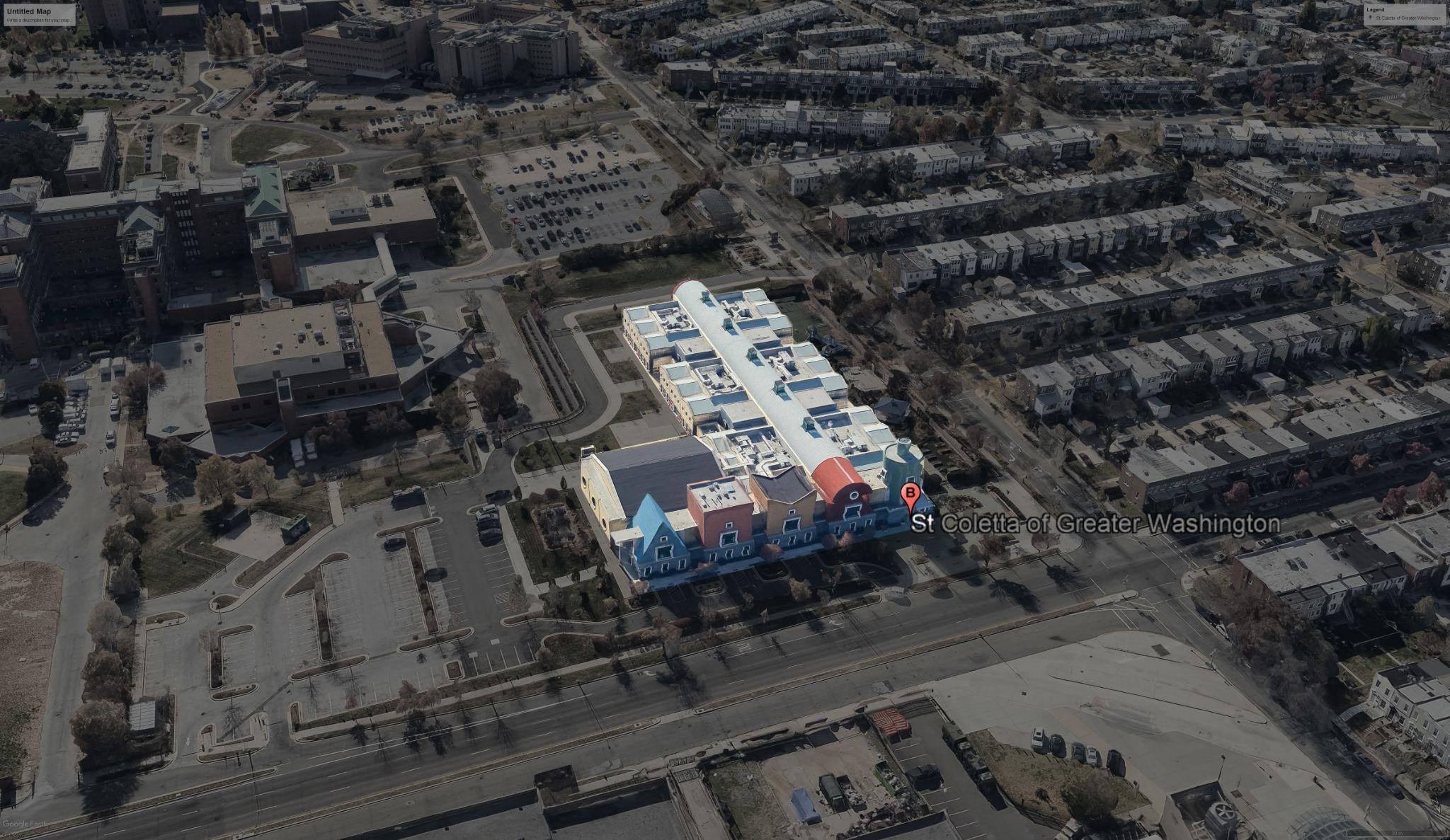
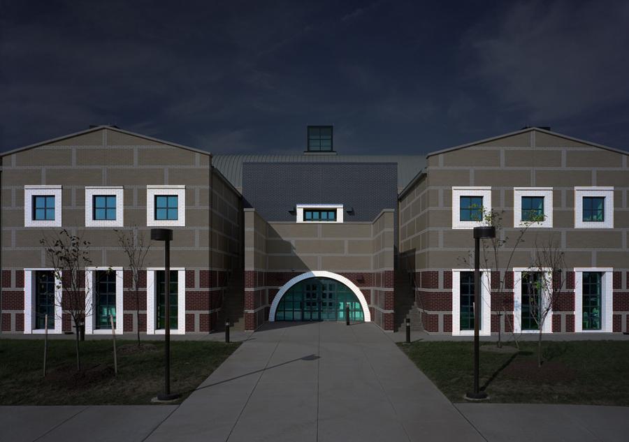
● The main entrance and common facilitieslocated -Along IndependenceAvenue Expressed as - two-story geometric pavilions Clad in - American-made Ludowici glazed tile.
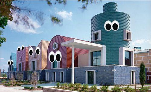
● Abright and fun building that stands out against its surroundings,
● The bright colors and simple formsPlayful Inviting
CONTEXTUALISM
Context
Architect’sphilosophy
Design for the masses
Emphasis on ornament and aesthetics
Developed a language of desire for attention
Bringing meaning and forming associations with people
Related to history and irony
Giving importance to smaller details
Humanism- People are what the built environment is all about.
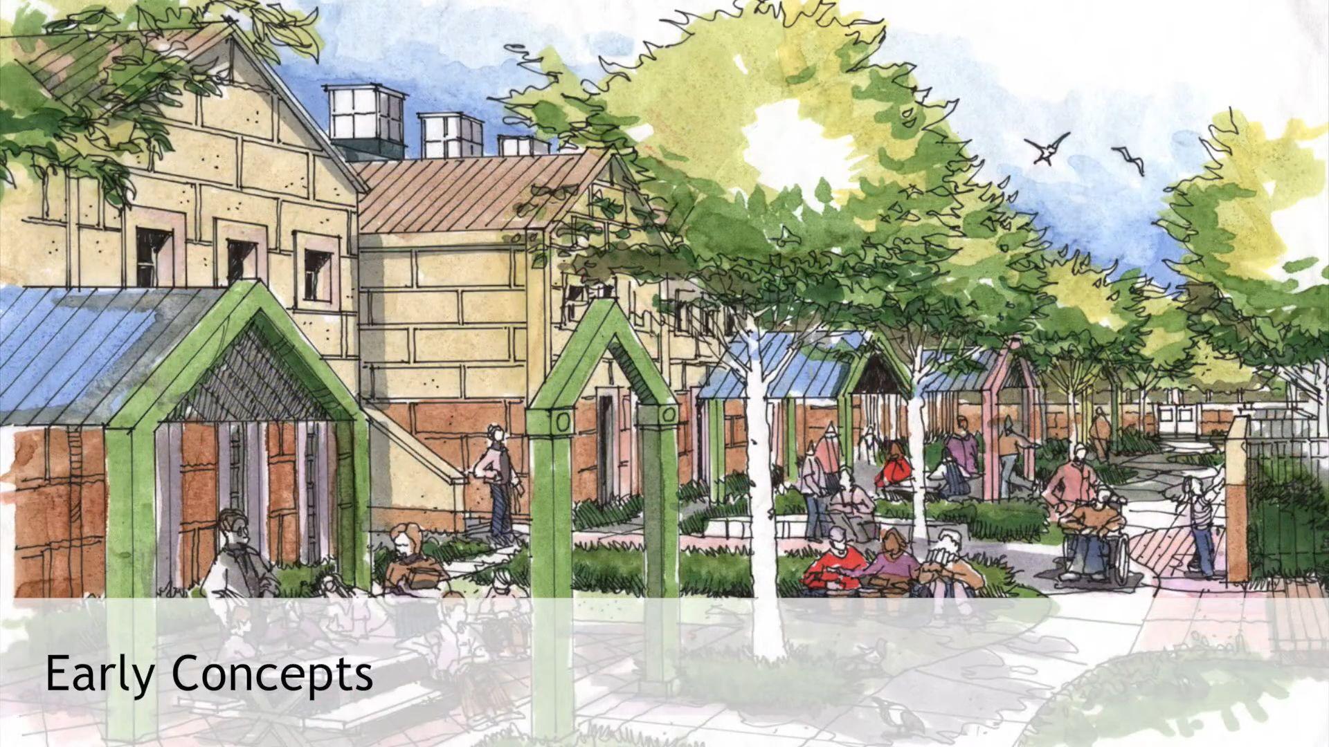
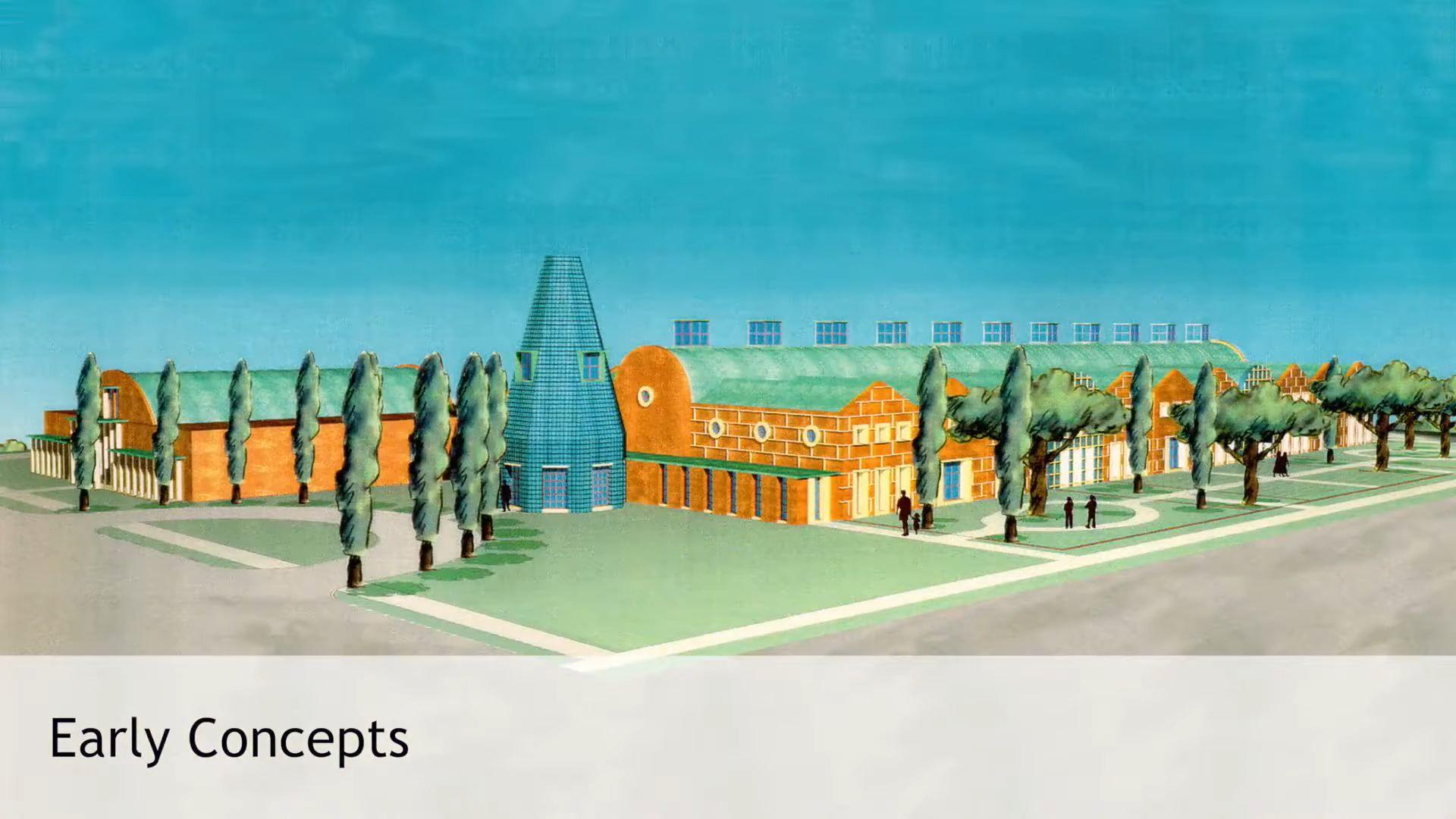
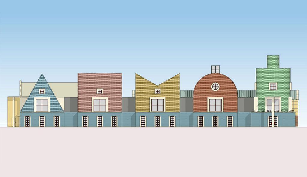
ArchitecturalApproach
Pluralism,ARTISTIC+FUNCTIONAL
● Final design proposal
 Source-MichaelGraves
ArchitecturalApproach
● Final design proposal
● Houses - initially designed Source-
 MichaelGraves
ArchitecturalApproach
● Final design proposal
● Houses - initially designed
● Recreational spaces - Later addition Source-MichaelGraves
ArchitecturalApproach
● Final design proposal
● Houses - initially designed
● Recreational spaces - Later addition
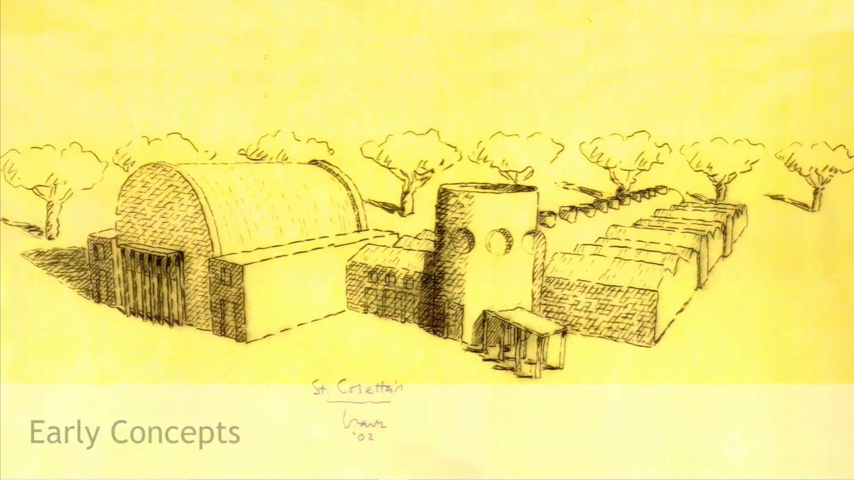
● Early concepts - Modification in recreational 1. One cylindrical and a common vaulted space.
Source-MichaelGraves
ArchitecturalApproach
● Final design proposal
● Houses - initially designed
● Recreational spaces - Later addition
● Early concepts - Modification in recreational
1. One cylindrical and a common vaulted space. 2. Common conical space at junction & diagonal entrance.
Source-MichaelGraves
ArchitecturalApproach
● Final design proposal
● Houses - initially designed
● Recreational spaces - Later addition
● Early concepts - Modification in recreational
1. One cylindrical and a common vaulted space.
2. Common conical space at junction & diagonal entrance.
3. Basic geometric shapes with horizontal lines.
ElementsofPostmodernism
A- Use of Bright Colours
● Use of bright primary colours to attract attention.
● Eye-catching colours and amuse.
B - Playfulness
● Playfulness in design elements, scale and proportion, and textures.
● Larger than life size elements to bring in satire.
DEMANDSATTENTION
NEOECLECTIC
ElementsofPostmodernism
HISTORICELEMENTSINSTYLIZEDMANNER
C - Classical Motifs, Symbolic Imagery
● Elements of classical architecture emphasized in certain areas.
● Variety of shapes and materials
● Fragmentation of programs and repetitions
● High Ceilings
● Use of historic elements in stylized manner
ArchitecturalAnalysis
● Along with the postmodernist ideology , architect also tried to reflect upon child’s psychology by inclusion of following symbolic elements in the design
1. Simple geometric shapes, like Square, rectangle, triangle, circle turned into creative forms

2. Textures- brick, tiles
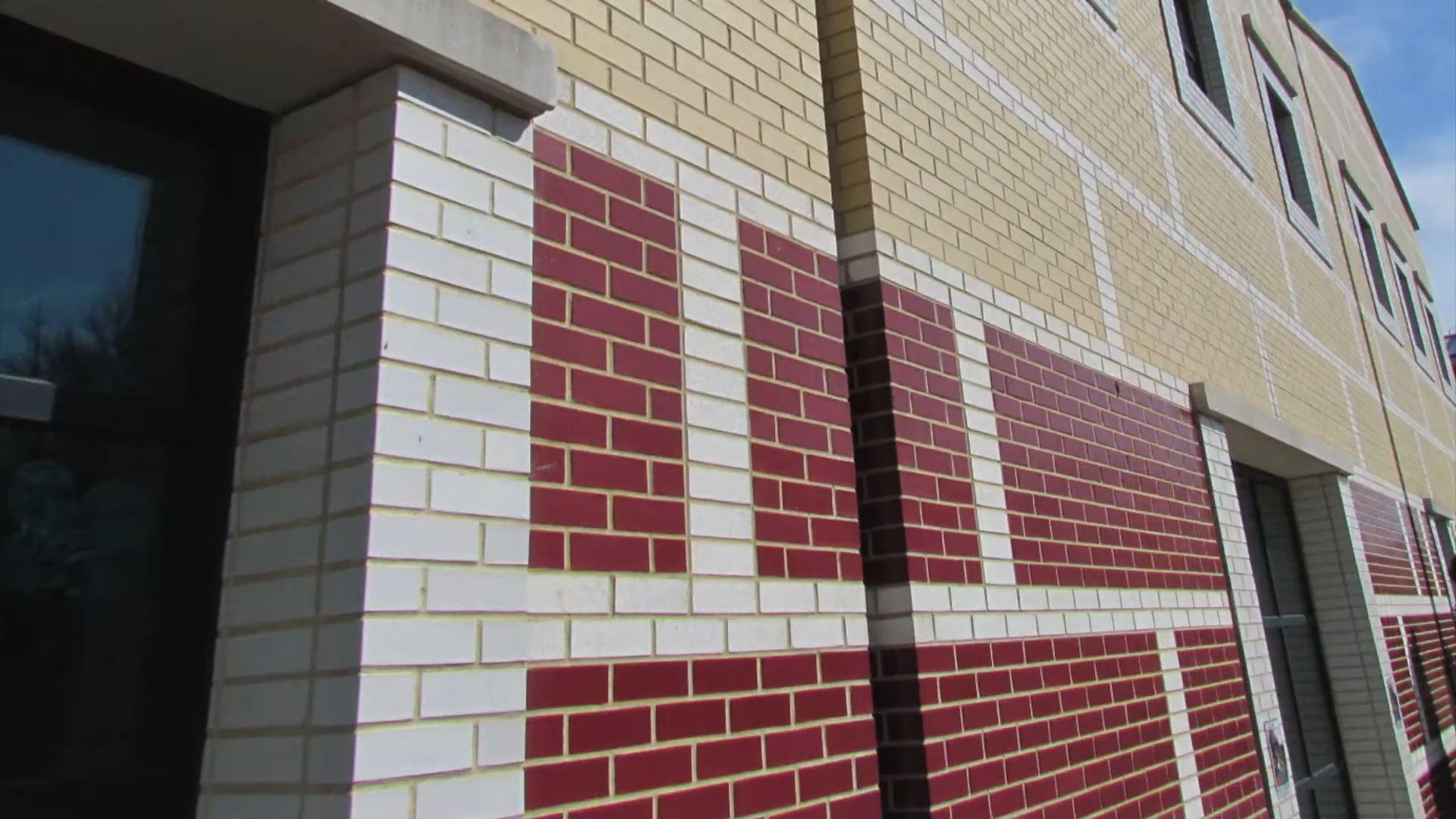
3. Primary colours - Red, Blue, Green,Yellow, Orrange
4. Simple square windows with four divisions emphasized using white frames.
PLAYFUL,SYMBOLIC
ArchitecturalAnalysis
● Scale-
Exteriors
● The elements of the exterior are emphasized in terms of scale
UNUSUALSCALE,SEEKINGMEANING
● Sense of surprise due to Unusual scale of brick pattern compared to actual brick size on the exterior facade
● Use of wide horizontal lines as separators- emphasizing horizontality
SENSEOFAMBIGUITYANDIRONY
Source-MichaelGraves
ArchitecturalAnalysis
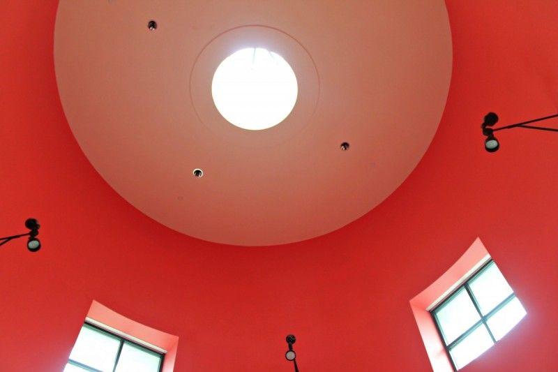
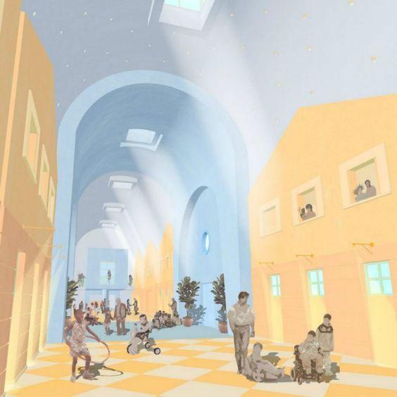
● Humanistic interiors - Children will live in the spaces and interact with them. Hence, they come first while designing.
● Understanding the child psychology- Adding splashes of different colours in the interiors, enlighten their mood, acts as way finding device and helps students forbetter cognition and identification of spaces.
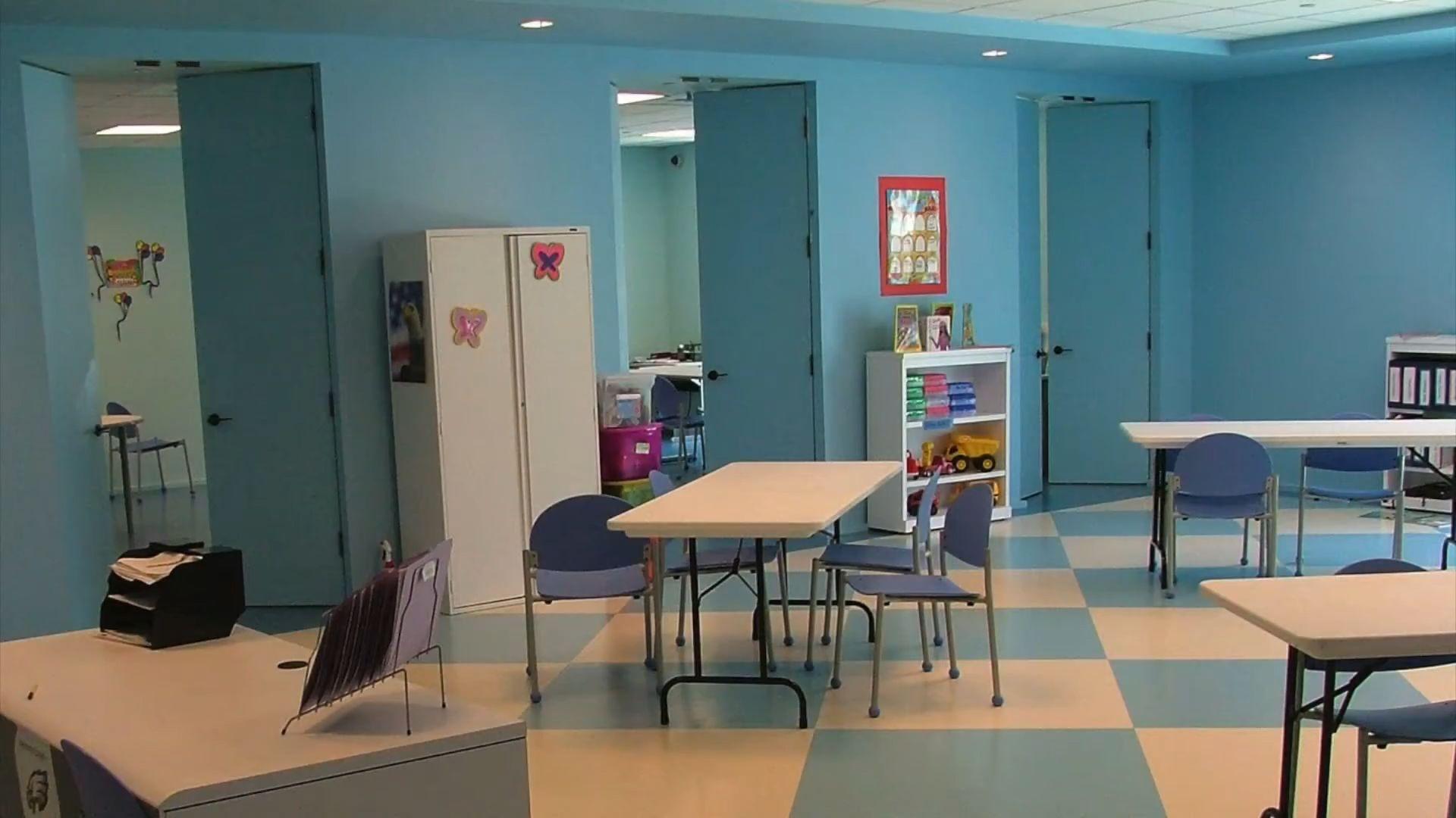
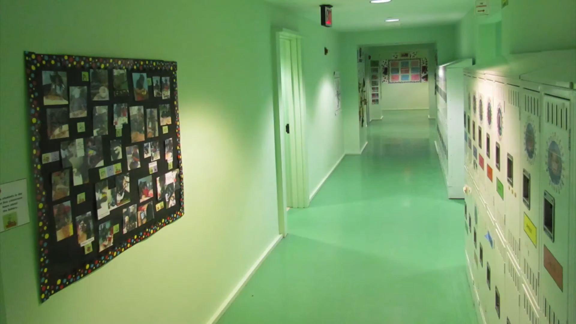
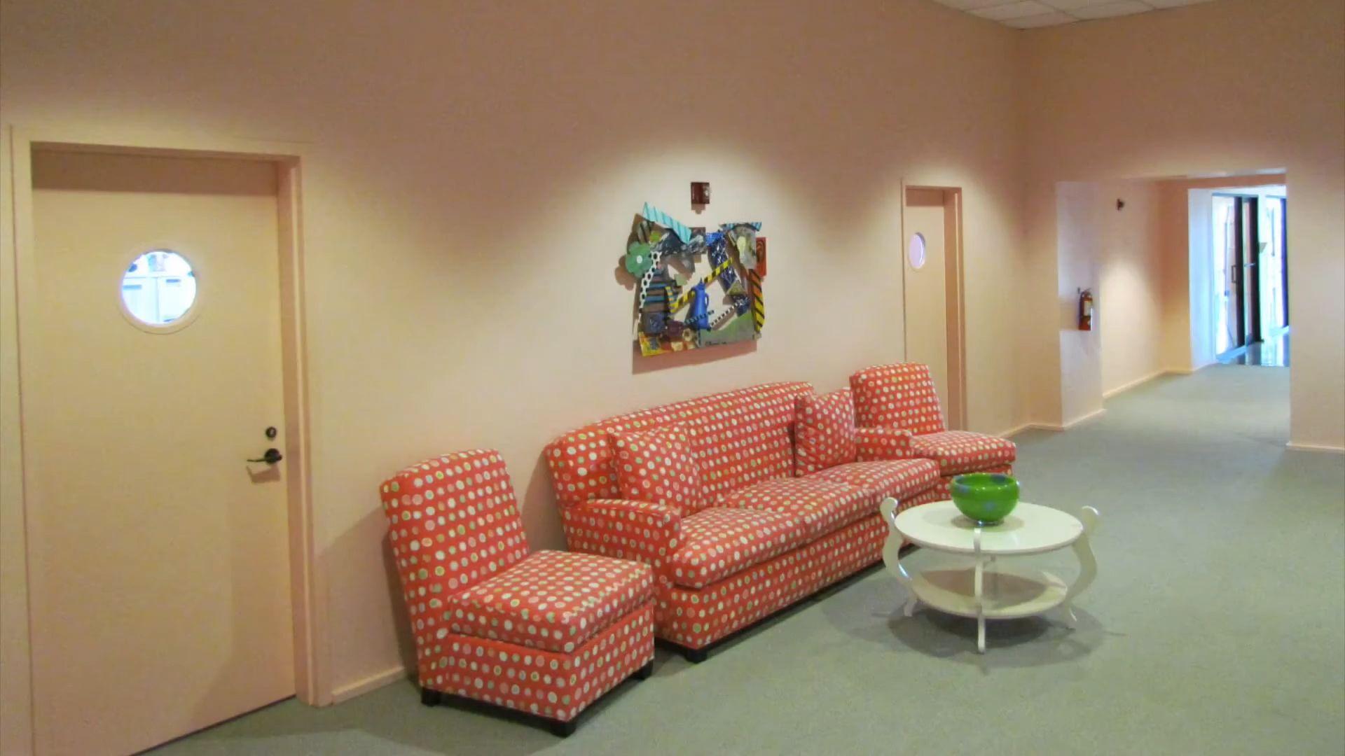
● Spaces designed with dramatic experience-Colour evoke different responses, associations and emotions in people:
● The different functional zones are associated with different hues calming hues, energizing bright primary hues, etc.
● Encourages learning process
Source-https://youtu.be/on6vN1uin5o
ArchitecturalAnalysis
● The latin cross plan- Belonging to the classical age - replicated in the planning
● A central naive - replicated as the central passage from where other functions branch out Source- Author,Archdaily
ArchitecturalAnalysis
● Scale - Interior
● The elements of the interior have a scale which is not proportionatepertaining to a child's psychologyof scale and texture.
1. Tiles laid in chessboard pattern
2. The use of larger skylights to light the corridors - Comparative larger scale
3. High Ceilings
● Decoded in terms ofsimply geometry so as to not focus on details
Irony
Source
Pinterest
-
Critiques
Regarding Postmodernism
● With diversity possesses sensitivity to the building's context and history.
● Vernacular Sensitivity- Often Evident- But sometimes alienated in the context..
● “Every city’s got one postmodern building and they always seem to be in the most prominent locations. It’s as if Michael Graves was given the choice plotof land in every important city to run wild with his Franken-building visions.”
With respect to the School
● Aesthetic qualities- modernity, playfulness, and scale.
● Have a plastic effect like imitation architecture of DisneyWorld
Googlyeyes
 Source-LInkTobeMentioned
Conclusion
● Modernist design was seen as pure, strictly utilitarian and boring by Michael Graves
● The aim behind designing this building was to combine both functionalism and aesthetics - i.e. comfort to both body and eye resulting in evoking of emotions
● This architecture communicated meanings with ambiguity and sensitivity towards disabled children and surrounding context.
● Michael Graves even though accused of EXTREMISM by critiques, he continued to follow his ideologies in 2006 (when the building was constructed) when postmodernism had started to fade
● St. Coletta school isn’t strictly display POSTMODERN characters but it is HUMANITARIAN and giving equal importance to the children’s psychology.
● Speaking architecture : Architecture communicates with people, its form explains function , Hence correctly fits into today’s contemporary society. Source-Autor(Group)
Humanitarian
Abstract Aesthetic
Functional
Symbolic Hybrid but inclusive Geometrical Communicating
Textures and facade treatment
● http://architectuul.com/architecture/view_image/st-coletta-school/8892
● https://thearchiblog.com/tag/michael-graves/
https://www.archdaily.com/563210/michael-graves-school-of-architecture-to-o pen-in-2015
● https://architectures.jidipi.com/a74097/ad-classics-ad-classics-st-coletta-scho ol/
● https://www.archdaily.com/88771/ad-classics-st-coletta-school-michael-graves
● https://www.michaelgraves.com/projects/st-coletta-of-greater-washington/
● https://www.michaelgraves.com/projects/st-coletta-of-greater-washington/
● https://in.pinterest.com/pin/379287599847742308/
Bibliography
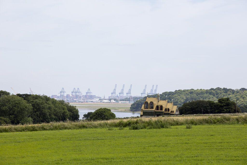
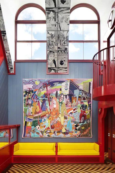
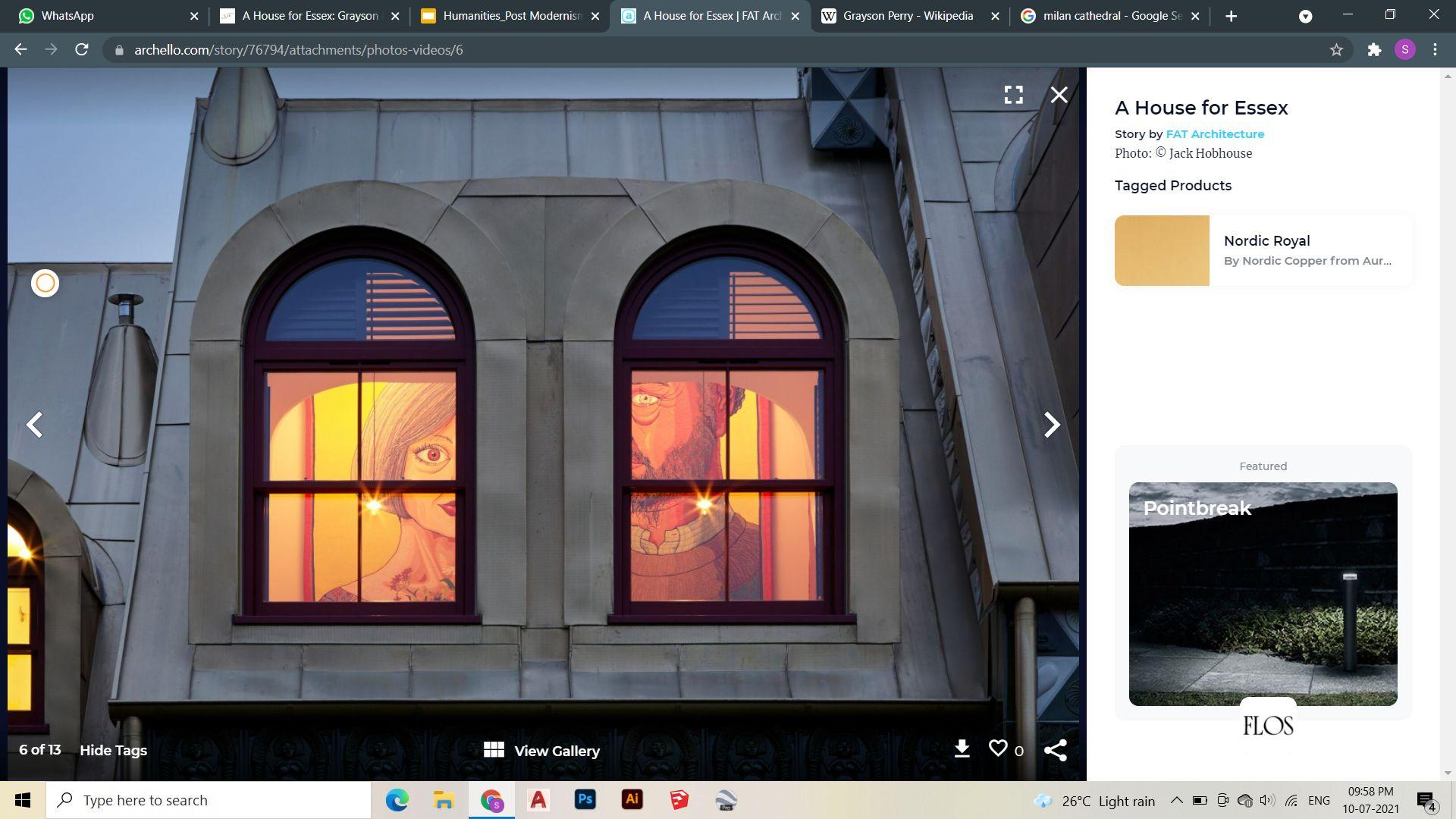
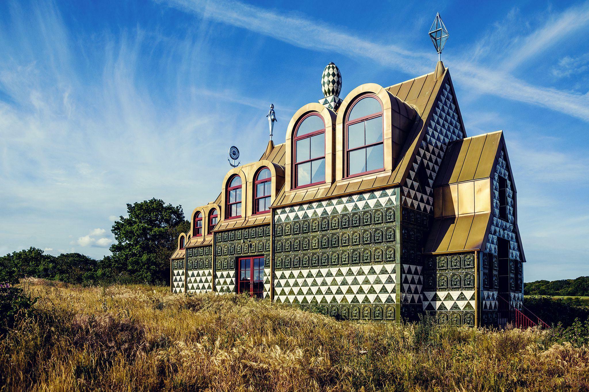
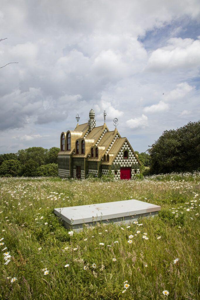
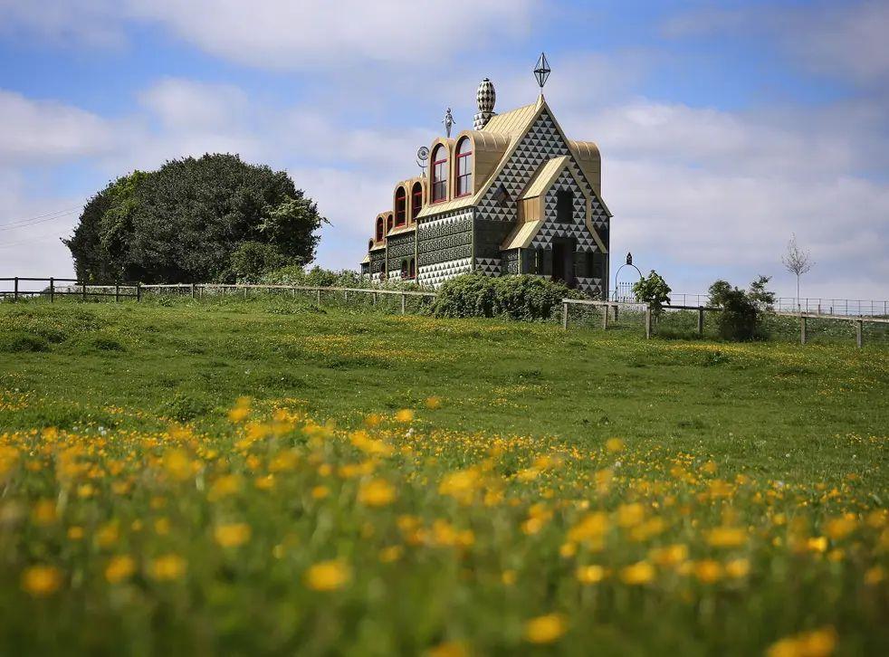
AHouseforEssex
Year of project - 2015 Location - Wrabness, UK
Architect / Firm - Artist Grayson Perry and Charles Holland, FAT Architecture
● At the north east of Britain, on the banks of of the river Stour - a shining example of britishWeirdness.
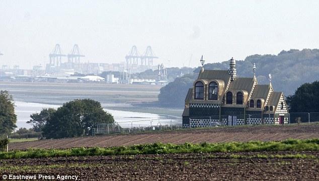
● Amonumental shrine for an imaginary Essexwomen.
● Aholiday home commissioned byAlain De Botton for ‘LivingArchitecture’
● Designed by Grayson Perry and Charles Holland.
● A culmination of the story aboutJulie.
● A fusion ofArt and domesticArchitecture.
Introduction
Source-https://archello.com/project/a-house-for-essex
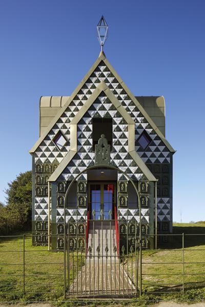
Inspired from concept of Russian doll

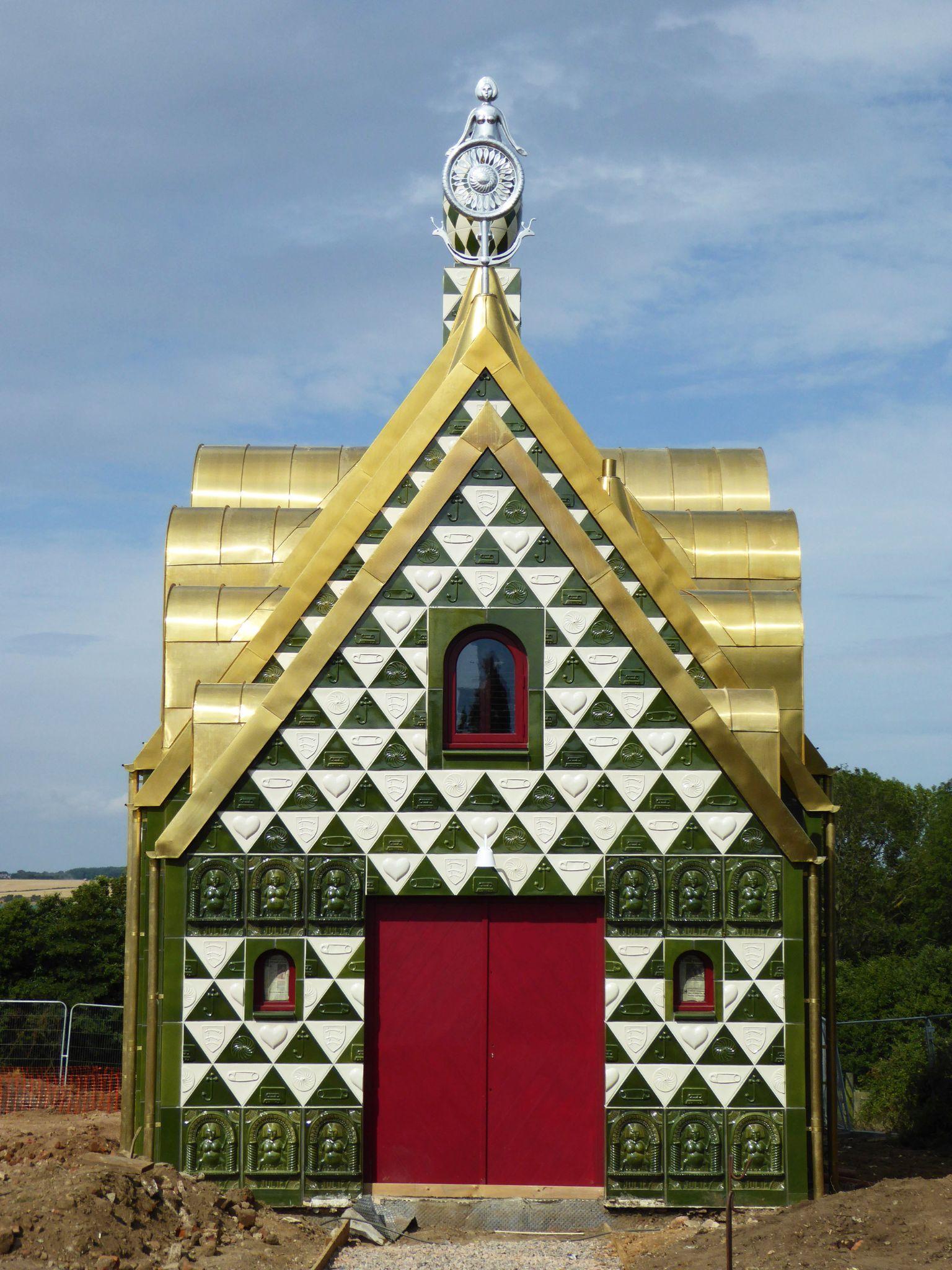
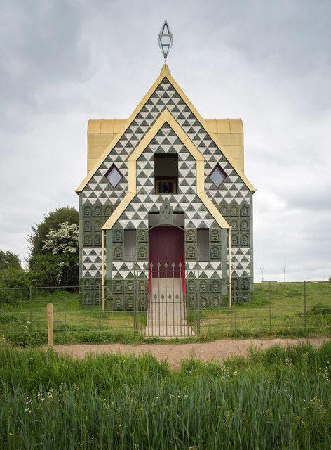
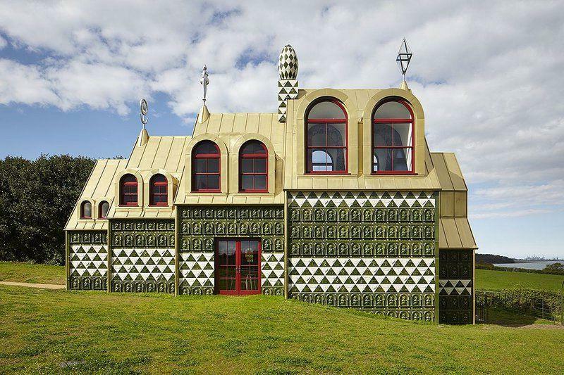
HOUSE
Facade facing road
Telescopic form in plan and
Dormer
Source-http://www.designcurial.com/news/a-house-for-essex-by-grayson-perry-and-fat-architecture-4646694/
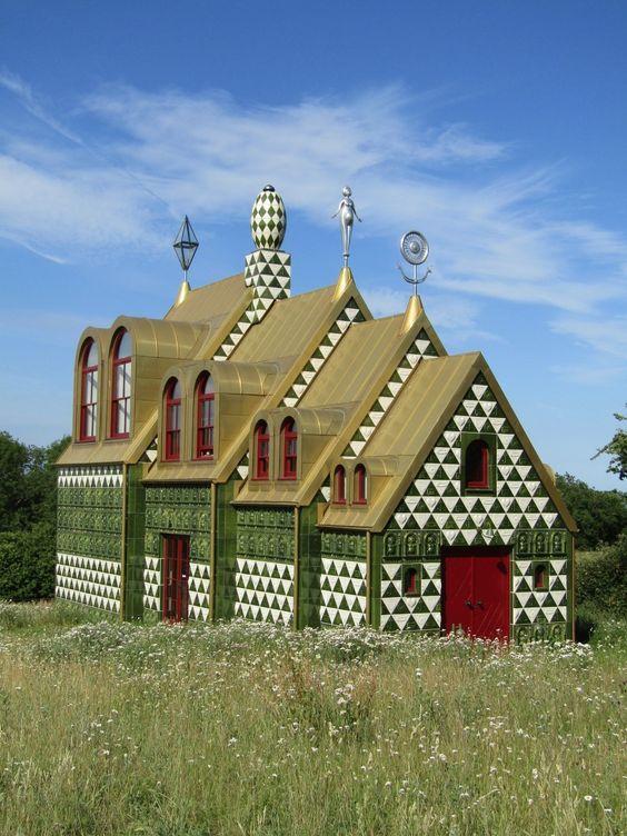
Window Aluminium cladded roof with sculptures
Structure blends into surroundings - Cornfield


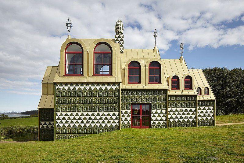
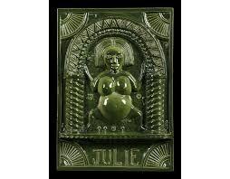
Futuristic versions of pagan fertility symbols and Sheela na gig Figurine connected to feminism


Olive green and White Ceramic tiles
Sourcehttp://www.designcurial.com/news/a-house-for-essex-by-grayson-perry-and-fat-architecture-4646694/
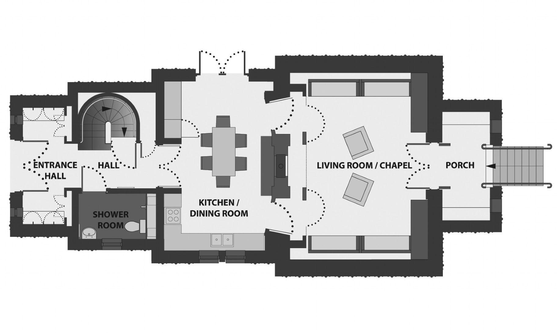
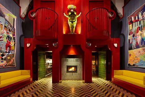
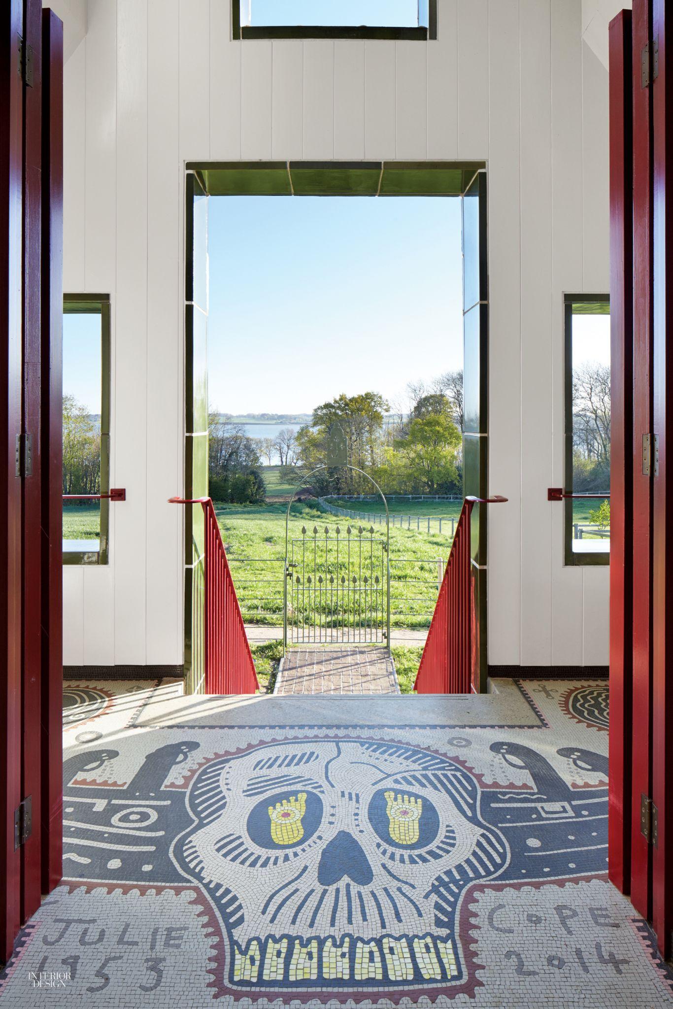
● The entrance porch from the chapel facade has a with footsteps.
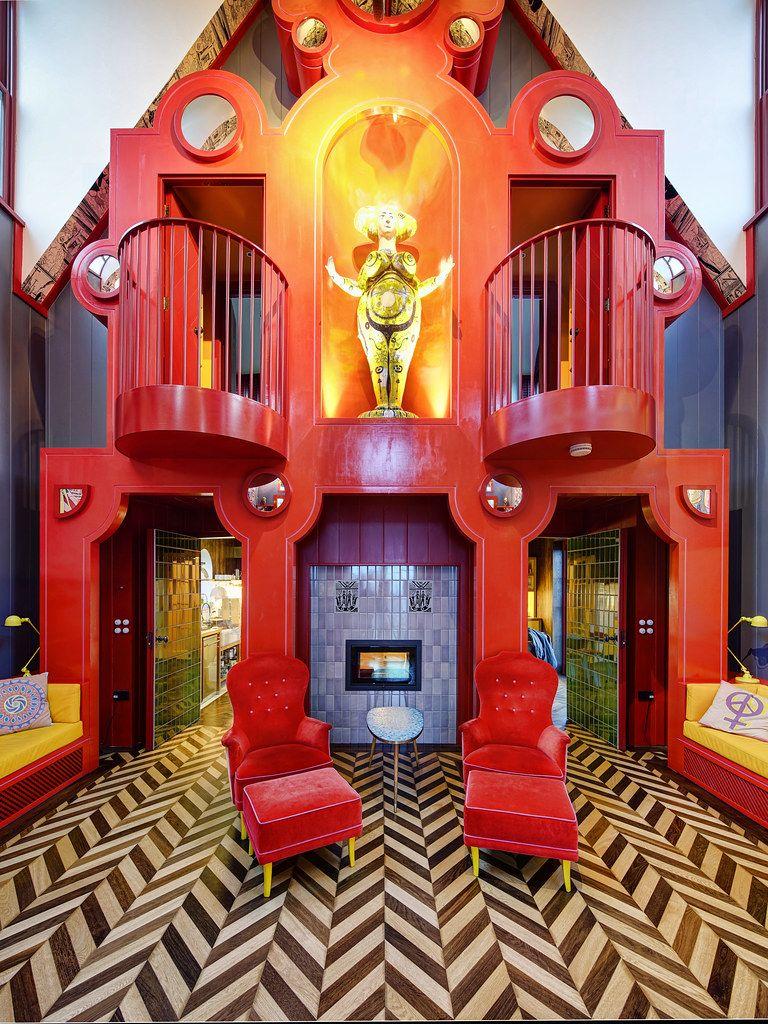
● This porch leads to the living room which is also a chapeldedicated to Julie.
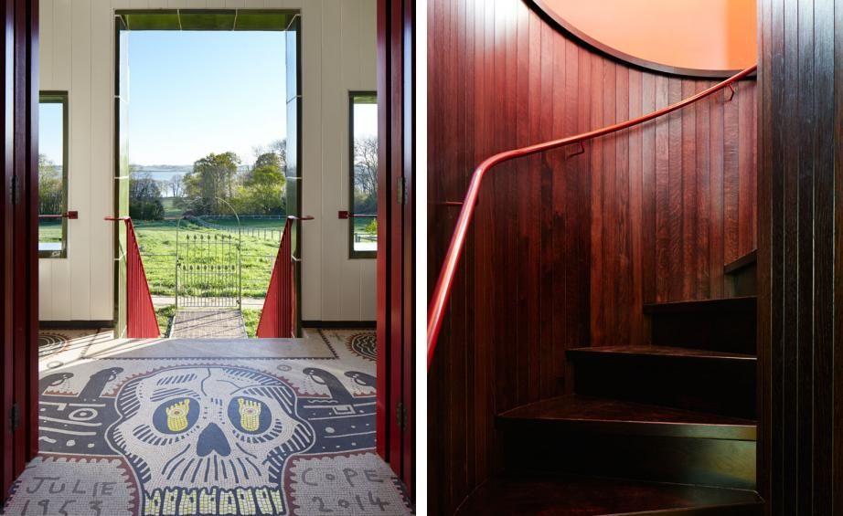
Porch
https://img.theculturetrip.com/wp-content/uploads/2017/04/1635-original-copy.jpg
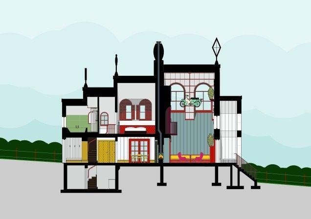
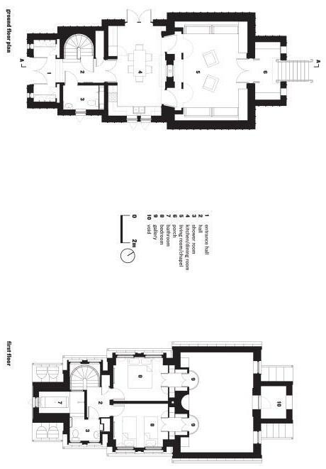
Groundfloorplan
Groundfloorplan
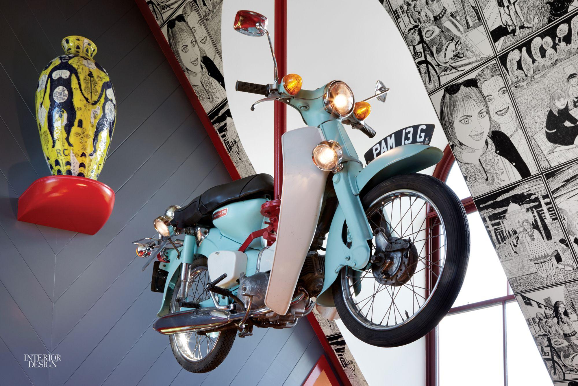
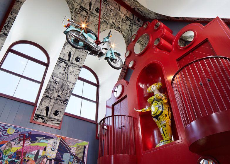
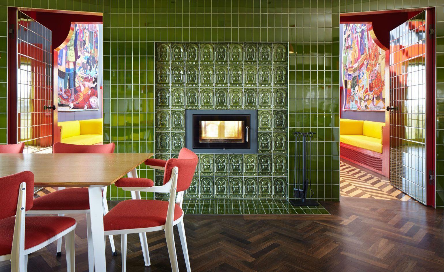
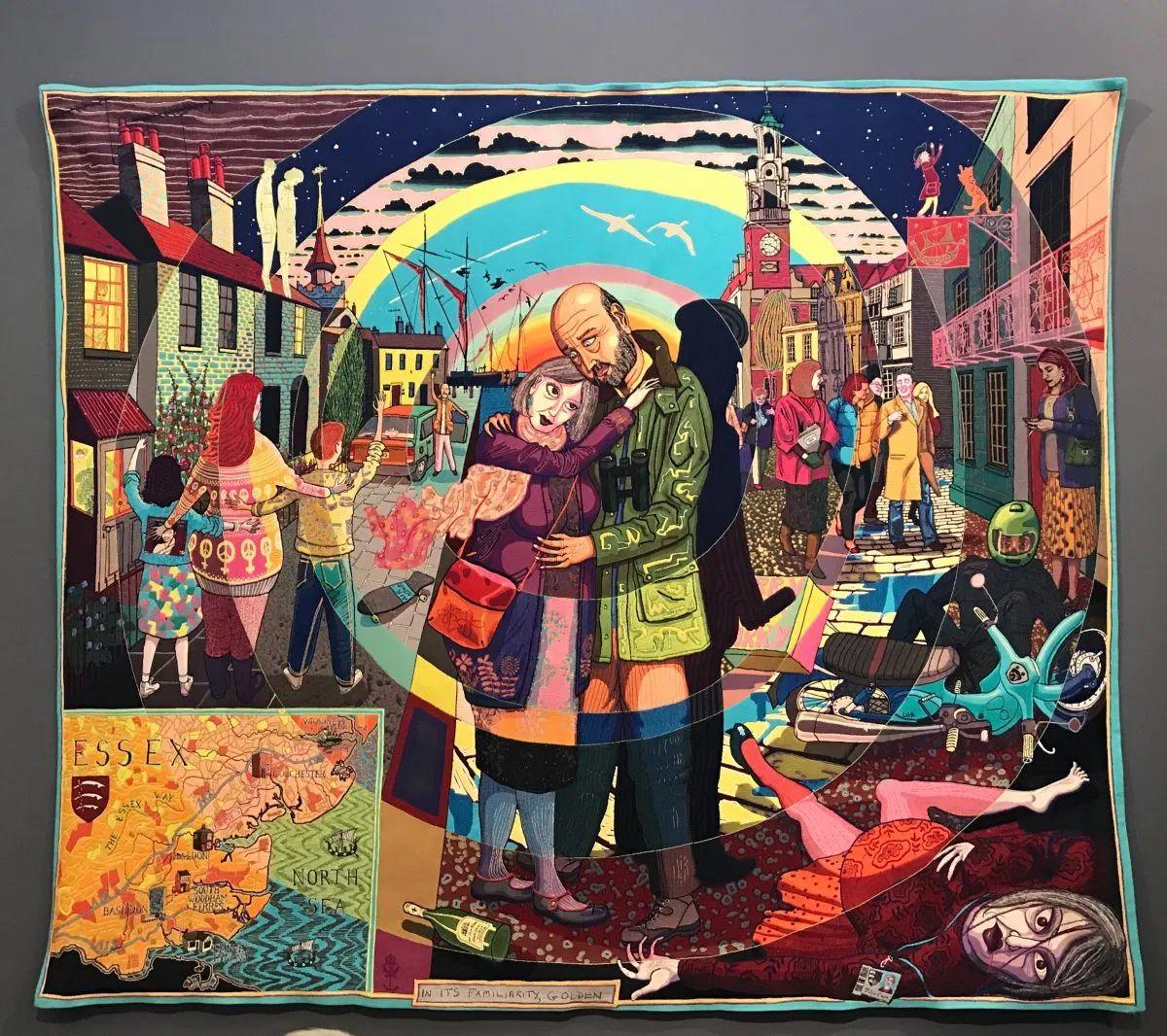
● Tapestries on opposite walls.
● Moped as a light fixture.
● Chapellike setting.
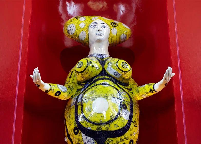
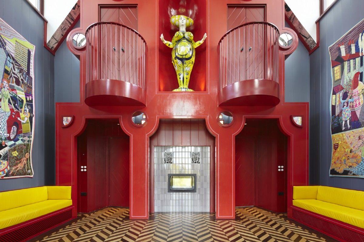
● Life-size Statue ofJulie.
https://static.dezeen.com/uploads/2015/05/A-House-for-Essex_FAT_Grayson-Perry_Jack-Hobhouse_dezeen_784_7.jpg
LivingRoom
Fictional women around which the concept of the house evolves
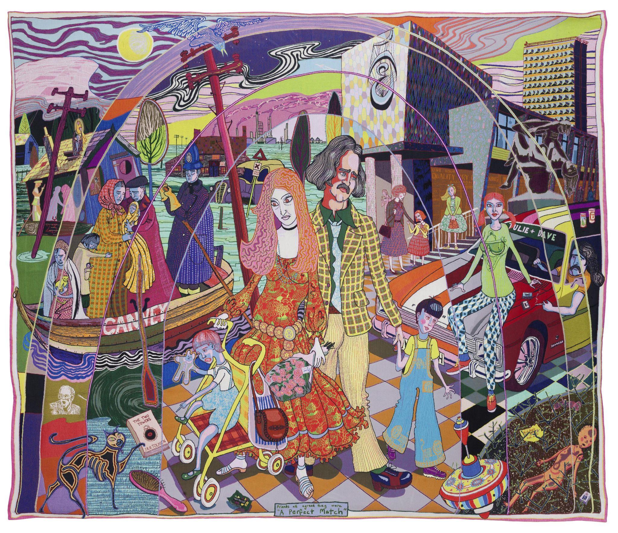
Born in Canvey Islands ,great floods of 1953
Migrated to many places (fictional) settled in Colchester
Married, had children, and divorced
Sourcehttps://5afcd40d31d88988688d-1eff6c2e5bc1acb4200996e1b293188f.ssl.cf3.rackcdn.com/The-Perfect-Match.jpg
JULIE COPE
JULIE COPE
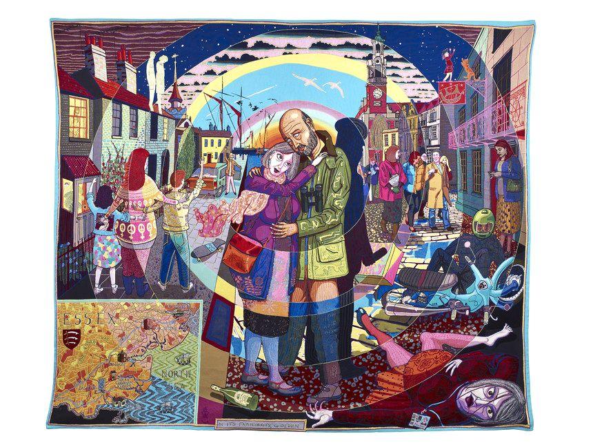
Married second time to Rob
Went on a dream holiday to India
Died in collision with Takeaway delivery scooter
A house of Essex - a monumental shrine dedicated to Julie
Sourcehttps://i0.wp.com/www.rebelessex.com/wp-content/uploads/2017/12/juliecope.jpg?fit=1200%2C1066&ssl=1
Married second time to Rob
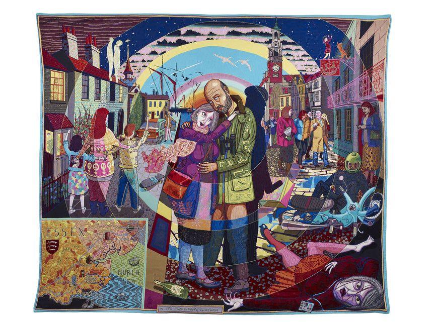
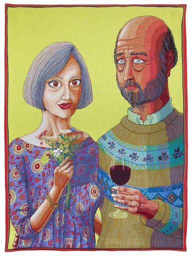
Went on a dream holiday to India
Died in collision with Takeaway delivery moped
As promised - built Taj Mahal - a house in Essex
https://i.pinimg.com/originals/62/4d/b5/624db512702385a901faf428c6d2a80f.jpg
https://i.pinimg.com/originals/03/72/e4/0372e461c687879da620e29d7ba3650a.jpg
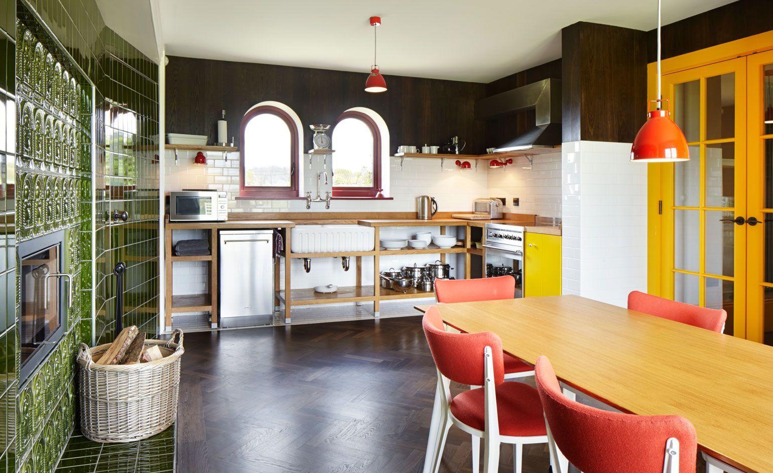
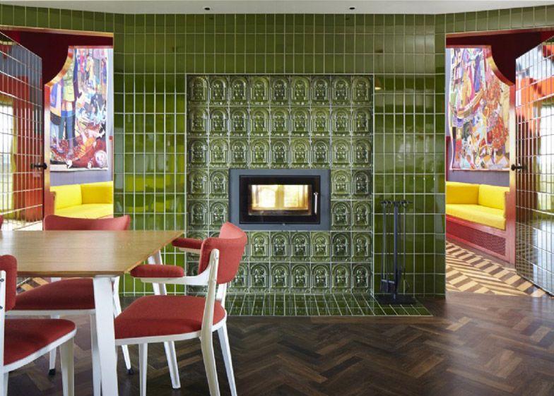
Kitchen
herringbone
● Kitchen with a
parquet floor
● Patterns - flooring, tiles on the walls
● Ceramic tile cladding around the fireplace and wall
● Custom designed furniture and light fittings.
Groundfloorplan
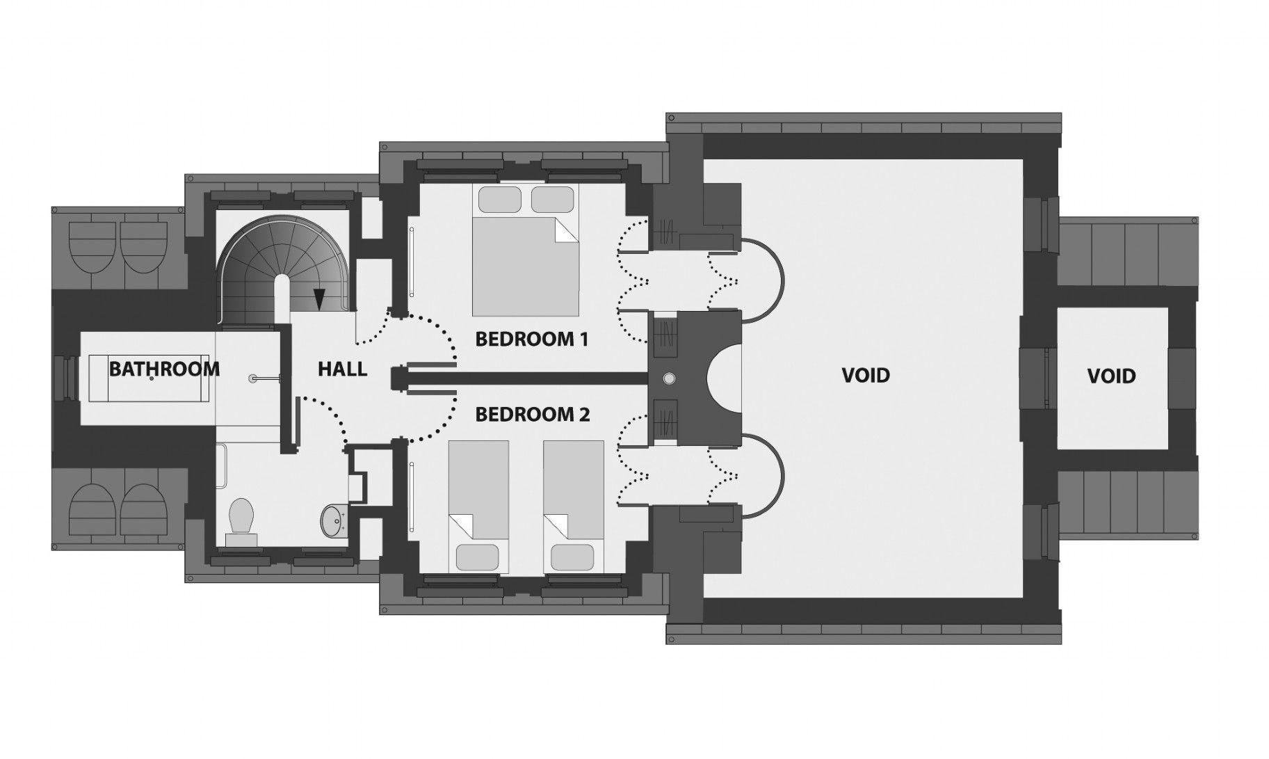
Bedroom
● There are 2 Bedrooms on the first floor.
● One representing each marriage.
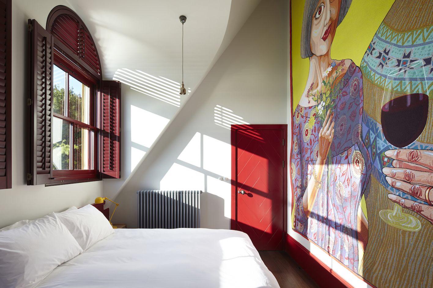
● The second bedroom has a tapestry ofJulie and Rob
First floorplan Source-
https://static.dezeen.com/uploads/2015/05/A-House-for-Essex_FAT_Grayson-Perry-Charles-Holland_dezeen_784_9.jpg
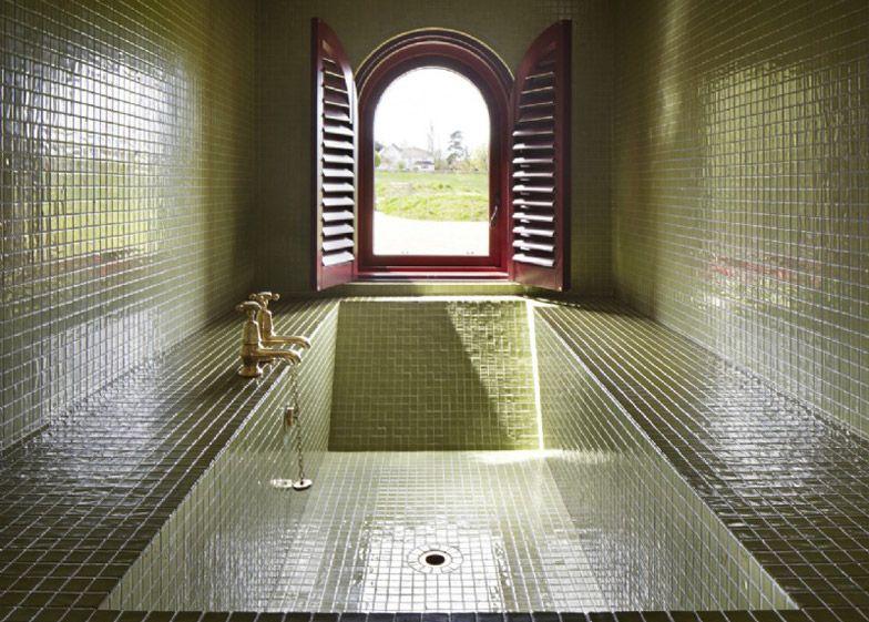
Bathroom
First floorplan
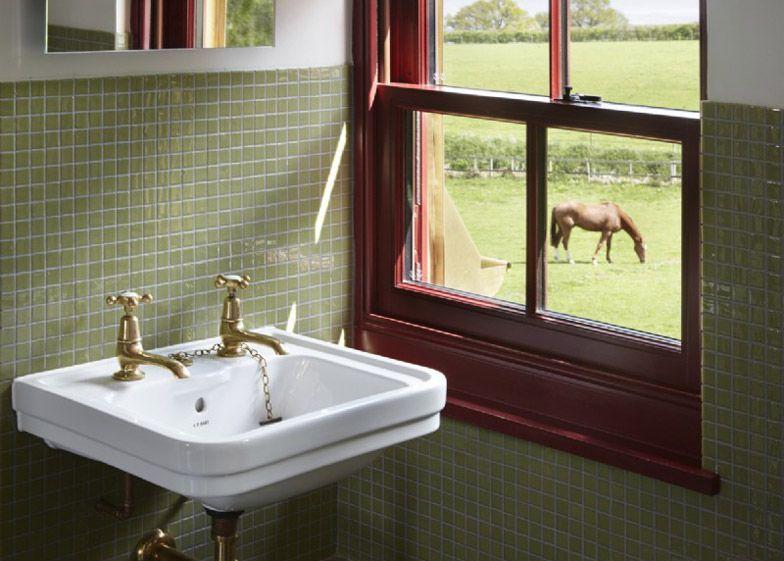
● Spiral Staircase of Oak timber
● Bathroom is Cladded with olive green ceramic tiles.
https://static.dezeen.com/uploads/2015/05/A-House-for-Essex_FAT_Grayson-Perry-Charles-Holland_dezeen_784_9.jpg
Critiques
● Most of the people loved staying, they loved the concept, the wit, the warmth, the colour.
● People had an amazing experience living in a work of art and wonderful to spend time looking at it, energising and stimulating place.
● Difference in experiences in just viewing the house and having a stay there. It was like living in an art museum
● People deeply felt the story of Julie through the tapestries, paintings and other elements in the house depicting her story.

● It may have been a mausoleum but it was a living one and was also beautifully placed in the landscape. It look like adisney princess castle.
● A sense of uneasiness can be felt due to the paintings and tapestries.
● The house is overwhelming due to the number of patterns, textures and colours.
ElementsofPostmodernism
●
A Materials
● DecorativeTimber
● Glazing
B Facade Ornamentation
● Olive Green andWhite tile finish with its symbolic ornament.
● Copper clad roof with dormerwindows.
● Silver coloured sculptures- Weather vane, chimney pot, Beacon, Wheel sculpture
● Aluminium Cladding on the roof
CeramicTiles on Facade and Interiors
● Wooden blocks Flooring
-https://www.locationscout.net/united-kingdom/29213-a-house-for-essex; https://www.dezeen.com/2015/05/15/house-for-essex-fat-grayson-perry-charles-holland-living-architecture-alain-de-botto n/
Source
ElementsofPostmodernism
C Multifaceted Cultural Influence & Neo Eclectic
● The form draws influence from Tibetian shrines
● The Chapel like interior, elements dedicated to Julie in the living room. Along with many elements from cathedrals for light quality.
● The different elements of artistic expression like the tiles and sculptures are a futuristic takeaways of Feminist fertility pagan symbols and figurines of na gig and russian doll that are quite evident in the ceramic lifesize doll of Julie.

● The Skull on the porch is a blend of polynesian and mexican art of the dead in black and white.
● Furniture is influenced by Bauhaus colour palette some custom designed lounge chairs, sofas, light fixtures.
https://static.dezeen.com/uploads/2015/05/A-House-for-Essex_FAT_Grayson-Perry-Charles-Holland_dezeen_784_9.jpg
Source-
ElementsofPostmodernism
D Seeking Meaning & Expression
● The house is a part of the series of ‘Living Architecture’, that makes the place available for the public.
● It is filled with artwork related toJulie that depicts her life.
Sourcehttps://static.dezeen.com/uploads/2015/05/A-House-for-Essex_FAT_Grayson-Perry-Charles-Holland_dezeen_784_9.jpg
Conclusion
● It is a three dimensional musing on religion, local history, feminism, happiness and death.
● It is a unique project that is an amalgamation of postmodern approach of the artist and his expression reflected in the structure.
The design embraces decoration, ornament and symbolism in order to tell a rich and complex story.
Bibliography
● https://www.ajbuildingslibrary.co.uk/projects/display/id/7206
● https://archello.com/project/a-house-for-essex
● https://www.theguardian.com/artanddesign/2015/may/10/grayson-perry-a-h ouse-for-essex-stonking-shrine
● https://www.ribaj.com/buildings/a-house-for-essex
● https://scenarioarchitecture.com/advice/house-essex-grayson-perry-living-arc hitecture/
● https://www.living-architecture.co.uk/the-houses/a-house-for-essex/overview/
● https://www.architectural-review.com/awards/ar-house/art-and-craft-a-hous e-for-essex-by-fat-and-grayson-perry
● https://cogdesign.com/journal/a-house-for-essex/
● http://www.designcurial.com/news/a-house-for-essex-by-grayson-perry-and-f at-architecture-4646694/
● https://www.dezeen.com/2015/05/15/house-for-essex-fat-grayson-perry-charl es-holland-living-architecture-alain-de-botton/
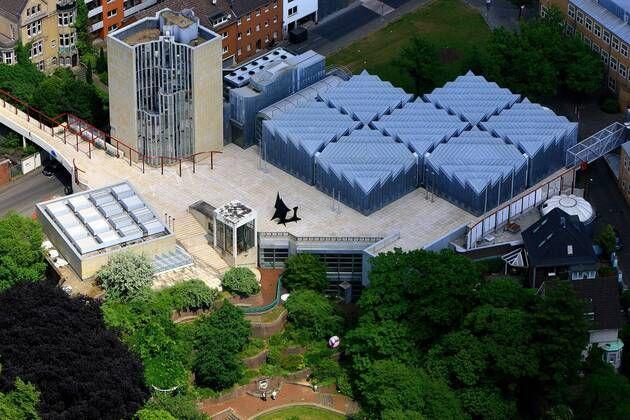
Abteiberg
Museum Hans Hollein 1982
Abteiberg Mönchengladbach, Germany
102
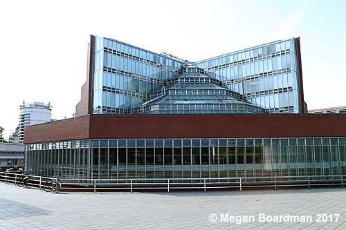
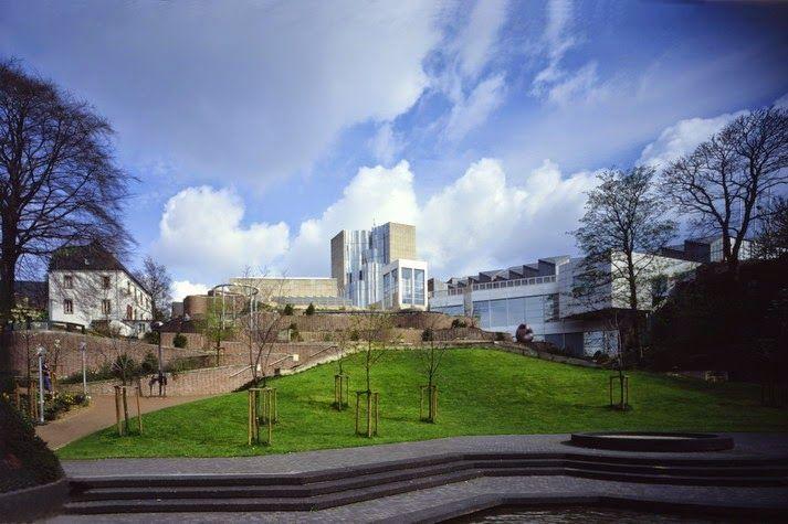
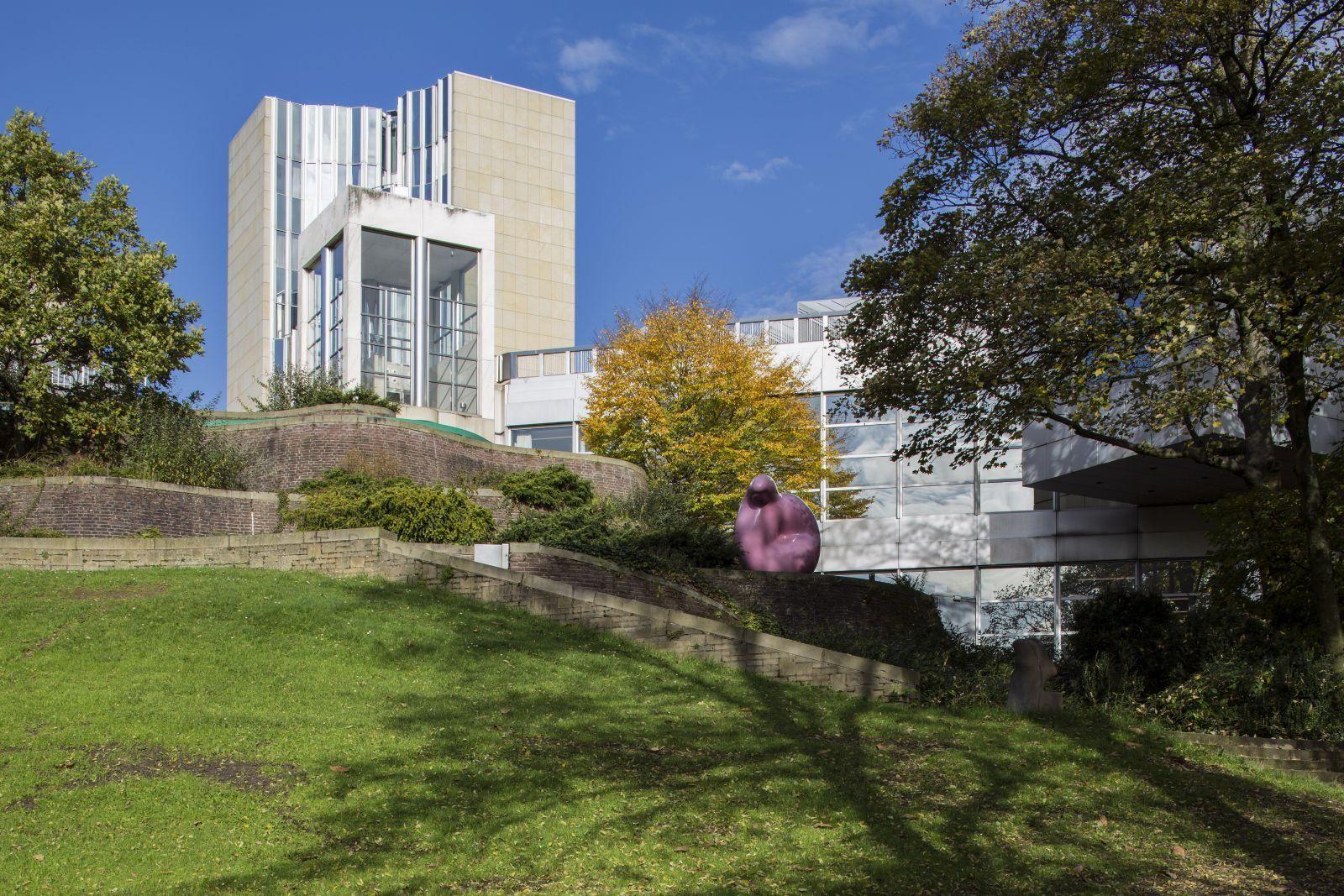
● Abteiberg Museum is a municipal museum situated in Mönchengladbach, Germany designed by Hans Hollein
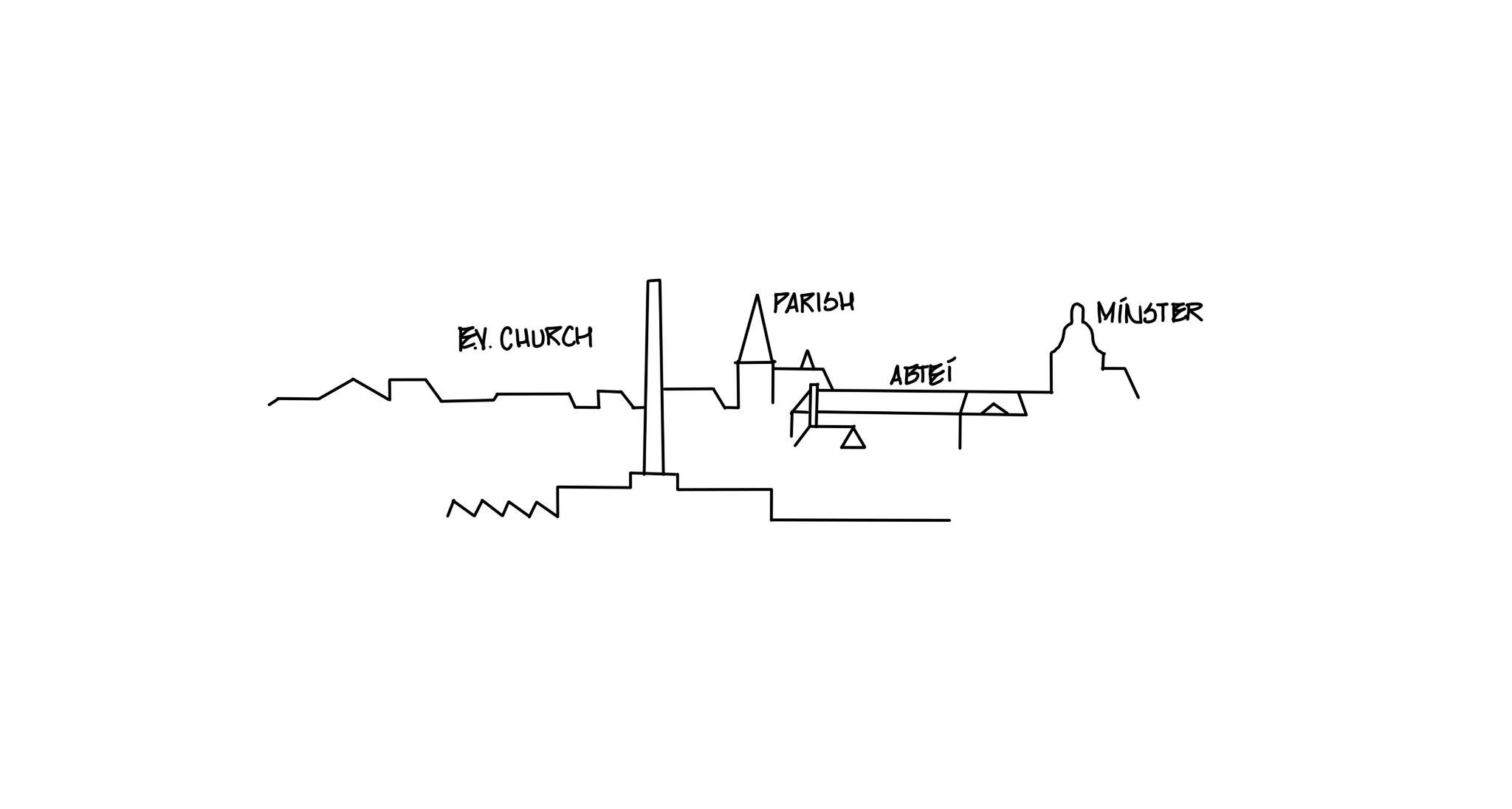
● The museum lies next to the Romanesque minster and a Baroque priory on a prominent hill-side site whose topographical qualities gave rise to the founding of the abbey, and with it of the city more than 1,000 years ago.
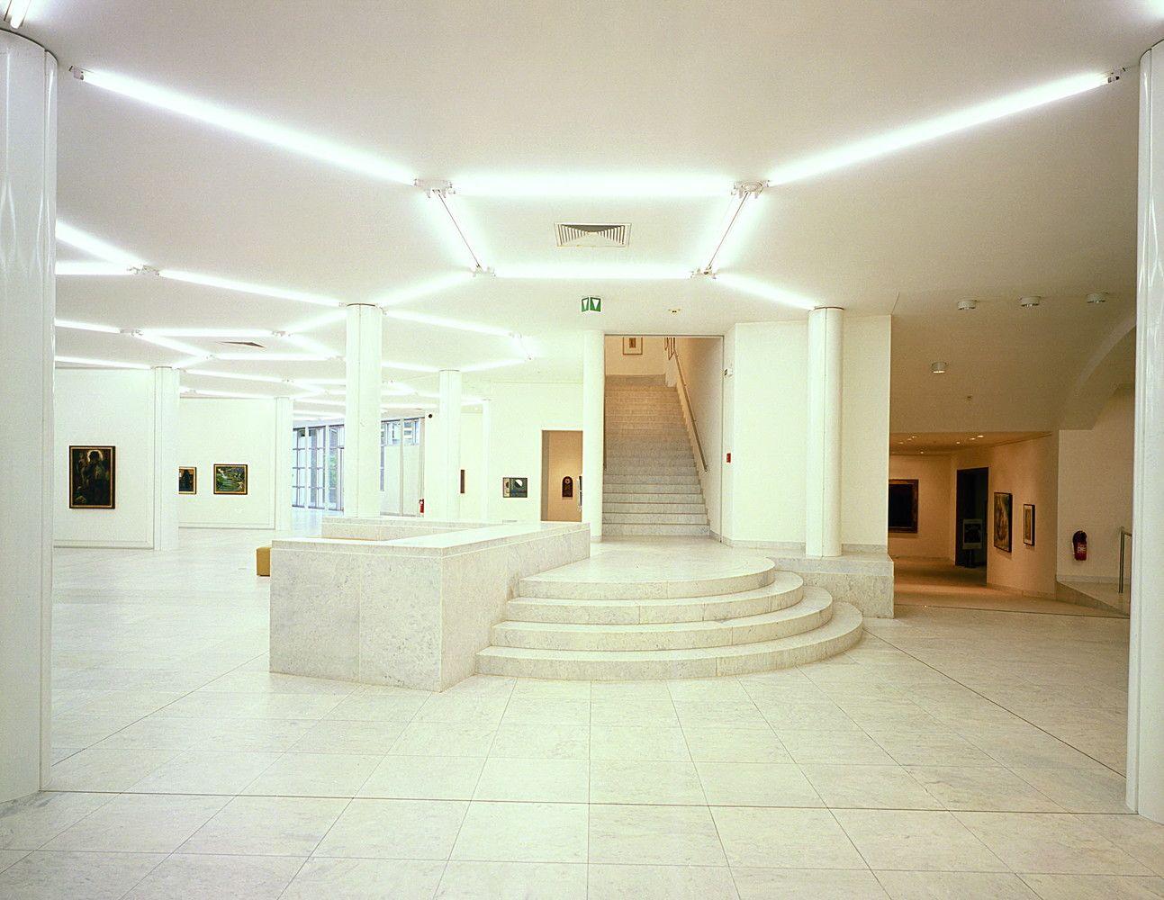
● With total display area of three and a half thousand square meters, contains lectures theatres, workshop, audio-visual room, cafeteria, conservation studio, libraryand offices.
● In 1922, the museum acquired a collection of major Expressionistworksand so established its profile as a museum of contemporary art. Source
Introduction
103
- https://www.domusweb.it/en/from-the-archive/2014/04/28/in_ma_nchengladbachthehansholleinsmuseum.html
● Abteiberg Museum is a municipal museum situated in Mönchengladbach, Germany designed by Hans Hollein
● The museum lies next to the Romanesque minster and a Baroque priory on a prominent hill-side site whose topographical qualities gave rise to the founding of the abbey, and with it of the city more than 1,000 years ago.
● With total display area of three and a half thousand square meters, contains lectures theatres, workshop, audio-visual room, cafeteria, conservation studio, libraryand offices.
● In 1922, the museum acquired a collection of major Expressionistworksand so established its profile as a museum of contemporary art.
Image 1- XYZ

Source - https://www.domusweb.it/en/from-the-archive/2014/04/28/in_ma_nchengladbachthehansholleinsmuseum.html

Introduction
104
ArchitecturalAnalysis
CONCEPT
● The concept is ‘Adventure’.
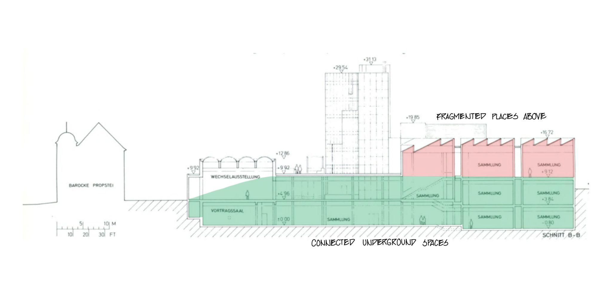
PLANNINGAND ZONING
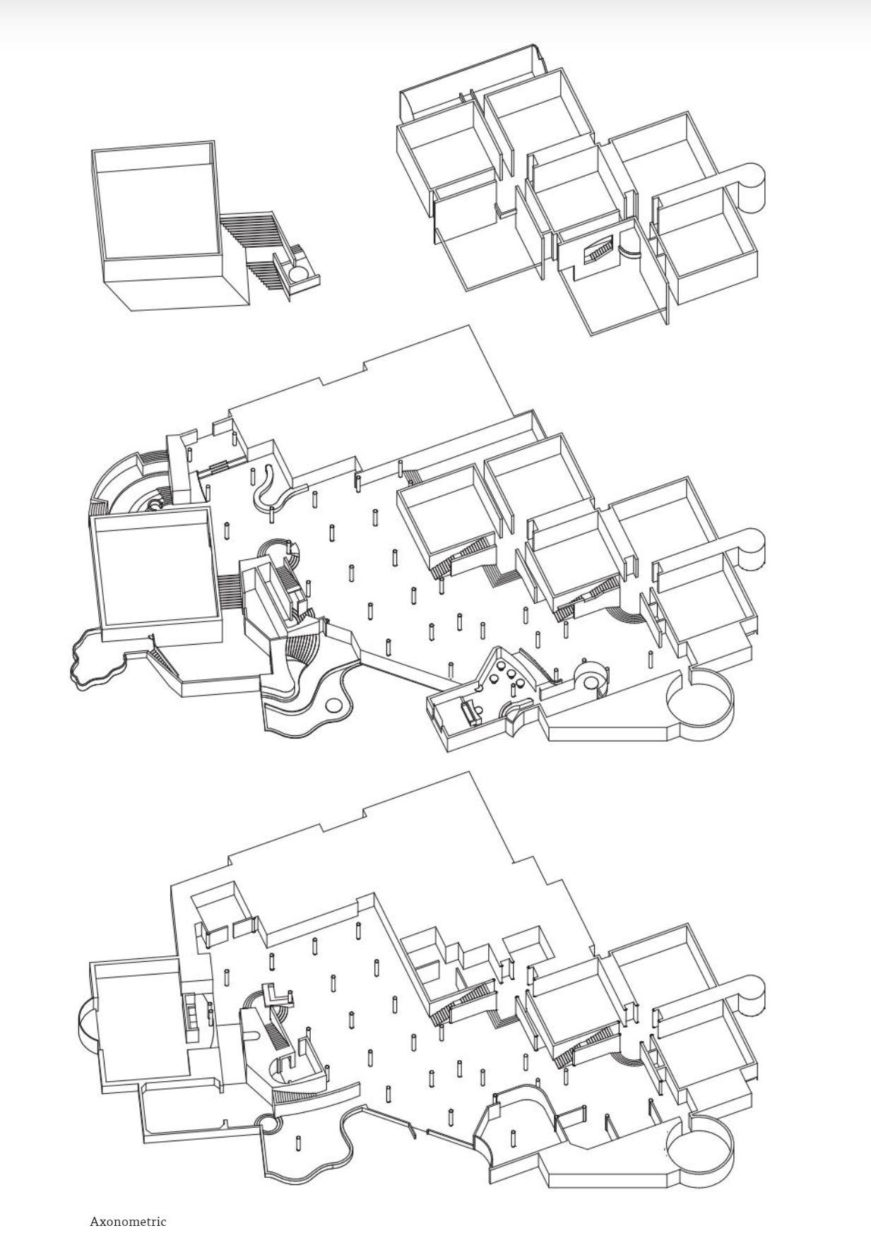
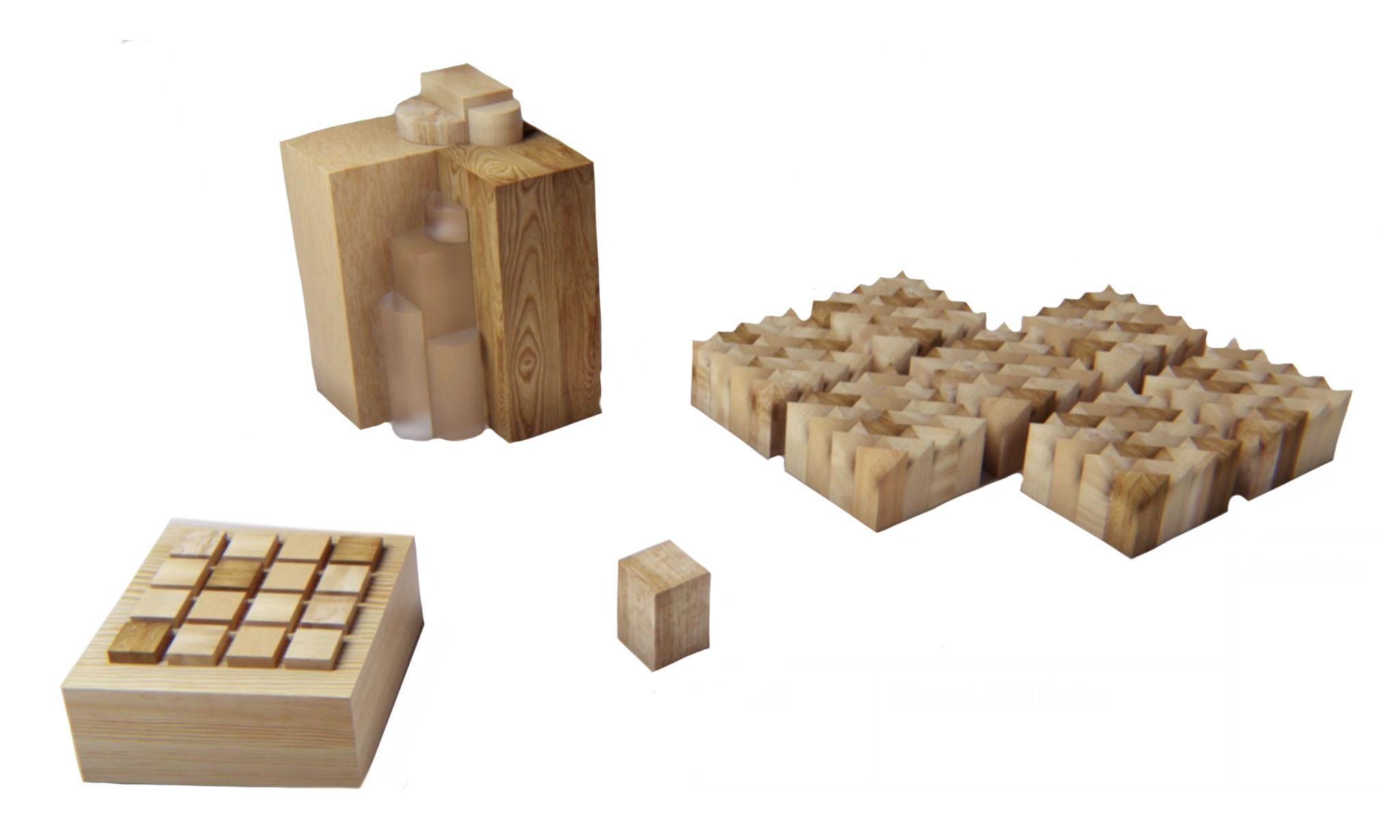
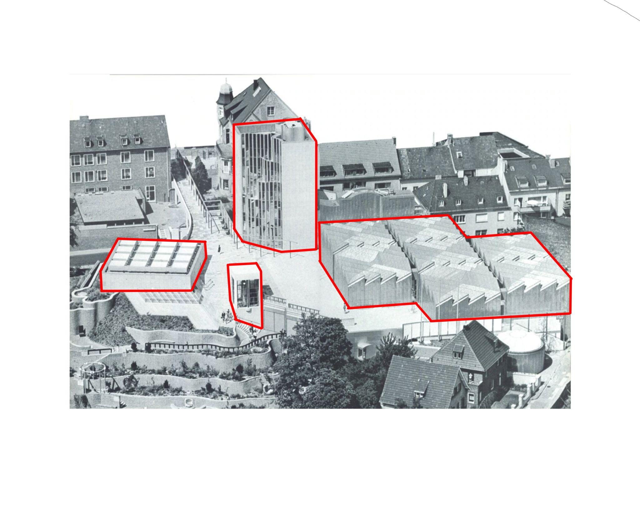
● The Museum Abteiberg consists of buildings arranged around a square-like pedestrian area slightly below theAbteiberg hill.
● Hans Hollein drew upon the topographical situation by arranging the ensemble on levels.
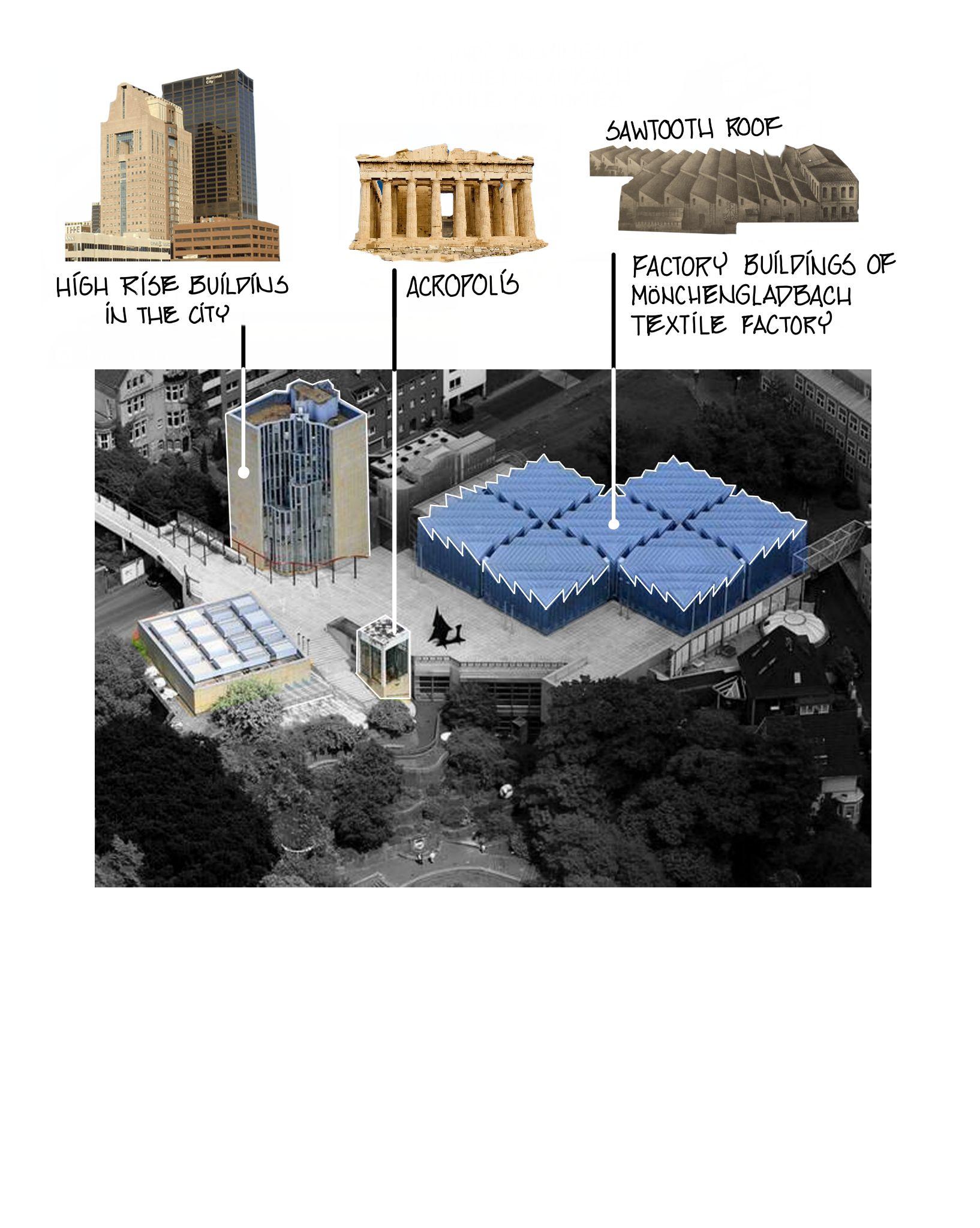
● The ensemble of building includes an administration tower, temporary exhibition space/lecture hall and a permanent exhibition space.
● The whole complex looks like a city like, admininstation tower as an high rise office building, Exhibition space as a multipurpose hall and entrance pavilion as a sacred building.
● To create a model model city.
● Ahuge standing building at the hilltop,
Sourcehttps://www.domusweb.it/en/from-the-archive/2014/04/28/in_ma_nchengladbachthehansholleinsmuseu m.html
105
ArchitecturalAnalysis
SPATIALEXPERIENCE
● Different levels giving unique spatial possibility .
● Traits of new museums of contemporary art.
● Factors cater to develop a museum like experience inside the structure as well as making it an adventure.
106
ArchitecturalAnalysis
LIGHTQUALITY
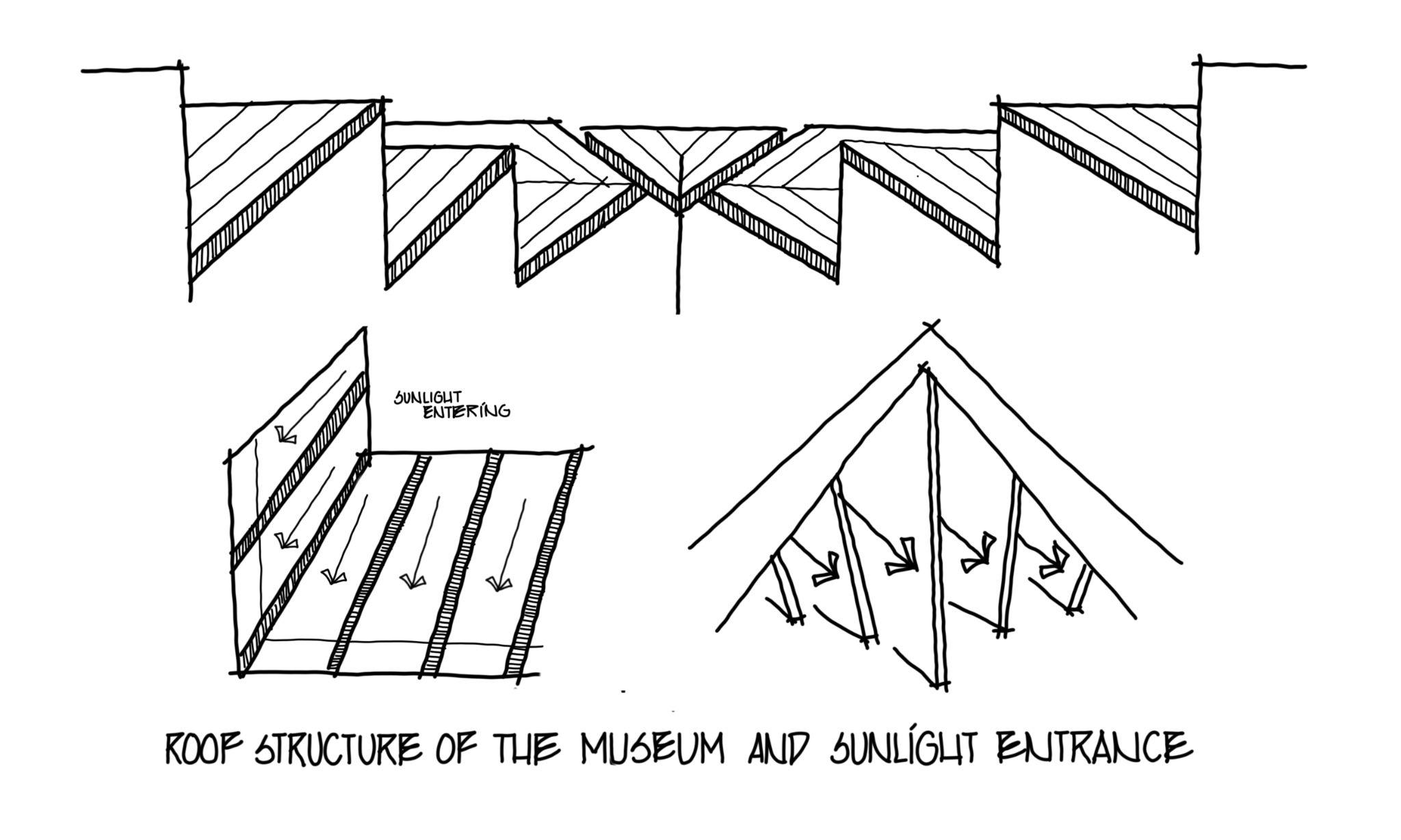
● The factory like form of the roof .
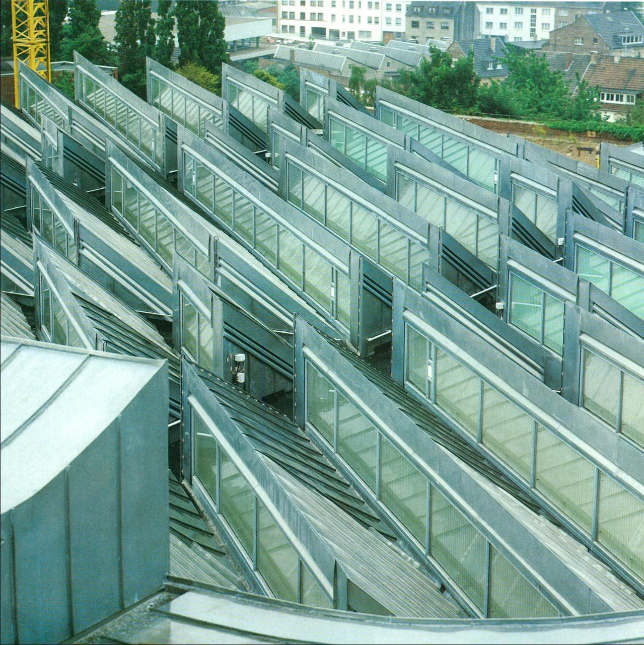
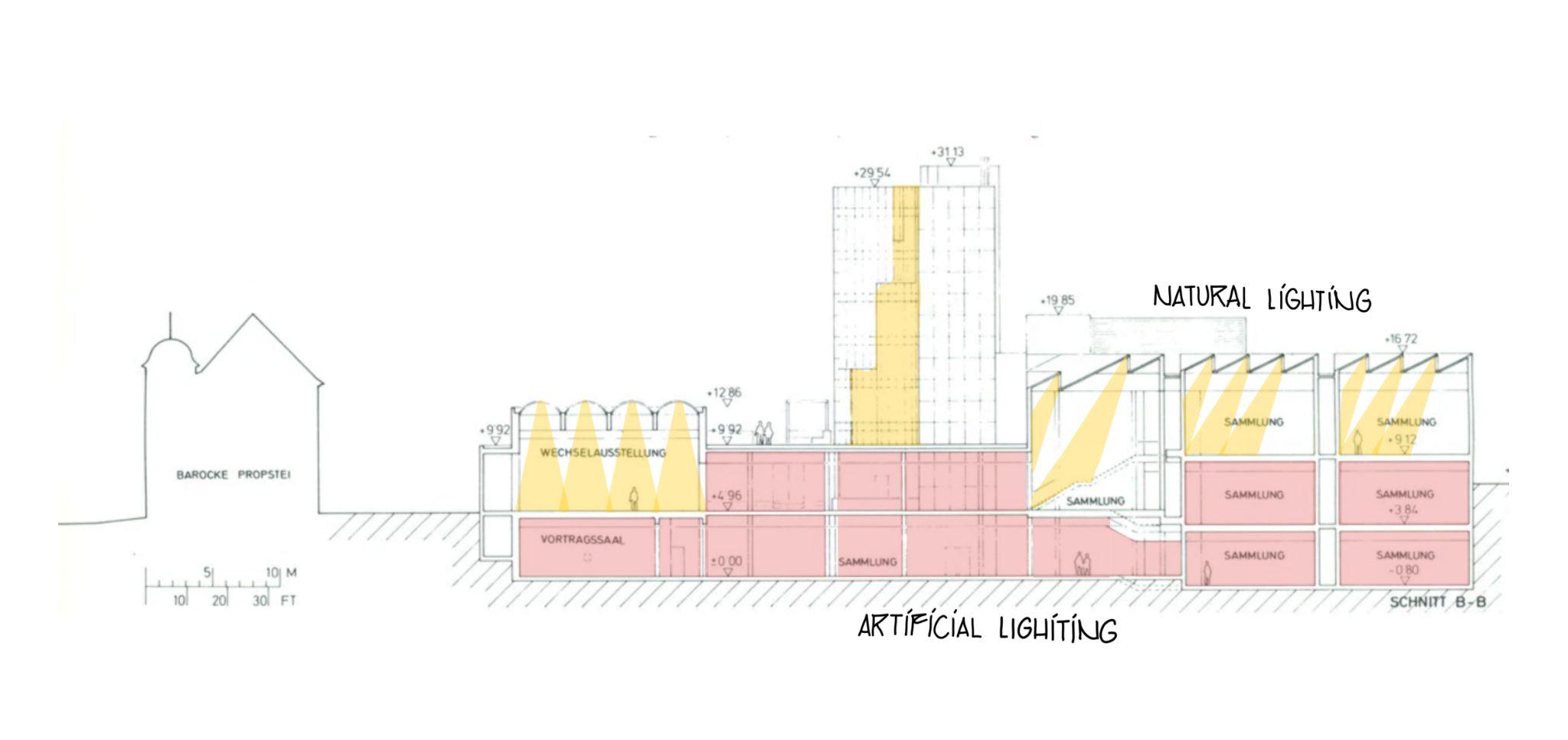
● The spaces also have neon lights as the artificial source of light.
107
ArchitecturalAnalysis
CIRCULATION
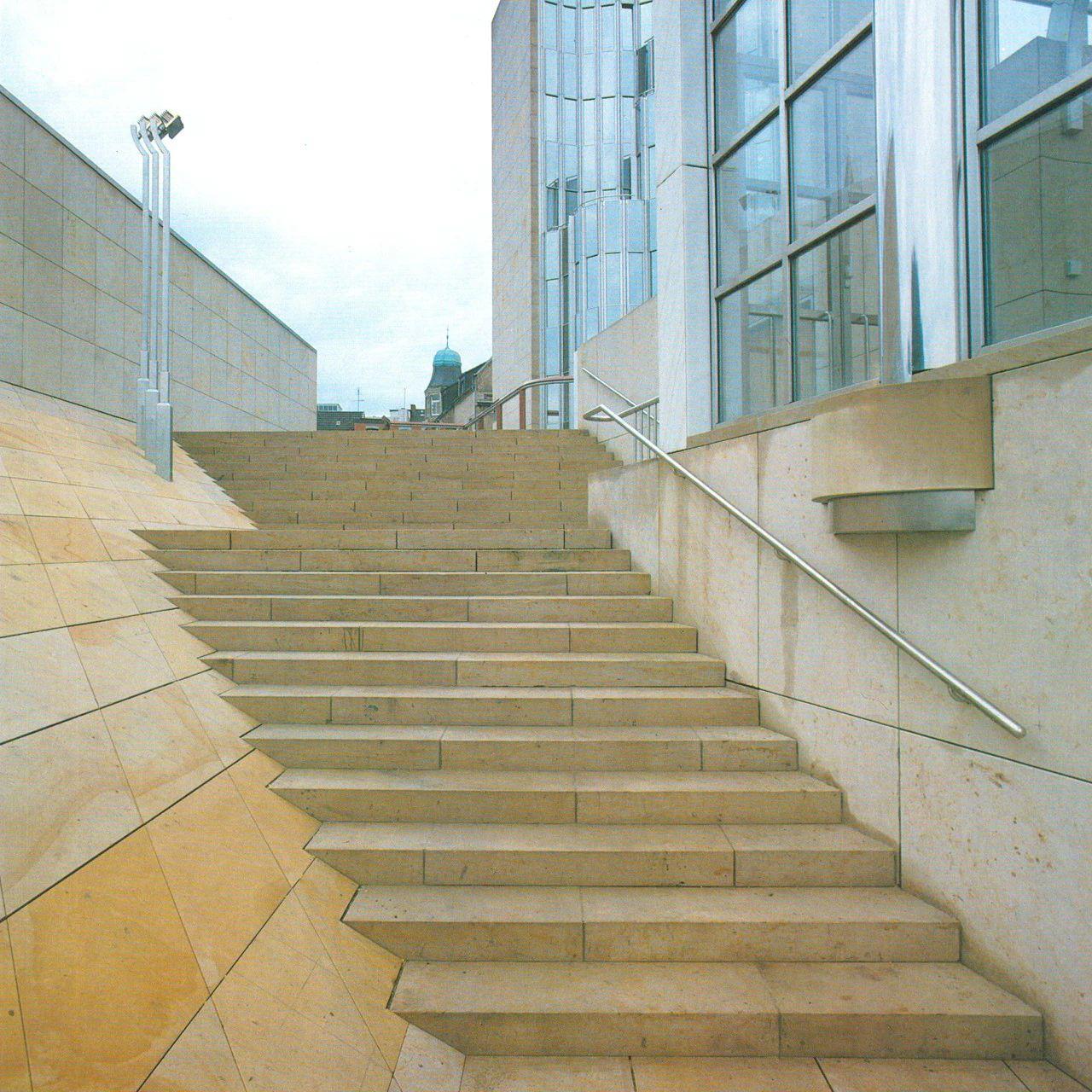
● The fragmented spaces become dynamic by interrupting stairs at such opportune moments that make the visitors to stop and look around at every turn and landing.

● Organic plans
108
ArchitecturalAnalysis
MATERIAL
● In essence four materials were used for the facades: the closed tower facade and the temporary exhibition zone are clad in light-coloured sandstone, the exhibition spaces including the shed roofs, are clad in titanium zinc sheeting, all glazed facades are framed in aluminium , and the “entrance” pavilion on the Flagstones Level is clad in white marble.
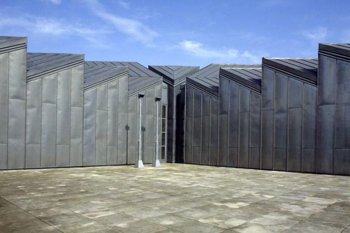
● The use of marble denotes the sacral architecture in the modelcity
Sandstone cladding
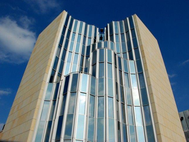
Aluminium framework
Glass
White marble
Source-https://tourism.restexpert.com/germany/place/abteiberg-museum/
Titanium zinc sheeting
Source-https://www.baukunst-nrw.de/en/projects/Museum-Abteiberg--278.htm
Sourcehttp://hollein.com/eng/Architecture/Typology/museums-cultural-buildings/Staedtische s-Museum-Abteiberg
109
ElementsofPostmodernism
A. HISTORICAL/CONTEXTUAL REFERENCES
● Post modernism condemned the ignorance of History and advocated architecture as a contextualresponse.
● The design of the Abteiberg museum is highly informed by the history and context of Monchengladbach, which was a traditional textile town until the 1960s, covered with weaving mills, thus the sawtooth shaped roof of the museum space, inspired from those along with functionalvalue.
110
ElementsofPostmodernism
B. FRAGMENTATION
● Postmodern architects were known for creating fragmented buildings that, while still connected as one building, took on the appearance of severaldifferent buildings that served various functions.
● The main museum space is separated from the administrative tower and the exhibition space/exhibit wall is an altogether different structure.
C.ASYMMETRY
● Asymmetry was a pillar of the postmodern movement because of its ability to capture attention and create unique buildings that stood out.
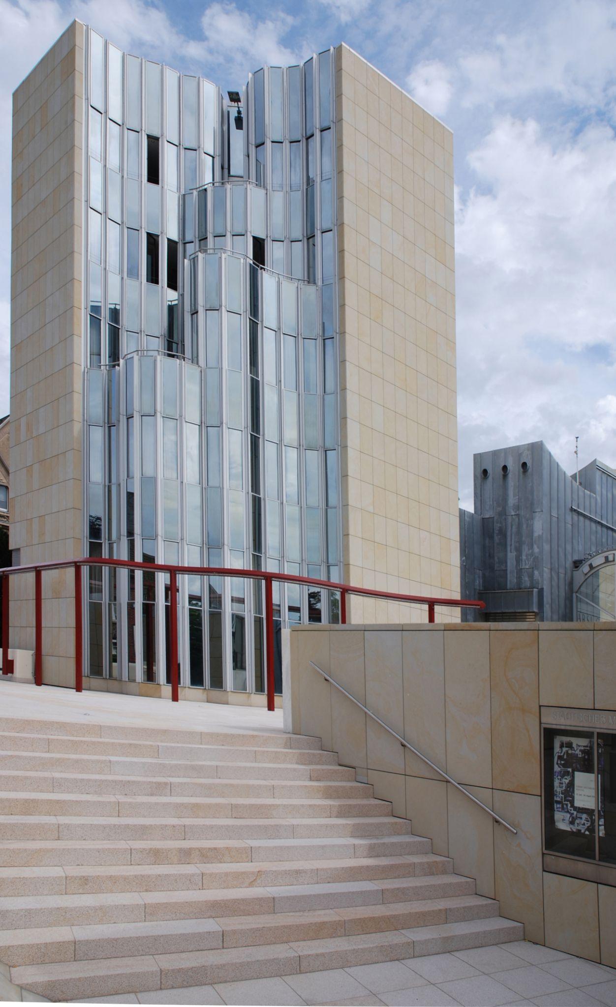
● The fragmented buildings are asymmetric, the administrative tower though at first may seem symmetric, but the glass facade is designed to break that symmetry too and stands as an element in focus celebrating the beauty of asymmetry.
Source-https://www.domusweb.it/en/from-the-archive/2014/04/28/in_ma_nchengladbachthehansholleinsmuseum.html
111
ElementsofPostmodernism
D. COLOUR
● Colour is an important element in many postmodern buildings; to give the façades variety and personality, coloured glass is sometimes used, or ceramic tiles, or stone.
● Collein involves the usage of varied materials such as light colored Sandstone on the admin tower, titanium zinc sheets for the museum and white marble for the entry/observation tower.The red railingalso becomes a point of contrasting highlight while moving in the complex.
E. COMPLEXITY
● Complexity can be used to describe all postmodern works, as the integration of a variety of colors, textures, shapes, and themes construct the framework of these unique buildings.
● The use of different materials with varied appearances and textures and different forms including sharp edges of the roof, smooth curves of the glass facade, completely enclosed museum space while relatively punctured observation tower imbibe complexity.
Source-https://www.domusweb.it/en/from-the-archive/2014/04/28/in_ma_nchengladbachthehansholleinsmuseum.html
112
ElementsofPostmodernism
F. DOUBLE CODING
● Double coding in postmodernism is the same time.
● The interior, however variable, is calm, cool and elegant feel, mood, materials and white walled/grey-floor colour scheme, where as its exterior silhouettes, massing and extensive use of metal, glass brick and concrete are jagged, irregular and industrial splitting of the external and internal personalities of the art museums and galleries is typicalof postmodernism architecture Source-
113
https://www.domusweb.it/en/from-the-archive/2014/04/28/in_ma_nchengladbachthehansholleinsmuseum.html
Critiques
Postmodernism in Germany:
● It was accepted much later in Germany than other countries.
● It started being associated with the arrogant elites
TheAbteiberg Museum:
● Wouter Davidts in his book Triple Bond: Essays on Art, Architecture, and Museums, the architecture of the museum is defined to be “cocky”.
● Reesa Greenberg, the downtown aesthetic of the building masks the split between the seemingly open democratic character of the spaces and the private nature of the endeavour.
● Wolfgang Pehnt said that the structure lacked a binding formula and an overriding principle that united the structure.
Thinking about Exhibitions
ByReesa Greenberg
Triple Bond: Essays on Art, Architecture and Museums
 By Wouter Davidts
https://www.academia.edu/35398306/Triple_Bond_Essays_on_Art_Architecture_and_Museums 114
Source-
● Cladders and Holei acknowledged the interdependency of art, architecture in the museum.
● He created an architectural structure where interior arrangement and external appearance reveal an abundance of ideas, diversity and surprises
● The integration of the traditional and new hi-tech architecture along with the aesthetics of sustainability and postmodernism moment in the design formed the connection between art and architecture,
Source-https://www.dbz.de/artikel/dbz_Hans_Hollein._Alles_ist_Architektur_oder_LEhttp_www.hollein.com_www_1982293.html
Conclusion
115
● https://journals.openedition.org/marges/2570
● https://www.jstor.org/stable/24660698
● https://www.jstor.org/stable/24664228
● https://www.proquest.com/openview/df24d315d49a12f2f32a98a7d09717e8/1? pq-origsite=gscholar&cbl=2026363
● https://en.wikipedia.org/wiki/Basilica_of_St._Vitus,_M%C3%B6nchengladbach
● https://www.jstor.org/stable/43687073?read-now=1&refreqid=excelsior%3A09b 2b89c5b009f36fbbd438fbe2f90ab&seq=12#page_scan_tab_content
● https://www.jstor.org/stable/24665307?read-now=1&refreqid=excelsior%3Ab35 a4156261bf741f080a6fa6d49e603&seq=7#page_scan_tab_contents
● https://books.google.co.in/books?id=Vv-HAgAAQBAJ&pg=PA254&lpg=PA254& dq=The+new+museum+at+M%C3%B6nchengladbach&source=bl&ots=tj_03dfE-q &sig=ACfU3U19rm3ubIDue2dXw41jv1wlAesmng&hl=en&sa=X&ved=2ahUKEwjYq c_SltrxAhU54XMBHcefCfQQ6AEwEnoECCcQAw#v=onepage&q=The%20new%20 museum%20at%20M%C3%B6nchengladbach&f=false
● https://caruso.arch.ethz.ch/archive/references/type/16
● https://issuu.com/birkhauser.ch/docs/the_drama_of_space
● https://mapio.net/pic/p-40782231/
Bibliography
116
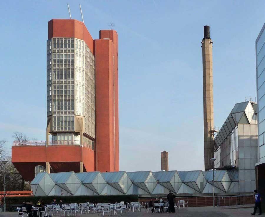
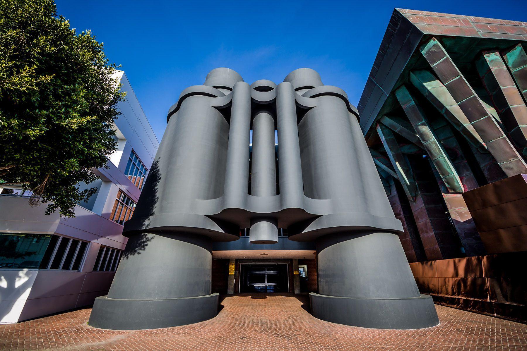
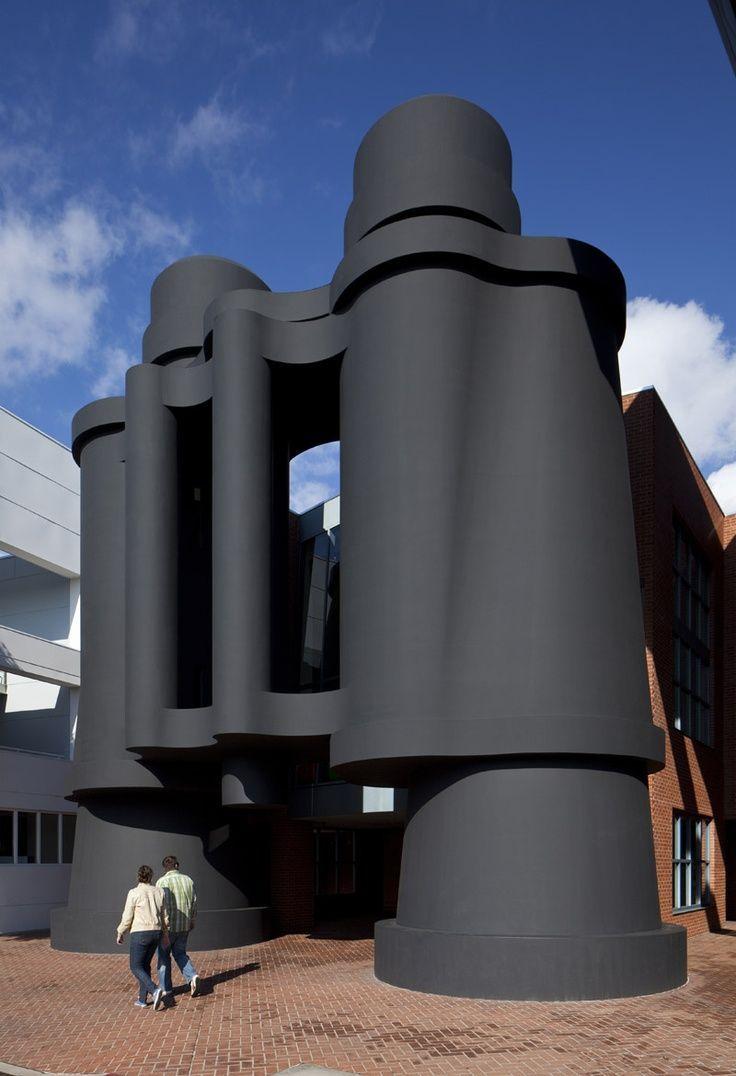
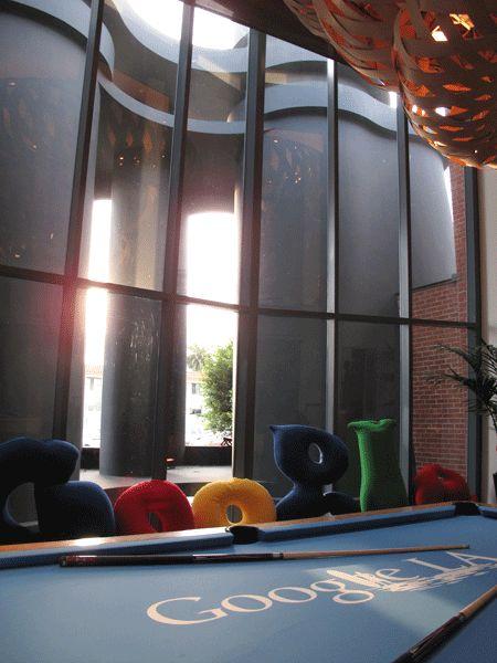
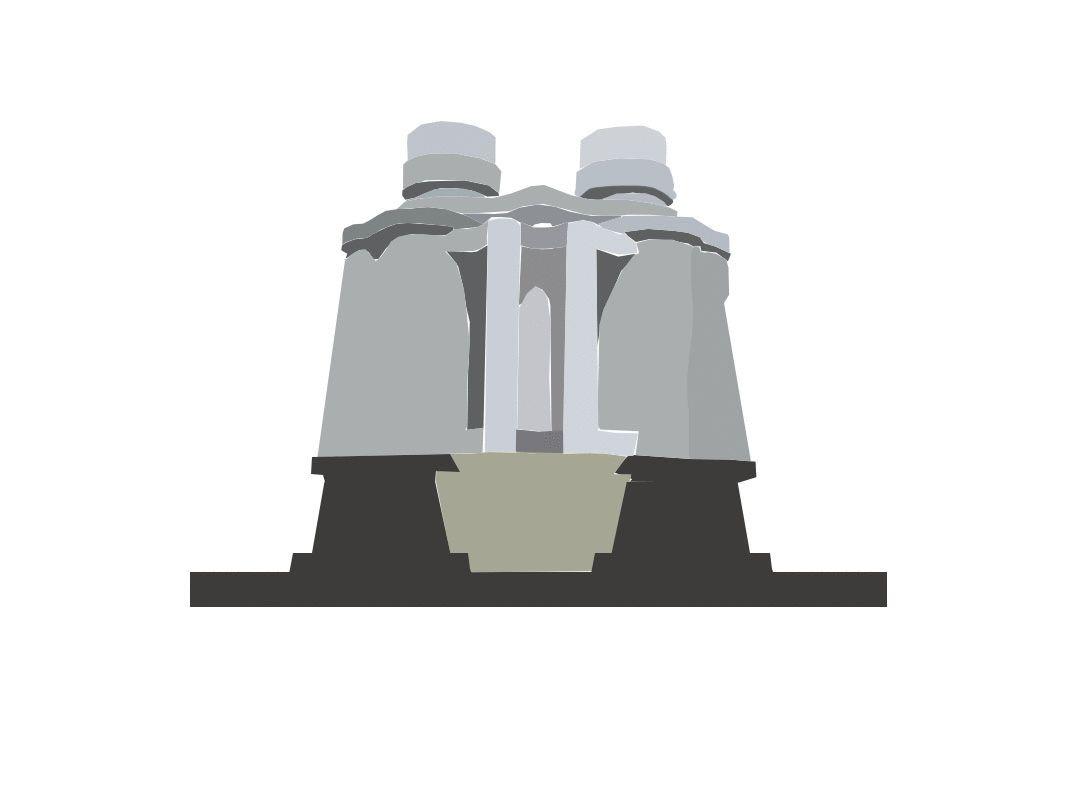
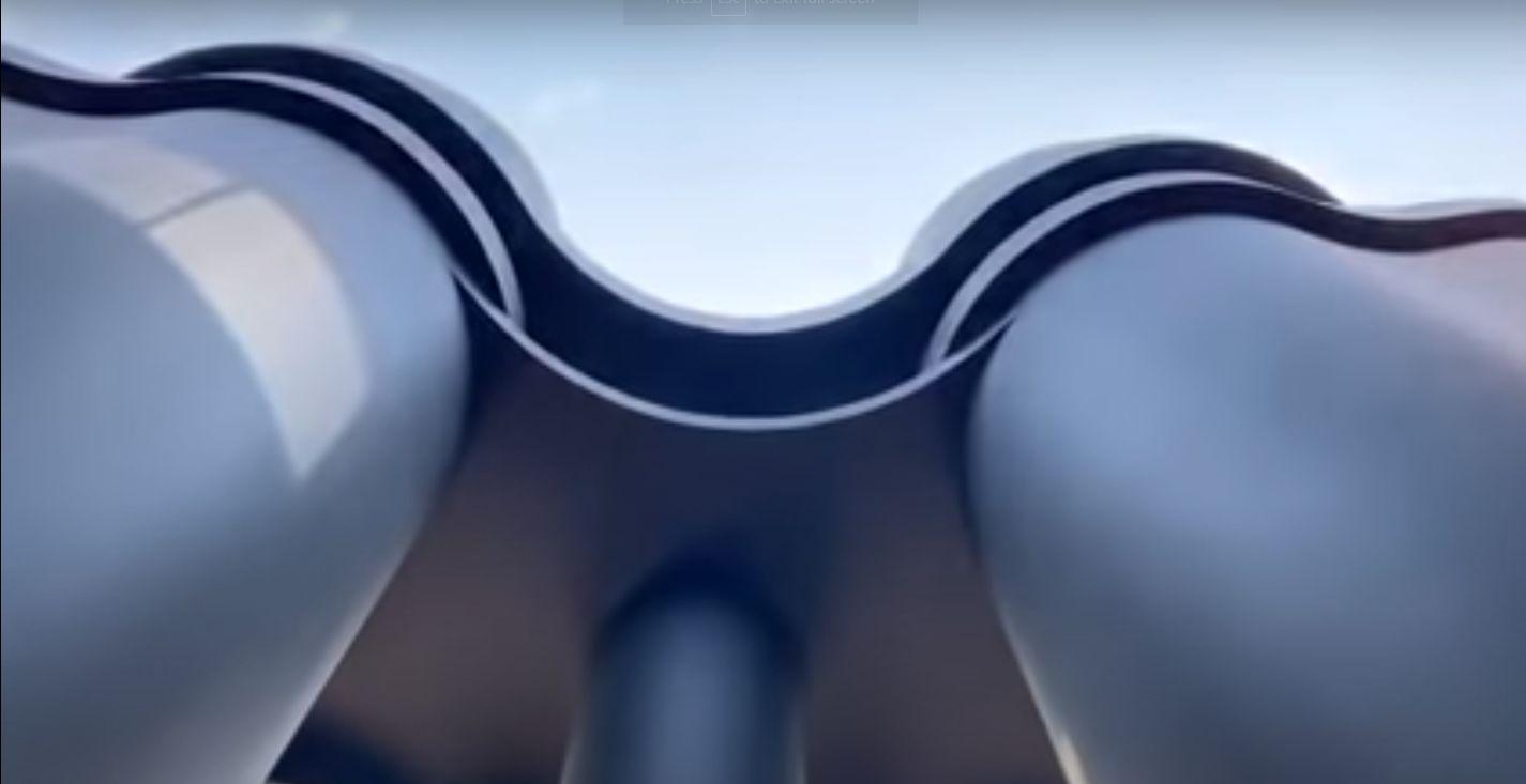
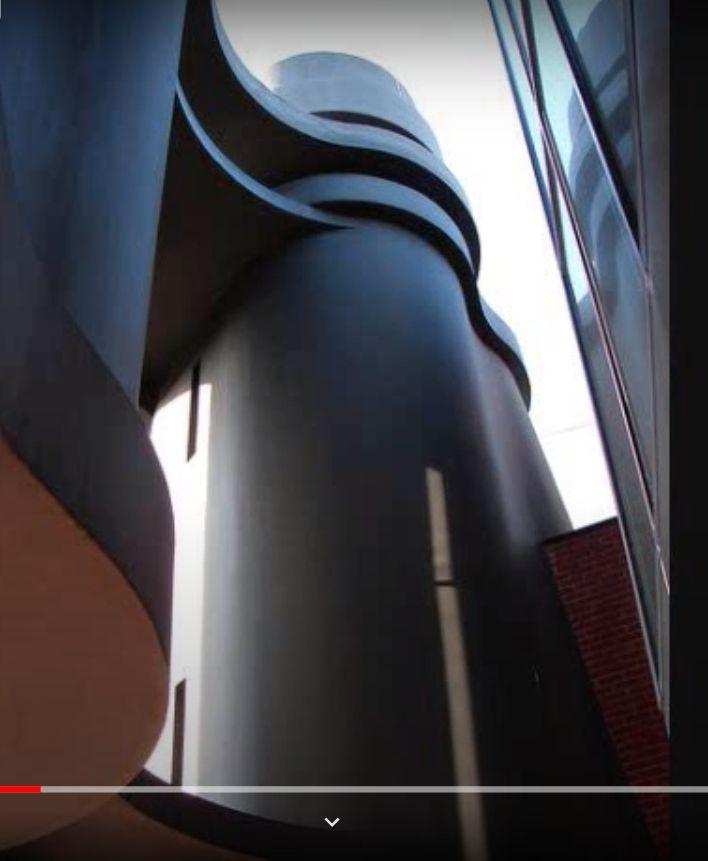
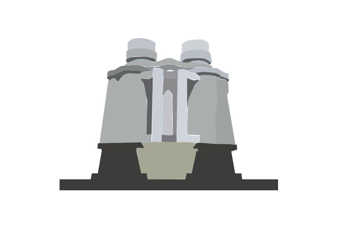
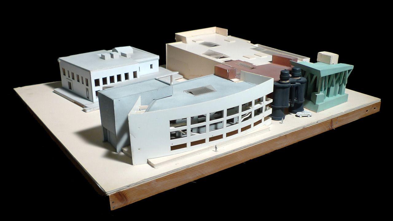
BinocularsBuilding
Frank Gehry/Gehry Partners 1991
Venice, Los Angeles, California
● Clients:AdvertisersJay Chiat (1931-2002) and Guy Day (1930-2010)
● Location: 340 Main Street,Venice, CA90291
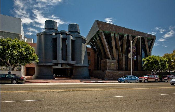
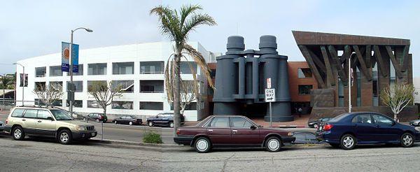
● Constructed: 1991
●
● Binocular Dimensions: 45 x 44 x 18 feet (13.7 x 13.4 x 5.5 meters)
Introduction
Artists &Architects: Claes Oldenburg, Coosjevan Bruggen, and Frank Gehry
Source - https://i.pinimg.com/originals/e1/ed/a2/e1eda229f0ba6989f3c7a26bb2040687.jpg
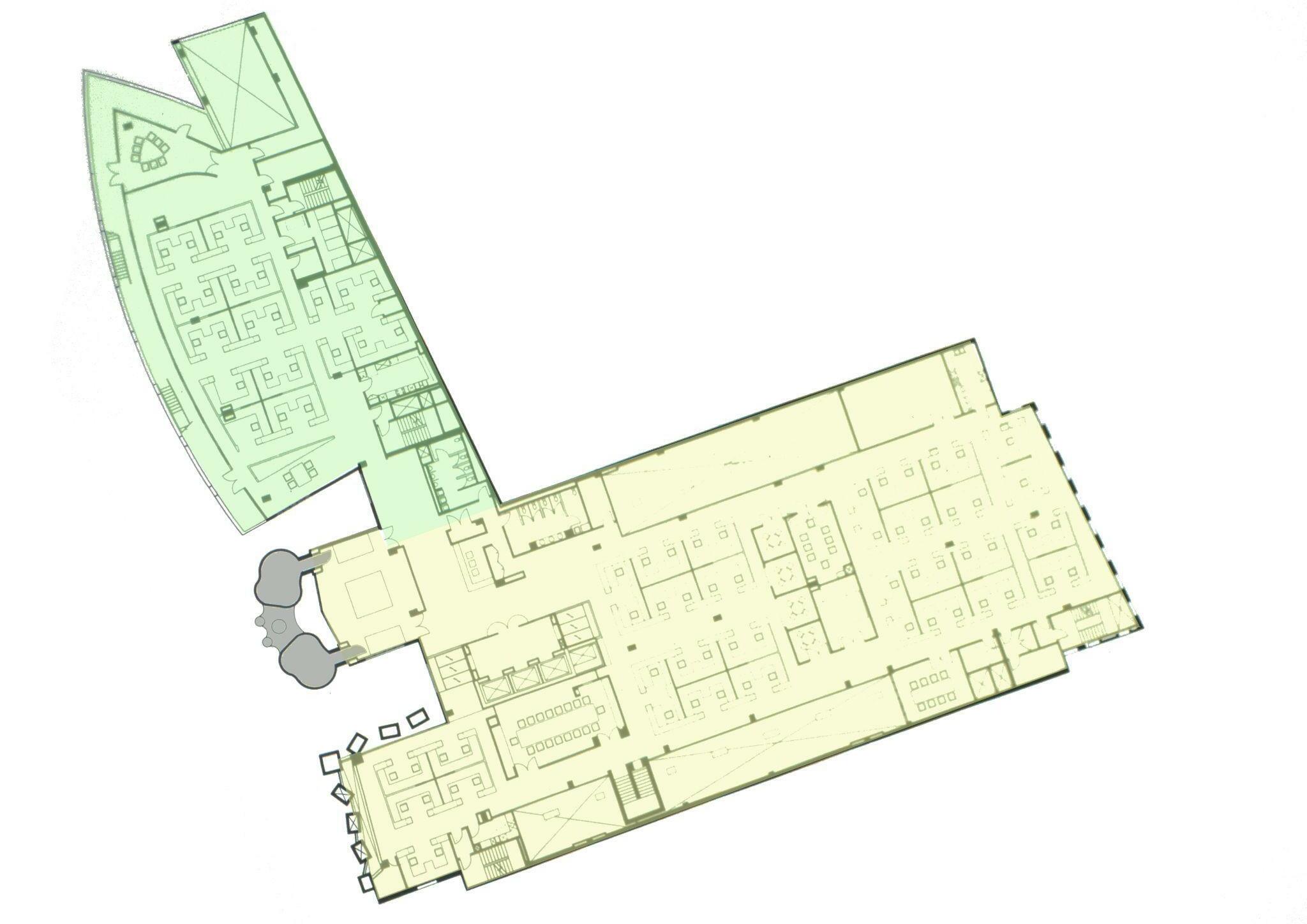
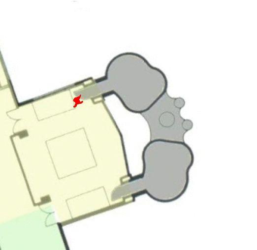
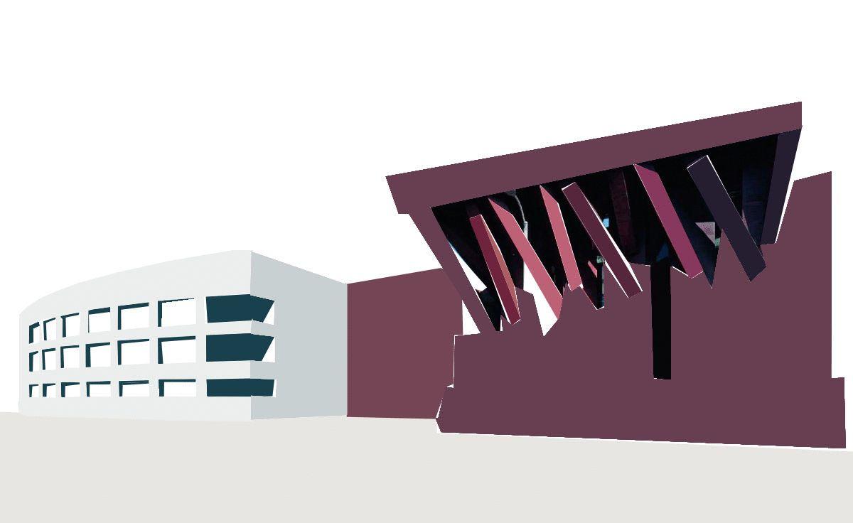
BinocularBuilding
ENTRY
● Office Space foradvertising company.
● 2 Fragments to the building complex- Tree shaped (Elevation) and Ship shaped Building (Plan)
● Giant Binoculars formed the connection between the 2 Fragments.
Ship Shaped Building
Tree Shaped Building
Source-https://dome.mit.edu/bitstream/handle/1721.3/131000/168009_sv.jpg?sequence=2
A A
ArchitecturalAnalysis
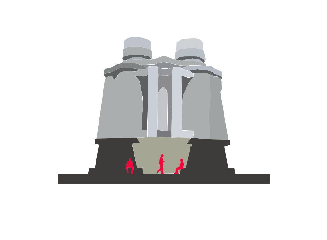
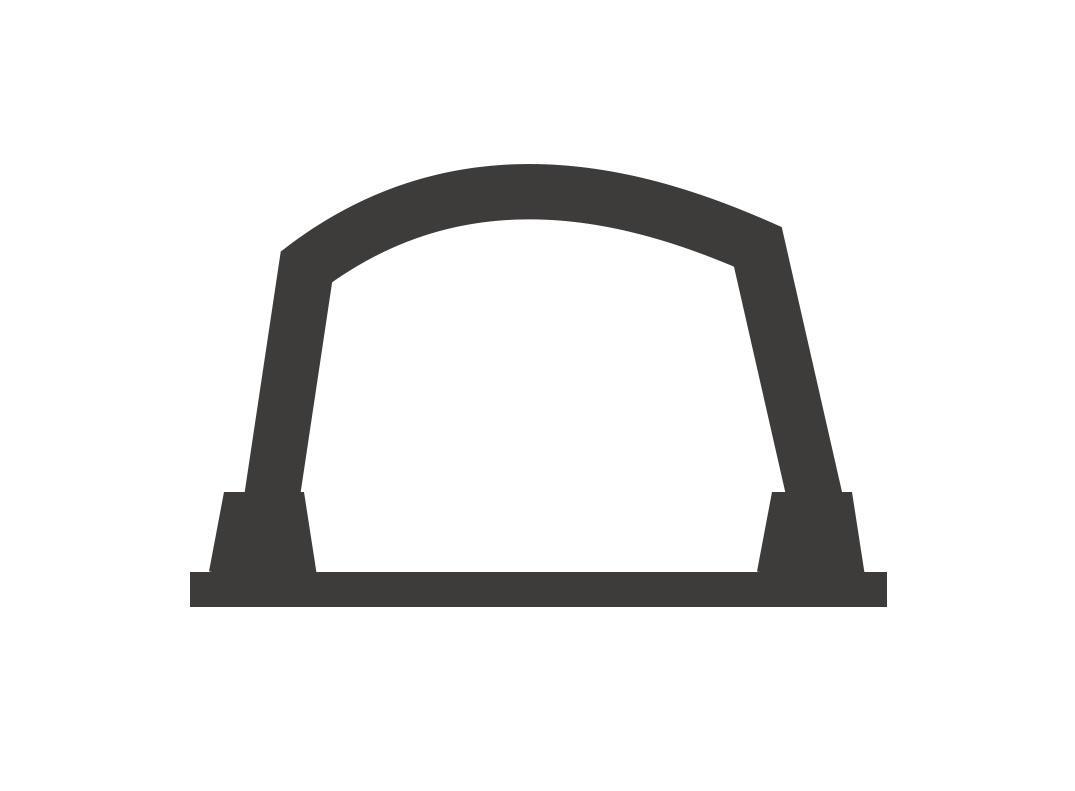

Gateway
● The building acts as an entrance gate to the ad agency’s main building.
● Acts as a Seating Space
● By using the arch of the binoculars as an entryway, this postmodern structure strikes a balance between ornamentation and function.
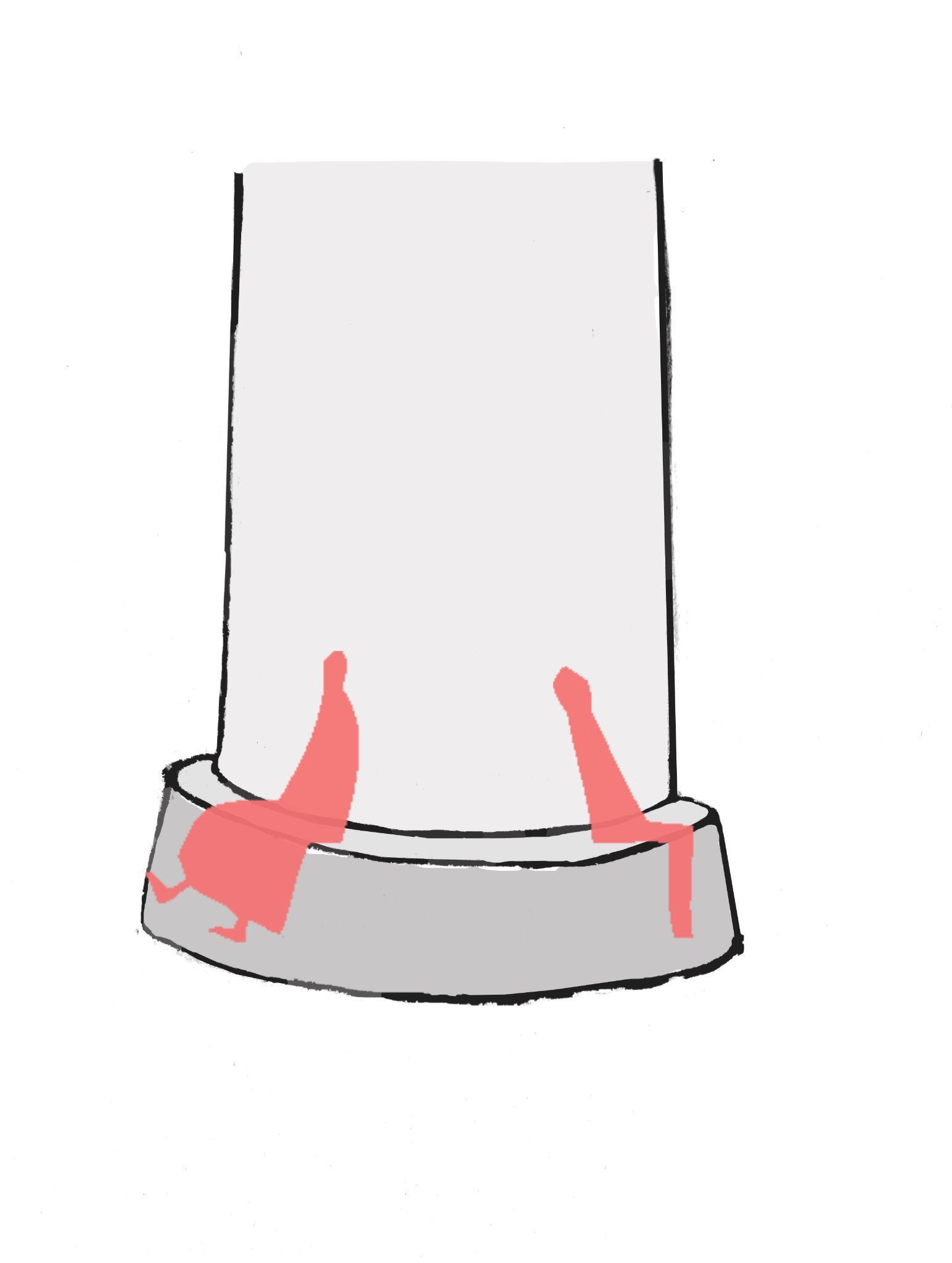
ArchitecturalAnalysis
Scale
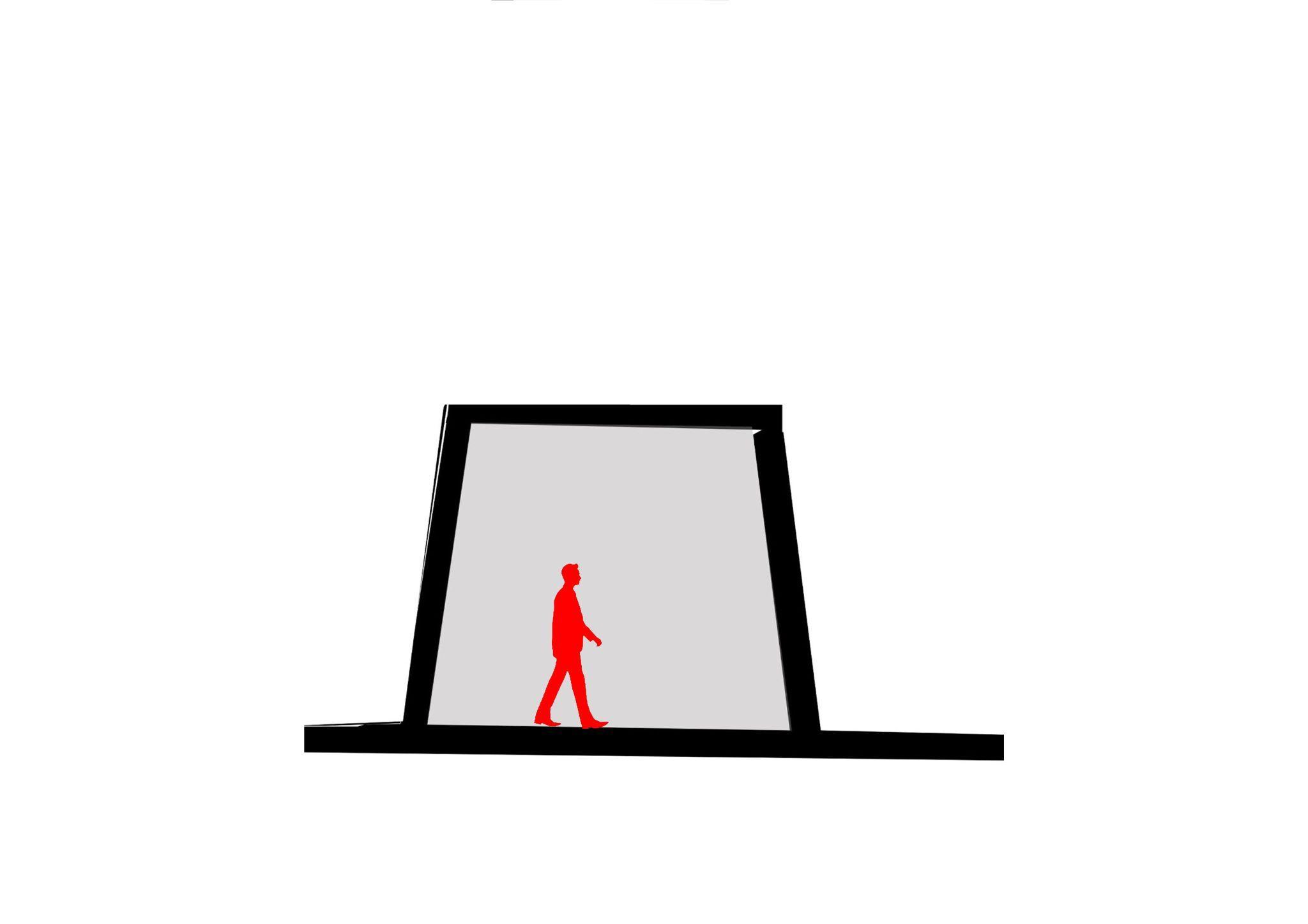
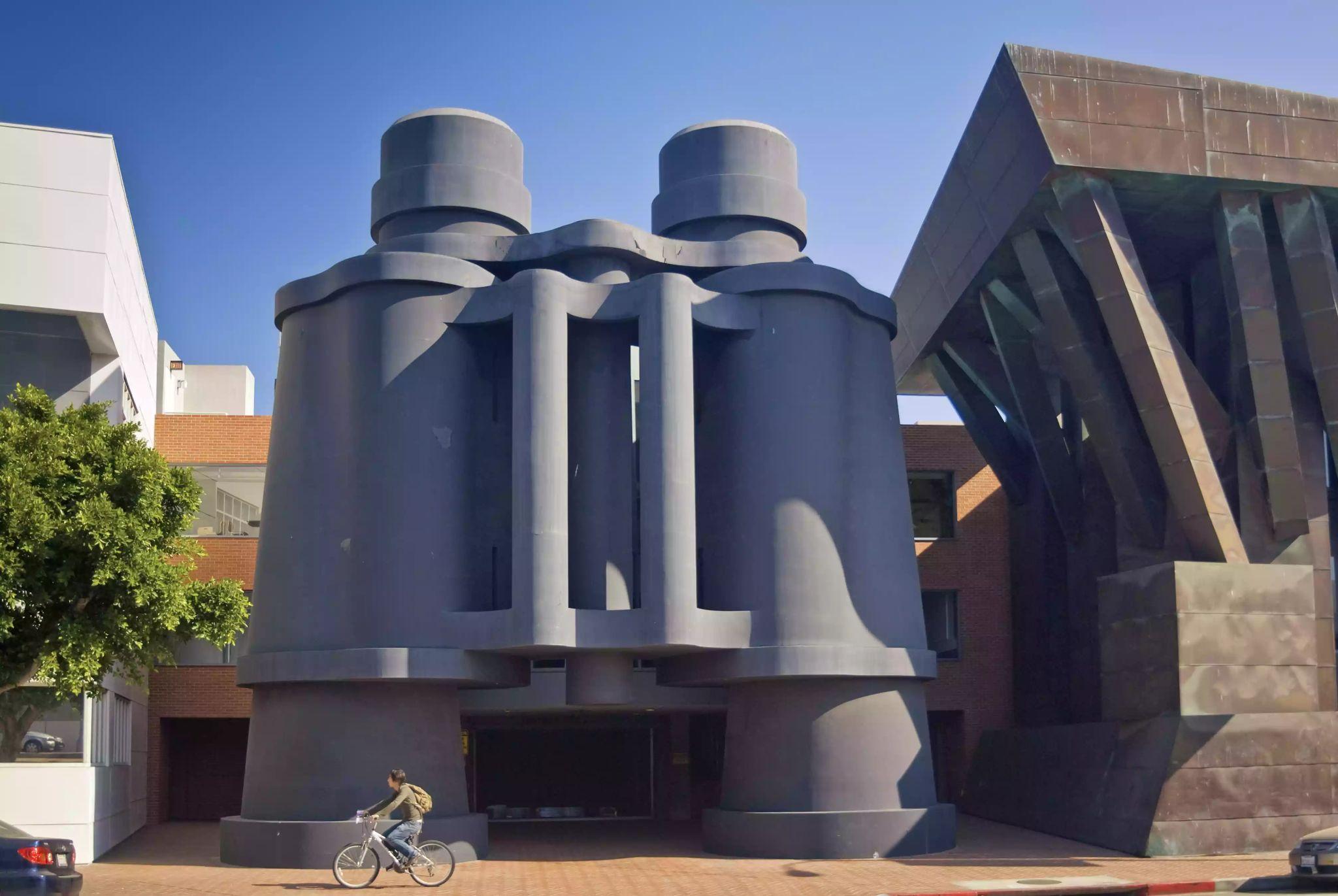
Visually (as a sculpture) the scale is large but functionally (as an entrance) the scale is small.
ArchitecturalAnalysis
Source-https://www.youtube.com/watch?v=7oWpE2w7mdg
between interior and exterior
Contrast Contrasting experience
ArchitecturalAnalysis
● Separation offunctionalelements into discrete structures.
● Arrangement ofthe buildings.
● Breaking the Facade to break scale.
ElementsofPostmodernism
Reference

Form was inspired from Claes Oldenburg, Coosje van Bruggen’s design model for a museum and theatre building.
●
●
Postmodernism
Attention grabbing
Elementsof
●
Unique form- Binoculars
Element ofSurprise
Colour Source-Author
●
ElementsofPostmodernism
Facade ornamentation
Binoculars forms the unusual facade of the structure grabbing attention and providing a starting point to the movement
ElementsofPostmodernism
Playfulness
An ordinary square building fails to create interaction due to its solid and orthogonalarrangement.
ElementsofPostmodernism
Playfulness
Here the curvilinear character of the facade is more interactive, its weight and bulkiness is reduced due to the soft edges which is exactly followed by the architect.
ElementsofPostmodernism
Playfulness
The facade itself forms a playfulfeature
Using symbolic elements to increase playfulness of the structure
ElementsofPostmodernism
● Paradox - Contradict
● Communicating meaning with ambiguity

Ship building

Critiques ● Successfulexample ofa postmodern elements ● AnAfterthought ● Facade: Sculptural> functional ● Curves add morevisualinterest Source-https://in.pinterest.com/pin/850124867142440248/
● Frank Gehry makes a statement with the binoculars catching peoples eye using the art .
“
An architect is given a program, budget, place, and schedule. Sometimes the end product rises to art - or at least people call it that. `
● Frank Gehry has used what Venturi advocates- to abandon the rigid views of architecture and instead use architecture as a symbolism.
I would like to make a building as intellectually driven as it is sculptural.
“
-Frank Gehry
Conclusion
Source-https://www.inspiringquotes.us/author/8647-frank-gehry
REFERENCES
● https://sah-archipedia.org/buildings/CA-01-037-0014
● https://www.youtube.com/watch?v=izwFhetQVT8
● https://www.youtube.com/watch?v=7oWpE2w7mdg
● https://www.youtube.com/watch?v=7oWpE2w7mdg&t=25s
● https://www.ukessays.com/essays/architecture/influences-on-frank-gehry-in-t he-construction-of-the-chiat-building.php
● https://in.pinterest.com/pin/850124867142440248/
● http://oldenburgvanbruggen.com/largescaleprojects/binoculars.htm
● https://www.archdaily.com/426402/behind-the-mind-of-frank-gehry-an-intervi ew-with-edwin-chan
● https://unframed.lacma.org/2015/09/10/frank-gehry-overview#:~:text=In%20th e%20early%201980s%2C%20Gehry,functional%20elements%20into%20discrete%20 structures
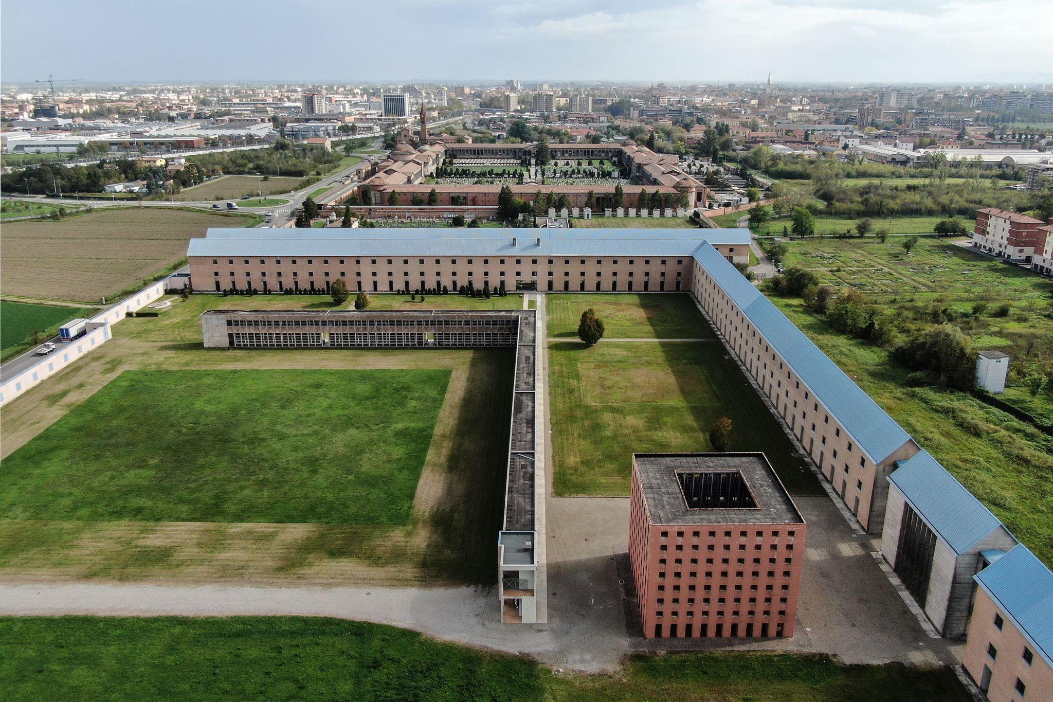
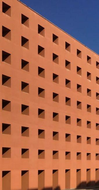
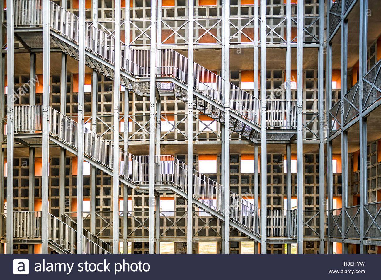
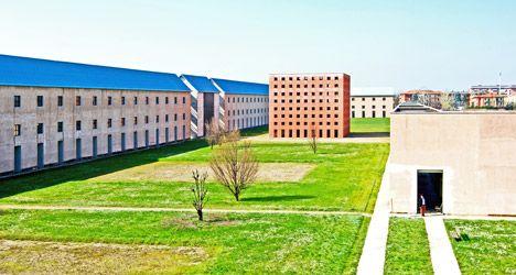
Sancataldocemetery Aldo Rossi 1971 Modena,Province of Modena,Italy
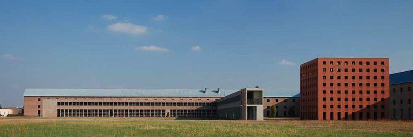
Year:
Typology: Cemetery
Style-Neo rationalism
--https://www.dezeen.com/2015/07/30/san-cataldo-cemetery-modena-italy-aldo-rossi-postmodernism/ Introduction
● Architect : Aldo Rossi ●
1971 ● Location: Modena, Province of Modena, Italy ●
●
Source
ArchitecturalAnalysis
Increase in height as length decreases
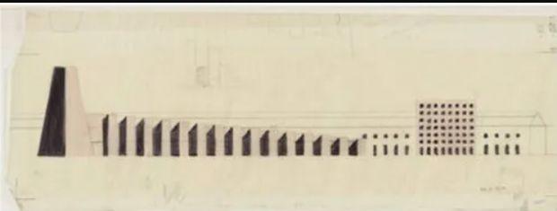
● Divided into three main elements
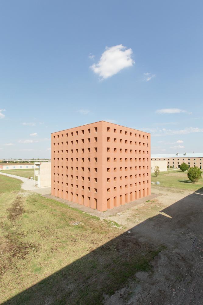
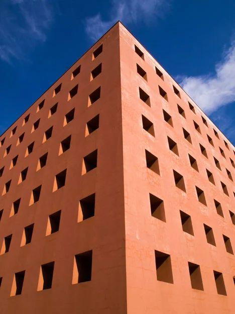
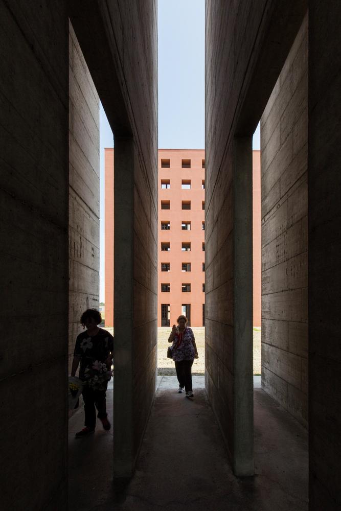
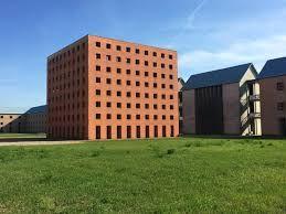
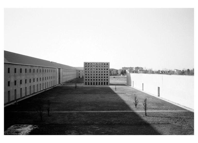
● The red cube ossuary also called as the house of dead
● The stepped triangle repositories
● The truncated cone representing surrounding industrial context Sourcehttps://www.archinomy.com/case-studies/aldo-rossi/
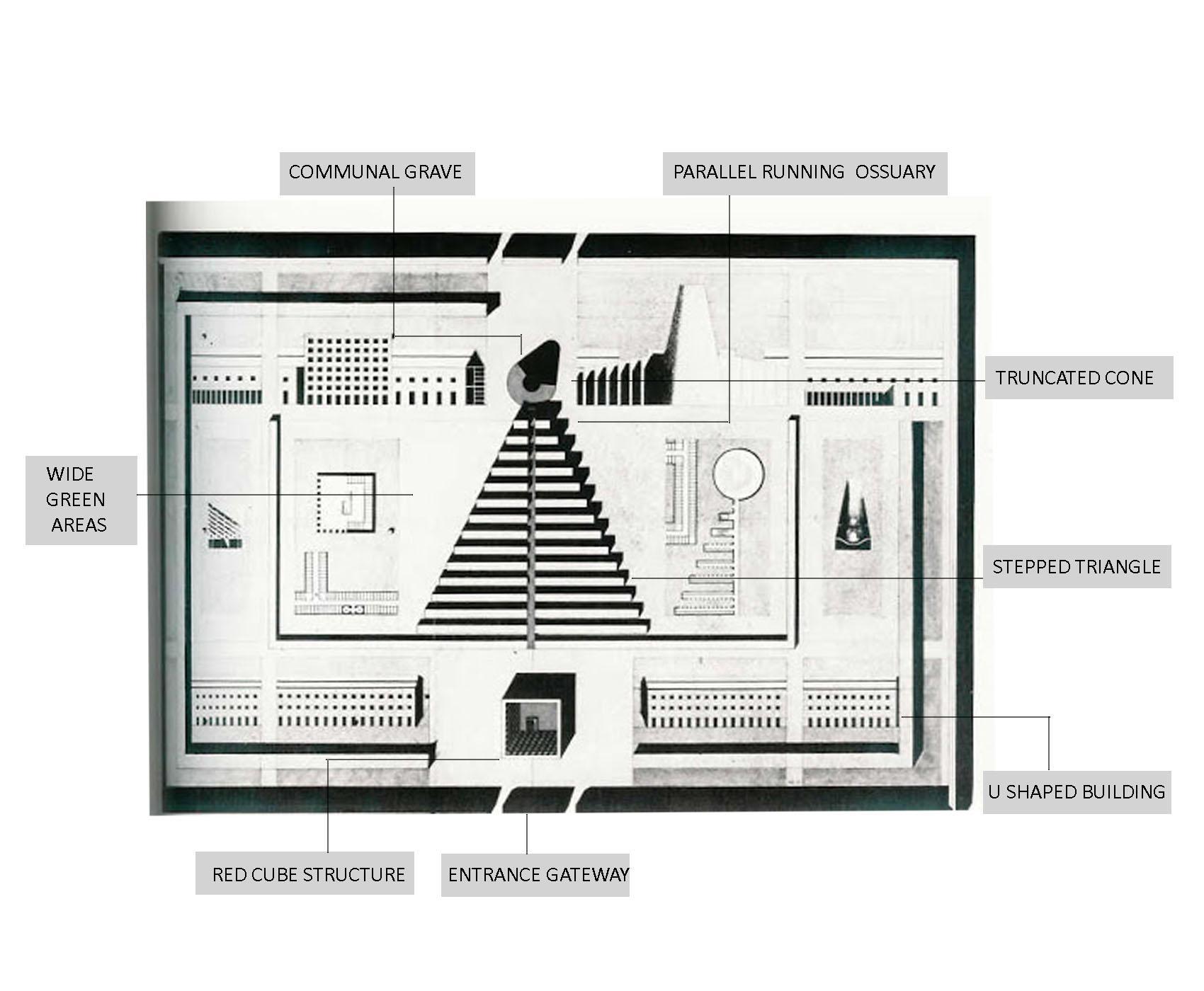
Stepped triangle
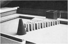
Truncated cone Head Central vertebral axis Depict human skeleton Shoulders And arms
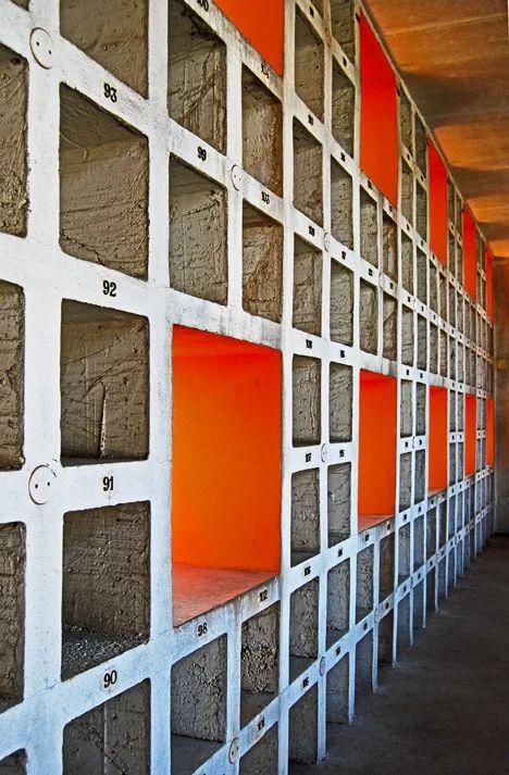
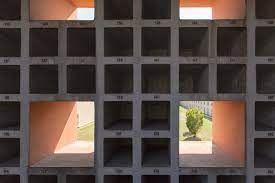
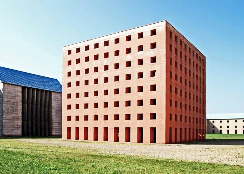
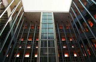
Source-https://archeyes.com/san-cataldo-cemetery-aldo-rossi/ Cubeform(Houseofdead) ● ‘House of dead’ ● Porous facade ● Open doors ● Windows without shutter ● Roofless walls ● Feeling of incompleteness courtyard Windows ArchitecturalAnalysis
ArchitecturalAnalysis
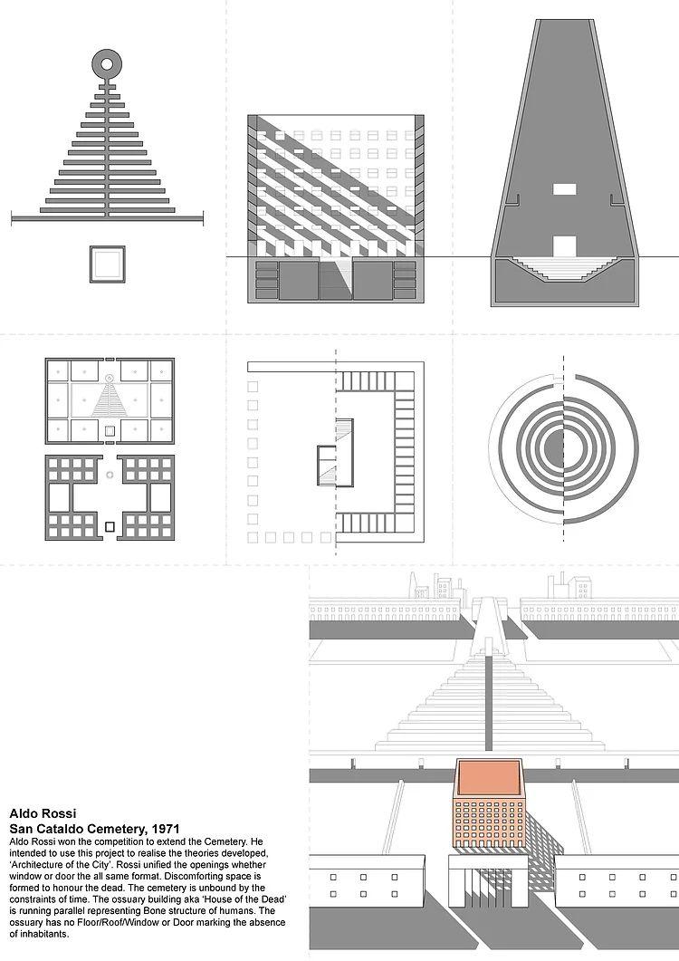
The truncated cone
Stepped triangle
Source-https://www.dezeen.com/2015/07/30/san-cataldo-cemetery-modena-italy-aldo-rossi-postmodernism/
shaped
spaces
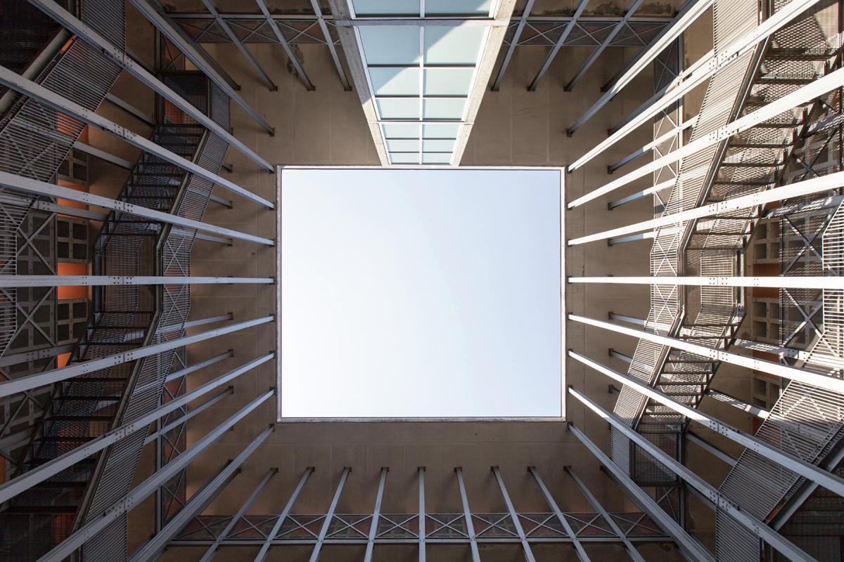
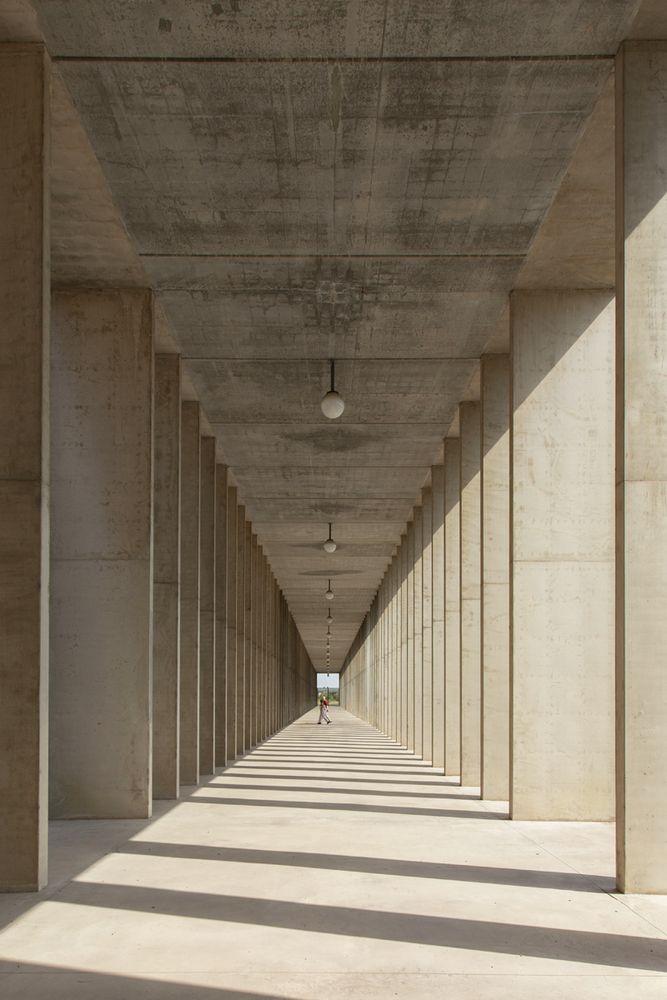
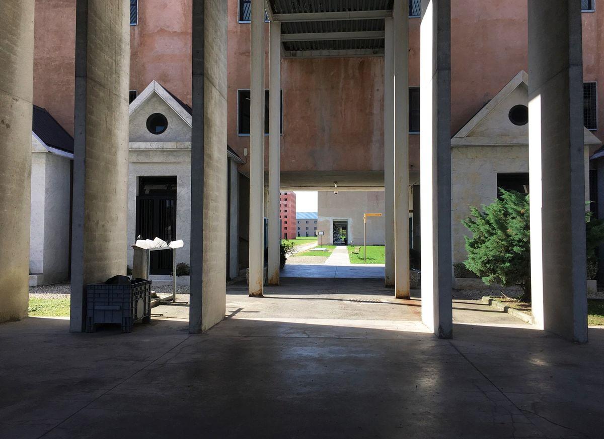
The U - shaped buildings recalling barracks
Connections between old and new cemetery
Unwelcoming entrance
Use of light and shadows to enhance the entire zoning
Unwelcoming entrance Use of light and shadows Source-https://www.dezeen.com/2015/07/30/san-cataldo-cemetery-modena-italy-aldo-rossi-postmodernism/
U
building with wide open
●
●
●
●
ArchitecturalAnalysis
-https://www.dezeen.com/2015/07/30/san-cataldo-cemetery-modena-italy-aldo-rossi-postmodernism/
Buildings
roofs .
Strong
Bold form
Historically
detailing
ElementsofPostmodernism Source
●
with steel blue
● Regimented openings ● Facade detail of ossuary cube. ●
colouring ●
●
referential
ElementsofPostModernism
A steelblue roofs:
● It seems like an industrialshade
● Breaks thevisuallanguage of skyline
B strong colouring
● Using muted blue and terracotta palette it emphasises postmodern approach
C facade detailof ossuary cube
● The orange facade of the ossuary is the centrepiece of the cemetery ground
● It creates a change in language and expression from outside to inside.
D Bold forms
● Creates contrastwith ancient cemeteries
Critiques
● Shadowand light magnifies the play on the bare concrete surfaces.

● Feeling of incompleteness was perceived more through his roughness in architecture.
● Isolated ,abandoned and empowering character of spaces in project suppresses one’s desire to speak while being in the cemetery.
● Simple forms and the use of colors highlight the structures
Source-https://www.adfwebmagazine.jp/en/architect/san-cataldo-cemetery-by-aldo-rossi/
Influences
● Was inspired by personal experiences as well as other artists and architects

● The temporal life emphasising newbeginning rather then sad end
● Reflects emotions and poetics
● The experience of death in the cemetery is concluded through the character of space, repetition and materials used with the combination of specific colours.
● Chilly uniformity of negative space is a visual reticence that is solemn but also eerie and discomforting.
● Distorted images of the buildings and scaffoldings which symbolises life and death
● Structures being temporalaswellas eternal
Source-https://www.dezeen.com/2015/07/30/san-cataldo-cemetery-modena-italy-aldo-rossi-postmodernism/ https://in.pinterest.com/pin/352758583294644355/
● Rossi’s language of architecture
● Emphasis on social importance of space
● Use of geometric shapes
● Simplicity of forms and facades
Source-https://www.dezeen.com/2015/07/30/san-cataldo-cemetery-modena-italy-aldo-rossi-postmodernism/ https://in.pinterest.com/pin/352758583294644355/
Conclusion
● https://www.dezeen.com/2015/07/30/san-cataldo-cemetery-modena-italyaldo-rossi-postmodernism/
● https://www.tastebologna.net/blog/modena-cemetery
● https://estatedocbox.com/Architects/72552990-Aldo-rossi-s-modena-ceme tery-a-metaphysical-labyrinth.
● https://www.itinari.com/san-cataldo-cemetery-in-modena-0rv0
● https://www.slideshare.net/dhairaybablani/works-of-aldo-rossi
● https://archeyes.com/san-cataldo-cemetery-aldo-rossi/
● https://www.archinomy.com/case-studies/aldo-rossi/
Bibliography
HumanaBuildingTower
Michael Graves and Associates 1985 USA
● Project Name : Humana Building
● Architect : Michael Graves
● Location : 500 West Main Street Louisville Kentucky United States
● Client : Humana Corporation
● BuildingType : Commercial building
● Establish. : 1985
● Award : 1987 AIA - National Award
● Area. : 525000
● Totalfloor. : 26
● Construction period - 1960 to 1970 .
● This building is link between modernism & Postmodernism.
● Cubist-inspired elementswere used by Michael Graves.
● Graves expressed his classism through postmodernism in this building.
Source -https://worldarchitecture.org/architecture-projects/pzc/the-humana-building-project-pages.html
Introduction
Image 1- XYZ
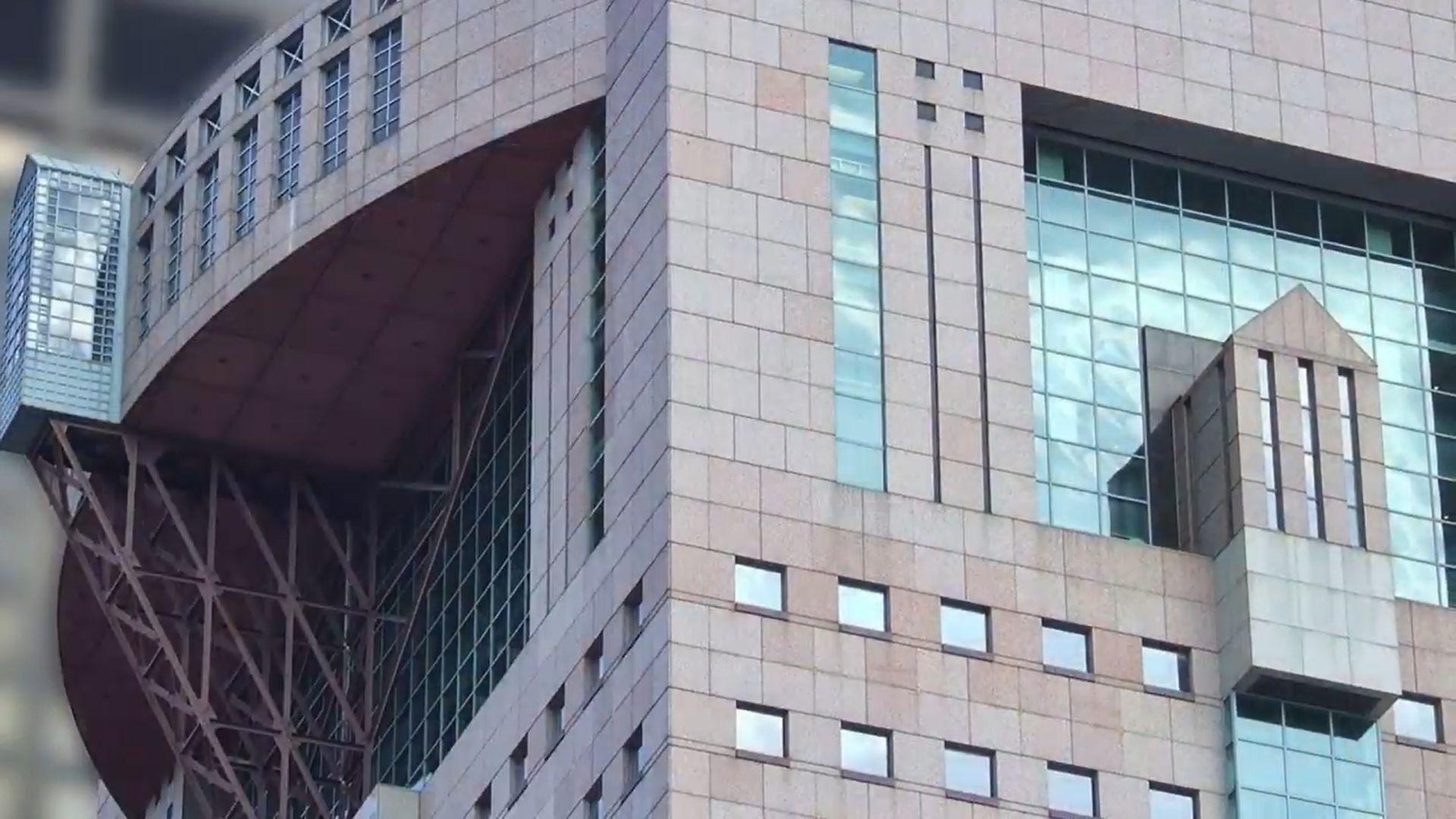
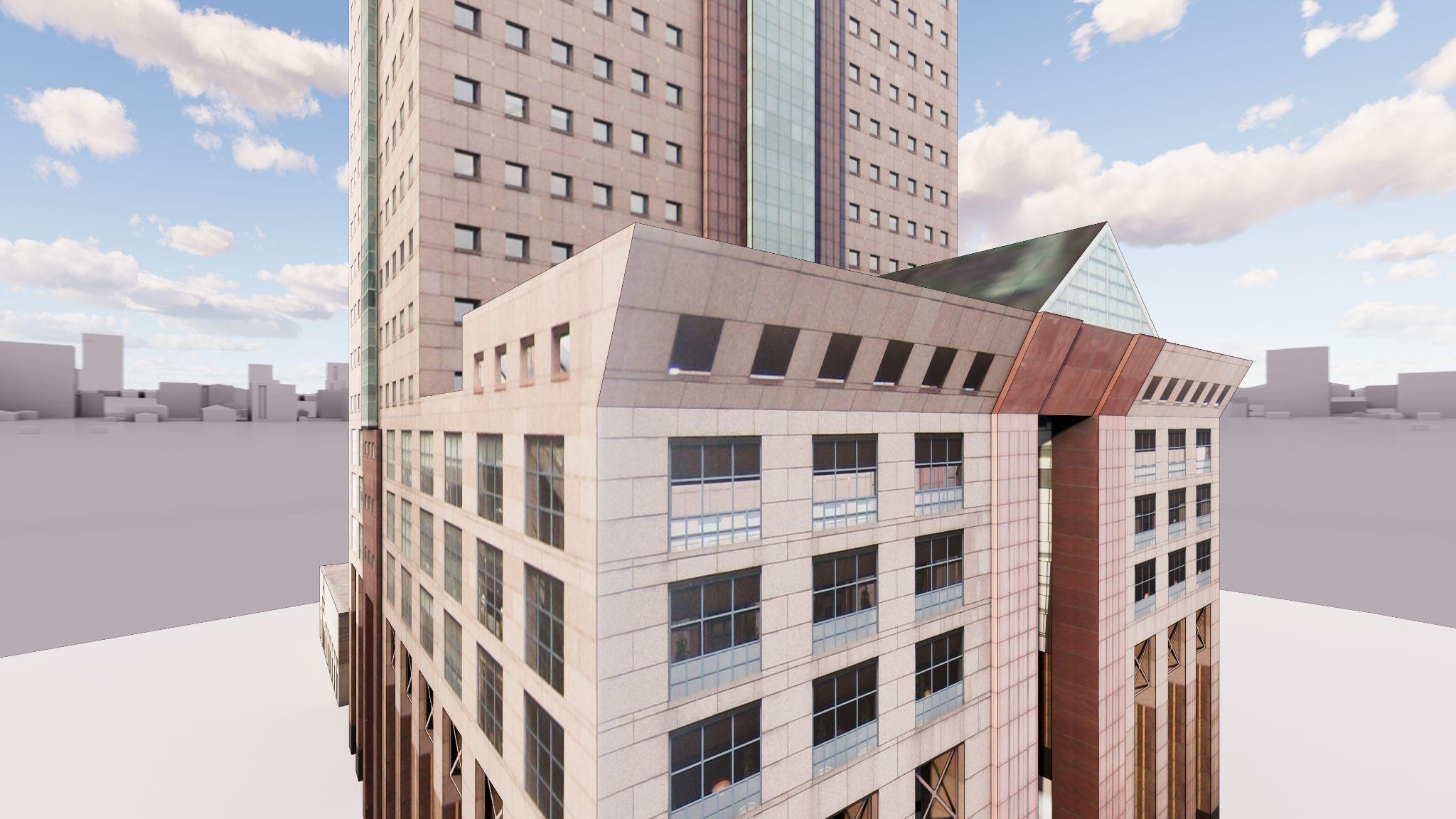
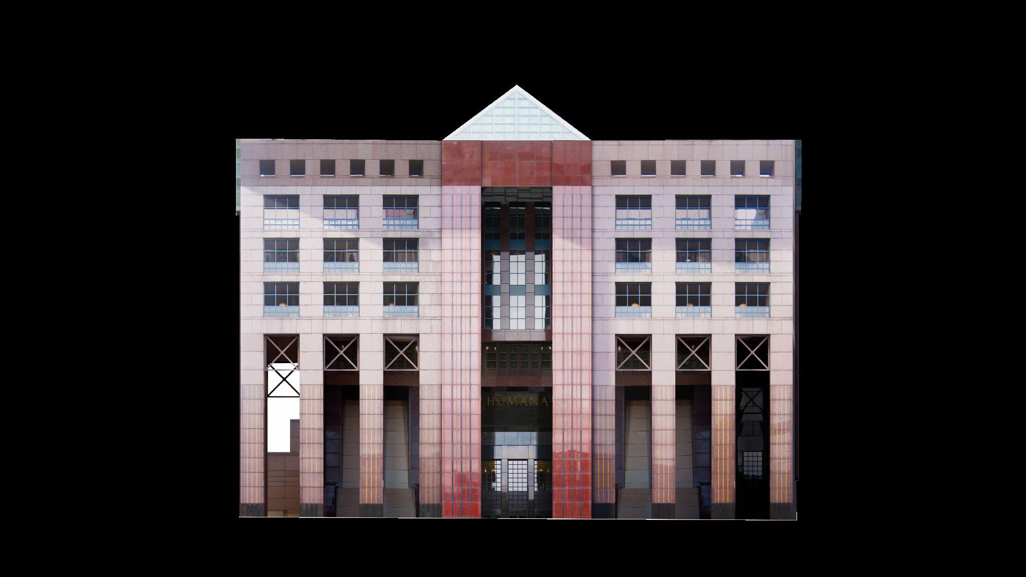
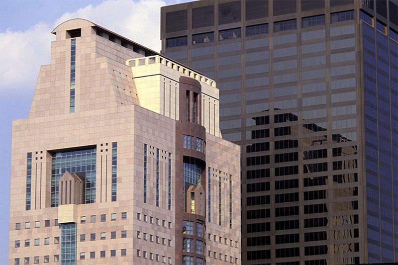
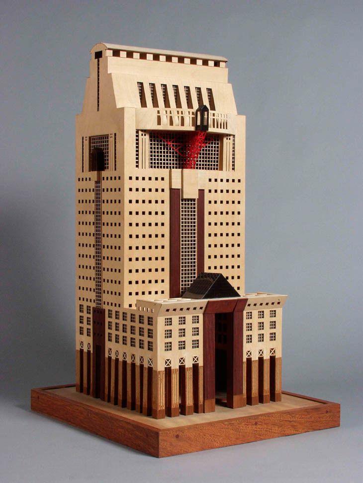
ArchitecturalAnalysis:Exterior
Linear and Symmetrical Facades
Linearity broken by Vertical bands of colors & windows
proportion and repetition of basic elements creates Surface texture on facade
A huge metal truss supports flying balcony at the top of the building.
Slants inward gabled roof
Sun room at South facade.
Inward Gable Roof
Flying Curved Loggia
Steel Truss
Small square glass Windows
Vertical band of colours
Cornice
Deep Red Granite
Source-3dwarehouse.com
North facade West facade
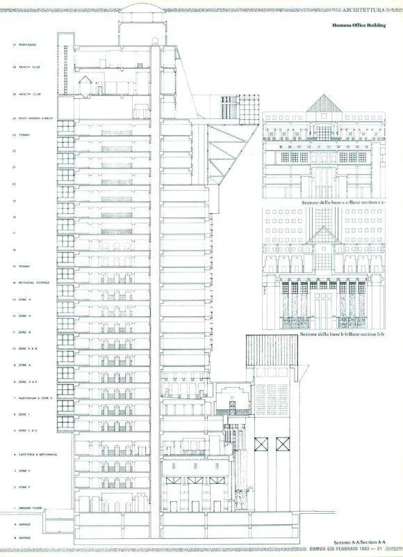
Drawings
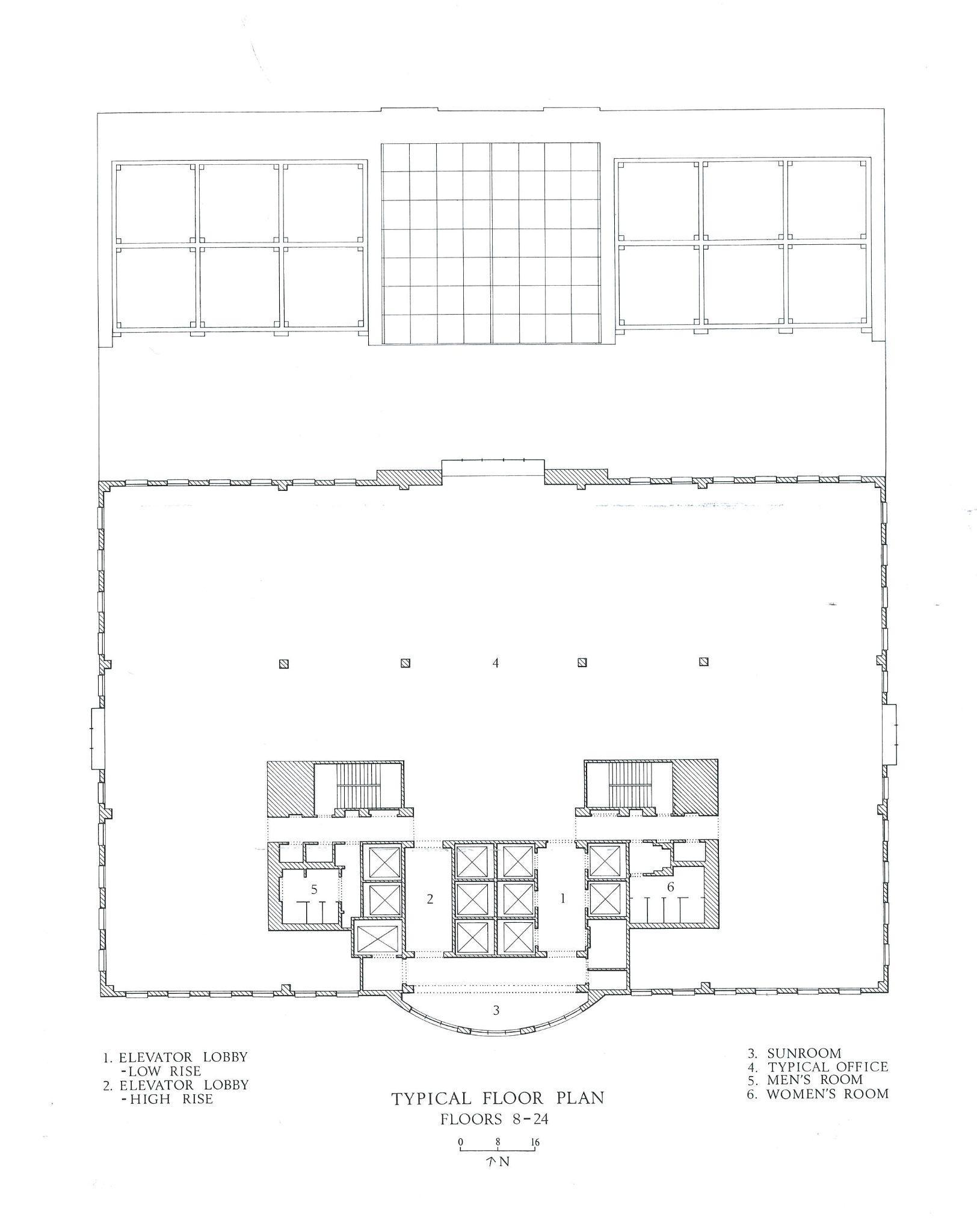
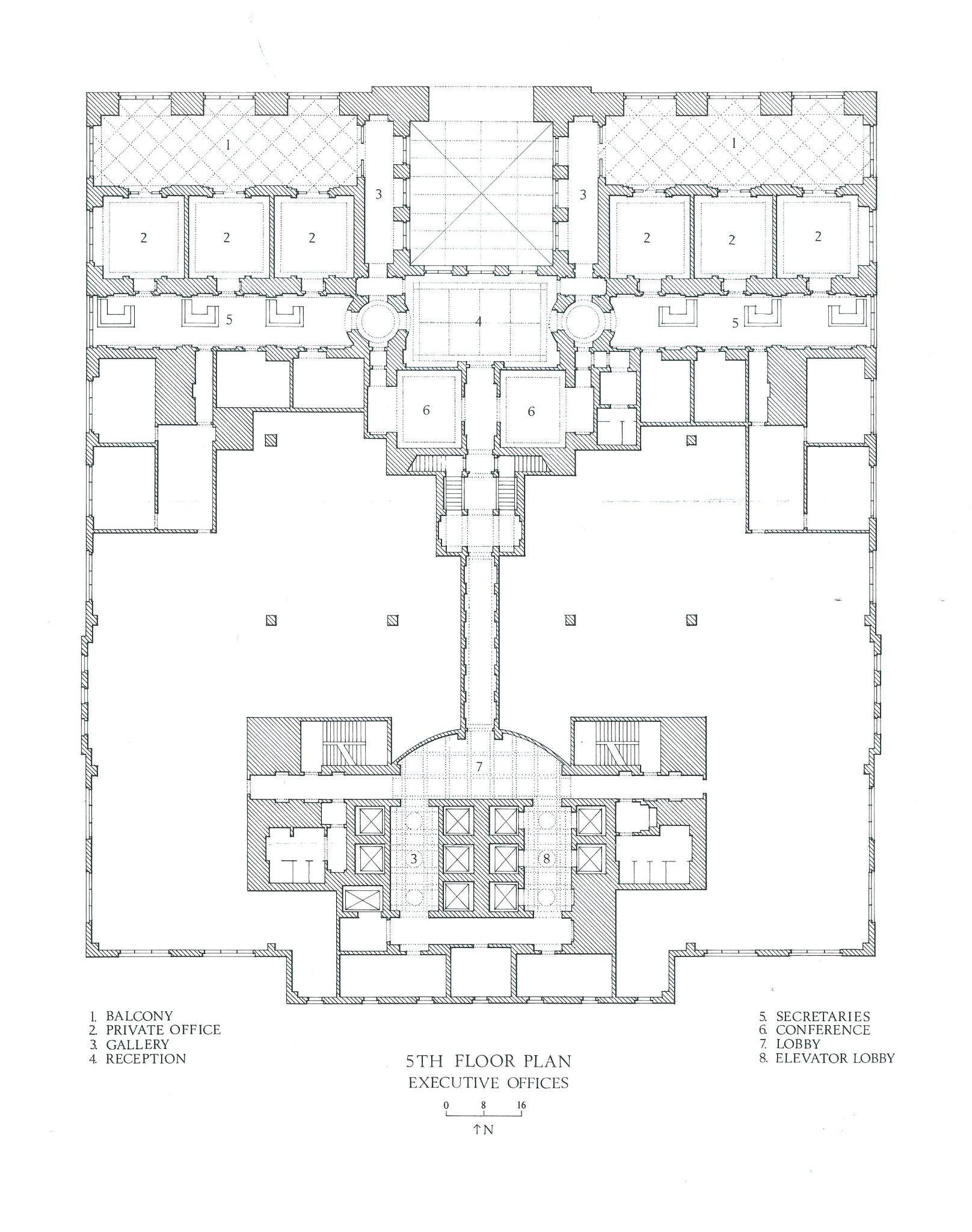
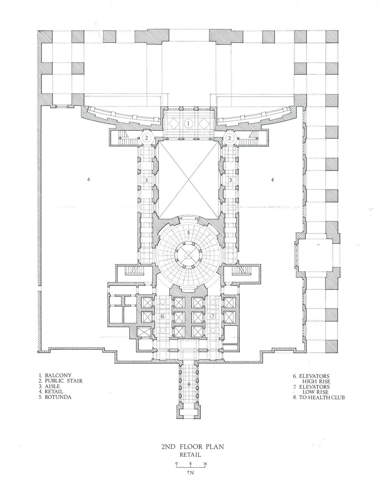
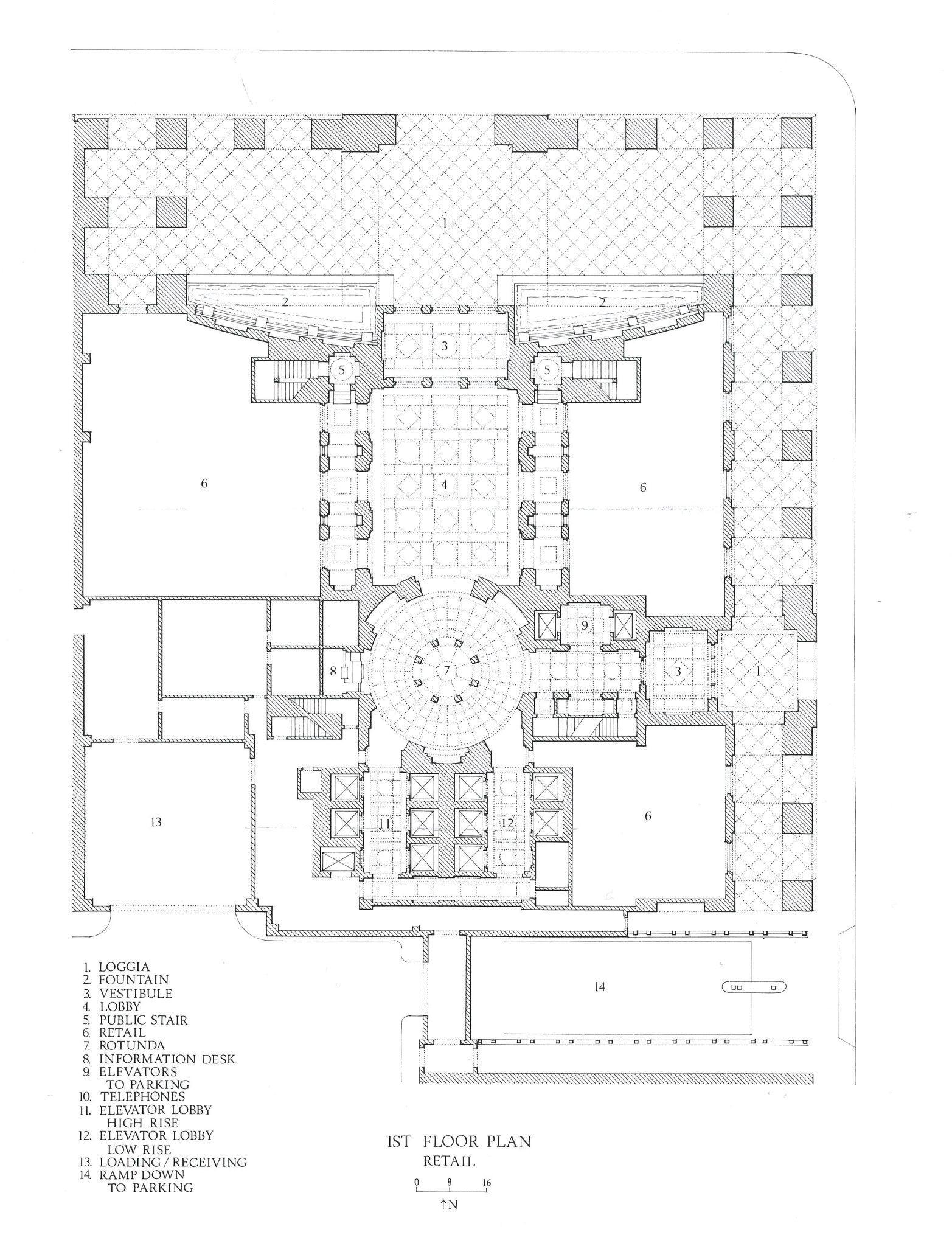
1st floor plan 2nd floor plan 5th floor plan Typical floor plan Source https://spaces.hightail.com/receive/ EoCn4gMhrR
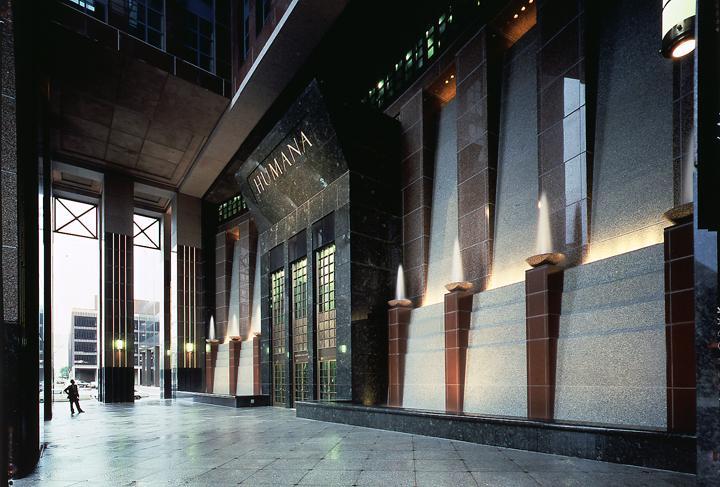
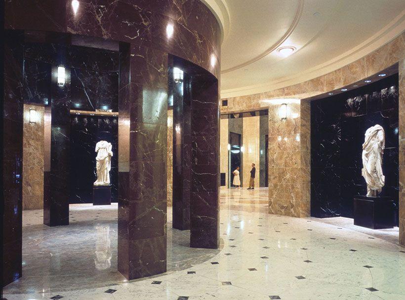
ArchitecturalAnalysis:Interior
Open arcade, or Colonnade street edge as an essential urban space
Retail Shop
Public space which connects street and building
Rotunda and Lobby
Creating axial connection between public and semi public spaces
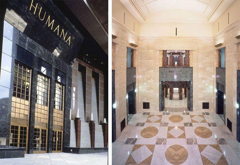
Elevator Lobby
Vertical transitional element
Source https://spaces.hightail.com/receive/EoCn4gMhrRl
ElementsofPostmodernism
Neoclassicalelements
1) Colonnade
2) Cornice
3) simplicity and symmetry
4) dramatic use of columns
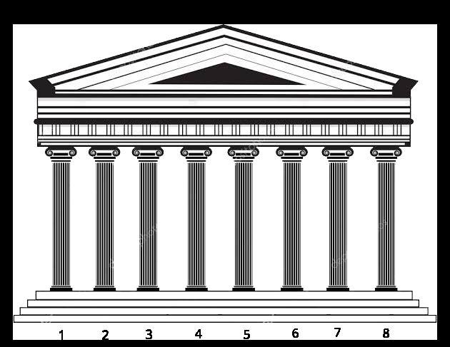
5) Triangular pediment
6) Gable roof
7) Rotunda in Interior Modern
Steel truss
Use of modern material - Concrete , Steel, Marble, Glass, Ceramic tiles.
1. Postmodern rejects the idea of absolute meaning and instead embrace randomness and abstraction.
2. Metafiction is an aspect of Postmodern architecture emphasized on incomprehensible thoughts which were different from conventional notions.
3. Postmodern architects began to experiment with more metaphysical elements in structure which draws attention to their work.
4. expressive and symbolic value of architectural elements and forms that had evolved through centuries.
Source-https://3dwarehouse.sketchup.com/?hl=en
Critiques
● The idea of visually connecting building to the bridge is more trite than convincing.
● Building oppose architects word- Logical and Natural
● Humana building contain elaborate sequences of highly articulated spaces.
● The sense of over-detailing that was present..
● Humana does not look like A.T.&T., or like any other skyscraper. It does look a great deal like most of the rest of the work of the Mr. Graves's, which is to say it is a richly colored composition made up of abstract, highly personal variations on classical forms
● Gapp called the project “Radical Postmodernism”
● Modernist architects may regard post modern building as vulgar, associated with a populist ethic.
 PaulGoldberger
PaulGapp
PaulGoldberger
PaulGapp
Conclusion
● Collage of Modernist and Classical elements.
● Classical features exerts a powerful visual attraction
● Street edge to Urban public space.
● Relating to the skyline.
● Common peoples can realize distinct architectural elements
 Source-GoogleEarthPro.
● https://sah-archipedia.org/buildings/KY-01-111-0033
● https://youtu.be/2auTHg-NaJE
● https://thearchiblog.com/2011/01/15/michael-graves-humana-building/
● https://slideplayer.com/slide/4531009/
● http://intranet.pogmacva.com/es/obras/44323
● https://www.nytimes.com/1985/06/10/arts/an-appraisal-the-humana-building-in -louisville-compelling-work-by-michael-graves.html
● https://thearchiblog.com/2011/01/15/michael-graves-humana-building/
Bibliography
Thankyou

July 2021
