

So finally, a full on watch fair! After three years! What was it like?
For one thing, the pandemic disrupted our plans of finally bringing our families together in Switzerland so they could see what we do. Because the (then) two fairs of Baselworld and SIHH were back to back again, we had planned on getting a house somewhere for two weeks so whoever wanted to go with their families could go while JP and I and all the others would work. That of course went out the window.
The two watch events became even closer, for now they are one. What was SIHH kind of morphed into Watches And Wonders, which if you remember, it was before when it had shows in Hong Kong for a while. There was a 2022 Watches and Wonders in Geneva, but many including us didn’t go. This 2023 was the big one.
It was quite surprising, because the structures and locations of brands like Patek Philippe, and Rolex and Tudor, and Chopard were almost the same as they were in Baselworld, which was rather confusing. Sometimes when you walk past Patek to your left expecting to go to another hall and instead you see… Grand Seiko. With, by the way, a way better booth than before in Baselworld, so kudos to them.
How did it all feel? Honestly, I never saw as much hugging before in watch fairs. These are people who have known each other for years by seeing each other a few times a year. We know each other’s lives and each other’s children. We advise each other and support each other. Hugs were appropriate.
The watch industry is very different from most others. It is steeped in both modern technology and generations of history and heritage. It is both global and local. Most people in the industry are there because they love it, or they end up loving it cause it is truly different from others. Combinations of creativity and daring, passion and precision, and financial commitment and family obligation. There is more camaraderie than cut-throat competition.
We have seen changes, and we will continue to see changes, in how this industry and those around it change. This year, invitations to the event (you are invited, you don’t apply) were tighter than ever in many ways. Almost everyone there was there because they knew their stuff, not just because of a title they represented. Many brands just said, “but we don’t know them so, no.” when asked to add a name to the invitees. May I say, though, in a show of pride for the team that has made Calibre what it is, that when I asked for more seats at the table we got them. And that is much much harder than almost anyone realizes.
That is, I guess, why I love this industry so much. It isn’t just about pieces and products, or technology and history, or creativity and viability. There is a vision. There is always a vision. And those that know and understand and share that vision or indeed just share the ability for vision, understand and appreciate. It is about the strongest names nodding to the newest players, the most storied collectors nodding to the emerging enthusiasts, the big group heads nodding to the independents large and small.
Thank you, as always, for allowing us to experience all this and for allowing us to share
it however we can. We want to share more, in so many ways, and we often feel we have gone amiss because there is just so much more we are excited about and still need to share.

Simon Crompton of PermanentStyle.com
(I am pretty sure I saw you in Geneva) just wrote something I wish I did. He was talking about denim, and for part of an article he said “appreciation deepens the more you know.” May we continue to deepen our knowledge and yours, and may we all appreciate even more.
And, Happy Mother’s Day.
Carl S. Cunanan Editor-in-chief carsandcalibres



Quality deserves time.


Time passes irrevocably.

Carl S. Cunanan
Editor-In-Chief
Executive Editor
Joseph Peter C. Calimbas
Senior Editor
Hernan C. Mapua
Collections Editor
Jason S. Ang
Associate Editor
Kit O. Payumo
Senior Staff Writer
Alberto E. Casal
Editor-at-Large
Bryan Martin B. Zialcita
Design Director
Charie L. Biaden
Senior Designer
Mark David A. See Designer
Mary Ann E. Marcelo
Contributing Writers
Katherine S. Cunanan
Jose Martin V. Ursúa
Leonard Vincent L. Ho
Edrich Santos
Dominique O. Cerqueda
Contributing Photographer
Keith Sundiang
Mayette L. Asis Vice President
Advertising Traffic Manager
Mary Jane O. Salazar
Account Managers
Malyn L. Bautista
Hiroshi D. Paderagao
C! Publishing and Media Group, Inc. Publisher
Chairman Michael L. Lhuillier
Managing Director
Paolo M. Puyat-Martel
Board of Directors
Michael L. Lhuillier
Paolo M. Puyat-Martel
Carl S. Cunanan
Kevin C. Limjoco
Vice President
Mayette L. Asis
Senior Accountant
Merline B. Urdas
Credit and Collection Officer
Mary Ann M. Benito
Legal Counsel
Paredes Garcia & Golez Law Office
C! Publishing and Media Group, Inc.
Burgundy Corporate Tower Units 27B and 27AR03 252 Sen Gil Puyat Avenue, Makati City Tel: (+632) 7728.3720 to 21 Visit: www.calibremagazine.com
Distributed by:
@calibremagazineph
Calibre Magazine PH

facebook.com/calibremagazineph
twitter.com/calibremagph
The opportunity to attend the 2023 Rolex China Sea Race firsthand in Hong Kong was very fitting for me both on a business and personal level. Flying out to Hong Kong wasn’t too stressful as would a trip to Europe or the Middle East would have been after three years of being grounded thanks to the global lockdowns and restrictions. It was also not as heavy as a purely watch launch or factory tour would have been as we were out in the open (we even got to cruise along Victoria Harbour for 2 of the 3 days we were there) most of the time. It was also great to touch base with people whom I have met early on my Calibre journey. There are a few more reasons that hit closer to home than I would have imagined too.
Firstly, one of the last away events I had attended was the previous Rolex China Sea Race back in 2018 (it was then a bi-annual event but then the world shut down) and it was great to have more time to soak up the atmosphere at the Hong Kong Yacht Club this time around as opposed to back in 2018 when we spend a day in HK and flew back to the Philippines to catch the boats arriving at the finish line in Subic Bay. It was nice to get time to chat (listened to) with the two Philippine
entries to this year’s race. Although I didn’t get to see them cross the line, it was a mega job by Standard Insurance Centennial 5 and her captain Ernesto Echauz in securing line honors, a first by a PH boat crew.
Also, it was by chance that the last event I attended right before the lockdowns happened
JP C. Calimbas Executive editor
was a Rolex event in Manila. Like 5 days before we shut everything down. Just had to include this.
Another interesting behind the race story came from the second Philippine entry’s captain Arturo Altura (Hurricane Hunters) wherein he mentioned that he was wearing a Rolex timepiece (Submariner if I remember correctly?) handed down to him by his father many moons ago and one that he wore through all the adventures he partook in (including being a naval aviator and part of a squadron that used the callsign Hurricane Hunters) including the run up to fulfilling his dream of being captain of a racing yacht competing in an open water race. He took the watch with him on this epic fulfillment of his dream even if he already had passed it down to his son as with their family’s tradition. He had to borrow it one last time. A short pause on the changing of the guard if you will.
While on the subject of changing of the guard, I would like to take this time to bid you farewell as I am stepping down as Executive Editor of Calibre magazine after 16 years of covering the world of horology. I take a step back knowing that the magazine and community we have built up is in good hands and will continue to flourish. May the fire of your passions continue to burn ceaselessly.
“TERMINAT HORA DIEM; TERMINAT AUCTOR OPUS”

“The time you enjoy wasting, is not wasted time.”
— Bertrand Russell

Watches and Wonders Geneva 2023 has come and gone. This year was better than most in my opinion, with some interesting releases that took everyone by surprise. Though I’m currently in the stage of my life where I’m just happy enjoying the watches I already own and haven’t paid too much attention to Watches and Wonders this year, some really drew my attention despite my busy schedule and apathy.
Like most years – this year’s releases were dominated by Rolex. I will be the first to admit that I’ve never been a big fan of Rolex since I find most of their models a bit bland, a bit too serious, and maybe a tad overpriced. I will never dispute the fact that Rolex’s resale value is second to none here in the Philippines, but most of their recent models never really pulled my heartstrings. Except now.
I’m a sucker for color when it comes to watches, and quite frankly the Rolex Oyster Perpetual “Celebration” is right up my alley. The combination of this burst of color all over the turquoise dial on a very classic, “prim
and proper” Rolex Oyster Perpetual case and Oyster bracelet is something else. And as a bonus - pricewise it’s not obscenely expensive since it’s part of the entry-level Oyster Perpetual line of Rolex.
On the flip side, I was a bit sad to see the discontinuation of the Rolex Milgauss line this year. From a purely aesthetic point of the view, the most recent version of the Milgauss was one of the few “playful” references of Rolex these past few years. I’ve always liked it, but unfortunately never pulled the trigger. It would be interesting to see when the Milgauss will be resurrected again, and how it would look like in the future.
Before this year, Rolex was executing a tried-and-true formula of making small, steady and “safe” changes to existing models. Perhaps some colorful dial changes here and there, but nothing like the aforementioned “Celebration” Oyster Perpetual or the “Jigsaw Puzzle dial” Day-Date. This is the first time I’ve been blown away by new Rolex models in recent years, and I love it. I hope that this is just the beginning of a more “fun” and “less serious” Rolex.
Bryan Martin B. Zialcita Editor-at-Large
THIS IS THE FIRST TIME I’VE BEEN BLOWN AWAY BY NEW ROLEX MODELS IN RECENT YEARS, AND I LOVE IT. I HOPE THAT THIS IS JUST THE BEGINNING OF A MORE “FUN” AND “LESS SERIOUS” ROLEX.
“Putting on a beautifully designed suit elevates my spirit, extols my sense of self, and helps define me as a man to whom details matter.”

— Gay Talese, Author parallel passion
Days before this year’s Watches and Wonders, Rolex released a video teaser as if it were launching a cinematic universe. Piqued collectors and internet experts pored over the spliced snippets of watch footage, desperate to glean any clues to fuel their wildest predictions. Its run time was 20 seconds — that’s shorter than the Zapruder film! The full 2023 lineup was soon revealed: Wild, polarizing dials, a bigger Explorer, a curiously handsome retro piece, a titanium Yacht-Master! Suddenly, there was a shifting of tectonic plates, and the world would never be the same again: A platinum Daytona was spun around to reveal… an exhibition caseback. Hell had frozen over, down tumbled the walls of Jericho.
Rolex casebacks are, in the main, drab and featureless affairs. There is a flat surface, perhaps a polished step, and then that familiar grooved edge. This has been Rolex’s way ever since it retired the Bubbleback in the 1950s. In fact, beginner watch collectors are often told that transparent casebacks are an easy way of spotting a fake Rolex. Not until 2005’s Cellini Prince could a Rolex legitimately boast a rear window, but no one cared since it was a Cellini. However, this new Daytona, a near-twin of the similarly earthy-and-icy 50th Anniversary, is the first sports model to expose its gubbins. The Cal. 4131 dresses for the occasion, and is tarted up with “Rolex Côtes de Genève” finishing on its plates, and a flashy gold rotor. I confess that this stirs up mixed feelings within me. Think of the transformed Olivia Newton-John at the end of “Grease”: the sight of Sandy in tight black pants and blood-red lipstick was sexy and exciting, but
also a little tawdry! How could my saintly Queen Rolex do something so vulgar?!
It’s not hard to understand the popularity of visible movements. Much of the appeal of mechanical watches is the mechanical bit. Gears and jewels can be pretty, and the whirring of a balance wheel gives us a sign that the watch is alive — unlike a motionless quartz movement. (If only we could see electrons flowing through circuits…) As a result, more and more watch brands have “opened up” to attract like-minded enthusiasts. Unfortunately, manufacturers have done so by compromising the stated purpose of their supposed tool watches. It was especially galling when, some years ago, every model in IWC’s Ingenieur family sported a display caseback. Here was a watch built for a clear scientific and engineering purpose: to endure the most intense magnetic fields. Now, the Ingy couldn’t be placed next to stereo speakers because, well, beauty above all else. One counterpoint: The demand for greater transparency may
Jose Martin V. Ursúa Contributing writer
have spurred recent advancements in magnetic resistance — particularly those of Omega. Omega’s exhibition backs have grown from portholes to Pyrex mixing bowls, yet it can cheerfully claim more gausses shrugged than IWC, Ball, or the Milgauss Makers at Rolex.
It may be infuriatingly obvious for industry observers, but there is something different about Rolex. We are simultaneously frustrated and comforted by its glacial evolutionary pace, and its stubborn resistance to the vagaries and whims of fashion. Rolex has famously refused to give people what they want. Like Rorschach of The Watchmen, Rolex looks down at the baying crowds at Geneva every year and whispers, “No.” The Oyster caseback was something you could rely on, and a sign that this was a serious, focused watchmaker. It’s not as if Rolex has anything to hide, as its calibres are rather attractive for mass-produced movements. But in recent years there have been signs of a thaw in Rolex’s attitude. Tudor was long rumored to be a stalking horse for Rolex to gauge public reception of new case materials and configurations, and the revival of old designs. The novelties of the 2020s seem to be proving that hypothesis.
In the aftermath of W&W, it is tempting to compare this time to the giddy days in 1989, when fed-up German youths chipped away at the Berlin Wall. Is the hole in the platinum caseback a sign that old Rolex is about to give its fans everything they want? Perhaps, but Wilsdorf giveth, and Wilsdorf taketh away, and while few will miss the Milgauss, rumors of the Pepsi GMT’s discontinuation are tenacious and worrisome to those still struggling to find one. In the end, there is only one constant with Rolex: You’re not getting what you want as quickly as you’d like!
parallel passion

“A well-tied tie is the first serious step in life.”
— Oscar Wilde
Snippets of what's going on in and around the Calibre world
The oldest blue-water race in Asia is back!

Rolex has always been associated with any activity driven by passion, excellence, precision and team spirit. Which is why the watchmaker’s association with the elite world of yachting has always been a natural fit. Encompassing six decades, the brand’s enduring partnerships comprises the most prestigious yacht clubs, races and regattas from all over the world. Naturally, this includes the Royal Hong Kong Yacht Club (RHKYC), the territory’s premier watersports club for sailing, rowing and paddling that has its roots in the Victoria Regatta Club from 1849, and which once again hosted the traditionally biennial event that is the prestigious Rolex China Sea Race
First held in 1962, the 30th edition of the Rolex China Sea Race marks the 61st anniversary of this offshore classic. And after five years of absence (due to a certain virus related pandemic), the oldest blue-water race in Asia restarted this year from Hong Kong’s iconic Victoria Harbour on April 5 and once again took 18 boats (14 from HK, 3 from the Philippines, and 1 from Mainland China) 565-nautical miles (1,046 kilometers) across the South China Sea to end in Subic Bay in the Philippines on April 10.
From the get go, Nick Southward’s J/109 Whisky Jack and Andrew Pidden’s Juice were at each other’s keels, but in the end, the Juice came in third, Philippe and Cosmas Grelon’s Simpson Marine posted second, and it was the Whisky Jack that finished first overall and lifted the China Sea Trophy for corrected time on International Rating Certificate (IRC), the established worldwide handicapping
system for sailboats and yachts managed by the Royal Ocean Racing Club (RORC) in the United Kingdom, which allows a wide range of keel boats to compete against each other on a similar playing field.
Owner/skipper Nick Southward was greeted with applause at the dock, “It feels absolutely amazing, seriously I can't believe it. I mean we've won this race! We've been right at the back of the fleet. We had a wild last 24 hours it was just wild; we could not have pushed it harder. But we stayed in one piece, everyone’s
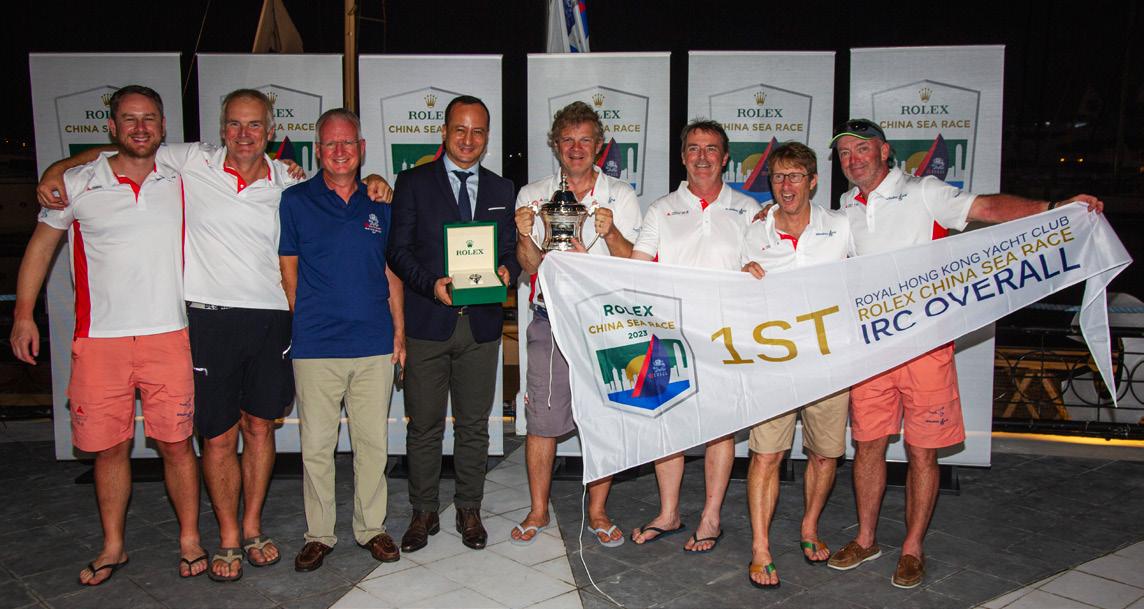

here and it just feels amazing to be here.”
Indeed, the lead changed hands numerous times throughout the fourand-a-half day race, but as the sun began to set on the final 24 hours in Subic Bay, it was the Whiskey Jack basking in the afternoon sun with no other boats in sight. To think the J/109 was given the second slowest IRC rating in the fleet, making for an inspirational underdog victory for the Whiskey Jack team.
“It goes to show that even the smallest boats can win,” said Southward.
And credits Barry Hayes, owner of UK Sailmakers Ireland, who worked in conjunction with UK Sailmakers Hong Kong to develop the winning sail combination (including a titanium main and headsails, spinnakers and a brandnew flying jib) for Whiskey Jack.
“Last night was a wild ride,” continued Southward. “We were sailing in 30 knots winds with four-meter waves. It was pitch black, and we were screaming along, reaching at 120° wind angle, hitting speeds of 12 knots at times. We had the
new flying jib up, with the storm jib as a staysail and the Titanium main with a single reef. Conversely, the third night was champagne sailing as well, 20 knots and flat seas. We had the A4 up that time, and the boat was really stable and solid. Our UK Sailmakers A4 is bulletproof.”
The father and son double-handed team of Philippe and Cosmas Grelon on board Figaro 3 Simpson Marine finished sailing in 94h 47m 10s, taking double-handed 1st place and IRC Overall 2nd place. They described the journey as exhausting,
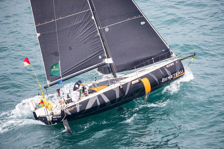
thanks in part to the loss of their autopilot which, “was man overboard at the Pratas,” said Cosmas with Philippe adding “It's very difficult because when you leave the tiller, the boat is like a dinghy, so you can't do anything. You have always to have a guy on the tiller. That was very, very hard."
Andrew Pidden’s J-99 Juice finished early Sunday evening after 103 hours of racing, earning them 3rd IRC Overall as well as 2nd in IRC 1. An exhausted Andrew commented after docking, “This is my first Rolex China Sea Race and it was a wild ride, from no wind at all to loads of wind, so it was quite crazy but it was a lot of fun and great to do it with my two sons and my regular crew as well.”
And you read that right: Andrew was sailing with sons Matt and Tom and joked about the family pressure, “I was pretty nervous because their mother was telling me we had three fifths of her entire family on one boat and if I sank it, she was going to be very angry but they are great sailors and it’s always good to be out with them.”
The awards ceremony was held in Subic Bay Yacht Club on Sunday evening and saw Rolex awarding two prizes: the coveted Rolex China Sea Race Trophy for the overall winner under IRC handicap, and a Rolex timepiece for the first boat under IRC Overall handicap and the first Monohull Line Honours. According to Rolex, “Two new perpetual trophies (named after the originals) will stay in the Philippines whilst the original China Sea Trophy and Sunday Telegraph Trophy remain at home in Hong Kong.”
“We are honored that this Asian blue-water classic is part of Rolex's distinguished portfolio of international offshore races,” said Lucy Sutro, Commodore of the RHKYC. “After five years of absence, we are delighted to see both local and international entries coming back to this iconic race.
For several decades Rolex has cultivated close associations with the best-known yacht clubs and organizers of major events in the world of sailing.
We are proud that this Race was the first Asian sailing event sponsored by Rolex and that, with their support, the Race continues to arouse attention within the international yachting fraternity.”




The new Porsche Driver Experience does not forget the front passenger
The new Porsche Cayenne made its world debut on April 18 at the Auto Shanghai show in China, and one of its highlights is a new cabin with a new high-resolution central display. This de luxe cockpit takes elements of the Taycan electric sports car and transports them for the first time into a Porsche with an internal combustion engine. And not just any Porsche but the Porsche Cayenne, arguably the sportiest vehicle in its well-treaded segment.


Its sporty character, therefore, was specifically engineered with enhanced dynamic functionality, which translated to the typical Cayenne design features turbo-charged with luxurious comfort. Indeed, the driver and passenger will experience a completely new cockpit in the new Porsche Cayenne, which combines an even stronger driver focus with new interactive elements that enhances the riding experience of the front passenger as well. This comes in the form of a fully digital, free standing, 12.6-inch curved display that does not require a hood cover giving it a resolutely contemporary aesthetic, and depending on the equipment level the driver can choose up to seven views on the instrument cluster. This includes the rev counter, online navigation, Night Vision Assist or

3D driving assistance, all of which can be selected for the foreground. A greatly reduced view and a classic mode are also available, the latter of which transfers the typical Porsche five-tube instrument cluster design into the digital age.
The entire instrument panel, in fact, including the center console and upper part of the doors have been completely redesigned with increased horizontal emphasis to make the interior look even wider. Naturally, all the controls important to the driving experience are grouped directly around the steering

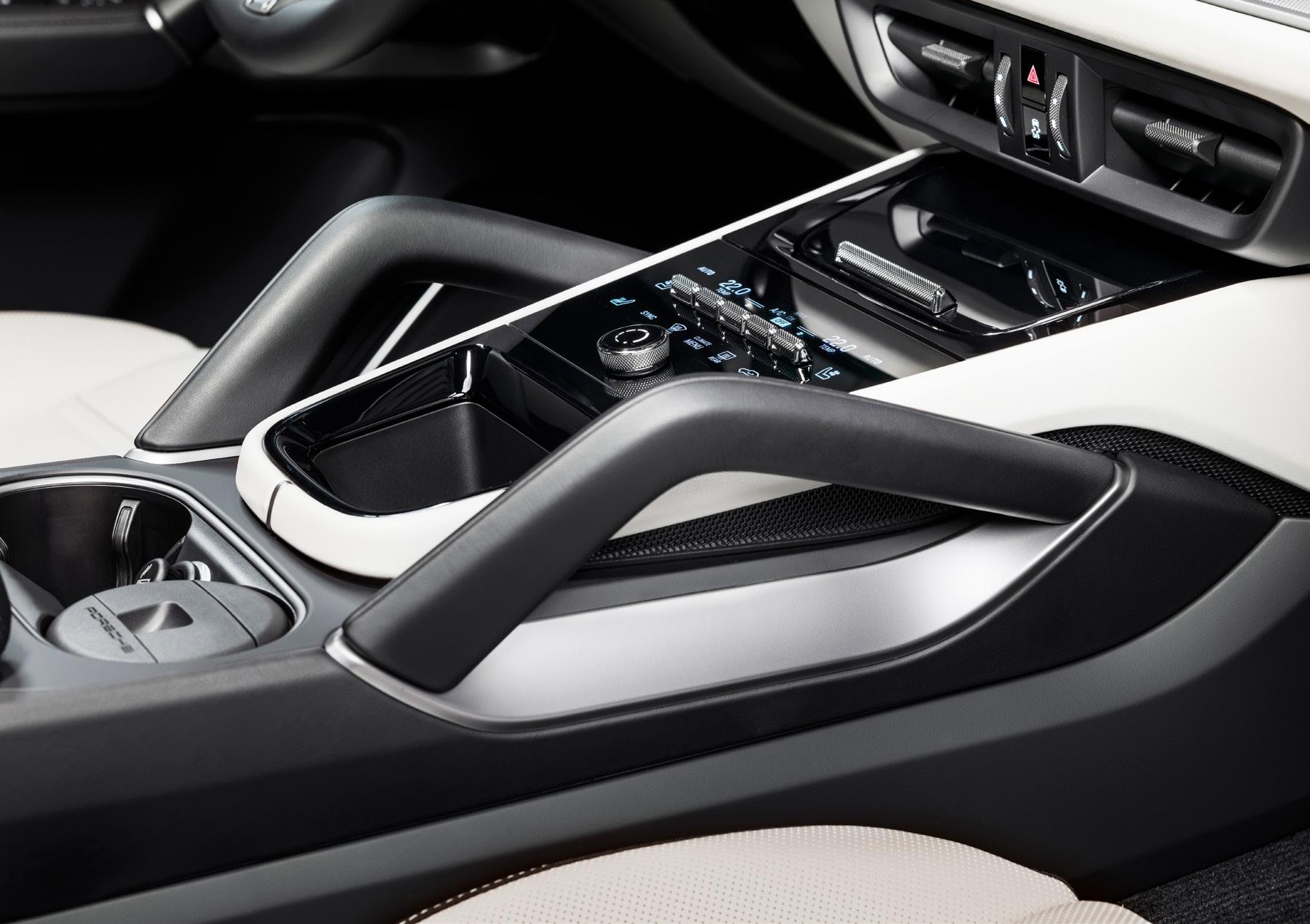
wheel. This includes the new engine start button, which is at its left; the gear selector, which is now to the its right between the instrument cluster and the central display; as well as the completely redesigned control lever for the driver assistance systems, which Porsche incorporated directly on the steering wheel of the new Cayenne. Speaking of which, the new multifunction steering wheel comes directly from the 911 but has been completely reworked to accommodate the new digital design parameters. This
means located right on the steering wheel is a new toggle button for selecting functions and designs for the instrument cluster; as are controls for the optional heads-up display; and the driving mode switch for selecting Normal, Off-road, Sport, and Sport Plus.
Further, the new air conditioning control panel on the center console features a glass surface with a black panel design to ensure a particularly high-end aesthetic. Indeed, air conditioning settings can be made quickly and intuitively on the clearly laid out control surface. And while the combination of touch recognition with mechanical air conditioning switches, and a physical volume controller ensures functionality that is both tactually and aesthetically pleasing, it’s the new features intended for the front passenger that has proven particularly interesting.
As before, the driver can operate numerous driving and comfort functions from the Porsche Communication Management (PCM) control center including the standard online navigation and multimedia functions. The newest feature of the Porsche Cayenne’s cabin however, is the optionally integrated 10.9inch passenger display. This additional touchscreen is geared for the front passenger to take the strain off the driver by operating the navigation or selecting a media service. Best of all, a special type of foil ensures that this display cannot be seen from the driver's seat and ensures that videos streamed on the passenger display will not distract the driver.
Porsche has also improved connectivity in the Cayenne with numerous connectivity functions and apps made available including Apple CarPlay and Android Auto, as well as Spotify and Apple Music. Also standard in the Cayenne is a cooled smartphone storage area with an inductive charging function; a bevy of USB-C ports throughout the interior of the vehicle for fast charging function; and a new In-Car Video function, which allows videos to streamed via the provider Screenhits TV, both from the passenger side and the central display when the vehicle is stationary.
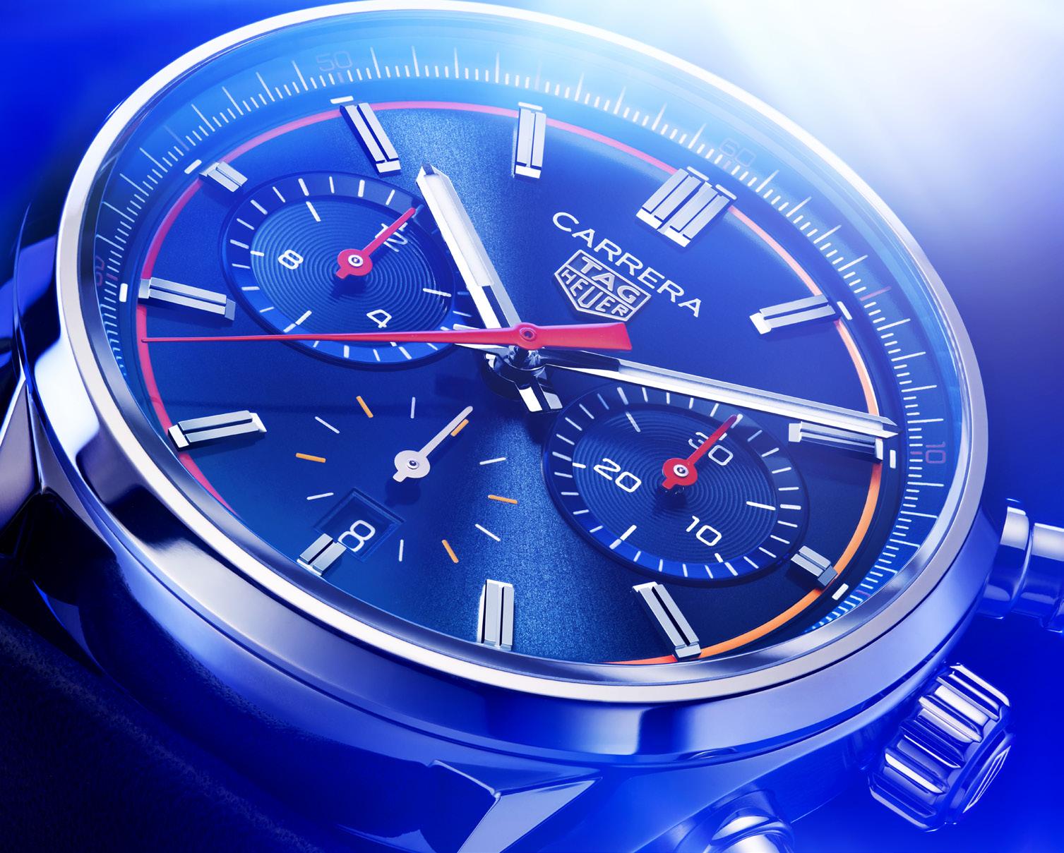
TAG Heuer celebrates the 60th anniversary of the iconic Carrera in grand Hollywood style
TThat’s right, TAG Heuer celebrated 60 years of one the greatest chronographs ever made with not only the latest version of their most iconic racing-inspired timepiece, but also with a new movie…well, sort of… an action-comedy short! And they held the celebrations in Hollywo… no, that’s not right, in London!
“We chose London for this special evening as the UK is such an important part of the brand, one of our biggest markets and a country of watch lovers and racing enthusiasts. And we are extremely excited to celebrate the 60th Carrera anniversary by unveiling a very special film,” said Fréréric Arnault, CEO of TAG Heuer.


The film in question is The Chase for Carrera, an action-comedy short produced by David Leitch, who produced the four John Wick movies and who directed Bullet Train, Fast & Furious: Hobbs & Shaw, Deadpool 2, and Atomic Blonde; and directed by short film and music video director, Nash Edgerton.


The 5-minute action-comedy revolves around an actor who refuses to return a rather special prop used during a fictional commercial shoot, thereby drawing the ire of a rather intense prop master who proceeds to come after the actor in a no-holds barred chase sequence worthy of a Hollywood blockbuster. Action and comedy ensues.
The rather possessive actor is played by none other than TAG Heuer ambassador and top Hollywood star, Ryan Gosling; the ruthless prop master is played by SNL-alum, Vanessa Bayer; and the rather special prop, of course, is the latest TAG Heuer Carrera called the “Glassbox.”
A clever reimagining of the original design, the Glassbox features a tachymeter scale integrated into the dial’s flange. This creates a bezel-less case and provides a stunning side view of the
dial through the box-shaped “Glassbox” sapphire crystal.
“We wanted to pay homage to the original design whilst adding a modern feel to it and bringing it to a new era and I am particularly proud of the Glassbox design the teams have come up with – and very honored that Jack Heuer himself enjoys it very much too,” added Fréréric Arnault.
Attended by UK stars including Simone Ashley, Micheal Ward, Milly Alcock, Louis Partridge, Kit Connor, William Gao, Mia Regan and Amita Suman, the maverick world premier of The Chase for Carrera campaign was held in Central London just last April 20. And hosted by the


equally maverick radio and TV host, Greg James, the event was attended not only by everyone involved in the film, but also by a veritable who’s-who of Hollywood glitterati, including the newest style icon and TAG Heuer Brand Ambassador, Jacob Elordi; the brand's latest US Ambassador and star of two of Netflix's biggest hits: Outerbanks and The Glass Onion, Madelyn Cline; Alexandra Daddario, known for lighting up The White Lotus and who wore the latest electric pink TAG Heuer Carrera Date in the print version of The Chase for Carrera campaign; and actor, director, and passionate Porsche racer, Patrick Dempsey.

So ingrained is the 24-hour day in modern society, across all cultures, that to even consider abandoning it seems ridiculous. The last great effort to revolutionize the representation of the time of day came, appropriately enough, during the French Revolution. Beginning in 1793, the French Republican Calendar used decimal time to divide each day into ten hours, which were subdivided into 100 minutes, which were subdivided into 100 seconds. Twelve years later, Napoleon Bonaparte would decree a return to the Gregorian calendar soon after he began his imperial reign, and clocks went back to normal.
Just as the world has come to agree on a 24hour day, splitting it into two 12-hour halves is a convention that has been similarly adopted by most. One notable exception is the traditional 6-hour clock (cycling four times a day) that was once commonly used in Indochina, though today only persists in Thailand. Half-days separated by noon make intuitive sense, as distinguishing the dividing line is astronomically easy: Look for the
sun at its highest point in the sky. It is no surprise, then, that 12-hour clocks with the 12 up top are dominant. In contrast, the 24-hour dial remains an oddball among watch collectors. Other than the Breitling Navitimer Cosmonaute, the Glycine Airman, or some much cheaper Russian military models, there are very few watches with 24-hour dials that are familiar to all but a cult following of watch collectors. Patek Philippe intends to change this state of affairs.
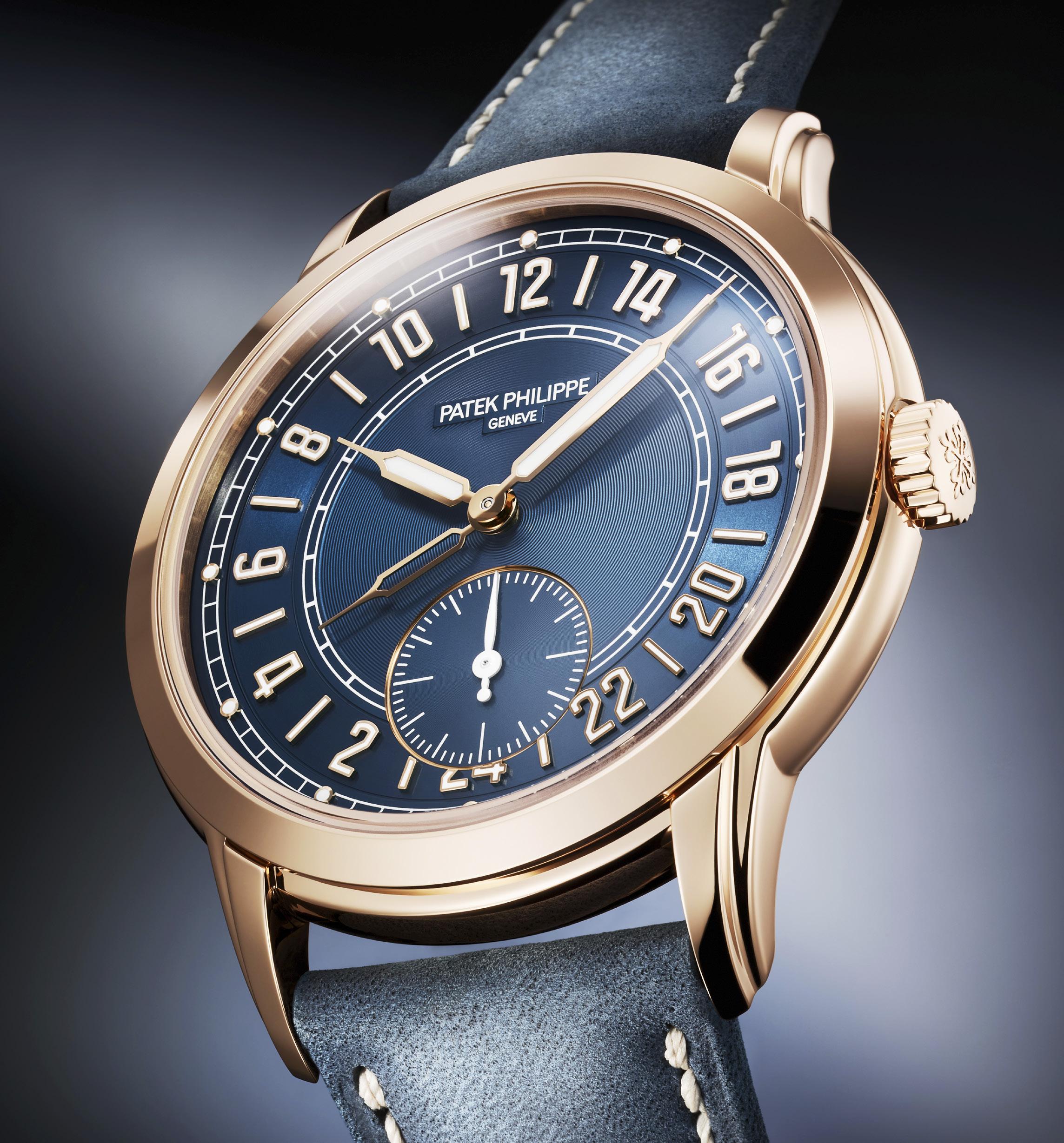
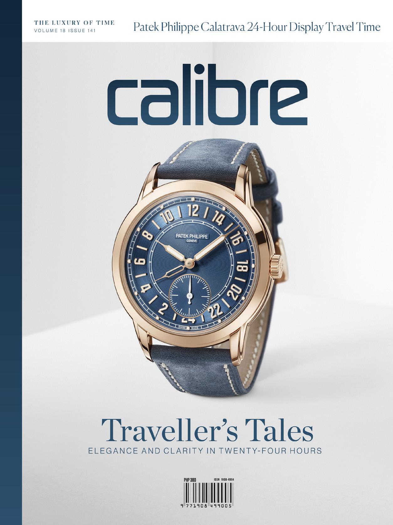
The Patek Philippe Calatrava 24-Hour Display Travel Time (ref. 5224R) takes a 24-hour dial, gives it a twist, and creates a new entry in its line of travel watches. To those unfamiliar with the manufacture’s model lines, it is useful to define what Patek Philippe considers to be “Travel Time”: Simply, it is a watch that can indicate two time zones, either via an extra hand with a 24-hour rotation, or an extra hand with a 12hour rotation plus day/night indicators for both time zones. “Travel Time” also separates Patek Philippe from the more plebeian “GMT” label, which is hazily defined but generally accepted to mean the former i.e. fourth hand pointing to a 24-hour scale. On the 5224R, the brains in Geneva have simplified their jobs by ensuring that both the home and local time zones are expressed in relation to a 24-hour day.
In April, research institute CERN issued a press release detailing a proposal for a 25-hour day, based on more precise measurements of “anticaesium.” To be even more precise, that announcement was made on the 1st, an April Fool’s joke by the famously comedic Swiss scientists.
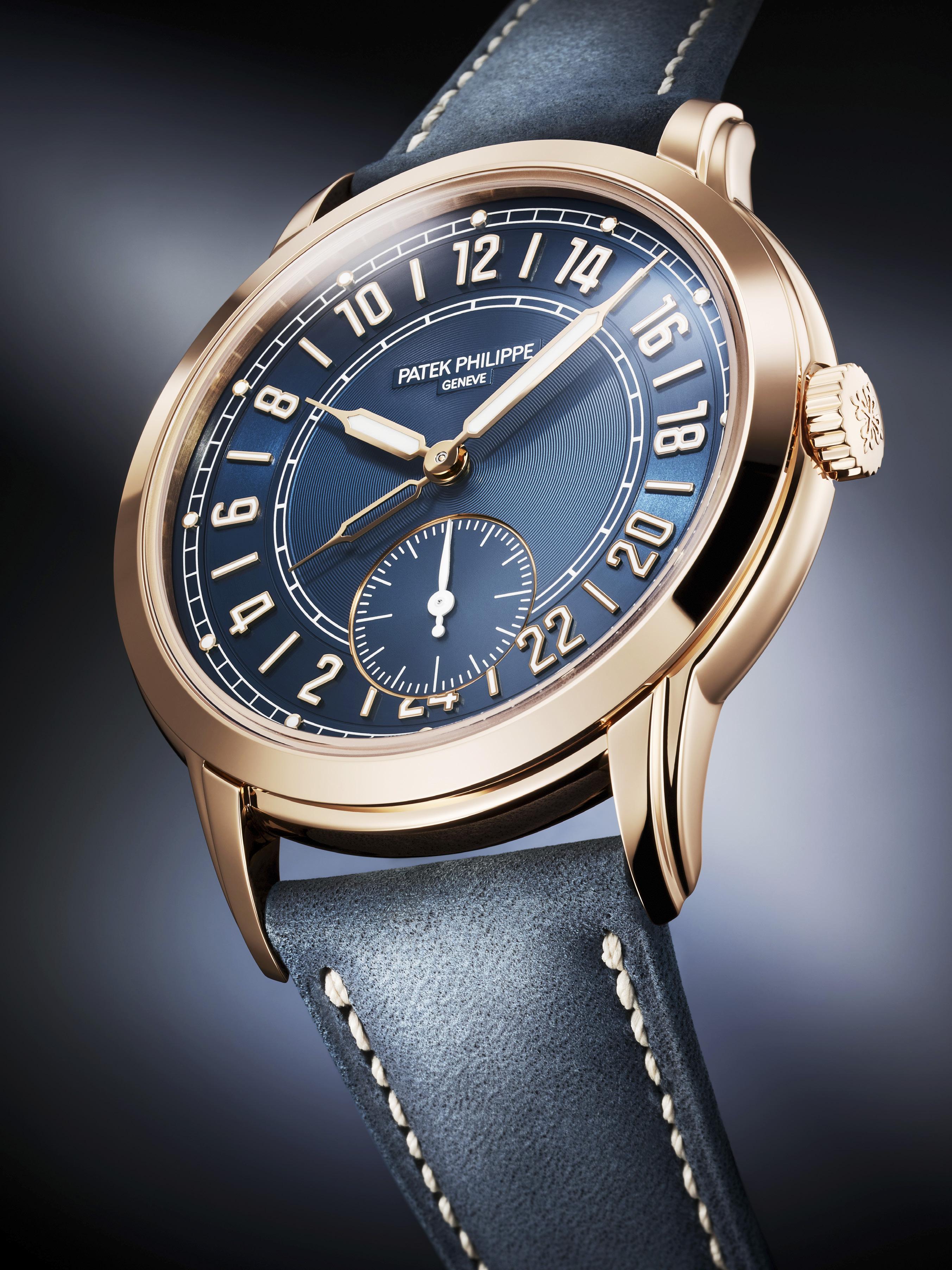
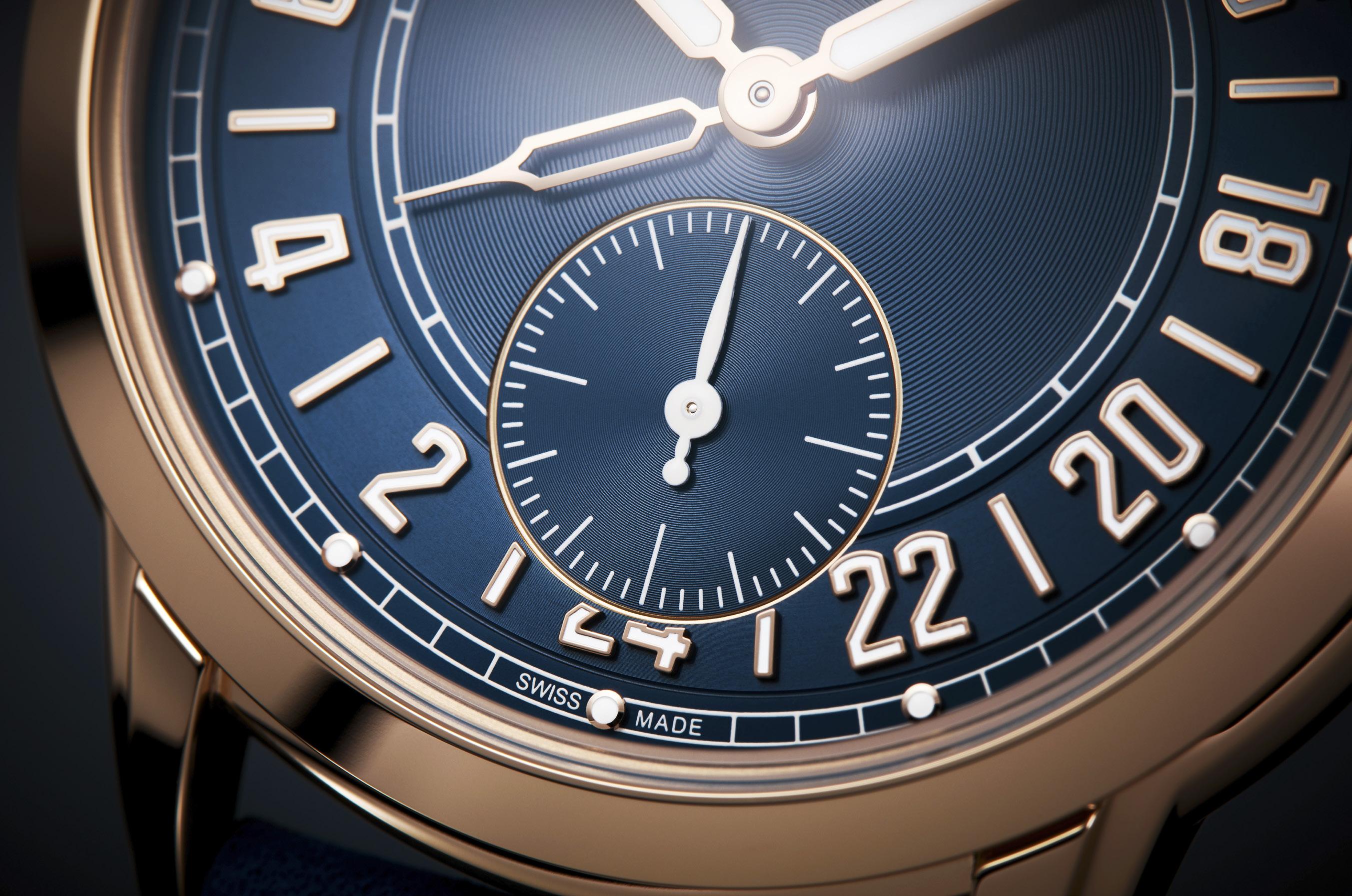
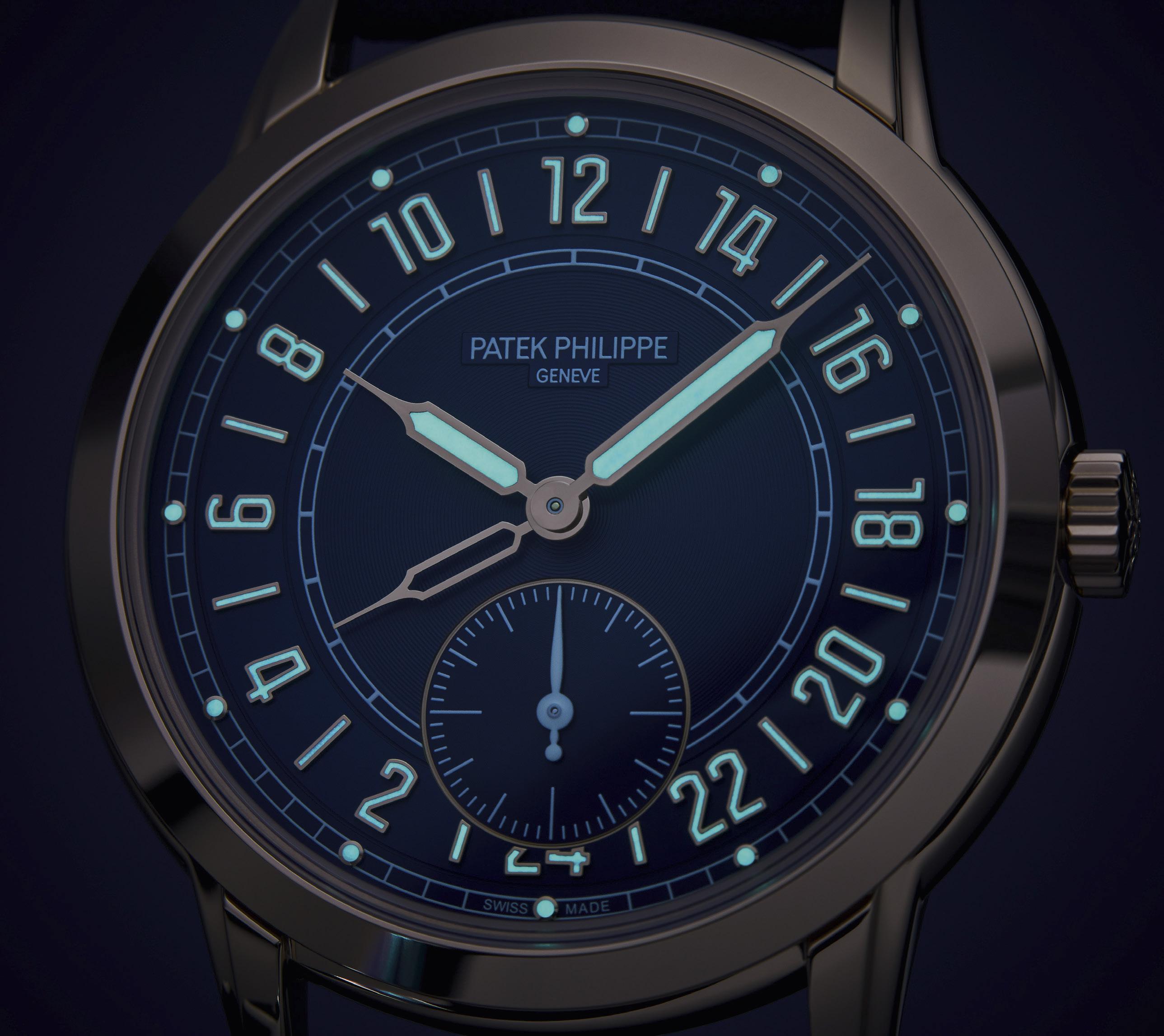
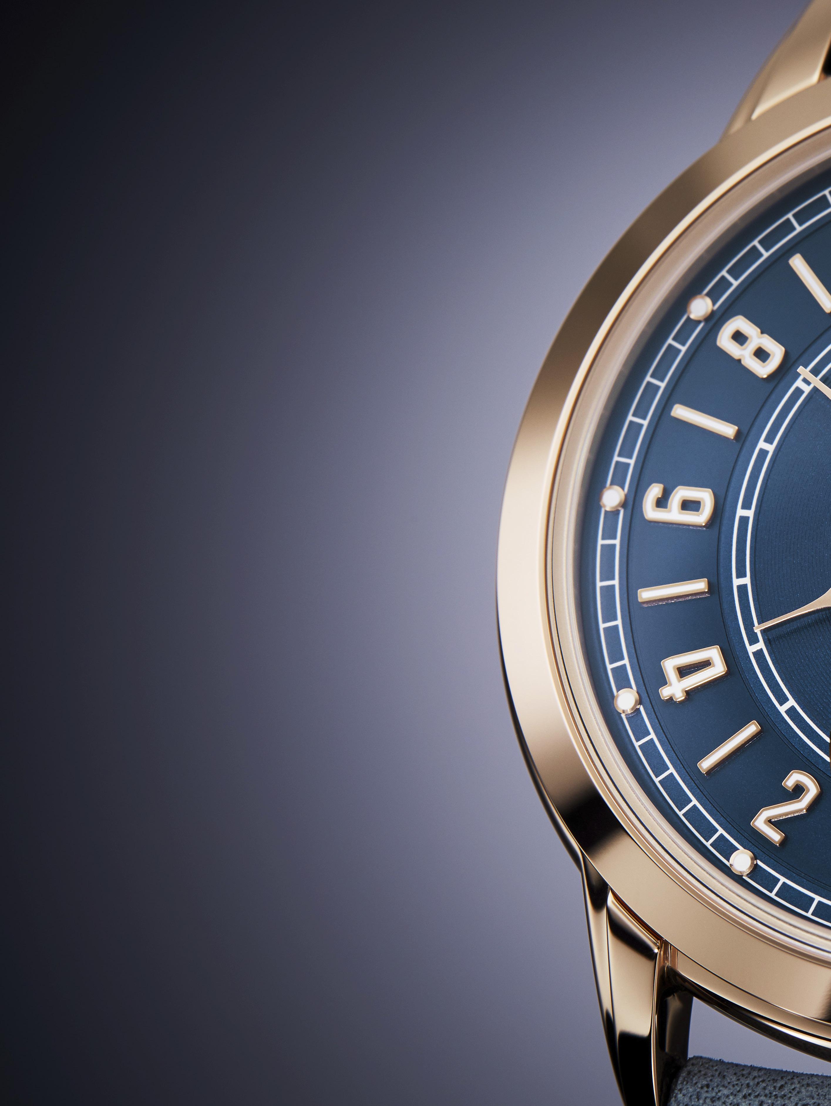
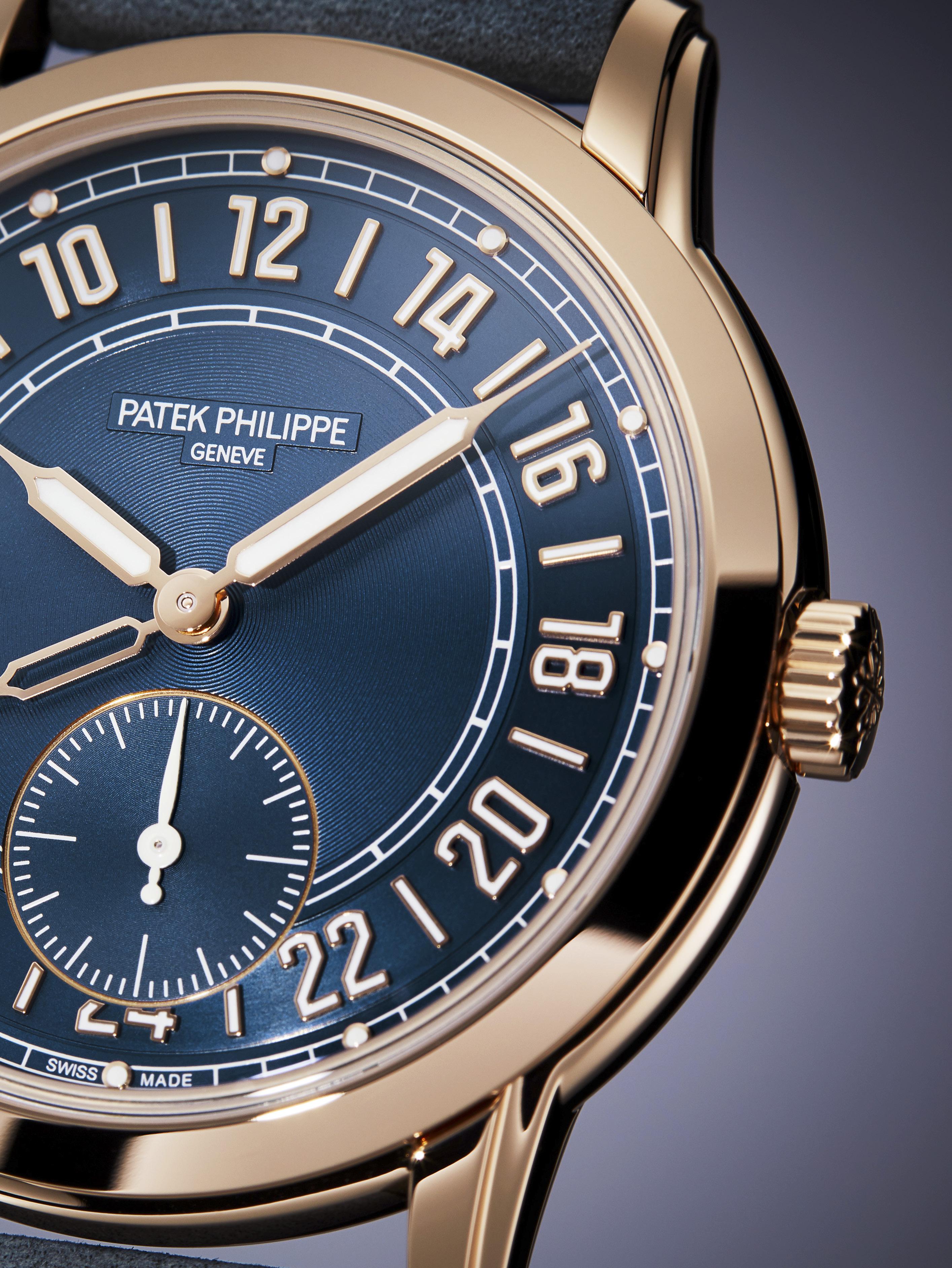
Given the breadth of information that it is meant to convey, the Calatrava 24-Hour’s rich navy blue dial is predictably big yet remarkably clean. Patek Philippe is often upbraided in social media for its sampler selection of typefaces and layouts, but it is hard to find anything that can be nitpicked here. This is a distinctly attractive dial from a company that has courted controversy on several recent releases. Even-numbered numerals are interspersed with batons and arrayed between two concentric circles. This area is called the annulus, and that will be the last time that this word is mentioned. The markers themselves are rendered in 18K rose gold, and painted with luminescent material. What sets the 5224R’s dial apart from its 24-hour predecessors is the orientation of said hours: Patek Philippe has taken the radical step of turning the world upside down and placing 12 noon up top. A “12” at the 12 o’clock position may appear blindingly obvious, but the majority of these watches have a “0” or a “24” at their dial’s peak.
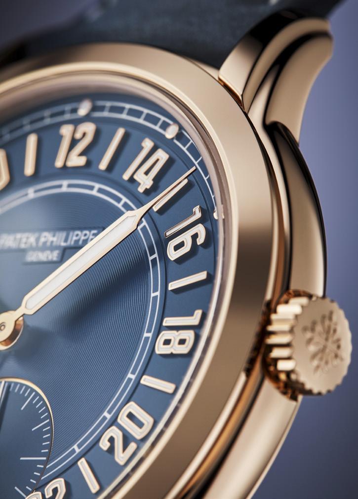
The cohesive design is continued on the rest of the dial. On the outermost ring is a minute track with metal pips marking every fifth minute. The inner circle is textured with concentric rings, extending outward toward a 24-hour track, which aids in the reading of the “home hour hand” (aka the GMT hand). The hands themselves are simple syringes in rose gold, each the correct length for reaching its respective track. Compared to the other hands, the home hour is slightly shorter and skeletal (i.e. unfilled with luminescent material), presumably so it can be more easily hidden behind the local hour hand should one want to stop tracking a second time zone. Above the center hand stack, there is a simple embossed label for “Patek Philippe Geneve.”
Beneath the stack is a running-seconds counter with a fine rose gilt outline and a white gold sword hand painted white. This subdial overlaps the inner hour track and decapitates the “24” at the bottom. Clearly, there was a higher power protecting the “12”!
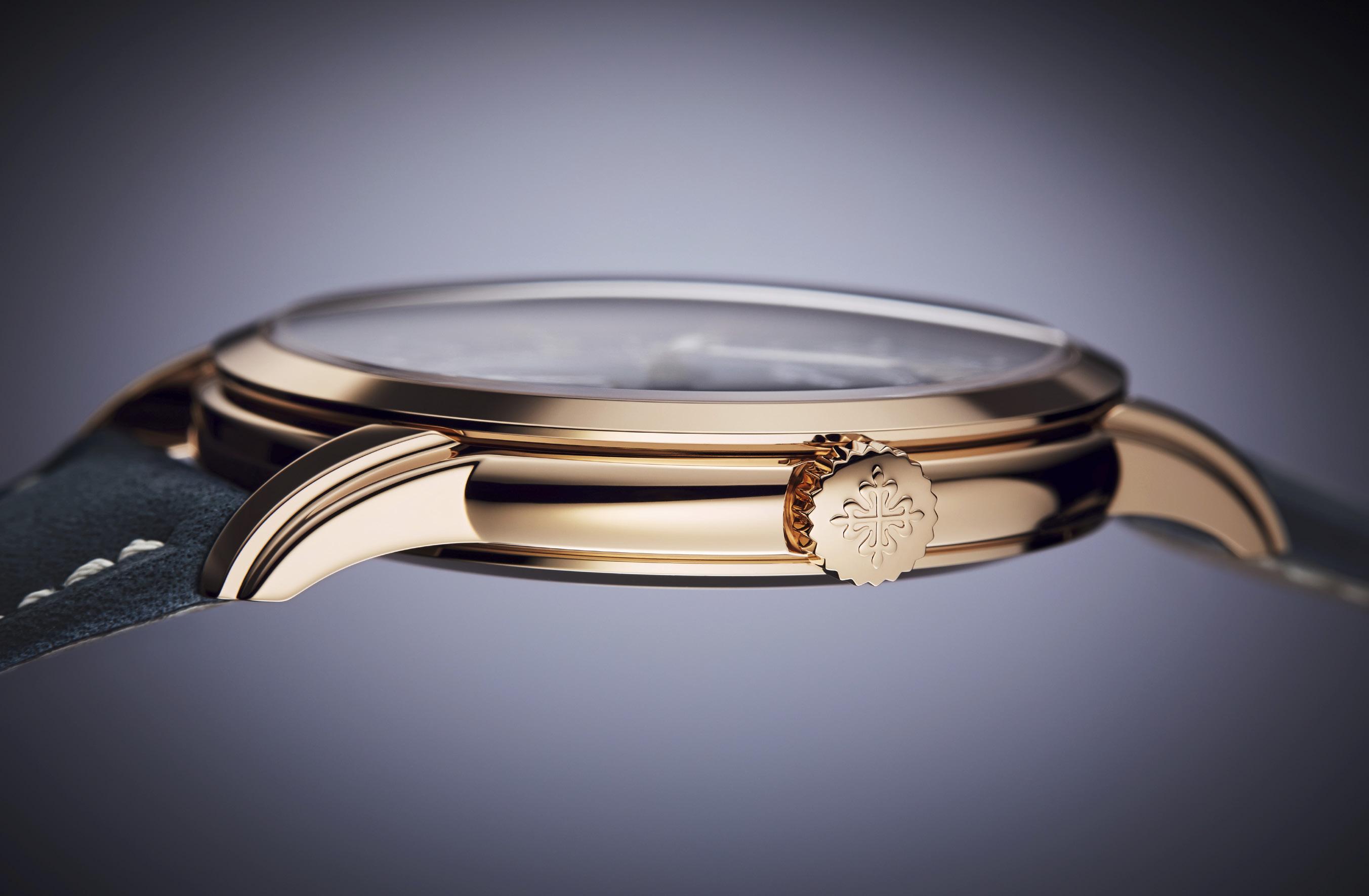
The clean design of the dial is more than matched by the cleanliness of the case. It is a traditional round case in rose gold, 42mm across and 9.85mm thick with nary a protrusion nor any texture to speak of. A Travel Time is often identified by the push-buttons that adjust the home hour hand, but on the 5224R those functions have been transferred to a 3-position crown. When pulled out by one detent, twisting the crown will move the home hour hand in onehour increments. As a result, the smooth surfaces of its flanks remain unbroken. Perhaps the most interesting features on the case are stepped lugs that complement the dial’s aesthetics. They combine to add a whiff of Art Deco to this Calatrava and vertical stripes are slimming, after all. Flipping the case over reveals a large porthole that reveals this travel watch’s wandering heart.
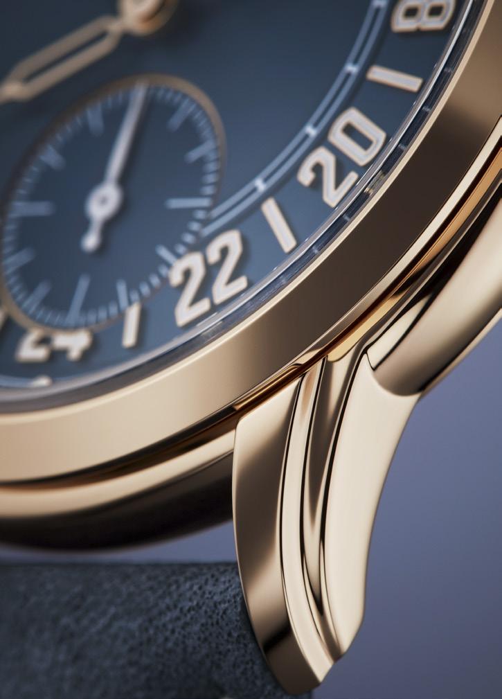
“Patek Philippe takes the 24-hour dial and gives it a twist — placing 12 noon up top to create this latest Travel Time.”
To provide the capabilities required by this 24-hour watch, a new movement beats within this Calatrava: Cal. 31-260 PS FUS 24H. A bit of a mouthful, perhaps, but it is consistent with Patek Philippe nomenclature: The caliber is 31mm (31.74mm, actually) in diameter, with a runningseconds subdial (PS), a dual time display (FUS), and 24 hours. In fact, this automatic movement is a modification of the Cal. 31-260 last seen on the ref. 5326G Annual Calendar Travel Time of 2022. This is arguably the most beautiful movement that Patek Philippe currently offers, bearing a strong resemblance to the manufacture’s own pocket watch movements from a century ago. The bridge, plates, wheels, and platinum microrotor are all on display, forming a pleasing arrangement of shapes that are finished and decorated to an extraordinary degree. The 5224R’s power reserve is modest, at 48 hours, which is wound down at a rate of 28,800 bph. Elsewhere on the technical front, Patek Philippe reuses three patents on parts that were first introduced on the 5326G. One reduces energy consumption, while the other two increase accuracy when setting the time or switching time
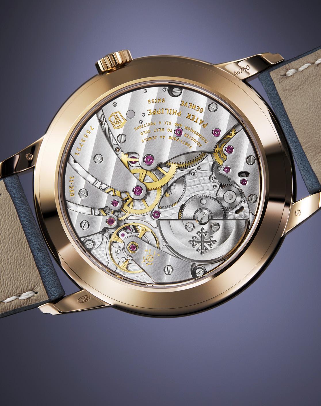
zones. None is earth-shatteringly innovative, but all are definite nice-to-haves. At this price point, anyone operating the 5224R’s functions should not feel any sensation that is less than meticulously calibrated and luxuriously damped. Completing the package is a matching blue calfskin strap fastened with a rose gold tang buckle. This Calatrava blurs the line between a dress watch and a tool watch — at least, what Patek Philippe would consider a tool watch. The band’s contrasting white stitching and rough nubuck finish are perfectly judged to reflect that balance.
The Calatrava 24-Hour stands out at this year’s Watches and Wonders as a definite hit among Patek Philippe’s novelties. It has tremendous visual appeal, while doing something new and mechanically interesting. Will this be the watch that moves the 24-hour dial into the mainstream? At a retail price of CHF 48,500, no, of course not. But there is that long trickle down effect from dream watches to achievable goals, and the 5224R could be the harbinger of this unconventional layout’s slow journey toward widespread acceptance. One day at a time.
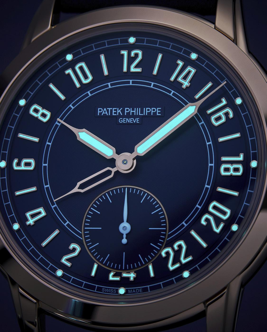
“The Calatrava 24-Hour Display Travel Time blurs the line between dress watch and tool watch — at least, what Patek Philippe would consider to be a tool watch.”
Every issue, we try to bring the timepieces that we've seen at the shows and in different events we've attended both locally and overseas. These are the pieces that have caught our fancy and we hope they catch yours as well.
 Words by Bert Casal
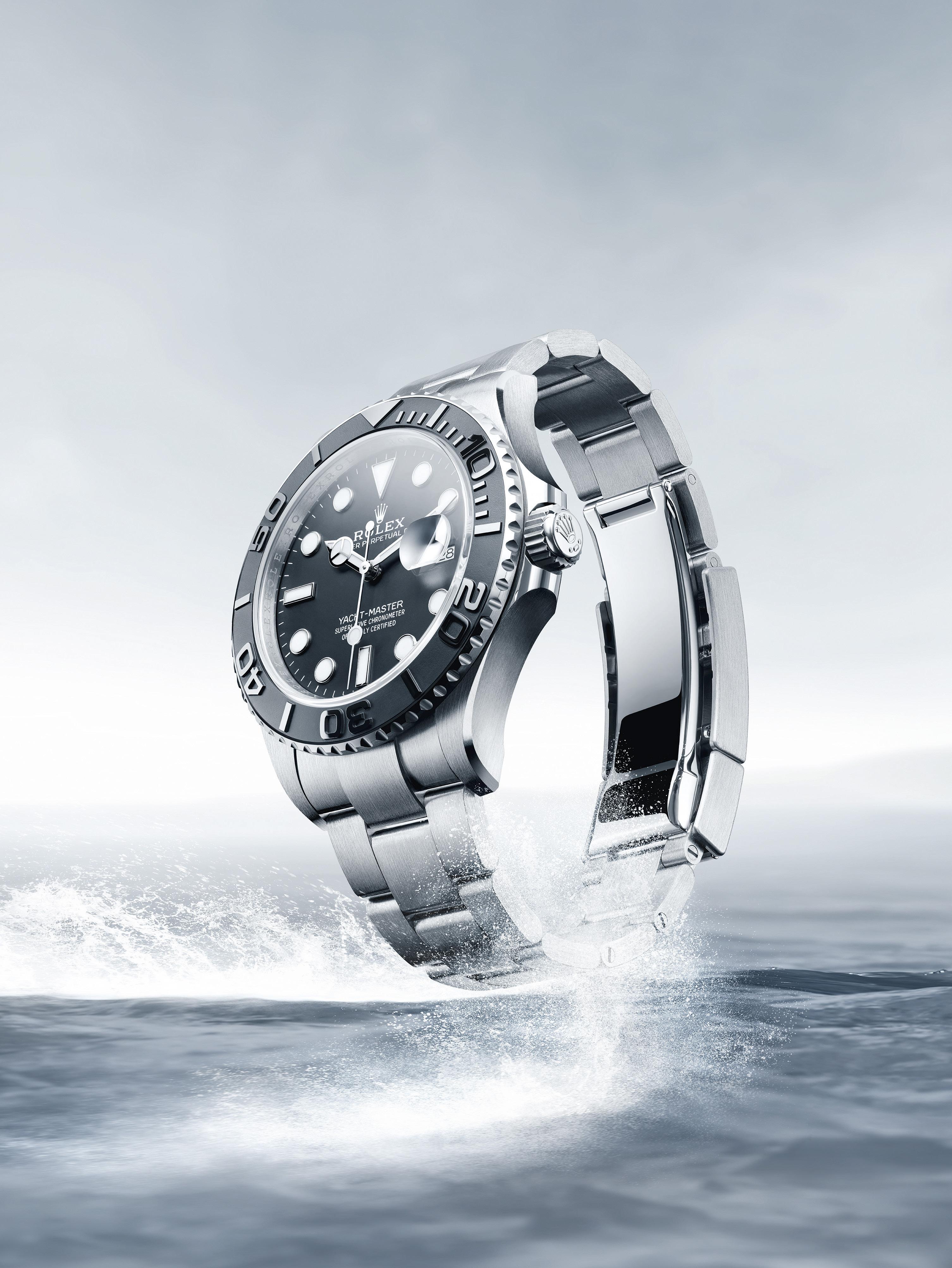
The first Rolex Yacht-Master was introduced in 1992. It was presented in 18-karat yellow gold. Two years later, they released a lady’s model and a mid-sized model, marking the first time in Rolex history that a professional series watch was available in a case that was smaller than standard size.
In 1997, the Yacht-Master was released in a combination of stainless steel and platinum: the case, bracelet and crown were in the former while the bezel and dial were from the latter. In the year 2000, a new two tone model was released with a new solid 18K gold center links and a new movement. These modifications, however, made the watch a little heavier.
In 2007, Rolex released the Yacht-Master II regatta chronograph watch. It was the world’s first watch equipped with a programmable countdown from 1 to 10 minutes using a mechanical memory. Years go by without much change, but in 2015, the brand launched the 18K Everose gold Yacht-Master, the first Rolex watch to come with a rubberized bracelet, the Oysterflex.
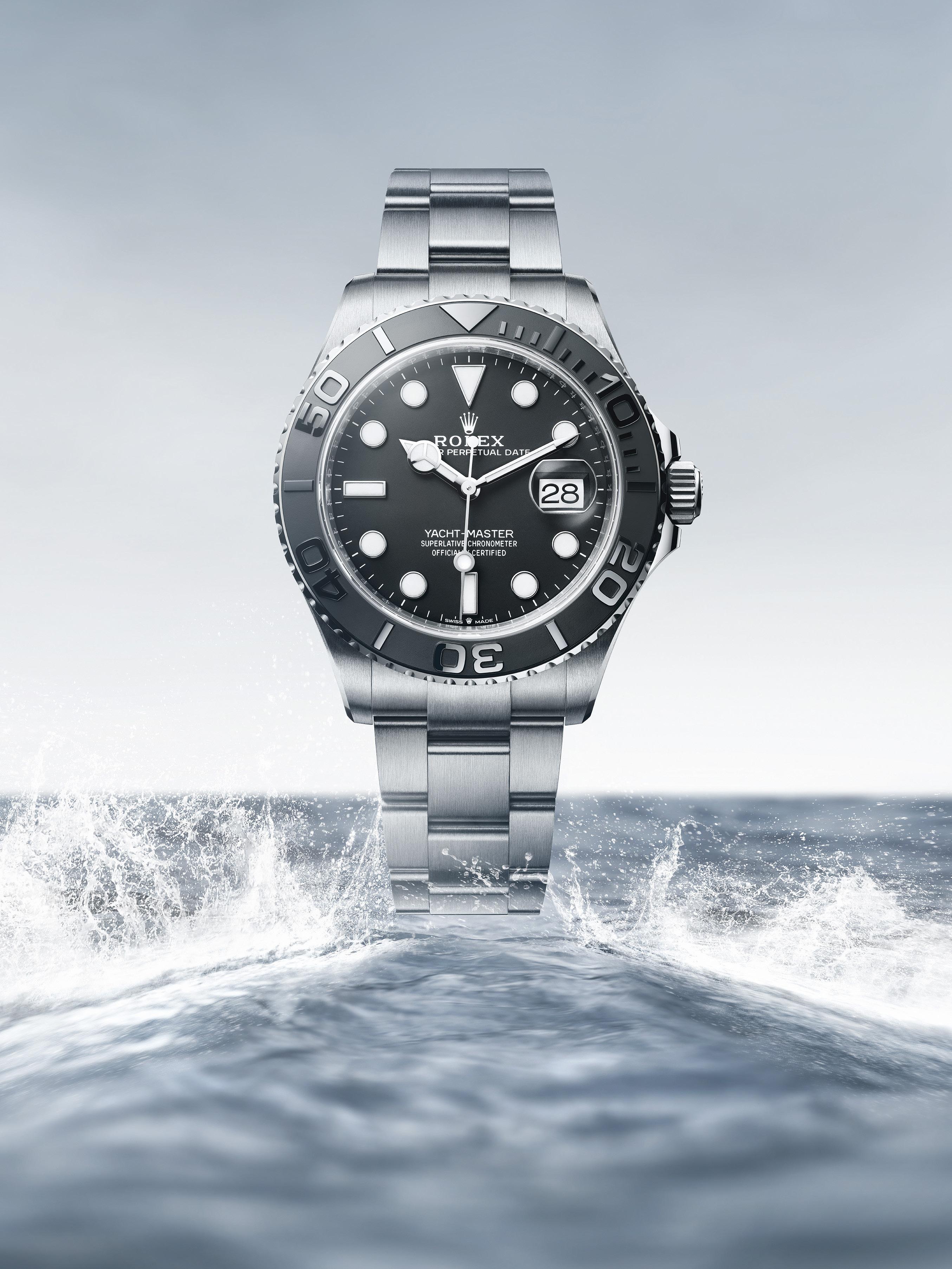
When 2019 came around, Rolex introduced another first with the release of the first YachtMaster with a 42 mm case to feature a date complication. The case, bezel, and Oysterlock clasp were made of 18K white gold, while the bezel contains a matte black and polished Cerachrom insert.
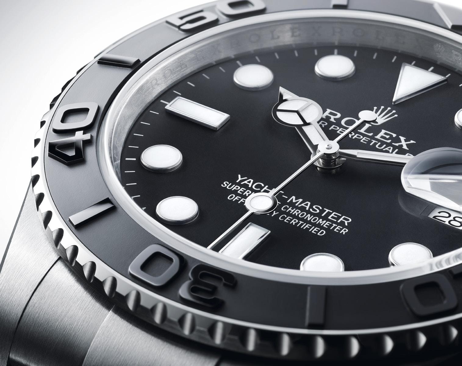
Throughout the years since its first introduction, the Yacht-Master has received a number of modifications, and as such, created its own following. This year will be no different as the new Yacht-Master is presented, for the first time, in RLX titanium.
RLX titanium is a grade 5 titanium alloy specially selected by Rolex. Like all titanium alloys, it is especially lightweight and is noted for its mechanical strength and corrosion resistance. Another characteristic of RLX titanium is the possibility of working it to give a polished or satin finish according to the brand’s specifications. Its high mechanical strength makes it complex to work with, and the decision to use it has required the introduction of special production processes.
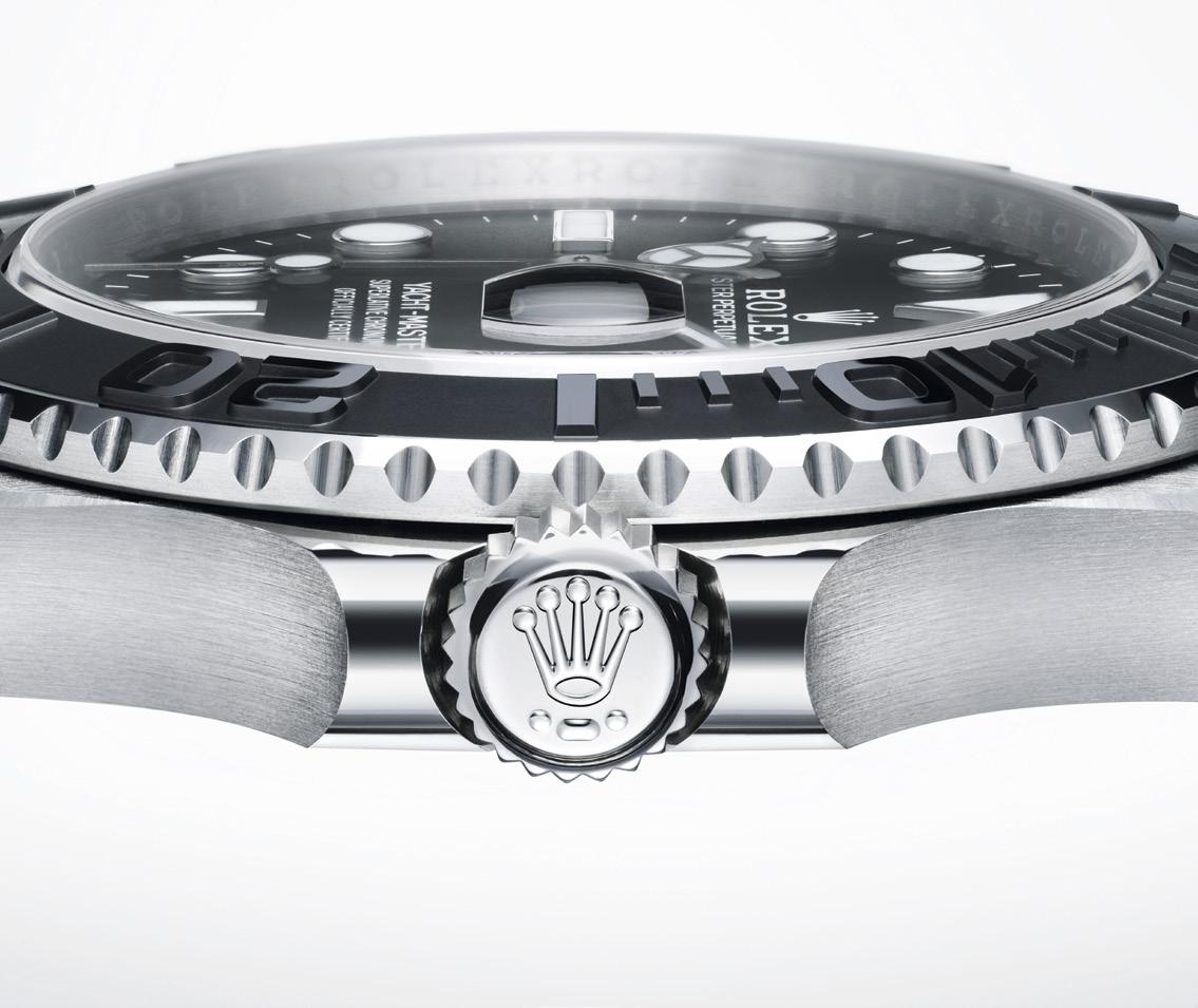
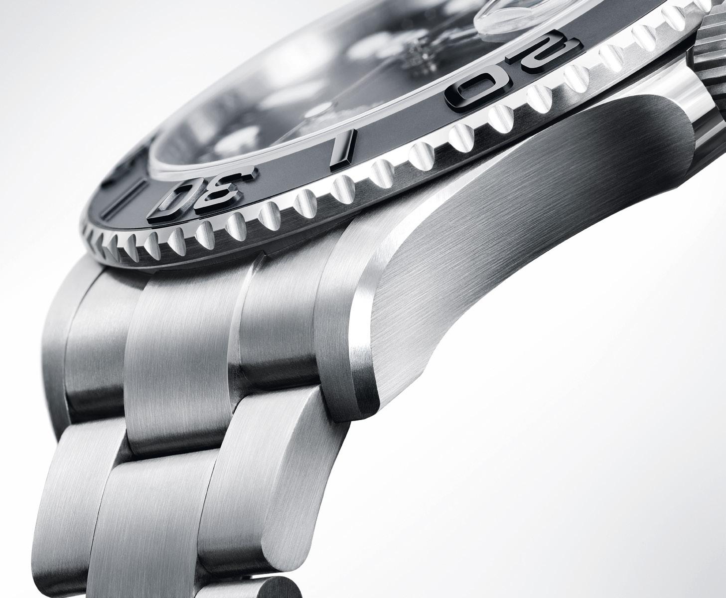
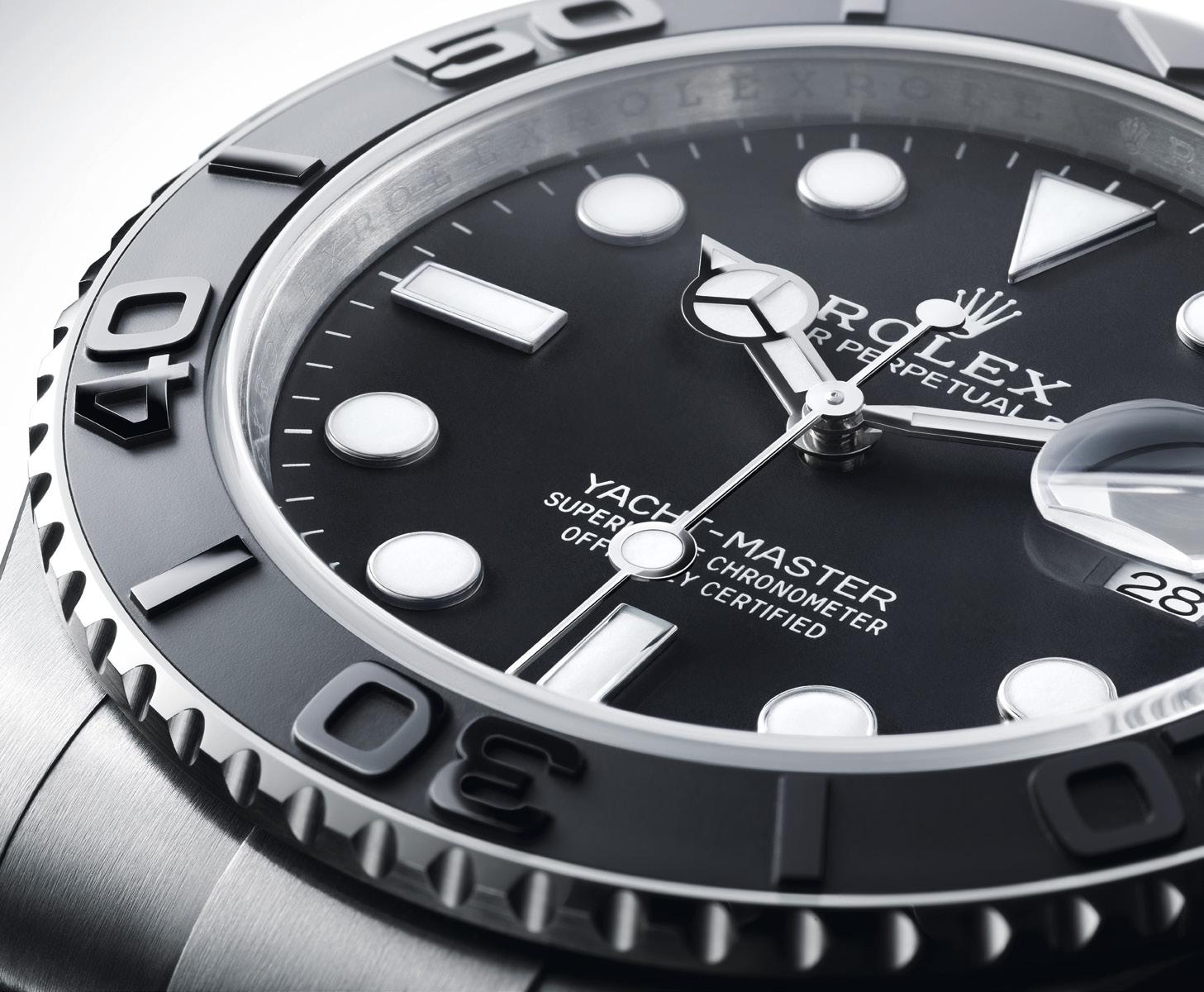
On the new Rolex Yacht-Master 42, the bidirectional rotatable bezel is fitted with a 60-minute graduated Cerachrom insert in matte black ceramic. Its raised graduations and numerals are first moulded into the ceramic and then polished. The first 15 minutes are indicated so the elapsed time can be read with ease and precision. The notched edges of the bezel offers a good grip for turning.
The 42 mm Oystercase is guaranteed waterproof to a depth of 100 meters. The middle case is crafted from a solid block of RLX titanium. Its case back is hermetically screwed down, and the Triplock winding crown is fitted with a triple waterproofness system to ensure water tightness.
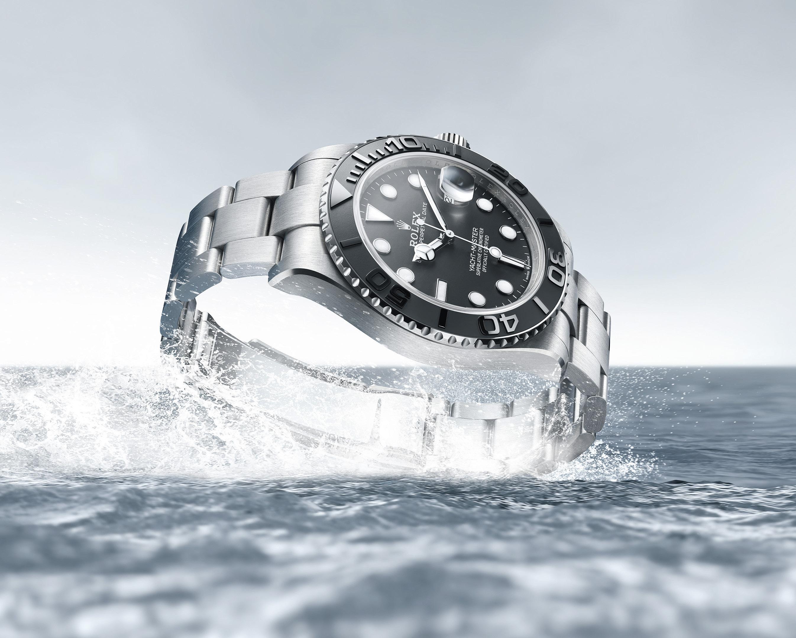
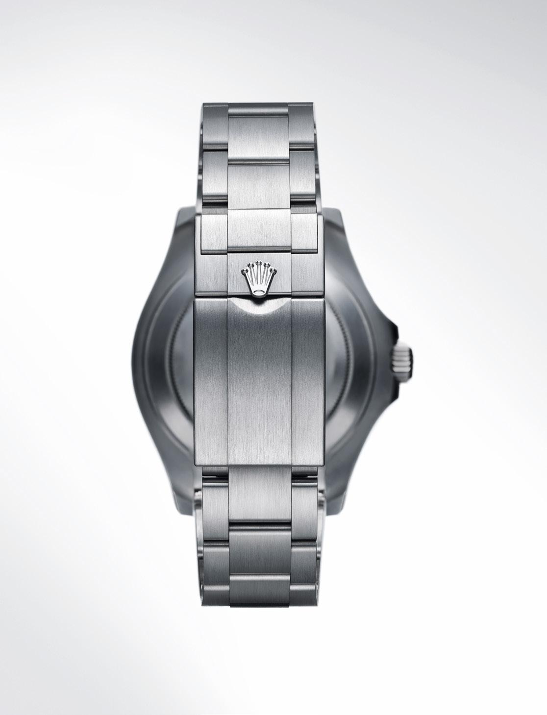
“Like all titanium alloys, it is especially lightweight and is noted for its mechanical strength and corrosion resistance.”
The new version of the Yacht-Master 42 is equipped with calibre 3235, a movement entirely developed and manufactured by Rolex that was released in 2015 and has been fitted on this model since its launch in 2019. This self-winding mechanical movement delivers outstanding performance in terms of precision, power reserve, convenience and reliability.
Calibre 3235 incorporates the patented Chronergy escapement, which combines high energy efficiency with great dependability. Made of nickel-phosphorus, this escapement is resistant to strong magnetic fields. This movement has a blue Parachrom hairspring which offers great stability in environments of varying temperatures as well as resistance to shocks. The oscillator is mounted on the Rolex-designed, patented high-performance Parallax shock absorbers, increasing the movement’s shock resistance. With its barrel architecture and the escapement’s superior efficiency, the power reserve extends to approximately 70 hours.
The Oyster bracelet of the new Yacht-Master 42 features the Oysterlock folding safety clasp, which prevents accidental opening. It is also equipped with the Easylink comfort extension link, developed by Rolex, which allows the wearer to easily adjust the bracelet length by approximately 5 mm. The Oyster bracelet in RLX titanium also includes patented ceramic inserts inside the links to enhance its flexibility on the wrist.
Like all Rolex watches, the new Yacht-Master 42 is certified as a Superlative Chronometer. In order for a watch to be called a “chronometer”, the watch has to be tested by a testing body to ensure that the watch keeps time to a certain accuracy. Rolex has redefined these parameters and required a more accurate result, settling for a -2/+2 second deviation per day, a standard that is significantly more accurate than other testing bodies. Those that passed the test were labeled as Superlative Chronometers. The Superlative Chronometer status is symbolized by the green seal that comes with every Rolex watch, and is coupled with an international five-year guarantee.
Light and robust, the new Rolex Yacht-Master 42 provides the perfect blend of functionality and nautical style, making it equally at home on or off the water.
JACOB & CO. WAS “INSPIRED BY THE IMPOSSIBLE” TO CREATE ONE OF THE MOST EXPENSIVE TIMEPIECES EVER
Words by Kit Payumo
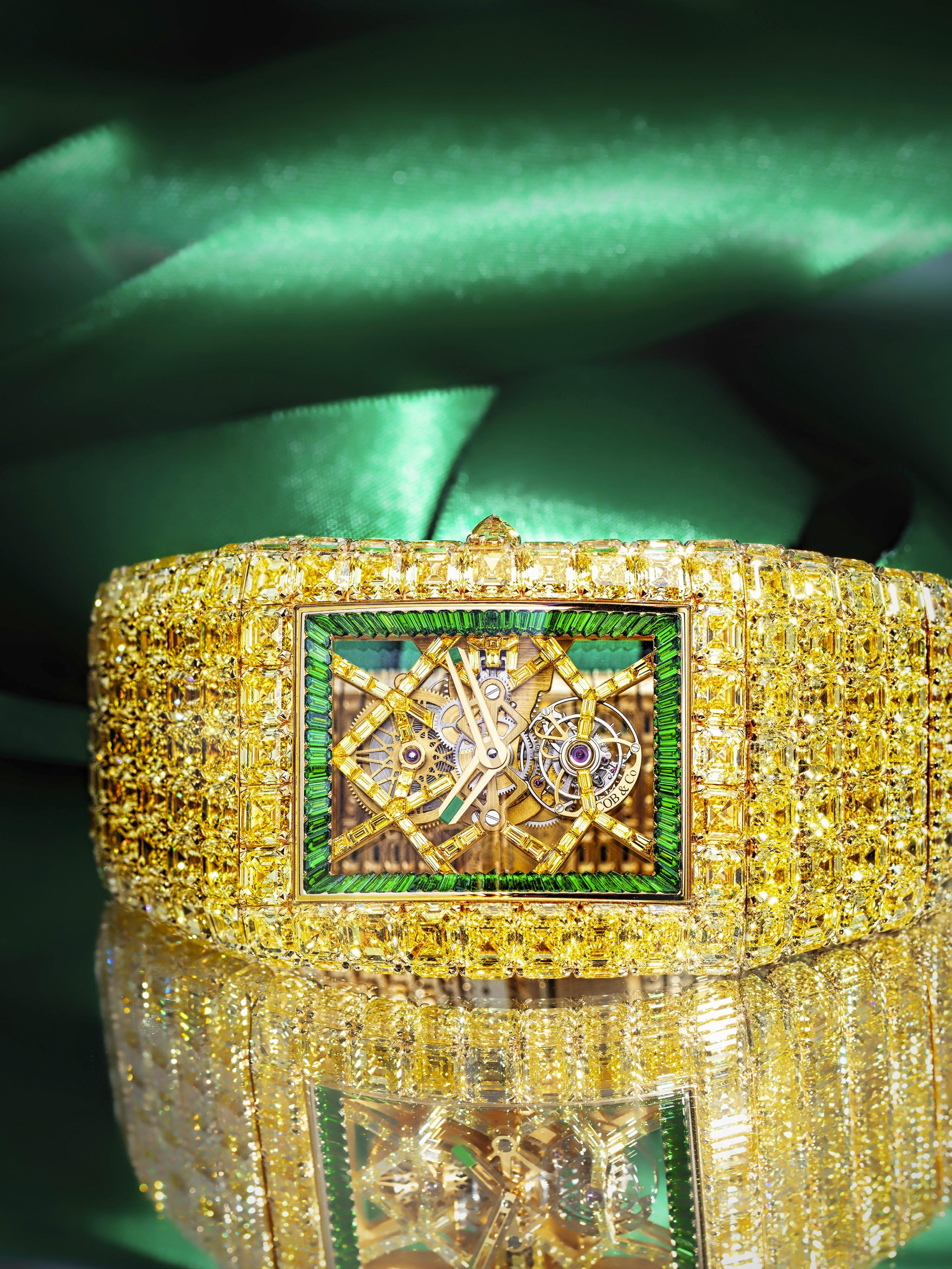
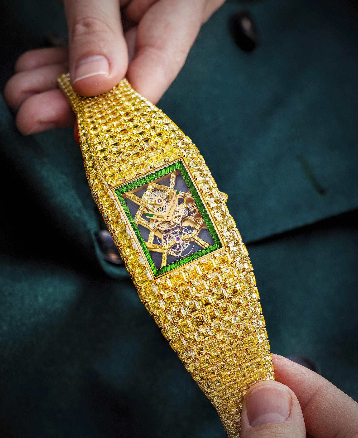
One of the standouts at Watches & Wonders this year was Jacob & Co., which astonished the attendees of the watch show with a bevy of some out-of-this-world creations, not the least of which was the Jacob & Co. Billionaire Timeless Treasure
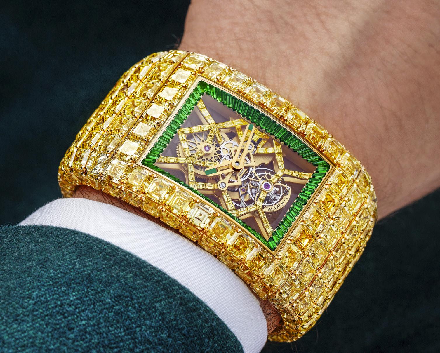
The original Billionaire was created as a bespoke project and launched in 2015 as a unique piece. This year, the unique, museum-worthy Billionaire Timeless Treasure is another diamond encrusted watch like no other, one that took three and a half years to realize, with much of that time just sourcing enough yellow diamonds of the same color and quality to complete the project.
“An unprecedented achievement in the history of high jewelry watchmaking,” the new Billionaire is, indeed, a masterpiece that demanded “absolute color uniformity and perfect quality consistence” to execute. So much so that, in its treasure hunt
across the globe, Jacob & Co. practically dried up the market of all exceptionally large and high quality yellow diamonds.
According to Seraina Wicht, head of gemology watch production at Jacob & Co., white diamonds outnumber yellow diamonds 10,000 to 1, making the latter impossibly rare and infinitely more expensive. In fact, the rocks in question, which are yellow in color due to the presence of nitrogen within their carbon structure, have become even more expensive over the past twelve months, especially at the size the Billionaire Timeless Treasure required.
In the end a whopping 880 carats of rough yellow diamonds were sourced throughout the globe, not a single gem of which was rejected because of its price. Only the color and clarity of the diamond led to its inclusion or downfall. Which is why it took a staff of ten, who were in charge searching, sorting, and the cutting of the gems to source 880 carats of the rarest and most
opulent rough yellow diamonds (some of which reached 2.50 carats), almost the entirety of the three and a half years of production.
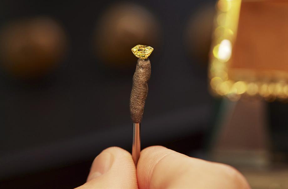
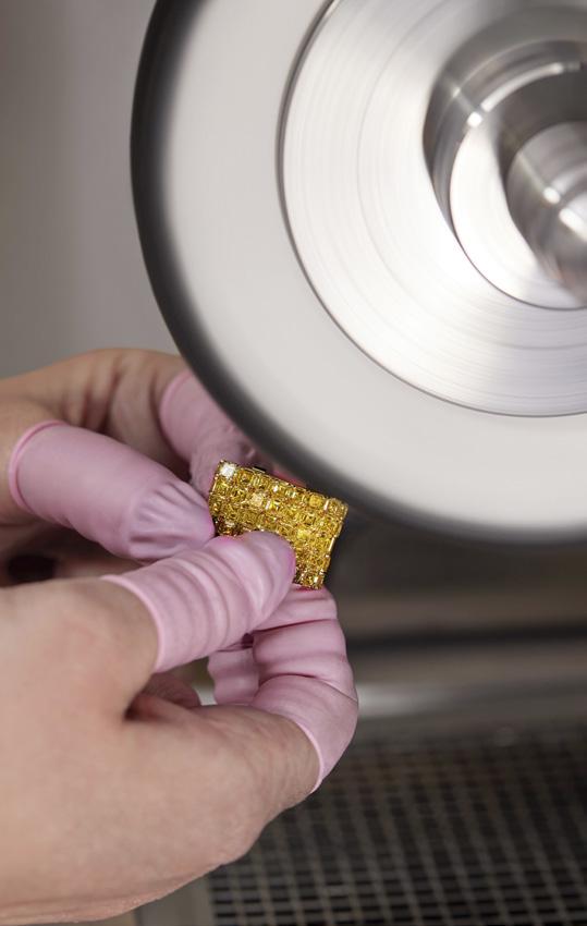
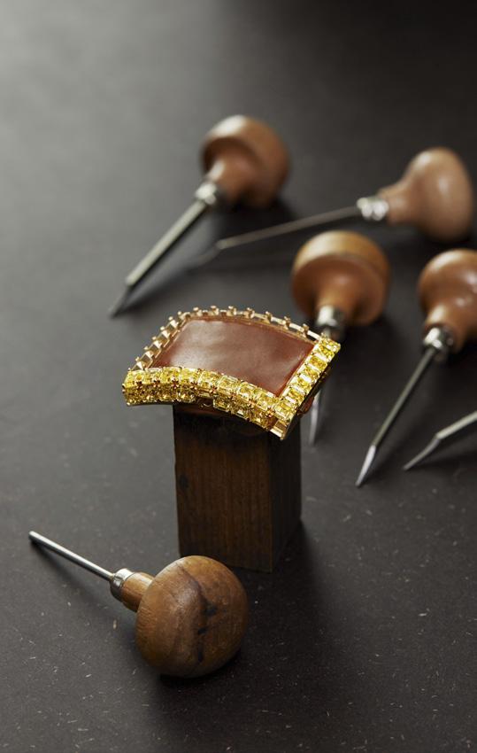
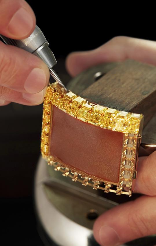
The inherent proportions of the demanding Asscher-Cut did not help matters. A squared shape with inclining corners, the Asscher-Cut is more of a 57-facet octagon, which demands much larger roughs than the typical brilliant cut. The rocks totaling 880 carats were, thus, meticulously cut into a total of 425 Asscher-Cut Fancy Yellow, and Fancy Intense Yellow diamonds totaling 216.89 carats.
“With white diamonds, we receive lots with dozens or hundreds of gems,” says Seraina Wicht. “For Billionaire Timeless Treasure, we were receiving stones one by one, two by two, three at the most. It happened several times that we spent several weeks without receiving a single one that was worthy of the piece.”
But here’s the rub, since color uniformity and perfect quality consistence were the priority, an unprecedented amount of waste was incurred when several large stones had to be cut to “fit” the overall color scheme. Indeed, the gems were not placed according to their size but their color. Never the less, each gem still had its designated place: 46 of the larger ones made up the case for a total of 55.15 ct., while the first rows of the 159 ct-bracelet also demanded hefty gems, with their individual size diminishing in perfectly regular increments as they neared the clasp.
Another team of 15 gem-setters produced a gold lattice that allowed all the stones to be invisibly set with the goal to create a singular mosaic where each stone has a specific part to play. The result is astonishing with the “band” looking like a single textured piece from a distance, and held together by anything other than what they have in common. Oh, and believe it or not, this skeletonized tourbillion watch can actually tell the time as well.
Indeed the lavishness of the Billionaire Timeless Treasure is matched only by its price tag: $20 million USD, each one backed up by impeccable quality, skill and the unyielding will that comes from being “inspired by the impossible.” Indeed, a divine undertaking of biblical proportions, never before has a timepiece been so lavishly set with so many high quality and large yellow diamonds. Never before have such stones been cut at such a high level of complexity as the Asscher-Cut in such large quantities for a single piece. And never has a watchmaker been as patient and resolute in its quest for quality and color consistence.

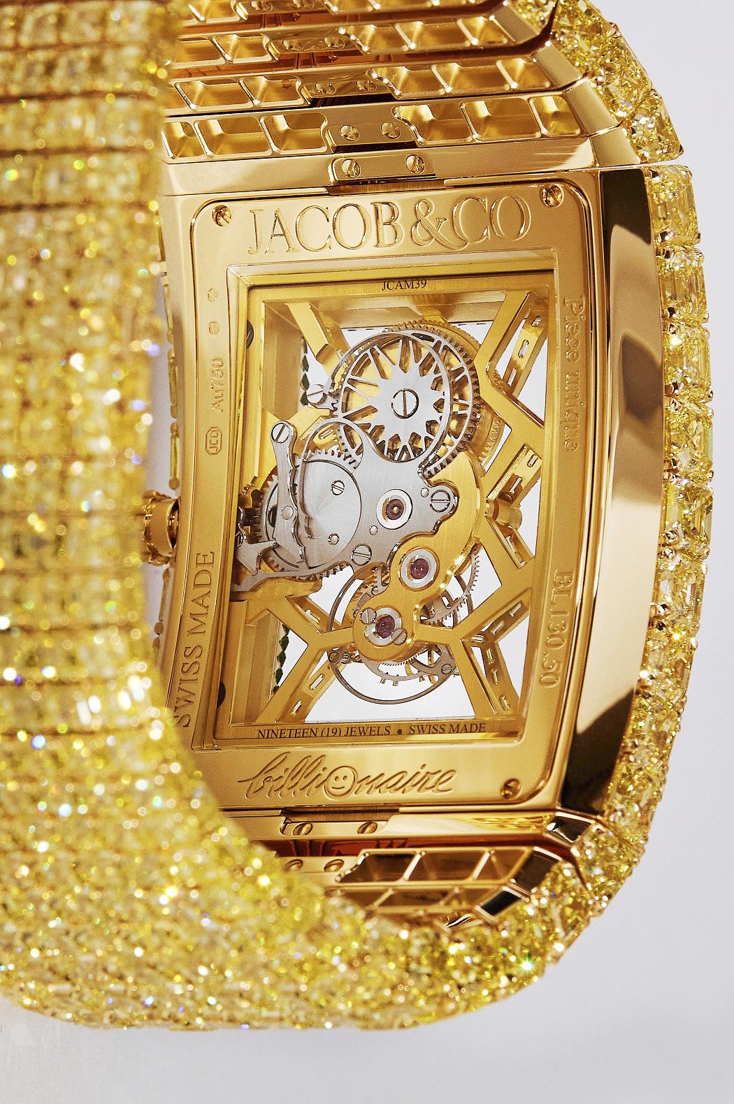
And that’s not all: the gems surrounding the movement had to be longer and thinner to fit the inner ring (the flange) that connects case to movement. Since it’s impossible to maintain the color intensity of yellow diamonds with those specific dimensions the Fancy Yellow and Fancy Intense Yellow color of the diamonds had to be enhanced by the unique green glow of 76 tsavorite gems, while the 167-part Billionaire skeleton tourbillon JCAM39 movement itself is adorned with another 57 yellow baguette-cut diamonds, the one-minute tourbillon regulator of which runs at 3Hz with the autonomy of 72 hours when fully wound. And did we mention the crown set with a 0.57-carat rose-cut yellow diamond?
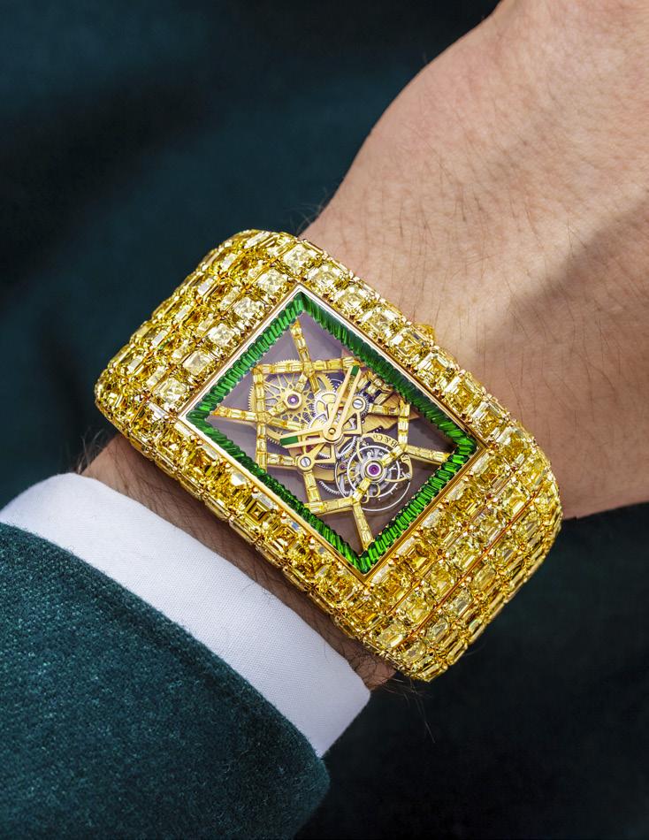
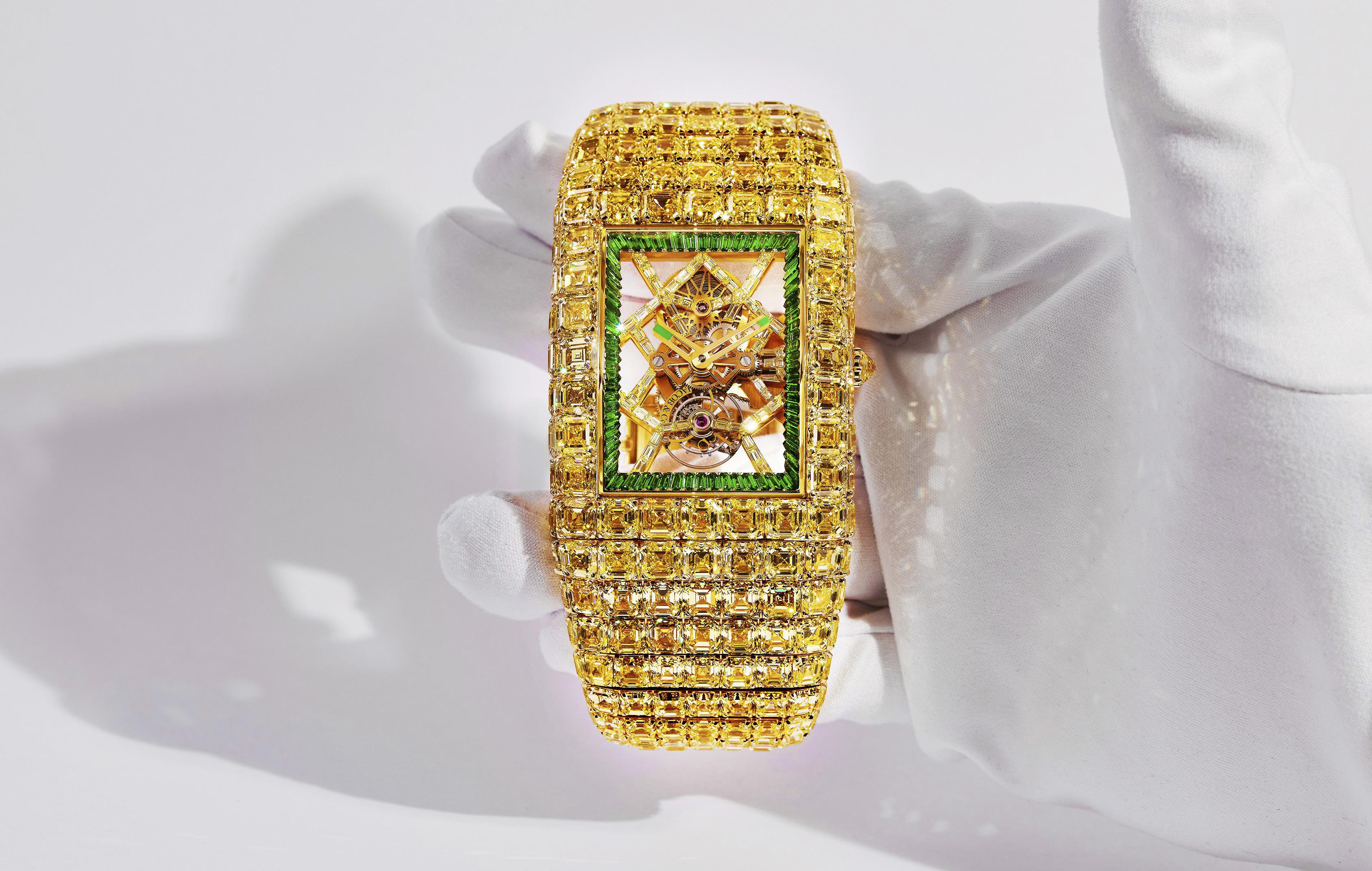
“We've browsed the entire world for three and a half years in search of an unprecedented number of perfect gems,” says Jacob & Co. CEO Benjamin Arabov. “We've gathered them here, in our Geneva headquarters, where each one was scrutinized at rough stage, at cut stage, before and after setting. The incredible work done by our gem-setters happened entirely here, in Geneva.We've combined our expertise in high jewelry with our skills in high watchmaking and used our drive to achieve what has never been done before. So we've created a unique piece that outshines every other high jewelry timepiece in opulence, exclusivity and diamond quality.”
The coolest little detail of the watch though is perhaps the least obvious one: flip the watch over to view the movement through the sapphire caseback and you’ll find the word “billionaire” engraved at the bottom of the case with a smiley face in place of the letter “o.” This suggests that even though this is quite obviously a seriously frivolous piece, the watchmakers know it and responded accordingly.
This begs the question: just how far are you willing to splurge on a fancy timepiece? For the 1% of the 1-percenters of this world, “anything” is probably the answer. Which is why as of February 2023, a total of twenty-one Billionaire timepieces had been crafted and sold either directly to private collectors or to the most high-end watch retailers on the planet. All, that is, except one, which made its “public,” worldwide debut in Geneva last March.
“Never before have such stones been cut at such a high level of complexity as the Asscher-Cut in such large quantities for a single piece.”
Words by Kit Payumo
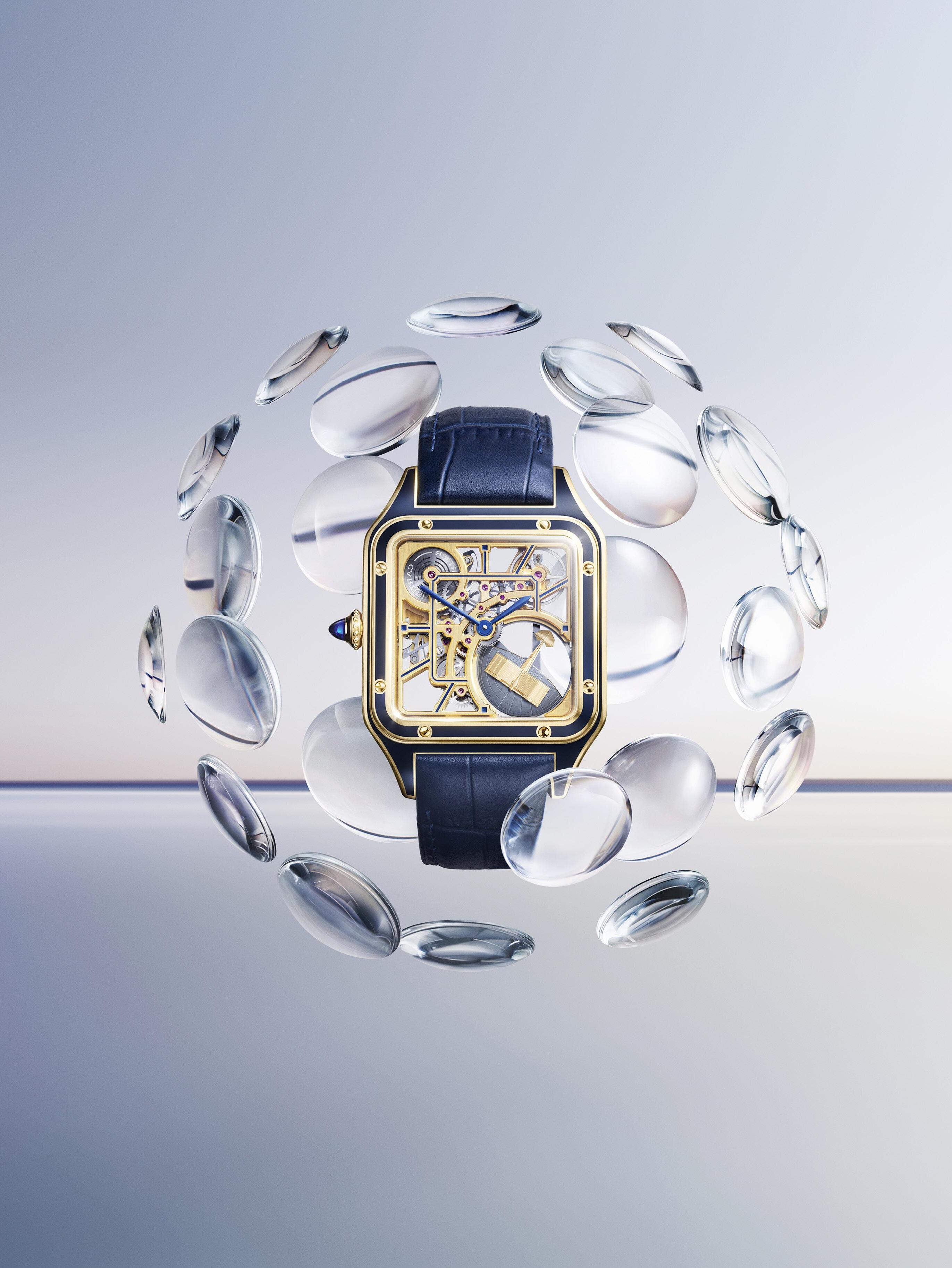
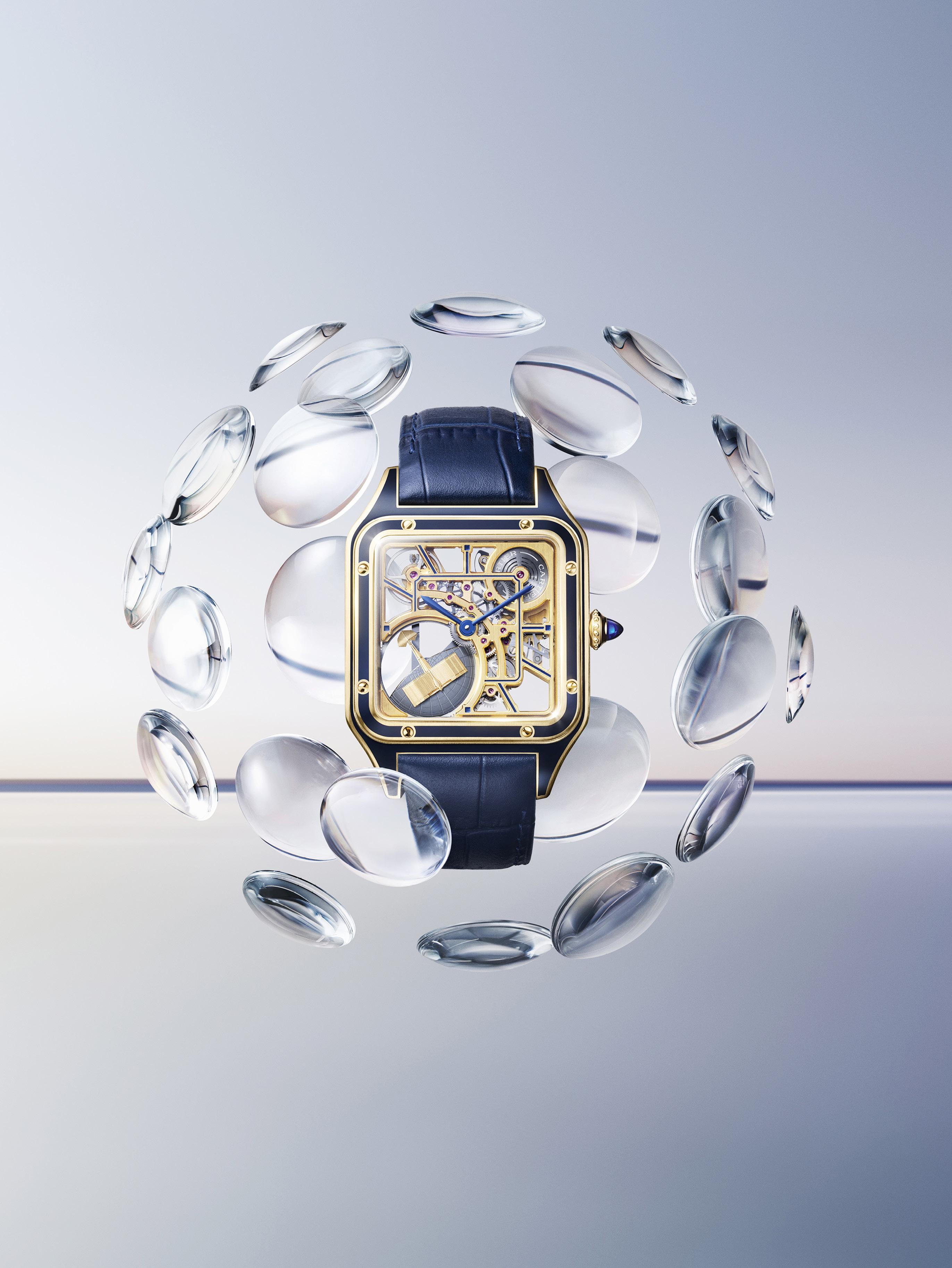
Nicknamed the “infuriated grasshopper,” La Demoiselle was a series of lightweight monoplanes built in France by the Brazilian aviator Alberto Santos-Dumont. Two planes in total were built, the SantosDumont No. 19, which was built in 1907 in an attempt to win the Grand Prix d’Aviation, and the Demoiselle No. 20, which was flown in 1908.
With a wingspan of 19 feet and powered by a 35HP engine, La Demoiselle is considered one of the world’s first ultra light aircraft and featured a wire-braced wing mounted above an open-framework fuselage extensively made from bamboo. Its pilot’s seat was located below the wing and between the main wheels of the undercarriage, while the rear end of the boom carried a tail wheel and a cruciform tail, which looks like a cross when viewed from the front or rear.
And just like any aviator that refers to his aircraft as “she,” Alberto Santos-Dumont named his monoplanes “Demoiselle,” which is a contraction of the French word mademoiselle, as well as a synonym for “jeune fille,” French for a young girl or woman. It is also a common name for a Damselfly, a winged insect similar but smaller than a dragon fly.
Regular Calibre readers are no doubt familiar with the story of how Alberto Santos-Dumont approached Louis Cartier and explained to him how accessing his pocket watch to monitor his flight time was somewhat inconvenient, and how Cartier delivered the iconic Santos watch in 1904, which was not only a unique piece designed specifically for the Brazilian aviator, but also went into regular production in 1911 to become the first ever watch designed to be worn on the wrist.
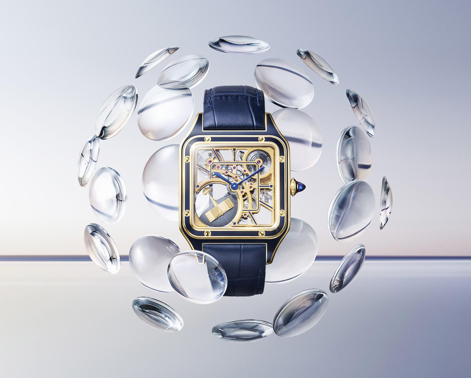
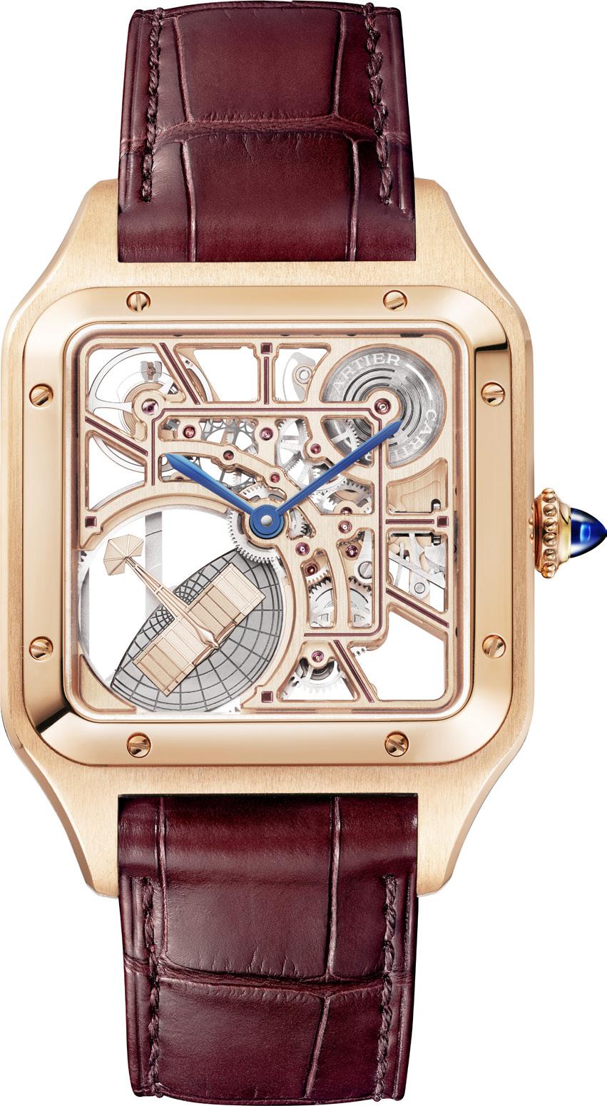
Over the years, the world has been graced with many iterations of Alberto Santos-Dumont’s tool watch. And this year, Cartier has elevated the familiar slim, understated shape of the iconic Santos-Dumont watch with a new 9629
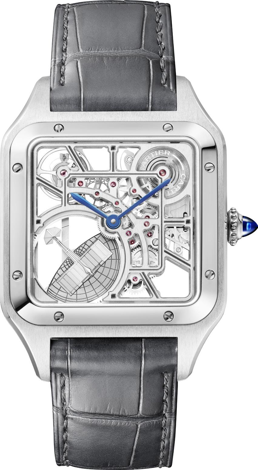
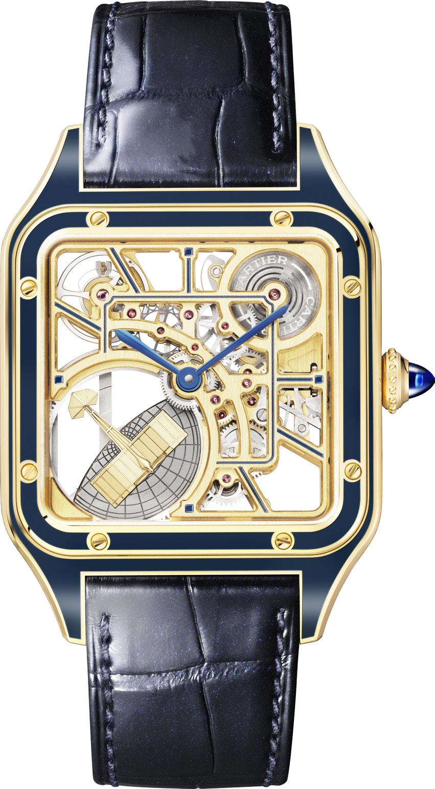
MC automatic skeleton calibre, a movement made all the more special with the integration of a miniaturized but fully functional oscillating weight in the shape of La Demoiselle, the trailblazing aircraft designed by the Brazilian aviator. Indeed, the symbol is made all the more powerful with the illusion of the Demoiselle soaring over a globe.
Over the past decade or so, we’ve seen Cartier release some attention-grabbing skeletonized watches. Indeed, Cartier has been designing movements that could be skeletonized from the ground up since 2009, and 2023 is apparently no different. Measuring 31.4mm across and 43.5mm long, the newest skeletonized SantosDumont model flaunts a lean profile of just 8mm while retaining the familiar boxy proportions of the original model, the eight screws embedded into its bezel, its blued steel hands, as well as the pointed sapphire cabochon incorporated into its beaded crown, all of which pay tribute to its many predecessors. So far, so very Cartier Santos-Dumont.
The real novelty here, however, is the unimpeded view of Cartier’s new 9629 MC automatic skeleton calibre, a beautifully executed 212-component movement that beats at 28,000 vibrations/hour and boasts almost 46 hours of autonomy. Indeed, the movement required almost 2 years to develop at its manufacture in La
Chaux-de-Fonds, and it all comes down to how the movement is suspended between a network of elegantly shaped bridges that echo the square shape of the case. As previously mentioned, no less special is the micro-rotor at 8 o’clock executed in the shape of the Demoiselle. This is counterbalanced by the openworked barrel at 1 o’clock, while the balance wheel is also exposed at 11 o’clock. And just like the hopeless romantics that they are the French are not about to miss out on a little romantic whimsy: the rotor was designed to look like the elegant little plane is flying over the globe.
The new Cartier Santos-Dumont Skeleton Micro-rotor is available in rose gold and stainless steel, each of which is highlighted by different tones of lacquer applied to the structure of their bridges: red for the former, and dark grey for the latter. Both models are matched with color coordinated alligator straps with large scales: brown for the pink gold version, and grey for the stainless steel.
The centerpiece of the new Santos-Dumont Skeleton collection, however, is the 150-piece limited edition in yellow-gold, which takes the sophistication up a notch by having all the details, the bezel, case and skeletonized movement bridges meticulously applied by hand with blue lacquer. Naturally, this yellow gold version with blue details is matched with an appropriately colored blue alligator leather strap.
“The symbol is made all the more powerful with the illusion of the Demoiselle soaring over a globe,”
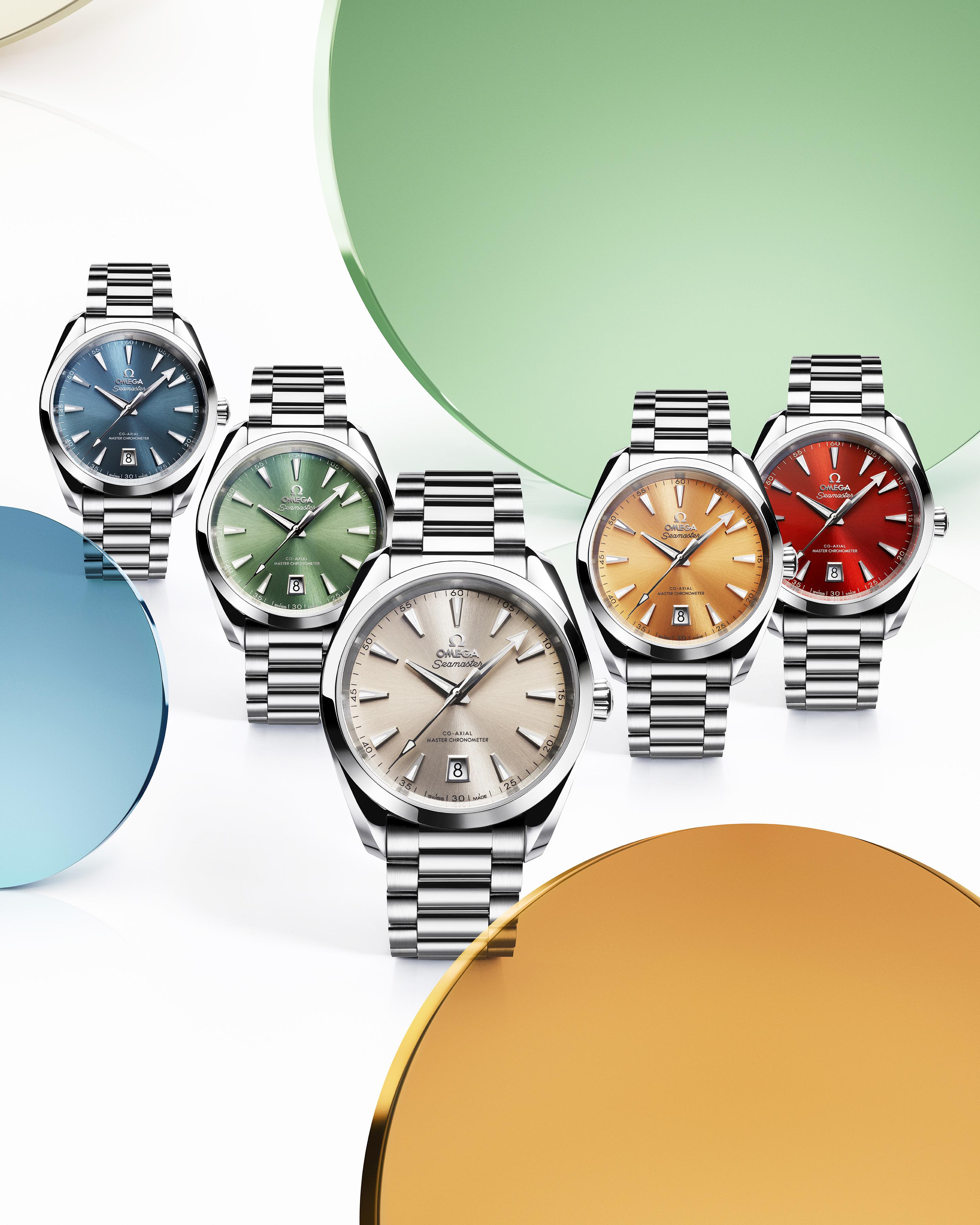
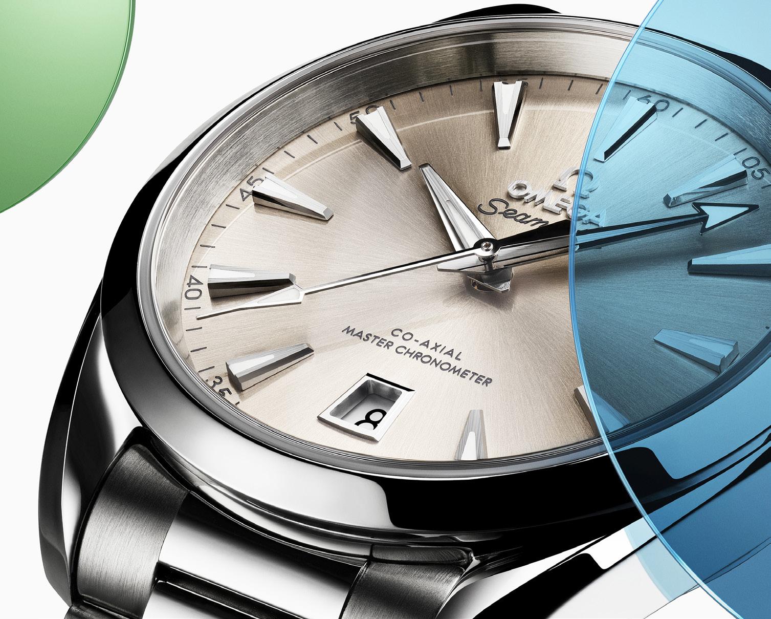
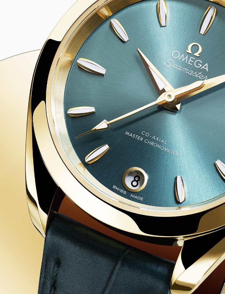
OMEGA watches are some of the most sought-after watches on the planet. Who doesn’t have a Speedmaster on their wishlist? Or even the OMEGA x Swatch planet models? The Aqua Terra models are on likely on that wishlist too, specially now with the colorful models OMEGA has brought us.
The OMEGA Aqua Terra was first introduced in 2002, and the name was meant to honor the Brand’s heritage and it’s iconic Seamaster line. Seamaster watches, aside from being incredibly handsome, were known for the reliability in the water and on land. Aqua and Terra – see what they did there?
The initial models in the Aqua Terra line were stylish and innovative, perfect for those with an active lifestyle. The models released in the last 20 years have continued with the spirit of the initial Aqua Terras – the watches are precise, laid-back yet very classic, Co-Axial Master Chronometer certified, of course. And now, they are also very colorful.

The OMEGA Aqua Terra Shades collection is bringing more color to our wrists. That real estate space on your left (or right) wrist is prime territory, and sometimes you want something classic with a twist to be there. Enter the Aqua Terra Shades models.
There are 12 Aqua Terra Shades models to choose from here – five in the 38 mm size, five in the 34mm size, and one golden model in each of the two sizes. It is complex, but trust me, it’s worth it. Both watch sizes are good for men or women, and sometimes it’s really a personal preference. For me, I switch between a larger size watch (some say it’s a gent’s model) and a medium-to-small size watch (typically seen as a ladies’ size watch). What makes me prefer one to another? Sometimes it’s the outfit, or the event, the sentimentality, or even which watch I happen to grab from my watch box when I’m rushing out the door.
Each color chosen for the Aqua Terra Shades is so clean and perfectly done, so you can’t go wrong with whatever watch you pick. The 38 mm stainless steel version comes in five deep colors: Atlantic Blue (perhaps a nod to the ‘Aqua’ in
the collection’s name), Bay Green (which is very soothing to look at), Sandstone (elegant and sublime), Saffron (quite playful), and Terracotta (yes, a very vibrant nod to the ‘Terra’).

The 34 mm stainless steel versions come in five delicate colors: Sea Blue (Aqua again), Lagoon Green (very serene), Sandstone (also very elegant), Shell Pink (dainty indeed), and Lavender (youthful and fun).


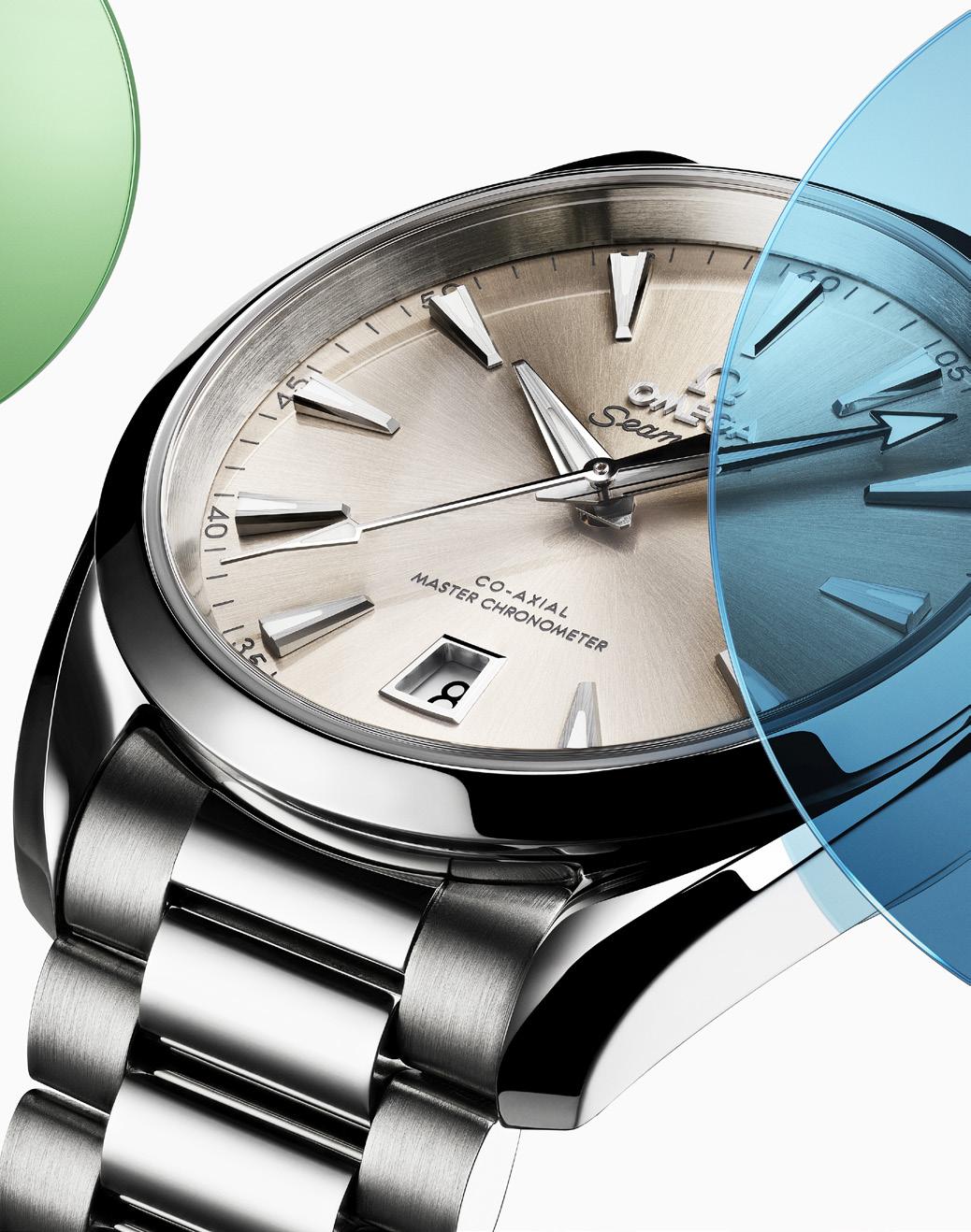

Each of the dials is carefully crafted from brass, then given a level up in finishing with lacquer. The colors are the result of more artisanship, lots of man-hours, and innovative technology. The Terracotta dial, for example, is achieved using Physical Vapor Deposition, or PVD, technology. The Sea Blue dial, on the other wrist, I mean, hand, is achieved using Chemical Vapor
Deposition, or CVD, technology. What does this all mean for us? It means that scientists and artisans work extremely hard behind the scenes and in the labs to create new ways to improve these watches that we cannot wait to get our hands on. Their hard work creates our latest flex.
If you’re looking for the elegant and classic his-and-hers watches, I’d suggest the 38 mm and 34 mm models in Sandstone. The color palette is more sedate that the other Aqua Terras in this collection, but the dials are still different enough from the white or silver dials to still be special.
A perusing of the 38 mm and 34 mm models side-by-side reveals little differences in details that help make all the difference. The 38 mm stainless
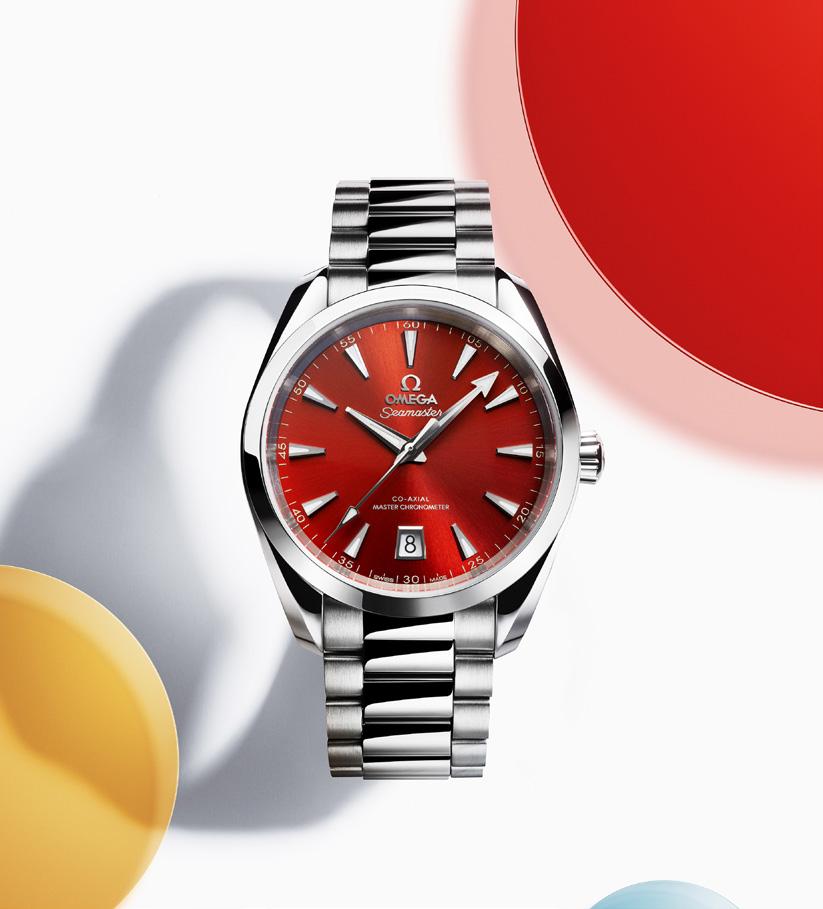
“more artisanship, lots of man-hours, and innovative technology”
models have rhodium-plated hands and indexes. The date window at the 6 o’clock has a boxy, masculine look to it. The 34 mm stainless steel models have 18K white gold hands and hullshaped indexes, with a feminine round window for the date, also at the 6 o’clock.
These models have stainless steel bracelets with slightly smaller and rounder links than previouslyreleased models. This adds a newness to the overall look while still staying true to the original Aqua Terra design aesthetic.
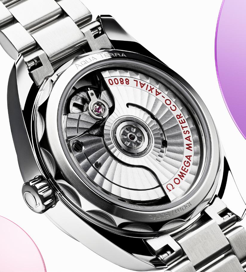
The stainless steel watch models are powered by the OMEGA’s Co-Axial Master Chronometer Calibre 8800. This means that each watch and movement has the highest standard of precision, quality, and magnetic resistance, having passed the strict tests set by the Swiss Federal Institute of Metrology (METAS).
What better way to showcase the delicious colors of the Aqua Terras Shades than with bold visuals and clips and, and of course some very goodlooking brand ambassadors too?
Zoë Kravitz is an American actress who has graced both the small and big screen, not just with her acting and but with just her voice too, in the case of some animation movies. Her exploits extend to the musical world too, as she is a singer and songwriter.
Zhou Dongyu is a Chinese actress and producer who has likewise been in movies and television shows. A quick check of her Insta profile shows 1 million followers, and counting.
Eddie Redmayne is a British actor who had stints in the National Youth Music Theatre and later on in university student productions. He had some television roles before moving to the silver screen. The years of training an experience seem to have paid off, as he has won an Olivier Award for best actor in a musical.
Each of these brand ambassadors knows excellence, and indeed, creates excellence too. The visuals and clips provide engaging forays into their world, with a colorful Aqua Terra on their wrist.
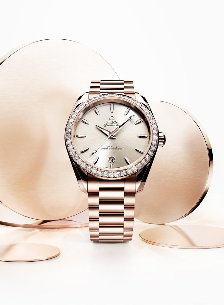
You might think we are done, but we are not –OMEGA has an ace up the sleeve with the solid gold models. The 38 mm model is 18K Sedna™ Gold, OMEGA’s red gold alloy. And even better it has a diamond-paved bezel, with 46 diamonds. The dial is sandstone in color (aha, another option for the his-and-hers plan), and has the rounded date window in 18K Sedna™ Gold just
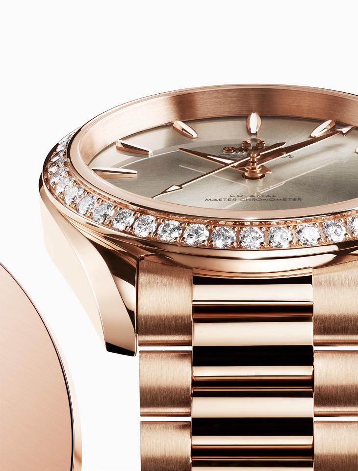
above 6 o’clock index, with hull indexes and greycolored transfers. The strap is an 18K Sedna™ Gold bracelet with a butterfly clasp.
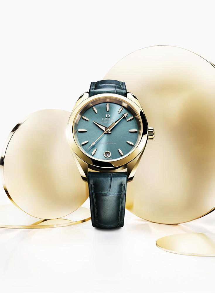
The 34 mm model is 18K Moonshine™ Gold, OMEGA’s pale yellow gold alloy. The dial is CVD-treated in lagoon green, has the rounded date window in 18K Moonshine™ Gold at the 6, with hull indexes and silver-colored transfers. The strap echoes the verdant dial with a pine green leather strap, with a buckle that has the OMEGA symbol on it.
Both models have ‘Au 750’ discretely engraved on the back of the watch, and each watch is powered by OMEGA’s Co-Axial Master Chronometer calibre 8801.
The OMEGA Aqua Terra Shades collection watches are colorful yet elegant, classic yet modern. Just as the Aqua Terra was a nod to the Brand’s Seamaster, perhaps one day OMEGA will create a collection that pays homage to this line too.
 Words by Kit Payumo
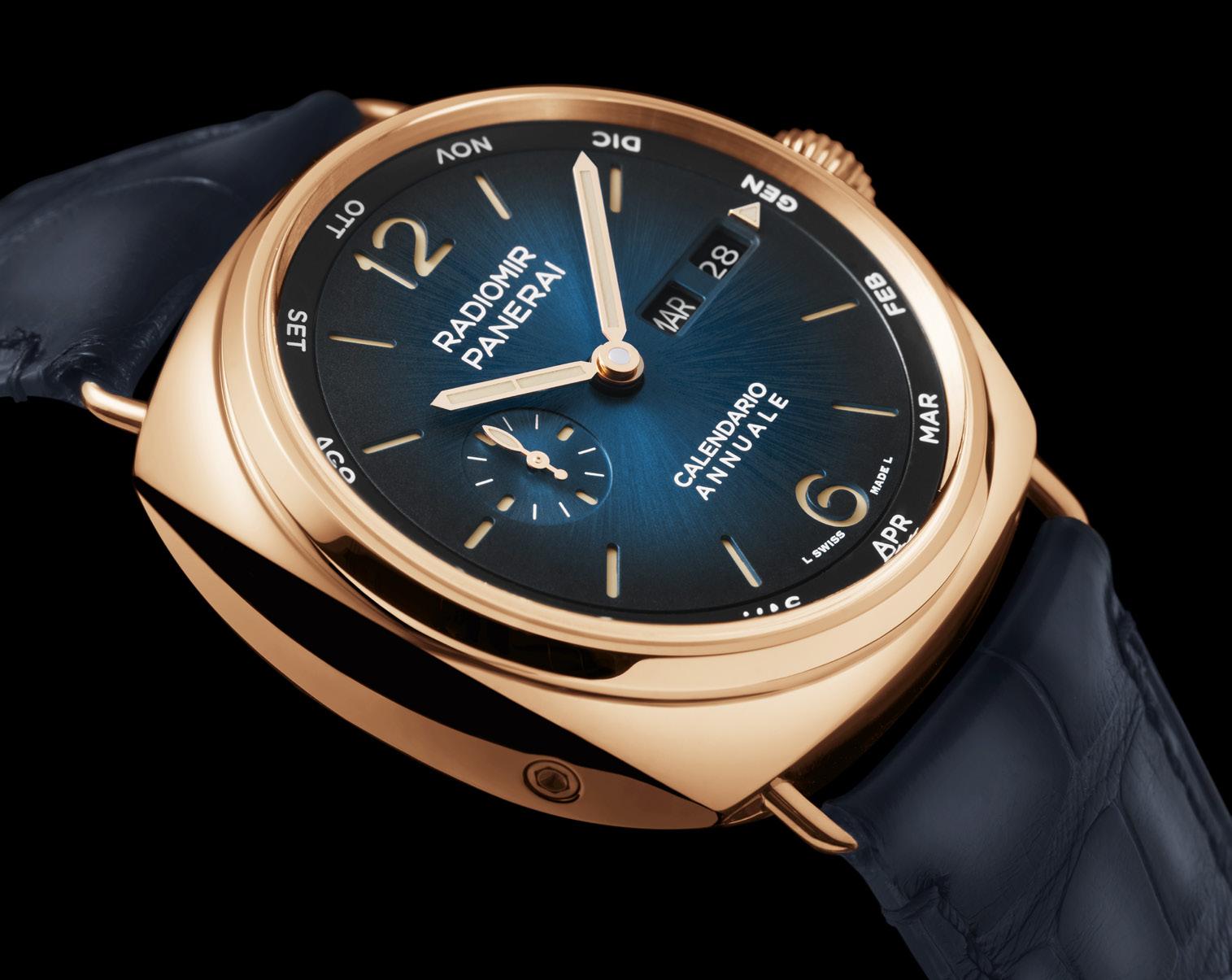
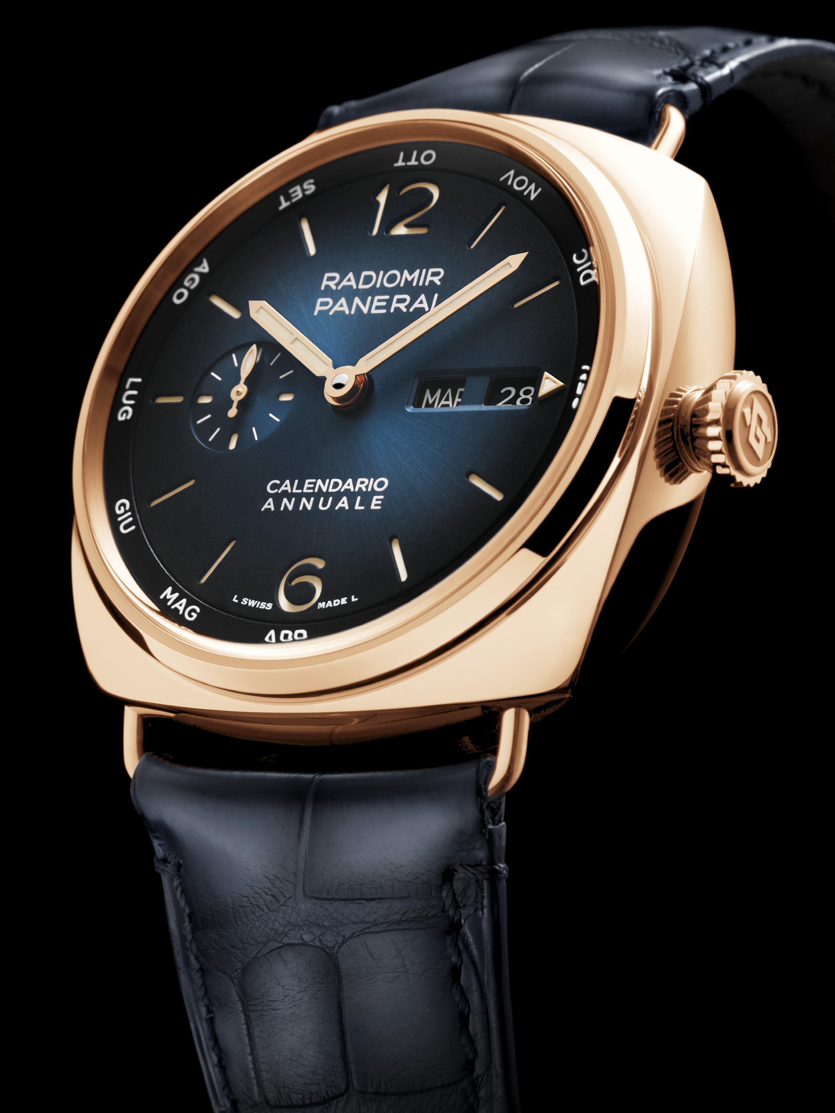
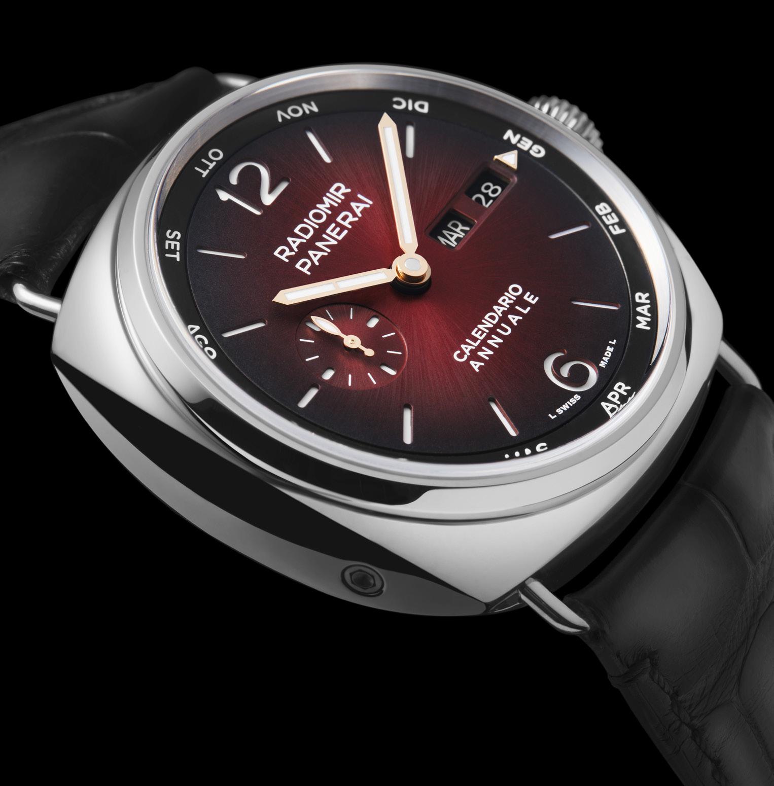
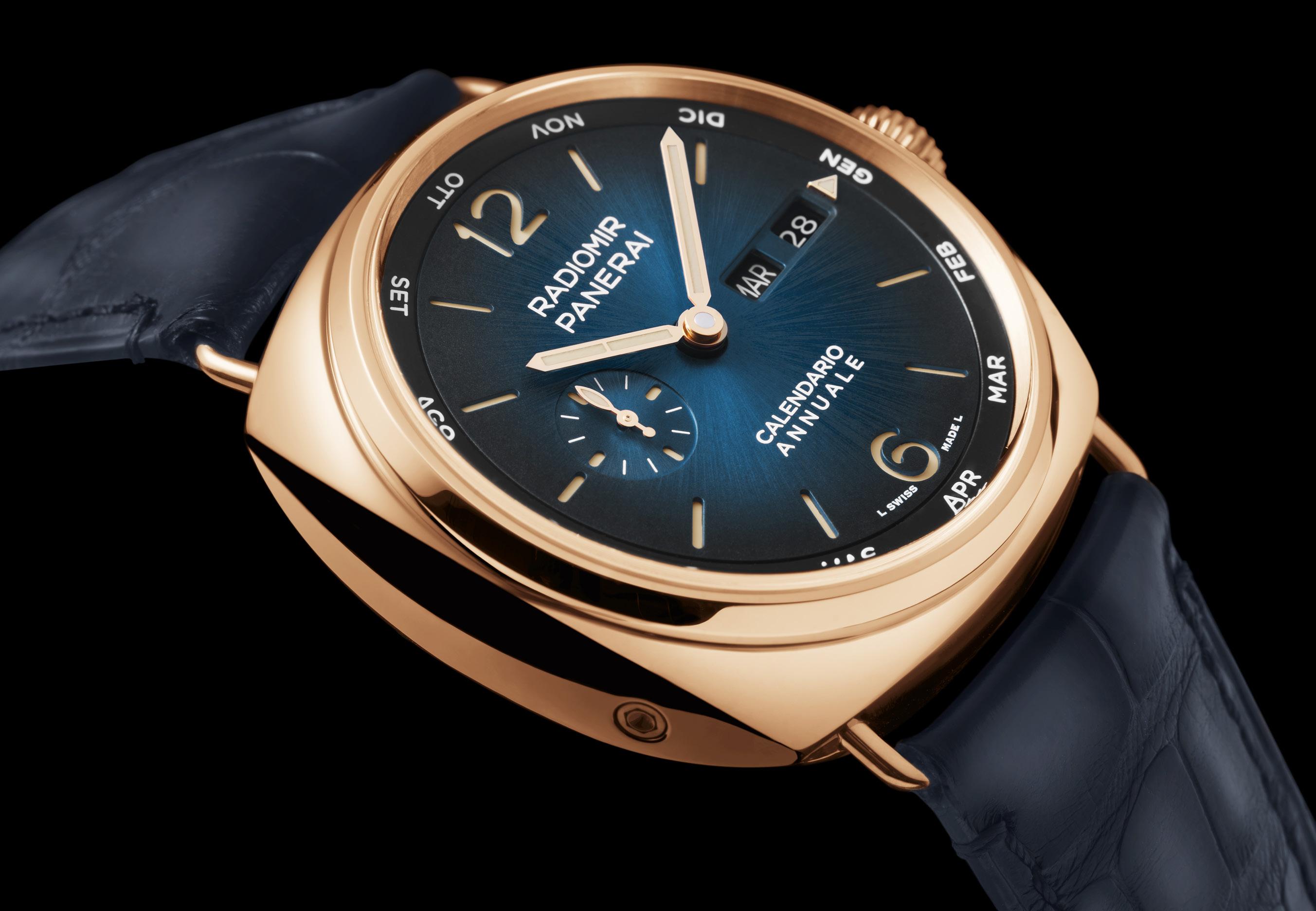
One of the highlights at Watches & Wonders this year was the expansion of the Italian watchmaker’s sleeker model with new variants, new sizes, new dials, and new complications. The biggest highlight from Panerai, however, was a first for the brand as a whole: the Panerai Radiomir Annual Calendar, which is not only the first annual calendar for the Radiomir collection, but the first annual calendar for Panerai, period.
Famous for developing movements with a clear and immediate readability, it’s a bit of a surprise that Panerai hadn’t tried their hand at an annual calendar until now. And while high complications are not something typically associated with Panerai, we have seen the Italian watchmaker dabble in the perpetual calendar before. Which is why it was a welcome surprise when reports started flooding in that Panerai had finally applied for the discount reaped by using the “budget,” only-somewhat-less-complicated, calendar complication.
Indeed, annual calendars always tend to get the short end of the stick, especially when compared to their astronomically priced perpetual calendar siblings. When all that’s required is to make a single manual adjustment on the first day of March, and you practically get a set-it-and-forgetit (at least for a year) calendar complication that
almost always costs a fraction of a comparable perpetual calendar’s price.
But don’t get us wrong, these aren’t budget watches, not by a long shot. And that’s because the new Panerai Radiomir Annual Calendar comes in two models, both in precious metals: the first in gold and the second in… (wait for it) platinum called the “Experience edition.” A limited edition of only 24 pieces, the price of admission for this second reference includes a free trip to the Eternal City, Rome, the capital of Italy, where owners will “experience” a guided tour of historic sites relevant to Panerai including the history, artisanal know-how, and culture of the manufacture.
Indeed, the 45mm polished cushion cases are classic Radiomir, all the way. But don’t be
fooled by that diameter, Radiomirs are famous for wearing smaller than their published sizes would indicate, and that’s probably because of those wire lugs, which are descended from the original 3646 made for the Italian Royal Navy in the early 1940s. That squared-off cushion shape is rendered in Goldtech, Panerai’s rose gold alloy with copper and peppered with a dash of platinum for PAM01363; while PAM1432 sees the familiar Radiomir case made from Platinumtech, the manufacture’s other proprietary alloy this time made of 950 platinum, which maintains its deep metallic hue while being harder and more scratch resistant than “regular” platinum.
Both watches are water resistant to 10 bar (100 meters), and feature a large cone-shaped crown
similar to those found in pilot’s watches. This not only sets the time, but also sets the month and date; while the days are managed with a corrector set into the case at 8 o’clock. But it’s on the dials where the real magic happens.
Never to be mistaken for anything other than a Panerai, the Panerai Radiomir Annual Calendar dial is flourished with many brand-specific features including the classic sandwich cutout indices with the rounded numerals at 12 and 6, as well as the running seconds at 9 o’clock with its distinctive seconds hand.
The primary timepiece, however, maintains its golden countenance with a complementing sun-brushed blue fumé dial that is so alluring it transitions from a lighter blue at the center to a
The new Panerai
Annual Calendar comes in two models, both in precious metals: the first in gold and the second in… (wait for it) platinum called the “Experience edition.”
darker gradient at the edges. While the second reference in platinum is set off with a similarly rendered dial albeit in a crimson so deep it almost seems sinister in its glamour. Both dials are treated with luminous Super-LumiNova, with the gold model getting lume in the old Radium color to match the case.
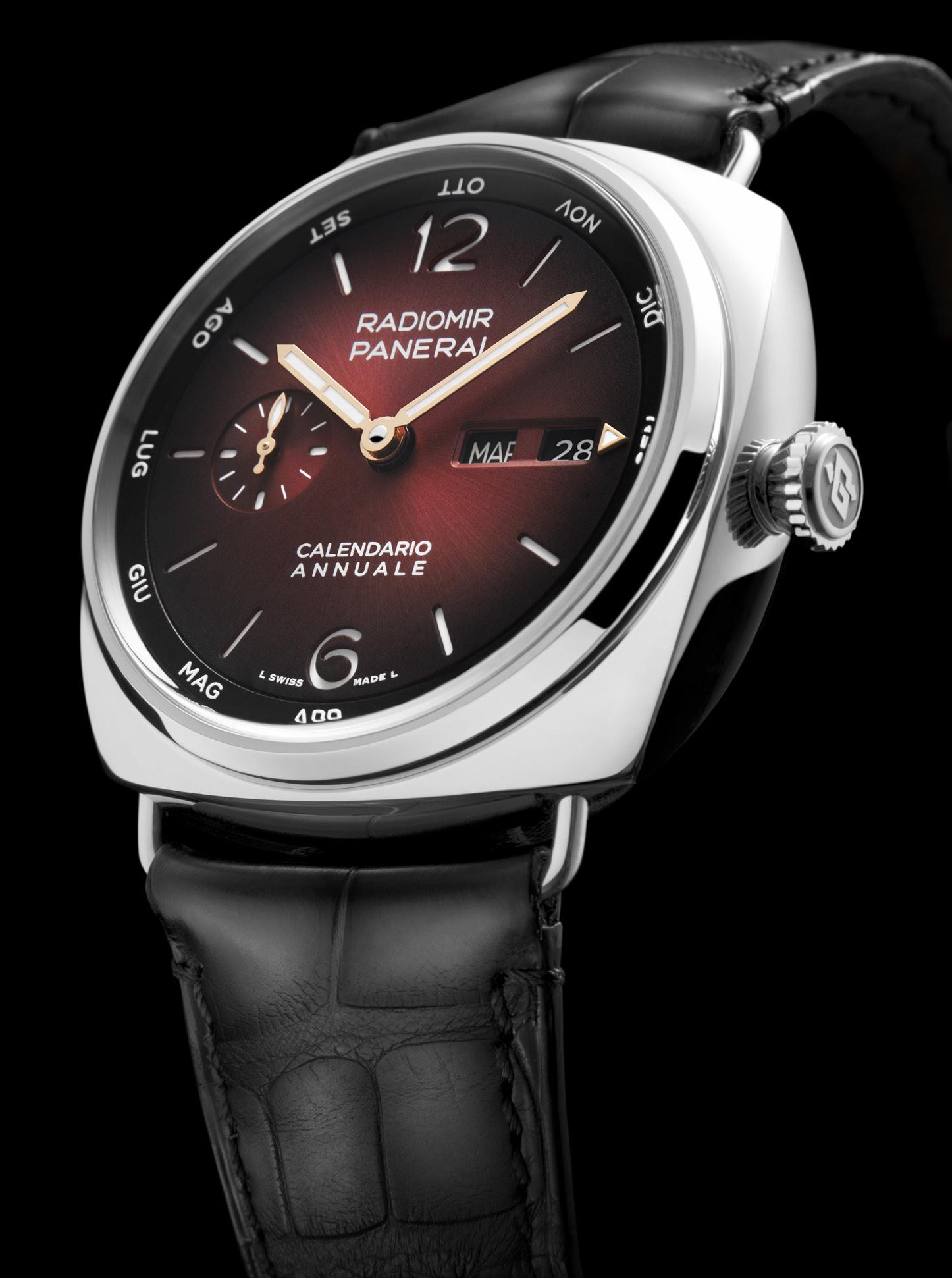
Further, despite forgoing the day/night and leap year indicators that mark perpetual calendars, the number of indications of an annual calendar can still be daunting, and if Panerai is known for one thing, it would be for keeping legibility as its utmost priority. Which is why it was such a pleasant surprise to see how legible the dial of the Panerai Radiomir Annual Calendar actually is. And if you’re familiar at all with the brand’s Luminor perpetual calendar, this dial is almost an elegant mirror copy…almost.
Once again unmistakably Panerai in its execution, the words “CALENDARIO ANNUALE” at 6 o’clock already tells you all you need to know about this Radiomir… even if you don’t speak Italian (a potential problem you might have to overcome anyway, because ALL the indications are in Italian, and that includes the months and days of the week).
Minimalist almost to a fault, the day of the week and date are read in-line via apertures at 3 o’clock. Standing out, however, is the month indication (if “stand-out” is even the correct term to use here because the month indication does anything but). Indeed, Panerai’s solution for the months is so unobtrusive they are displayed via a rotating disc around the dial’s periphery. So much so that the abbreviated months in Italian are shown almost subliminally, same as the days of the week.
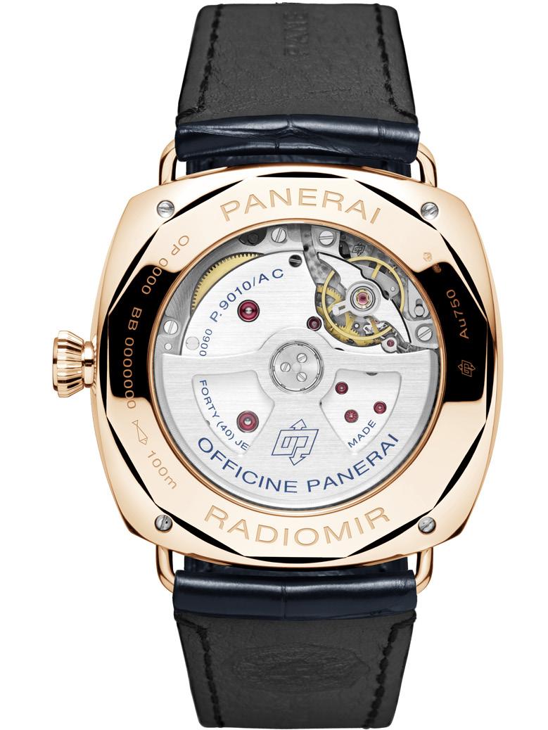
To power the annual calendars, Panerai banked on the framework of the existing P.9010 to create the P.9010/AC, a new self-winding movement developed specifically for the Radiomir collection. This 40-jewel calibre oscillates at a very modern 28,800 vibrations per hour, and boasts up to three days of power reserve courtesy of twin barrels.
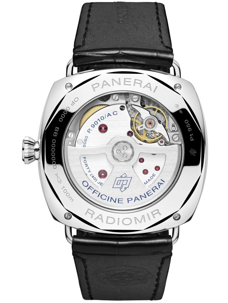
Wonderfully large and unmistakably Panerai, the new Panerai Radiomir Annual Calendar adds another chapter to the brand’s signature aesthetic. We doubt if it’s just us, but we’re pretty certain that this exciting new addition to the brand’s stable will probably sell like hotcakes. But that’s just our opinion.
The Ingenieur line of watches first appeared in IWC’s collection in 1955. It was originally created to address the needs of the era’s modern life. This collection of watches was special because it was designed for scientists and engineers who work in an environment that has electromagnetic fields. As we all know, these fields can adversely affect the accuracy of a mechanical watch. To counteract this invisible force, a soft iron case was built in the watch to protect the movement.
This first generation of Ingenieur watches continued on to the following decade. But around 1967, it received a “refreshed” design. A new case was created to accommodate the slightly thinner movement. Other changes to the design included sunburst dials, white gold markers, and applied IWC logos.
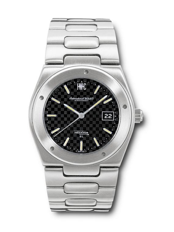
But despite their efforts, IWC was finding it a challenge to sell the Ingenieur. This wasn’t necessarily a bad thing. It is true that not many of
Gérald Genta’s Ingenieur SL, Reference 1832these watches were sold. This also means that not many of these watches were produced. And these translate to the watch being rare, and as we will see in the future, become highly sought after.
Going back, in 1969, IWC recognized the need for a “revamp” of this model, to completely modernize the watch. In their historical archives, there were plans for this but they were never executed. IWC decided to start fresh, to go outside of the company for a new design.
The responsibility for creating a new design fell upon the lap of Gérald Genta, the only known independent watch designer at the time. Genta had made a name for himself through his main accomplishments of the Royal Oak and the Nautilus. The design stipulations included the following: The watch had to be round with an integrated bracelet, and it had to maintain the double case and accommodate for a thinner movement. Designed in 1974 by Genta, the Ingenieur SL Automatic reference was released in 1976.
It is this Genta-designed Ingenieur that IWC chose to upgrade, to modernize. When Gérald Genta first designed the Ingenieur in 1976, he was able to give it a new, highly distinctive visual identity. It featured gold aesthetic codes such as a screw-on bezel with five recesses, a dial with a unique pattern, and an integrated H-link bracelet.
Today, IWC presents the new Ingenieur Automatic 40.
IWC invested a lot of time and effort into engineering this new automatic model, taking careful considerations to keep the perfect case
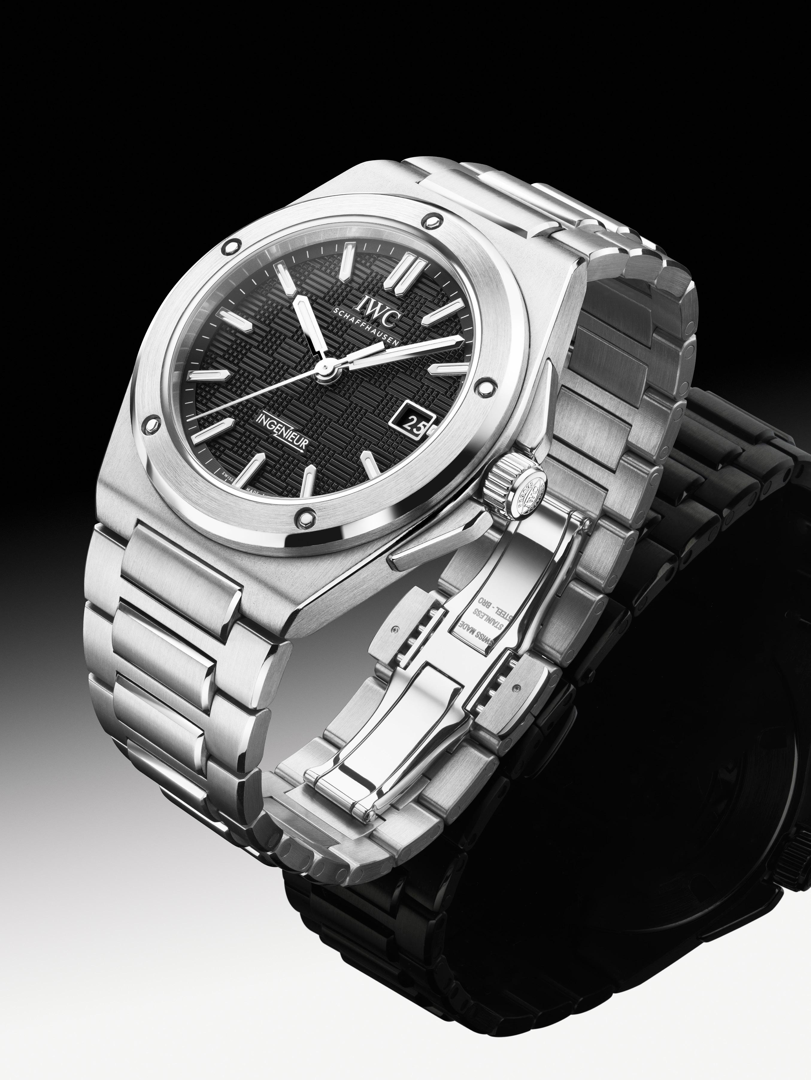


“This newly-engineered automatic model reflects the bold aesthetic codes of Gérald Genta’s original design.”
proportions and ergonomics. Christian Knoop, Chief Design Officer of IWC Schaffhausen stated: “It is not every day that a designer gets the chance to work on an icon like the Ingenieur SL. We were aware of the enormous responsibility this task entailed and proceeded very cautiously. Nevertheless, we believe we succeeded in creating a new and contemporary interpretation, perfect down to the smallest detail. While keeping faithful to the original design signature, the new Ingenieur Automatic 40 is a perfect embodiment of IWC’s engineering excellence.”
The Ingenieur Automatic 40 has enhanced ergonomics and wearability. The overall dimensions of the case have been carefully reworked and improved down to the smallest detail. The lug-to-lug distance of 45.7 mm ensures perfect ergonomics and excellent wearability, even on a slender wrist. It features a newly engineered middle-link attachment that provides an even better fit on the wrist.
The Ingenieur Automatic 40 is fitted with functional screws and “Grid” dial. The original Ingenieur SL had a bezel with five recesses screwed onto the case ring. As a result, the recesses ended up in a different position on each watch. The new Ingenieur Automatic 40 has five screws secure the bezel to the case and are
always in the same position. Additionally, the dial features a distinctive “Grid” structure, creating a balance to the technical and very sculptural case design. It is stamped into the soft iron blank before it is galvanized. The appliqués with luminescence add additional depth and ensure easy legibility.
The Ingenieur Automatic 40 has a high level of detail and finishing. The case, bezel, and bracelet are elaborately finished using a combination of polished and satin-finished surfaces. The upper parts of the bracelet contain closed links without pins, accentuating the outstanding craftsmanship. The elaborately finished butterfly folding clasp highlights the beauty and thinness of the H-link bracelet.
The Ingenieur Automatic 40 is powered by the IWC-manufactured 32111 calibre with an automatic pawl winding system and a power reserve of 120 hours. In keeping with the tradition of the Ingenieur, a soft-iron inner case efficiently protects the movement from the effects of magnetic fields. The case is water resistant to 100 meters.
The Ingenieur Automatic 40 is available in three references in stainless steel:

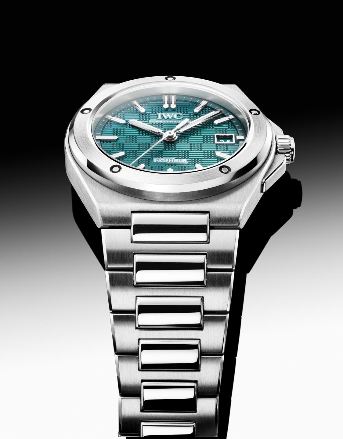
• Ingenieur Automatic 40, Ref IW328901 in a stainless steel case, black dial,
rhodium-plated hands and appliqués, integrated stainless steel bracelet with butterfly folding clasp.
• Ingenieur Automatic 40, Ref IW328902 in a stainless steel case, silver-plated dial, rhodium-plated hands and appliqués, integrated stainless steel bracelet with butterfly folding clasp.
• Ingenieur Automatic 40, Ref IW328903 in a stainless steel case, aqua dial, rhodium-plated hands and appliqués, integrated steel bracelet with polished center links and butterfly folding clasp.
A fourth version is available, this one is presented in titanium.
• Ingenieur Automatic 40, Ref IW328904 in a Grade 5 titanium case, grey dial, black hands and appliqués, integrated grade 5 titanium bracelet with butterfly folding clasp.
All new Ingenieur Automatic 40 models are available through selected IWC boutiques. They are eligible for registration under the My IWC care program, benefitting from a 6-year extension to the standard 2-year international Limited Warranty.
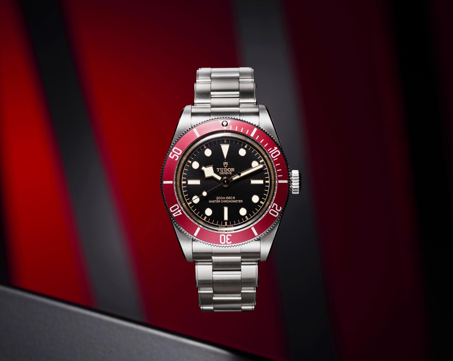
The original Black Bay was first launched in 2012 with a burgundy bezel. Four years later, the color came out once more, but this time, carried a Manufacture Calibre.
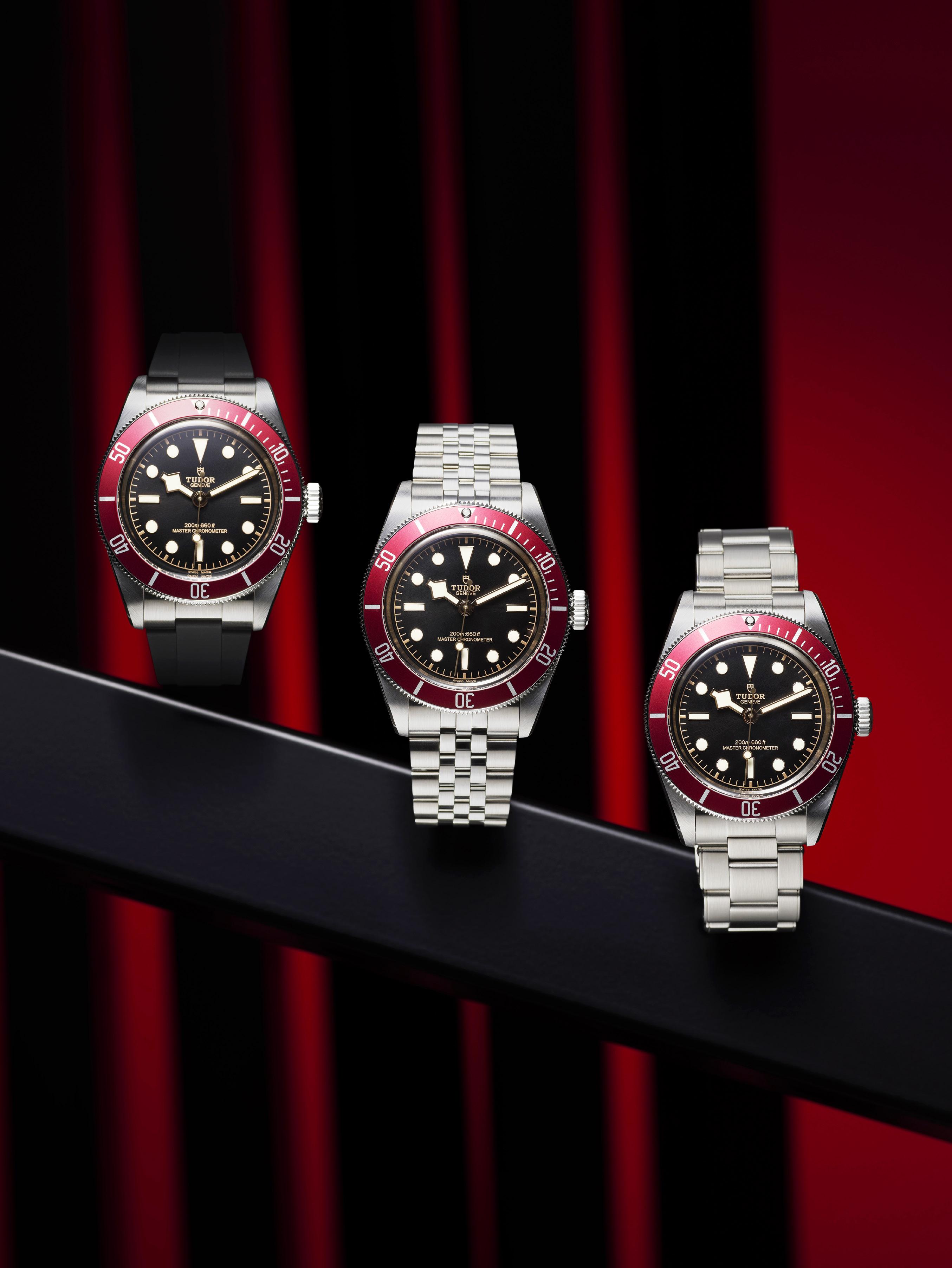
This year, the Black Bay with the burgundy bezel returns for the third time carrying cutting-edge watchmaking technology with design elements inspired by TUDOR’s heritage of making robust professional diving watches.

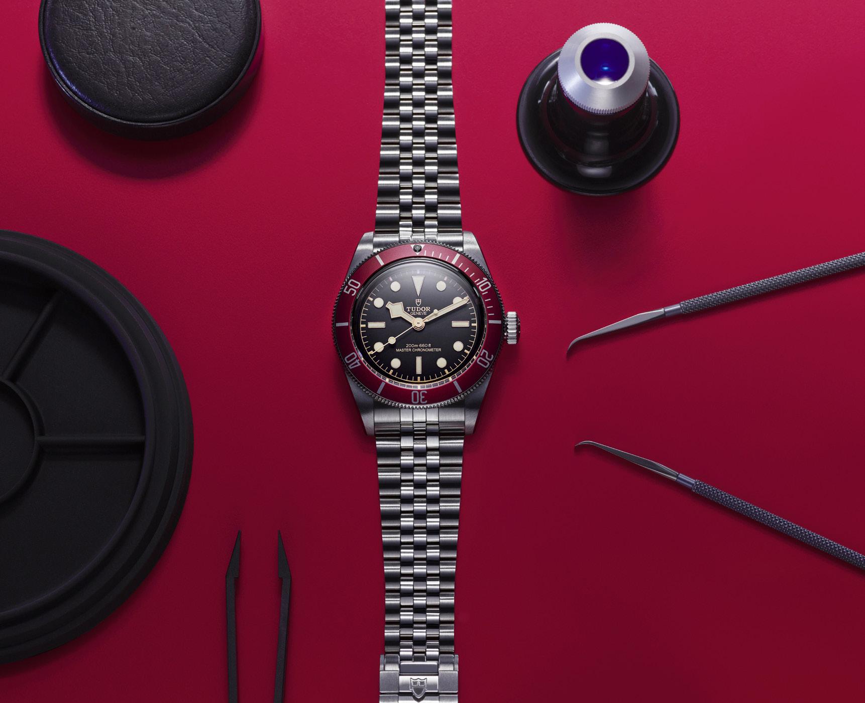
This latest release of the Black Bay still carries the signature details of what makes it a Black Bay. It sports the inverted triangle at the 12 o’clock position, rectangular indices at the 3, 6, and 9 o’clock, and circles for the remaining hour markers. It also has the iconic snowflake hour hand and the lollipop seconds hand.
Inside the case ticks the Manufacture Calibre MT5602-U that displays the hour, minute, and seconds functions. It offers the general look and feel of TUDOR Manufacture Calibres with dedicated sun laser design and bears the Master Chronometer on its bridges. Its rotor is fashioned in tungsten monobloc and is openwork. It also features the distinctive laser radial grooving with sand-blasted and polished surfaces and laser decorations.
In order to be labeled as a Master Chronometer, the watch needs to undergo comprehensive certification tests, which include precision, resistance to magnetic fields, waterproofness, and power reserve. In order to qualify, the watch must be able to function within a 5-second range of variation each day (0 +5), that is to say 5 seconds less that the Swiss Official Chronometer Testing Institute


(COSC) that requires a -4 +6 variance, and a second less than TUDOR’s internal standard, which is applied to the brand’s models with a Manufacture Calibre (-2 +4).
All test and prerequisites leading to the Master Chronometer certification, which the Black Bay has achieved, are summarized as follows:
• Swiss made
• Certification by the Swiss Official Chronometer Testing Institute (COSC) Precision at two temperatures in six different positions, and at two different levels of power reserve: 100% and 33%
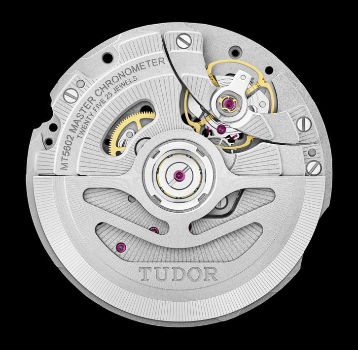
• Smooth functioning when exposed to a magnetic field of 15,000 gauss and precision following exposure

• Waterproof to 200 meters (660 feet) in accordance with ISO standard 22810:2010
• 70-hour power reserve
The Black Bay with burgundy bezel remains one of TUDOR’s most recognized models. In its latest iteration, named Black Bay, the case keeps the original proportions of a 41mm diameter case with a thinner profile. The unidirectional rotatable bezel offers very prehensible sides and its insert shows subtly curved numerals aligning with the outline of the outer ring.
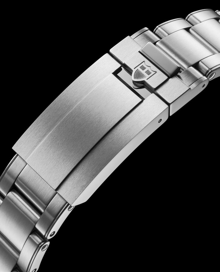
This Black Bay with burgundy bezel has three variations. The first is fitted with an entirely satin-brushed three-link steel bracelet. The second comes with a five-oval-shaped-link brushed and polished steel bracelet. They both come with the TUDOR “T-fit” clasp equipped with a system for rapid length adjustment that requires no tools. The clasp ceramic ball bearings that ensure a smooth and secure closure in addition to adding a pleasing tactile element to the action of the clasp.
The third variation comes with a black rubber strap. It comes in three sizes complete with TUDOR “T-fit” clasp. For the perfect fit, it is able to be cut down to the exact size of the wearer’s wrist. On the inside it features the signature

snowflake motif, and it is form-fitted specifically for the Black Bay.
The Black Bay line is the result of the subtle blend of traditional aesthetics and contemporary watchmaking. It brings together over sixty years of TUDOR dive watches, at the same time being resolutely anchored in the present. Though it has a neo-vintage aura, its manufacturing techniques, reliability, robustness, and the quality of its finish are consistent with today’s more rigorous requirements.
“Though it has a neo-vintage aura, its manufacturing techniques, reliability, robustness, and the quality of its finish are consistent with today’s more rigorous requirements.”
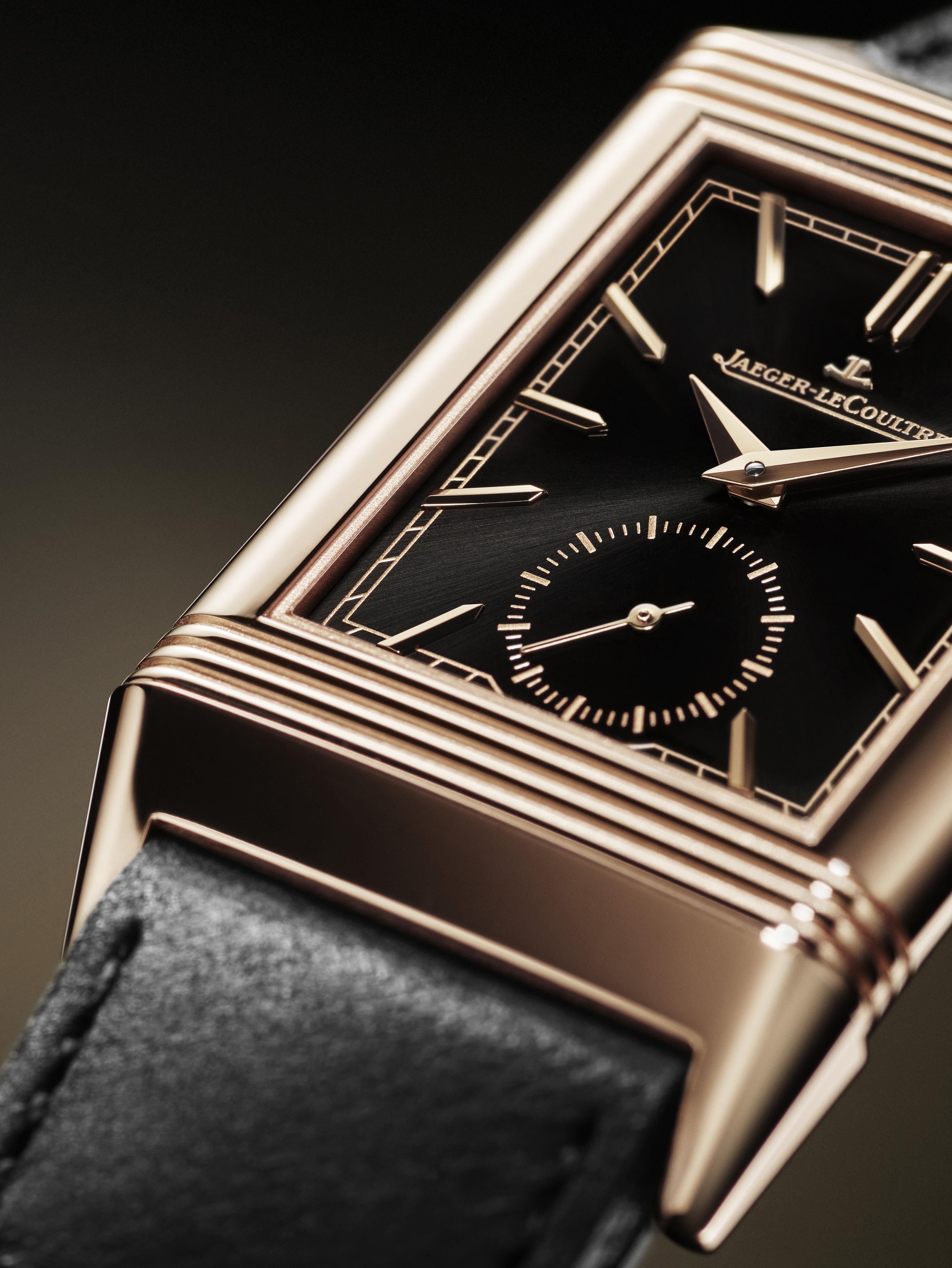
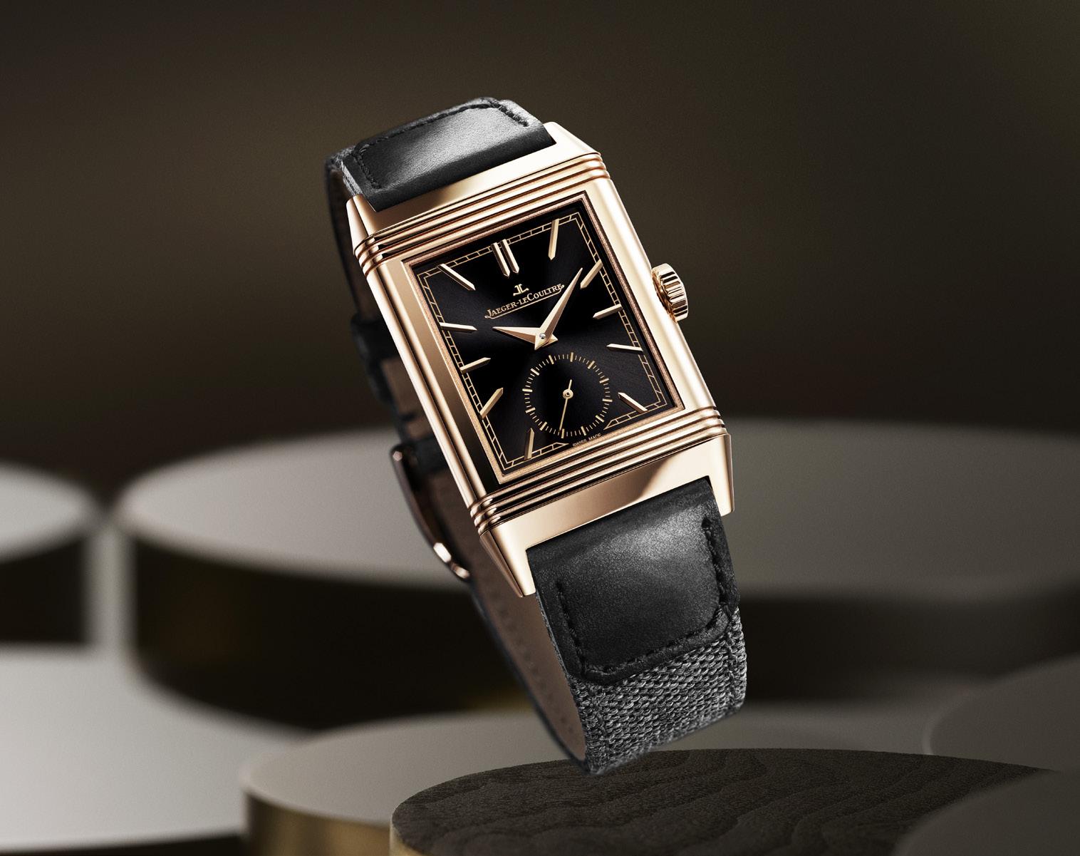
The Jaeger-LeCoultre Reverso watch has a wonderful storied past. Legend has it that a polo-playing gentleman was upset when his watch was smashed during a particularly intense polo match. Said gentlemen then asked a friend to create a watch that would be able to withstand the physical stress and occasional contact during a match. Thus was born the Reverso — a watch whose dial could reverse with a quick swivel to protect the crystal. The year was 1931, and now more than 9 decades later, the Reverso is still a fantastic watch.
Perhaps the Reverso is so appealing because it adheres to the Golden Ratio, that mythical number that somehow uses mathematical concepts applied to objects. The harmony and beauty seem effortless, but apparently follow a mathematical construct. Think of the innate beauty of a Nautilus shell, for example. Though not exactly symmetrical, the spiral is a thing of beauty. A supermodel’s face that aligns with the Golden Ratio is often used to show the beauty of the, well, beauty.
Though the Reverso watch has had various iterations through the years, the initial design
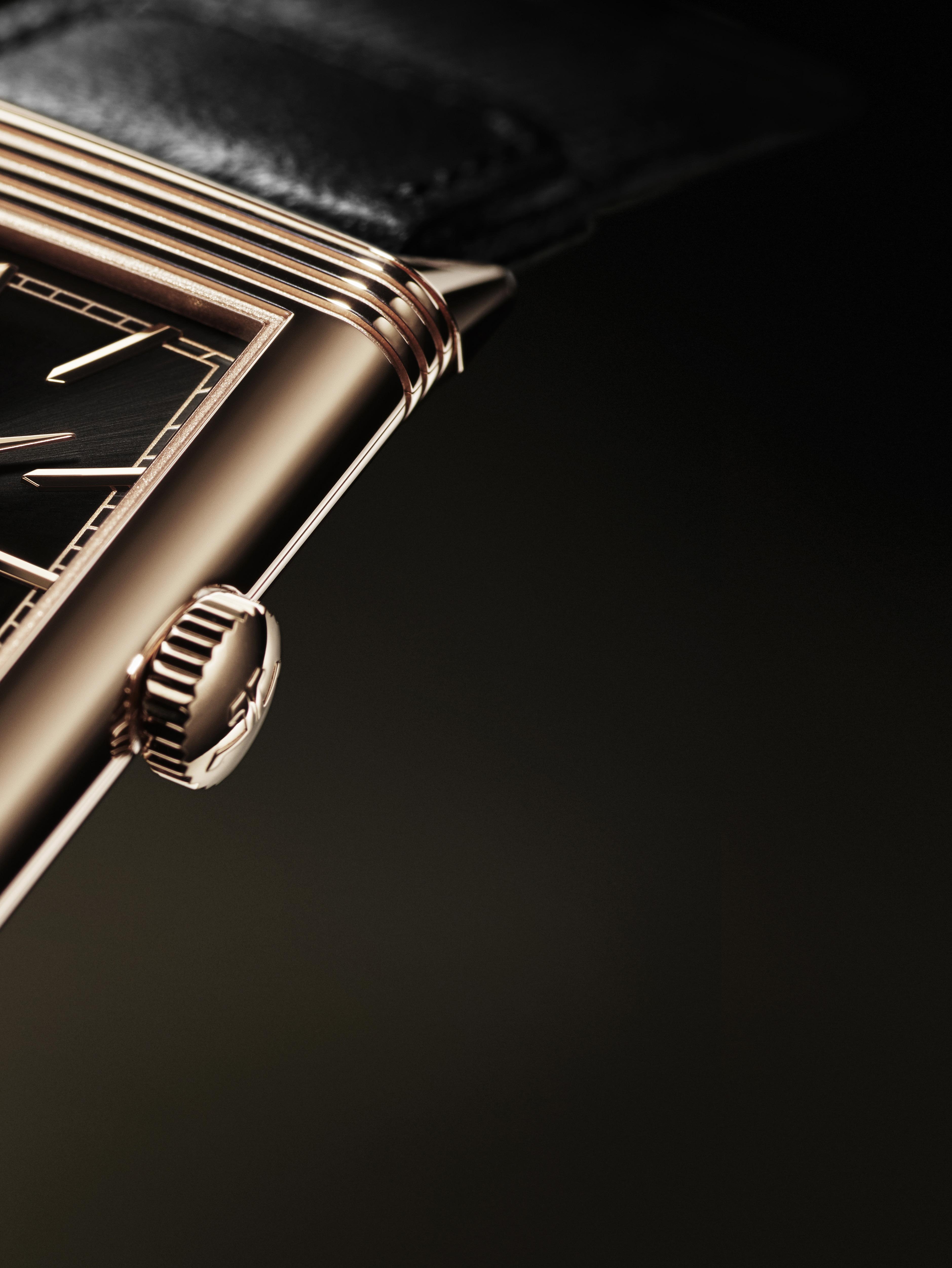
is a constant characteristic. The Reverso is a combination of functionality and style, which required a new way of thinking about watches. Watches were typically round, harkening back to the sundial, the original timepiece. The Reverso though was and is rectangular. It is no simple feat to simply compress the round mechanism to fit into a rectangular case, and you can’t just lob off the errant sections either. A redesign, or a reinvention, of the watch mechanism was needed.
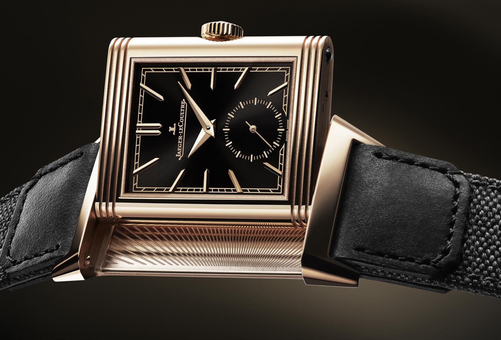
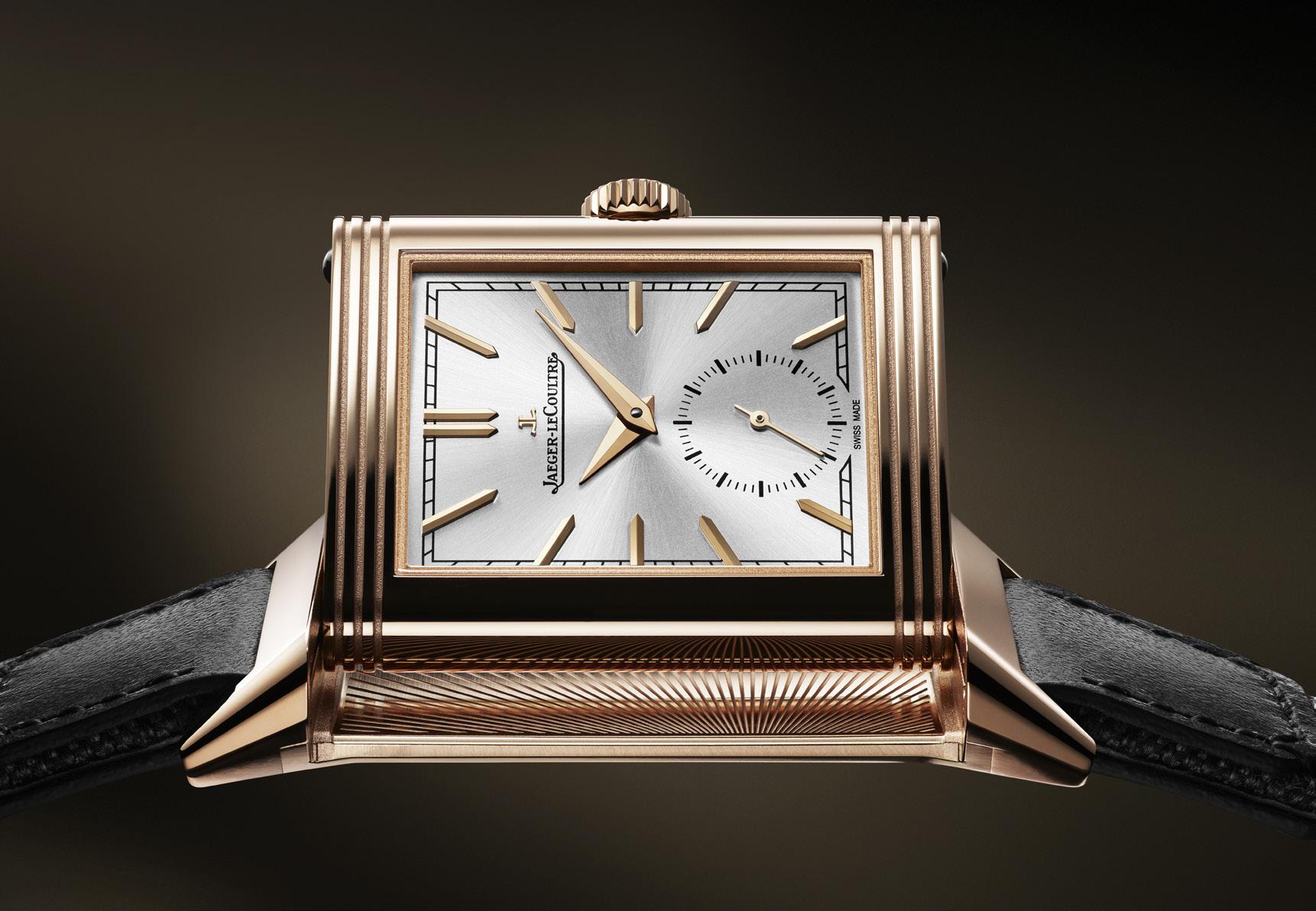
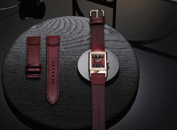
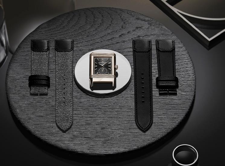
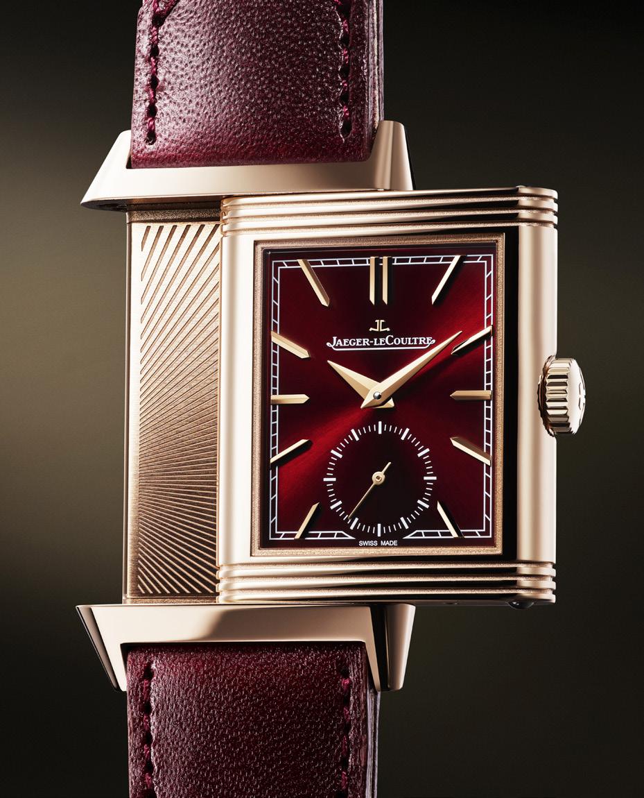
Adding to the feat was having the case swivel while still connected to the frame. A simpler solution could’ve been to just pop out the dial completely and then reinsert it face-down. But the likelihood of the dial popping out during a fast-paced polo match was too high, so the dial still needed to be attached to the watch frame. The slide-and-swivel mechanism is quite complex, with 40 of the 50 components purely for the swiveling move.
The Jaeger-LeCoultre Reverso Tribute Small Seconds has all these design aspects from the original Reverso, and yet it still brings something new to the table, or rather, the wrist. One significant change is the case being even slimmer than it was. Reducing the case by almost a full millimeter brings the Reverso Tribute to a mere 7.56 mm, and yet the watch retains the elegance and sophistication, and yes, still adheres to the Golden Ratio.
The flipside of the dial here remains an open slate for personalization. It can be kept blank, a solid statement, or it can be engraved with something special just for the wearer. Perhaps the first run of the Reverso watches had the polo team logo or mantra.
Shortly after the 1931 release of the Reverso, Jaeger-LeCoultre began to experiment with variations of color. White or silver dials were expected back then, but Jaeger-LeCoultre introduced dials of other colors. The 2023 Reverso Tribute Small Seconds continues with that successful foray and has four dials to choose from.
Color abounds in these Reverso Tribute Small Seconds models — deeply rich colors. The black sunray dial model (reference no. Steel Q713842J) is an homage to the original 1931 Reverso. The silver sunray dial model (reference no. Q7132521) is very elegant and perhaps easier to read, with hour markers and hands that match the pink
Reference: Q713257J
Reference: Q713256J
Reference: Q7132521
gold case. The showstopper here though is the deep burgundy lacquer dial model (reference no. Q713256J), which is a perfect pairing with the pink gold case. The rich color draws you in like never before, and the color is echoed on the straps.
The three dial versions mentioned earlier each have a pink gold case. Pink gold, sometimes called rose gold, has copper added to the yellow gold to achieve the delicate pink color. The more rich the pink, the more copper in the alloy.
There is a fourth model available, new for 2023, and perhaps this was meant for those who prefer the look of steel (reference no. Steel Q713842J). The silver opaline dial has black nickel hands and indexes, bringing a modern look to the Reverso Tribute.
The Reverso Tribute is powered by the Calibre 822. A mechanical movement, as watch-lovers know, has an oscillating rotor that spins as the wearer’s wrist moves. Each time your wrist moves,
the rotor spins and the mechanism is given power. The 822 has 108 components, each of which is finely finished and decorated. Though there is no crystal caseback here, you know the watch is just as beautiful on the inside as it is on the outside.
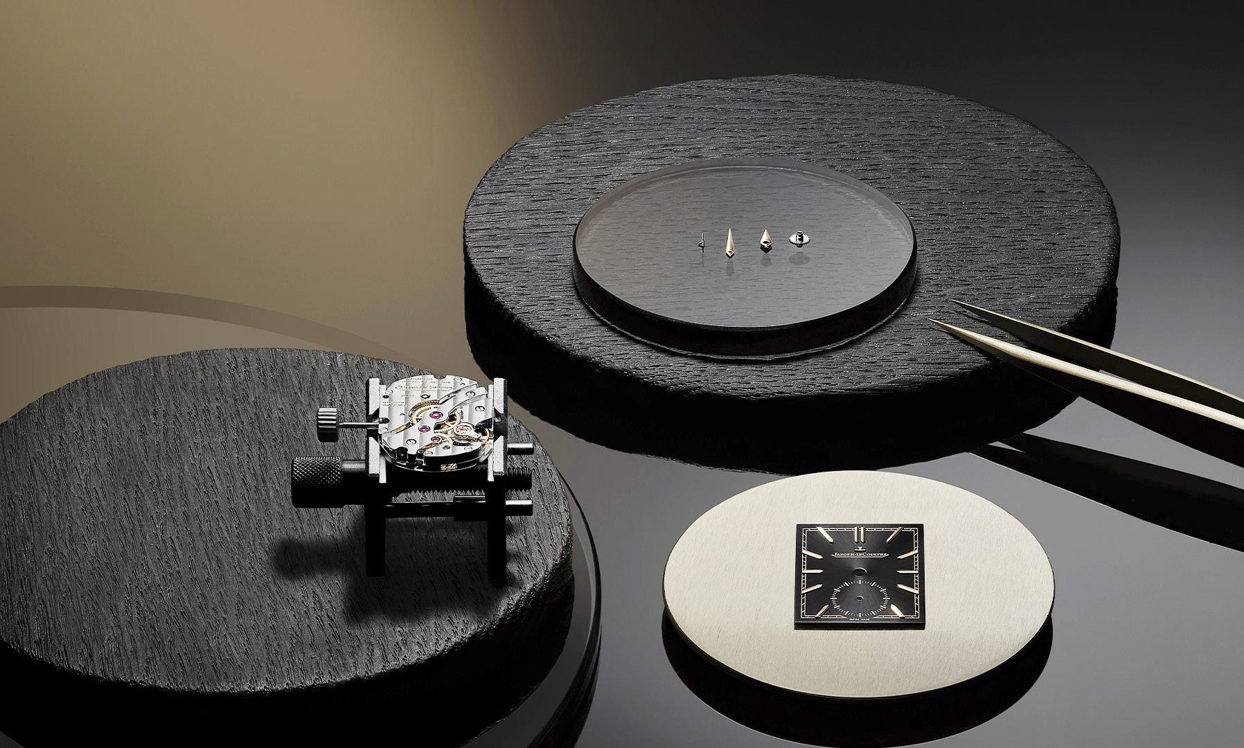
Remember the polo-playing gentleman from the start of this article? This Reverso Tribute has well, another tribute in this collection. The straps that accompany the watch are the result of a collaboration with Casa Fagliano, a leather brand known for their exclusive polo and equestrian boots. Legend has it that in 1920, a polo player asked the artisans of Casa Fagliano to repair his polo boots. So impressed with the workmanship, the polo player ordered some new boots too. Thus began that intertwined life of Casa Fagliano and polo. I wonder, is this the same gentleman who commissioned the polo-proof watch over a decade later?
The pink gold models of the Reverso Tribute each have two straps — the signature Fagliano Collection design of calf-leather-and-canvas, and a second all leather strap. For the pink gold models with the black dial and the burgundy dial, the second strap is all-calf-leather. For the pink gold model with the silver dial, the second strap is black alligator leather. The steel model with the silver opaline dial has the Fagliano Collection calf-leather-and-canvas strap.
With the Reverso’s 100-year milestone coming up, we can only wait with baited breath to see what Jaeger-LeCoultre will bring us next.
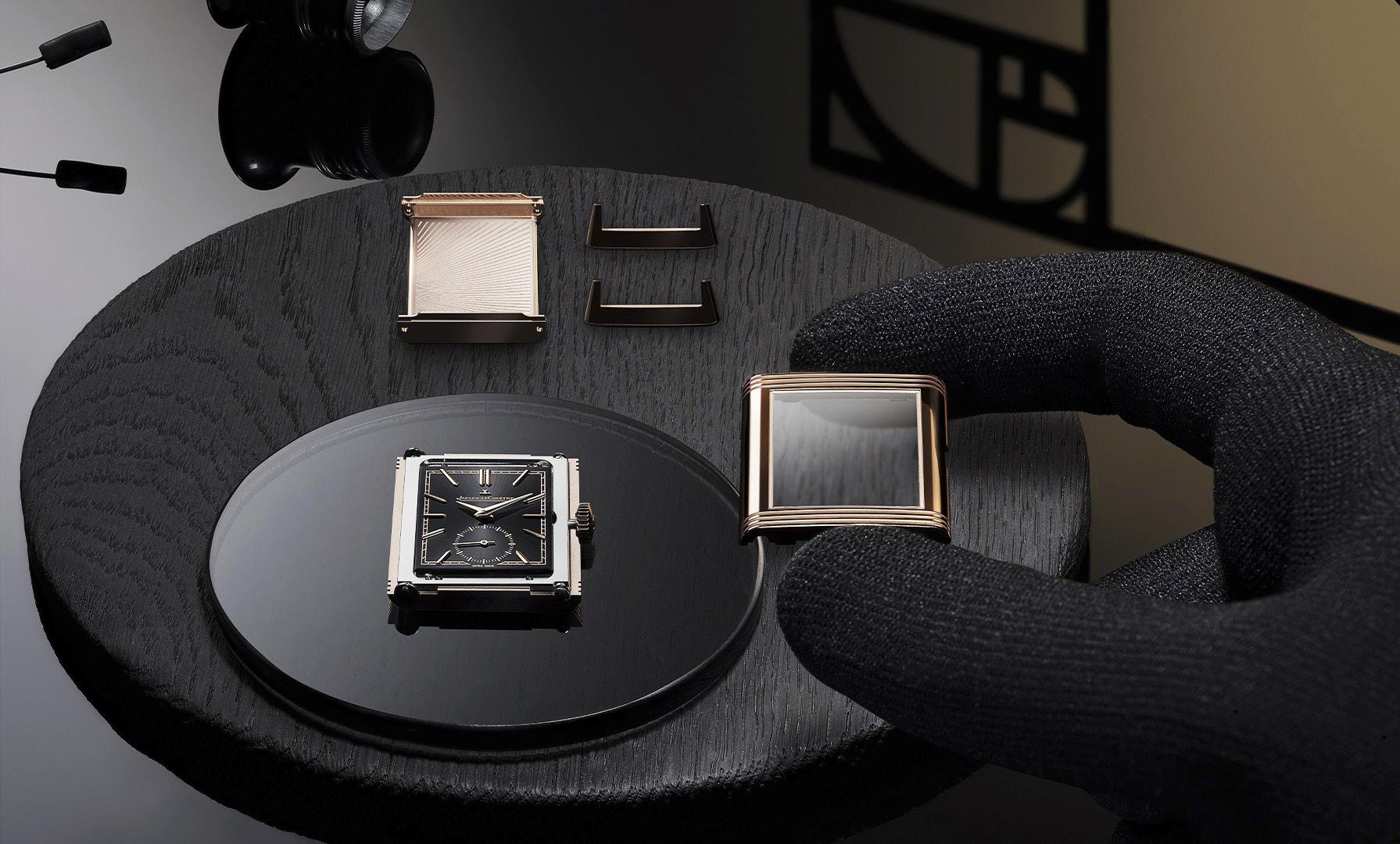
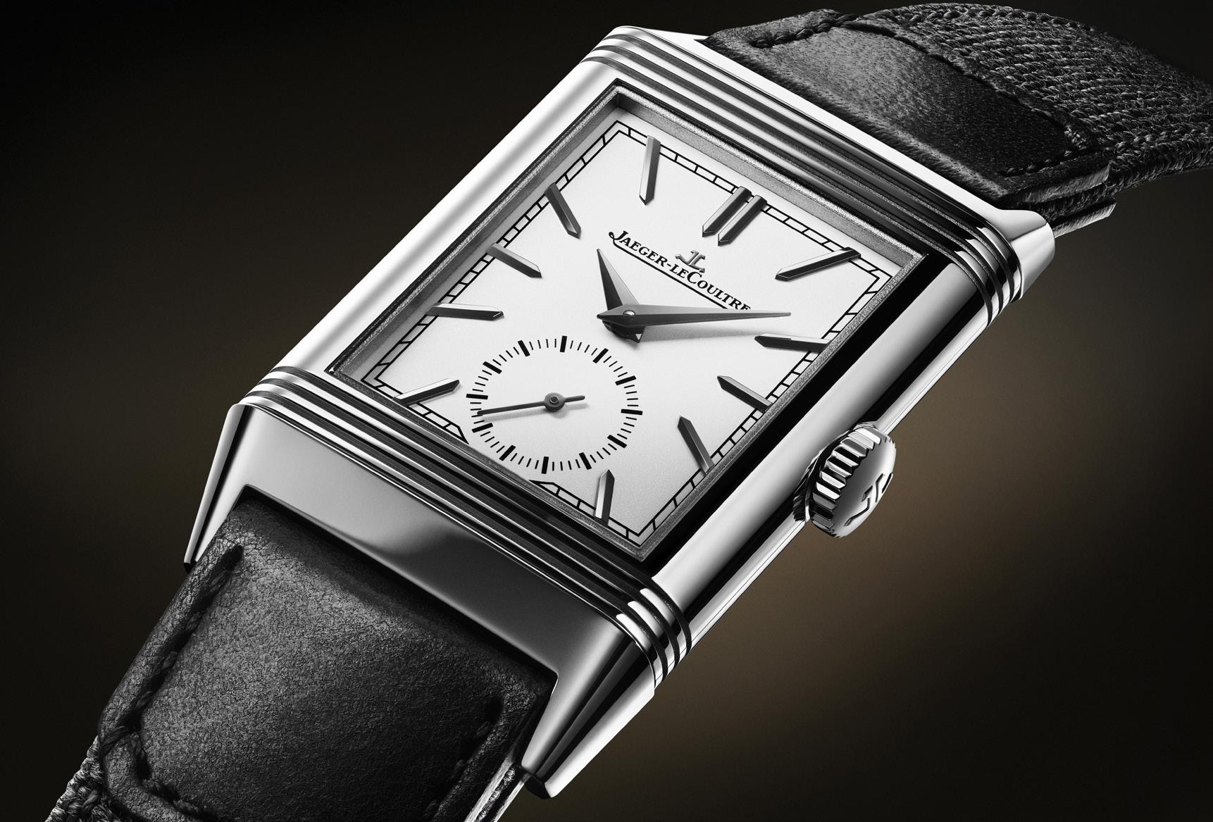
“The watch retains the elegance and sophistication, and yes, still adheres to the Golden Ratio.”
A. LANGE & SÖHNE MAKES THE ODYSSEUS EVEN MORE CAPABLE
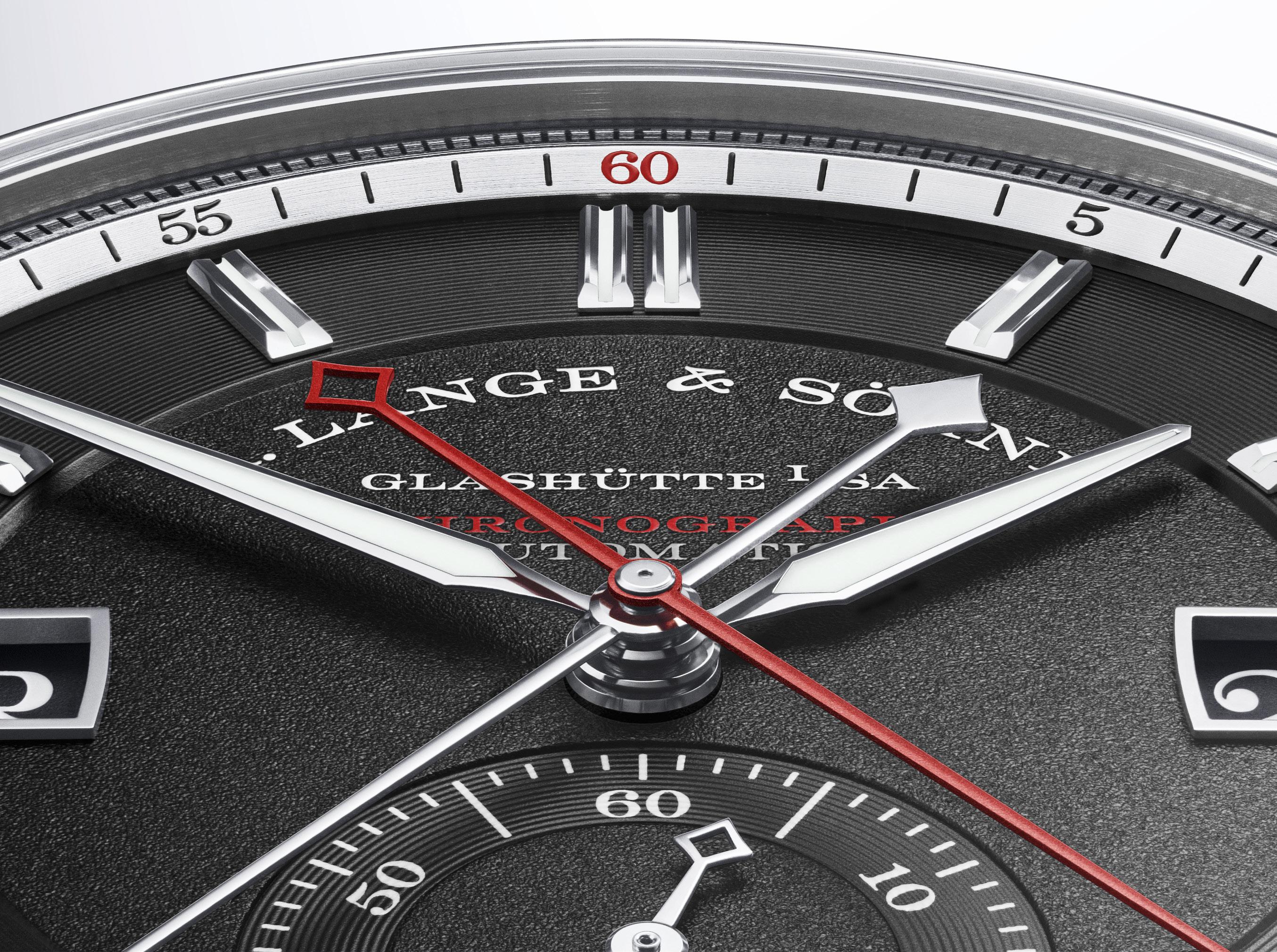 Words by Kit Payumo
Also known by his Latin name, Ulysses, Odysseus is the legendary Greek king of Ithaca and the hero of Homer’s epic poems the Iliad and the Odyssey. One of the most frequently portrayed figures in Western literature, Odysseus is sometimes called “the man of many turns,” most likely because of his portrayal as a man of outstanding wisdom, shrewdness, eloquence, resourcefulness, courage and endurance. Odysseus’ bravery and wiliness are, in fact, extensively documented especially in the most famous portion of Homer’s poem: the decade-long Trojan War, which relates how he accomplished the capture of Troy by means of a wooden horse.
Its namesake notwithstanding, the A. Lange & Söhne ODYSSEUS was divisive when it made its debut back in 2019. Indeed, many watch “experts” were unsure as to what to make of the German watchmaker’s line of sporty watches. Wading into uncharted waters, A. Lange & Söhne struck a new and distinctive path by creating a timepiece, “Specially conceived for sports and leisure activities.” Indeed, the ODYSSEUS was designed from the get-go “for ambitious individuals who want a watch that accompanies them in life’s most memorable moments.”
For A. Lange & Söhne this meant the artisanally “perfect” timepiece, which not only reflected the type of conservative and traditional watchmaking that the German watchmaker has been painstakingly cultivating since their rebirth in 1994, but which also translated into a timepiece that was so robust and water-resistant that it could be worn during any leisure and
sports activity you could throw at it. And anyone with even just a passing familiarity with the German brand would know how disparate those two goals actually are.
The result was something a little different but still familiarly Teutonic. With an emphasis on openness and lightness, the ODYSSEUS struck a definite contemporary stance with a comparatively large dial encompassing lancetshaped hands, and the signature Lange displays of a large date and day of the week to ensure excellent legibility. The ODYSSEUS was the first steel model for the brand, the first model with 120m of water resistance (a big deal for ALS), and the first model with an integrated metallic bracelet. The ODYSSEUS was also equipped with a new movement, the L155.1 DATOMATIC, which was developed especially for the collection.
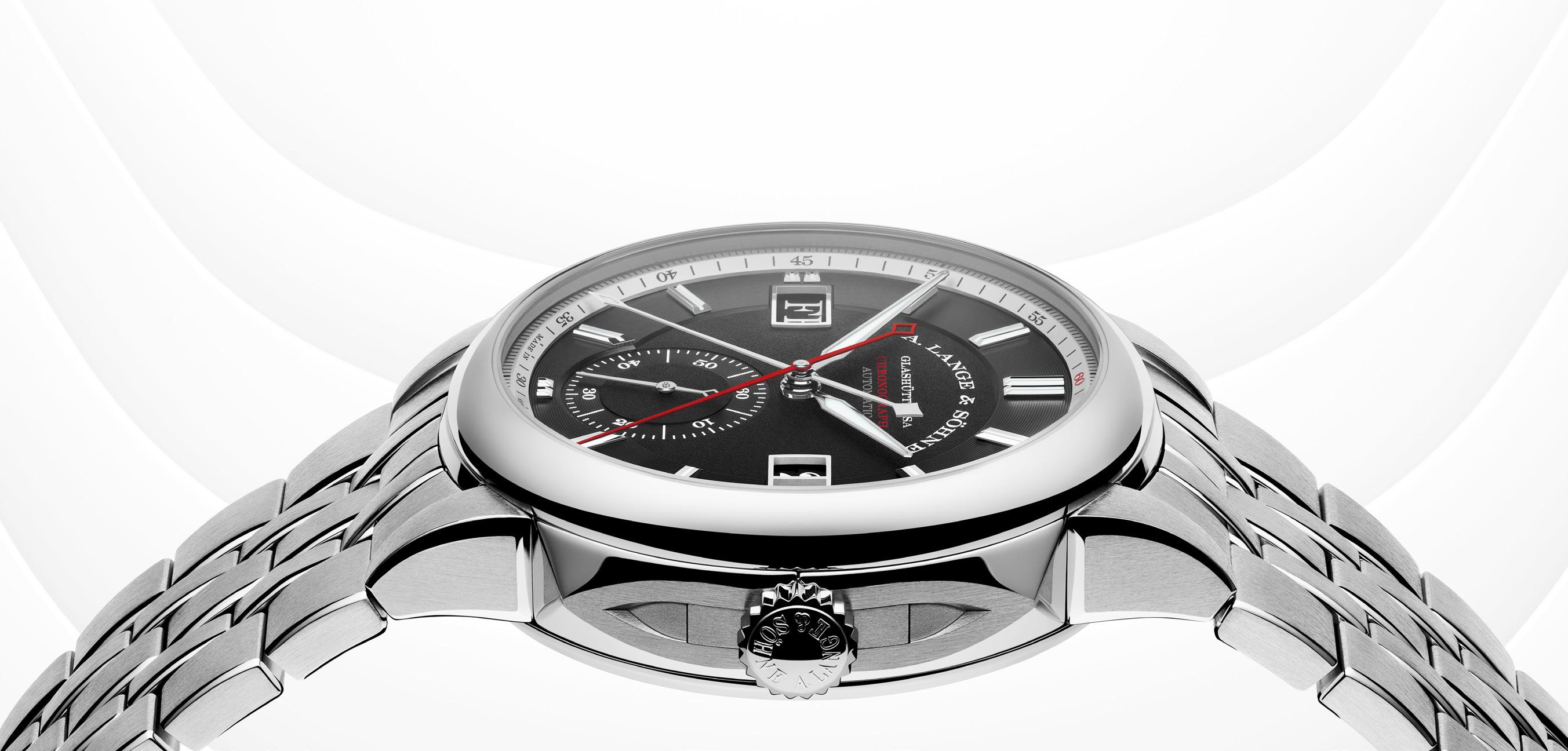
Last year, A. Lange & Söhne found the secret ingredient to make the ODYSSEUS worthy of its Greek namesake: titanium. Coming after the white gold ODYSSEUS from 2020, the third entry into the ODYSSEUS family finally found a material to match its occupation, and not only was it the best of the collection back then, it also happened to be the German watchmaker’s first watch forged in lightweight titanium, and that included its integrated multi-link bracelet. To think, most traditional high-end watchmakers rarely use titanium and save the high-end material only for their most special, ultra-high-end watches. This made the use of titanium on a sports (sports adjacent?) watch even more significant.
Not in the business of resting on their laurels, however, A. Lange & Söhne has once again given its sporty-elegant timepiece another upgrade, this time by returning to its natural sporty material of steel but incorporating a function particularly popular with its intended target market: a very high-end and exquisitely finished chronograph movement. And not only is the ODYSSEUS Chronograph the best of the collection yet the new chronograph movement driving it may the
best of its type made by A. Lange & Söhne. The German watchmaker was so confident about their new chronograph in fact, they showed up to the most important watch show of the year with just the limited edition watch and only the limited edition watch.
That’s right, once again wading into unfamiliar waters, A. Lange & Söhne dared to take their all-steel sports watch and place a very high-end chronograph movement in it. And anyone at all familiar with the industry knows that doesn’t happen all that often. Yes, despite the challenges of engineering the complication the chronograph can be a dime a dozen. But the really interesting examples are usually found in precious cases matched with alligator straps (we’re looking at you PP, VC, AP, and yes, even your own big boys, ALS), so to have an all steel sports watch on a metal bracelet with a very high-end chronograph movement made by an industrial watchmaker and not a boutique brand is…in a word: rare.
And to take that necessary next step for the ODYSSEUS, you’d be forgiven to think that A. Lange & Söhne would take the easy path and go with the existing L951.5 chronograph movement, arguably the most attractive handwound chronograph in the market already driving the 1815 Chronograph and shoehorn it into a steel ODYSSEUS case. But because they are Lange… and they are German… and Germans will do things simply because they can, they naturally didn’t do that and instead came up with an entirely new movement altogether in the form of a modified L155.1 DATOMATIC calibre, which has been powering the ODYSSEUS collection since 2019.
First up, unlike the L951.5, the new movement uses a large openworked rotor in 950 platinum making the new L156.1 an automatic. This makes the latest chronograph movement created by A. Lange & Söhne unique compared to the other manually wound chronograph movements it had already created.
Second, anyone who’s ever seen a chronograph will immediately notice the lack of chronograph sub-registers on the new ODYSSEUS dial. Instead, we get the now familiar ODYSSEUS set up with the brand signature large date and date windows at 3 and 9 o’clock, respectively, as well as the running seconds display at 6 o’clock. So where is the stopwatch? And here, ladies and gentlemen, is where things get interesting.
To retain the now familiar the ODYSSEUS layout, the German watchmaker had to modify the L155.1 DATOMATIC calibre EXTENSIVELY, thereby creating an all-new movement. Other lesser watchmakers would have simply thrown in a couple of chronograph sub-registers and have happily called it a day. Not so with
A. Lange & Söhne. What we have instead is a CENTRALIZED chronograph with a bright red anodized aluminum chronograph hand, and a 60-minute hand with a lozenge-shaped tip, both of which operate from the center of the dial ensuring that the brand signature large date and day windows at 3 and 9 o’clock, as well as the running seconds at 6 o’clock remain in place. But did we mention it has a quirky parlor trick up its sleeve?
The L156.1 has a dynamic reset-to-zero function activated by the pusher on the caseband at 4 o’clock, which is well and good. The difference here is unlike other chronographs the zero-reset hammer of the ODYSSEUS Chronograph is set by the minute counter wheel. So upon resetting the chronograph, something that the press kit calls “a short but impressive spectacle,” happens:
“While the minute counter jumps back to its starting position in the conventional way, the red chrono seconds hand covers the entire distance travelled beforehand within a fraction of a second ‒one full revolution for each measured minute. If the minute counter has not reached the 30-minute mark
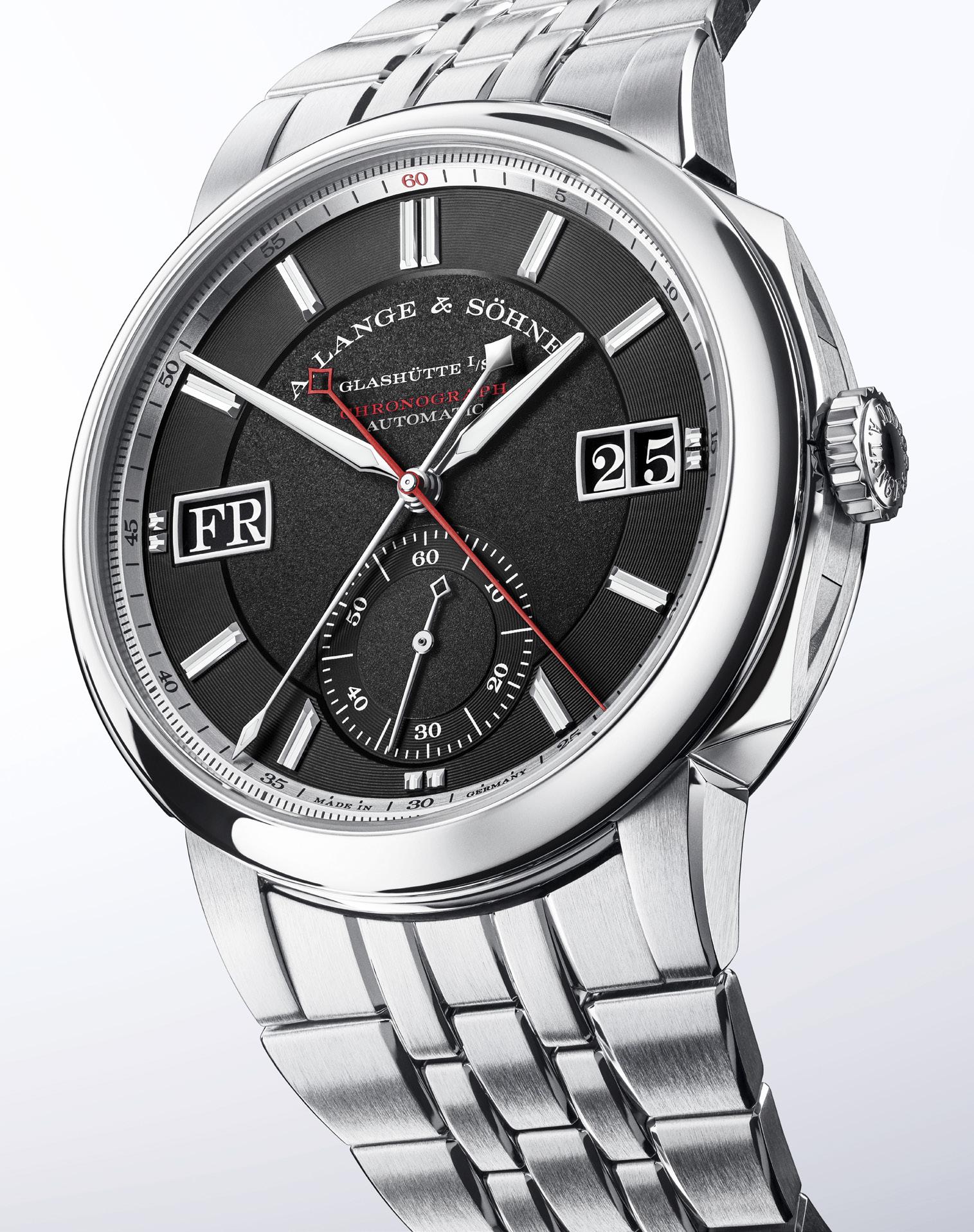
yet, the two hands move anti-clockwise. If the minute counter has passed the 30-minute mark, both hands will advance to zero clockwise. At high speed, the chrono seconds hand performs a full revolution for every minute required to reach the full hour.”
So, basically, it’s first important to note that this is a 60-minute chronograph (up from the 30 minutes of its ilk). Upon reset, both chronograph hands travels back to zero either clockwise (if after the 30-minute mark), or counter clockwise (if before the 30-minute mark). But, while the minute counter (the one with a lozenge-shaped tip) resets back to zero in the fastest direction possible, the red hand is truly "a man of many turns" as it goes for a wild ride before stopping at zero.
If before the 30-minute mark, the red hand will speed back and make a full revolution around the dial for every minute that has passed. So if the chronograph had run only 24 minutes, the red chronograph hand will spin around the dial backwards 24 times. But if AFTER the 30-minute mark, the red hand will speed FORWARD and make a full revolution around the dial for every minute remaining before the 60-minute mark. So if the chronograph had run 43 minutes, the red chronograph hand will spin around the dial forward 17 times. Was that clear? If not, we suggest taking out your browser and logging on to YouTube posthaste.
The curious part of all this is there is no good explanation why the chronograph works this way, not even from the watchmakers themselves. When the prototype was made everyone involved was reportedly dumbfounded when made its wild ride. So, is it possible that the watchmakers at A. Lange & Söhne stumbled onto something cool and unusual BY ACCIDENT? Only an official statement from the watchmaker will clear this up, in the meantime on with the show.
The ODYSSEUS was designed from the get go to work with two pushers at 2 and 4 o’clock. These adjust the signature Lange large date and day on the dial. But what happens when a chronograph is added? The watchmakers aren’t about to drill additional holes on the opposite side of the case to accommodate more pushers. The ODYSSEUS is water-resistant to 120 meters, after all.
The solution is so typically A. Lange & Söhne “out of the box:” dynamic, dual-purpose pushers! When the crown is screwed in, the pushers work as the chronograph start/stop and reset buttons. But when the crown is unscrewed or pulled out, the pushers revert to their original function to correct the day and date.
“The ODYSSEUS CHRONOGRAPH transports the contemporary and one-of-a-kind design of the watch family to a new technical dimension. It meets all the requirements of a stopwatch suitable for many fields of application, without relinquishing the hallmarks of Lange precision watchmaking,” says Anthony de Haas, Director of Product Development at A. Lange & Söhne.
The ODYSSEUS CHRONOGRAPH makes a statement with a three-part stainless steel case with a diameter of 42.5mm and a thickness of 14.2mm, making it a bit on and the big & tall to wear. It’s much larger than the 40.5mm regular model to be sure, but necessary to accommodate the new movement. Still, the new chronograph hasn’t forgone its primary purpose so is robust enough to withstand all sorts of sports and leisure activities, and is still rated to withstand water pressure of up to 12 bar (120m). Best of all, case finish remains exemplary with brushed surfaces accentuated by chamfered edges to create an impressive play of light echoed on the lugs and links of the solid stainless steel bracelet.
The dial, naturally, was not spared greatness, and features dual finishing to accentuate an illusion of depth similar to previous ODYSSEUS models. Colored in obsidian black, the inner surface of the main chronograph dial features a textured surface, while one step up on the outer section where the notched white gold baton appliques reside is finished with concentric circles. To complete the
illusion, this dual texture treatment is echoed on the subsidiary seconds scale.
A palladium-colored flange with a printed two-part minute scale frames the dial. The scale for the fractions of a second is positioned on the outer circumference, while the scale for minutes and seconds sits on the inside. Printed in red, the number 60 at 12 o’clock and the red chronograph seconds hand accentuate the already elegant and dynamic appearance of the ODYSSEUS CHRONOGRAPH. The typical Lange lancet-shaped hour and minute hands, which are slightly more prominent in the watches of the ODYSSEUS family, contrast well against this background, and are luminous along with the inner surfaces of the baton appliques.
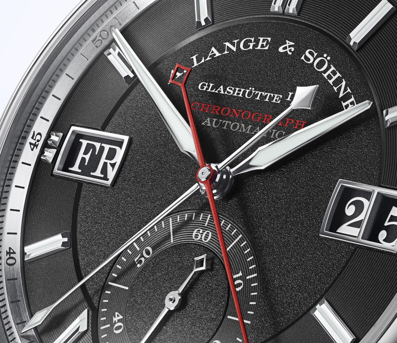
Not to be left out, the large displays for the date and the day of week also contribute to all the distinctiveness, the modern, digital aesthetics of which were inspired by a masterpiece of historic Saxon watchmaking: the Five-Minute Clock in the Dresden Semper Opera. Designed to inaugurate the opening of the Opera House in 1841, the famous stage clock, which (distinct for that period) displayed the time digitally, was created by Court Clockmaker Johann Christian Friedrich Gutkaes who also happened to be the father-inlaw of Ferdinand Adolph Lange, the founding father of Glashütte precision watchmaking.
Naturally, the manufactory’s first selfwinding chronograph movement that drives the
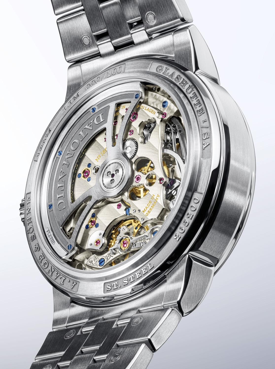
ODYSSEUS CHRONOGRAPH wasn’t spared the of A. Lange & Söhne stamp of “perfection,” and what can we say the German watchmaker has come up with another winner here. The L156.1 DATOMATIC features 516 individual components with bridges and plates made of untreated German silver, its balance bridge is hand engraved with gold chains secured by the bluest of screws, while its finishing (even those that are not visible) are entirely and elaborately finished by hand.
As with every in-house movement made by the German watchmaker, the L156.1 DATOMATIC was assembled twice, and operates at 4 hertz. Further, it has an in-house balance spring, a shock-resistant balance with four poising screws, and 50 hours of power reserve. And, need we say it, may be the best looking self-winding movement in the world, chronograph or otherwise.
“The ODYSSEUS CHRONOGRAPH symbolizes the pioneering spirit of the manufactory to explore previously undiscovered fields, to overcome obstacles and to implement innovative technical solution,” says Lange CEO Wilhelm Schmid. “Inventiveness and creativity, two A. Lange & Söhne key areas of expertise will continue to break the mold in traditional precision watchmaking.”
Only 100 pieces of the ODYSSEUS CHRONOGRAPH limited edition will be made available worldwide exclusively at A. Lange & Söhne boutiques.
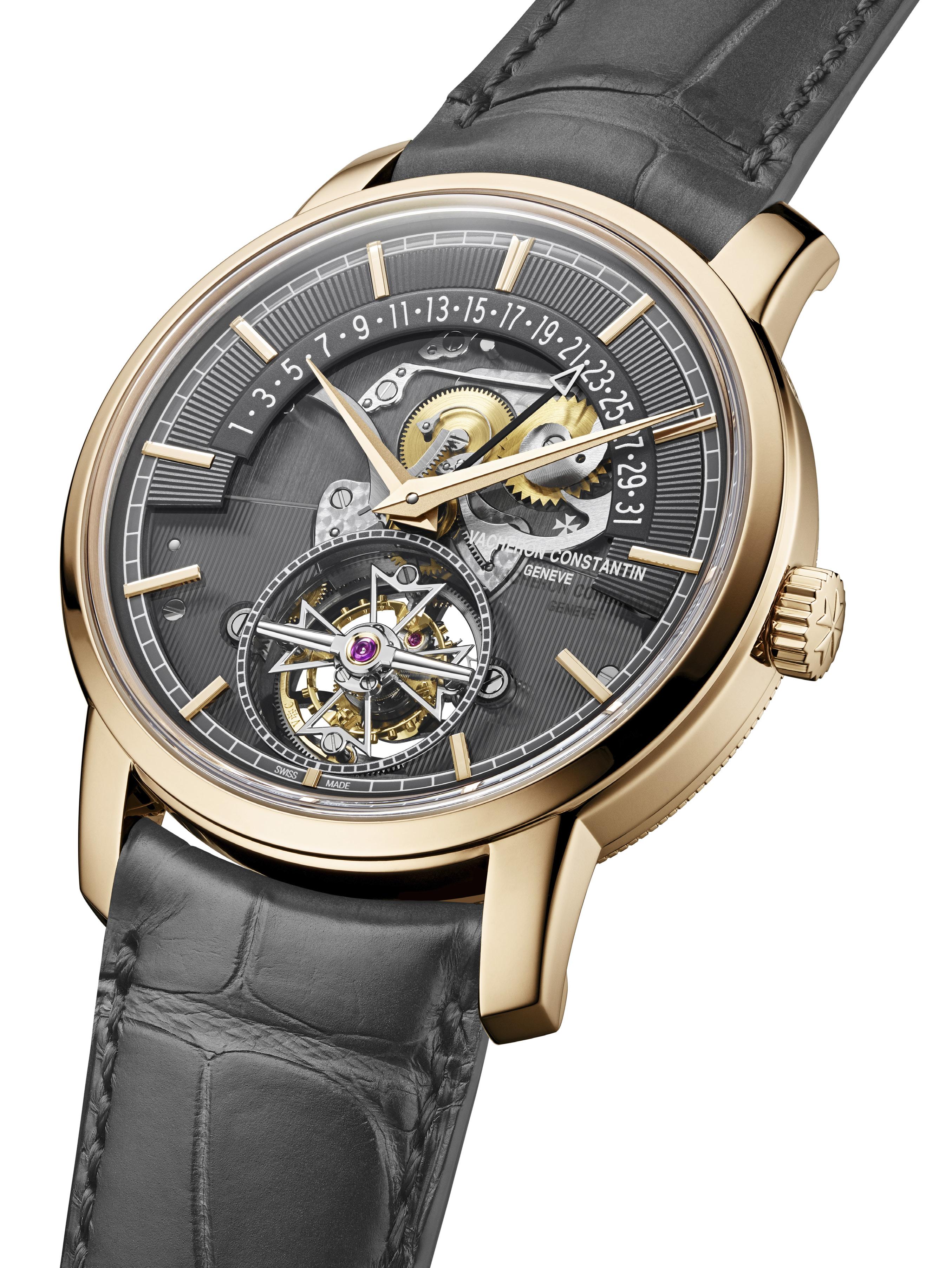
Words by Kit Payumo
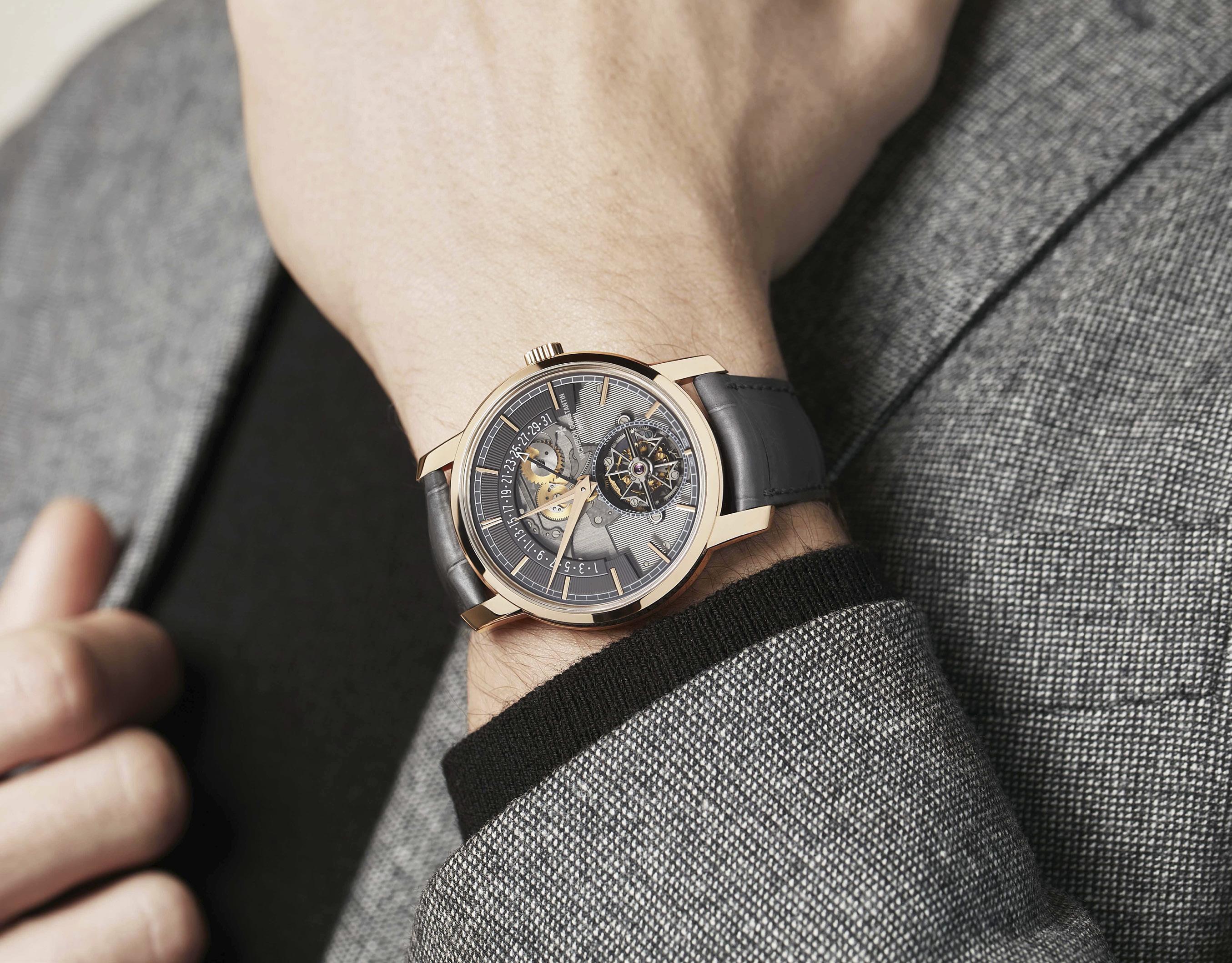
Carly Simon may have been singing about a certain British super secret agent but we believe it applies here too. Indeed, it seems everyone has been getting into the openface / open dial movement of late. And with all due respect to all the other top-tier watchmakers out there (Patek Philippe and A. Lange & Söhne, we’re looking at you), we believe nobody does it better than Vacheron Constantin, and we have the new Traditionnelle Tourbillon Retrograde Date Openface to back us up.
Indeed, for the almost 270-year-old watchmaker, executing this type of timepiece is just another Tuesday. As the saying goes: if you’ve got it, flaunt it. And we believe Vacheron Constantin most definitely has it because the flair and panache of this new timepiece from the Traditionnelle line is beyond compare. There really isn’t anything else quite like it. Just look at that multi-layered semi-skeletonized dial, that eccentric combination of retrograde date display and tourbillon; and the hollowed out Maltese cross that dominates the latter if you still aren’t convinced.
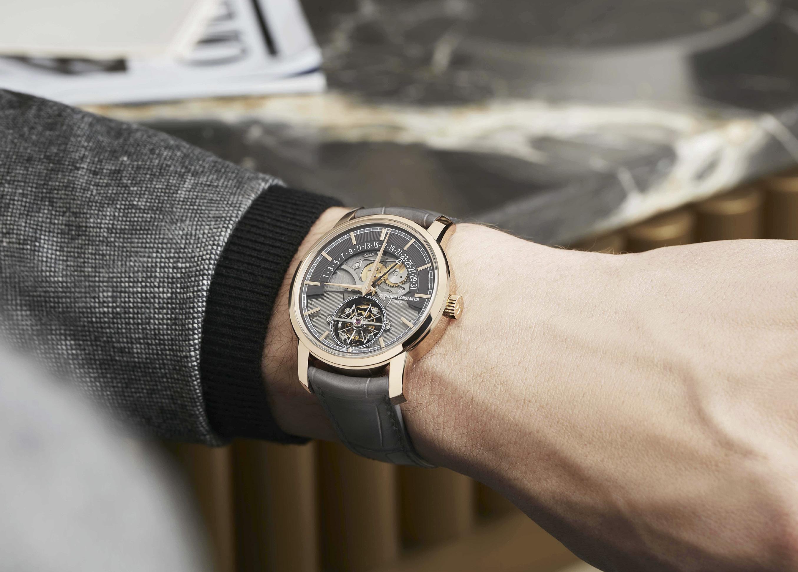
“A model born from a combination of contemporary design and the wealth of Vacheron Constantin’s watchmaking heritage,” the new Traditionnelle Tourbillon Retrograde Date Openface owes its singular aesthetic from References 47245 and 47247, which made their bows in the early 2000s. Indeed, the watchmaker has a long history of this type of display, known as ‘openface’,” says Christian Selmoni, Director of Style and Heritage at Vacheron Constantin.
“The very first Vacheron Constantin timepiece with a partially openworked dial dates from 1918. It was a pocket watch with an astronomical calendar, which was totally innovative at the time in terms of design. It was not until almost a century later that the Manufacture once again turned its attention to this dial concept with Reference 47247 unveiled in 2002 on the eve of the millennium, for the 247th anniversary of the Maison. This 247-piece limited edition available in a 37 mm platinum case, features a retrograde date, a trailing days subdial at 6 o'clock and an openworked dial enabling the retrograde date mechanism to be admired. It marks this same openface spirit that has become a Vacheron Constantin signature.”
Not just a date “window,” a retrograde date display is a kind of complication that requires great precision and rigorous discipline, especially when it comes to wear and shock resistance, and displays all the dates at one time usually in the form of an arc. Each date in turn is indicated by a dedicated hand, which travels the entire gamut of the display in one month pointing to the relevant
Nobody does it better Makes me feel sad for the rest Nobody does it half as good as you Baby, you’re the best
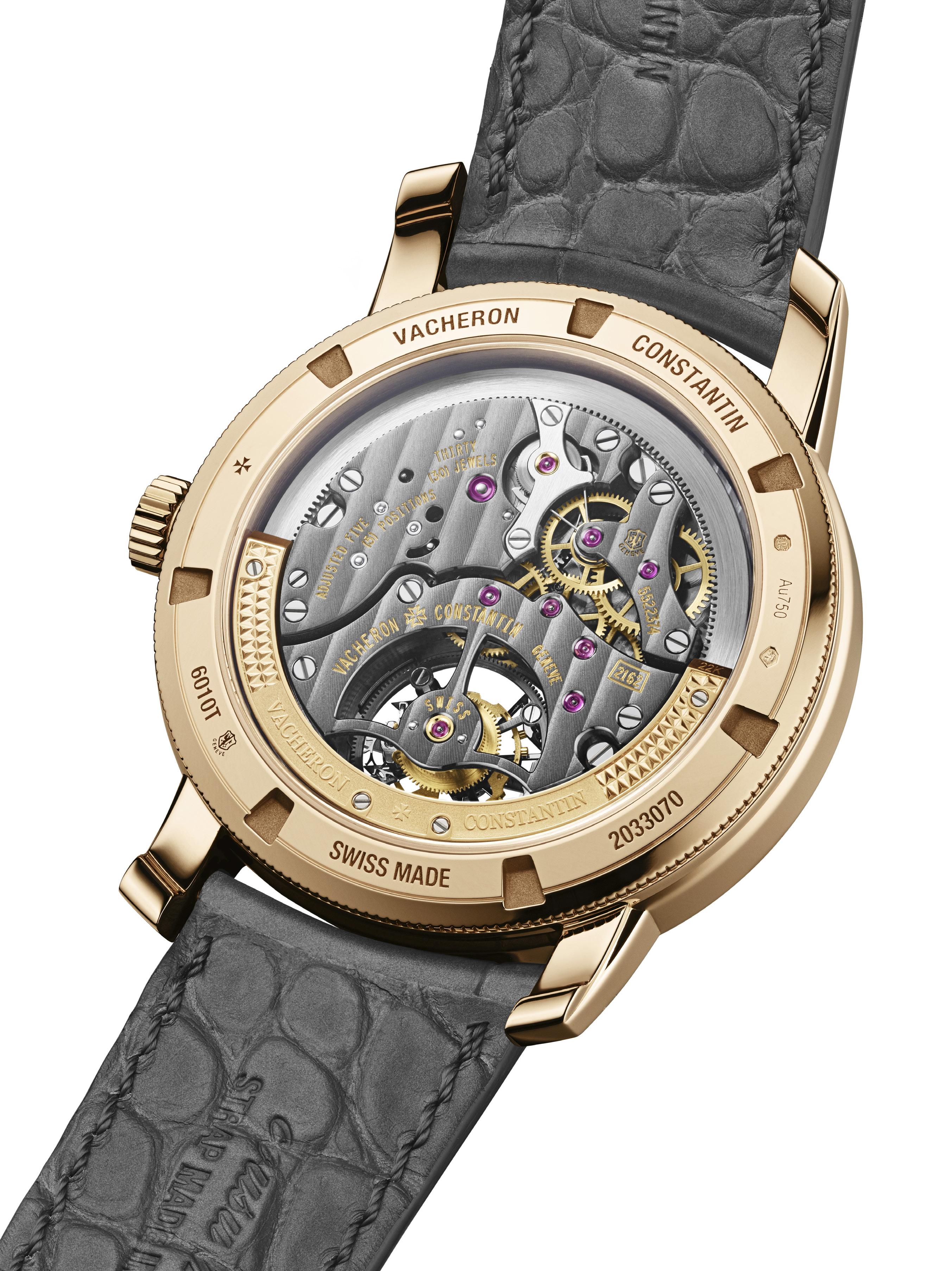
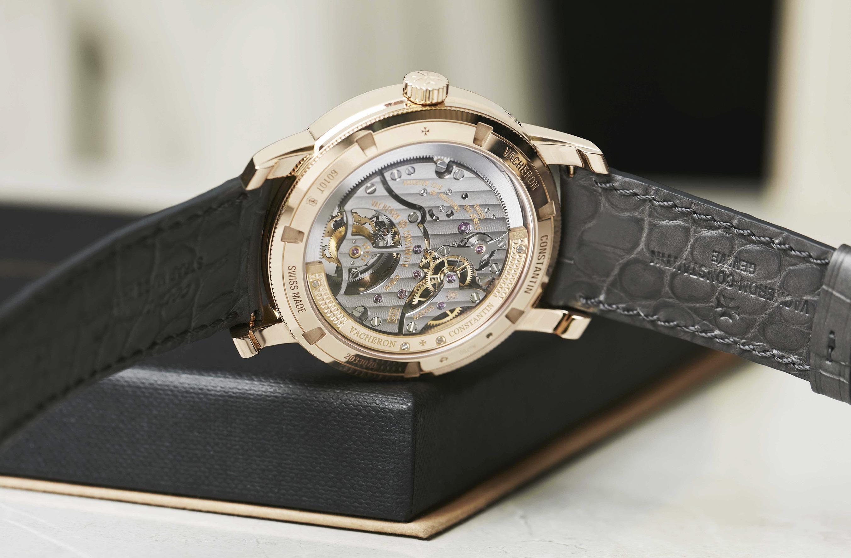
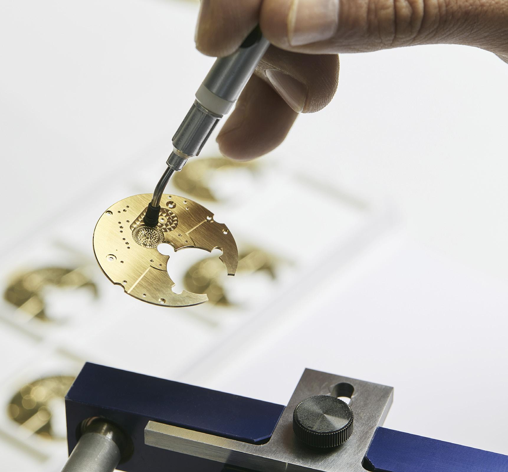
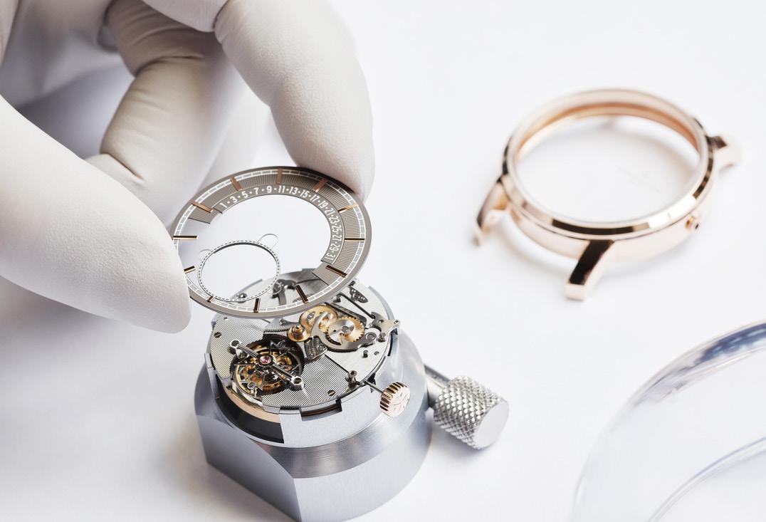
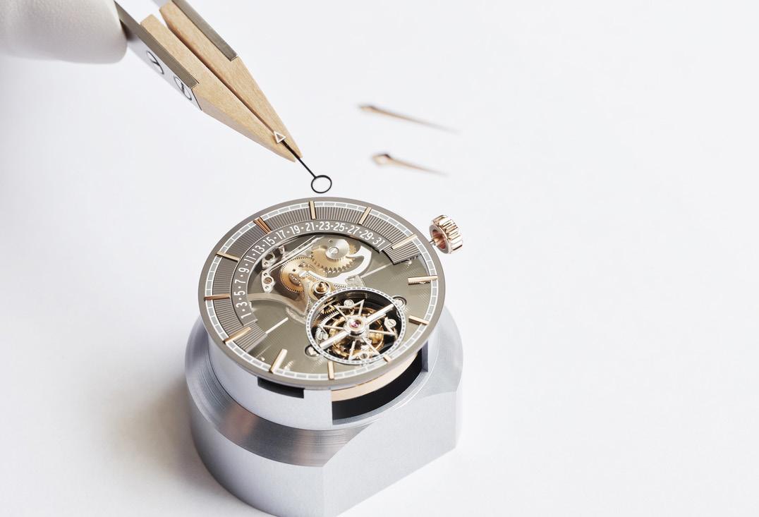
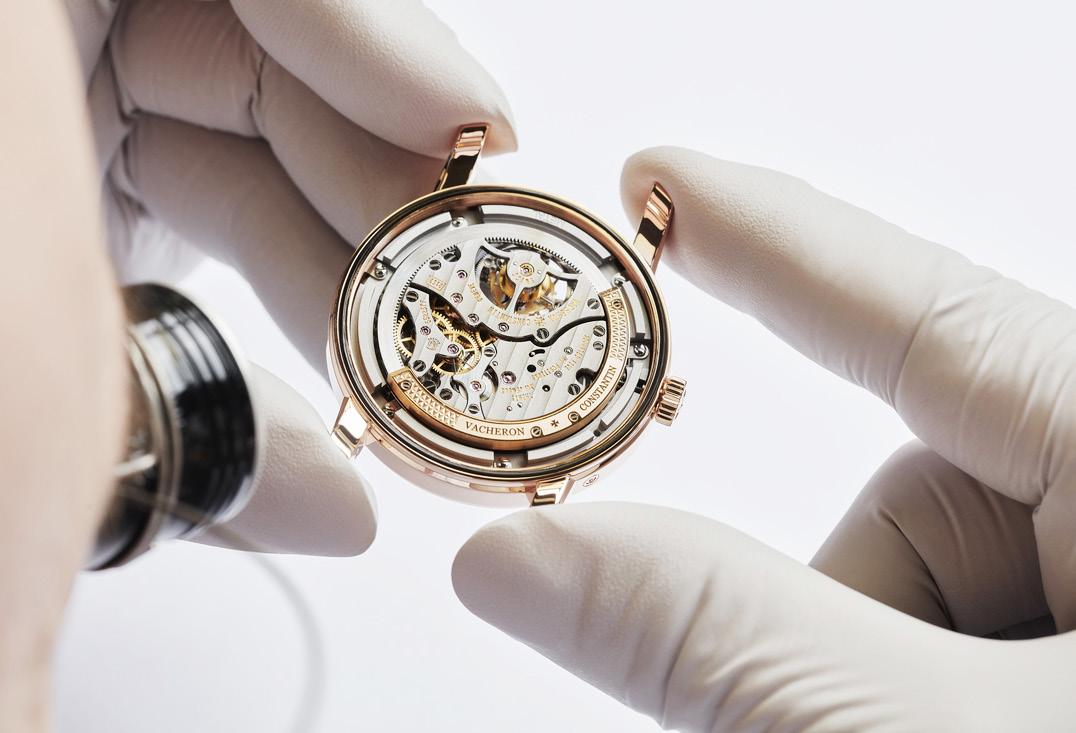
date everyday only to return to its starting point at the beginning of every month.
This type of display became a staple at Vacheron Constantin during the 1920s, the time of Art Deco, which saw the Maison allow its imagination to roam free and express it in wildly innovative designs. The retrograde date display on the Traditionnelle Tourbillon Retrograde Date Openface, in fact, looks very similar to the old elevator floor displays found in the lobbies of 1920s Art Deco structures like the Empire State Building.
The new watch is marked by a 41mm 18K 5N stepped pink gold case and lugs, a fluted caseback, and a practically non-existent bezel, all of which are hallmarks of the Traditionnelle collection. An openworked sapphire dial takes the place of a traditional dial and features a railroad track around the entirety of the multi-layer dial. This hosts the applied gold baton hour indices, which juts out and hovers above the lower half of the dial.
At its lowest point, the dial reveals the in-house Calibre 2162 R31 with a plate highlighted by a slate grey surface treatment achieved by a succession of thin galvanic layers. Two layers above that is the top half of the dial where the
retrograde date display resides. This is enhanced by an upper part flourished with vertical hand brushing, its surface smoothed out with a dedicated abrasive to create subtle light effects.
One layer below that is the lower half of the dial and the dominion of the tourbillon. This is also enhanced with hand-applied guilloché, and stylized in the shape of a hollowed-out Maltese cross, the tourbillon features a set of refined and enviably complex finishes. The inside of its carriage, for example, is hand-bevelled, while its cone-shaped transversal bar is hand-polished to mirror effect.
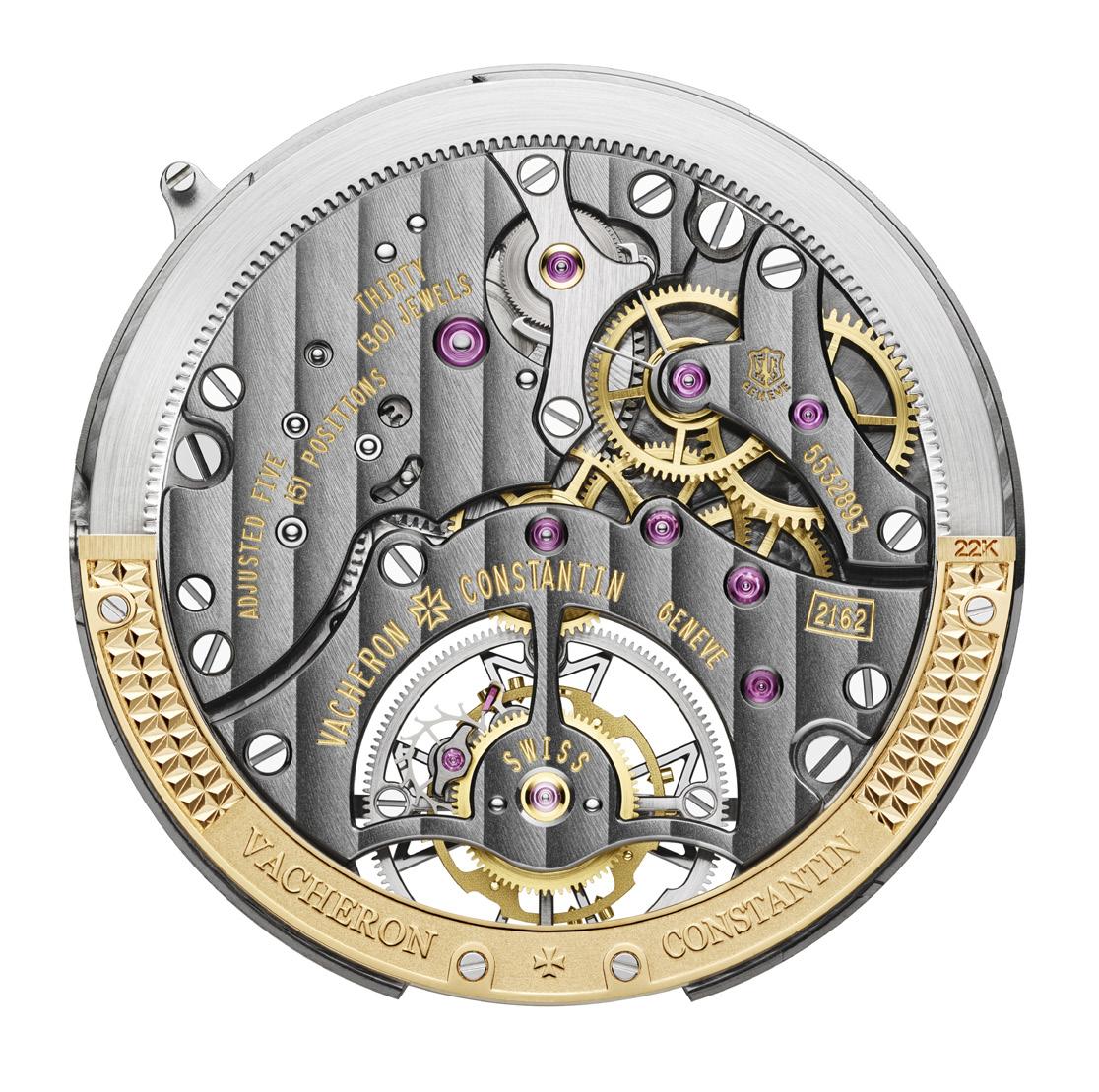
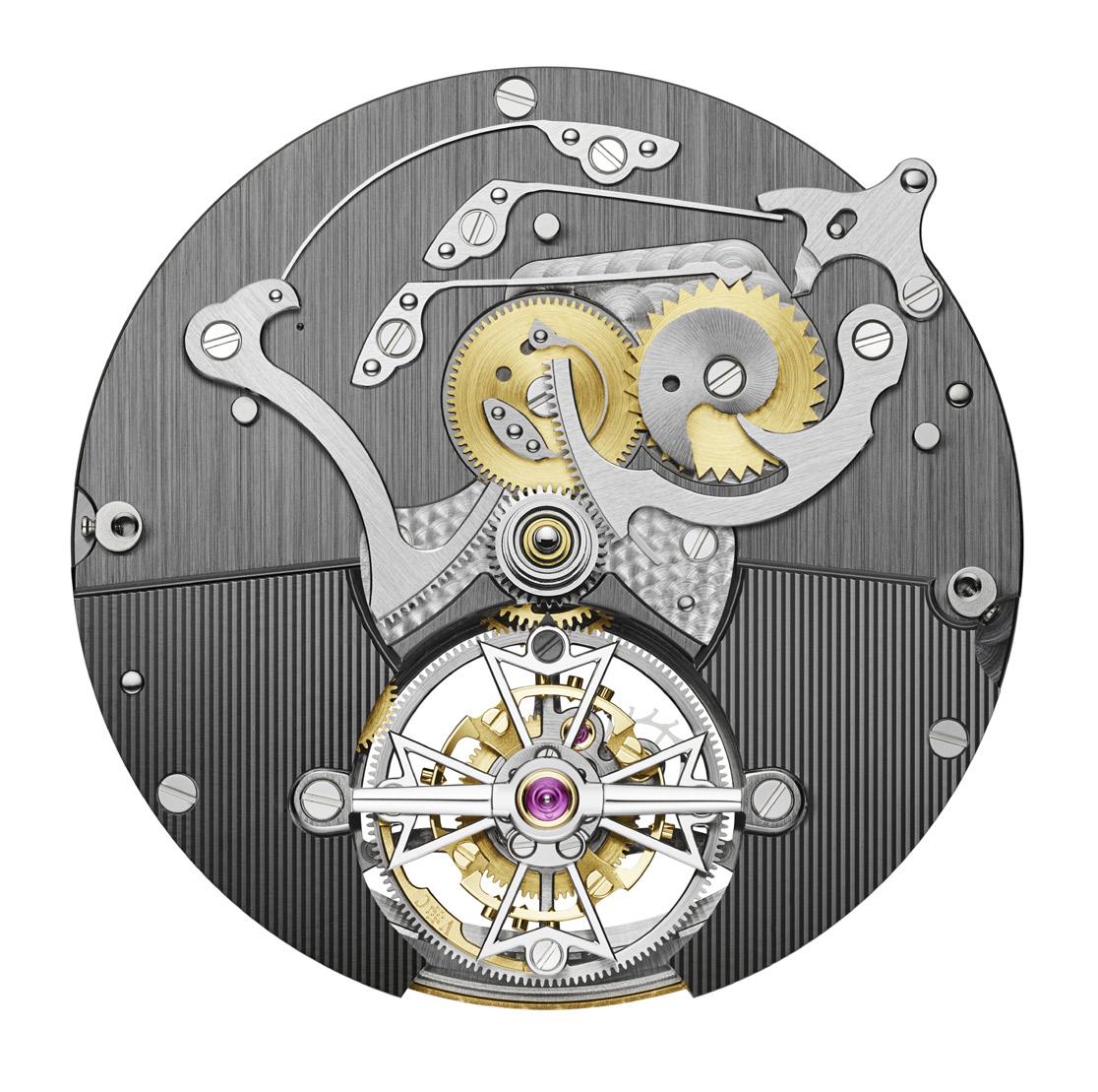
Turn the watch over and the rest of the Calibre 2162 R31 movement is revealed. Proudly bearing the Hallmark of Geneva, the 242-component movement was completely developed and produced within the workshops of Vacheron Constantin and adapts to modern times with slate grey bridges treated with a NAC surface treatment. Measuring just 6.25mm thick, the Calibre 2162 R31 movement beats at a traditional frequency of 18,000 vibrations per hour, and boasts a power reserve of 72 hours courtesy of a gold peripheral rotor.
“This new reference continues to write the history of watches with openworked dials at Vacheron Constantin. And it does so in grand style with a tourbillon, a retrograde date and absolutely remarkable component finishes,” summed up Christian Selmoni. “The idea here is to push the limits of technical complexity and horological beauty by making them visible, all in a classic rose gold case. The opportunity to admire the contemporary design of Calibre 2162 R31 is truly spectacular. This new interpretation embodying a blend of contemporary design and watchmaking heritage is clearly a strong signature of the Maison.”
An expression of a true avant-garde aesthetic combined with a demand for mechanical sophistication, the Traditionnelle Tourbillon Retrograde Date Openface is the manifestation of a master watchmaker doing what it does best: pushing the boundaries of traditional watchmaking. It is singular in its design and execution, and is matched with a Grey Mississippiensis alligator leather with large square scales and fastened with a polished 18K 5N pink gold folding clasp in the shape of half a Maltese cross.
“The retrograde date display on the Traditionnelle Tourbillon Retrograde Date Openface looks very similar to the old elevator floor displays found in the lobbies of 1920s Art Deco structures like the Empire State Building.”
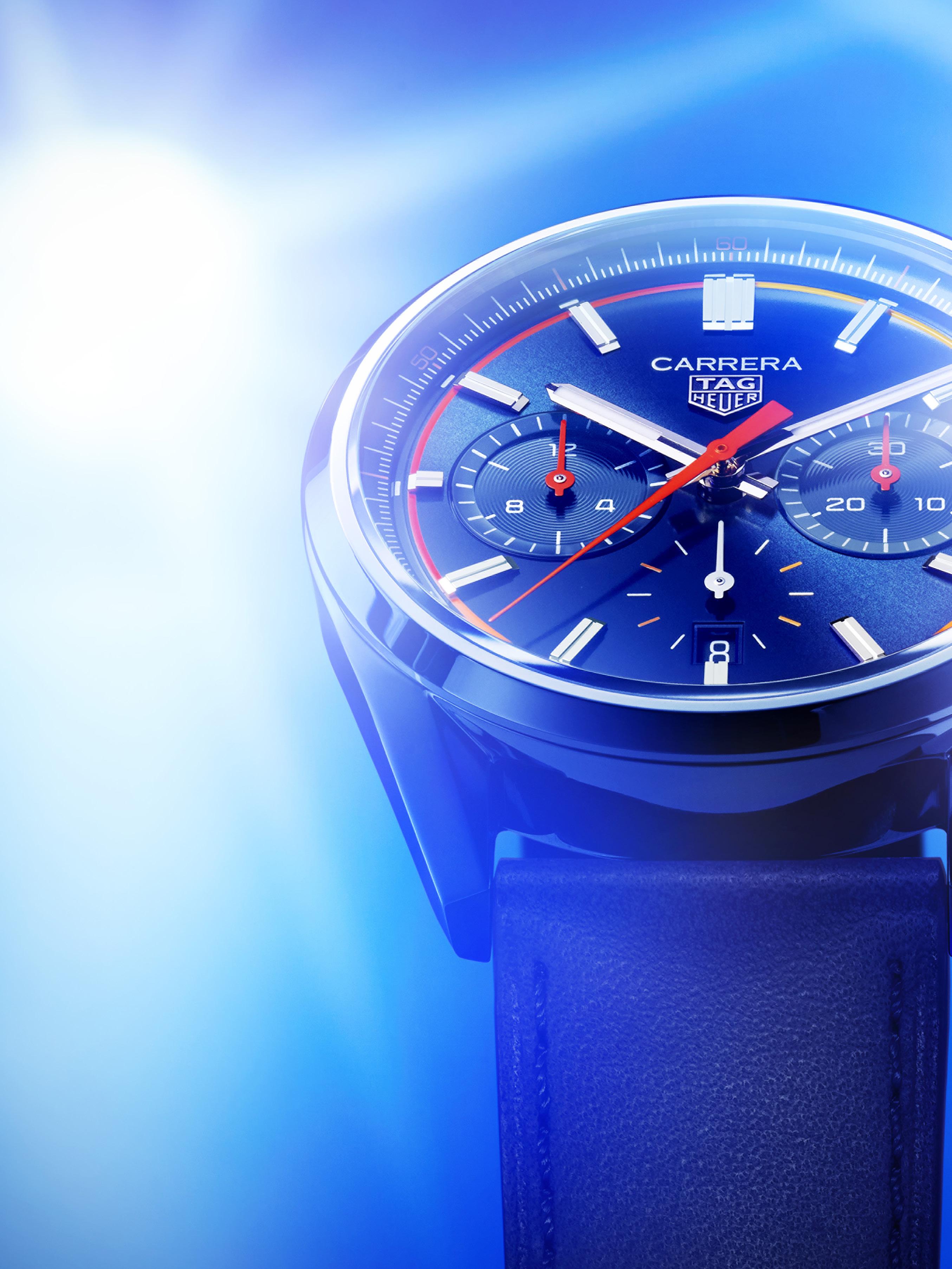

It seems the story of the TAG Heuer Carrera Chronograph will never end. And why should it? It is, after all, one of the most iconic chronographs ever made, one that continues to easily communicate the thrills and adventure of automobile racing even 60 years after Jack Heuer put pen to paper.
“The Tag Heuer Carrera is our flagship collection,” says Frédéric Arnault, TAG Heuer CEO. “It’s also our bestselling line, commercially speaking. Although we animate all pillars of the brand, this year, with the 60th anniversary, the Tag Heuer Carrera is definitely the highlight.”

The past 60 years have indeed been all kinds of glorious for TAG Heuer’s signature timepiece and the world has seen numerous incarnations of the watch in that time. But it’s also been said that one must continue to look back in order to successfully move forward, and slowing down to occasionally glimpse at the rear-view mirror is something that TAG Heuer does and does well, which is why this year the watchmaker once again does just that with, yet, new versions of Jack Heuer’s favorite chronograph.
Indeed, TAG Heuer has released a whole slew of Carrera Chronographs starting with the limited edition “Panda” model, an almost exact copy of one of the brand’s most collectible models, the Carrera Ref. 2447 SN from the late 60s, at the LVMH Watch Week this last January. An instant hit, and with so many months left in its anniversary year, the vintage-inspired Carrera left collectors and enthusiasts alike wondering what the brand would do next.
The answer came with the release of 5 new models of the Carrera Chronograph at Watches & Wonders 2023. Starting with 3 vintageinspired models: two 30mm chronographs with a “Glassbox” style case that mimicked the look of the original domed plastic crystals used on the models in 1960s (Ref. CBS2100 and Ref. CBX2112); and a 42mm Tourbillon chronograph also with a Glassbox style case (Ref. CBS5010). But it’s the final two 42mm models that extends the existing collection that we’re preoccupied with here today.
The Carrera Chronograph has been in its present form since September 2020. In that time, we’ve seen models that run the gamut between sporty and dressy, including a couple of special editions such as those designed in collaboration with Porsche, as well as an 18K gold limited
edition model, and a Limited edition “Panda” model sold exclusively through Watches of Switzerland. These two latest models that made their bows at Watches & Wonders continue the racing motif that has been associated with this line from the very beginning.
Inspired by the handsome, ageless design of the original 1963 Heuer Carrera, the latest TAG Heuer Carrera Chronograph tells the same “racing” story we’ve all come to know but propels it into the future with “fresh, dynamic styling” and “a tank full of racing spirit.” This means that even if the new models have been updated aesthetically, these are still technically the same models that made their debut 3 years
ago, and share their overall design with the rest of the Carrera Chronograph family including the 42mm stainless steel case, the slim sloping bezel, the gently brushed case sides, the stout pump pushers, and the distinctive sharply faceted lugs.
Once again reporting for power duties is the in-house Heuer 02 movement, which has become the backbone of the brand’s higher-end models and offers very modern performance numbers including a massive 80-hour power reserve while oscillating at 28,800 vibrations per hour. Naturally, the finishing of the Heuer 02 is second to none and is consistent with its stainless-steel siblings with Côtes de Genève across the bridges, as well as a racing wheel inspired skeleton rotor.
The main differences of the new models, however, are the color schemes of the new dials, of which two options are available from the get go: the first in TAG Heuer Carrera signature blue, and the second in obsidian black, both with a sunray-brushed finish for an extra touch of sporty sophistication. These colors punctuate the nowfamiliar tri-compax layout of the chronograph with the minute counter at 3, the hour counter at 9, and the running seconds with date window at 6 o’clock.
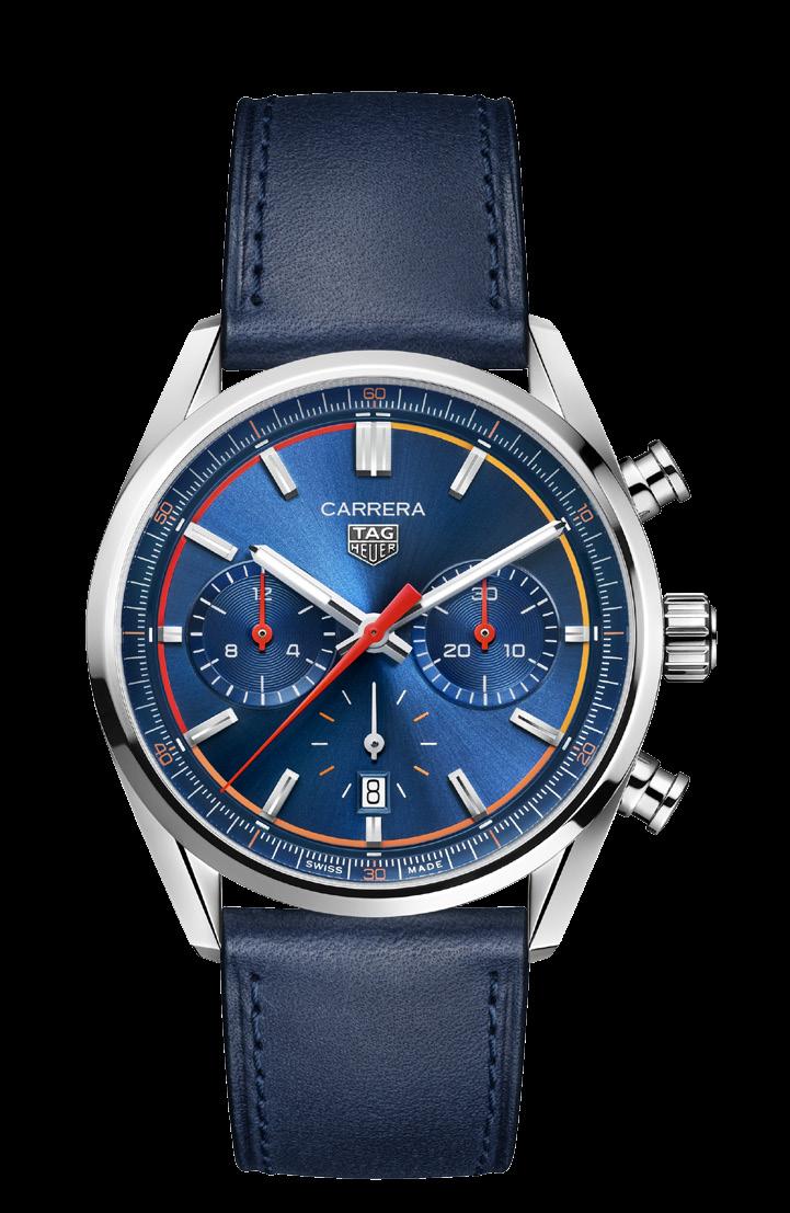
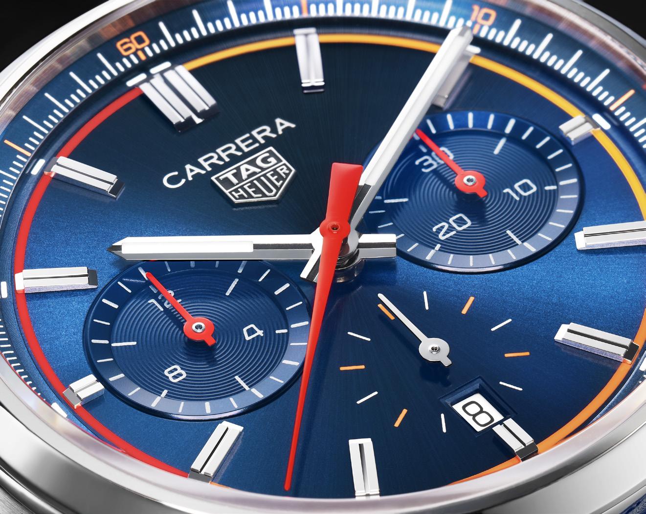
The defining touches are the punchy splashes of color designed to amplify the “thoroughbred racing style” of the new models. This primarily comes in the form of a gradient orange ring that runs around the edge of the dial to link the
applied hour markers, and acts like the visual representation of the sound of a racing engine spooling up and building speed, its sound rising to a crescendo like no other.
Adding to the high-energy details are a central chronograph seconds hand and subdial hands all in red and inspired by sports car dashboards, as well as the alternate indexes on the small seconds at 6 o’clock and the 10-minute/10-second markers on the flange, all of which are in a fiery orange.
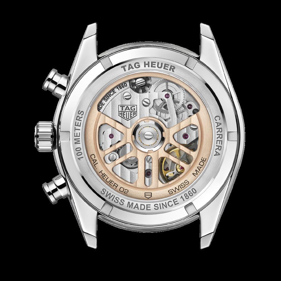
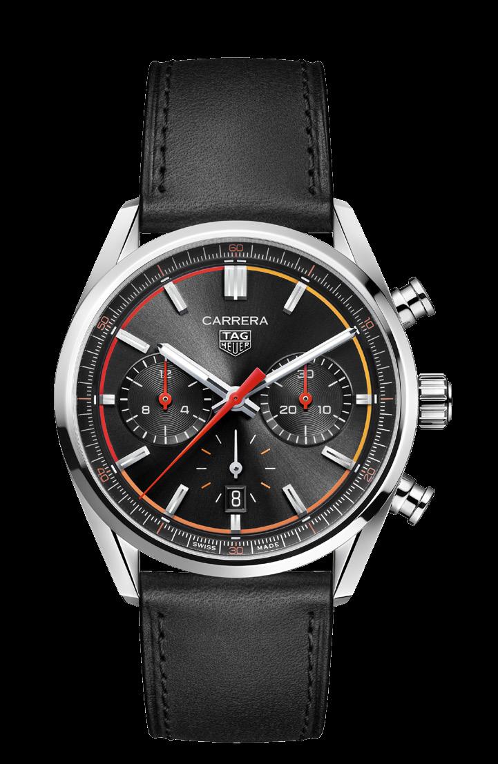
The 2 new TAG Heuer Carrera Chronographs are matched with high-quality calfskin leather straps in either blue or black depending on the model and color of the dial, and are fitted stainless-steel folding clasps.
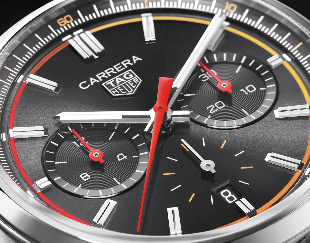
“the story of the TAG
Heuer Carrera
Chronograph will never end. And why should it? It is, after all, one of the most iconic chronographs ever made”

 Words by Bert Casal
Oris has been making mechanical watches for one hundred and nineteen (119) years now. And in those years, they have created over 280 calibres. Their current Movement Creation Programme has 10 new calibres in 10 years. That is a serious testament to their commitment and passion for mechanical watches. These are the qualities that drive Oris to create beautiful, innovative watches with advanced performance levels.
“Go Your Own Way” is the philosophy that Oris lives by. It encapsulates the key values by which the brand functions: The spirit of Independence, Craftsmanship, and Quality. One of the ways that they chose to take is through their Change for the Better program where they work with pioneering conservation organizations that help clean, restore, and protect the planet.
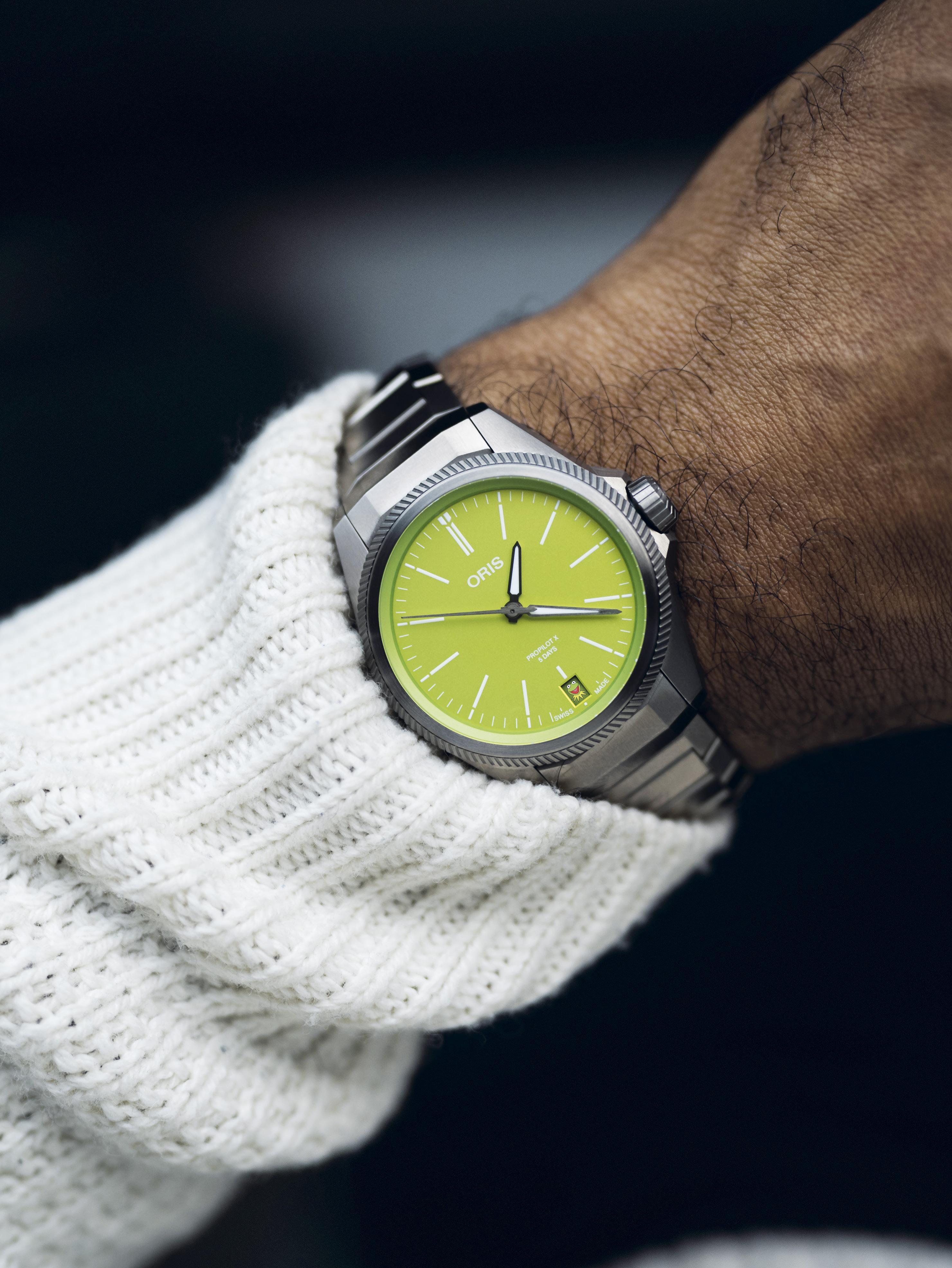
The question we can ask now is, what inspires Oris to design and create these watches? The simple answer is this: We’re inspired by what we call the Joy of Mechanics. The first function of every Oris watch is to bring joy in its purest emotional, feel-it-in-your-bones sense. If an Oris watch can make someone’s day better, then they have achieved their objective.
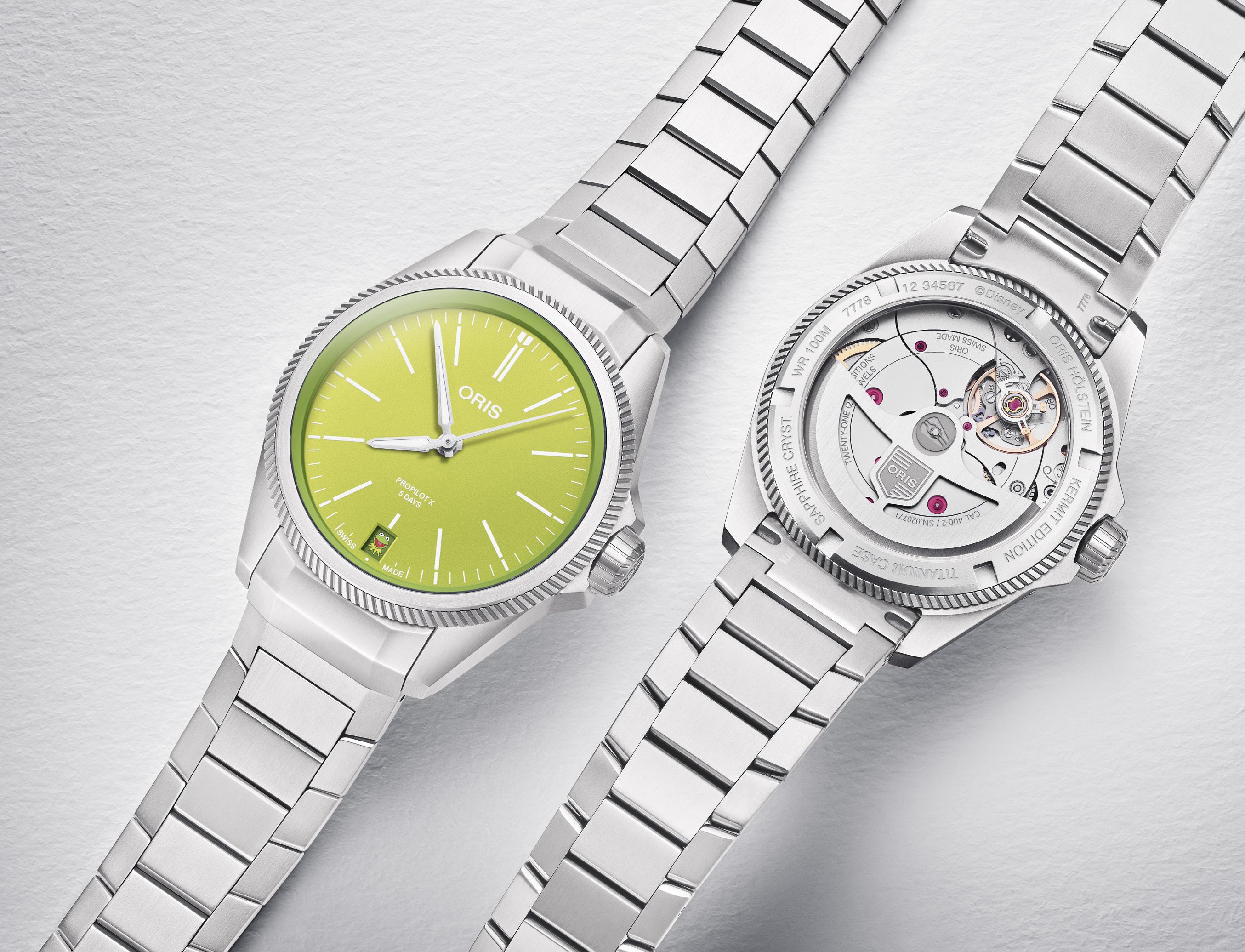
For some time now, Oris has been looking for the ultimate expression of this and to make a watch that is pure joy. The solution came with the collaboration with a character that has brought joy to generations of children (and adults), whose sole purpose is to entertain and spread happiness to his audience. To my knowledge, he is the only muppet to cross over from Sesame Street to The Muppet Show. He is none other than Kermit the Frog.
This year, Oris is proud to present the ProPilot X Kermit Edition.
The ProPilot X Kermit Edition is based on the 39mm titanium ProPilot X Calibre 400. The

only difference is, this one’s got a green dial with the green shades of Kermit himself. A surprise will reveal itself every first of the month when the date window will display the image of Kermit the Frog. This icon is there to remind us to not take things too seriously. We all need a break from work, chores, adventures, anything that may induce stress. The first of the month, when Kermit appears on the date window, is what Oris calls “Kermit Day,” a day when everyone should just feel… joy.
Ken Laurent, Oris Creative Director, went to Hollywood to meet Kermit the Frog and make a TV ad with him. The ad showed Kermit just taking time for himself, drinking tea and having a massage. In the commercial, Kermit
IN DETAIL
Case
Multi-piece titanium case with satin and sandblasted finishes
Size
39.00 mm (1.535 inches)
Dial Green
Luminous material
Indices and hour and minute hands with SuperLumiNova®
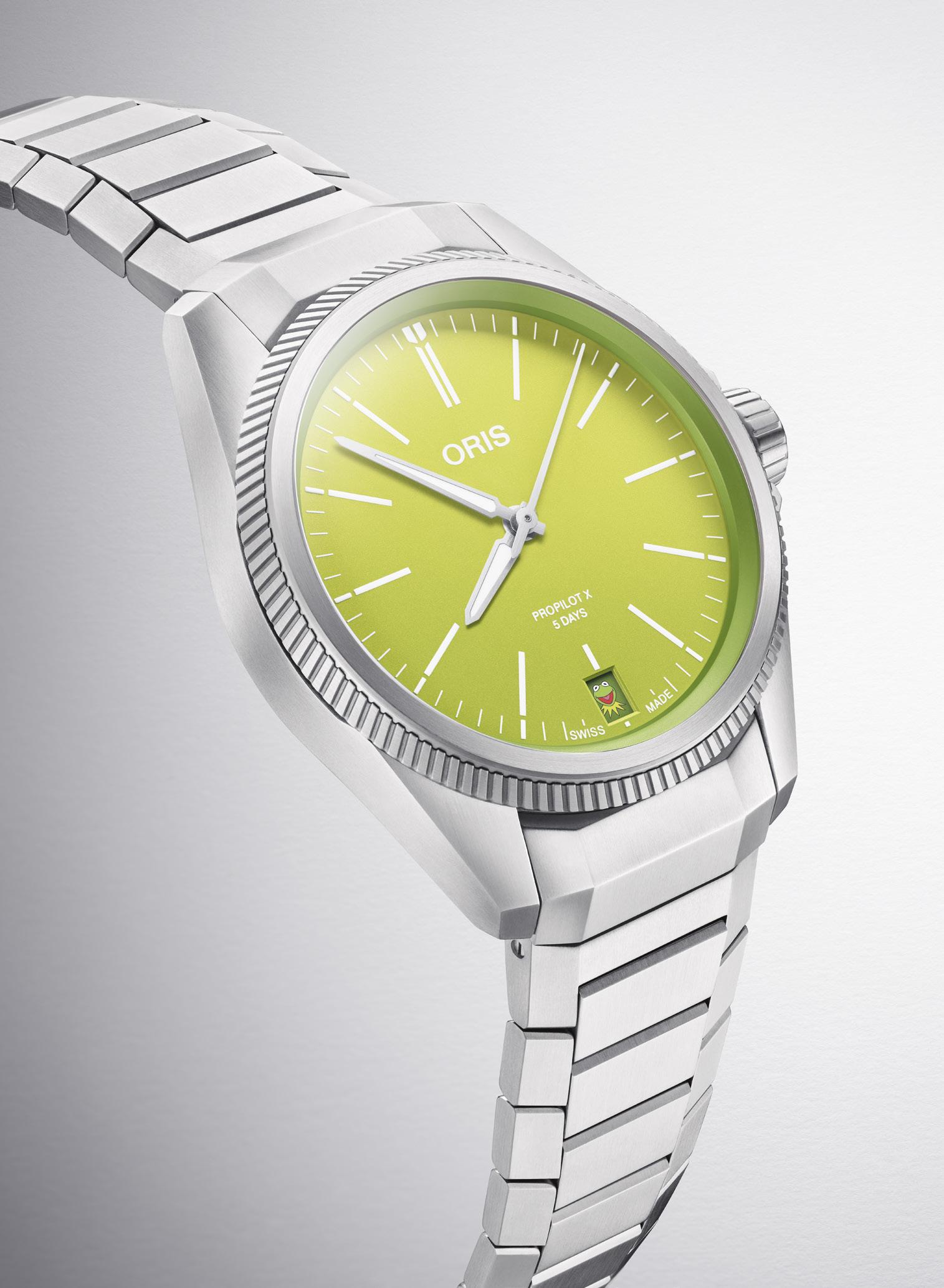
Top glass Sapphire, domed on both sides, anti-reflective coating inside
Case back
Titanium with satin and sandblasted finishes, screwed, seethrough sapphire glass
Operating devices
Titanium screw-in security crown with protection
Bracelet
Titanium with folding clasp with Oris-patented ‘LIFT’ system
Water resistance
10 bar (100 m)
MOVEMENT
Number
Oris Calibre 400
Functions
Centre hands for hours, minutes and seconds, date window at 6 o’clock, date corrector, fine timing device and stop-second
sings the aptly-named song Gotta Make Time For Me. When asked about why Kermit was subtly tucked in the date window, Laurent said: “It’s beautiful the way its been done. We could have put a big Kermit the Frog emoji on the dial. Some might have done that because they want their most important collaborations to be in-your-face, to scream. But we didn’t want that. We wanted something more humble that would respect the product.”
When asked if there will be other Disney’s The Muppets in the future, his reply was: “Maybe. You’ll have to wait and see…”
The ProPilot X Kermit Edition could be the start of the Joy Movement. I guess we’ll just have to “wait and see.”
Accuracy
-3/+5 seconds a day (within COSC tolerances)
Extra features
Highly anti-magnetic
Winding
Automatic Power reserve 120 hours
Warranty
Extended to 10 years with MyOris sign-up. Applies to watch and movement.
10-year recommended service intervals. Fiveyear
recommended waterresistance check

“If an Oris watch can make someone’s day better, we’ve done our job.”
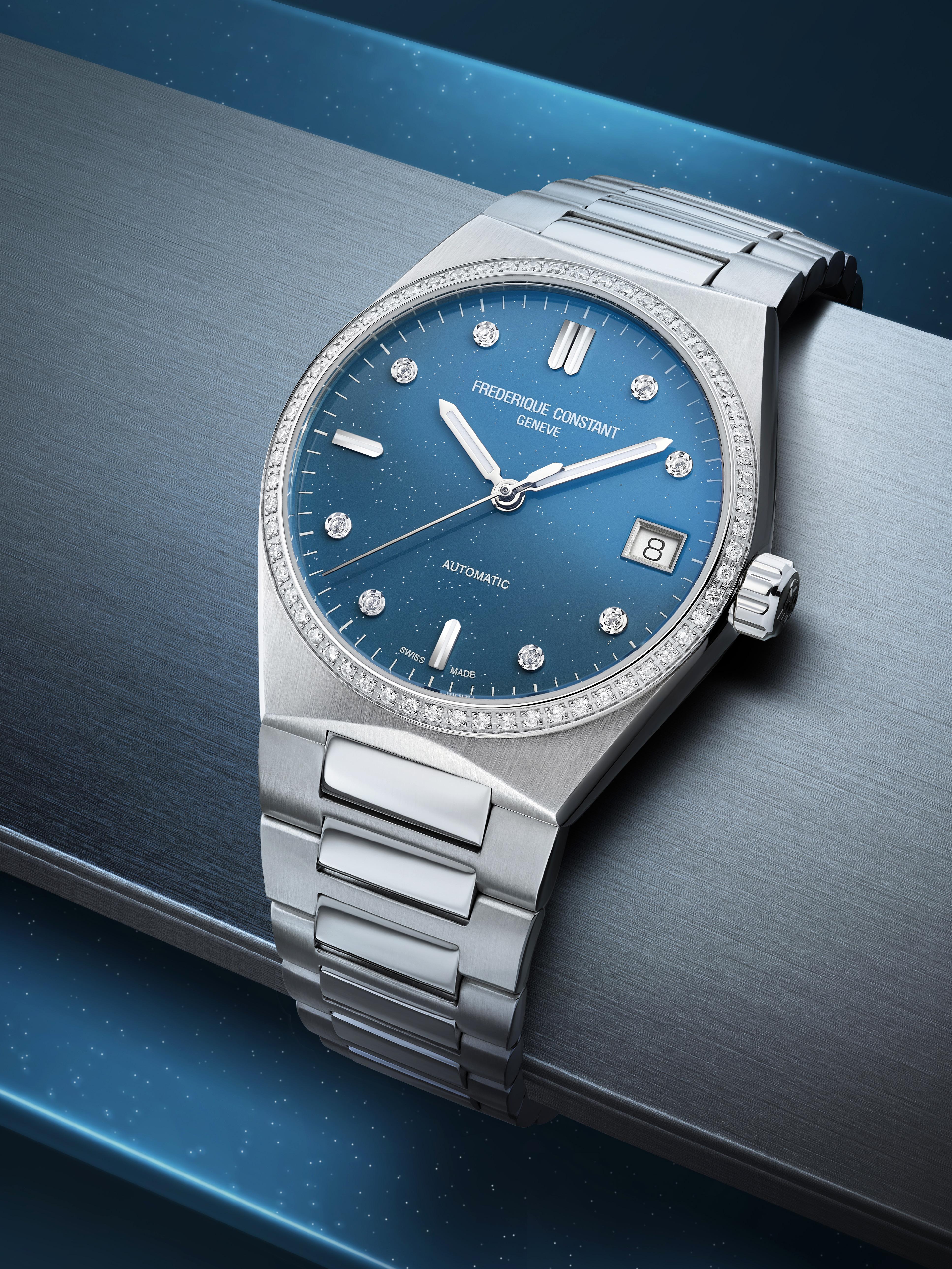

Frederique Constant came on the watchmaking scene in 1988. Aletta and Peter Stas are the minds that powered this brand and set forth a clear mandate: “Swiss
Made luxury watches at fair prices.” The brand has understood the assignment and the watches have been creative, practical, Swiss-made, and attainable. The brand has a variety of watches on offer, both quartz and mechanical models, and can boast of 30 calibers of its own creation from their Manufacture at Plan-les-Ouates, Geneva.


The Frederique Constant Highlife collection was initially launched in 1999, and thanks to several design markers, it became a landmark collection for Frederique Constant. The watches were — and still are — great examples of fine Swiss watchmaking, paired with high-level finishing, all within our reach, thanks to the affordable pricing. But don’t let the pricing fool you — each Frederique Constant watch is worth more than it’s price tag.
At first Frederique Constant offered the Highlife collection for the gentlemen. In time (no pun intended) they saw the light (from the stars? okay, pun intended here) and offered the Ladies version in 2021: the Frederique Constant Highlife Ladies Automatic Sparkling. The design aesthetic was similar to the Men’s watches,
with a little more finesse. Ladies deserve more than just adding gems to a watch to make it worthy of their attention. The round case was slightly curved, making a more gentle silhouette, and the case size was 34mm, just right for the ladies’ wrist. The steel case has both brushed and polished surfaces that create a nice interplay of light.
Where does the ‘sparkle’ come in, you ask? Just gaze upon the dial and you’ll see. The dial is a delightful blue reminiscent of the sky above. Though the Firm describes it as ‘sky-blue’ it seems a little closer to an ‘evening sky-blue.’ The stardust on the dial is actually silver fragments that have been added to resemble stars in the sky. Are there representations of actual constellations? Perhaps, perhaps not; and it could depend on your individual watch. But it is the watch wearer’s option if they choose to see specific constellations in the scattered sparkles.
Adding to the sparkle are the diamond hour markers, except for the 3, 6, 9, and 12 o’clock. All other hours have a delightful diamond marker, and having two diamonds in each of the four quadrants gives a nice symmetry to this classic


watch. The 6 and 9 o’clock hours have single applique markers, with the 12 getting a double dose. The 3 o’clock has the date window. The watch is a classic three-hander, with the seconds hand markedly slimmer than the other two.
And the dazzle continues with the diamonds on the bezel — 60 diamonds circle the dial. Did you see what they did there? Sixty diamonds, one for each minute in an hour. Time is precious indeed, so why not mark each minute with a diamond?
The original Highlife watches had an integrated strap system, which helped make the watch look oh-so-sleek and elegant. Since then the designers have taken the strap a step further and have made it easily interchangeable too. This gives the wearer flexibility and options with their watch. You can go from glamorous chic to urban sporty in a matter of seconds, with no special tools needed.
And these quick-change straps? Don’t worry, your diamond-adorned bezel will not be damaged when you change straps. Each strap is held safely in place by a pin buckle that has the Frederique Constant coat-of-arms. Whether you choose the
elegant three-link steel strap, or the white rubber strap, the diamonds stay with you too.
The Highlife Ladies Automatic Sparkling watch has an automatic movement, meaning it is equipped with an oscillating rotor that spins as the wearer’s wrist moves. Each movement of the wrist will wind the watch. No need to worry about batteries with this beauty on your wrist. The FC-303 caliber has 26 jewels, and this does not mean the diamonds on the bezel. Jewels in a watch caliber are used as bearings, and since the gemstones are so smooth, they create only minimal friction, and this allow the gears to move more smoothly and efficiently.
And you’ll be able to fully appreciate the beauty of this movement through the crystal caseback. It takes a confident watchmaker to release a watch with a crystal caseback, because every millimeter of the watch movement will be open to scrutiny. Each surface must be perfectly polished and treated. No cutting corners allowed here.
The Frederique Constant Highlife Ladies Automatic Sparkling watch will have only 888 units made, available across 120 countries.
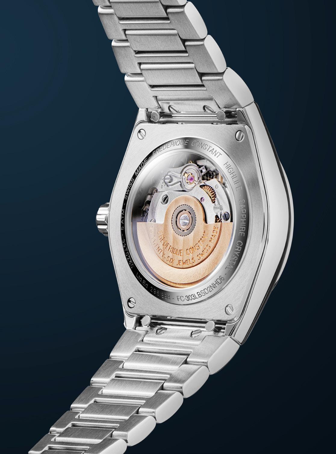
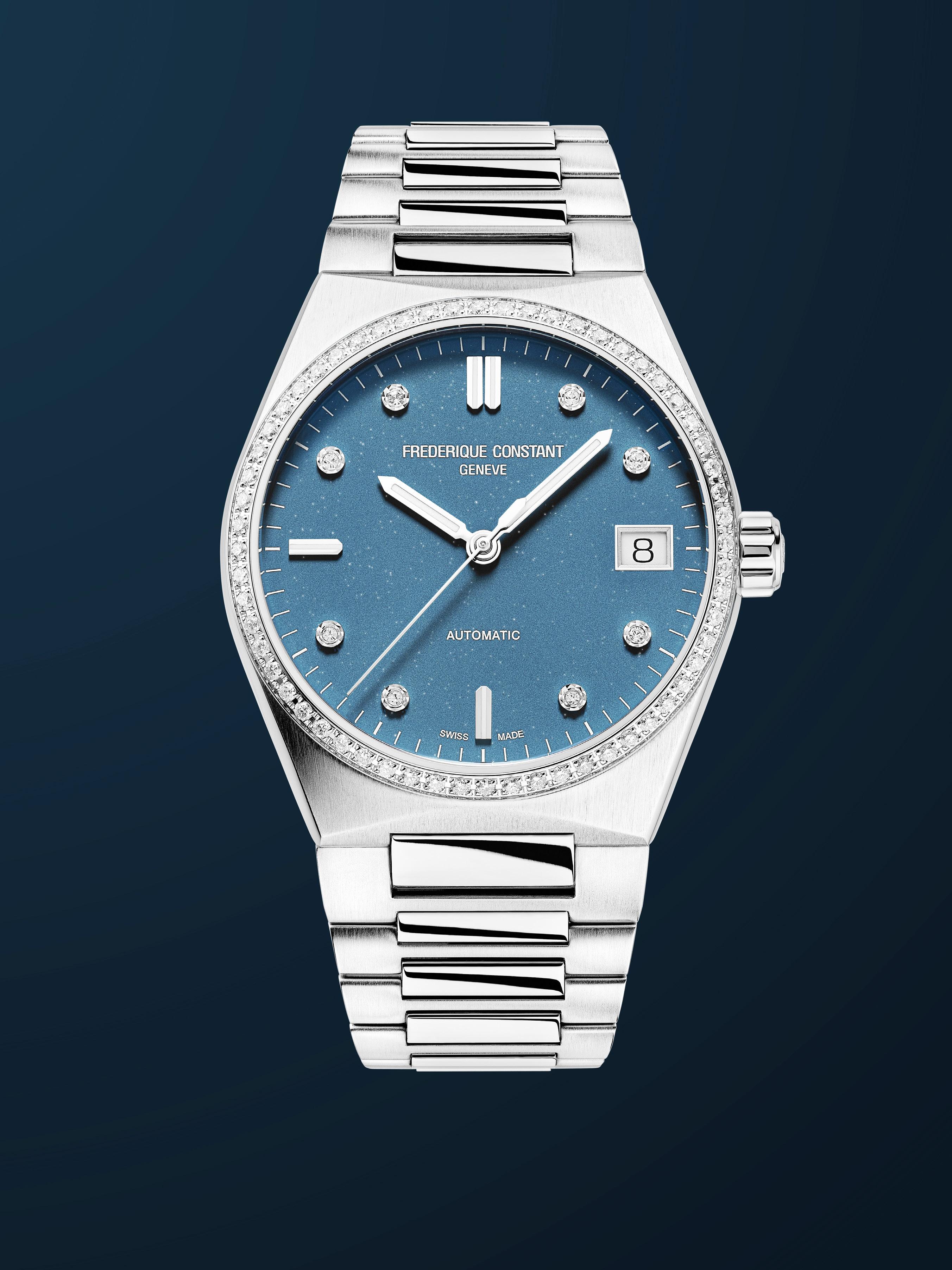

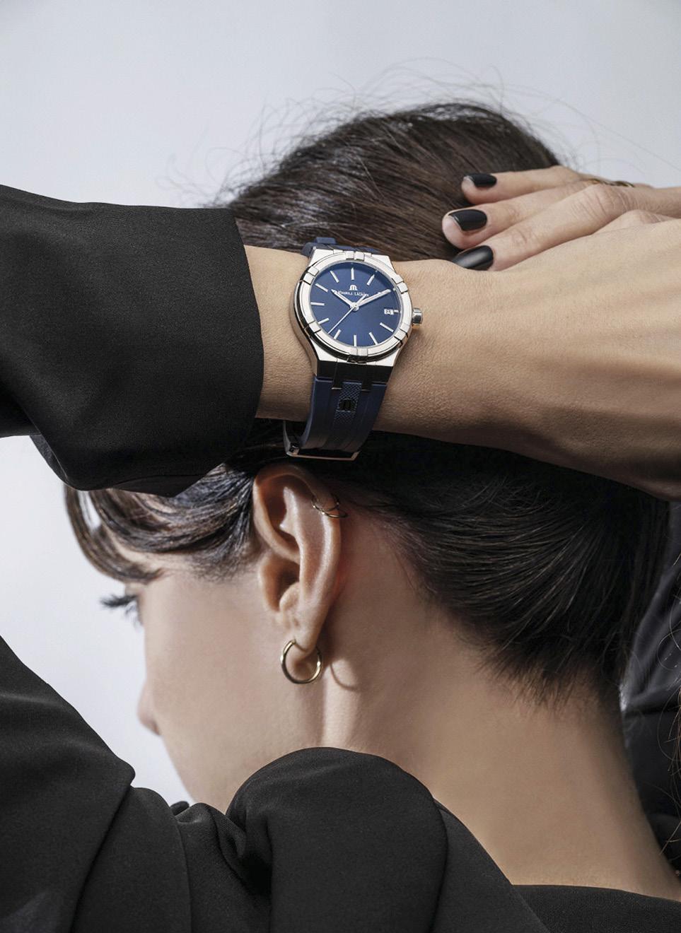
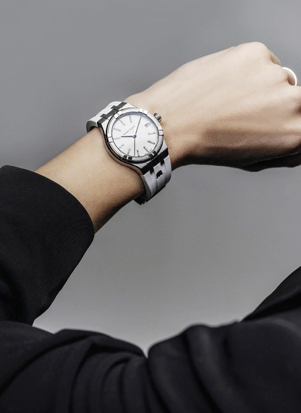
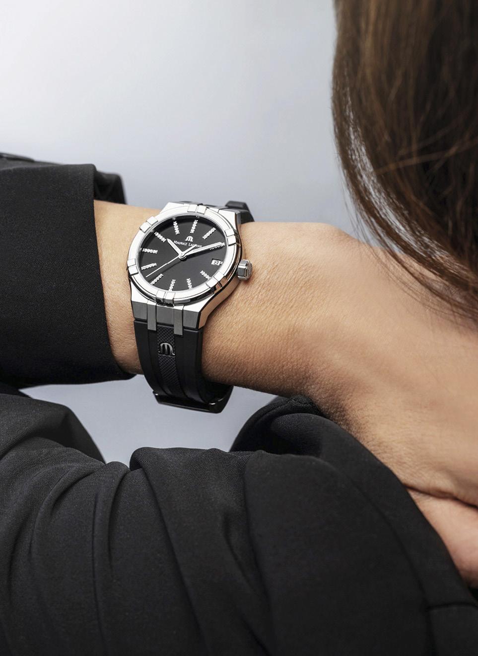
Desco von Schulthess (Desco) is an international trading company best known for establishing the Maurice Lacroix brand. Established in Zürich in 1889 as a distributor of silk and other goods from Asia, Desco became the agent for many luxury and mass-market watch brands in certain parts of Asia after World War II. Finding the watch business extremely lucrative, Desco established an assemblage business in Saignelégier and began producing watches and movements for other brands in 1961. Highly successful in this endeavor, Desco von Schulthess went on to launch its own watch brand in 1975.
Swiss rules dictated, however, that a company had to be named after an employee. Thus, Desco selected Monsieur Maurice Lacroix, their Director for Silks in Lyon, France to headline the brand (and it helped that the name also sounded
romantic), and the first timepiece under the name Maurice Lacroix was launched in Austria that same year.
Thanks to the attractive design of the watches (and their excellent price-performance ratio) Maurice Lacroix has seen rapid growth since the early 1990s, and gained ‘manufacture’ status in the early 2000s. Becoming independent of its parent company in October 2001, the Jura-based watch brand has been owned by the Asia-focused market development conglomerate DKSH since 2011.
In 2016, Maurice Lacroix “resurrected” one of its most popular watches from the 1990s, the Calypso, to produce the AIKON (pronounced “icon”). First released as a collection of quartz movements, the AIKON has proven to be a bestseller for the Jura-based brand and the collection has grown to encompass mechanical movements with different dial colors and various case materials and complications.
Indeed, the AIKON has proven to be the
perfect urban-inspired timepiece, appealing to both Millennials and members of Gen Z by uniting the freshest urban style (like the six polished “arms” placed around the bezel, as well as the integrated bracelet usually consisting of five links) with Swiss precision while, most importantly, delivering high perceived value (read: very affordable).

But despite enjoying extraordinary success with its urban-inspired model, Maurice Lacroix has continuously revisited their popular AIKON, and in the spirit of continuous improvement has revisited the inaugural quartz models to unveil new and updated versions of the AIKON Quartz for 2023.
Consisting of four new 35mm models for the ladies, and one 40mm bi-color version for the gents, the new AIKON Quartz continues to impress with its Swiss quartz movement, and its distinctive bezel endowed with six arms, which resonated with style conscious wearers

“In the spirit of continuous improvement, (Maurice Lacroix) has revisited the inaugural quartz models to unveil new and updated versions of the AIKON Quartz”
appreciative of its modern aesthetic. Aside from this, the flat sapphire crystal, sitting flush with the neighboring bezel; the screwed crown and screwed caseback; as well as the integrated bracelet or strap continue to distinguish the 2023 versions of the AIKON Quartz.
The first of the 35mm stainless-steel models is a refreshing Piña colada model that’s just perfect for “escaping from it all.” Water resistant to 100 meters, this sporty model is ideal for summer wear during the day but seamlessly transitions to the dance floor when the sun goes down courtesy of the sparkles of its diamond-set indexes that complement its matte white dial. And aside from the “standard” 5-row stainless steel bracelet, this model becomes a fashion icon with an optional white M-branded rubber strap.
The model with the black dial, on the other hand, is the spiritual opposite of the white-dialed model. Always fashionable, this “horological temptress” makes a statement at all times of the day and is particularly glamorous at night with its diamond-set indexes paired with its obsidianlike black dial. This model is also presented with an M-branded rubber strap albeit this time in matching black.
For the more conservative of us, there is the option of the blue-dialed model, which hones its urban-style with silver-toned indexes incorporating Super-LumiNova treatment matched with a sparkling blue sunray dial. Once again, housed in a 35mm stainless steel case, the watch is presented on a blue M-branded rubber strap, matching the dial and its effortlessly cool vibe.
Last but not least, is the 40mm bi-color gents model, which adds a dose of warmth into the stainless steel mix with its six-arms made of 4N PVD gold that span the bezel. The silver sunbrushed dial serves as a foil for the gold-toned hands and indexes to shine brightly, while the date aperture at 3 o’clock also framed in 4N PVD gold, heightens the overall sense of luxury. Finally, the gents model is presented on a 5-row bi-color bracelet, completing the look of this stylish ensemble.
All the updated models of the AIKON Quartz feature a center seconds hand and a date aperture at 3 o’clock, as well as an Easy Strap Exchange system that allows the provided straps to be easily swapped out without the need for tools. Since its inception in 2016, the AIKON has been the epitome of contemporary urban styling and Swiss precision, all wrapped in an accessible package of perceived high value. This new AIKON Quartz line aims to continue that tradition.
Geneva for Watches and Wonders 2023 was bright but also gray. Familiarly welcome but with the morning rains as you ran to the buses for the daily commute. Snatches of beauty and peace on busy days.


