

Ihave always enjoyed learning.
Exploring.
Then I found I enjoyed sharing. Teaching. Listening.
I discovered the wonder of working with amazing teams.
Of learning from them.
Of being motivated by them.
Of watching them grow.
I found the joy of creating one of two watch publications that, according to the big names of the western world, beat them hands down.
“What is in your water?” became a badge of honor. I stood in confusion as someone I had just met told me we had the most empowered yet polite team. I remember telling someone I wanted them to create images and journeys that would make people cry. And they went out and did it.
I cried as someone pulled me aside in a car show and told me the story of his watch, and his father, and his children, and cancer.
I thoroughly enjoy watching someone’s face when they hold and wind a mechanical timepiece for the very first time.
I love telling people special stories about their watch, showing them closeups of why their watch is special.
I love hearing them tell me the stories of the landmarks, the special moments, the finer times in their lives.
I completely appreciate the fact that I am given access to people who have wonderful stories to tell, and to be given the trust of telling those stories to others.
I am honored by the fact that a lot of the stories they tell me, I can’t actually talk about. Or talk about
yet. But give me amazing insight into the worlds of passion and technology and history and management.
I dive into talking to watch industry heads, scions, owners that tell me how they plan for the far future with vision but also with intelligence, with heritage in mind but also with change. With responsibility as well as with daring.
I relish talking to the people who ask about things I often forget to discuss. About horological beginnings, about how to properly wind, about how to choose, about how they are surprised by what I actually wear a lot when I am alone. Because that is where the growth comes from.
Two decades ago many people said there would be no real growth in the local watch industry.
I can’t say I believed differently, and to be honest I really didn’t know any better. But I knew there were stories to tell, and people to talk to, and information to share.
Maybe that is the key.
When you think you know too much, it keeps you from listening. From trying.
When you assume you have much to learn, that is exactly what you do.
When we started the C! Group, my column (one of several) was named Avid Amateur. Everyone was against it. We should be authorities, they said. We should say we are the best. We should say we are the most knowledgeable.
I guess I just really want to learn.
To grow.
To share.
Thank you for letting me keep on learning.
Always.
“I AM HONORED BY THE FACT THAT A LOT OF THE STORIES THEY TELL ME, I CAN’T ACTUALLY TALK ABOUT. OR TALK ABOUT YET. BUT GIVE ME AMAZING INSIGHT INTO THE WORLDS OF PASSION AND TECHNOLOGY AND HISTORY AND MANAGEMENT.”
Letting people see more with the Unveiled Minerva Monopusher Chronograph
Launches a new movement in two wonderfully classic watches
Tudor
Visiting the Tudor Manufacture 42



60
Celebrates 25 years of the Datograph with a special, luxurious edition.
64
Unveils stunning new timepieces, simple to use but exclusive to own.


68
Unveils a new steel GMT-Master II alongside a meticulously crafted classic.
72
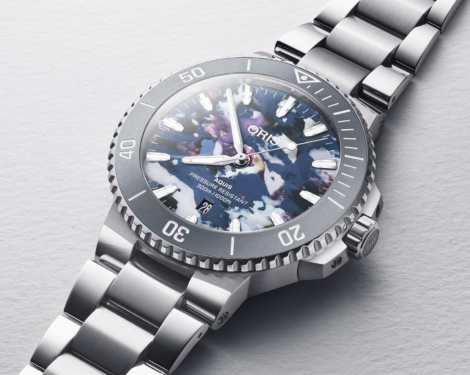
Elevates the Aquis Date, offering sustainable luxury within its core collection.
76
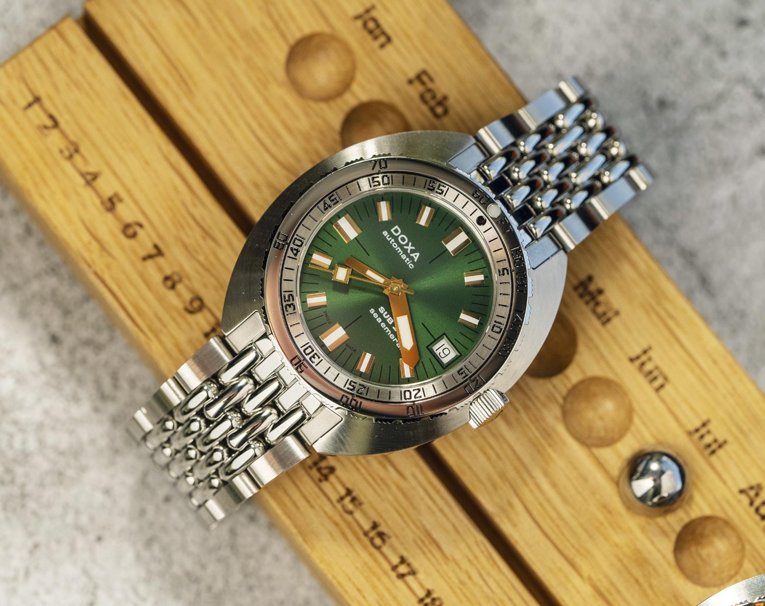
Unveils the SUB 200T in a new, green colorway and smaller size.
80
TAG Heuer
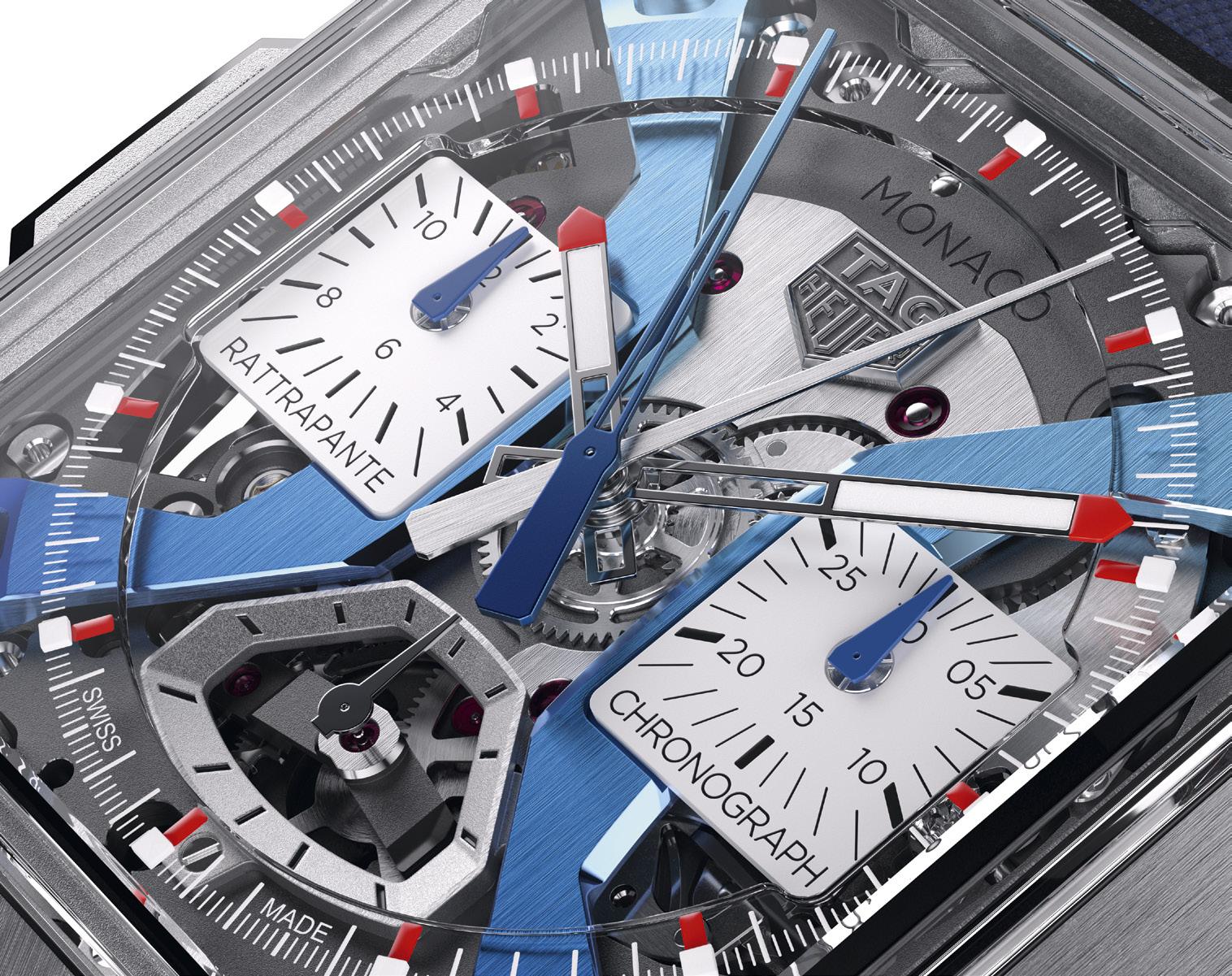
Races to the future with the new Monaco

 By William Herrera
Carl
S. Cunanan Editor-In-ChiefSenior Editor
Hernan C. Mapua
Collections Editor
Jason S. Ang
Associate Editor
Kit O. Payumo
Senior Staff Writer
Alberto E. Casal
Design Director
Charie L. Biaden
Senior Designer
Mark David A. See
Designer
Mary Ann E. Marcelo
Contributing Writers
William Herrera
Brian M. Afuang
Katherine S. Cunanan
Jose Martin V. Ursúa
Leonard Vincent L. Ho
Edrich Santos
Dominique O. Cerqueda
Advertising Traffic Manager
Jennie O. Salazar
Account Managers
Malyn L. Bautista
Erwin G. Bautista
C! Publishing and Media Group, Inc. Publisher
Chairman Michael L. Lhuillier
Managing Director
Paolo M. Puyat-Martel
Board of Directors
Michael L. Lhuillier
Paolo M. Puyat-Martel
Carl S. Cunanan
Kevin C. Limjoco
Chief Operating Officer
CK Buenviaje
Senior Accountant
Merline B. Urdas
Credit and Collection Officer
Mary Ann M. Benito
HR Admin Associate Liezl Siborboro
Legal Counsel
Paredes Garcia & Golez Law Office
C! Publishing and Media Group, Inc.
Burgundy Corporate Tower
Units 27B and 27AR03
252 Sen Gil Puyat Avenue, Makati City
Visit: www.calibremagazine.com
Distributed by:
#5 Everite St., Calumpang, Marikina City
Tel: (+632) 7945-5089


There are distinct differences between each era of motorsports. Contrast the 1950s with the 1960s: Toward the end of the latter decade, the sport was infused with the sex, drugs, and rock’n’roll that had overtaken the broader culture. Meanwhile, the 50s brings to mind softspoken, middle-aged men racing in polo helmets and shirtsleeves. No less dangerous than the following decades, but altogether a refined and reserved affair. Even the styling of the era was more graceful and gamine: Place the streamlined form of the Mercedes-Benz 300SLR next to the gorgeously vulgar curves of the Ferrari P4. Goodbye, Audrey Hepburn! Hello, Raquel Welch!
Dramatizations of said eras likewise differ in tone. Let’s look at the recent Ferrari and compare it with 2019’s Ford v Ferrari: Both are thoroughly Hollywoodized versions of history, but FvF was pugnaciously in-your-face, while Ferrari is (for the most part) a quiet meditation on Enzo Ferrari’s drive, and his relationships with those around him. It has the ingredients for greatness: The supremely talented Michael Mann directed this adaptation of Brock Yates’ revisionist biography, with a laser focus on just three months in Il Commendatore’s life. Surely, Mann could attract a budget and a cast that would do the story justice, but the early news did not bode well. Adam Driver is one of the best actors of this generation, but here he is physically miscast. Driver is a lanky figure with aquiline features, whereas Enzo Ferrari was similarly tall, but barrel chested and moonfaced. They both have pronounced beaks, but one is an eagle, the other an owl. As for the women in his life, it should come as no surprise
that the real Mrs. Ferrari and the mistress Lina Lardi look (how to put this politely?) quite unlike Penelope Cruz and Shailene Woodley! Ferrari, to quote Dom Toretto, “is about family”: Enzo, his wife Laura, his late son Dino, his mistress Lina, and their son Piero. (Piero would only be acknowledged as a Ferrari upon Laura’s death in 1978.) This Italian soap opera is sufficiently entertaining, but surrounding it is the high-stakes business of selling and racing cars. It would be easy to nitpick these scenes, but it’s best to enjoy the sights of bunched-up sports cars (vintage originals and replicas) racing on the open roads of northern Italy. Unlike in some scenes of FvF, the racing footage is not undercranked, nor does it have the conspicuous sheen of CGI seen in films like Rush. The routes look realistic; I’m sure there was great temptation to show a Ferrari 250 drifting around the Roman Colosseum!
The central narrative is bookended by a pair of crashes — one, hilariously exaggerated while the second is coldly horrific. In March 1957, Eugenio Castelloti struck a curb that launched both car and driver 100 yards, killing the young Italian with only 1 pole and 3 podiums on his F1 record. That the on-screen stunt looked more like a physics-defying scene from Sylvester Stallone’s Indycar stinker Driven was a bad omen. The final accident, during the Mille Miglia in May, is one that claimed the lives of Spanish playboy Alfonso de Portago, his co-driver Ed Nelson, and nine roadside spectators, including five children. This tragedy is filmed dispassionately, the stricken 335S tumbling into the crowd and economically ending a dozen lives in seconds.
Where do watches fit into Enzo’s story? Horology will always be intertwined with motorsport, and comes into literal focus early in the movie. Rival Maserati driver Jean Behra finishes a warm-up lap of the Modena Autodrome, and out comes a quartet of timepieces. The first two are Soviet-era stopwatches made by Agat, formerly known as the Zlatoust Watch Factory, established in 1941. Its workers had been evacuated east
of the Urals as German Army Group Centre advanced on Moscow. Another hand comes into frame: It’s an Omega stopwatch, cal. 9300 (not to be confused with the modern co-axial) and capable of recording hundredths of a second. The fourth and final timepiece is the highlight: A gorgeous Universal Genève Pocket Compax (Ref. 22549) powered by a manual-wind Cal. 292 rotated on its side. At first glance, it appears to have a fourregister layout like a Tri-Compax. However, the 9 o’clock subdial is entirely decorative — "Universal Compax" framed by its pre-war gear/clock logo. The Compax is a beauty, but unfortunately, it’s the only timepiece here that would be neither cheap nor easy to acquire. Final verdict? Ferrari plays fast and loose with history, reordering the chronology of events, omitting and inventing at its convenience, and grossly misrepresenting characters. The racing action could stand to be much more accurate, or filmed in a way that clarifies what is happening between the cars. Meanwhile, character scenes will be too ponderous and somber for the crowd that enjoyed FvF. Some dialogue is too on-thenose, and always delivered with questionable Italian accents. Ultimately, I am surprised that I enjoyed Ferrari despite its flaws. It is an imperfect but compelling glimpse into the man, his priorities, and his acceptance of a level of danger that we struggle to even grasp in 2024.
“IT WOULD BE EASY TO NITPICK FERRARI , BUT IT’S BETTER TO ENJOY THE SIGHT OF SPORTS CARS RACING ON THE OPEN ROADS OF NORTHERN ITALY.”

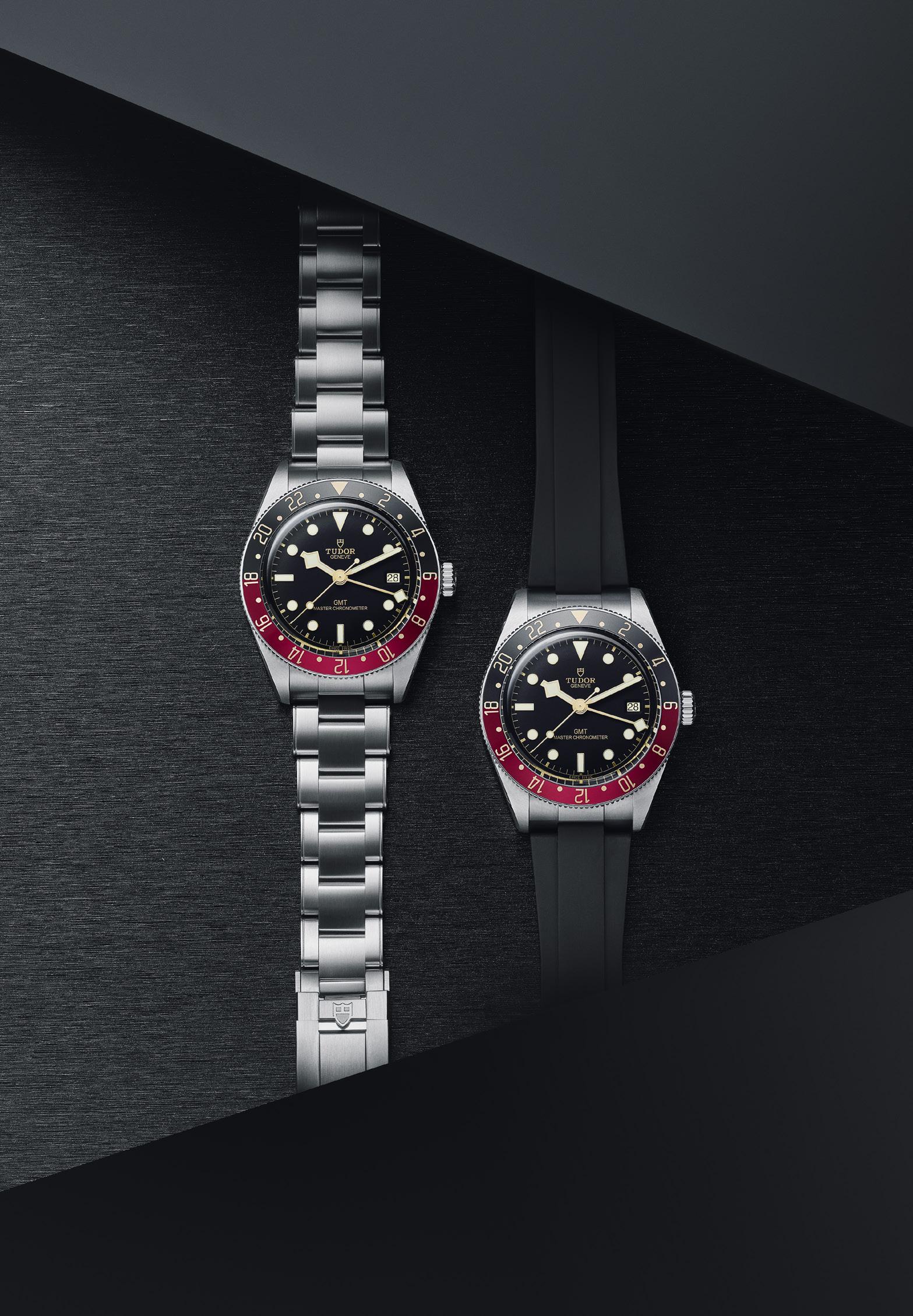
Tudor gets back to basics and simultaneously goes sky high with an all-black diver and a GMT reminiscent of the golden age of travel
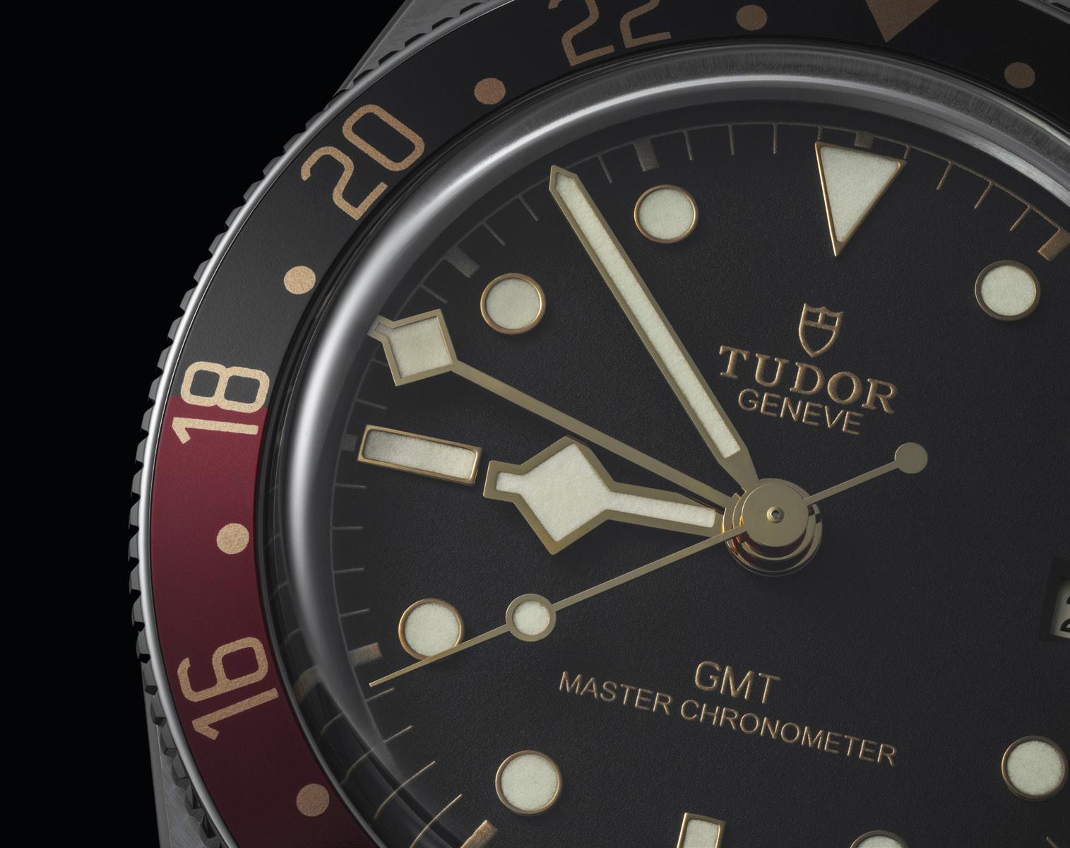
Last year, Tudor unveiled the Black Bay Burgundy with an updated and slimmer 41mm case, new bracelet options, a new clasp, new bezel, new crown, and most importantly, a Master Chronometer movement. This year, Tudor presents a gilt-free, no-nonsense, all-black version of the same watch in the Tudor Black Bay 41 Instead, the new watch keeps its original 41mm proportions and thinner profile, and stands out with a matte black dial combined with a black aluminum insert on the unidirectional bezel enhanced by a silver-colored 60-minute diving scale. Which is probably why Tudor went the complete opposite with the Black Bay 58 GMT, a smaller take on the brand’s popular Black Bay GMT travel watch with just the right touch of gilt and in colors that hark back to the golden age of travel.
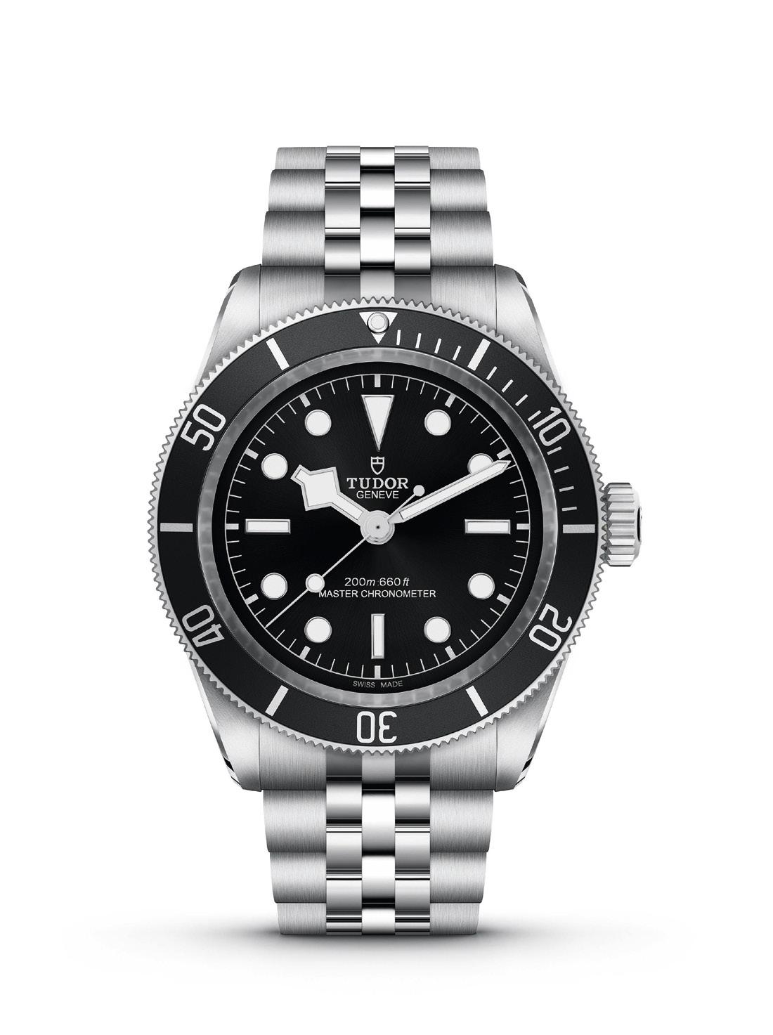
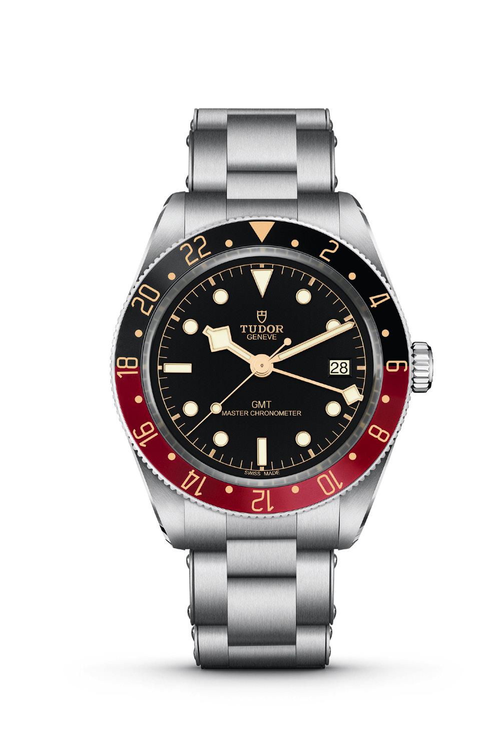
Simultaneously getting back to basics and going sky high this 2024, Tudor delivers a satisfying one-two punch with the Black Bay 41 and the Black Bay 58 GMT that not only got everyone’s attention, but also proves that Tudor is listening to its core audience. The former is a monochrome wonder that cements the fact that the Black Bay 41 is truly the core model of the brand, while at 39mm wide, only 12.8mm thick, and paired in warm hues of burgundy, black and gilt on the bezel, the Black Bay 58 GMT is an entirely new model that provides the slimmer Tudor GMT that many have been asking for. That’s only 0.9mm thicker than the standard Black Bay 58 and almost 2mm thinner than the other two GMT watches Tudor has in its catalogue.
Both watches are METAS certified Master Chronometers and bring together cutting-edge watchmaking technology with unassailable watchmaking heritage. The Calibre MT5602-U drives the Black Bay 41, while the Black Bay 58 GMT derives power from the Calibre MT5450-U, both of which are designed to ensure robustness and precision with the latter endowed with adaptable movement architecture capable of integrating new functions rather than resorting to additional modules. Both movements bear the look and feel of Tudor Manufacture calibres, are impervious to magnetic fields below 15,000 gauss, and are also “weekend-proof” with the former
boasting 70 hours of autonomy, and the latter endowed with approximately 65 hours of power reserve.
Last but not least, both watches are enhanced with a set of bracelets and rubber straps designed to bolster their performance-oriented vocations in either 3-link, or 5-link bracelet guise, or fitted with an optional rubber strap that comes in 3 sizes, all of which are enhanced with Tudor “T-fit” clasps to ensure the perfect fit. We hope to feature more “fleshedout”, and fully detailed articles on both the Black Bay 41 and the Black Bay 58 GMT soon. Tune in to future issues of Calibre for more details.
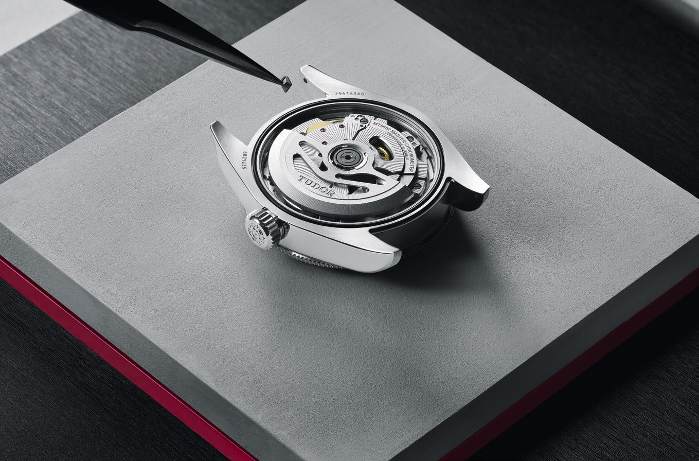 Black Bay 41

Time passes irrevocably.
When physics inspires the creation of music.
At the recently concluded Watches and Wonders 2024 in Geneva, IWC Schaffhausen awed the world with their release of the new Portugieser Eternal Calendar. It was IWC’s first secular perpetual calendar that automatically takes into account the Gregorian’s calendar’s leap year rules by skipping three leap years over 400 years. It also features a moon phase display with an accuracy of 45 million years. The Portugieser Eternal Calendar is not just a feat of engineering. It also represents a true work of art.

"The result of this collaboration was a unique masterpiece of music, all four of which was played every full hour at the IWC Schaffhausen booth at Watches and Wonders in Geneva."

The new Portugieser collection (from the Perpetual Calendar to the Chronograph) has four new colorways: Silver Moon (a white dial that represents the beginning of a new day), Horizon Blue (which signifies the brightness of the day), Dune (shows the warm colors of the late afternoon), and Obsidian (the black that the night manifests.)
So what do Academy Award®-winning film score composer Hans Zimmer and renowned physicist Professor Brian Cox have to do with this mechanical marvel?
IWC called on Hans Zimmer to compose music for the four signature dial colors in the new Portugieser collection. While working on the compositions, Hans Zimmer was brought together with Brian Cox to exchange concepts and ideas.
The unlikely pair exchanged thoughts on the Portugieser Eternal Calendar and discussed some key concepts inherent to art and science. The unique perspectives shared by Brian Cox as a scientist inspired Hans Zimmer while creating his music.
The result of this collaboration was a unique set of masterpiece music, all four of which were played every full hour at the IWC Schaffhausen booth at Watches and Wonders in Geneva.
Brian Cox said: “To a physicist with a deep interest in space and time, IWC’s watchmaking is a source of inspiration. Looking at the second hand of a watch invites profound questions about the nature of time and space and the underlying structure and beauty of our Universe.”
Hans Zimmer remarked: “As an artist, I always seek inspiration to take me to unexpected places and give my work new directions. Talking to Brian Cox, a leading physicist and such a brilliant mind, has deeply inspired me. This project has reinforced my intention to create a unique community of artists, scientists, and other thought leaders with the aim of collaborating on some of the most pressing challenges we face globally as a species.”
Physicist Professor Brian Cox Music Composer Hans Zimmer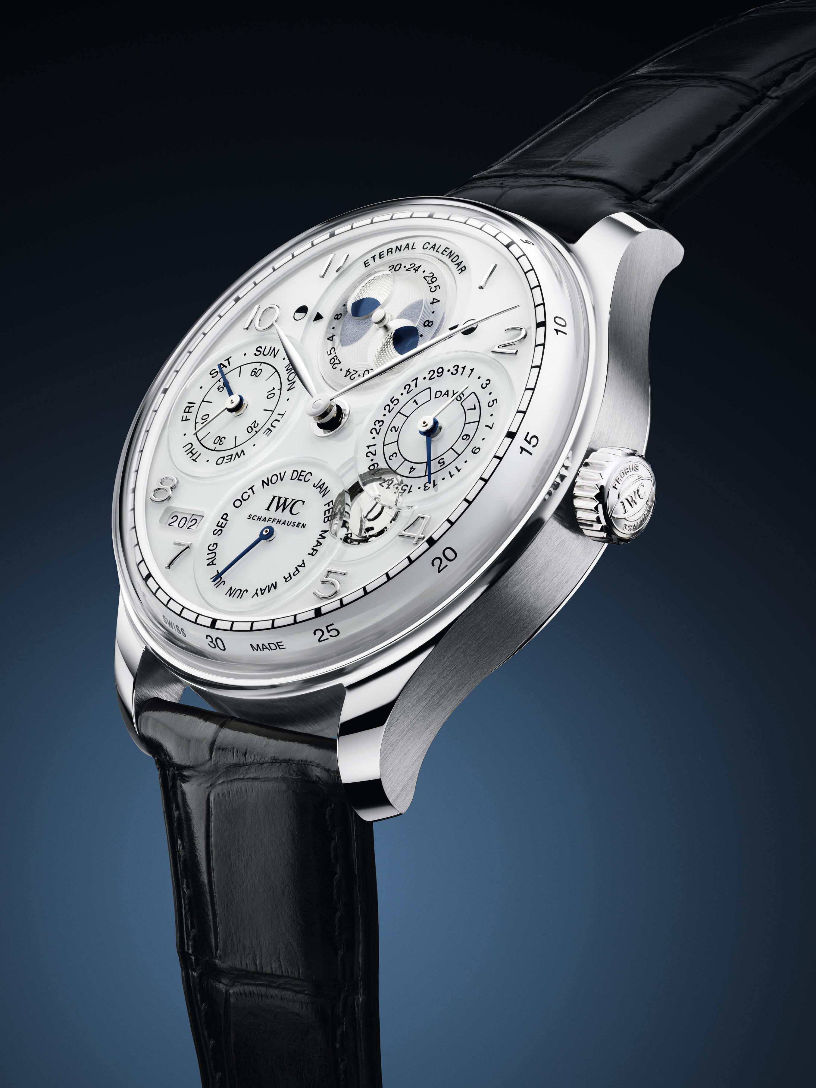


OMEGA releases a new Chronoscope for the summer olympics.
The Paris Summer Olympics will begin on July 26, 2024. To commemorate this quadrennial event, Official Timekeeper
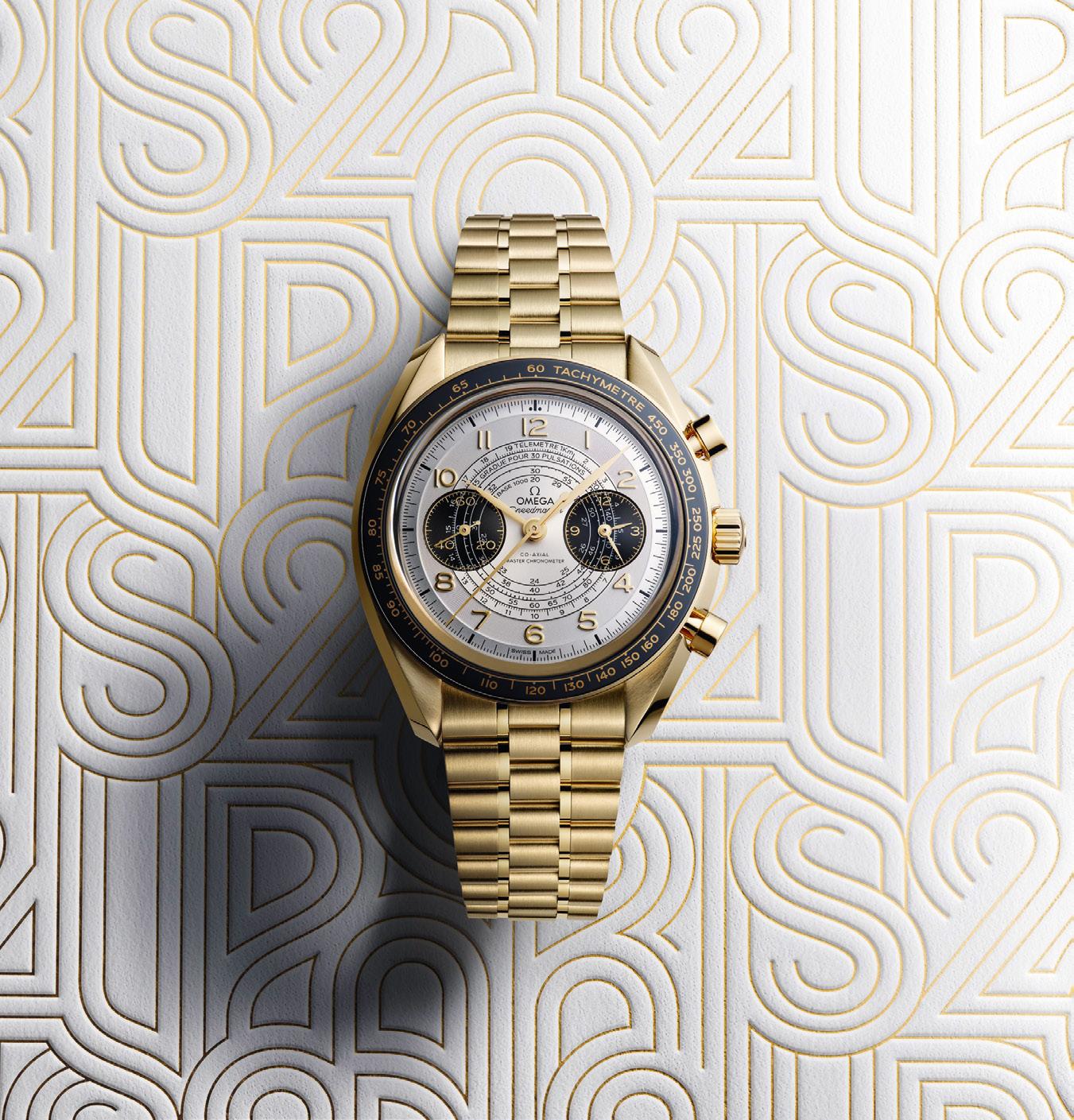
OMEGA presents the new Speedster Chronoscope. This new 43 mm series has four available models, each presented in the gold, black, and white color way of the Olympic Games Paris 2024. This includes a version in full stainless steel with an anodized aluminum bezel.
Another is presented with a ceramic bezel and 18K Moonshine™ Gold case and bracelet - OMEGA’s own yellow gold alloy, known for its subtle hue and long-lasting shine. The blackened subdials, Arabic numerals in 18K Moonshine™ Gold, and leaf-shaped hands and sundial hands are Moonshine™ Gold coated.
Each watch has a silvery white opaline dial, which is transferred with three dark grey timing scales in a 1940s “snail” design. These include a tachymeter scale, a pulsometer scale, and a telemeter scale, offering a wide range of measurements right on your wrist.
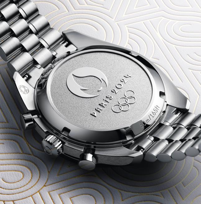
Powering this new Speedster is the manual winding OMEGA 9908 that has a power reserve of 60 hours. This movement is certified by METAS at the highest standard of precision, performance, and magnetic resistance in the Swiss watch industry. The steel case is water resistant to 50 meters. The case back contains a commemorative marking of the Paris 2024 logo. It comes with a stainless steel bracelet and a folder clasp with comfort setting.
Additionally, two editions are available for the Speedster Chronoscope Paris 2024 collection. These are a perforated black calfskin leather strap on the stainless steel model, and a standard black calfskin leather strap on the 18K Moonshine™ Gold version.
Tissot, Wilson and the WNBA launch the first official watches in the league’s history
As the official timekeeper of the NBA and WNBA shot clocks, Tissot gives us a three-point play by collaborating with both Wilson and the WNBA to create the ultimate expression of WNBA timekeeping. Indeed, interest in the women’s game is at a fever pitch, and to celebrate, the first official watches crafted specifically to highlight the significant cultural influence of the WNBA, the innovative and official WNBA basketball made by Wilson, and the ultimate
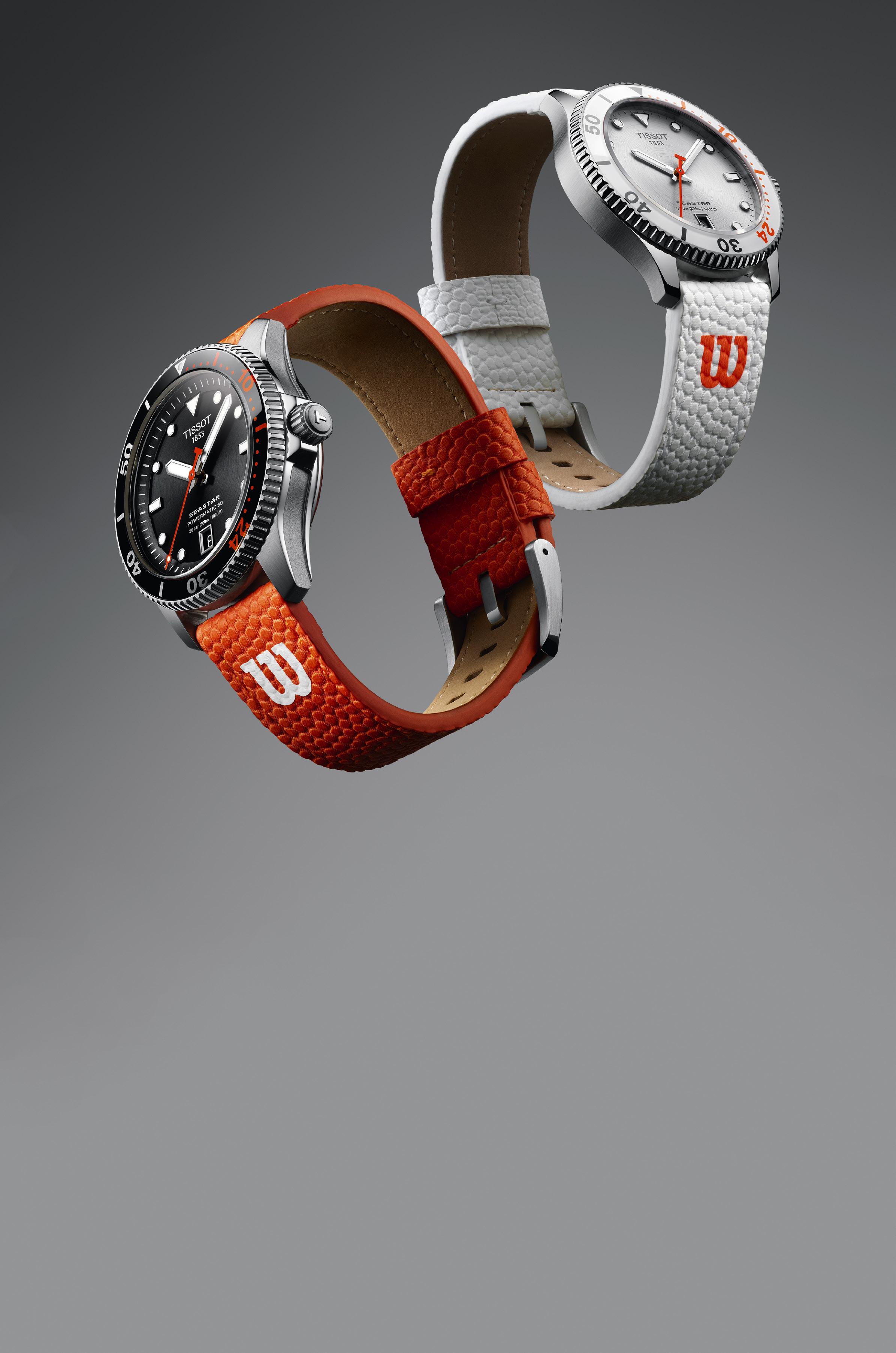
expertise in Swiss watchmaking courtesy of Tissot, have just made their debut.
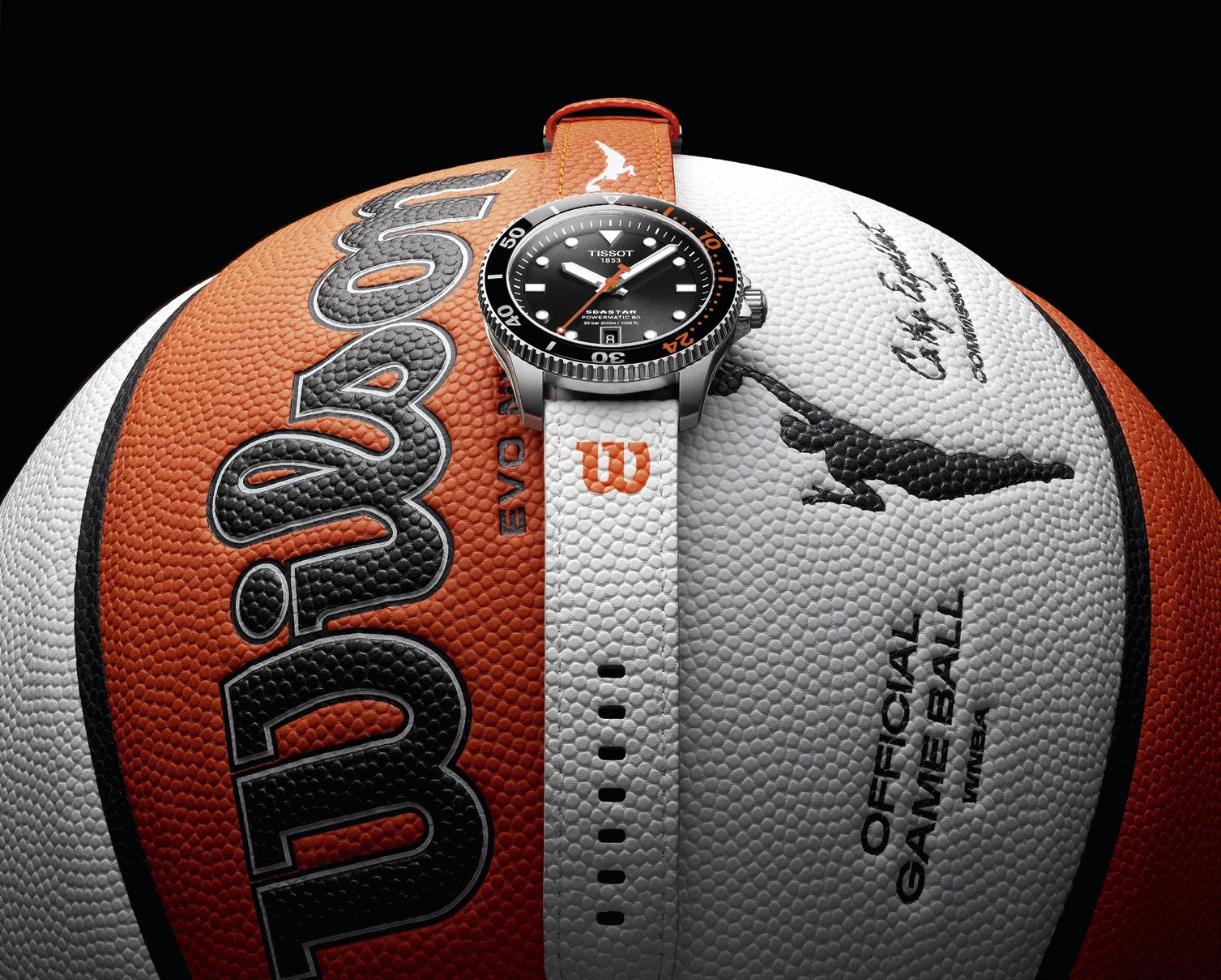
Tailored to the most enthusiastic basketball fans, Tissot gives us a full-court press with the Tissot Seastar Wilson WNBA Powermatic 80, and the Tissot Seastar Wilson WNBA Quartz, two special, first-of-their-kind 40mm Tissot Seastar timepieces in statement-making, basketball-inspired designs. Both featuring white and orange details recognized globally as the brand colors of the WNBA, the model offering the allure and esteemed mechanics associated with automatic watches is distinguished by a black circular brushed dial and mineral bezel, while the model powered by the high-quality Swiss-made EOL quartz movement has the same elements in white with both models highlighted by orange accents.
And that’s no ordinary dive-time bezel either. In connection with Tissot being
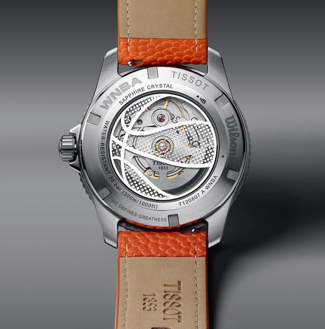
the official timekeeper of the NBA and WNBA shot clocks, the Tissot Seastar Wilson WNBA timepieces feature a rotating bezel with the number 24, which counts down the 24-second shot clock time. Further, both watches are matched with easily interchangeable orange and white straps embossed with a contrasting “W” and made of Evo-NXT Premium Composite Material, the same material Wilson’s Official Basketball of the WNBA is made of. And turn the watches over and a representation of the WNBA Wilson basketball is etched on the sapphire caseback of the mechanical model, and on the solid caseback of the quartz model. This slam-dunk of an accessory ensures technical superiority with waterresistance up to 30 bar (300 meters/1,000 feet), and enhanced visibility in low-light conditions provided by Super-LumiNova on the hands and hour markers.

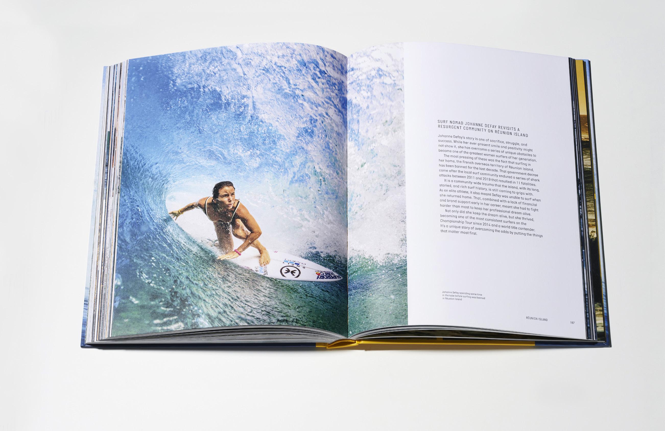


Breitling captures the diverse characters, unexpected outposts, and collective culture in a book about surfing
This is around the time you’d be asking, what does a watchmaker that specializes in aviationcentric timepieces have anything to do with surfing, much less an in-depth book about it? Well, the short answer is: the Breitling SuperOcean, that’s what. Not many people outside the industry (or the surfing community for that matter) are aware but ever since Breitling launched the first SuperOcean dive watch back in 1957, Breitling has cultivated a special relationship with the surfing community. “Based on a sense of adventure and a shared love of the sea,” this “connection” is what prompted the watchmaker to produce the book.
“This is not your typical surf book,” says Breitling CEO Georges Kern. “Sure, there are plenty of jaw-dropping barrels and big waves, but in the end, this is a book about the people, places, and cultures that are the essence of surfing. Being so close to the sport, we know we had to capture that.”
Written by Ben Mondy, the 256page coffee table book isn’t just about surfing as a sport or lifestyle with its sports endorsements and worldwide competitions, but is in fact a profound exploration of surf communities across the globe. An illustrated journey that guides the reader through modern surf culture guided by the international surfers themselves, The Breitling book of Surfing is not just about capturing the heart-pounding thrills of riding the waves, but is also about camaraderie, shared sunsets, and the quiet moments of reflection that every surfer experiences after a long day of surfing. Most especially, the book aims to show the special connection shared by surfers from

all across the globe, and what keeps them rooted in the places where they carved their first waves.
“Look, I’ve been around long enough to know the end game of this book is to sell expensive watches,” said Mondy. “And yet, by concentrating on community, and by examining suffers with a wide breadth of ages, backgrounds and experiences there is, hopefully, a sense of authenticity (that) pervades the book.”
A treasure trove of stories, what sets this book apart is how it is presented. Utilizing epic photography in combination with intimate in-depth interviews, some of the world’s most exciting professional and freestyle surfers use their own words to talk about their careers, their influences, their hopes and dreams, and the places and waves that have shaped their lives and their surfing.
A surprisingly substantial visual feast, The Breitling book of Surfing features interviews with surfing heavy hitters like GOAT Kelly Slater, Stephanie Gilmore, Sally Fitzgibbons, Johanne Defay, and
Mikey February, as well as lesser-known yet equally passionate surfers like Effie Vrakas from Greece, Freddie Meadows from the cold waters of the Baltic, and Italy’s Roberto D’Amico, all of whom give an in-depth “glimpse” of their life stories and how waves have indelibly shaped it. In fact, Mondy’s book features a special foreword by Mikey February, and an introduction by Steph Gilmore.
Described by Breitling as, “as much an in-depth travelogue as it is a beautiful photography book,” the book is a testament to the beauty and enduring diversity of surfing culture around the world. By featuring glimpses of Ireland’s rugged and unforgiving west coast, and the famous beaches of Oahu, Hawaii, not to mention making stops across six continents along the way, Breitling provides a unique and unexpected window on the modern surf experience.
In the end Mondy had this to say about Breitling: “It was great working with a brand that had a sense of clarity and purpose. Oh and budget.” Let’s not forget that.

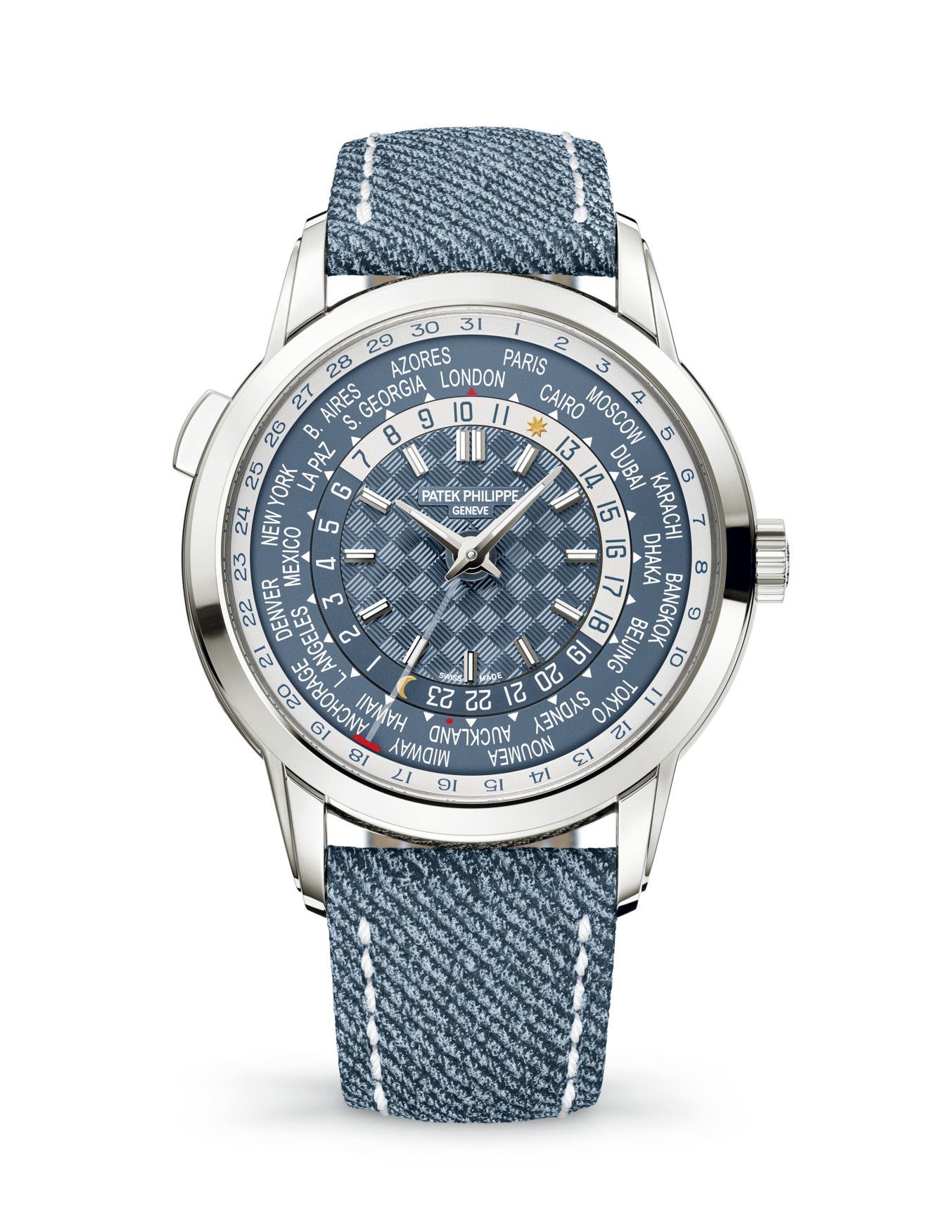
Patek Philippe and their very different World Time Watch

We always look forward to meetings with Patek Philippe.
Whether they are at the big watch shows like before Baselworld or now Watches And Wonders in Geneva, or lunches for the launch of new boutiques such as the one in Greenbelt in Manila, or just the casual sit-downs when we end up in the same city, we always get amazing insight into the horological world as well as the minds of those that shepherd it.
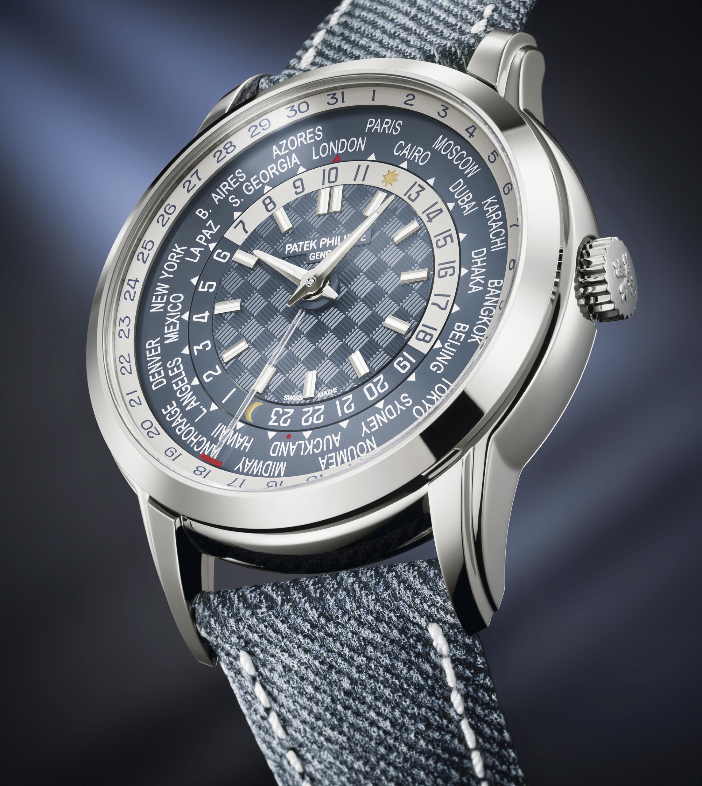
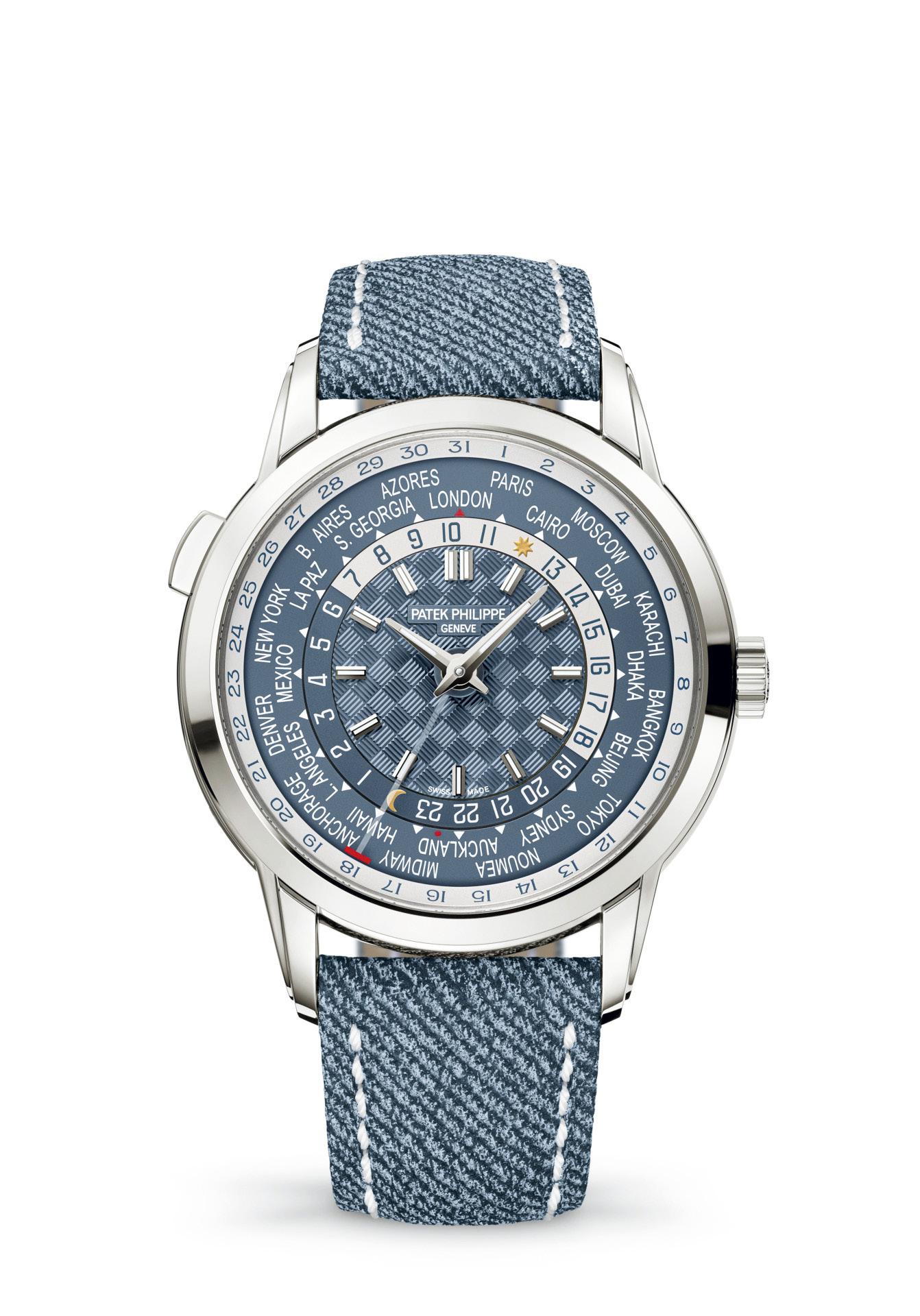
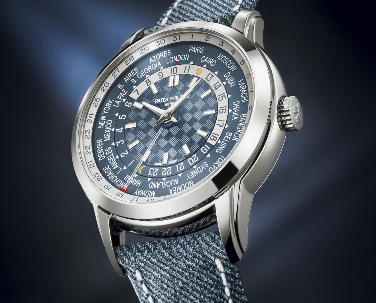
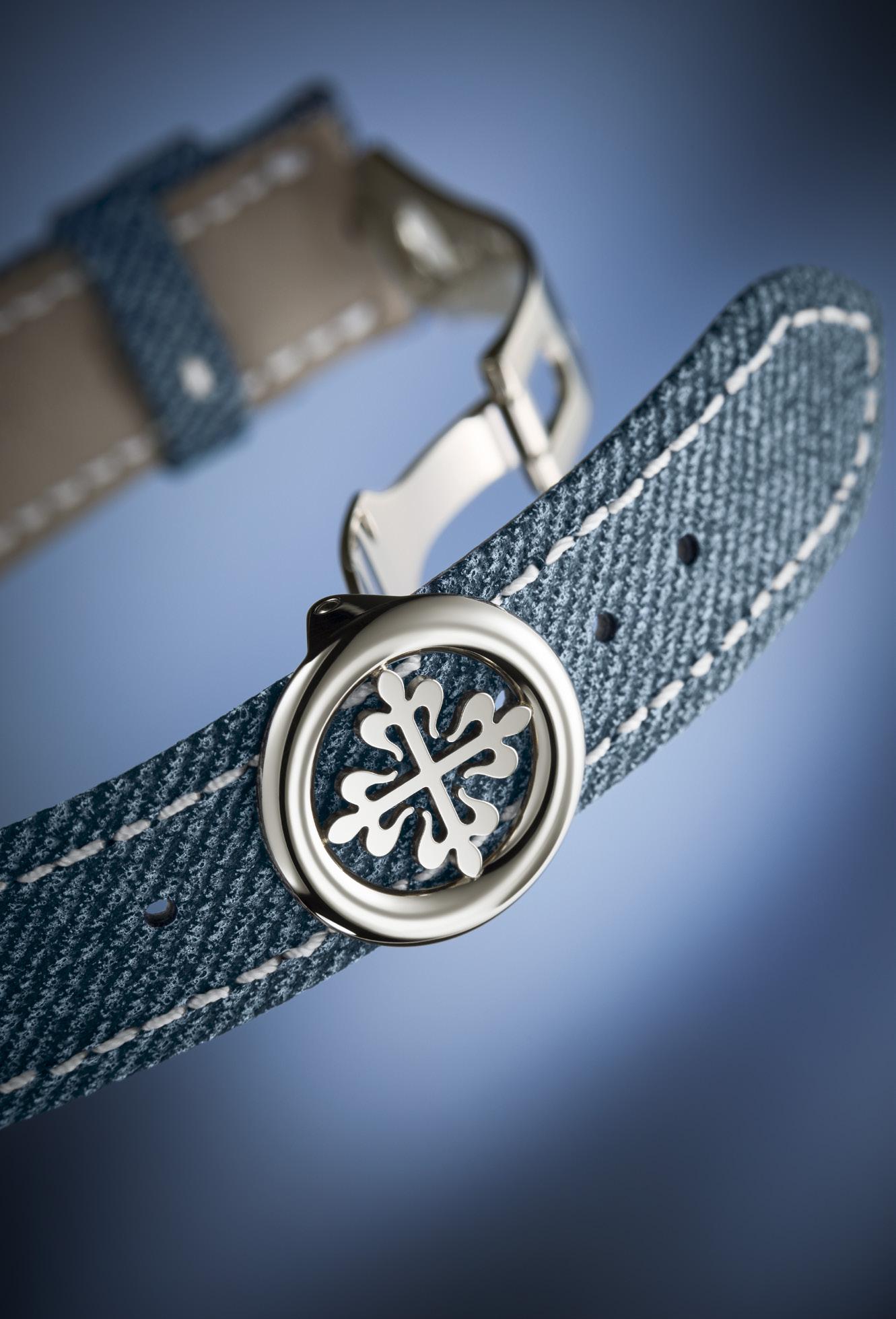
This year at Watches And Wonders, it was a breath of fresh air to see, feel and discuss their new World Time Watch, the 5330G001 World Time With Date. And not because it had a denim strap. Which it Does Not! It is a calfskin strap with a handstitched blue-grey denim pattern, and it wears wonderfully.

The meeting was a breath of fresh air, actually meetings, because there were a few with everyone from President Mr. Stern to the different watchmakers and designers, because we went deeply geeky on the type of thing most people won’t look at, and because we were surrounded by people who feel the same way.
Patek Philippe is very known for many things, and their wonderful World Time watches are merely some of those. In our introduction to the piece they put in our hands, the conversation went quickly to the internals. They wanted to do something, which was present a world time watch with a date that was tied to the local time. Then they explained why this was so hard.
If you look at GMT or dual time zone watches, things are relatively simple. This isn’t as easy to do with a world time watch because you have so many more hour indications you


“They
wanted to do something, which was present a world time watch with a date that was tied to the local time. Then they explained why this was so hard.”
“But for those at the highest level of watchmaking passion, this is just a further reason to love the family-owned Geneva watchmaker. Independence has its advantages.”


need to be able to run to in an instant. Now, since you are switching hours and time zones in whichever direction you need to, which is already a bit challenging, how do you add a date function to this?
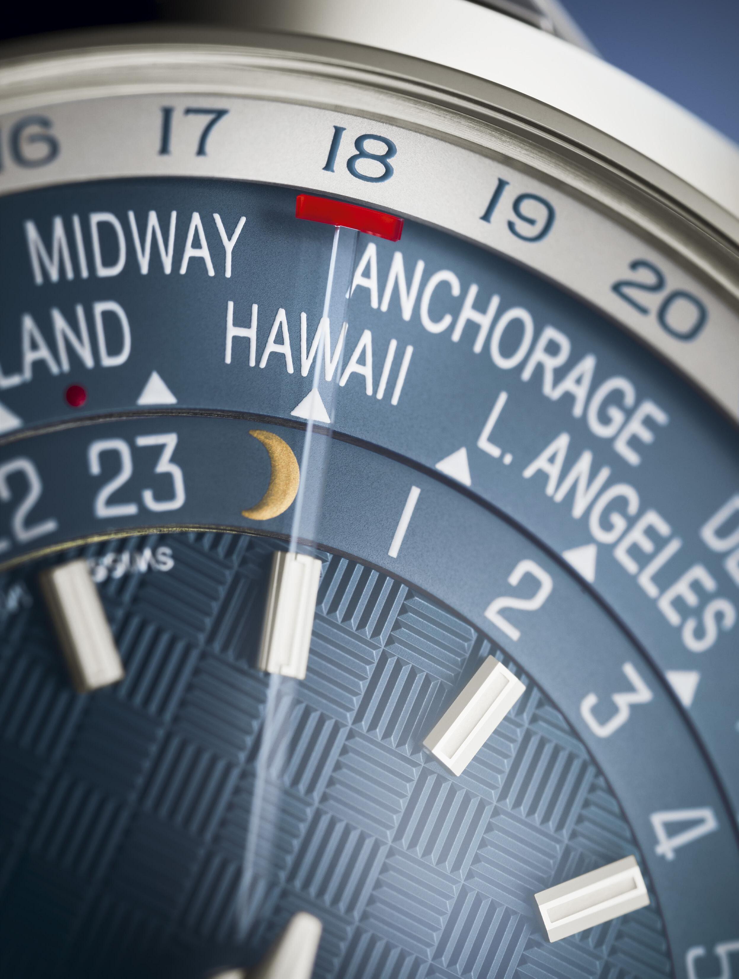
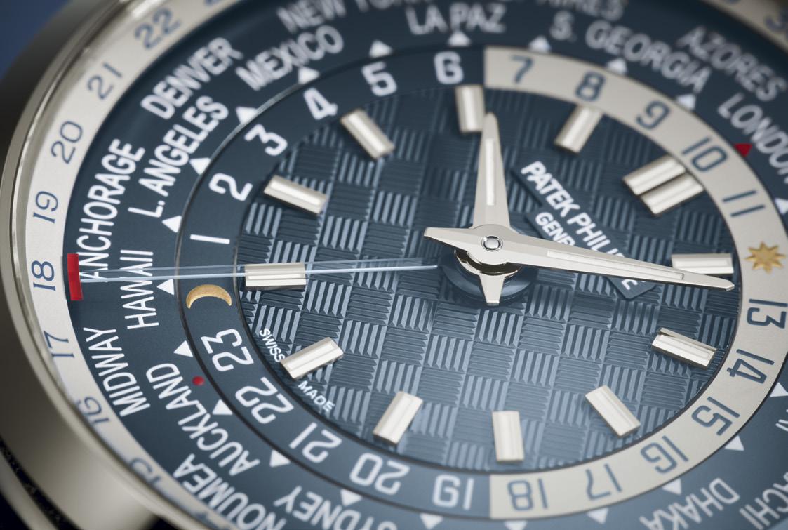
This is challenging both technologically and aesthetically. It is challenging technically because, among other things, you will have opposing forces at the time of day the world has the same date everywhere and when you are crossing the date line. The usual answer for this, for simplicity and for size, may be that you have internal mechanisms that will either push a wheel forward or back. But if that happens at the same time, things don’t exactly go well. The end result is that Patek Philippe designed a system where two rings are stacked, and the forces don’t oppose each other but the end result is as

needed. An extremely elegant solution for something that very few people will understand or use. But for those at the highest level of watchmaking passion, this is just a further reason to love the family-owned Geneva watchmaker. Independence has its advantages.
The aesthetic challenge was how to you add a date in a way that doesn’t add to an already full dial. You have hands and indices, then outward from that you have a 24 hour disc, then you have the two-lines of text showing city names. The date indication goes outboard of that, against a white background whereas everything else is again the “denim” blue color. How is it indicated? A transparent glass hand brings a surprisingly visible red line to sit under whatever date it is. And remember this is keyed to local time.

“So, the breath of
2024 in Geneva, it was somewhat a building year with many brands taking rather cautious steps.”
Most people will be discussing this watch based on the coloring and the “denim” look of the strap. That is fine, this is their way of reaching out to more enthusiasts with a watch they can wear on more occasions.
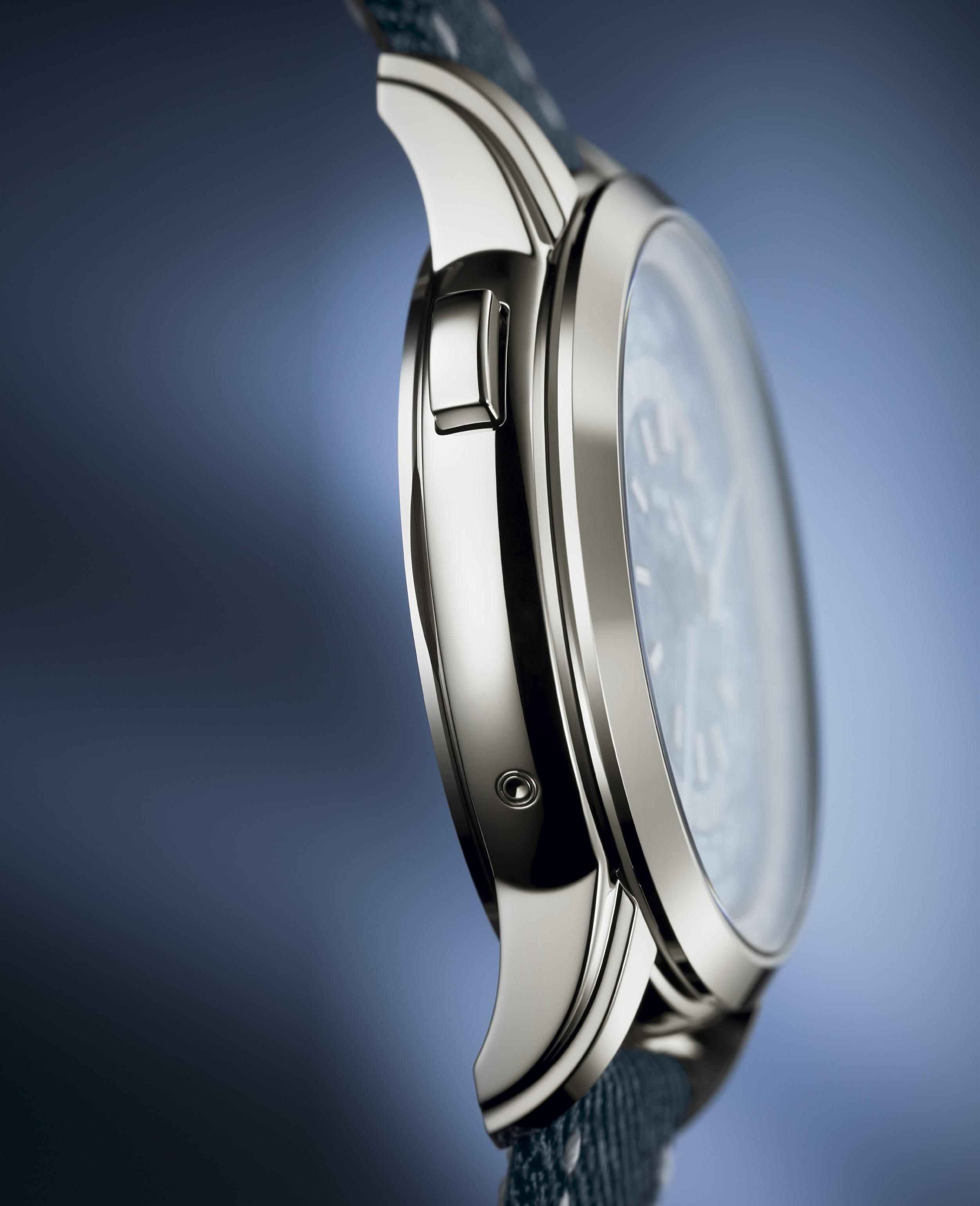
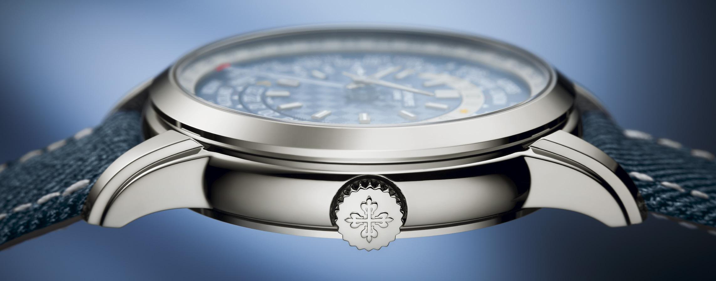
The dial color is the pale blue “denim” weave pattern, an identical scheme has been used in Aquanaut and Nautilus models. So here it is used in the more classic Calatrava round shape, and inside a 40mm white gold case. On the right at three o’clock is the two-position crown, at around ten o’clock is the rectangular pusher for the time zone selection. There is a corrector button inset at eight o’clock, for which a tool is included so please don’t use a pen.
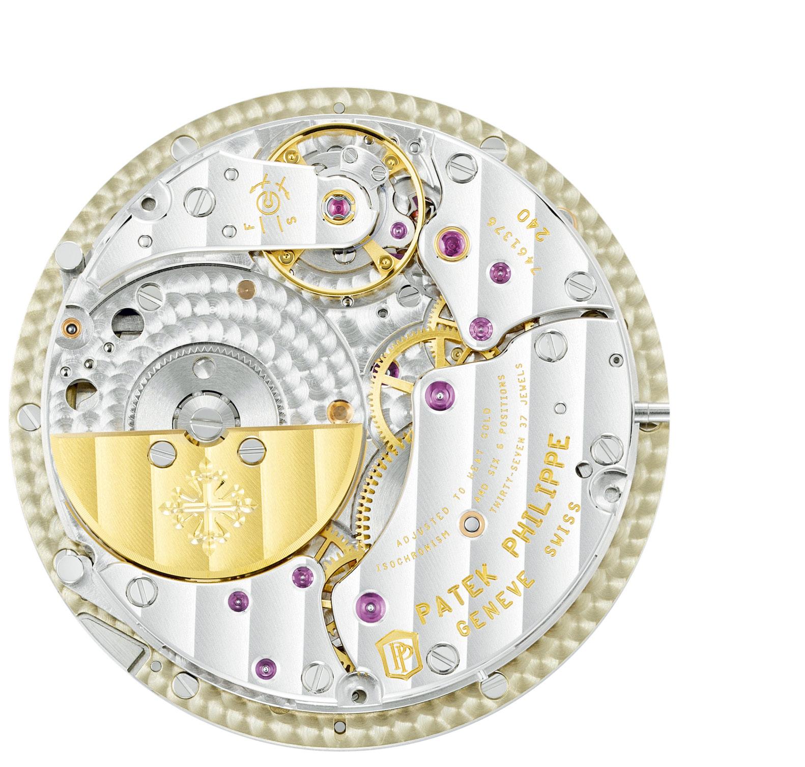
The watch is slightly larger than their previous similar pieces, but sits very nicely on the wrist with an 11.57mm thickness. It slips under tailored shirts and coats very well, but the look and texture is fun enough to be used as a casual watch, The movement, an in-house calibre 240 HU C self-winding mechanical and a 22k mini, is visible through a sapphire crystal caseback. They quote power reserve as a minimum of 38 to a maximum of 48 hours. The watch is water-resistant to 30 meters.
So, the breath of fresh air? At Watches And Wonders 2024 in Geneva, it was somewhat a building year with many brands taking rather cautious steps. Seeing Patek Philippe being exactly who they are, bringing technical expertise and their usual passion forward in a piece that is sure to excite was just so nice to see, feel, hear and touch. Doing so in the more traditional round case while in a color and texture that is more usable and accessible helps to teach new “enthusiasts” that there is a whole world past what everyone talks about online.
Patek Philippe reminds everyone what “fine time” really means. Or in their case, perhaps “a finer time.”


Each issue features a selection of exquisite timepieces, meticulously chosen from international exhibitions and prestigious local events.
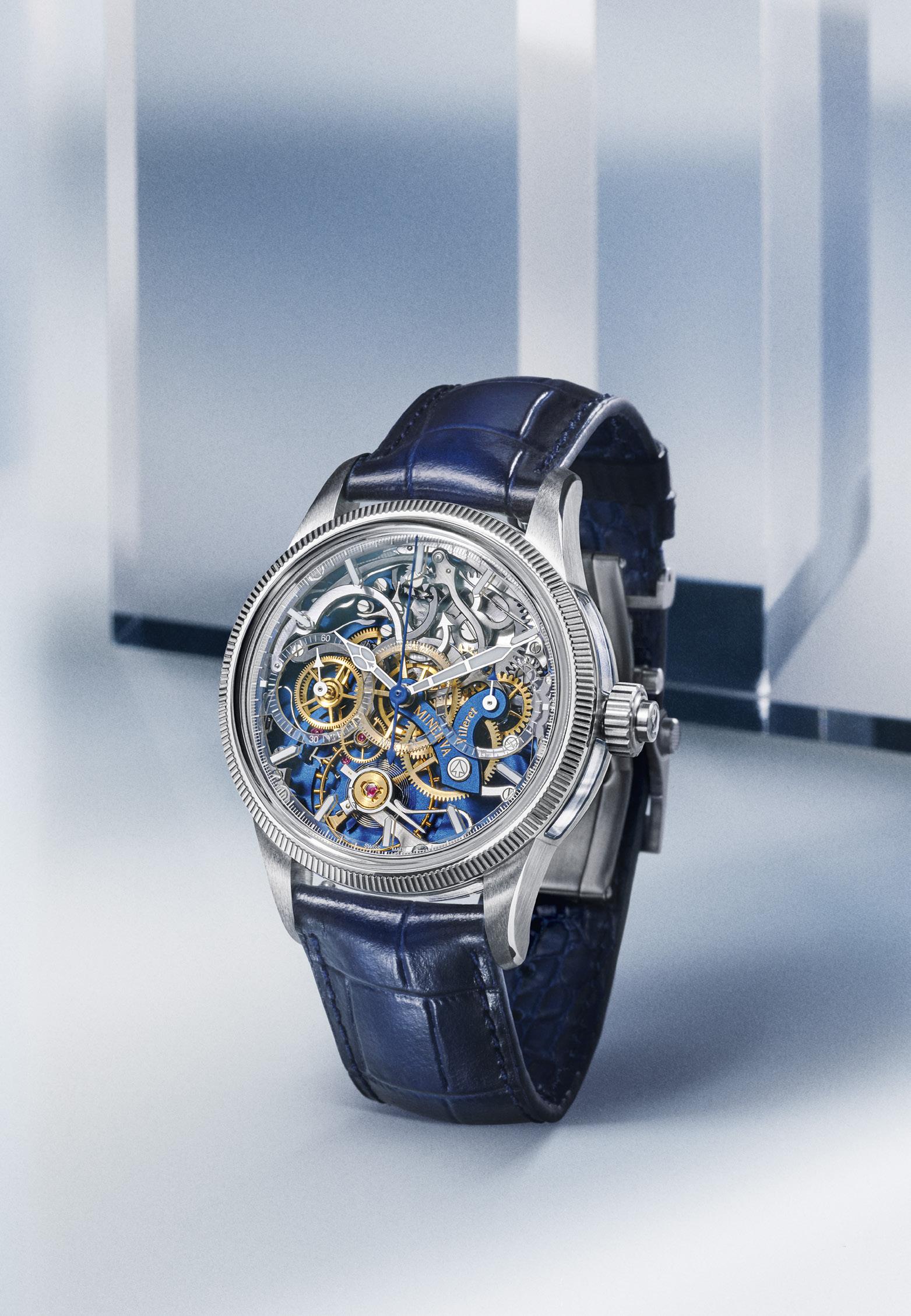
Montblanc 1858 The Unveiled Minerva Chronograph Limited Edition MAY-JUNE 2024
Montblanc continues to push their passion by letting people see more with the Unveiled Minerva Monopusher Chronograph
We had the most fun time last year with the Montblanc
Unveiled Minerva Monopusher
Chronograph at last year’s 2023 Watches and Wonders in Geneva. Now we see even more!
Last year, we did a video on the watch, which basically said that really intense watch enthusiasts spend a huge amount of time looking at the back of a watch. So Montblanc turned their Minerva movement backwards. Now I have often said that Minerva are some of the most beautiful calibres you will ever see, and it was wonderful to see people agree and then do something about it. It wasn’t easy, it was extremely technically challenging especially with a complication like a monopusher chronograph.
But we had fun. And the rather quiet watchmaker who stood by while we did a very quick video looked rather taken aback. He stared at us for a while when we finished, then he said wow. It’s never that energetic here. But then he started talking about how nice it is to see his work appreciated so immediately. So we weren’t thrown out of Montblanc.
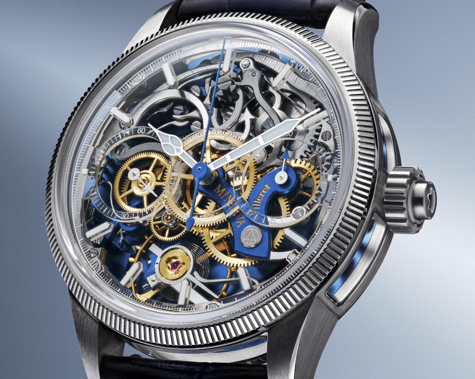
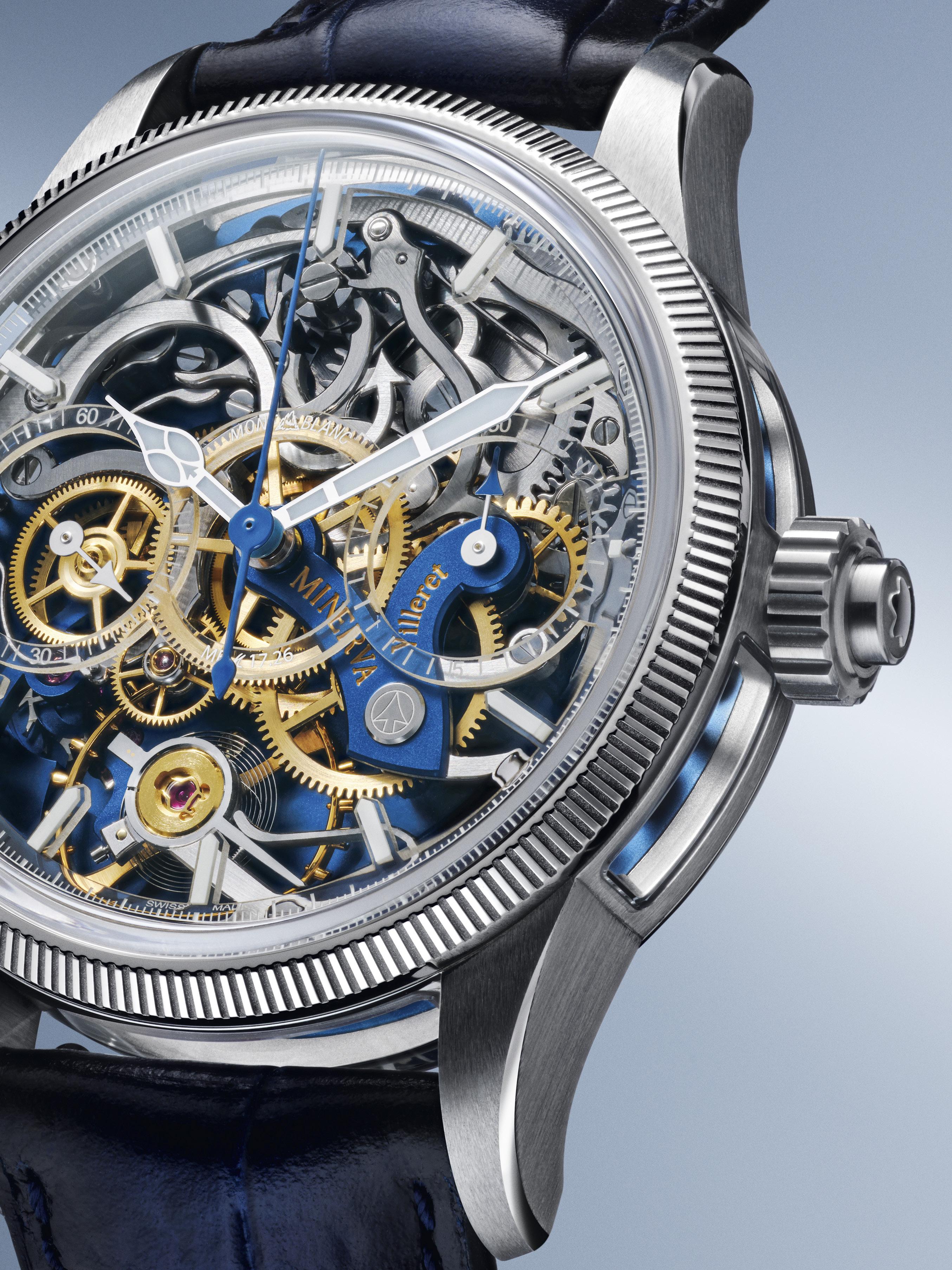
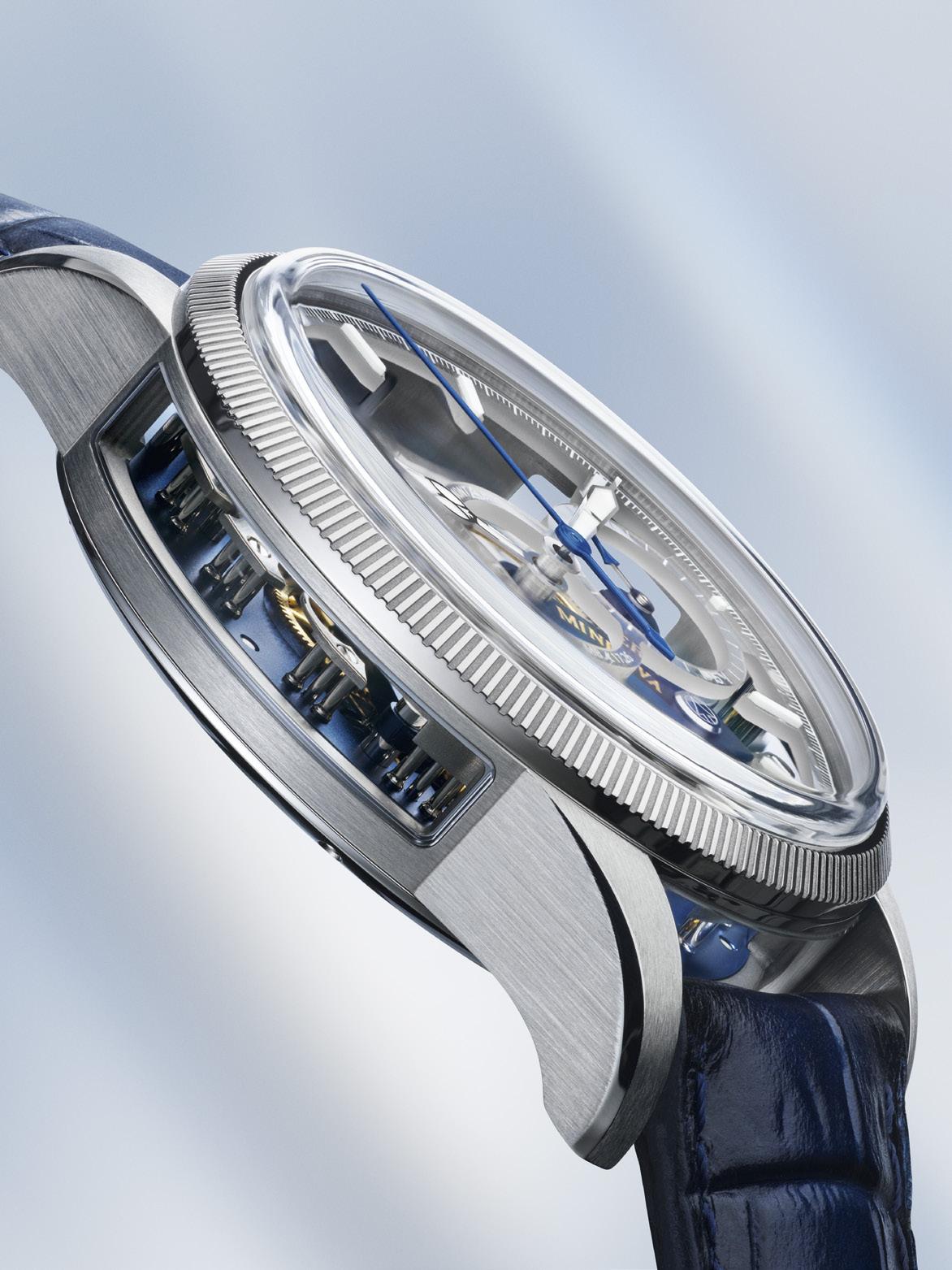
This year they gave us more of the good stuff. Same idea, but more light. The Calibre MB M17.26 with its 291 components is much more easy to see because there are now five sapphire crystal windows around the case.
You can look through the new windows of course, and you will see particular details. But it is the way the light comes through that really works magic. The movement is constructed on pillars, so there is a lot of space for light to play. It is still reversed of course, so you are really drawn to the intricacy of the work and the finish. The chronograph bridge is on top of the movement, so give it a bit of importance. Plates and bridges of German silver have been given a more modern blue color, which helps provide a bit of contrast when you look through the sapphire crystal and helps you identify things better a bit.
Other little details are still there when you look for them. The Minerva arrow that draws from the arrow-tipped staff of the goddess, the V-shaped bridge that that looks like the view of the mountains from the watchmakers’ windows in Villeret.
The movement is wonderful to behold as well, and the watch is appropriately large to give all the needed space but with nothing wasted or superfluous. The movement diameter is 38.40mm and height is 7.70mm, while the stainless steel watch case itself is 43mm in diameter and with a height of 14.78mm. It is actually water resisitant to 30 meters, but, well, don’t.
This is a watch you get for yourself, and to share with the few that truly understand the technical issues and history and craftsmanship and passion that goes into truly special work.
But it is the way the light comes through that really works magic.

Montblanc 1858 The Unveiled Minerva Chronograph Limited Edition
Ident.: 133296
Movement
Montblanc Manufacture
Calibre MB M17.26
Type of movement
Manufacture hand-finished manually wound movement
Monopusher Chronograph
Reversed movement with regulating organ, going-train, bridges and plate visible through watch’s dial
Chronograph
Monopusher chronograph with column wheel and horizontal coupling
Dimensions
Diameter = 38.40mm; height = 7.70mm
Number of components
291
Number of rubies
26 jewels
Power Reserve
Approx. 50 hours
Balance
Balance with screws, diameter = 14.50mm
Frequency
18 000 A/h (2,5Hz)
Hairspring
With Philips curve
Plate
Blue-plated German silver
Bridges
Blue-plated German silver
Going-train
Gold-plated, circular grained, chamfered, diamond hubs on both sides
Displays
Hour and minute from the center, small seconds at 9 o’clock
Chronograph’s elapsedseconds hand from the dial’s center, 30- elapsed minute counter at 3 o’clock
Habillage
Case
Stainless steel with sapphire openings on the middle, satinated and polished finishing
Bezel
18K white gold fixed fluted bezel, satinated and polished
Crystal
Scratch-resistant, domed box-shaped sapphire crystal with antireflective coating
Back
Stainless steel case back with historic Minerva Manufacture special engraving
Dimensions
Diameter = 43mm; height = 14.78mm
Water Resistance
Approx. 3 bar (30 m)
Crown Fluted stainless steel crown with Montblanc emblem in relief
Pusher
Monopusher chronograph integrated into the crown.
Dial
Skeleton sapphire dial with white luminescent Arabic numerals and indexes; historical Montblanc logo
Hands
White luminescent rhodiumcoated hour and minute hands, rhodiumcoated seconds hand, rhodiumcoated chronograph minute hand with blue arrow, bluecoated chronograph seconds hand
Wristband
Blue interchangeable sfumato calf leather strap with alligator print & stainless steel triple-folding clasp
Limited Edition
100 pieces
Certified by the Montblanc Laboratory Test 500H
Super-LumiNova® is a registered trademark which is not owned by Montblanc

Always let your daughter speak her mind; For she has the stars in it. And the moon, in this case.
Words by Katherine Cunanan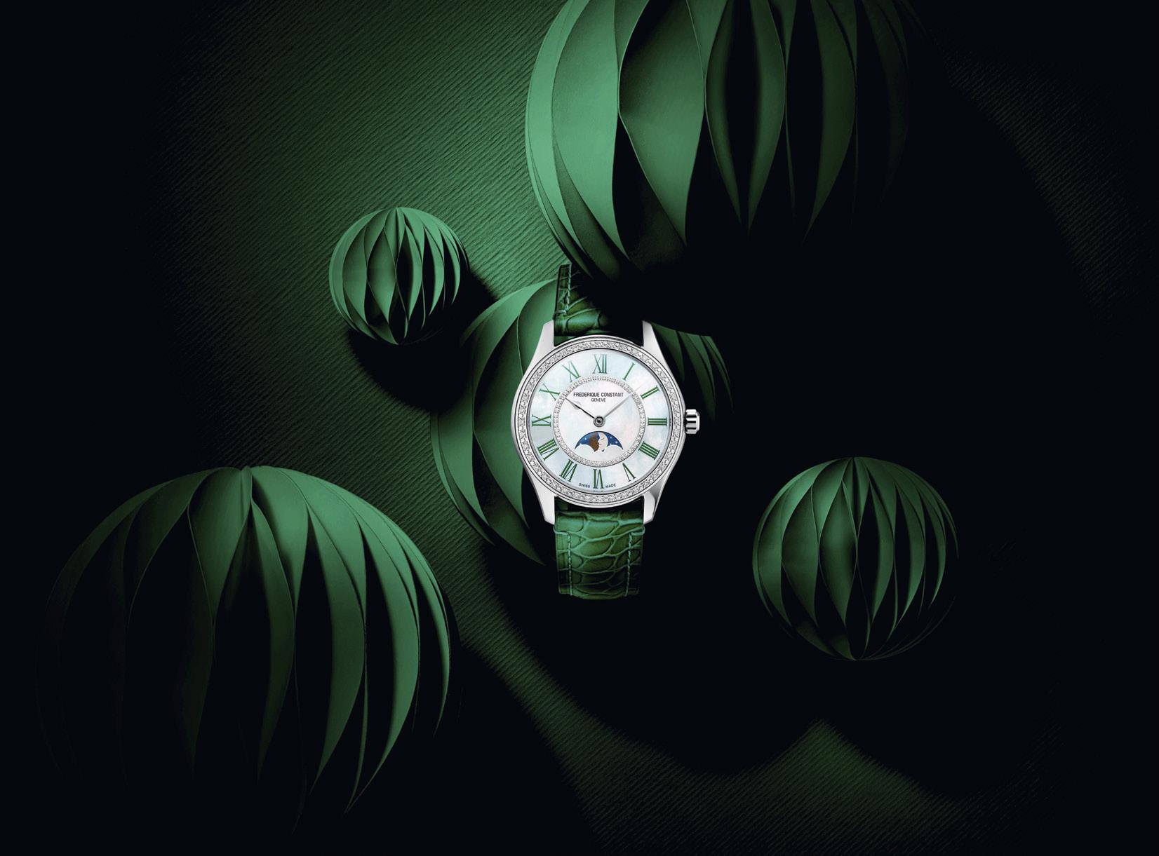
What a nice story this is.
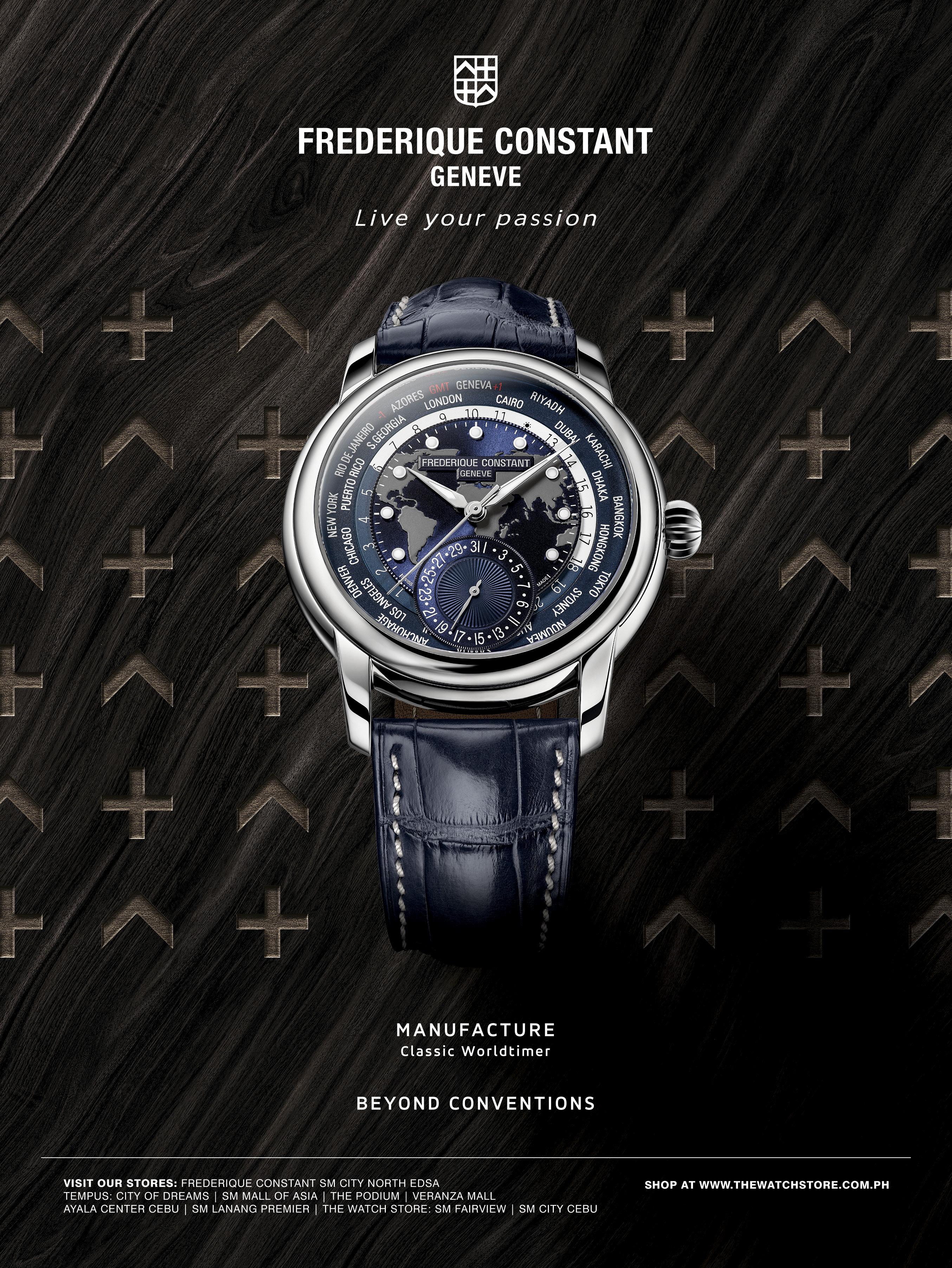
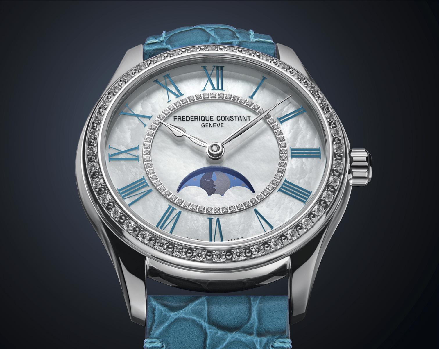
Frederique Constant was created many years ago with the idea of bringing a higher level of watchmaking to more people. It has very much succeeded, with levels of finish and its own movements and complications at very enticing price points.
What they presented in Geneva this year is in some ways somewhat simple, but also quite fun.
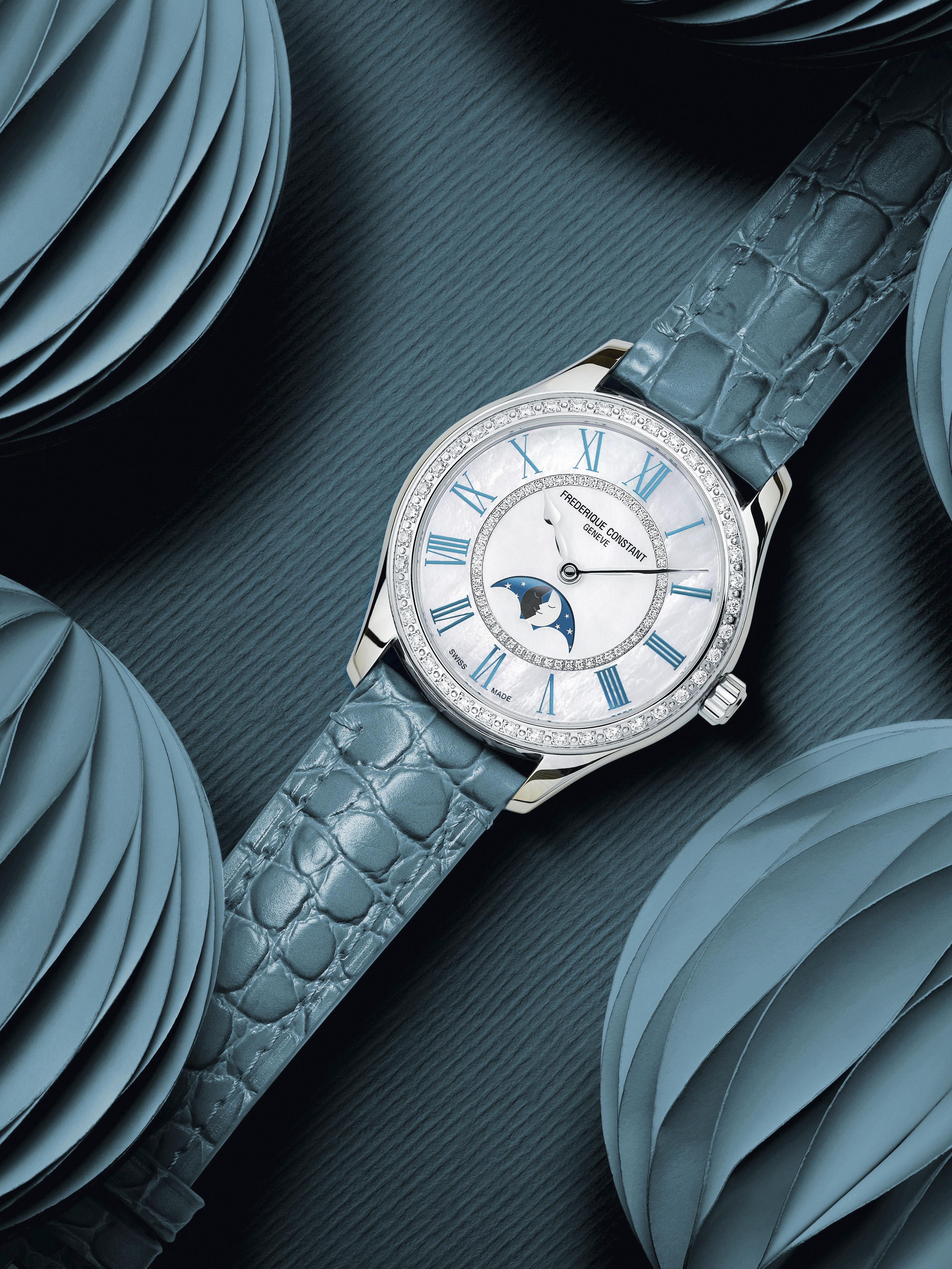
The Classics Elegance Luna is deceptive. It is part of their Classics collection, but it is a very special first. And firsts are always amazing.
The designer of the very special moon phase watch was the daughter of the Manufacture’s head of Research and Development. And the resulting watch is quite subtle. Calibre EditorIn-Chief Carl Cunanan at first didn’t see the specialness of the design when it was presented to him at Watches and Wonders 2024 in Geneva.
“It looked like a somewhat regular moon phase watch,” he said, “but then when it caught light differently you saw that there were actually two moons! Or two half-moons kissing, to be more precise. This watch is an excellent example of how there is still so much freshness and fun to be seen. This isn’t an earth-shattering new complication or anything, but it is something new and fun and special to those who get one. Or even better, get one for someone else.” Sometimes you just need to look a little closer to see how beautiful something truly is.
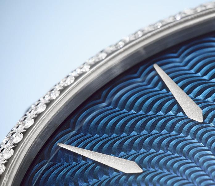
The watch face is of mother-of-pearl, with the two half-moons that are light and dark shades of grey that change a bit as light moves. Mother-ofpearl is perfect for a ladies watch, as the material is lustrous and unique. No too shells are exactly alike, and sometimes it is the nuances that make the difference. Initially the image looks like just one light half-moon until it moves. Sleek shaped hands point to a new hour ring that uses slender Roman numerals.
There is still much to play with. There are different watch versions to be made available,
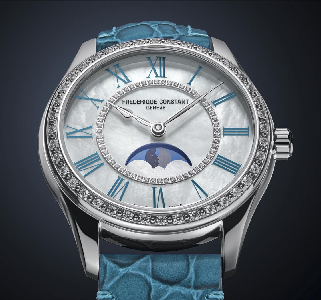

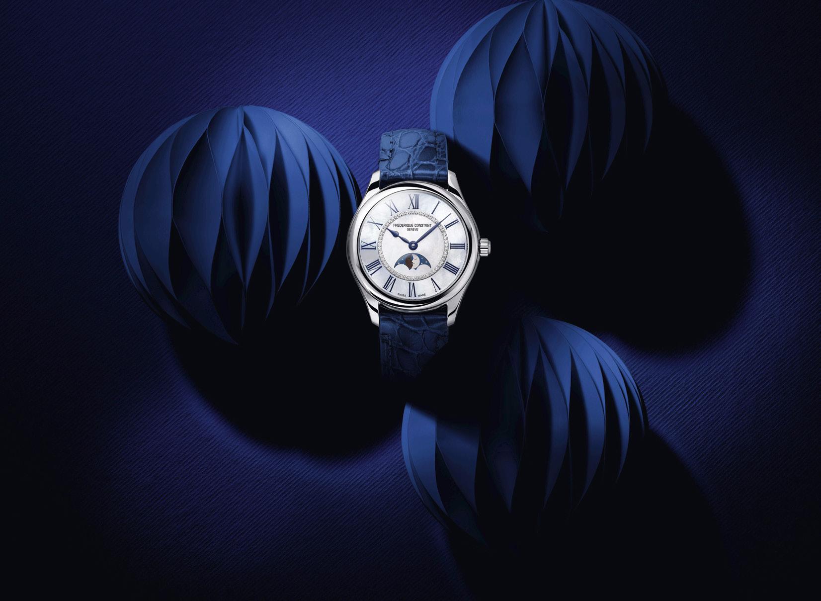
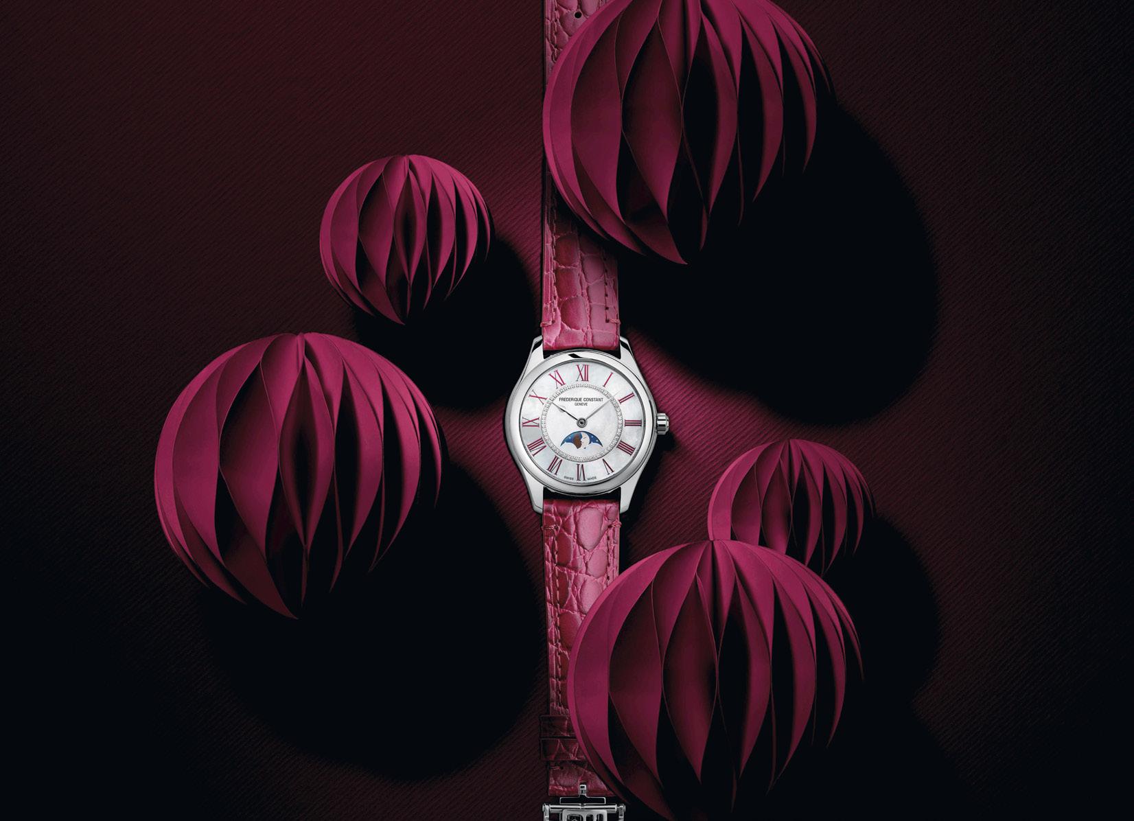
all using the self-winding 38-hour power reserve Calibre FC-331 tucked safely inside a 36mm stainless steel case. But then come the choices of color, in a way a bit unusual. All the versions have the inner ring set with 56 diamonds (totaling 0.7 carats to add a little sparkle but not really in your face). The Roman numerals outside that ring though are available in a choice of colors. And the straps colors match the numeral colors for all the different models. Quite subtle and quite fun. After all, ladies deserve as many options as possible.
All of the new watches models in the Classics Elegance Luna line have the diamonds on the
“This watch is an excellent example of how there is still so much freshness and fun to be seen.”
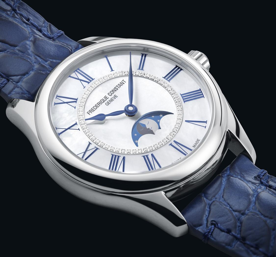
face. But there are two watch models that have a little more sparkle with diamonds set into the bezel, the blue (which is kind of a light aquablue, really) and the green strap, and numerals. The other two watches are kind of maroon-red and a darker blue. All the straps are calf leather with alligator pattern embossing. The attention to detail is another indication of excellence.
Frédérique Constant has enjoyed playing with moon phases before, saying that horology is the daughter of astronomy. These new watches bring that connection out in a nice fresh way. Daughters can do that for you.
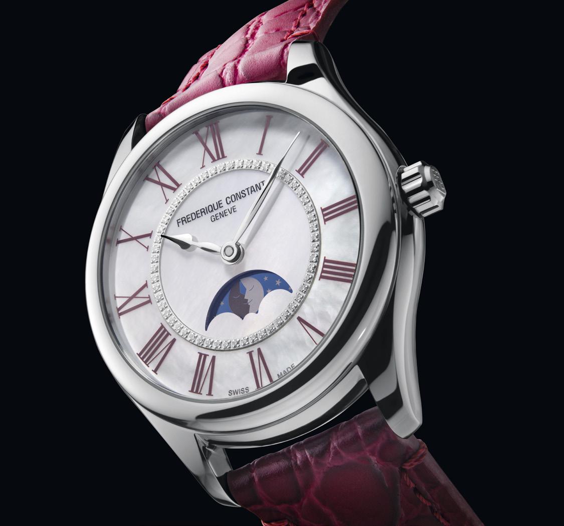 Classics Elegance Luna Ref. FC-331MPWTD3BD6
Classics Elegance Luna Ref. FC-331MPWND3B6
Classics Elegance Luna Ref. FC-331MPWGRD3BD6
Grand Seiko launches a new movement in two wonderfully classic watches
 Words by Carl S. Cunanan
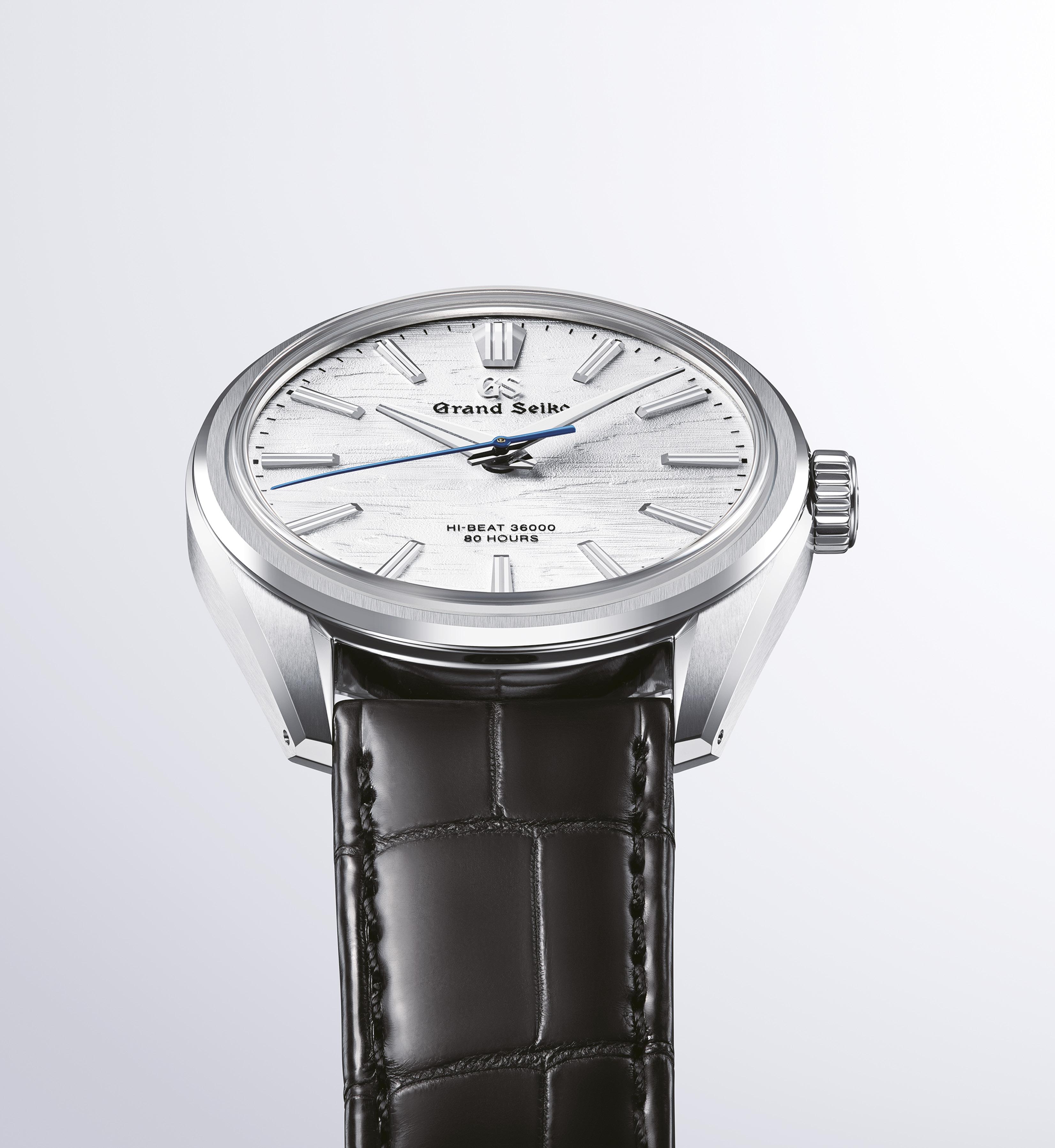
Ilike the way the evolution of, well, the Evolution 9 is going with Grand Seiko. The Evolution 9 family gained popularity with a look that was rather more solid and sporty, which fit well with the earlier launch models. But I have always been a fan of the sleekness and fineness of the watchmaker.
With these two new watches released at Watches And Wonders 2024 in Geneva, I think they have moved wonderfully into a space I quite like.
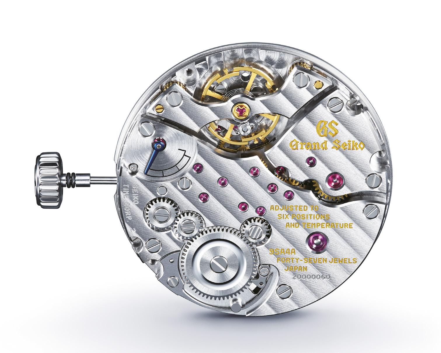
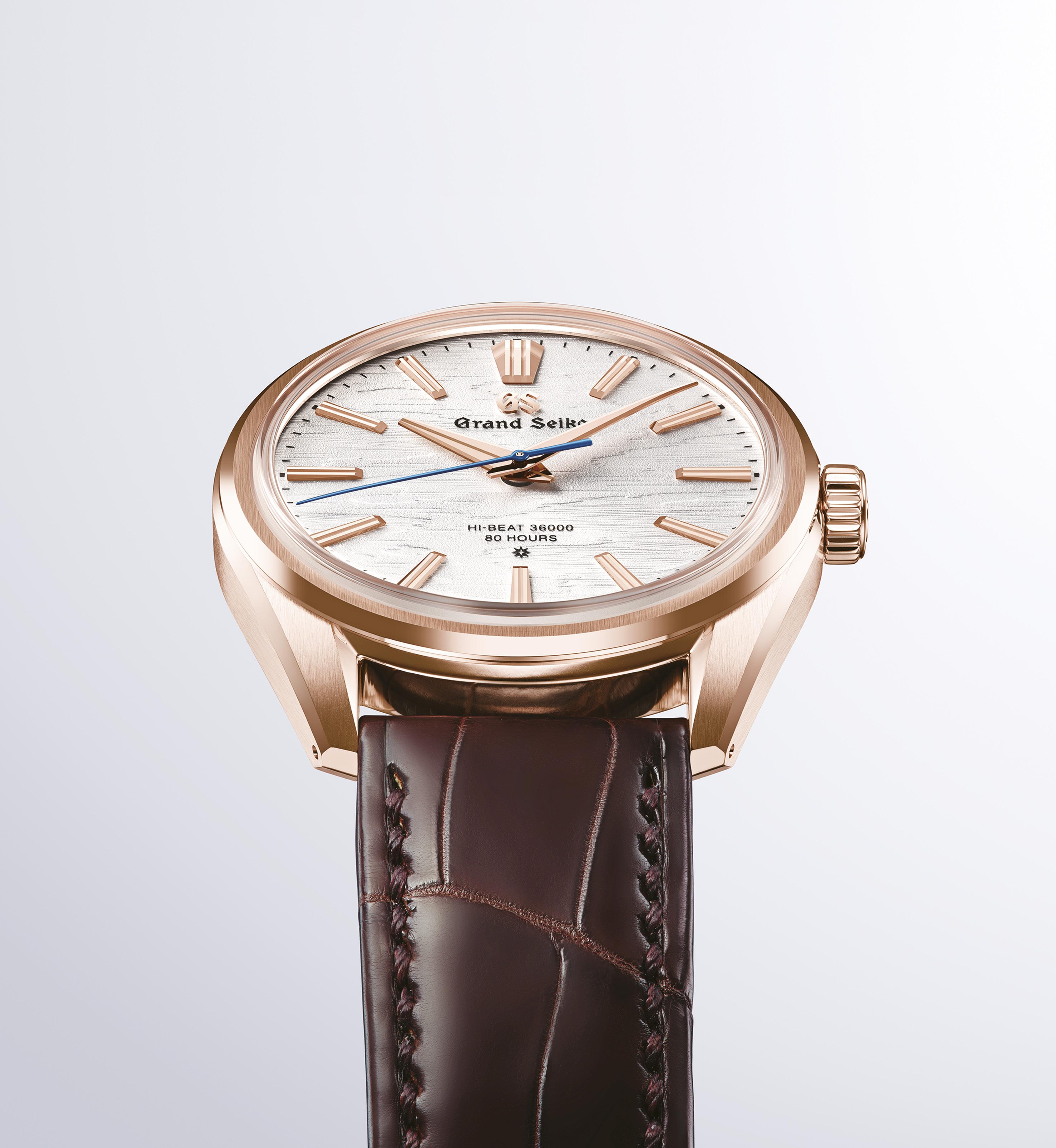
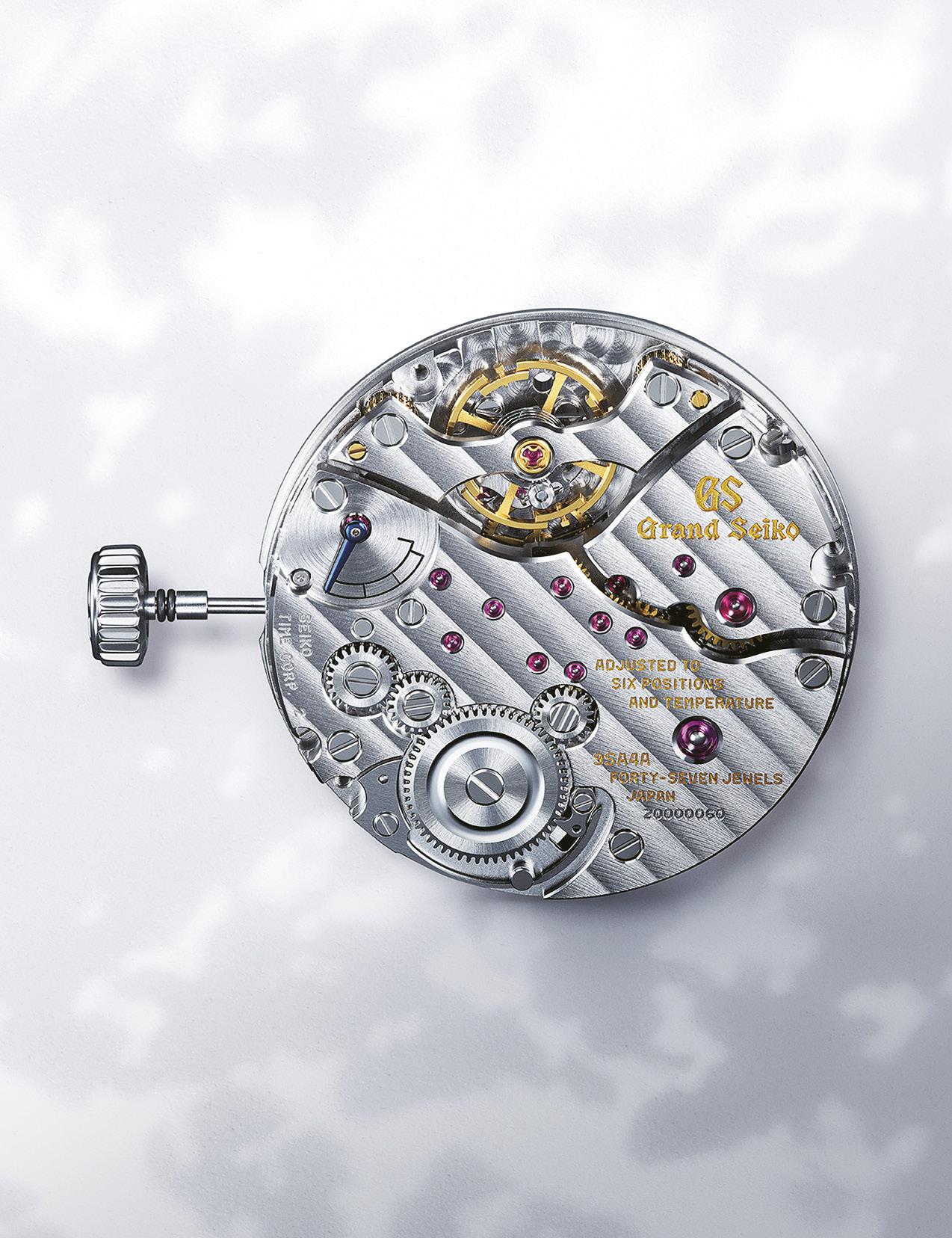
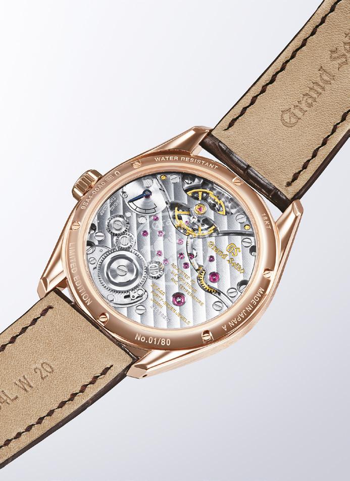
The two new watches are the SLGW002 and SLGW003.They are classic dress watches at their finest, but with the Evolution 9 details made a little more elegant. They are also the launch watches for an important new movement, the Calibre 9SA4. This new movement is the first manual-winding 36,000 vph to be done in around 50 years, so look forward to it being a base for growth.
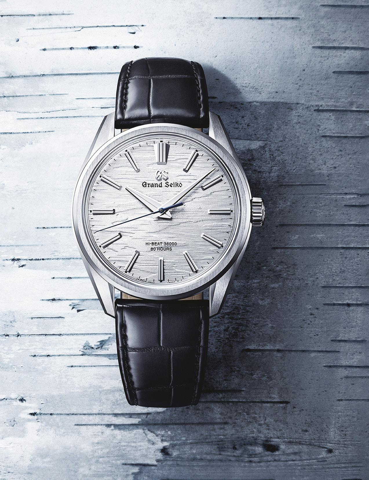
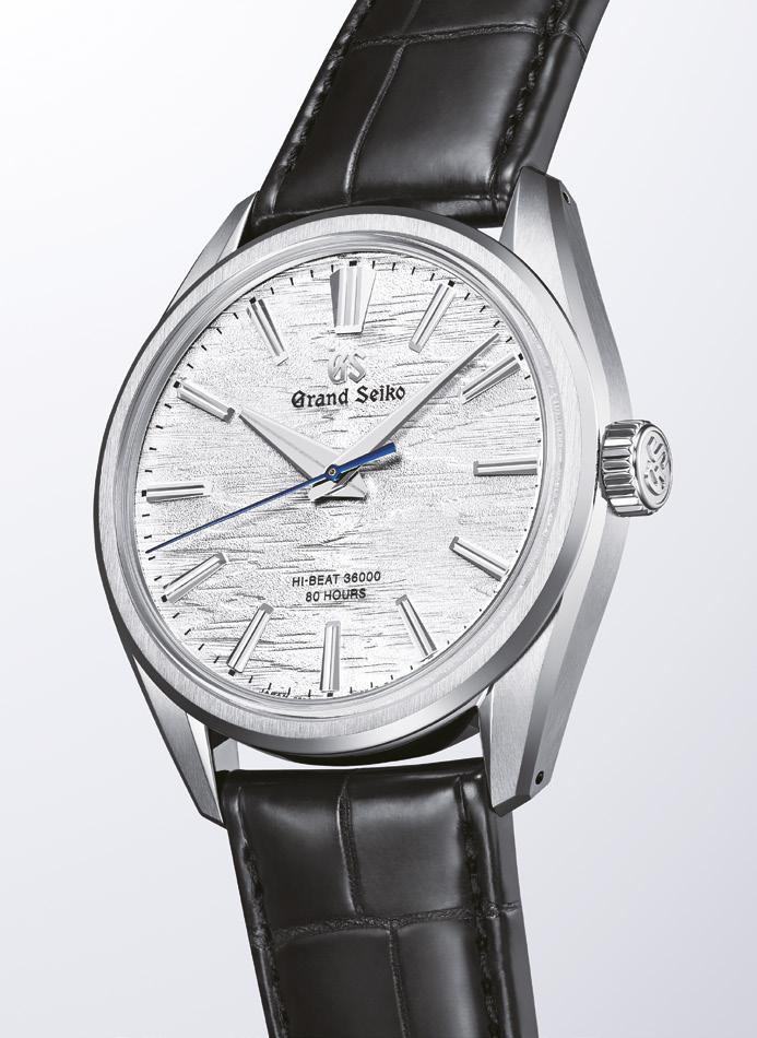
The increased fineness is evident immediately when you look at the watch, though you may not be able to pinpoint right away that's what makes it so. The prominent grooved indices of the Evolution 9 have been slimmed down and are a little longer. The multifaceted lugs by the way are also narrower and have less surface area, so that contributes to the sleek look, especially when on the wrist.
But it is the face that draws. The watch is clean and minimal, and the hands and indices have a wonderful backdrop of what they call birch bark. If you remember the white birch watches we showed on the wrist a while back when we brought you all to the Grand Seiko Studio in Shizukuishi, the look was vertical because it was a vision of the trees in the forest. Here the inspiration is the birch bark itself, close up. The lines are more horizontal. It is a three hand watch, hours minutes and seconds, so very clean. The text is minimal, telling you the movement is a hibeat 36000 with 60 hours of power reserve.
That 9SA4 beats ten times a second, yet has that high power reserve. This efficiency comes from a dual impulse escapement system with two barrels. It is a manual wind movement, so a fine Calibre to put inside an elegant dress watch. You can see the movement through the sapphire crystal caseback.
And do look through to the movement. Look close. What clicks when you wind looks like a little bird. That is supposed to symbolize a wagtail, a little bird often seen around the home of Grand

“I have always liked Grand Seiko for their vision of simple elegance. But I have also of late liked the way they play with the influences of their surroundings.”
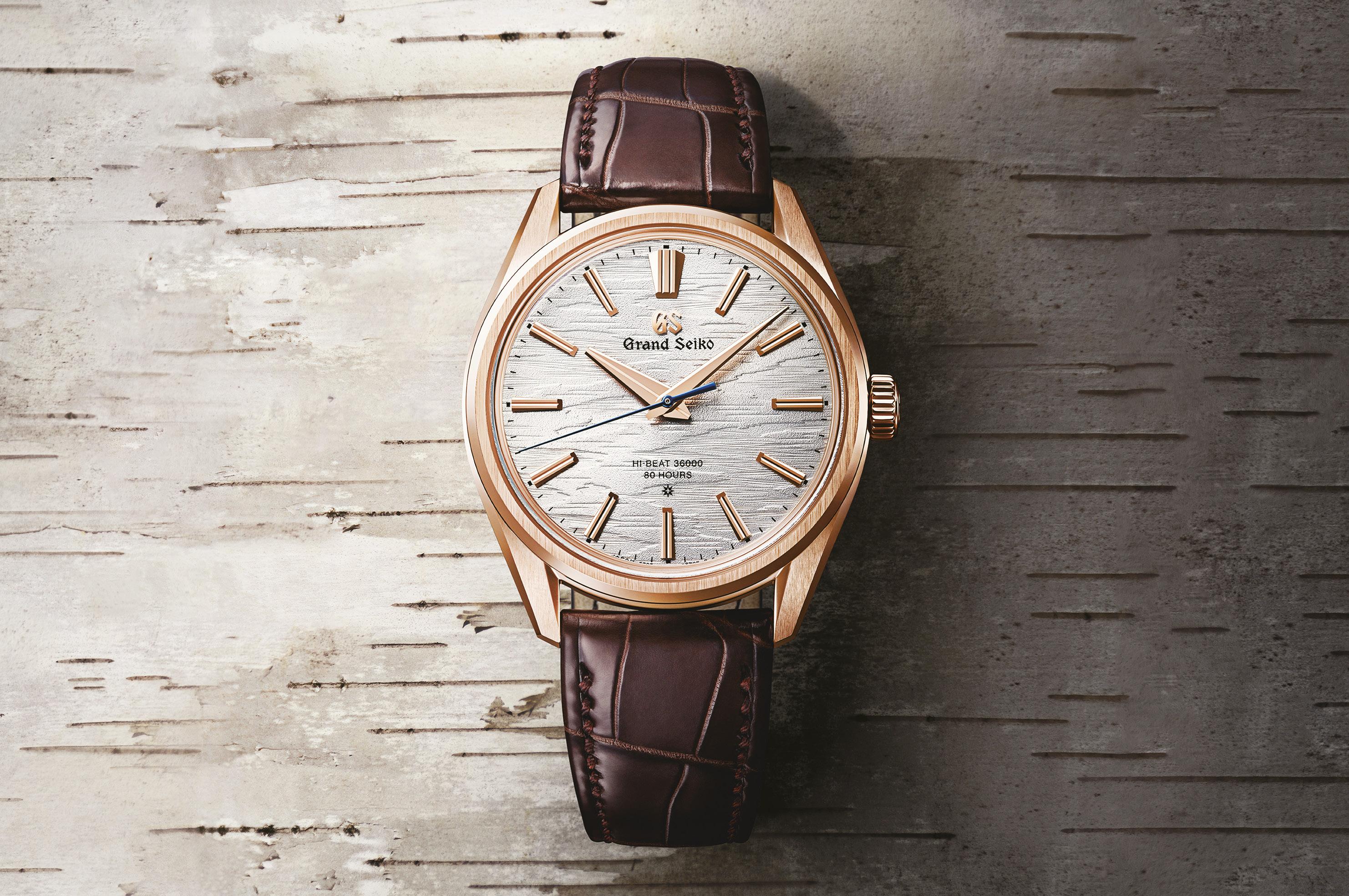
Seiko Studio Shizukuishi. Quite fun detail really. The new movement is highlighted in their two new watches. The SLGW002 is encased in 18k Rose Gold, the SLGW003 in Brilliant Hard Titanium, with completely different look and feel, but both sit very well under tailoring on the wrist thanks to a lower center of gravity helped by the thin 31mm movement. The diameter of both watches is 38.6mm with a thickness of 9.95mm.
Obviously there is a weight difference, the gold has a bit more presence than the titanium. But looks wise, the titanium is more subtle while the
rose gold more striking perhaps. Very tough to choose really. The gold is limited to eighty pieces anyway, and the titanium is a boutique exclusive.
I have always liked Grand Seiko for their vision of simple elegance. But I have also of late liked the way they play with the influences of their surroundings. These new watches with this new movement combine technical expertise in the movement with playfulness with the little wagtail bird shape. On the face, fineness and cleanness with their textured backdrop. On the wrist? Subtle, elegant, beautiful.




It is about the people. And about how motivated they are. And how they feel.



You wouldn’t necessarily think that that would be the major takeaway I had coming from the rather rare opportunity to get inside the very new Tudor Watch Manufacture in Le Locle, Switzerland, but it is.
It is, of course, an amazingly modern facility. Construction began in 2018 but was challenged by the worldwide pandemic soon to come. However, because the whole idea was to make the facility closer to affiliates and suppliers in and around the lovely Jura mountains and the area and to use people and organizations from that area, they were more able to continue work than many. Though the earlier plans of actually visiting the facility were rather stalled until recently, which is why we ended up going there this April in 2024.
Back to the people. The Head of Manufacture, Mr. Régis Gaudimier, told us that he was pretty much the only person than moved from Geneva when they started, that the
organization wanted to make the Tudor Manufacture a very localized, very Swiss operation with it’s own identity separate from but still within the Rolex organization. He pointed out the window, and said that in spite of being minutes away from the French border using the road outside, the workforce was pretty much fully Swiss.
But the key point, in my mind, was that they somewhat changed around the way they worked. Bringing in engineers, craftsmen and watchmakers from the region was their goal, and these people were all used to working in a particular way. They were used to being given, for example, a number of parts or blanks or mechanisms or whatever their expertise was, and then being given a deadline and watched over in the smaller companies they were working with before. The Tudor Manufacture system changed that around, giving more freedom and independence to those that produced the pieces.


The end result, Mr. Gaudimier said, was that they were much happier, much more motivated. And, which should be no surprise to anyone who actually does the work, production efficiency and consistency increased. Because people that feel better just do better. All this was great timing, because Tudor demand has soared globally and continues to grow robustly even as a lot of the hype has caused a softening of the market for other brands.

The new facility is amazing in several ways, and extremely forward-thinking. When you drive up to it, set against a combination of energetic community and Swiss countryside, you approach a long and not all that tall stretch of building, or rather buildings. You get a feeling of, well, a Swiss bank, solidity and strength. A bank vault rather, because the whole facility is red on the right side, white-grey on the left, and a black chunk in the center. And the black chunk, several stories high, is, yes, the vault.
The red portion is the Tudor side, the white portion is actually Kinessi Manufacture. I know this because I have a LEGO set I will use to build this. Because their own employees did the same thing for fun and won awards. They have that kind of camaraderie in the organization.
The two sections are side by side, but do not connect in terms of flow of materials. Kinessi Manufacture is owned primarily by Tudor, having been created in 2010 to develop industrial production capabilities that were going to be needed for the high performance mechanical movements they were going to create. Their first client outside Tudor was Breitling (remember the movement-sharing) and they developed an alliance with Chanel a few years later. Kinessi now produces movements for, primarily of course Tudor, but also TAG Heuer, Norqain, Bell & Ross, Fortis and Ultramarine.

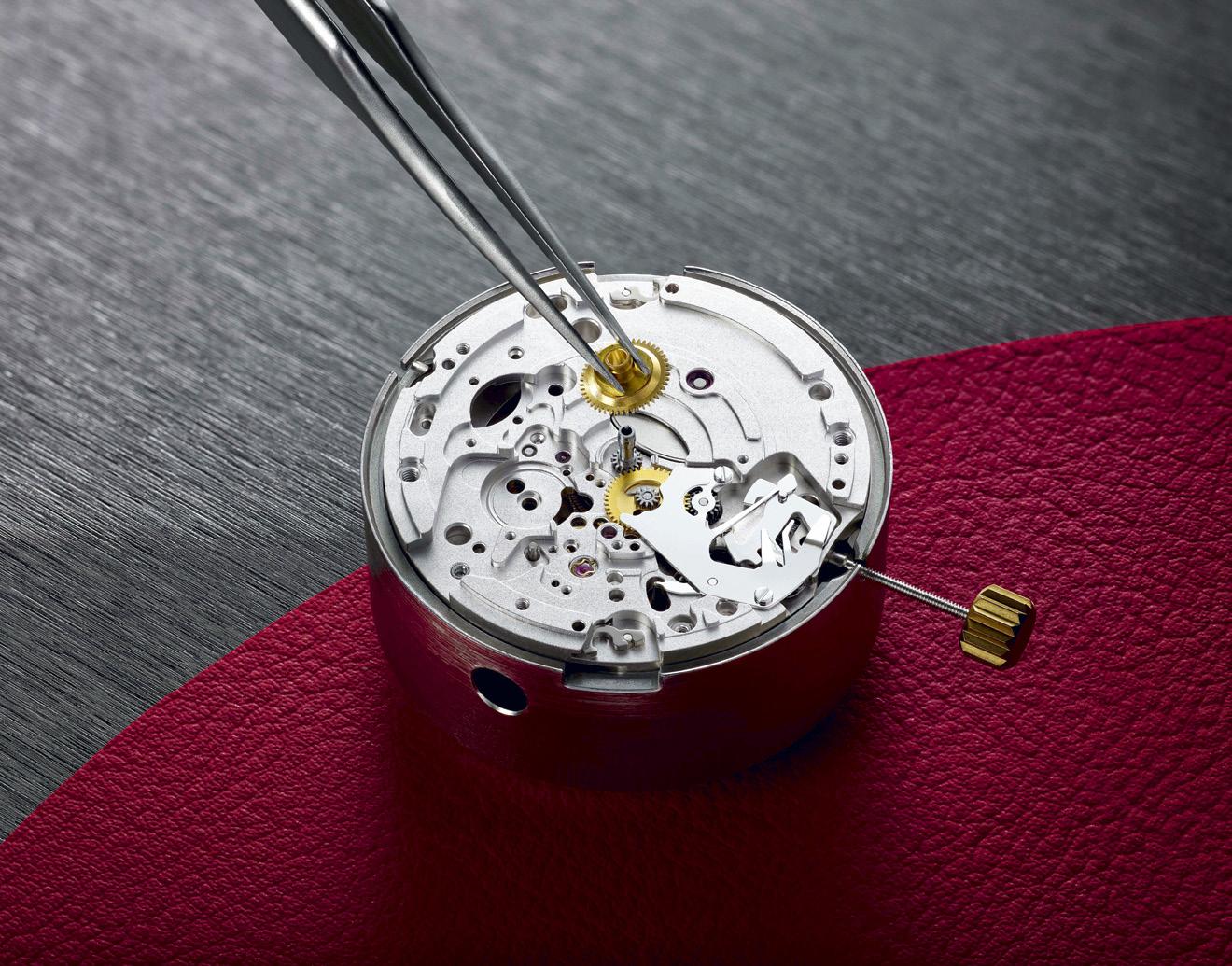
So here is something interesting, which they didn’t really go into until I asked. The movements are created in the white side, Kinessi, benefitting from being very close to all the suppliers they use from around the region and of course the very local workforce. They design, develop, engineer and create the movements here, they do their own very stringent and repeated testing. Their production system is a very interesting combination of industrialized and hands-on. When we were there, little robots were moving trays of movements around to different testing bays and banks of equipment, with pieces pulled out either for checking by very skilled, and quiet, human watchmakers. Then rechecked and retested. They are also sent to COSC for certification from here.
When everything is all double or triple checked and tested and boxed up, it all goes to the Tudor side of the building.
By a pushcart, basically.
There is no flow of products from the white to the red. The movements go down to the ground floor where they are put onto a trolley and rolled out. All under cover and secure of course, as deliveries take place within the big black chunk that houses the vault upstairs. But it exits the Kinessi side and gets pushed over to the Tudor side. This was hugely fun to find out. We wanted to watch it happen, but like I said, it was extremely secure.

On the Tudor side, we started with the LEGO. Really. We saw the award-winning LEGO creation made by some of the staff that went on to be a model for the smaller ones that I will be trying to do myself with my kids. Mr. Gaudimier explained the development of the building and facilities, including why as we spoke the windows changed from light to dark to help conserve energy. Then we geared up and moved to an area that moved to a place that we had to actually put on gowns and shoe covers then swing our feet (encased) from the dirty side to the cleaner side. I say cleaner because this still wasn’t the way-cleaner area where more work is done.
We went down, way down, into the physical plant of the building. We were shown air conditioning. Or rather, the air and filtration systems of the building, because they maintain pressures to keep out as many contaminants as possible in addition to constantly filtering things. We were shown the pumps used to keep moisture and humidity under control, as the building was actually built where a pond used to be. We were shown the fire control system, which is particularly complex because they want to protect people as well as the things in the vaults. And apparently, some fire control isn't all that great for human beings. Theirs is.
Oh back to the vault, which we saw but were told not to photograph. The Head of Manufacture, the guy in charge of everything, isn’t allowed inside unless he has special permission, which in this case is because of our little (very little) group. It is that secure.
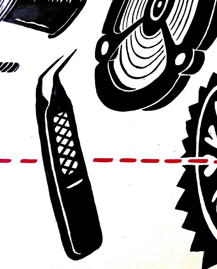
We walked upwards to where work began. We also used elevators, but the walk was fun because they have this great mural that goes from top to bottom and has little tidbits of information. If you ever get to see it, or look at the photos,
you will see things like space travel return capsules. For when astronauts splash down. Why are these in Tudor? Because, guess what the guys who were supposed to rescue the astronauts were wearing?
We went through the acceptance of delivery area, where they first lay hands on what comes from the oh so far away land of Kinessi, where things are checked and put into the trays and containers that will send them off for things like putting on the hands, casing them up, finishing, bracelets and such. And testing. There is still constant testing. There are METAS office within the facility, and you can’t go in. You can’t even see in. Neither can the Tudor people. It is like an embassy, foreign soil. Inside, METAS the independent testing organization does its own testing.
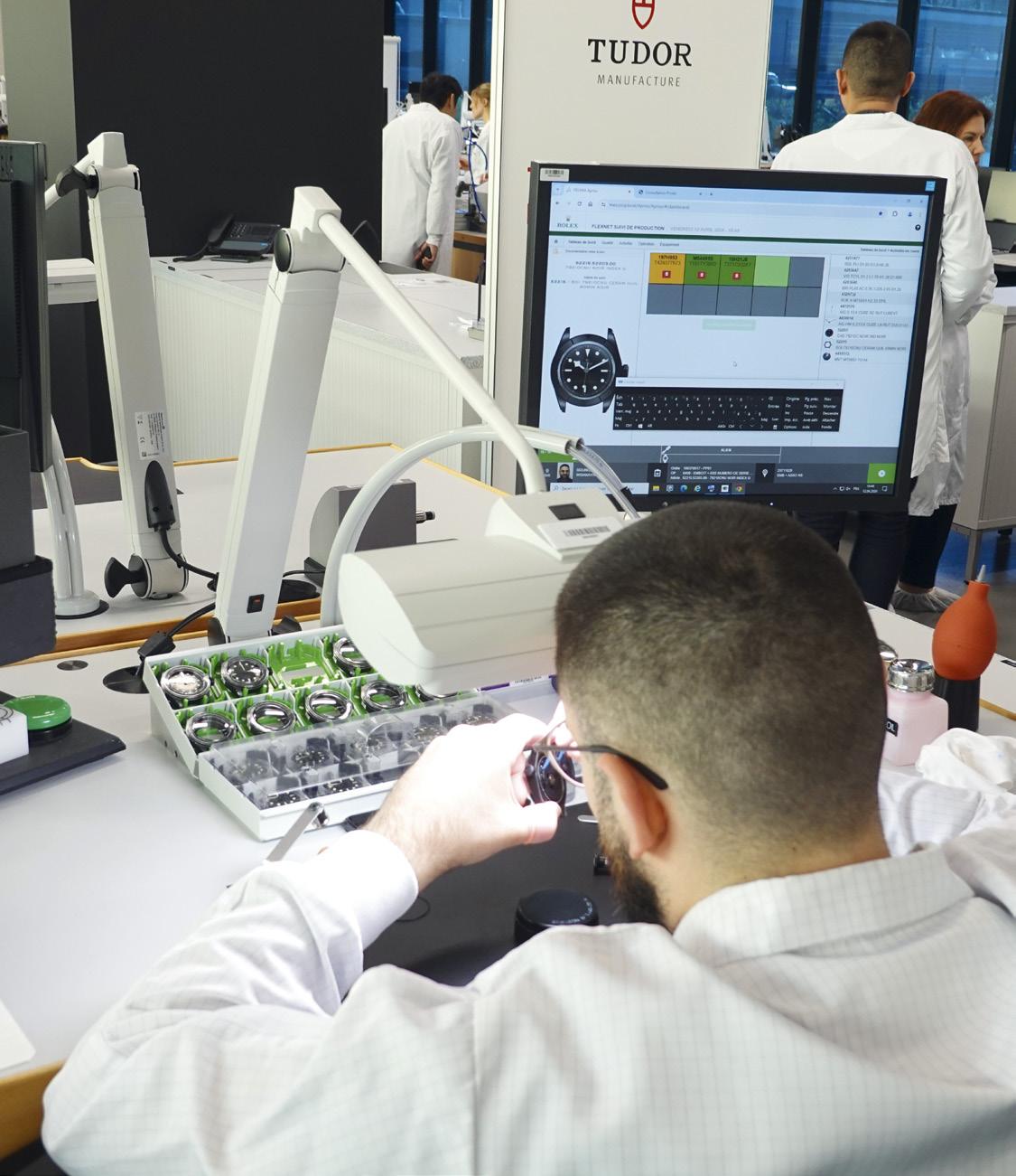
Back to the accepting from Kinessi. Movements are always RFID tagged and have a complete history, and this includes more information than you may realize. Tudor doesn’t keep stock. Everything goes out immediately to fill an order that has already come in. On the different levels of the building are the different processes. Watchmakers are cross-trained in all the different areas, so they understand the demands and needs of just about everything.
Amazingly useful for an organization, to have people that happily take ownership of the end result. Surprisingly done far less than most realize.
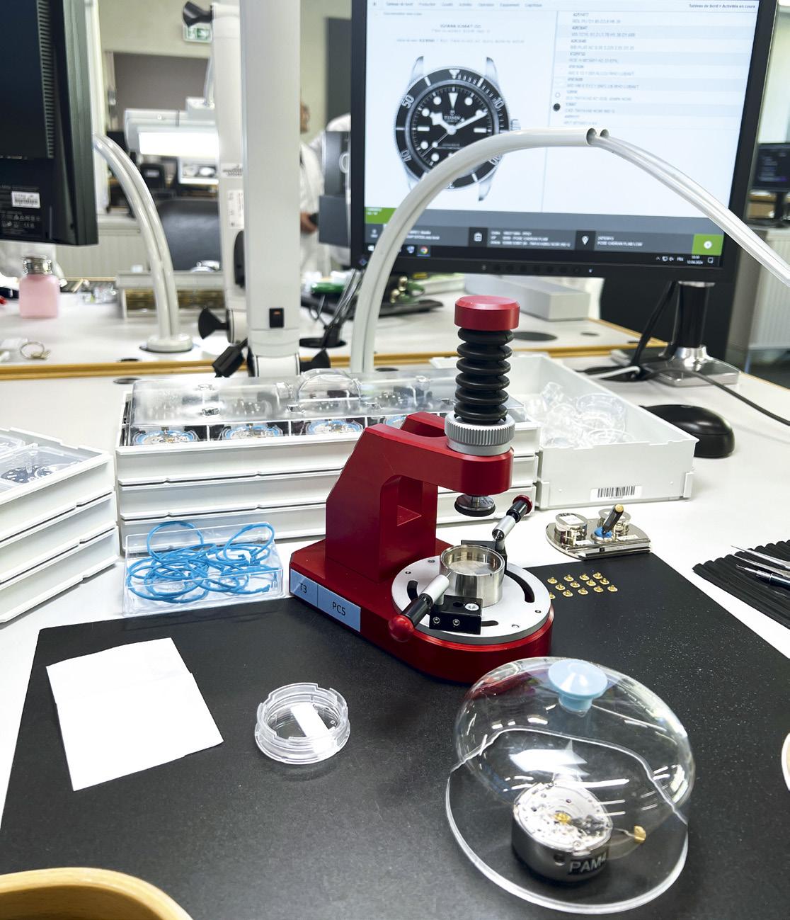
There are four areas or cells of watchmaking, but everything looks pretty similar. Benches are laid out the same way, processes flow the same way. There are touches of individuality, of course, but everything everywhere will feel familiar.
Dials will be fitted, as will hands. When the COSC certification is done, they use different hands from those that




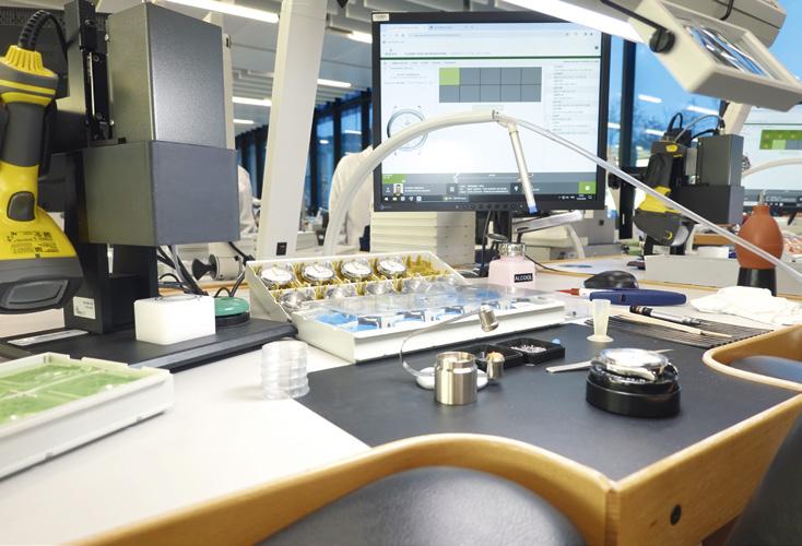
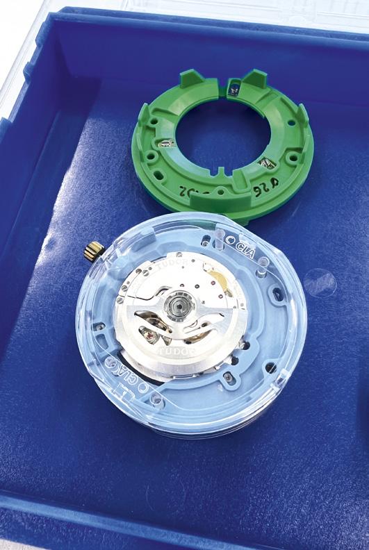
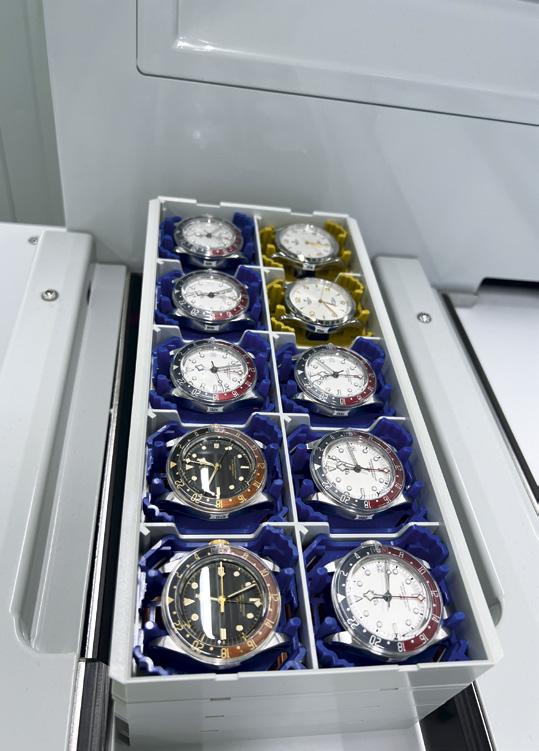
end up on the watch that goes to the customer. So here the right stuff is put on, and the movement is encased.
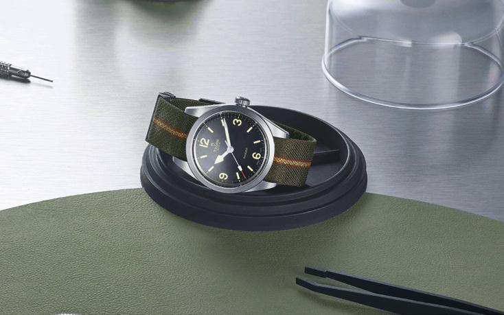
And tested. Tudor has their internal testing under what they call TUDOR Performance Control. The watch, fully assembled now, must be tested and meet certain minimums such as -2/+4 seconds of precision a day if it is supplied with a Manufacture calibre. -4/+6 if using something else. So yes, there is a difference with their Manufacture calibres. And no, this isn’t always the case with other watch companies.
Then some of the watch models go to the METAS room, where they are independently tested by METAS (not Tudor) personnel completely away from view. For a watch to qualify for a METAS approval, it must individually pass standards that are even tougher than the previous ones. 5 seconds tighter, for example, than the Official Swiss Chronometer Testing Institute (COSC) and a second tighter than even Tudor’s internal standards. Other guarantees before a watch leaves include accuracy if subjected to magnetic fields of 15,000 gauss. Also waterproofness must be as claimed based on ISO certification standards. And the power reserve claims must be verified. All this has to happen, and each watch has to pass, before the certifications of Swiss-Made and COSC will be released.
So what has Tudor done here? They have created a Manufacture, yes, but they also gave it soul and identity. It is within the Rolex umbrella and has benefits from that of course. But it has it’s own individuality. Hans Wilsdorf had the

vision of taking the precision, strength and solidity of what he did with Rolex and making it more available to more people.
The Tudor Manufacture is continuing with the watchmaker’s constant journey to improve on this vision. It is located away from most Rolex stuff, and whatever has been around the area recently had to do with foundation (remember, Rolex is a Foundation) work.
So this hugely interesting building, with its bank vault the boss can’t enter. With clean room within clean room. With robots assisting people and vice versa. With a primarily local workforce and supply chain that makes things both efficient and more environmentally-friendly. With a fire safety system that protects both people and parts (not like the move Tenet, in case you are wondering). With its murals and its plants. With its LEGO awards.
This hugely interesting building is the projection of a vision from someone from a vey long time ago, but has evolved and changed and moved forward past the demands of today and is ready for the demands of tomorrow.
All while creating an environment that people are happy to be in. To feel a part of. To take ownership of.
When we started Calibre, I told people that we really don’t talk about products as much as you think we do.
We share passion. We share intelligence. We share vision.
This is such a wonderful example of what we have seen, and what I will continue to share.
And I so love that mural.
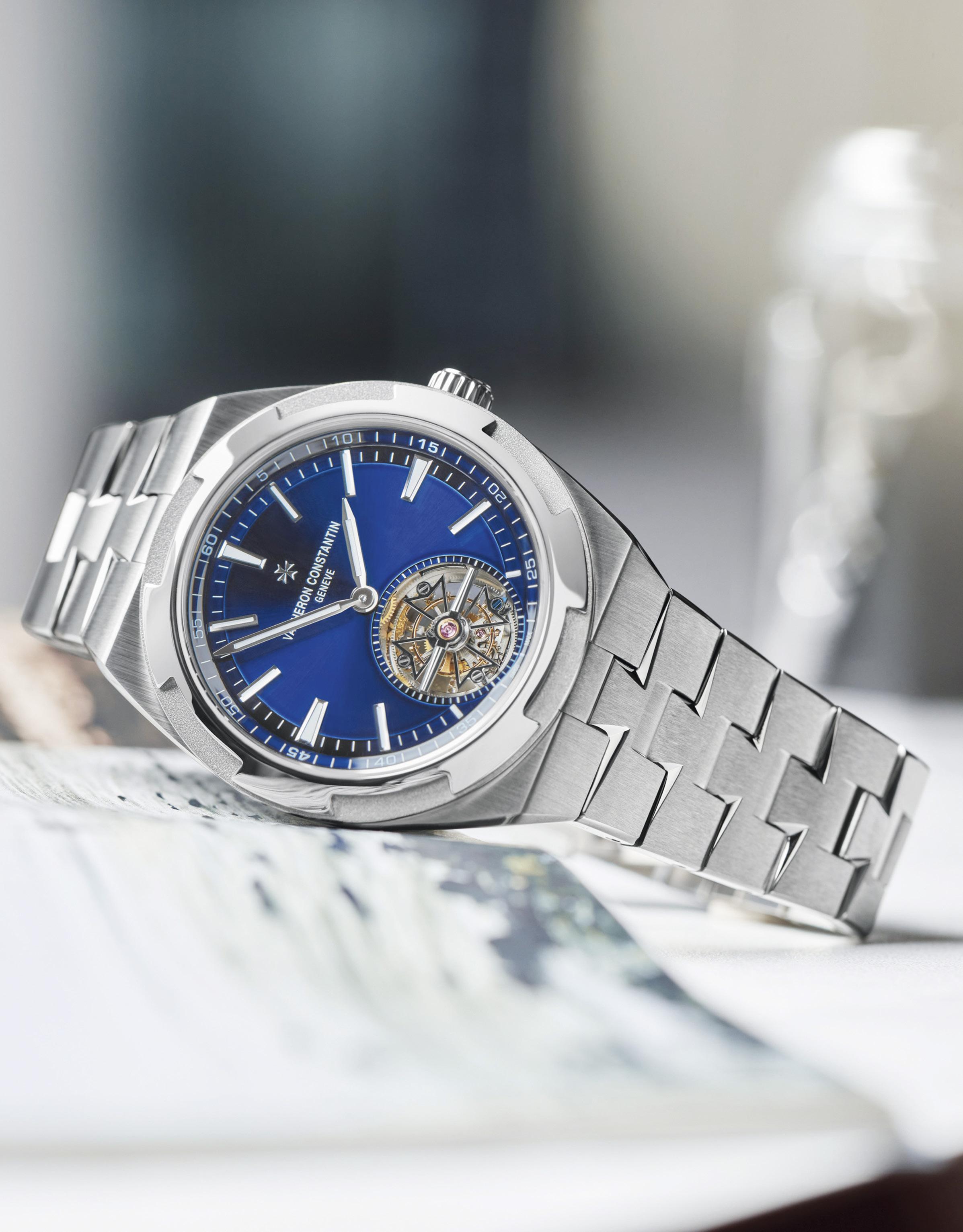
Vacheron Constantin makes elegance and complication subtle and fun with their new Overseas Tourbillon in titanium

Calibre creator Carl Cunanan has said almost from even before day one that it is a shame to spend a lot of money on a watch you don’t use very often. High complications were almost always in the classical or more elegant watch lines. So this watch would be right up his alley.
 Words by Katherine Cunanan


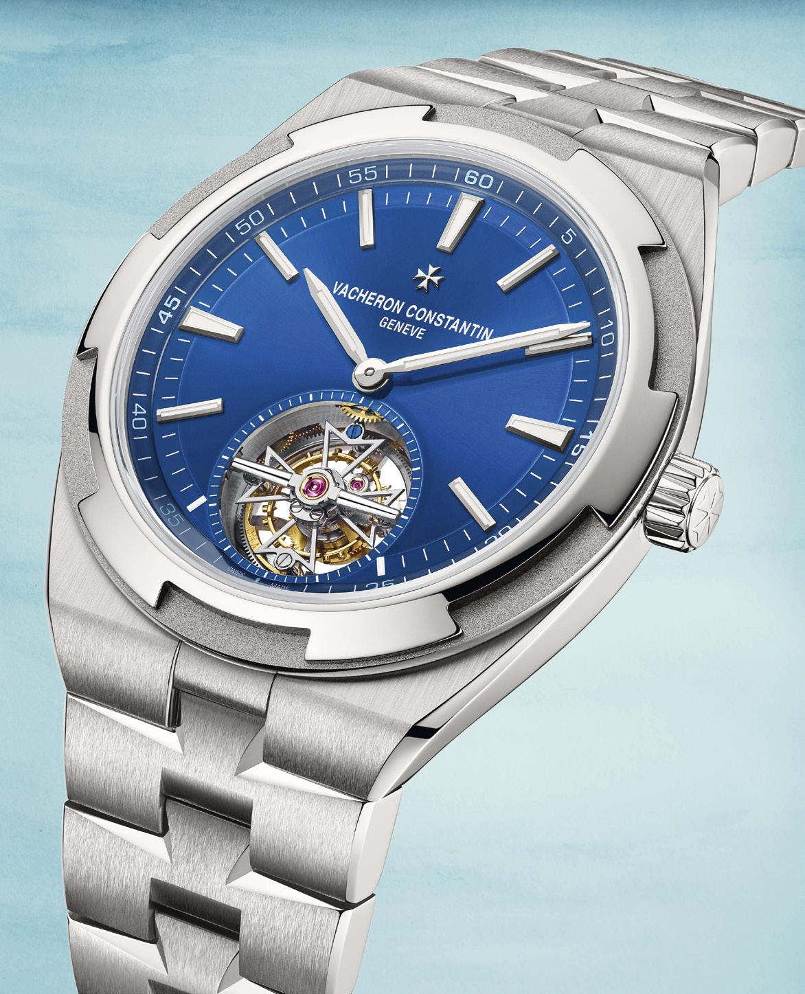
The material, which is used for everything from case to bracelet and from crown to bezel, is a wonderful frame for the elegant blue dial, which in turn is itself a wonderful frame for the Tourbillon regulator between 6 o’clock and the center. The watch is visually enchanting, with the well-finished titanium a very interesting change of tone from the more usual materials that would surround the whirlwind complication.
The finishing of titanium isn’t very easy or simple, and being done to the level that Vacheron Constantin demands is even more so. Titanium is quite lightweight, but it is also quite delicate and needs special work and care to work with properly. Only grade 2 and grade 5 titanium can be used for something like this, and Vacheron Constantin of course chose type 5. The bracelet has a delicate vertical satin-brushed finish with the familiar polish on the link angles, and on the caseback as well. The bezel used a different brushing, a circular satin-brushing on a sandblasted ring. The matte effect of this material means this particular Overseas looks very familiar but just a bit different. Enough to catch your eye and make you wonder.
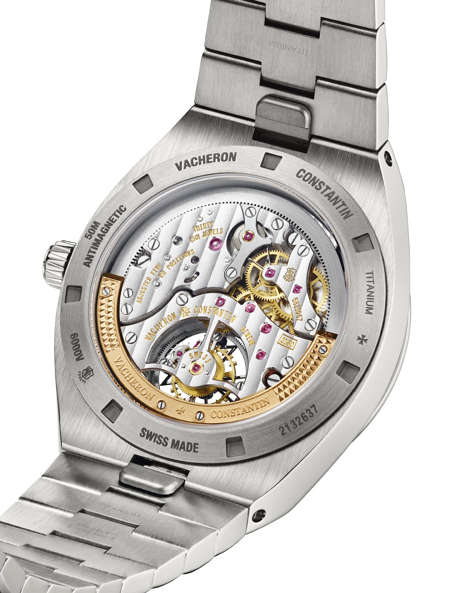
The Tourbillon complication spins nicely framed by the blue dial and the brushed titanium case. The watch uses the selfwinding Calibre 2160, which was developed and manufactured by Vacheron Constantin. The self-winding mechanism uses a peripheral rotor of 22k gold, so there is no usual oscillating weight to block the view of the finely-finished movement through the transparent sapphire crystal caseback. So you can see the level of detail that has been presented. Circular graining on the mainplate provides backdrop for the hand-bevelled bridges with their Côtes de Gèneve design. The wheels are finely-grained, the screws are chamfered and polished. With the hand-polished Tourbillon bar, the view through the back is balanced and elegant. The movement has a three-day power reserve, listed by the maison as approximately 80 hours, so more than enough to keep going through the weekend if you switch to something more elegant or more sporty. Balanced and elegant on the front as well, which honestly isn’t always the case with tourbillons. Perhaps the titanium tone makes things just a bit more special. It is technically a twohand watch, with the hour and the minute hands of 18k white gold extending from the center and pointing outwards to the hour markers of the same material. As befits a watch meant for travel, blue SuperLuminova is used simply and tastefully.
There is actually a seconds indication, but it isn’t a hand. The Tourbillon moves around every sixty-seconds, and the seconds indicator is a colored screw on the Tourbillon carriage.
Calibre spoke with Vacheron Constantin Style and Heritage Director, Christian Selmoni about the new piece. We asked because some maisons don’t like to use titanium for their more complicated watches, or any watch, sometimes. Yet this isn’t the first time Vacheron Constantin has used it, is it?
Correct, he nodded. “The first proposal was for the Quai de l'Île collection in 2008, followed by Overseas timepieces in 2009. In those cases, it was used for the bezels of two
But how is it on the wrist?
“Surprisingly good, well, maybe not that surprisingly,” said Calibre Editor Carl Cunanan when asked about the watch in Geneva.
self-winding models, one of which was equipped with a chronograph. The following year, the same bezel was adopted for a dual time model.”
So why choose titanium when you already have steel watches? The watch does indeed have a special look to it, but it is also extremely challenging to work with.
“The aim was first and foremost to accentuate the sporty, hard-wearing aspect of these Overseas watches. They offer the properties of sporty timepieces through their lightness and robustness while remaining on a par with the technical timepieces for which Vacheron Constantin is renowned. What's more, customers can now choose between a skeleton version and one with a blue dial.”
But how is it on the wrist? “Surprisingly good, well, maybe not that surprisingly,” said Calibre Editor Carl Cunanan when asked about the watch in Geneva. “Titanium is a bold choice; from a technical standpoint, some maisons avoid it and point to flash marks on their workshops floors to point out why. VC has of course done this before, and using the material now surrounding a Tourbillon has made this, for many, THE Overseas to have. And it wears really really nicely.”
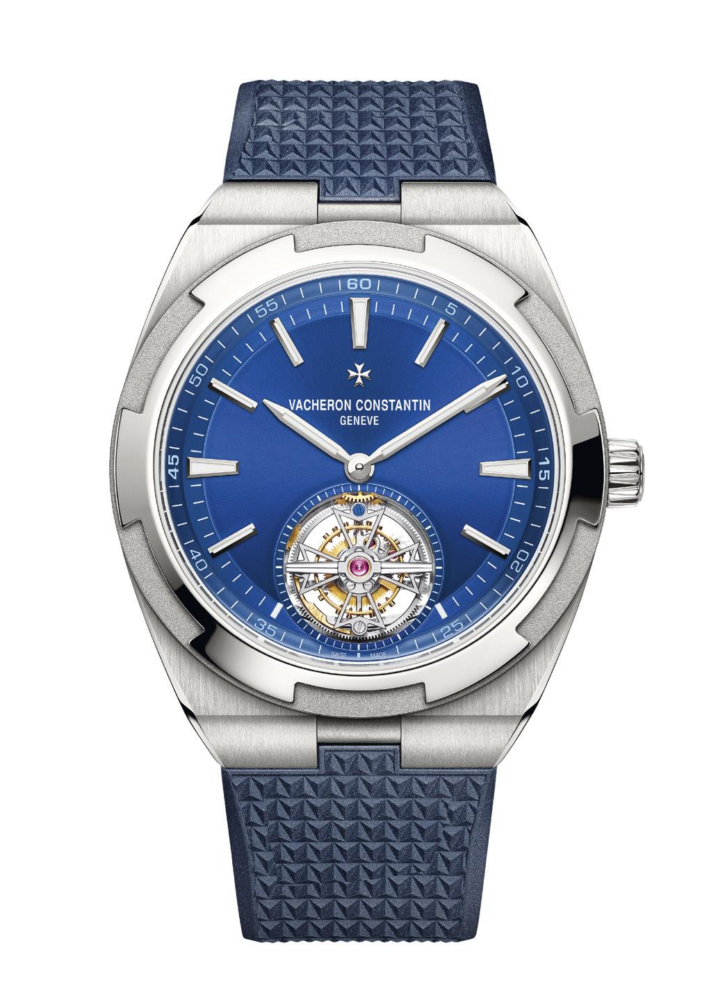
The watch is as flexible in use as modern sporty watches need to be. It is under ten and a half mm in thickness, so fits easily under a tailored shirt sleeve. Given this height on the wrist, it wears well with its 42.5mm diameter. There are three options for keeping the watch on your wrist, all easily swappable thanks to the tool-free system VC uses. The integrated titanium bracelet is the obvious choice, but you can also go with calfskin leather or blue rubber straps for different looks. The straps have a self-interchangeable folding clasp also of grade 5 titanium, and also swappable without any tools.


At the recent Watches and Wonders Geneva 2024, the famed Italian watchmaker Panerai introduced the new Submersible QuarantaQuattro Luna Rossa Ti-Ceramitech™.
As the official Sponsor of the Luna Rossa Prada Pirelli since 2019, Panerai has regularly crafted collections of technical watches, every year in preparation for the oldest international competition, the grueling America’s Cup. The prestigious event will take place in Barcelona on the 22nd to the 27th of August, 2024.
Panerai’s journey with the America’s Cup began in 2017, as Official Partner for the elite sailing competition and as sponsor of the Oracle Team USA and Softbank Team Japan. Then in 2019, the Maison became the Official Sponsor of the Luna Rossa Prada Pirelli; it was during the 36th America’s Cup presented by Prada, held in the Hauraki gulf, Auckland, where Panerai cemented its nautical ties with the sailing team. Drawing inspiration from the materials and technologies found within the America’s Cup, and, using the insights of the team and needs of the Luna Rossa Prada Pirelli team, Panerai has relentlessly developed collections of technical watches, one for every year of preparation leading up to the ultimate sailing challenge.
In a statement, Jean-Marc Pontroué, Panerai CEO said: “Our association with the Luna Rossa Prada Pirelli Team resonates deeply with Panerai’s maritime heritage and our pursuit of boundarypushing performance. This partnership is a natural extension of our brand’s core values.”
In the lead-up to the pinnacle of yacht racing, the 37th America’s Cup, Panerai reaffirmed its commitment as the Official Sponsor, and joined forces with the Luna Rossa Prada Pirelli team for the second consecutive edition.
The team’s Skipper and Director, Max Sirena had this to say: “The synergy with Panerai takes us on a shared journey in pushing the limits of performance, where precision, innovation and a relentless pursuit of excellence are at the heart of our endeavours.”
This collaboration is a convergence of the Panerai identity, the embodiment of the Italian DNA, a deep-rooted connection to the marine world, and the Maison’s commitment to crafting instruments for modern day heroes; thus, watches engineered and tested for the toughest conditions, epitomize Panerai’s dedication to durability, reliability and functionality.
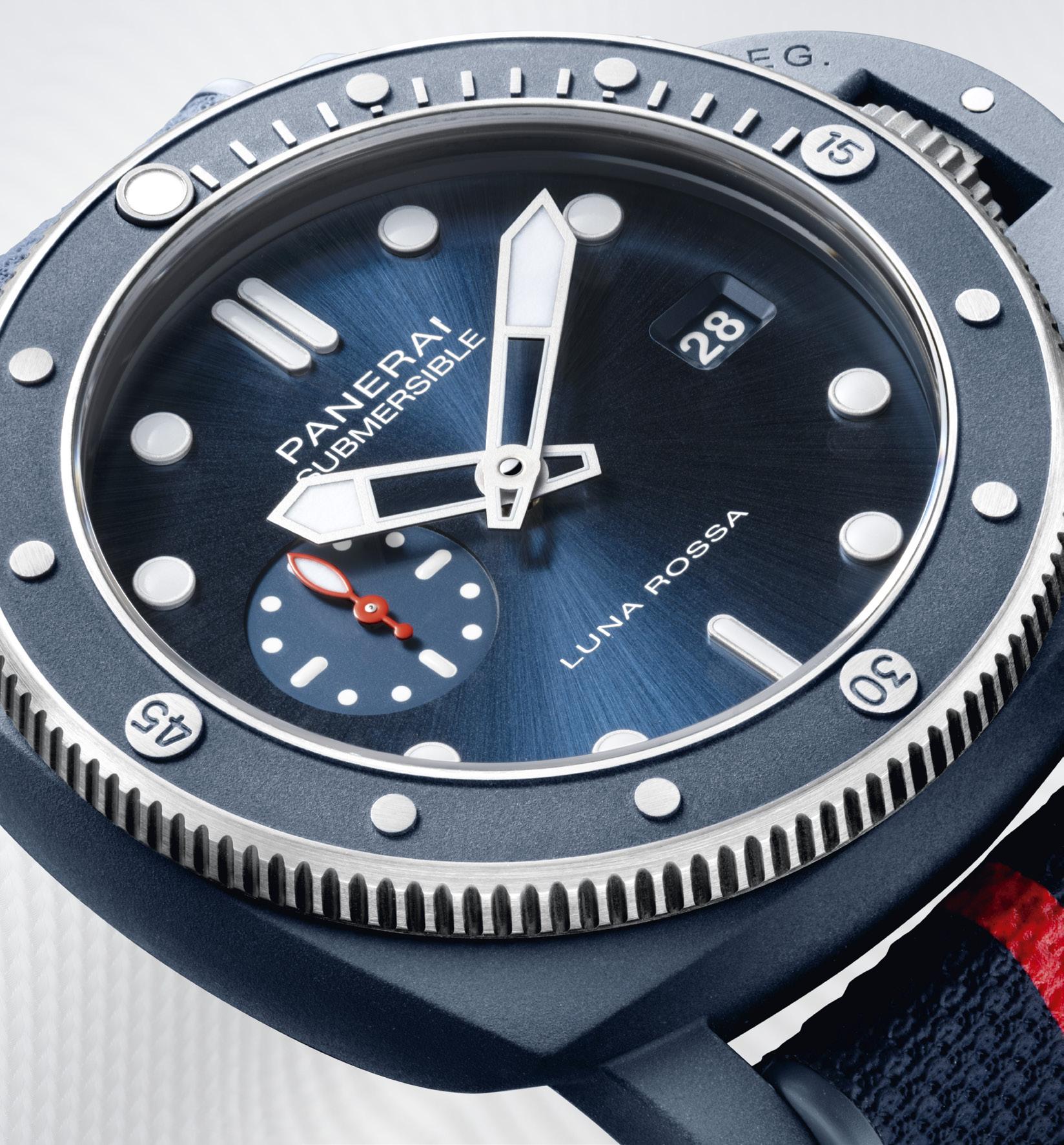
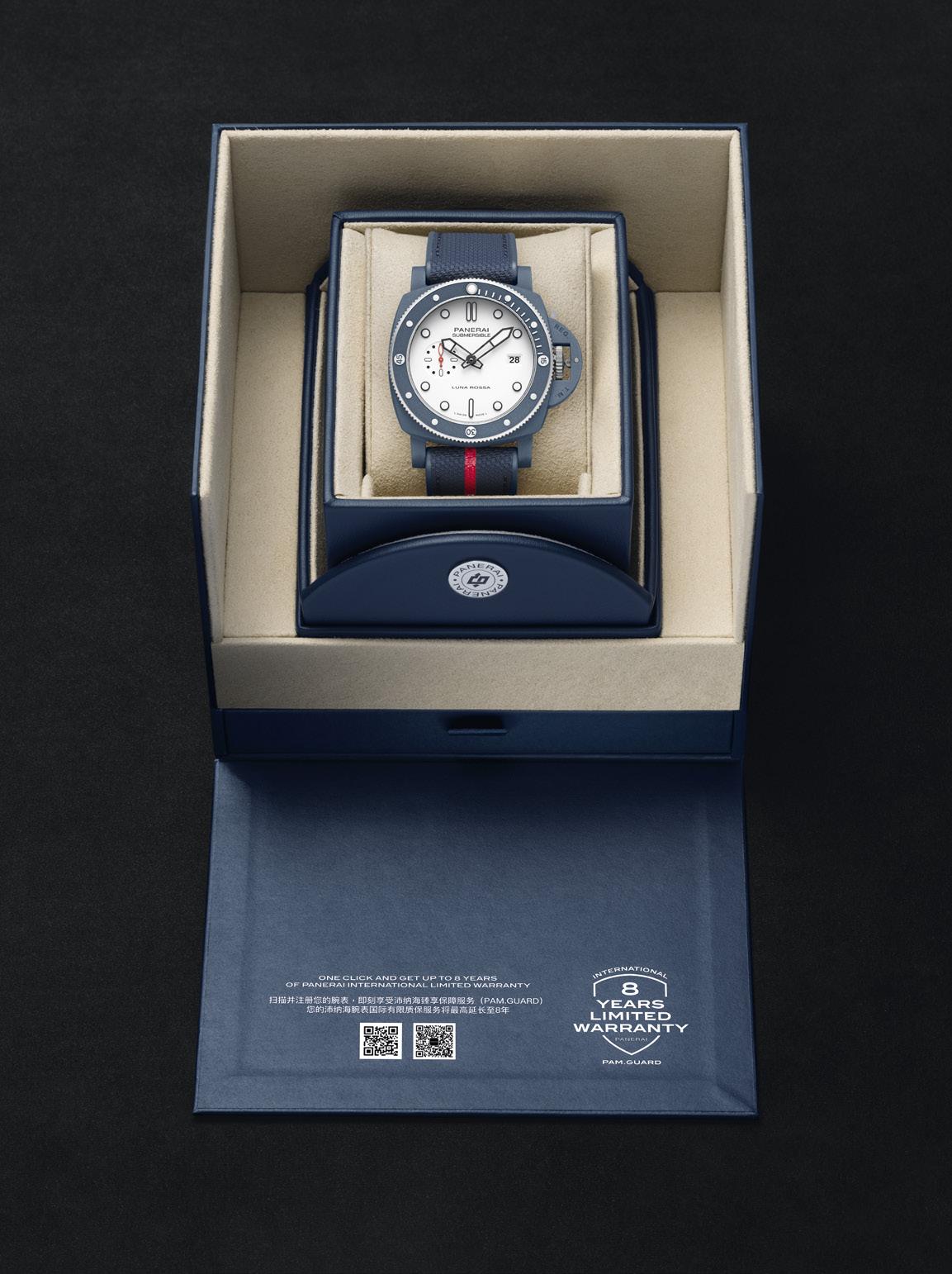
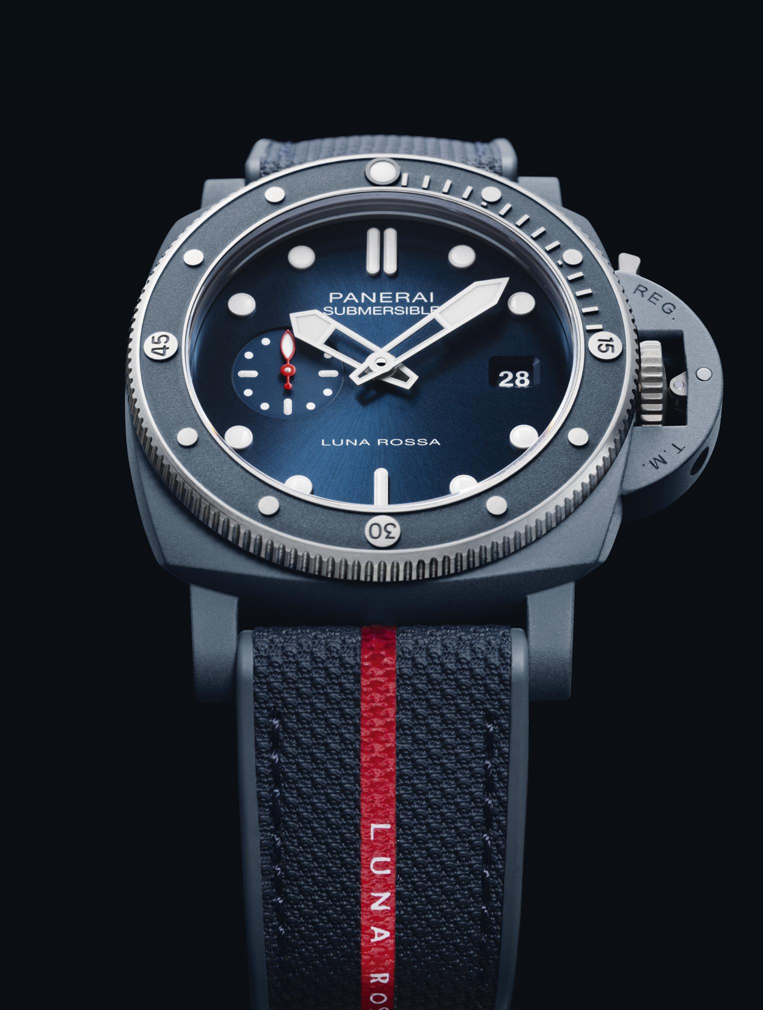
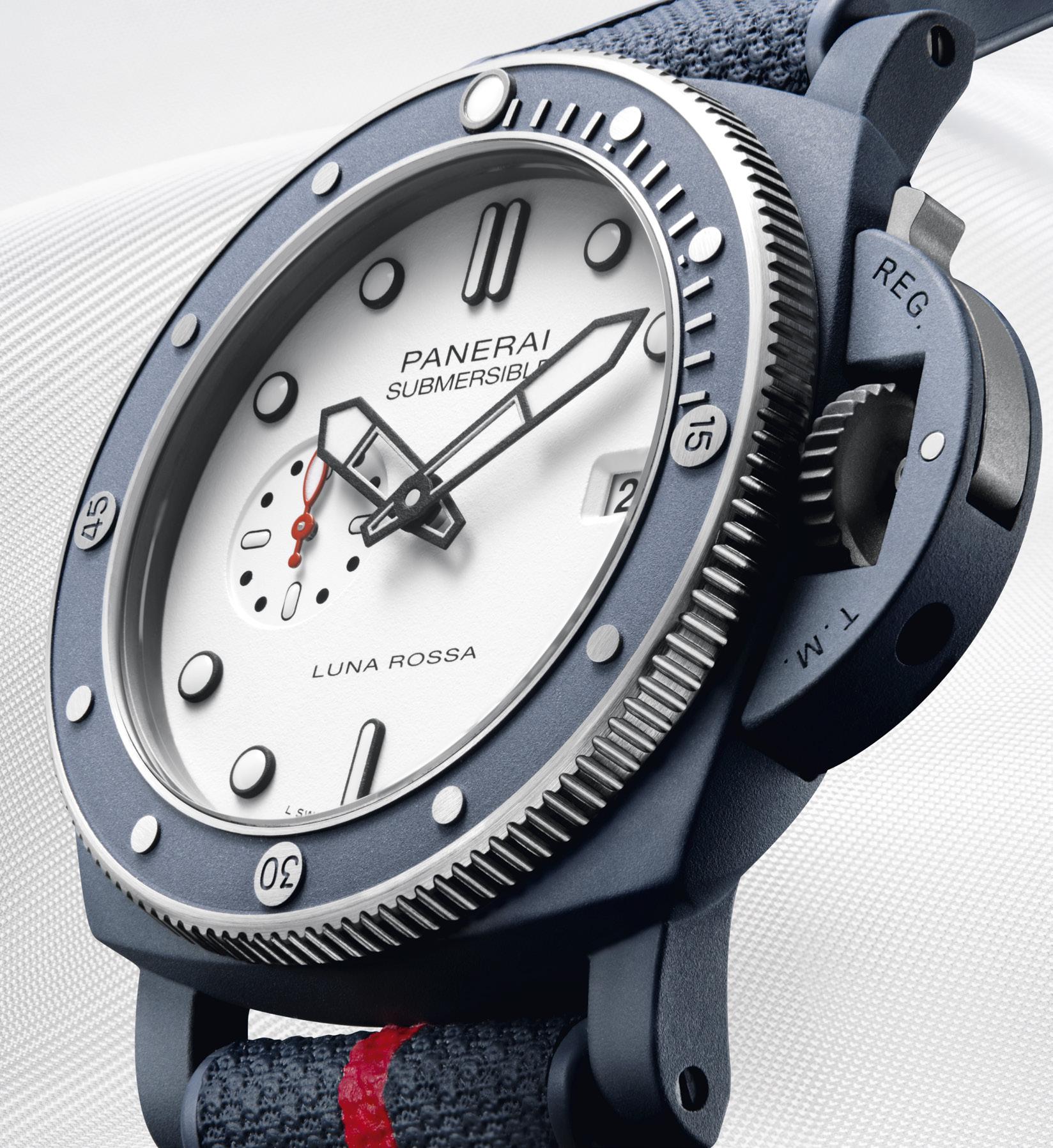 Submersible QuarantaQuattro Luna Rossa Ti-Ceramitech™ PAM01543
Submersible QuarantaQuattro Luna Rossa Ti-Ceramitech™ PAM01466
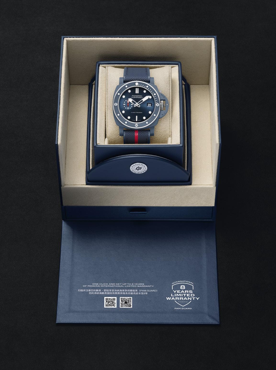
The new Submersible QuarantaQuattro Luna Rossa Ti-Ceramitech™ PAM01466 and PAM01543.
The new releases represent a strategic alliance of high-performance and cutting-edge technology by way of a new and innovative material, TiCeramitech™, mirroring the ethos of the Luna Rossa Prada Pirelli Team at the pinnacle of sailing competition.
Jean-Marc Pontroué, CEO of Panerai had this to say; “The launch of the submersible QuarantaQuattro Luna Rossa Ti-Ceramitech™ series, PAM 01466 and PAM 01543, marks a significant milestone in our innovation journey,” he further added, “We are excited to showcase the pioneering Ti-Ceramitech™, a material seven years in the making by our Laboratorio di Idee at the Panerai Manufacture in Neuchâtel, that epitomizes our dedication to advanced technologies as well as the spirit of Luna Rossa’s quest for daring performances.”
Max Sirena, Luna Rossa Prada Pirelli Team Skipper and Director further highlighted the challenges in top-level sailing; “In recent years, as
boats have gotten faster, the forces acting on sails and other boat parts have increased. Friction, which can add up to 30% more force, became a major issue. So, research was done on materials that don’t create as much friction, including titanium, special steels, composites, and more. However, none were ideal until by chance, it was found that a certain type of treated ceramic had a very low friction. After many tests, materials that are very strong and coated with ceramic were used, reducing friction to below 10%. This discovery is now used in many parts of the boat, like pulleys and carts, wherever there’s movement or rubbing under heavy load.”
Drawing inspiration from a material and a process being used in high-performance competitive environments, the 44 TiCeramitech™ case is ceramic coated, developed through the high-demand, high-tech world of Luna Rossa; a true example of how cutting-edge technology and material science can be used to elevate performance in sporting disciplines. This process, specifically the ceramization of steel parts to reduce friction significantly, enhances the efficiency and more importantly the speed of
racing boats, was the inspiration for Panerai. After much research and development, Panerai has filed a patent application for a titanium ceramization process through Electrolytic Plasma Oxidation, that can achieve the much desired and very distinctive shade of blue. This process transforms the titanium alloy surface into a dense ceramic layer, and the specific choice of elements mixed together with the electrolyte composition, allows for the creation of the very distinct and striking blue color, akin to the color of the high seas.
This technique produces a significantly enhanced hardness, resulting in a case which is 44% lighter than steel, with an impressive fracture hardness 10x than that of traditional ceramic. A material that can withstand high pressures and high thermal stress is an ode to Panerai’s pursuit of creating reliable and innovative instruments.
The Submersible QuarantaQuattro Luna Rossa Ti-Ceramitech™ features the automatic P.900 calibre, with a three-day power reserve, a diameter of 12 ½ lignes (28mm) and just 4.2mm thick, it integrates expansive function within the confines
Our association with the Luna Rossa Prada Pirelli Team resonates deeply with Panerai’s maritime heritage and our pursuit of boundary-pushing performance.
JEAN-MARC PONTROUÉ, PANERAI CEO
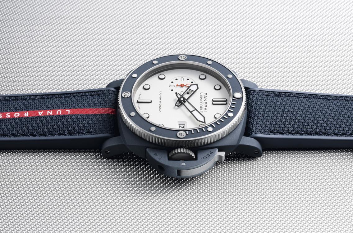
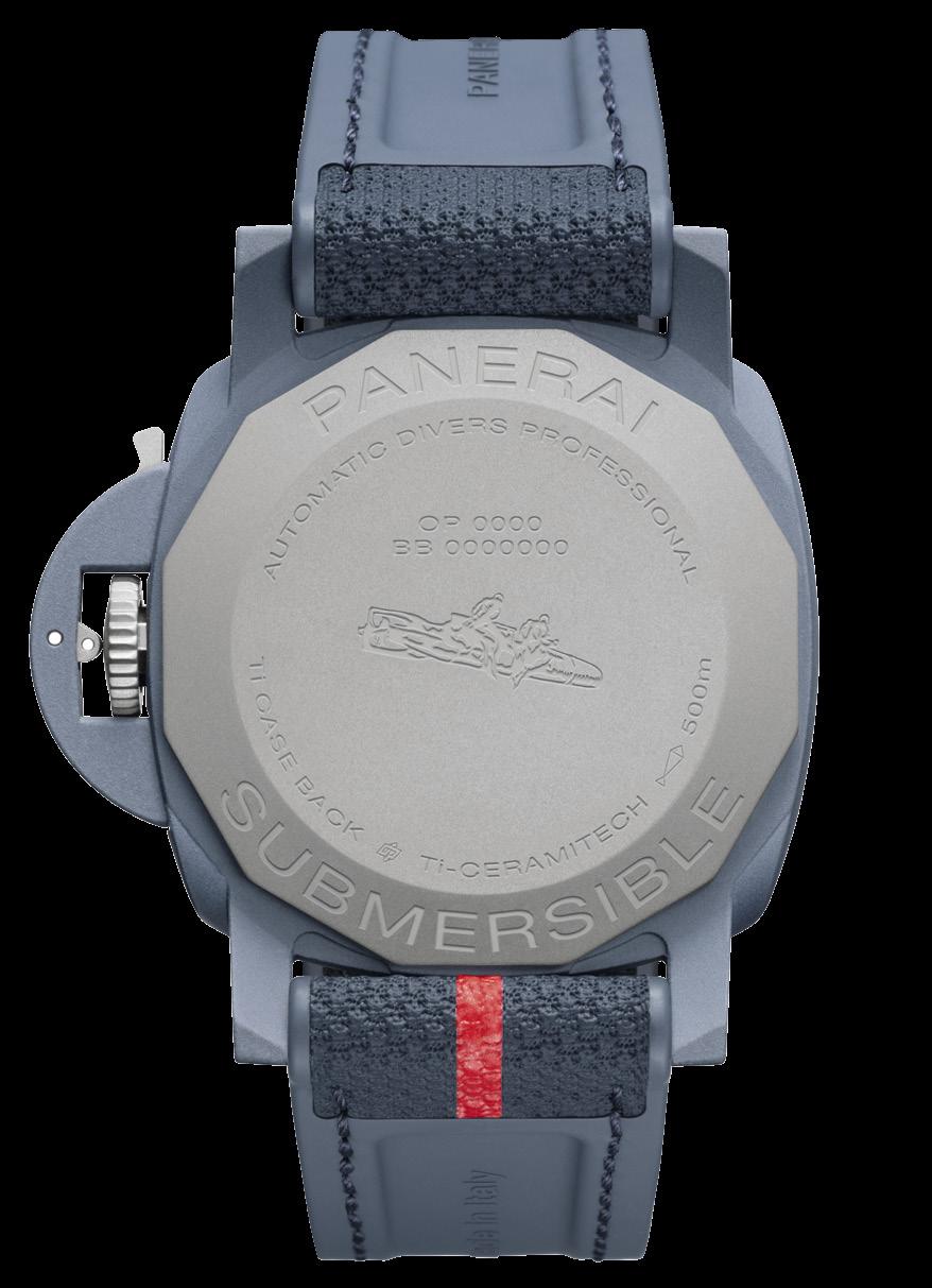
of remarkably streamlined proportions. The energy required to produce a three-day power reserve comes by way of the bidirectional oscillating weight, stored in a single barrel. The balance wheel oscillates at a frequency of 28,800 vibrations per hour, is kept in place by a balance cock. The calibre is equipped with a stop-second function, allowing for a precise time setting. The case measures 44mm, with a unidirectional rotating TiCeramitech™ bezel, a screwed micro-sandblasted Titanium case-back with a sapphire crystal.
Similar to the case, the bezel is made from ceramized machined titanium, which is meticulously reworked to reveal the metal beneath at strategic points, that produces an eye- catching contrast between the materials, punctuating the crown, its protecting lever, the edge and indexes of the bezel, the back-case and the trapezoidal pin-buckle. The blue hue produced that was a result of the ceramization process, was so distinctive, it necessitated the development of a bespoke color for the accompanying straps, adding to watch’s singular character. Water
resistant up to 50bar (500 meters), these watches were rigorously tested, subjecting them to a pressure up to 25% greater than the guaranteed water resistance value to ensure it exceeded Panerai’s stringent standards.
PAM01466’s aesthetic evokes the spirit of the high seas with its blue sun-brushed dial, on the other side of the spectrum the PAM 01543 with its white-matt grained dial is simply glorious, both watches are accented with a decal of Luna Rossa and a small second hands, a subtle nod to the sailing team’s identity. The date window is at 3 o’clock, while the discreet seconds subdial is at 9 o’clock, surrounded by luminous hands and hour markers that ensures legibility in ocean’s depth or the darkest of nights.
The watch comes with two strap options; the first has a striking red stripe with the words Luna Rossa, in white, against a blue backdrop; the second comes in a uniform blue tone and is made of rubber.
Scheduled to be available in boutiques by July 2024; just in time for the 2024 America’s Cup!

 Words by Brian M. Afuang

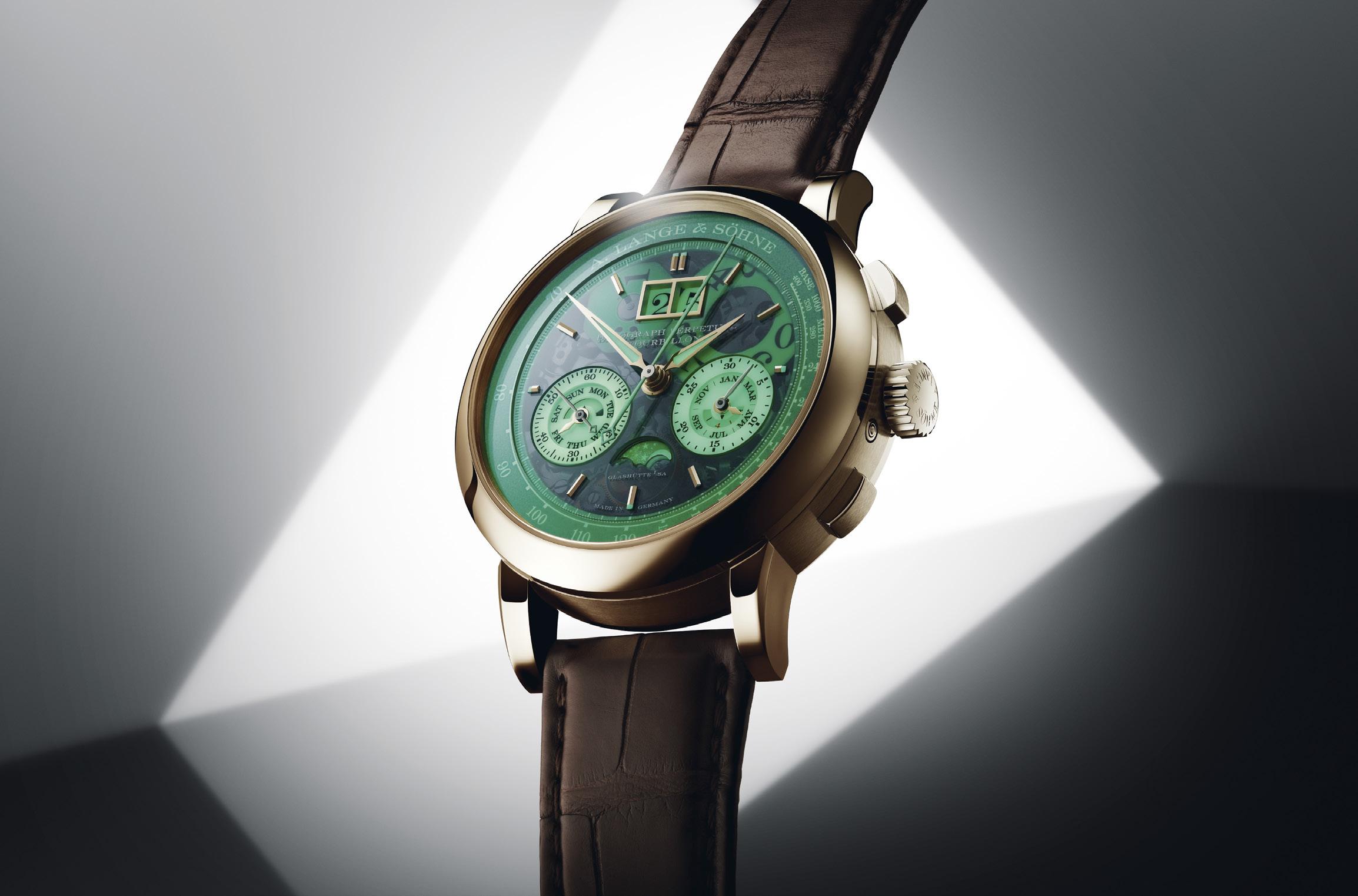
A. Lange & Söhne Datograph marks 25 years of benchmark-setting tradition with a special complications-packed, fully glammed-up piece
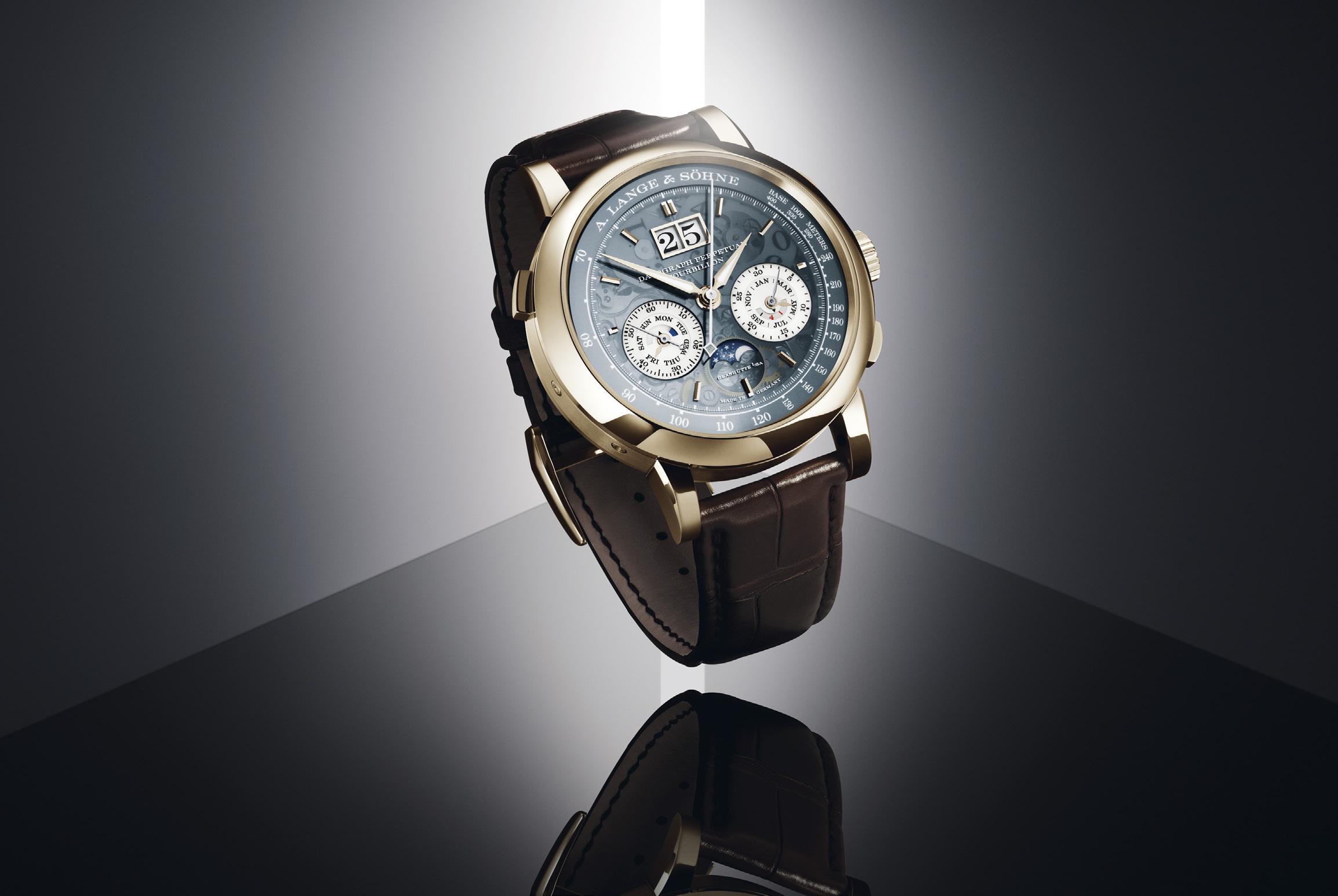
Seventeen years after debuting the original Datograph in 1999, A. Lange & Söhne released the Datograph Perpetual Tourbillon. This watch promptly claimed its own imposing position in the most hallowed halls of horology, just like what the first Datograph did when it raised the standard for inhouse haute horlogerie chronographs of the era.
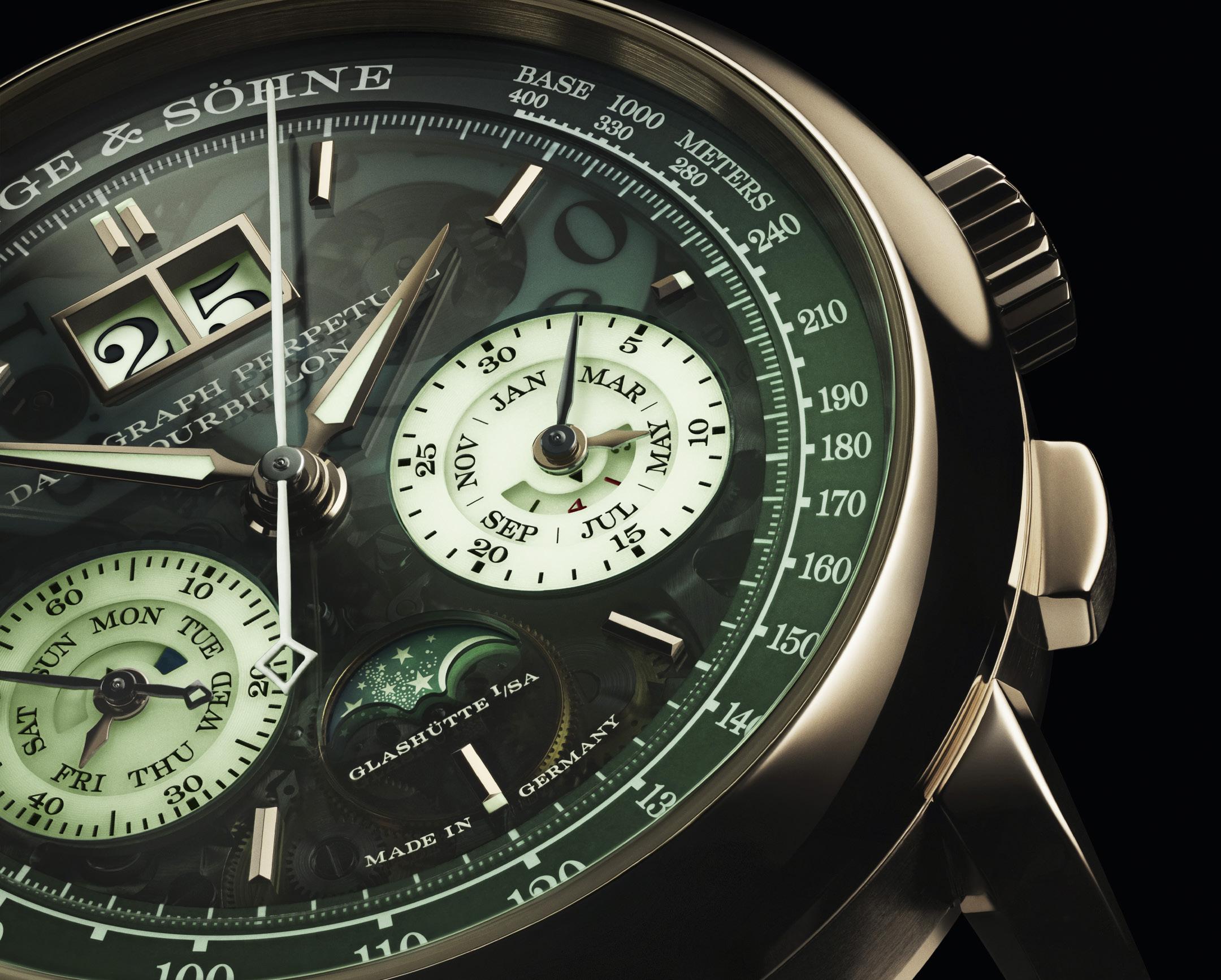
Because what the Datograph Perpetual Tourbillon has been afforded with were a perpetual calendar, a tourbillon with an ampedup function, and a flyback chronograph. It also has a moonphase indicator and Lange’s signature big-date display. Any one of these complications would elevate a timepiece. That these all come together in a single watch is nothing short of a feat.
As the Datograph line marks its 25th anniversary, it only seems fitting for Lange to choose this complications-laden Datograph as the model with which to celebrate the milestone. But the preeminent Glashutte watchmaker went further and made it even more special. The result is the Datograph Perpetual Tourbillon Honeygold Lumen, a truly dazzling piece of watchmaking virtuosity limited to only 50 examples.
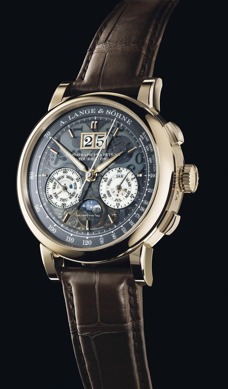
Yes, dazzle this piece does. Because the 41.5-millimeter case (it is a substantial 14.6 millimeters thick) of this commemorative watch is now fashioned from Lange’s proprietary “honey gold” concoction. More subtle than rose gold, thanks to its warmer tone, the material is harder than other gold alloys. Lange reserves it for its most exclusive limited-edition releases.
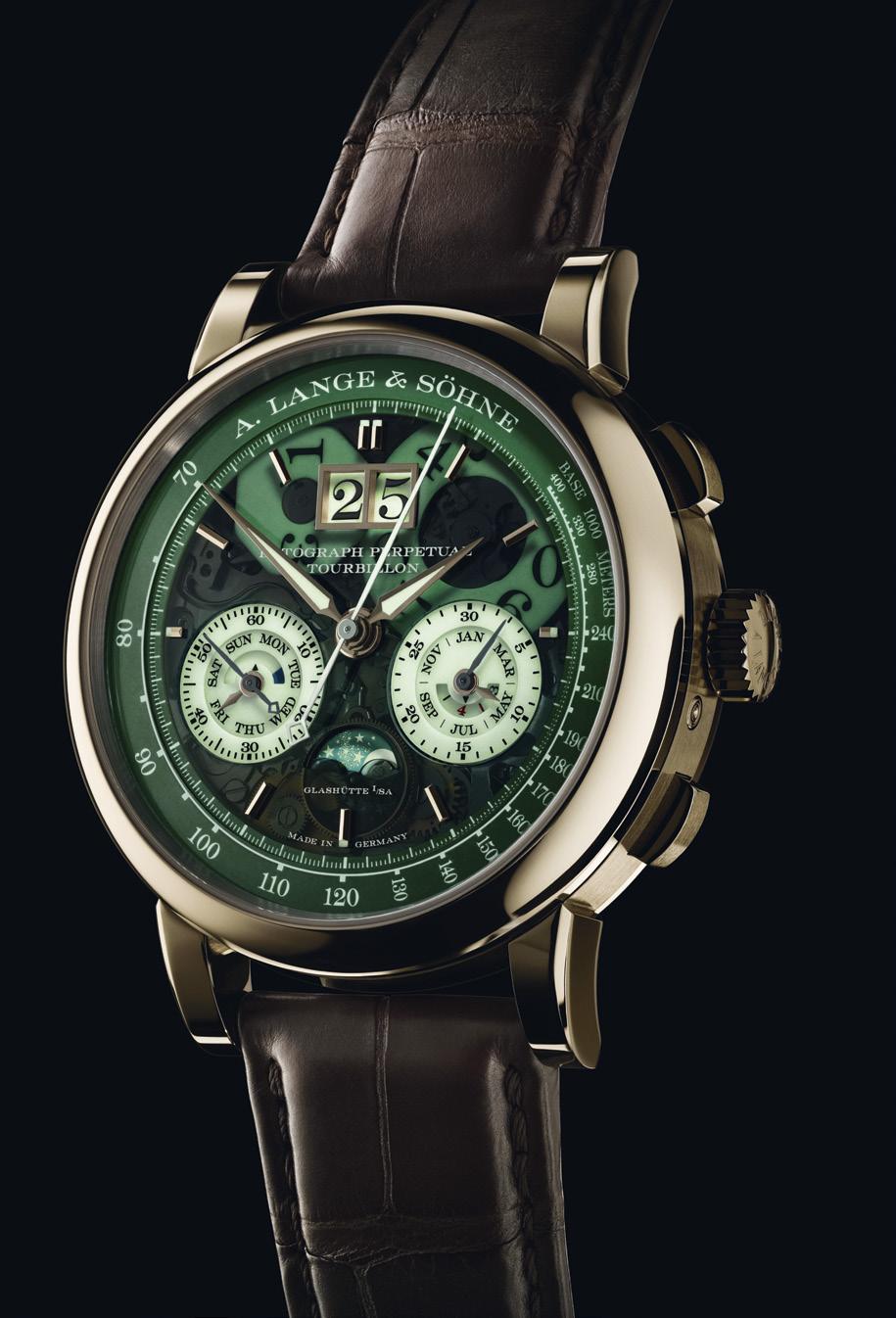
No less exclusive is the Lumen feature. Lumen is one Latin word for “light,” and is also the measuring unit of how much light is perceived by the eye. In Lange’s case, it refers to the in-house phosphorescent pigment that discards most of visible light, but not those on the UV spectrum that are able to glow. On the anniversary Datograph, Lumen coats the dial, is inlaid on parts of the hour and minute hands, and covers the entire chronograph seconds hand. Also immersed in Lumen are the two sub registers and date display, as well as the minute track and tachymeter scale on the edge of the dial. So, the darker the environment, the brighter Lumen — and, hence, the watch — shines.
Now, combine Lumen’s evocatively green glow with the strikingly sophisticated honey gold hue of the case, and this commemorative Datograph Perpetual Tourbillon wears a truly distinctive birthday suit.
As noted, there is substance propping the form — oh, there is. Beating beneath the Datograph Perpetual Tourbillon Honeygold Lumen is Lange’s evolved cal. 952.4, a lushly decorated marvel fusing engineering and artistry. A symphony of nearly 700 parts, it features Lange hallmarks like bridges carved from untreated German silver (you would want to see this acquire a soft patina over time), gold chatons, and blued screws. The handwinding movement, seen it all its glory through a crystal sapphire display window, spins at a relaxed 18,800 vph and when fully wound has stored energy good for 50 hours.
Some components of the perpetual calendar complication are visible amid the rich tapestry. With this movement, Lange is unmistakably

Lumen is one Latin word for “light,” and is also the measuring unit of how much light is perceived by the eye. In Lange’s case, it refers to the in-house phosphorescent pigment that discards most of visible light, but not those on the UV spectrum that are able to glow.

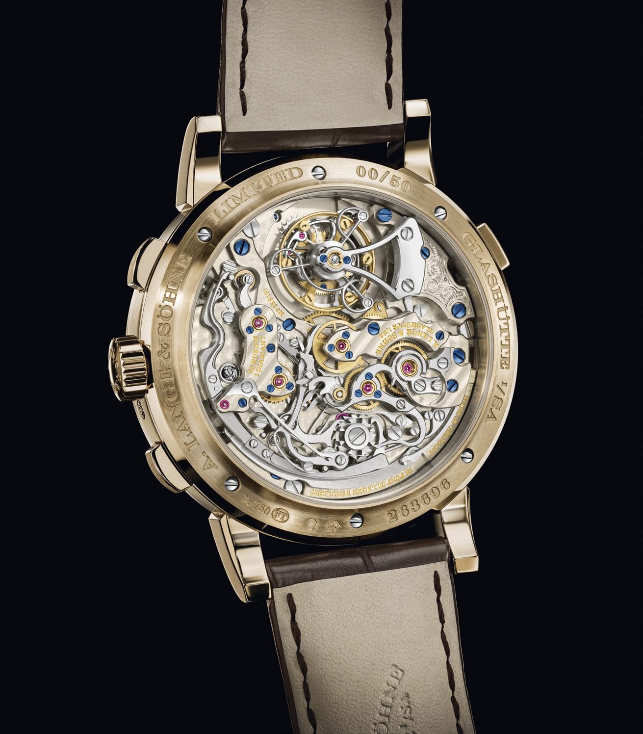
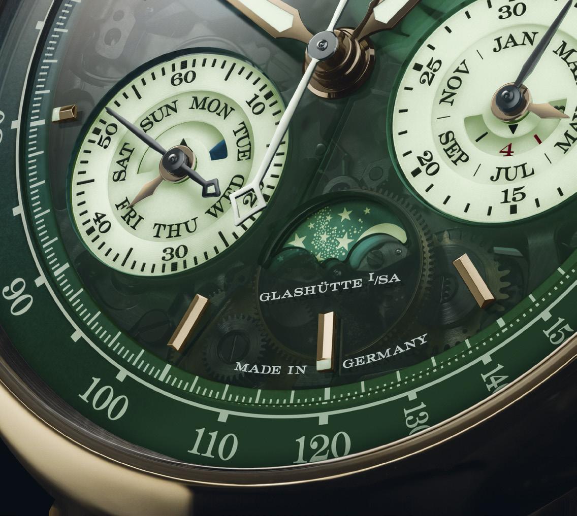
looking at eternity, fitting it with a quickcorrection function that could simultaneously adjust all the calendar displays by one day — a good thing to have when March rolls around in 2100, which is a year that excuses itself from the leap-year count. Other correctors allow the day, month, leap year and moonphase readouts to be adjusted separately. Incidentally, the moonphase is reckoned to remain accurate for 122 years and six months.
Lange could not well leave this special Datograph’s tourbillon alone, too. Centuries after this innovation was introduced — a tourbillon improves timekeeping by counteracting the effects of gravity on the rategoverning parts of a mechanical movement by residing in a rotating cage — it gets a mechanism that could stop it at will. This means the tourbillon’s motion, as well as the movement’s second hand, can be synced more accurately with another trusted timing device.
More horologic wizardry comes to the Datograph Perpetual Tourbillon Honeygold Lumen by way of its flyback chronograph. The complication uses a single button for its stop, reset, and start functions. And, as a flyback, timing can be restarted even while the chronograph is running. The readouts, impressively, are quite legible amid the dial’s landscape.
Speaking of which, the watch’s dial itself acquires an ethereal quality because it is semitransparent. This affords a faint glimpse of the movement’s sundry bits beneath the surface. More visible are the two discs on which the numerals of the big-date display are inscribed. The touch, rightly so, throws a spotlight on one of Lange’s signature features.
And quite another fantastic way to get the Datograph Perpetual Tourbillon Honeygold Lumen’s name in lights.

Cartier brings their own sense of wonder to some easy-to-use, but not necessarily easy-to-get, new timepieces

 Carl S. Cunanan

Cartier has a rather unique position in the watchmaking world. It has some historically important pieces such as the simple and elegant tanks, which bring forth an identity even amongst other rectangular watches. They have insanely high haute horlogerie abilities, creating mysterious movements with no connection to indications or even Tourbillons that just look like they float. They have a mastery of artistry and craftsmanship that is second to none.
But they also, as a group that has a history of elegance and luxury and design, a vision and a responsibility to both past and future. When we speak to their designers, they say they need to make pieces that will be judged a hundred years from now.
At the 2024 Watches And Wonders show in Geneva, they presented pieces that were built on this foundation but also
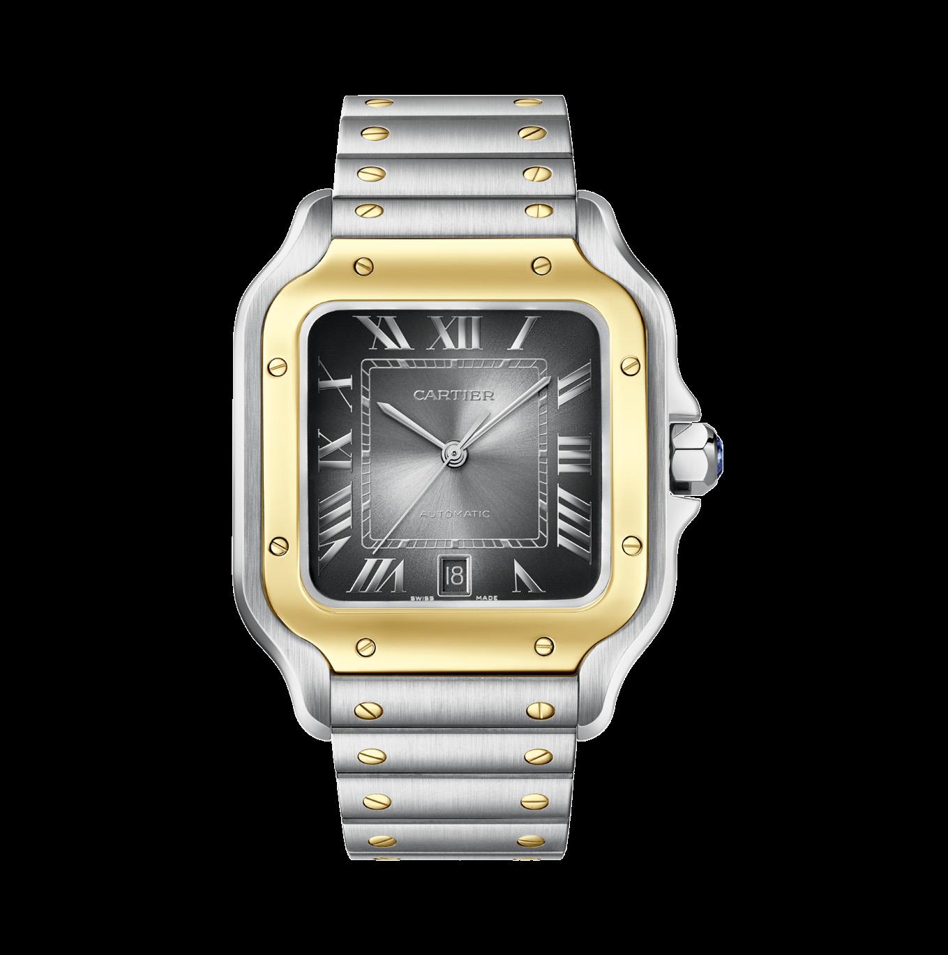
reached out in different ways. There was usefulness, there was whimsy, there was fun.
The two novelties we are looking at here drew my attention for two completely different reasons, and they may well be at odds with many. But I enjoyed them.
The first one surprised even me. I prefer the most classic of Cartier timepieces, the simple Tanks. Clean, elegant, simple.
If I were to deviate, I would say Crash.
Then I would say skeletal Crash.
So how did the new Santos de Cartier grab my attention?
The exact opposite, more sporty really, a bit busier, a lot more detail such as the rivets when the Tanks are clean.
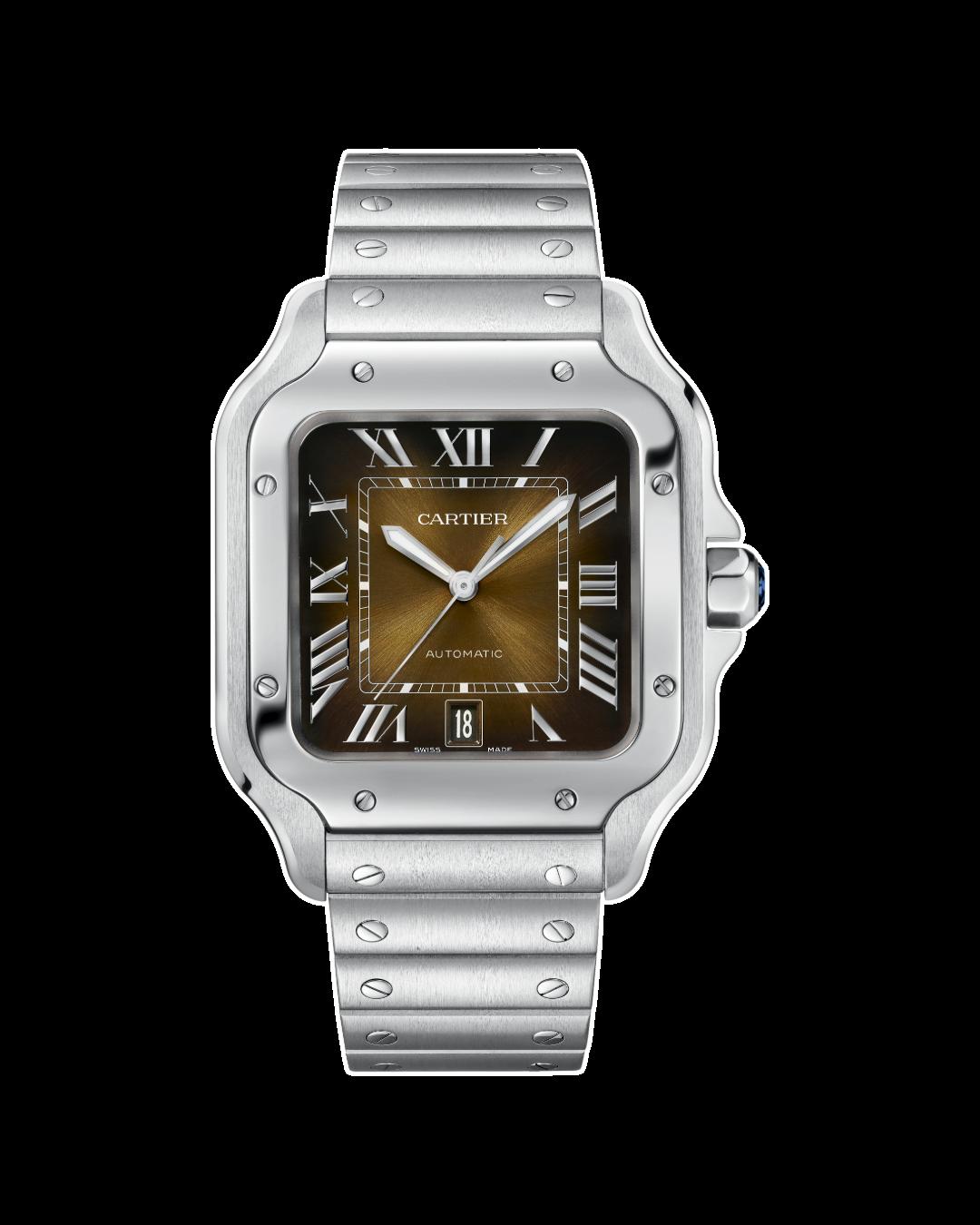
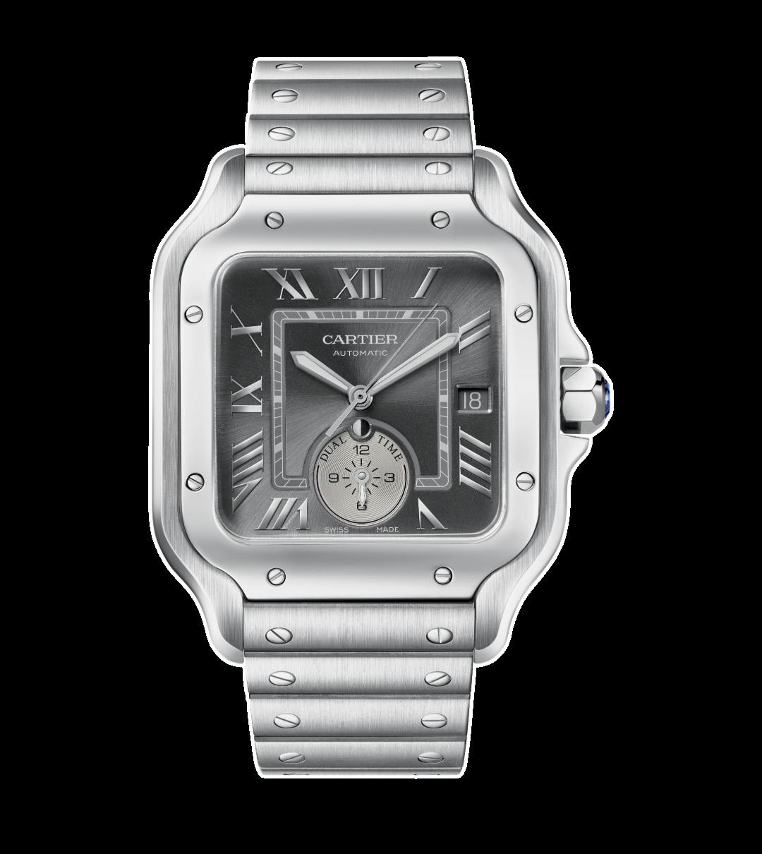
But it did. It drew me visually, perhaps because the colors flow so well. Yes there are a lot of details but in spite of that the look is clean. Silver Roman numerals against a grey dial (sunray-brushed anthracite, actually), encased in a steel case with a matching bracelet ( there’s also gray alligator included) that sits pretty flush on the wrist thanks to very adjustable
“But I have always liked dual time zone more as a way to connect with home than anything else. So to me this works wonderfully. And as I said, it is one of the first Santos de Cartier I have really been drawn to.”
Smartlink size adjustment system. Toolfree so easy to adjust on the fly. It is a 40.2 mm diameter case, with a thickness of 10.1mm, but it has a length of 47.5mm so it is a watch you should really try on before you have an opinion. I personally find is quite wearable, perhaps because of the curved shape of the caseback.
On the fly, because this is a dual time zone watch. The time zone sits in a subdial at six o’clock, finished differently from the dial around it so easily seen. It says Dual Time on it, and I guess it needs to, but it has numerals at 12, 3, 6 and 9, so it works on 12 and not 24 hours which I just kind of like. There is a day/ night indicator in a small circular window, so if you need it it is there. But I have always liked dual time zone more as a way to connect with home than anything else. So to me this works wonderfully. And as I said, it is one of the first Santos de Cartier I have really been drawn to.
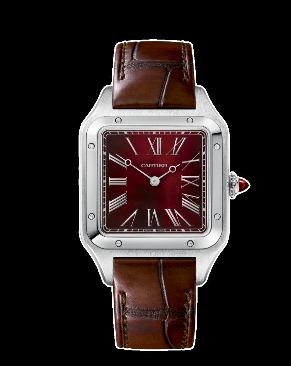

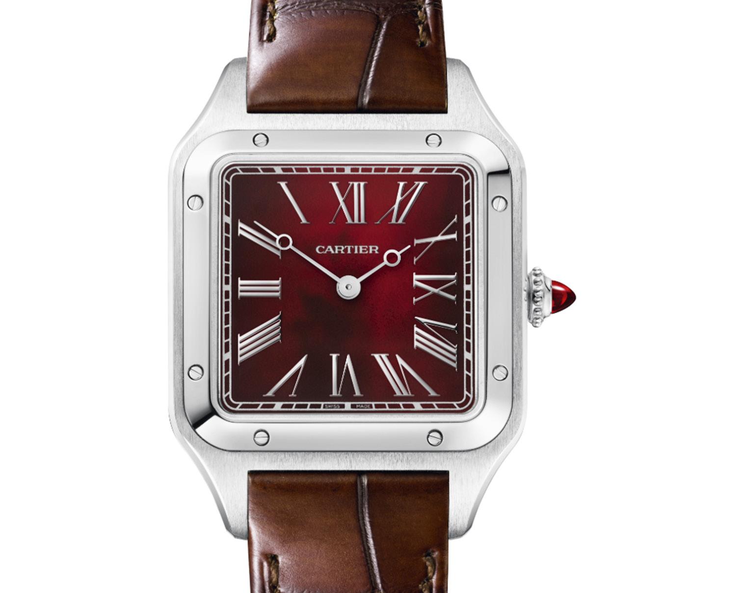
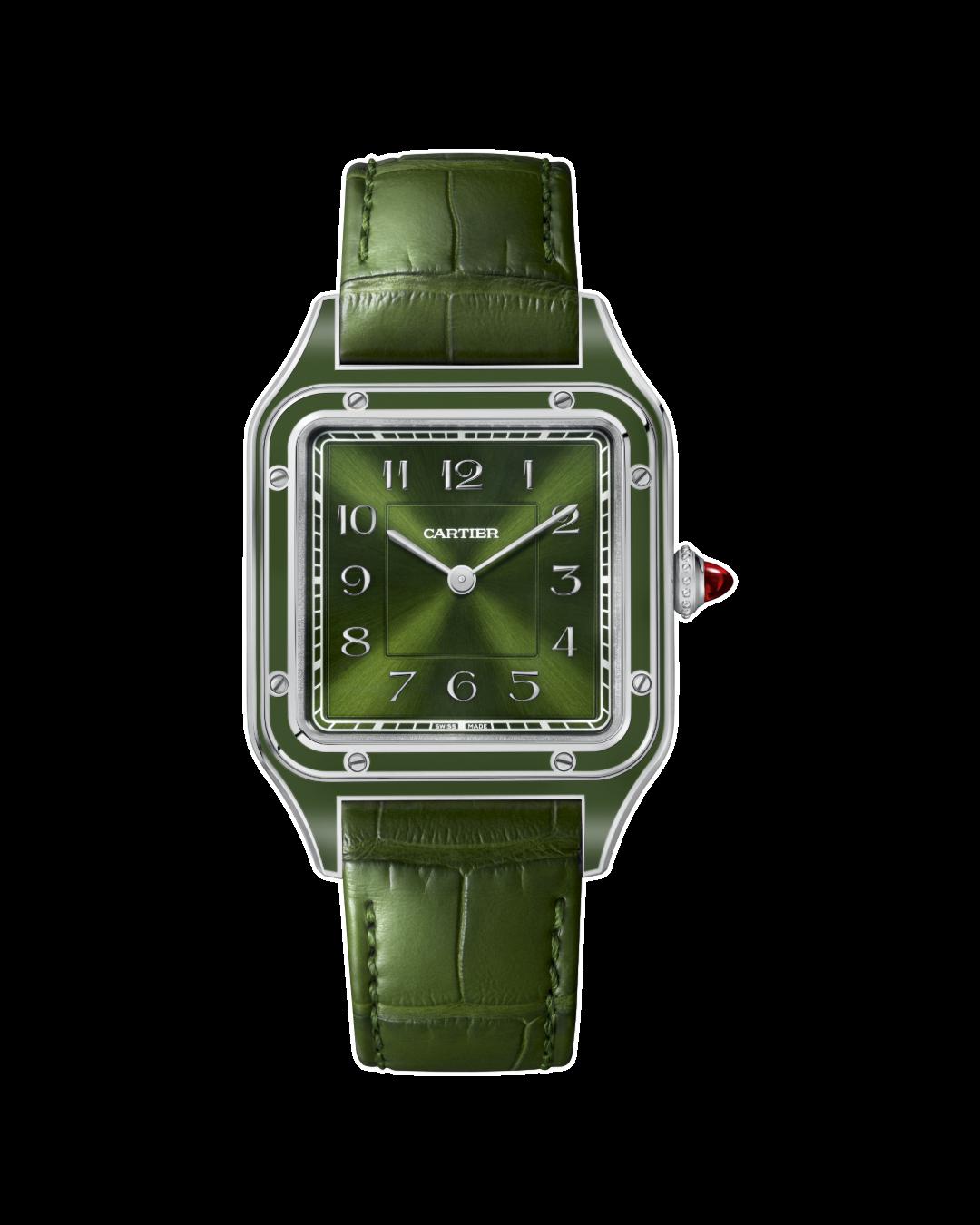
Then we have a watch that will throw everyone, which is a wonderful reason for existence on its own. It is, again, a diversion from the Tank line so I am not particularly inclined to like it. But I do. The all-new Santos Dumont even has a notvery-serious and somewhat “trendy” name, the Rewind. But it all works.
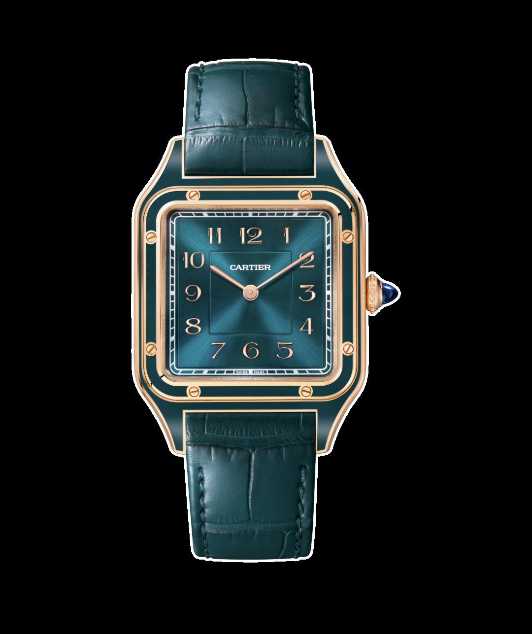
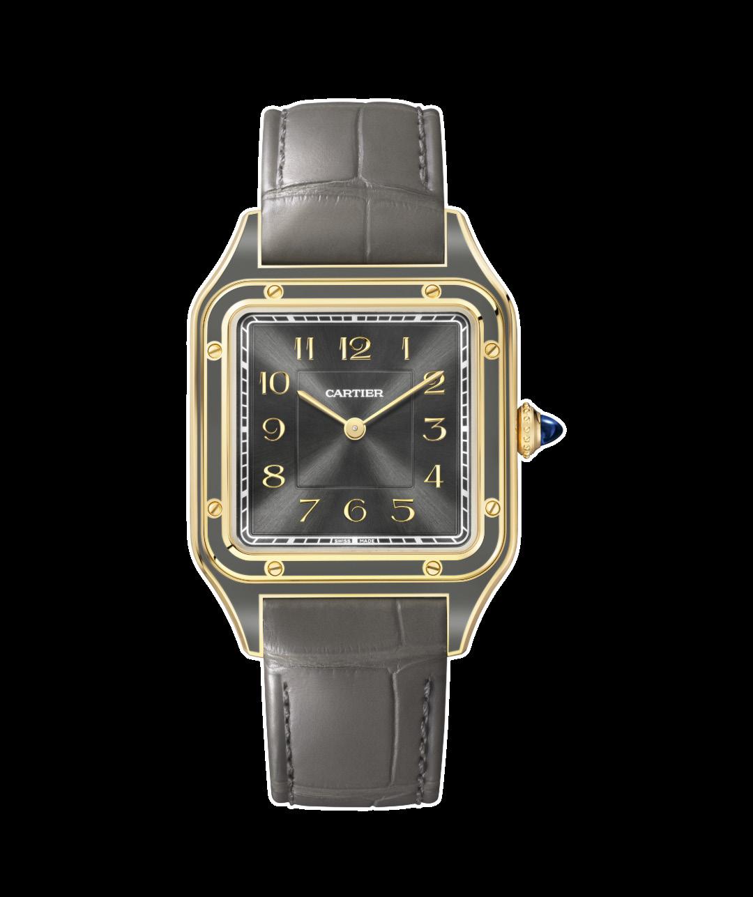
It is a simple two-hand watch, Roman numerals against a bold Carnelian face. A very usable size for most people, the case is a 31.5mm in Platinum, and at a height of just 7.3mm it sits wonderfully on any wrist. Not many though, there will only be 200 numbered pieces released.
Now, look carefully. And think Rewind. The numerals are backwards. The classic apple-shaped hands, powered by a manual wind 320 MC that is also reveres, go backwards. Does it make sense? Not necessarily.
Is it challenging? A bit.
Is it fun? Completely.
Besides, at only 200 pieces it really is only for a special few. Frankly, it sounds like a wonderful gift to give someone you want to always remember you with joy.
 Words by Carl S. Cunanan
What was pretty fun this year was walking into the Rolex booth (remember that their definition of booth is a huge multi-story multi-room structure) and seeing what many internet trollers were saying would disappear. A blue and red GMT-Master II bezel circled the interior. Clearly Rolex had no intention of taking it out of circulation. As Watches And Wonders this year had more time available to the public, Rolex bumped up the look of the public area of their facility, and it proved a huge success looking at the long lines of those that had to pre-book their appointments to visit.
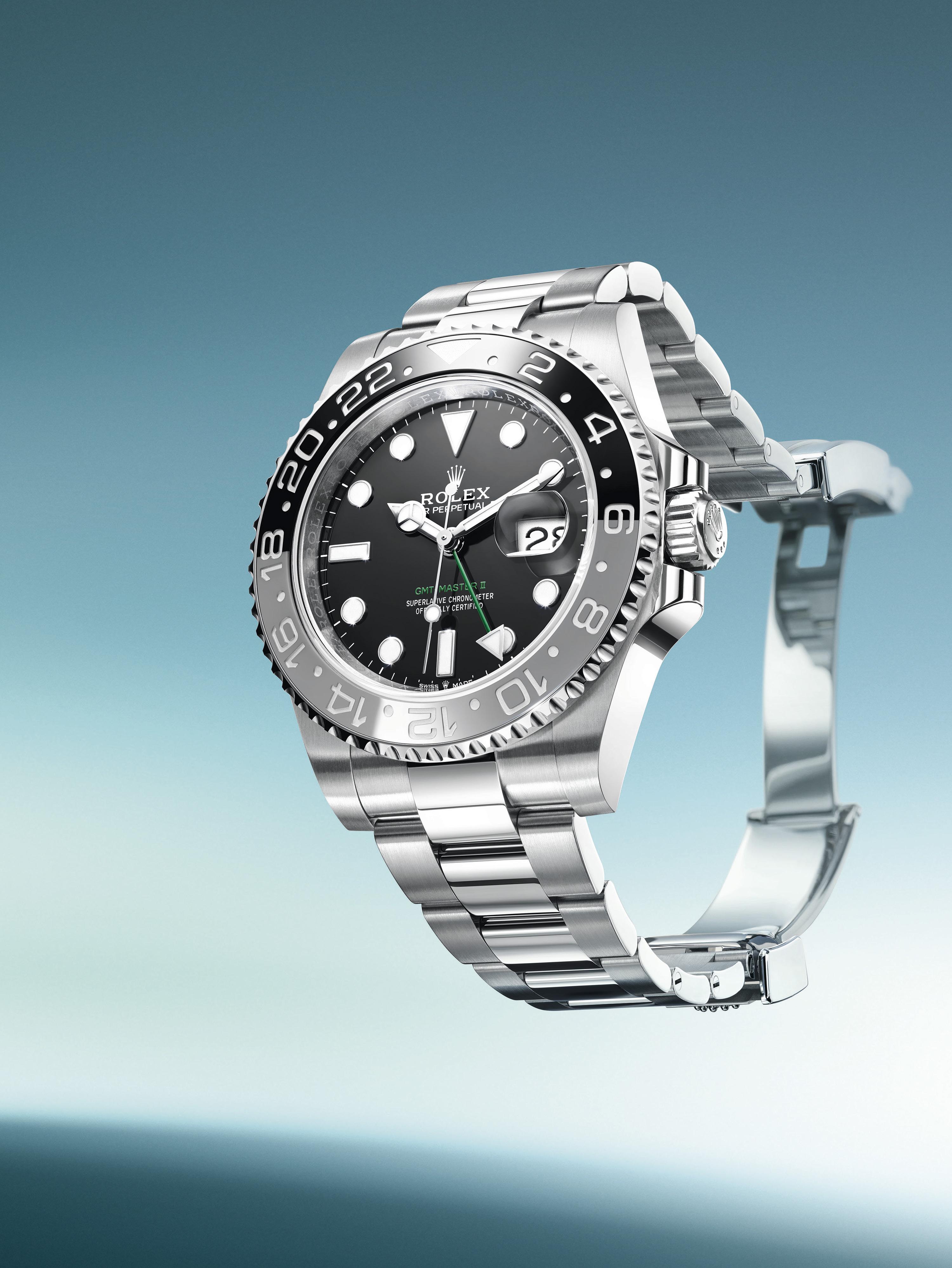
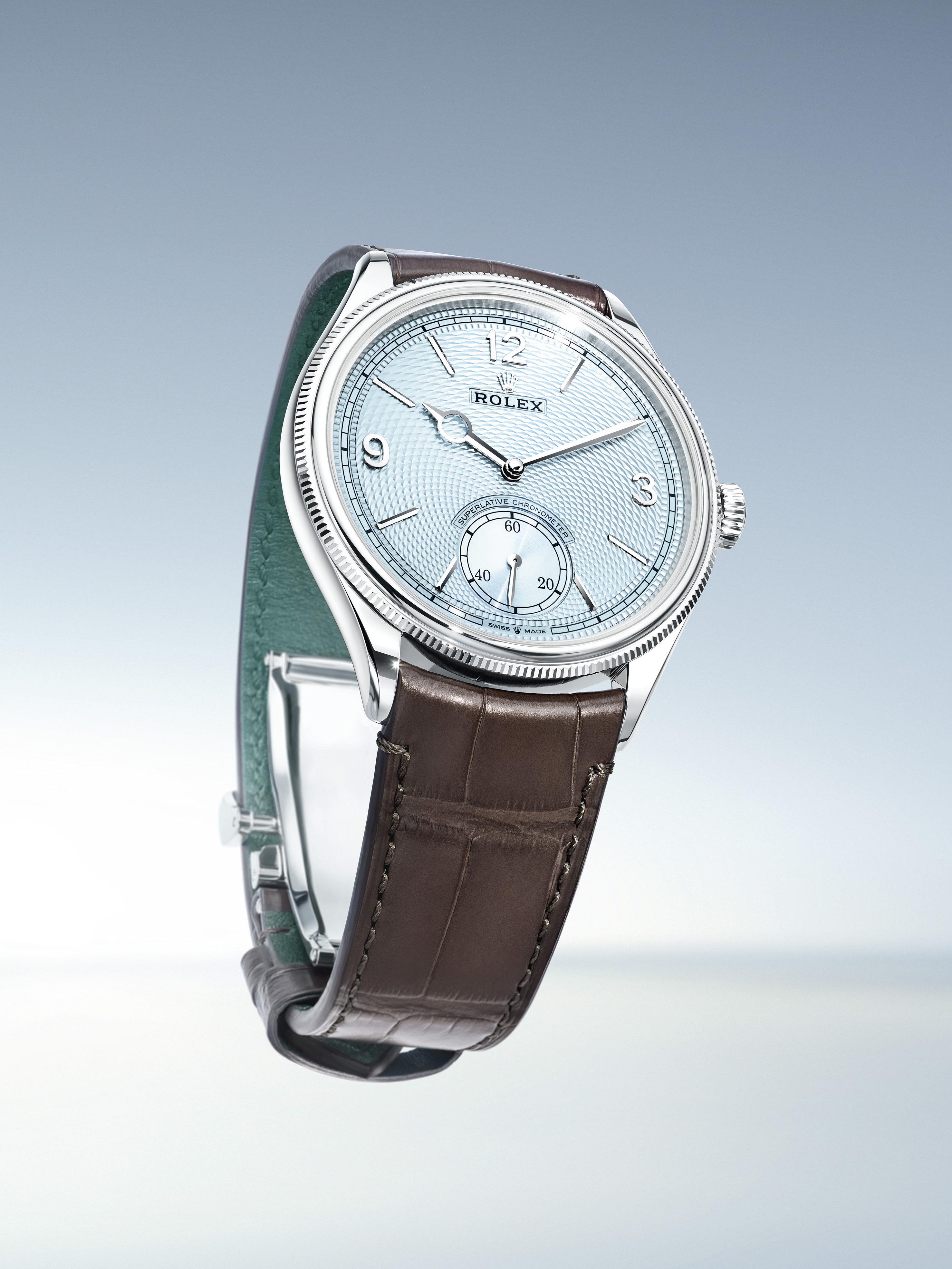
Now let’s look at two of the different watches Rolex released this year at the 2024 Watches And Wonders in Geneva. One was somewhat expected and one was a bit of a surprise but still is seriously spot-on in terms of history.
What was expected was the black and grey bezel GMT-Master II in steel. Expected if not inevitable, because the color scheme of grey and black Cerachrom Bezel insert was previously introduced in precious metal. Technically this is two watches, because Rolex says they released two versions. One with an Oyster bracelet, the other with a Jubilee. The watch on the wrist is the most subtle really of the two-tone GMTs, with the only real pop of color coming from the green of the 24 hour hand and one line of text on the face. It uses the familiar calibre 3285. This is perhaps the best match for those that look back to the feel on the one-color bezels with fondness.
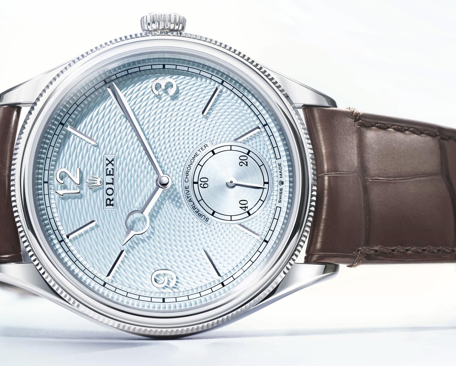
The other watch we will discuss actually drew a lot of attention once it got into our hands and on our wrists. It is, in many ways, the more historically important type of watch for Rolex, as opposed to all the attention drawn by the modern sports watches. The new Perpetual 1908 showcases the finishing and detail abilities of the watchmaker like no other current regular model, really. It is a simple three hand (subdial seconds) watch in a 39mm case using a movement developed for the launch of
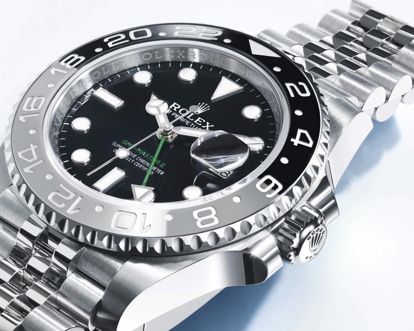
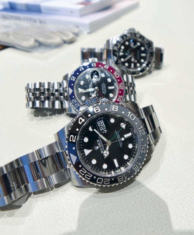

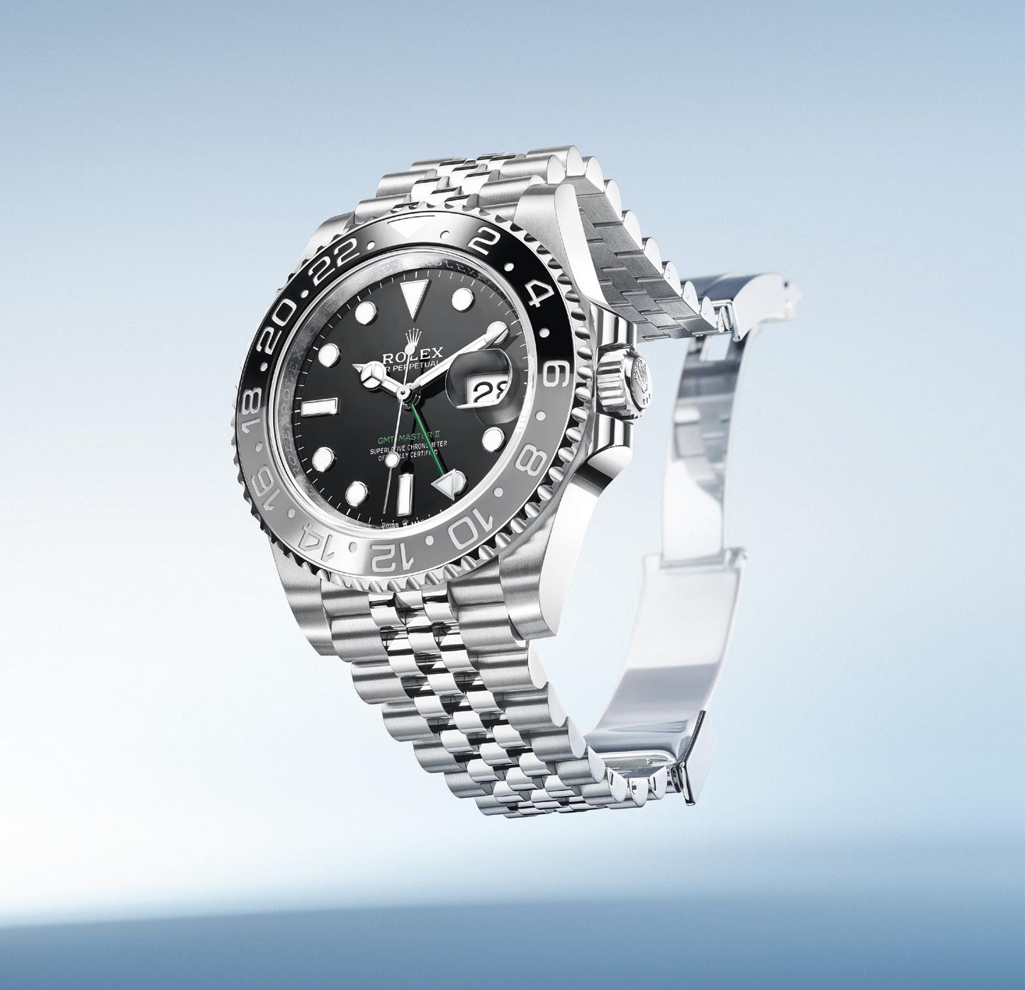

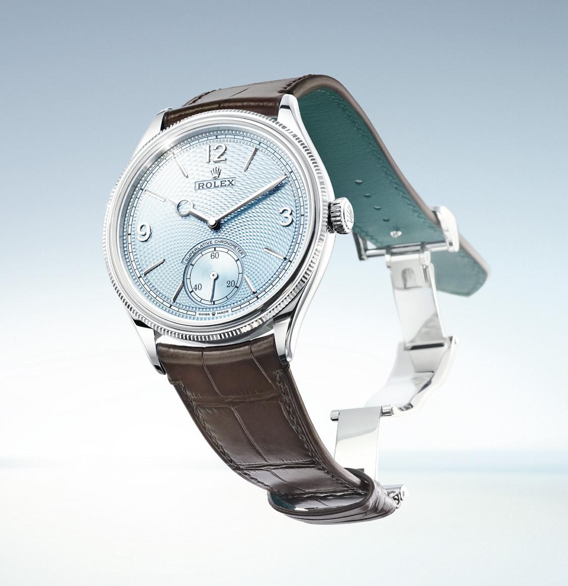
this model, for which it is used exclusively. The calibre 7140 uses familiar technology from Rolex, the patented Chronergy escapement, the Syloxi hairspring and more. What is different here is that you can actually see it and it looks good. Through the sapphire crystal caseback you can see the movement and the level of finish it has been given. The bridges may look familiar but a little different. Rolex Côtes de Genève are slightly different from the traditional because of a polished groove between the bands. It is selfwinding, with a Perpetual rotor. Power reserve is around 66 hours.
What had us all poring over the watch though was the finishing on the watch face. We were looking at the 950 Platinum model, which has an ice-blue dial (color used only on the Day-Date and the Daytona) with a guilloche of a rice-grain motif. The texture is enchanting to look at, but look carefully. The design doesn’t start from the center but rather seems to flow from the seconds subdial so while it is geometric and threedimensional it also seems like it has variation. There is also a different type of guilloche used on the border around the minute track. The words superlative chronometer sit curved above the subdial. Around all that sits a bezel that is again familiar but a little different. It is divided, and has
Rolex has envisioned the Perpetual collection as a tribute to the art and craft of traditional watchmaking.
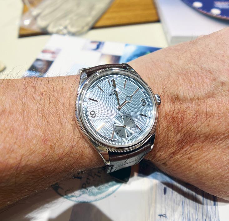
a lower portion with fine fluting and the upper portion domed.
Rolex has envisioned the Perpetual collection as a tribute to the art and craft of traditional watchmaking, and this watch does indeed remind you of times past. The number 1908 is used as an homage to the year that Rolex founder Hans Wilsdorf actually came up with the now-iconic name Rolex and registered it as a brand in Switzerland.
The Perpetual 1908 is also available in white gold or yellow gold, but in those models the face is of either intense black or intense white.
All these watches use leather straps, matte brown alligator leather (with green calfskin lining) in the case of the platinum we were playing with. All will have a matching Dualclasp folding clasp designed to always sit centered on the wrist.
As we have said, the Rolex sports watches have gotten so much of the attention in recent years, and that is fine. But when Hans Wilsdorf and Rolex first started sending watches into the ocean or up mountains or into caves, they weren’t really any special “sporty” designs. They were the watches you would wear when you only had one watch. Elegant enough for almost all occasions, but tough enough to handle some pretty recordbreaking things.
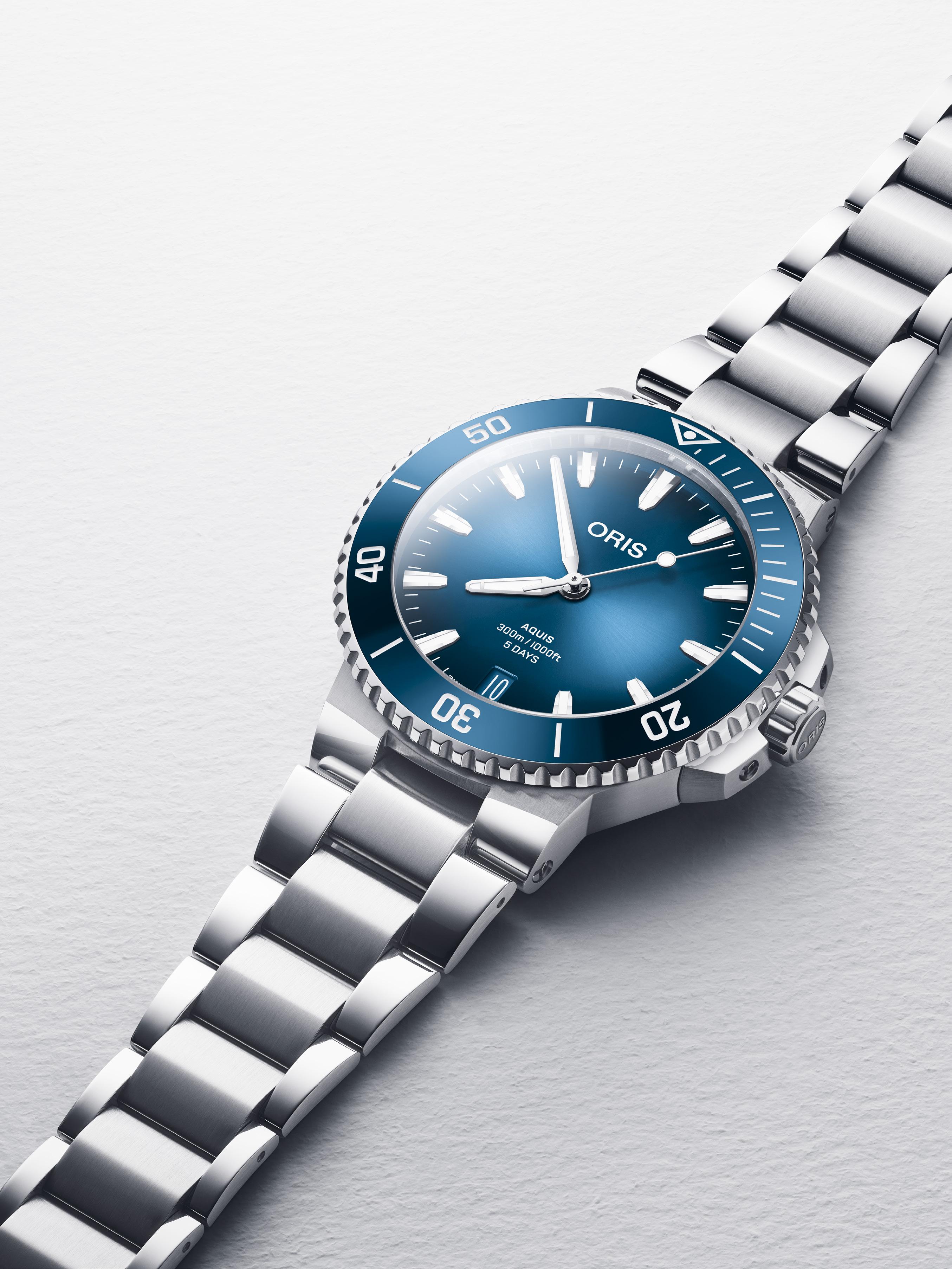

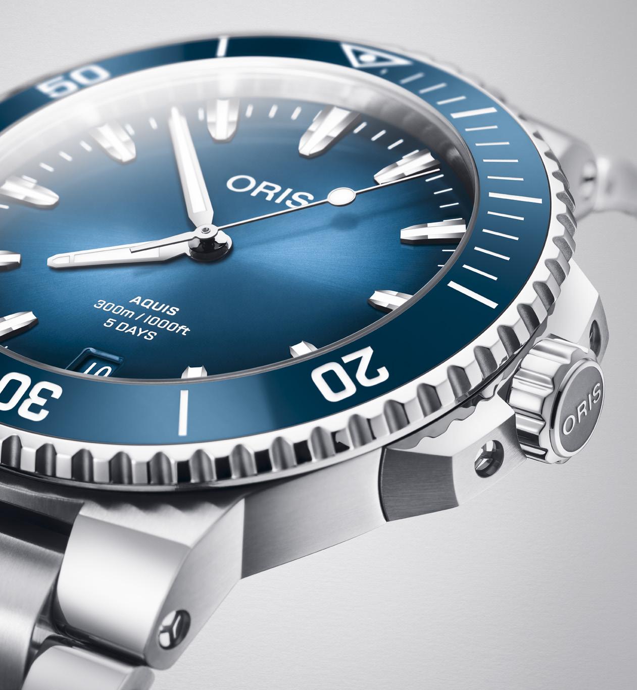
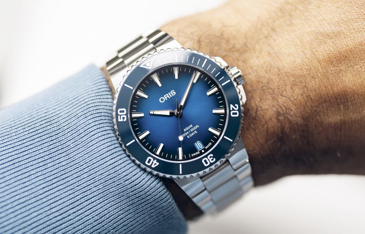
Subtle. No sea change here. On the surface, at least. Because it is below it where details with which Oris is buoying up the 2024 renditions of the Aquis Date lie. Which is just as well. After all, the Aquis Date is the brand’s core collection, its bestseller. It is an “inclusive watch that unites people in a divided world,” according to the Holstein-based watchmaker. As such, any update to these contemporary divers’ piece calls for controlled breathing.
That Oris has just emerged from the vibrant reception of its equally refreshing ProPilot X Kermit Edition further primes the new Aquis Date line to chart a similar course to prominence.
The Kermit watch — a bright green-dialed piece of happiness replete with Kermit the Frog’s
smiling mug — made more people sit up and take notice of the brand’s ability to bring joy to mechanical timepieces, says Oris chief executive Rolf Studer. He notes this positive energy is something Oris can use to propel the latest Aquis Date, regarded as an everyday tool watch, deeper into the luxury segment.
One route Oris is taking to reach this is by stepping up the company’s sustainability quotient. Oris has vowed to reduce its carbon emissions by 10 percent annually over a period of three years. A key factor here is more efficient packaging. As such, the new Aquis Date models come nestled within the Oris Sustainable Watch Box that is made from upcycled materials. This, alone, saves the company from using as much as 1.5 million tons of plastic-related materials in a single year.
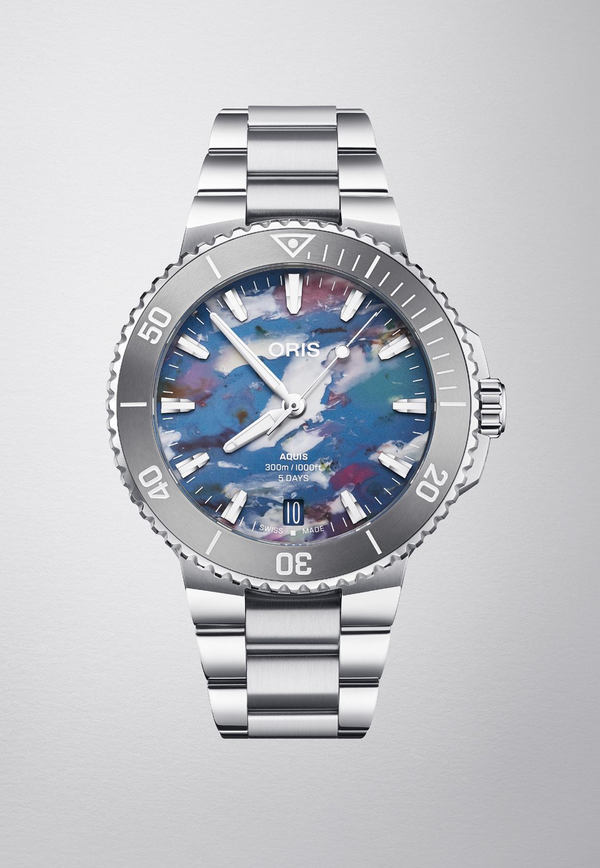
Just as meritorious is the return of the Aquis Date Upcycle in the collection. A literal plasticfantastic representation of Oris’s “Change for the Better” sustainability program, the Upcycle versions are defined by colorful dials fashioned from plastic waste collected from the world’s oceans. Though comprising a miniscule percentage of the total flotsam swirling across the planet’s waters, the use of this material on the Aquis Date’s dial nonetheless makes a strong argument for the statement “every little bit helps.”
Without doubt, too, sustainable practices of this sort spells how the concept of luxury is taking on a new meaning.
Of course, some actual recontouring and other touches have done wonders in furthering the new Aquis Date collection’s push toward the luxury watch sphere. Oris says every time it returns to working on the design of the Aquis Date, the goal is to refine it.
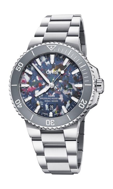
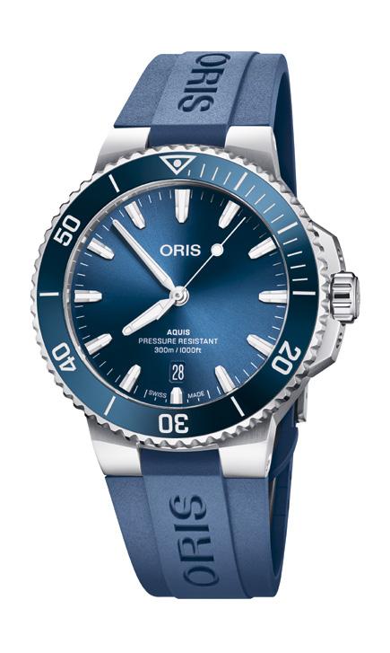

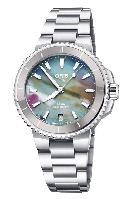
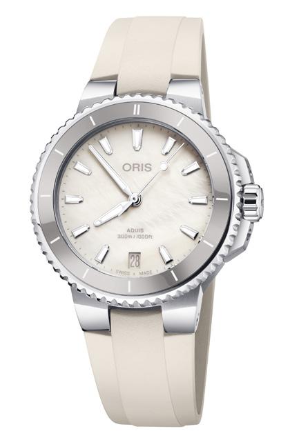
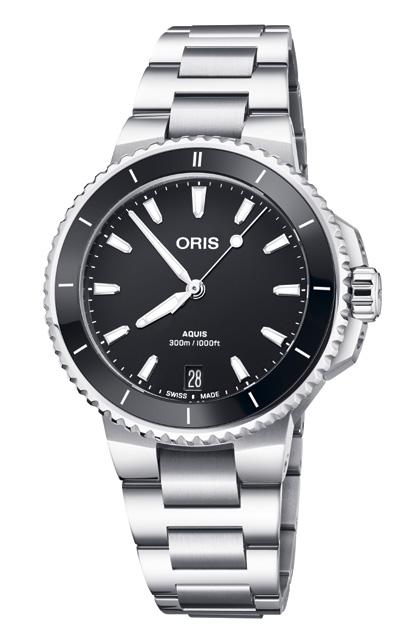
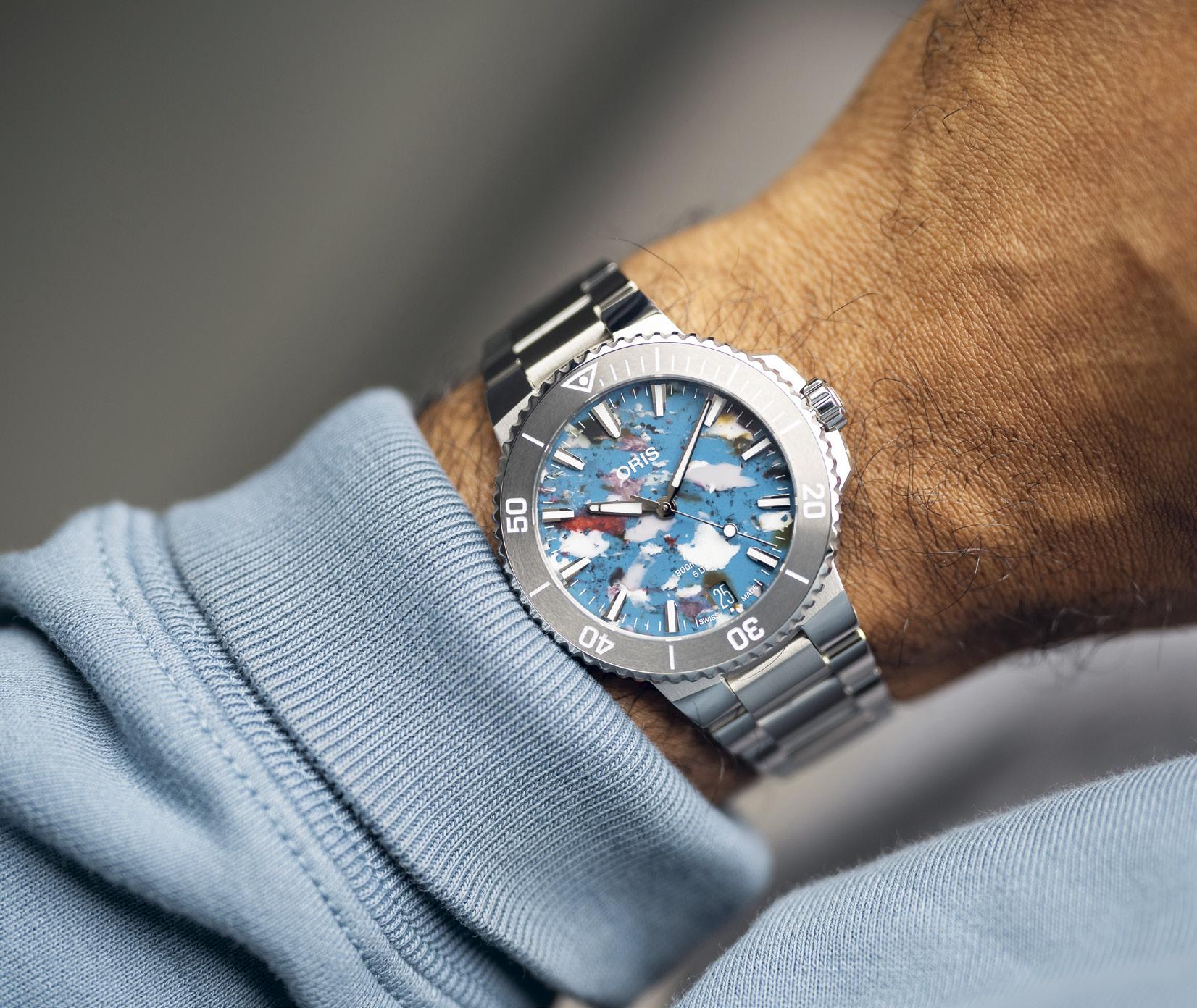
Sustainable practices give new meaning to the concept of luxury.
Recognizing typography's impact, the Aquis Date features a bespoke, athletic font exclusive to its dials.

In the latest models, this means reshaping the lugs, as well as tapering the blocks that serve as crown guards, to lend them elegance. The uni-directional rotating bezel and its ceramic insert also receive some tweaks in proportion. On the dial itself, new shield-shaped hour markers and Alpha hands work harmoniously to ensure legibility — even on the busy Upcycle models, of which, incidentally, no two dials are alike. Recognizing the key role typography plays in any design brief, Oris has commissioned a new, bespoke typeface for the Aquis Date. It’s a font that will not be used on any other Oris.
Complementing the changes made on the case and the dial are those on the bracelet; its brushed central links are wider even while the entire bracelet itself turns more tapered. This reduces visual weight without making the timepiece appear dainty.
Of course, not to be overlooked is the obvious significance of the watch’s date function. And so the Aquis Date gets a new date wheel that markedly contrasts with whatever color the dial may come in.
Certainly as much functional as they are intended for aesthetic purposes, the new touches afford a fresh sense of refinement to all four models in the new Aquis Date collection — composed of the 36.5-millimeter piece, another measuring 41.5 millimeters across, and two models sized 43.5 millimeters. One of the 43.5-millimeter Aquis Date pieces is spun by the in-house self-winding cal. 400 packing a five-day (120 hours) power reserve, and which is COSCreckoned to be accurate to within three to five seconds a day. The other three models have the Swiss self-winding cal. 733 that has a 38-hour power reserve ticking beneath them.
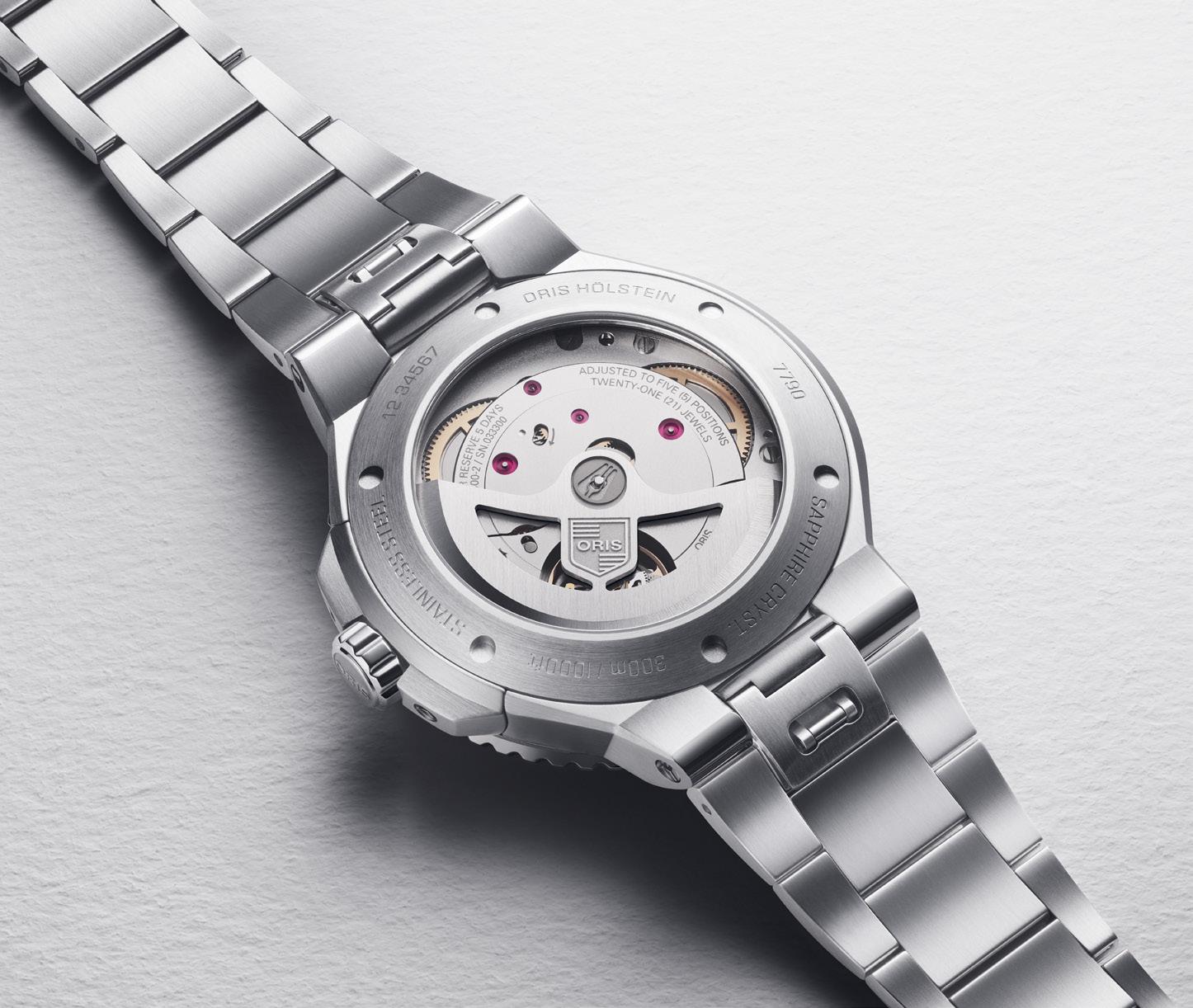

In all four models, the calibres are visible through the screw-down caseback with a sapphire

glass. Each piece offers the option of having either a metal bracelet or a rubber strap. The Upcycle dial is available for every model.
Oris is the first to admit the updates acquired by the latest Aquis Date may be apparent only when the watch is viewed alongside its previous self, considering how subtle these are. This takes real skill, the company chief says, adding the changes entail “looking at every detail and making it better at everything it needs to do.”
“To change everything and yet preserve the design language and the integrity of the idea. The new Aquis Date shows how much we love watchmaking,” Mr. Studer says.
And given how swimmingly Oris has taken the Aquis Date to eco-conscientious waters, the brand shows it loves sustainable affluence as well.
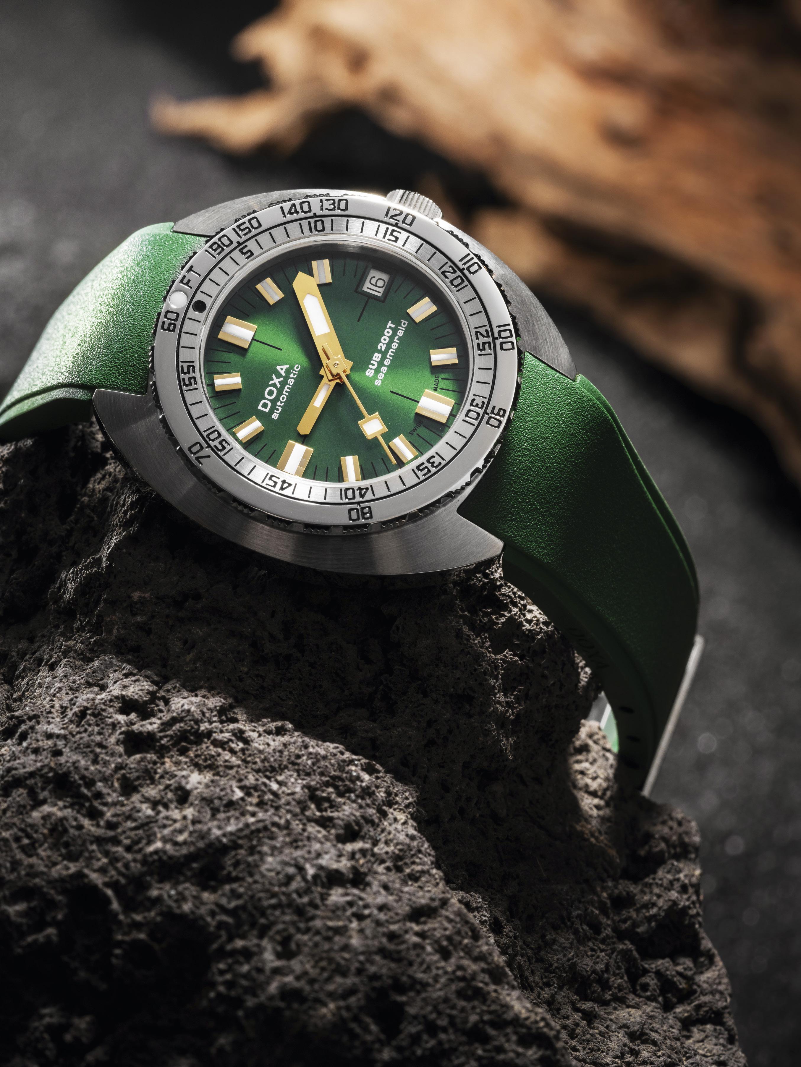
DOXA presents the new SUB 200T with a new diameter in green.
Words by Bert CasalGone are the days of oversized watches. The demand for smaller, more compact diameters is growing. And the same goes for dive watches. It is true that the principle of sport watches should be comfortable, more wearable. Why should it be any different for dive watches? To answer this call, DOXA released the first SUB in a 39 mm diameter case.
The watch brand DOXA was established in 1889 when Georges Ducommun opened his own business in Switzerland, naming it Georges Ducommun, Fabriques Doxa. In Greek, the word “Doxa” means “glory.” His drive was to make the next watch even better than the last. It didn’t take long for his works to be synonymous with quality,
value, and innovation. Mr. Ducommun passed away in 1936. His son-in-law Jacques Nardin (grandson of Ulysse Nardin) took over the helm and continued the founder’s vision.
After the second world war, diving began to gain popularity. The quest for producing the perfect dive watch was on. This trend continued to grow during the 1960s, when recreational diving picked up. As scuba diving began to evolve, so did the diving watch. Watch companies kept on improving what technologies they already had, from improving watch cases to producing better calibres.
DOXA, on the other hand, decided to approach the challenge with a blank sheet of paper. Mr. Urs Eschle, the product manager of DOXA in 1964, set up a research team with several professional divers and experienced watchmakers. Their goal was to develop the first affordable sports diver
watch for leisure and professional divers. It had to be reliable, comfortable, and a highly legible piece of equipment.
From the ground up, the team chose a massive solid stainless steel tonneau case. This type of case profile enhanced protection for the movement. The shape also protected the crown from accidental scraping. To solve the problem of underwater legibility, Mr. Eschle suggested using a bright color dial with oversized luminous markers with the highest amount of tritium ever seen on a wristwatch. They tested different color dials to a depth of 30 meters under water, and the dial color that stood out the best (based on their tests) was orange.
The only element that divers manipulate under water is the bezel. Mr. Eschle’s team decided to utilize a saw-tooth edge for optimum grip, either
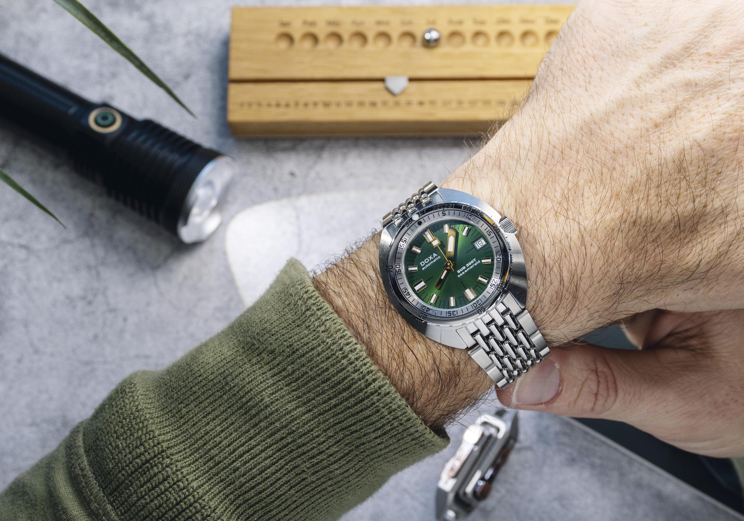
The new SUB 200T skillfully retains all of the original SUB's DNA while embracing modern style and sophistication with its smaller diameter.

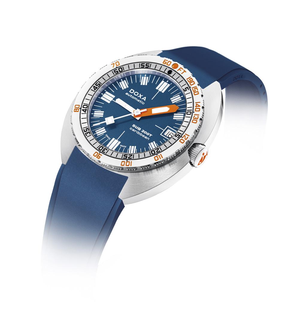
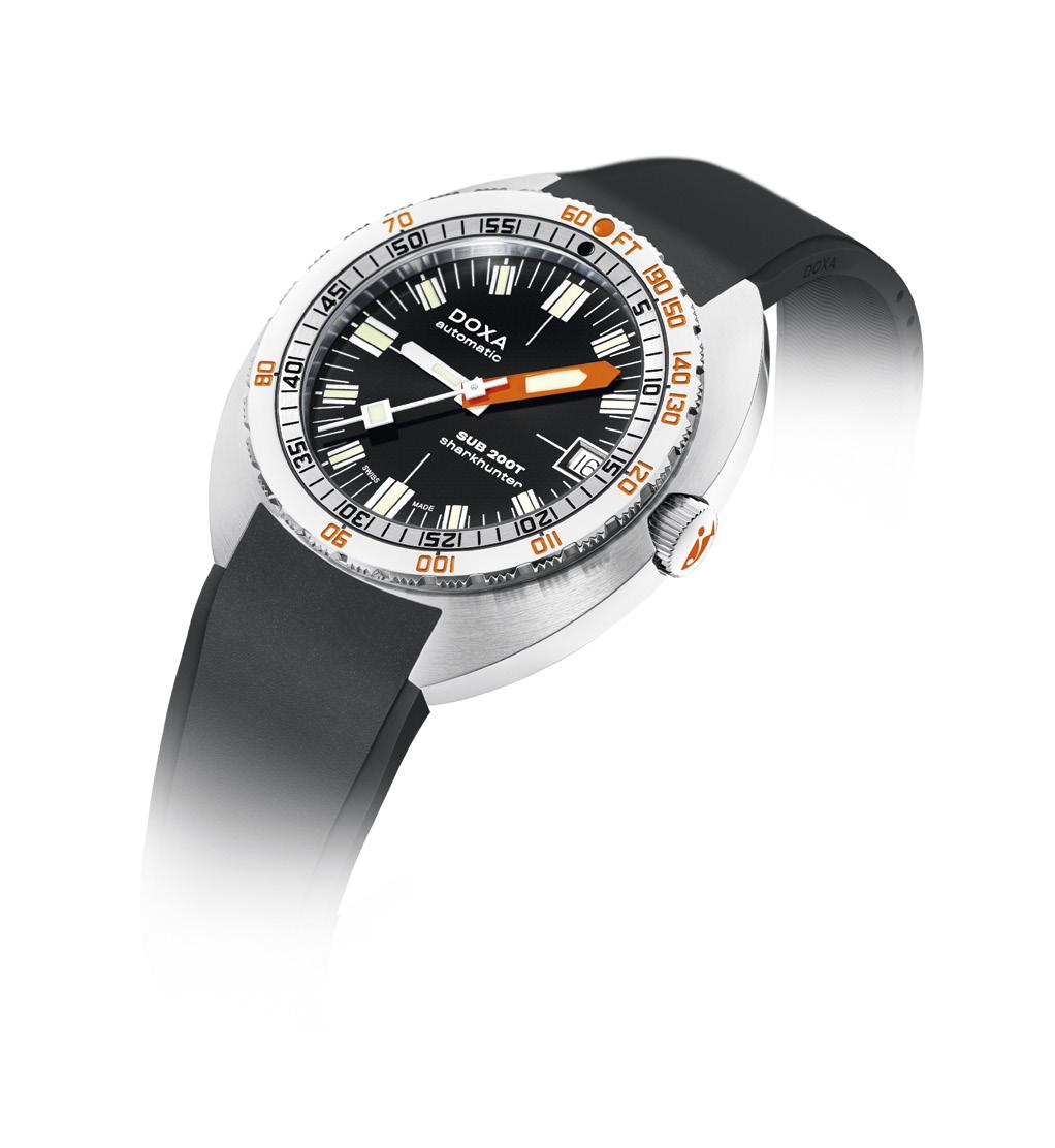
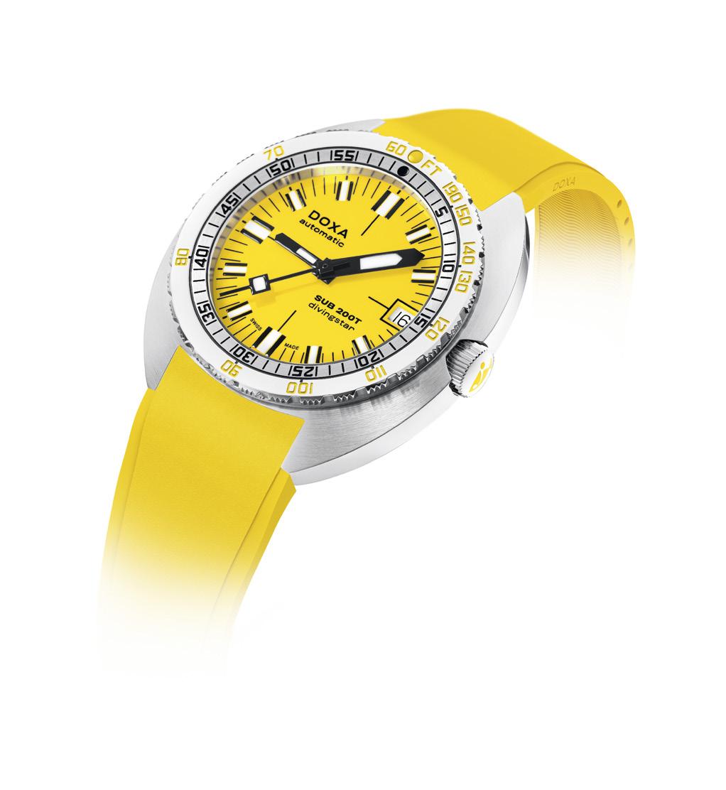
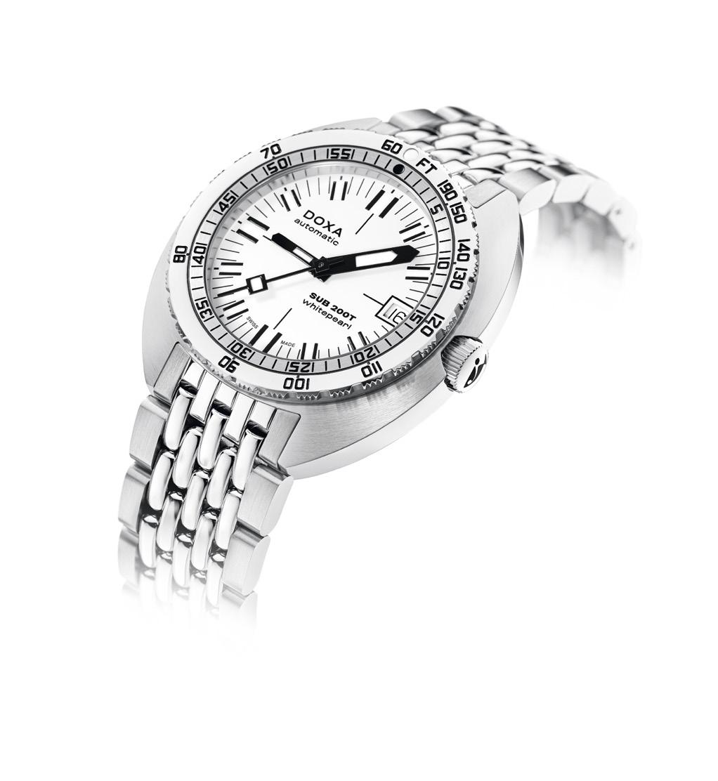
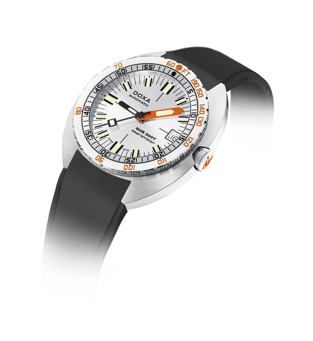
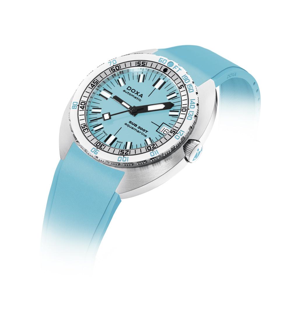
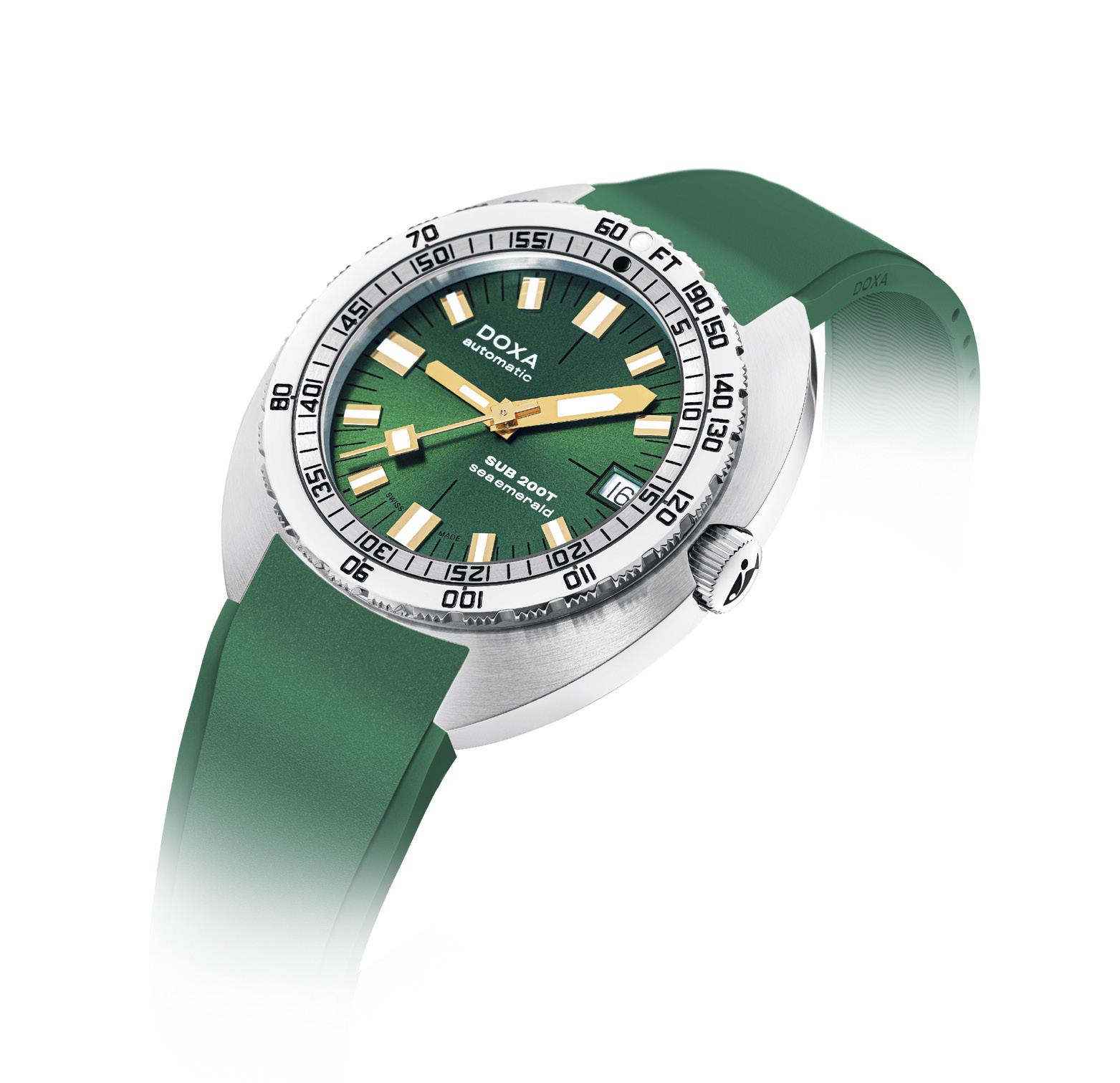
with gloves or with wet hands, and made it rotate in only one direction. The team also designed a new kind of flex buckle on the stainless steel bracelet, which easily adapts itself to the diameter of the wrist, with or without a wetsuit.
Mr. Eschle traveled to California, contacted Jacques Cousteau, and showed him the watch. Cousteau and his team were so impressed by the wristwatch that they decided to exclusively market the DOXA SUB 300 in the USA. The success of the DOXA SUB, with the help of Cousteau, led to the development and creation of the HRV helium valve.
This year, at the Geneva Watch Week, DOXA released their latest DOXA SUB, this time in smaller dimensions, a smaller 39 mm case that is more in tune with the times. The new DOXA SUB 200T makes its grand entrance with a wide range of variant choices. It is now available in 8 DOXA colors: Professional Orange, Searambler Silver, Sharkhunter Black, Caribbean Navy, Divingstar Yellow, Aquamarine Turquoise, Whitepearl White, and now the new Sea Emerald Green
Sea Emerald Green is a color that is timeless, and it resonates deeply with the essence of the brand. This particular shade captures the everchanging reflections of water — whether salty or fresh, shallow or deep. It also ushers in a new dimension of style for diving watch enthusiasts. The SUB 200T distinguishes itself with golden hands and hour markers that gracefully contrast with the green dial.
The DOXA SUB 200T Sea Emerald Green comes in two different styles of dial. One is equipped with the timeless elegance of the Iconic dial, which effortlessly signals subtlety and sophistication, reflecting a refined and minimalist design. The second has a Sunray dial which elegantly captures every ray of light to create a mesmerizing spectacle of reflections and hues. It adds a touch of dynamism and sparkle to the wrist with its captivating play of light and shadow.
The strap has the sporty appeal of FKM rubber, known for its flexibility and light weight. It snugly fits the contours of the wrist while enduring the rigors of the elements. It guarantees a comfortable fit all day long, resistant to sweat, water and extreme temperatures, making it the ultimate choice for people with an active lifestyle. Or if you prefer, you can opt for the “beads of rice” bracelet in stainless steel. This bracelet embraces the legacy of DOXA. It conveys the
appreciation of heritage, durability, and effortless elegance, bridging the past to the present in an expression of refinement and reliability.
The new DOXA SUB 200T retains all of the original SUB’s DNA while embracing modern style and sophistication. Its smaller 39 mm diameter case makes it more wearable for an everyday watch. It is crafted from premium 316L stainless steel and has its patented unidirectional rotating bezel with its integrated US Navy nodecompression limit table. It has a self-winding
mechanical Swiss movement that beats at 28,800 vibrations per hour and has a power reserve of approximately 38 hours.
The new SUB 200T transcends mere choice. It stands as the quintessential dive watch, versatile and suitable for all wrists, combining reliability, technicality and accessibility. Faithful to DOXA principles since the launch of the first SUB in 1967, it is designed to be perfectly in sync with every moment of your life, be it on an adventure or your most elegant occasions.
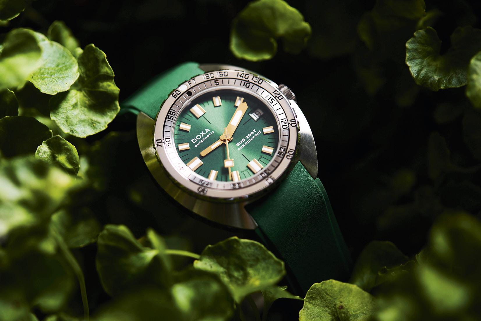
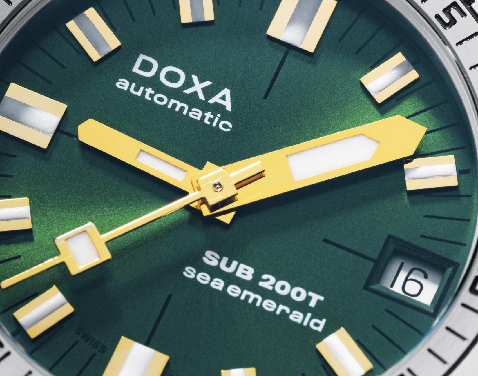
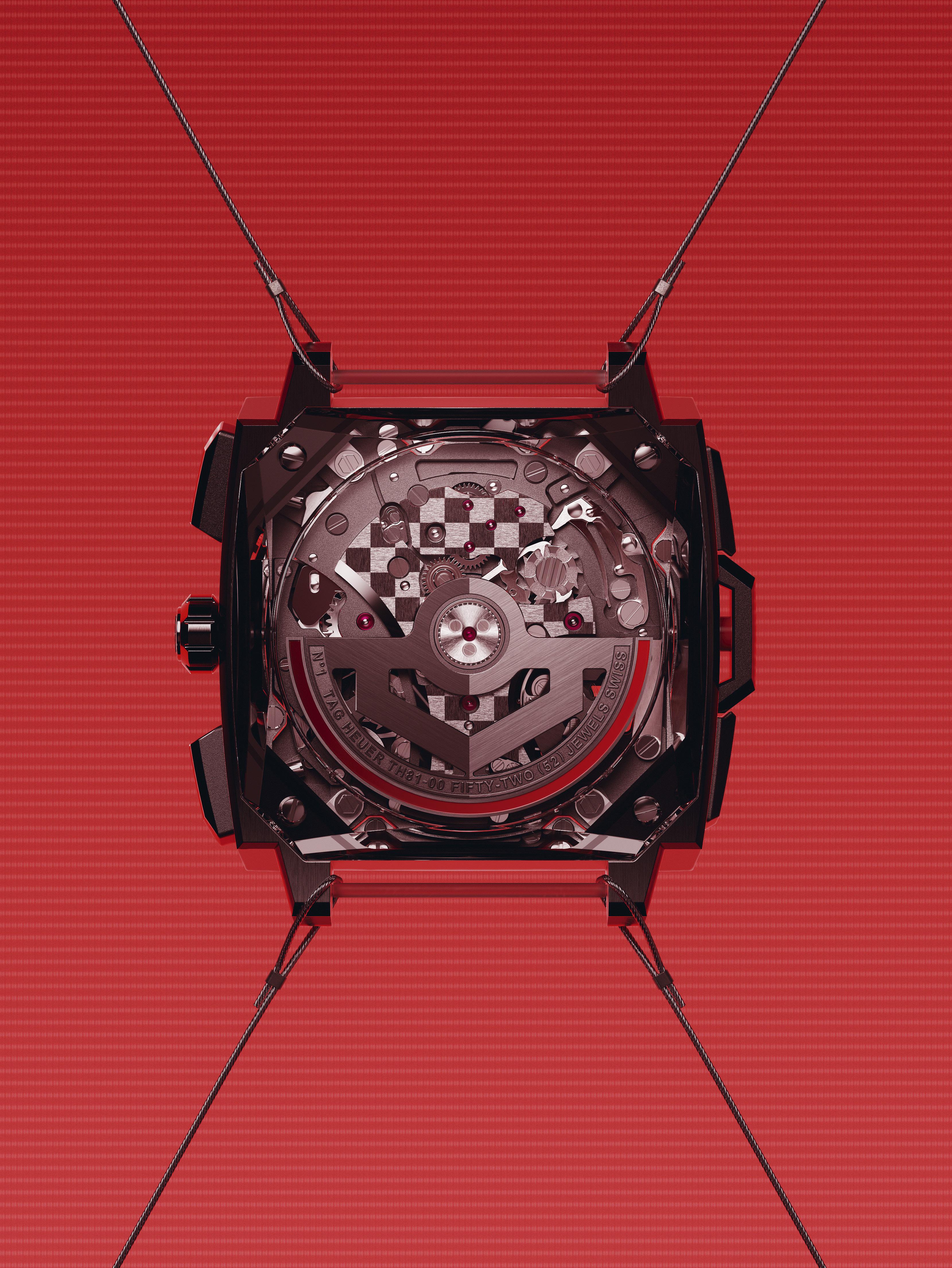

TAG Heuer goes high tech with their most iconic motorsport timepiece
In the 2023 edition of the Only Watch auction for Duchenne Muscular Dystrophy, TAG Heuer gave us a glimpse of the most high-tech, and most spectacular reimagining of their iconic Monaco yet. Spearheaded by the maison’s movement director Carole Kasapi with a nocompromise mandate, the Monaco Split-Seconds for Only Watch made its debut with a totally new case design that took direct inspiration from the original 1969 model but was updated with a thoroughly contemporary aesthetic based on the brand’s avant-garde mindset. More importantly, the texturized 41mm titanium case of TAG Heuer’s one of a kind watch contained the brand-new TAG Heuer Calibre TH81-00, which was the first and only self-winding split-seconds chronograph movement created by TAG Heuer, until now.
Celebrating the 55th anniversary of its square chronograph, TAG Heuer has just released the regular production run of the same watch called the TAG Heuer Monaco Split-Seconds Chronograph at Watches & Wonders 2024. No longer a pièce unique, the new watch is more than just the spiritual successor of last year’s Only Watch one-off but essentially the same watch aesthetically tweaked to accommodate “general admission,” a term we use rather sparingly because there is nothing “general” about the TAG Heuer Monaco Split-Seconds Chronograph’s price of admission. Hovering at over the hundred fifty thousand dollar mark, TAG Heuer’s latest Monaco is suddenly in the same league as the industry’s more premium (read: more expensive) watchmakers. Fortunately, TAG Heuer made sure that the new Monaco Split-Seconds Chronograph not only looked the part, but also walked the walk. Having had a long and storied tradition of cutting-edge timekeeping starting way back in 1916 with the Heuer Mikrograph, a 1/100th of a second chronograph, which was the preferred timekeeper of the Olympic games in 1920s and 30s, as well as the Heuer Microsplit from 1976, the world’s first LCD pocket size stopwatch also accurate to 1/100th of a second, and with a split-seconds function thrown in for good measure, TAG Heuer is more than capable of pulling off something like the Monaco Split-Seconds Chronograph
It even has the motorsport heritage, which began in the 1960s with the memorable reference 11.402, a split-seconds chronograph capable of
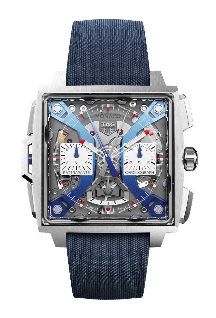
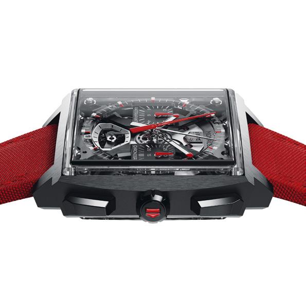
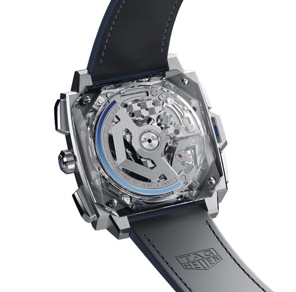
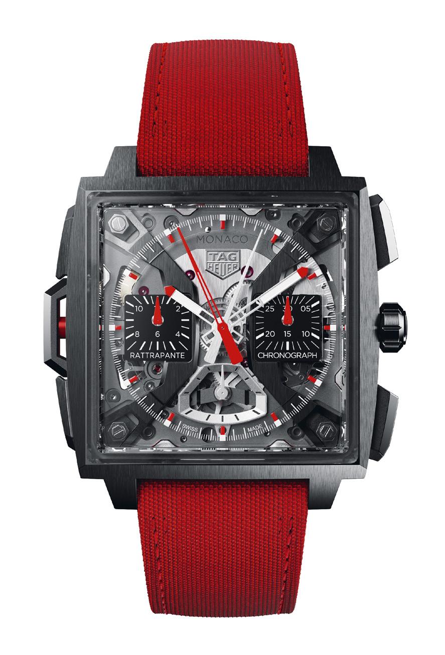
measuring time with 1/10th of a second accuracy, and continued into the late 1980s when the brand introduced a quartz split-seconds chronograph, which gained immense popularity throughout the 1990s with racing legends like Ayrton Senna, Gerhard Berger and Michael Schumacher.
But it was the 1970s when this partnership with motorsport probably reached its peak with the TAG Heuer Monaco, quite possibly the La Chaux-de-Fonds-based watchmaker’s most recognizable timepiece thanks to its distinctive square shape, left-hand crown, brushed and polished case, and blue dial. And in many circles it’s even more iconic than the brand’s other massively iconic motorsport-related watch, the TAG Heuer Carrera, and it’s not just because of how it looks, but also because of who wore it. A pop culture icon as much as a horological one, the TAG Heuer Monaco became lastingly famous when American actor Steve McQueen wore the watch in his 1970 film “Le Mans.” Thus, it’s
become known as “Steve McQueen’s watch,” and the latest TAG Heuer Monaco takes that basic concept and runs with it.
Taking off from its still-very-arresting square shape, this latest Monaco looks even more Darth Vader-esque than ever before. Quite possibly one of the most complicated Monaco watches in recent memory, the Monaco Split-Seconds Chronograph uses the same texturized 41mm grade-5 titanium case of the Only Watch one-off resulting in a watch that weighs a mere 85 grams, which when paired with the wonderfully excessive use of sapphire on the dial and caseback has resulted in an open-worked aesthetic that looks almost weightless in appearance. According to TAG Heuer, titanium and sapphire has been “fused” together resulting in a case, “crafted from a half of each, enhancing its uniqueness.” Imagine if Darth Vader went to the gym, lost 30 pounds, and donned a lighter suit of his signature armor and you’d be close.

Taking off from its still-very-arresting square shape, this latest Monaco looks even more Darth Vader-esque than ever before.
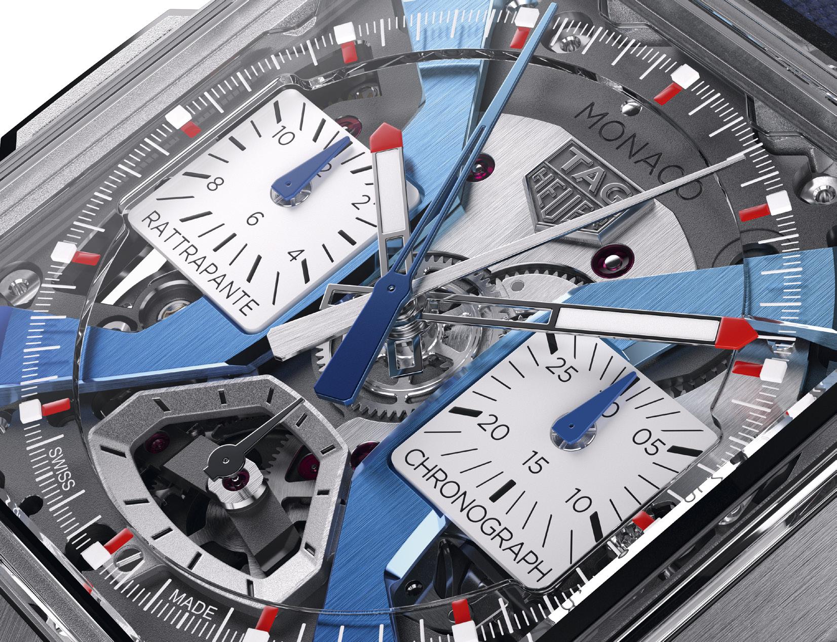
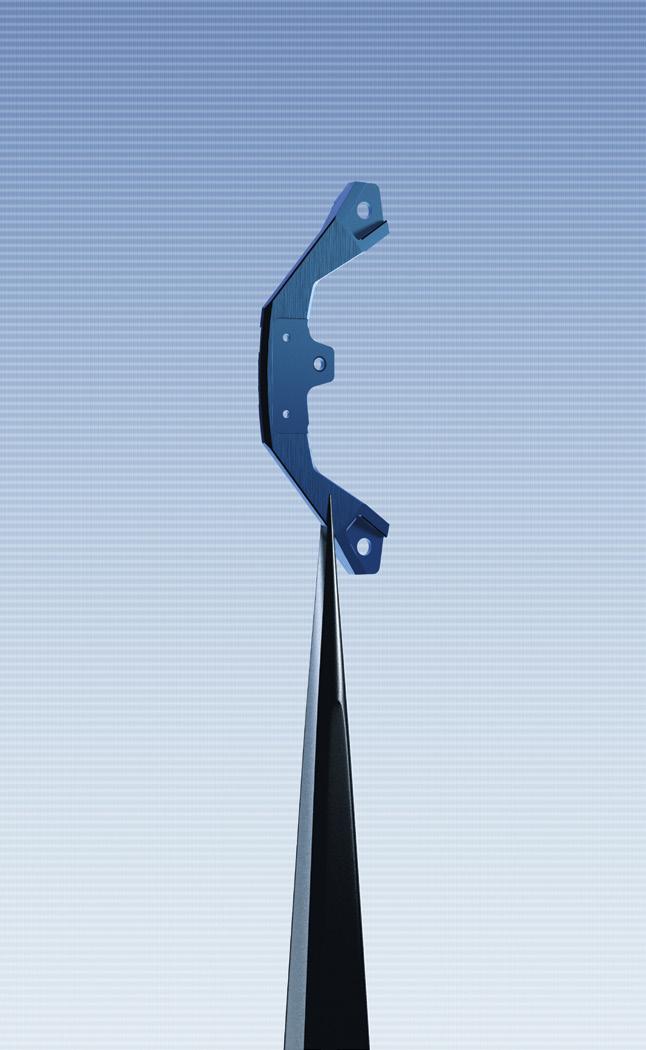
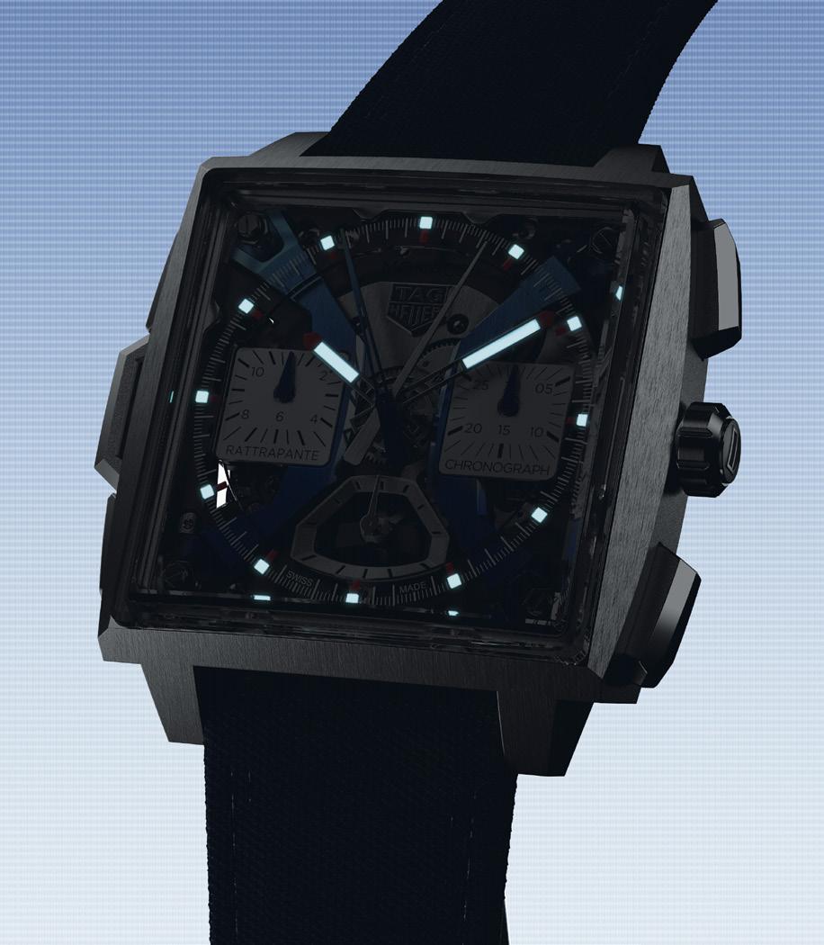
Naturally, the vaunted black 41mm DLCcoated square-shaped titanium 15.2mm thick case is meticulously finished with brushed, sandblasted and polished finishing. This is matched with a bevelled, domed sapphire crystal framed by a polished sapphire bezel to ensure a clear view of the mechanics of the watch, an aesthetic mirrored on the caseback with another dominating bevelled, polished, and screwed-in sapphire crystal that gives an unobstructed view of the new TH81-00 calibre.
This open-worked aesthetic was specifically engineered to draw attention to the brand spanking new TH81-00 mechanical split-seconds chronograph calibre, the same movement that powered last year's one-off model developed
in conjunction with the esteemed Vaucher Manufacture Fleurier and based on the manufacture’s integrated, high-frequency, columnwheel chronograph calibre also adapted for Richard Mille’s RM65-01 rattrapante chronograph.
For those not in the know, a split-seconds chronograph (called “rattrapante” in French) is a highly sophisticated mechanical timekeeping device capable of measuring two separate time intervals concurrently, such as timing laps on a racetrack or when tracking multiple sporting events. This provides the rattrapante a level of functionality that far exceeds a regular chronograph, the pinnacle of which is the TAG Heuer Monaco Split-Seconds Chronograph, which, pound for pound, offers unparalleled accuracy
and cutting edge design unmatched by anything the brand has ever offered before.
Crafted entirely out of titanium, it is one of the lightest automatic chronograph movements TAG Heuer has ever created. Even the open-worked oscillating weight cut into the TAG Heuer shield shape looks as if it’s freely floating when viewed from the entirely sapphire crystal caseback. Further, the signature checkerboard pattern on the center bridge and the finely brushed balance wheel bridge with its polished bevels are all hand-executed and demonstrate the Maison’s dedication to top-tier finishing, a fact further bolstered by the polished screws and sandblasted surfaces of the movement. This high frequency, column wheel-equipped TH81-00 calibre operates at 36,000 vibrations/hour (or 5Hz), and boasts a robust and almost “weekend proof” power reserve of 65 hours.
Presented in two distinct versions in either blue or red that reflects its avant-garde design ethos, the blue Monaco Split-Seconds Chronograph is the more traditional of the two and harks back to the original “cool-blue” aesthetic of the first “Steve McQueen” Monaco. This has been ramped-up and turbo-charged befitting its top-shelf status with gradient dial arches that transition from a light blue at the top to a richer royal blue at the bottom achieved via a delicate anodizing process that required varying voltages at highly specific stages of the treatment. The red version, on the other hand, is the model that gives off that Galactic Empire vibe being almost all-black but punctuated with a with blazing red aesthetic.
The Monaco Split-Seconds Chronograph is enhanced by a titanium crown adorned with the TAG Heuer logo in either blue or red lacquer, which is flanked by robust brushed and polished titanium chronograph pushers. This is echoed on the opposite side by a split-seconds pusher at 9 o’clock, which features a red or blue aluminum tube depending on the model. On the dial, a thick applied logo with polished edges and texts against a matte backdrop makes a statement, while the two iconic squared Monaco sub-registers are enhanced with the words “Rattrapante” on the left, and “Chronograph” on the right, which are not-so-subtle reminders of the watch’s technical prowess. The TAG Heuer Monaco Split-Seconds Chronograph is a numbered non-limited edition and is matched with a hand-stitched red or blue calfskin strap embossed with a fabric pattern.


 Words by William Herrera
An event billed as a one-of-akind, modern luxury experience, the Range Rover welcomed guests, clients, and media practitioners to the exclusive enclave south of Manila that is Ayala Alabang.
at the affectionally called “Range Rover House,” guests were treated to a special welcome drink from one of the most exclusive restaurants in the region, Helm by Chef Josh Boutwood. There were also some artworks curated by Galeria Paloma that adorned the foyer. The pieces on display are part of the 40 or so works of art by Filipino artists who came together and wanted to make a difference by raising funds for YUGO an international organization that grants college scholarships for women in need.
The evening’s festivities then began with a welcome address by Chris Ward, Vice President of IC Land Automotive Inc. who stated that, “The Philippines is one of the fastest growing countries in Asia, with a rising number of high net-worth individuals. This is why this is a great opportunity for the Philippine market, as our discerning clients look for exclusivity and utmost luxury. This is the first time Range Rover SV has been publicly shown and this is the best way to reinforce our Modern Luxury principles in a way that clients have not previously experienced.”


The event was a more intimate way to get to know clients and potential clients. As well as to get a good feeling of what Range Rover is all about, which, again according to Chris Ward, is much nicer if we do it in a beautiful environment, and give you not just something about the car but try to just expand your mind a little bit about on where they are going as a brand. Range Rover is more about creating experiences, curating things about the brand and matching it to one’s lifestyle.
After enjoying exceptional Dalmore Whiskeys, some art, sumptuous food, an introduction to the world of watches by Carl Cunanan, Chris Ward brought attendees into the “Car Cave” to unveil the Range Rover SV Autobiography LWB.
The Range Rover SV showcased was a plug-in hybrid, which gives you the best of both worlds, a good engine combined with a battery, that easily provides a combined 700km range.
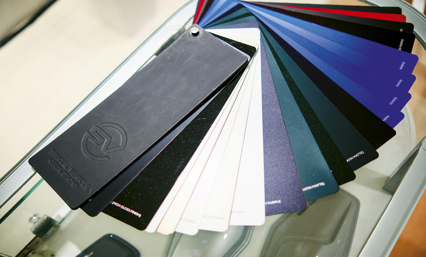


Selected art pieces curated by Galeria Paloma, proceeds of which will be donated to YUGO, to help females get much needed educational support.

Calibre Editorin-chief, Carl S. Cunanan, addressing watch relataed queries from attendees at the Range Rover house.


“The Philippines is one of the fastest growing countries in Asia, with a rising number of high net-worth individuals. This is why this is a great opportunity for the Philippine market, as our discerning clients look for exclusivity and utmost luxury. This is the first time Range Rover SV has been publicly shown and this is the best way to reinforce our Modern Luxury principles in a way that clients have not previously experienced.”


A plug-in hybrid is the best way to get yourself into the world of electric cars without the range anxiety that comes with it. The SV features a refined new 530PS V8 Twin Turbo, 510PS Extended Range plug-in hybrid and the efficient 350HP mild-hybrid Ingenium 6-cylinder diesel.
The Range Rover SV comes with two optional curated SV interior and exterior design themes, the SV Serenity and SV Intrepid. SV customers can choose from the standard Range Rover paint pallete or from the 14 additional exterior color options.

Once inside the Range Rover, one can easily differentiate it from other cars, it was pure luxury, SV-specific finishes include embossed ceramic, natural wood finishes with marquetry inserts or inlaid with metal, and even anodized metal or woven mesh. The sound system that envelops the passengers, to the sublime leather seats, panels made from sustainably sourced woods, luscious plated metals, and the highly visible and user-friendly infotainment system, to the full ottoman rear seats all form part of the Range Rover Experience.
Arguably, this could just be the best Range Rover ever created.
Ador for Adornment
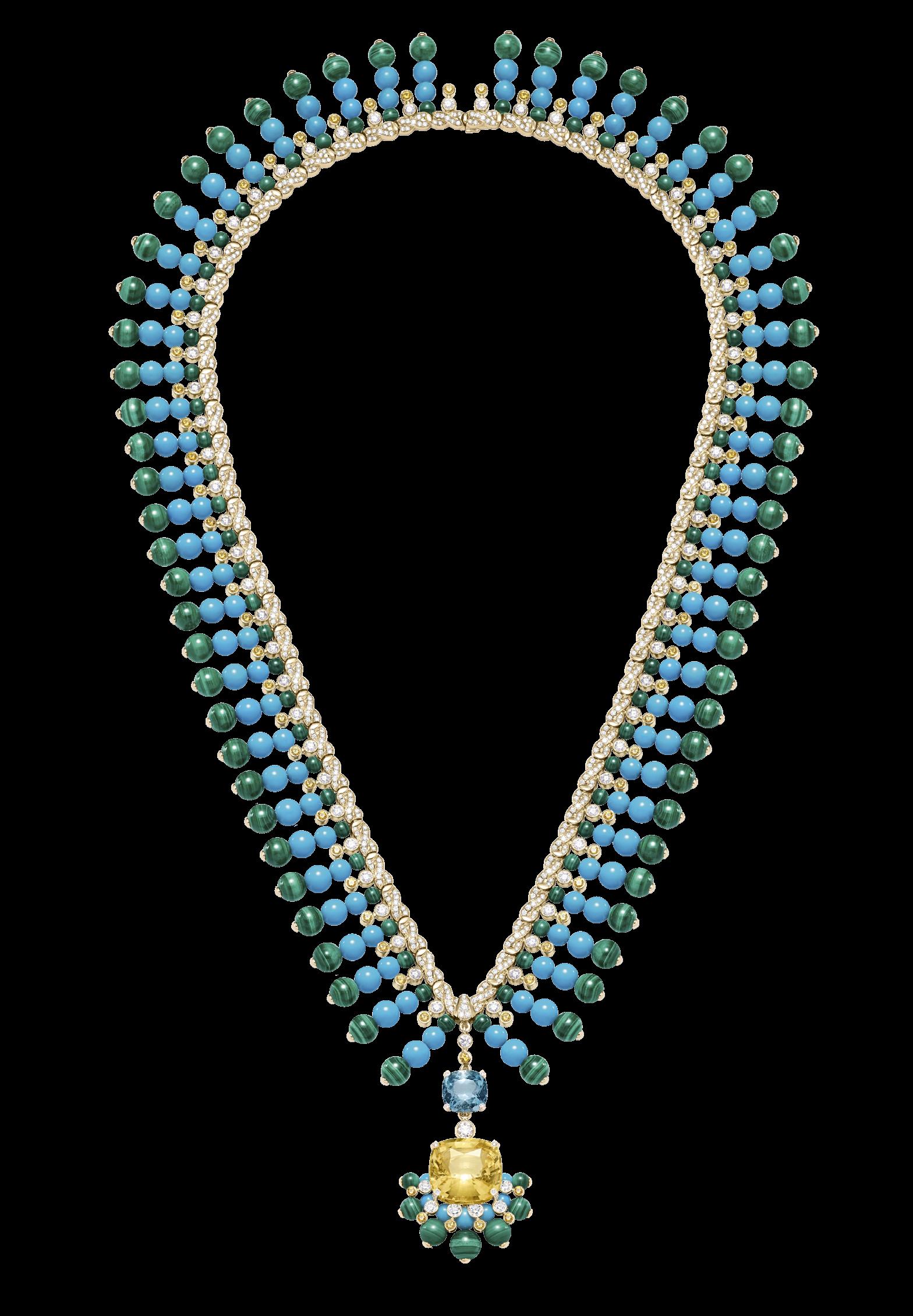
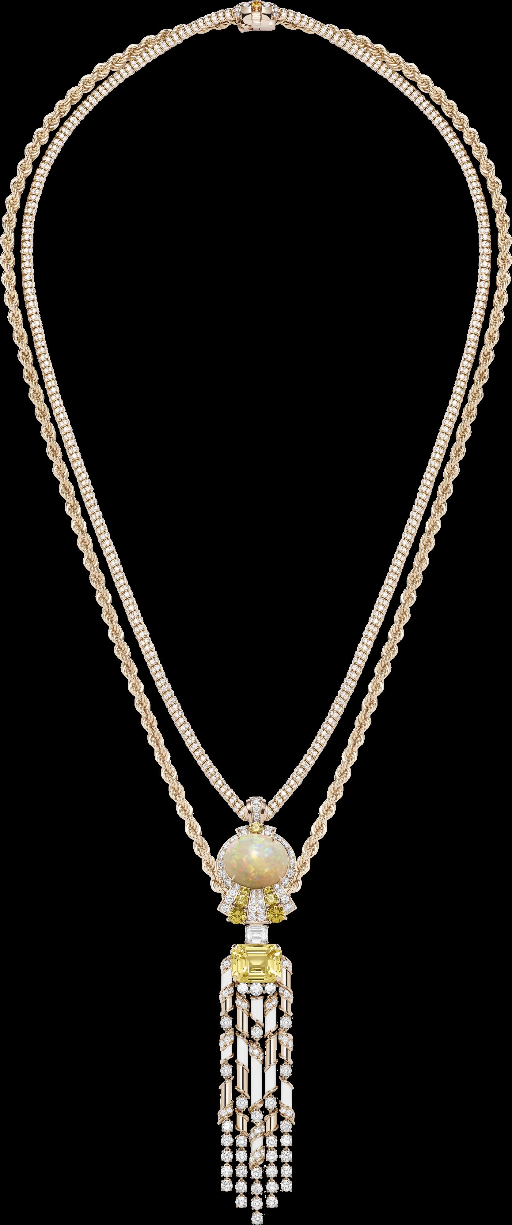
ith a century and a half of history behind it, Piaget has established itself as a stalwart in high jewellery watches. The Maison excels at bringing together fascinating horological pieces and sparkling gems to create beautiful works of art.
In 2023, the Maison decided to revive some of their most iconic High Jewellery Watch signatures. These are the pieces that were breathtaking and sometimes envy-inducing. Among them is the Swinging Sautoir.
The Swinging Sautoir was first introduced in 1969, and it was indeed a beauty, crafted by the skilled and talented watchmakers-who-becamejewellers. The Piaget artisans are more than just craftsmen completing a skill: they are visionaries who dare to dream the impossible and make it a reality.
But to understand and fully appreciate the Swinging Sautoir, we need to go back in Piaget’s history and see how far they have come. After all, what is a name without the history?
Back in 1957, Piaget created the movement that would power the Swinging Sautoir decades later. The mechanical movement is ultra-thin and hand-wound. Mechanical movements have an oscillating rotor that spins as you go about your day. The spinning winds the watch, and this means there is no need for a battery. That being said, creating that mechanical movement as ‘ultra-thin’ is also an achievement. There was a time in history (no pun intended) when clocks and watches were thick, as in, inches thick. The industry then did not have the ability to create thinner or smaller yet still functional movements. Yet. There is power in the ‘yet.’
As years and decades passed, clocks became smaller and watches became thinner. The technology had evolved allowing for smaller movements coupled with proper functioning. What is good is something thin if it is inaccurate or unreliable? The first need to be addressed in making a smaller watch is the power source, and the design needs to assure that there is no loss of power caused by a poor design.
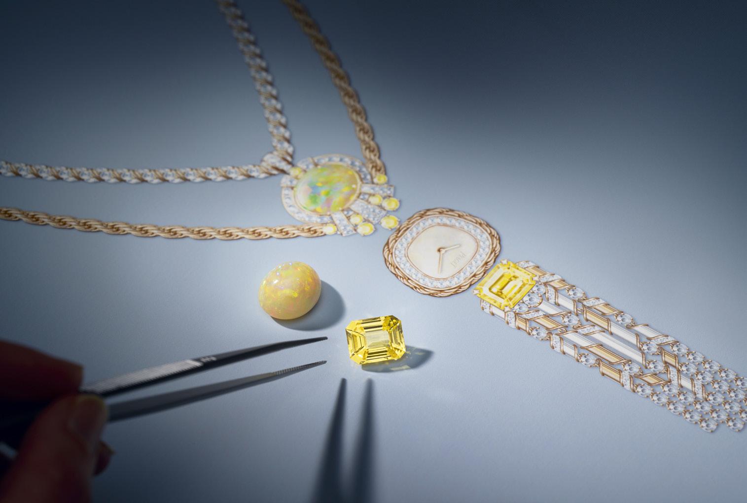
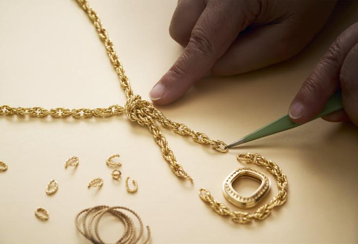
The Piaget artisans are more than just craftsmen completing a skill: they are visionaries who dare to dream the impossible and make it a reality.
The next need to cover is the proper architecture within the movement. Sometimes this means removing part of the initial movement and replacing it with … nothing. This is where the creative intellectual minds really had to come together to design a movement that could function even without a part or process that was previously thought to be critical. Sometimes things work better with less.
To date, there are watches that are considered thin or ultra-thin that range from 6 millimeters, yes, millimeters, to even 1.7 mm. The Swinging Sautoir watches have the ultra-thin 9P handwould mechanical movements.
But wait, there is more. Not only is the Swinging Sautoir considered ultra-thin, it is considered, well, ultra-pretty, because Piaget has housed the movement in precious metals coupled with dazzling gems. This move brought the Swinging Sautoir to even more elegant heights.
Watches and Wonders 2024 was the perfect place for the Maison to reveal the three beautiful Swinging Sautoir watches. Let’s take a closer at these three beauties.
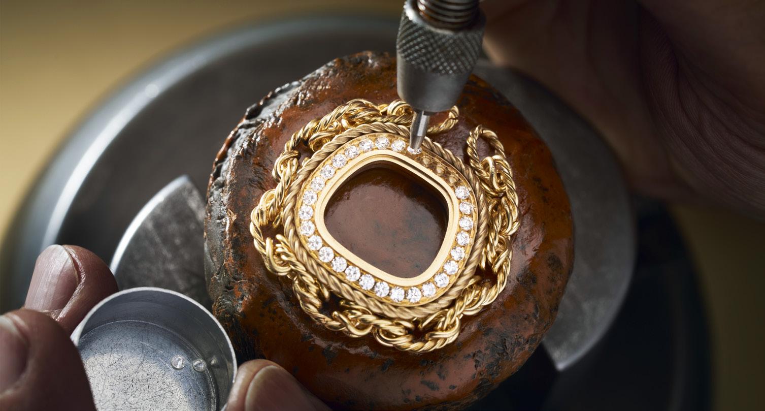
All three of these watches carry the hallmarks that made the originals into icons. Each watch has an ultra-thin movement, which gives you the timekeeping horological aspect that is expected of a watch. Keep in mind that these watches were designed with knowledge aforethought – when the lady is wearing the piece as a necklace, the Piaget name appears upside-down to others. But when the lady lifts the watch to view the time, it will be correctly positioned for her.
With the cases surrounded by diamonds, each one has the high jewellery aspect that makes it fabulous. For extra oomph, two of these watches can each be transformed to be worn on the wrist. There is beauty in adaptability, isn’t there?
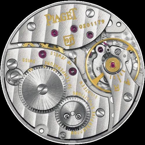
The first Swinging Sautoir is a masterclass in elegance. The gold chain is more of twisted gold links than just a simple twisted line, which adds depth and interest to the piece. The center part of the necklace appears like a knotted chain, as of you simply threw a knot into a long thin rope. The watch part swings delicately at the bottom end of the smaller loop.
The next Swinging Sautoir is awash in the vibrant colors of blue and green, thanks to the turquoise and malachite beads that embellish the gold chain. No simple gold chain here, either –the twisted gold chain is proof that the beauty extends to the details. Each chain is made of single strands of gold that have been delicately crafted together by hand to create twisted gold chains. And because simple gold is not enough for high jewellery, the gold chain has been diamondpaved for extra extravagance. Did we mention that there are yellow sapphires and brilliantcut diamonds here too, with the turquoise and malachite beads? The turquoise dial, surrounded by diamonds, is suspended from the gold chain by a 6.11-carat aquamarine and a 29.24-carat yellow sapphire. This Swinging Sautoir can be separated into two special pieces – a necklace that can be worn on its own, while the watch piece

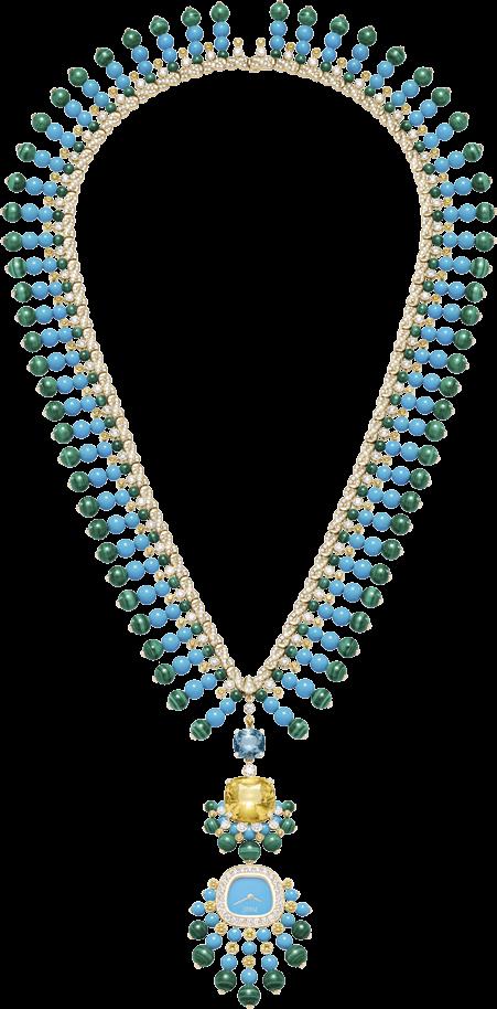
can be added to a green satin strap and worn as a wristwatch. The entire creation is resplendent in color and luxury.
For those who prefer a more monochromatic look, there is the second Swinging Sautoir. This has a double chain, one in the classic twisted gold, and the second in diamond set gold. The doublechain adds a touch of dimension to this piece. Anchoring the two chains in the center is an 11.68-carat white opal cabochon. The watch part has a glamorous tassel of chalcedony, diamonds, gold, and rare emerald-cut yellow sapphire. The piece might be simpler in the color palette, but it is definitely beautiful and flamboyant. So what can we learn from the glorious history and elegant expertise that is Piaget? Work hard and try new things, appreciate your history, and don’t be afraid to glam up and play a little.

