
1 minute read
Visual identity


Bringing the brand to life from the basics

Advertisement
Pink = delicate, playful, charming, sweet, innocent > cultivating a body that adopts wellness habits (unharmed health) Green = balance, spring, rebirth, spiritual > using holistic health to guide a new standard of health
Gradient = symbolising growth, change, transformation > taking charge of personal self-development and healthy changes
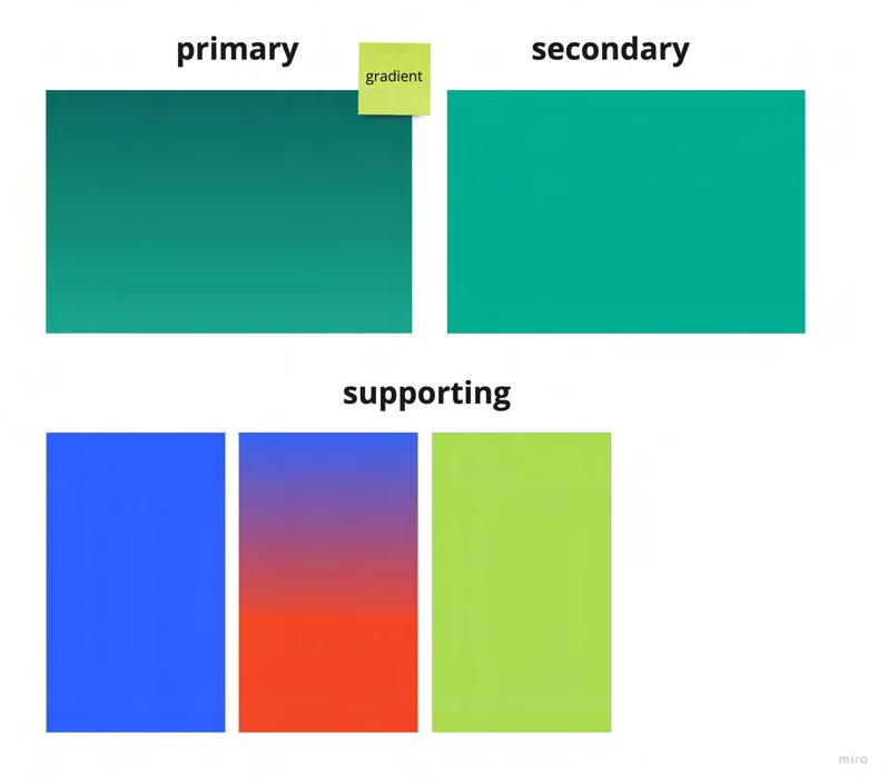
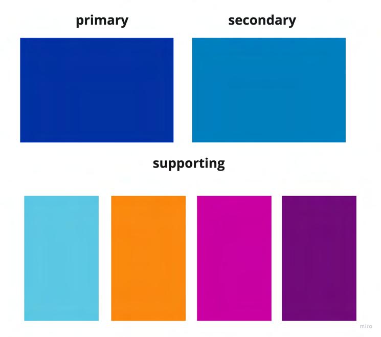
Colour scheme
There were many, many colours to identify my brand with. Looking at colour psychology, gradient patterns and the subtlest diferences in tone and hues, I experimented with colour palettes based on primary, secondary and supporting segments. Again, I conducted a dot-voting exercise that would later help decide on the final colour.
Tone of voice
My tone of voice would mostly be established as serious, thought-provoking and encouraging. Likened to fitness and training apps, second-person tone and motivating dialogue would empower individuals to take charge of their own health through the eHealth app. I also looked at other brands like Apple, and how they positioned themselves as ‘confident’, which inspired some of my tag lines.
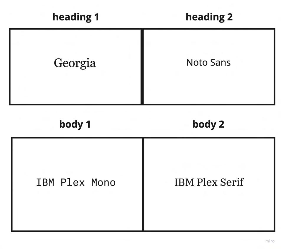
Typography
Playing around with diferent fonts, I tried to avoid using serif typography because I personally thought it would clash with my brand’s playful and approachable vibe. I judged eHealth’s current logo based on their combination of sans serif and serif that I thought was conflicting. Ultimately, the chosen fonts were most dependent on my soon-to-bedesigned wireframes.

SUPERHUMAN. SUPERHUMAN superhuman Superhuman SuperHuman SUPERHuman
Believe you can and you’re halfway there. Building resilience, one day at a time. Resilience, one step at a time.


