



PUBLISHER & CREATIVE - Kip Johnson
MANAGING EDITOR - Dawn Duncan
LAYOUT & DESIGN - Aaron Burgener
LAKE & HOME MAGAZINE – ADVERTISING SALES
Jerry Shea • 218.205.7454 • jerry@lakeandhomemagazine.com
Becky Haarstad • 262.994.8744 • rebecca@lakeandhomemagazine.com
Renee Redenius • 701.212.7227 • renee@lakeandhomemagazine.com
Terri Jo Peery • 320.491.5618 • terrijo@lakeandhomemagazine.com
Kim Arneson • 612.618.9371 • kim@lakeandhomemagazine.com
SUBSCRIPTIONS
In the U.S., one year $24.95; two years $43.50; three years $55.00. Elsewhere add $5.00 per issue. Back issues are available for $5.00 per issue, plus shipping and handling. Subscriptions can be purchased online at lakeandhomemagazine.com/products
& HOME MAGAZINE


Whether you will be home for the holidays or not, this special time of year usually evokes memories of home(s) and the special memories created by friends and family. If we step back for a moment and think about all that we experience in the homes we occupy throughout our lives, the list of significant moments is endless. Certainly, our celebrations---birthdays, retirement parties, new babies and pets, and the holidays are the superstars of the show!
We talk often about what makes a house a home; despite our focus on upscale architecture and design, bringing you the premiere resources for building in this area, it’s the combination of these foundational elements mixed with the “soft side” of daily life that gives our houses that character that’s difficult to describe. Old houses evoke their own unique charm (even oddities!), but new

construction can as well, with one-of-a-kind and trending touches that make a home standout visually, but also offer ease of lifestyle, too.
Here, we are bringing you everything from bathroom luxuries (your guests will be delighted if you share these) to gorgeous glass showers and even creative uses of tile, well beyond the basic backsplash. Our feature homes are showstoppers, each with their own style and incorporated list of what the homeowners envisioned as the qualities they felt would evoke their desired experiences. What can you do, even something small, to make your own house feel more like home, to reflect your personality, and to display what you love?
We invite you to look through your home at this time of year and see where little things can make a difference in how you live and how you make memories in your living space. From consciously designing to ensure proper space for a large Christmas tree to ensuring your dining room fits a long table for family and friends, mindfully choosing what’s important to you makes all the difference.
Enjoy the holidays, and let your home be the stage for beautiful memories. L&H
Dawn Duncan Managing Editor
See more from this feature home on page 80


Fragrant coffee cakes, mouth-watering apple crisps, pumpkin spice EVERYTHING – the holidays are the best time to be in the kitchen! For centuries, the kitchen has been the tie that binds loved ones together. It’s where the day begins, a communal space where memories are made, and in modern times can even act as an escape from the screens that dominate much of our lives. With today’s high-tech appliances, working within the kitchen is easier than ever. But if you’ve grown tired of your kitchen, or if you feel like it’s lacking that extra bit of flavor that elevates the space from ordinary to extraordinary, consider the importance of lighting.
Your kitchen is an especially great example of how light can change the feel of a room because it often uses multiple different types of lighting. Skye Fingalson, president and owner of Design 2 Sell and Allure in Detroit Lakes, MN, sheds some light on illumination. “We are ALWAYS pushing the importance of lighting! It is our make it or break it element in the overall design aspect of any project we tackle.” She adds that lighting is primarily broken down into four categories: ambient, task, decorative, and accent. All four types of lighting can be utilized and combined within the kitchen, but the most important ones are ambient and task.

Ambient lighting, sometimes referred to as general lighting, is like looking at the big picture. “It creates a mood all on its own that may make you feel settled, cozy, and calm,” says Skye. This is often the main lighting source of your kitchen. Building codes require most rooms to have switch-controlled lights. Ceiling light fixtures are the easiest to satisfy that requirement and come in many shapes and styles. They shine light around the majority of the room but do not illuminate kitchen counters well. This often leaves your most utilized surfaces in the dark.

Task lighting, most often used as a compliment to another lighting source, is vital to operating well within the kitchen. “We use task lighting throughout our days more than we realize,” explains Skye. “Not only is it considered our overhead lighting, but you may also have under cabinet lighting that allows you to better see what you are working on in the kitchen, a desk lamp that allows you to focus on your paperwork, or pendants above your island that better highlight your working area.”

Under cabinet lighting is probably the most important source of task lighting you can incorporate into your kitchen work area. No matter what kind of ceiling fixtures you use, you will still most likely need some sort of task lighting that shines down from your wall cabinets. This is the best, most efficient way to illuminate working surfaces without casting shadows. These types of lights are also invisible when installed and allow you to embellish with other decorative fixtures without making it look too busy. You can even choose a cooler, whiter light than your other light sources without creating a harsh feel to the space because these light sources tend to be smaller and much more directional.
Though each category of lighting is important on its own, many light fixtures can overlap into multiple categories. Pendant lights are a great way to combine lighting types. Depending on their spacing and size, pendant lights can be a source of ambient or task lighting. Skye remarks that recent design trends are seeing an increase in the popularity of drop-down light fixtures. These types of lights can be a major focal point of your kitchen. “Another thing we are seeing is doing two larger pendants over a kitchen island versus three smaller ones. Scale is of the utmost importance and larger light fixtures make more of a statement.”

Recessed lighting also falls within the category of task lighting. This is because recessed lighting can be directed at task areas such as counters or the kitchen sink. Though their low profile can help add light without the distraction of a light fixture, their downward facing beams do not cast any light onto the ceiling which helps more evenly illuminate your space. Recessed lighting has fallen out of favor in recent trends mostly because they tend to be energy wasters and do not add any of that important visual appeal many people look for in their design schemes.


Track lighting is another way to incorporate more task lighting into your kitchen area, but it can also be used as ambient lighting. Though track fixtures have risen in popularity over the decades, track lighting tends to fall in and out of style. It has many of the same pros and cons as recessed lighting with the added bonus of being directionally adjustable so shadowing isn’t as much of an issue. One thing to watch out for is track lighting that uses halogen bulbs as they tend to be ultra-bright and not very energy efficient. Look for track fixtures that use LEDs to conserve power and produce less heat while still providing high-quality light.

For a visually exciting space, the light fixtures you choose will be just as important as the quality and direction of light they provide. Some recent trends include the use of interesting textures and materials, bold color finishes, and a throwback to nostalgic vibes. Infuse your space with organic beauty by selecting fixtures composed of jute, lake grass, or rattan. Take advantage of complementary colors to highlight and accentuate areas you want to pop. If you enjoy an antique feel, many contemporary designs are drawing inspiration from vintage styles for a retro look that is to die for. Lighting is the easiest way for a quick kitchen update that will leave you feeling refreshed with minimal effort.

The tone of your lighting choices will come down to your own personal preference. Skye prefers warm light throughout her home, but she acknowledges the practical use of cooler lighting as well. “Lighting affects the way you feel about a room in many ways. As humans, we tend to be happier when functioning in a well-lit environment rather than a dark and dreary one. We feel different ways with cool light versus warm light as well. Most people prefer one or the other! A person may not realize how the lighting of that space is affecting them, but I challenge you to take a look around and notice all of the different forms of lighting next time you enter a new space and ask yourself ‘how does this make me feel?’”
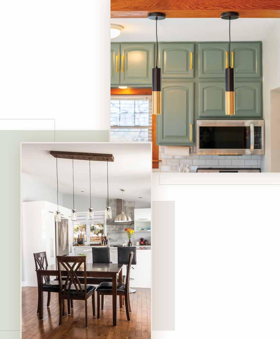
In the end, your choice in lighting shouldn’t feel like a last minute addition. “Lighting is used effectively in interior design by accentuating areas we want to highlight. We also are very intentional about using it for functioning areas such as a kitchen or other work area. As designers, we want to make sure we have thought thoroughly through our lighting plan for each individual space.” If you struggle with deciding on what’s best for your home, don’t hesitate to contact Skye and her talented team of designers at Allure. They are always glad to illuminate the various possibilities your space can provide. With how much love comes out of the kitchen, that much should go into its design. The proper lighting is your secret ingredient to creating a space you’ll adore every month of the year. L&H

tray, medium bowl, mixing spoon, measuring cups and spoons, small spoon, serving plate or tray
1 box phyllo shells
3 oz. Mascarpone cheese
2/3 cup whole milk Ricotta cheese
3 T powdered sugar
1/2 tsp vanilla paste or extract
1/4 tsp of cinnamon
1/3 C mini chocolate chips
2 T pistachios, chopped

HHoliday appetizers and sweet bites offer the chance to explore new ideas and techniques. These don’t have to be complicated, however, and choosing easy to assemble bites allows time to create multiple appetizer options for your guests to enjoy. This recipe is dairy-filled, however, non-dairy/vegan options are available in the specialty section of stores or online. Replace the cheeses and chocolate chips with dairy-free options if needed. You’ll find the phyllo shells in the freezer section of most stores. Happy entertaining!
Remove the shells from the freezer, place on a tray or countertop, and thaw. Combine the Ricotta cheese, Mascarpone cheese, vanilla, powdered sugar, and cinnamon in a medium bowl with a spoon. Mix well. Add the mini chocolate chips and mix well.
Divide the filling between the phyllo cups, then top with mini chocolate chips and pistachios. Arrange on serving tray. Serve immediately.


Your bathroom has tremendous potential. Think back to when you were dreaming of your forever home. Whether you were building a new or updating an existing house, bathroom necessities were probably at or near the top of your priority list. Not only does the bathroom act as a place to escape the world around you (even if it’s only for a little while) it is also the place you go to take care of yourself and your body. It is a place of sanctuary. A nicely updated bathroom can even increase your home’s value anywhere from 10 - 40%. That’s not insignificant for a room only in use during a small portion of the day! One of the easiest and most noticeable ways you can give your bathroom a makeover is by updating the shower. More specifically, the shower door.

The benefits of glass shower doors over shower curtains are transparent. Not only can shower curtains trap soap scum, but they can also serve as breeding grounds for bacteria. Glass shower doors might come with a higher cost, but they bring value to the table.
First and foremost, they are much easier to keep clean than a shower curtain is. Glass shower doors are also durable. “No one will argue that the right glass will transform any space,” says Mike Butler of Ottertail Glass in Fergus Falls, MN. “I’m always sad when people invest thousands of dollars into a new bathroom remodel including amazing tile work and then turn around and put a shower curtain up or a flimsy shower unit. All the beauty gets covered up.”
Sharing the sentiment regarding curtains is Chuck Deutsch of Brainerd Glass, Brainerd, MN. “If you treat it right, you’re going to have a glass shower door for 20 years, he says. Did you know that most shower curtains should be replaced every six months to a year? That cost can really add up over time! “A glass shower door is going to be easier to maintain than anything in your home. It’s an awesome selling point.”

Another great thing about shower doors is that they work in all kinds of spaces no matter how small or awkward. With glass doors, custom is the name of the game. Mike comments that projects can range from very small to large, luxury bathrooms. “We have put custom showers into customers’ first homes or first remodels to help create their oasis or to add to their home’s resale value. We’ve installed our showers in very highend homes. My advice is to get us involved during the design process; we often can make suggestions or provide insight about ways to make the shower more ergonomic, efficient, and even budget friendly.” He adds that he commonly hears customers say things like, ‘I never thought of that’ during initial visits. Contractors, designers, and tile installers are in contact with Mike and his team daily to explain their situations and find the best solutions for customers. Ottertail Glass never charges for the initial visit, estimates, or measurements.

Professionals like Chuck also have plenty of experience working with designers to make sure your vision doesn’t just look great, but also works great too. “Quite a few of the concepts from the designers are good and they work. But when they don’t, it’s kind of our obligation to let them know that, hey, this is what you’re going to run into if you don’t change this. And typically, they respect that.”
Consider your shower door like any other form of statement decor that ties the elements of your home together. Trends continuously evolve over the years, but some styles will remain timeless. “One thing that we’re seeing that I’m not so much a fan of, is gridded shower doors,” Chuck says. This is typically a solid glass panel that is sectioned into grids using appliques to give it the look of a window. Alternatively, some prefer to have multiple smaller panels that are assembled separately into a sort of framework. “At times it almost looks institutional. When I’m standing in the shower, I don’t want to look like I’m standing in a prison cell.”

And though that may be his opinion, Chuck does warn customers against jumping on fads that don’t have lasting power. With your shower doors being a much more permanent fixture, you’ll want to consider options that look good no matter how much time goes by. Some of the most popular options today are trackless doors that give your shower a sleek, contemporary feel, neo-angle shower doors which work great in tight spaces, steam doors that are meant to turn your shower stall into your own personal steam room, curved doors which are great for corner showers, and frameless shower doors that are perfect for showing off your selection of beautiful tile. Mike states that it’s hard to pin down what is the most alluring for customers at present because their top sellers run the gamut, from single door or panel options to barn door frameless sliders. As with all design components, each home and room are unique and this is where the pros are vital to the project’s success and value.


The process of selecting your glass shower door can be as easy as consulting with your designer. “Most of what we do is through contracts and relationships we’ve built over the years,” Chuck explains. “We have clients come in, take a look at our full displays, and they’ll start picking out handles and hardware that looks good with the glass.” Chuck asks that clients remember to have patience. “Human error comes into place. Sometimes the glass is scratched or is made wrong. Of course, our manufacturer understands that it’s their mistake and they’ll try to turn it around and deliver again within a week.” If this ever happens to you, don’t panic! Professionals are happy to accommodate. “We’ll put in the bad piece of glass so that clients can use their shower. Then we’ll come back out and change it when the new piece comes.” Though not exactly cost effective, it’s a small price to pay for customer satisfaction.
In addition to the customer service aspect, companies focused on providing ample in-person viewing options are key to being able to properly select what matches your preferences and space. And, by being able to see and touch products, you begin to understand quality. “This is honestly what sets us apart from others,” Mike comments. “Believe it or not, there are different qualities of glass, but especially with hardware like hinges, pivots, rollers, and handles. All of ours are the best you can buy. They are extremely heavy duty and come with a lifetime warranty.” Ottertail Glass’ shower are either 3/8” or ½” heavy duty tempered glass that is polished, and it includes a protective coaching to help prevent water spots and soap scum. “Years later, our showers are still clear, as long as the customer cares properly for them.”
“Believe it or not, there are different qualities of glass, but especially with hardware like hinges, pivots, rollers, and handles. All of ours are the best you can buy.”
Mike Butler of Ottertail Glass


Speaking of cost, you may be wondering whether this luxury will shatter your budget. Glass shower doors may not be the cheapest option, but Chuck firmly believes their durability makes up for it. Many of the homes Brainerd Glass works in are extravagant northern retreats with three to four bathrooms per home. With the broad spectrum of style and size, the standard price range is nearly non-existent. “98% of what we do are heavy glass doors. You’re not going to get anything under $1,000.” From there, the price will only go up depending on how unique you’d like to be.
Chuck recalls one particularly memorable project for a gentleman out in California. “We built a single door that was angled at the top, kind of like an old outhouse door, and it had multiple shades of gray through it. It ended up being installed for a price around $5,400.” If that kind of price gap leaves you balking, remember that a quality shower door is like an investment for your home value. Chuck adds, “If you’re only placing something every 20 to 30 years, then get it done right the first time.”
Mind the details as well and know that what might seem unimportant or even not feasible matters and is probably doable. These are companies that specialize in custom work and Mike remarks, “Notching up over benches and knee walls is not an issue. We have a wide variety of hardware colors and finishes to match what you have.”
Overall, the benefits of upgrading to a quality shower door far outweigh any of the disadvantages. Glass shower doors tend to be safer because, when properly installed, do not let water spill out onto the floor which can create a slipping hazard. They are easy to maintain, and according to Chuck need only a good squeegee and some foaming cleaner to keep them looking brand new. Durable and long-lasting, this bathroom necessity is a real game-changer for the feel of your home. Bathroom renovations have a high return on investment that pay for themselves over time, not to mention they can add to how luxurious you’ll feel enjoying such a great amenity!
“My favorite part of custom shower doors is definitely seeing the final product completely transform the bathroom,” Mike says in closing. “The customers’ faces, gasps, and comments are always amazing and rewarding. It’s a lot of work, but this job is a lot of fun.”
If you’re looking to refresh your bathroom, or if you’re picking out the finishing details of your new build, do yourself a favor – don’t overlook the shower door. L&H

“If you’re only placing something every 20 to 30 years, then get it done right the first time.” Chuck Deutsch of Brainerd Glass

8-10
small skillet, wooden spoon or spatula, measuring cups and spoons, sheet pan, aluminum foil, serrated knife, serving platter/plate
1 sheet frozen puff pastry, thawed
8 ounce wheel of Brie cheese
4 T raspberry preserves
1/4 C fresh raspberries, plus more for garnish
1/4 C candied pecans, coarsely chopped
1 egg, beaten
To make the candied pecans:
1/4 cup pecans, chopped
2 T light brown sugar
1/2 tsp ground cinnamon
1 T maple syrup
1/2 tsp vanilla extract
Oil or non-stick cooking spray

/ recipe by:
Stephanie Disse
Brie is a favorite of many and at holiday time, it’s easy to play with flavors to combine with this soft cheese. With a mellow flavor and creamy texture, Brie melts easily and mixes well with multiple sweet and savory options. Add this favorite to your party line up and serve with crackers, sliced apples, rustic bread, and/or toasted crisps.
In small skillet coated with oil or non-stick cooking spray, cook pecans, stirring about two minutes or until golden brown. Add brown sugar, cinnamon, maple syrup, and vanilla and keep stirring until brown sugar is melted and combined. Note: Watch carefully, as cooks quickly.) Cool 5-10 minutes. Preheat the oven to 375 F. Line a sheet pan with foil, then coat the foil with oil. Lay one sheet of puff pastry on the foil. Cut a thin slice off the top of the Brie. Spread the jam over the Brie, then arrange the raspberries and chopped pecans on top. Wrap the puff pastry around the brie, then pinch the edges to seal shut. Brush the egg all over the pastry. Bake for 20 minutes or until the pastry is golden brown. Add a handful of raspberries to top of baked Brie for garnish. Let cool for five minutes before serving.


When we think of designing and building custom homes, there are myriad details to consider, from the plot of land, surveying, architecture, materials, style, and more. Taking the process all the way through means consciously thinking through how you want to experience the home and what features will make a difference in your daily life. Considering luxury add-ins for the bath are a modern convenience, but also a special touch to a room that is accessed regularly.

FREE-STANDING TUBS: You have options when it comes to tubs, well beyond the standard market offerings of kits and tubs anchored to the floor/walls. Free-standing tubs are striking as well as comfortable, often being deeper and oversized compared to others. From antique claw foot tubs (or new replicas) to sleek, contemporary designs, you can choose from countless options that will fit the aesthetic you are going for in your home, as well as a tub that fits your lifestyle. If you love soaking in the bath, be sure that the width and length of the tub fit comfortably for you and add in a spa pillow, a bamboo or teak tray for a book and candle, and don’t forget your favorite beverage!

SMART TOILET: It sounds rather humorous, but “smart toilets” are becoming more popular as they have several functions beyond a standard unit. These are constantly being improved, to offer reduced sound, auto-flush settings, controlled water amount options, heated seats, and more.
TOWEL WARMERS: Think spa luxury when it comes to adding a towel warmer to the bath. These are usually simple in their metal design aesthetic and some have adjustable temperature. Set your fluffy bath towels on the rack to heat while you take your bath or shower and look forward to wrapping up in a warm, toasty blanket of coziness when you’re done.

Frameless showers allow a clean, contemporary, minimalist look while providing ultimate water protection for your bathroom floor. They are durable and easy to keep clean and sanitized, plus they allow light into the shower area. (See our extended article on page 28).

MARBLE: Popular for centuries, you really can’t go wrong with marble. It’s classic, sturdy, and will withstand the test of time in terms of wear and tear, as well as its look. There are several options on the market, with Italian imports still ruling the list. Consider background color, the design and shades represented, and where the marble will be installed (floor, walls, vanity, etc.) in order to select the best color combination and pattern.


LIGHTS: Lighted mirrors that are a step up from the “Hollywood bulb styles” of past decades include LED lights that are often positioned behind the unit to bring light softly to the mirror’s edges. Under vanity lighting, recessed lights, sconces, and, when applicable, bold artistic lighting all add ambiance to the room and make the space unique. The idea is to add lighting that accents, rather than takes center stage; lights should be added for function, such as around mirrors, as well as fashion, setting the mood and offering options for dimming.

See more from this FEATURE HOME on page 80
Multi-head showers provide water at differing heights and pressure options. Seen in spas around the world, the therapeutic benefits of these and being able to control pressure and placement are true luxuries.

HEATED FLOORS: It’s an easy sell if we’re talking about anything heated in Minnesota! Nothing feels better than a warm floor in the winter as opposed to cold tile or wood. Keep temperatures lower during low or non-use hours, then turn up the heat for after-shower bliss.

RAIN SHOWER HEAD: Expanding a shower head to be several times wider than the standard offering is a touch of luxury that once you have it, you may never return to a basic one. With a wider head, water is dispersed over the entire head and body, bringing heat and a spa-like feel to the shower experience.
FLOATING VANITIES: A mounted vanity makes a bathroom look larger and also more open. A professional install is critical here as you want to be sure that the proper hardware system is used that can support the weight of the vanity and its contents. It is also important to have the floating vanity hanging straight. Bringing the vanity up also provides comfort and the option to include lighting below, again accentuating the idea of more space and flow.

UNIQUE SINKS: Exotic woods, carved out rocks, hammered or smooth metals, hand painted ceramic tile; these are a few of the options to think about if you want to add a conversation piece to the bath.
DÉCOR: Bring color and life to the bath through towels, artwork, accessories that coordinate with the hardware of your room, and greenery (faux or natural). Use light to your advantage by placing greenery where sunlight will hit; this will not only feed your plant if natural, but also create a focal point for visual appeal. Blinds and curtains depend on the space, but those that allow light to filter through are typically more popular as they keep the bath looking brighter.

Even adding just one of these ideas to your bathroom will set the stage for an improved experience as you get ready for your day or decompress at night. Little touches like these go a long way and boost the appeal of the room, whether for just your own use or in the case of selling your home. L&H


Whether we like it or not, winter is on the way. Blowing snow, bitter winds, and below zero temperatures are characteristic of Minnesota’s coldest months. And though we may pride ourselves on being a hearty bunch, it never hurts to have an escape from the bad weather. Not only are saunas great for beating the winter blues, they can be enjoyed year-round and even help you live a healthier lifestyle. “Everybody wants a sauna these days,” says Scott Stewart of Suite Saunas in Isanti, MN. His business has been charging full-steam ahead on the sauna bandwagon for a year now. Trends in the market show that the global demand for saunas have been surging upwards for years, and it’s not hard to see why.

Saunas not only provide a warm, relaxing way of escaping frigid winter days, they have also been shown to help lower the risk of vascular diseases such as high blood pressure, cardiovascular disease (CVD), stroke, and neurocognitive diseases. Mild heat stress induced by sauna bathing activates heat shock proteins that can promote longevity and protect against muscle atrophy and chronic illness. The symptoms of nonvascular afflictions including the common flu, certain skin conditions, and pain from rheumatic diseases may also be managed with the use of saunas. One sauna bath can produce similar physiological responses to that of moderate- to high-intensity physical activities such as walking. Sauna bathing is not just reinvigorating, they are downright healing.

The sauna as we know it today originated from Finland where the oldest known saunas were constructed of pits that were dug into a slope in the ground. The use of highheat – typically around 170 to 190 degrees Fahrenheit! – and controlled humidity are meant to induce perspiration and increased circulation. Dry or wet heat saunas are available and will provide bathers with a different experience depending on which kind is used. Even the level at which you sit inside a sauna can change how hot it feels, but a good sauna will have minimal variation in temperature gradients. If you’re new to sauna bathing, professionals recommend starting slow. Begin with short visits then increase the heat and duration of your stay over time to ensure you get the most out of your experience. Equally important to the sauna cycle is cooling down after your bath. It’s imperative to exercise caution as sudden submersion in a cold lake, pool, or shower can cause severe circulatory strain on the body. Be sure to cool yourself gradually to reduce the risk of any unpleasant side effects.


For Scott, building saunas is more of a passion than a job. “I think I’ve done 10-15 saunas in the last year. I could give the phone number to any one of my customers and they’d be tickled pink.” He prides himself on building relationships with his clients while simultaneously proving that quality work can come at a low cost. “The things I hear the most are, ‘you don’t charge enough!’” Considering that Scott only charges anywhere from $15,000 to $20,000 per sauna, that may very well be true. To put it in perspective, customers shopping in the custom sauna market can often expect to pay around $50,000 and more. Not only does Scott promise great service on a budget, he even provides free consultations for prospective clients. Each sauna also comes with two beach towels as a fun bonus. This particular business model stems from his love for the work he does. “Total honesty: it’s not about the money. It’s about the enjoyment of making somebody’s day and building a nice product. I don’t need to hit a home run on every sauna. It’s more about keeping people busy and having fun.”
The first step towards getting your custom
sauna is scheduling a consultation where Scott will iron out details such as how many people you want your sauna to seat and the size of your finished product. Scott states that common sizes are typically around 7’ x 7’ or 8’ x 8’. “Anything above that is usually custom.” Whether you want an outdoorsy, rustic look or something to match your home’s exterior, the look of your sauna can be catered to your specific tastes. Customers should consider the type of sauna they want: electric or wood-burning. Keep in mind that an electric sauna will require contracting a professional electrician to complete installation, while wood-burning saunas are typically on the cheaper end of the spectrum. Currently Suite Saunas specializes in exterior outdoor units and does not offer services for building inside a client’s home. However, if indoor saunas are more your speed, Scott is still happy to help. He sells cedar (the most popular wood used in sauna construction) for
a living and is more than willing to provide customers with any supplies needed plus assist in the planning process – whatever it takes to bring their dreams into reality.
When it comes to installing your sauna, there are some options to choose from. “It’s much easier to build on site,” he says. “We prefer it. But if that’s not an option, like if the location is on a hill or the homeowner doesn’t want us building on site, we’ll build them panelized and then bring them out and set them up.”
The best part is Scott and his team can deliver custom saunas just about anywhere, even if it means traveling across the country to do so. “We shipped a sauna to Florida [recently]. We’ll go anywhere. My crew loves to travel. They’ll sleep right in a tent on somebody’s lot. It takes them about three and a half days to build a sauna from start to finish.”


Western red cedar is the most popular wood used for sauna construction because it provides sauna bathers with a sensory experience. “A lot of people like that cedar smell when they walk into a sauna,” says Scott. “99% of our saunas are made out of cedar.” Not only are they beautiful to look at, cedar planks also remain cool enough to sit on when things start heating up. They even have antifungal and antibacterial properties. Other popular wood choices include: alder, because it doesn’t overheat and is highly water-repellent; aspen, for its light color and smooth texture that doesn’t easily splinter; and hemlock, due to its resistance to shrinking and ability to withstand changing humidity levels. There’s even a market for thermally modified wood planks from a variety of popular species that boast dimensional stability, durability, rot-resistance, and decreased moisture absorption.


Taking care of your sauna is surprisingly easy. “Make sure that your sauna is well vented. Many of my customers will try to seal their saunas up as tight as they can and that’s not the way to do it.” Scott explains that air circulation is crucial for heating your sauna properly. Sealing a sauna too tightly is the number one issue he sees customers having. Keep a two inch gap under the door and leave all vents open to ensure your sauna operates at full efficiency. Cleaning your sauna is even easier. Scott recommends a 50/50 mix of apple cider vinegar and water to clean the seats of sweat stains. Otherwise, saunas are virtually maintenance free as long as you follow the proper guidelines for operation.

As a final thought, it’s important to remember that saunas are great for mostly everyone, but there are still a few groups that should consult with their doctor before proceeding. Anyone who is pregnant should closely monitor how much time is spent in a high-heat environment, especially in the early stages as it can cause expectant mothers to feel ill or have negative effects for their developing child. Likewise, individuals suffering from unstable angina pectoris, recent myocardial infarction, and severe aortic stenosis should steer clear until they’ve received medical clearance. Furthermore, alcohol consumption and the use of saunas can increase the chances of injury or death. If you’re unsure if sauna bathing is right for you, speak with a physician and be honest about any health concerns. When done correctly, sauna bathing can be a wonderfully life-changing addition to your everyday routine. If you’re curious about the positive effects a sauna can bring, don’t hesitate to contact Scott for a chat. You can find Suite Saunas on Facebook or give them a call at 612-490-3399. L&H


A brand-new kitchen is the dream for many homeowners. But reality doesn’t always oblige. For a revamped kitchen without the high price tag (and without spending weeks living in a construction zone), try a kitchen refresh. Skip the full remodel and tackle targeted, cost-effective repairs, tweaks and updates to breathe new life into the heart of your home.
These simple fixes can improve the way your kitchen functions, make the room look and feel more inviting and make a distinctive design statement. While a few refreshes require expert assistance, many are DIY projects. Some entail a modest investment, but others are free.
You don’t have to wait until you have time or money for a full kitchen remodel. These 10 quick kitchen fixes can make the space feel new again.
Don’t add anything new to your kitchen until you’ve assessed the old. Remove everything from counters, drawers, closets and cabinets. Discard or recycle any broken or unused kitchen gadgets and utensils. Sort out mismatched or damaged pots, pans, glasses, food storage contains and utensils. Toss or repurpose faded, stained and torn linens as rags. Rehome or donate duplicate items, or anything you haven’t used in years. The only remaining items in your drawers, cabinets and counters should be things you need, use and love.
Then give everything a good scrub. Wipe down the walls, microwave and stove top and clean out the fridge. You might find the space looks bigger (or better) than you originally thought. As a result, your wish list might be smaller than anticipated.
Now that you know what you have, it’s time to determine what you need to make the space look better or function more effectively. The most important part of this process is to actually record the elements you need, so you can clarify your wish list. This will keep you focused as you shop or repurpose items from elsewhere your home.
Start with the counters, walls and floors. Record any textiles, kitchen appliances, utensils and other items you need to add or replace. Notice which workstations or seating areas don’t function well and write down how they can be improved. Detail the dimensions, colors and finishes so you can have everything in once place.
Note the tasks and rituals you love and brainstorm ways to make them more beautiful or interesting. For example, someone who loves to wake up with a hot beverage will benefit from a top-of-the-line tea kettle or a self-serve coffee station to share the experience with guests. Alternatively, a person who hates chopping vegetables should switch to a high-capacity food processor, buy sharper knives or place pre-chopped veggies in coordinated storage containers so the process is easier or more pleasant.
Then open drawers and cabinets to dig a little deeper. Maybe organizers to separate pots, pans and lids would be helpful. Some homeowners find that decanting staples into canisters, purchasing matching food storage containers or separating dry goods into clear containers can look soothing and expand storage capacity. Others prefer to group kitchen tools or utensils into drawers or countertop containers for easy access.
There are no hard and fast rules, so set up a system that works for you and your life. A well-organized kitchen is easier and more enjoyable t to use, so this investment is well worth the time and money.

“Updating to new cabinet hardware is the easiest way to give your kitchen a quick facelift,” says John Filippello, kitchen and bath design project manager at Fergus Home and Hardware, Fergus Falls, MN. “Contemporary hardware colors and styles can give an outdated kitchen a more modern look without breaking the bank.”
Select subtle knobs and pulls that blend in with the existing cabinet’s color or finish for a seamless look. Or make a statement with bold contrast and or sculptural shapes. There are dozens of options to choose from.
“Brushed nickel, brushed brass, and matte black are the most common hardware finishes we are seeing being used today,” explains Filippello. “Brushed nickel or chrome go with cool-toned cabinets, while gold or bronze hardware pair with warmer tones. Black is versatile and goes with many cabinet colors and styles.”

To make a strong statement, repaint the cabinets. Since they take up so much space in a kitchen, re-imagining the cabinets can be even more impactful than painting the walls.
Repainting isn’t an easy process, so many homeowners opt to hire a professional. But even with that investment on the books, it still pays off in a big way.
“Painting your cabinets can be one of the most cost-effective facelifts that you can give your kitchen,” says Filippello. “Paired with replacing drawer glides and hinges, you can get a new look and feel for a fraction of the price of a new kitchen.”
Select shades that showcase your style. Quiet whites, warm beiges, pale grays and soft neutrals feel light and airy, while bright colors inject energy into the space. Moody, dark shades add depth and weight.

A lack of good light is a common kitchen problem. The good news is, it’s a problem that’s very easily solved. Upgrade to LED bulbs for better illumination and a much longer bulb life. As an added bonus, LED lights are also more energy efficient. The quality of light these bulbs emit is cooler (and more similar to natural sunlight), which can produce an energizing effect that’s welcome on dark winter days.
If the issue is light placement, not quality, LED strip lights, light bars, puck lights and tape lights are a quick and easy fix. They’re a favorite for under kitchen cabinets, but they also work well on top. No wiring? No worries. Many options are battery operated, so you can save investing in complex electrical work for another day.
Don’t underestimate the visual impact of replacing outdated light fixtures. Opt for eye-catching pendant lights over an island or splurge on a sculptural chandelier to wow your guests and add a note of artistry to the room. Don’t limit yourself to traditional materials like crystal, wrought iron or burnished brass. Light fixtures (especially chandeliers) can be made from a variety of materials, including colored glass, wood, shiny chrome – even seashells.
If you frequently entertain, upgrading to dimmers can be an atmospheric addition. They add a little drama to dinner parties and allow you to customize your light levels all day long.
Of course, you might not need to add light fixtures at all if you can maximize the natural light that pours into your kitchen. Switching out your window coverings can give you that cheerful, sundrenched look – and keep things toasty during cool weather.
Sheer curtains or translucent fabric roller blinds allow lots of light into the room, but still provide a bit of privacy. Lightweight Roman blinds and honeycomb shades almost recede from sight when not in use, while café blinds only mask part of the window. Those without neighbors might want to remove window coverings altogether, allowing the outdoor views to take center stage.
Homeowners who want maximum privacy (or folks who want to keep a west or south-facing kitchen cool in the summer) can try black-out curtains, wooden blinds or long fabric curtains for a little extra weight and emphasis. No matter what your kitchen needs, you have numerous choices.
“Cordless and remote operated window blinds in bold patterns and bright colors are among the latest trends for 2024,” Filippello says. But don’t live and die by the trends. Choose what’s right for your space.


“It may be time to update your kitchen appliances if you haven’t done so in the past 10 to 15 years,” Filippello advises. “It’s a good rule of thumb to replace your appliance if the repair costs are half the cost of a new model. With repair costs going up, more energy-efficient models and new options each year, updating appliances can take away the stress of wondering when your appliance will fail and leave you more time to spend with your guests.”
Opt for appliances that vibe with other design elements in the room. Updating everything will cost more up front, but it’ll make it easier to find appliances that match. You may also be able to coordinate delivery times and obtain more favorable financing.

Sleek, modern appliances work well with any aesthetic. Retro-look appliances add a punchy accent to farmhouse, vintage-inspired and bohemian interiors, but offer energy-efficiency and convenient benefits that our ancestors only could have dreamed of. Whatever style you choose, be sure to investigate new features that have arrived since the last time you went shopping. New refrigerators, ovens, microwaves and range tops don’t just look great – they can also make life easier and more convenient.
“French door, bottom freezer refrigerators have become a kitchen staple for their ease of use and abundance of options,” says Filippello. “Convection/air fryer ranges have become popular because of their quicker cook times. Microwave drawers are easier to access than traditional microwaves because they open like a drawer and are usually installed at countertop level. Induction cooktops are also becoming popular because of their quicker heat up and cool down times.”


Installing a new backsplash can quickly change the character of your kitchen and add a pop of color and texture to the space. Choose materials that complement (or contrast with) your countertop and cabinetry. Neutral backsplashes help unite the kitchen’s color scheme, while bright and patterned designs double as artwork, especially in an understated kitchen.
If you don’t want to try tiling yourself (or hire an expert), consider peel-and-stick options that are easy to apply. They’re a fun way to test drive a look and learn what you like by living with it for a time. Just be aware that this isn’t a long-term solution.
“While there are many peel and stick tile options, ceramic, porcelain, and glass tile are preferred due to their durability and ease of cleaning,” Filippello explains.
Incorporate Open Shelving
After a major kitchen edit, you’re left with only the items you need, use or love. Show off key pieces or collections that have made the cut by displaying them on open shelves.

Open shelving creates a sense of airiness and makes any objects or collection on display feel curated and intentional – even if the spotlighted items are just your everyday dishes or stemware. Too much contrast can be visually jarring, so aim for continuity of color and texture for the most pleasing results.
You can replace an existing cabinet or two with shelves or simply remove the cabinet doors temporarily to test-drive the look. But it’s also quite simple to add an open shelf to an open wall to add additional square footage without taking up valuable counter space. As an added bonus, much-loved or frequently-use items can be within easy reach.
Kitchen textiles are in constant use, so they can show wear and tear very quickly. But thoughtfully selecting beautifully colored or patterned fabrics can give the kitchen a unified look.
Replace thin, faded, torn and mismatched dishtowels, hand towels and washcloths.
Choose colors and textures that complement your decorating style and buy a few more than you think you need, so you always have replacements on hand.
Then turn your attention to the tabletop. A decorative runner or tablecloth adds richness to the room any day of the week, so don’t save these only for special occasions. Thoughtful touches like hand-stitched cloth napkins and heirloom linens are truly unique elements that you can’t find anywhere else.
Rugs add color, comfort and visual interest. They can also help separate a large, open plan kitchen into zones. Try a cushioned runner in front of the sink to remove the pressure on feet and lower backs or place a small throw rug in front of the patio door to add traction and catch sand or dirt. Machine washable rugs look great and offer maximum durability and ease.
Updating your kitchen doesn’t have to mean committing to a full remodel. These ten updates can create a fresh and functional space, so you can enjoy a kitchen that reflects your personality and supports your lifestyle for less time and money. L&H


his issue’s Lake Picks are from the quaint town of Alexandria, MN and located in its busy downtown on Broadway Street. You’ll find all these items within one city block that is packed with shopping and food/beverage options. Pop in and browse, find the “picks”, start your holiday shopping (and get a few goodies for yourself, too), and meet the friendly owners and staff of these local businesses!

Alexandria-based woodturner Bill Seykora’s work includes many pieces inspired by the beautiful lakes country of Minnesota, including the Turning Lake Fish Sculpture, handcrafted from Cedar wood. This hanging art piece is a bold statement for any lake home and testament to true craftsmanship. $260.00
Imported from Sweden, the Sommarbjörkar wool tapestry by Christine Talberg is a unique piece in a collection of gorgeous, one-of-akind creations with an array of motifs. This pick features Birch trees, common in Minnesota and stunning in their beauty. $795.00
Another piece by Alexandria’s own Bill Seykora, the Turning Lake Board is made from Redwood old growth and a perfect statement piece for display and/or entertaining. It’s the ideal size for charcuterie, dessert bites, cheese, or as a standalone conversation starter. $170.00

Ittala glassware stands out for its contemporary design and quality. Founded in 1881, The Ittala Glass Factory is considered a pioneer of Finnish design. There is an extensive selection of glassware and other pieces available; these are just a few picks that are a different twist on pieces for everyday use or entertaining. From the Ultima Thule line: pitcher, $200.00; wine glasses (left), $60.00 (set of two); sparkling wine flute (right), $65.00 (set of two). Faux foliage branch accent: $15.50

Celebrating 23 years, Creative Touch Boutique’s myriad offerings for clothing, accessories, gifts, and décor run the gamut. Included are modern kitchen pieces like these wooden canisters that are available in three sizes. They feature sturdy, high-quality workmanship, along with tight seal lids to protect your favorite treats, teas, coffees, and basic sundries. $29.95; $32.95; $36.95

Salt and pepper should be “married,” as in not passed separately, according to etiquette custom, so what better way to ensure that ongoing union than to have a stacked set? This unique design in simple black and white is not only a bit of a space saver, but its design also keeps the pair together on the table and off. $12.99

Perfect for day to evening, including curling up next to the fireplace on a chilly autumn or winter night, this soft, cozy wrap features sleeves with cinched cuffs and ample fabric for tying in front or simply using as a blanket wrap. It is reversible from tan to light gray and made by Crosstree Lane. This is an ideal gift, as it is a one-sizefits-most option, taking the guesswork out of choosing a size. $92.00. Underneath, there is a classic white Foxcroft button down blouse from the world-famous “No Iron Collection.” Skip the iron and board with this washable classic piece. $88.00


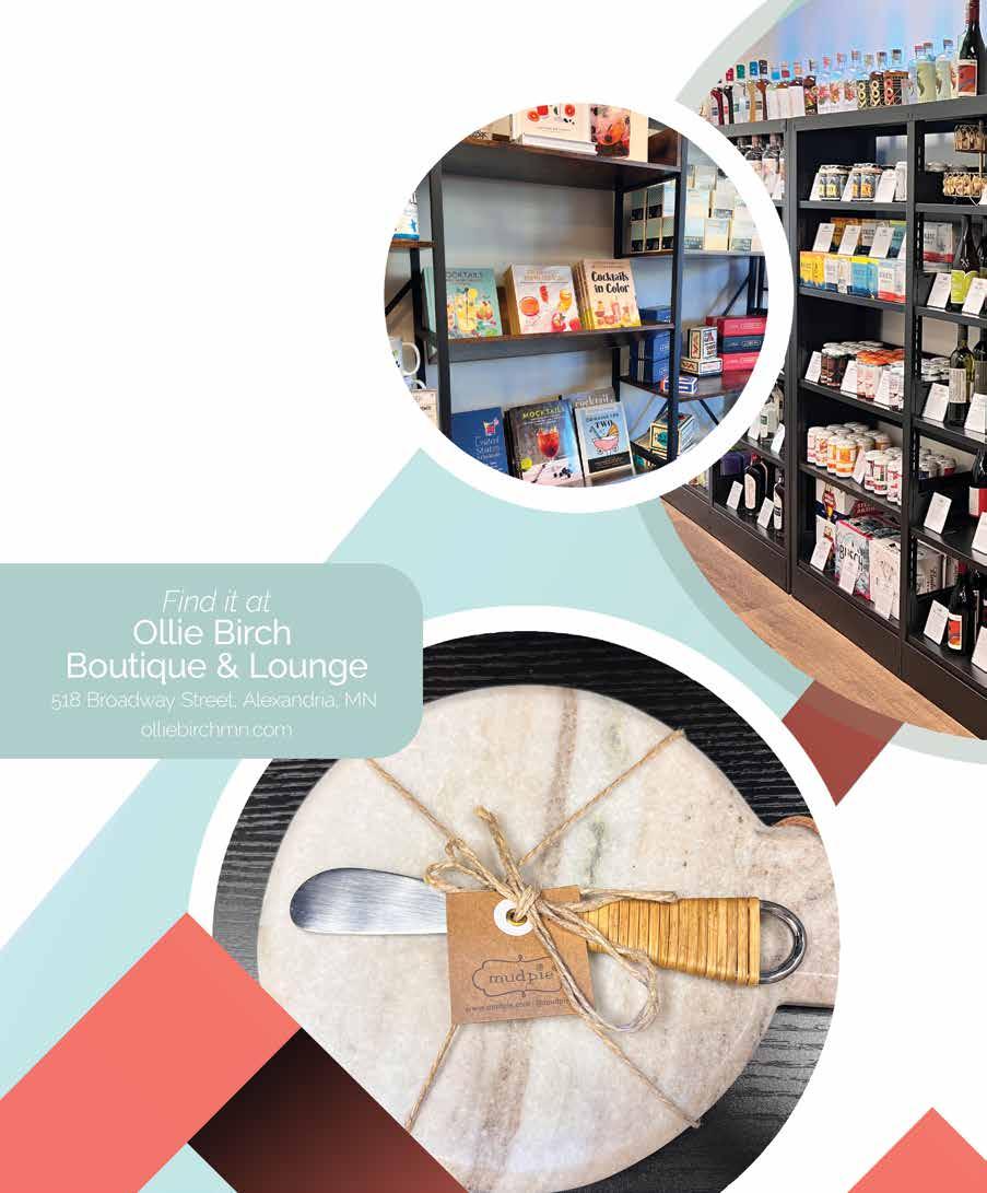
Ollie Birch Boutique carries numerous gifts for men, women, and kids. Their selection of journals, stickers, candles, and kitchen items is carefully curated and includes a variety of mocktail books and accessories. These satin-wrapped box sets included all the tools and mix needed to craft the perfect mocktail and are ready for gifting! Three options available, all with charming names and stocked with edible drink glitter, jigger, spherical ice molds, coasters, mocktail picks, simple syrup, and mocktail recipes. Gold and silver options are available, along with different colors of glitter depending on selected box.
$32.00
All you need to add is “spiritless liquor,” which is offered in Ollie Birch’s expansive area of options. Want to try a specialty mocktail or non-alcoholic beer or wine? Stay for a sip at the sister business, The Lounge, located in the back area of the boutique. This stylish bar specializes in zero-proof drinks, boba teas, and coffee drinks.

Pie is a fun brand that makes quirky as well as classic pieces for entertaining. This simple, smaller cheese tray in marble, complete with a matching spreader, is a great gift or addition to your own kitchen items. $20.00


2

1) Minnewaska Lake (NW) Directions to access: Starbuck, on Mn Hwy 29, to SW shore.
Facilities:
2 ramps (concrete slab)
1 parking lot (natural)
no vehicle parking spaces
32 vehicle/trailer parking spaces
no accessible parking spaces
2 docks no restrooms
9.1 FEET 1
2) Minnewaska Lake (N)
Directions to access: In Glenwood off Cnty Rd 54 (near DNR Fisheries Station) to N shore.
Facilities:
2 ramps (concrete slab)
1 parking lot (natural) no vehicle parking spaces
20 vehicle/trailer parking spaces
no accessible parking spaces
2 docks 1 restroom
3) Minnewaska Lake (NE)
Directions to access:
At the south end of the City of Glenwood off of CR 17
Facilities:
2 ramps (concrete slab)
1 parking lot (asphalt) no vehicle parking spaces
15 vehicle/trailer parking spaces
no accessible parking spaces
2 docks
1 restroom
3
Source: Minnesota Department of Natural Resources & Wikipedia
8050.3
19.9 MILES


Most Minnesota lake homes showcase the water. But for one local family, Maple Lake (and the landscape around it) shaped almost every design decision they made.

“We fell in love with the lake before we found the lot,” explains Nicole, who lives on the shaded property with her husband, their young daughter, two cats, and the family dog. (Three older children are also often in residence.) “The lot itself turned out to be just perfect for us, quiet and private. We were able to leave all the existing trees as they are near the shore.”
The family wanted to keep the space as wild as possible, while still maximizing those impressive water views. So they worked closely with HighPoint Homes, HighPoint Interior Design, Woodland Home Design, landscape architect Jillian Reiner of Widseth and Creative Landscapes (all located in Alexandria, MN) to fully integrate their new home into the site.
Every interior and exterior element – no matter how small – works together as a greater whole. Nicole gravitated towards styles and materials that she and her family had connected with on a personal level, a preference that would repeat itself inside the home. The team emphasized materials and landscaping that both look and feel soothing. No space was too humble.
“Creative Landscapes created the gorgeous flagstone patio with meandering flagstone path to the shoreline,” says Nicole. “I used the inspiration of the dry riverbed look that is prevalent in the Sonoran Desert area of Arizona to achieve the delightful area between the two garages. We took a blah, trapped and seemingly wasted space and created this wonderful peaceful and serene setting of rocks left behind after a spring wash and added some nice green with trees from Plants Beautiful in Parkers Prairie, Minnesota. The flagstone steps connecting the garages and driveway are a favorite. Love, love, love the feel of the flagstone warmed by the sun on bare feet.”
These tactile, “less is more” landscaping choices mean that the house is nestled into an environment that feels both peaceful and untouched. It’s the undisputed focal point of the home.

“There was a natural ‘keyhole’ in the trees that we just accentuated a bit by clearing a little brush facing east,” explains Nicole. “This is where we situated the dock and a small beach area. All of the bedrooms face east to capture the gorgeous morning sun, while the front door faces west, allowing the warm afternoon sun to flood our front step and landscaping. One of the most amazing things about how this home came together on the lot, is that with the way the shoreline wraps around, we have a 270-degree view of the lake. I believe there is only one window in the house that doesn't have a water view.”
“It's on a point on the lake, so we did our best to try to design for that,” agrees Jay Paulson, owner of HighPoint Homes. “It’s all set up for main floor living, with main floor laundry and a main floor master suite.”
The house’s floor plan does more than simply emphasize those water views. Main level living allows the couple to stay in their home as they age. And the layout provides an easy traffic flow pattern that connects functional spaces as well as grander rooms for entertaining and relaxation.
"We fell in love with the lake before we found the lot, The lot itself turned out to be just perfect for us, quiet and private. We were able to leave all the existing trees as they are all near the shore."
Nicole homeowner

“The homeowner can come in off the garage and go into the mudroom and butler's pantry, so they can unload groceries, and then flow into the kitchen, dining room and great room,” explains HighPoint Interior Design’s Ashley Trousil. “If you were to enter from the main entrance, the front door, you'd see the great room and a great view of the lake, the fireplace, a nice little piano nook and then this statement staircase.”
That statement staircase, constructed by Travis Miller of Miller's Custom Woodworking in Alexandria, whisks guests away from

the baby grand piano, a gift purchased from Carlson Piano World in Eden Prairie, MN. (Nicole, a son, and the young daughter all play.) From there, they descend down to a sunny lower story that opens up to the lake.
This walk-out level includes a bar area that doubles as a full kitchen. (“It also has a beverage cooler and an ice maker to load up the cooler before heading out on the boat,” Nicole adds.) There’s a bedroom and another bathroom for guests, as well as some fun surprises customized for the family’s needs.
A spacious bunk room has, at various times, housed fishing buddies, an international exchange student and a niece working at a local hospital. Cloudy, cool or windy days are no problem here. A screen porch and an utterly unexpected golf simulator tucked behind the fireplace tempt the family and their guests to stay in.
The resulting 5,937-square foot home showcases epic lake views and the family’s passions at every turn. The three bedrooms (and bunk room) gently nudge the family and their guests to turn their eyes to the water and to spend time doing the things – and being with the people – that they love. Lots of little design tweaks (and tons of natural light) mean that occupants can follow the sun through the space like flowers.

“One of the most impactful things about this house is that it is totally custom,” says Nicole. “Kim at Woodland Home Design added the slight angled turn of the entire house at the kitchen and had the wonderful idea of incorporating the large vertical windows flanking the hood vent over the stove. I decided to forgo the typical counter with the sink looking out to the lake in lieu of a large floor to ceiling window. It is massive, but wow, does it ever bring the outside in! Our cabinet maker (Travis Miller of Miller Custom Woodworking) recommended putting the sink in the island. He went above and beyond making everything exactly as we asked. There was definitely no template for him to go off of.”
There wasn’t a template for Nicole and interior designer Ashley Trousil to follow either. Nicole’s range of influences is diverse and her preferred aesthetics don’t often co-exist in other homes. But the pair didn’t let that stop them.
“The inspiration for this house came from eastern, coastal homes combined with a Scandinavian simplicity and a bit of the "up north" Minnesota vibe,” she explains. “The main open tread staircase was inspired by a luxury home tour and the small arched door, the ‘mouse hole’ (a tiny door in the youngest resident’s play area) was inspired by Taliesin West, the home of Frank Lloyd Wright in Arizona.”

Nicole says that attending luxury home tours in Minneapolis/St. Paul helped her narrow down the home’s layout and features. But when it came to the color scheme, they came up short. She just couldn’t find an aesthetic that resonated.
“Looking at existing homes just wasn't working for me,” Nicole admits. “I went out cross
country skiing and looked around at the beautiful light tan of the fields of grasses peeking out of the snow and the winter white of the birch trees with highlights of black and I had my ‘aha’ moment. This was my happy place. These colors and textures inspired me and made me feel good. This was my color scheme, all right in front of me.”


Once again, the homeowners took their inspiration from nature. And once you hear that the winter landscape was the inspiration, the home’s most striking design features – its soaring poplar ceilings, rustic stone fireplaces, exposed beams and creamy walls (Sherwin Williams’ Toque White, Pearly White and Shoji White) – make perfect sense.
“You will see the influence of the birch trees in the smooth expanse of light, sun-bleached wood of the cabinets with jet black horizontal handles,” Nicole agrees. “The gold handles in my daughter's bathroom, inspired by the golden blades of grasses sticking out of the winter white snow. The marble veining has a hint of gold in the ceramic tile and quartz countertops that echoes the wind-blown colors across the drifts of snow. It's all there.”

It’s an unconventional combination, but it works. And it’s not just the colors that contrast. It’s the shapes and textures too. For every crisp right angle, every ceiling fan as aerodynamic as a propeller, there’s an equal abundance of curves. These contours are everywhere: the rounded doorways, the sculptural stone sink in the powder room, lush velvety chairs tucked onto the landing. Windows arch toward the high ceilings in neat half circles. A pair of white soaking tubs anchor their respective bathrooms, as regal and voluptuous as Old Hollywood starlets. These rounded shapes add warmth and depth to the home’s clean lines, making the interiors feel relaxed and welcoming.
“It's warm, it's inviting, it's not sterile in that way that modern design can sometimes be,” agrees Ashley. “We’ve got a lot of organic materials, cool stone, and exposed beams that have a little bit of rustic-ness to them, but not over the top. Then it gets a little moody in some spots. The downstairs bar area was definitely designed with the darker wood and darker paint.”
The combination of light and dark, sleek and textured, is unexpected, but striking. Rich paint colors like Iron Ore, Urbane Bronze and Skyline Steel (all Sherwin Williams) draw from a different sector of the natural world. The contrast even impressed a seen-it-all professional from Out and About in Alexandria who painted the master suite in a restful shade of Sherwin Williams Repose Gray.
"We’ve got a lot of organic materials, cool stone, and exposed beams that have a little bit of rustic-ness to them, but not over the top."
Ashley Trousil
HighPoint Interior Designer
“The light Poplar wood on the ceiling and the very dark walls in the master bedroom give the room such a nice feel,” Nicole says. “Having the two walls of solid windows lets in an enormous amount of natural light and also gives it the feeling of a treehouse. By leaving all the trees and vegetation on the shoreline, the room feels open, but private at the same time. I knew that I nailed the effect I was looking for when one of the painters finished painting the dark walls and laid down on the floor facing up. He said, ‘Now this is a bedroom to dream in!’"
Beautiful quartz and granite countertops and intricately veined black soapstone keep the dreamy vibes coming. The stone for the spectacular wood burning fireplace in the great room, as well as the downstairs fireplace, the entryway accent wall and the exterior stone was all sourced from North Carolina. It was installed by Cory Greseth of Stonewall Masonry in Alexandria.

As expected in a home that draws inspiration from the northern Minnesota forest, wood features prominently in the home’s interior design. Standouts include a wooden staircase railing with custom, rectangular spindles, bespoke closet shelving and a unique bar and wine room. Inspired by Nicole’s vision, Ashley Trousil worked with The Woodshop of Avon to bring these elements to life by creating custom millwork and stains. The beams were made by Distress City Millwork in Pequot Lakes and installed by HighPoint Homes. Travis Miller of Miller Custom Woodworking created the metal accents. Light wood floors from Arnquist Flooring in Alexandria complete the look. Several of the most striking wooden accent pieces were specifically created for this particular home.
“The dining room table is a nine-foot, white oak table custom designed and created by Jill Arnquist of BORD,” Nicole says. “There are numerous pieces of Jill's work in this home: the small round walnut table by the front door, the round white oak coffee table
"The Muskie over the mantle is a chainsaw piece that I purchased locally for my husband in anticipation for this home build. Ashley from HighPoint designed the fireplace and surrounding cabinetry specifically to display that Muskie."
Nicole homeowner

in the great room, the white oak shelf under the horse painting in the dining room, the shelf under my Swedish grandfather's sheep horns in the mud room and multiple bedside tables and benches.”
Nicole also selected the lighting for this Maple Lake home with a curatorial eye. Most of her finds were from Southern Lights in Burnsville. Their placement might be surprising -- a glittering golden chandelier in a bathroom and laundry room fixture dropping with wooden beads are equally unexpected -- but every fixture complements the natural shapes and materials throughout the home.
Appliances were considered with equal attention to detail. The couple selected Wolf/ Subzero appliances from Cullen’s Home Center in Alexandria, choosing features truly enhance their quality of life.
“The oven has Wi-Fi capability and can be turned on remotely, so it's hot and ready for take and bake pizzas,” says Nicole. “A favorite is the Wolf built-in coffee maker. We tucked it in the butler's pantry and added a sink and filtered water right next to it. It was the best decision ever! Our 10-year-old can make us a fresh, hot cappuccino with just a push of a button. It grinds the beans fresh for each
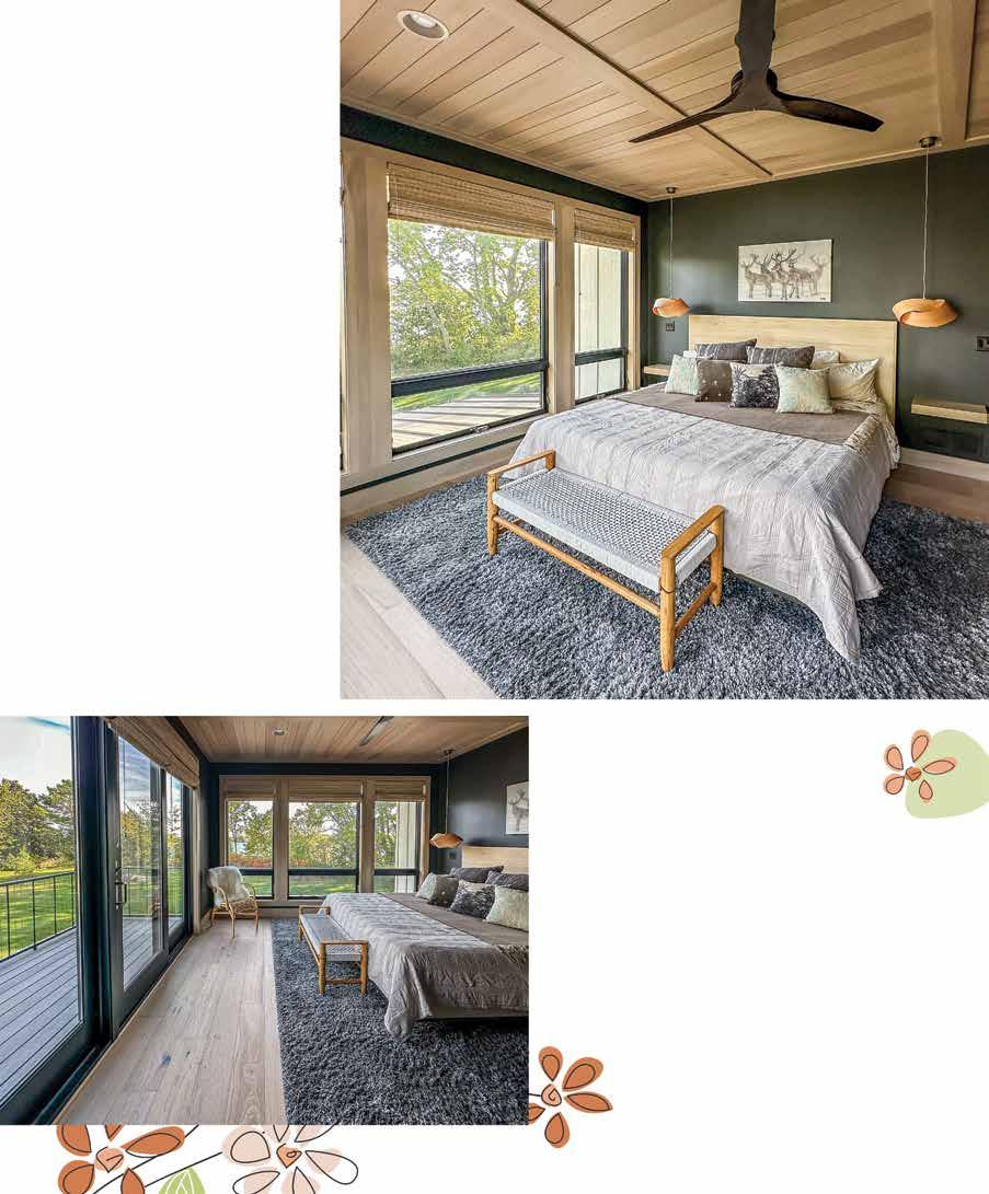
"Having the two walls of solid windows lets
in
an enormous amount of
natural light
and also gives
it the feeling of a treehouse. By leaving all the trees and vegetation on the shoreline, the room feels open, but private at the same time"
Nicole homeowner


cup of coffee. My favorite thing in the whole world is to make a steaming cup of coffee with fluffy frothed milk and take it out on the deck and listen to the loons in the morning sun. Glorious.”
Sourcing the perfect original artwork would complete the interior design process. When Nicole couldn’t find what she needed, she commissioned it specifically for the space.
“The Muskie over the mantle is a chainsaw piece that I purchased locally for my husband in anticipation for this home build,” she explains. “Ashley from HighPoint designed the fireplace and surrounding cabinetry specifically to display that Muskie. The colorful painting to the right of the great room fireplace is a painting from an artist in Argentina, brought back from a street fair there. The imposing ‘War Horse’ hanging near the stairs is actually a photographic piece and the large dark horse painting in the master bedroom is a Harper Henry oil painting. I fell in love with her work at an art exhibit in Arizona.”
There are now three original Harper Henry paintings in the home, including “Girl in Red Blanket,” which was commissioned for the powder room. These works add a touch of the American West to this eclectic, yet beautifully restrained home.
This custom home on Maple Lake is a carefully curated collection of opposites working in perfect harmony. It’s proof that staying true to nature – and to your own instincts –can help you create a truly distinctive home.
L&H

HighPoint Homes | BUILDER
View our ad on page 83
Woodland Home Design | ARCHITECT
HighPoint Interior Design | INTERIOR DESIGNER
Traut Wells | WELL
Expert Insulation | INSULATION
Stonewall Masonry | MASONRY
Spaulding Stone | COUNTERTOPS
JGT | HVAC, PLUMBING
Out and About | PAINTING
Arnquist CarpetsPlus | FLOORING, TILE WORK
View our ad on page 91
Lennes Brothers | ELECTRIC
Paz Excavating | EXCAVATING
Simonson Lumber | BUILDING MATERIALS
View our ad on page 85
Nyberg Surveying | SURVEYOR
Cullen's Home Center | APPLIANCES
View our ad on page 69
Miller's Custom Woodworking | CABINETS
Woodshop of Avon | STAIRS, MISC MILLWORK
View our ad on page 89
Viking Garage Door | GARAGE
Creative Landscapes | LANDSCAPING
Jillian Reiner | LANDSCAPING
Andersen | WINDOWS
Edge Builders | SIDING
Advantage Seamless | GUTTERS
View our ad on page 94
Nordic | FIREPLACE
View our ad on page 93
Alex Glass & Glazing | SHOWER DOORS
View our ad on page 87
Vantage Bank | FINANCING


Every architectural project reflects the craftsmanship, innovation, and dedication of the builders behind it. Near & Streeter of Wayzata, MN has a deep commitment to deliver houses to their clients that are more than just a house. When it comes to creating a home, it’s all about creating a unique experience for every single person they work with.
Since Near & Streeter’s conception in January 2020, they’ve had the privilege of working on some of the most sophisticated and unique projects across the Twin Cities and the lakes areas. “We wanted to venture off and start our own company where we could really focus on giving the client a great experience and an awesome product,” said Bob Near, Co-founder of Near & Streeter.
Bob Near’s journey into the building world was deeply rooted in his heritage since his grandfather was a builder. “I’ve always had a passion when it comes to building. It’s in my blood. I think I inherited it from my grandfather,” said Near. Bob’s business partner, Brandon Streeter also came from the industry. He’s a second generation from a family who builds custom homes in Minnesota. So it made sense for them to get together and start Near & Streeter when they did. “You could say both of us had family ties to it.”
“I’ve always had a passion when it comes to building. It’s in my blood. I think I inherited it from my grandfather.” Bob Near
This beautiful home, located in Avon MN, was originally built in the 1980s using high-quality materials. Despite its solid foundation and “good bones,” the house had become dated over the years and was in need of a good update. After living there for over 15 years, the homeowner was eager to transform the residence into a modern, stylish living space, while still preserving its warmth and comfort. He wanted to update the house to create a contemporary, inviting environment that seamlessly brought his dream home to life.
To achieve this stunning transformation, Near & Streeter partnered closely with the talented architect David Charlez. Charlez provided a clear and cohesive vision for the project, and selected color tones while also defining the overall aesthetic to perfectly align with the homeowner’s desires.

Guided by this refined vision, Near & Streeter’s team expertly managed the selection of materials, collaborating seamlessly with a range of skilled artisans–from expert cabinet makers, flooring specialists, and more. Each professional brought their expertise to the table and this ensured that every detail was executed to perfection, and it ultimately brought the design to life. This collaborative effort resulted in a home that blended modern sophistication with timeless elegance and warmth.
The result is nothing short of spectacular. It blends a warm organic feel and it shows natural elements in the materials that were used such as the rich wooden flooring. The final design embodied a California-modern style, and created a restful haven. This redesign not only enhanced the home’s functionality and visual appeal, but also created an inviting atmosphere.
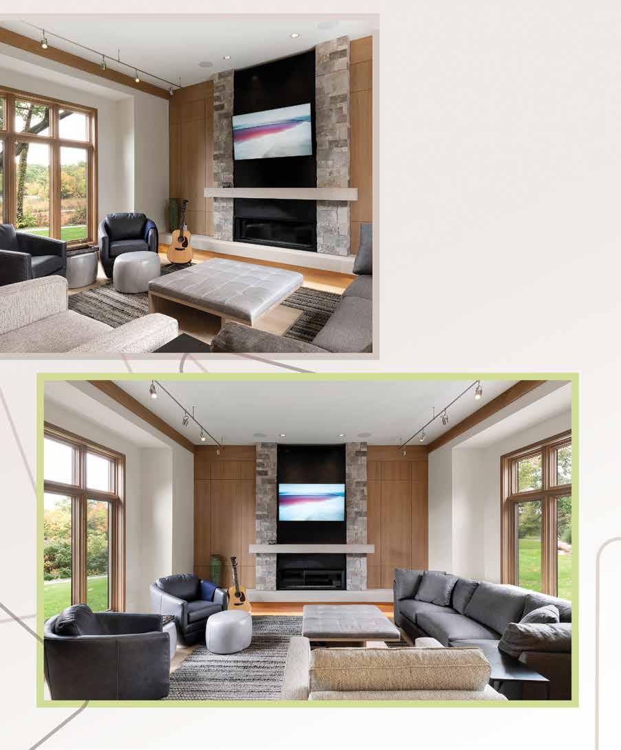
When it came to the inspiration behind the house, it was deeply influenced by the modern architecture found along the Florida coast. The homeowners have a house in Florida, so were inspired by that. “They weren’t tearing the house down, so we had to walk that line, to find what was appropriate for the house, as well as what style the homeowners wanted it to be. We still wanted to use details that were more Minnesota-ish, for a lack of a better way to say it,” said Near. So they carefully balanced the existing architectural elements of modern Floridian architecture along with materials that conveyed a sense of Minnesota’s unique character. The end result is a harmonious blend that respects the home’s original structure while embracing the fresh, modern aesthetic. This thoughtful integration ensures that the home feels both contemporary and grounded in its Northern setting.
“And nothing is crazy over the top with this house. It’s nicely scaled and comfortably sized. Downstairs there are two bedrooms and a bathroom, and an open living rec kind of area.”
Bob Near

“The house is roughly 3,500 square feet,” said Near. “The main level of the home was designed for convenient one-level living. It features an owner’s suite, a den or office, an open-concept kitchen, a dining room, and a sunken living room.” Additionally, there is also a laundry room, a mudroom, a foyer, and a powder room, making the space both practical and comfortable. “And nothing is crazy over the top with this house. It’s nicely scaled and comfortably sized. Downstairs there are two bedrooms and a bathroom, and an open living rec kind of area.”
One of the focuses of the renovation was to maximize the natural light and improve the seamless connection between the indoor and outdoor spaces. One of the big changes they made was that they flip-flopped the kitchen and the dining room, which enhanced the overall flow of the rooms and created better access to the outdoor deck as well. “We basically just improved the indoor-outdoor connection by changing out those spaces. Originally, the kitchen had been on the other side and the dining room
was where the kitchen is now. There was a wall that separated them and that was taken down and removed,” said Near.
The open design concept of the remodel ensured that the light could travel throughout the home, which made it feel bright and airy–and also made one feel connected to the outdoors. When they opened up the space, by removing that wall, the team created a seamless flow between the two rooms, enhancing the home’s livability and overall functionality. “We wanted bigger windows where we could get them. So we could continue to improve that indoor-outdoor connection,” said Near.
They carefully selected the materials such as the flooring and this allowed that the house would have a cozy aesthetic. Every little detail within the house flows with the interior palette and works harmoniously with the rest of the house. When talking about the colors and textures in the house, Near mentioned “Having subtle variations of beiges and grays, but still keeping a warm look. We were able to create more of a comfy and cozy atmosphere.”

The renovation not only focused on the interior enhancements but also brought a remarkable upgrade to the home’s exterior. They integrated modern design principles with durable materials that will last for a long time. The exterior was transformed to achieve both style and functionality with an aluminum siding. “It has a wooden texture and a reddish wood tone to it. That way it’s just less maintenance, you still get the beauty and the warmth of the wood,” said Near. This is a nice way to add aesthetic appeal without the high maintenance associated with traditional materials like wood that require staining it every few years.
Another perk of aluminum siding is that it’s UV-resistant, which means it maintains its vibrant appearance and won’t fade throughout the years and will ensure that it stays its original color. The siding will keep the home well-protected against the harsh changing elements of our northern seasons. A regular power wash is really all that’s needed to keep the outside looking fresh, clean, and beautiful.
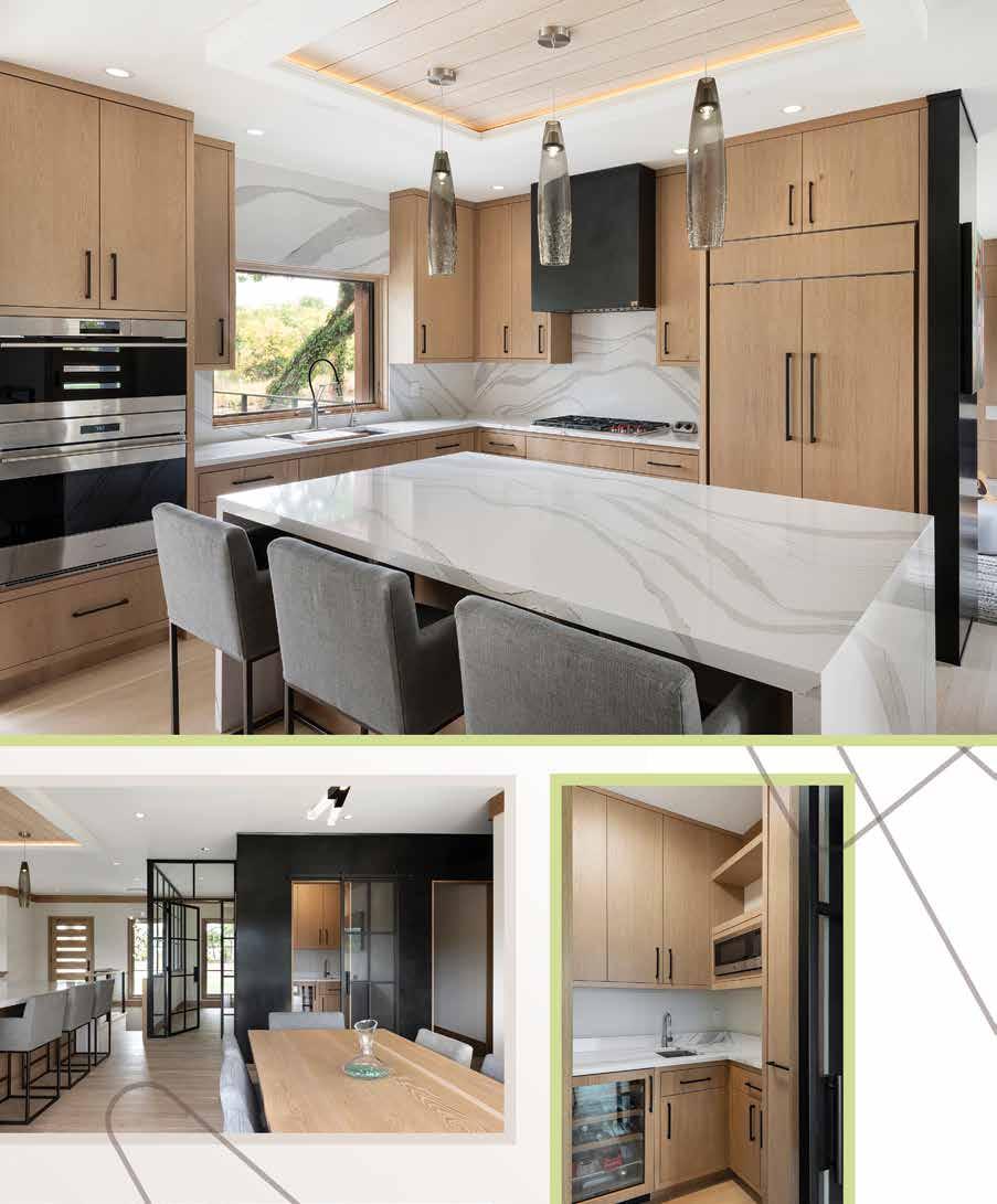

The deck and outdoor living area were thoughtfully renovated so it would enhance the home’s connection with nature. While the original deck framing was kept intact, new composite decking and railing were installed to improve the look and durability. The composite material was chosen for its low-maintenance qualities, ensuring the deck remains easy to care for over the years. Plus, it looks nice for a long time. The new railing added a modern touch, while the expanded outdoor area, including a pergola, created a perfect space for outdoor relaxation and entertainment for the homeowner.
The transformation of this Avon home by Near & Streeter shows the dedication they have to blending architectural excellence with client-centered design. The careful integration of contemporary style with the home’s original charm, paired with a thoughtful selection of materials and features, highlights the team’s commitment to creating spaces that are not only visually stunning but also deeply functional. The fusion of Minnesota’s unique character with a touch of coastal inspiration has resulted in a home that embodies both warmth and hominess. Near & Streeter’s meticulous craftsmanship and collaborative approach have turned the homeowner’s vision into a remarkable reality, demonstrating their passion for creating exceptional living spaces that truly reflect their clients’ dreams and lifestyles. L&H

David Charlez Designs | DESIGN
Islero Fabrication | ARCHITECTURAL METALS
Belrose Hardwood Flooring | WOOD FLOORS
Cambria | COUNTERTOPS, SELECT SURFACES
Hurley Custom Cabinets | CABINETRY
Marvin Ultimate | WINDOWS AND EXTERIOR DOORS
Siding Unlimited | SIDING & EXTERIOR FINISHES
Manatee Plumbing | PLUMBING
JDP Electric | ELECTRICAL
Masonry Gellerman Masonry | MASONRY, FIREPLACE
Trends In Tile and Stone | TILE
dotandminnies.com | 148 1st Ave S | Perham, MN 56573 218-346-4180
Visit Dot & Minnie’s in Perham for a true boutique experience. Explore a wide range of classic yet unique styles and a stunning collection of jewelry. Our designers include names such as Joseph Ribkoff, Sympli, Luukaa, Kozan, Bodil, Chalet, Fenini, Tulip, Cut Loose, Liverpool, Dear John, and many others. Need some shopping guidance? We love to help!
Shop our extensive website and follow us on Facebook for the latest in-stock styles.




46461 295th Ave | Vergas, MN 56587 (218) 342-2681 | www.forestedgeartgallery.com
November 22nd - 23rd “Vergas Festival of Trees” Open 11a - 5p November 30th “Small Business Saturday” Open 11a - 5p


HOLIDAY OPEN HOUSE EVENTS AT THE GALLERY Beautiful, Unique Gift Items in all prices, Free Gift Box or Wrap. Refreshments and Door Prizes December 6th-8th / 13th-15th / 20th-22nd / 11:00a - 5:00p
Forest Edge Gallery is a fine art and fine crafts gallery just 4 1/2 miles northwest of Vergas, Minn. The gallery features the artwork of the owners – Patrick Shannon and Helena Johnson, as well as artists from the area and across the U.S. You will find metalwork, pottery, paintings, jewelry, fused and blown glass, laser art and much more from many talented artists.
Also Open By Appointment | Call Ahead (218) 342-2681 www.forestedeartgallery.com
28 W. Main St. Crosby, MN 56441 (218) 545-0110


122 Lake Ave S | Battle Lake, MN 56515
218-864-2555 | www.marketfergusfalls.com
November / December Friday - Saturday 10am-4pm



“Radiate Compassion”

(218) 290-4599 | Shop online: www.MarcellaRose.com
43005 US Hwy 59 | Pelican Rapids, MN 56572
Marcella Rose Studio & Gallery, North of Pelican Rapids Open by appointment, call 218-290-4599

409 W Stanton Ave | Fergus Falls, MN 218-998-4147
Tuesday - Friday Open 10am to 6pm and Saturday Open 9am to Noon

A little off the beaten path, but well worth the trip.


Beyond The Mitred Corners is a locally owned and operated custom framing and gift shop. Owner, Lisa Anderson, will help you with a personal touch. She will assist you every step of the way with all of your framing needs.
Open the door to a shop with beautiful quality merchandise and a few surprises. You will be sure to find just the right piece for your living room or bedroom. You can even have that perfect picture framed for your living room with personal service. Beyond the Mitred Corners, Fergus Falls-the shop you will be glad you stopped.

One stop shop for Fusion Mineral Paint!
215 W Lincoln Ave | Fergus Falls, MN
218-998-2225
Open Mon thru Fri 10am - 6pm | Sat 10am - 4pm


The Bric in downtown Fergus Falls, one of the top Otter Tail County’s Best Woman’s clothing store! We offer extra small3xl, but the fun doesn’t stop there. We continue to expand your shopping experience with...
• Baby Gifts
• Girl Friend
• Jewelry
• Bridal
• Kitchen
• Shoes
• Anniversary
• Gourmet/Candy
• Bath & Body
At The Bric, we offer a wide variety of gifts for men, women, and children, perfect for special occasions such as birthdays, showers, weddings, and anniversaries. Our store carries the latest decor trends, with unique and on-trend items available on both levels. We are constantly expanding our brand selection to enhance the shopping experience for our customers. We strive to cater to everyone’s preferences and interests. Follow us on Facebook and Instagram to stay connected.




328 MN Hwy 78 | Ottertail, MN
218-367-3900
Open 7 Days a Week | Mon thru Sun | 10am - 5pm Memorial Day to Labor Day | 9am - 6pm Daily


Periwinkle Marketplace is an Ottertail city shopping favorite. Find women’s clothing, jewelry, kids, home décor, and all things lake! Stephanie Ellingson Dykhoff and her crew are known for making a walk into the store a great experience!
“It’s been 24 years (since 2000) and it feels like only yesterday that we started Periwinkle in Fergus Falls! Thanks for supporting our stores throughout the years! We would not be here without you! You are the reason we continue to grow!”


