This style guide has been developed to ensure consistent use of the Downtown Concord brand. Please follow the instructions provided. The value of our brand and the investment made toward it can most readily be realized through consistency and repetition, thereby ensuring brand saturation across all target markets.
BRAND LOGO
THE HEART AND SOUL OF OUR BRAND
A Scalable Identity System
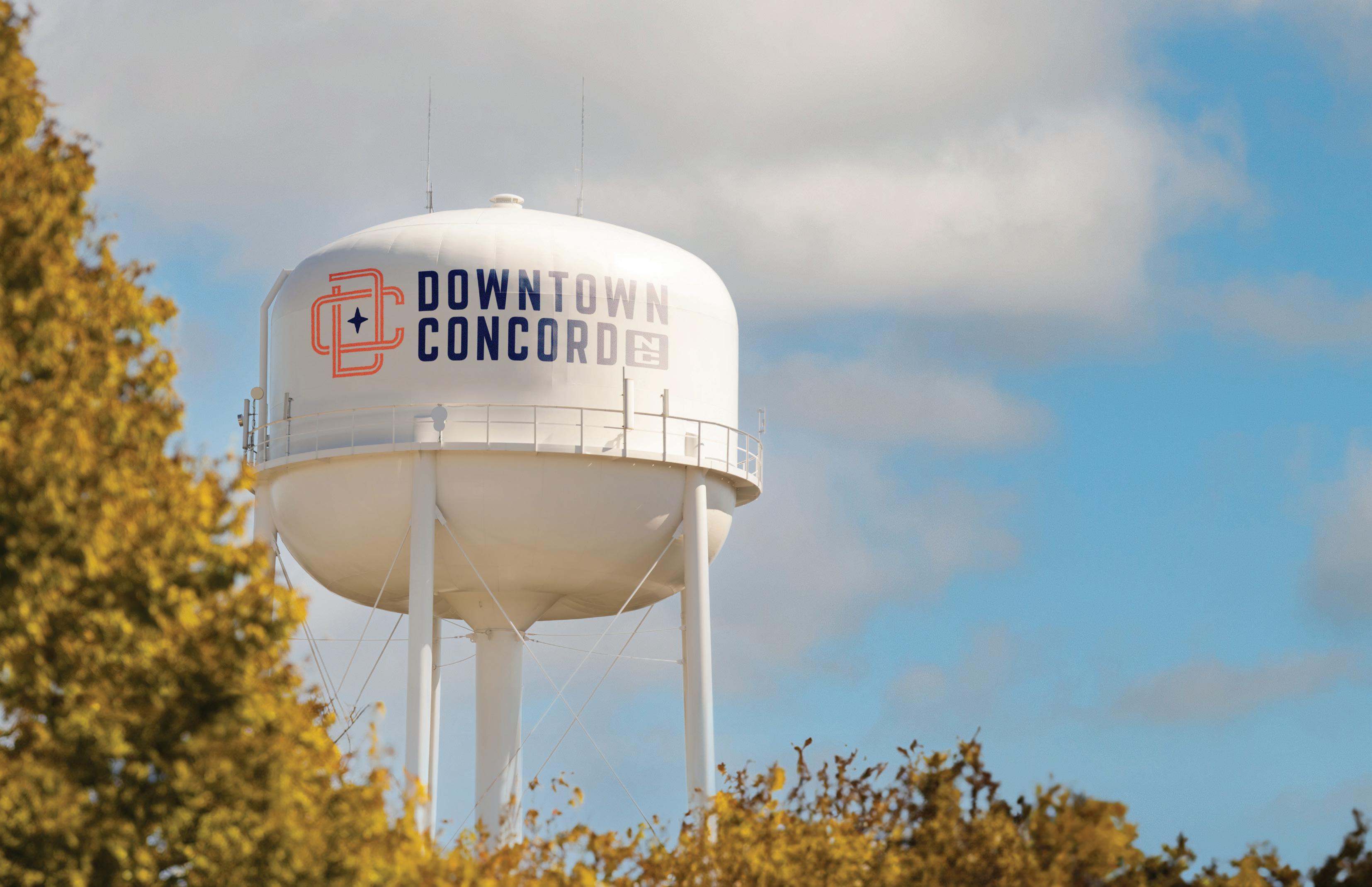
Trying to fit the same mark simultaneously on a billboard and on the bottom of a camp mug is a challenge. Our identity system is designed for flexibility, consistency, and brand recognition.
We have provided different logo lockups that should cover every space imaginable. Instead of trying to fit a logo into a space that is too small or crowded, simply use a different version for maximum visual impact and clarity.
When using the icon-only mark, ensure that our brand name is visible near or in relationship with the icon. For example, a camp mug bearing the icon design on the inside of the cup should have a hang tag or box which displays our brand name legibly. This will help reinforce our brand recognition across multiple touchpoints.
Icon-Only
Primary Lockup
Horizontal Lockup Emblem
ICON
The Downtown Concord brand icon is the visually distinctive and instantly recognizable symbol that serves as a powerful and memorable representation in the minds of viewers.
This mark is the most widely usable piece of the brand, seen on clothing, stationery, phone cases, stickers, tote bags, websites, social media, and much more.
ALTERNATE COLOR
WHITE
PRIMARY LOCKUP
The primary lockup identifies Downtown Concord as a whole to the public. Use this logo to represent individual locations, products, and merchandise as needed.
This logo is a carefully created piece of locked artwork that should not be altered in any way.
ALTERNATE COLOR
WHITE
HORIZONTAL LOCKUP
When something iconic is desired, the Downtown Concord badge can be used in place of a full logo lockup.
For example, a t-shirt bearing the badge on the front should have a hang tag which displays our brand name legibly. This will help reinforce brand recognition.
ALTERNATE COLOR
WHITE
HORIZONTAL BADGE
This mark is a badge variant of the horizontal lockup. This badge has no distressed version, as its primary use is for tourism merchandising.
This mark is a versatile options that can most effectively be embroidered directly on to clothing or sewn on to hats as a patch.
ALTERNATE COLOR
WHITE
ALTERNATE COLOR COMPASS BADGES
For a more compact and versatile representation of the Downtown Concord brand, the compass badges condense the brand into a single, memorable symbol that can be easily recognized across various applications.
Stickers, magnets, and pins can all prominently feature one of the various compass badges.
WHITE
Primary Compass
Secondary Compass
HARMONY ON UNION BADGE
An additional element for use when the Downtown Concord brand has already been established, this badge can be used as a “tag” of sorts to build a more cohesive brand environment.
An example of use for this would be an event banner or an even tent bearing the horizontal tagline. This will help reinforce brand recognition while allowing space in larger formats.
ALTERNATE COLOR
WHITE
CONCORD SCRIPT BADGE
An additional element for use when the Downtown Concord brand has already been established, this badge can be used as a “tag” of sorts to build a more cohesive brand environment.
An example of use for this would be an event banner or an even tent bearing the horizontal tagline. This will help reinforce brand recognition while allowing space in larger formats.
ALTERNATE COLOR
WHITE
HASHTAG
These marks are an additional element that can be used in campaigns and other media in which the focus is to attract tourist to Downtown Concord.
There are multiple options provided in order to fit multiple formats, giving the option of two badge shapes.
ALTERNATE COLOR
WHITE
Making a Solid Brand
In some cases, solid variants of the lockups will be necessary. Prime examples would be embroidery or scenarios in which lockups are used in smaller formats where the distressed elements would not be visible.
Icon-Only Primary Lockup
Horizontal Lockup
Primary Compass Badge
Secondary Compass Badge
Harmony on Union Badge
Concord Script Badge Hashtag
USAGE
HOW TO USE (AND NOT USE) OUR NEW BRAND IDENTITY
Incorrect Usage
Don’t rotate the logo. Don’t distort, compress or stretch the logo dimensions. Don’t change the layout or relationship between logo elements.
Don’t make alterations to elements within the logo or wordmark that are not consistent with the brand.
Don’t use gradients in or on the logo. Don’t use shadows, bevels or other effects on the logo.
Background Control
Our logo works very well on a plain white background.
The Downtown Concord Navy is a great background color for the logo. If you are using one of the patterns, make sure there is proper transparency so that the logo stands out.
Never use the logo on 100% black background. Use an 85% tint of black instead.
Be careful placing the logo over a photo. Make sure you have a blue transparent layer on top of the photo if at all possible. Use the full color or white versions of the logo.
Placement
ON THE PAGE
Place the logo left-aligned on the primary grid line. If this space is not available, the logo belongs in the top or bottom left page corners.
PREFERRED
Align the logo to the primary grid line (referred to as the spine). The primary lockup looks best when left-aligned.
ALTERNATE OPTIONS
Align the primary lockup to the left corners. If the layout dictates a centered or right-aligned mark, use the icon or vertical lockup.
Placement
ON MERCHANDISE
Branded merchandise like t-shirts, hats, and camp mugs should all follow a leftaligned logo placement if possible.
If possible, look for unique and uncommon imprint areas to utilize. Areas like t-shirt sleeves are rarely used and can make a striking visual statement.
Each piece of merchandise will carry unique limitations. Use the images on the right as general guidance.
APPAREL
Left align the logo when possible. Use the icon for centering, or if brand subtlety is desired.
Placement
ONLINE
On the Downtown Concord website, the logo will be placed in the upper left-hand corner of the navigation bar.
Do not center the logo in navigation, even on small screens.
FAVICON
Our favicon—a 32px x 32px icon that is displayed in the browser next to the url—is the only other approved usage of our icon in solid form.
DEVICE ICON
If our website is saved as a bookmark on the home screen of some mobile devices, this graphic will be displayed. Default size is 192px x 192px.
Placement
SOCIAL MEDIA
When used as social media avatars, the icon-only logo should be used with the right amount of clear space on all sides.
We have developed an approved avatar image found here on this page. It’s approved for both circular and square avatars shapes of all sizes.
While the layout of this avatar should not be altered in any way, approved secondary brand colors may used to address special events, holidays, and seasonal changes.
ICON AVATAR
Preferred avatar for use on all platforms. All approved color combinations may be used.
COLORS & FONTS
CONSISTENCY TO THE “T”
PRIMARY BRAND COLORS
The consistent use of color is vital to effective brand recognition.
Our brand should always be represented in one of the colors on this page, aside from specific recommendations within this guide.
Do not use any other/ unauthorized colors.
NAVY
WHITE
DIGITAL
HEX - #2C3547
RGB - 44, 53, 71
PRINT
PANTONE - 7546 C
CMYK - 85, 72, 48, 44
CARDINAL
DIGITAL
HEX - #DC4F48
RGB - 220, 79, 72
- 7417 C
- 0, 90, 78, 0 2 3
TAN
DIGITAL
HEX - #FFFFFF
RGB - 255, 255, 255
DIGITAL
HEX - #E4D1AD
RGB - 228, 209, 173
- 468 C
- 9, 16, 36, 0
PRIMARY CONCORD
BRAND COLORS
These colors are used the most when designing Downtown Concord’s print and digital collateral. They are a key part of the brand identity and play an integral role in maintaining the consistency of the brand.
Recommended guideline for the presence of each color that you will use when implementing your brand identity.
NAVY
CARDINAL
WHITE
APPROVED PAIRINGS
Nearly all of the colors within our primary palette can be used in combination. Whenever possible, strive for legibility with contrast, especially when setting typography.
Harmony Harmony Harmony
Tan text, Red icon, Tan star on a Navy background.
Perfect for use in print, and web.
White text, icon, and star on a Cardinal background.
Demands attention. Use Cardinal backgrounds sparingly.
Navy text, Red icon, Navy star on a white background.
Classic combination and great contrast, without use of black.
In cases where the Concord name is used outside of a brand lockup, alternate color is reccomended to be used to identity the state within the copy.
Refer to the example below, or the Hashtag Lockup for reference
et od etur aut magnatur molupti di occullabo. Us si
oditatem etur sundant pores et quam rem ipit odicit
quodit aut ma voluptaquam uga. Cusanis ex experro bis
ese nectis Obit unt, utatqui aerspientia doluptatus
h OC h ST a DT - ROUNDED
ha RMONY ON UNION
Header: Hochstadt Rounded
SUBHEADER: URW DIN - BOLD
BODY COPY: URW DIN Medium doloraest fugiam
exerite modistrum aborrov ideruntius ipsamus
reictatibus, sus, corpori beriore prae laborehenda et od etur aut magnatur molupti di occullabo. Us si
oditatem etur sundant pores et quam rem ipit odicit
quodit aut ma voluptaquam uga. Cusanis ex experro bis ese nectis Obit unt, utatqui aerspientia doluptatus
PATTERNS
THE LITTLE THINGS MATTER
PATTERNS
The Concord patterns can be used as an additional brand design element. This pattern is designed to be tone-on-tone, meaning the colors should be used together as shown on this page.