DANVILLE, VA BRAND PLAYBOOK
VERSION 01 FEBRUARY, 2024
A City brand is not just a logo. It is an identity. It is what we are saying about ourselves to each other and the outside world. To be successful, it must be relevant to our current existence. It speaks to the history, is relevant to the present, and looks to the future.
With numerous logo variations and endless ways to implement them, this guidebook is vital in our efforts of brand consistency. The success of this rebranding effort is dependent on this team’s ability to carefully read, understand, and implement the brand strategies detailed in this playbook.
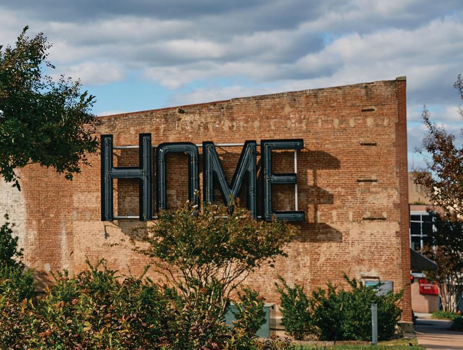
Our new brand tagline is “feels like home.” This brand is an opportunity to capture the feeling of home for all Danville citizens, new residents, and travelling visitors. In this new brand, we express hope for a brighter tomorrow and want to share our sense of belonging with all who interact with our City.
The guidelines presented outline proper ways to market the logo on official City social media pages, merchandise, letterhead, news releases, and more.
As our city has progressed over the last 10 years, with a rapidly increasing number of residents, tourists, restaurants, small businesses, and industries, we knew our brand needed to also evolve. The new City logo and seal are visual representations of the brand. We believe they capture our current period of optimism and growth, while honoring our rich history.
By following these guidelines, you not only contribute to the strength of our brand, but also strengthen your department’s unique marketing and mission. We strive for clear, consistent communication and that is dependent on your ability to utilize the visual identity resources outlined here.
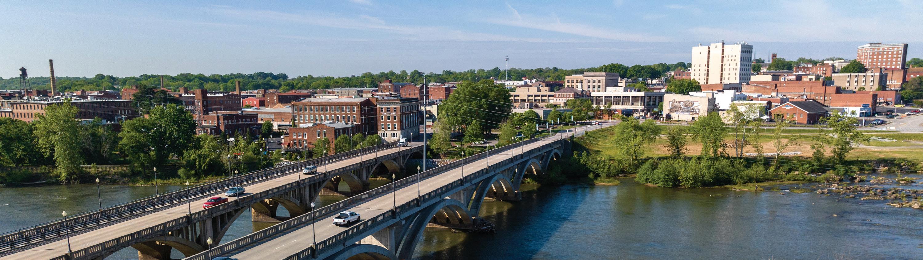
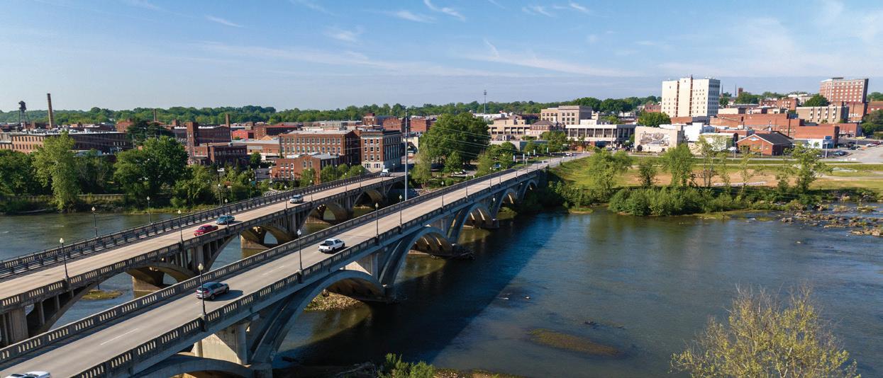
The logo incorporates many elements that resonate with our community, including a bridge that connects communities and a river that ties our past to our present. The seal also incorporates these timeless aspects that will be used to identify our City for many years to come.
I am grateful to call Danville home and to be part of this talented team of individuals. As you strive to inspire and unite our community, remember that you are part of the Danville City team. I am proud of the work our team does to help make Danville a great place to call home and thank you for helping us to make sure we are unified in consistently expressing our brand identity.
What’s Inside
001. Introduction
002. Intent of This Guide
003. Using our Materials
004. About the Brand
005. Our Tone & Voice
006. Taglines
007. Master Style List
008. The City Seal
009. City Seal
010. Brand Logo
011. Identity System
012. Icon Meaning
013. Brand Icon
014. Primary Lockup
015. Horizontal Lockup
016. Combination Mark
022. Usage
023. Incorrect Usage
024. Background Control
025. Letterheads
026. Business Cards
027. Email Signature
028. Websites
029. Apps
030. Social Media
031. Merchandise
032. Brand Colors
033. Primary Color Palette
034. Usage Percentage
035. Using Tints
036. Approved Pairings
037. Secondary Color Palette
040. Typography
041. Primary Typefaces
042. Digital Type
043. Patterns
044. Pattern Options
045. Implementation
046-062. Viewing the Brand
063. In Closing
064. File Types
065. Outside Use
066. Approvals & Contacts
Version: 1
Updated: May 2024
Originally Published: May 2024
017. Lockup Assembly
018. Badge
019. Arch
020. Banner
021. Emblem
038. Usage Percentage
039. Using Tints
1
Intent of this Guide
This style guide is a reference for our internal design team, vendors, and others who are authorized to work with Danville.
The standards, guidelines, and references within this document are grounded in the years of research, experimentation, and brand executions that have preceded our brand look and feel.
Our intent with this guide is not to restrict creativity and innovation: far from it. We believe in the creative spirit, and innovation is one of our core values.
What we strive for is a coordinated, consistent, and effective brand presence in everything we create. If we make something, we want to make sure that people know where it came from.
While some of our brand executions and graphics have been standardized— like business cards, letterhead, and envelopes—these are intended as a secondary focus of this guide. Each one of our execution templates have internal documentation that is easier to update, follow and implement in today’s digital environment.
Instead, the focus of this guide is to empower you, the creative, with the elements you need to create. By utilizing these tools, resources, and adhering to the guidelines within, you’ll make things that look like the Danville brand, every time.
Please refer back to this guide often. We believe that our style guide is a living document. It should evolve over time, just as our brand inevitably will.
If you have any questions concerning the content of this guide, please don’t hesitate to reach out to our Design Team at DanvilleVA.gov.
2
Using Our Brand Materials
You must have specific permission and authorization to use any of our brand materials, including any resources, graphics, or visual elements found within this guide and its accompanying files. Simply being in possession of these materials does not imply or imbue permission in any way.
We reserve the right to disapprove or deny any use or uses of our logo, our brand visuals, or other brand elements at any time, for any reason.
3
ABOUT THE BRAND
WHO WE ARE, WHAT WE STAND FOR, AND WHERE WE CAME FROM.
Our Writing Tone & Voice
WE SPEAK CALMLY WITH EXPERIENCE & CONFIDENCE.
We speak to our team and others with calmness, experience, and confidence. We’re genuine, honest, transparent, and ready to provide feedback based off of real world experience.
5
Feels Like Home
The purpose of our brand tagline(s) are to capture and summarize our brand promise, brand values, and product experience.
Tagline(s) may be used in any marketing materials, advertising, or brand execution where we see to communicate our personality, mission, or brand values.
Each tagline may be used in combination with the brand logo and brand images as a standalone brand marketing campaign. The brand taglines should not be combined with campaign-specific taglines or phrases.
Avoid rewriting, rewording, or editing the tagline(s) in any way.
Feels Like Home Feels Like Home
6
Master Style List
Headlines
• Headlines should be short, clear, and “hook” the user into reading more
• Use “&” instead of “and”
• Use Title Case, not sentence case
• Use periods when writing in sentences
Punctuation
• Use consistent punctuation
• Do not use spaces around the em-dash
• Do not end bulleted or numbered lists in periods, unless the list item contains multiple sentences
• Do not hyphenate paragraphs
Correct Spelling
• Use grey, not gray
• Use canceled, not cancelled
Formatting
• Capitalize the first word in a sentence
Contact Information & Times
• Phone numbers should be written with periods. Do not use hyphens or parenthesis. For example: 434.793.1753
• Use 24-hour time formatting. For example: 1:30PM, not 1330
• Use en-dash when referring to time ranges instead of words like “through, to, or thru”
• List 12:00 am as midnight
• List 12:00 pm as noon
• Use 24-hour instead of 24 hour
• Days should never be abbreviated. Use the full spelling: Monday – Thursday
• Only the state or province should be abbreviated in addresses:
City of Danville, Virginia
P.O. Box 3300
Danville, VA 24541
7
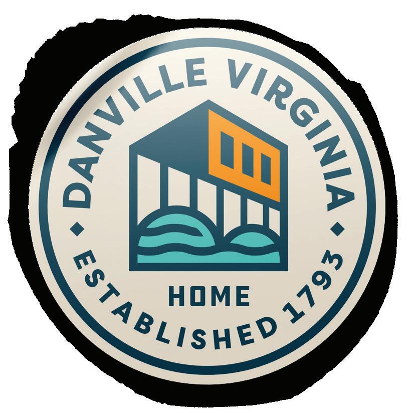
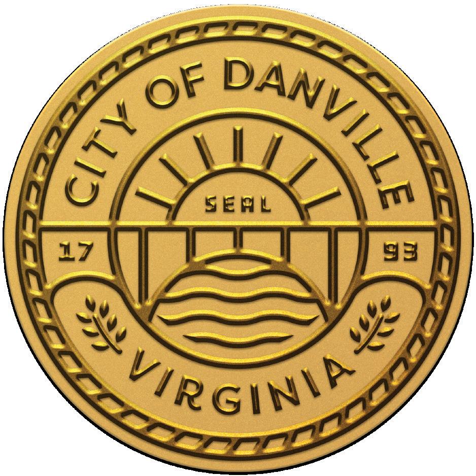
CITY SEAL
THE IDENTITY AND HERITAGE OF OUR CITY
CITY SEAL
The Danville city seal is a symbolic emblem uniquely crafted to encapsulate the city’s distinct identity, incorporating local historical and cultural elements, serving as an official mark of civic pride and governance for the com munity.
The city seal MUST be approved for use, and should only be used on official documents, government signage, and municipal assets; serving as a visual representation of the city’s identity and values.
ALTERNATE COLOR
9
WHITE
BRAND LOGO
THE HEART AND SOUL OF OUR BRAND
A Scalable Identity System
Trying to fit the same mark simultaneously on a billboard and on the side of a mug is a challenge. Our identity system is designed for flexibility, consistency, and brand recognition.
We have provided different logo lockups that should cover every space imaginable. Instead of trying to fit a logo into a space that is too small or crowded, simply use a different version for maximum visual impact and clarity.
When using the icon-only mark, ensure that our brand name is visible near or in relationship with the icon. For example, a mug bearing the icon design on the inside of the cup should have a hang tag or box which displays our brand name legibly. This will help reinforce our brand recognition across multiple touchpoints.
11
Primary Mark Emblem Icon-Only Badge
Combination Mark Banner
Horizontal Mark
What Our Icon Stands For

FEELS
LIKE HOME.
Danville feels like home because of its tight-knit community, where neighbors know each other by name and support one another through thick and thin.
The charm of Danville lies in its picturesque streets adorned with historic architecture, creating a sense of nostalgia and belonging for its residents.
With its vibrant cultural scene, bustling downtown, and abundance of green spaces, Danville offers a perfect blend of comfort, familiarity, and opportunities for growth.
12 + =
ICON
The Danville brand icon is the visually distinctive and instantly recognizable symbol that serves as a powerful and memorable representation in the minds of viewers.
This mark is the most widely usable piece of the brand, seen on clothing, stationery, phone cases, stickers, tote bags, websites, social media, and much more.
ALTERNATE COLOR
13
WHITE
PRIMARY LOCKUP
The primary lockup identifies Danville as a whole to the public. Use this logo to represent individual locations, products, and merchandise as needed.
This logo is a carefully created piece of locked artwork that should not be altered in any way.
14
ALTERNATE COLOR WHITE
HORIZONTAL LOCKUP
When there’s not much vertical space, the horizontal Danville lockup can be used in place of the primary logo lockup.
An example of use for this would be a magazine bearing the horizontal lockup at the top in order to prominently display the image being used. This will help reinforce brand recognition while allowing space in larger formats.
15
ALTERNATE COLOR WHITE
COMBINATION MARK
The combination mark is an alternative to the primary that can be used in situations where little vertical space is available, but the horizontal lockup is not necessary.
This mark is a versatile option that can most effectively be used on print materials such as stationery and business cards.
16
ALTERNATE COLOR WHITE
Lockup Assembly
Height
The height of the Danville icon is and should always be at least 3.5x the height of the D in Danville.
Separation
The space between the icon and wordmark is half that of the width of the D in Danville.
Vertical Alignment
The top right point of the icon should align exactly with the vertical top of the wordmark.
.75” or 50px
Minimum Size
This version is not intended for extremely small sizes. The minimum height is .75” for print applications and 50px for digital applications.
17
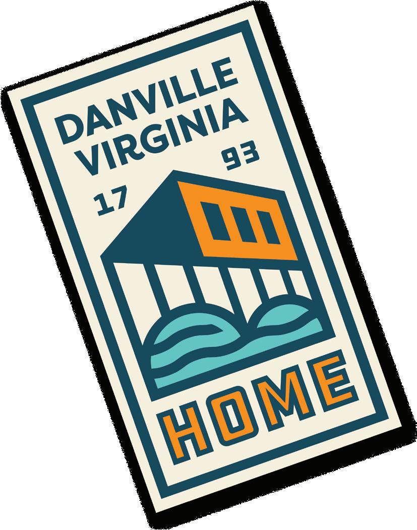
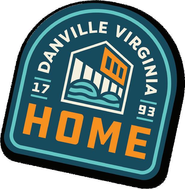
BADGE
When something iconic is desired, the Danville badge can be used in place of a full logo lockup.
For example, a t-shirt bearing the badge on the front should have a hang tag which displays our brand name legibly. This will help reinforce brand recognition.
ALTERNATE COLOR
18
ARCH
A simplification of the badge, the Danville arch can be used as a simpler mark that conveys a visual similarity to the badge.
When this mark is used, ensure that the arch has nothing behind it or bumped up next to it.
19
ALTERNATE COLOR WHITE
BANNER
When something iconic is desired, the Danville banner can be used in place of a full logo lockup.
This lockup can be displayed proudly as street flag, and can function on its own to display the Danville brand legibly.
20
ALTERNATE COLOR WHITE
EMBLEM
For a more compact and versatile representation of the Danville brand, the emblem condenses the lockup into a single, memorable symbol that can be easily recognized across various applications. Stickers, magnets, and pins can all prominently feature the emblem making it easy for a passerby to recognize the brand.
21
ALTERNATE COLOR WHITE
USAGE
HOW TO USE (AND NOT USE) OUR NEW BRAND IDENTITY
Incorrect Usage
Don’t rotate the logo. Don’t distort, compress or stretch the logo dimensions.
Don’t change the layout or relationship between logo elements.
Don’t make alterations to elements within the logo or wordmark that are not consistent with the brand.
Don’t use gradients in or on the logo. Don’t use shadows, bevels or other effects on the logo.
23
Background Control
Our logo works very well on a plain white background.
The cream color is a great background color for the full-color logo. If you are using one of the patterns, make sure there is proper transparency so that the logo stands out.
Never use the logo on 100% black background. Use an 85% tint of black instead. Only use the all white logo if you are using a background color other than Danville Navy.
Be careful placing the logo over a photo. Make sure you have a navy or cream transparent layer on top of the photo if at all possible. Use the full color or white versions of the logo.
24
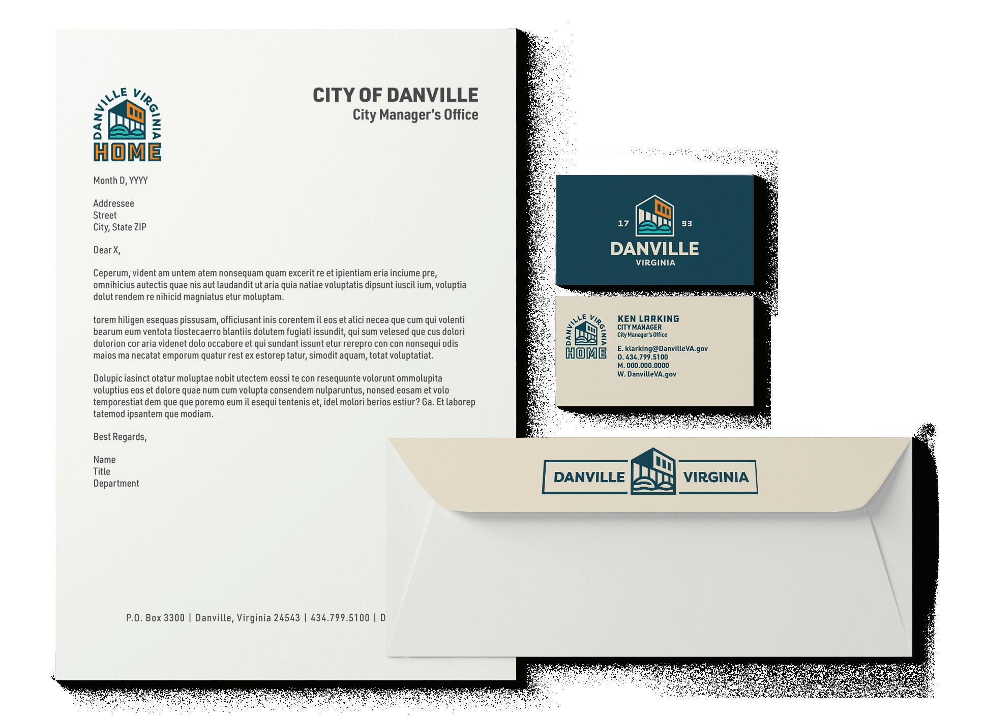
Placement
ON THE PAGE
Letterheads are printed on an asneeded basis. If a typed document is not finalized, do not print. We prefer to reduce our waste of paper products.
Content on all letterheads should follow the included template: nothing should be added or removed.
Body Copy Font: Calibri Regular
Body Copy Size: 12pt
Size: Standard 8.5” x 11” (110.572mm x 279.4mm)
Paper: Refer to printshop for paper stock recommendations
PREFERRED
Align the logo to the 1” margin. The arch lockup looks best when top leftaligned.
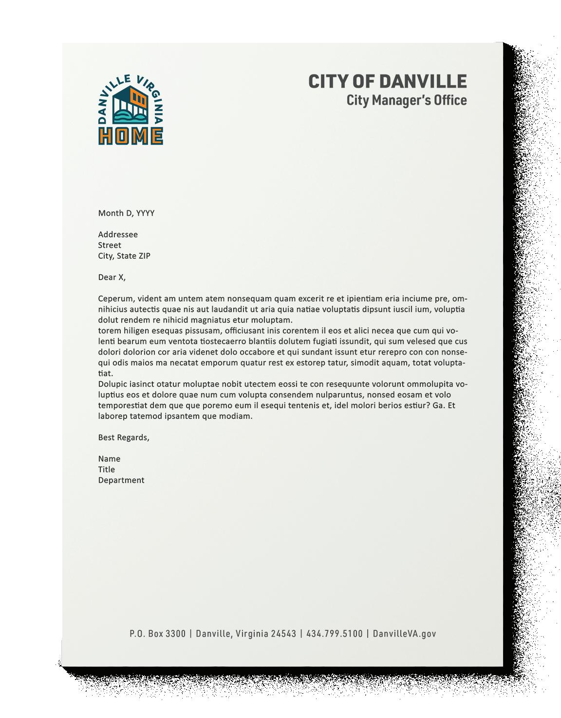
ALTERNATE OPTIONS
Align the icon to the top-left corner. If the layout dictates a centered footer, use the icon or vertical lockup.
25
Placement
BUSINESS CARDS
Business cards are printed on an asneeded basis. If these are not needed for day to day use, do not produce them. We prefer to reduce our waste of paper products.
Content on all business cards should follow the included template: nothing should be added or removed.
Size: Standard 3.5” x 2” (88.9mm x 50.8mm)
Paper: 17pt Uncoated Cardstock
Finish: Spot UV (Back)
FRONT
Four-color process print on matte stock. Name typeset in DDC Hardware Regular. Details typeset in URW DIN.
BACK
Four-color process print on matte stock. Centered icon printed in spot UV.
KEN LARKING CITY MANAGER City Manager’s Office E. klarking@DanvilleVA.gov O. 434.799.5100 M. 000.000.0000 W. DanvilleVA.gov 26
Placement
EMAIL SIGNATURE
The standard Danville email signature should always follow the format to the right. Any alterations to the set brand signature will be addressed in a oneon-one basis.
Content on all email signatures should consist of the following:
- First Name, Middle Initial, Last Name
- Job Title
- Department - Email | Street | City, State ZIP
- Office Phone | Fax (If Applicable)
- Department Web Address
- Social Media Tag
laura.ashworth@discoverdanville.com
27
Laura J. Ashworth
Marketing and Research Manager
Economic Development & Tourism
| 427 Patton St | Danville, VA 24541 O: 434.793.1753 | F: 434.797.9606 www.discoverdanville.com
Placement
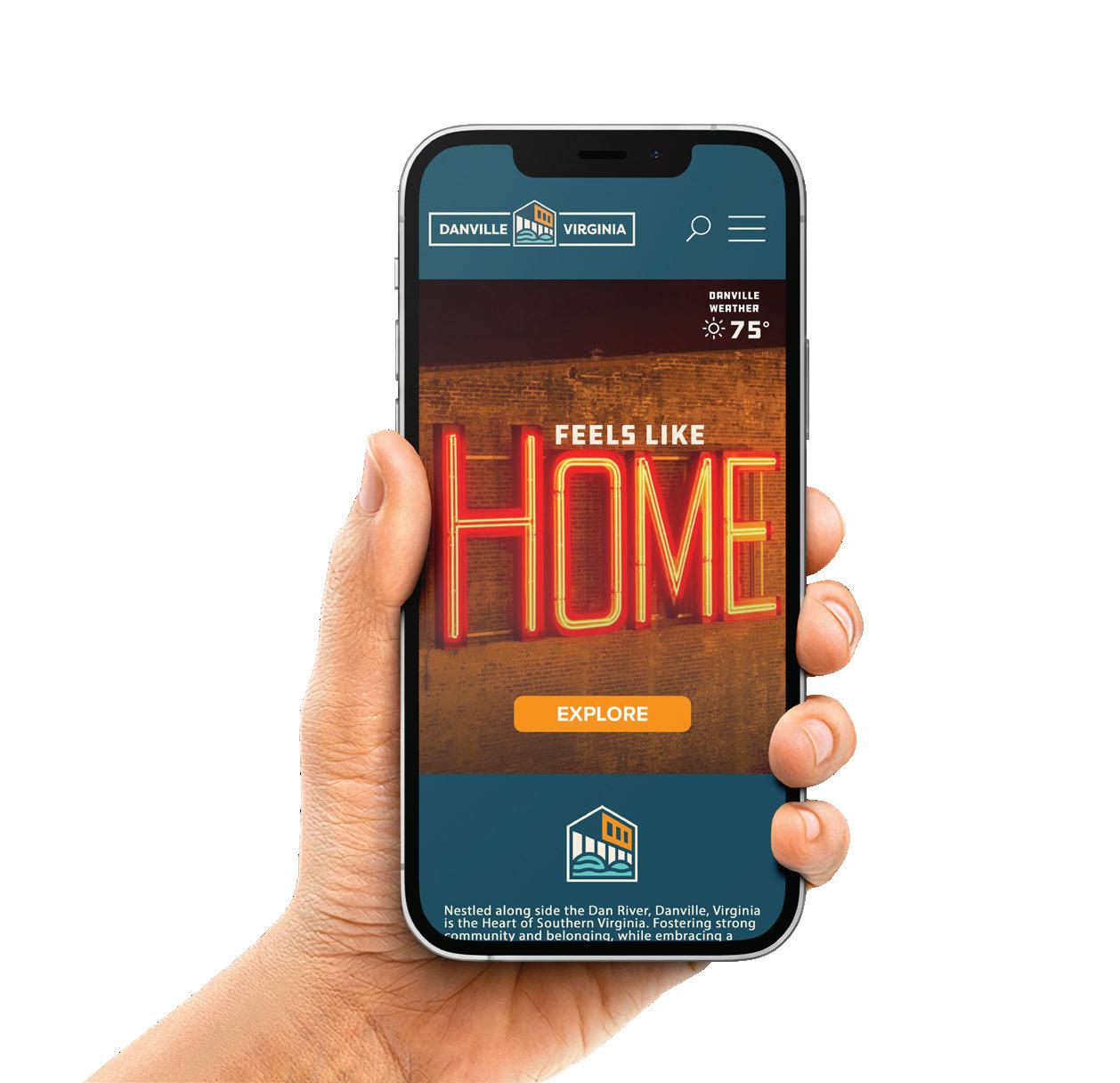
ONLINE
On the Danville website, the logo or horizontal lockup will be placed in the upper left-hand corner of the navigation bar.
Do not center the logo in the navigation, even on small screens.
FAVICON
Our favicon—a 32px x 32px icon that is displayed in the browser next to the URL—is the only other approved usage of our icon in solid form.
DEVICE ICON
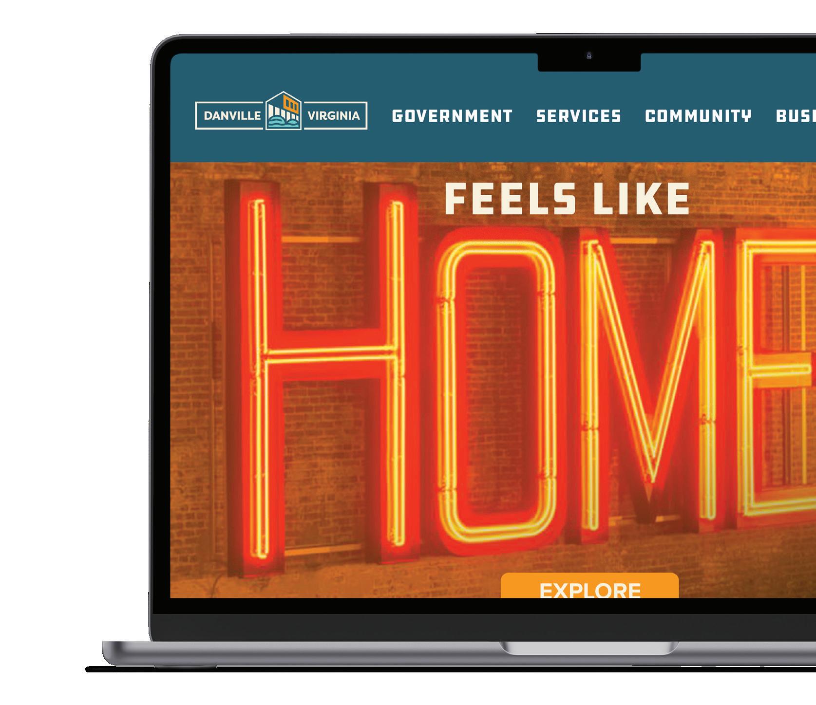
If our website is saved as a bookmark on the home screen of some mobile devices, this graphic will be displayed. Default size is 192px x 192px.
28
Placement
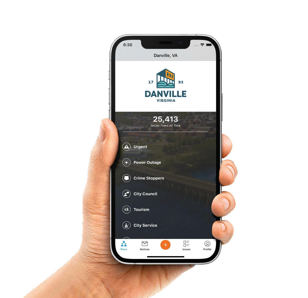
IN THE APP
On the Danville app, the badge will be centered within the working space.
Do not align any elements to any borders within the layout, or you risk a part of the lockup being cut off.
APP ICON
On a device this graphic will be displayed at a smaller size.
Default size can range from 58px to 167px depending on the device, and it will automatically scale as needed.
APP STORE ICON
In the app store this graphic will be displayed at a larger size.
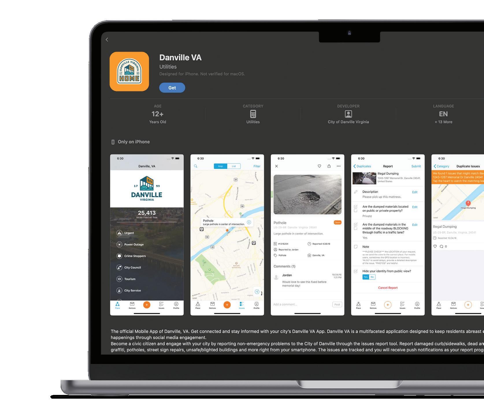
Default size for the store is 1024px x 1024px.
29
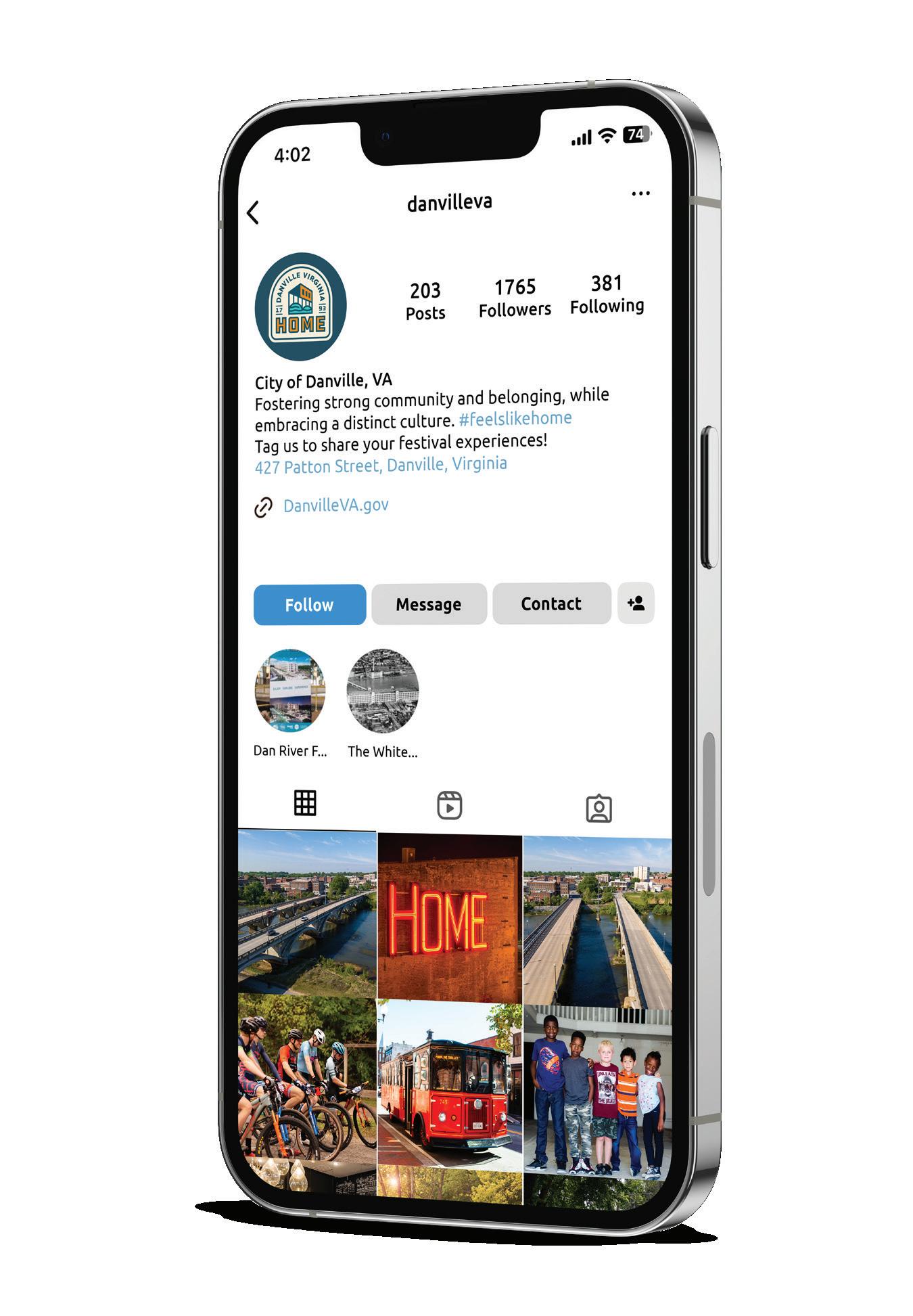
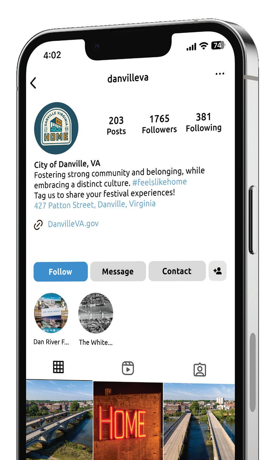
Placement
SOCIAL MEDIA
When used as social media avatars, the emblem lockup should be used with the right amount of clear space on all sides.
We have developed an approved avatar image found here on this page. It’s approved for circular shapes of all sizes.
While the layout of this avatar should not be altered in any way, approved secondary brand colors may used to address special events, holidays, and seasonal changes.
ICON AVATAR
Preferred avatar for use on all platforms. All approved color combinations may be used.
30
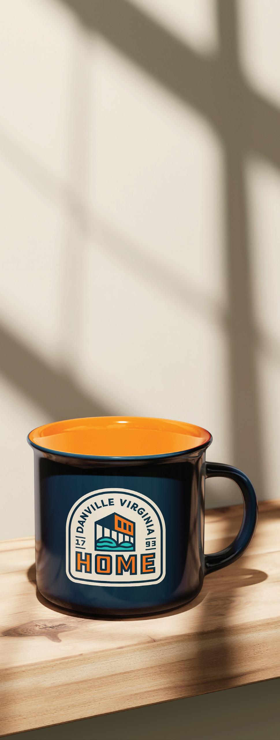
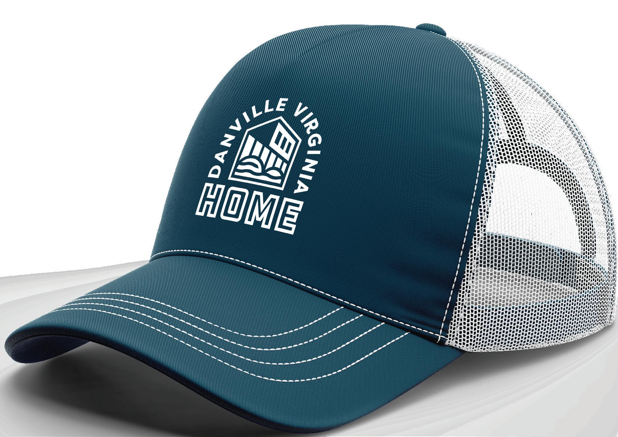
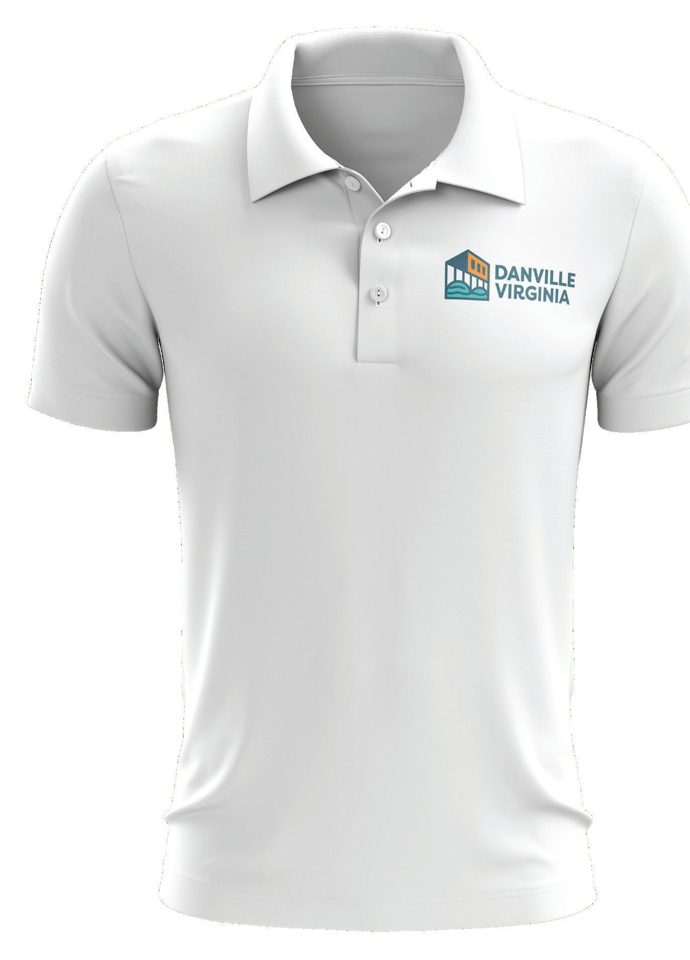
Placement
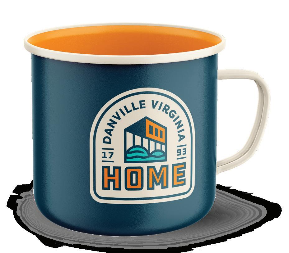
ON MERCHANDISE
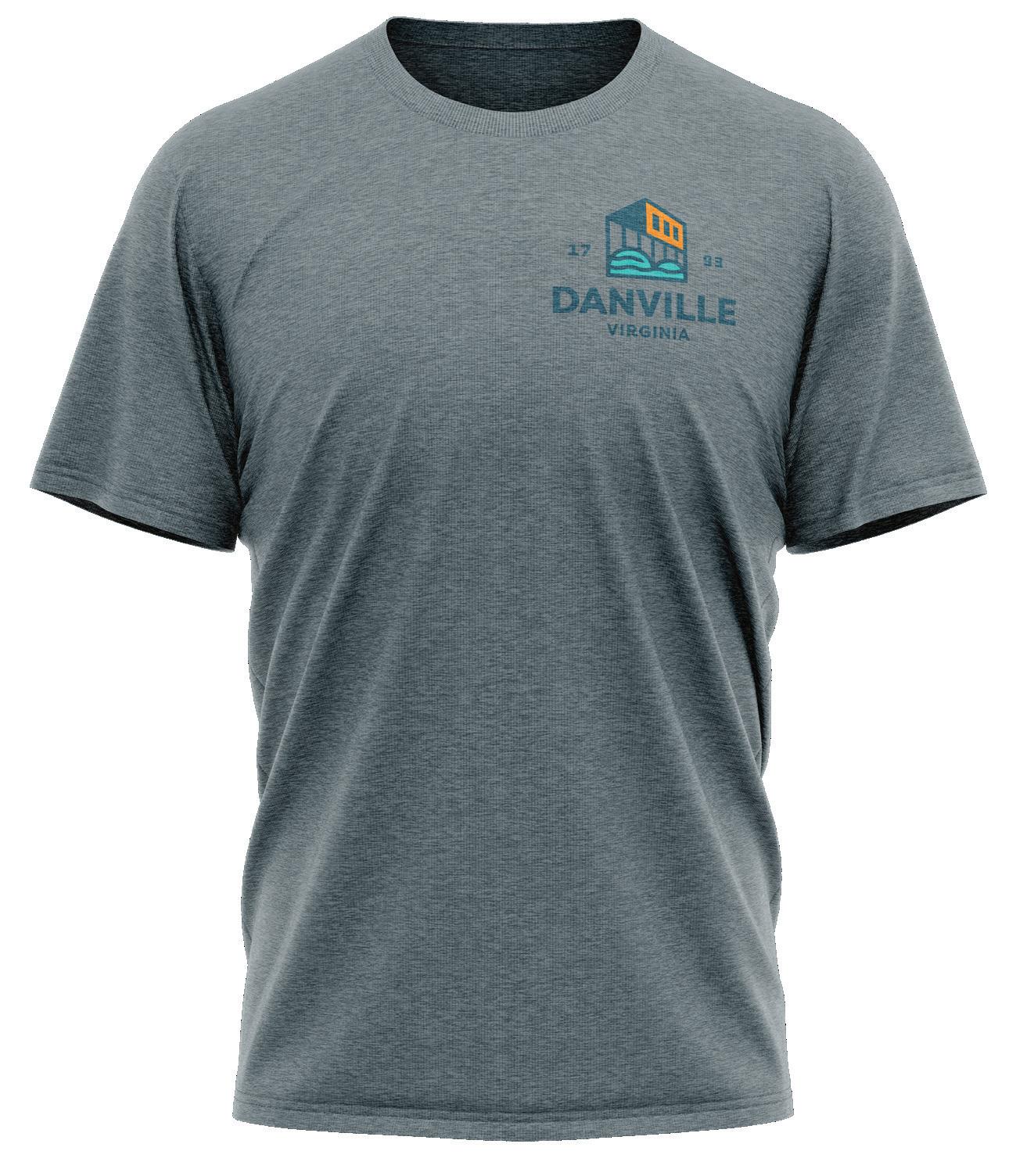
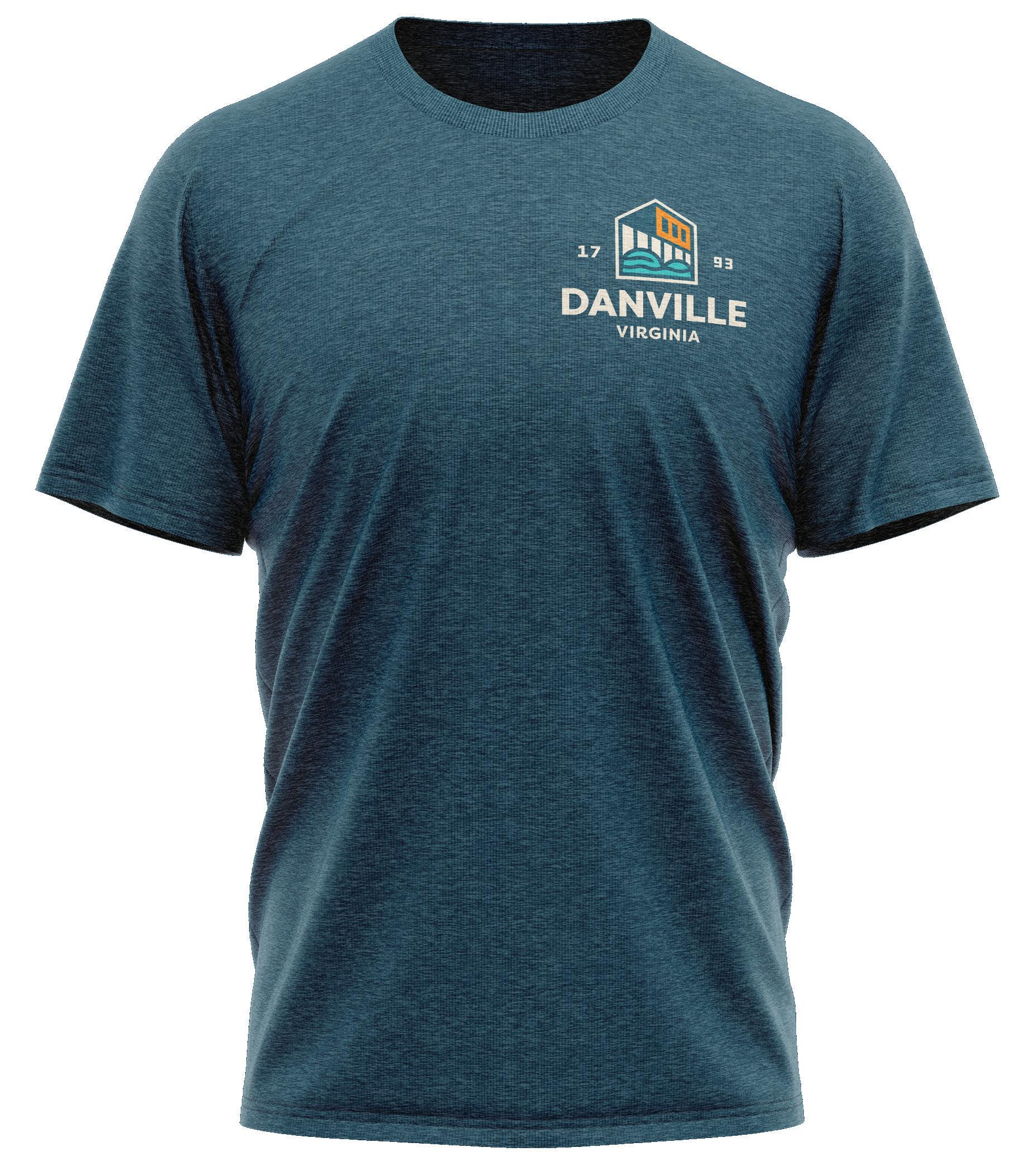
Branded merchandise like t-shirts, hats, and camp mugs should all follow a leftaligned logo placement if possible.
If possible, look for unique and uncommon imprint areas to utilize. Areas like t-shirt sleeves are rarely used and can make a striking visual statement.
Each piece of merchandise will carry unique limitations. Use the images on the right as general guidance.
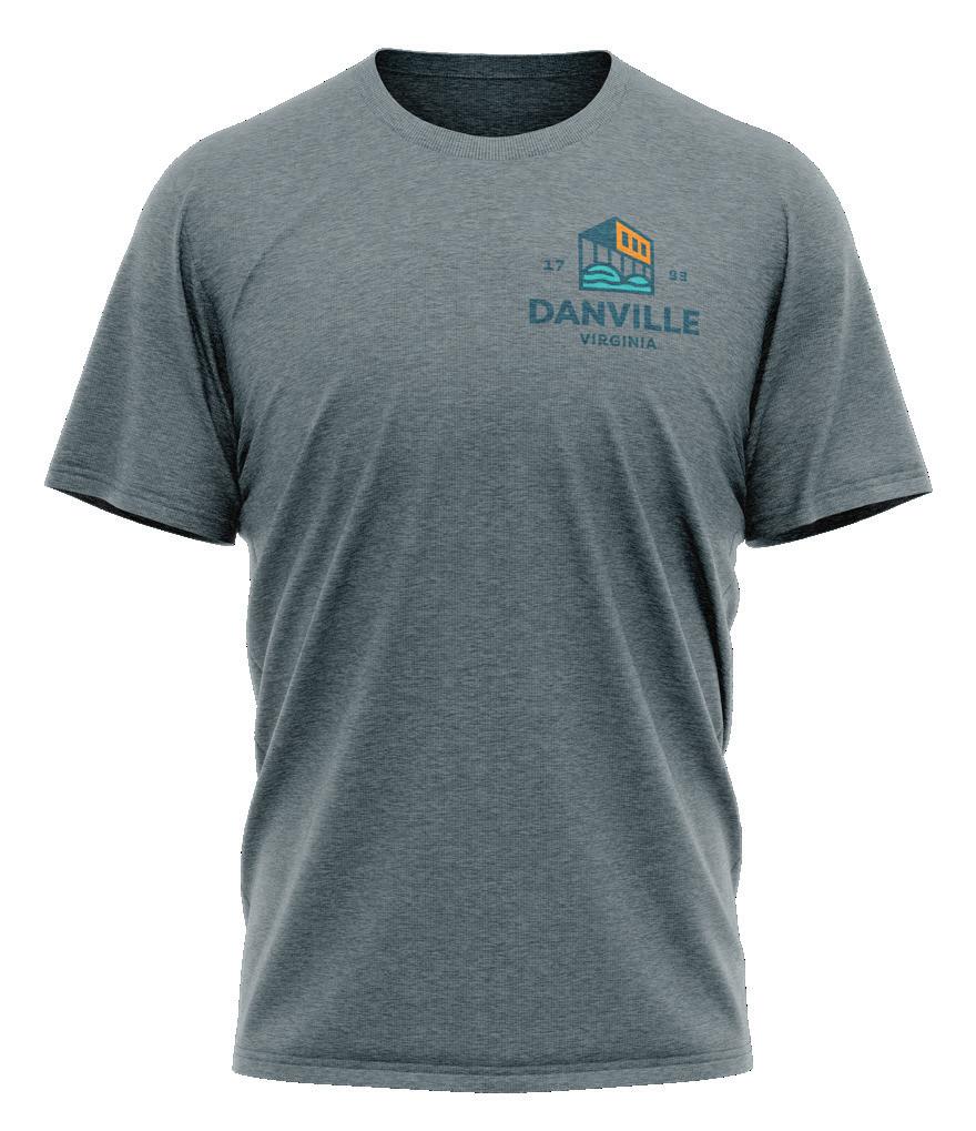
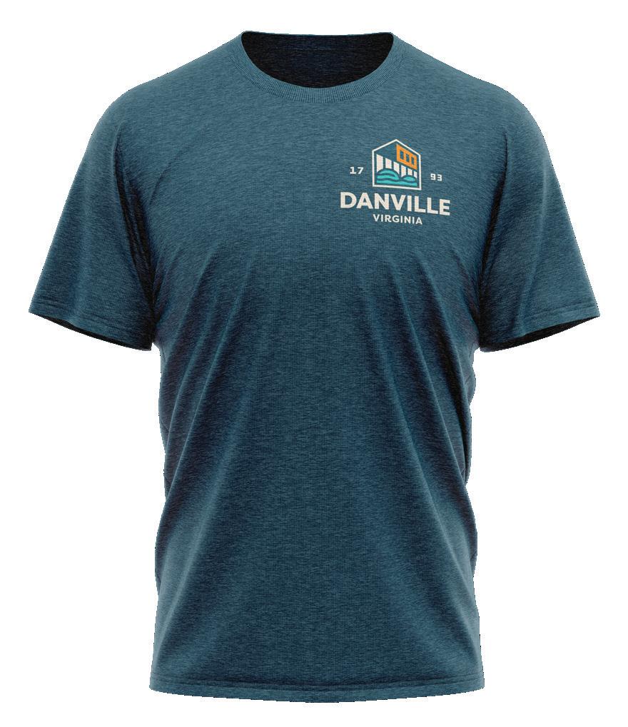
APPAREL
Left align the logo when possible. Use the icon for centering, or if brand subtlety is desired.
31
COLORS
CONSISTENCY TO THE “T”
DANVILLE NAVY
HEX - #174A5D
CMYK - 92, 62, 46, 30
RGB - 23, 74, 93
PANTONE - 7477 C
GOLDEN HOUR
HEX - #FF9100
CMYK - 0, 52, 100, 0
RGB - 255, 145, 0
PANTONE - 1495 C
PRIMARY BRAND COLORS
The consistent use of color is vital to effective brand recognition.
Our brand should always be represented in one of the colors on this page, aside from specific recommendations within this guide.
Do not use any other/unauthorized colors.
PREFERRED 2-COLOR PAIRINGS
HEX - #F4ECDC
CMYK - 4, 5, 13, 0
RGB - 244, 236, 220
PANTONE - 16-9 C
TEAL
HEX - #5CCCC6
CMYK - 57, 0, 28, 0
RGB - 92, 204, 198
PANTONE - 325 C
33
CREAM
PRIMARY COLORS USAGE
These colors are used the most when designing Danville’s print and digital collateral. They are a key part of the brand identity and play an integral role in maintaining the consistency of the brand.
Recommended guideline for the presence of each color that you will use when implementing your brand identity.
DANVILLE NAVY
CREAM
GOLDEN HOUR
TEAL
34 40% 30% 20% 10%
USING TINTS
We prefer our brand colors used without editing, but some situations require the use of color tints, especially on the web. For example, when a user hovers over a button on our web site, using a tint change can help confirm their action.
If necessary, use a 20% tint step system, keeping legibility in mind. Any tint below 60% used as a background will require dark text.
35 100% 100% 100% 80% 80% 80% 40% 40% 40% 60% 60% 60% 20% 20% 20%
APPROVED PAIRINGS
Nearly all of the colors within our primary palette can be used in combination. Whenever possible, strive for legibility with contrast, especially when setting typography.
Home
Home Home Home
Navy text, full color icon on a cream background.
Great contrast and legibility.
White text and icon on a navy background.
Perfect for use in print, and web.
Cream text and icon on a navy background.
Slightly lower contrast, but excellent legibility.
Home
Home
Blue text and icon on white. Classic combination and great contrast, without use of black.
Navy text, full color icon on white.
The contrast of full color draws attention and visual interest.
Navy text, full color icon on a golden hour background. Demands attention. Use golden hour backgrounds very sparingly.
36
CRIMSON RED
HEX - #E74E2F
CMYK - 4, 84, 92, 0
RGB - 231, 78, 47
PANTONE - 7625 C
SECONDARY BRAND COLORS
These colors are essential in design for their ability to enhance visual appeal and complement primary colors.
Use these sparingly, but effectively to enhance the quality of the brand.
AQUA LAKE
HEX - #39BCAC
CMYK - 69, 0, 40, 0
RGB - 57, 188, 172
PANTONE - 7465 C
FERN GREEN
HEX - #3AAF6F
CMYK - 74, 5, 76, 0
RGB - 58, 175, 111
PANTONE - 7723 C
37
SECONDARY COLORS USAGE
These colors are used the most when designing Danville’s print and digital collateral. They are a key part of the brand identity and play an integral role in maintaining the consistency of the brand.
Recommended guideline for the presence of each color that you will use when implementing your brand identity.
CRIMSON RED
AQUA LAKE
FERN GREEN
38 30% 30% 30%
USING TINTS
We prefer our brand colors used without editing, but some situations require the use of color tints, especially on the web. For example, when a user hovers over a button on our web site, using a tint change can help confirm their action.
If necessary, use a 20% tint step system, keeping legibility in mind. Any tint below 60% used as a background will require dark text.
39 100% 100% 100% 80% 80% 80% 40% 40% 40% 60% 60% 60% 20% 20% 20%
TYPOGRAPHY
CONSISTENCY TO THE “T”
DDC HARDWARE - REGULAR
FEELS LIKE HOME
URW DIN - BLACK
Header: URW DIN BLK
BODY COPY: URW DIN Medium doloraest fugiam
exerite modistrum aborrov ideruntius ipsamus
reictatibus, sus, corpori beriore prae laborehenda
et od etur aut magnatur molupti di occullabo. Us si
oditatem etur sundant pores et quam rem ipit odicit
quodit aut ma voluptaquam uga. Cusanis ex experro
DDC HARDWARE - REGULAR
FEELS LIKE HOME
URW DIN - BLACK
Header: URW DIN BLK
BODY COPY: URW DIN Medium doloraest fugiam
exerite modistrum aborrov ideruntius ipsamus reictatibus, sus, corpori beriore prae laborehenda et od etur aut magnatur molupti di occullabo. Us si
oditatem etur sundant pores et quam rem ipit odicit quodit aut ma voluptaquam uga. Cusanis ex experro
41
48PT 12PT 24PT 12PT 48PT 12PT 24PT 12PT
Not all fonts are available depending on what software you’re using.
In a situation in which URW DIN is not available for use, the primary replacement font that can be use is Calibri Bold and Calibri Regular.
These can be used as subheaders and body copy, respectively.
Not all fonts are available depending on what software you’re using.
In a situation in which URW DIN is not available for use, the primary replacement font that can be use is Calibri Bold and Calibri Regular.
These can be used as subheaders and body copy, respectively.
WEB FONT WEB FONT
Body Copy: Calibri Regular molestrum quas sitiae laut duciisci dolenet et aliquatem cusciis dem aut quaspit od quis et ulparumet am ipiet quas et ut eaquosto que nosam tis et ligniatia dolut qui ut experer umquatus, conem. Cepedit atiasit iliciatum qui totatio rempella aut eumquia nossume que sim que culliqui consequame lignit
Body Copy: Calibri Regular molestrum quas sitiae laut duciisci dolenet et aliquatem cusciis dem aut quaspit od quis et ulparumet am ipiet quas et ut eaquosto que nosam tis et ligniatia dolut qui ut experer umquatus, conem. Cepedit atiasit iliciatum qui totatio rempella aut eumquia nossume que sim que culliqui consequame lignit
42
CALIBRI - BOLD
CALIBRI - BOLD
PATTERNS
THE LITTLE THINGS MATTER
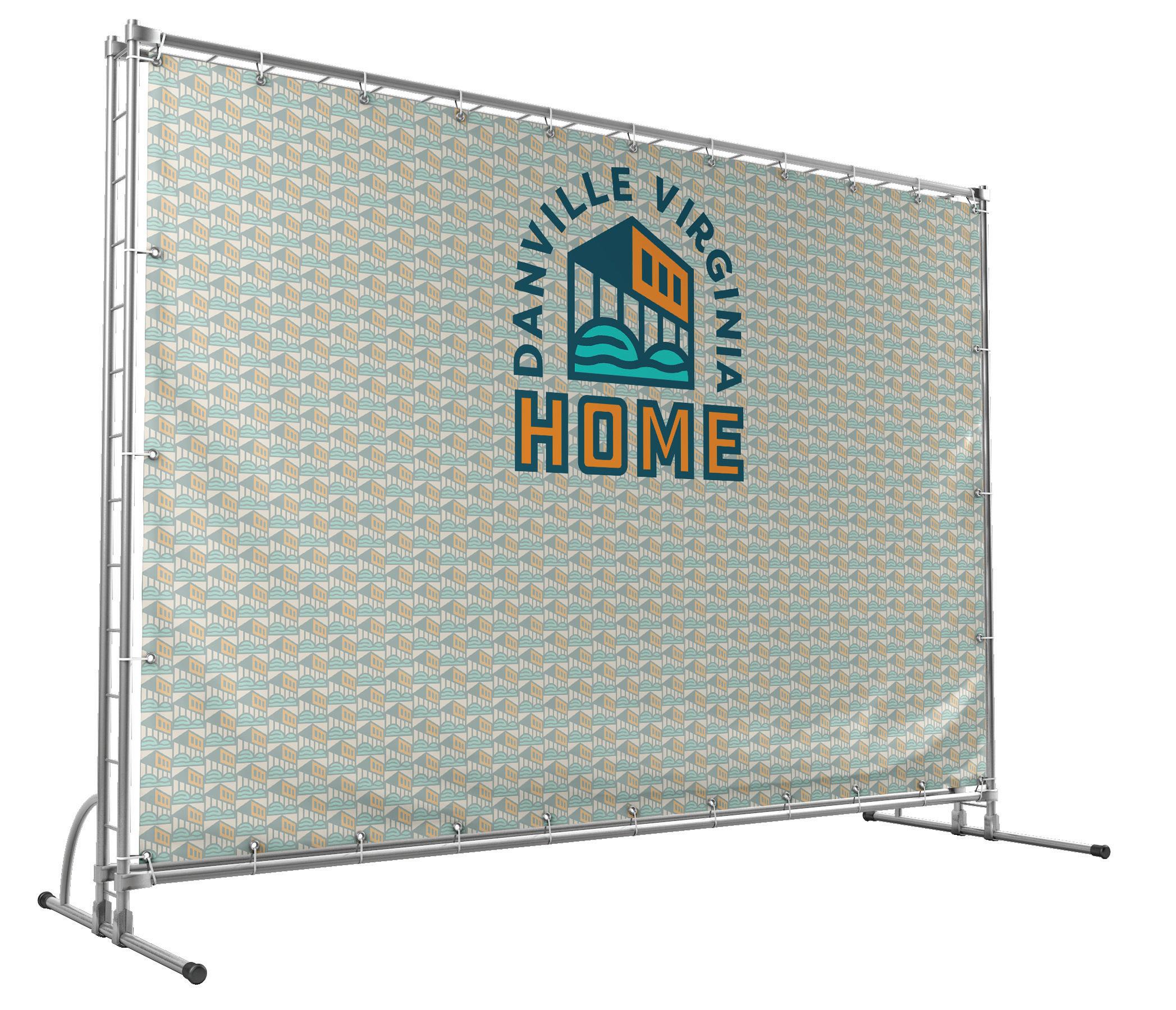
PATTERNS
The Danville patterns can be used as an additional brand design element. Outside of the full-color pattern, these elements are designed to be tone-on-tone, meaning the colors should be used together as shown on this page.
IMPLEMENTATION
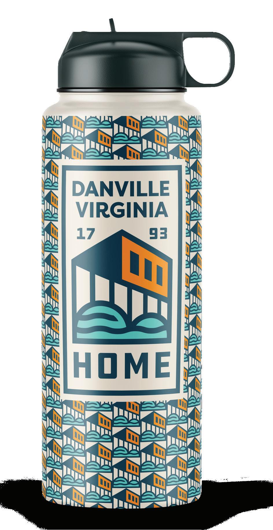
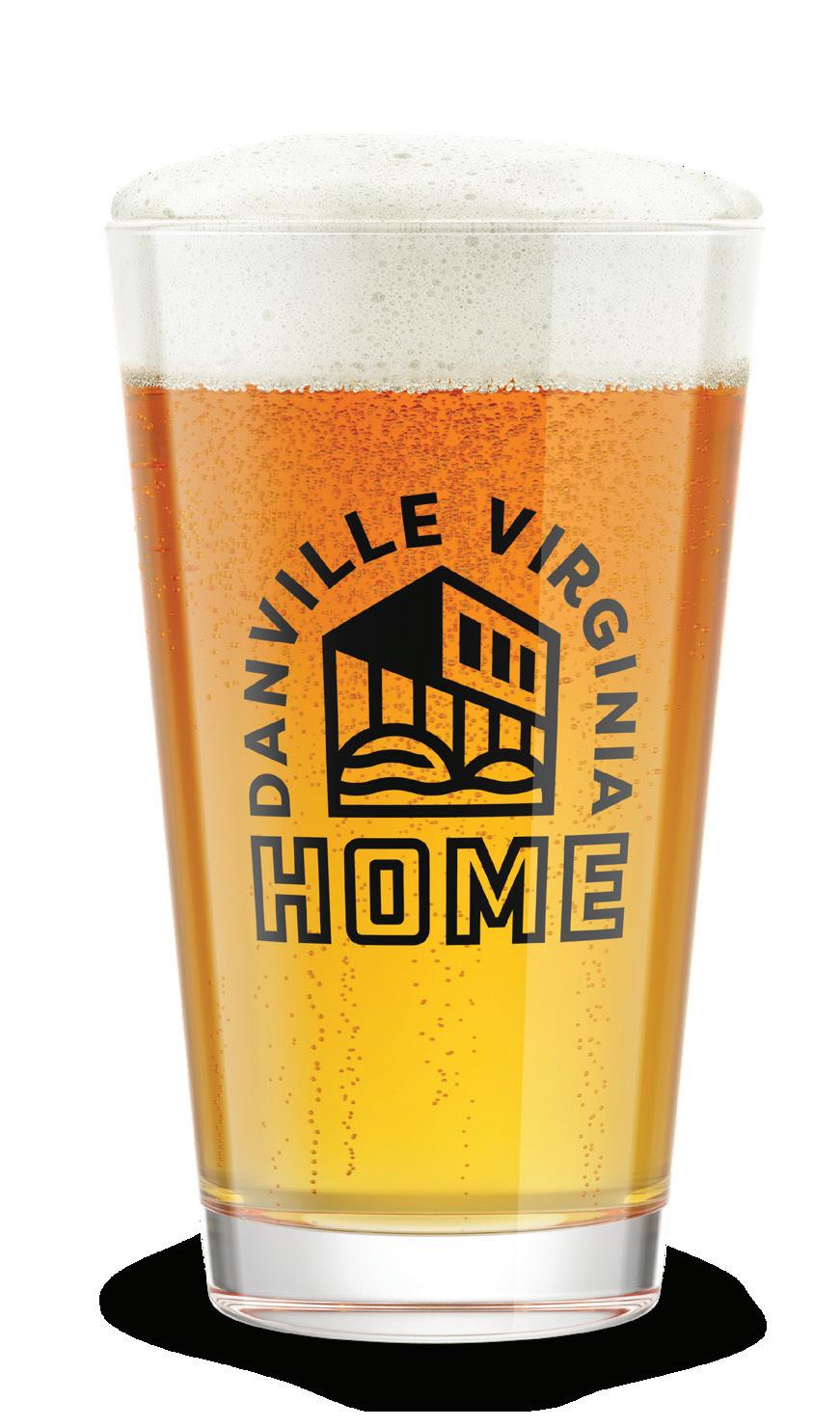
VIEWING THE BRAND “IN THE WILD”
BEVERAGE CONTAINERS
46

STICKERS & CAP
47
STREETWEAR
48
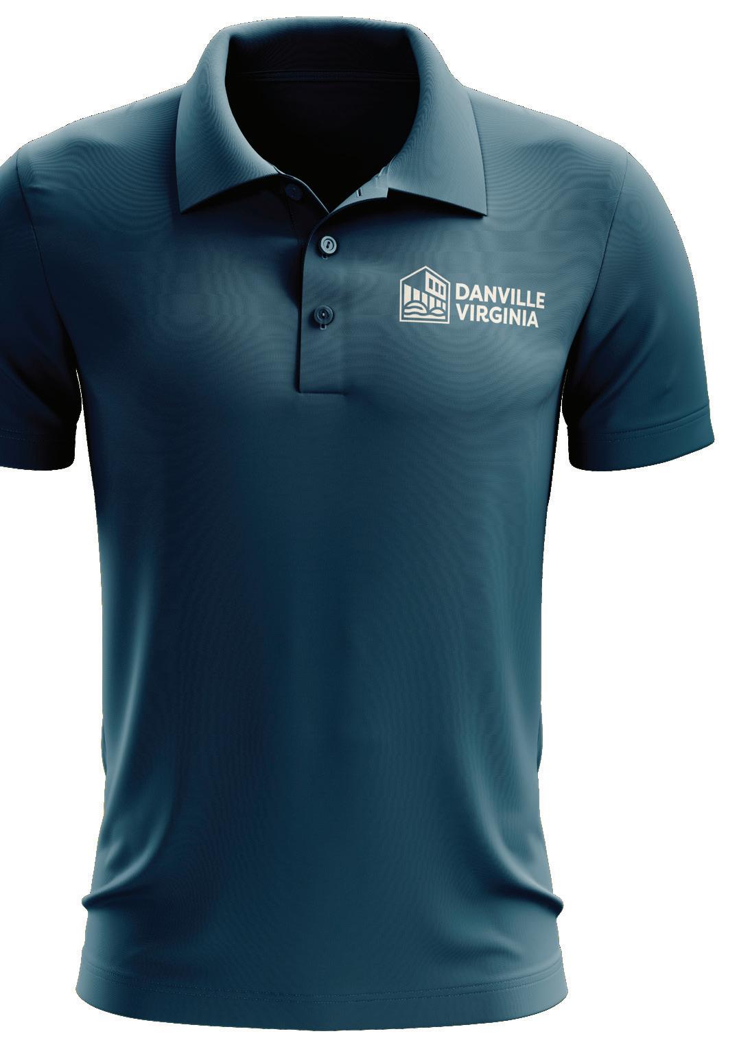
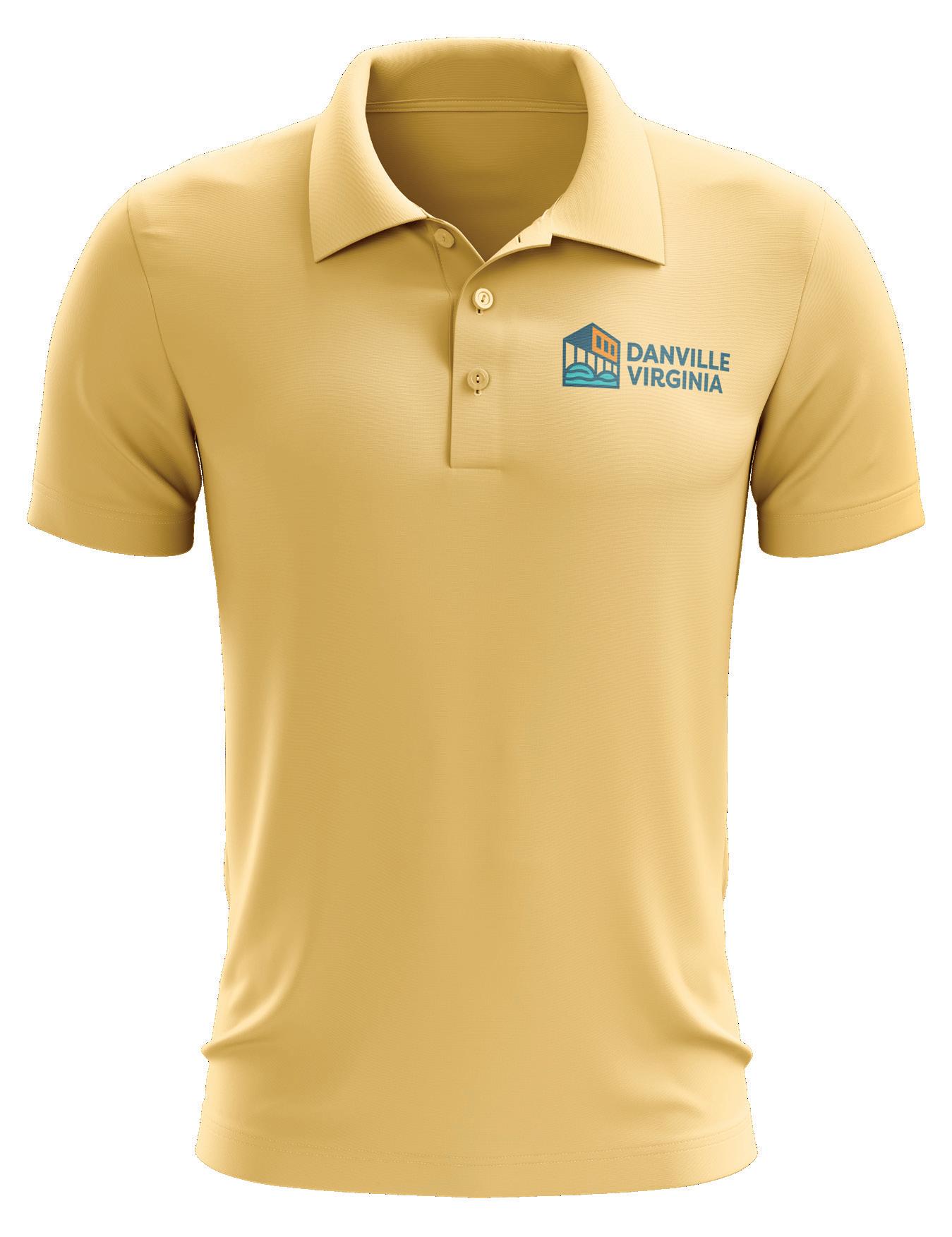
POLO SHIRTS
49
50 WEB & SOCIAL
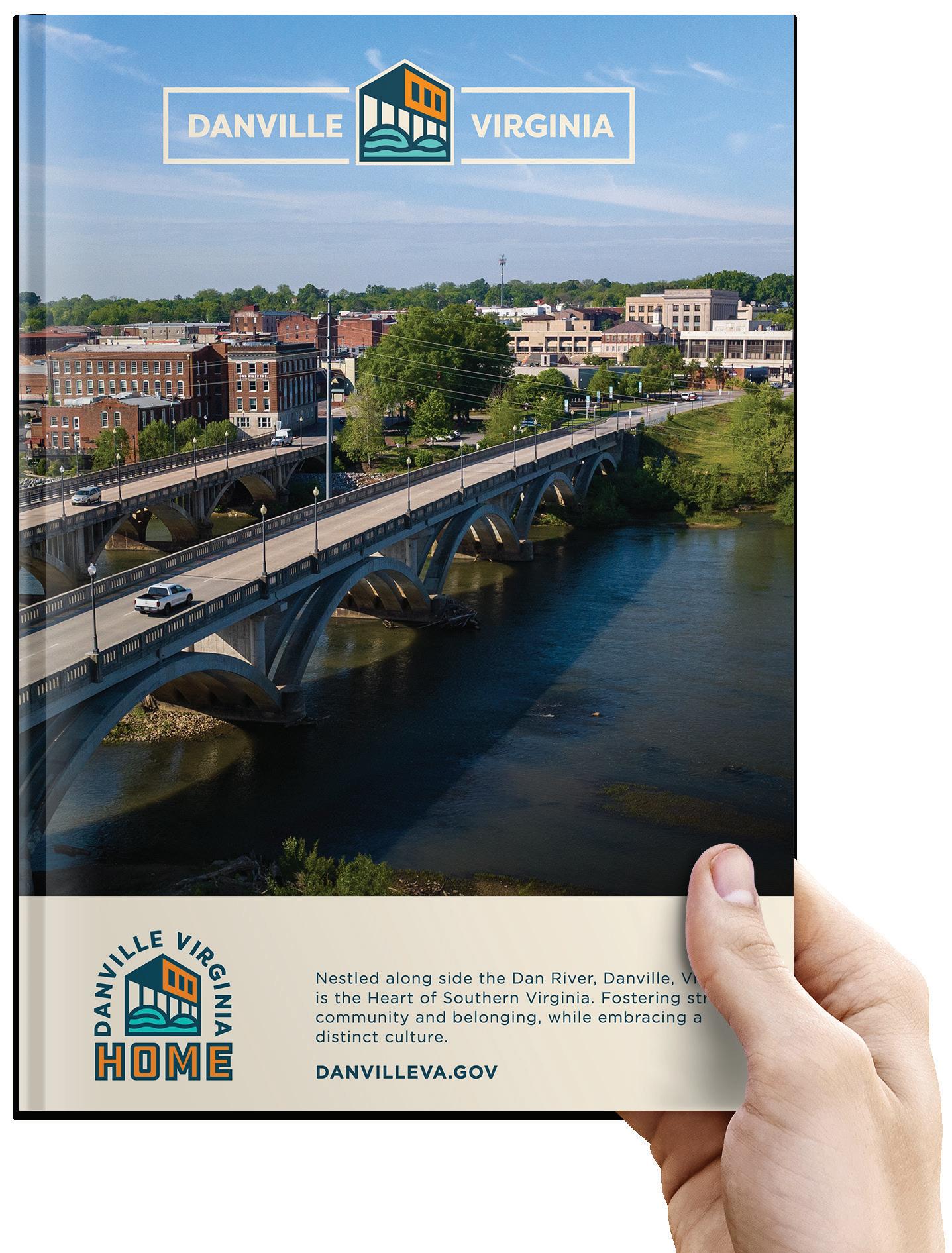
51 STATIONERY
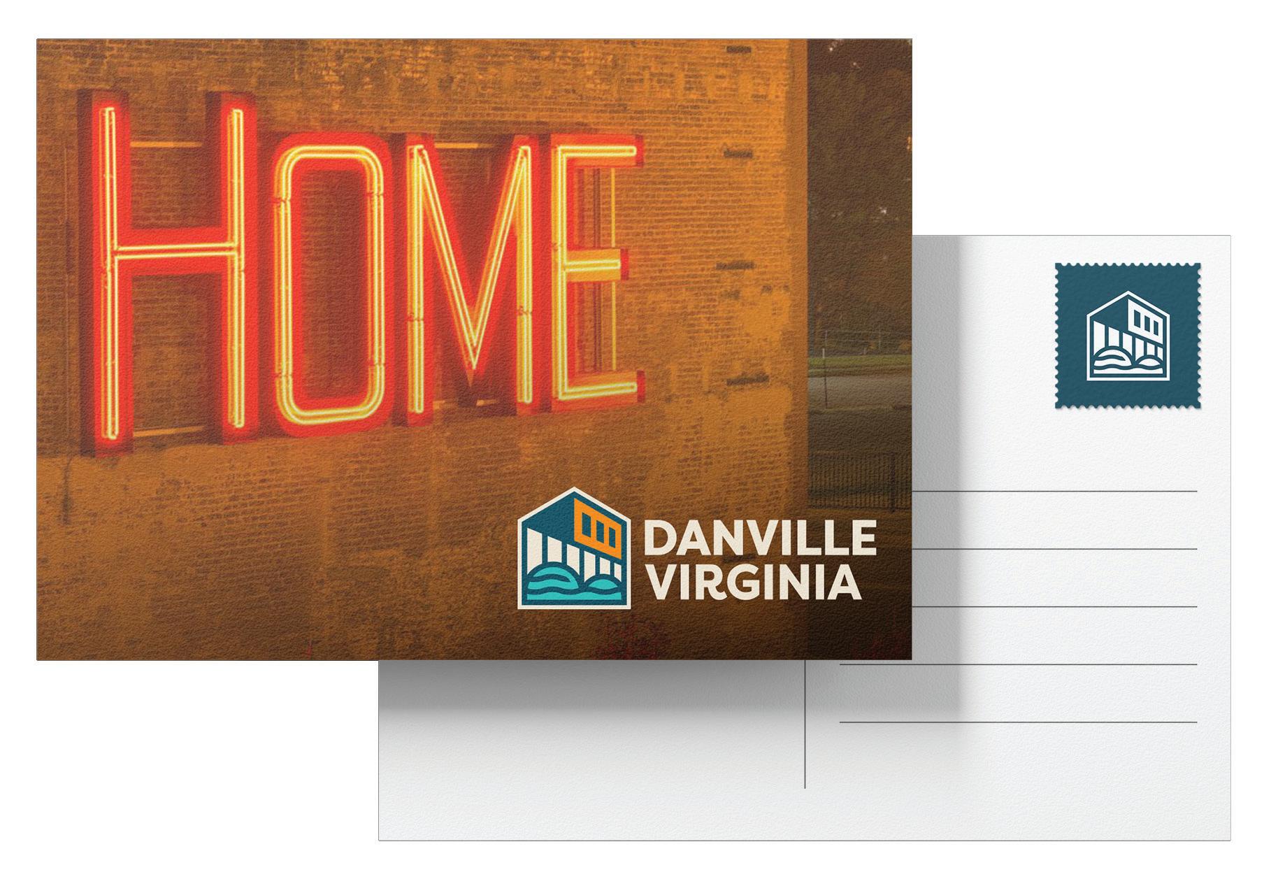
52 POSTCARD
53 PRINT AD
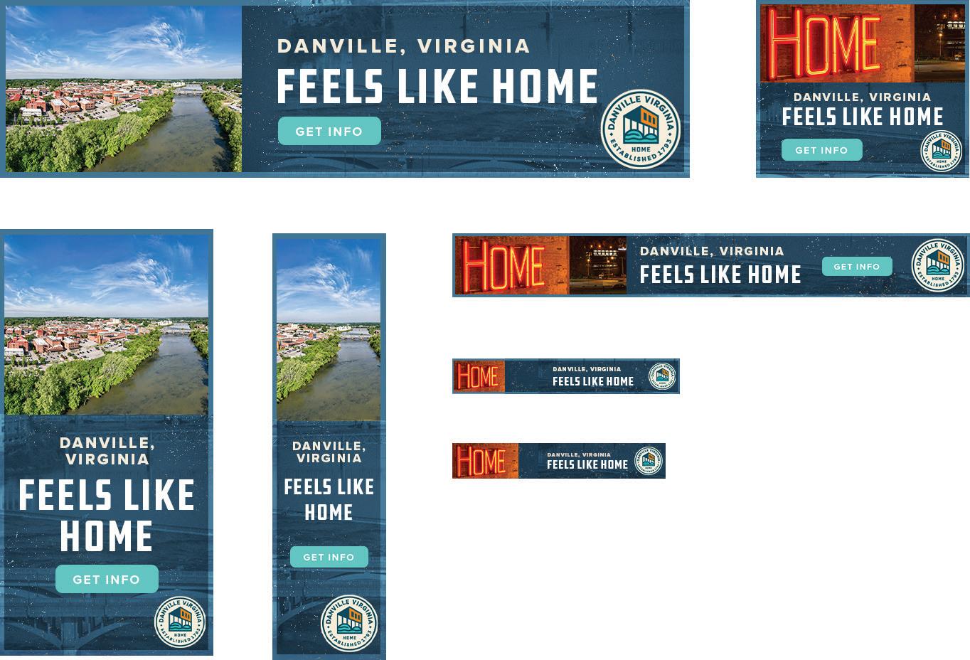
54 DIGITAL ADS
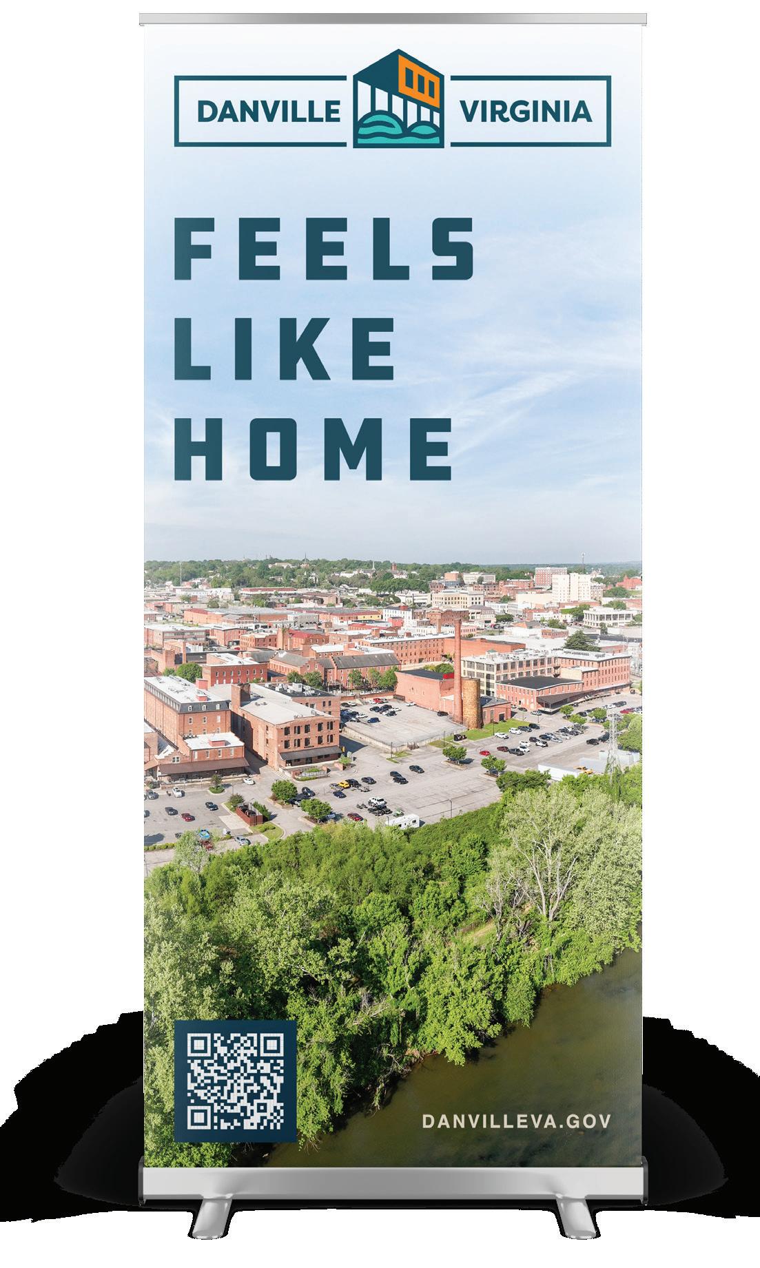
BANNER
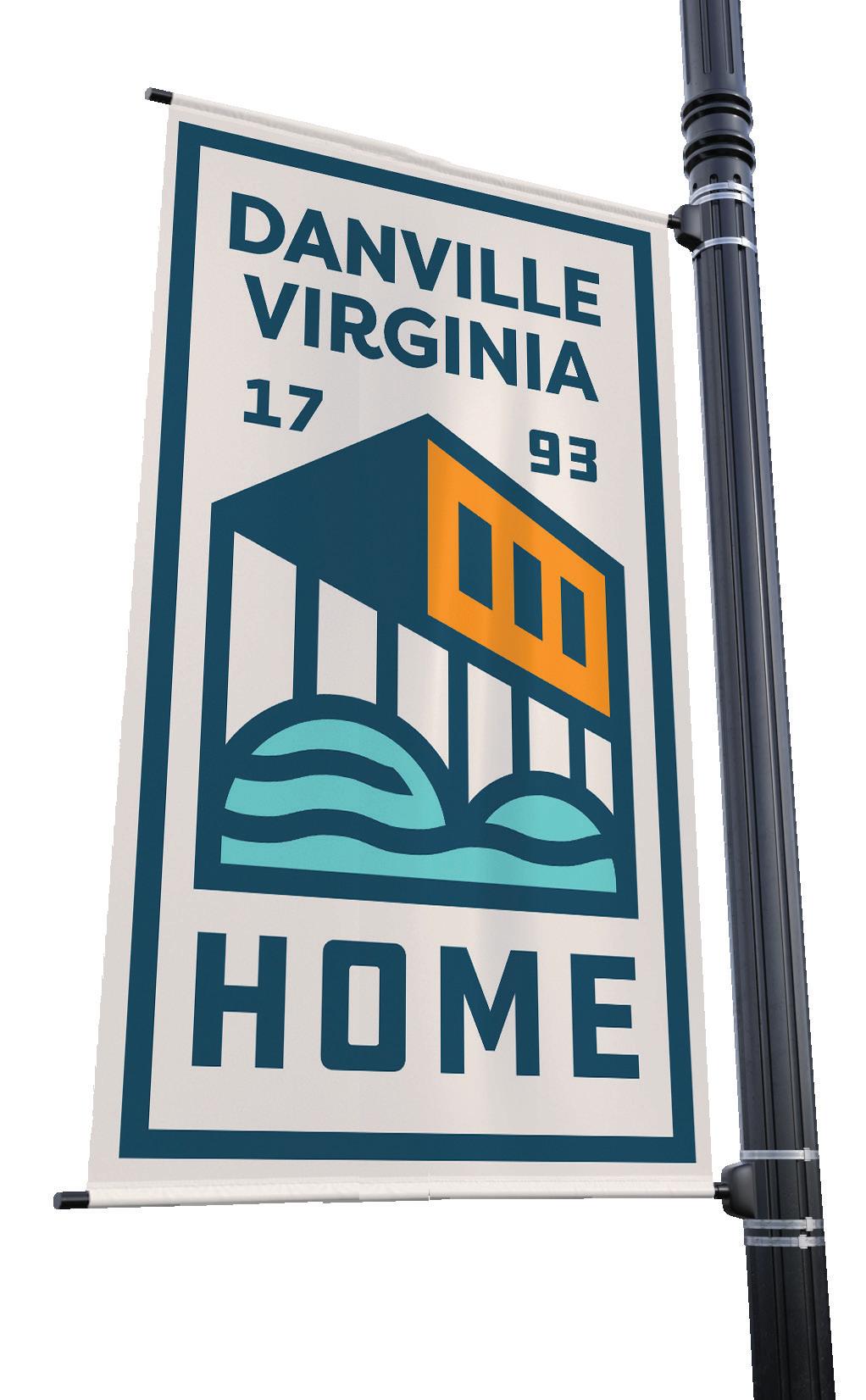
55
BILLBOARD
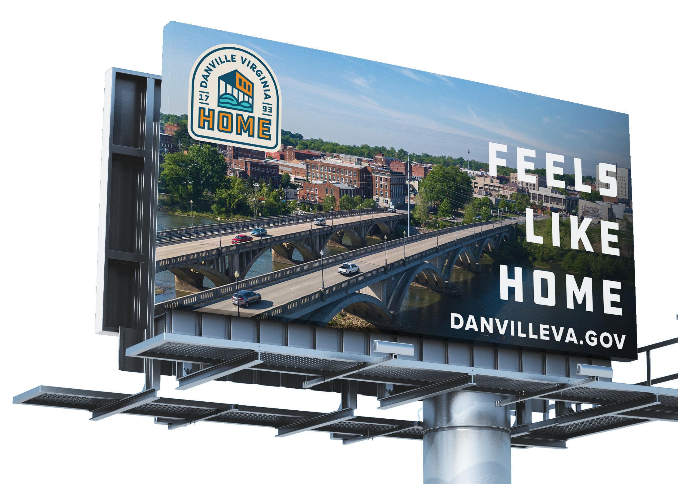
56
57
EXHIBIT POPUPS
PINS
58
ACTUAL SIZE LOGO DETAIL SEAL DETAIL
ACTUAL SIZE
LAPEL
.75IN
.75IN
59
INK & EMBOSS
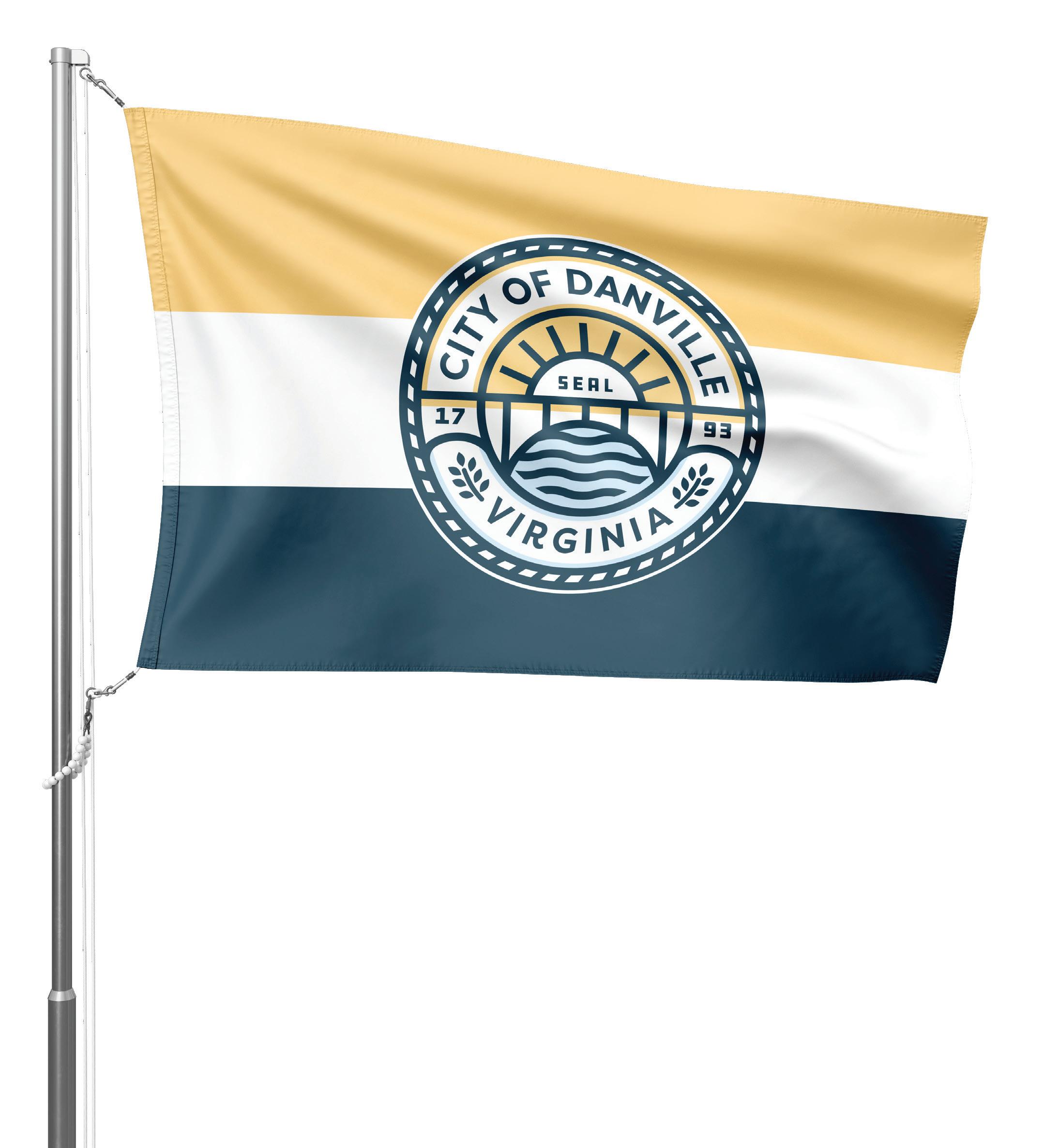
CITY FLAG
60
FIRST RESPONDER PATCHES
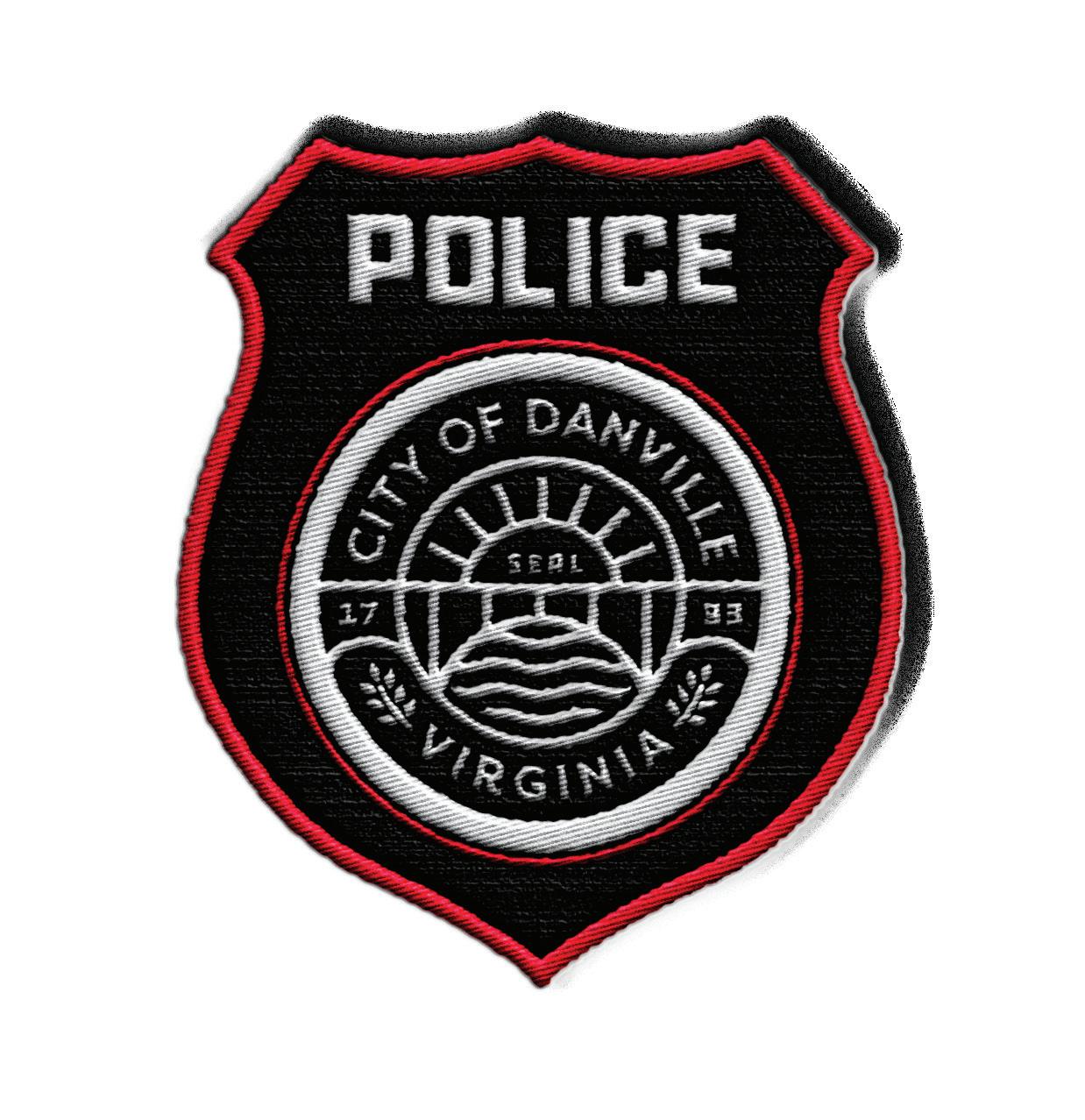
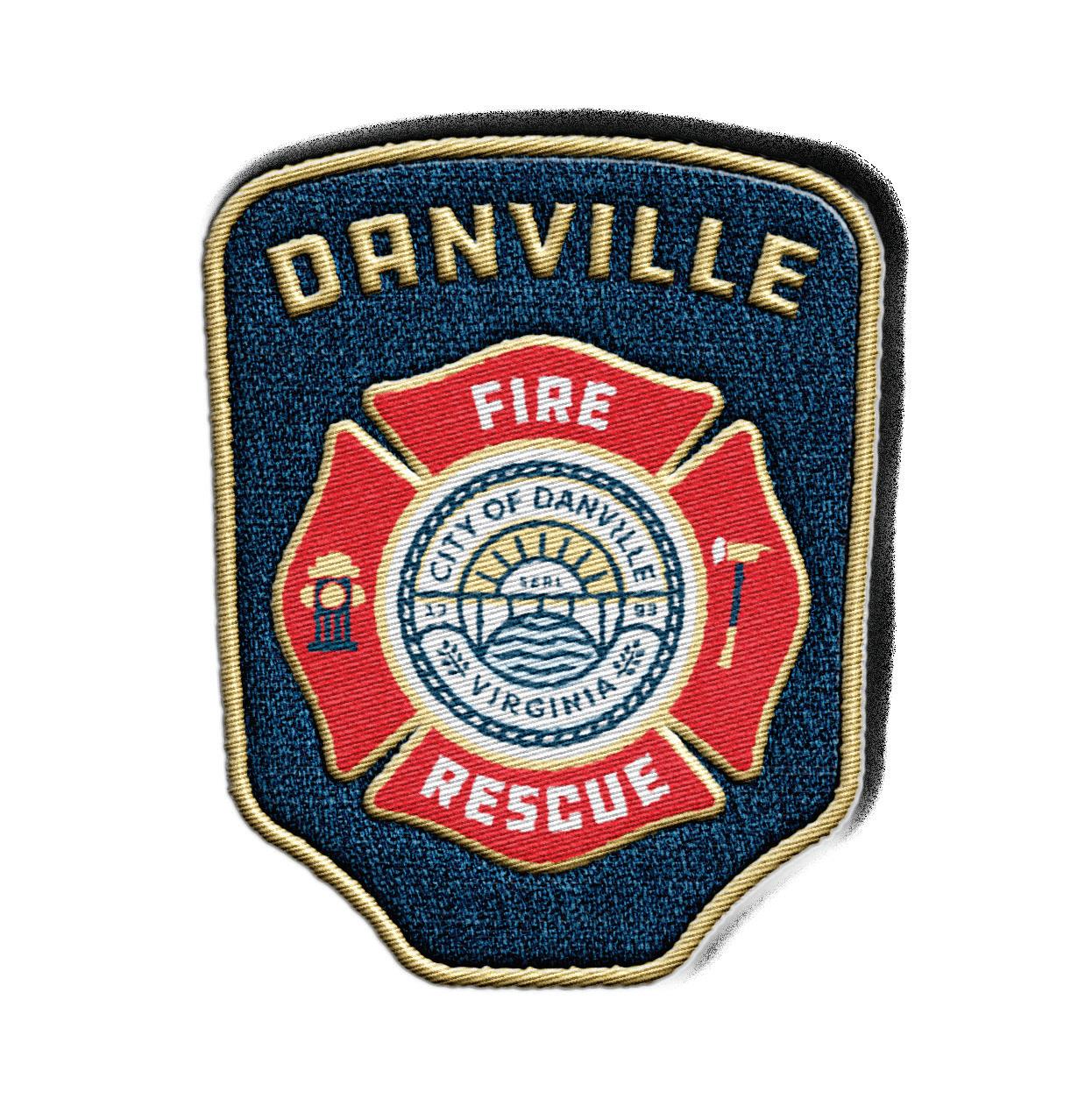
61
POLICE PATCH FIRE PATCH
62
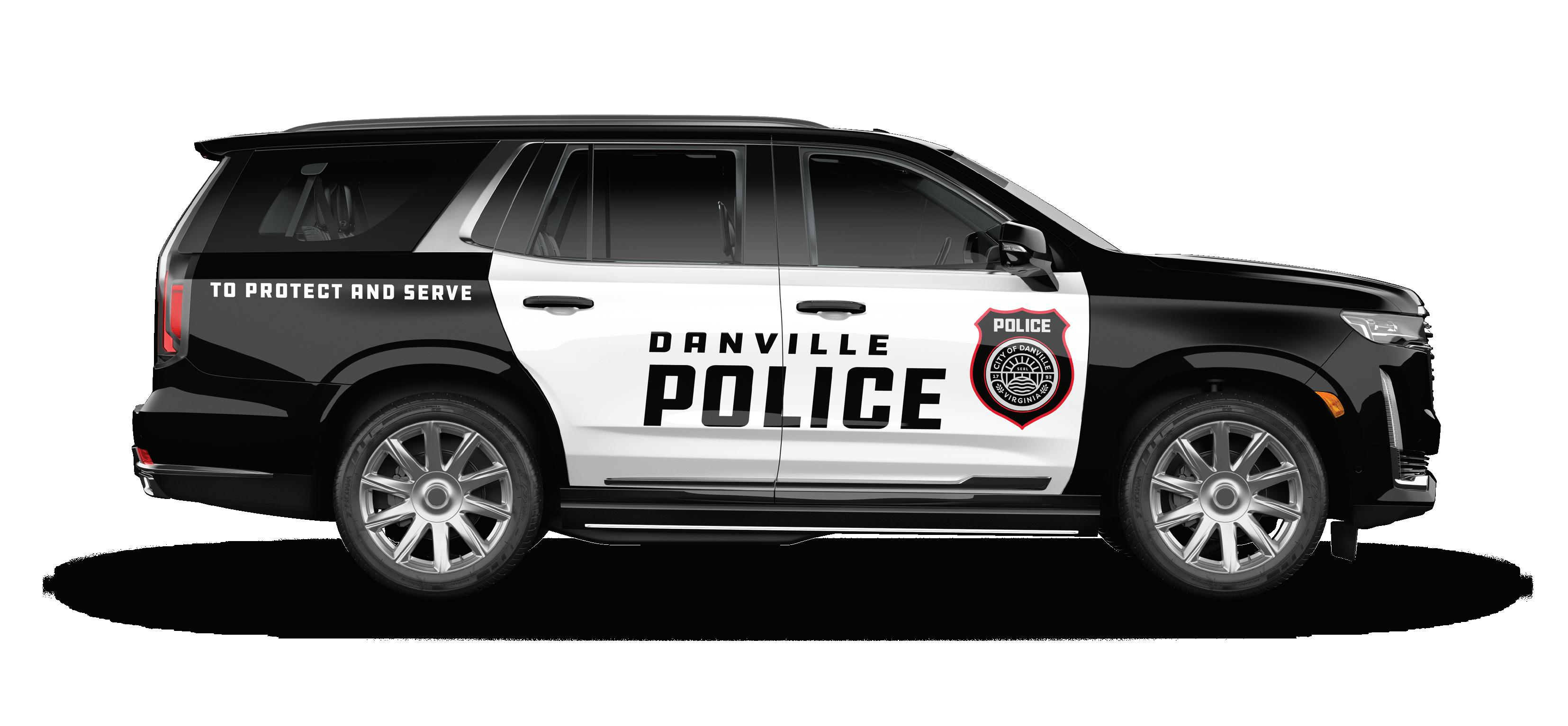
VEHICLES
IN CLOSING QUALITY
CONTROL
File Types
WHAT WE CAN ACCEPT
There’s hundreds of file types for graphics out there. In order to keep things organized, we limit what file types we accept to this industrystandard list.
Anything else submitted will be turned down until the appropriate file can be provided.
WHAT’S THE DIFFERENCE IN A RASTER VS. VECTOR GRAPHIC?
Raster: A graphic that relies on pixels to create the image. These have a limit to how much they can be scaled.
Ex. JPG, PNG, TIFF
Vector: A graphic that relies on math to create the image. These can be scaled infinitely.
Ex. AI, EPS, SVG
FILES FOR DIGITAL USE
JPEG:
A widely used compressed image format that maintains a low file size, these do not support transparency.
PNG:
A lossless file type that preserves image quality and supports transparent backgrounds. These tend to be larger in file size than jpeg.
PDF:
A digital document format designed to maintain the layout and integrity of text and images across different platforms and devices. Great for documents.
SVG:
A scalable vector format meant to work universally within editing softwares. This file type works well for logos on websites to keep loading times quick.
GIF:
A file type popular for short animated images, used on a variety of platforms.
FILES FOR PRINT USE
Print-Ready PDF:
A pdf exported at either High Quality Print or Press Ready settings in order to maintain quality. In most cases this will require crop marks and bleeds.
AI:
A scalable vector format made for Adobe Illustrator. This file type can be scaled infinitely.
SVG:
A scalable vector format meant to work universally within editing softwares. This file type can be scaled infinitely.
TIFF:
A high-quality format for digital images, often used in professional settings such as photography, known for its abilikty to store large amounts of data with loss of quality.
64
Outside Use
WHO CAN USE THE BRAND?
There will be occasions in which a local business will request to use the city’s brand in promotional material of some sort. The process of approval is vital to avoid violation of the Danville brand.
WHAT’S THE LIMITS ON WHAT FILES CAN BE PROVIDED?
There is no need to provide other raster file types. JPEG will have a background that may clash against whatever background is behind it, and TIFF will be overkill for what the average business would need.
NEVER provide a vector file. The vectors are provided for internal Danville use ONLY. Handing out vectors can lead to a major headache once a business decides to make the colors match their brand, thus violating the established Danville Brand.
LOCKUP ALLOWED FOR EXTERNAL USE : PRIMARY/ARCH LOCKUP:
PNG:
Exported at 300ppi with a transparent background.
The lossless file will provide a fullresolution image that supports transparent backgrounds.
Colors:
Only the full-color and the white version of the lockup is necessary.
Limiting outside use of brand colors helps maintain a consistent appearance across the city. Full-color works on any light backgrounds, and white works on any dark backgrounds.
65
Approvals & Contacts
WHO DO YOU CONTACT?
This guide is meant to be comprehensive, but won’t cover every situation.
If you run into something that’s not covered by this guide, here’s a list of people you can talk to.
LAURA ASHWORTH
Marketing & Research Manager Economic Development & Tourism
E. laura.ashworth@DiscoverDanville.com O. 434.793.1753
AMANDA PAEZ
Assistant to the City Manager City Manager’s Office E. amanda.paez@DanvilleVA.gov O. 434.799.5009
HANNAH BARKER
Marketing & Communications Coordinator Economic Development & Tourism
E. hannah.barker@DiscoverDanville.com O. 434.793.1753
LINDA THOMPSON Print Shop Supervisor Finance, Print Shop E. thomplw@DanvilleVA.gov O. 434.799.5230
66
DESTINATION BY DESIGN DBDPLANNING.COM
