BRAND GUIDE
COPYRIGHT © 2023 FLORIDAWILD.COM
DESOTO, FL VERSION 01 SEPTEMBER, 2023
INTRODUCTION
This style guide has been developed to ensure consistent use of the DeSoto County brand. Please follow the instructions provided.
The value of our brand and the investment made toward it can most readily be realized through consistency and repetition, thereby ensuring brand saturation across all target markets.
LOGO
THE HEART AND SOUL OF OUR BRAND
PRIMARY DESOTO LOCKUP
The primary lockup identifies the DeSoto county as a whole to the public. Use this logo to represent individual locations, products, and merchandise as needed.
This logo is a carefully created piece of locked artwork that should not be altered in any way.
ALTERNATE COLOR WHITE
L OGOMAR K
When boldness is the aim, the DeSoto logomark should take center stage instead of a full logo lockup.
When employing this mark, make certain that every facet of the DeSoto logomark stands out boldly.
For instance, a t-shirt featuring the icon on the front should include a prominent hang tag that prominently showcases our brand name. This will significantly bolster brand recognition.
ALTERNATE COLOR
WHITE
BADGE ALTERNATE COLOR WHITE
When something iconic is desired, the DeSoto badge can be used in place of a full logo lockup.
When this mark is used, ensure that the DeSoto name is visible near or in relationship with the icon.
For example, a t-shirt bearing the badge on the front should have a hang tag which displays our brand name legibly. This will help reinforce brand recognition.
HORIZONTAL LOGO
The horizontal logo is great for small spaces, like the navigation bar on the website, or on letterhead.
ARCHED LOGOTYPE ARCHED TWO COLOR
WHITE ALTERNATE TAGLINE
The purpose of our brand taglines are to capture and summarize our brand promise, brand values, and the overall DeSoto experience.
The taglines should be used in all marketing materials, advertising, or brand execution where we seek to communicate our personality.
USAGE
HOW TO USE (AND NOT USE) OUR NEW BRAND IDENTITY
SPACING
When placing the DeSoto logos in layout, give a general spacing of the height and width of the ‘W’. Do not put items within the dotted lines or free space indicated around each logo. Use this as your guide to determine proper space surrounding the logo.
BACKGROUND CONTROL

Our logo works very well on a plain white background.
Never use the logo on 100% black background. Use an 85% tint of black instead. Only use the all white logo if you are using a background color other than palm green.
The DeSoto Forest Green is a great background color for the logo. If you are using one of the patterns, make sure there is proper transparency so that the logo stands out.
Be careful placing the logo over a photo. Make sure you have a forest green transparent layer on top of the photo if at all possible. Use White or palm green versions of the logo
INCORRECT LOGO USAGE
DON’T make alterations to elements within the logo or wordmark that are not consistent with the brand.
DON’T rotate the logo.
DON’T distort, compress or stretch the logo dimensions.
DON’T use gradients in or on the logo.
DON’T use shadows, bevels or other effects on the logo.
COLORS & FONTS
CONSISTENCY TO THE “T”
DESOTO FOREST GREEN
HEX - #063627
CMYK - 94, 47, 82, 62
RGB - 6, 54, 39
PANTONE -
DESOTO PALM GREEN
HEX - #1B8A47
CMYK - 95, 18, 100, 5
RGB - 27, 138, 71
PANTONE -
PRIMARY BRAND COLORS
The consistent use of color is vital to effective brand recognition.
Our brand should always be represented in one of the colors on this page, aside from specific recommendations within this guide. Do not use any other/unauthorized colors.
DESOTO SANDY
HEX - #EBC98D
CMYK - 7, 20, 50, 0
RGB - 235, 201, 141
PANTONE -
DESOTO ORANGE
BLOSSOM
HEX - #FD6943
CMYK - 0, 79, 82, 0
RGB - 253, 105, 67
PANTONE -
WHITE
HEX - #FFFFFF
CMYK - 0, 0, 0, 0
RGB - 255, 255, 255
PANTONE -
PREFERRED 2-COLOR PAIRINGS
PRIMARY DESOTO BRAND COLORS
Forest Green
These colors are used te most when designing DeSoto's print and digital collateral. They are a key part of the brand identity and play an integral role in maintaining the consistency of the brand.
Green
Reccomended guideline for the presence of each color that you will use when implementing your brand identity.
30% 30% 30% 10%
Palm
Blossom Orange
BOhEMIAN ALChEMIST
Caps
CALVOUS
Regular
BRAND FONTS
We’ve chosen strong, workhorse fonts to do some heavy lifting for the DeSoto visual identity.
PATTERNS
PATTERNS
The DeSoto pattern can be used as an additional brand design element. This patterns is designed to be tone-on-tone, meaning the palm green and DeSoto forest green should be used together or the palm green and DeSoto sandy should be used together, as shown on this page.
IMPLEMENTATION
IDEAS FOR YOUR BRAND
SWAG


SWAG


SIGNAGE


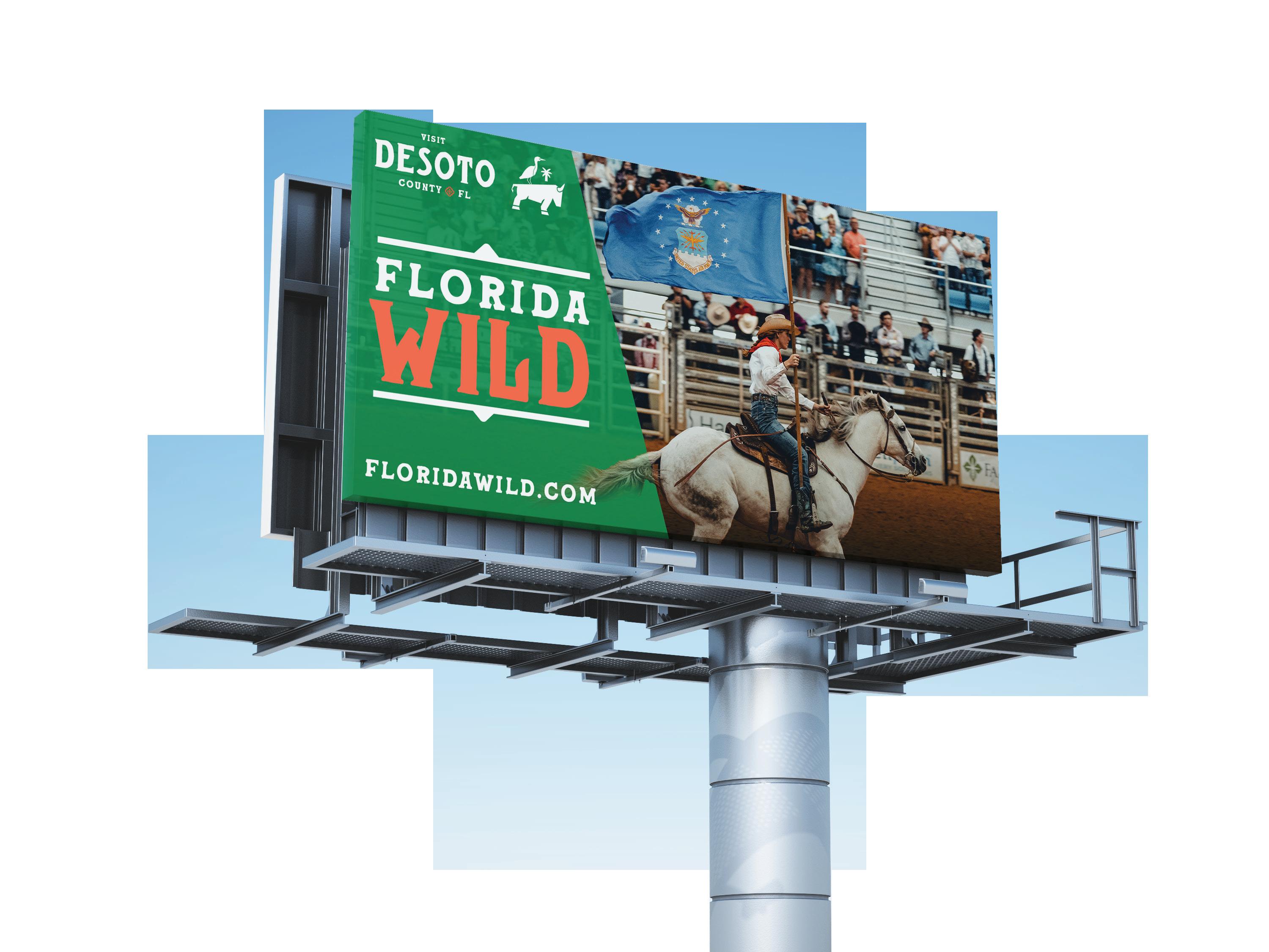
SIGNAGE


STICKERS

STATIONERY

WEB


DIGITAL


PRINT


DESIGNED IN BOONE, NC BY DESTINATION BY DESIGN DBDPLANNING.COM
