
BRAND GUIDELINES
VERSION 01 MAY, 2024
INTRODUCTION
This style guide has been developed to ensure consistent use of the Jonesville brand. Please follow the instructions provided.
The value of our brand and the investment made toward it can most readily be realized through consistency and repetition, thereby ensuring brand saturation across all target markets.
BRAND LOGO
THE HEART AND SOUL OF OUR BRAND
A Scalable Identity System
Trying to fit the same mark simultaneously on a billboard and on the side of a camp mug is a challenge. Our identity system is designed for flexibility, consistency, and brand recognition.
We have provided different logo lockups that should cover every space imaginable. Instead of trying to fit a logo into a space that is too small or crowded, simply use a different version for maximum visual impact and clarity.
When using the icon-only mark, ensure that our brand name is visible near or in relationship with the icon. For example, a camp mug bearing the icon design on the inside of the cup should have a hang tag or box which displays our brand name legibly.
4
Icon-Only Primary Lockup Badge Roadtrip Mark
ICON
The Jonesville brand icon is the visually distinctive and instantly recognizable symbol that serves as a powerful and memorable representation in the minds of viewers.
This mark is the most widely usable piece of the brand, seen on clothing, stationery, phone cases, stickers, tote bags, websites, social media, and much more.
ALTERNATE
5
PRIMARY LOCKUP
The primary lockup identifies Jonesville as a whole to the public. Use this logo to represent individual locations, products, and merchandise as needed.
This logo is a carefully created piece of locked artwork that should not be altered in any way.
LIGHT VERSION
6
DISCOVER JONESVILLE
The Discover lockup and the Uptown lockup both serve as a secondary mark, providing a tourism oriented representation of the brand.
In a given layout, pair this lockup with the brand icon to effectively represent Jonesville as a whole.
LIGHT VERSION
DISCOVER7
UPTOWN LIGHT VERSION
HORIZONTAL MARK
When there’s not much vertical space, the horizontal Jonesville lockup can be used in place of the primary logo lockup.
An example of use for this would be a magazine bearing the horizontal lockup at the top in order to prominently display the image being used. This will help reinforce brand recognition while allowing space in larger formats.
LIGHT VERSION
8
BADGE
When something iconic is desired, the Jonesville badge can be used in place of a full logo lockup.
For example, a t-shirt bearing the badge on the front should have a hang tag which displays our brand name legibly. This will help reinforce brand recognition.
9
EMBLEM
For a more compact and versatile representation of the Jonesville brand, the emblem condenses the lockup into a single, memorable symbol that can be easily recognized across various applications.
Stickers, magnets, and pins can all prominently feature the emblem making it easy for a passerby to recognize the brand.
ALTERNATE
10
HEART OF THE YADKIN VALLEY
These marks are additional elements that can be used in situations where the Jonesville brand has already been established.
These are versatile options that can most effectively be used in advertising materials such as street banners and digital ads.
11
ROADTRIP TO JONESVILLE
These marks are an additional element that can be used in campaigns and other media in which the focus is to attract tourist to Jonesville.
There are multiple options provided in order to fit multiple formats, giving the option of two badge shapes and one emblem.
12
ROADTRIP EMBLEM
ROADTRIP BADGE
JNC BADGE
An additional element for use when the Jonesville brand has already been established, this badge can be used as a “tag” of sorts to build a more cohesive brand environment.
An example of use for this would be an event banner or an event tent bearing the horizontal tagline. This will help reinforce brand recognition while allowing space in larger formats.
13
USAGE
HOW TO USE (AND NOT USE) OUR NEW BRAND IDENTITY
Incorrect Usage
Don’t rotate the logo. Don’t distort, compress or stretch the logo dimensions.
Don’t change the layout or relationship between logo elements.
Don’t make alterations to elements within the logo or wordmark that are not consistent with the brand.
Don’t use transparent knockouts or gradients in or on the logo.
Don’t use shadows, bevels or other effects on the logo.
15
Background Control
Our logo works very well on a plain white background.
Mist is a great background color for the logo. If you are using one of the patterns, make sure there is proper transparency so that the logo stands out.
Never use the logo on 100% black background. Use an 85% tint of black instead.

Be careful placing the logo over a photo. Make sure you have a blue transparent layer on top of the photo if at all possible.
16
SPACING + PLACEMENT
A SIGH OF RELIEF, LIKE THE BREATH BETWEEN MUSIC NOTES
Spacing
LETTING THE BRAND SHINE
Providing open space around a logo ensures its clarity and visibility, allowing it to stand out amidst surrounding visual clutter.
Some whitespace serves as a visual buffer, letting the various logos shine and maintaining their integrity across various layouts and sizes.
Icon-Only
0.23in Size 0.16in Size
0.16in 0.23in 0.5X 0.5X X 0.5X 0.5X 1X 1X 1X 1X X 18
Full
Lockups
Placement
ON THE PAGE
Place the logo left-aligned on the primary grid line. If this space is not available, the logo belongs in the top or bottom left page corners.
Specific stationery layouts are provided in the Brand Collateral section of this document.
PREFERRED
Align the logo to the primary grid line (referred to as the spine). The primary lockup looks best when left-aligned.

ALTERNATE OPTIONS
Align the primary lockup to the left corners. If the layout dictates a centered or right-aligned mark, use the icon or vertical lockup.
19
Placement
ON MERCHANDISE
Branded merchandise like t-shirts, hats, and camp mugs should all follow a leftaligned logo placement if possible.
If possible, look for unique and uncommon imprint areas to utilize. Areas like t-shirt sleeves are rarely used and can make a striking visual statement.
Each piece of merchandise will carry unique limitations. Use the images on the right as general guidance.


APPAREL
Left align the logo when possible. Use the icon for centering, or if brand subtlety is desired.

20
Placement
ONLINE
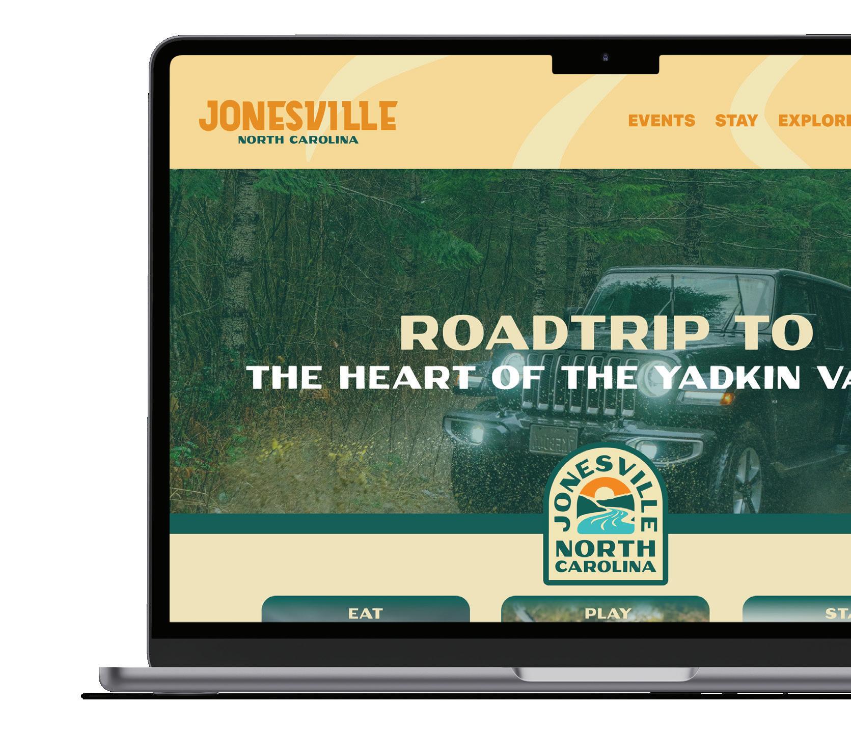
On the Jonesville website, the logo will be placed in the upper left-hand corner of the navigation bar.
Do not center the logo in navigation, even on small screens.
FAVICON
Our favicon—a 32px x 32px icon that is displayed in the browser next to the url—is the only other approved usage of our icon in solid form.
DEVICE ICON
If our website is saved as a bookmark on the home screen of some mobile devices, this graphic will be displayed. Default size is 192px x 192px.

21
Placement
SOCIAL MEDIA
When used as social media avatars, the icon-only logo should be used with the right amount of clear space on all sides.
We have developed an approved avatar image found here on this page. It’s approved for both circular and square avatars shapes of all sizes.
ICON AVATAR
Preferred avatar for use on all platforms. All approved color combinations may be used.

22
COLORS & FONTS
CONSISTENCY TO THE “T”
RIVER
HEX - #5DABAE
CMYK - 64, 16, 32, 0
RGB - 93, 171, 174
PANTONE - 2197 C
SUNRISE
HEX - #E38400
CMYK - 9, 56, 100, 0
RGB - 227, 132, 0
PANTONE - 137 C
DEEP GREEN
HEX - #024E47
CMYK - 91, 47, 66, 40
RGB - 2, 78, 71
PANTONE - 350 C
TAN
HEX - #EADFB9
CMYK - 8, 9, 30, 0
RGB - 234, 223, 185
PANTONE - 7499 C
PRIMARY BRAND COLORS
The consistent use of color is vital to effective brand recognition.
Our brand should always be represented in one of the colors on this page, aside from specific recommendations within this guide.
Do not use any other/unauthorized colors.
24
PRIMARY JONESVILLE
BRAND COLORS
These colors are used the most when designing Jonesville’s print and digital collateral. They are a key part of the brand identity and play an integral role in maintaining the consistency of the brand.
Recommended guideline for the presence of each color that you will use when implementing your brand identity.
RIVER
DEEP GREEN SUNRISE
40% 30% 20% 10%
TAN 25
USING TINTS
We prefer our brand colors used without editing, but some situations require the use of color tints, especially on the web. For example, when a user hovers over a button on our web site, using a tint change can help confirm their action.
If necessary, use a 20% tint step system, keeping legibility in mind. Any tint below 60% used as a background will require dark text.
26 100% 100% 80% 80% 40% 40% 60% 60% 20% 20% 100% 80% 40% 60% 20% 100% 80% 40% 60% 20%
APPROVED PAIRINGS
Nearly all of the colors within our primary palette can be used in combination. Whenever possible, strive for legibility with contrast, especially when setting typography.
Green text, full color icon on a Tan background.
Perfect for use in print, and web.
Tan text, full color icon on a Green background.
Great contrast and legibility.
Green text, full color icon on a River background.
Slightly lower contrast, but excellent legibility.
Tan text, full color icon on a Sunrise background. Demands attention. Use Sunrise backgrounds sparingly.
Green text, full color icon on white.
Classic combination and great contrast, without use of black.
River text, full color icon on white. The pop of river draws attention and visual interest.
27
Heart Heart Heart Heart Heart Heart
SEQUOIA - REGULAR
HEART OF THE YADKIN
Header: Sequoia Narrow
SUBHEADER: ROBOTO - BOLD
BODY COPY: Roboto Medium doloraest fugiam exerite
modistrum aborrov ideruntius ipsamus reictatibus, sus, corpori beriore prae laborehenda et od etur aut
magnatur molupti di occullabo. Us si oditatem etur
sundant pores et quam rem ipit odicit quodit aut ma voluptaquam uga. Cusanis ex experro bis ese nectis
SEQUOIA - REGULAR
HEART OF THE YADKIN
Header: Sequoia Narrow
SUBHEADER: ROBOTO - BOLD
BODY COPY: Roboto Medium doloraest fugiam exerite
modistrum aborrov ideruntius ipsamus reictatibus,
sus, corpori beriore prae laborehenda et od etur aut
magnatur molupti di occullabo. Us si oditatem etur
sundant pores et quam rem ipit odicit quodit aut ma voluptaquam uga. Cusanis ex experro bis ese nectis
28
48PT 21PT 12PT 12PT 48PT 21PT 12PT 12PT
PATTERNS
THE LITTLE THINGS MATTER
PATTERNS
The Jonesville patterns can be used as an additional brand design element. This pattern is designed to be tone-on-tone, meaning the colors should be used together as shown on this page.
IMPLEMENTATION
VIEWING THE BRAND “IN THE WILD”


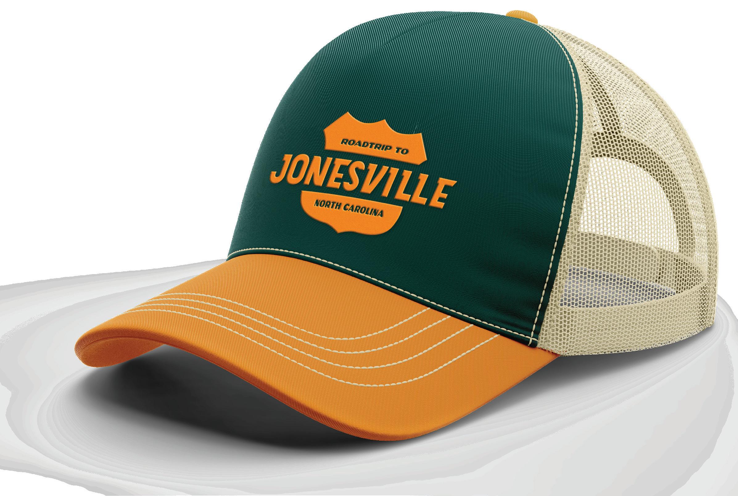
STICKERS & CAP
32
STREETWEAR


33


34 SWIMWEAR


35 WEB

36 STATIONERY

37 POSTCARD

38
VISITOR GUIDE
DIGITAL ADS

39
DOWNTOWN BANNERS


40
WAYFINDING


41
WATER TOWER

42
DBDPLANNING.COM