BRAND GUIDE
COPYRIGHT © 2023
VERSION 01
WV MOUNTAINEERTRAILNETWORK.COM
MTNRA,
INTRODUCTION
This style guide has been developed to ensure consistent use of the Mountaineer Trail Network brand. Please follow the instructions provided.
The value of our brand and the investment made toward it can most readily be realized through consistency and repetition, thereby ensuring brand saturation across all target markets.
LOGO
THE HEART AND SOUL OF OUR BRAND
ONE COLOR
PRIMARY MTN LOCKUP
The primary lockup identifies the MTN brand as a whole to the public. Use this logo to represent individual locations, products, and merchandise as needed.
This logo is a carefully created piece of locked artwork that should not be altered in any way.
ONE COLOR
DARK BACKGROUND
M Logomark (M + Mountains = )
When subtlety is desired, the MTN “M” icon can be used in place of a full logo lockup.
When this mark is used, ensure that the MTN name is visible near or in relationship with the icon.
For example, a t-shirt bearing the icon on the front should have a hang tag which displays our brand name legibly. This will help reinforce brand recognition.
ALTERNATE COLOR
ONE COLOR
DARK BACKGROUND
PRIMARY MTN BADGE
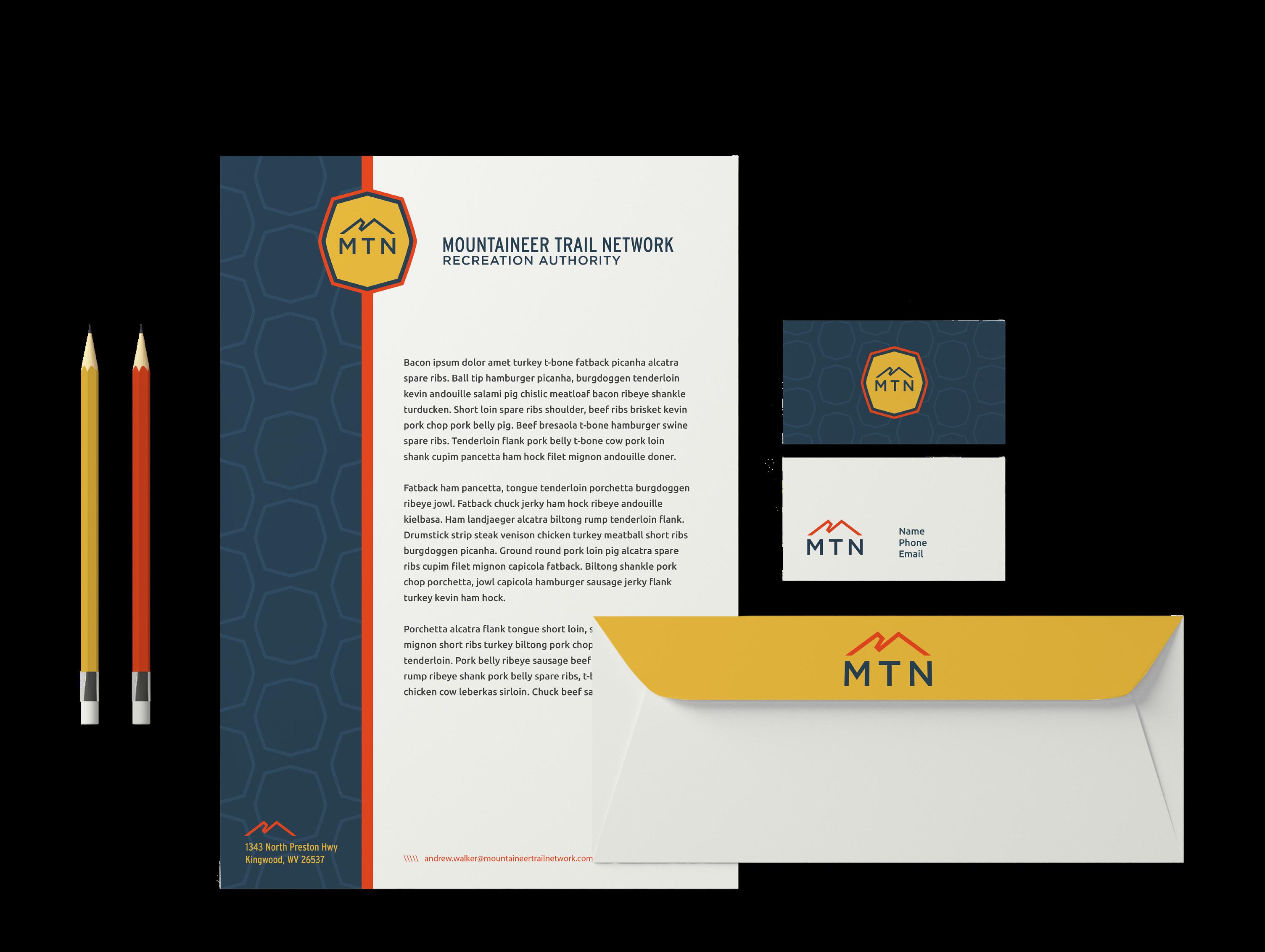
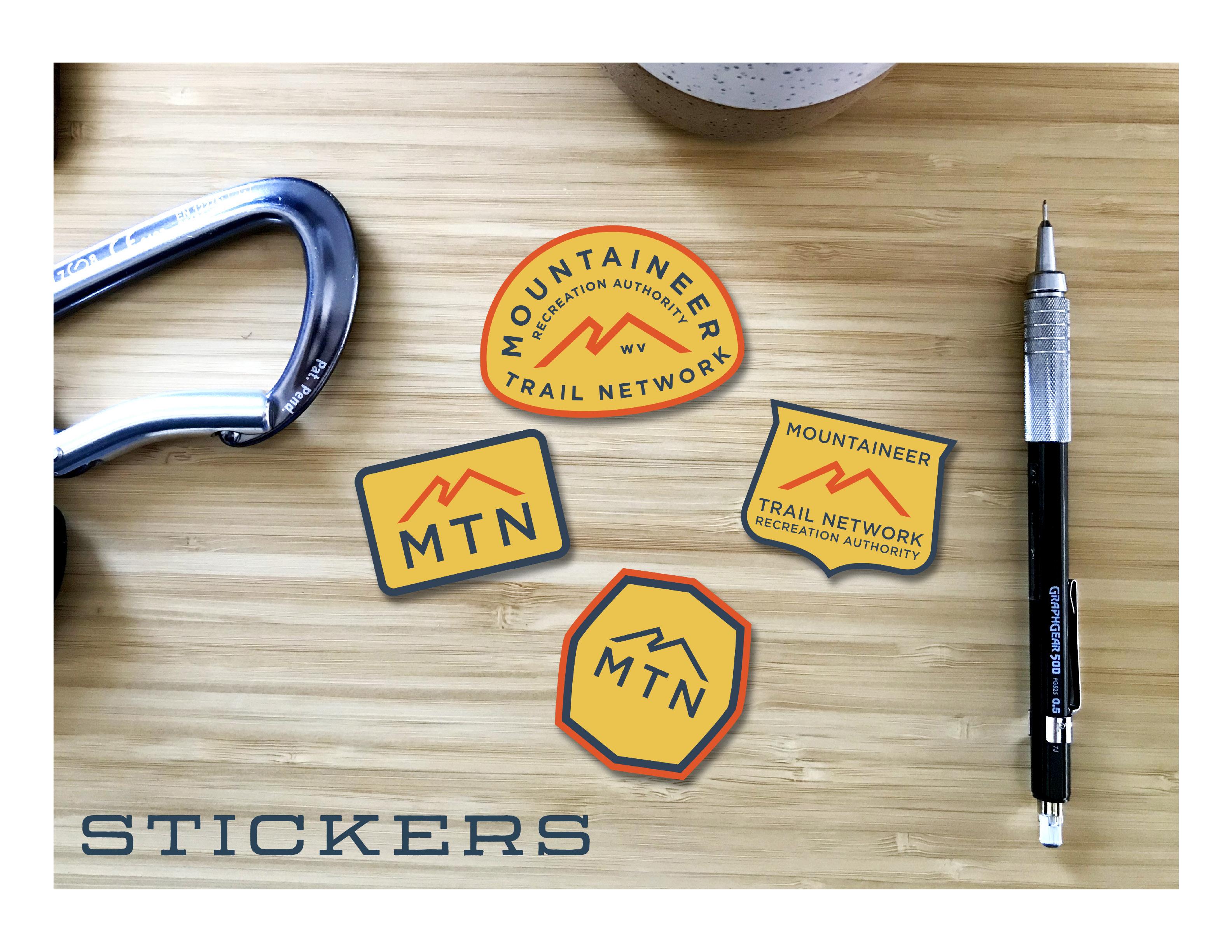
The MTN Badge is a versatile mark, intended for both official use and merchandise opportunities. This badge can be printed as a sticker or used on letterhead. Alternate MTN badges are also provided, but try to use the primary badge whenever possible.
ALTERNATE BADGES
MOUNTAINEER TRAIL NETWORK RECREATION AUTHORITY BADGE
The full-name badge can be used when introducing yourself to a new audience. It would also work well as a patch on a hat or canvas jacket.
2-COLOR BADGE
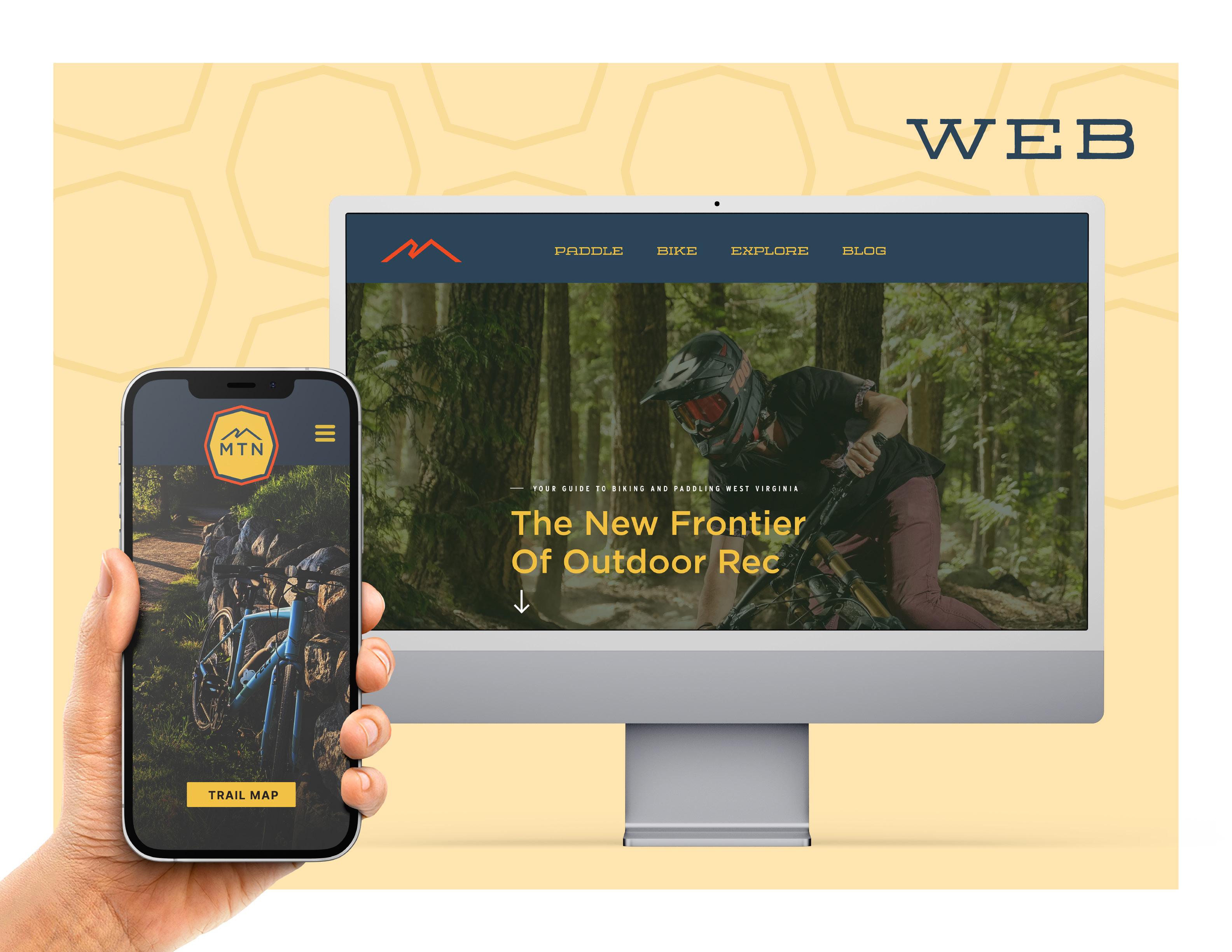
HORIZONTAL LOGO
The horizontal logo is great for small spaces, like the navigation bar on the website, or on letterhead.
STOKE BADGES
BOUNDARY MARKER
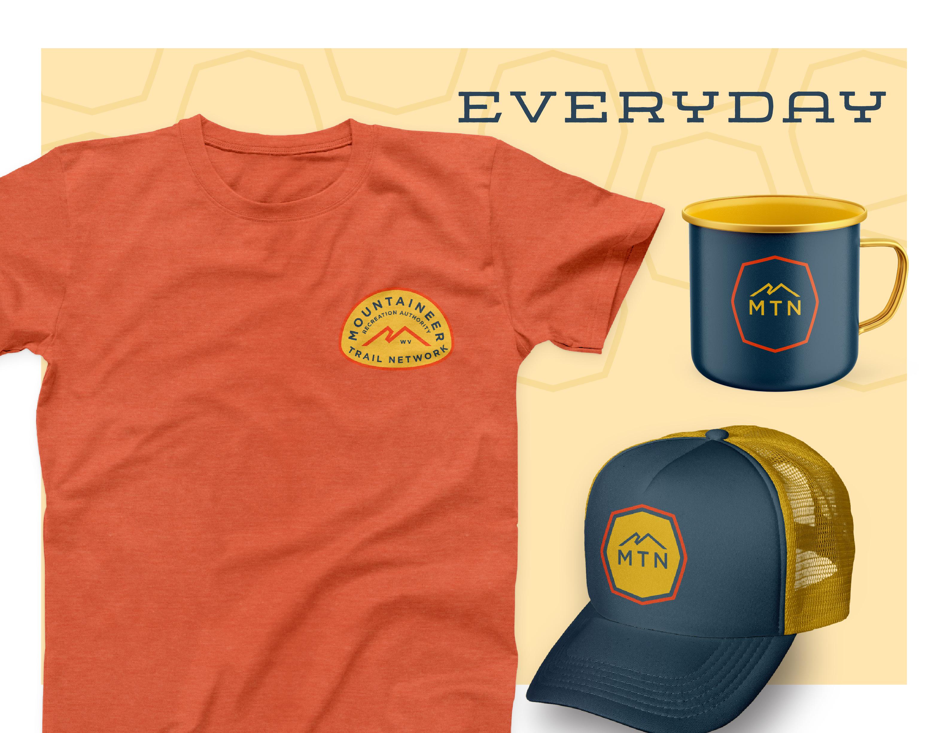
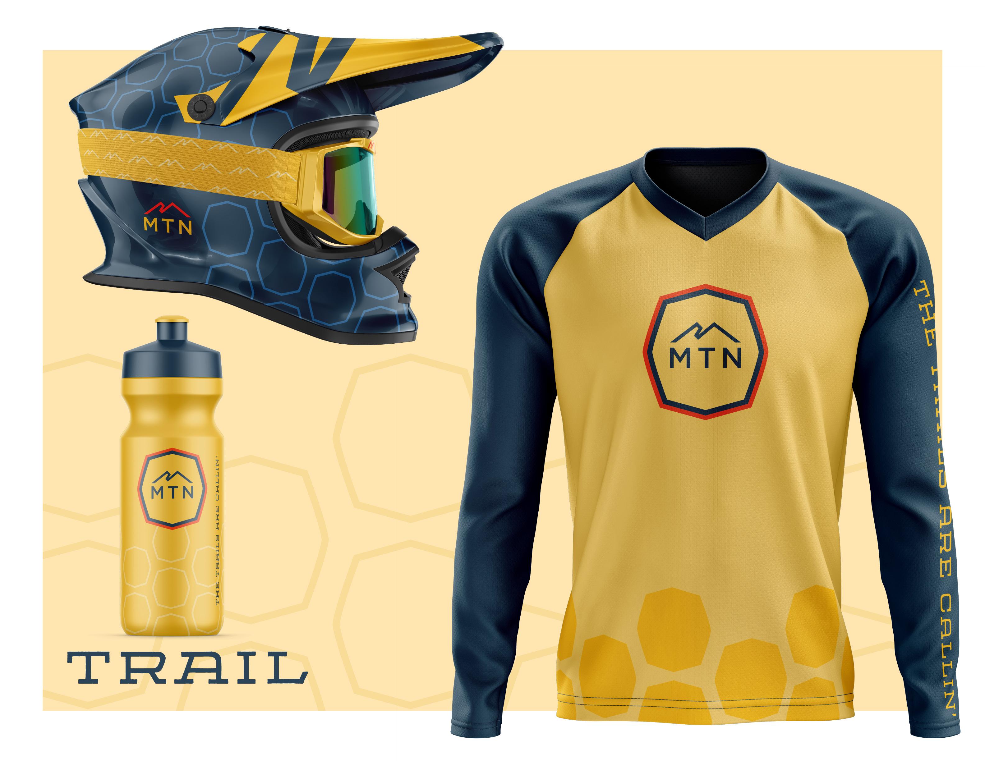
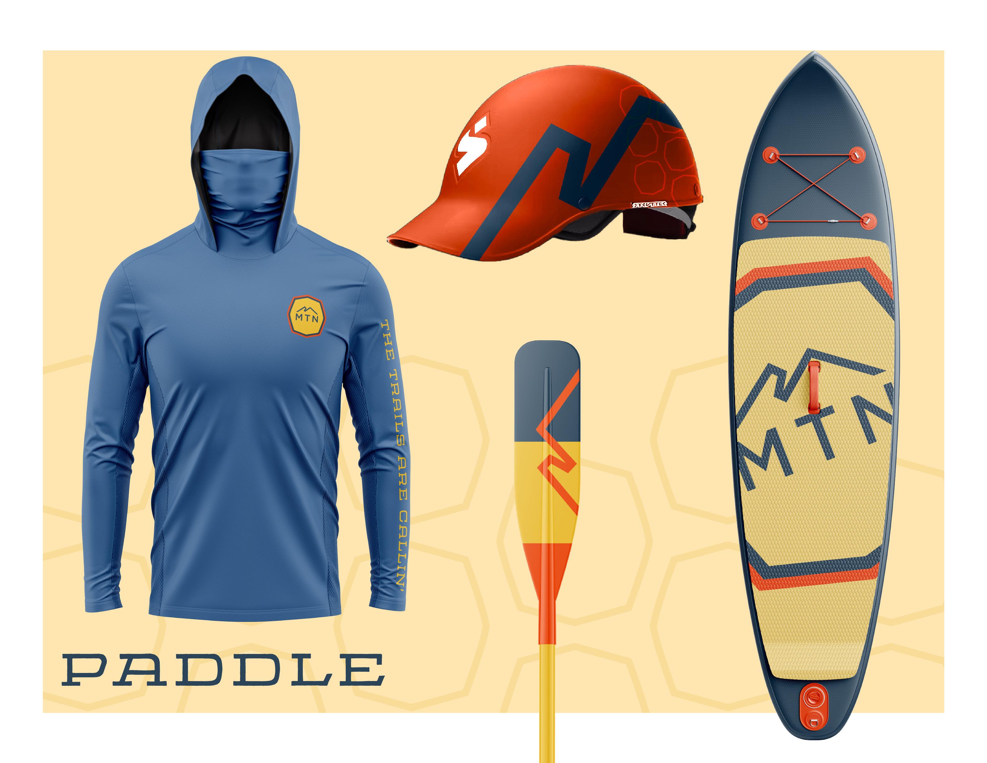
MERCHANDISEBOUNDARY MARKER + STOKE BADGES
The MTN Brand is just as much fun as it is serious. The intention for these merch badges is to show the versatility of this brand. These badges would make great stickers or patches and will screenprint well on items like T-shirts.
THE TRAILS ARE CALLING
TAGLINE
The purpose of our brand taglines are to capture and summarize our brand promise, brand values, and the overall MTN experience.
The taglines should be used in all marketing materials, advertising, or brand execution where we seek to communicate our personality.
ESPIRITU Expanded
FONT
TAGLINE
USAGE
HOW TO USE (AND NOT USE) OUR NEW BRAND IDENTITY
SPACING
When placing the MTN logos in layout, give a general spacing of the height and width of the ‘M’. Do not put items within the dotted lines or free space indicated around each logo. Use this as your guide to determine proper space surrounding the logo.
Our logo works very well on a white background.
Never use the logo on 100% black background. Use an 85% tint of black instead. Only use the all white logo if you are using a background color other than navy.
BACKGROUND CONTROL
The MTN Navy is a great background color for the logo. If you are using one of the patterns, make sure there is proper transparency so that the logo stands out. Default to using the red M-Mountain with Yellow “MTN” for most dark background uses.
Be careful placing the logo over a photo. Make sure you have a navy transparent layer on top of the photo if at all possible. Use White or Red and Yellow versions of the logo
INCORRECT LOGO USAGE
DON’T make alterations to elements within the logo or wordmark that are not consistent with the brand.
DON’T rotate the logo.
DON’T distort, compress or stretch the logo dimensions.
DON’T use gradients in or on the logo.
DON’T use shadows, bevels or other effects on the logo.
COLORS & FONTS
CONSISTENCY TO THE “T”
MTN NAVY
HEX - #2B4558
CMYK - 86, 66, 45, 33
RGB - 44, 69, 89
PANTONE - 7545C
PRIMARY BRAND COLORS
The consistent use of color is vital to effective brand recognition.
Our brand should always be represented in one of the colors on this page, aside from specific recommendations within this guide. Do not use any other/unauthorized colors.
MTN RED
HEX - #F04A21
CMYK - 0, 86, 100, 0
RGB - 240, 74, 33
PANTONE - WARM RED C
MTN YELLOW
HEX - #F1BE3C
CMYK - 54, 13, 16, 0
RGB - 241, 190, 60
PANTONE - 123C
PREFERRED 2-COLOR PAIRINGS
LIGHT YELLOW
HEX - #F2D07D
CMYK - 5, 16, 60, 0
RGB - 242, 209, 125
PANTONE - 7403C
BLUE
HEX - #4B75A4
CMYK - 77,52, 17, 0
RGB - 75, 117, 164
PANTONE - 7683C
SECONDARY BRAND COLORS
The secondary color palette allows for additional color options when implementing the brand.
Medium
BRAND FONTS
We’ve chosen strong, workhorse fonts to do some heavy lifting for the MTN visual identity.
Condensed Regular Expanded
INTERSTATE ESPIRITU GOTHAM
PATTERNS
PATTERNS
Two patterns can be used as additional brand design elements, the MTN ‘M” pattern and the hex pattern. These patterns are designed to be tone-on-tone, meaning the light blue and MTN navy should be used together or the light yellow and MTN yellow should be used together, as shown on this page.
ALTERNATE COLORS
IMPLEMENTATION
IDEAS FOR YOUR BRAND
MOUNTAINEER TRAIL NETWORK RE CREA TION A UTHORITY MOUNT AINEER T RAIL NETW ORK
MOUNTAINEER TRAIL NETWORK RE CREA TION A UTHORITY
DESIGNED IN BOONE, NC BY DESTINATION BY DESIGN
