
proces
s
Design Technology & Concepts
Hey! I’m the creator of this book and everything in it. I’m currently a freshman at the University of South Carolina. I am majoring in Biology, and minoring in Art Studio. I have always grown up loving art in all forms. My dad plays a huge role in that. He is an architect and I have always been interested in his work, constantly asking questions and always excited to hear about his current projects. Growing up he would always teach my brothers and I tips
and tricks on how to draw or paint. He also has a very clear style that is consistent amongst his work. All of his work, designs, sketches, and even the hundreds of art or architecture books lying around the house are either modern or mid-century modern style. I think this is a huge reason why my artwork resembles the same style. I am always leaning towards a clean modern or mid-century modern look when I am desiging something. This
book included. I was in the Journalism & Communications magnet at my high school, but I was always more into the design and visual communication aspect of it rather than the journalism. So I took every graphic design course offered and designed for the youth magazine. Those four years is when I learned how to create using adobe platforms and gained even more of an interest in graphic design because of how much I loved it.
2
Introduction

3
Statement of Intent
Meet the designer. Understand the vision for this process book.
Six-Word Stories
Project #1. Choosing a six word story and using typographjy and professional photography to illustrate them.
Type Faces
Project #2. Using various typefaces, and ma- nipulating letters and characters to create multiple distinct faces.
GD+I Poster
Project #3. Using a quote regarding design, creating an inspirational poster for artists and creatives.
4
Contents 02 06 08 10
14 16
Making Marks
Project #4. Using a combination of two words to create a two brands/products and an appro- priate logo for both.
Syntax & Semantics
Project #5. Picking a product and showing understanding of syntax and semantics in the world of design.
20
Process book
Project #6. Compiling all completed projects from Arts 102 spring semester into a cohesive book breaking down the process of each one.
5
6
Project 1 Six-Word Stories
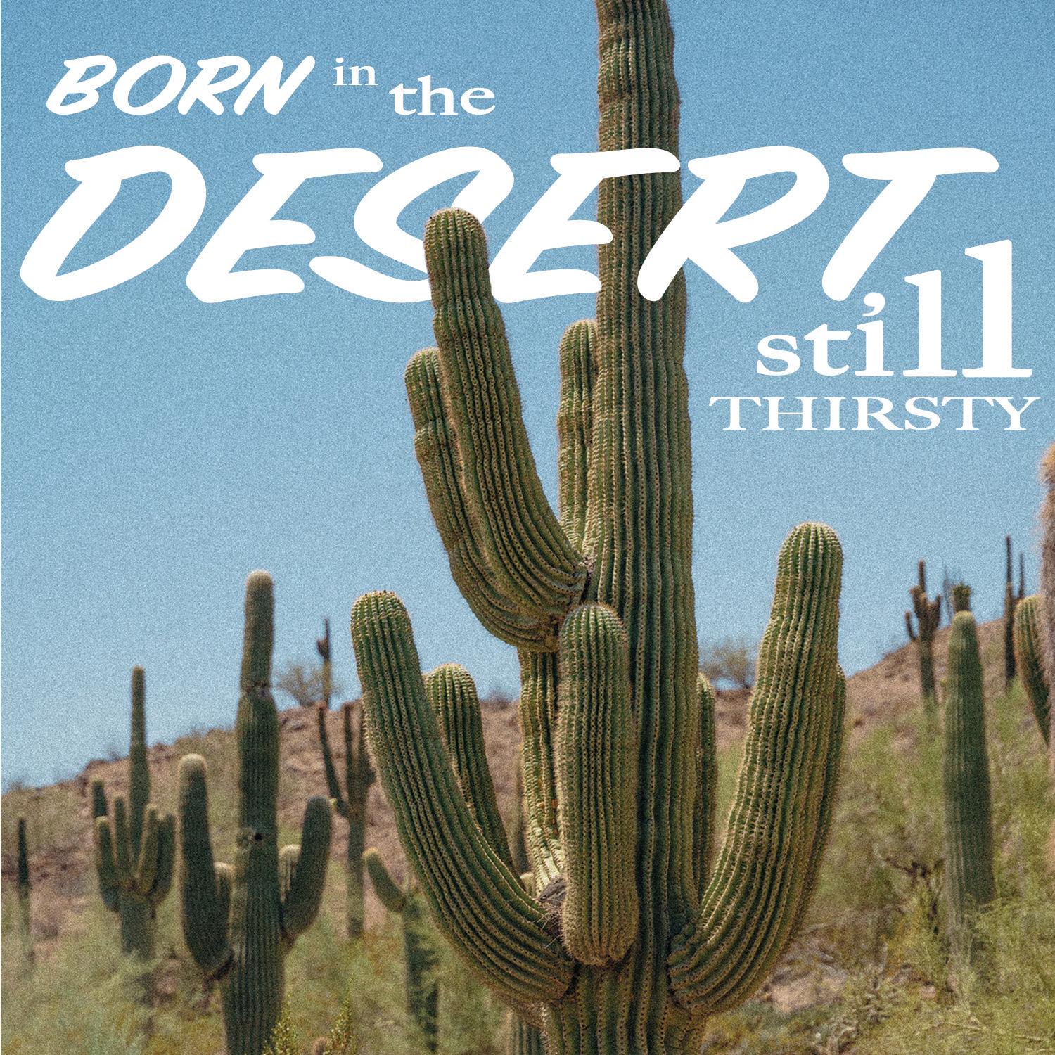
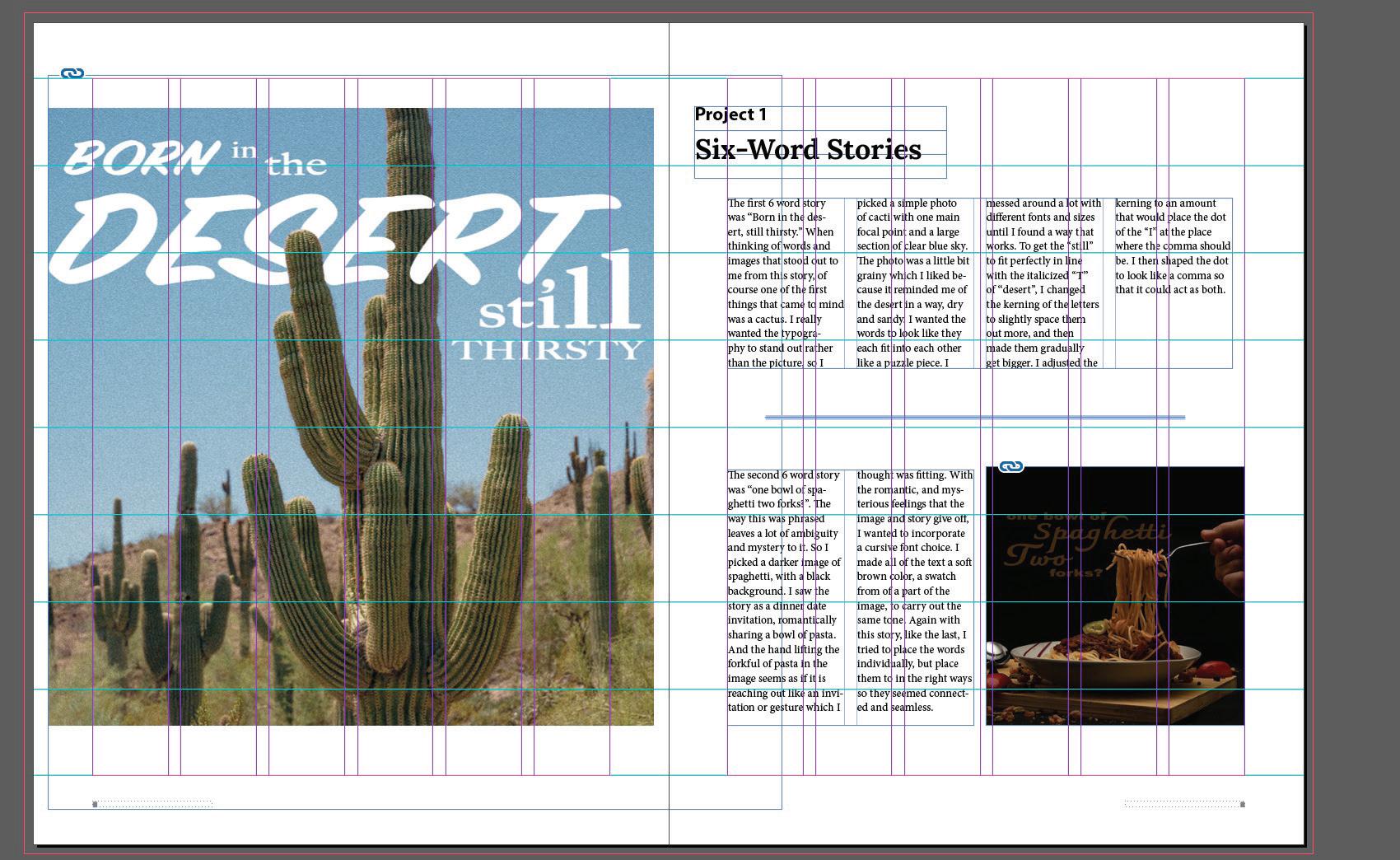
The first 6 word story was “Born in the desert, still thirsty.” When thinking of words and images that stood out to me from this story, of course one of the first things that came to mind was a cactus. I really wanted the typography to stand out rather than the picture, so I
picked a simple photo of cacti with one main focal point and a large section of clear blue sky. The photo was a little bit grainy which I liked because it reminded me of the desert in a way, dry and sandy. I wanted the words to look like they each fit into each other like a puzzle piece. I
messed around a lot with different fonts and sizes until I found a way that works. To get the “still” to fit perfectly in line with the italicized “T” of “desert”, I changed the kerning of the letters to slightly space them out more, and then made them gradually get bigger. I adjusted the
kerning to an amount that would place the dot of the “I” at the place where the comma should be. I then shaped the dot to look like a comma so that it could act as both.
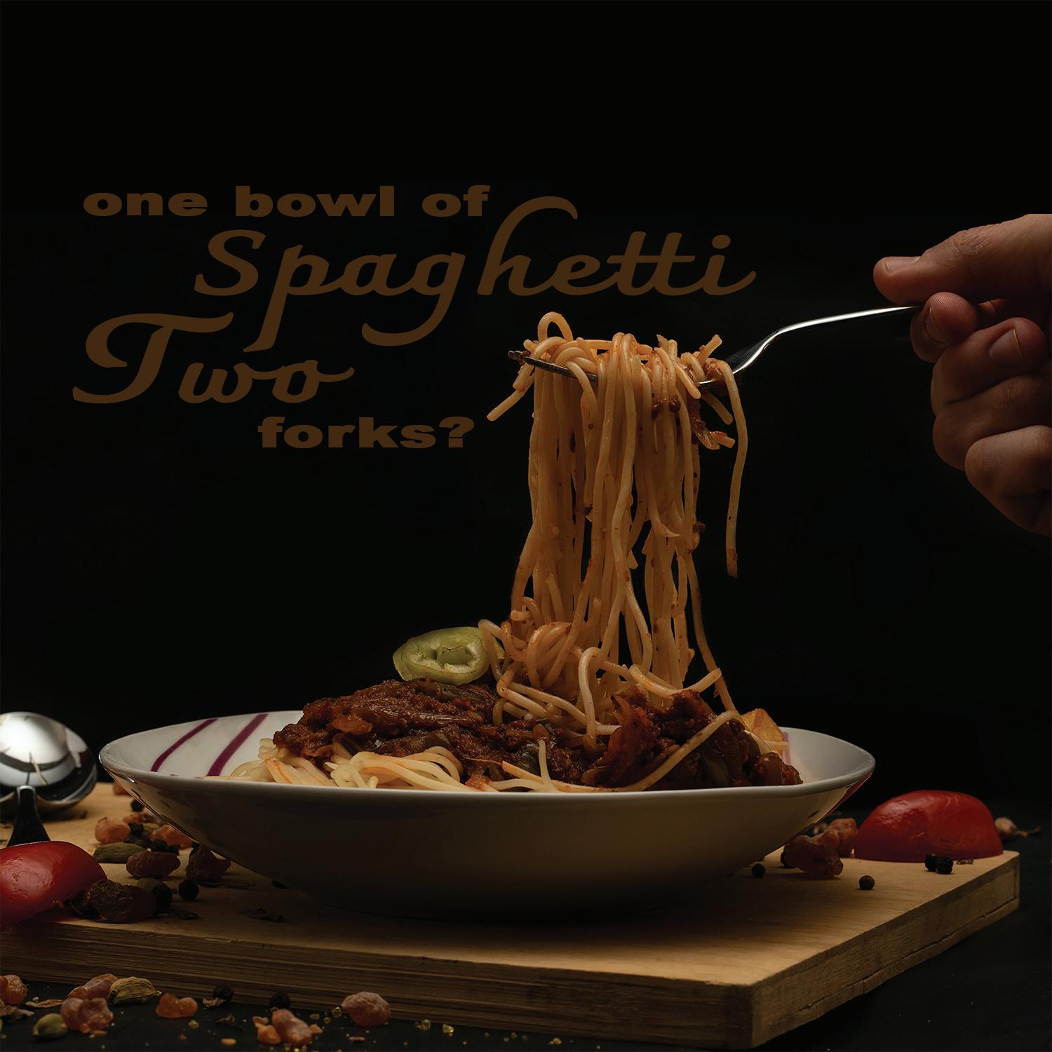
The second 6 word story was “one bowl of spaghetti two forks?”. The way this was phrased leaves a lot of ambiguity and mystery to it. So I picked a darker image of spaghetti, with a black background. I saw the story as a dinner date invitation, romantically sharing a bowl of pasta. And the hand lifting the forkful of pasta in the image seems as if it is reaching out like an invitation or gesture which I
thought was fitting. With the romantic, and mysterious feelings that the image and story give off, I wanted to incorporate a cursive font choice. I made all of the text a soft brown color, a swatch from of a part of the image, to carry out the same tone. Again with this story, like the last, I tried to place the words individually, but place them to in the right ways so they seemed connected and seamless.
7
Project 2 Typefaces
There are millions of typefaces out there. Each one has something unique and different about them. Different typefaces are more appropriate to use than others in various situations. Each one has it’s own personality and message that it sends to the audience, regardless of what the words themselves say. So it is important to pick the perfect typeface to
pair with your artwork or message. Project #2 was to use only letters, numbers, and symbols, from one typeface to make a character or face. This is a perfect way to creatively show the style of the font. With this project I wanted to create a face for each typeface I choose that matched the style and energy of it.
The first typeface I chose was a basic serif font, “Lora”. To me this seems sophisticated and clean. The font uses sharp edges and lines. So for this face I kept rearranging the letters and numbers until I had created a face that resembled a businessman with a smug smile, and sharp chin with slicked up hair. I wanted it to seem professional but also confident, because that is what I see with the typeface “Lora.”
The next typeface I chose was a script font, “Sunday morning.” With the more handwritten feel that a script gives off, I wanted this face to seem more like a sketch of a person. I used the letters to give my face a soft smile and eyes, and a bushy beard, then gave him a fluffy beanie. Like the typeface, this face seemed warm and inviting to me.
8
Sunday Morning
Lora
Sunday morning Andrew elegant
Lora
The last typeface I chose was another serif, “Apple Chancery” yet it was different than the first. This typeface had more curves and a heavier thickness, yet it also was somewhat proper. The idea this gave me for this face started with the eyes I gave it. I used Qs,
but the leg of the Qs were extra wavy, and resembled questioning eyebrows. So I decided to make this face a detective, and with a thick mustache and top hat to fit that stereotypical character.
9
Apple Chancery
10
OUR ABILITIES ARE LIMITED ONLY BY OUR
Debbie Millman
Project 3 GD+I Poster
For this project I choose the quote “Our abilities are limited only by our perceptions,”(Debbie Milman). After creating a word map and mood board, I drew up some sketches, most of them playing off of an illusion or warp of some kind but contrasting with some sort of boxy design.
The word “Limit” seems very strict and boxy, so I chose a simple seif font and placed all of the text (except for perceptions) together, left aligned.
To me “perceptions” means very fluid and lots of variations. To play off of that I wanted to liquify some shapes to create an illusion almost. I also
hand drew the letters to have a more loose, fluid font. I manipulated a couple of letters to make it look like they were being pulled through the door. I wanted to keep the colors simple by using as few as possible to balance out the busy design of the warped perceptions.
11
Project 3 Mood Board
This is the mood board that I created for this project before I began working on the actual poster. My process of making a mood board for any project is to go on a deep dive on pinterest. I was searching words that were in the quote, things that it reminded me of, the person who said the quote, colors, anything you could
think of I looked up. And with every search I saw things that I liked and saw things that I didn’t like. It helped me refine my next searchs and refine the ideas that I had for the project. Once I collected what I felt was enough inspiration I compiled them in a way that makes sense to me. Then I choose the color scheme I was
set on and included that as well. Mood boards have helped me tremendously in this class this semester. For some projects I just had no idea where to start, or had nothing sparking a vision. So creating a mood board would help me get it started and have something to build off of.
12
13
Project 4 Making Marks
A logo is one of the most important piece of a company. It creates a face for the brand, and something that will stick with the customers. It needs to be simple enough to be rememberable yet still resemble the brand. For this project I used the words “floral” and “mouse” to create two companies and two separate logos. The first was for a florist. The logo created used a simple elegant serif font. To incorporate both words, I used the pen
floral mouse

flower arrangements
tool on Illustrator to create a silhouette that could look both like a mouse as well as a simple flower. The colored version used shades of lilac and green, calm colors that shows high class, but also the fun of spring and summer. The second logo was created for a boutique, most likely for teens/young adults. The style is very modern chic with the typeface and different mouse silhouette. The flowers bring a bit of softness to the design as well as light pinks, pur-
ples, and greens used. The design as a whole is what I imagine similar to the style of clothes that would be sold at this boutique.

floral mouse flower arrangements
14
Floral Mouse
Floral Mouse
FLORAL MOUSE boutique
mood board
FLORAL MOUSE boutique
Simple Tulip:
The concept for this logo came from the elegance and daintiness associated with recieving a beautiful floral bouqet. Keeping the logo as simple as possible, the silhouette actually is both a mouse and a flower. The mouse seen more in the all black logo, but the flower is revealed more with the colored version. The color scheme for this logo is muted spring colors. The shades of green and lilac expressing the warmth
of spring and summer without the loud bright colors. The typeface is a simple serif to keep it clean and elegant.
Chic Spring Mouse
floral mouse
flower arrangements
Inviting and youthful. This logo uses a modern chic font and style mouse silhouette to attract the right customers to this boutique . The color scheme is also muted spring to match the company’s brand image. The flowers add a softer touch to the modern font and silouette.
floral mouse
flower arrangements
floral mouse
flower arrangements
floral
15
Syntax
16
This project is all about exploring the syntax and semantics of different products to help understand the consumers mind to be able to cater to them more effectively with designs. I choose to narrow my items to those of one brand, new balance. They have quite a
few different styles of shoes that all fit a different purpose and look. I choose a cleat, a casual, a skate, and a basketball shoe. Placing them in a line next to each other, I was able to compare them all and determine the syntax and semantics of each shoe. It helped me understand
where one would be worn more than other, or the type of people who would be wearing them. This is a very important thing for designers to take into consideration in the real world. In order to effectively sell their product, it needs to be designed for the consumers.

Syntax & Semantics
Project 5
17
SYNTAX (visual elements and relationships) White base and body, with white shoe studs on the sole. Organic gray forms line the front of the shoe just before the toe. Starting at the toe, and overlapping the gray forms is an altered NB logo. The black outline extendes sharply out of the logo extending towards the back of the shoe.
SEMANTICS: DENOTATION (specified) accessory>shoe>women’s cleats
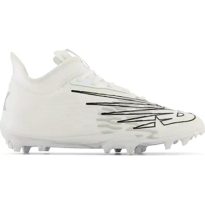
SEMANTICS: EXPRESSION (feelings) athletic, fast
SEMANTICS: CONNOTATION (associations) athletes, lacrosse players, soccer players
PRESENCE (contextual)
Litlle: at a lacrosse or soccer field Lots: in a classroom, in church
SYNTAX (visual elements and relationships) Tan and white body of the shoe with rich green accents. The toe of the shoe is a tan color with a cloth like texture. The middle patch of white is detailed with very small holes. The rest of the shoe is made with a matte leather material. A large N is tilted at an angle, and used as a logo in the center of the shoe. Delicate stiching outlines each color block and the logo.
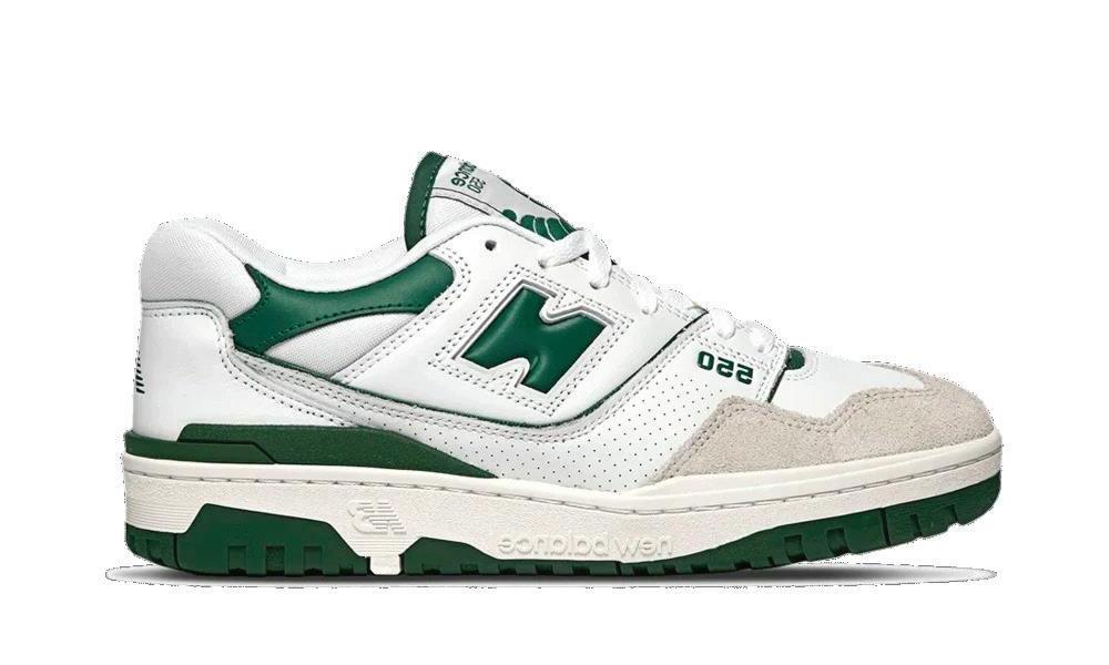
SEMANTICS: DENOTATION (specified) accessory>shoe>unisex everyday use
SEMANTICS: EXPRESSION (feelings) trendy, vintage
SEMANTICS: CONNOTATION (associations) streerwear, highschool, college
PRESENCE (contextual)
Litlle: city, classroom, party Lots: parks, in the gym
18
SYNTAX (visual elements and relationships)
White base is broken up and blocked off by using different fabrics. The tan rubber sole comes up on the front of the toe as well as the heel of the shoes. A small navy accent wraps around the heel. A simple is white N with a navy outline is located in the center of the shoe at an angle.
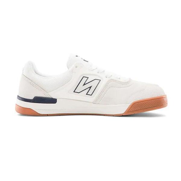
SEMANTICS: DENOTATION (specified)
accessory>shoe>unisex skate shoe
SEMANTICS: EXPRESSION (feelings)
sturdy, simple
SEMANTICS: CONNOTATION (associations)
skate boarders, streetwear
PRESENCE (contextual)
Litlle: skate park, sidewalks
Lots: formal dance, funeral
SYNTAX (visual elements and relationships)
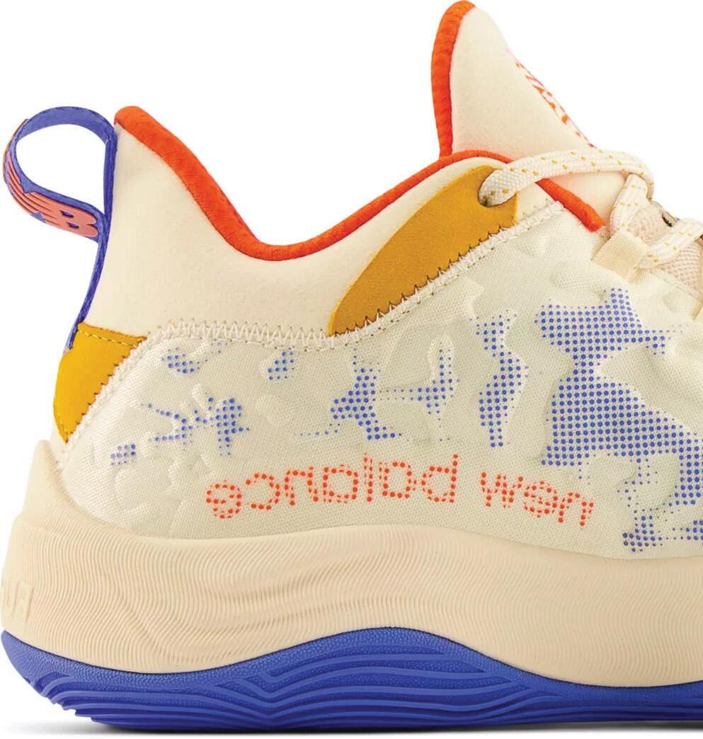
A cream color body scattered with orange and royal blue organic shapes that are dotted rather than solid color. Two solid mustard yellow color blocks are located near the back of the shoe. The interior fabric is orange. A rubber royal blue sole continues up along the bottom of the shoe in a wave like pattern. A creme rubber piece mimics this wave directly above the blue piece. The body of the shoe contains raised bubbles that blend in with the body. ‘new balance’ is spelled out backwards in orange along the bottom rubber of the shoe towards the back.

SEMANTICS: DENOTATION (specified)
accessory>shoe> men’s basketball shoe
SEMANTICS: EXPRESSION (feelings)
bold, colorful, fast
SEMANTICS: CONNOTATION (associations)
basketball players, athletes
PRESENCE (contextual)
Litlle: basketball court, gym
Lots: wedding, hiking trail
19
Project 6 Process Book
The final project of the semester. The goal is to create a cohesive process book. Including all the previous porjects in this class, describing them, the inspiration behind them, and showing how they were created. Then tying them all together with a theme of graphics or colors for the whole book.

20
original cover ^
The first step to creating this book was to make a mood board. After scouring the internet and scrolling through pinterest, I found a few different things that I liked and wanted to explore. They weren’t all the same style or color scheme, but it was enough for me to be inspired to create a theme that incorporates bits and pieces off of the board.
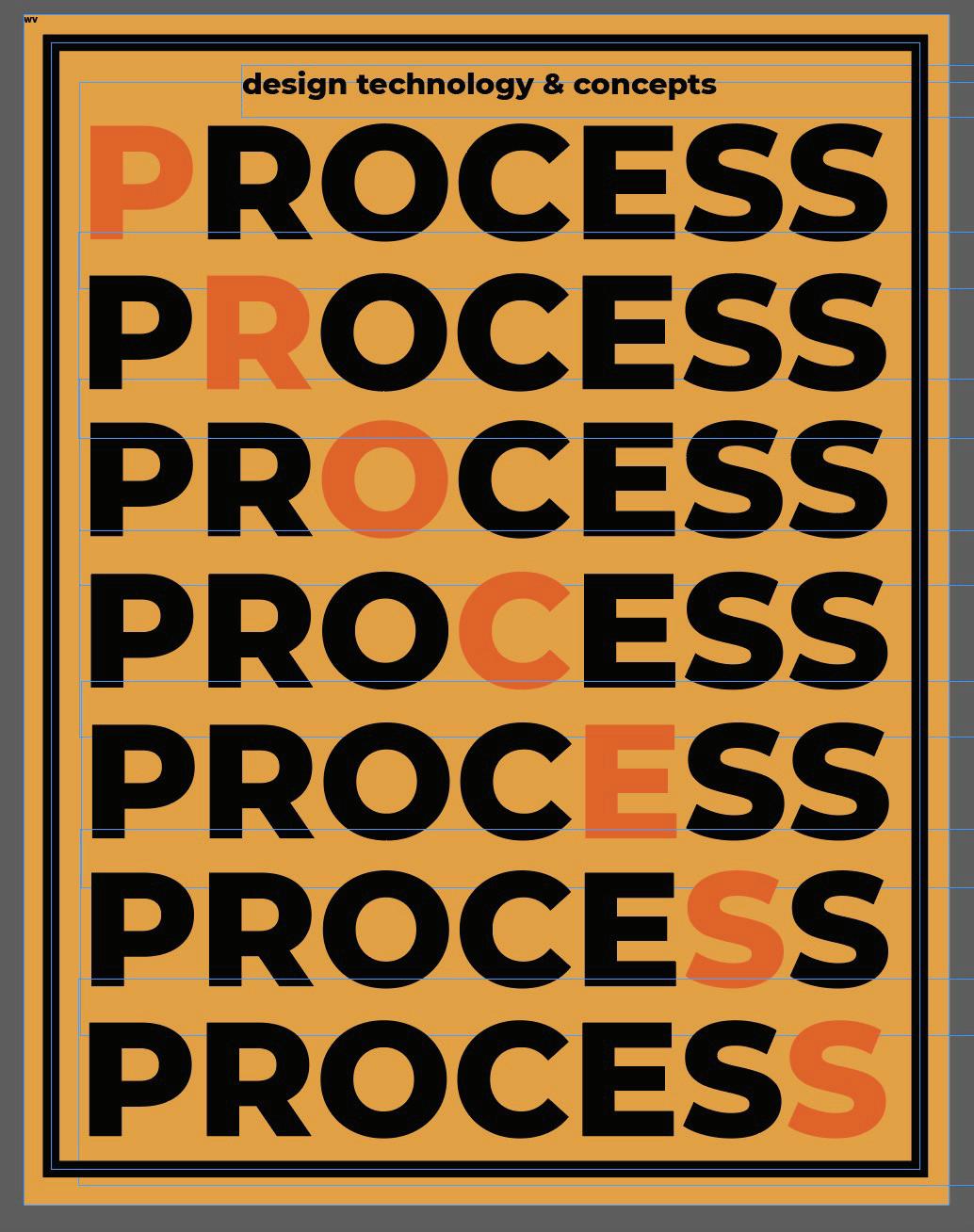
After placing every previous project and mood board or sketch into the template, I could get a clearer vision of how I wanted it to look. So I started to create a cover page as something to go off of style wise. The first design was very bold, using oranges and black, and the word process in a thick font repeating across the whole thing. After toying around with it for a while, I decided that even though


I liked it, with the content that was going in the book I didn’t want to make a whole thing that style. I think it would have been a little over the top and overwhelming. So I created a much simplier, and more modern version of it. The light blue/lavender color was much softer, and the type was much less in your face. I thought it would be much cleaner to create the rest of the book off of this version.
Lastly, after knowing what sytle I was going for, I put in all the copy. Then I was able to work on the individual spreads, constantly changing and editing them until I had everything placed how I wanted. Then the book was complete and the only thing left to do was publish it.
21
mood board
This process book, with all of my projects from my first college level art class in it’s contents can be used as a benchmark. I plan to continue to take art classes, as I
Reflection
move forward with fufilling my minor in art studio. I want to specifically dive more into the world of graphic desgin and visual communication. This book is basically
a portfolio of my work from this class, and I want to be able to look back on it in 3 years and see imporvements and remember where I started at.
22
23 Ella Dye Arts 102 Donna Smith University of South Carolina Columbia, SC 2023
Colophon
