
MODERN CRAFT ™ A new design integrity 50 PARIS TO SYDNEY MELBOURNE TO LA Fixtures Lighting Products Materials GLOBAL KITCHEN INSPIRATION

MELBOURNE
Bank
subzero-wolf.com.au Preserve masterfully. Cook precisely. Live deliciously.
Savour the ingredients that stay fresher longer with Sub-Zero, the food and wine preservation specialist, the meals that are cooked to masterful precision with Wolf, the cooking specialist, and a kitchen appointed with elegantly crafted appliances.
SHOWROOM ,
House. 11-19 Bank Place, Melbourne. SYDNEY SHOWROOM, Foveaux House. 63 Foveaux Street, Surry Hills.
masterfully.
fresher meals precision and Melbourne. Hills.
Re f r ig er at ion. C ook i ng .



Editor’s letter
 Sophie Lewis Managing Editor @sophlew_says

We’re launching this issue of est magazine off the back of Melbourne Design Week 2022, showcasing Australian and international contemporary artists, designers and makers responding to: “Design the World You Want”. Highlights included ‘Futures Collective’ which welcomed the ‘Plastic Rivers’ rugs by Spanish designer Álvaro Catalán de Ocón in collaboration with GAN and the inaugural Melbourne Design Fair, curating collectables such as the all-metal Firescale series by designer Ella Saddington with armourer Sam Bloomfield and Olive GillHille’s sculptural ‘TRUNK’ series.
These expressive works reaffirmed what we set out to explore in this issue, ‘Modern Craft’. We magnify the design details that underpin our experience in the kitchen by tracing craftsmanship, original design thinking and a dedication to raw, honest and reclaimed materials.
We walk through 12 kitchens from different corners of the globe to see how designers confront our understanding of this space, and at the same time, we deconstruct the elements of a kitchen into a definitive resource; ‘The est Best 50 Kitchen Fixtures, Lighting, Products and Materials’. Through our Detail pages, we appreciate how even the smallest details can leave a lasting impression in the kitchen.
We enter an Ibizan villa where Dutch designers Framework Studio employ traditional building methods to impart deep respect for landscape and history. These same principles take us to a family home in Paris that adheres to the classical codes of its architecture through bespoke intervention. A dedication to refined detailing also transcends a Sydney home by architect Madeleine Blanchfield to conjure ‘palpable’ calm and character.
This intuitive, human-centred approach to design continues to inspire us – and finds its way onto every page in this issue.
Sophie x
ISSUE #44
CONTENTS


This Side of Paradise the detail the est best


 kitchen compendium world’s edge
est style the latest
at home with Will Dangar
French Eloquence
the library Desert Oasis
ISSUE #44
Transformative Tranquillity


Meet the contributors


Jack Milenkovic
Atelier Lab’s Jack Milenkovic is a former Vogue Living creative director, interior designer and stylist. Drawing on his 20 plus years in magazine publishing, Atelier Lab was formed seven years ago – described by House and Garden magazine as “a powerhouse design and styling partnership”. In this issue, Atelier Lab worked with architect Madeleine Blanchfield on styling the interiors of a Sydney family home.

@atelier_lab_
Yvette Caprioglio

A long-standing est contributor and style editor, Yvette Caprioglio has worked for more than 25 years across advertising and communications. With a highly-refined eye for aesthetics, Yvette has been known to say, “Don’t hurt my eyes,” and believes that while a picture tells a thousand words, some sassy wordplay never goes astray. Yvette writes on Madeleine Blanchfield Architects’ latest project, Dusk House, for this issue of est magazine.
@yvette_caprioglio
Timothy Kaye

Having worked as an architectural and interior designer for a decade, Timothy applies his minimalist architectural eye and considered approach to frame unique scenes and moments. While exploring the relationship between the finer details and the underlying narrative of each project, Timothy focuses on capturing the emotion and atmosphere of each space, utilising light and shadow to evoke depth and mood in his photographs. Timothy worked with CJH Studio to capture details in their House E Kitchen as part of ‘Kitchen Compendium’.
@timothykaye
Niamh Barry
Niamh Barry is a Toronto-based photographer specialising in interiors and architecture. Niamh’s creative vision stems from her attention to detail and ability to capture the narrative of a space. Niamh photographed Lune 1860 as part of ‘Kitchen Compendium’, collaborating with Studio Author to highlight the unique materials and textures of the space.
@niamhbarry1
ISSUE #44


est TEAM
Managing Editor
Sophie Lewis
Style Editor & Copy Yvette Caprioglio
Design & Creative Jack Seedsman
Product Editor Brigitte Craig
Editorial Strategy Advisor Karen McCartney
Associate Editor & Marketing Manager
Sarah Knight
Editorial & Social Media Coordinator Lidia Boniwell
Editorial Assistant India Curtain
Features Writer Holly Beadle Sales Coordinator
Emmy Ford Managing Director Miffy Coady
Advertising & Partnerships Mandy Loftus-Hills | mandy@estliving.com Astrid Saint-John | astrid@estliving.com Deb Robertson | deb@estliving.com
ON THE COVER
Design
Benoit Viaene Photography Thomas De Bruyne
Location Antwerp, Belgium
CONTACT
editorial@estliving.com advertising@estliving.com

credits
CONTRIBUTORS
WORDS
Karen McCartney, Alexandra Gordon, Yvette Caprioglio, Holly Beadle, Haydn Spurrell, Sarah Knight, Sophie Lewis
PHOTOGRAPHY
The Latest Dave Wheeler, Derek Swalwell, Anson Smart, Simon Strong, Shannon McGrath
At World’s Edge Thomas De Bruyne
Kitchen Compendium Stephanie Mathias, Piet Albert Goethals, Thomas de Bruyne, Rory Gardiner, Matteo Dal Vera, Ben Anders, Alexis Armanet, Adrien Dirand, Niamh Barry, Joe Fletcher, Timothy Kaye
French Eloquence Francis Amiand
At Home With Will Dangar Prue Ruscoe
Desert Oasis Roger Davies
The Library Petrina Tinslay
Transformative Tranquility Dave Wheeler
The est Best Anson Smart, Mark Roper, Felix Forest, Timothy Kaye, courtesy of Akin Atelier, Willem-Dirk du Toit, Rhiannon Taylor
This Side of Paradise Nicole Franzen
Lessons in Subtlety Salva Lopez
Playlist Curation | Mark Richardson
The Detail Matthew Williams, Ruth Maria Murphy, Anson Smart, Felix Forrest, Thomas de Bruyne, Timothy Kaye, Nicole Franzen, PION Studio
Back Cover Thomas De Bruyne
CONNECT
ISSUE #44
THE COMPLETE PACKAGE
Quality, Experience
Design 10 is Australia’s newest offering for premium kitchen, bathroom and laundry appliances, bathware, sinks, tapware and accessories.
The Design 10 team value relationships and quality, drawing on years of experience to provide expert advice and service.
Only the highest quality and innovative brands are on offer at Design 10, available online or at select showrooms.

Design AV-ID

Innovation,
EXPLORE THE DESIGN 10 RANGE >
Architecture Abe McCarthy Architects
Project Flinders House Photography Shannon McGrath
The latest
An up-to-date look at what’s happening on estliving.com and across our social platforms.
Be inspired by a Melbourne landscape designer’s own outdoor spaces.

Pinterest
Find out more about Henry Willson’s latest piece – the Offset lamp – made from Arabescato Marble. Product Library

See Melbourne Design Week 2022 highlights. Instagram
Walk through a Melbourne home inspired by southern Italy.
Exclusive Video Tour

Heide Museum of Modern Art, together with architect John Wardle and designer Simon Lloyd, present ‘Relatively Useful’. News


Explore a multi-generational family home in Western Australia’s Margaret River.


Australian Architecture & Interiors


Kyra Thomas welcomes est inside her reinvented warehouse home.
Where Architects Live
A Detailed Lens
BY YVETTE CAPRIOGLIO STYLE EDITOR
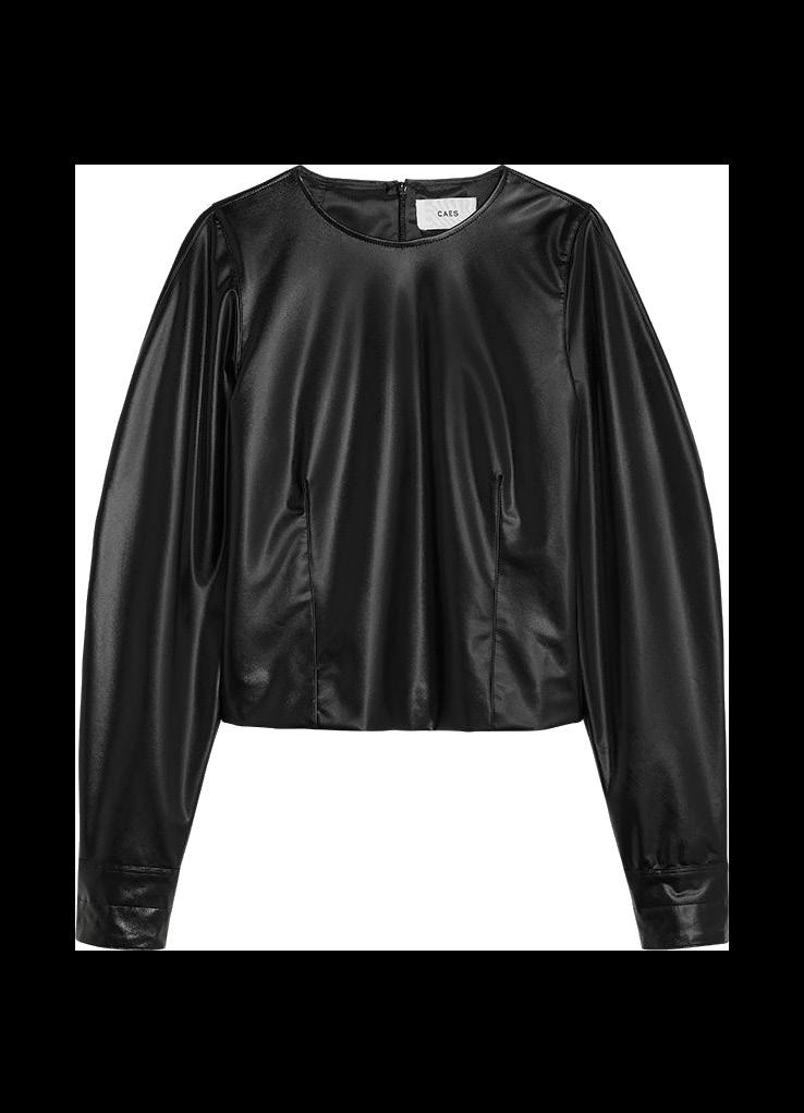


An eye for detail manifests in many ways. Apply the same lens any great designer does regardless of discipline and make materiality key when looking for new or consignment pieces to add to your wardrobe. Think about the craft behind the clothing with an enduring yet contemporary approach. Consider brands and lean towards pieces that sit at the crossroad of cohesive design integrity and materiality, ones that innately transcend fashion through form and function while preserving artisanal craft and process.

SHOP THE COLLECTION >
CALFSKIN LOEWE EDITION 4 – 0001 VEGEA LEATHER LOOK CURVED SLEEVE TOP CAES
NAPPA
VANISHING LEGACIES MARLO LYDA
BRITTON BLACK TROUSER MOTHER OF PEARL
est style

NORDA 001 – M NORDA


ISSUE #44
ATHENA TAN DRESS MOTHER OF PEARL
CROPPED DOUBLEBREASTED JACKET NANUSHKA

SERVE IT UP
Turn up the heat and start cooking with volume two of our best-loved playlist.

Curation
Mark Richardson


WORLD’S
WORLD’S EDGE
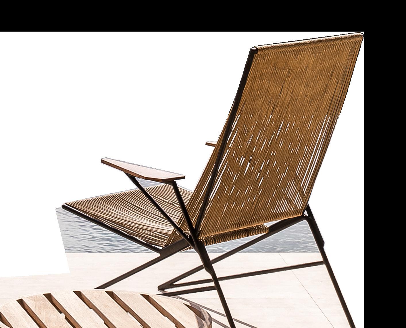


At the edge of Spain’s Balearic Sea sits a villa that is a testament to artisanal craftsmanship.
DESIGN | Framework Studio PHOTOGRAPHY | Thomas De Bruyne
WORDS | Holly Beadle
ISSUE #44 / FEATURED HOME

The home’s traditional stonework exterior and garden walls set the tone for the artisanal details within.


Can Brut, the most recent project from Paris and Amsterdam-based Framework Studio lies in the centre of an 85,000 square-metre plot overlooking the Balearic Sea. The family villa adheres to a design vernacular that is both steeped in tradition and tethered to now.
Most who descend on the island of Ibiza are looking for an escape from reality and for the family of Can Brut, their story is no different; the villa is their secluded sanctuary by the sea. As one of the smallest beaches on the island, the area remains largely unfrequented by travellers, rendering it a private cove for locals. The seabed is inlaid with smooth stone, making swimming and snorkelling an all-yearround affair. The pool area draws inspiration from its sequestered locale; the ocean materialises in Verde Lapponia tiles, while the beach materialises in sandstone and Travertino Romano. The garden has all the hallmarks of Balearic island life, with lush romantic flowers and winding sandstone corridors. “We tried to capture the Balearic feel in the material palette,” Framework Studio senior architect and interior designer Alexandra Ramos says, striving for “comfortability and simplicity.”
The custom kitchen designed by Framework Studio features a material mix of oak, gunmetal and Travertino Romano. A vintage Alla Gould lounge chair and Arno de Clercq Senufo stool feature in the foreground.
ISSUE #44 / FEATURED HOME
The dining room features a wooden table crafted by the late Brazilian architect Jose’ Zanine Caldas and vintage Pierre Jeanneret chairs.

ISSUE #44


Entering Can Brut, light floods the hallway creating an easy passage into the kitchen and living area. Curved ceilings reference traditional building methods and attribute an open, airy feel to the villa. Hidden skylights create depth, while internal elevations create contrast. An ongoing engagement with the outdoors is achieved through a direct line between indoor and outdoor spaces. Standing in the kitchen or living area, views of the pool and outdoor dining area are framed from all angles. “The view gives you this magical feeling of being completely secluded; of being off the beaten track,” Alexandra says. An ocean backdrop and century-old Sabina trees certainly affirm this.
With a focus on craftsmanship, Framework Studio have paired custom woodwork with minimalist sculptural pieces – a vintage Wiener Werstatten sofa, and a one-of-a-kind wall art piece by Nerone Patuzzi – consummating an unpretentious and organic interior.

Vintage, pre-loved pieces are the guiding motif, while honest materials are the foundation. Framework Studio’s philosophy is grounded in “enabling the true identity of materials to come through”; from the way they are treated to the way they are presented.
Can Brut by Framework Studio bears witness to the synergy between craftsmanship and context, attesting to the importance of being present in the world around us.
A curation of vintage objects in the living room includes the circa 1970 vintage sculptural sectional sofa by Wiener Werstätten, vintage Conoid lounge chair by George Nakashima, Vincenzo de Cotiis coffee table and vintage wooden wall art piece by Nerone & Patuzzi.

ISSUE #44


ISSUE #44 / FEATURED HOME
The Arno Declercq Senufo stool is a recurring theme in the villa, as is the custom woodwork designed by Framework Studio, including the headboard in fabric and elmwood.

The bathroom palette is consistent with the kitchen, featuring gunmetal fixtures, oak and Travertino Romano.


Previous Page: The outdoor dining area is the hero of the home; a space to park on warm summer nights and soak up the surroundings.
Current Page: Verde Lapponia lines the inside of the pool, while limestone was used for the outside, and outdoor area.

ISSUE #44 / FEATURED HOME


ISSUE #44

ISSUE #44 / FEATURED HOME
FRAMEWORK STUDIO’S


SIGNATURE STYLE


Framework Studio reflect Ibiza’s landscape and history through authentic materials, traditional craftsmanship and unique vintage pieces.


TRAVERTINO ROMANO SIGNORINO
VERDE ALPI LAPICIDA
REFLECTION BAUWERK COLOUR FREEFORM CRACKENBACK ECO OUTDOOR
VERDE LAPPONIA BAGNARA
BEN MAZEY CRITERIA COLLECTION BLACK LINE FLAG CRAYON Edition 4 + 2AP 2022
MAD BENCH PIERRE YOVANOVITCH


ISSUE #44 / FEATURED HOME
OAK CROWN TEXTURED MATT GEORGE FETHERS & CO
GRUPPO NP2 WALL PANEL NERONE & PATUZZI
DAPHINE TERRA LED LUMINA
SCULPTURAL SECTIONAL SOFA WIENER WERSTÄTTEN


 Design Atelier 10.8 Photography Stephanie Mathia
COMPENDIUM KITCHEN
Step inside 12 kitchens from around the globe where design is shaped by craft.
ISSUE #44 / Special Feature
WORDS Sophie Lewis
 Photography Thomas De Bruyne
HOVE
BY Antwerp, Belgium
BENOIT VIAENE
The Hove kitchen’s arched ceiling isn’t what you’d typically expect in a home on the outskirts of Antwerp. “It surprises every guest, and the monumentality combined with the materials awaken an emotive response,” Belgian designer Benoit Viaene says.
Naturally, Benoit set out to create a kitchen unique in form and experience. While the arch sets the tone, it’s accentuated by the materials and finishes, from the custom clay plaster, smoked oak veneer “left as natural as possible to keep the gradation in the wood” to the brushed Travertine benchtops. The kitchen floors are a custom mix of gravel, hand polished to give an imperfect, waved appearance. “Although monumental in space, the palette of materials, kitchen design and wall finish create a more intimate atmosphere,” Benoit adds.
A custom wine cellar, dining table, kitchen tap and central pendant have been specially designed for the space. Benoit credits the craftspeople they worked with to pull off this level of detail. “An idea or a design can be strong on a drawing board or presentation, but in the end, the skills of craftspeople make it real,” he says. “They are a key element in making a design real.”
ISSUE #44 / Special Feature
– Benoit Viaene

“An idea or a design can be strong on a drawing board or presentation, but in the end, the skills of craftspeople make it real. They are a key element in making a design real.”
The kitchen features a custom made tapware combination and a central pendant that has been specially designed for the space.

ISSUE #44 / Special Feature
 Photography Rory Gardiner & Matteo Dal Vera
WOOLLAHRA HOUSE
BY Sydney, Australia
AP DESIGN HOUSE
The Woollahra kitchen by AP Design House takes cues from its past life as a gallery space through a minimal aesthetic, heralded by custom stainless steel joinery. Taking form in a space that was dark and narrow, the stainless steel plays an unexpected role in reflecting light and movement.
AP Design House director Alexandra Ponting draws attention to the intricacies of the craftsmanship, where the stainless steel benchtop sits flush with the door and drawers below. “The benchtop seamlessly integrates into a custom stainless sink; a thing of beauty, but also unbelievably practical,” Alexandra says. She also admires the relationship between the joinery and cooker. “The custom joinery hugs the French Lacanche cooker with such precision that it appears it was made for the oven,” Alexandra adds.

Creamy Tadelakt and micro-cement finishes and olive terrazzo tiled flooring anchor the stainless steel’s soft and sharp lines, just as the custom-made and antique Italian furniture and lighting. “The antique furniture and lighting boast charm and intrigue; a refreshing and homely contrast to the foundations.”
The stainless steel’s strong lines are softened by micro-cement joinery, as well as a Tadelakt rangehood, splashback and floating shelf.

“I love the reflective nature of stainless steel and the light and movement it creates.”
– Alexandra Ponting

 Photography Adrien Dirand
DIRAND RESIDENCE BY
JOSEPH DIRAND
Paris, France
French architect Joseph Dirand is always concerned with how the senses respond to space, particularly through the quality of light, informing his restrained yet elegant interiors. This couldn’t be more clear than in his own kitchen, located on Paris’ Right Bank with front-row views of the Eiffel Tower.
The architect is known for collecting cuts of marble and saving them for the right opportunity – just like the Breccia Stazzema marble he selected for his kitchen island, which he had stored away for five years prior. The marble island symbolises Joseph’s belief that “craftsmanship and its wide range of expertise are a genuine laboratory of ideas”, reflected in the stone’s polished curved edges and detailing beneath. The scorched stainless steel cabinets also attest to his signature approach to materiality, grounded by the Versailles parquet flooring. Above, a chandelier by Philippe Anthonioz and Joseph’s own Gelule wall light nearby affirm how Joseph’s classic French design is always grounded by artisans, classic and contemporary.
Joseph Dirand designed a custom banquette adjacent to the Breccia
Stazzema marble kitchen island, which features a table by Ettore Sottsass, his own Roma stool, Métropole no. 305 chairs by Jean Prouvé and by Eric Schmitt pendant light.
ISSUE #44 / Special Feature


ISSUE #44 / Special Feature

PROJECT M
BY Oudenburg, Belgium
FREDERIC KIELEMOES
Belgian designer Frederic Kielemoes says his Project M kitchen exists as a series of balancing juxtapositions; “Contemporary, yet timeless. Minimal, yet warm. Graphic, yet calm. Calculated, yet intuitive.” For this, he derived inspiration from how we seek tactile, familiar touch points away from the virtual world. “This longing for familiarity translated into a study on materiality. I did this mostly by opposing raw materials, often with a history, with refined contemporary materials,” he says.
Reclaimed old French flagstones on the floor meet untreated iron and solid worn oak, limewashed cupboards and expressive marble that intersects in a series of pieces. Above, solid timber slats line the ceiling, “directly cut from a tree”. An important aspect of the kitchen is also the nearby fireplace, “almost as sacred and symmetrical as an altar,” Frederic says. Deliberately, Frederic has hidden as much modern technology as possible – heating, ventilation, appliances, lighting – so that the space elicits relaxation and ease.

Photography Thomas De Bruyne

“Contemporary, yet timeless. Minimal, yet warm. Graphic, yet calm. Calculated, yet intuitive.”
– Frederic Kielemoes

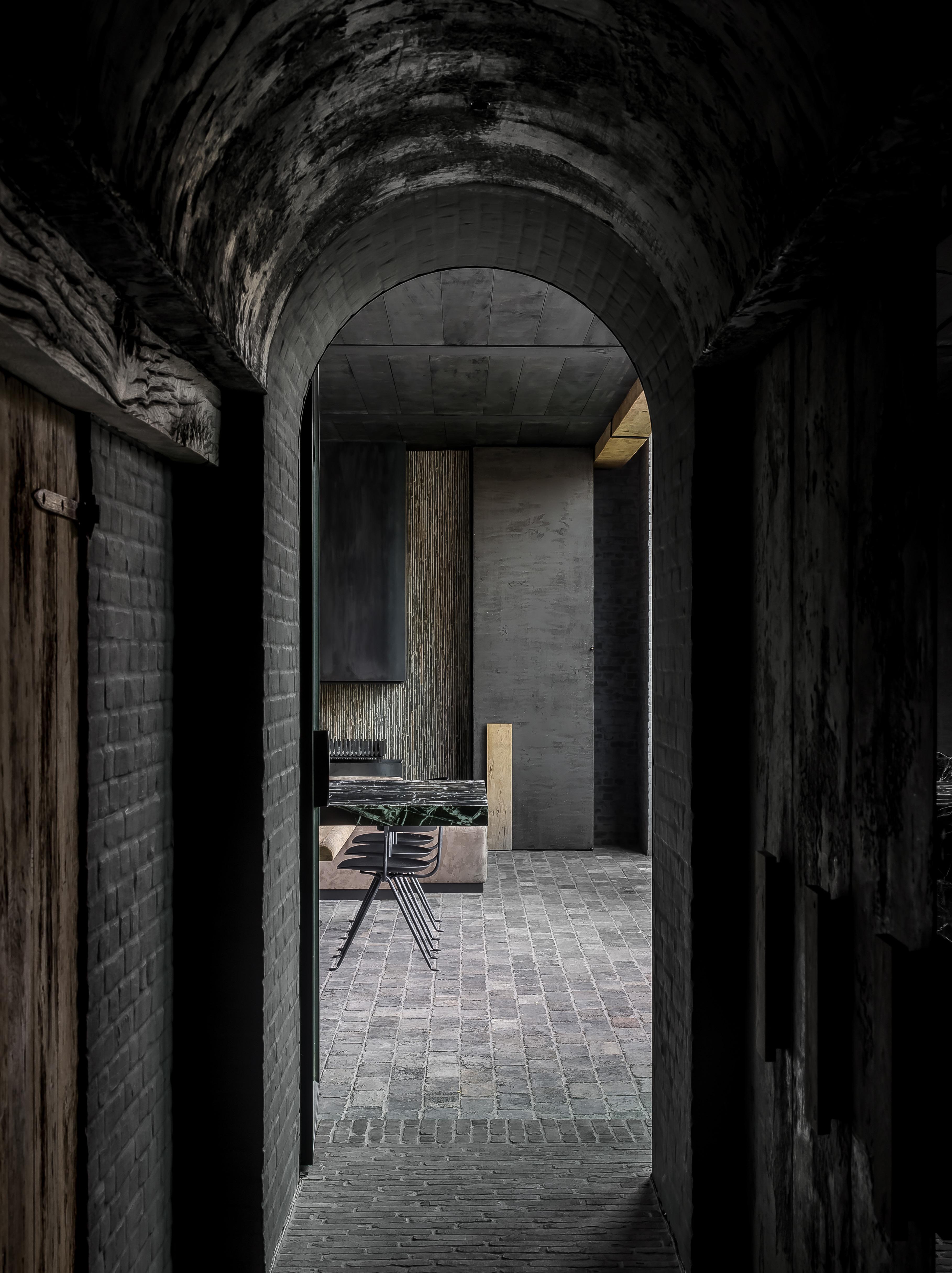
The kitchen features a palette of raw and reclaimed materials; French flagstones, solid worn oak, expressive marble, untreated iron and limewashed surfaces.

ISSUE #44 / Special Feature
The lower part of the kitchen island with its vintage dining chairs is set up as the breakfast area, surrounded by vintage dining chairs. A relaxed seating area and separate snug lead off this. The Voyager pendant by US Studio Allied Maker let’s light flow from two openings cut into the cylindrical brass shade.

LEINSTER SQUARE TOWNHOUSE
BY London, UK
BANDA
Banda follows the mantra that homes and spaces are not just to be lived in, but to be loved. It’s through working with craftspeople and the provenance of the materials, that they achieve this. “Craftsmanship is everything,” CEO and creative director Edo Mapelli Mozzi says, leading the redesign of an 1850s townhouse, with its high ceilings, period windows and historic garden square vistas.
The cantilevered Calacatta Oro marble Obumex ‘Joseph Dirand’ kitchen, is the space’s dramatic centrepiece. “It gives the notion of solidity and quality, the roots of the home, and then the softer, contrasting features of the vintage wooden pieces and fabrics,” Edo says. “The kitchen is a celebration of natural materials, colours and textures – marble, bronzes, vintage and antique woods.”
There’s even a bespoke bar that can be completely shut away behind a hidden door when not in use. “The kitchen is the perfect blend of old and new, hard and soft,” Edo reflects. “It is a place to come together, to gather, cook, talk, entertain, have fun but also seek respite.”
ISSUE #44 / Special Feature
Photography Ben Anders Kitchen
Design Obumex & Banda

ISSUE #44 / Special Feature


“The kitchen is a celebration of natural materials, colours and textures – marble, bronzes, vintage and antique woods.”
– Edo Mapelli Mozzi

ISSUE #44 / Special Feature
A French antique pine country dresser cabinet dates back to the 19th century.

BRICK 99
BY East Flanders, Belgium
AM DESIGNS
Brick 99 by Belgian studio am designs takes in views of the Scheldt river, in the country’s East Flanders region. The entire apartment is designed around this outlook, inviting natural light through large openings and terraces.
The kitchen exists as part of the open plan living and dining area, so every effort was made to conceal it being a workspace. “I wanted the kitchen to integrate seamlessly,” am designs founder Mark Mertens adds, concealing Gaggenau appliances behind the floor-to-ceiling wall joinery that runs along the side of the kitchen.
am designs visualised the kitchen as “pieces of free-standing furniture”, achieved through a signature palette of Douglas fir timber and Pietra Dei Medici stone, warmed by brushed brass fixtures. “Ultimately, the stone and timber needed to connect with the large outside terraces and surrounding nature,” Mark adds.
The Brick 99 kitchen was designed to not appear as a workspace. All appliances are concealed behind joinery which forms one wall in the apartment’s open plan kitchen and living area.

Photography Thomas De Bruyne


ISSUE #44
RUSTIC CANYON
BY Los Angeles, USA
WALKER WORKSHOP
Walker Workshop’s president Noah Walker describes their Rustic Canyon kitchen as a sacred place. As the tallest room in the house, Walker Workshop designed and installed the expansive steel-framed windows, crediting natural light for the creation of their ‘Kitchen Cathedral’. “Rustic Canyon is nestled among some of the most beautiful Southern California flora and fauna,” Noah says. “We chose to pull dappled natural light from the outside environment into the core of the home. It was imperative to pull that light into the house.”
The material palette was selected for how it collected, reflected or observed the light. “We chose the softer, lighter-coloured wood veneer that was consistent in colour and a white, almost ephemeral stone to complement,” Noah says. Fundamentally, Rustic Canyon also challenges traditional perceptions of a kitchen’s purpose. “The great lesson we learned is a kitchen doesn’t have to prescribe to outdated notions of what a kitchen should be for it to be functional, exciting, and unexpected,” Noah adds.
Photography Joe Fletcher
ISSUE #44 / Special Feature

Concealed elements in the kitchen were a key consideration. Ventilation was the first, followed by a pantry hidden behind a cabinet door panel, allowing the main kitchen to be “as minimal as possible”. A hidden roller shade on the outside of the kitchen’s expansive glass protects it from the heat.


ISSUE #44
Photography Thomas De Bruyne
APARTMENT MARIPOSA
BY Cannes, France
CAPRINI &PELLERIN
‘Apartment Mariposa’ lies within a 1970s architectural icon designed by Sir Basil Spence and Eugène Lizero, in Cannes, France. The Brutalist-Modernist style of the building informed Caprini & Pellerin interior treatment. “The apartment was designed so that it would age with authenticity,” Caprini & Pellerin co-director Kevin Caprini says. “It was very important the result gave the impression that everything had always been there.”
In Kevin’s words, they’re “defenders of ancestral techniques”. “We like to apply them or reinterpret them,” he says. It’s how they worked with their 70s-inspired material palette; ash grey Dordogne stone, upcycled oak, patinated bronze, Travertine and walnut wood. “We used handmade bottle green tiles by New Terracotta, laid one by one for an artisanal touch and to create depth,” Kevin adds.
Designed for Caprini & Pellerin co-director Jerry Pellerin’s mother, he says what lies within the kitchen drawers tells its story best. “I know all of her objects and utensils and I took all of these into consideration,” Jerry says. “For example, moulds of her silverware and spice jars were taken so that they all fit snugly.”
Lime plaster covers the walls, ceiling and rangehood, while green tiles laid by hand echo the outdoor vegetation. All kitchen surfaces are clad in Travertine, with the Gaggenau cooktop integrated within.
ISSUE #44 / Special Feature
“The apartment was designed so that it would age with authenticity. It was very important to us that the result gave the impression that everything had always been there.”
 – Jerry Pellerin
Styling Sarah de Beaumont
Photography Alexis Armanet

ISSUE #44 / Special Feature
Caprini & Pellerin used solid wood so that they could carve out the handles and towel holders, creating intricate details and rounded angles in the cabinetry.
Photography Thomas De Bruyne
– Jayme Million

“We sought out materials that would add character, depth and a touch of imperfection to the space and then used them in unexpected ways.”
LUNE 1860
BY Rural Ontario, Canada
STUDIO AUTHOR
Studio Author’s co-founders Alex Simpson and Jayme Million were inspired by the moon in their restoration of an 18th-century stone manor in rural Goderich, Ontario, Canada. The now private residence and special events space nods to the state it was found through an underlying theme of imperfection that reflects the textures of the moon. Studio Author co-founder Jayme Million says this is most notable in the kitchen’s large raw brass island – the showpiece – designed to patina. “We used unlacquered brass, which will transform beautifully over time, further adding to the character and story of the space,” Jayme says.

Marble slabs were broken by hand and layered to create a unique backsplash, “not dissimilar from the rocky terrain of the moon”, underpinned by contrasting stone floor tiles and hand-applied limewashed walls. “We knew that we wanted the focus to be on the finishes,” Jayme says. “Integrated finger pulls and appliances, the absence of upper cabinets and the island’s monolithic form allowed the natural, tactile surfaces to stand out,” Jayme says.
Studio Author took inspiration from the moon for their Lune 1860 kitchen, as seen in the contrasting light and dark stone floor tiles, limewashed walls and raw marble backsplash detail.
Photography Niamh Barry

BRUSSELS APARTMENT
BY Brussels, Belgium
ÆSTUDIO
Æ Studio, led by interior designers Arno Broeckhoven and Ellen Van Laer, were tasked with designing the “perfect hideaway” from the city centre in Brussels, Belgium. In an apartment that deliberately eschews the hustle, Æ Studio derived calm from patina and texture. “The patinated copper was the key ingredient in the kitchen,” Arno says. “The colour, depth and gradient will keep on evolving through the years, while the sleek lines and sharp corners make the welded copper cabinetry dramatic and stylish.”
Arno believes the combination of materials in the kitchen and their bespoke application, including custom patinated copper Vola tapware, are essential to the design outcome.“The combination of the plaster technique’s soothing tones, and the dramatic copper forge a strong bond. They tell the story of those who live there.”
ISSUE #44 / Special Feature
Photography Piet-Albert Goethals


OLD FACTORY
BY Berchem, Belgium
ARJAAN DE FEYTER
When Arjaan De Feyter was first introduced to the ‘Old Factory’, it consisted of two parts – a terraced house, and a small former steel factory. The designer converted the two into a complete ‘whole’ for the family that now lives there.
Arjaan says the kitchen was deliberately positioned at the centre of the former factory space. “It oversees the house and its users like a captain on a ship,” he adds. The kitchen makes liberal use of Calacatta Viola stone for the island with a custom sink, backsplash, benchtop and shelving. The evocative stone commands attention on a canvas of ebony cabinetry painted using a “special paint technique” and white concrete floors. “Everything happens around the kitchen island, everyone passes by there,” Arjaan says. “That’s why it has also been given striking materials in an otherwise sober context.”
At the centre of the former factory space, the kitchen asserts itself through Calacatta Viola stone and textured black cabinetry, that calls on the Shou Sugi Ban exterior cladding.
Photography
Piet-Albert Goethals
ISSUE #44 / Special Feature


ISSUE #44
– Arjaan De Feyter

“The kitchen is a striking intervention in the former factory space and was deliberately positioned at the centre. It oversees the house and its users like a captain on a ship.”

HOUSE E KITCHEN
BY Melbourne, Australia
CJH STUDIO
Interior designer Cassie James-Herrick is a stickler for details, which comes with leading both her design practice CJH Studio and architecture and interior hardware business, Linear Standard. The House E Kitchen sees both come together inside a heritage home, in a response that highlights the strength of natural materials, contrasted by textural bronze accents.
Cassie selected Quartzite as a hardwearing working surface for the central island, explored through a series of precise, angular intersections. “The kitchen explores an interplay of mixed grain directions in the timber veneer and natural stone, pushing what’s possible with interconnecting planes on the island bench,” Cassie says.
Full-height solid American oak handles were designed for the kitchen and crafted by Grange Joinery, integrated into the wall joinery. “They enhance the bespoke detailing that’s streamlined yet durable in nature,” Cassie says. Linear Standard ‘THIN’ handles were also powder coated in a custom bronze for the return working bench area. The craftsmanship behind the finer details throughout was imperative to the project’s success.
 The kitchen features the designer’s own hardware range and custom-designed full height handles in American oak.
Joinery Grange Joinery Stonemason The Porcelain Factory Handles Linear Standard Builder Omnicon Photography Timothy Kaye

“The kitchen explores an interplay of mixed grain directions in the timber veneer and natural stone, pushing what’s possible with interconnecting planes on the island bench.”
– Cassie James-Herrick

ISSUE #44 / Special Feature
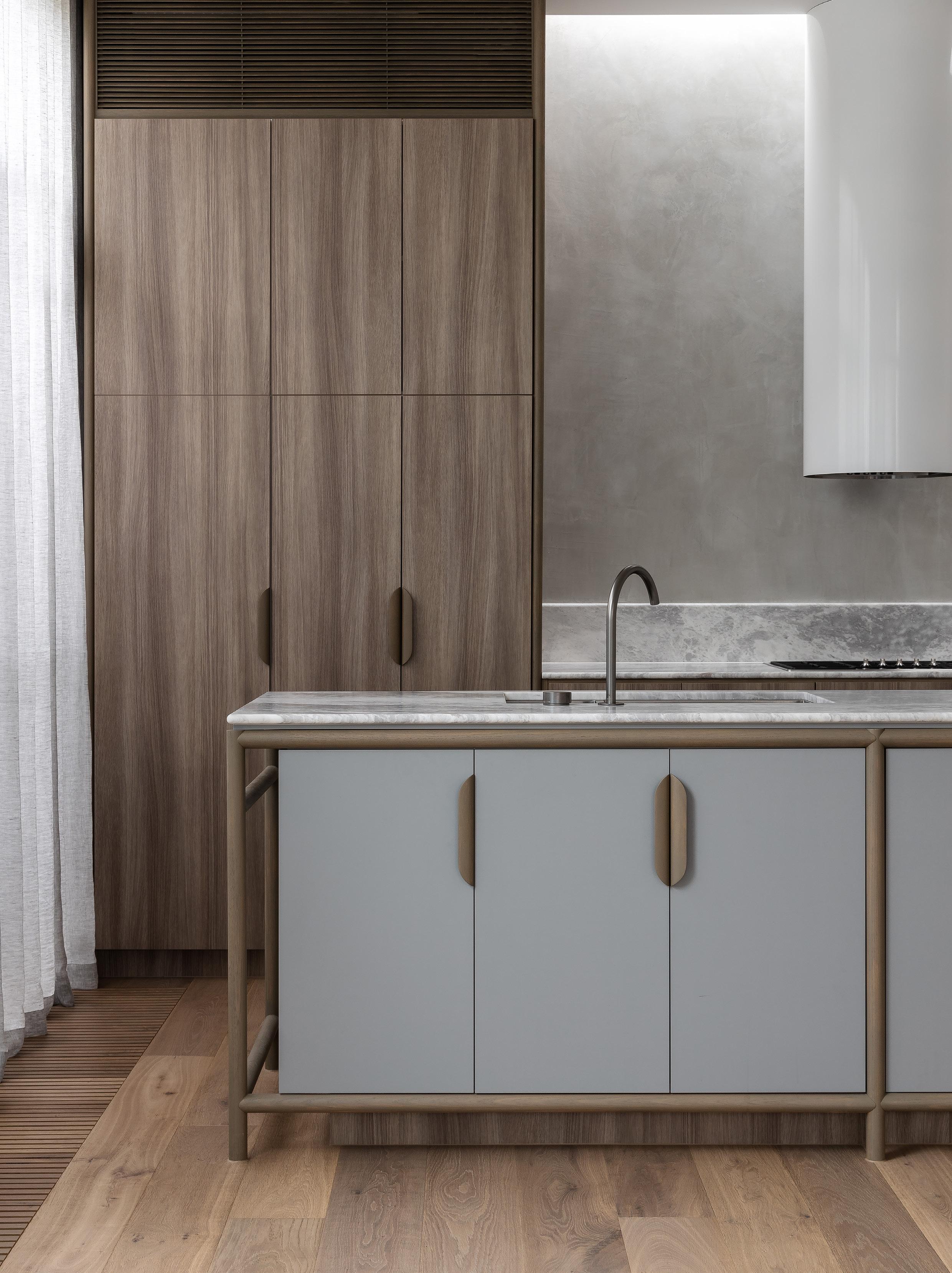 Design Luke Fry Architecture & Interior Design Project Ripponlea House Products Eccentric swivel hob outlet & Eccentric progressive hob mixer
Photography Timothy Kaye
Timeless Design Details
Designed by Rogerseller and made in Australia from quality machined solid brass and stainless steel, the award-winning Eccentric range is engineered to stand the test of time.

The Rogerseller Eccentric fixed hob outlet features in the Ripponlea House kitchen by Luke Fry Architecture & Interior Design; a heritage home transformation with an inherent focus on longevity.

THE ECCENTRIC RANGE BY ROGERSELLER >
ISSUE #44
EXPLORE

ELOQUENCE F RENCH
Drawing from various eras and art movements of the past two centuries results in a rare balance of subtlety and excess.
DESIGN Humbert & Poyet
PHOTOGRAPHY Francis Amiand WORDS Haydn Spurrell
ISSUE #44 / FEATURED HOME

ISSUE #44
Within the third arrondissement, in the northern section of Paris’s Marais, Humbert & Poyet designers Emil Humbert and Christophe Poyet reworked a two-storey apartment of sublime eloquence, simple in its layout and arresting in its atmosphere.
The design is largely inspired by the Art Deco stylings of a bygone era. Defined by its popularity in the 1920s and 30s and characterised by sleek geometry and form materialised by human ingenuity, it proved a deep well for the designers to draw from.
Humbert & Poyet handpicked the Arabescato marble to serve as a backdrop for the La Cornue range cooker. They custom-designed the Asterios suspension light to hang above the marble island, with BassamFellows Tractor stools. All kitchen cabinets are fitted with brass handles and painted in Farrow & Ball’s Calke Green.
ISSUE #44 / FEATURED HOME
 An electric blue Grand Theodore sofa designed by Humbert & Poyet is the focal point in the living room, accompanied by their Theodore armchair and Gabrielle coffee table. A sconce by Gino Sarfatti (1963), painting by Bertrand Lavier and ceramics by Georges Jouve also make an appearance in this space.
A custom marble fireplace designed by Humbert & Poyet reflects their mission to keep traditional craftsmanship alive, by carefully selecting the best artisans and craftspeople.

The dining room features Humbert & Poyet’s metallic Apolline table, paired with the Superleggera chairs by Gio Ponti for Cassina. Wall art by Katja Strunz.
Apartment Turenne features ornate frames, hardware by I1 Fanale, lighting and suspension by the firm’s in-house Asterios, and decorative furnishings, all of which use noble materials such as marble, terrazzo, wood and brass. “In all of our designs, we think it is important to carefully select the best artisans and craftsmen in order to keep traditional craftsmanship alive,” Emil says. “To source the marble we use for our projects, we work closely with the Carrara quarry where we go ourselves to handpick every slab.” Melded with a precise layout and Parisian-inspired interior design, Humbert & Poyet have captured all of these often disparate qualities and pulled them together harmoniously.
This transcendent balance of material abundance and the warmth accentuated by use of space, is encapsulated by the kitchen – modern in its design, yet balanced with classical inspiration. For the firm, the Arabescato marble is a standout, to serve as a backdrop for the La Cornue range cooker. Lining all of the kitchen’s surfaces, they “used the marble for its richness, colour and overall presence which really helps to bring the space to life,” Emil says. “When you have a party, there’s always a gathering in the kitchen – here, it’s around this incredible marble island,” he adds.
However striking through the abundance of design intricacies, Humbert & Poyet never lose sight of their mission – to craft a family home that speaks to the character of its occupants.
ISSUE #44


“In all of our designs, we think it is important to carefully select the best artisans in order to keep traditional craftsmanship alive.”
– Emil Humbert
Humbert & Poyet introduced terrazzo flooring with a custom terrazzo staircase and brass railing. Artwork: Subway drawings, Keith Haring 1986.
ISSUE #44 / FEATURED HOME
The primary bedroom features a large painting by Aaron Young (2001) above the Flexform bed, with a Magic Circus pendant and bedside table by Humbert & Poyet and Olimpia floor lamps by Franco Albini.


ISSUE #44 / FEATURED HOME
Pierre Paulin Groovy chair, Serge Mouille wall lamp, chest by Humbert & Poyet, painting by Paul Stanley, ceramics by André Aleth Masson (1952).

ISSUE #44


Humbert & Poyet handpick every slab of stone they use in their projects while working with Italian artisans. The main bathroom features Arabescato and antique French black stone.
ISSUE #44 / FEATURED HOME
THE POWER OF 7 IN 1
A WHOLE SUITE OF COOKING TOOLS AT YOUR FINGERTIPS


Explore and expand your culinary repertoire with traditional, steam and microwave technology used singly, sequentially or simultaneously with the added option of next level in-oven barbecue, air-fryer and stone cooking. Confidence to explore.


galileo.smeg.com.au


AT HOME WITH WILL DANGAR

INTERIOR DESIGN Alwill Interiors ARCHITECTURE Clayton Orszacky
PHOTOGRAPHY Prue Ruscoe
William Dangar, of landscape design practice Dangar Barin Smith, has a family home The Barn in Sydney’s Bondi that reflects his passions and preoccupations. Working facing a garden of ‘perfect imperfect’ planting he enjoys the blurring of lines from inside to out in a space filled with art and furniture that has evolved over time.
ISSUE #44 / AT HOME WITH
WORDS
Karen McCartney
 The living and dining space face the garden with silvery tones of blues and greys in the rug and sofa designed by Romy Alwill. The abstract work is by Michael Cusack at Olsen Gallery and just seen outside on the fence is an outdoor sculpture in corten by Caroline Duffy.

You’ve said the block of land you bought in Sydney’s Bondi was an unconventional, pizza-slice shape. What drew you and Julia to it?
Julia found the block. We had been looking for years as Bondi is a very tightly held suburb and level sites with rear access are uncommon. We also liked the proximity to the beach but also the road access to other suburbs to the west, south and north. It was not a popular site due to the shape of the block and I don’t think other interested parties could quite imagine the potential.
You worked with architect Michelle Orszacky of architecture practice Clayton Orszacky on the design of the house a decade ago. What was the creative concept ?
Photographer Murray Fredericks is a good friend and he was showing me images of simple structures on the edges of glaciers from his trip to Greenland.
They reminded me of the barn structures I had grown up with in country NSW and this became the very high-level structural brief to Michelle.
We knew we wanted a timber building that was simply but elegantly detailed. Michelle, Julia and I worked really closely with our building business Robert Plumb Build to deliver the project. We did it with the bare minimum of documentation as there was great deal of trust within the team. We also had an amazing friend of mine Paul Sheather who we employed as our foreman. He died not long after we completed the house which was very sad. We have an apprentice award named in Paul’s honour within our building team which is given annually.
You have long supported the work of interior designer Romaine Alwill who did both the original fit-out and recent updates – what was the original brief?
Romy and I met while working at Belle magazine. Our careers have developed together and we have been friends for several decades. Julia and I love her unfussy style: it’s elegant yet unpretentious and not overwhelming. Originally when the kids were smaller we had a slightly less refined interior – more robust. But as they are now older we have recently updated much of the furniture to be a little more sophisticated with a bespoke sofa designed by Romy and with some iconic furniture pieces such as the Borge Mogensen Spanish chair.
The entrance boasts a bolt of vibrant orange with a sculpture by Korban Flaubert and a more muted bench in oak from the Robert Plumb Ribbon range.
ISSUE #44

 Custom-designed sofa by Romy Alwill, Missoni throw, Børge Mogensen Spanish chair, and Rio low table by Charlotte Perriand. Artwork by Indivi Sutton.

ISSUE #44 / AT HOME WITH

Over time some things have changed and some have remained. Is the ability to evolve the sign of a good interior?
The built-in components of our house are timeless and have remained. The joinery is hand painted and we have combined this with solid timber and stone which never dates. This makes updating as simple as bringing in some key pieces and selecting items that will be with us for life.
Art plays a big role in the interior. What are you and Julia drawn to?
We have just slowly begun collecting more art. We have some really beautiful art and sculpture from Australian artists Michael Cusack, Greg Wood and Indivi Sutton. We are also lucky to have two beautiful images of Murray Fredericks’ Lake Eyre series as well as a very interesting photographic composition from Daniel Shipp in our bedroom. We like sculpture both inside and in the garden with work from Caroline Duffy on an interior wall and a punchy tangerine metal piece by Korban Flaubert in the entrance way.
You often work from home and have meetings here. Is the house conducive to creativity?
It’s a lovely creative space and very sunny in winter. I work from the dining table and when the doors are open to the garden you feel like you are literally in it. I think it’s also nice for my clients to see my garden as it’s very unexpected for Bondi.
For The Barn, the relationship with the garden was always going to be crucial. Large sliding doors ensure the connection is maintained while the planting embodies Will’s philosophy of perfectly imperfect.


What are the garden’s defining elements?
It’s very green and relies on texture and foliage form. It’s also a composition of entirely native plants from Japan and Asia, except for the jacaranda and Ficus which were here when we moved in. I never get sick of looking at it – it is so perfectly imperfect.
You have created a beautiful, contained world with the house and garden but you also spill the landscaping out to the street. What does that achieve?
It’s a trick I often employ where possible on all of my projects. I detest large imposing fences or walls as the first thing you see of a project. Our house is enveloped by a beautiful composition of native plants outside the physical boundary of the site planted in the verge and the narrow strip of garden between the boundary and our fence. The Banksia trees also attract lots of bird life.
ISSUE #44 / AT HOME WITH


Desert Oasis
Dramatic desert views surround a home reminiscent of the iconic architecture of the region.
 WORDS Sarah Knight DESIGN Kovac Design Studio STYLING Anita Sarsidi PHOTOGRAPHY Roger Davies
ISSUE #44 / FEATURED HOME

Madison Desert Club by Californian architectural firm Kovac Design Studio is equal parts vacation home and boutique hotel. With a generous nod to the ‘Golden Hollywood’ era of nearby Palm Springs, the two-level residence is hidden deep in the exclusive Coachella Valley of La Quinta.
Overwater pavers lead to the main entrance of Madison Desert Club. Overhead, a large oculus peeps through the foamed aluminium canopy – a signature design element extended over the entire 9,220 square foot home.
ISSUE #44 / FEATURED HOME


Hosting large numbers of guests was at the core of the design brief, seen through the home’s unique flow and layout. “The homeowner’s love for entertaining and outdoor living served as the driving force behind the design,” Kovac Design Studio partner Michael Kovac says. Kovac Design Studio created “a central, double-height gathering space with four flanking casitas housing six bedrooms, separated by outdoor walkways and courtyards for visual and acoustic privacy,” Michael says. Each bedroom features an en-suite, mini bar, private terrace and fire pit – not to mention amenities including a wellness spa, gymnasium and private garden.
A foamed aluminium canopy shelters the entire home, mimicking the cholla cactus skeleton, protecting it from the harsh desert elements while creating intriguing shadow play as the sun moves throughout the day. The retreat takes full advantage of its dramatic mountain panorama. Frameless, oversized glass doors open from the kitchen, dining and living space; they are capable of disappearing completely to create an illusion of being immersed in the landscape.
ISSUE #44 / FEATURED HOME
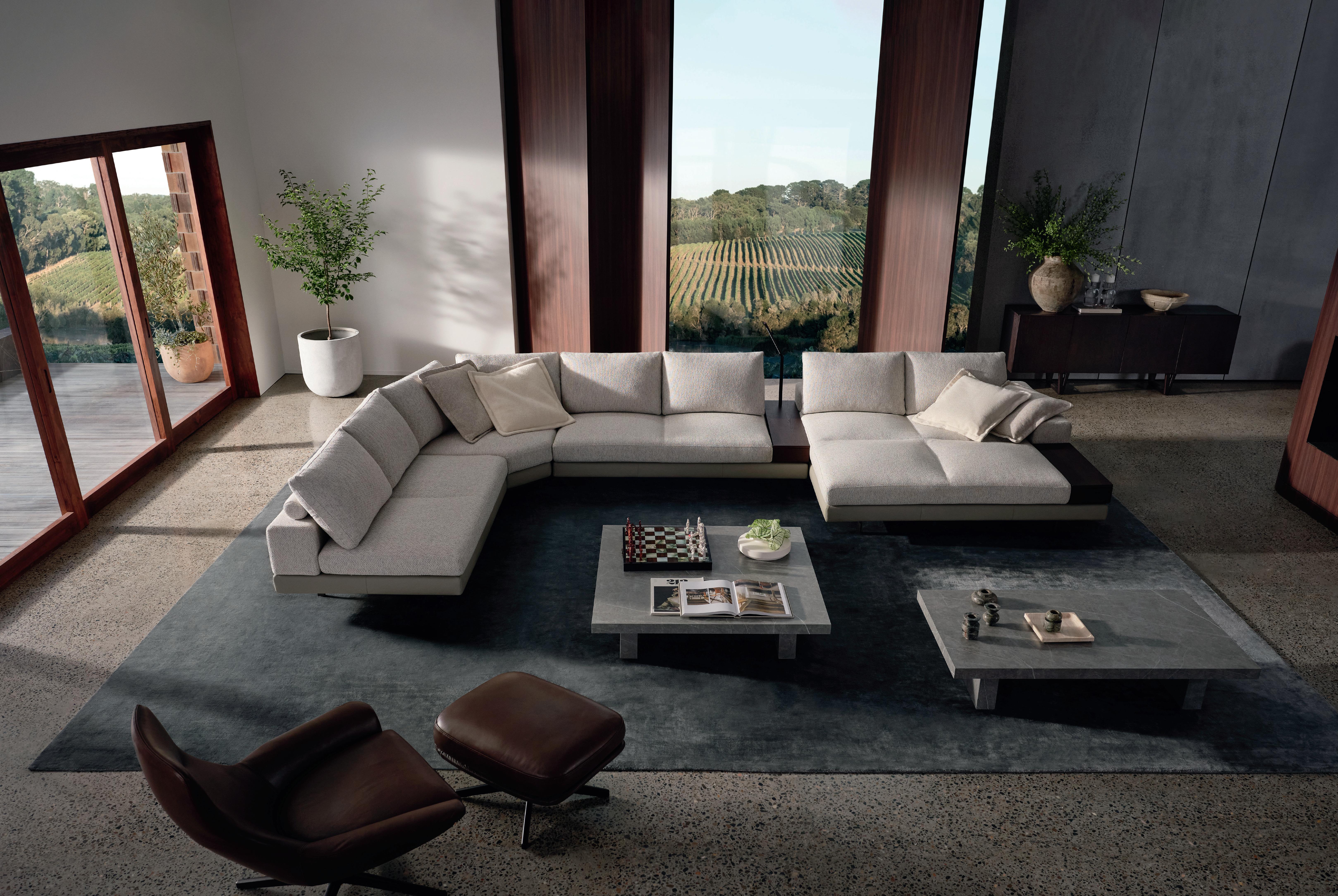
The great room features a Tufty Time sofa by Patricia Urquiola for B&B Italia resting on a custom Armadillo rug.
In the lounge area, Tom Dixon pendants hint at Hollywood glamour, hanging above reupholstered vintage Groovy chairs by Pierre Paulin. Sheer bronze metal mesh drapery by Whiting & Davis initiates a more intimate space.


 A Cremo Delicato marble countertop with waterfall edges creates a centrepiece for the kitchen. Miele dishwasher and cooktop appliances are accompanied by a Dacor oven, refrigerator and freezer.
To negotiate the desert climate, Kovac Design Studio favoured enduring materiality. “We leaned on materials like exposed aggregate exterior plaster for the walls and foamed aluminium for the canopy, neither need any maintenance,” managing partner Thomas Scheider explains. Inside, soft-textured plastered walls meet concrete floors and rich walnut paneled ceilings.

In the kitchen, Cremo Delicato marble countertops reference ‘old Palm Springs’, coupled with stone and warm timber. However, what is most intriguing about this space is the ability for guests to view live chef demonstrations projected onto the motorised cinema screen across the room.
“The design of the home is less about privacy, although that was desired – and more about creating a sense of mystery,” Michael Kovac says. “Encouraging exploration as new spaces and moments are revealed throughout.”

Stairway to the lower level leads to a wellness spa, gym (which opens to a private garden), as well as an entertainment room with custom built-in bunk beds.

ISSUE #44 / FEATURED HOME

Each of the six bedrooms features an en-suite, mini bar, private terrace and fire pit.

The open-air hallways between the casitas to the main house. An aluminium canopy above provides much-needed shade throughout the warmer months.


ISSUE #44 / FEATURED HOME


Create one aesthetic statement.
Visit us at our flagship showroom in South Melbourne for the full Gaggenau experience. 192-196 Coventry Street, South Melbourne Victoria 3205 | +61 3 9690 3123

The difference is Gaggenau.
Gaggenau appliances: individually accomplished, exceptional together. Every Gaggenau piece is distinctively designed, crafted from select materials, offers professional performance, and has done so since 1683. Make a statement: www.gaggenau1683.com.au


 Interior Design Studio Daminato
Architecture Andrea Meirana
Project Villa Peduzzi
Photography Petrina Tinslay
the library
The latest Mediterranean-inspired cookbooks.


 ITALIAN STREET FOOD PAOLA BACCHIA
ISTRIA PAOLA BACCHIA
BITTER HONEY LETITIA CLARK
AEGEAN MARIANNA LEIVADITAKI
OMBRA CARLO GROSSI
PASTA MISSY ROBBINS
VENETIAN REPUBLIC NINO ZOCCALI
SEE MORE BOOKS >
PRESERVING THE ITALIAN WAY PIETRO DEMAIO
ISSUE #44
THE ITALIAN DELI COOKBOOK THEO RANDALL

 Project Tiny Holiday Home Design i29 Interior Architects
Photography Ewout Huibers
estliving x abey
Beyond their aesthetic appeal, black sinks are an essential feature in the modern kitchen; easy to clean and preserve. Together with Australian kitchen and bathroom retailer Abey, we’ve curated a selection of black sinks from leading international brands, fit for use in the kitchen, butler’s pantry, bathroom, laundry and even the home bar.
ABEY AUSTRALIA’S RANGE OF BLACK SINKS >


SEE
ISSUE #44 / FEATURED HOME
Schock Mono 1& 1/3 bowl Magma
Schock Formhaus Onyx Double Bowl
Schock Typos Single Bowl with Drainer Onyx

TRANSFORMATIVE TRANQUILLITY
An elegant and quiet celebration of passing time, emotion and shadow.
DESIGN Madeleine Blanchfield Architects
PHOTOGRAPHY Dave Wheeler
STYLING Atelier Lab
WORDS Yvette Caprioglio
ISSUE #44 / FEATURED HOME

once unassuming single-storey house has been thoughtfully transformed into a tranquil and evocative family home. Through a series of juxtapositions, ‘Dusk House’ by Madeleine Blanchfield Architects embraces light and dark, play and rest and indulgence and restraint.
Before its transformation into Dusk House, the mostly dark and cold 1960s residence with little architectural merit, was home to a family of four. After making the decision to undertake a substantial renovation, their brief was to bring warmth and light into the home and create a sense of openness, boldness and connectivity to otherwise unremarkable spaces. The family’s love of art and design also inspired the design approach.
The site sits within a leafy, suburban locale and this provided the opportunity to create new focal points in the interior spaces together with new vistas and spatial layering within the home. The family enjoy large gatherings yet also enjoy intimate time together, so the house needed to be flexible, offering both expansive and cosy spaces.
ISSUE #44 / FEATURED HOME


ISSUE #44 / FEATURED HOME
The kitchen island takes the form of a cube with Calacatta Oro (gold) on all faces.


ISSUE #44 / FEATURED HOME
“Working with the existing plan we wanted to bring clarity and a sense of order to the spaces,” Madeleine Blanchfield says. A series of glass sliding doors aligned to enable the house to be completely open or closed off into more intimate spaces, depending on the time or mood. The glass also enables light to reach the previously dark and disconnected central spaces of the home. Large windows, visual connections and a new void to a second level transformed the rooms into voluminous spaces. “Light plays a crucial role in our work and we thought a lot about its reflective quality upon different finishes, textures and tiles as we designed,” Madeleine says.
The client was very interested in using colour and texture within a refined interior layout, so the material palette was always going to be rich and warm. Dark timber and textured glass bring an inherent sophistication to the space, while white polished plaster and refined detailing engender a natural sense of calm.
The kitchen is a focal point of innovative design in the home. The design team worked together with joinery and stone fabricators to create a perfect alignment of seamless panels and joints which can be seen on the altar-like marble island, where each face is book matched – after a model of the piece was set up using photos of the slabs before being made on site. The home’s powder rooms were a blank canvas for playfulness, with Cipollino marble and deep sea-foam green walls offering a surprise for guests.
“Light and simplicity are fundamental to everything we do and this is reflected in the quiet atmosphere of the Dusk House,” Madeleine says. “Beyond that, we treat each project as an opportunity to showcase the client’s personality and character.”
The client was open to playing with colour and materials. The powder room makes a statement with green Lavanza honed stone and emerald green walls. The Michael Anastassiades sconce and Astra Walker tap appear as jewel-like accents.
ISSUE #44 / FEATURED HOME
 The Giopato & Coombes Bolle pendant, Spence & Lyda Three Frame dining table, Kett Softline Karm chair, Articolo Float Hover wall sconce. Artwork by Clementine Maconachie.

ISSUE #44 / FEATURED HOME

ISSUE #44 / FEATURED HOME
The Baxter Nepal armchair sits up at a custom walnut veneer dressing table.


ISSUE #44 / FEATURED HOME
Onsite Casa handmade pearl grey bricks and Concordia honed marble bring colour and texture into the primary bathroom, complemented by ‘Brown bronze’ Astra walker tapware.

ANGIE PAI
If I wail loud enough, will they hear me up there, 2019.


MADELEINE BLANCHFIELD SIGNATURE STYLE


Madeleine Blanchfield Architects explore rich colours and textures to balance light and shade, play and rest, indulgence and simplicity.
 CUSIN PITT COOKING
CIPOLLINO ONDULATO RUSSO SIGNORINO
NEW KNURL ICON + LEVER ASTRA WALKER
CONCORDIA MARBLE ARTEDOMUS
IRON OXIDE MUROBOND
ATRANI WALNUT IXORA
CALACATTA ORO VICTORIA STONE GALLERY
ZELLIGE BRICK BLANC
TIENTO
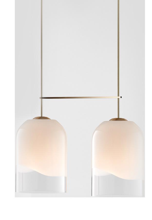
INDI DOUBLE EXTRA-LARGE PENDANT ARTICOLO



ISSUE #44 / FEATURED HOME
MARBLE ENTRY TABLE MADELEINE BLANCHFIELD
RYAN HOFFMANN LIVERPOOL STREET GALLERY 250 NYC, USA
ARMADILLO
LITTLE PETRA LOUNGE CHAIR &TRADITION AGRA RUG - ARTICHOKE

Food & Wine Preserved with Passion

Monolith - Cooling Redefined Monolith from Liebherr stands for a whole new generation of fully-integrated refrigerators, freezers and wine cabinets, based on over 60 years of innovation and German engineering. Keep your food fresh and protect your coveted wine collection.
With its timeless and elegant design, Monolith becomes the highlight of every kitchen. Discover pure perfection at home.liebherr.com.au
Monolith. Cooling Redefined.
 Sydney, Melbourne, Brisbane Singapore, Kuala Lumpur
spacefurniture.com

bebitalia.com

Previous page: Design Flack Studio Project Middle Park Photography Anson Smart
best est The
ISSUE #44 / Special Feature
50 KITCHEN FIXTURES, LIGHTING, PRODUCTS & MATERIALS
GRAND PALAIS 180 La Cornue


01
.

BERTOIA BARSTOOL Knoll

Previous page: Design Flack Studio Project Middle Park Photography Anson Smart
.
02
ISSUE #44 / Special Feature

E61 LEGEND Faema 03 . ISSUE #44


APERTIVO SERVING TRAYS Michaël Verheyden PIET BOON SET11 BASIN MIXER Cocoon 04. 05. 06. ELISE 90CM DUAL FUEL RANGE COOKER Falcon ISSUE #44 / Special Feature

ISSUE #44 07 . SPINE STOOL Fredericia
 Interior Design Alexander & CO.
Project Spotted Gum House Photography Anson Smart

RAY PENDANT LIGHT ON ENTROPY

08
.

KITCHEN OVEN 200 SERIES Gaggenau 09 . ISSUE #44
 Architecture & Interior Design Robson Rak
Project St Huberts
Photography Mark Roper Build DDB Construction

10
ISSUE #44
HANGING LAMP N2 Valerie Objects
.


MINK GREY Royal Oak Floors 13. KOICHI FUTATSUMATA CUTLERY Valerie Objects 11 . TUMBLED MARBLE COBBLESTONES Aeria Country Floors 12 . ISSUE #44 / Special Feature
IONIAN TWO-HOLE BENCH MOUNTED MIXER

Perrin & Rowe
.
14
ISSUE #44
 Design Tamsin Johnson
Project Palazzo Photography Anson Smart
DUAL FUEL RANGE Wolf

15
ISSUE #44
.


SERGIO HERMAN POT XL SURFACE Serax 18 . CB-23 TRACTOR BAR STOOL BassamFellows 17 . VERDE ST LAURENTAGRIPPA FINE Hullebusch 16 . ISSUE #44 / Special Feature
 Design Handelsmann & Khaw
Project Bellevue Hill Federation House Photography Felix Forest

CLASSIC SERIES SIDE-BY-SIDE REFRIGERATOR/FREEZER WITH INTERNAL DISPENSER Sub-Zero 19. ISSUE #44 / Special Feature

20. TWIG 5 PENDANT Apparatus


410 CAB STOOL Cassina ISSUE #44 21.


ARABESCATO CORCHIA Victoria Stone Gallery 590HL MIXER Vola LAB EVOLUTION 4 BURNER HOB Barazza ISSUE #44 / Special Feature 23. 22. 24.

MACON CLASSIC Lacanche
Previous page: Design Arent&Pyke Project Darley House Styling Claire Delmar Photography Anson Smart

25
ISSUE #44 / Special Feature
.

Nemo 26. ISSUE #44
LAMPE DE MARSEILLE


TUNISIAN MOSAIC COTE COULER Earp Bros FRENCH MIDCENTURY GOURMET COPPER POTS Baumalu CLOTAIRE LARGE DOUBLE BOWL CERAMIC Chambord 29. 28. 27. ISSUE #44 / Special Feature
 Architecture Adam Kane Architects
Project Barwon Heads House
Photography Timothy Kaye
YOKATO KITCHEN MIXER Brodware

30
ISSUE #44 / Special Feature
.
OAK Dinesen

ISSUE #44
31
.


SARPANEVA CASSEROLE CAST IRON POT Iittala 32. 33. KM 7897 FL INDUCTION COOKTOP Miele ZELLIJ PAMPAS Earp Bros 34 . ISSUE #44 / Special Feature

ISSUE #44 RETRO FRIDGE SMEG 35.
 Design Akin Atelier Project Wunulla Residence Photography Courtesy of Akin Atelier


ISSUE #44
37. 38. NORWEGIAN
36.
ROSE Artedomus COLLETT ZARZYCKI SOLID BRASS & MARBLE DOOR PULL Joseph Giles CRISP SCONCE RBW

BUILT-IN DUAL ZONE WINE CELLAR Liebherr 39. ISSUE #44 / Special Feature
 Design CJH Studio Project House Fin Build KABSAV Photography Timothy Kaye

COOKING EBEKO PITT
40. ISSUE #44 / Special Feature
Cooking
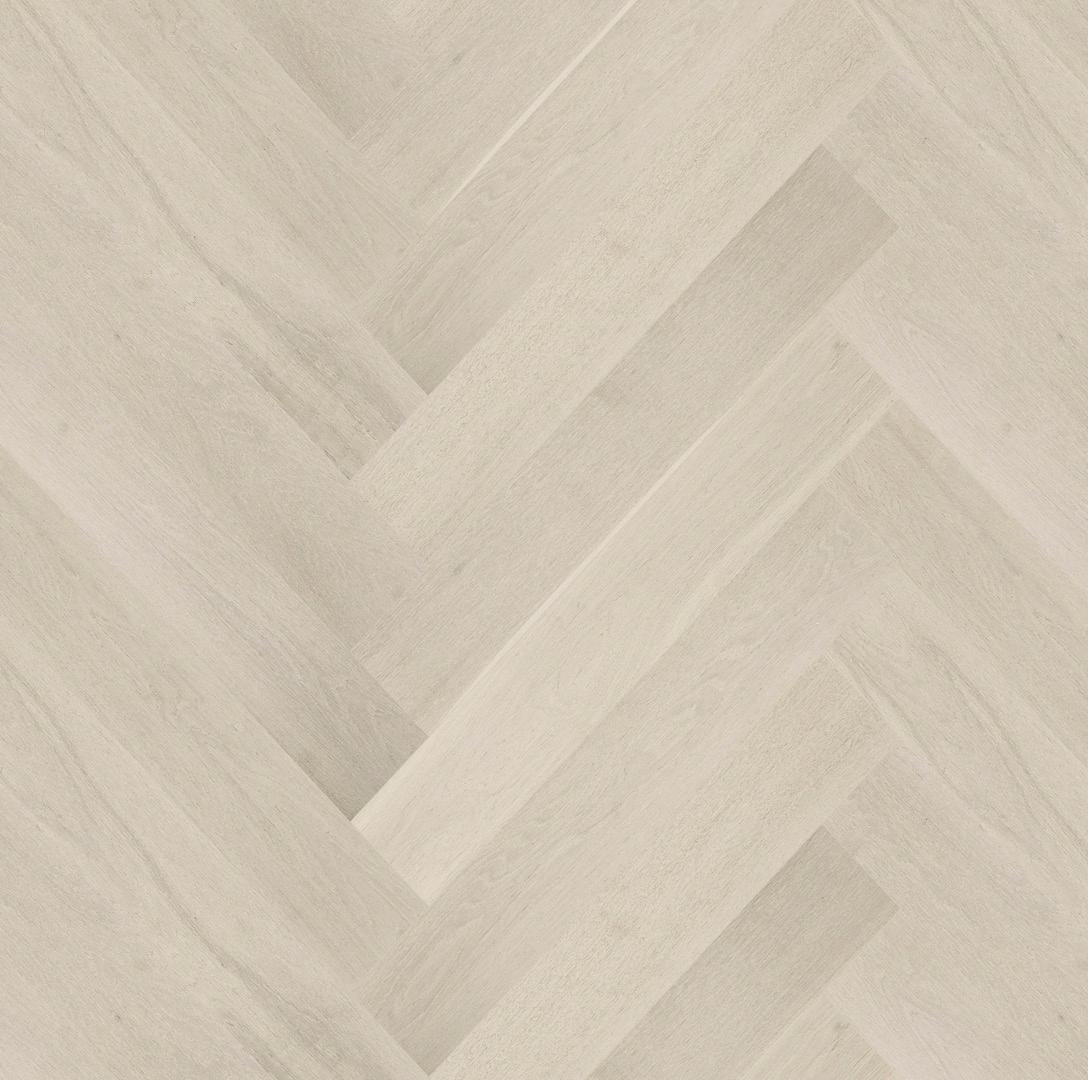


NUEVEHERRINGBONE Tongue n Groove 42. 43. ELLIPSE PESTLE & MORTAR SALVATORI SYNCHRONIKA ECM 41. ISSUE #44

ATOLLO 235 Oluce 44. ISSUE #44 / Special Feature

548M TERRAZZO Signorino 45.
Design Beatrix Rowe Interior Design Architecture Pop Architecture Project South Yarra House Build Cloverleigh Home Improvements Photography Willem-Dirk du Toit ISSUE #44
Previous page:


46. THIRTIESFURNITURE PULL Pittella ROMAN TRAVERTINE GREY Signorino 47. 48. KEY BOWL Collection Particulière ISSUE #44

KETTLE 9091 Alessi 49. ISSUE #44 / Special Feature
 Design Chelsea Hing
Project Orchard House
Photography Rhiannon Taylor

IVA
Grazia&Co 50. ISSUE #44 / Special Feature
STOOL


PARADISE

AN EXTENSIVE SEARCH AND AN EMOTIVE BRIEF MADE A LONG-IMAGINED DREAM HOME A REALITY. THIS SIDE OF


hen Thomas Melhorn architect Christian Thomas was asked by clients to pinpoint a site for their dream house it was the start of something special. The search covered a broad stretch of 40 miles up and down the Florida coast, with the only proviso it had views of the ocean and privacy. “After bouncing around for six months I found these two pieces of property, raw land on Jupiter Island that were adjacent but had been separated,” recalls the local architect, adding, “the clients bought it sight unseen and flew down to this forest on the ocean that you couldn’t really see and that’s where it all began.”
ARCHITECT | Thomas | Melhorn INTERIOR DESIGN | Betsy Brown PHOTOGRAPHY | Nicole Franzen WORDS | Alexandra Gordon
ISSUE #44 / FEATURED HOME
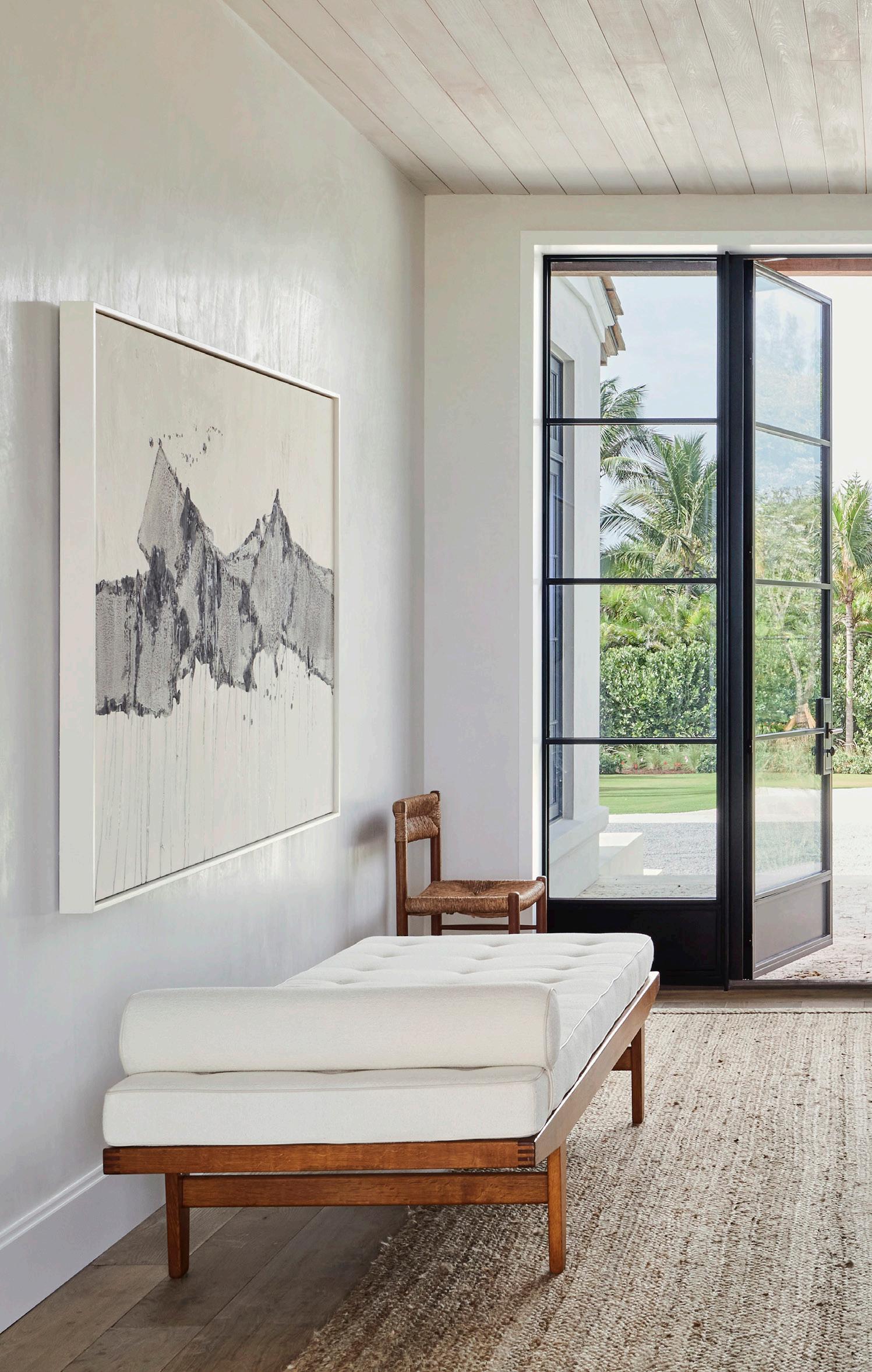
The entrance to the Jupiter House features a curation of classic pieces; a late 19thcentury French entry table that resembles a tree stump, a Spanish Chair by Børge Mogensen, Dordogne dining chair by Charlotte Perriand and Poul M. Volther daybed. Artwork by Jean-Marc Louis..


The brief was as compelling as the hunt for the land, a blank page with 10 evocative words that the holiday house should encapsulate rather than a prescriptive list. From a practical sense, the design needed to accommodate the clients, a couple from New Jersey, and three adult children with families of their own. “It was really a game for us to create a house that had all these functions for this wonderful family, yet it feels manageable and very human in scale,” Christian says who was able to execute this with clever planning.
With a nod to the old Florida vernacular in style, the house is divided into two parts with a formal wing parallel to the ocean and a family wing splaying off at an angle. “If you pull into the property you are only addressed with portions of the house at any given time, you only ever see vignettes and that was really intentional to make it feel quite cottage-like,” the architect explains. The varied views this affords is another advantage of the home’s unique siting. “As you circulate through the house you have these different presentations of the ocean,” he says.
In the Jupiter House, materials are layered in their purest form; as seen in kitchen with its timber stained and treated naturally, and wood beams overhead. French stools sit up at the island bench, beneath the Twig 5 chandelier by Apparatus.

ISSUE #44
Materials and furnishings were selected to reflect the passing of time. “We wanted materials that patina and age because I think it adds to the story, over time those nicks and scratches are reminders of past generations,” Christian shares. This approach is in keeping with the Japanese philosophy wabi-sabi, perfection through imperfection, a philosophy Christian has followed for a long time.
Locally-sourced materials run inside and out, from limed Cypress for walls, ceilings and joinery and American white oak floorboards that are fumed but left raw, to Florida coral stone paving. Christian worked with Alabama-based interior designer Betsy Brown on the rustic but understated palette so it complimented her artful curation of mid-century furniture along with the client’s existing collection of Papua New Guinean art.
A unified collaboration between all involved has created something that speaks for itself. “It’s just one of those unions that came together perfectly where the client was receptive and open to pushing boundaries to try to create something more soulful and it really allowed for our creativity to run,” Christian says. “And as that snowballed it became this magnificent and magical place that feels like it has been there forever.”
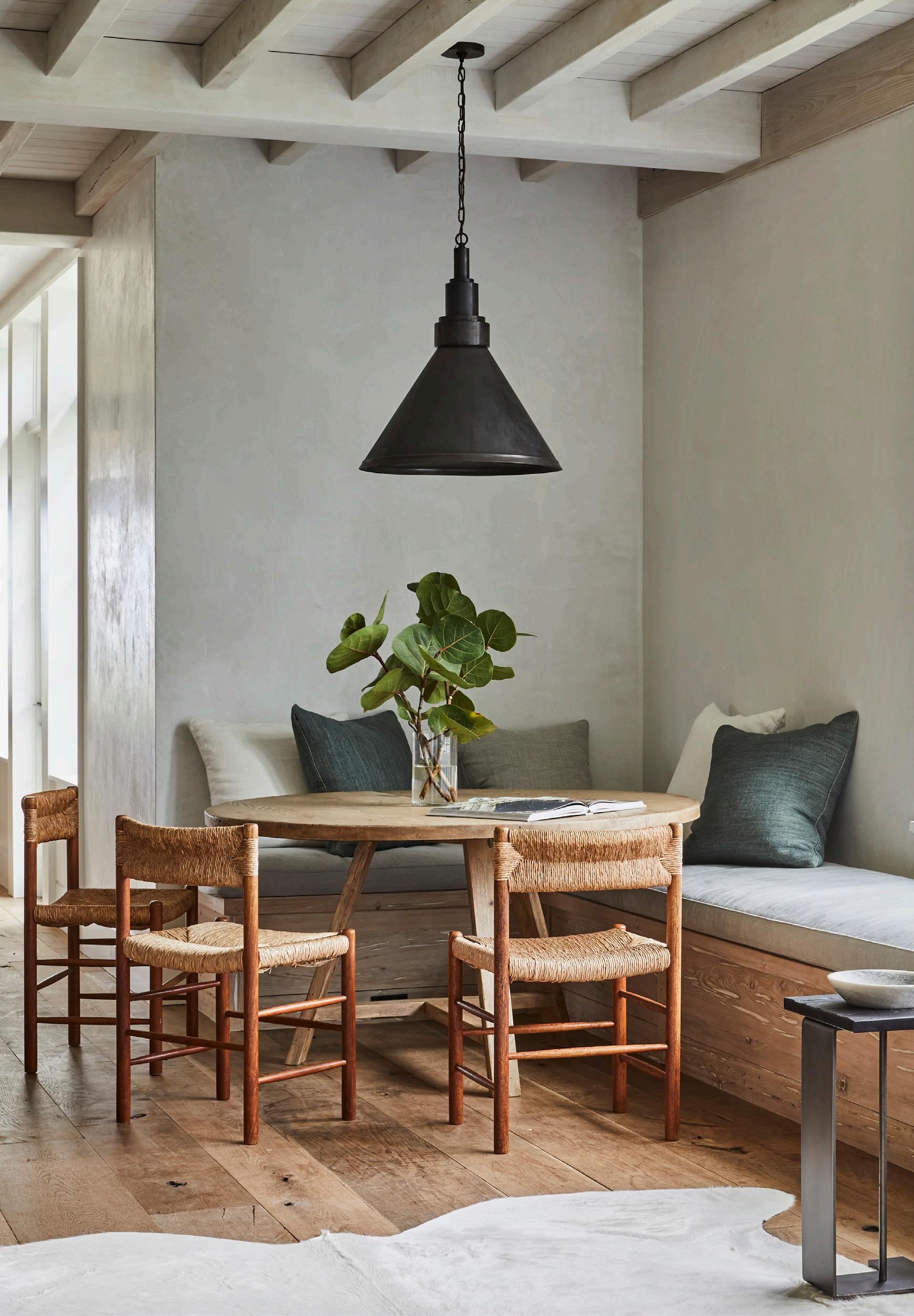
The dining nook features the industrial Savoy pendant by Huniford, custom chestnut dining table by Demiurge and Dordogne dining chairs by Charlotte Perriand. A Boisson steel ‘C’ drinks table sits next to the custom window seat.
ISSUE #44 / FEATURED HOME


“The intention of this property was that it was meant to be handed down through generations and this was really built into the materiality.”
– Christian Thomas
ISSUE #44 / FEATURED HOME


ISSUE #44 / FEATURED HOME
Illum Wikkelsø lounge chair and Arc Well sconce by Allied Maker.

An antique iron canopy bed sets the tone in the master bedroom, with 19th-century ‘cricket’ tables on either side and 19th-century French jar lamps on top.


ISSUE #44 / FEATURED HOME
The bathroom reflects the overall design intent; wabi-sabi elements and modern functionality. Custom mirror by Kevin Reilly.
Living the good life outdoors, that is the essence of Tribù.
Contour Armchairs designed by Piergiorgio Cazzaniga | Illum Table designed by Merckx & Maes. Discover the latest outdoor collections by leading designer brand Tribù at Cosh Living.


Melbourne| Sydney | Brisbane | Perth www.coshliving.com.au
 Project Twin Gables Design Workstead
Styling Mieke ten Have Photography Matthew Williams
the DETAIL
The est definitive guide to artisanal kitchen elements from our go-to Product Library.
ISSUE #44

THE DETAIL
Project Lover’s Walk Design Kingston Lafferty Design Photography Ruth Maria Murphy
QUARTZITE


Hardwearing Quartzite reflects natural beauty.


VIEW MORE QUARTZITE >
THE DETAIL
EMERALD HAZE QUARTZITE CDK STONE
ST ELLE QUARTZITE CDK STONE
VERDE RIVIERA QUARTZITE BAASAR STONES
AQUARELLA QUARTZITE VICTORIA STONE GALLERY CRYSTALLO VICTORIA STONE GALLERY
QUARTZITE CRISTALLO ROSA SIGNORINO
COSMOPOLITAN G-LUX
ROSA CALMANTE QUARTZITE CDK STONE
EMERALD GREEN QUARTZITE VICTORIA STONE GALLERY
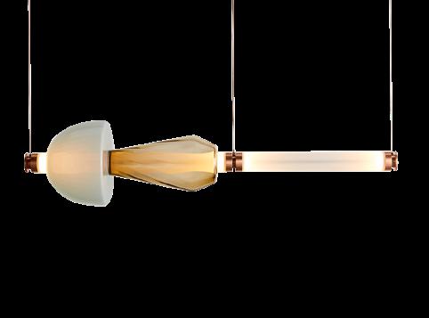
GLASS PENDANTS
Bespoke glass pendants realise intricate craft and fluidity.


VIEW MORE PENDANTS >
THE DETAIL
SOAP
KNOT
LIGHTS
SPACEY
CHERRY BOMB
GLASS MORI GREY LANTERN SEGUSO VETRI D’ARTE
KALEIDO 1 TIER CHANDELIER GABRIEL SCOTT 28.8A.1 ARMATURE SUSPENSION LAMP
73.5V SUSPENSION LAMP BOCCI
PENDANT LIGHT BOMMA
PENDANT
BROKIS TIMA PENDANT LA MANUFACTURE
LASVIT
PENDANT LINDSEY ADELMAN MURANO
LUNA
BOCCI

THE DETAIL
Project Coastal Home Architecture Tim Wright Architect Design Decus Interiors Build Mosman Bay Luxury Homes Photography Anson Smart

THE DETAIL
Project Watsons Bay Beachfront Home Design Handelsmann & Khaw Photography Felix Forrest
PREMIUM COOKERS

The traditional farmhouse premium cooker marks a return to slow cooking.


VIEW MORE OVENS >
THE DETAIL GRAND PALAIS 180 LA CORNUE RICHMOND DELUXE 110CM DUAL FUEL RANGE COOKER BELLING ELISE 110CM DUAL FUEL RANGE COOKER FALCON CLUNY 1800 CLASSIC LACANCHE CORNUFÉ 110 LA CORNUE VICTORIA COOKER SMEG DUAL CONTROL 150 DUAL FUEL WITH WARMING PLATE AGA PROFESSIONAL SERIES 90 CM 6-BURNER + ELECTRIC OVEN BERTAZZONI CLASSIC DELUXE 110CM DUAL FUEL RANGE COOKER FALCON
TIMBER VENEER


Timber veneer joinery expresses natural grain and burl.


VIEW MORE TIMBER VENEER >
THE DETAIL
EVENEER RISTRETTO ELTON GROUP
SMOKED ROBUSTA QUERKUS
AMERICAN WALNUT CROWN CUT BORD PRODUCTS
SPOTTED GUM QUARTER CUT BORD PRODUCTS
LIGNAPAL SPOTTED GUM 181.05 GEORGE FETHERS & CO
NATURAL ADAGIO QUERKUS
MADRONNA BURL BRIGGS VENEERS
WALNUT BURL YATES WOOD
OAK BURL BRIGGS VENEERS

THE DETAIL
Project BJ House Design Bart America Photography Thomas De Bruyne

THE DETAIL
Project Scalpellino House Design Biasol Photography Timothy Kaye
GRANITE
Granite captures subtle texture and patterning.


VIEW MORE GRANITE >
THE DETAIL
BLACK BEAUTY
SENSA
NERO MARINACE
VICTORIA STONE GALLERY
ANTIQUE BROWN GRANITE WK QUANTUM QUARTZ
ALPINE WHITE VICTORIA STONE GALLERY
STEEL GREY PROJECT STONE MARIS GREY CDK STONE
CORNERSTONE GRANITE ERGON
BLACK FOREST LEATHER GRANITE EUROPEAN MARBLE CENTRE
PATAGONIA BAASAR STONES
POT FILLERS
The classic pot filler unites aesthetic with functionality.


VIEW MORE POT FILLERS >
THE DETAIL REGULATOR WALL MOUNTED ARTICULATED POT FILLER WATERWORKS
BRIZO
POT FILLER BRODWARE UNIVERSAL WATERWORKS
POT FILLER KOHLER
MOUNTED POT FILLER TAP PERRIN & ROWE
ARTESSO
MANHATTAN
ARTIFACTS
WALL

THE DETAIL
Project Barrow Street Townhome Design And Studio Styling Katja Greeff Photography Nicole Franzen

THE DETAIL
Project Warsaw Apartment Architecture Ewa Thomas Studio Photography PION Studio
RINOCERÓNTICO
PULLS & KNOBS

Sculptural joinery hardware articulates attention to design detail.


VIEW MORE JOINERY HARDWARE >
THE DETAIL
HANDLE THE SOCIETY
DROP LINEAR STANDARD SEFTON BRIDLE LEATHER STRAP HANDLE JOSEPH GILES
IN-TERIA FERMAT JOINERY PULL BARBERA DESIGN OPALE LINEAR STANDARD
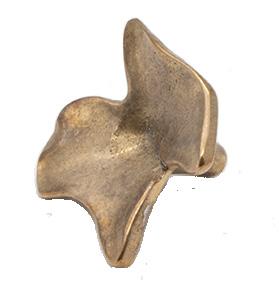
HANDLE FERM LIVING ORGANO SOLID BRONZE CABINET PULL JOSEPH GILES
FALCONER
INC
HALF MOON
CURVATURE
BD
BARCELONA

™ ISSUE #44 estliving.com


 Sophie Lewis Managing Editor @sophlew_says


 kitchen compendium world’s edge
est style the latest
at home with Will Dangar
French Eloquence
the library Desert Oasis


 Design Atelier 10.8 Photography Stephanie Mathia
 Photography Thomas De Bruyne


 Photography Rory Gardiner & Matteo Dal Vera


 Photography Adrien Dirand


 – Jerry Pellerin
Styling Sarah de Beaumont
Photography Alexis Armanet


 The kitchen features the designer’s own hardware range and custom-designed full height handles in American oak.
Joinery Grange Joinery Stonemason The Porcelain Factory Handles Linear Standard Builder Omnicon Photography Timothy Kaye


 Design Luke Fry Architecture & Interior Design Project Ripponlea House Products Eccentric swivel hob outlet & Eccentric progressive hob mixer
Photography Timothy Kaye


 An electric blue Grand Theodore sofa designed by Humbert & Poyet is the focal point in the living room, accompanied by their Theodore armchair and Gabrielle coffee table. A sconce by Gino Sarfatti (1963), painting by Bertrand Lavier and ceramics by Georges Jouve also make an appearance in this space.


 The living and dining space face the garden with silvery tones of blues and greys in the rug and sofa designed by Romy Alwill. The abstract work is by Michael Cusack at Olsen Gallery and just seen outside on the fence is an outdoor sculpture in corten by Caroline Duffy.


 Custom-designed sofa by Romy Alwill, Missoni throw, Børge Mogensen Spanish chair, and Rio low table by Charlotte Perriand. Artwork by Indivi Sutton.


 WORDS Sarah Knight DESIGN Kovac Design Studio STYLING Anita Sarsidi PHOTOGRAPHY Roger Davies


 A Cremo Delicato marble countertop with waterfall edges creates a centrepiece for the kitchen. Miele dishwasher and cooktop appliances are accompanied by a Dacor oven, refrigerator and freezer.


 Interior Design Studio Daminato
Architecture Andrea Meirana
Project Villa Peduzzi
Photography Petrina Tinslay


 ITALIAN STREET FOOD PAOLA BACCHIA
ISTRIA PAOLA BACCHIA
BITTER HONEY LETITIA CLARK
AEGEAN MARIANNA LEIVADITAKI
OMBRA CARLO GROSSI
PASTA MISSY ROBBINS
VENETIAN REPUBLIC NINO ZOCCALI

 Project Tiny Holiday Home Design i29 Interior Architects
Photography Ewout Huibers


 The Giopato & Coombes Bolle pendant, Spence & Lyda Three Frame dining table, Kett Softline Karm chair, Articolo Float Hover wall sconce. Artwork by Clementine Maconachie.


 CUSIN PITT COOKING
CIPOLLINO ONDULATO RUSSO SIGNORINO
NEW KNURL ICON + LEVER ASTRA WALKER
CONCORDIA MARBLE ARTEDOMUS
IRON OXIDE MUROBOND
ATRANI WALNUT IXORA
CALACATTA ORO VICTORIA STONE GALLERY
ZELLIGE BRICK BLANC


 Sydney, Melbourne, Brisbane Singapore, Kuala Lumpur


 Interior Design Alexander & CO.
Project Spotted Gum House Photography Anson Smart


 Architecture & Interior Design Robson Rak
Project St Huberts
Photography Mark Roper Build DDB Construction


 Design Tamsin Johnson
Project Palazzo Photography Anson Smart


 Design Handelsmann & Khaw
Project Bellevue Hill Federation House Photography Felix Forest


 Architecture Adam Kane Architects
Project Barwon Heads House
Photography Timothy Kaye


 Design Akin Atelier Project Wunulla Residence Photography Courtesy of Akin Atelier


 Design CJH Studio Project House Fin Build KABSAV Photography Timothy Kaye


 Design Chelsea Hing
Project Orchard House
Photography Rhiannon Taylor


 Project Twin Gables Design Workstead
Styling Mieke ten Have Photography Matthew Williams


