DESIGN IN CONTEXT

WOODS+DANGARAN
MARCH STUDIO
NICOLAS

SCHUYBROEK ARCHITECTS


WOODS+DANGARAN
NICOLAS

SCHUYBROEK ARCHITECTS

ONE SOFA. TWO DISTINCT STYLES
A timeless silhouette defined by detailed stitching and gentle curves. Sculptural and distinctive, this design statement in comfortable flexibility is destined to become an Australian design icon.


They create furniture collections that are honest in their use of materials & united in their craft.
 Melbourne studio, Kett, is headed up by leading Australian designer Justin Hutchinson.
Erskine Bed & Frame Bedroom by Kett.
Kett celebrates an Australian way of life; drawing inspiration from our natural landscapes and cosmpolitan cities.


I’ve always loved the idea of a sense of place and how it imprints on our memories. The people; the sounds; the smells, the textures, the feeling.
It’s one thing to explore thematically and it’s another to experience it as we did inside our Spring Street cover star by March Studio. The apartment is a unique reflection of its Melbourne location and who lives there. From how the silver ceiling mirrors the design of the train station below, to owners’ collectables and the fact that March Studio founders Rodney Eggleston and Anne-Laure Cavigneaux were also the previous owners.
Karen McCartney and David Harrison’s Milan Design Week 2022 report is anchored in cultural identity – the city’s iconic buildings juxtaposing new designs and experimental exhibits. A city’s spirit of good design also leads our ‘on the ground’ highlights from Copenhagen’s 3daysofdesign.
We head to Palm Springs to see how architects Woods + Dangaran interpret the desert terrain and contrast the region’s iconic mid-century homes. Photographer Joe Fletcher takes us further into the country’s dramatic landscapes as he captures his appreciation for light and architecture, just as Columbian studio Cinco Sólidos uses light to mirror a home’s surroundings. On the French Riviera, designer Jean-Charles Tomas’ inherent understanding of the local design landscape leaves a stamp on a home overlooking Saint-Jean-Cap-Ferrat. This spirit of placemaking also extends to the objects and materials in our Detail pages.
In Belgium, we walk through Thomas Ostyn’s home – the thirdgeneration owner of kitchen and interior design studio Obumex – and in Sydney, interior designer Tania Handelsmann takes us through her family terrace and all her personal design details within.
Wherever we go in this issue nothing is superfluous, expressing a genuine sense of place – world-over.
Sophie x




Uncommon, unconventional, and unexpected, MODE brings you a new perspective on gas fireplaces. For those who seek a design edge, a style statement, something to start a conversation – look no further than MODE.
Available exclusively at Stoke Fireplace Studio.


Enrico Costantini, a Venetian documentary and travel photographer, with a talent for visual storytelling, has followed his lens around the world to photograph people, places and charming interiors. With a background in interior design and fashion, he combines aesthetics, forms and a sense of space to create compositions that bring empathy to his photography. At this year’s Milan Design Week, Enrico captured Karen McCartney and David Harrison reporting on the ground for est.

@enrico_costantini
Rei Moon hails from South Korea where she graduated in Photography and Visual Arts. After some successful years in fashion photography, she moved to London to complete a Masters at Goldsmiths, subsequently specialising in interiors, architecture and lifestyle. Rei has contributed extensively to major magazines and publishing houses across Europe and Asia. Now based in London, Milan and Seoul, she photographs La Vita Bella throughout Europe and the UK striving to capture the joy of life through a camera lens. Rei Moon captured Bernard Dubois Architects’ Paris apartment for this issue.

@moonraystudio
Dan Preston is an Australian-based photographer and videographer, drawn to documenting the built environment and art objects. He aims to tell authentic visual stories that capture the aspirations and final forms of architects’ and artists’ works, revealing their intentions in his photographic process and cinematic aesthetic. In this issue, Dan captures March Studio’s unorthodox approach to redesigning an apartment on Melbourne’s Spring Street.

@danpreston_1

As an architect, designer and writer, Bronwyn’s layered and storied approach sees her transfer fluidly across disciplines, ensuring an empathetic narrative unfolds. Immersed in the world of design, she has lived and worked in Australia, Europe and the United States, and is quested to find and imbed meaning in the many spaces and places we occupy. Her love of language and the importance of substance through design ensures her account of Woods + Dangaran’s Desert Palisades comes from a place of curiosity and appreciation.
@bronwynmarshall


est TEAM
Managing Editor
Sophie Lewis
Style Editor & Copy
Yvette Caprioglio
Creative & Concept Designer
Jack Seedsman
Product Editor
Brigitte Craig
Editorial Strategy Advisor
Karen McCartney
Features Editor & Marketing Manager

Sarah Knight
Editorial & Social Media Coordinator
Lidia Boniwell
Editorial Assistant
India Curtain
Features Writer
Holly Beadle
Sales & Marketing Coordinator
Emmy Ford
Managing Director
Miffy Coady
Advertising & Partnerships
Mandy Loftus-Hills | mandy@estliving.com
Astrid Saint-John | astrid@estliving.com
Deb Robertson | deb@estliving.com
WORDS
Karen McCartney, David Harrison, Alexandra Gordon, Stephen Crafti, Yvette Caprioglio, Holly Beadle, Sarah Knight, Sophie Lewis, Megan Rawson
The Latest
Anson Smart, Yiorgos Kordakis, Eric Petschek
MILAN 2022 , Enrico Costantini, Eric Petschek, Marina Denisova, Luke Hayes, Sean Davidson, Depasquale+Maffini, Allegra Martin, courtesy of davidpompa, Gianluca Vassallo and Francesco Mannironi, Stefano Galuzzi, Pablo Abate, Mattia Iotti portrait photography and Angus Mill, courtesy of Poltronova, Depasquale+Maffini, Andrea and Filippo Tagliabue (FTFoto)
Desert Refuge
Joe Fletcher
Silver Lining
Dan Preston
At Home With Tania Handelsmann
Felix Forest
3daysofdesign Copenhagen
Armin Tehrani, wichmann + bendtsen, Torben Eskerod, Rasmus Hjortshøj, Hedda Rysstad, Stamer, courtesy of Getama and courtesy of Le Klint
The Library
Courtesy of Las Perelli
French Riviera Reimagined
Jérôme Galland
Mirror Image
Nick Wiesner & Anna Dave
My Space: Thomas Ostyn
Ambroise Tézenas & Koen Van Damme
Behind the Lens: Joe Fletcher
Joe Fletcher
Cultivating Creativity
Rei Moon
The Detail
Joe Fletcher, Dave Wheeler, Mike Karlsson Lundgren, Anson Smart, Stephen Kent Johnson
Back Cover
Dan Preston


VOLA brings us closer to the unbridled beauty of nature, exploring how it can enrich our lives. For centuries, the natural world has coexisted with the man-made, and from an architectural space in Iceland, VOLA celebrates how these two worlds can collide. The wild, untamed Icelandic landscape meets contemporary design, inspiring a profound connection between architecture and landscape. VOLA’s stainless steel demonstrates this harmonious relationship. With expert craftsmanship, pure, natural resources are transformed into enduring conduits of an essential earthly element: water. Thoughtfully designed and meticulously crafted, these products shape our interaction with water, enhancing people’s connection to nature.


An up-to-date look at what’s happening on estliving.com and across our social platforms.
Discover L’ENVOL @ The Future Perfect (2022) by French artist and designer Olivia Cognet.


Art
Appreciate light and materiality inside a reimagined Sydney home. Australian architecture & interiors
Read our exclusive chat with Australian furniture designer Brodie Neill. News


Explore popular residential architecture and interior inspiration, such as the Cove Hollow House by Architecture Outfit.

Pintrest
Product Library

Get to know the brothers behind Greek architecture firm K-STUDIO.

In Conversation
Explore this Greek Island home through video. Instagram

Sounds to pound the pavement design fairs and

pavement at this year’s and beyond.

 Karen McCartney & David Harrison

 Photography Enrico Costantini
US THROUGH THE STREETS OF MILAN TO UNCOVER THEIR 20 HIGHLIGHTS FROM THIS YEAR’S DESIGN WEEK.
Glowing like coloured lanterns, there is precision in the pattern making of these delicate yet monumental structures at Hermes by designers Hervé Sauvage and Charlotte Macaux Perelman. Constructed in timber and translucent paper, they combine the grand scale of the water towers they were inspired by with a certain lightness of being while housing objects the brand is renowned for.
 Photography Enrico Costantini


Nicolas Schuybroek is a Belgian architect with a restrained, intelligent sensibility, whether designing a vessel, a kitchen or a building. On show was his sculptural kitchen island in tin for Obumex, alongside vessels and objects of beautiful utility for When Objects Work.


“For the kitchen, I was finding a way to play around with blocks and with volumes shifting in a very specific way. I see it almost as an altar for daily rituals; breakfast, preparing lunch, or just a drink with friends.”
 – NICOLAS SCHUYBROEK
Lee Broom celebrated 15 years of the brand by showing six new ethereal lighting collections – each relating to a place of worship throughout the ages. Deftly handling the journey through the space, the religious experience of awe and intrigue was not lost on attendees.


Colin King, artistic director at large, showcased the Spoken Lines rug collection for Beni Rugs in the Casa delle Suore building at Alcova – a show set in a partially disused military hospital in Milan. A raw wool sculpture by contemporary artist Amine El Gotaibi created a much-Instagrammed install.
.

As part of the meandering design experience of 5Vie, und Messing by Melbourne-based lighting designer Volker Haug Studio is an ode to brass and represents the experimentation yielded from the many years’ work with the Volker Haug Studio’s cornerstone material. The series represents an accumulation of ideas collected over the last two years.

Oublie – an exhibition in Via Solferino by DIMORESTUDIO – illustrated their deft hand with mood and atmosphere, scale and juxtaposition. They describe it as; “Oublie, an installation that evokes a return after a long journey, a rediscovery through everyday furnishings and accessories, finally liberated from the patina of time passed far from curious eyes.” Visually poetic, the series of rooms had a sultry, decadent sense, with furnishings and lighting designed to intrigue and seduce.
.
 Photography Pablo Abate


A lyrical display from lighting designers Giopato & Coombes with their ‘MAEHWA – INTO THE BLOOM’ range showcasing the way they combine inspiration from nature and artisanal skills with clever technical developments.

Tufted and textural, Duccio Maria Gambi’s Tempore Collection pushes the boundaries of what a rug can be. These art pieces in wool include organic shapes, irregular lines, nuanced colour and boldly raised sections that bring an impactful 3-D aspect to every rug.

The Japanese brand Ariake has been shown at Stockholm Furniture and Lighting fair since its launch in 2016. This year saw the brand show in Milan for the first time in a stylish apartment in Porta Venezia. The timeless pieces cleverly blend Japanese craftsmanship with a restrained Scandinavian aesthetic courtesy of a host of respected Swedish and Japanese designers.

Drawing inspiration from classic Italian tradition – from ancient Pompei to the architectural works of Gio Ponti and Piero Portaluppi – Studio KO interprets marble’s natural properties. COLLEZIONE STUDIO KO, designed by the French architect duo, Karl Fournier and Olivier Marty, illustrates their ability to occupy the space between the historical and the contemporary.


Tom Dixon presented TWENTY in the opulent setting of Villa Serbelloni, showing two decades’ worth of his products in prototype form. The anniversary offering included a host of his past design concepts, including his flame-cut steel chair.


The Alimonti Milano showroom by Studiopepe in Corso Venezia showcased the possibilities of working with limestone, Travertine and exotic marbles. The culmination of several years of collaboration between Studiopepe and Alimonti Milano shows the clear synergy between the designers and the materials used to create a mesmerising world that illustrates the creative potential of stone as a decorative and functional material.
 Photography Andrea and

Showcasing the latest indoor and outdoor ranges from Baxter within the context of a 1940’s villa on the edge of Lake Como was an inspired decision by the brand. Set on various terraced garden levels, around a pool, on a veranda and inside a house of age and character, the pieces proved timeless while still retaining the edgy glamour that denotes Baxter.
 Photography Gianluca Vassallo and Francesco Mannironi

British Icon Sir Paul Smith and his collaboration with Italian brand De Padova for the EVERYDAY LIFE collection provides the collision of his distinctive design language with the craft and construction knowledge of the De Padova brand. Refined leather details, specialised stitching motifs and an emphasis on good old-fashion British comfort (with sustainable fillings) give this new range a great deal of cachet.

Showing at Alcova, Mexicanbased designer davidpompa worked cleverly into the context to showcase his crafted range of products. Lava Landscape –Magmatic Parallelism - a range of carefully articulated lights that combine the textured properties of lava stone with the precision of powder-coated steel componentry.


Capturing a moment on board a ship to Japan in 1940, the Graffiti rug by renowned architect and designer Charlotte Perriand depicts unusual sea creatures drawn initially in chalk on the ship’s deck by an unknown sailor. The drawing later became a rug for the Exhibition of the Creations of Japan but was never serially produced. Lovingly recreated by Cassina in collaboration with rug specialist cc-tapis, the rug is hand-knotted in Nepal.


Nilufar Gallery in via della Spiga is an source of exquisite vintage and limited-edition contemporary pieces but their huge Nilufar Depot space is on another level entirely. The featured collection to grace the entrance level this year was by regular Nilufar collaborator Martino Gamper. His Innesto collection radically adapted found tubular steel furniture pieces by grafting colourful linking elements in laser cut steel and by combining plastic laminate table tops with natural wood edging and Gamper designed upholstery fabric.

La Manufacture at Museo Poldi Pezzoli used the same single accent colour – a magnificently vibrant orange – to curate 50 products by 17 designers. Conceived and curated by Italian designer Luca Nichetto, the contemporary designs included all categories of furniture selected to create a powerful dialogue with the historic exhibits in the museum.
.

Archizoom’s famous Superonda sofa for Poltranova from 1967 has been reinterpreted with a new fabric specially commissioned for the iconic piece. British designer Bethan Laura Wood’s Terrazzo continues her exploration of imaginary material combinations with the fabric portraying a kaleidoscopic pattern of multi-coloured gemstones.


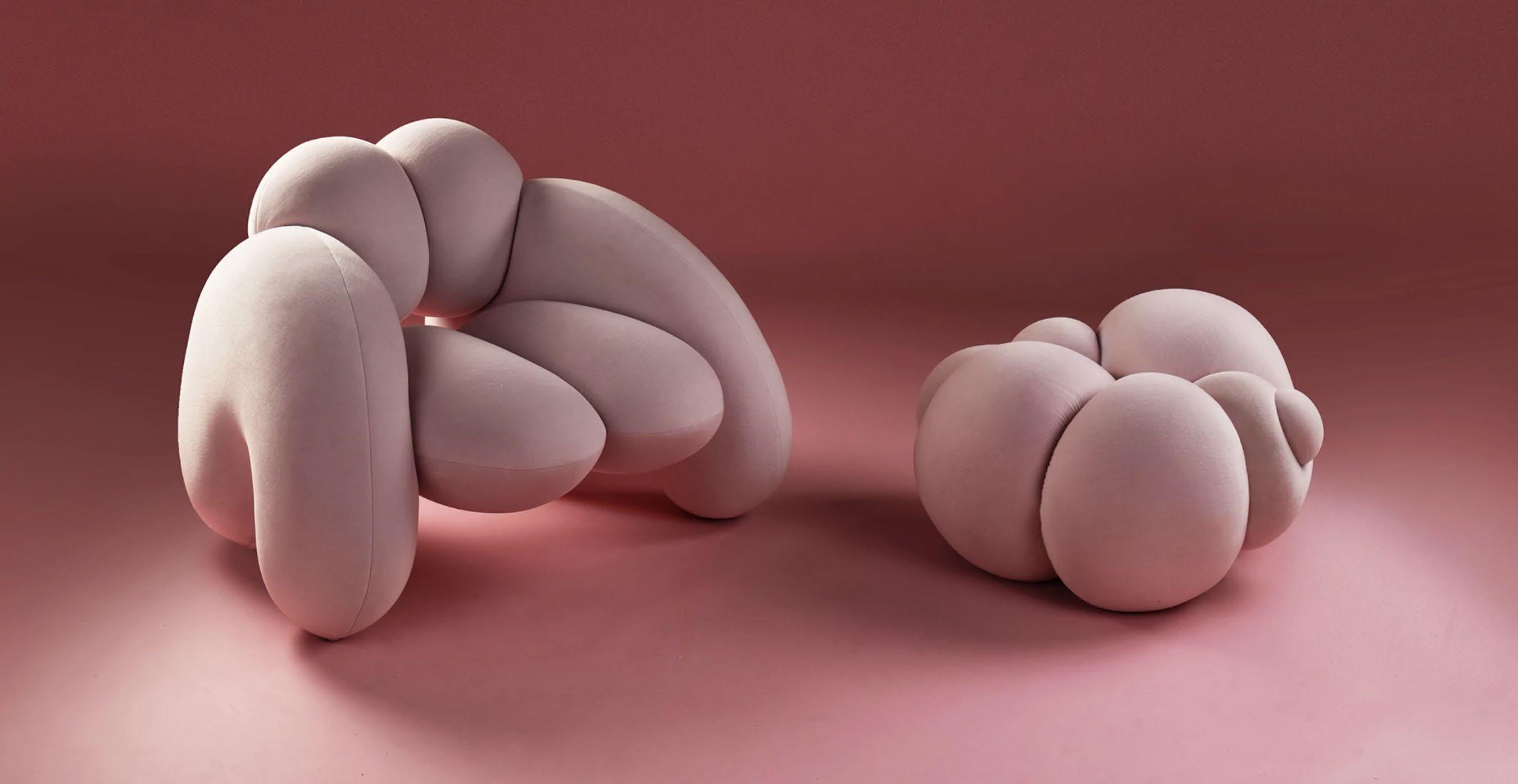
A visual tour de force set in the majestically faded context of the Casa Delle Suore building at the Alcova show. The Peaches collection which included the Derriere armchair – with exaggerated upholstered forms – felt right for now in its assertive generosity. It’s made up of six symmetrical wooden pieces encased in voluptuous layers of foam to convey aspects of the female figure.


 BY YVETTE CAPRIOGLIO STYLE EDITOR


The 60th edition of Salone del Mobile Milano and a European summer are back on the radar. Pack with a purpose and make your style intent clear, always giving a nod to ‘La Sprezzatura’, while covering a schedule that balances dressing up and down in equal measures with pieces that work from wandering the streets, lunch and aperitivi to parties that last late into the night.


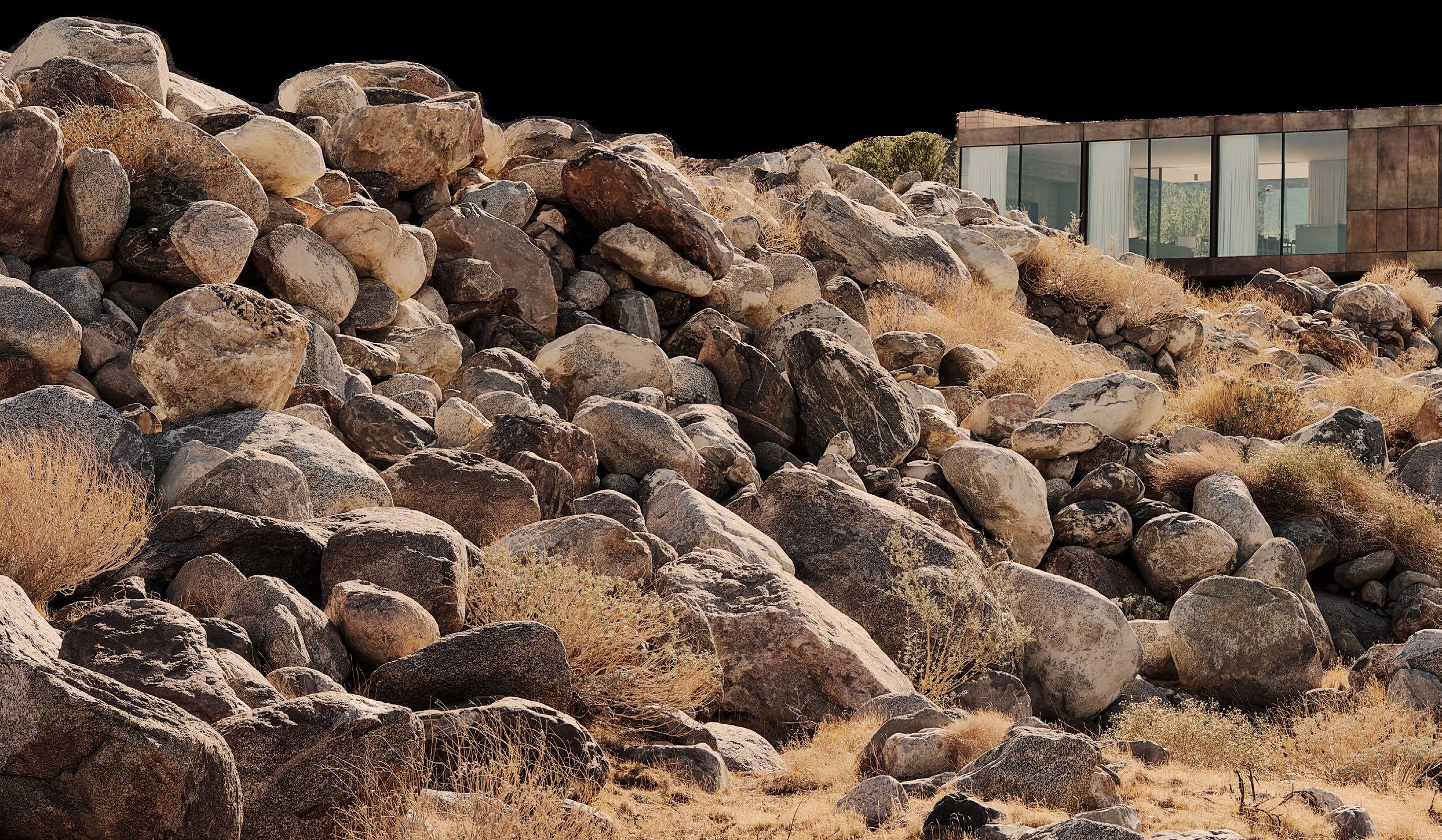


 Woods + Dangaran Springs, North America
PHOTOGRAPHY Joe Fletcher
Bronwyn Marshall

Beautifully expressed as a commitment to the desert modernist movement in Palm Springs, Woods + Dangaran’s Desert Palisades sits elevated and defiant of its raw and unyielding natural surrounds.
The linear and low-lying form presents as an unexpected structure within the landscape, yet also fits perfectly in this particular context. Surrounded by boulders and spanning a natural arroyo, the clean and controlled lines of the resulting home lift it above the existing site yet still enable it to retain a powerful connection to the earth.
Within the exterior walls of earth toned plaster, an interior of refinement awaits. The tension of contrasts is what also strengthens the home, with thick and weighted walls anchoring the home to the site, and expansive glazing that allows clear and uninterrupted visual reminders of context balancing one another.
In its heated climatic setting, operable elements allow natural ventilation to pass through the home, while orientation ensures an ideal capture and control of sun and heat. The home emerges from the landscape as a series of pavilions that interlock across the site, with open courtyard and garden spaces dotted between, further bringing the natural to coalesce with the built. Timber shading devices then create a filtered dappling of natural light.
The ability to open the home and dissolve the threshold between inside and out adds an element of drama. With the façade pulled back to allow access, the outdoor fireplace, lounge, pool, deck and dining area become part of the interior of the home. Desert Palisades both adds to the lineage of modernist in Palm Springs, while also seeing Woods + Dangaran imprint their own signature on the resolve – a beautifully considered and serene refuge.


Woods + Dangaran call on desert modernism principles through horizontal lines and the visual and physical relationship between indoors and outdoors. Travertine floors feature throughout the interiors and as part of the outdoor living room. Outside, all added landscape elements were selected to ‘blend seamlessly’ with the natural surroundings.

 Exposed burnished natural grey CMU blocks nod to the terrain. Natural tones and textures are further explored through the custom bed frame and headboard by Prestigio, custom oak pedestal by KM Custom Furniture and Malawi rug by Armadillo. Custom throw pillows by F&S Fabrics, Parachute linen in clay and natural and a waffle linen blanket with fringe from LinenMe Store dress the bed.


Design Luke Fry Architecture & Interior Design

Project Ripponlea House
Products Eccentric Dual Rail Shower & Eccentric Progressive Wall Mixer
Photography Timothy Kaye
Designed by Rogerseller and made in Australia from quality machined solid brass and stainless steel, the award-winning Eccentric range is engineered to stand the test of time.

The Rogerseller Eccentric dual rail shower features in the Ripponlea House bathroom by Luke Fry Architecture & Interior Design; a heritage home transformation with an inherent focus on longevity.
EXPLORE THE ECCENTRIC RANGE BY ROGERSELLER >
 Painting by Brent Harris and framed photograph at back of the room by Bill Henson.
A unique opportunity to reimagine a familiar space reveals an architect’s connection to place.
DESIGN March Studio
PHOTOGRAPHY & VIDEO Dan Preston
WORDS Holly Beadle

 Warm afternoon light filters through the windows of St Patrick’s Cathedral and into the living room.
Interiors and architecture practice March Studio’s latest residential project located on Spring Street in Melbourne’s CBD is an evolving case study of light and materiality. The two-bedroom apartment once belonged to March Studio founders Rodney Eggleston and Anne-Laure Cavigneaux before they entrusted it to the current owners, a retired couple looking to embark on their next chapter. Celebrated for their radical residential, hospitality and retail spaces, notably AESOP stores, this project exposes the lesser-known side of Rodney and Anne-Laure’s illustrious firm.
The apartment is situated within a heritage-listed Brutalist-style building finished in 1972 with views to Parliament House and Yuncken Freeman’s State Government Offices. March Studio initially left their mark on the building in 2016 when they gave the lobby a much-needed facelift, so this time, it was like reuniting with an old friend.
The new homeowners personally requested Rodney and Anne-Laure redesign the apartment for them, knowing they’d lived in the apartment for nine years. Although sad to part with it, the silver lining was that they got to re-experience it in a different light. In this sense, Spring Street represents a rather unusual client-architect relationship, where the client is carrying on the architect’s legacy. Presented with a unique opportunity to reimagine a space that they had intimate knowledge of, Rodney and Anne-Laure’s connection to place allowed them to formulate a clear design solution.
 B&B Italia Camaleonda sofa by Mario Bellini, Oscar Niemeyer Aran Lounge Chair, Flos Chiara F floor light, Damien Wright dining table and Cassina 412 Cab chairs.
Photography by Bill Henson, sculpture by Walala Tjapaltjarri.

The dining table, made from recycled black wood, set in motion a heavier timber language across the home. With this as the starting point, Rodney felt he had the freedom to “go a little louder” with the blue, silver and gold accents.

Walking into the apartment, you first notice the silver-lined ceiling, which effectively renders all the contents of the apartment twofold. It’s no coincidence that the ceiling of the train station several storeys below is inlaid with the same polished aluminium panels. “Parliament Station is one of my favourite stations in the world,” Rodney says, “it’s indicative of the 70s optimism that was prevalent at the time, where architects were introducing reflective materials.”
Rodney likens the material palette to famous Brutalist buildings, like London’s Barbican. “The key to balancing a harsh exterior is creating a warm, textural interior,” he says. Heavy timbers, manifested in the dining table and joinery, are offset by a brilliant blue lacquer. And this is not the only unlikely duo; this residence might be the only exception to the universal rule, ‘don’t mix gold and silver’. Instead, the March Studio team applied the two metals as if they were butter and bread.
Living this high up certainly has its perks; the view being one of them. To the west, there’s the city and to the east, on a clear day, the Dandenong Ranges and as the sun rises and sets, it ignites an evolving story of light in the process. This story doesn’t just end with the day; at night, Spring Street becomes awash with neon lights as Melbourne morphs into a city of stars.

“The ceiling was a way for us to bring place into the conversation,” Rodney says. The shiny canopy creates the illusion of more; more space, more colour, more texture, and more light.

 The kitchen unites stainless steel, gold and iridescent blue. The island is made from aggregate concrete inset with shards of blue glass. “We joked with the clients that they had to drink ten bottles of Bombay Sapphire for the glass in the island bench,” Rodney laughs.


The bathroom is the only part of the apartment that remains unchanged from when Rodney and Anne-Laure lived there. During the day, sunlight casts playful shapes onto the concrete floor through the breezeblock walls. At night, the same phenomenon takes place with the city lights.
 March Studio refurbished the lobby of the apartment building back in 2016. The gold anodised aluminium of the original windows comes through in the ceiling, seats and letter boxes, signifying the building’s unique heritage.

March Studio articulate 70s optimism through a warm and textural design language.


DESIGN Handelsmann + Khaw LOCATION Sydney, Australia

STYLIST Joseph Gardner
PHOTOGRAPHER Felix Forest
WORDS Alexendra Gordon
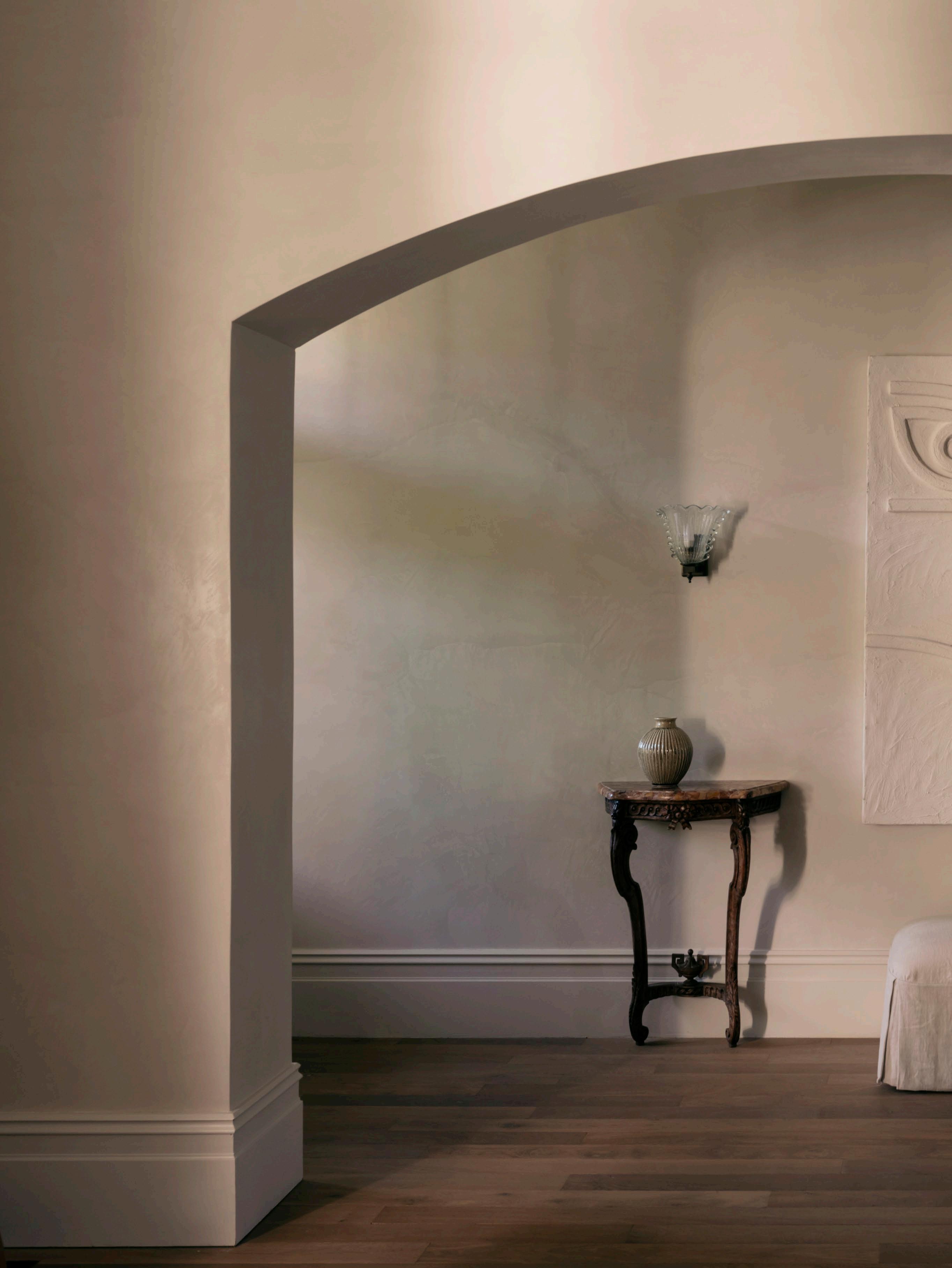 A 19th-century oak console with a Breche D’Alep Marble top, artwork by Angie Pai, and a 1930s Murano sconce make a charming vignette in the entrance hall.


Interior designers often say they are their own worst client – not so Tania Handelsmann, of Sydney interior design studio Handelsmann + Khaw. The designer immediately recognised the potential in her own home when she purchased it eight years ago. “When I came across this house I was immediately won over by its Regency period detailing – the dentil cornices and exterior frieze, the columns on the front porch and the handsome simplicity of the internal windows with no architraves,” Tania recalls. When she finally undertook the six-month renovation in 2021, she not only had a clear vision, but she’d also collected many of the pieces that now take pride of place in the reimagined interior.
Located in Sydney’s Paddington, the house is one of a pair of 1850s Regencystyle terraces that were originally one freestanding home. “It was built before many of the surrounding Victorian terraces which is why the architectural style is not typical of this neighbourhood,” Tania explains who lives there with her husband Andrew, children Oscar and Harper and Russian Blue cat Babushka.


 In the dining room is a custom table by Chatsworth Fine Furniture surrounded by 1930s vintage French Guillerme et Chambron chairs. The artwork is by Dorothy Napangardi. To the right, the living room joinery by Silhouette combines carefully curated vintage candlesticks and vessels.

Not one to do things by halves, Tania ensured the renovation involved gutting the entire house and demolishing and rebuilding the rear half - a rabbit warren of tacked-on rooms. “The ground floor layout was replanned to optimise the spaces through generously scaled rooms that flow easily from one to the other,” Tania says. On the first floor, the designer ingeniously added bay windows to make the small rear bedroom and bathroom more functional, while working within the strict Paddington conservation zone. After deliberating, an attic room was also added creating a much-needed home office.
It is the handpicked finishes that really make the spaces sing. “I was careful to select finishes with patina, warmth and texture,” Tania says, adding “one of the more dramatic changes was the plaster wall finish used throughout the front two rooms, imbuing those spaces with a real sense of atmosphere that didn’t exist before.” Newly installed narrow solid oak floorboards with distressed edges emulate what might have been originally there. Characterful marbles are dotted throughout with Viola in the kitchen, Paonazzo in the ensuite and Amarillo in the main bathroom. “The stone slabs were selected and reserved years ago!” Tania laughs.

 The kitchen is equipped with a Lacanche oven, Viola splashback and stainless steel units by Silhouette Kitchens. A bell passed down from Tania’s mother and restored by Noble Elements has pride of place on the wall.


 A view out past the custom steel doors by Ganci Steel doors of children Oscar and Harper playing in the garden.
The furniture is equally as individual, “I had a very clear idea from the beginning of what I planned to do with the house so enjoyed slowly collecting vintage pieces that would work in the spaces as I envisaged them,” the designer explains. Highlights include the Guillerme and Chambron French oak cabinet from the 1950s, the 17th-century kitchen table and entry console and a pair of brass wall sconces acquired from the estate of Yves Saint Laurent and Pierre Berge. Custom-designed pieces such as the dining table and blood-red velvet sofa complete the picture.
Having woven her magic, the house is now the perfect balance of artful spatial planning and a carefully executed, yet seemingly effortless atmosphere. “Aesthetically, I finally feel like I live in a home that is a true reflection of my personal style and practically, the quality of the spaces makes my family feel more comfortable, organised and productive,” Tania says. From the pretty vignette at the entry through to the floral upholstered inbuilt seating at the back, it is the embodiment of style and substance.
The main bedroom is dreamy and white with a custom bedhead in Lelievre Lama boucle by Ambient Upholstery, Love Cashmere throw and Velvet Valley Baltic linen bedcover. Viabizzuno Roy Parete wall lights punctuate the walls.

“I had a very clear idea from the beginning of what I planned to do with the house so enjoyed slowly collecting vintage pieces that would work in the spaces as I envisaged them.”
– Tania Handelsmann
 The ensuite has a custom vanity by Silhouette Kitchens and Granite Marbleworks in Calacutta Paonazzo, Pierre Charreau Block wall sconces from Edition Modern and a custom mirror by Silhouette Kitchens. The door hardware throughout is by Noble Elements.


PRAIA-PIQUINIA 31/07/12 10H16


Tania’s home is reflective of its architectural style, layered with warm textures and individual pieces sourced over time.


Keeping true to the original European oak colour, Freado creates a neutral backdrop for any application.

Tongue n Groove Herringbone parquetry is
 Project: Balmoral House II | Builder: 3Corp | Architect: PopovBass | Photographer: Pablo Veiga
 Photography Armin Tehrani, wichmann + bendtsen, Torben Eskerod, Rasmus Hjortshøj, Laura Stamer, courtesy of Getama and courtesy of Le Klint.
Great Dane founder Anton Assaad and creative director Megan Marshall, together with Australian interior designer Lucy Marczyk report on standout Scandinavian design at this year’s 3daysofdesign in Copenhagen under the theme “Remember to Play”. Produced
Georg Jensen, in collaboration with Danish architecture firm Spacon & X, presented an interactive installation, #ShapedbySilver. The exhibit paid tribute to some of Georg Jensen’s most iconic pieces in silver, while black podiums signified the launch of their collaboration with design studio Nendo.


Originally designed by Verner Panton in 1964, Verpan reintroduced their Easy sofa at Copenhagen’s Lindencrone Mansion. Lucy Marczyk says the exhibit showcased the most dramatic use of colour across 3daysofdesign. “Each room was saturated in monochromatic colour – shades of rose, pink and burgundy coupled with stunning floral installations,” she adds.

Verpan is exclusively available at Great Dane in Australia

Studio Oliver Gustav’s gallery-style showroom, studio and boutique in central Copenhagen was a highlight for Lucy.

“The studio is situated inside the 1920s Museumsbygningen and was exquisite, presenting a mixture of homely contemporary furniture with antique pieces,” Lucy says.
“Here, Scandinavian minimalism fused with art and design storytelling maximalism.”
Danish lighting stalwart Le Klint (retailed through Great Dane in Australia) revealed their latest handfolded lampshade, PLIVELLO at their flagship store and showroom in Odense, Copenhagen. Designed in collaboration with Christian Troels, the lamp is inspired by multi-tiered chandeliers. “There were pleating technicians in the showroom demonstrating incredible skill that creates the famous pleats,” Anton says. In anticipation of turning 80 next year, Anton says Le Klint has been commissioned to design a new light for Designmuseum Denmark.

Le Klint is exclusively available at Great Dane in Australia

Lighting designers Nuura hosted their ‘house warming’ – inviting 3daysofdesign guests to explore their new showroom in central Copenhagen. Megan Marshall says the showroom colours were selected in response to the church nearby. “The tone shifted as you moved through the rooms very subtly – evocative of Nuura creative director Sofie Refer’s obsession with golden light,” Megan says. Nuura is exclusively available at Great Dane in Australia
Japanese artist Chiharu Shiota presented Multiple Realities at Copenhagen’s Cisternerne – a former reservoir that’s part of the city’s Frederiksberg Museums. The installation transformed the underground location by featuring web-like yarn, reflections and rotating dresses. “It was one of the most ambient exhibition spaces I have experienced,” Lucy says. “Entering the Cisternerne was like stepping inside a dream-like, tempestuous magical world for an hour and half of our day.”

Vipp Garage, designed by architects Frank Maali and Gemma Lalanda, is their latest design experience in Copenhagen. For 3daysofdesign, the transformed mid-century garage hosted The Artful Supper Club – an installation by artists Pettersen & Hein and Alexander Kirkeby, curated by Julie Moelsgaard Interior. “In a typical understated Scandinavian style, you could also enjoy coffee and Danishes in the sunshine with Vipp’s new outdoor furniture collection,” Lucy says. Vipp is exclusively available at Cult in Australia

dk3 presented their Baia Chair in new Corsa Rosso and British Racing Green – a fair highlight for Great Dane’s Megan Marshall and Anton Assaad (available at their Australian showroom). Designed by Kensaku Oshiro, the chair is a tribute to both Danish and Japanese aesthetics. “The highly anticipated Groove dining table alongside dk3 classics such as the Ten table, Pia chair and the Royal system were also on display,” Anton says. “The new colours are based on the dk3 founder’s love of motorcars.”
dk3 is exclusively available at Great Dane in Australia
09.
Getama exhibited a new collection designed by iconic Danish architect and furniture designer Mogens Koch, including the Embassy table, folding chair and bookcase at their showroom. “Mogen Koch and Nanna Ditzel’s families were in attendance,” Megan says. “It was amazing to meet them.” The event affirmed Getama’s hold on Denmark’s craftsmanship and design legacy. Getama is exclusively available at Great Dane in Australia
To celebrate their 150-year milestone, Danish furniture brand Fritz Hansen (retailed through Cult in Australia) collaborated with architect Henning Larsen on an exclusive pavilion, in the yard of Designmuseum Denmark. Winner of this year’s Best Exhibition Award, the pavilion unveiled Fritz Hansen’s anniversary collection that featured seven iconic designs. “The translucent polycarbonate roof allowed light and warmth into the space as well as connectivity to the surrounding grounds,” Lucy says. “It was a divine space to be in.”
Fritz Hansen is exclusively available at Cult in Australia


 Design Las Perelli
Stying Beatriz Aparicio Ibañez
Project Segovia
Photography courtesy of Las Perelli
LIVING IN JAPAN. 40TH ED. ALEX KERR, KATHY A. SOKOL, AND RETO GUNTLI

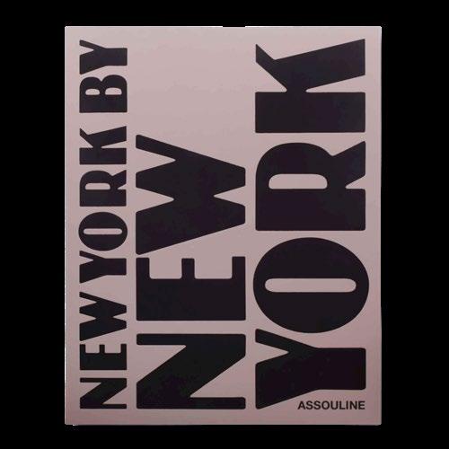
Explore a sense of place through our edit of coffee table books.


KENGO KUMA: MY LIFE AS AN ARCHITECT IN TOKYO PAOLA BACCHIA

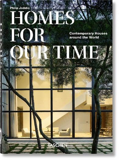
HOMES FOR OUR TIME: CONTEMPORARY HOUSES AROUND THE WORLD PHILIP JODIDIO

POOLSIDE WITH SLIM AARONS BOOK SLIM AARONS, GETTY IMAGES, WILLIAM NORWICH

KERSTIN THOMPSON ARCHITECTS: ENCOMPASSING ... LEON SCHAIK
IN AMERICA: A LEXICON OF FASHION ANDREW BOLTON, AMANDA GARFINKEL, JESSICA REGAN, STEPHANIE KRAMER


A house at Saint-Jean-Cap-Ferrat overlooking the Mediterranean updated to adapt to the maximise unsurpassed

Mediterranean Sea is the owner’s needs and unsurpassed views.
 Saint-Jean-Cap-Ferrat
Jean-Charles Tomas
Côte d’Azur, France
Jérôme Galland
Stephen Crafti

Originally built in 2000 for a developer of high-end houses, and renovated 10 years ago, it was, according to designer Jean-Charles Tomas, lacking character and quite impersonal. “I feel the original idea was to sell it on, hence the fairly neutral interior was applied at that time,” Jean-Charles says, who has worked with the owner on several projects.
The initial brief was to rework the kitchen, making it more befitting of the scale of the house and one that would allow a professional chef to prepare meals for the owner and guests. When the new kitchen featuring new joinery, marble benches and splashbacks along with state-of-theart appliances was complete, Jean-Charles was then awarded the larger brief to redesign the entire home – complete with new timber windows to maximise the views.
As the owner was working and living from the home due to the pandemic, Jean-Charles’ approach was ‘room by room’, with the guest bedroom turned into the home office. “We tried to retain as much of the original house as possible, embellishing it rather than simply removing things and starting from scratch,” Jean-Charles says.
 Iconic mid-century pieces – the Hans J. Wegner JH571 desk and PP503 chair – are front and centre in the living space under a custom-made Branching Bubbles chandelier by Lindsey Adelman. A B&B sofa by Antonio Citterio upholstered in Loro Piana Fabric and Knoll Warren Platner side table are also featured. Artwork by André Butzer.

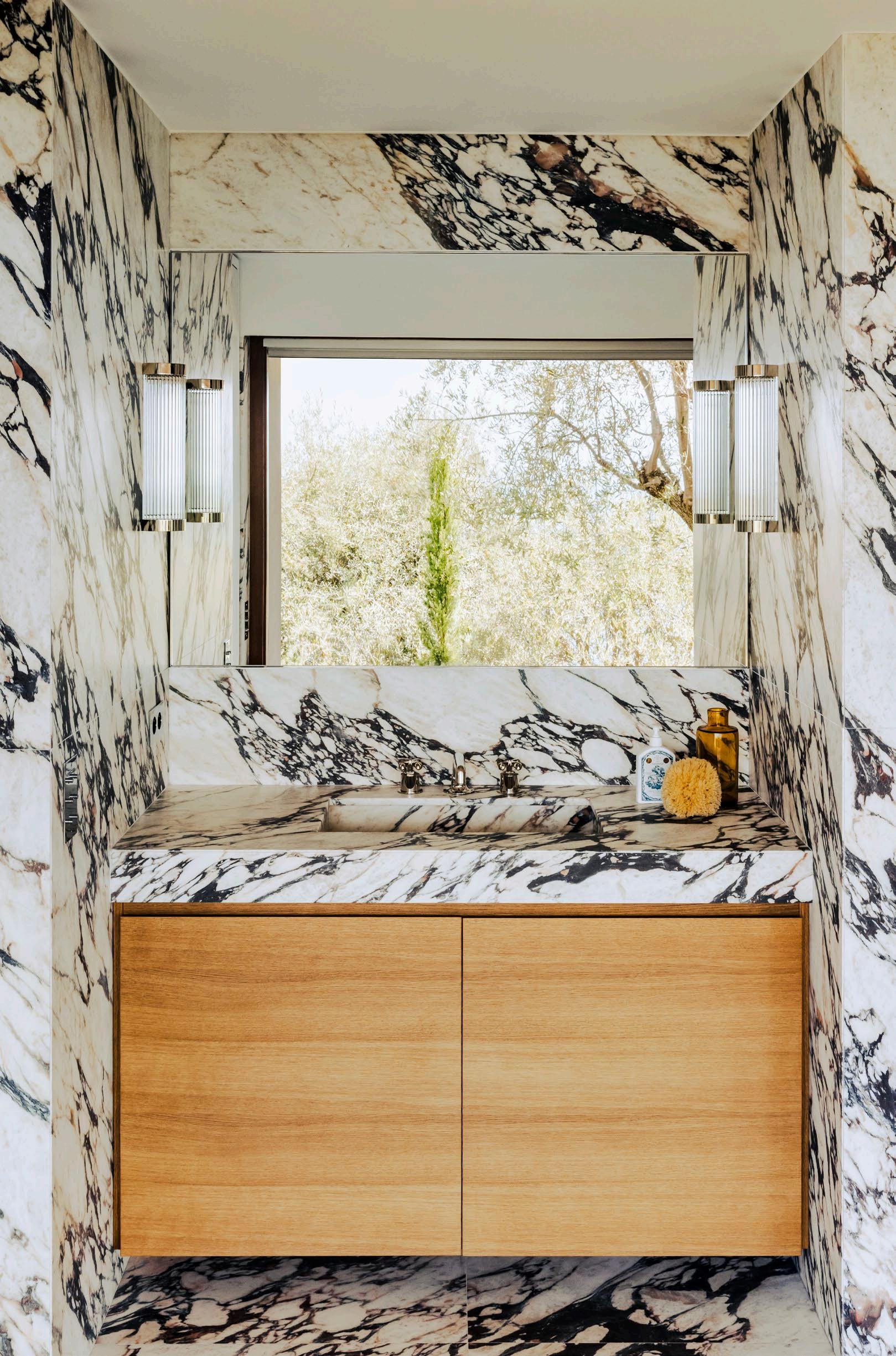
Jean-Charles’ approach was to work with a natural palette of materials, whether it took the form of timber, metal or stone, mindful of how each complemented the other. There were visits to quarries in Tuscany with the owner, where they discovered the Arabescato Viola marble that features in the kitchen and the lavish new ensuite bathroom to the main bedroom. Mindful of the structural columns in areas such as the bedroom, the solution was to add a third ‘faux’ column that provides symmetry and a nook for a chest of drawers. Each of the three nooks now has a specific function – writing, storage or reading. “It’s important to have a feeling of security in a bedroom,” Jean-Charles says.
Many of the walls in the home are quite neutral, allowing the owner’s art collection to be displayed, while sometimes adding a subtle tint of colour to respond to certain pieces of furniture or art. Some of the furniture had been purchased when the house was first completed, with some new pieces added including the statue of Thomas Schutte in the living area, the Finn Juhl 45 chairs and the Hans J. Wegner JH571 desk with its fine brass inlay. “That brass detailing became an inspiration for some of the other details,” Jean-Charles says.
Although the spacious living and dining areas are often the places to which the owner gravitates, it’s the kitchen that has the greatest hold. “We all have to eat and a great kitchen is a great place to share with friends. It’s an immersive and inclusive experience,” Jean-Charles says, who also reworked some of the outdoor spaces, including the roof terrace, for entertaining, sunbathing and simply contemplating the extraordinary views of the Mediterranean.
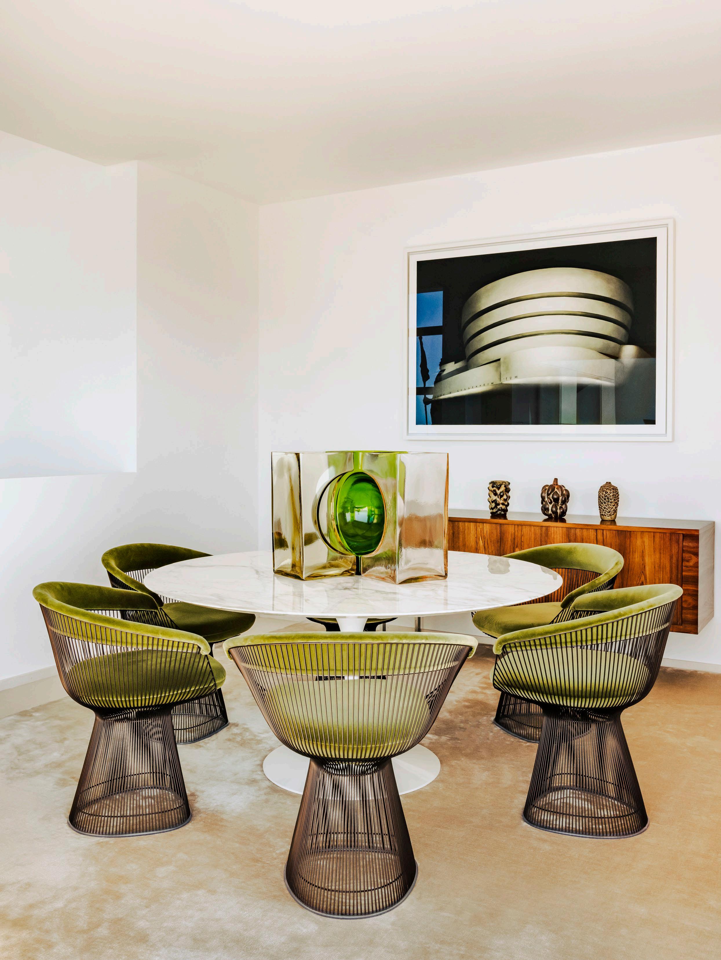
 A bespoke wooden headboard, desk, chest and sofa were all designed by Jean-Charles Tomas in the primary bedroom. A vintage Philip Arctander sheepskin Clam chair sits in the foreground while a Samouraï mask and Hiroshi Sugimoto print are featured on the wall behind.



Jean-Charles Tomas ensured the roof terrace was optimised for entertaining, sunbathing and taking in views of the Mediterranean. The pool’s sparkling effect has been created with Bisazza glass mosaic tiles.


Considered architectural elements form the hallmarks of this reflective casa in Colombia, making it a minimalist refuge for modern living.
INTERIOR ARCHITECTURE Cinco Sólidos
LOCATION Medellín, Colombia
PHOTOGRAPHY Nick Wiesner & Anna Dave
WORDS Megan Rawson
Asymmetry is intentional and repetitive throughout Casa JL. Softer elements such as the overlapping rugs in the living room disrupt otherwise rigid architectural compositions. The living room features the Terra sofa and Orilla coffee table – both designed by 5 Sólidos Objects – and Norm Architects’ Kinuta

Terrace N-LC02 chairs. Clavo de Luna
Sculpture by Carla Cascales.

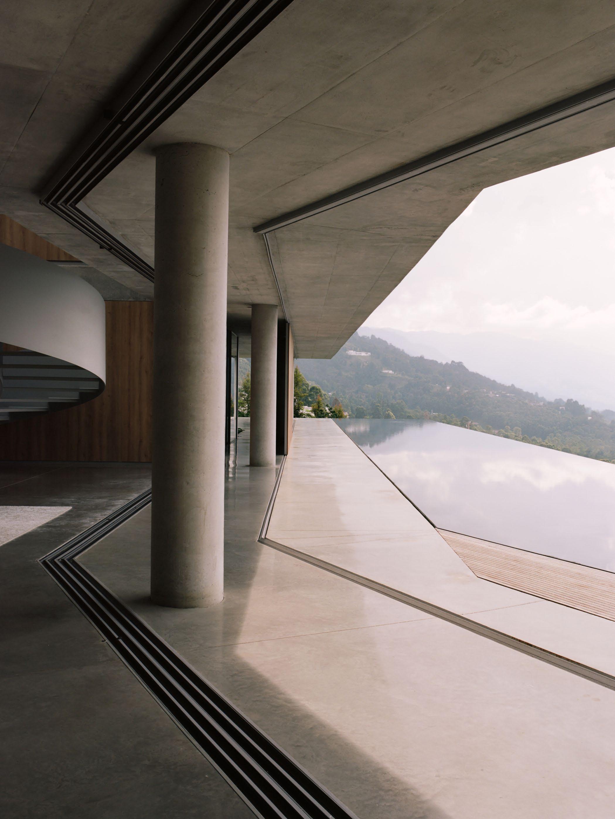
Casa JL by architectural practice Cinco Sólidos sits in the mountainous outskirts of Medellín, a city that has left its dark past behind, reinventing itself with a resurgence of culture, hospitality, architecture, and emerging design.
Medellín-based Cinco Sólidos is one of the multi-disciplinary representatives leading the new wave of architecture emerging out of Colombia, applying a holistic approach to five (cinco) fields of design; architecture, interior design, branding, furniture and project direction. Gaining momentum for their reductive approach to crafting highly refined homes within a Latin American context, the studio have built an impressive portfolio of exclusive residential projects; each one embodying the core of their ‘simplicity and elegance with an edge’ design ethos.
Proving that less is more, Casa JL is a Brutalist-inspired refuge that wholeheartedly embraces this ethos. Composed of two linear structures which overlap to create a ‘V’ each wing is set across two- storeys and recedes into the earth, making the surrounding landscape one of its strongest design influences. As though levitating above ground on columns, the home follows the contours of the sloping valley to cast a modern and minimal silhouette against the tree line. Raw, cast concrete slabs, timber and floor-to-ceiling glass are the prevailing materials used both inside and out to create a cohesive flow while an abundance of greenery easily visible through every vantage point, window and balcony of the home draws the landscape inwards from all angles.


The ground floor structure connects a concealed garage, utility room and storage rooms through a closed corridor which leads to the communal spaces including a generous kitchen, dining room, living area and TV room. Collectively, these spaces each have glass sliding doors that unfold onto the pool area. A terrace, stretching impressively along the expanse of the home, occupies a sunken outdoor living space and is embedded at ground level to ensure it remains unobtrusive to the awe-inspiring vista beyond. A key feature of Casa JL is the dark lined pool that acts as a natural mirror, creating a changing reflection throughout the day, alongside the angular architecture with organic, colourful views of the hillside.
The upper structure connects the private spaces including three bedrooms, each one intentionally stripped of any unnecessary elements to accentuate the views. Timber and concrete juxtapose to become a connecting theme between them, while glass sliding doors open out onto a communal balcony.
The considered use of materials and local craftspeople guarantee that the polished concrete floors, rendered walls, and custom timber joinery all sculpt a unifying integrity. Thoughtfully selected furniture has been placed throughout the spaces and a sense of raw materiality in the environment balances beautifully with the warmth and texture of these pieces without detracting from the architecture. A ribboning metal staircase creates an architectural gesture in the form of a sculptural centrepiece, while light-filled atriums and circular glimpses of the sky offer moments of curiosity and contemplation.
Intended as a reflective space for admiring the local landscape, this pavilion-like home rightly claims its belonging to place. Generously designed and impeccably finished, Casa JL is an accolade to Cinco Sólidos who have explored a compelling dialogue in aesthetic tensions. The Brutalist-style silhouette, raw tactility and connectivity to the land allow the true essence of the home’s unique surroundings to come to the fore.


Thomas Ostyn, third-generation owner of kitchen and interior design studio Obumex, takes us inside his light-filled, multi-functional Belgian sanctuary designed by Nicolas Schuybroek Architects.
WORDS

n the outskirts of Brussels, a patch of land surrounded by dense woodlands presented a new opportunity for Thomas, his wife Julie and their three children. He appointed Belgian architect Nicolas Schuybroek, who debuted his first kitchen interpretation for Obumex at Milan Design Week this year, to design his first family home. “Floor to ceiling windows invite nature and light inside, while our spacious internal areas allow us to roam about as if we were immersed in the landscape itself,” Thomas says. Of working alongside Nicolas, he says “our partnership was incredibly positive. Nicolas’ vision was aligned with my Obumex way of thinking from decisions regarding space and light, right through to material choices.”
 Externally, OV House features light grey limestone blocks among bespoke steel-framed windows. On the terrace, limestone tiles are carried underfoot. Charlotte Perriand chairs, a custom sofa in Belgian linen and a bespoke Nicolas Schuybroek coffee table all feature as part of the outdoor setting.


Aesthetics and practicality work in tandem inside the home. “Our large entrance doors on all sides of the home ensure the children can enter and exit the garden from several vantage points,” he says. “There are almost no internal doors – all rooms are connected. Essentially, one can view family activity in the living zone, the terrace, or even in the office – all while standing in the kitchen.”
True to the Obumex ideology of ‘sustainable happiness beginning at home’, Thomas’ home features raw and natural materials such as limestone, aged oak timber and metal. “Even though substitute artificial alternatives are plentiful nowadays, no compromise was ever considered,” he says.
Naturally, the kitchen is the hero of the home – and a showcase for one of Thomas’ proudest collaborations; French architect Joseph Dirand’s signature cantilevered kitchen for Obumex. The home’s finishes reflect the quiet composure he desired for his family. “A house should provide tranquility, which is why we opted for honest, noble, natural tones,” he says.
Importantly, practicality is a non-negotiable for Thomas. “A home may be aesthetically pleasing, but it must also be functional,” he says. “Every space within our home serves a purpose, if not several.” He believes unused areas can make a house feel uninviting. “To me, there is no such thing as a dining room. Rather a space that can be utilised as a dining room, a desk, a bar, or even a children’s drawing nook. Ninety per cent of our home is used ninety per cent of the time.”

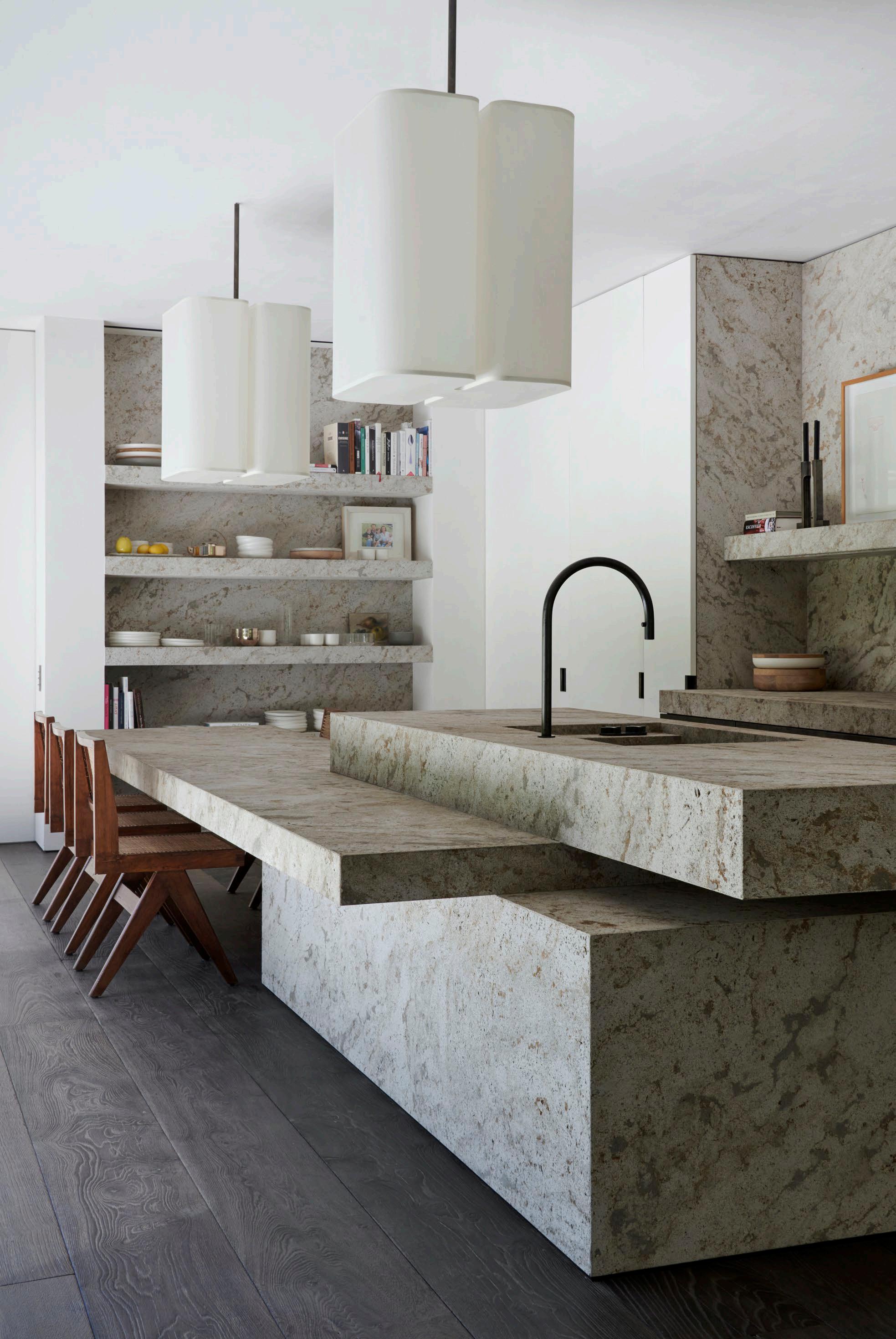

 Timber ceiling beams and sandblasted aged-oak timber wall panels concealing storage add warmth to the dining space. Stone tiles flow beneath a custom dining table by Nicolas Schuybroek. Walnut chairs from the BassamFellows Chair Factory surround the table dressed with vintage Louis Weisdorf pendant lights.


 Above the Christian Liaigre sofa rests artwork by Gavin Turk. Pierre Jeanneret vintage chairs and bench complement the pigeonhole desk in the study nook. An artwork by Ethan Cook sits above a Brasilia LP table lamp by Michel Boyer for Ozone. A custom mantlepiece is crafted from limestone. A bespoke Nicolas Schuybroek elm coffee table is paired with two white Ipanema armchairs by Jorge Zalszupin for Etel.


 Light pierces through the indoor pool area, accentuated by the wall and floor stone tiling.


Joe has captured Amangiri Resort in Utah, USA by I-10 Architects twice – when it first opened, and a decade later to see how the architecture had patinated.

British-born, Californian-based photographer Joe Fletcher unashamedly admits he’s enamoured with the golden state’s light. “The light here has presence; it’s magical and golden,” Joe says. “I’m quite in love with it.”
Joe credits his UK heritage for shaping his perception of architecture and design. He has inherited a passion for what he calls England’s design identity; “understated, humble but refined”. “I shy away from anything flashy - I suspect that’s rather English,” Joe laughs.
Since moving to the US in 2003, Joe has chronicled some of America’s best emerging and established architects, such as Woods + Dangaran, Faulkner Architects and Walker Workshop. His published works offer a fresh perspective on California’s ranch houses and iconic Palm Springs architecture, such as Richard Neutra’s Kaufmann House.


The photographer has also captured remarkable architecture in some of the most dramatic landscapes such as the secluded Amangiri Resort by I-10 Studio in Utah’s Canyon Point. “My favourite buildings are those that emphasise the relationship to the natural world they inhabit, be it nature or the elements,” Joe says.
Interestingly, Joe didn’t set out on the path to becoming a photographer. Instead, he completed a Bachelor of Fine Art majoring in painting, which subsequently influenced his approach to photography. “I learned the emotional content of your work is far more important than technique,” Joe says. “A large vocabulary will aid your writing, but if you’ve nothing to say, it’s of little use.”
He credits photographer Richard Pare and his lens on Japanese architect Tadao Ando’s work for piquing his initial interest in architecture. “I was captivated. There was a synergy between the architecture and photography that elicited the poetry of light. I immediately wanted to experience making the same.”
Since then, Joe has learned to express his belief that great architecture is a visceral experience. It reminds him to be present and to resist the urge of slipping into a formulaic composition. “My favourite photographs are found, not created,” he says. “When photography works as a medium it can be deeply emotive. But it’s a spell that’s easy to break.”
Although there’s a thrill in seeing new architecture for the first time, Joe also enjoys revisiting projects he’s previously shot, to capture the beautiful patina that develops in the years after an initial shoot. “It’s where you often appreciate the architectural work and the multitudes of beauty gifted by the natural world to us every day.”

 Amangiri Resort in Utah, USA by I-10 Architects

 The Kaufmann House by Richard Neutra in Palm Springs, California.


 Left: pool at Ridge Mountain Residence by Woods + Dangaran Palm Springs, California.
Right: Joe Fletcher
Joe describes his work as a bit like a haiku; “imparting a small amount of information – a sense of the season and the time of day and if that happens, the authenticity of a moment,” he says. Left
 & right: Three Chimney House by TW Ryan Architecture in Charlottesville, Virginia.

 Ishawooah Mesa Ranch House by Lake Flato Architects in Wyoming, USA.


A minimalist Parisian apartment forms a stunning backdrop to a carefully curated collection of art and furniture.
PHOTOGRAPHY Rei Moon
LOCATION Paris, France
WORDS Yvette Caprioglio
Located on Rue Galilée south of Avenue des Champs-Élysées in Paris’s 16th arrondissement, the founder and CEO of a global fashion brand and his family have made their home in a five-bedroom, 500 square metre space. Views towards the Left Bank and the Eiffel Tower are as impressive as the home’s interiors.
Spread over two floors and housing an extensive and varied collection of contemporary and often playful art pieces, the owner knew it was a rare opportunity when he first saw it, realising immediately it would also offer more space for both his family and their all-important art. Before establishing himself in the world of fashion, the owner was an artist, with a passion for collecting furniture, objects and art.


Collaborating with Belgian architect Bernard Dubois, the top two floors of what was an entire building have become the family’s home, with an expansive terrace and a phenomenal view of the Eiffel Tower. There’s a distinctly different feel between the everyday living and social spaces and the family’s private sleeping quarters. Bernard utilised the building’s distinctive architectural features, exposing raw wooden beams and restoring the impressive stone staircase. He then added tactility and character through materiality such as Ceppo di Gré stone and rough gnarled oak. These materials feature in the living and dining area with an oversized stone bench anchoring the kitchen set against stainless steel and oak. The home’s furniture is understated yet notable. Large Christian Liagre sofas upholstered in green and blue sit front and centre in the living room while mid-century designers feature in the dining room with Charlotte Perriand shelving and Pierre Jeanneret chairs.
The family floor, in contrast to the industrial feel of the living spaces, unfolds through a series of suites, linear in nature with reference to the elegance of 17th-century French interiors. Every corner of the home is considered in its layout. Bernard’s all-white utilitarian design with its carefully placed walls allow for the owners’ art to be curated in a gallery-like setting for works by renowned artists including Picasso – a painting of a woman’s head is the first thing you see when entering the apartment, Jean-Michel Basquiat, Christopher Wool and Cy Twombly. There are other remarkable pieces too such as the pillars on the terrace from the Gurma people of Burkina Faso and sculptures from Indonesia that add contrast and warmth to the home’s modern atmosphere.

 A Je Détruis le Monde (2007) neon sculpture by Claude Lévêque sets the tone in the stainless steel and Ceppo di Gré stone kitchen with Gaggenau appliances.


 All spaces are inherently indicative of the art-collecting client.
Pictured: electric red Pierre Jeanneret armchairs and Death in America #2 (2005) by Steven Parrino.


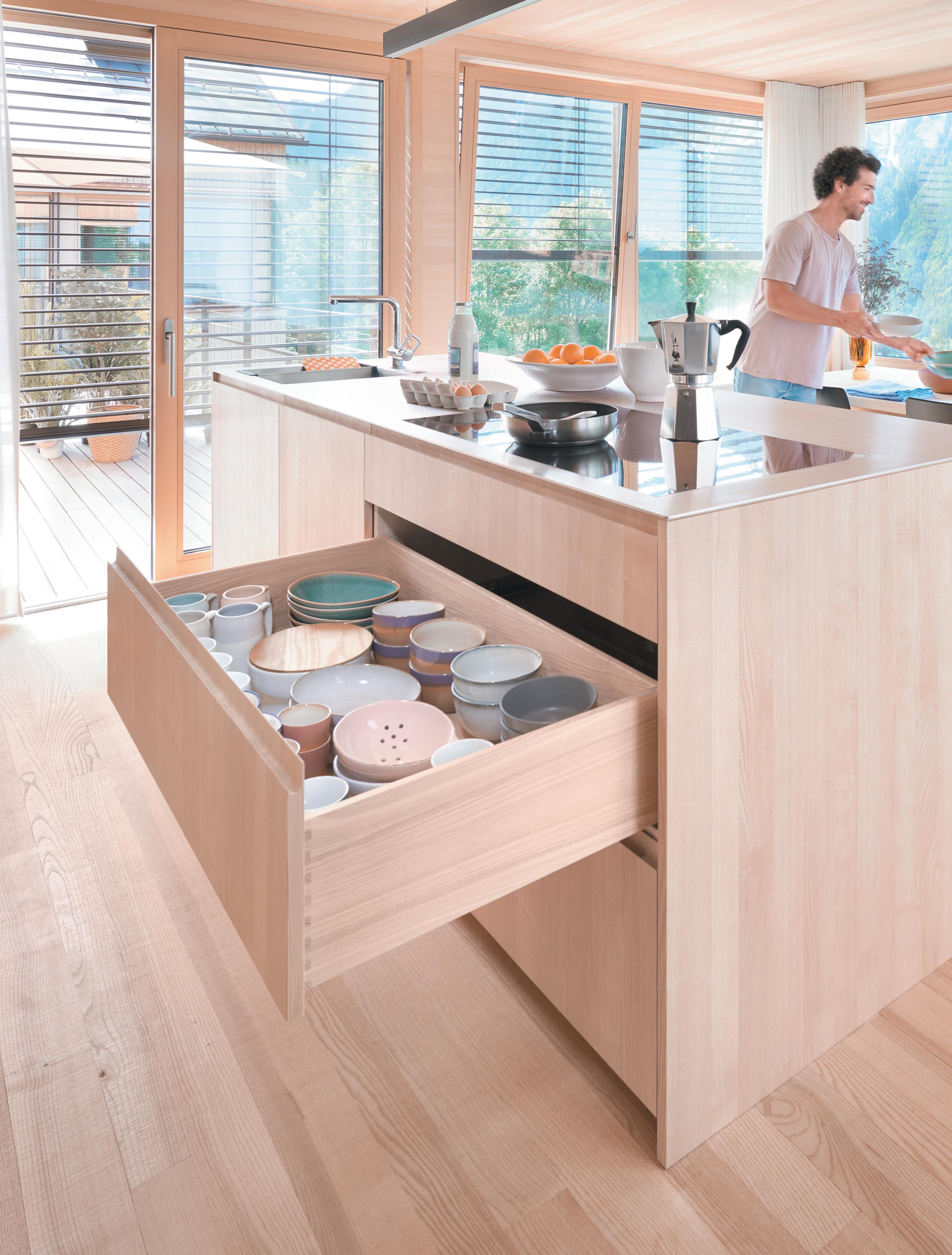
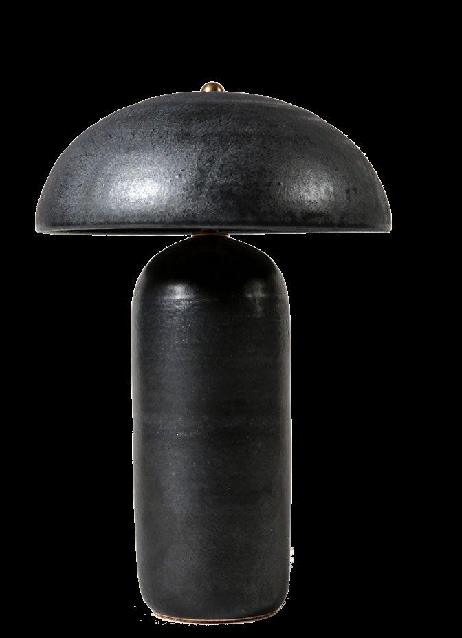
The est definitive guide to impactful interior elements from our go-to Product Library.
 Project Mandeville Canyon
Interior Design Jamie Bush + Co Landscape
Build Hill Construction
Photography
Design Walker Workshop
Landscape Architecture Christine London
Photography Joe Fletcher


NEVERENDING GLORY PENDANT LASVIT

Lighting inspired by people, architecture and the natural environment.


designed to sink into.


Rugs are an expression of the designer and maker.


