Design Voices
FAYE TOOGOOD · ROSE UNIACKE · DAVID FLACK
CLARE COUSINS · MANUEL AIRES MATEUS
HARRY NURIEV
™
Retail
· HUGO TORO · OLIVIA WILLIAMS · INDIA MAHDAVI · OUR 2024 DESIGN AUTHORITIES Form Follows Fashion: a Lens on
Design

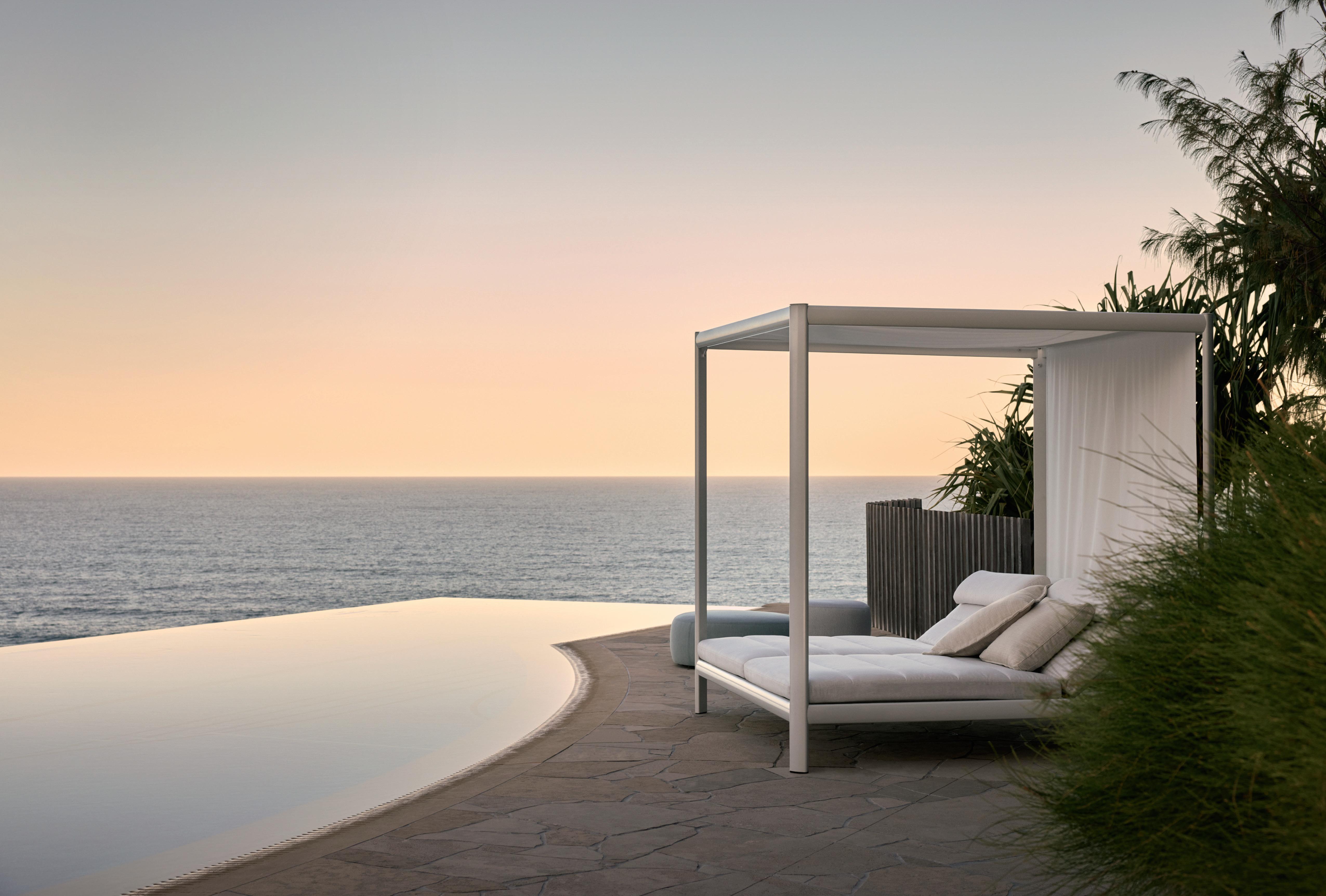
kingliving.com #SomethingWorthKeeping KING CABANA Your personal comfort oasis, a sanctuary from the sun

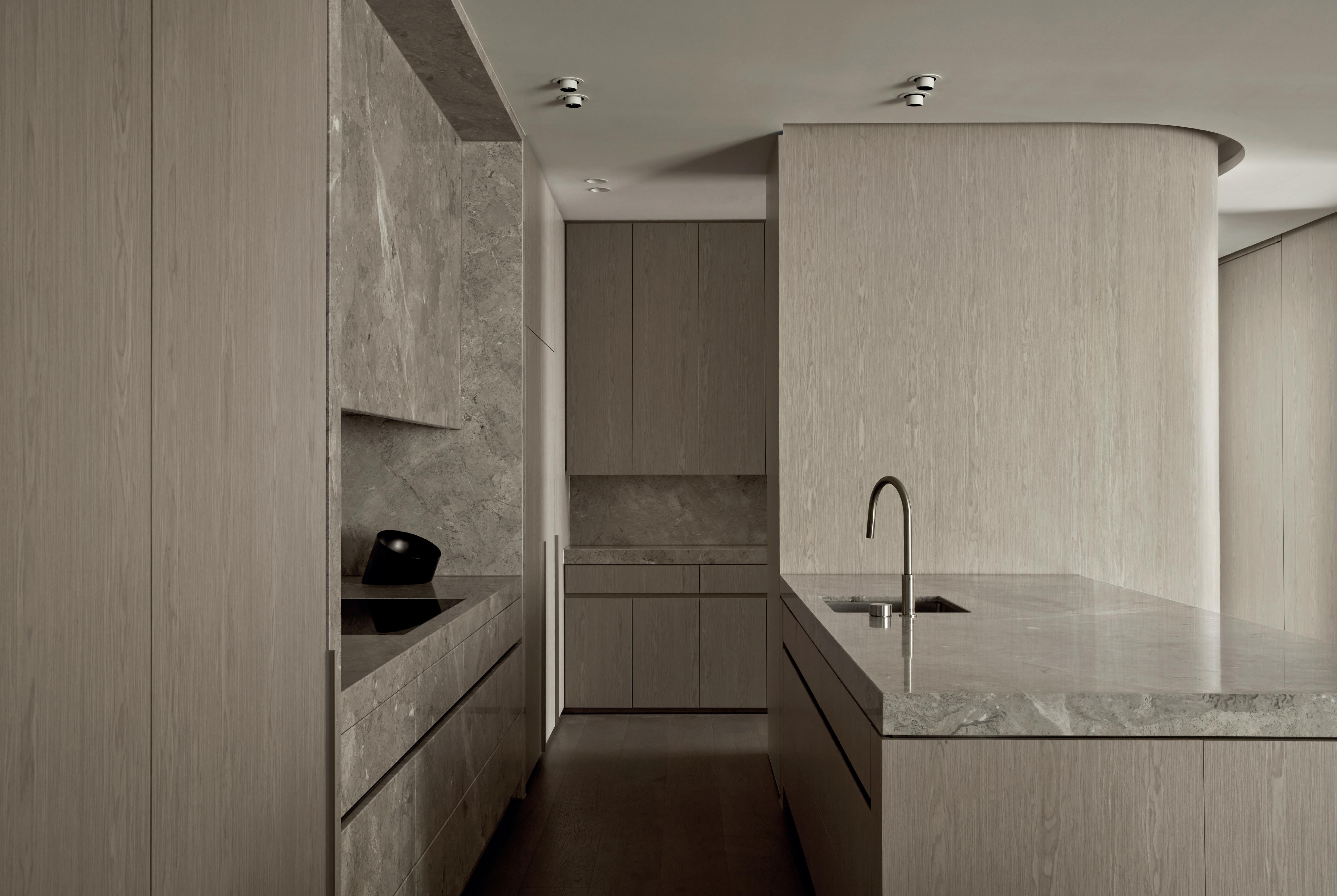 Eveneer Raw Cumulus by Elton Group
Design Finnis Architecture & Interiors
Timber veneers
elevate
living
Photo Damien Kook
to
the
experience.







Authentic. Innovative. Sustainable.
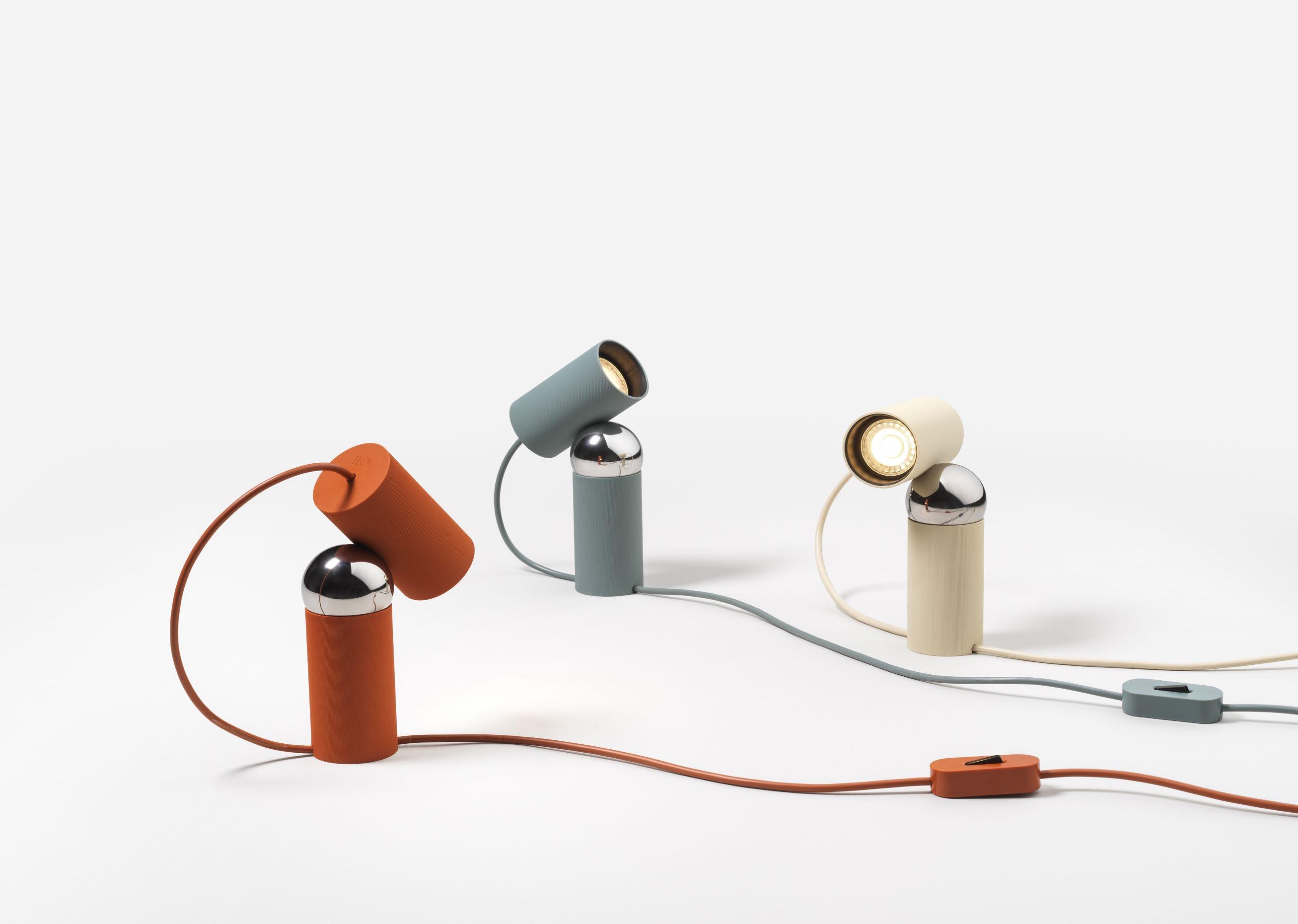 by Philippe Malouin Flos
Simple in appearance but full of personality, Bilboquet is an adjustable table lamp that allows you to direct light in a playful yet precise manner. Taking cues from magnetic ball joints, Bilboquet o ers a full range of movement for a variety of functions. Whether used as a task light on a desk, or to provide a soft glow against a wall, or directed at a good book, Bilboquet shines light where it is needed.”
Philippe Malouin

 Bilboquet
euroluce.com.au




CONTENTS

9 return to puglia the detail
esteemed 10 multidisciplinary designers common thread where
architects live Ben Ridley
the
design
radar
the library style guide
architecture of fashion
where architects live Felix De Montesquiou
esteemed 10 architects & designers
where architects live Ben Mitchell
This Much I Know podcast Kennedy Nolan
where architects live Luis Laplace & Christophe Comoy
est on film Manuel Aires Mateus
EDITOR'S LETTER
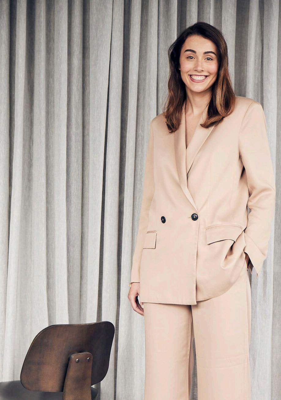
In this issue, we’ve let architects and designers do the talking. You’ll hear directly from our esteemed 10 for 2024 – ten architecture and design authorities and ten multidisciplinary design authorities – who shed light on their practice, approach and the evolving design landscape.
Our Where Architects Live series takes us inside the homes of five different architects, including our cover story –architect Felix de Montesquiou’s converted Paris warehouse, that he shares with his wife, young family and their two dogs. You’ll also find interviews with Argentine architect Luis Laplace and partner Christophe Comoy in their Menorca finca, Sydney architect Ben Mitchell in his former shoe-factory-turned-family-home, and London architect Ben Ridley in his Edwardian terrace informed by ‘Passivhaus’ principles. Beyond the page, our latest film enters architect Manuel Aires Mateus’ ever-changing home in the heart of Lisbon.
We see architecture and design transcend high fashion within four exceptional retail stores, inspiring our library edit. This same transcendent influence is seen in fashion designer Penelope Loorham’s Melbourne home designed by Templeton Architecture.
As part of our podcast This Much I Know, Karen McCartney speaks with Kennedy Nolan founders and principal architects Rachel Nolan and Patrick Kennedy in a home they designed for Melbourne gallerist Sophie Gannon. This issue is filled with brilliant design conversations in all forms – conversations you’ll want to revisit as we move into 2024.

est magazine
MELBOURNE FLAGSHIP STORE 459 CHURCH STREET, RICHMOND, VIC 3121 PH. 03 9968 1222 SYDNEY BOUTIQUE 28/118 CROWN STREET, DARLINGHURST, NSW 2010 PH. 02 8044 1222 moltenigroup.com


CONTRIBUTORS
HOLLY BEADLE
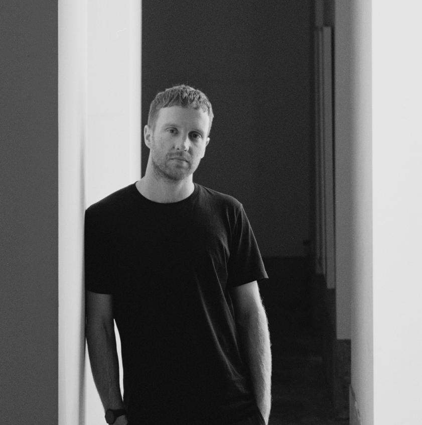
Since joining the est living editorial team as features writer in early 2022, Holly has penned countless pieces on exceptional architecture, design and products for estliving.com and the past eight issues of est magazine. In this issue, Holly speaks to Melbournebased architect Emma Templeton about the design of fashion designer Penelope Loorham’s South Melbourne home. Holly also takes us to four design-led retail stores to dissect where fashion and architecture converge.
#hollybeadle
RORY GARDINER
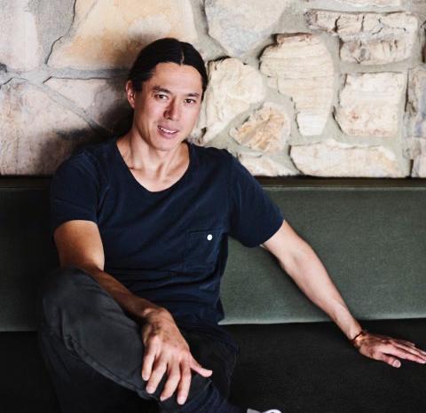
London and Melbourne-based photographer Rory Gardiner has established a name in the global design community, working with some of the world’s most renowned architects and designers. He captures light, materiality and form in a way that transforms his architectural photography into artwork. In this issue, Rory captures Templeton Architecture’s latest project, Luna, home to fashion designer Penelope Loorham.
@arorygardiner
KAREN M C CARTNEY
Karen McCartney is est living’s editorial advisor, known for her work in the world of interiors and architecture, with an impressive resume that spans print and digital media. In this issue, the best-selling author and design commentator speaks with London-based architect Ben Ridley and Sydney-based architect Ben Mitchell as part of our Where Architects Live series. You can also listen to Karen’s conversation with Kennedy Nolan founders and principal architects Rachel Nolan and Patrick Kennedy as part of our latest podcast, This Much I Know
@mccartneyk
ANSON SMART
Sydney-based photographer Anson Smart captures beautiful food, spaces and places. Studying at San Francisco’s College of Fine Arts, he returned to Australia to begin his photography career in Sydney. Twenty years later, Anson has established a portfolio shaped by the work of the world’s best creatives across editorial, advertising and published books. As part of this issue, Anson photographed architect Ben Mitchell’s family home in Mosman, Sydney.
@smartanson
est magazine
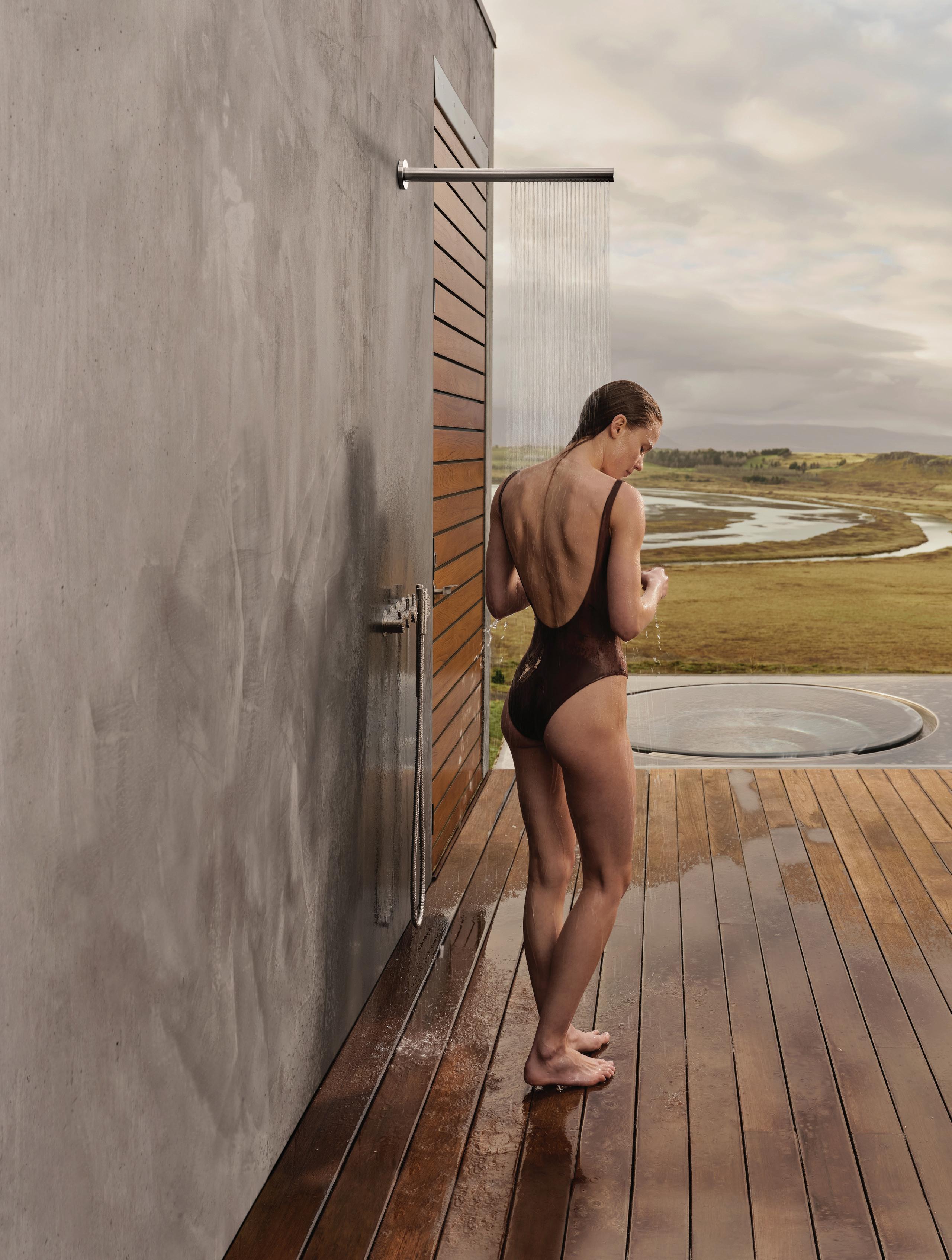
Elemental living VOLA stainless steel, bringing together natural beauty and pure form.
Shower and hand-shower in brushed stainless steel. Explore the Elemental living story vola.com/on-design. VOLA DESIGN PTY. LTD. 94 Wellington Street | VIC 3066 Collingwood | Phone: +61 402 372 480 | sales@vola.com.au vola.com The original
5471S-081ST
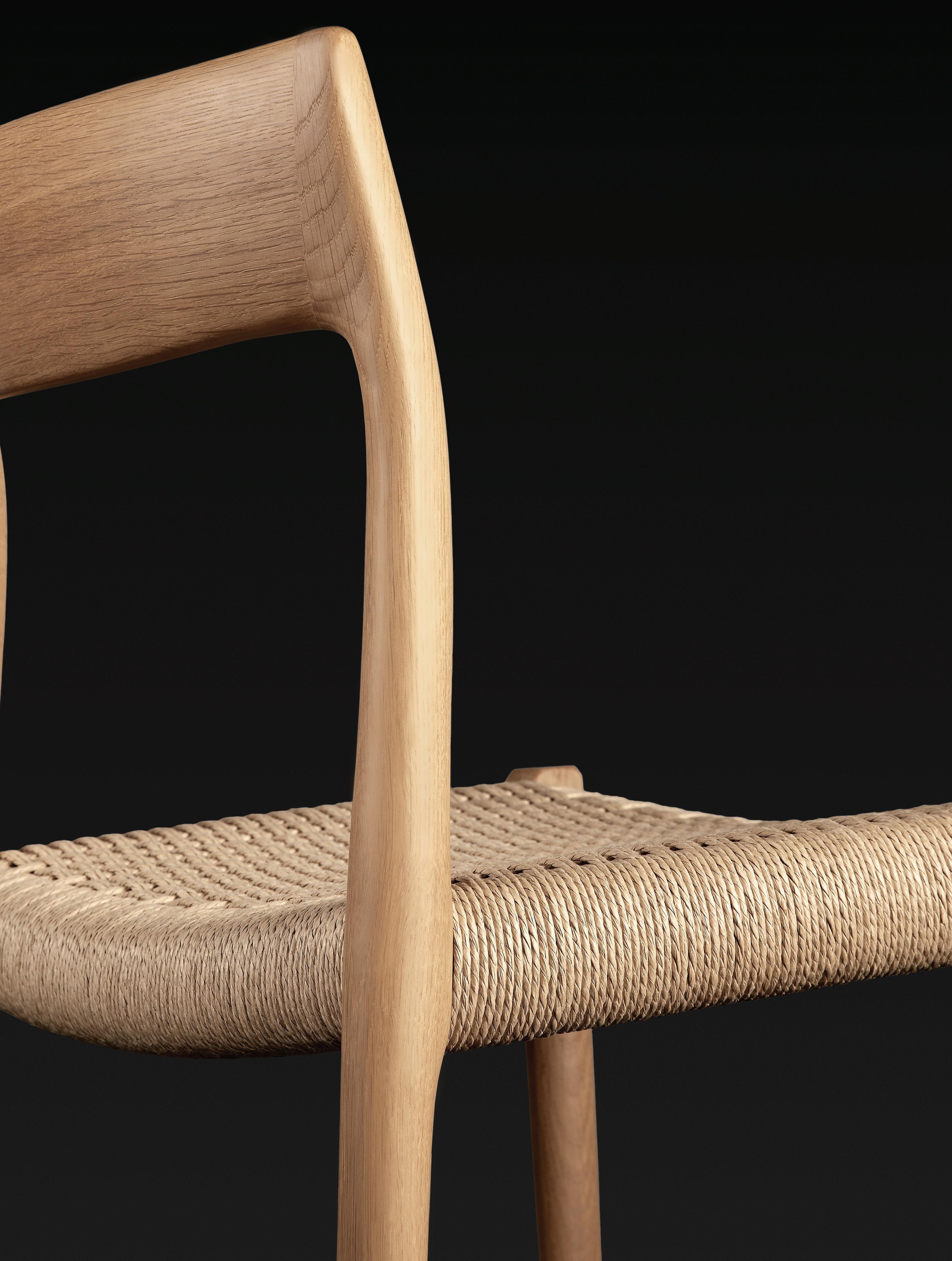
Est . 2002 R E S E R V E C O L L E C T IO N BY

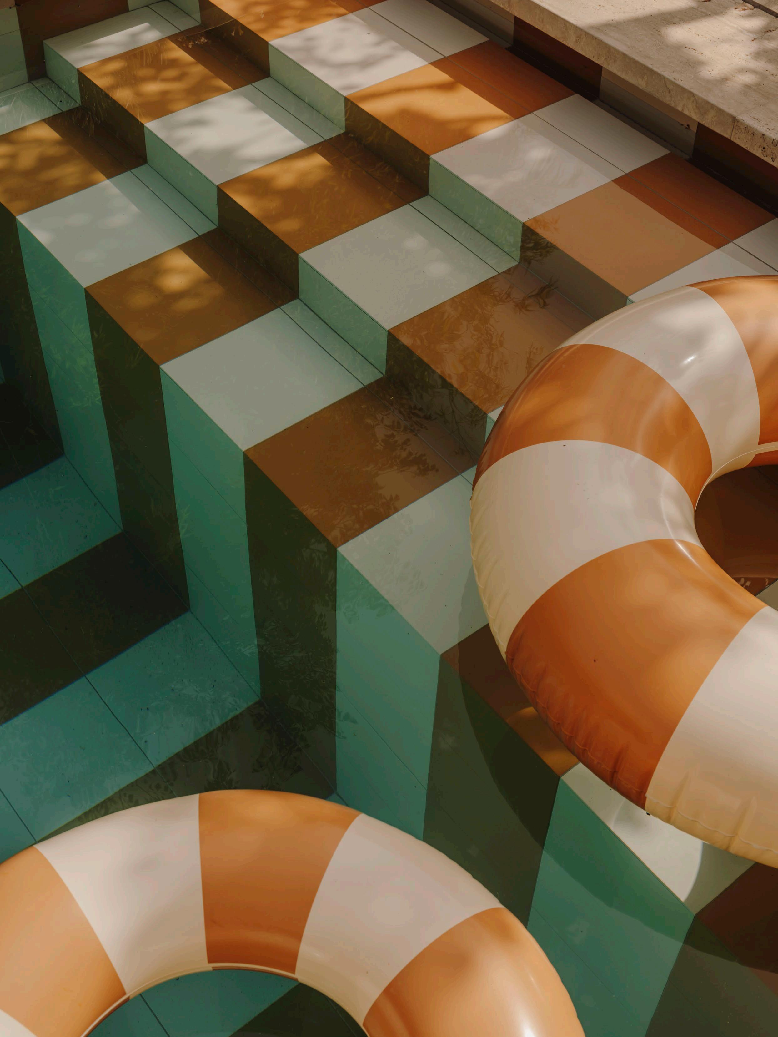
LISTEN NOW > POOLSIDE est living PLAYLIST
Location Mallorca, Spain Project Santa Teresa 34 Design Durietz Design & Development
Photography Salva López
CREDITS
est TEAM
Editor
Sophie Lewis
Visual Concept Designer
Jack Seedsman
Features Writer
Holly Beadle
Producer & Product Editor
Brigitte Craig
Editorial, Social Media &
Video Coordinator
Lidia Boniwell
Marketing Coordinator
Emerald Ford
Sales Coordinator
Chloe Rogerson
Partnerships Editor
Megan Rawson
Advertising & Partnerships
Mandy Loftus-Hills | mandy@estliving.com
Astrid Saint-John | astrid@estliving.com
Deb Robertson | deb@estliving.com
Nicola Siddall | nicola@estliving.com
Editorial Advisor
Karen McCartney
Managing Director
Miffy Coady
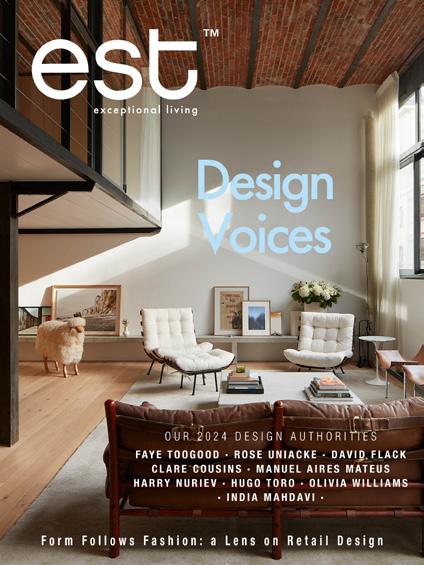
ON THE COVER
Design
DAS Studio
Photography DePasquale+Maffini
Location Paris, France
CONTACT
editorial@estliving.com advertising@estliving.com
CONNECT

CONTRIBUTORS
WORDS
Holly Beadle, Megan Rawson, Lidia Boniwell Lombardero, Sophie Lewis, Karen McCartney
PHOTOGRAPHY
Playlist: Poolside
Salva López
Design Radar
Oli Kearon, Charlie White, Courtesy of Thomas Joseph Wright
PenguinsEgg Photo for Gallery FUMI, Emerald Ford, Rory Gardiner, Courtesy of Hotel Panamera, Lorenzo Zandri, Jo Lane
Where Architects Live: Luis Laplace
Daniel Schäfer
est on film | Manuel Aires Mateus
Dan Preston
The esteemed 10: Architecture & Design Specified in feature
Where Architects Live: Felix De Montesquiou
DePasquale+Maffini
The esteemed 10: Multidisciplinary Design Specified in feature
Common Thread
Shannon McGrath
The Architecture of Fashion
Adriano Mura, Angela Hau, Kris Tamburello, James Nelson
The Library
Benoit Florençon
Style Guide
Rory Gardiner
Where Architects Live: Ben Ridley
Christian Brailey, Lorenzo Zandri, Jack Harding
Where Architects Live: Ben Mitchell
Anson Smart
This Much I Know: Kennedy Nolan
Derek Swalwell
Return to Puglia
Cosimo Calabrese
The Detail
Anson Smart, Daniel Schäfer, Piet-Albert Goethals, Yaseera Moosa, Courtesy of Kelly Wearstler
Back Cover
Daniel Schäfer
est living acknowledges the Traditional Owners of the land on which we work, the Wurundjeri Woi Wurrung of the East Kulin Nation. We pay respect to their Elders past, present and emerging.
est magazine


POOL TILES FOR YOUR DREAM POOL
GERMAN-MADE AMANO ICE BLUE
25X25MM CERAMIC POOL TILES
‘BISCAYNE’ BY KWD
PHOTOGRAPHER – ARMELLE HABIB
NEW RELEASE
chateau orlando x cc tapis @cc_tapis @olikearon
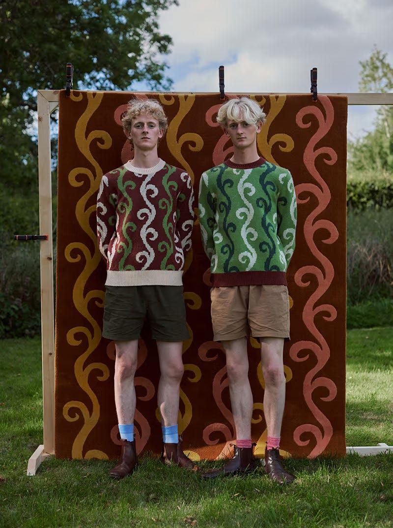
ARCHITECT
fala.atelier @fala.atelier @arorygardiner

DESIGN RADAR
Jack Seedsman leads visual concepts and creative in est magazine, on estliving.com and across est living channels. Always pushing new and different design perspectives, Jack shares noteworthy projects, products and art on his radar in 2024.

ARTIST
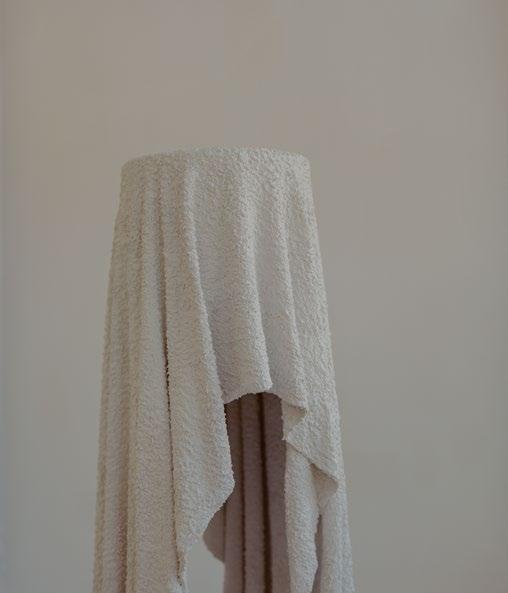
CLOUD PLINTH
Plinth Exhibition for Misc Objet 'Ghost Plinth' by Melbourne-based multidisciplinary designer Charlie White explores the simple function of a plinth and its novel ability to defy gravity. The ghost-like form is made from discarded towels soaked in concrete, as a lighter counterpart to the typical fluted column. @charliewhitewhite

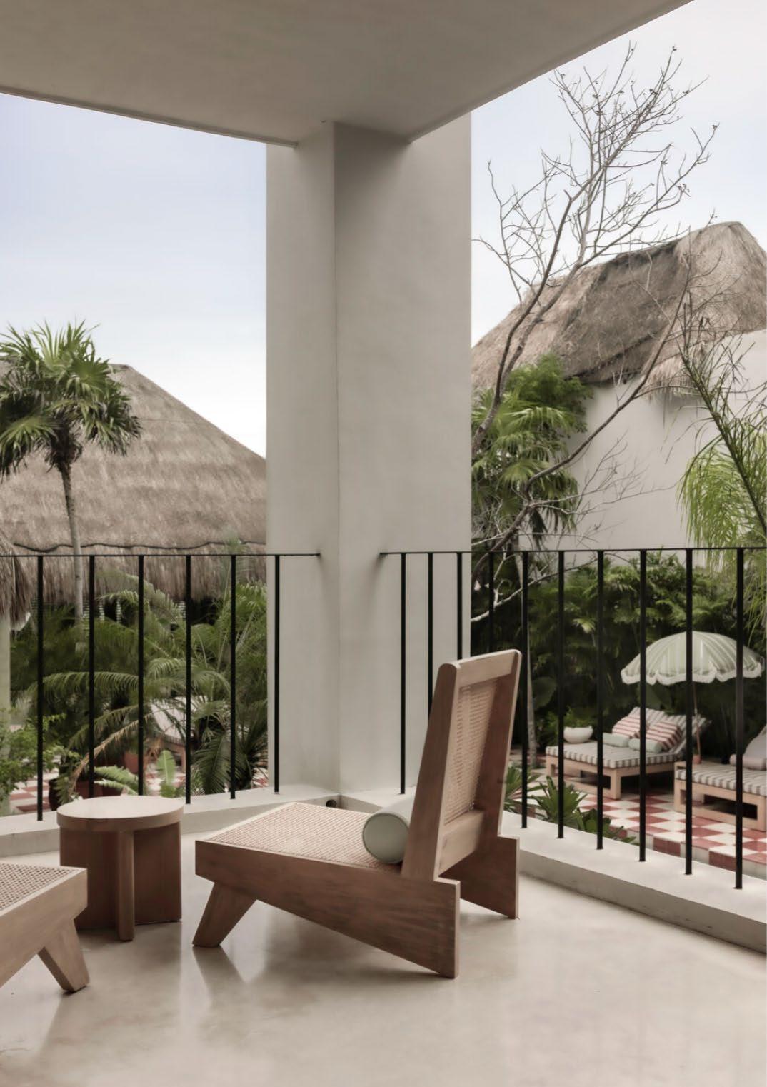
Hotel Panamera Tulum @hotelpanamera DESIGN DESTINATION
EXHIBITION
BOX by MaxLamb at Gallery FUMI @gallery_fumi @penguinseggphoto
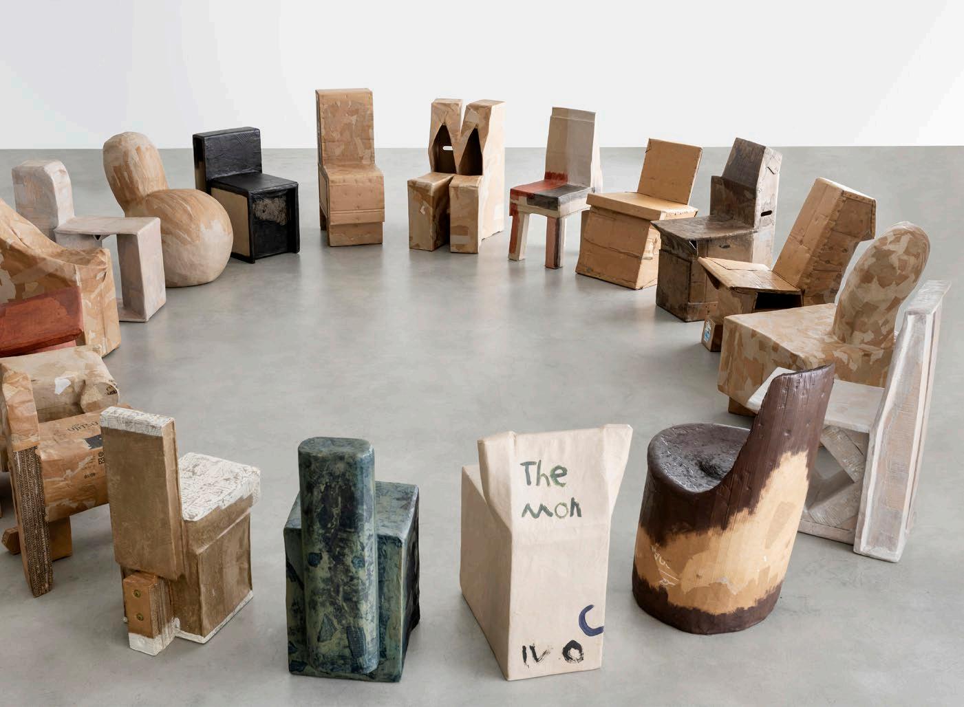
PROJECT
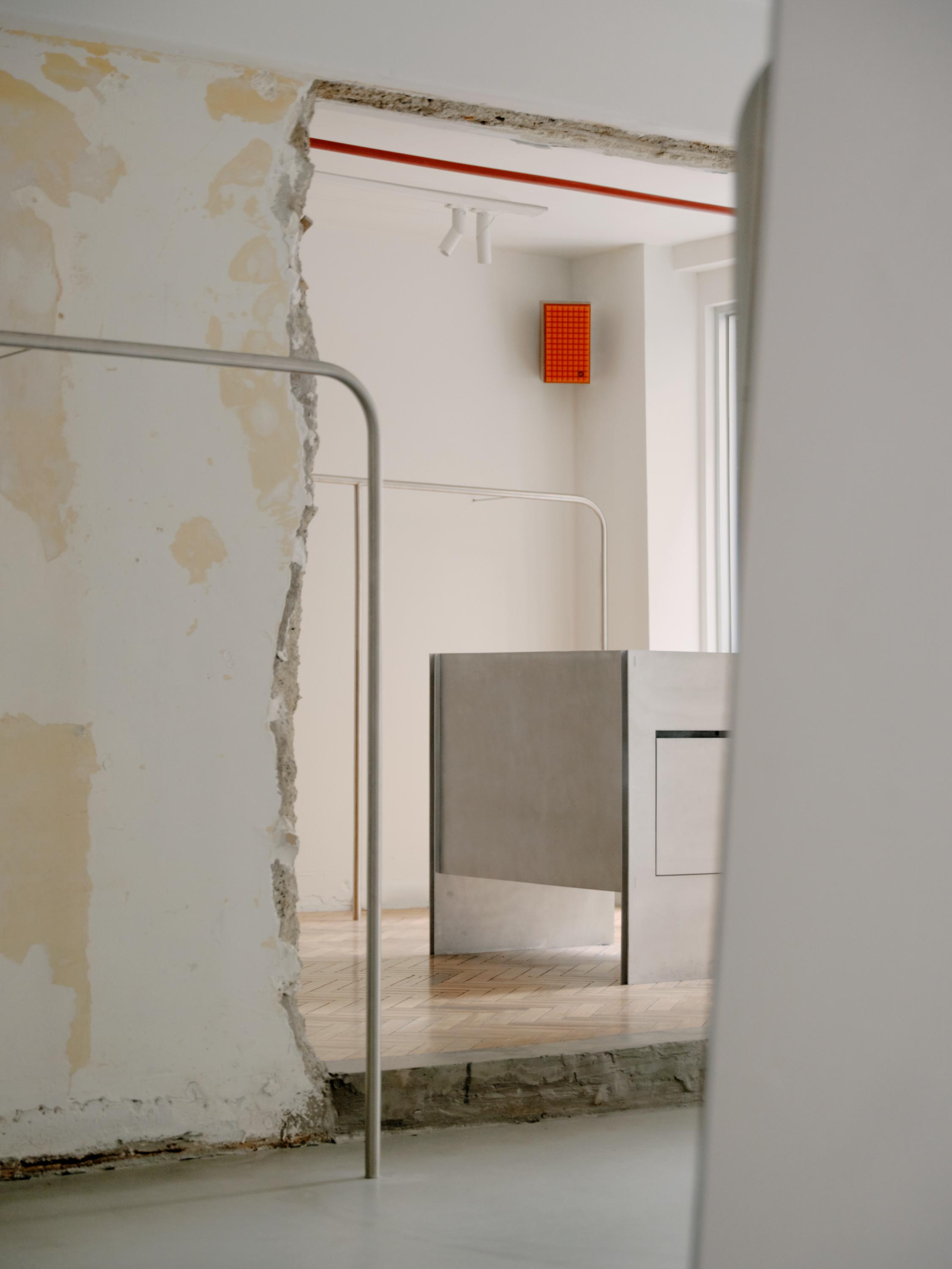
Mithimnis Apartment by Molonglo & Royffe Flynn @royffeflynn @ lorenzozandri
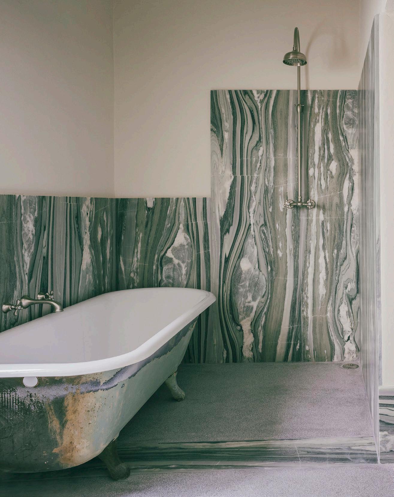
ARTIST
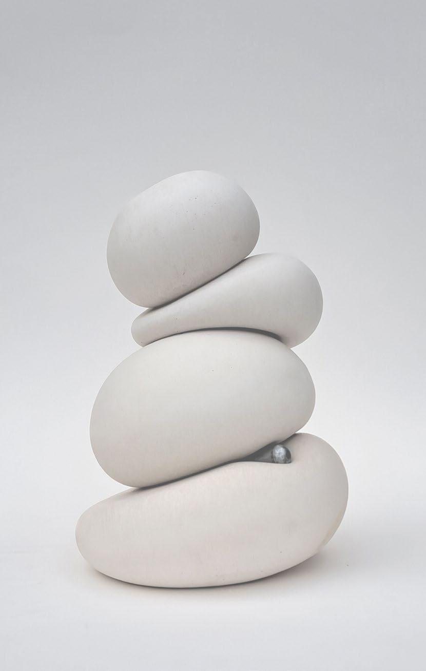
JO LANE
Artist Jo Lane's sculptures explore a soft and tactile sensibility through contrastly solid materiality. @__jolane__
19
DESIGNDESTINATION
199-201 LITTLE COLLINS STREET MELBOURNE, AUSTRALIA NOW OPEN

Join us as we reflect on a year of exceptional design. Watch our best-loved architectural films, step inside the most memorable homes in Australia and abroad and get to know the leading landscape designers and premium builders that shaped 2023. SEE THE BEST OF EST 2023 >
Proudly
best of est ™
supported by

HANDCRAFTED IN FRANCE

sculptfireplaces.com.au JC BORDELET LEA 998

WHERE ARCHITECTS LIVE LUIS LAPLACE & CHRISTOPHE COMOY
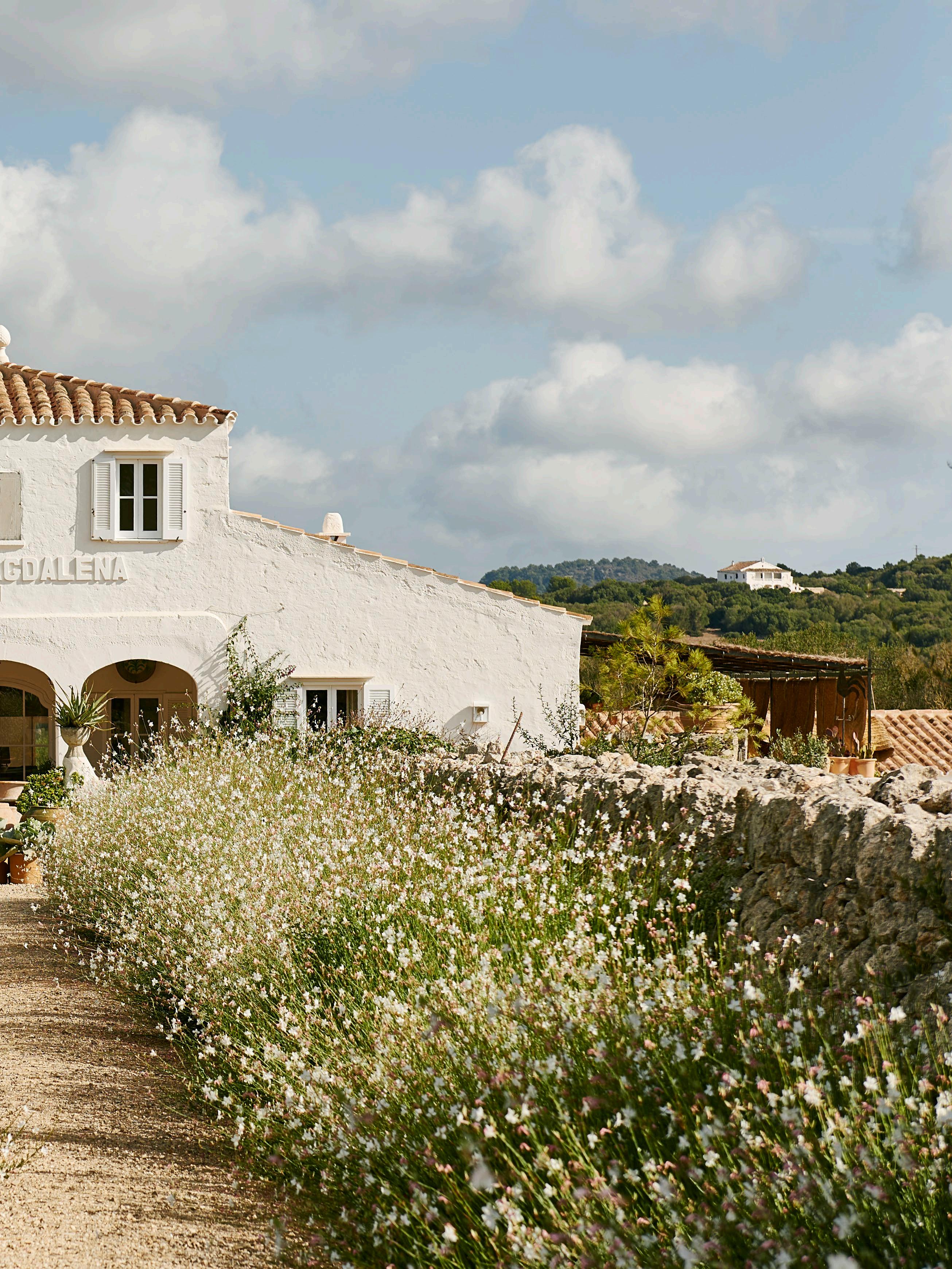
Renowned for their ability to weave together the threads of tradition and modernity, architect Luis Laplace and his partner in life and business, Christophe Comoy, are the creative duo behind architectural and interior design practice Laplace.
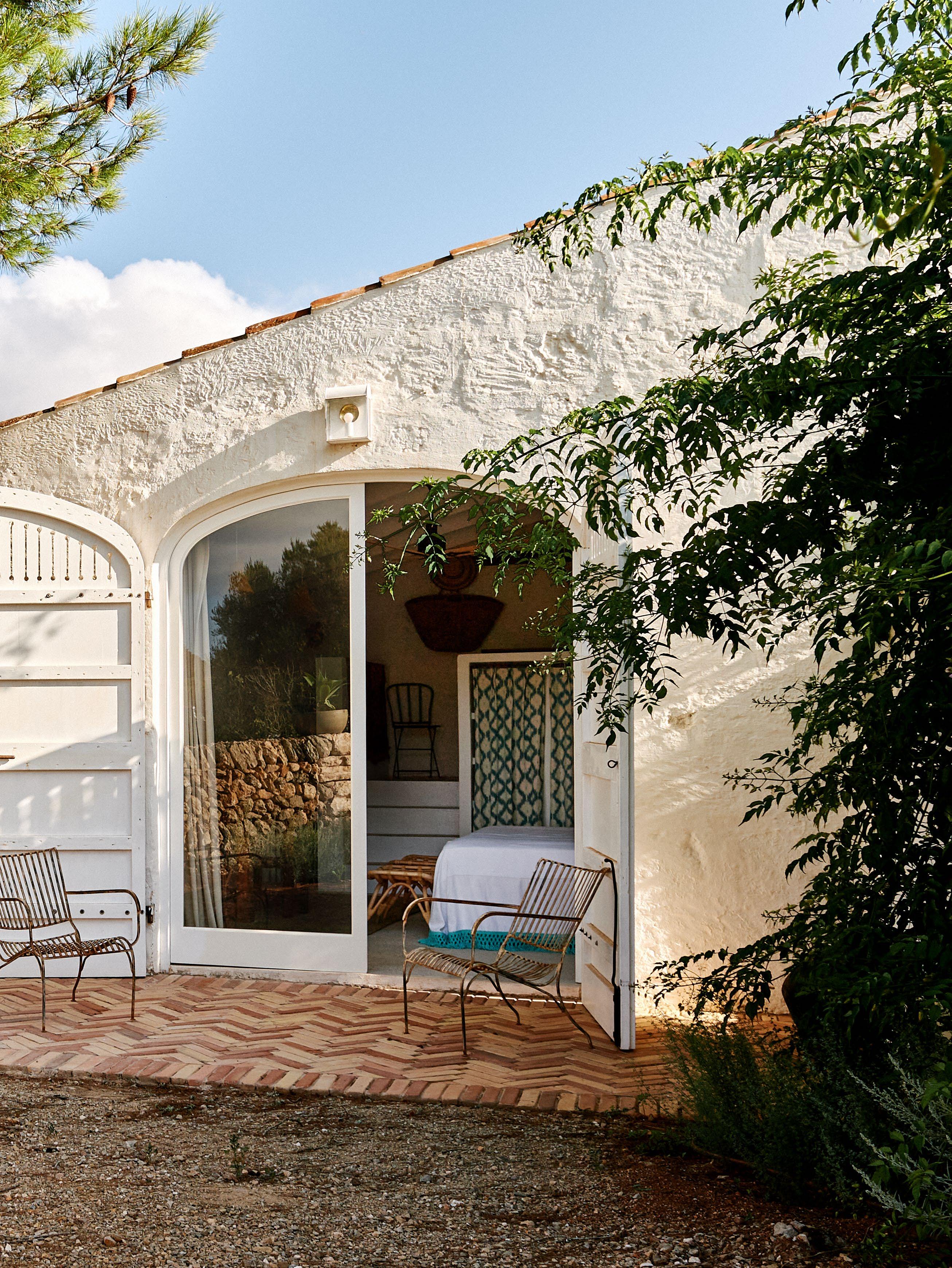
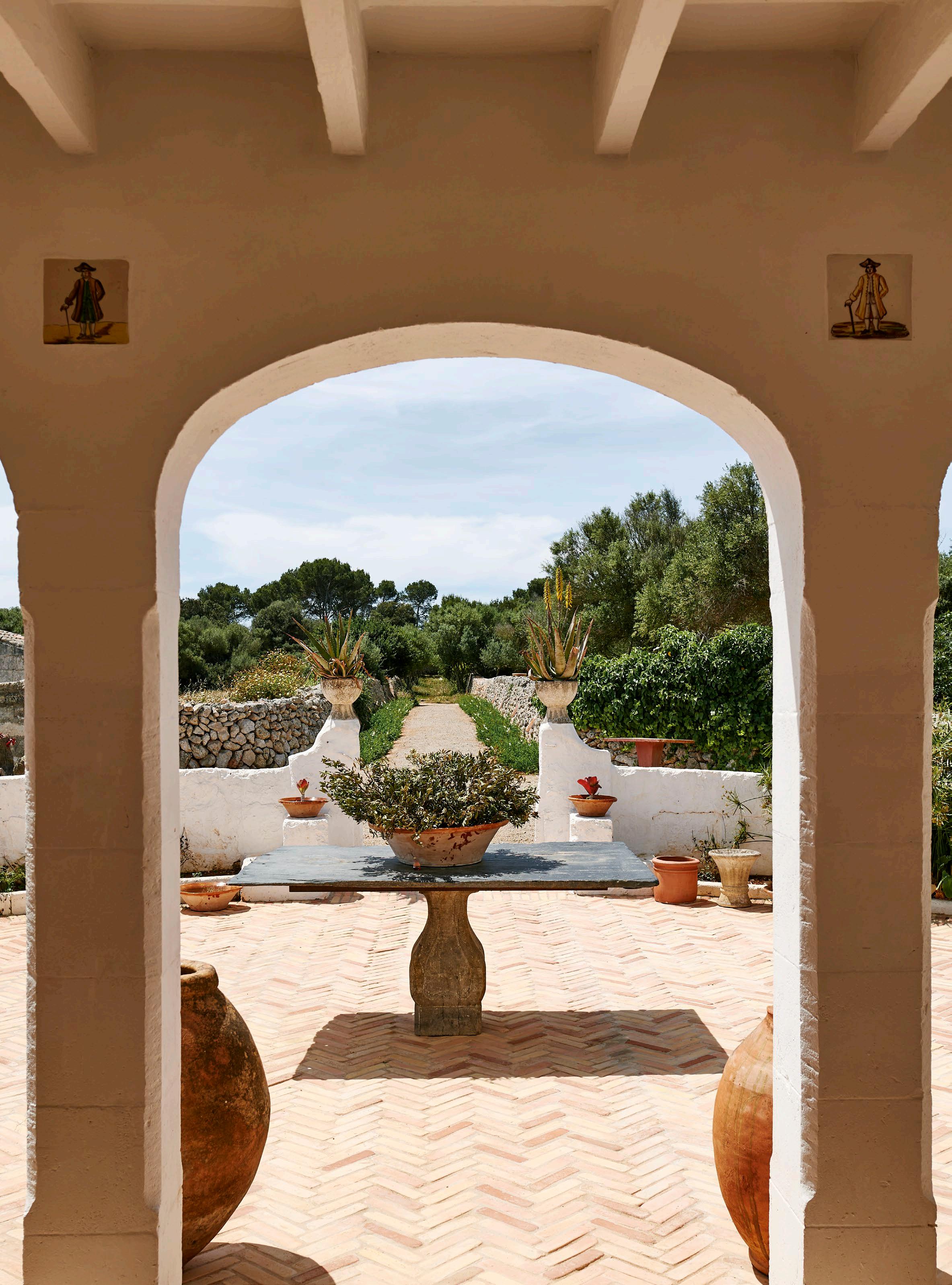
Founded in Paris in 2004, Laplace is well-regarded for an artistic acumen that eclipses creative boundaries and champions art and craftsmanship. Laplace combines a contemporary sensibility with respect for history and context to create soulful, timeless spaces. The spaces the practice designs each tell a unique story of artistry under their expert curation, and Laplace and Comoy’s own home 'Casa Santa Magdalena' in Menorca, provides the perfect testament. Overflowing with treasured fleamarket finds, their Menorcan finca is an ode to provincial life, preservation, spirit and Mediterreanean resplendence.
LOCATION | Menorca, Spain DESIGN | Laplace
PHOTOGRAPHY | Daniel Schäfer
ADDITIONAL WORDS | Megan Rawson
est magazine ISSUE #51


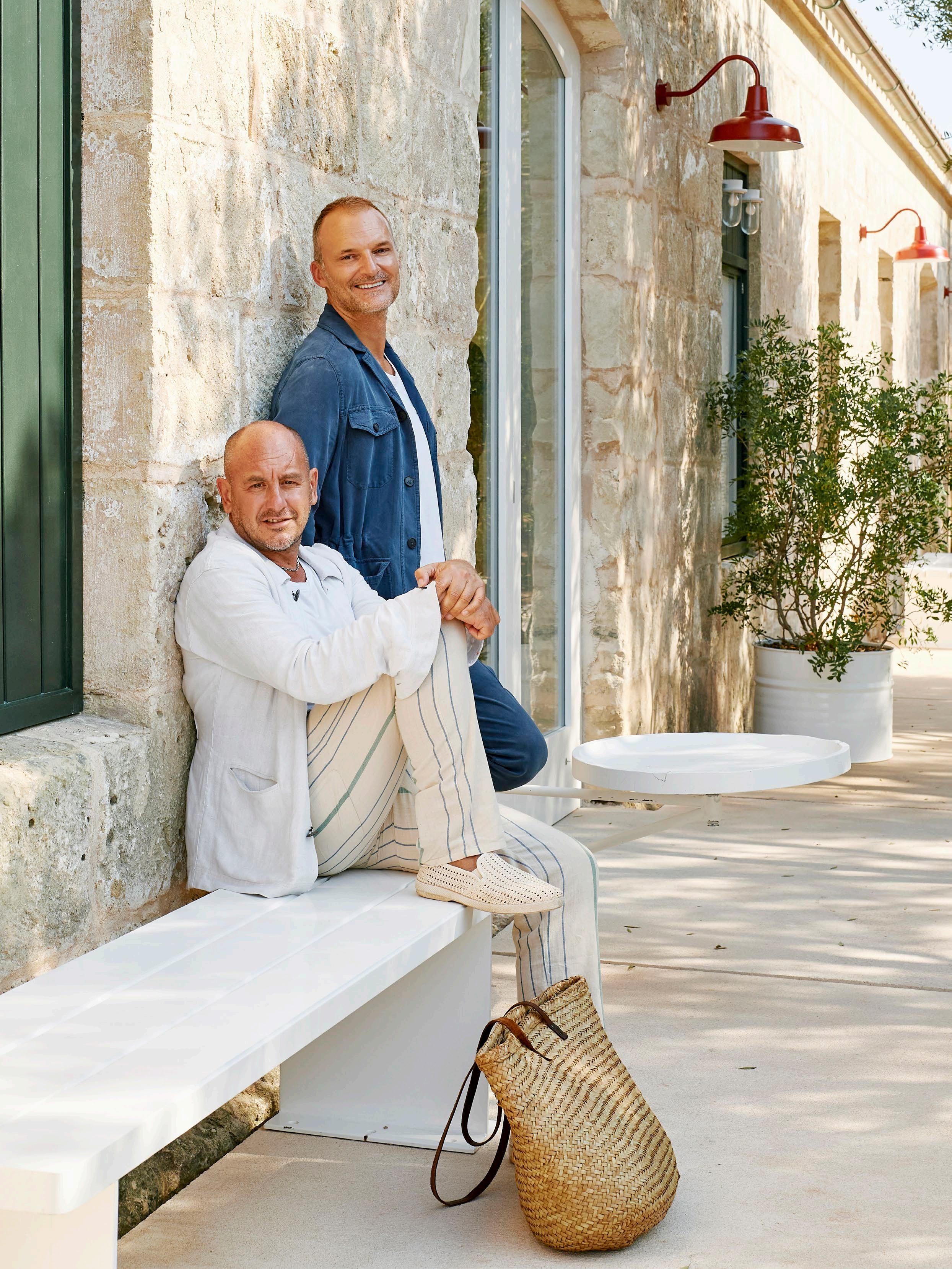 Architect Luis Laplace and Laplace CEO
Christophe Comoy.
You were first commissioned to design a Menorcan residence for Ursula Hauser before converting a former military hospital on the island into the Mediterranean headquarters of gallery Hauser & Wirth. Had you spent much time on the island before you embarked on these projects?
Luis: Yes, we had initiated a project in 2017 for Ursula in Menorca, 'Casa Xaloc', which was completed by the end of Summer 2019, providing us with familiarity with the island. This prior engagement allowed us to develop a deep understanding of Menorcan aesthetics, culture, and architectural nuances that lay a solid foundation for subsequent projects, including converting a former military hospital into the Mediterranean gallery of Hauser & Wirth.
How did this work lead to you considering a place of your own on the island of Menorca?
Christophe: As we immersed ourselves in this project, the idea of having our own place on Menorca naturally evolved. The experience of designing and engaging with the unique character of Menorcan spaces ignited a desire to create our personal haven, prompting us to consider a place of our own on this picturesque island.
What initially drew you to ‘Santa Magdalena’?
Luis : Santa Magdalena, with its history as an old farm, immediately captured our attention as a property with immense potential. The allure of its historical past and the intrinsic charm of an old farm resonated with us, sparking a vision for its transformation into a personal sanctuary. The moment we set eyes on Santa Magdalena, we recognised its unique qualities. We envisioned the possibilities, solidifying our
decision to make it our own place on the beautiful island of Menorca.
Can you shed some light on Santa Magdalena’s past life?
Christophe: Santa Magdalena reveals a charming history dating back to the 1890s. It was once a farm dedicated to cheese production, and its agricultural heritage echoes throughout the restored space, informing the design choices and creating a unique ambience.
The transformation from a cheese-producing farm to a meticulously restored home adds a layer of historical richness, allowing its heritage to live on in a contemporary context.
You collaborated with Menorcan artisans and architects to restore ancestral techniques within Santa Magdalena. Can you share some specific examples or anecdotes from this process?
Luis: We were deeply committed to preserving the authentic Menorcan essence in the restoration of Santa Magdalena and collaborated closely with local artisans and architects. One notable aspect of this collaboration was the meticulous restoration of ancestral techniques that define the unique character of Menorcan architecture.
We initiated a comprehensive renovation by carefully dismantling the entire interior of the house, allowing us to uncover its historical layers. During this process, we made a concerted e ff ort to incorporate traditional Menorcan elements into the design. For instance, we worked closely with Menorcan artisans to apply lime paint, creating a distinctive layered and thick white finish reminiscent of the island's cultural heritage.
DESIGN VOICES
est magazine
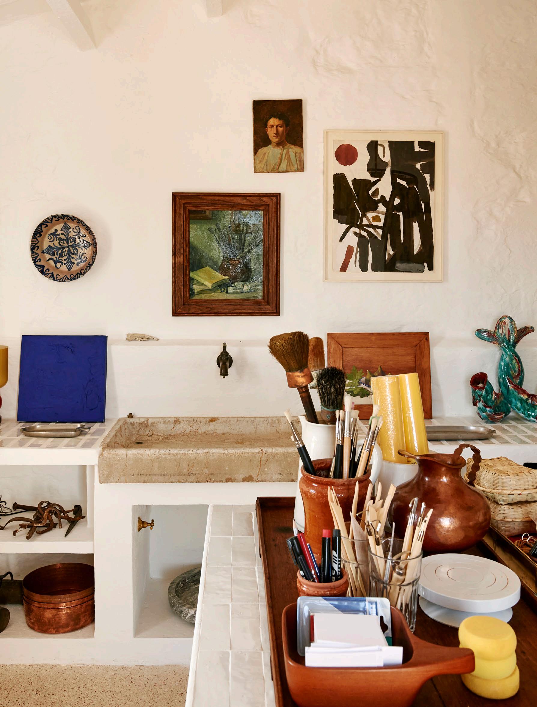
 A salvaged sink that once belonged to a boat is set within a countertop clad in Moroccan Zellige tiles.

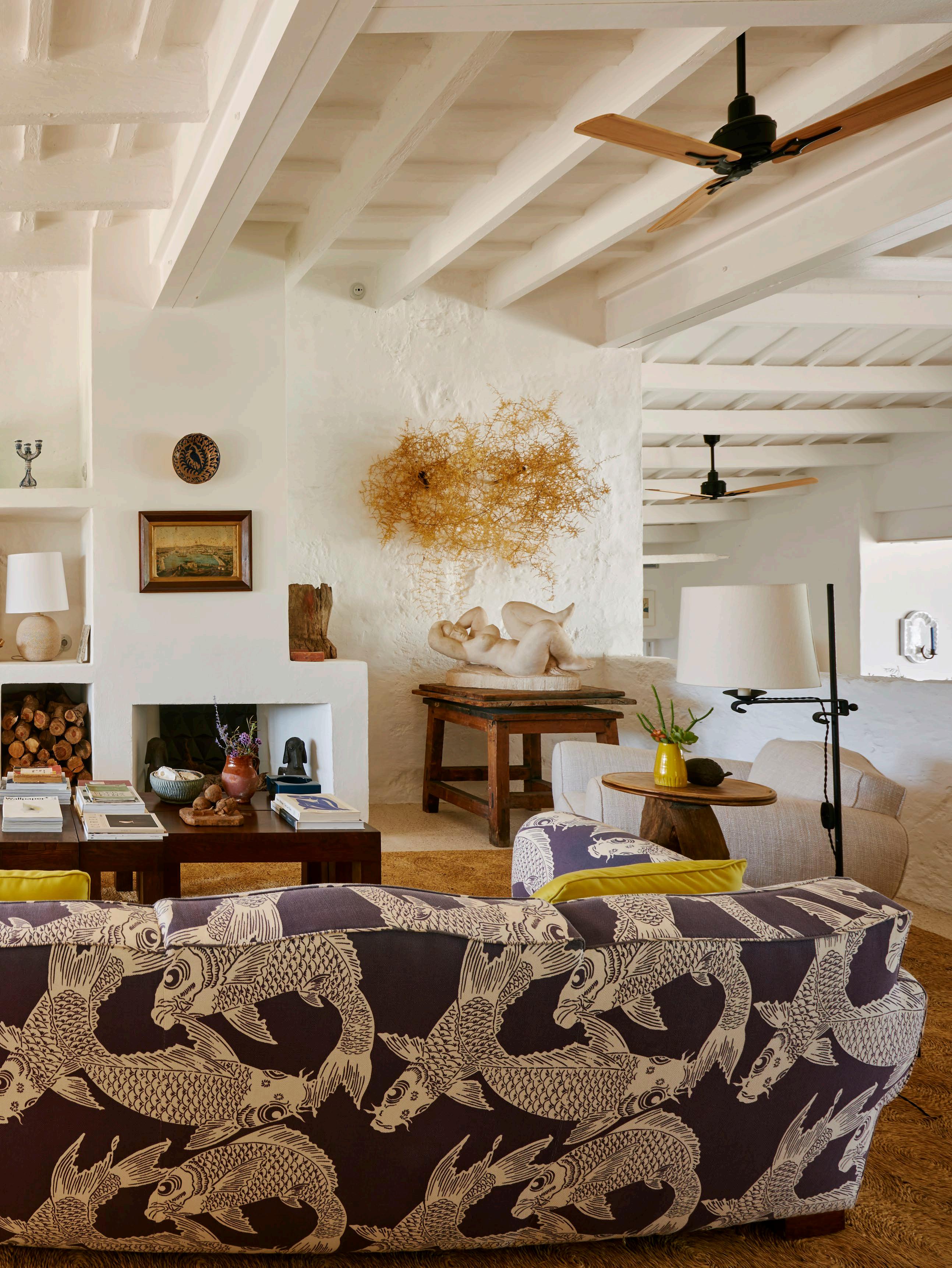
The exposed ceiling beams were painted in white limewash paint to o er a neutral foundation to layer collected sculptural pieces and vintage furniture, including a vintage 1940s French sofa upholstered in a statement fabric.
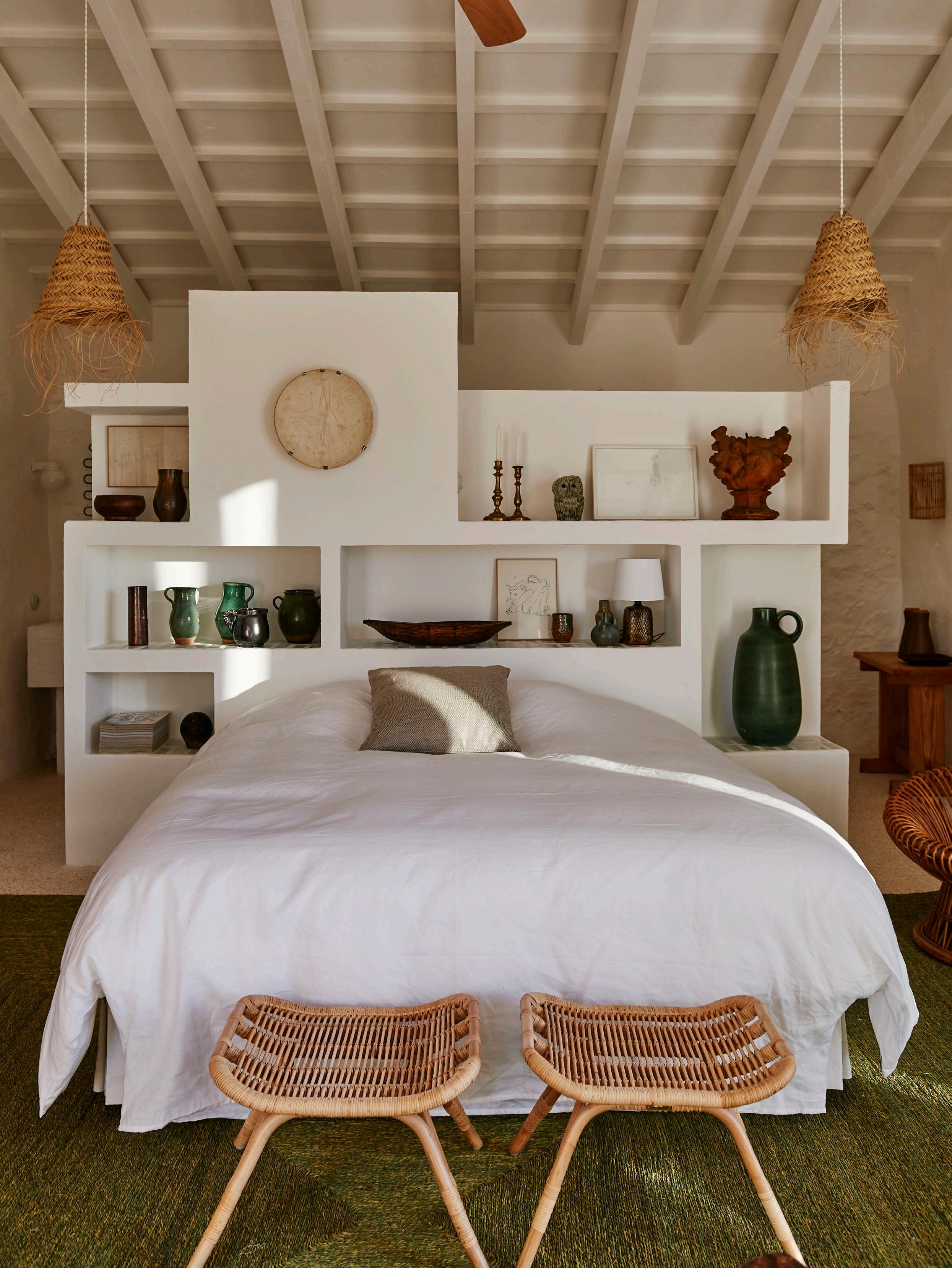 Two wicker Sika Design Monet footstools and a pair of Hangfrill-S Basket lamps from Tine K home in the bedroom.
“Throughout the home, colour is thoughtfully curated to enhance the unique character of each space, creating a dynamic and visually engaging environment that complements the island's rich heritage.”
– Christophe Comoy
How does the home reflect both of your personalities?
Christophe: The home truly reflects our distinct personalities, seamlessly blending our individual tastes and interests. The ‘Cabinet de Curiosity’, showcasing unique pieces, reflects our joint passion for ceramics and diverse works of art. Luis’ influence extends to the Atelier, where his creative pursuits unfold, while my personality is felt in the garden, highlighting my appreciation for outdoor spaces and natural beauty.
The design ethos revolves around creating a welcoming space for guests, embodying our preferences. The home is not only a personal haven but also an open invitation for those who share a similar appreciation for art, craftsmanship, and the beauty of nature.
There are unexpected moments of vibrancy in your home; what was your approach to colour?
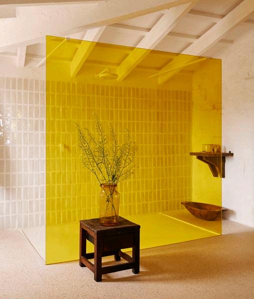
Christophe: Our approach to colour in the home is guided by a desire to inject vibrancy and personality into unexpected spaces. In the case of the bathroom, where space constraints ruled out elaborate colour schemes, we opted for a creative solution. Instead of a basic transparent glass, we introduced a splash of bold yellow tiles, a concept brought to life by Luis. This decision not only adds a touch of unconventional charm but also reflects our commitment to innovative design solutions that seamlessly integrate with the historical restoration of Santa Magdalena.
Throughout the home, colour is thoughtfully curated to enhance the unique character of each space, creating a dynamic and visually engaging environment that complements the island's rich heritage.
Your home features a curation of vintage furniture, art and objects. Can you share the unique story behind a few of these pieces?
Christophe: Our home features vintage pieces in every room of the house, each with its own unique story. Numerous
pieces have been sourced from flea markets or on the island. One standout piece is the kitchen sink, attached to the countertop with a glazed ceramic cover, which once belonged to a boat. Its maritime history adds a unique touch to our space, evoking memories of past journeys and a personal connection to nautical heritage.
Another noteworthy piece is a set of curtains adorning the cabinets, sourced from Artisanat Textile Bujosa, a traditional Mallorcan manufacturer. With a collaborative history spanning two decades, we worked with them to create a unique design, choosing a colour palette between ochre and green. Each curated item contributes to the overall narrative of our home, creating a space that is not only visually stimulating but also deeply personal and meaningful to us.
An inherent connection to nature pervades Santa Magdalena. How does this inform your daily rituals and movements within the home?
Luis: In contrast to the urban setting of Paris, where nature is limited, Santa Magdalena becomes a sanctuary that allows us to embrace and immerse ourselves in the serene beauty of the surrounding environment. This connection to nature informs our daily routines, creating a harmonious balance that enhances our well-being and enriches the overall living experience at Santa Magdalena.
Finally, do you use the home as you thought you would?
Luis: What has been surprising is the realisation of how we predominantly use the kitchen and the adjoining outdoor terrace rather than the living area, fireplace entrance, or TV room. This observation underscores the essence of Santa Magdalena as a summer house – a place where life revolves around expansive, communal spaces that invite shared moments and provide respite from the Menorcan heat. The home has, in essence, dictated our patterns of use, highlighting the success of our design in fostering a living experience that seamlessly blends with the natural rhythm of the island.
DESIGN VOICES

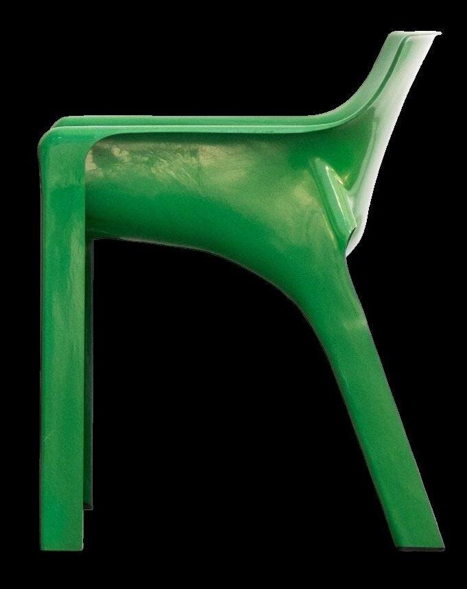
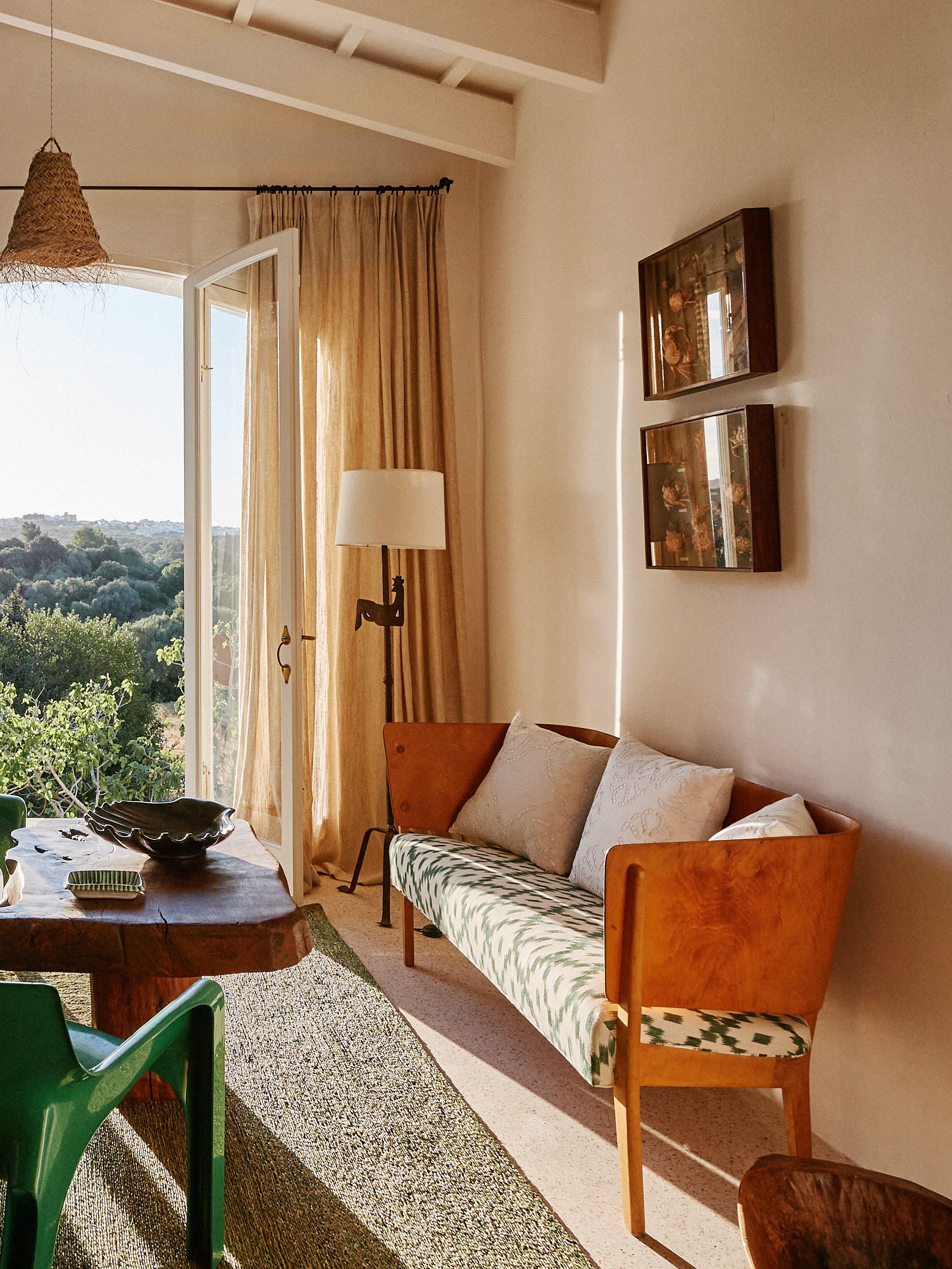 The guest bedroom’s neutral palette is punctuated by contrasting green Gaudi dining chairs designed by Vico Magistretti in 1970.

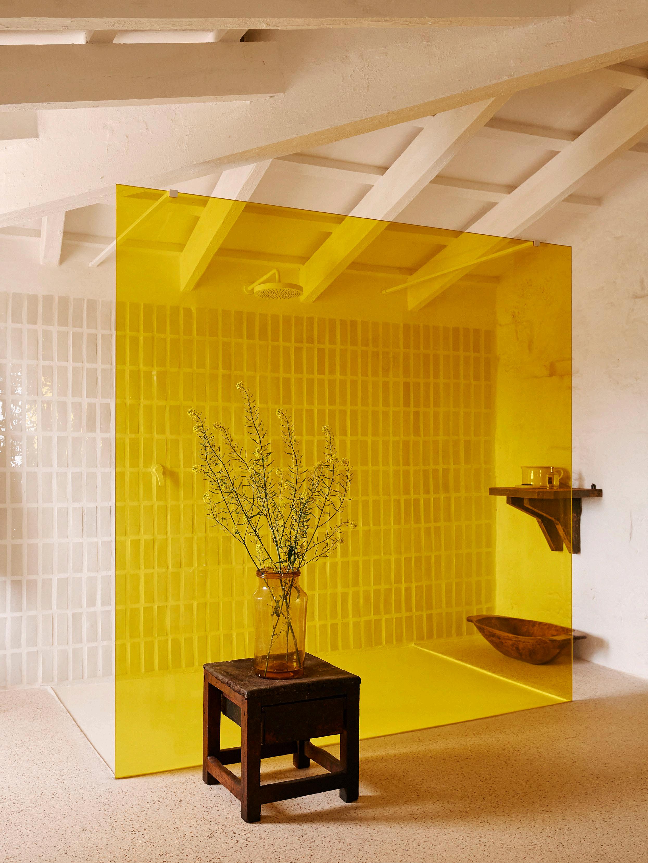
This Page: In the main bathroom, a sunshine-yellow glass shower stall o ers an element of surprise.
Opposite Page: In Christophe and Luis’ bedroom, a bed cover and curtains were both handcrafted by a Spanish seamstress from locally-sourced Mallorcan textiles. The sisal floor rug was sourced from southeastern Spain.
ISSUE #51
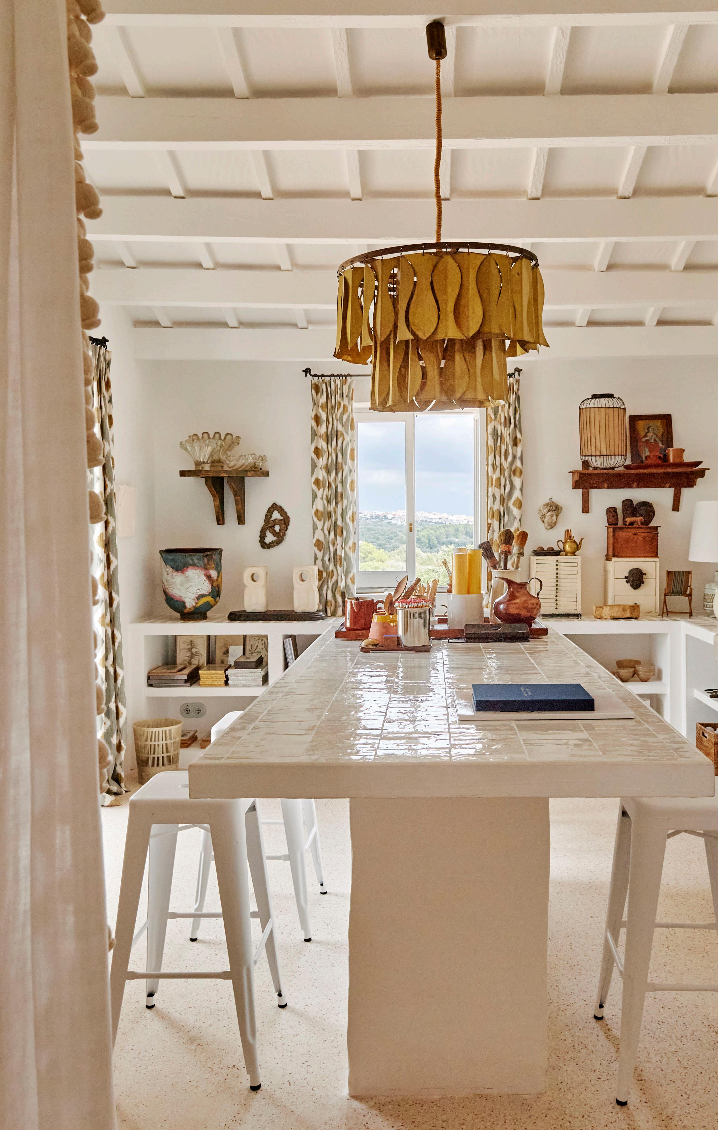
The atelier table rests on the same terrazzo floor as the rest of the kitchen and o ers a place for creativity – from work meetings to painting.

“Santa Magdalena becomes a sanctuary that allows us to embrace and immerse ourselves in the serene beauty of the surrounding environment.”
– Luis Laplace
43
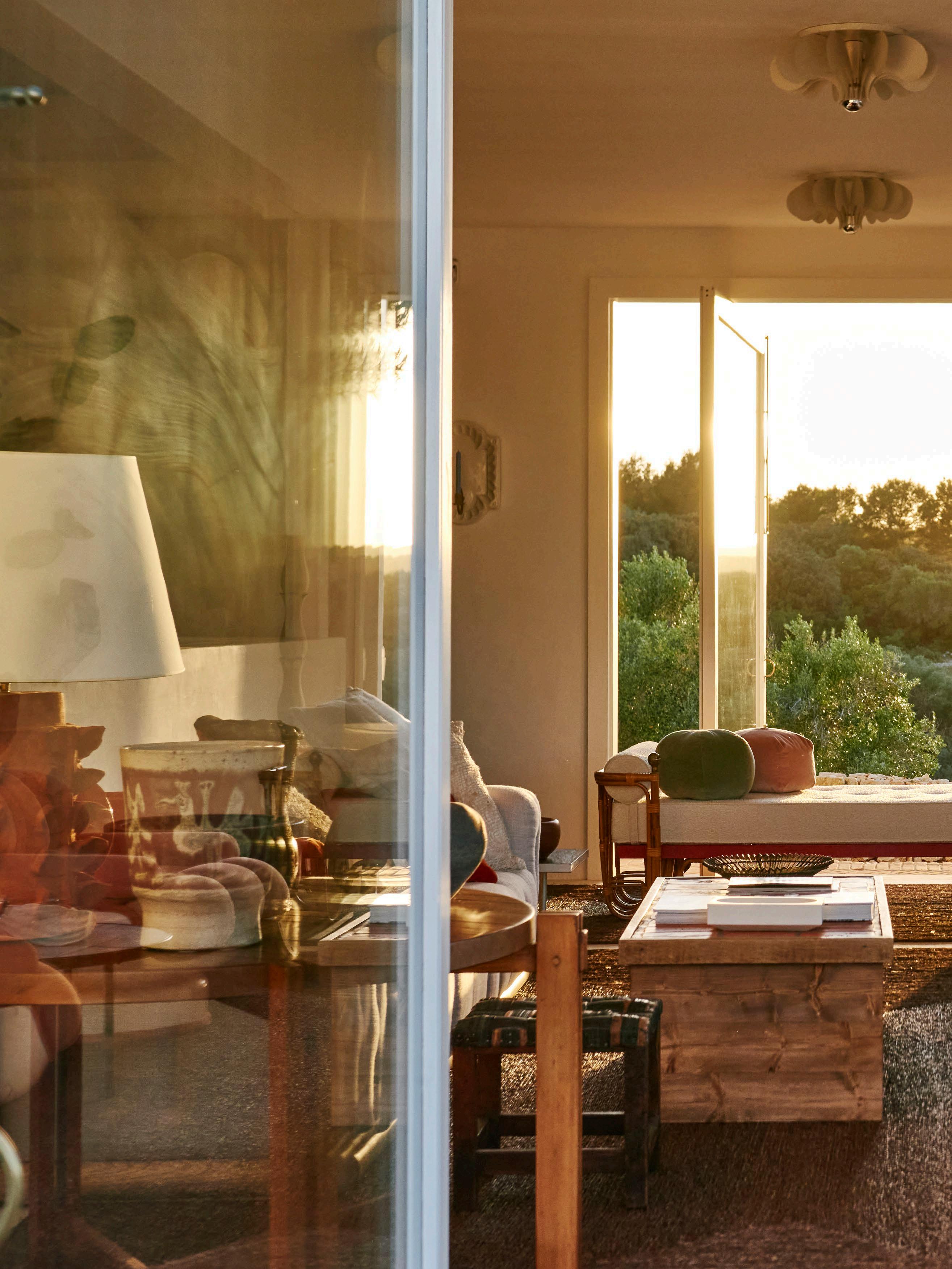
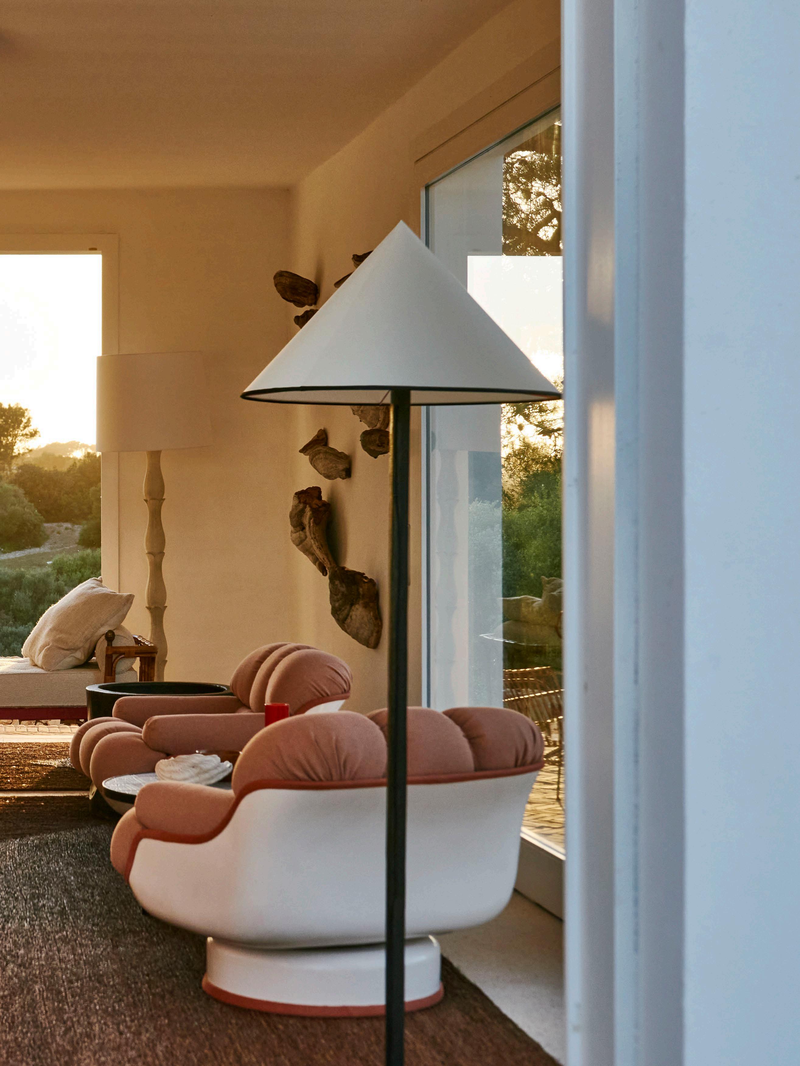
A curation of vintage pieces, including a pair of 1970s fibreglass and leather armchairs, sits atop a locally-made sisal rug to build a storied and charming aesthetic within this light-filled main living space.
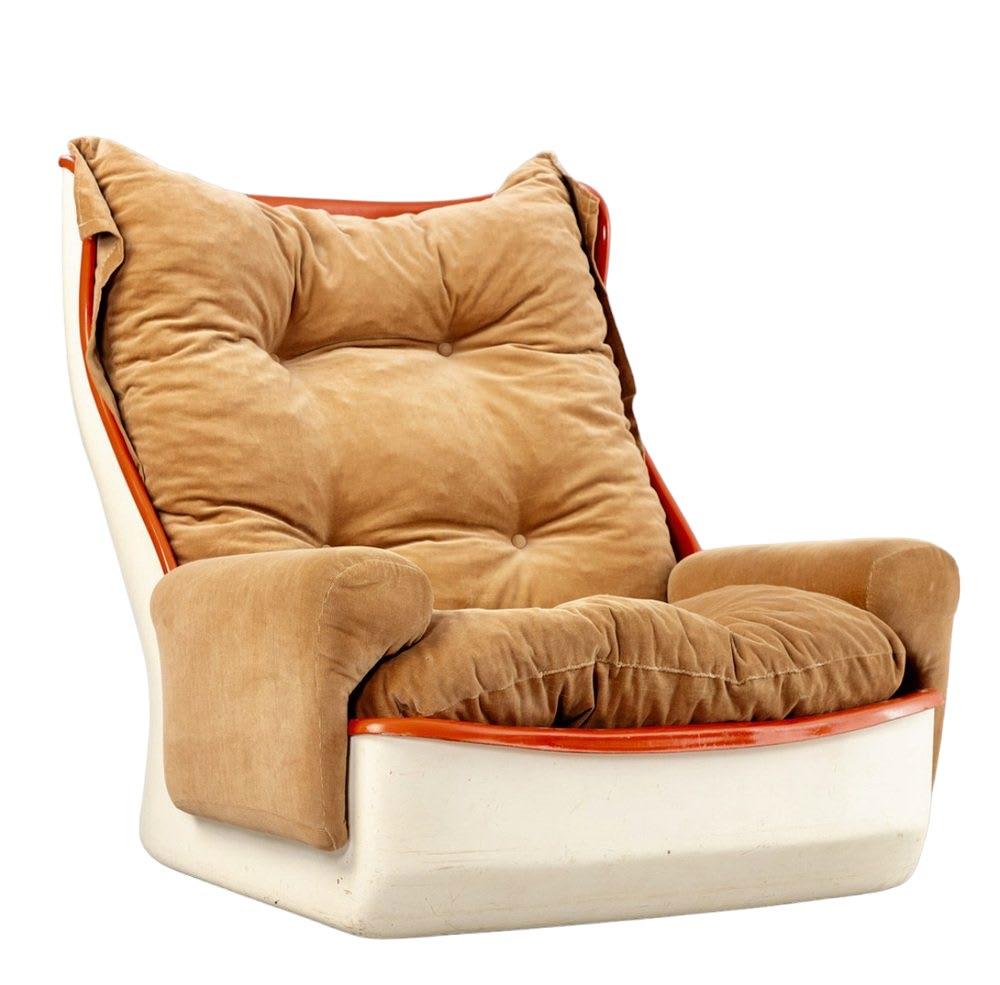
ORCHIDÉE LOUNGE CHAIR
MICHEL CADESTIN
Airborne, France 1960s
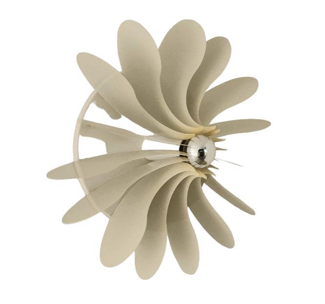
BOLIDE WALL LIGHT
HERMIAN SNEYDERS DE VOGEL
Raak, Netherlands 1968

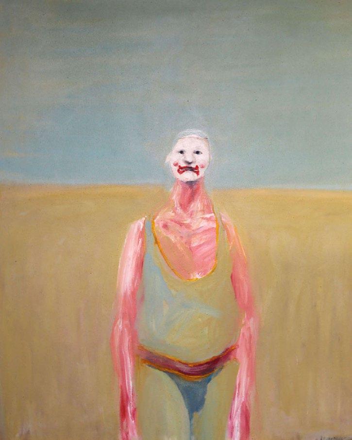
Oil on canvas 1986, La Place Antiques
ISSUE #51
LIMESTONE
PETER LEWIS PAINTS
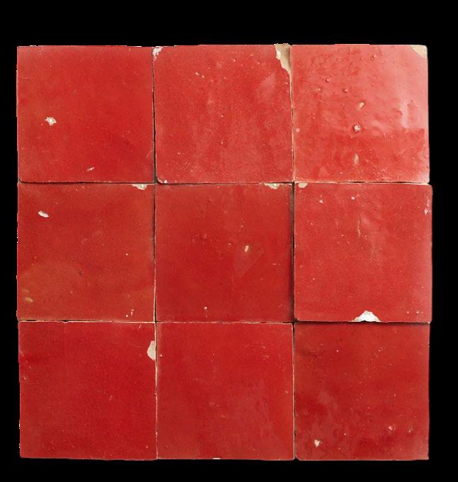
ZELLIGE PALACE RED SQUARE CLÉ TILES
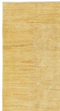
GABRA RUG HONEY HALCYON LAKE
THE CLOWN IAN HUMPHREYS
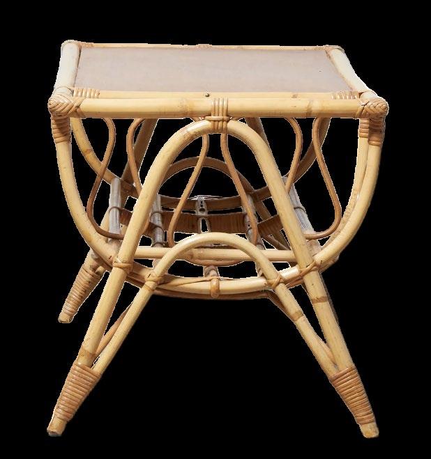
RATTAN COFFEE TABLE TIGMI
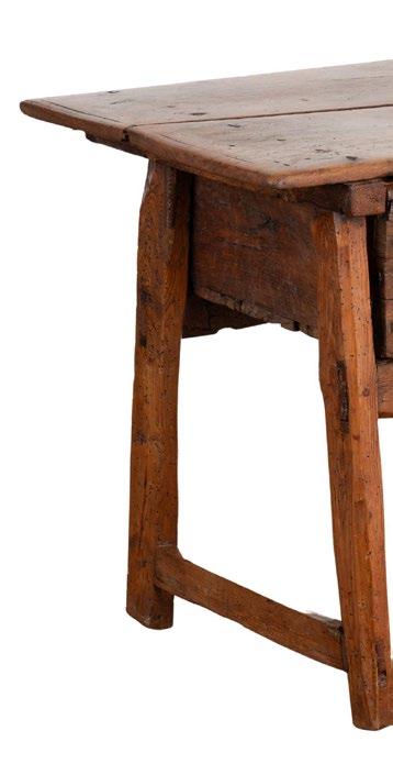
OAK SIDE TABLE
VINTAGE 1800'S
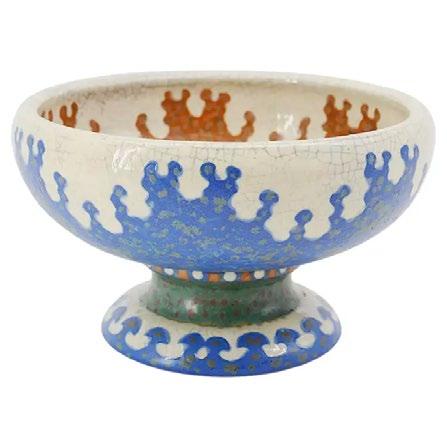
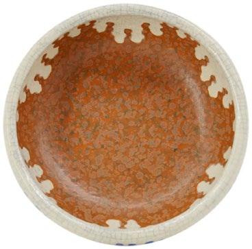
FRENCH ART DECO STONEWARE BOWL ON PEDESTAL REVERNAY
France, 1925


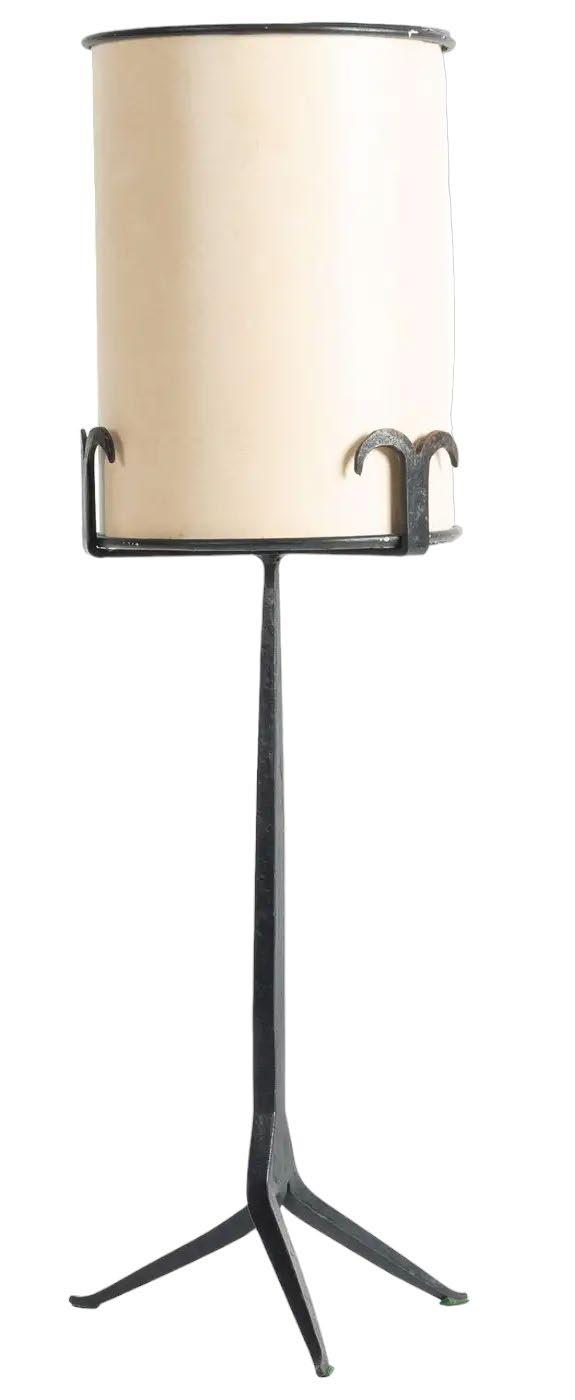
LAMPADA DA TAVOLO TRIPODE
JEAN TOURET
Marolles, France, 1950s

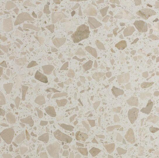
VERONO BOUTIQUE SURFACE GALLERY

LATTICE PATTERN GARDEN PLANTER 1ST DIBS
England, 20th Century
47
GAUDI DINING CHAIR
VICO MAGISTRETTI
Artemide, 1970s
ENGLISH
ODESSA PENDANT ETSY
Design Consigned x est living UNLOCKING
Future Nostalgia


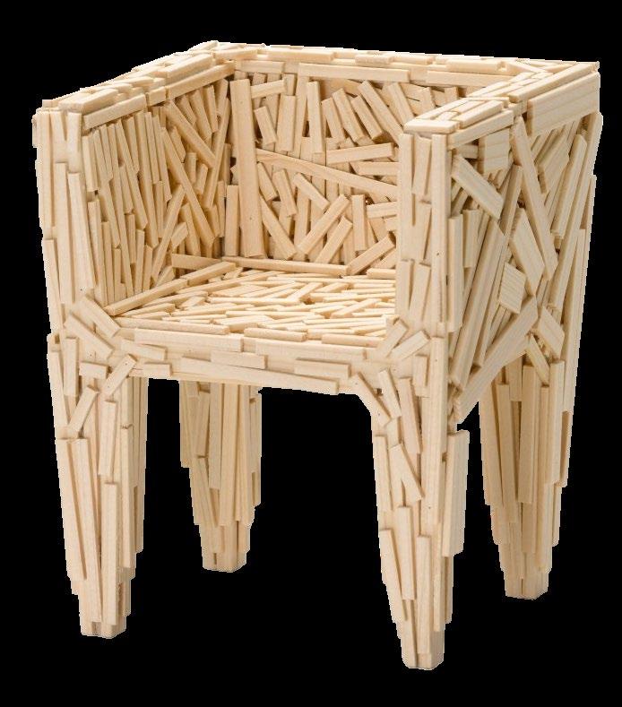
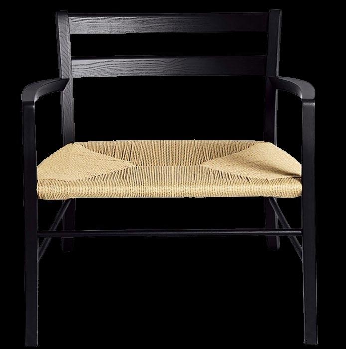
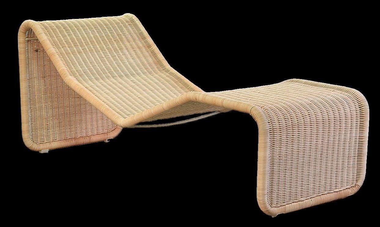
THE VALUE OF VINTAGE FURNITURE designconsigned.com.au Explore Authentic Design Pieces >

 Project Amsterdam Residence
Design Anne Claus Interiors Photography Thomas De Bruyne
FILM SERIES architects where live
 Manuel Aires Mateus
Aires Mateus
est
living

Click here to watch now >
Natural paints made by utilising the elemental cycle of earth, fre, water + air. The result is 400 natural colours with extraordinary depth, a unique textured efect, a fnish like no other.
bauwerkcolour.com

Visual Silence Colour Range in Collaboration with House of Grey London
Photo by Michael Sinclair
ISSUE #51
10 The est eemed
The est eemed 10 recognises influential voices in the architecture and design community in 2024. Criterion is based on approach, notable achievements and completed and anticipated projects.
Proudly supported by

55
DESIGN VOICES
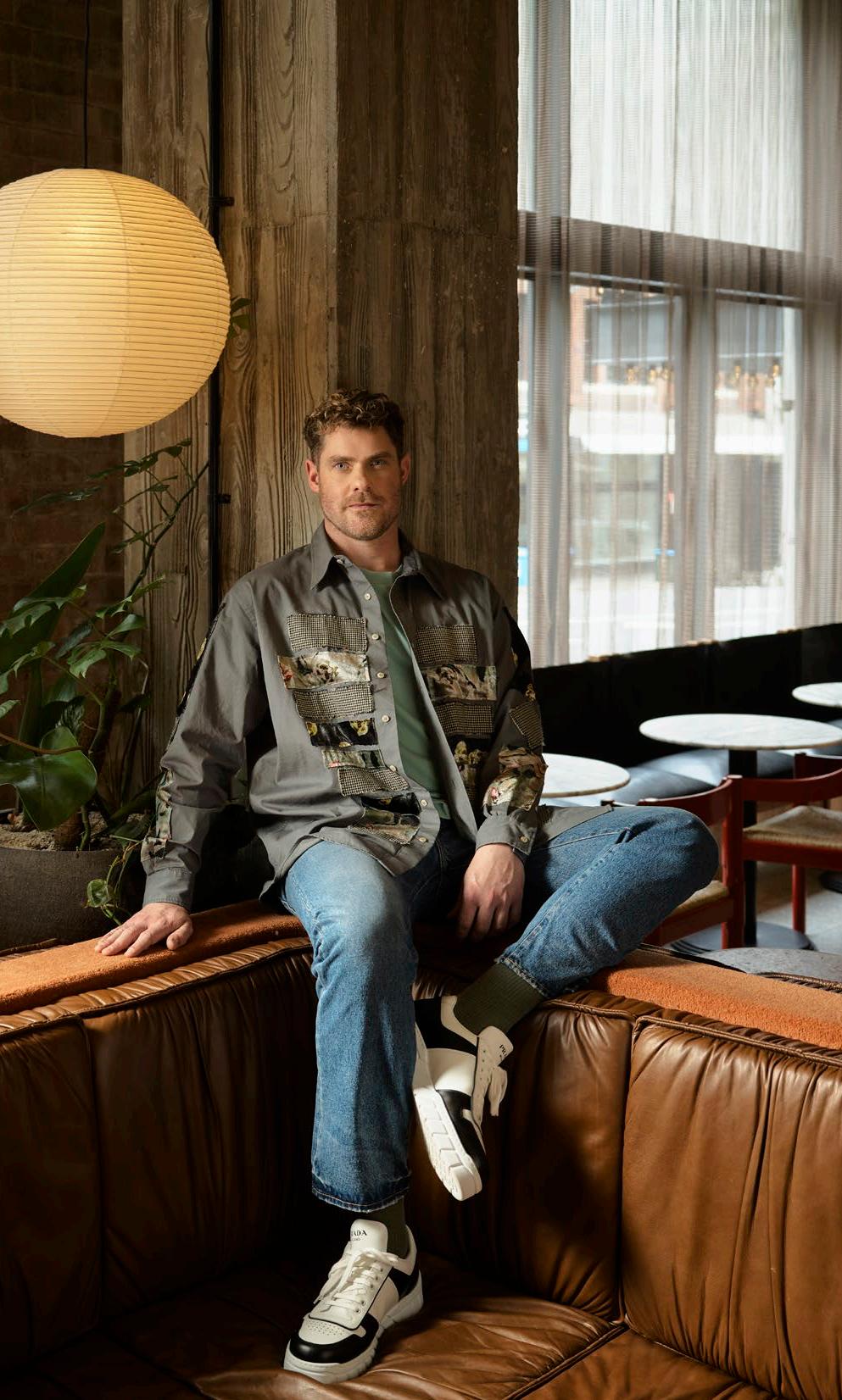



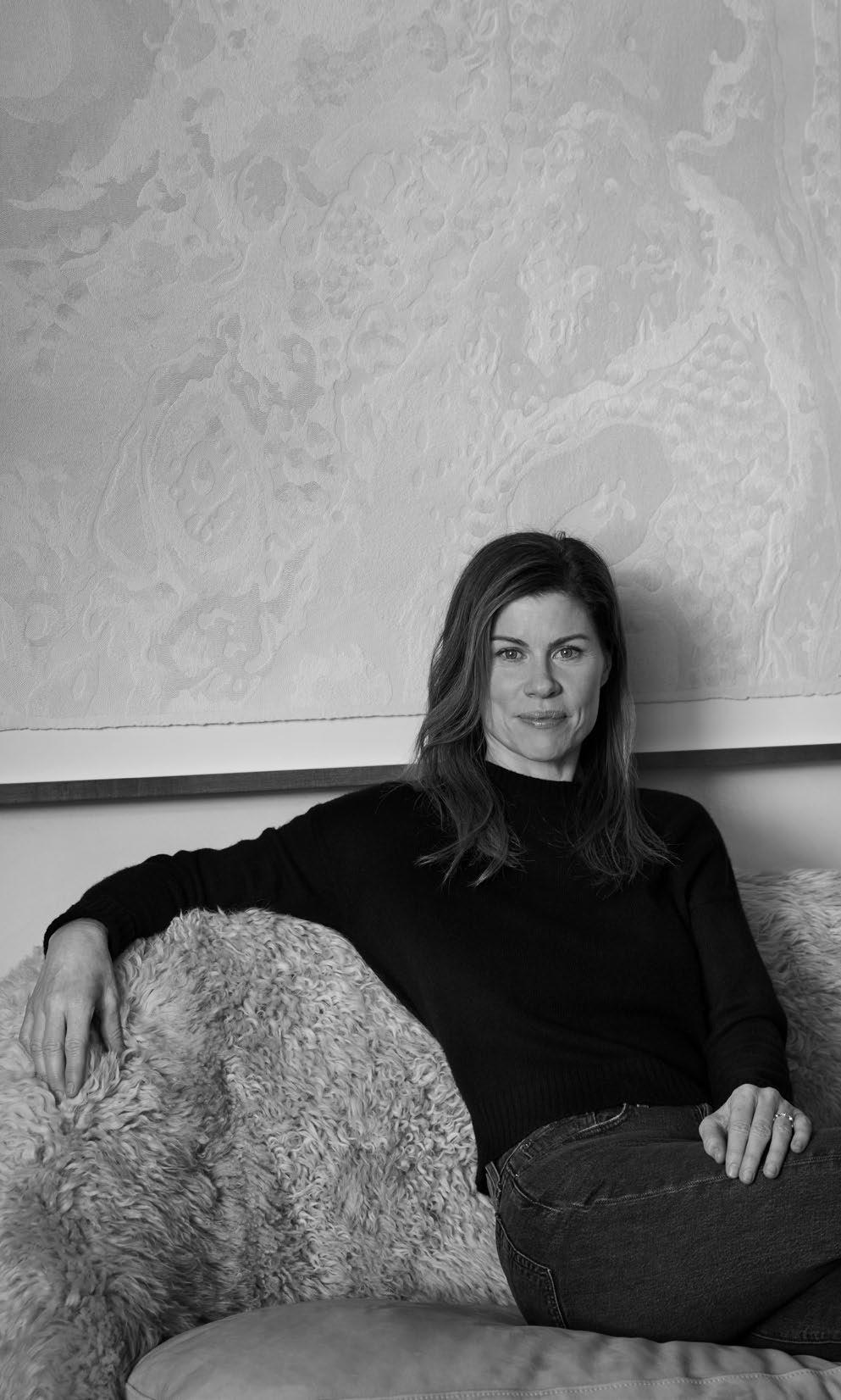

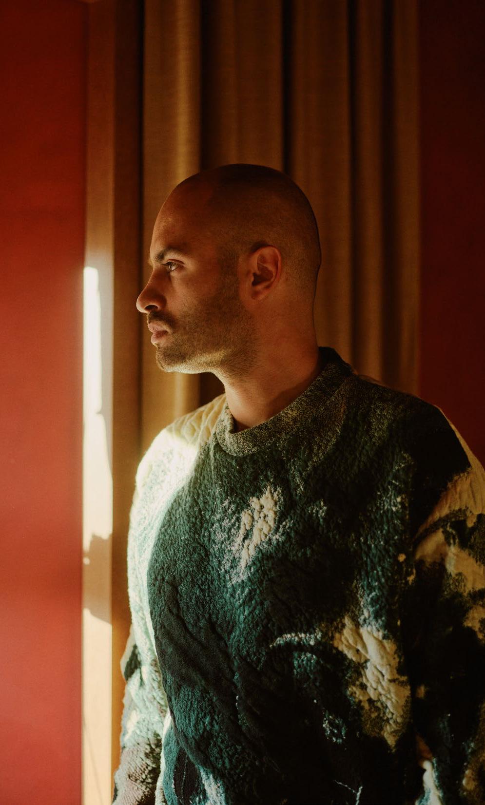
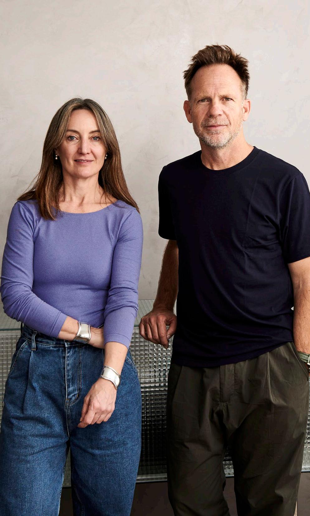
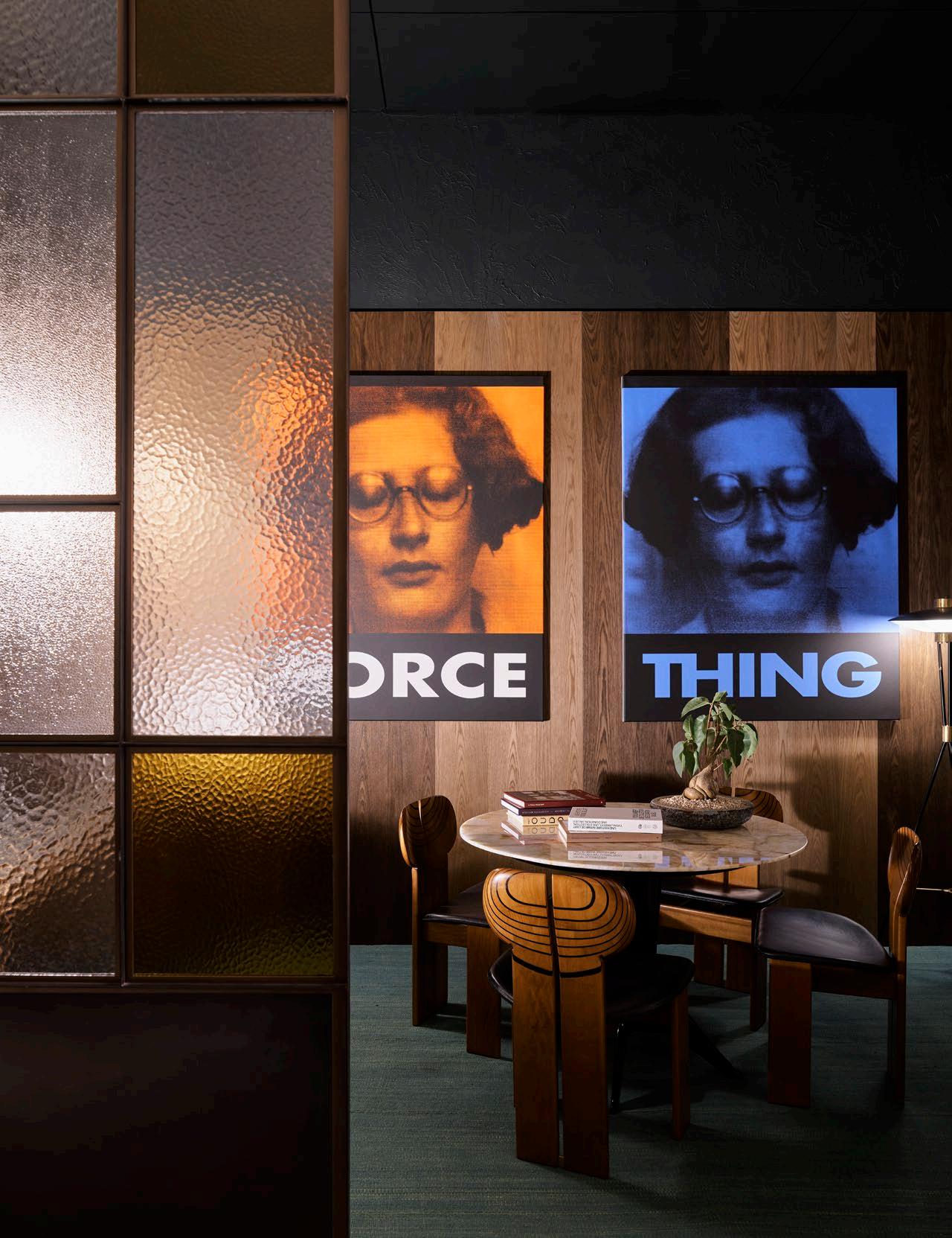
FLACK STUDIO
Founder David Flack
Wurundjeri Woi Wurrung Country/Melbourne, Australia
Where do
I would like it’s everywhere.Nomatterwhatjourneyyoucompleteaspartofyourdailyroutine,it’s been designedandhighlyinformedbyart,architecture,design,books,travel,food, fashion, experience,
The one thing
Do you know
Three words
Intuitive, approachable,
What key infuence release?
Flack Studioisnowanarchitecturestudio.Wearecurrentlyworkingonsomeincredible private residentialhomes.Ouruniqueinteriorvisioninformsourarchitecture,focusing on creating So the influence
What is theonepieceofadviceyouwouldsharewithanemergingdesigner?
Stay true to afraid to say
What’s the
Natural light, we must stay
What product/s
We try to encouragepeopletothinkaboutselectingitemsthatwillstaywiththem throughout their already stood

DESIGN VOICES
Photography Anson Smart
yougotoappreciateexceptionaldesign?
INTUITIVE APPROACHABLE UNORTHODOX
you go to appreciate exceptional design?
to talk more about what feeds into my design. I’m always absorbing design; it’severywhere. No matter what journey you complete as part of your daily routine, it’s beendesigned and highly informed by art, architecture, design, books, travel, food, experience, small moments and conversations.
thing people always ask me is:
know exactly what you want to do as soon as you walk into a space?
words that most appropriately sum up my approach to design are: approachable, unorthodox.
infuence can we anticipate seeing in projects you are yet to

FlackStudio is now an architecture studio. We are currently working on some incredible privateresidential homes. Our unique interior vision informs our architecture, focusing building envelopes that further enhance the story we’ve crafted, inside out. influence is really coming from our new architecture principal, Richard Blight.
Whatisthe one piece of advice you would share with an emerging designer? yourself, remain authentic and work for the best people you can. Don’t be
afraidtosay no.
frst thing you always notice when you walk into a room?
light, existing features, character and soul. Spaces have an energy and history; stay true to this whenever we take on a project, regardless of its size and scale. product/s or piece/s do you admire most right now?
Wetrytoencourage people to think about selecting items that will stay with them their lifetime. We often look to vintage items or furniture. These items have stood the test of time.


PROPORTION SCALE HARMONY
Where do you go to appreciate exceptional design?
We believe exceptional design is in the history of architecture and design – museums in cities like Copenhagen, Paris, Milan, and London.
The one thing people always ask me is:
What is your style?
Three words that most appropriately sum up my approach to design are:
Proportion, scale, harmony.
What key infuence can we anticipate seeing in projects you are yet to release?
We are now very inspired by the work of Georges Geffroy.
What is the one piece of advice you would share with an emerging designer?
Every designer should find their craft and master it. Specialisation and mastery are valuable qualities for designers to cultivate in their careers.
What’s the frst thing you always notice when you walk into a room?
Lighting is one of the most important aspects of a space. It can completely change the perception of space and has the power to create ambience, which is one of the aims of our job.
What product/s or piece/s do you admire most right now?
We just re-edited a ‘Chevalet’ designed by Alain Demachy. It is called the ‘Chevalet Egypcien’.
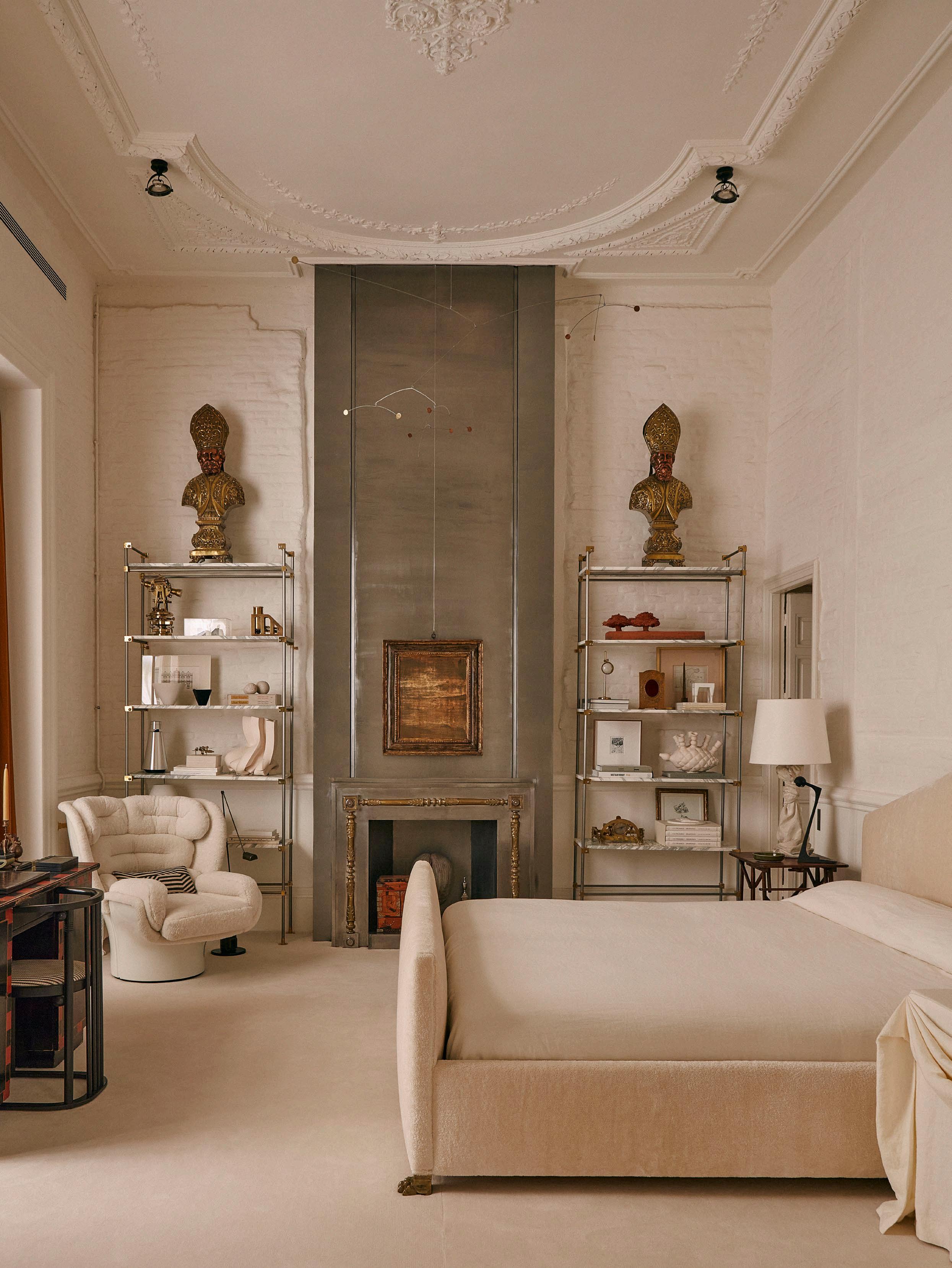
CASA MUÑOZ
Founders Gonzalo Machado and Mafalda Muñoz
Madrid, Spain
DESIGN VOICES
Photography Gonzalo Machado
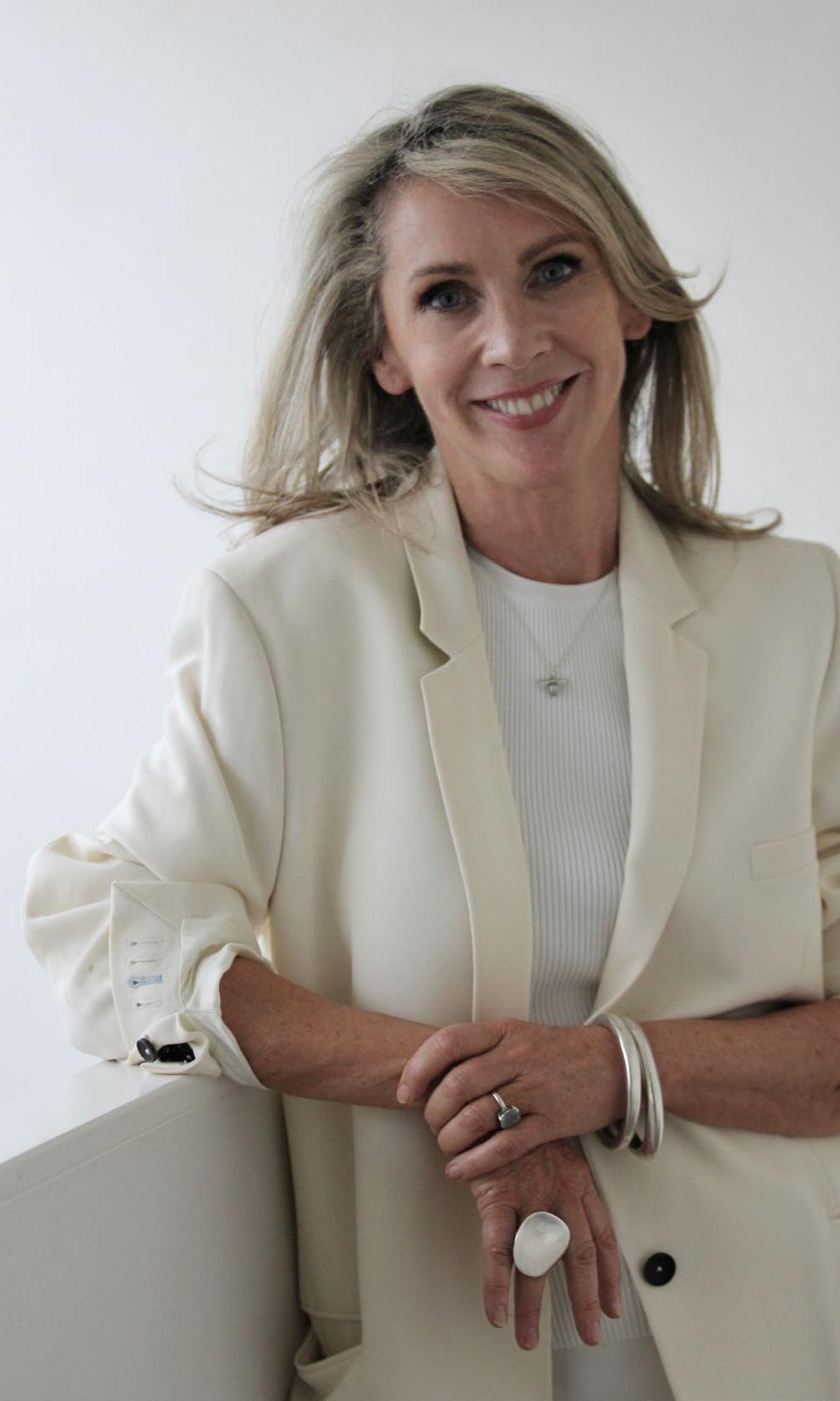
CLARE COUSINS ARCHITECTS
 Founder Clare Cousins
Wurundjeri Woi Wurrung Country/Melbourne, Australia
DESIGN VOICES
Photography Tess Kelly Portrait Jes Lindsay
ARCHITECTS CURIOSITY TENACITY COMPASSION
Where do you go to appreciate exceptional design?
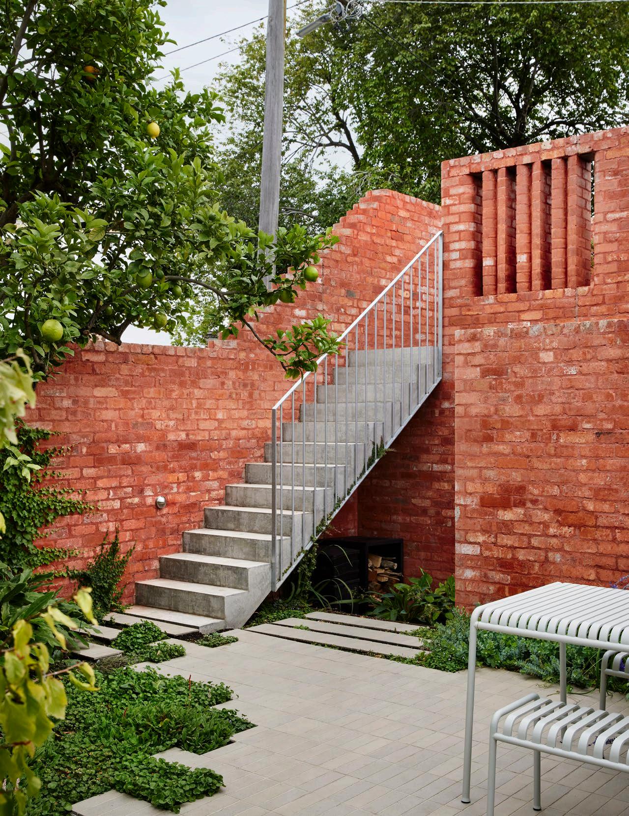
I love spending time in two of Melbourne’s great modernist homes which are now house museums; Heide II by McGlashen Everest and Robin Boyd’s own house at Walsh Street. Inventively built from humble materials, these are both seminal projects that the public can visit.
The one thing people always ask me is: Do you have a minute?
Three words that most appropriately sum up my approach to design are: Curiosity, tenacity, compassion.
What is a key infuence that we can anticipate seeing in projects you are yet to release?
We are exploring opportunities to repurpose construction and post-consumer waste in a current commercial project. As a profession, we must be far more responsible with resource consumption than the status quo.
What is the one piece of advice you would share with an emerging designer?
Doing a great job for your client is the best marketing you can ever do. Architecture is a long game. You need to love your projects and hold onto the values and intentions of the project until the end. We design for our clients by listening and observing. We also think about who, beyond our clients, can benefit from the project.
Approaching projects with a curious mind; we are always learning and exposed to new ways of thinking. We relish the opportunity to solve problems with creative solutions.
What’s the frst thing you always notice when you walk into a room?
The quality of light. Whether a space has abundant natural light or none, there is a real skill in designing a space with beautiful light.
What product/s or piece/s do you admire most right now?
I am keen to treat myself to some David Mellor cutlery for our new house; timeless, practical, and able to be used daily.

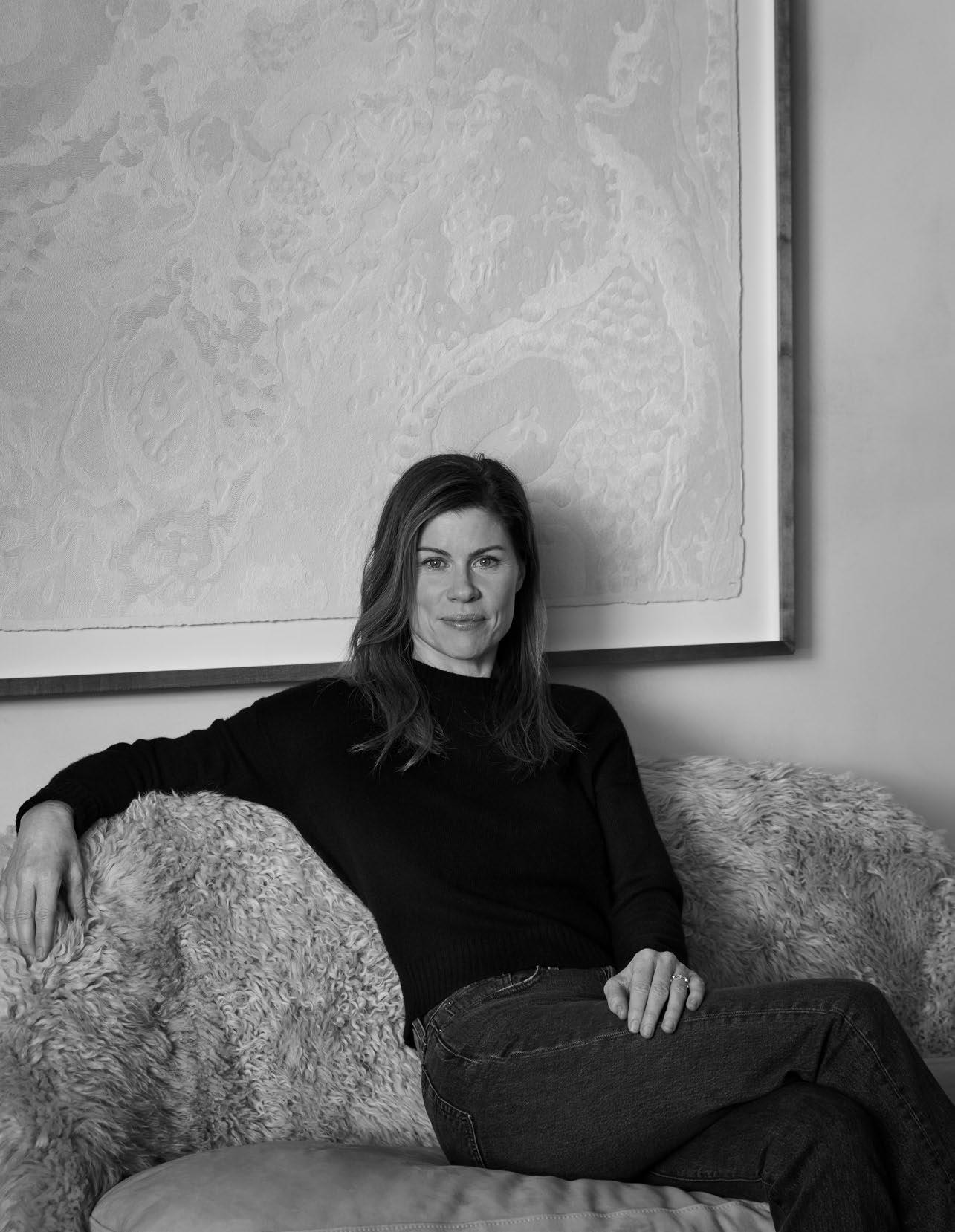
COLLECTION ART COLLABORATION
Where do you go to appreciate exceptional design?
I love to travel, finding inspiration at museums and galleries wherever I go. Nomatter the place, I always look for interesting stores, galleries or local museums, contemporary or ancient.
I grew up in New Zealand but have been based in the US for a long time and frequently travel overseas for our projects. I have always been inspired to travel to farawayplaces.
That said, New Zealand and Australia have so much exceptional design and architecture. Inspiration can be found right in your backyard.
The one thing people always ask me is:
How did you learn to be a designer?
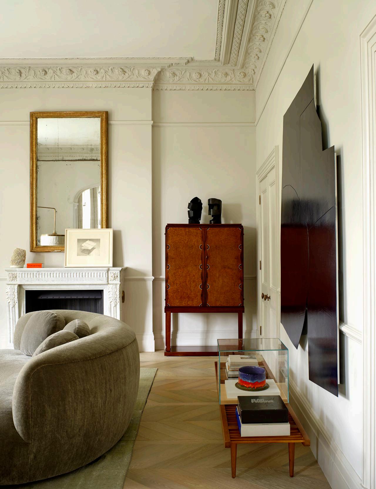
Three words that most appropriately sum up my approach to design Collection, art, collaboration.
What key infuence can we anticipate seeing in projects you are yet release?
Texture, colour and pattern. Looking at historical and contemporary design and interesting ways to marry the two.
What is the one piece of advice you would share with an emerging designer?
If you don’t already have one, find a good accounting software that caters specificallyto interior design and get familiar with it. This tool will be the backbone of your business and can save you a lot of time and stress.
What’s the frst thing you always notice when you walk into a room?
Any existing art, collections, or any objects of interest. If it is a bare space, I always look at ceiling height and light – where is the light coming from, and how doesitplay in the space throughout the day?
What product/s or piece/s do you admire most right now?
Anything that is timeless. I always admire timeless design that can be used andloved for decades.
Last week, I was on a site visit in Santa Fe, New Mexico and picked up some vintage Levis and a great old Levis jacket. They’re still cool, in style and timeless always.
OLIVIA WILLIAMS STUDIO
Founder Olivia Williams
Los Angeles, North America
matter IgrewupinNewZealandbuthavebeenbasedintheUSforalongtimeandfrequently traveloverseasforourprojects.Ihavealwaysbeeninspiredtotraveltofaraway places.
are: to
Whatistheonepieceofadviceyouwouldsharewithanemergingdesigner?
Ifyoudon’talreadyhaveone,findagoodaccountingsoftwarethatcatersspecifically to business room?
Anyexistingart,collections,oranyobjectsofinterest.Ifitisabarespace,Ialways
 Photography Henry Bourne
DESIGN VOICES Ilovetotravel,findinginspirationatmuseumsandgallerieswhereverIgo.No
Portrait Stephen Kent Johnson
Texture,colourandpattern.Lookingathistoricalandcontemporarydesignand
lookatceilingheightandlight–whereisthelightcomingfrom,andhowdoes it
Anythingthatistimeless.Ialwaysadmiretimelessdesignthatcanbeusedand loved vintage LevisandagreatoldLevisjacket.They’restillcool,instyleandtimelessalways.
play
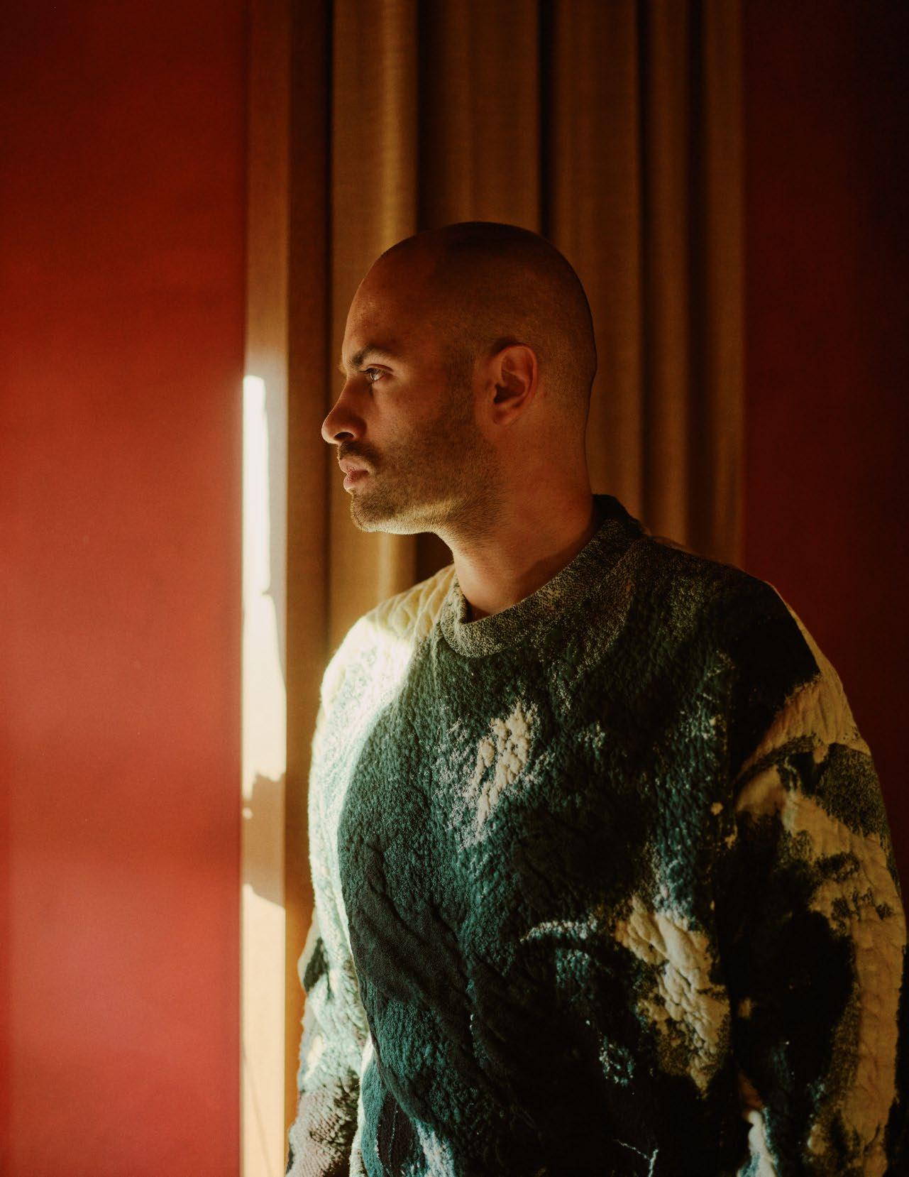
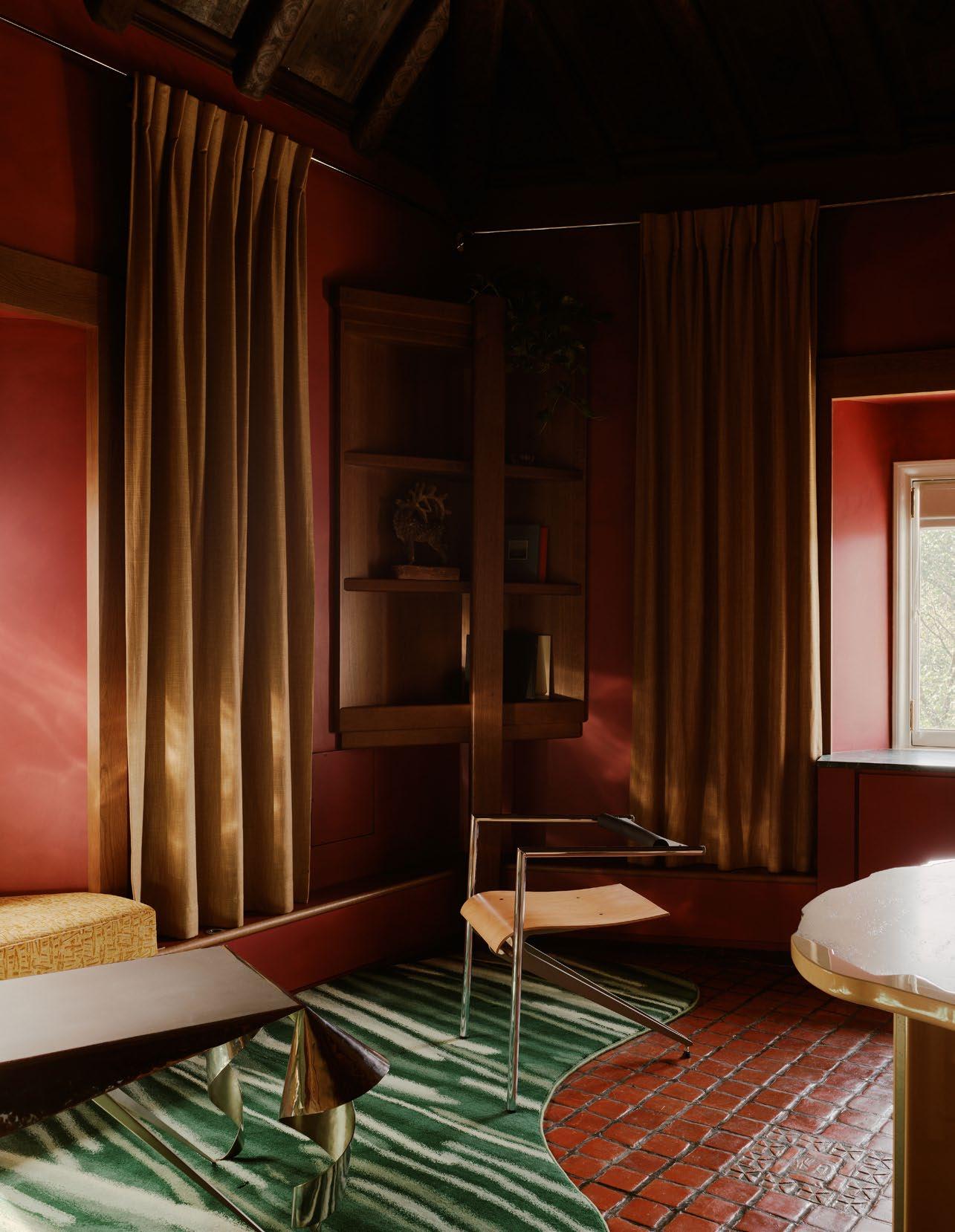
HUGO TORO
Paris, France
Where There observe made to it and exceptional.
The one Do you Three Narration, What release? Each project place consequently, What designer?
You have ‘feed’ myself. you don't
What’s The temperature place What Right wood surface multiple hard-wearing
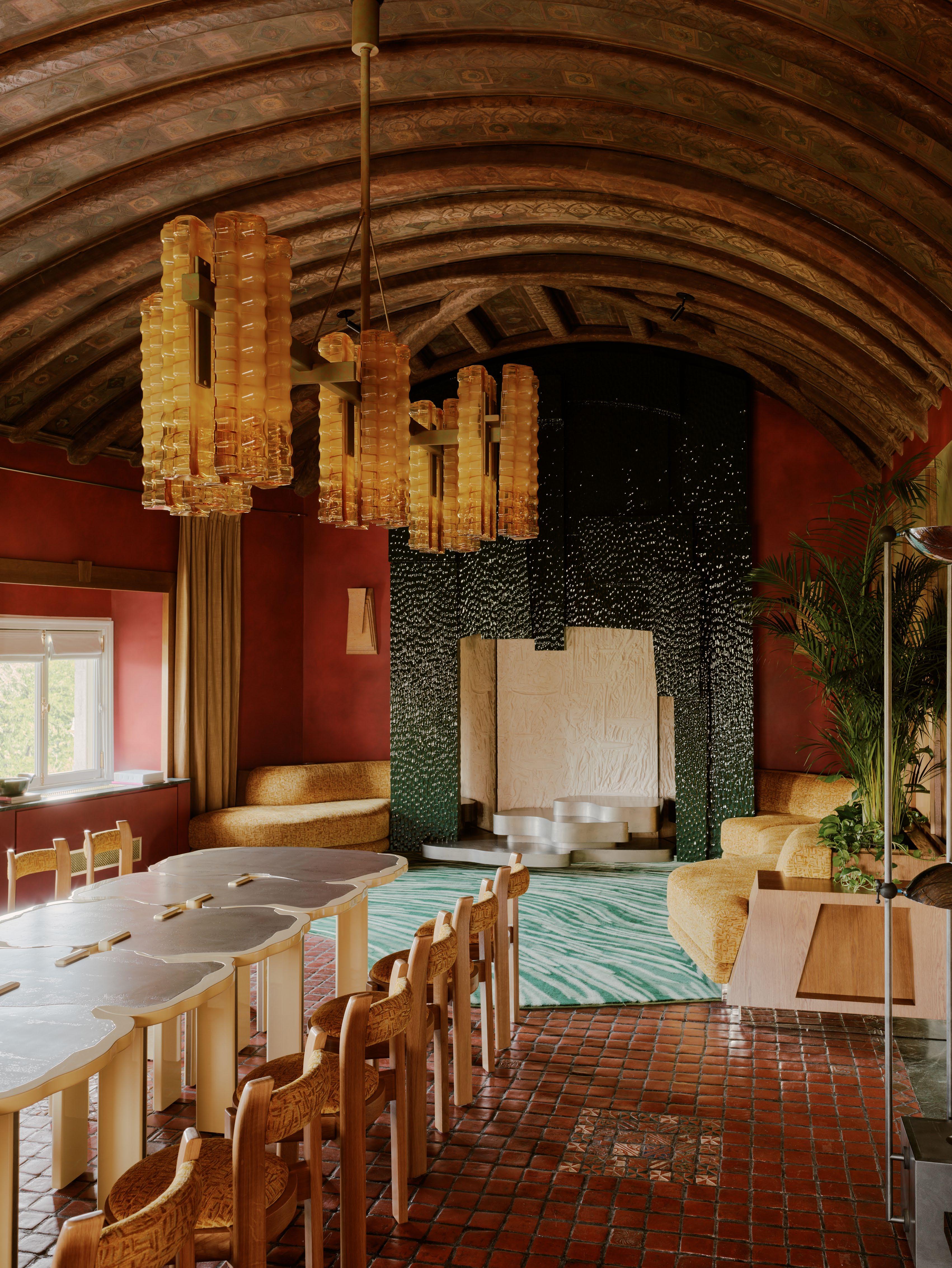
DESIGN VOICES
Photography William Jess Laird
NARRATION CONTEXT ATMOSPHERE
Where do you go to appreciate exceptional design? isn't a specific place but conjunctions that make the design exceptional. Just observe a detail in a garden, on a door, or even the window of a house. A place with the heart is inherently an exceptional design; one just needs to open up and let inspiration come. Light greatly contributes to making a design exceptional.
one thing people always ask me is: you sleep much?
Three words that most appropriately sum up my approach to design are: Narration, context, atmosphere.
key infuence can we anticipate seeing in projects you are yet to release?
project obviously has a common thread, but I am always influenced by the itself, its history, and its context. Each project has its own identity and, consequently, a particular influence.
is the one piece of advice you would share with an emerging designer?
have to live in the moment to grow and learn. I'm constantly on the move to myself. You have to listen to yourself, be daring, and make suggestions. If don't take risks, nothing happens.
What’s the frst thing you always notice when you walk into a room?
temperature of the light – I am very sensitive to light. The atmosphere of a is conveyed through light.
product/s or piece/s do you admire most right now?
now, I have a passion for charred wood; Yakisugi. It is derived from a natural protection technique of Japanese origin. It involves deeply burning the surface of a board to obtain a superficial layer of carbon. This technique produces multiple textures and variable colours of deep, captivating black. It's a very hard-wearing material, indoors and out.
ISSUE #51

SCULPTURAL PRAGMATIC WARM
Where do you go to appreciate exceptional design?
Travel; a village in Japan, surfing in the ocean, Paris, camping by a lake in the mountains. Travel anywhere…
The one thing people always ask me is:
Could you create a space that’s beautiful, and functional, serene and joyous?
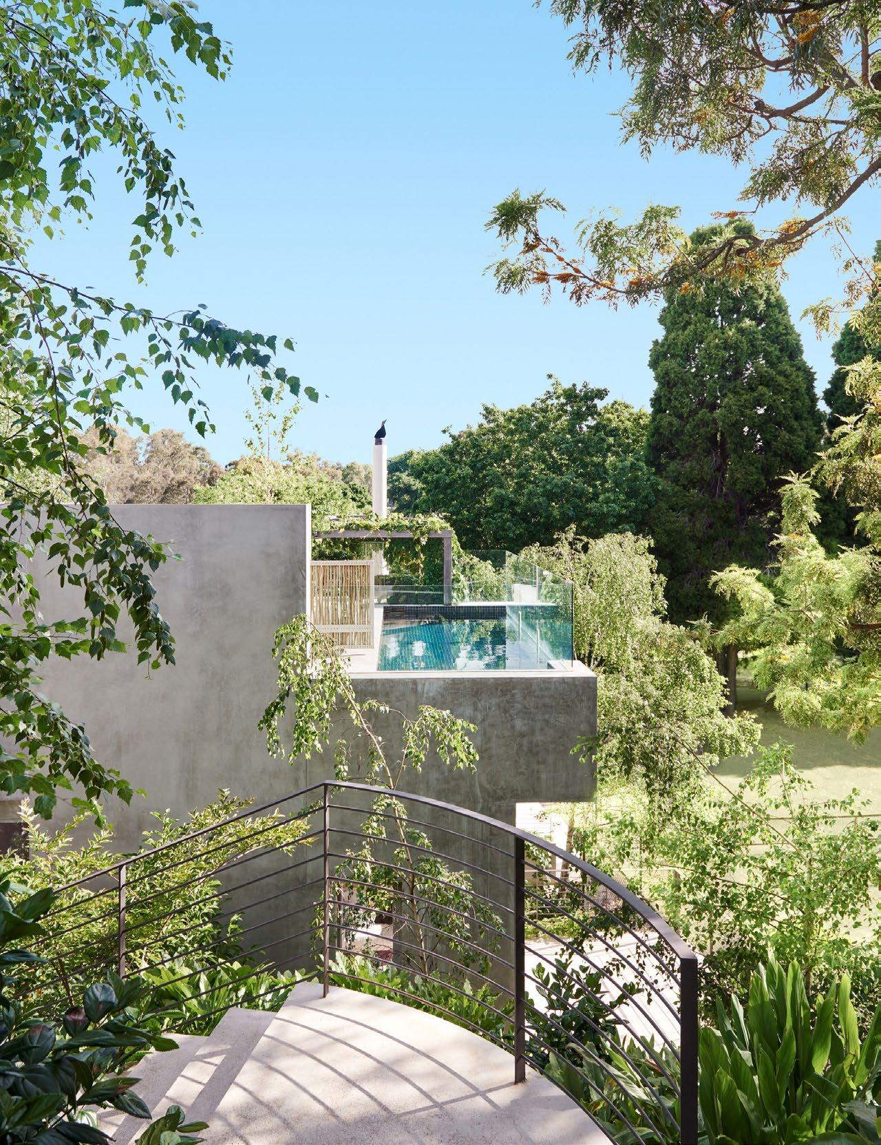
Three words that most appropriately sum up my approach to design are:
Sculptural, pragmatic, warm.
What key infuence can we anticipate seeing in projects you are yet to release?
The concept of timelessness and sensitivity. We love creating spaces that make you exhale when you walk through the door and make you feel like you've arrived home to a little piece of paradise.
What is the one piece of advice you would share with an emerging designer?
Be generous and curious about time, creativity, mediums, people and ideas.
What’s the frst thing you always notice when you walk into a room?
How it makes you feel on a subliminal, visceral level. The chiaroscuro of light, the vibration of sound, the shimmer of texture, the scent floating in the air. I adore a space that touches the soul.
What product/s or piece/s do you admire most right now?
An artwork by the Australian indigenous artist, Sally Gabori; grounded, vibrant, spiritual, evocative, and spiritual storytelling.
ARCHITECTS
SUSI LEETON ARCHITECTS + INTERIORS
Founder Susi Leeton
Wurundjeri Woi Wurrung Country/Melbourne, Australia
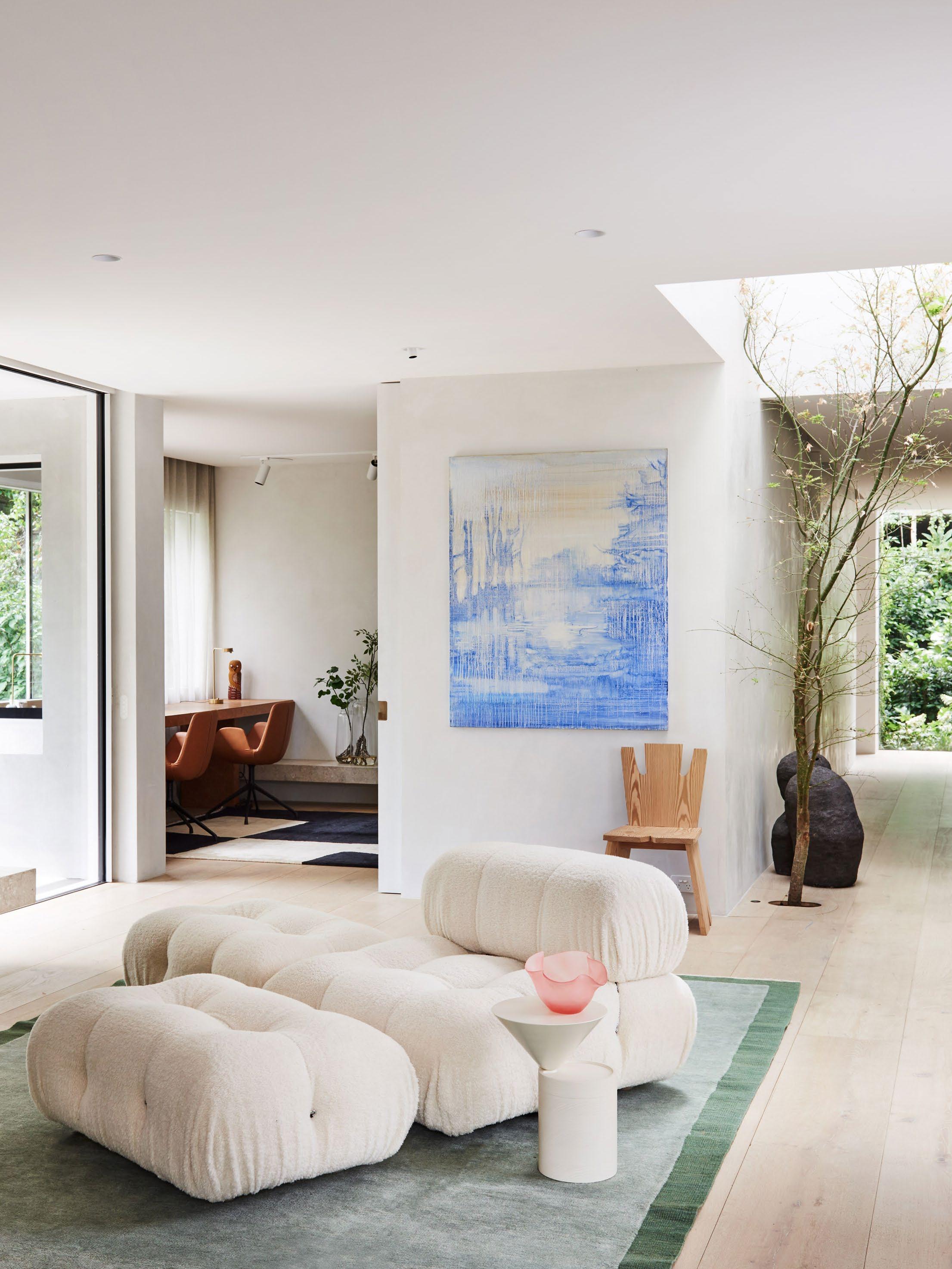
DESIGN VOICES
Photography Lisa Cohen
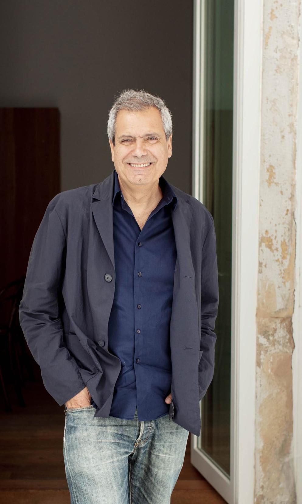
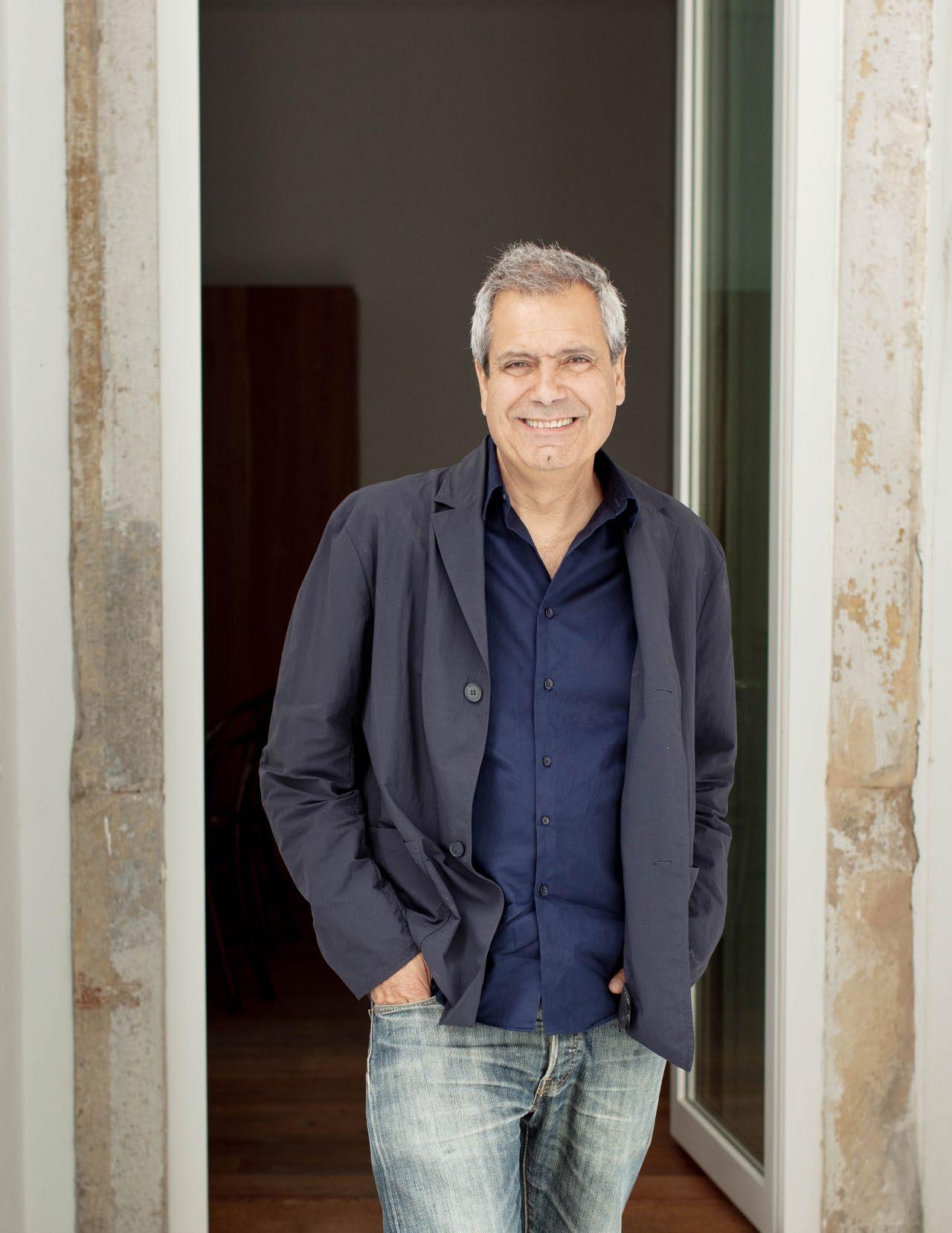
AIRES MATEUS
Founder Manuel Aires Mateus
Lisbon, Portugal
Where
I see exceptional when resonates most extraordinary
The one How do
Three Life, people,
What release?
What I and its surprise
What designer? We have resistance, What’s It's always awareness textures, but later, What I admire in each
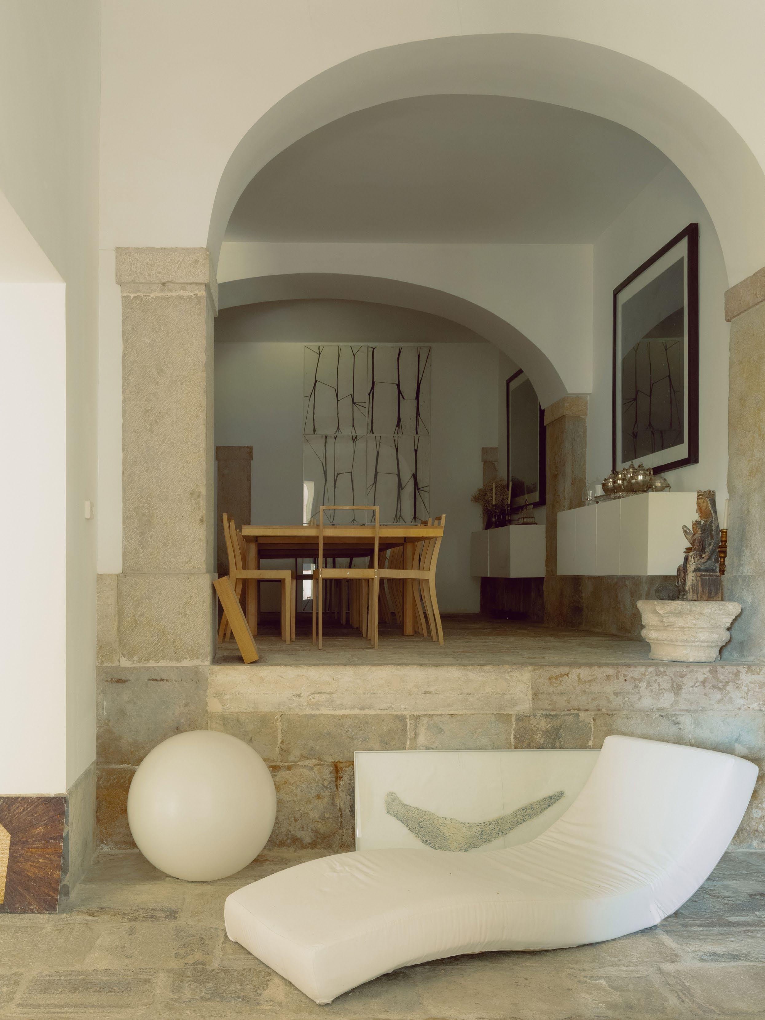 Photography Dan Preston
DESIGN VOICES
Portrait Matilde Travassos
LIFE PEOPLE FREEDOM
Where do you go to appreciate exceptional design? exceptional design in things that have been enshrined by time. Somehow, we find an extraordinary object, it's partly new, partly something else that resonates in our memory. Normally, the things that give us peace of mind are the extraordinary things. one thing people always ask me is: do you start a project?
Three words that most appropriately sum up my approach to design are: people, freedom.
key infuence can we anticipate seeing in projects you are yet to release?
I like to imagine is that each project has its own personality, its own identity its own story. So, in reality, what we're going to see will, hopefully, be a surprise for me too.
is the one piece of advice you would share with an emerging designer?
have to tell young people that they have to believe. This is a profession of resistance, and that time for resistance must be respected.
What’s the frst thing you always notice when you walk into a room?
always different things. But the first thing I notice is the impact of a general awareness of the space, which has to do with proportions, light, materials, colours, textures, and a sense of how you can live in that space. At first, we can't explain it, later, if we want to, we have to analyse it in more detail.
product/s or piece/s do you admire most right now?
admire all sources of things. I'm interested in people who work by questioning life each profession.
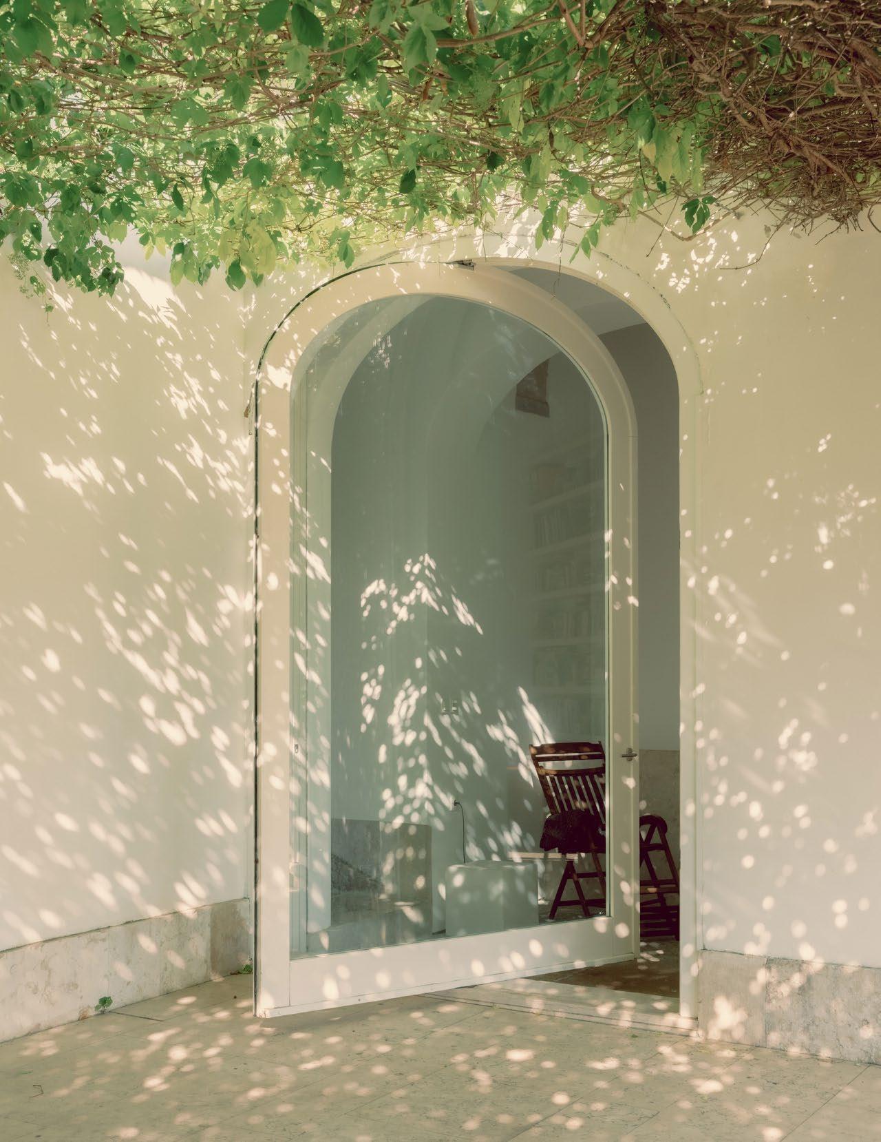
DESIGN VOICES


PERSONAL SYNCHRONICITY COLLECTED
Where do you go to appreciate exceptional design?
Into nature. We have two places to hide and recharge, one on the Veluwe in the Netherlands and the other on the island of Menorca, Spain. Our 60s Bungalow in Veluwe is the perfect place to go to and spend time in nature. In Menorca, we enjoy its wild nature and beaches. This calms our mind and opens our eyes to enjoying everything right in front of us.
The one thing people always ask me is:
What is it like to work together as a couple?
Three words that most appropriately sum up my approach to design are:
Personal, synchronicity, collected.
What key infuence can we anticipate seeing in projects you are yet to release?
The sun and the Mediterranean lifestyle.
What is the one piece of advice you would share with an emerging designer?
Have a thorough and deep interest in understanding your client.
What’s the frst thing you always notice when you walk into a room?
The light, the views, and its energy, and when it’s in a poor condition: the potential.
What product/s or piece/s do you admire most right now?
Our collected set of vintage Gio Ponti cabinets.
est magazine
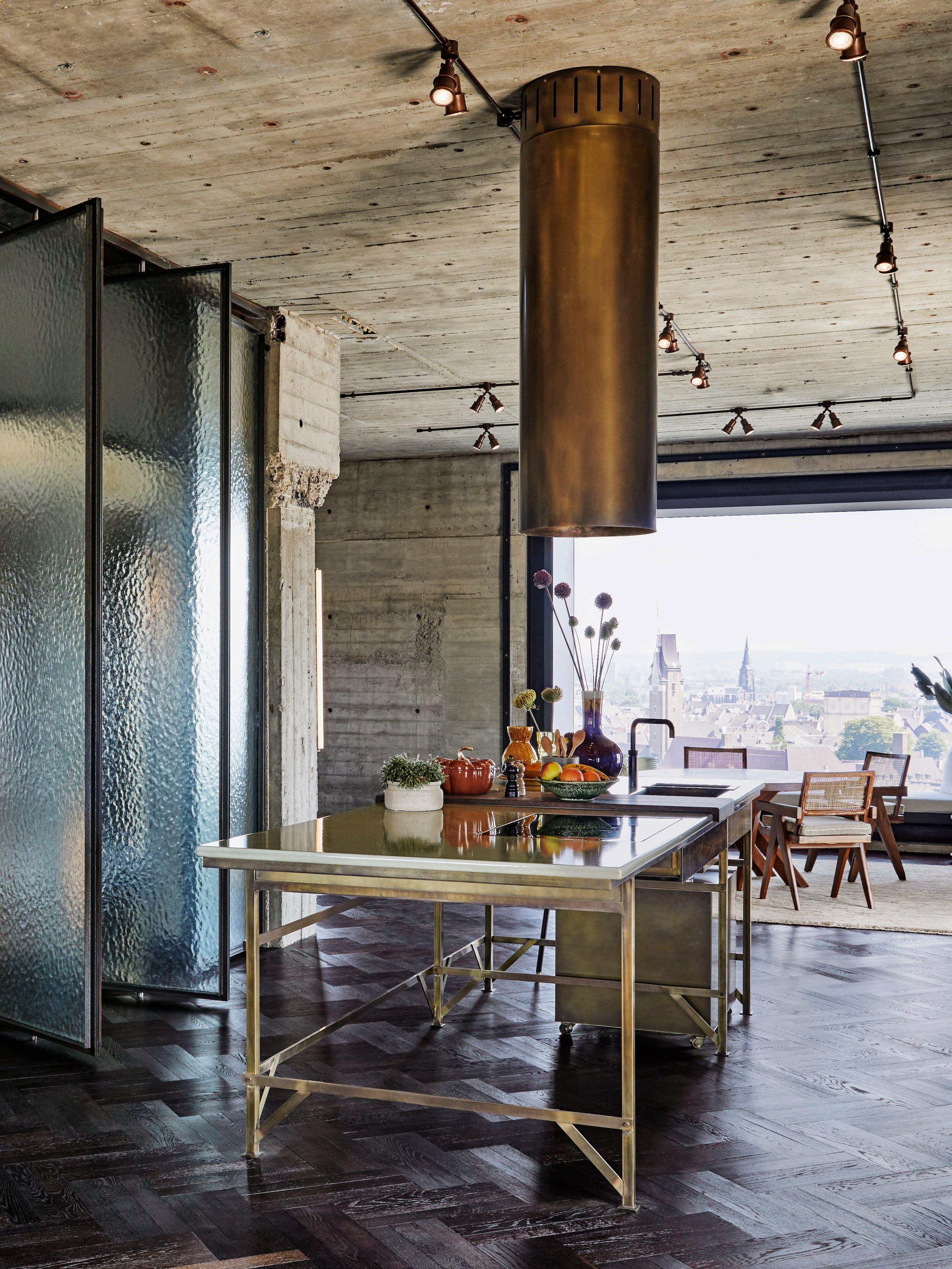
NICEMAKERS
Founders Joyce and Dax Roll
Amsterdam, The Netherlands
Photography Alan Jensen
DESIGN VOICES
Portrait Philippe Vogelenzang
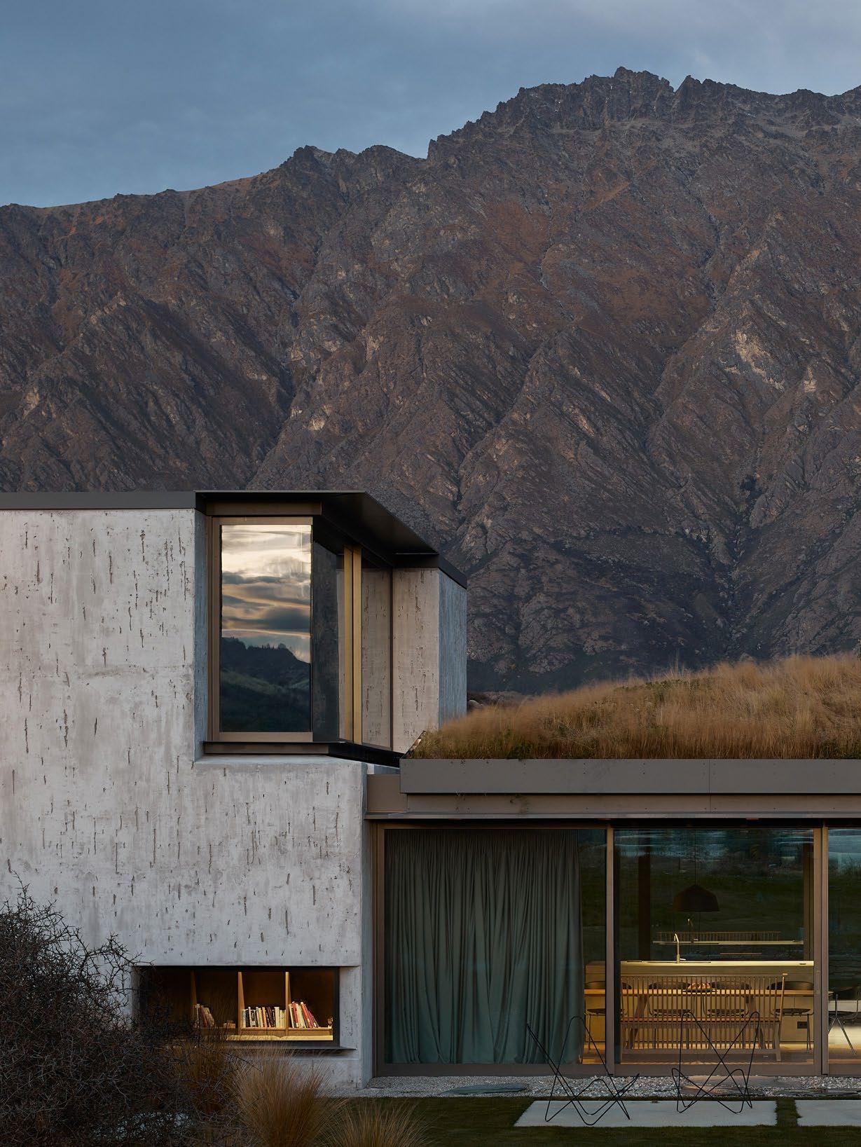
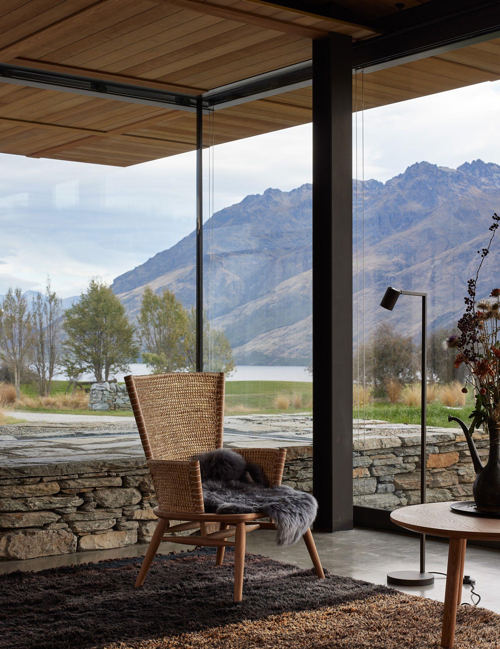
FEARON HAY ARCHITECTS
Founders Tim Hay and Jeff Fearon
Auckland,
New Zealand & Los Angeles, North America
Where Good inspiration can offer thinking
The one Working office?
Three Listen, What release? Place; variety about What designer? Build It takes to be received, someone.
What’s Not one continually different opportunities technical
DESIGN VOICES
Photography Simon Wilson
Portrait Sam Frost
LISTEN
INTERROGATE DREAM
Where do you go to appreciate exceptional design? design is everywhere; it's not limited to certain places. But we also draw inspiration from the natural world rather than just the constructive world. Nature offer inspiration through materiality, proportion and scale that influence our thinking in design.
one thing people always ask me is:
Working on multiple projects in Australia, when will you be opening an Australian office?
Three words that most appropriately sum up my approach to design are: Listen, interrogate, dream.
key infuence can we anticipate seeing in projects you are yet to release?
we work in many different places; we have an LA and Auckland studio. The variety of locations constantly inspires us. We always want to understand more a place and are fortunate to have the variety; it invigorates our process.
is the one piece of advice you would share with an emerging designer?
confidence in your ideas and your process to communicate them concisely. takes a lot of work initially to have the confidence to put them forward. For them received, they need to be packaged in a way that is easily absorbed by someone.
What’s the frst thing you always notice when you walk into a room? one product; we like to look at opportunities to use products in different ways continually and how we can play with the product or the specification to achieve different results. It’s not necessarily about new products, but it's playing with opportunities and boundaries within products we are familiar with, both from a technical and environmental point of view.

ARCHITECTS
DESIGNING FOR FEELING
Where do you go to appreciate exceptional design?
Jonathan Richards: Predictable perhaps, but the Sydney Opera House never disappoints. Kirsten Stanisich: There are certainly incredible places like Milan and Tokyo where I have been blown away by special design moments, but more often than not, I get excited by the experience of a space or place, and that can happen at the most unexpected moments.
The one thing people always ask me is:
Jonathan: Can I ask you for some quick design advice?
Kirsten: What projects are you working on?
Three words that most appropriately sum up my approach to design
Jonathan: Enjoy the process.
Kirsten: Designing for feeling.
What key infuence can we anticipate seeing in projects you are yet release?
Jonathan: A sense of optimism expressed through colour and sculptural form.
Kirsten: We have always been interested in immersing the DNA of our clients all of our projects and continuing this through our future projects.
What is the one piece of advice you would share with an emerging designer?
Jonathan: Don’t become a computer zombie. Draw by hand, feel materials, go site; be obsessed with design and step away from the computer.
Kirsten: The biggest advice is to keep going no matter what comes your way stop to celebrate all the good moments.
What’s the frst thing you always notice when you walk into a room?
Jonathan: The energy of a room. Whether it’s beautiful, calming, exciting or – I am responsive to that immediate energy.
Kirsten: Before I’ve had the chance to touch or experience the space, I’d say it would have to be how the light works and what effect it has on the colour and texture of the space.
What product/s or piece/s do you admire most right now?
Jonathan: A Bill Henson landscape.
Kirsten: The De Padova Uragano chair designed by Vico Magistretti.
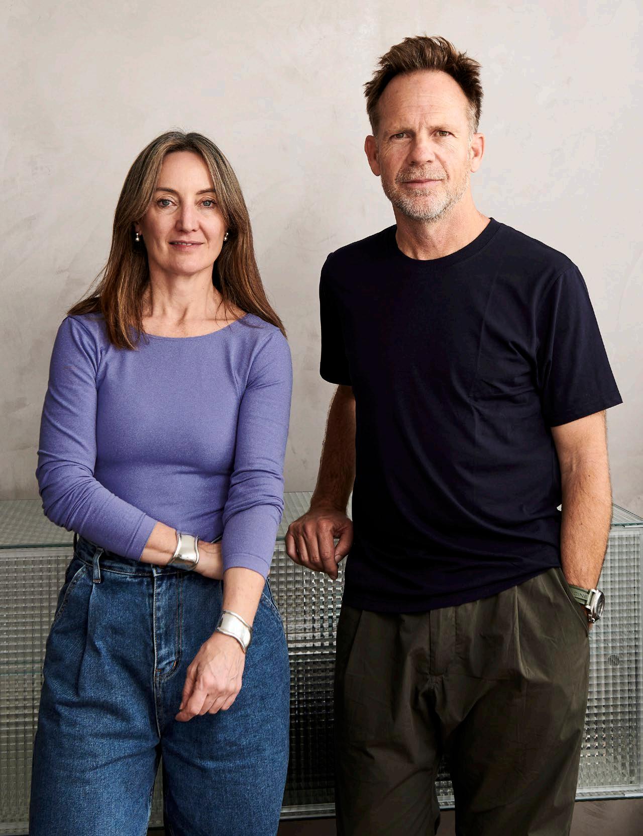
RICHARDS STANISICH
Founders Jonathan Richards and Kirsten Stanisich
Gadigal Country/Sydney, Australia
DESIGN VOICES never Milan more can
to form. clients into go to and room? dull it
Photography Felix Forest
are:

PLATINO PREMIUM COLLECTION Regular
Perth 12 Callaway St, Wangara WA 6065
Adelaide 5013/6 Capelli Rd, Wingfeld SA 5013
Cosentino
Cosentino
Melbourne 44 Corporate Dr, Heatherton VIC 3202
Brisbane 8 Gassman Dr, Yatala QLD 4207
City Melbourne (Coming soon) 460 Collins St, Melbourne VIC 3000 Cosentino City Sydney 155 Liverpool St, Corner, 130 Elizabeth St, Sydney NSW 2000
www.cosentino.com/en-au/
Cosentino
Cosentino
Cosentino
infoaustralia@cosentino.com /
ENDLESS BEAUTY
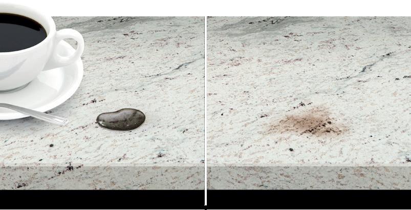
Protected Natural Stone
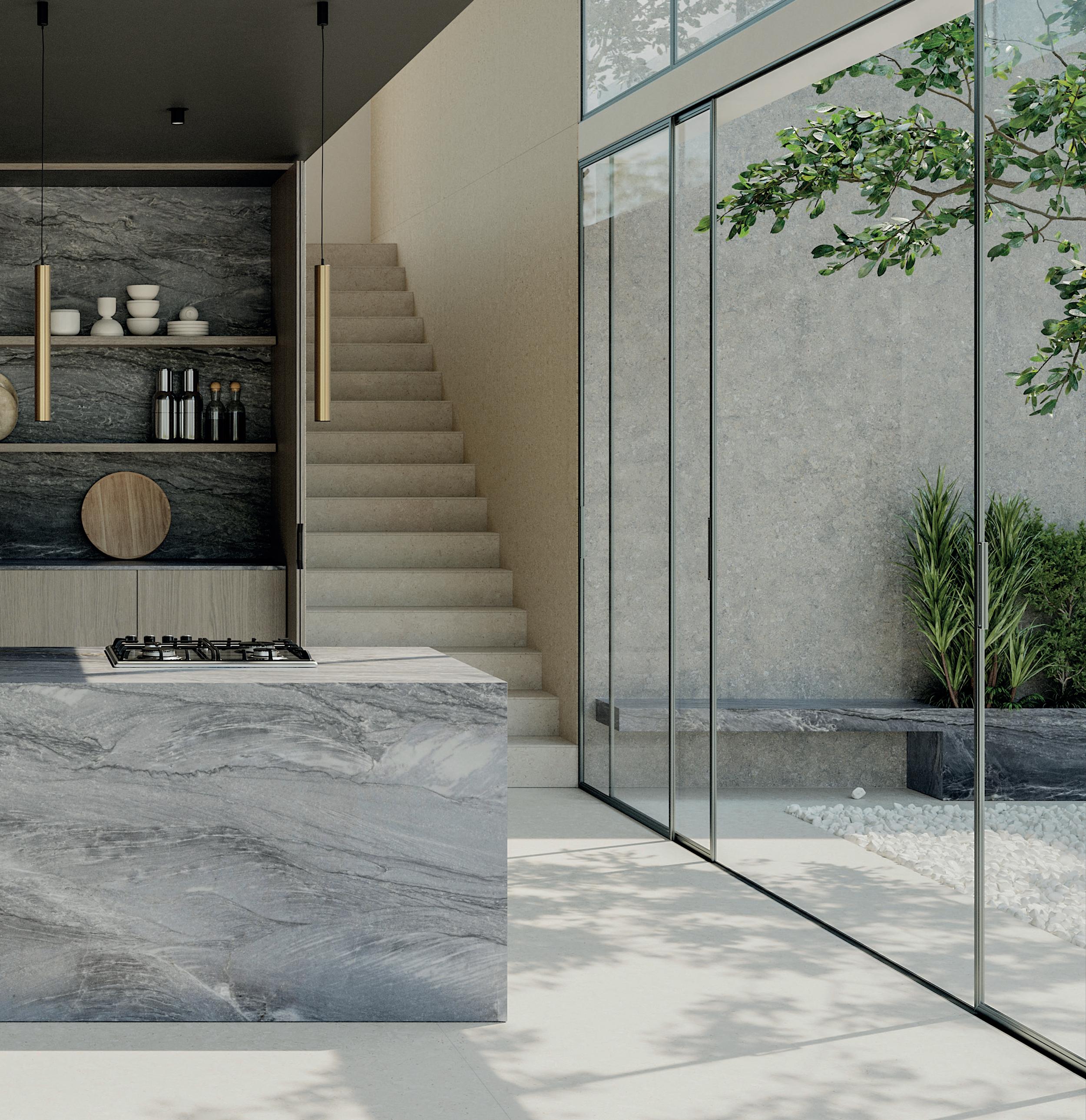
The beauty and properties of Sensa’s natural stone remain unchanged thanks to its innovative invisible protection against stains, preventing liquids such as oil or cofee from entering the material.
Surfaces with unique and exclusive designs created by nature with the best anti-stain treatment.

YEAR
WARRANTY

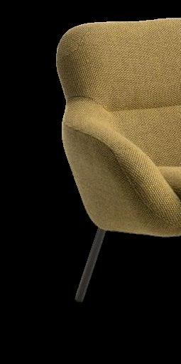
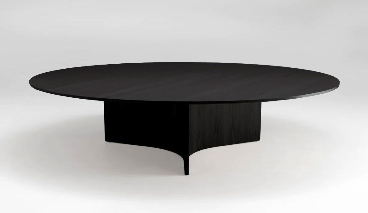
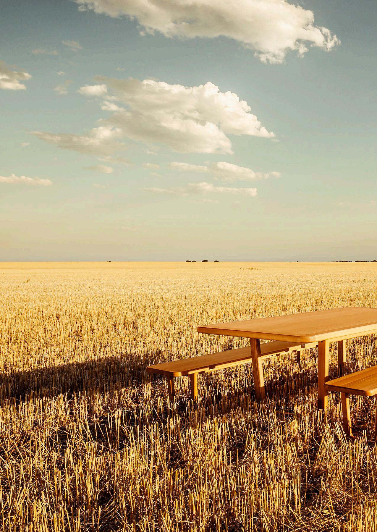
Ross Didier is known for intuiting a world where art meets design; his craft fuses function with engineering, and utilitarianism with a sense of luxury. As an infuential player in the Australian industry, Didier’s collections capture a pioneering narrative.

“We aim to celebrate and poetic design challenging to justify I rigorously make remain authentic with responsible,
didier.com.au mail@didier.com.au

celebrate individuality and offer beautiful design through engineered art. It is often justify new product for the market, so make sure the Didier furniture designs authentic to our brand story and are created responsible, high-quality manufacturing. ”
– Ross Didier


mail@didier.com.au
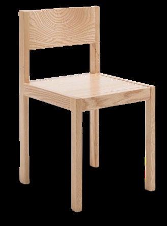
Clockwise from left to right: APPAREL Low Back Chair, PUFFALO Modular Lounging, GUNZEL Chair, TERRA FIRMA Table & Bench, CALDERA Low Table, ELFIN Oak Stool/Side Table
+61 418 511 619
Where Architects Live
Felix De Montesquiou
Architect Felix De Montesquiou’s Paris home refects his affnity for natural light, industrial scale and integrated design elements.
LOCATION Paris, France DESIGN DAS Studio
PHOTOGRAPHY DePasquale+Maffini
INTERVIEW Sophie Lewis
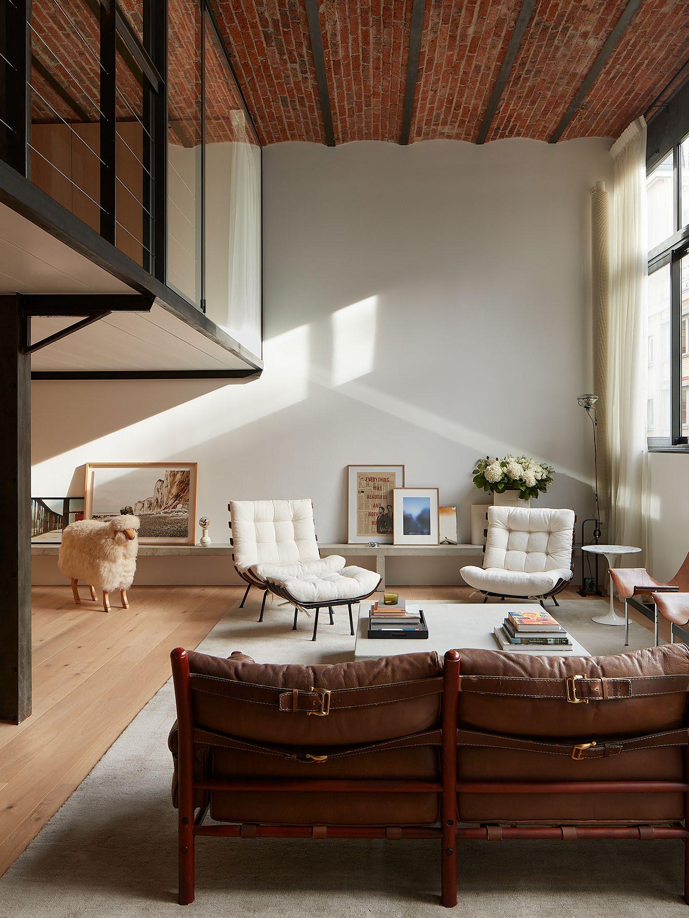
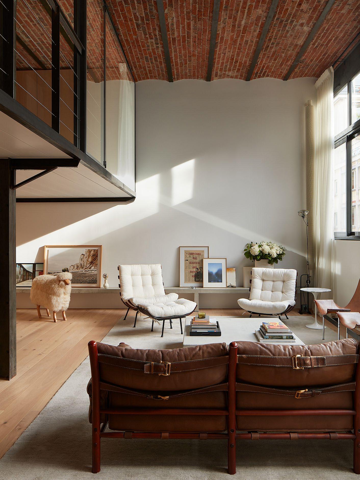
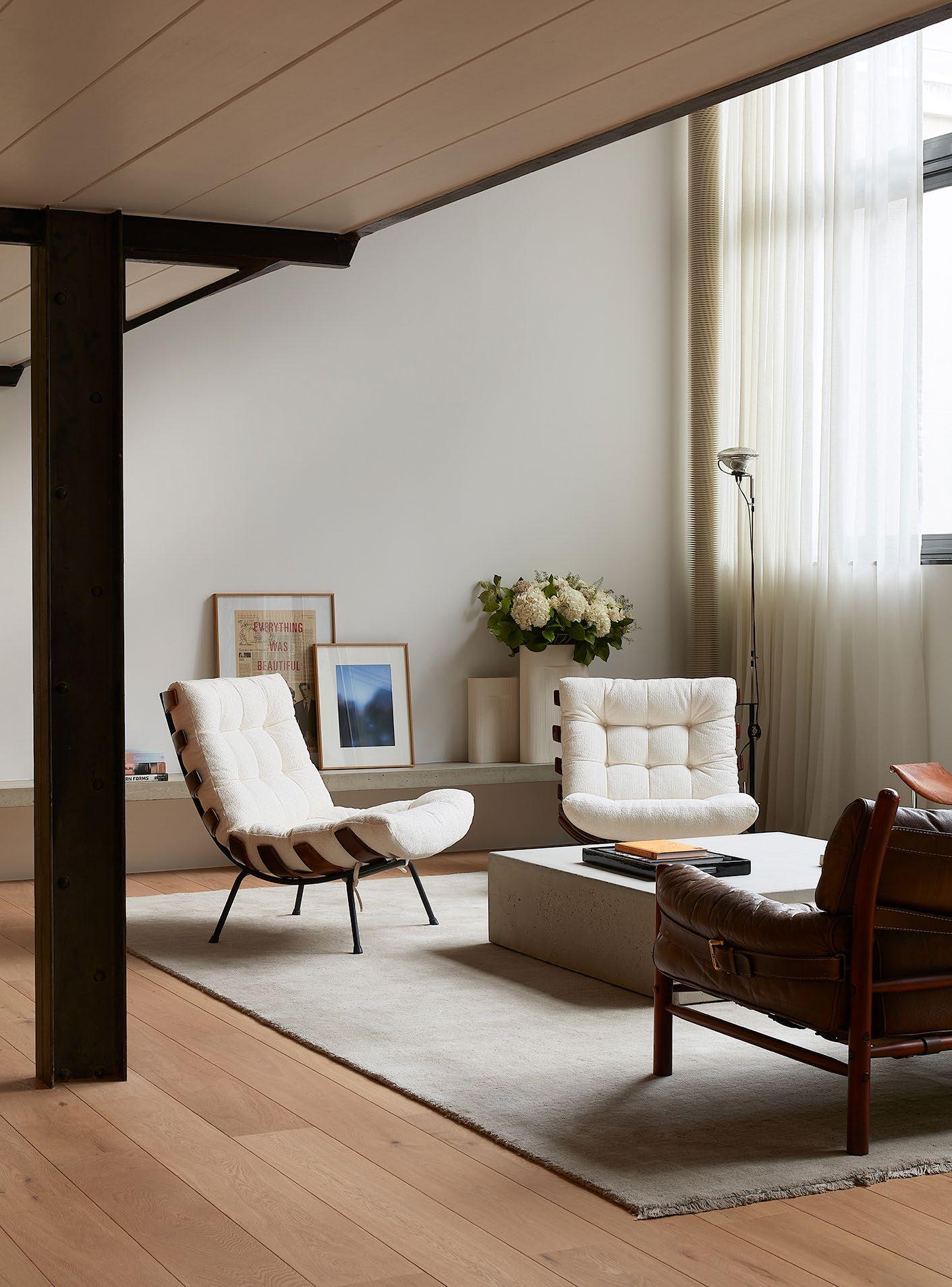 The double-height living space features a pair of vintage Costela chairs by Brazilian designers Carlo Hauner and Martin Eisler – one of Felix’s all-time favourite designs.
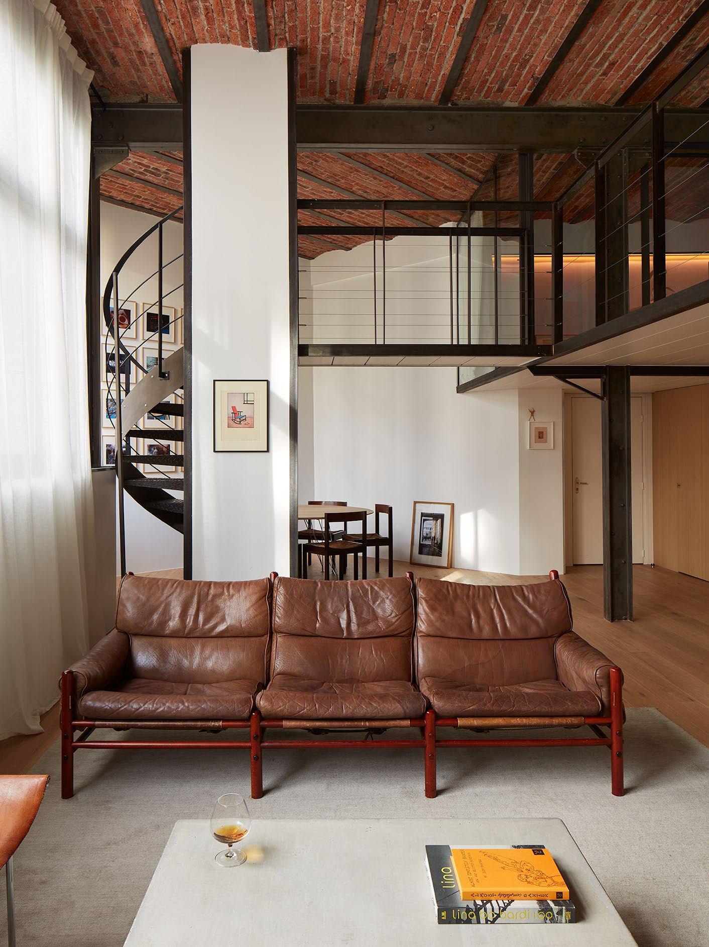
A pair of vintage Katavolos, Kelley, and Littell for Laverne chairs, a Model Kontiki sofa by Arne Norell and a concrete co ee table by DAS Studio are also pictured.
Your ‘Bichat’ home isn’t a typical heritage apartment in Paris. What drew you to this building to make it your home – did you immediately see the potential?
I was excited about the volume when I first came into the flat. It’s rare in Paris to find a flat in an industrial building that isn’t on the ground floor, and this one had a fantastic luminosity.
I also gravitated to the orientation. The main facade faces southeast; I knew we would have great light all through the morning.
The exposed brick ceiling and industrial bones reveal an interesting past life. What was the building before it became your home?
It was a factory, but it’s unclear what was manufactured last; we have been told it was a sewing machine factory. I also know a developer converted the building into housing in the 1990s.
How did you respond decoratively to the industrial interior elements, such as the brick ceiling and steel columns?
Although the living room had a double height when I bought the place, the spaces were much more divided.
It’s easier to project your lifestyle into a space of your own. I knew we wanted as much living space as possible because this is where we spend most of our time, so I tried to confine all of the technical elements in hidden spaces to keep the volume as simple as possible.
We love cooking, but we rarely have the time. I wanted a kitchen that wouldn’t visually invade the living space but had all the necessary elements.
It was also important for me to create spaces with strong rationality and regularity in proportions so that the rhythm of the oak kitchen doors is repeated throughout the flat.
As in all of my work, I use many existing decorative elements. The steel beams were cleaned, and we applied a patina to darken them. We used the same patina on the steel and glass structure on the mezzanine to keep everything homogeneous. The ceiling was a no-brainer; the bricks warmed the space up.
est magazine
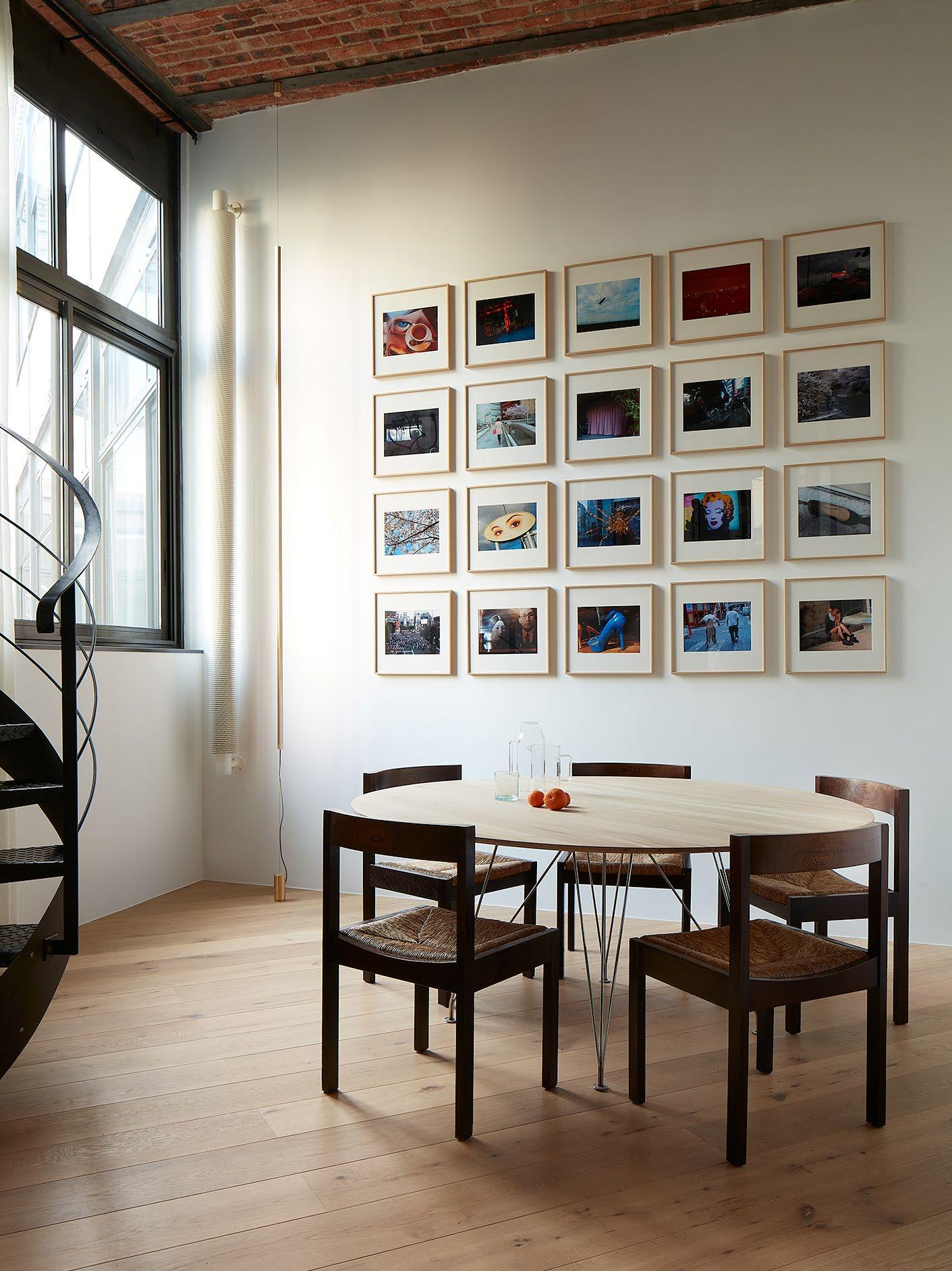 A custom-made table and lighting by DAS Studio, 1960s Wengé dining chairs by Gerard Geytenbeek produced by AZS Meubelen and photographs by Daidō Moriyama.
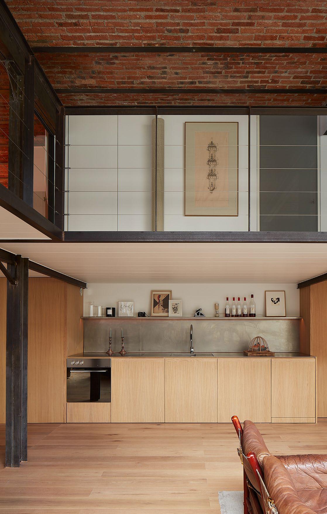
The minimalist kitchen is designed as a backdrop to the living space and conceals all of the ‘technical elements’. The oak kitchen joinery is repeated throughout the flat to create spaces with ‘strong rationality and regularity’.
ISSUE #51

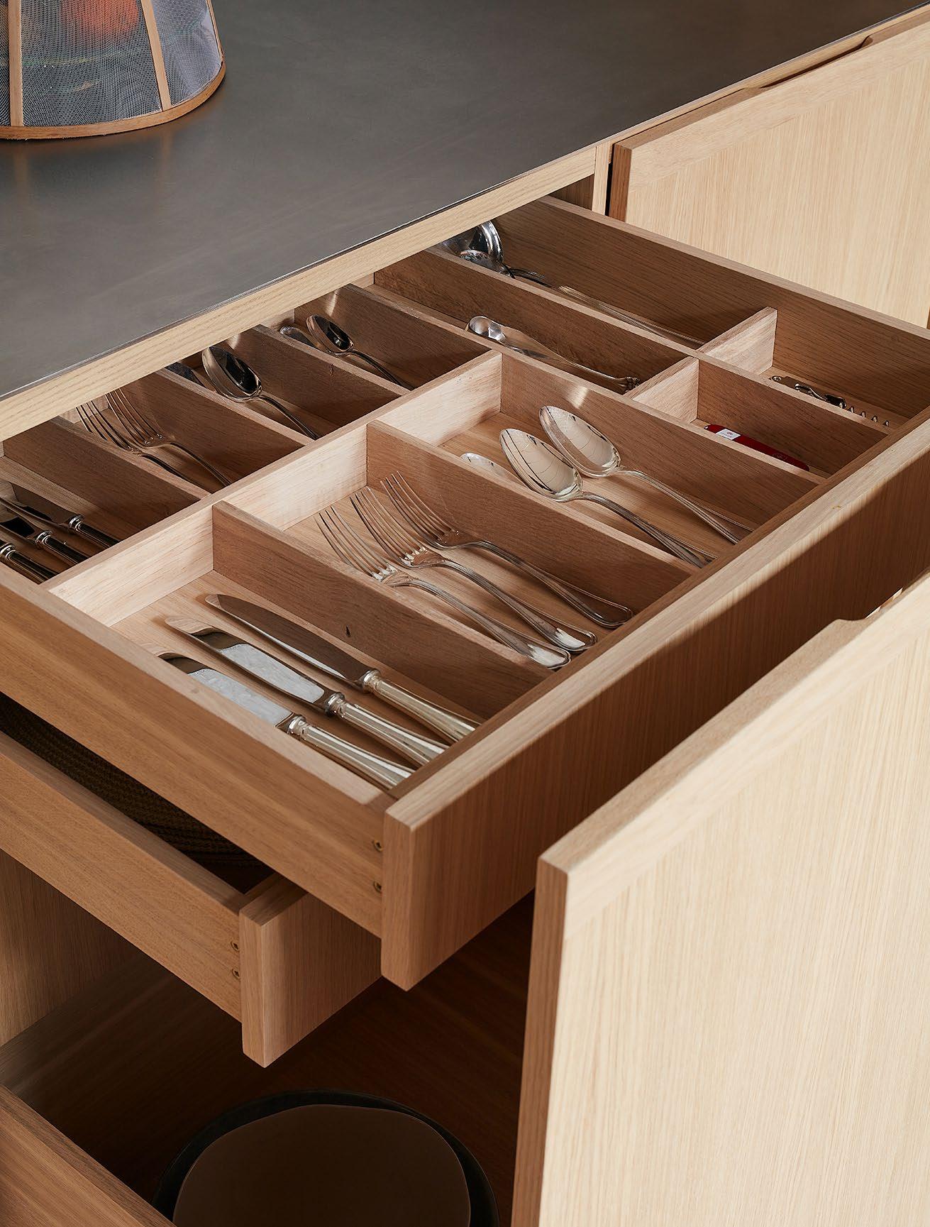
“I LIKE SPACES TO BE SIMPLE AND CLEAN; HAVING MINIMAL OAK DOORS TO CONCEAL ELEMENTS ALLOWS ME TO KEEP A SOOTHING ENVIRONMENT.”
– Felix De Montesquiou
89
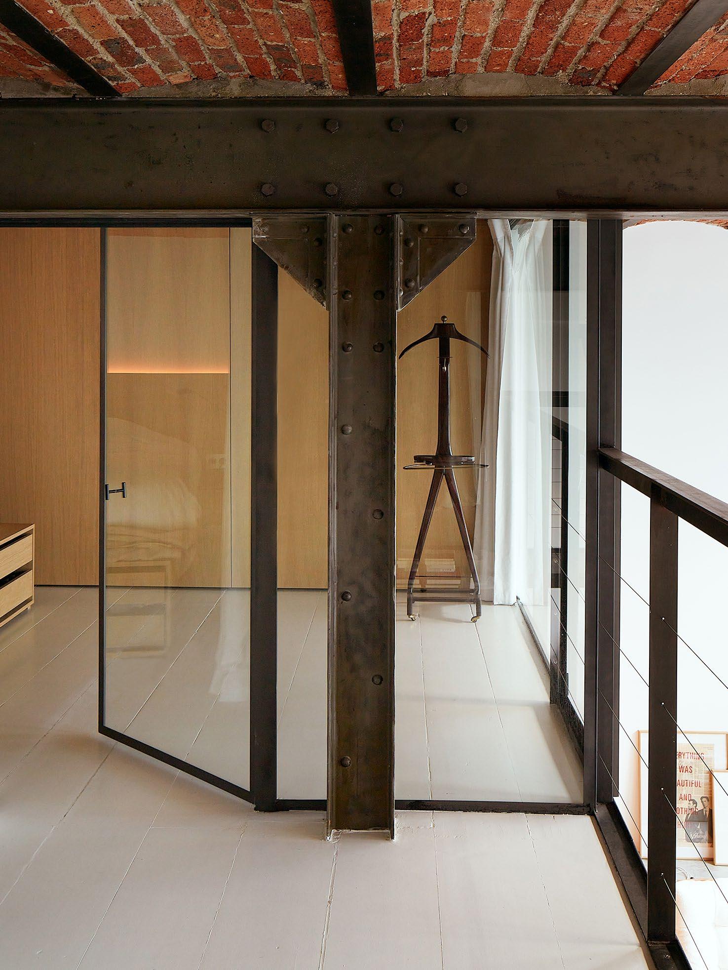 The mezzanine level features the home’s private areas. The rooms are wrapped in glass and open onto the living area, allowing light to enter throughout the day.
Working within an existing building poses spatial challenges. What are some of the unique spatial solutions you created?
As I knew we would enjoy the living space the most, I tried to integrate the technical elements such as the bathrooms, storage and fridge behind oak doors to keep the space as visually simple as possible. It’s hard to tell what opens and what doesn’t.
The bedrooms on the level mezzanine are small, cosy volumes, but they can open completely to the living space. As they were compact, I integrated lighting into the furniture to avoid complicating the space. All the storage is also tucked away, englobing the existing structure when I didn’t feel like revealing it. I also designed a new light to occupy the whole volume but remain discreet and underline the collection of Daido Moriyama photographs in the dining room.
Your home features a mezzanine level enclosed in glass. How have you pulled natural light into different areas?
The rooms on the mezzanine open completely to the living room. During the day, we keep everything open to enjoy the great light from this space.
How do the custom details reflect how you live in your home?
I like spaces to be simple and clean; having minimal oak doors to conceal elements allows me to keep a soothing environment.
I rarely work from home but do when I need maximum concentration and quietness, as my office can be busy and loud. I keep a sketchbook and some pens at home and work on the dining table where I have wonderful light.
The use of marble in the bathroom feels simple but monumental – what effect did you want to achieve here?
I wanted something that would contrast with the industrial feel of the main floor. I sourced this Italian marble with a very strong pattern because I knew I couldn’t have decorative elements in the bathroom but wanted something warm and precious.
The tub is custom-made in stainless steel, but I have covered the most visible side with a piece of marble for the same
reason. The design of these elements enhances the pattern of the marble.
Your home features a curation of art and vintage pieces. Could you share the story behind sourcing a couple of pieces and why they are personal to you?
I compulsively buy furniture in galleries in Paris and throughout the world, most of the time without knowing where I will install them.
None of the pieces were bought, especially for my Paris flat, but I tried to include furniture in my house that was most inspiring to me.
The two Katavolos chairs come from a gallery in Amsterdam and are very sculptural and minimal. I love that they look uncomfortable and unstable, but as soon as you sit in them, you realise they are the opposite.
I have had the Arne Norell sofa for a while. My dogs love it; it’s extraordinary light and is an amazing system that is completely dismountable with no screws; the leather straps tie everything together.
The coffee table is a concrete square mounted on wheels that we produce in my studio. It looks heavy, but it’s quite easy to move around as it’s hollow. It’s a rough element but well-sanded, so it is very soft to touch. It’s also great for kids who love climbing and standing on it.
The Costella chairs are one of my all-time favourite designs. So when I found an affordable pair from a gallery in Brazil, I didn’t hesitate to purchase them.
Now, living in a home of your own design, is there anything that has surprised you about how you and your family use the space?
My son is a year and a half old and enjoys running in the living room. He learned to stand and climb on the concrete table I created, although it wasn’t my intention! He spends most of his time around it, which is quite surprising as there are other areas to explore.
I remember hesitating to dedicate so much space to the kitchen, but it’s what we use the most, and we absolutely love being completely integrated in the living space.
DESIGN VOICES
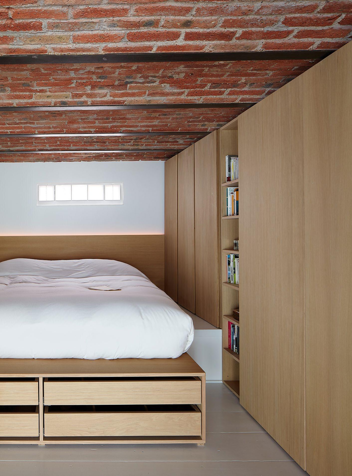
 The Italian marble in the bathroom was selected to contrast the industrial feeling of the floor below. The bathroom also features a custom-made bathtub in stainless steel, clad with marble; a design feature that enhances the marble’s strong patterning.
bauwerkcolour.com
Natural paints made by utilising the elemental cycle of earth, fre, water + air. The result is 400 natural colours with extraordinary depth, a unique textured efect, a fnish like no other.

The est eemed
10
The est eemed 10 recognises influential voices in the multidisciplinary community in 2024. Criterion is based on approach, notable achievements and completed and anticipated projects.

DESIGN VOICES 97 Proudly supported by
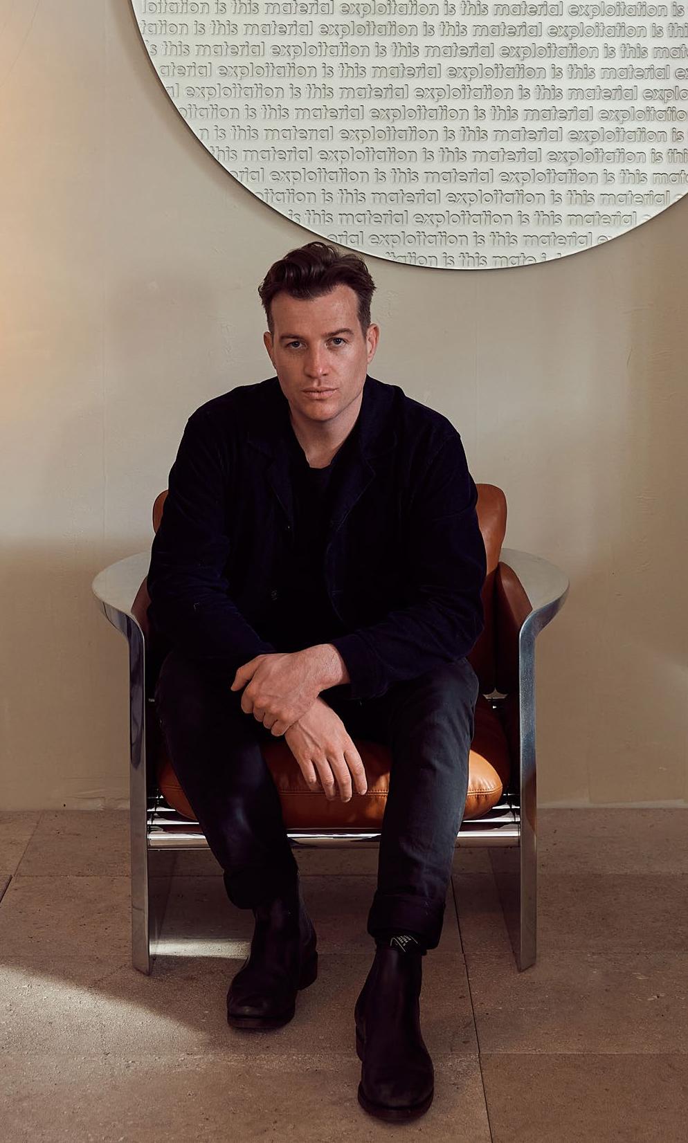
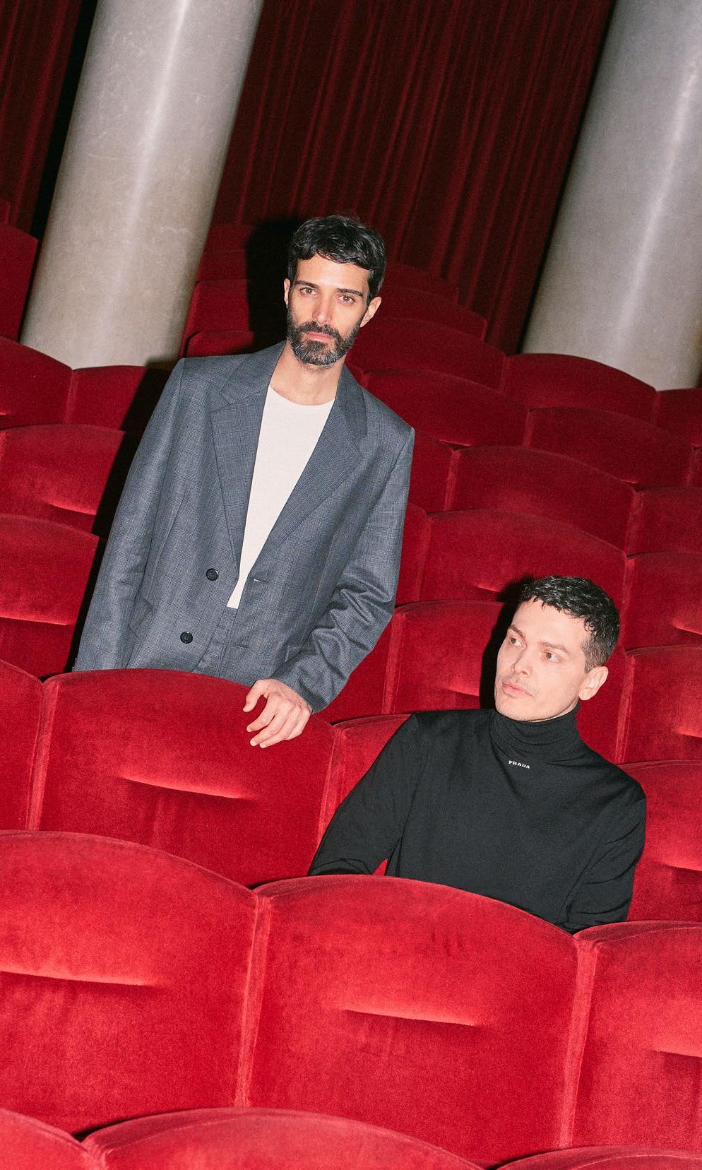


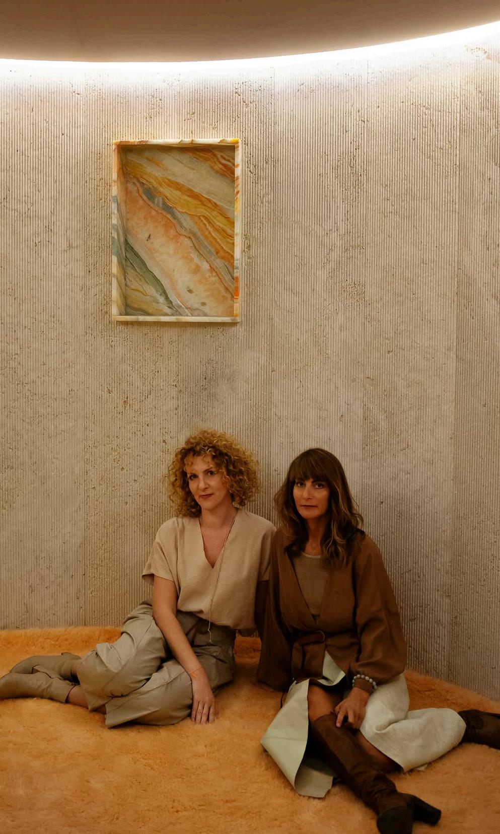


TOM FEREDAY
Gadigal Country/Sydney, Australia and London, England
DESIGN VOICES
Photography Pier Carthew Portrait Mattia Panunzio
NATURAL MATERIAL INNOVATION
Where do you go to appreciate exceptional design?
Within the workshops of the incredible makers I work with – people with decades of experience in a material specialism.
The one thing people always ask me is: What is Australian design?
Three words that most appropriately sum up my approach to design are:
Natural, material, innovation.
What key infuence can we anticipate seeing in projects you are yet to release?
How light beautifully interacts with glass.
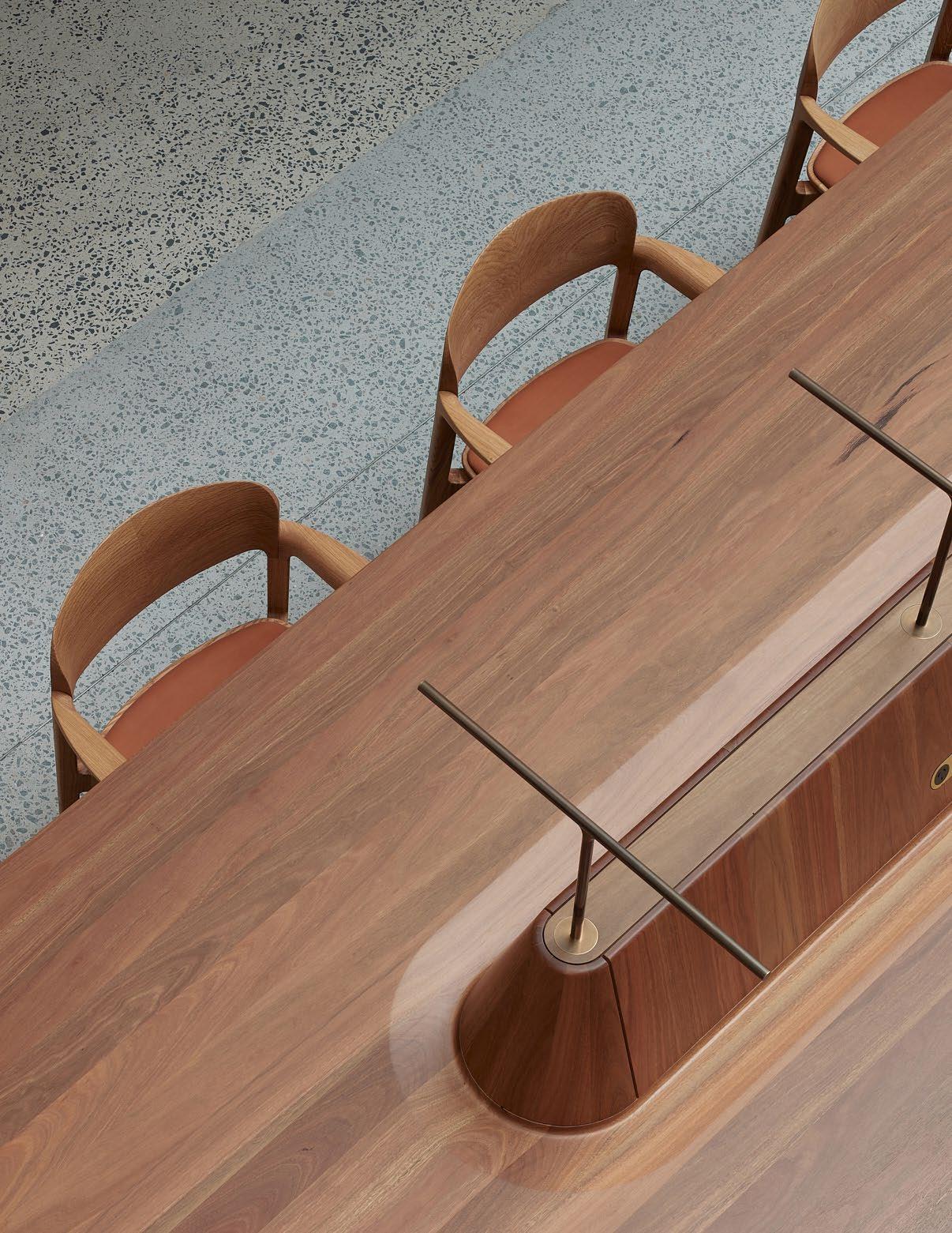
What is the one piece of advice you would share with an emerging designer?
Sometimes you have come up with something truly special and sometimes there is a good reason why someone has not created your idea before. Understanding when to stick and when to twist is an important and challenging lesson.
What’s the frst thing you always notice when you walk into a room?
The general feeling of a room – often the lighting ambience, subtle material details and space layout.
What product/s or piece/s do you admire most right now?
South Korea-based silversmith Hyun-seok Sim’s functional sterling silver pinhole cameras.
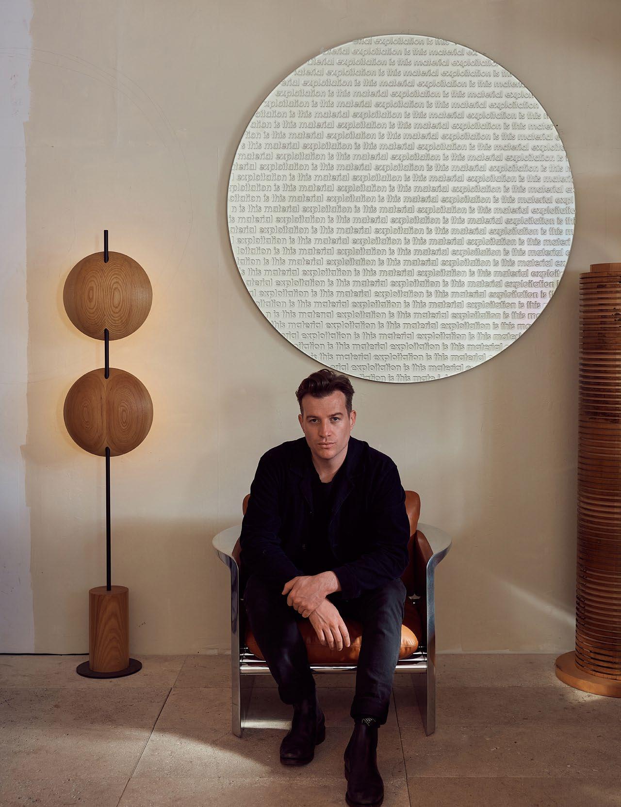
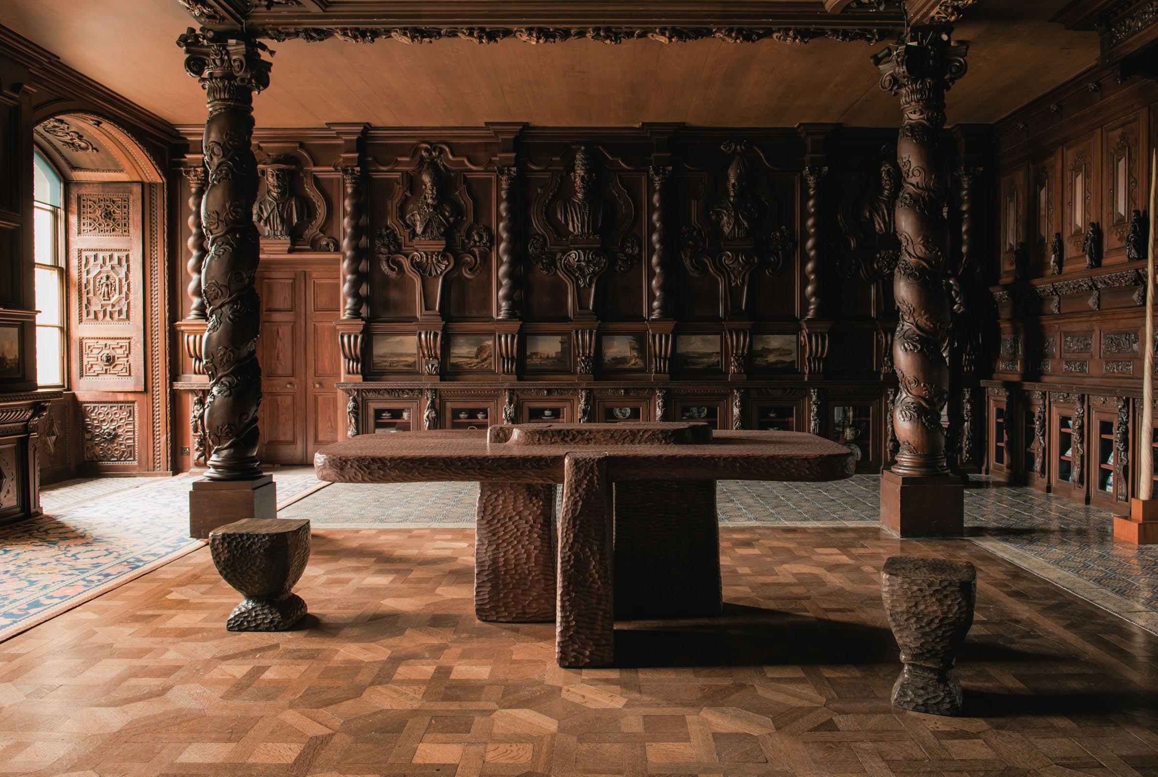
Where do you go to appreciate exceptional design?
New York – the galleries and museums are exceptional.
The one thing people always ask me is: Toogood, is that your real name?
Three words that most appropriately sum up my approach to design are:
Sculptural, naive, experimental.
What key infuence can we anticipate seeing in projects you are yet to release?
Artist Philip Guston, artist Alberto Giacometti, photographer Martin Parr and Northern Soul music.
What is the one piece of advice you would share with an emerging designer?
Stop looking at everybody else’s work. It will make you feel bad about yourself, and it will make you recreate what others are doing. Stop looking at everybody’s lives, too. It’s unhealthy and doesn’t allow you your independence and individuality. It’s very difficult to stop looking, but it’s very necessary.
What’s the frst thing you always notice when you walk into a room?
The quality of the light.
What product/s or piece/s do you admire most right now?
One of my favourite designers/architects is Marcel Breuer. I covet his plywood lounger.
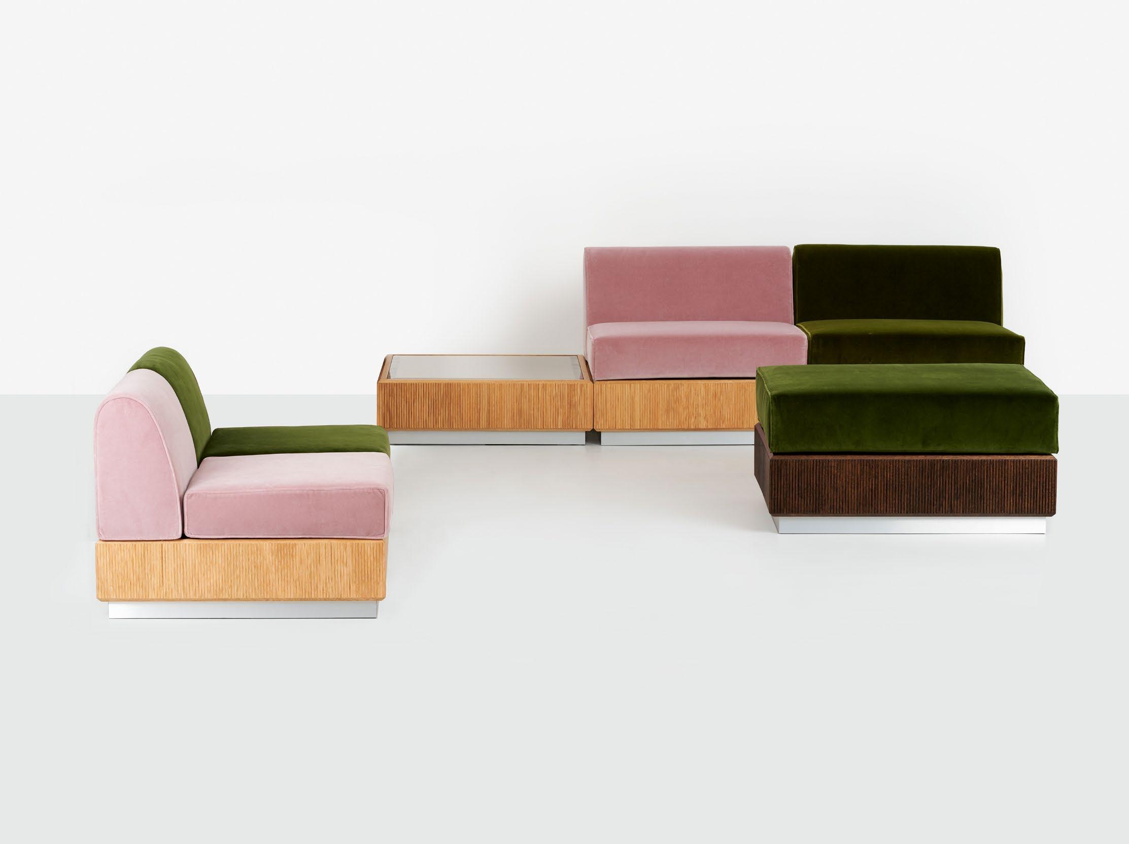
ISSUE #51
TOOGOOD
Founder Faye Toogood
London, England
 Photography Genevieve Lutkin
SCULPTURAL NAIVE EXPERIMENTAL

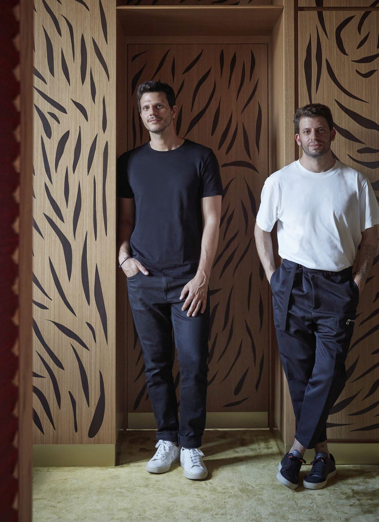
DAVID/NICOLAS
Milan, Beirut and San Francisco
Founders David Raffoul and Nicolas Moussallem
DESIGN VOICES
Photography Sara Magni
TIME SPACE POETRY
Where do you go to appreciate exceptional design?
Musée des Arts Décoratifs and the Glass House by Pierre Chareau in Paris, Villa Necchi in Milan and the International Fair in Tripoli, Lebanon by Oscar Niemeyer.
The one thing people always ask me is: How did you meet?
Three words that most appropriately sum up my approach to design are: Time, space, poetry.
What is the one piece of advice you would share with an emerging designer?
Explore and nurture what makes you unique in your field. Your individuality is your greatest strength; focus on discovering and cultivating your distinctive style, approach, or perspective.
What’s the frst thing you always notice when you walk into a room?
The light and windows.
What product/s or piece/s do you admire most right now?
Pierre Chareau Curule en M stool model No.Sn1.
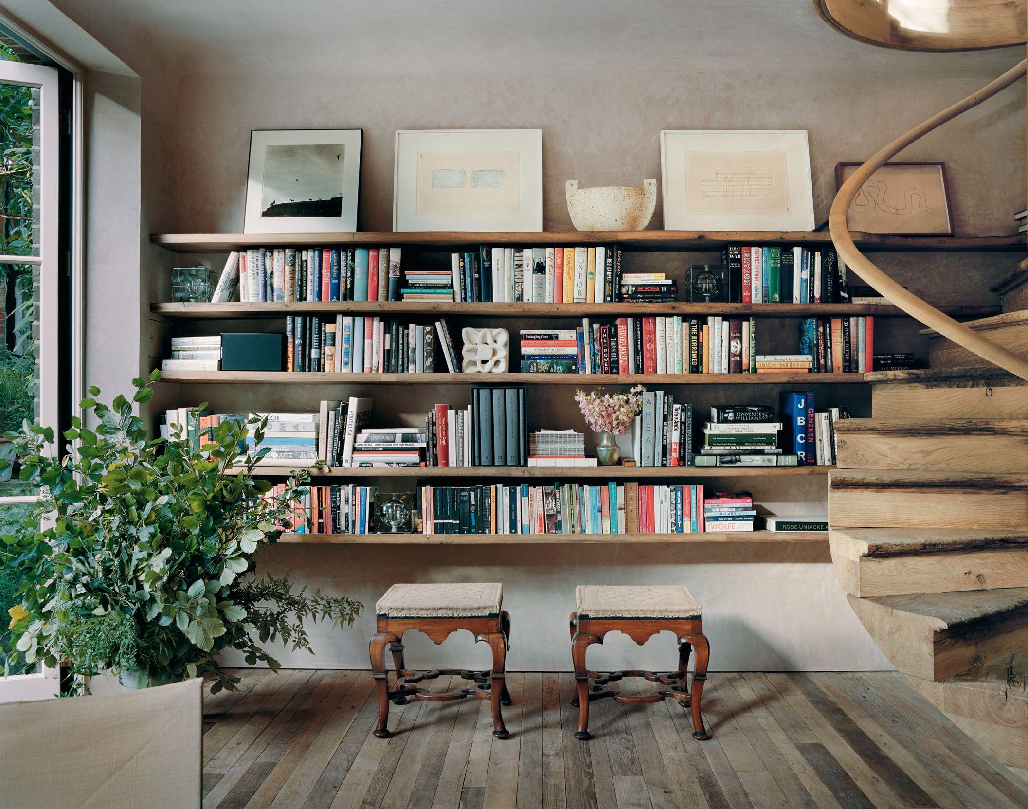
Where do you go to appreciate exceptional design?
I travel a lot. There is so much great design to see. I visit interesting architecture whenever I can. Particular favourites include Schindler House in LA and Maison de Verre in Paris. There are so many gems all over the world.
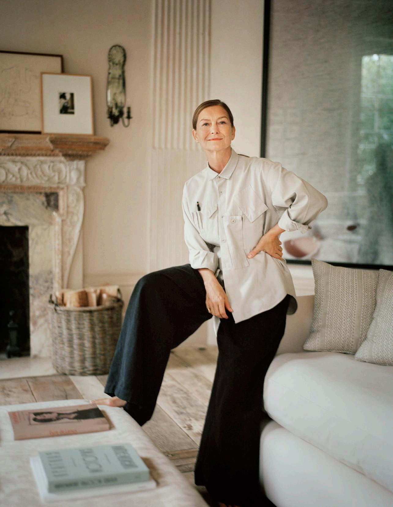
The one thing people always ask me is:
Will you do my house?
Three words that most appropriately sum up my approach to design are:
Atmosphere, beauty, practicality.
What is the one piece of advice you would share with an emerging designer?
Trust yourself; be brave and create your own narrative. Believe in what you love, find your voice, experiment and feel how things work.
What’s the frst thing you always notice when you walk into a room?
Is it welcoming? Does it have a strong and interesting point of view? Does it hold you? Is it inspiring?
What product/s or piece/s do you admire most right now?
I have just bought a Japanese chopping board. It's beautiful, elegant, and simple. Made from Japanese slow-grown pine/cedar, musical instrument grade, it is gently shaped at the edges in a way that it feels light and delicate and lovely to touch. Alongside its beauty, it has a purpose.
ROSE UNIACKE
London, England
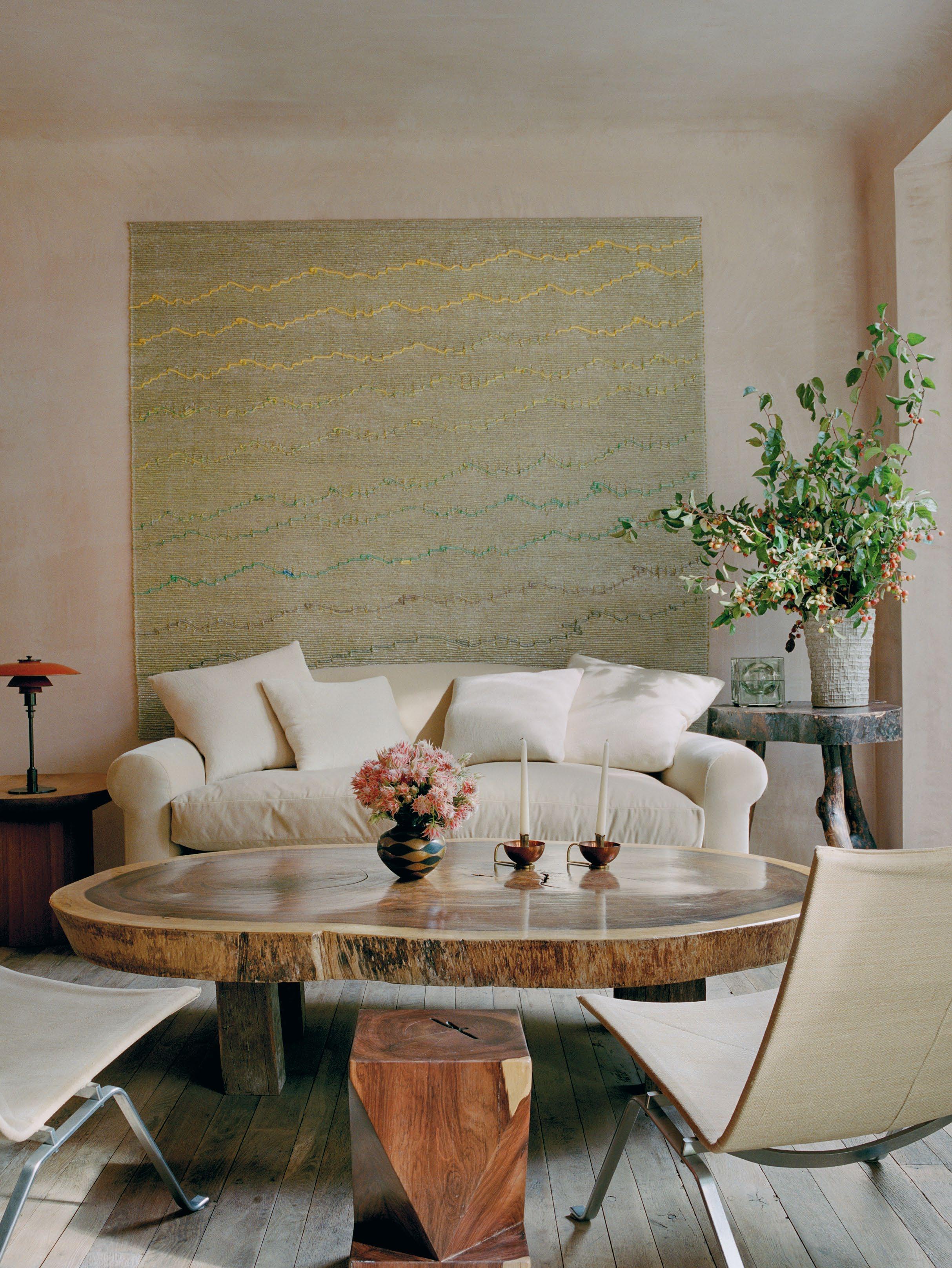
ATMOSPHERE
BEAUTY
PRACTICALITY
DESIGN VOICES
Photography François Halard
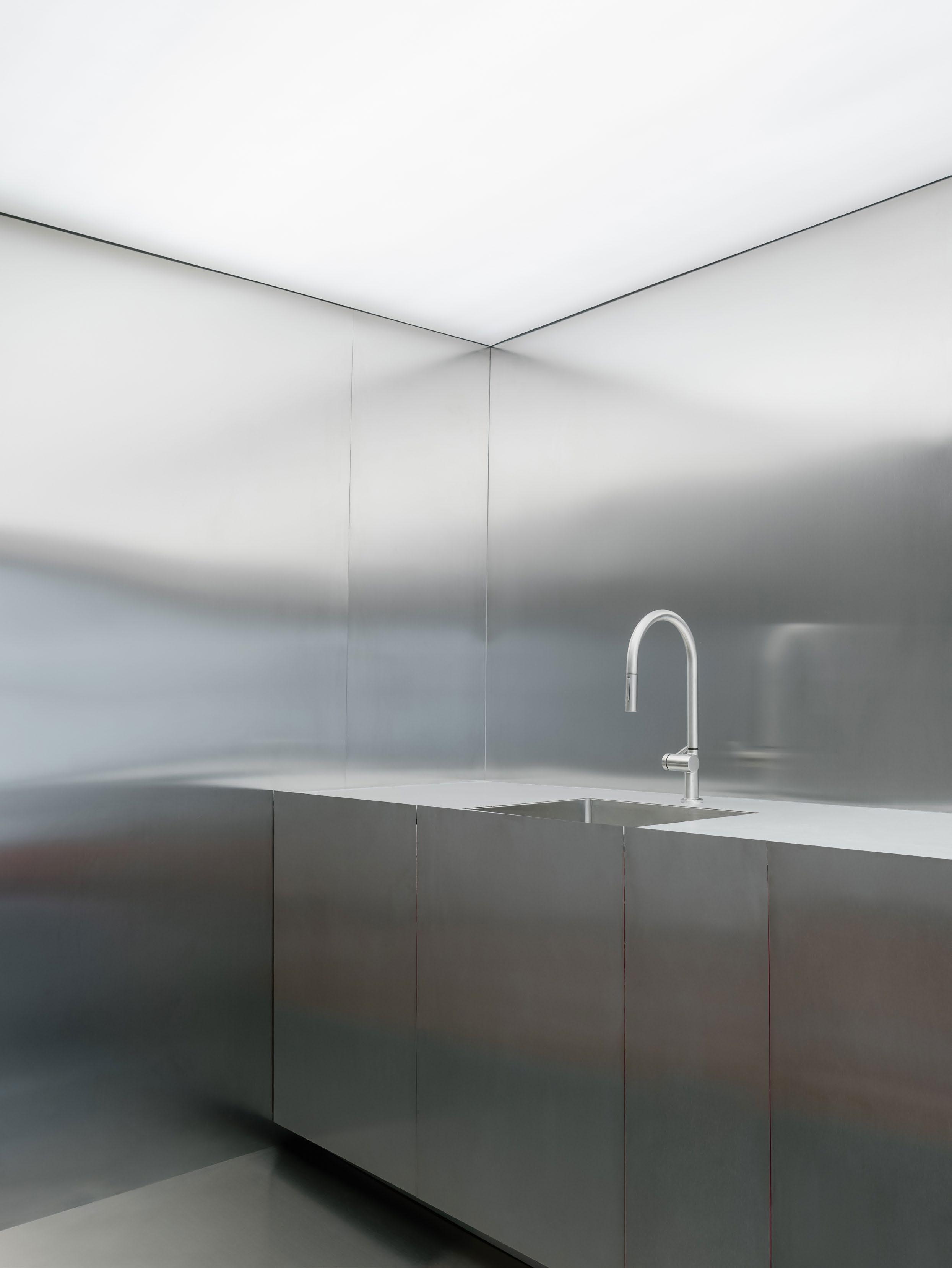
CROSBY STUDIOS
Founder Harry Nuriev
Paris, France and New York City, North America
Photography Benoit Florencon, Joshua White
DESIGN VOICES
Portrait Benjamin Baccarani. Courtesy: Carpenters Workshop Gallery
ONE WORD: TRANSFORMATION
Where do you go to appreciate exceptional design?
I find it in random places. It could be an old library or hardware store.
The one thing people always ask me is:
How do you find your voice as an artist?
Three words that most appropriately sum up my approach to design are:
One word: transformation.
What key infuence can we anticipate seeing in projects you are yet to release?
The French culture of art, design, fashion and craftsmanship.
What is the one piece of advice you would share with an emerging designer?
Don’t wait until someone knocks on your door. Believe in yourself. Be disciplined and do your art. And this art will bring more art.
What’s the frst thing you always notice when you walk into a room?
Balance
What product/s or piece/s do you admire most right now?
I’d rather we had fewer products. We are too overwhelmed with products.
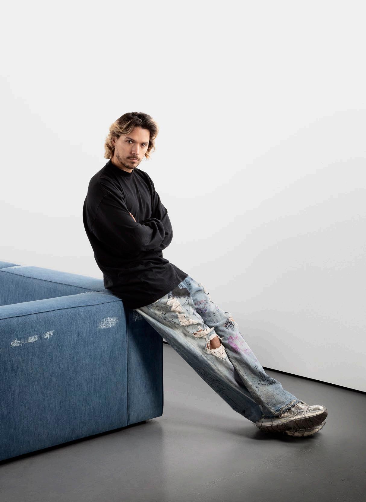
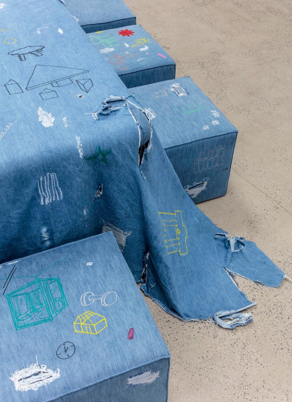
Where do you go to appreciate exceptional design?
To mention some classics: Castelvecchio by Carlo Scarpa, Palazzo Abatellis in Palermo and Studio BBPR at Castello Sforzesco in Milan.

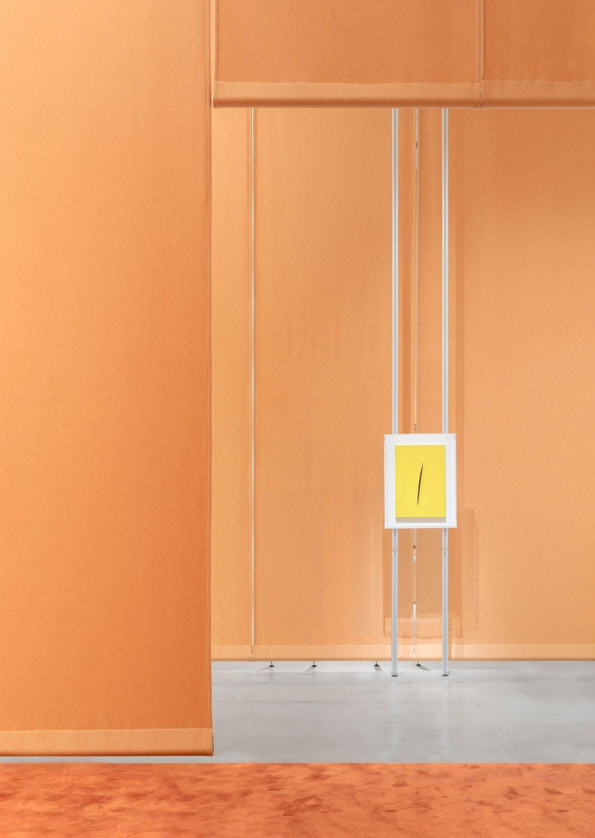
The one thing people always ask me is:
What is the meaning of your name, FormaFantasma?
Three words that most appropriately sum up my approach to design Research-based, contextual, political.
What key infuence can we anticipate seeing in projects you are yet release?
There are multiple works with multiple influences. The work of Enzo Mari has significantly impacted our work because of his approach to design, which is never to look at it from a formal perspective.
What is the one piece of advice you would share with an emerging designer?
If they want to have their own office and not work for others, do not compromise initially. Compromises are better later in life.
What’s the frst thing you always notice when you walk into a room?
Either great details, or everything that does not work. Unfortunately, we are trained to notice what isn’t working.
What product/s or piece/s do you admire most right now?
The classic straw broom. It’s made of very little; it’s one gesture. It’s almost all natural materials, and it can be replicated almost globally with natural materials.
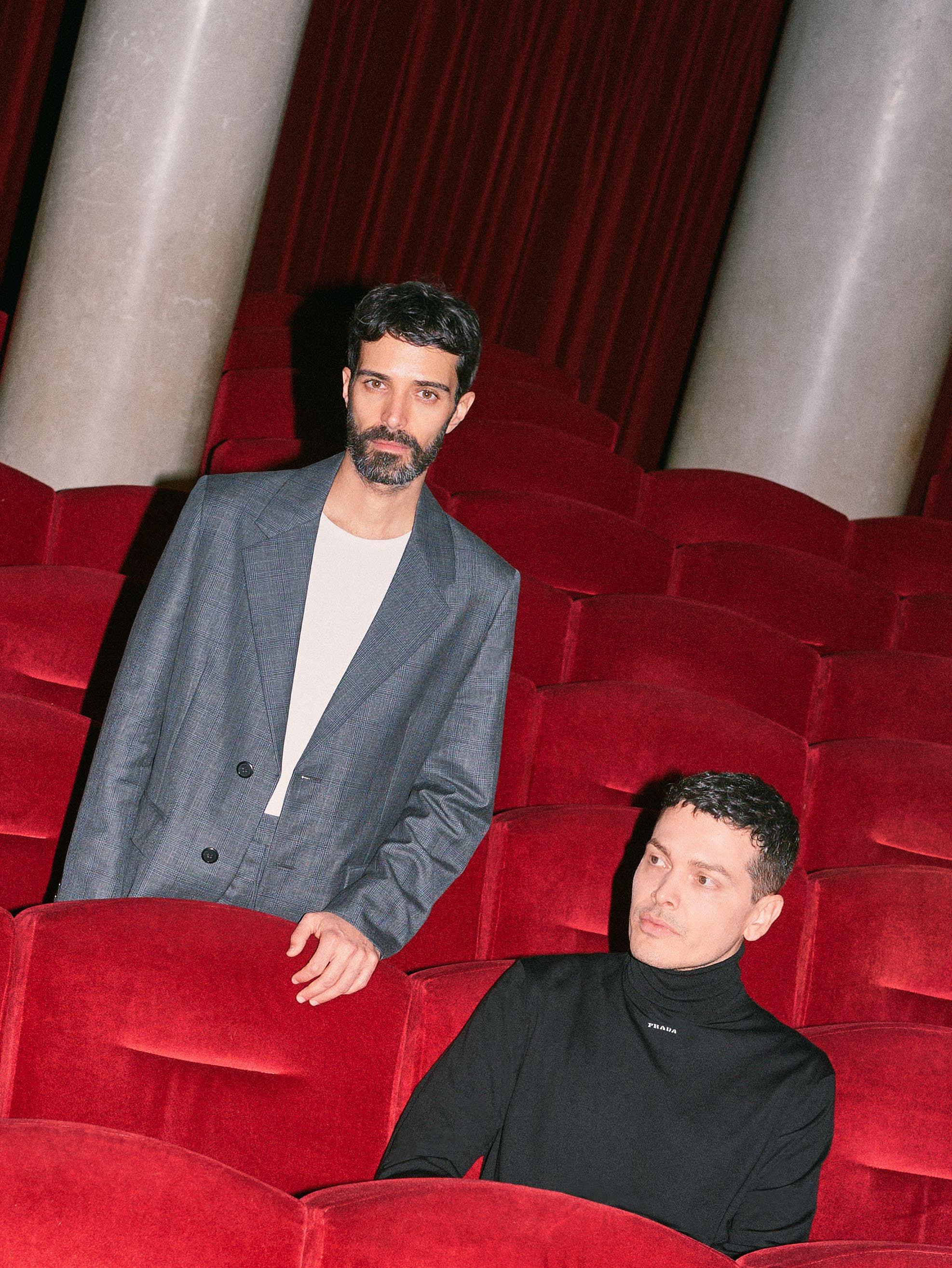
FORMAFANTASMA
Founders Andrea Trimarchi and Simone Farresin
Milan, Italy
Photography Marco Cappelletti
RESEARCH-BASED CONTEXTUAL POLITICAL DESIGN VOICES
Portrait Gregorio Gonella
in are: to never compromise room? trained all materials.
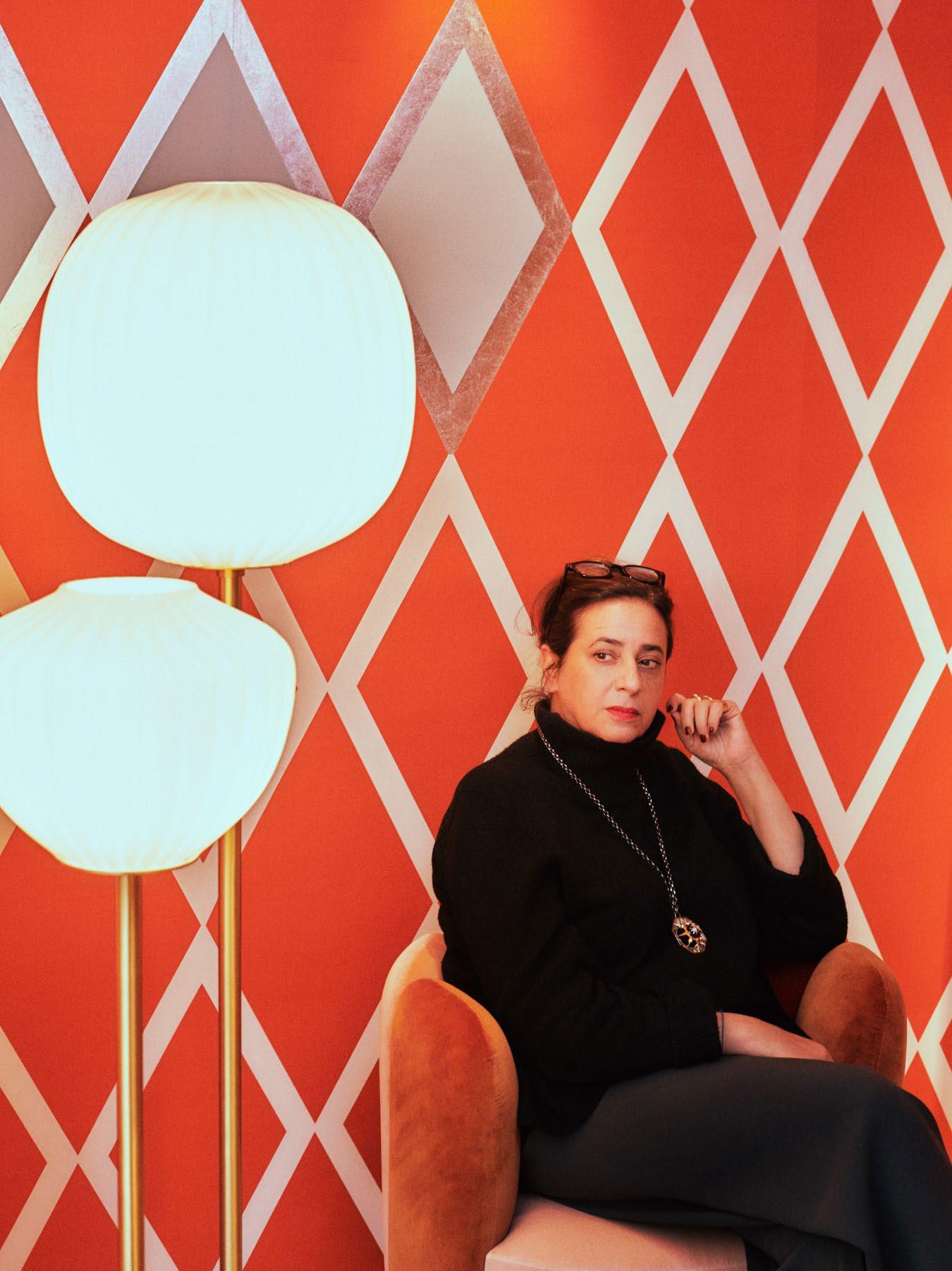
INDIA MAHDAVI
Paris, France
Photography Lillie Thompson, François Halard
DESIGN VOICES
Portrait Antoine Doyen
POLYGLOTTE POLYCHROME LOCAL
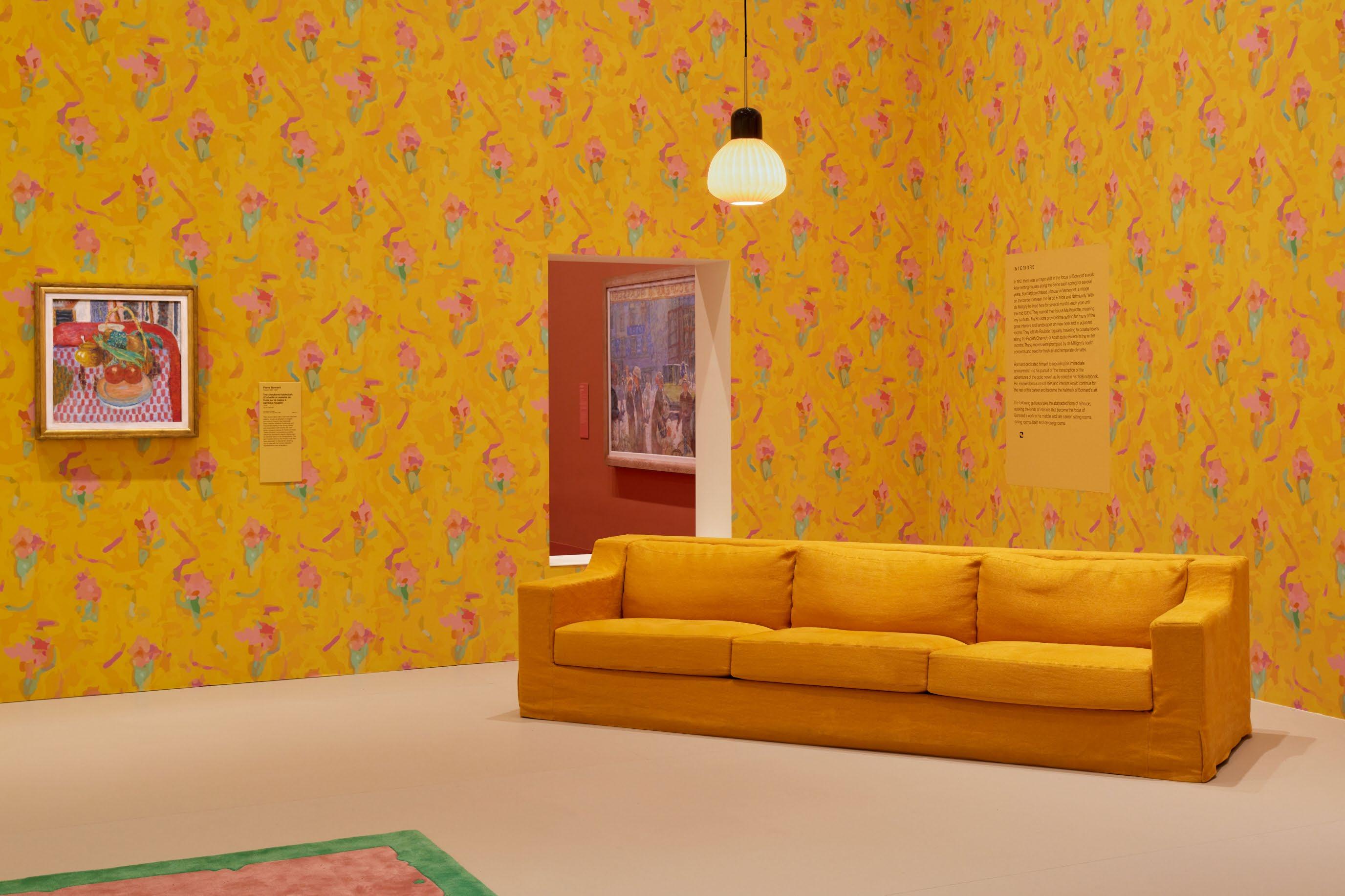
Where do you go to appreciate exceptional design?
Milan Design Week, although I appreciate exceptional design all around the world.
The one thing people always ask me is:
What is your favourite colour?
Three words that most appropriately sum up my approach to design are:
Polyglotte, polychrome, local.
What key infuence can we anticipate seeing in projects you are yet to release?
Less building, more ornament.
What is the one piece of advice you would share with an emerging designer?
Hard work, humility and curiosity.
What’s the frst thing you always notice when you walk into a room?
The atmosphere.
What product/s or piece/s do you admire most right now? Ronan Bouroullec’s ceramic landscapes.

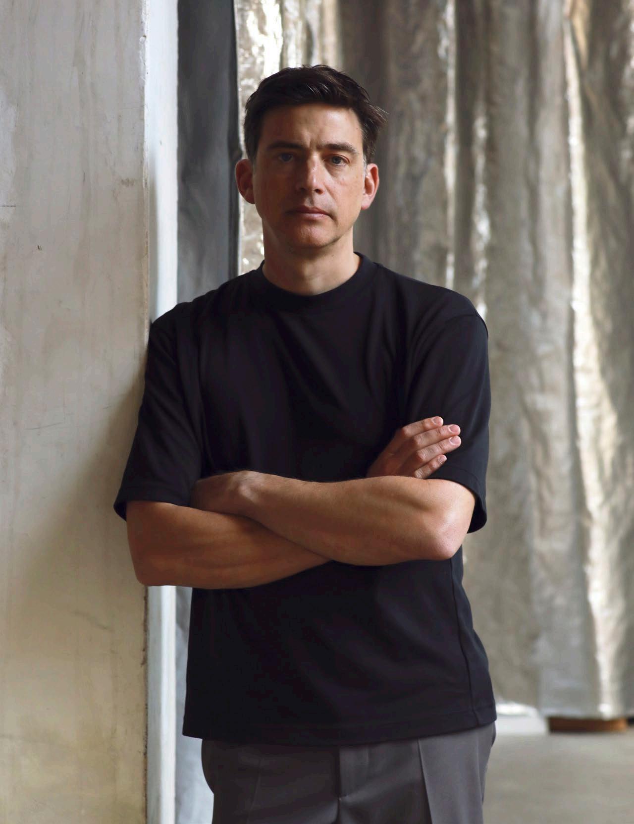
HONEST FUNCTIONAL SIMPLE
Where do you go to appreciate exceptional design?
Broadly, Italy and Japan are the places I visit with design on the agenda. I visit Salone del Mobile in Milan nearly every year, and as crazy as it has become, it does become the epicentre of design for that one week a year.
The one thing people always ask me is:
What was it like to work for Marc Newson?
Three words that most appropriately sum up my approach to design are:
Honest, functional, simple.
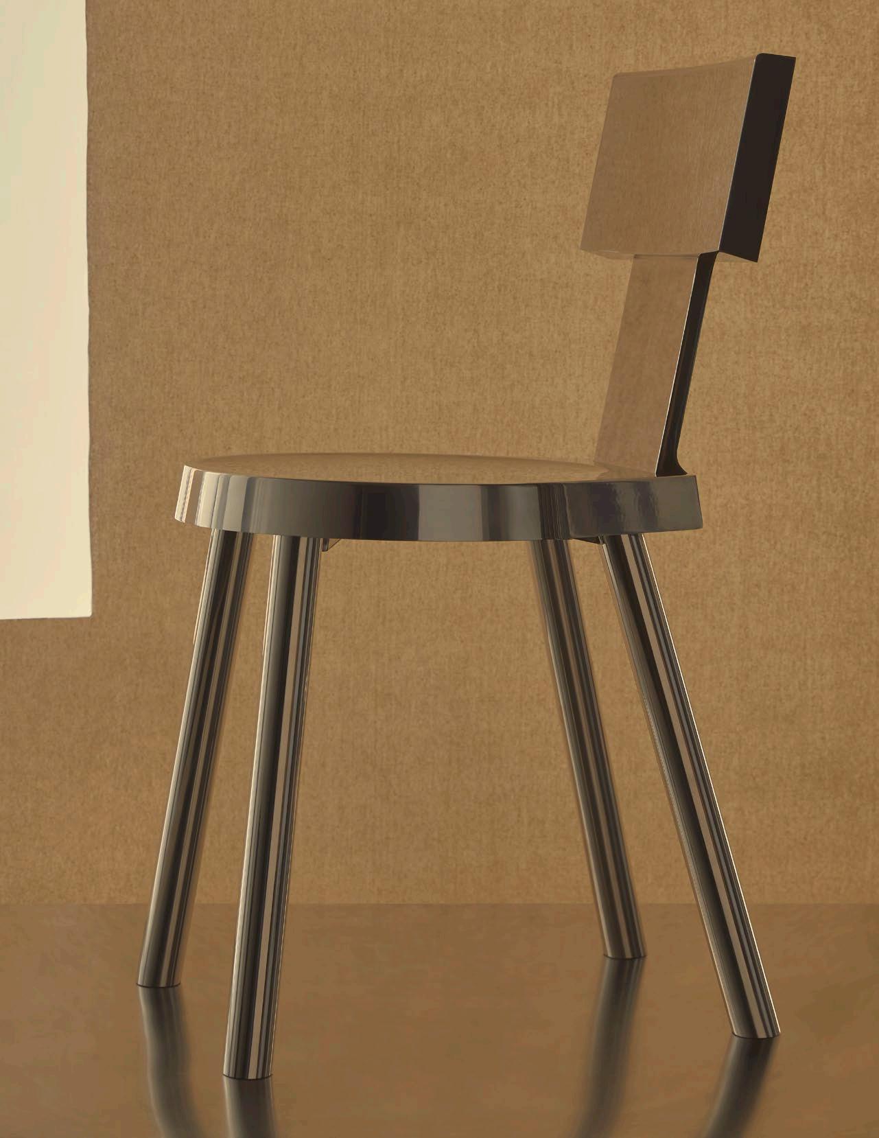
What key infuence can we anticipate seeing in projects you are yet to release?
I have been evolving my approach to design in recent years. I am thinking more about simplicity in my work, which is starting to show. There's probably a growing appreciation of Dieter Rams there, so the focus is to remove detail rather than add.
What is the one piece of advice you would share with an emerging designer?
To focus on the idea and to keep things simple. Modern technology and tools allow for a huge amount of complexity, but this doesn't mean that it will make a beautiful or functional object. Knowing what not to do comes with experience, which I truly appreciate. Also scale – think about scale and proportion.
What’s the frst thing you always notice when you walk into a room?
Probably the lighting and then everything else. Lighting can make or break a space whether it's natural or designed.
What product/s or piece/s do you admire most right now?
I think the next piece I buy will be the Vitsoe 620 chair in line with my appreciation of Dieter Rams' body of work.
CAON DESIGN OFFICE
Founder David Caon
Gadigal Country/Sydney, Australia
Photography Lillie Thompson, Nick Tsindos & Anson
Smart Portrait Nick Tsindos
DESIGN VOICES
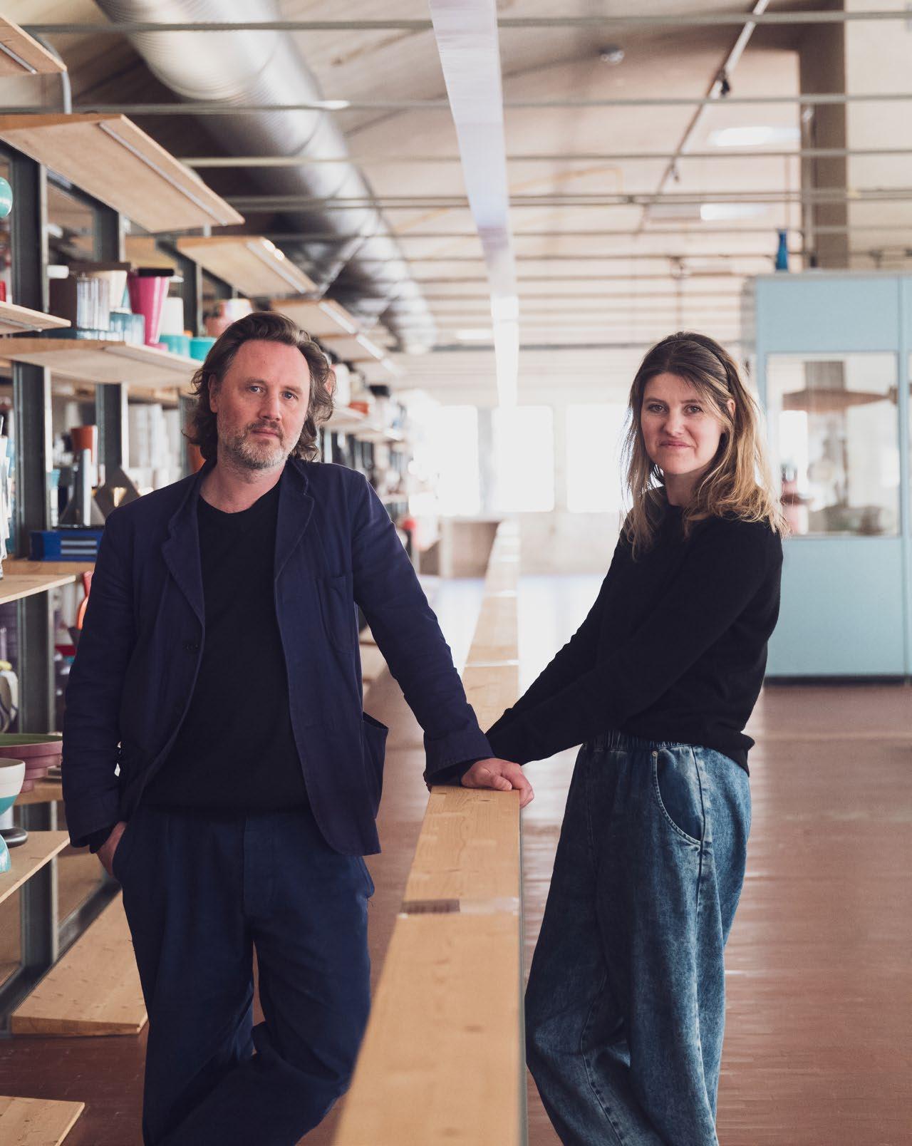
STUDIOPEPE.
Milan, Italy
Photography Silvia Sirpresi
Portrait Andrea Ferrari
DESIGN VOICES
Founders Arianna Lelli Mami and Chiara di Pinto
BALANCE MATERIAL SCULPTURE
Where do you go to appreciate exceptional design?
We like going to ethnographic and archeological museums around the world. That’s where we find what we call ‘pristine’ design, something that comes right before design and is truly inspiring.
The one thing people always ask me is: How did you meet? (In Mexico)
Three words that most appropriately sum up my approach to design are:
Balance, material, sculpture.
What key infuence can we anticipate seeing in projects you are yet to release?
Costantino Nivola, African folk architecture and surfaces and Tobia Scarpa - we love contrasting dialogue.
What is the one piece of advice you would share with an emerging designer?
Look, study and sketch.
What’s the frst thing you always notice when you walk into a room?
Light and volumes.
What product/s or piece/s do you admire most right now?
Andrea Brazi sculptures, LOEWE OBJECTS of research presented yearly at Milan Design Week and the Hermès home collection.

PROPORTION APPEARANCE HONESTY
Where do you go to appreciate exceptional design?
Galerie kreo, Paris
The one thing people always ask me is:
Where do you find inspiration, and how do you work as a couple?
Three words that most appropriately sum up my approach to design are:
Proportion, appearance, honesty.
What key infuence can we anticipate seeing in projects you are to release?
Perforation, transparency and repetition.
What is the one piece of advice you would share with an emerging designer?
Don't look too much at others; look within yourself and create the language you want to speak.
What’s the frst thing you always notice when you walk into a room?
The windows.
What product/s or piece/s do you admire most right now?
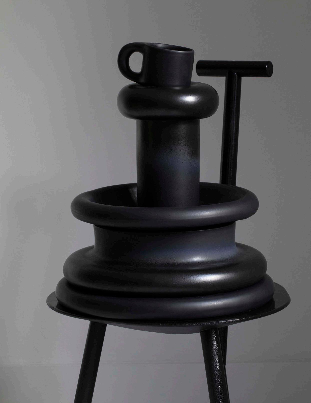
The new Bilboquet light by Philippe Malouin for Flos and the new Black Flag light by Konstantin Grcic for Flos.

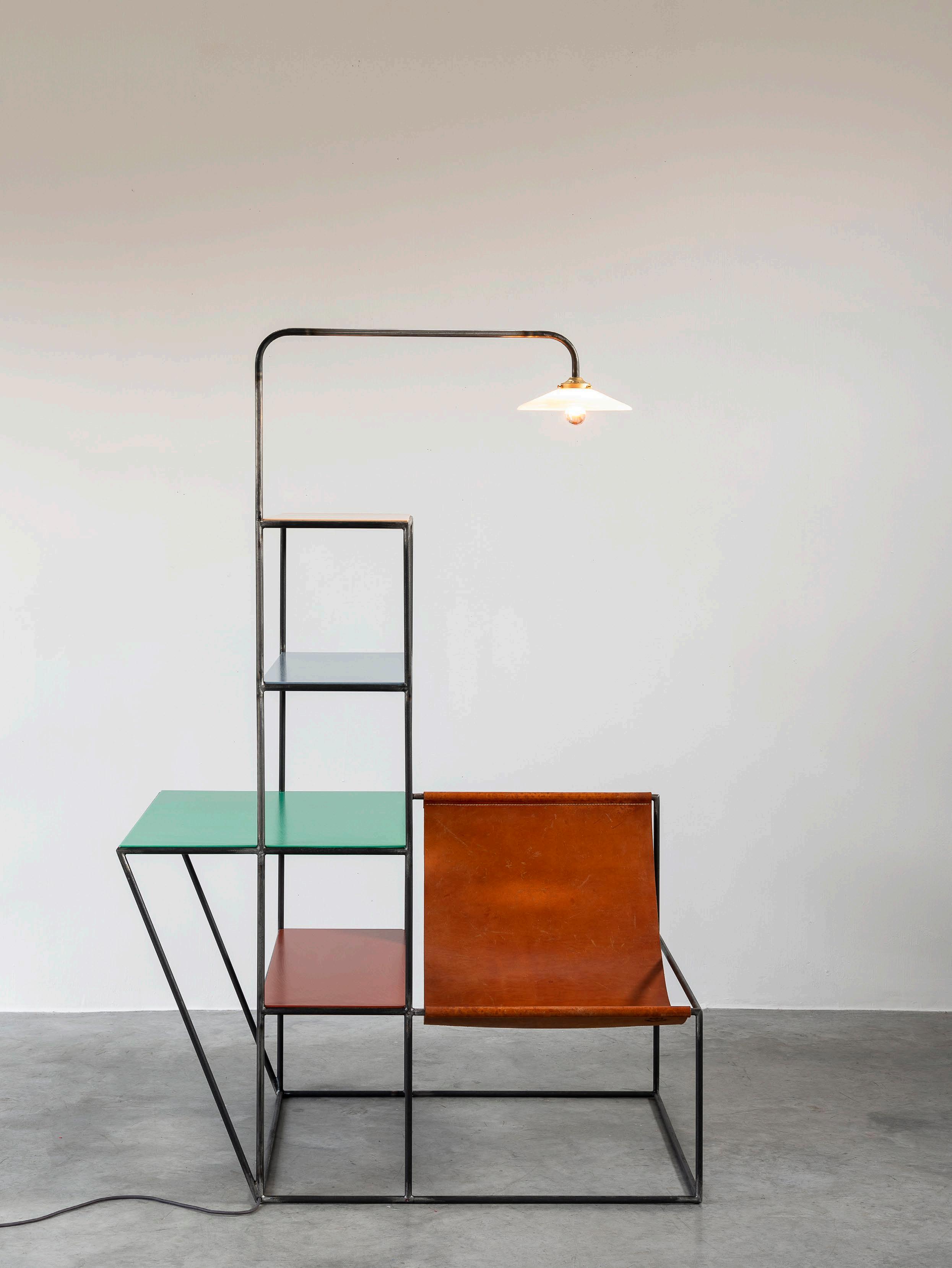
MULLER VAN SEVEREN
Founders Fien Muller & Hannes Van Severen
Evergem, Belgium
Photography Frederik Vercruysse, Fien Muller
DESIGN VOICES design yet emerging language room? Flag
Portrait Clara Vannucci
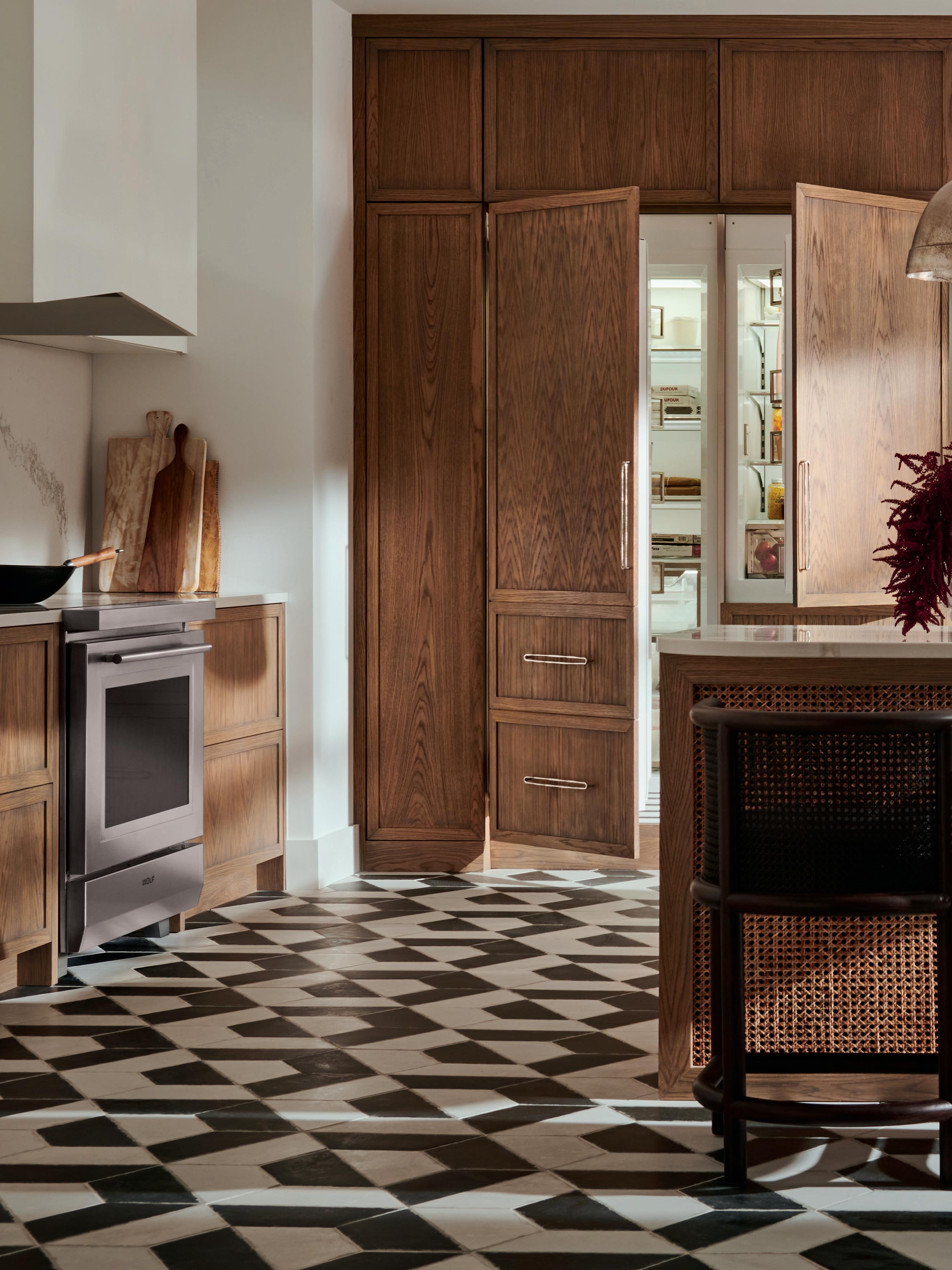
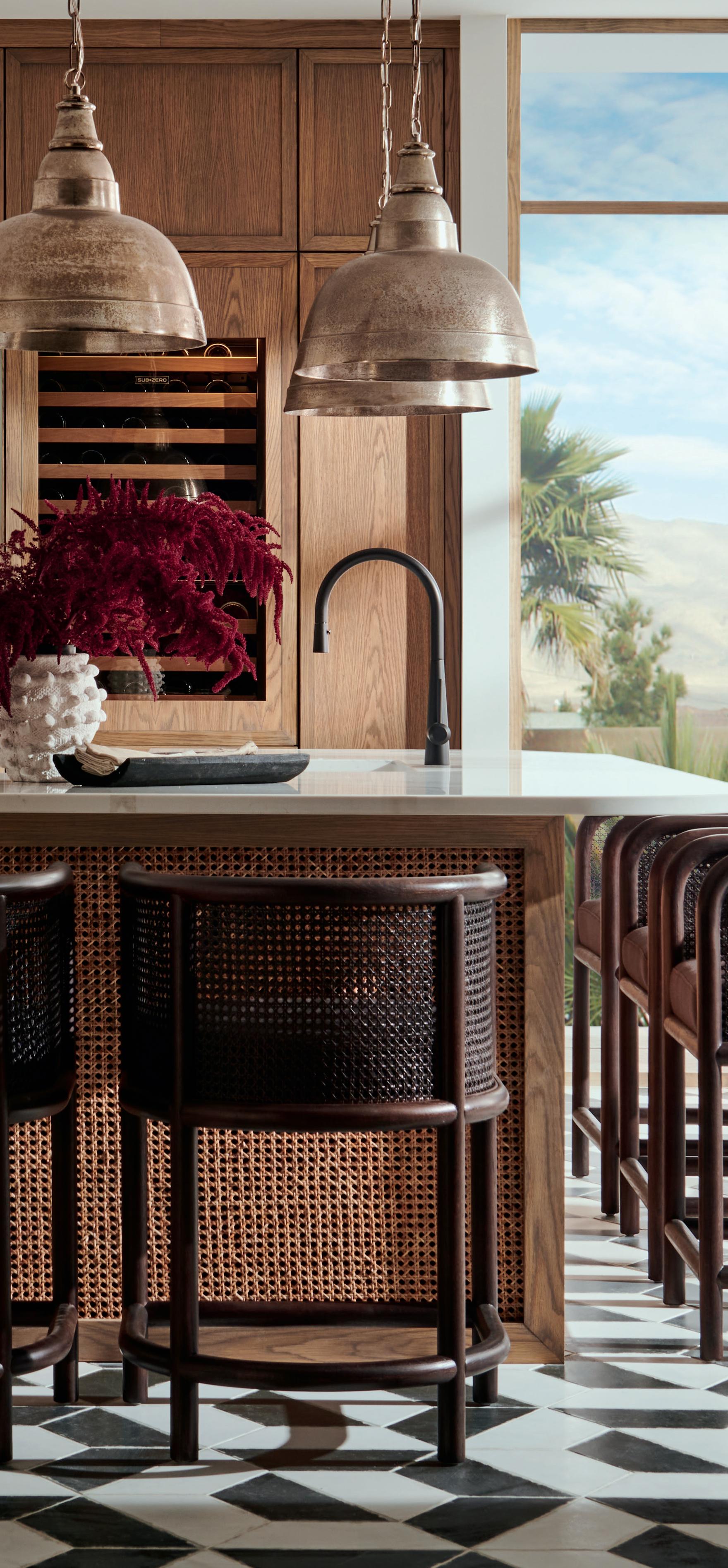
Savour the ingredients that stay fresher longer with Sub-Zero, the food and wine preservation specialist, the meals that are cooked to masterful precision with Wolf, the cooking specialist, and a kitchen appointed with elegantly crafted appliances.
Newly refined, inside and out, explore the Sub-Zero Wolf design possibilities.
MELBOURNE SHOWROOM , Bank House. 11-19 Bank Place, Melbourne.
SYDNEY SHOWROOM, Foveaux House. 63 Foveaux Street, Surry Hills.
subzero-wolf.com.au
ook
Preserve masterfully. Cook precisely. Live deliciously.
Re f r ig er at ion. C
i ng
COMMON
THREAD
AN EAST MELBOURNE
HOME CONTEMPLATES LEGACY THROUGH AN EQUALLY SENSITIVE AND CONTEMPORARY DESIGN INTERVENTION.
LOCATION | Wurundjeri Woi Wurrung Country / Melbourne, Australia
DESIGN | Hecker Guthrie PHOTOGRAPHY | Shannon McGrath
WORDS | Sophie Lewis
est magazine ISSUE #51
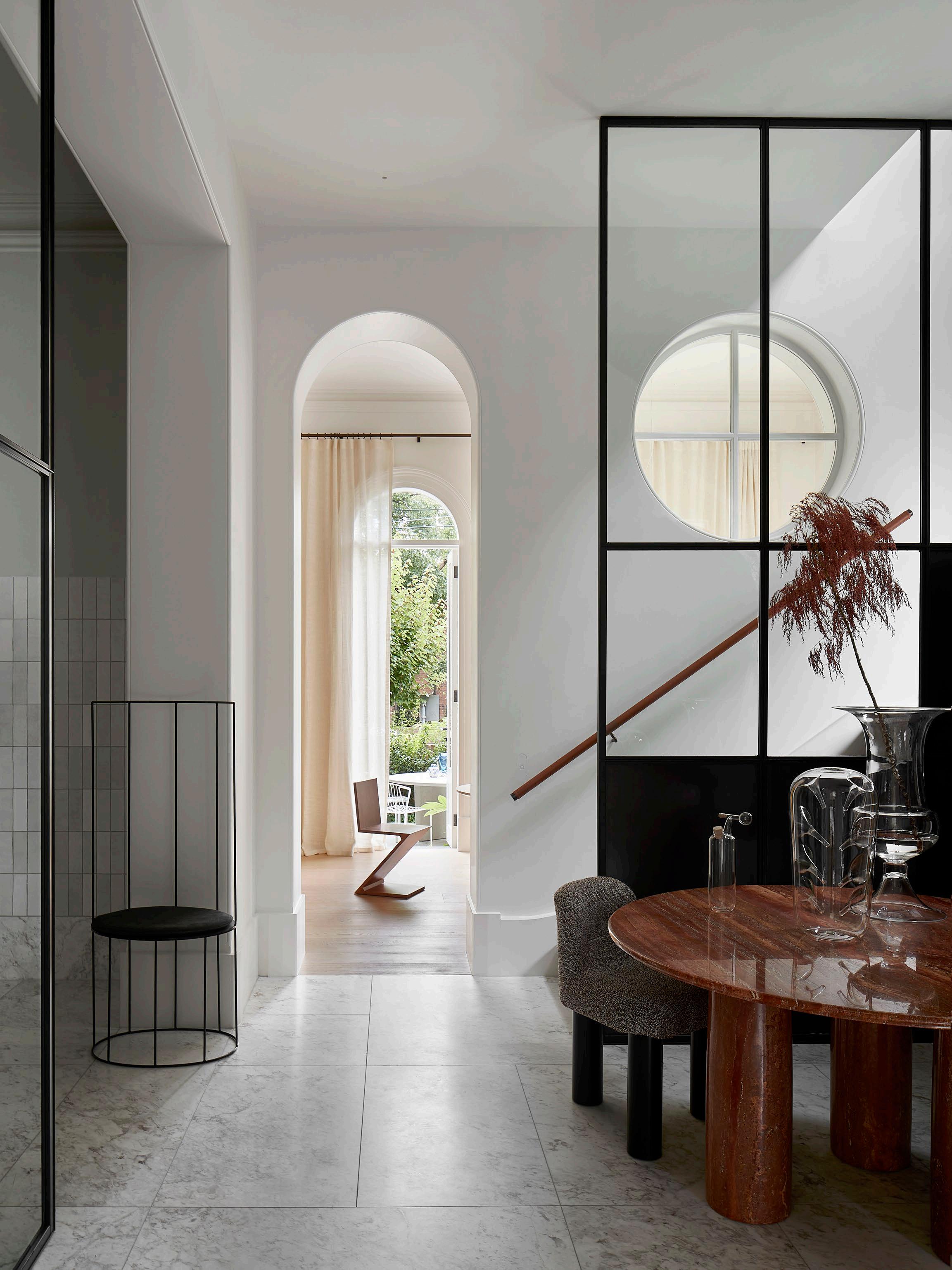
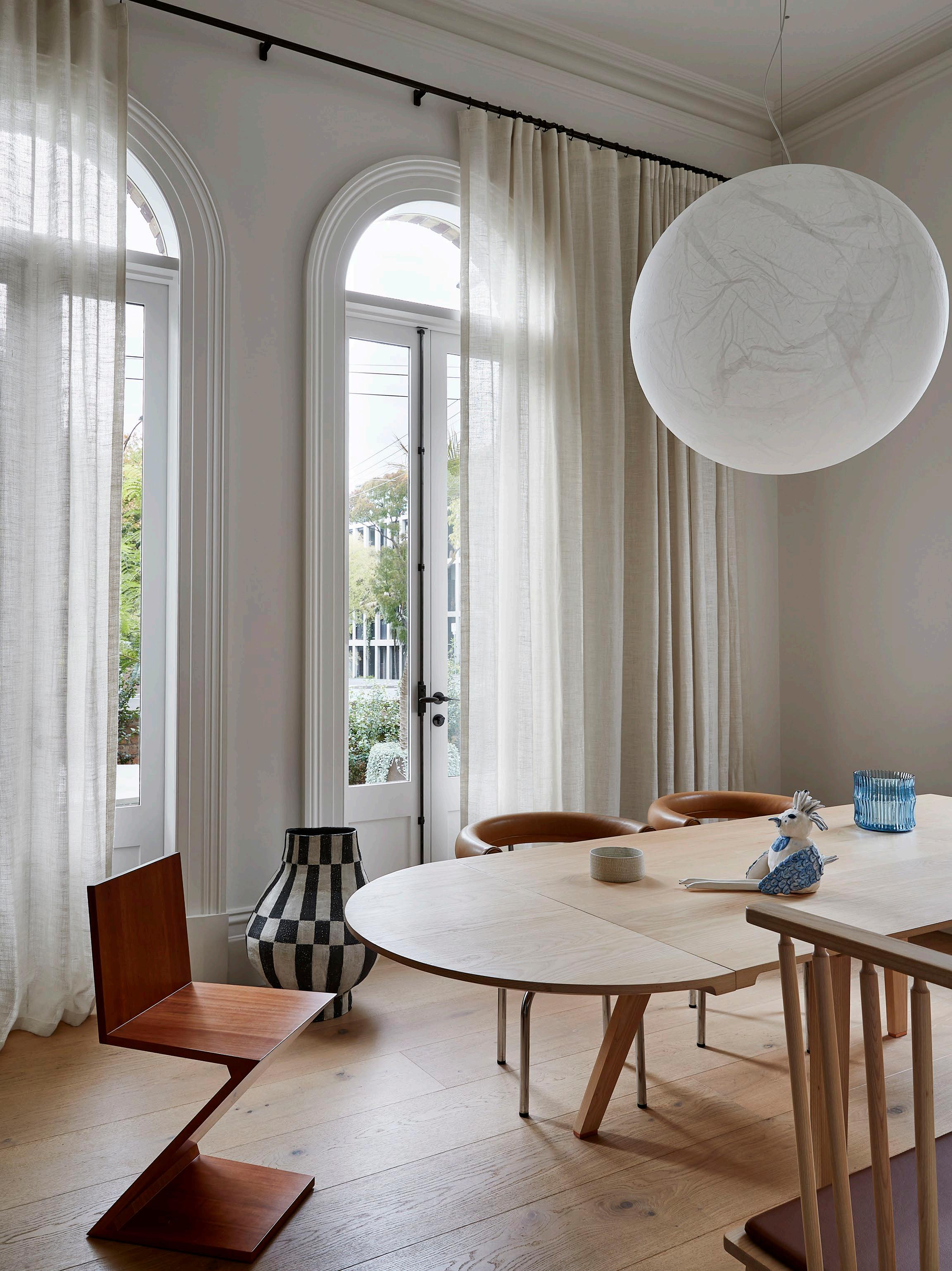 Pictured: dining table by De La Espada for Studioilse, Zig Zag chair by Gerrit Thomas Rietveld and 7
Fauteuil Tournant chair by Charlotte Perriand for Cassina, ceramic bird sculpture, bowl and vessel by Lauren Jo e and Moon pendant light by Davide Groppi.
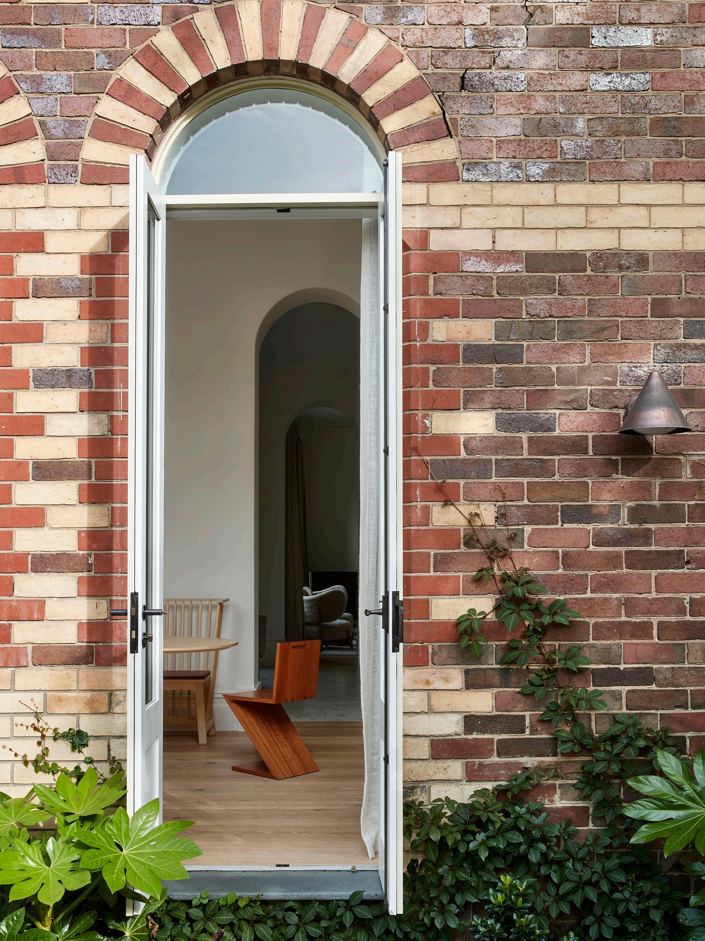
When interior design studio Hecker Guthrie were approached by the owners of a twolevel inner Melbourne townhouse, they immediately struck a chord with their wish to tread lightly. Well-versed in historic home revivals, Hecker Guthrie co-director Paul Hecker says they resonated with the homeowners' desire to understand the building – and the gentle mark they wanted to leave on it. “It’s an important building that grounds the corner; it deserved to be treated well,” Paul says.
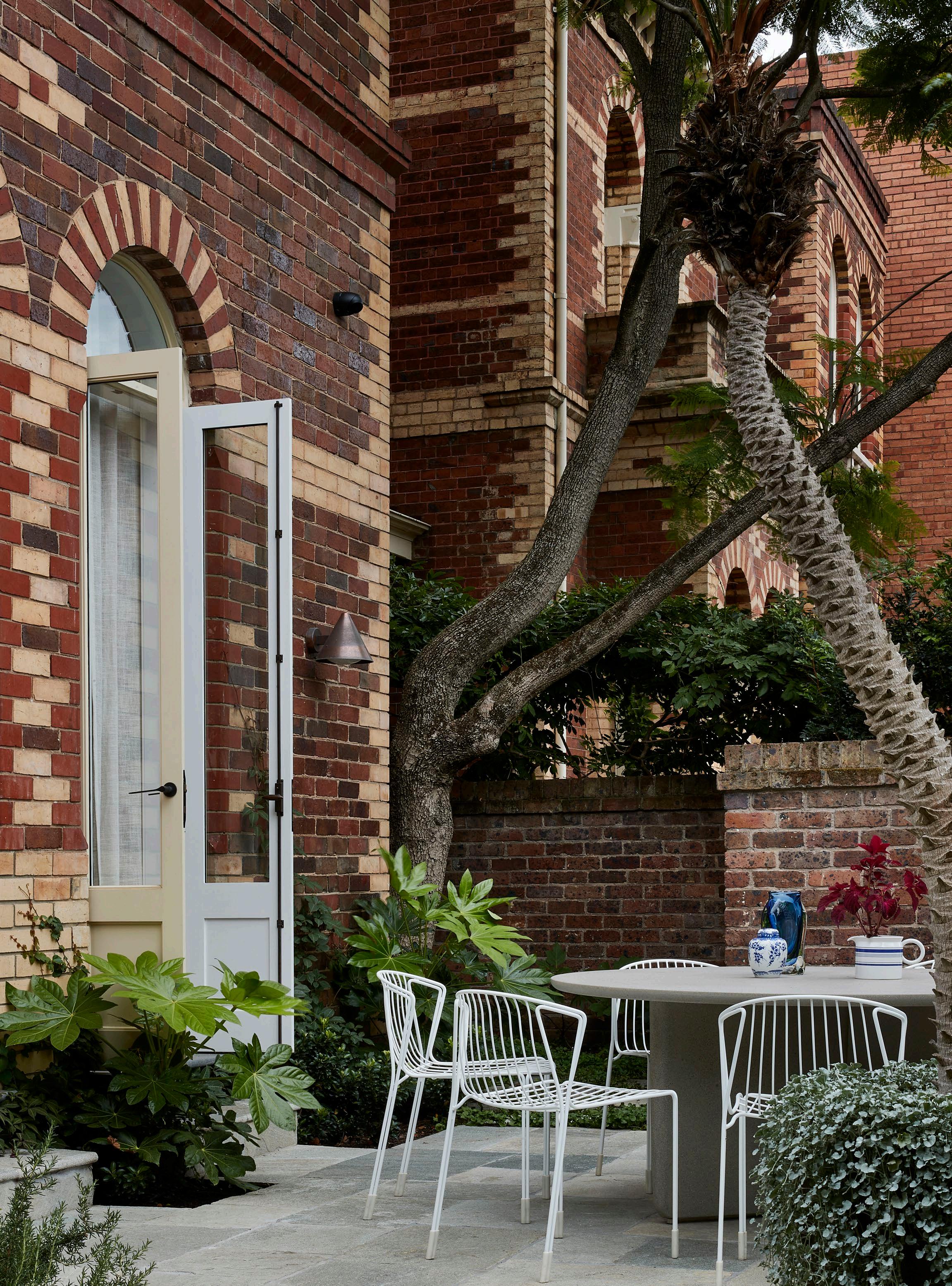
The townhouse is one of four in a former estate designed in 1864 by Joseph Reed, once home to the first Lord Mayor of Melbourne, Sir Benjamin Benjamin. While there were obvious design elements Hecker Guthrie needed to reinstate and a 1970s addition to unfold, there was enough to tell them exactly what had been there. “It wasn’t a matter of guesswork. Skirtings, mouldings – we embraced it all,” Paul says. “It was a ballet between getting the function of the house to work for the owners without minimising the history in any way,” he adds.
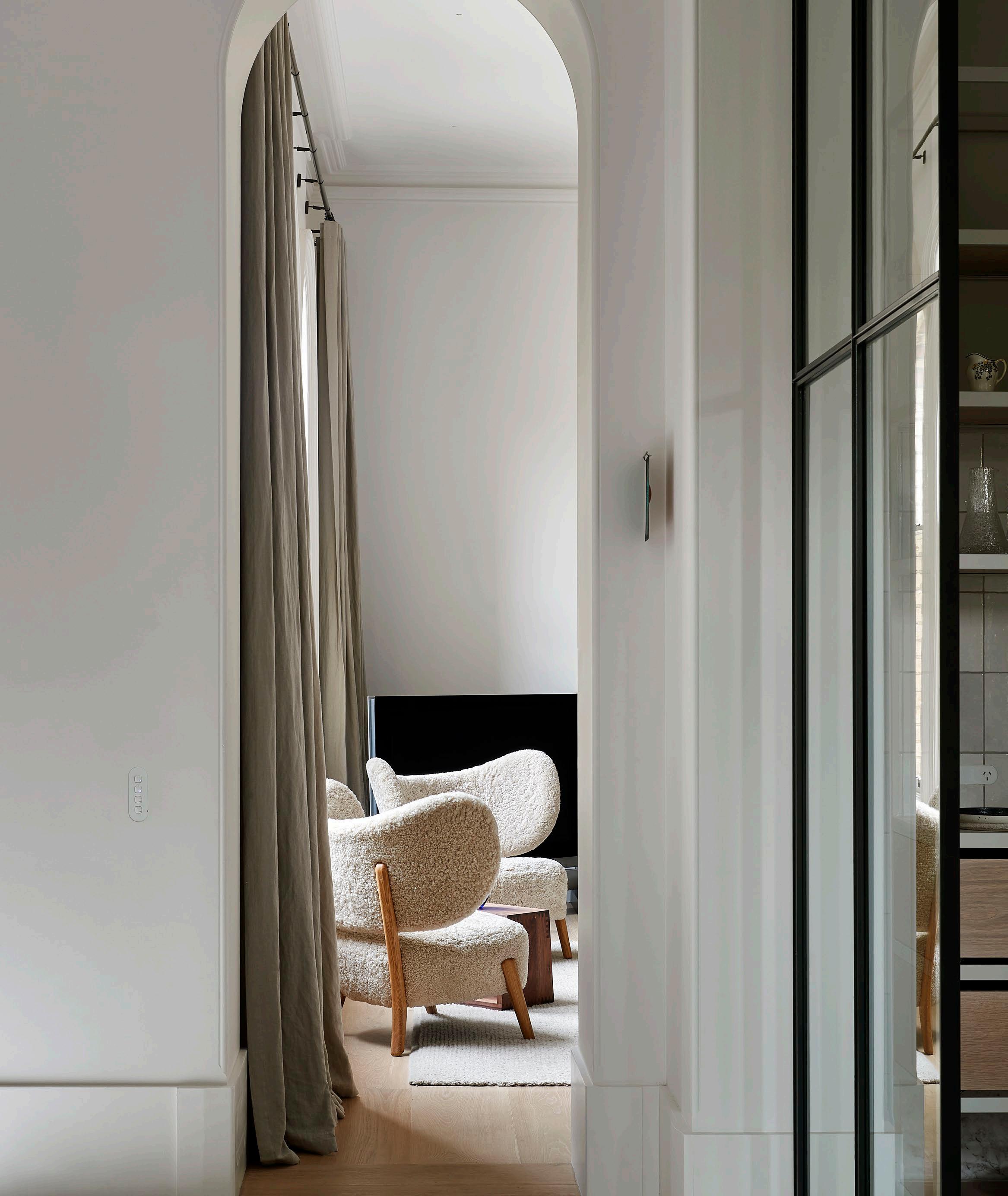
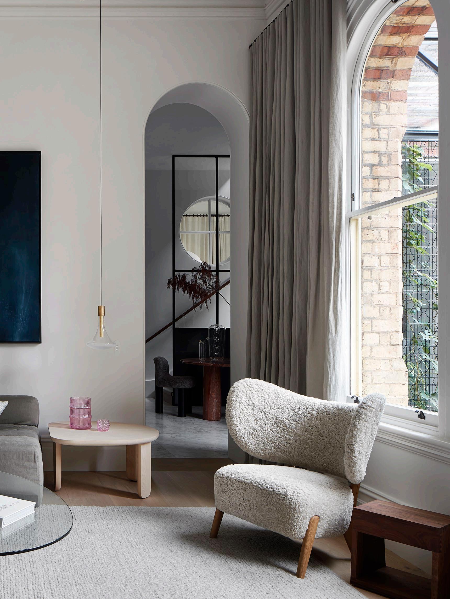
Hecker Guthrie took the arched motif from the home’s windows and heightened this language, creating a clear distinction between the inserted and the existing. Doors were removed from the entranceway, and new archways opened up the space between the dining room, living room and lobby. “The rooms aren’t huge,” Paul says, “But the archways exaggerated the ceiling height and scale – this is where you create grandness.” Artedomus Selinis marble used in the bathroom and kitchen also signifies the dance between heritage and contemporary relevancy. “It’s a classic marble; not overly decorative, very singular in its materiality, and calming,” Paul maintains.
127 DESIGN VOICES
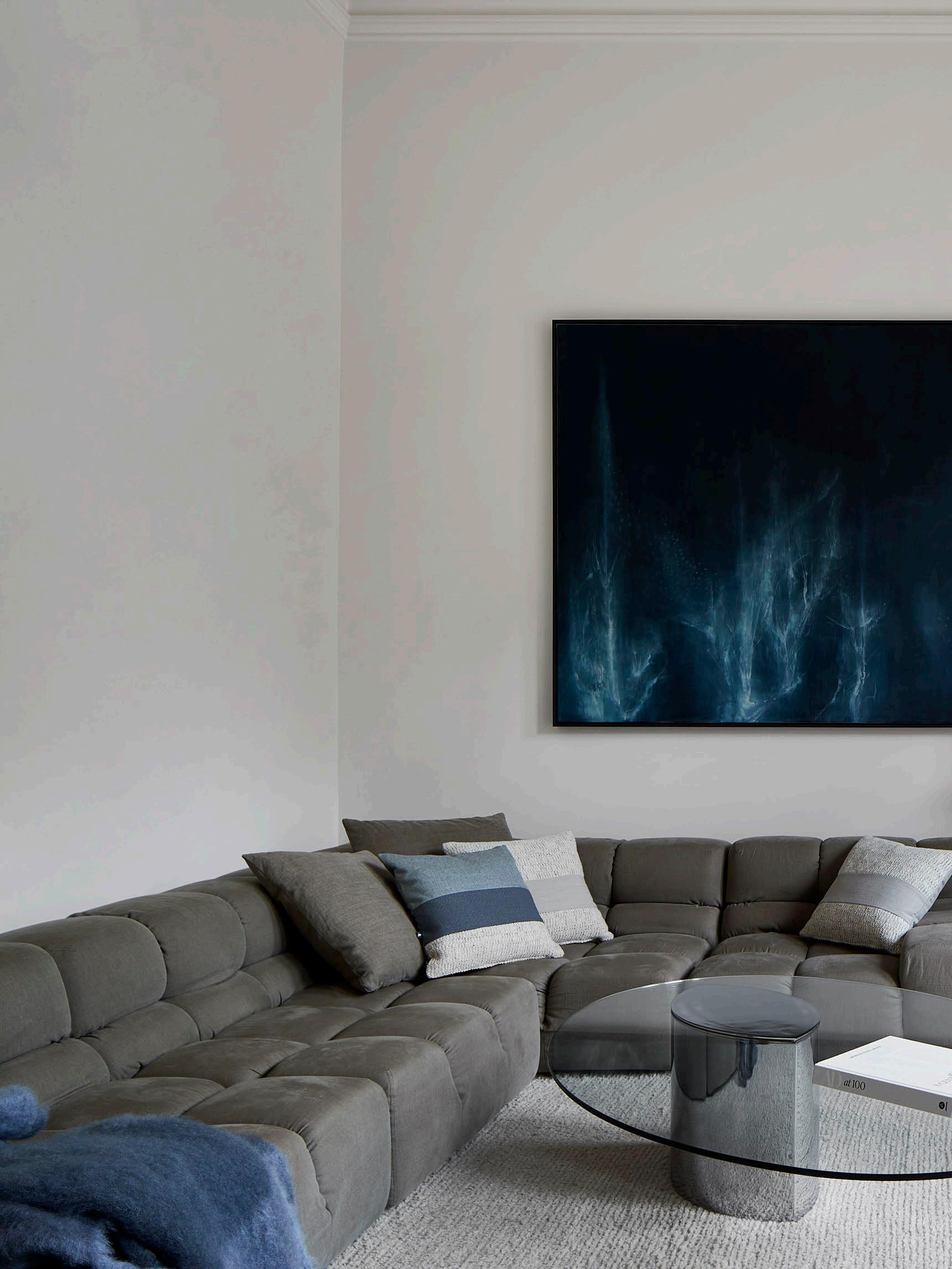 The B&B Italia Tufty-Time sofa by Patricia Urquiola, TMBO lounge chair by Magnus Læssøe Stephensen, De La Espada Kim Nest
by Luca Nichetto, vintage Lunario co ee table
by Cini Boeri for Knoll, Halcyon Lake rug and CATHODE pendant by Davide Groppi.
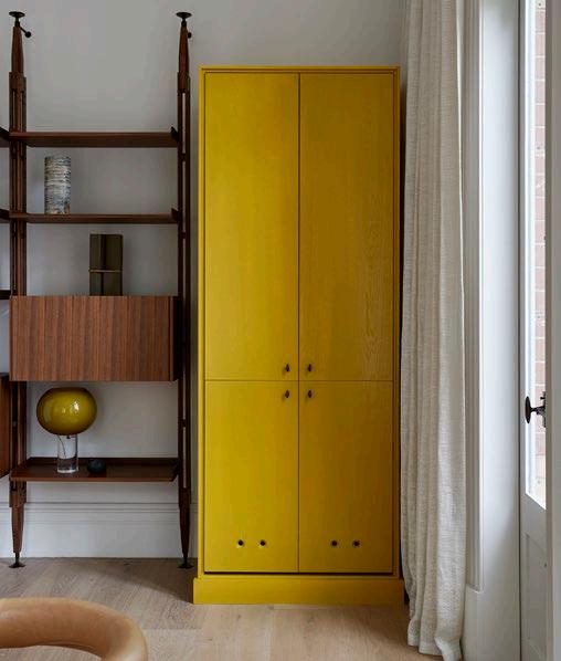
 Paul Hecker describes the yellow cabinet produced by LNP Schade Cabinets as a strong and deliberate injection of colour in the soft and neutral dining space. The cabinet features Crossiant joinery handles by Emily Gillis x Zachary Frankel and Iittala glassware.
“COLOUR IS SO ARBITRARY. THAT’S WHAT I LOVE ABOUT DESIGN – WHEN IT’S SERENDIPITOUS AND YOU KNOW IT’S THE RIGHT CHOICE IN THE MOMENT.”
–Paul Hecker
The kitchen isn’t a typical cook’s kitchen; it’s designed as the hub of the home but more like a bar. Paul describes the space as a joy to design for this reason, where the homeowners greet and host guests rather than prepare food.
Moments of colour, such as the yellow cabinet in the dining room, are calculated and deliberate. “Colour is so arbitrary. That’s what I love about design – when it’s serendipitous and you know it’s the right choice in the moment,” Paul says. “Because it’s not an entire room, you get to have fun.”
Upstairs, a rich forest green envelopes the bedroom and mezzanine study. Green is a colour Hecker Guthrie treat as more of an ‘earthy neutral’, creating a distinct nighttime space in the home. The bedroom also speaks to the Scandinavian and Japanese design influence in Hecker Guthrie’s work. “It’s not that I’m directly drawn to those countries for their aesthetic, but more to the design history, the intent and the feeling,” Paul explains.
An appreciation for history, intent and feeling are woven into the fabric of the East Melbourne Residence. “I love that there are layers of the different people that have lived there,” Paul reflects. “But also that there’s a clear defining point at which you can say that is not original, that is Hecker Guthrie,” he adds. “You can see where we start and stop.”
131 DESIGN VOICES
ISSUE #51

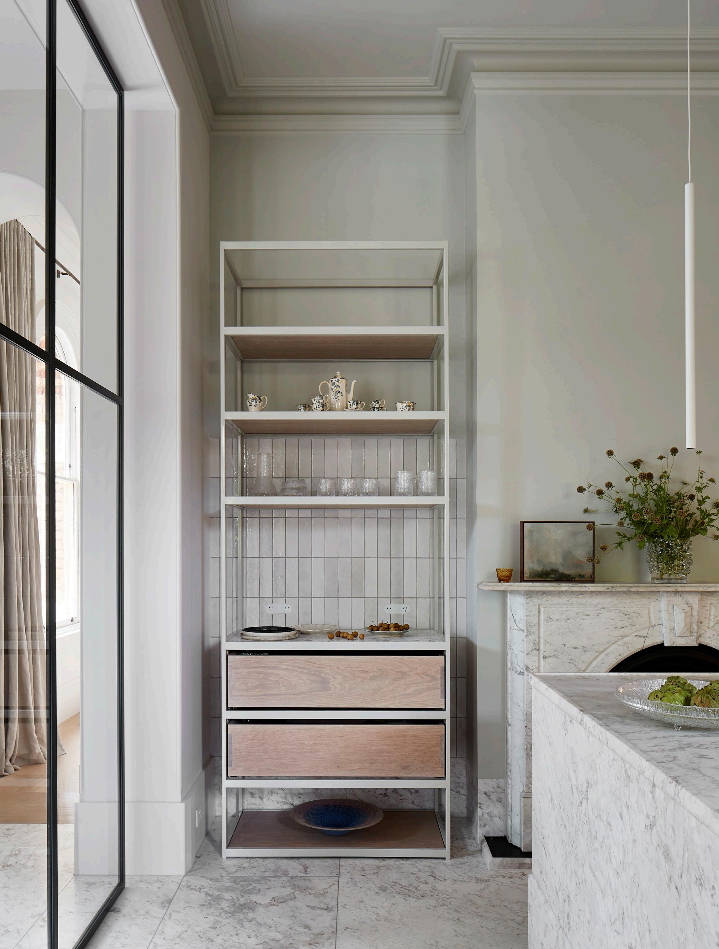
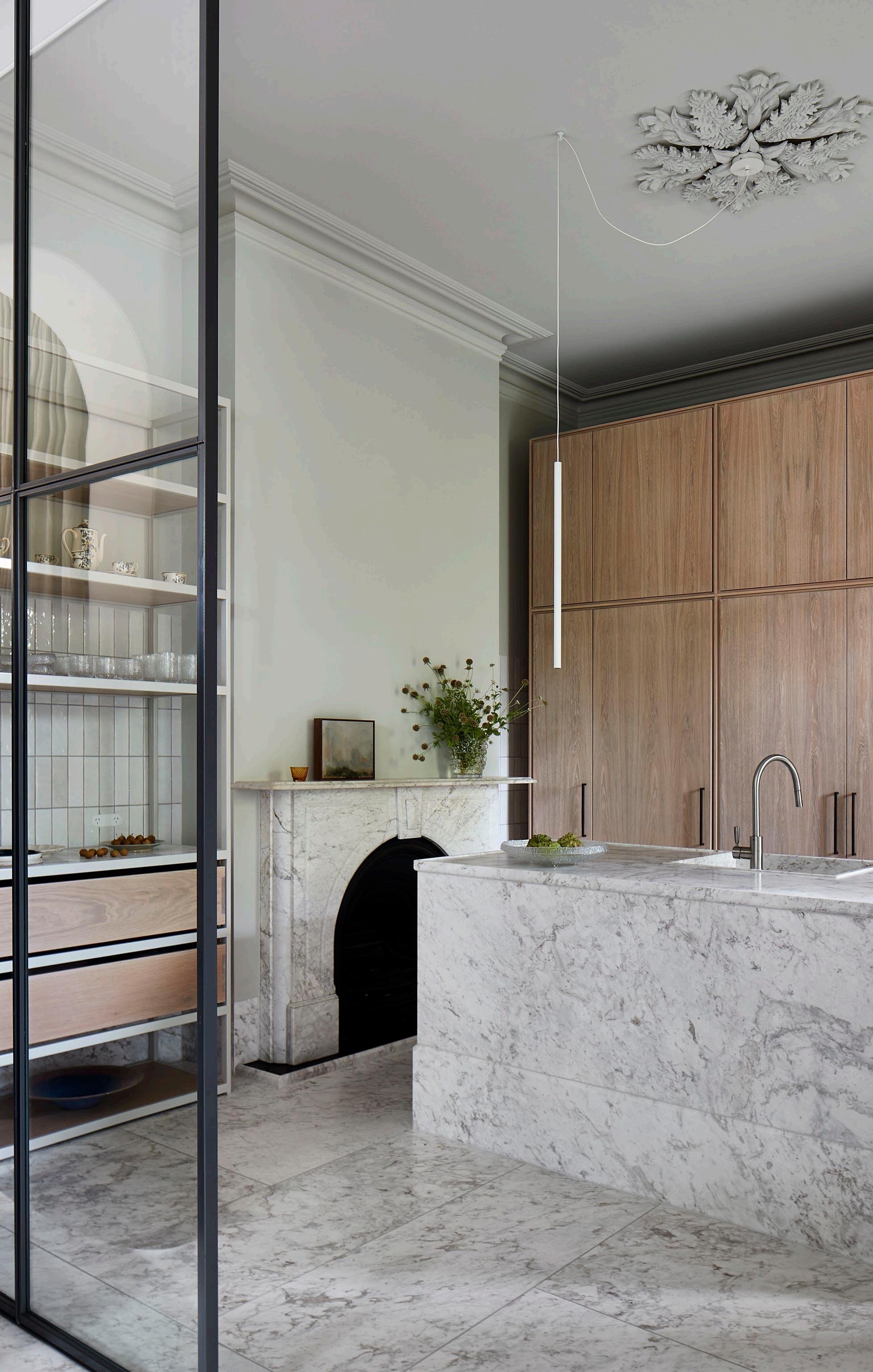
The custom cabinetry in the kitchen is a signature detail in Hecker Guthrie’s work, produced by LNP Schade Cabinets, with steel shelving produced by M&T Allison Steel Fabrication.
The joinery was deliberately not taken to the ceiling out of respect for the cornices, while the classic Artedomus Selenis marble lines the floor, fireplace, kitchen island and benchtops. Also pictured: tiles from Academy tiles, MISS 1 LED pendant by Davide Groppi, Brodware Manhattan mixer and artwork by Greg Wood.
133

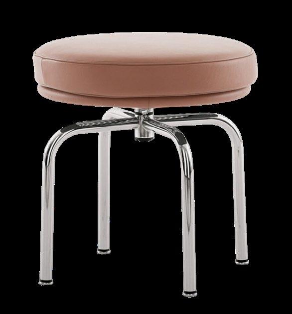
The upstairs bedroom with a mezzanine study and focal spiral steel staircase is cloaked in a rich forest green to feel like a nighttime zone. The space also features the Tufty bed by Patricia Urquiola, Cassina LC14 Tabouret Cabanon Roquebrune-Cap-Martin 1952, Baxter Blade table lamp and Halcyon Lake rug.

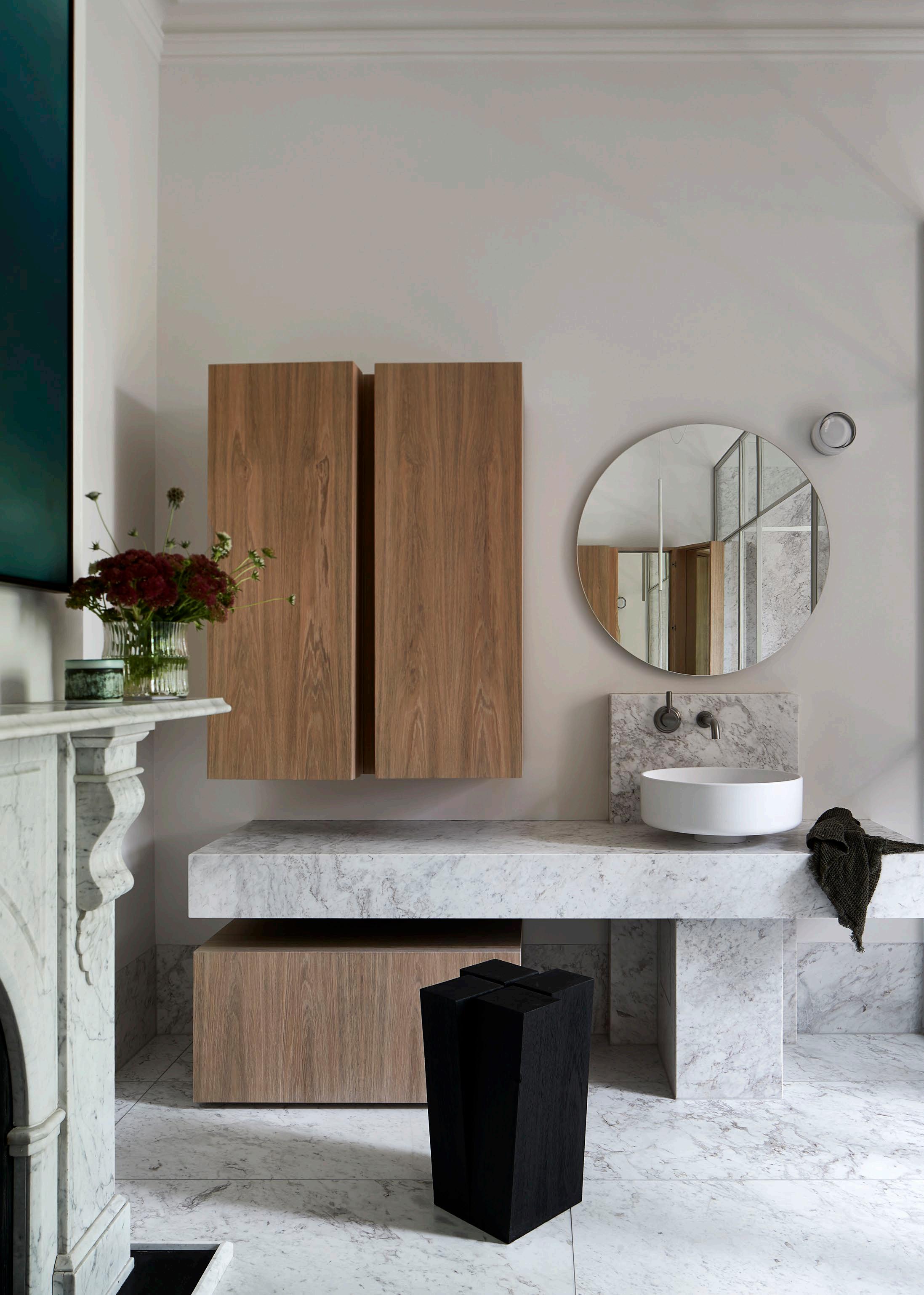
The main bathroom is designed around the original fireplace and cornices, featuring a new-age interpretation of the claw bath by Agape – and a custom Artedomus Selenis marble vanity with an Agape basin and mirror. Brodware tapware, an RBW Dimple wall sconce, the Jove co ee table by Draga & Aurel and an Arno Declercq Four Legs stool also feature in this space.
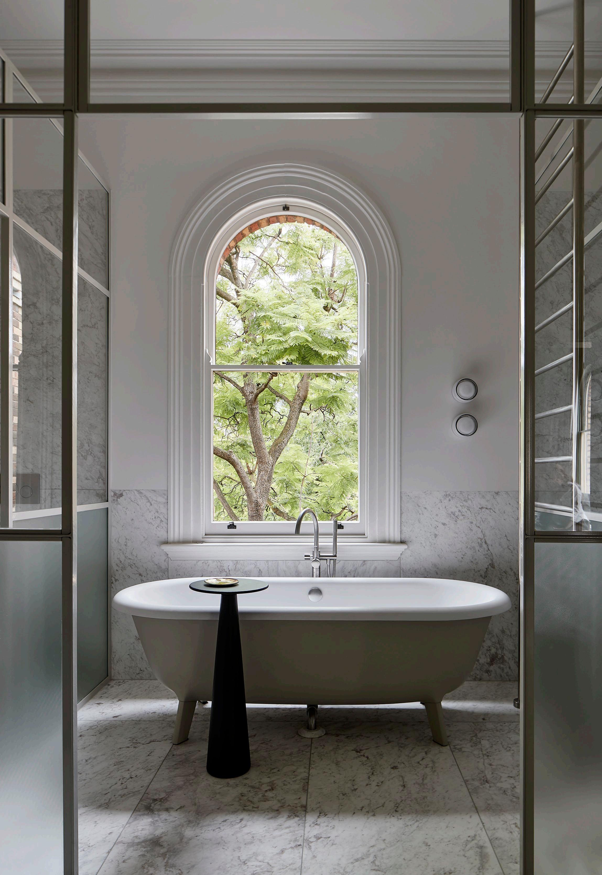
137
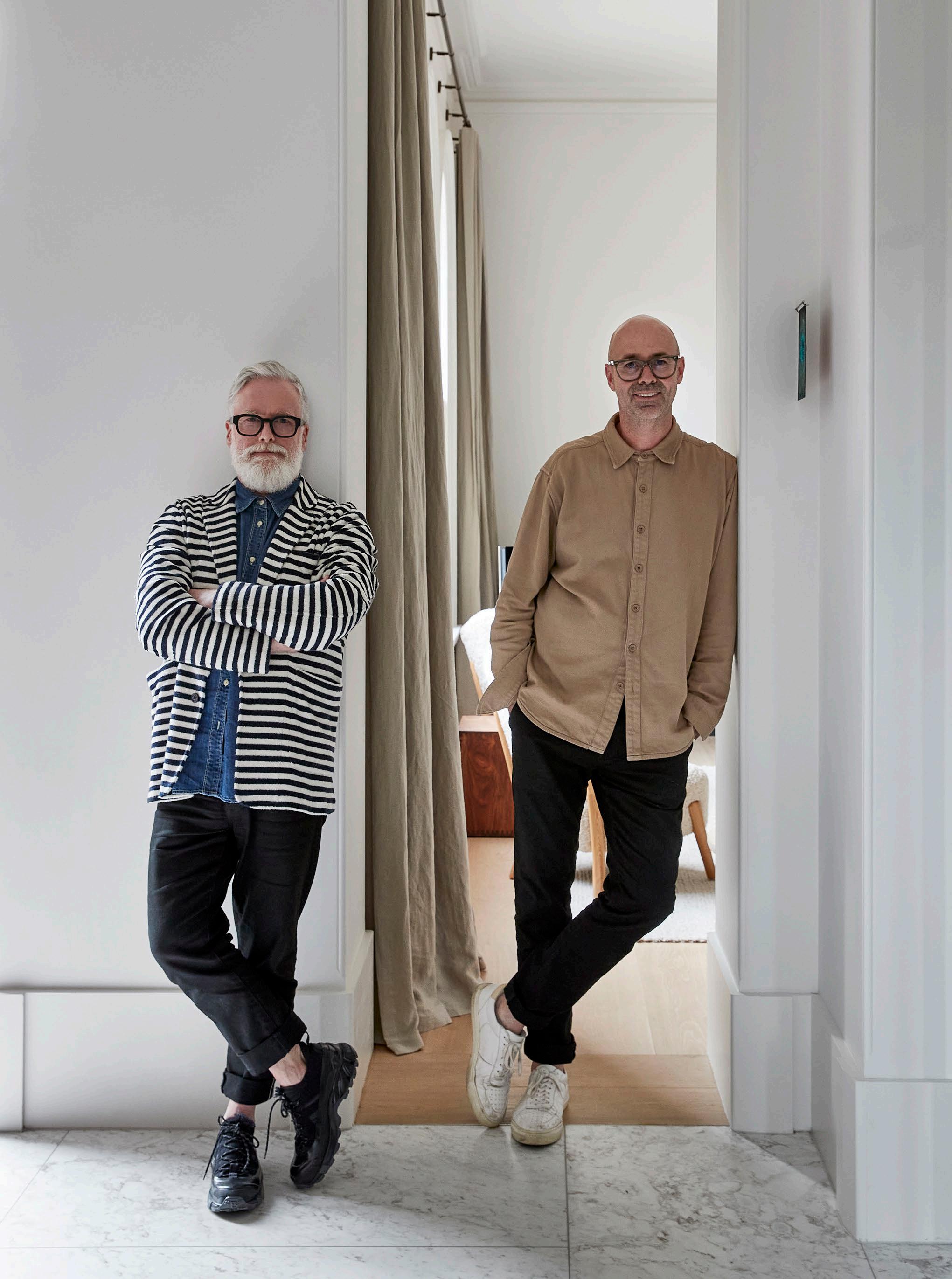 L to R: Hecker Guthrie directors Paul Hecker and Hamish Guthrie.
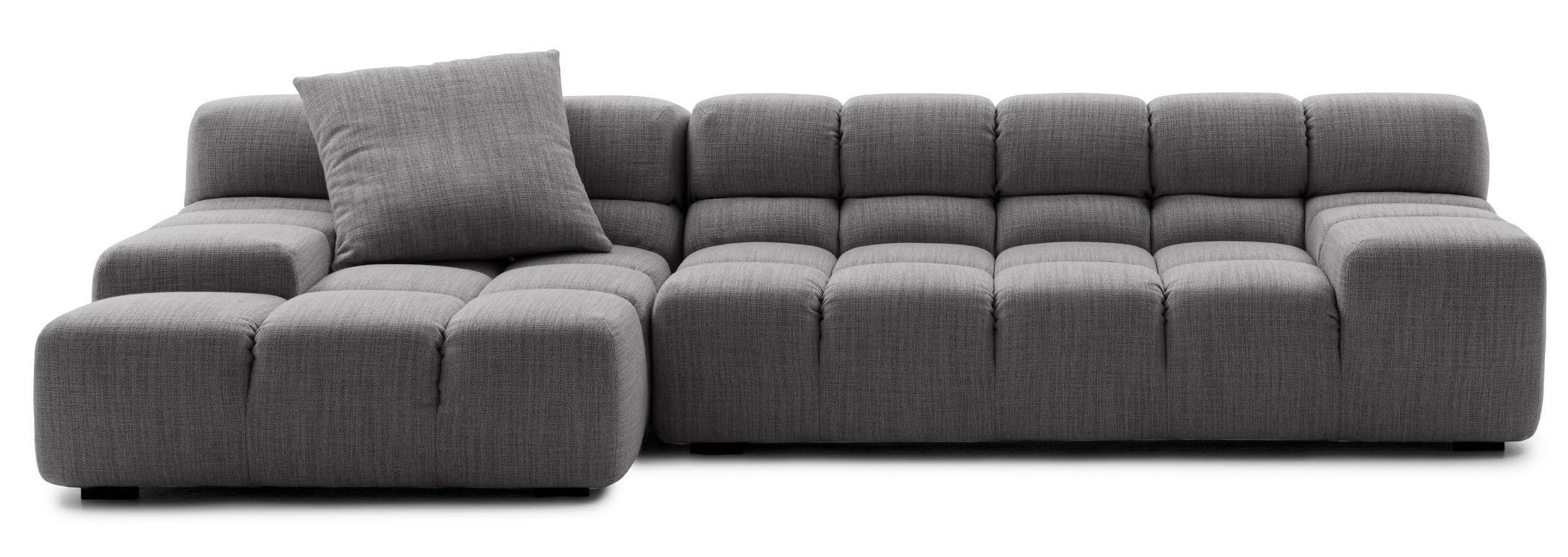
TUFTY-TIME SOFA B&B ITALIA


ISSUE #51
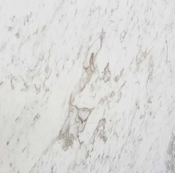
SELENIS ARTEDOMUS
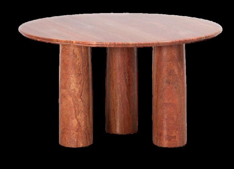
IL COLONNATO DINING TABLE CASSINA
Red Travertine table by Mario Bellini for Cassina, 1977.
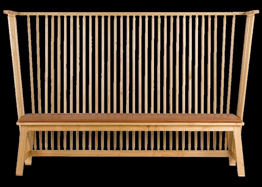
SETTLE BENCH DE LA ESPADA
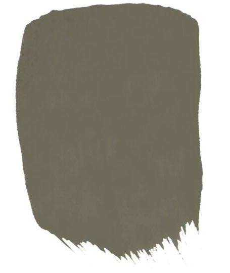
OLIVE TREE PETERS PAINTS
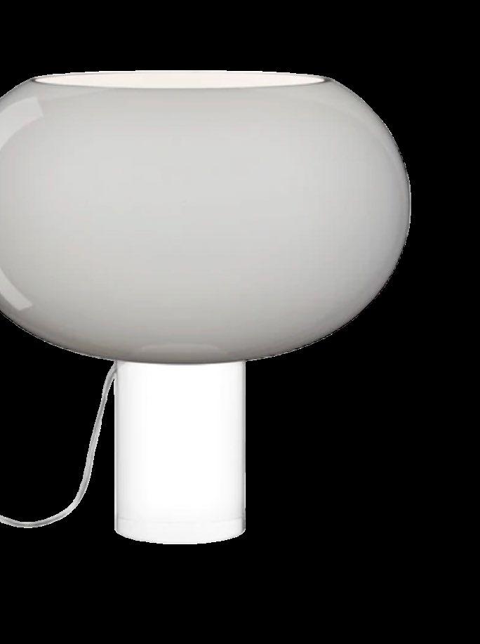
BUDS 2 FOSCARINI
SANTORINI WOODCUT



141
FOSCARINI SANTORINI WHITE WOODCUT
TABLE LAMP
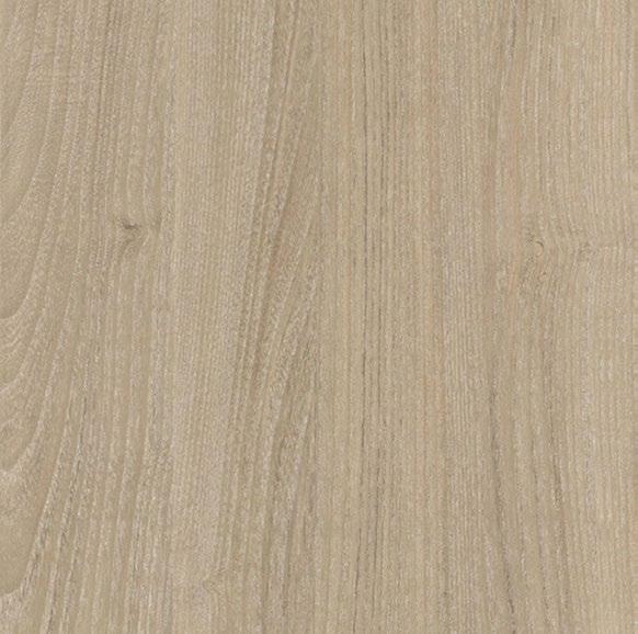
DESERT GUM EVENEX SINCRO
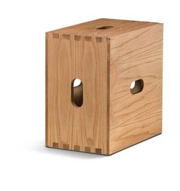
LC14 TABOURET CABANON ROQUEBRUNE-CAP-MARTIN 1952
CASSINA
MATELIER – 12477 ACADEMY
BOTOLO CHAIR - HIGH VERSION ARFLEX
8 TABOURET TOURNANT - DURABLE CASSINA
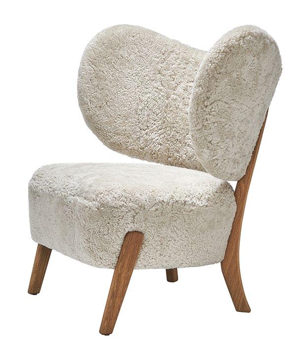
TMBO LOUNGE CHAIR, 1935 MAZŌ
TS404 BIG-LINA, TULIP VASE THOMAS SANDELL
KENNEDY NOLAN
A DESIGN CONVERSATION WITH KAREN MCCARTNEY
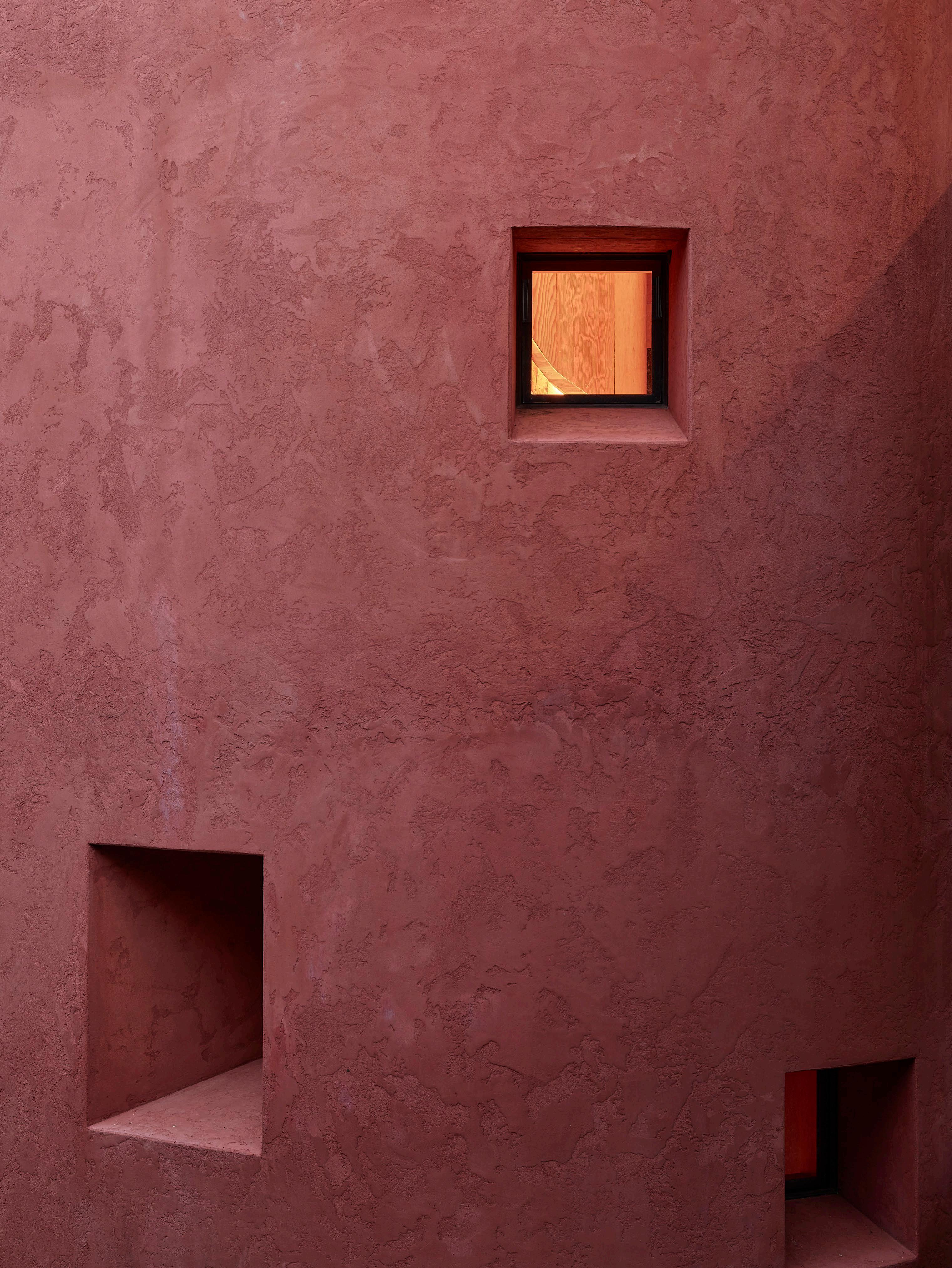
Project Somers House
Photography Derek Swalwell
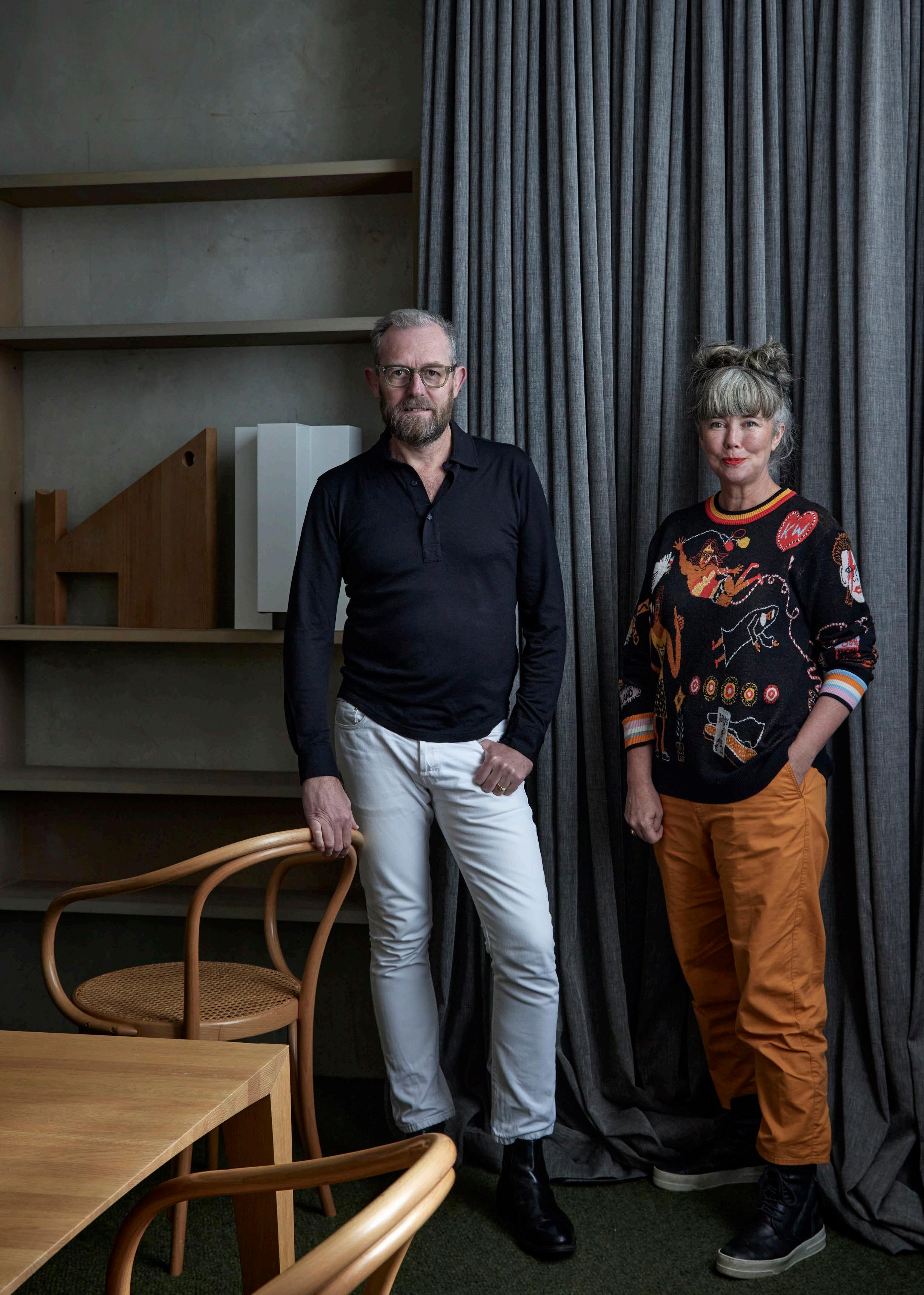
Recorded while sitting in one of their latest projects, Kennedy Nolan founders and principal architects Rachel Nolan and Patrick Kennedy discuss how buildings can engage the imagination, the impact of colour and memory, and designing homes relevant to today.
est living PODCAST
 BNE MEL PER SYD

THE ARCHITECTURE OF FASHION
In this special feature, we explore four retail spaces without merchandise that have emerged from collaborations between architects and fashion designers, where ideas collide and one discipline enhances the other.
CURATION Jack Seedsman
WORDS Holly Beadle
MOSCHINO
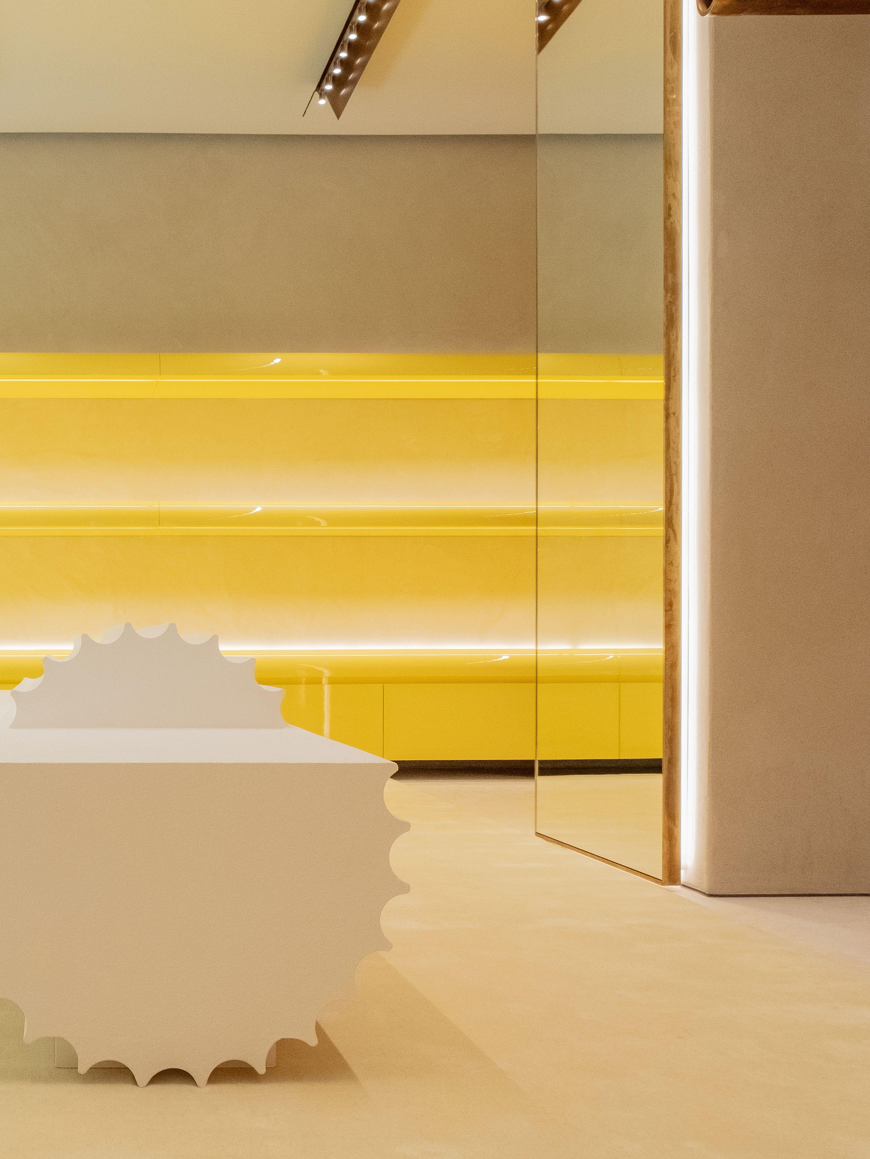
In the design capital of the world and the home of Italian fashion house Moschino, Italian architect Andrea Tognon designed a store that captures the brand’s exuberant style in a subtle manner. “The challenge was to harmonise the brand’s loud and baroque visual language with a calm and serene design approach,” Andrea says.
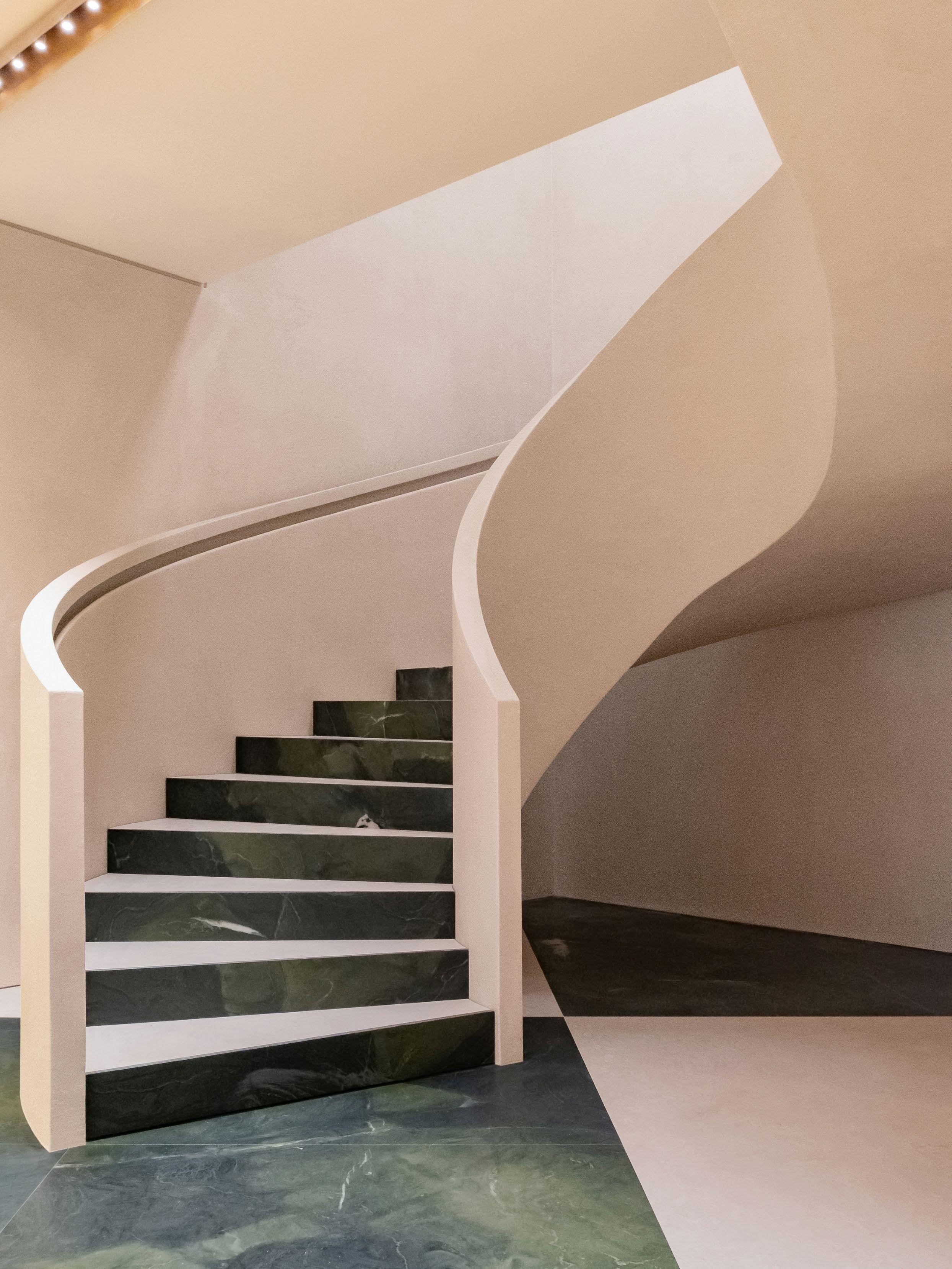
Located on one of Milan's most historically significant shopping strips, Via della Spiga, the store needed to feel like an inherent part of the city. “Walking through the space, you’ll find marble in-lays of cut flooring and details along a grand staircase that are sprinkled as sweet reminders of the city as the centre of Italian design,” Andrea says.
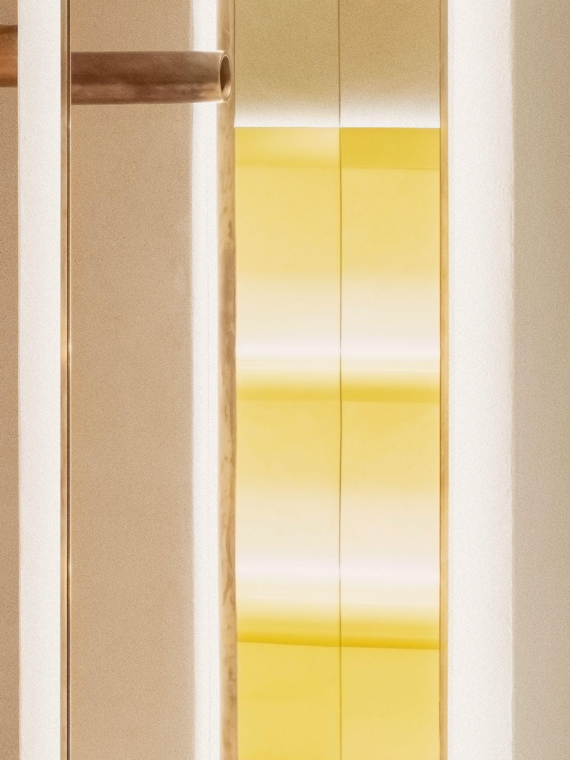
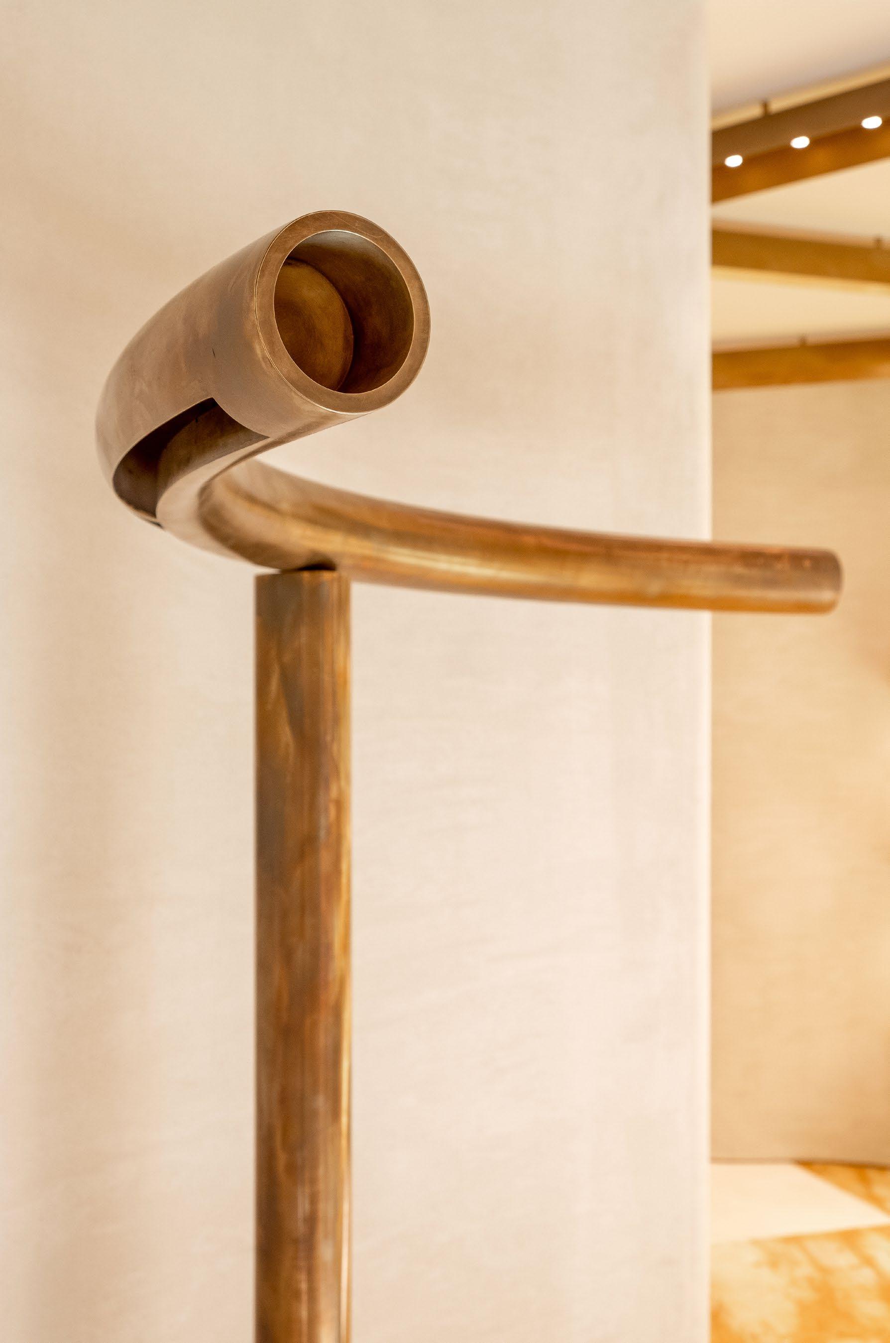
From the chequered floors crafted in Botticino marble and dark green stone to the lacquered bright-yellow shelves and sweeping spiral staircase, each element reflects the brand’s playful, eccentric and often unconventional approach to fashion. “It is not just a single feature or detail that tells the brand's story, but rather the coming together of many to create a cohesive retail concept,” Andrea adds.
LOCATION Milan, Italy
DESIGN Andrea Tognon Architecture
PHOTOGRAPHY Adriano Mura
149
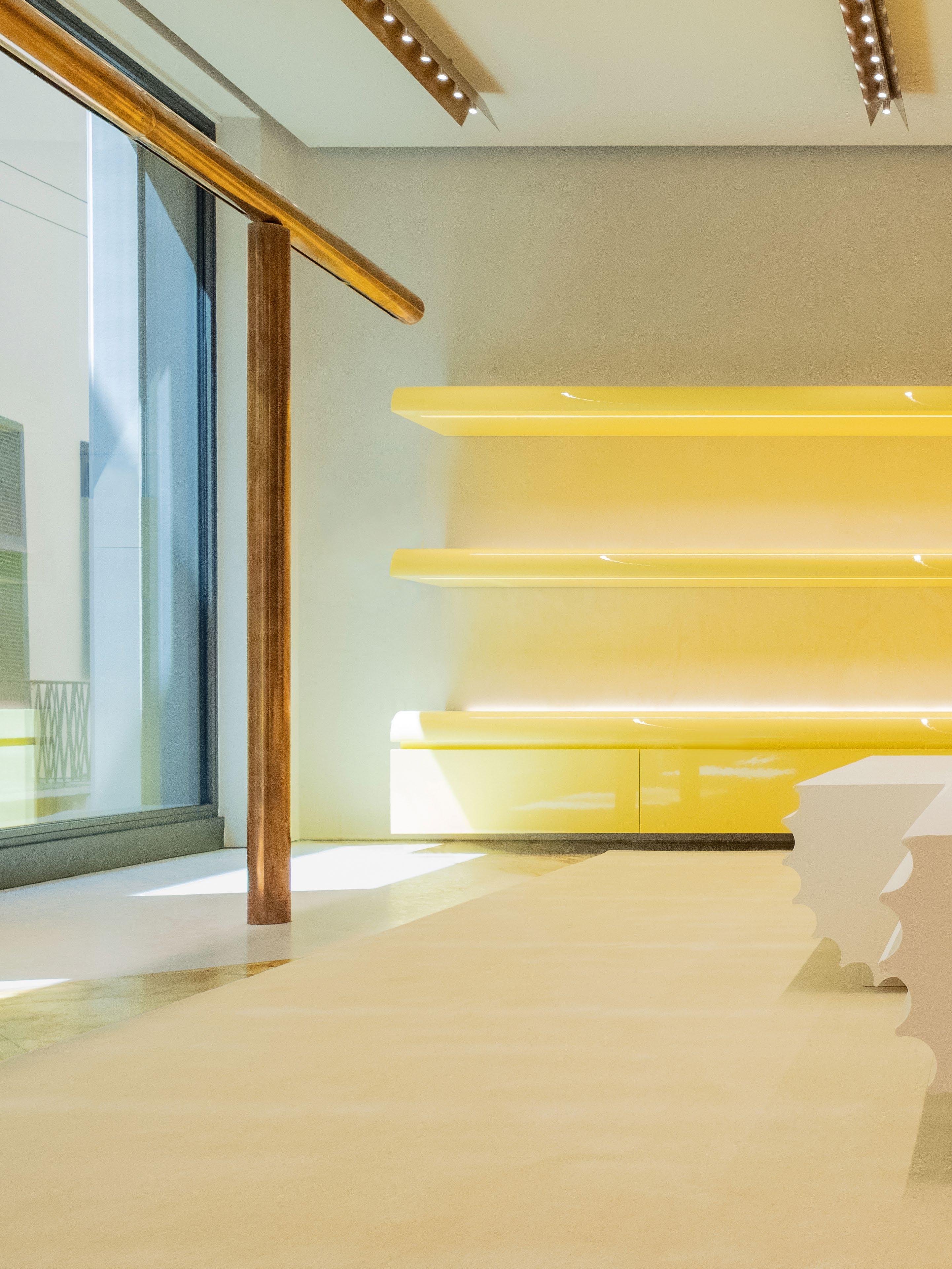 The Moschino Milan store designed by Andrea Tognon Architecture features chequered floors crafted in Botticino marble and dark green stone, lacquered bright-yellow shelves and a sweeping spiral staircase, reflecting the brand’s playful and eccentric style.

COURRÈGES
In Soho, New York, Belgian architect Bernard Dubois conceived a store for French fashion house Courrèges that echoes the brand’s minimalist and futuristic style. “Our goal was to create a space that would naturally refer to the brand – one that felt obvious somehow,” Bernard says.
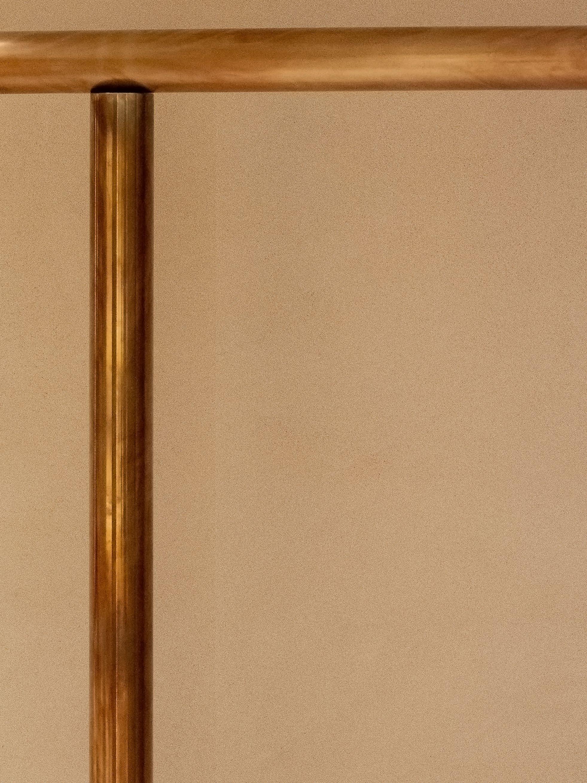
Drawing inspiration from the historic Courrèges flagship store in Paris, the architect chose to envelop the front of the space in white and introduce an all-mirrored fitting room at the back. The elongated mirrored ceilings dotted with spotlights evoke the atmosphere of a nightclub – a concept dear to the brand’s creative director, Nicolas Di Felice.
“We chose iconic brand elements, like the monochrome colour palette and references to the clubbing scene, and reinterpreted them to help shape the brand’s new and future identity,” Bernard says. The continuity between the floors and walls, as if one is melting into the other, is another distinctive feature of Courrèges stores that Bernard has recreated.
LOCATION New York City, North America
DESIGN Bernard Dubois Architects
PHOTOGRAPHY Angela Hau

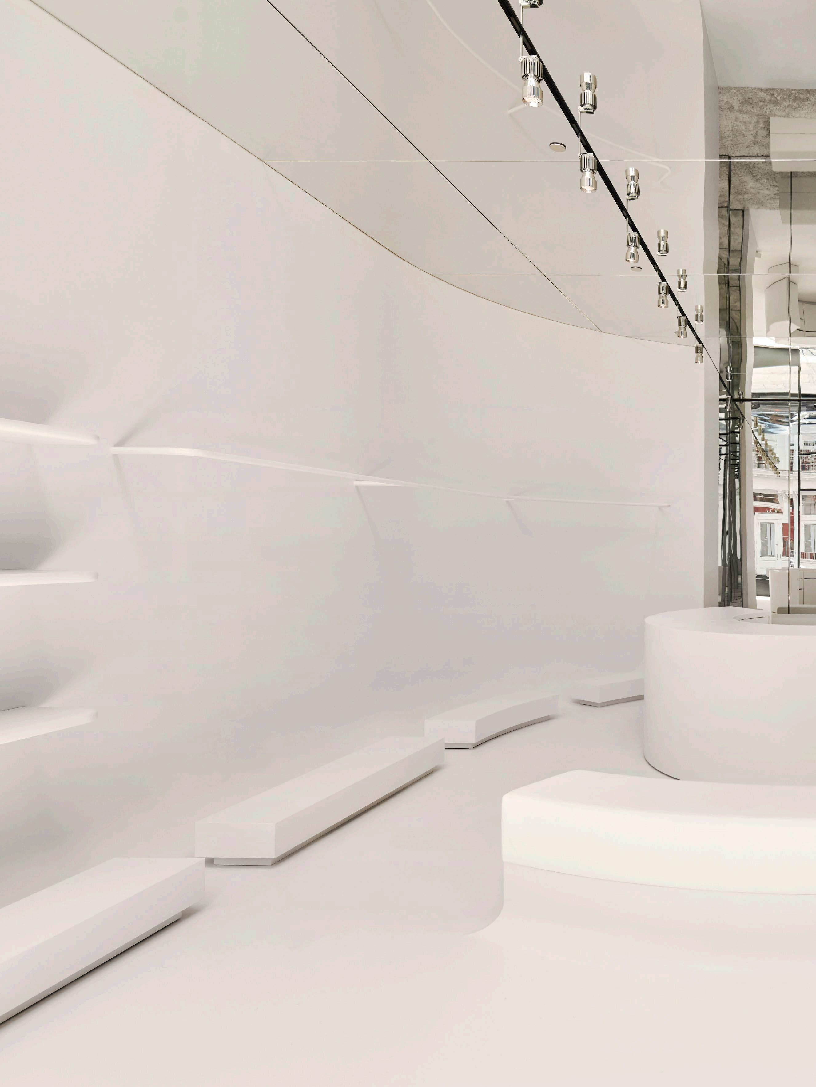 The Courrèges New York store designed by Bernard Dubois Architects reflects the brand’s minimalist and futuristic style with its all-white colour palette and mirrored ceilings dotted with nightclub-grade spotlights.

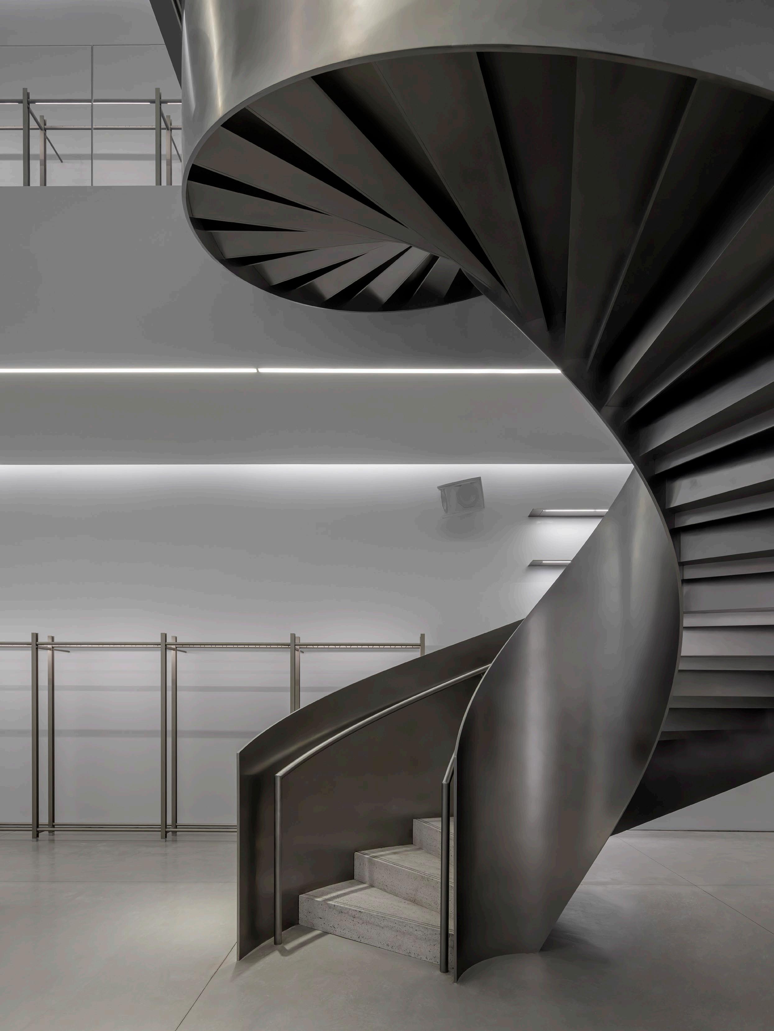
DION LEE
Two synonymous Australian designers – architect William Smart and fashion designer Dion Lee – joined forces to create the brand’s first stand-alone international store in the heart of Miami’s design district. The space is polished and textured, sophisticated and gritty, and distinctively on brand: “A subtle yet striking canvas to showcase Dion’s sculptural and functional ready-to-wear collection,” project architect Linda Tjaturono’ says.
Spanning two stories and covering 280 square metres, the space features a dramatic central void, making way for a soaring double-height volume. A helical staircase, crafted from stainless steel and travertine, punctuates the void – a striking connection between the two levels. Custom stainless-steel clothing racks, which the architect likens to construction scaffolding systems, flank the walls, opening up space in the middle for display tables, lounge seating, catwalks and cocktail parties. Revealing Smart Design Studio’s penchant for details, the Dion Lee logo has been etched onto all the joints of the clothing racks.
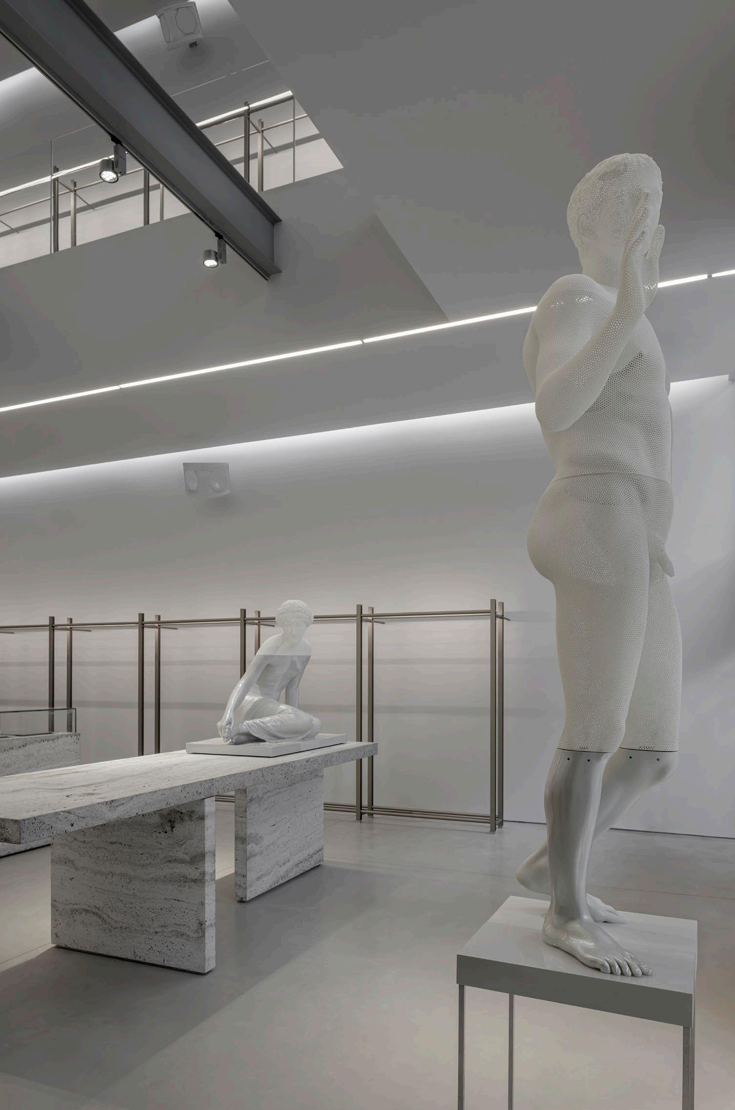
The material palette comprises polished concrete, grey travertine, stainless steel and mirrored glass. “Honest in materiality, elemental in form, minimal in ornamentation; the store offers a retail experience that’s authentically Dion Lee,” Linda affirms.
LOCATION Miami, North America
DESIGN Smart Design Studio
PHOTOGRAPHY Kris Tamburello
157
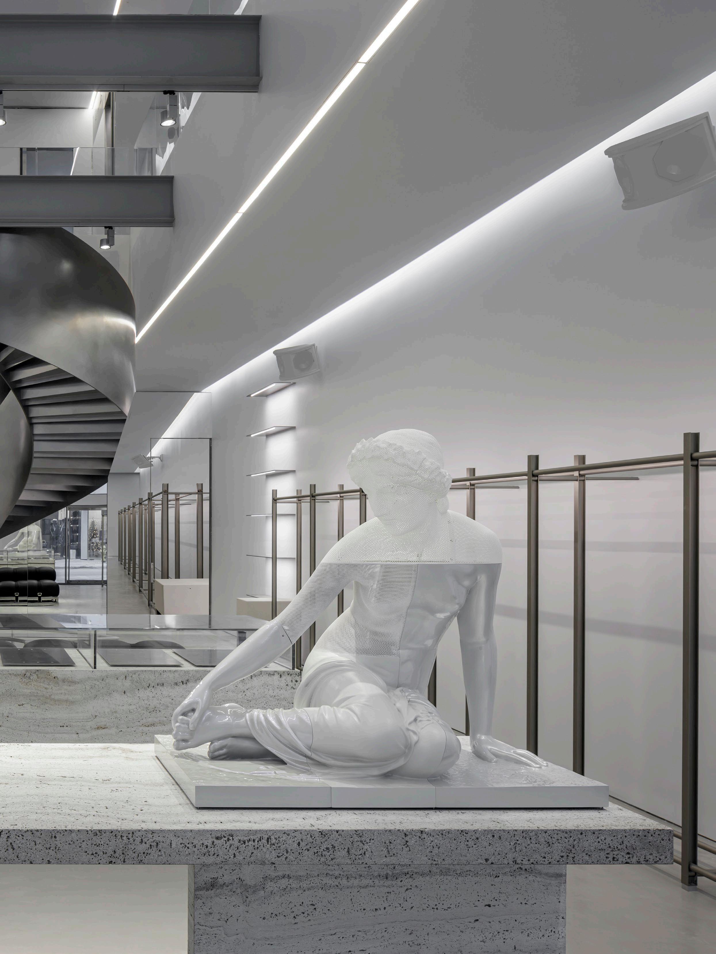
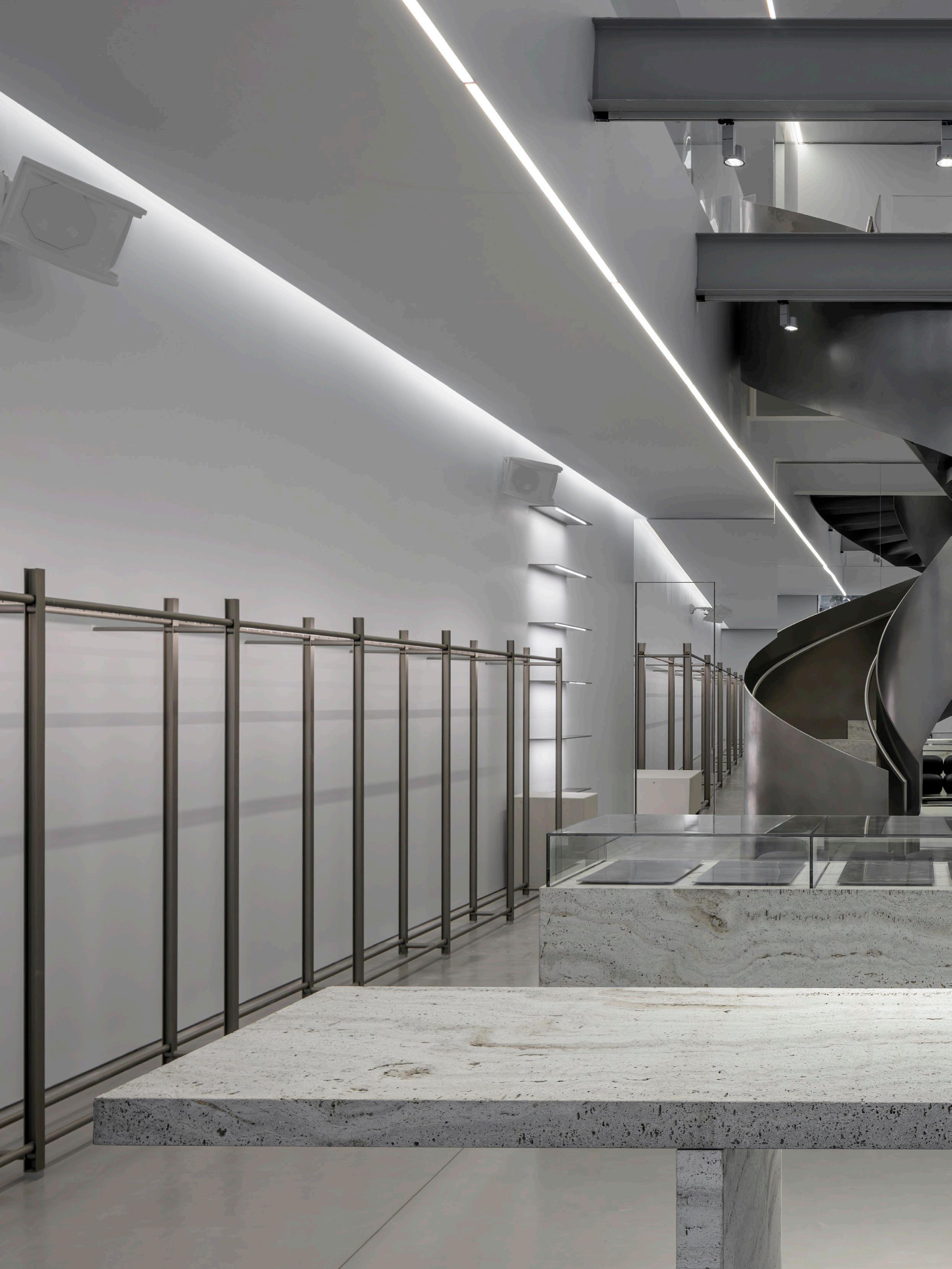 The Dion Lee Miami store designed by Smart Design Studio features a dramatic central void punctuated by a helical staircase crafted from stainless steel and travertine. Custom stainless-steel clothing racks flank the walls and open up space in the middle of the store, where sculptural works by Oliver Laric feature.
CHESNAIS CHARLOTTE
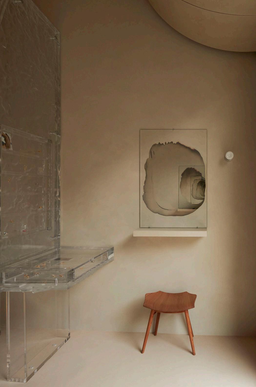
On Paris’ famous Boulevard Saint-Germain, Dutch architect Anne Holtrop was tasked with designing a boutique for French jewellery brand Charlotte Chesnais. Seeking to push the boundaries of a conventional jewellery store, Anne substituted the typical horizontal display tables for a huge freestanding translucent wall to display the pieces.
The wall, appearing like a sculpture within the space, is composed of large, three-dimensional CNC-cut acrylic sheets. “The material possesses a natural texture from the CNC drilling and a synthetic quality due to the presence of acrylic,” Anne explains. As a result, it reflects a blend of both natural and man-made characteristics, creating an interesting juxtaposition of past and present. “The jewellery appears to float within the transparent mass and casts subtle shadows,” she adds.
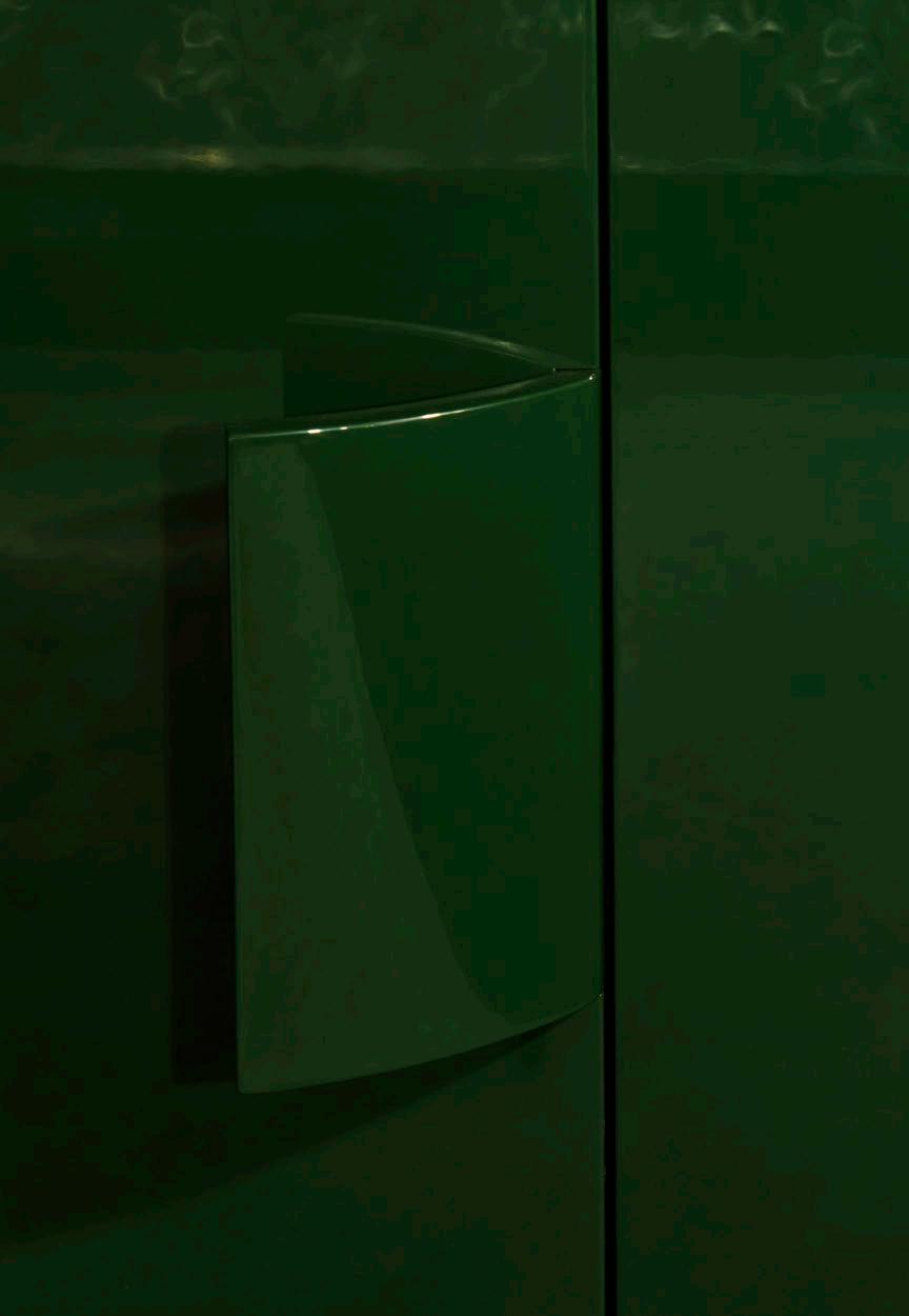
Passing through the display, a set of stairs leads to an additional room coated in deep-green high-gloss paint. Here, Anne has employed a similar technique as downstairs, displaying the pieces on an acrylic wall that has adopted the colour of its surroundings.
LOCATION Paris, France
DESIGN Studio Anne Holtrop
PHOTOGRAPHY James Nelson

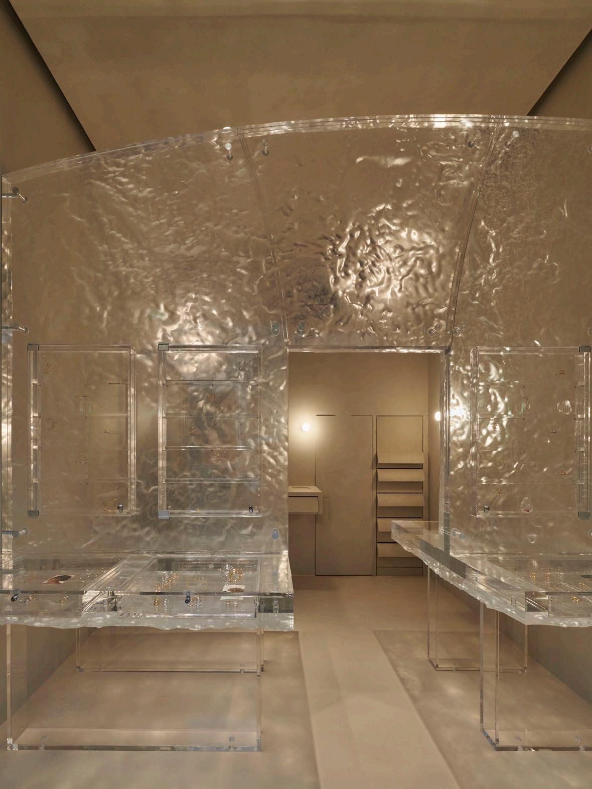 The Charlotte Chesnais Paris store designed by Studio Anne Holtrop features a huge freestanding translucent display wall composed of large, three-dimensional CNC-cut acrylic sheets.
DESIGN VOICES
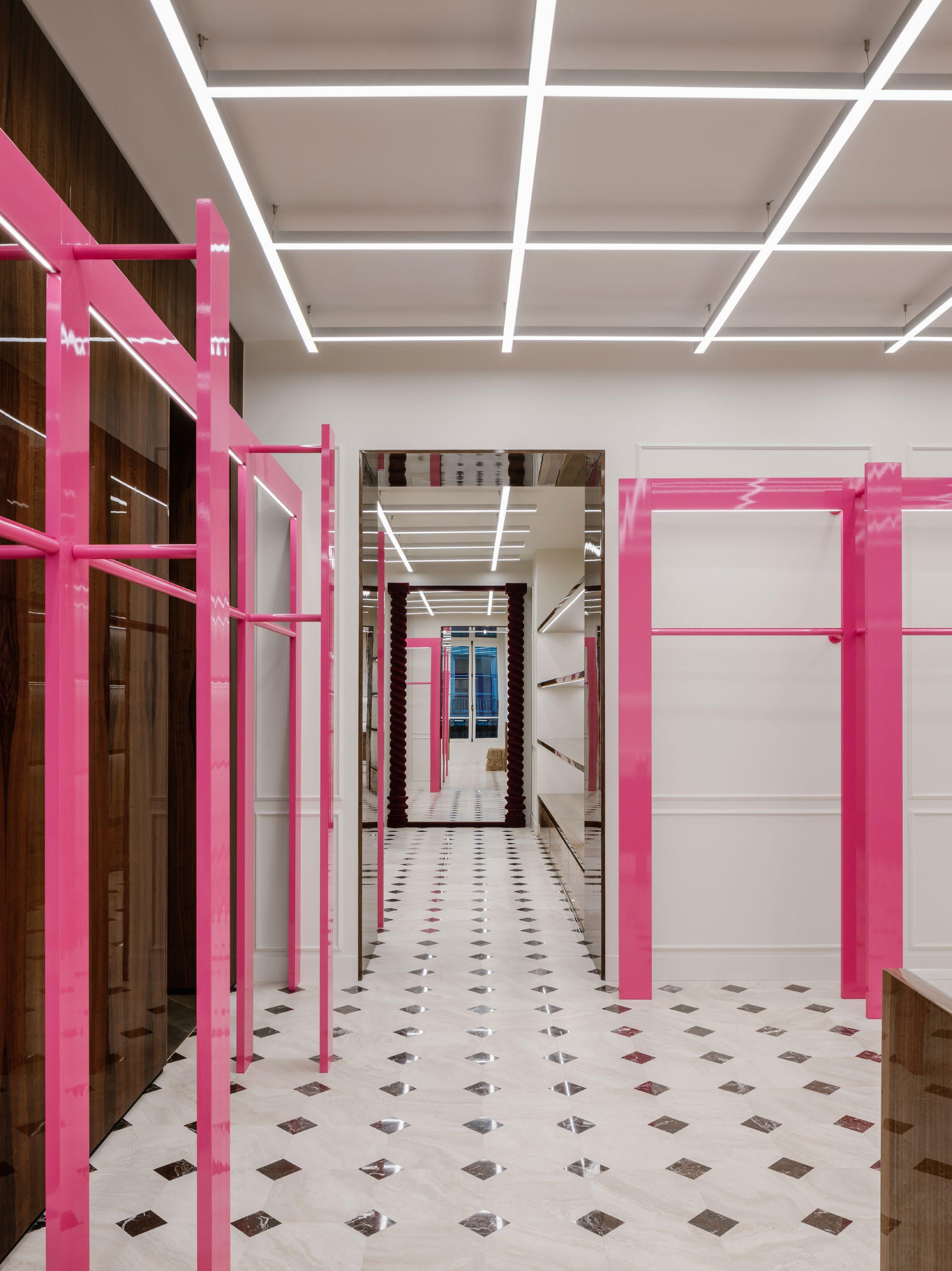 Location Paris, France
Project Palm Angels fagship store Design Studio Henry
Photography Benoit Florençon
THE LIBRARY
The best fashion and design books.



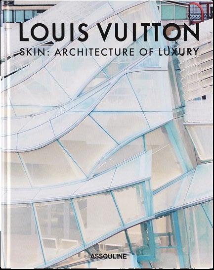
THOM BROWNE & ANDREW BOLTON
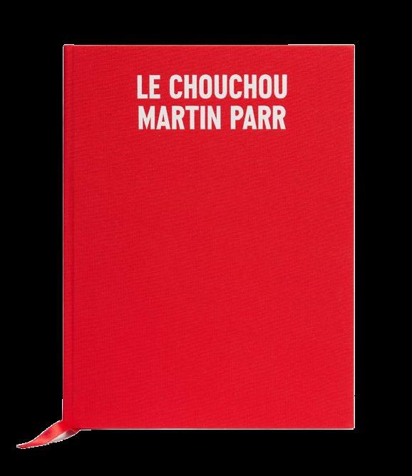


165 DESIGN VOICES
SEE MORE FASHION
>
DESIGN BOOKS
LE CHOUCHOU MARTIN PARR JACQUEMUS
LOUIS VUITTON SKIN: ARCHITECTURE OF LUXURY SEOUL PAUL GOLDBERGER
ACNE PAPER ISSUE 17 | ATTICUS ACNE STUDIOS
THOM BROWNE THE 20TH ANNIVERSARY BOOK
BURBERRY ALEXANDER FURY
YVES SAINT LAURENT: THE IMPOSSIBLE COLLECTION
LAURENCE BENAIM
MOSCHINO ALEXANDER FURY AND JEREMY SCOTT
VALENTINO ROSSO CHARLIE PORTER
POLO HERITAGE NACHO FIGUERAS
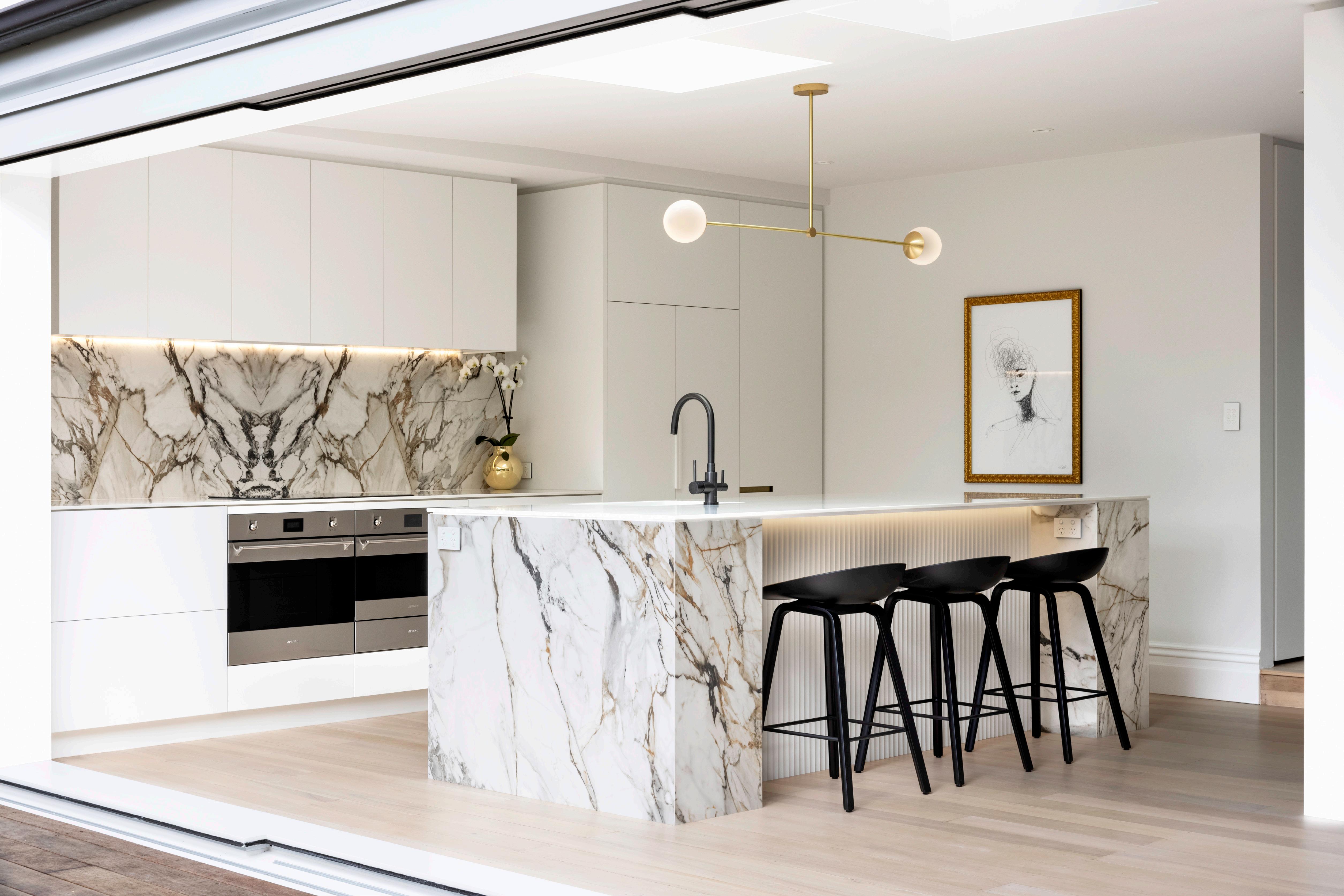

NEOLITH.COM
STYLE

STYLEGUIDE

Home to a fashion design veteran, an architectural extension is inspired by the dichotomy between two design disciplines.
LOCATION Melbourne, Australia
ARCHITECTURE Templeton Architecture
PHOTOGRAPHY Rory Gardiner
WORDS & INTERVIEW Holly Beadle
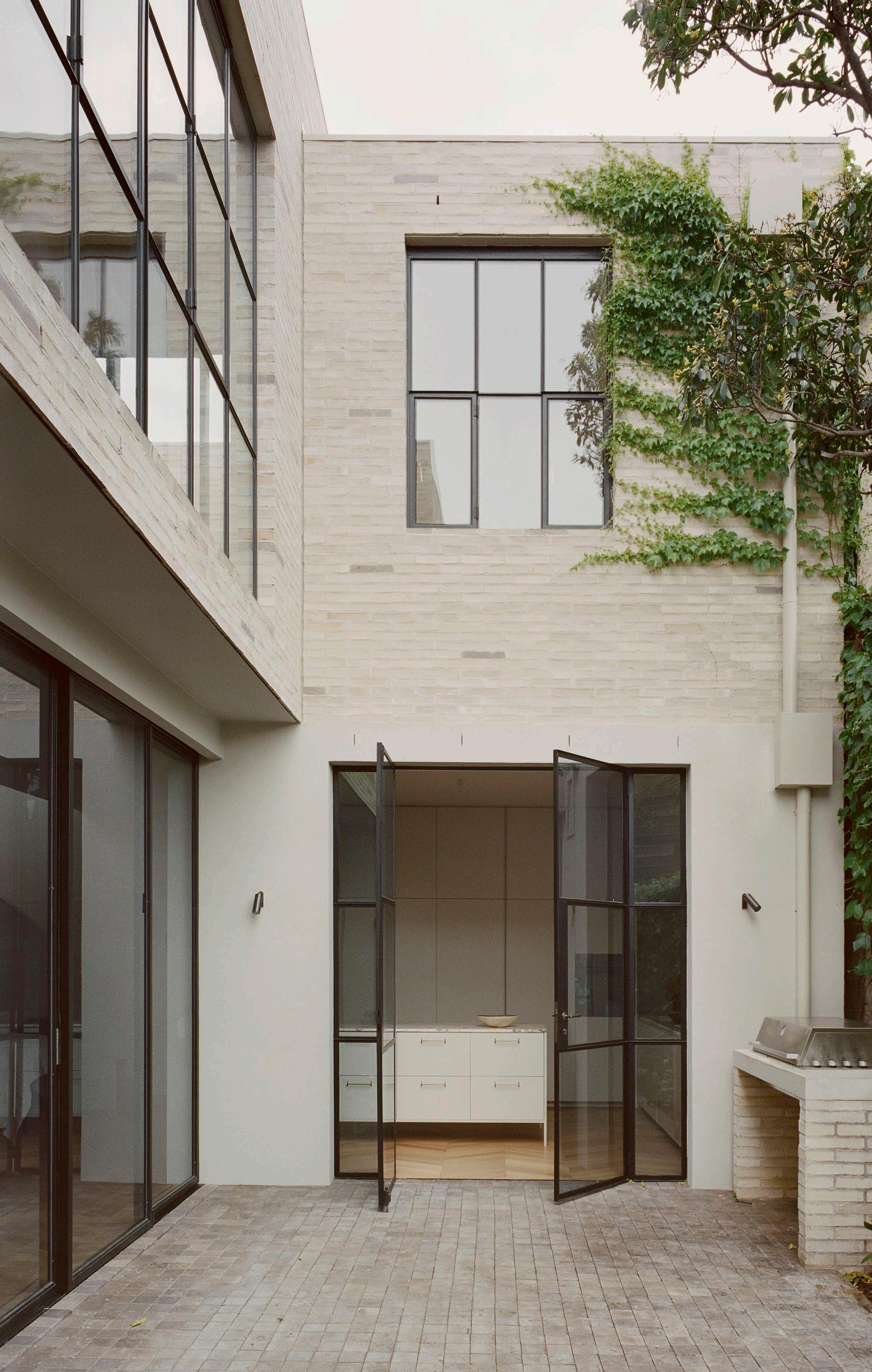
ISSUE #51
The outdoor courtyard o ers both movement and light while also serving as a protected outdoor area for Luna, Penelope's cat. The courtyard walls are painted in Porter’s Paints ‘Moonstone’.

In what ways did the location of South Melbourne influence your design decisions? How did you integrate the context into the architectural concept?
South Melbourne is a charming neighbourhood with beautiful Heritage architecture. The site, formerly a Victorian corner store, is a testament to the suburb's evolution from a working-class district into a more residential area. It was important that the building’s next layer of architecture did not diminish the preceding historical layers.
The existing single-story residence was modest in scale, featuring simple Victorian elements, such as cornices and parapets. The preservation of the historic facade and the retention of the four front rooms was a priority. The intentional stepped-down design of the two-story extension aims to minimise its impact on the overall form, demonstrating a commitment to respecting the heritage value that this humble building contributes to the neighbourhood.
How did you ensure that the design captured Penelope’s identity as a fashion designer?
Penelope is renowned for her understated and classic style; she has impeccable taste and a strong appreciation for quality materials and craftsmanship. These are all qualities we strive for in our work and underpin our design decisions for her home. The spaces are functional and beautiful, offering respite from her busy schedule and the outside.
What parallels can you draw between the home (architecture) and Penelope’s work (fashion)?
Engagement with contemporary art, fashion and culture is a common thread across our projects. In many ways, fashion and architecture exist at opposite ends of the spectrum of creative expression. Fashion can be so responsive, quickly capturing a moment in time before it passes. Conversely, architecture has a permanence which can sometimes be a burden. We were inspired by this dichotomy while working on Luna, considering the agility, freedom and autonomy of fashion design.
Collaboration is critical to a successful project outcome. Can you describe how you worked with Penelope to ensure her vision for the space was realised?
The most successful design outcomes stem from well-thought-out design briefs; it doesn’t need to be complicated or lengthy, it just needs to paint a clear picture of the client’s needs and desires. Penelope’s brief did not deviate from the initial meeting. Though we explored numerous options and took our time with decisions, the overarching goals remained the same.
Throughout the process, we discovered that our design approaches are very similar; we define the desired outcome, research and gather, and we curate and test until a solution that excites us materialises. It was a highly enjoyable project, albeit one that occasionally presented challenges to Penelope when it came to making decisions. As designers, we are accustomed to making decisions on behalf of others – making decisions for ourselves proves to be a far more formidable task.
171
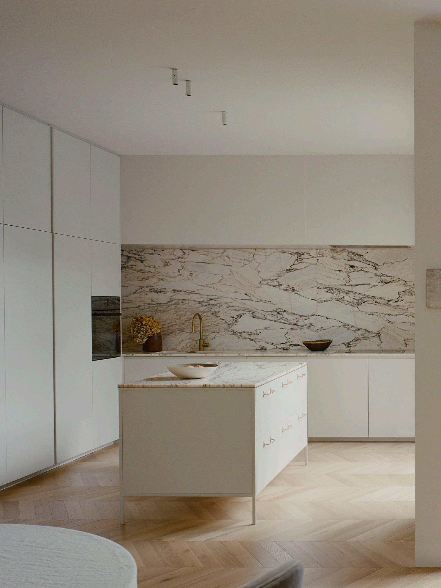
Natural materials, such as Royal Oak
and G-LUX
marble benchtops, were chosen to blend seamlessly with the surrounding garden while also infusing the spaces with a restorative quality. The kitchen features a Liebherr integrated fridge.
‘Toasted Oak’ chevron floorboards
'Paonazzo’
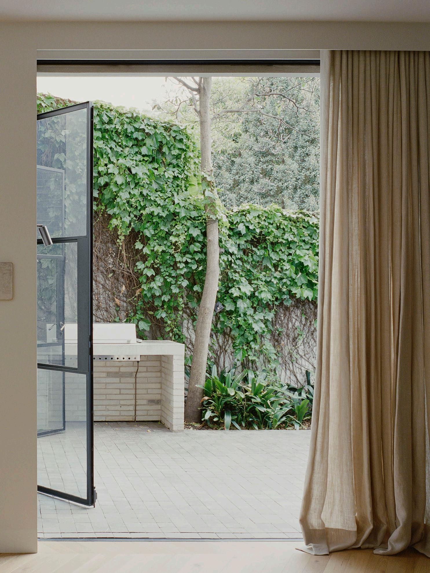
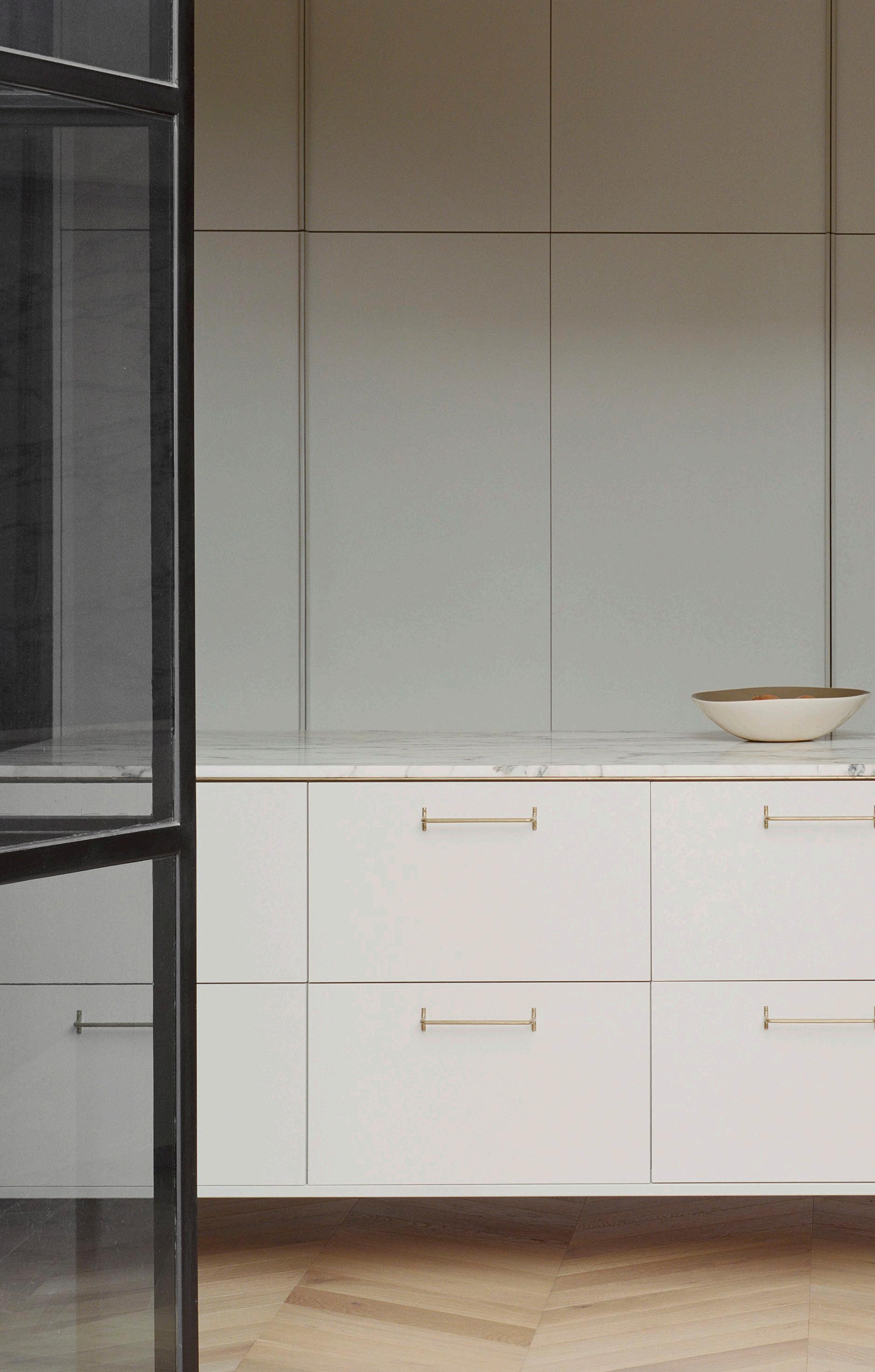
ISSUE #51

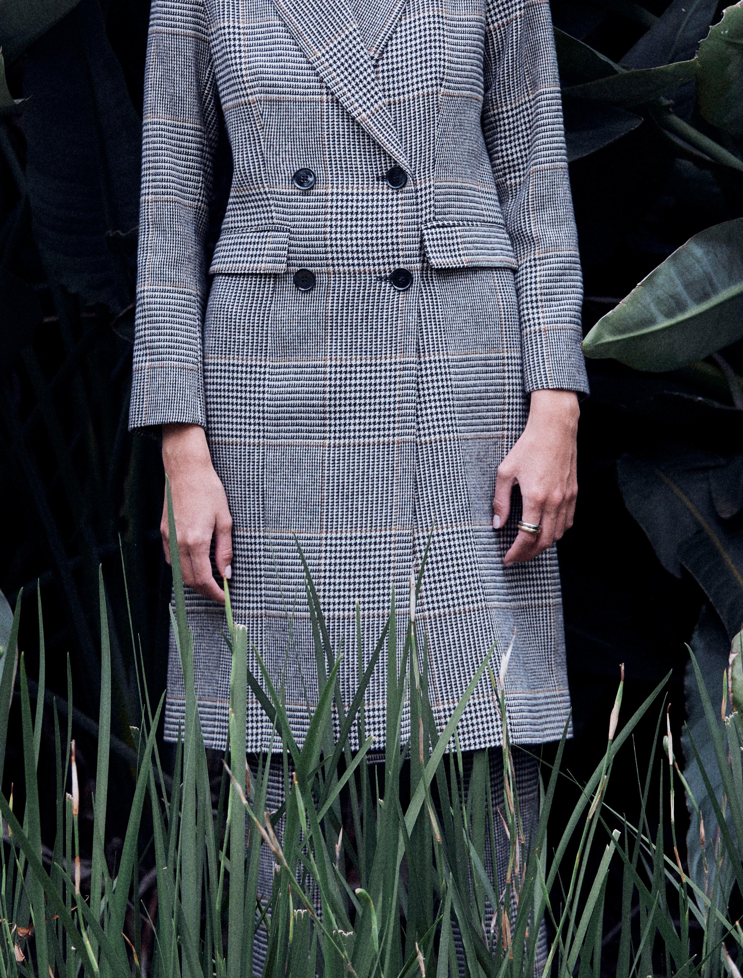
Parallels can be drawn between the home and the understated designs of
175
Penelope’s fashion label Perri Cutten.
“In many ways, fashion and architecture exist at opposite ends of the spectrum of creative expression. We were inspired by this dichotomy while working on Luna, considering the agility, freedom and autonomy of fashion design.”
– Emma Templeton
How does the home's minimalist design contribute to a sense of calm and well-being?
We sought to create a vessel for Penelope and her family to express themselves. Rather than incorporating unnecessary details, we aimed to craft refined and calm spaces. The limited palette of natural materials and neutral tones were selected as they sit beautifully against the verdant garden that surrounds the home, and lend to the spaces a restorative quality.
As Penelope and her family introduce layers of art, furniture and life into their home, we anticipate that it may no longer be characterised as minimalist. However, we are confident it will continue to evoke a sense of calm.
Pared-back interiors often bring a home’s functionality to the fore. Can you share a key design solution you implemented to create a functional home?
Function can be an interesting word. For many, it implies design solutions such as clever storage and concealed televisions. In this project, function manifests as a staircase that gracefully sweeps between the two floors, inviting visitors to ascend into the lofty, light-filled living area above. This gesture allows light to glide into the core of the home and is imperative to the function of the project.
What unexpected design elements emerged during the design process, and how did they enhance the overall design?
Originally, we hoped that the external space on the ground floor would be flooded with natural light on the north side of the building. However, the first floor's design changed significantly due to planning controls, leading to the creation of an internal courtyard space. This courtyard has evolved into a distinctive feature of the home, offering both movement and light while also serving as a protected outdoor area for Luna, Penelope's long-haired cat.
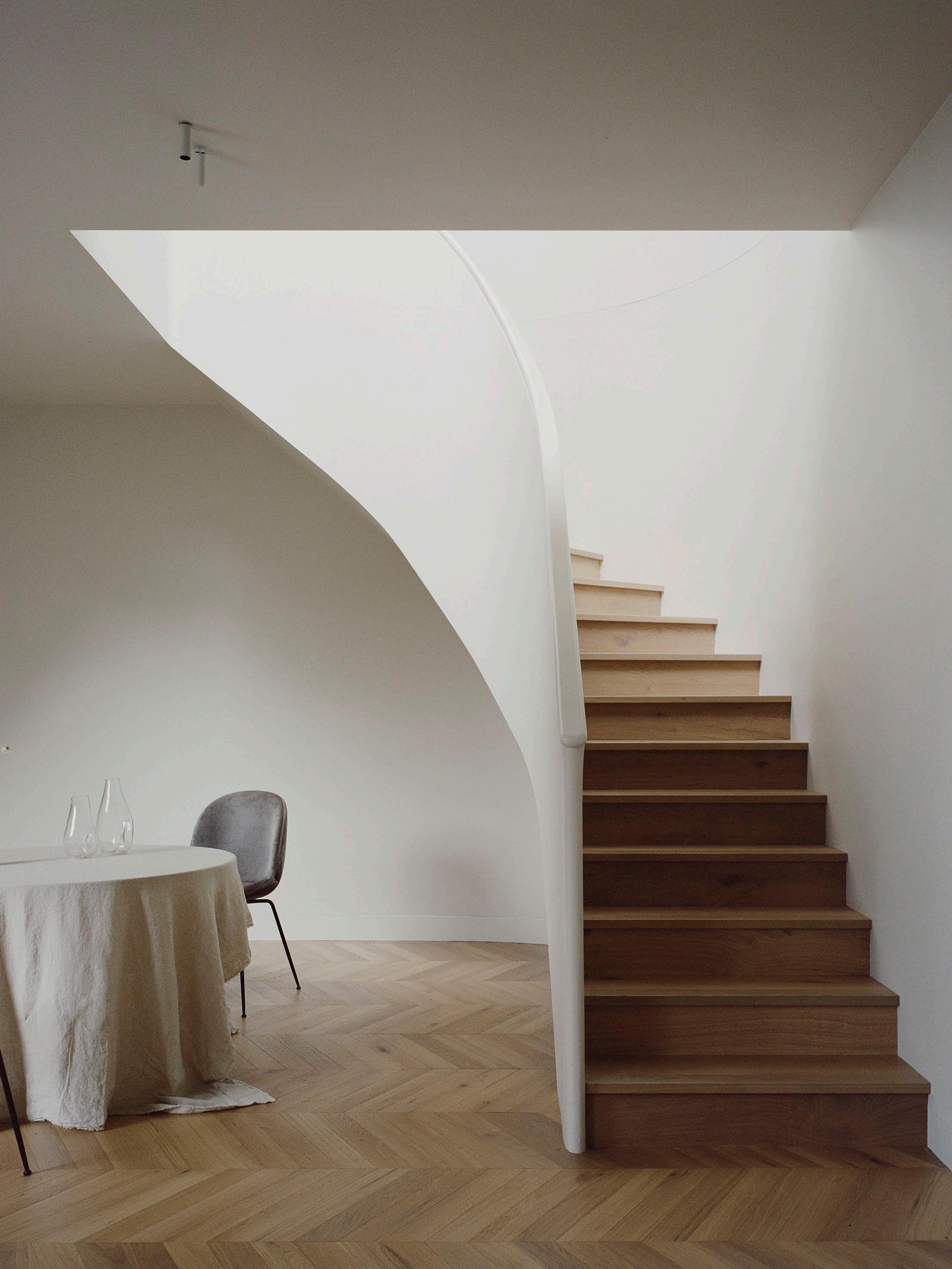 A staircase gracefully sweeps between the two floors, pulling light into the interiors and inviting visitors to explore the living area above. The dining space features the Gubi Beetle dining chair.

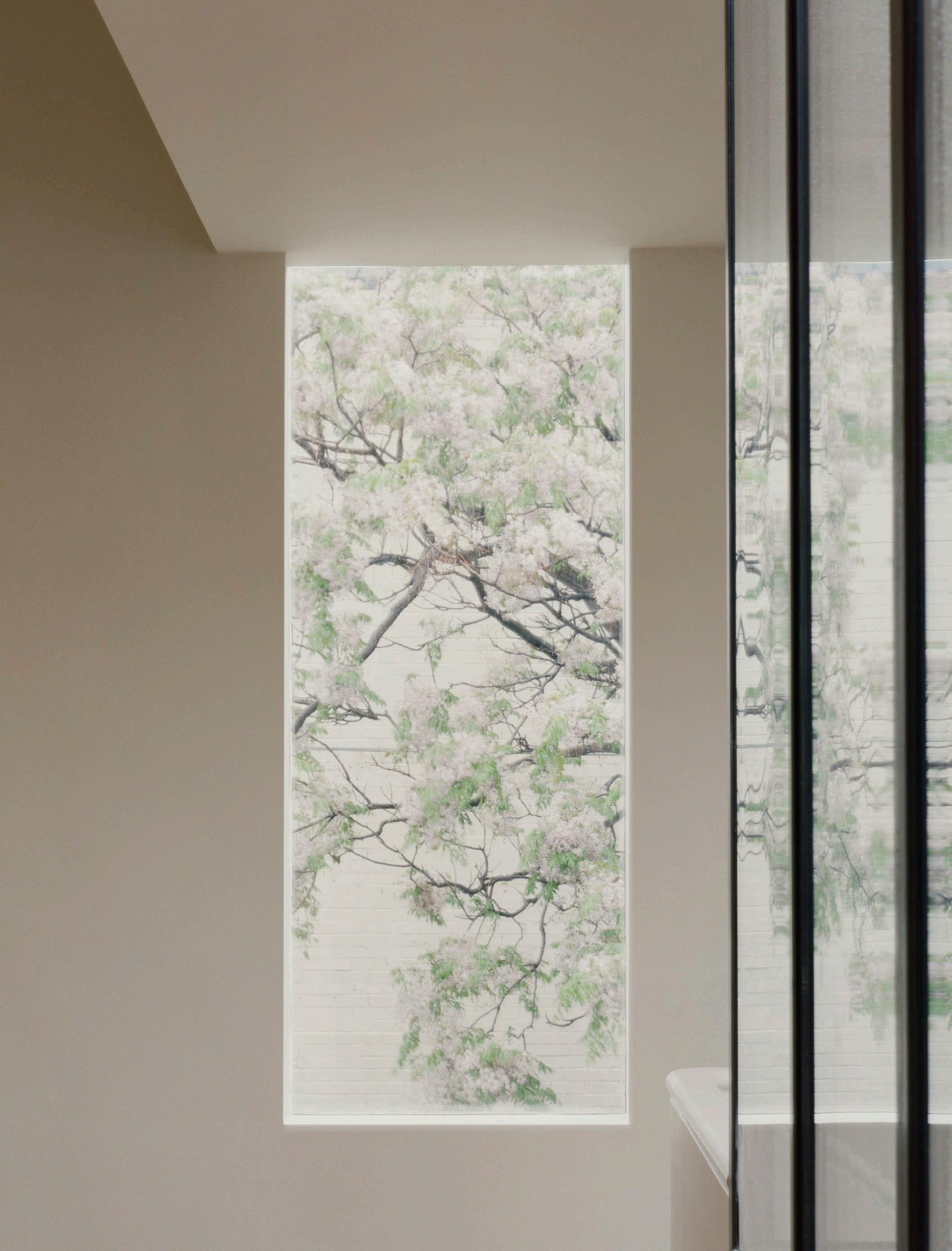
179
Opposite page: The home’s exterior is characterised by a simple palette of cream bricks and steel-framed windows and doors.
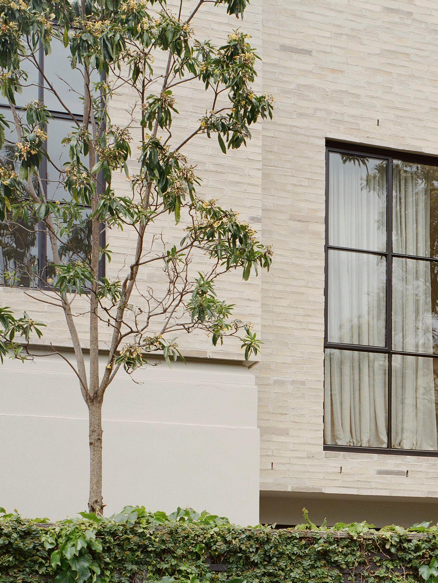

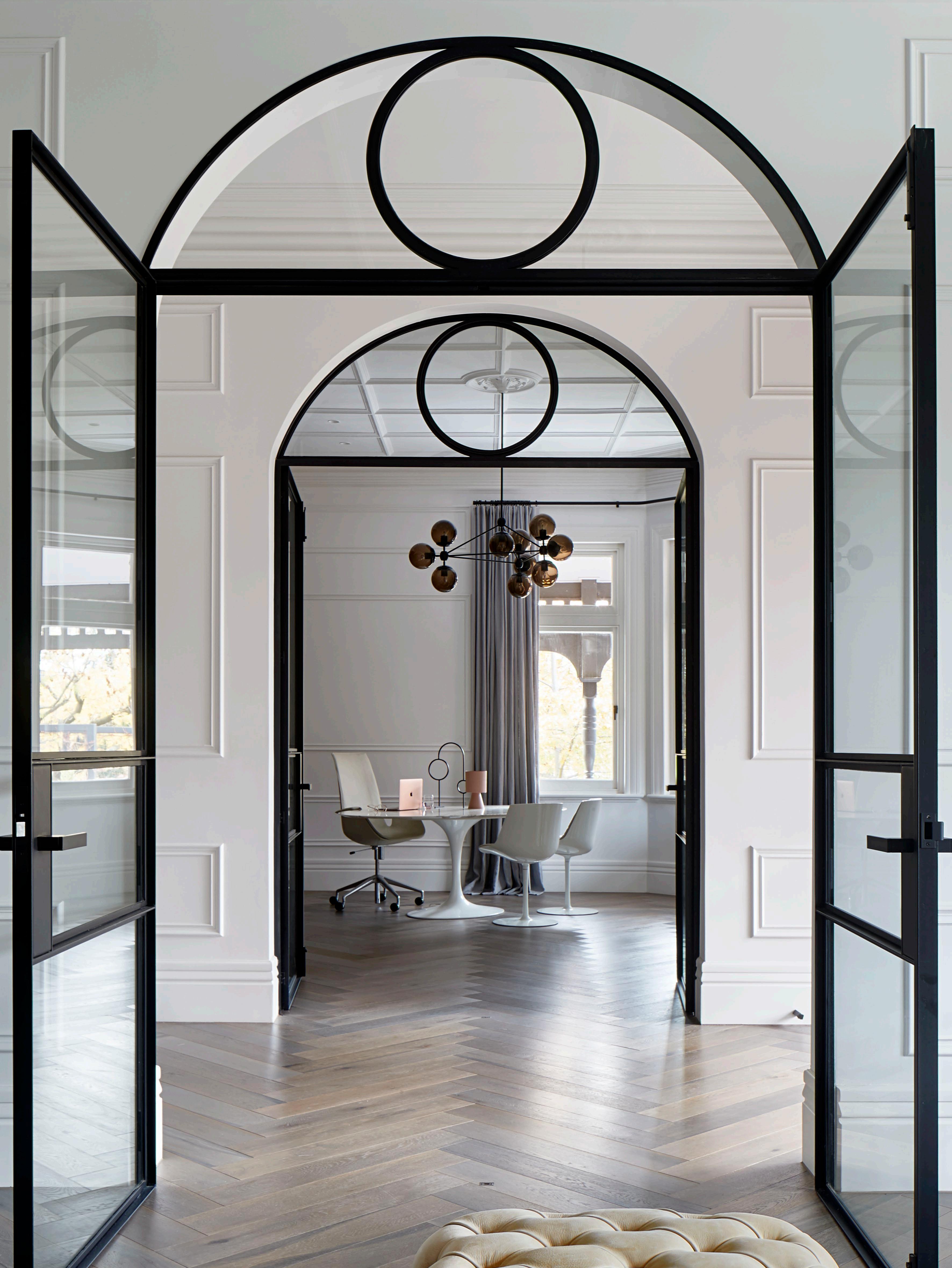


A fusion of timeless elegance, unmatched quality, with custom choices.
Experience the efficiency, reliability and precision that distinguishes us as the top choice for steel windows and doors in Australia.
183 DESIGN VOICES
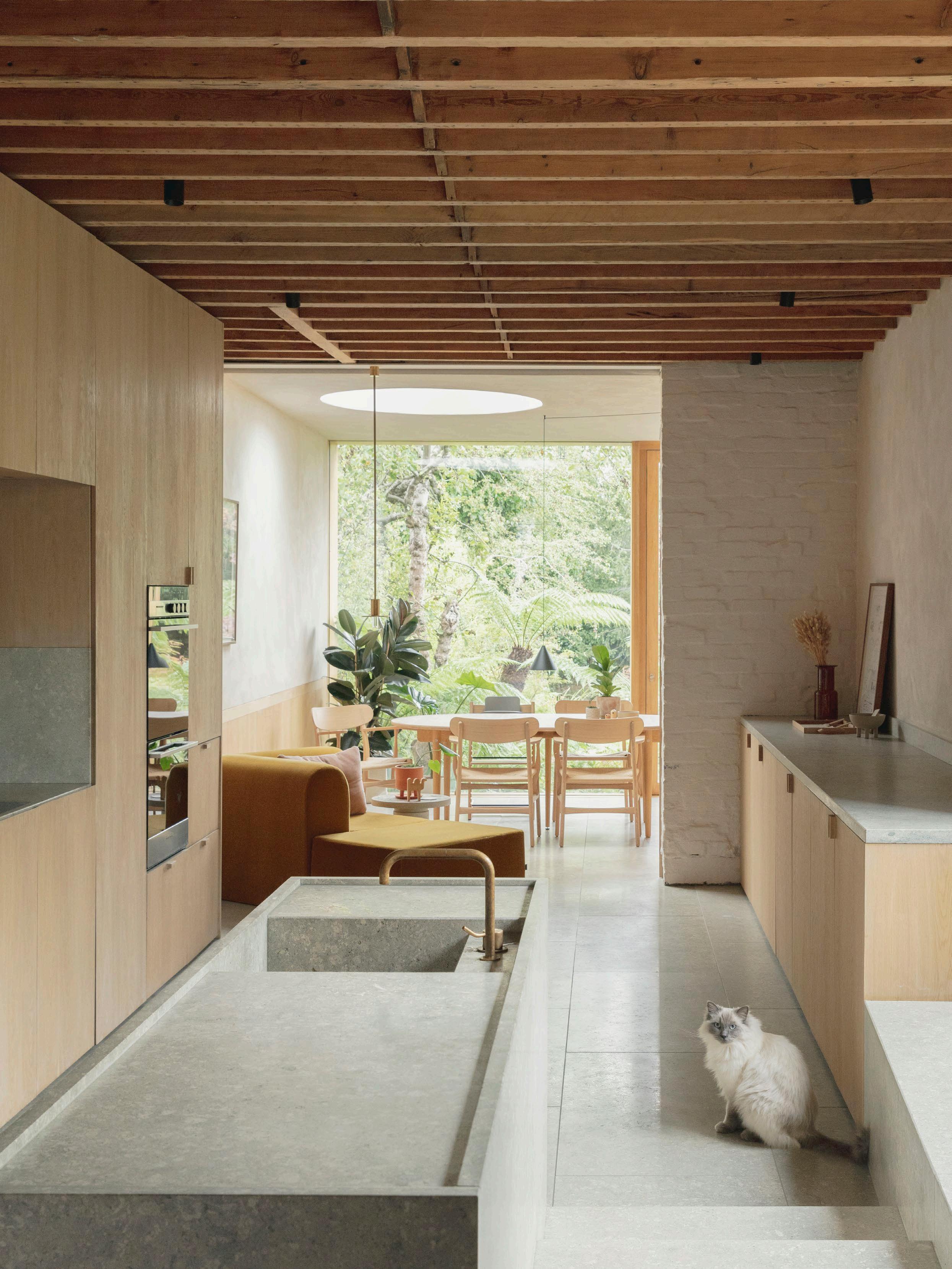
Where Architects Live
Ben Ridley
An unpromising Edwardian terrace in London’s northern suburb of Muswell Hill has become a place of calm and connection to nature under the direction of Ben Ridley, founder of practice Architecture For London.
LOCATION London, England DESIGN Architecture For London
PHOTOGRAPHY Christian Brailey, Lorenzo Zandri & Jack Harding
WORDS Karen McCartney
Looking all over North London for the right property, Architecture For London founder Ben Ridley came across a house with the downside of a deeply depressing existing interior. It did mean other potential buyers overlooked it, Ben admits, and the upside of an empty block to the east. “We have designed a house for that site which fully embraces Passivhaus principles,” he says.
The Edwardian terrace in London’s Muswell Hill has been completely refurbished to open it up to natural light and the garden, creating a flow of integrated spaces that are a far cry from the original dark, boxy rooms.
“On the ground floor, we had almost no daylight as there was only one small window that faced north,” Ben says. So the addition of a large window to the east, a circular skylight and glazing to the garden, framing the greenery beyond, create both light and a sense of connection to the site.
New and existing elements combine – such as the exposed pine beams with their original timber cross-bracing, creating a pleasing rhythm to the ceiling and increasing the volume of the rooms. Usable space has been expanded by adding a rear extension directly linking to the intentionally wild garden and converting the loft as guest accommodation, taking the total internal space to 177 square metres.
As a studio, Ben says Architecture For London strive to create environments where energy saving is paramount. “I trained in the Passivhaus principles about seven or eight years ago, and while I have been trying to convince people of their value ever since, it feels like we have turned a corner, and clients are now coming to us because they are keen to understand the benefits,” he says.
Triple glazing and improving air tightness through high levels of insulation alongside the addition of an MVHR system providing pre-heated fresh air have achieved an estimated 80 per cent of energy saving.
These steps are further enhanced by aesthetics driven by the choice of materials and Ben’s exacting eye for volume, proportion and design. A limited palette is widely used –natural stone, timber and lime plaster with its textural raw finish – all coalesce to add character to the space. “The Grassi Pietre limestone is from Italy, near Vicenza, and oak timber is used pretty much everywhere except for in the master bedroom, where we have wide Douglas Fir boards from heritage Danish brand, Dinesen.”
est magazine ISSUE #51

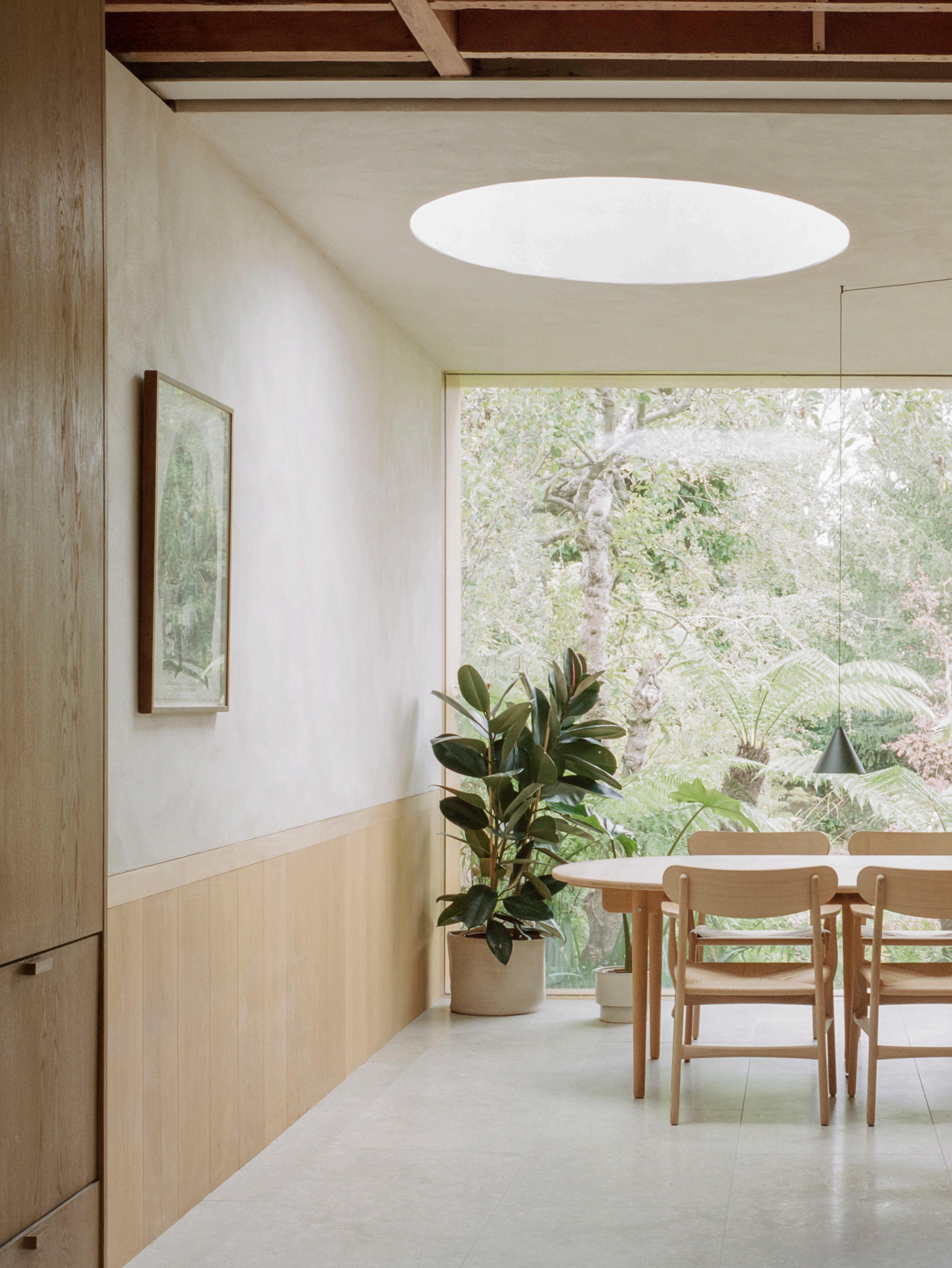
The original sequence of dark, boxy rooms has been opened up and a sense of expansiveness created by edging an extension into the garden space with its wild planting – a far cry from a traditional British lawn – which is framed by a wall of glazing.

“We employ Passivhaus principles…and clients are now coming to us because they are keen to understand the benefts.”
– Ben Ridley

New and existing elements combine – such as the exposed pine beams with their original timber cross-bracing, creating a pleasing rhythm to the ceiling.
In the extension, which forms a dining space adjacent to the garden, the book-matched, crown-cut oak veneer has a white soap finish to soften it and bring it in line tonally with the lime plaster. “The good thing about the lime plaster is that it is a natural material that has been used in these homes for hundreds of years, and it appeals because it is self-finished – you don't need to paint it afterwards. It has a subtle texture and colour and is airtight if you use a thick enough layer of it,” Ben says.
The interior furnishing are quiet, as seen through the Danish timber pieces, upholstered sofas and chairs in soft tones. The clever use of curtaining in the master bedroom where a cocooning S-fold curtain from Kvadrat allows filtered light but takes the edge off the streetscape. The house is carefully detailed with a crafted timber banister that reflects tradition while creating a new contemporary vocabulary.
This is something Ben is keen to do through his practice, which now has 20 people on the architecture side, a quantity surveyor and a building team. This ensures control of the process, giving client confidence and enabling the practice to embed high levels of knowledge and expertise on an ongoing basis. “We would like to convince councils to let us take on a row of terraces to show what the real benefits are,” Ben says.
Indeed, given his house is off a busy suburban road, the tranquil interior, with its insulated properties, natural palette and garden views, seem to mute the city beyond. I hesitate to use the word oasis, but there is certainly a sense of containment and calm that would make the house a pleasure to return to daily.
191 DESIGN VOICES
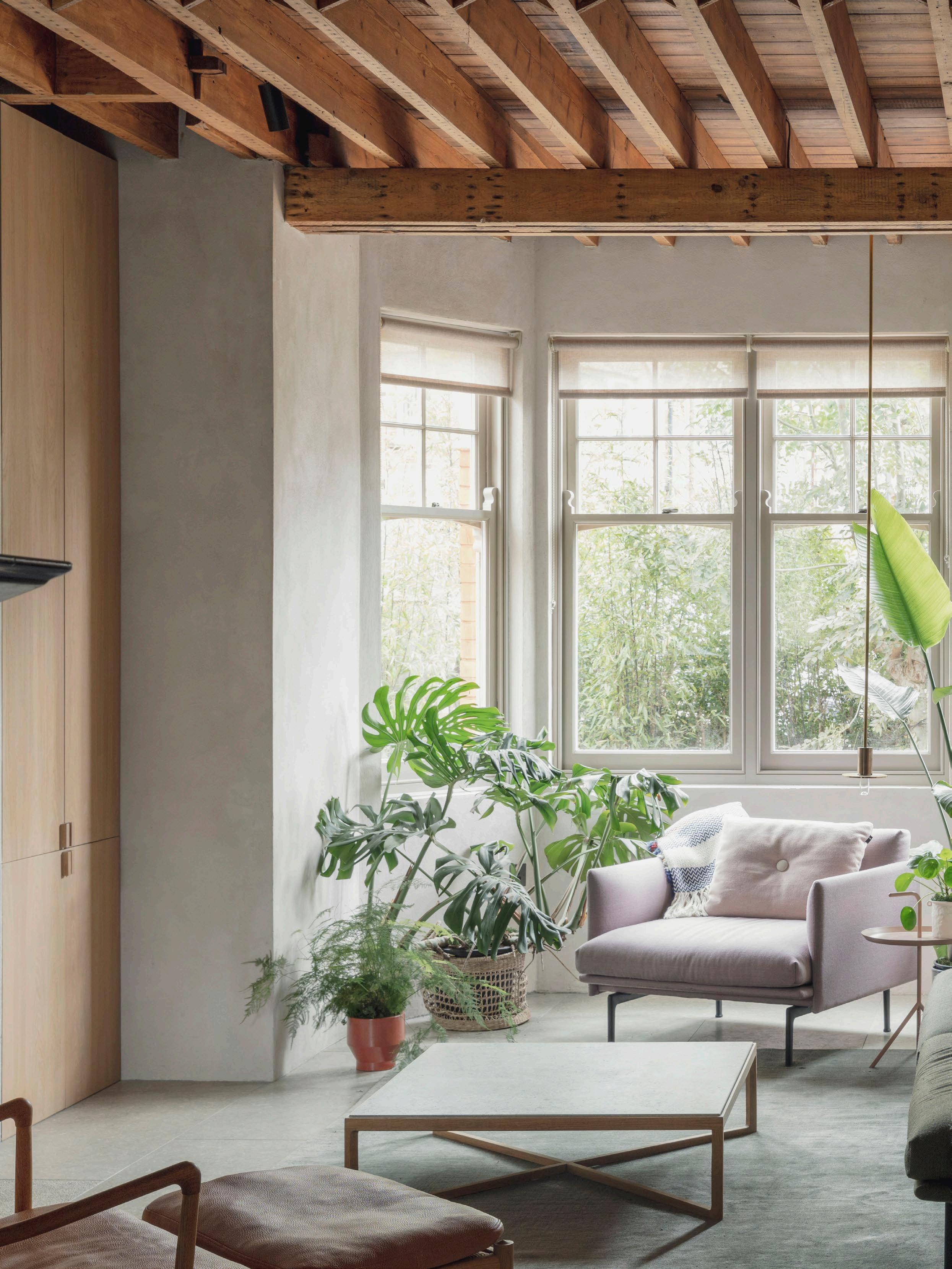
The original part of the house facing the street retains the charm of the stained-glass windows, while contemporary furnishings in soft natural tones sit among potted plants. The limed wall treatment and joinery are continuously linked between existing and new spaces.
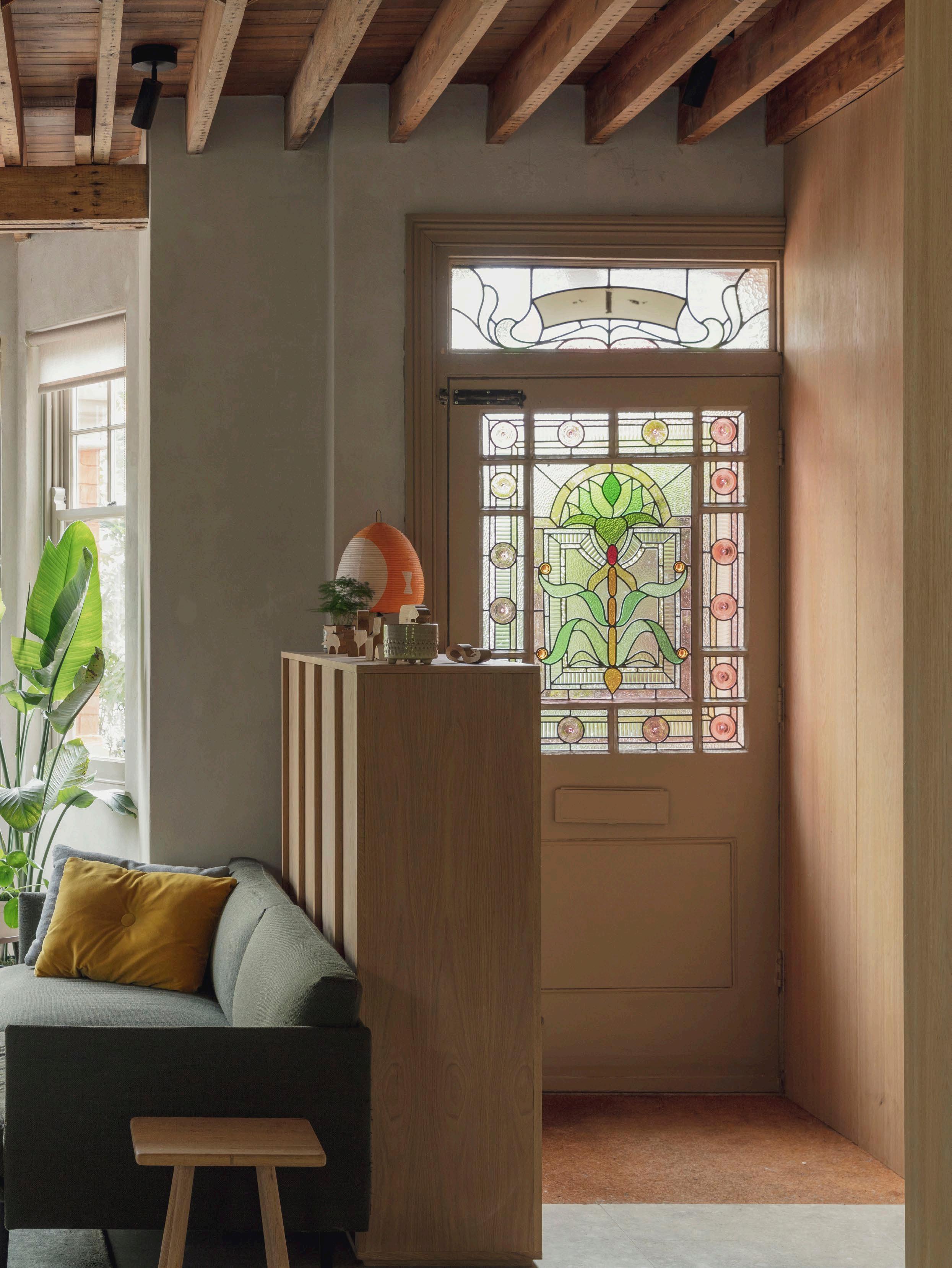
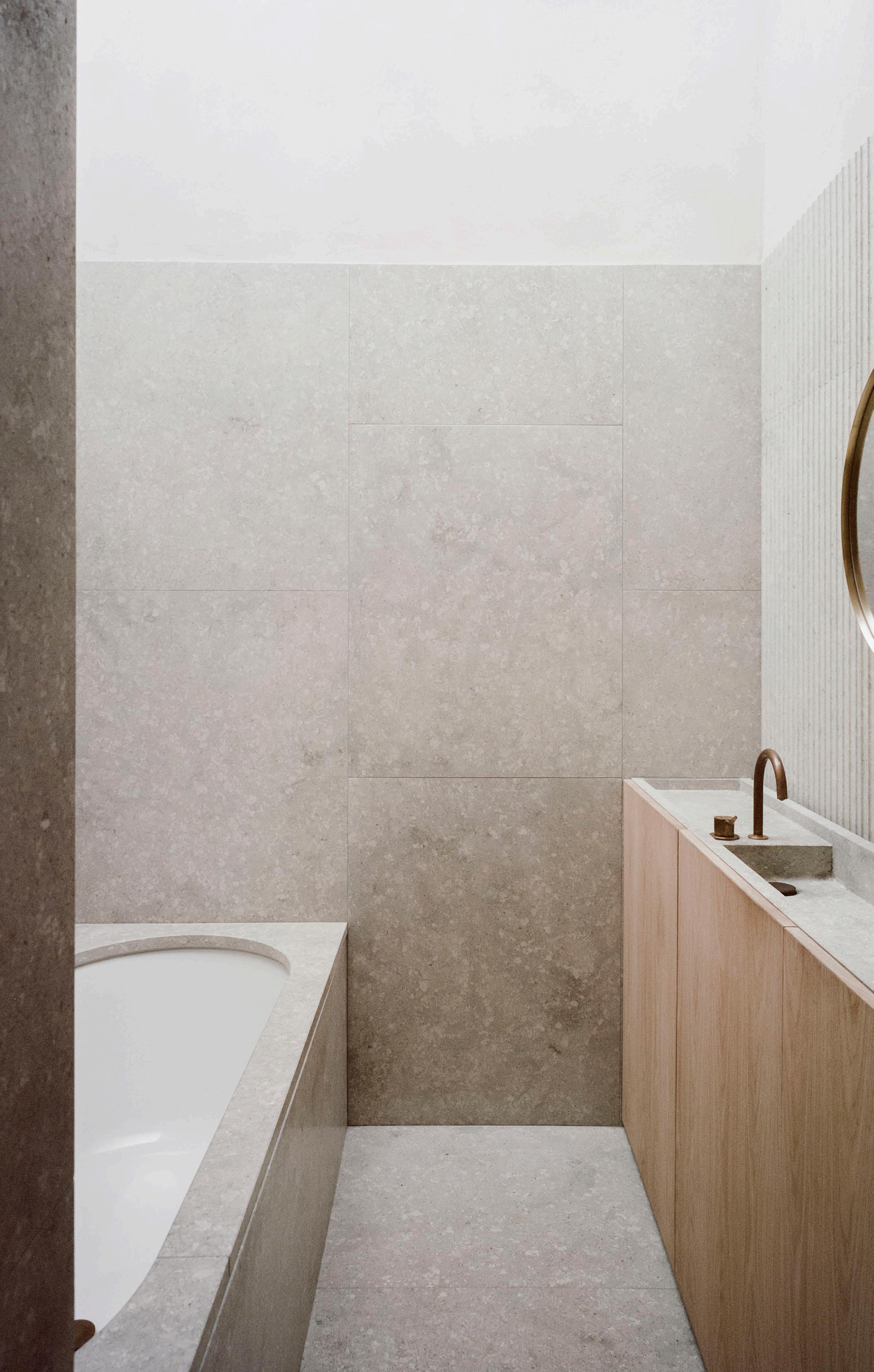
ISSUE #51


It is a house of expansive gestures and fine detailing. “The Grassi Pietre limestone is from Italy, near Vicenza, and oak timber is used pretty much everywhere,” Ben says. The containment of the palette allows the forms, the repetition of the ceiling beams and the light to inform the space.
195

This page: floorboards from Dinesen combine with original brickwork treated in lime plaster – a finish that has been used for centuries.
Opposite page: Ben Ridley is photographed in the filtered light of the upstairs bedroom, where an S-fold curtain from Kvadrat mutes the street and gives a cocooning e ect.
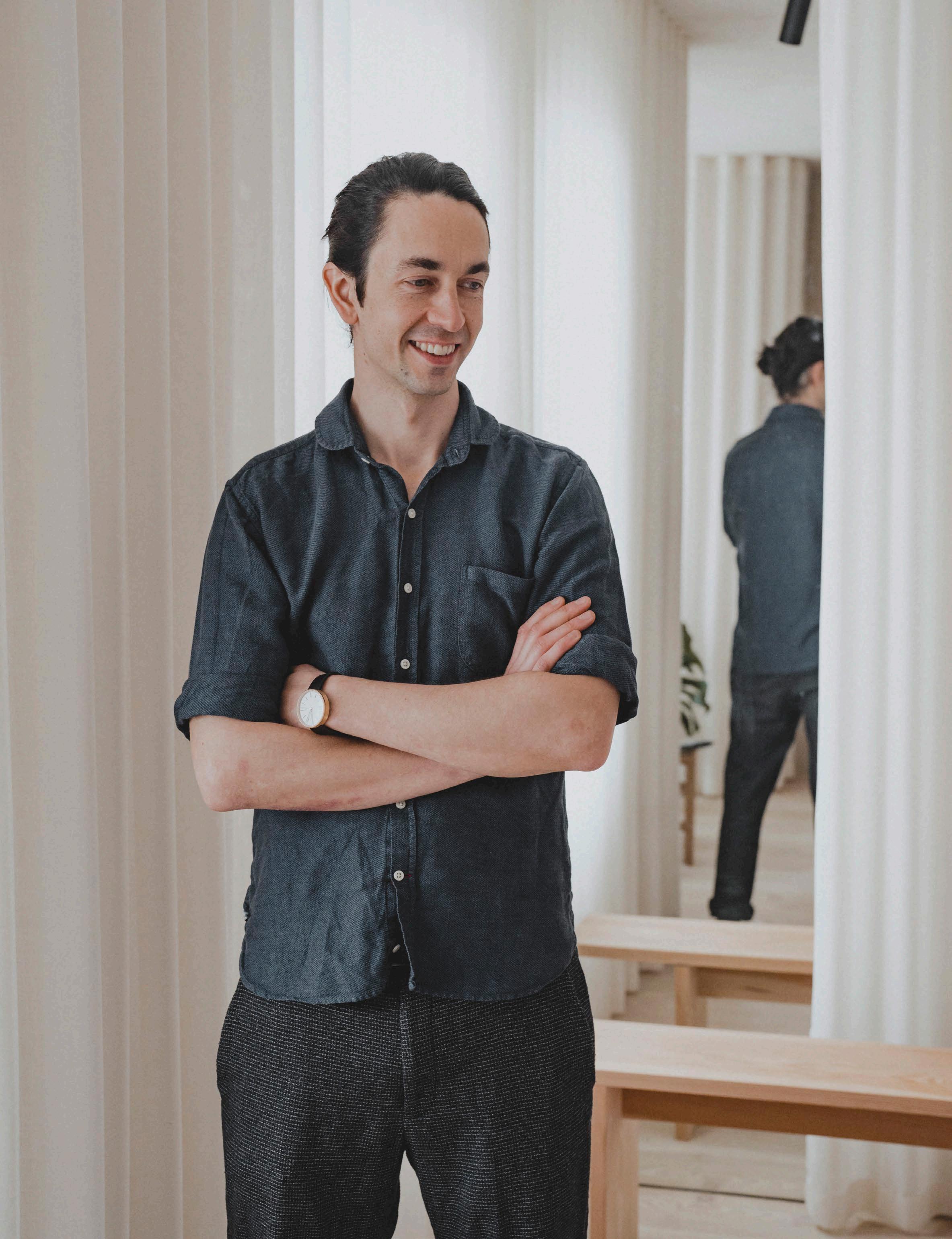
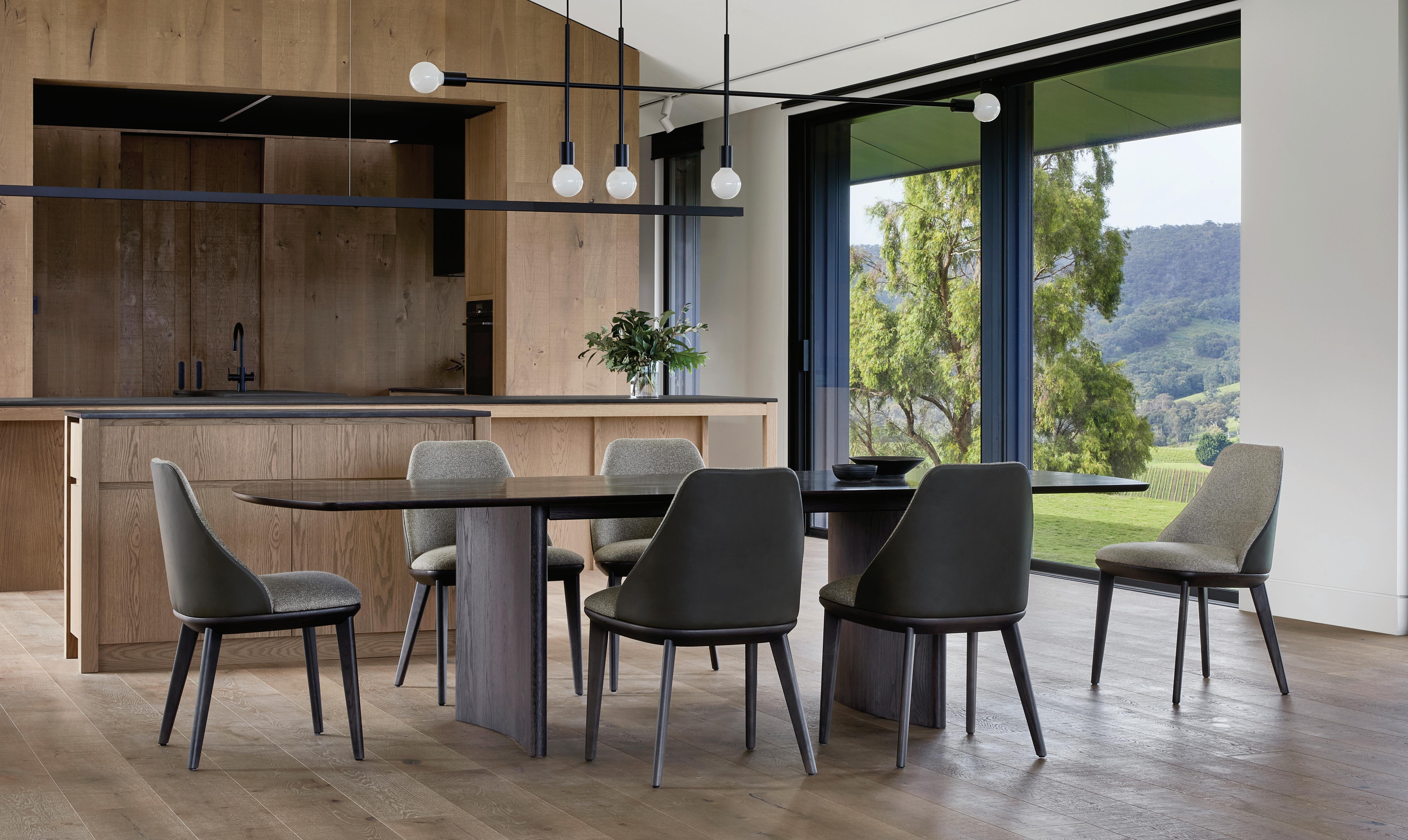

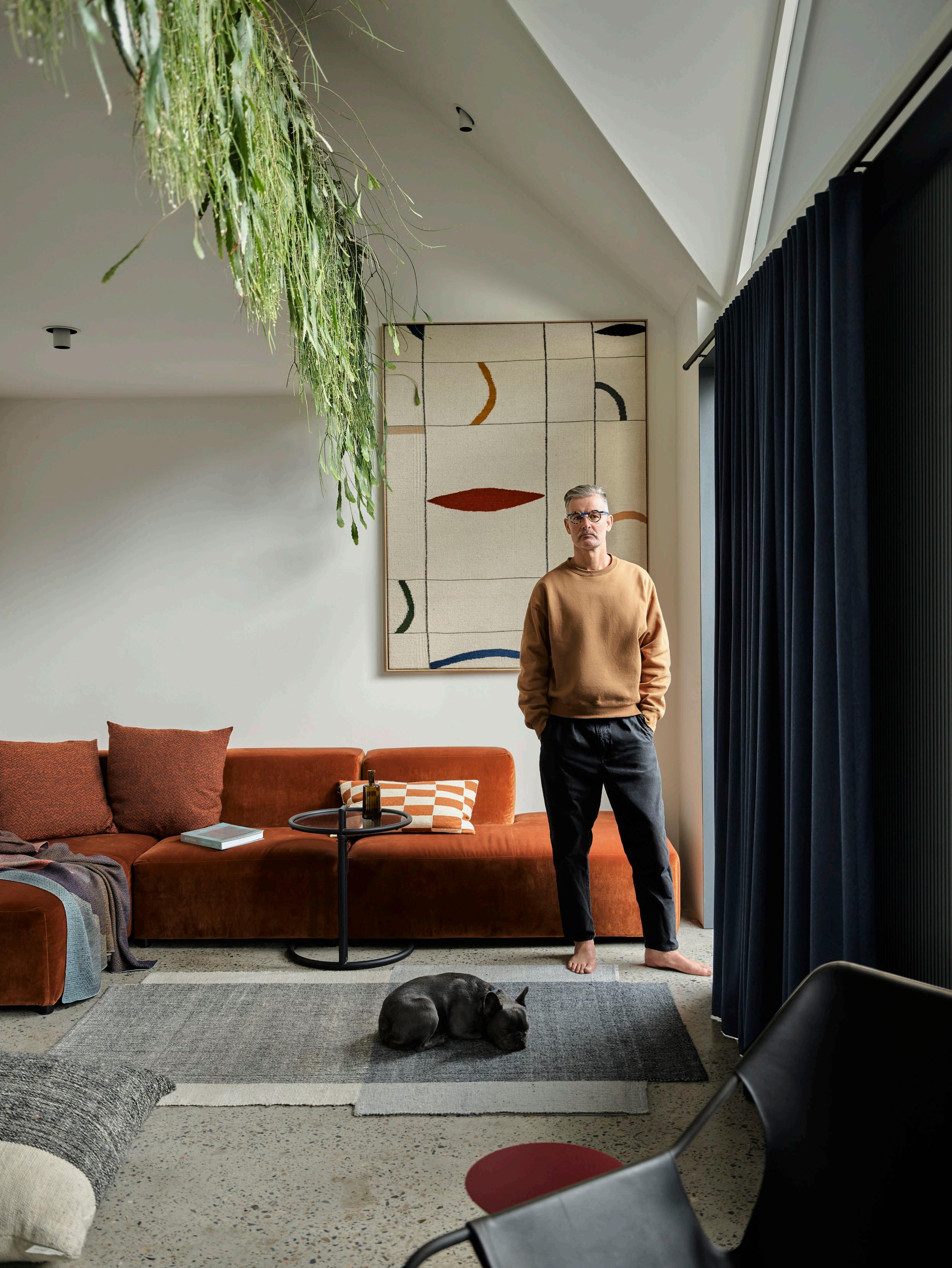
Where Architects Live Ben Mitchell
Illustrating the impact of disciplined architectural thinking, architect Ben Mitchell has transformed a former shoe factory into a home that embraces new-found areas of outdoor space, light and even water views.
LOCATION Gadigal Country / Sydney, Australia
DESIGN Those Architects
STYLING David Harrison PHOTOGRAPHY Anson Smart
WORDS Karen McCartney
Those Architects principal Ben Mitchell had driven past this site in Sydney’s Mosman for many years. Originally a shoe factory with south-facing windows and located on a reasonably busy road, it was easy for him to understand why buyers persistently overlooked its potential. “As an architect, I could immediately see both the problems and their resolution – I knew I had the skills to remedy it – and more importantly, it was within my budget,” he says.
Getting to the finish line has, he admits, been slow. Bought in 2006, he did a quick fix – where architectural savvy met an IKEA budget – and for many years, he either rented it or lived in it until the time came for a major revamp.
“I had it completely planned and didn't deviate from that original intent. I always knew we wanted to reduce the impact of the road – both visually and aurally – and create an atmosphere of greenery as both an outlook and internally through generous in-built planter boxes,” he says.
Other issues included creating cross-ventilation, access to northern light and taking advantage of the spectacular harbour views from the roof. “In the old days, we would scramble up there, but now we have a terrace – perfect for breakfast and evening drinks.”
In the main living space, the three-metre ceiling height allows for floor-to-ceiling double-glazed glass doors to run the entire southern façade of the house. When those doors are open, there's no barrier between the outside and the inside, and the slim courtyard, with a sculptural BBQ and Eucalyptus tree, is embraced as interior space. For Bleu the French Bulldog, a tiny dog flap is tucked under an in-built concrete seat adjacent to the dining table.
This 170-square-metre house is robust and purposeful while having a laser-like focus on fine design detailing and material selections. The concrete kitchen bench is solid and, as Ben says, “is built to cope with almost anything”, whereas the slimline table in walnut, by local maker Mark Welch, is designed with softened oval ends to provide a sense of inclusiveness. “Everything is very specifically selected, from the Marcel Breuer Thonet dining chairs from Anibou to the wall-hanging tapestry from Slowdown Studio in the living room,” Ben says.
est magazine ISSUE #51
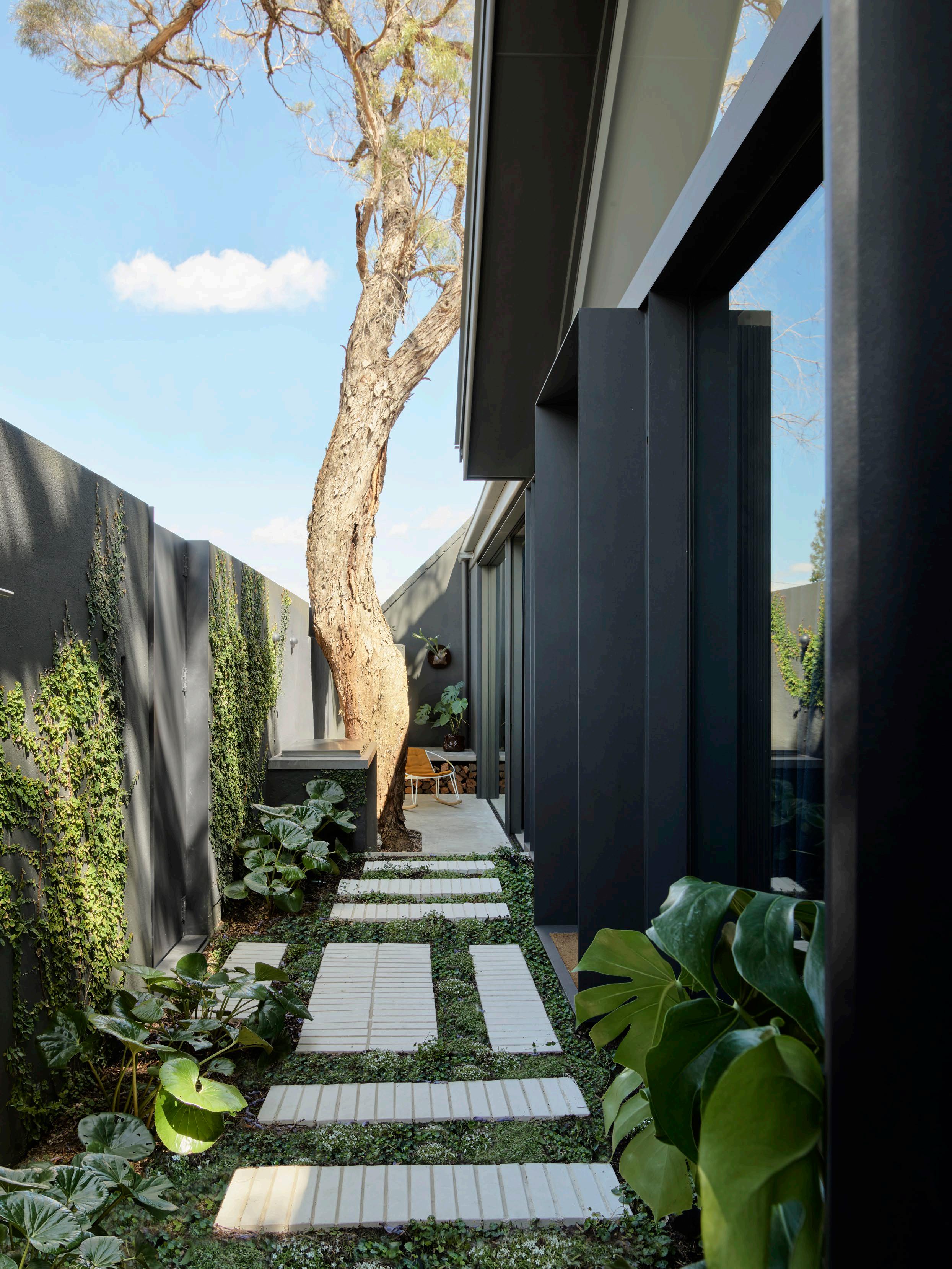
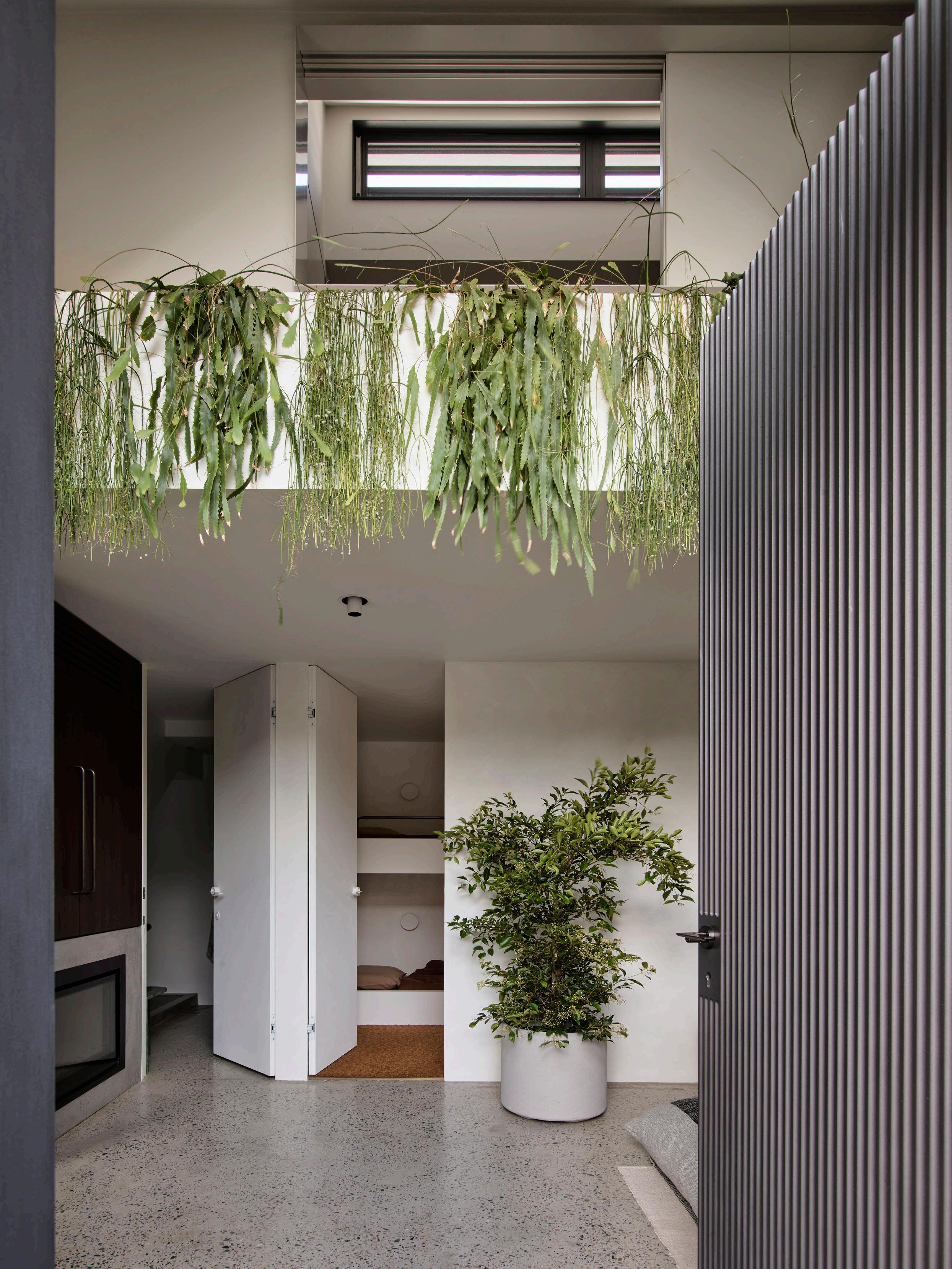
By retaining the original terrazzo flooring, with all its marks where machinery was anchored, the tones of the aggregate inform the colour palette of the house – rust, blue and grey – and impart something of the history of the space.
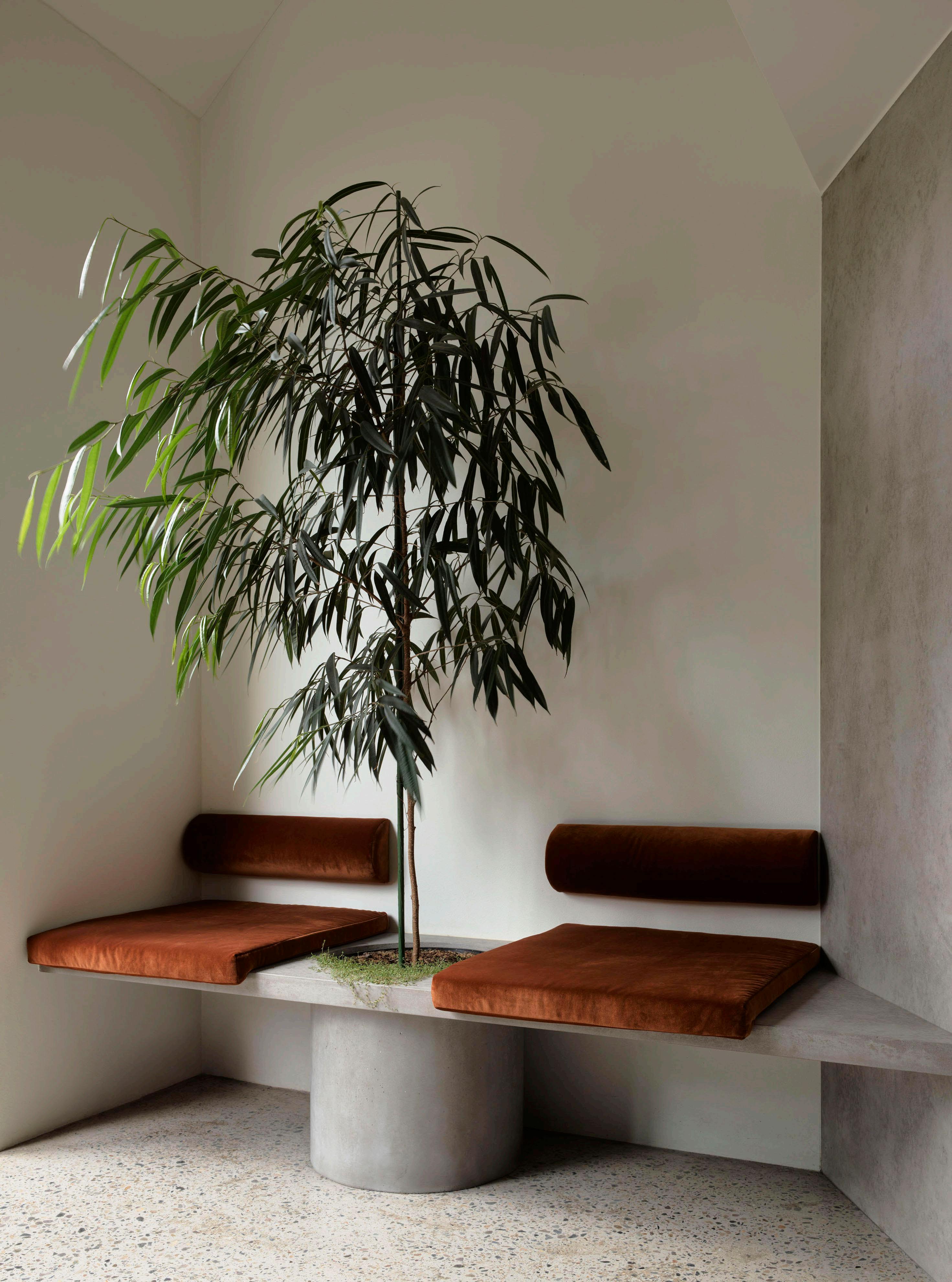
DESIGN VOICES
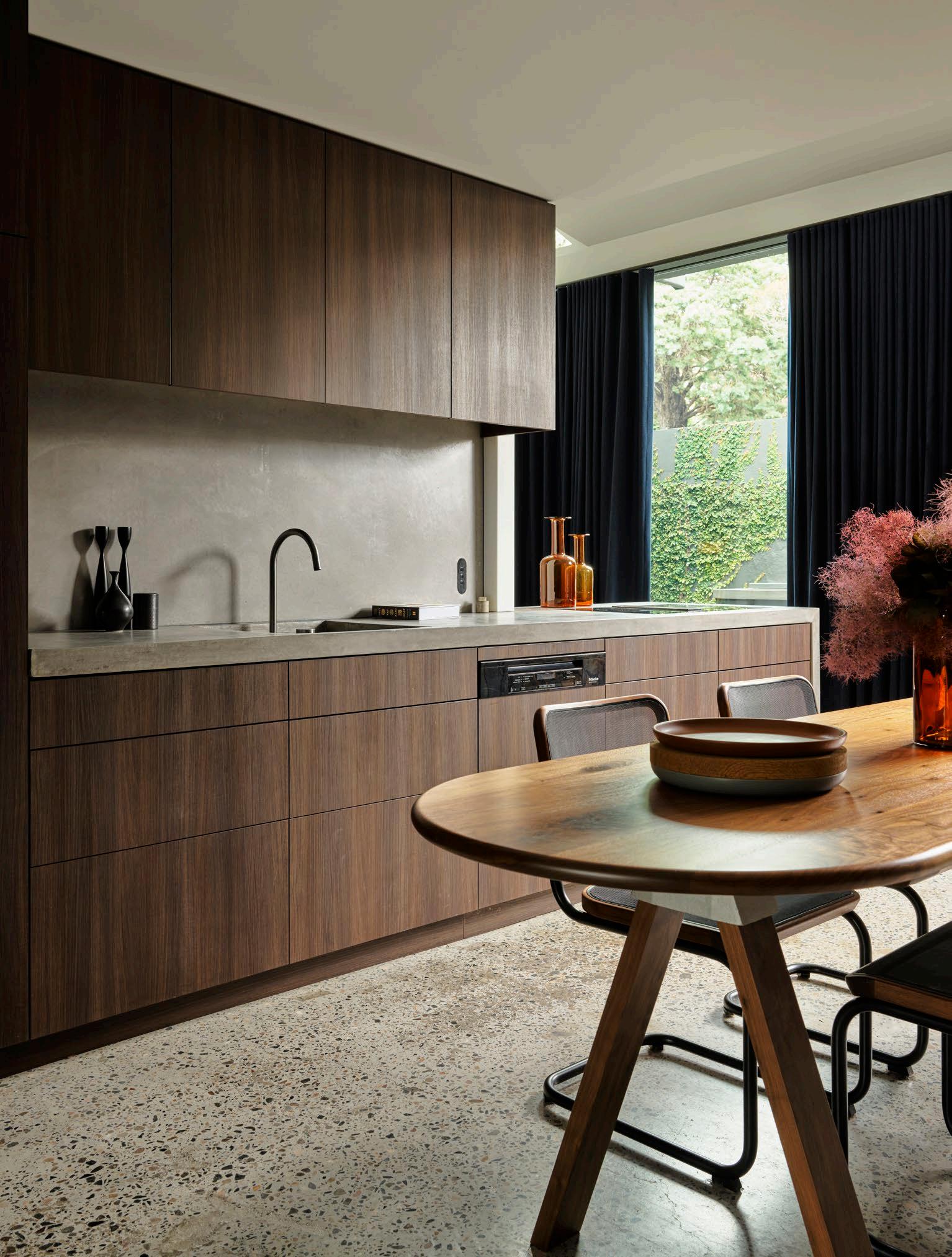
In fact, the colour palette has been derived quite literally from the ground up as the original terrazzo floor – with all its imperfections from the fixing points of the cobbler’s machinery – houses the bluey greys and rust tones within the aggregate that inform the fabric selections for the curtains and soft furnishing.
“My instinct is more architectural and quite spare, and so it was up to my partner Diana to push along the notion of comfort,” he admits. The balance between the two now presents a great sense of equilibrium, and it is a house where every room is used and every space considered. “We both work from home occasionally, so the part-time study is also a part-time bedroom, with a pull-down bed and joinery that conceals extra storage,” he adds.
Together with Simon Addinall who heads up the Those Architects Bryon Bay office, Ben encourages clients in this efficient use of space, preferring one room that does three things and is used 90 per cent of the time to a multitude of seldom used rooms. This approach does not result in a feeling that more is shoe-horned into less rather there is a real ease to the place, managing to convey the feel of an apartment and the amenity of a house.
Two new additions for 2024 – a new baby in March and a 36-ft timber boat that will be moored in the adjacent harbour – are sure to change the dynamic of the household. “So really, we see this place as Monday to Friday. Its lock-up and go quality really works for us, but it is also a really beautiful space to come home to.”

“My instinct is more architectural and quite spare, so it was up to my partner Diana to push the notion of comfort.”
– Ben Mitchell

ISSUE #51

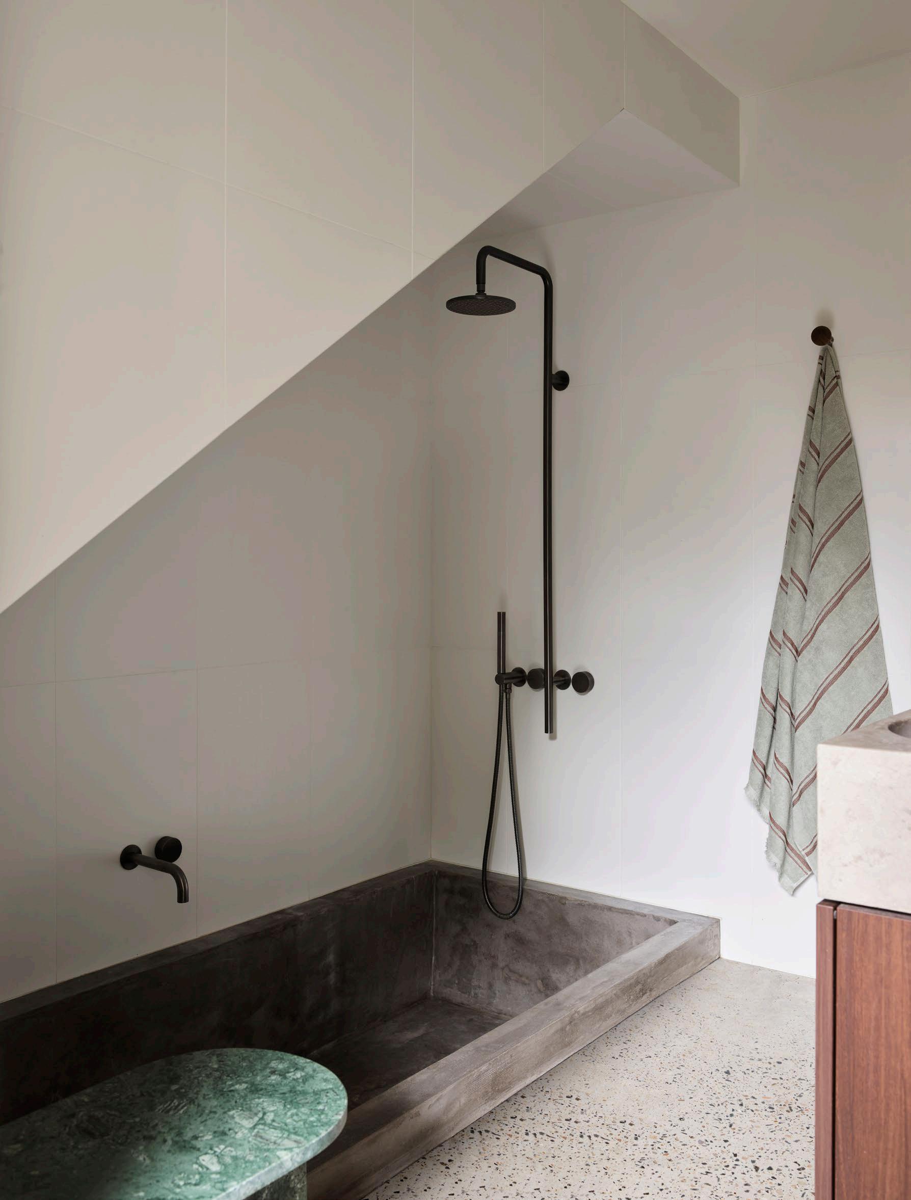
Utility has never looked so good with streamlined bunk beds (left) and a concrete sunken bath (shaped specifically to suit Ben’s back) while doing double duty as a shower trough. A small stone side table in a rich green adds a shot of colour.
209
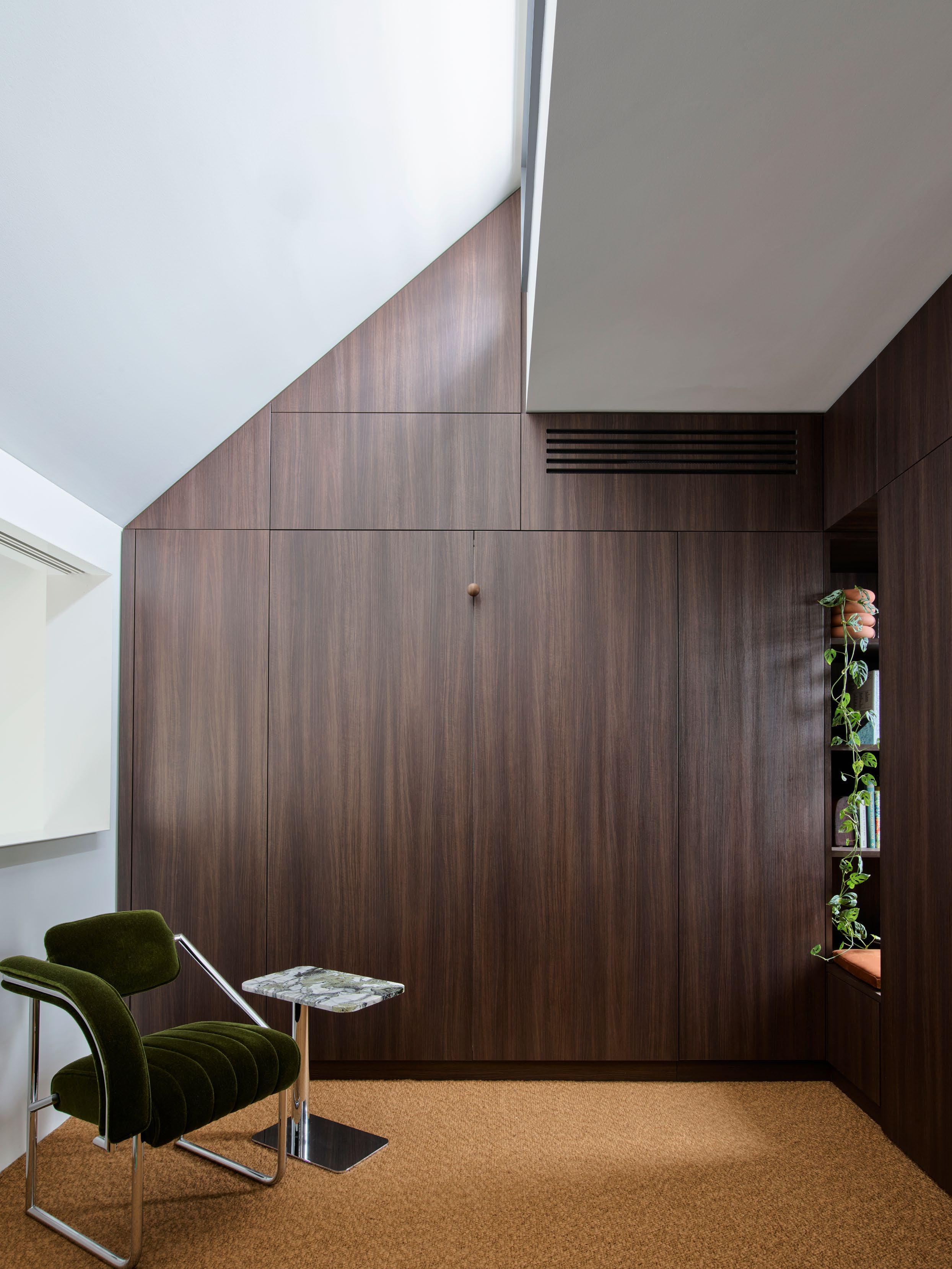
This page: This multi-functional room is a study, a spare bedroom (a bed folds down out of the joinery) and provides extra storage space. The alcove to the right pulls light in from the north and houses a mini library and padded seat. A favourite chair – the Non Conformist chair by Eileen Grey for Classicon – has a sculptural presence.
Opposite page: The house exterior gives little away, with the high masonry wall protecting the sound and sight of the street.
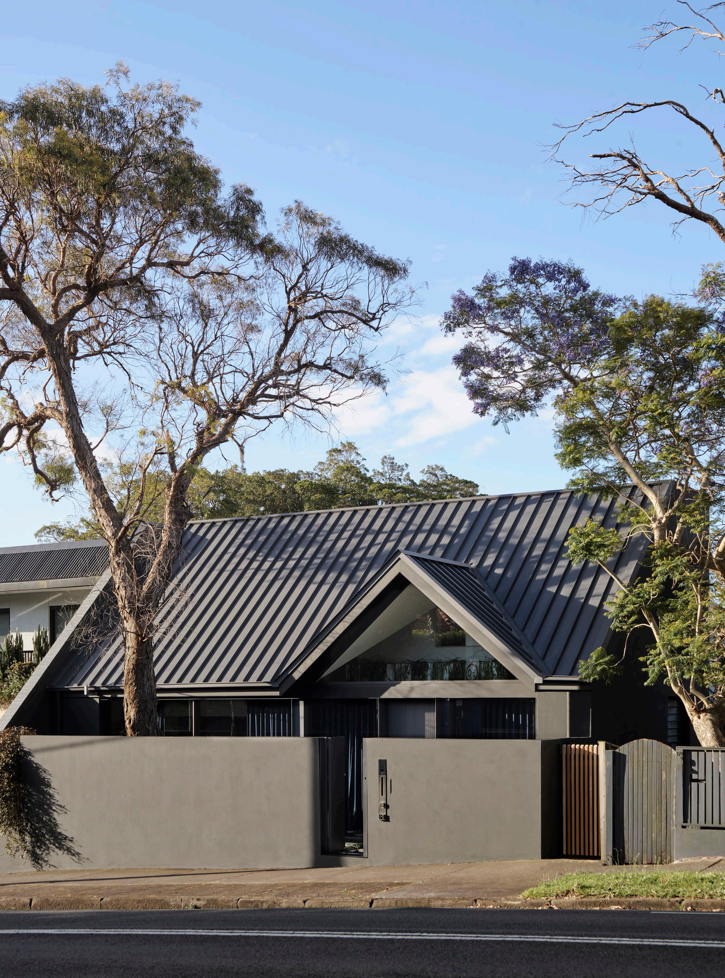
DESIGNER OF THE YEAR 2024
MathieuLehanneur
The upcoming January edition of Maison&Objet, a bi-annual international design fair focused on lifestyle, decoration, and home furnishings, will honour French multidisciplinary Mathieu Lehanneur as ‘Designer of the Year.’
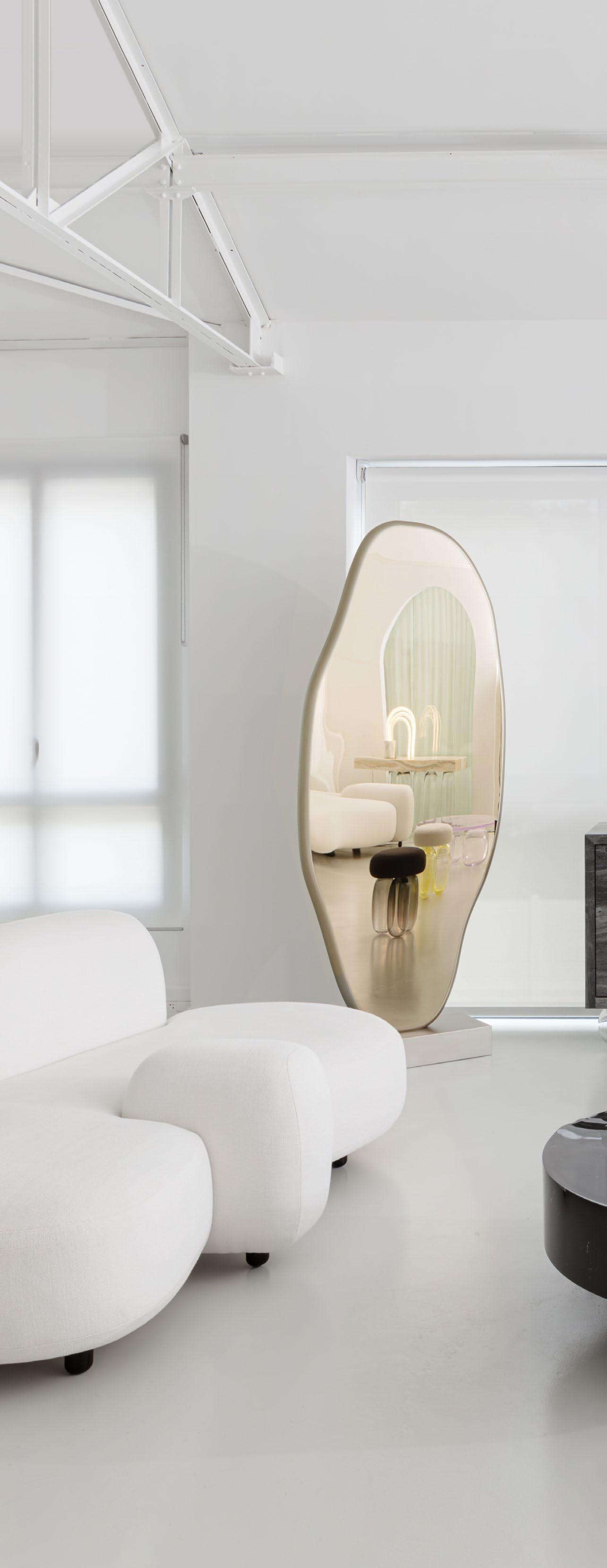

VIEW THE ENTIRE PROGRAM >

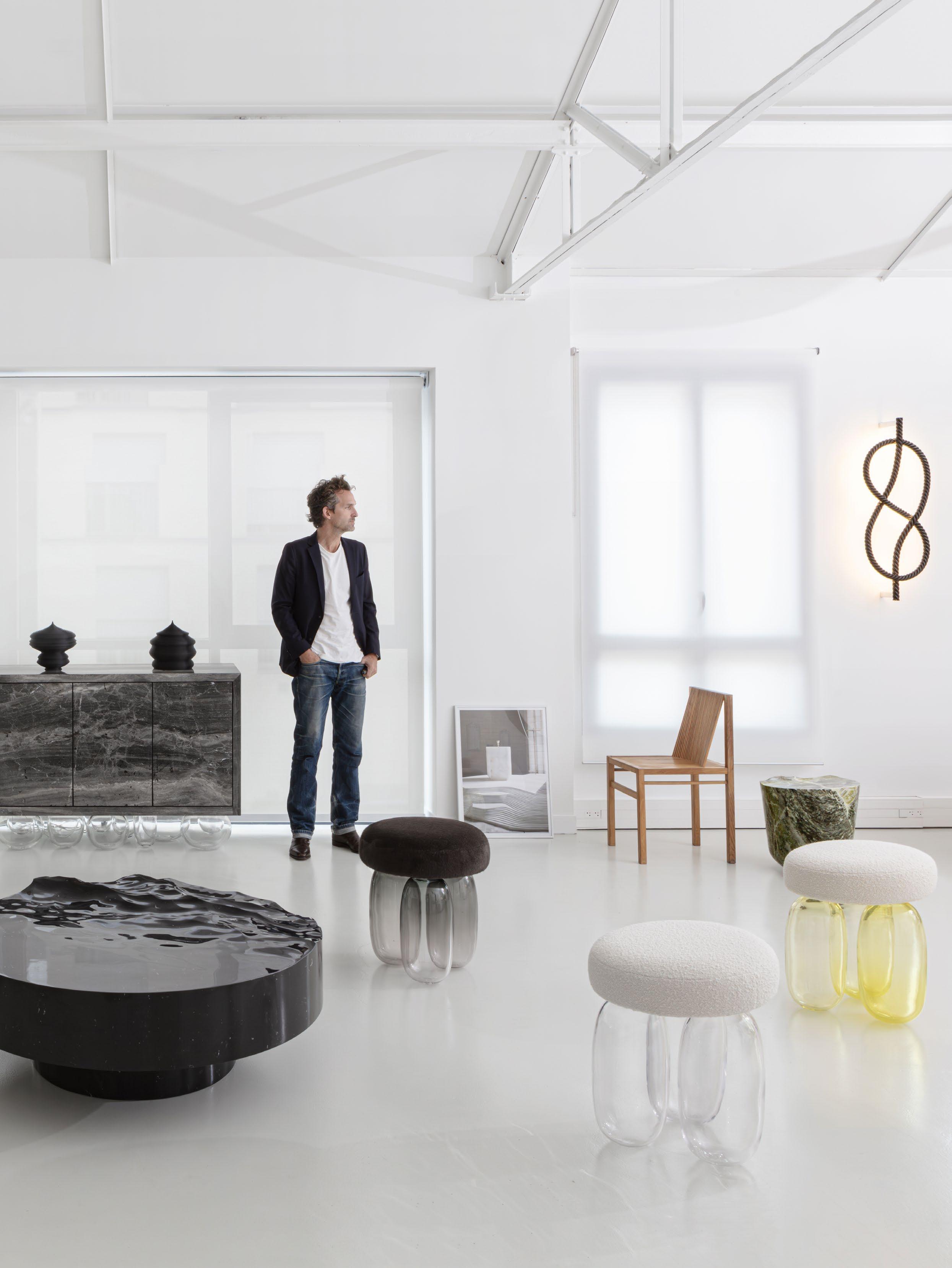
RETURN
A Puglia-born ceramicist and art collector has created a meditative retreat surrounded by native olive trees.
LOCATION Puglia, Italy DESIGN Niní and Francesca Bonavoglia
PHOTOGRAPHY Cosimo Calabrese
WORDS Lidia Boniwell Lombardero
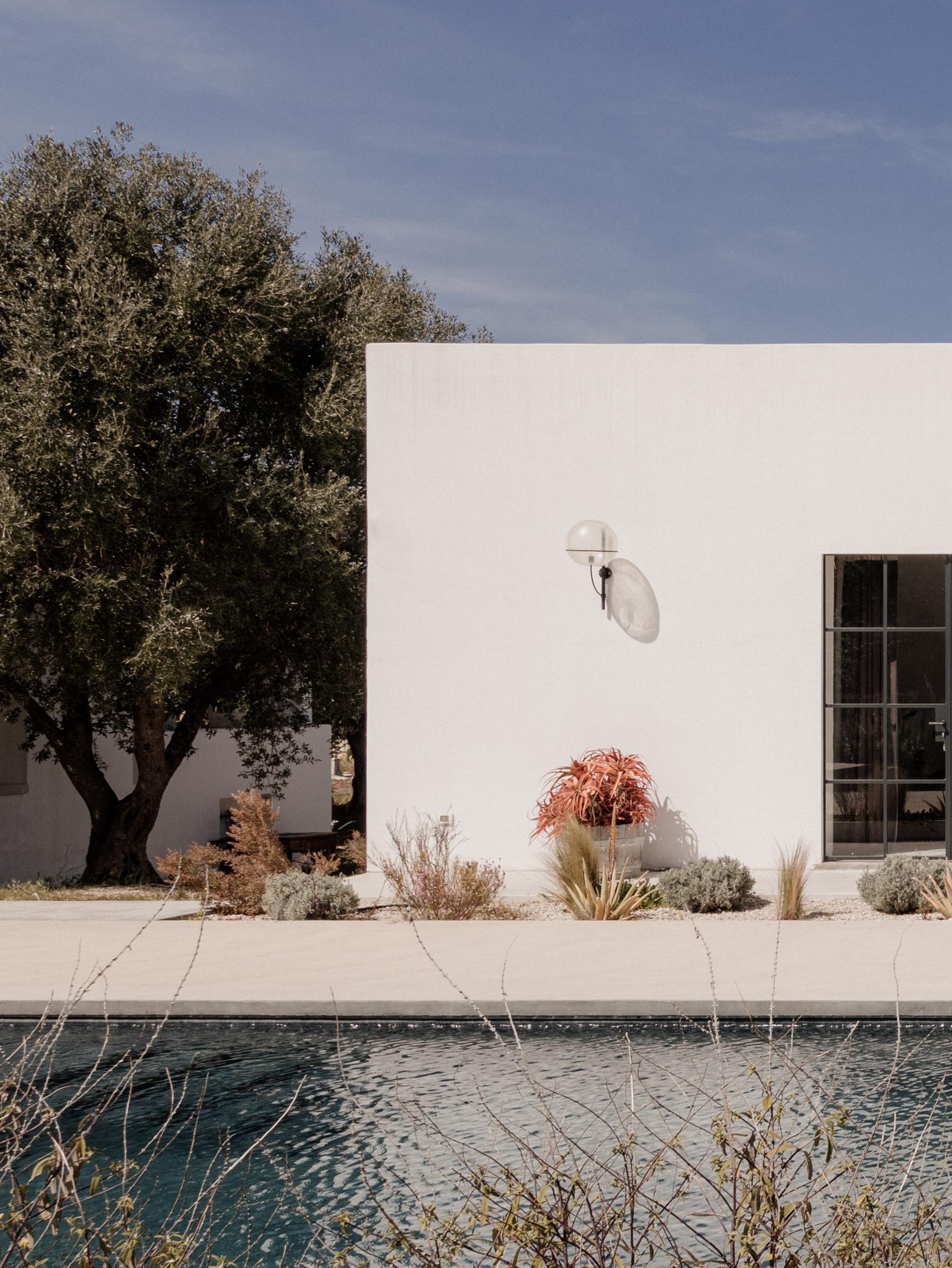

TO PUGLIA
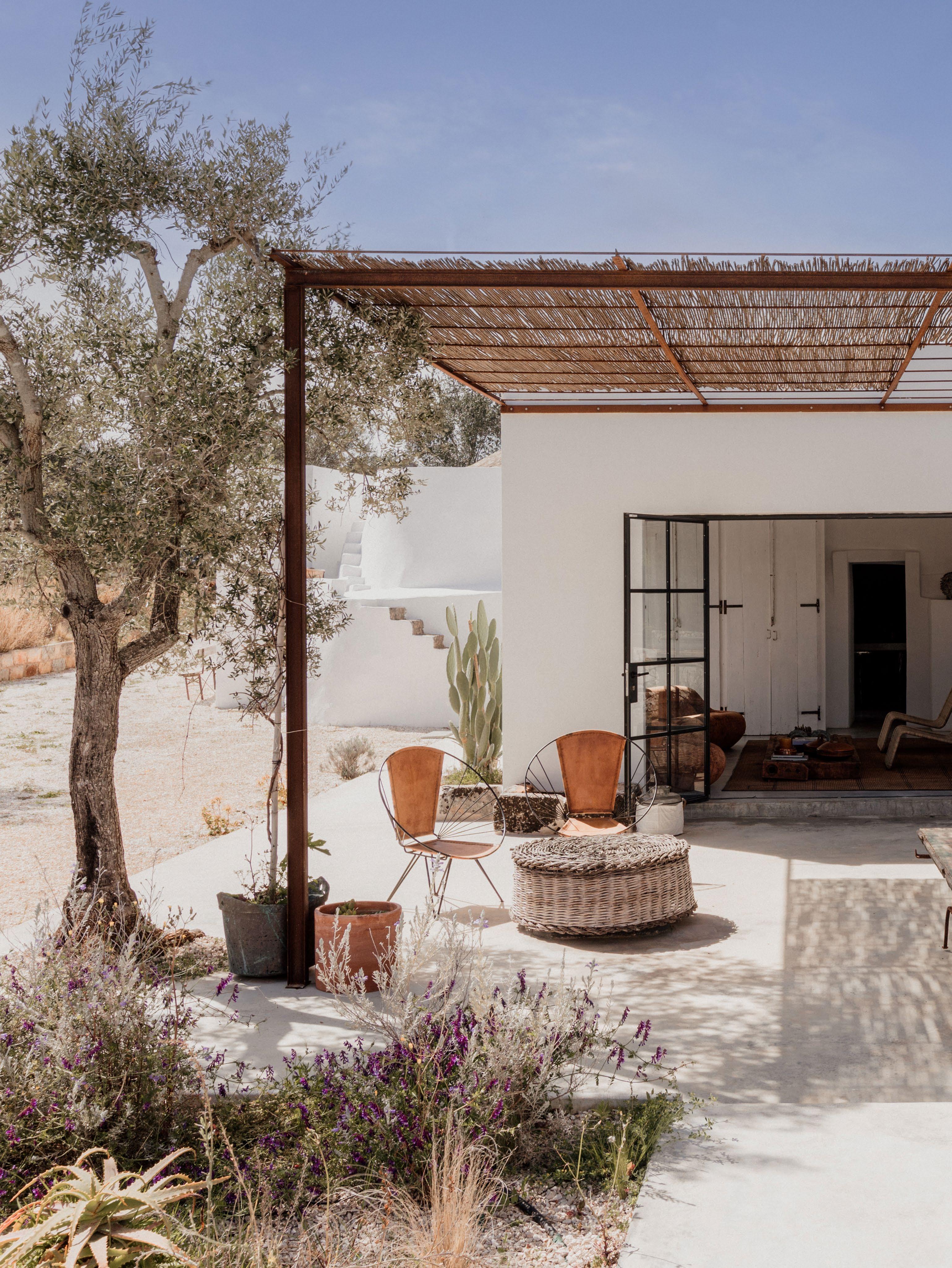
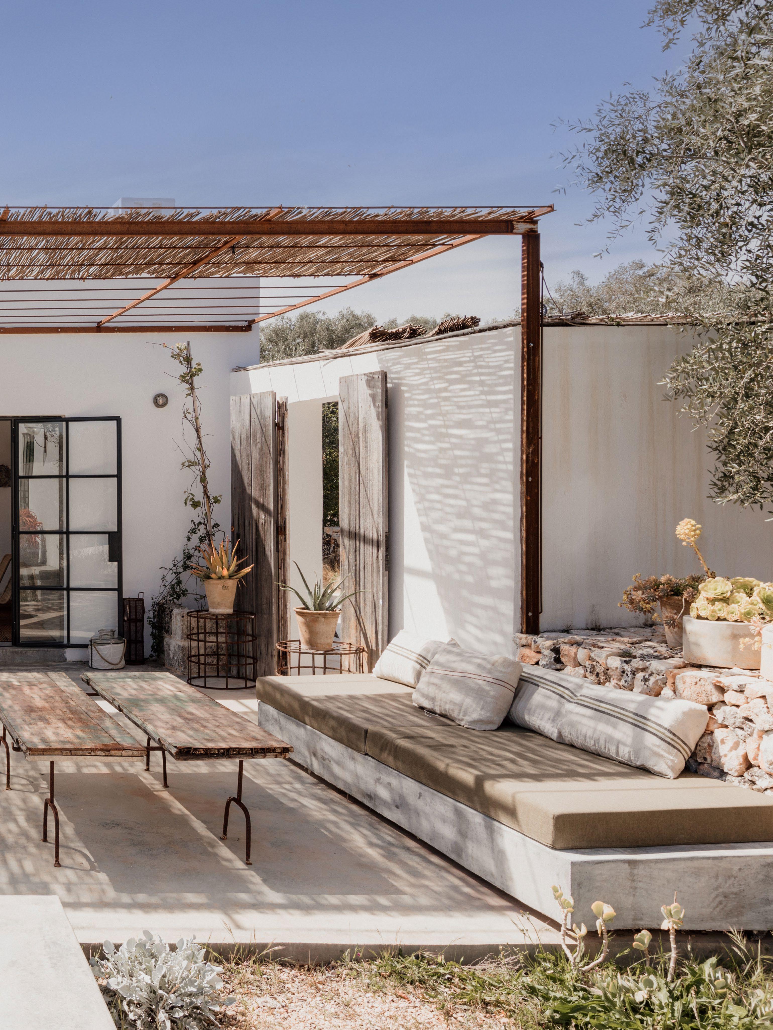
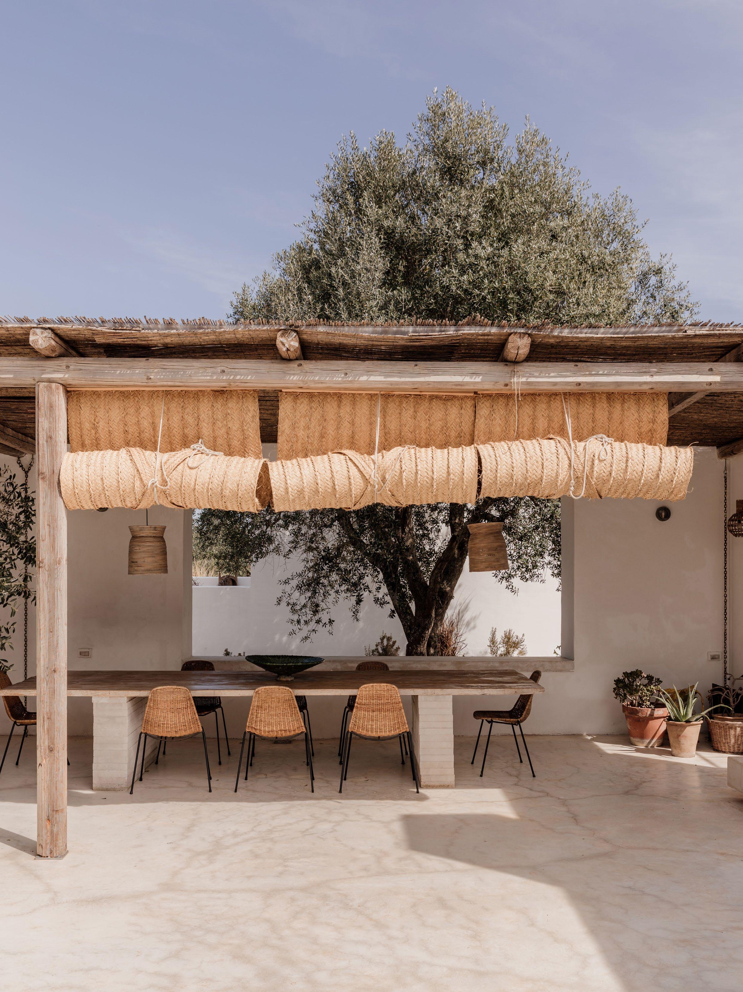 Woven rolled mats from Andalusia and a traditional bamboo pergola shade the outdoor kitchen from the hot afternoon sun. This space also features 1950s wicker chairs by Gian Franco Legler and a table by Niní Bonavoglia.
Niní Bonavoglia is an artist, art dealer and art collector. Born in Bari, Puglia, and spending his formative years here, he studied abroad in Milan and Paris before a 10-year stint in New York. Now, the art cognoscente yearned to be close to home again.
Niní's parents first laid eyes on a tree-lined plot of land tucked at the end of a gravel sideroad by chance. "I fell in love with the location the minute I saw it," Niní explains. "I loved the silence and the imminent sense of peace." After three years of construction, the Valle d'Itria villa and unique hospitality experience was born and named 'Amazigh'; Berber for 'free man', and a symbol for the olive tree.
Niní sought to create a place where guests could immerse themselves in Puglia’s culture and the slow way of life. Covering the vast area of central Puglia, Valle d'Itria is known for its bright red soil, olive groves and vineyards, narrow streets and traditional white buildings with cone rooves. Turquoise water and sandy Adriatic beaches are a short drive away, including Niní’s favourite place to swim, Torre Guaceto Nature Reserve.
The two new buildings, with their white walls and rectilinear form, reflect the neighbouring architecture. Inside, Niní has filled the houses with a unique array of objects d’art, including a series of Berber mats from travels through North Africa and his own ceramic pieces. "I started working with ceramics during construction. This allowed me to incorporate different personal elements of my work into the project, such as the fireplace, door handles and sculptures that inhabit each room," Niní says.
The two-part villa features four bedrooms with ensuites, two kitchens, two living rooms and an outdoor entertaining area overlooking the pool. Each space shares a common language of earthy colours, tactile rattan and bamboo accents and antique furniture collected by Niní over the years. Artisanal objects and vintage Italian lighting contribute to the eclectic yet considered Mediterranean aesthetic. "When I'm here, I feel at peace and reconnect with myself, my passions, and all the little things that make me happy," Niní reflects. So much so, he wants to transform the villa into an artist residency. "I think it’s important to grant the place the creative contribution of diverse, “like-minded people to enhance the legacy I have created.”
219 DESIGN VOICES

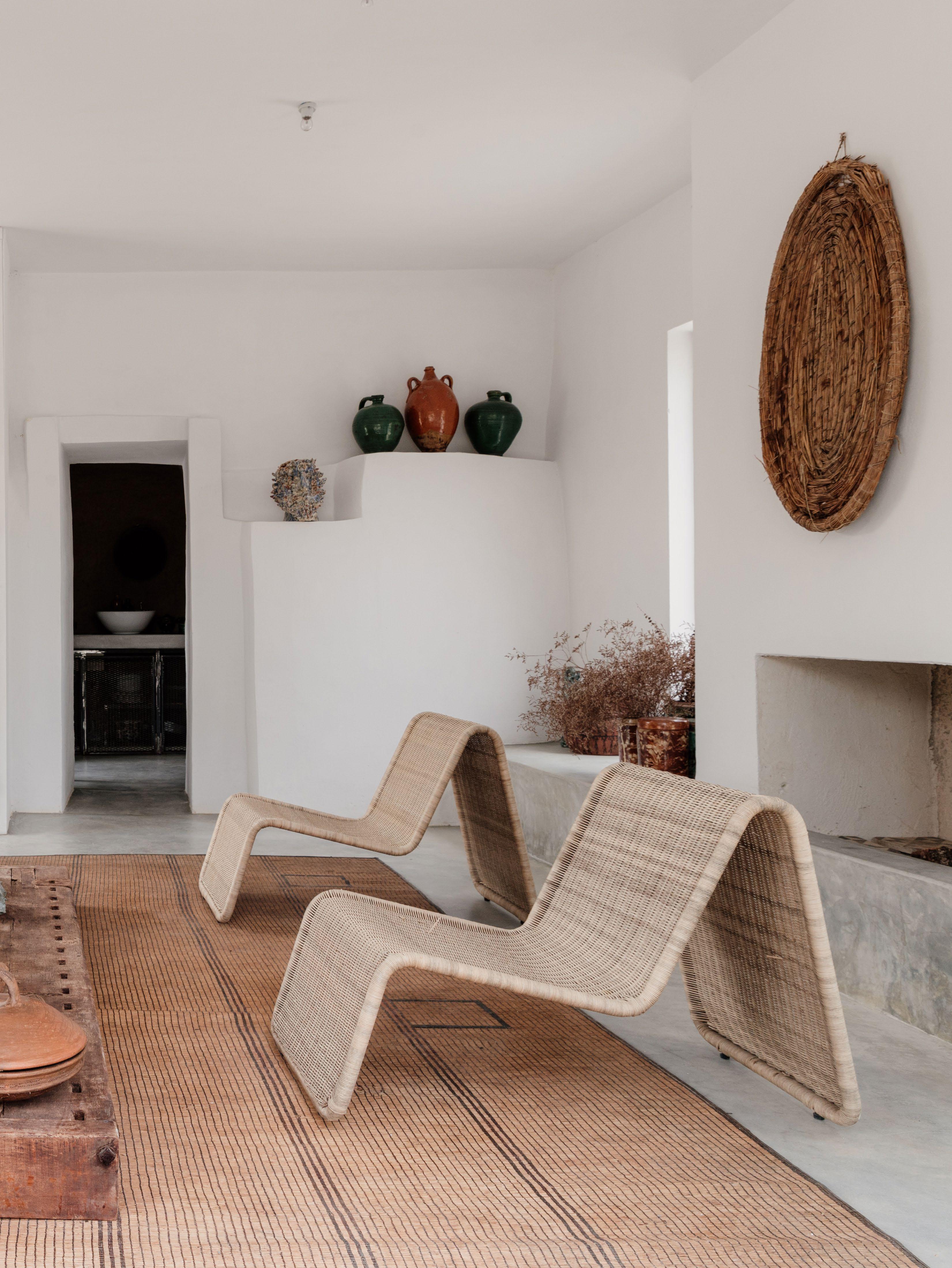 The vintage Carrera sofa designed by De Pas, D'Urbino and Lomazzi for BBB Italia and artwork by Jakub Milčák anchor the living room. Niní’s handmade ceramics and a Berber mat are also displayed in this space.
 The secondary kitchen is housed in an alcove, where industrial metal mesh joinery contrasts the Berber mat and terracotta walls.
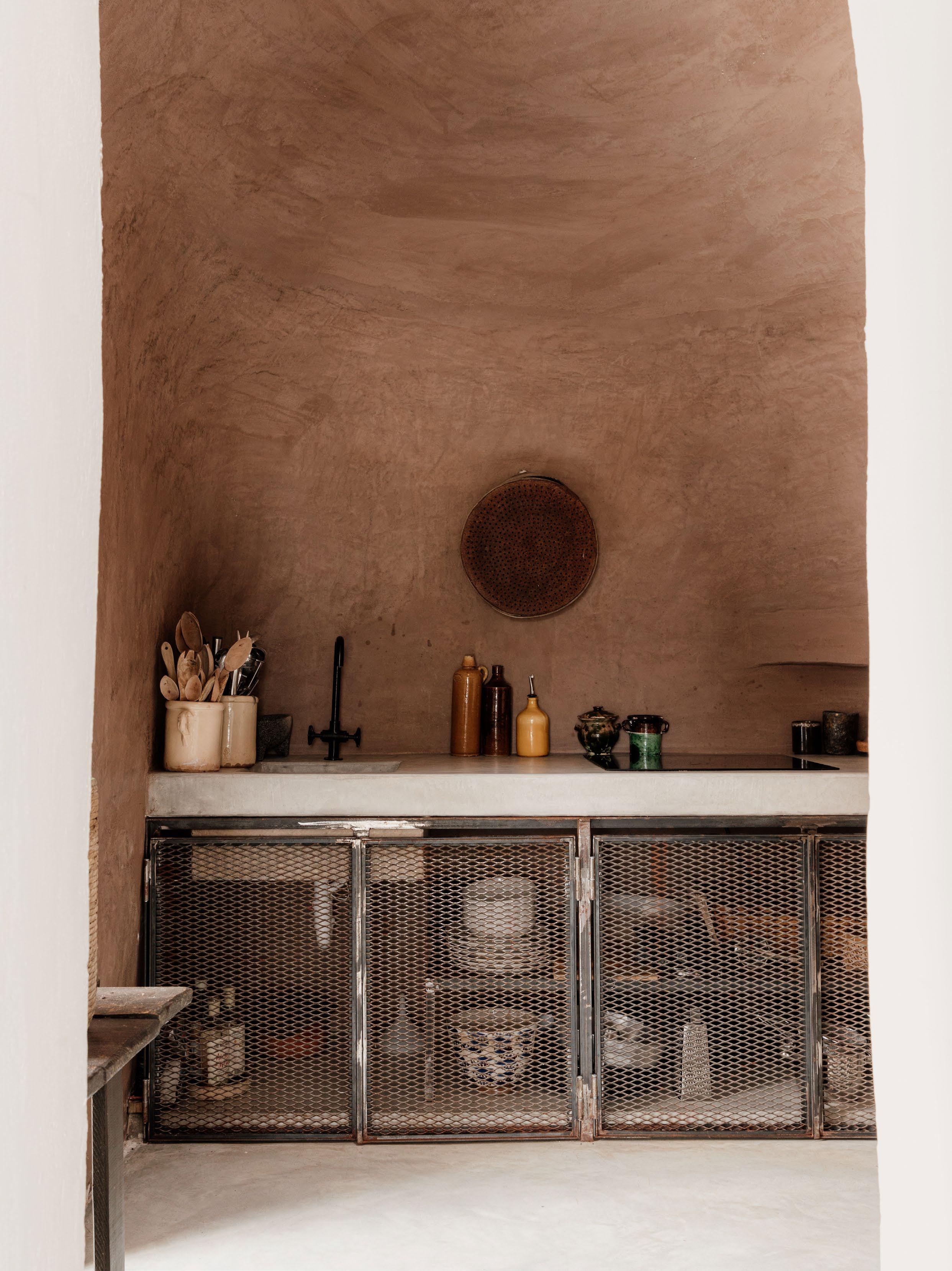
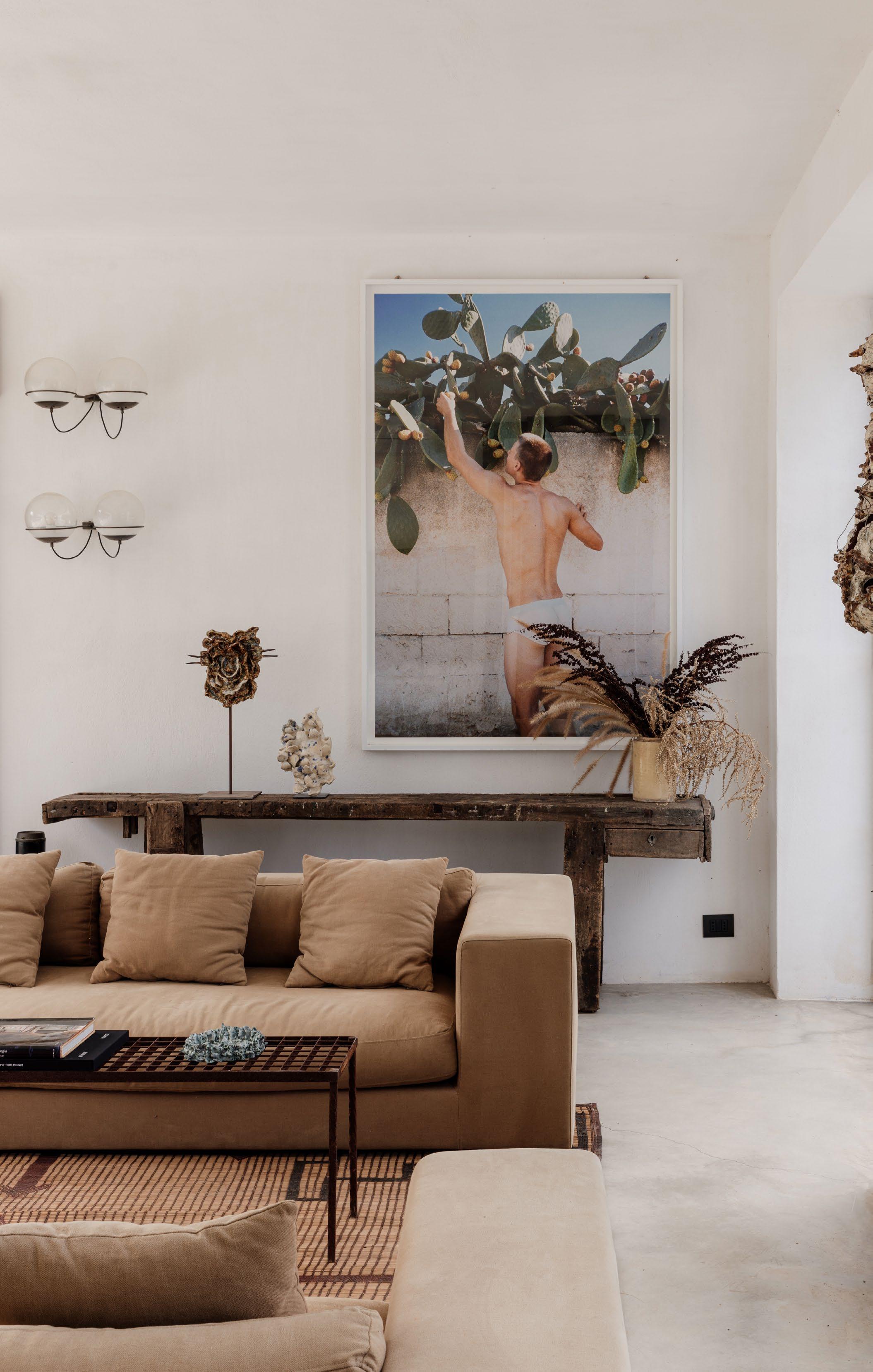

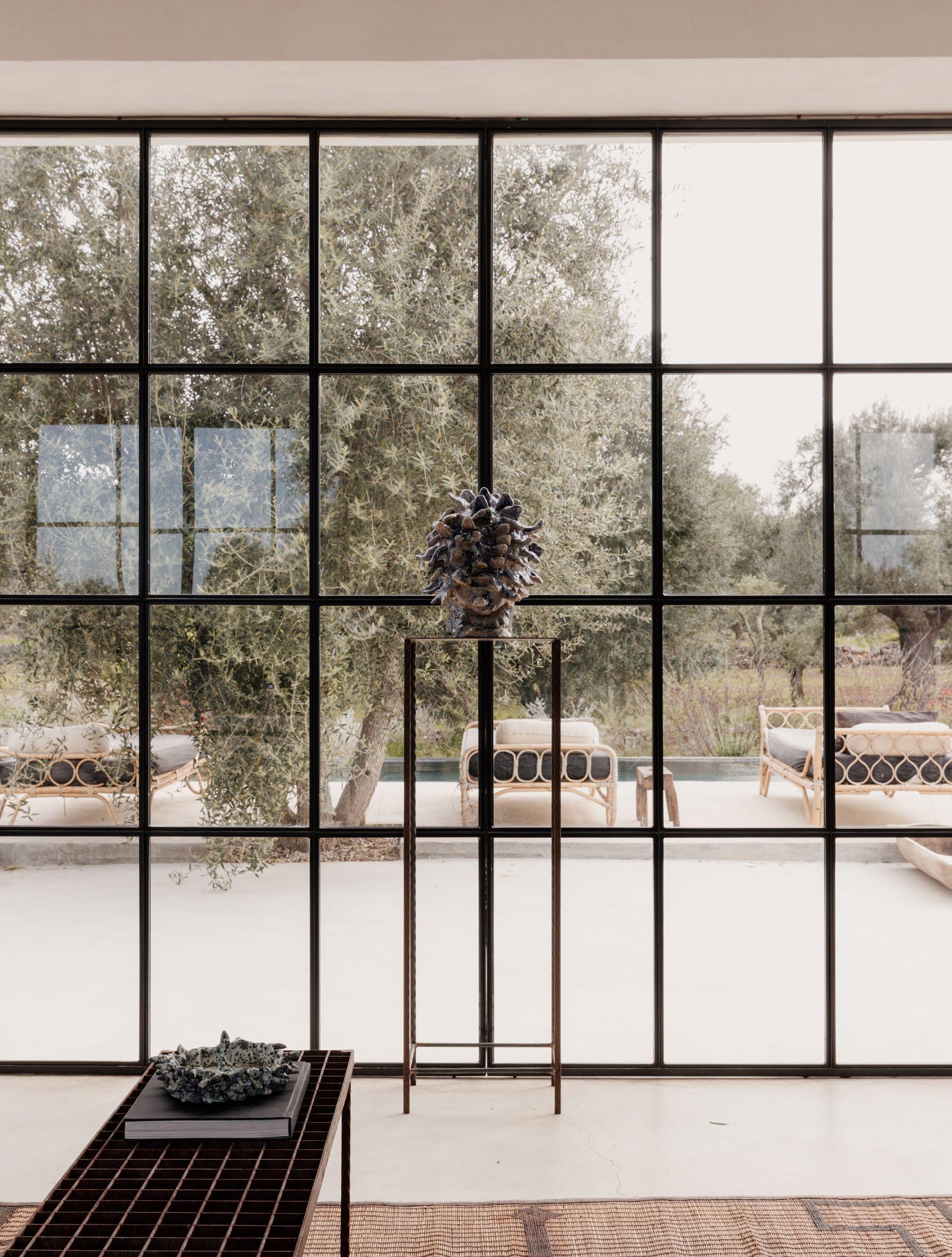
Niní paired the vintage sofas from Belgium with an iron table, ceramic fireplace surround and ceramic sculptures he designed. Other pieces include a photograph by Alessio Boni and two wall lamps designed by Gino Sarfatti.
225
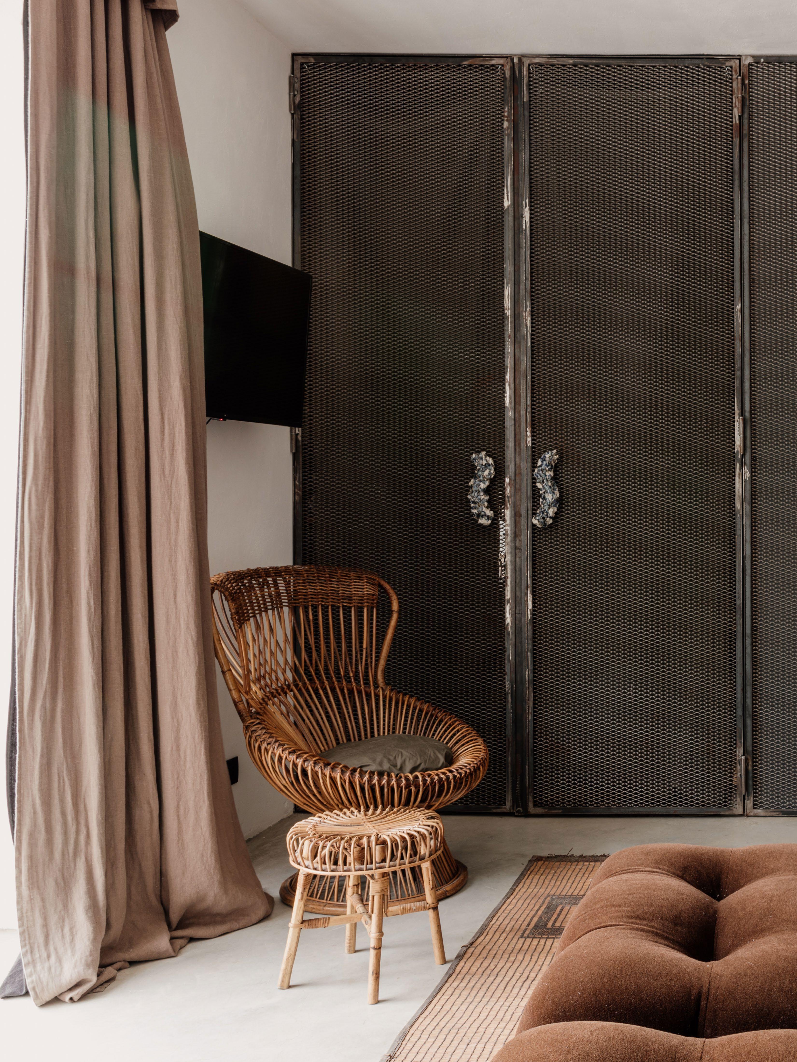
The primary bedroom and ensuite are separated through a wall of mesh joinery adorned with custom handles designed by Niní and the ceramicist’s most treasured possession in the home, a 19th-century portrait bought at an auction. The
rectangular
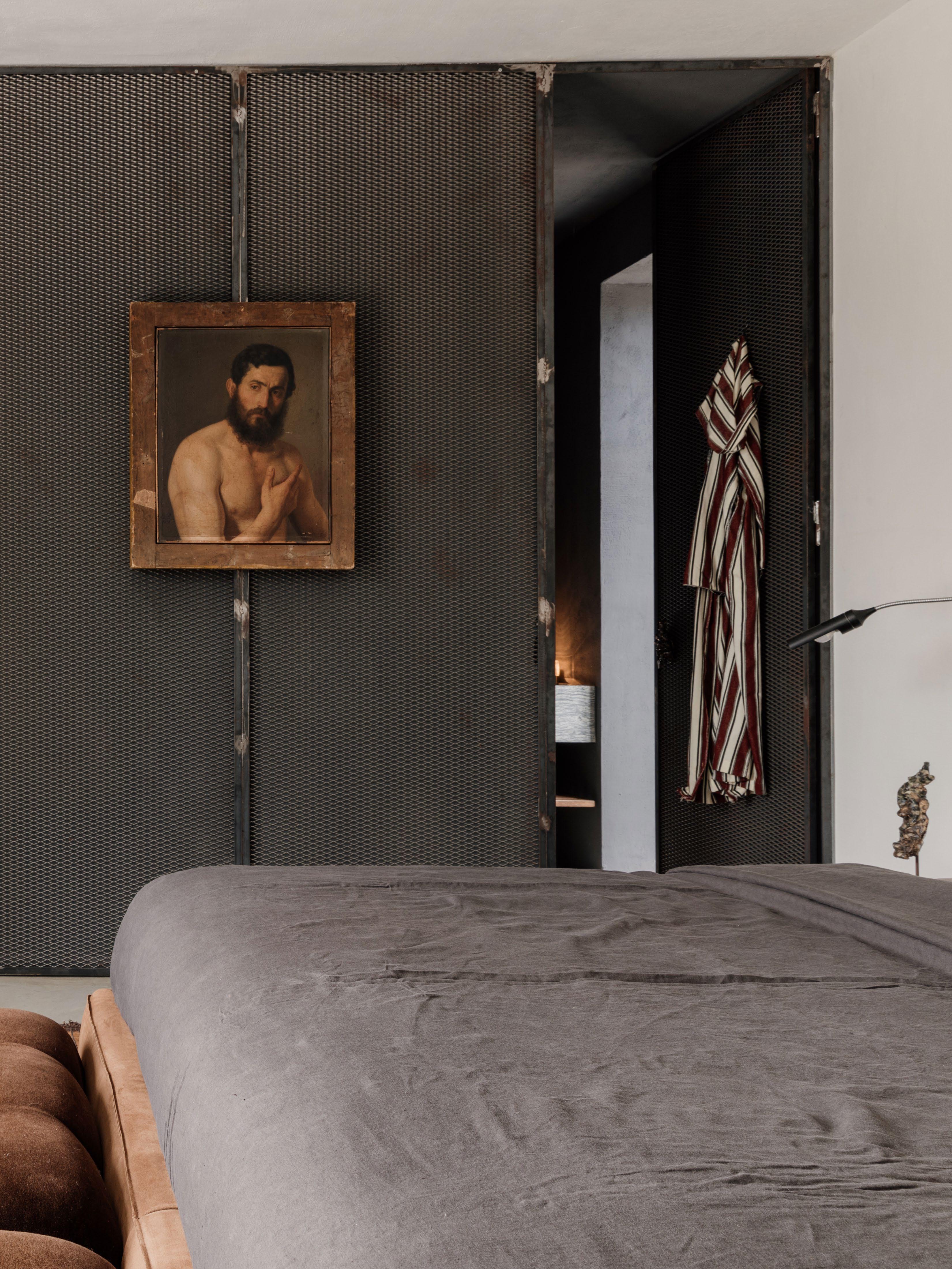
and a
in this space.
B&B Italia Camaleonda
ottoman
vintage rattan chair by Franco Albini also feature
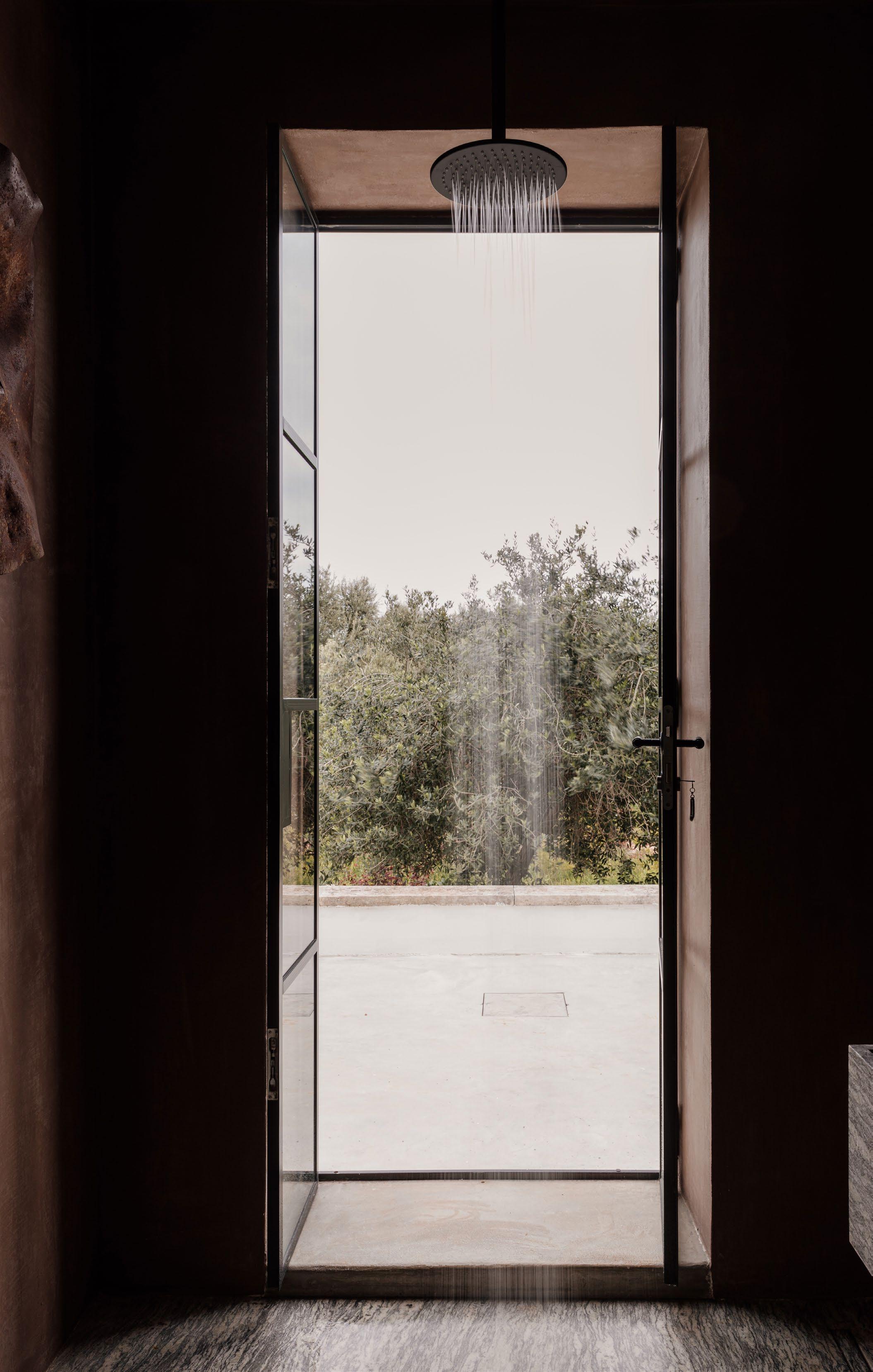
ISSUE #51

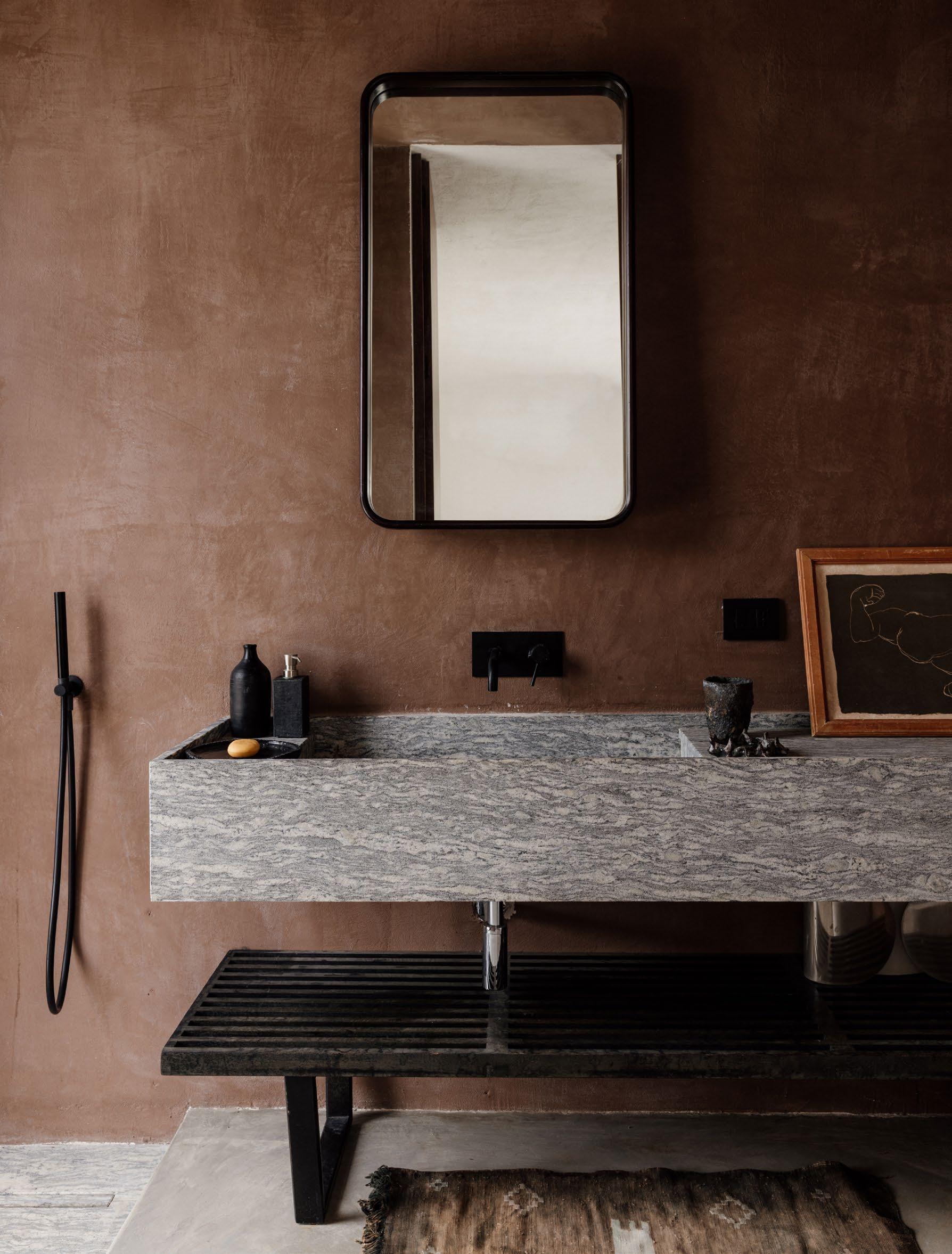
Niní opted for granite in the bathroom for its contrast and hardness, together with the terracotta paint and another Berber mat.
229
BOOK YOUR STAY >
A centuries-old olive tree extends over the pool area. Two Lyndon lamps designed by Vico
for Oluce feature on the building’s exterior.
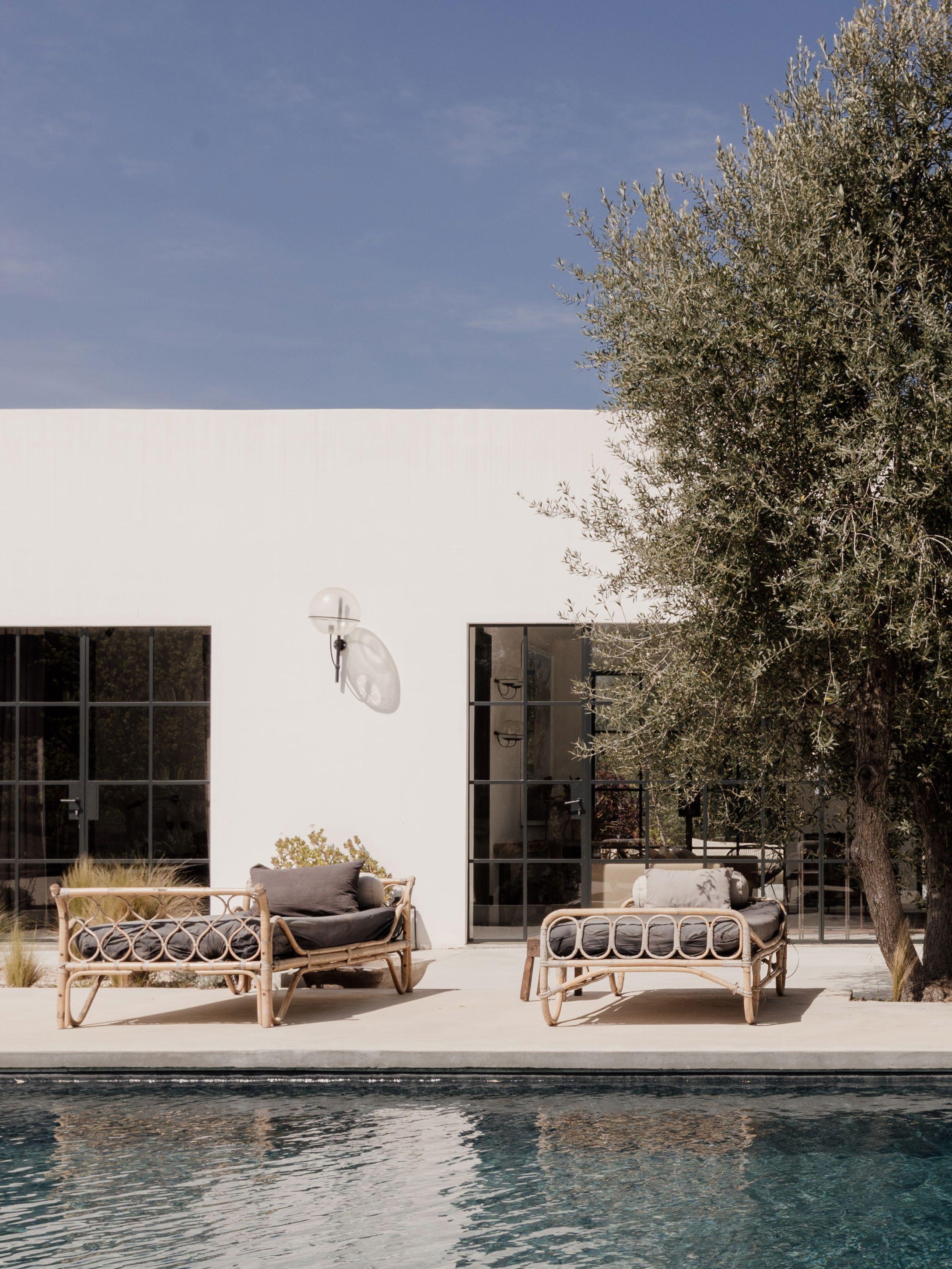 Magistretti

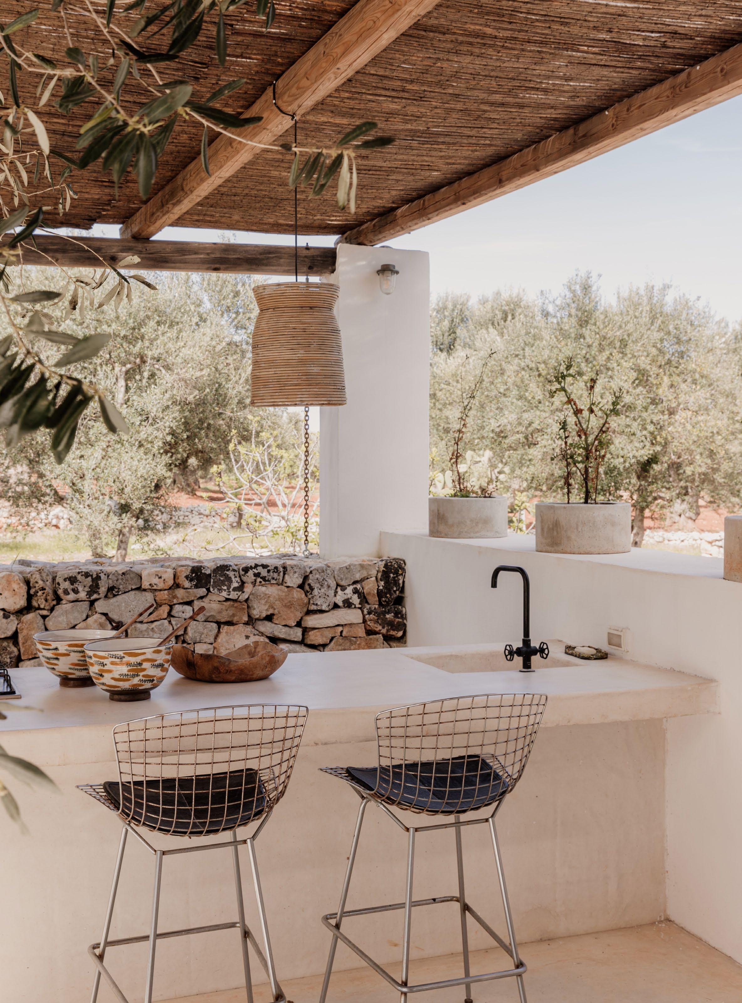 This page: The fully-equipped outdoor kitchen in concrete and stone encourages guests to cook local produce, with Bertoia barstools designed by Harry Bertoia for Knoll.
Opposite page: Two vintage armchairs and a built-in, half-moon sofa under the shade of the bamboo pergola.

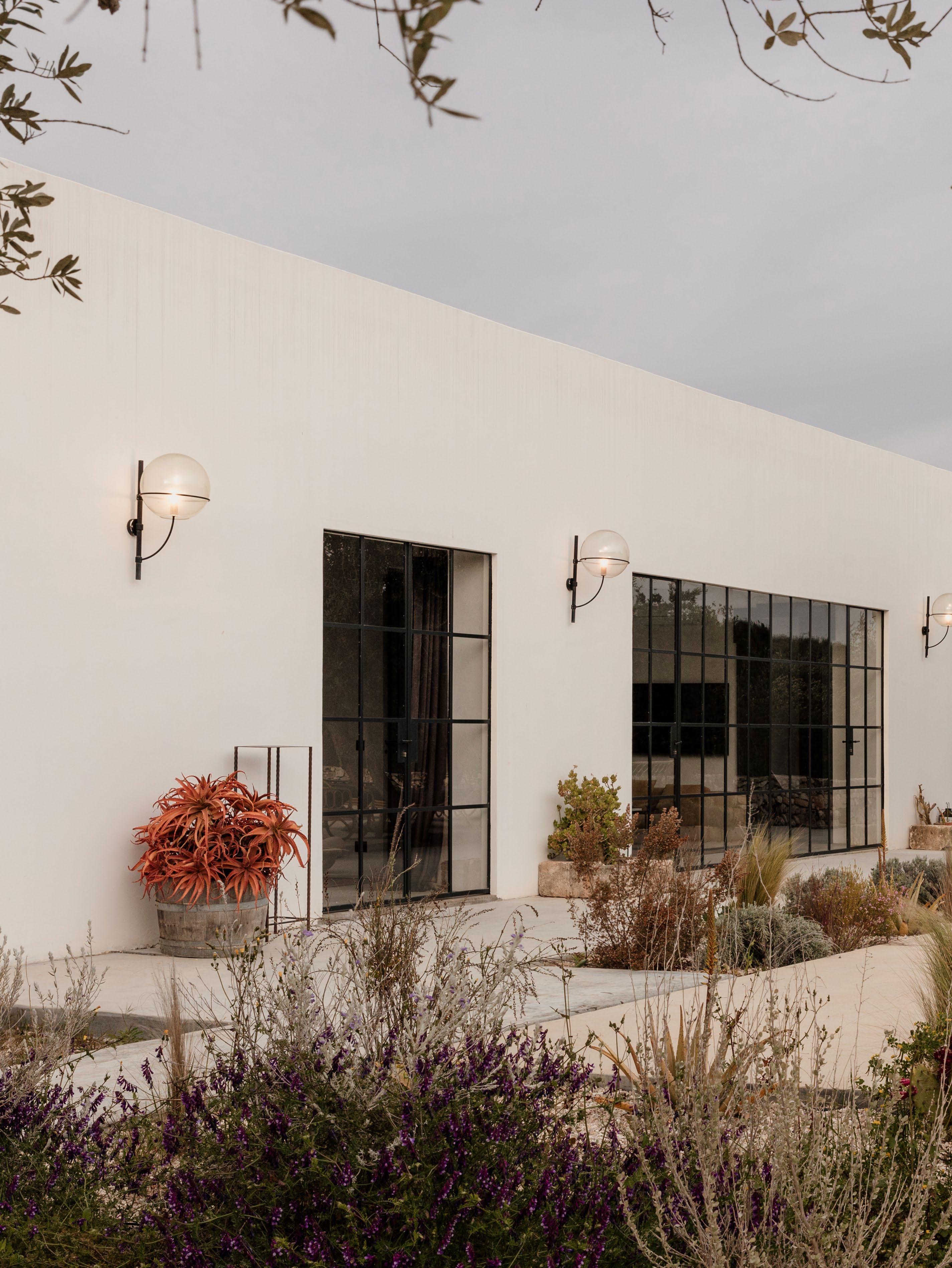


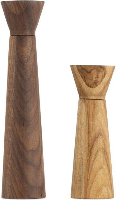
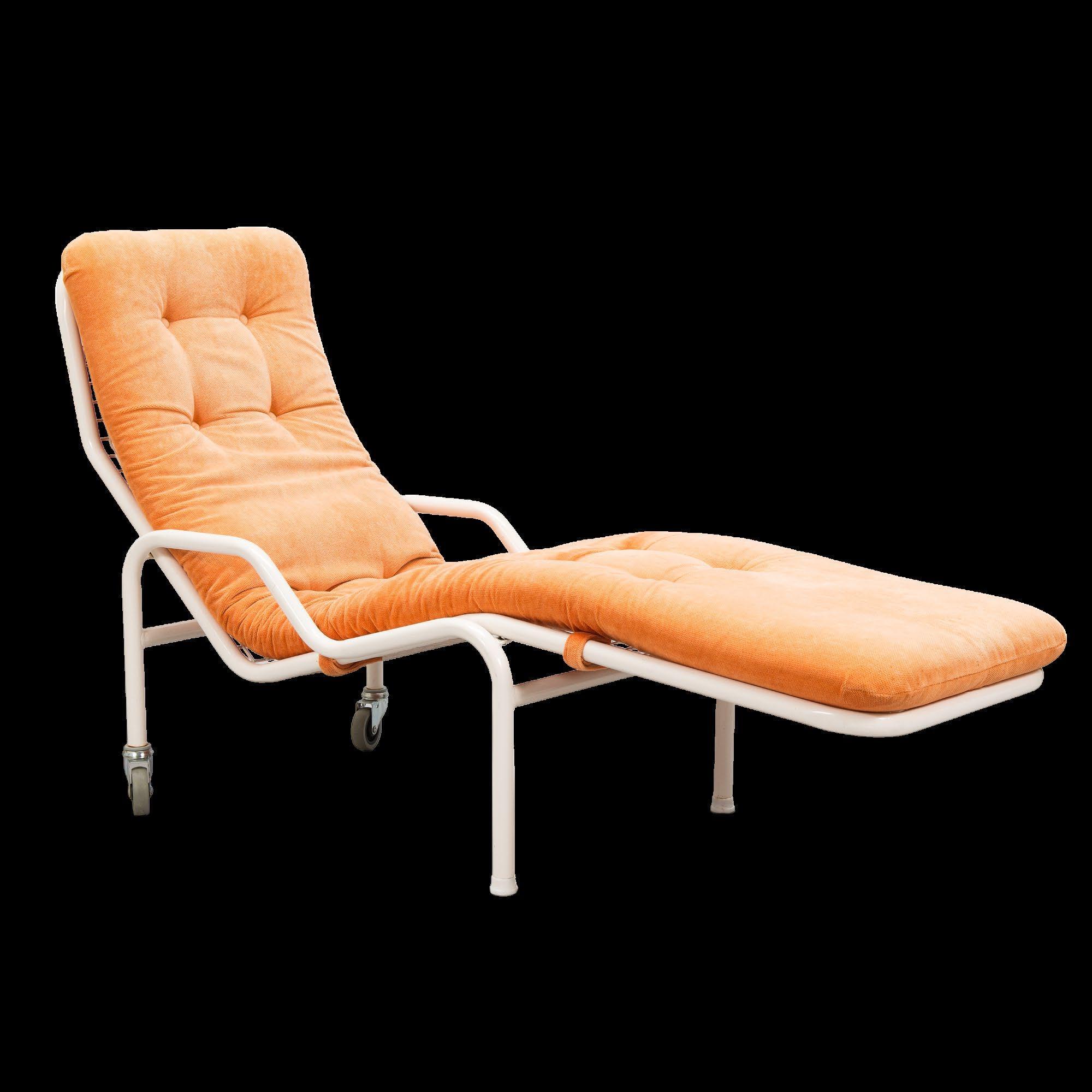
est magazine ISSUE #51
THE DETAIL
The Detail takes a design lens to summer entertaining using the est living Product Library.
237 DESIGN VOICES
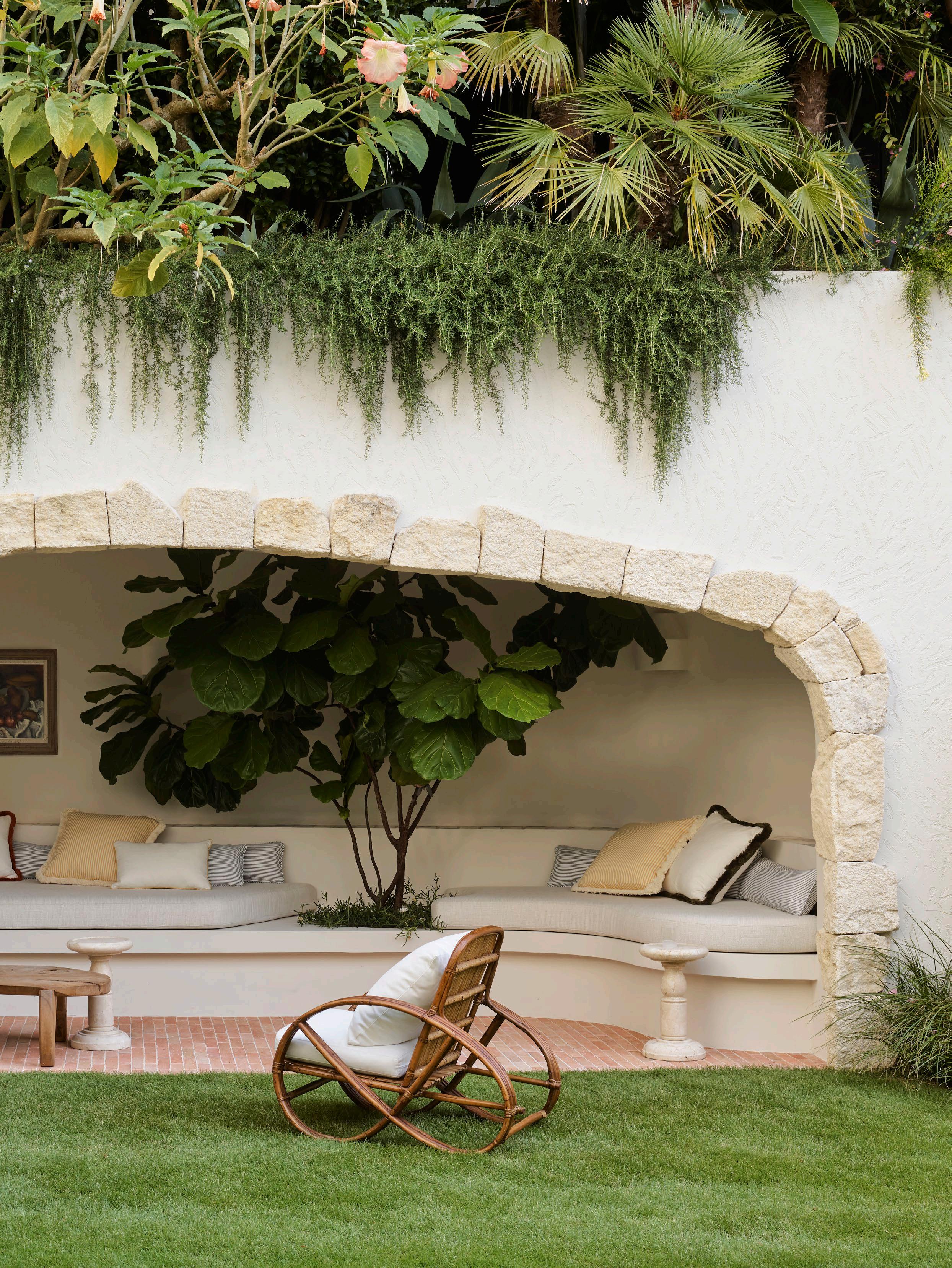 Project The Boulder House
Location Gadigal Country / Sydney, Australia
LandscapeDesign Wyer & Co Editorial Styling Claire Delmar
InteriorDesign Tamsin Johnson Photography Anson Smart
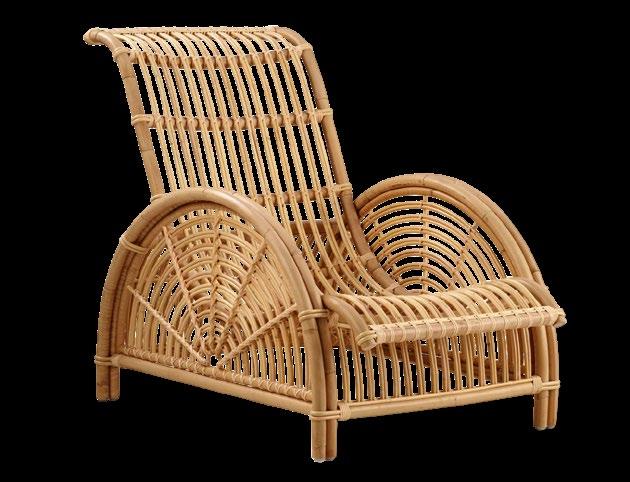
SIKA DESIGN
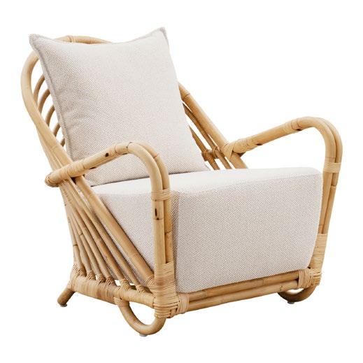
CHARLOTTENBORG CHAIR
SIKA DESIGN
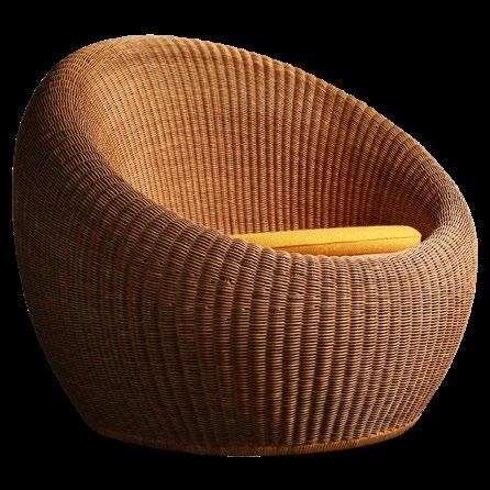
WICKER ARMCHAIRS
VIEW
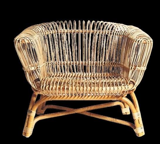
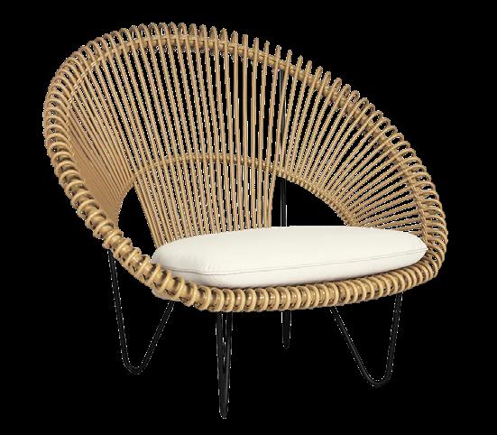

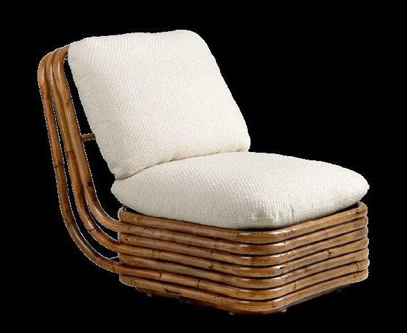

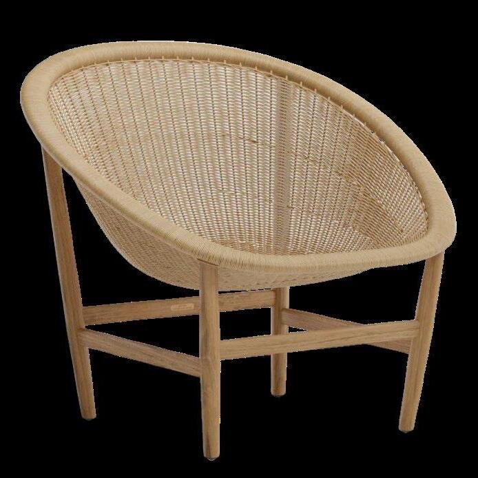
239 DESIGN VOICES
MORE OUTDOOR ARMCHAIRS >
SILVIA ARMCHAIR DEPADOVA
ROY COCOON COTSWOLD
PARIS LOUNGE CHAIR
BONACINA CANE HIGH BACK CHAIR TIGMI
BOHEMIAN 72 LOUNGE CHAIR GUBI
BERGERE RATTAN 1930 ECART
BASKET OUTDOOR CHAIR KETTAL
RATTAN LOUNGE CHAIR
YAMAKAWA RATTAN
GLASSWARE


HIGH RISE TUMBLER AMBER ICHENDORF MILAN

MARGOT CHAMPAGNE COUPE FFERRONE DESIGN

2 CHAMPAGNE COUPES | PINK & AMBER
MAISON BALZAC


ORANGE SPHERE GLASS / ORANGE CUBE GLASS NATE COTTERMAN
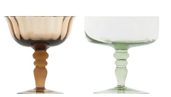
DISEGUALE CHAMPAGNE COUPE BITOSSI



MARGOT CHAMPAGNE COUPE SERAX


est magazine ISSUE #51 VIEW MORE GLASSWARE >
BUMP SHORT GLASSES GREEN TOM DIXON
MULTICOLOR PIANO COCKTAIL GLASS SET
SOPHIE LOU JACOBSEN
BON BON COCKTAIL WITH A TWIST HELLE MARDAHL STUDIO
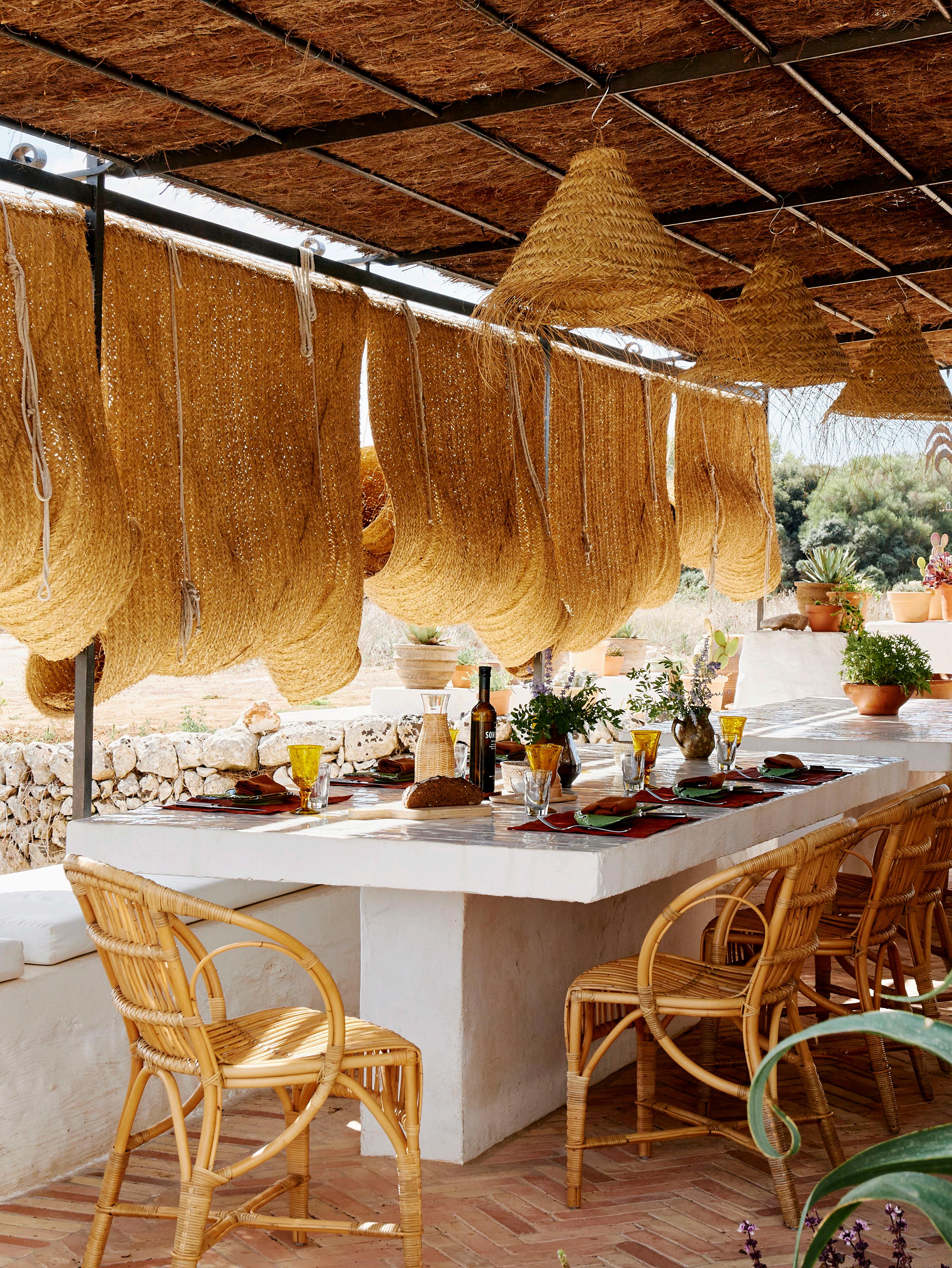 Project Santa Magdalena
Location Menorca, Spain Design
Laplace Photography Daniel Schäfer
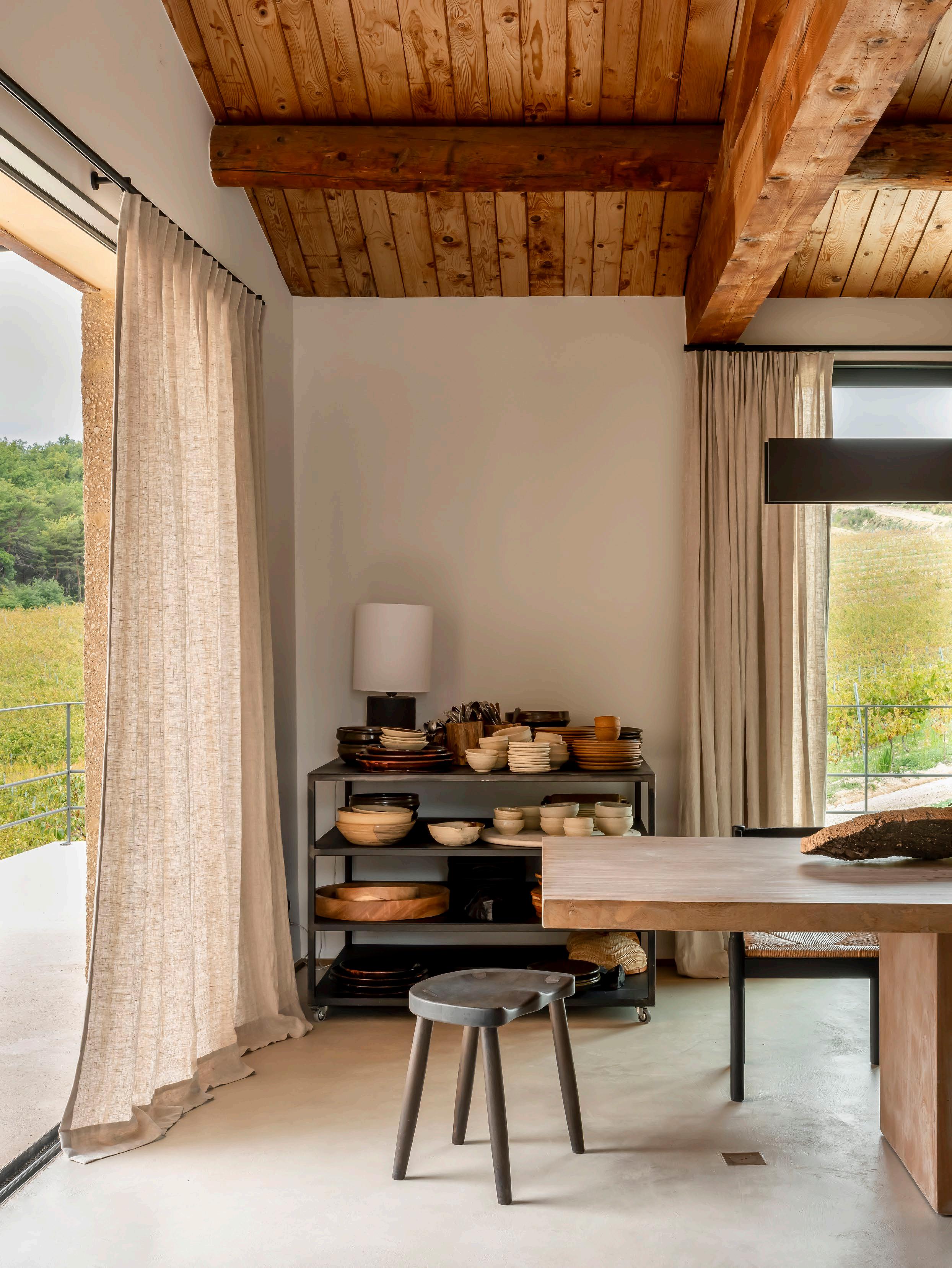 Project Câlin Valreas
Location Valréas, France
Architecture Sam Peeters and Toon Martens (Contekst)
InteriorStyling Bea Mombaers Photography Piet-Albert Goethals
TABLEWARE

ZUMA TABLEWARE SERAX

SALAD SERVERS WHEN OBJECTS WORK
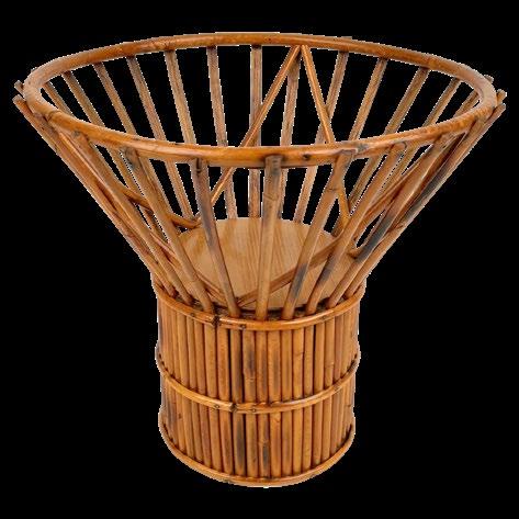
BAMBOO AND RATTAN FRUIT BOWL VINTAGE, ITALY, 1960S
FARO BAKED CLAY
NAPKIN SET
L&M HOME

VAPOROUS GREY JUG RAAWII

SILVER ARNE JACOBSEN EDITION CUTLERY SET GEORG JENSEN
BROWN TEAK WALNUT SALT & PEPPER MILL SET THE CONRAN SHOP
243 DESIGN VOICES VIEW MORE TABLEWARE >
GY TRAYS
MICHAËL VERHEYDEN
LOTTE MARBLE BOWL BLOC STUDIOS
SUN LOUNGES

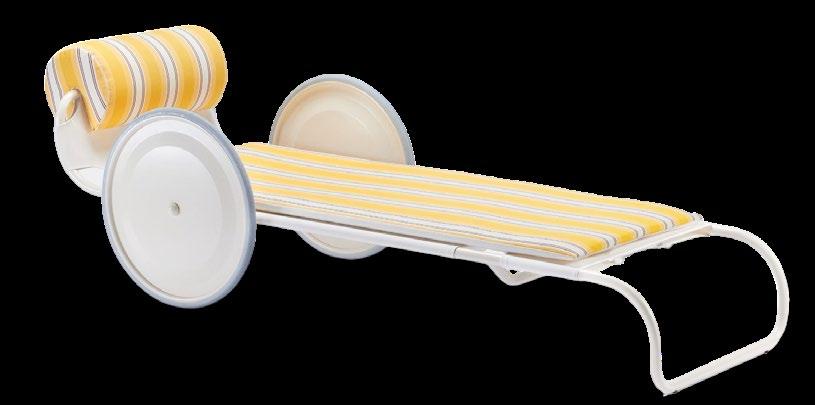
LOCUS SOLUS SUNLOUNGER JACQUEMUS + EXTETA


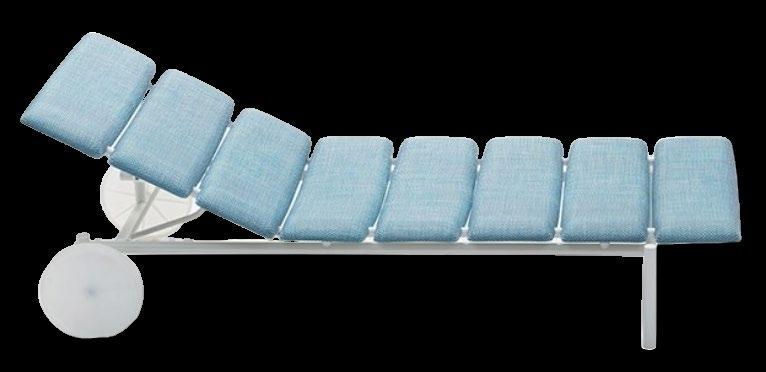

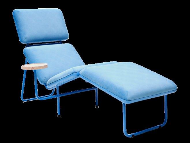

DUNE SUNLOUNGER
est magazine ISSUE #51
VIEW MORE SUN LOUNGES >
KANTAN ALUMINUM VINYL CHAISE LOUNGE BROWN JORDAN
IRONSIDE SUNCHAIR SKANNO
GOLDIE SUNLOUNGER GRAZIA&CO
MIRAMAR SUN BED PAOLA LENTI
TRAMPOLINE DECKCHAIR CASSINA
SOAP CHAISE LOUNGE PROPRO
FERMOB
 Project La Scala
Location Meanjin Country / Brisbane, Australia Architecture Richards & Spence Photography Yaseera Moosa
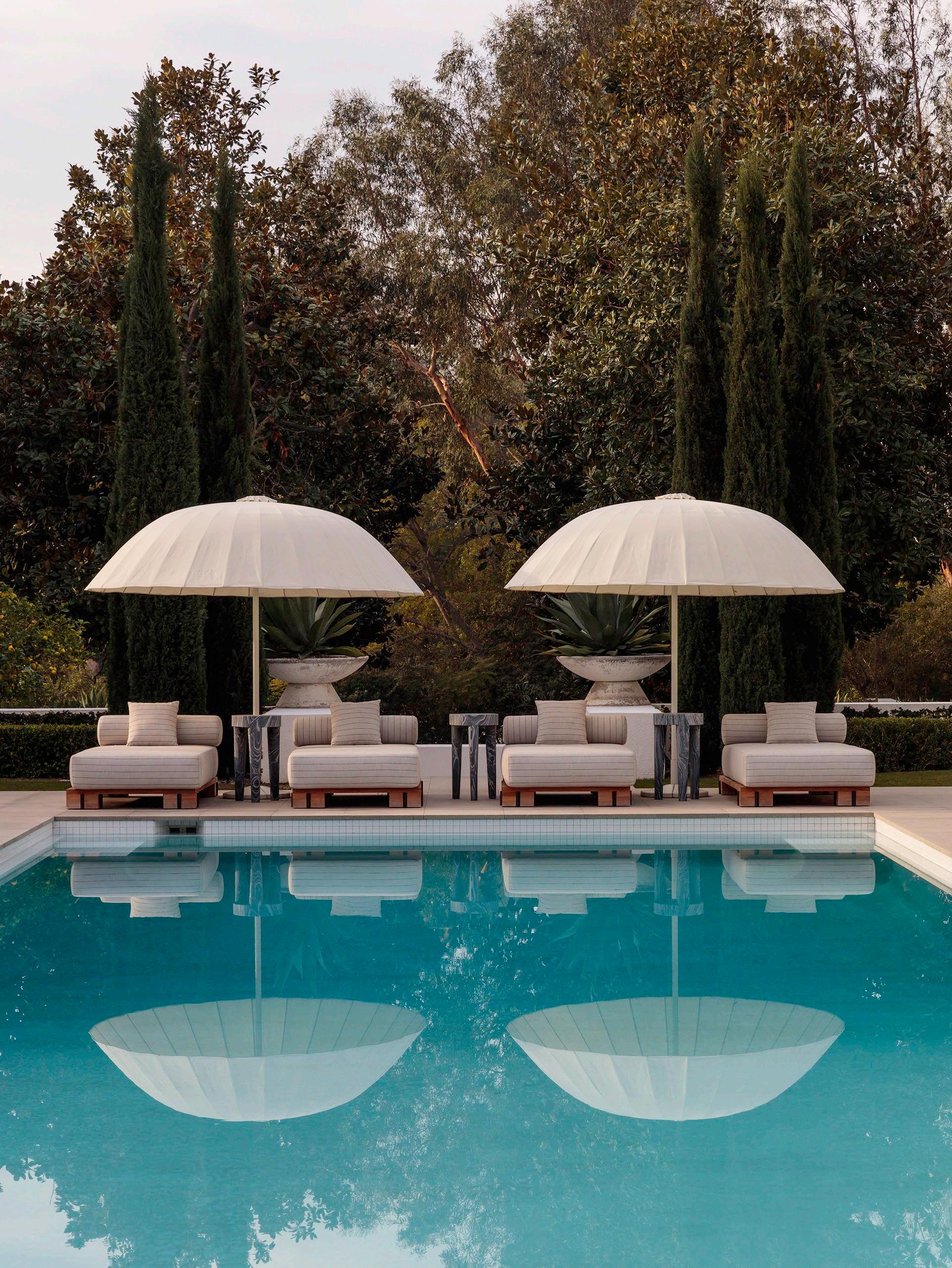 Project Hillcrest Residence
Location Beverley Hills, North America
Design Kelly Wearstler
Photography Courtesy of Kelly Wearstler


THE BALMORAL - SAGE THE ORIGINAL PARASOL CO

MITOS GARDEN UMBRELLA ATMOSPHERA
PARASOLS AND UMBRELLAS


THE KLASSIKER PARASOL WEISHÄUPL
VIEW MORE SUN PARASOLS AND UMBRELLAS >
247 DESIGN VOICES
OUTDOOR UMBRELLA GRAZIA&CO
SHADOO UMBRELLA FERMOB
LULL UMBRELLA, CASHMERE FERM LIVING
CHAKRA WALL LAMPS KUNDALINI
S PARASOL 220X220 KETTAL
BISTRÒ PARASOL PAOLA LENTI

™ ISSUE #51 estliving.com SUMMER 2024


 Eveneer Raw Cumulus by Elton Group
Design Finnis Architecture & Interiors


 by Philippe Malouin Flos

 Bilboquet


 Architect Luis Laplace and Laplace CEO
Christophe Comoy.

 A salvaged sink that once belonged to a boat is set within a countertop clad in Moroccan Zellige tiles.


 Two wicker Sika Design Monet footstools and a pair of Hangfrill-S Basket lamps from Tine K home in the bedroom.

 The guest bedroom’s neutral palette is punctuated by contrasting green Gaudi dining chairs designed by Vico Magistretti in 1970.


 Project Amsterdam Residence
Design Anne Claus Interiors Photography Thomas De Bruyne
 Manuel Aires Mateus
Aires Mateus


 Founder Clare Cousins
Wurundjeri Woi Wurrung Country/Melbourne, Australia


 Photography Henry Bourne


 Photography Dan Preston


 The double-height living space features a pair of vintage Costela chairs by Brazilian designers Carlo Hauner and Martin Eisler – one of Felix’s all-time favourite designs.
A pair of vintage Katavolos, Kelley, and Littell for Laverne chairs, a Model Kontiki sofa by Arne Norell and a concrete co ee table by DAS Studio are also pictured.
 A custom-made table and lighting by DAS Studio, 1960s Wengé dining chairs by Gerard Geytenbeek produced by AZS Meubelen and photographs by Daidō Moriyama.


 The mezzanine level features the home’s private areas. The rooms are wrapped in glass and open onto the living area, allowing light to enter throughout the day.

 The Italian marble in the bathroom was selected to contrast the industrial feeling of the floor below. The bathroom also features a custom-made bathtub in stainless steel, clad with marble; a design feature that enhances the marble’s strong patterning.


 Photography Genevieve Lutkin


 Pictured: dining table by De La Espada for Studioilse, Zig Zag chair by Gerrit Thomas Rietveld and 7
Fauteuil Tournant chair by Charlotte Perriand for Cassina, ceramic bird sculpture, bowl and vessel by Lauren Jo e and Moon pendant light by Davide Groppi.
 The B&B Italia Tufty-Time sofa by Patricia Urquiola, TMBO lounge chair by Magnus Læssøe Stephensen, De La Espada Kim Nest
by Luca Nichetto, vintage Lunario co ee table
by Cini Boeri for Knoll, Halcyon Lake rug and CATHODE pendant by Davide Groppi.

 Paul Hecker describes the yellow cabinet produced by LNP Schade Cabinets as a strong and deliberate injection of colour in the soft and neutral dining space. The cabinet features Crossiant joinery handles by Emily Gillis x Zachary Frankel and Iittala glassware.


 L to R: Hecker Guthrie directors Paul Hecker and Hamish Guthrie.


 BNE MEL PER SYD


 The Moschino Milan store designed by Andrea Tognon Architecture features chequered floors crafted in Botticino marble and dark green stone, lacquered bright-yellow shelves and a sweeping spiral staircase, reflecting the brand’s playful and eccentric style.


 The Courrèges New York store designed by Bernard Dubois Architects reflects the brand’s minimalist and futuristic style with its all-white colour palette and mirrored ceilings dotted with nightclub-grade spotlights.


 The Dion Lee Miami store designed by Smart Design Studio features a dramatic central void punctuated by a helical staircase crafted from stainless steel and travertine. Custom stainless-steel clothing racks flank the walls and open up space in the middle of the store, where sculptural works by Oliver Laric feature.


 The Charlotte Chesnais Paris store designed by Studio Anne Holtrop features a huge freestanding translucent display wall composed of large, three-dimensional CNC-cut acrylic sheets.

 Location Paris, France
Project Palm Angels fagship store Design Studio Henry
Photography Benoit Florençon


 A staircase gracefully sweeps between the two floors, pulling light into the interiors and inviting visitors to explore the living area above. The dining space features the Gubi Beetle dining chair.


 Woven rolled mats from Andalusia and a traditional bamboo pergola shade the outdoor kitchen from the hot afternoon sun. This space also features 1950s wicker chairs by Gian Franco Legler and a table by Niní Bonavoglia.

 The vintage Carrera sofa designed by De Pas, D'Urbino and Lomazzi for BBB Italia and artwork by Jakub Milčák anchor the living room. Niní’s handmade ceramics and a Berber mat are also displayed in this space.
 The secondary kitchen is housed in an alcove, where industrial metal mesh joinery contrasts the Berber mat and terracotta walls.


 Magistretti

 This page: The fully-equipped outdoor kitchen in concrete and stone encourages guests to cook local produce, with Bertoia barstools designed by Harry Bertoia for Knoll.
Opposite page: Two vintage armchairs and a built-in, half-moon sofa under the shade of the bamboo pergola.


 Project The Boulder House
Location Gadigal Country / Sydney, Australia
LandscapeDesign Wyer & Co Editorial Styling Claire Delmar
InteriorDesign Tamsin Johnson Photography Anson Smart


 Project Santa Magdalena
Location Menorca, Spain Design
Laplace Photography Daniel Schäfer
 Project Câlin Valreas
Location Valréas, France
Architecture Sam Peeters and Toon Martens (Contekst)
InteriorStyling Bea Mombaers Photography Piet-Albert Goethals


 Project La Scala
Location Meanjin Country / Brisbane, Australia Architecture Richards & Spence Photography Yaseera Moosa
 Project Hillcrest Residence
Location Beverley Hills, North America
Design Kelly Wearstler
Photography Courtesy of Kelly Wearstler

