Mim Design · Ome Dezin · Pasquale Cook · Poco Designs · Roisin Lafferty · Sebastian Zuchowicki
Sophie Dries Architect · Studio Mellone · Studio Tate · Tamsin Johnson · Welsh + Major · YSG Studio
smeg.com.au
EDITOR'S LETTER
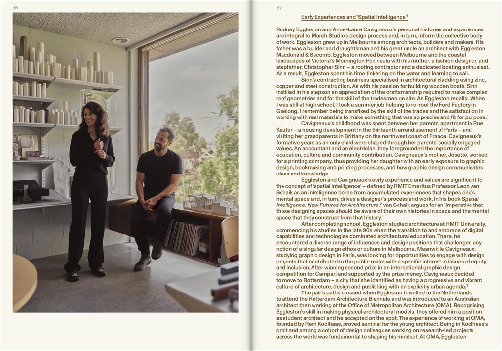
An appetite for experimentation, particularly around adaptive reuse, has always been the backbone of our September issue. For this edition, we’ve leant towards the homes and workspaces of creatives, knowing they’re vital test labs for ideas.
We see this through our cover story—architect Sophie Dries’ Paris apartment—and Italian designer Giampiero Tagliaferri’s Los Angeles atelier, set inside a Wes Jones-designed industrial home. Brazilian designer Andre Mellone describes his New York City home as a “lab where you test ideas out, and if things go wrong, you have no one to answer to but yourself.”
CRITERIA and C. Gallery founder Rachael Fry’s restored Victorian villa in Melbourne is a canvas for her diverse style and pieces, just as designer Sebastian Zuchowicki’s hybrid living-working space is designed for constantly rotating furniture, objects, and art.
We step inside one of Melbourne's most significant high-rise apartment blocks by Yunken Freeman Brothers, Griffith & Simpson, where Kennedy Nolan has reconceived a late-modernist apartment’s interior for art-collecting clients. Honouring a building’s past extends to a home’s historic well in Welsh + Major’s design of a new pavilion for a Sydney terrace.
Our Bathroom Blueprint special feature gives voice to designers seeking new and interesting materials, shapes, and details in this space. We leave you with a definitive guide to bathroom design elements using our Product Library, recognising the joy of rethinking our spaces, regardless of their scale and purpose.
– Sophie Lewis, editor
pittella.com.au @pittelladesign
CONTRIBUTORS
Christophe Coënon is a Franco-Italian still life, interior architecture, and travel photographer based in Paris. He developed a personal approach akin to lyrical documentary at ECAL in Switzerland, with an aesthetic of subtle obviousness and enlightened quality. Over the past two years, Coënon has been working on a project in Sri Lanka, unveiling the island's hidden gems. Coënon photographed designer Sophie Dries’ Paris home, which also graces the cover of this issue.
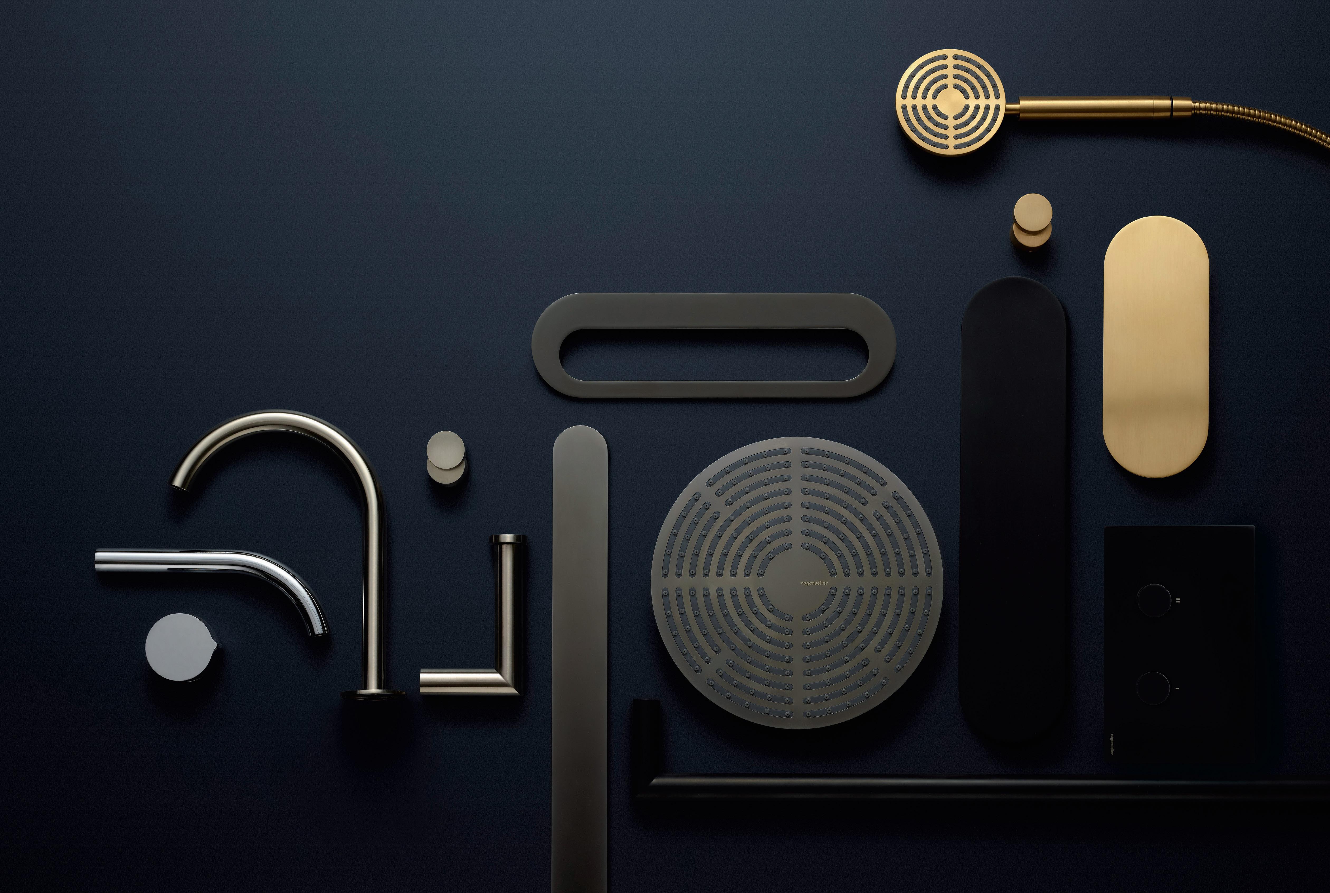
Aleesha Callahan is a Melbourne-based design journalist, editor, and communications strategist. With more than a decade of experience in media and design, Callahan has honed a distinct voice and an innate ability to craft compelling narratives. Callahan writes on 10 arresting bathroom spaces as part of our special feature Bathroom Blueprint
William Jess Laird works at the intersection of art and design, photographing people and spaces with a keen sense of naturalism and sophistication. Through collaborations with renowned architects, designers, and artists, Laird has built a reputation as one of the leading photographic voices in design today. In this issue, Laird captures designer Sebastian Zuchowicki in his hybrid live-work space in Manhattan.
CREDITS
est living acknowledges the Traditional Owners of the land on which we work, the Wurundjeri Woi Wurrung of the East Kulin Nation. We pay respect to their Elders past, present and emerging.
Aleesha Callahan, Alexandra Gordon, Holly Beadle, Megan Rawson, Sophie Lewis, Yvette Caprioglio
Photography
Playlist
Anson Smart
My Space | Giampiero Tagliaferri
Billal Taright
Life Imitating Art
Sean Fennessy
Bathroom Blueprint
Anson Smart, Barbara Corsico, Austin Leis, Chris
Mottalini, Timothy Kaye, Olivier Amsellem
Where Architects Live | Sophie Dries
Christophe Coënon
Reinstated Beauty
Clinton Weaver, Anson Smart
My Space | Andre Mellone
Billal Taright
Modern Curiosity
Derek Swalwell
Blurred Lines
William Jess Laird
The Detail
Andre Herrero, Anson Smart, Stephen Kent Johnson
On the Cover
Design
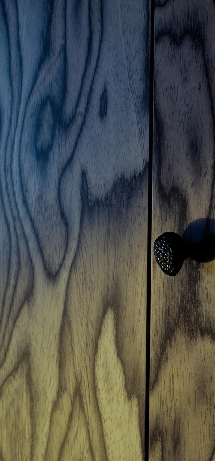
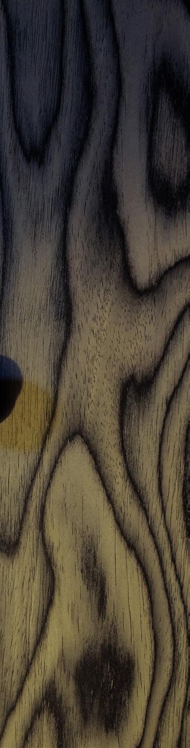
Where Architects Live | Sophie Dries
Photography
Christophe Coënon
Location
Paris, France
VOLA. For life.
The first VOLA tap was designed by Arne Jacobsen for Danmarks Nationalbank in 1968. Since then, every product has been made to order in our factory in Denmark and is designed to be repaired, never replaced.
5171RT34 Thermostatic mixer, hand shower and shower rail, in 20 Brushed chrome. Explore our new catalogue at VOLA.com.
STUDIO SOUNDS
LISTEN NOW >
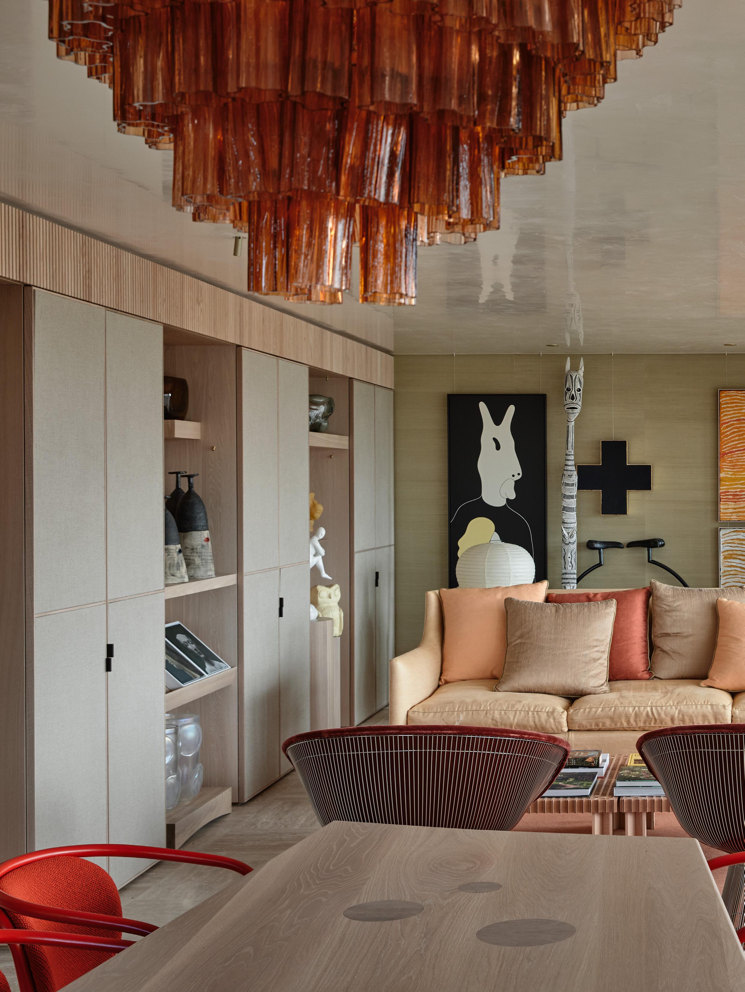
Project Flack Studio Office Design Flack Studio Photography Anson Smart
Timeless Gifting
Give the gift of timeless design with our curated edit of objects, furniture and accessories.
01. Shallow Pot by Vincent Van Duysen for When Objects Work available at The Front Room 02. Zuma tableware by Kelly Wearstler for Serax available at The Front Room 03. Eames House Bird in Walnut by Charles and Ray Eames for Vitra available at Living Edge 04. Akari 25N Floor Lamp by Isamu Noguchi for Vitra available at Living Edge 05. Flowerpot VP9 Portable Table Lamp in Vermilion Red by Verner Panton for &Tradition available at Cult Design 06. Købn Crema Bathroom Set available at Købn.
My Space Giampiero
Giampiero Tagliaferri
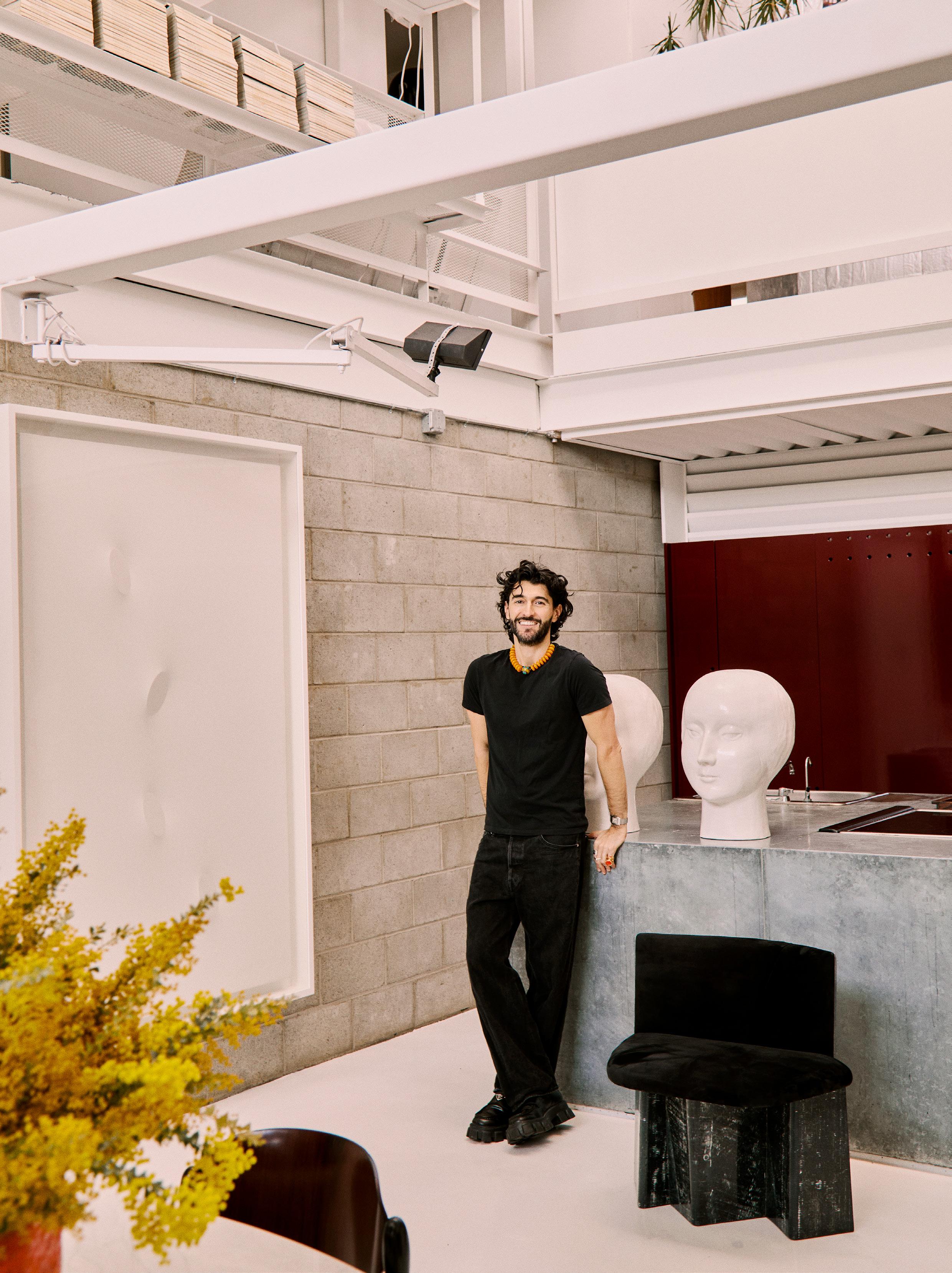
LOCATION Los Angeles, North America DESIGN Giampiero Tagliaferri ARCHITECTURE Jones & Partners
PHOTOGRAPHY Billal Taright WORDS Sophie Lewis
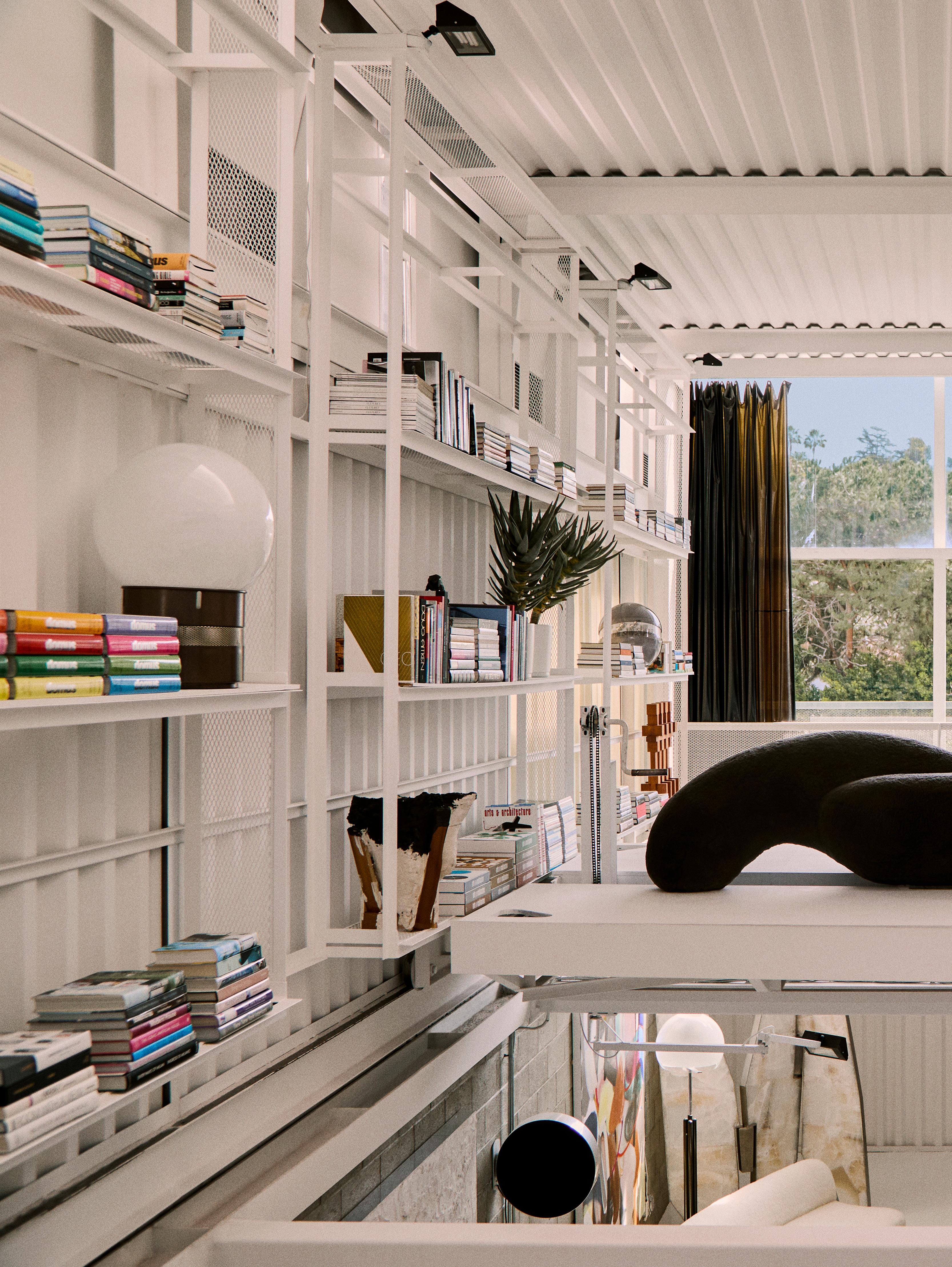
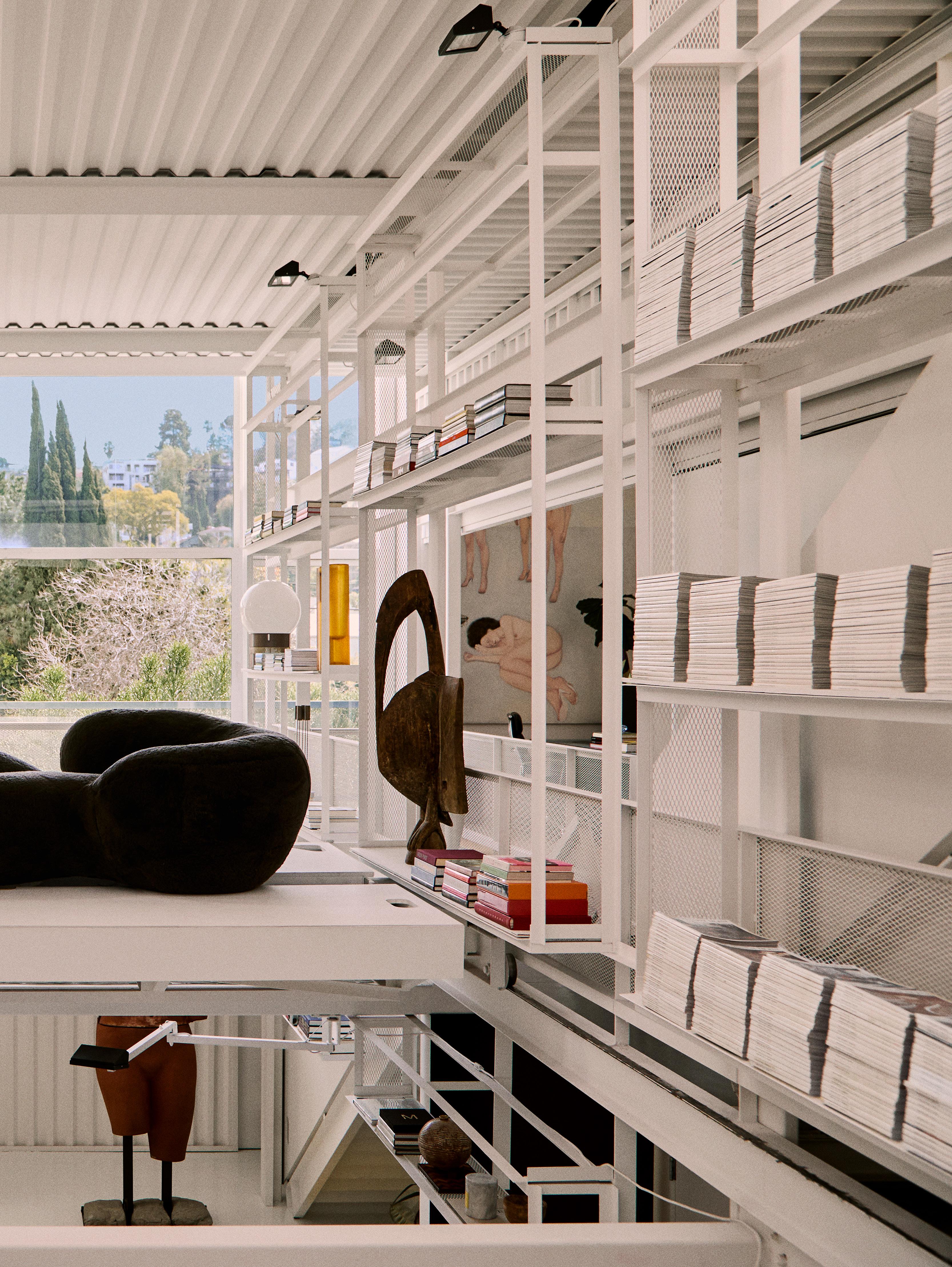
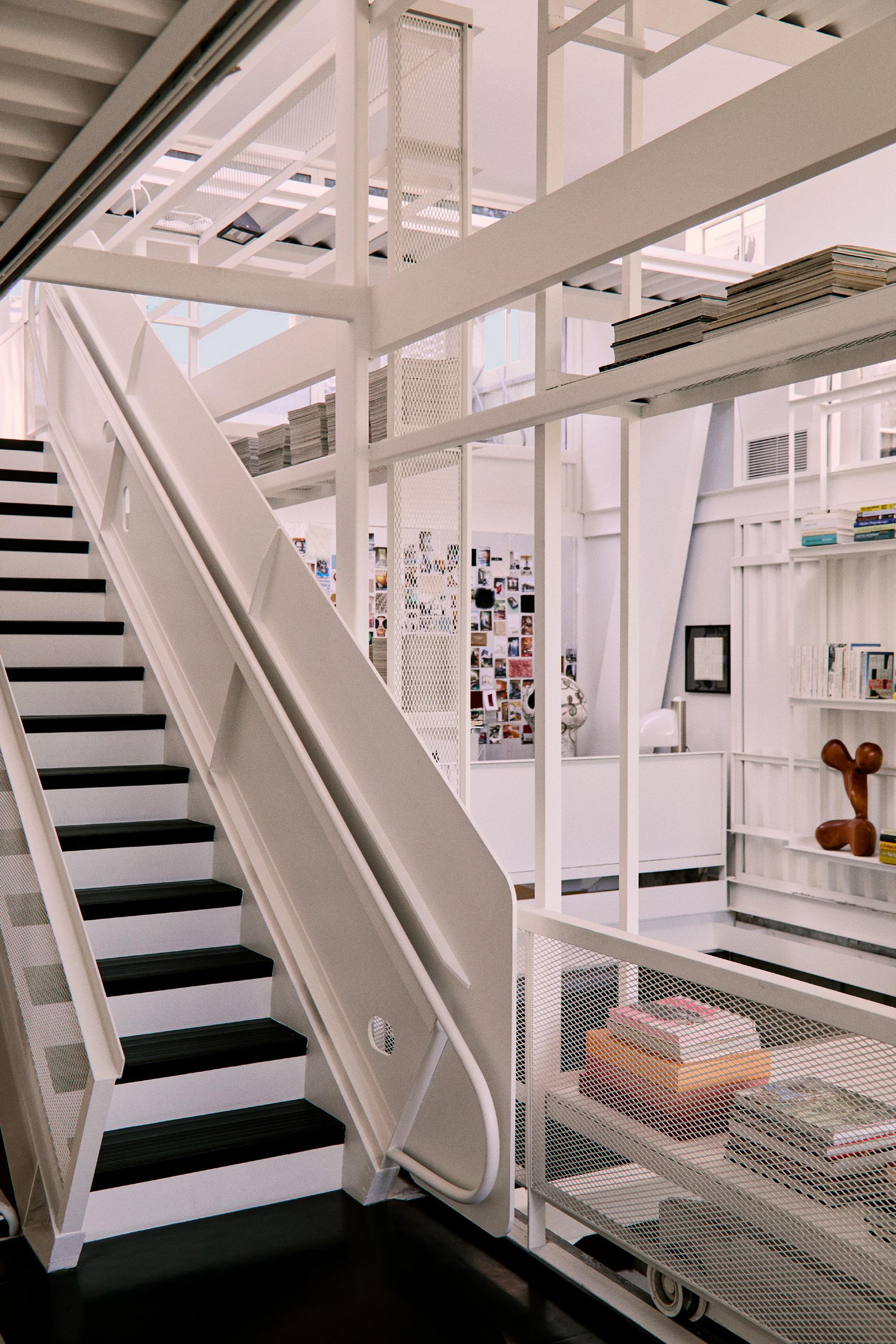
Italian designer Giampiero Tagliaferri’s Silver Lake atelier, set within an architecturally significant home, expresses his love for creating tension, brutalist architecture, and collecting vintage Italian and Brazilian design pieces.
Your Silver Lake atelier is located in what was once a martial arts studio before architect Wes Jones transformed the building into a home in the late 1990s. Did you set out to find a residential setting for your atelier?
We were searching for a space with character, not just a standard office building. I wanted a place that would inspire us every day, with architectural significance. It also needed to accommodate our studio’s library.
The moment I entered the space, I instantly knew it was the perfect fit for our office.
What features attracted you most to the home?
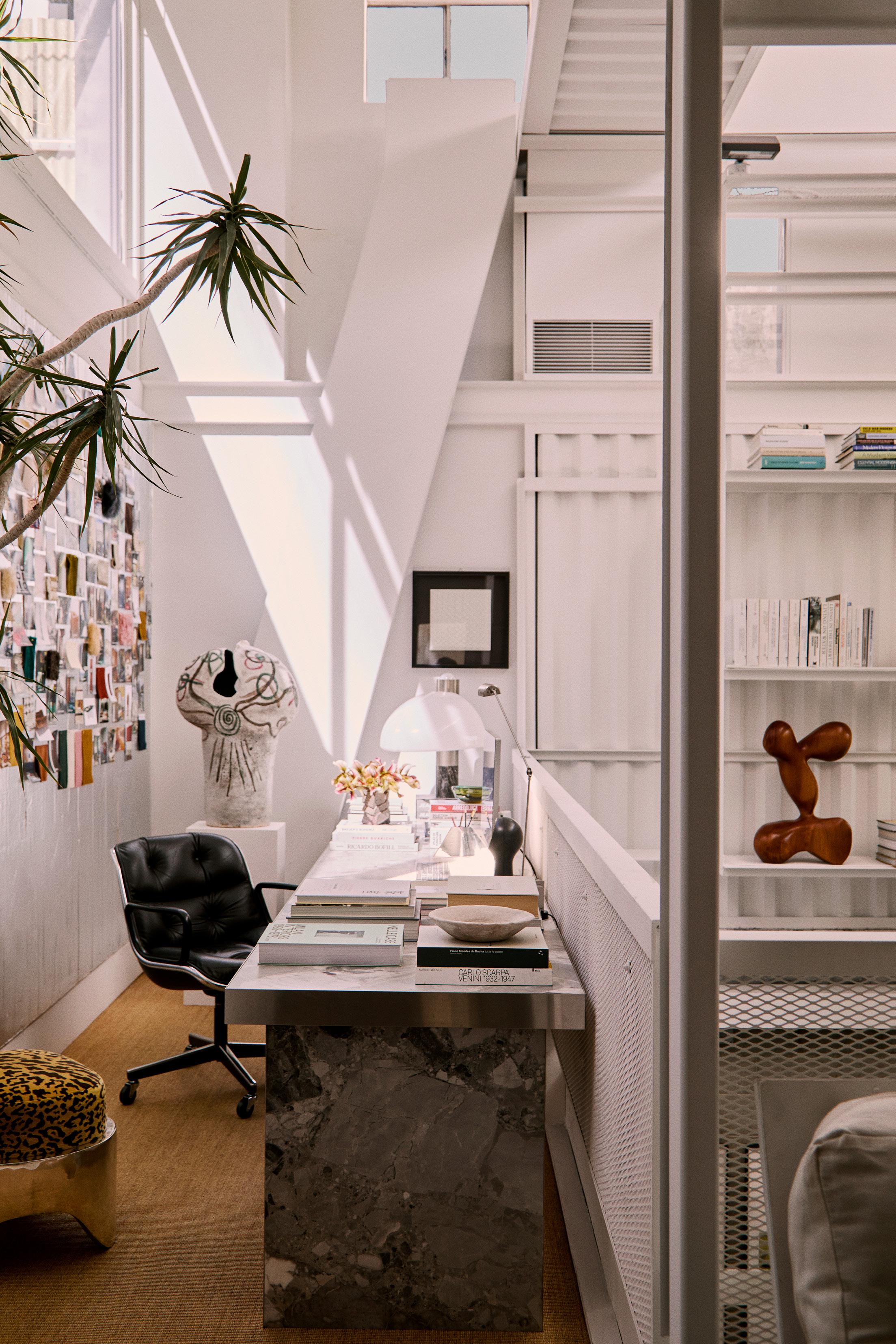
I’m really taken with how bright the space is, thanks to the large windows at both the front and back. The sense of openness created by the generous volume is fantastic, and the platform that moves across the second floor for easy access to our shelving is incredibly useful.
The building’s brutalist character is inspiring, and it brings to mind the work of architect Paul Rudolph, whose work I deeply admire.
How does your design respond to Wes Jones’ architecture and the building’s industrial nature?
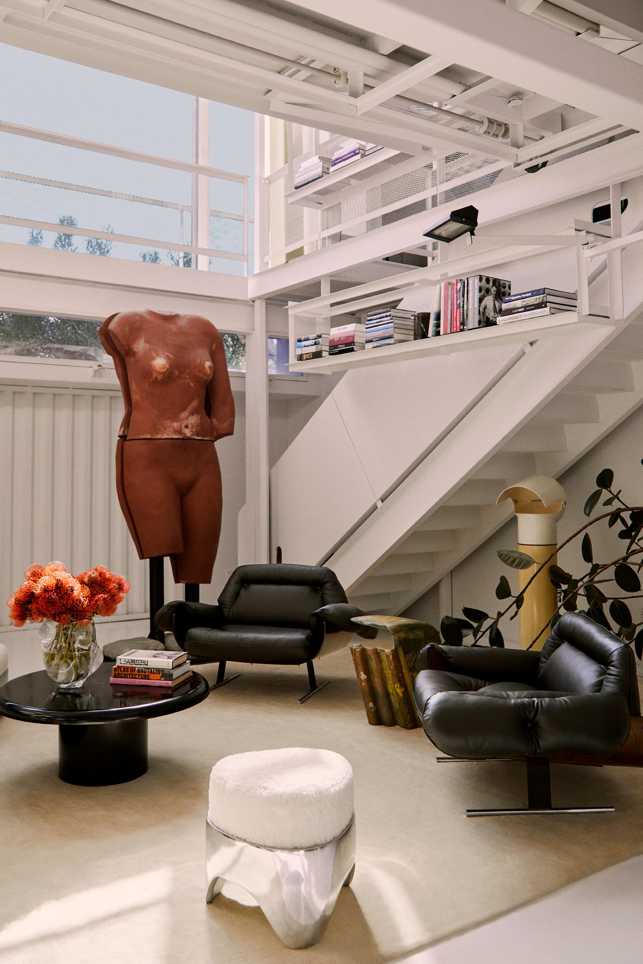
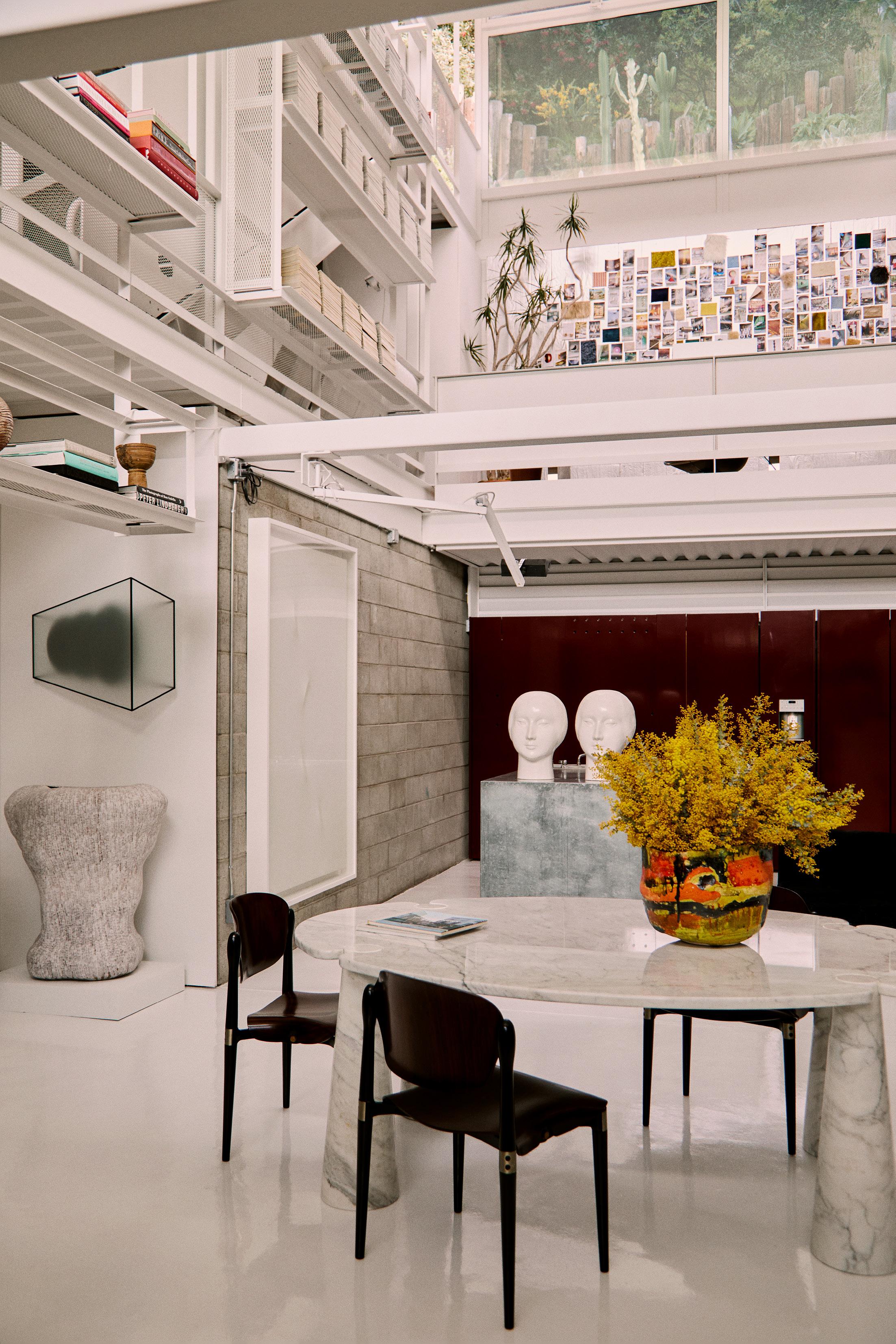
In our design approach, we enjoy exploring the contrast between different styles. On the ground floor, we opted for glossy bordeaux-coloured lacquer on the cabinets, which adds a Milanese flair and creates a contrast with the metal island and concrete walls.
Similarly, the vintage furniture we selected stands in sharp contrast to the building's materials, featuring warm rosewood, rich velvets and Italian marble.
Contemporary design elements like Brett Robinson’s sofa inject fresh energy into the space with their innovative forms.
Sisal flooring in the corridors introduces a touch of softness, while the custom tables, with their more brutalist design, are finished in a soothing baby blue to balance their stark form.
This page: A metal staircase to the atelier’s second floor expresses the building’s industrial character. Opposite page: A pair of lounge chairs in black leather and Brazilian rosewood by Jorge Zalszupin, an ottoman by B G Robinson, a vintage Pileo floor lamp by Gae Aulent for Artemide, and the DC2211 side table by Vincenzo de Cotiis. Artwork by Vanessa Beecroft.
You designed your atelier as a gathering space for creatives. Why was this important to you?
I believe that creativity flourishes when you surround yourself with other talented individuals from various fields. These relationships foster collaboration between different industries and allow us to learn and grow from each other's experiences. I love to offer my space for this reason.
The interiors are an amalgamation of objects, artwork and furniture pieces that you have collected, with a particular focus on Italian architects and designers, such as Vincenzo De Cotiis and Gae Aulenti. Could you share the story behind one or two pieces and why they are personal to you?
I admire Gae Aulenti immensely, both as a designer and as an architect. What I love most about Aulenti’s approach to architecture is her ability to understand the legacy of a building while simultaneously adding a completely new and unique layer that is different yet interacts intensely with the original structure. As a designer, I find her ability to create objects that live in the tension between rigour, geometry, and occasional irreverence—as well as being architectural—very interesting. She said, "I aim to create furniture that appears in a room like buildings on the horizon and reminds the viewer of the interaction between design objects and architectural space.” A great vision of design.
I consider Vincenzo De Cotiis one of the most significant Italian architects of our time. His work is distinctive and exceptional, merging elements of Italian antiquity with contemporary forms and concepts.
This page: A sofa by Rich Mnisi for Southern Guild on a movable bridge that allows access to Tagliaferri’s library. A Senufo bird sculpture features to the left of the sofa, with Oracolo lamps by Gae Aulenti for Artemide on the shelves. Opposite page: Tagliaferri introduced sisal flooring for a ‘touch of softness’. Pictured: a Knoll Executive chair by Charles Pollock, another ottoman by B G Robinson, and a large ceramic vase by Valerie Bloom on the plinth.
Are these pieces permanent fixtures in your workspace, or do you rotate pieces from your own home and vice versa?
Our studio is always in a state of flux, with pieces continually rotating. The arrangement is constantly evolving as we frequently hold items for clients or art shows. Whether we have an in-house art show or an install coming up often influences what’s currently on display.
Speaking of your own Los Angeles home, it presents very differently to your atelier. What design threads or ideas do the two spaces share?
A key element of my approach is the idea of creating tension within the space. My home, a 1939 modernist building with wood-panelled walls, has a warmth that the office lacks in its architecture. Yet I apply the same furnishing method to both places. I like to mix in pieces from various periods that don’t relate directly to the architectural style.
In the end, both spaces are a reflection of designers I love, with a focus on Italian and Brazilian creators.
You moved to Los Angeles eight years ago. How has your design approach evolved or changed in the years since?
One of the most distinctive features of my work is the fusion of influences from the two cities.
Milan is the city where I spent my most formative years and where I lived for 18 years. It is a city that has greatly contributed to my education in the field of design. I believe that more than any other city in Italy, it represents the ultimate expression of Italian modernism. It is home to great masters of architecture and design who have given Milan its unmistakable character, made of functionality and aesthetics, of details and hidden beauty. It is a city that is somewhat severe and inward-looking, inviting you to discover its nuances little by little. It is a city made of layers that make you want to get to know it better. This aspect of layering is one of the most important concepts in my work, where I love to mix eras and influences while maintaining aesthetic consistency.
Los Angeles, on the other hand, is a city that opens outward, much more relaxed and informal. The last eight years spent here have taught me the importance of light, the relationship between indoors and outdoors and the functionality of spaces. Los Angeles has also played a fundamental role in the development of modernist architecture, especially in the residential sector. It is the city where, thanks to the favourable climate, modernist ideas of blending indoor and outdoor spaces and simplicity of materials and lines, have been able to express themselves very significantly. All these elements constantly influence my work.
You also opened a studio in Milan last year after launching your namesake practice two years ago. How do you divide your time between both?
Los Angeles is our headquarters, where I spend most of my time, but I travel to Milan every month and a half to work with our studio there.
As Oliver Peoples creative director, you designed several boutiques worldwide. Now, primarily specialising in highend residential, how did this formative experience influence your perspective on designing homes?
At Oliver Peoples, I consistently aimed to create spaces tailored to their specific context. My approach often involved making those stores feel inviting and unique, much like a home. For instance, the Oliver Peoples boutique in Milan was directly inspired by a mid-century Milanese apartment.
This approach mirrors residential design—my goal is to craft designs exclusive to each space and context while developing a material palette that feels balanced and refined.
“In styles. cabinets, island
our design approach, we enjoy exploring the contrast between different styles. On the ground floor, we opted for glossy bordeaux lacquer on the cabinets, which adds a Milanese flair and creates a contrast with the metal island and concrete walls.” –
Giampiero Tagliaferri
Previous page: Vanessa Beecroft sculptures feature on the metal island. A Tecno Italy S83 dining chair by Eugenio Gerli and a Skipper Eros dining table by Angelo Mangiarotti are also pictured.
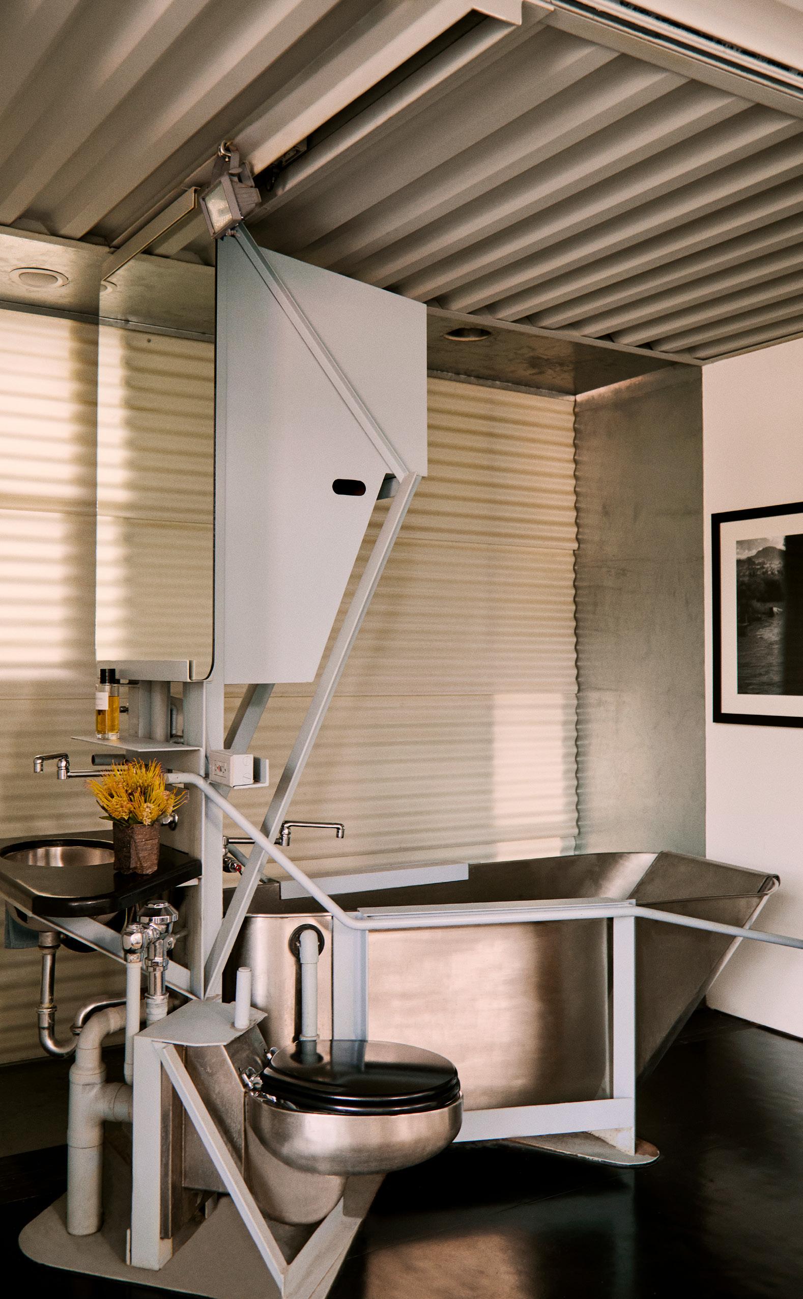
This page: Making creative use of a prison toilet, the office bath is an original design feature by architect Wes Jones.
Opposite page: The atelier reflects Tagliaferri’s affinity for the work of Italian artist and performer Vanessa Beecroft. The brutalist custom tables, paired with Soft Pad chairs by Charles and Ray Eames, are finished in a soothing baby blue to balance their stark form.
Meaningful Design to Inspire People’s Lives
Architectural Minimalism in the Kitchen
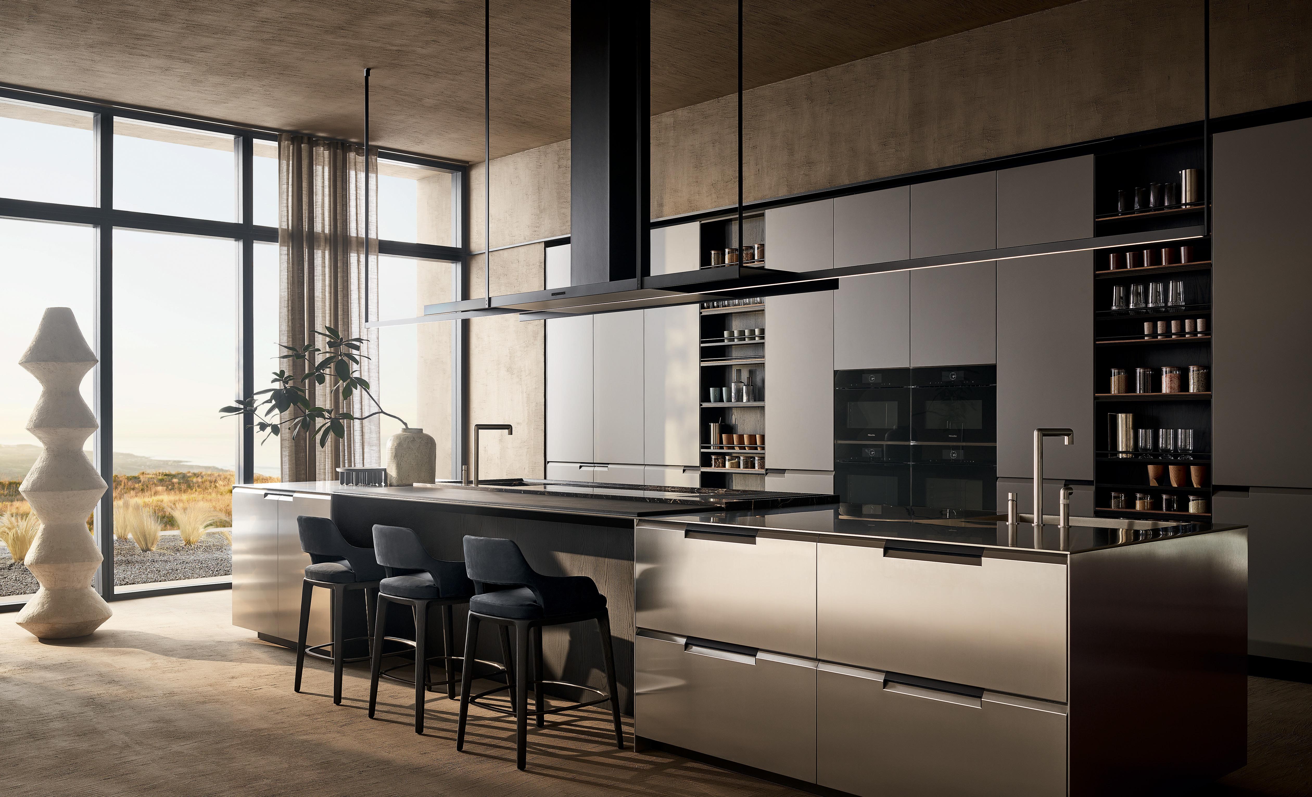
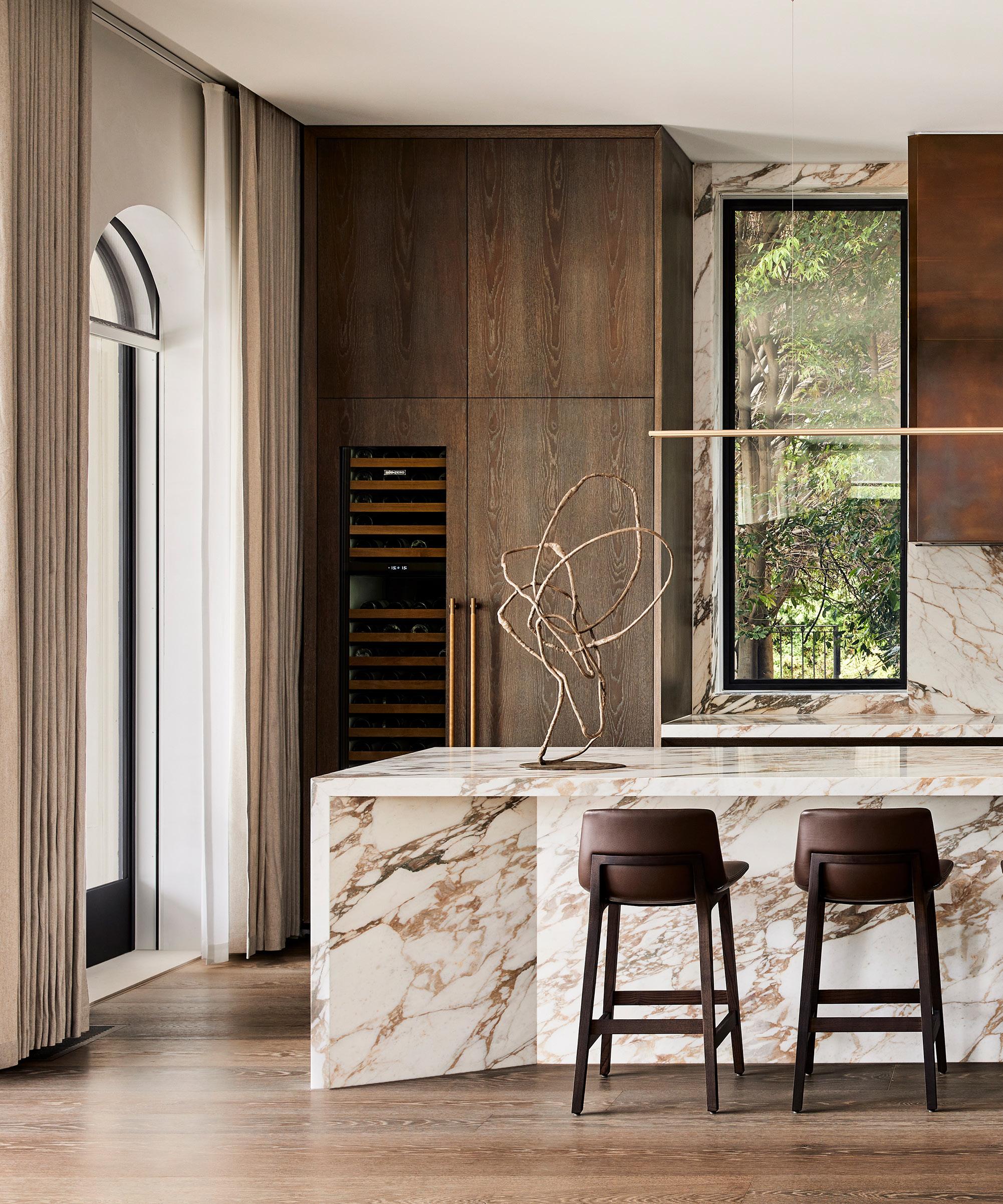
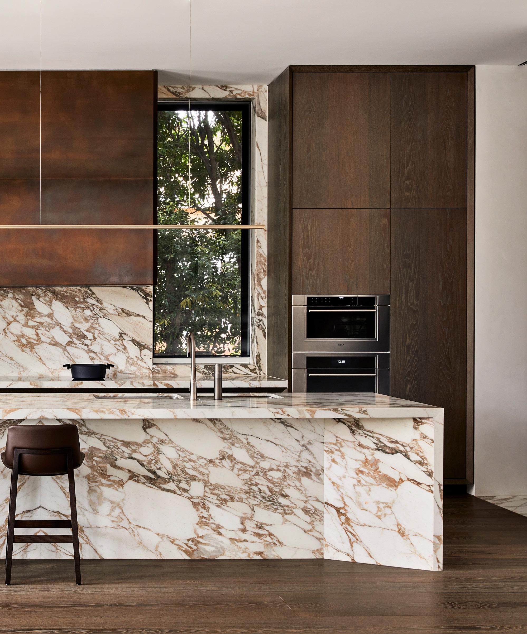
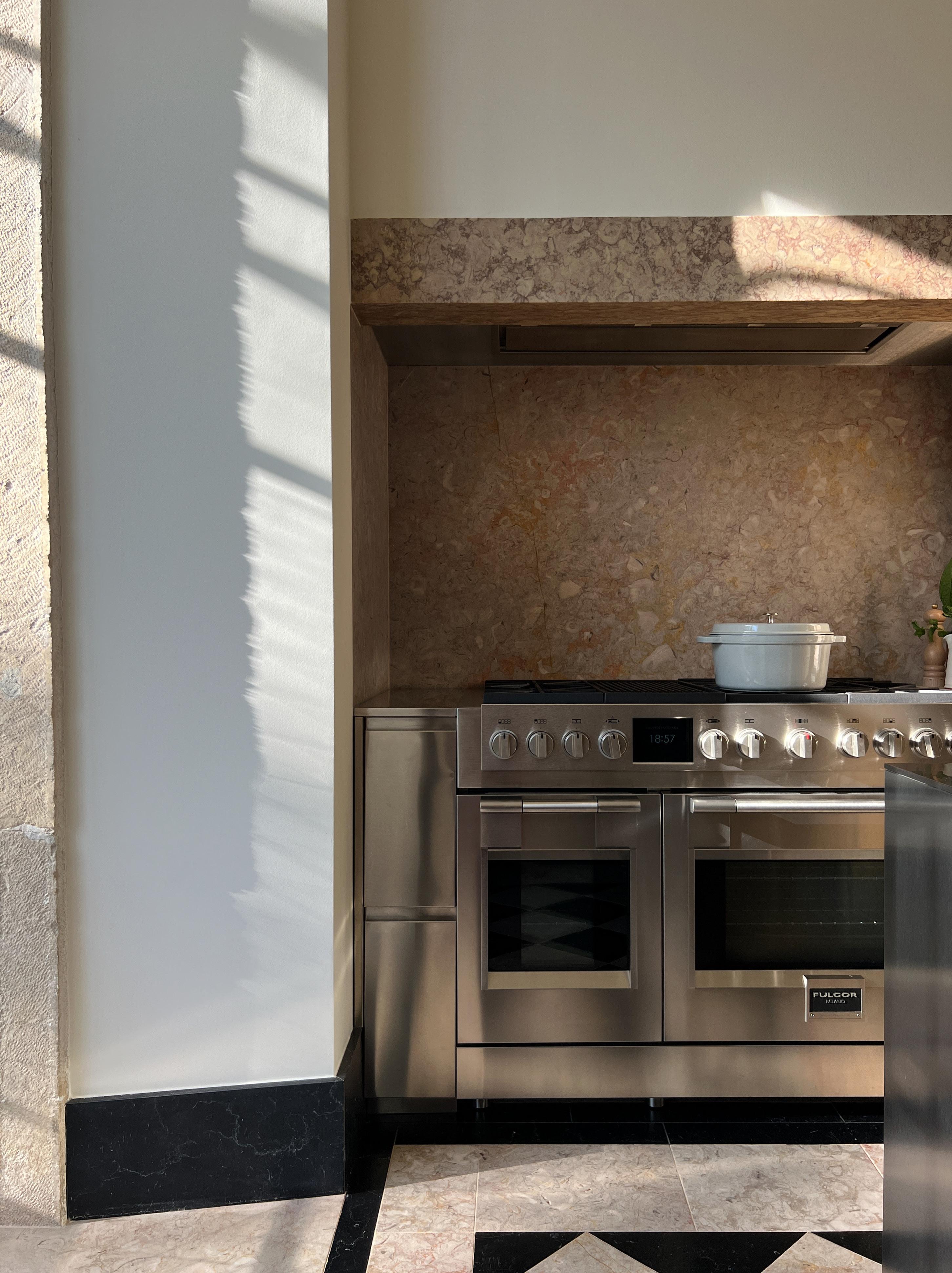
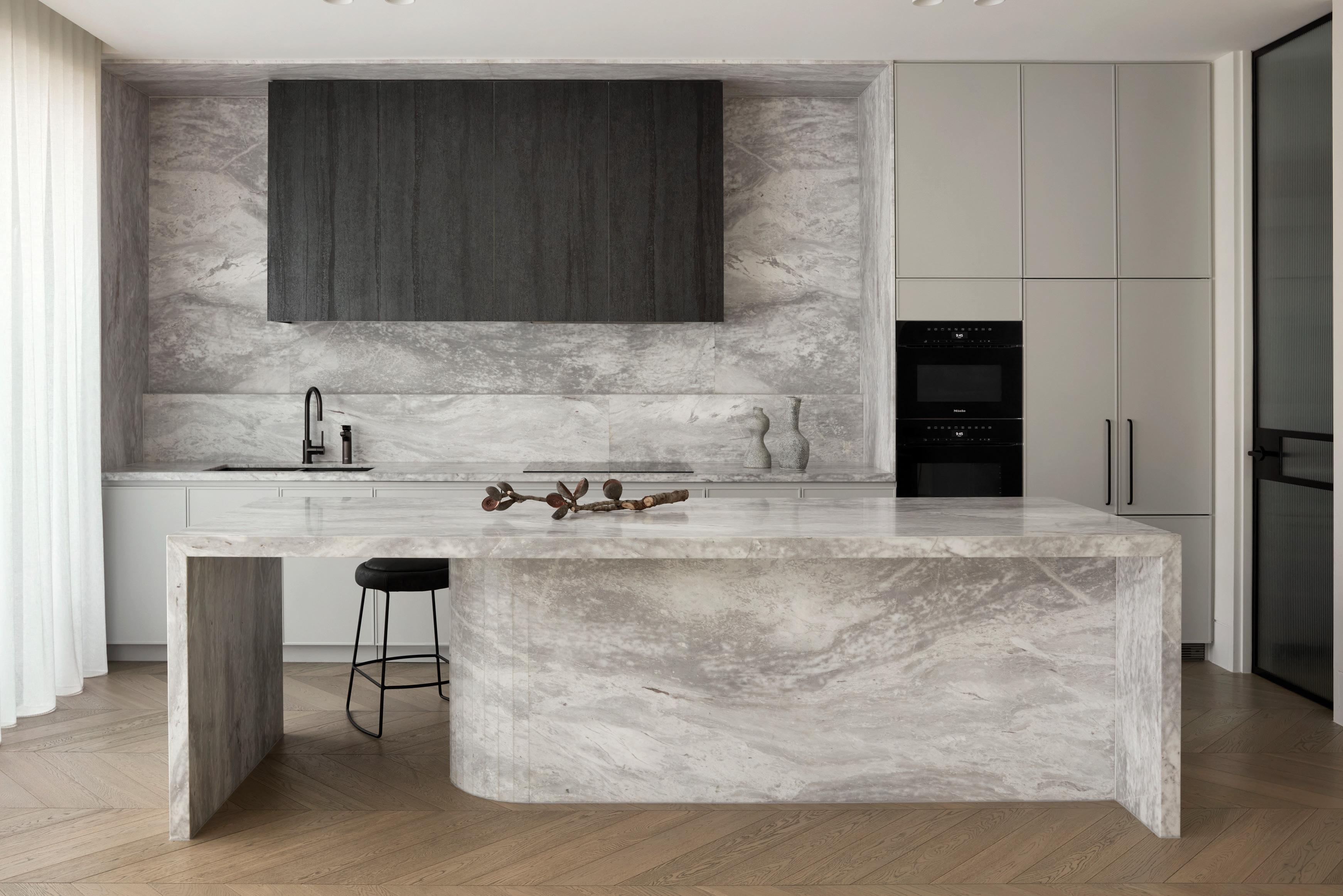
In reimagining a residence in Melbourne’s CBD, Rob Mills Architecture & Interiors has crafted not one, but two kitchens that seamlessly blend sophisticated design elements with premium appliances. “Each of our kitchens are crafted to reflect the unique lifestyles of our clients,” architect Rob Mills says.
The vision for the home was to design two distinct kitchens tailored to the homeowners’ culinary passions. One kitchen stands out as an elegant showcase of form and function, while the second, a concealed space designed specifically for Chinese cuisine, integrates powerful ventilation and carefully selected materials to cater to specific culinary needs. Both kitchens are outfitted with premium appliances from the Sub-Zero and Wolf range, ensuring a seamless fusion of innovation and craftsmanship.
“In this case, that meant understanding and designing for the client’s culture and cooking practice. The design of both kitchens had to not only be visually striking, but also allow for an easy workflow.” Rob Mills Architecture & Interiors have transformed both kitchen spaces into a pinnacle of elevated living, where performance and design converge. As Mills eloquently puts it, “In every residence and every space, our aim is to achieve intelligent architecture, healthy design, a commitment to craftsmanship, and a profound connection with nature. This philosophy applies to the kitchen, where functionality must align with aesthetics to meet daily demands.”
Explore the Sub-Zero and Wolf range of kitchen appliances >
LOCATION Wurundjeri Woi Wurrung Country / Melbourne, Australia
DESIGN Rachael Fry and Pasquale Cook STYLING Joseph Gardner
PHOTOGRAPHY Sean Fennessy WORDS Megan Rawson
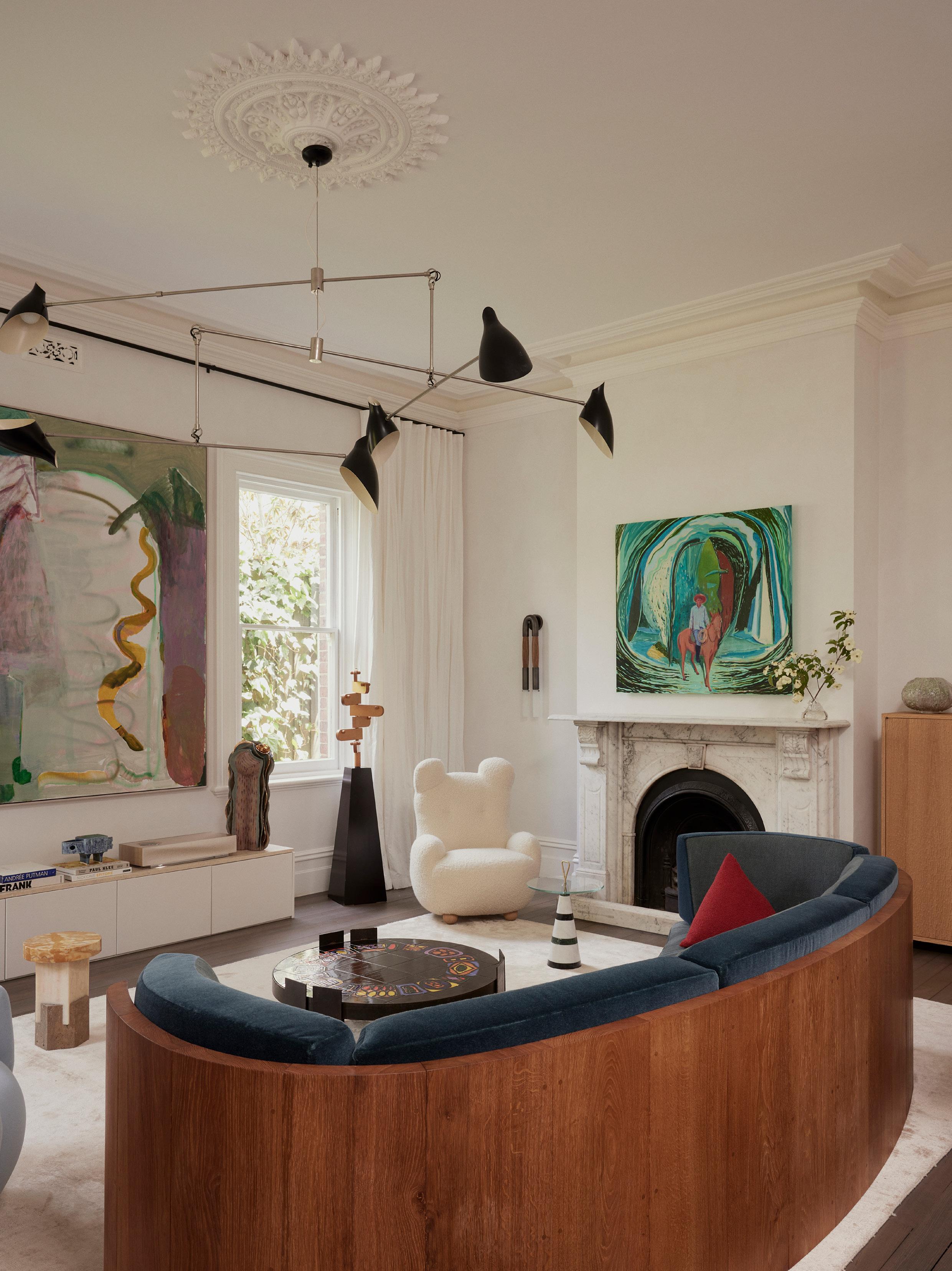
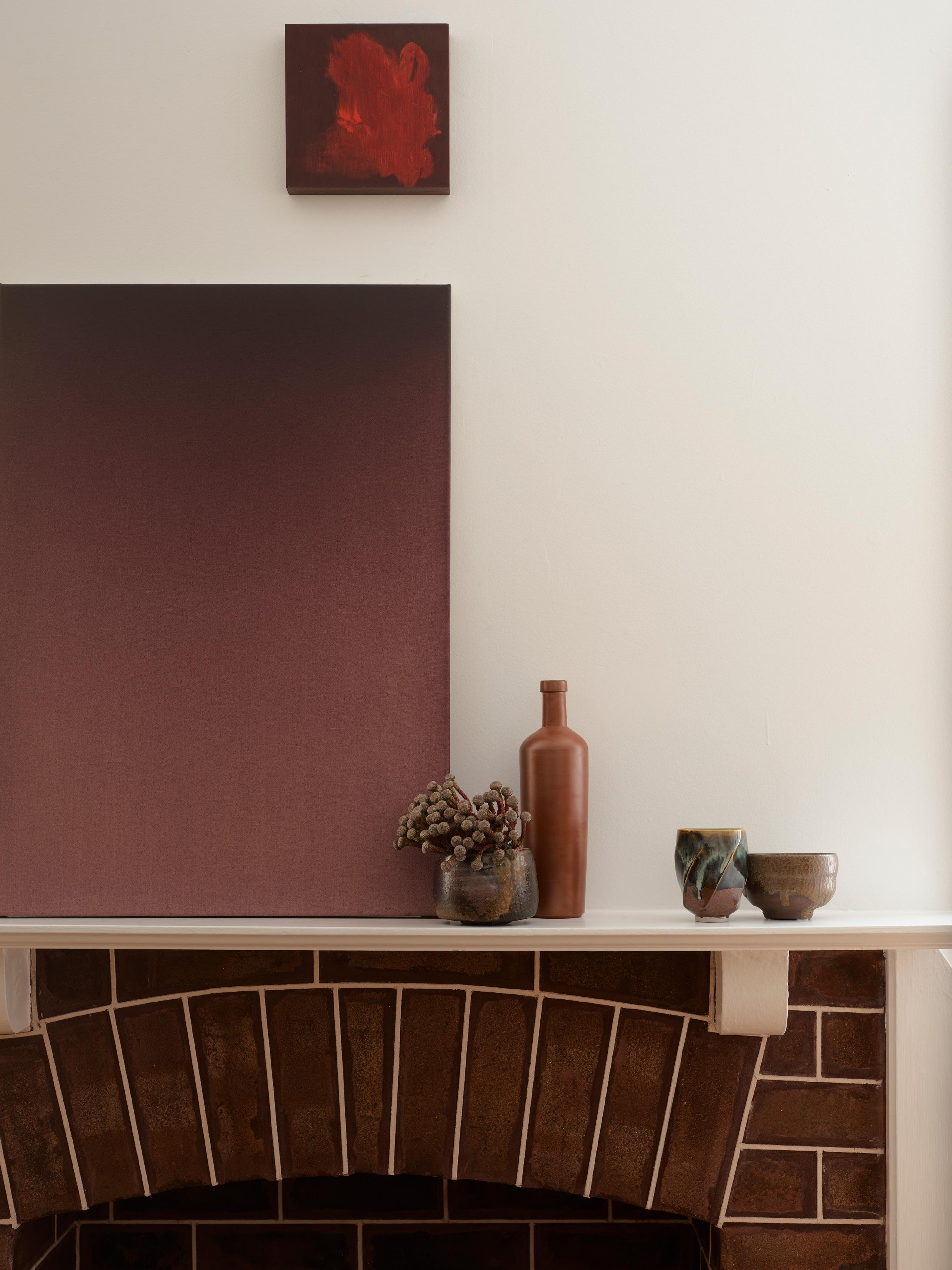
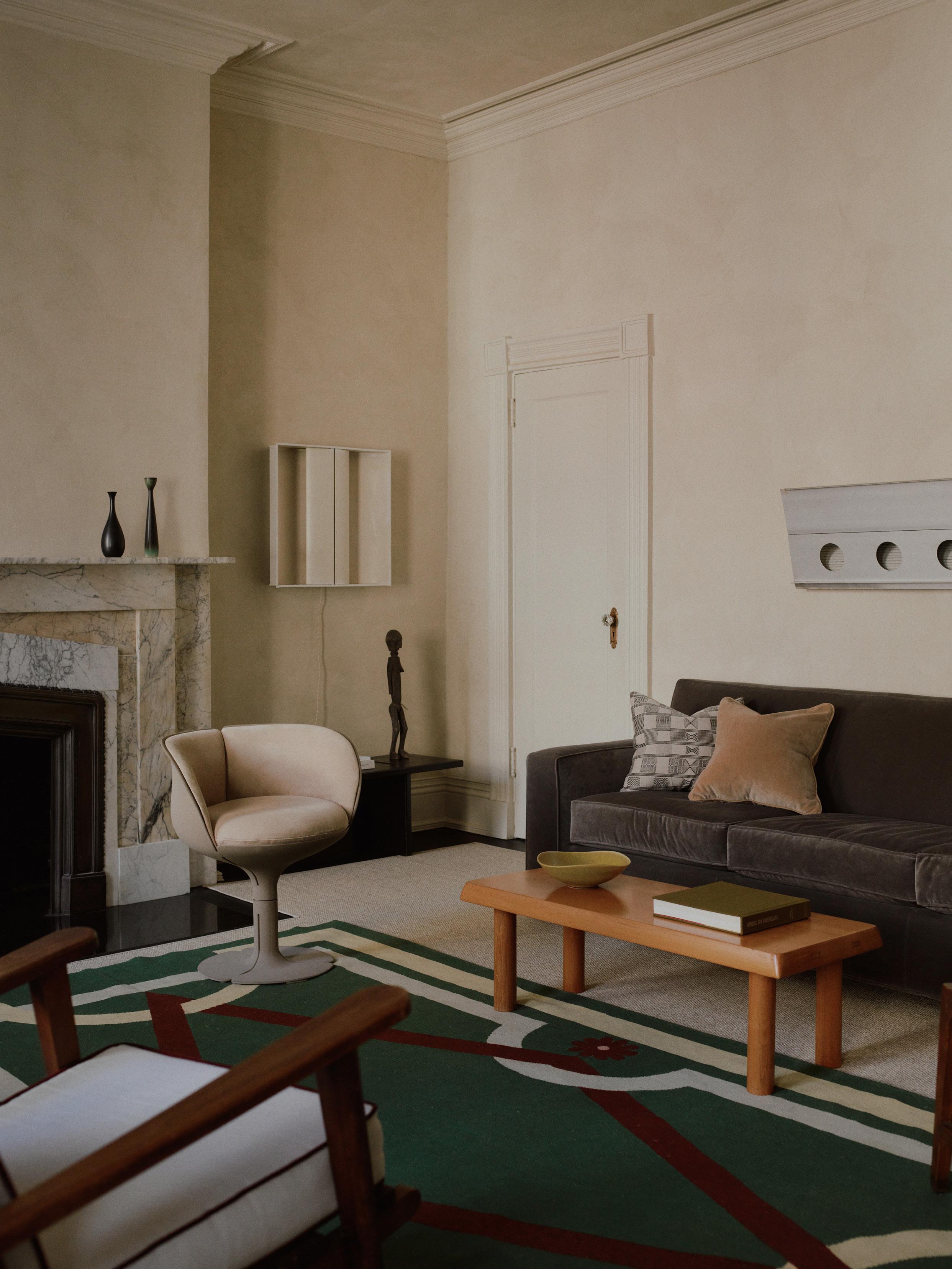
This page: Above the fireplace hangs an untitled piece by artist Jules de Balincourt, with ‘Posts and Pillars’ by Fry’s friend, artist Miranda Skoczek, on the adjacent wall. The Mindy sofa and Mama Bear, armchair both from Pierre Yovanovitch Mobilier, are complemented by a 1970s coffee table from Castorina, a SAT coffee table by Pietro Russo, and an Apparatus Horsehair wall sconce on the wall beyond. Opposite Page: The Asymmetry armchair and Flare wood floor lamp both from Pierre Yovanovitch Mobilier sit alongside an Oeuffice Dorik Chroma stool.
The formal dining room nods to the home’s rich past, with a Roze dining table and Mr. Oops dining chairs from Pierre Yovanovitch Mobilier taking centre stage. A Piccolo 114 vessel by Jeremy Anderson from C. Gallery, a Capodimonte glazed earthenware planter, and an Apparatus Synapse pendant light add intrigue. The ceiling makes a strong case for Capsicum Red Gloss by Dulux. The original Baltic pine flooring and mantel have been preserved, and an untitled artwork by artist Miranda Skoczek completes the space.
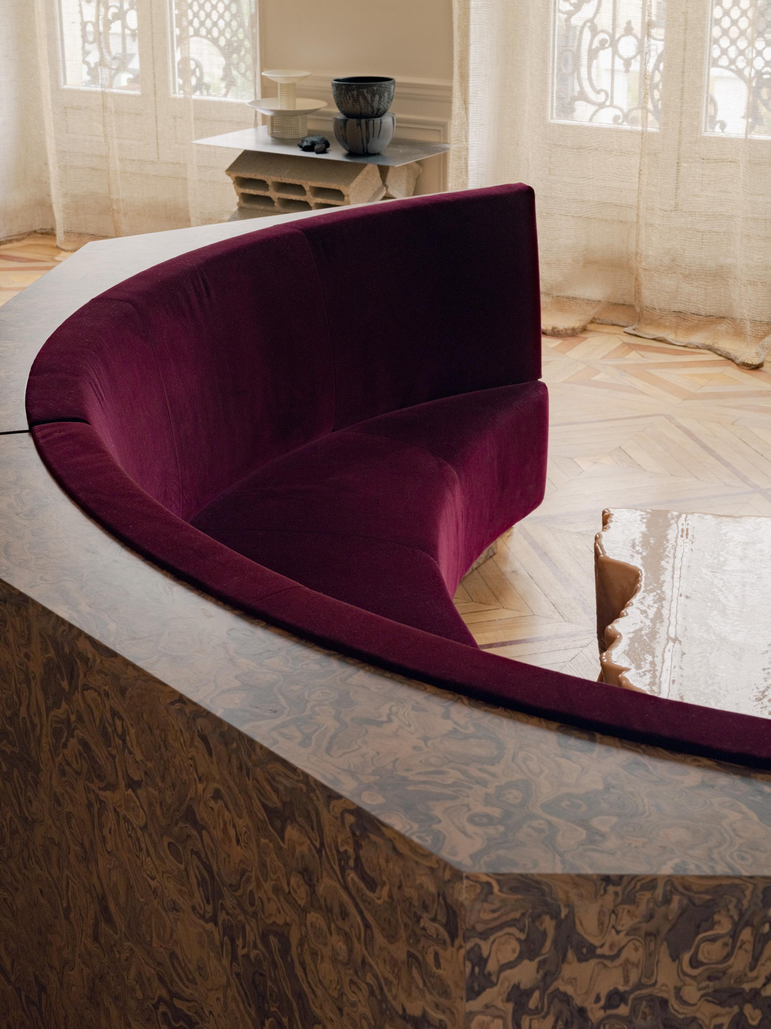
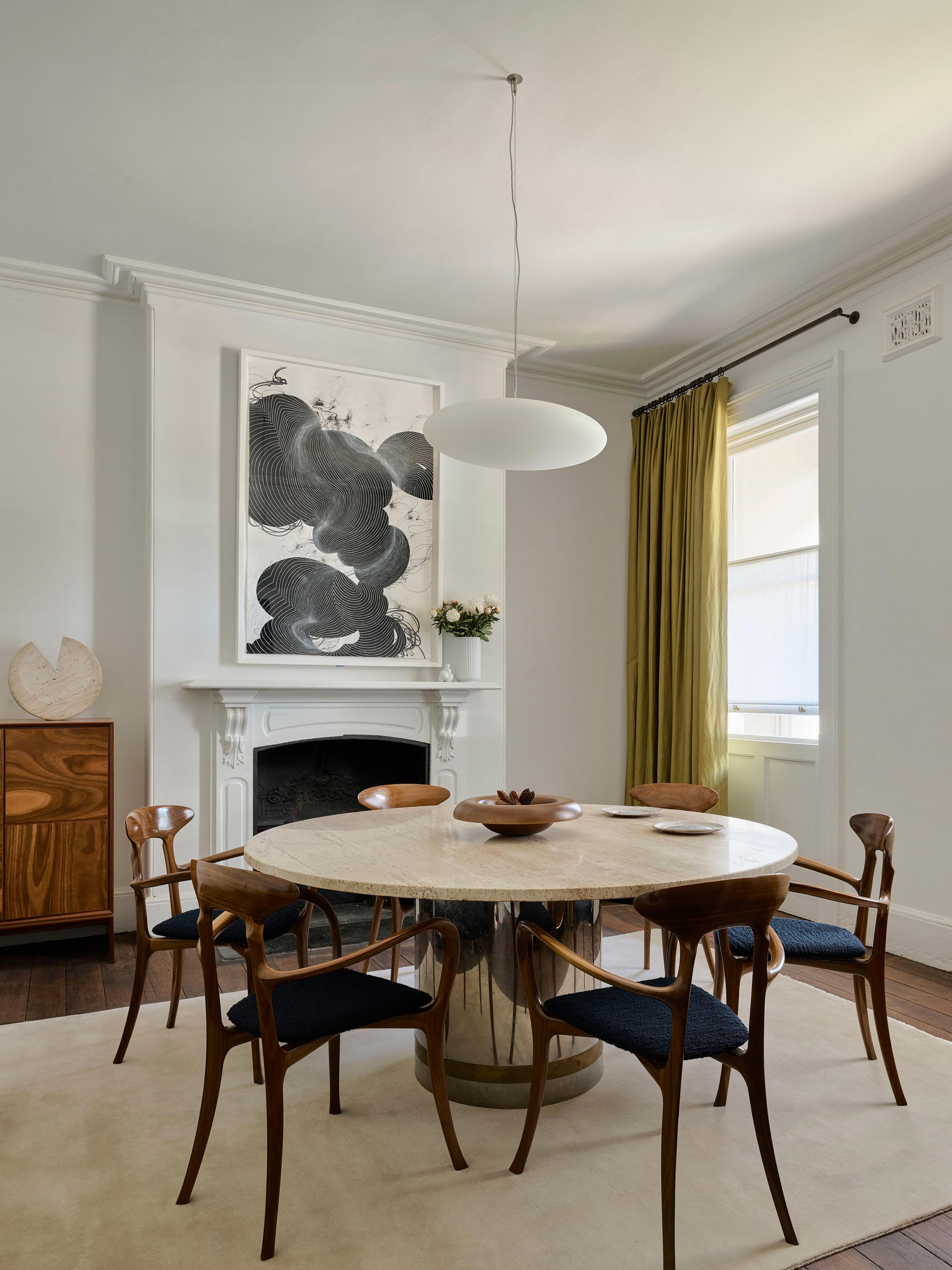
The Melbourne home of CRITERIA and
C.Gallery founder Rachael Fry is a natural extension of her discerning eye for art and furniture. It serves as a personal canvas that celebrates her curated collection through a playful exploration of colour.
This coincidental story began when, passing by, Fry expressed her admiration for the house set in Melbourne’s city fringe to its then-owner, only to learn it would be going on the market in a matter of months. “I fell in love with this house even though it was in a state of disrepair—I just loved the bones, the details, and the sequence of spaces,” Rachael Fry says of her newly revitalised Victorian home. “It has such a liveable stateliness to it; I could see my family here in all of our mayhem and glory.” After buying the home, Fry and her husband embarked on a fullscale refurbishment, collaborating with friend and interior designer Sophie Di Pasquale and her Pasquale Cook co-founder Sally Cook.
Over the next few years, Fry embraced the challenge of preserving the villa’s original Victorian detailing while modernising it to suit family life with three small children. The material palette, featuring patinated brass, glass, and porcelain, along with statement pieces such as Apparatus lighting and Pierre Yovanovitch’s solid oak and ceramic tables, reflects this careful balance. “I love that we have incorporated so many pieces from CRITERIA and C.Gallery into our home. In a lot of ways, the home is an extension of CRITERIA,” Fry says.
The house illustrates how diverse pieces and styles work together to compelling effect and it serves as a testing ground for the designers she retails, proving the versatility and strength of the global lineup of creatives Fry spotlights through CRITERIA. “I have a personal connection to everything in the house—art from my close friend Miranda Skoczek, pieces from my family, kids’ art, and small objects collected over the years. It all works together for me—I love how the pieces have become part of our family.”
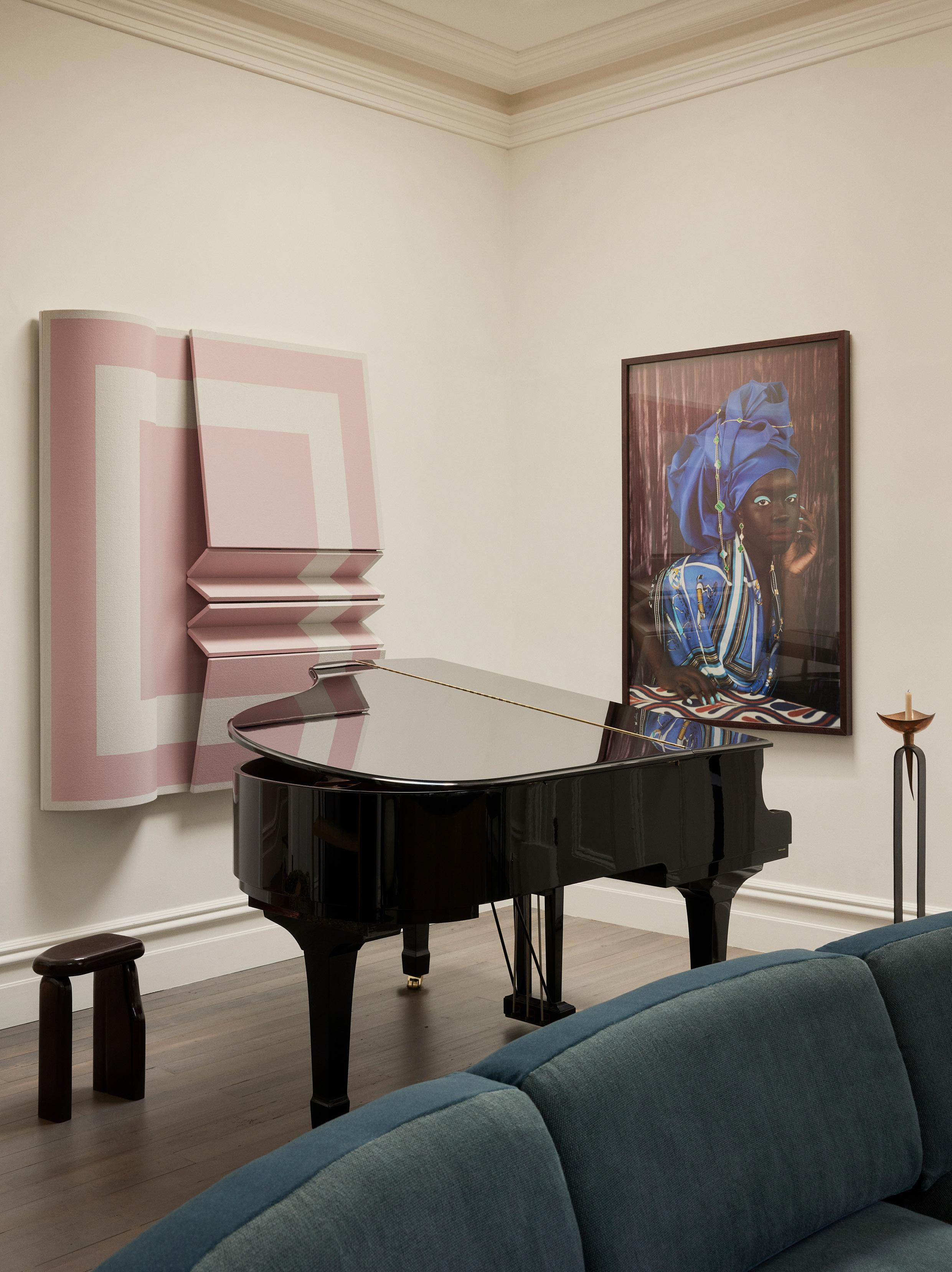
This page: Another angle of the living space reveals a Yamaha C2 grand piano; Windows of a Bo Bardi side table by Destroyers/Builders, 'untitled' artwork (left) by artist Robert Moreland and 'Blue Silk' (2022) artwork by artist Atong Atem. Opposite page: The entry hallway is painted in Bauwerk Chalk. It features a 1935 console table by Jean-Michel Frank and Adolphe Chanaux for Ecart, a vintage coat rack, a De La Espada Commune bench, an Echo 06 mirror by Hendel Futerfas, a Lantern table lamp by Apparatus Studio, a MCDE Simple Sloping Block wall sconce, ceramic vase by Georgia Morgan, 'Stretch' artwork by Lucia Bru and 'Ode à la mémoire' (2023) artwork by Elladj Liney Deloumeaux.
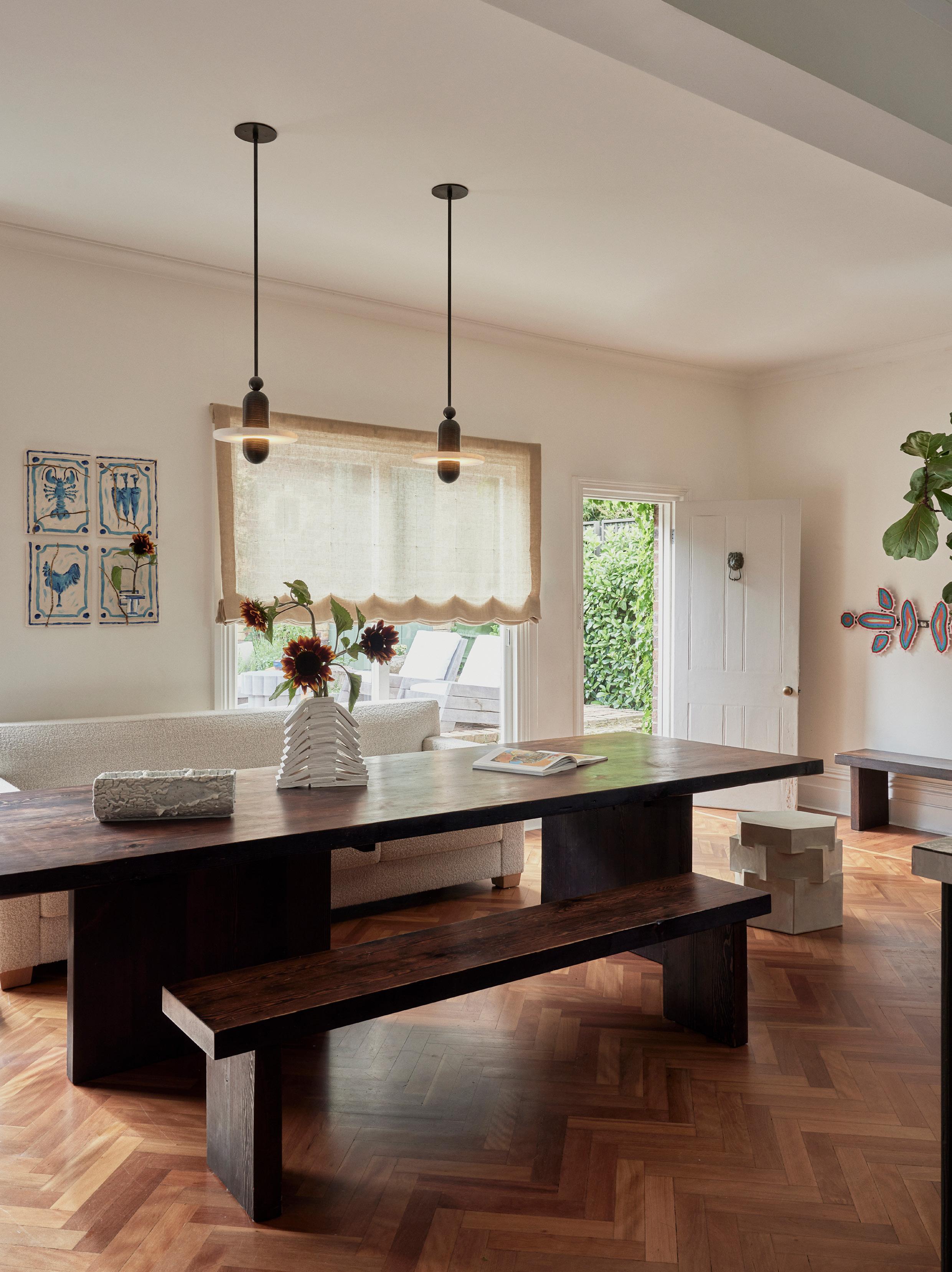
Opposite page: The family dining space features a Studio Liam Mugavin Breakfast table and benches, a Bzippy Triple Tier side table, and Apparatus Median 1 pendant lights. The One vase by Ben Mazey and Standing Below vessel by Claudia Lau adds a sculptural touch. The restored 1950s herringbone floor complements the space, and a 'Culinary Charm Bracelet' artwork by Ben Mazey (above the sofa) and 'Ilma' artwork by Roy Wiggan (far right) add moments of intrigue.
While Fry and her family live surrounded by art, high-end furniture and bespoke lighting, this has been offset with spaces that are both approachable and unfussy, especially in the family’s living areas and children’s bedrooms. “The kitchen and family dining area is the heart of our home—it’s the landing pad and where we gather for meals but also homework, reading or dancing. Our lounge room also gets a lot of love; my kids practice the piano, or we gather for movie night.” The living room is situated around a large painting by Miranda Skoczek and the curved Mindy sofa by Pierre Yovanovitch, which sets the tone for the communal space.
Rachael Fry's home is more than a beautifully curated space—it’s a living, breathing reflection of her family’s journey, creativity, and personal connections. Each space tells a story, blending art, design and everyday life in a way that feels authentic and curious. As her family grows, the hope is that the home will also evolve as a canvas for living. As Fry puts it, “I wanted to create a space that we could grow and really live in; I don’t believe in having spaces that are precious and museum-like”.
“I wanted to create a space that we could grow and really live in; I don’t believe in having spaces that are precious and museum-like”.
– Rachael Fry
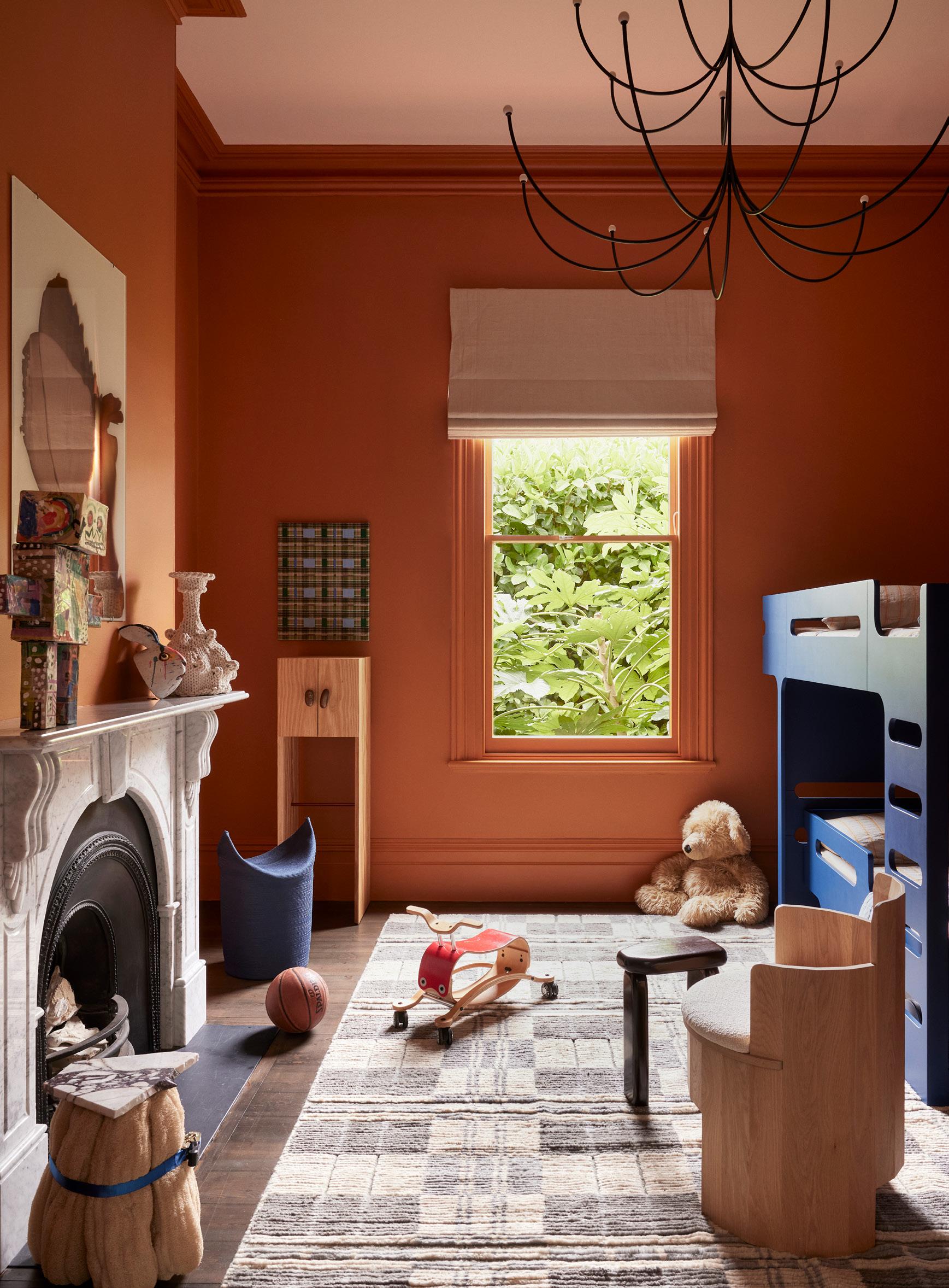
The children’s bedroom features a bunk bed from Rafa Kid. The Fort Standard Cooperage chair, Plaid rug by Commune for Christopher Farr, and Arca chandelier by Philippe Malouin for Matter Made offer a cosy texture. The room retains its original mantel, which displays a Whangaumu bottle by Finn Ferrier. The Raw Composition side table and Solid Nostalgia cabinet by Oko Olo are complemented by the 'Henry II' artwork by Tia Ansell (above the cabinet), all from C. Gallery. A whimsical Mr Fast Robot papier mâché by Freyja and Rachael adds a playful touch.
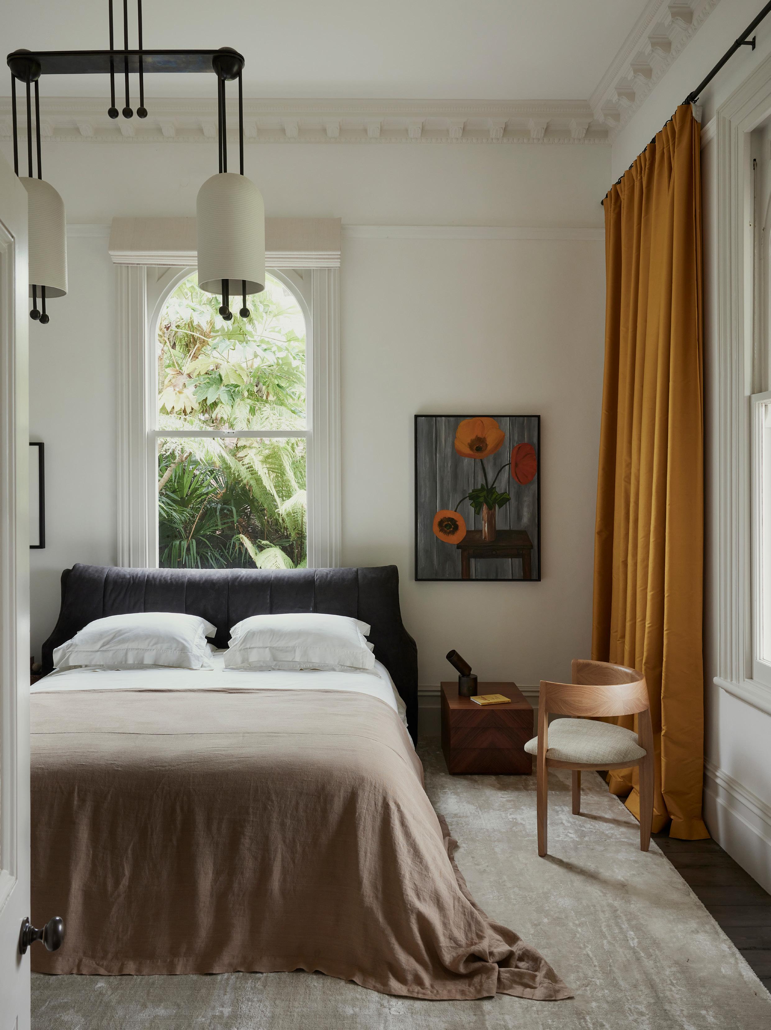
The primary bedroom features the Degrade nightstand by Pietro Russo, an Ecart Bridge Wolf chair, a custom silk rug by Christopher Farr, and Apparatus Lantern 2 pendant light. The bed features a heavyweight linen bed cover from Cultiver. Additional lighting includes the Apparatus Cylinder Uplight table lamp. The walls are finished in Chalk by Bauwerk Colour, with Carom curtains in Amber from Jim Thompson. An untitled artwork by Rachael Fry’s great-grandmother adds a personal touch to this intimate space.
In the study, a Studio Liam Mugavin Pebble table pairs with Gratz TG 10 Sling chairs, while the Snake and Pomegranate rug by Studio Shamshiri for Christopher Farr and the Apparatus Median 2 pendant light anchor the space. A Rising Spring vase by Claudia Lau (from C. Gallery) adorns the table, and a vintage Ettore Sottsass mirror adds character against the original paint-stripped wall.
WORDS Aleesha Callahan
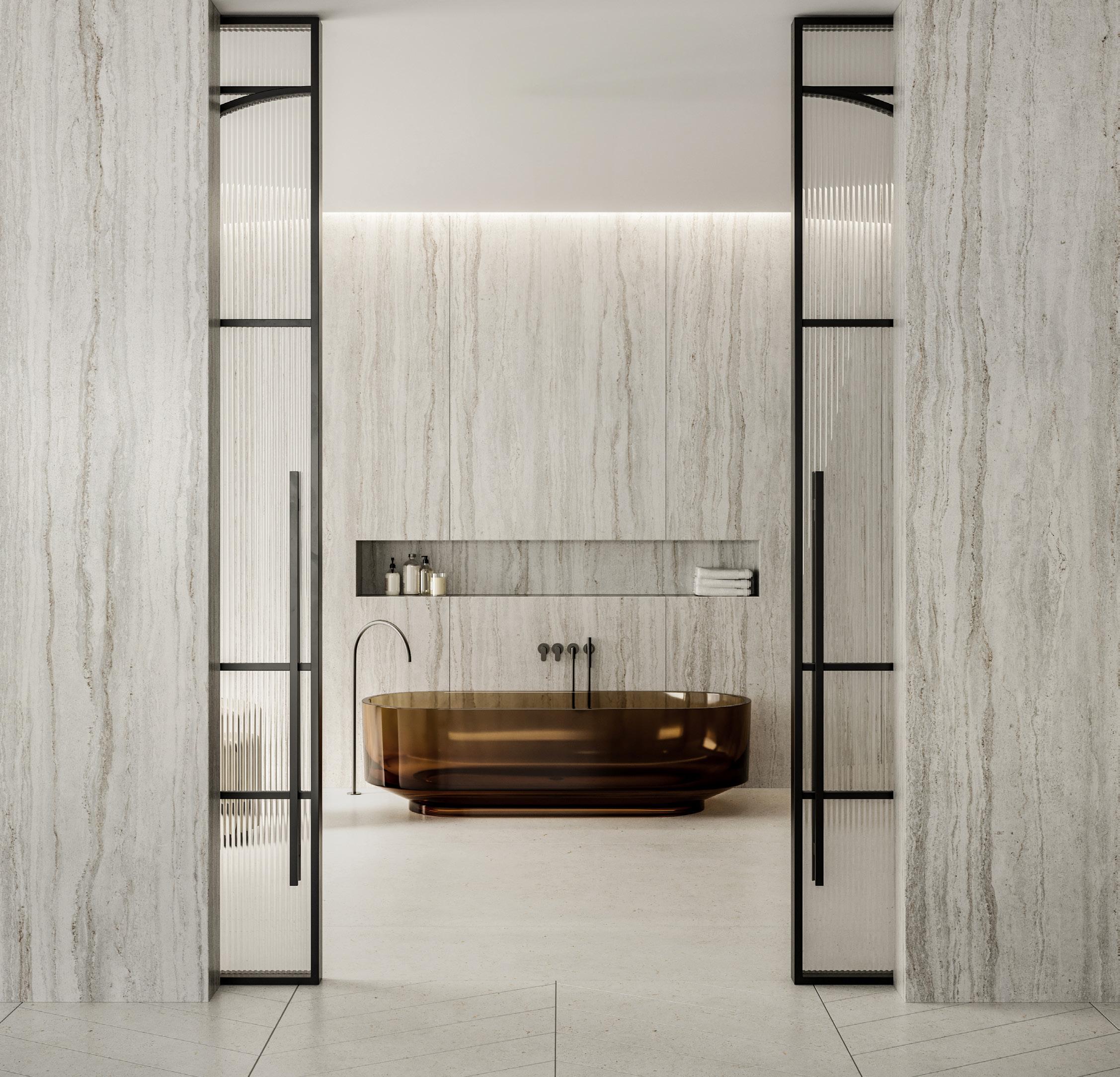
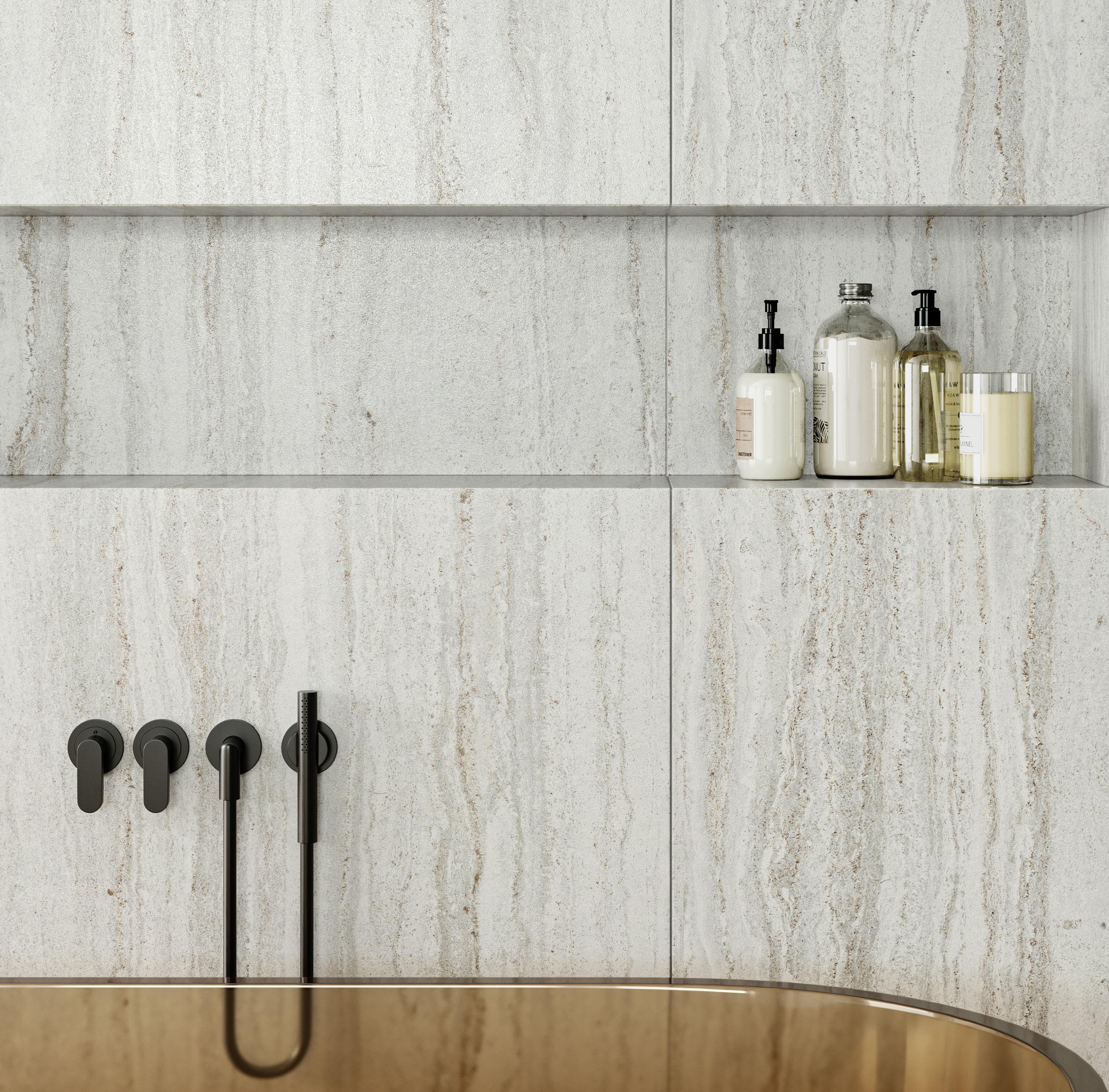
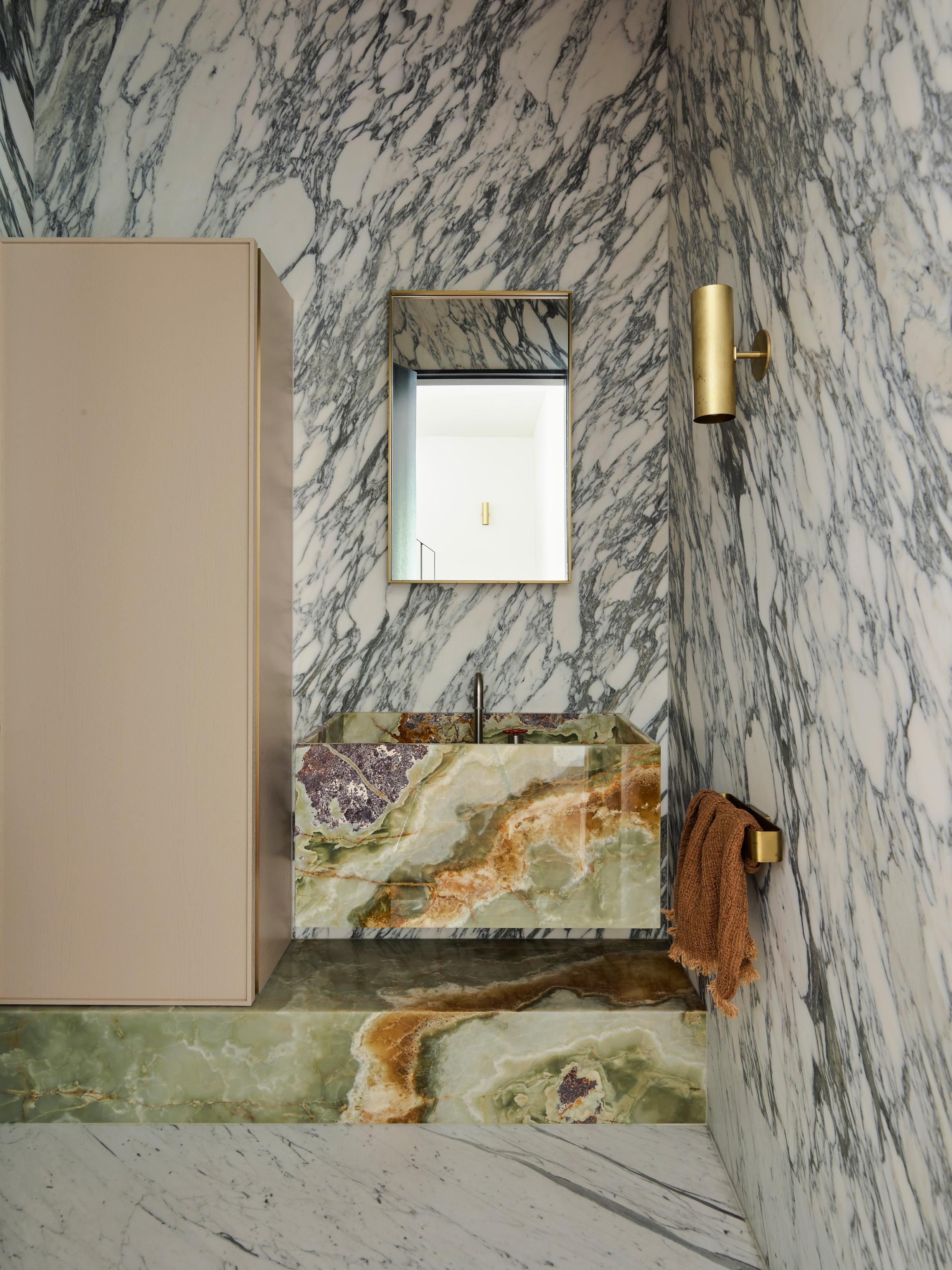
BATHROOM BLUEPRINT
From the cocooning to the dramatic, these 10 bathrooms turn the everyday into ritualistic spaces of respite.
Proudly supported by
YSG STUDIO
PROJECT Mo Jacobson LOCATION Wurundjeri Woi Wurrung Country / Melbourne,
Australia DESIGN YSG Studio PHOTOGRAPHY Anson Smart
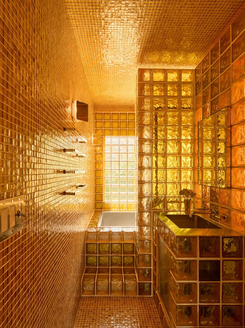
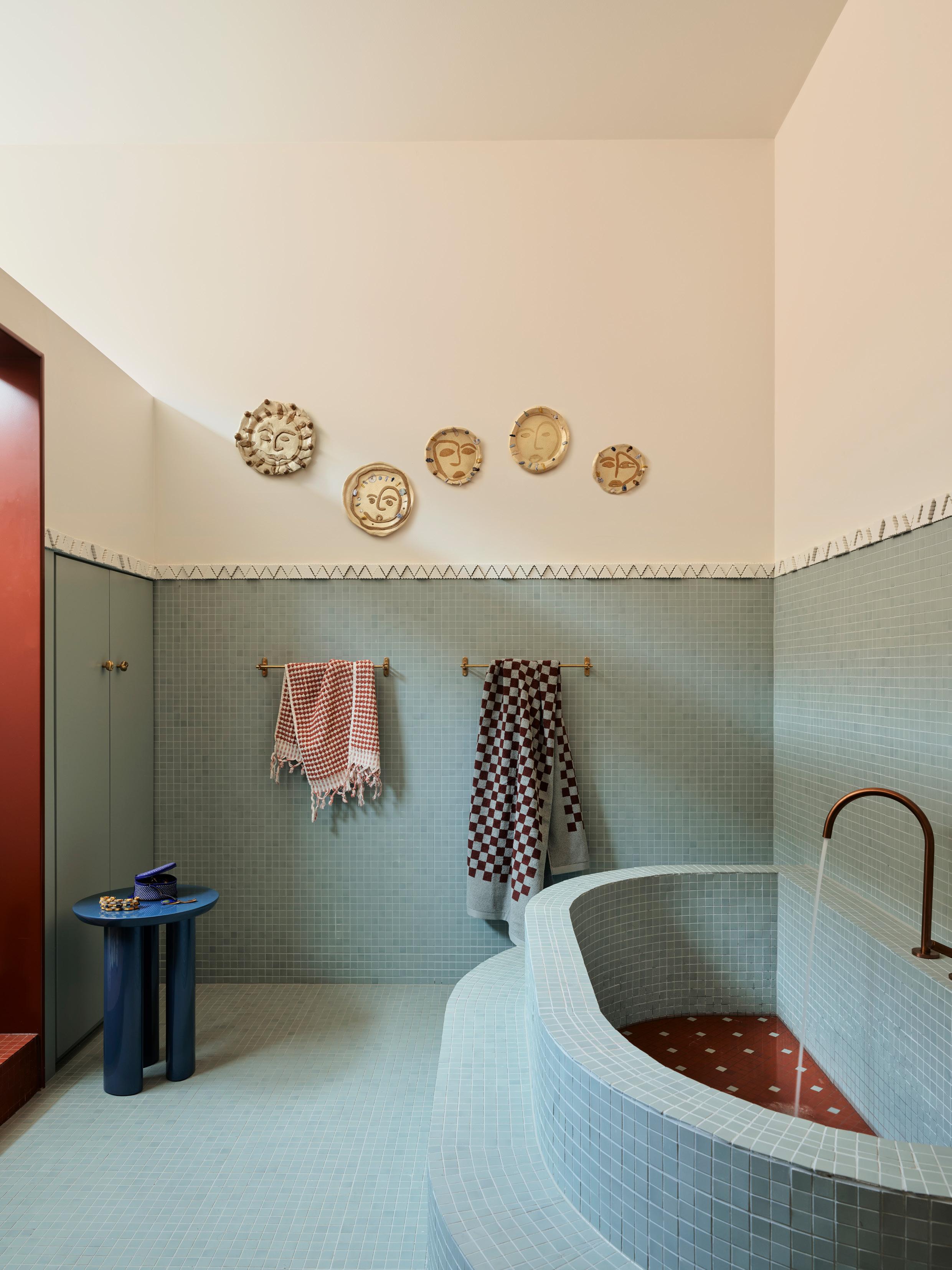
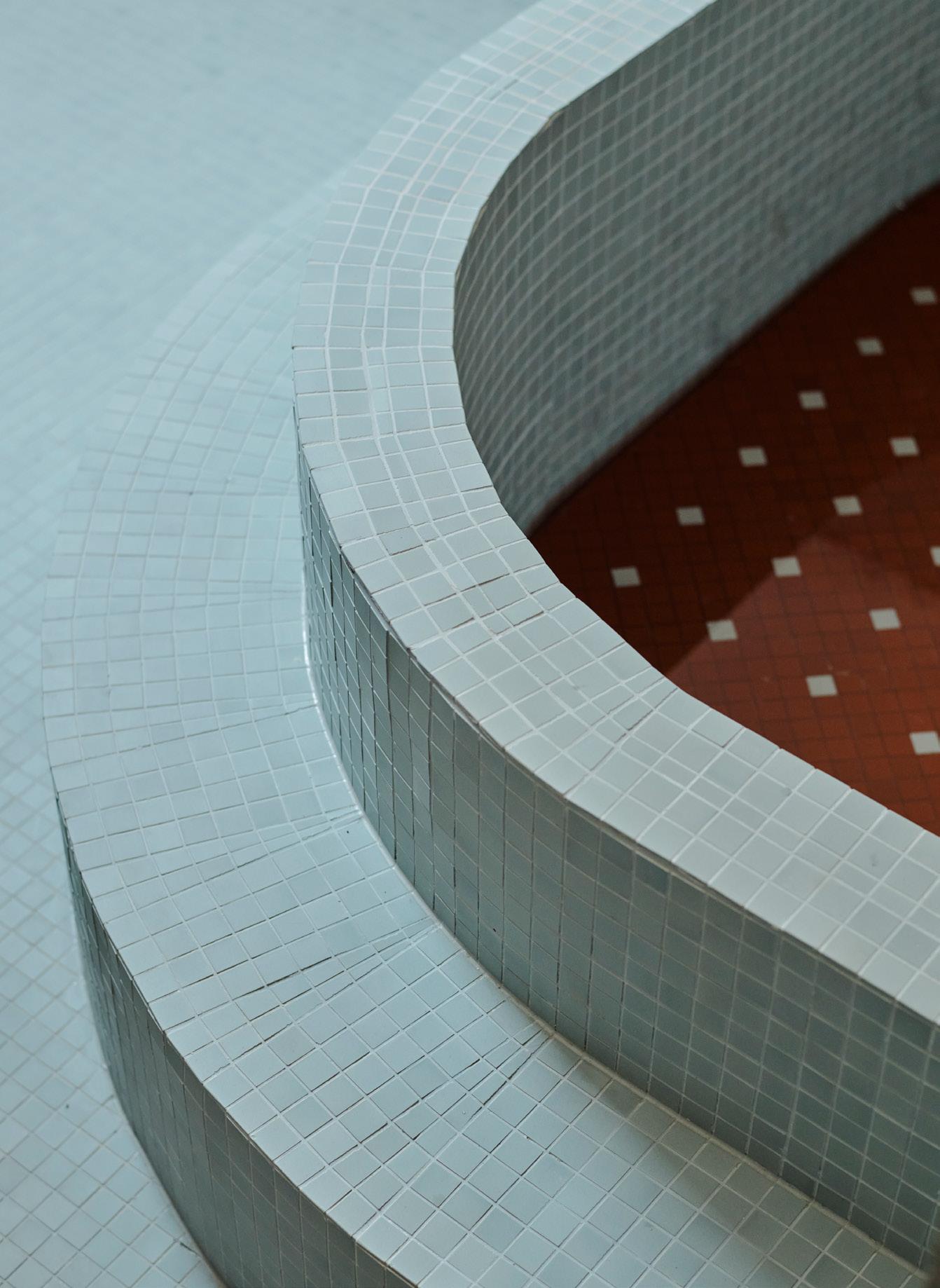
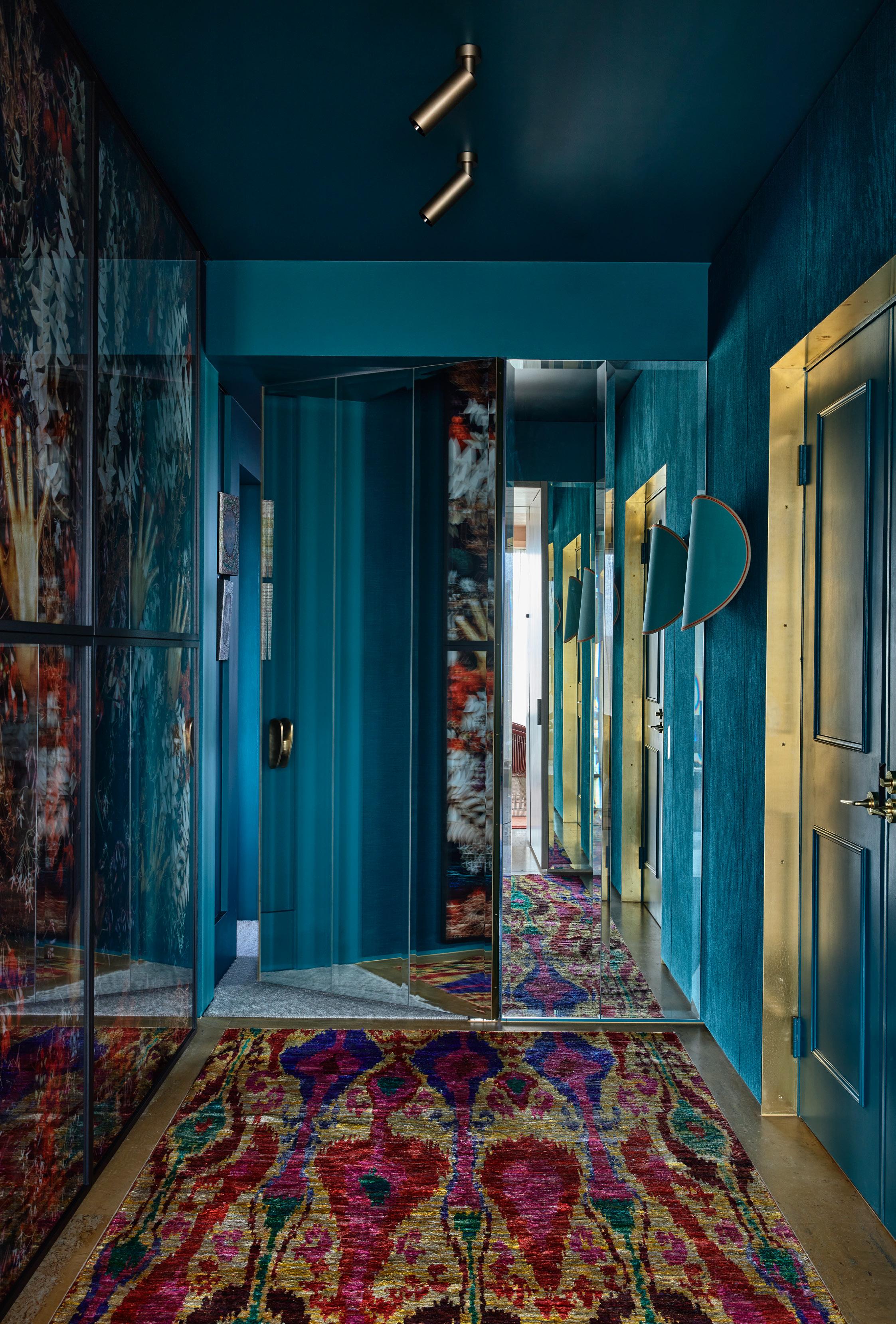
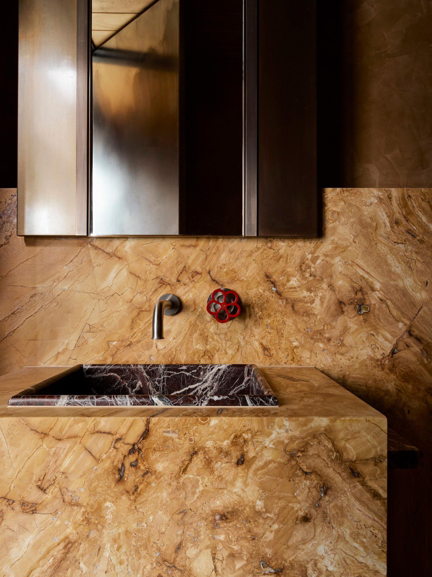
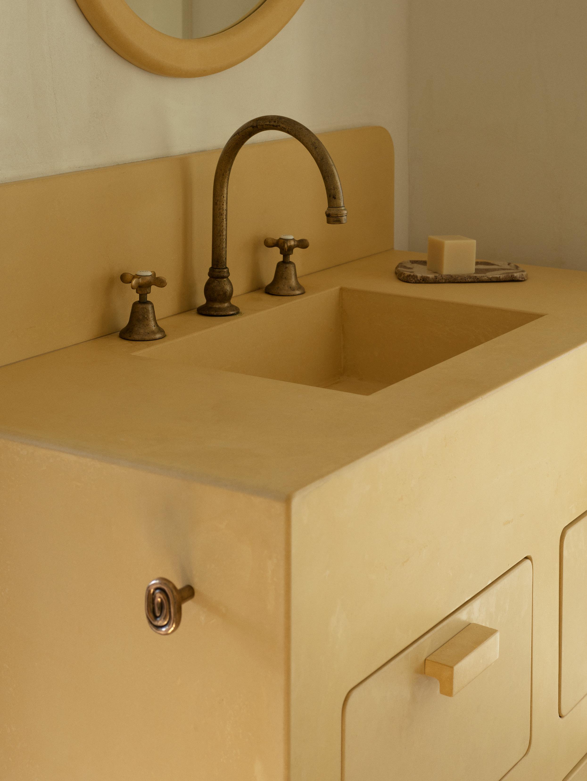
In this inner-city Melbourne renovation by YSG Studio, Egyptian and Danish design sensibilities are fused together. The effect is an electrifying marriage of pattern and calm minimalism. The main bathroom features a custom curved and raised hammam-style bath with integrated seating, tiled in rich mosaics. "The bath’s sculpted steps and curved perch create a space for slow, intentional bathing," YSG Studio director Yasmine Ghoniem explains. Above runs a datum line of graphical 3D Inax Triangle tiles, appearing like a feathery art installation. The palette of terracotta and lapis blue tiles balances vibrant warmth with cool tones in a bold and colourful execution. A modular vanity, which corresponds to the Rosso Verona marble basin visible from the hallway, adds a shimmery rhythm. The space feels both functional and luxurious, with concealed elements such as a shower wall that adds privacy and enhances a sense of flow.
In the adjacent powder room, continuity is achieved through the use of blue tiles with burgundy mosaic accents. Both bathroom spaces feature the same design language, colour palettes and bronze fixtures as a unifying gesture. Together, these elements instigate an interplay of texture, colour and form – all with an unmistakable mischievous touch.
"THE BATH’S SCULPTED STEPS AND CURVED PERCH CREATE A SPACE FOR SLOW, INTENTIONAL BATHING.”
– Yasmine Ghoniem
An interplay of light blue and terracotta tiling washes the main bathroom, with Inventory Inax Triangle TNG-1 tiles creating an artistic datum. Mi & Gei brass knobs and towel rails ground the space alongside the bronze Astra Walker tapware. An electric blue Tung side table by John Astbury for &Tradition is also featured in the corner of the space.
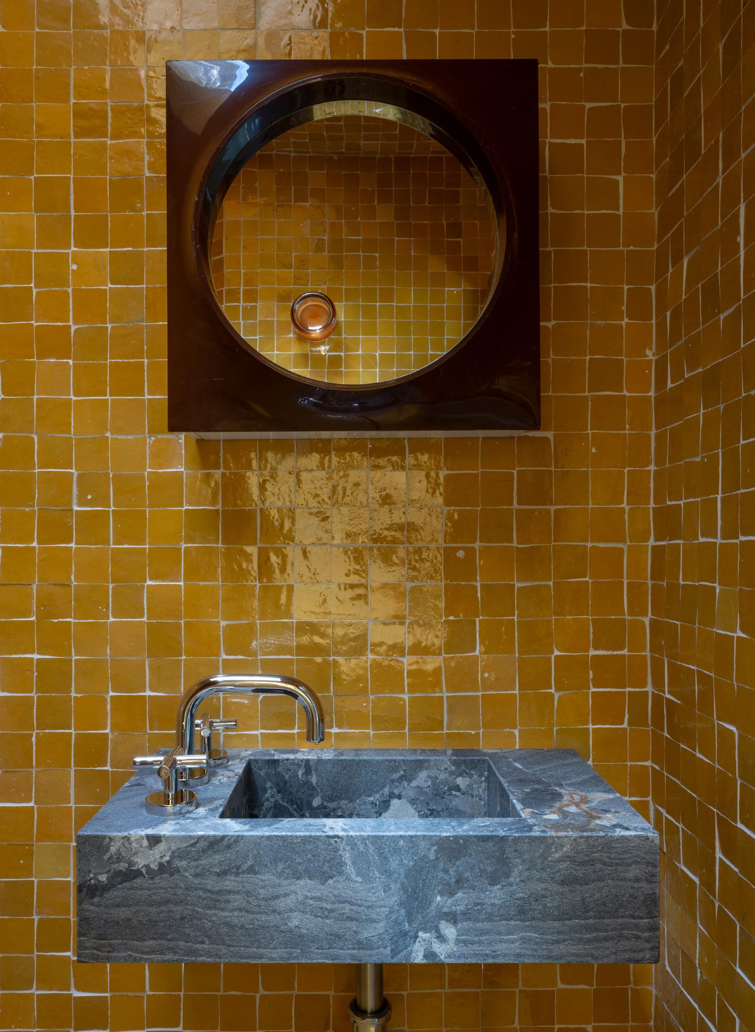
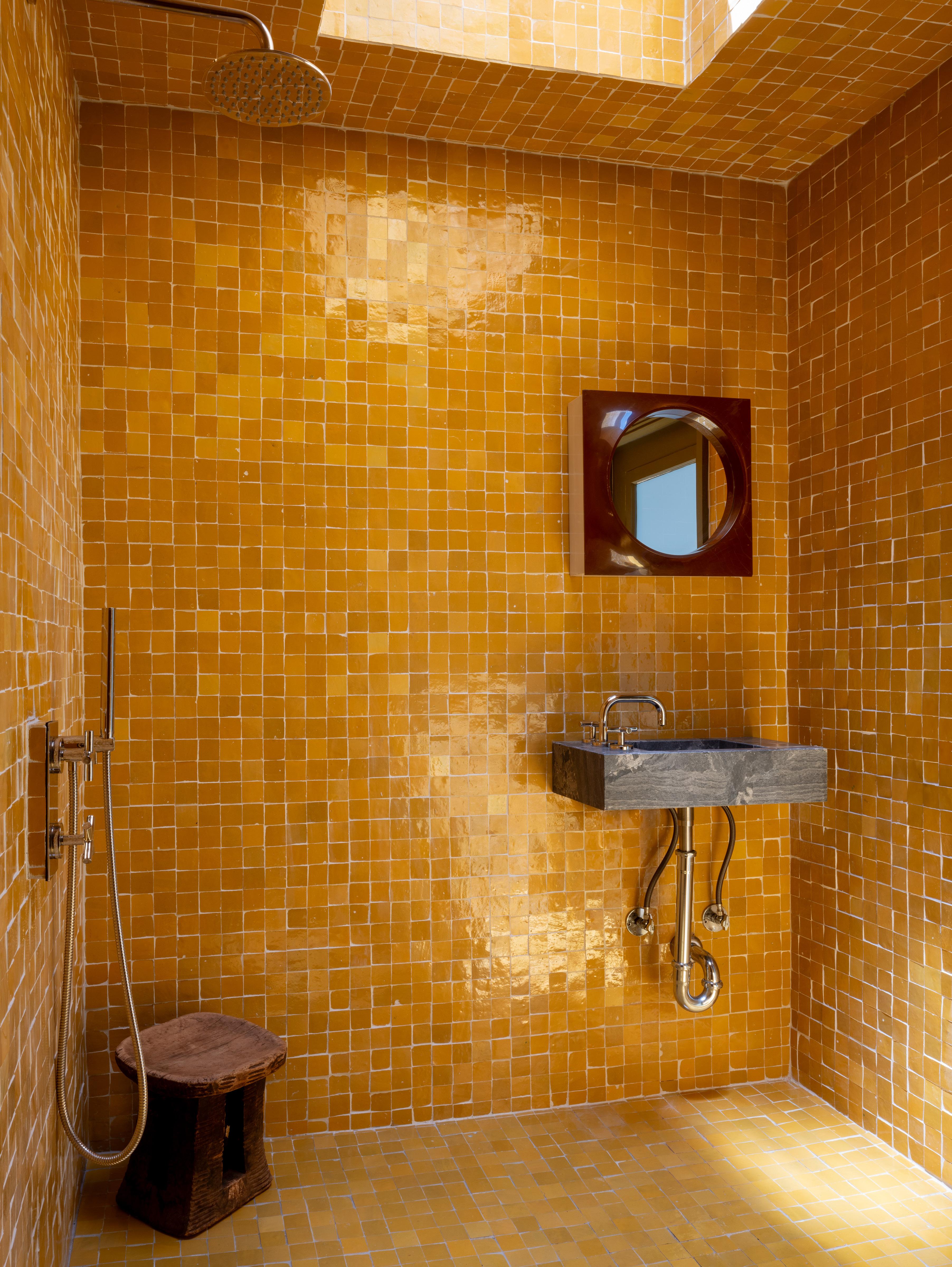
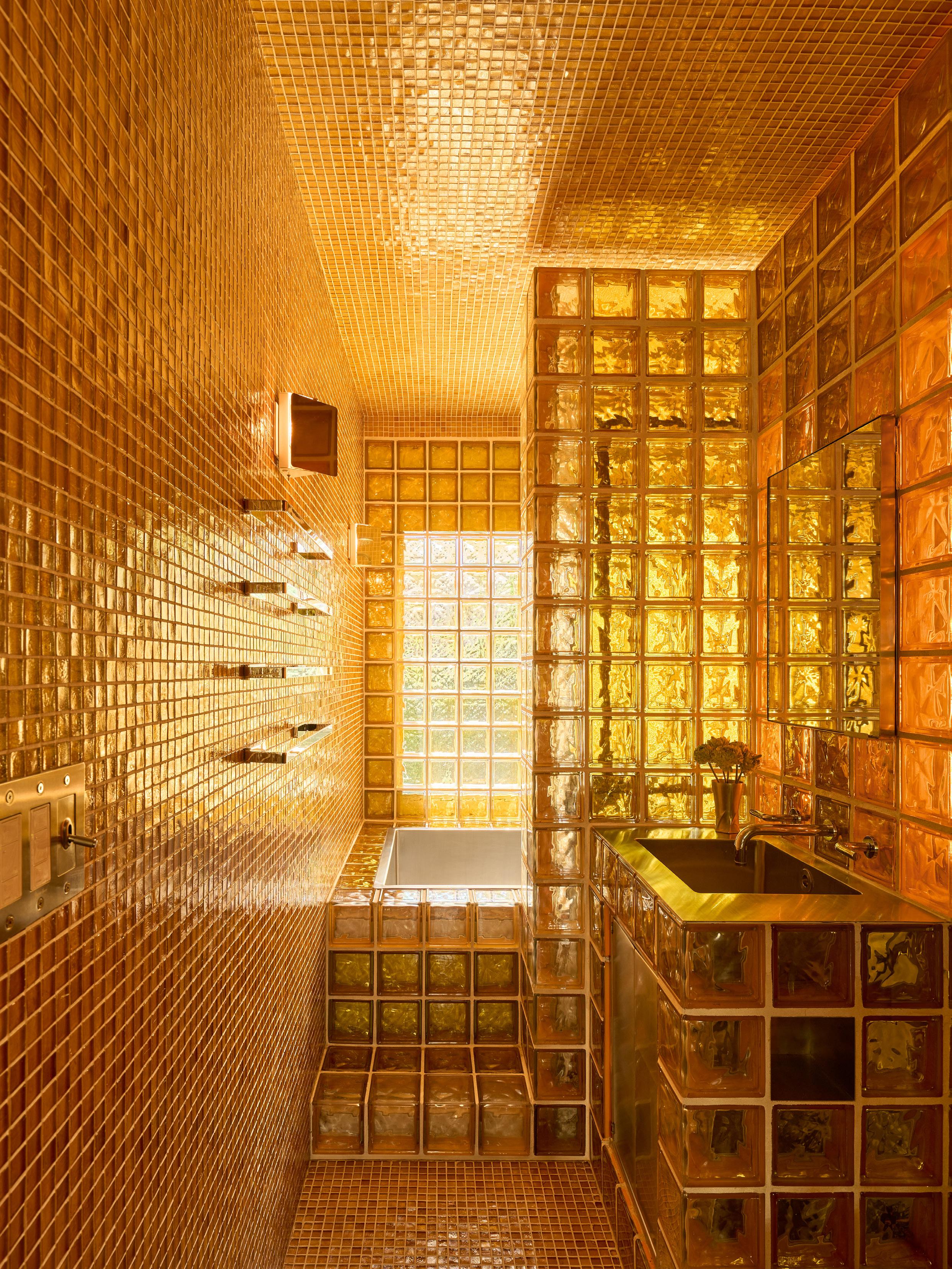
Drawing reference to the immersive saturation of work by Mexican architect Luis Barragán, Park Lane by Ome Dezin administers a jolt of brightness with this sunflower shower room.
“To be surrounded by one bold colour is immersive and transports you,” Ome Dezin co-founder Joelle Kutner says. The vivid cadmium Zeillige tiles line the space from floor to ceiling, wrapping up into the lightwell to completely submerge the space. A dark-stained timber mirror and poppy seed blue stone basin combine for a retro modern flavour. This bathroom is a joyful embrace.
“TO BE SURROUNDED BY ONE BOLD COLOUR IS IMMERSIVE AND TRANSPORTS YOU.”
– Joelle Kutner
The CADMIUM square Zeillige tiles from Zia Tile, paired with browns and blues, remind the designers of a sunflower field. The basin mixer, shower mixer and shower head are Phylrich, with a vintage 1970s Hammarplast Quadrat mirror cabinet featured above the basin.
OME DEZIN
PROJECT Park Lane LOCATION Los Angeles, North America DESIGN Ome
Dezin PHOTOGRAPHY Austin Leis
POCO DESIGNS
PROJECT Bellevue Hill LOCATION Gadigal Country / Sydney, Australia DESIGN
Poco Designs PHOTOGRAPHY Anson Smart
While only a petite-sized powder room—Poco Designs founder Poppy Tzaneros, has colour blocked swathes of statement marble and a buttery Marmorino plaster finish to create an immersive space. “The Blue Dreams marble was the key component of the design and set the tone and palette for the remaining elements,” Tzaneros says on the material selection.
Marble encases the floor, running up the walls to the same height of the vanity to create a distinct datum line. The sink appears as if etched out of angular blocks. Each of these design moves add a sense of space and depth. “The room is quite small and although I wanted it to feel moody, I wanted to ensure I didn’t close the space in. By wrapping the key materials in the room onto the floor and ceiling and having a large mirror, it allows the space to feel big and spacious.
“BY WRAPPING THE KEY MATERIALS IN THE ROOM ONTO THE FLOOR AND CEILING AND HAVING A LARGE MIRROR, IT ALLOWS THE SPACE TO FEEL AS BIG AND SPACIOUS.”
– Poppy Tzaneros
Colour and materiality define this powder room, a small but mighty space drenched in just two key materials: Blue Dreams marble from Euro Marble and a buttery plaster finish of Marmorino. The space also features the Halo collection from Brodware and the Allied Maker Bridge 3 wall sconce.
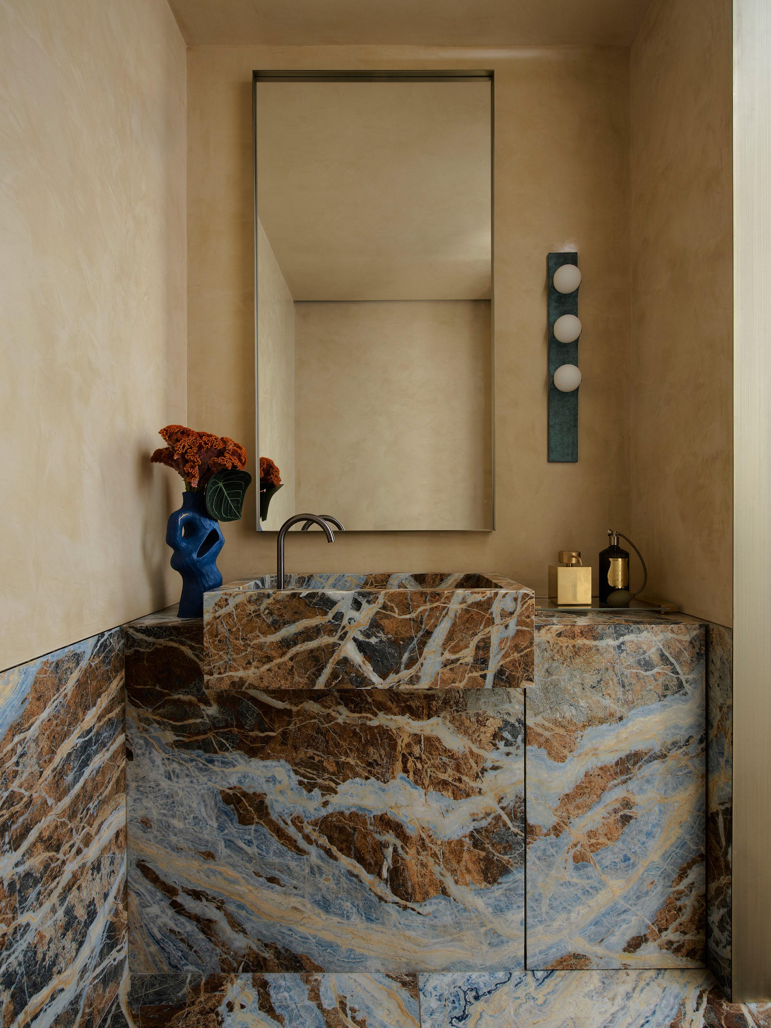
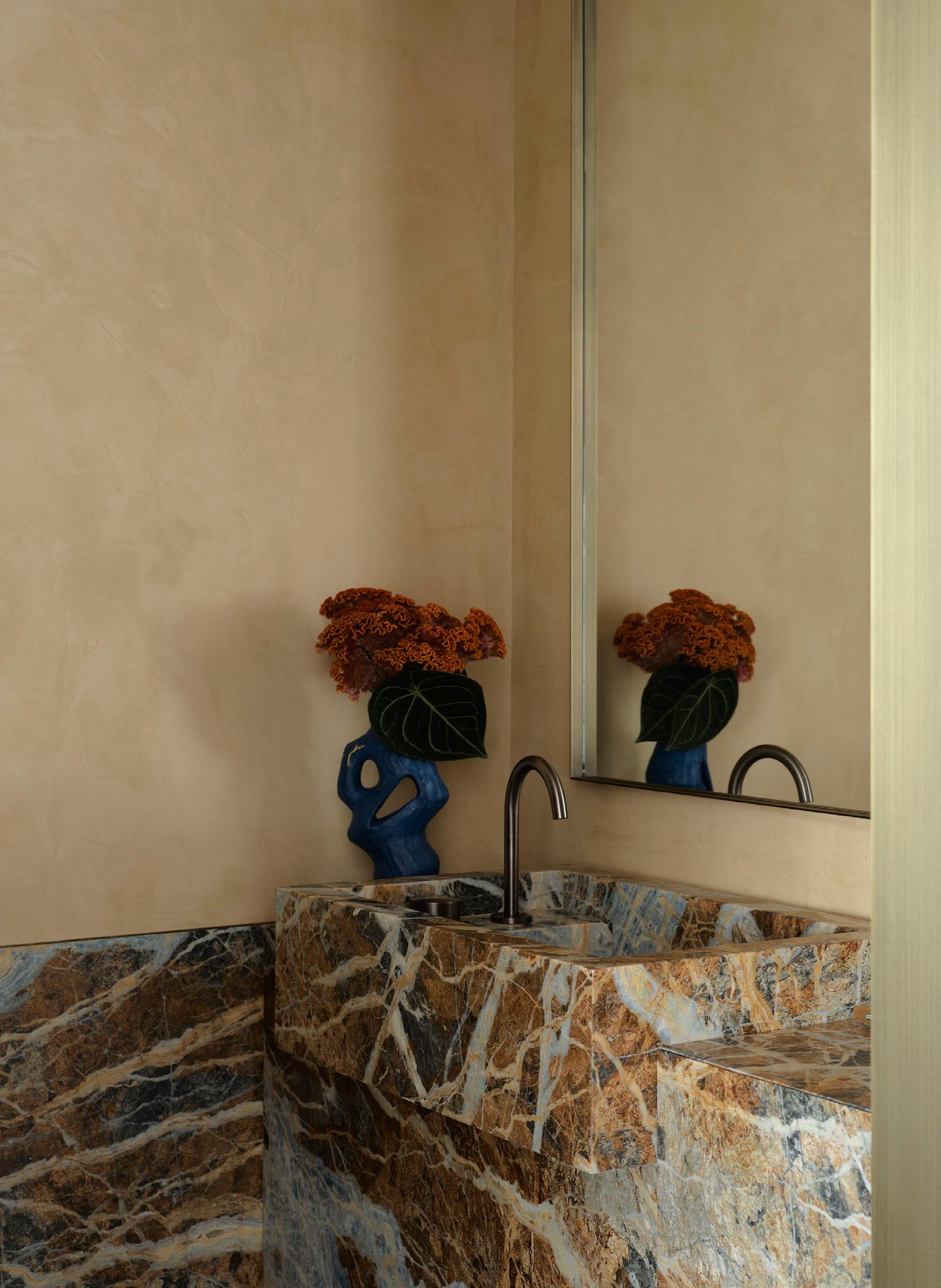
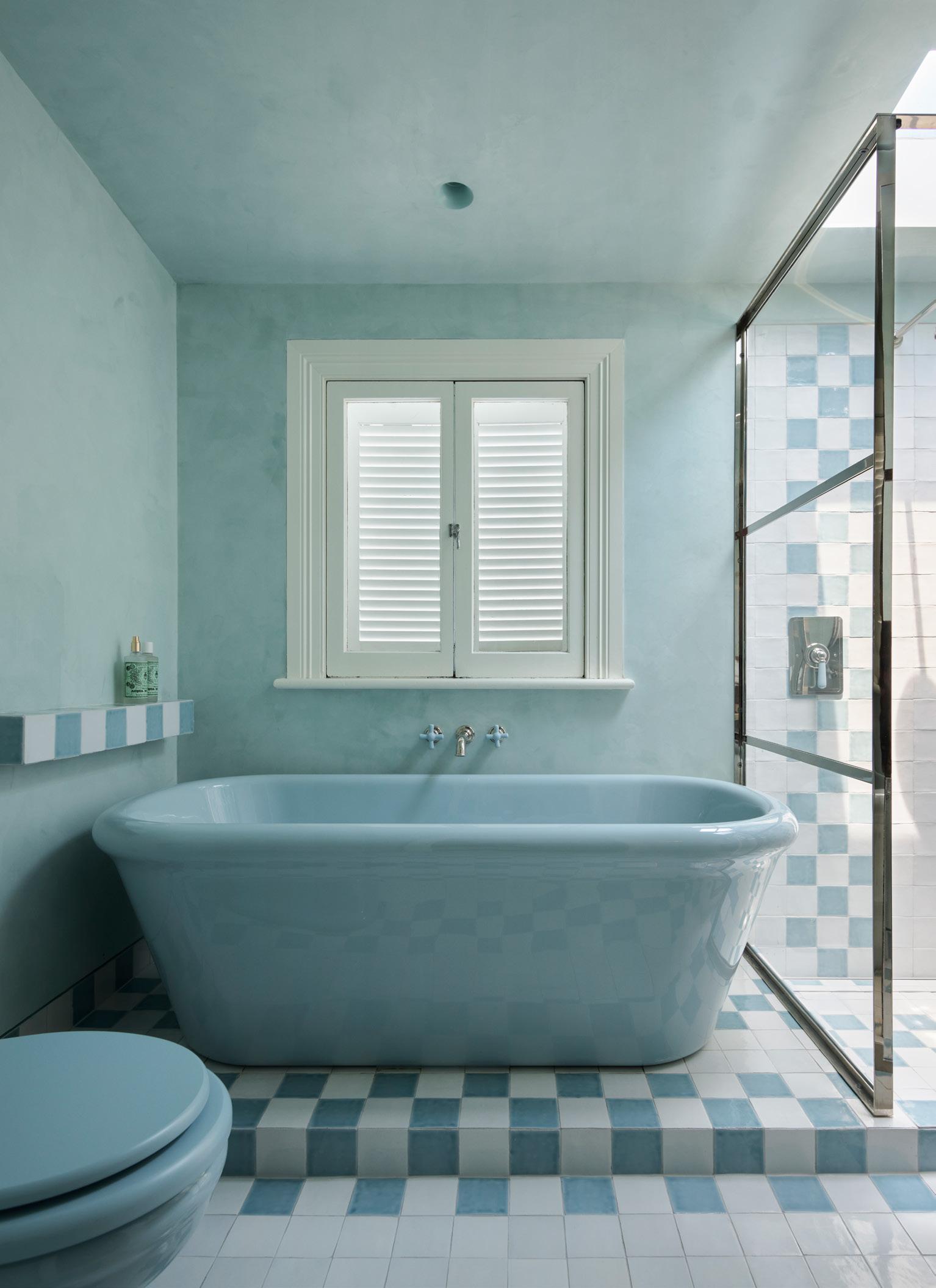
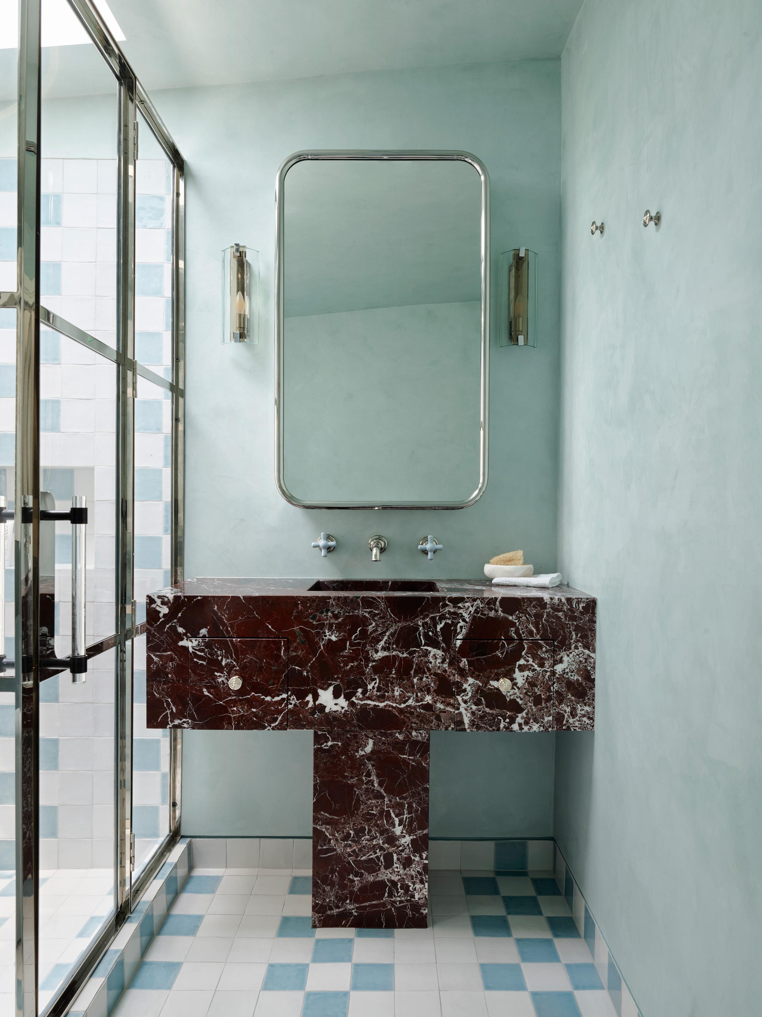
Exuding a modern vintage sensibility, the bathroom at Paddington by Tamsin Johnson is feminine and adventurous. Embracing the heritage of the Victorian terrace home, the space features a large free-standing bathtub by The Water Monopoly, set on a checker-board tiled platform. The colour combination of baby blue, white, silver and daring burgundy Rosso Levante marble meld with playful softness.
Sky blue limewash render wraps the space, tying everything together. Counteracting the exaggerated, curvaceous forms of the bath and tapware, a solid, linear vanity steals the show. Johnson describes the contrast of the basin as “giving the bathroom its ‘moment’.” Window shutters, vintage Murano glass wall lights and a custom nickel-framed mirror contribute to the overall sense of antique luxe—a signature of Tamsin Johnson’s eponymous studio.
“COUNTERACTING THE EXAGGERATED, CURVACEOUS FORMS OF THE BATH AND TAPWARE, A SOLID, LINEAR VANITY STEALS THE SHOW.”
– Tamsin Johnson
Working with a client unafraid to push the boundaries, the bathroom at Paddington is modern while maintaining a vintage vibe, accentuated by The Water Monopoly Rockwell powder blue bath, wall-mounted bath mixer, wall-mounted basin mixer, and toilet, as well as the Joseph Giles COLLETT ZARZYCKI solid brass and glass door pull handle.
TAMSIN JOHNSON
PROJECT Paddington LOCATION Gadigal Country / Sydney, Australia DESIGN
Johnson PHOTOGRAPHY Anson Smart
Tamsin
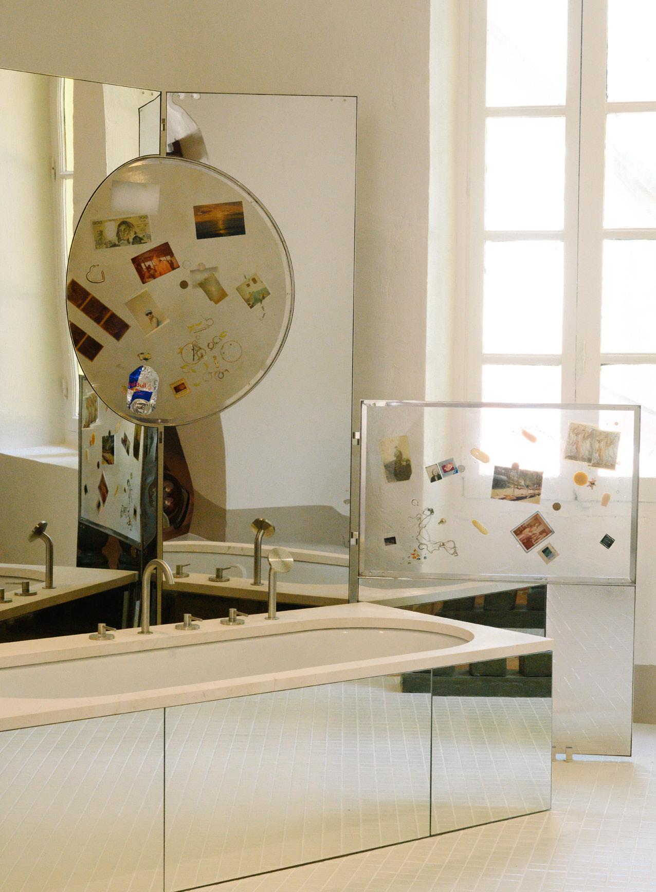
MARION MAILAENDER
PROJECT
Mailaender PHOTOGRAPHY Olivier Amsellem
In Marion Mailaender's installation, Residence Vue Mer, the bathroom emerges as a lesson in light-hearted fun. Inspired by elegant Mediterranean interiors of the 1970s, Mailaender blends surrealism and nostalgia to create a bathing space that is experimental and evocative.
Set on a raised and tiled platform, the space is separated by sculptural banisters. Mirrors of all shapes and sizes—organic, rectangular and encasing the bathtub—reflect the volume of the space back on itself. An oversized pink basin and soap banister blur the line between form and function. This whimsical approach invites visitors to reconsider the relationship between space and material, echoing the ideals of set designer Andrée Putman, who championed the beauty of ordinary materials within structured designs.
Although Residence Vue Mer is only an installation, it offers a prototype for adventurous design thinking. “The space prioritises suggestive shapes and shadows over tangible objects,” Mailaender says, adding, “It encourages a new perspective on domestic spaces, celebrating both the raw and refined aspects of design.”
Residence Vue Mer gives a visual interplay for collective coastal living, inspiring future iterations of personal and communal bathing experiences.
“IT ENCOURAGES A NEW PERSPECTIVE ON DOMESTIC SPACES, CELEBRATING BOTH THE RAW AND REFINED ASPECTS OF DESIGN.”
– Marion Mailaender
The bathing space is positioned on a platform, open and connected to the bedroom. Marion Mailaender’s installation is a unconventional example of how to push design boundaries. Mirrors of all shapes and sizes bring a level of depth to the space.
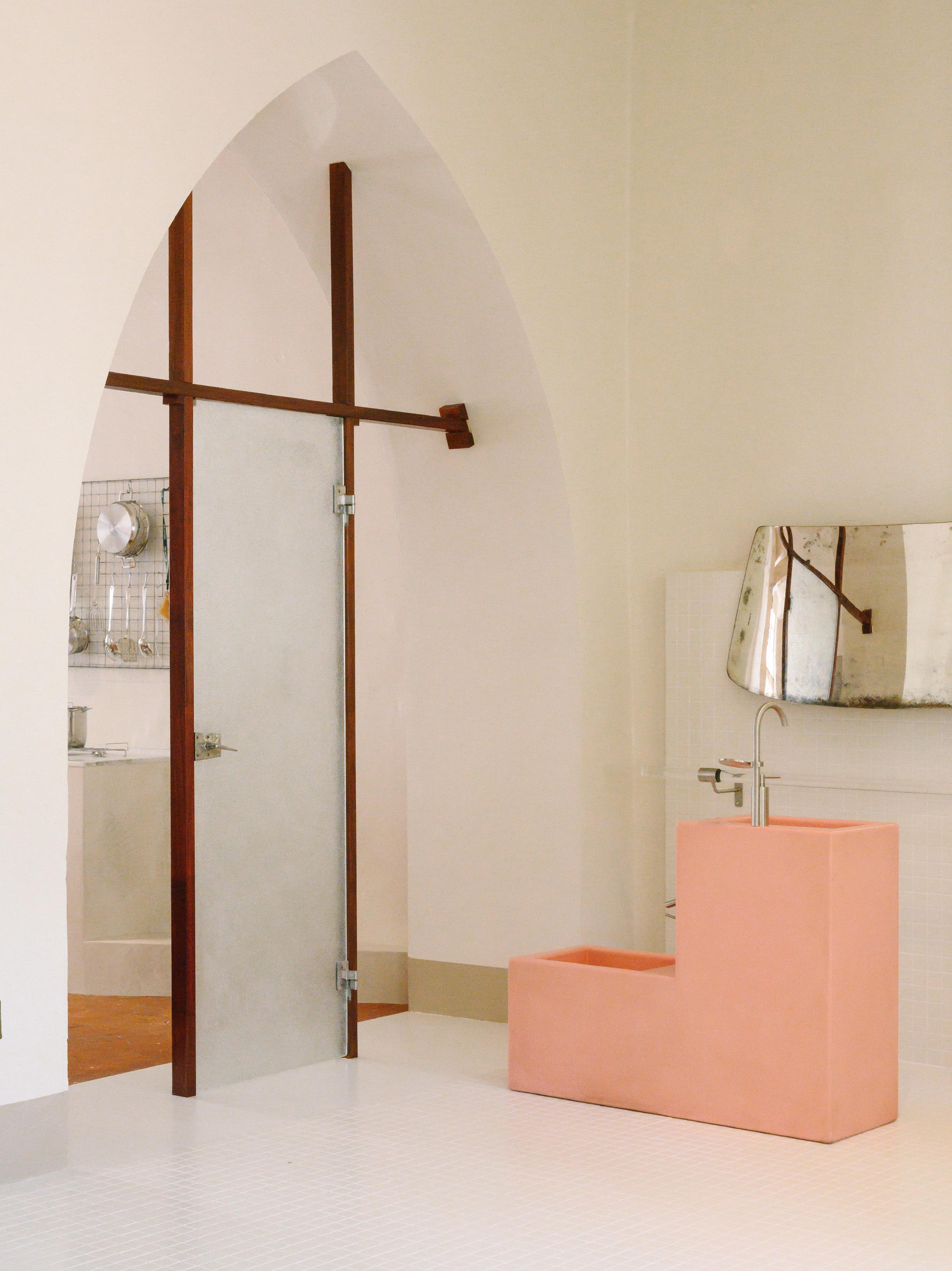
There are many features of this bathroom that make it one-of-a-kind, such as the fact it’s within a grand Georgian manor house in Ireland with yawning proportions. To honour the largess of the original shell, designer Róisín Lafferty has zoned the bathroom into a series of demarcated spaces, with the shower in the centre of the room. A walled structure on one side instils a physical separation from the bedroom, while discreetly concealing the WC. Flowing from the shower, monolithic basins flank either side of a door that leads to a bathing room. In here, a free-standing bathtub makes for a private realm of retreat.
“There is a majesty to the structure, and we wanted to celebrate the suite's spaciousness and sense of indulgence by designing the bathroom layout to further elevate the building’s beauty,” Lafferty says on the orchestration of the spaces.
Of particular note are the carved basin sinks, forged from silver travertine. While modern, they add a sense of age and weight within the history of the walls. A splotchy green and grey Waterlilies marble is inset across the wet areas. “We selected it because of its haziness, almost painterly patination and beautiful inconsistencies,” Lafferty adds.
“THERE IS A MAJESTY TO THE STRUCTURE, AND WE WANTED TO CELEBRATE THE SUITES SPACIOUSNESS AND SENSE OF INDULGENCE.”
– Róisín Lafferty
A chunky silver travertine basin sits atop a silver metal frame, with organic mirrors above. The Waterlilies marble brings a painterly quality to the shower zone.
RÓISÍN LAFFERTY
PROJECT The Estate LOCATION Wicklow, Ireland DESIGN Róisín Lafferty
PHOTOGRAPHY Barbara Corsico
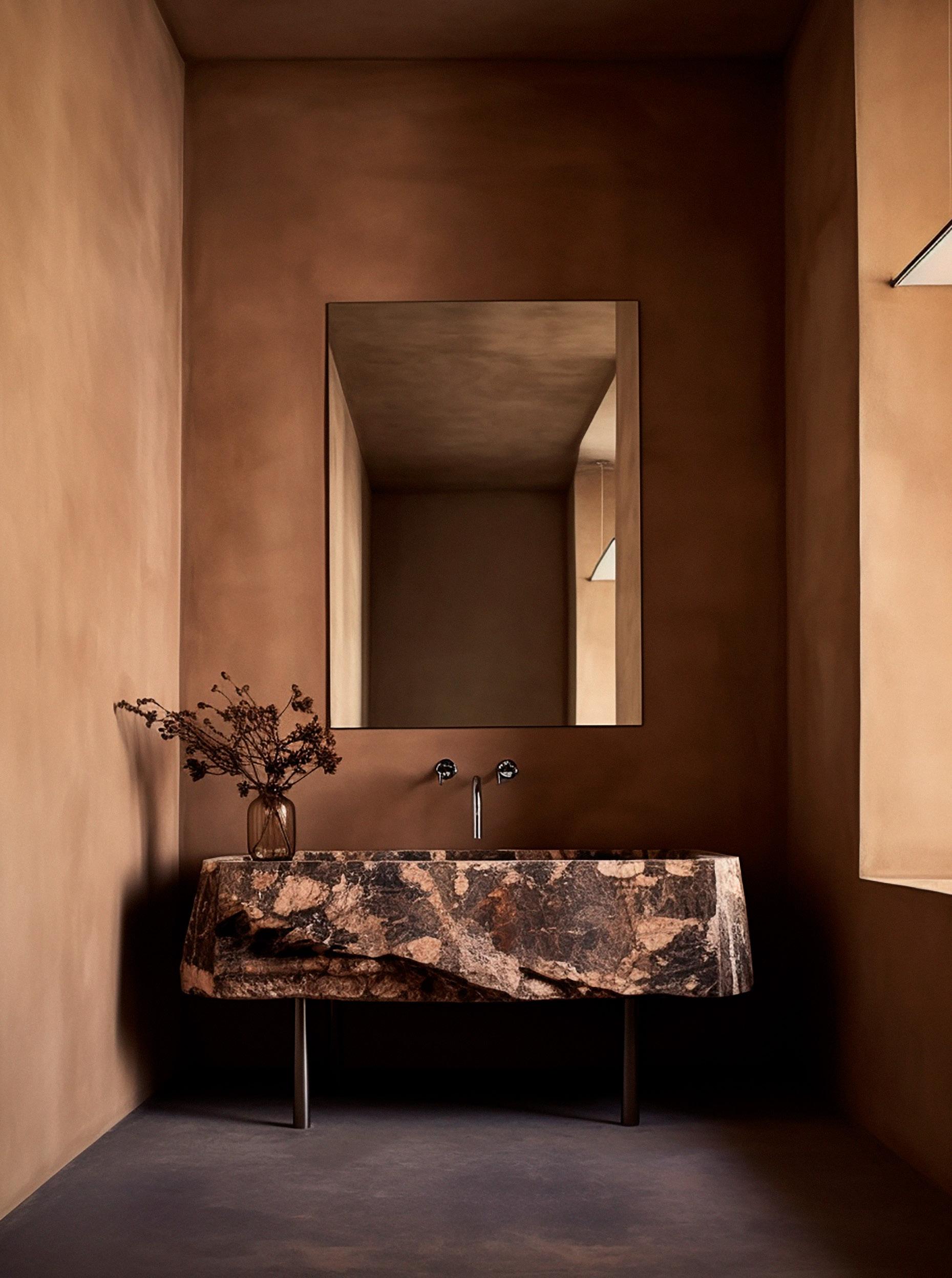
MIM DESIGN
PROJECT Darling House LOCATION Gadigal Country / Sydney, Australia
DESIGN Mim Design PHOTOGRAPHY Timothy Kaye
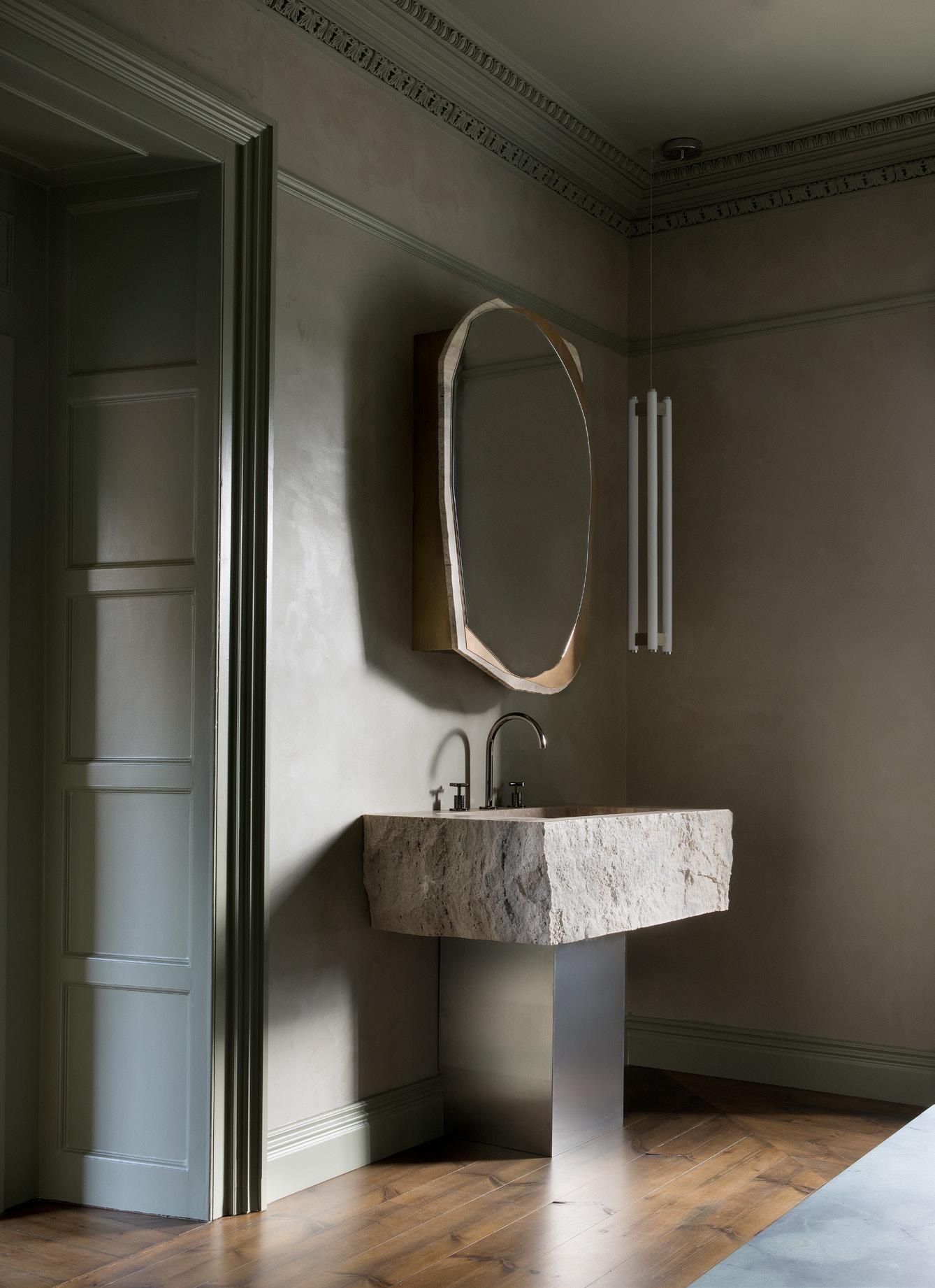
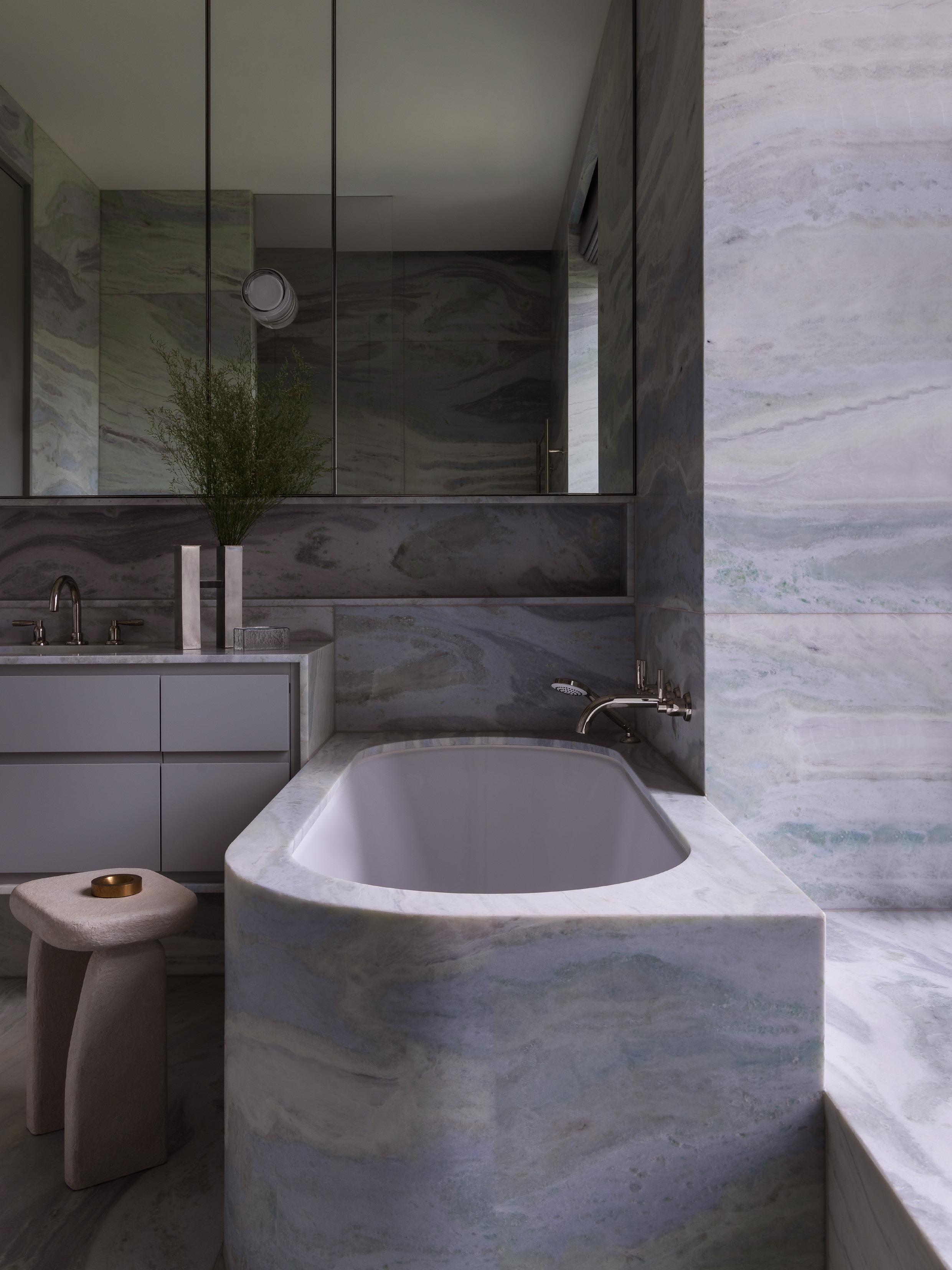
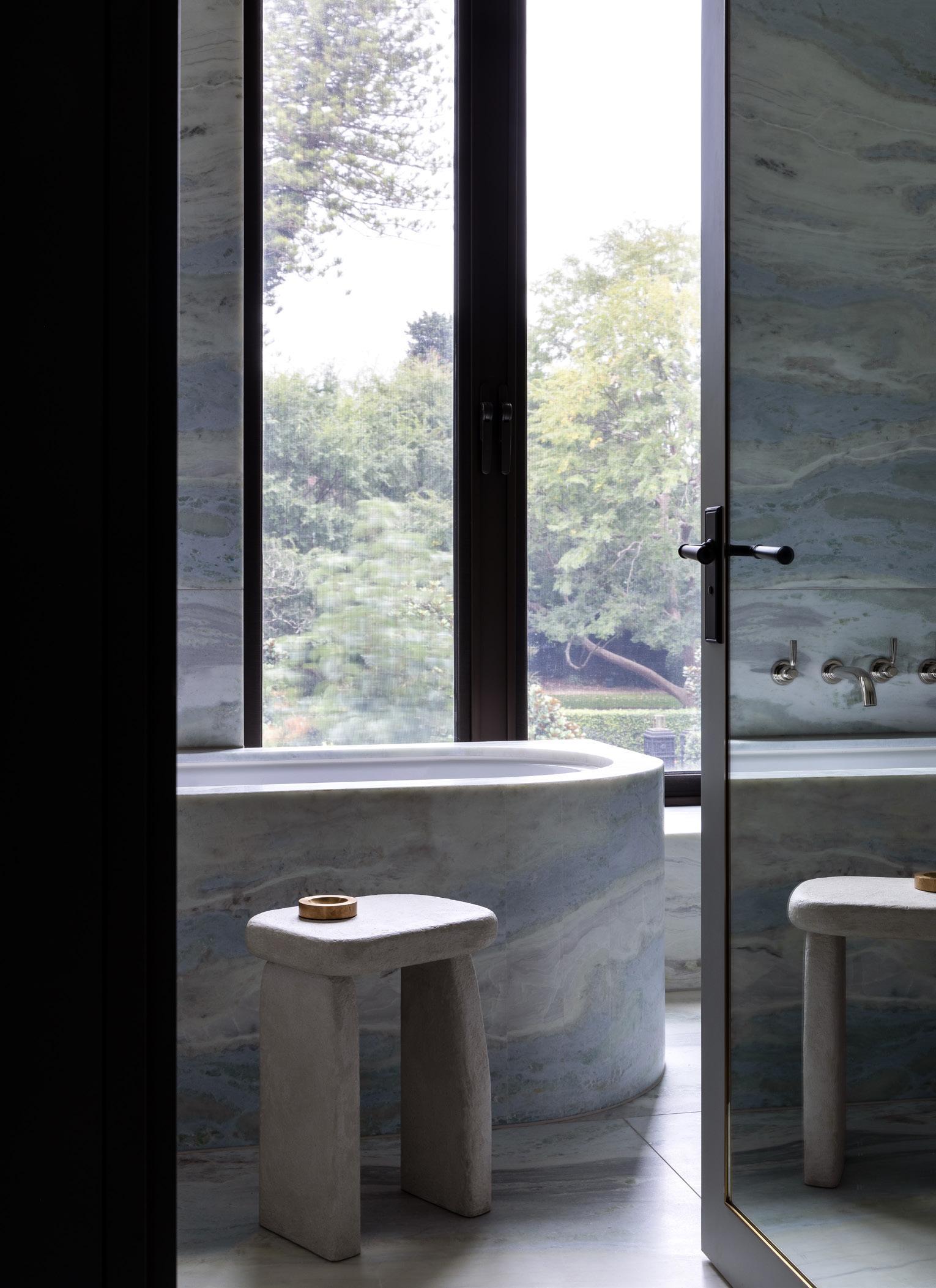
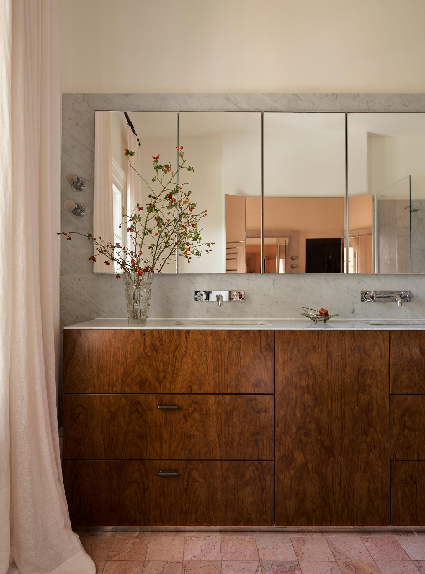
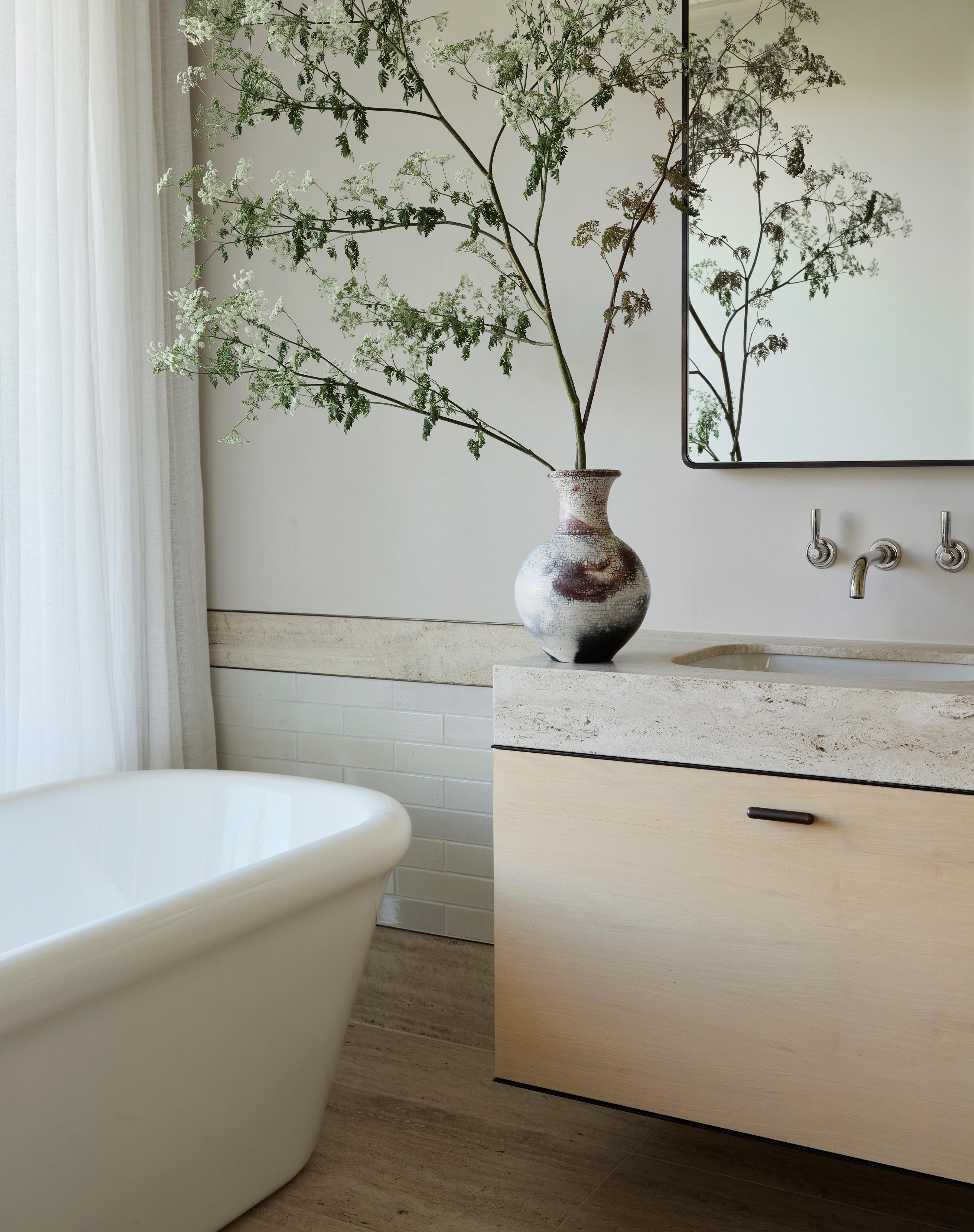
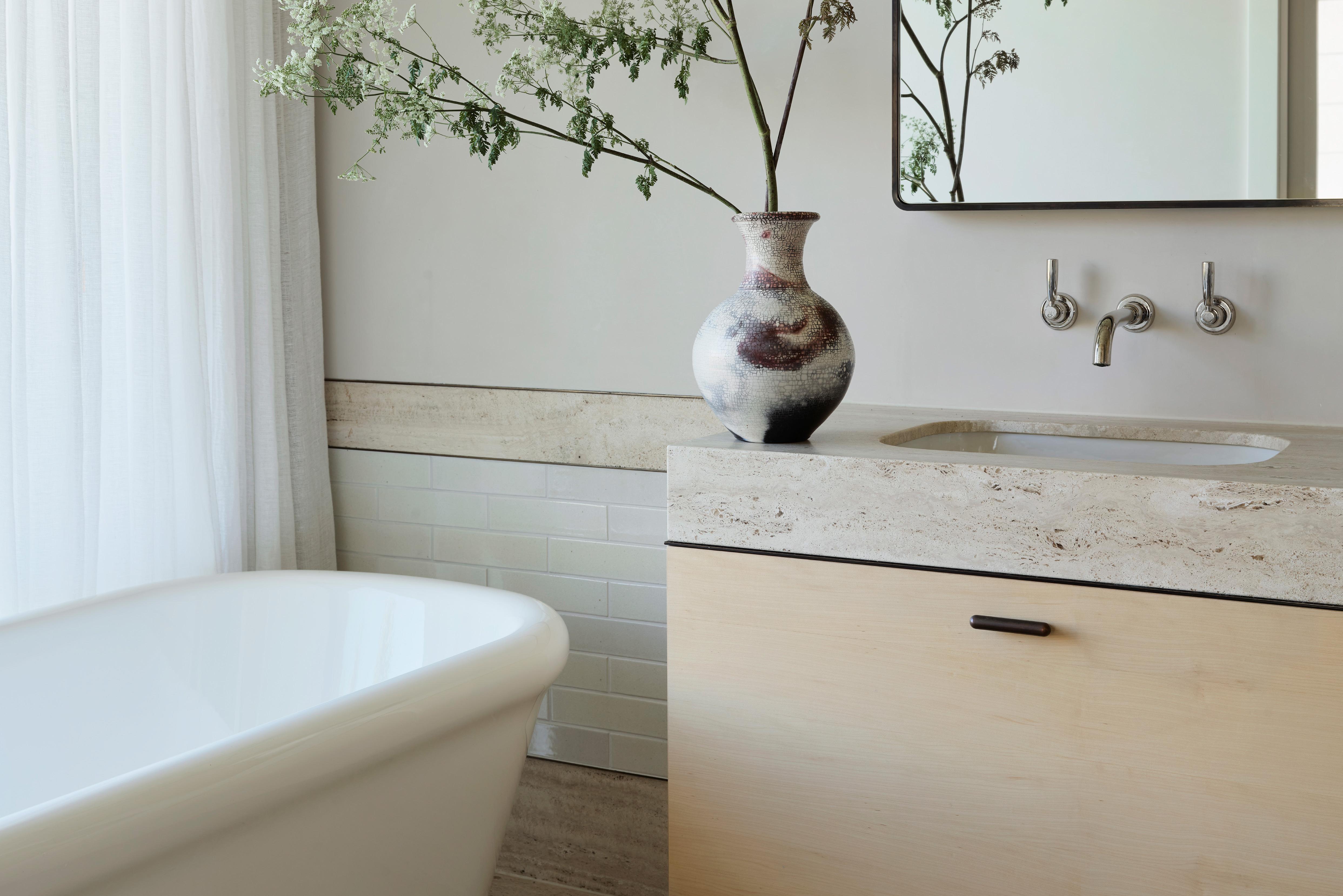
Working within the confines of an unusual ensuite, this bathroom at Darling House by Mim Design uses the proportions of the space right down to the millimetre. “Creating deep window reveals enabled the casement windows to open: this also created a bespoke bath hob detail that has its own form located between the double vanity and curving gently into the shower entry,” Mim Design founder Miriam Fanning explains.
Astute planning ensures effortless functionality, but the aesthetics of the space are characterised by the soft tones of the Barlume marble used throughout. The natural stone has a water-like silkiness, to it, rendered like a watercolour painting with hints of seafoam within the swirls of light greys and blues. Exacting in scale, yet awash with lightness, this is a space to start and end the day.
“ASTUTE PLANNING ENSURES EFFORTLESS FUNCTIONALITY, BUT THE AESTHETICS OF THE SPACE ARE CHARACTERISED BY THE SOFT TONES OF THE BARLUME MARBLE USED THROUGHOUT.”
– Mim Fanning
The unusual forms of the bathtub encasement were dictated by the spatial planning and confines of the small ensuite. The space is clad in Fum Barlume stone, with a Perrin & Rowe Langbourn wallmounted mixer and bath mixer. An RBW Dimple wall sconce is featured on the custom mirror.
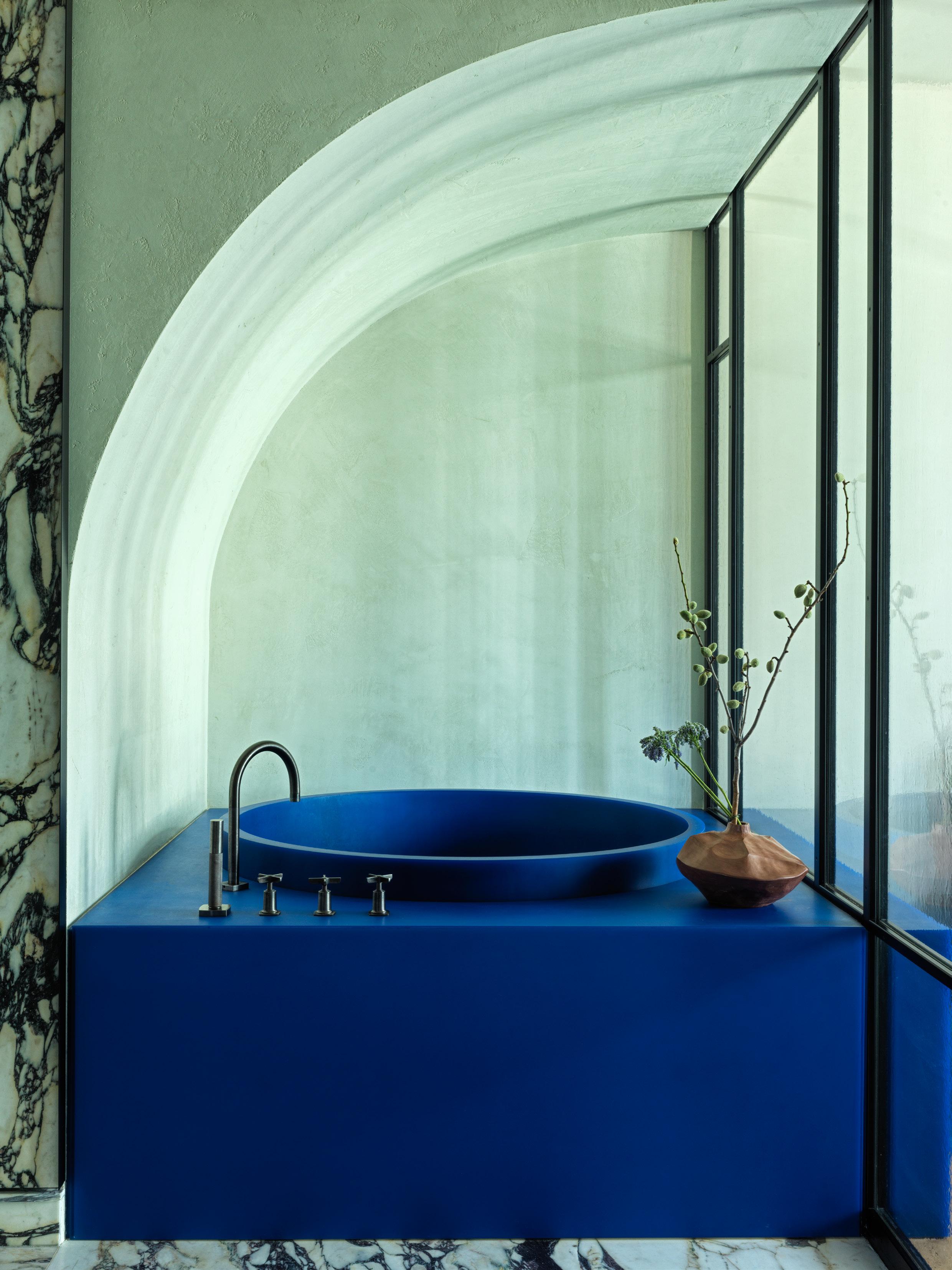
Audacious alchemy and artistic collaborations underpin the design approach of the bathroom in this Tribeca Apartment project by Crina Arghirescu Rogard. Utilising the confines of the space, the response has a hotel-like quality, with a glass partition separating the bedroom from the bathing suite. The partition was created in collaboration with revered Italian designer Henry Timi.
“The owner is colour blind … the brief was ‘the bolder and more vibrant, the better’,” Arghirescu Rogard explains on the process. A plunge-style bathtub in Yves Klein Blue is the centrepiece, made in collaboration with Brooklyn-based designer Quincy Ellis and Facture Studio founder.
Given the client’s colour-blindness, it was imperative that it be made in an exacting shade, as such the team cycled through 10 samples before landing on the perfect one.
To construct a space matched to this client’s needs, adventurous forms ensure the experience is elevated. Hulking stone basins fill the wall, below a wall-to-wall mirror with a hand-eglomised edge. Curves, connection and texture add visual punchiness without the need for colour.
"UTILISING THE CONFINES OF THE SPACE, THE RESPONSE HAS A HOTEL-LIKE QUALITY, WITH A GLASS PARTITION SEPARATING THE BEDROOM FROM THE BATHING SUITE."
– Crina Arghirescu Rogard
A Yves Klein Blue bathtub is an artistic yet practical piece for this homeowner, whose colour-blindness ensured it came out in the perfect hue. The glass partition was designed in collaboration with Italian designer Henry Timi.
CRINA ARGHIRESCU ROGARD
PROJECT Tribeca Apartment LOCATION New York City, North America DESIGN
Crina Arghirescu Rogard PHOTOGRAPHY Chris Mottalini
ARENT&PYKE
PROJECT Sydney Cove House LOCATION Gadigal Country / Sydney, Australia
DESIGN Arent&Pyke PHOTOGRAPHY Anson Smart
At Sydney Cove House, the free-standing bathtub appears to float in the middle of the room. But it’s a sleight of hand by Arent&Pyke, which sees the bath ensconced in angles of rose-tinted mirror, atop a floor of pink-toned marble tiles. What draws the eye, however, are the large French doors that open up to the balcony, coupled with the full height drama of pale pink curtains.
The family home has been entirely reconfigured. “This room was actually the dining room, oddly located one level above the kitchen given the Georgian terrace was built in the late 19th-century. It now resides on the same level as one bedroom, with two others directly above,” Arent & Pyke principal Sarah-Jane Pyke explains.
While the glow of the pink hues undeniably dominates—selected for how they evoke sunsets out the window—the tint is met with the equally warm Bubinga timber to the joinery. “We selected Bubinga timber … given its lovely coppery lustre. It’s a traditional Australian hardwood befitting the era of the home,” Pyke says.
“WE SELECTED BUBINGA TIMBER … GIVEN ITS LOVELY COPPERY LUSTRE. IT’S A TRADITIONAL AUSTRALIAN HARDWOOD BEFITTING THE ERA OF THE HOME.”
– Sarah-Jane Pyke
This family bathroom feels like the embrace of a pink-drenched sunset, including a free-standing bathtub wrapped with a rosetinted mirror. The vanity features Classicon Pailla wall lights by Eileen Gray and Studio Henry Wilson PSL bronze handles.
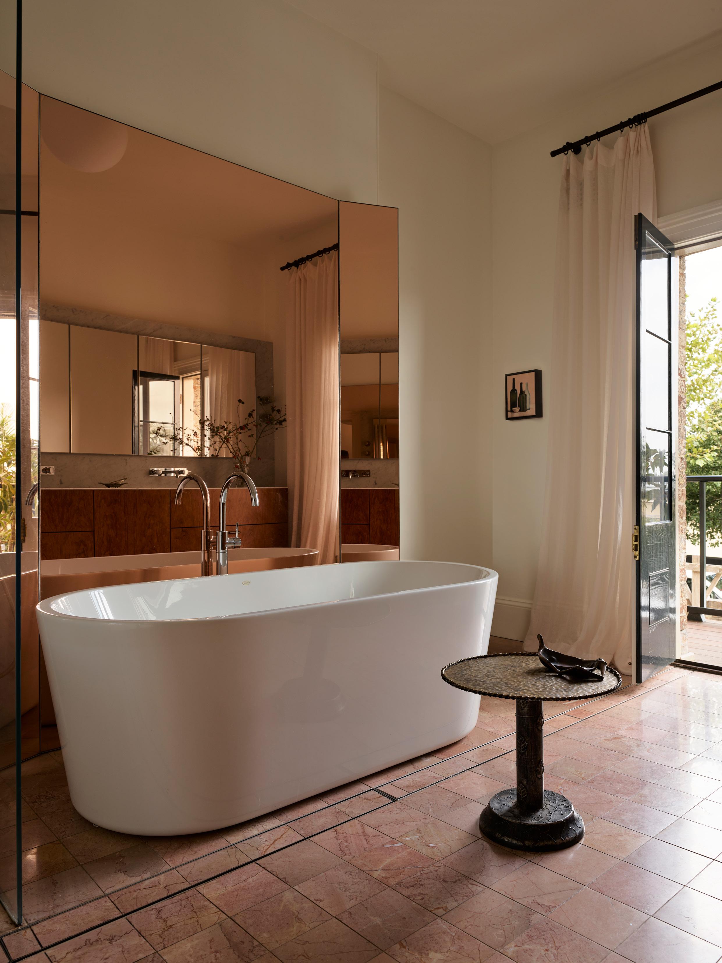
Nestled under a sculpted stair, the powder room at Malvern Residence III by Studio Tate is a blush-toned jewel box. Designed as an indulgent experience for guests, the space is refreshingly whimsical. “We wanted something that had its own language and palette and was at once frivolous and luxurious,” Studio Tate associate director Liz Ride says.
The design began with the selection of the corporeal Norwegian Rose marble flooring, installed as a single slab, with the walls then built around it. Complementing the stone is a soft plaster finish that wraps the room’s curved edges to evoke a warm, cocoon-like atmosphere. A floating bronze mirrored ceiling adds a playful touch, reflecting both the marble floor and the vintage chandelier. Brass accents tie into the rest of the home’s metal finishes.
The pedestal basin and a cantilevered marble shelf highlight the level of craftsmanship that defines the space. “The tiered, triple bullnose shelf is bespoke, detailed, unusual and a delight,” Ride notes. Other surprise elements include full-height mirrored storage, which conceals some hidden storage. The crowning feature, though, is a vintage chandelier, casting soft, flattering light to the room’s overall charm.
“WE WANTED SOMETHING THAT HAD ITS OWN LANGUAGE AND PALETTE AND WAS AT ONCE FRIVOLOUS AND LUXURIOUS.”
– Liz Ride
Norwegian rose marble lines the floors and skirting, with a triple bullnose floating marble shelf adding an element of beauty and femininity to this experiential powder room. A Carrara freestanding marble basin by Marble Hub and an Aesthetiker vintage chandelier further enhance the powder room’s sophistication.
STUDIO TATE
PROJECT Malvern Residence III LOCATION Wurundjeri Woi Wurrung Country / Melbourne, Australia DESIGN Studio Tate ARCHITECTURE Lovell Burton
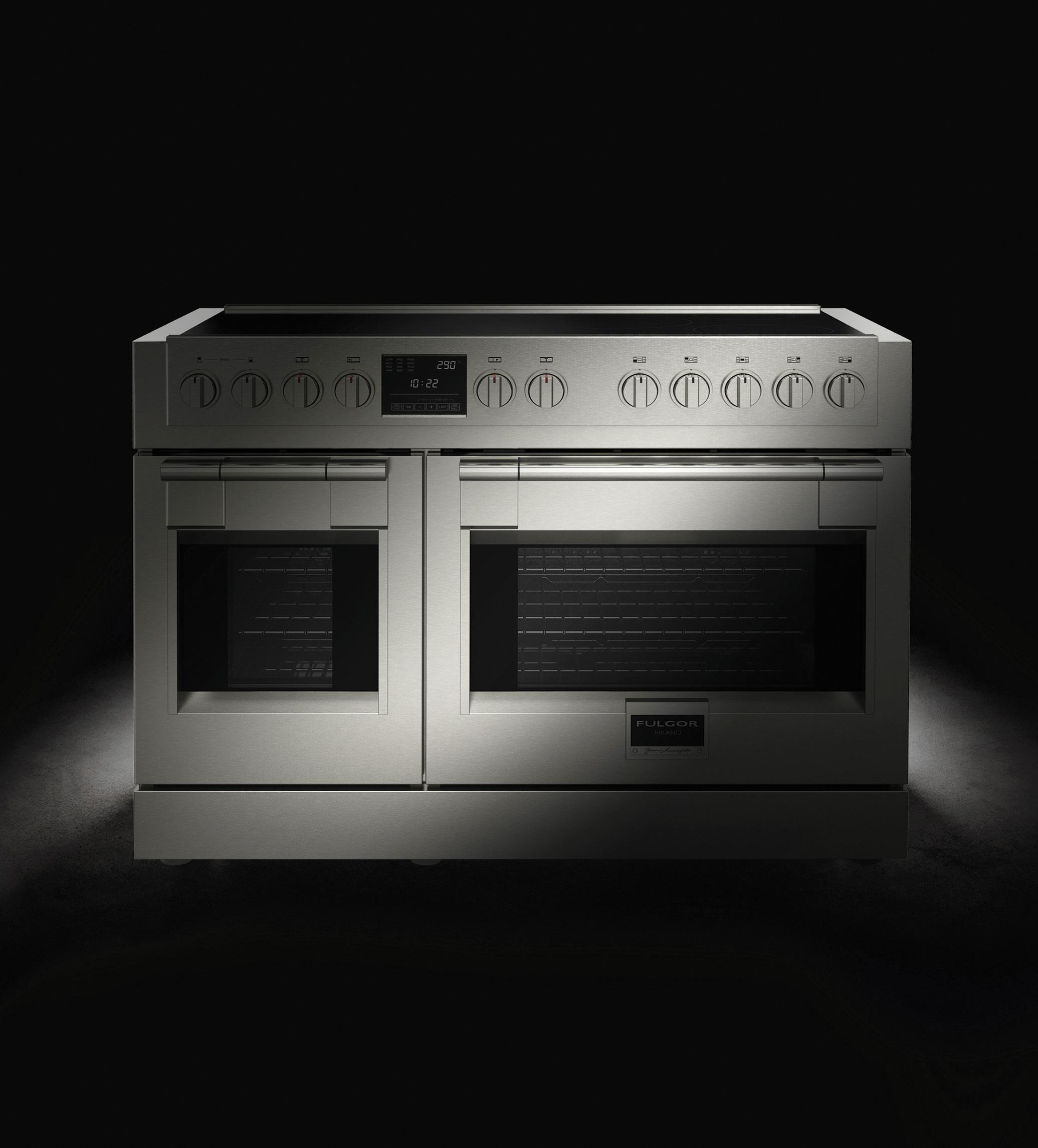
Celebrating the seamless blend of sleek architectural simplicity and state-of-the-art technology, we explore Fulgor Milano’s legacy of innovation and craftsmanship in culinary design.
Fulgor Milano represents Italian beauty and sophistication and is a brand that has consistently set the standard for Italian kitchen design through a commitment to precision, premium quality, and forward-thinking innovation. Founded in Milan amidst the post-war Italian manufacturing revolution—a pivotal era that redefined global design—the family-owned company began by crafting charcoal ovens, stoves, and ranges, embodying the essence of 'La Cucina della Nonna,’ a sentiment deeply rooted in Italian culture, symbolising the kitchen as the heart of the home where families gather, and traditions are passed down.
From modest beginnings, Fulgor Milano grew into a pioneer of modern technology, with the introduction of revolutionary advancements including the triple-burner flame, the pyrolytic oven, and, more recently, unveiling their ENOVA and Sofia range of appliances. For over 70 years, Fulgor Milano has maintained its passion for creating high-quality, design-driven products that meet the demands of modern living while staying true to the brand's rich heritage.
Explore the Fulgor Milano range of kitchen appliances >
@fulgormilano_au
www.fulgormilano.kitchen
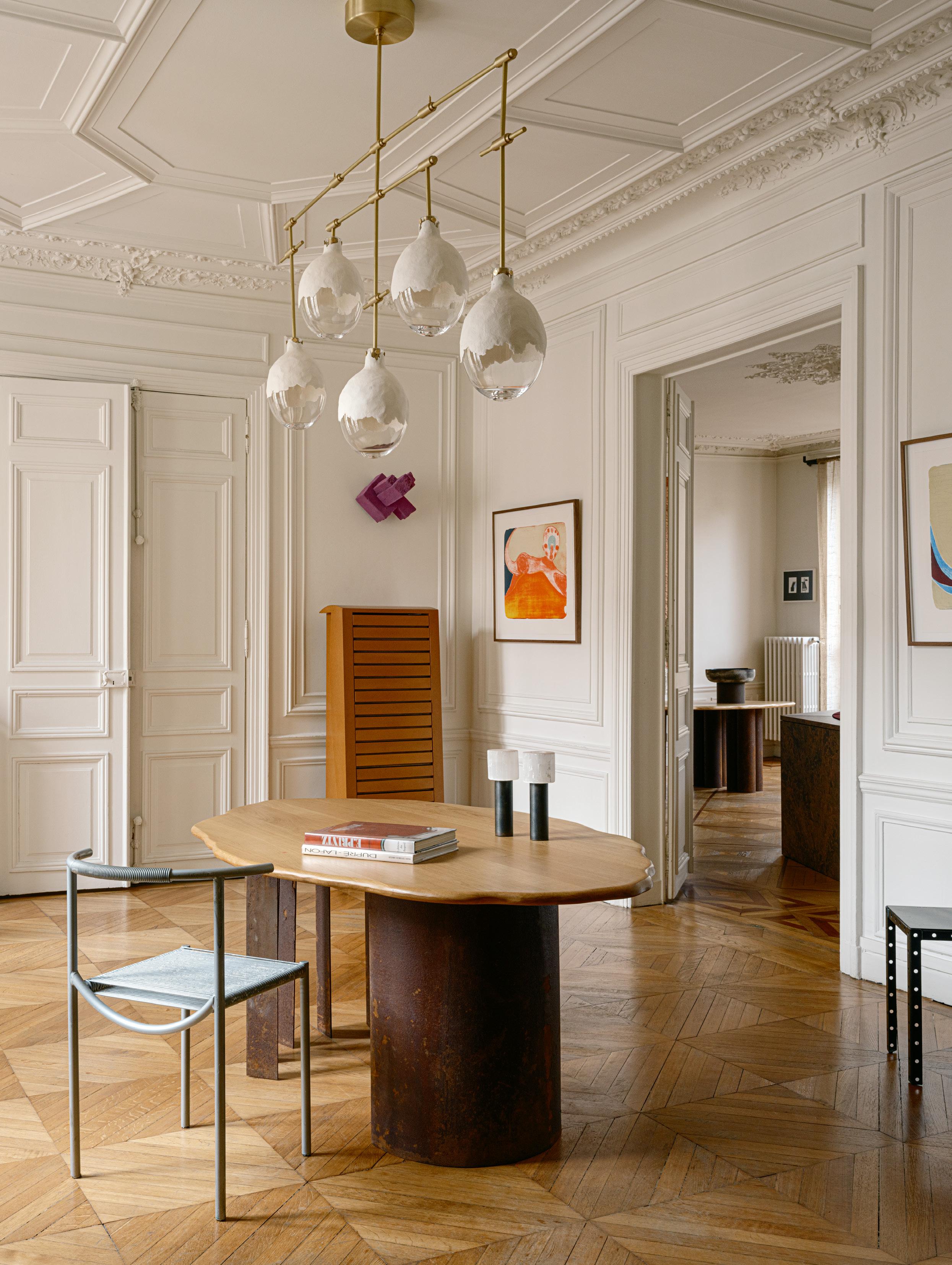
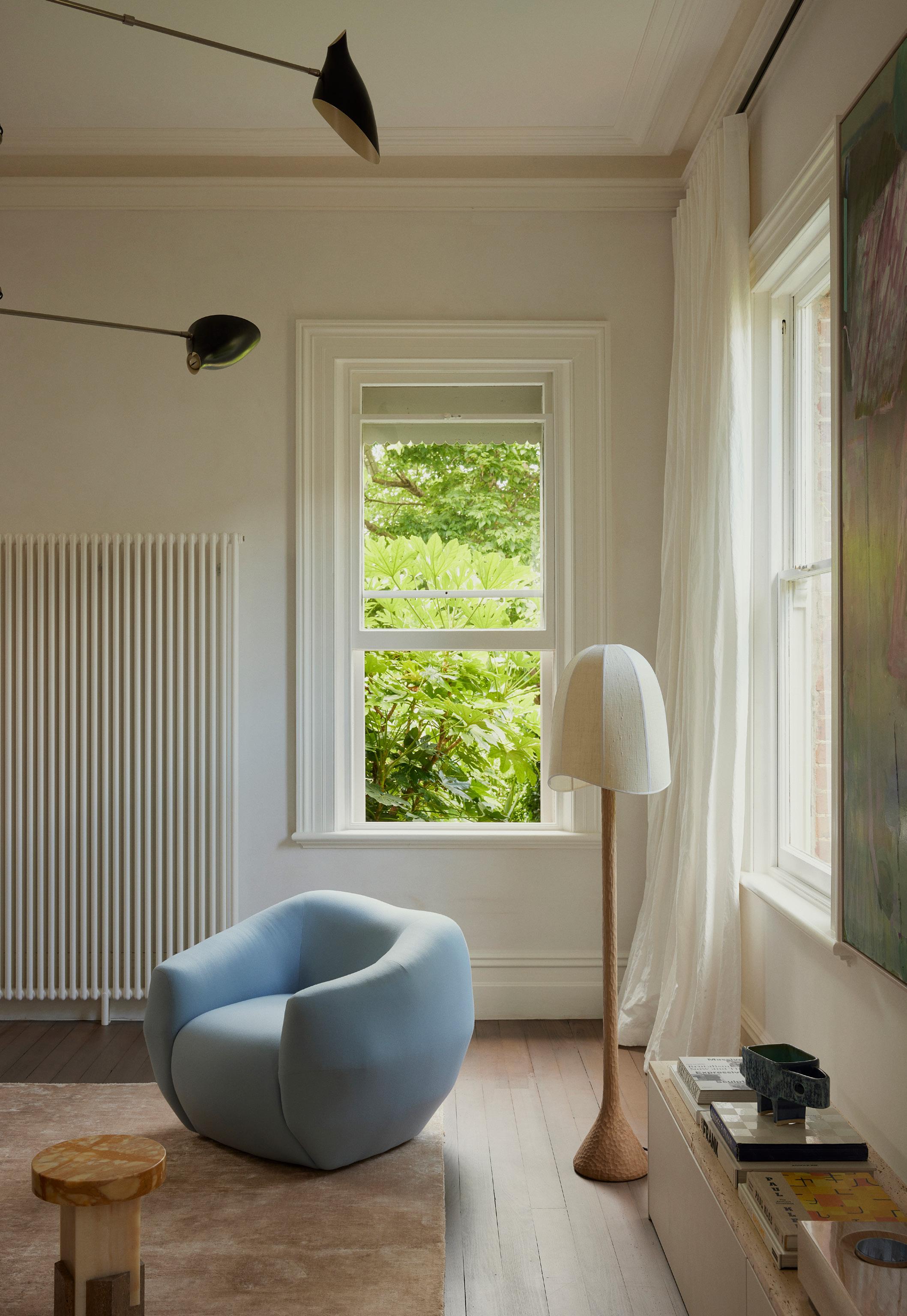
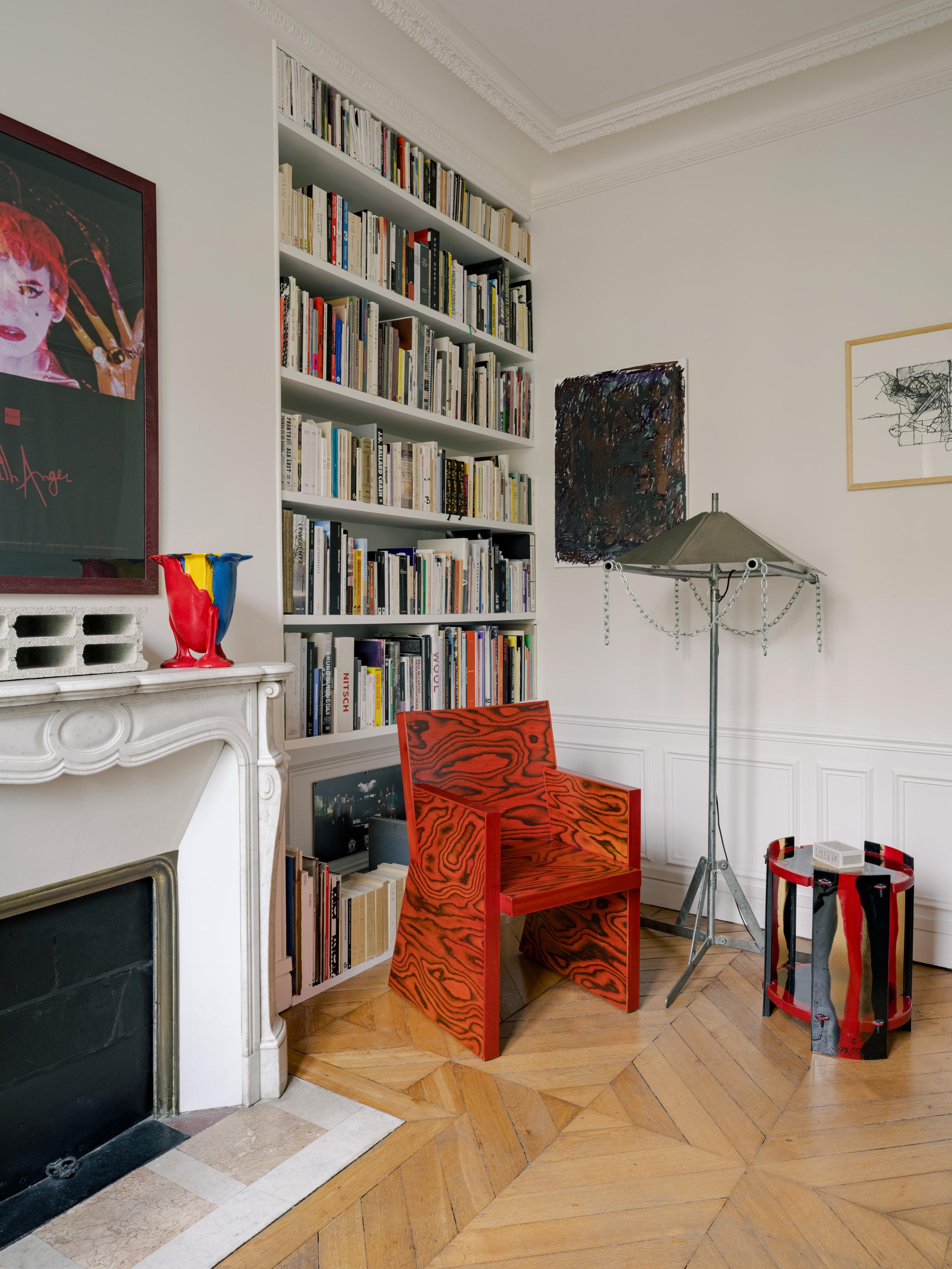
SOPHIE WHERE ARCHITECTS LIVE
SOPHIE DRIES ARCHITECTS
LOCATION Paris, France DESIGN Sophie Dries PHOTOGRAPHY Christophe
Coënon INTERVIEW Yvette Caprioglio
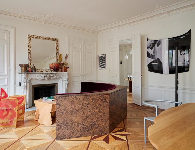
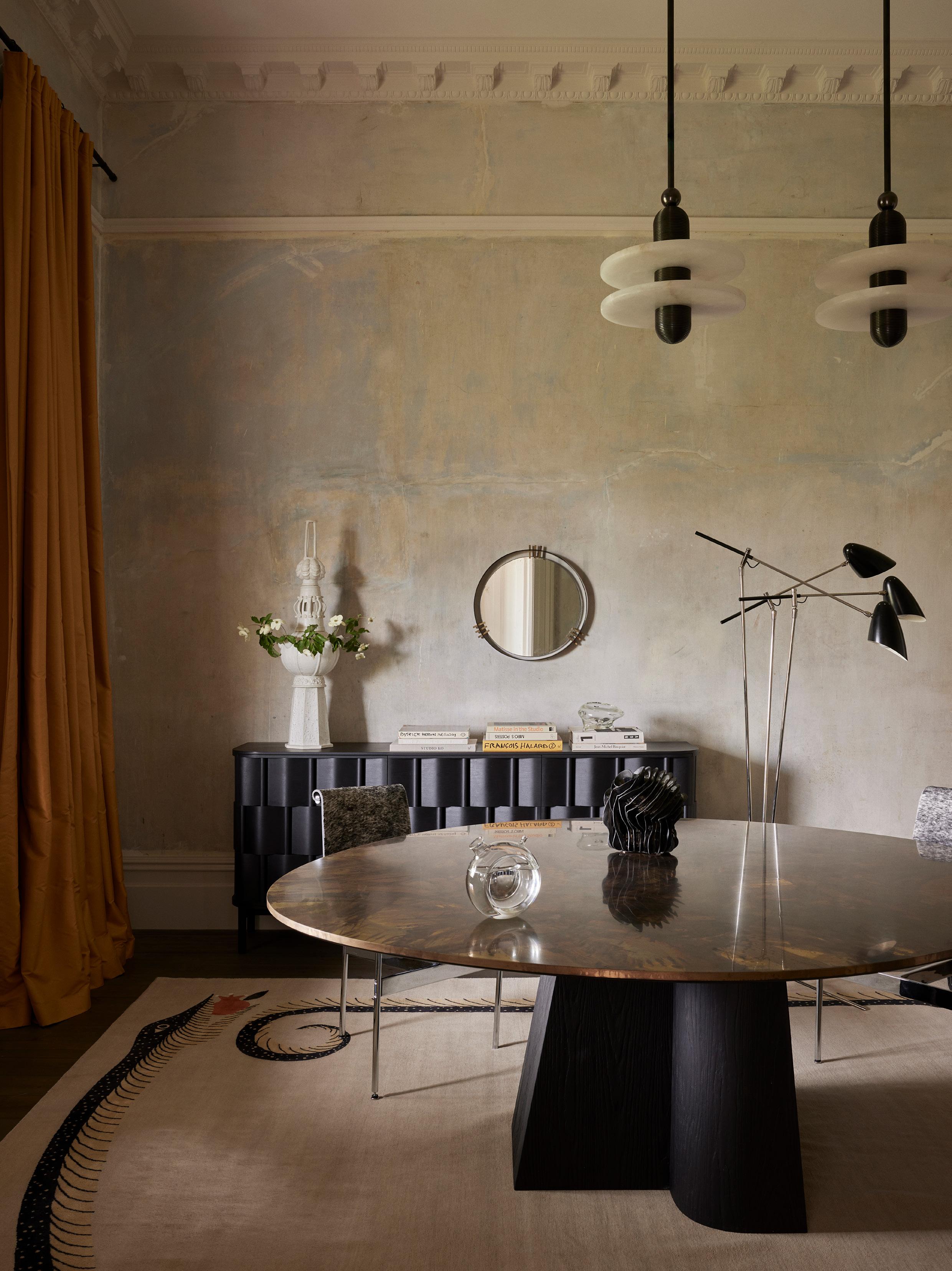
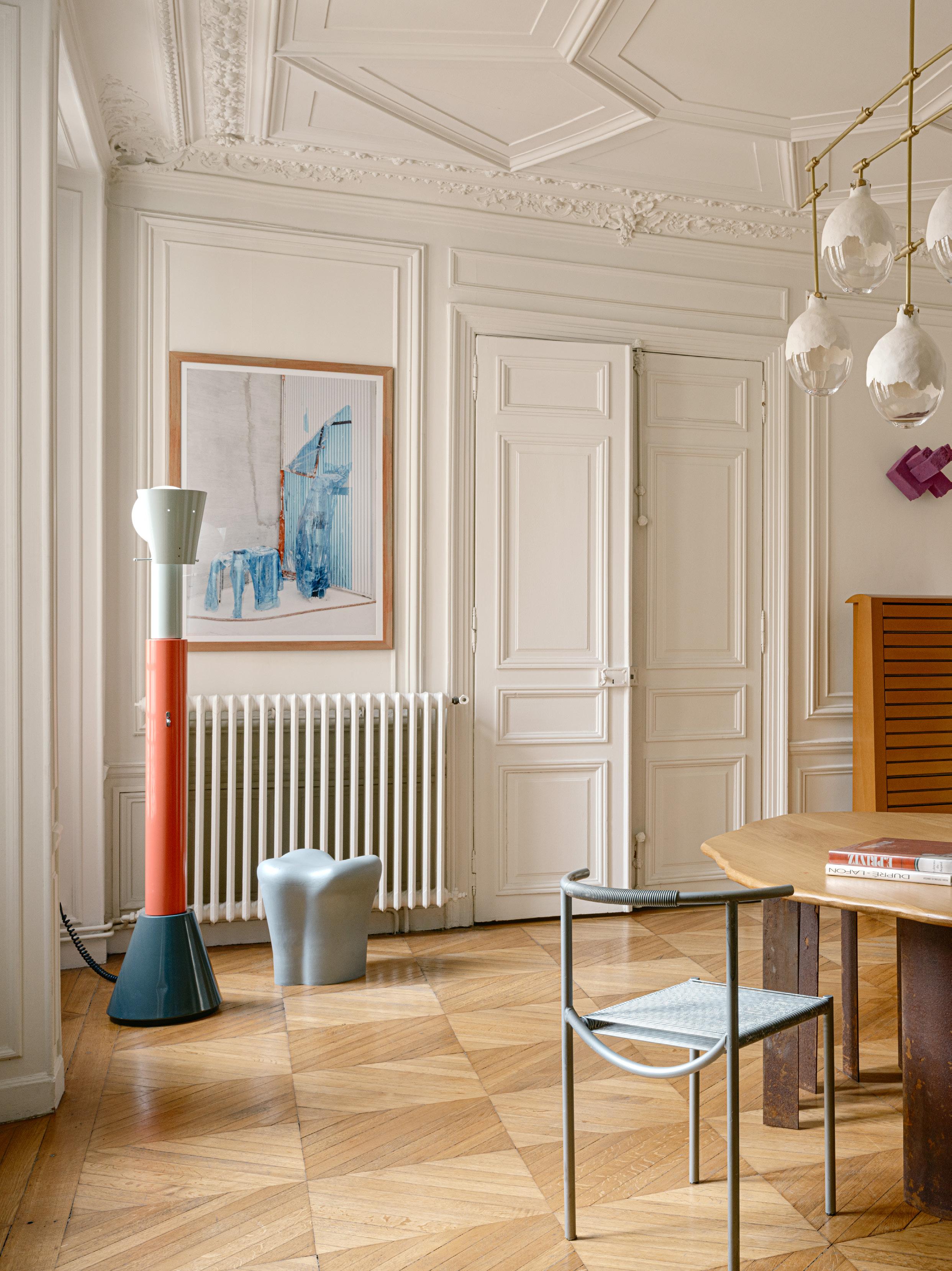
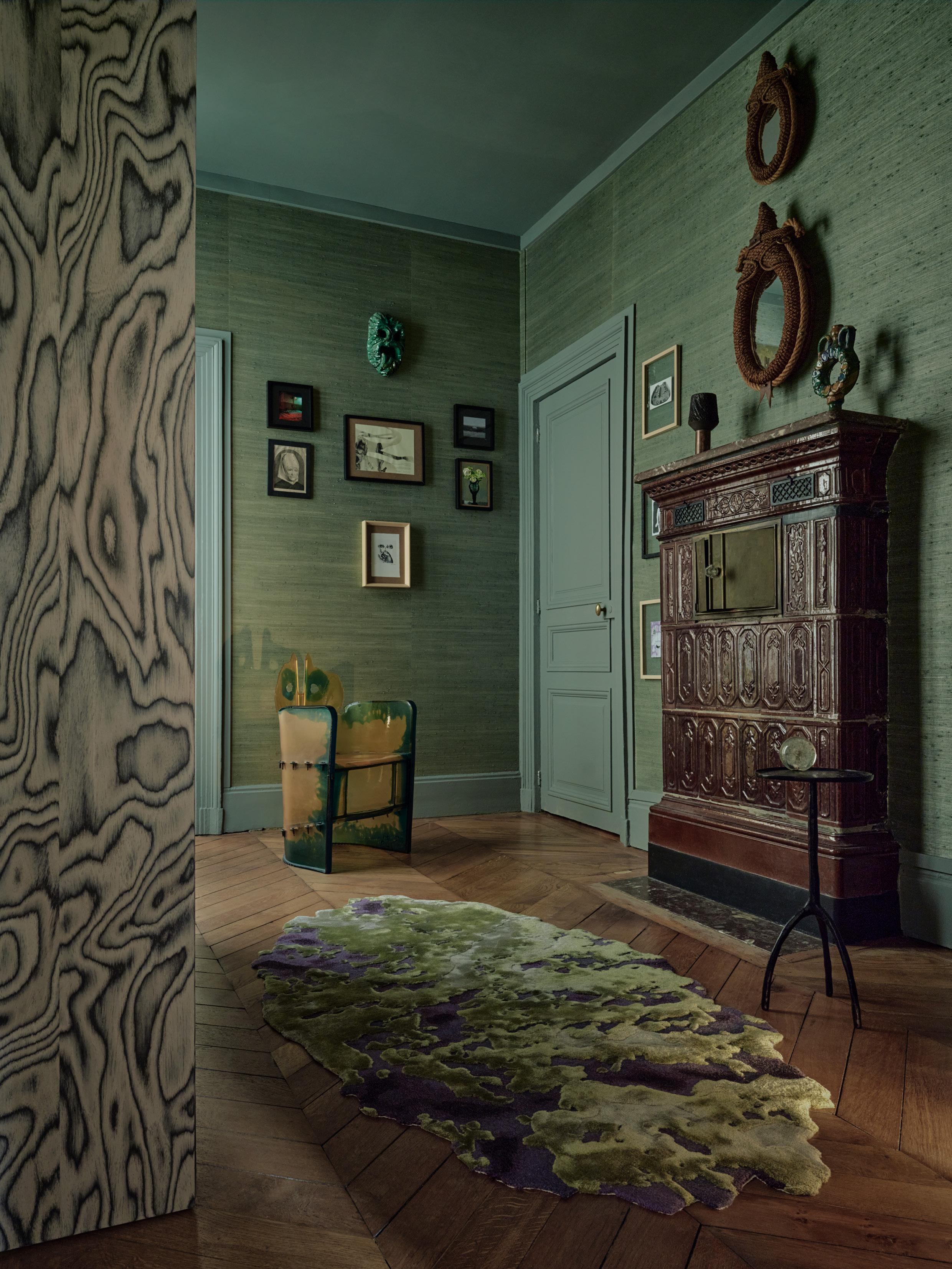
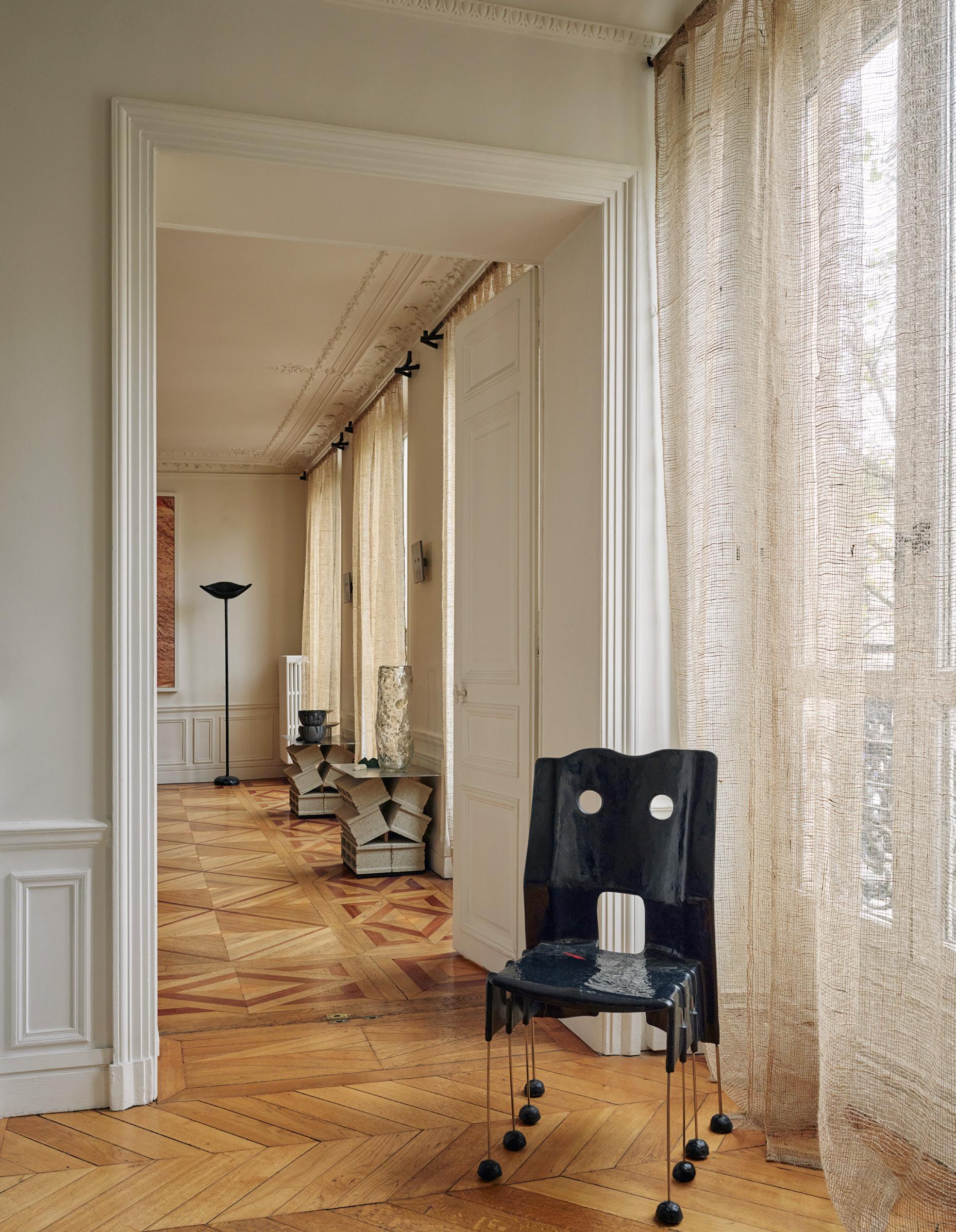
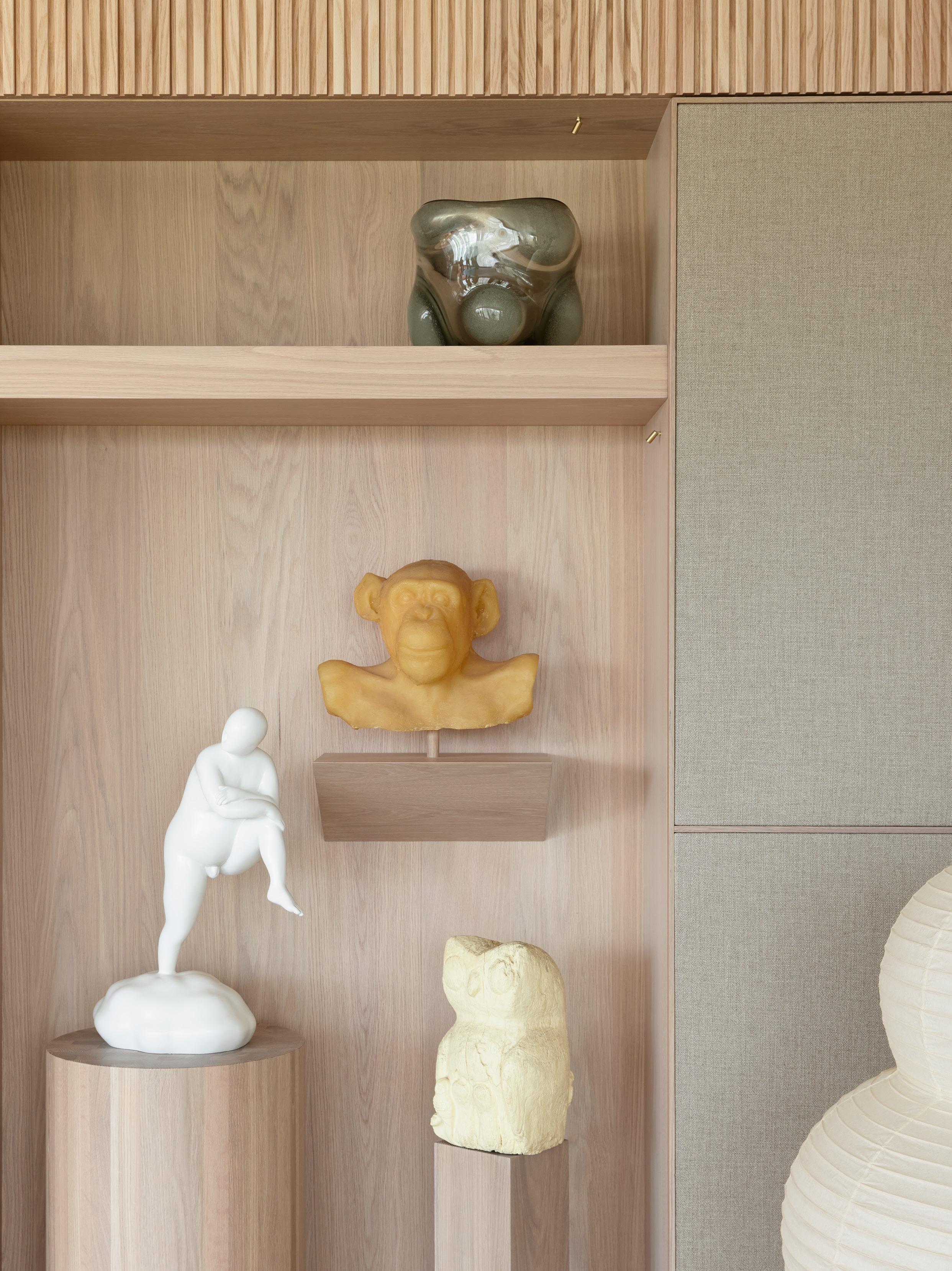
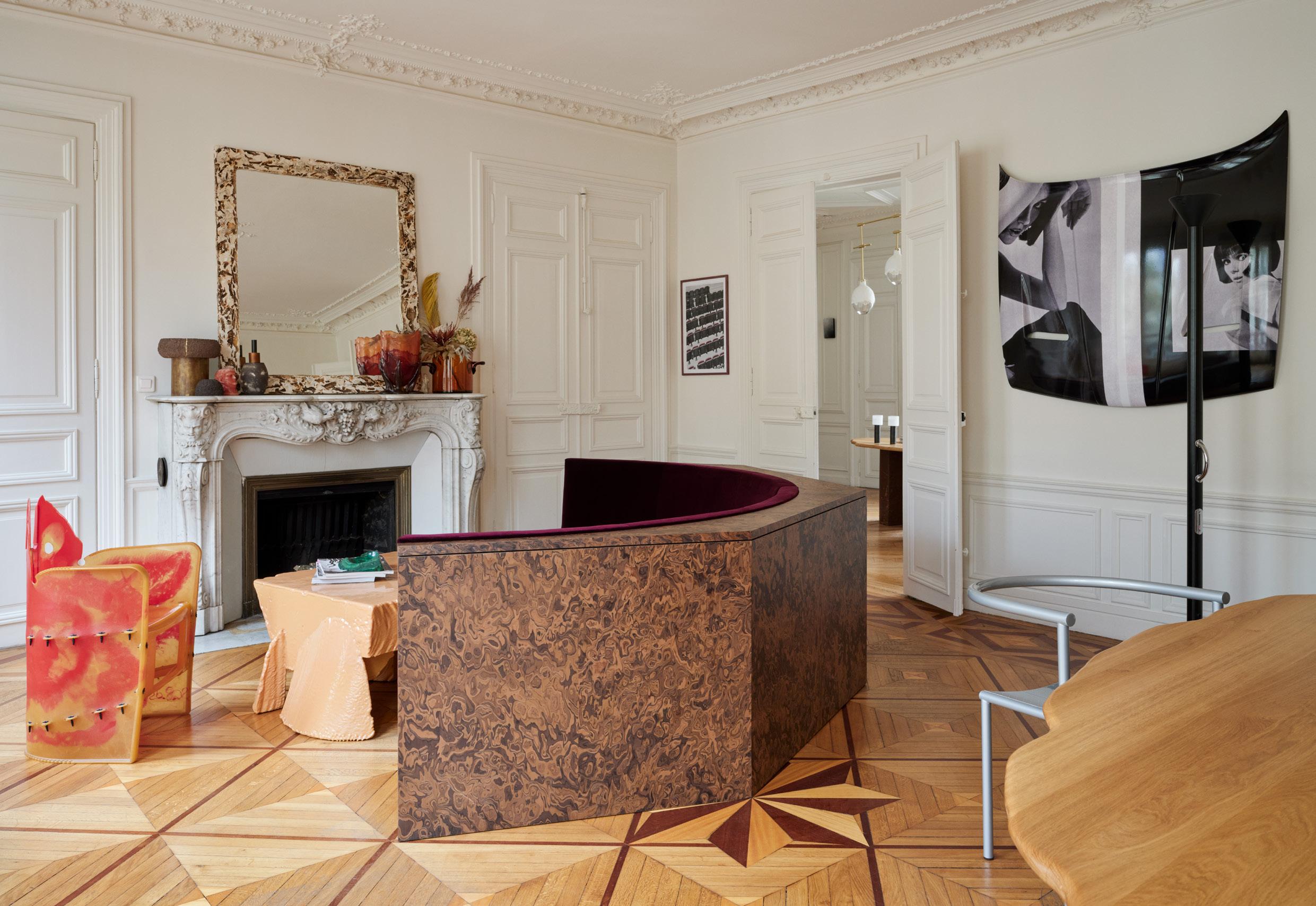
In the dining room, a Songye dining table in solid oak and rusted steel by SDA with a vintage chair by Philippe Starck made for Café Costes Beaubourg in 1986 sits beneath a brass & papier-mâché Glow chandelier by SDA for Kaia. Behind, a medium wood cabinet by Martin Szekely from Rémi Gerbeau Gallery and a fragment of Chris Schanck furniture on the wall. On the left, wall photography by Gilles Uzan, a vintage Tooth stool by Philippe Starck, and a 80s vintage floor lamp by Alessandro Mendini from Remi Gerbeau gallery. On the right, a metal chair by Bob Wilson from Paul Bourdet Gallery and on the right wall, diptyque by Izumi Kato from Galerie Perrotin.
Designer Sophie Dries in the living room of her apartment with a Nobody’s Perfect chair by Gaetano Pesce.
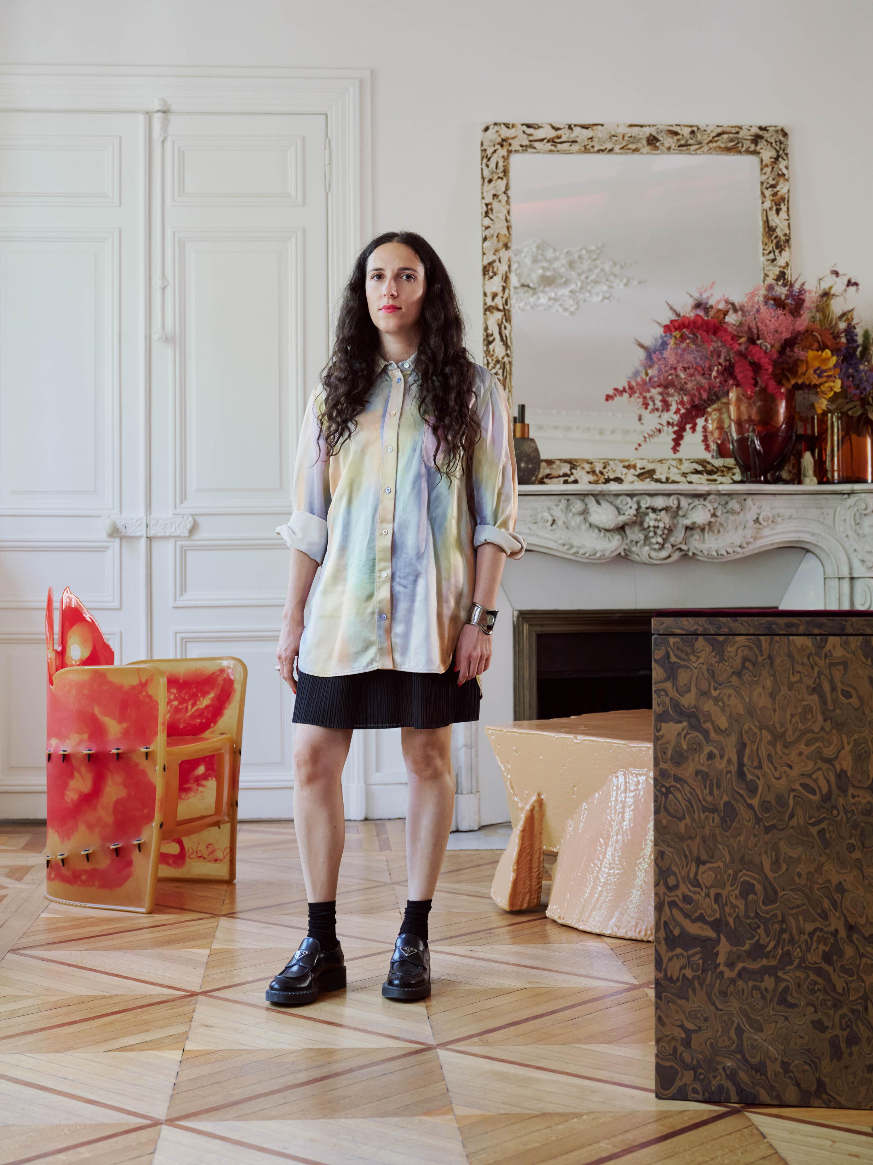
Architect Sophie Dries
talks to us about her home, which is also a gallery for her work, her paradoxical approach to mixing raw and precious materials and the influence of her artistic community.
Who lives here?
My husband, sculptor Marc Leschelier, our child and I. The home is also a gallery where I receive clients and press to show them my furniture pieces in a domestic context, on top of my studio Rive Gauche, which is more of a mess of drawings and samples.
How is your space a reflection of you?
The space shows a paradoxical aspect of my approach to mixing eras: a typical 19th-century Haussmannian interior with contemporary and 80s vintage furniture.
There is no hierarchy of what luxury is; I combine precious materials like marble and wood marquetry with raw materials such as plaster, cinder block, and resin.
I enjoy creating unexpected dialogues between people and the spaces I design, using edgy art rather than ‘ticking boxes’ works, as well as incorporating historical features and context, alongside my iconic vintage references from my ‘80s and ‘90s generation, such as Gaetano Pesce, Philippe Starck, Sottsass, and Martin Szekely.
What did you set out to create in the interior spaces?
The structure is still very classical with perfect symmetry in the reception rooms, and the ultracontemporary furniture respects a classical arrangement—following axes, proportions and the composition of the Hotel particulier style of existing context.
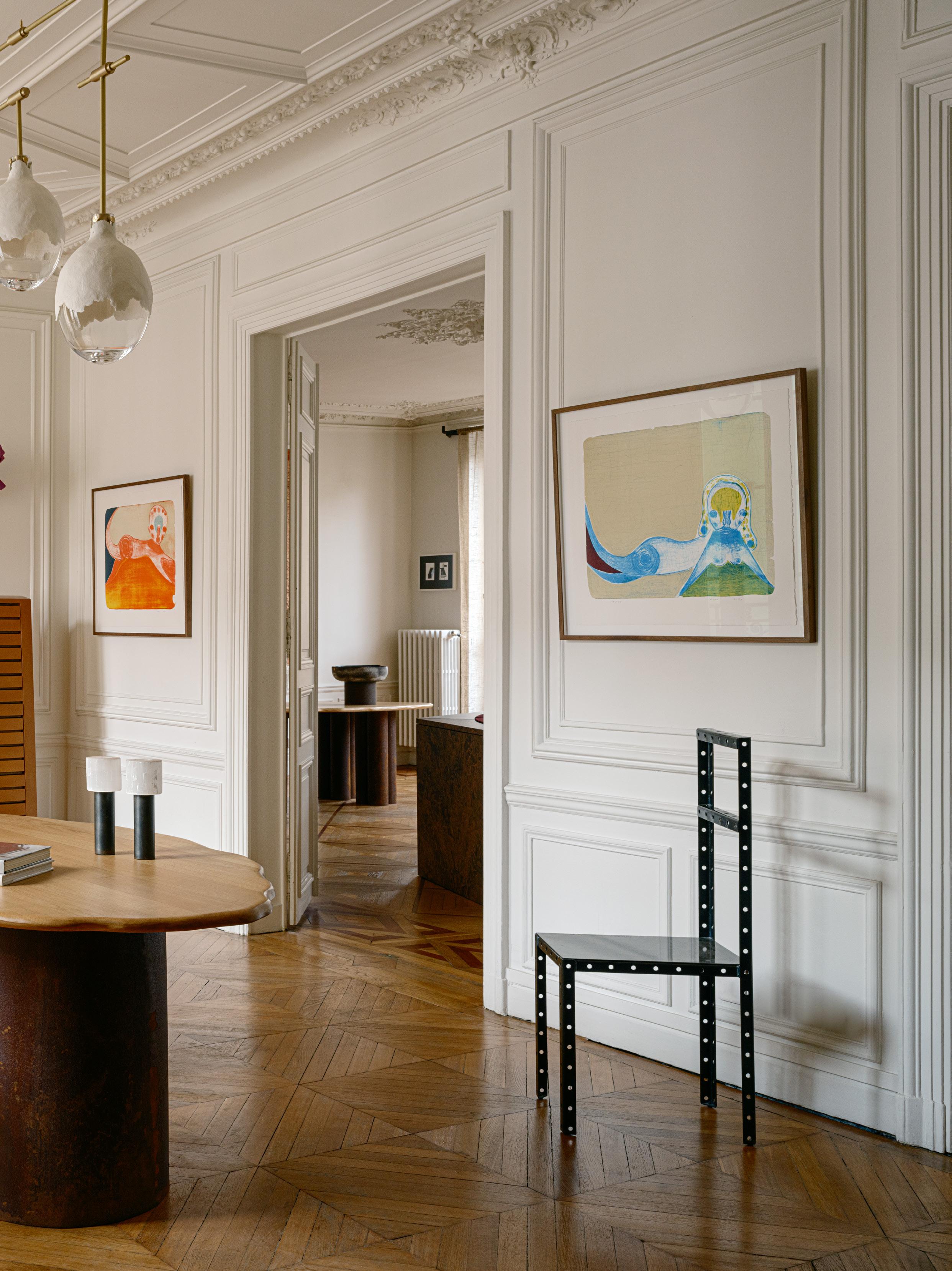
I have designed most key furniture pieces, including the dining table, sofa, mirrors, chandelier and textile elements like curtains, rugs and the bedhead. I’ve also created 'the drawing cabinet', the green room, as a special box room with dark green straw paper on the walls, displaying our works on paper and small-format collection.
This page: In the kitchen, a dark blue concrete benchtop and floor are offset by beige lacquer cabinetry and raw hemp curtains. A set of vintage Alessi coffee and teapots, ceramics by Trame, and a rubber vase by Gaetano Pesce sit atop the bench. Opposite page: The ‘drawing cabinet’ space features dark Chinese straw paper on the walls, a Traces carpet by SDA for Nilufar Gallery on the floor, and a resin chair by Gaetano Pesce.
How does your environment influence the way you live?
I am very influenced by my artistic community of painters, designers, curators, and filmmakers. I like to work with and display my friends’ works, purchasing some of their studio prototypes or swapping them with my design or my husband’s works.
Social media is quite influential to the style of interior designers and clients, as well as nostalgia, which feels very safe in such insecure times. My approach is different and more enthusiastic; I like creating new dialogues and supporting my generation of creative people.
There’s a notable mix of distinctive pieces, such as the orange rubber coffee table, the beautiful pendant light over the dining table, and the concrete and steel console—can you reveal more about some of these?
The coffee table in orange resin is a carte blanche I gave to my talented colleague Max Lamb in 2020. He had total freedom, and I never asked for drawings or samples; it was pure surprise when I received the crate.
All the concrete pieces are specially made for our home by my husband, Marc Leschelier, who normally creates non-functional sculptures.
The dining table and the egg Glow lighting are my designs, and I change them sometimes when I sell to collectors or institutions, lately French Mobilier National.
The vintage pieces are found in galleries that I work with and at auctions while we should be buying for our clients. These include gems like many of the Gaetano Pesce tables, chairs, and vases. I even have more Starck and Frank Gehry in storage; it will be for the next house, maybe an old manor in the countryside with playful contemporary artefacts or a minimal warehouse in concrete with medieval and vernacular wood furniture; who knows.
This page: Greene Street chair by Gaetano Pesce for Vitra from Gastou Gallery, with curtains in raw linen canvas by SDA. All of the concrete pieces are specially made for the home by Dries’ husband, Marc Leschelier, who normally creates nonfunctional sculptures. A vase in Murano glass by SDA for Nilufar Gallery features atop the concrete blocks. Opposite page: In the living room, a sofa in dark oak burl and aubergine velvet by SDA and a Poly coffee table in orange rubber by Max Lamb.
Your interiors reveal a sense of tactility and materiality—are these common threads and hallmarks of your work?
I am obsessed with textures, and I like to say that I sometimes ‘torture materials’ as I like to explore the limits of what is possible to make with rugs, glass, plaster, or metal.
My design research is about chemistry and how to discover things in design with the magicians, who are my artisanal partners in Murano, France, and Italy.
The home is punctuated by colour—from wall coverings to the bedhead and furniture. What is your approach to using colour in interiors, and how does it inform your mood?
I don’t describe myself as having a colourful approach; that comes after design and texture. But I am not so rigid as to erase any tone and do only monochrome interiors, which would be easier than being radical.
I like to work with colours that mimic texture, like the aubergine sofa with the dark brown burl wood. The green room was chosen to emphasise the cosy box effect, which I like in smaller spaces, but it could have been Bordeaux. The rug came after the green walls and featured purple because it complements green.
First come the lines, then the textures, and finally the colours.
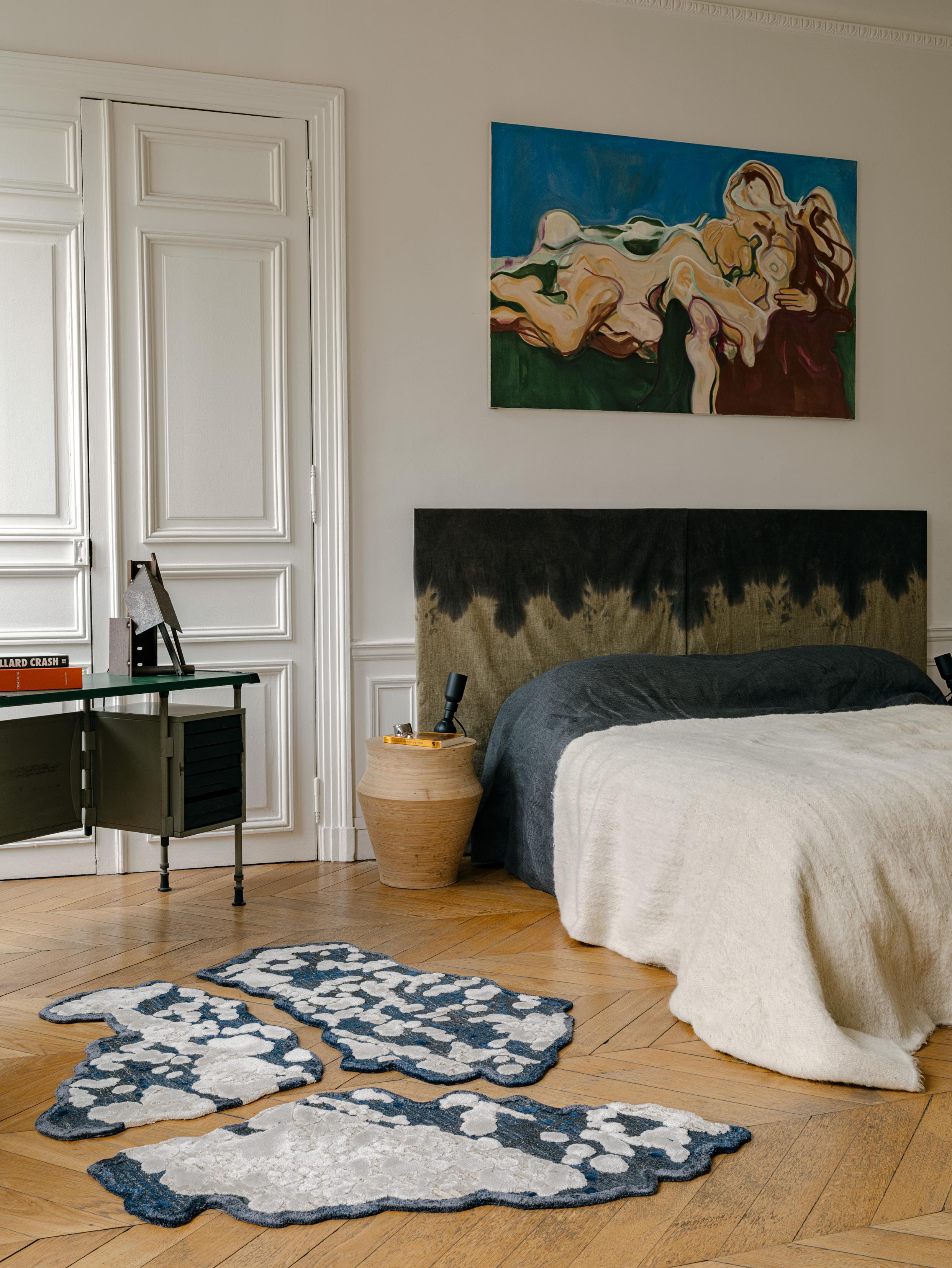
This page: Another vintage ‘Tooth’ stool by Philippe Starck. Opposite page: Bedroom with a bedhead in tainted linen by SDA, a painting above by Ana Karkar, Totem side tables in turned wood by SDA with vintage 60s leather and metal lamps by Gino Sarfatti for Arteluce, a set of Météor rugs by SDA on the floor and a vintage BBPR desk for Olivetti from Nilufar Gallery, with a metal sculpture by Marc Leschelier.
Opposite page: Vintage In Praise of Epicurus chair by Ettore Sottsass from Gastou Gallery, Nobody’s Round table by Gaetano Pesce and Matelas lamp by Marc Leschelier.
LightTower
Discover the impressive tower storage solution with award-winning signature lighting, a seamless fusion of form and function.
We’re committed to enhancing residential living spaces with German-quality hardware solutions.
Kitchen Closeup Proclamation House by State of Kin
Proclamation House by State of Kin is designed as a lightfilled oasis, which can easily switch into entertainment mode.
From the street in Western Australia’s Subiaco, Proclamation House appears like a single storey. Yet once inside, the olive-toned render and confident curves that wrap the exterior blend into soaring, double-height interiors.
This family residence, while clearly modern in its incarnation, draws on the history of the suburb. This home needed to accommodate dual functions—be a calm and peaceful abode for relaxation and reading, and equally be capable of hosting parties and entertaining friends. Central to the home’s interior is the kitchen. Positioned beneath the mezzanine with openness all around, it manages to cement the living space. A large, sculptural kitchen bench, also rendered in the custom hemp plaster, appears like an altar, inviting the rituals of daily life.
A combination of V-ZUG Combi ovens and V-ZUG Pyrolytic ovens offer versatility alongside Sub-Zero refrigeration, all from Winning Appliances.
Explore the Winnings range of kitchen appliances >
"The balance between practicality and refinement tells the story of a kitchen that doubles as a working space and social heart, reflecting the client’s love of entertaining and desire for a space as beautiful as it is functional."
– State of Kin director, Alessandra French
Produced in partnership with Winnings
Project Proclamation House Design State of Kin Photography Jack Lovel Words Aleesha Callahan
STUDIO PRINEAS PODCAST
THIS MUCH I KNOW
A DESIGN CONVERSATION WITH KAREN MCCARTNEY
Studio Prineas principal Eva-Marie Prineas reflects on 20 years of building an authentic and sustainable architecture practice, focused on relationships, problem-solving, and creating lasting design solutions for everyday life.
Project Alpha House
Photography Anson Smart
Portrait Felix Forest
Scan the QR code for more information
Photography: Timothy Kaye
Location: First Light (a DCF x Yoo Hotels development)
Matte perfection.
Cutting edge design. Intuitive appliances. Now in Matte Black.
Miele. Immer Besser.
REINSTATED BEAUTY
REINSTATED BEAUTY
LOCATION Gadigal Country / Sydney, Australia
STYLING Design Daily
WORDS Holly Beadle
DESIGN Welsh + Major
PHOTOGRAPHY Anson Smart & Clinton Weaver
An innovative reinvention project in Sydney's harbourside enclave of Millers Point
results in a reinstated beauty offset by
elevated sculptural forms.
Built in the 1840s, the four-storey terrace house underwent several transformations, the most recent of which saw it converted into seven studio apartments. Intending to restore the house to its former glory as a single residence while incorporating a modern pavilion, the new owners enlisted Sydney-based architects Welsh + Major, led by Chris Major and David Welsh.
“We’ve had the privilege of working on many beautiful old homes in the past, which led the owners to seek us out,” Major shares. “They brought to the project a genuine love for design, an openness to exploring new ideas, and a commitment to honouring the building’s past—qualities clearly reflected in the final design.”
The original part of the house was reimagined through a sculptural yet functional lens, where the new intentionally contrasts with the old. “We always take the approach that new elements of architecture should be contemporary and respond to their particular requirements rather than simply mimicking what is already there,” Major explains. "Our goal, therefore, was to reinstate the beauty and scale of the heritage house while elevating it with new elements.”
"Wherever possible, we used traditional restoration techniques, which lend a solid, authentic quality to the spaces," she continues. “For example, the original tallowwood floors were restored with a traditional oil finish, giving them an aged yet luminous character. Likewise, the cornices were reshaped on-site using wet plaster, honouring the craftsmanship and history embedded in the home.”
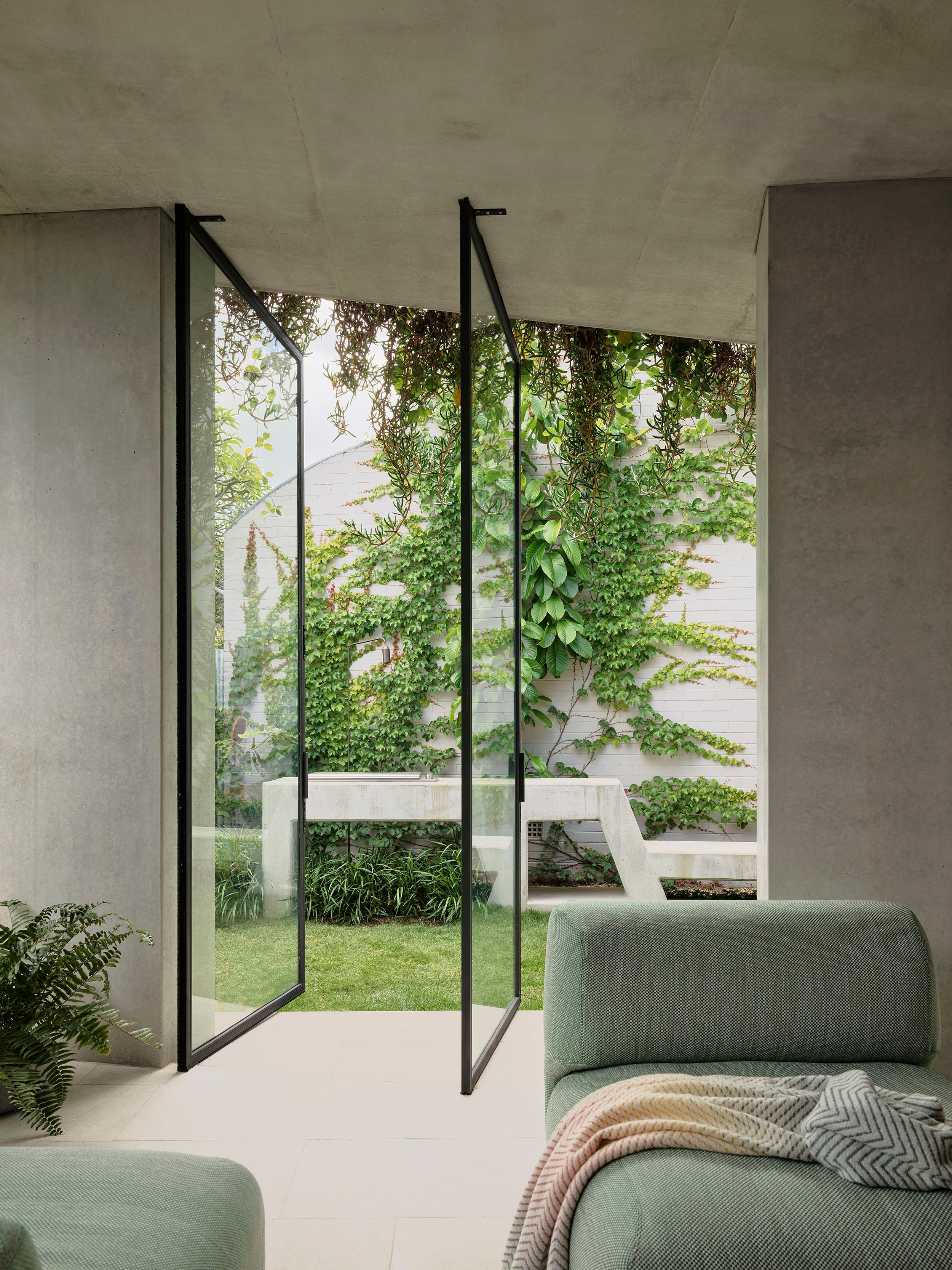
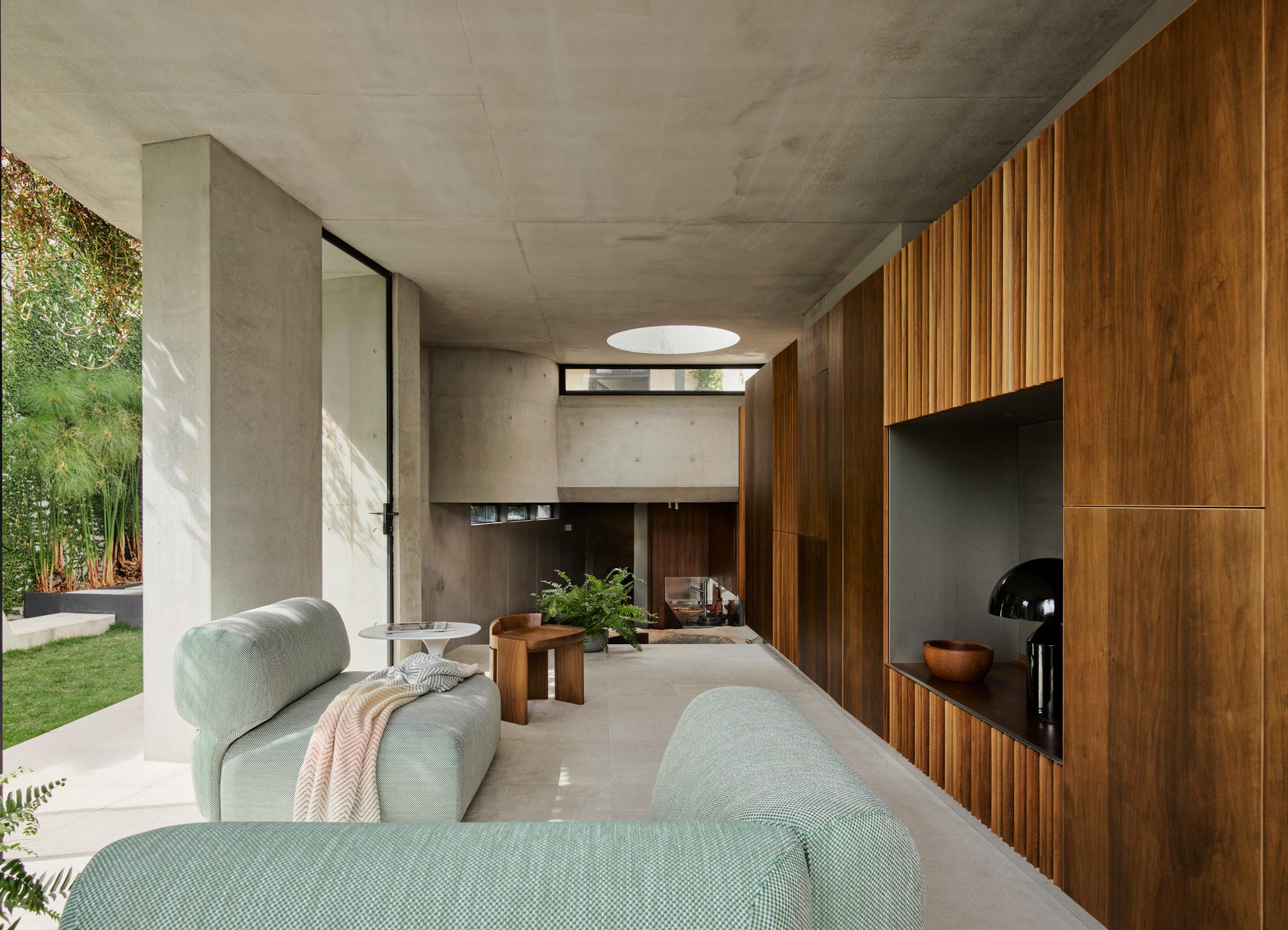
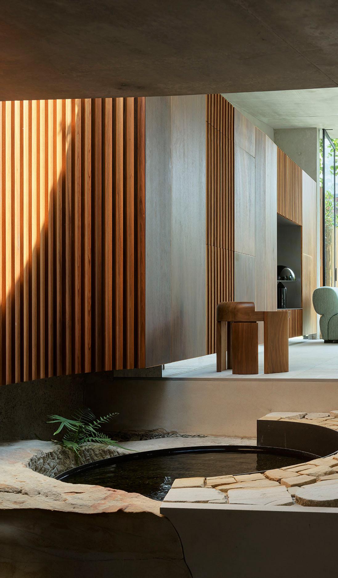
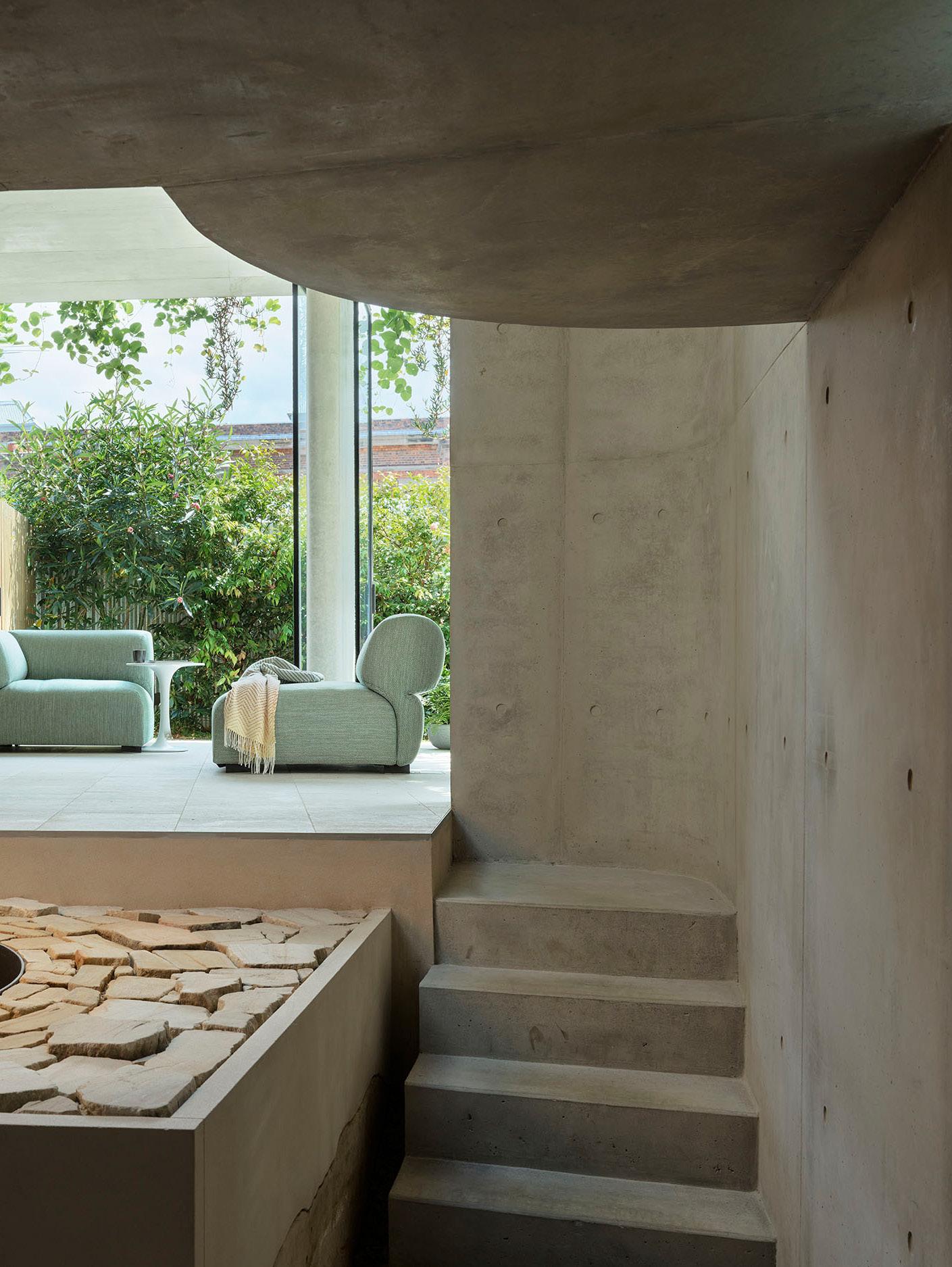
Welsh + Major then introduced four elements crafted from stone, wood, and steel as sculptural features staged against a historic backdrop, such as the extraordinary green marble island in the kitchen that serves as the room's centrepiece, with its flowing marble veins extending towards the view. In the guest bedroom, they crafted a pod-style bathroom complete with a glass shower and fabric curtain inspired by the flowing forms of an Alvar Aalto vase.
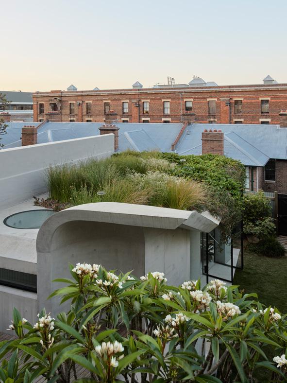
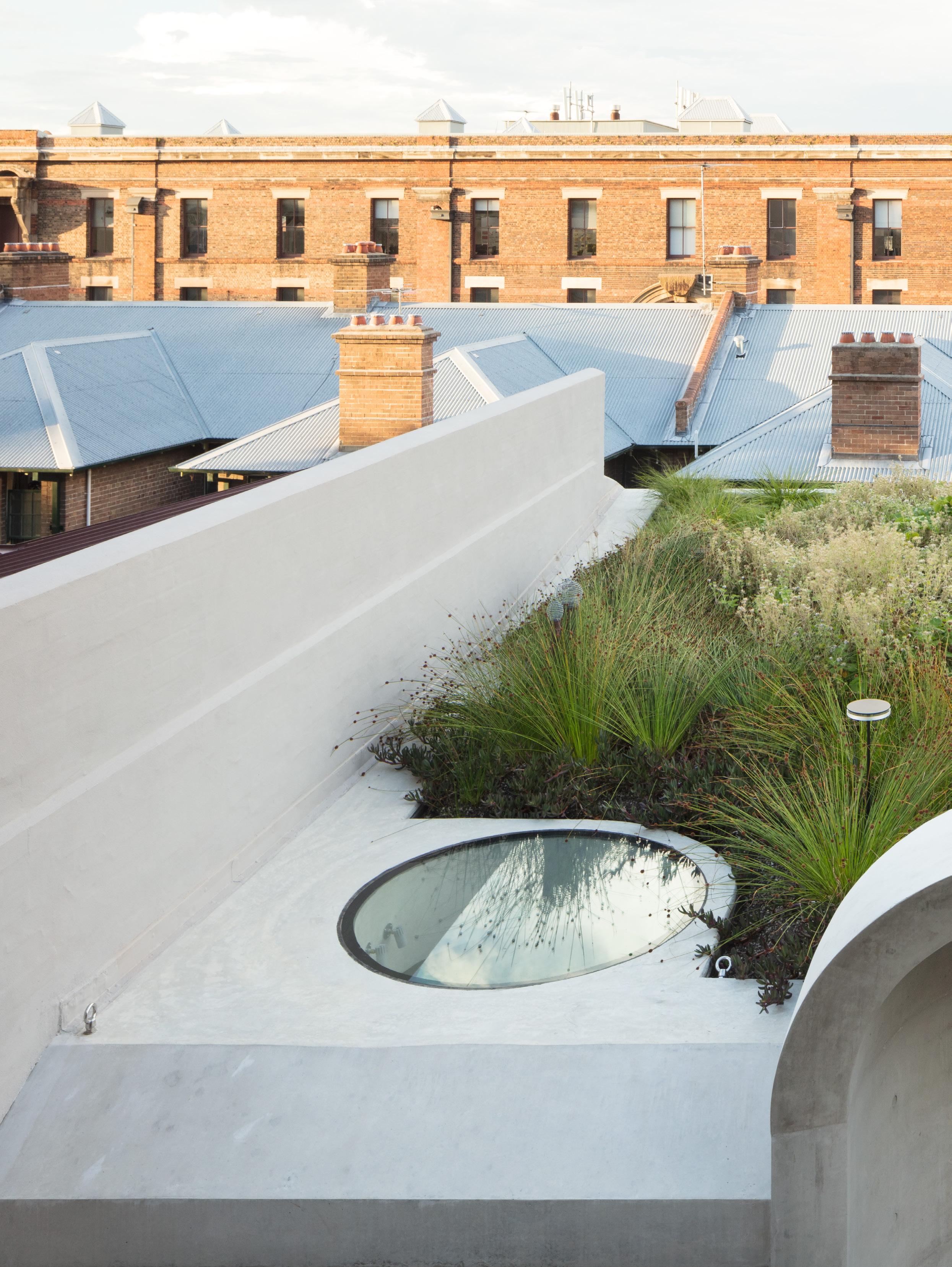
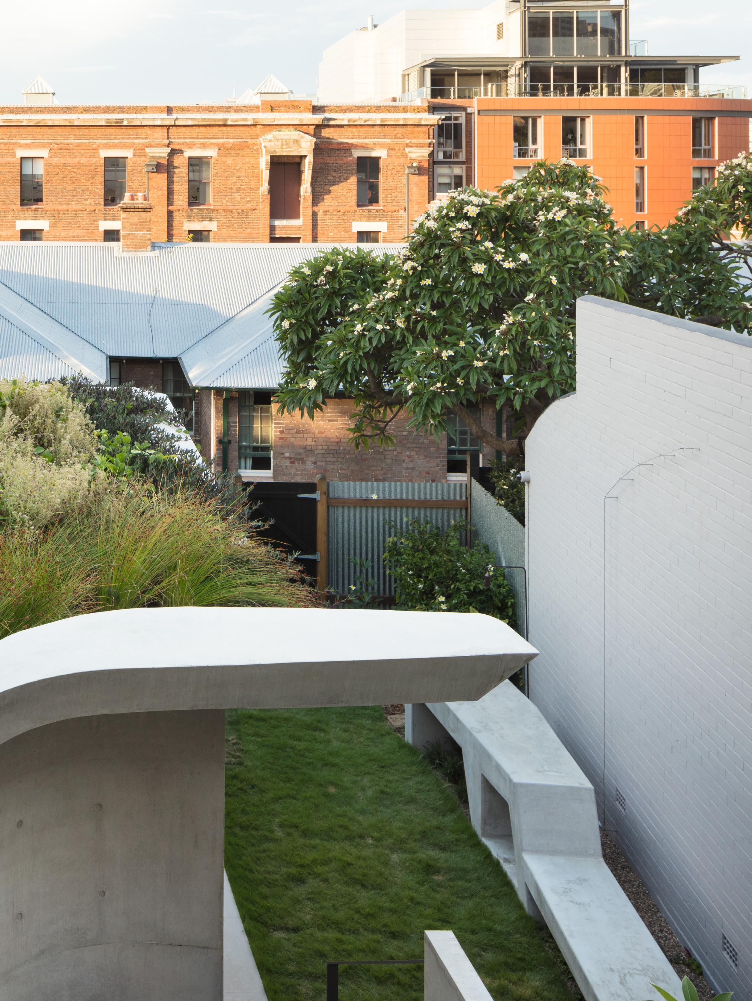
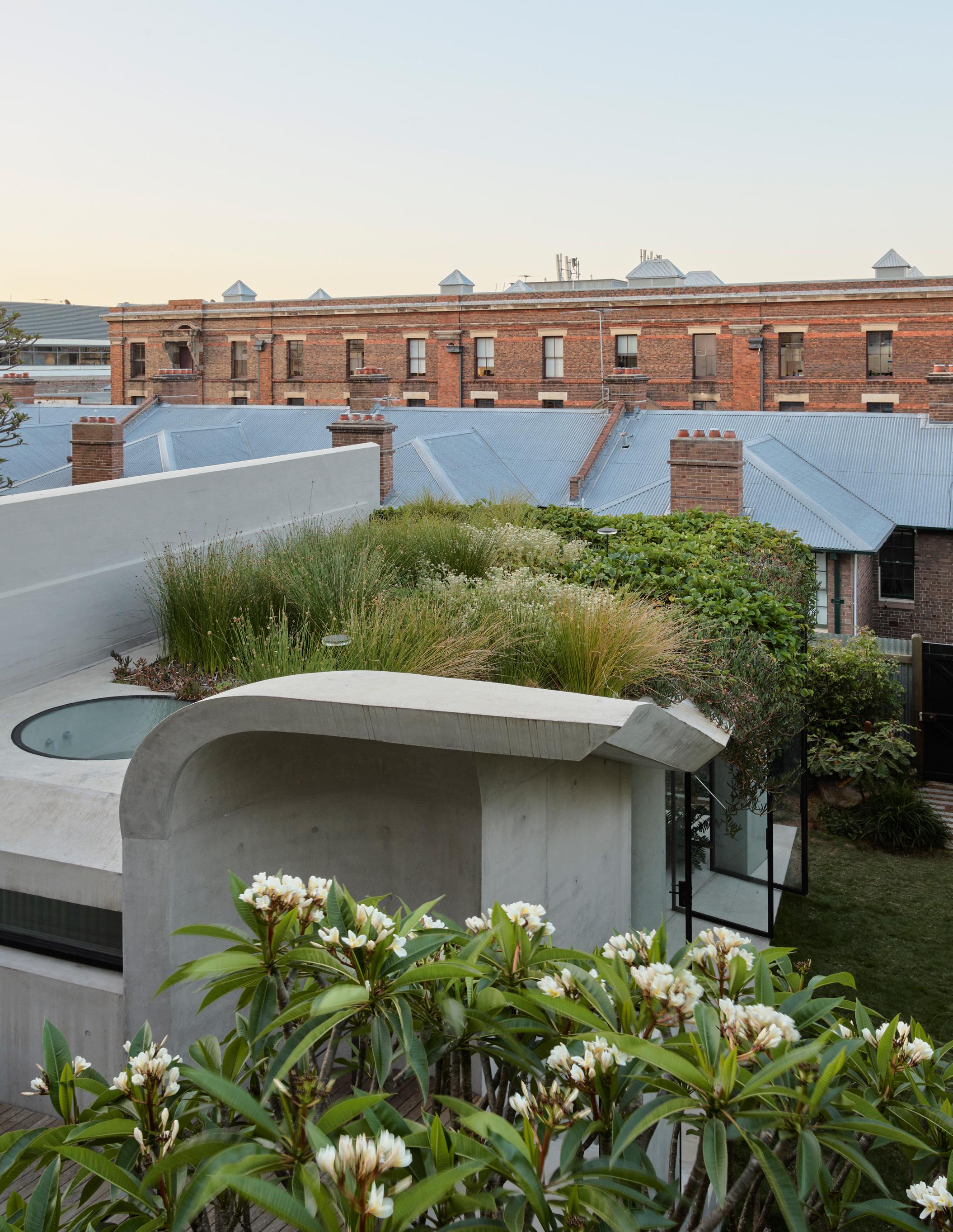
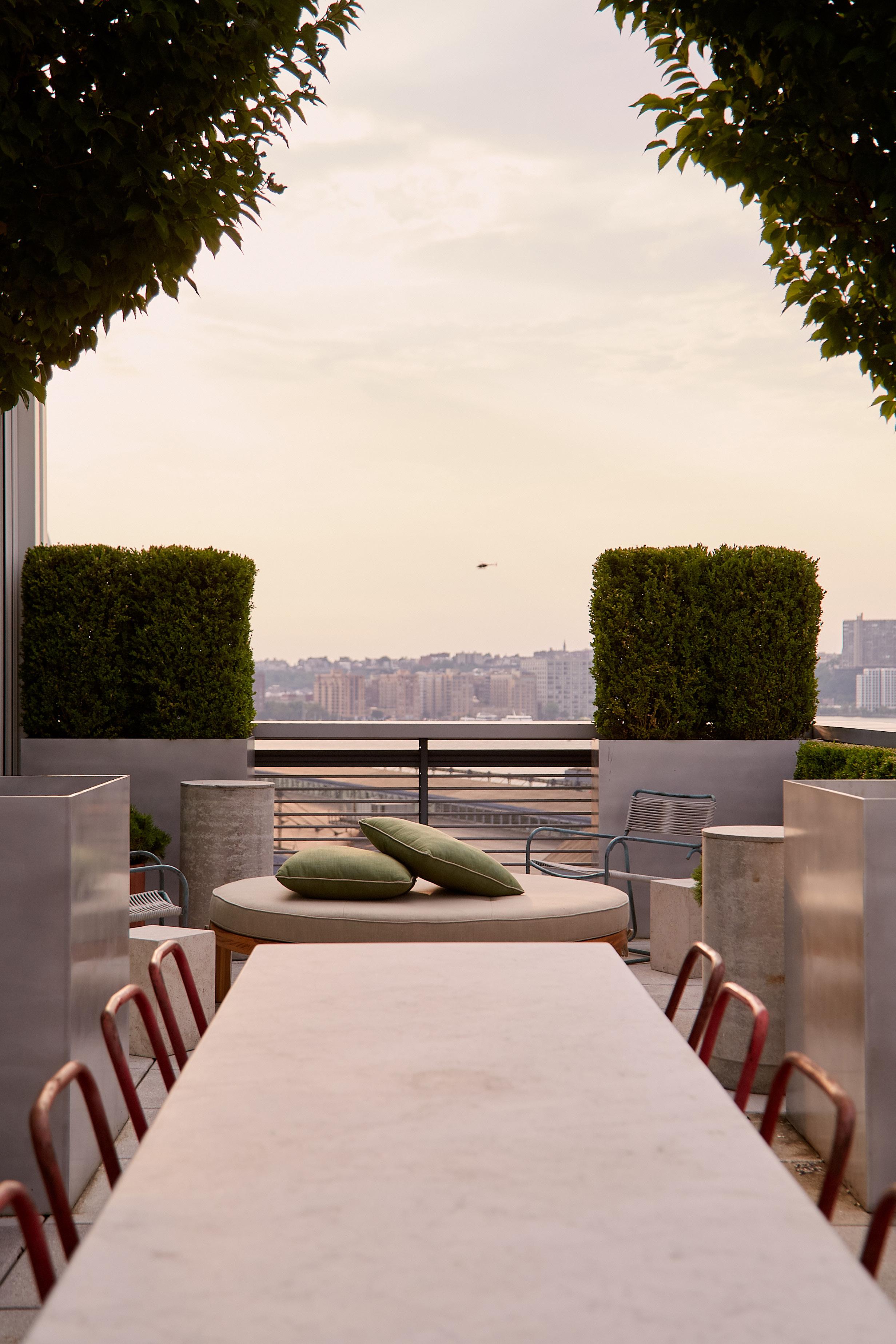
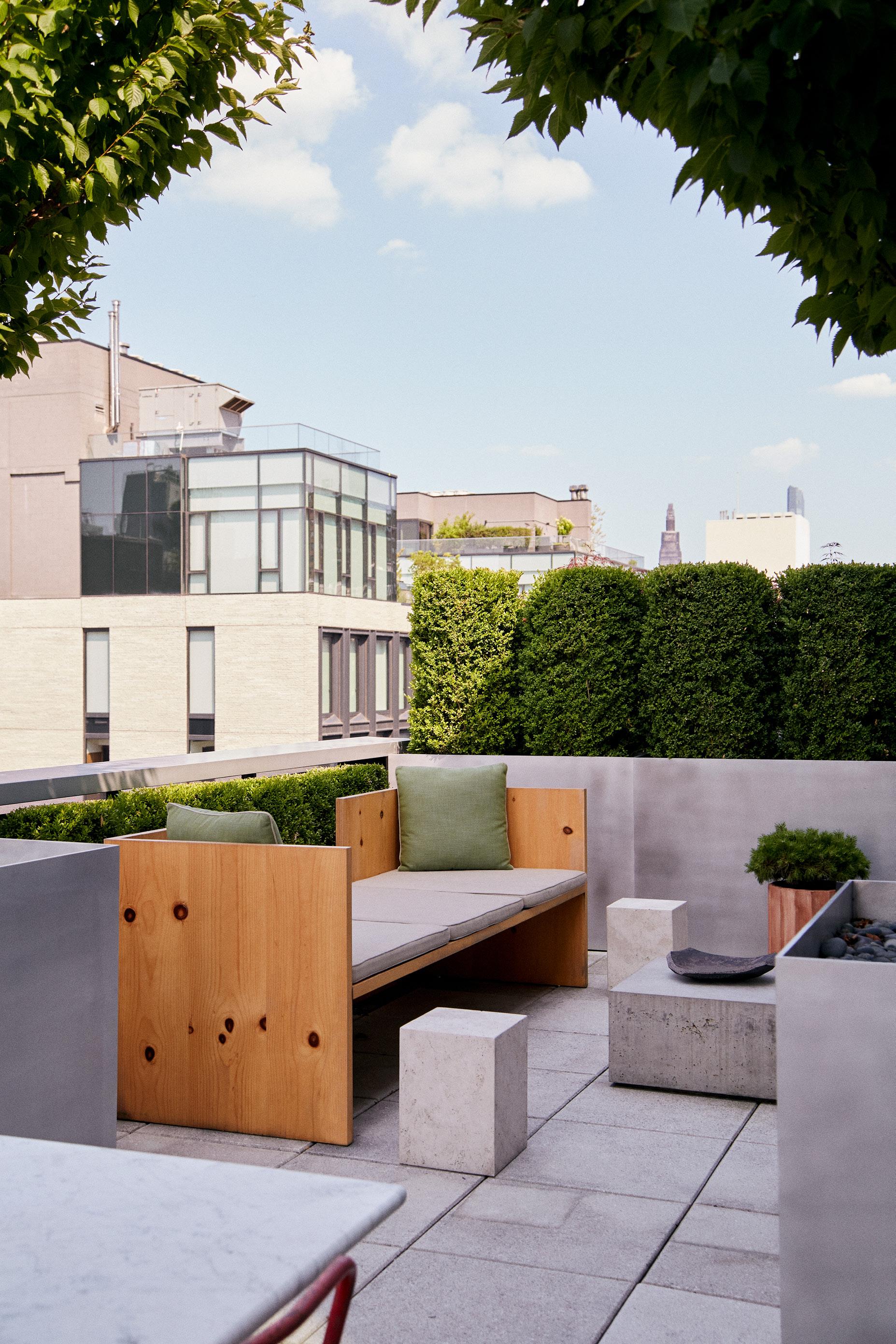
This page: Recognising that the new pavilion would be visible from the upper levels of the terrace, Welsh + Major designed the roof as an additional layer of garden to offer a lush, green perspective from above. Opposite page: The pavilion’s weighty concrete forms, draped with the overhanging leaves of the rooftop garden, create a vivid contrast with the expansive garden and sky beyond.
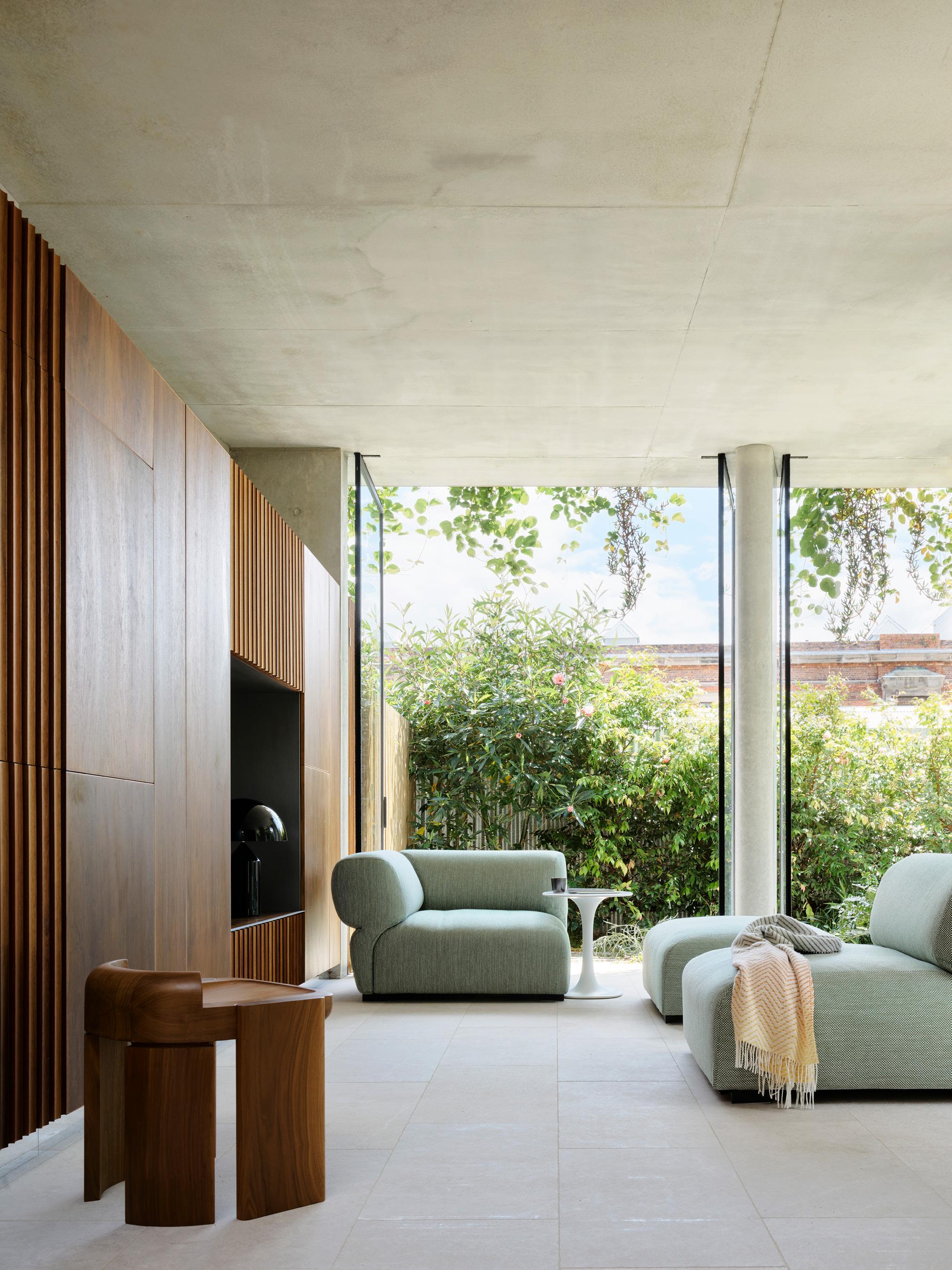
The living area in the pavilion is lined with St Martin limestone floor tiles. It features the Butterfly sofa by Patricia Urquiola for B&B Italia, Awa side table by Naoto Fukasawa for B&B Italia, Nevers stool by Studio Don Cameron from Gallery Sally Dan Cuthbert, Missoni Bram 164 throw and Oluce Atollo table lamp.
In designing the new rear pavilion, Welsh + Major sought to push the usual parameters of a reinvention project, creating a space that functions as both a sculpture and a sanctuary, deeply rooted in nature. "The pavilion is designed to ground you while fostering a strong connection with the garden. It strikes a balance between being protective and open,” Major says. The weighty concrete forms, draped with the overhanging leaves of the rooftop garden, create a striking contrast with the expansive garden and sky beyond.
At the heart of the pavilion is a preserved water well from the 1800s, which inspired the project’s name, ‘Argyle Well’. “We knew there was an old well on site before beginning work on the addition, but we were unsure of its exact location or condition, so we had to proceed with caution during construction,” Major says. Once located, its position required a slight design adjustment to accommodate a small set of steps around it. “We loved how the discovery brought the story of the rocks and water surrounding the house to the fore, so we chose to centre the pavilion around it.”
Despite the challenges the architects encountered during the lengthy renovation, Major shares that each solution they found made the house even more beautiful than before. “It was such a privilege to work on this old beauty of a house and add another layer to its rich history,” she reflects.
The pavilion is centred around a water well dating back to the early 1800s, which inspired the project’s name, ‘Argyle Well’. After the stonemason taught Major how to cut and place the stone, the architect reconstructed the well by hand. A reflection pool with an overhead skylight has been constructed above the well.
This page: The formal dining space features a vintage round travertine table with polished base, Ma Belle dining chairs in American walnut by Roberto Lazzeroni for Ceccotti, a Spotted gum cabinet by Ross Longmuir, Lenticchia Grande pendant light by Peter Zumthor for Viabizzuno, Armadillo Agra rug in Haze, vintage travertine sculpture by Sergio Asti for UP&UP circa 1970 from 506070, round bowl by Colin King for Audo Copenhagen, and ‘Near Dark’ (2008) by Mira Gojak from the Artbank collection above the fireplace. Opposite page: In the kitchen, Welsh + Major incorporated four elements crafted from stone, wood and stainless steel. The green marble island is the centrepiece, with a KWC Ono pull-out kitchen mixer and Yspo pendant lights by TossB above. Kitchen appliances include a V-ZUG Induction cooktop and Miele Combi-steam oven in a bespoke stainless steel cooking cabinet. Artwork is ‘Chairs’ (1983) by Geoff Harvey Studio from Artbank Collection. The black glazed porcelain vases on the mantelpiece are by Vivian Foley (UK).
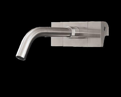
In the guest bedroom, a pod-style bathroom complete with a glass shower and fabric curtain emulates the flowing forms of an Alvar Aalto vase. The Cove armchair by Tom Fereday, made of post-industrial waste cast aluminium and cognac leather, complements these forms. The space also features a Flos Mini Glo-Ball by Jasper Morrison by the mirror, Vola tap mixers and basin spout, and a vintage 1970s coat stand by Lodovico Acerbis for Acerbis, from 506070.
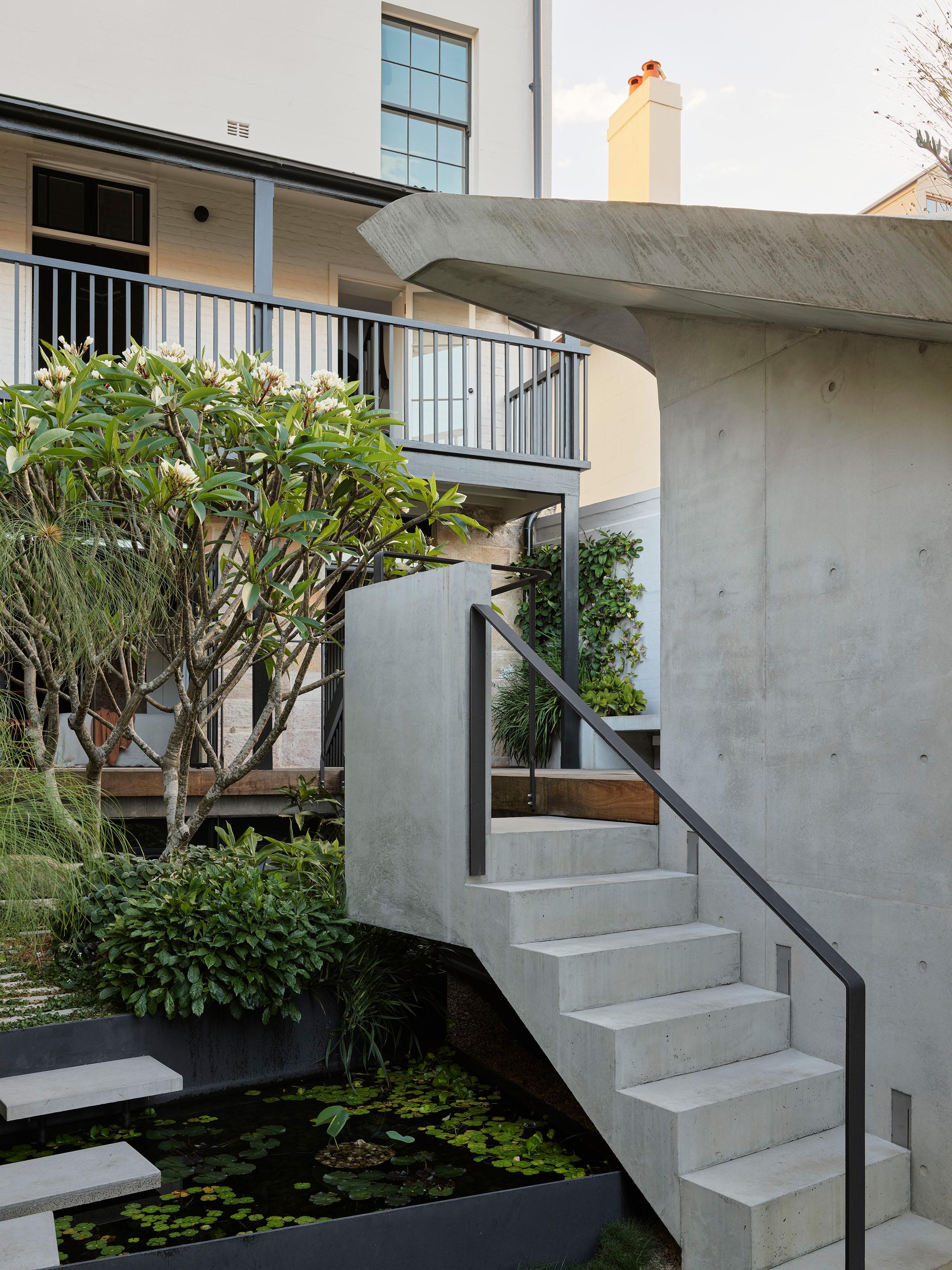
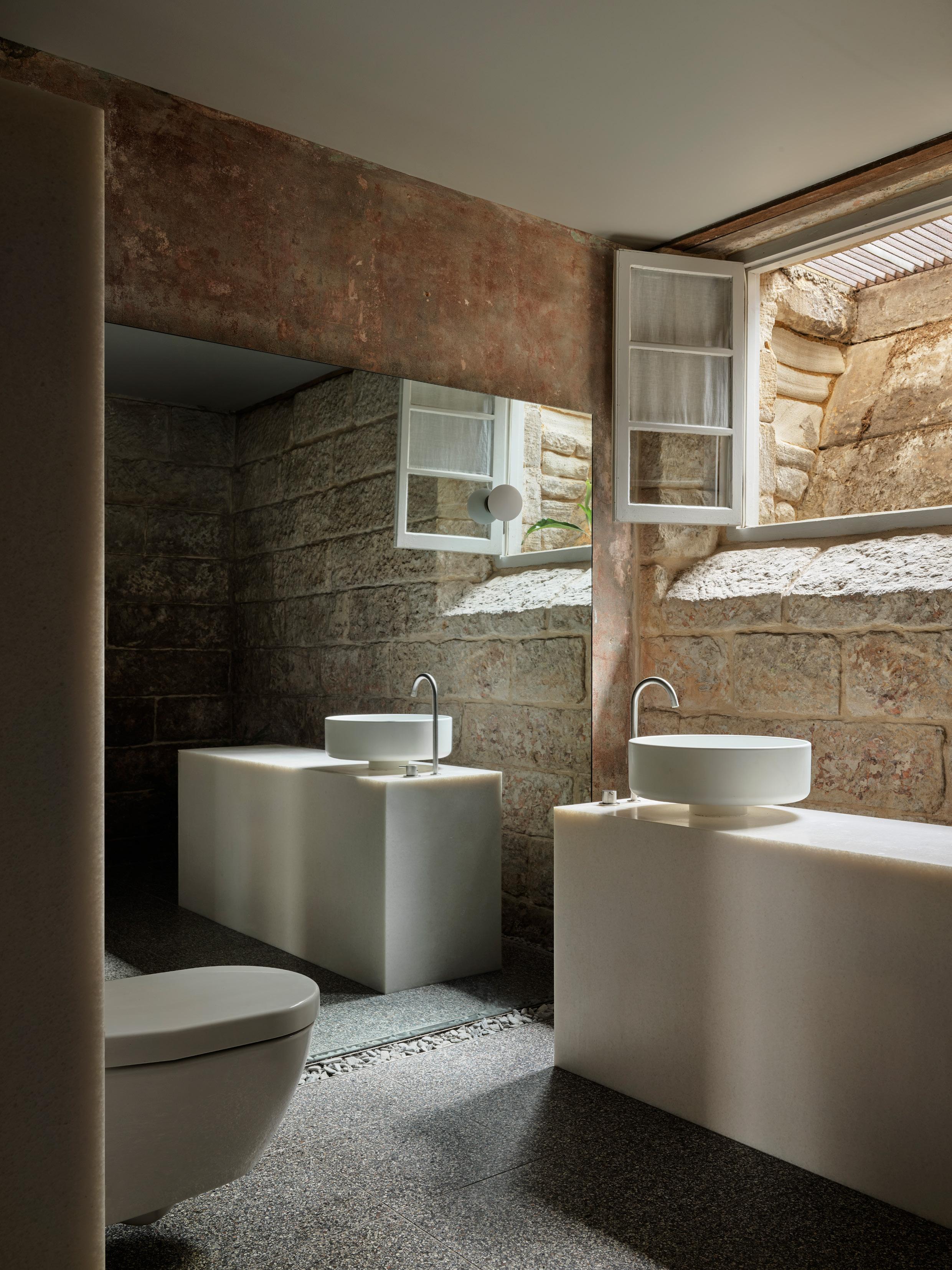
This page: The terrace’s original features, such as the weathered timber door frames, intentionally contrast with the contemporary features to create a dialogue between old and new. This bedroom features bedlinen by Bedouin SOCIETE. Opposite page: Welsh + Major stripped back the walls in the basement bathroom to reveal the original sandstone underneath. The floors are Surface Gallery Italian terrazzo, while the vanity is crafted from white quartzite and features a Bjhon countertop basin by Agape and Vola tapware.
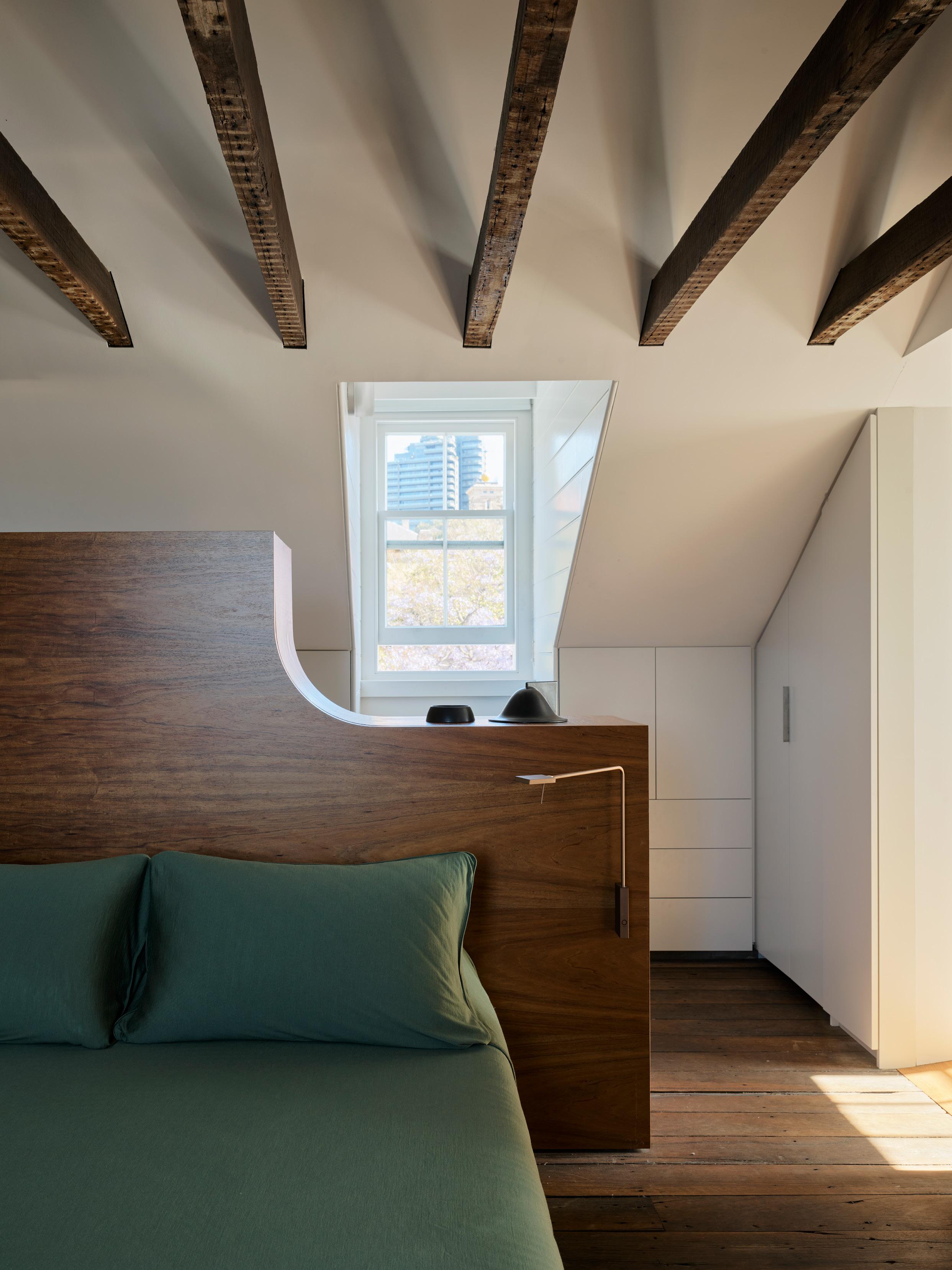
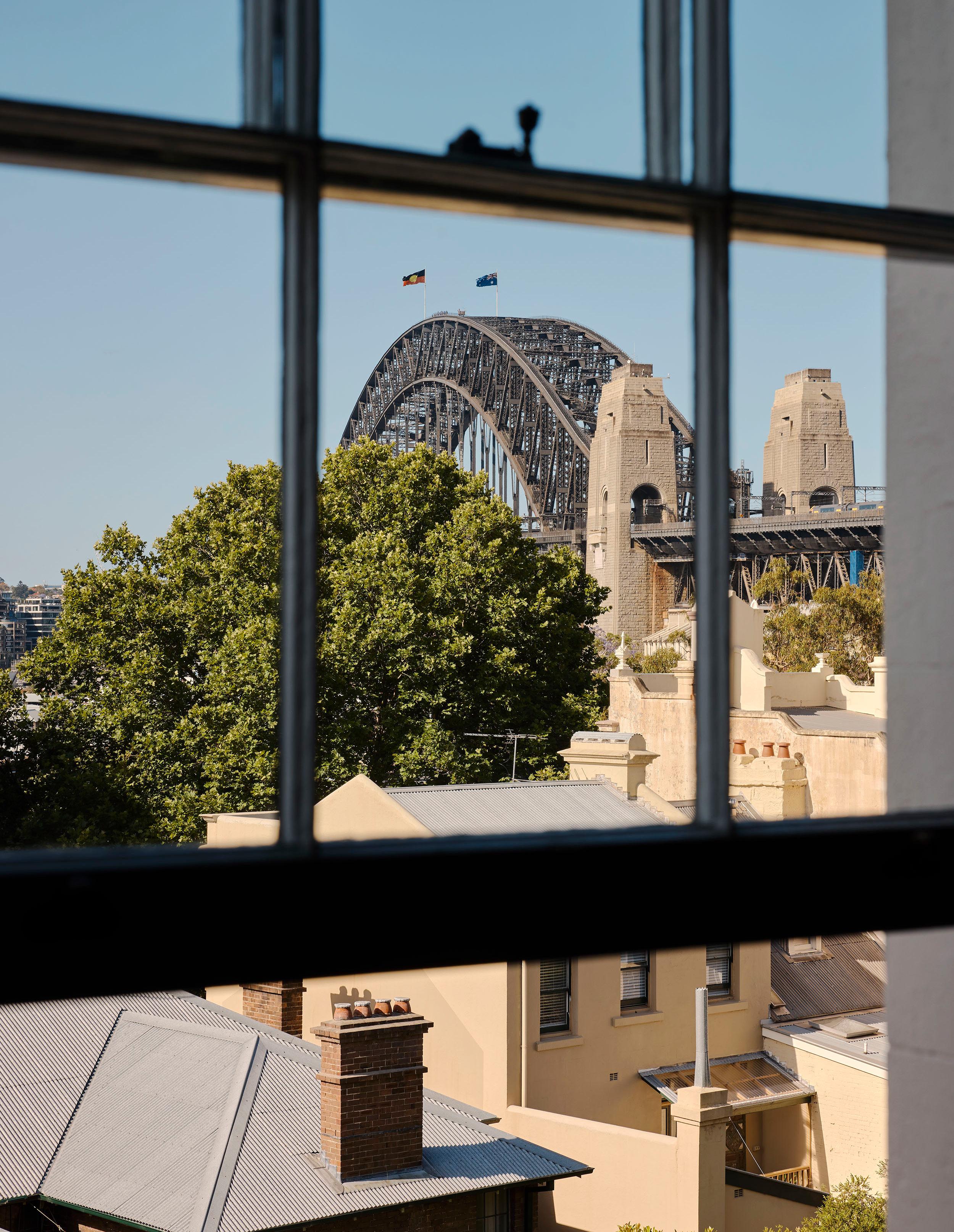
Opposite page: In the attic bedroom, a custom curved bedhead with Roy Tavolo wall lamps by Viabizzuno was designed to tie in with the exposed timber ceiling beams. The No. 1 bowl (and lid) by Aldo Bakker for Karakter sits within the curve. The space features two dormer windows that frame views of Observatory Hill and the Harbour Bridge. Bed linen is Shleep fine merino wool jersey sheeting and pillowcases in Olive Grove.
BNE MEL PER SYD
MY SPACE ANDRE MELLONE
Billal Taright PORTRAIT Stephen Kent Johnson WORDS Alexandra Gordon
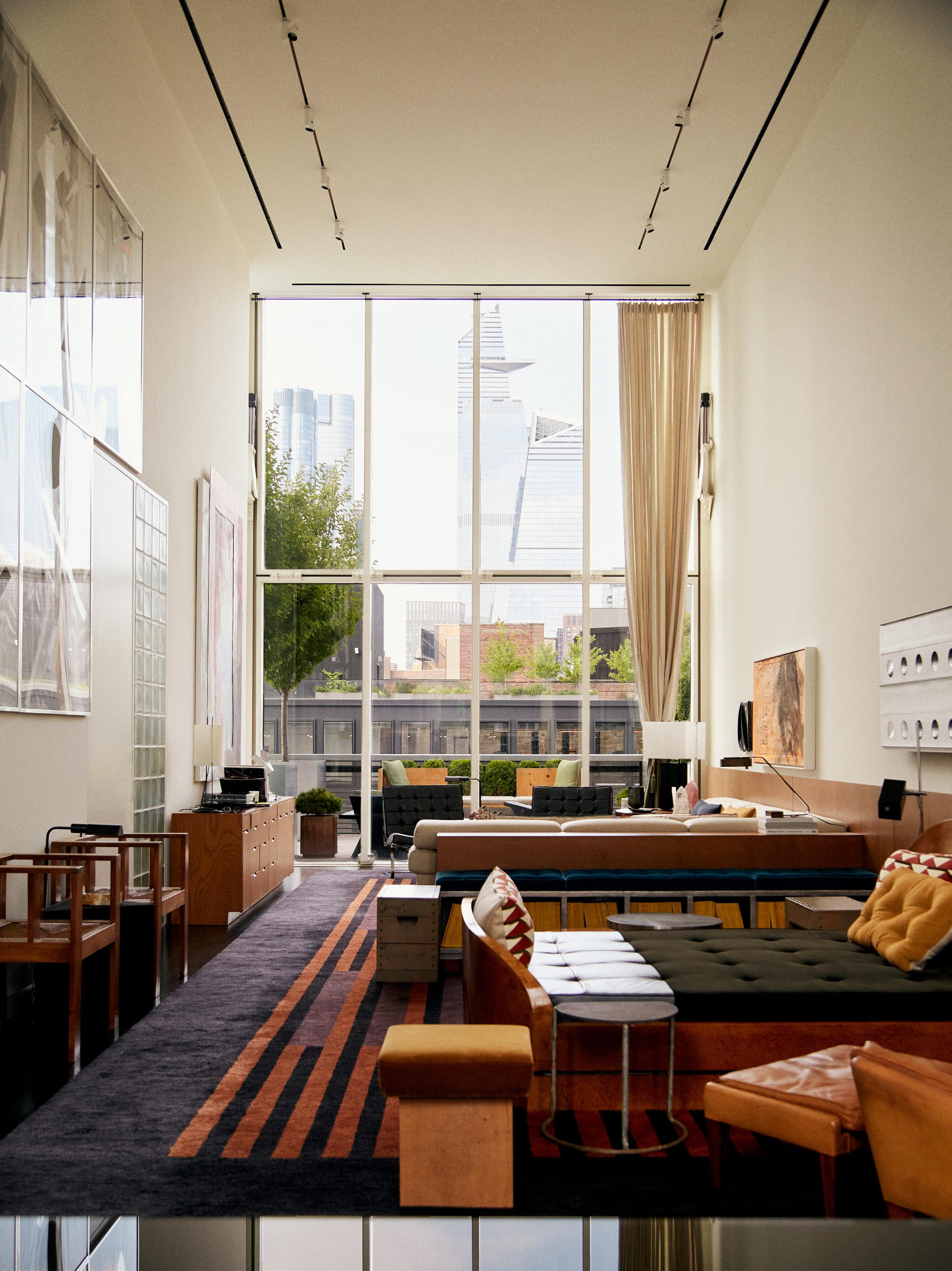
This page: A 1926 Pierre Chareau bed with Jean Prouve’s Aluminium Ventilators hanging on the wall above the wainscoting. An A805 Angel Wing floor lamp by Alvar Aalto for Artek features alongside a vintage 1960s lounge chair and stool by Illum Wikkelsø. Opposite page: In a corner of the living room, Knoll Barcelona chairs by Mies van der Rohe and an Ellen Felixon side table.
Pictured: Studio Mellone founder Andre Mellone. Art by Meredyth Sparks creates a commanding seating area in the living room with chairs by Frances Jourdain.
Explore Brazilian designer Andre Mellone’s New York apartment that doubles
as his ‘test kitchen’.
Designing your own home could be daunting for some designers, but not for Andre Mellone, founder of his namesake studio, who relished the opportunity. “It’s like a lab where you test ideas out and if things go wrong, you have no one to answer to but yourself,” the Brazilian-born New York-based designer says, adding, “and in that frame of mind I think it’s when the good ideas happen because you are so free and open.”
Situated within the only ground-up building in New York designed by renowned Japanese architect Shigeru Ban, the apartment had an undisputable pedigree. “We wanted an apartment that was both interesting and architecturally appealing, so when this became available in Shigeru’s building in Chelsea, close to the studio, it was obviously a big drawcard,” Mellone recalls, who together with partner Kevin Baker had conducted a widespread search for a new home.
Spread over two levels, it offered ample space for Mellone’s family to stay when visiting from Brazil. “We ideally wanted a couple of floors, some subdivision for privacy, with a few bedrooms that are private from each other for when family come to stay,” Mellone says, adding “it checked many boxes—the style box, the usage box and the functionality box.” Over the eighteen-month process that followed, Mellone made minimal changes to the bones of the apartment.
According to the designer, recolouring the walls and floors transformed the triple-height, combined living space from stark to homely. “We did an extensive study of what would be the right white for the walls,” Mellone laughs, landing on a warmer shade, verging on sand colour. “We ebonised the floors to change the feel, but obviously with rugs and decor it doesn’t feel so daunting," he admits. Custom joinery and a low wainscot stripe with integrated cove lighting completed the transformation.
The proportions of the main space made it challenging to furnish. “The whole idea behind furnishing this big long room was to separate it into smaller zones,” the designer says. A Carlo Scarpa-inspired sofa with a custom-designed credenza at the back delineates one space, while an unwanted family heirloom, a Pierre Charreau day bed, defines another seating area. “No one wanted it because it has funny dimensions, so I claimed it, incorporating it into the layout as a daybed,” Mellone explains. A custom mirror inset in the wainscot reflects the dining room.
This page: A Jean Prouvé armoire punctuates a corner of the combined living space. In the foreground is a custom cushion made of Pierre Frey fabric and a Green River Project stool. Opposite page: A custom mirror hangs above a Ludovico Acerbis sideboard in the dining room, centred around a Richard Meier dining table and chairs. To the left is an Illum Wikkelso lounge chair and ottoman. The overscale windows are softened by custom De le Cuona fabric curtains.
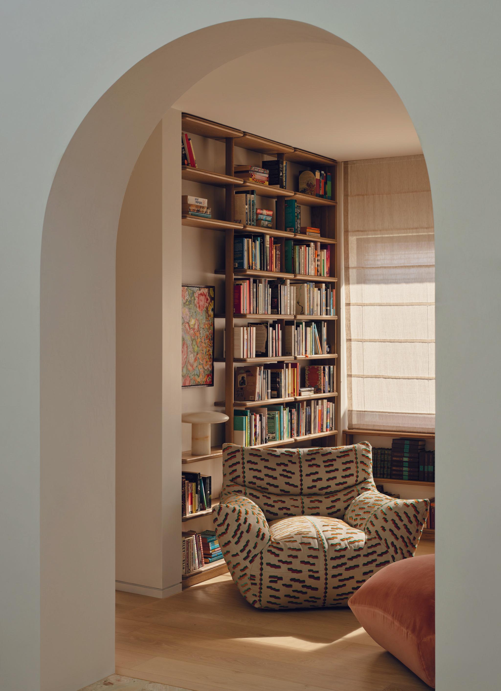
The second-floor library is furnished with a custom sofa, an Eames coffee table, and a side table by Elle Felixon. The painting by Tom Burr adds drama to the space.
Mellone was inspired by the work of American artist Donald Judd when furnishing the apartment. “At the time I was designing this apartment I went to Marfa, Texas, where I discovered the work of Donald Judd,” the designer recalls. “It led to the exploration of colours I hadn’t used before, whether on a cushion, or the seat of a bench, or the oversized custom striped rug,” Mellone says. A bench by Judd, an interpretation of one of the Marfa pieces, is surrounded by custom planters on the terrace.
The end result is a home that perfectly suits Mellone, Baker and their extended family. “I think a good project is one where you can’t decide what your favourite space is or it changes from one day to the next,” Mellone says who fluctuates between the living room and the more modestlyscaled bedroom, where he has a drafting table set up. Busily working between the States, Brazil and Switzerland, if he comes up for air, the decor might well change again. “It reflects my style but more than anything, it reflects the things I am interested in at that moment, Mellone says, “if I were to redesign it, which I am sure I will at some point, I would see different things because the eyes are always evolving.”
“It’s like a lab where you test ideas out and if things go wrong you have no one to answer to but yourself.”
– Andre Mellone
The guest bedroom is anything but bland. It features a painting by Reena Spaulings, a sculpture by Elaine Cameron-Weir, and a bench by JM Szymanski. A vintage Moroccan wool rug from Doris Leslie Blau grounds the space.
This page: The terrace is centred around a Donald Judd Pine bench. Travertine side tables and a concrete coffee table echo its form. Opposite page: A vintage bistro dining table and chairs creates seating on one of the expansive terraces.
A N E W E R A I N F I R E
H a n d c r a f t e d i n F r a n c e , w i t h 1 0 0 % P u r e C a s t I r o n B u i l t t o l a s t
s c u l p t f i r e p l a c e s . c o m . a u
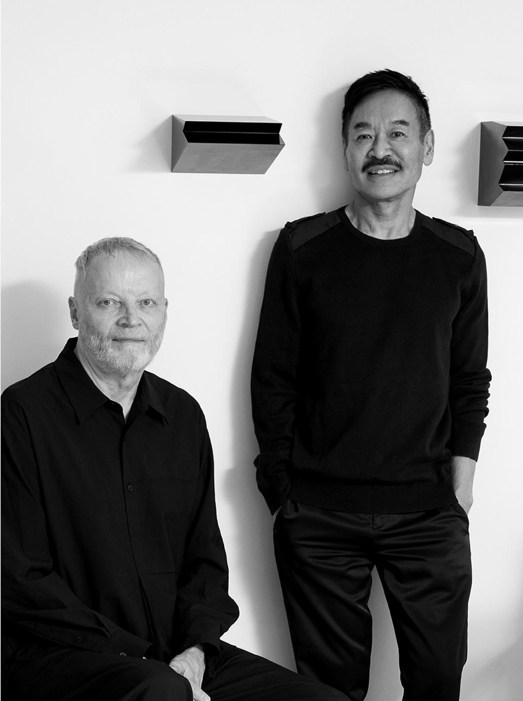
YABU PUSHELBERG
In Conversation
courtesy of Molteni&C
Additional words by Megan Rawson
George Yabu and Glenn Pushelberg have earned a reputation for their multi-disciplinary approach to design, seamlessly blending innovation with craftsmanship. In this exclusive interview, the duo reflects on the philosophies that guide their work, their creative journey, their longstanding collaboration with Molteni&C, and their unique approach to materiality.
Your practice is known for its multi-disciplinary approach. What core principles or philosophies guide your approach to design across different disciplines?
Glenn Pushelberg: We are not interested in repeating ourselves, so we look for partners who are open to exploring potential. Maybe this was more of a challenge for us when we were younger, but we have always placed importance on working with partners who share similar values to us, partners who are looking to innovate.
How do you stay creatively inspired and maintain a fresh perspective in your work?
George Yabu: Nature keeps us creatively inspired; it is at the root of who we are and what we do. More than ever, nature is threatened by the pace and build out of urban centres and the impact of climate change. As it becomes harder to access, nature becomes the epitome of luxury. This is a sad truth, but it urges us and our partners to think better about our creative outputs. It also means finding ways to make people aware of the beauty of nature and why we need to protect it.
Sway, our first outdoor furniture collection for Molteni&C, was designed to be one with nature and we hope this feeling reverberates to those who use it so we can together become more cognisant of our surroundings.
Photography
Pictured: The Sway modular sofa and coffee tables by Yabu Pushelberg for Molteni&C combine teak, aluminum, and polypropylene rope, drawing inspiration from nature with their fluid, organic forms.
Pictured: The Surf modular sofa, designed by Yabu Pushelberg, was inspired by sitting in a beach house, watching the waves and sketching their fluid movements. The final design aims to captures that same fluidity and undulation.
Can you talk about your relationship with Molteni&C and how your creative vision aligns with their design philosophy?
Glenn Pushelberg: Our mutual respect, trust, and admiration of one another can be seen through our three collections; the Surf sofa, Tivali kitchen and our oudoor collection; Sway. Molteni&C provides us with the freedom to explore our ideas, and we can trust that they can be brought to life with their technical prowness and integrity to craft.
The Sway outdoor collection seamlessly blends modern aesthetics with a Japanese influence. How did you approach balancing innovation with Molteni&C’s Italian heritage of craftsmanship?
George Yabu: The gentle disposition of Sway was crafted through its details. How we achieved this sensibility is through the collection's form and materiality. Throughout the design process, I was guided back to my Japanese heritage, and the attributes that so succinctly define craftsmanship in Japan. At the same time, Molteni&C’s Italian heritage brought a poetic element to the collection, along with their meticulous engineering skills.
Can you describe the role that materiality played in shaping your collection with Molteni&C?
George Yabu: We worked with three primary materials: teak essence, aluminum, and polypropylene ropes. Together the materials create an eleven-module system that invites imaginative configurations, inspired by the layering concept of the sofa.
What do these collections represent in the broader context of your design portfolio, and how does it reflect your evolution as designers?
George Yabu: We continue to dream bigger and think about how we can apply our ideas to new challenges. Each collection we’ve created with Molteni&C resolves a different challenge in design. So much
outdoor furniture today is big and bulky and in no way relates to its surroundings. Being aware of what is on the market, and how little it correlates to the outdoors guided us towards the concept of Sway. We wanted to create a collection that could be one with nature’s elements. When you are low to the ground, you are put into a position where you are one with nature and everything is lifted. The leveling of Sway allows you to root yourself in your surroundings and feel more present.
Collaboration is a key element in creating iconic design pieces. What has been the most rewarding aspect of working with Molteni&C?
Glenn Pushelberg: Despite the scale and prestige of Molteni&C, at the end of the day they are a family business. They work with their gut. It is so much easier to create beautiful things with people when you can have a genuine partnership. You can see the authenticity of the partnership in our collections.
Lastly, do you have a piece from the Molteni&C collections that you are especially drawn to?
Glenn Pushelberg: Our beach home in Amagansett grounds us, and that feeling often leads us to some of our most pure ideas. Our beach home in Amagansett grounds us, and that feeling often leads us to some of our most pure ideas. Many of our product collections have been conceived in that house, like the Surf Sofa for Molteni&C. The design was inspired by the waves; we have one of the sofas there now. When you get closer to yourself and what matters to you, you can unleash a bounty of potential.
George Yabu: We also have the Sway collection on our outdoor terrace in our Toronto home. It’s funny, our love for Bennington grew so much that we noticed the foundation beginning to tilt, requiring us to re-prop it to preserve the structure. This turned out to be a blessing in disguise because it allowed us to focus on enhancing our outdoor porch.
Visit Molteni&C’s Melbourne Flagship at Industry Lanes, 459 Church Street, Richmond VIC 3121. Stay tuned for the opening of a second location in Sydney in 2025. +61 3 9968 1222 | melbourne@themanagement.company
MODERN
CURIOSITY
LOCATION Wurundjeri Woi Wurrung and Bunurong Country / Melbourne, Australia
DESIGN & ARCHITECTURE Kennedy Nolan PHOTOGRAPHY Derek Swalwell WORDS Sophie Lewis
A late-modernist apartment overlooking its neighbouring gardens is reconceived as a cabinet of curiosities.
Designed in 1961, ‘Fairlie Flats’ by Yuncken Freeman Brothers, Griffiths & Simpson heralded a new decade of residential architecture in Melbourne. The nine-storey building was one of the city’s earliest examples of a high-rise block of apartments, claiming its exclusive place opposite the Royal Botanic Gardens.
“We’ve admired the Fairlie building for longer than we can remember,” Kennedy Nolan founding partner Patrick Kennedy says, admitting he had big expectations. While the apartment’s existing interior had been significantly altered to be rather ‘unremarkable’, Kennedy maintains the inherent qualities of the building remained. “The apartment featured a superb entry sequence, an aspect on three sides and the elegant late-modernist colonnaded veranda facing west with one of the most beautiful views in Melbourne,” he adds.
With its reinforced concrete frames, prefabricated concrete panels, and non-loadbearing vertical curtain walls, the Fairlie façade was a reference point for residential buildings well into the 1970s. Its late-modernist influence can also be seen in the common areas, such as the fully-glazed lobby and spiral staircase. “The building’s structural design allowed for freedom in each apartment layout,” Kennedy explains. “We interpreted this approach as intentional, reimagining the apartment based on the design principles of the building’s architecture.”
The clients had a discerning eye for art and furniture, and their collection consciously shaped the design methodology. “Our role was to provide an exciting and elevating setting,” Kennedy says, likening their design to a Wunderkammer—a cabinet of curiosities. Late modernism and its ‘refined, mannerist sub-genre’ led the studio to develop an interior based on axial planning that emphasised theatrical settings manifested through surface texture and tertiary hues.
This page: The ‘long room’ features a custom-designed rug by Kennedy Nolan and produced by Loom, Knoll Platner armchairs and a Tahiti lamp by Ettore Sottsass for Memphis Milano on the Artedomus Roccia travertine ledge. The floors are also Artedomus Roccia travertine, and the wall covering is Juicy Jute Grasscloth by The Textiles Company. On the left shelf; ‘Together’ ceramic sculptures by Brendan Huntley from Tolarno Galleries and ‘Diety and House of Verrocchio’ paintings by Kez Hughes from Stockroom Kyneton. Previous page: Kennedy Nolan designed designated elements such as plinths, platforms and ledges for the client’s sculptures. Pictured: a Micheluzzi Murano glass piece on the shelf, a Cloud No. 1 sculpture by Guan Wei from Arc One Gallery, an Owl sculpture by David Noonan, and a White Ape sculpture by Lisa Roet.
This page: The snug is for ‘refuge and intimacy’, featuring a grasscloth wall covering in a custom coral colour and armchairs upholstered in a check pattern referencing the client’s Scottish heritage. Also pictured: a Vitra Eames Soft Pad chair and artwork by Amanda Marburg, Kirsty Budge, Stephen Bush, Damiano Bertoli and Adam Lee. Opposite page: In the dining space, a Tronchi chandelier by Toni Zuccheri for Venini, Vienna Wiener Stuhl chairs by Gebrüder Thonet, and a customdesigned Thomas Lentini dining table. Artwork by ‘All is Dark is Midnight To Me (For K.L.)’ by Adam Lee from Station Gallery.
Spaces are organised around the windows on three sides of the apartment, capturing what Kennedy describes as the star of the show–the gardens. This is best seen in the ‘long room’, one continuous space with a salon-style arrangement, where high-gloss plaster ceilings reflect the tree canopy, and strips of mirror bookend each window to create infinite views. Condensing the home’s three bedrooms into a primary suite, horizontal space is further amplified through enfilade planning.
Kennedy Nolan’s appreciation for the clients’ art and objects spurred them to design elements such as plinths, platforms, and ledges, “Always understanding that everything should not be so specific that it was incapable of accommodating a broad range of objects,” as Kennedy articulates. Grasscloth, raw linen and limed oak speak to the studio’s use of beige tones throughout, underscoring the art and views. “Beige, often maligned for its blandness, is a tone that feels ripe for reappraisal,” Kennedy observes, adding, “It’s warm, soft, and neutral, which is infinitely adaptable to other hues.”
Late-modernist tertiary colours, particularly red-orange, can be seen in the 60s design pieces, such as the vintage Venini chandelier, and Vola tapware. These accents culminate in the ‘snug’ with its custom coral grasscloth walls, check-patterned armchairs and focal artworks by Australian artists Amanda Marburg, Kirsty Budge, Stephen Bush, Damiano Bertoli and Adam Lee. For Kennedy, the snug is about refuge and intimacy. “We had to carefully balance where to deploy intensity,” Kennedy says, guiding every design gesture in the creative, intelligent reinterpretation of this remarkable apartment.
The Vola KV1 kitchen mixer plays to the tertiary hues seen throughout. Floors are Artedomus Roccia Travertine, with a yellow-tinged Artedomus Travertine Lait benchtop and limed American oak cabinetry produced by Charles Sandford.
The entry creates a sense of arrival, featuring a Servomuto Easy Ovale wall light, Flos C1 Mono Spot ceiling lights by Vincent Van Duysen, Sari silk rug from Apadana Rugs & Carpets, and Barbera Fermat handles. Cabinetry is upholstered in James Malone Debussy from The Textile Company. The four-panel photograph art piece is ‘Barindyila Barindyila (Sister, Sister)’ by Dr Christian Thompson AO from Sarah Scout Presents.
This page: Studio Henry Wilson Counter hook in brass, Artedomus Vixel | O.12 tiles, VOLA KV10 basin tap set and limed oak cabinetry. Opposite page: Kennedy Nolan condensed the apartment’s three bedrooms into a primary suite featuring a Gervasoni Ghost 80 bed by Paola Navone, Portofino wall lights by Servomuto, Pierre Frey curtains and wall panels upholstered in James Malone Debussy from The Textile Company.
Clockwise from top left: Akari 25N floor lamp by Isamu Noguchi for Vitra, Vienna Wiener Stuhl chair by Gebrüder Thonet, Triple Tier coffee table by Barl Ziperstein for BZIPPY, Block tray by Studio Henry Wilson, Tahiti lamp by Ettore Sottsass for Memphis Milano, Charlotte Perriand: Inventing a New World by Jacques Barsac, Portofino wall light by Servomuto, Platner armchair by Warren Platner for Knoll, Sincro Clear Oak by Evenex Sincro, Juicy Jute Grasscloth in ‘First Snow’, Travertine Lait and Roccia Travertine by Artedomus, Vixel O.12 tiles by Artedomus, KV10 basin tap set by Vola, Kyoto coffee table by Gianfranco Frattini for Poltrona Frau, Large Fermat Entrance handle by Barbera Design.
PREMIUM ENGINEERED TIMBER MELBOURNE | SYDNEY |
ELBA BLUE
THE LIBRARY
LIBRARY
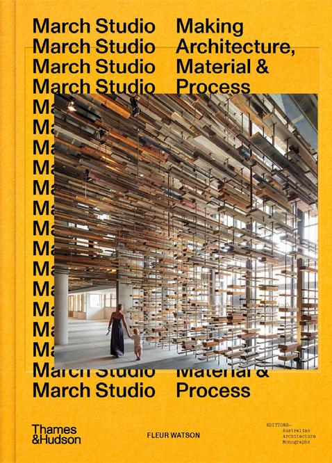
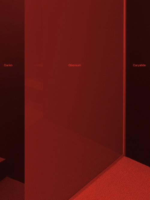
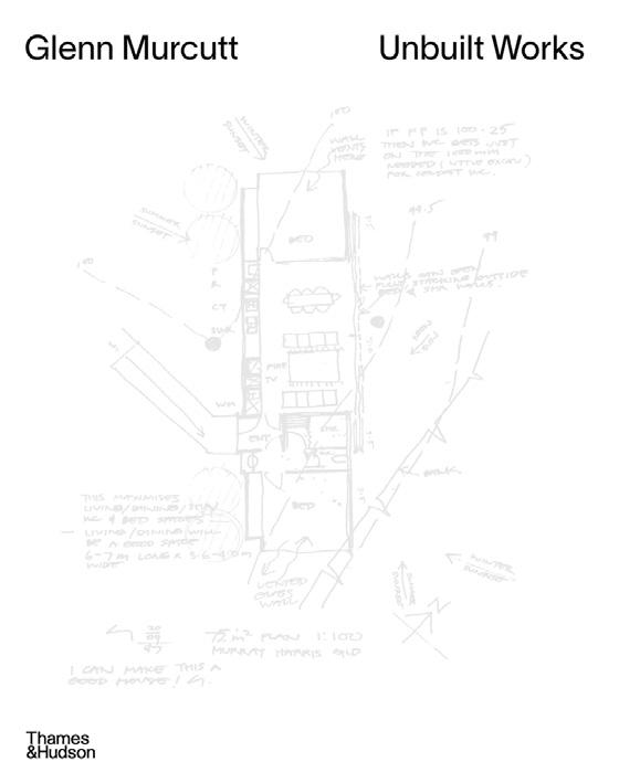
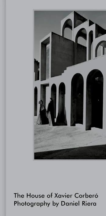
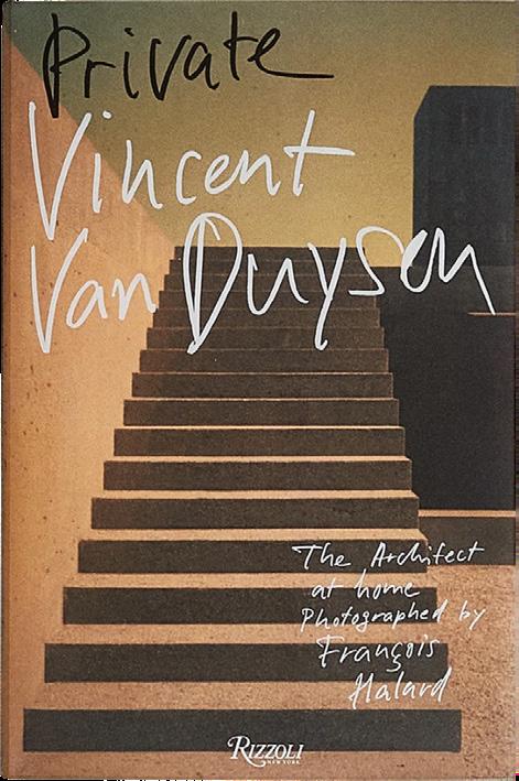
Clockwise from top left: March Studio: Making Architecture, Material & Process by Fleur Watson, Vincent Van Duysen: Private by Vincent Van Duysen, Louis I. Kahn: The Last Notebook by Sue Ann Kahn, Louis De Belle, Glasraum Ganko by Ganko + L. De Belle; F. Ballabio; K. Geers, The House of Xavier Corberó by Ana Corberó, Elizabeth Roberts Architects: Collected Stories by Elizabeth Roberts, Hot to Cold: An Odyssey of Architectural Adaptation by Bjarke Ingels Group (BIG), Glenn Murcutt Unbuilt Works by Nick Sissons, Ashe Leandro: Architecture + Interiors by Ariel Ashe and Reinaldo Leandro.
bauwerkcolour.com
Bauwerk Imagined by Christoph Neumann
The Quiet Luxury of Minimal Hardware with Momo Handles
Minimal hardware, with its refined craftsmanship and understated finishes, has evolved into a design statement that transcends functionality to embody an essence of quiet luxury in the home.
The movement toward minimalism in interior schemes goes beyond elegant furniture and restrained material palettes, extending into hardware design—an often-overlooked yet essential detail that captures the art of finishing touches. These contact points throughout a home serve as essential, yet unobtrusive design elements that provide an opportunity to bind together an aesthetic.
Momo Handles offers a distilled range of handles, pulls, and knobs that exemplify this balance of precision and finishes. Their pieces highlight how minimal hardware can cohesively enhance a space without sacrificing usability, proving that sometimes the most subtle details make the strongest impact.
Leading architects and designers are embracing minimal hardware by focusing on clean lines and functional simplicity. Design studios such as the Belgium-based practice Ville Design are celebrated for their pared-back aesthetic and attention to detail, prioritising high-quality materials and bespoke craftsmanship.
Explore hardware from Momo Handles >
www.momohandles.com.au
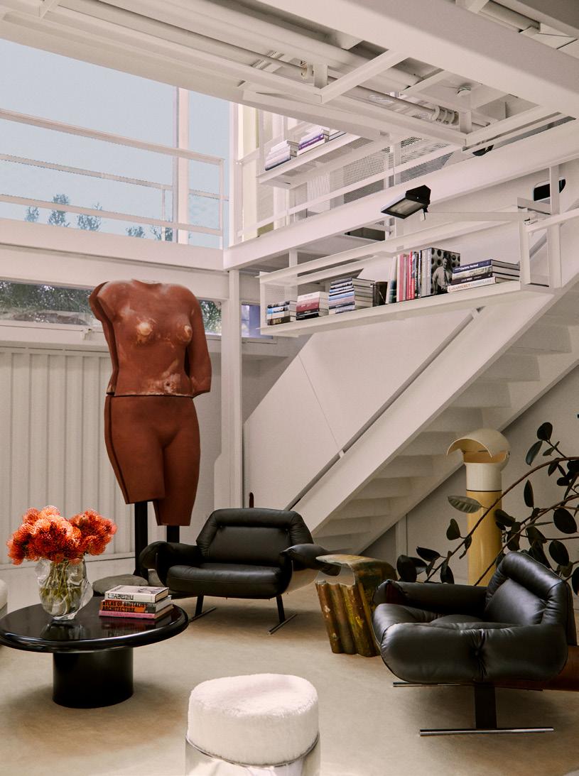
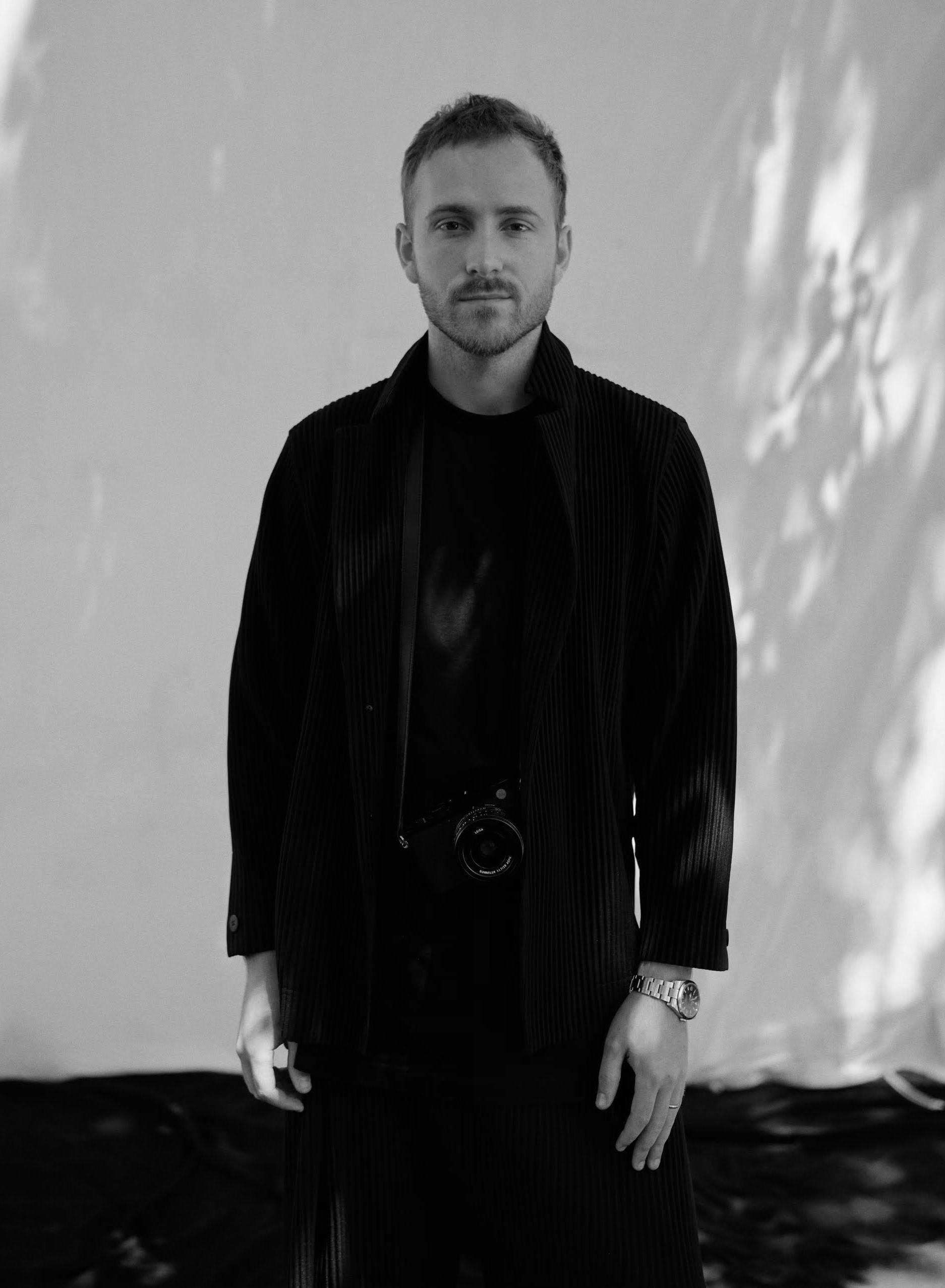
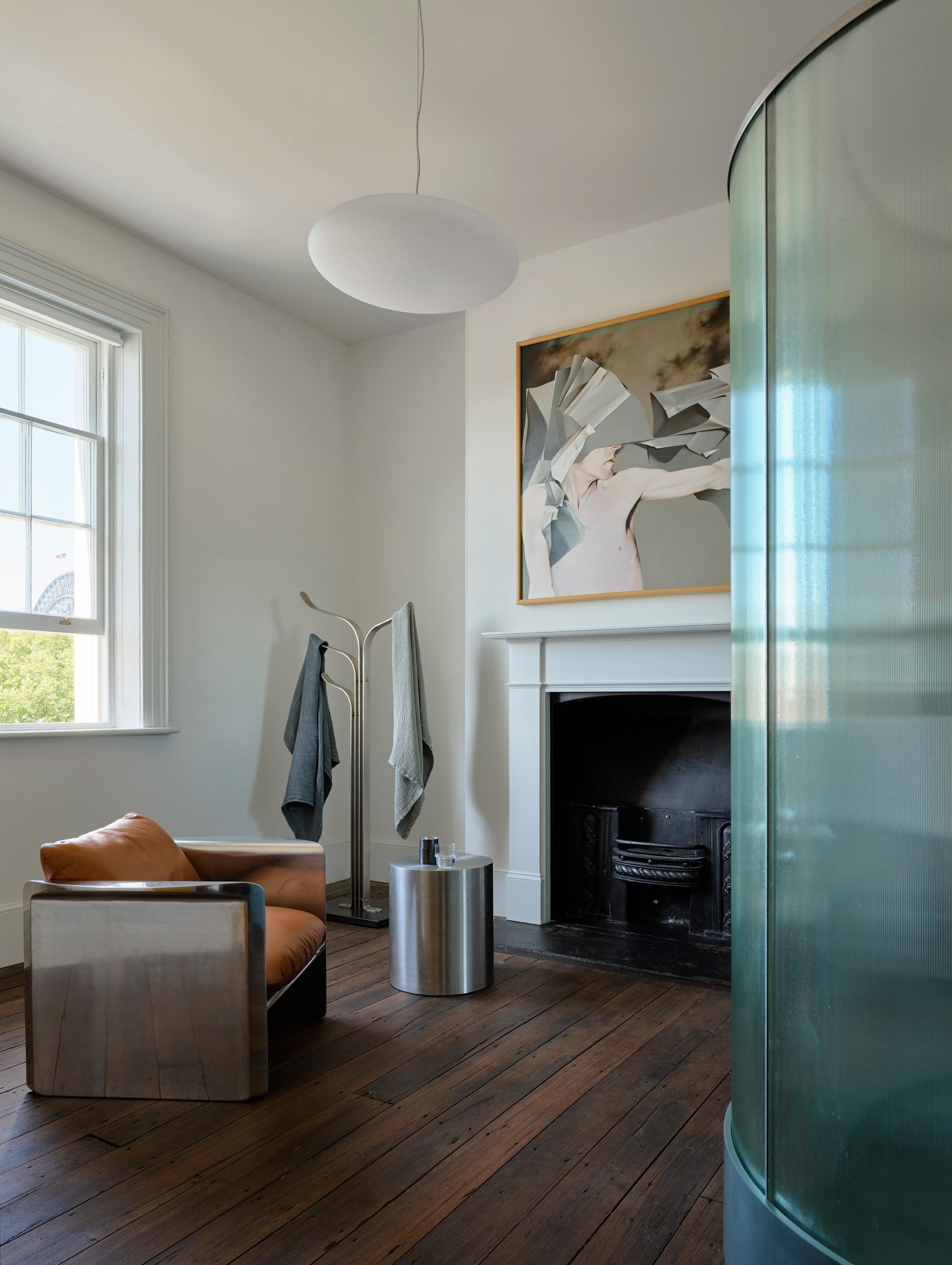
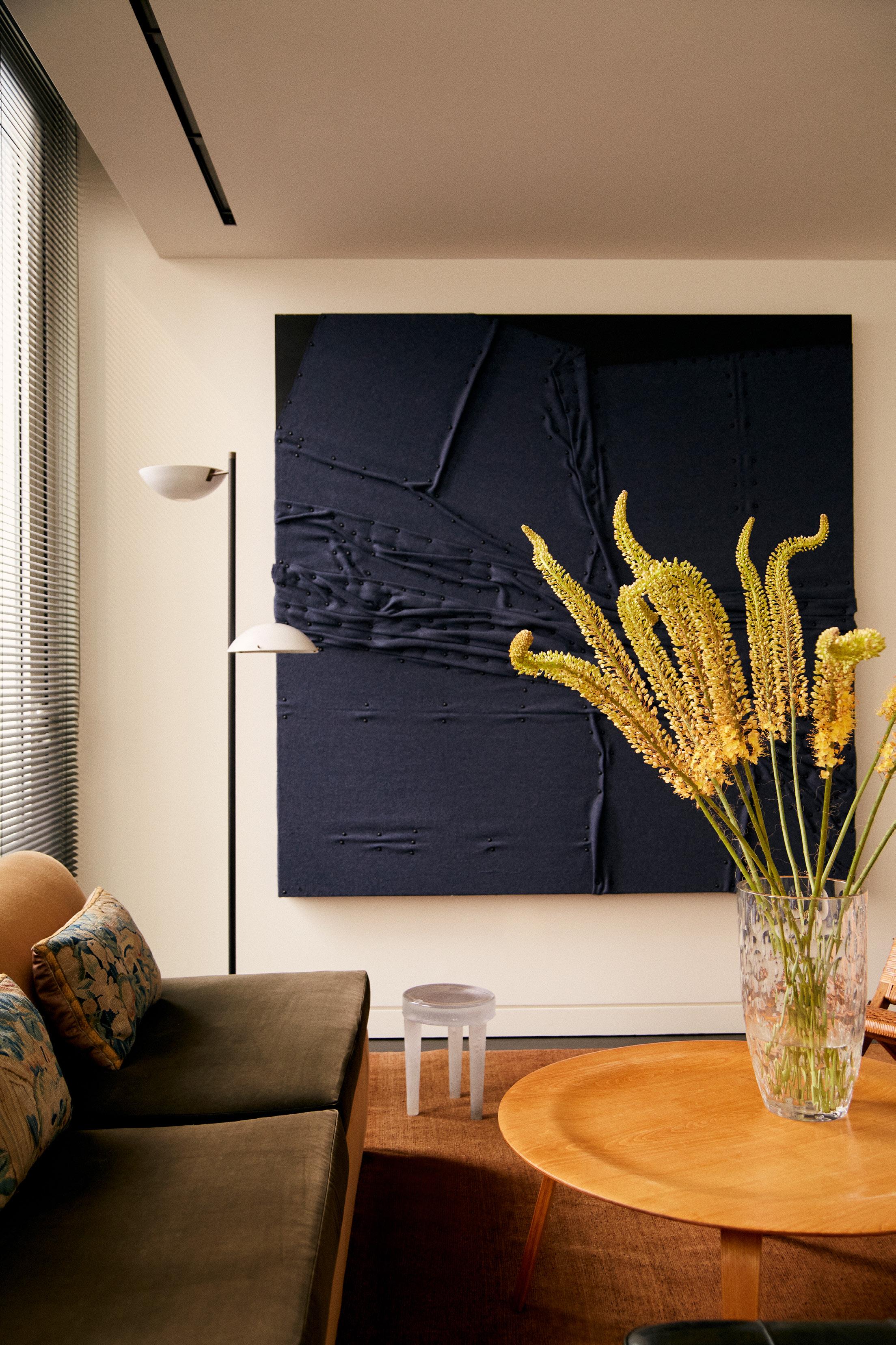
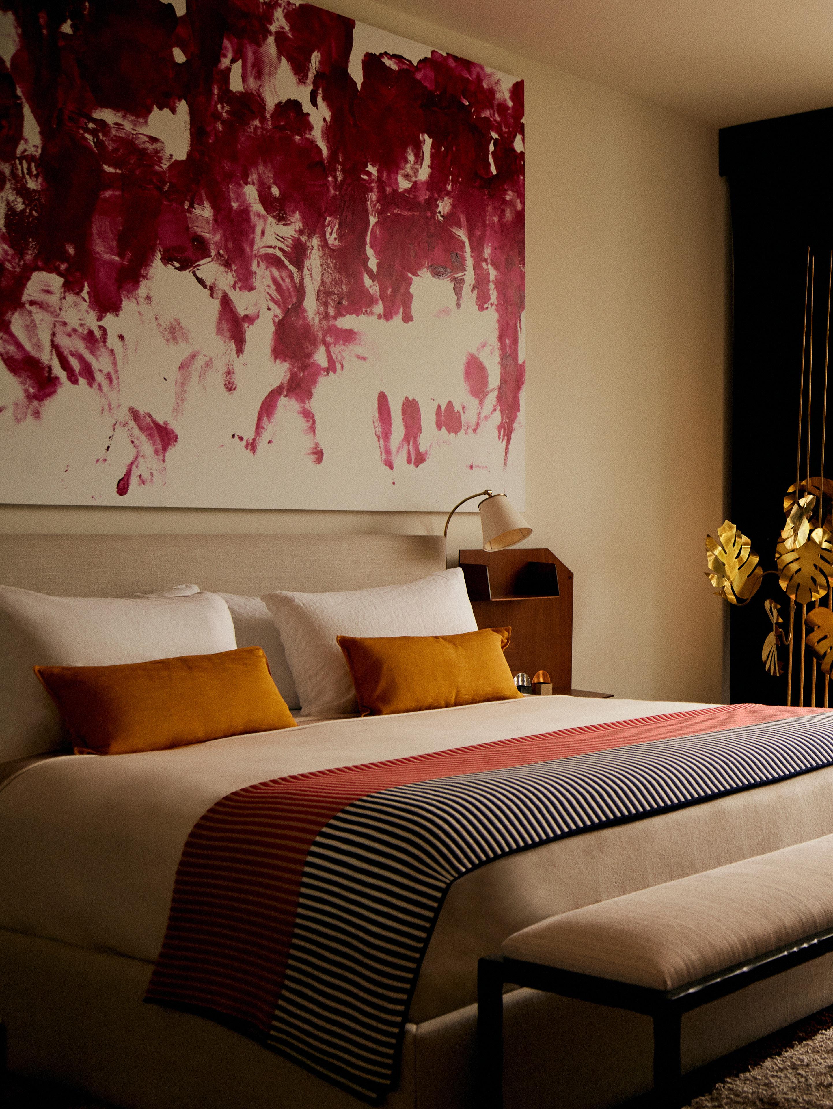
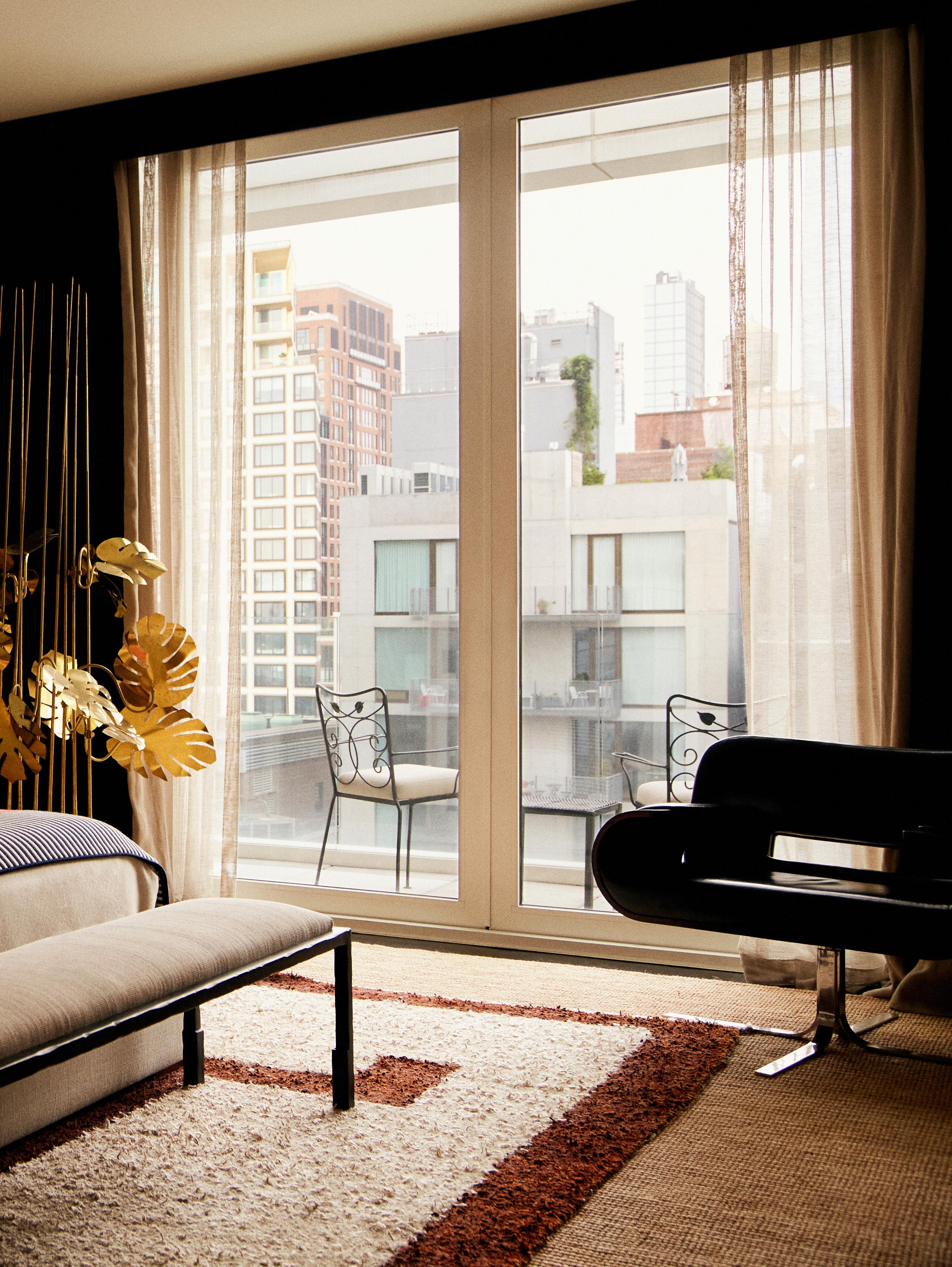
BLURRED LINES
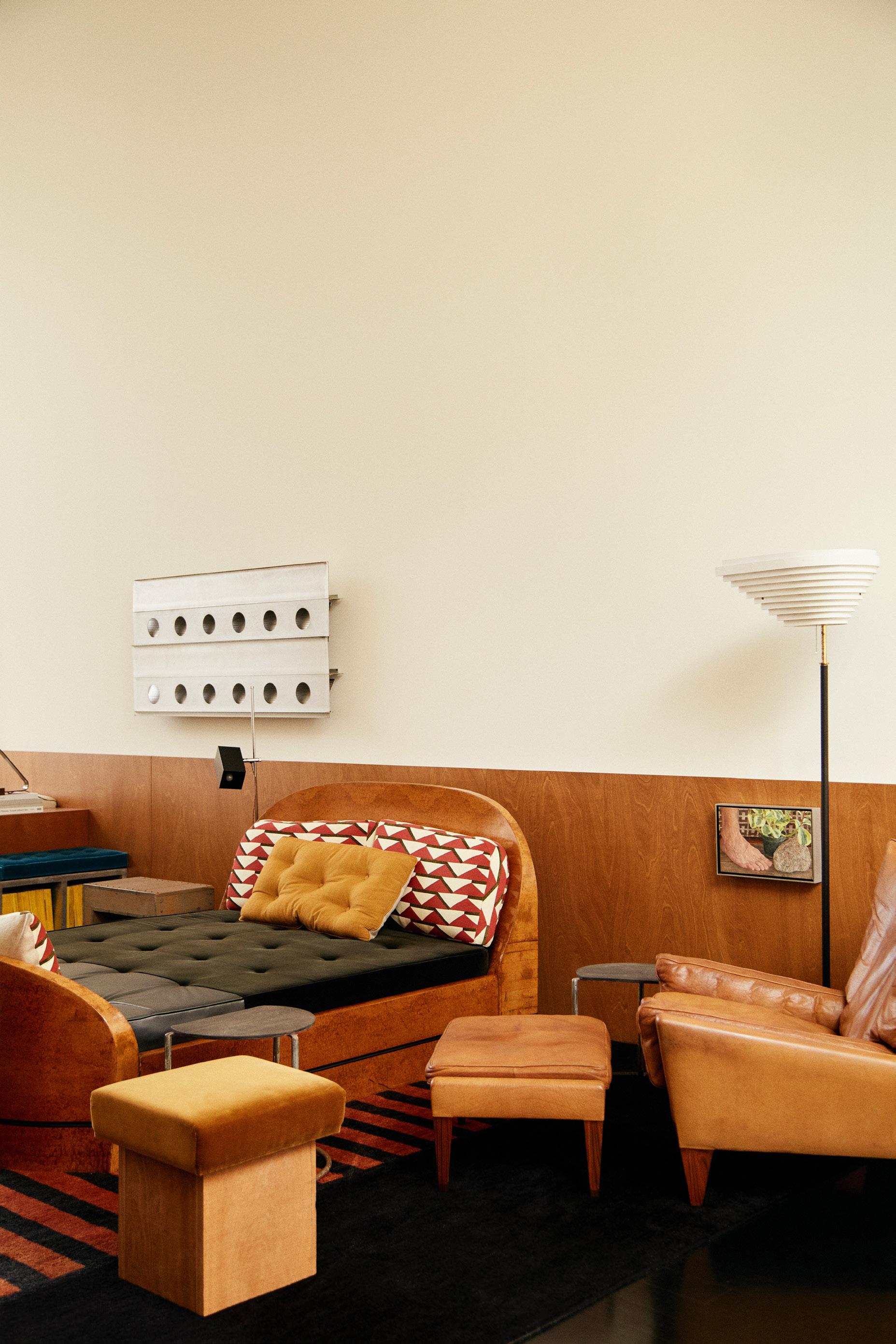
LOCATION New York City, North America DESIGN Sebastian Zuchowicki
PHOTOGRAPHY William Jess Laird WORDS Holly Beadle
The main living area features a cosy sitting area alongside a dedicated work zone. The space's neutral plaster walls and richly stained timber floors provide a serene backdrop for furniture, art, and textiles—some a part of Zuchowicki’s own collection, others on loan from vendors and available for clients to purchase.
Vintage pieces from Raisonne—a Charlotte Perriand coffee table, Pierre Paulin armchair and Pierre Jeanneret stool—rest atop a 1930s André Arbus rug from Beauvais, which rests atop Zuchowicki’s own sisal rug. Hanging above Zuchowicki’s velvet sofa is an aluminium Jean Prouvé wall panel.
When Argentine-American interior designer Sebastian Zuchowicki set out to merge his living and working spaces, he saw it as an invitation to blur the lines between comfort and creativity. The result is a home-office that embodies the warmth of home life while fostering a dynamic, welcoming space for his team in the heart of New York’s West Village.
Zuchowicki founded his eponymous interior design studio in 2020, during a time when the meaning of home was being redefined. As the world reopened and his business flourished, the need for a space to collaborate with his team and host clients became apparent. Embracing the idea of a hybrid living-working space, Zuchowicki began searching for a location that could serve both purposes. His search led him to Manhattan’s West Village, where a broker friend introduced him to an 1886 Georgian-style townhouse. Without hesitation, Zuchowicki secured an entire floor of the space, eager to create a home-office that would reflect his studio's ethos of comfort and connection.
"Chaotic yet full of life" is how Zuchowicki describes the space. The main living area, which features a cosy sitting area alongside a dedicated work zone, was crafted with his team’s wellbeing in mind. "I wanted my team to walk in and immediately feel at ease, so I chose colours rooted in nature," he shares. The space's neutral plaster walls and richly-stained timber floors provide a serene backdrop, ideal for layering furniture, art, and textiles. "I've always had a love for plaster, and I've never been one for stark white walls!"
Pieces are constantly rotating through the space, many on loan from vendors and available for clients to purchase. A 1930s forest-green André Arbus rug currently rests atop Zuchowicki’s own sisal rug, destined for an upcoming project, while a sleek aluminium Jean Prouvé wall panel is showcased above his velvet sofa. "We want our clients to experience how these pieces will feel in their own homes—it's much more impactful than seeing them in a gallery or store," Zuchowicki explains.
The compact kitchen epitomises New York living. “I’m not much of a cook,” Zuchowicki admits, “so I designed a kitchen meant for making coffee and little else. Very Carrie Bradshaw, if you ask me.” Nevertheless, the kitchen had to align with the overall vision of the space, especially since it’s the first thing you see upon entering. Black Roman clay walls, stainless-steel counters, and a charcoal under-sink skirt create a dark, theatrical atmosphere, as if the kitchen itself knows it's mostly there for show.
The primary bedroom follows a similar theme, featuring deep-green plaster walls, a terracotta Ivan Da Silva Bruhns rug, and bamboo blinds. A vintage Jean Prouvé desk stands across from the minimalist bed, which is framed by a folding wood screen designed by George Vincent—a keepsake from Zuchowicki’s James Bradley hotel project. The room is always impeccably styled, just in case a client were to pop their head in.
Beyond the convenience of not having to juggle two Manhattan leases, Zuchowicki finds that living and working in the same space has some surprising advantages. “I find that my best ideas often strike at night, so being able to just step into my living room and unpack them is incredibly valuable,” he says. “It’s both a blessing and a curse, but for now, I love it.”
This page: Black Roman clay walls, stainless-steel counters, and a charcoal under-sink skirt create a dark, theatrical atmosphere in the compact kitchen. Previous page: "I love our work table—it was a gift from my millworker. We designed it together when I first moved in," Zuchowicki shares. The sleek design is 110" long and made from one veneer, so there are no visible seams.
This page: The cosy bedroom features a vintage Jean Prouvé desk, a Standard chair by Jean Prouvé for Vitra, a Serge Mouille Lampe Tripode, a minimalist bed frame by George Vincent, a wood screen designed by Zuchowicki for The James in New Jersey, and a Noguchi 75A Pendant for Vitra. Following page: Artwork by Stuart Winecoff.
Centor is excited to celebrate the worldwide recognition of its luxurious S4 Screen & Blind System after winning the Red Dot ‘Best of the Best’ Award in the internationally respected German design competition. 1300 CENTOR | centor.com
THE DETAIL
The definitive guide to expressive bathroom elements using the est living Product Library.
Project Flack Studio Office Design Flack Studio Photography Anson Smart
Basin Mixer Sets
VIEW MORE BASIN MIXER SETS >
SQUARE WALL-MOUNTED MIXER TAP AGAPE
WINGS WALL-MOUNTED BASIN MIXER BOFFI
SEN WALL-MOUNTED TAP FOR BASINS AGAPE
NEUTRA NEU01 WALL-MOUNTED DUAL HANDLE MIXER WITH SPOUT CEADESIGN
AA/27 WALL MIXER WITH OUTLET ABOUTWATER
ANELLO WALL-MOUNTED BASIN MIXER GESSI
2122C ONE-HANDLE MIXER VOLA
BOFFI AK/25 FANTINI
WALL MIXER & OUTLET FANTINI
ABOUTWATER
MILANO
Mosaic Tiles
VIEW MORE MOSAIC TILES >
TERRACOTTA SQUARE MOSAICS SURFACE GALLERY
MOROCCAN ZELLIGE MOSAIC TILES OF EZRA
APEX LEOPARD SURFACE GALLERY
ARTEDOMUS VIXEL | O.12 ARTEDOMUS
TUNISIAN MOSAIC COTE COULER EARP BROS
ZELLIJ NULLARBOR EARP BROS
SQUARE COTTO MANETTI MANETTI
SAIGON SRIRACHA GLOSS PERINI TILES
GINZA TERRACOTTA SIGNORINO
Project Silver Lake Renovation Design Charlap Hyman & Herrero Photography Andre Herrero
Project Sunset Design Tamsin Johnson Photography Anson Smart