CELEBRATING ISSUE 50
ERA-DEFINING PRODUCTS

From the world's most in-demand architects and designers


From the world's most in-demand architects and designers


“Eschewing trends in favour of longevity, our practice has always felt a strong alignment with Gaggenau – a brand that is renowned for their enduring, high-quality, functional designs.”
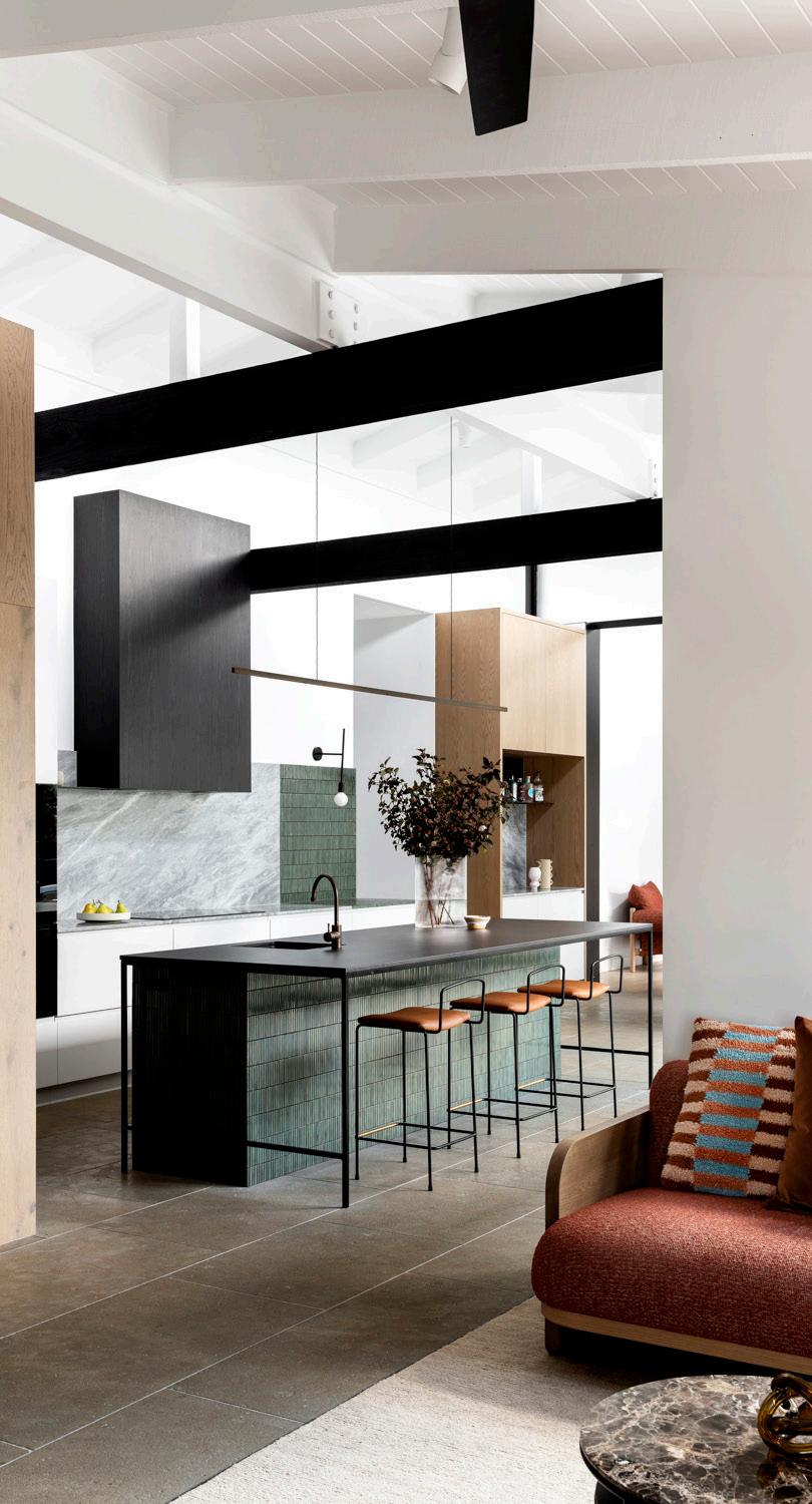
– Eva-Marie PrineasSEE THE AWARD-WINNING KITCHENS >
Design Studio Prineas Photography Gavin Green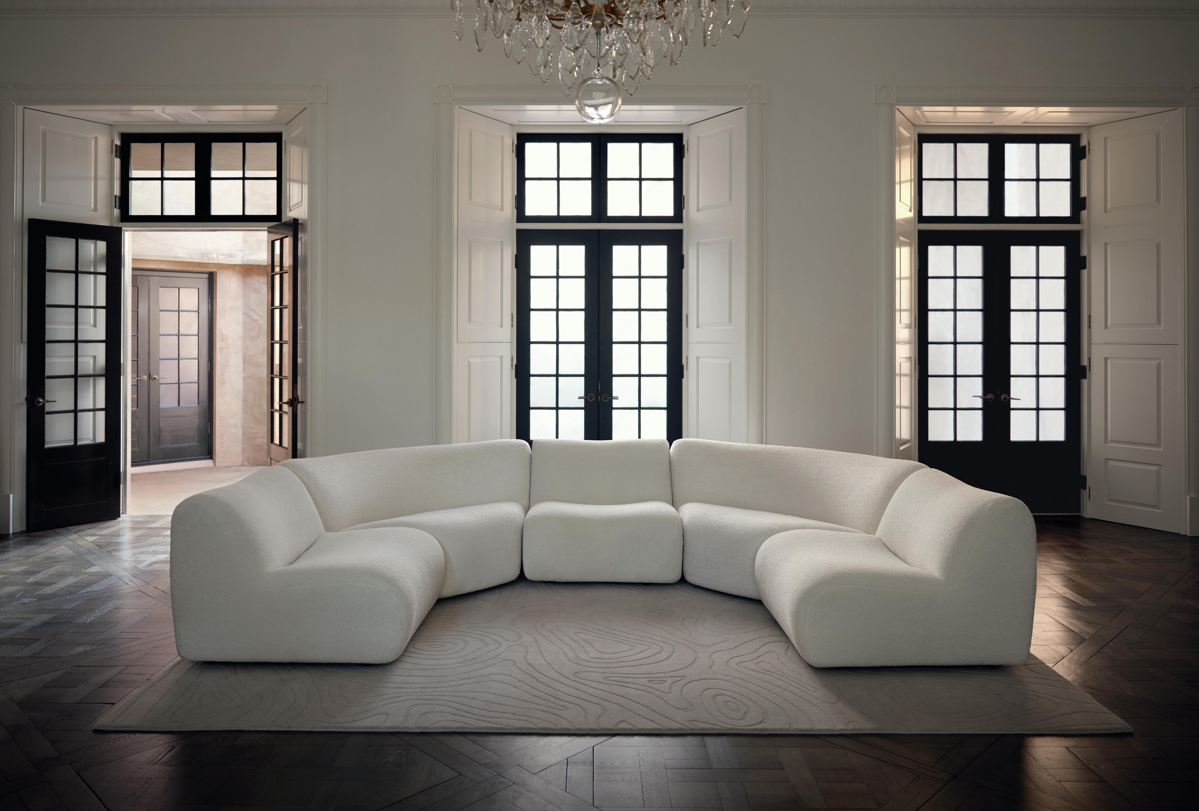

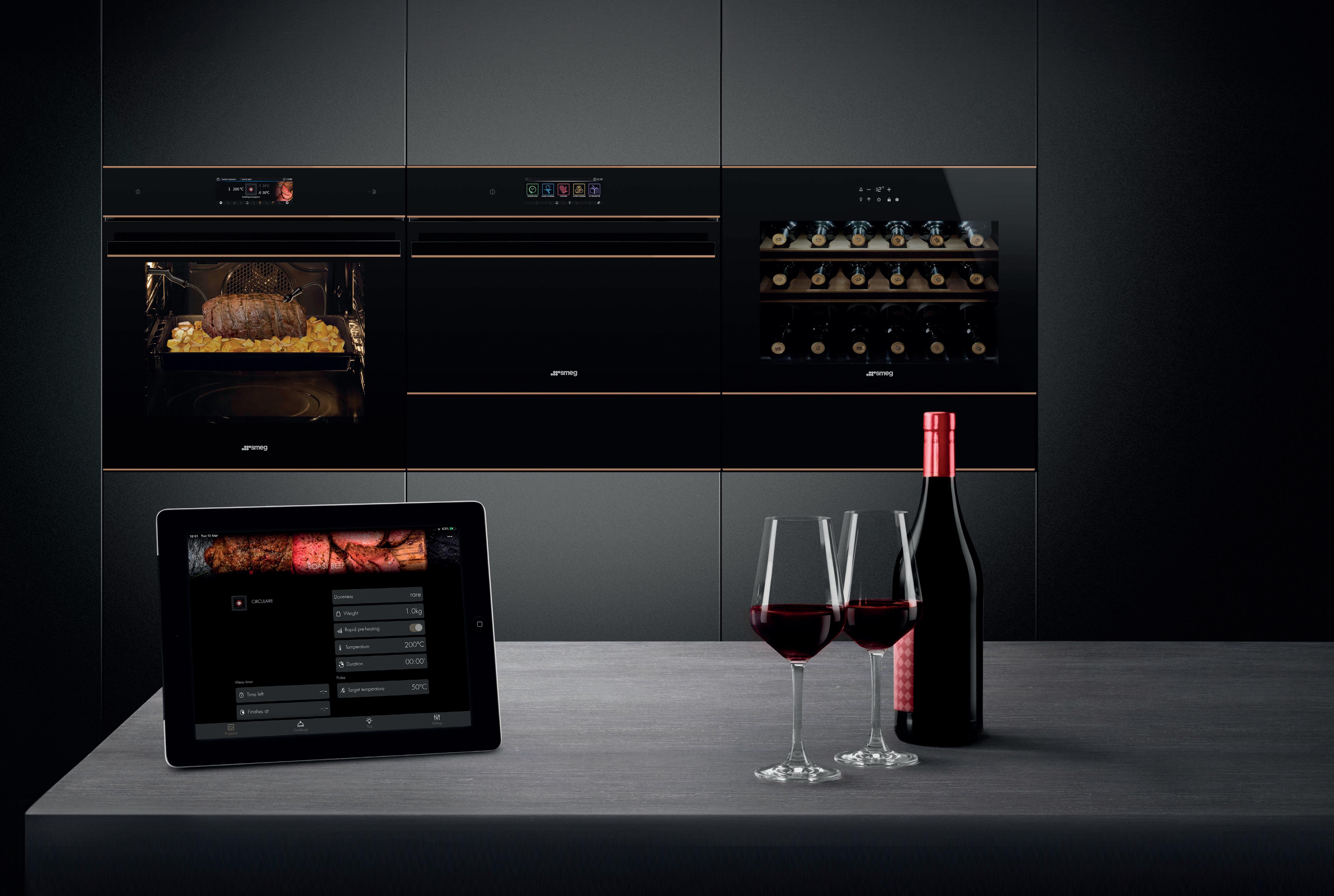
SmegConnect is Smeg’s new smart app, allowing users to connect to wifi enabled appliances and control them via smartphone or tablet, whenever or wherever they are. smeg.com/au/smegconnect





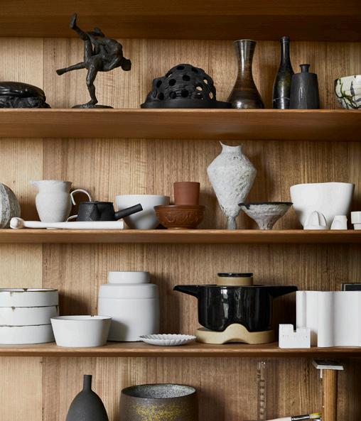


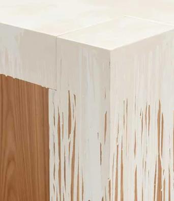

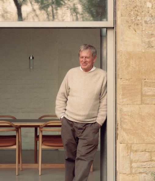


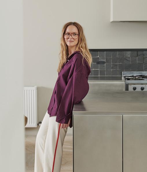
Welcome to our 50th issue. It’s a milestone moment for our team and the magazine, as est has always been a leader in the digital publishing space. To celebrate, we’ve asked Australian architects Kennedy Nolan and interior designer David Flack to join an international lineup of 10 architects and designers in naming their five era-defining products. This definitive edit of 50 products captures our enduring reverence for Australian design with a global lens across design disciplines.
As with every September issue, we explore exceptional living within the fabric of existing buildings – this time in Belgium, France and the US. We enter a 16th-century Belgian estate painstakingly restored over four years and see the transformation of ‘Câlin’ – three secluded guesthouses in Vaucluse’s rolling vineyards. We’re also granted access to an architecturally-significant home-turned-exhibition-space in Palm Springs paying tribute to the city’s iconic desert modernist movement.
Closer to home, we’re invited inside architect Ed Glenn and interior designer Edwina Glenn’s converted hotel – now an intimate family residence in one of Melbourne’s oldest suburbs. Our Australian home stories extend beyond the written word and into film as we experience an 1860s homestead overlooking Port Phillip Bay reimagined by interior design studio Mim Design and Neil Architecture.
Our foray into film continues with UK designer John Pawson taking us on a personal walkthrough of his ‘Home Farm’ in the Cotswolds, while at the same time, our podcast This Much I Know hosted by Karen McCartney takes us into architect John Wardle’s Melbourne home to understand his approach to preservation and materiality.

Following our on-the-ground coverage earlier this month, we share 10 highlights from Maison&Objet and Paris Design Week, revealing our constant search for inspiration and ideas – the undercurrent to every digital issue of est magazine.
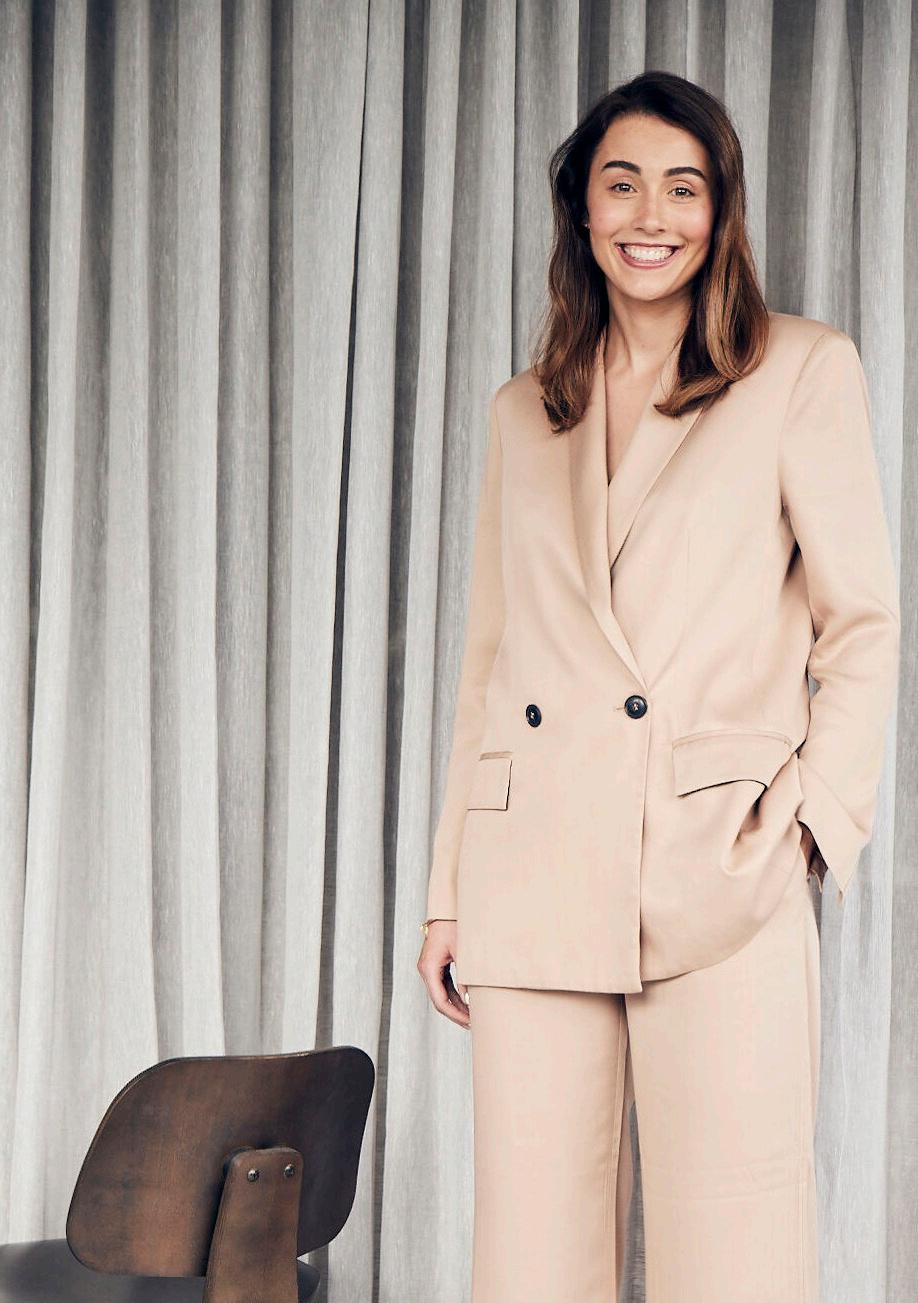




Dan Preston is an Australian-based photographer and videographer drawn to documenting the built environment and art objects. He aims to tell authentic visual stories that capture the aspirations and final forms of architects' and artists' works, revealing their intentions in his photographic process and cinematic aesthetic. Dan captured both John Pawson’s ‘Home Farm’ in the English countryside and the Dawn House by Mim Design and Neil Architecture on Victoria’s Mornington Peninsula through film and stills, showcased as part of this issue.
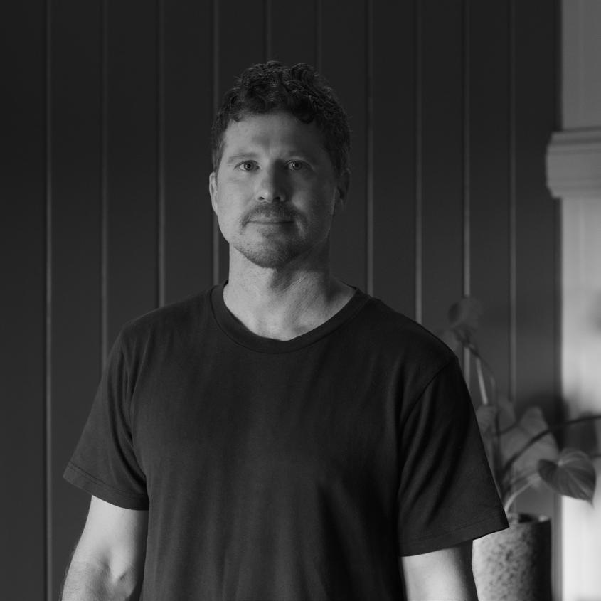
@danpreston_1
Cardia Speziale is a Melbourne-based communications consultant and writer. After completing her studies at Stockholm University, Cardia launched into design-led communications in Australia and overseas, working closely with brands, studios and cultural institutions to help articulate their stories with ease. Cardia speaks with Australian designer Amelda Wilde about her own home in this issue as part of our At Home With series.

@Cardia
SpezialeThomas De Bruyne is an architectural photographer and graphic designer based in Belgium. Best known for capturing the work of Belgium’s leading architects, Thomas loves unique vintage furniture, raw materials and imperfect finishes. In this issue, Thomas is the photographer behind Atelier Daaa’s Maubourg apartment in Paris and Simon de Burbure Architects’ transformation of a historic Belgian estate.
@cafeine
Lance Gerber is a contemporary photographer focused on interior and architecture photography, fine art documentation and environmental photography. Lance’s background in art direction and graphic design has helped shape an approach that’s noted for intricate compositions, detailed styling and dynamic yet natural lighting. Lance’s photography has been included in several museum and contemporary art exhibitions and editorial publications. We explore Lance’s lens on an architecturallysignificant home-turned-art exhibit in Palm Springs in this issue.
@lance.gerber
Superloon
By FlosArchitects FGR Architects
Photography
Peter Bennetts
Innovative Lighting Solutions
Sydney | Melbourne | Brisbane
euroluce com au

I: @pantheoneaudio
M: info@pantheoneaudio.com
W: pantheoneaudio.com
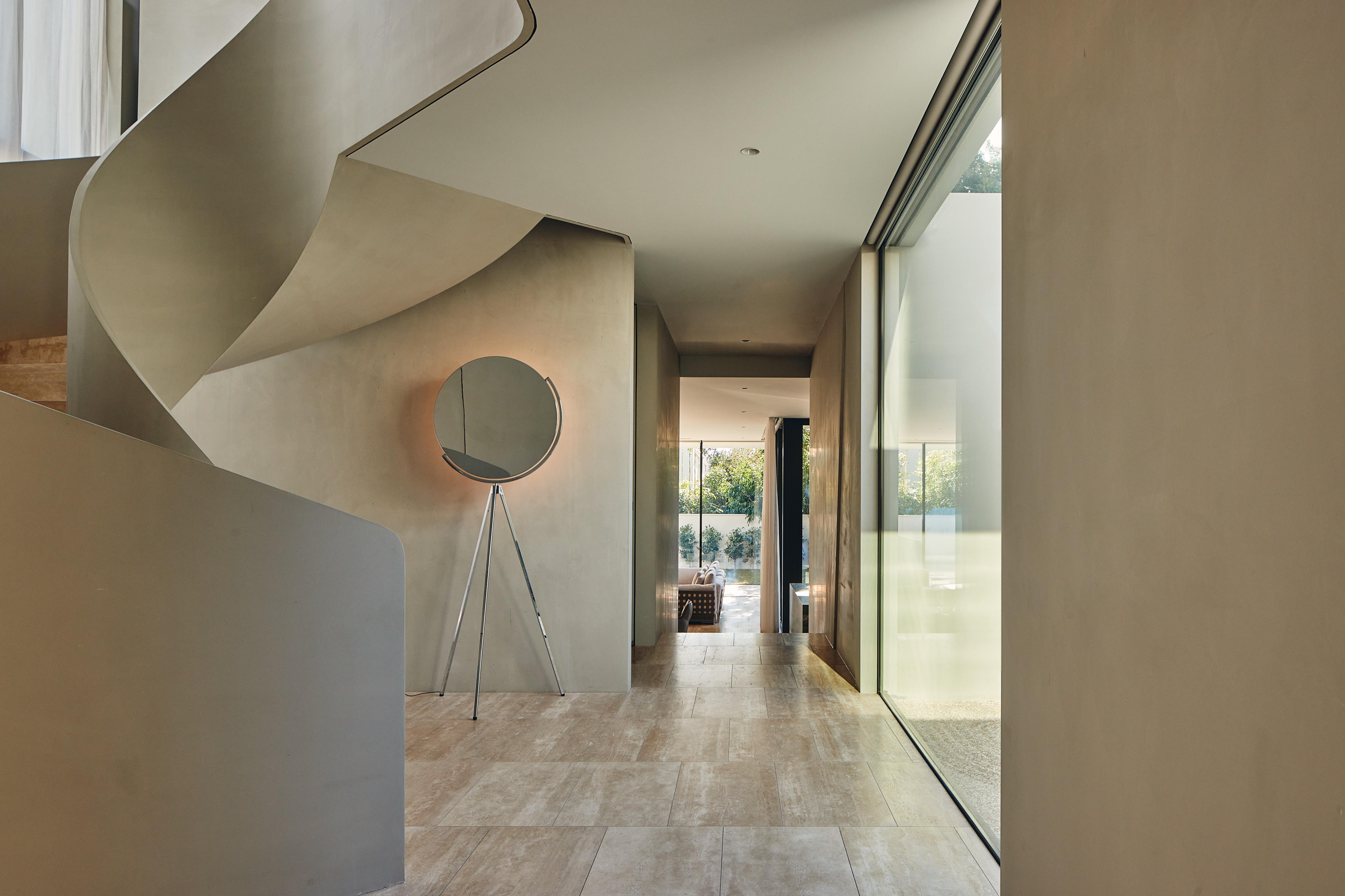
The Obsidian speaker, draws inspiration from the organic curves and lines found in nature and architecture. The speaker is lightweight, making it easy to move between rooms, allowing the sound to follow you. Featuring a 15-hour battery life, multi-room capabilities, seamless streaming, and wireless playback, the Obsidian speaker offers a sound experience tailored uniquely to you.
Visit our website to purchase the Obsidian speaker and to find a store near you.


est TEAM
Editor
Sophie Lewis
Copy Editor
Yvette Caprioglio
Visual Concept Designer
Jack Seedsman
Features Writer
Holly Beadle
Product Editor
Brigitte Craig
Editorial, Social Media & Video Coordinator

Lidia Boniwell
Sales & Marketing Coordinator
Emerald Ford
Partnerships Editor
Megan Rawson
Advertising & Partnerships
Mandy Loftus-Hills | mandy@estliving.com
Astrid Saint-John | astrid@estliving.com
Deb Robertson | deb@estliving.com
Nicola Siddall | nicola@estliving.com
Editorial Advisor
Karen McCartney
Managing Director
Miffy Coady
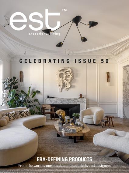
ON THE COVER Design
Atelier Daaa
Photography
Thomas De Bruyne
Location
Paris France
CONTACT
editorial@estliving.com
advertising@estliving.com
CONNECT
Words
Holly Beadle, Cardia Speziale, Yvette Caprioglio, Megan Rawson, Stephen Crafti, Sophie Lewis, Lidia Boniwell
Film
Dan Preston
Photography
At Home With John Pawson
Dan Preston
Storied Walls
Piet Albert Goethals
50 Icons
Specified in feature
Desert Reawakening
Lance Gerber Studio
This Much I Know: John Wardle
Sharyn Cairns, Trevor Mein
Signature Detail
Thomas de Bruyne
Common Ground
Sean Fennessy
The Library
Dan Preston
Where Architects Live: Ed & Edwina Glenn
Sharyn Cairns
Former Glory
Thomas de Bruyne
Maison&Objet and Paris Design Week
Specified in feature
At Home With: Amelda Wilde
Cricket Studio
The Detail
Shade Degges Photography, Dave Wheeler, Anson Smart, Felix Speller, Eric Petschek
BACK COVER
Lance Gerber Studio
est living acknowledges the Traditional Owners of the land on which we work, the Wurundjeri Woi Wurrung of the East Kulin Nation. We pay respect to their Elders past, present and emerging.



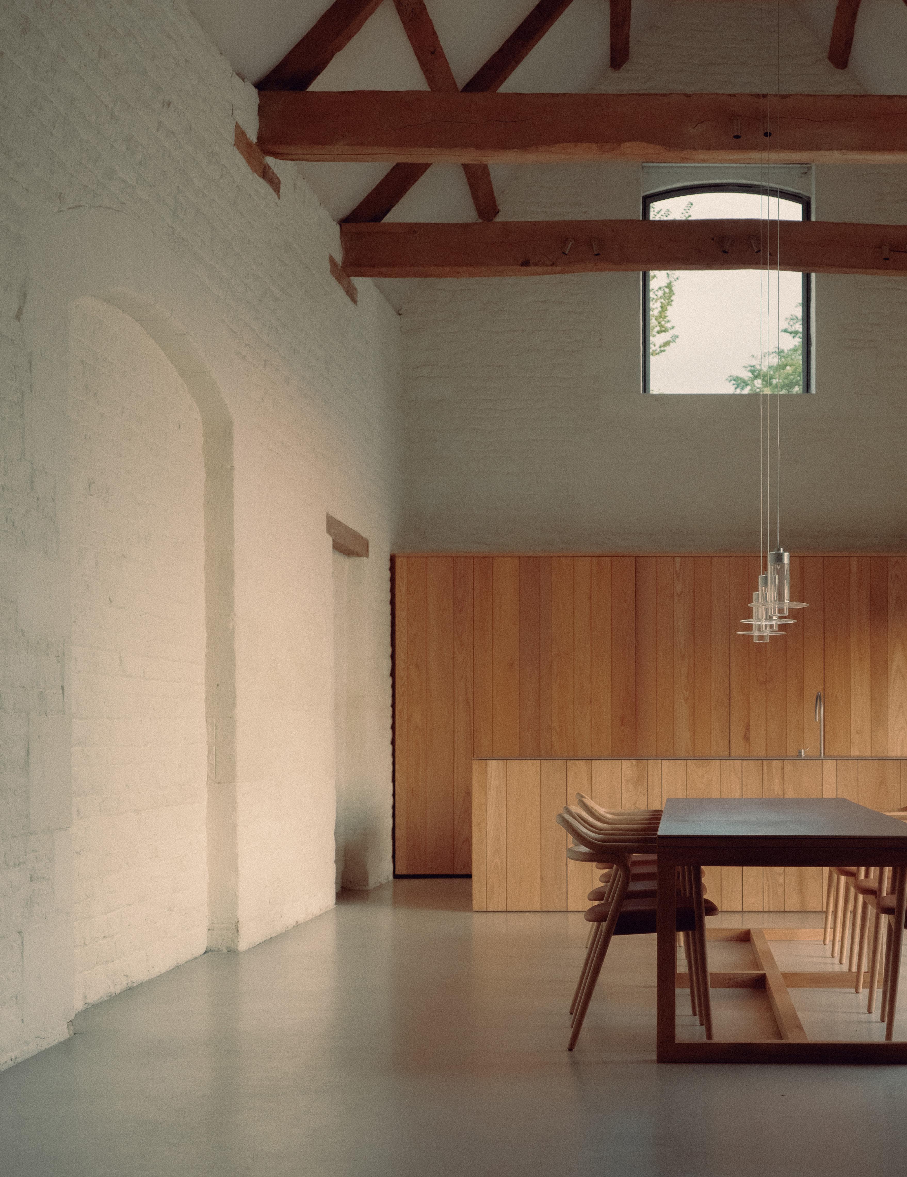
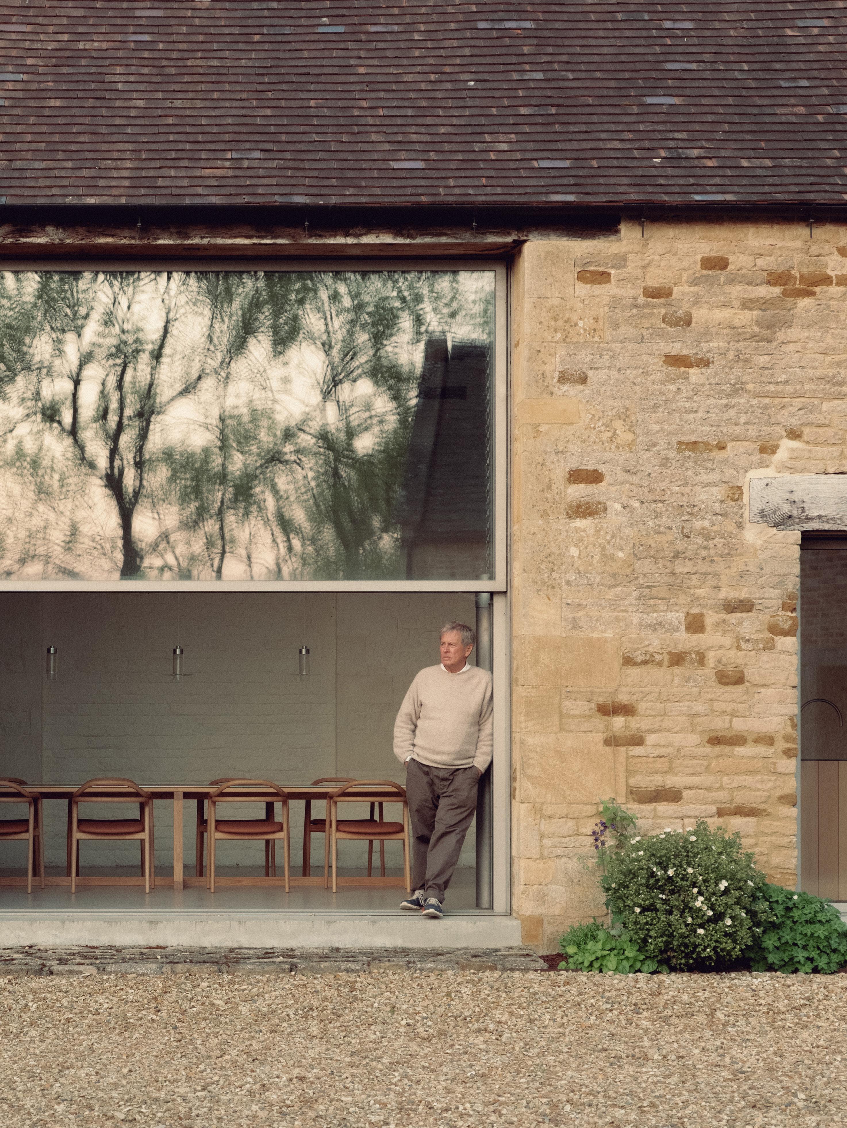
John prefers things to be simple in his home, meaning not too many pieces of furniture. His kitchen-dining space features the Tacta chairs he designed for Passoni and Sleeve pendants he designed for Wonderglass. Despite being in the English countryside, where the weather is always moving, light permeates the space year-round through large windows on the west side.

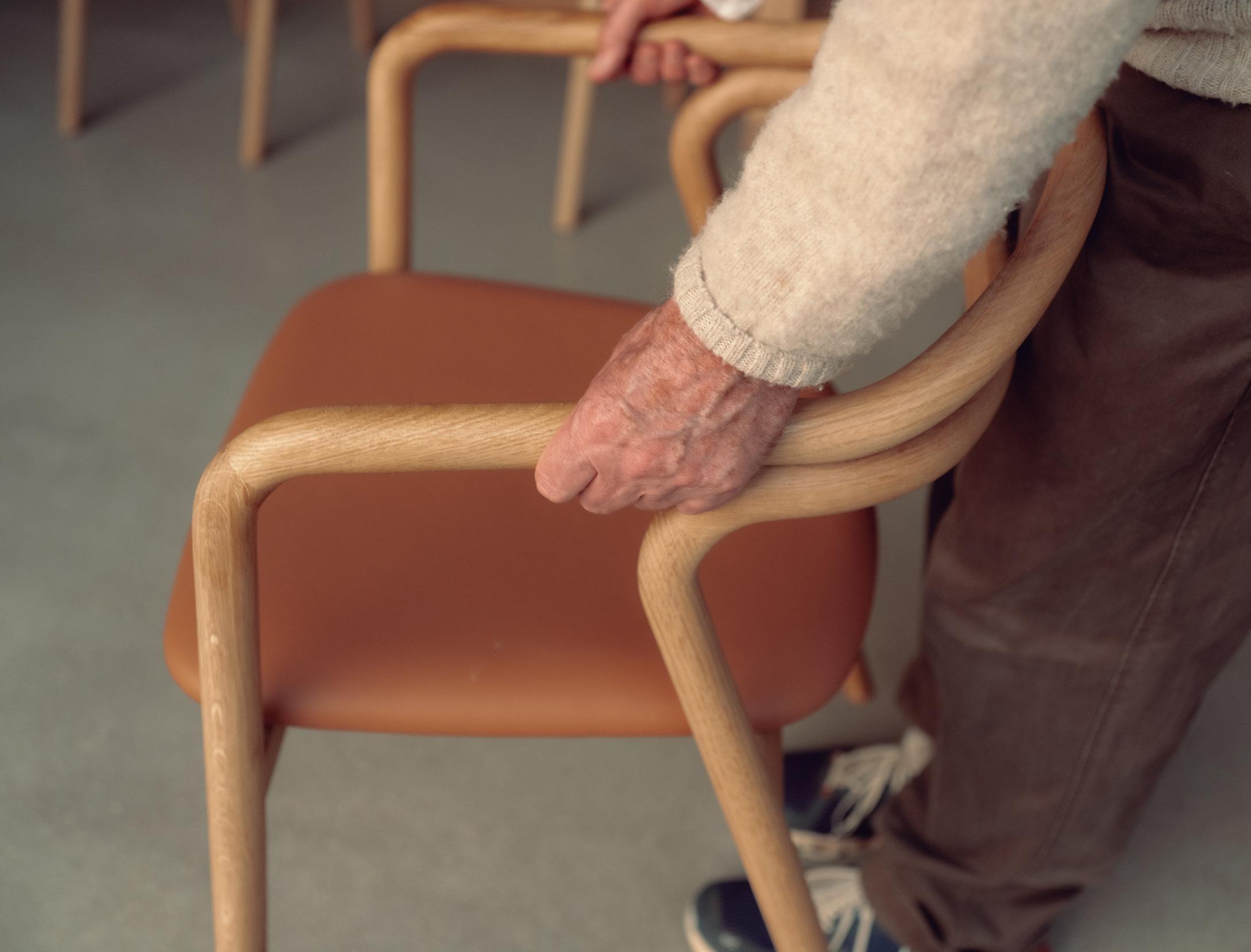
John’s love of simple things is expressed in the furniture pieces he has designed. The Tacta chair for Passoni features two lines of timber that create a refined, sculptural form with a comfortable leather seat.
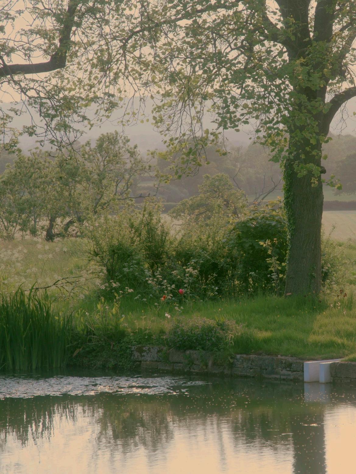
 The buildings at Home Farm are centred around a pond that predates the house. The pond was put in by monks during the mediaeval period and stocked with carp – just as it is today.


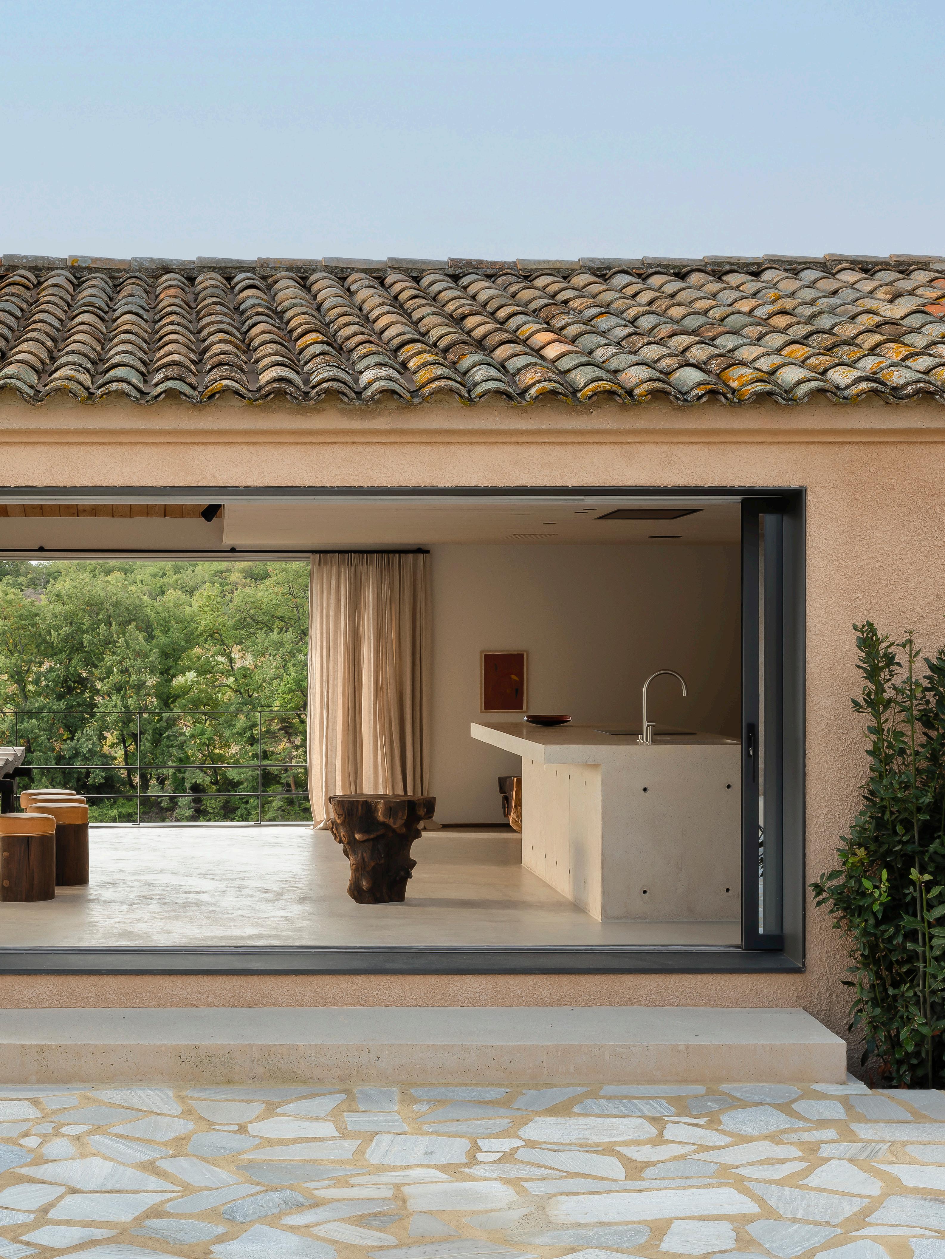

hospitality experience unfolds within a centuries-old French estate.
LOCATION | Valréas, France
ARCHITECTURE | Sam Peeters and Toon Martens (Contekst)
INTERIOR STYLING | Bea Mombaers
PHOTOGRAPHY | Piet-Albert Goethals
WORDS | Holly Beadle

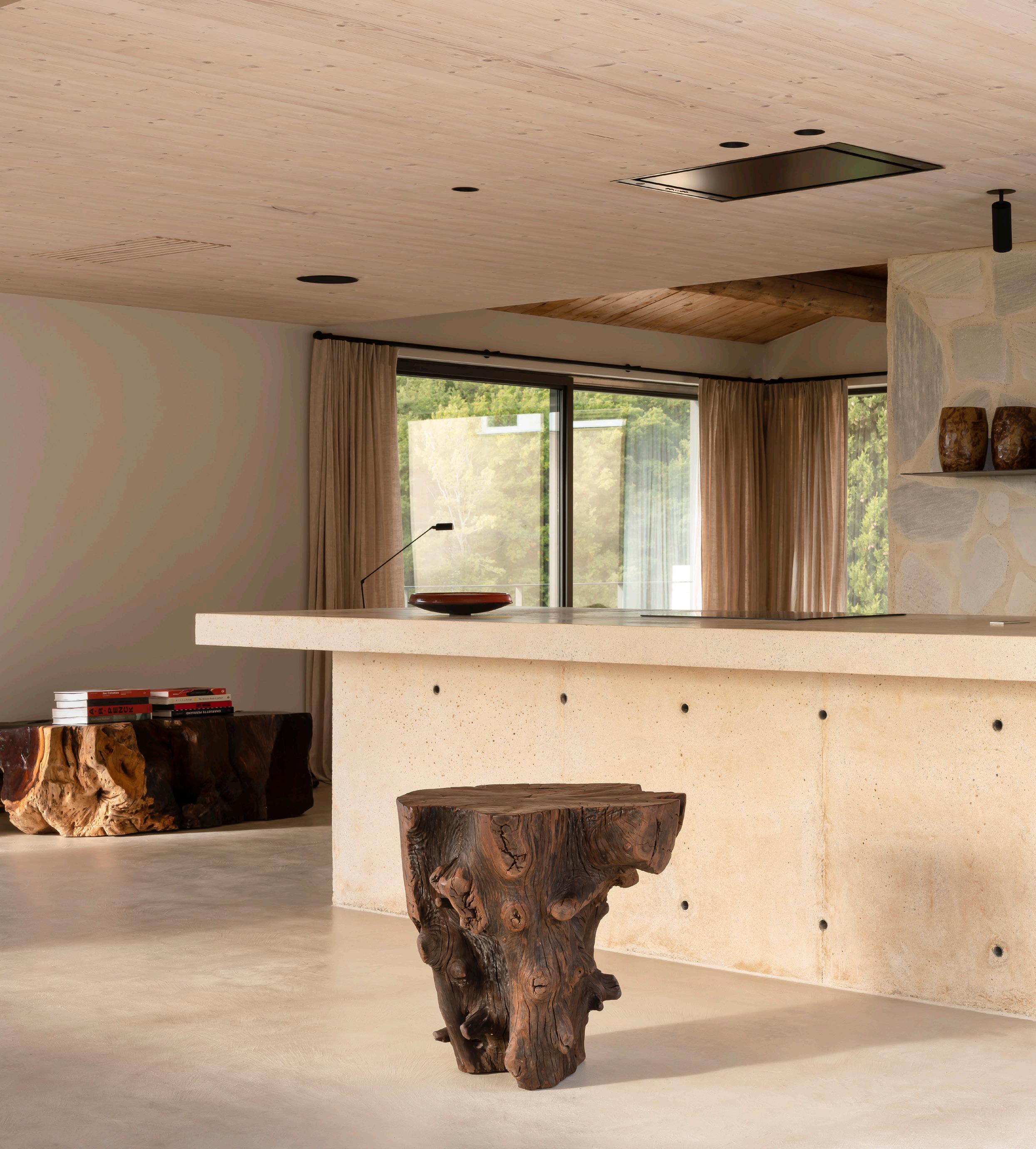
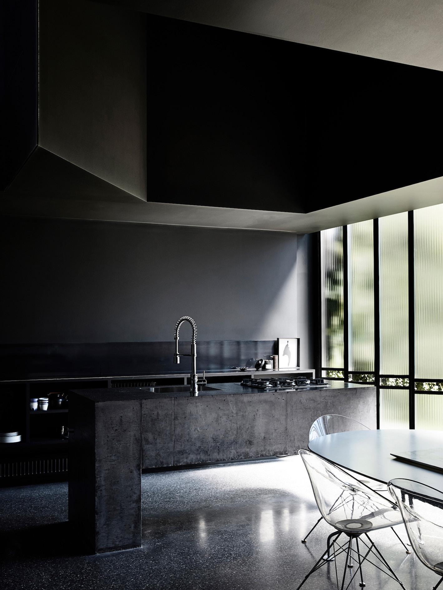
The interiors reflect the building’s sand-coloured concrete and raw stone exterior. This space features an island bench crafted on-site from concrete, stone floors and walls, and birch ceilings.
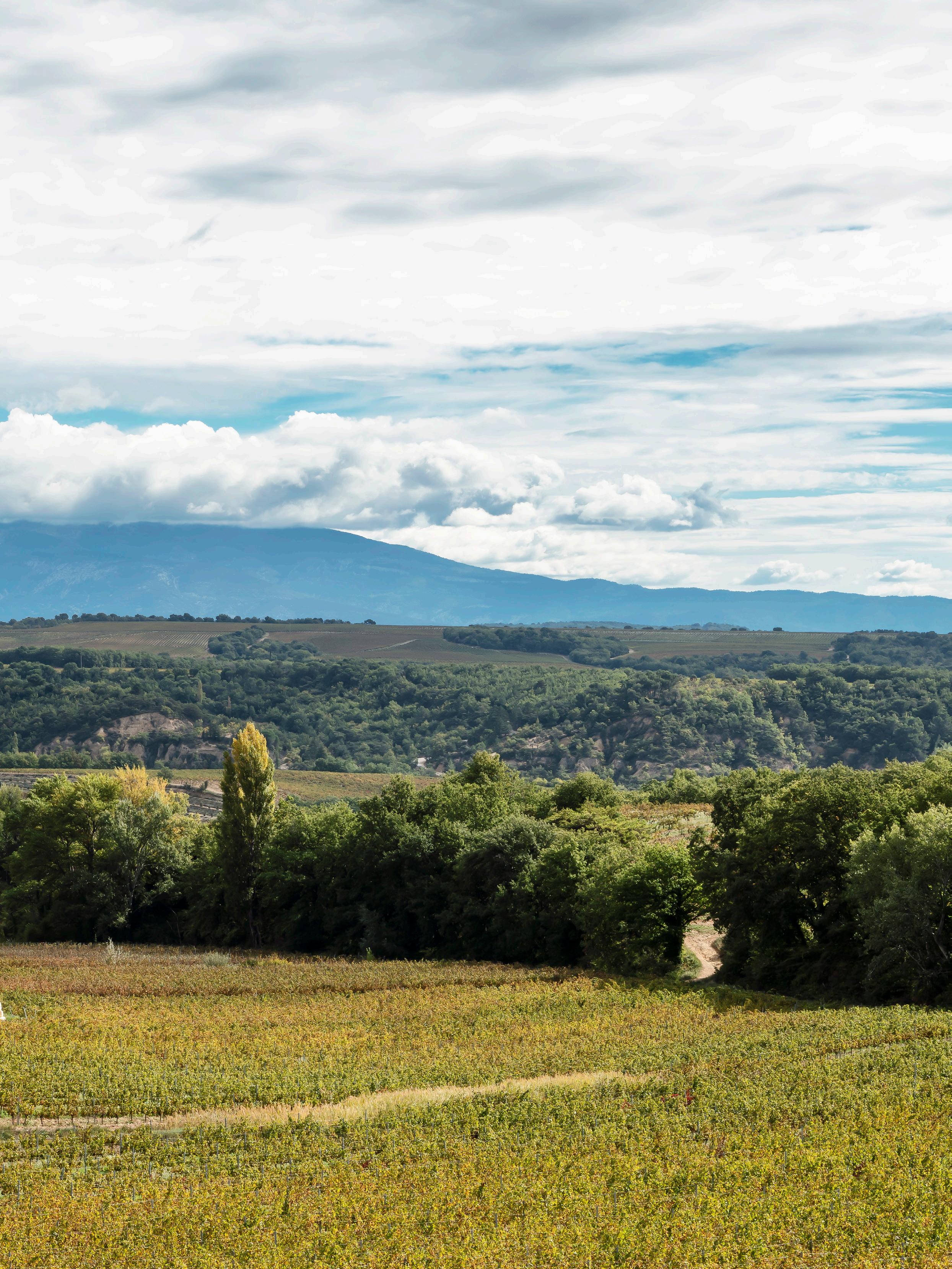
Within the storied walls of Câlin Valreas, overlooking a landscape of mountains and rolling vineyards, there is a sense of being lost, with no desire to be found.
The property, consisting of three separate yet interconnected guest houses, rests on a sequestered patch of land in France’s Vaucluse region, in the commune of Valreas. The hosts, a Belgian couple named Ilhem and Michael, had been re-visiting the area for more than 20 years before they came across this particular estate. “We immediately felt its potential as a restful and invigorating location to be appreciated by family, friends and other kindred spirits; a place to isolate and completely immerse oneself in nature,” Ilhem says.

The couple engaged Sam Peeters and Toon Martens of the Antwerp-based architecture firm Contekst, and Knokke-based interior stylist Bea Mombaers to assist with the conversion, both of whom have extensive experience in transforming historic interiors through a sensitive lens. Neither, however, had encountered a project quite like this before. “It was rare in that it was so untouched,” Toon says; “A truly unique location; you don’t find places like this anymore,” Bea adds.
The overarching concept of the project was to recreate a French village, where the trio of guest houses are connected via a series of pathways, evoking a sense of journey and discovery. Together, ‘Àme’, ‘Île’ and ‘Tour’, as they’re named – Àme being the smallest and Tour being the largest – can accommodate 13 adults.

Most furniture pieces are one-of-a-kind or vintage that Bea sourced from Belgium or France. The use of timber is especially prevalent in the selection, coinciding with the building’s ceilings. Artwork (right) by Thomas Kratz.
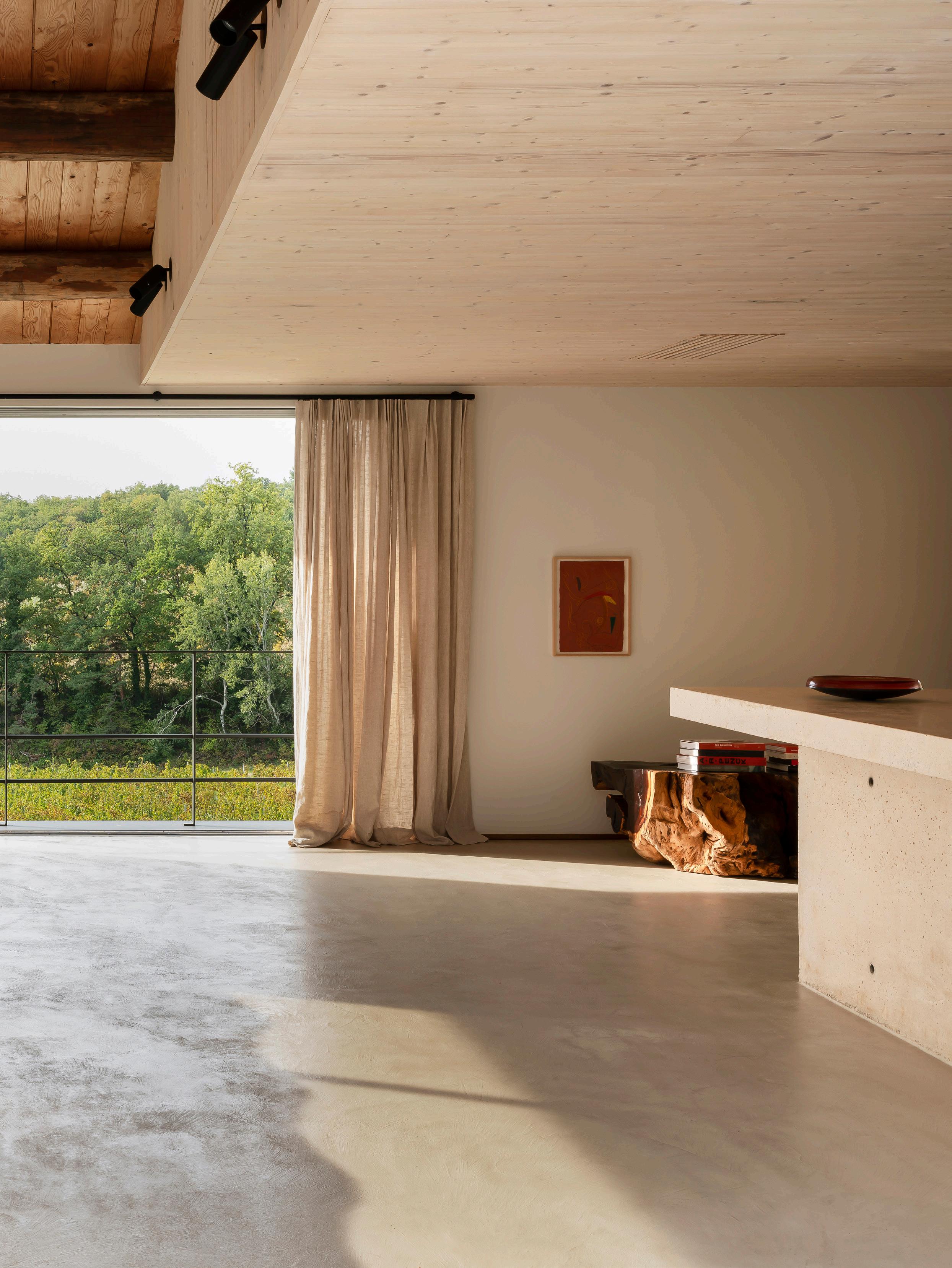
The colours Bea chose – reds, oranges and browns – impart warmth to spaces while grounding inhabitants in their surroundings. This space features the
 Lumina Daphine Terra floor light, Fritz Hansen PK22 chair and a sofa by Bea Mombaers for Serax.
Across the three houses, the design intent remains the same: to honour the building’s legacy and connection to the landscape. “At Contekst, we design spaces that flirt with the past – a key aspect of our practice that can be observed in Câlin. We like to fade the boundaries between the new and the existing,” Sam says. The building’s sand-coloured concrete and raw stone exterior led Sam and Toon to dress the interiors in a similar palette, creating a link between inside and outside, new and old.

“At the start of each project, I like to get a sense of the location and how I would like to live there. What’s really important is how the home can exist in harmony with nature,” Bea says. She made each design choice, from the colour of the fabrics to the shape of the furniture, with this in mind, resulting in spaces that ground inhabitants in their surroundings. Most pieces were sourced from Belgium, with the exception of some local treasures found while on expeditions into neighbouring French villages. Local rumour also has it that Câlin used to be a place for art and artists, so it was important to Bea that she carried on the tradition, sourcing works from both young and established artists to fill the spaces.
Beyond the design itself, Câlin stands as an extraordinary avenue through which to experience Vaucluse. Ilhem and Michael remain close by at all times, eager to impart 20 years’ worth of knowledge to their guests; fresh, locally-grown produce is served every morning for breakfast and throughout the day; and nearby, activities range from hiking in orchards and swimming in lakes to truffle picking – Vaucluse is the home of the French truffle. “Every time I return to Câlin, I am in awe of its uniqueness. I would live here all year round if I could,” Bea says.

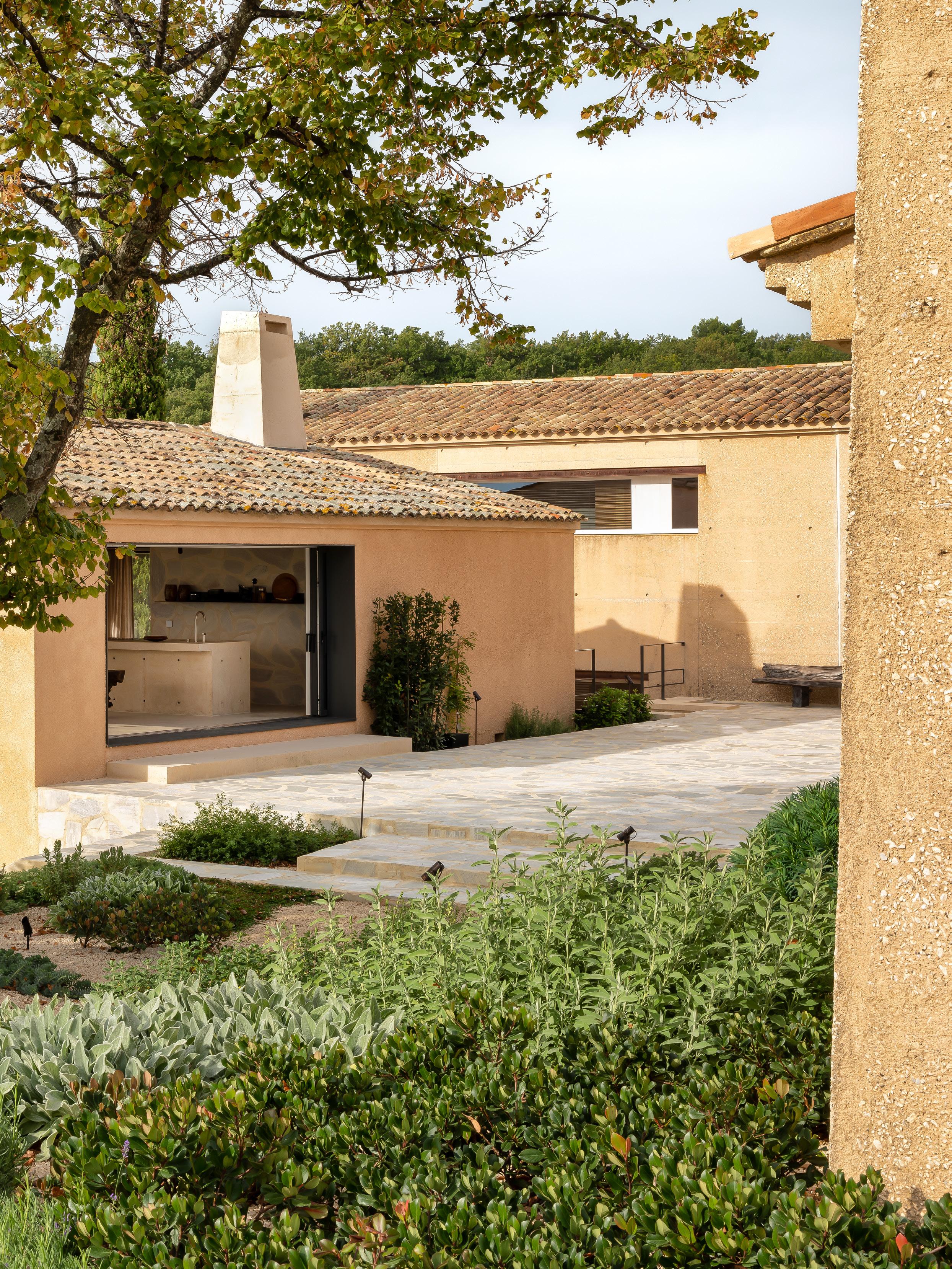
Previous Page: Steel elements were specified as a nod to the contemporary, contrasting with the original light-toned building materials. The steel lighting fixtures throughout the project are by Lebanese lighting brand PSLab.


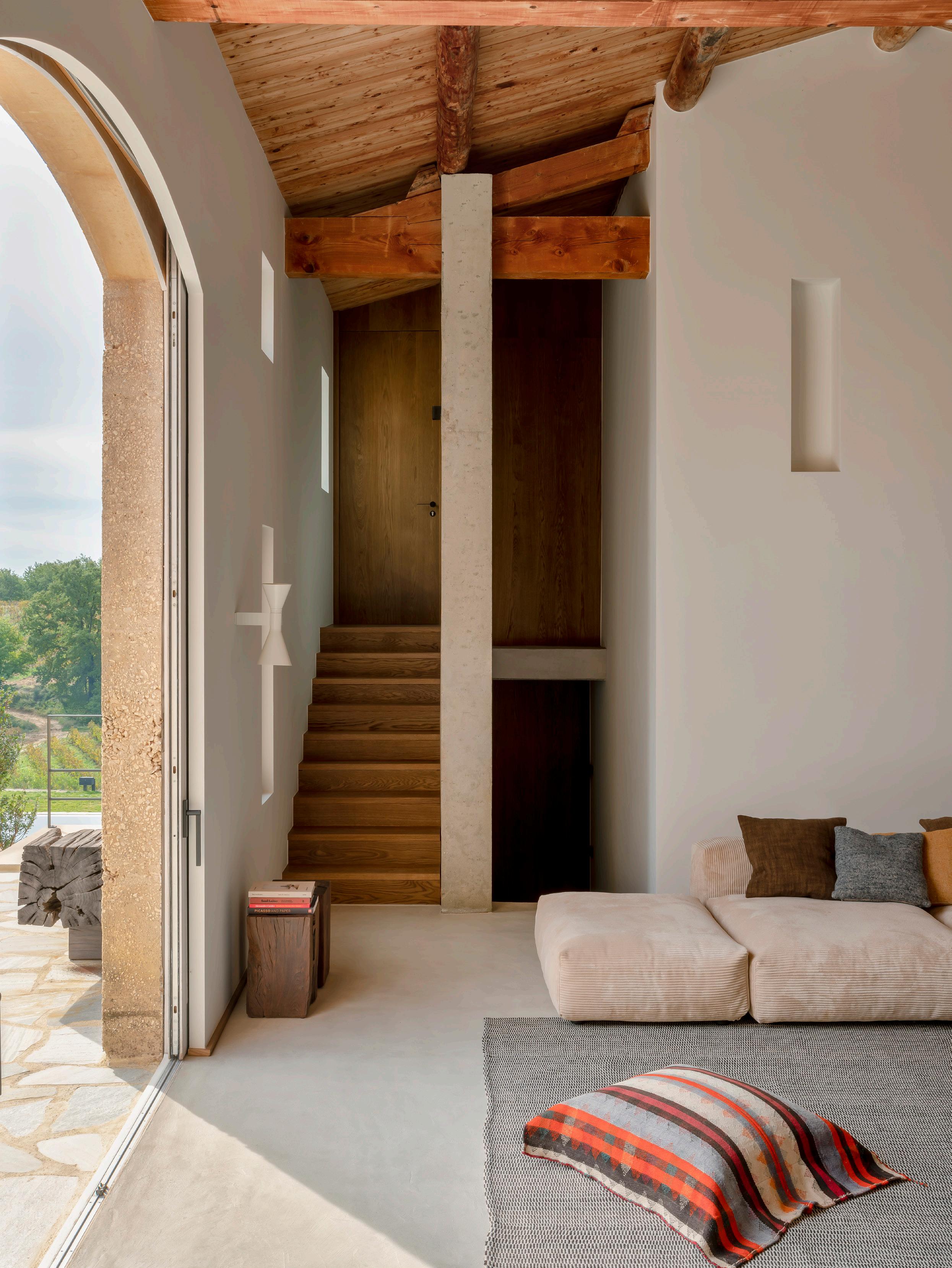 The living space features the Sergio Rodrigues Diz lounge armchair, a vetsak sofa and rug by Bea Mombaers for Serax. Pictured on the wall is the Nemo Applique de Marseille by Le Corbusier.
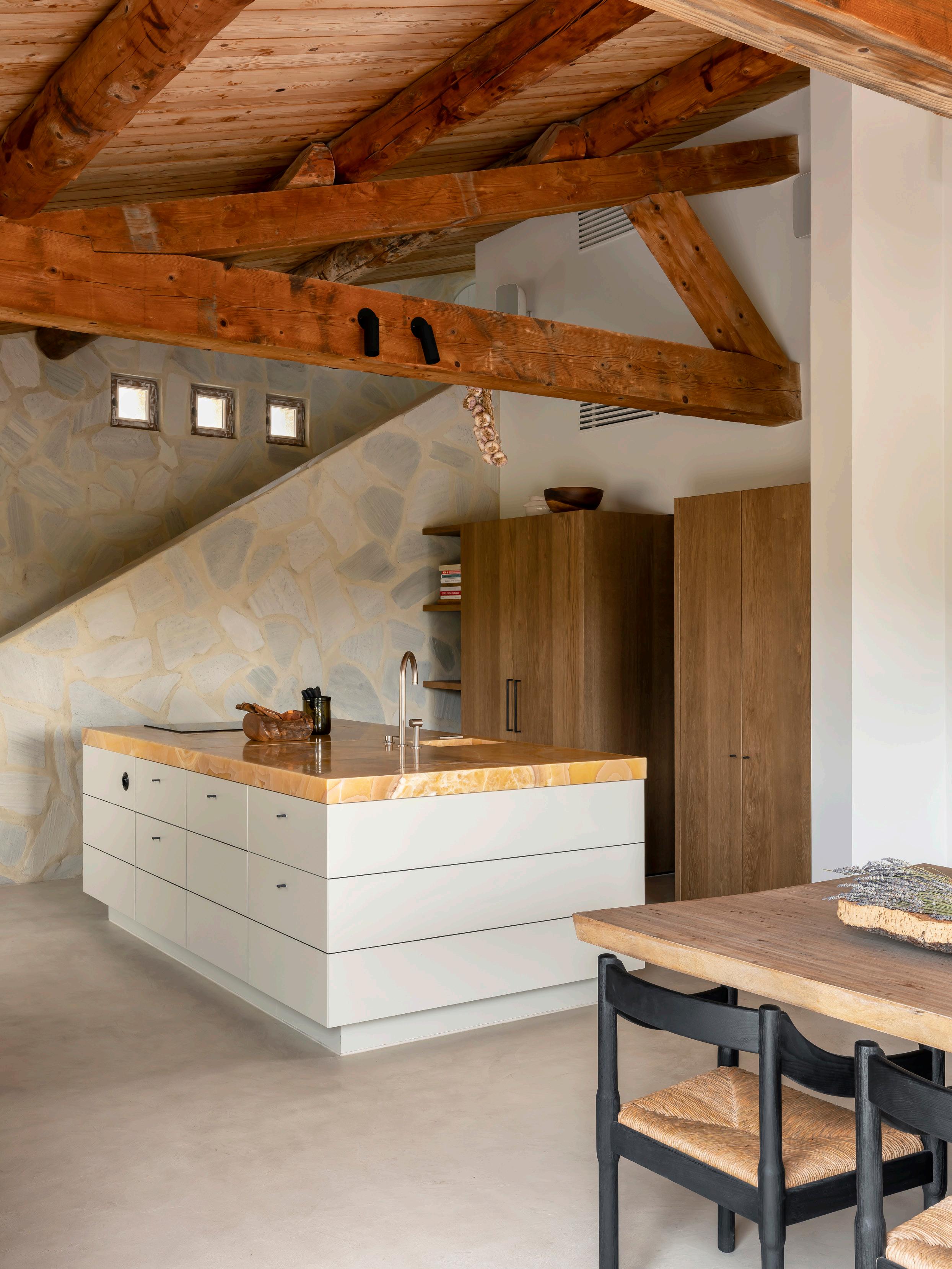
Exposed timber trusses serve as a reminder of the building’s age. This space features an island bench with a top made of butterscotch-coloured onyx. Bea also sourced vintage Cassina Carimate chairs.

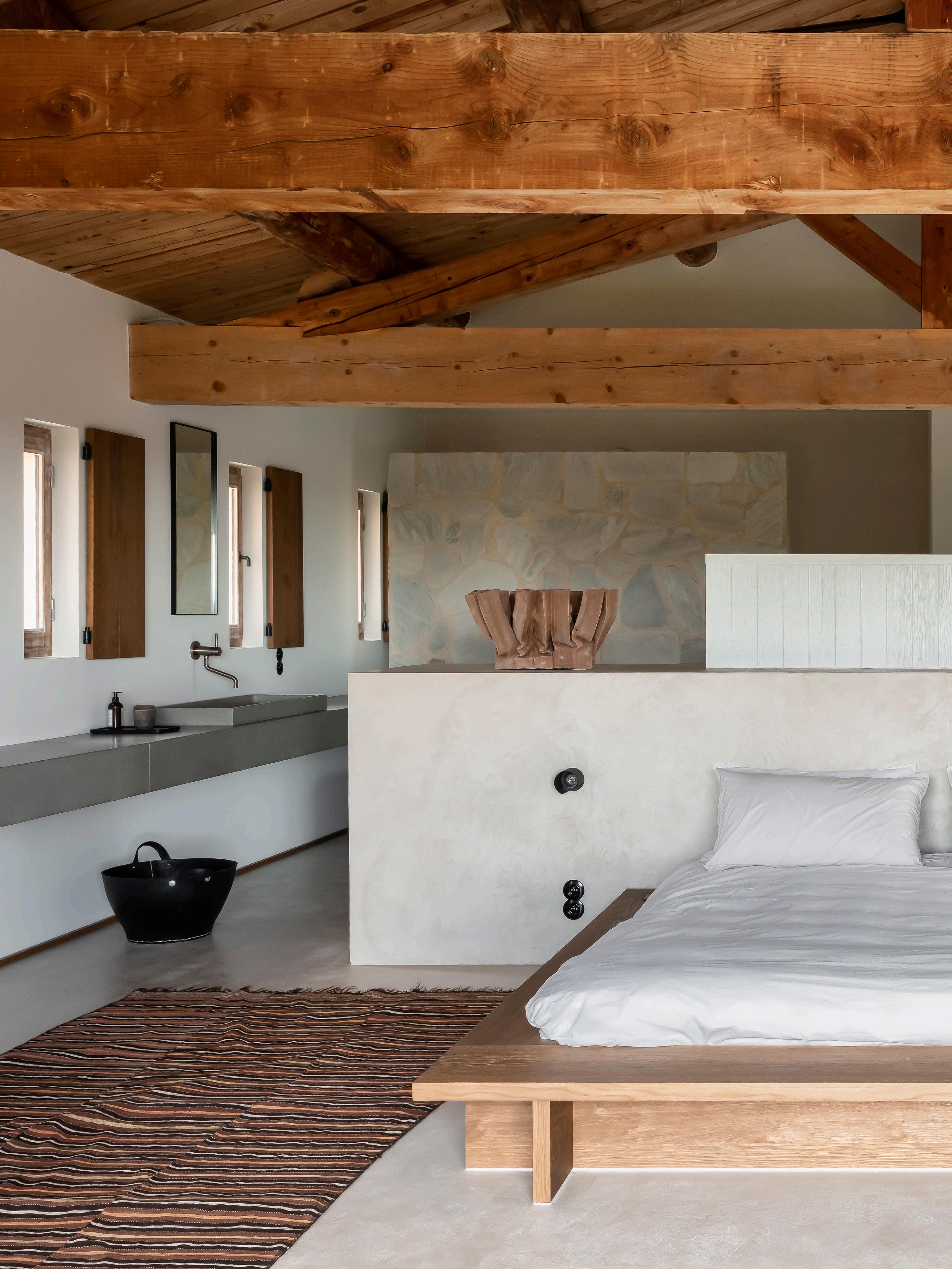 This space features a custom timber bed with a built-in concrete bedhead by Contekst.

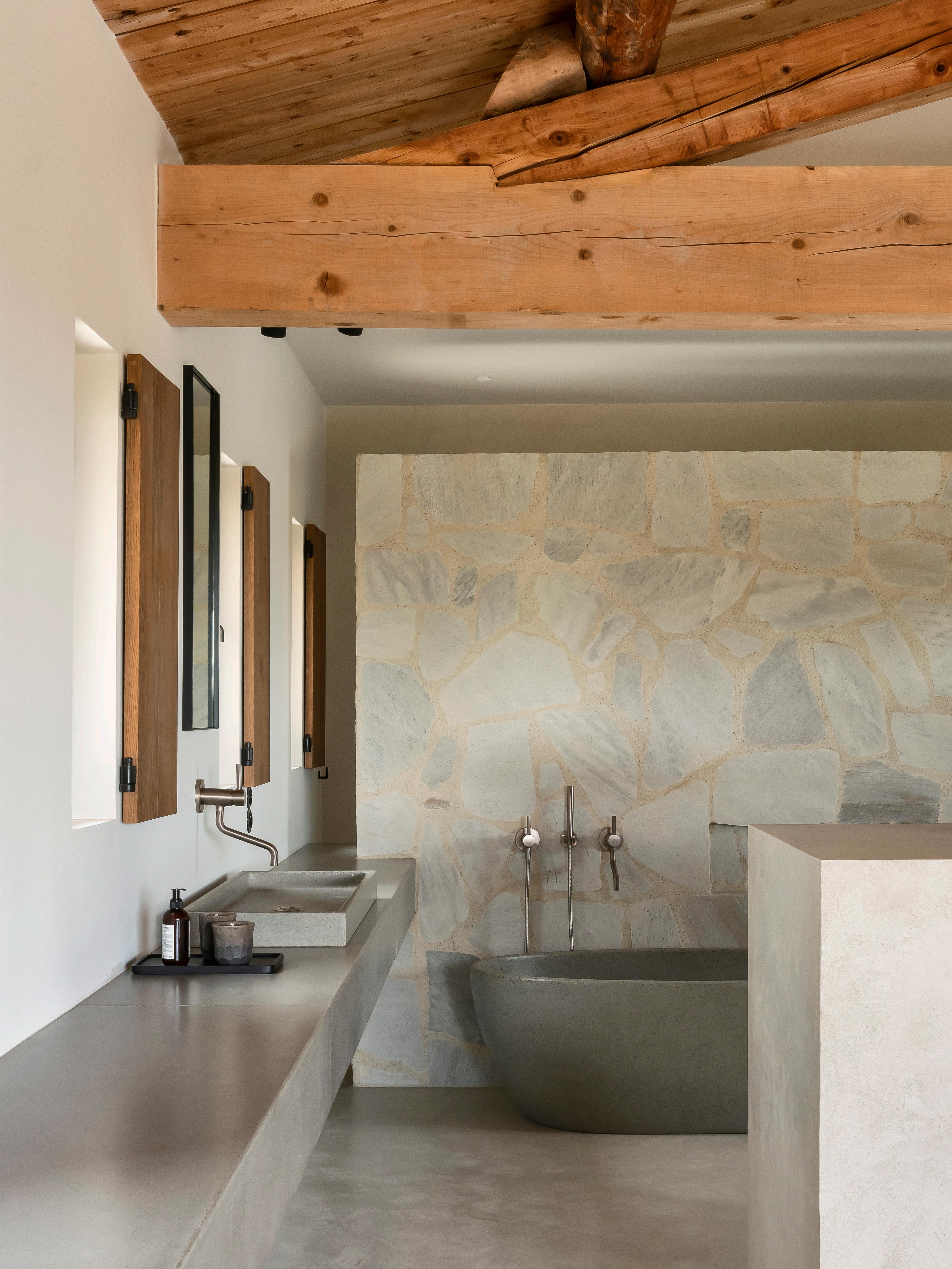 Contekst also designed custom concrete bathtubs and countertops.


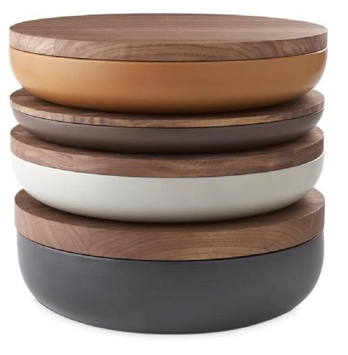


 VINCENT VAN DUYSEN SHALLOW POT WHEN OBJECTS WORK
DAPHINE TERRA LED LUMINA
CALIFORNIA MADE BY STOREY
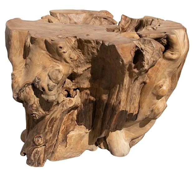
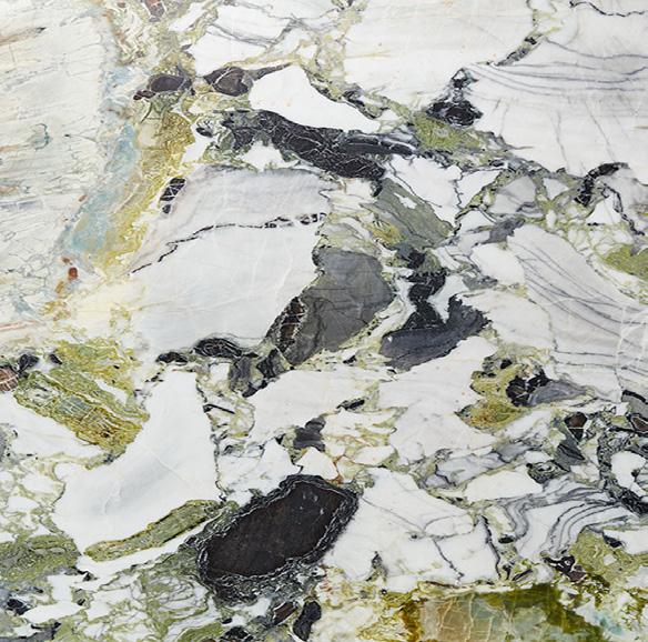
MARIS GREY GRANITE CDK STONE BIRCH BAUWERK COLOUR
BOX 1 BY MACHTELD RULLENS 1ST DIBS Karton, olieverf, pigment, epoxy
VINTAGE MERIBEL DINING CHAIR 1ST DIBS Circa 1960's, Charlotte Perriand
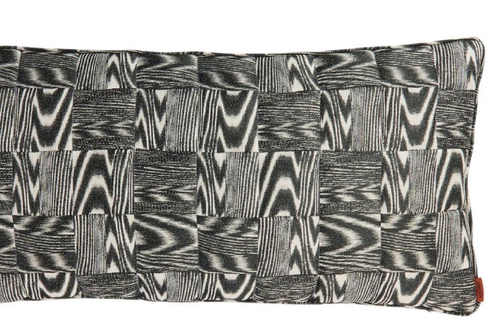
APPLIQUE DE MARSEILLE WALL NEMO MISSONI TILE MISSONI
PK22 CHAIR FRITZ HANSEN



Introducing RODA
With its generously designed shapes highlighted especially in the depth and thickness of the cushions, the Eden collection is characterised by an extreme modularity and a unique combination of materials. Designed by Rodolfo Dordoni for RODA, now available at Living Edge.

 Rodolfo Dordoni
Exclusively at The Front Room.
The Front Room at Industry Lanes Shamrock Street, Richmond VIC 3121
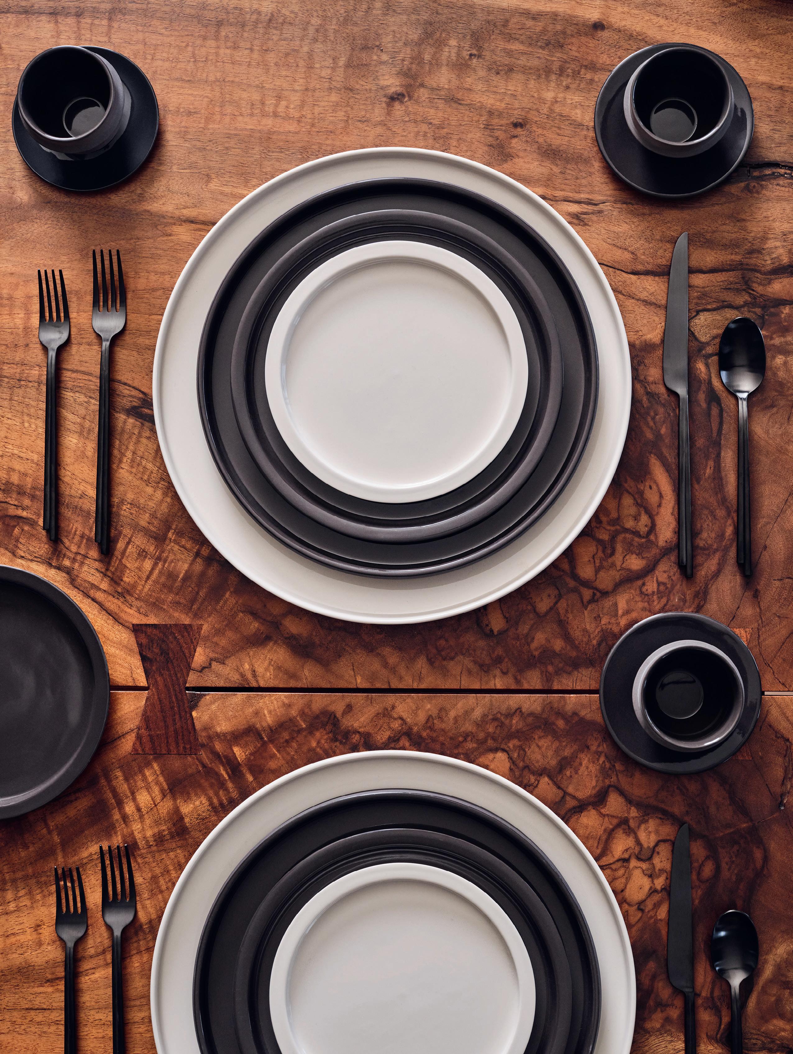
Announcing an exciting collaboration between LA’s Kelly Wearstler and Belgium’s Serax, now available exclusively at The Front Room. The Dune and Zuma collections offer an elegant reimagining of tableware, glassware, serve ware, and cutlery. Craft inviting tablescapes that celebrate shared moments and the joy of coming together for meals.
Discover the Kelly Wearstler x Serax collection. Full range now available to pre-order.
@thefrontroom__gallery thefrontroomgallery.com.au
Maximise your space with WingLine bi-folding door system
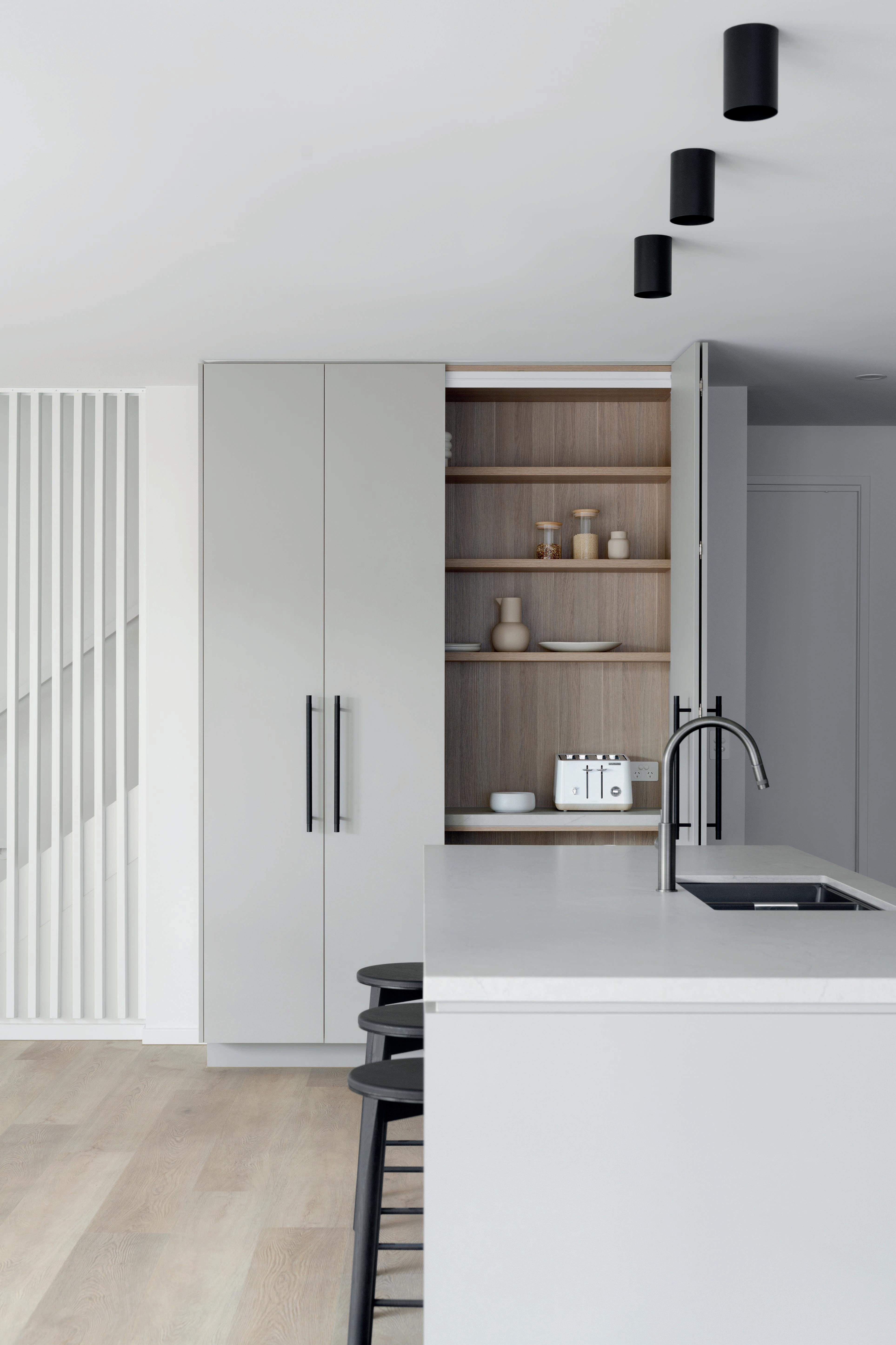
Design by @zephyr_and_stone

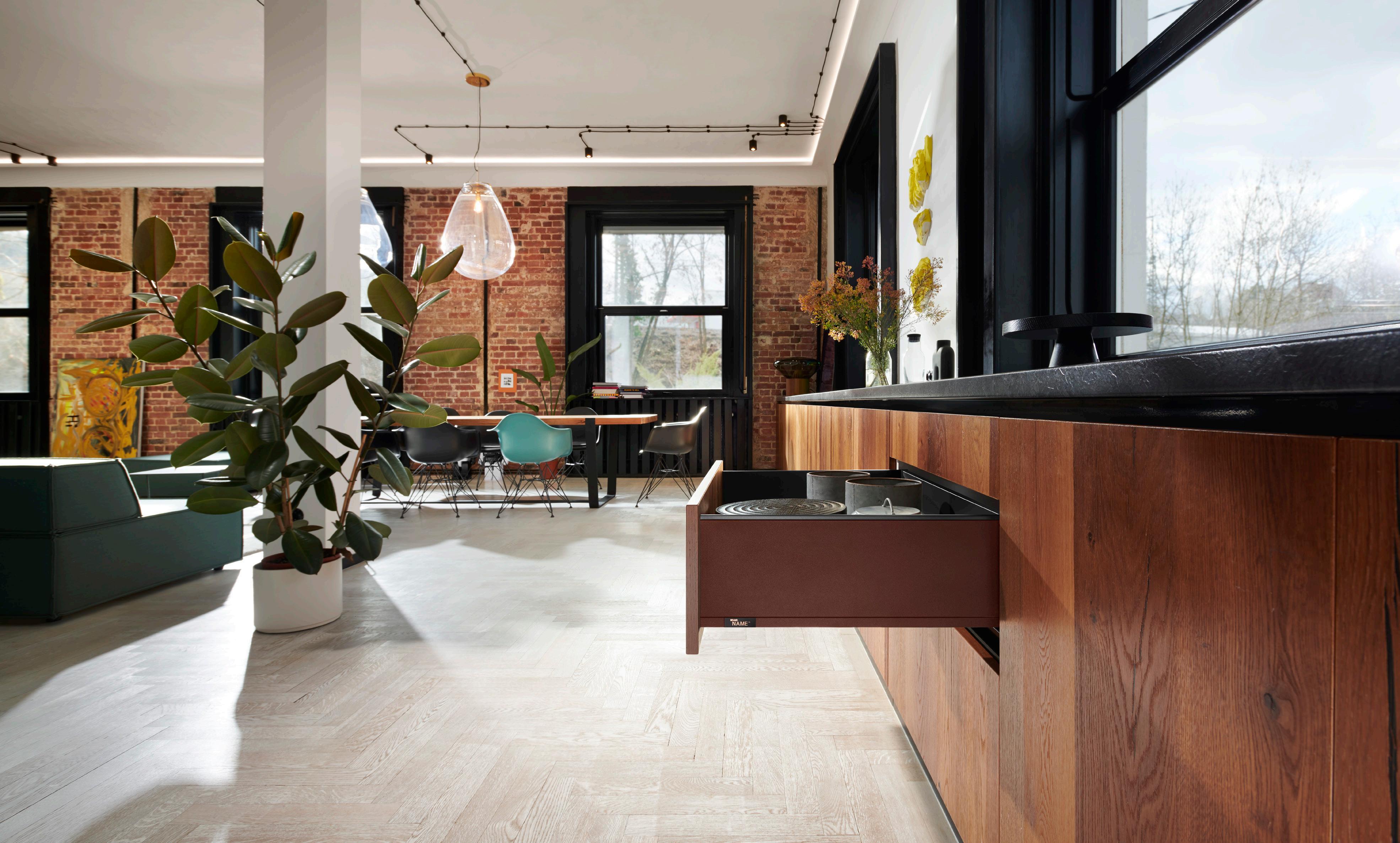
Revamp your wardrobe with AvanTech YOU drawers


Hettich makes living spaces work beautifully through a wide range of high-quality German hardware fittings. Follow us @hettichaustralia


Words: Sophie Lewis

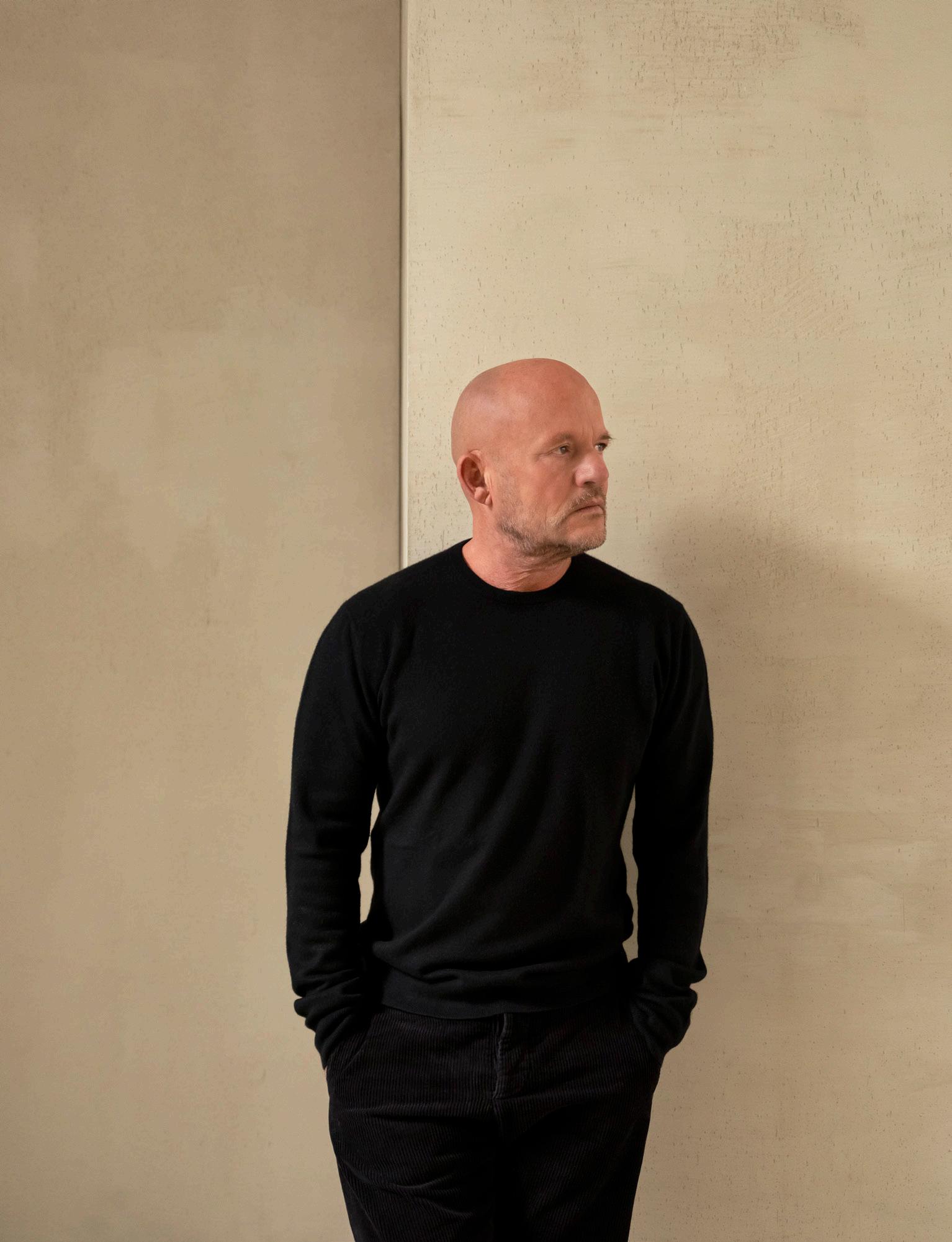
Belgian architect Vincent Van Duysen and his studio have distilled ‘the art of living’ for more than 30 years. The intuitive architect has accumulated a vast body of work, appointed as creative director of Italian brand Molteni&C in 2016.

Vincent resonates with the design of the leather and oak Jean-Michel Frank chair re-edited by Hermès. “I’m a big fan of Frank’s,” he says. “I like the fact that the object is reduced to essential design with an ergonomic backrest and beautiful Hermès leather seat cushion.”

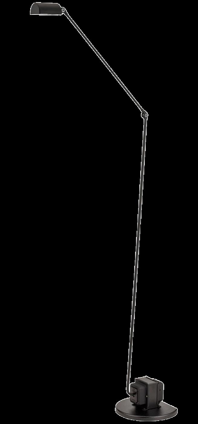
The architect lists his Atelier table for Zara Home as an era-defining piece for its pure, robust form and the Paul sofa he designed for Molteni&C for its interplay with large, loose cushions. “I revisited the classic, archetypical sofa in a slim and ergonomic way,” Vincent adds. The Daphine floor lamp by Lumina is a hallmark of the designer’s residential projects, “disappearing in space yet very performant,” he says.

Designed by Pierre Chapo, Vincent admires the B17C library for “the honest way the shelves are placed on the vertical wall elements; all made of wood; pure yet sculptural.”

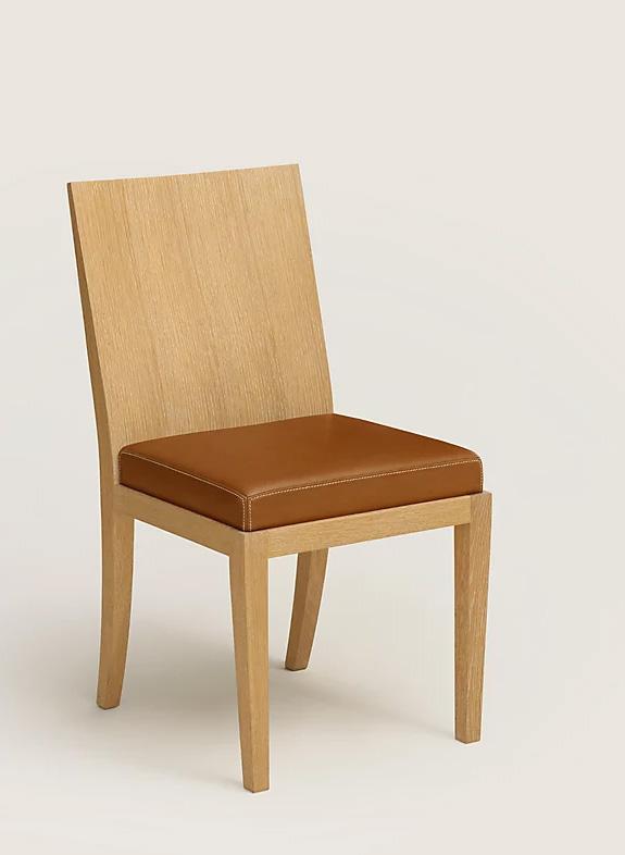


“I enjoy the honest way the shelves are placed on the vertical wall elements; all made of wood, pure yet sculptural.”– Vincent Van Duysen 1. Paul sofa by Vincent Van Duysen for Molteni&C 2. Atelier dining table by Vincent Van Duysen for Zara Home 3.B17C library by Pierre Chapo 4. Jean Michel Frank chair re-edited by Hermès 5. Daphine floor lamp by Lumina Photography François Halard


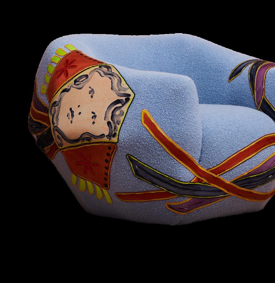


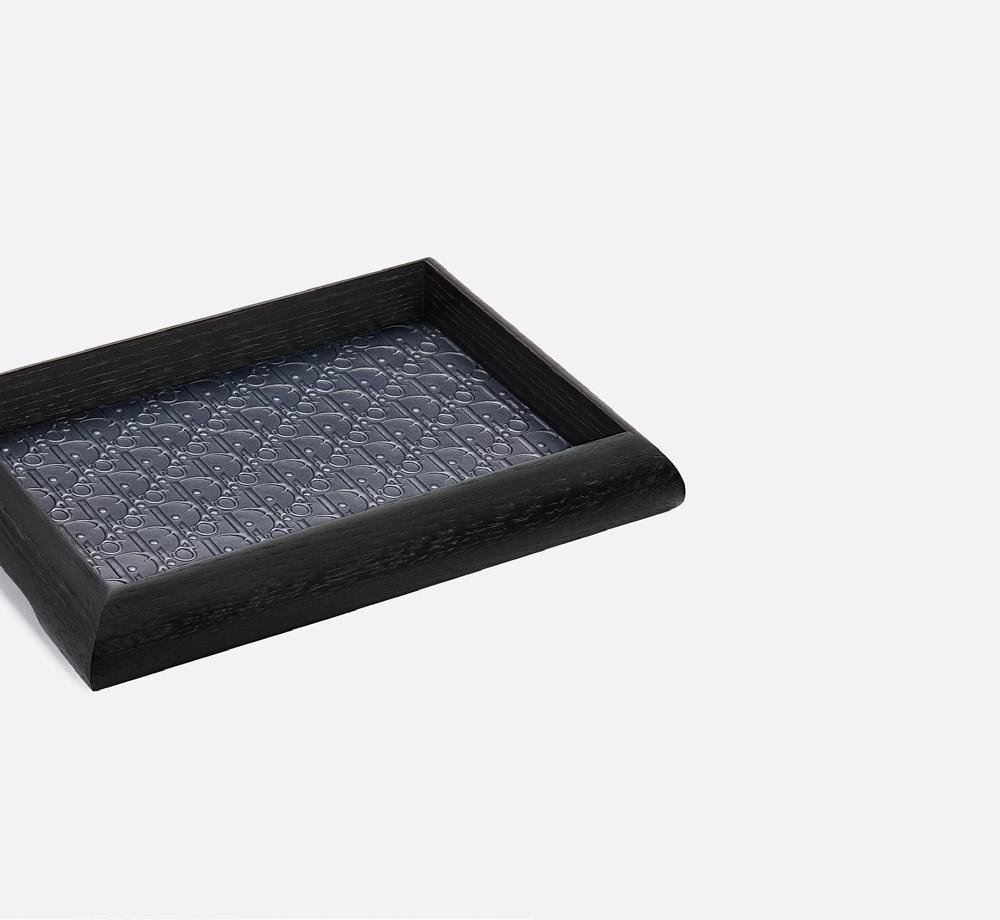
 1. Snowflake chandelier by Paavo Tynell 2. Asymmetry armchair by Pierre Yovanovitch x Claire Tabouret 3. Dior Maison x Pierre Yovanovitch black tray
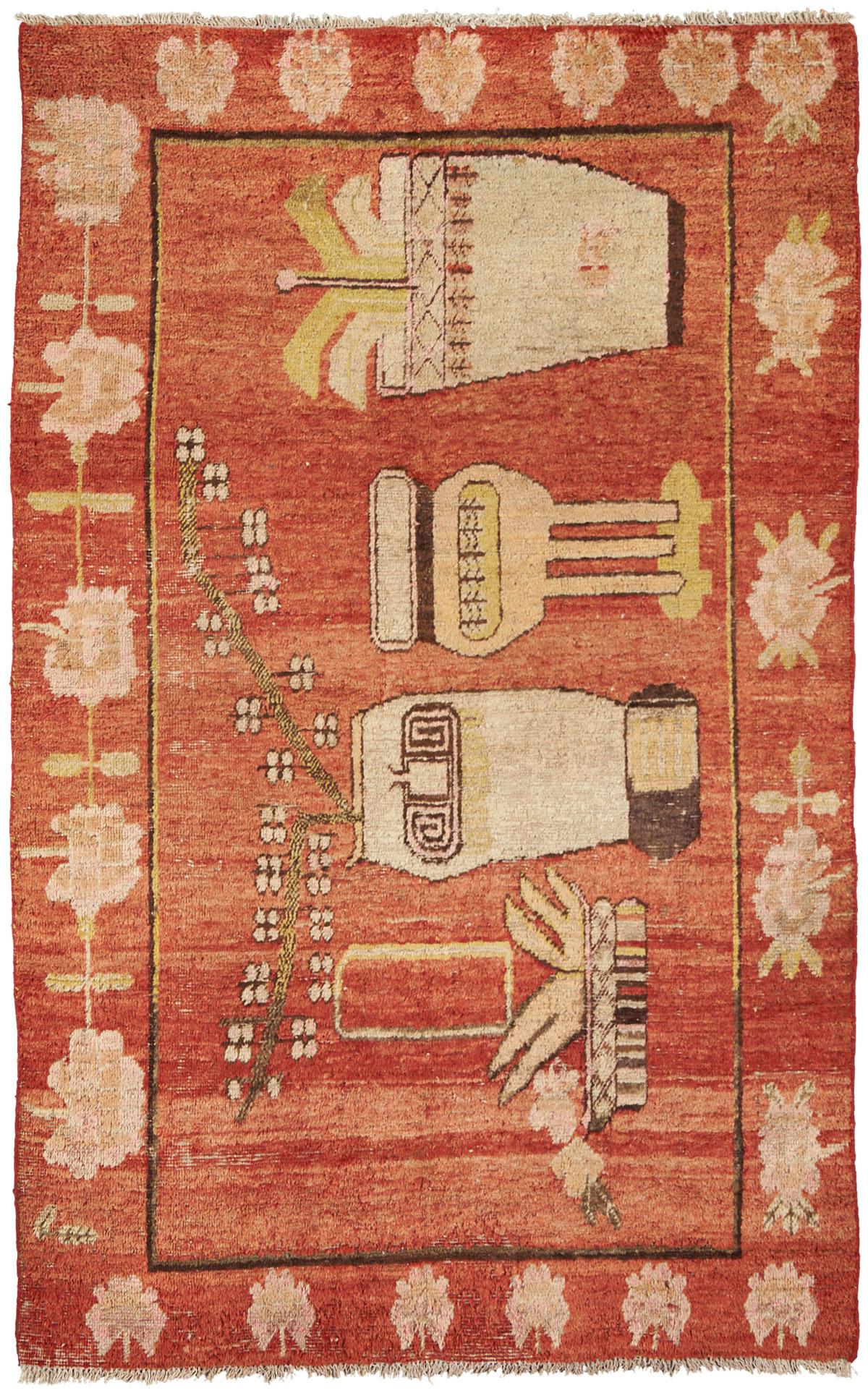
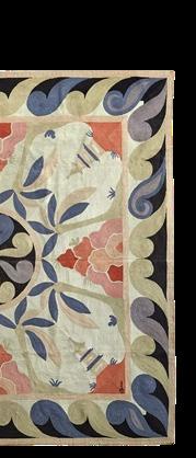
4. Pagoda rug by Ernest Boiceau 5. Mesa table by T.H. Robsjohn-Gibbings
“Tynell’s light is really something special – it changes the atmosphere of a room. It complements contemporary pieces, like our Asymmetry armchair.”
– Pierre YovanovitchPhotography Romain Laprade


Following a career in fashion, designer Pierre Yovanovitch established his Paris-based atelier in 2001, passionate about fusing historic design pieces, contemporary designers and art. Two decades on, the interior designer opened his furniture brand Pierre Yovanovitch Mobilier.


Finnish designer Paavo Tynell has always featured in Pierre’s interiors, in particular, his Snowflake chandelier. “Tynell’s light is really something special – it changes the atmosphere of a room,” Pierre says. “It complements contemporary pieces, like our Asymmetry armchair.”
Pierre transports his clients to “a dream setting with the finest craftsmanship”, achieved through pieces such as the Mesa table by T.H. Robsjohn-Gibbings and the Pagoda rug by Swiss Art Deco interior designer Ernest Boiceau – whom Pierre adores. “He made his rugs using a unique embroidery technique called ‘Cornély stitch’".
Never far from haute couture, Pierre designed a new line of home accessories with Dior Maison, including the embossed leather Dior Maison x Pierre Yovanovitch tray – which he says is “an invitation to the sweetness of life”.
Architect Isabelle Stanislas’ practice spans interior design, architecture and furniture design that leans toward fashion. Having designed countless high-fashion stores around the globe, Isabelle is guided by an appreciation for materials and design details.

Isabelle’s penchant for materiality led her to Jean Guillaume Mathiaut’s Okibo coffee table. talent for crafting wood. His workshop near Fontainebleau is a true hidden gem that I says. A designer also working from Fontainebleau, Isabelle says she’s enchanted by Eric magical touch with bronze, as seen in his lighting designs. It’s also the exploration of most minimalist form that makes Tadao Ando’s bench seat an era-defining piece.


Designer Gio Ponti has always interested Isabelle for his ability to apply the principles everyday objects. “Building a chair, in particular, is a fascinating design challenge that consideration of the backrest and its ergonomics for the human body,” Isabelle says. master in his craft.”


Looking to her own living room, Isabelle designed the Gabriel sofa as her ‘perfect sofa meticulously crafted with just the right proportions for both relaxation and entertaining,”
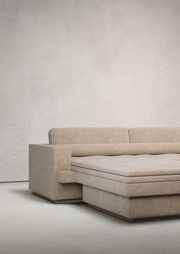
table. “He has a love to visit,” she Eric Schmitt’s materials in their principles of proportion to that requires careful “Ponti truly is a sofa design’ – “It was entertaining,” she says.


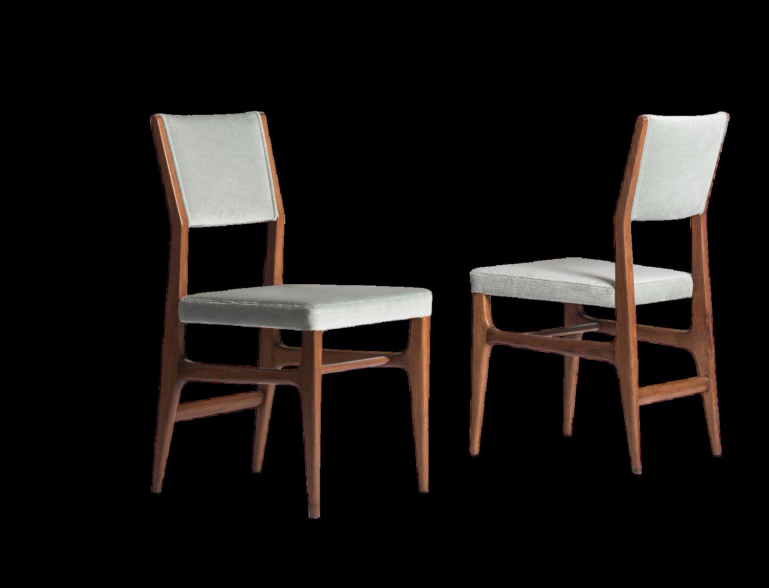
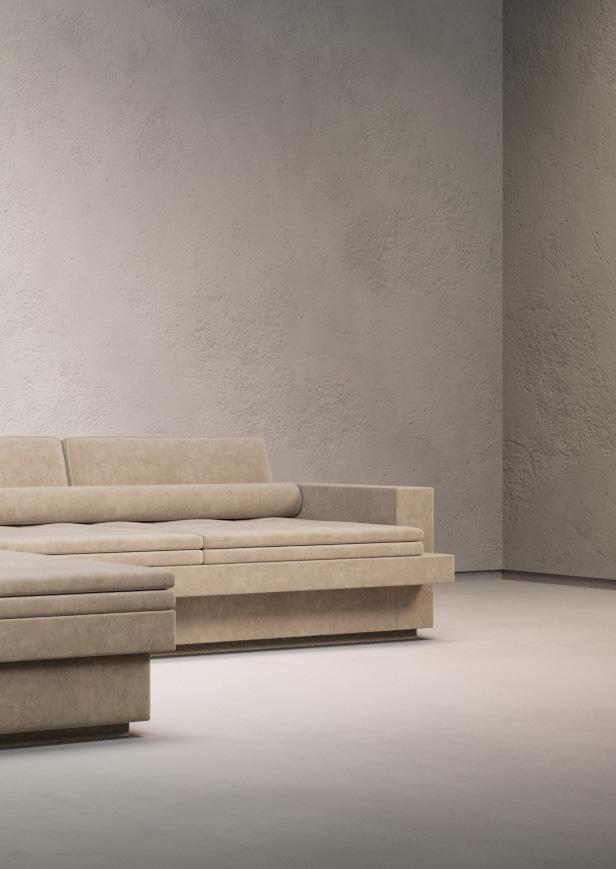
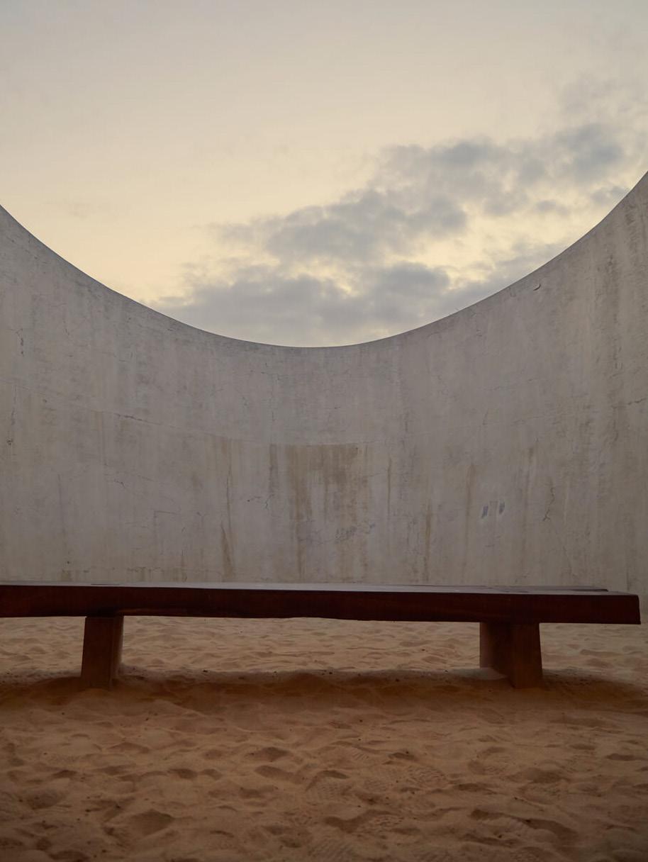
“Building a chair, in particular, is a fascinating design challenge that requires careful consideration of the backrest and its ergonomics for the human body. Ponti truly is a master in his craft.”
– Isabelle Stanislas1. Bench seat by Tadao Ando 2. Okibo coffee table by Jean Guillaume Mathiaut 3. ISA dining chair by Gio Ponti 4. Gabriel sofa by Isabelle Stanislas 5. Marceau pendant by Studio Eric Schmitt courtesy Isabelle Stanislas Photography Sergio López
“I absolutely treasure [The Taraxacum pendant by Achille and Pier Giacomo Castiglioni] and love to find them patinated and worn; they are an enduring classic in any interior.”


 – David Flack
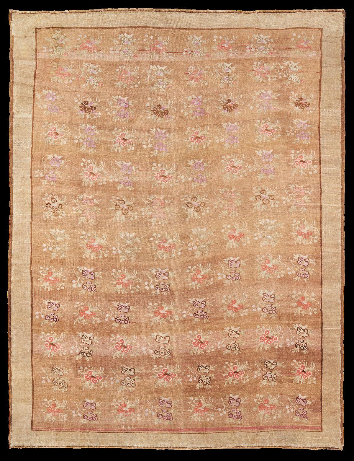
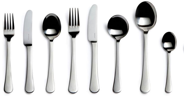
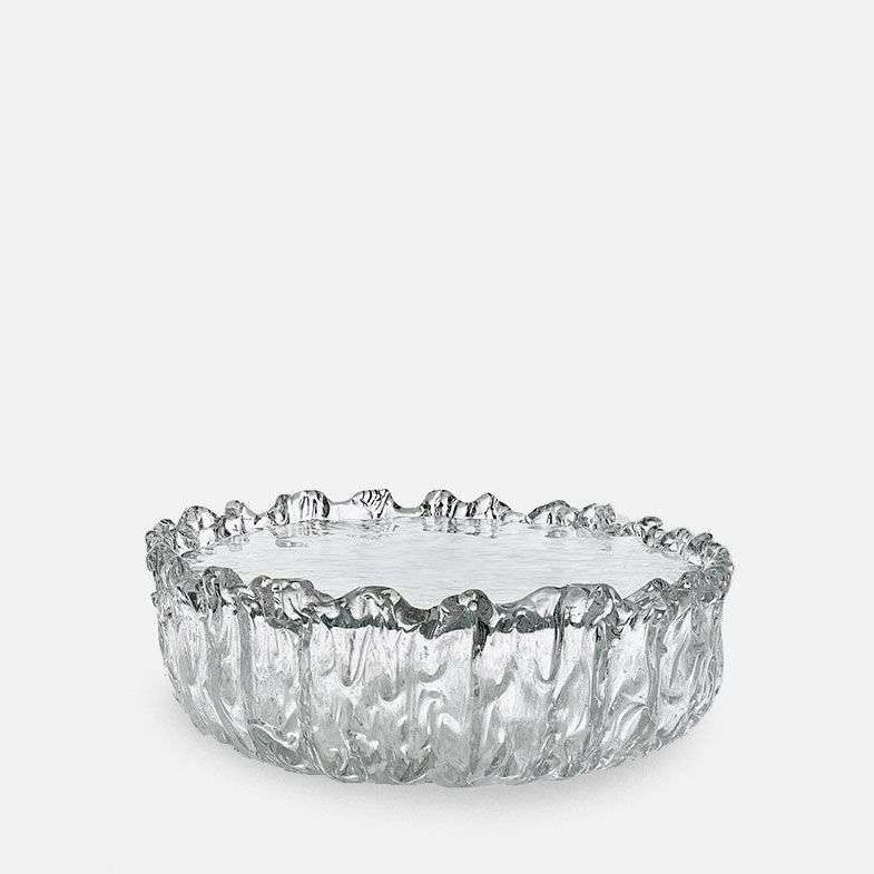
1. Fountain side table by Tokujin Yoshioka for Glas Italia 2. David Mellor cutlery 3. Taraxacum pendant by Achille and Pier Giacomo Castiglioni 4. Bergere armchair by Tobia Scarpa 5. Halcyon Lake Vintage Turkish Kars 17 rug


Designer David Flack and his namesake Melbourne studio create experiential spaces characterised by expressive materiality. The studio have collaborated on interior projects across hospitality, retail and residential design for nearly a decade.
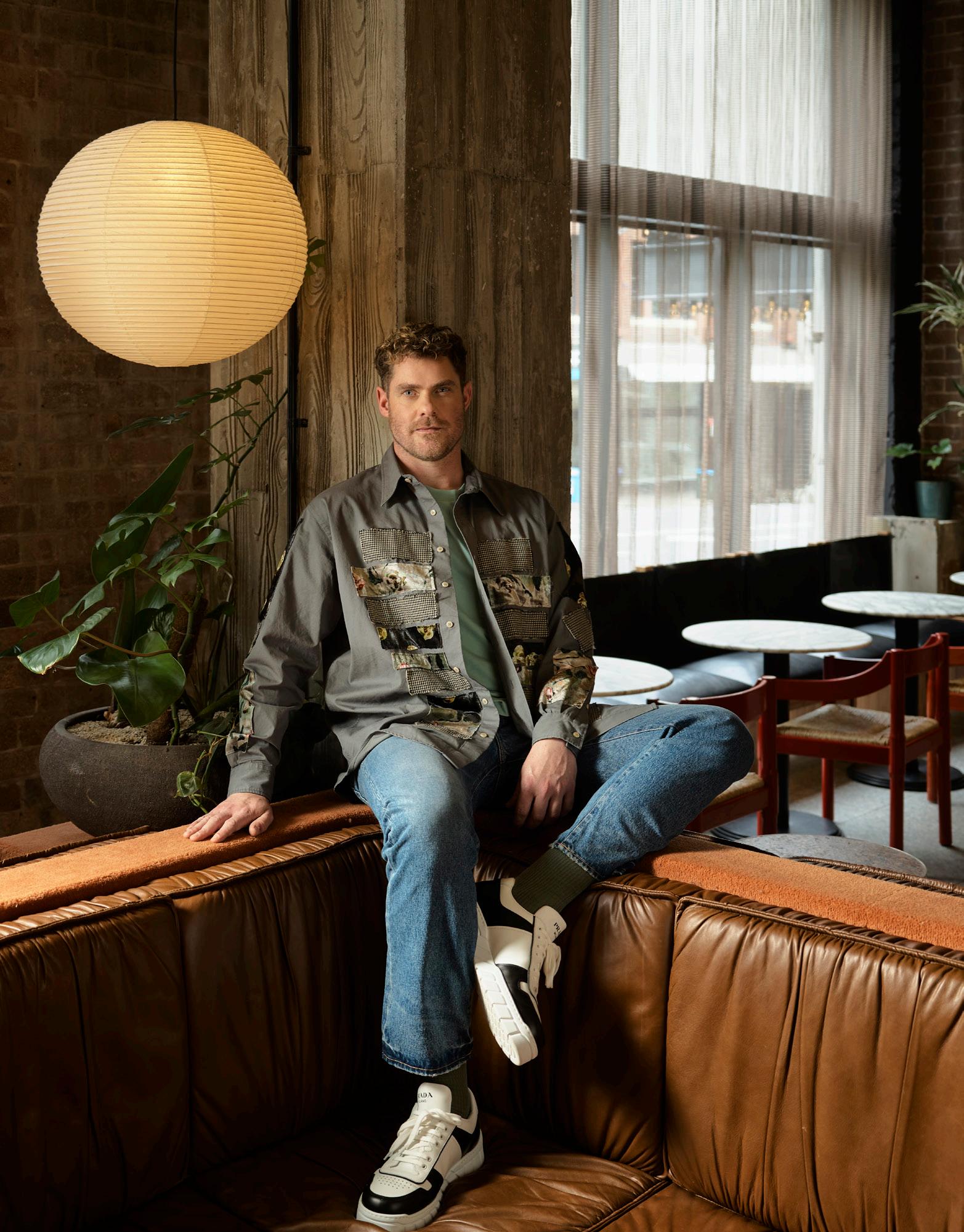
The Taraxacum pendant by Achille and Pier Giacomo Castiglioni is no stranger to the work of David Flack, who always sources the pendant vintage. “I love to find them patinated and worn; it’s an enduring classic,” he says. When it comes to an era-defining rug, David lists antique kilim or Persian rugs – also for the inherent story they tell. The Bergere armchair designed by Tobia Scarpa in 1970, is a piece that simply invites you to sit and relax. “It’s large in scale yet not difficult to locate in a smaller home,” David adds.


The designer sees the Fountain side table by Tokujin Yoshioka for Glas Italia as more of a “melting sculpture” than a furniture piece, chosen for how the hand-shaped glass “glistens in the light”. And when looking to the smaller details, David speaks of the importance of well-made cutlery in the home. “Every time I share a meal, I love to use the David Mellor cutlery for its quality and distinctive design.”


Multi-disciplinary designer Kelly Wearstler established her studio in 1995, evolving beyond interiors to architecture, product design, creative direction and brand identity. The designer’s breadth of work shares her penchant for mixology, juxtaposition and maximalism.

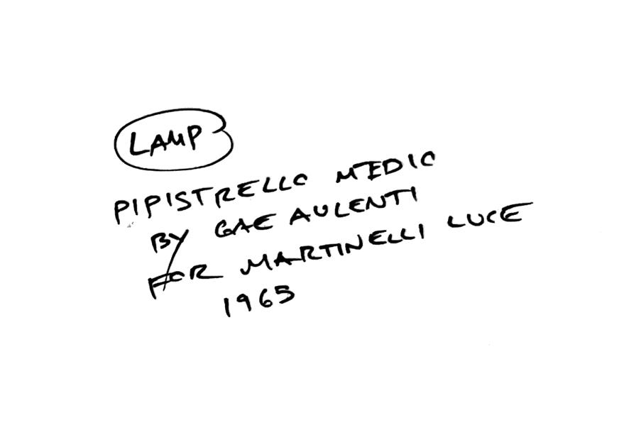
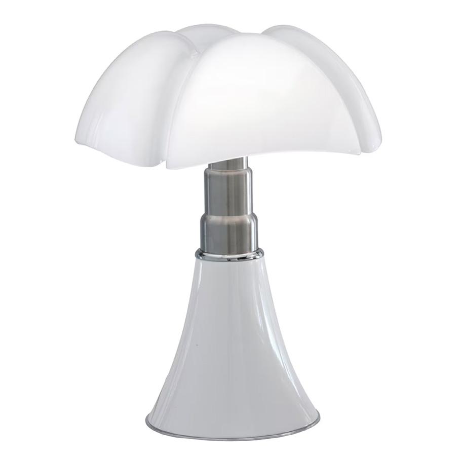
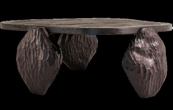
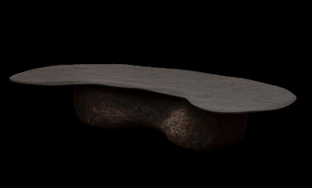
Lighting sets the mood of a space according to Kelly, who selected the Pipistrello lamp, designed by visionary Gae Aulenti “for its ability to cast the most enchanting luminous ambience”. The designer says the low profile of the Obliqua sofa by Mario Botta is indicative of its comfort – a marriage of form and function – and admires the unexpected sculptural shape of Felix Muhrhofer’s Xenolith coffee table. “Its artistic nature transcends mere furniture with the rawness and refinement of stone,” she adds.
Looking to Kelly’s own designs, the Butt stool is a playful combination of technology and design inspired by the human form. “I love the interplay of humour and craft and had a lot of fun getting the shape of the cheeks just right,” she says.
Featured in Kelly’s most recent collaboration with Serax, the Dune Marble High bowl marks her debut in the tableware category. “Each piece in the collection asserts its own singular identity, and I love the grandeur of this dynamic bowl.”



artistic nature of Felix Muhrhofer’s Xenolith table transcends mere furniture with the rawness and refinement of stone…”
– Kelly Wearstler1. Butt stool by Kelly Wearstler 2. Dune Marble High bowl by Kelly Wearstler for Serax 3. Xenolith coffee table by Felix Muhrhofer 4. Obliqua sofa by Mario Botta 5. Pipistrello lamp by Gae Aulenti




"The Le Corbusier Borne Beton lamp is a great use of material. The concrete manages to have a lightness to it…”
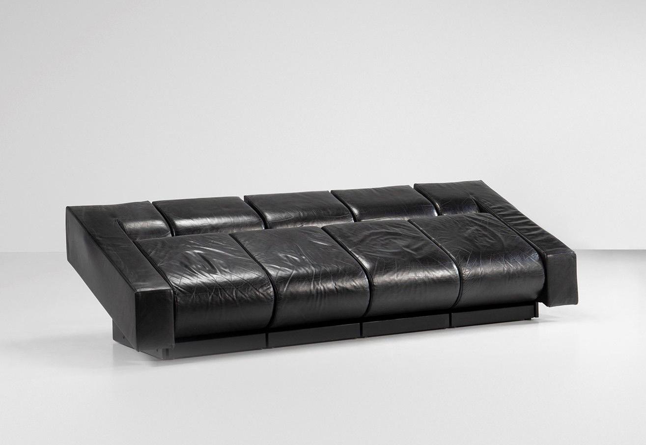
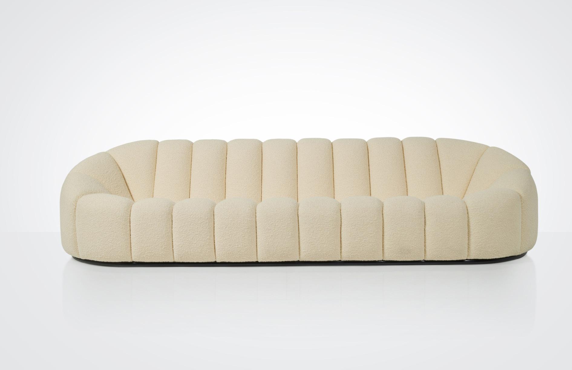
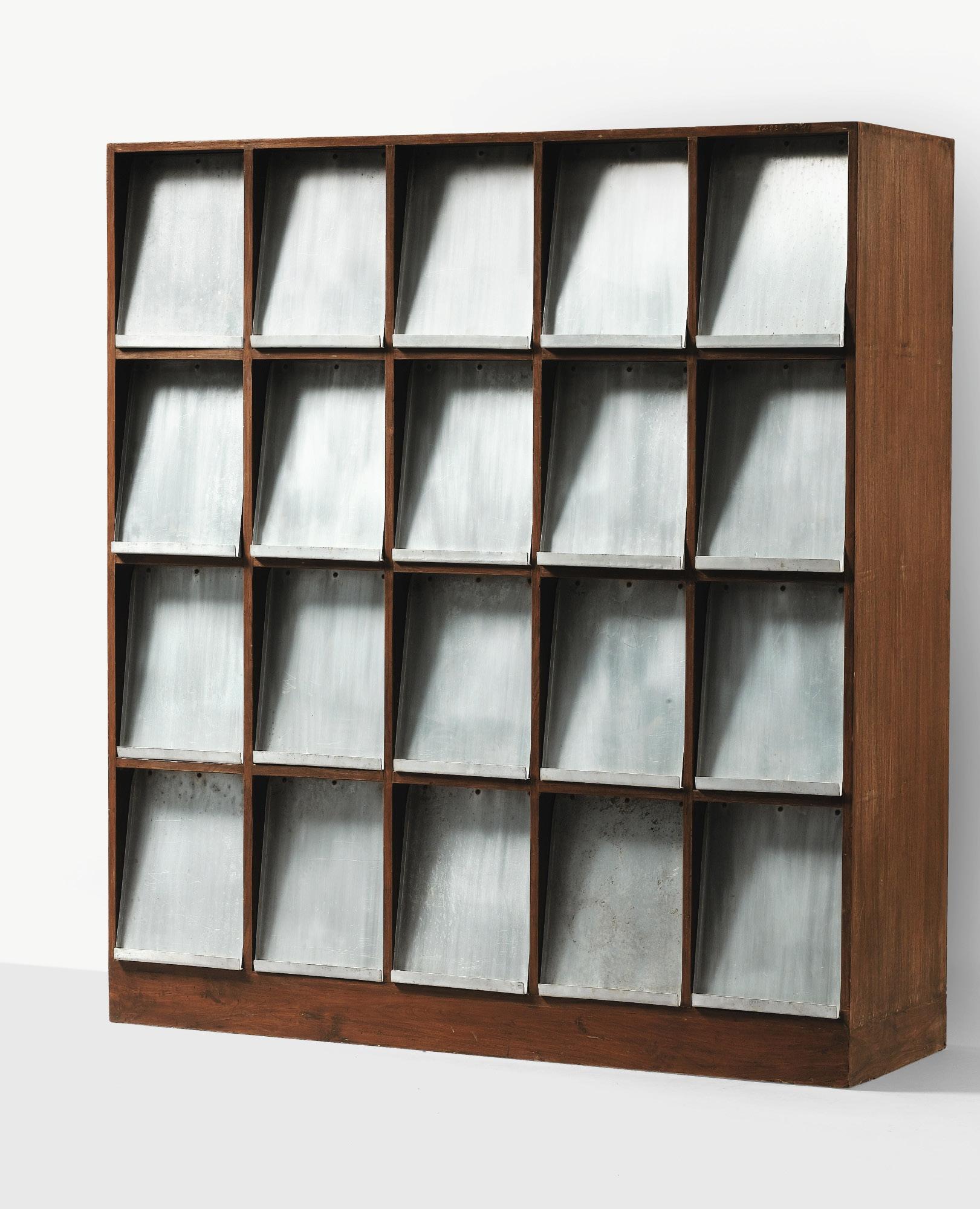
– Giancarlo Valle1. Pierced coffee table by Isamu Noguchi 2. Pierre Jeanneret magazine rack 3. Carlo Mollino Lutrario armchair and stool 4. Alpha sofa by Pierre Paulin 5. Borne Beton lamp by Le Corbusier

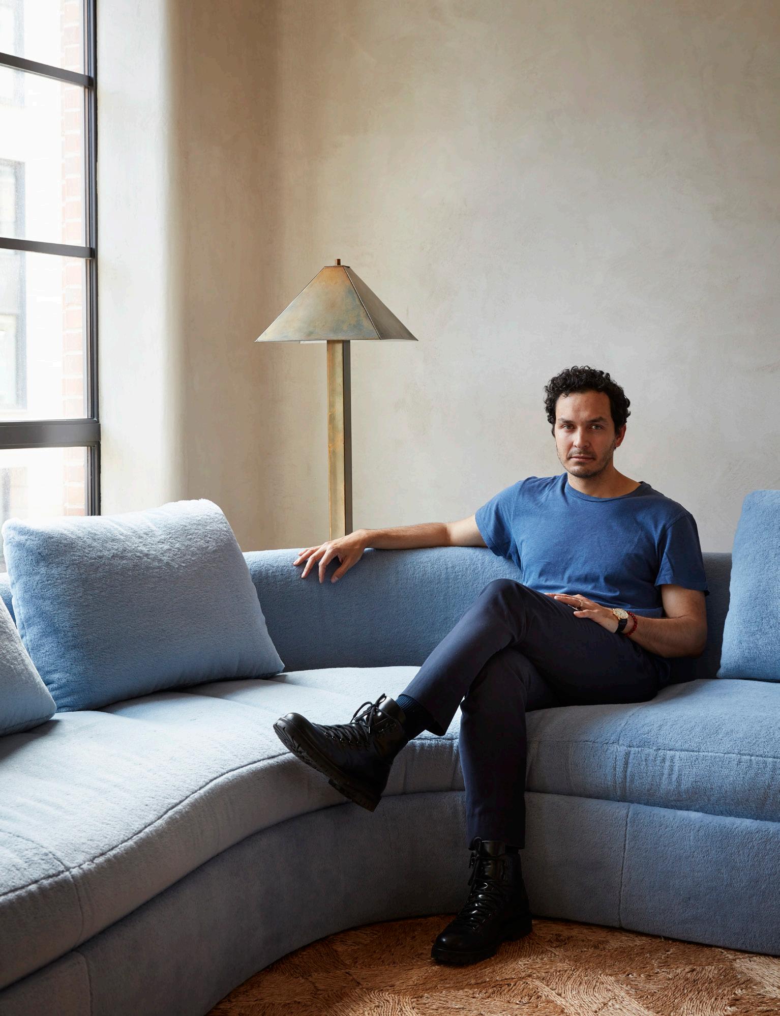
New York-based designer Giancarlo Valle’s work lies at the intersection of architecture, interiors and the decorative arts. His namesake studio is known for artistic collaborations across fashion, furniture, hospitality and home design.


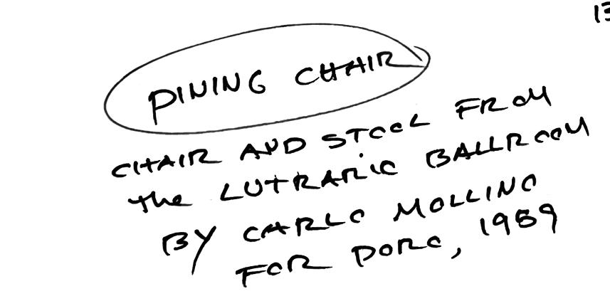
Giancarlo describes the dining chair Carlo Mollini designed for the Lutrario Ballroom in Turin, Italy, in 1959, as incredibly modern, like a race car, but at the same time, traditional. “I've always felt this chair is timeless and from a period I could never quite figure out,” Giancarlo adds. Alpha sofa by Pierre Paulin is also a contrasting piece: “This sofa has a form that feels both space-age and alien while also comforting and familiar,” he says.
The Pierced coffee table by Isamu Noguchi captures Giancarlo’s belief that “minimal means to create a maximum effect”, made using flat sheets to create a three-dimensional object. The designer is fascinated by an object’s first intended use, such as the Borne Beton lamp by Le Corbusier designed in the ‘60s to illuminate walking paths at night and the Pierre Jeanneret magazine rack. “Originally created for the public library, I love the magazine rack’s presence in a room,” he says.

Rachel Nolan and Patrick Kennedy established their Melbourne architecture practice Kennedy Nolan in 1999. Together, the architects yield evocative forms, colour, texture and light to respond to a diverse range of projects from education to interiors.


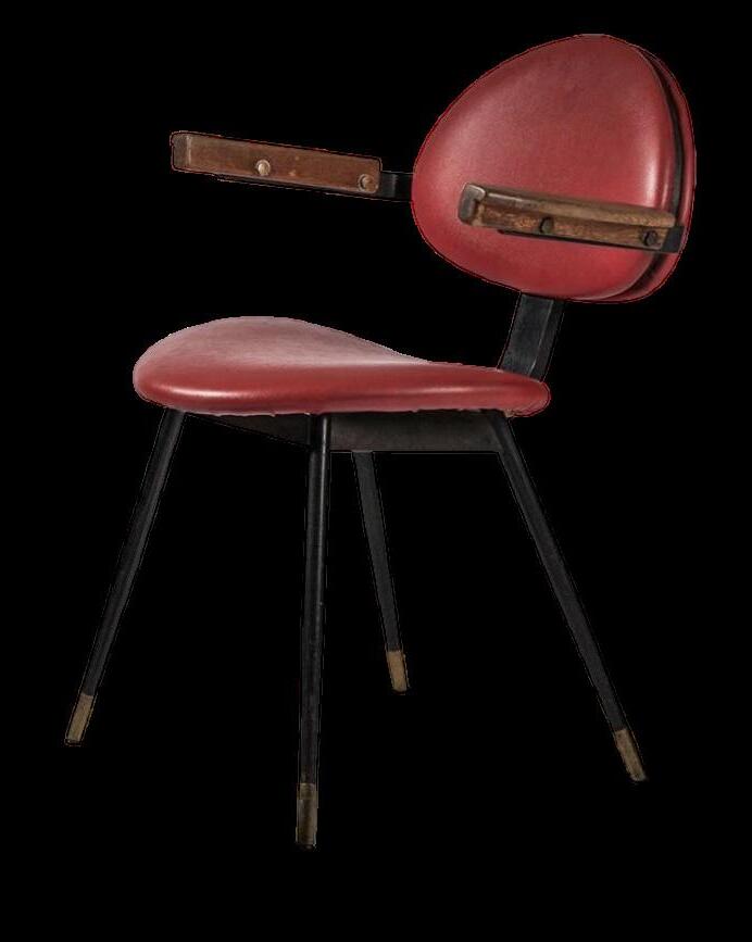
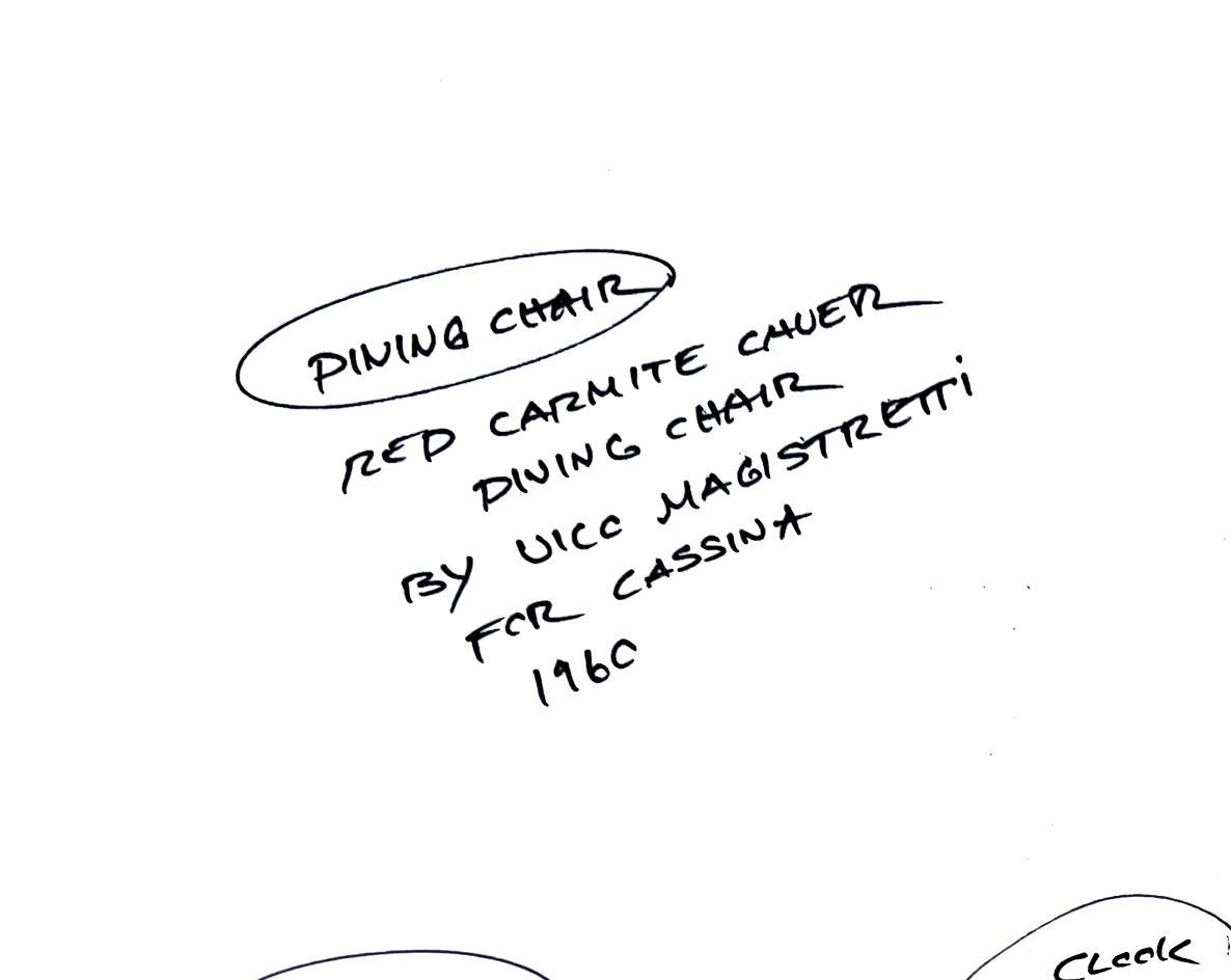
Rachel enjoys the playfulness of Vico Magistretti’s designs for Cassina. Designed in 1960, Magistretti’s red, wood and straw Carimate chair “Feels like it’s been made for a thoroughly modern Goldilocks,” Rachel says. “The Maralunga sofa is such a spirited and dynamic little creature. Its modest dimensions that defy how comfortable it is,” she adds.

Designed in 1951, the unexpected scale of the Akari UF3-Q lamp by Isamu Noguchi often finds its way into Kennedy Nolan’s work. “The paper light is nearly human in its size. It's sturdy and fragile at once – it makes me think Noguchi had a sense of humour,” the architect says.


The Bramante table designed by Achille & Pier Giacomo Castiglioni, chosen for its adjustable feet, reveals Kennedy Nolan’s constant lens on functional and whimsical design; underscoring the Ikea IVAR modular shelving system. “Those who know me will understand how much I enjoy ‘entry-level’ Ikea,” Rachel says. “This modular classic is ageless, adaptive and affordable.”


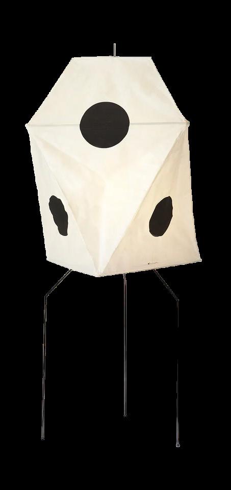
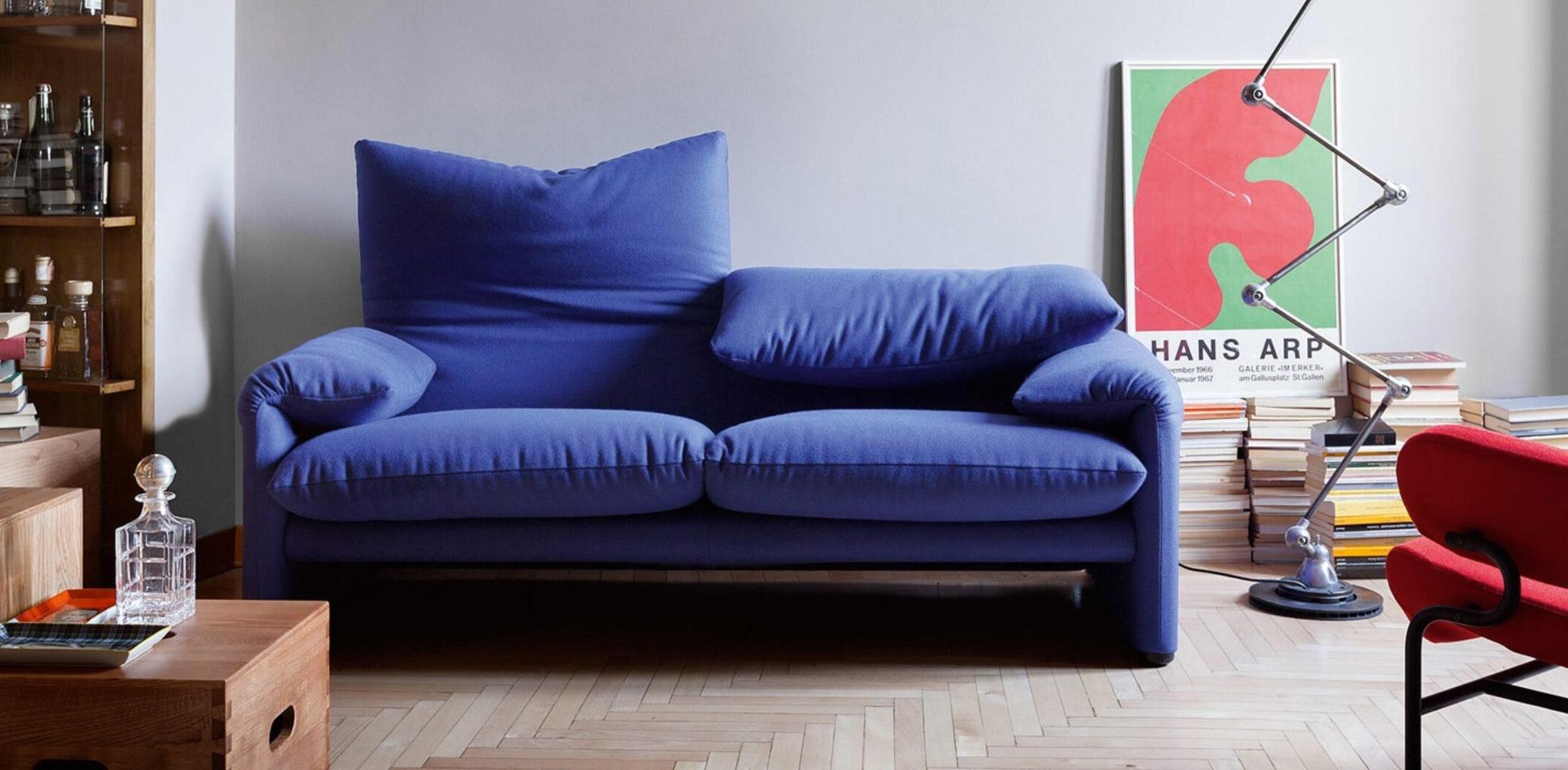


 1. Ikea IVAR modular system 2. Akari UF3-Q lamp by Isamu Noguchi
3. Maralunga sofa by Vico Magistretti for Cassina 4. Bramante table designed by Achille & Pier Giacomo Castiglioni
5. Carimate chair by Vico Magistretti
“[The Akari UF3-Q] light is nearly human in its size. It is sturdy and fragile at once – it makes me think Noguchi had a sense of humour…”
– Rachel NolanPhotography courtesy of Cassina


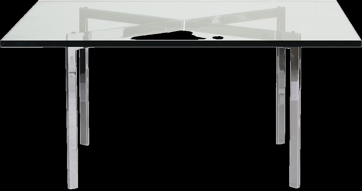


 1. Barcelona coffee table by Mies van der Rohe 2. Battuto vase by Tobia Scarpa for Venini 3. Armchair 41 “Palmio" by Alvar Aalto 4. Ivan Da Silva Bruhns rug 5. Akari ceiling lantern by Isamu Noguchi
“The Barcelona coffee table by Mies van der Rohe is the ultimate expression of form and function.”
– Andre MellonePhotography courtesy of The Isamu Noguchi Archive


Brazilian designer Andre Mellone founded his New York-based namesake studio in 2012. Specialising in high-end residential projects, his interiors are marked by ‘simplicity, rigour and common sense’.


Andre considers the Akari ceiling lantern by Isamu Noguchi as an era-defining piece because it represents a switch from traditional lighting to something new – both as a material and lighting experience. The Armchair 41 “Palmio" designed by Alvar Aalto in 1930 also makes Andre’s list, reflecting Aalto's carpentry techniques and how he “revolutionised the way we experience wood,” he adds.
The designer sees the Barcelona coffee table by Mies van der Rohe as “the ultimate expression of form and function” and the Battuto vase by Tobia Scarpa for Venini as a “completely modern interpretation of Murano glassworks”. Andre opines any rug designed by Ivan da Silva Bruhns as “a real moment in time… the most beautiful expression of abstract Art Deco composition”.


Barbara Ghidoni, Marco Donati and Michele Pasini have led their multi-disciplinary Milan studio STORAGEMILANO for more than 20 years. Their conceptual approach centres on finding new aesthetics and spatial solutions through material and form.

The Biagio table lamp, designed by Tobia Scarpa in 1968, carved from a single block of white Carrara, is an era-defining piece for STORAGEMILANO, crediting its “sublime manufacturing technique”. The design firm’s enduring fascination with how a product is made is also expressed in the Damier rug by cc-tapis design-lab. “Minimalist, it’s the result of an experimental handicraft production; the chessboard is like a virtual space and a serial repetition of the same element that creates movement,” Michele says.
STORAGEMILANO’s own Stay lounge chair takes a contemporary perspective to 1950s design references. “The slender structure contrasts with the full volumes of the cushions to appear suspended,” Barbara says. According to Marco, both the Shape coffee table by STORAGEMILANO and Tripod by George Nelson share a clean and balanced design language that translates traditional shapes.
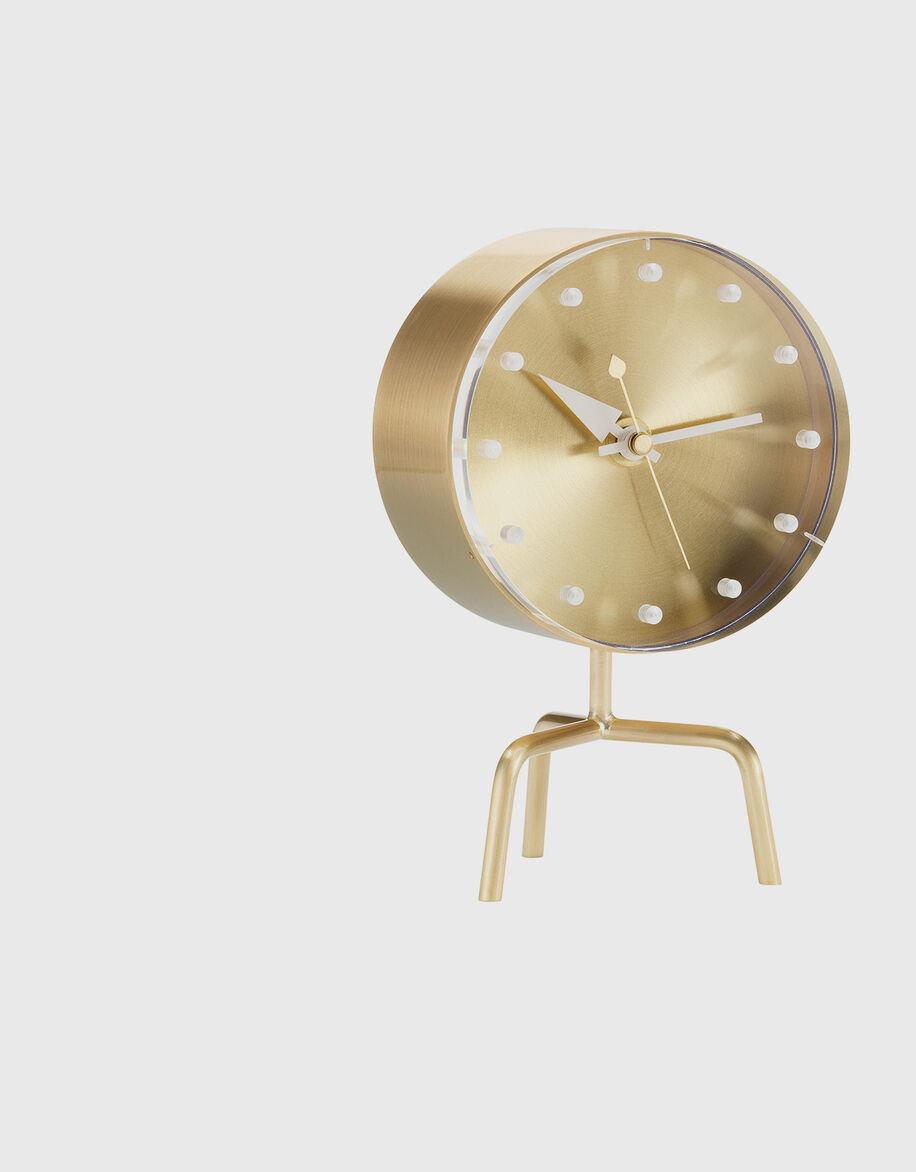

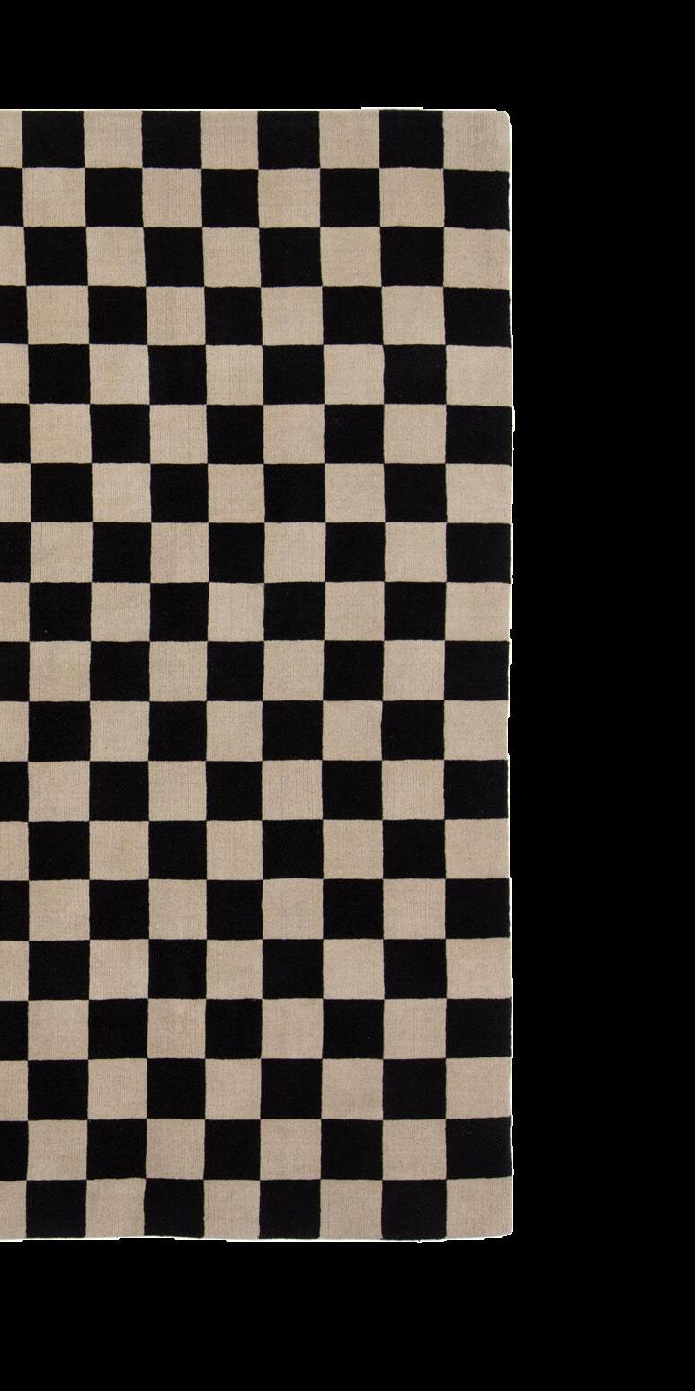
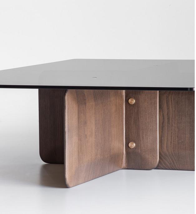
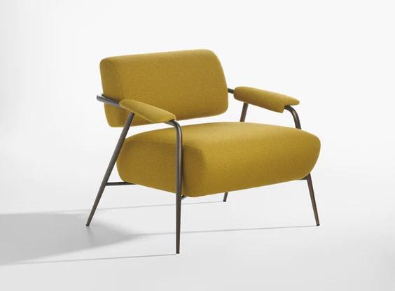
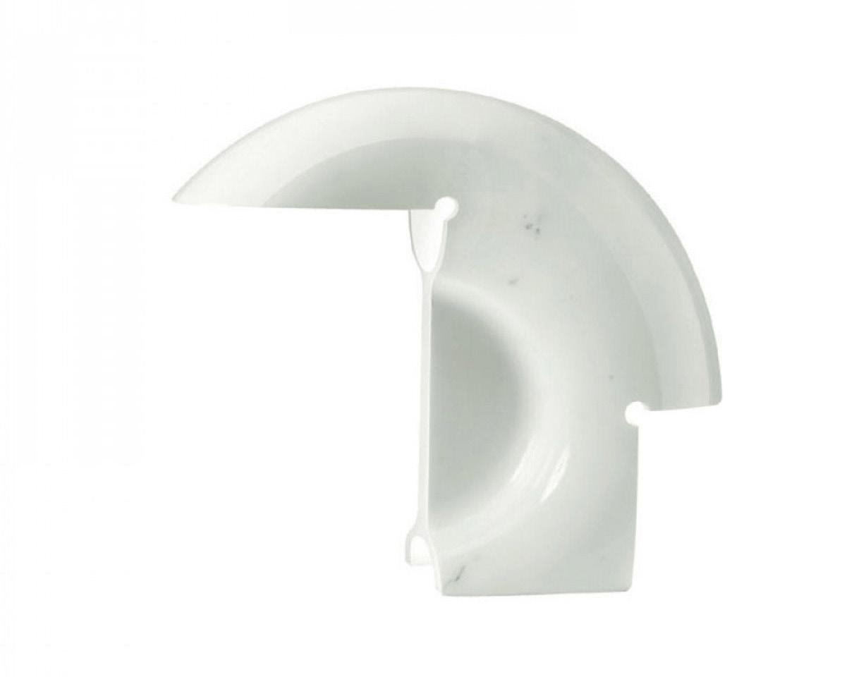


“[The Damier rug by cc-tapis design-lab] is the result of an experimental handicraft production; the chessboard is like a virtual space and a serial repetition of the same element that creates movement…”
– Michele Pasini1. Biagio table lamp by Tobia Scarpa for Flos 2. Stay lounge chair by STORAGEMILANO for Potocco 3. Damier rug by cc-tapis design-lab 4. Tripod by George Nelson 5. Shape coffee table by STORAGEMILANO for Potocco
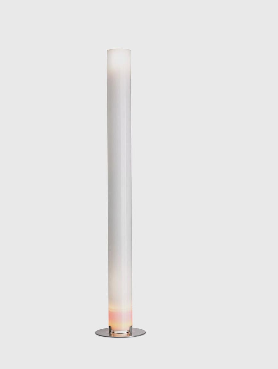

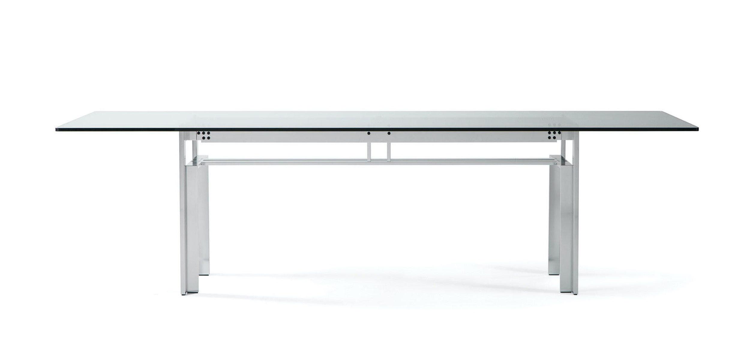


“Scarpa's design is an architectural structure akin to the skeleton of a building that is yet to be constructed…”
– Ludovica Palomba1. Doge table by Carlo Scarpa 2. Lama chair by Ludovica and Roberto Palomba for Zanotta 3. Traccia table by Meret Oppenheim for Cassina 4. Stylos lamp by Achille Castiglioni 5. Mata rug by Ludovica and Roberto Palomba for cc-tapis


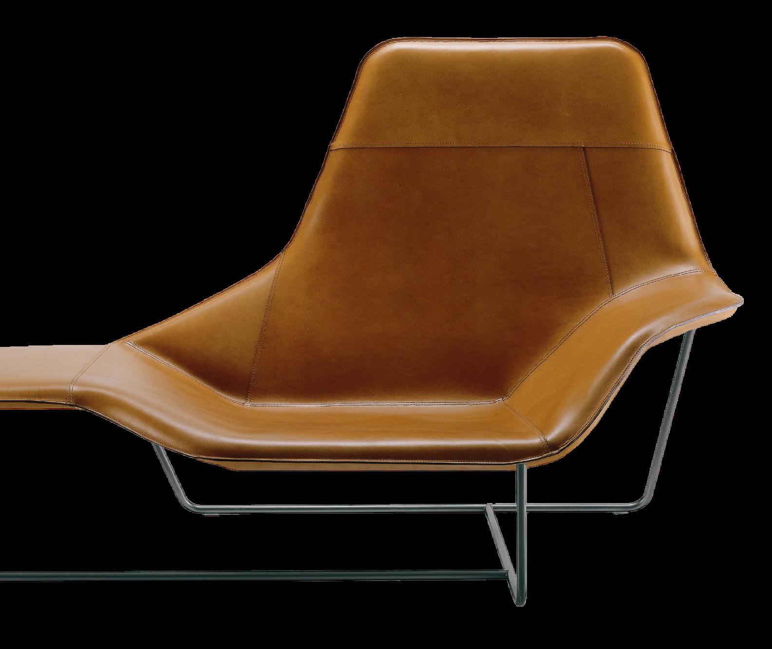


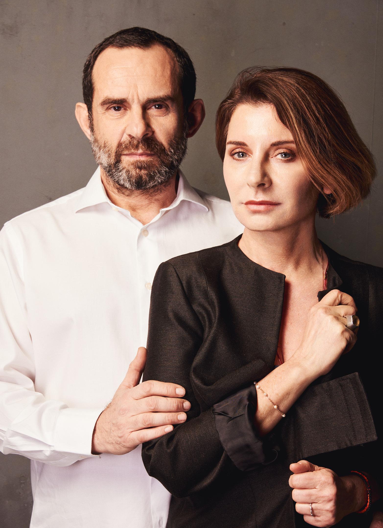
Ludovica and Roberto Palomba founded their Milan-based architecture and design studio, Palomba Serafini Associati, in 1994. The design duo have collaborated with several leading brands on designing products through their signature ‘controlled lexicon’.
The Doge table by Carlo Scarpa, designed in 1968, is a form of architecture in itself for Palomba Serafini Associati. “Scarpa's design is an architectural structure akin to the skeleton of a building that is yet to be constructed,” Ludovica says. The Stylos lamp by Achille Castiglioni was also selected for its architectural language. “The lamp seamlessly integrates into the architectural space while remaining an absolute protagonist,” Ludovica adds.
The Lama chair, “a domestic icon” Ludovica and Roberto Palomba designed for Zanotta, was conceived as a warm embrace. Also designed by the pair, the Kizo, Mata and Swazi rugs for cc-tapis are akin to watercolour paintings by 19th-century travellers. “The fragments of colours, fabrics, and materials give life to tribal patterns and the manes of strange, fantastical animals,” Roberto describes.
The designers chose the Traccia table by Meret Oppenheim for Cassina because it serves little but to bring happiness. “It stands as an independent object that can coexist within both a maximalist and minimalist interior,” Roberto adds.
https://www.neolith.com/en/company/about-us, https://www.neolith.com/en/company/about-us, https://www.neolith.com/en/company/about-us, https://www.neolith.com/en/company/about-us, https://www.neolith.com/en/company/about-us,
Neolith is an innovative architectural surface made from 100 per cent natural raw materials. Bonded with heat rather than resins, Neolith sintered stone contains minimal amounts of silica between 0 and 9 per cent, making it safer for the whole value chain.
https://www.neolith.com/en/company/about-us, https://www.neolith.com/en/company/about-us, https://www.neolith.com/en/company/about-us, https://www.neolith.com/en/company/about-us, https://www.neolith.com/en/company/about-us,

https://www.neolith.com/en/company/about-us, https://www.neolith.com/en/company/about-us, https://www.neolith.com/en/company/about-us, https://www.neolith.com/en/company/about-us, https://www.neolith.com/en/company/about-us, https://www.neolith.com/en/company/about-us, https://www.neolith.com/en/company/about-us, https://www.neolith.com/en/company/about-us, https://www.neolith.com/en/company/about-us, https://www.neolith.com/en/company/about-us,


LOCATION PALM SPRINGS, NORTH AMERICA
PROJECT WILLIAM CODY’S PALM SPRINGS HOUSE

CURATION PETER BLAKE GALLERY
PHOTOGRAPHY LANCE GERBER STUDIO
WORDS HOLLY BEADLE
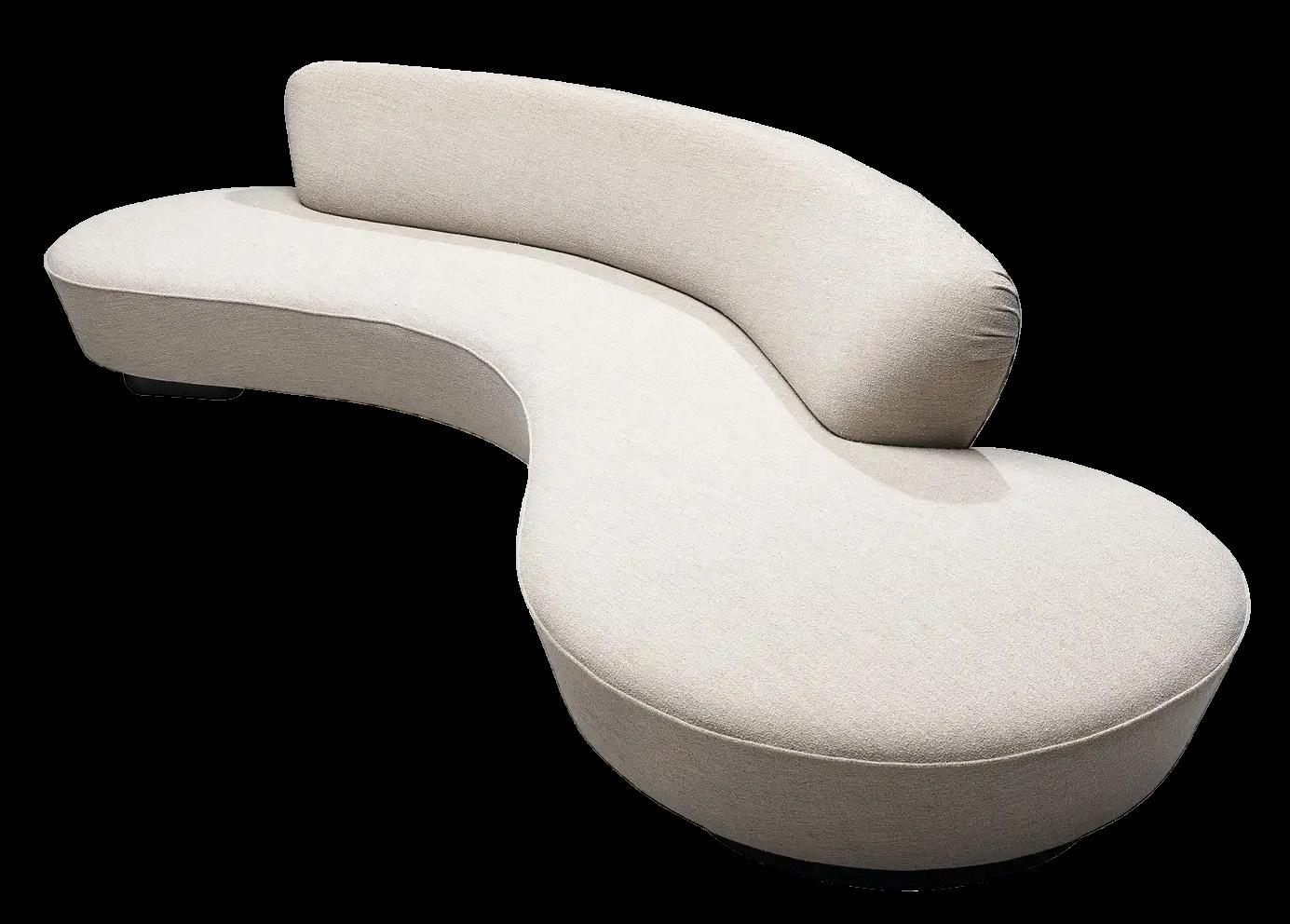
Previous page: Overlooking a cacti-filled garden bed, this living space features a painting by Lita Albuquerque (above sofa) and a sculpture by Stephanie Bachiero (bottom left corner), along with a Vladimir Kagan Serpentine sofa, Girolle chair designed by Jean-Pierre Laporte for Thonet, Jorge Zalszupin Petalas coffee table and Pierre Guariche magazine stand.
This page: Another painting by Lita Albuquerque (left) is paired with an LED lighting piece by Phillip K. Smith III (right). The colours of Smith’s pieces shift according to computer-based algorithms.

The modernist design movement, which peaked during the 50s and 60s, had many revisions as it spread across continents, landscapes and cultures. Palm Springs Desert Modernism was born from attempts to translate the movement into the arid landscape of Palm Springs in Southern California and a pioneer of the movement was architect William Cody, who helped transform the desert city into the modernist marvel that it is today.
Cody’s former home in Palm Springs, which he designed and built in the early 50s, was recently purchased by Spanish architects Paula Bueso-Inchausti and Guille Castaneda. With a vision to temporarily transform the interiors into an art exhibit, the couple, with the encouragement of their realtor Keith Markovitz, engaged Laguna-Beach-based gallerist Peter Blake to curate a selection of pieces that spoke to the original design. “We all met at the house one afternoon and became fast friends, bonding over art, design and architecture. It led to a discussion regarding the possibility of an art exhibit and cocktail party at the house, which subsequently turned into a two-month-long residency,” Peter recounts.
The house is a refined version of Palm Springs Desert Modernism, assuming a simple, steel-framed structure with large glass rooms that open onto cacti-filled garden beds and sunny patios. “What immediately struck me about the house was the amazing light that streamed through the windows. It felt incredibly spacious despite its low ceilings and intimately scaled rooms,” Peter says. Its relationship with the outdoors was another defining feature, he says, with every room in the house connecting to the landscaped areas.
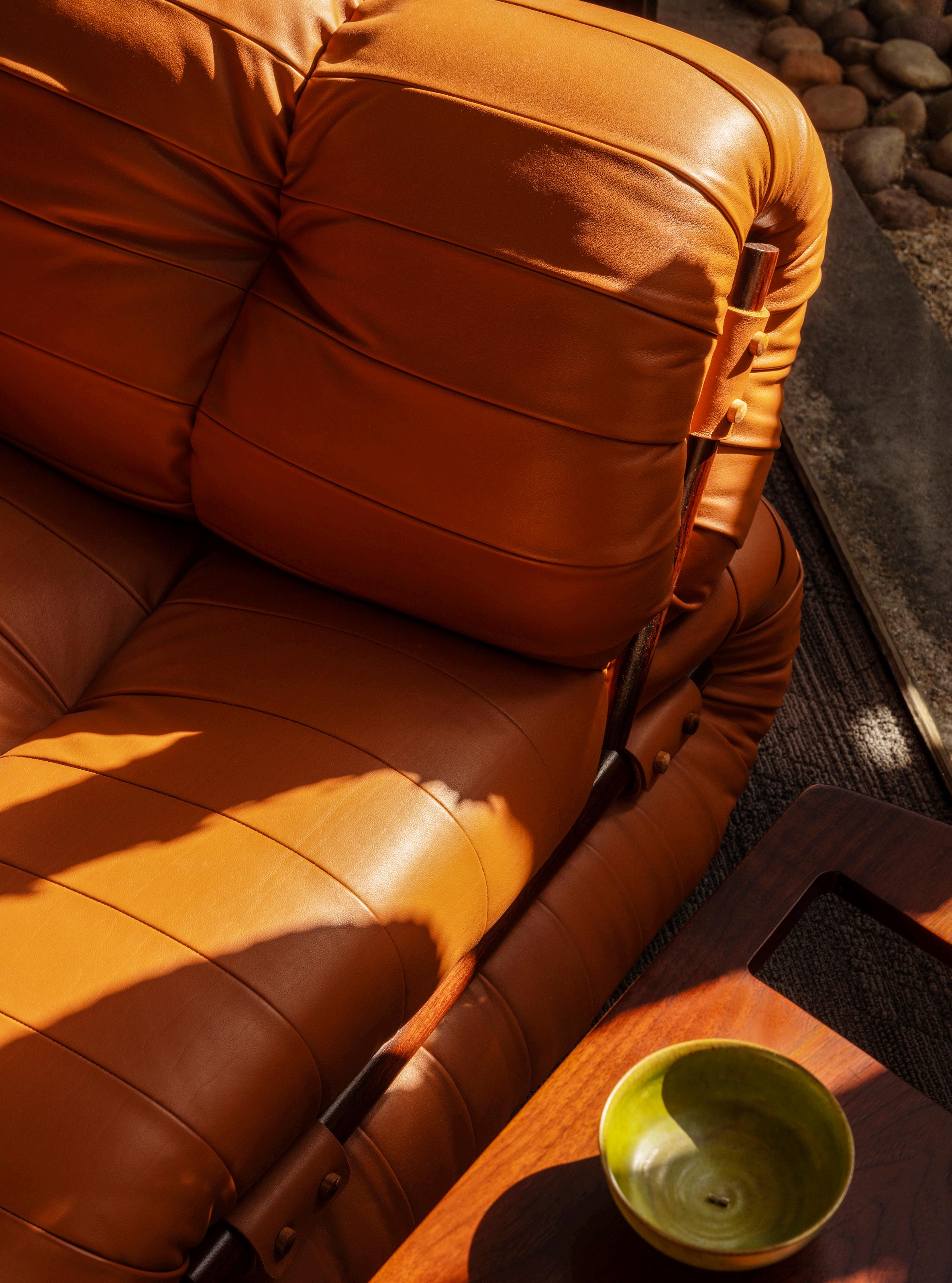
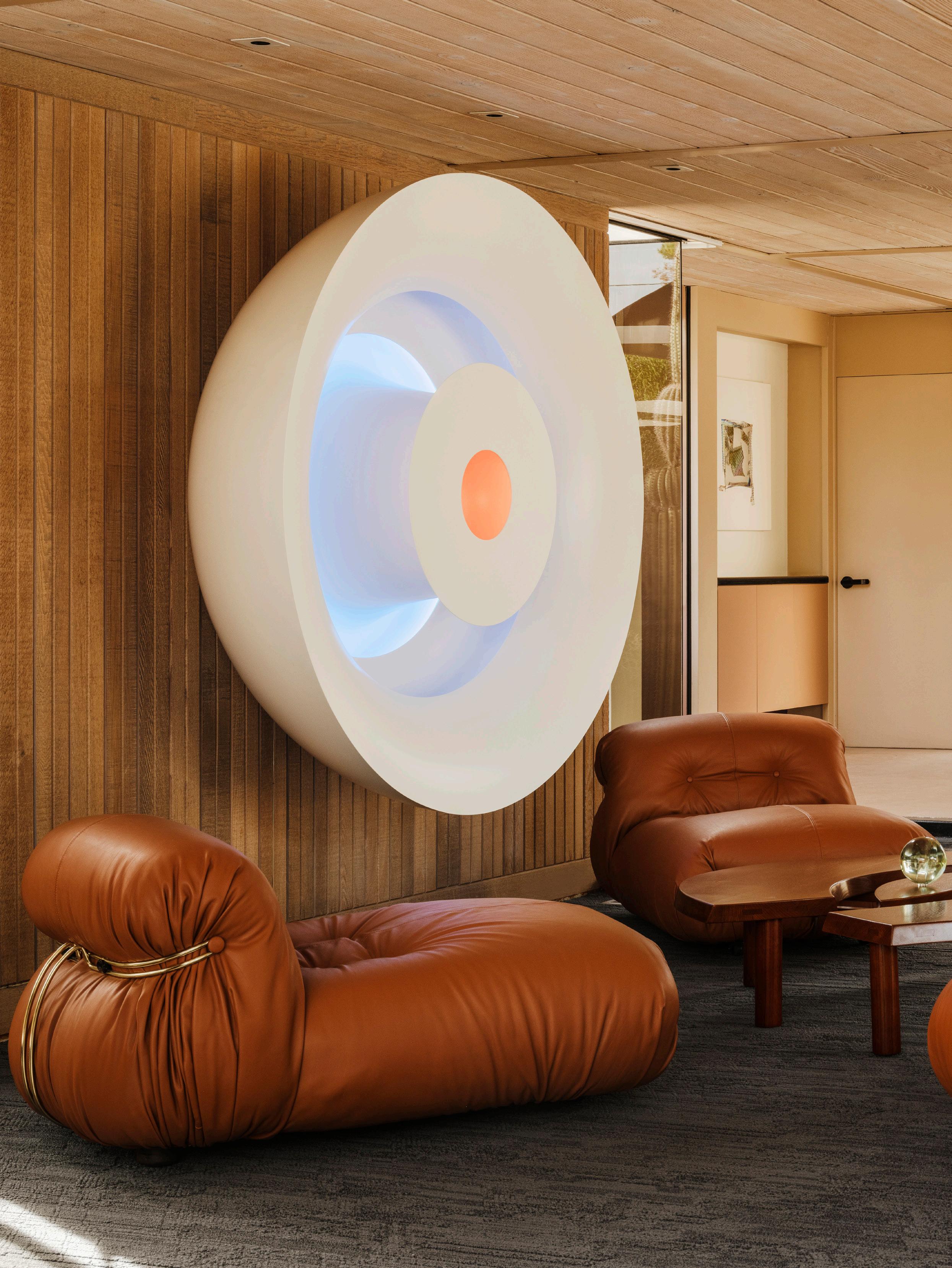 Peter wanted to represent iconic furniture designers as well as iconic artists in the exhibit. Pictured are four leather Soriana armchairs designed by Tobias Scarpa for Cassina around a Pierre Chapo coffee table, and on the wall, another remarkable LED lighting piece by Phillip K. Smith III that resembles a human iris. A glass piece by Helen Pashgian rests atop the coffee table.

Peter primarily collects West Coast minimalism with an emphasis on Light and Space – the same aesthetic he imbued into the Cody house; “The art was chosen to take advantage of the natural light which enters the home. I chose works that could absorb, reflect and refract the beautiful, white Californian sunlight. The exhibit changed throughout the day as the light shifted. It was magical.” In addition to the colour-shifting pieces like those by Gisela Colon and Helen Pashgian, which react to natural light, Peter also chose brilliantly-hued lighting sculptures by Phillip K. Smith III, rendering the home a mesmerising light installation at night.
“We tried to channel Cody by imagining what he might have collected and displayed had he been around today. His daughter, who grew up in the house, toured the exhibit and loved it. That was enough to make us feel like we had reached our goal of respecting the home’s history while engaging a more contemporary art and design narrative,” Peter says. “The response from the thousands of visitors to the exhibit were very similar. They left in awe of the architecture, art and interior design. It was as immersive and experimental as an exhibit could be.”
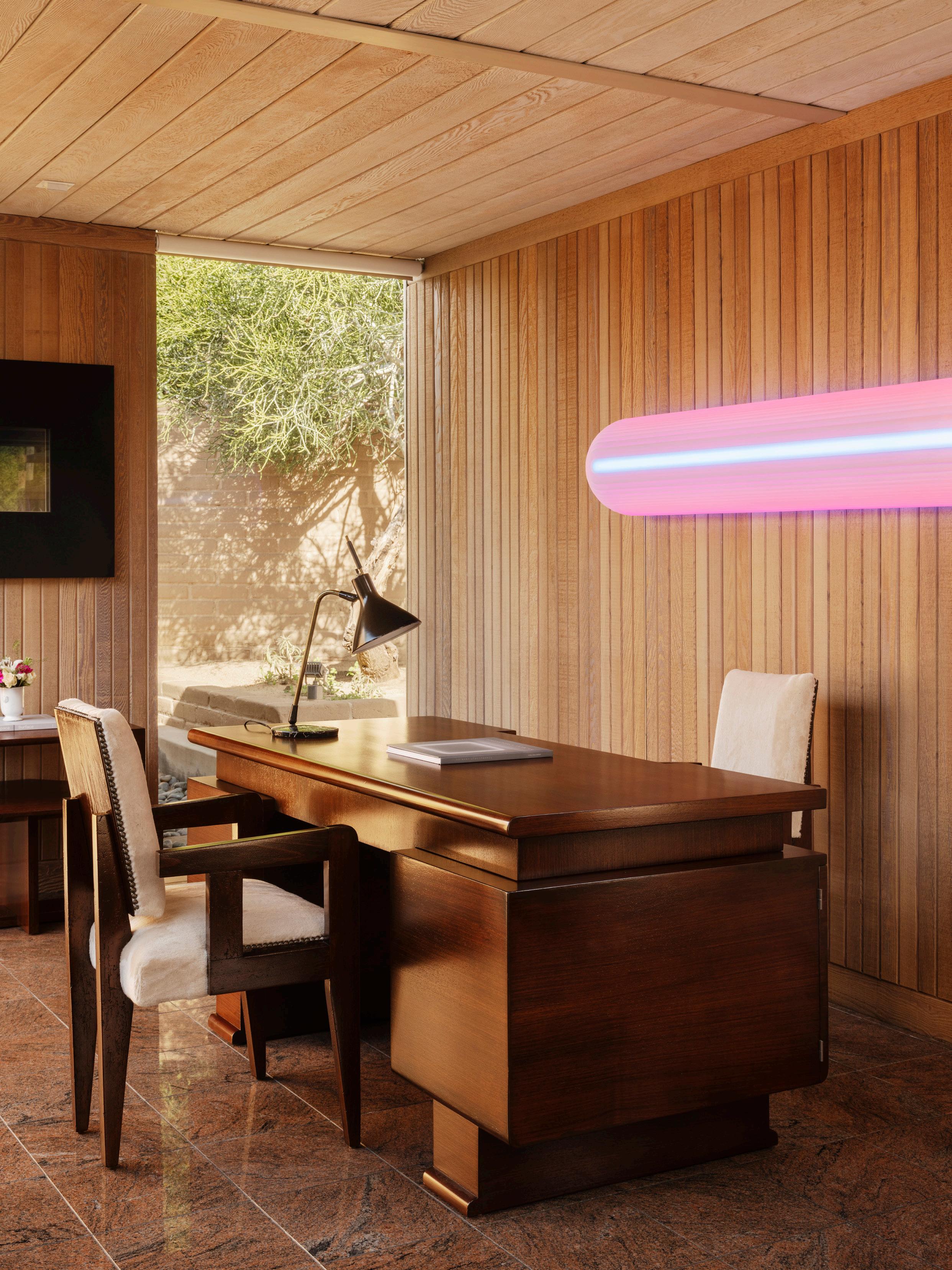 A two-metre-long Phillip K. Smith III hangs above a 1940s walnut desk.
 The colours of this two-and-a-half-metre-tall cast-resin sculpture by Gisela Colon shift with the changing natural light.
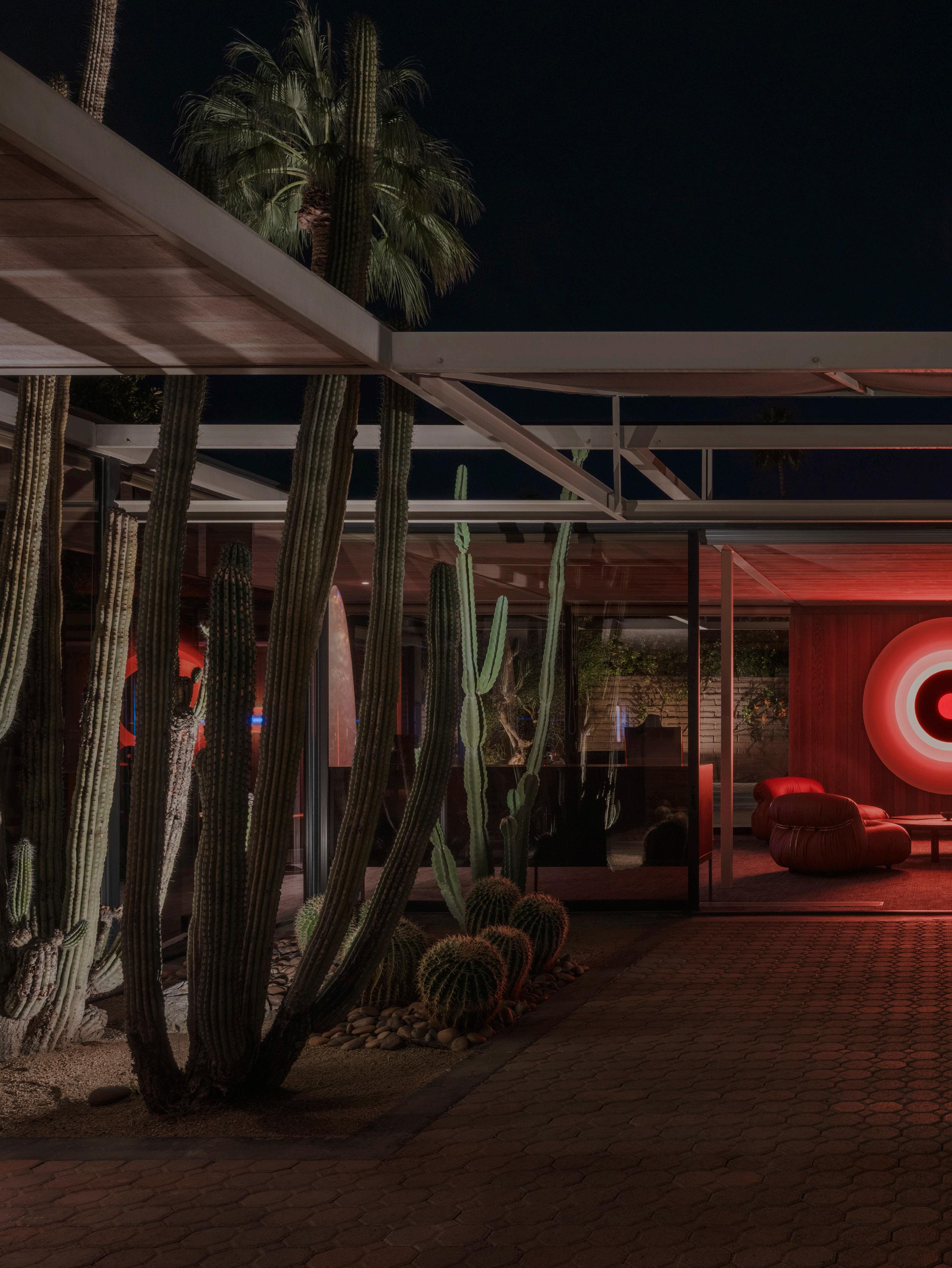 The LED lighting pieces render the home a mesmerising light installation at night.



est presents
Click here to listen now >
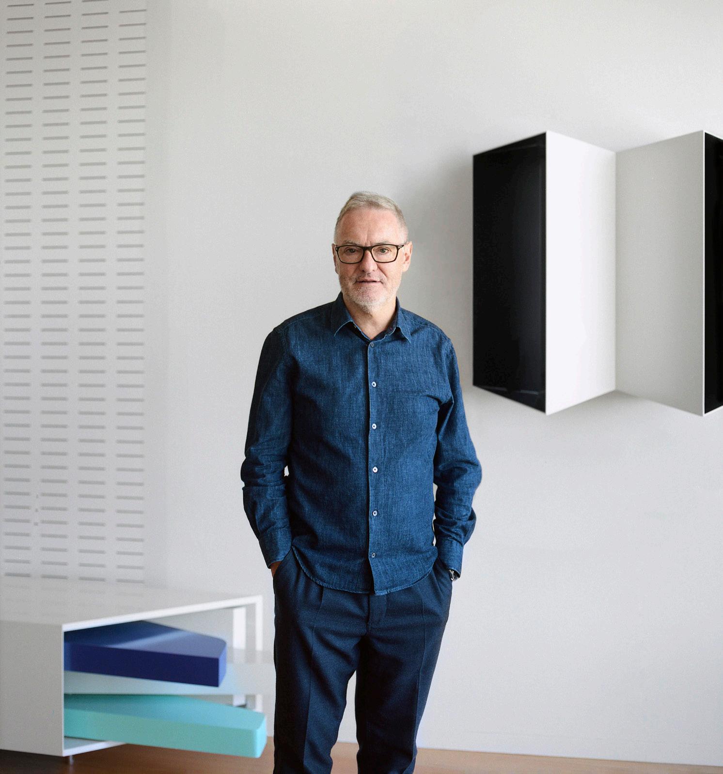
A design dialogue with Wardle founder and architect John Wardle in his own home explores his endless curiosity for the rhythms of living, working and learning and how the architect’s passion for finer details transcends all scales of work.
 Aside from timber, tiles are one of the other primary materials in John’s home. John sourced the green bamboo tiles in his powder room from a factory he’d visited in Japan, that hadn’t been made for 40 years; the tiles were remade especially for John.

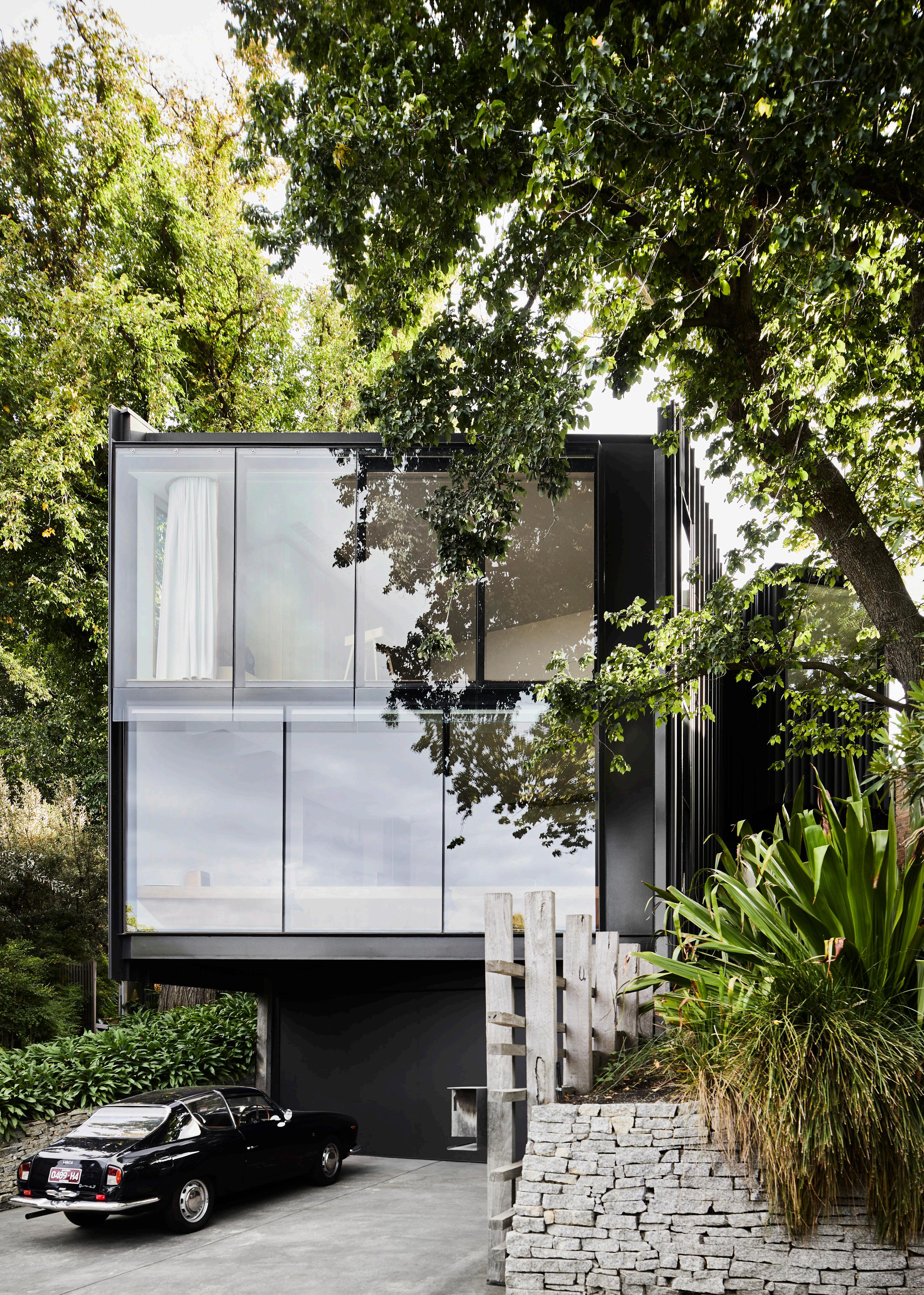
Opposite page: The front section of John’s home is designed to sit between two ancient elm trees. The steel and glass façade cantilevers out over John’s 1963 Lancia Flavia Zagato. A sequence of stone steps winds around an elm tree to the entrance.
This page: Timber is used extensively in the most recent refurbishment, as seen in the corridor to the living room. The art hanging system comprises a dowel affair recessed vertically down timber panels, allowing for easy rearrangement of artworks.

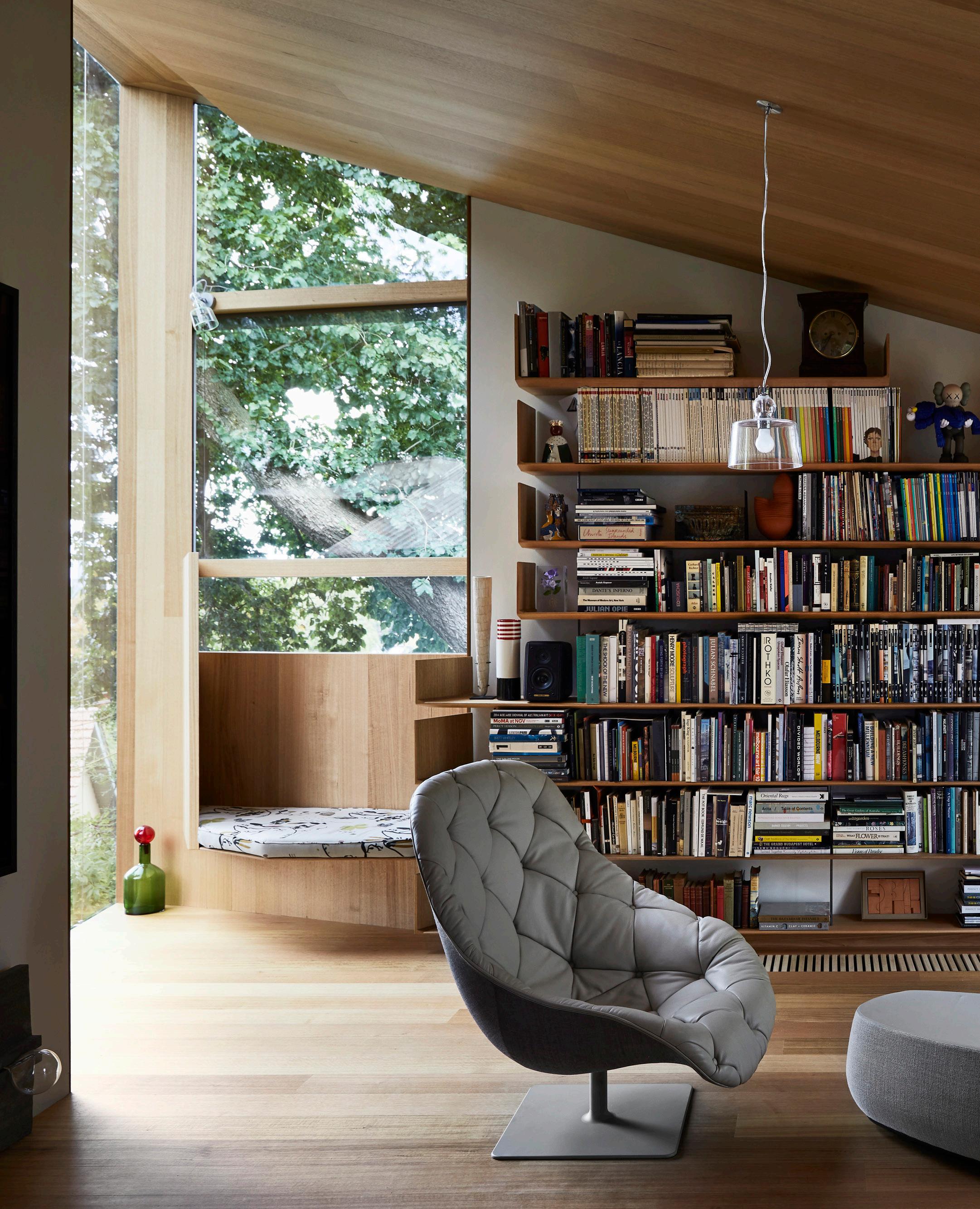
Timber lines the walls, floors and joinery in John’s study space. The architect has abstracted Louis Kahn’s Fisher House window seat – a tribute to one of John’s favourite works since he was a student.

Cosentino® launches C-TOP Design, a collaborative program to support design professionals at all stages of their creative process.
With the aim of supporting professionals at all stages of their creative process, C-TOP Design creates a unique network for interior designers. Key resources include a members-only digital hub; support from specialised design managers; expedited delivery timelines, exclusive colours, networking events and much more. Find

at cosentino.com




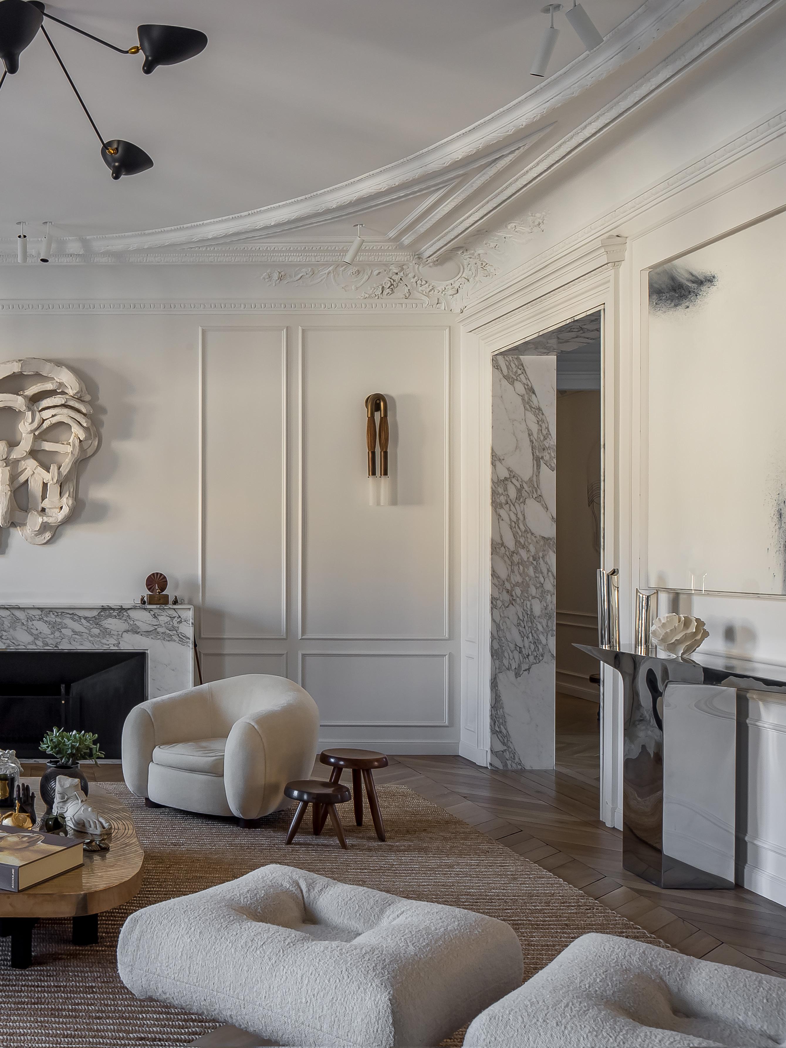
A Parisian apartment located in the 7th arrondissement in the Invalides neighbourhood is transformed into a family home that also forms the backdrop to a unique art collection.
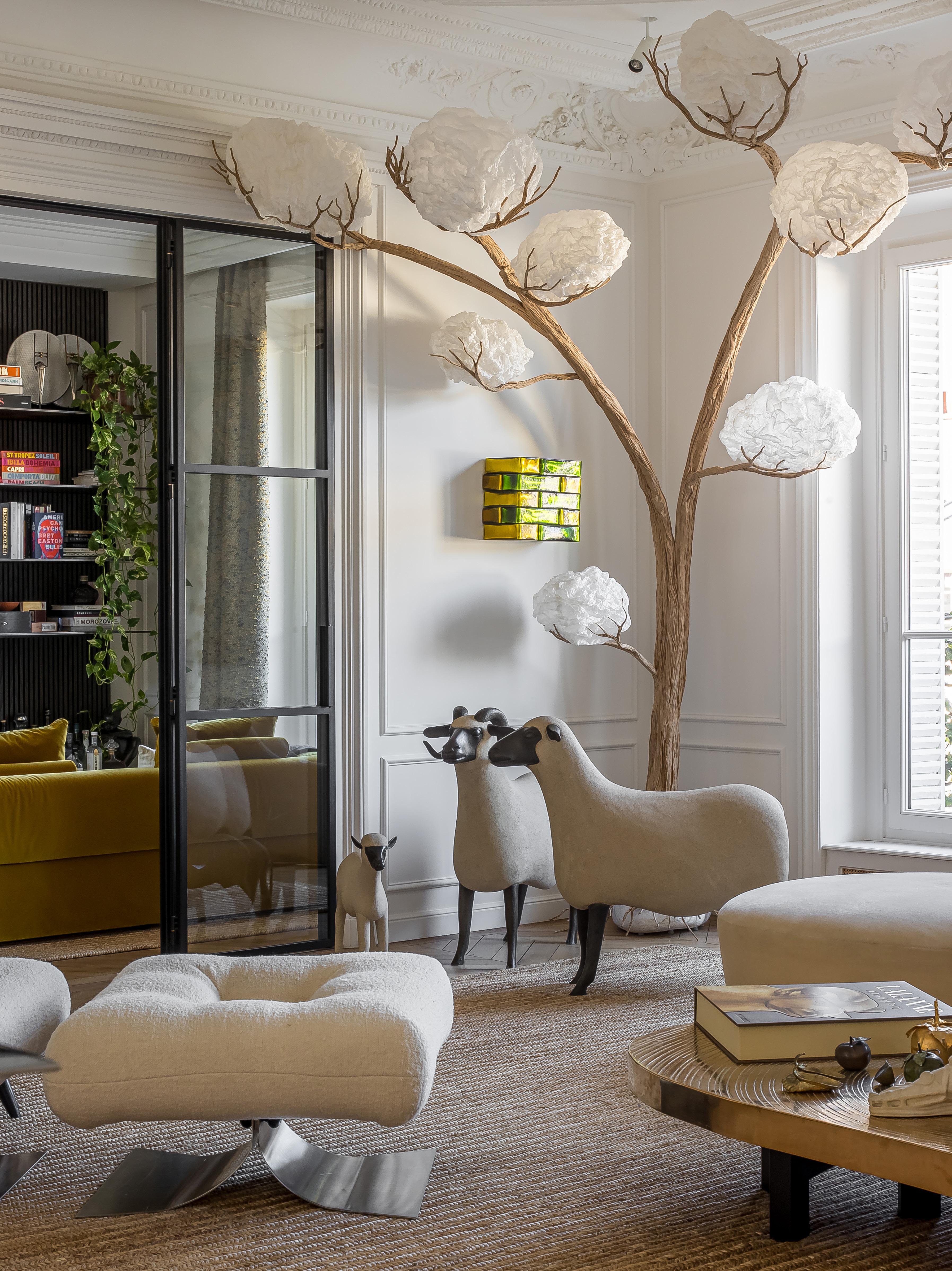 In the living room, a bronze sheep sculpture by François-Xavier Lalanne, Goutte d'eau coffee table by Ado Chale, Tree lamp by Atelier Compagnie Charlot, Berger Tripod stool by Charlotte Perriand and a vintage sofa by Vladimir Kagan (1950) compose a detailed picture.
Housed in a typical Haussmanian building dating back to 1880, with an L-shaped floorplan revolving around an inner courtyard, the untouched apartment had huge potential for a well-travelled, dynamic young couple with three children.
Their curiosity led them to discover Atelier Daaa, a similarly young group of designers, on Instagram. “They liked our style, which resonated with their preferences. I also believe they appreciated that, at that time, we were young designers who could bring a certain freshness while still preserving the codes of Paris’ quiet refinement,” Atelier Daaa co-founder Pierre Petit says.
The couple entrusted Atelier Daaa to completely rework their apartment, expressing their desire for a family-friendly space with shared areas that also ensured each individual had their own space. As keen art collectors, it was essential for the atelier to consider art pieces and existing furniture without making them feel fixed in place. Their concept was to completely open up the apartment to create enough open space for art pieces without feeling like being in a gallery.
Working closely with their clients, the atelier retained distinctive features such as the parquetry floors and characteristic mouldings, while introducing a touch of necessary modernity. Fireplaces were redesigned to incorporate materials like marble, metal, and bronze, and materials were prioritised more than colours in the design, as the couple’s art pieces already brought a strong colour presence to the space.
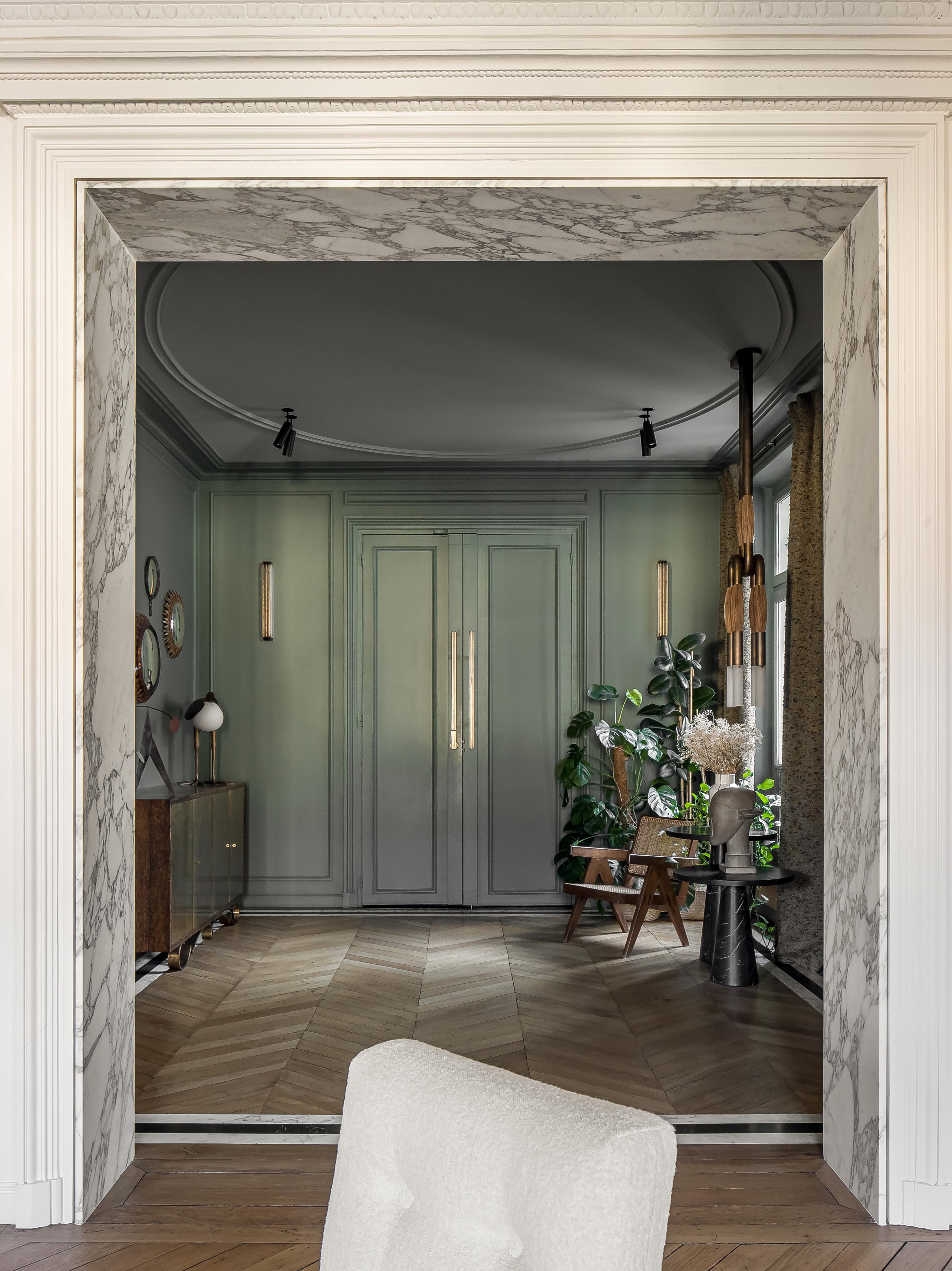
Atelier Daaa retained distinctive features such as the parquetry floors and characteristic mouldings, as seen in the Reseda green entrance space, which features the Apparatus Studio Tassel pendant and Capitol Complex chair by Pierre Jeanneret.
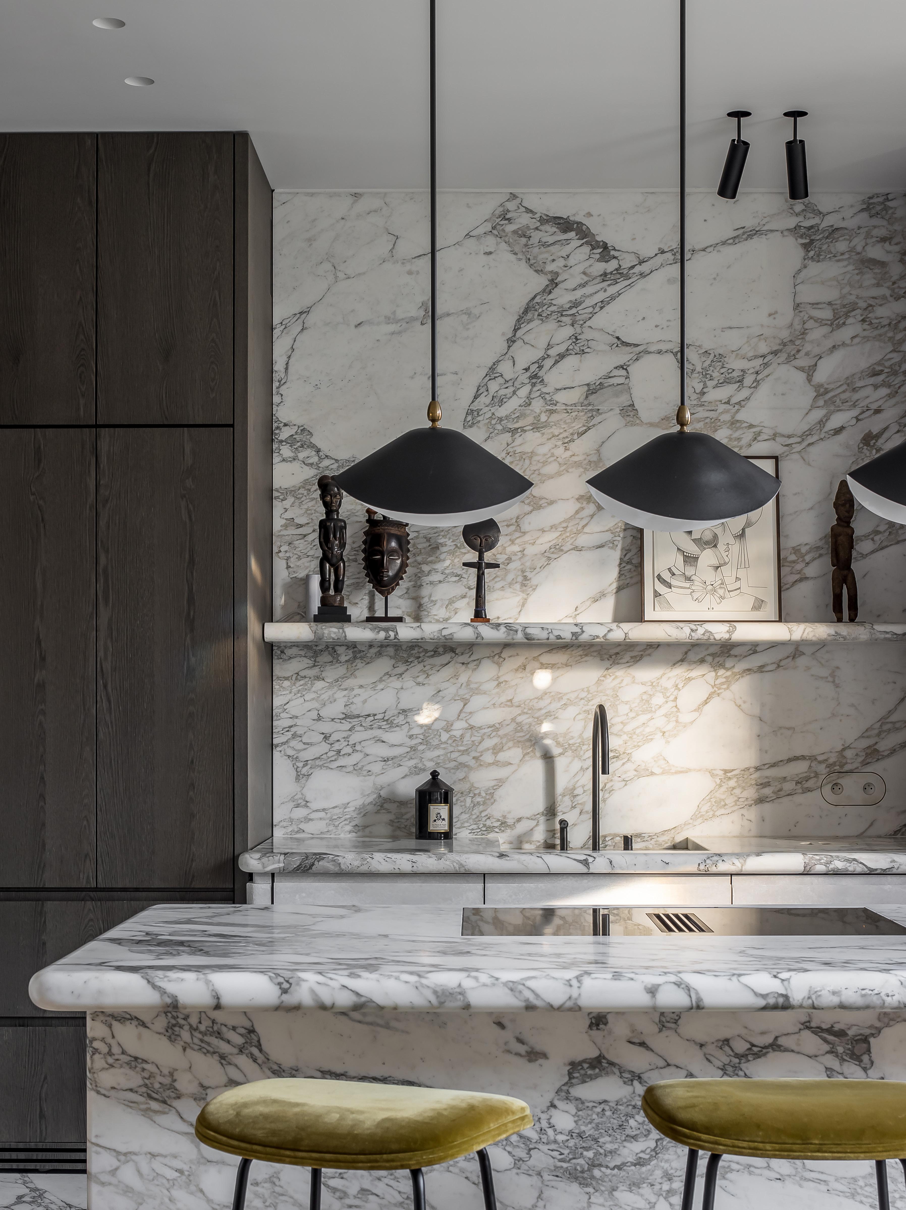 In the kitchen, pendant lights by Serge Mouille and Gubi Beetle stools draw focus to the central island.
“All the pieces have been collected by our clients, working closely with Parisian art dealers, whether artworks or furniture,” Pierre says. “They maintain a privileged relationship with the galleries Marcilhac and Bailly, and we have been able to exchange with them throughout the project to complete the layout.”
Atelier Daaa follow the ethos that architecture is based on details. “Whether it's the alignments between spaces or the materials used, sometimes it's even of the order of the invisible, but we believe that it’s felt when you live in the apartment,” Pierre says.
A highlight in the design process was the open kitchen space connected to the dining room. “This kind of space allows us, as interior designers, to express ourselves the most. We have worked on everything, from designing the kitchen and table to choosing fabrics and even the stained glass window,” Pierre says. “Every element has been custom-made to be practical for everyday life while also creating a delightful atmosphere for hosting guests.” Pierre also believes the children’s spaces reflect the mindset of the renovation. “Converting the attic space above the apartment allowed us to create spacious bedrooms for each child with a cabin-like feel, while at the same time, the open corridor with glass partitions gives the sensation that each room communicates with the other.”


 In the open dining space, analog photographs by Clare Strand and Entrelacs Creation wall sconces by Felix Millory form a backdrop to the custom dining table, Warren Platner Knoll collection chairs and pendant light by Apparatus Studio.
IVORY

FRANÇOIS-XAVIER
LALANNE


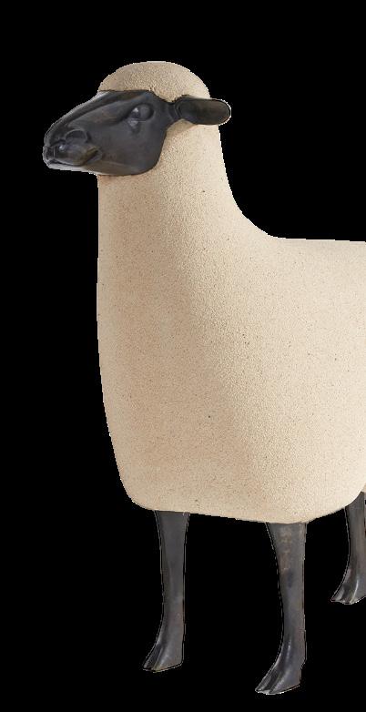
Epoxy stone, patinated bronze1988

OSCAR




As creators of new possibilities
Abey Australia have built an expansive and high quality portfolio of fixtures and finishes empowering you to push the limits of creativity and design in the kitchen, bathroom and laundry. Visit an Abey Showroom today. Lucia Double Bowl


 BY
BY



Previous Page: The library has been sensitively reworked with new built-in bookshelves and a new marble fireplace. The space features the Vitra Mariposa sofa, Kelly Wearstler Visual Comfort floor lamp, Christophe Delcourt Dot side table, Daniel Boddam Low coffee table and Gubi Stay swivel lounge chair. On the bookshelves (right) is an artwork by Samuel Condon.
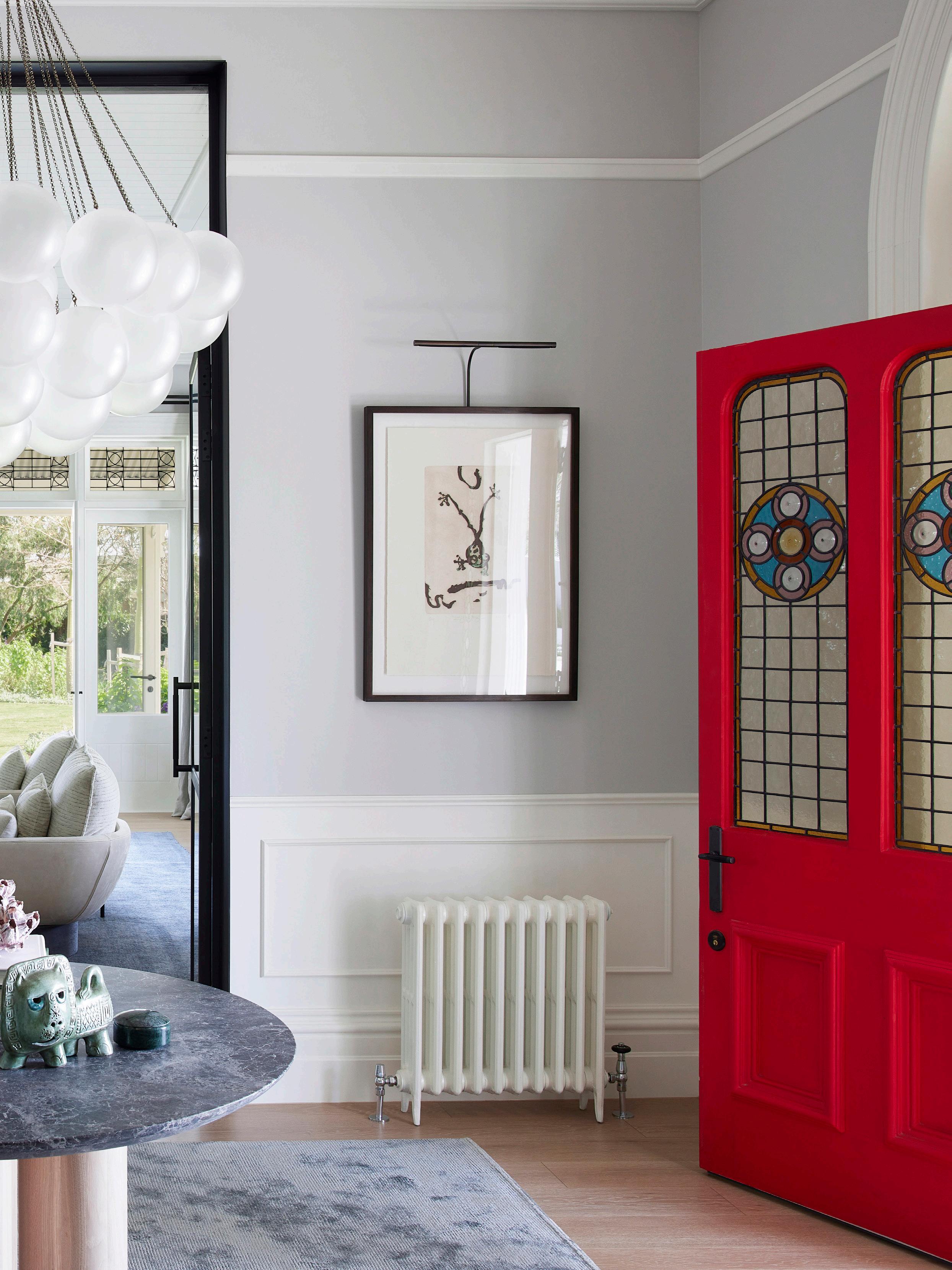
This page: The entrance celebrates the home’s original leadlight framed front door, now linked to the library on one side and a living area on the other. The space features the Apparatus Studio Cloud 19 Orb pendant light, a Murano vase, a custom entry table by John Bastira and a custom silk rug by Behruz.

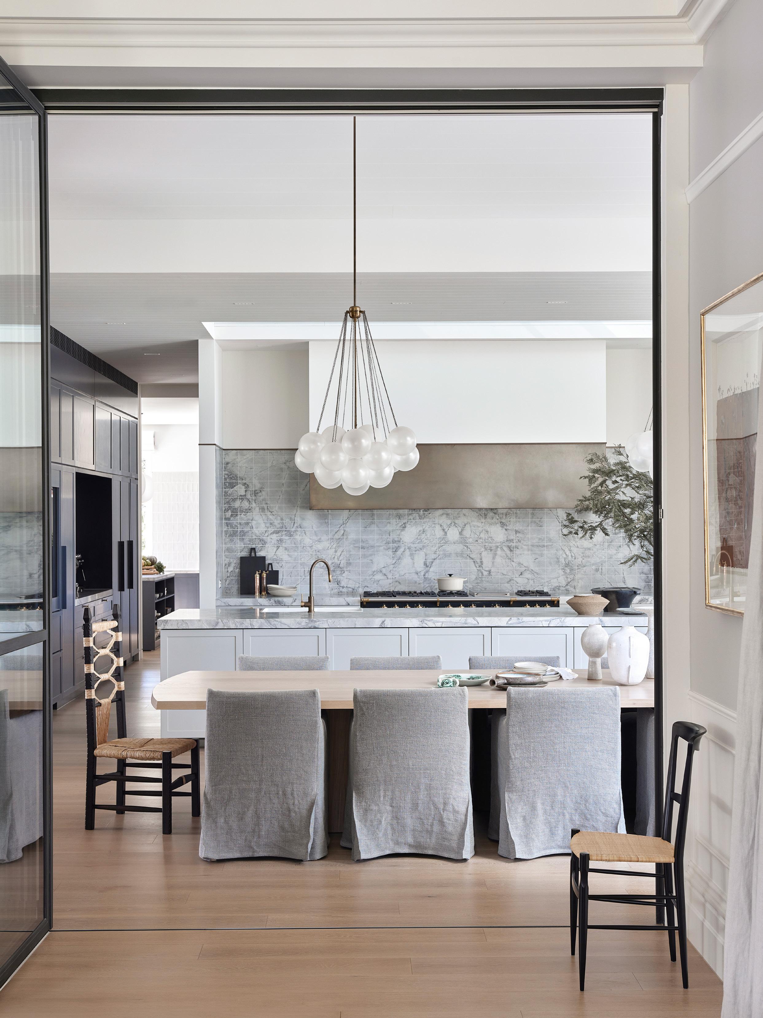
The kitchen has a relaxed ambience with Woodcut light timber floors, benchtops in Apex Stone White Dolomite and a custom bronze rangehood. The space features custom dining chairs with soft-grey fabric covers, the Apparatus Studio Cloud 19 pendant light, the Origine Lia chair and the Origine Tigullina Gold chair.
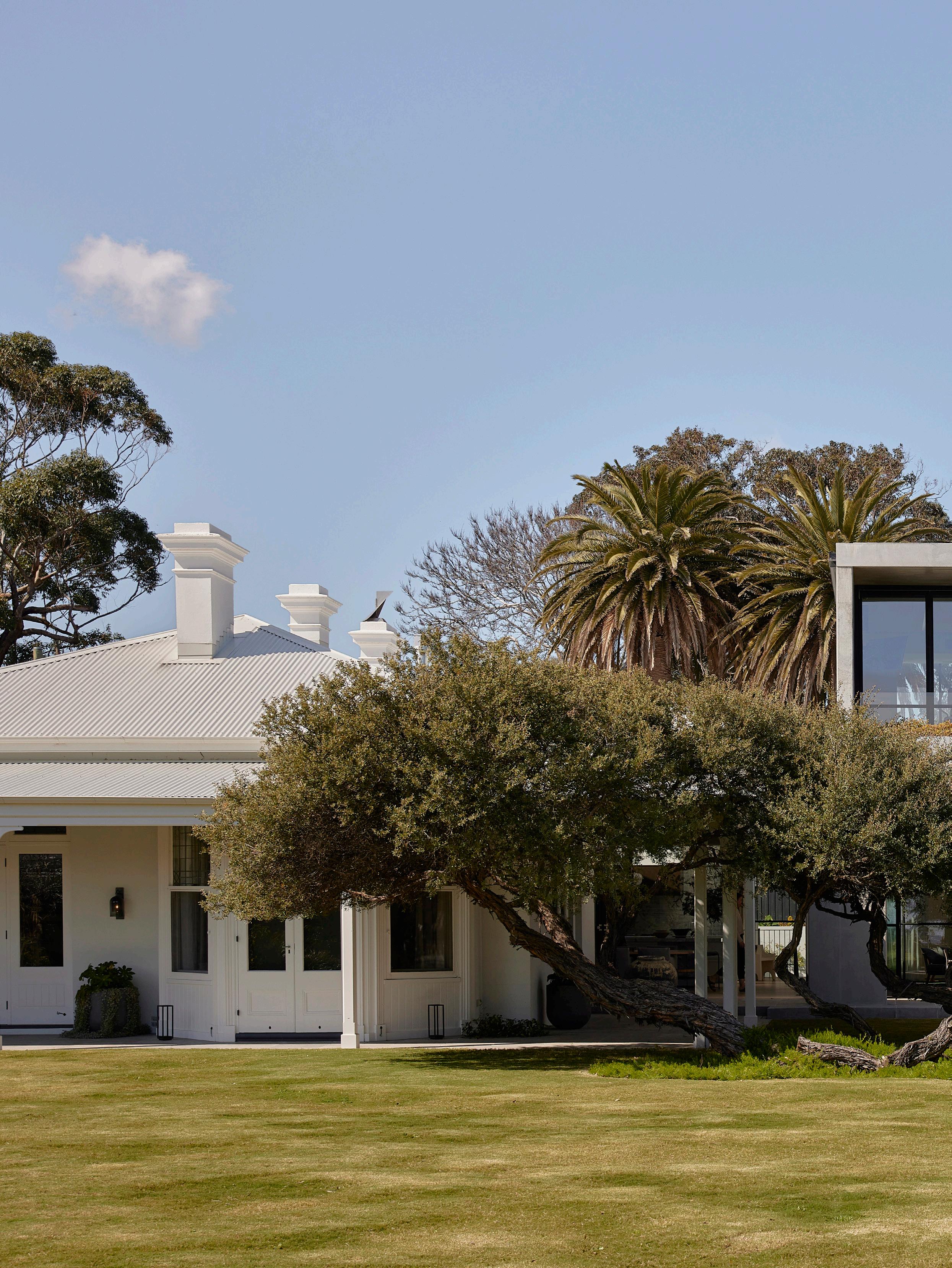
Stitching the past and present together is something that Mim Design is known for - whether it’s a commercial building, an apartment or, as seen with the ‘Dawn House’ on Victoria’s Mornington Peninsula, a large homestead dating from the 1860s. “It came with some beautiful bones, yet it was in a dilapidated state,” says interior designer Mim Design director and interior designer Mim Fanning says, who worked closely with practice associate interior designer Lisa Ransom. “But I could see where it needed to be steered towards,” Mim says, pointing out the impressive views of Port Philip Bay.
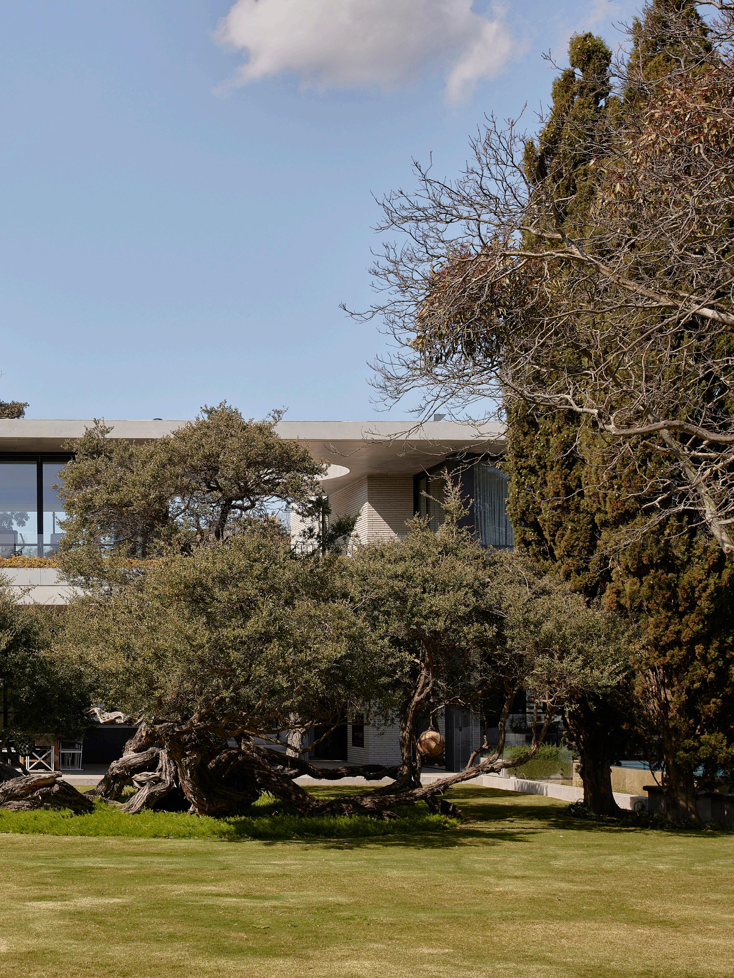
The original timber and brick period home was finely restored by Mim and her team, while a new two-storey contemporary wing was added by Neil Architecture. The two portions of the house maintain their own identity, yet are ‘threaded together’ by a glazed link and a two-storey alfresco dining area. Although the two wings contrast dramatically, the brick materials tie the past and present together. “Our clients didn’t want the house to appear fussy, but a relaxed place to entertain friends and their extended family,” Mim says.
Mim Design had to take apart and restore many of the period features, including window frames, leadlight windows and ornate cornices. A new steel and glass door was inserted into a large living area, enabling views of the home’s original Edna Walling garden, while in some areas, where the proportion of a room wasn’t quite right, an entire wall was removed with two rooms becoming one. By doing this, Mim and Lisa avoided having the mismatch between smaller-sized rooms in the period home and large rooms in the new contemporary wing designed by Neil Architecture.
The period home has been completely reworked with a library on one side of the entrance and a generous living area on the other. And where there were previously a couple of rooms dedicated to food preparation, there’s now a large kitchen and dining area with a large butler’s pantry behind. Featuring Super White Dolomite marble benchtops and splashback by Apex Stone, the kitchen includes a wall of bespoke joinery for the display of objet d’art as well as simple finds such as shells discovered on the nearby beach.
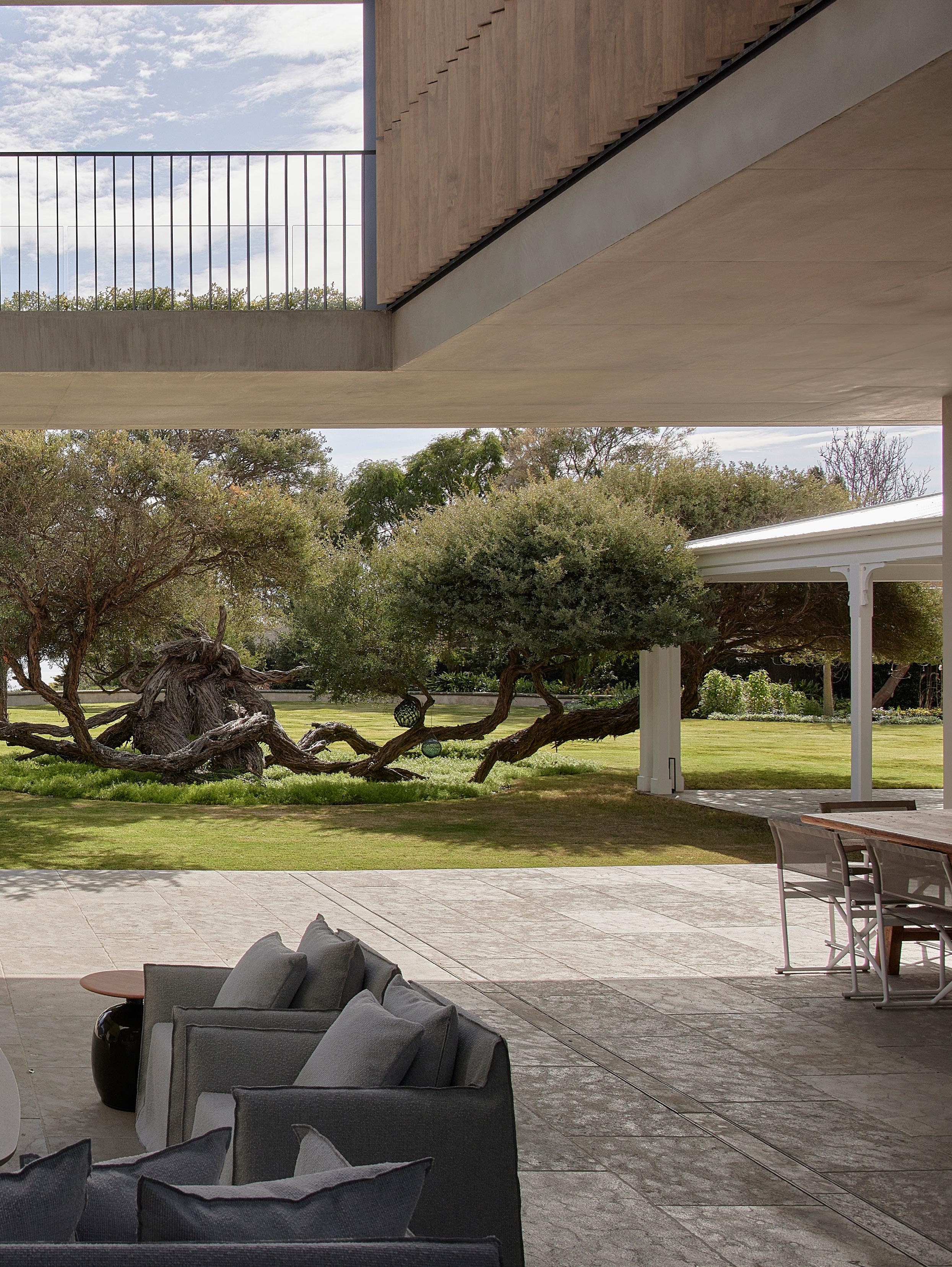
A double-height alfresco area includes a large oculus to allow both the sky and the sunlight to penetrate. The space features the Gervasoni Ghost Out sofa and chair.
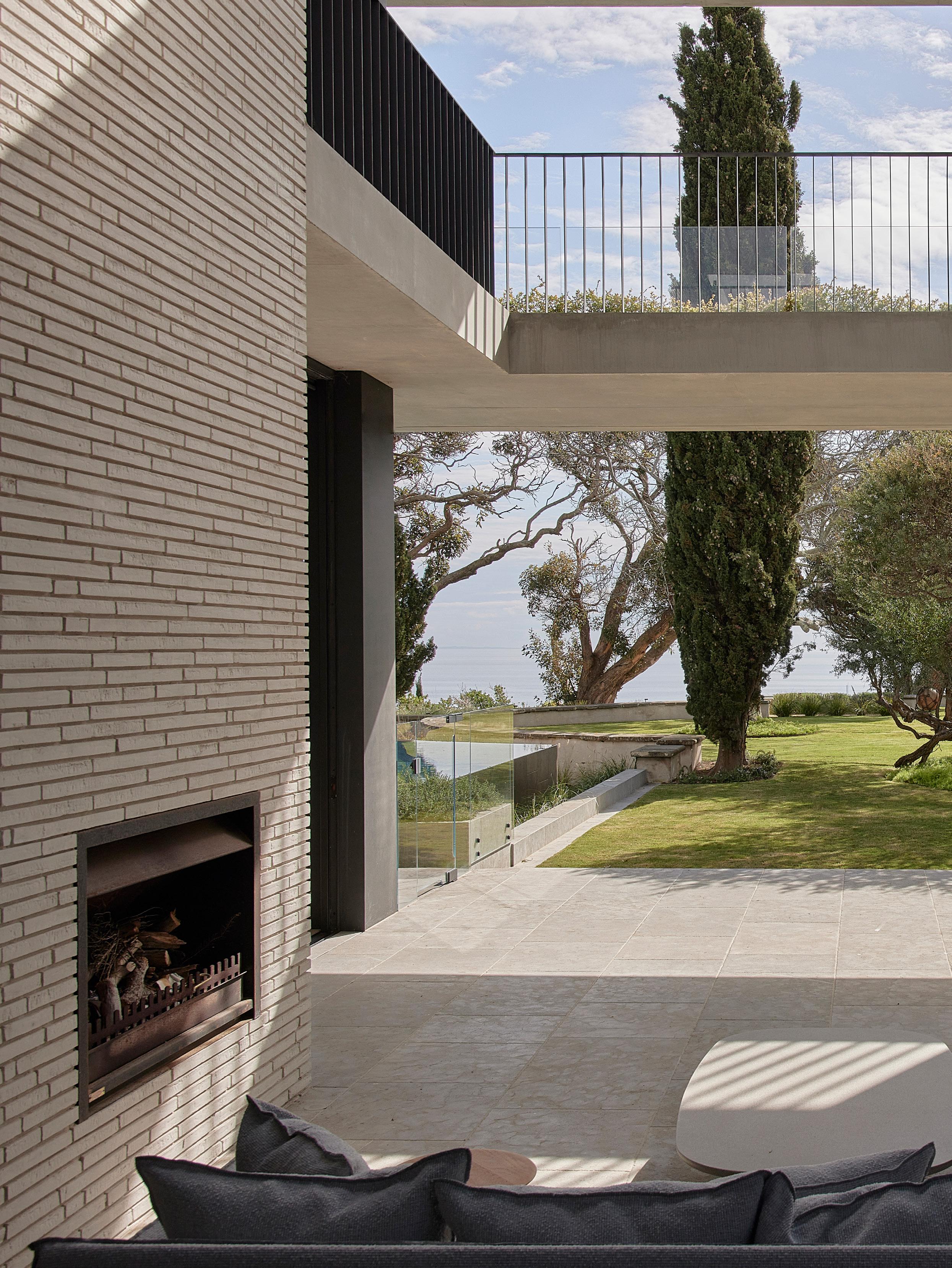
The new wing, with an alfresco area, features a three-storeyhigh brick wall with an integrated fireplace – approached in a contemporary manner to coincide with the reworked marbleadorned fireplaces in the original home. And to enjoy the view of the sky, a three-metre-wide skylight was inserted into the concrete ceiling above, with the ability to close it during the warmer or wetter parts of the year. A curvaceous steel staircase leads to the main bedroom, dressing area and ensuite where an Agape Lariana bathtub, Super White Dolomite marble and weathered brass organic tapware by Brodware are used. A protected walkway leads to a separate gymnasium also located on this level.
“Our clients came to us because they loved our planning, making spaces easy to use and feel comfortable to be in whether it be night or day,” Mim says, who was conscious from the outset that the spaces, including two lounges, had to feel at one with the outdoors, including a swimming pool at eye level and a spa just a few steps below and closer to the beach. As with the design, the furniture has been considered in every room, from a design to display a chess set designed by the artist Mirka Mora for the front lounge, or combining a 1950s rattan-seated chair by Gio Ponti with simple armchairs covered with dusters to create a relaxed and informal ambience. “It’s certainly not a precious house. All the spaces were conceived to be used and enjoyed,” Mim adds.
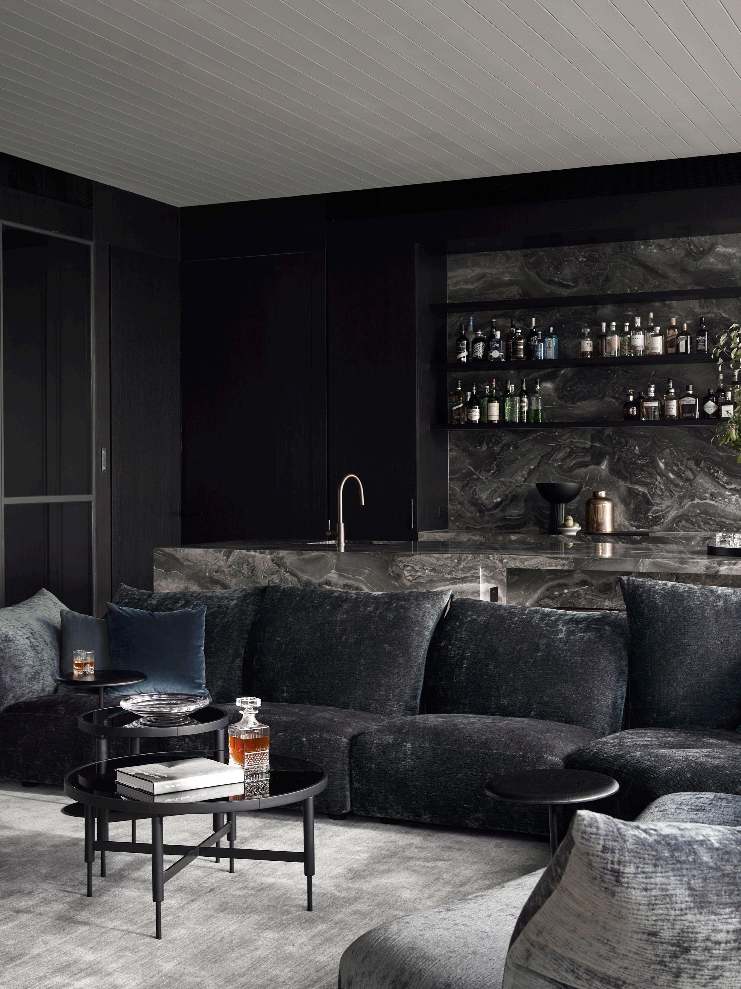
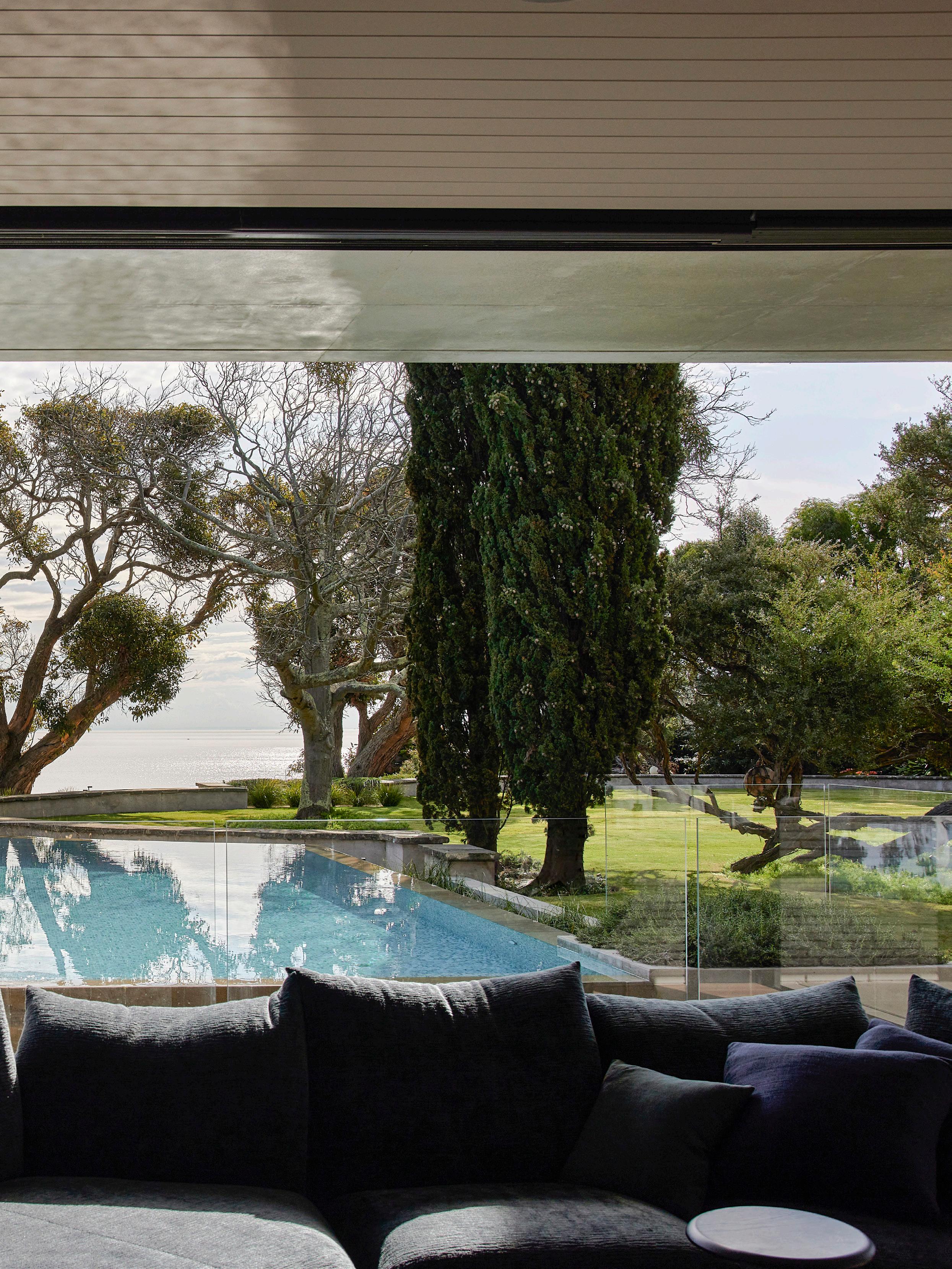
The view of the swimming pool and the bay merge together from the living area, which includes a bar for entertaining. Generous timber decks by the pool provide another secluded outdoor space. The space features the Edra Standard sofa and Barbara Designs Uccio bar stool.

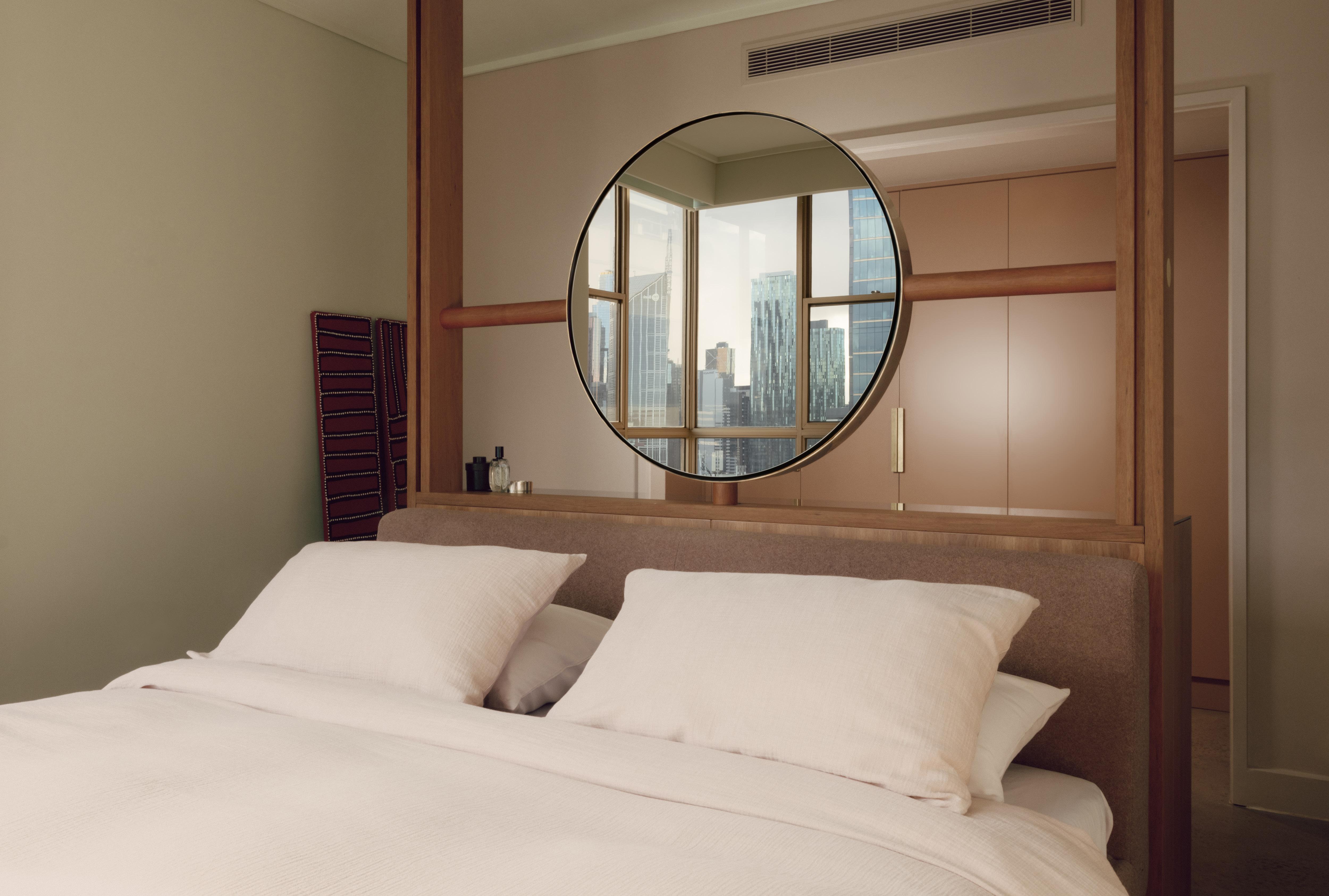
Since 1991, we’ve been family-owned and run. Crafting nearly all our linens and bedding locally in Melbourne from the finest Italian fabrics. Our passion for fine textiles has been in our family for five generations. Experience the Abode difference.


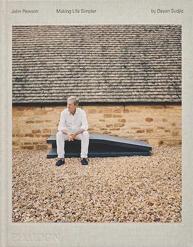
 Project Home Farm Design John Pawson
Photography Dan Preston
John Pawson pictured in his library at Home Farm with his monograph Making Life Simpler .
NEESON MURCUTT NEILLE: SETTING ARCHITECTURE
ANNA JOHNSON & RICHARD BLACK
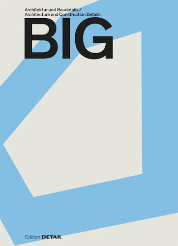
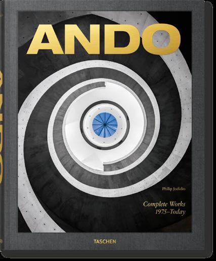
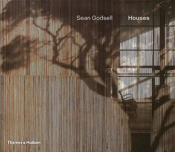
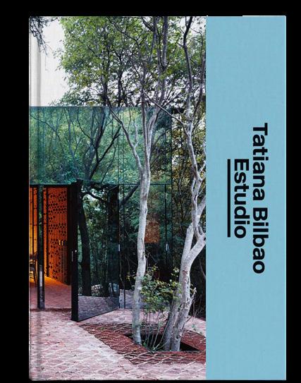
Explore monographs on the world’s best architecture firms.



TATIANA BILBAO ESTUDIO: THE ARCHITECT'S STUDIO
SEE MORE BOOKS >
BIG: ARCHITECTURE AND CONSTRUCTION DETAILS SANDRA HOFMEISTER


An architect and interior designer couple convert a historic hotel in one of Melbourne’s oldest suburbs into their own family home.
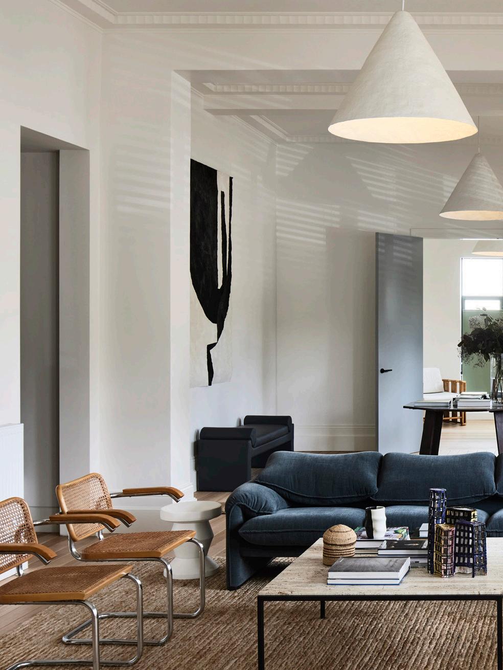
Doubling as Edwina’s studio space, the downstairs sitting area features a Maralunga sofa by Vico Magistretti for Cassina, original Marcel Breuer Cesca chairs, a vintage cane armchair and a vintage travertine coffee table from the Netherlands. The Fold side table by Zachary Frankel and a custom ceramic wall light by artist Claire Lehmann feature alongside artworks by Godfrey Clive Miller and Emily Ferretti.

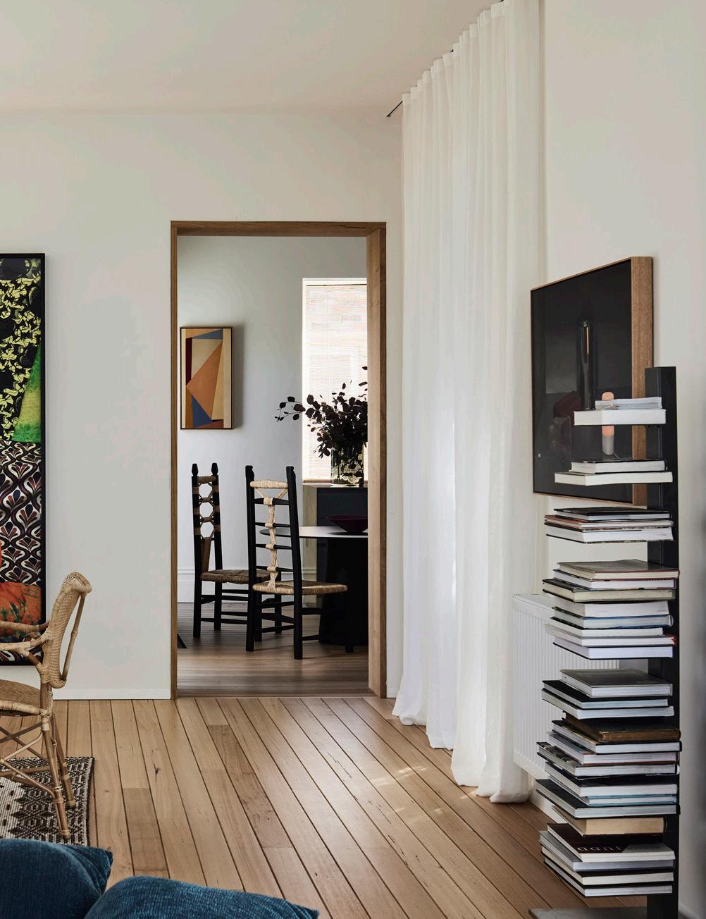
 Centred around a contemporary fireplace, the upstairs living space features the Edra Standard sofa, Eva lounge chair by Giovanni Travasa for Vittorio Bonacina, Verticale bookshelf by Aero Design, Allié stool by Luca Nichetto for La Manufacture and ‘You’re all Fucking Dying’ (2022) by Kieren Seymour.
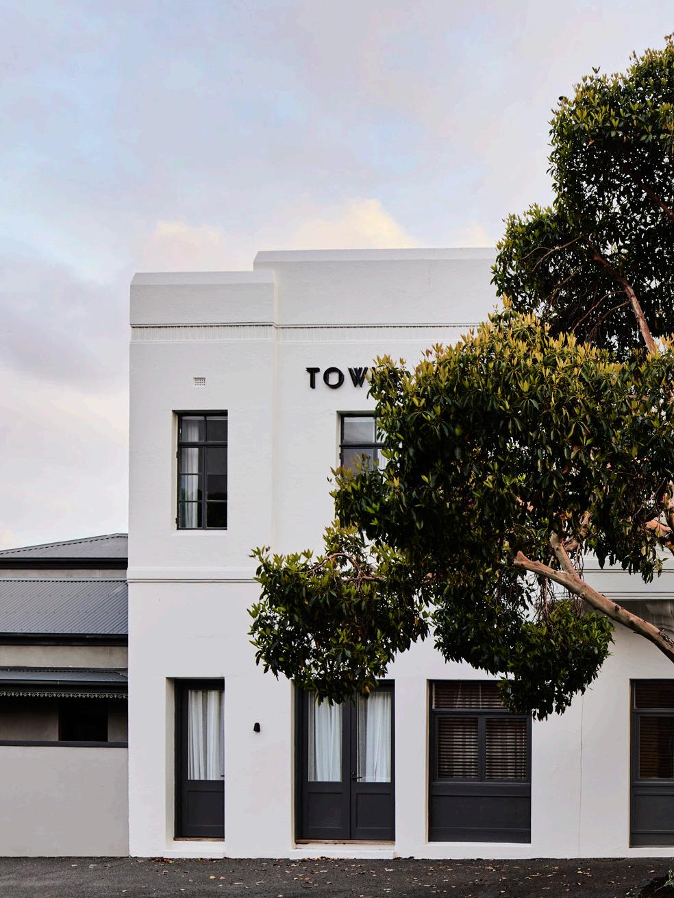
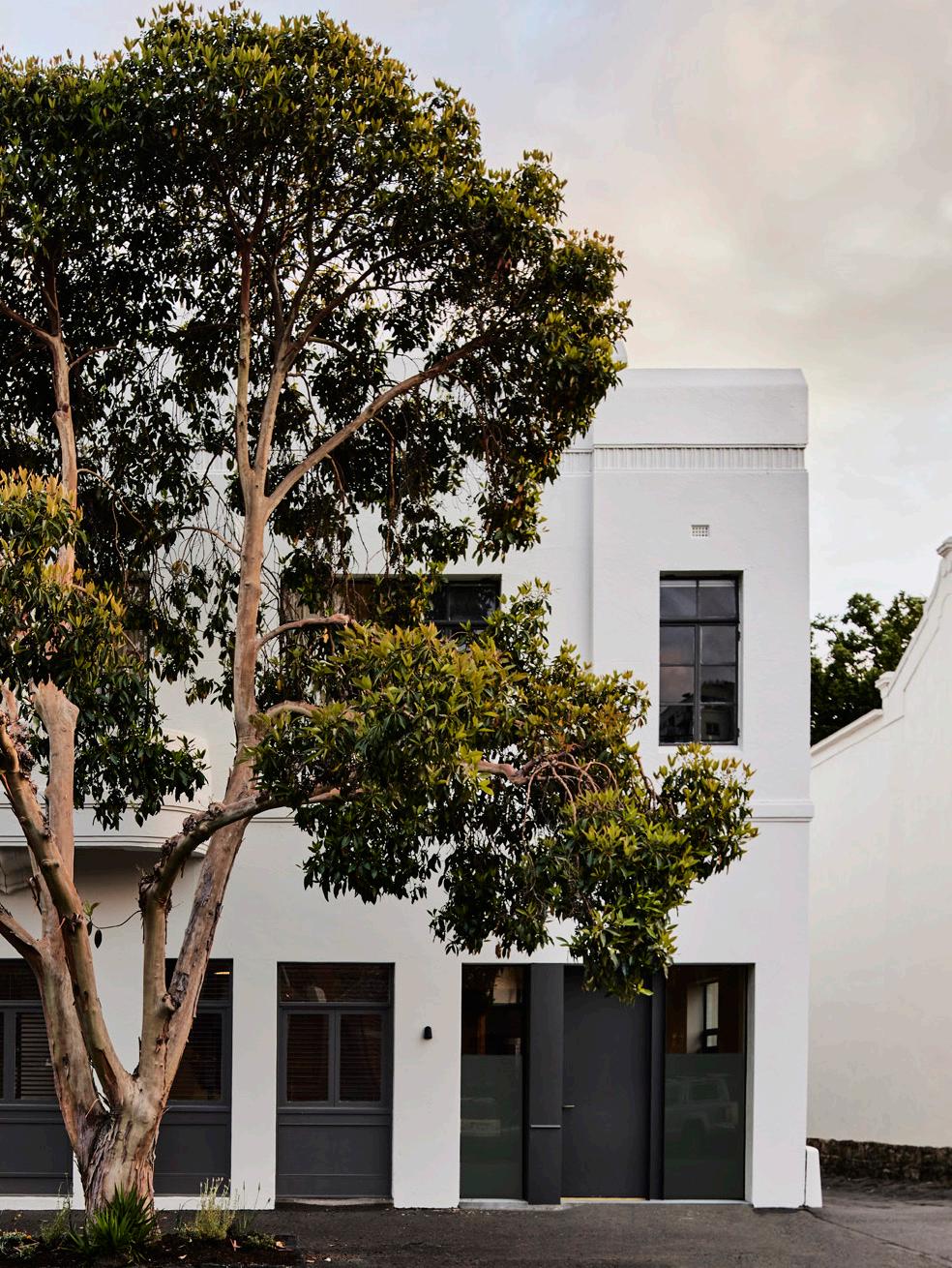
On arrival, it’s not immediately clear that architect Ed Glenn and interior designer Edwina Glenn’s South Melbourne home is no longer a functioning hotel. The preserved, all-white facade still wears ‘Town Hall Hotel’ in iron letters, and while the front entrance is concealed, it’s not rare to see the original doors open to the street on a warm afternoon.
The Art Deco exterior was what first piqued Ed and Edwina’s interest in repurposing an existing building. Within walking distance of the famed recording studio, Armstrong Studios, the Town Hall Hotel is rumoured to have welcomed the Rolling Stones and Elton John in its heyday. Familiar with the hotel, after having lived in the suburb for 16 years, it wasn’t until months after first considering the idea of living there that they walked past with friends who encouraged them to take on the project.
“The facade was always magnificent,” Edwina says. “But the Victorian interior had been completely butchered by very nineties pub architecture.” Following a few site visits, it was revealed the hotel had four parts: the original Victorian building built in 1868, an Art Deco renovation and two additions that supported the venue’s pub and bistro at the rear. After understanding what could be achieved working with the building’s heritage overlay, Ed and Edwina conceived a U-shaped addition on the first floor.
“There’s an element of surprise as soon as you walk through the door,” Edwina says. The interior designer’s workspace lies at the front of the building, which also doubles as an entertaining area, adjacent to the deep green bar. The space’s windows and doors have a direct connection to the street, tempered by full-height linen curtains. The home’s ground floor also includes a rumpus room, powder room, guest bedroom and bathroom.
Upstairs, Edwina describes the first floor as the family zone, featuring the kitchen, dining and living areas. “Everything is shaped around the internal courtyard to capture the northern light,” she says, “It’s also a very private space, with all of the bedrooms facing north and facing the city”.
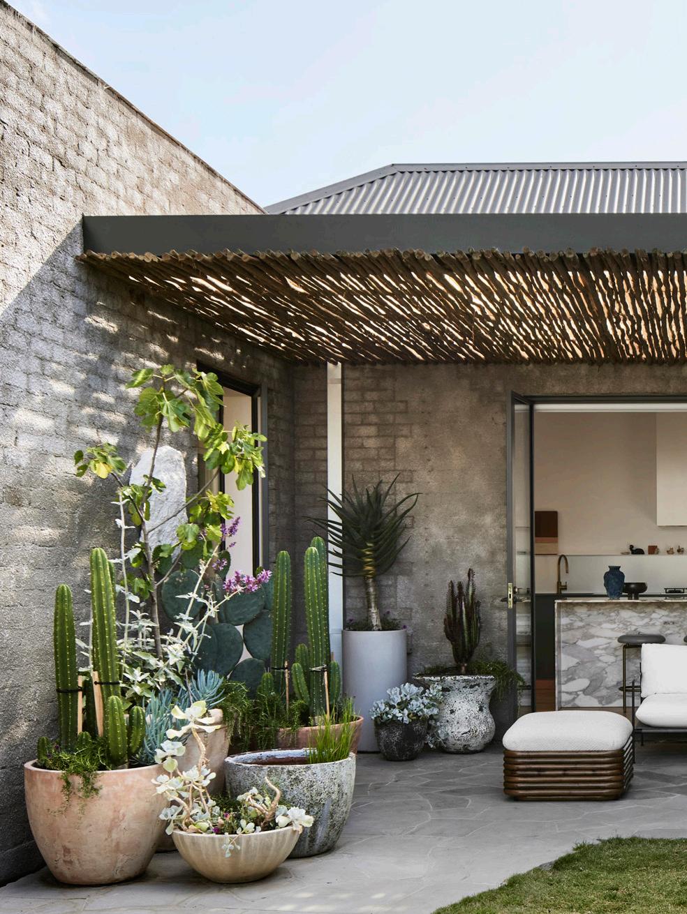
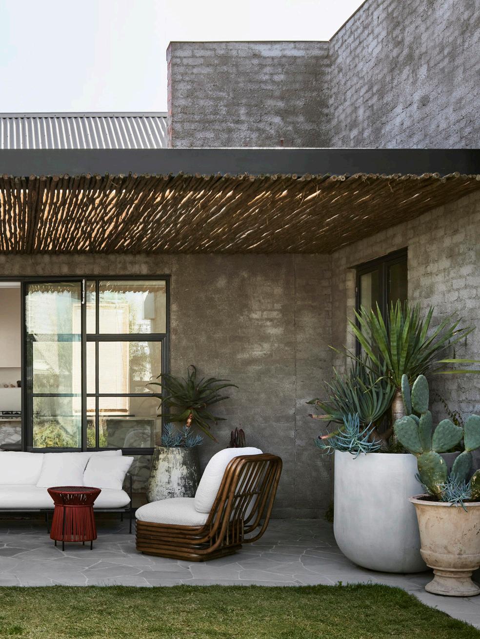 The first-floor addition is arranged around a central courtyard by Myles Baldwin, inspired by South Melbourne’s Mediterranean migrant gardens. Pictured: a Gubi Bohemian 72 outdoor lounge chair and ottoman.
Architecturally, the hotel’s large, square shape was a challenge. “We wanted to carve courtyards and light out of that large form,” Ed says, introducing a checkerboard plan, “where each space, particularly on the first floor, is never more than a few paces from a courtyard garden and a quality light source.” Designed by Myles Baldwin, a courtyard inspired by South Melbourne’s Mediterranean migrant gardens grounds the first floor. “When you contrast larger spatial volumes with more intimate gardens, you get a very nice effect,” he adds.
The material palette, such as the kitchen’s stainless-steel joinery, solid Tasmanian oak timber floors and terrazzo tiles, reinterprets the commercial space through a contemporary lens. In the bedrooms, colour creates a moment of arrival, while in the shared spaces, white walls are accented by Ed and Edwina’s art collection and custom lighting by Sarah Nedovic and Peter Cole. Works range from paintings and sculptures by Ed’s uncle, renowned artist Les Kossatz, Joseph McGlennon’s Kangaroos series, and an oil painting by Robert Malherbe. Ed credits the late collector Geoffrey Hatty for several vintage pieces in the home, such as the Danish table lamp, ‘Kongelys’ by Niels Rasmussen Thykier for Fog & Morup.
“We plan to spend the next 20-plus years filling this place with art and objects that bring us joy,” Ed says. “It’s part of what we love about this place; it’s a home with an unexpected warmth and intimacy.”
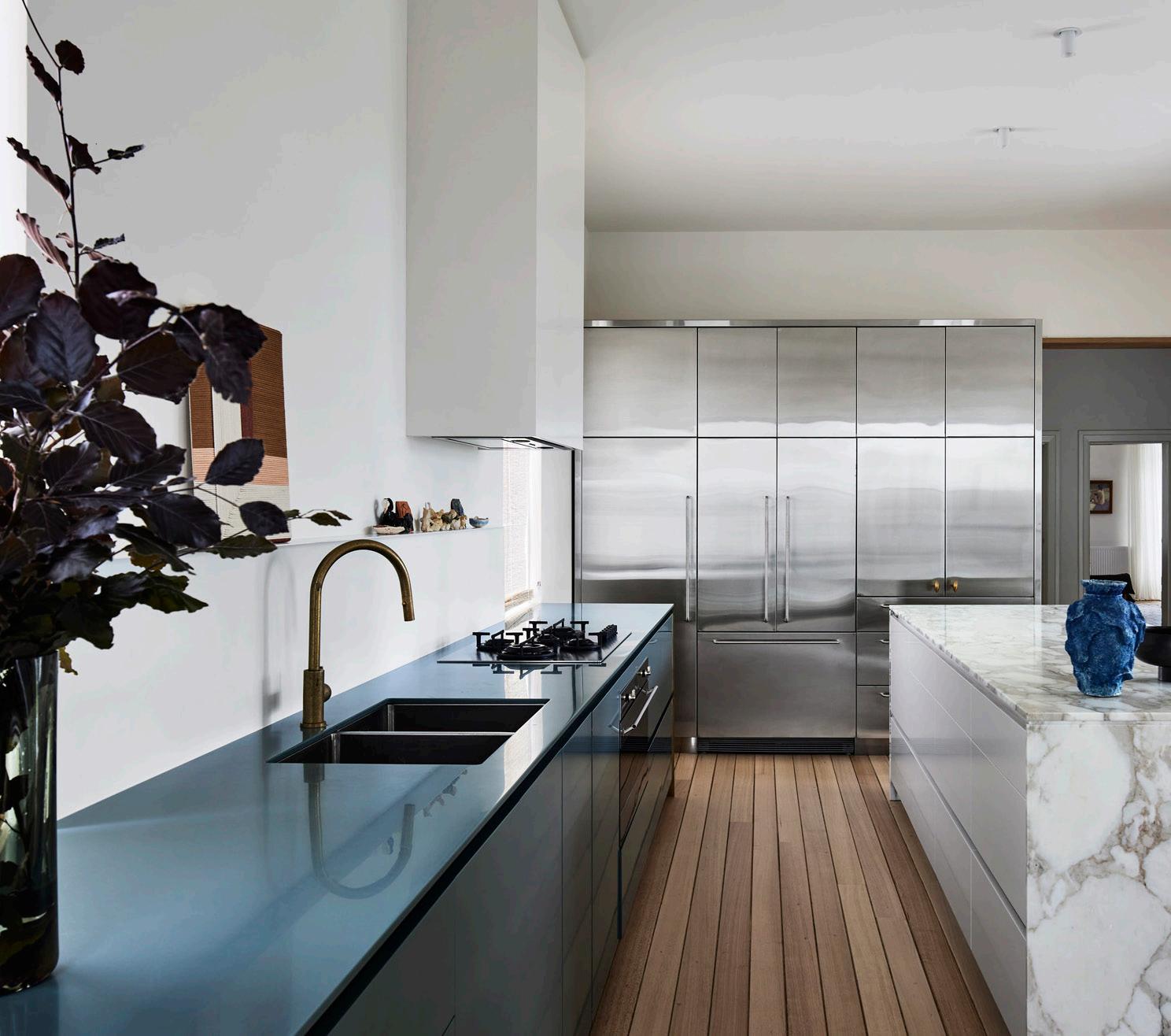
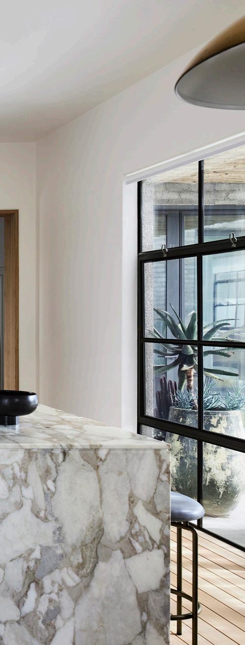
The kitchen’s stainless steel joinery, solid Tasmanian oak timber floors and brass accents reinterpret the commercial space through a contemporary residential lens.


Ed and Edwina’s home reflects their long-standing passion for art collecting. The formal dining and living area features ‘Adut and Bigoa’ (2015) by Atong ATEM loaned from Artbank (front) and ‘Steamer Lamp With Tall Pot and Objects’ (2022) by Ebony Truscott (right). A Rometti Italian Terakota Fysallida vase by Jean-Christophe Clair and a vintage Italian mirror and brass tray from Geoffrey Hatty rest on the Eero Saarinen Oval Tulip table in Carrara marble, while a FAINA Strikha Big pendant hangs above. Beyond the dining space, the kitchen features Pretziada Nannai chairs and artwork by Celia Gullett.

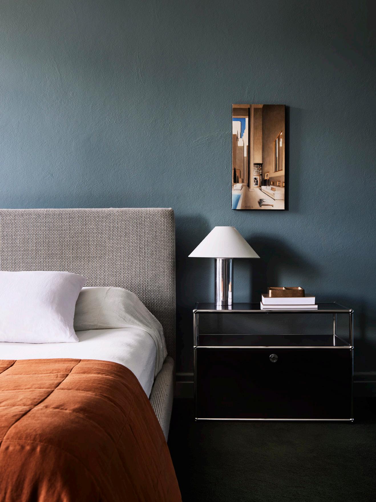 The primary bedroom suite references the courtyard’s green and blue hues. A USM Haller STORAGE 02 credenza in black features next to a bed customdesigned in Kvadrat Maharam wool fabric. The bedside table features a Studio Henry Wilson brass tray.
The original ‘Town Hall Hotel’ was built in 1868, but the facade reflects the Art Deco renovation.

Savour the ingredients that stay fresher longer with Sub-Zero, the food and wine preservation specialist, the meals that are cooked to masterful precision with Wolf, the cooking specialist, and a kitchen appointed with elegantly crafted appliances.

Newly refined, inside and out, explore the Sub-Zero Wolf design possibilities.
Re
subzero-wolf.com.au
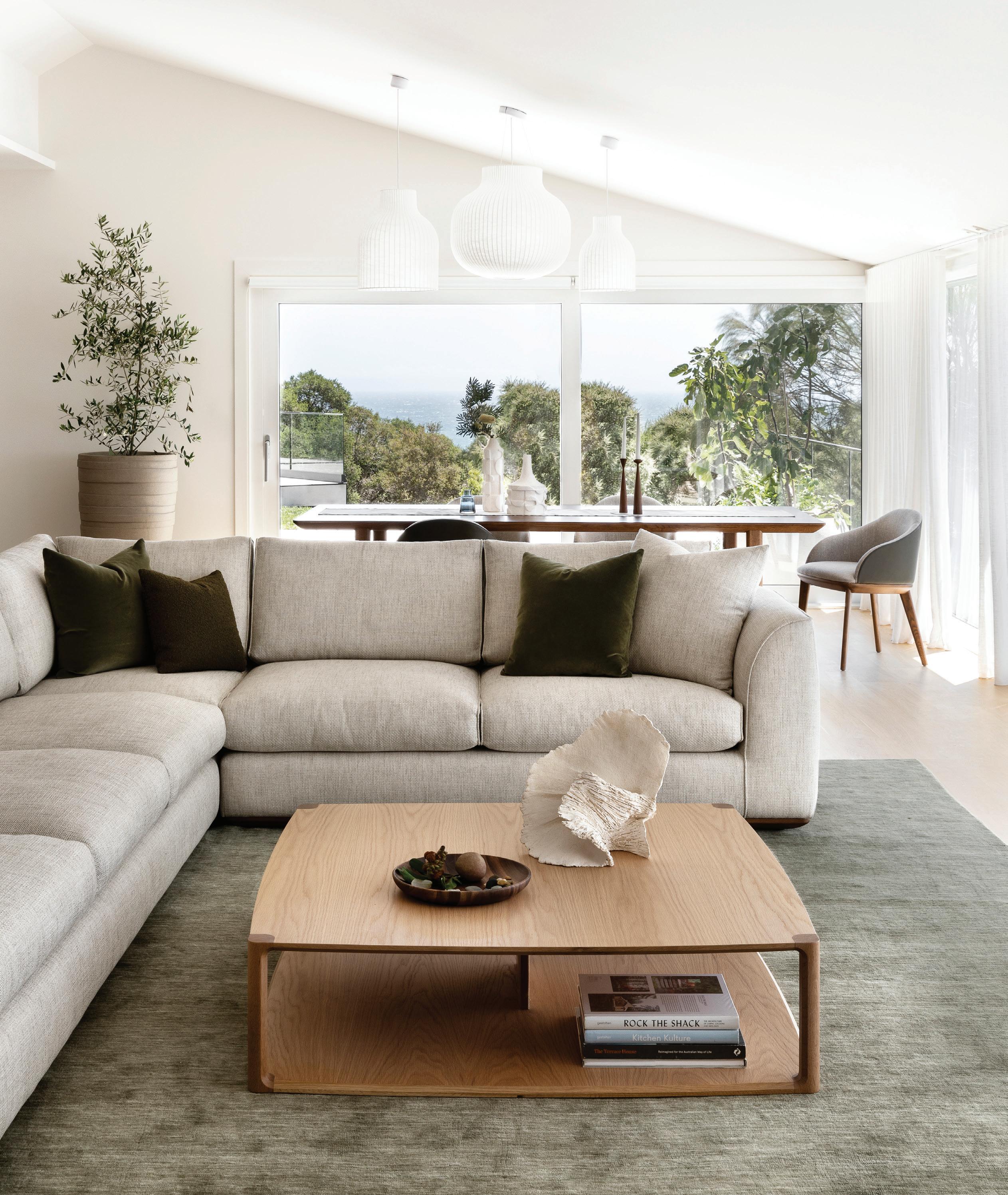


A 16th-century estate in Bruges, Belgium, is recast as an eloquent family home, offering a new narrative through exquisite finishes and bespoke artistry.
This page: An indoor swimming pool is designed entirely from Pietra Di Medici stone.
Opposite page: The archways and reductive interior scheme offer a modern character to the spa area while maintaining a luxurious feel. The dark brown beamed ceiling and monolithic-like columns offer an Italian bathhouse feel.

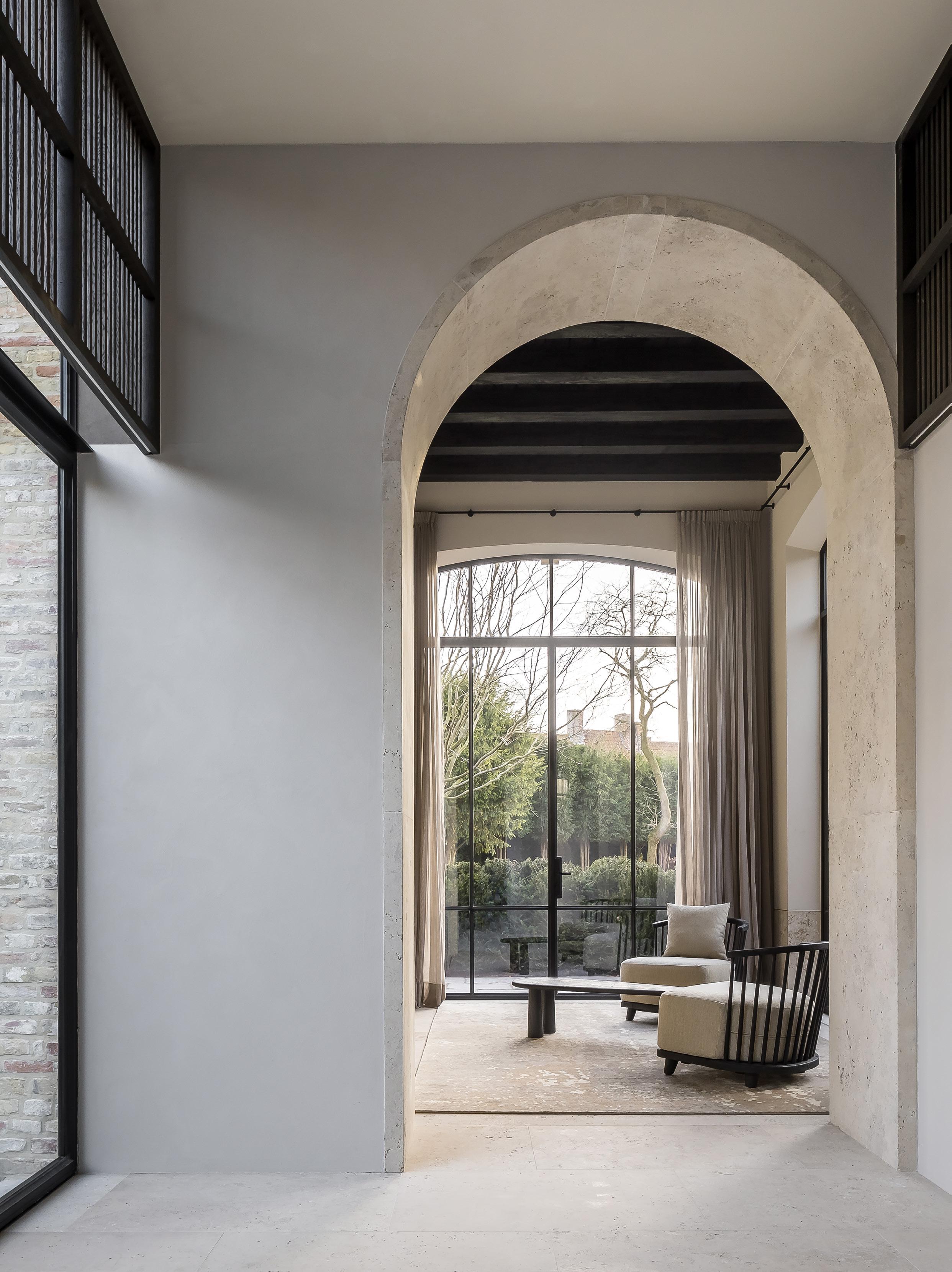

Taking on the renovation of a 16th-century estate requires a fearless spirit. This grand dame in Bruges has received a second life, thanks to the tenacious architectural vision of Simon de Burbure Architects and their dedication to an intensive, four-year design journey that honoured age-old traditional craftsmanship at every step of the way.
The reframing of this 16th-century estate originally started with a scope for a renovation but evolved quickly into a partial reconstruction involving two side-wing extensions. “Before the current owner, the property had been occupied for the last 20 years by an elderly lady who didn’t use most of the rooms. Our team was incredibly fortunate to be able to dissect this monument to the very bone and transform it into a city palace,” Simon de Burbure says.
Last touched in 1880 with decorative updates befitting the era, Simon and his team worked tirelessly to streamline and open spaces, blending old with new, while staying true to the architectural imprint of the original property. “Immaculate architecture combined with the highest level of finishing using high-quality materials and craftsmanship formed the common thread within this project,” Simon says.
The ground floor comprises a vast entrance hall, bathrooms, two living rooms, a kitchen, conservatory, spa and fitness area with a swimming pool, garage and staircase up to the first floor where a primary suite, bathroom, dressing room, two guest bedrooms with bathrooms, and a massage room are all housed. The former attic space has been converted into a bar and billiard room, while the basement occupies an intimate wine cellar.
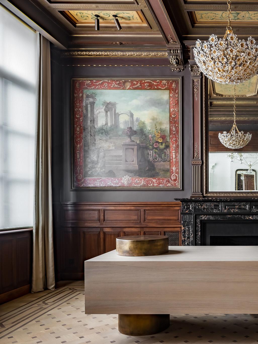
The study illustrates the property's original architectural heritage. The timber panelling, including four paintings on canvases in the study space, was moved to a studio outside the centre of Bruges, where professional artists restored it to its former glory.
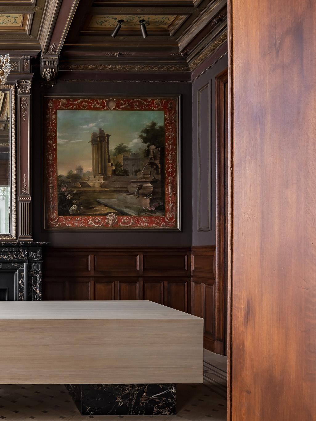

The impressive original 16thcentury entrance hall is 20 metres deep and 6 metres wide, which is almost unthinkable within a new construction in today's architectural landscape.
A dual design approach included the restoration of the original, central parts of the home, such as the vast entrance hall, kitchen, living rooms, bedrooms and office spaces alongside the new extensions. “There were many existing elements we had to consider, such as the high ceilings with existing panelling, original floors and 12 fireplaces – which also had to be individually preserved,” says Simon. “To create unity, I felt it was important to draw inspiration from the home’s classical past to shape the new additions.”
The orangery is a perfect example of the intensive care and consideration taken by the restoration team. “The floor of the 1887 conservatory was originally a combination of terrazzo and mosaic. When we recovered the property five years ago, the floor had risen 30 centimetres due to roots underground,” says Simon. “There were drawings in the mosaic that could be partially preserved by complete removal and restoration, while parts of the terrazzo floor were reinstalled using the same technique from 1887 using stone such as Rouge Royal, Noir De Golzinne and Carrara.”
While the central section of the estate was given an overhaul, two new buildings now flank either side making room for a fitness room, an 18-metre indoor swimming pool carved entirely of Pietra Di Medici stone, a spa area and garage. “You can see through the old study all the way to the kitchen in the new part and even further into the garden, creating transparency and overview,” Simon says. “The client's brief included a relationship between nature, light and views of the garden.
By restricting the colour palette for each space, Simon and his team have cultivated a refined atmosphere of ‘tonal poetry’. “The ultimate goal was minimalism and refinement in terms of details and maximalism in terms of a luxurious look and rich materialisation,” Simon adds.
Simon de Burbure Architects have added a modern mark to this historic residence, restoring its beauty and charm for a second coming.
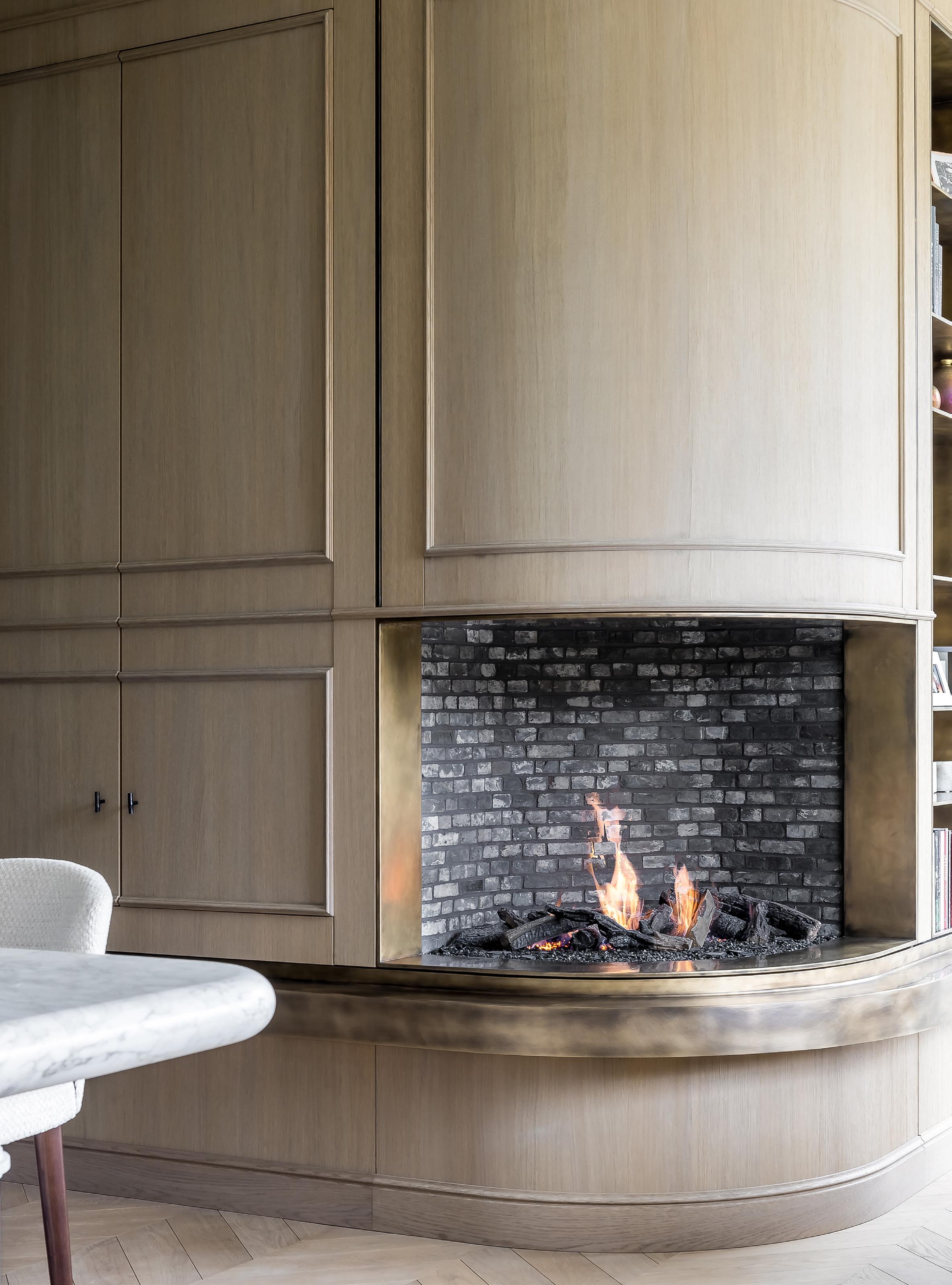
 From the cosy corner seating the family kitchen unfolds, and the curved gas fireplace made of bronze creates a focal point.
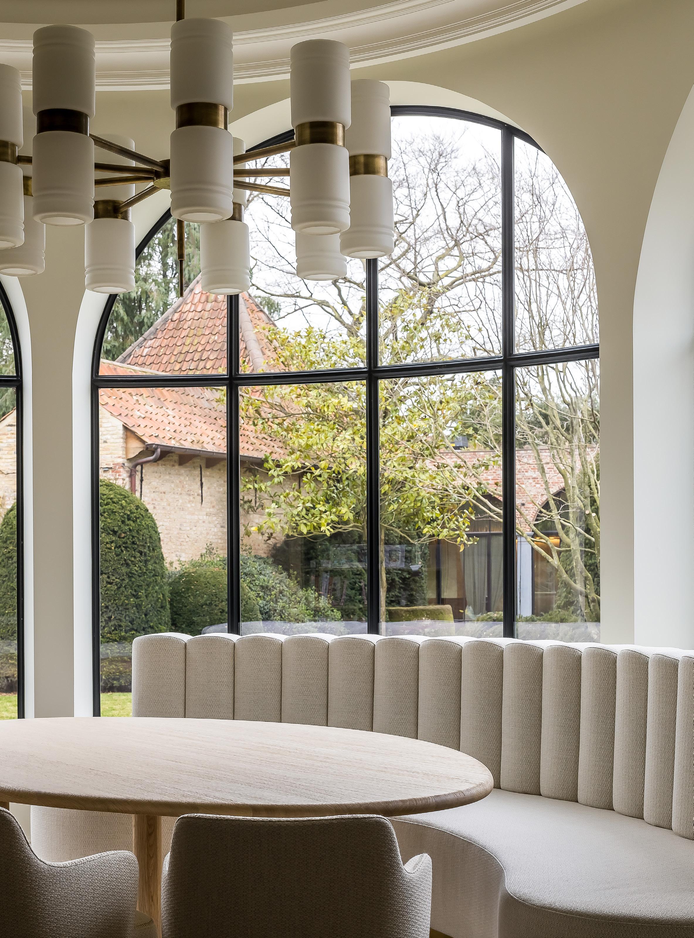
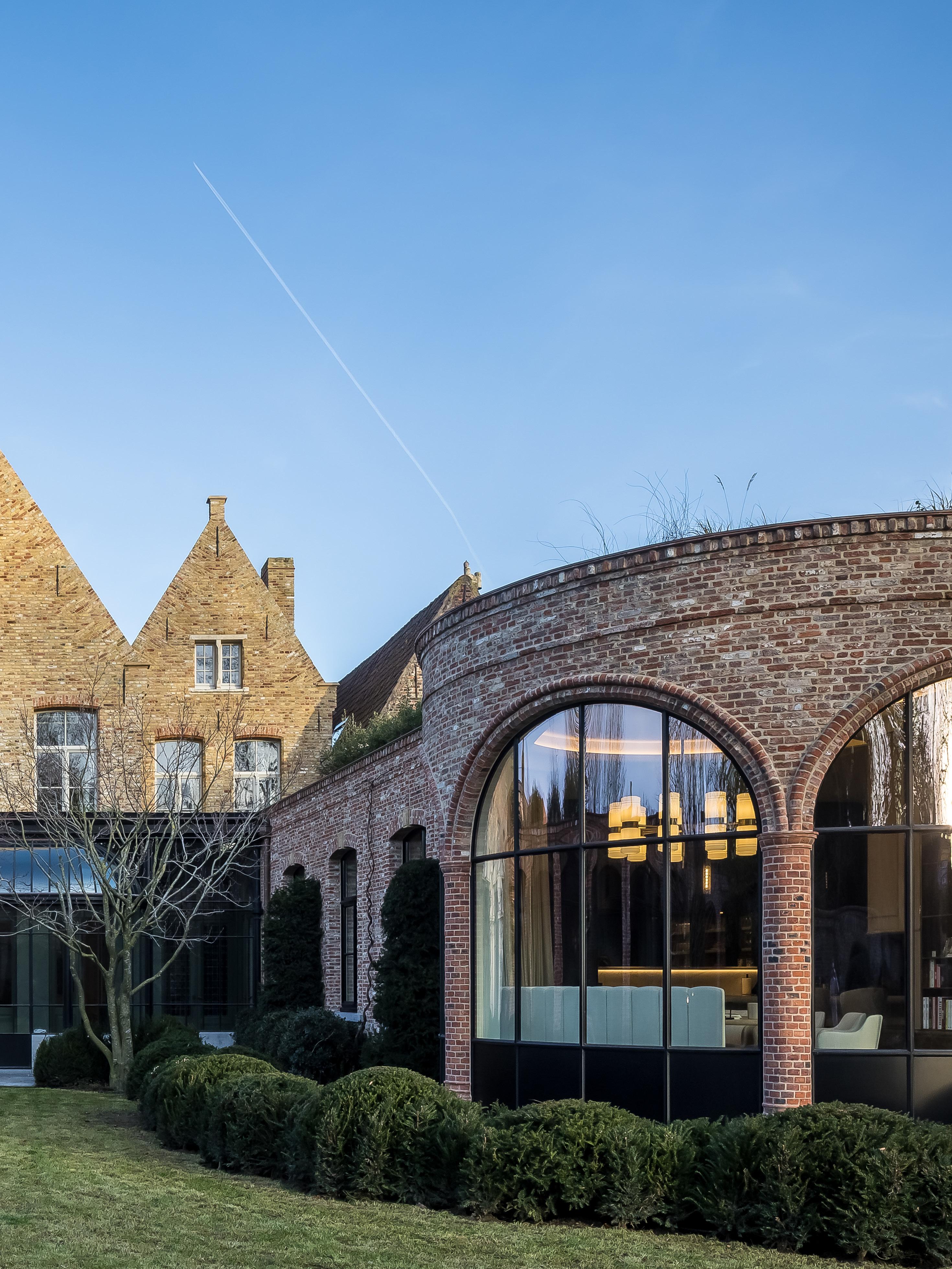
These new windows have the same shape and proportions as the original section of the home, so they blend seamlessly into the façade of the house.

The 3,500-square-metres enclosed garden features several terraces, open and covered, rebuilt ancient brick walls, and towering old trees alongside newly planted flowers, bushes and trees.

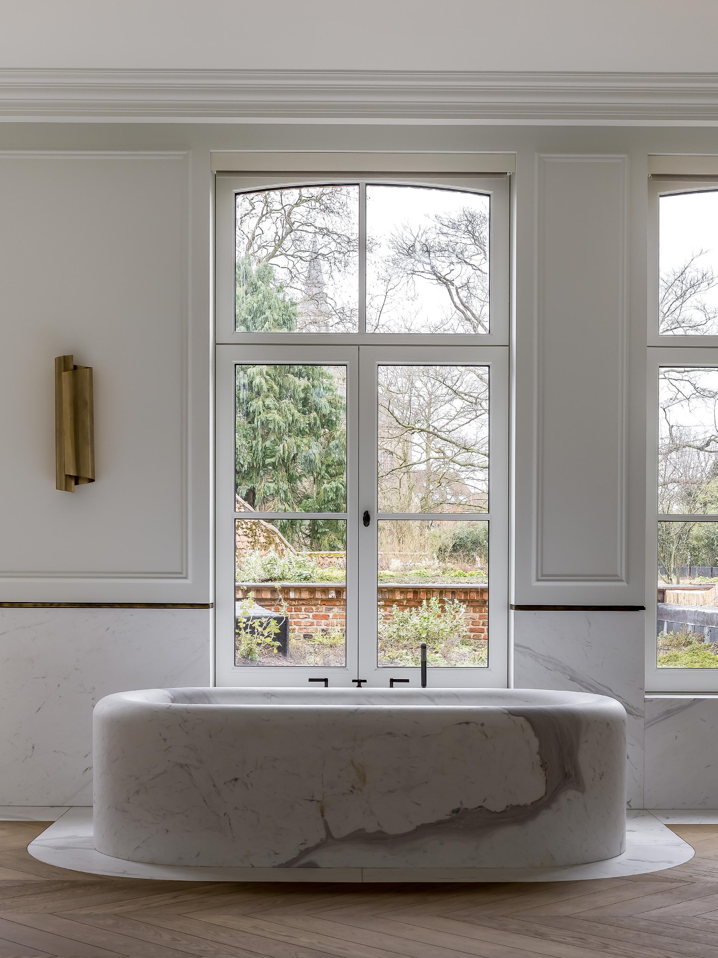
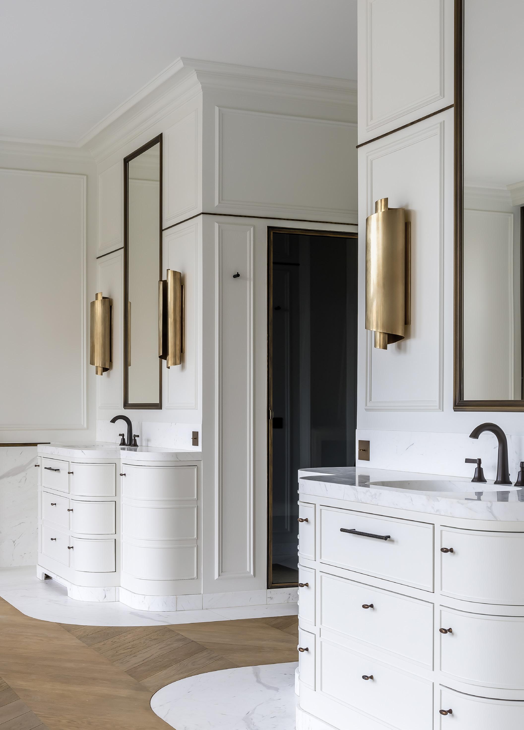
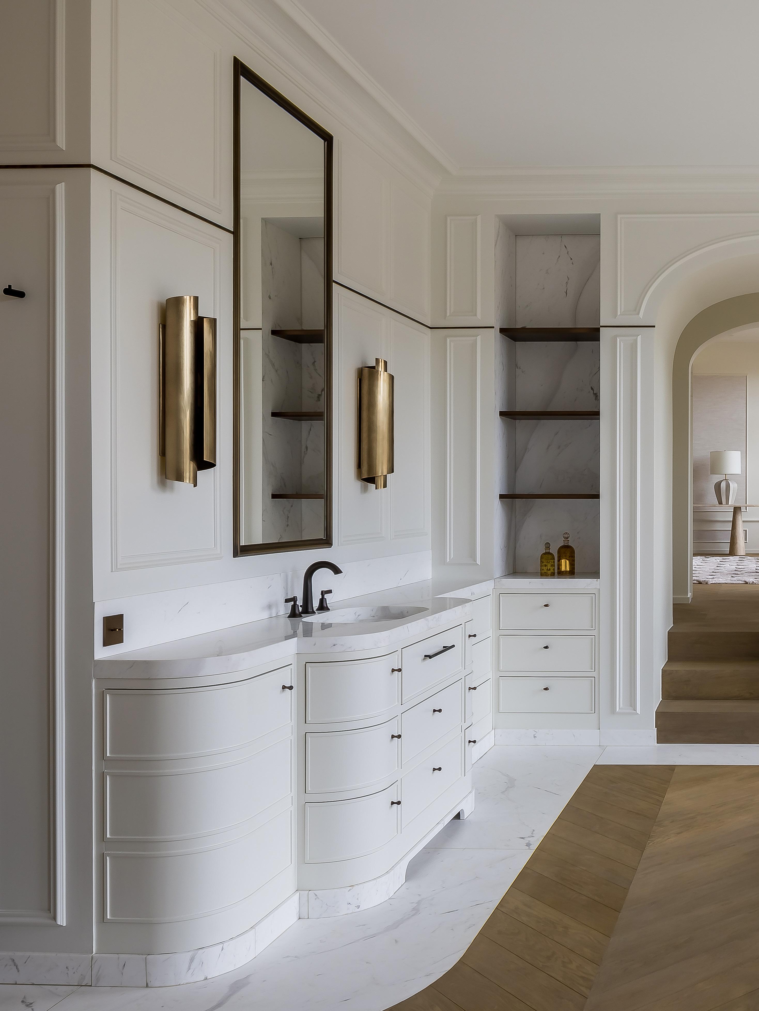
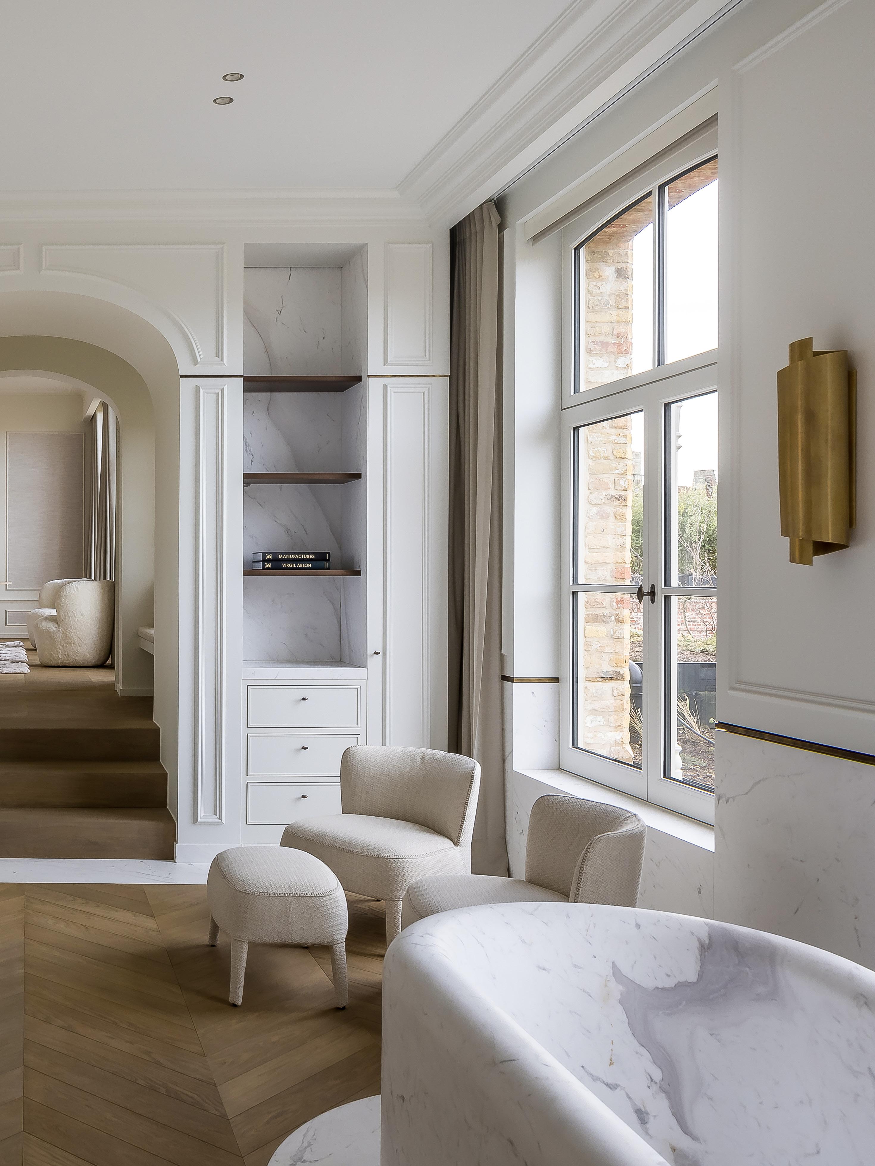
The upstairs bathrooms articulate Simon's approach to restricting the colour palette to cultivate a refined atmosphere of 'tonal poetry'.

 Project The Home of Franck Genser Design Franck Genser
Photography Vincent Leroux
We uncover the best in design at this year's Paris Design Week and Maison&Objet.
Words: Lidia Boniwell Lombardero
The Sculpture table by design studio Toogood was the centrepiece of the British multidisciplinary design studio’s stand at Maison&Objet. Constructed of oak and draped in three layers of marbling paint, the table faintly recreates the Brutal form of a marble table but “without the dinnertime clanging,” as founder Faye Toogood puts it.

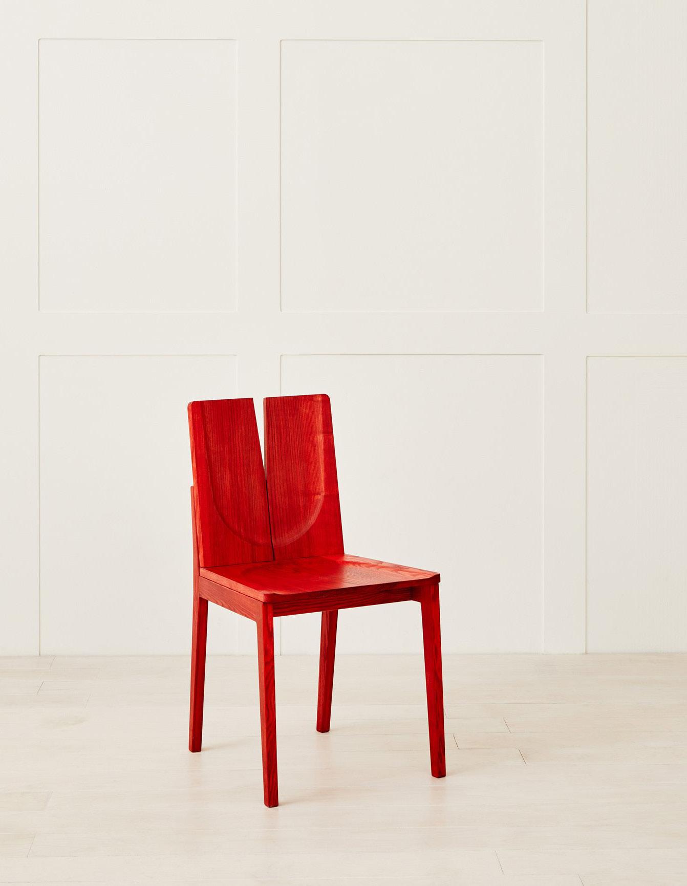
Recognised as one of the UK’s ‘Rising Talents’ at the Maison&Objet fair in 2017, regenerative designer and craftsman Sebastian Cox returned to the fair this year in the exclusive Designer Studio. Together with his partner Brogan, the duo and their team design and manufacture heirloom pieces from locally sourced UK timber. The Barker chair was displayed at the fair, an English ash dining chair available in a range of bright colours.
Interior designer Pierre Lacroix unveiled his inaugural furniture collection titled ‘Timeless’ at the brand’s Paris studio – a converted apartment in Saint-Germaindes-Prés. The collection comprises dining tables, stools, a mirror, daybed and sofa in various materials, including polished stainless steel and alabaster.


In the spirit of Maison&Objet’s theme of ‘ENJOY’, trend forecasting agency Peclers Paris curated an immersive 150m² apartment at the fair celebrating the notion of hedonism and living well. More than 50 designers contributed to the space, presenting elements that touched all five senses. Guests were encouraged to watch artists perform their craft live, interact with edible gardens and sit on the furniture. The ‘bedroom’ featured the Nude Metallic Jersey duvet cover by Swedish linen designer Magniberg, an ode to pop art, disco and sex.
The Sharpei stool by bespoke woodworking atelier Senimo was another Paris Design Week Factory standout. The curved stool is an ode to the seventies with its bright colourways and playful, organic shape.
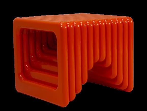

On show at Paris Design Week Factory – a space for emerging designers to showcase their work – the bb collection by Corpus Studio is defined by its distinct legs, formed from a circle cut and arranged in different ways. The collection is made from sand-cast aluminium with deliberate, visible traces of the manufacturing process. By way of contrast, each edge is polished to underline the sculptural nature of the table.
Housed within a corner building in Paris’ 7th arrondissement, the home of French furniture and lighting designer Franck Genser is a testament to the designer’s unconventional and eccentric sensibility. Franck hosted a special welcome dinner for the opening of Paris Design Week in the intimate kitchen and dining room, with a three-course dinner prepared by celebrity chef Valentin Neraudeau.

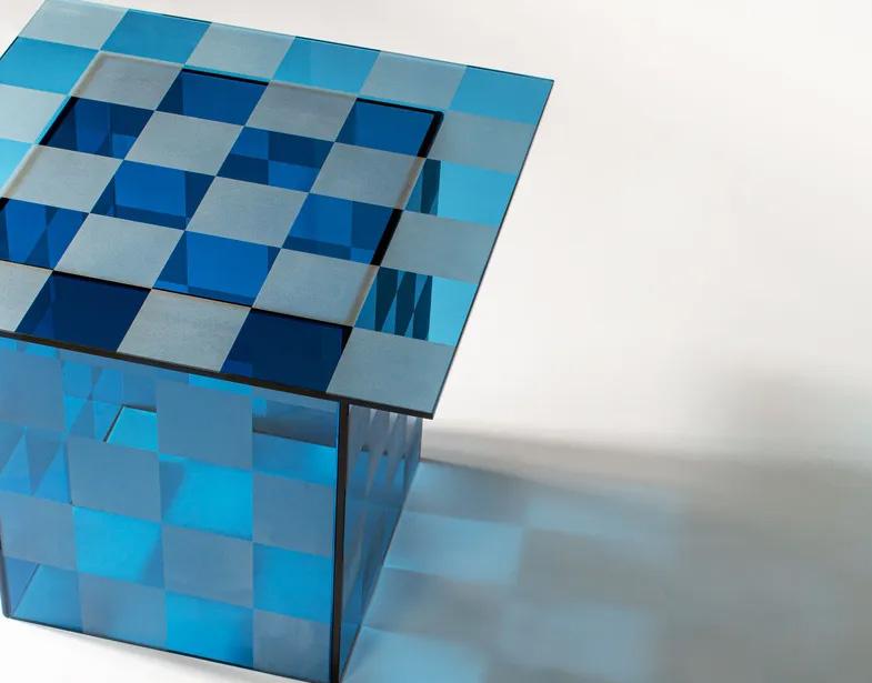
Long-term partners Pulpo and Sebastian Herkner released the Thales side tables earlier this year. The rectilinear tables are handcrafted from textured float glass and available in a checkerboard or striped pattern.
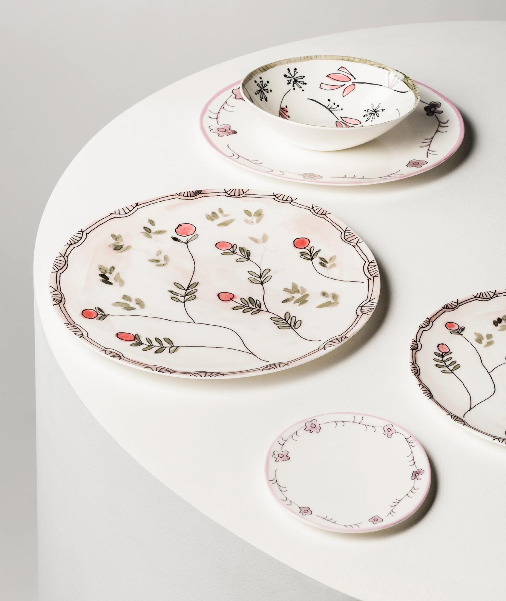
Italian fashion house Marni and Belgian homeware brand Serax joined forces in an unconventional collaboration on a 123-piece tableware collection. Inspired by designs in the Marni archive, whimsical, nostalgic depictions of flora are hand-illustrated with an endearing sense of imperfection.
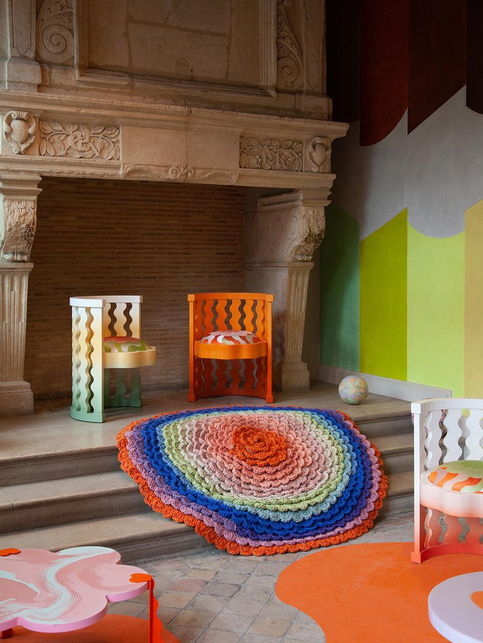
Interior and furniture designers Uchronia took over the iconic gardens and orangery of the Hôtel de Sully in Paris’ Le Marais district for their ‘Think Pink!’ exhibition. The exhibition revealed a prototype for Uchronia’s latest collaboration with Italian rug artisans cc-tapis. The Colour Swirl rug is crocheted by hand out of a single yarn of wool and dyed in a gradient, marking an exciting chapter for Uchronia.

“Thedesignteamexploredandunpackedthe ideaofhowitfeelstobeonholidayandhow a sensation or emotion can be translated into aphysicalspace.Anticipation,excitement, relaxationandnostalgiainformedthewarmcolour palette,diversityintexturesandorganicforms.”
- Ewert Leaf Director Ana Calic
|
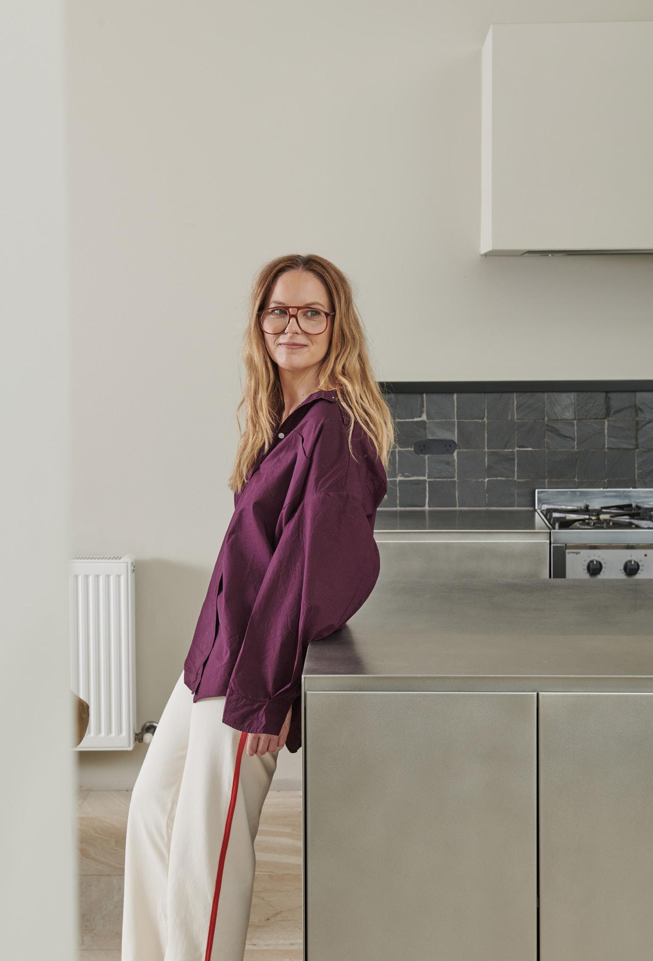
The home of interior designer Amelda Wilde is a testament to her penchant for preservation and the beauty of atmospheric experience.
LOCATION Wadawurrung Country / Geelong, Australia
DESIGN Amelda Wilde
Having swept up a plethora of industry awards this year for her residential work, Amelda Wilde understands what constitutes a well-designed space. She and her partner lived in their 1930s Californian Bungalow for more than a decade before finally completing what is now their dream home, celebrating the creative expertise between them.
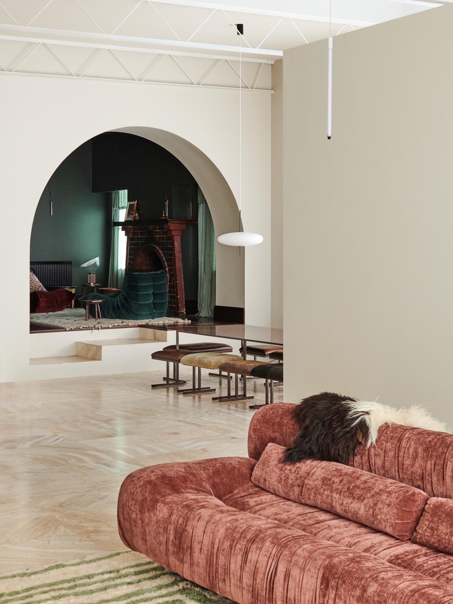
Located in regional Victoria, about an hour’s drive from Melbourne, the couple instantly fell in love with the existing house. Inspired to highlight its unique, historic and nostalgic elements, the design approach embraced imperfections as characterful quirks to be reckoned with. “I believe in designing adaptable spaces that will endure generations,” Amelda says. “The charred bricks from many nights by the fire, the dints and scratches on the floorboards and mouldings – all subtle hints of history and families that have lived here before.”
There is an element of surprise passing through the entrance corridor to the vast, contrasting spaces and thoughtfully curated furnishings beyond. “I think we often expect all spaces to have uniform functionality,” Amelda reflects. “But there is something I really enjoy about every space when it is not replicated anywhere else in the house,” she adds.
Seeking to amplify the charm of the existing building while playfully incorporating contemporary layers, Amelda’s approach explores innovative ways to welcome natural light, contrasting spatial proportions and unique colour palettes. Within the original materiality reside moments of chunky timber and decorative embellishments, which now exist alongside minimalist detailing that brings honest materials like stone and steel and handcrafted one-of-a-kind objects to the forefront.

 Opposite page: The dining space features the Astep 2065 pendant above the dining table and custom-made stools by Amelda and her partner’s steel fabrication business, Von Steel. Artwork by Cricket Saleh.
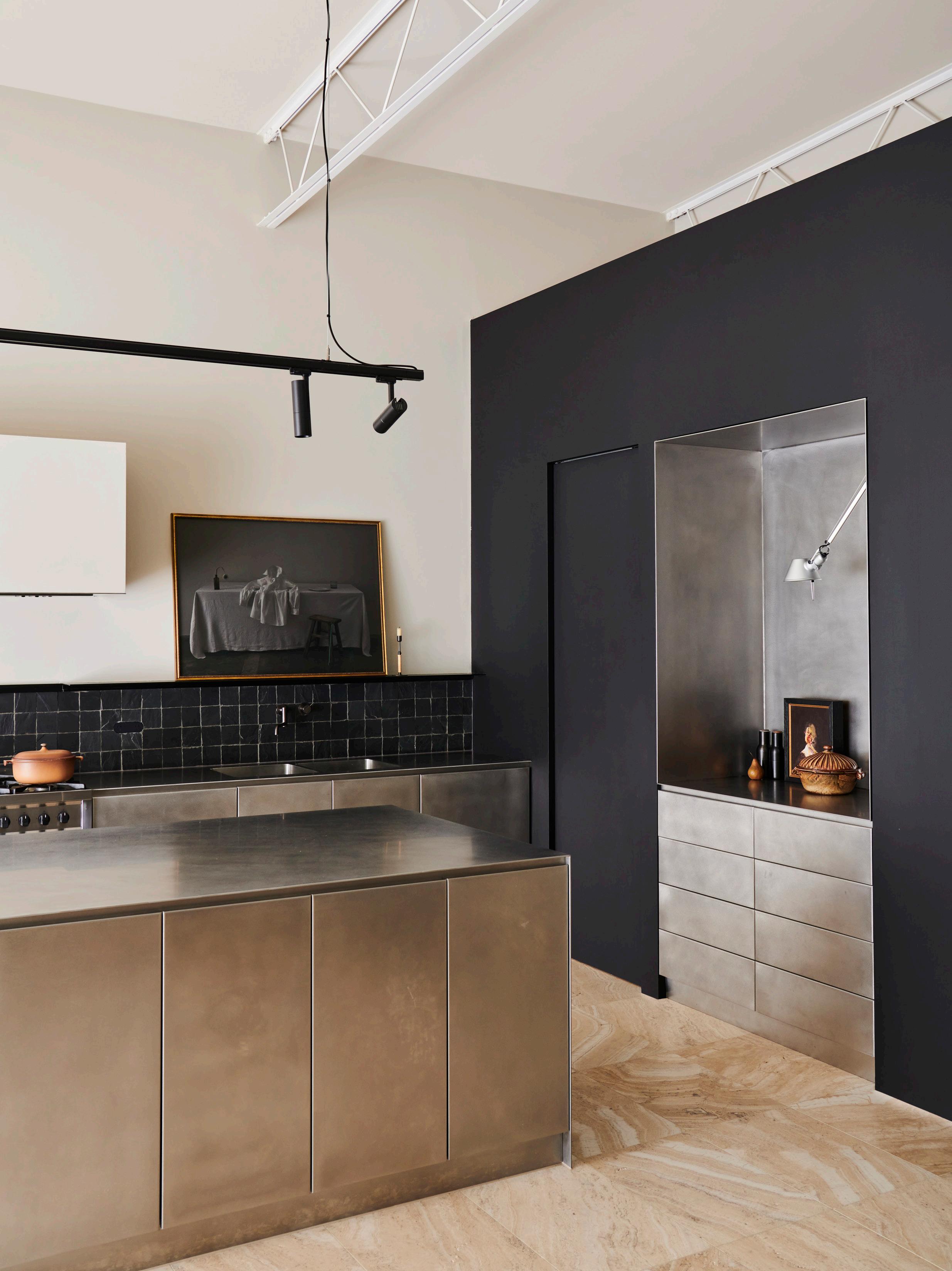
This page: The kitchen joinery, island, pantry shelving and door hardware are all custom-made by Von Steel. Also pictured: artwork by Steve Salo, Menu bottle grinders and the Artemide Tolomeo wall lamp.


At the heart of the design is a combination of old and new, with the two worlds brought together by an accentuated archway. Elevating the experience of this connecting threshold is a staircase that pivots in such a way as to create a moment of stillness before moving into the contemporary part of the house. “The story of adaptation lies in the transitional arch,” Amelda says. “It’s all in the subtle details that mightn’t be noticeable to anyone else but that I felt were important to create a special space that someone would want to preserve in the future,” she adds.
Many of the furnishings were handmade on-site – a labour of love by Amelda and her partner, who works as a steel fabricator. As a result of the sheer number of bespoke steel objects they crafted for their home, the couple have now established ‘Von Steel’ an architectural steel fabrication business and are working on custom commissions.
Layered, warm and lived-in, Amelda’s home carries a sense of ease and self-assuredness — quietly confident in its ability to stand the test of time.
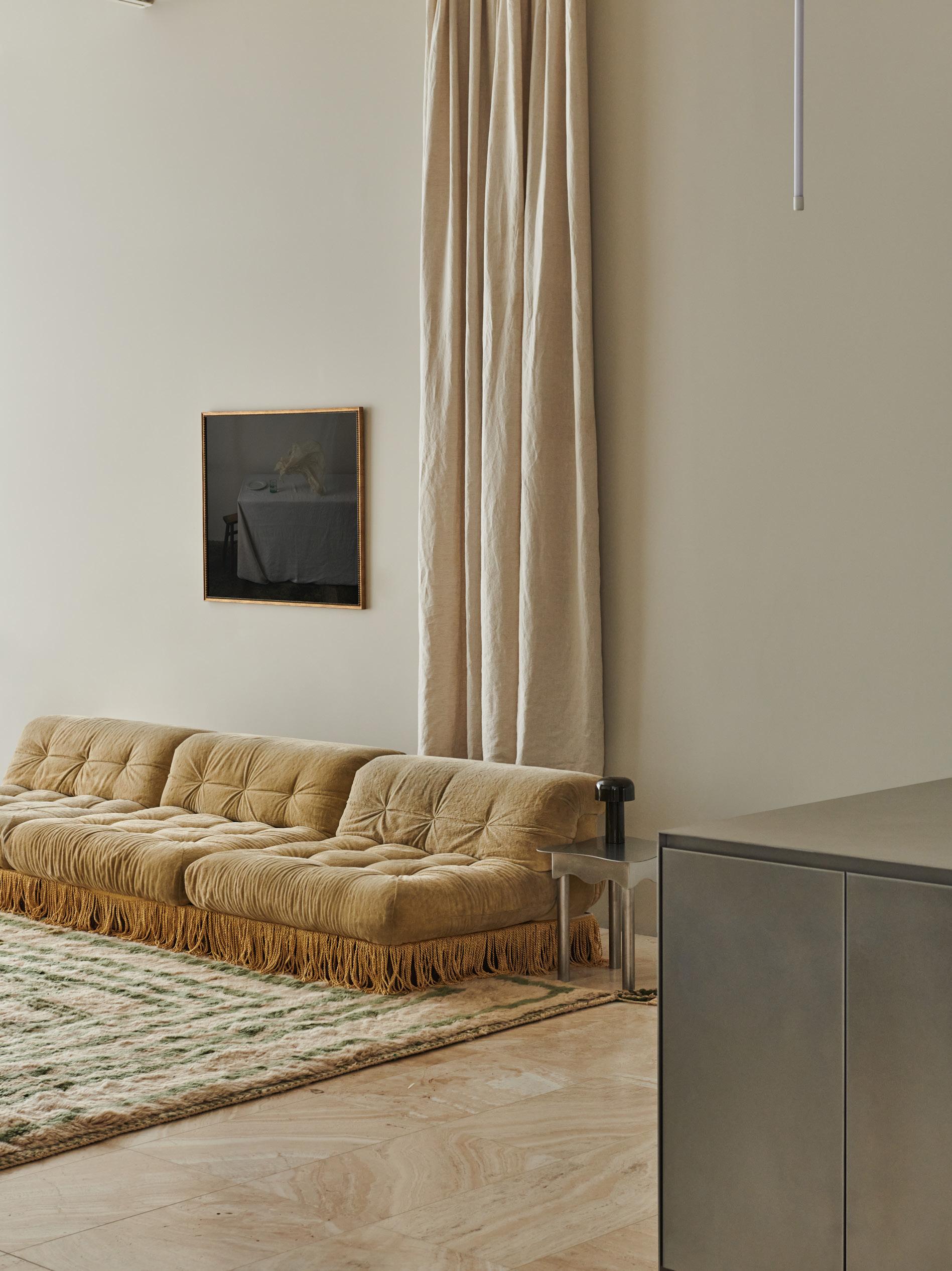 The living room features drapes by Society of Wanderers, a Lahandira rug, a Flos Belhop table lamp and artwork by Cricket Saleh. The vintage Roche Bobois sofa is atop a tassel plinth and beside the Duchess side table, both designed by Von Steel.
 The study space features two artworks by Samuel Condon, the Ettore Sottsass Planula chair, the Flos Parentesi floor lamp and a Clairy Laurence sculpture. The table is custom-made by Von Steel — all set before the backdrop of William Morris Montreal wallpaper.
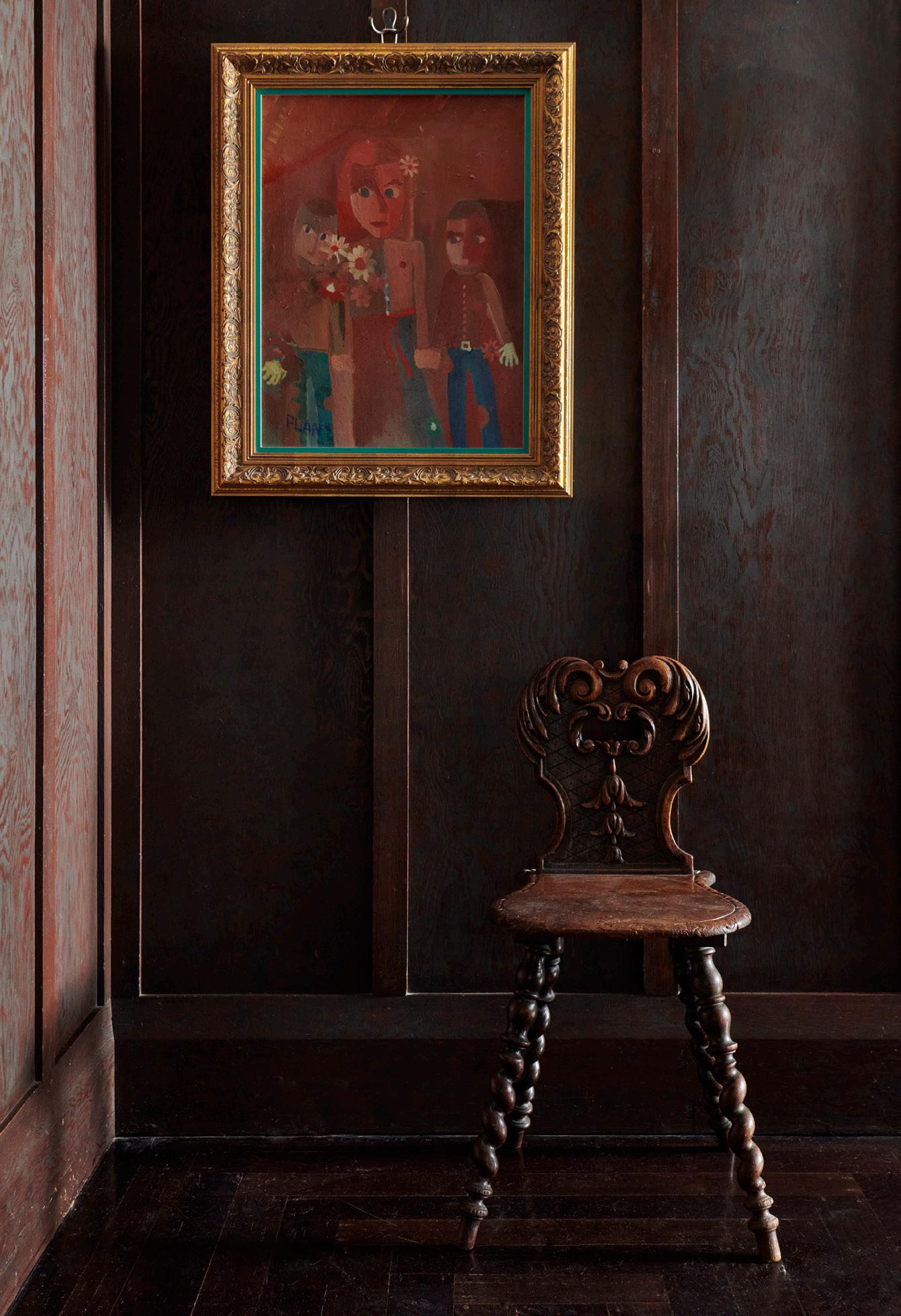
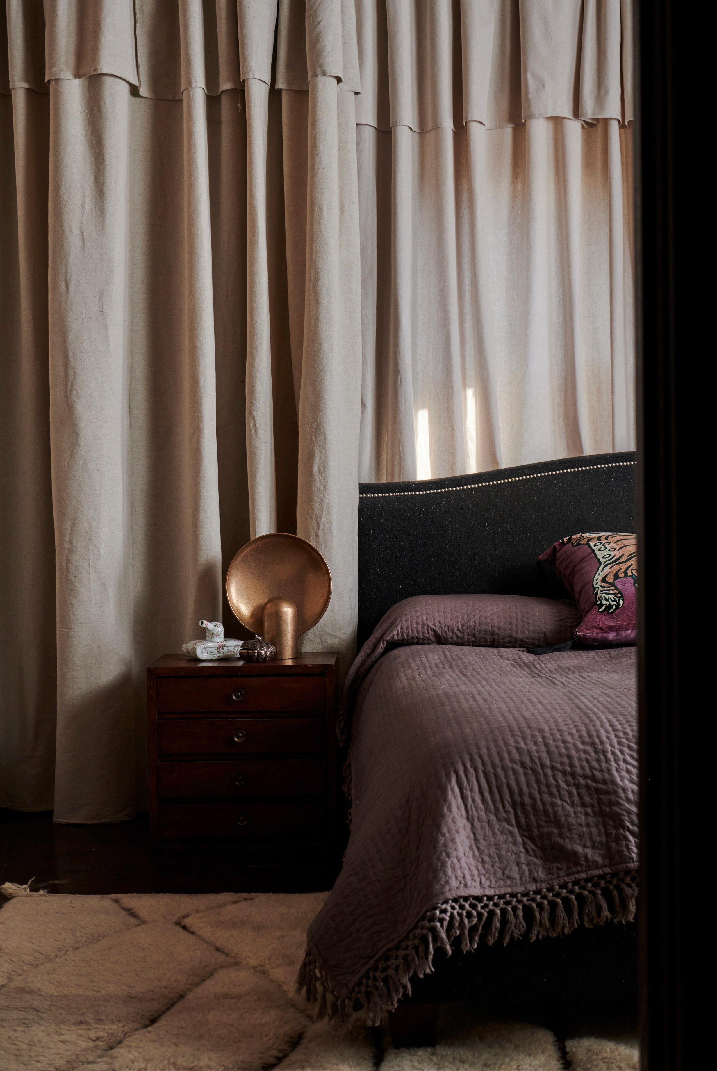 A dark and rich material palette nods to the home’s Arts & Crafts design period. The bedroom features bed linen by Society of Wanderers and a Henry Wilson Surface sconce.
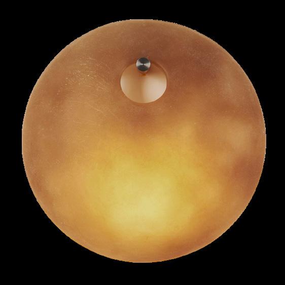



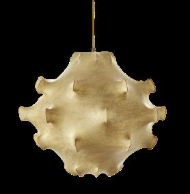
VIEW MORE LIGHTING >
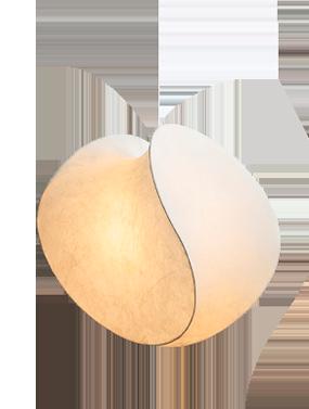
 Project C House Design Studio Montemayor
Styling Yedda Morrison Studio Photography Shade Degges Photography
 Project Potts Point Design Flack Studio
Photography Anson Smart


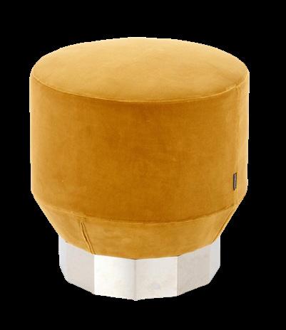

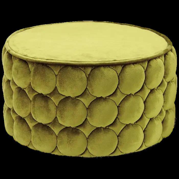
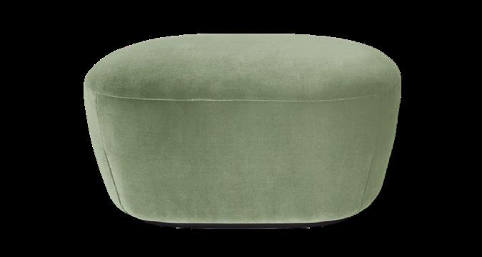
VIEW MORE OTTOMANS >




 Project Dusk House Design Madeleine Blanchfield Architects
Photography Dave Wheeler
 Project Mayfair Home Interior Design Child Studio
Photography Felix Speller
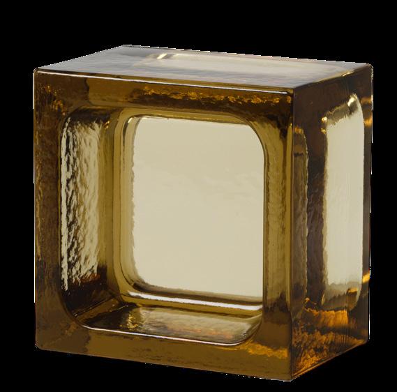
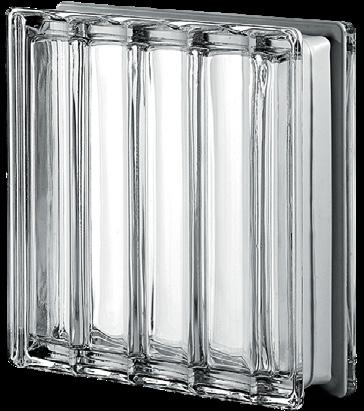
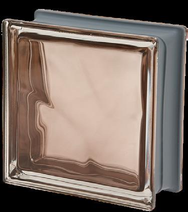
VIEW MORE GLASS BRICKS AND BLOCKS >





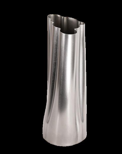

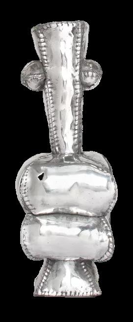
VIEW MORE VESSELS >


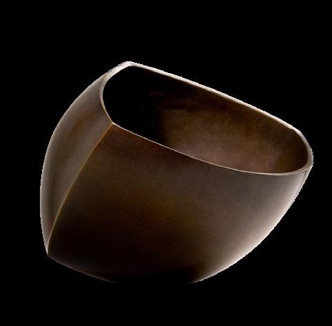

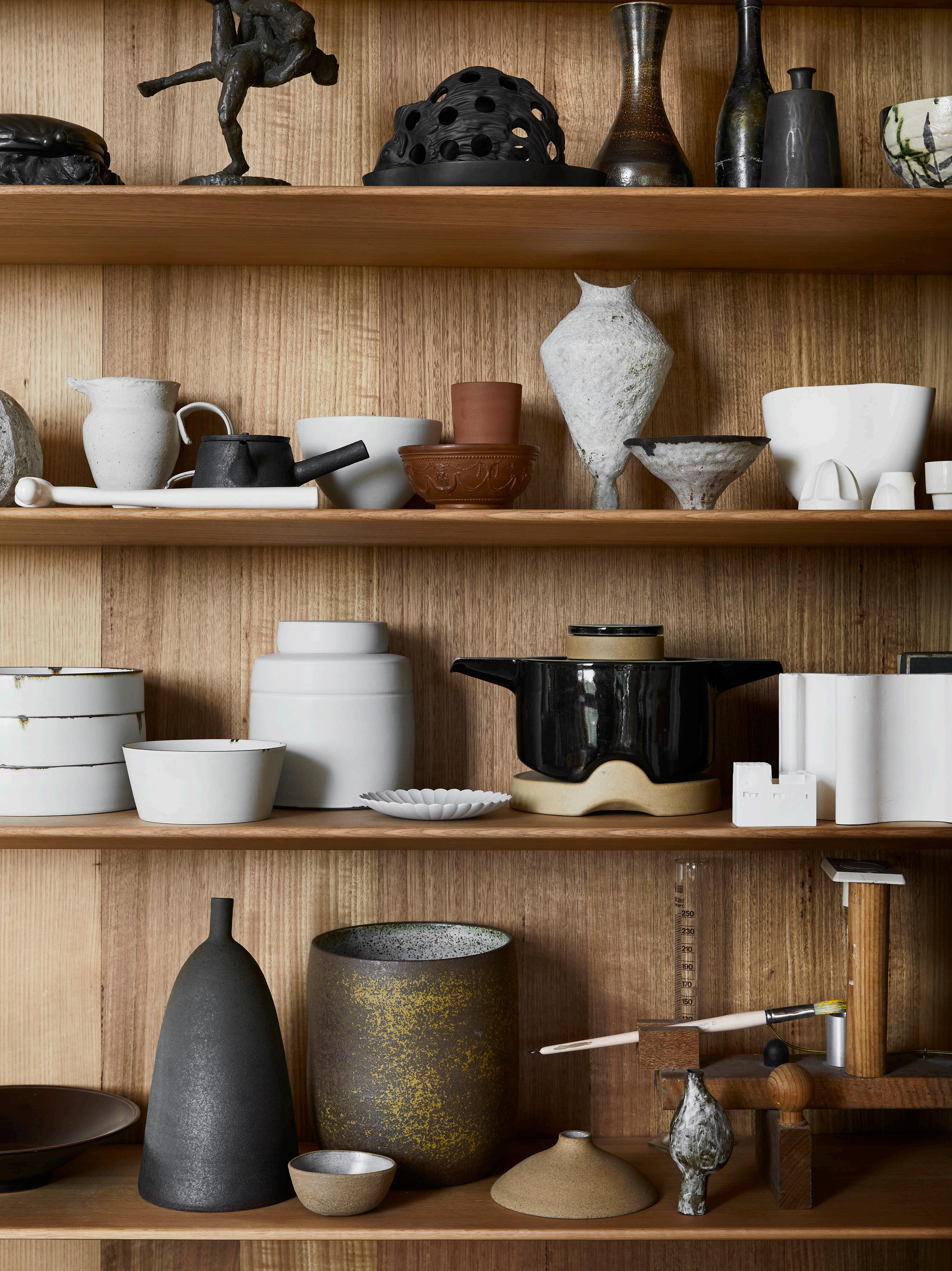
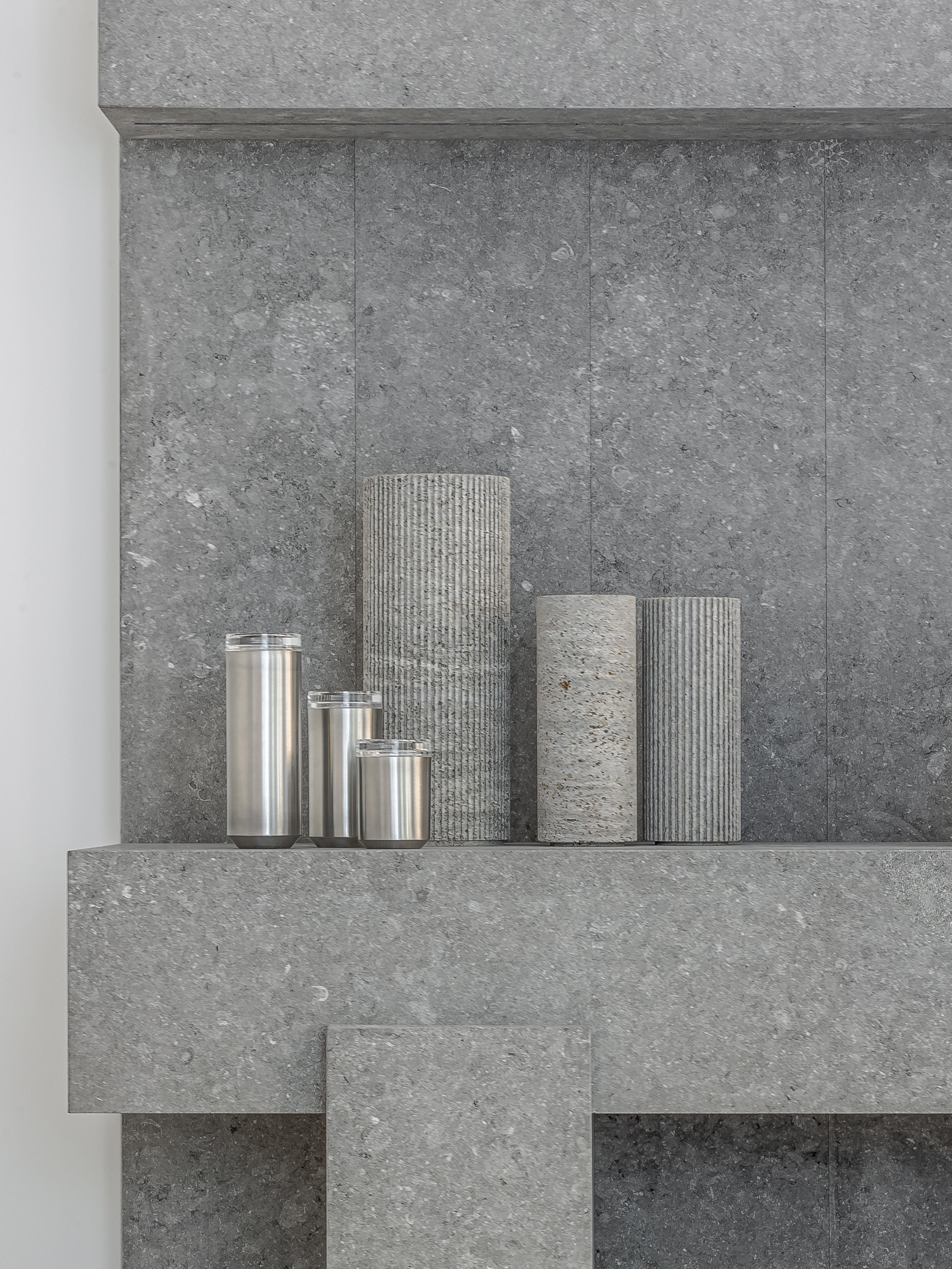 Project Obumex Kitchen & When Objects Work Vessels by Nicolas Schuybroek
Photography Eric Petschek
