A joint IIID and OECD conference
Paris, 18-20 June 2009

A joint IIID and OECD conference
Paris, 18-20 June 2009
Enhancing social, economic and environmental progress

One of the reasons why this conference took place at all is a phrase that kept popping up again and again in very different contexts: story telling. Statistics, visual analytics, data representation, development and environmental agencies, information design, visualisation, psychology, social sciences and many more – all are searching for ways to make complex data more accessible and understandable. All are aiming to support decision-making in the face of increasing complexity. All are using visual methods. It seemed only logical to bring together these disciplines.
Having heard about the “Global Project for the Progress of Societies” IIID contacted the OECD Statistics Directorate. Enrico Giovannini, then Chief Statistician, took a chance with IIID and so the DD4D story began. Enjoy ...
 Veronika Egger IIID deputy director


18 June, 8:30 am. Security is tight at the OECD. After some of the delegates have travelled half way around the world this is the last and nearly final hurdle: security scan and check in.


Equipped with conference bags ...

They made it. Nothing short of a natural disaster can now prevent the seasoned travellers from joining DD4D.

Flags prepared for a global OECD event - also a fitting backdrop for DD4D with attendees from 29 countries.

Wondering what’s in store ...

207 people from 29 countries:
Content conference bag: workbook (19 x 25 cm, spiral bound) containing speaker portraits, abstracts and note taking space; conference programme; ballpoint pen, pencil; miniature packet of tissues; packet of mint pastilles; 2010 calendar; feedback cards.

with: Pat Wright – Pamela Flattau – Hans Rosling – Jorge Frascara –Phil Berczuk – Mikael Jern – Nic Marks – Mark Palmer – Elizabeth Pastor –
Carlo Amati – Pavle Sicherl – Leslie MacNeil – Lara Ho – Seth Flaxman –Bruce Robertson – Helen Joyce – Christophe Aguiton – David Skopec –Christiaan Adams – Stephanie Hankey – Yvonne Eriksson


Elizabeth Pastor led the “OECD Communication Toolkit” workshop, which began on Thursday with a kickoff conversation on how we can strengthen the ways in which the information design and statistical communities work together. On day two small teams communicated and/or visualised a complex statistical challenge. In the debrief on Saturday learnings from both sides and some basics on stats NoNo’s and YesYes’s were defined.

Regina Rowland’s workshop explored creative (visual) methods and tools for collecting, presenting, and interpreting data. It began with an introduction to communication patterns and co-creation of meaning, where group dynamics directly project into “visual maps” that reveal and confirm cultural dimensions. Friday morning was a highly interactive, visual creative process to observe cultural dimensions in action. A final analysis reflected upon the usefulness of this method in supporting social sustainability.


“We are currently experiencing a paradigm change, whereby statistics are created, used and accessed by communities and individuals to make decisions about their lives”, said Enrico Giovannini, Chief Statistician of OECD when opening the conference. “The OECD is hosting the Global Project on Measuring the Progress of Societies, which brings together thousands of people around the world working in different disciplines, who want to improve the effectiveness and efficiency of understanding and measuring progress. This conference will advance the frontiers of our knowledge about how best to present statistical data to support effective decision-making in different contexts.”
Peter Simlinger, founder and director of IIID in his opening address: “Designing data does not necessarily mean converting the data into pretty charts and graphs. It means converting data into the sort of information that provides useful knowledge to the person who needs to make a decision. The outcome might be pretty charts and graphs but what’s important is the goal: successful knowledge transfer. If the knowledge transfer does not occur, the pretty information – and the underlying data – are useless. I am looking forward to the exchange of ideas at this conference to bridge the gap between data and the needs of those who must make decisions for survival, for progress and for the improvement of life”.


DD4D #1

nic marks: »my aim in life is to replace gdp as the standard measure of progress«


The first day gave a glimpse of how wide the scope of topics and disciplines is that all work with data communication and decision making. From psychology to policy making, from visual analytics to ICT tools, from statistics to information design. To give justice to this variety and to establish a sense of the communities involved we opted to include several sets of short presentations in the conference. The densely packed programme had a lot to offer.
The keynote address was given by Pat Wright, a psychologist at Cardiff University who discussed tools and interaction methods to help the public make difficult decisions and informed choices.
Pamela Ebert Flattau followed in her talk on measuring public safety and security data as a basis for policy decisions, and Hans Rosling advocated accessibility and availability of data in his inimitable style. Jorge Frascara presented methods of contextualisation of information using the cost of traffic injuries as an example, followed by Phil Berzcuk with a decisionmaking tool for transport planning.
Geovisual analytics and web-enabled tools were the subject of Mikael Jern who presented the OECD explorer software as a highly sophisticated visualisation tool. Nik Marks brought the discussion round to what makes people happy and how this
could be measured to change policy.
Karen Shriver, communication designer and author, led the first panel session with Mark Palmer and his one-page visualisation of key metrics, Elizabeth Pastor and Visual SenseMaking for the American Human Development Report, and Carlo Amati presenting a tool to follow up on public investments. Pavle Sicherl took Gapminder one step further and talked about Gaptimer and Leslie MacNeil brought ethnography to the information design process.
In the afternoon Lara Ho reduced the variety of indicators for measuring field activities of the International Rescue Committee, Seth Flaxman invited us all to join in the city ranking with its novel indicators and Bruce Robertson took us on an unforgettable journey into the past and present follies and successes of information design.
The second session of short talks was chaired by Simon Briscoe, statistics editor of the Financial Times. The session kicked off with, Helen Joyce, who questioned the role of journalists in online media. Christophe Aguiton followed the mobile trail of UrbanMobs, David Skopec designed the interface to a database of social indicators, Christiaan Adams showed what tools Google has offer for data visualisation, and Stephanie Hankey looked at the value of information design for advocacy and campaigning.


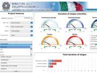


Students of Information Design at Mälardalen University together with the School of Fine Arts in Stockholm set out to challenge traditional ways of presenting data for personal decision making. A selection of the results were presented by Yvonne Eriksson of Mälardalen University, Sweden.


After a hard day at the conference she really wanted to show them a good time.


Just follow the sign ...
and walk through time.
In the meantime, some of us discovered the world of tomorrow with Stéphane Villard at the edf fondation, “Paris/design en mutation”, joined Giuseppe Attoma in a tour of the Grand Paris Exhibition or enjoyed a glass of wine at Ruedi Baur’s studio “integral”. To be continued


Unlike Bruce’s comment below we were anything but bored on day two of the conference.
Information design is, among other things, about giving order to information, so starting the day with a mess brought us face to face with wicked problems and social messes involved in decision making processes. Bob Horn told us about mess mapping and Julian Jenkins followed with how we can design the user experience to arrive at meaningful decisions.
We were beginning to get personal, to get down to the nitty gritty of finding out what users want.
With Stefan Schwarzer and Karen Cheng there were two examples of how statistics can be turned into powerful visual stories.
The afternoon speakers continued with the user and usability of information, David Sless with a reality check on the usability of credit card staements, and Will StahlTimmins and Martin Pitt about hospital data, where a wrong decision may well mean harming a person. Per Mollerup was the severe advocate of functional simplicity and making data useful, and he warned of the consequences of mediocre information design.
with: Robert E. Horn – Julian Jenkins – Stephan Schwarzer – Karen Cheng –Paul Kahn – Carol Briam – Giuseppe Attoma – Aaron Marcus – Arlene Birt –Angela Norwood – Virginia Tiradentes Souto – Nicolas Naveau – Kirti Trivedi –Ruedi Baur – Tingyi Lin – David Sless – Per Mollerup – Will Stahl-Timmins –Martin Pitt – Nigel Holmes


Wibke Weber of the Hochschule für Medien in Stuttgart chaired the first panel session on this day which brought us not only two men in hats, (one even with a funny hat, see page 30), but some excellent content as well.

Paul Kahn kicked off with information architecture for organising and accessing large data sets, Carol Briam unleashed the LATCH-principle for data organisation, Giuseppe Attoma looked at the human factors in organising 750.000 people a day in Châtelet Les Halles. Aaron Marcus did a last minute switch and presented the Green Machine, an iPhone application that can promote a more environmentally responsible lifestyle by keeping track of consumption, and Virginia TiradentesSouto gave an interesting evaluation of text clouds – do they contriubute to understanding?
Today Wes Ervin took over as conference chairman to guide us through Friday and Saturday – with charm, humour, patience and a mean timekeeping technique. Wes is an information designer currently working in the healthcare sector, he is Vice President of IIID and also leads the healthcare communication special interest group within the Institute.


The afternoon panel session was chaired by Vincent Puig, who is co-founder and Deputy Director of Centre Pompidou Cultural Development in charge of the newly founded Institute for Research and Innovation (IRI) dedicated to cultural technologies such as annotation tools, collaborative Web and social networks and multimodal interfaces.
Arlene Birt started by tracking and communicating the origins of a product to help consumers understand and own the impact of their everyday decisions. In a powerfully poetic presentation Kirti Trivedi tought us recognise naturally occurring patterns. Ruedi Baur also referred to our ability to recognise patterns instinctively showed us how he applied this knowledge in the design of information systems. Next Nicolas Naveau took us into space for an interactive global observation of the earth and its development, which was the perfect link to looking at population development in Taiwan and a study on fertility rates and communication by Tingyi S. Lin.

The afternoon concluded with an animated film by Nigel Holmes on humour and wit in information graphics, which sparked a heated discussion among designers whether “funny little men” in data visualisation are of any value in understanding information.

What is the role of graphic designers in addressing the Millennium goals? Graphic design students from York University in Toronto, Canada, explored the Millenium goals, Angela Norwood presented a selection of the posters the students created.


DD4D #3


aaron marcus wears a funny hat. day saved ;)




In all the excitement about the content of the conference the photo documentation is beginning to get slightly patchy from day two ...


Panel session four was chaired by Vincent Puig, left from top to bottom: Arlene Birt, Kirti Trivedi, Tingyi Lin; right: Ruedi Baur and Nicolas Naveau

The T42 session was one of the favourites among conference delegates.


At registration you could pick four people you would like to meet and you were matched with as many of your preferred “dates” as possible. At the T42 event you and your partner were given a cup of tea and 20 minutes each to get to know each other, learn about the other’s research or simply chat about whatever you wanted before you switched to your next “date”.
People felt it was very communicative, they spent time with people they would not have talked to otherwise, the atmosphere was very relaxed and buzzing with exciting conversations.
Slightly chaotic – it was a first – but great fun. Next time we will follow the delegates’ suggestion of having this kind of event on the first day of the conference.


She really enjoyed an adventure and already knew who could provide it.


Before they could start, they had to solve THE RIDDLE. Fortunately, they were well prepared ...

Thanks to the magician’s map they could start.


And the wild ride across Paris could begin ...
Saturday 20 June #1:

Chris Burke started the day with information Design classic Otto Neurath and how Isotype was used for a pictorial representation of social relationships. This briefly gave new life to Friday’s debate on “funny little men”. The important role of Isotype in the history of statistics representation remains undisputed, though, whatever it’s current relevance might me. However, the really exciting presentation by Yuri Engelhardt and Raoul Nino Zambrano demonstrated how modern Neurath’s thinking was. They showed little known animated film material produced by Otto Neurath in the 1930s and compared his methods to those of Hans Rosling – both advocates of touching people through data and using the most modern ways of communication available. Leonard Verhoef opened our eyes to how cognitive psychology would completely re-design data graphs to suit human physiology, and to use our cognitive abilities to present more than three dimensions in a graph. Séphane Villard made the flow of electricity visible. But will it change our behaviour, will it help us use electricity more efficiently?
They say that by Saturday conferences are half empty – well, DD4D must have been the exception to the rule. The quality of presentations on this last day made it well worth the stay.
with: Christopher Burke – Yuri Engelhardt – Raul Niño Zambrano –Leonard Verhoef – Stéphane Villard – Maria Gonzáles de Cossio – Maria de Lourdes Fuentes – Jim Ridgway – Jean-François Porchez – Judith Moldenhauer


The last panel session of the conference was chaired by Jim Northover, founder and chairman of the branding consultancy Lloyd-Northover.
He first introduced Mariá Gonzáles de Cossío and Maria De Lourdes Fuentes, who demonstrated how information design can make people aware of the impact of education on their lives - and hopefully change their behaviour.

Jim Ridgway explored the processes of reasoning with information and misinformation and showed how young students cope with a mash-up of data.


An expedition into the world of typography and its role in understanding was led by Jean-François Porchez, and Judith Moldenhauer presented the results of the DD4me student project (see also page 40).

Chaired by Jim Northover. From top to bottom: Maria Gonzáles de Cossio and Maria de Lourdes Fuentes, Jim Ridgway, Jean-François Porchez
Judith Moldenhauer


DD4D #3
yuri engelhardt & raul niño zambrano are comparing hans rosling with otto neurath.


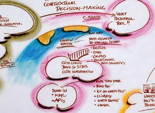


For two and a half days Regina created a mural that stretched around the room, a truly amazing sight. We watched it grow and many of us frequently went back to it to read up on what we had heard and to see it through Regina’s eyes.
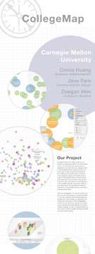


DD4me – the student project that took place in the months leading up to the conference this conference – offered students from around the world the opportunity to address the impact of statistics upon their lives.
The projects examined when, where and how statistics enter the Students’ lives, how they influence their interests and thus their decision-making, how the visual representation impacts on decision-making and what relevance statistics have to their lives. Students from eight Universities participated:
– Carnegie Mellon University, Pittsburgh, USA
– University of Applied Sciences Joanneum, Graz, Austria
– National Institute of Design, Bangalore, India

– Bauhaus University, Weimar, Germany
– Chapman University, Orange, USA
– Mälardalen University, Eskilstuna, Sweden
– Academy of Fine Arts, Krakow, Poland
– Wayne State University, Detroit, USA
Students were invited to participate in the DD4D conference and to present one poster of their Project.


We couldn’t have done it without them!
Gabriele Musella
Tommaso Catalucci
Georgio Caviglia
Elodie Bongrain

Lorenzo Fernendez
Azzurra Pini


Petra Isenberg
Marian Dörk
Markus Jaritz
Johanna Guggenberger
Philipp Sackl
Audrey Richard-Laurent
Lalao Rakotoniaina
Alena Morrison
IIID:
Lucie Jagu Martin Foessleitner


Veronika Egger
(from left to right)
OECD:
Lucy Hulett
Suzanna Grant Kejairi

Sylvain Fraccola
Lynda Hawe
(clockwise from top left)

Catharina Ballan created a series of photo collages especially for DD4D, which accompanied us in most communication material of DD4D.


Conference co-masterminds, communicators and orgainsers Martin Foessleitner and Lucie Jagu also produced postcards and invited delegates to write to their friends and families from the conference.
“Great conference, very enjoyable, lots of interesting speakers and topics, but too little time for discussion and explore some subjects in greater details”, commented conference delegates.
DD4D largely succeeded in its aim to bring together the disciplines, create a sense of community and give a glimpse of how to move on from slick visuals towards data that’s relevant and useful to people.
Next time - yes, we really want there to be a next time – we can move on to be focused on certain core areas. Maybe not in Paris, but wherever it will be, we have a good basis to build on and look forward to learning more for this exciting and diverse grup of people.
Editor and Content: Veronika Egger for IIID, International Institute for Information Design (IIID), Palffygasse 27/17, 1170 Wien, Austria
Conference organisation: Martin Fößleitner and Lucie Jagu, High Performance
Conference photographs: by Audrey Richard-Laurent and Lalao Rakotoniaina
Thanks to Aaron Marcus who kindly agreed to let us use some of his personal photographs.
DD4D-graphics and photo collage: Catharina Ballan, flussobjekte.at
Cartoons: Bruce Robertson

Layout: isdesign.at
Printed by: digitaldruck.at
