

ROAD TO FOREVER
PRINT CAMPAIGN + WEB CAMPAIGN
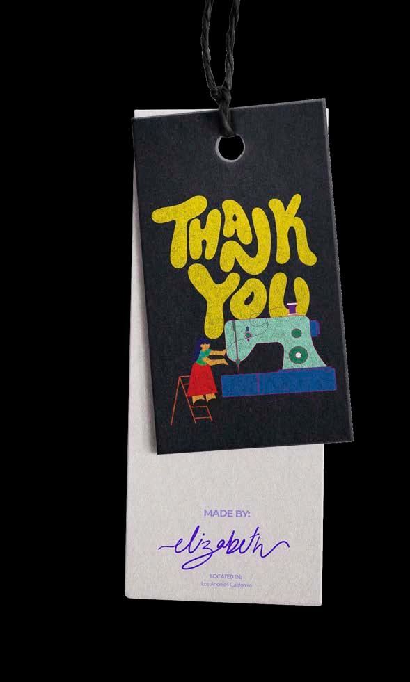
This is a Forever 21 campaign given to us from an art director. Bringing their concept to life with my own personal twist. The objective for this campaign is to showcase the appreciation the f21 team has for their employees. Showcasing it in a variety of mediums such as print, social media and web.


HANDMAIDS TALE
BOOK COVER REDESIGN + PRINT
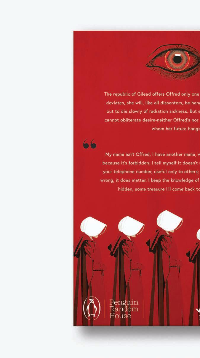
We were asked to redesign some well known books such as the infamous book “The Handmaids Tale” by Margaret Atwood. For this project I decided to take a very minimal approach to its design letting the images speak for themselves and leaving a feeling of uneasiness and desire.

POLAROID
PRINT + SOCIAL MEDIA CAMPAIGN
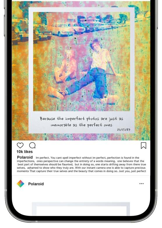
The “Developing Memories” campaign for Polaroid was created with the intent to showcase how in the imperfect lies something so beautiful. Because its not about the picture but the memories that were captured and sealed inside that white frame.




DIA DE LOS MUERTOS
EMBLEM DESIGN + MERCH DESIGN
El festival del Dia de los Muertos is a Latin tradition which is celebrated once a year on November 2nd. It is a day in which we honor our loved ones and celebrate surrounded by family while remembering all of the beautiful memories our departed have left behind. So come join us for this colorful festival and celebrate the people who have been in your life.


GATSBY CHOCOLATE
CHOCOLATE BAR REDESIGN + LOGO DESIGN
We were asked to redesign an existing chocolate bar packaging. For this redesign I decided to work with Gatsby, a low calorie chocolate bar. I decided to highlight the name and the status symbol associated with the brand showcasing a beautiful eye catching design.

Why did we set
make
chocolate with half the calories that tastes even better than full-sugar, full-fat brands? Well, it’s pretty simple: we like chocolate so much, we wanted to eat chocolate All. The. Time. Morning. Night. As much as we want
So we made GATSBY Chocolate and, in honor of the name, set out to make the richest chocolate on the market…without the calories. Cut the sugar. Cut the fat. Cut the calories. Keep the silky, melt-in-your-mouth texture & taste explosion. We would accept nothing less.
NUTRITION FACTS


SIMPLR
ICON SET + LANDING PAGE DESIGN

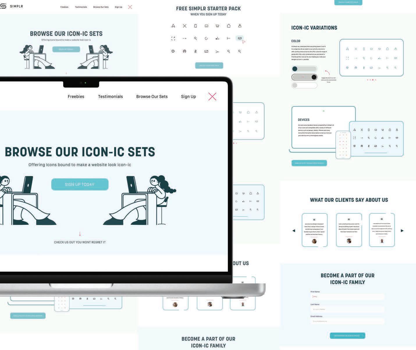
The company Simplr gave us the opportunity to create a landing page for them which promoted their icon-ic sets. We were also asked to create an icon set. This contained all of the basics for future web users which would be promoted on their site.
with some of our color and see what works best
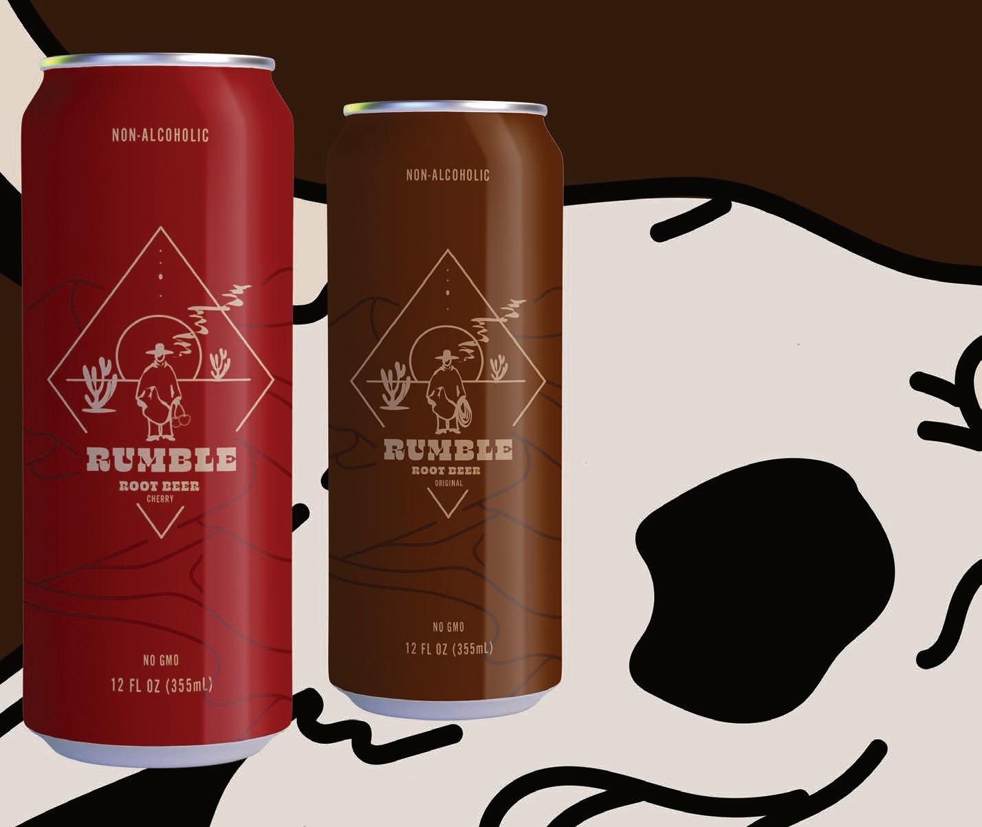
RUMBLE ROOT BEER
PRODUCT DESIGN + PRINT CAMPAIGN
Rumble Root Beer is a family owned company who asked us to create some packaging design as well as some poster designs for their newly launched flavored root beer company.



PHX OLYMPIC
PHX OLYMPICS + WEB DESIGN

This project consists of a responsive landing page design for the Phoenix Olympics. We try to convince the people of Arizona into agreeing to have the upcoming Olympics in the beautiful city of Phoenix. This showcases what Phoenix has to offer and the ideas we have in mind to make this happen.

