


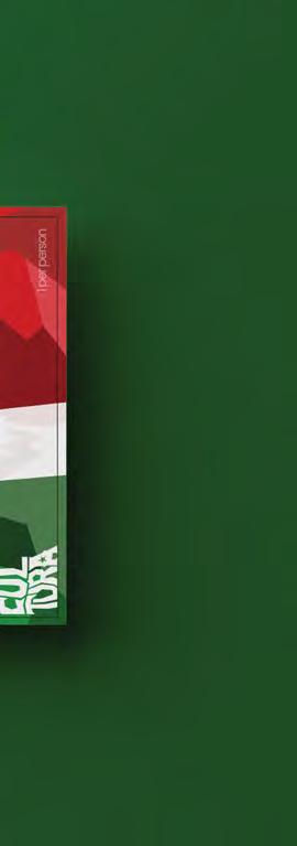
Cultura Gallery is an art gallery featuring some of the most exceptional artists in Phoenix. The gallery is a unique celebration of diverse art forms and mediums. Designing a powerful and memorable symbol that represents the essence of the gallery is paramount, as an emblem/logo is a crucial element when creating an event’s brand. To create the emblem/logo for Cultura Gallery, I drew inspiration from various Mexican art forms, including Aztec and Mayan iconography and traditional folk art, to imbue the symbol with cultural significance. The final logo is a sharpedged type form, radiating boldness
and creativity, reflecting the gallery’s diversity and artistic caliber. The “A” in the logo has a star, a symbol used throughout many of the other branding elements. To ensure the branding’s longevity, it was crucial to make it adaptable since the gallery is an annual event. The logo’s versatility allows it to be used across various mediums, as evident in the mockups. To showcase the versatility of the branding, I created mockups of a ticket, banner, mural, and t-shirt for the gallery. Each design emphasized the essence of Mexican art and its unique characteristics, making them a perfect representation of Cultura Gallery.


Within this campaign, I embarked on an extensive ideation process to create a new and distinctive logo for Hot Diggity Dog, a food truck located in the Phoenix metro area. The goal was to develop a logo that would enable the client, Matt Rover, to stand out in a crowded market and reflect the unique personality of his brand. To achieve this objective, I created 100 thumbnail designs, each one carefully crafted to provide a wide range of logo options for our client. The focus was on creating a logo that was both bold and memorable, something that would make Hot Diggity Dog stand out from its competitors.
The logo I created for Hot Diggity Dog features typography stylization that is bold and loud, perfectly reflecting the edgy and exciting nature of the brand. Also incorporated a striking graphic of a skull to add an element of excitement and intrigue. By combining these elements, we were able to create a logo that was both distinctive and memorable, perfectly embodying the spirit of Hot Diggity Dog. The logo design is a result of extensive ideation and careful consideration. It perfectly reflects the unique personality of the brand while also setting it apart from the competition.


This project primarily focused on innovative typography for the skincare company, Humanrace, founded by Pharrell Williams. The goal was to create a design that reflected the brand’s philosophy while emphasizing its product’s personalized benefits. To achieve this, I incorporated fingerprints as a visual metaphor. The
fingerprints were given a natural and distorted effect, reminiscent of a stamp, to add authenticity to the design. The result is a unique and visually compelling typographical design that aligns perfectly with the Humanrace brand.


The main focus of this project was to promote an old classic horror movie, and I chose “The Cabinet of Dr. Caligari” as the film to feature. This silent horror masterpiece was created in 1920 in Germany by Robert Wiene, and it continues to captivate audiences today. To promote this iconic film, I created a web page that includes a synopsis of the plot, a cast list, details about the director, a trailer for the movie, and an order form for interested viewers

to purchase the film. By providing all of this information on the web page, I aimed to entice audiences to discover this timeless classic and experience its eerie and chilling atmosphere for themselves. Overall, my project aimed to introduce a new generation of horror fans to “The Cabinet of Dr. Caligari” and ensure that this cinematic masterpiece continues to be appreciated for generations to come.


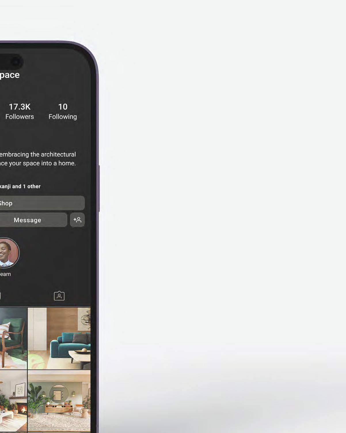
As part of our project, we were challenged to develop a brand from scratch and create a comprehensive marketing campaign to promote it. I developed the company “Eero Space”, an interior agency and shop based in Columbus, Indiana. Inspired by the architectural roots of design and layout pioneered by renowned architect Eero Saarinen, Eero Space is committed to Mid-Century Modern Design. Their goal is to provide clients with a seamless and stress-free experience when it comes to interior design, as well as offering a onestop-shop for all their home decor needs. The marketing campaign will highlight the unique brand, emphasizing the value it brings clients with our commitment to
exceptional design and unmatched customer service. By tapping into the growing popularity of Mid-Century Modern Design, it aims to showcase expertise and creativity in creating beautiful and functional living spaces. Eero Space is an exciting new brand that represents a fresh approach to interior design and decor. With a focus on Mid-Century Modern Design, committed to making the interior design process easier and more enjoyable for clients. The project included making a cohesive brand, website, social media marketing, blogs, & email marketing.


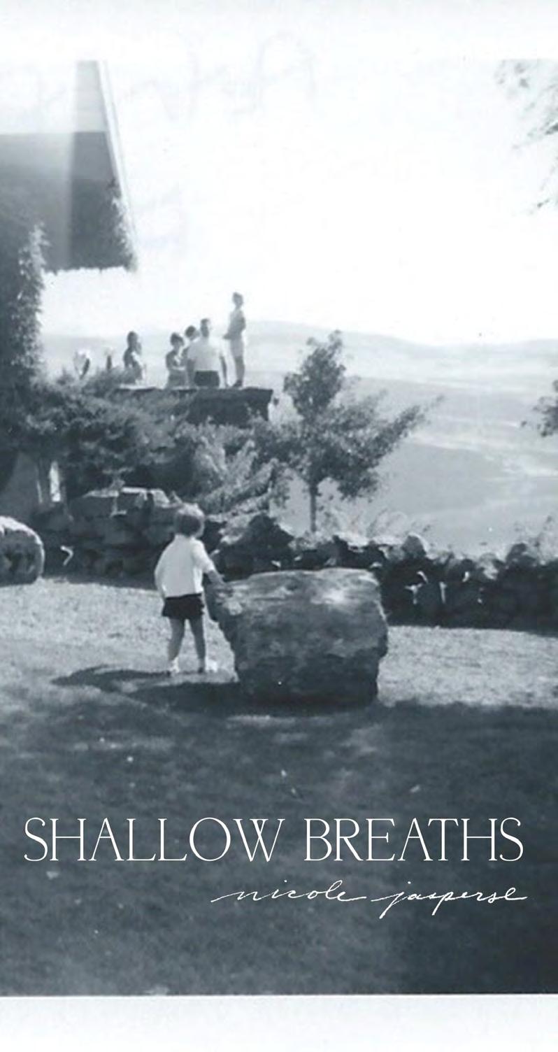
The primary emphasis of this project centered on layout, copywriting, and photography. I employed my personal photography and composed the entire article, placing particular emphasis on the imagery and the narrative that supports the message. In addition to layout, copywriting, and photography, I
also focused on crafting a compelling narrative that would resonate with our target audience. By using my personal photography and storytelling skills, I was able to create a cohesive and engaging article that effectively communicated the brand’s message and value proposition.


For this project, we were given the assignment to design a book cover jacket for J.R.R Tolkien’s “The Hobbit.” Our task was to develop three different styles for the cover: photographic, typographic, and illustrative. I ultimately decided to go with the illustrative style. To create the final product, I focused on highlighting the story’s dragon and featuring the main character, Bilbo, in its eye. I utilized a variety of textures to give the
cover more depth, including a cracked stamp effect to make it appear weathered. In addition, I incorporated a smoke effect into the title, making it appear as though it were coming out from the dragon. Overall, I am pleased with the final product and believe it effectively captures the essence of the story while also standing out on the bookshelf.


623.755.4599