
PORTFOLIO
Tory Barden 2020-2024STELLAR THERAPY PODS
UX & Product Design
Stellar therapy pods are high-tech, rentable spaces which provide a quick, easy, and affordable alternative therapeutic escape. Stellar is a new mobile and tablet application combating the mental health crisis by helping users experience therapy in their daily lives.



4202 A DDY AWARD WINNER














The Daily User SARA CONNELL
34 years old


Meet Sara Connell, a 34 year old marketing executive from Denver, Colorado. As a hard working mom of 3 children, a manager at her company and a full time employee, Sara understands the importance of mental health. Sara has struggled with depression and anxiety her entire life and finds a way throughout her day for therapy. She uses the stellar pods daily at her office space.


DJU S TABLE LIGH T S

Stellar is a truly unique product which provides an all encompassing therapy experience for its users. Mental health is a huge crisis in the United States, and alternative therapies present a cheaper way for people to receive healthcare. Being fascinated by high-tech rentable spaces and alternative therapies, I invented the stellar product as a viable solution to address the mental health crisis. This project included
a mobile application helping users customize and rent the pods, and a 3D model and animation of the pod showcasing its various features such as the digital thermostat which controls the tempurature of the pod, the adjustable light fixtures, the scent diffusor, and the zero-gravity chair. This product was submitted to the Phoenix ADDY awards and won silver in the interactive application category.


PITCH DECK
The final deliverable was a pitch presentation in which the design solution was consolidated to be shown to the client. Connecting all the dots together, I created the cohesive product, Stellar.
LITTLEBIRD APP REDESIGN
LevelUp | UX Design
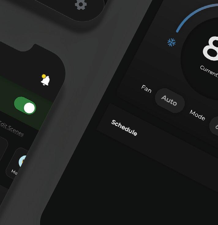
The LittleBird application was in need of a re-brand. I was the lead designer on this project at LevelUp, and was tasked with redesigning many of the major problem areas of the application. This included the notification hub, the devices page, and device specific interfaces.




BEFORE


The LittleBird application utilizes dark mode throughout its ecosystem.
The LittleBird user uses the homepage to view all happenings within their home. They manage things like their door locks, light fixtures, and the

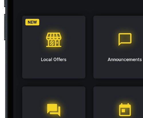

guest access of the household. Our design team worked on making the home page more interactive, upfront and helpful for the user. Our focus throughout this feature was to improve application engagement for the




AFTER









user. Making the devices page more interactive and easier to use was the at the forefront of our minds when designing these new interfaces. I brought new life and fun into this application through gamification and
the addition of customization for the user. Some of the major features of this project included scene/routine integration, updated device UI, and a new notification center.
VALLEY METRO REDESIGN
Web Design
After the COVID-19 pandemic, public transportation took a major hit. The valley metro of the greater Phoenix Area experienced this significantly. In order to bring travelers back to the metro and fix the income gap, valley metro instituted a new initiative: coming back to a clean metro. With a

promise of a new and improved environment, the Metro requested a website redesign showcasing their goals and inviting travelers back into their stations. This project included a redesign of the brand guide, and an incorperation of new initiatives for the company.


SKYGUIDE
UX & Product Design
SkyGuide is an Airport way-finding product I designed to help ease navigation stress by providing detailed airport maps, utilizing augmented reality and LED calculated navigation to help users traverse and understand the airport environment.


The Infrequent Flyer CAMERON WHITE
72 years old
Cameron White, a 72-year-old retired accountant, typically spends his days at home but occasionally ventures out on trips with his wife. However, Cameron faces several challenges: he struggles with directions, has a fear of flying, and experiences limited mobility. As a senior citizen, Cameron is acutely aware of the stress associated with airport travel. He seeks a product that can assist him in planning his trips, mapping out routes, and navigating airports effectively.


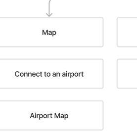
I strongly believe that conducting field research and interviews is the most effective approach to gather information on any given subject. As a designer, these interactions enable me to empathize with potential users of a product. In the case of SkyGuide, I engaged in conversations with a customer service representative at Denver International Airport, which happens to be one of the busiest airports globally. Through this insightful discussion, several significant factors contributing to the stress of airport travel were identified: Architecture, Population, and Signage.






02 DESIGINING IN 3D
The SkyGuide product provides 3-dimensional maps allowing for users to explore the airport before they arrive. 3D maps allow for better spacial awareness and a higher level of detail.


SkyGuide makes airport travel easier providing various forms of innovative navigation.


PITCH DECK
This project culminated in a final presentation showcasing the research, ideation, personas, and prototypes which went into the SkyGuide product.
E-COMMERCE CAMPAIGN
Branding & Web Design
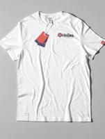
Helios Churros is a Greek churro company located in Santa Fe, New Mexico. This project was part of my content management systems class, where we were assigned a company and its name. Our objective was to create a brand identity and establish a web presence for the company.


BRANDING
As Santa Fe boasts a culturally vibrant environment adorned with vivid colors, I aimed to reflect the beauty of its landscape in the brand. Therefore, I incorporated hues of reds and oranges into the sun logo symbol, capturing the essence of the region’s scenery.






WINNER


INTERACTIVE WEBSITE
Web Design
For numerous years, the California wildfires have devastated the desert landscape. My assignment involved delving into the history of these fires, crafting a compelling article, and designing an interactive website




to narrate the distinctive stories of the affected individuals. Alongside ensuring the website’s responsiveness, it was submitted to the Phoenix ADDYS and received a bronze award for interactive web design.


LITTLEBIRD CALENDAR
DESIGN
LevelUp | UX/UI Design
LittleBird is an all-in-one smart home product that provides its users with a comprehensive all-in-one property management platform. LittleBird services property managers, dealers, and administration with unique needs and pain points.
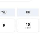
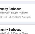
A lot goes on within a multifamily apartment complex. There are reservations, pool parties, and neighborhood sales throughout the month. However, for the property manager, there was no solution which presented all of these events into one calendar, thus causing overwhelm for managers trying to stay organized.








CUSTOMIZED VIEWS
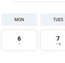
I designed a month view for the calendar allowing the manager to see all events, reservations, and schedules throughout the month for their property, allowing them to organize and customize their schedule to fit their unique needs.
Week and day views were also designed to allow the user to narrow down the information they are looking at. This project was uniquely designed with responsiveness in mind so that a manager could edit their calendar throughout their day.
FORTE UX & Product Design

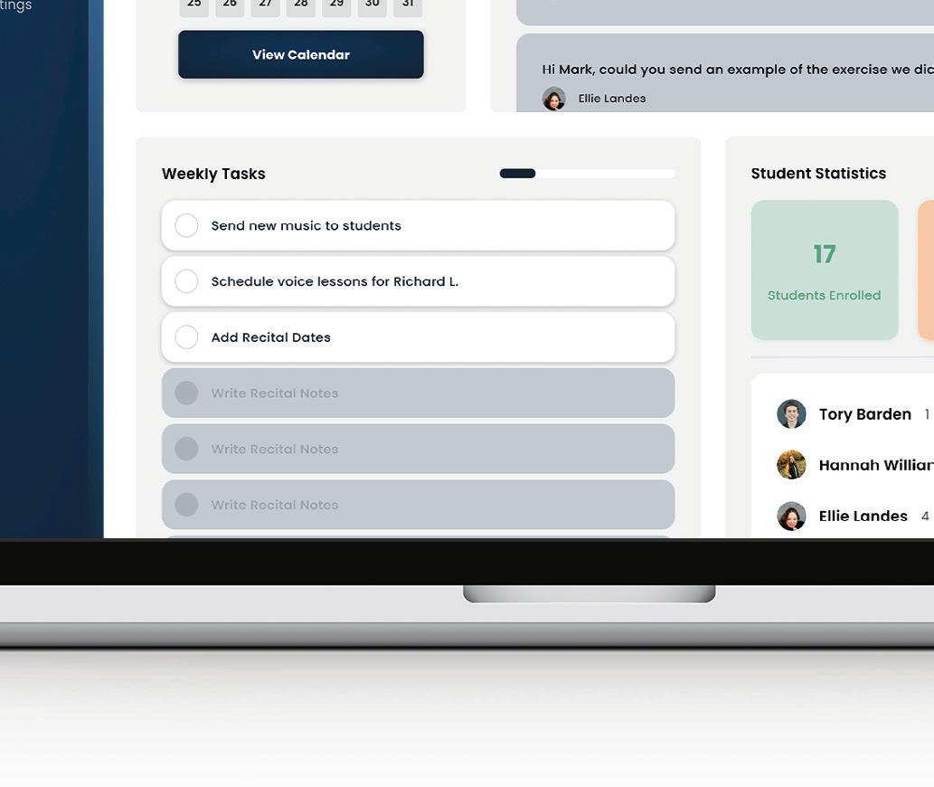
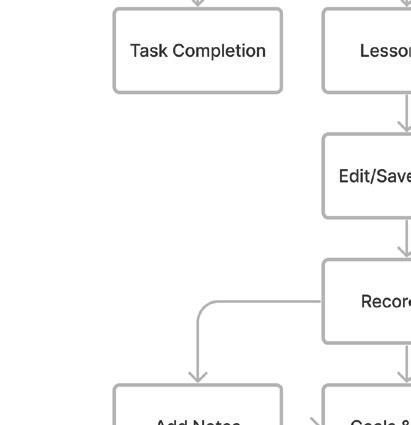
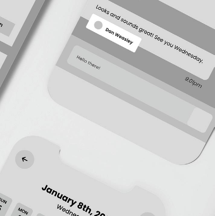
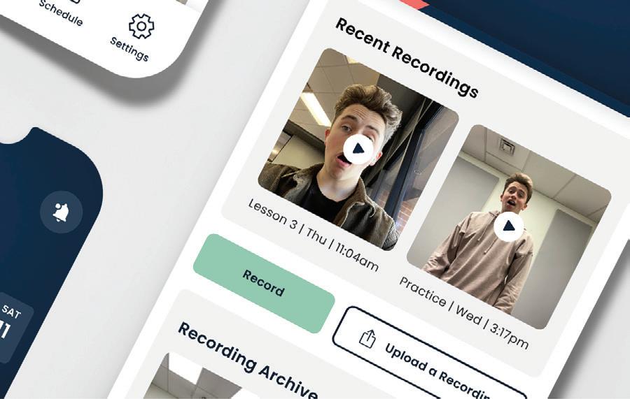
Forte is a new mobile and desktop product powered by generative AI and digital mirror technology to help music students and teachers be more efficient in their lessons. Fortes goal is to connect students and


teachers through technology allowing for a more effective private lesson environment. Inside the forte application, students can record themselves, view old recordings and receive feedback from their teacher and AI.


TYPOGRAPHY
Greycliff - Regular
UI ELEMENTS
PHOTOGRAPHY


The Student TORY BARDEN
As a college student, I lead a hectic music-filled life, balancing commitments across three choirs and weekly lessons. I have over a decade of choir experience and approximately eight years of voice lessons under my belt. However, my journey to this point hasn’t been straightforward. I’ve encountered numerous challenges typical of music students, and I’m eager to find ways to optimize my lesson experience, ensuring that I make the most of the time and money invested in my private instruction.


The Instructor MARK
FEAREY
Mark Fearey is a highly experienced faculty member at GCU, renowned for his exceptional piano expertise. With over 30 years in the industry, Mark has collaborated with notable figures such as Emma Stone and Kimiko Glenn. As an instructor, Mark handles a demanding schedule, mentoring over 20 students each week. He expressed keen interest in leveraging AI for coaching and a centralized platform to streamline student management, recognizing the potential for significant benefits in his teaching.







ADVERTISING





Advertising played a pivotal role in this project. I developed print advertisements specifically tailored to educators and designed a landing page for online advertising purposes.


PITCH DECK
This project culminated in a final presentation showcasing the research, ideation, personas, and prototypes which went into creating the final Forte product.


SELF-GUIDED TOURS
LevelUp | UX Design
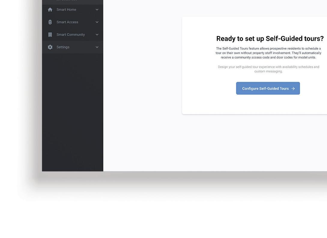
During the COVID-19 pandemic, multifamily properties experienced a major decrease in new-resident engagement. Turning to new technology, the idea of a self-guided tour emerged. I had the pleasure of working
with a team of designers on an automated self-guided tour feature for potential residents and managers. The user signs up for a tour of the property online and have a fully self-guided, no-contact tour.






The property manager has a customized interface allowing them to determine which of their units were avaliable to tour, tour duration, time and date, and the messaging the tourist recieves as they tour the model.


