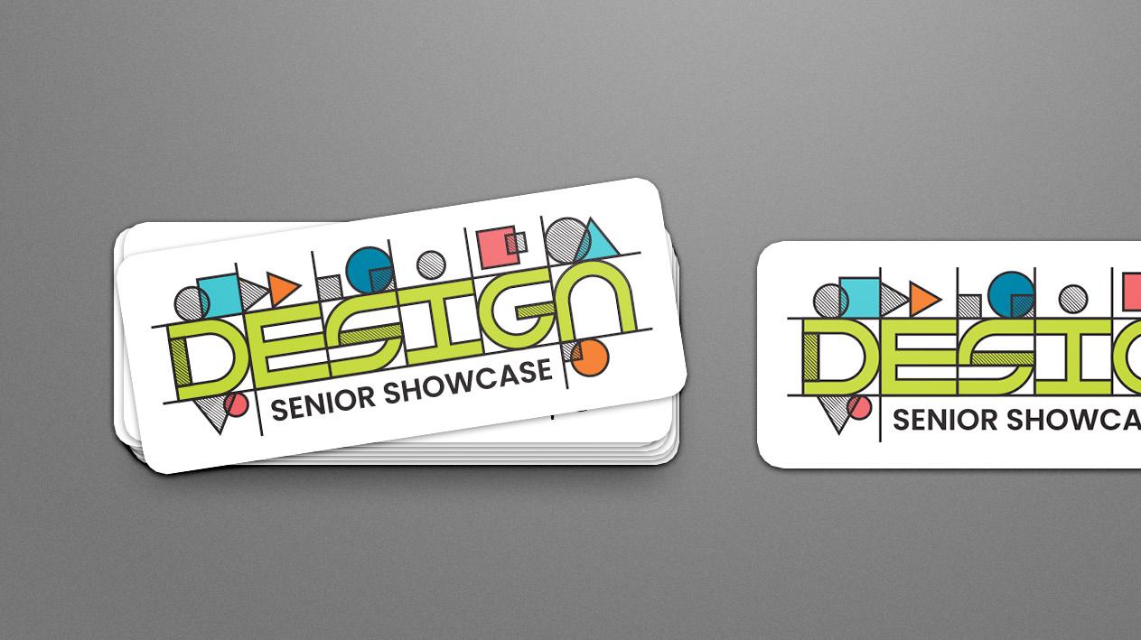
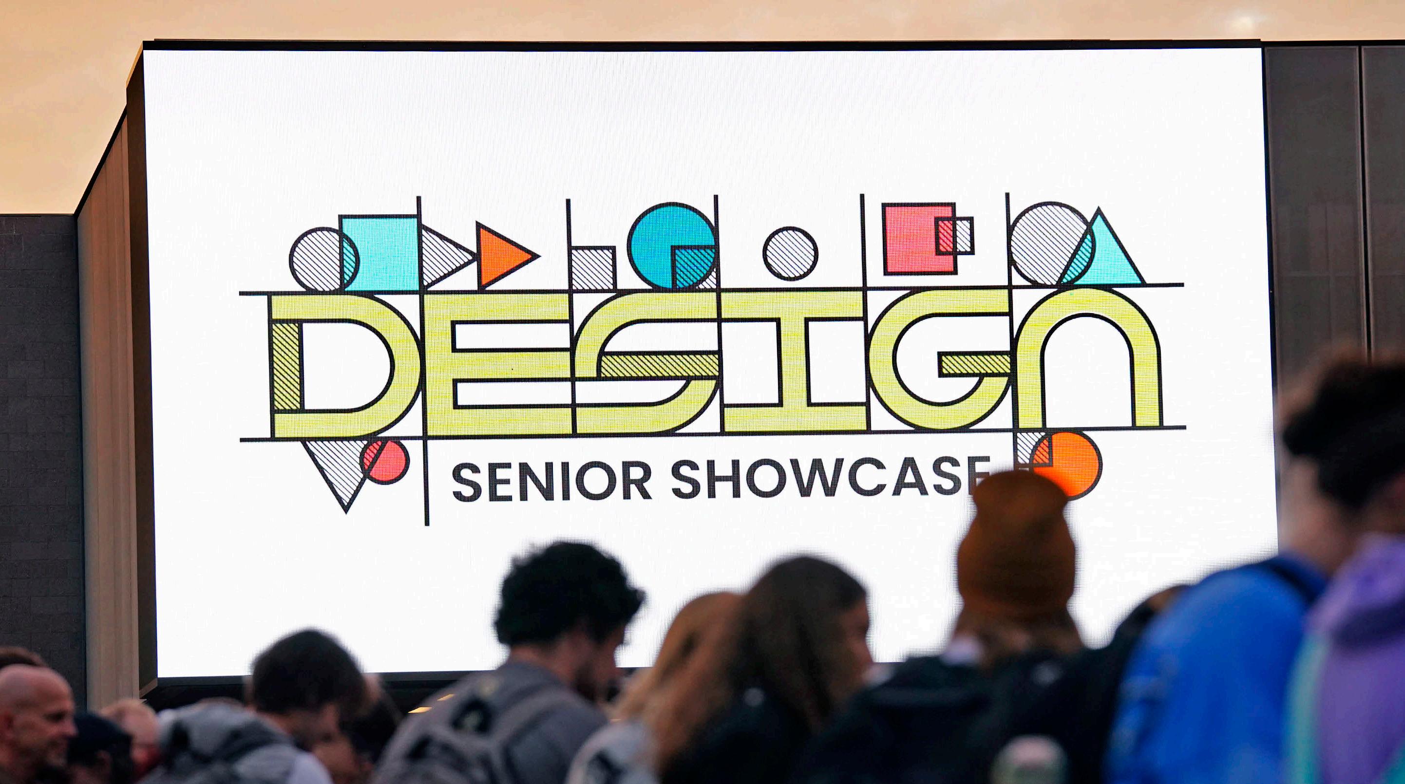
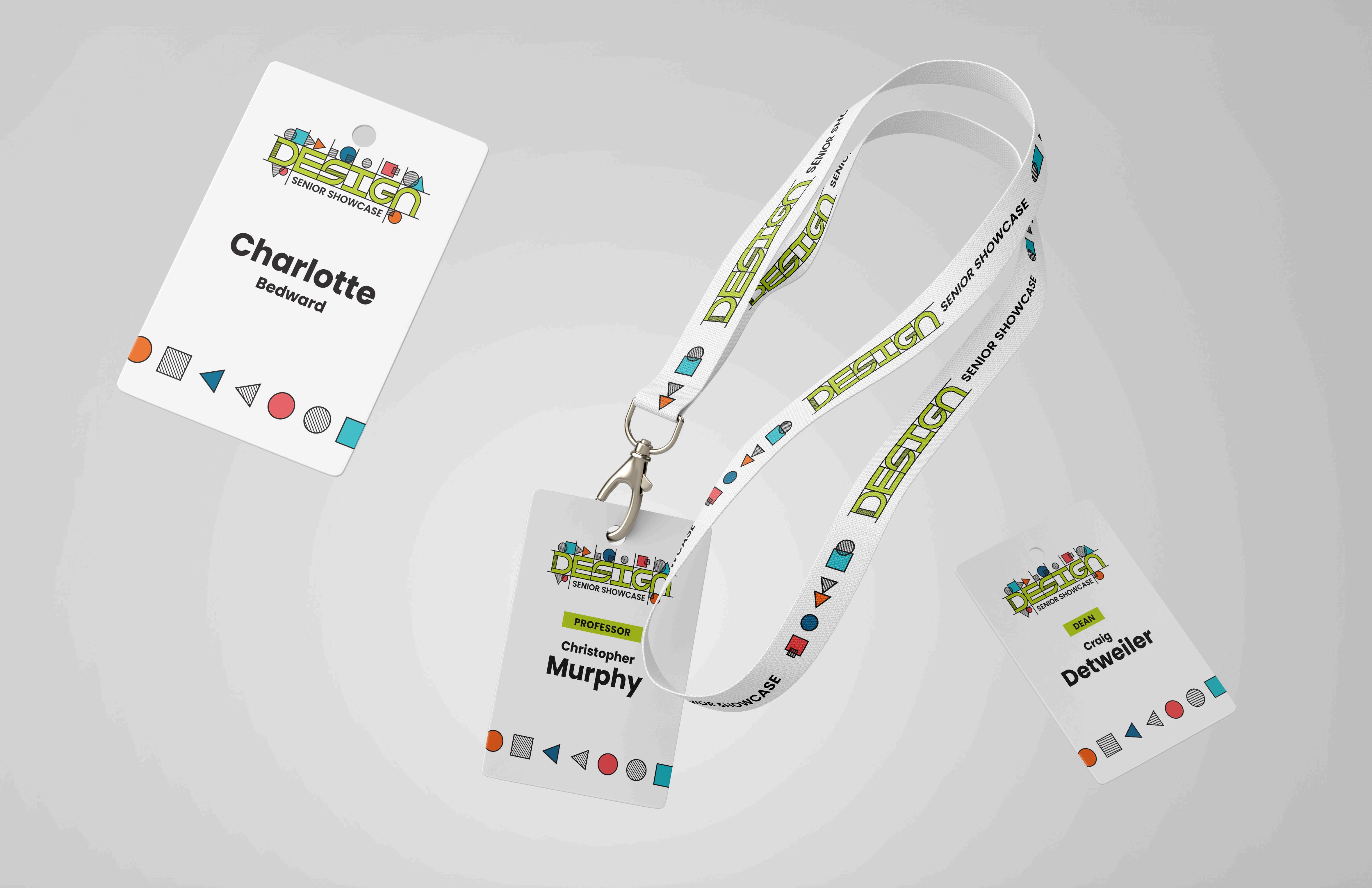
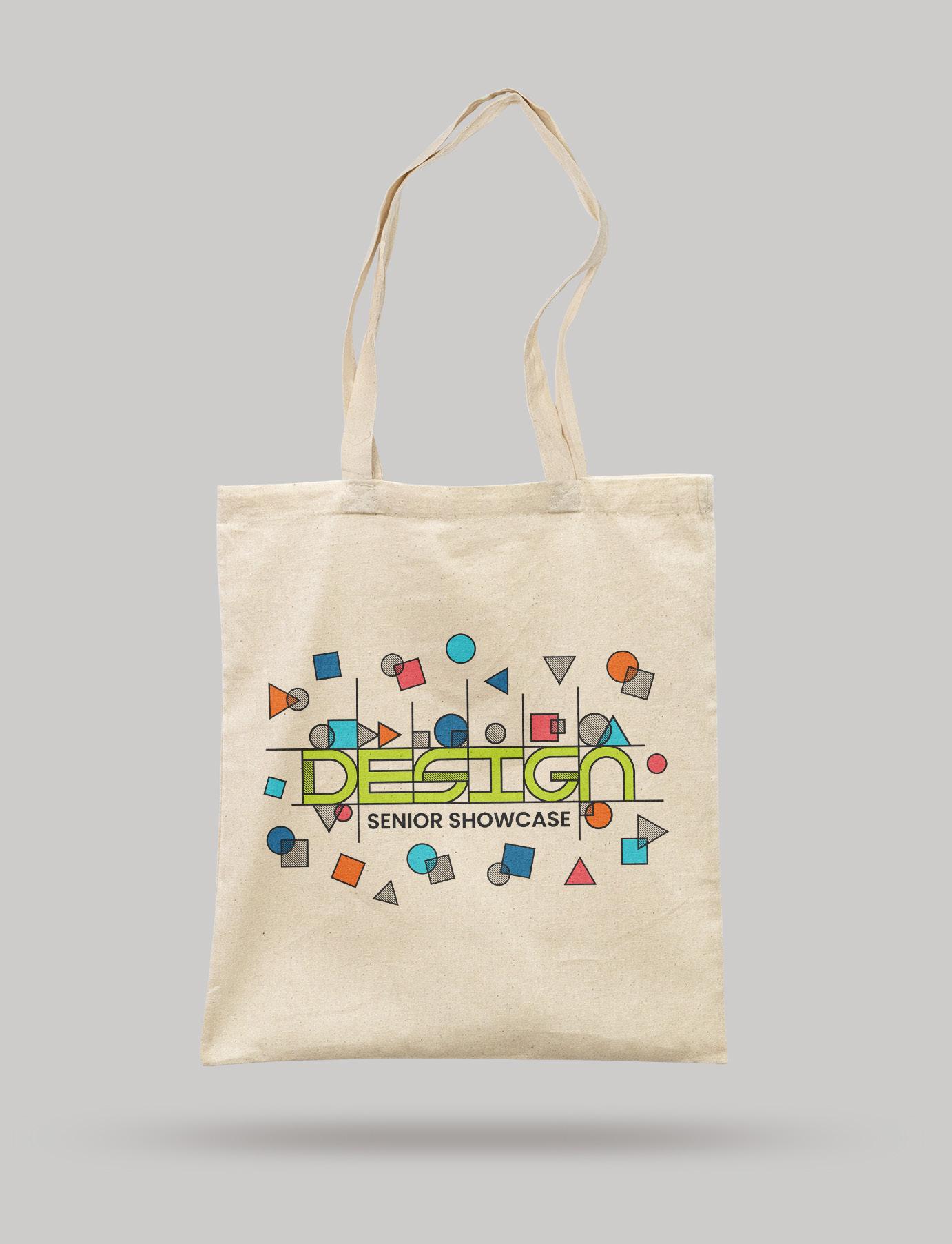
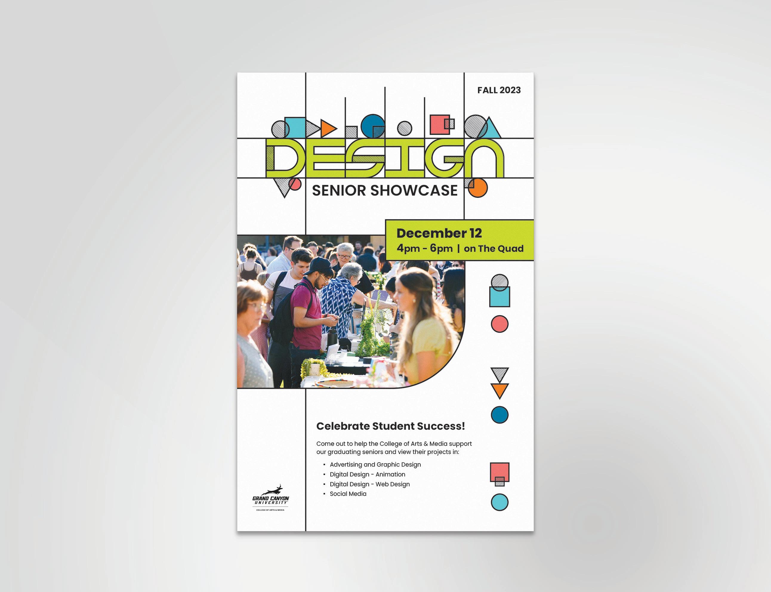
SENIOR DESIGN SHOWCASE
THE CHALLENGE
This project was completed while I worked at Canyon Creative. The College of Arts and Media (CAM) at Grand Canyon University required a new event logo, tote bags, lanyards, stickers, and posters.
The challenge was creating event branding that would represent the varying majors within GCU’s Design department.
THE SOLUTION
To represent all the majors (graphic design, web, animation, social media), I used simple shapes and lines foundational to all types of design. The new logo symbolizes creativity with structure and playfulness.
Ai
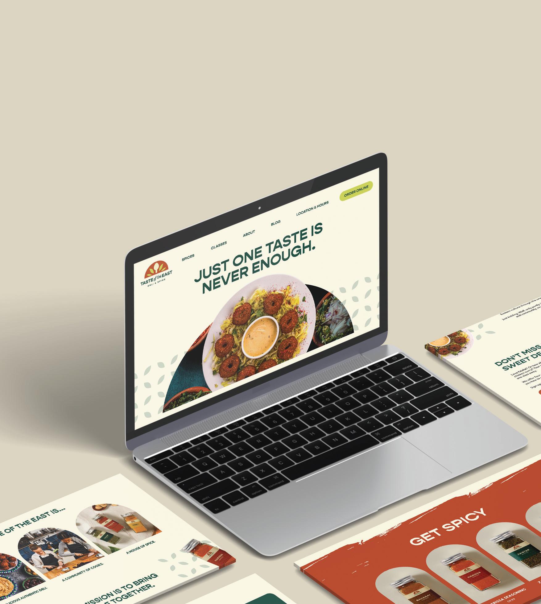
TASTE OF THE EAST CAMPAIGN
THE CHALLENGE
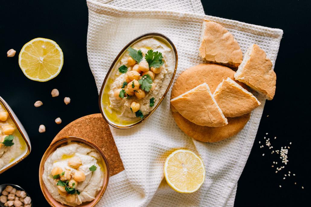
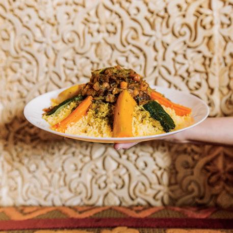
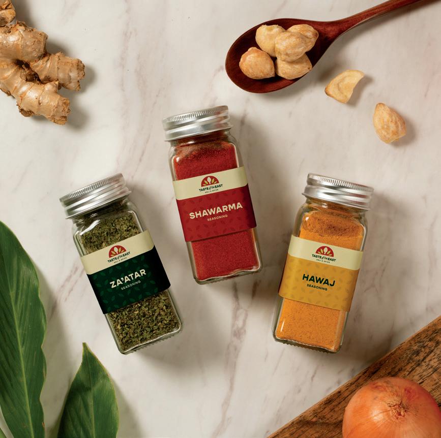
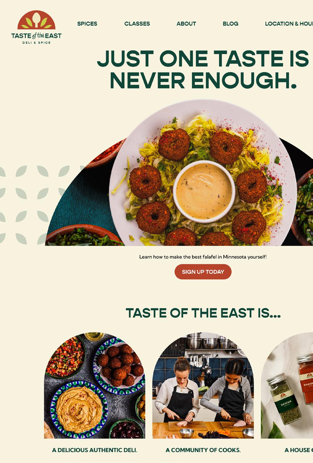
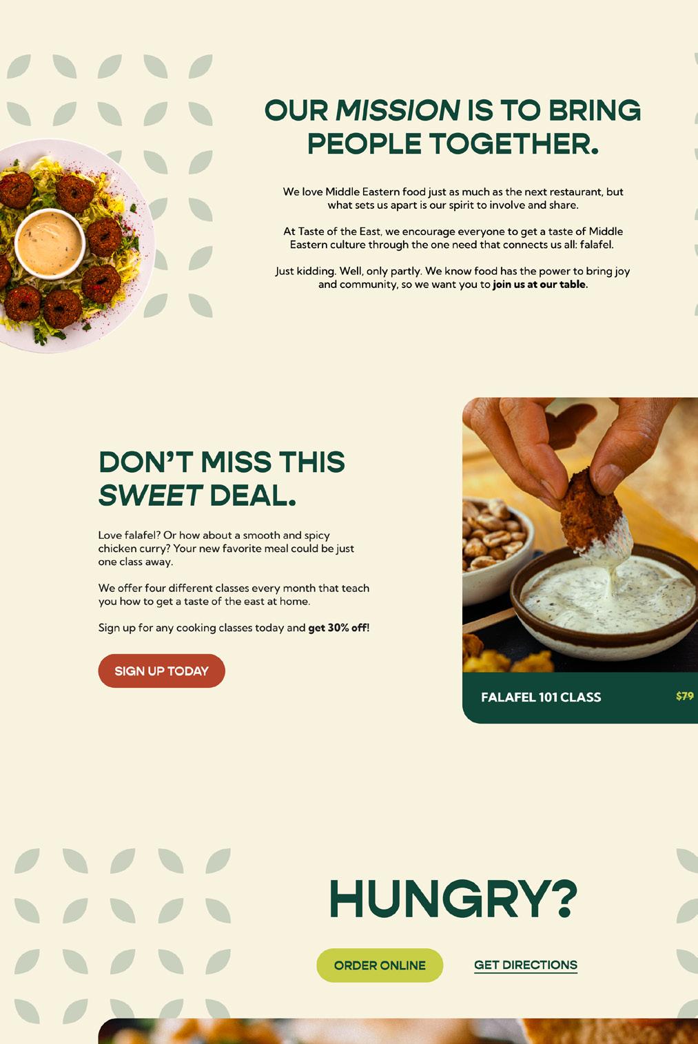
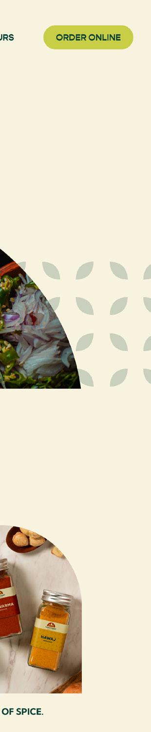
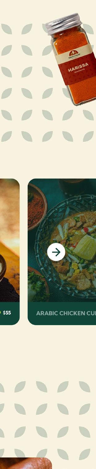
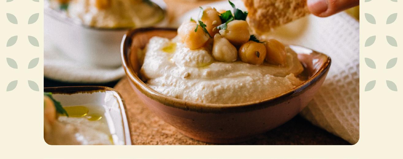
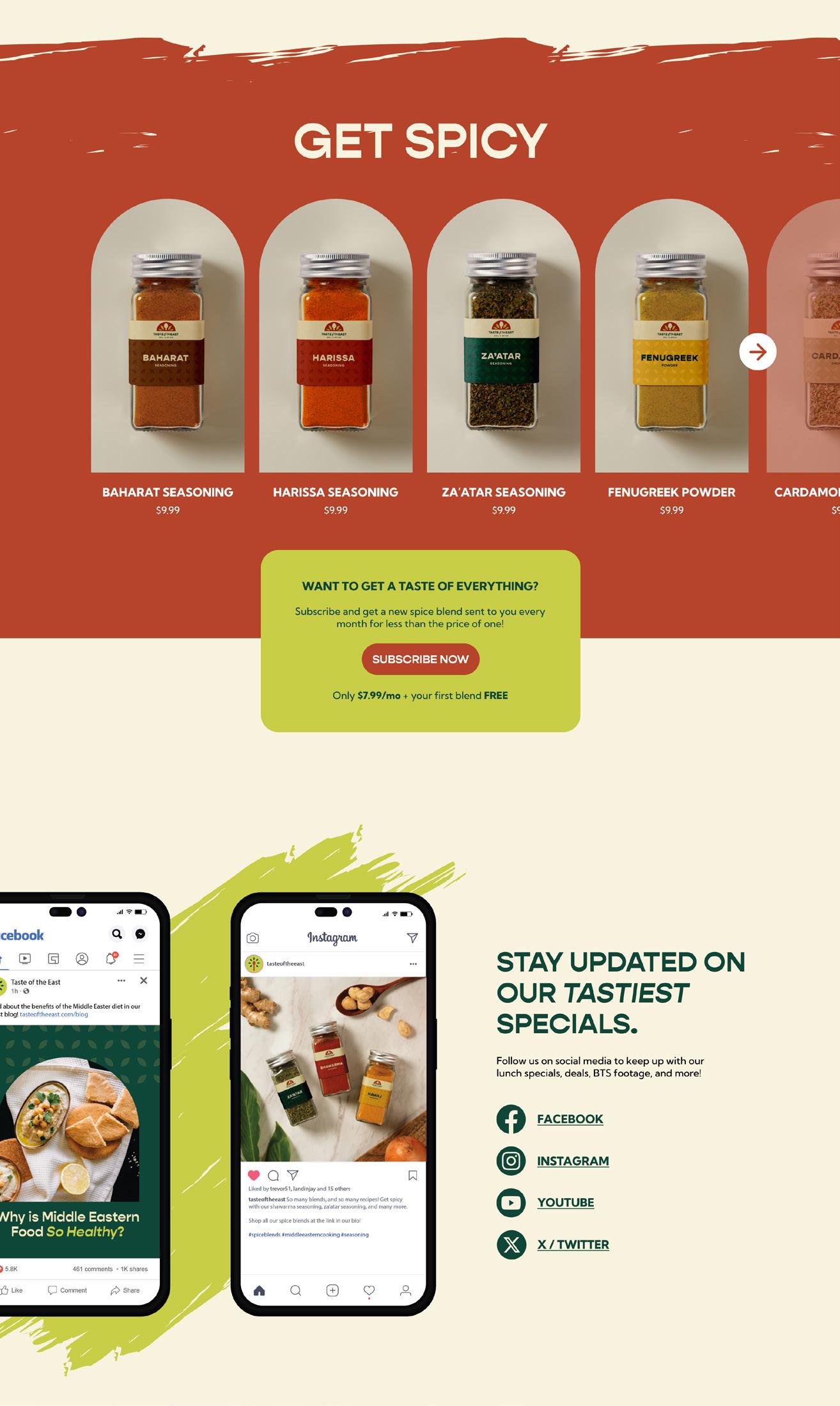
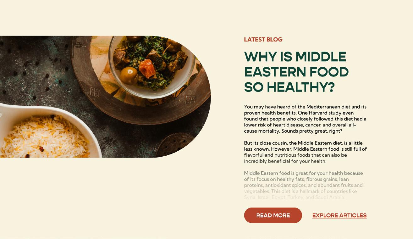
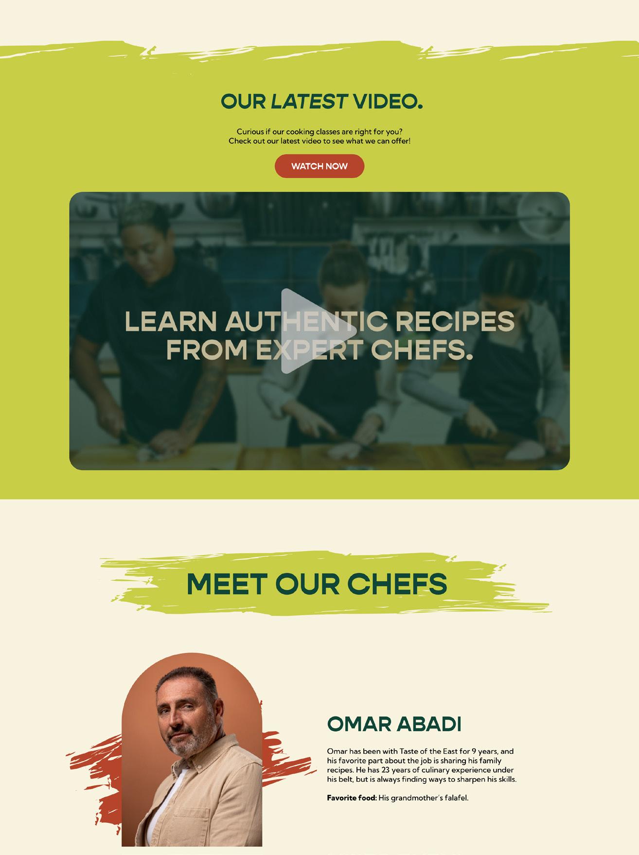
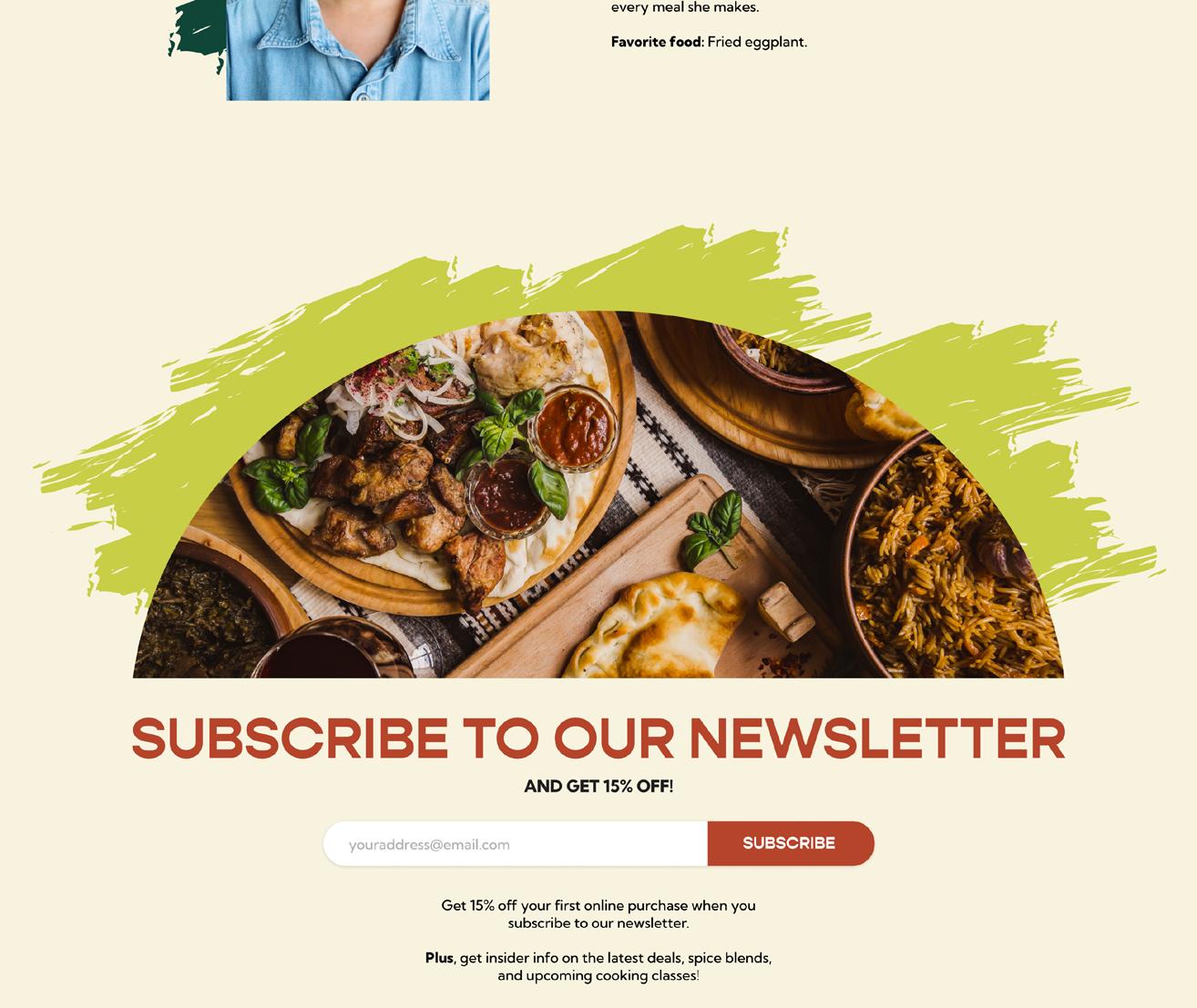
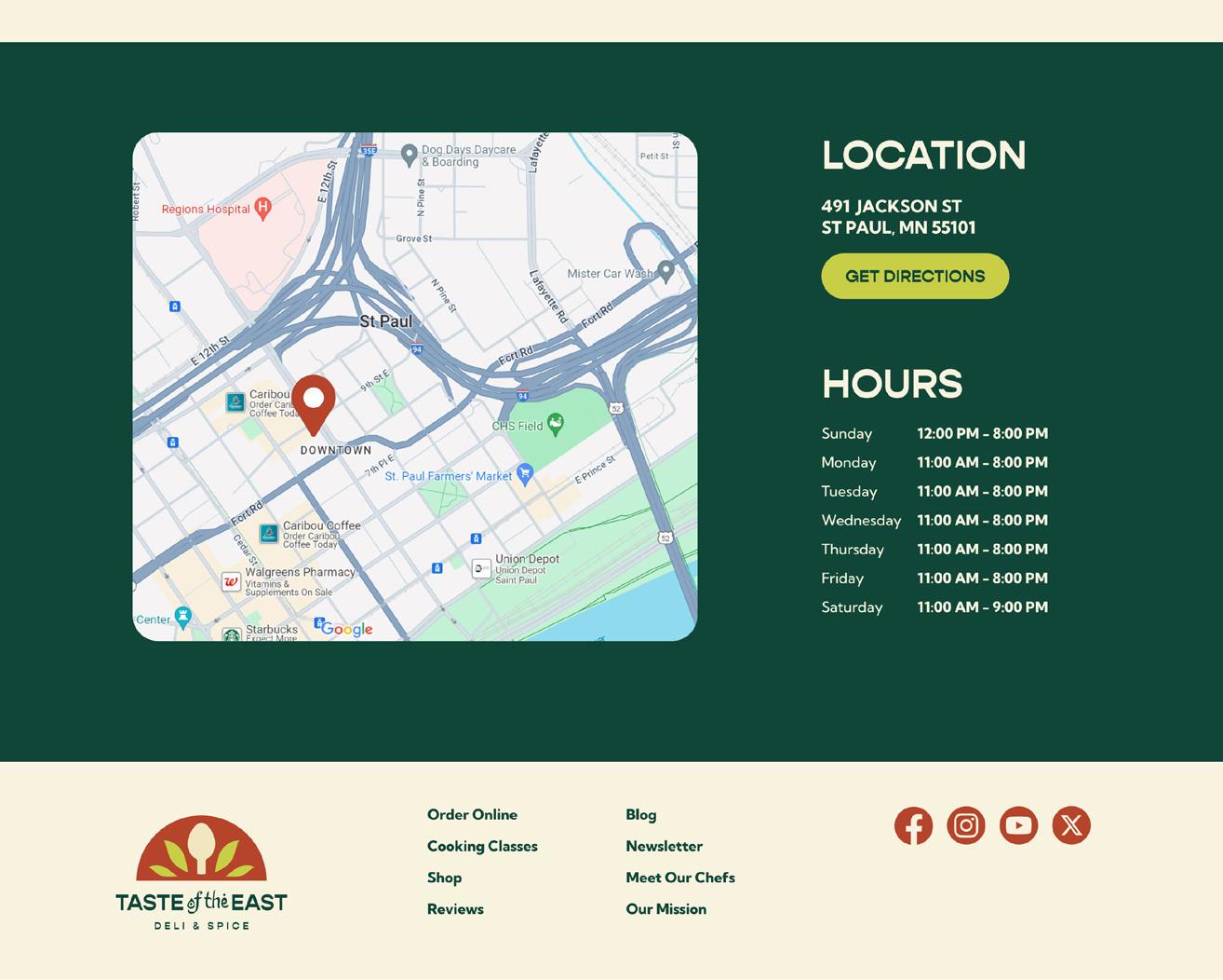
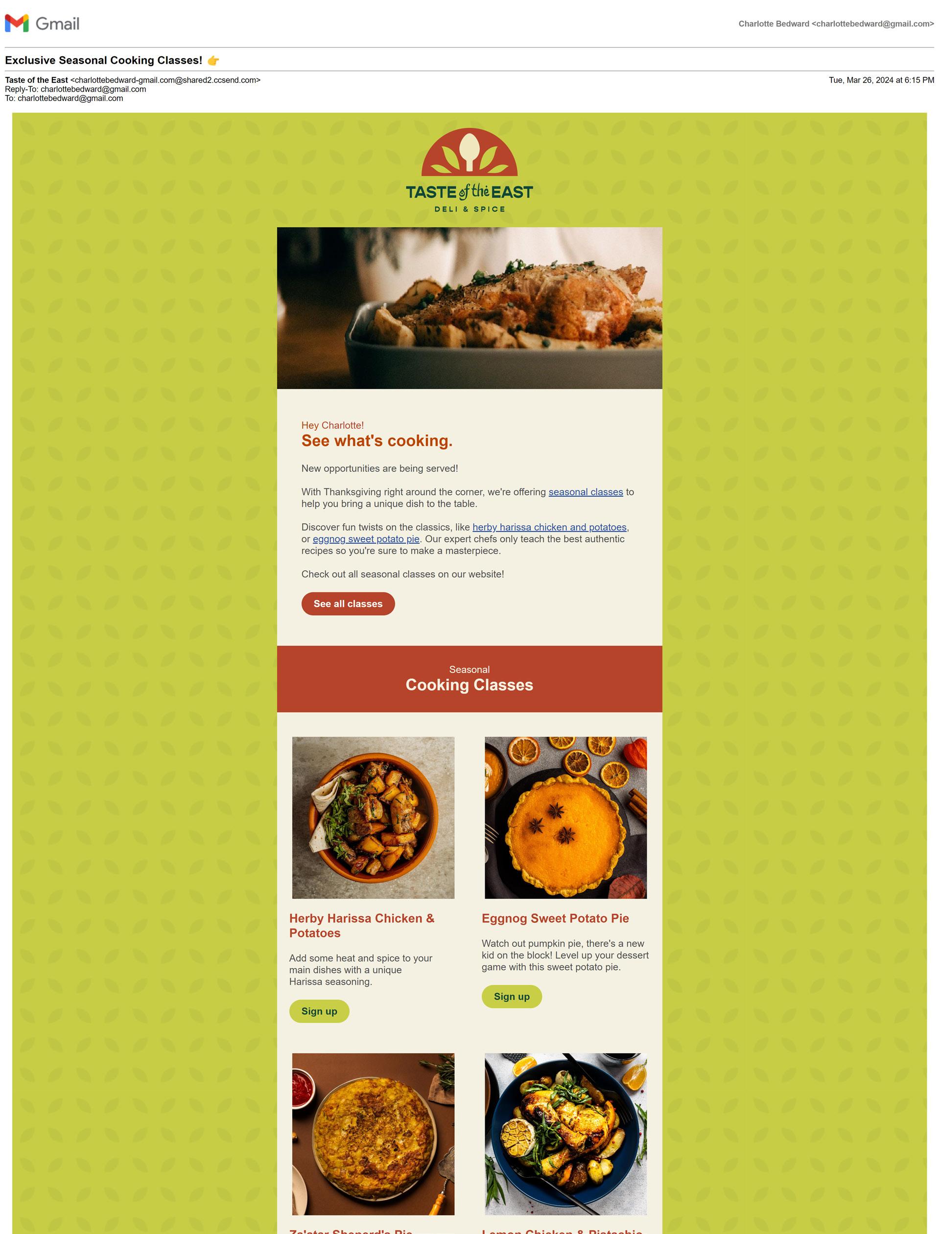
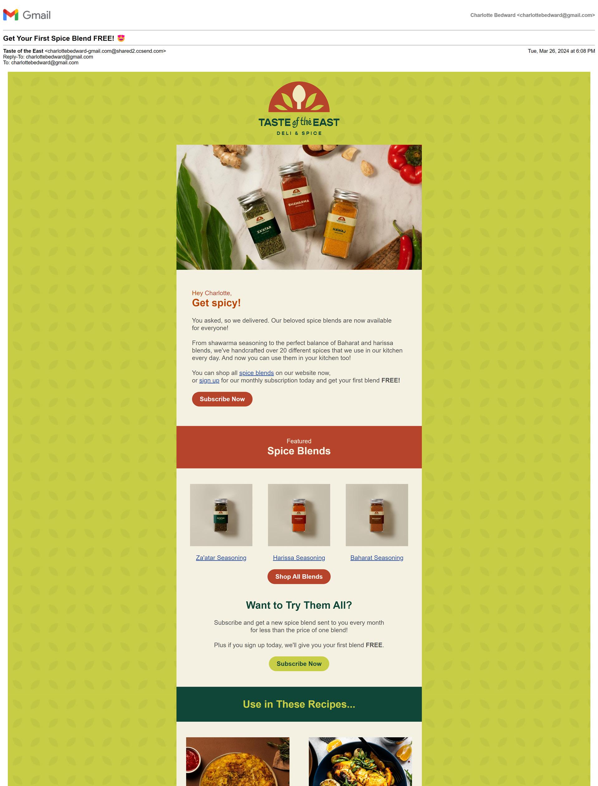
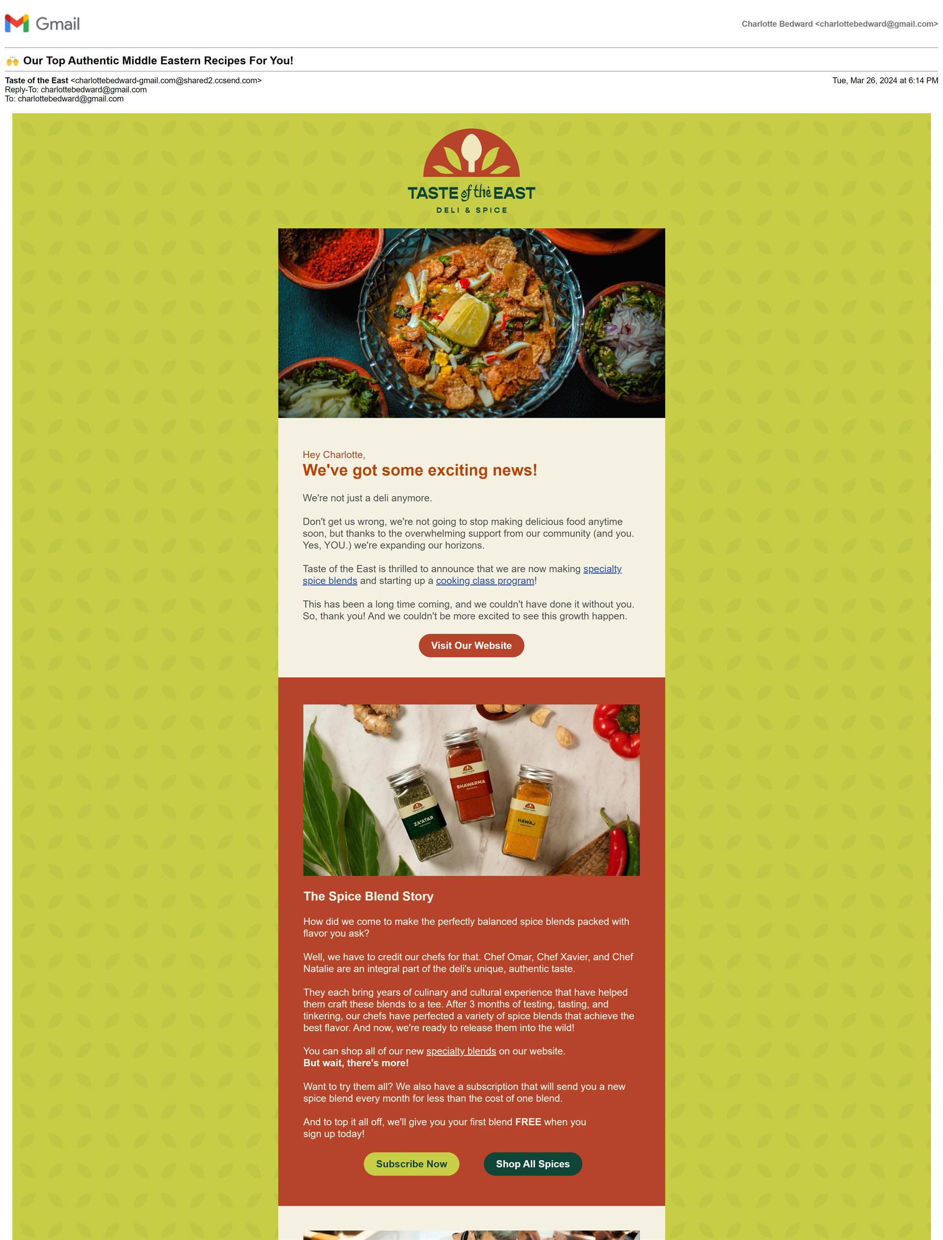
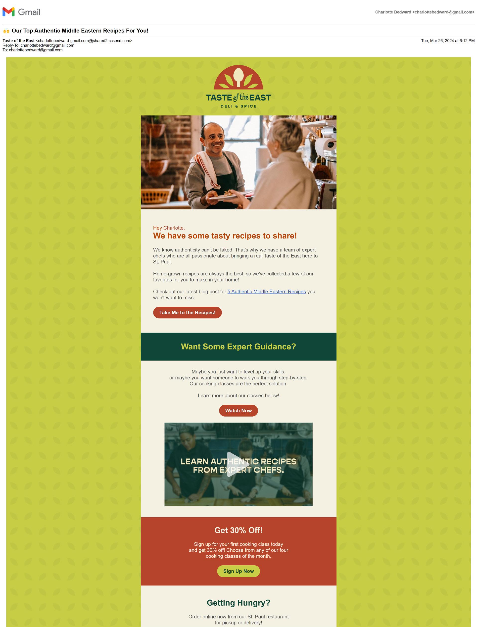
Taste of the East is a Middle Eastern deli and spice business that required a full brand identity, marketing strategy, and marketing materials. This hypothetical restaurant desired to expand into selling spice products and offering cooking classes, so the campaign needed to increase awareness and generate sales.
THE SOLUTION
I created and implemented a marketing strategy that reached the target audience on several platforms and stages of the sales funnel. The logo incorporates a spoon for their deli/restaurant and leaves for their spice products. The rich colors are inspired by the herbs and spices used in Middle Eastern cooking.
This campaign involved branding, a website, social media content, email marketing, blog articles, web banners, a content calendar, and a pitch deck all aligned with the strategy.
Ai Id Ps
Read about the bene ts of the Middle Eastern diet in our latest blog! tasteoftheeast.com/blog Taste of the East 1h Like 5.8K 461 comments 1K shares Comment Share 87 Why is Middle Eastern Food So Healthy? With Thanksgiving coming up, it might nally be time to brush up on those cooking skills. Learn how to make classics with a twist and impress the whole family! Check out our special Thanksgiving cooking classes today. tasteoftheeast.com/classes/thanksgiving 1 Brin ble . What’s happening? Liked by trevor51, landinjay and 15 others tasteoftheeast So many blends, and so many recipes! Get spicy with our shawarma seasoning, za’atar seasoning, and many more. Shop all our spice blends at the link in our bio! #spiceblends #middleeasterncooking #seasoning
tasteoftheeast
EMAIL
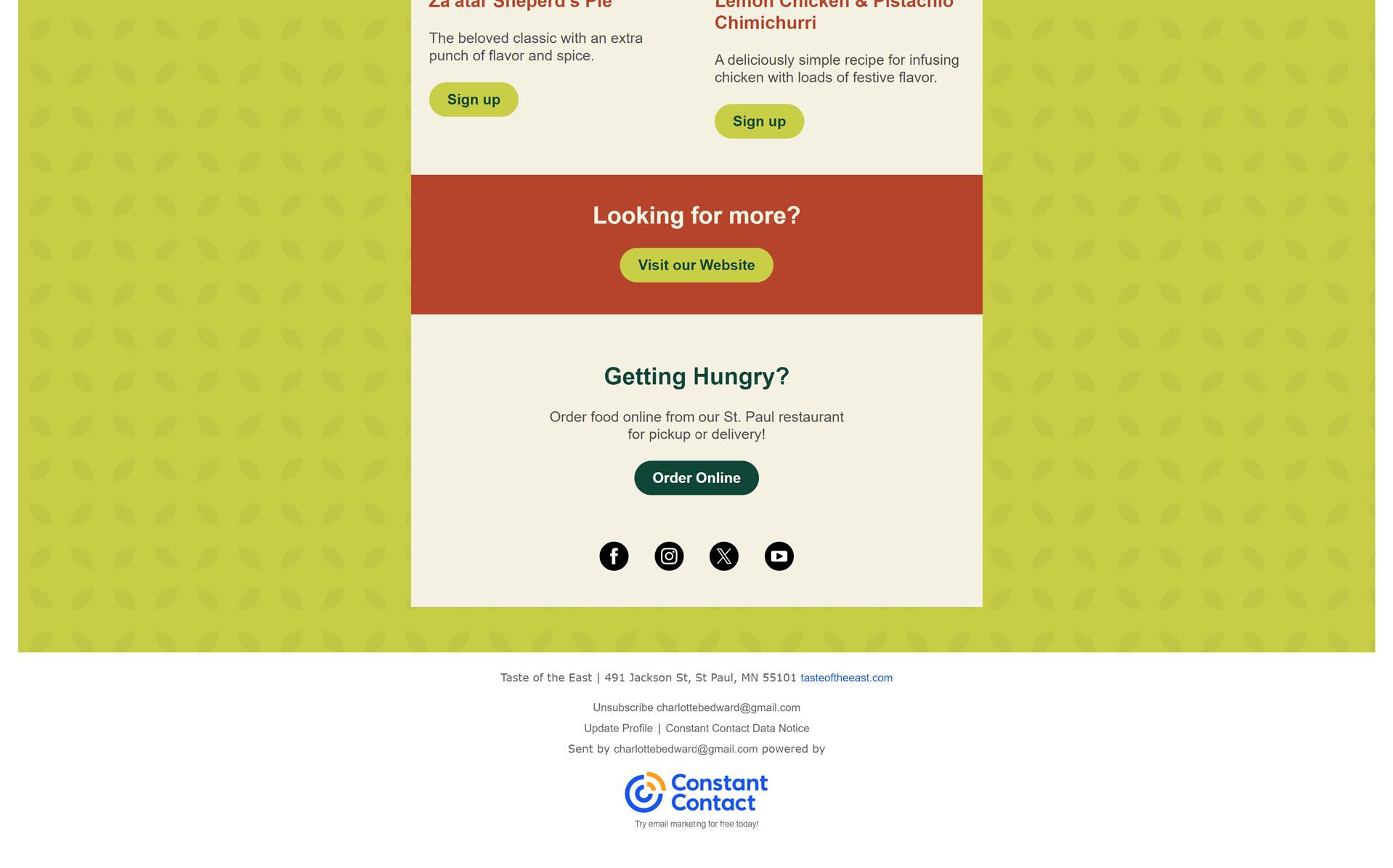
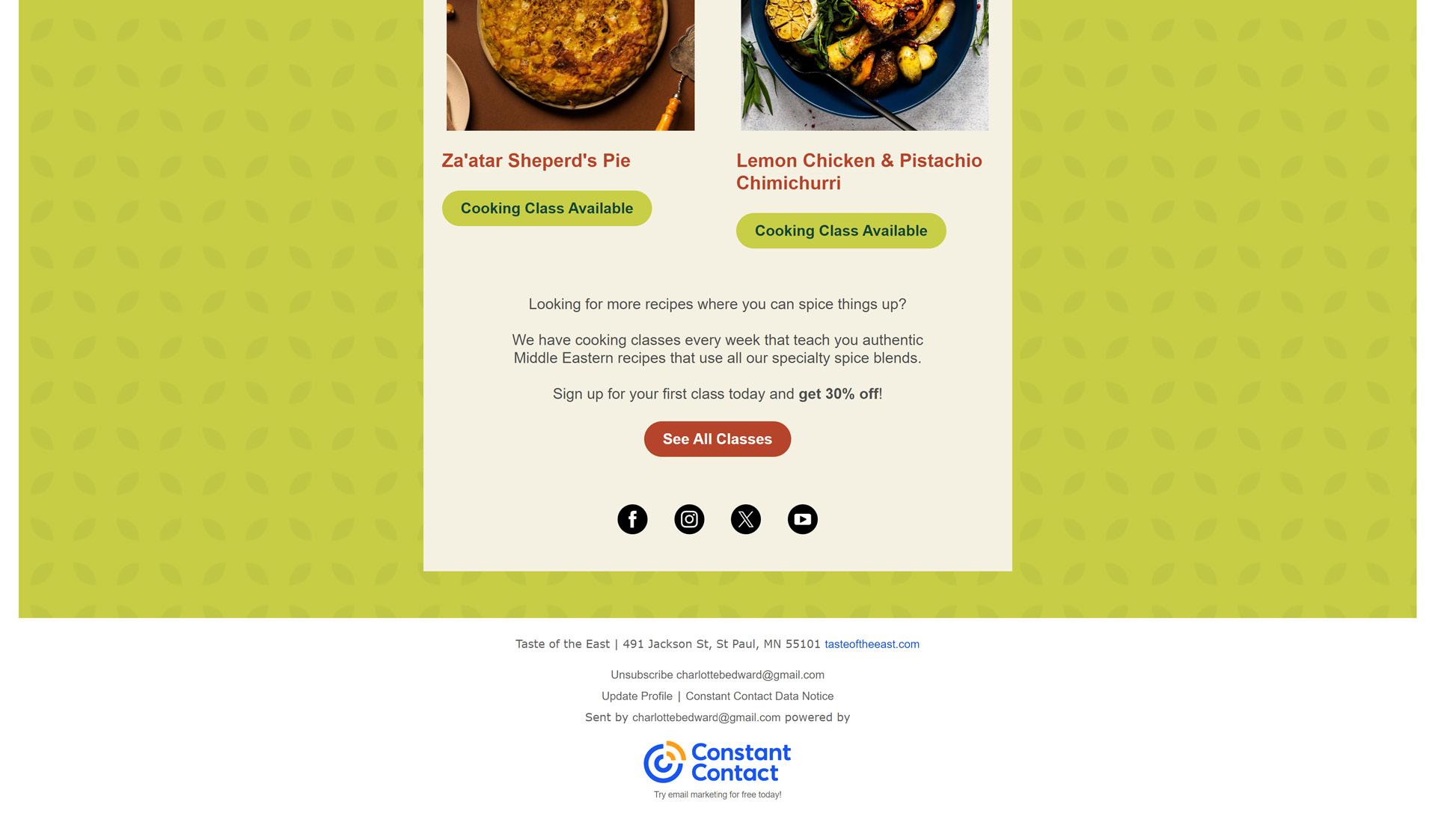
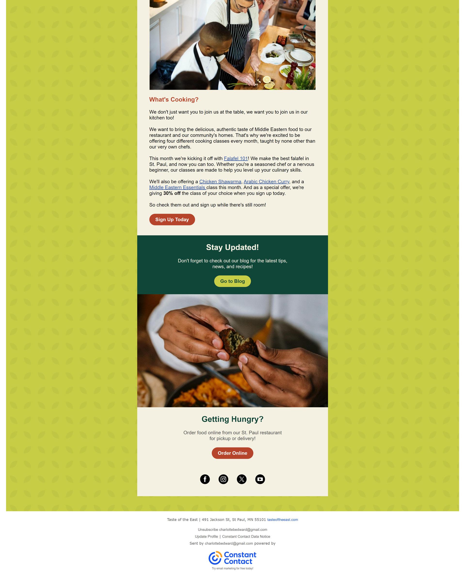
Three emails and one e-newsletter were created for this campaign to introduce the new spice products and cooking classes to existing customers.

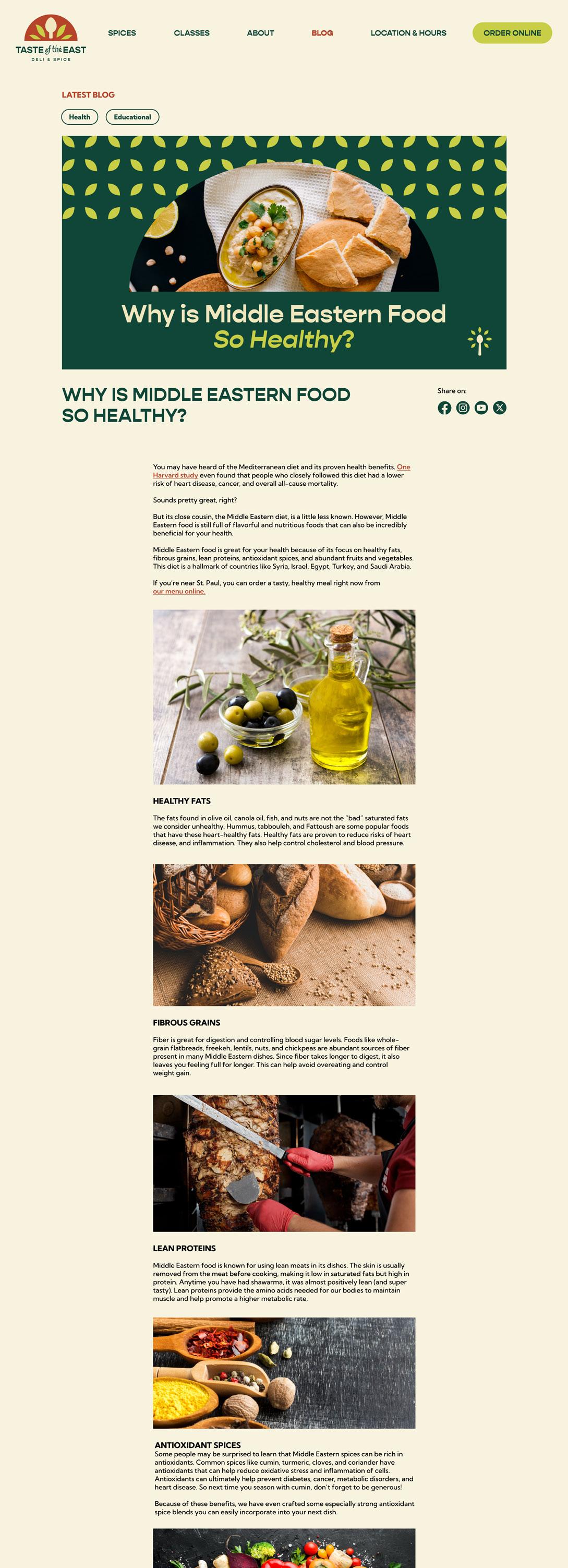
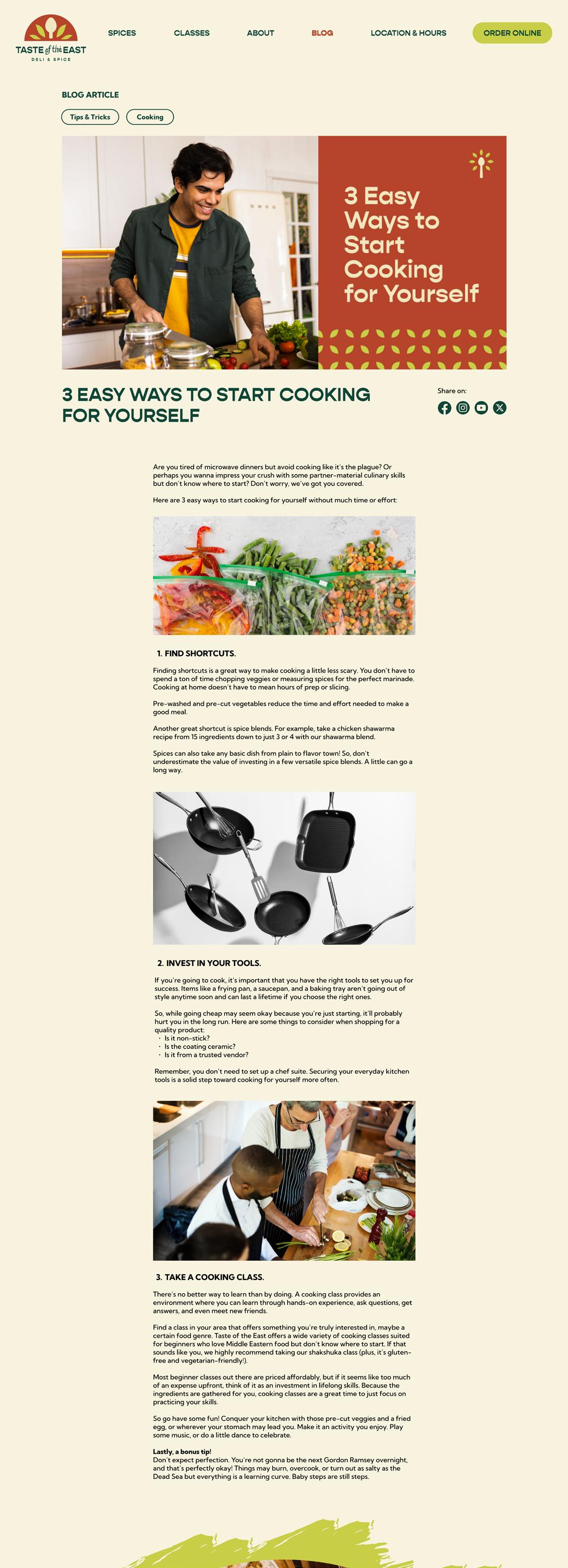
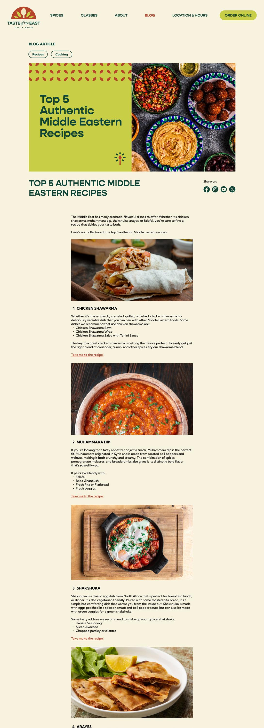
BLOG
Content marketing helps provide value to attract new customers through relevant cooking tips and recipes.
The blog articles are geared toward different segments of the target audience: young adult males learning to cook and middle-aged moms who love cooking.
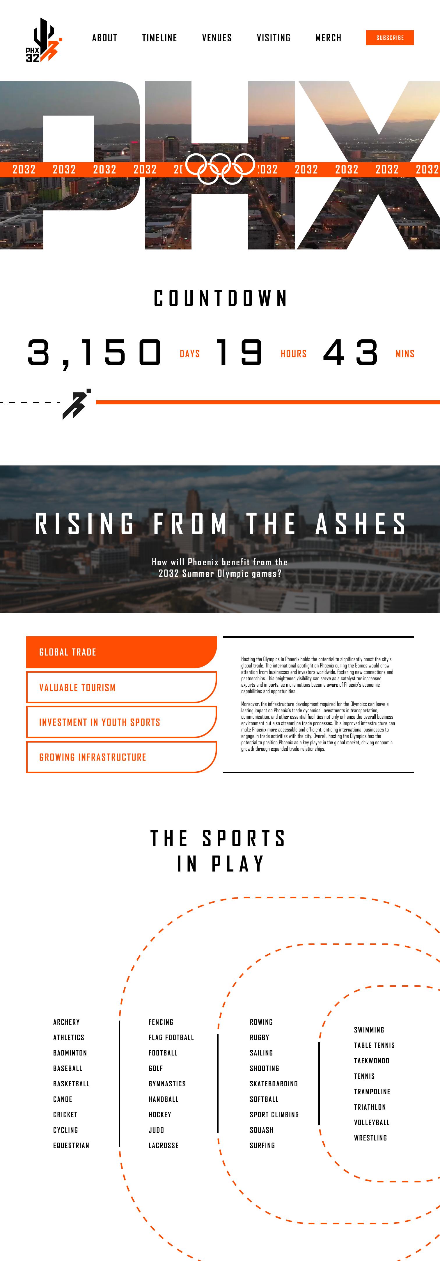
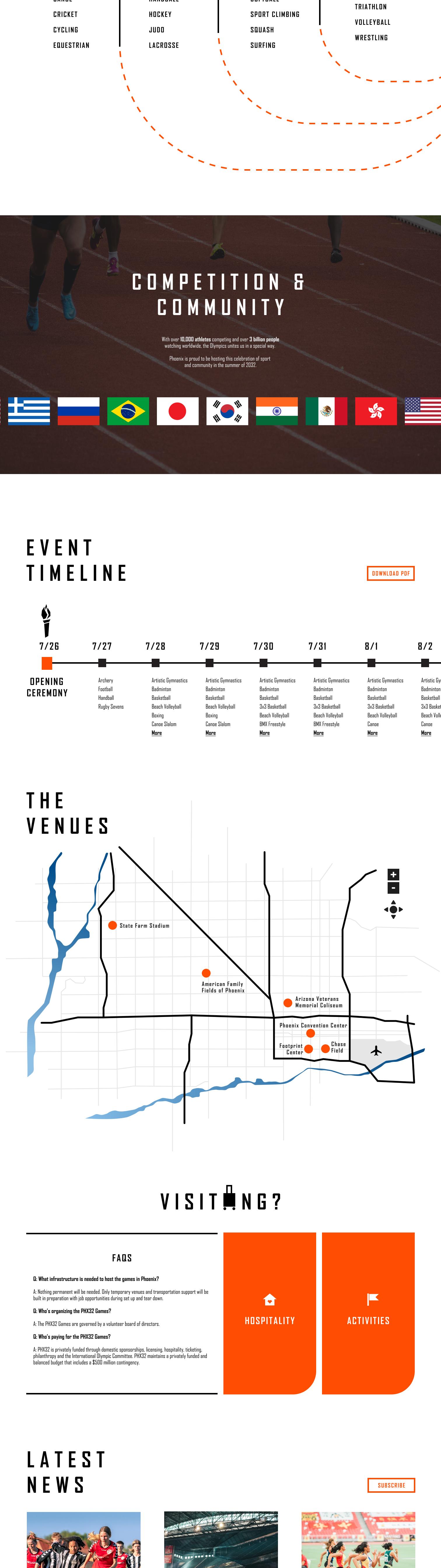
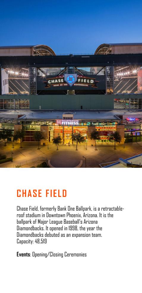
PHOENIX OLYMPICS CAMPAIGN
THE CHALLENGE
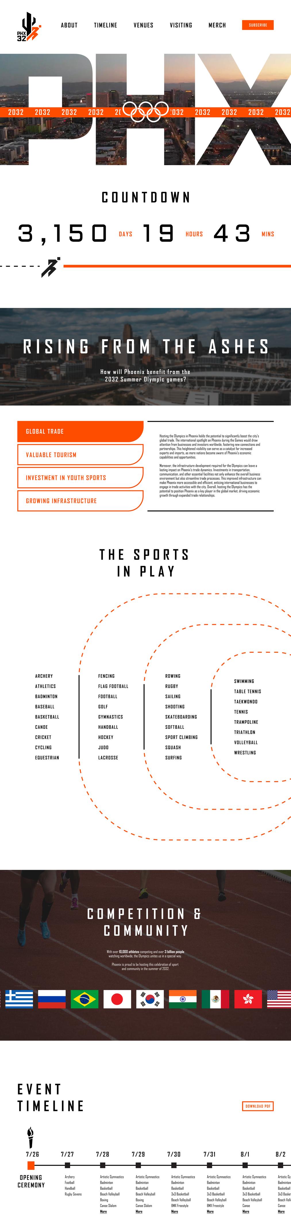
The goal of this one-page website is to get the public to support Phoenix hosting the 2032 Summer Olympics. The content was designed as if Phoenix were being considered and needed to show that they’re prepared.
The challenge for this project was creating a unique visual identity that would entice and represent Phoenix successfully.
THE SOLUTION
I created an interactive and engaging website that informs users about PHX32. The logo developed for this event also represents athleticism and Phoenix’s bright, hot desert weather.

Ai
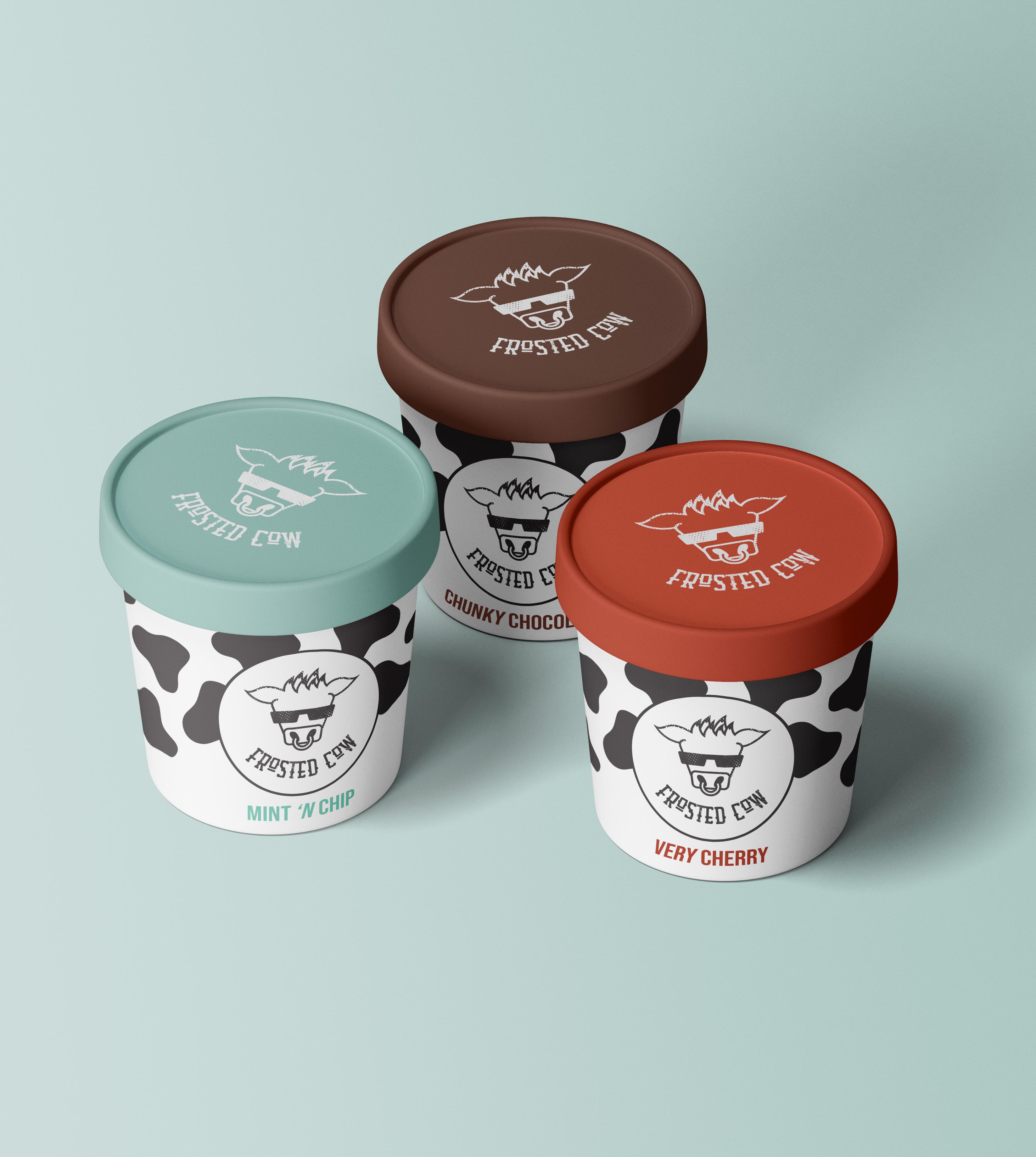
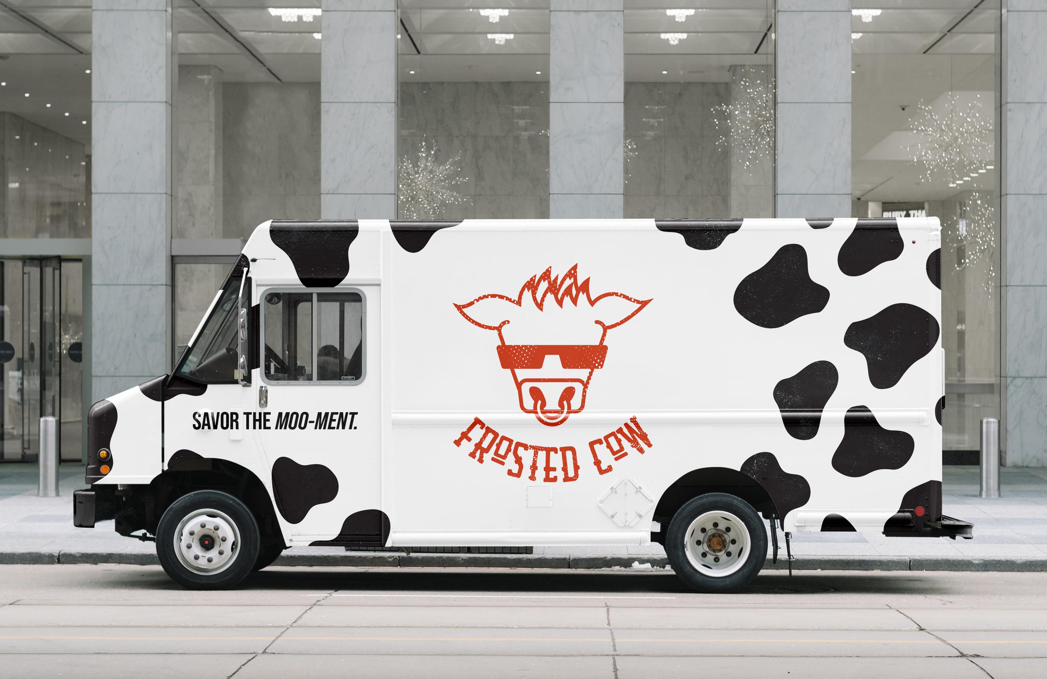
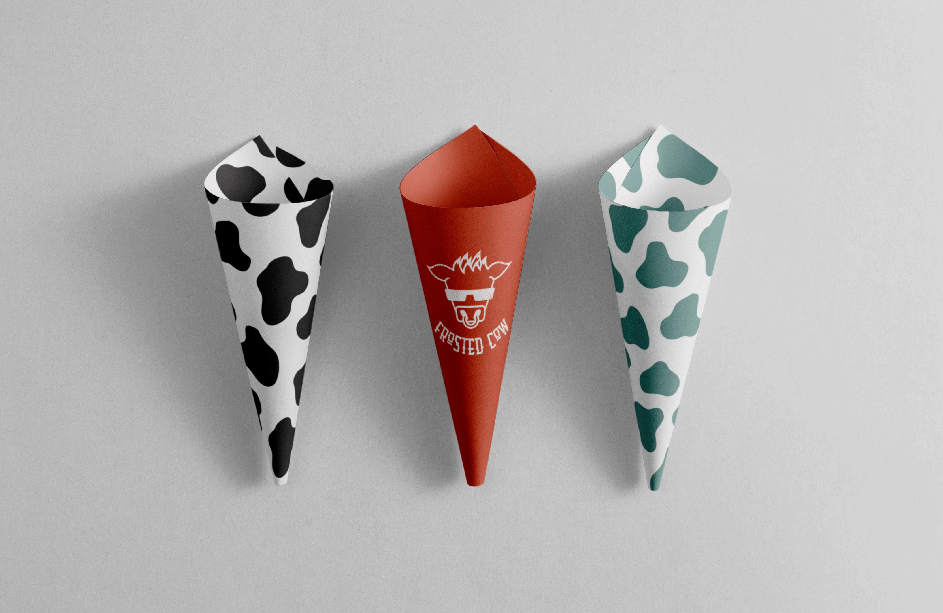
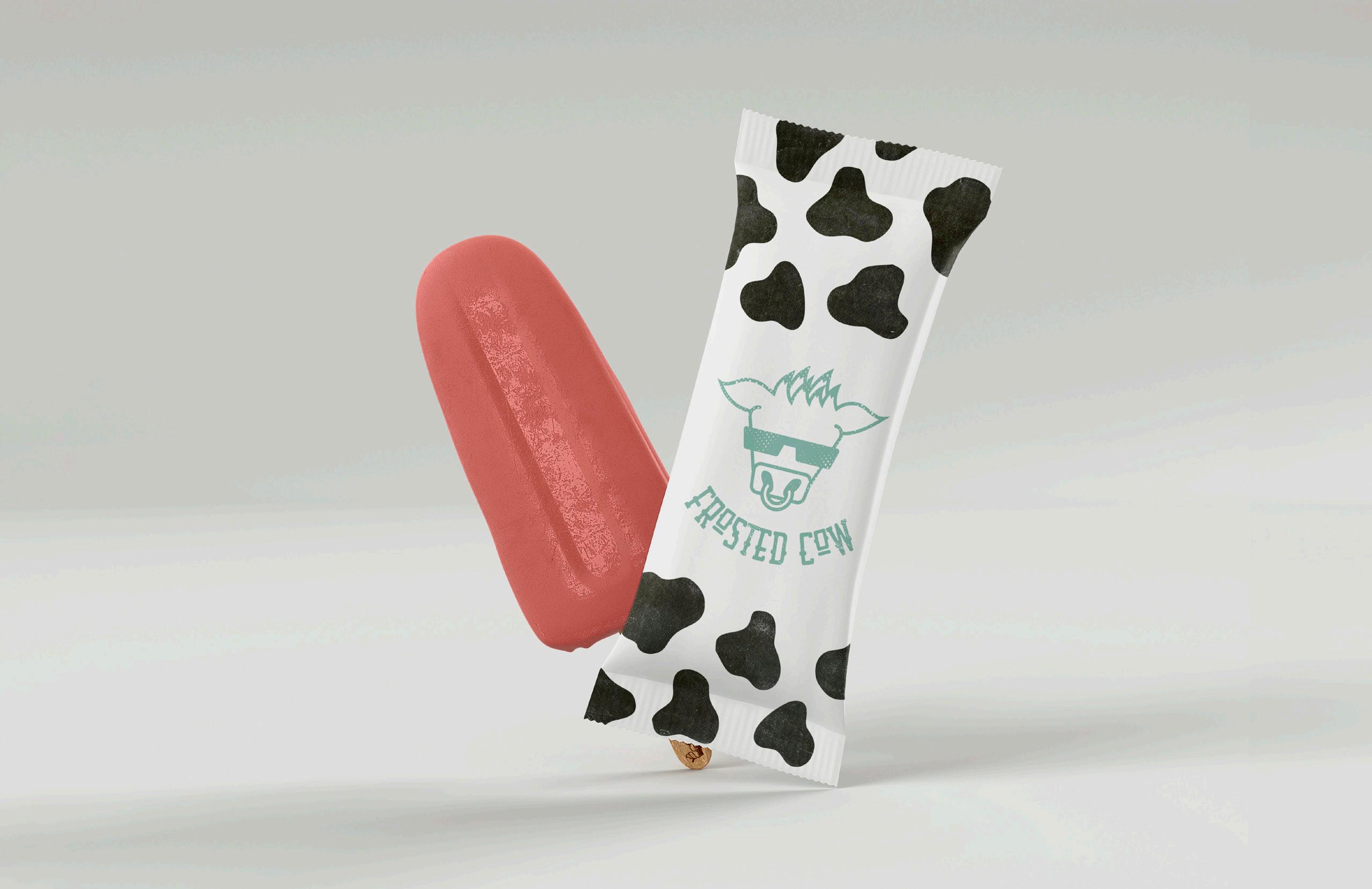
FROSTED COW
THE CHALLENGE
Frosted Cow is an ice cream truck company that required a brand identity that would appeal to families. The logo needed to go beyond ice cream cones and scoops to stand out on the street.
THE SOLUTION
I designed a playful brand called Frosted Cow whose logo is a cow with frosted tips. The spunky mascot has a biker theme that brings personality to the brand while playing with the on-the-road aspect of the ice cream truck. A punny tagline, “Savor the Moo-ment,” also shows the charisma behind the company. This branding helps Frosted Cow appear family-friendly, approachable, and fun.
Ai
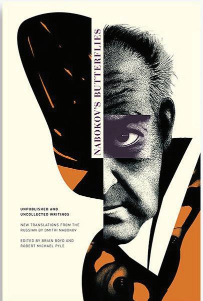
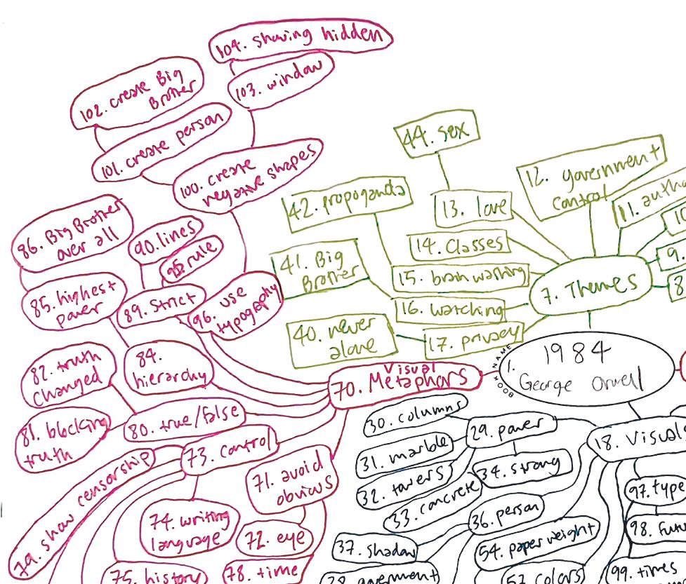
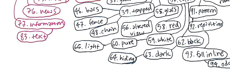
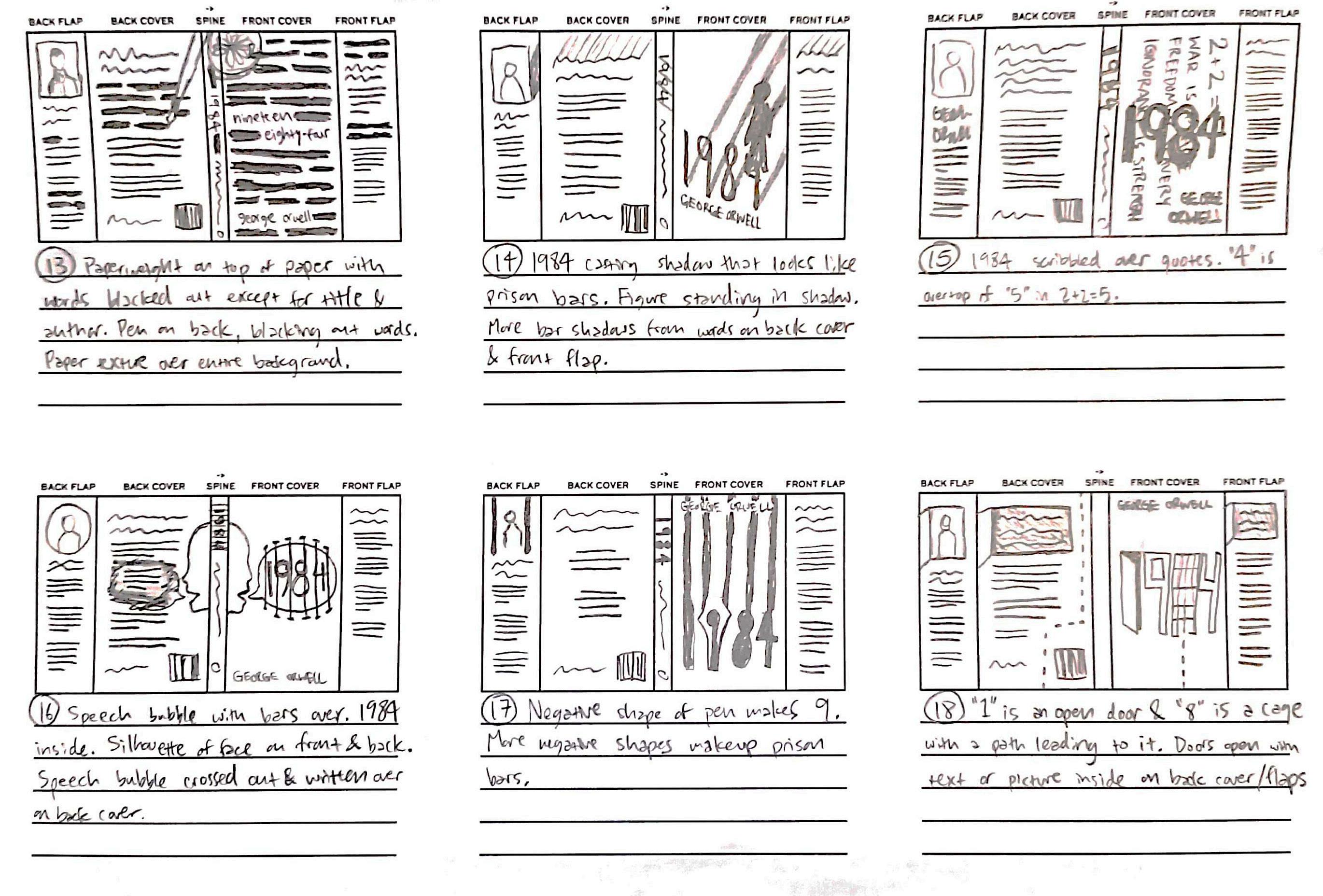
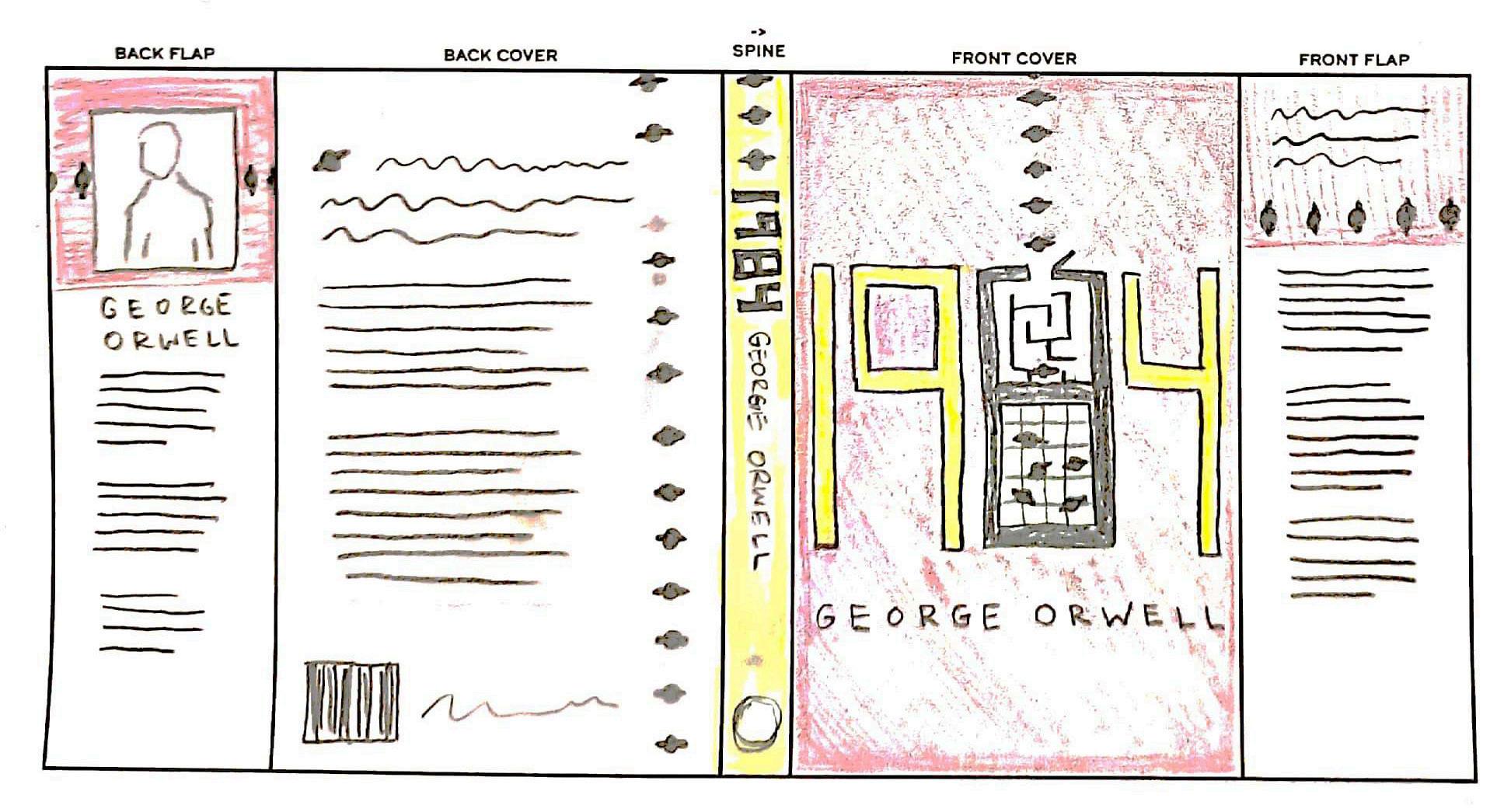
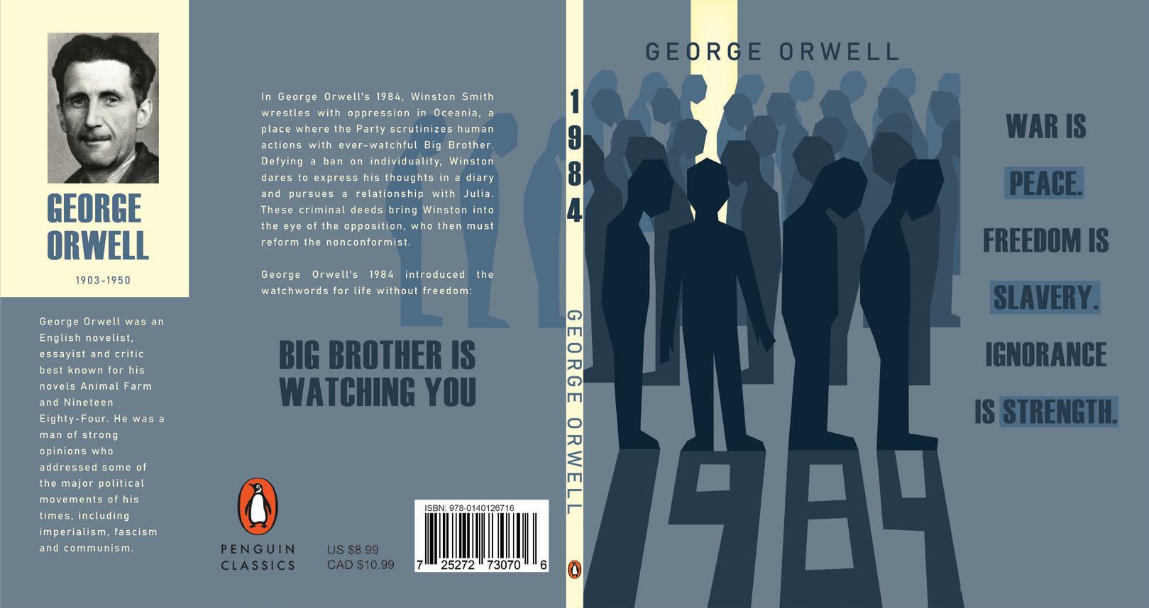
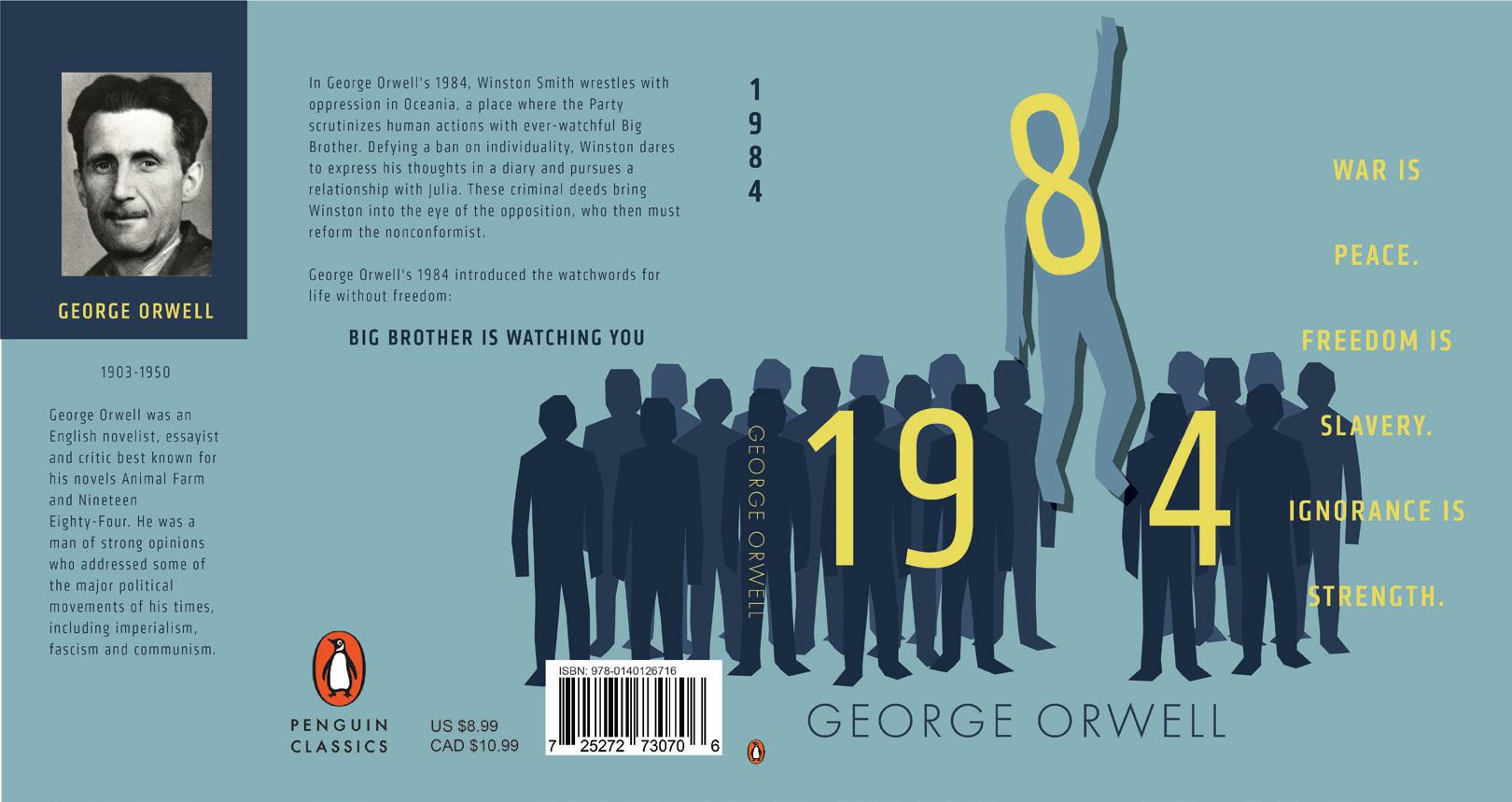
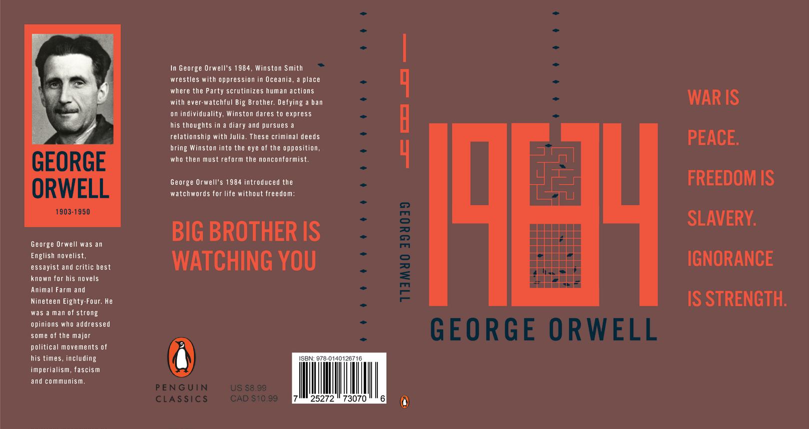
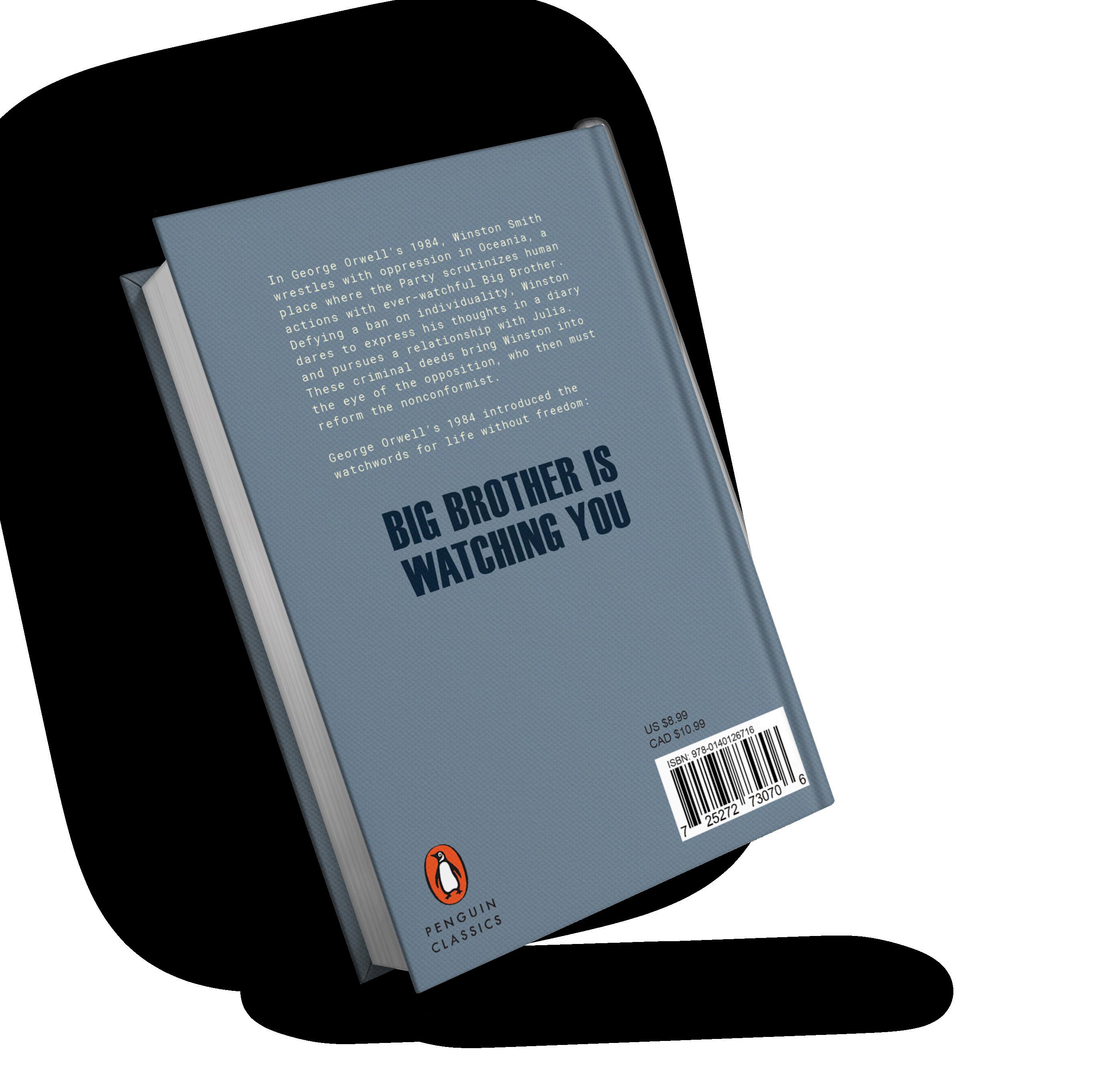
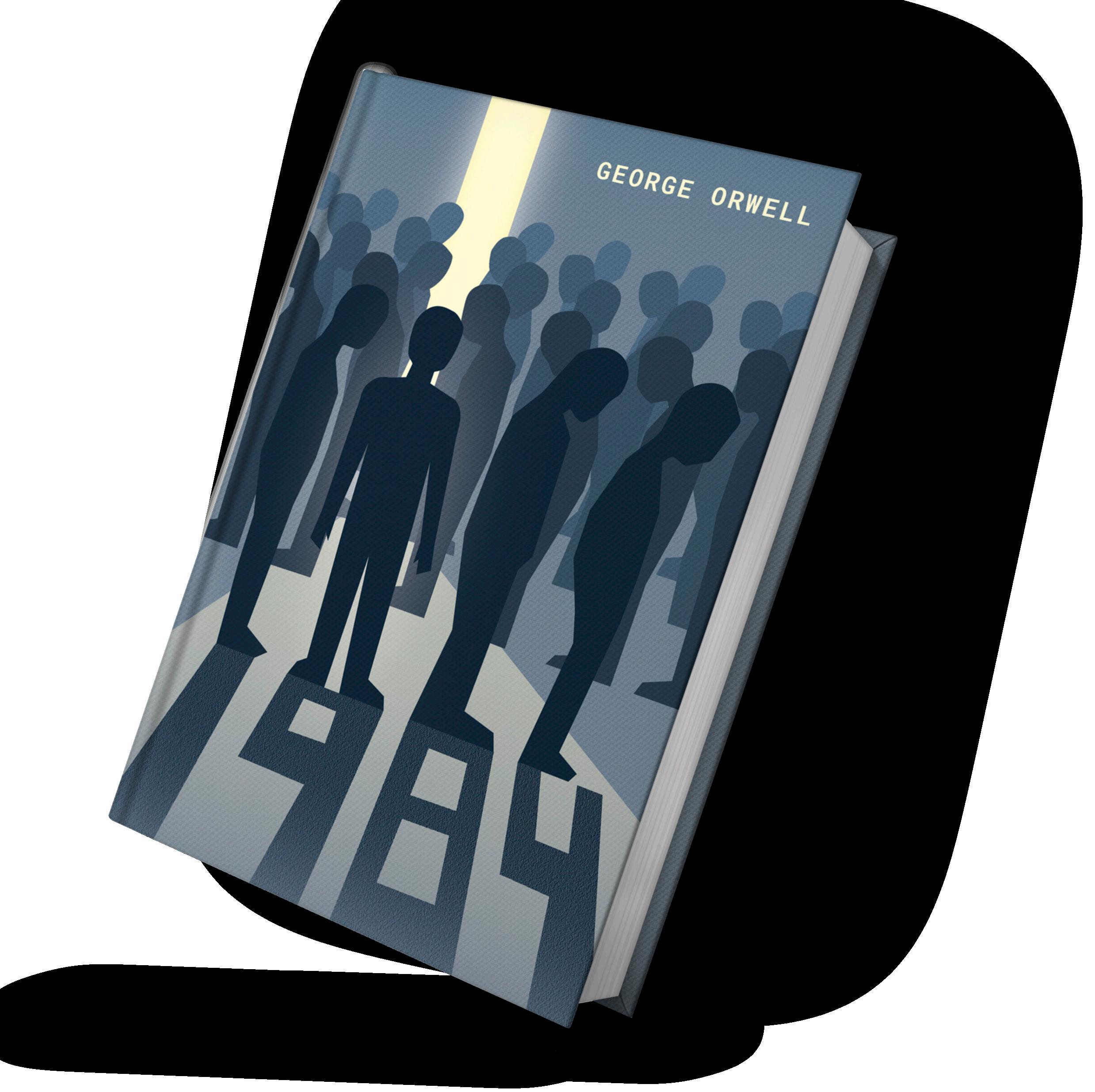
1984 BOOK COVER
THE CHALLENGE
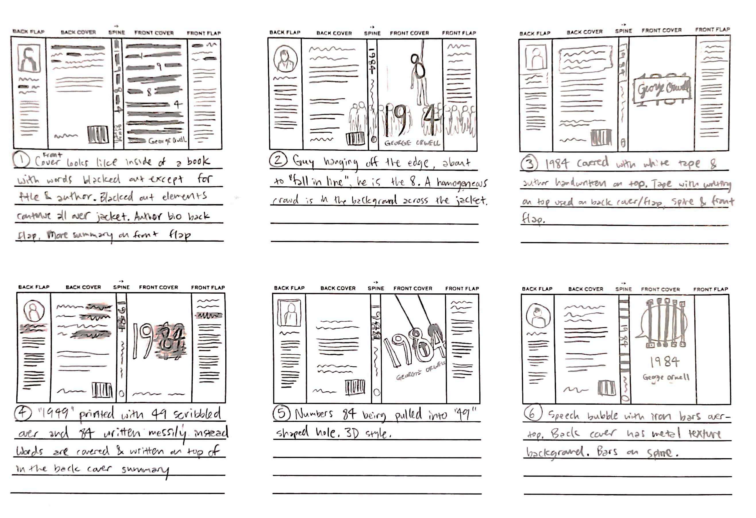
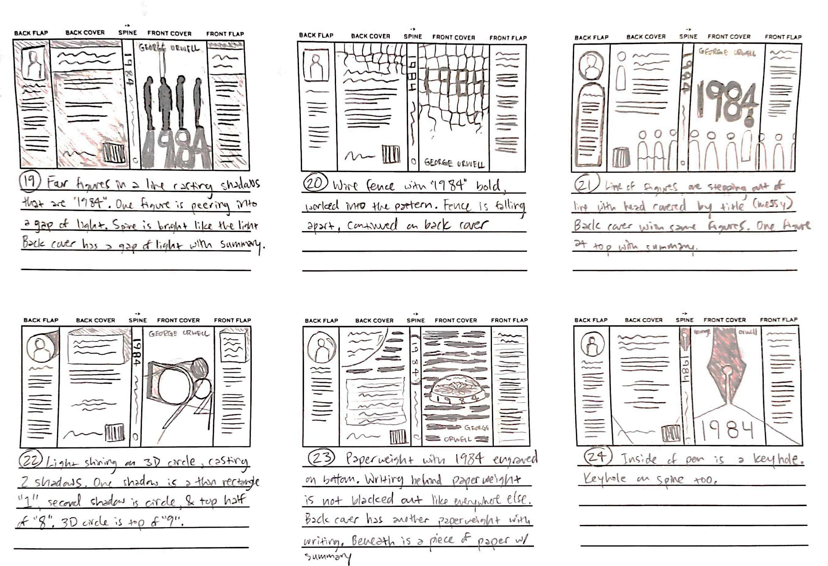
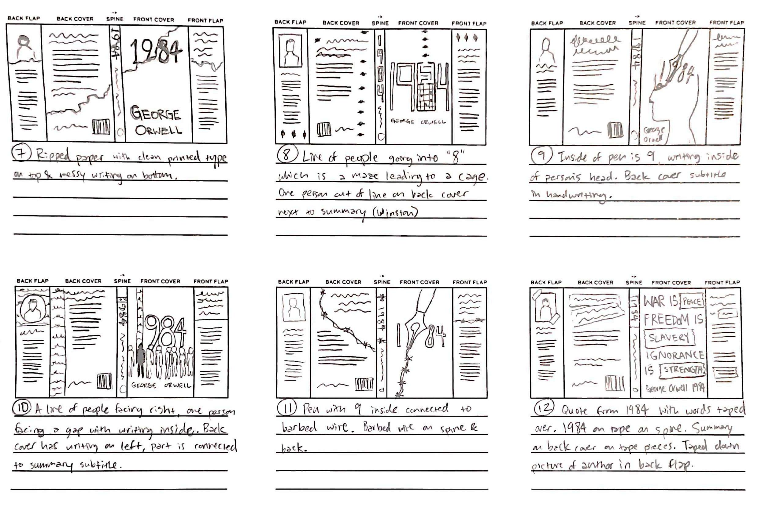
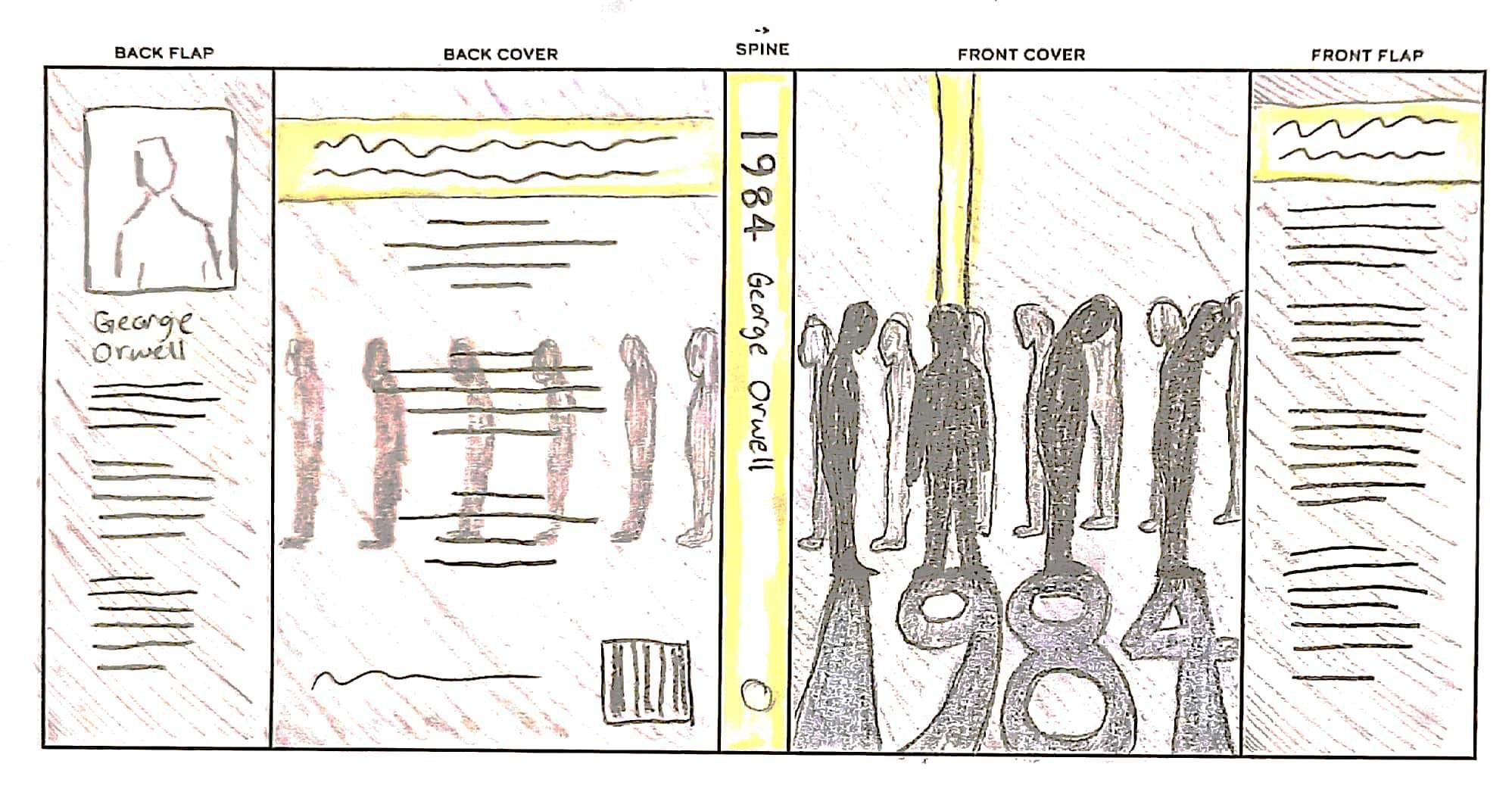
This book cover for George Orwell’s 1984 needed a strong visual metaphor. This was challenging because I had to condense the story into a visual that would appeal to people who have and haven’t read it.
THE SOLUTION
I started ideating based on the strongest themes I remembered and fleshed out my top three concepts. For the style, much of my inspiration came from Saul Bass and books that used flat illustrations.
The final cover uses the concept of being “enlightened” literally. The person facing the sliver of light represents the main character and his discovery of the truth. Although the “truth” is shining before everyone, he’s the only one who sees it fully because he isn’t conforming to the line.


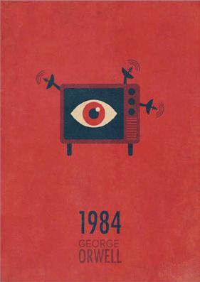
Ai Id
1 2
3

Bedward_Charlotte_Comp1.indd All Pages 1/23/2023 3:50:34 PM Bedward_Charlotte_Comp2.indd All Pages 1/23/2023 3:51:11 PM Bedward_Charlotte_Comp3.indd All Pages 1/23/2023 3:51:38 PM 4
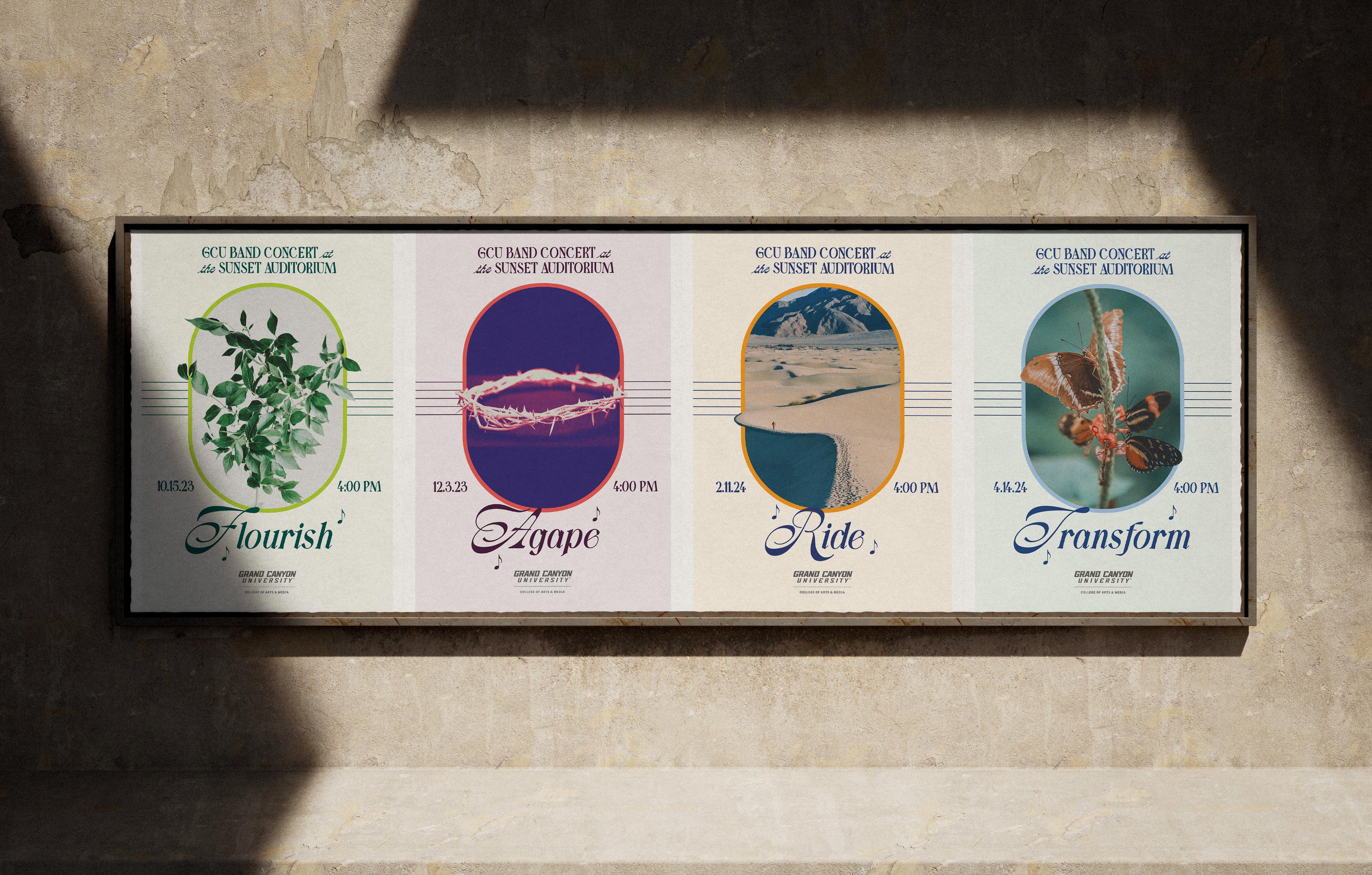
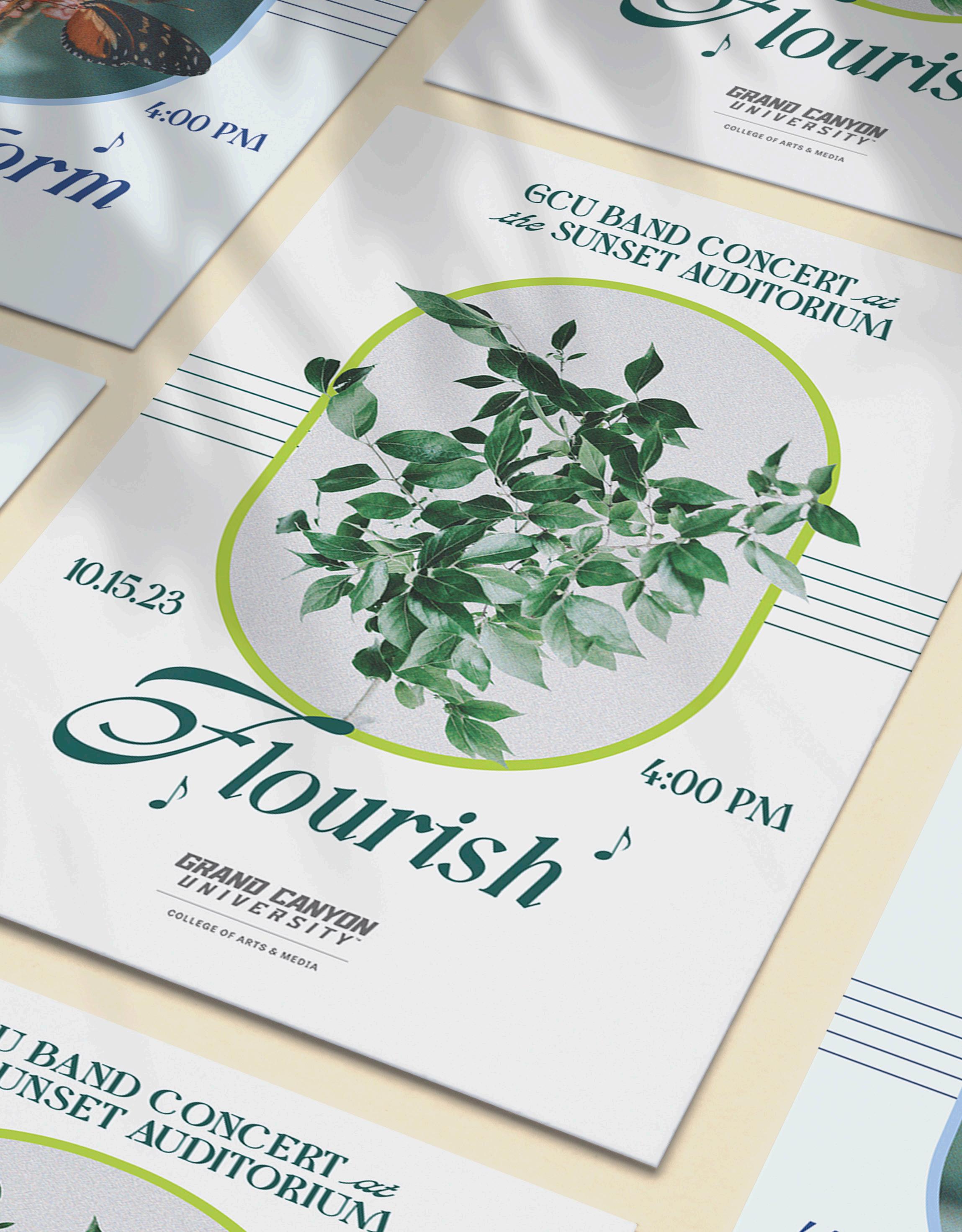
BAND CONCERT
POSTER SERIES
THE CHALLENGE
I created this project while working at Canyon Creative to promote Grand Canyon University’s band performances. The challenge for this was that each design needed to reflect its respective theme while maintaining a cohesive collection.
THE SOLUTION
I created a frame-based design that allows for each poster to adapt to the title of the performance. The posters also incorporate musical elements, such as a staff and eighth notes which are consistent throughout.
Ai Ps
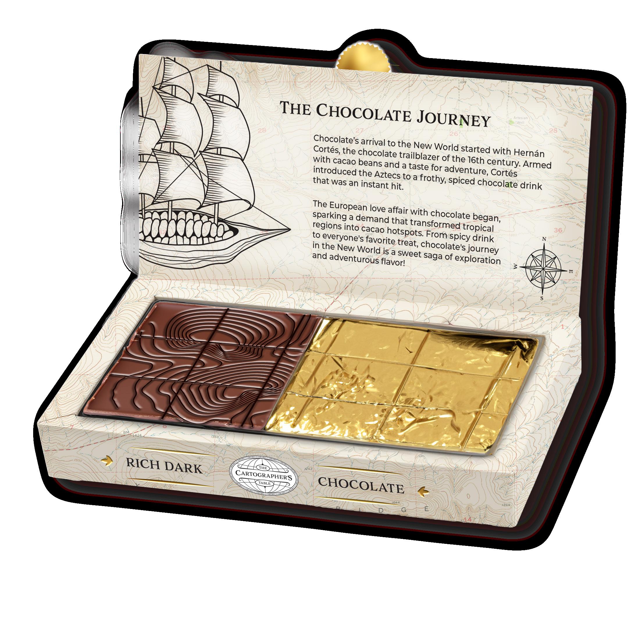
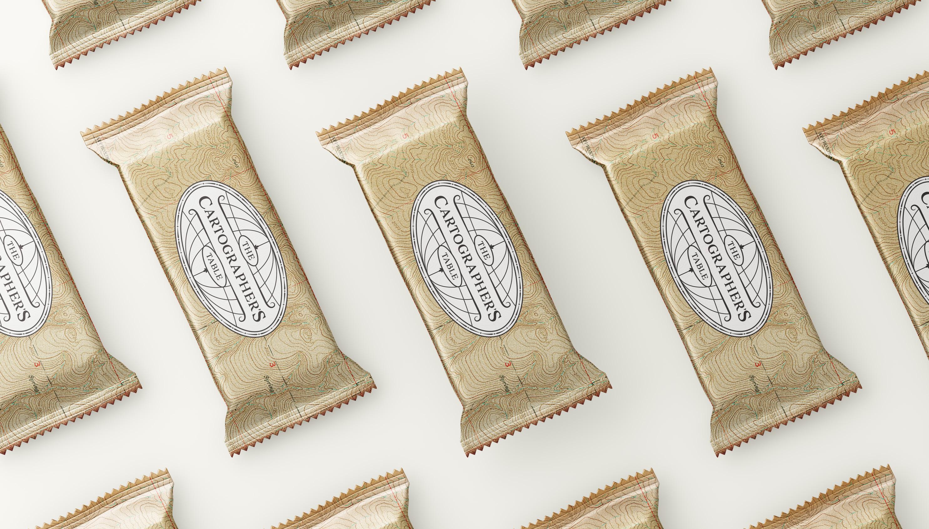
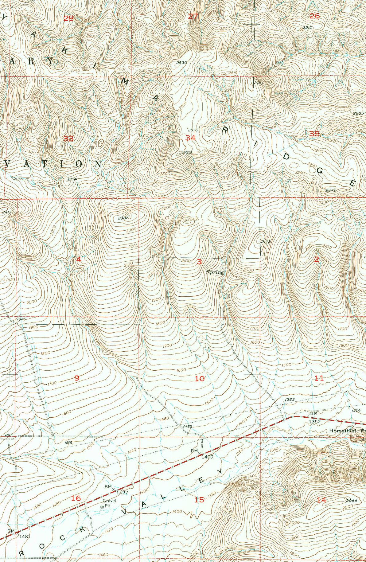
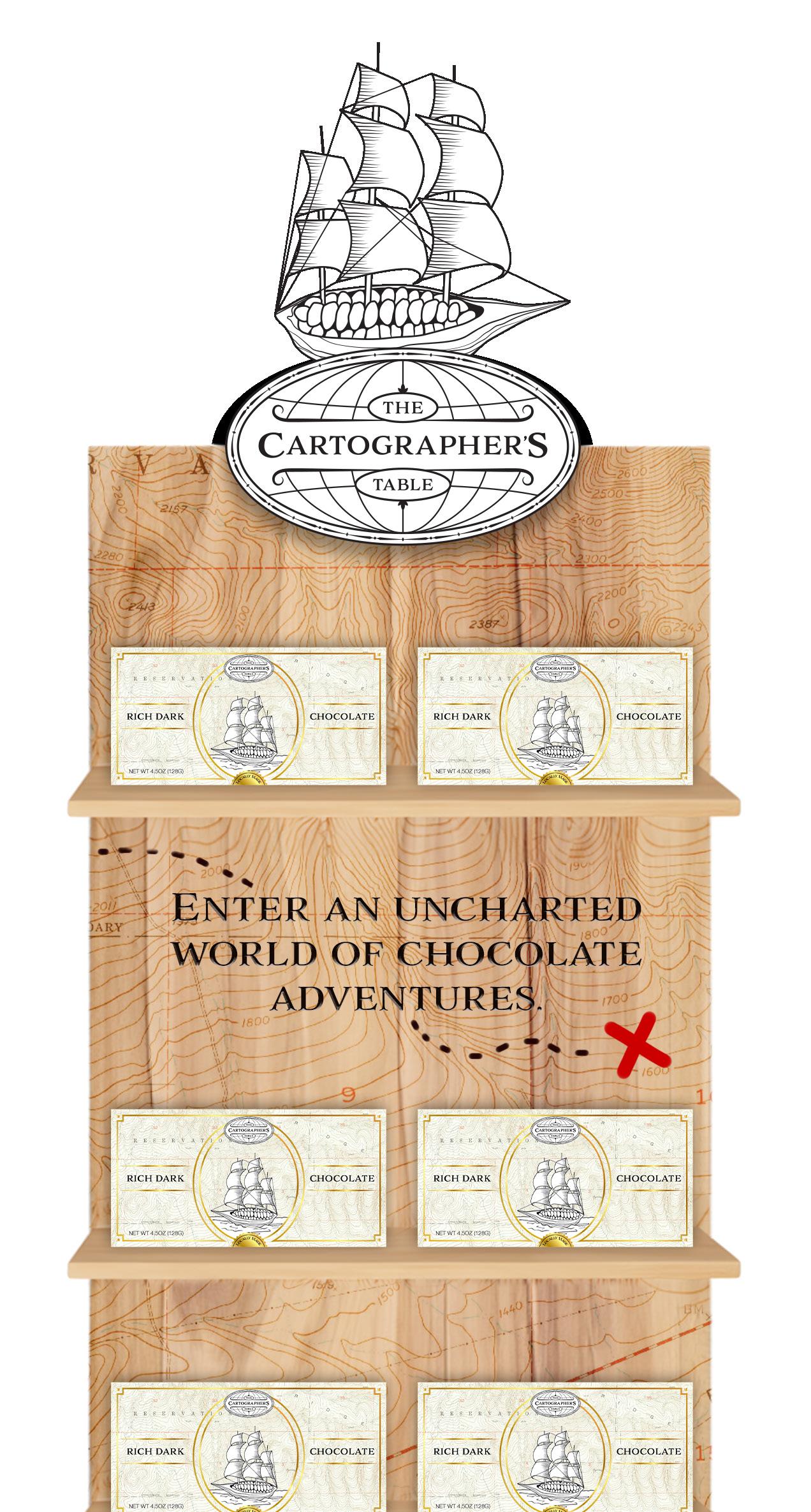
THE CARTOGRAPHER’S TABLE
THE CHALLENGE
This chocolate brand required a completely new identity down to the company name and product concept. The goal was to create a luxury chocolate product that would appeal to women and stand out on store shelves.
THE SOLUTION
I came up with The Cartographer’s Table, a brand that puts a unique topographical map on each one of their chocolate bars. In the packaging, I incorporated the story of chocolate’s voyage to the new world, tying into the overall theme of adventure.
The packaging uses real topographical maps and conveys a vintage, luxurious theme that helps it stand out on shelves. This chocolate bar is ready to take you into “an uncharted world of chocolate adventures.”
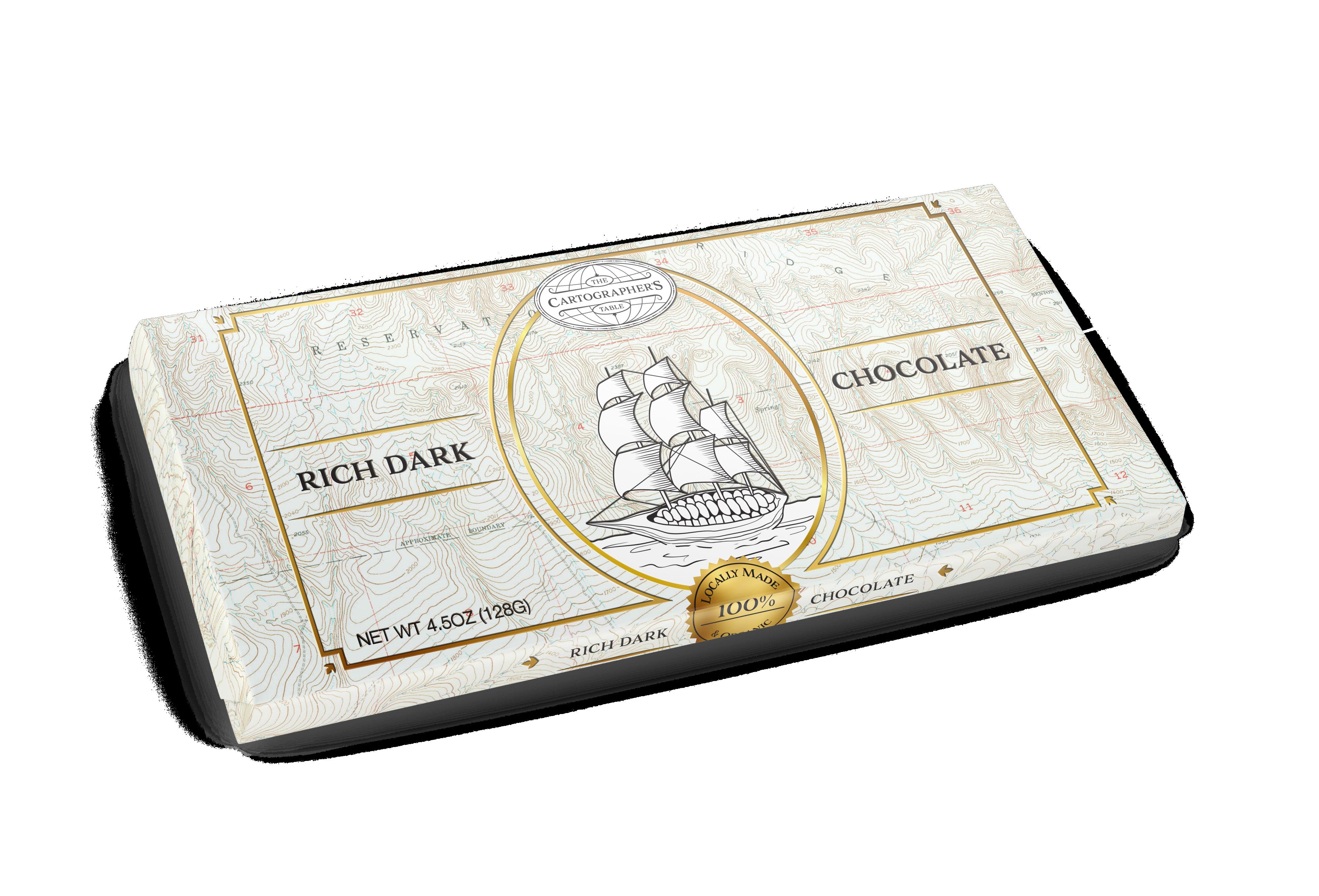
Ai Ps
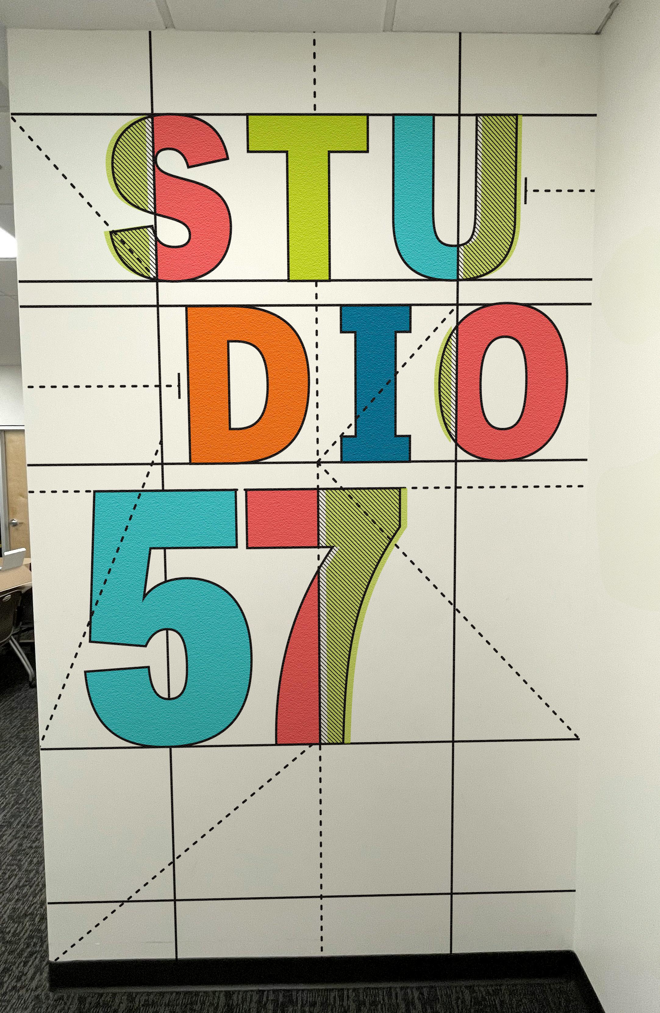
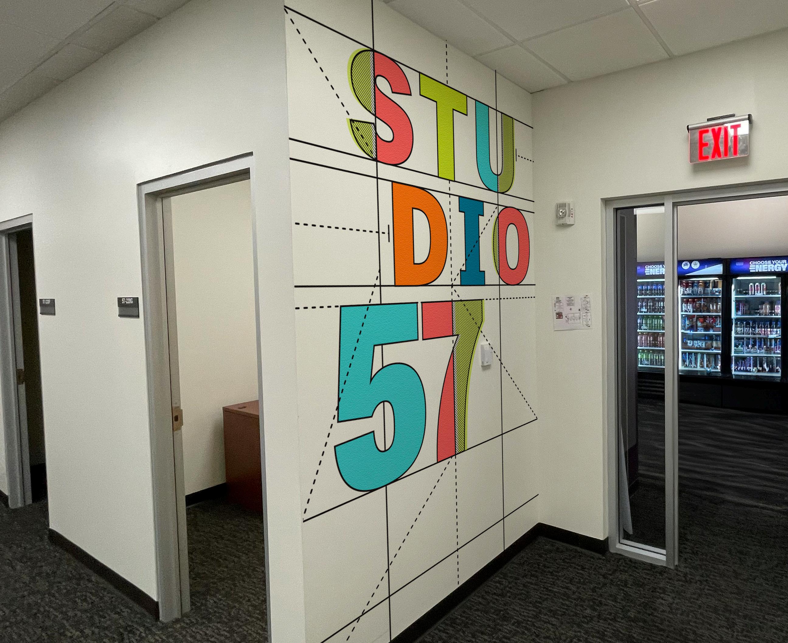
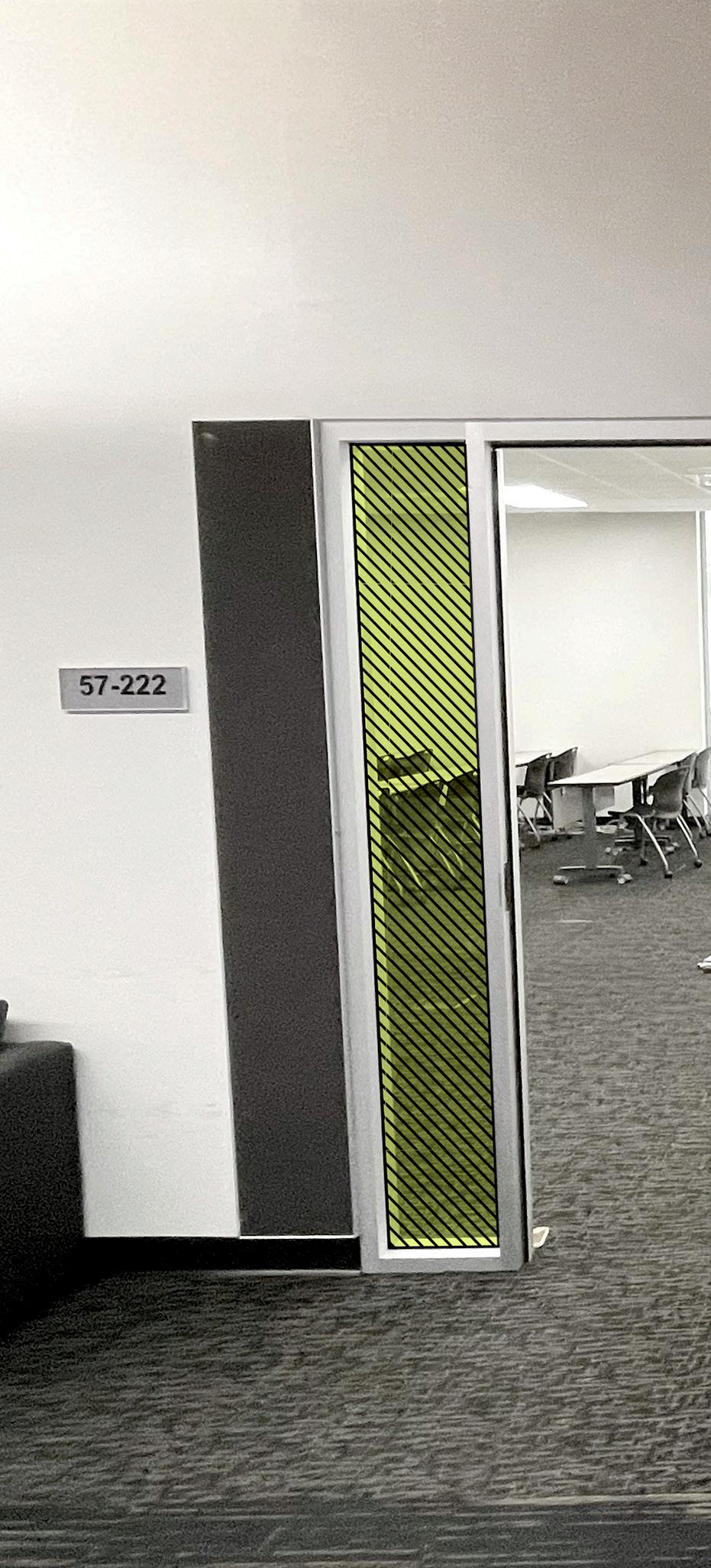
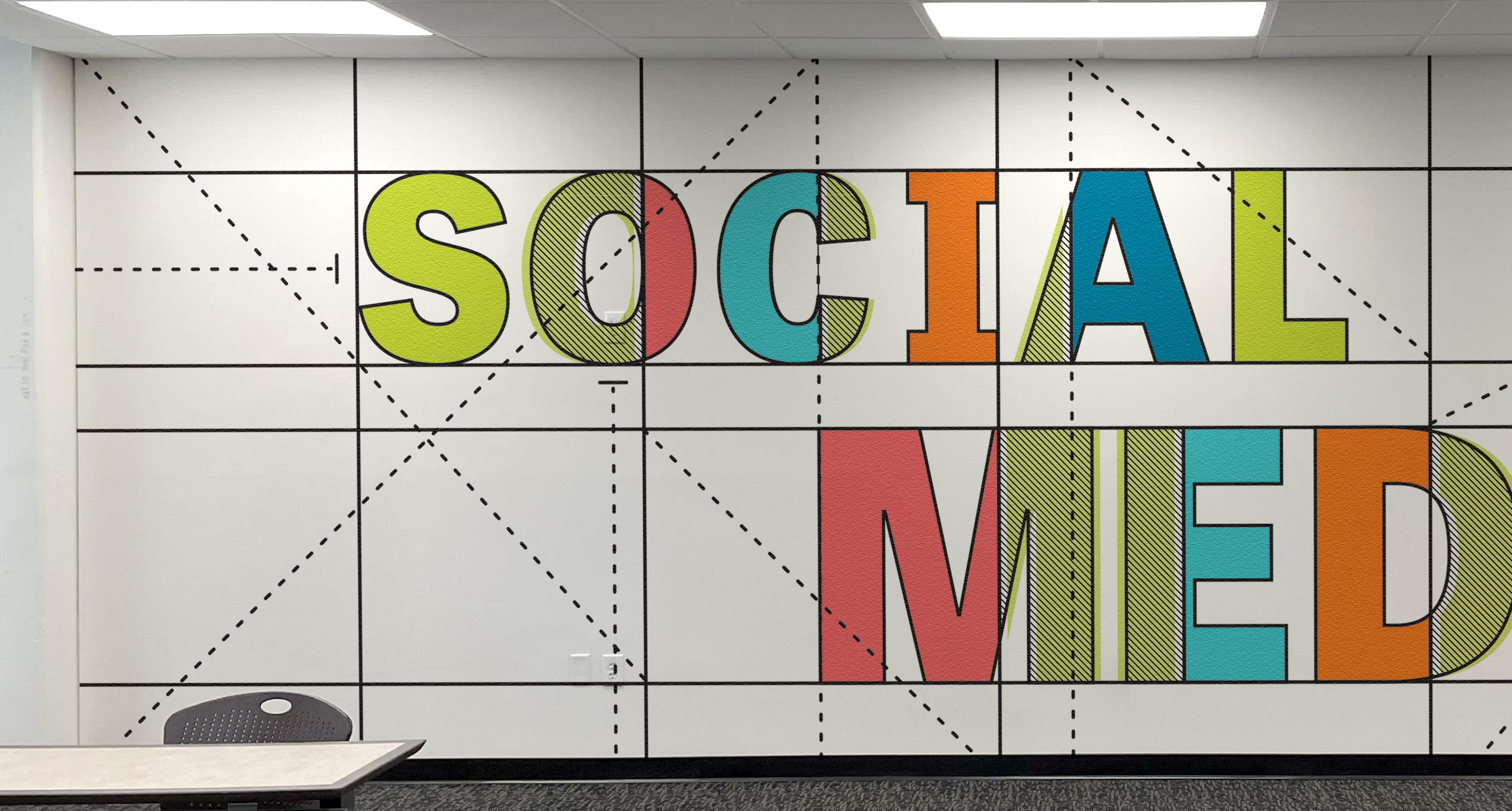
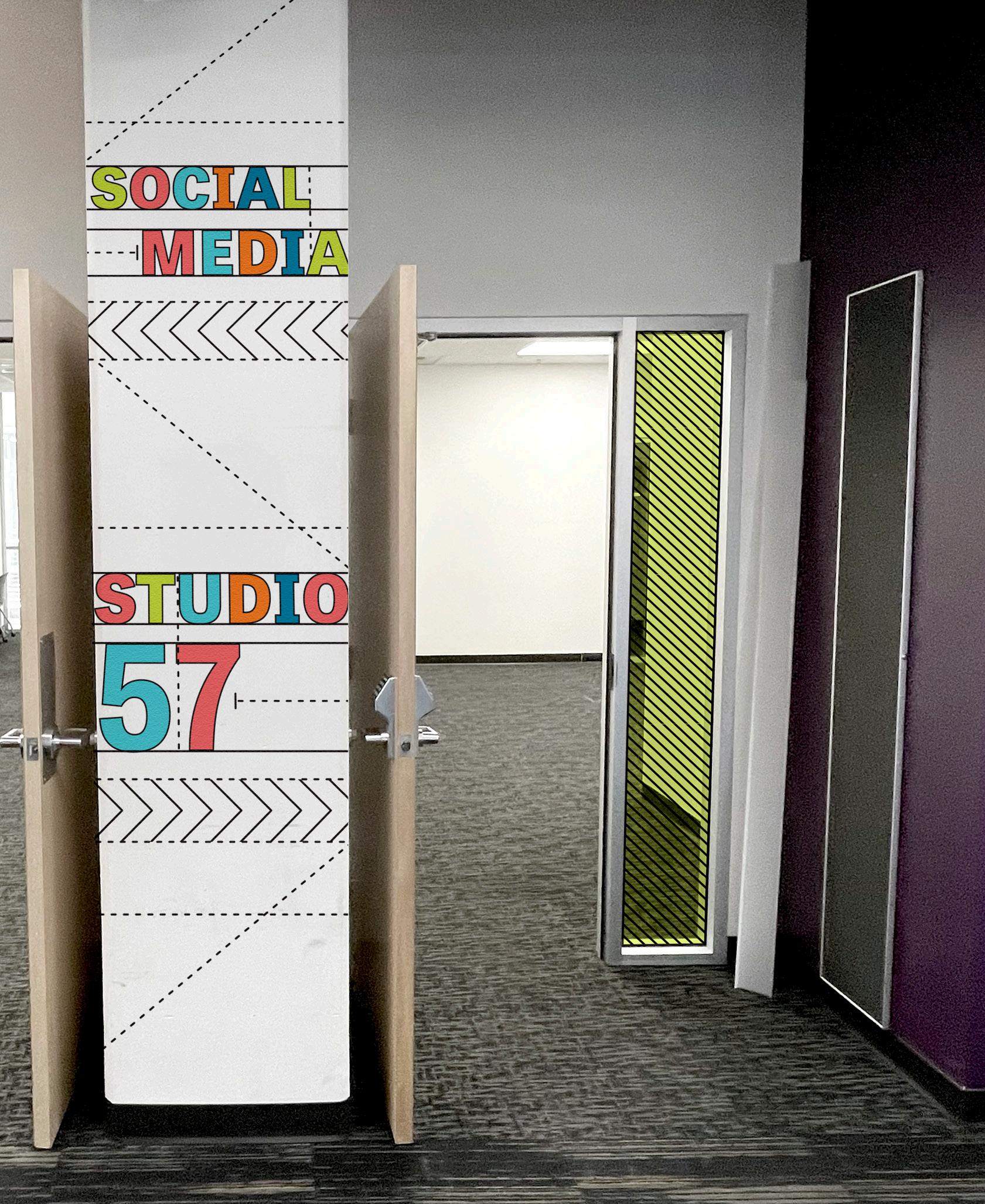
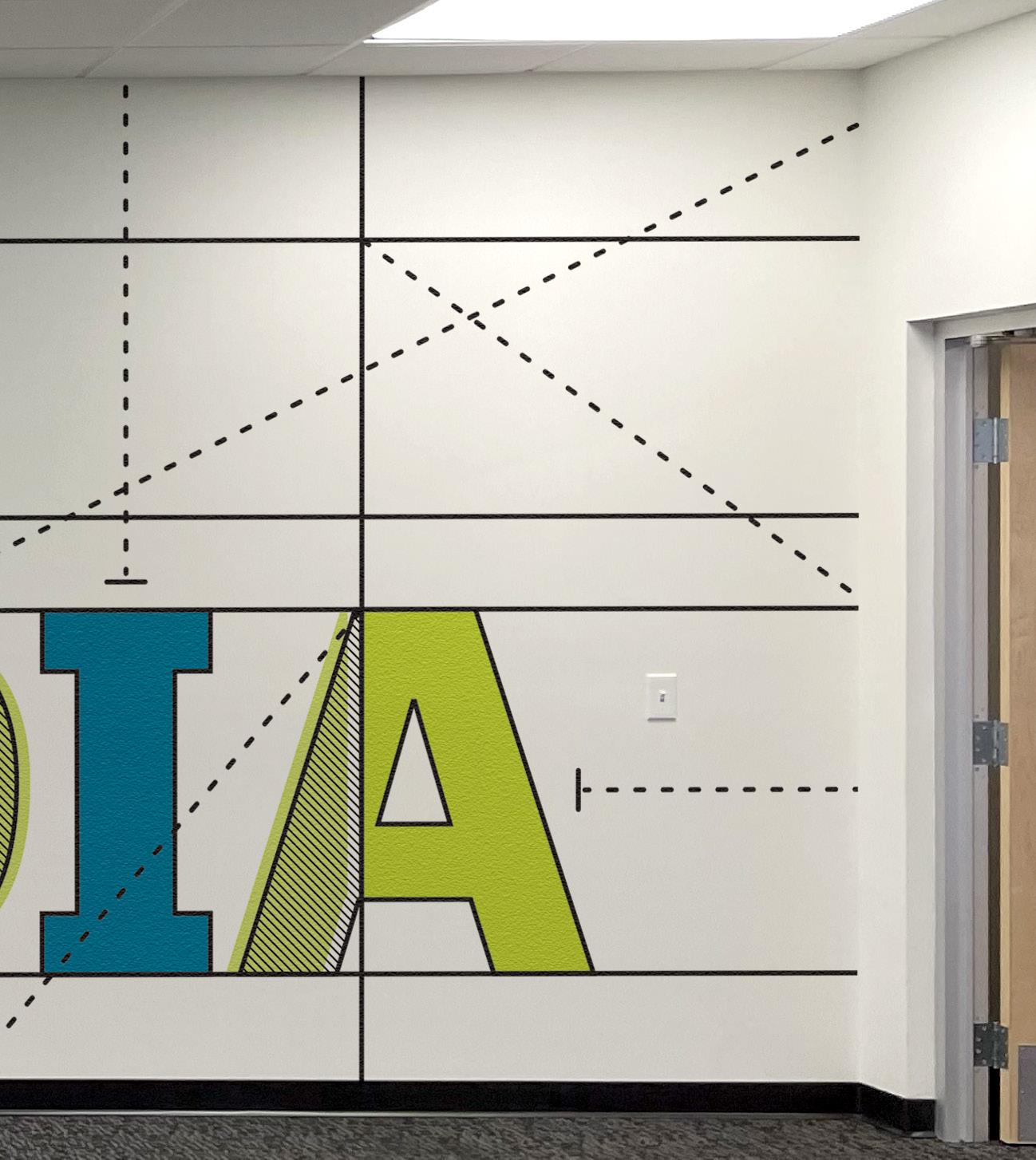
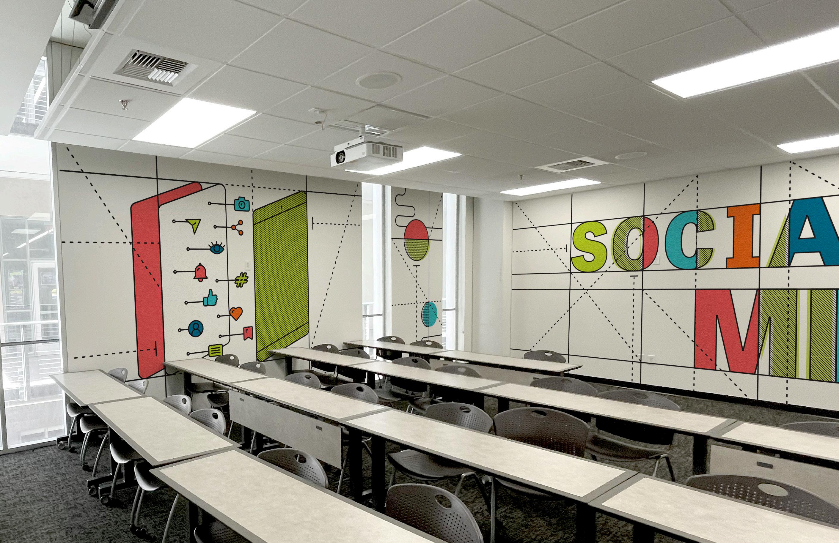
BUILDING 57 BEAUTIFICATION
THE CHALLENGE
While at Canyon Creative, I was tasked with creating concepts for a beautification of Building 57. The challenge was to create floor-to-ceiling graphics for two classrooms for the College of Arts and Media.
THE SOLUTION
For both the Social Media and Studio 57 spaces, creation is a prevailing theme. So, I used dotted and solid lines to represent development, online networks, and connection.
On one of the Social Media walls, I designed a phone with icons that appear to be coming apart. The overall concept is to show how digital media can involve dynamic, moving pieces.
Ai
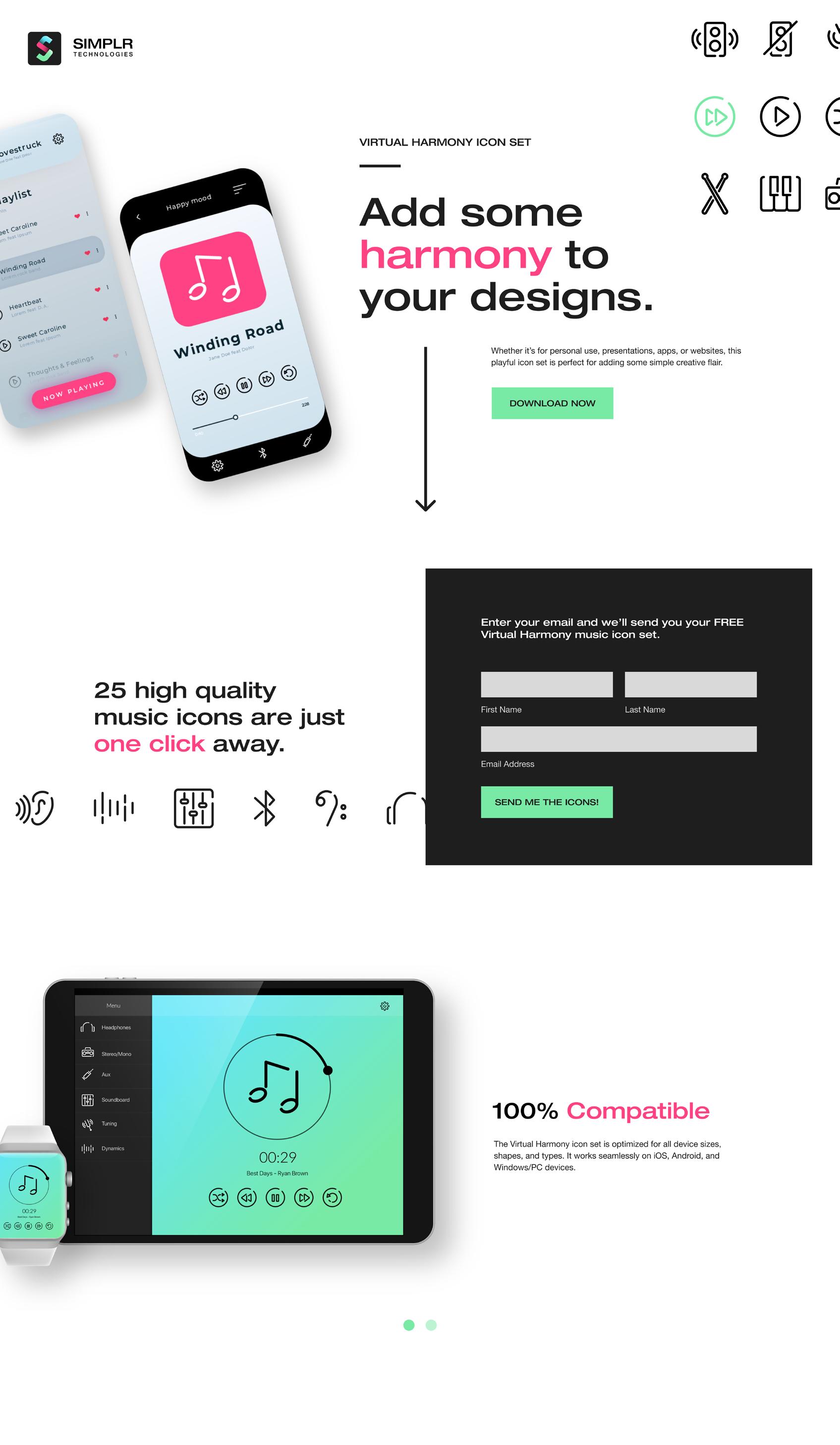
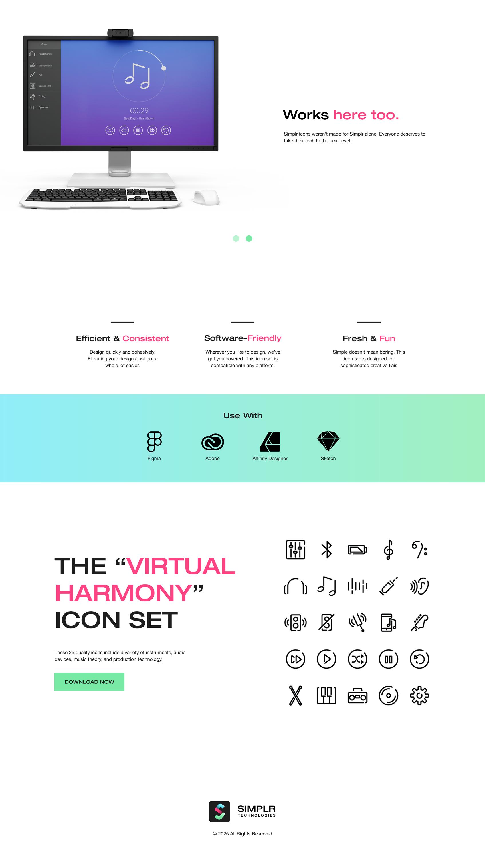
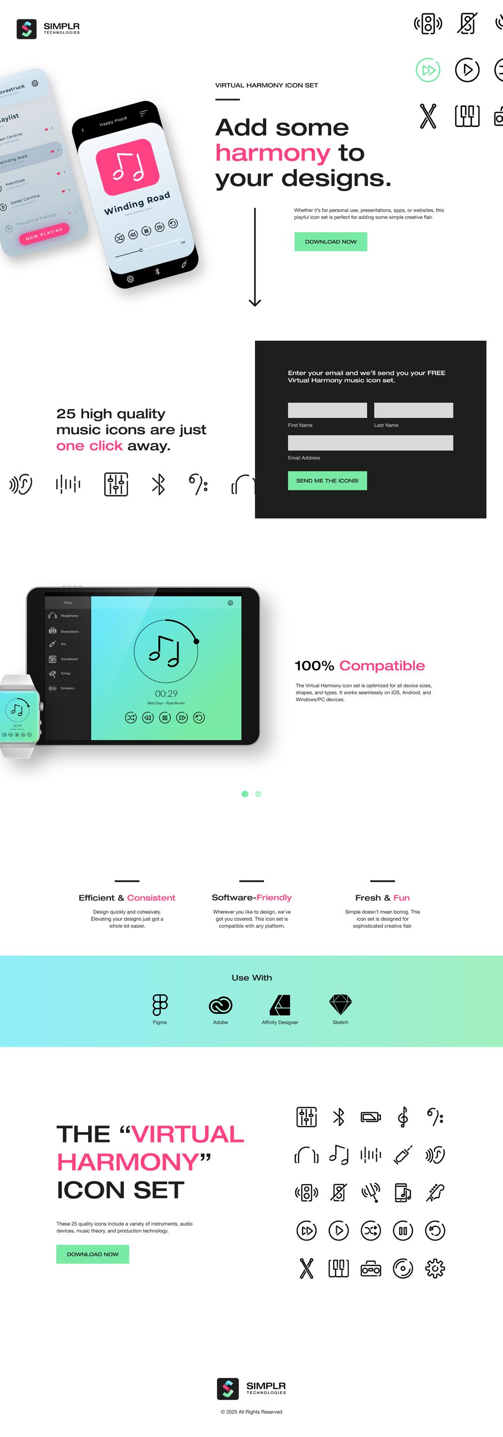
SIMPLR LANDING PAGE
THE CHALLENGE
This project involved creating a musical icon set and a landing page to promote them. The icons needed a distinct style that worked as a collection, and the landing page needed to be engaging without distracting from the product.
THE SOLUTION
I created “Virtual Harmony,” a set of 25 musical icons that are modern, versatile, and have a disconnected style. These icons would be given away to designers, so I targeted the landing page toward them by addressing their pain points. The final website is simple, clean, and communicates the call to action.
Ai
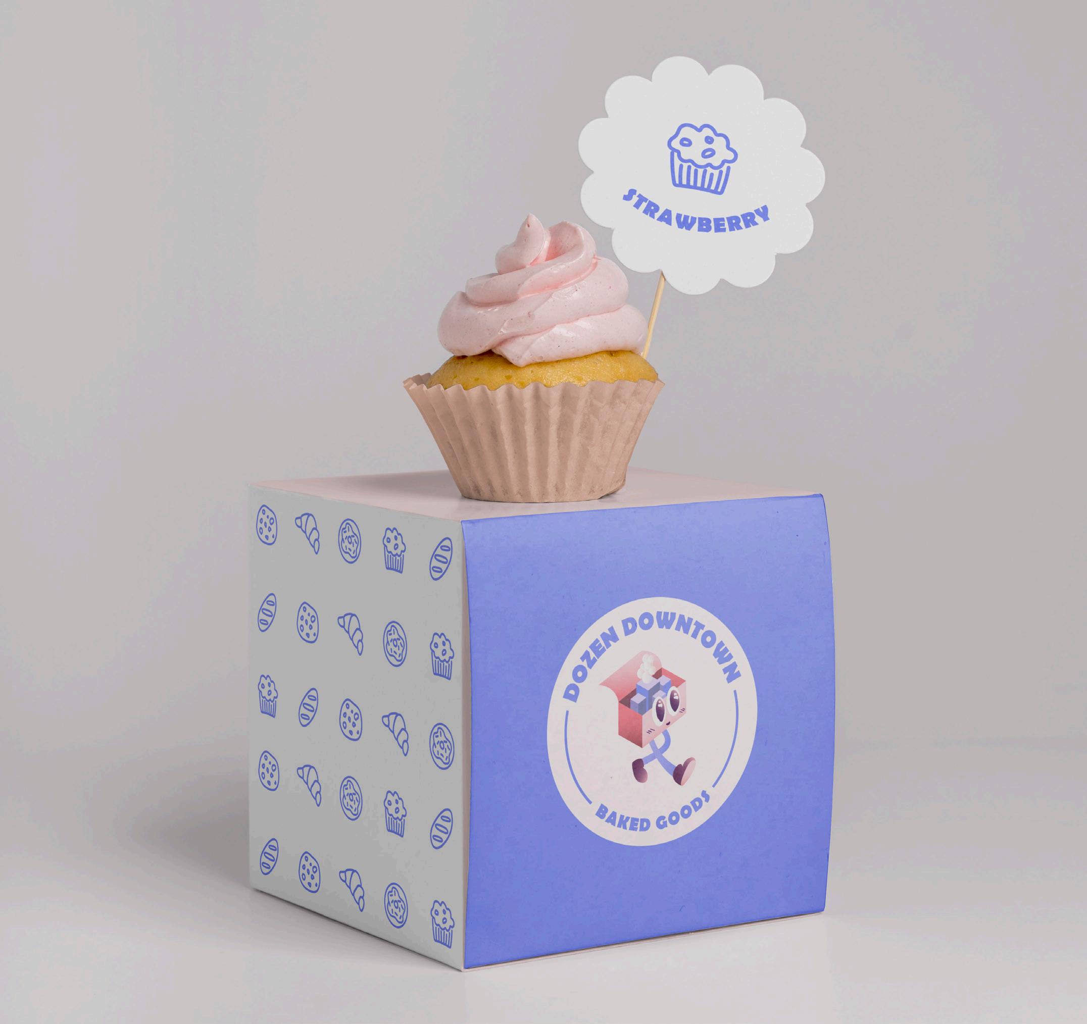
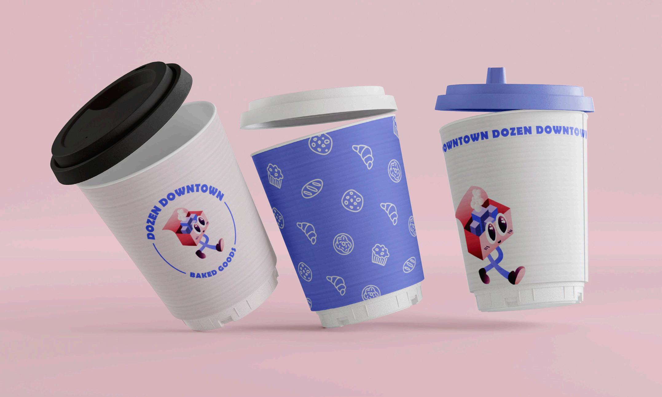
DOZEN DOWNTOWN BAKED GOODS


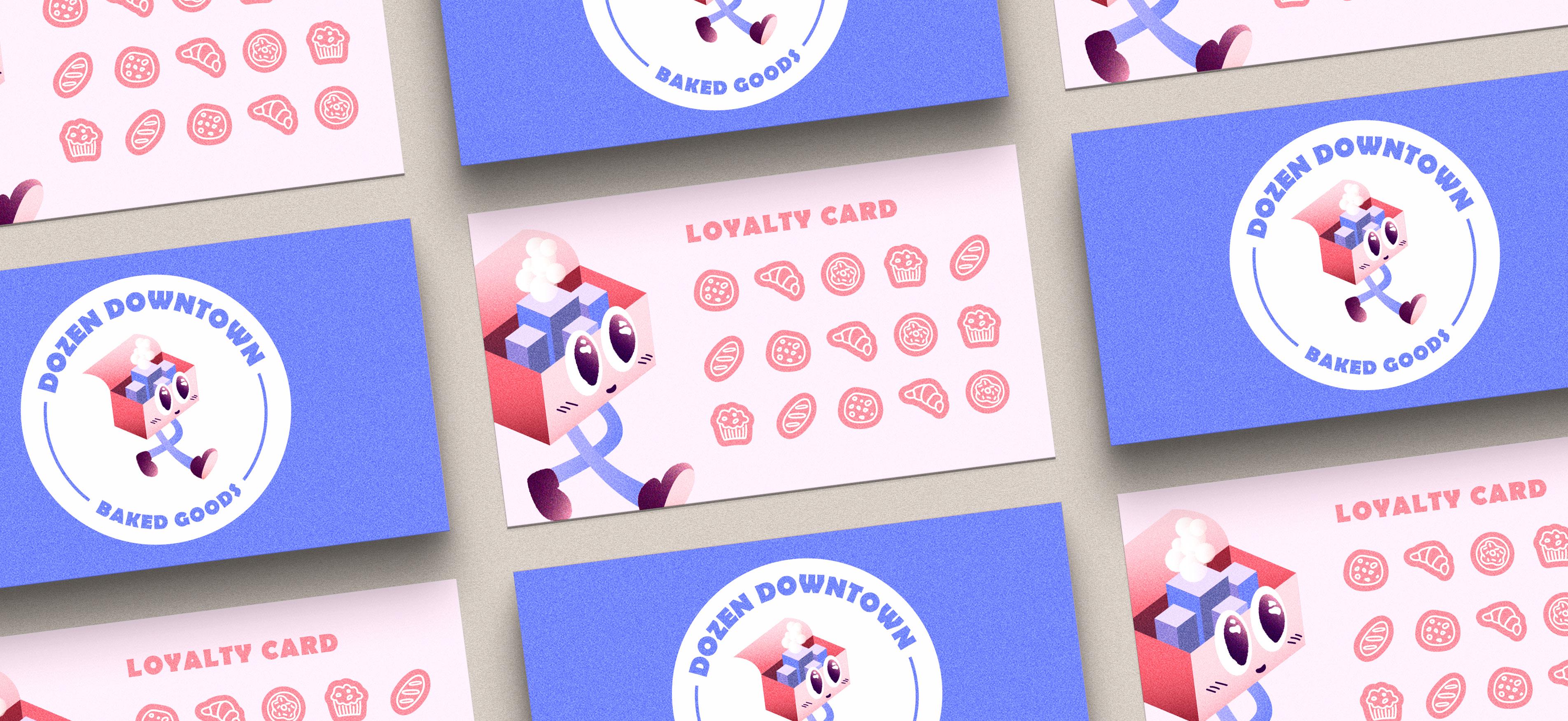
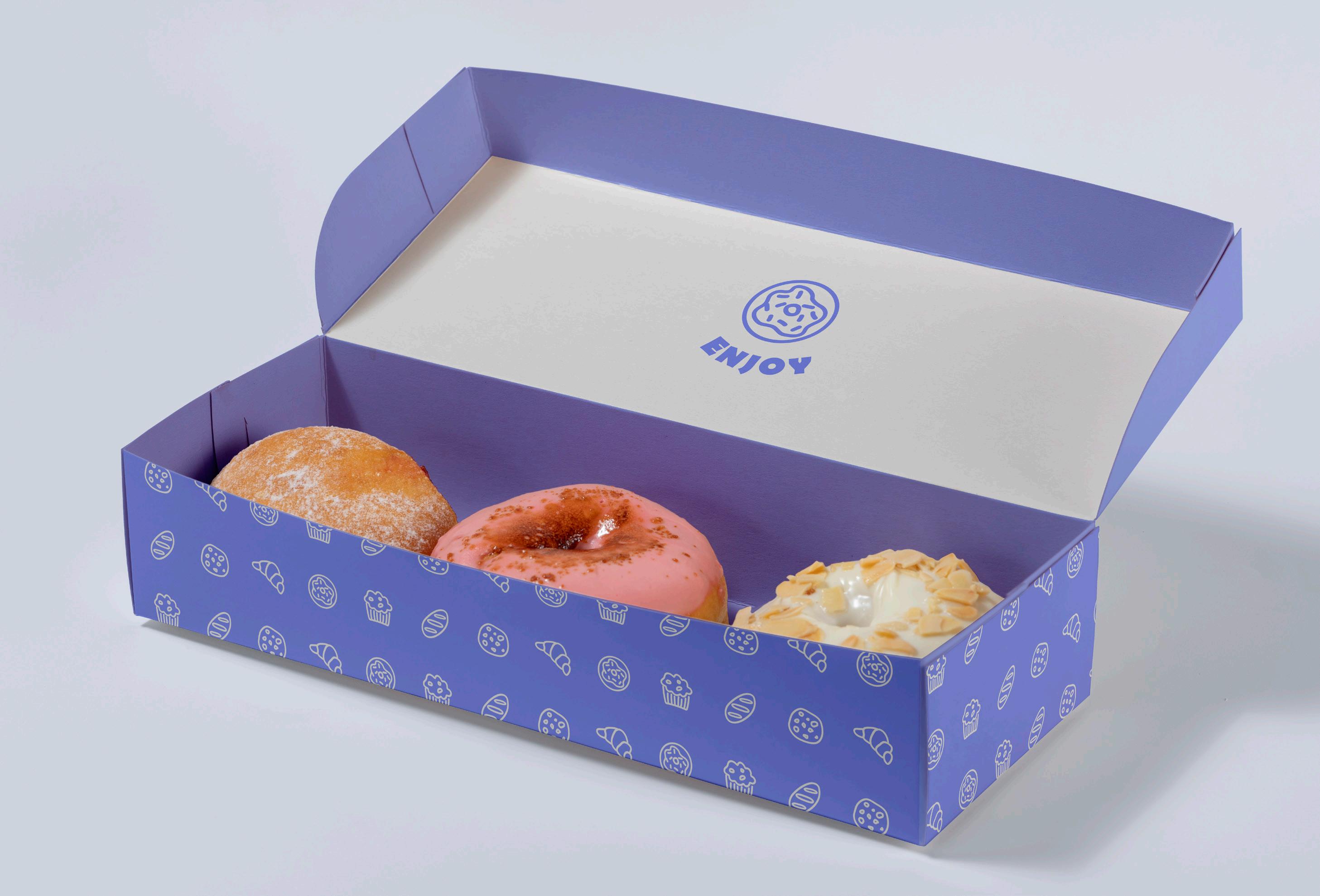
DOZEN DOWNTOWN
THE CHALLENGE
In this project, I pushed myself to create a character-based logo with an isometric aspect. Given the name Dozen Downtown, the challenge was to create a mascot that would be playful and make sense for the brand.
THE SOLUTION
I illustrated a walking bakery box that has small buildings inside of it, representing “downtown”. The smoke was added to give the impression that a warm treat was baking inside. Other assets like loyalty cards, takeout boxes, and coffee cups were designed with the same bright playfulness as the logo to expand the brand.
Ai
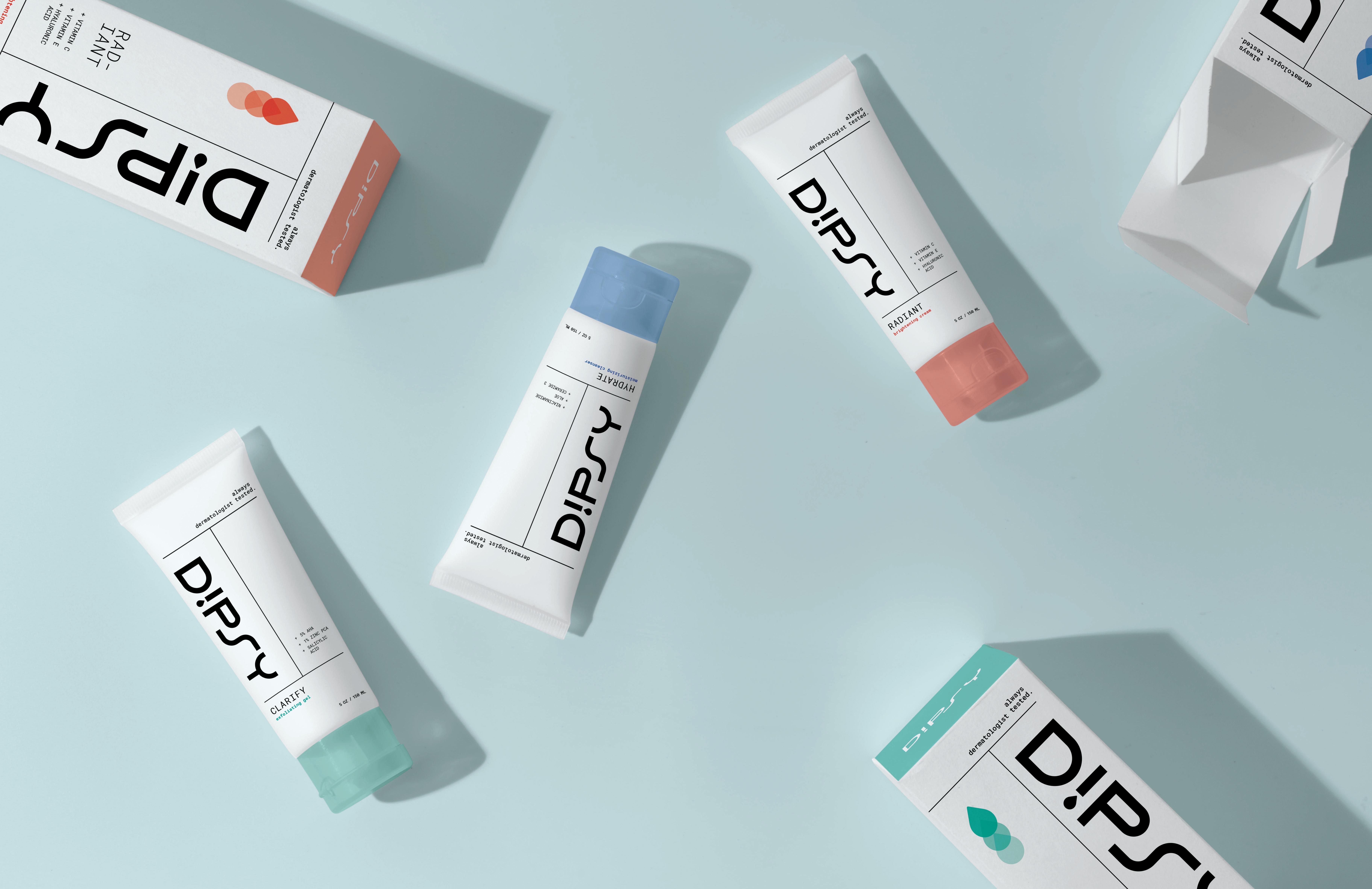

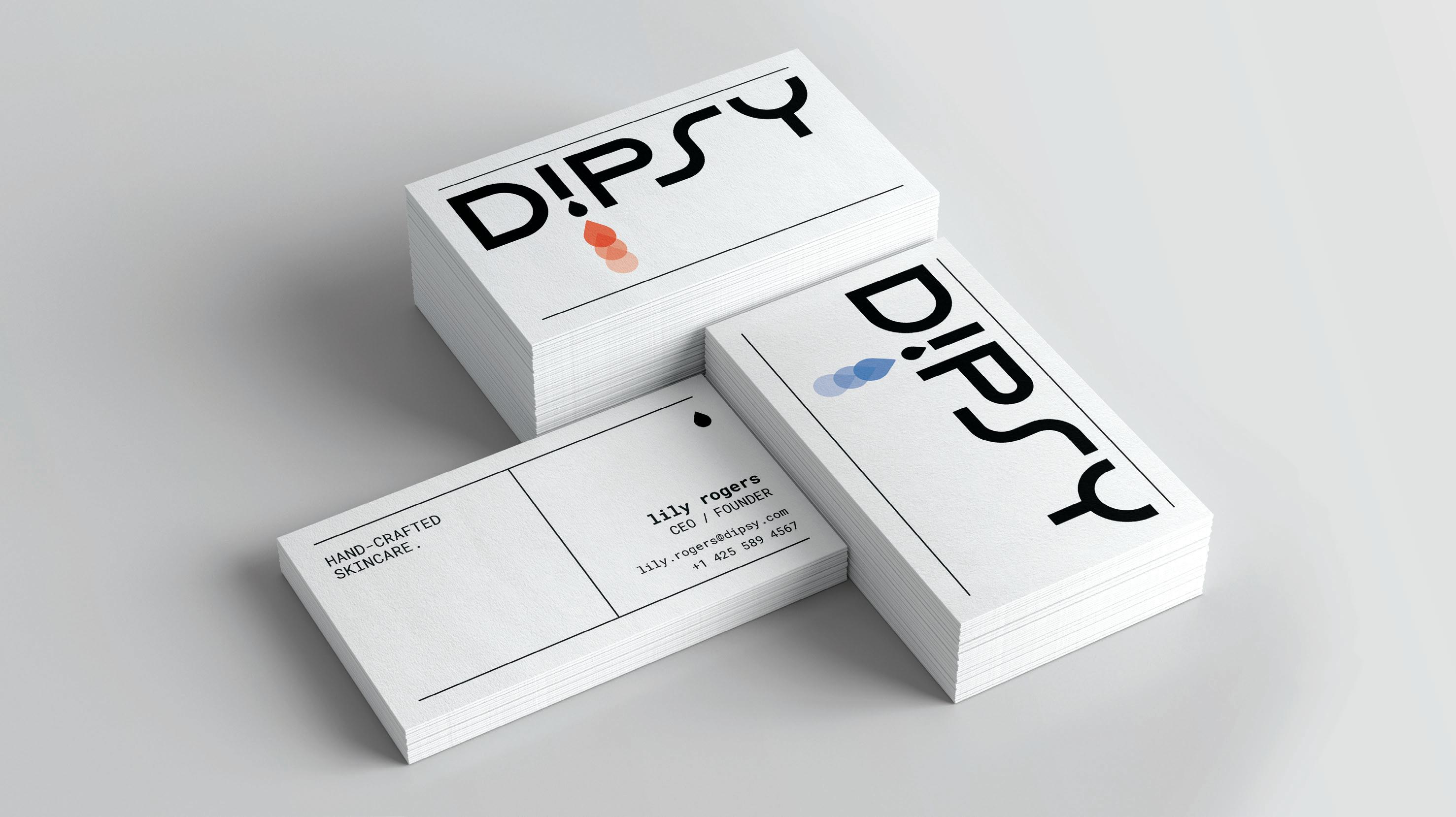
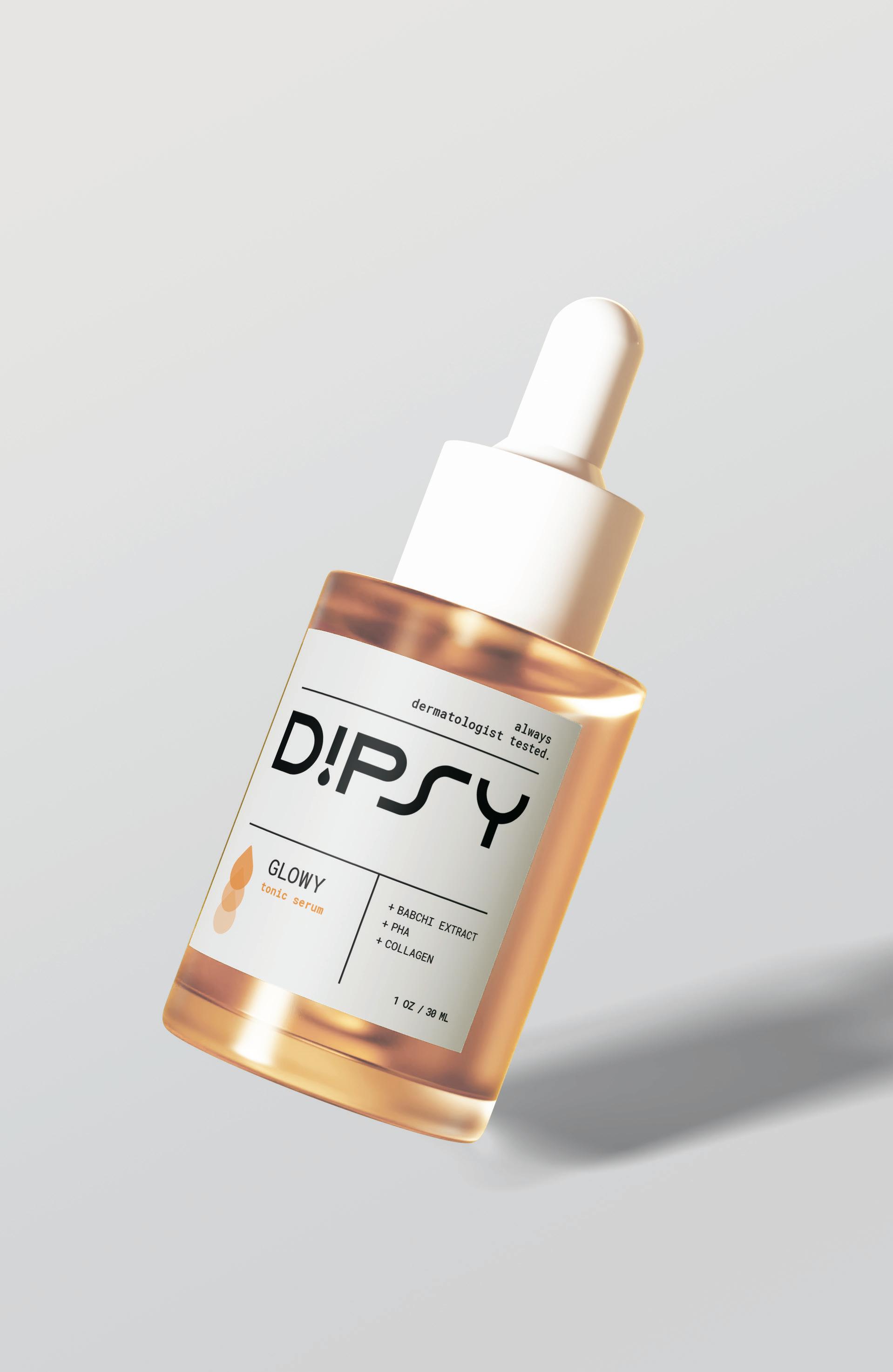
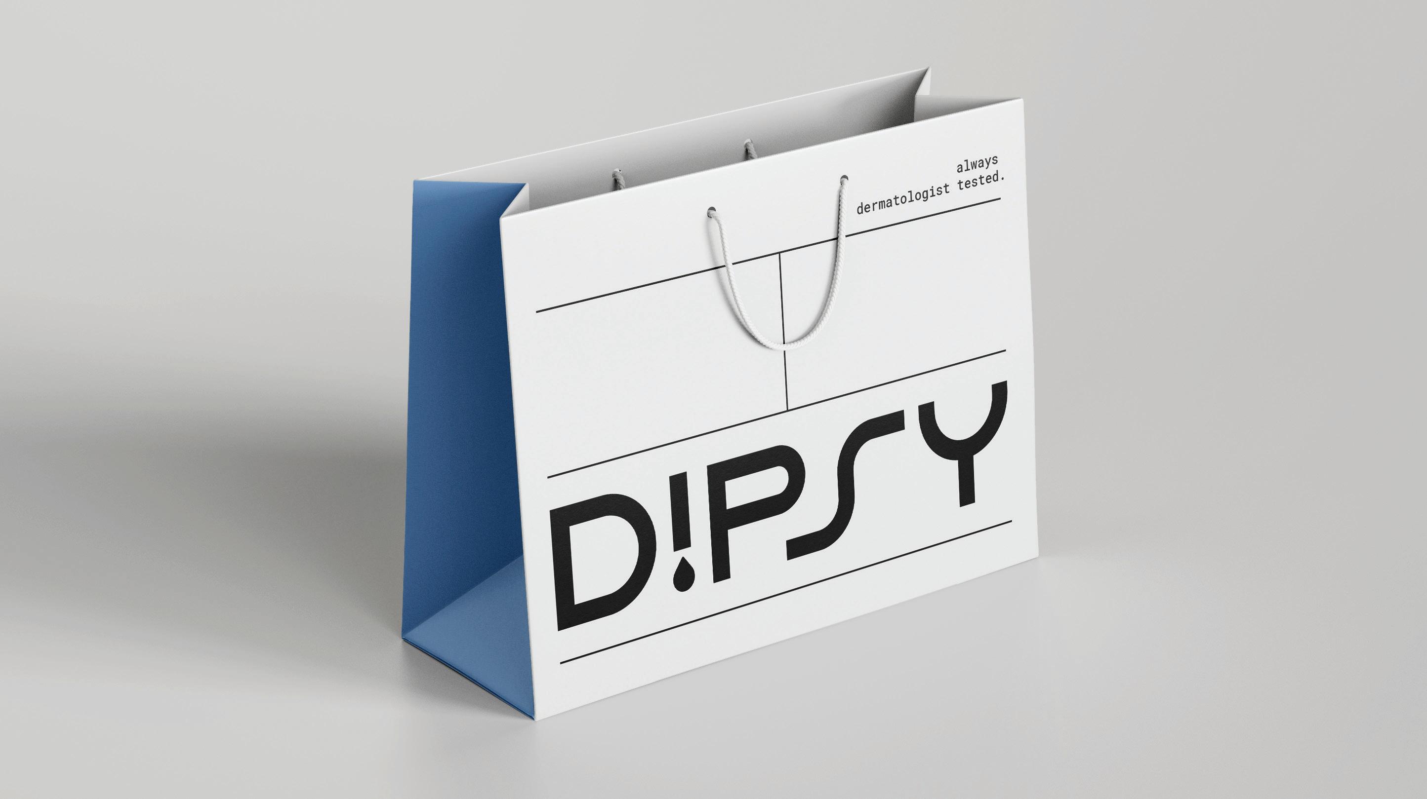
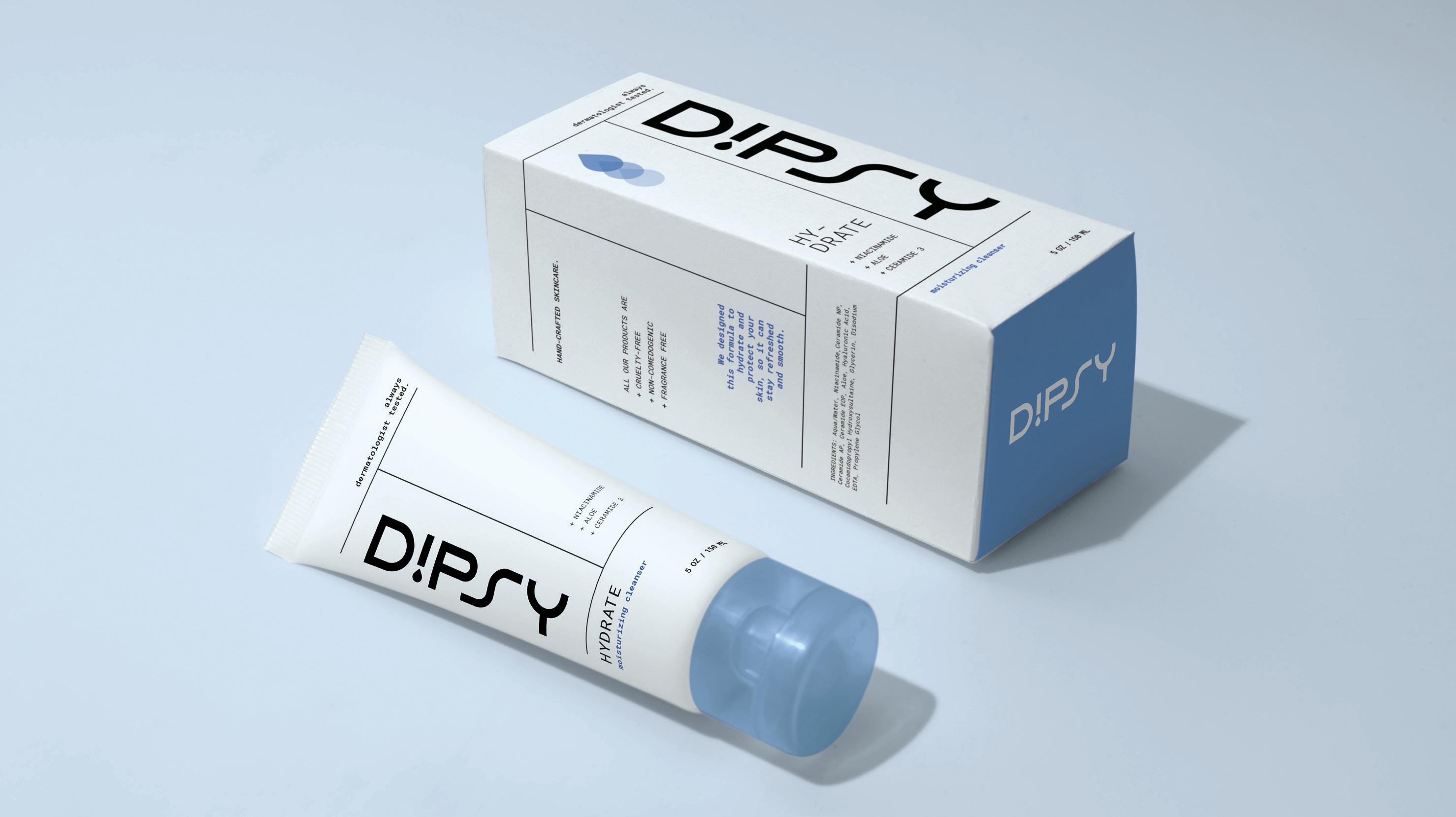
DIPSY SKINCARE
THE CHALLENGE
This is a passion project I created for a skincare brand named Dipsy. For the branding and packaging, I wanted the designs to feel simple, geometric, and clean.
One of the challenges was creating a brand system that could be applied to various product shapes and sizes. The other challenge was making each product distinct while fitting nicely within the product line.
THE SOLUTION
I created a modular brand identity that could be easily adjusted for different products and packaging materials. The grid-like format allows for endless layouts that are distinct but consistent. Soft colors are also used to quickly distinguish products for consumers.
The result is a sleek and simple brand identity that can adapt to many product lines. The final assets include product packaging, cosmetic tubes, dropper bottles, shopping bags, and business cards.
Ai
always dermatologist tested. 5% AHA 1% ZINC PCA + SALICYLIC ACID exfoliating gel 5 OZ / 150 L HAND-CRAFTED SKINCARE. ALL OUR PRODUCTS ARE + CRUELTY-FREE + NON-COMEDOGENIC + FRAGRANCE FREE DIRECTIONS: Apply gently to face and wash off with warm water. Use 1-2 times per week. If contact with eyes occurs, wash them gently with cold water to avoid irritation. We designed this gentle, nonabrasive exfoliant to help unclog pores and leave your skin clear. INGREDIENTS: Aqua/Water, Niacinamide,Ceramide NP, Ceramide AP, Ceramide EOP, Aloe, Hyaluronic Acid, Cocamidopropyl Hydroxysultaine, Glycerin, Disodium EDTA, Propylene Glycol moisturizing cleanser 5 OZ / 150 L always dermatologist tested. HAND-CRAFTED SKINCARE. RAD-
always dermatologist tested. + VITAMIN C + VITAMIN E + HYALURONIC ACID brightening cream 5 OZ / 1 0 ML HAND-CRAFTED SKINCARE. ALL OUR PRODUCTS ARE + CRUELTY-FREE + NON-COMEDOGENIC + FRAGRANCE FREE DIRECTIONS: Apply gently to face once a day avoiding the eye area. If contact with eyes occurs, wash them gently with cold water to avoid irritation. We designed this formula with rich antioxidants to replenish and brighten your skin. INGREDIENTS: Aqua/Water, Niacinamide,Ceramide NP, Ceramide AP, Ceramide EOP, Aloe, Hyaluronic Acid, Cocamidopropyl Hydroxysultaine, Glycerin, Disodium EDTA, Propylene Glycol exfoliating gel 5 OZ / 1 0 ML always dermatologist tested. HAND-CRAFTED SKINCARE.
CLARIFY
IANT
425.563.4342
hello@charlottebedward.com
charlottebedward.com
ROMANS 8:28
