SAM’S SWEET CHILI SAUCE CO.
PACKAGE DESIGN - SOCIAL MEDIA
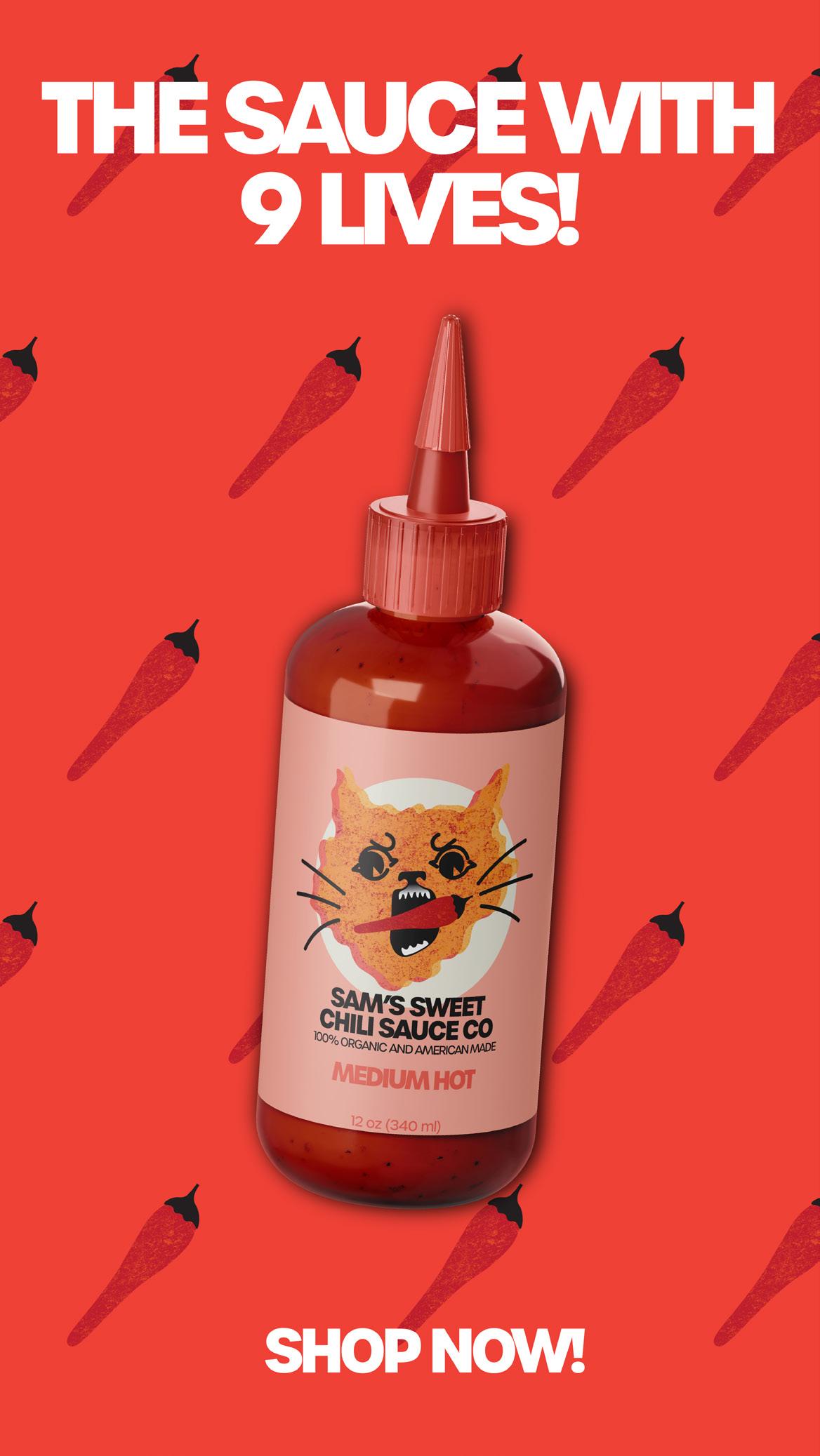
The sauce with 9 lives. Sam’s Sweet Chili Sauce Co. aims to be the lively choice in hot sauces, targeting Gen Z with vibrant packaging and a playful cat mascot. Bright colors evoke energy to attract visually-oriented consumers, while hunger-inducing hues promise sensory satisfaction, catering to youthful appetites.

2


6


A SOLDIER, A BEAR, & A BOY
BOOK DESIGN - TYPOGRAPHY
The cover features a prominent image of Harry Colebourn, the soldier, with Winnipeg the bear. Including a historical photograph evokes the time period. Choosing sepia tones is reminiscent of early 20th-century photography, to convey the historical context of the story but also to reflect the yellow from the well known Winnie-the-Pooh character. The typography chosen is an elegant script font reflecting the handwriting from the original postcards written along with a serif typeface to anchor the historical period.

8

FROSTY FOX
LOGO DESIGN - SOCIAL MEDIA
I chose vibrant and playful branding for Frosty Fox ice cream shop in Phoenix, AZ. Targeting parents and children, the design is clean yet colorful, appealing to both demographics. While the branding is vibrant and playful, it is also designed to maintain a clean and modern aesthetic. This balance ensures that the branding remains visually appealing and professional, aligning with the expectations of both parents and children.


10


12 flavor poll Help us choose the next limited most popular one will hit our Comment your choice Option 1: Salted Lavender Option 2: Freckled Coffee Option 3: Caramel Honeycomb Option 4: Chocolate


limited edition flavor. The counters next month! choice below!


frostyfox

Liked by amyhansen and others frostyfox Join us anytime this month and get 10% o single scoops because it’s NATIONAL ICE CREAM MONTH. This deal last the whole month of July! The frigid avors are waiting... View all 412 comments 21 minutes ago


poll friday!
Lavender
Coffee
Honeycomb
Chocolate
Orange
COLEOTTERO CHOCOLATE
PACKAGE DESIGN
The packaging design exudes sophistication, employing clean lines, minimalistic typography, and whitespace to convey refinement. Inspired by the Italian word for “beetle” the design pays homage to Italian culture, adding depth and authenticity. Bold colors and elegant packaging elevate the chocolate bar’s perception as a high-end product, appealing to discerning consumers seeking premium experiences.

14

PHOENIX OLYMPICS
WEB DESIGN
Welcome to the Phoenix Olympics web page, designed to gauge citizen interest in hosting the 2032 Games. Inspired by the track, our design is sleek and dynamic, echoing the spirit of Olympic athleticism. Through interactive elements, we invite engagement and feedback, fostering a shared vision for a future where Phoenix shines on the global stage of sportsmanship and unity.

16

DAZED MAGAZINE
WEB DESIGN
In response to evolving audience demographics, Dazed magazine embarked on a web redesign project aimed at engaging a younger audience. The redesigned website features distinct layouts for the home page, music section, and article pages, each meticulously crafted to resonate with the target demographic. With user experience at the forefront, the websites navigation prioritizes ease of use and accessibility. Visitors can seamlessly navigate from the home page to the music section and dive deep into articles, ensuring a fluid and engaging browsing experience.

18


