HI, I’M KATERI!
I was born and raised in sunny Yuma, Arizona alongside my loving family. Now, I am proud to say that I’m about to graduate from Grand Canyon University with my bachelor’s degree in Advertising and Graphic Design. Truly, I have a passion for many things, such as design, art, cooking, nature, and more. The world is full of endless possibilities, and I’m always eager to explore and learn new things. As a graphic designer, I firmly believe that design is much more than just work; it’s a personal reflection of who I am. When creating my designs, I hold true to values like honesty, diversity, and functionality, all of which are deeply rooted in my core beliefs. Integrity is the foundation of my creative process, and I strive to infuse every project I work on with authenticity.
My ultimate dream is to become a part of a thriving design community where I can contribute my skills and collaborate with like-minded creatives to bring success to our shared projects. I am also excited about the opportunities for growth that the future holds for me as a designer. There is an inherent uniqueness in both myself and the skills I bring to the table. With unwavering confidence in my abilities, I’m ready to tackle any challenge that comes my way. My design approach is highly adaptable, effortlessly aligning with current trends and aesthetics. Thank you for taking the time to get to know me a little better. I am absolutely thrilled to share my journey and creations with you!
TO VIEW MORE OF MY WORK, YOU CAN VISIT CARRASCOKATERIDESIGNS.COM
NICE ICE BRANDING AND PRODUCT DESIGNS
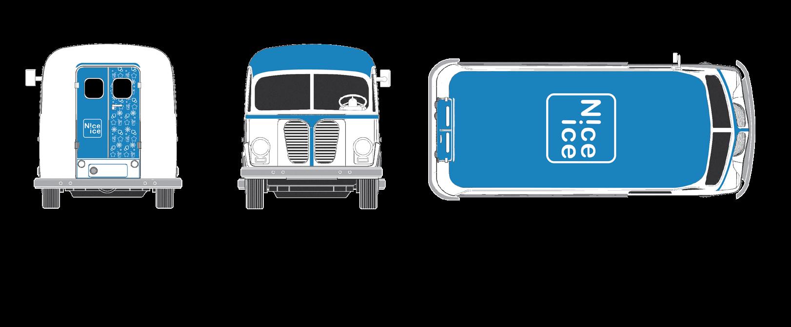
“Nice Ice” is renowned for its high-quality, homemade ice cream and refreshing cold drinks. The brand’s exceptionally delicious products gained a significant amount of popularity, leading to the opportunity for a whole new brand revitalization. Their main appeal and want for their new look is to emphasize on the freshness of their delicious frozen treats and beverages. To elevate their brand identity, I created a fresh new concept. It features a charming logo design crafted with simple typography, along with an engaging pattern that beautifully highlights their range of cold drinks and delectable ice cream treats. You can see how I tailored a food truck design for their brand image, as well as custom-made containers ideal for enhancing their business products.

01.
COLORS
LOGO
THUMBNAILS
#00AEEFA #FFFFFF


NICE ICE 01 - 02


NICE ICE 03 - 04
02.
DOTERRA
PRINT AND OUTDOOR ADS
The renowned brand doTERRA specializes in providing a wide range of health and wellness products sourced from natural ingredients. While they are widely recognized for their extensive selection of essential oils, they also offer an array of other items such as lotions, soaps, creams, deodorants, and more. The primary objective of this project was to design a series of advertisements featuring popular products in order to enhance sales. I explored various print-based advertising mediums including magazines, bus stop posters, and billboards. Each product was complemented with original images that were crafted specifically for the promotional designs. Through collaboration with another designer, we successfully drove this project to its current final form.


05 - 06 DOTERRA
MINDFULNESS RETREAT
COMMEMORATIVE EVENT
The Mindfulness Retreat is a serene weekend getaway in beautiful Sedona, Arizona, offering meditation, yoga, and mindfulness practices. Designed to promote inner peace and self-care, this event provides a haven from the stresses of everyday life. They wanted an emblem that represented the event’s essence by including its name, date, and location while maintaining a calming, welcoming vibe. I created a singular emblem for an event shirt (3 colors, with sponsor Headspace) and three products. Using Illustrator, I developed flat artwork for each item and utilized Adobe Dimension for realistic mock-ups. The aim was to create a cohesive collection of wearable items that reflect the retreat’s essence and appeal to attendees during and after the event. Going above and beyond I revised this project and worked on developing an event website using Figma to provide visitors with more information and join the registration for the next event.


LOGO 03.
THUMBNAILS
#93A76A #91A1BA
COLORS

MINDFULNESS RETREAT 07 - 08


MINDFULNESS RETREAT 09 - 10
04.
HONEST CREATIVITY
BOOK COVER
I was assigned to produce cover artwork and chapter illustrations for Dr. Detweiler’s book “Honest Creativity,” drawing inspiration from artists such as The Beatles and Taylor Swift to explore genuine creative expression. Exploring unique visual metaphors, I utilized mood boards and mind maps to create my final designs. Tailored for the Dean of GCU College of Arts and Media, the project aimed to deliver visually impactful cover art and a chapter illustration while allowing for artistic freedom. Striving for a visual tone that is both playful and serious, I targeted business professionals and individuals seeking creativity in today’s world. By starting from scratch I reached the final design phase which was more illustrative and engaging, differing from the original prototype given at the project’s briefing. Although my cover was not chosen, my artwork for chapter 19 “Honest Marketing” was selected for the final prints.


HONEST CREATIVITY 11 - 12
05. TAZO
PRINT AND SOCIAL MEDIA ADS
Steven Smith, the founder of Tazo, traveled worldwide and discovered bold and unique blends to brew. He found a variety of mesmerizing flavors cultivated by global cultures and communities over centuries. In 1994, he established TAZO Tea, known for crafting unexpected blends that burst with flavor and sourcing ingredients that invigorate the senses. The objective of this project was to develop print advertisements for TAZO Tea and social media postings. My intended outcome/action was for more TAZO Tea products to be bought and that awareness/support will spread to help the fight for climate justice. I created all of the photography for this project so I could use it for my final designs. The copywriting for all of the print ads and social cations I also created from scratch as I worked towards the final goal for this project.


TAZO 13 - 14


TAZO 15 - 16
BEST FRIENDS
CUSTOM ICONS AND LANDING PAGE
Since its establishment in 1984, Best Friends Animal Society has been dedicated to the ambitious objective of transforming all shelters in the United States into nokill facilities by 2025. This noble goal is pursued through a diverse approach that includes advocacy, educational initiatives, and hands-on support provided at their sanctuary located in Kanab, Utah. The organization offers compassionate care for a wide variety of animals and can accommodate more than 1,600 animals simultaneously. In a recent project, I undertook the first phase of this project involving conceptualizing and designing a set of icons for a landing page. This task included extensive research, brainstorming, and the creation of a comprehensive collection of 25 icons associated with a non-profit charity. My primary objective throughout this assignment was to ensure the development of an aesthetically pleasing landing page that effectively communicated the core mission and values of the non-profit organization.

06.


BEST FRIENDS 17 - 18
07. FORBES
MULTI MEDIA WEBSITE
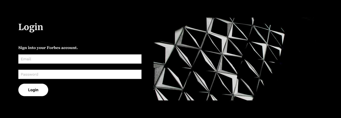
While working on this project, I dove deeper into the realm of web design and utilized the Figma software to create a userflow map, mid-fidelity wireframes, and compositions for a newly reconstructed news site. My focus was on redesigning Forbes, an influential American business magazine under Forbes, Inc., known for its global presence in both print and digital media. Forbes covers a big group of topics such as finance, industry, investing, marketing, technology, communications, science, and law, with its headquarters situated in New York City. It was interesting to work within the established brand guidelines of Forbes and maintain consistency throughout my design process, presenting a fun challenge. This experience broadened my understanding of branded designs, website development, and prototyping techniques.


SAM’S SWEET CHILI SAUCE CO.
LOGO DESIGN
“Sam’s Sweet Chili Sauce Co.” specializes in producing a variety of chili sauces suitable for enhancing various food items as a condiment. With a long-standing popularity among older Americans, the company now aims to introduce a fresh appeal to attract a younger demographic while retaining its loyal elderly customers. While receiving the project brief, it became clear that Sam desired a rebranding approach that resonated with their vision. The company sought a logo design that exuded an American farm-inspired vibe, aligning with my concept of featuring not just the chili pepper but also its distinctive leaf component. To achieve a homemade aesthetic, I used typography that was kept straightforward yet rustic. This rebranding attempt allowed me to reinvent the brand’s identity uniquely and innovatively.


08.
LOGO COLORS
THUMBNAILS
#95D777 #FFC86C
#E84242


SAM’S SWEET CHILI SAUCE CO. 21 - 22
SELENA
ALBUM COVER AND MERCH
This project involved the development of a brand identity campaign for the launch of an album inspired by the legendary Selena Quintanilla-Pérez. Initially, Selena started on her musical journey as part of a group named Selena y Los Dinos alongside her two elder siblings back in the 1980s. The main aim of the advertising was to showcase how creativity and strategic planning can enhance the recognition of an individual’s brand. A lot of effort was put into this project I undertook. I had to work through creating diverse advertising materials and products. One of my outcomes was the crafting of a simplistic typographic logo, complemented by a second version adorned with delicate roses. I also made a bold design featuring Selena’s face and roses, which proved to be a central element in the album artwork and t-shirt artwork. I explored numerous ideas and refined them before arriving at the ultimate concept for the campaign.

09.

SELENA 23 - 24


SELENA 25 - 26
THUMBNAILS
10. SWEETBEAN CHOCOLATE
LOGO AND PACKAGE DESIGN
The main objective of the project was to establish an innovative chocolate bar brand characterized by dynamic and distinctive qualities. The task included designing a logo for the brand and crafting a custom chocolate bar wrapper to complement it. As a designer, this project provided a valuable opportunity to delve into the details of product packaging creation. I used this experience to enhance my skills in design and illustration, incorporating them seamlessly with my Sweetbean Chocolates brand. The resulting packaging shows a sophisticated luxurious aura while maintaining a playful and bold feel, perfectly resonating with the overall branding concept.

LOGO COLORS
#FFFFFF #161517
#F7CACA

SWEETBEAN CHOCOLATE 27 - 28
928.581.5373 CARRASCOKATERIDESIGNS.COM HELLO@CARRASCOKATERIDESIGNS.COM


