はじめまして。
(Nice To Meet You)


Logo Design
Product Design
Apparel Design


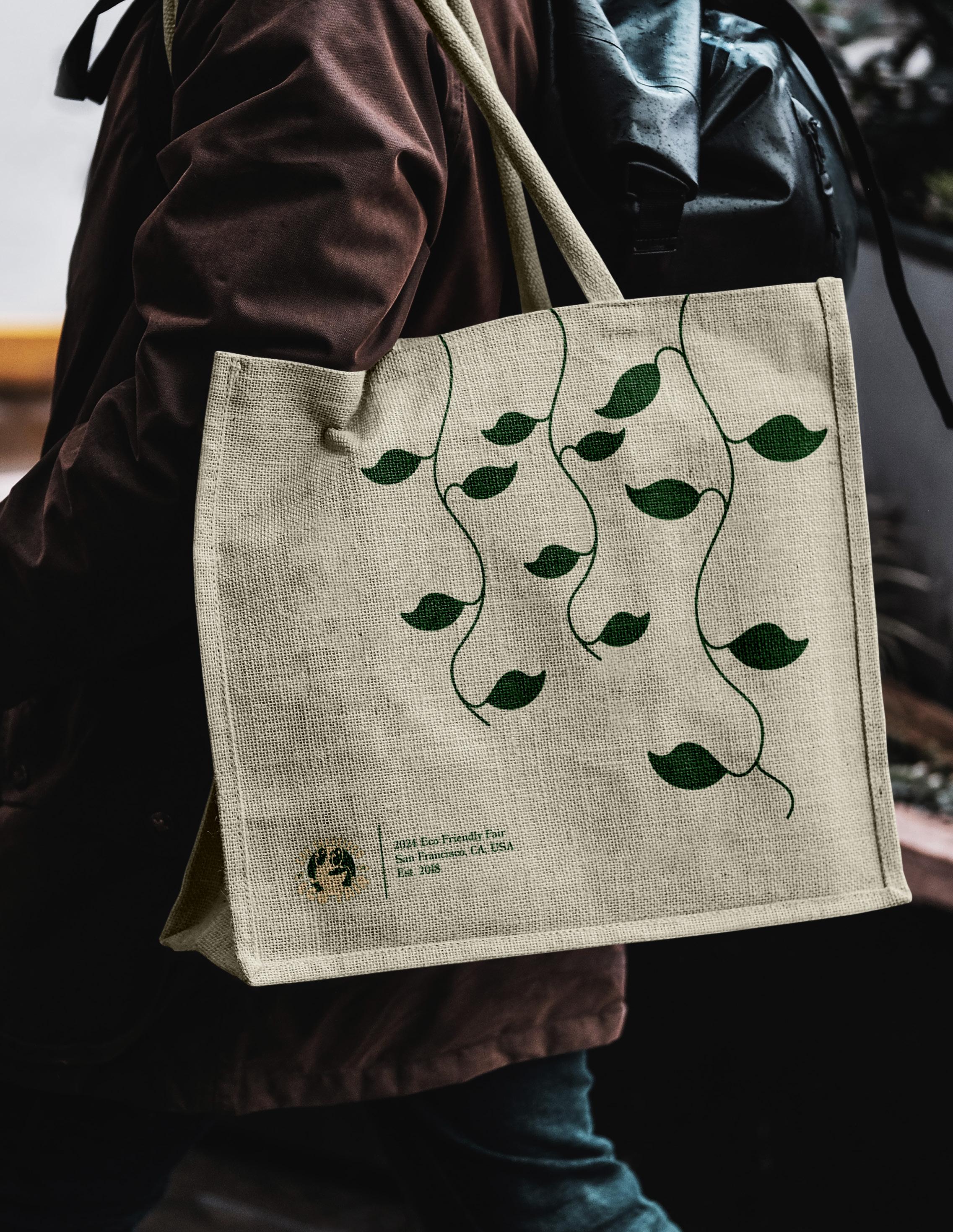
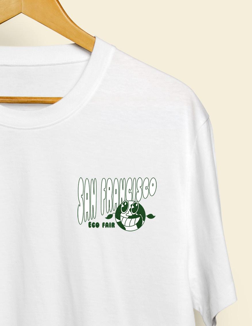
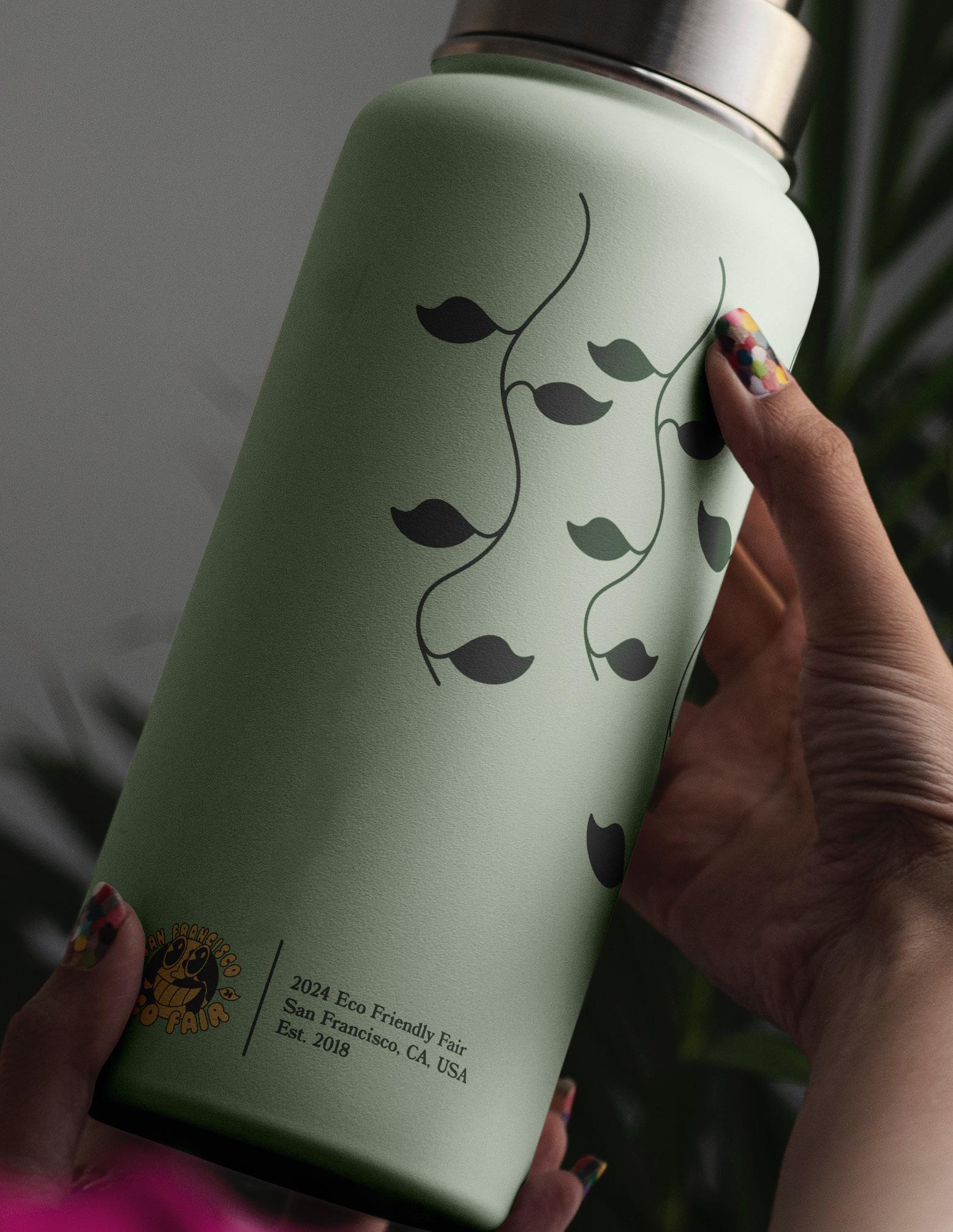
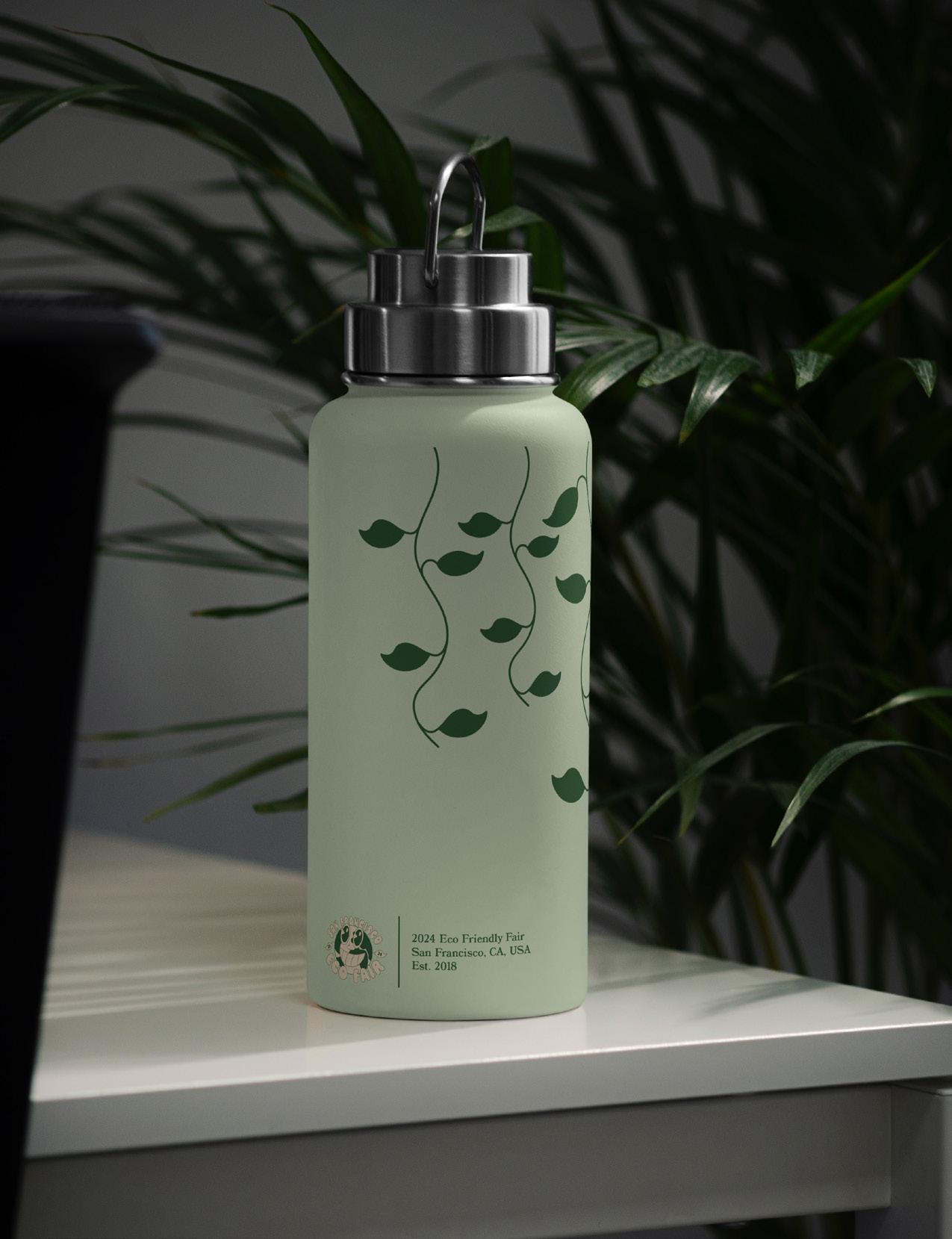
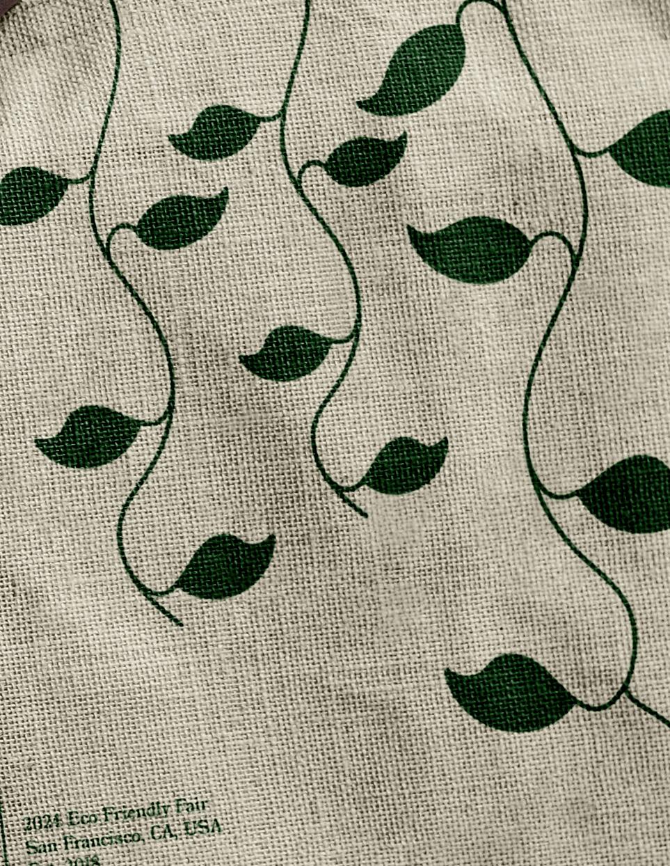
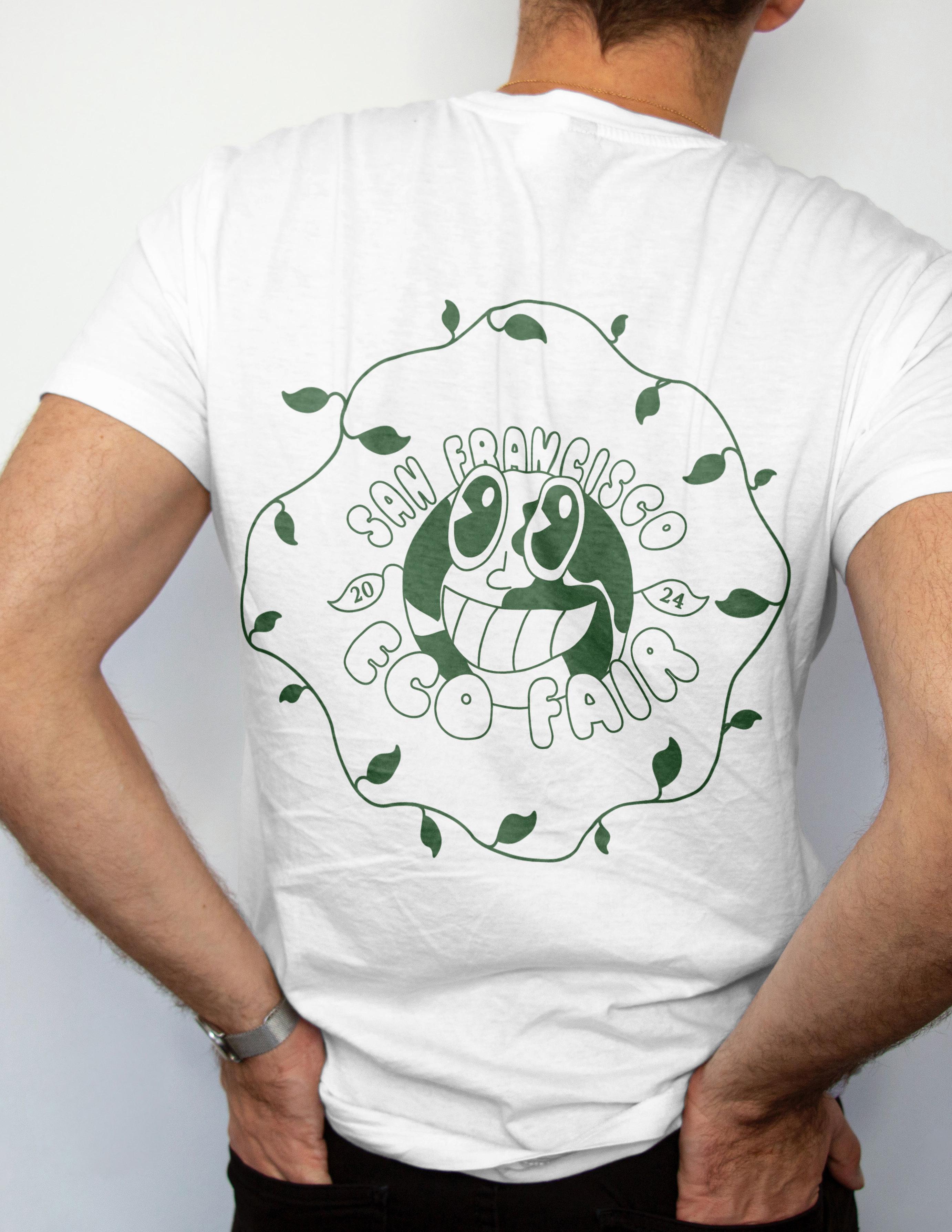
The San Francisco Eco Fair is a one-day event that focuses on eco-friendly products and sustainable living practices. The design is focused on the idea of being ‘eco-friendly’ and encouraging the betterment of the planet.

BY:
Book Cover Design
Illustration


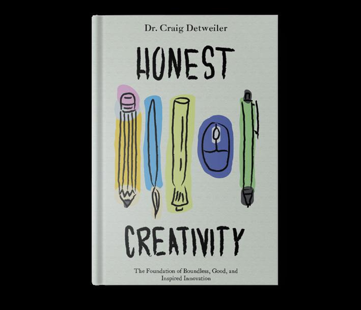
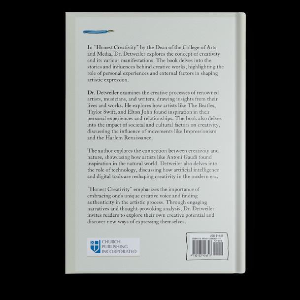
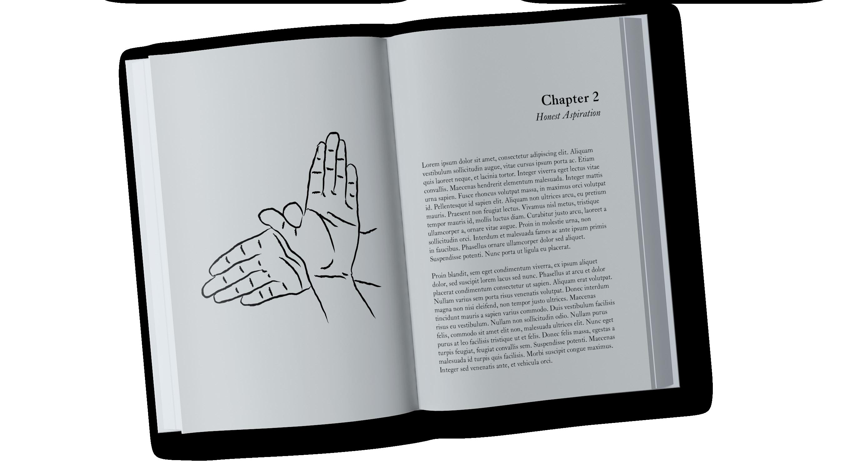
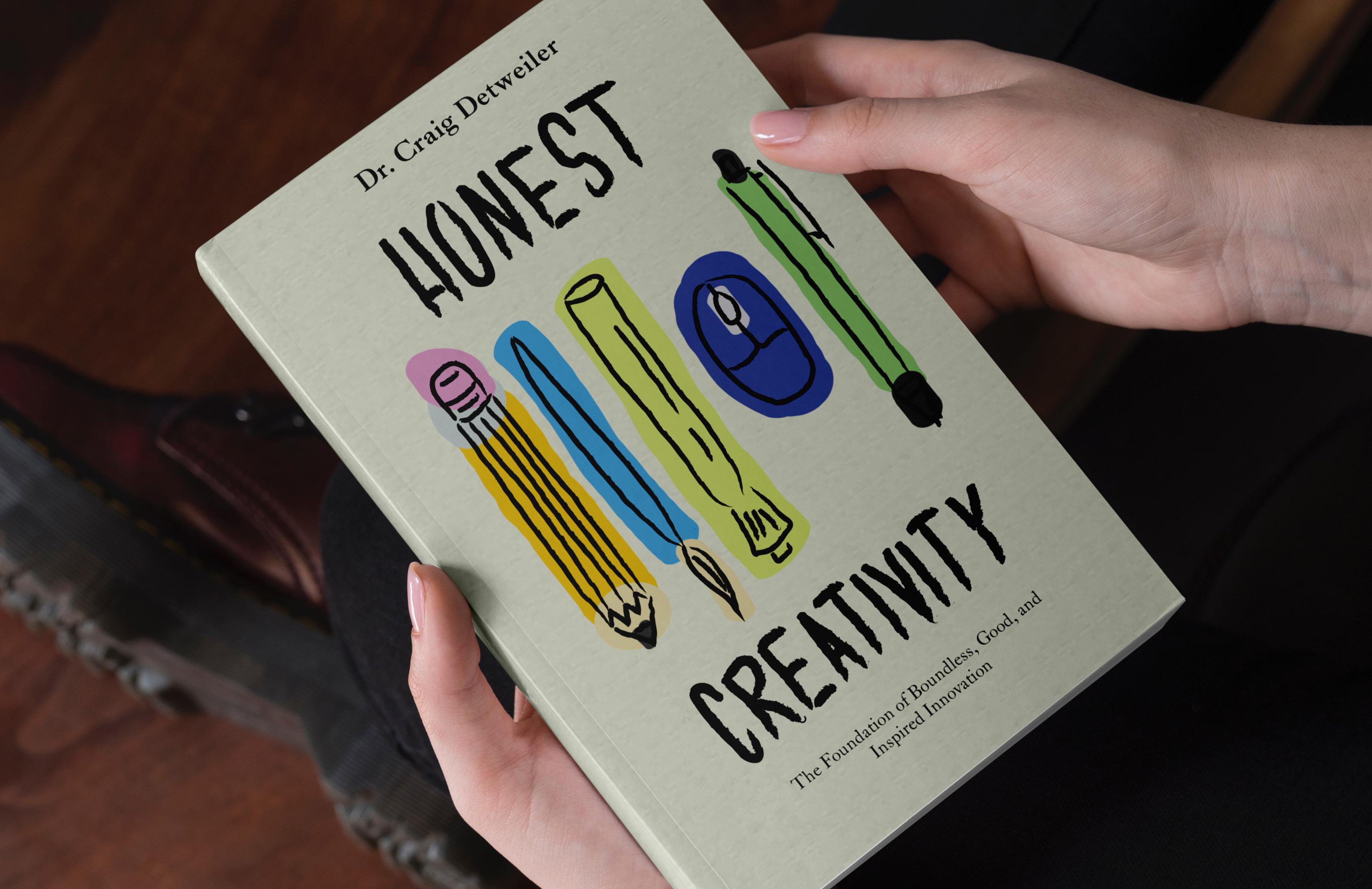
The cover represents physical tools that graphic designers use in response to AI in the industry. The chapter artwork is a hand puppet formation of a bird to represent having true aspirations inspired by the Bible verse, Isaiah 41:31. The handdrawn chapter artwork has been selected by the author to be featured in the published book, Honest Creativity.
Logo Design
Product Packaging Design
Apparel Design


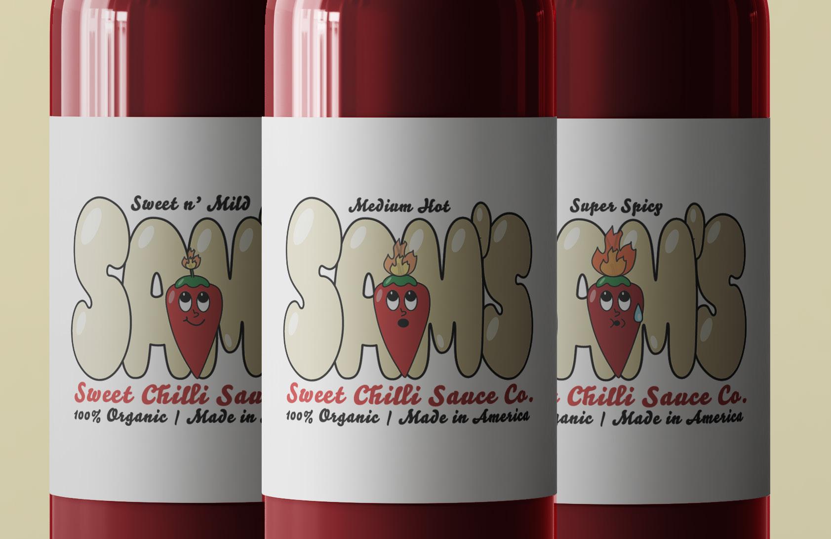
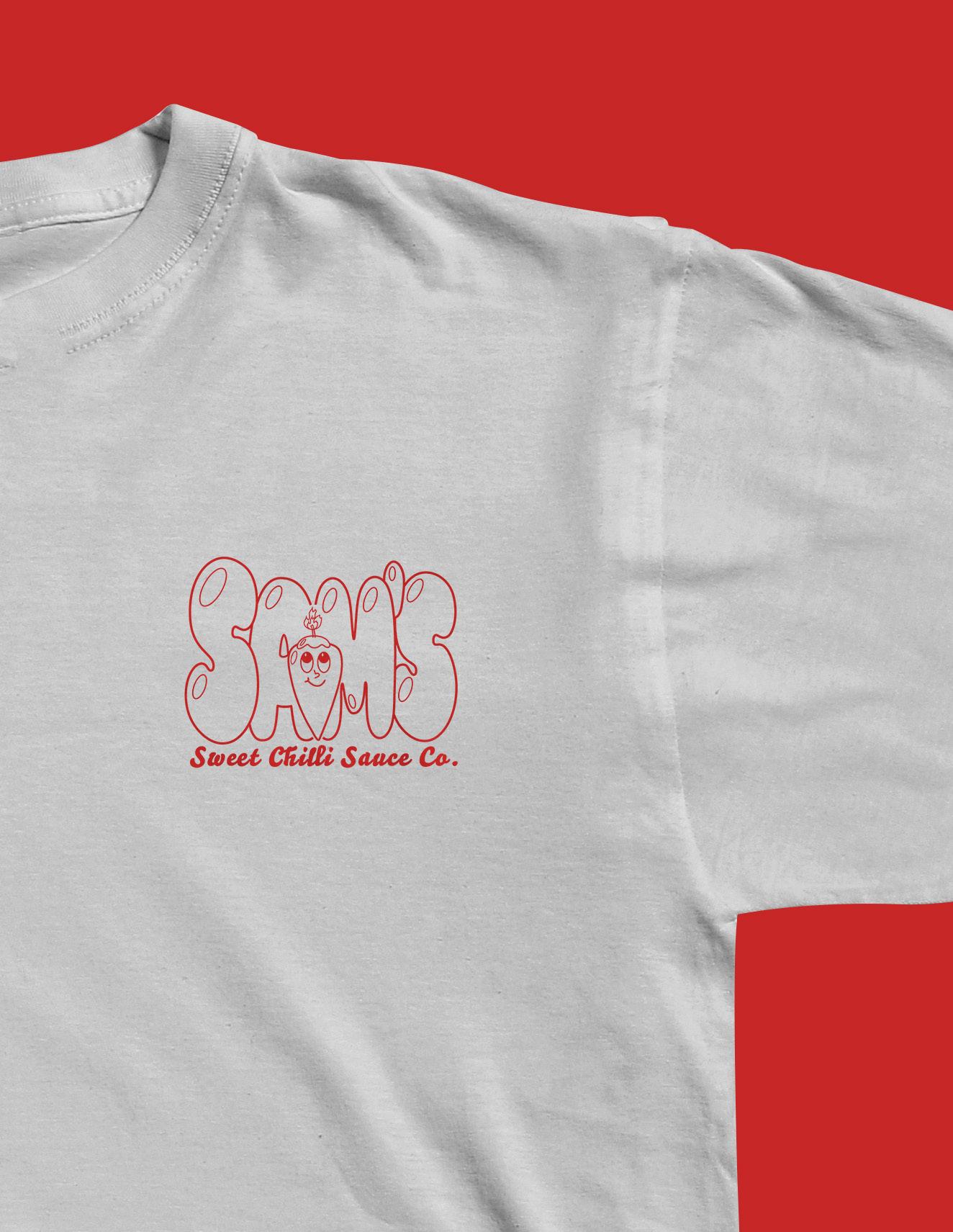
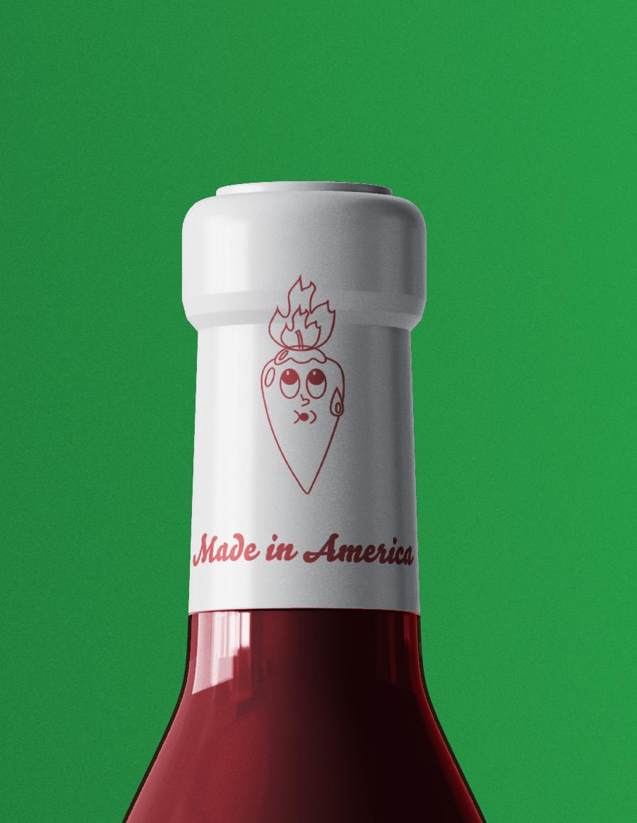
The package design was designed to be fun, attentiongrabbing, unique, and versatile for other flavors and variations.
The cartoon chili pepper character provides the sauce company with a memorable and relatable character that consumers will be able to recognize quickly on shelves alongside the fun, bubbly font.


Logo Design
Apparel Design
Social Media Marketing


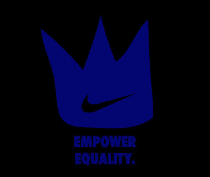
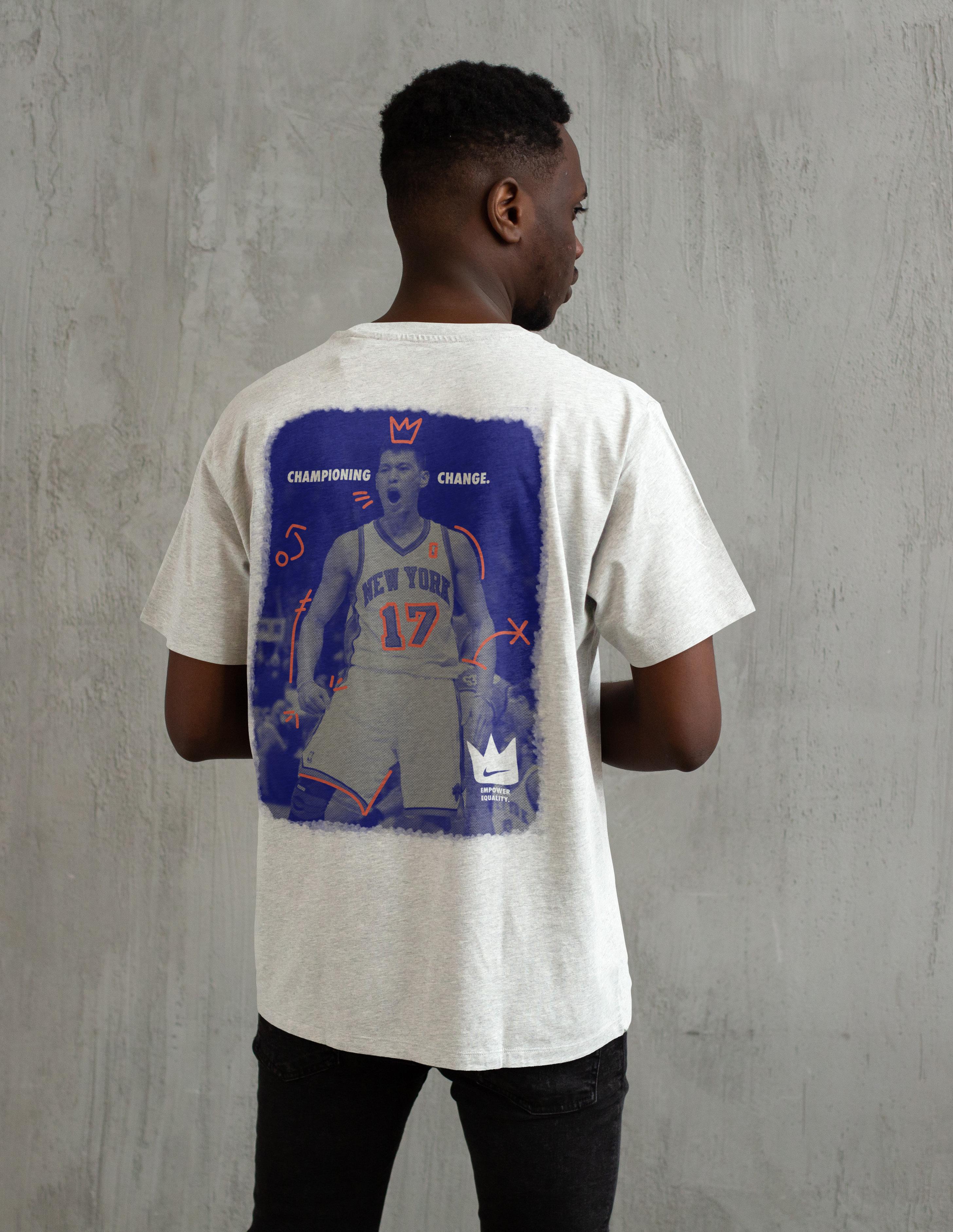
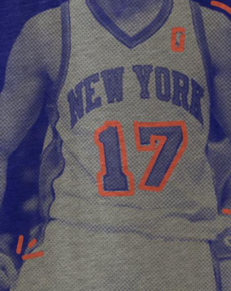
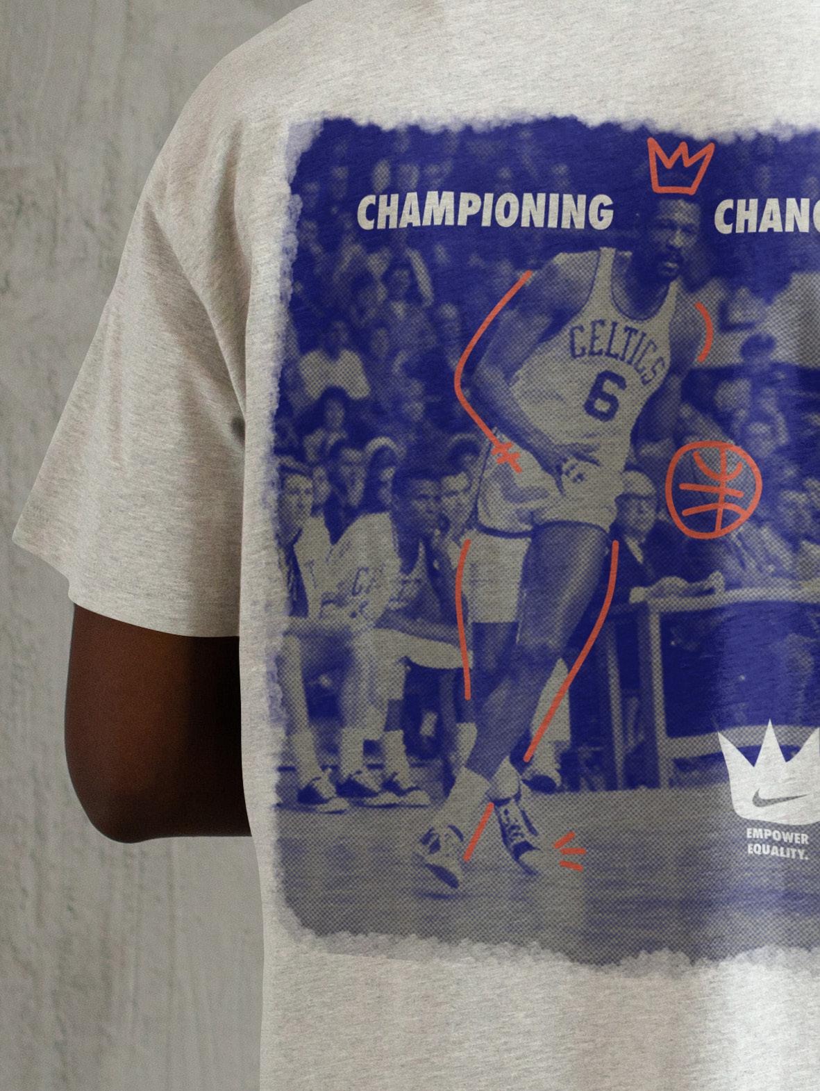
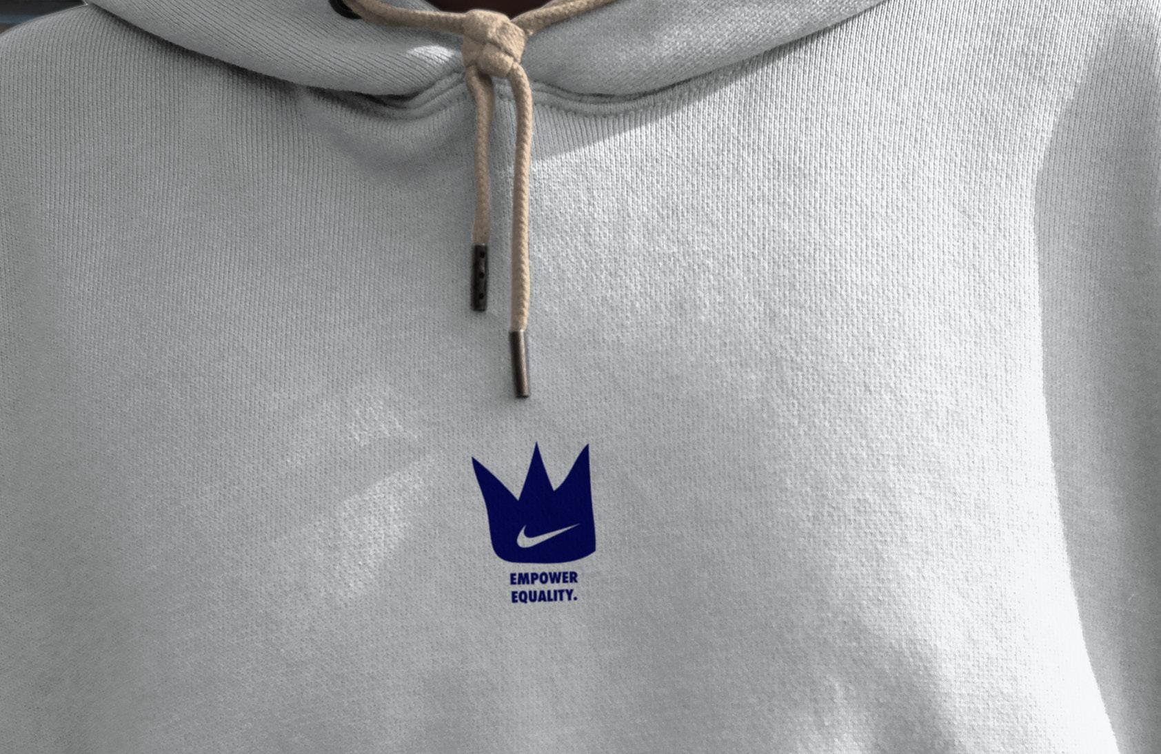
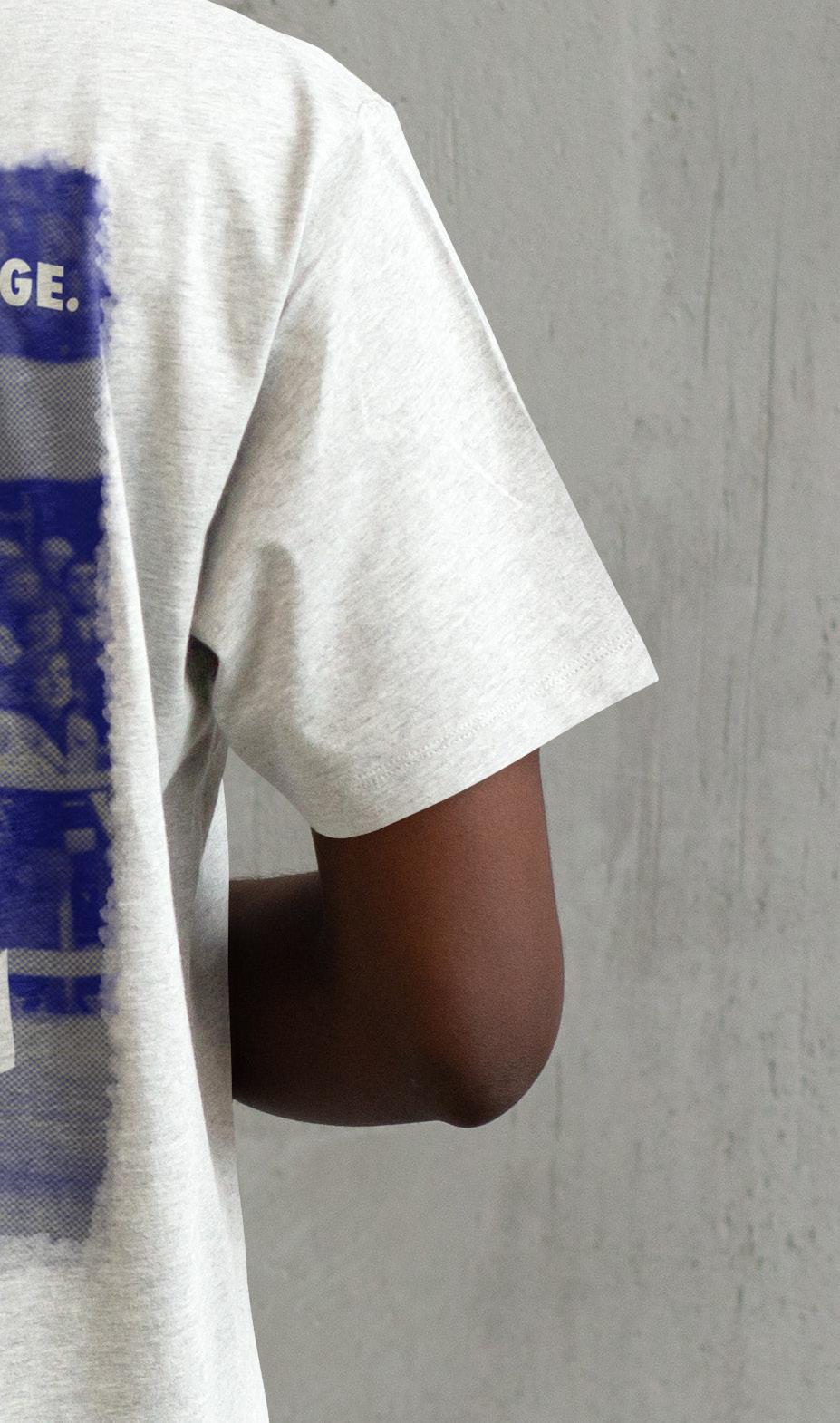
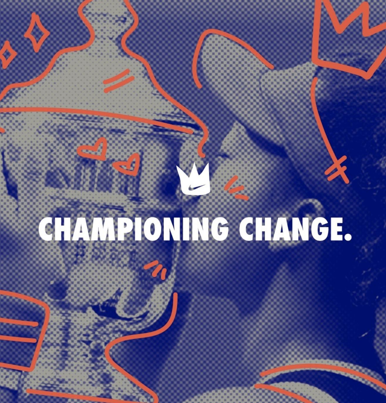
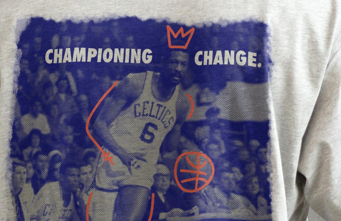
In collaboration with another creative, the campaign was designed to bring Nike’s effort to highlight equality in sports, to life. With the slogan, “Empower Equality,” and tagline, “Championing Change,” through playful, hand drawn designs, the campaign highlights athletes who have used their platform to support equality in sports including Bill Russell, Jeremy Lin, and Naomi Osaka. The hand-drawn crown represents child-like innocence and early ideas of equality.
Logo Design
Apparel Design
Brand Design


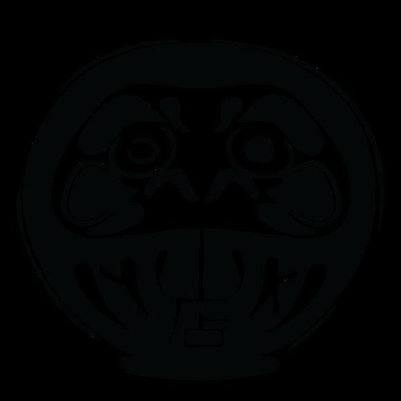
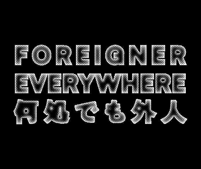
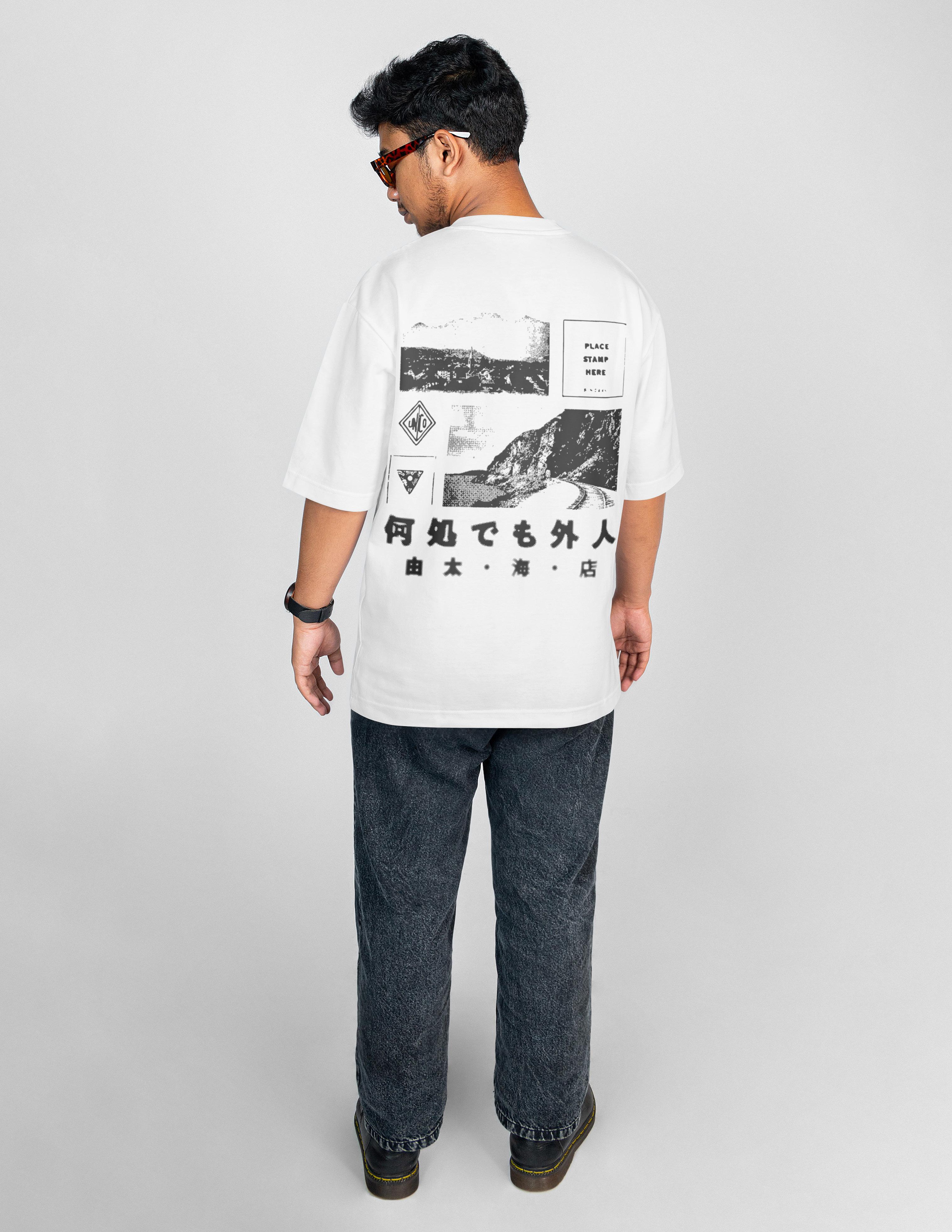
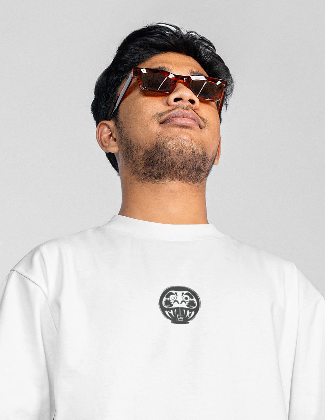
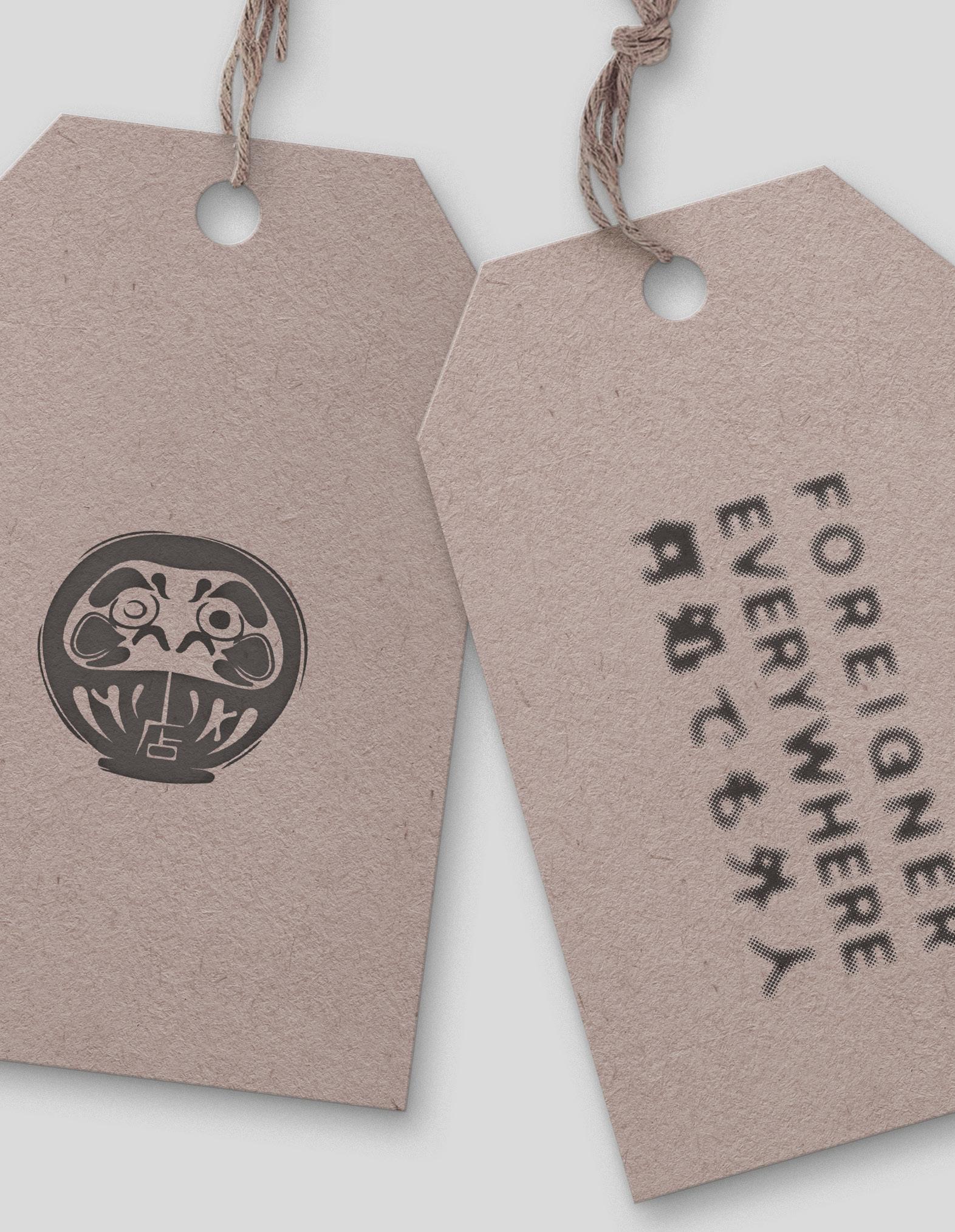
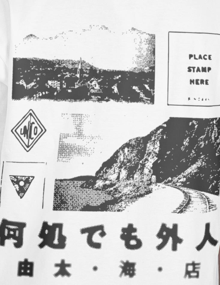
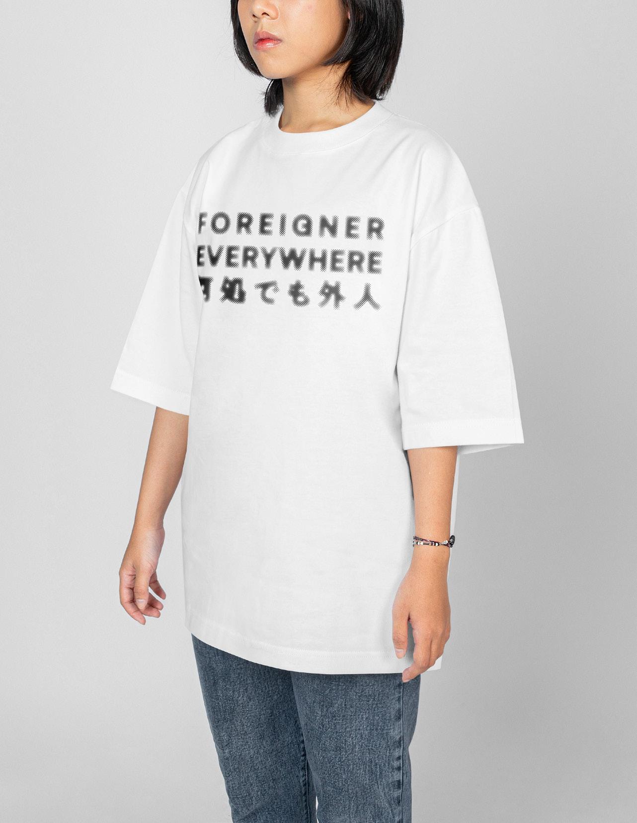
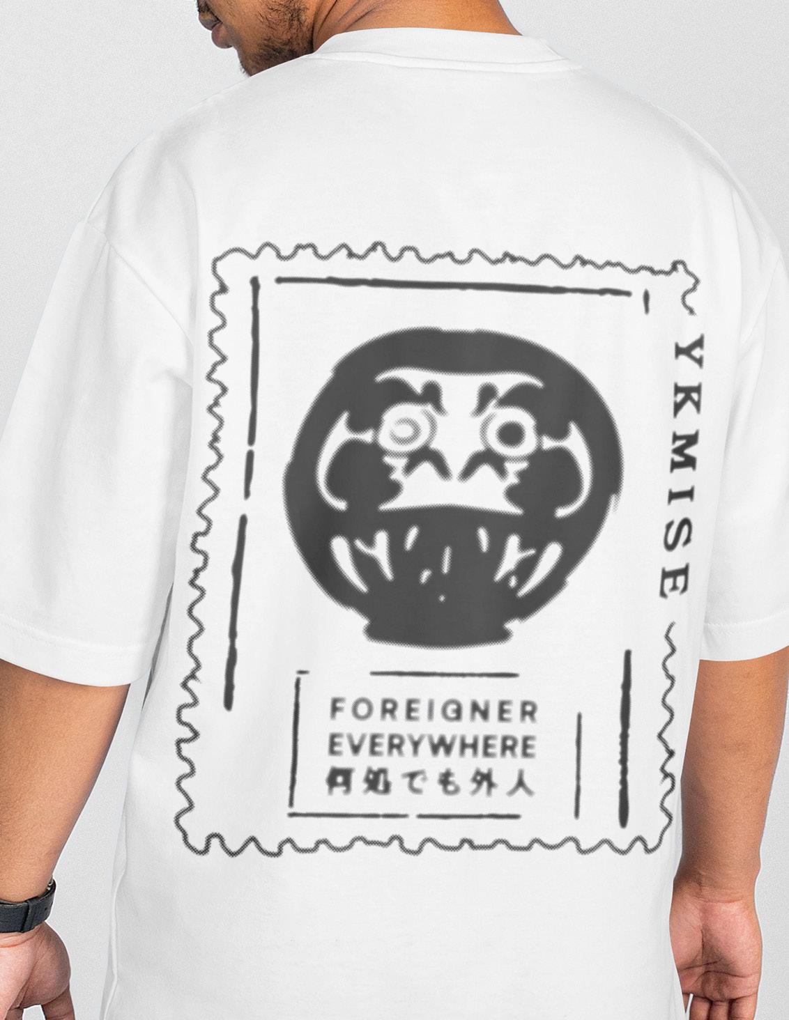
This is a passion project for the brand developed by Leon Reilly and myself known as, YKMISE. The collection name comes from an idea my mother and I would joke about - me being a foreigner wherever I go. I am half-Japanese and I have always felt different in whatever country I travel to or live in. This brand’s mission is to provide a community and a physical connection, through clothing, for other half individuals who identify with multiple cultures. The imagery is taken from vintage postcards that were gifted to me by one of my longtime best friends.
Logo Design
Apparel Design
Product Design


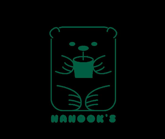
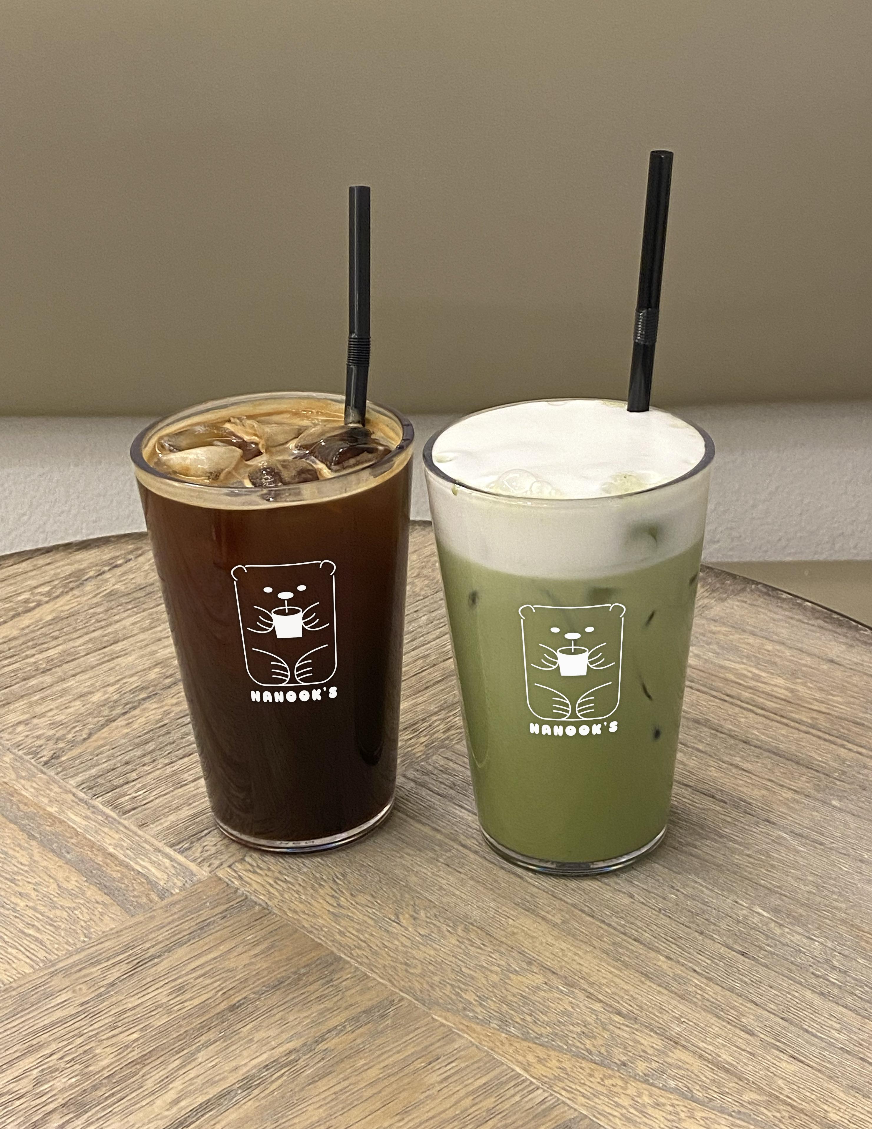
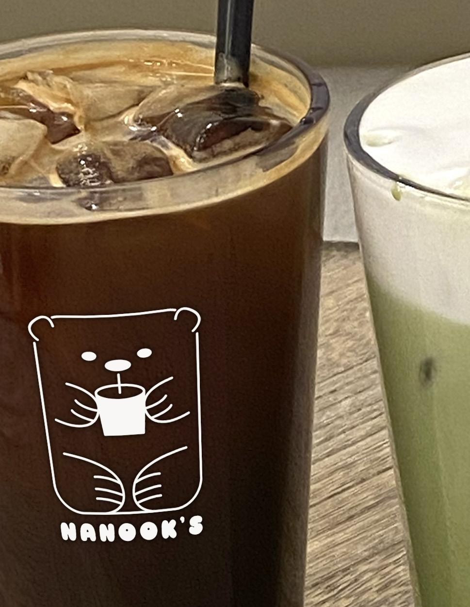
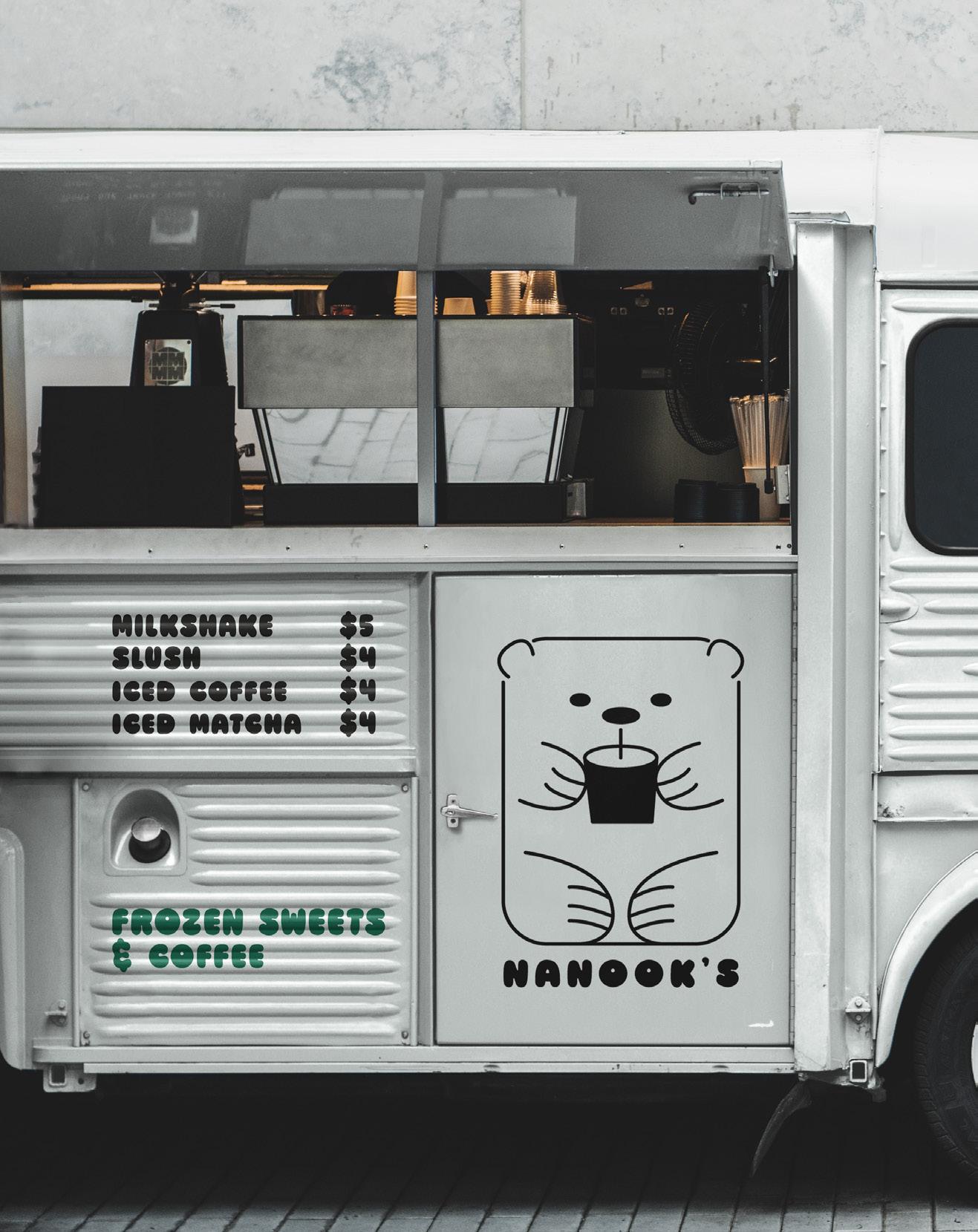
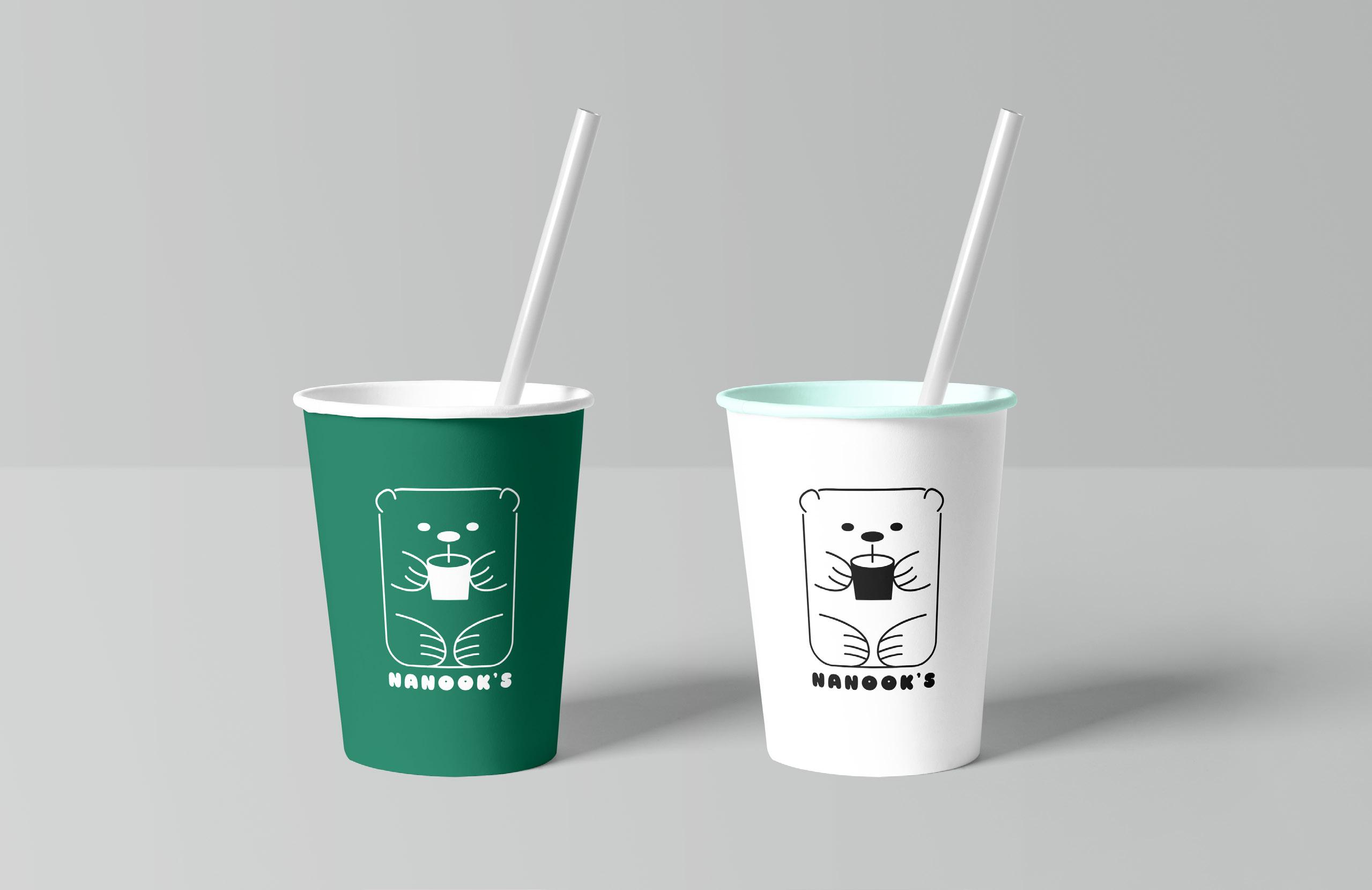
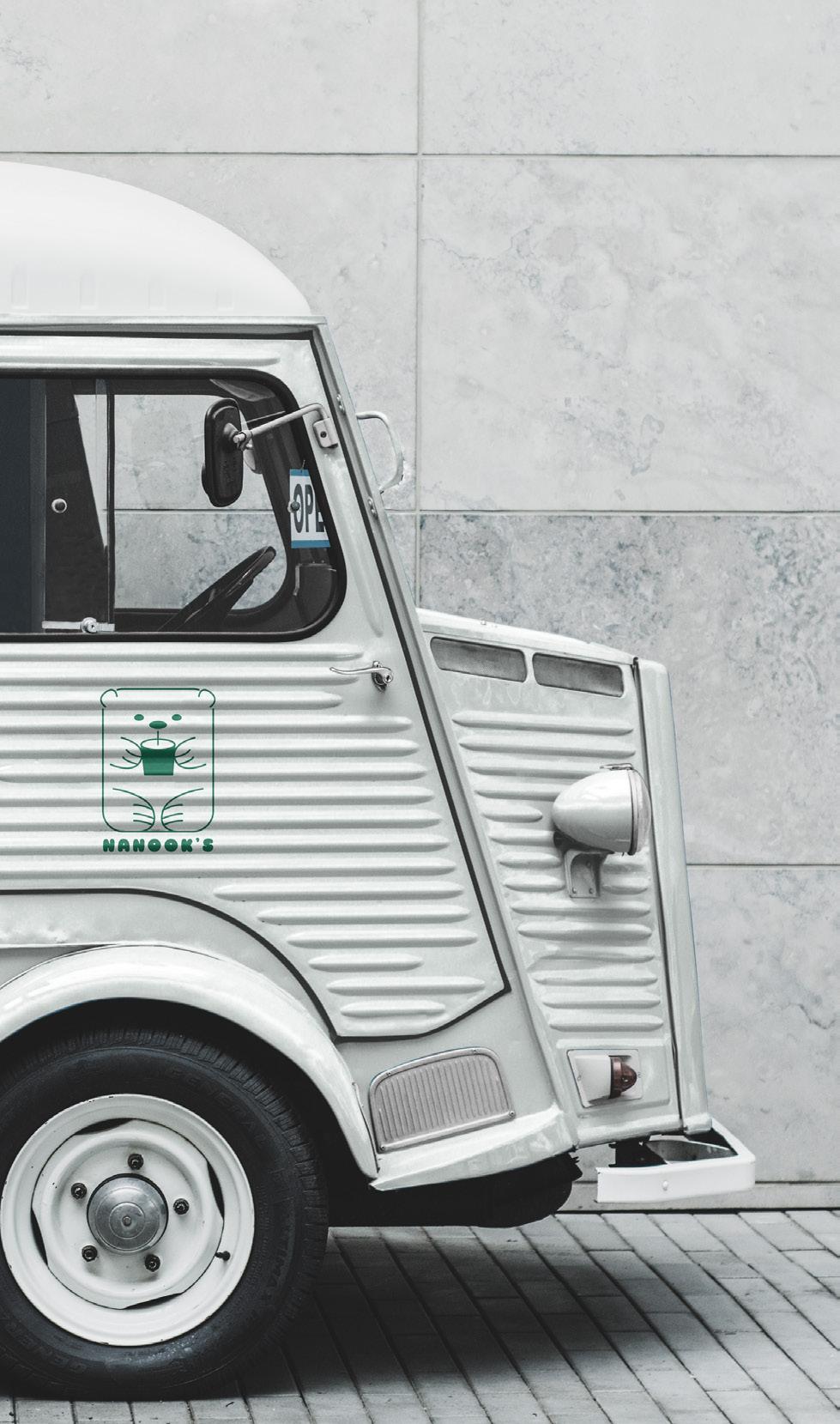
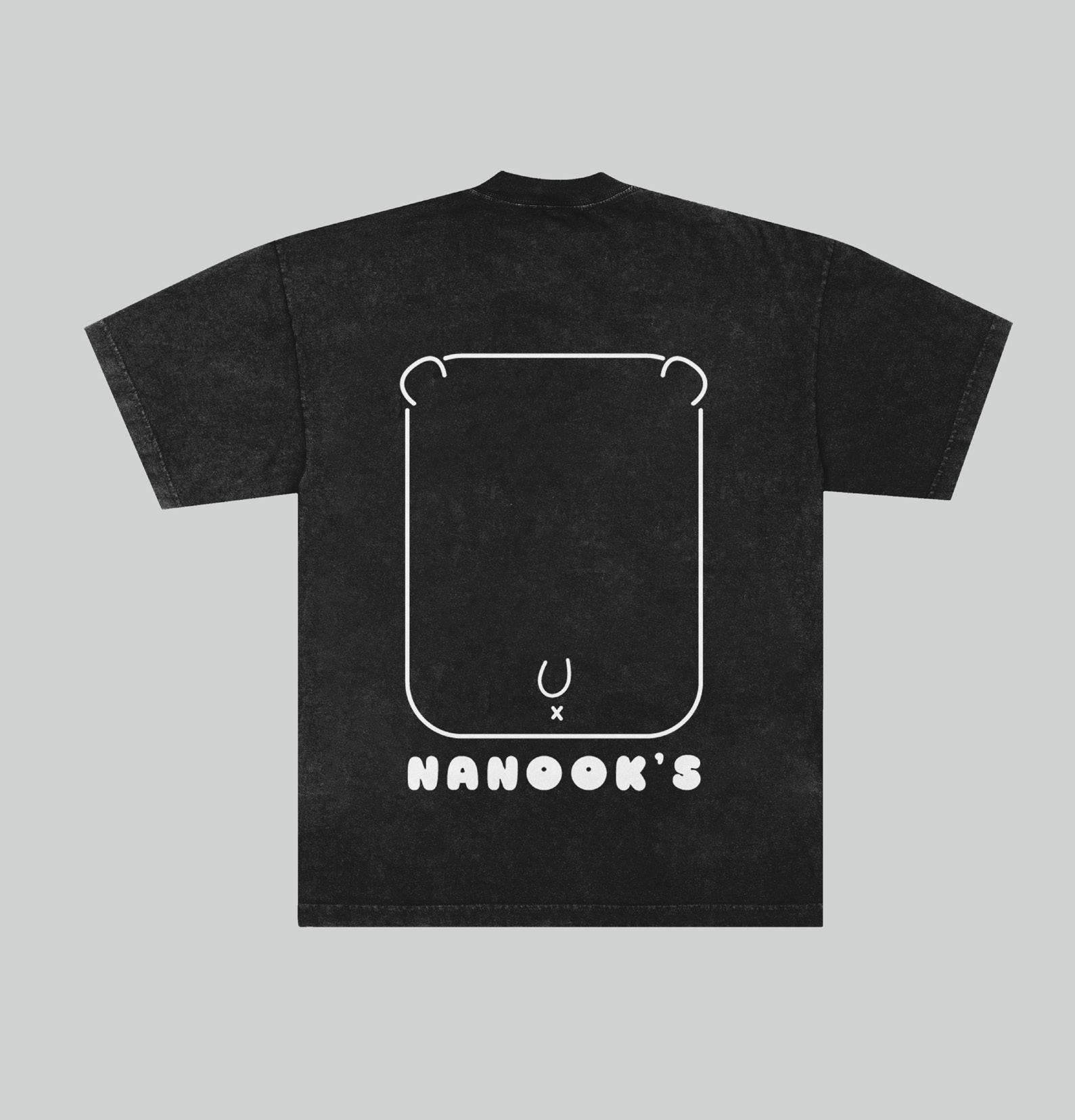
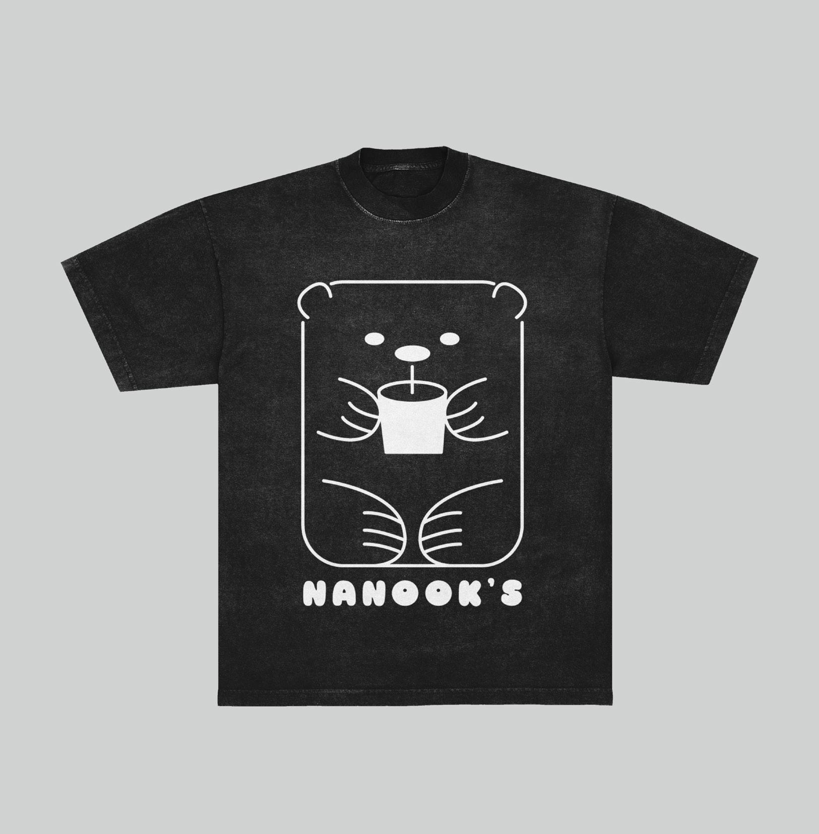
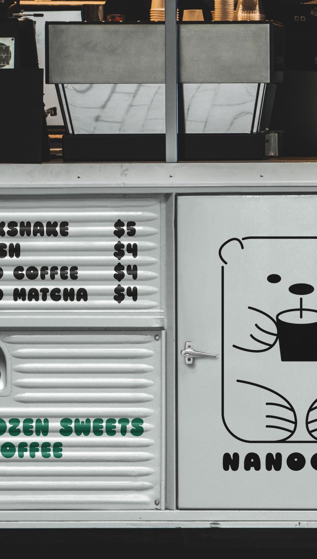
This rebranded logo design takes inspiration from the name’s native origins. Nanook is the Inuit word for “polar bear” and the totem pole style of artwork was commonly found among Native North American tribes. The design brings a cute and friendly approach to a traditional style and includes imagery of the product as well.

Logo Design
Apparel Design
Product Design
Campaign Direction
Illustration


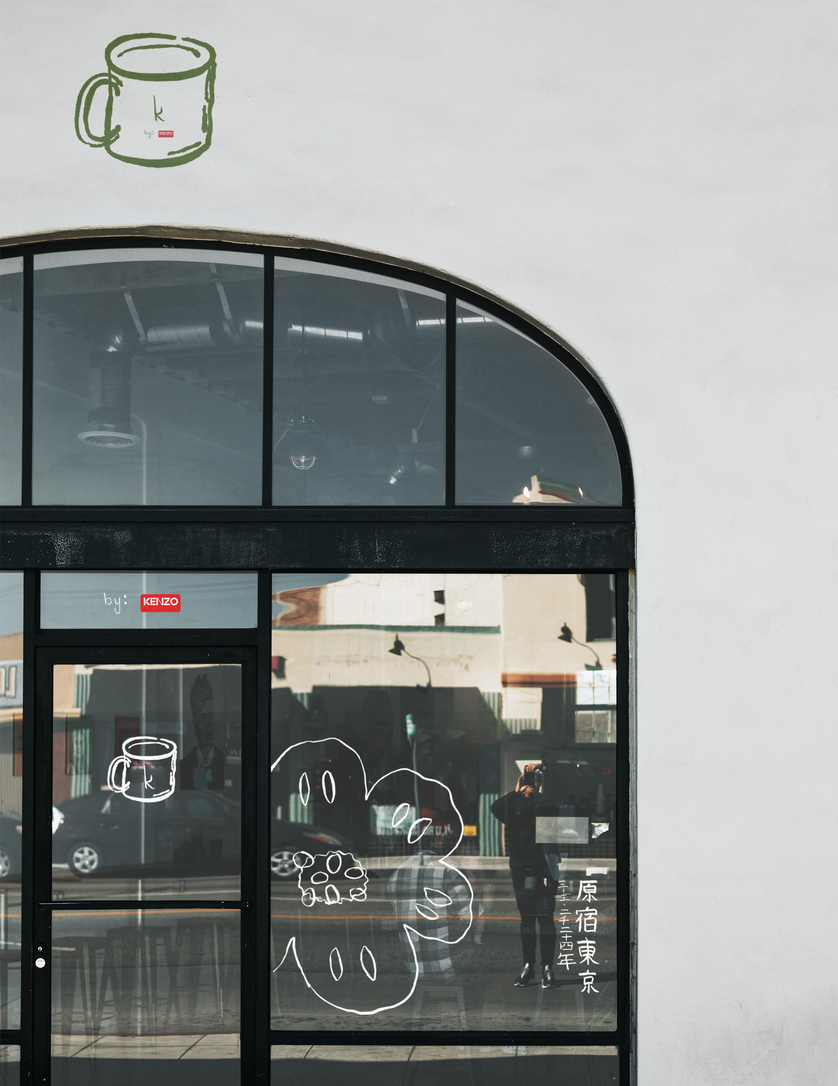
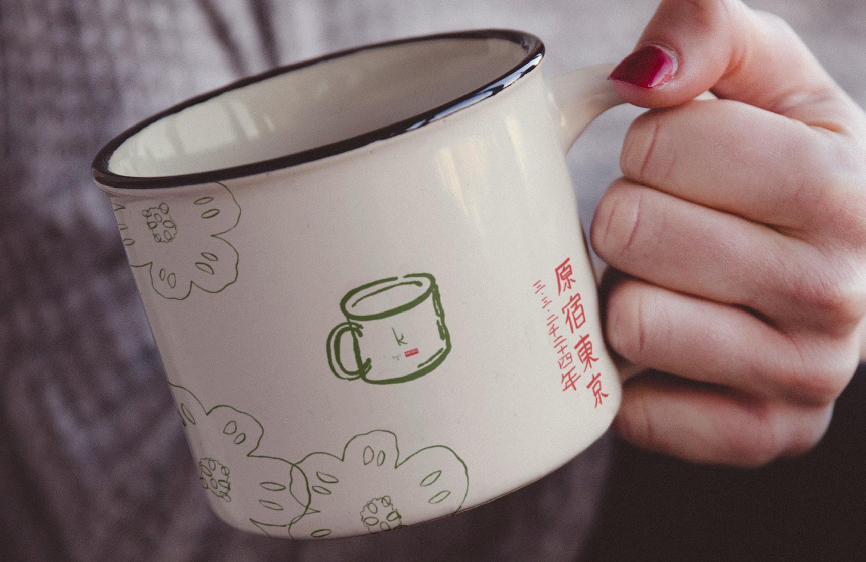
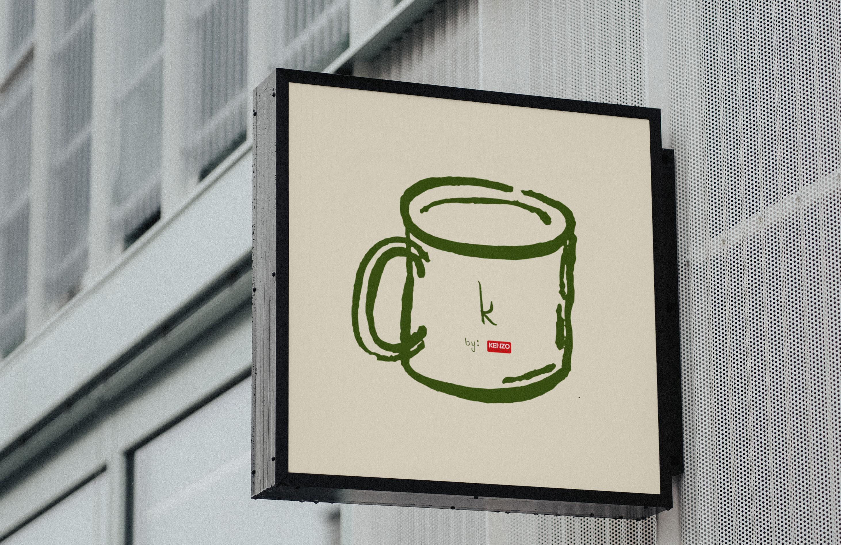
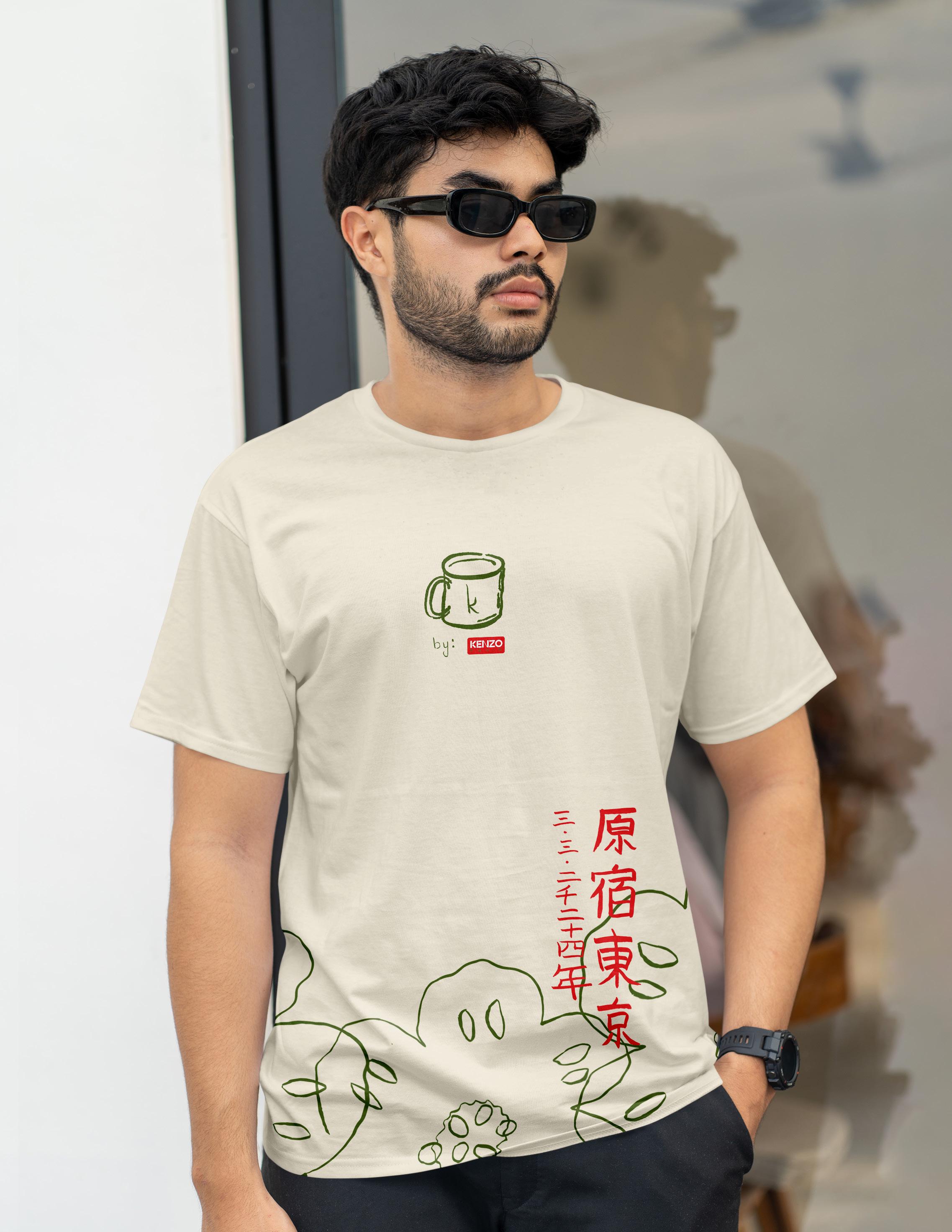
The campaign was designed to capture the creative genius of Kenzo’s creative director, Nigo. The campaign calls for a pop-up coffee shop in Tokyo, Japan, to promote Kenzo’s newest collection. The art and typography were all handdrawn to promote an organic collection. The “K” in Koffee is intentional and a callback to the Kenzo brand. The Japanese text on the merch and storefront states the location and date of the event in Japan.
Logo Design
Apparel Design
Product Design
Illustration
Campaign Direction
Social Media Marketing


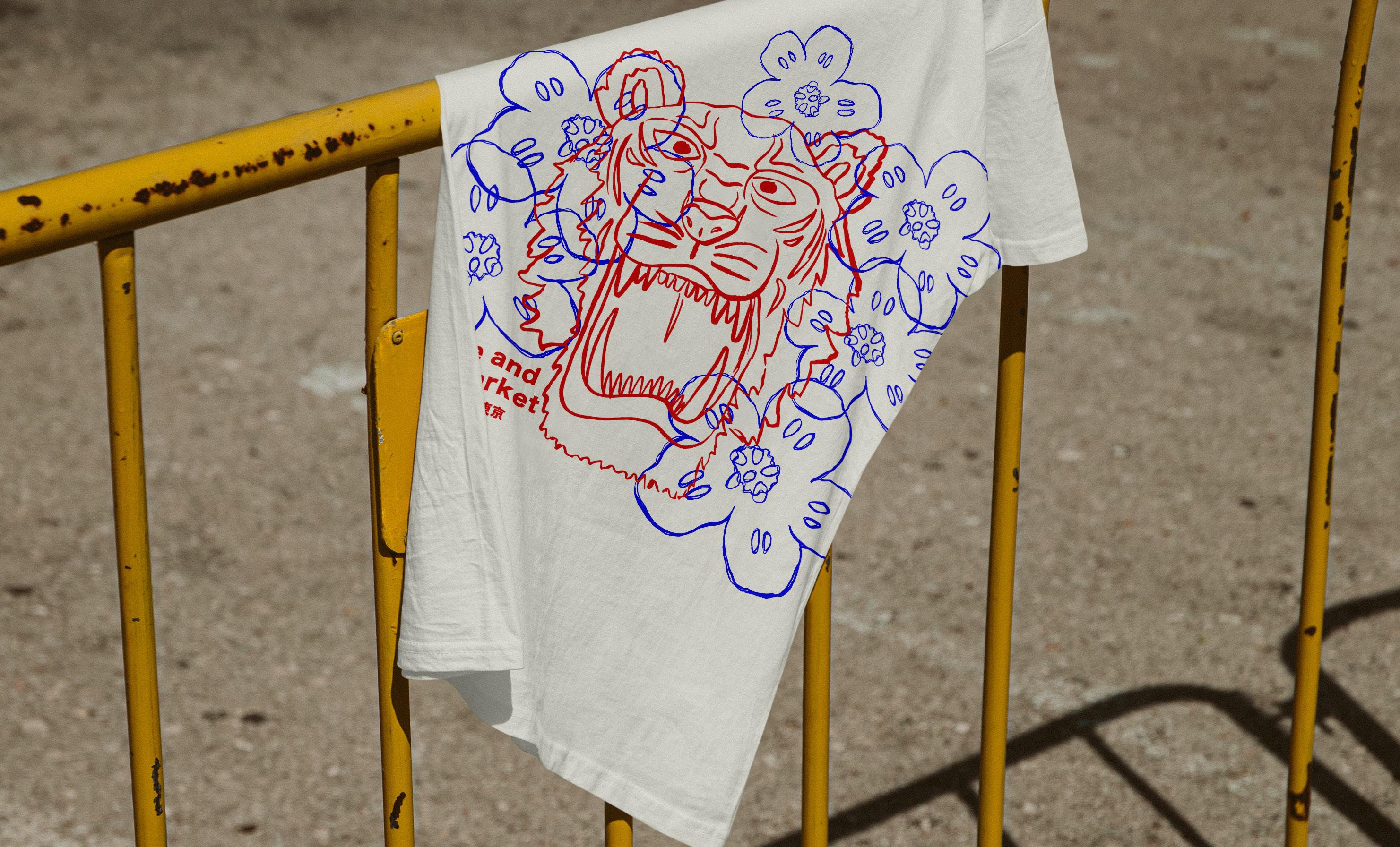
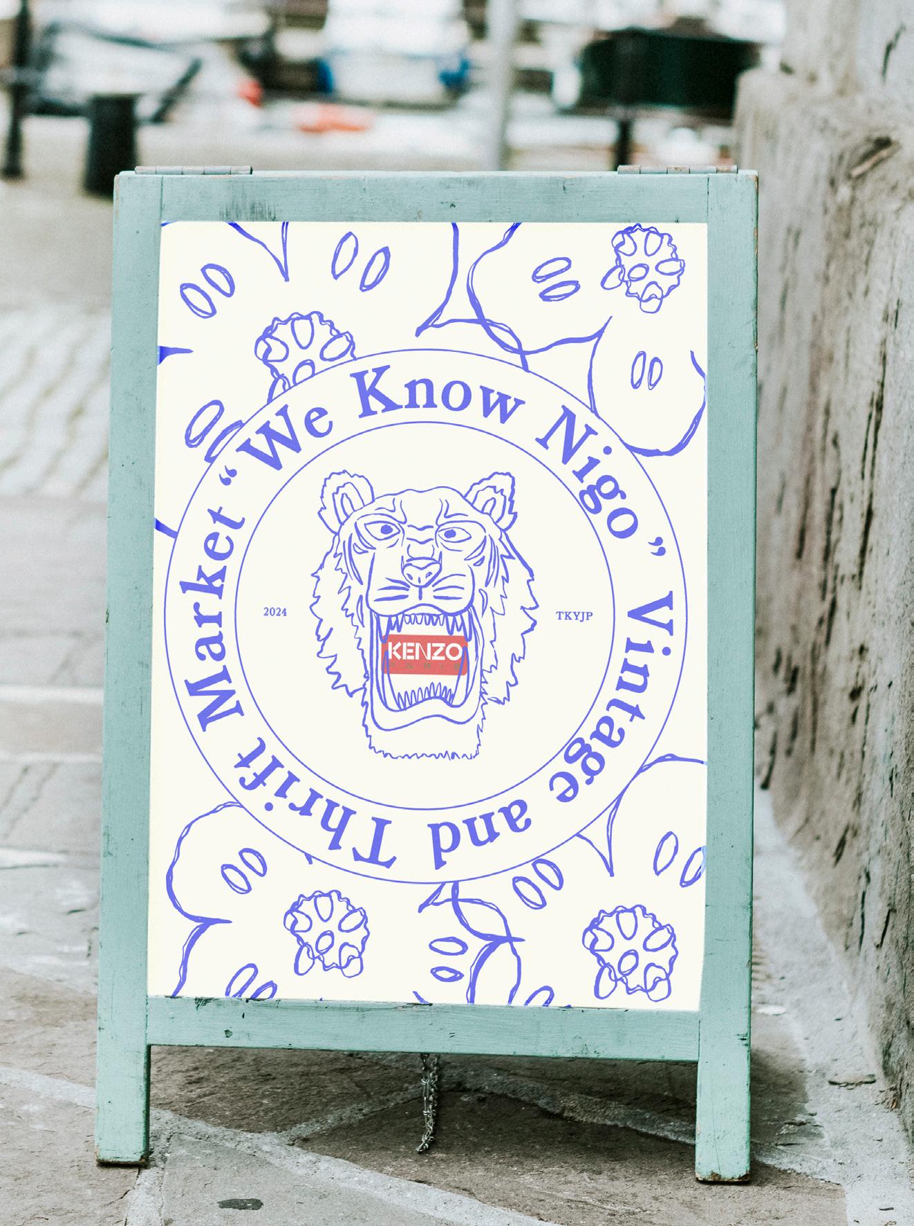
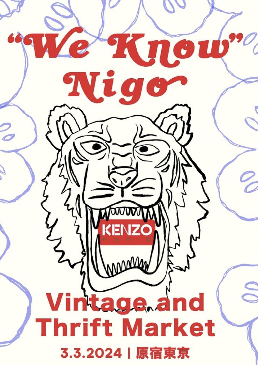
This campaign was designed to promote the creative genius of Nigo through a vintage market event. The campaign brings together indivduals who value and appreciate Nigo’s creative excellence while also promoting Kenzo’s upcoming collection. The title, “We Know Nigo,” derives from Nigo’s latest studio album and the assets for this campaign come from existing Kenzo elements in my own hand-drawn style.
